Articles

It’s 2022, and React has a huge ecosystem to help developers bring complex UIs to life faster. Furthermore, with the extensive support of ReactJS libraries, there is hardly any case when a developer has to build a component from scratch.

However, not every ReactJS UI developer is aware of the best practices to build UIs faster in ReactJS. Therefore, I’ll be discussing the top five approaches (which I personally use) for building UIs quicker in a ReactJS project. So without further ado, let’s get started:

Source de l’article sur DZONE

I bet you didn’t know that WordPress is the world’s most popular website builder and content management system (CMS).

Just kidding…of course, you did! But that’s not all there is to know about WordPress, so take our ridiculously challenging WordPress quiz and see how much of an expert you are…

(Scroll to the bottom for the correct answers.)

1. What is WordPress?

  1. SEO plugin to check your keyword density
  2. AI tool to create illustrations
  3. Online software to create websites
  4. A coffee shop in Canada

2. What is the number of websites using WordPress?

  1. 75 million
  2. 1.3 billion
  3. 2 thousand
  4. 7.1 billion

3. WordPress has a tradition of naming its major releases after:

  1. American presidents
  2. Famous jazz musicians
  3. British kings
  4. Heavy metal bands

4. How many websites are created on WordPress per day?

  1. Two websites
  2. 20,040 websites
  3. Over 500 websites
  4. 60-80 websites

5. What is the correct WordPress website address?

  1. WordPress.org
  2. WordPress.us
  3. WordPress.com
  4. WordPress.au

6. Who is the WordPress CEO?

  1. Elon Mask
  2. Bill Gates
  3. Leonardo DiCaprio
  4. No CEO

7. Which US government website is using WordPress?

  1. WhiteHouse.gov
  2. U.S. Embassy Websites
  3. State.gov
  4. All of them

8. How many languages is WordPress available in?

  1. 21
  2. 72
  3. 78
  4. 1

9. What is the most downloaded WordPress theme of all time?

  1. Divi
  2. Gutenberg
  3. WoodMart
  4. Astra

10. How many Fortune websites are using WordPress?

  1. 11
  2. 25
  3. 90
  4. 78

11. What is the average salary of a WordPress developer per year?

  1. $100k
  2. $56k
  3. $24k
  4. $201k

12. When was the first WordPress version released?

  1. 1999
  2. 2010 
  3. 2007
  4. 2003

Answers

1. What is WordPress? – 3. WordPress is online, open-source software that you can use to create websites.

2. What is the number of websites using WordPress? – 2. In 2021, WordPress powers over 1.3 billion websites all over the web, and this number continues to grow.

3. WordPress has a tradition of naming major releases after – 2. WordPress has a habit of naming its big releases after famous jazz musicians. For example, in the first version of January 2004, they called 1.0 (Davis), named after American trumpeter Miles Davis. Another version of May 2004 was named 1.2 (Mingus).

4. How many websites are created on WordPress per day? – 3. Over 500 websites are created on WordPress every day. At the same time, only 60-80 sites are built on popular platforms like Squarespace and Shopify. Besides, every second, 17 new blog posts are published on WordPress!

5. What is the correct WordPress website address? – 1. The fact that always confuses beginners is that WordPress.org and WordPress.com are entirely different companies that provide separate services. WordPress.org is the real WordPress everyone talks about that helps you to build websites. While WordPress.com is a hosting provider created by Automattic, the co-founder of WordPress.

6. Who is the WordPress CEO? – 4. WordPress is a free, open-source project. That’s why it does not have a CEO; volunteer developers run the project from all over the globe. This is the reason anyone can submit a report about a bug or suggest features.

7. Which US government website is using WordPress? – 4. The correct answer is all of them. All major websites of the US federal government use WordPress for their websites. The list includes all government sites of big and small cities, counties, universities, and high schools.

8. How many languages is WordPress available in? – 2. The Default WordPress language is English; however, the platform provides a fully translated platform with plugins that allow you to change your site’s language in seconds. The software has been successfully used in over 72 languages and can be modified for more!

9. What is the most downloaded WordPress theme of all time? – 4. Astra is the most downloaded WordPress theme of all time. Astra is claimed to be the most potent and fast theme trusted by many popular brands. Besides, the theme earned over $30M.

10. How many Fortune 500 websites use WordPress? – 1. 11 Fortune websites, such as Walt Disney Company, ABM Industries, and 21st Century Fox, use WordPress.

11. What is the average salary of a WordPress developer per year? – 2. The average WordPress developer earns $56,000 per year, according to Payscale.

12. When was the first WordPress version released? – 4. The first version of WordPress was released on May 27, 2003, which makes WordPress much older than Twitter and Facebook.


Featured image via upklyak on Freepik

Source

The post Ridiculously Challenging WordPress Quiz first appeared on Webdesigner Depot.

Source de l’article sur Webdesignerdepot

Cyber threats have become more sophisticated. Hence, it is a good idea to utilize the expertise of public cloud providers to better manage assets against security threats. Cloud security is a collection of proactive measures to protect your cloud assets from internal and external threats. In this Refcard, we will walk through common cloud security challenges, continuous security for cloud infrastructure, and advanced strategies for securing cloud workloads.
Source de l’article sur DZONE

I won’t introduce Dependabot. Lots and lots of developers use it daily on GitHub. I do use it as well. However, it suffers from two drawbacks:

  • While it’s perfectly integrated with GitHub, integrations with other platforms are less seamless.
  • It’s limited in the list of ecosystems it supports For example, I generally use Docker Compose files for my demos. When necessary, I use Kubernetes. Dependabot supports none.

    Source de l’article sur DZONE

The purpose of a website is to reach new customers and keep current ones engaged. Therefore, customer-first should be at the top of your list for design features. After all, without your clients, your business won’t grow or succeed.

Customer-first has been a buzzword for a few years now. In a nutshell, it’s easy to imagine what customer-first design means. The needs of consumers come before anything else. However, the concept isn’t quite as simple in practice. A lot of nuances enter the equation.

Just what does it mean to have a customer-first web design? What are the must-haves to reach users on their level and keep their attention for the long haul?

Embracing quality customer experiences has driven loyalty for as long as anyone can remember. However, we now live in a time of uncertainty, and when people leave companies on a dime if they’re dissatisfied with any aspect. So you must hit the high notes on every song – your website is your purest online persona and must engage users and keep them entertained.

Whether you embrace causes that matter to your customers and share information on them or tweak your design to meet accessibility guidelines, many factors come into play with a customer-centric design.

In a recent report, researchers found that about 88% of company leaders feel customer engagement impacts revenue. You can’t control every variable, but you can ensure your website hits all the strong points for a customer-first web design that grabs them and keeps them on your page.

Here are our favorite tips to create a customer-first approach. You may already be doing some of these things. Pick and choose what makes the most sense for your business model. Even small changes can have a big impact.

1. Know Your Customers

Before creating a website centered around your customers’ needs, you must know who they are. What are the demographics of your typical clients? Survey them and find out what their needs and expectations are. How can you best help them?

You may also want to survey them about your website. What’s missing that might help them? Is there anything they love? What do they hate? The more you know, the better your design can match their expectations. Create buyer personas based on their preferences.

At the same time, buyers will sometimes say one thing but actually feel another way. No one is quite sure why people do this when being surveyed. One way around that issue is to do some A/B testing to see how they actually feel about various changes. Do they respond the way you thought? What other adjustments need to be made?

2. Find the Right Color Palette

Different industries trend toward various hues. For example, businesses in the banking industry trend toward blues and occasionally reds. Blue elicits trust from users and has a calming effect. On the other hand, the fashion industry might tap into brighter shades, such as lime green. Think about what colors people expect in your industry, and then find your color palette.

Each hue has its emotional impact. For example, red is a color of power and can elicit excitement in the viewer. Choose your shades accordingly to get the most emotional punch possible.

3. Accept Feedback

One of the best ways to improve your site over time to match the needs and preferences of your audience is by allowing feedback. Add reviews, place a feedback form in your footer, and even send out requests for feedback to your mailing list.

It’s also a good idea to find a mentor who has been successful at running a business. Ask them to look at your site and give you advice. You might also enlist the help of a marketing professional.

4. Stick With the Familiar

Have you heard of Jakob’s Law? The rule of thumb states that people prefer common design patterns they’re most familiar with. So when they see a pattern they know, such as a navigation bar layout, it boosts their mood and improves their memory of the site.

When making edits, don’t make significant changes. Instead, implement minor adjustments over time to give your followers a chance to acclimate to the shift.

5. Cut the Clutter

If you want users to feel wowed by your page and engage, you have to limit their choices. Add in too many options, and they may not know where to go first.

Start by choosing an objective for the page. Cut anything that doesn’t point the user toward the goal. Ideally, you’d have a little info, an image, and a call to action (CTA) button. However, this may vary, depending on where your buyer is in the sales funnel and how much information they need to decide to go from browser to customer.

6. Choose Mobile Friendliness

Recent reports indicate about 90% of people use mobile devices to go online at times. With phones gaining greater capabilities and 5G bringing faster speeds to communities, expect people to use their mobile devices even more frequently for internet browsing.

Making sure your site translates well on smaller screens makes sense for your company and for your customers. Be sure to test everything. Click through all links. Fill in forms. Ensure images and text auto-adjust to the correct size, so people don’t have to scroll endlessly.

7. Make Multiple Landing Pages

Like most businesses, you probably have several buyer personas as you segment your audience. Don’t just create a single home page and expect it to fulfill the purpose of every reader. Instead, create unique pages for each persona to best meet their needs.

Make sure each landing page speaks in the natural language patterns of your specific audience. Think about the unique needs of each group. How do their pain points differ? How can you best meet their needs?

8. Keep Important Info Above the Fold

People are busy. They work, have families, and might visit your site on the 15-minute break they get in the afternoon. Most consumers want the information they need to decide and don’t want to dilly-dally around with other things.

Place the essential headlines and info they need above the fold, so they see it first. Make it as readable as possible by using headings and subheadings. Add in a few bullet points. People also absorb information easier in video format, so add a video highlighting your product’s or service’s main benefits.

You should also place a CTA button above the fold if it makes sense for your overall design. Keep in mind people may have visited and already read some of the information. Some users return just to sign up and want to find the CTA quickly.

Step Into Your Customers’ Shoes

Look at your site through the eyes of your audience. What works well? What needs to be adjusted? Over time, you’ll develop a customer-first web design that speaks to those most likely to buy from you. Then, keep making changes and tweaking your site until it hits the perfect balance for your customers.


Featured image via Freepik.

Source

The post What Customer-First Web Design Looks Like first appeared on Webdesigner Depot.

Source de l’article sur Webdesignerdepot

The most important task in any machine learning model is finding or building a dataset that perfectly accommodates your algorithm. Without the correct foundation, your machine learning model may not perform in its intended way.

While well-known sites such as Kaggle allow you to download and utilize thousands of adequate datasets, a few other dataset providers are increasing in popularity. In this article, we will cover one known as Hugging Face.

Source de l’article sur DZONE

A data pipeline, at its base, is a series of data processing measures that are used to automate the transport and transformation of data between systems or data stores. Data pipelines can be used for a wide range of use cases in a business, including aggregating data on customers for recommendation purposes or customer relationship management, combining and transforming data from multiple sources, as well as collating/streaming real-time data from sensors or transactions.

For example, a company like Airbnb could have data pipelines that go back and forth between their application and their platform of choice to improve customer service. Netflix utilizes a recommendation data pipeline that automates the data science steps for generating movie and series recommendations. Also, depending on the rate at which it updates, a batch or streaming data pipeline can be used to generate and update the data used in an analytics dashboard for stakeholders.

Source de l’article sur DZONE

This month we’re seeing websites that are very conscious of the design trends they’re following. Designers are making conscious choices to adopt styles, and opting out when it doesn’t suit the site. What we end up with is a crop of sophisticated, well-designed websites that use style as a technique to further their aims.

Here are the sites that caught our eye this month, enjoy!

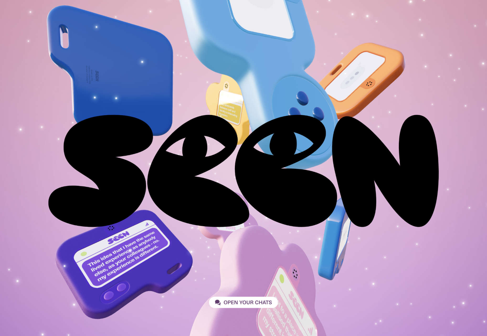
Seen

Seen uses conversations to explore themes surrounding ethnicity and racism in creative fields. Displaying these conversations as online chats creates a sense of intimacy.

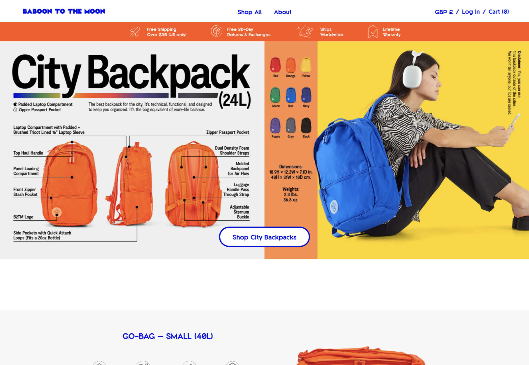
Baboon to the Moon

There is a lot of color in Baboon to the Moon’s product shots, so the rest of the site is kept simple, with good clear navigation too.

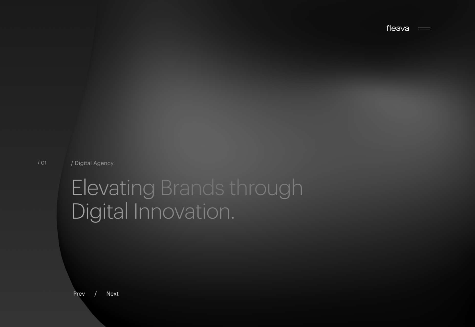
Fleava

There is a strong sense of luxury to digital agency Fleava’s glossy brochure portfolio site.

Baunfire Portfolio Review 2022

This site for Baunfire digital agency’s creative networking event is bold, personable, and fun.

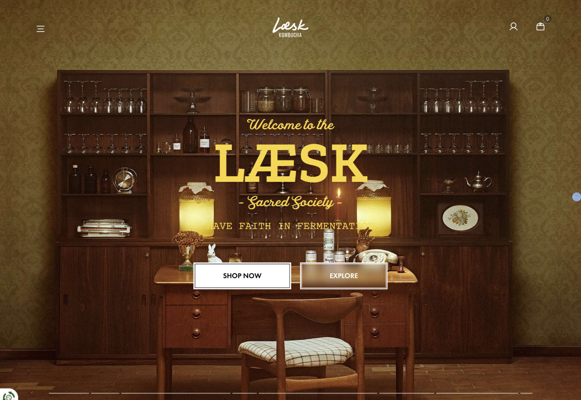
Laesk Kombucha

There is more than a touch of Wes Anderson’s style to this site for Laesk Kombucha; somewhere just out of sight is Bill Murray in a red beanie.

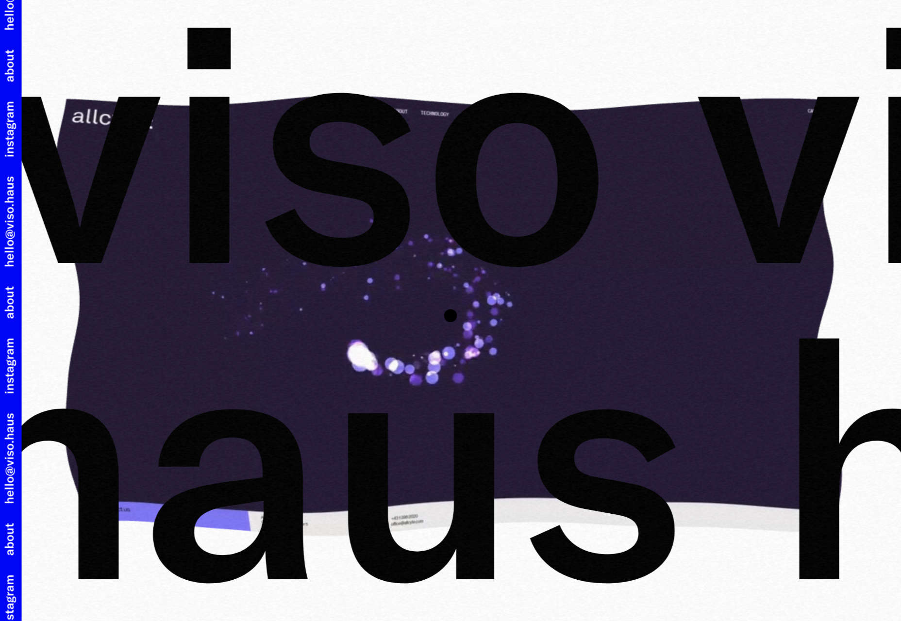
Viso Haus

Viso Haus doesn’t do anything hugely groundbreaking here with their brutalist-style portfolio site, but they do it very well.

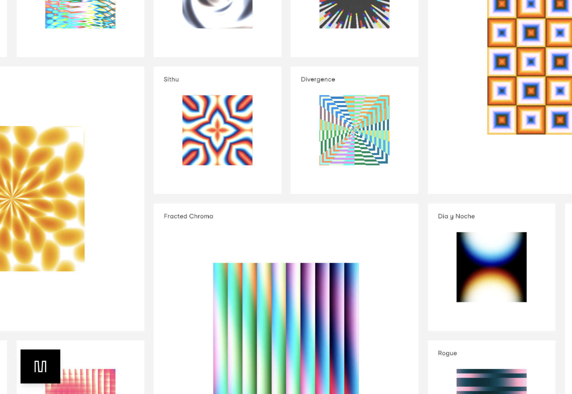
Mario Carillo

Artist/programmer Mario Carillo has opted for a minimal approach, allowing the work to do the talking.

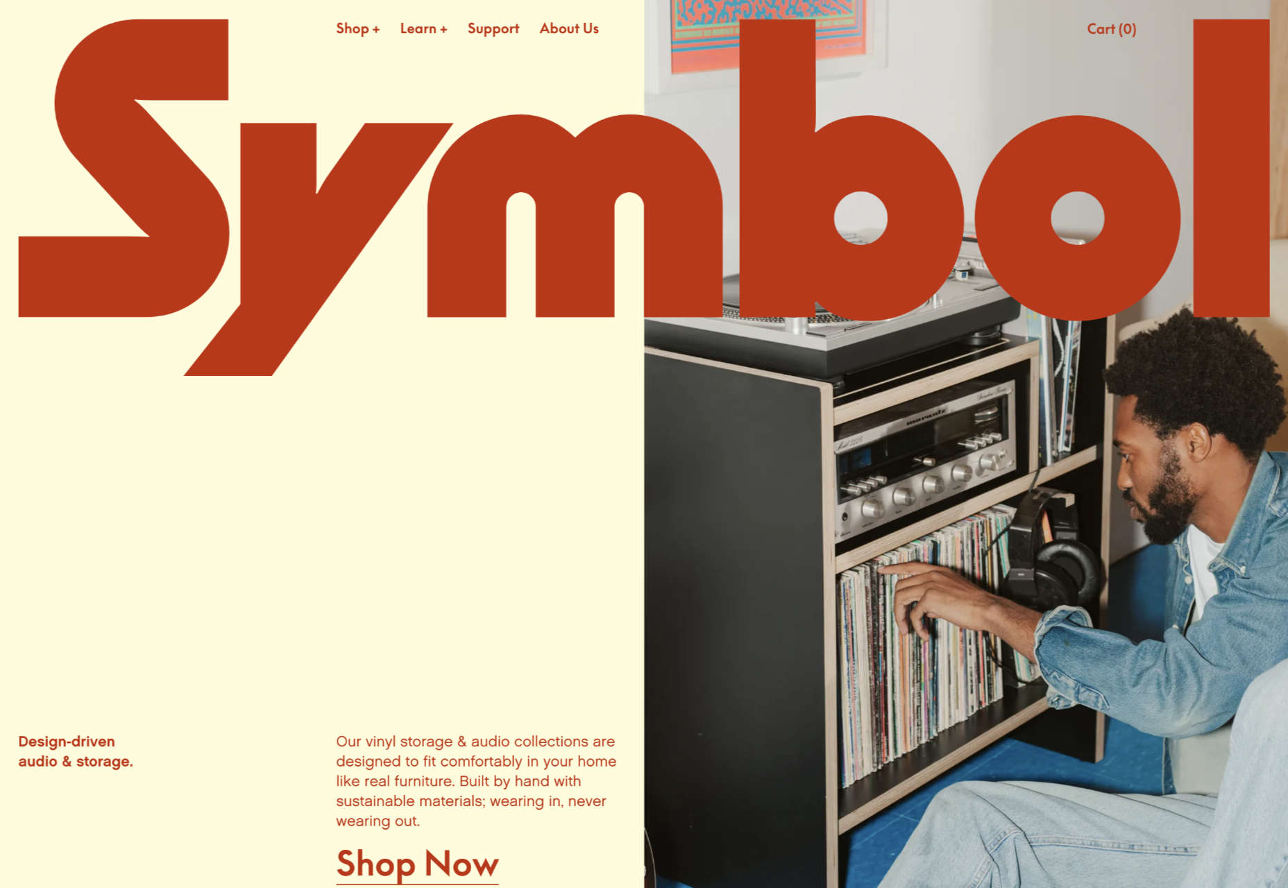
Symbol

There is a warmth to Symbol’s site, created by the color tones and combinations used here.

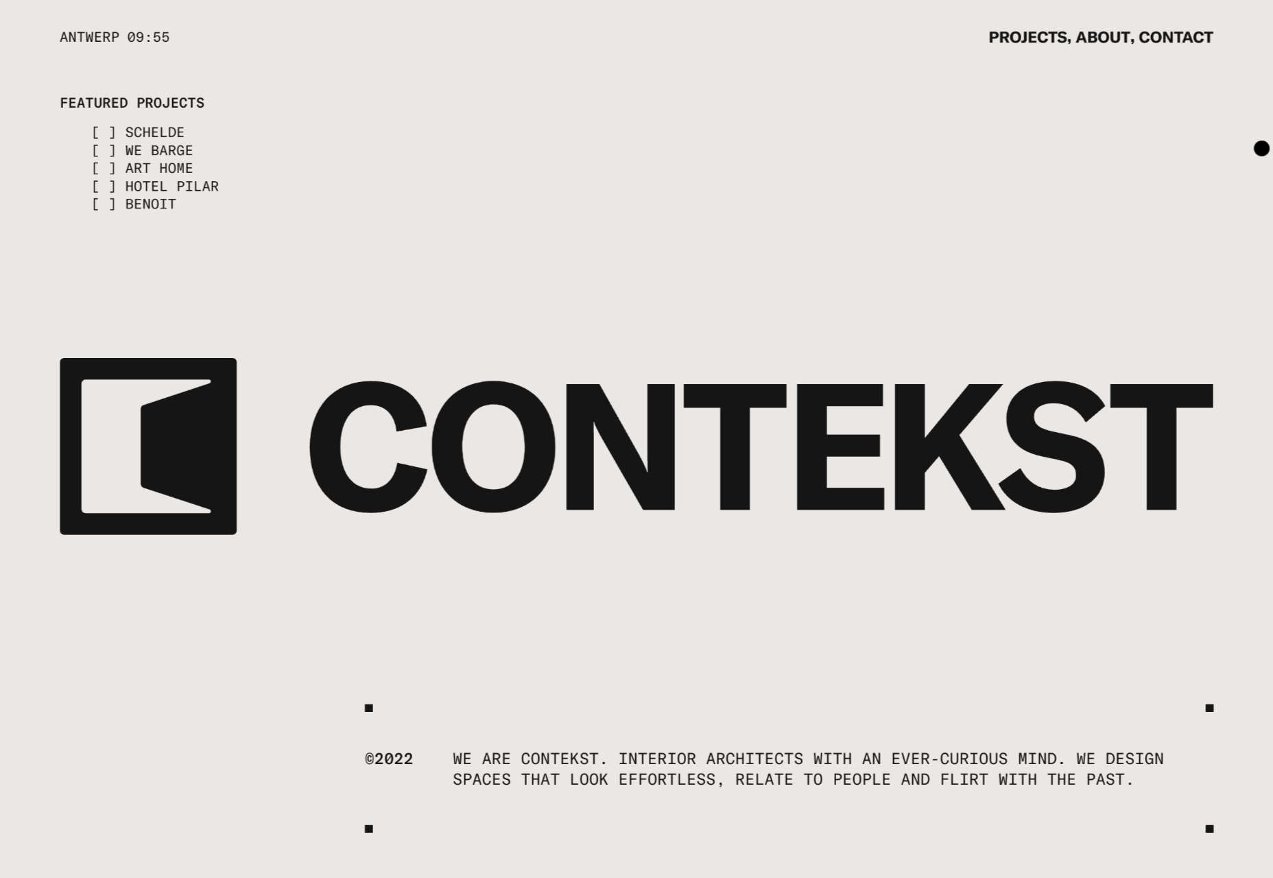
Contekst

Interior architects Contekst favor a brutalist visual style for their site, but with some nice little animated extras.

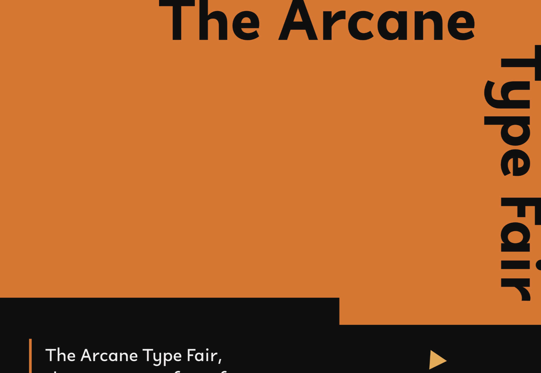
Arcane Type Fair

No, you haven’t missed the font lover’s answer to Comic Con: the Arcane Type Fair is fictitious and a clever showcase for Rain Foundry’s Conacher typeface.

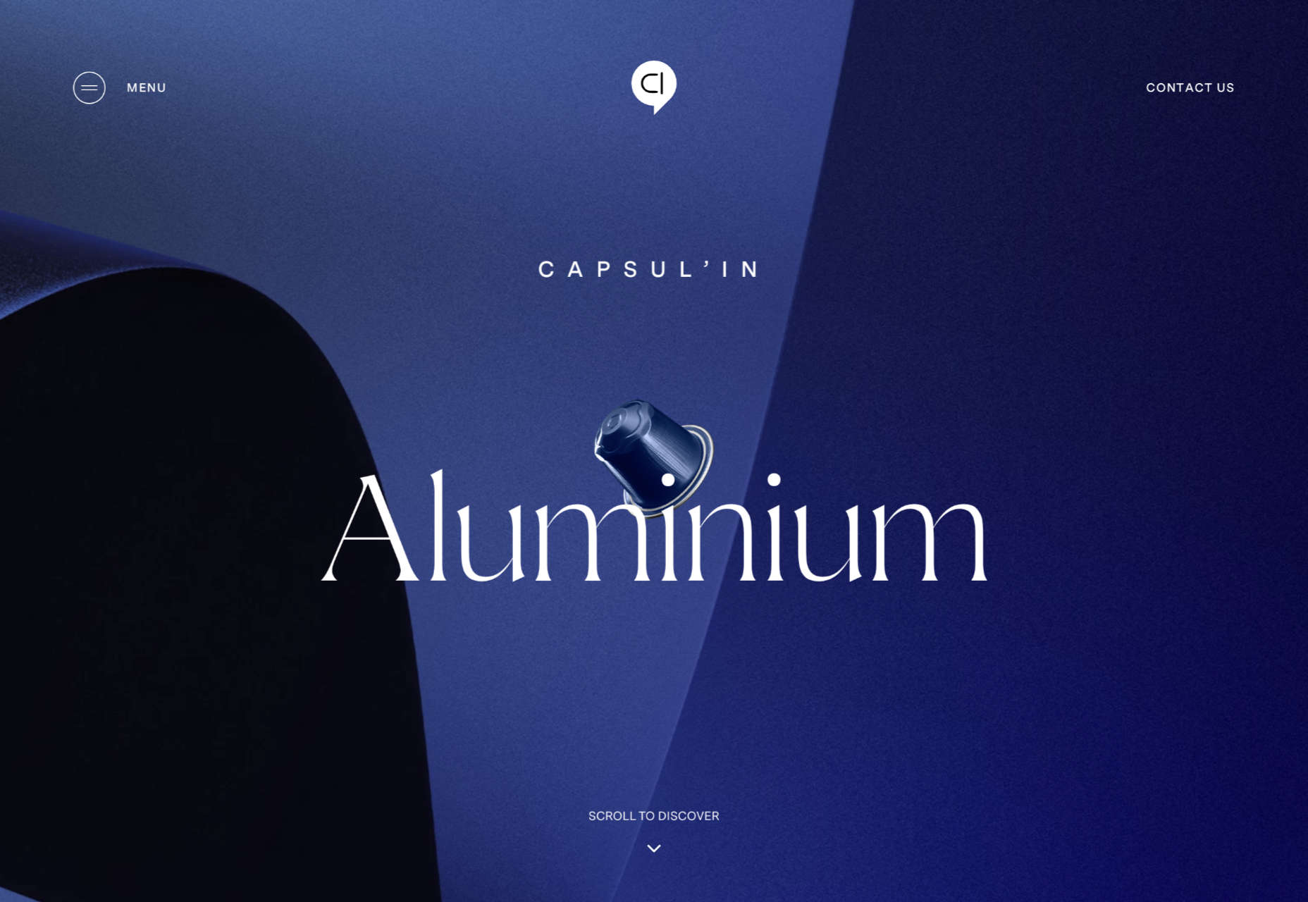
Capsul’in Pro

With lovely scrolling animation and soothing colors, this site for Capsul’in Pro manages to turn coffee pods into objects of desire.

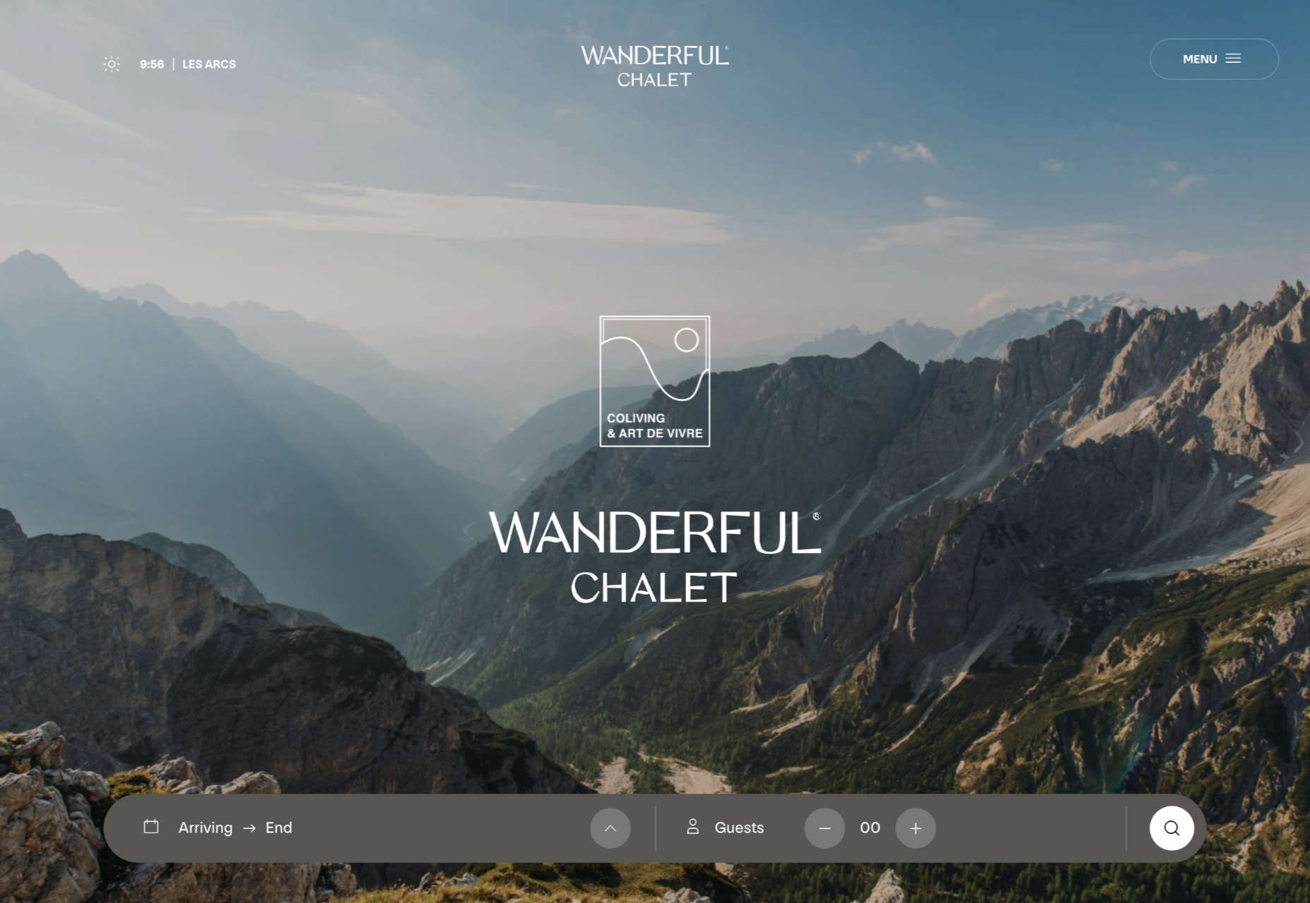
Wanderful Chalet

Random illustrations and a quirky display type add character to Wanderful Chalet’s brochure site.

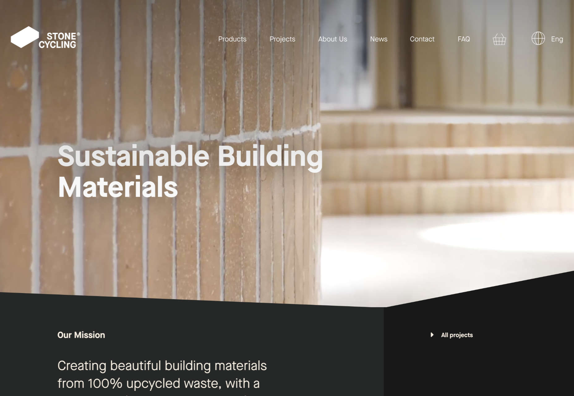
Stone Cycling

Bricks made from rubbish don’t sound like the most exciting thing ever, but this site evokes a lovely clean feel: like an old building gleaming in the sunlight after all the soot has been scraped off it.

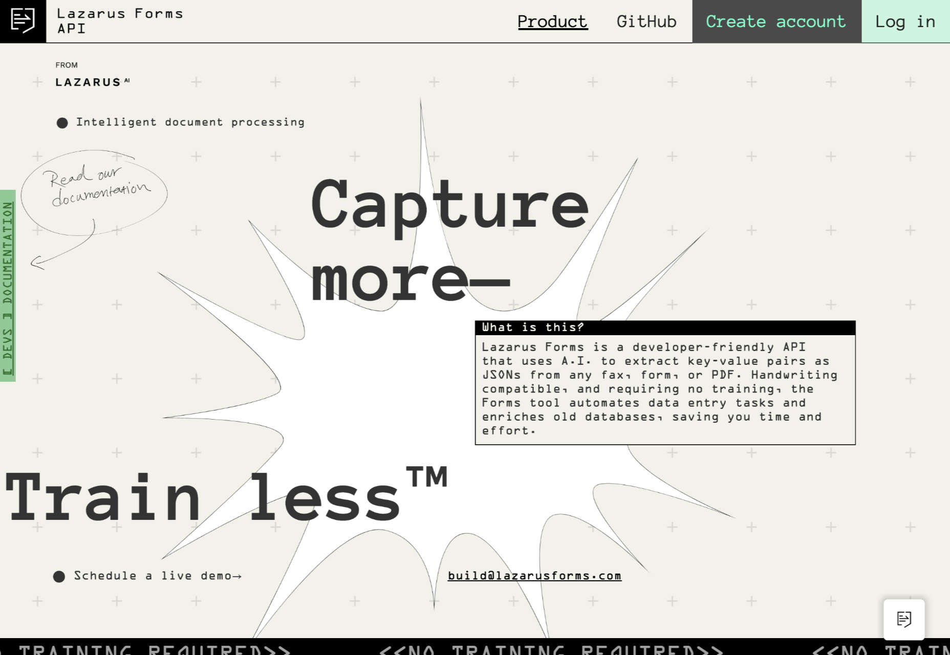
Lazarus Forms

Lazarus Forms is an API for AI document processing. This site succeeds in being transparent in its explanation without being overly technical and pleasing visually.

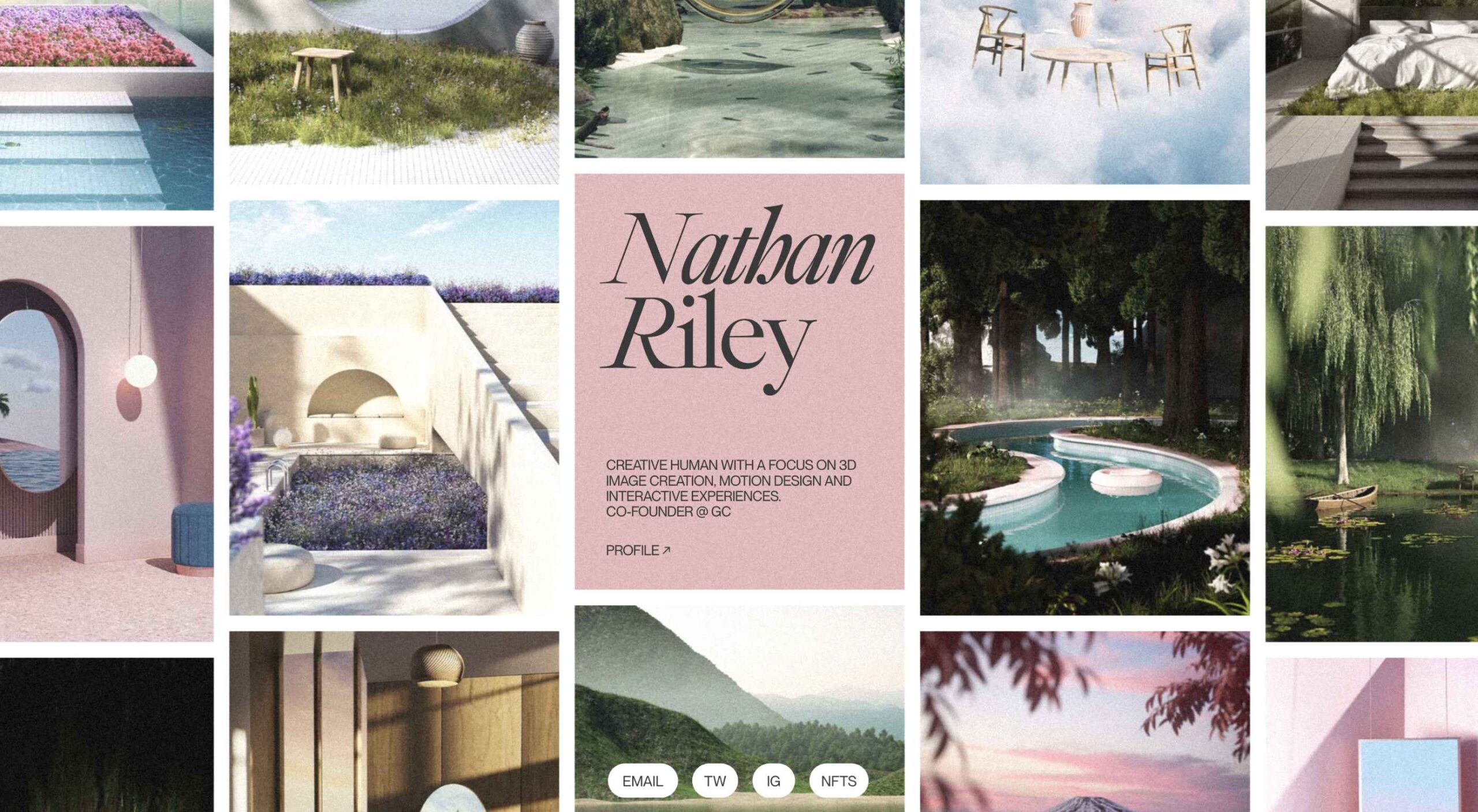
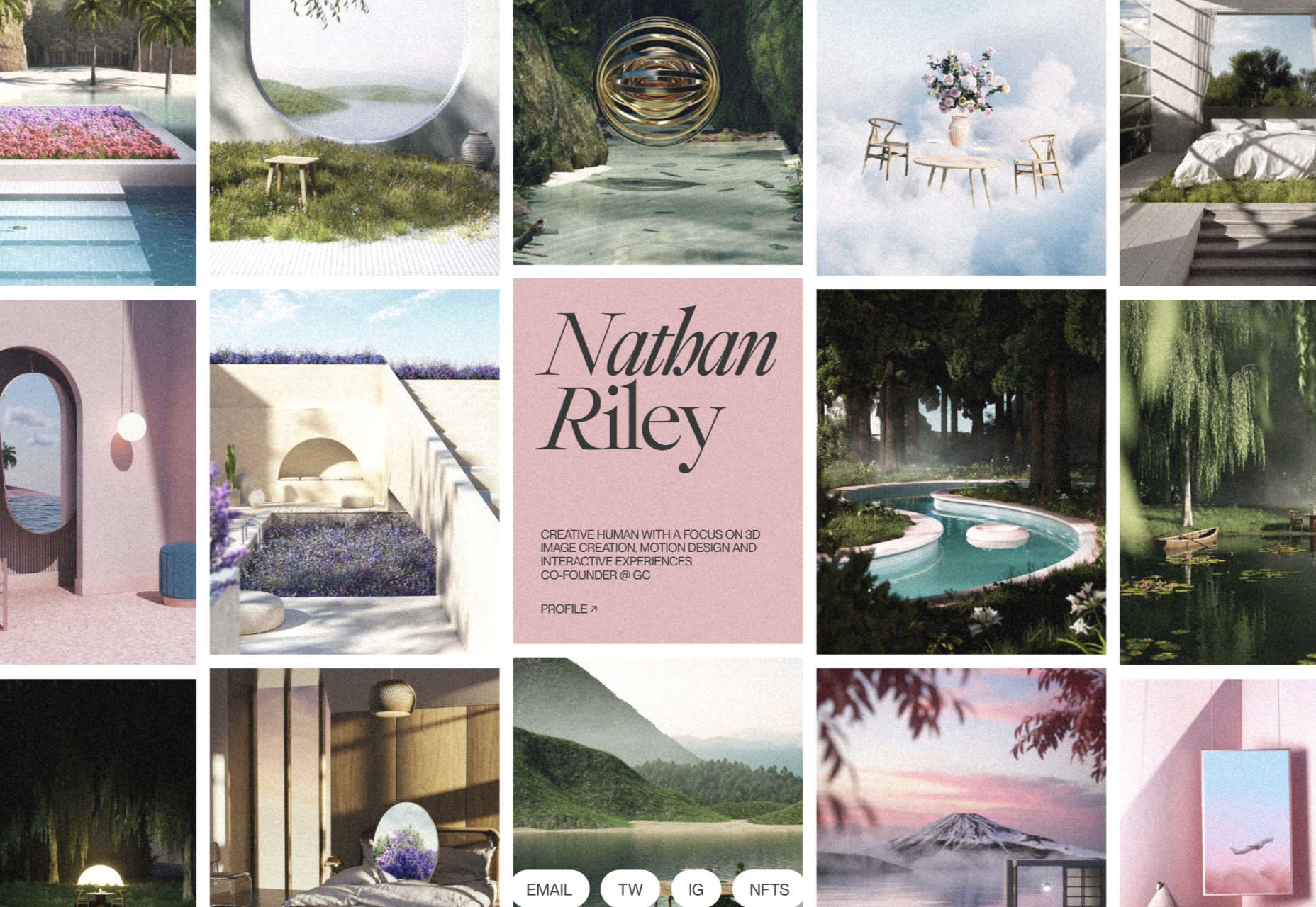
Nathan Riley

An excellent example of masonry combined with variable scrolling speeds creates tension in digital artist Nathan Riley’s portfolio.

Evi O. Studio

Sometimes the simplest things, like this full-screen image transition for Evi O. Studio’s portfolio, can be so well done it’s an absolute pleasure to scroll through.

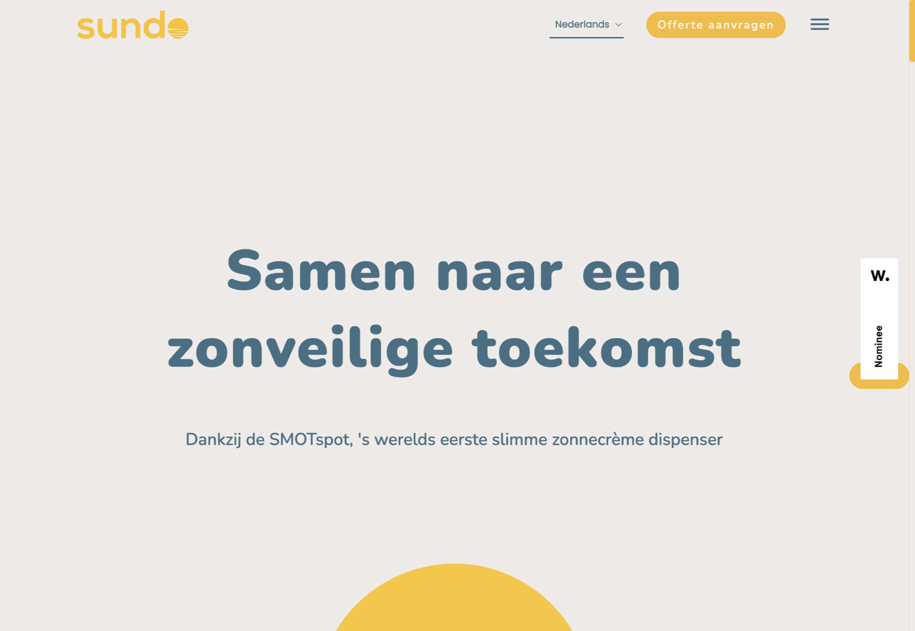
Sundo

Sundo has created SMOTSpots – smart sunscreen dispensers for public areas. The tone of the site is suitably utilitarian with a soft edge.

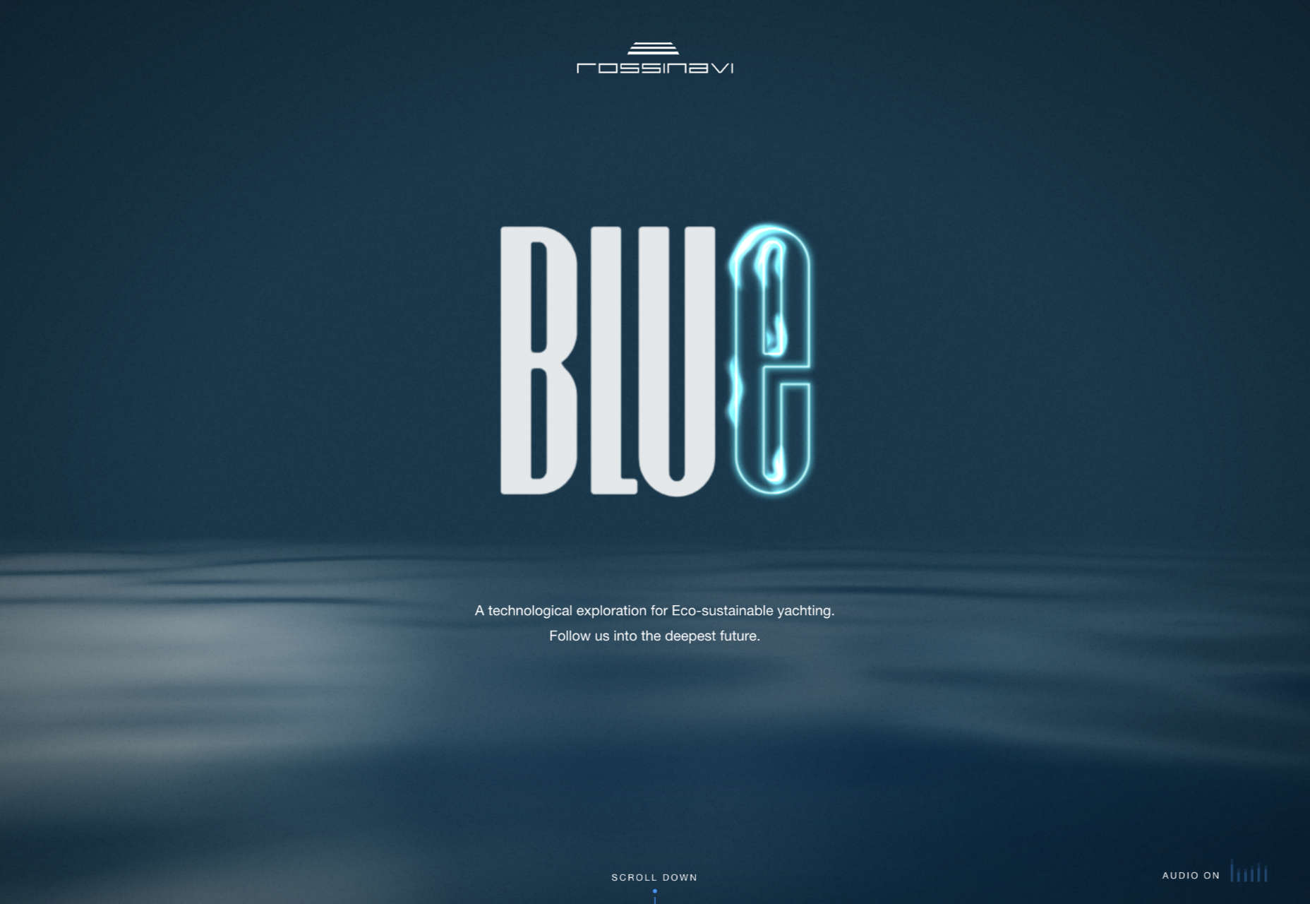
Blue

The Blue experience from Rossinavi luxury boat builders is a pleasing immersive microsite showcasing their new hybrid-electric boats.

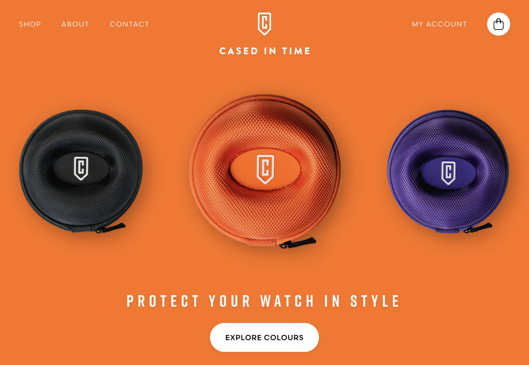
Cased in Time

This site is an excellent example of how to make a single product commerce site that doesn’t feel lacking in content.

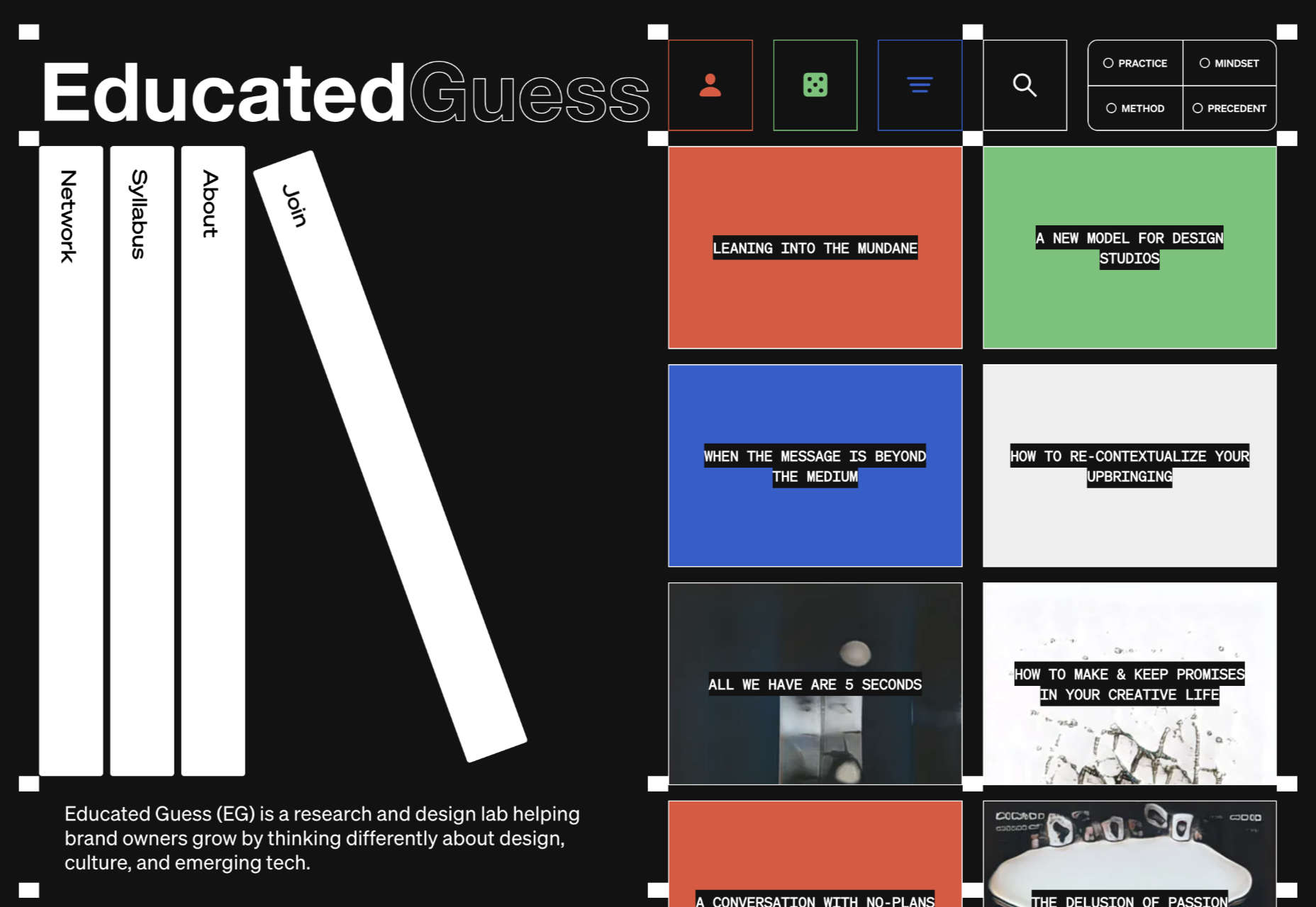
Educated Guess

Educated Guess is a podcast for creatives by creatives. The accompanying website is pleasing to use, easy to navigate, and allows the user to focus on the content.

Source

The post 20 Best New Websites, September 2022 first appeared on Webdesigner Depot.

Source de l’article sur Webdesignerdepot

Whenever we build an awesome product we first build it standalone but sooner or later it attracts more users and then our minds start thinking about how to accommodate more users and there comes the need of scaling the application. Generally scaling means providing more elasticity to the application so that it can sustain the high influx of users and run smoothly without any glitches.

Software scalability is an attribute of a tool or a system to increase its capacity and functionalities based on its users’ demands. Scalable software can remain stable while adapting to changes, upgrades, overhauls, and resource reduction

Source de l’article sur DZONE

People often experience network or internet connectivity issues while traveling, most often when they are on a subway. But not only in this particular case — one can encounter such issues anywhere where the network connectivity is poor. Browsing a mobile application in those situations can lead to a poor and frustrating user experience if it doesn’t possess the ability to work in the offline state. This is where the role of offline-first apps comes into play.

Users carry a strong negative emotion for apps that are not optimized for low connectivity. And do you know latency is the number one reason why people in the U.S. decide to bounce from mobile pages? Though the stats don’t reveal whether it is when they are stuck in a low network area or it is the application’s slow nature despite a good network, the point that we want to put stress on is that a mobile app’s inability to load quickly can leave users highly dissatisfied and compel them to abandon the application. This, along with an increase in churn rate, can result in revenue loss as well. This has pushed « appreneurs » toward adopting an offline-first approach or building offline-first apps to tackle limited connectivity issues.

Source de l’article sur DZONE