Articles

Yesterday’s creativity won’t keep pace with tomorrow’s requirements; businesses need speed and agility without sacrificing creative quality.

“The creativity that was needed in the past is not the creativity that is needed today,” according to Matthew Rayback, a creative director at Adobe. He’s not talking about the function of creativity but rather about the process of creative management in a marketing context. 

What is needed today? Speed and agility without sacrificing quality. 

Why? Because the pace of change has accelerated. As Rex Salisbury, a deal partner for the venture firm a16z noted early in the pandemic, “Businesses of all kinds are experiencing two years’ worth of digitization compressed into months.”

This accelerated digital transformation has put pressure on marketing teams to turn campaigns around faster. In turn, that places pressure on creative teams to generate the requisite creative for those campaigns. Leaders need to sharpen their awareness of the unfolding creative management trends to keep pace. To that end, below are five such trends to watch in 2022. 

1. In-House Creative Teams Continue to Grow

Companies have been building in-house creative teams for the better part of a decade. A 2018 study by Forrester Research and the In-House Agency Forum (IHAF) found the number of in-house teams has grown 22% in the last ten years or so. As The Wall Street Journal reported, more than half of advertisers (64%) have shifted their creative organizations to an in-house team.  

According to a more recent version of that same study, the in-housing movement didn’t stop throughout the pandemic. It revealed, “80% of respondents said they have brought more marketing assignments in-house since the onset of the pandemic, with 50% saying the increase was directly triggered by the events of the past two years.”

Businesses seem well-satisfied with the results because the urge to in-house is poised to grow beyond creative teams. For example, a recent survey by the customer intelligence company Axciom found about 50% of respondents believe the “in-housing is currently a top marketing objective, and 40% expect it will remain a top priority in the coming years.”

2. Outside Agencies Hired for Specialized Skills

Despite the in-housing trend, there is still opportunity for agencies, consultants, and freelancers, particularly those with specialized skills. Even the consumer-packaged goods giant Proctor & Gamble, a leading example of brands bringing marketing and creative teams in-house, still needs outside service providers.

Indeed, while in-house creative teams produce the lion’s share of creative work, the vast majority (86%) also continue to partner with agencies and freelancers; according to our own research, published in our 2021 Creative Management Report, which was facilitated by Lytho (formerly inMotionNow) and based on a survey of 400 creatives and marketers. 

When the survey asked creatives why they hire outside resources, the top reason was access to specialized skills (60%). That was followed in a distant second by a need for increased capacity (44%), help with developing strategy (24%), and, lastly, to get work done faster (20%). 

“It is very unusual for an in-house team to have no outside resources that they lean on,” wrote Alex Blum of Blum Consulting Partners, Inc. in a written assessment of the survey results.

He says there are two primary ways to partner with agencies. “First, for overflow capacity. There is always a need for more creative resources, and agencies can offer that flexibility without the cost of maintaining larger teams,” he wrote. “Second, in-house teams can divide areas of ownership with an agency based on the skill sets they have in-house.”

3. The Creative Process Evolves

Marketing today is dominated by an insatiable thirst for fresh content, produced and polished by creative teams. The demand for that content continues to explode. 

What does this portend for creative teams? Despite adding headcount, creative requests exceed the creative team’s capacity to produce it – even as lead times shrink. Matthew Rayback, the creative director at Adobe, suggested the creative process must evolve. 

He likens creatives to an auto factory, where “creatives used to be the assembly line to make a single car.” However, today, creatives are tasked with creating more cars, each with unique adjustments such as personalization. 

“The assembly line we built can’t accommodate that speed or volume,” he says. So the whole factory – the entire creative process – must be overhauled to adapt. 

4. Quantitative Measurement Drives Creative Priorities

Current methods for measuring the value of creative teams center on outputs. That is to say, the metrics tracked tend to quantify the number of creative projects in progress, the rounds of review, and the number of projects completed over time. 

These metrics are important, but alone they are insufficient. A complementary way to prioritize large volumes of creative requests is focusing on those tasks most likely to move the business needle. The barrier to achieving this is that most creatives aren’t kept informed as to the outcomes of marketing campaigns fueled by their creative efforts. This must change.

With the growing demand for content, the margin of error for applying creative resources to projects that don’t correlate to business results shrinks. Marketing organizations must build a feedback loop that brings quantitative results back to the creative team. In turn, creative teams must learn to use the data to drive their work priorities in collaboration with marketing. 

5. Creative Resource Management Becomes Essential

Resource management is both a leadership concept and technology (or a combination of technologies). It’s a means to plan, track, collaborate and measure creative operations, including people, processes, and budgets.  

Traditionally, planning and tracking of all things creative and marketing occurred in a spreadsheet. It works well when the future is generally predictable – yet cliché as it may be to say it – we are living in a state of uncertainty. 

Like many trends over the last 18-24 months, the global pandemic “forced virtual experiences, disrupted marketing channels and campaigns, and accelerated companies’ transition to digital marketing,” according to Forrester. The research firm calls resource management “essential” because it helps move “planning from static spreadsheets to a dynamic and real-time environment.” 

Final Thoughts

Yogi Berra paraphrased an old Danish proverb when he said, “It’s tough to make predictions, especially about the future.” Even so, the pandemic has accelerated trends that were already underway, and these five trends are good examples. More than just watching them, creative and marketing leaders should take steps now to get ahead of them.


Featured image via Pexels.

Source

The post 5 Creative Management Trends to Watch in 2022 first appeared on Webdesigner Depot.

Source de l’article sur Webdesignerdepot

Every day design fans submit incredible industry stories to our sister-site, Webdesigner News. Our colleagues sift through it, selecting the very best stories from the design, UX, tech, and development worlds and posting them live on the site.

The best way to keep up with the most important stories for web professionals is to subscribe to Webdesigner News or check out the site regularly. However, in case you missed a day this week, here’s a handy compilation of the top curated stories from the last seven days. Enjoy!

Svija – A Website Builder Based on Adobe Illustrator

13 Graphic Design Trends for 2022: Retro Uprise & Bold Ideas

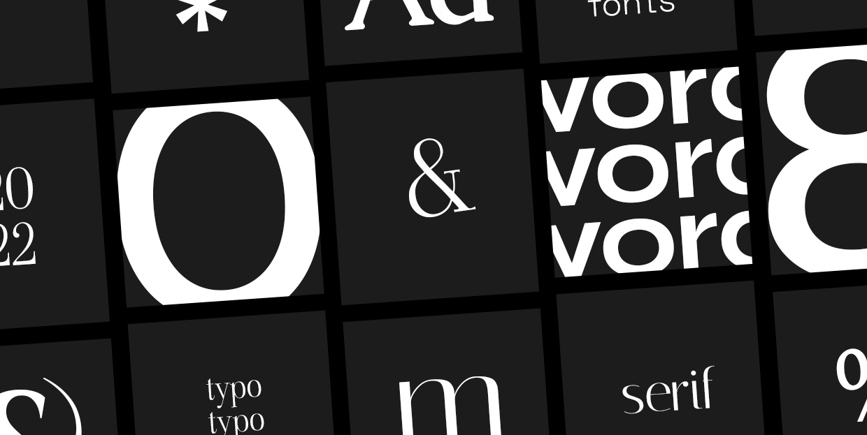
Designers’ Pick: Best Google Fonts for 2022

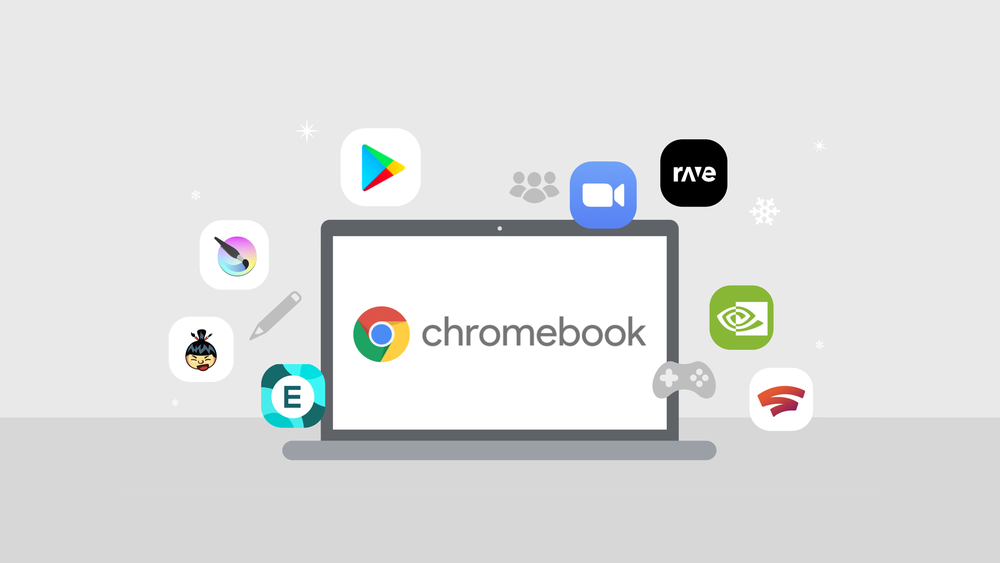
7 Apps We Couldn’t Live Without in 2021

Mistakes I Made While Learning Web Development as a Beginner

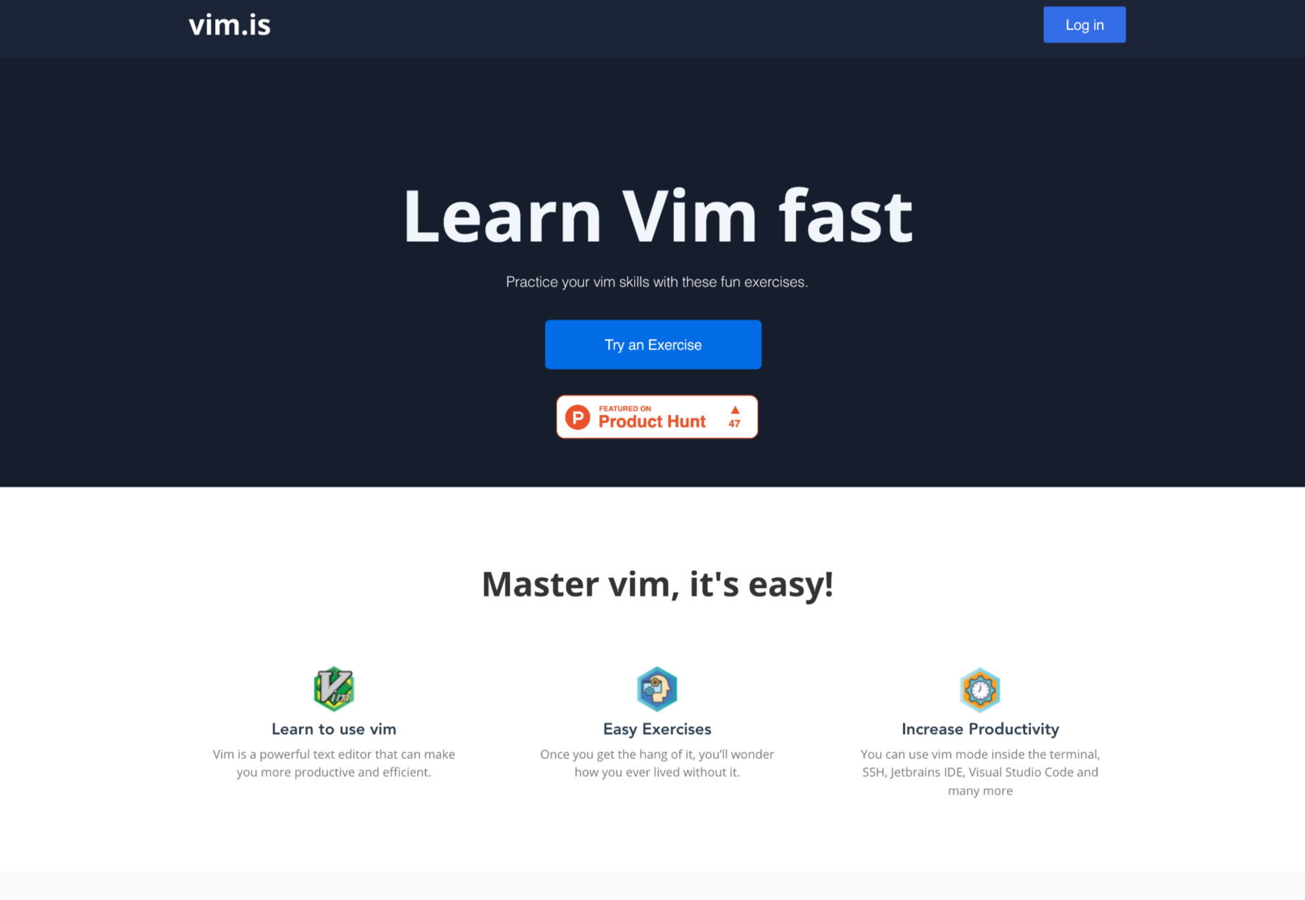
Interactive Vim Exercises

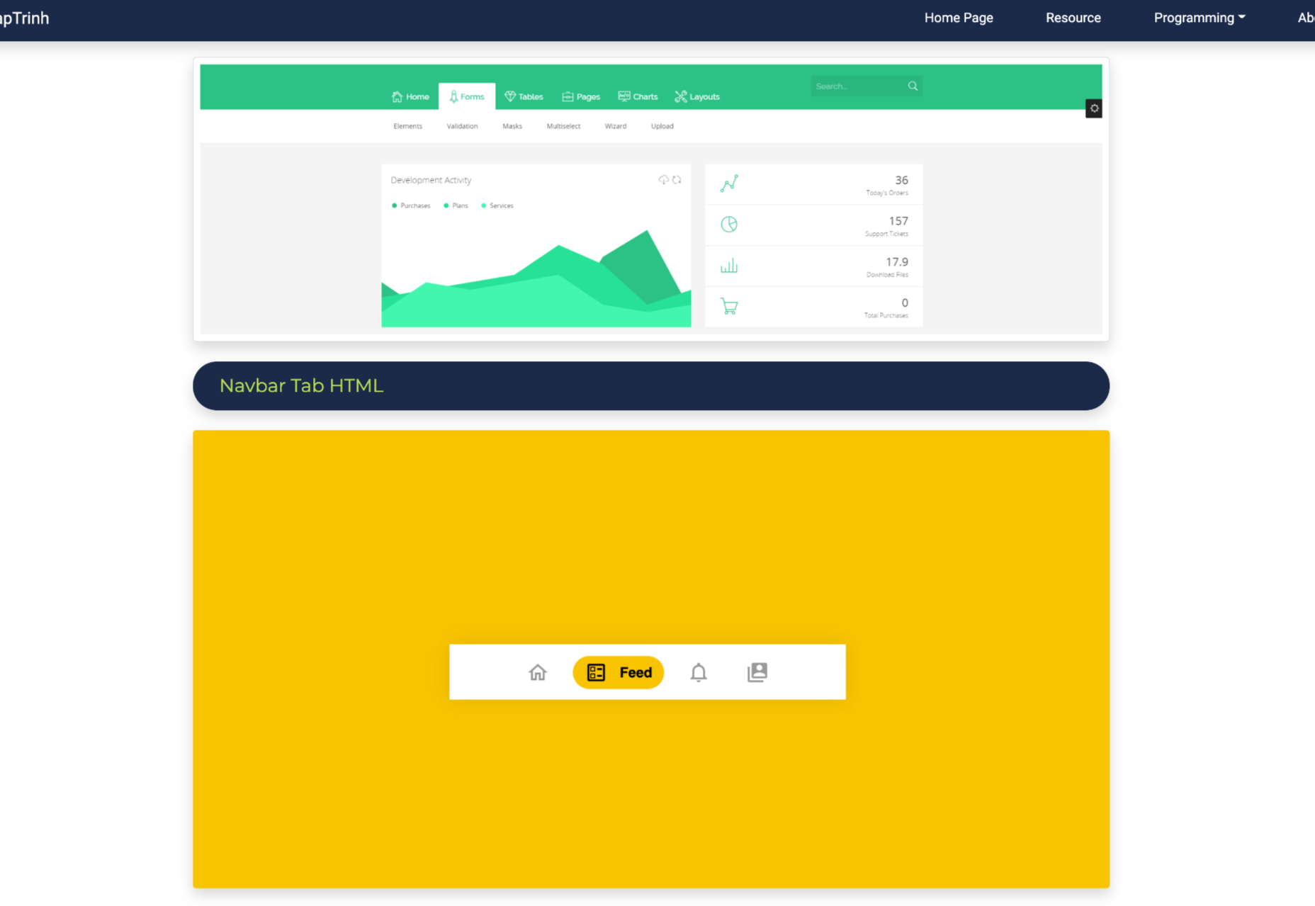
34 HTML Tabs Examples for Web Development

How to Reset a Single Git File and Why

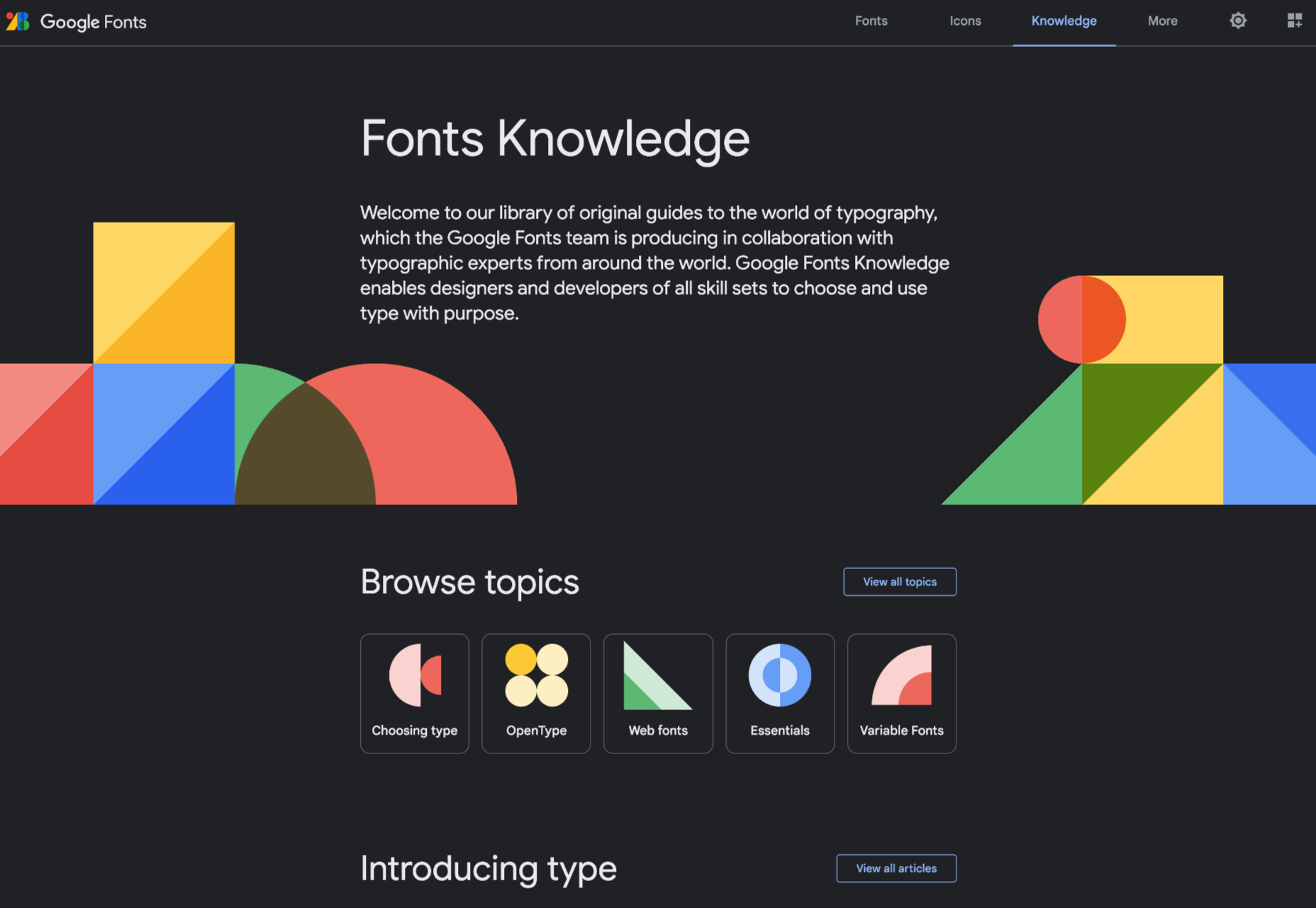
Google Fonts Knowledge

Dark UI Design: Principles and Best Practices

Source

The post Popular Design News of the Week: December 6, 2021 – December 12, 2021 first appeared on Webdesigner Depot.

Source de l’article sur Webdesignerdepot

The Adobe PDF Embed API provides a simple way for web developers to display PDFs on their web pages. While browsers provide good support for rendering PDFs, they do so in an « out of context » manner that takes over the entire screen. The PDF Embed API however lets you place a PDF within your site’s layout, providing much better control over the position and size of the rendered document. This improved experience also provides deeper integration into the PDF viewer, letting developers listen for events and perform operations on the document. In this article, I’m going to demonstrate a simple, but hopefully really useful example of this.

Imagine a large document covering many pages, for example, a textbook. Your website users, potentially students, could work with the document over many weeks while school is in session. If the document is a few hundred pages long, it would be incredibly useful to remember where they were in the document when they start reading again. While a large PDF may have bookmarks, even then they could only be for chapters or other sections, not the exact page the user last read. Luckily, the Embed API provides a method to help with this. Let’s take a look!

Source de l’article sur DZONE

As a UX designer, you get to work on creative, rewarding, even life-changing projects. It’s an industry with flexible working and countless opportunities. All this, and you get paid well too.

It doesn’t matter if you’re not a creative prodigy, or a tech grandmaster; you can learn to become a UX designer with the right mindset, a few tools you pick up along the way, and some committed learning.

By the time you’ve finished reading this post, you’ll be well on your way to designing your new career.

You can do this, let’s get started…

What is a Career in UX like?

Every career is different, but generally speaking, a UX designer works on making a user’s interaction with a product or service (normally websites) as intuitive as possible.

Just as a golf architect designs the layout of a golf course to flow through greens, tees, and holes, with buggy paths for access, and the odd bunker to add a challenge; so a UX designer creates the optimum experience for a site. A golf architect doesn’t need to reinvent the game of golf, and neither does a UX designer need to reinvent websites.

A golf architect will not design a course with a 360-degree sand bunker surrounding a tee (well, they might, but they really really shouldn’t), or a hole too small for a golf ball. In the same way as a UX designer, you’re not going to design an ecommerce site with a cart in the bottom left, a non-existent search feature, or hidden pricing.

The best thing about being a UX designer is that you don’t need to spend years in formal education to get qualified. The flipside is that if you want to be a great UX designer, it’s not a walk in the park.

Every designer is different, but some of the main traits of successful UX designers are: an enjoyment of problem-solving; good listening skills; curiosity; open-mindedness; attention to detail; creativity; communication skills; process-driven; and adaptability.

Before committing to this career path, check out a few podcasts, and read a few blog posts, to dip your toe in the water.

Still interested? Excellent, the next step is…

Getting Certified as a UX Designer

UX design is a practical skill. It’s all well and good knowing the theory, but without practice putting the theory into action no one will give you a chance to prove what you can do. So how do you get practical experience? You get certified, and there are three popular options: online, in-person training, or self-taught.

A good UX syllabus will include portfolio-building projects, tool mastery, networking opportunities, and even 1-2-1 mentorship. As well as learning the fundamentals of UX, you’ll cover user research and strategy, analysis, UI design, and more.

Option A: Online Course

Online courses tend to be much easier on the bank balance, as well as being flexible, which means you can fit them around your current job. You can work at your own pace, and in many cases choose modules that interest you, once you’ve completed the basic introduction.

There are many online course providers, including Coursera, Udemy, Skillshare, and Career Foundry.

Whatever option you choose, it is a good idea to get as broad a perspective as possible, so consider following more than one course — perhaps mix and match a paid course with a free one.

Option B: In-Person Training

This could be a university course, or a local boot camp where you physically sit in with an instructor and classmates.

This is more expensive, but it provides benefits that nothing else does. Firstly, you’ll have classmates you can bounce ideas off, collaborate with, keep motivated, inspired, and accountable. You can also get real-time, intensive coaching and advice from someone who’s been there, done that, bought the T-shirt (and redesigned it so it fits better).

Seach local boot camps and workshops, check out workshops at local conferences, and ask your local college what courses they offer.

Option C: Self-Taught

Being self-taught is the cheapest of all options. Work at your own pace, where, and when you want to. Watch YouTube videos, read blogs, garner information anywhere you can find it.

This option involves a lot of stumbling around in the dark. The biggest challenge is that you don’t know what it is that you don’t know. For this reason, it can pay to follow the syllabus of a local college course, even if you’re not enrolled and don’t attend lectures.

In reality, all education is self-taught to an extent, even the most prescribed courses need self-motivation.

Some of the most in-demand UX designers in the world are self-taught, so why not? Start exploring UX blogs like Nielsen Norman Group articles, Google Design,  UX Planet, and UX Matters.

Mastering UX Tools

Recruiters and hiring managers will seek your technical ability and your experience using popular tools from user research, to wireframing, to prototyping. When you get your first job in UX, the tools you use will be determined by your project manager, so it’s a good idea to have a passing familiarity with the most popular. These will include Maze, Userzoom, Sketch, XD, Figma, Marvel, and Hotjar.

If you’re following a guided course you should get an introduction to at least a couple of important tools. Once you understand one, you can probably pick the others up quite quickly… because, after all… they should be intuitive.

You do not need to know how to code, but understanding the roles, and restrictions of HTML, CSS, and JavaScript is very beneficial. When you get your first UX job, you’ll need to be able to talk about how technologies fit into the plan.

Building a UX Portfolio

Your portfolio is your résumé. The golden ticket. The silver bullet. Amassing a content-rich portfolio is paramount. You don’t need a real-world job to build your portfolio, and you should already have content to add from your course.

You need to demonstrate knowledge of UX tools and processes (what future employers will look for). Case studies that incorporate research, problem-solving, strategy, imagination, and (if possible) results are the best way to do this.

There are a variety of ways of building a portfolio, but the best is taking a real website, and redesigning it. Don’t worry if your first few projects aren’t the best; as long as you demonstrate improvement and growth, that counts for something.

You can showcase your portfolio on sites such as Behance, Dribbble, or preferably create your website.

Landing Your First Job in UX

Start combing the job boards to see which companies are looking for UX designers. There’s a global shortage of qualified UX designers, so if you can’t find anything you’re looking in the wrong place! Make sure your whole network, from your Mom’s hairdresser to the barista at your favorite coffee place know that you’re looking; you never know where a good lead will come from.

Some companies are looking for UX skills as part of other roles. Others are looking for full-time UXers.

Don’t be disheartened if “Junior UX Designer” positions require 2 years of experience; HR just throws this in as a pre-filter. If you think you can do the job, apply anyway, if your portfolio’s good you might get an interview regardless, and if you get an interview they think you’re worth taking the time to meet.

If you don’t get the job, don’t be downhearted. Remember: every time someone else gets a job, that’s one less person you’re competing with for the next job.

Quick Prep on Some Common UX Interview Questions:

  • What’s your interpretation of a UX Designer?
  • What has inspired you to become a UX Designer?
  • How do you take constructive feedback and non-constructive feedback?
  • Who, or what companies, do you look up to in this industry, and why?
  • What’s your process with a new project?

Good Luck!

So, now you know what it takes to get into the field, it’s time to start applying yourself to this newfound and richly rewarding career. As the great writer Anton Chekov said, “Knowledge is of no value unless you put it into practice.” So get out there and practice, practice, practice. Add and add and add to your portfolio.

To become a UX Designer, enroll in a great course, build your portfolio, network, apply for roles, and always be learning. Always be open to new ideas and suggestions. There’s a lot of leg work, but the juice will be worth the squeeze.

Featured image via Unsplash.

The post How to Kickstart Your UX Career in 2022 first appeared on Webdesigner Depot.

Source de l’article sur Webdesignerdepot

_____________________________________________

Another excellent guide to help people to prepare for job interviews to give them the best possible chances of success and not make some common mistakes can be find here : https://www.ireviews.com/interview-resources/

Wireframes are a powerful tool, especially for UX designers; whether you are developing a new app, a website, or anything else, the initial steps of any project can be tackled with this robust approach.

There are many occasions when we get stuck or overwhelmed for hours in front of a new project. This is where creating wireframes can be beneficial. A wireframe is nothing more than a diagram of your ideas for the flow of a project.

This post will analyze what wireframes are, and why they are so crucial for user mapping. Then, we will reveal the steps you need to follow to create an efficient wireframe. Let’s dive in…

What Is A Wireframe?

In a few words, a wireframe is a drawing created in the early stages of a UX project. Wireframes are a brilliant and effortless way to create a blueprint for the structure of a page.

In such a drawing, you can include valuable information about the UI and UX of the page you want to design.

You can think of wireframing as a process of visualizing the initial ideas you have about a project. It does not matter if you are comfortable with drawing; you can design wireframes on paper or digitally.

In either case, drawing a wireframe is not about your artistic skills. Instead, wireframes are about structuring your project and identifying the fundamental interactions you want to build out.

Why Is Wireframing Important For UX Designers? 

If you are an experienced UX designer, you have already come across concepts like user mapping and user journeys. Mapping the entire user experience is crucial. And that’s the main reason why wireframing is a must for a UX project.

Since you need to provide a top-notch user experience, wireframing is a great way to ensure this from the earliest stages of your design. But what is the process you need to follow when designing wireframes?

And how can you ensure that your wireframes are efficient? Let’s find out…

Creating An Effective Wireframe In 5 Simple Steps

Creating a good wireframe will allow you to construct your project. You will think it through, prioritize some fundamental interactions and consider alternatives.

1. Research

Although this is not a wireframing step per se, it is critical to the efficiency of your wireframes. How can you start drafting without doing user research? Well, you can not. That’s why the first thing you need to do is analyze your project.

All you have to do is seek similar products/services and check them out. Look at what your competitors are doing right and what they are doing wrong. This way, you will be ready for the next step.

2. Create Personas

You have already selected the best practices and ruled out other guidelines you believe will not be effective on this project. Now it’s time to think about user flow: How many screens will you put on a page? Where are users coming from, and where do you want them to go after reading this page?

By mapping your user flow, you can create a user persona. Then all you have to do is figure out what information to include. 

Mapping the information correctly is crucial because it will help you ensure that users do not get frustrated or overwhelmed when they visit your final page.

Once you do that, you are good to go. 

3. Start Sketching

It’s time to reach for your fine pen, pencil, eraser, and paper. Visualizing your ideas needs to be quick and efficient. Try to avoid fine details because this step is not about creating a high-fidelity wireframe on paper. 

All you need to do here is sketch out basic features and formats.

Since most of us designers are perfectionists, you can use a timer. Set the timer to 4-5 minutes and force yourself to finish the wireframe by that time. Repeat this step until you have created a few wireframes with which you are happy.

Finally, expand and polish your favorite mockups for a few minutes and prepare for the hard part.

4. Ask for Feedback

There is nothing more important than feedback when it comes to wireframing. Discuss your project with your colleagues. Just let them know how each mockup helps you with the project and what idea it visualizes.

Try to sincerely listen to what they have to say about your designs. Once you have gathered all the information and advice, start modifying the wireframe accordingly.

5. Add Details and Create Prototypes

It’s been a long road, but you are now at the point where you feel most comfortable as a UX designer: prototyping. Plenty of software (Adobe XD, Framer, Proto.io, etc.) can help you with this step. 

Start by turning your low-fidelity sketch into a high-quality prototype. Once you are happy with the result, test your prototype’s screens and see if the result serves the user flow. Platforms like UsabilityHub and Prott can help you with this.

Valuable Tips to Keep in Mind While Creating a Wireframe

Keep your Wireframes Simple: Creating a wireframe is not about fine details; try to manage the time you spend on it well. All you need is a clear and simple visualization of your page. You will have all the time you need for prototyping.

Don’t Worry About Your Artistic Skills: Anyone can draw. It’s as simple as that. You do not have to be an artist to create a clear wireframe to help you visualize your ideas. Be confident and make sure you include all the information you need.

Always Think of the User Personas You Created: Creating a wireframe is a smart way to ensure that the page you create meets the user’s needs. Therefore, you should always keep in mind what users will do when they open this page and whether it meets their needs and goals.

The Bottom Line

Creating a wireframe is not as difficult as you might think. All you need to do is research, find out what users need from this page, and create a map. By following these simple steps, you’ll ensure that the wireframes you design deliver a top-notch user experience.


Featured image via Pexels.

Source

The post 5 Simple Steps To Effective Wireframing first appeared on Webdesigner Depot.

Source de l’article sur Webdesignerdepot

Every day design fans submit incredible industry stories to our sister-site, Webdesigner News. Our colleagues sift through it, selecting the very best stories from the design, UX, tech, and development worlds and posting them live on the site.
The best way to keep up with the most important stories for web professionals is to subscribe to Webdesigner News or check out the site regularly. However, in case you missed a day this week, here’s a handy compilation of the top curated stories from the last seven days. Enjoy!

Supercharge Your Node.js With Rust

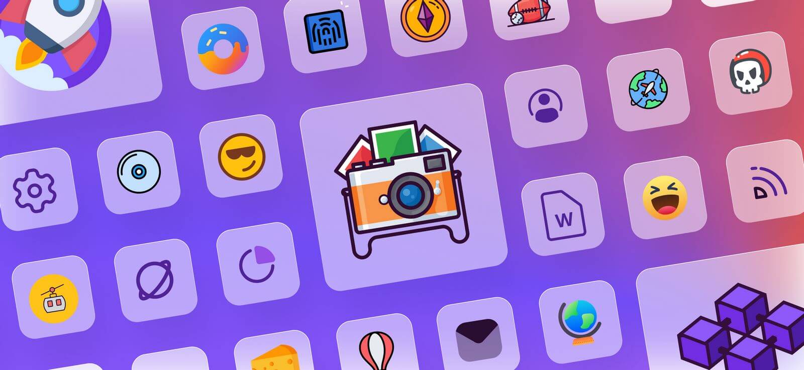
Icon Trends in 2021

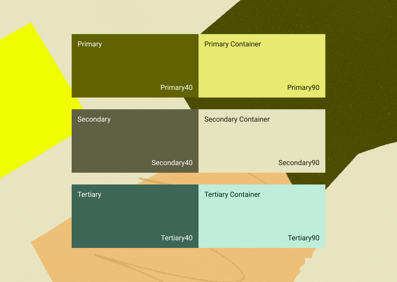
Material Design 3

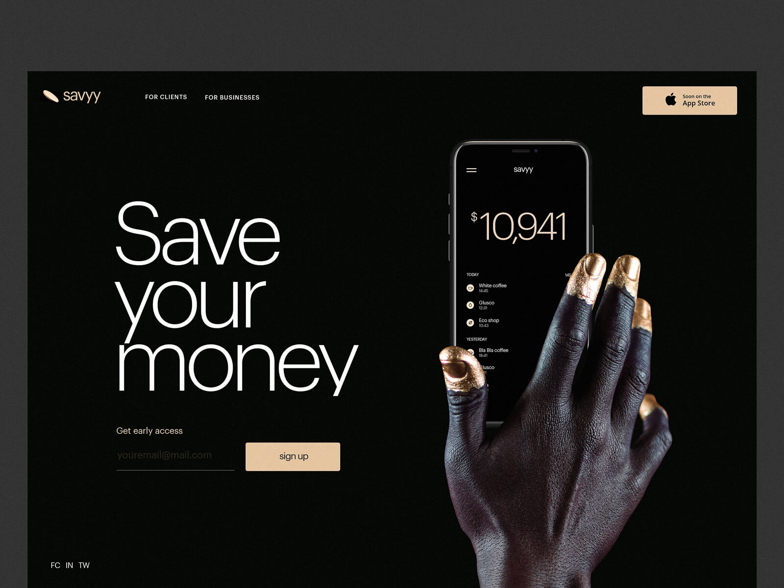
5 Pillars of Effective Landing Page Design

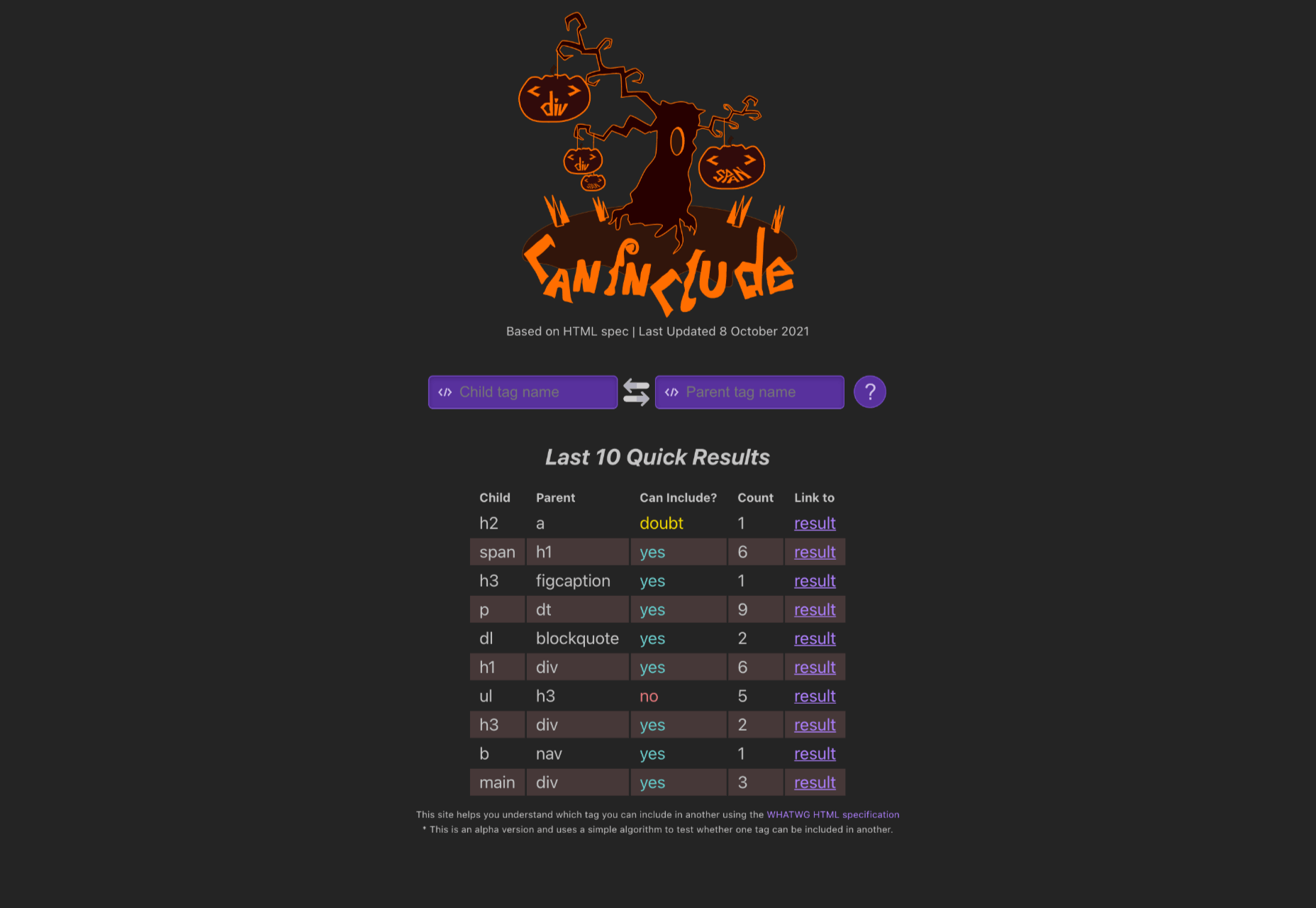
Can Include (a Certain HTML Element Within Another Certain HTML Element)

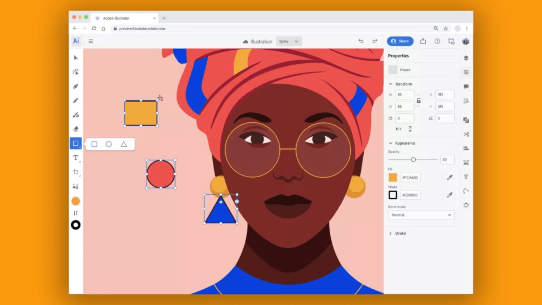
Is Photoshop & Illustrator in the Web the Most Exciting Reveal of Adobe MAX?

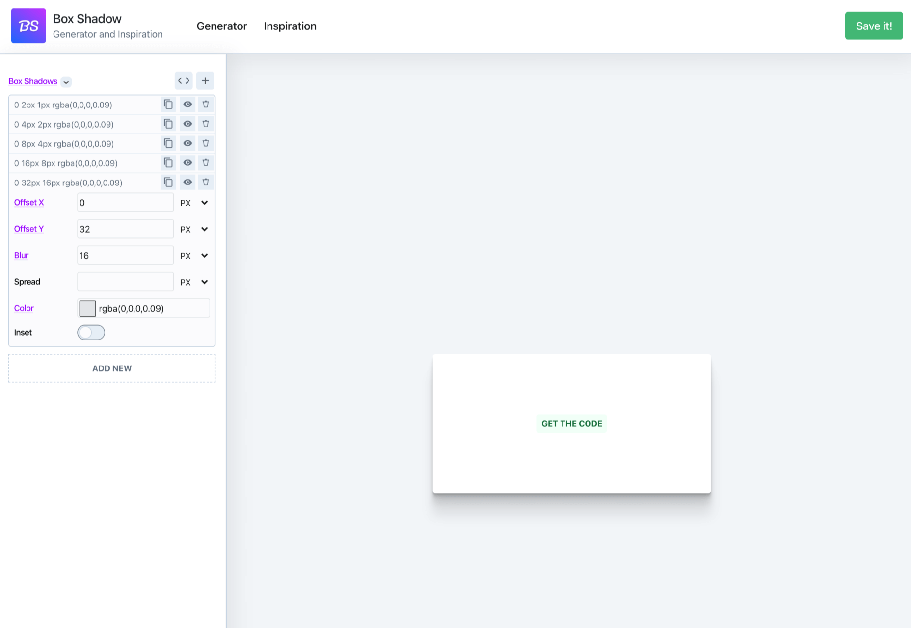
Box Shadow Generator – Generate Multilayer CSS3 Box Shadows

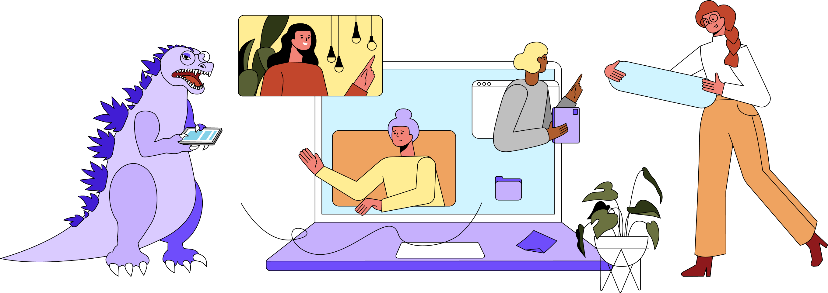
Olio – Illustration Constructor with 130+ Characters and Objects

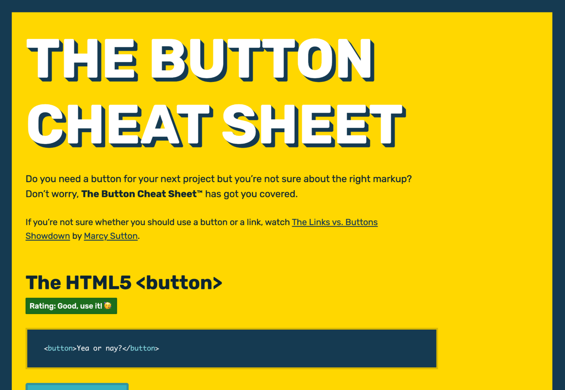
The Button Cheat Sheet

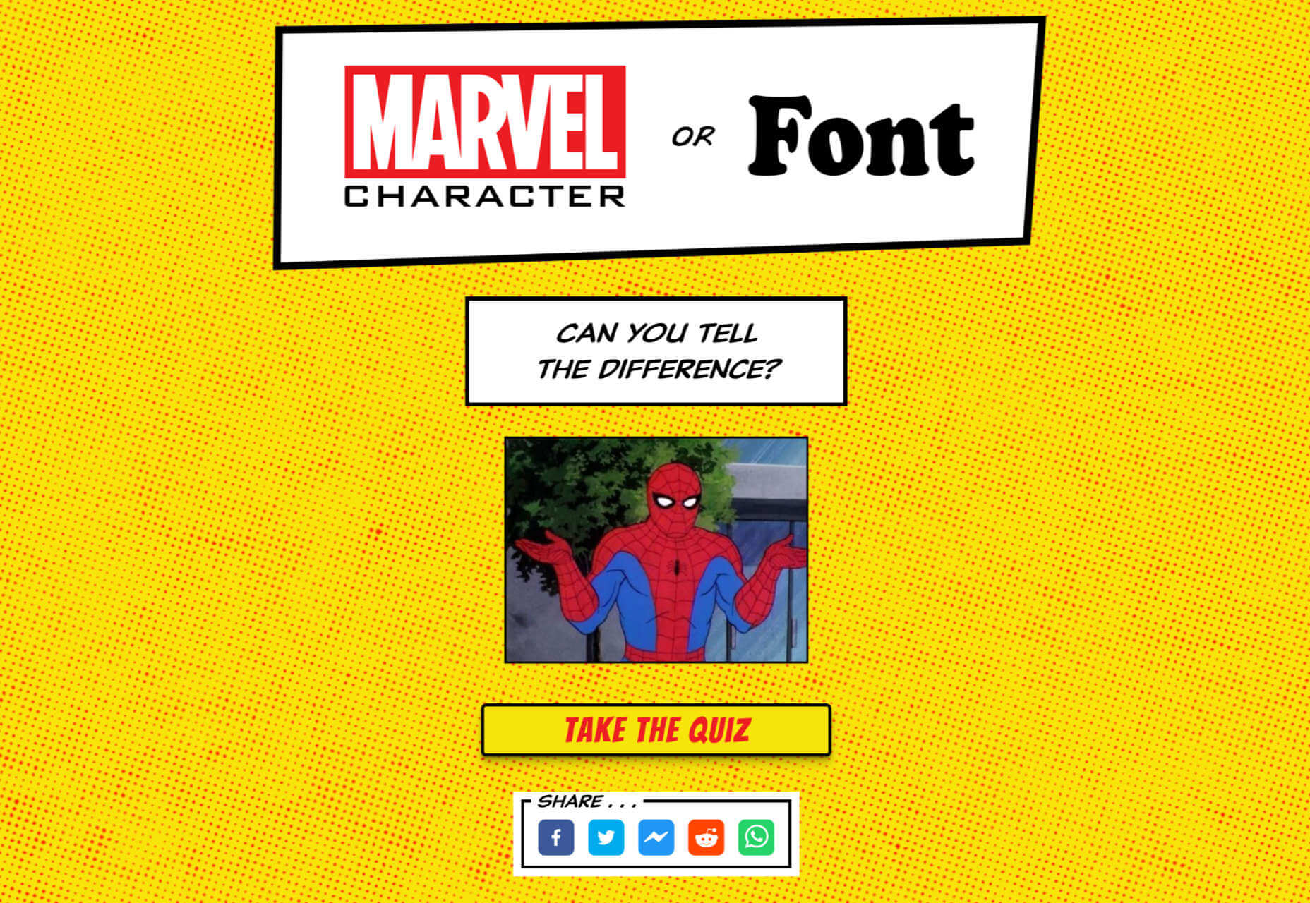
Marvel Character or Font?

Source

The post Popular Design News of the Week: October 25, 2021 – October 31, 2021 first appeared on Webdesigner Depot.


Source de l’article sur Webdesignerdepot

The dog days of summer are here. From vacations to pool time, you might not be thinking about work that much. But there are still plenty of new tools and resources popping up to help you become a better or more efficient designer.

Here’s what new for designers this month.

Haikei

Haikei is a web app that you can use to generate SVG shapes, backgrounds, and patterns in a web-based editor that you can use with any design tool or workflow process. Everything is customizable and it is free with access to 15 generator functions. (Additional templates and generators will be available when the pro plan is released later.)

Pixelhunter

Pixelhunter is a smart image resizer for social media platforms. It recognizes objects and crops pictures automatically. It supports 102 sizes and is free to use.

Compo

Compo is an Apple app that allows you to play with shapes and colors and create compositions on your own. You can see shapes and colors like the Bauhaus masters, creating from a blank canvas or shuffling in more creative ways. You can move, rotate, copy, overlap, and adjust shapes and colors to suit your style. Available for iPad and iPhone.

Backlight

Backlight is an all-in-one design system platform that allows you to build code and reference sites in a space where designers and developers can work together. It has a series of “starter kits” to help you with the technology you use from React to Chakra to Tailwindcss. It’s designed to be collaborative with everything in one place and integrates into your workflows. The tool is just launching and you can request early access to learn more.

Multi Color Text With CSS

Multi Color Text With CSS is pure fun. Check out the pen by Shireen Taj.

Mega Creator

Mega Creator is an online graphic design tool that helps you create images, icons, illustrations, backgrounds, and more for a number of uses. It has templates that are sized for common uses such as social media. You can upload your own elements to work with (free) or use including graphic assets for a fee.

Noloco

Noloco is a no-code solution for designers to build web apps. You can start building for free and design almost anything you can dream up from a set of drag-and-drop ready-made blocks. (And it will work across all screen sizes.)

Tinter

Tinter is a tiny web tool to generate color variations of images. The tool also generates monochrome colors of images with multiple variants, without hampering the quality of the image.

Radix Colors

Radix Colors is an accessible, open-source color system for designing gorgeous websites and apps. It includes 28 color scales with 12 steps each and includes support for dark mode as well as matching transparencies.

WP Cost Calculator

WP Cost Calculator is a smart, simple tool that allows you to easily create price estimation forms. It’s perfect for a number of industries that use online pricing.

TraveledMap

TraveledMap allows you to create customizable maps thanks to the use of markers, routes, and photos, which you can share or add to your website or blog. This tool is made for travelers and tourism pros.

Glyph Neue Icons

Glyph Neue Icons is a collection of 1,500 icons in SVG and PNG format. (They are free with a link.) Icons come in plenty of categories and styles for all types of use.

Streamline Icons

Streamline Icons is a set of thousands of icons in 12 different styles and themes that you can use for projects. They work through the Streamline app or a plugin for Figma, Sketch, or Adobe XD.

Health Icons

Health Icons is a set of free, open-source health icons for personal or commercial projects. They include filled and outline styles that are editable. There are more than 800 icons in the collection.

OMG, SVG Favicons FTW!

OMG, SVG Favicons FTW! Is a look at the benefits of using SVG favicons in web projects. It also examines some of the challenges – such as browsers support – with code snippets to help you get started.

Aspect Ratio in CSS

Aspect Ratio in CSS explores a design concept we talk about a lot in other places, but not so much with CSS. This piece by Ahmad Shadeed takes a look at how you can go beyond the “padding hack” and use native aspect ratio support in CSS to maintain image height and width ratios in responsive design.

Fight Kick

Fight Kick is a bold font with a lot of personality. The free demo version has 249 characters and is for personal use only.

Glow Better

Glow Better is a beautiful premium typeface with a pair of options – a serif and script. Both contain letterforms with swashes and tails that are delightful.

Huggable Hedgehogs

Huggable Hedgehogs is a playful font that’s perfect for children’s projects. Everything has a mono-height in the all uppercase typeface.

Monice

Monice is a rounded sans serif with thick lines and high readability. It includes bold, regular, and italic styles with free (demo, personal) and commercial options.

Rustica

Rustica is a robust premium typeface with 20 styles and family options. It has slim curves and an easy-to-read character set that would work for almost any use. It also supports 219 languages.

Source

The post Exciting New Tools for Designers, July 2021 first appeared on Webdesigner Depot.


Source de l’article sur Webdesignerdepot

On June 29th, GitHub announced Copilot, an AI-powered auto-complete for programmers, prompting a debate about the ethics of borrowed code.

GitHub is one of the biggest code repositories on the Internet. It hosts billions of lines of code, creating an unparalleled dataset with which to train a coding AI. And that is exactly what OpenAI, via GitHub, thanks to its owners Microsoft has done — training Copilot using public repositories.

The chances are you haven’t tried Copilot yet, because it’s still invite-only via a VSCode plugin. People who have, are reporting that it’s a stunning tool, with a few limitations; it transforms coders from writers to editors because when code is inserted for you, you still have to read it to make sure it’s what you intended.

Some developers have cried “foul” at what they see as over-reach by a corporation unafraid of copyright infringement when long-term profits are on offer. There have also been reports of Copilot spilling private data, such as API keys. If, however, as GitHub states, the tool has been trained on publicly available code, the real question is: which genius saved an API key to a public repository.

GitHub’s defense has been that it has only trained Copilot on public code and that training AI on public datasets is considered “fair use” in the industry because any other approach is prohibitively expensive. However, as reported by The Verge, there is a growing question of what constitutes “fair use”; the TLDR being that if an application is commercial, then any work product is potentially derivative.

If a judge rules that Copilot’s code is derivative, then any code created with the tool is, by definition, derivative. Thus, we could conceivably reach the point at which a humans.txt file is required to credit everyone who deserves kudos for a site or app. It seems far-fetched, but we’re talking about a world in which restaurants serve tepid coffee for fear of litigation.

There are plenty of idealists (a group to which I could easily be accused of belonging) that nurture a soft-spot for the open-source, community-driven web. And of course, it’s true to say that many who walk the halls (or at least log into the Slack) of Microsoft, OpenAI, and GitHub are of the same inclination, contributing generously to open-source projects, mentoring, blogging, and offering a leg-up to other coders.

When I first learnt to code HTML, step one, before <p>hello World!</p> was view > developer > view source. Most human developers have been actively encouraged to look at other people’s code to understand the best way to achieve something — after all, that’s how web standards emerged.

Some individuals are perhaps owed credit for their work. One example is Robert Penner, whose work on easing functions inspired a generation of Actionscript/JavaScript coders. Penner published his functions online for free, under the MIT license; he also wrote a book which taught me, among other things, that a while loop beats a for loop, a lesson I use every day — I’d like to think the royalties bought him a small Caribbean island (or at least a vacation on one).

There is an important distinction between posting code online and publishing code examples in a book, namely that the latter is expected to be protected. Where Copilot is on questionable ground is that the AI is not a searchable database of functions, it’s code derived from specific problems. On the surface, it appears that anything Copilot produces must be derivative.

I don’t have a public GitHub repository, so OpenAI learned nothing from me. But let’s say I did. Let’s say I had posted a JavaScript-powered animation from which Copilot garnered some of its understanding. Does Microsoft owe me a fraction of its profits? Do I in turn owe Penner a fraction of mine? Does Penner owe Adobe (who bought Macromedia)? Does Adobe owe Brendan Eich (the creator of JavaScript)? Does Eich owe James Gosling (creator of Java), if not for the syntax, then for the name? And while we’re at it, which OS was Gosling using back in the mid-90s to compile his code — I doubt it was named after a fruit.

If this seems farcical, it’s because it is. But it’s a real problem created by the fact that technology is moving faster than the law. Intellectual property rights defined before the advent of the home computer cannot possibly define an AI-driven future.


Featured image uses images via Max Chen and Michael Dziedzic.

Source

The post Poll: The Ethical Dilemma at the Heart of GitHub’s Copilot first appeared on Webdesigner Depot.


Source de l’article sur Webdesignerdepot

A new design trend has emerged in the last year: Soft UI or Neumorphism is everywhere. 
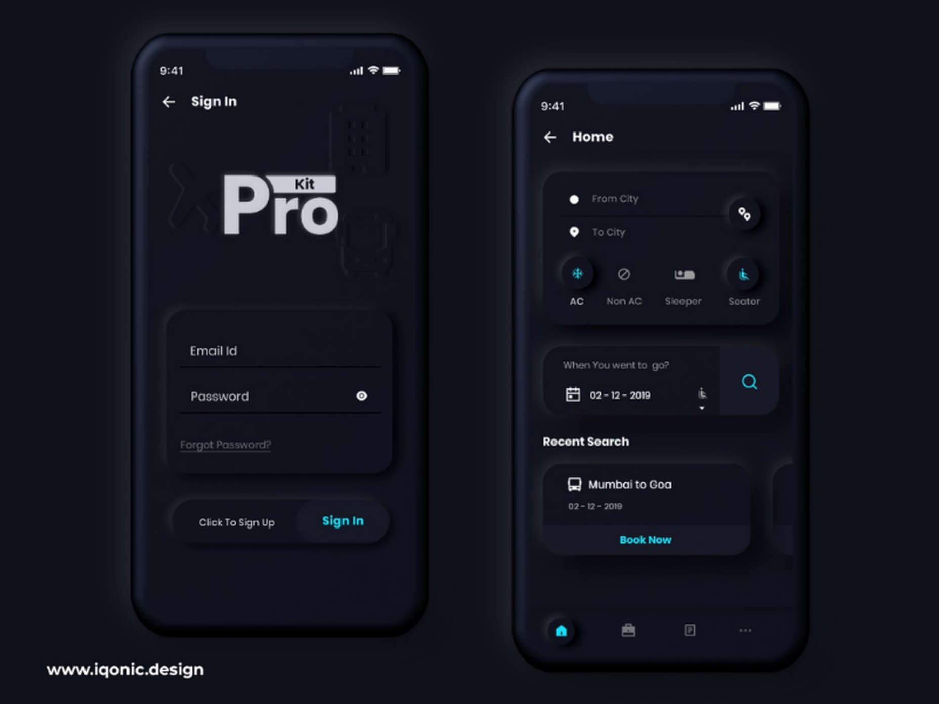
Even Apple is in on the trend; the company introduced a host of changes in both its mobile and desktop operating systems that use the style. The elements of Soft UI introduced by Apple reflect various aspects of the Microsoft Fluent UI design too. 

So, if soft UI is such a huge concept, what do we need to know about it? How does soft UI work, and what are the pros and cons of using it?

What is Soft UI (Neumorphism)?

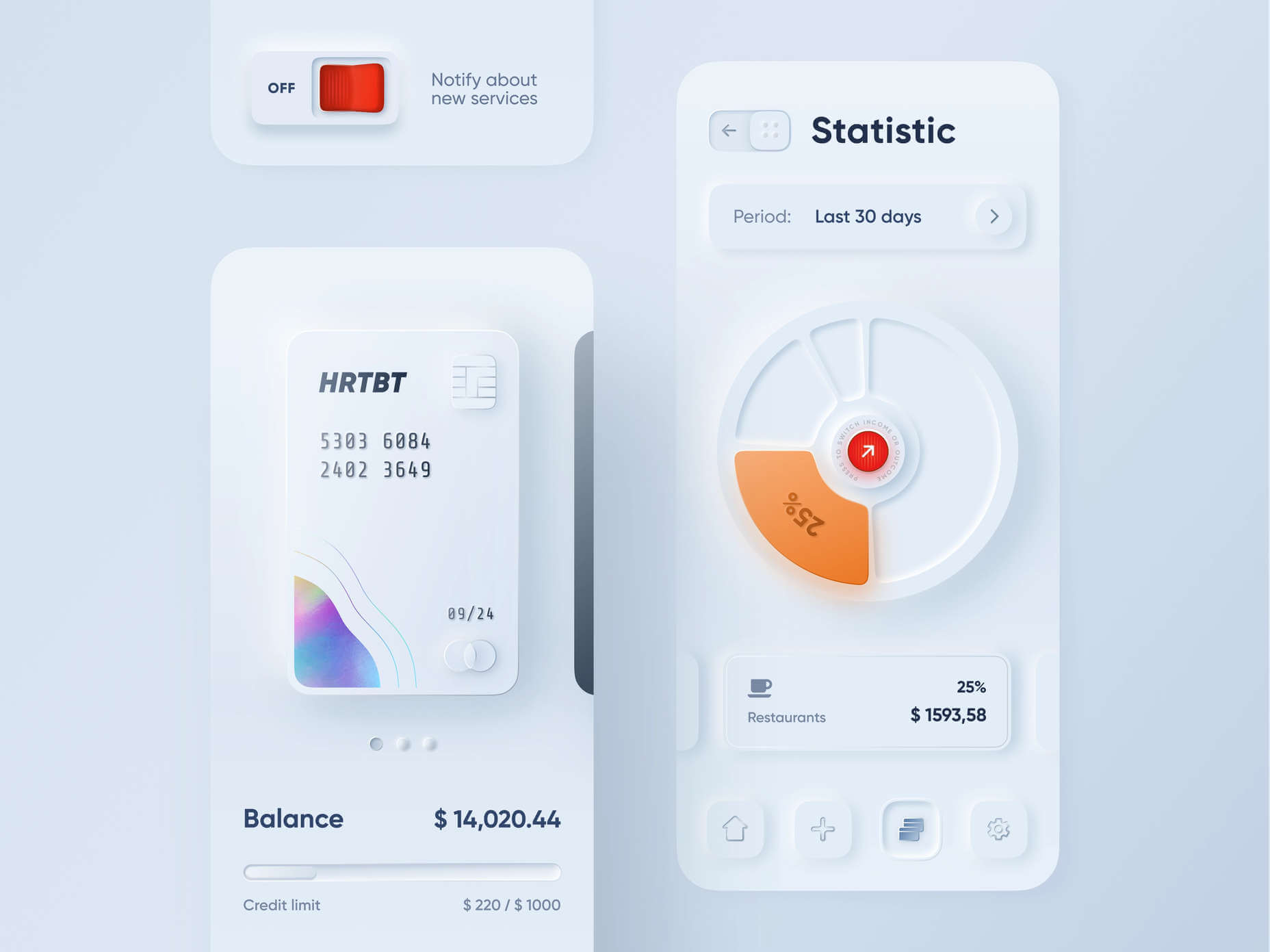
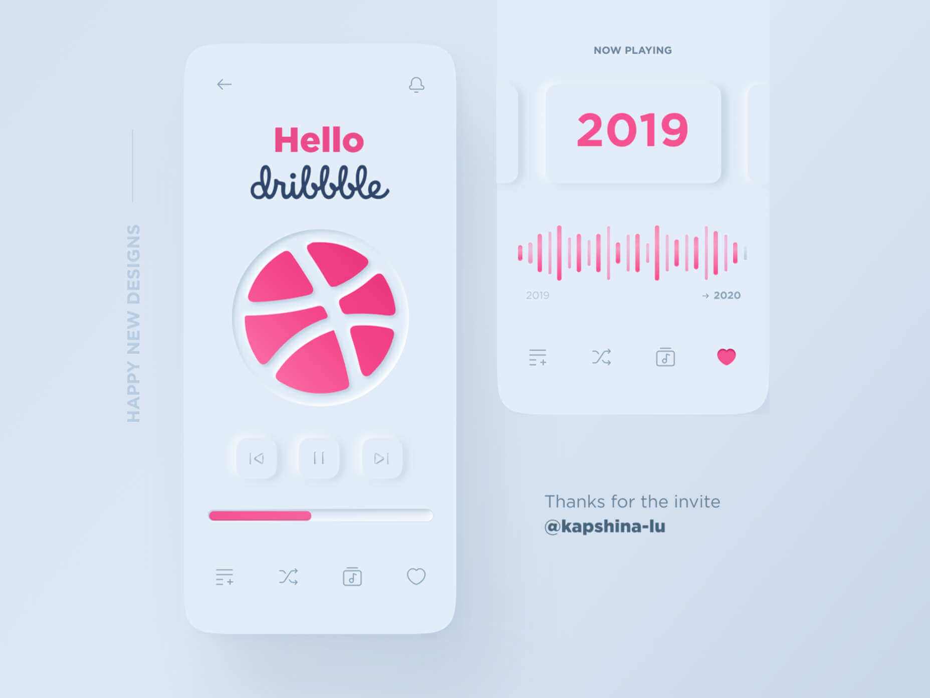
Soft UI involves using highlights and shadows in design elements to make them look as though they’re layered on the page. 

The term neumorphism is derived from a previous design style — skeuomorphism, where designers create something as close to its real-life counterpart as possible. If you remember the shift between iOS 6 and 7, you’ll remember the switch between skeuomorphic and flat designs. However, neumorphic design isn’t quite as dramatic. 

Neumorphism doesn’t focus excessively on things like contrast or similarities between real and digital elements. Instead, this “soft UI” practice creates a smoother experience for users. 

With neumorphism, you get the sense that buttons and cards are actually part of the background they’re on. This trend removes the flashier aspects of a typical interface and focuses on a softer style that stays consistent throughout the design. 

The Common Features of Soft UI

Soft UI is all about smoothing out the experience by making everything feel more connected. There’s nothing overly harsh in the aesthetic, hence the term “soft.”

So, what kind of features can you expect?

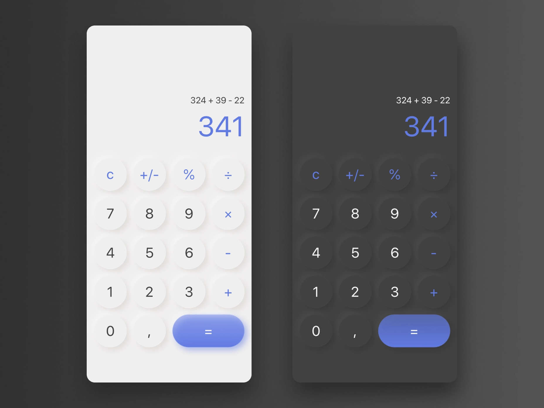
Rounded Corners: Soft UI removes some of the sharper parts of the interface, like the corners on modules and segments. This allows for a more gentle appearance overall. In this experimentation from Iqonic Design, we can see how the round corners tie everything together.

Transparency and Background Blur: Background blur and transparency are more popular today since the infamous iOS 7 solution emerged. Most people hated the appearance of ultra-minimalism, combined with thin fonts. However, the background blur effect was more popular. The blur in soft UI shows that part of the window is connected to the rest of the OS. It seems like parts of the background in the app are pushing through to the surface. 

Unified Symbols: Everything needs to fit perfectly in a soft UI design. Anything that doesn’t look like it’s part of the same entity throws off the experience. In this design experiment by Surja Sen Das Raj, you can see how all the colors, shadows, and gradients tie together consistently. Because everything is more uniform, the experience flows perfectly for the end-user. 

Implementing Soft UI Elements in Your Design

So, what does neumorphism look like in your UI design process?

Ultimately, it’s all about subtle contrast and aligned colors. Every part of your interface needs to look like it’s part of the same form. Your element and background need to be the same color so that you can create a feeling of objects protruding from the background. 

With Soft UI, the keys to success are shadows and highlights. 

Let’s take a look at some key steps. 

Achieving the Soft Look

When you’re designing your interface, remember that sharp edges make the interface more serious and formal. Rounded corners are more playful and friendly. 

What also makes the design look lightweight and delicate is plenty of deep shadows and highlights. When you add shadows to elements, you create a visual hierarchy. The items that cast a larger, deeper shadow are the ones closest to you. That’s why only a few elements need to cast an intense shadow. Everything else should work in the background. 

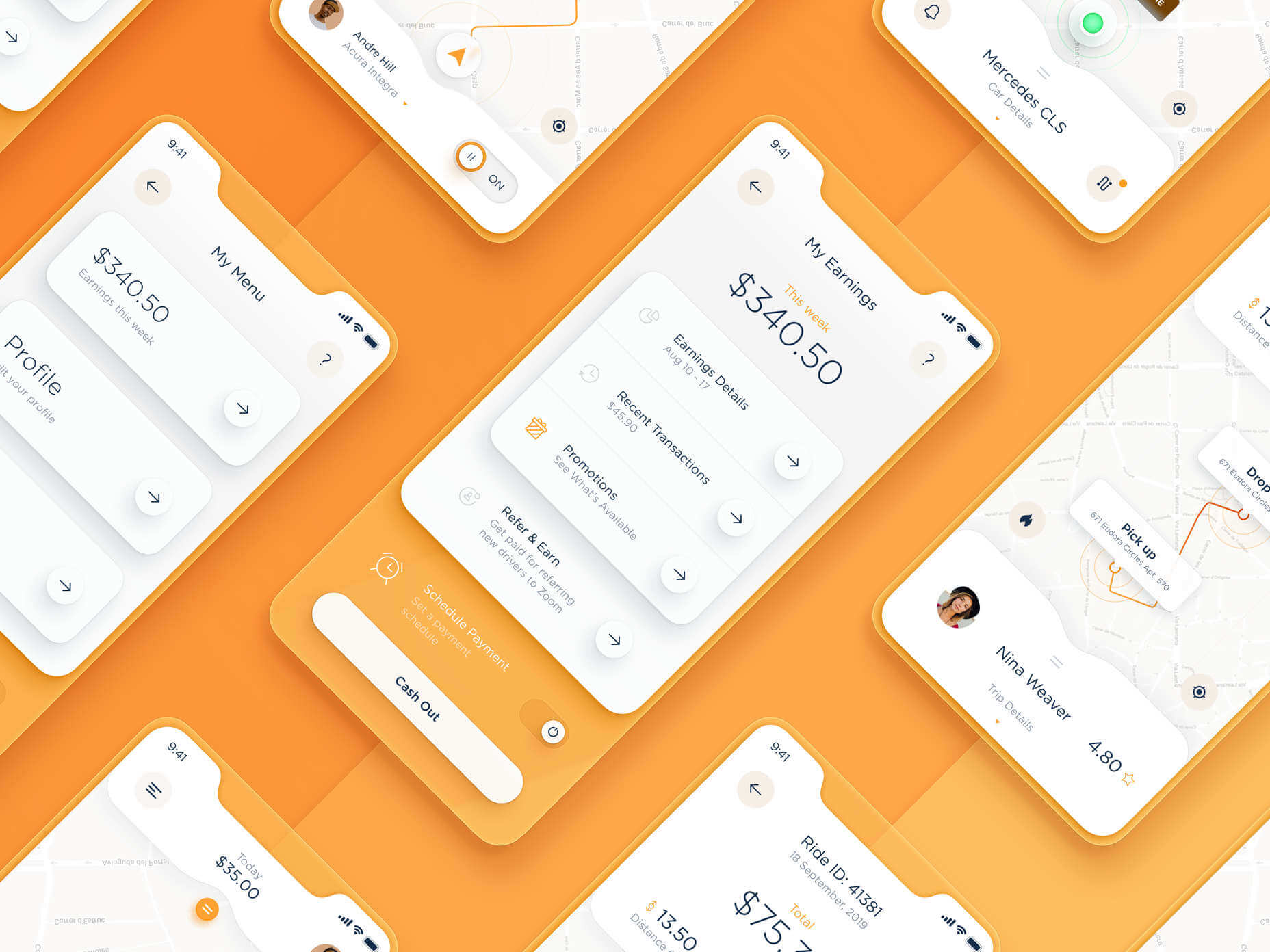
Take a look at this design by Alexander Plyuto, for instance.

Creating Smooth and Delicate Gradients

Gradients are part of the shadow and highlighting process in Soft UI design. Ideally, you’ll need to choose colors from the same palette, just toned down or brightened, depending on your needs. The gradient needs to be barely visible, but just enough to make the elements stand out. 

For white gradients, like highlights, use a very delicate color somewhere between white and your background shade. For instance, consider this design from Marina Tericheva.

Consider the Little Details

Finally, remember that the neumorphism design principle is all about little details. 

Choosing a font that visually matches the background is an excellent choice. However, you can also choose something more contrasting, as this will help information stand out

Adding a little bit of the background into your fonts might be suitable too. For instance, if you have a green font and a grey background, add a little grey into the mix. 

Extra elements in your design, like allowing a button to shift into a more recessed state after being clicked, are a great way to make the soft UI more engaging. Everything your end-user interacts with needs to feel smooth and perfectly unified. 

The Problems with Soft UI Design

Just because a design process is trending – doesn’t mean it won’t have its issues. 

Neumorphism is a fun way to make apps, operating systems, and websites feel more friendly and informal. However, this softer approach has a weak spot too. 

When you’re dealing with a small margin of contrast and color where neumorphism works well, it’s hard to get the effect right every time. For instance, this all-yellow design for Dtail Studio may be overwhelming for some.

A slight deviation in saturation or a problem with your shadowing could render the entire effect of Neumorphism completely pointless. 

Another major issue is accessibility. The soft UI design looks great for people who have a full visual range. However, visually impaired users might not see the same benefits. Anyone without perfect vision may see crucial objects disappearing into the background.

Your users don’t necessarily need significant vision problems to struggle with neumorphism, either. The design is all about softness that causes elements to almost blend together. People with low-quality screens that don’t have as many pixels to work with won’t see these elements. 

Issues With Buttons and CTAs

Another major issue of neumorphism is that its subtlety can lead to problems with attracting clicks and conversions. Usability is the most important consideration of any UI design. 

Unfortunately, when you focus on subtle elements throughout your entire interface, usability sometimes takes a hit. 

Let’s consider buttons, for instance – they’re essential to any interface. To simplify the customer journey, these buttons need to be noticeable, and they need to shift into different states when your customers interact with them. 

For the button experience to be excellent, users need to notice the design instantly. However, the heart of neumorphism revolves around the idea that nothing stands out too much. 

This isn’t just an accessibility issue; it’s a problem for conversions too. 

Neumorphism is soft on the eyes, with minimal color contrast and few color pops. This means that CTA buttons don’t stand out as much as they should. Buttons almost blend into the background, and the website struggles to pull attention to the areas that demand it most. 

How to Experiment With Soft UI (Free Kits)

The key to unlocking the benefits of soft UI interfaces without getting lost in the negative points – is proper experimentation. Like any new design trends, professionals and artists will need to learn how to merge the elements of soft UI together in a way that doesn’t compromise usability. 

Trends in UI design can’t focus exclusively on aesthetics, as a customer’s comfort will always be an essential part of the process. 

If you want to start exploring, here are some of the best kits and freebies to get you started:

Closing Thoughts on Soft UI

The world of design and the trends that we use are constantly changing. Companies are always searching for the best ways to connect with their users. Often, this means focusing on an interface that really connects with your target audience and delivers the best possible results. 

The soft UI design trend has its benefits and its downsides. On the one hand, the smooth appearance of every element on a combined screen can deliver a delightful aesthetic. Buttons feel less imposing, and elements are friendlier and easier to interact with. 

On the other hand, neumorphism also makes it difficult to truly capture your audience’s attention in the places where it matters most. It suffers from accessibility issues and requires plenty of care and practice.

Source

The post Soft UI: Making Sense of the Latest Design Trend first appeared on Webdesigner Depot.


Source de l’article sur Webdesignerdepot

Every designer has their own preferred strategy for collecting resources. Some pluck brushes, fonts, and templates from different “stock photo sites” and public marketplaces. Others collect graphics from swipe files and forums around the web.
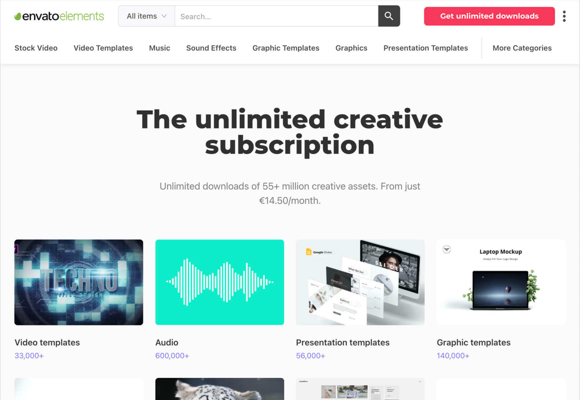
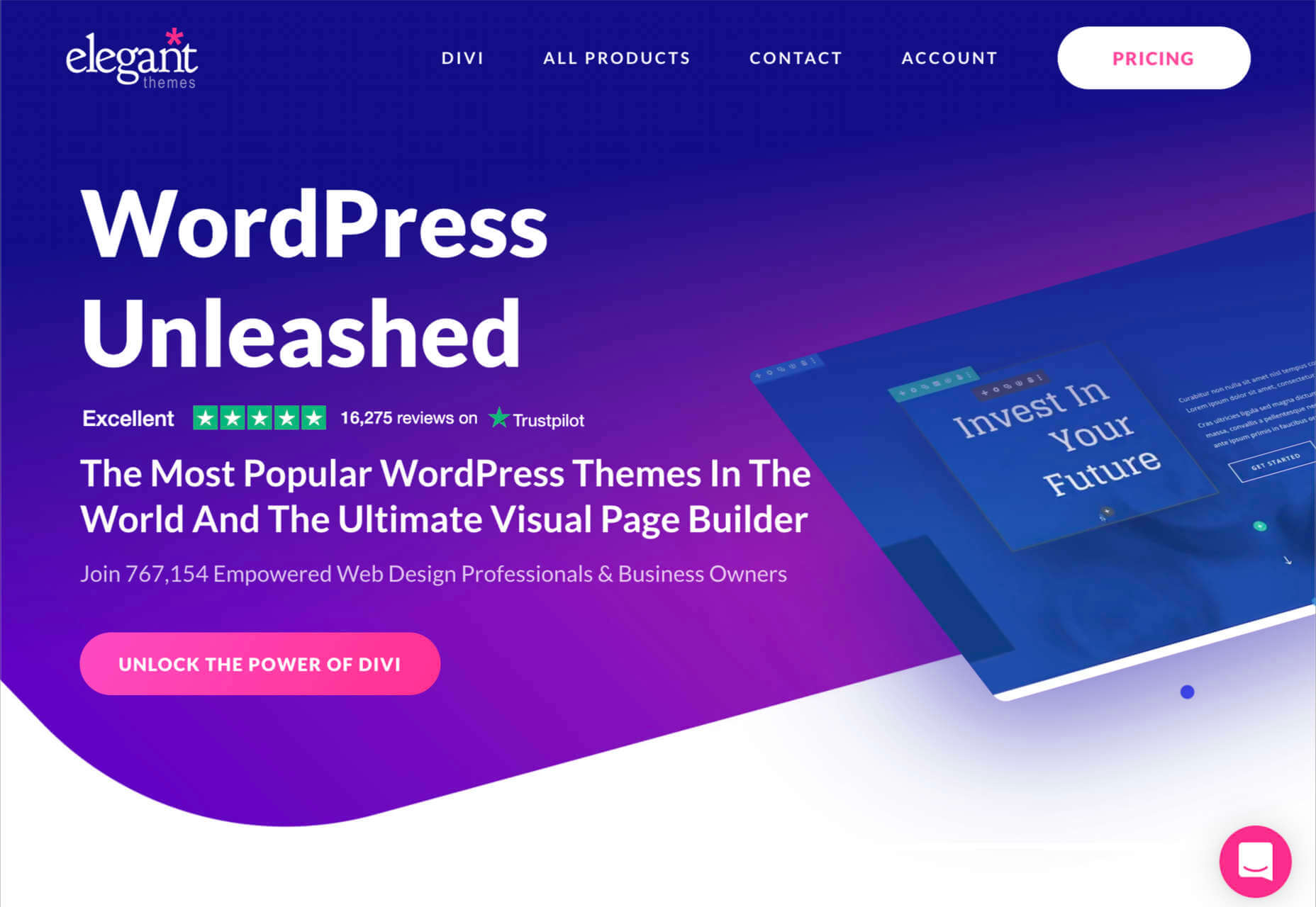
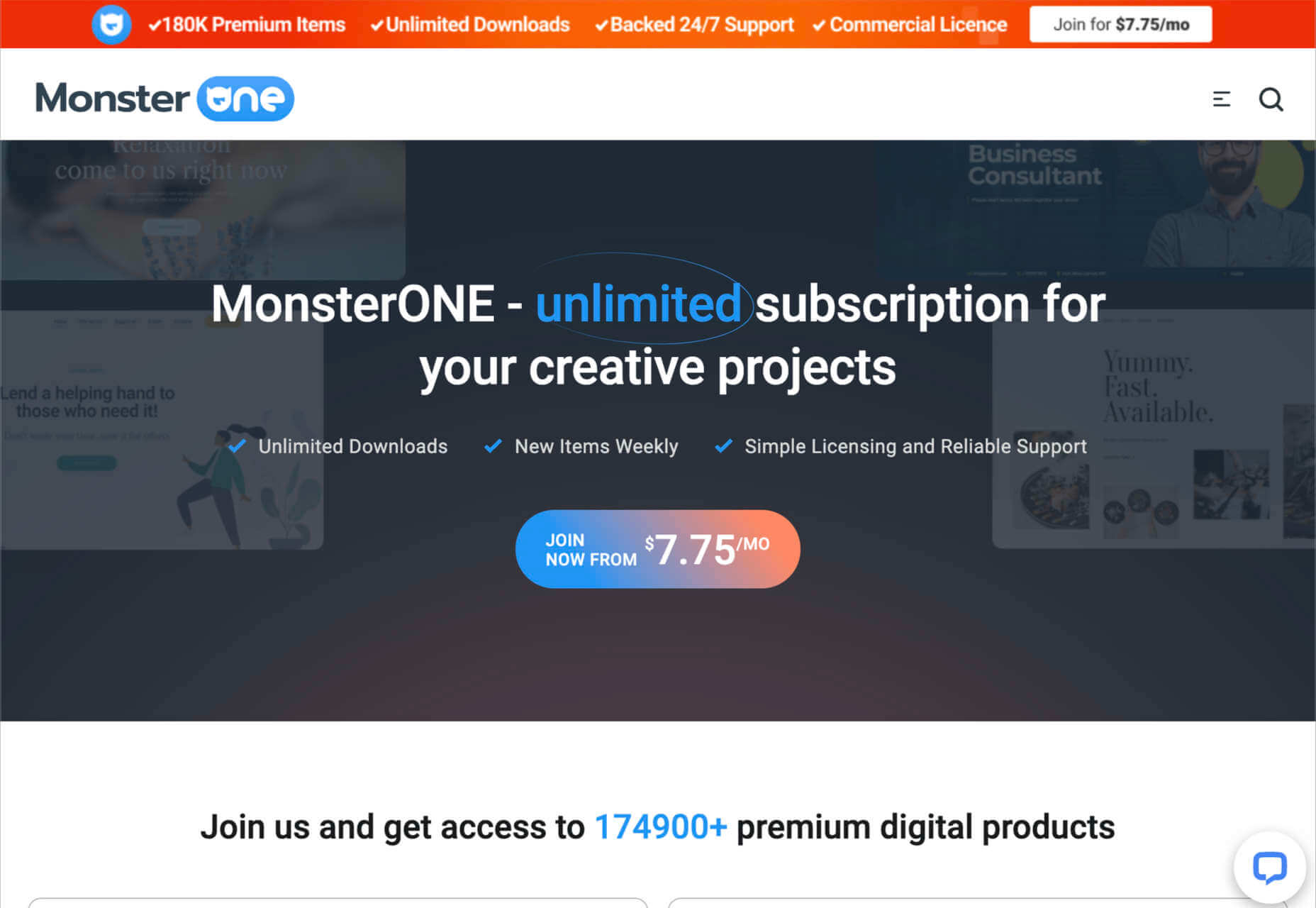
The never-ending desire for themes, visual content, and graphical components has prompted an influx of “design packages” to appear around the web. These all-in-one bundles, ranging from Envato Elements to Elegant Themes, promise a selection of valuable creative content in exchange for a single fee or monthly subscription. 

If you’ve been planning to seek out a few of these high-value subscriptions yourself, you’re in the right place! Today, we’re going to talk about some of the top designer resources available on the market. 

1. Envato Elements

Probably the best-known of all the designer resource marketplaces, Envato Elements advertises itself as the unlimited creative subscription. On this website, you’ll be able to access around 54 million creative assets through a single subscription. There are endless resources to unlock here, ranging from templates for your graphics to video templates, audio, and stock photos. 

Unlike most marketplaces, Envato gives you peace of mind by promising only the highest quality designs and graphics. Your content comes with quality assurance, and there are many PSD elements on the site, too, including stationery and web design templates, mock-ups, and more. Categories for your creative content include:

  • Stock photos
  • Video templates
  • Music
  • Sound effects
  • Graphic templates
  • Graphic designs
  • Presentation templates
  • Fonts
  • Photos
  • Web templates
  • Add-ons
  • CMS templates
  • WordPress resources
  • 3D content

Pricing: Pricing starts at only $16.50 per month, and this gives you unlimited access to everything on the site, including millions of digital assets and stock photos. You’ll also be able to use various courses and tutorials on the website too.

2. Elegant Themes

Elegant Themes is an all-in-one creative resource for website themes. The solution offers you access to some of the most popular WordPress themes worldwide. 

You’ll also get access to a visual page builder as part of the kit. When you sign up for the Elegant Themes subscription, you get access to all of the resources within, including the Divi page builder and WordPress theme, Extra, Monarch, Bloom, and more. If you’re a site builder or work on building pages for clients, this is a must-have subscription. 

Elegant themes are currently the go-to resource for more than 750,000 people. It’s also home to some of the highest-rated themes around. Features include:

  • Divi WordPress page builder
  • Endless WordPress themes
  • Page editing tools
  • Monarch, Bloom, and Extra 
  • Hundreds of website packs
  • Lifetime premium support
  • Unlimited website usage

You can either pay for yearly access with Elegant Themes or pay a one-off price for lifetime access. For most, the lifetime option is likely to be a pretty appealing one. You don’t have to worry about renewing your subscription this way.

3. Template Monster

Template Monster offers the “ONE” web development membership, perfect for creative professionals. The MonsterONE offering is a complete unlimited subscription for all of your creative needs, with access to unlimited downloads, new weekly items, and simple licensing. You also get plenty of support from the Template Monster Team. 

A goldmine for anyone who needs to upgrade their selection of video and photo assets, graphic templates, HTML templates, or anything else, Template Monster is packed full of amazing resources for any project. You can also find new products from fresh contributors all the time, so the value of your membership is constantly increasing. 

Features include:

  • HTML templates
  • Presentation templates
  • CMS templates
  • Graphic templates
  • Video assets
  • 3D models
  • Audio assets
  • WordPress themes and plugins

Pricing starts at a tiny $6.90 per month, with a slight discount if you pay yearly. The lowest-cost package gives you access to all of your graphic and design assets, but you won’t get any eCommerce or WordPress themes. However, if you upgrade to the all-in-one package at $14.95 per month, you get a more extensive range of resources.

4. Creative Market

Creative Market is another one of those amazing all-in-one environments for creatives and designers. This marketplace is supplied by thousands of independent artists from around the globe, each offering a host of top-quality designs and resources. You’ll find photos, graphics, templates, fonts, web themes, and countless other tools on the Creative Market. 

If you’re looking for sheer size, it’s hard to find another company that competes with the Creative Market package. There are literally millions of ready-to-use products available, including Instagram templates, textures, and procreate brushes. 

You’ll have access to 3D content for your immersive website designs and a host of purchasing products. Although there’s no “subscription model” per-se for this marketplace, you can invest in a credit plan that allows you to set how much you spend on your assets each month. 

Features include:

  • Millions of creative products
  • Huge selection of independent designers
  • Brushes, textures, templates 
  • Fonts and web content available
  • Huge selection of stock photos
  • Convenient credit plan

The individual purchasing plan is likely to appeal more to people just beginning to test Creative Market for the first time. However, if you want a subscription experience, we’d recommend using the credit plan to estimate how many credits you’ll need each month.

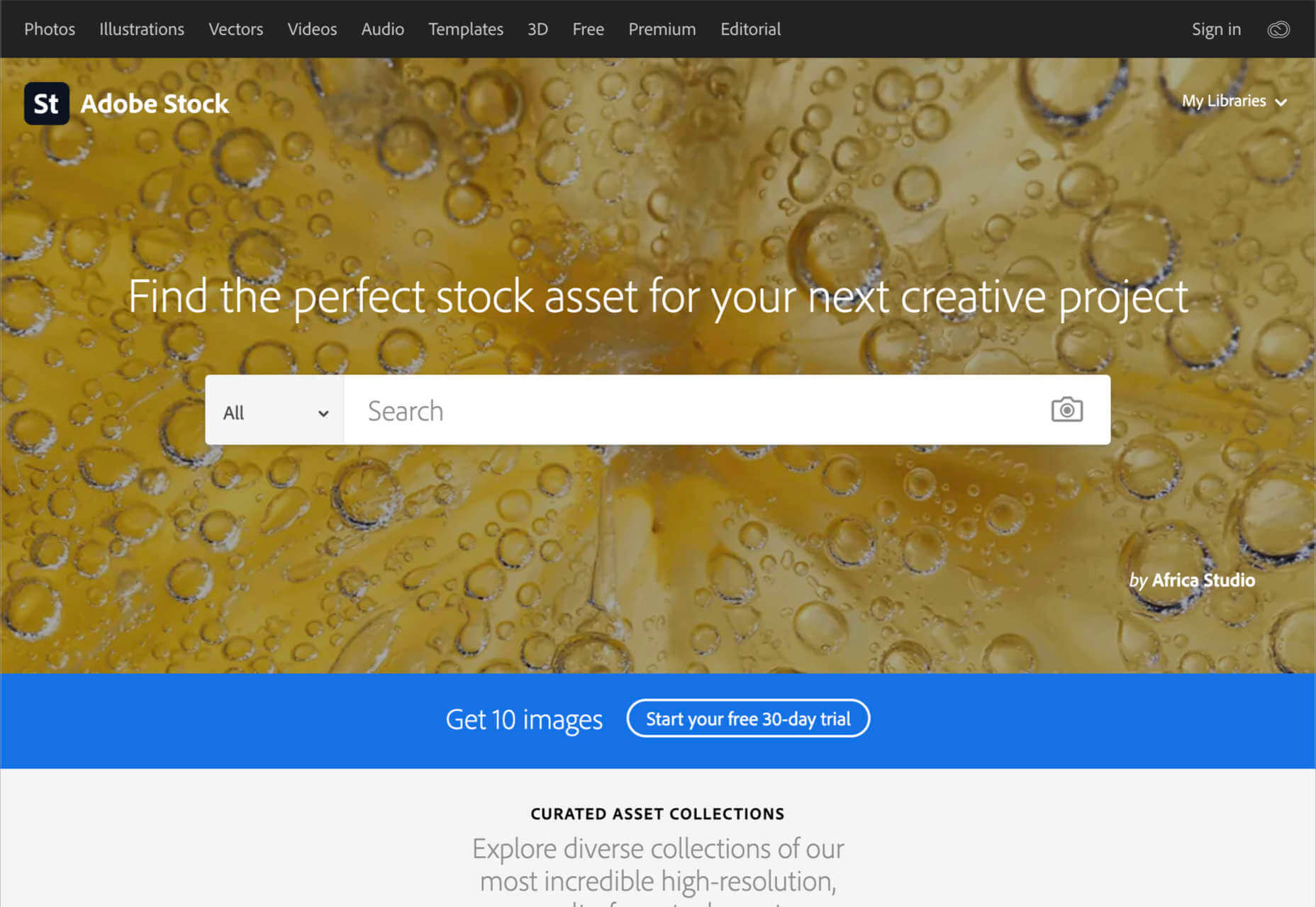
5. Adobe Stock

All web designers know Adobe. The chances are that no matter what kind of creative work you do, you’ve developed a few skills with an Adobe product, from Photoshop to Lightroom. Adobe Stock is also one of the leading platforms for images on any topic. 

Although Adobe Stock doesn’t compete with other marketplaces in terms of versatility, it still stands out as one of the main resources for designers. There are hundreds of millions of stock images, videos, editorial content, and vectors. You can also access a premium collection of custom content and 3D resources too. The great thing about Adobe stock is that you can easily create your own libraries and download content into your Adobe software. Resources include:

  • Stock photos
  • Premium images
  • 3D content
  • Vectors and brushes
  • Stock video footage
  • Royalty-free templates
  • Vector art and illustrations
  • Stock music and audio
  • Integration with Adobe software

Adobe Stock is a little pricier than some of the other marketplaces available today, but it’s still pretty impressive. You’ll pay around $29.99 per month for 10 assets per month, or you can access a full annual plan at $199.99 per month. The amount you pay will depend on the quality of the resources that you want to download.

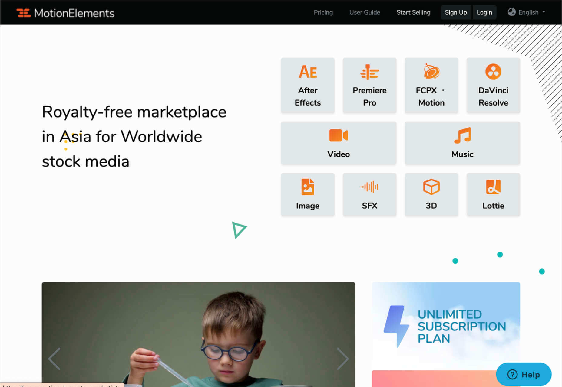
6. Motion Elements

If Elegant Themes is the go-to resource for designers searching for WordPress themes and web design solutions, Motion Elements is the top choice for “motion” content. Here, you’ll find videos, SFX content, images, music, 3D solutions, and so much more. 

Though it’s located in Asia, Motion Elements is available worldwide. The marketplace offers a monthly subscription plan wherever you can download unlimited products to suit your needs. There are tons of resources to choose from here, including After Effects elements, tools for Lottie, Premiere Pro, FCPX motion, DaVinci Resolve, and more. 

Features include:

  • After Effects elements
  • Premier Pro resources
  • FCPX Motion
  • DaVinci Resolve
  • Video and audio content
  • Stock images
  • SFX resources
  • 3D content

Pricing starts at $16.50 per month for an unlimited annual plan. This means that you can download as much as you like without having to pay any more. There is a small discount if you pay for a full year of access in one go.

7. Creative Tim

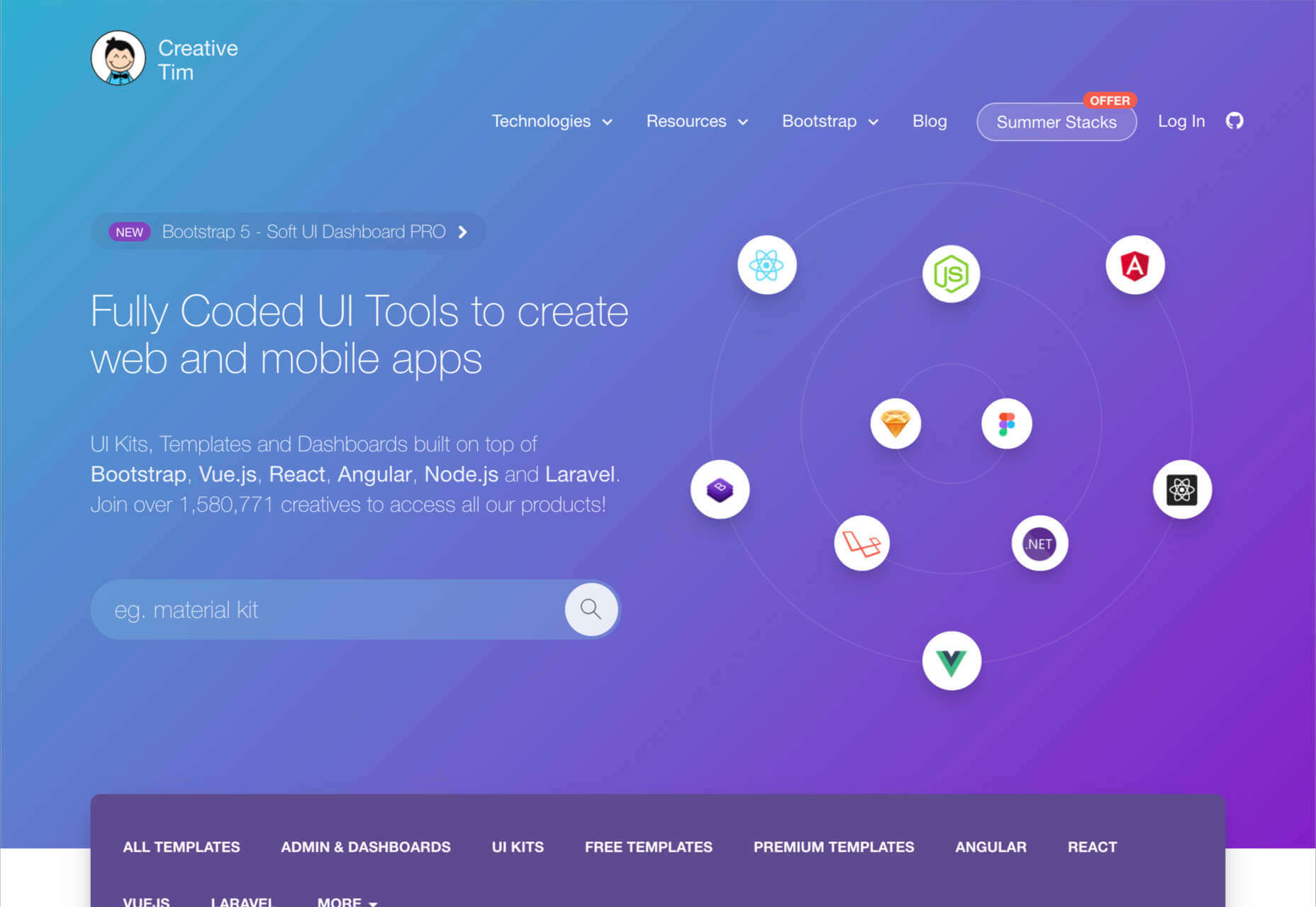
Simple but effective, Creative Tim is an amazing resource for front-end and back-end content bundles. You get fully coded UI tools here that can help you create various mobile and web apps and a huge selection of dashboards and templates. If you’re the kind of designer who likes working on top of things like Bootstrap, React, Angular, Laravel, Node.js, and more, then Creative Tim has you covered. 

This is one of the more technical creative resource packages that we’ve looked at so far, but it has a lot of value to offer. That’s probably why there are already more than 1.5 million people using the service. You can search through administration dashboards, UI kits, premium templates, free content, and design systems. Of course, everything is easy to access too. Features include:

  • Frontend design technologies for endless platforms
  • Soft design, light design, paper design, and more
  • Bootstrap content 
  • Resources and third-party tools
  • Complete design and web kits
  • UI kits and templates
  • Admin and dashboard templates

There’s a free version of Creative Tim available for beginners if you want to keep your costs low, but it’s generally much better to sign up for the premium subscription. You can also purchase kits and templates on a one-off basis if you prefer to start small. However, the best prices generally come from buying the bundles from Creative Tim’s subscription side. 

8. Storyblocks

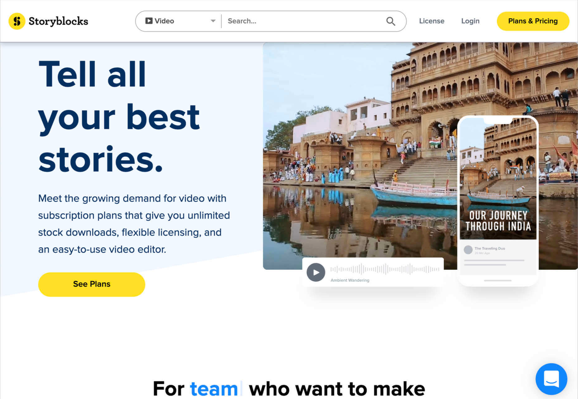
Similar in style to Motion Elements, Storyblocks is a creative design resource for any designer getting involved with the video world. This website is home to some of the best free-to-use videos around, with simple licensing available at a click. Aside from high-quality videos and templates, you also get audio and sound effects as part of your subscription and images or illustrations. 

The unlimited access pass gives you all the resources you might want, from 4K and HD footage to music and sound effects, After Effects templates, and photos, vectors, or illustrations. You can also export a host of your own video projects with access to the Maker video editor, which allows you to make various changes to your custom video content. Features include:

  • HD and 4K video footage
  • After Effects Templates
  • Sound Effects and Music
  • Photos, Illustrations, and Vectors
  • Unlimited video exports
  • Video editor access
  • Licensing support

The standard all-access plan from Storyblocks starts at a very affordable £39 per month for all of the content you might want. In addition, everything you get here is unlimited, so you don’t have to worry about running out of credits. There’s also an enterprise option available if you want to share access to resources with your team.

9. Motion Array

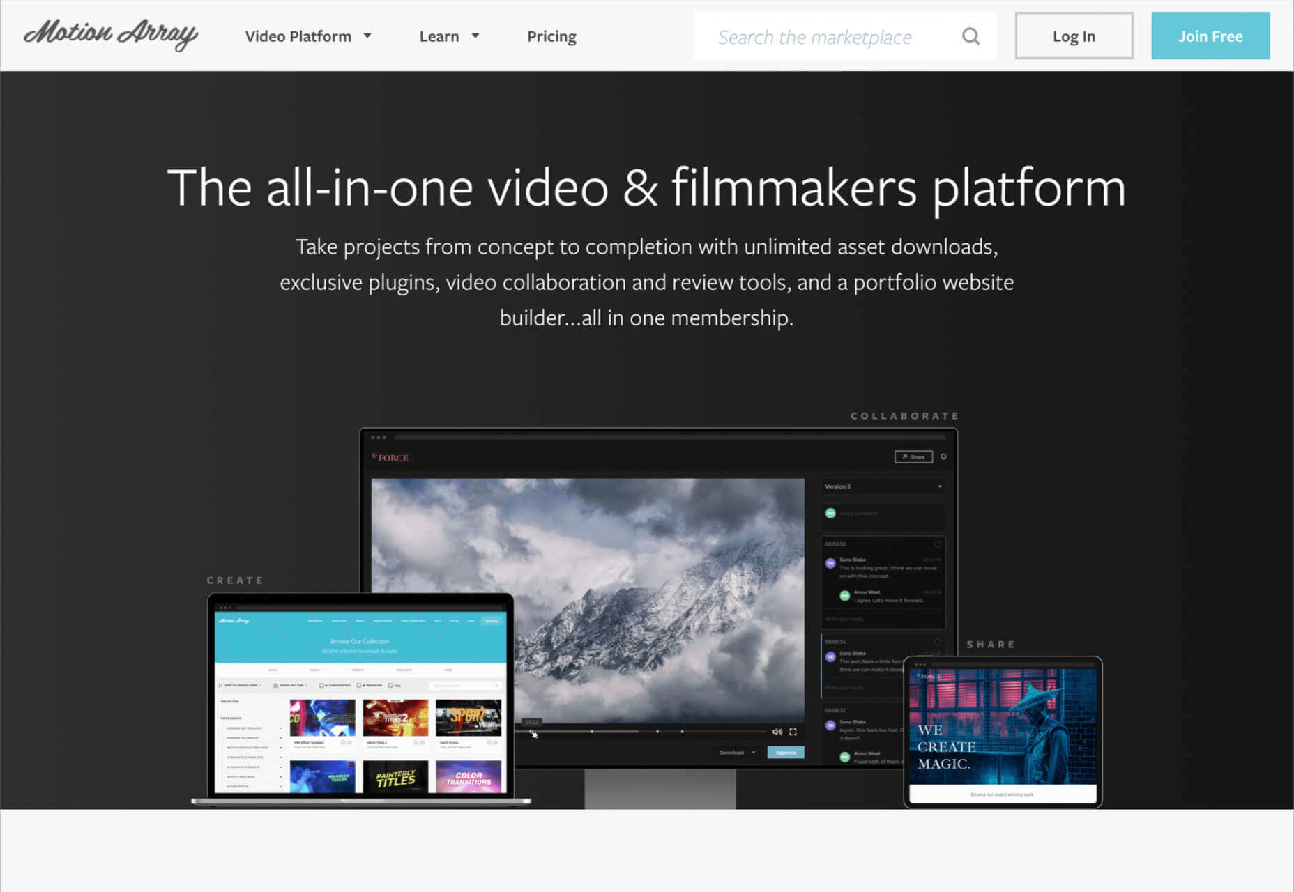
Motion Array is an all-in-one video creation platform for those with an eye for visual content. This fantastic resource center is packed full of valuable tools, from Da Vinci Resolve templates to Adobe Premier Pro Content. As part of your subscription payment, you’ll get endless presets, audio effects, plugins, video footage, tutorials, and more. 

Though a little more expensive than some of the other premier subscription services on the market, Motion Array does offer a lot of content that you can’t get anywhere else. There’s an unlimited marketplace constantly updating with access to royalty-free footage, stock photos, music, and sound effects. You also get plugins built for Premiere Pro. Features include:

  • Adobe Exchange elements
  • Final Cut Pro and DaVinci resolve templates
  • Royalty-free music and sound effects
  • Stock footage and video
  • Photos and images
  • Time-saving integrations with your favorite apps
  • Portfolio site builder
  • Stock media requests

There’s a free subscription option for Motion Array, which you won’t find from most alternatives. This only gives you access to some basic stock photos and assets, but it’s a nice way to start. When you are ready to upgrade, you can pay $29.99 per month for the full stock media library, as well as requests for custom media assets and exclusive plugins.

Start Stocking Up on Designer Resources

As a designer or creative professional, keeping a constant stack of resources available is crucial to your ongoing productivity. Fortunately, there are tons of premium marketplaces out there today, making it easier to access everything you need. 

Whether you’re looking for full UI kits and templates, or you want some free-to-use images and videos for the website content you’re creating, there’s something for everyone. With most monthly subscription services available at a highly affordable price, you could even sign up for multiple sites at once. 

Source

The post 9 Amazing Design-Resource Package Sites first appeared on Webdesigner Depot.


Source de l’article sur Webdesignerdepot