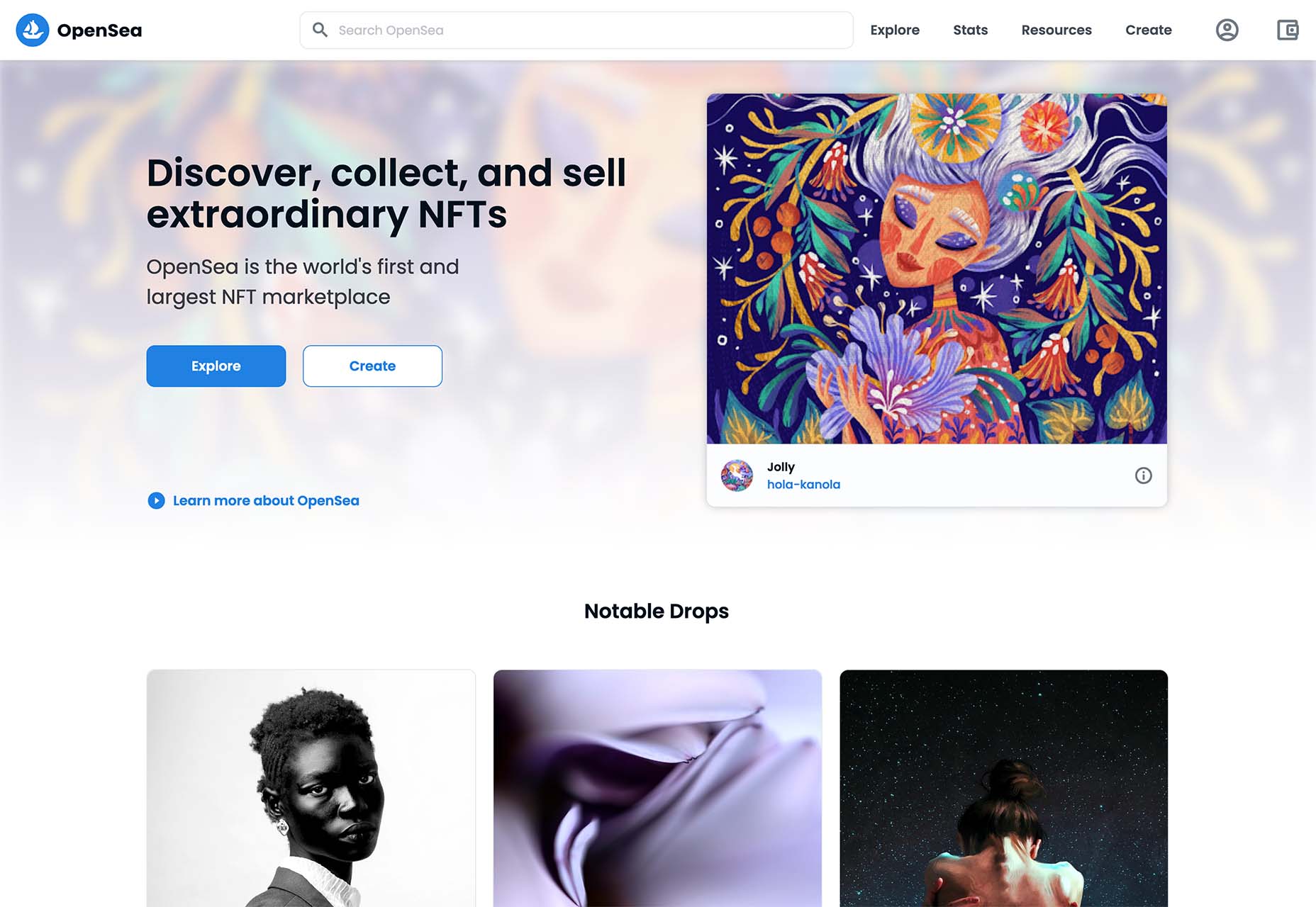
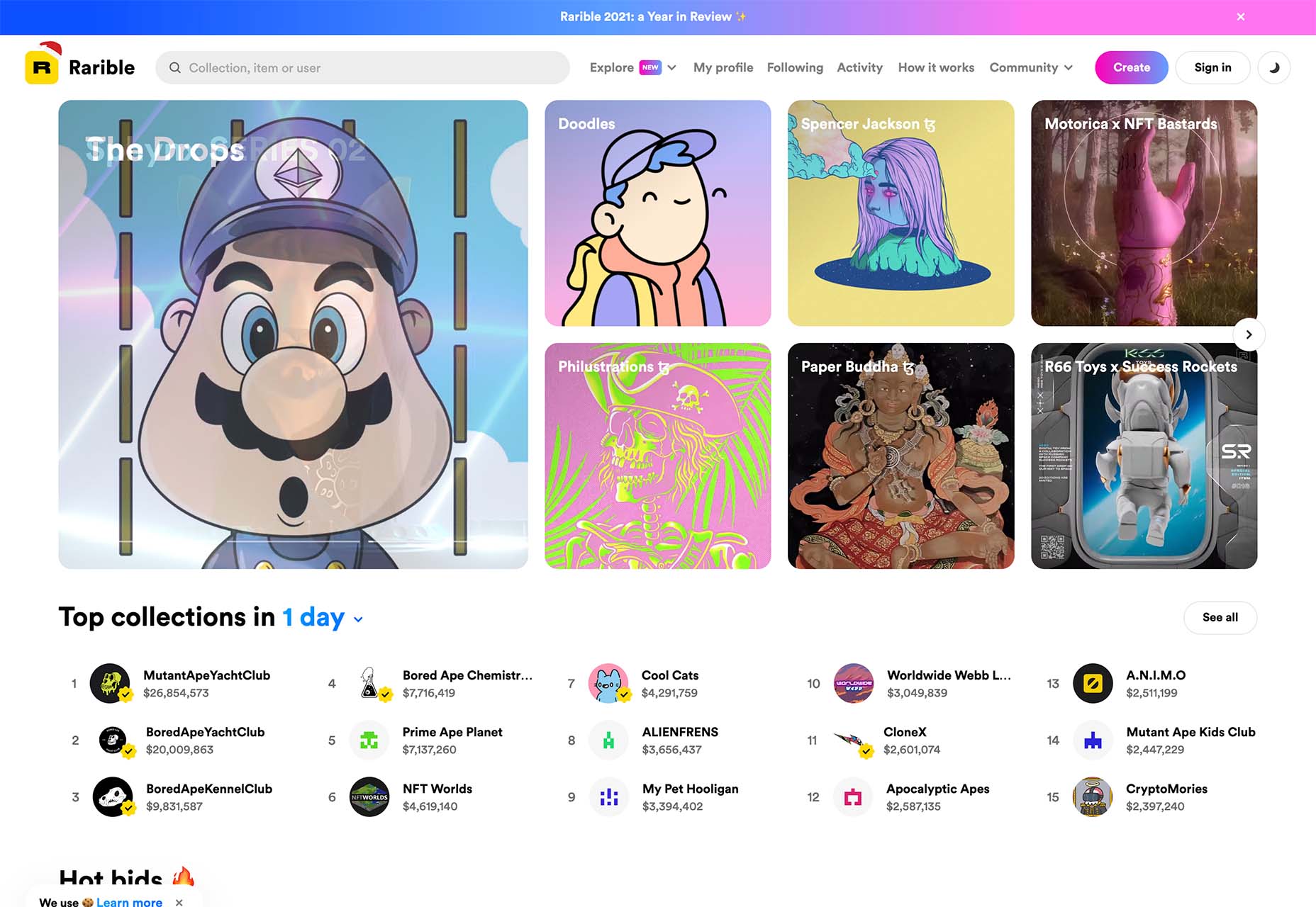
 One of the most talked-about digital elements of the new year leads our roundup of tools and resources this month – NFTs. The NFT landscape seems to be exploding right now and that includes tools for designers to get in on the game as well.
Here’s what is new for designers this month…
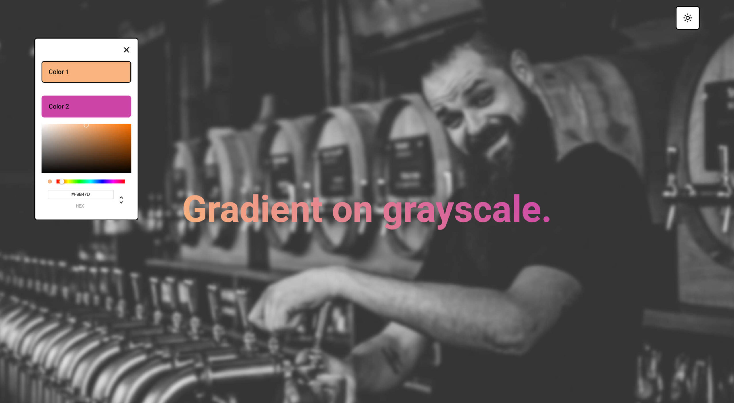
Zero Code NFT
Zero Code NFT offers an advanced no-code tool to simplify the smart contract development and deployment process, allowing you to launch your NFTs with no previous coding experience. It includes a smart contract wizard that supports Ethereum, Polygon, Fantom, and Avalanche, with Solana and others underway. The tool has a waitlist if you are interested.
54nft
54nft is a tool to create a customized NFT store. It is a complete commerce platform that lets you start, grow, and manage an NFT business. Create and customize a store, publish and mint assets on available blockchains, and sell. The tool is free but charges a transaction fee on sales.
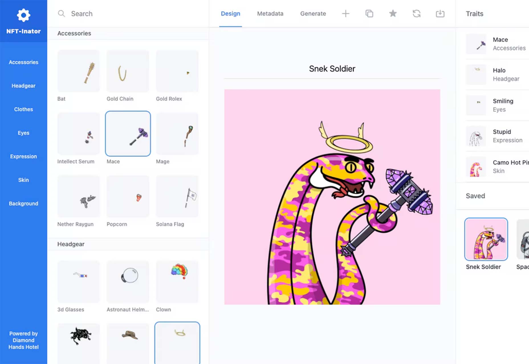
NFT-Inator
NFT-Inator is a free toolkit to accelerate the design and development of procedurally generated NFT projects. Create custom and randomized designs, test layer combinations, and export images and metadata for Solana, Ethereum, and Polygon.
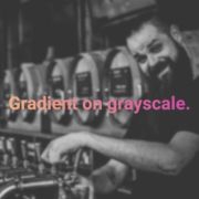
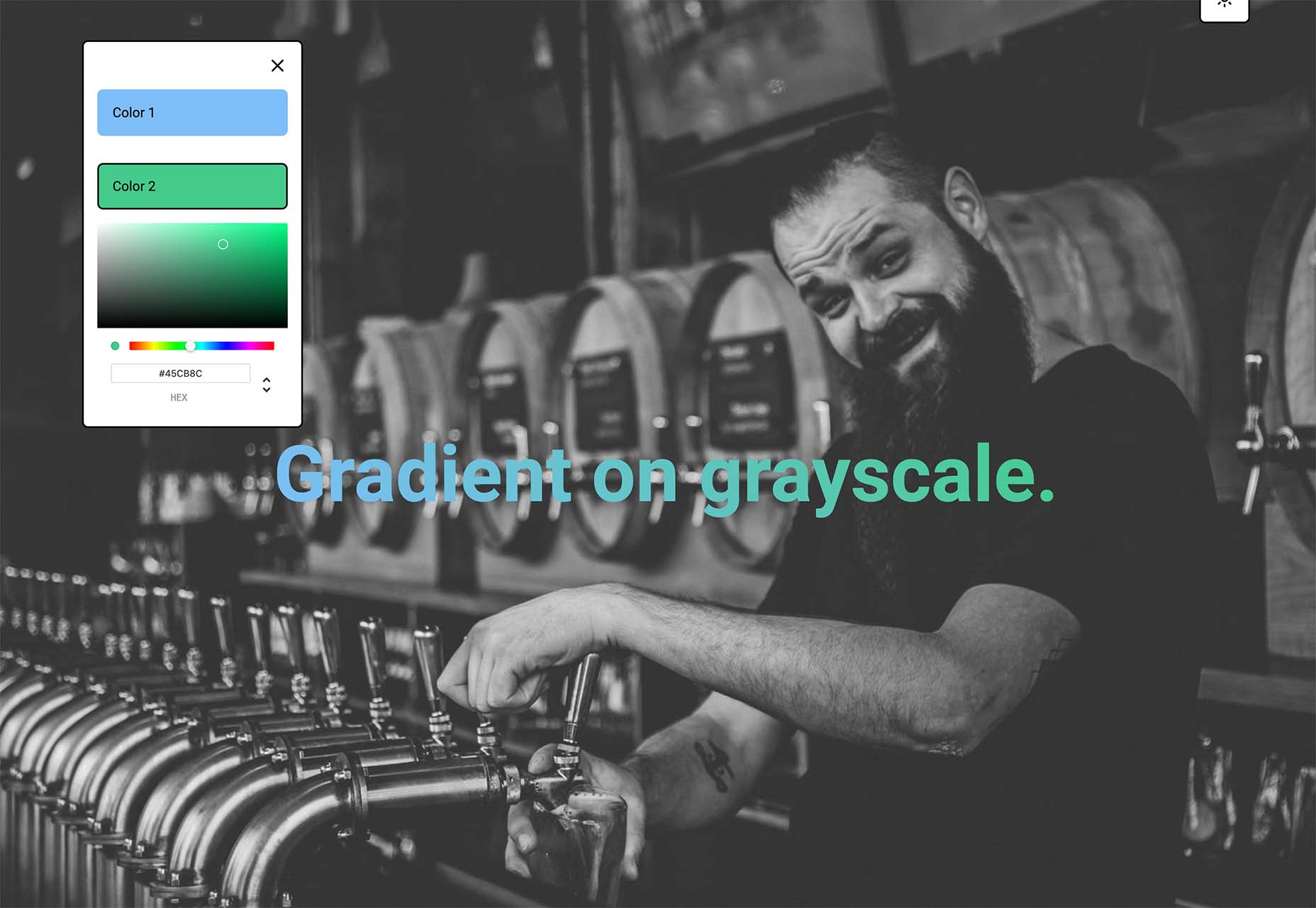
Gradientos
Gradientos makes finding gradients that work with your design easy. Pick your colors and see the gradient live on a demo website with common UI elements.
Web Almanac
Web Almanac is an annual state of the web report from HTTP Archive. It is a comprehensive report on the state of the web, backed by real data and trusted web experts. The 2021 edition is comprised of 24 chapters spanning aspects of page content, user experience, publishing, and distribution.
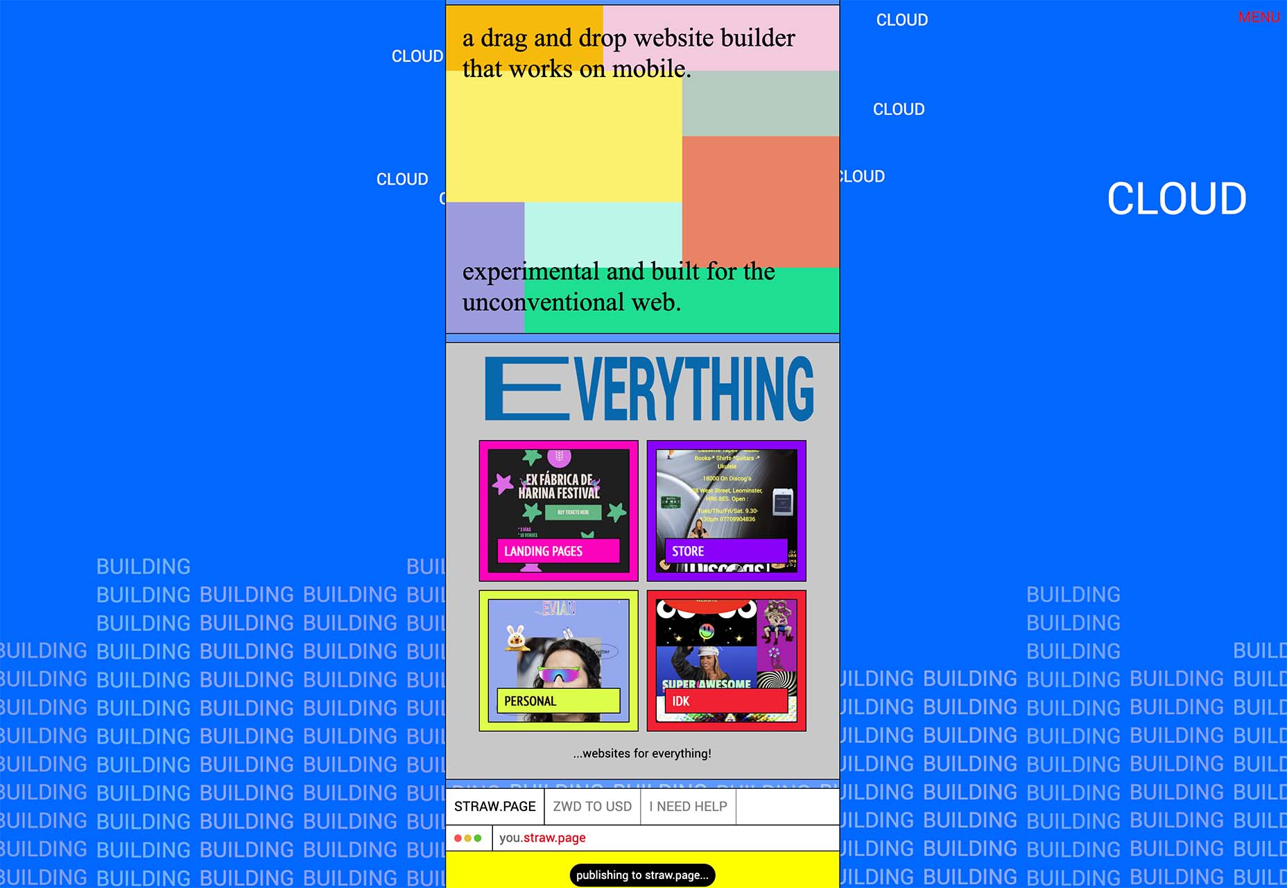
Straw.Page
Straw.Page is a new take on website builders. It is a super simple builder that you can use to create websites from your phone. It’s a drag and drop builder that’s highly experimental and allows you to connect via a subdomain or with a custom domain.
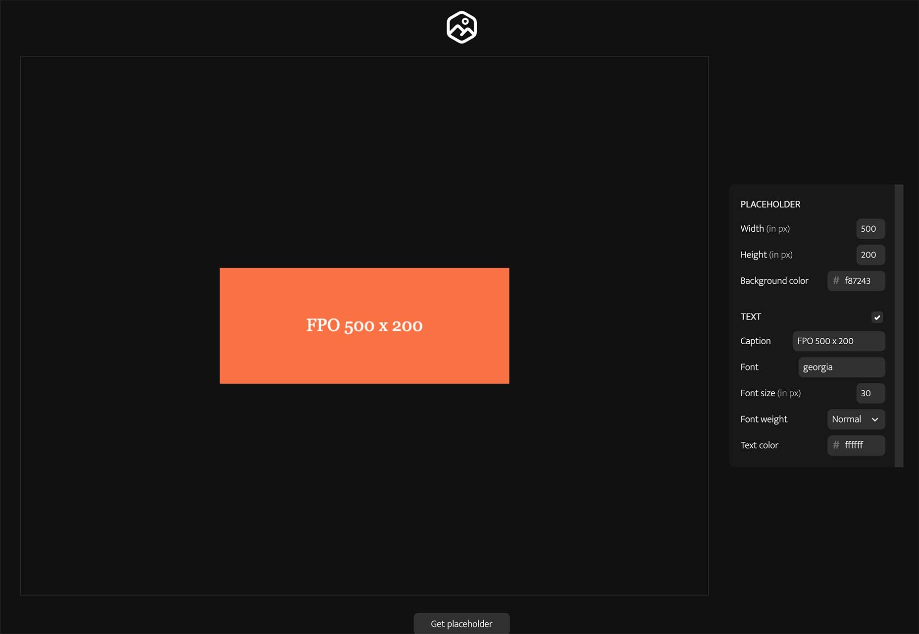
Placy
Placy is a simple placeholder generator. Set the size, color, and fonts and you’ll get a usable data URL to include on your website. Available and JPG, PNG, or SVG.
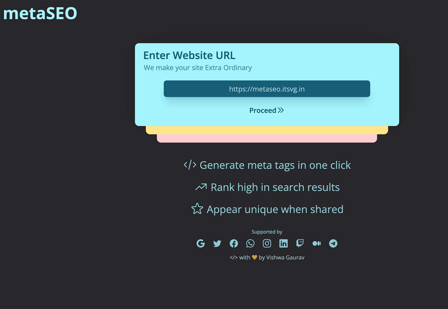
MetaSEO
MetaSEO is a tool to generate meta tags in one click for the best SEO of your website, rank high in search results, and appear unique when someone shares your link. It’s a no-brainer SEO tool for web designers and developers that aren’t as versed in search engine optimization.
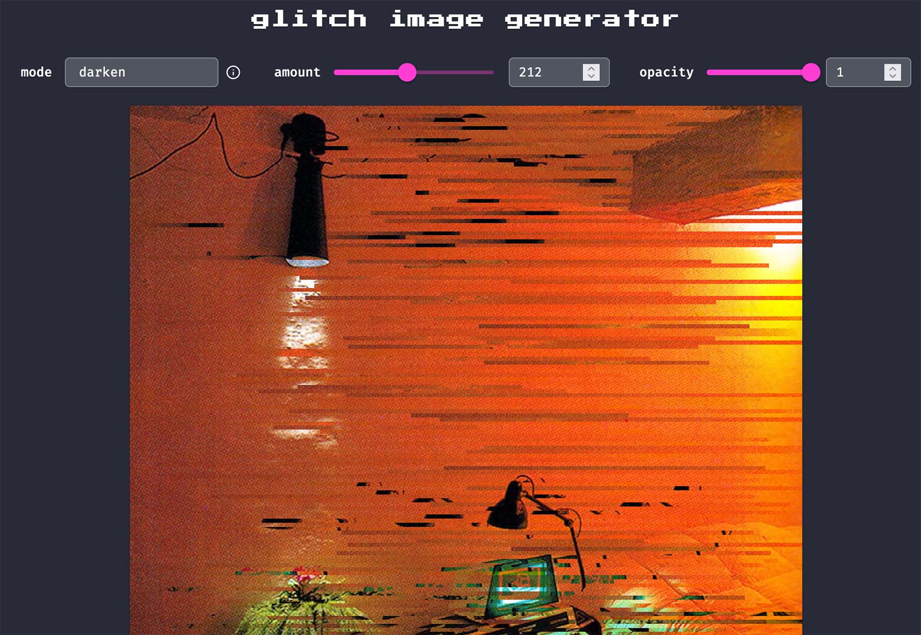
Glitch Image Generator
Glitch Image Generator is a tool to create a trend effect of the same name. Upload an image, pick a color mode, set glitch preferences, and save it as a PNG for projects. It’s that easy.
Smoothly Reverting CSS Animations
Smoothly Reverting CSS Animations is a simple and easy-to-understand tutorial that will walk you through how to create a keyframe animation that moves smoothly. Pragmatic Pineapple explains the steps with code snippets to help you understand how to make this animated element work for you.

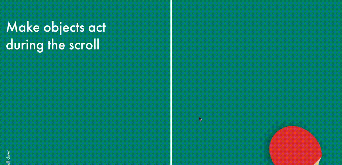
Alternate Column Scroll Animation
Alternate Column Scroll Animation is a nifty little tutorial and demo (with downloadable source code) from Codrops. The result is a grid layout with columns that scroll in opposite directions and a content preview animation.

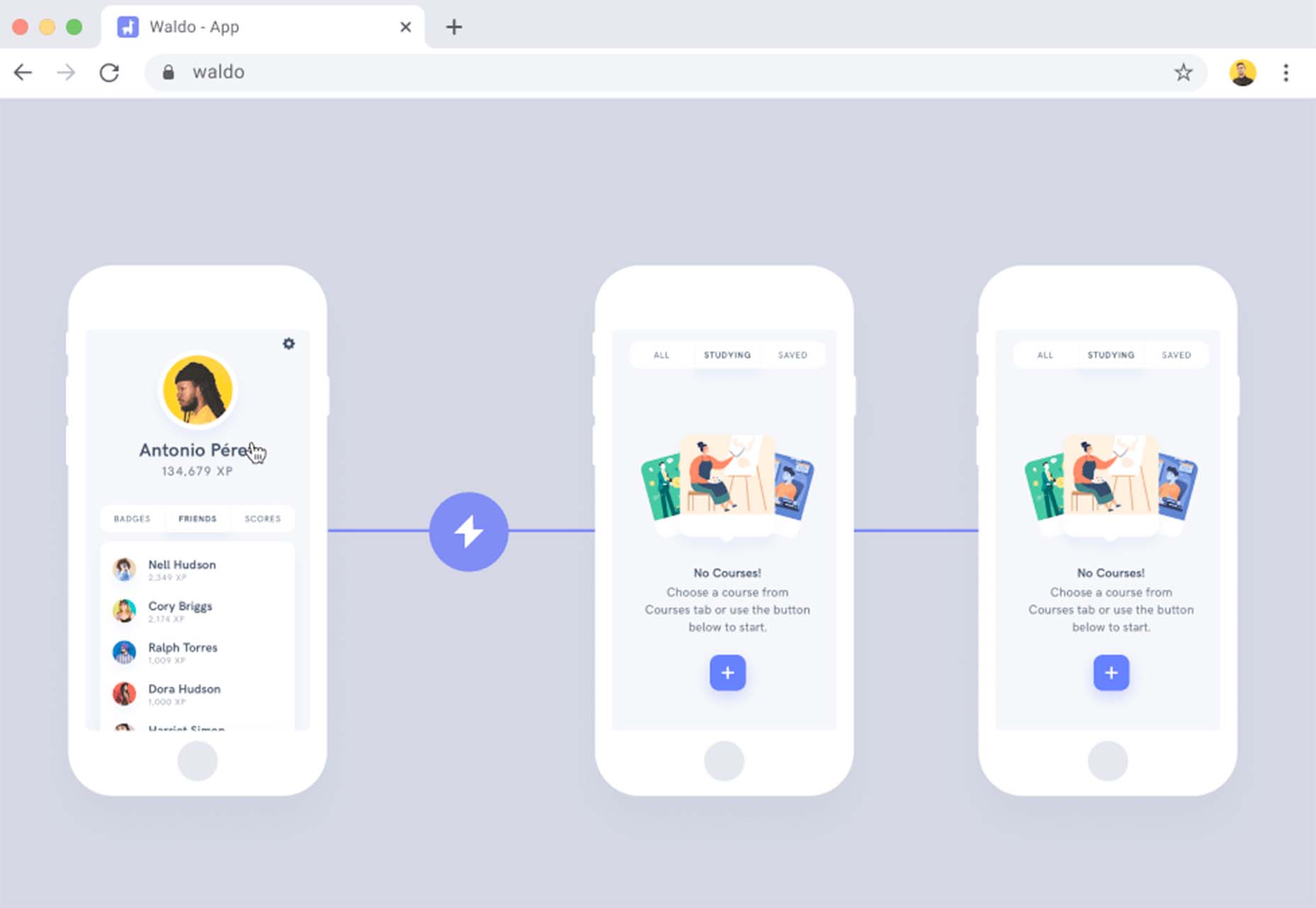
Waldo
Waldo is a premium tool that can help you ship mobile apps faster with fewer bugs (that’s a win-win). The no-code testing platform allows you to upload your app to the platform, run tests, and fix any issues that might arise to help you provide a better experience when it is time to make your app live.
Monad
Monad offers an efficient and simple way to share and discover code snippets. Create an account to easily find snippets relevant to you using tags or browse and create snippets anonymously. One of the best features is the ability to work collaboratively or privately.

Doodle CSS
Doodle CSS is a simple hand-drawn HTML/CSS theme that you can snag from GitHub. It’s fun and whimsical. Practical application for a look like this is up to your style and imagination.
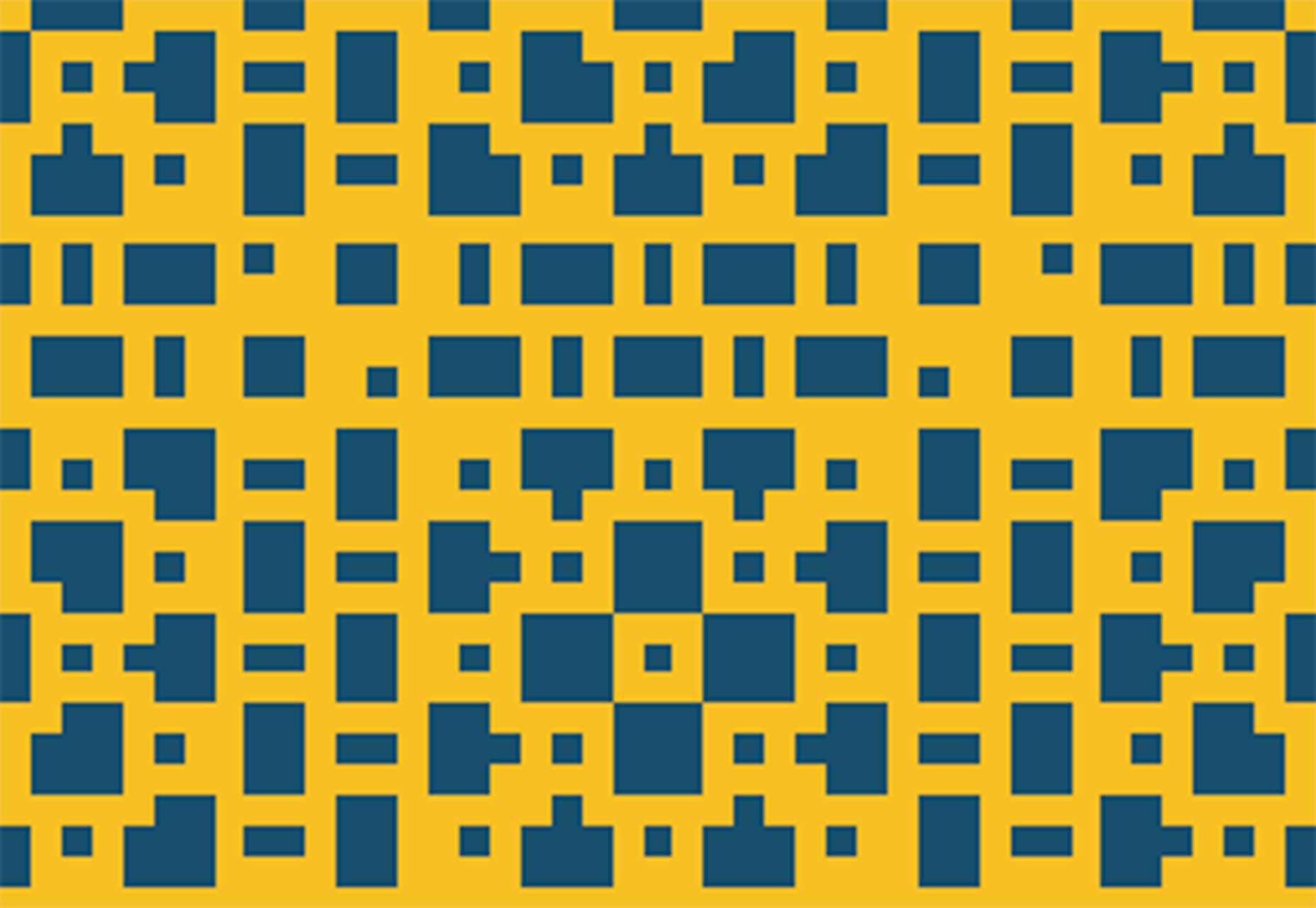
Pixel Patterns
Pixel Patterns is a concept pattern set that implements a function to create patterns with minimal syntax. They are in a pixel style with code snippets that you can play with.
Protodeo
Protodeo is a tool to make 3D video website templates to help show off new products or services. Just upload a few images, customize your settings, and the tool will give you a Bootstrap template with video mockups in less than a day.

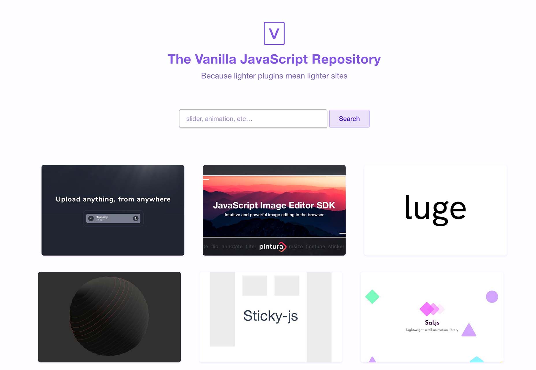
VanillaList
VanillaList is a repository of handpicked JavaScript plugins and resources to save time as a developer and create high-performance web apps. And as the name implies, they are all vanilla.
The Mouse Mover
The Mouse Mover is a fun little tool with questionable ethics – it simulates real mouse movements on your PC. Plus you get the source code and won’t have to worry about going to sleep or triggering a logged-off status.

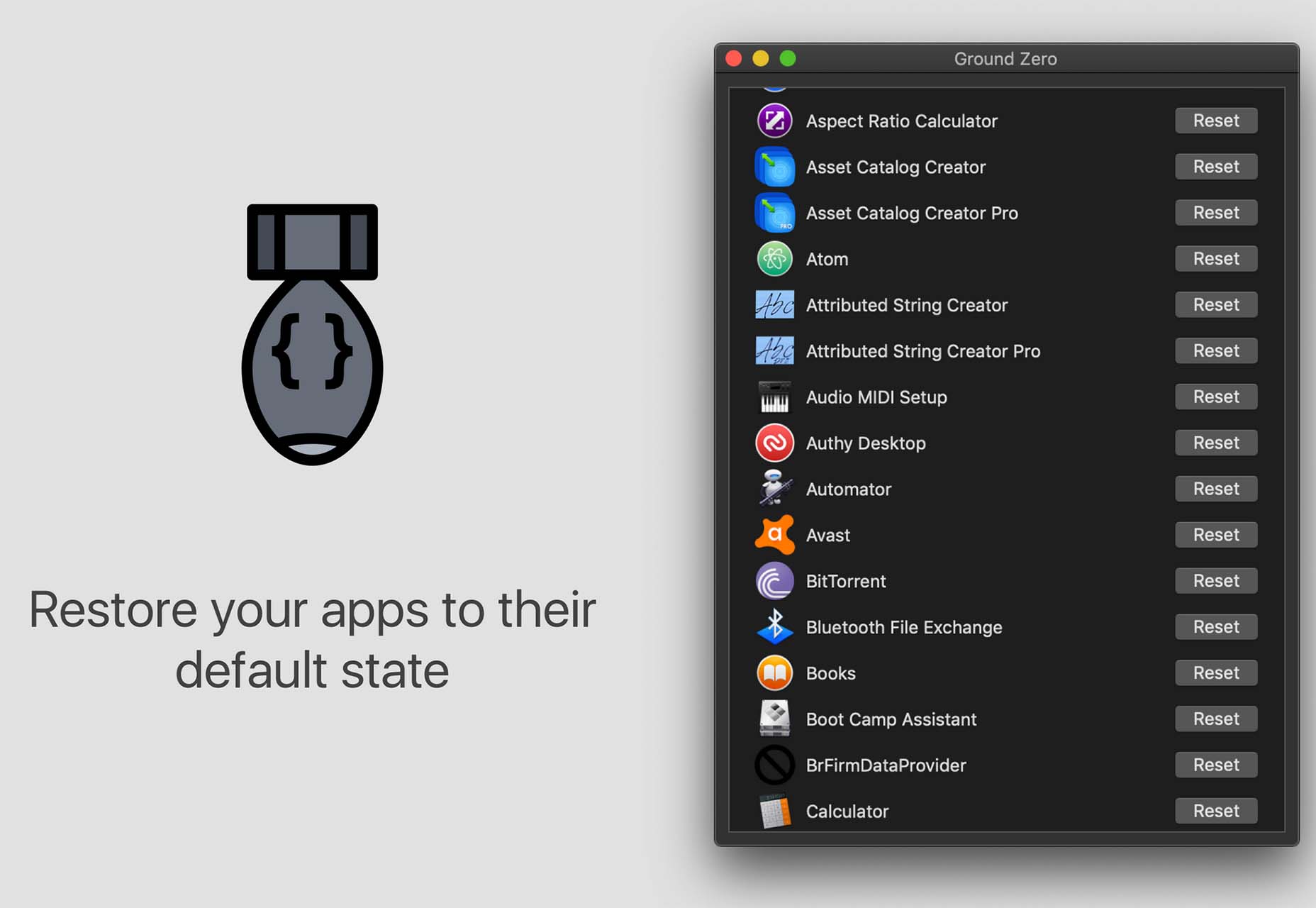
Ground Zero
Ground Zero returns Mac apps to the state they were in when first installed, without deleting the app. Fix issues and get back the default settings, or simply re-claim disk space by cleaning up data that would normally be left behind when uninstalling an app.
Alonzo
Alonzo is a premium typeface family in a modern style with high contrast stroke weights. The family includes 24 styles and with an almost condensed style fits nicely in tight spaces.

ContaneText
ContaneText is the more readable text version of the Contane typeface family. It’s a solid serif with 20 styles including Romans and matching italics. Stronger hairlines, solid serifs, and slightly more comfortable proportions make it appropriate for bold headlines, as well as for small text sizes.
Plinc Flourish
Plinc Flourish completes our roundup this month with an interesting, premium typeface that’s beautiful and functional. Part italic, part roman, this iconoclastic font is all style. It includes formal pen strokes in a taut upright framework to create a typeface that looks defiantly forward.

The post Exciting New Tools For Designers, February 2022 first appeared on Webdesigner Depot.

 So here we are, in a brand spanking new year—time for looking forward with fresh ideas and renewed hope for the year ahead. We are kicking off 2022 with a mixed bag and, we hope, something for everyone.


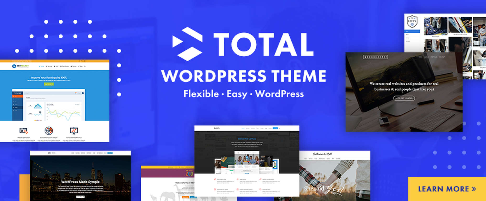
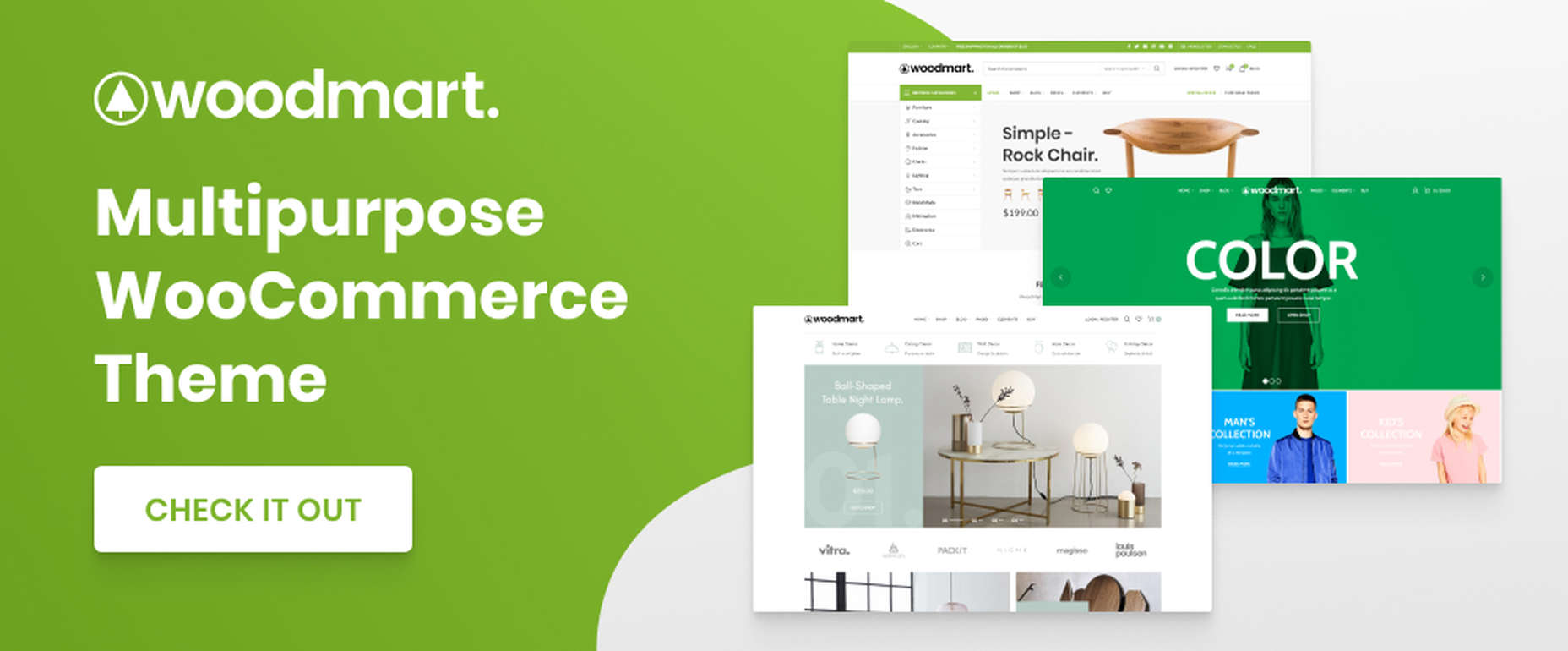
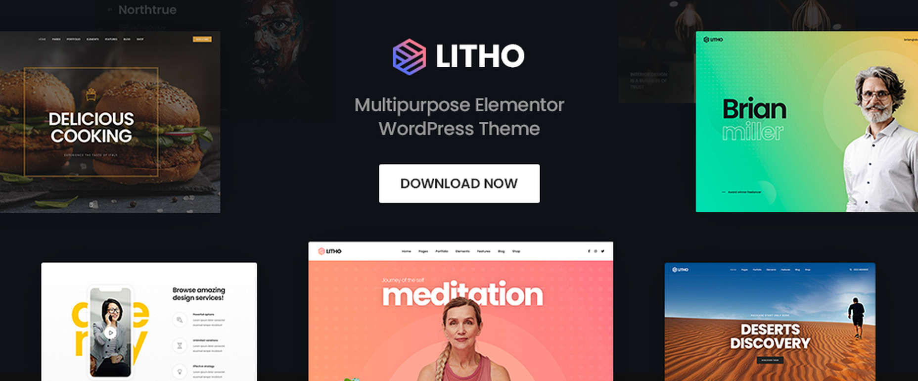
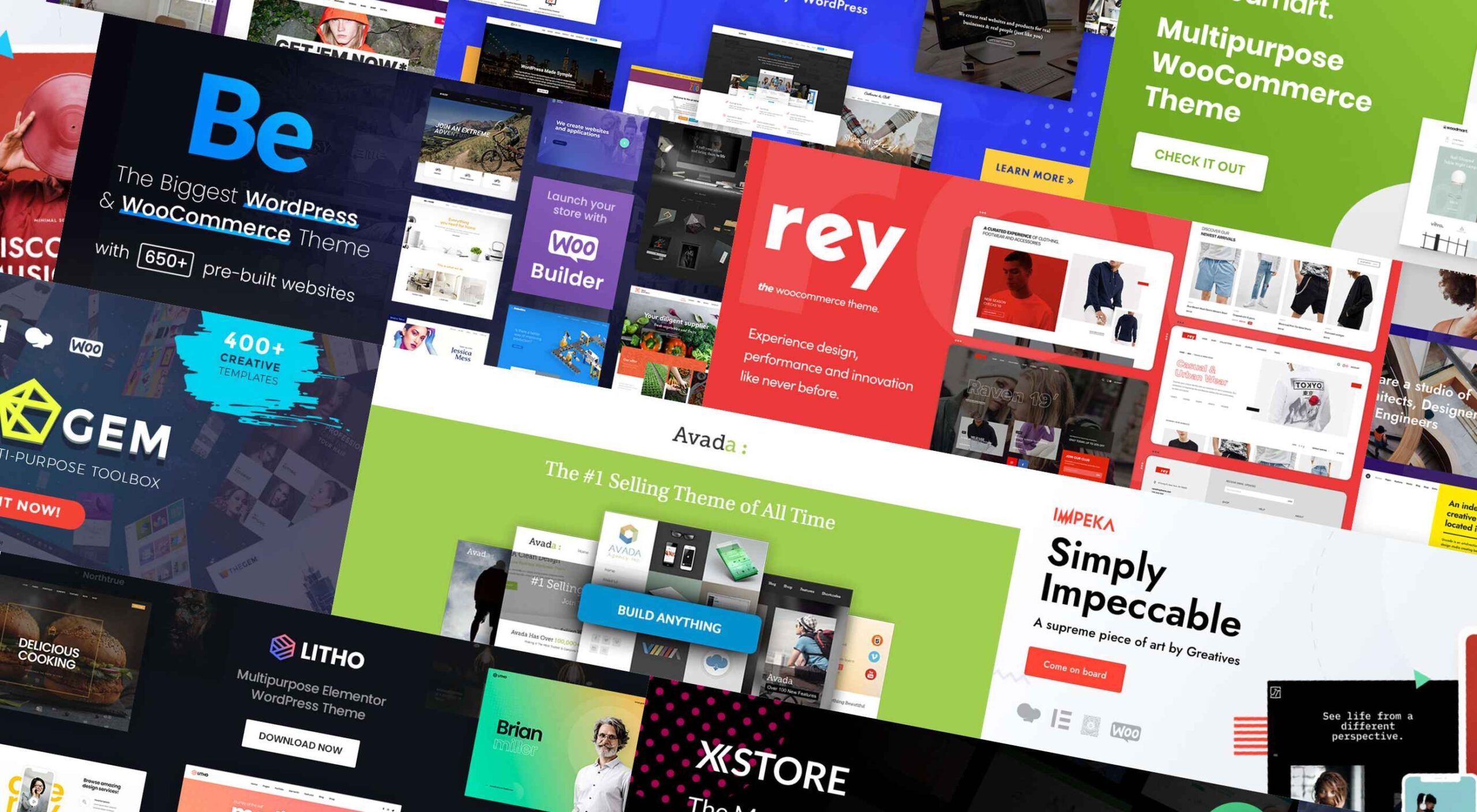 If you’re looking for a WordPress theme for your 2022 projects, it never hurts to see what the experts consider to be the best of the bunch. That’s not to say that experts don’t have their favorites. They often do, and we are no different.
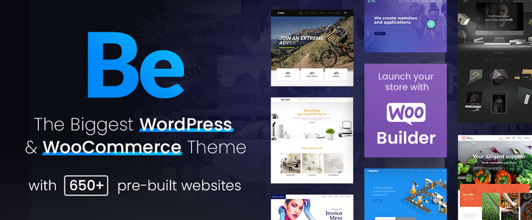


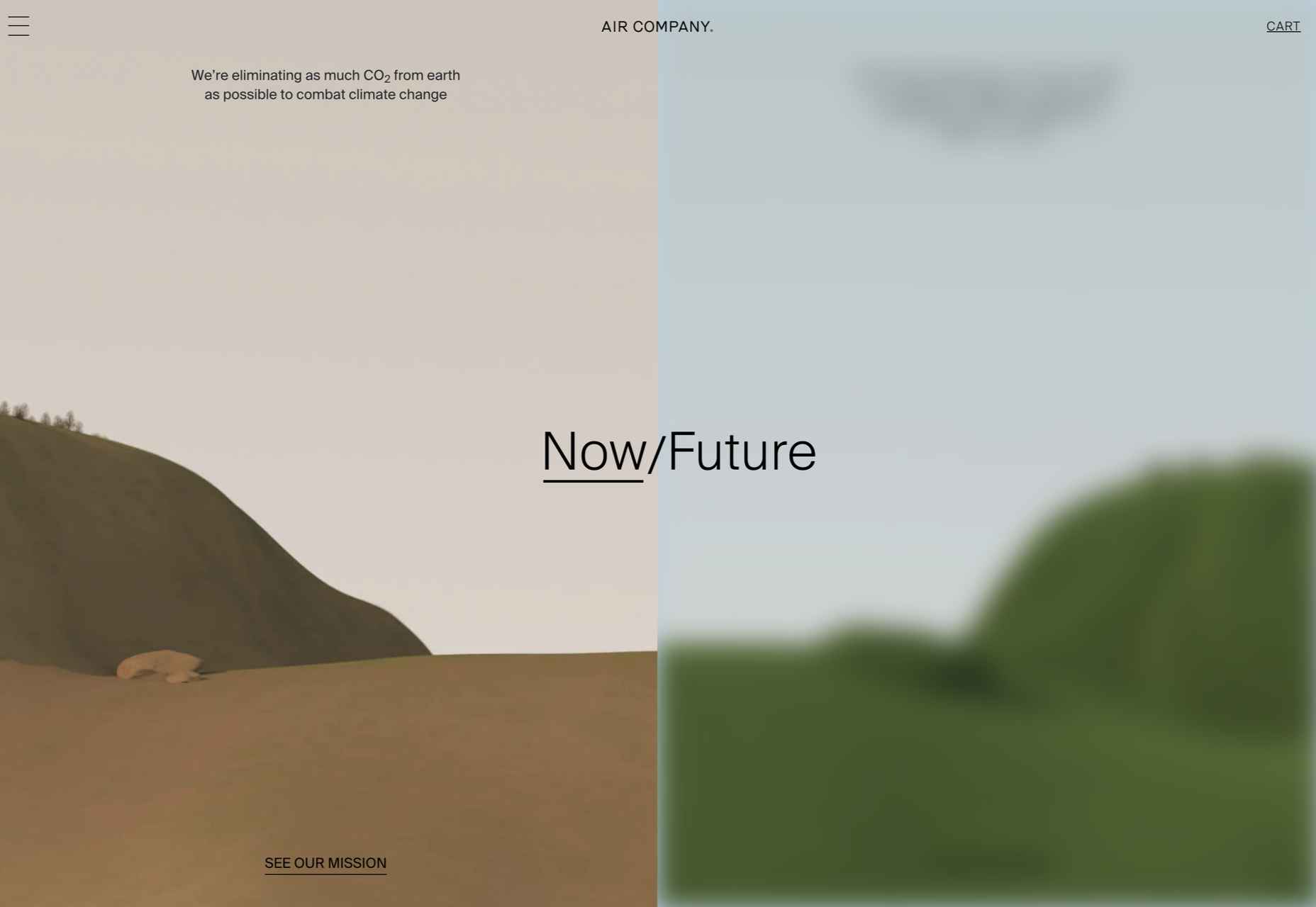
 Happy New Year, fabulous new website design trends!
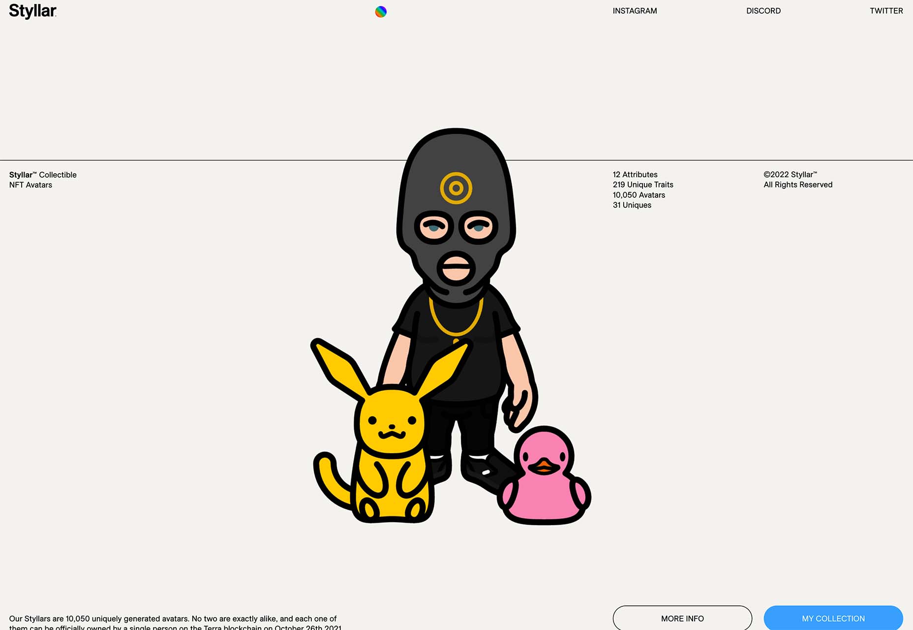


 The year’s winding down as everyone segues into a much-needed holiday R&R. But that doesn’t mean there aren’t some awesome new tools and resources for website design projects.


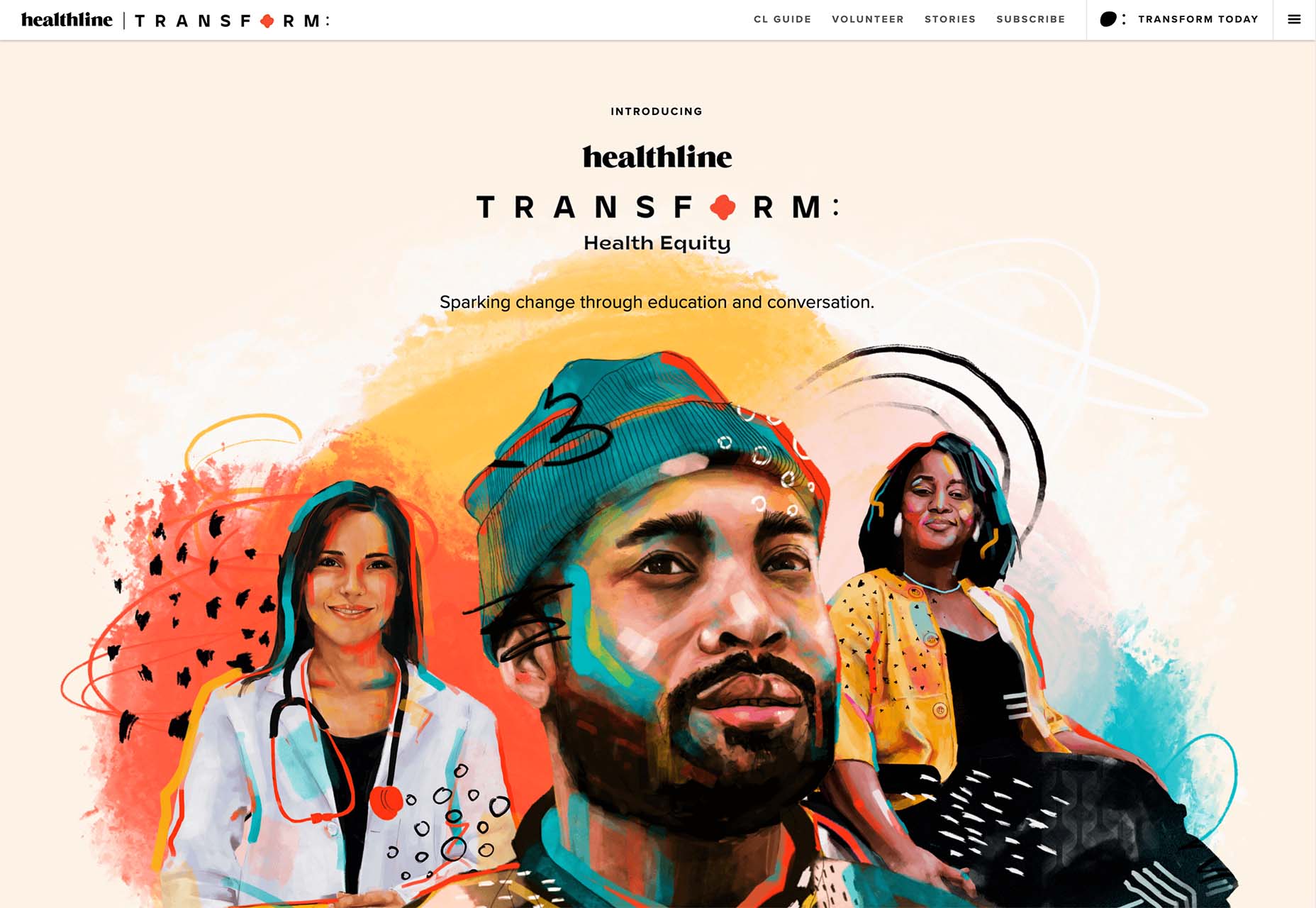
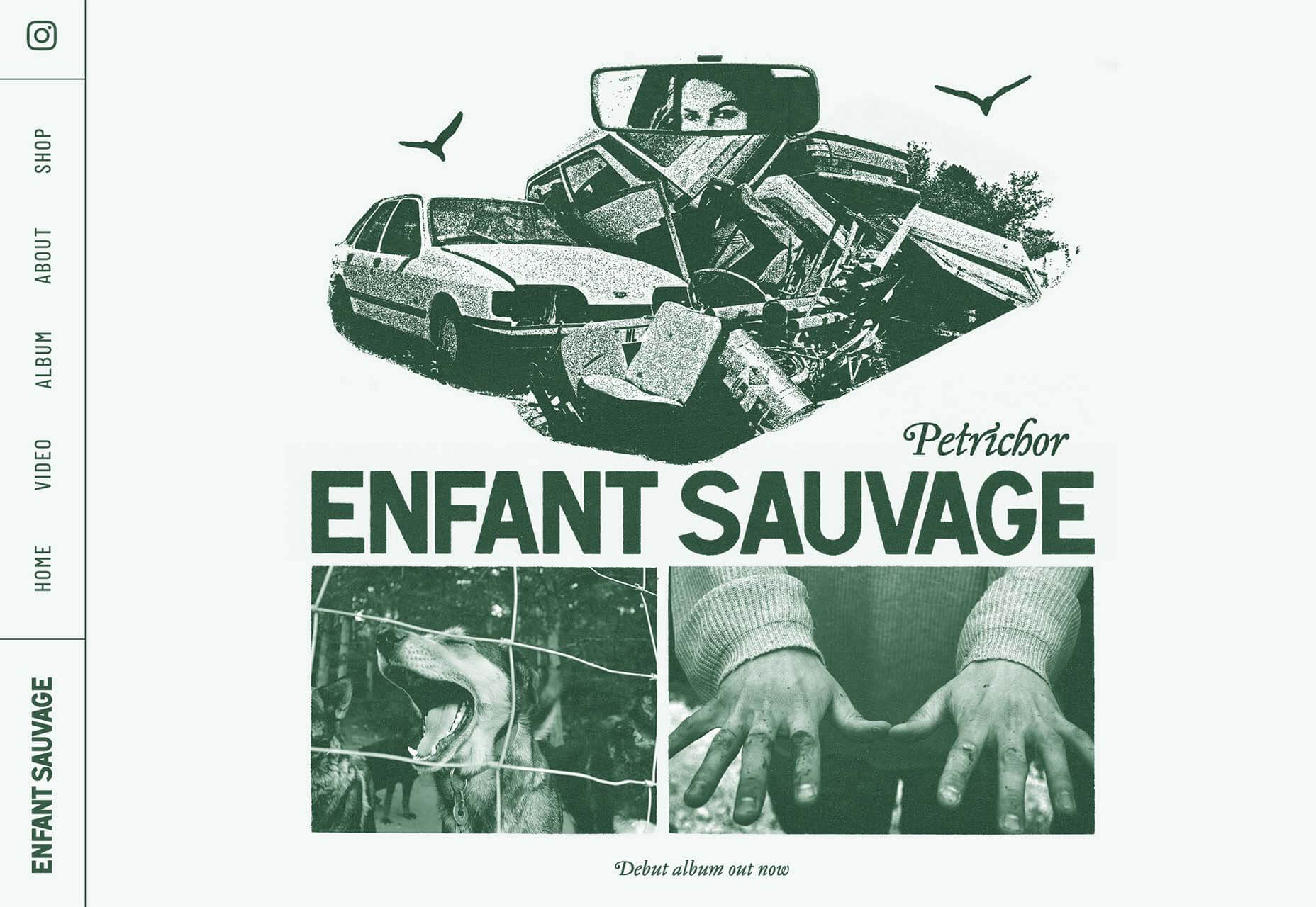
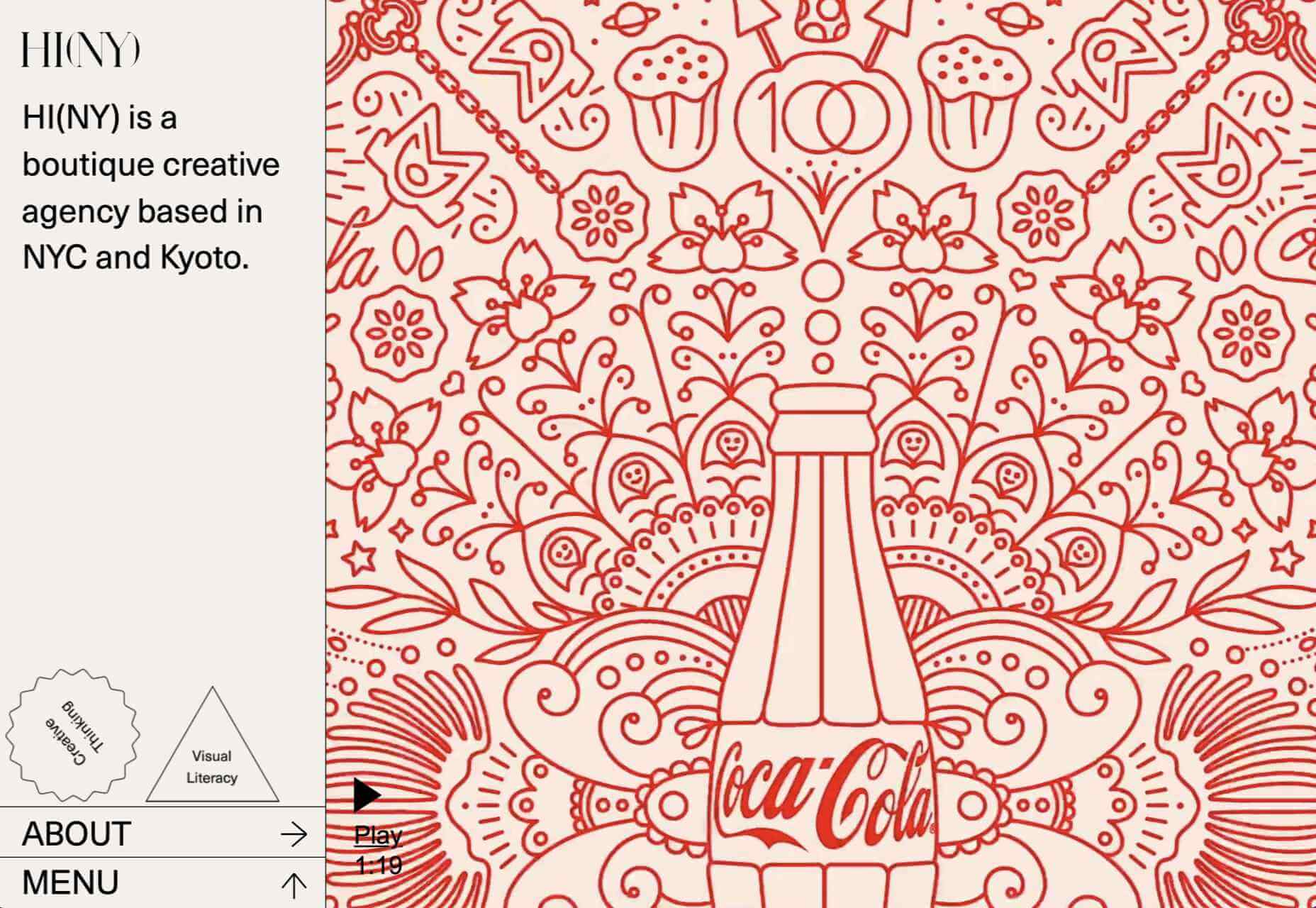
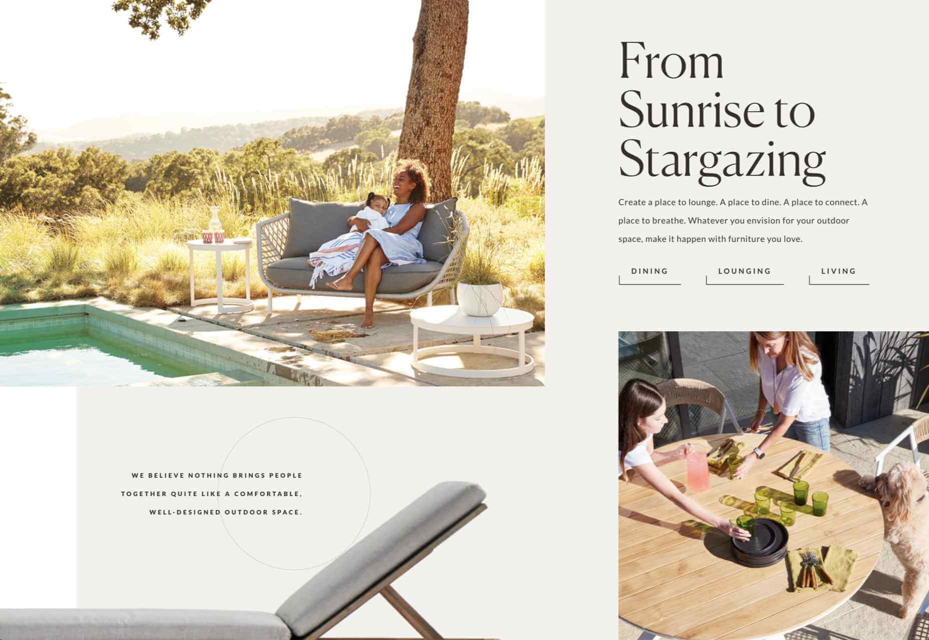
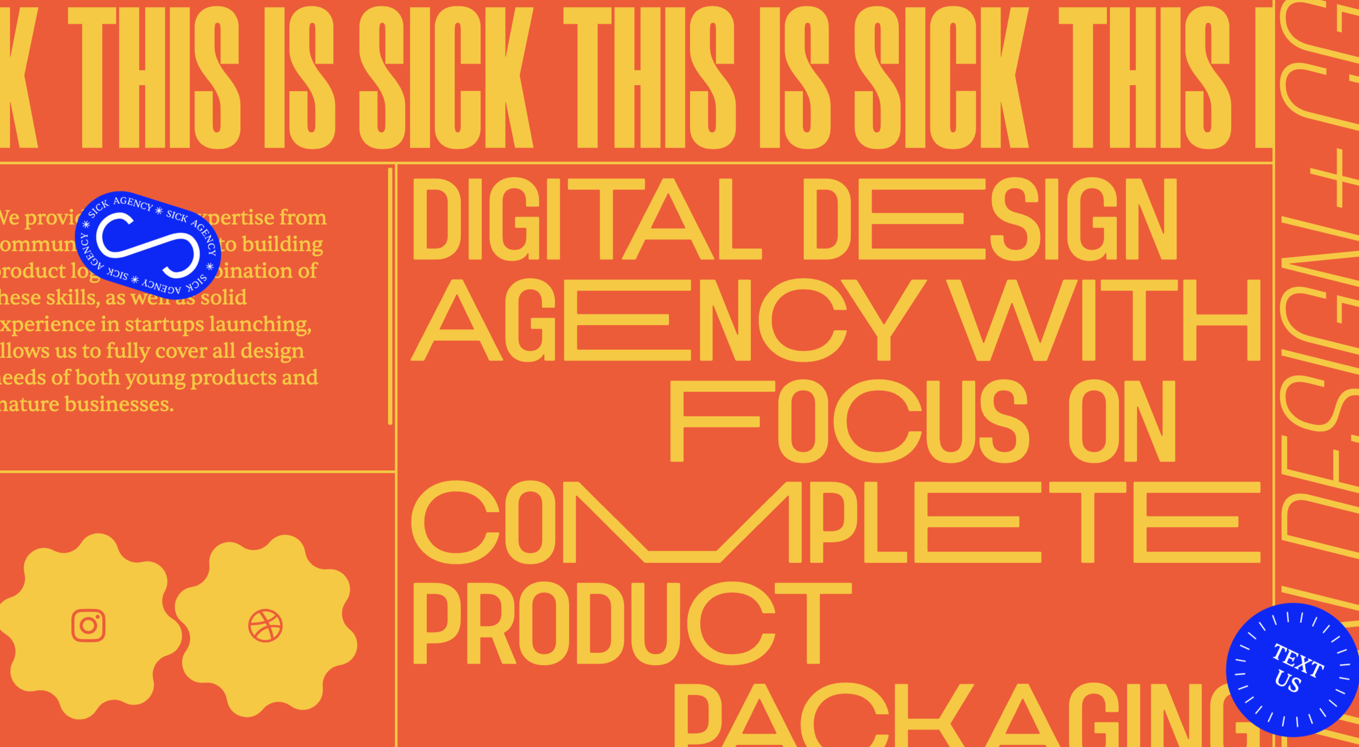
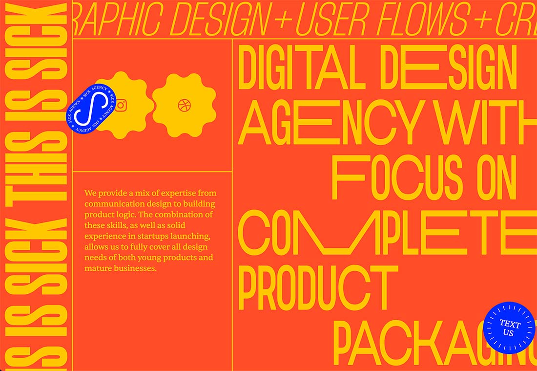
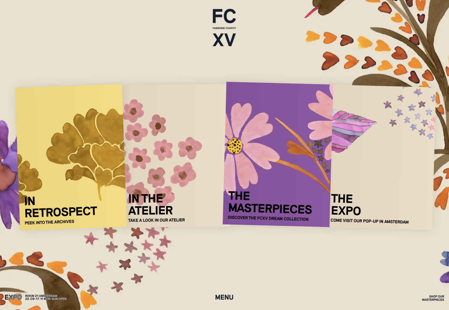
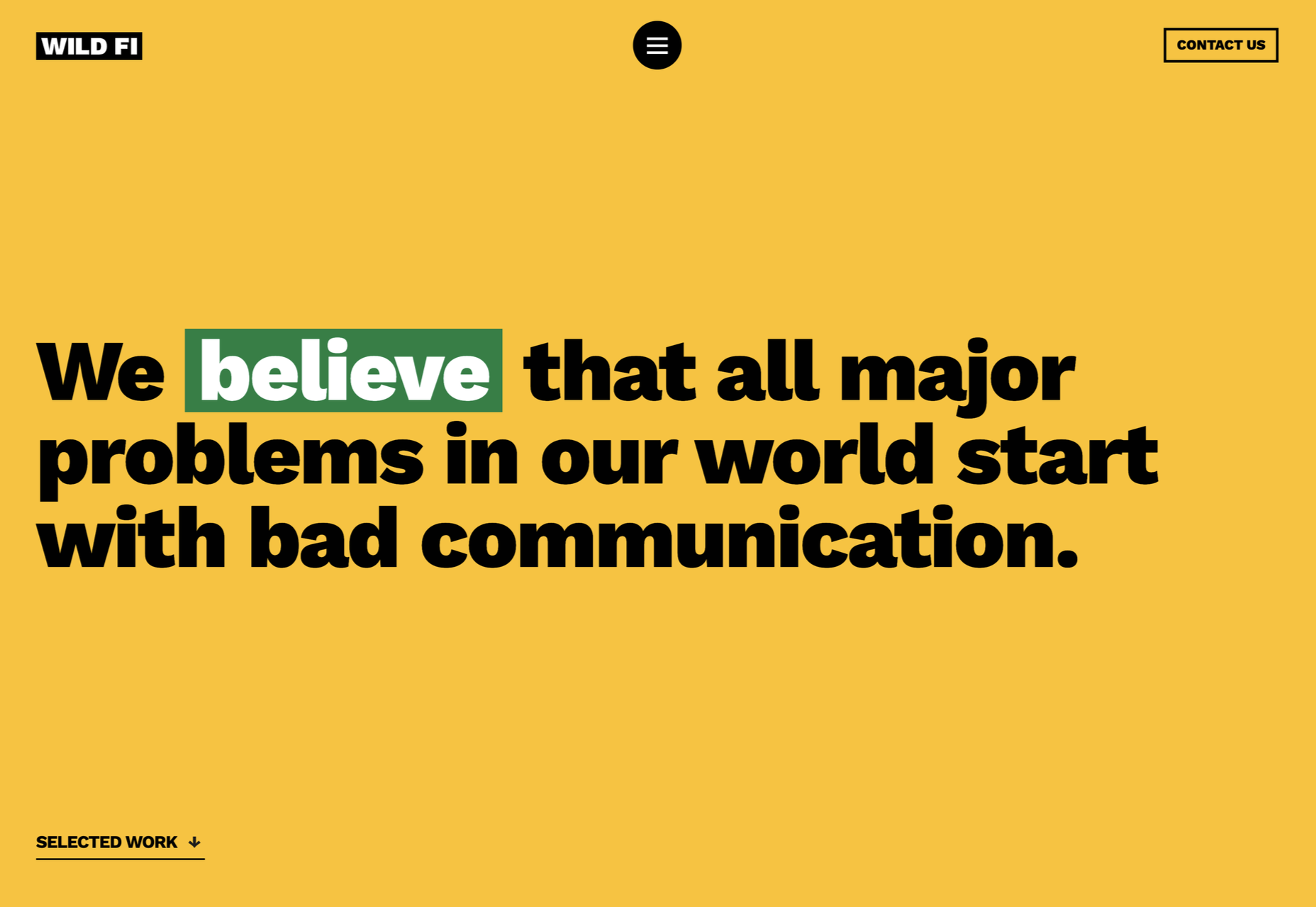
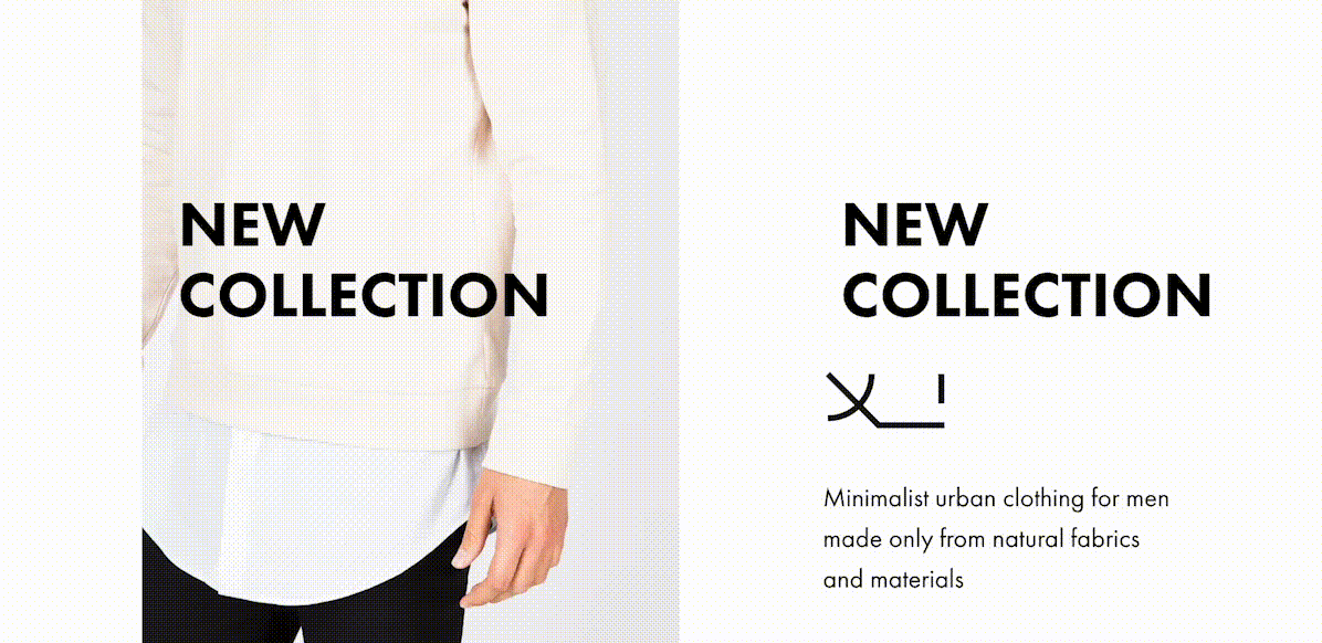
 The year might be coming to an end, but plenty of design trends are still beginning to emerge. It’ll be interesting to see how many of these website design elements remain popular into the new year. From vintage elements to circles to happier feelings, there’s a lot to play with here.
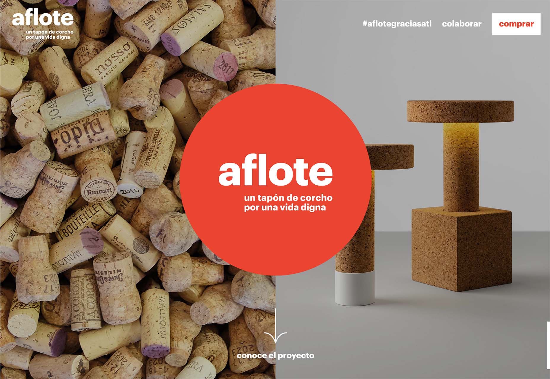


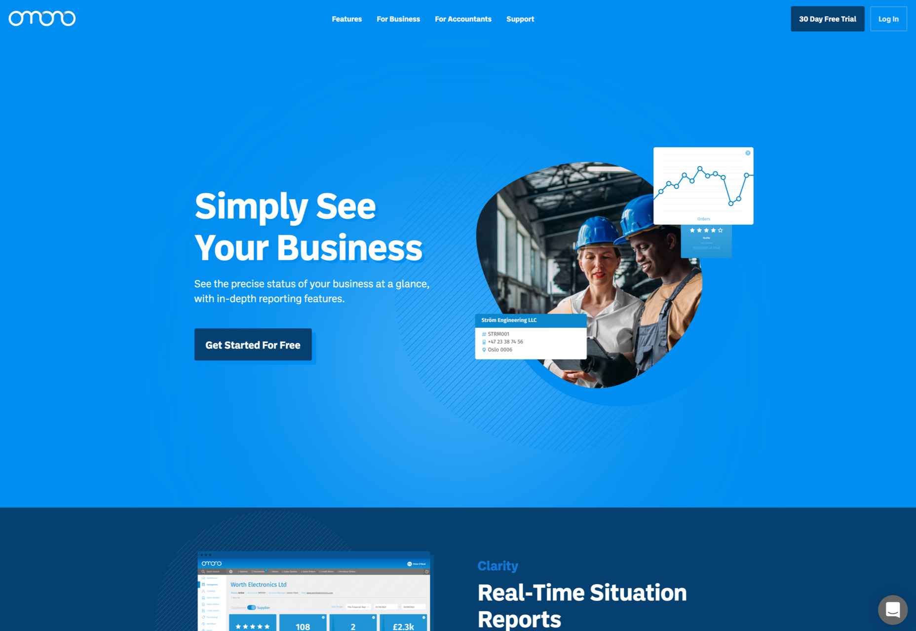
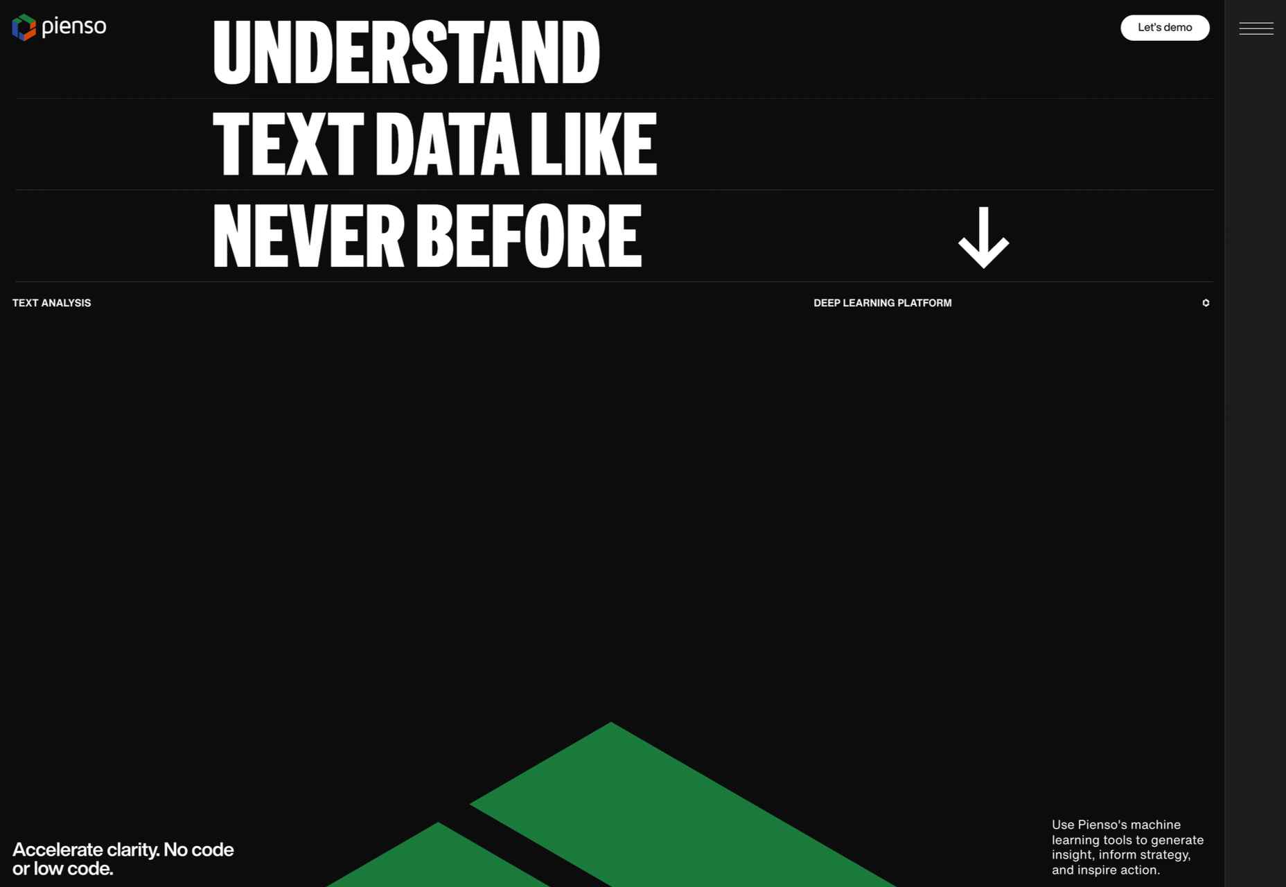
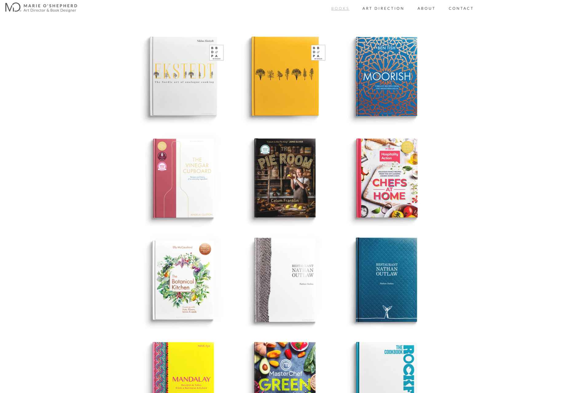
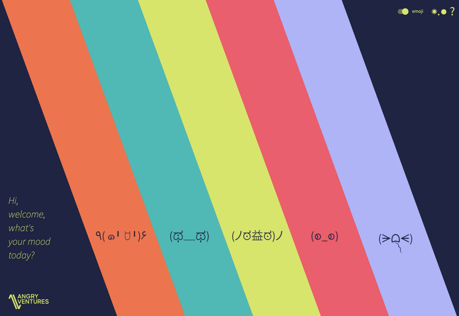
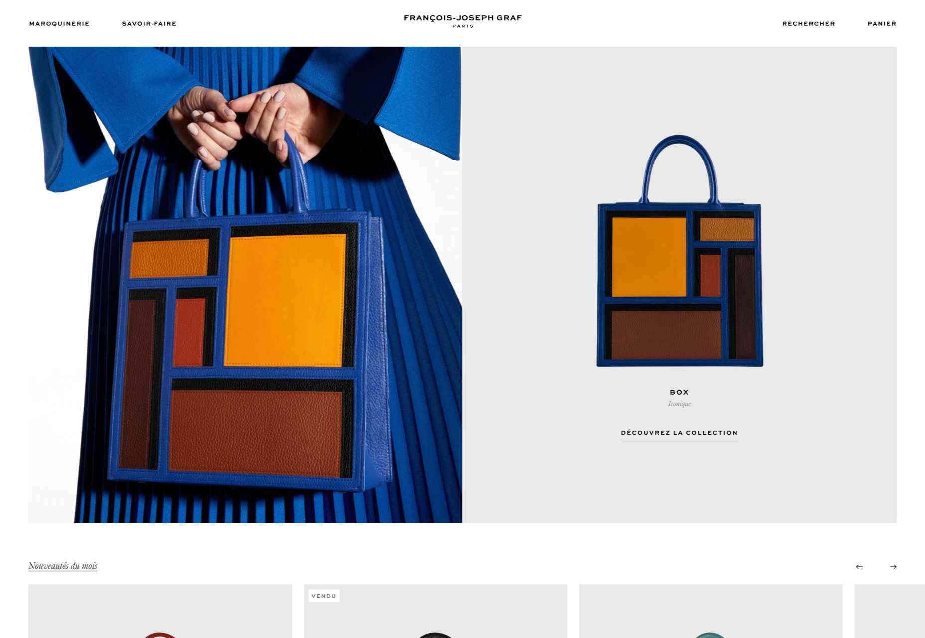
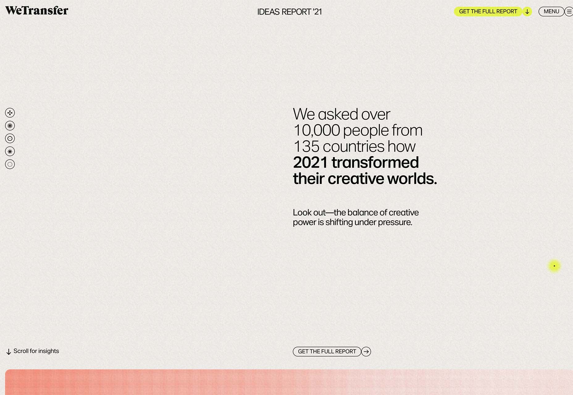
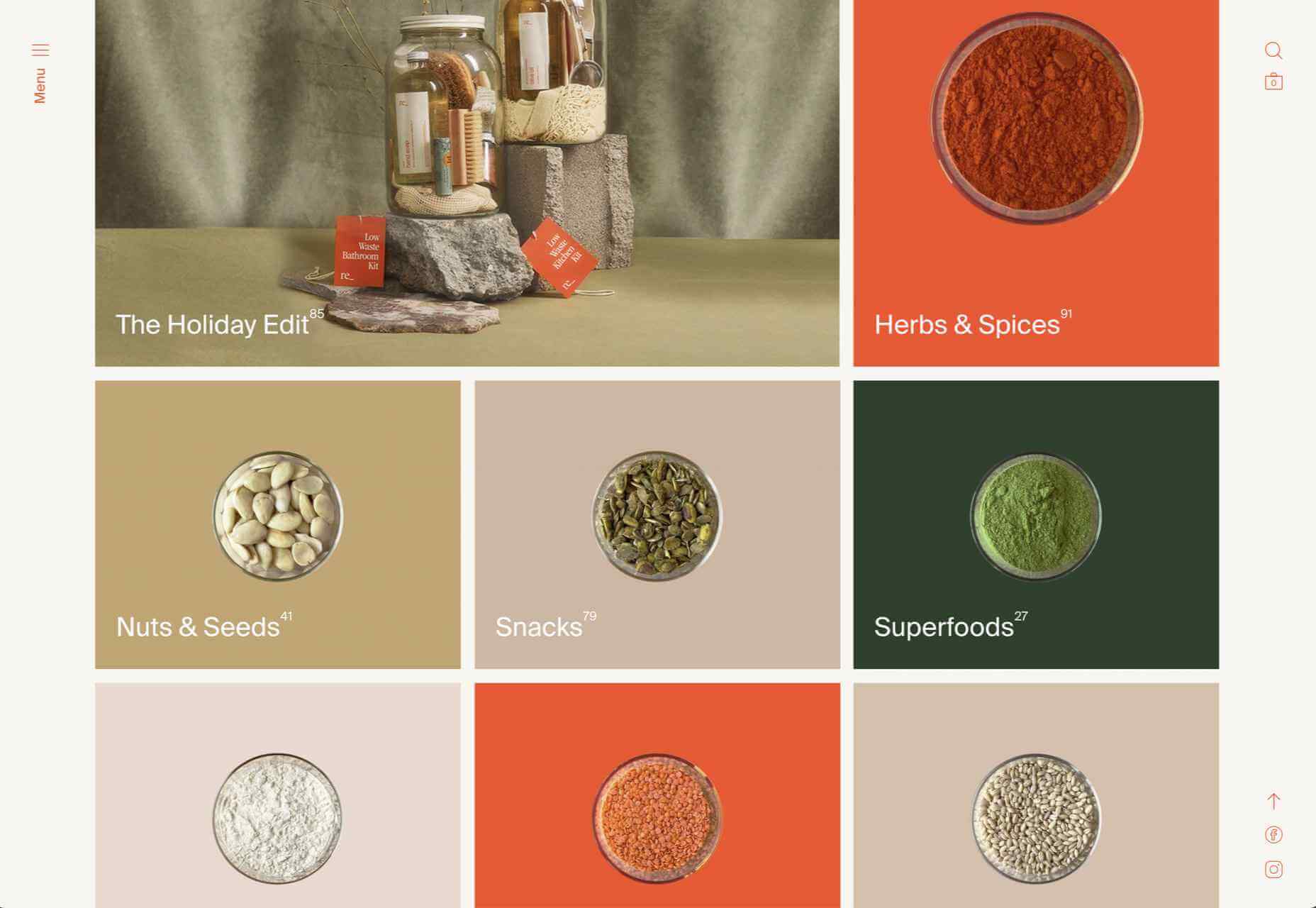
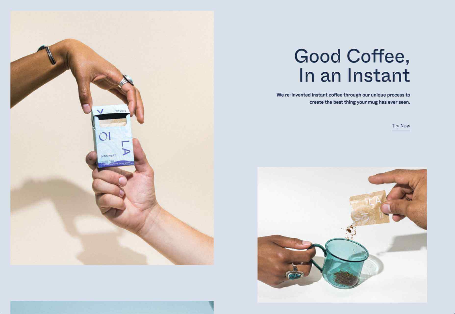
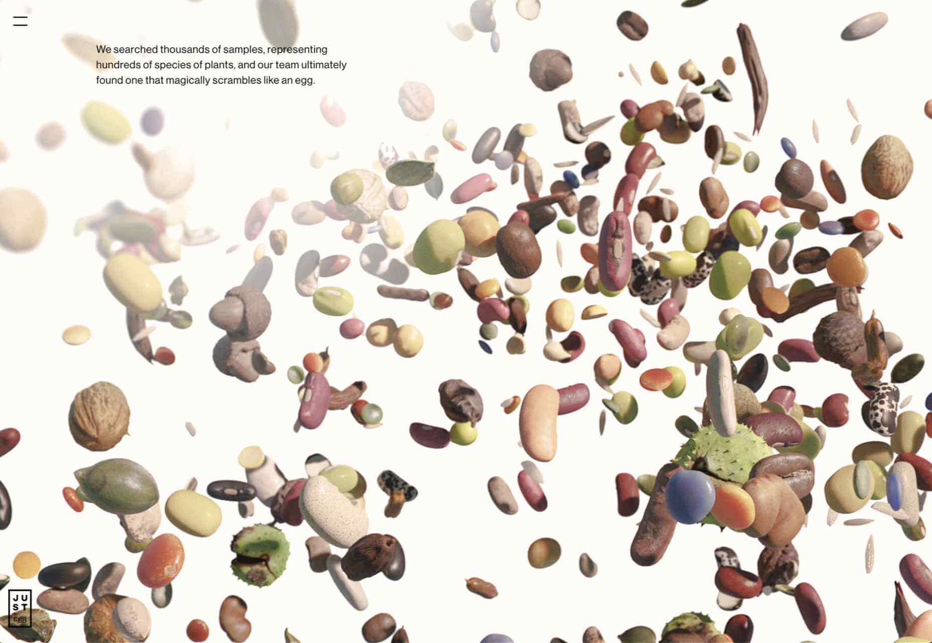
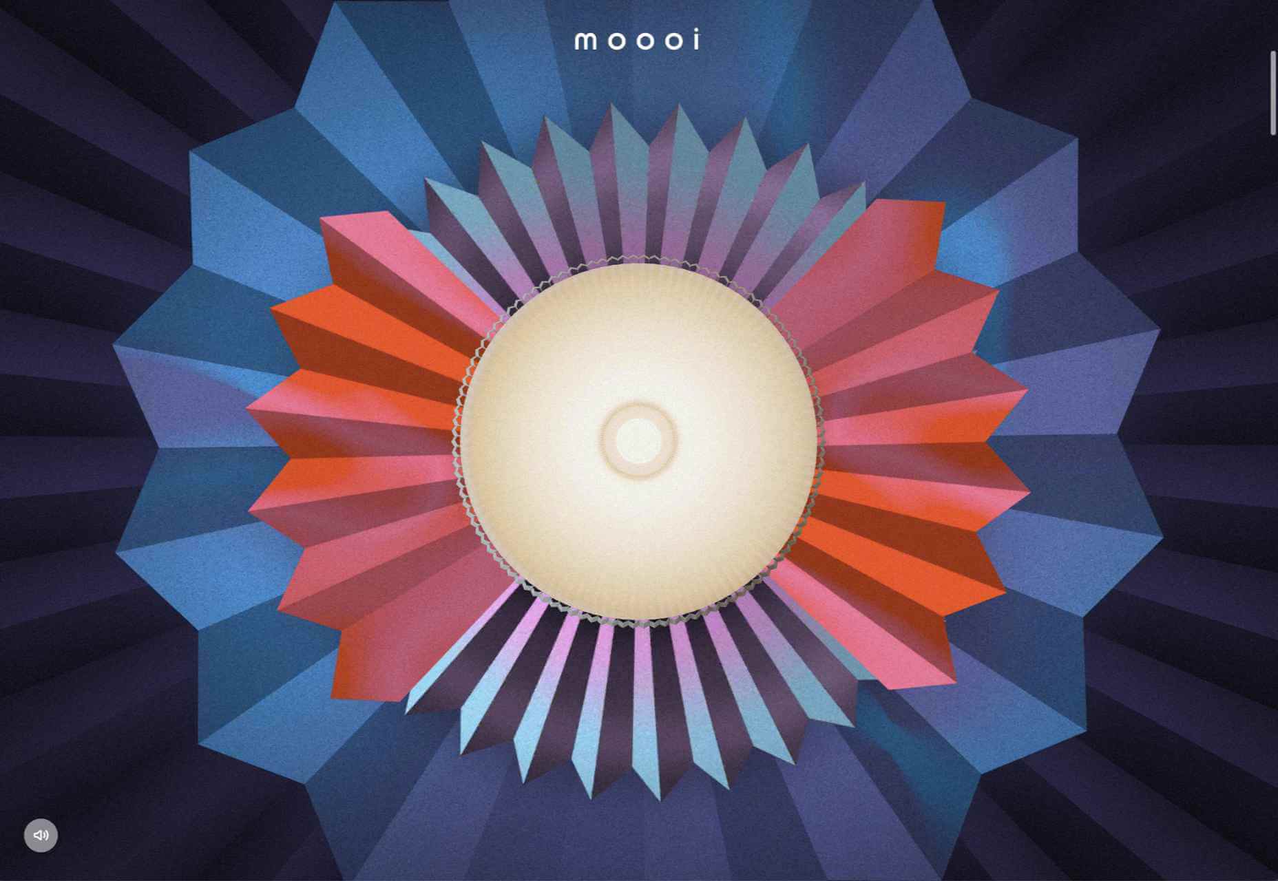
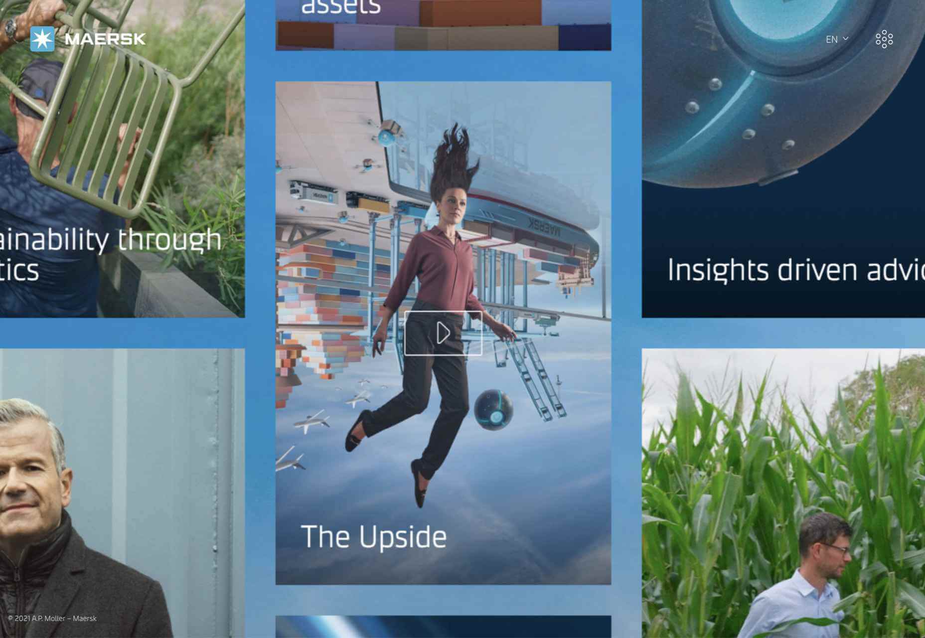
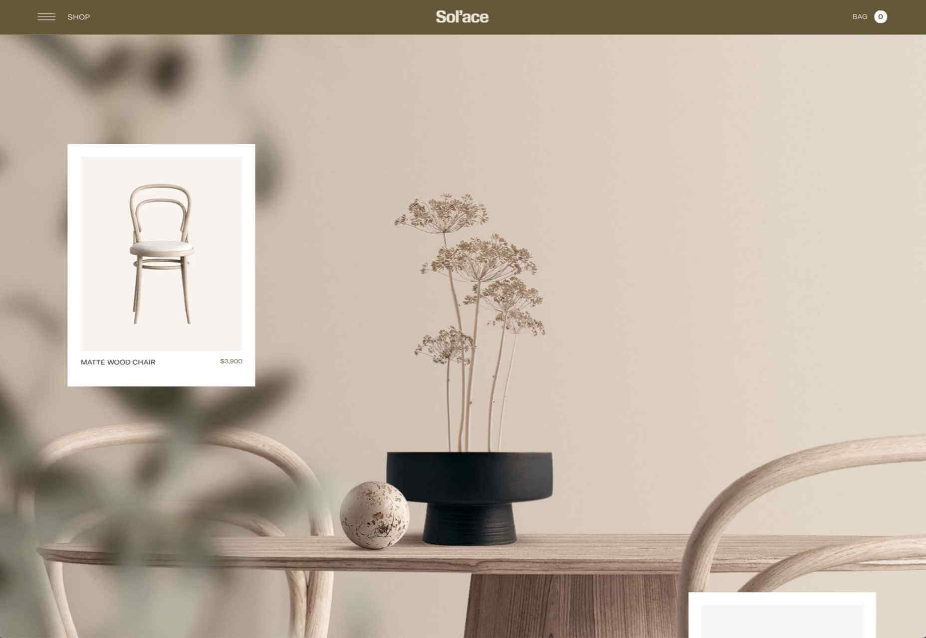
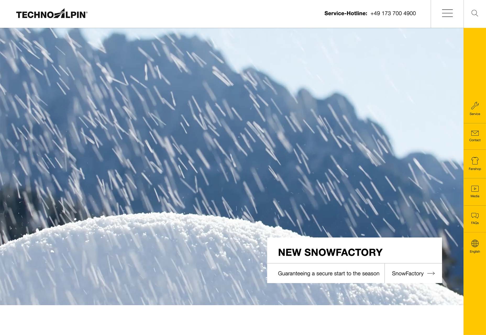
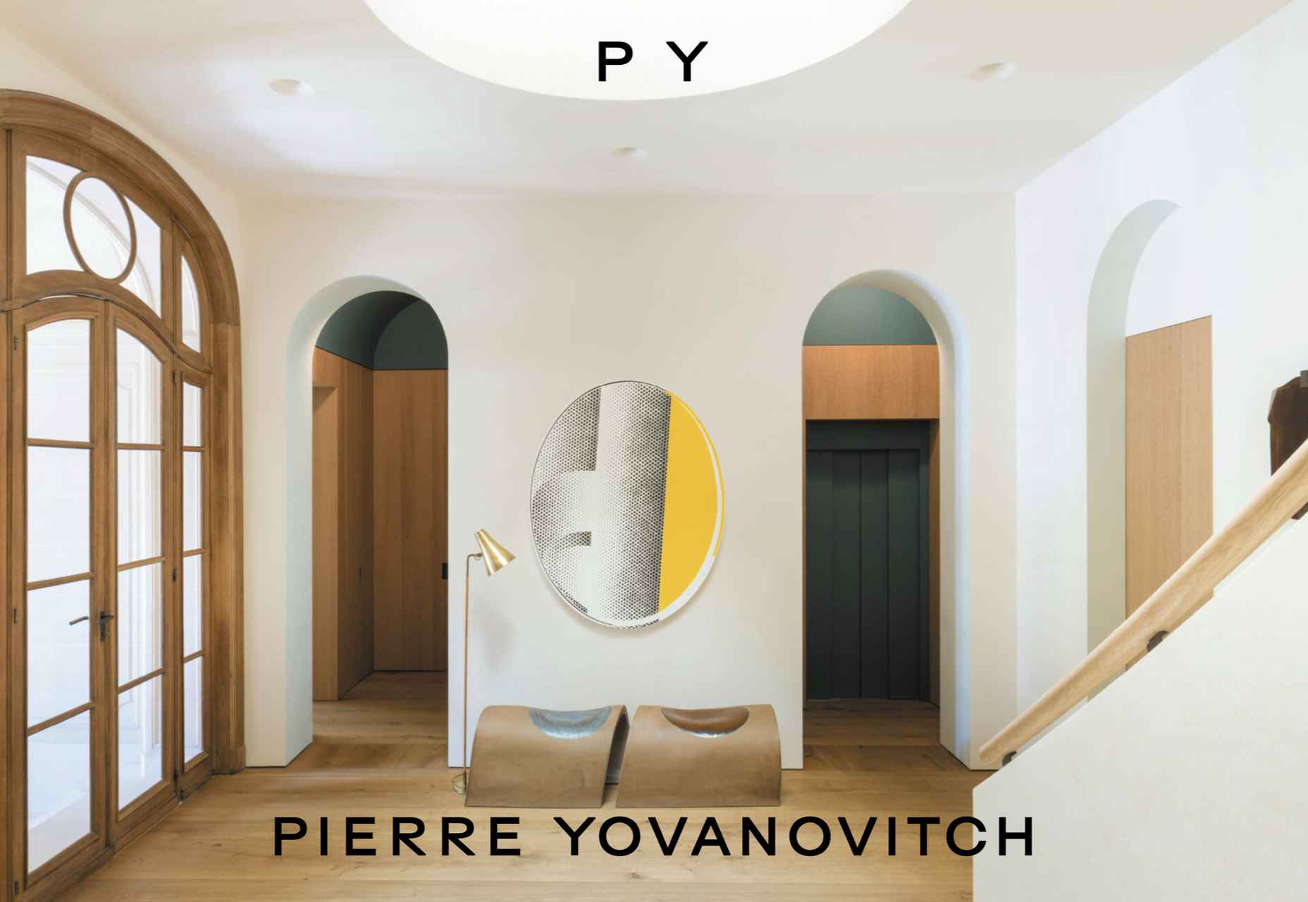
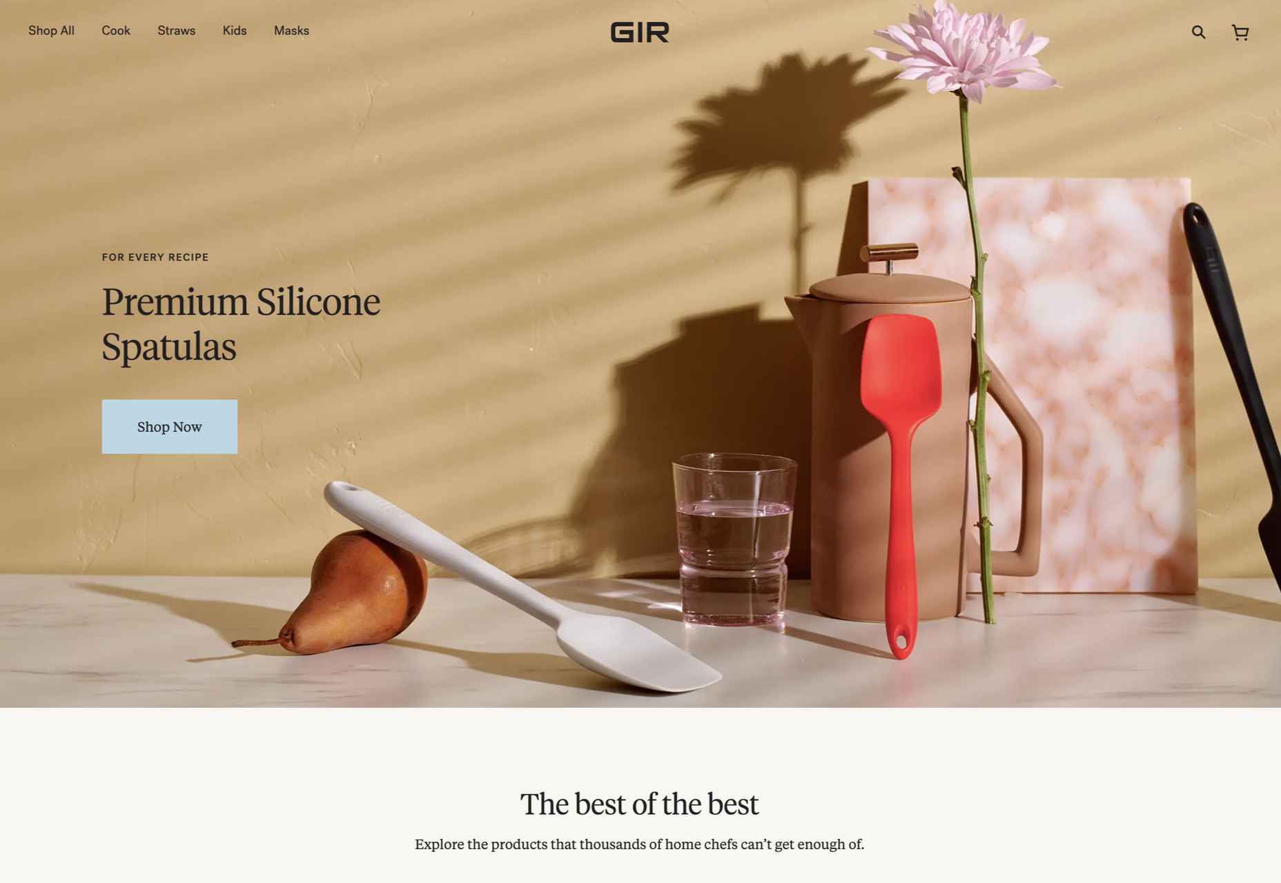
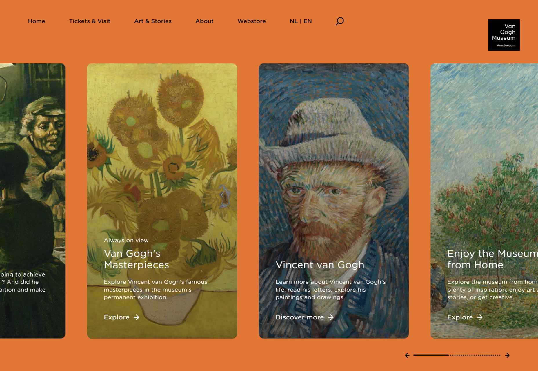
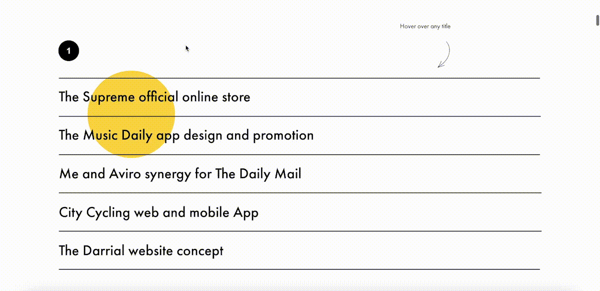
 Welcome to this month’s round up of what has caught our eye on the web. As it’s November we’re going to help chase those winter blues away with some color.

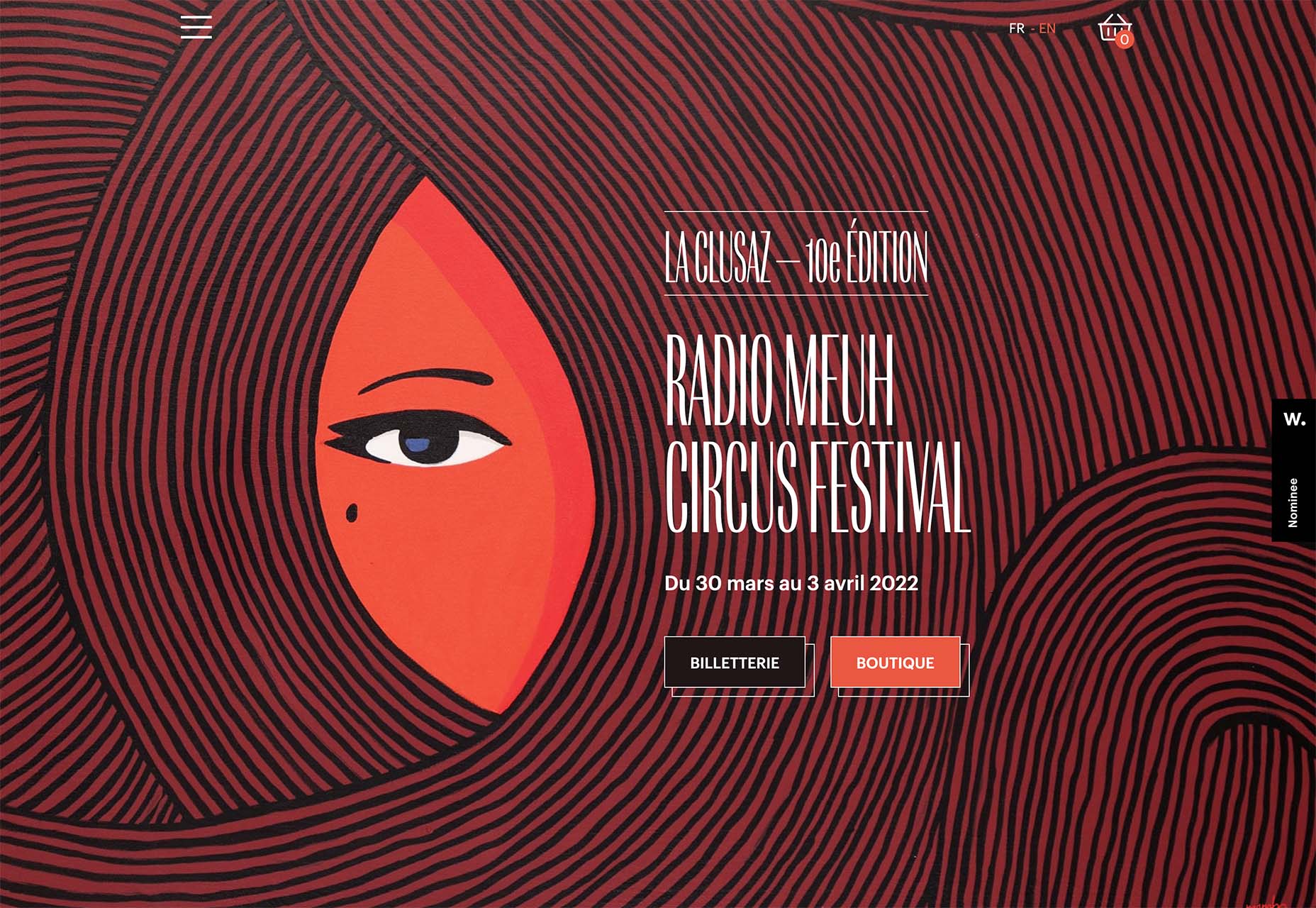
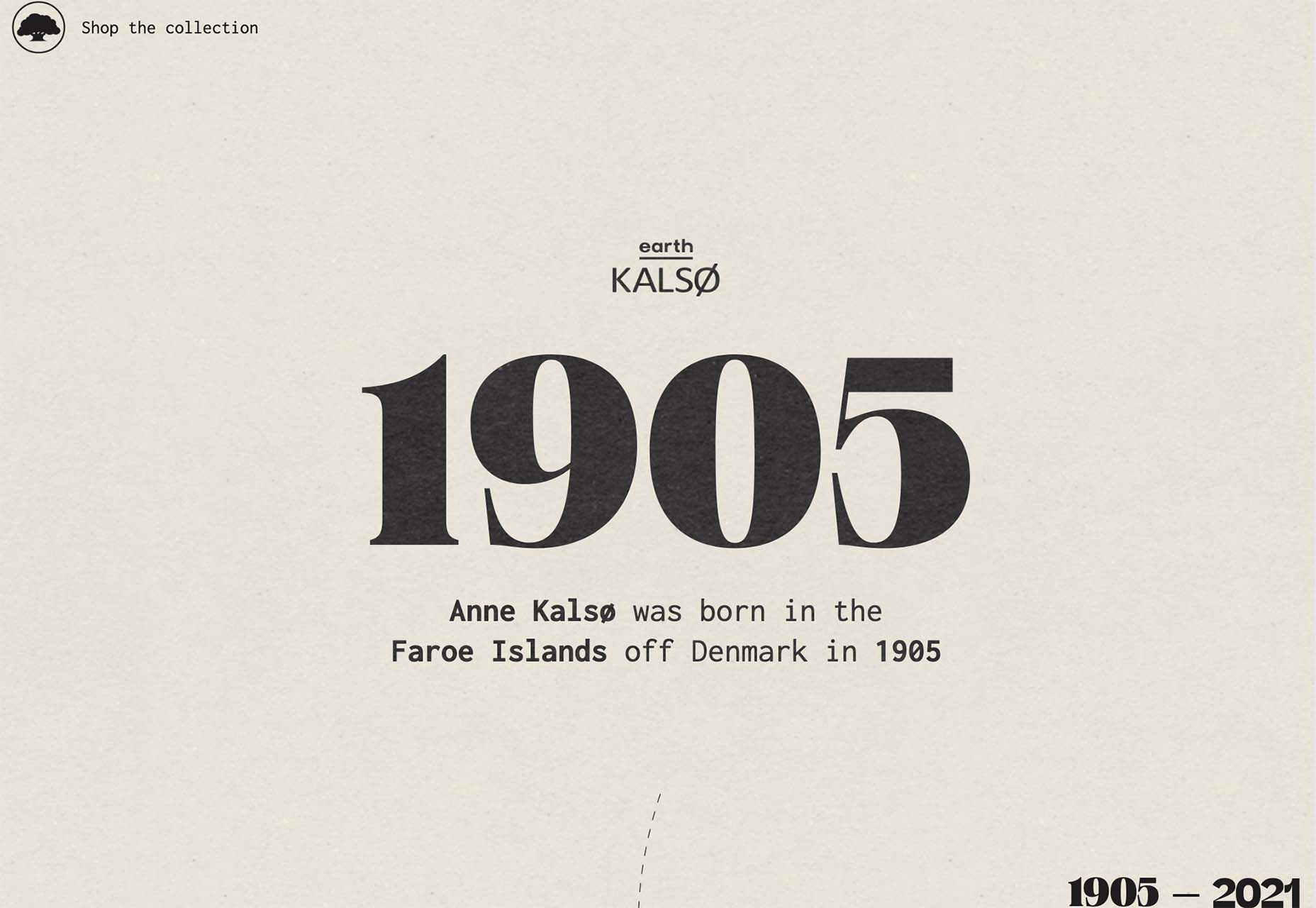
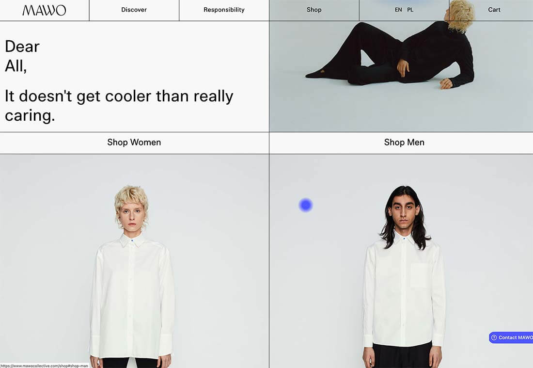
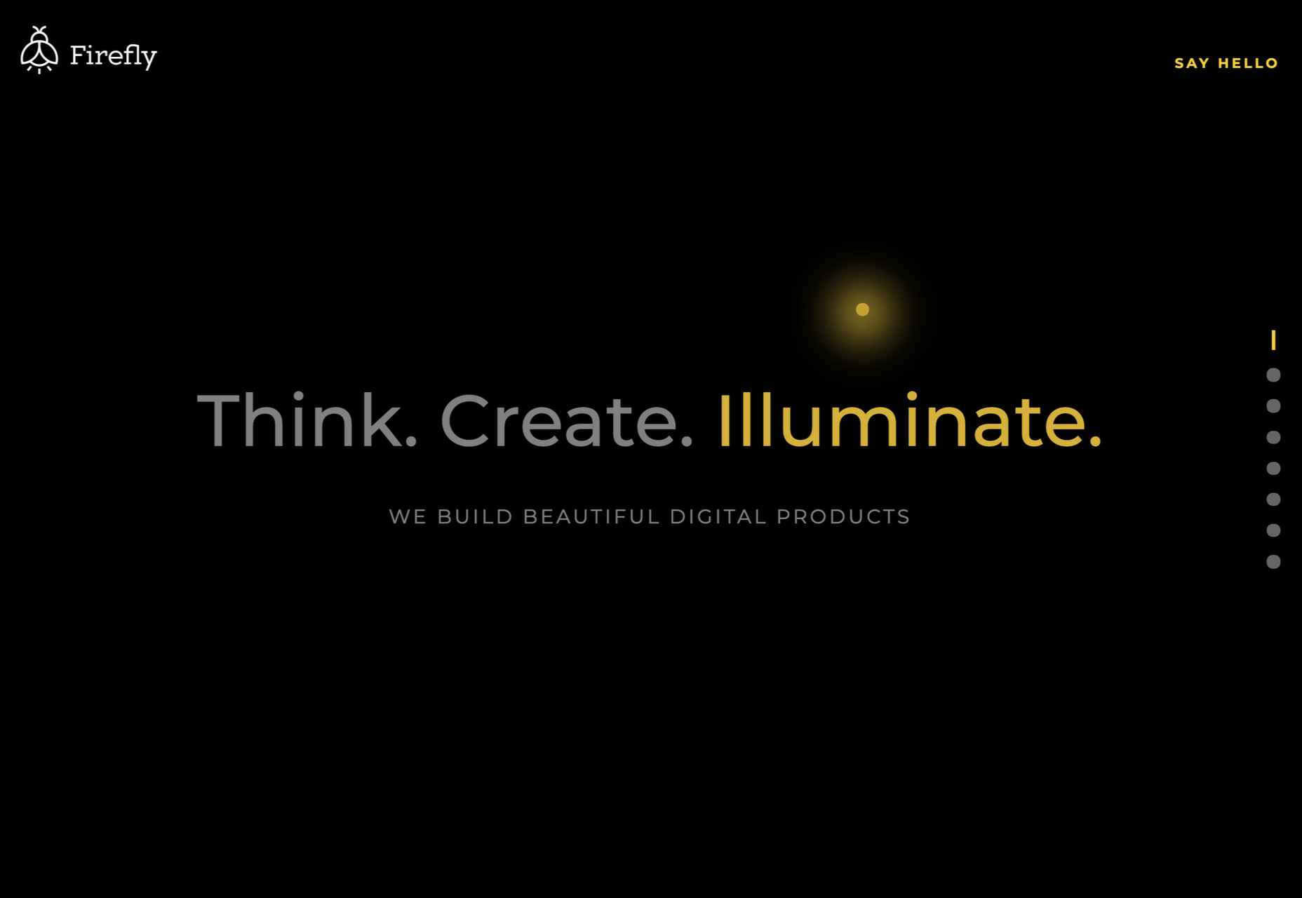
 As the year begins to wind down, there are still plenty of new and evolving website design trends going strong. Much of what you’ll see this month carries over from things we’ve been seeing all year but with fresh touches.
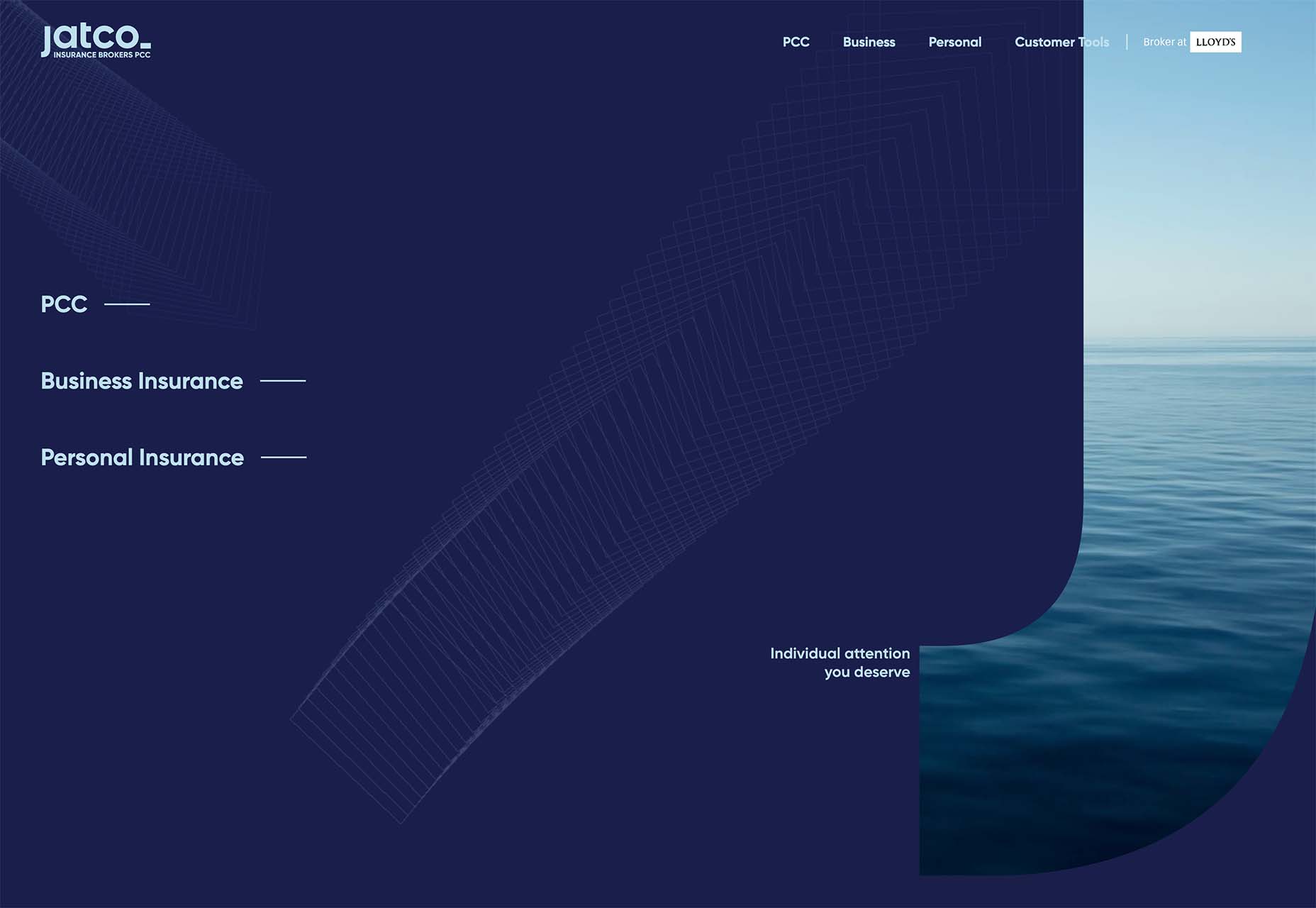
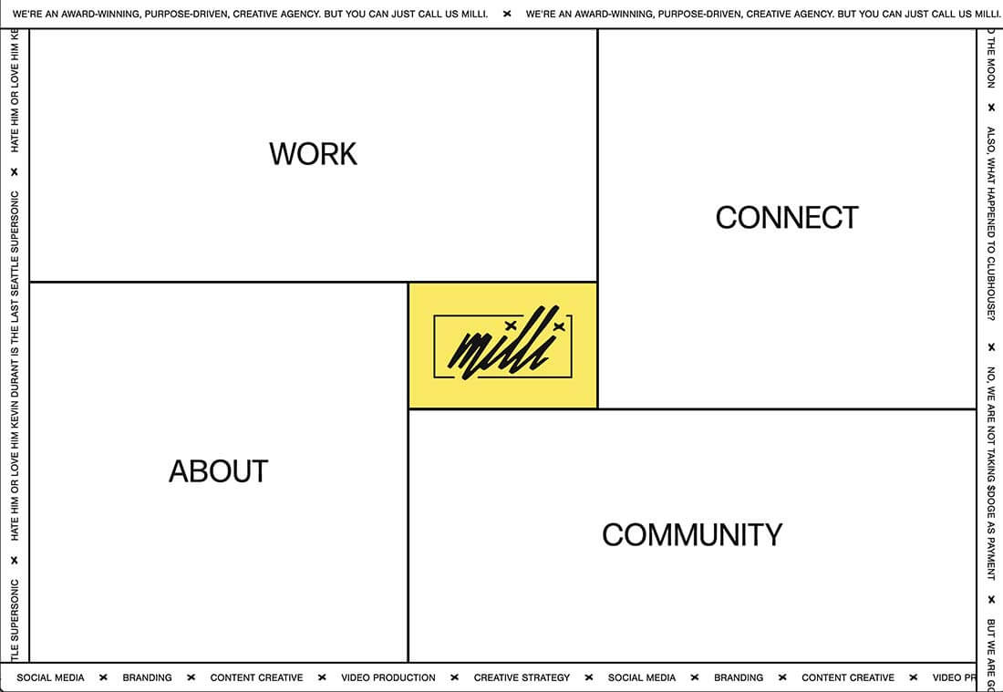

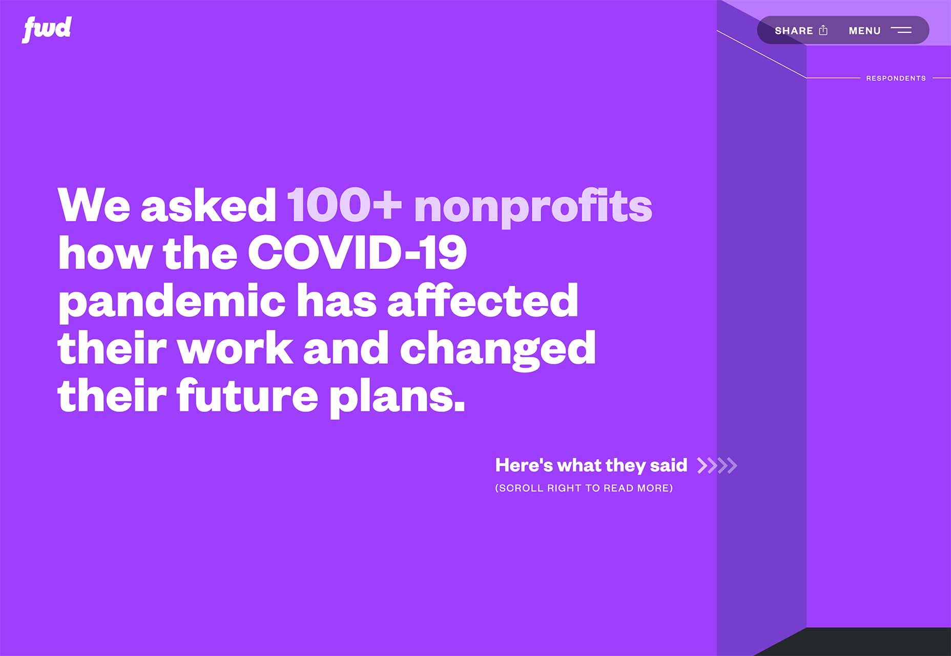
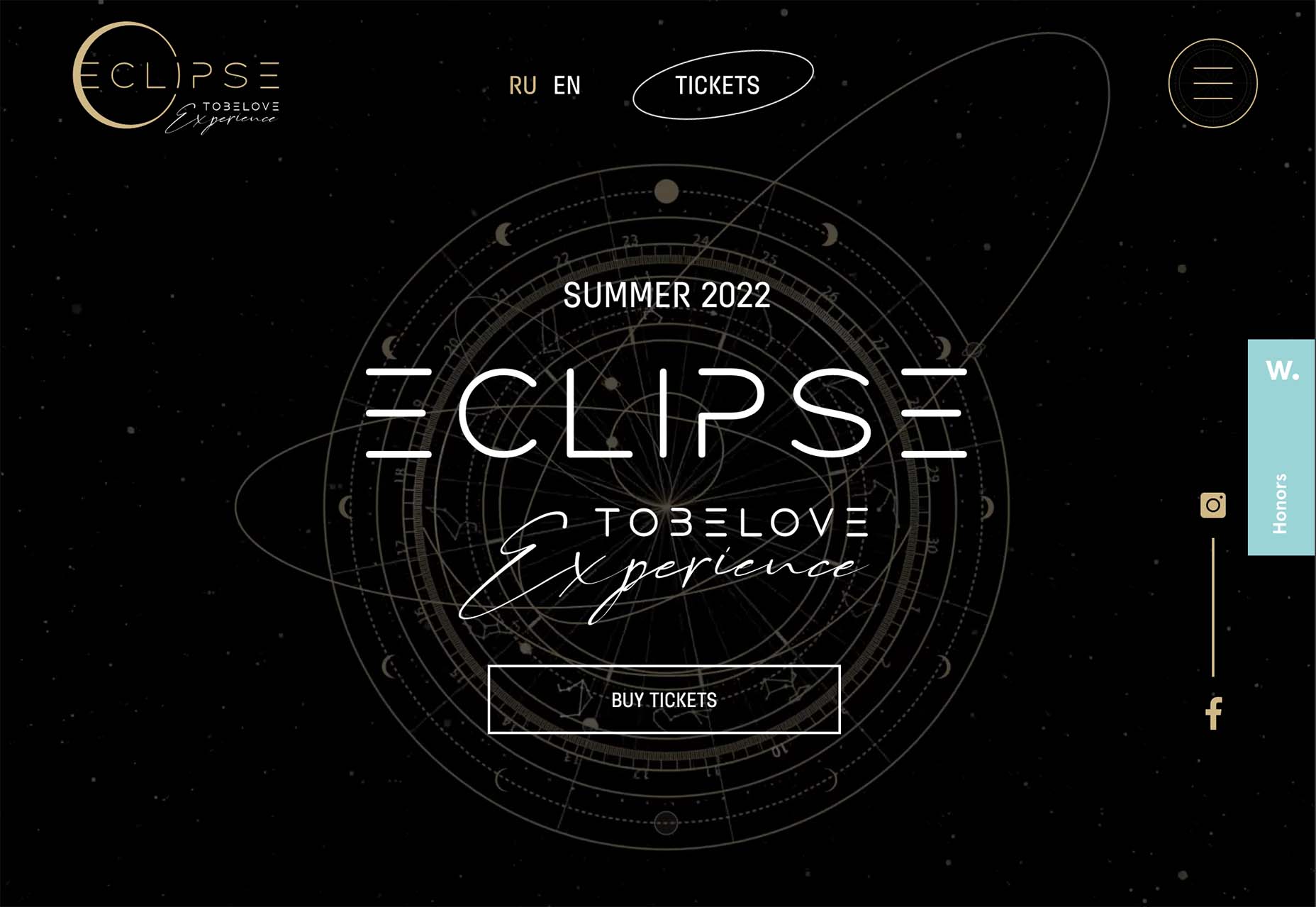
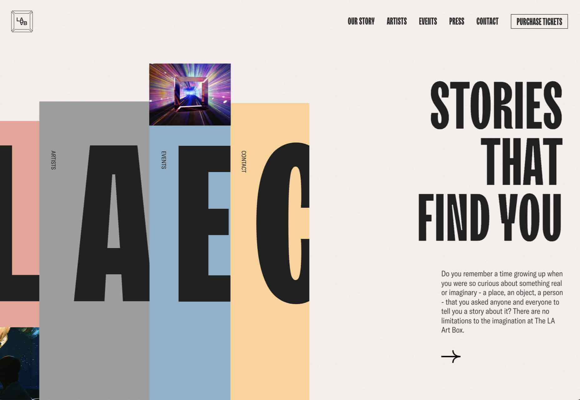
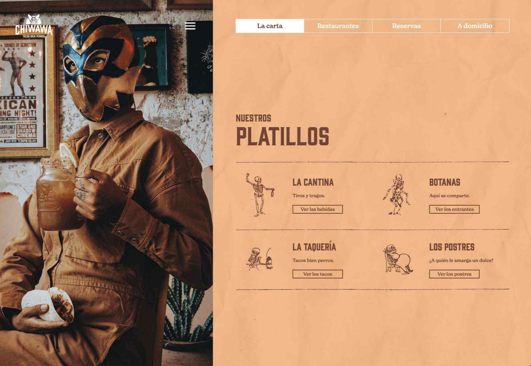
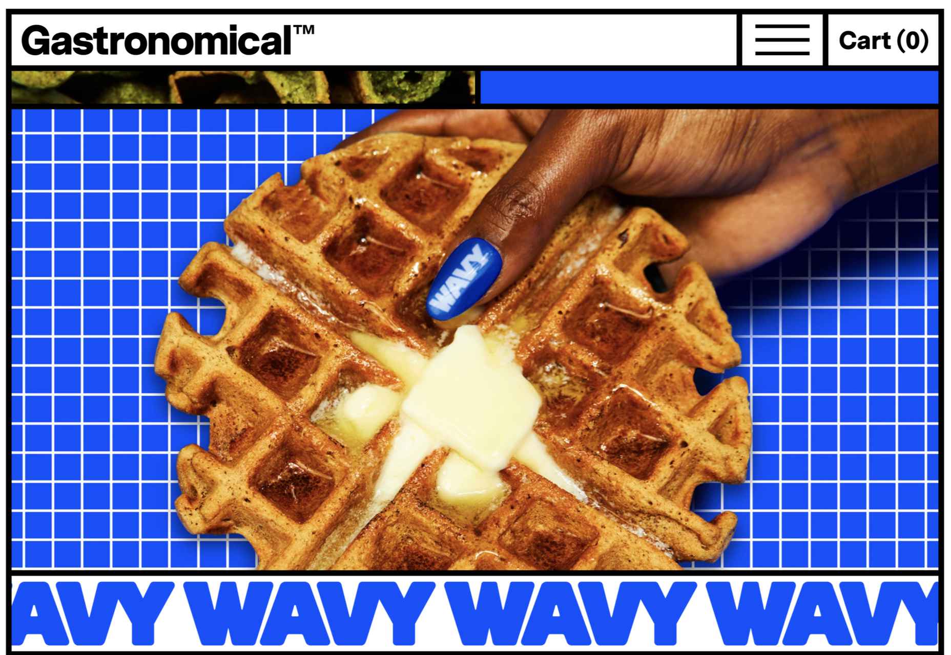
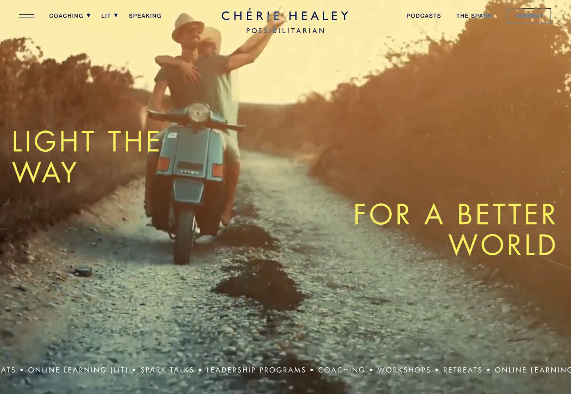
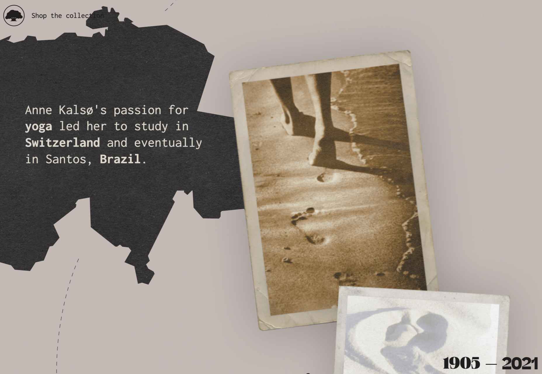
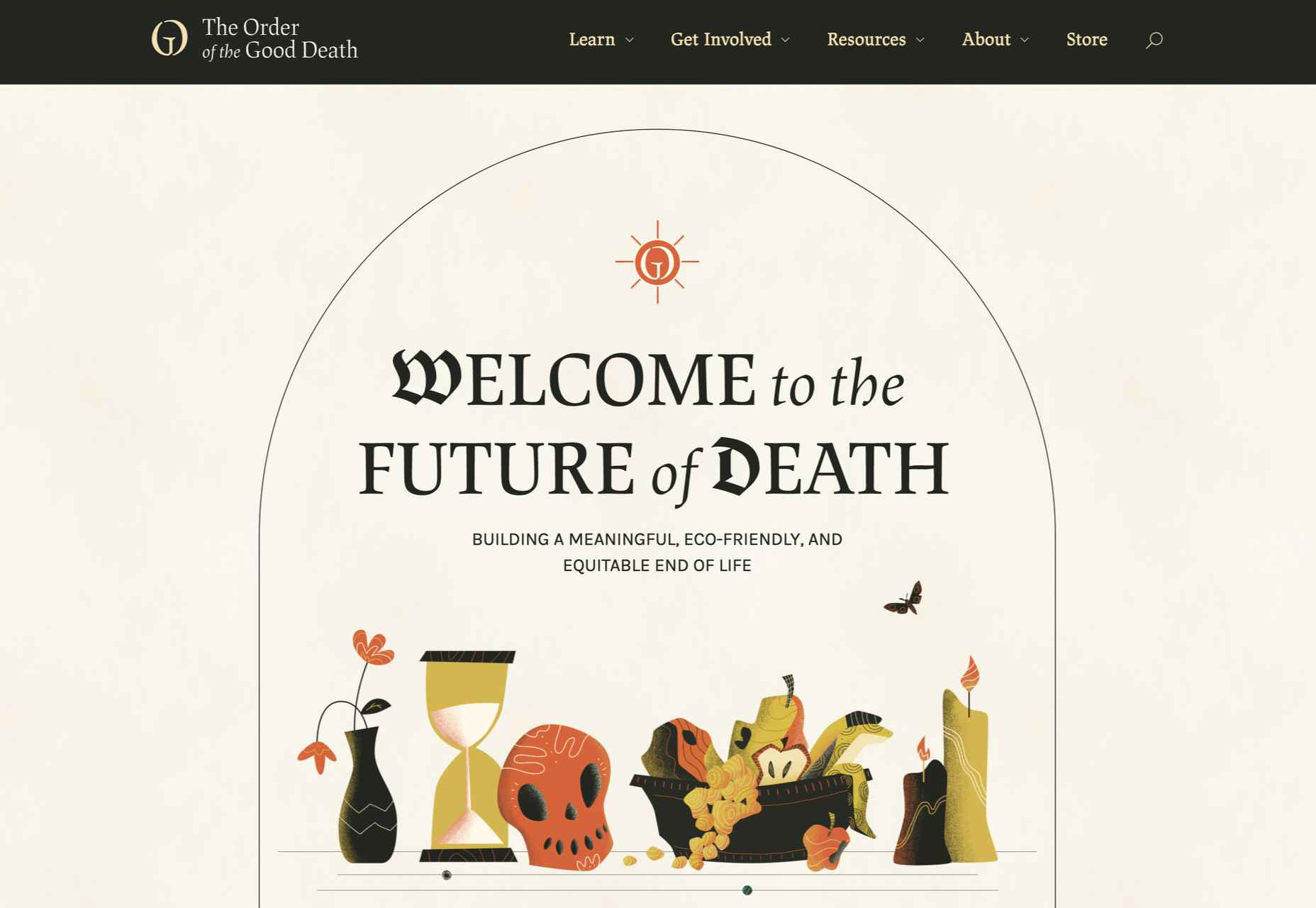
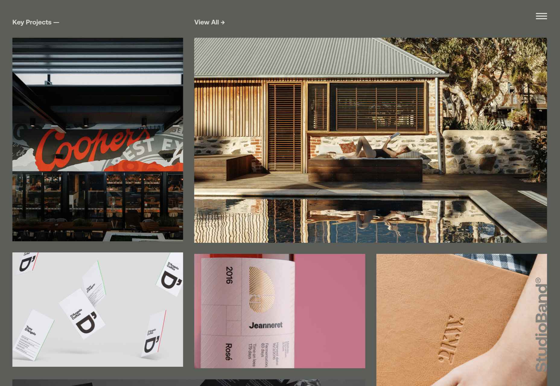
 We’re well on our way to Hallowe’en already, and it’s time for another collection of websites that have caught our eye.


