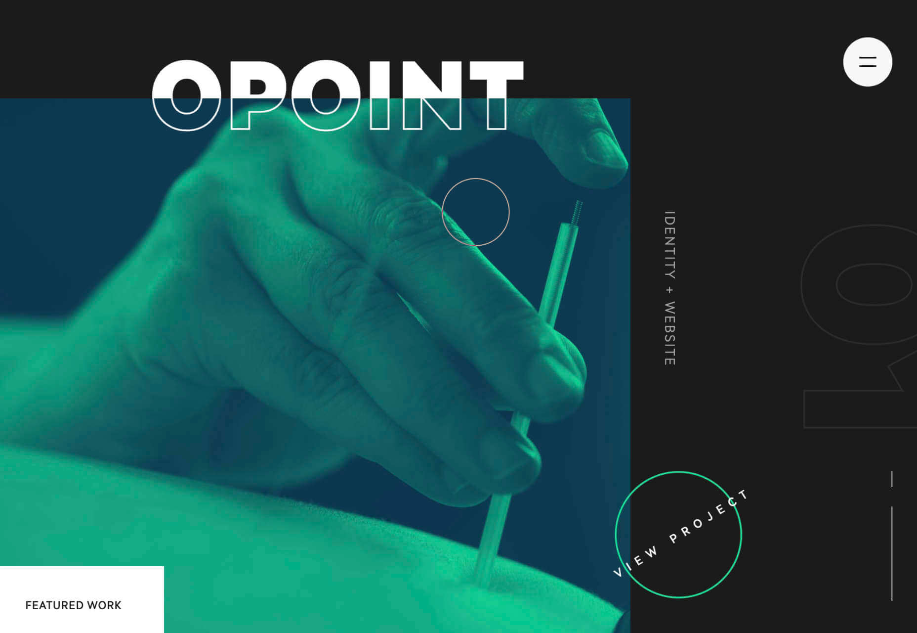
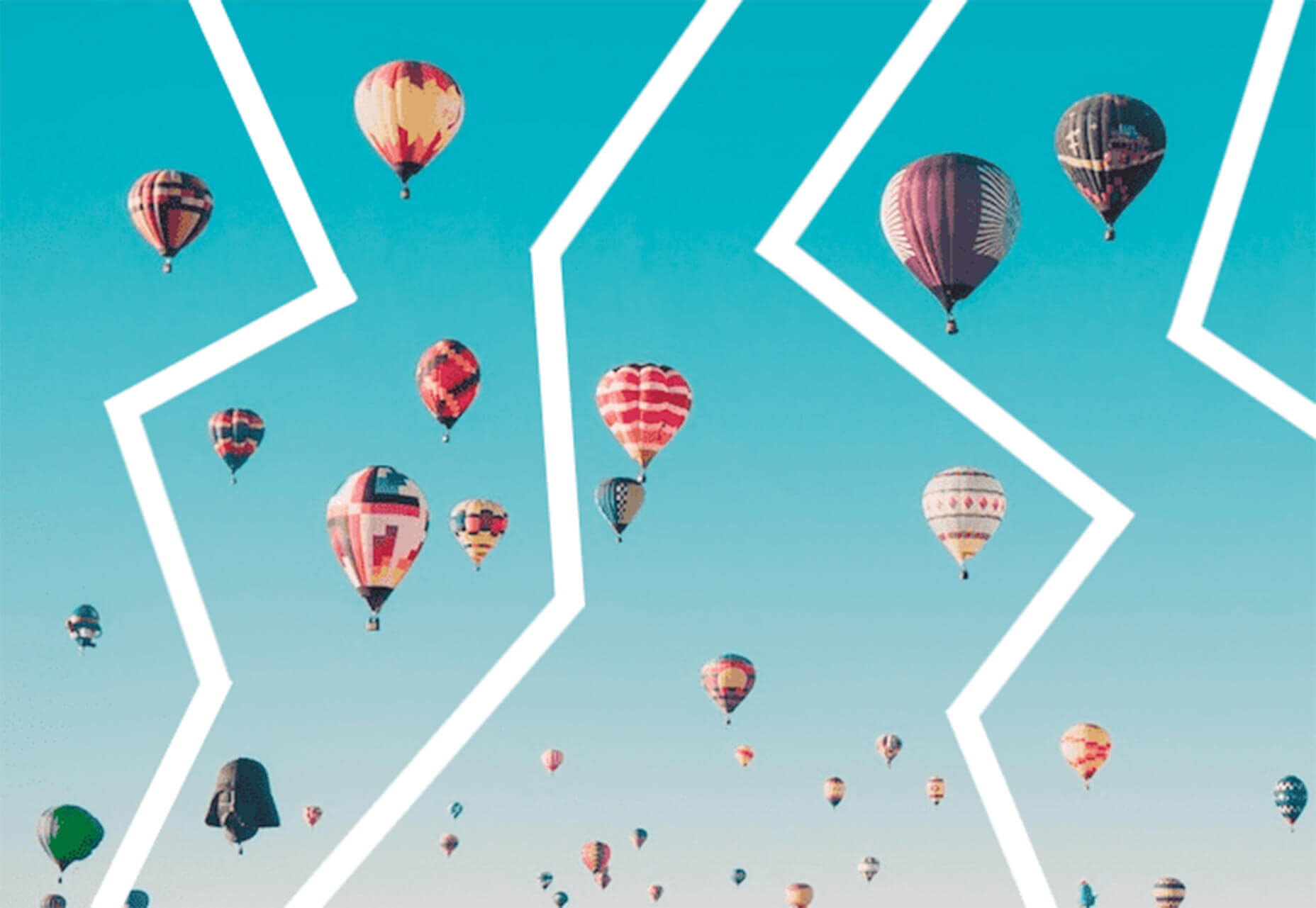
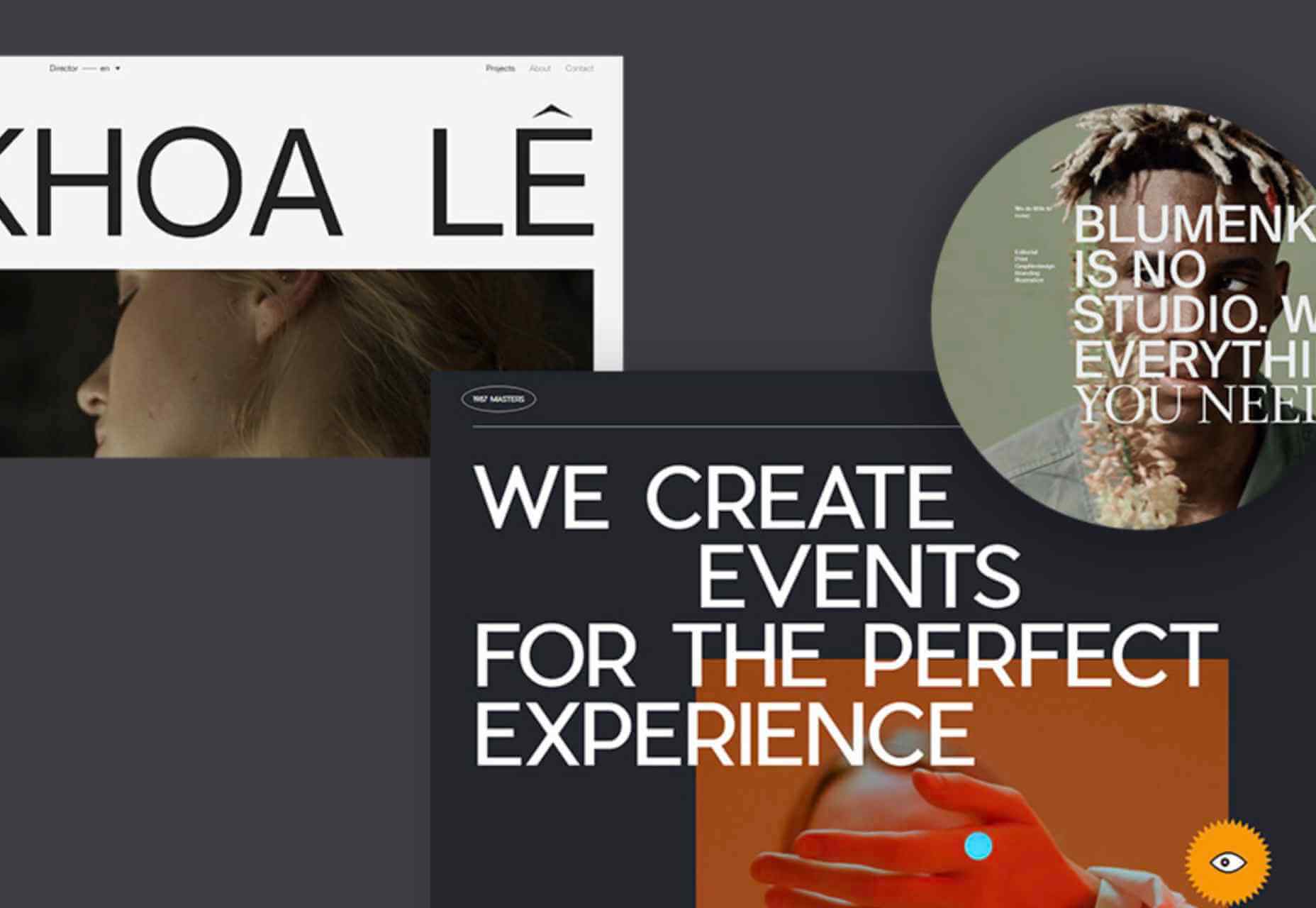
This month we have several examples of brutalism used to good effect as a foil to showcase products and/or work. By contrast, at the other end of the scale, we have brands who have chosen to go more of an immersive experience route, using full-screen images, sound, animation, and even VR.
Both are valid approaches, depending on the content. The former tends to work better as a backdrop for artwork, photography, and artisanal craft goods — acting as a virtual gallery space — while the latter is better for consumer goods and experiences, particularly food, drink, and accommodation.
There is, of course, a whole range in between these extremes, and we’ve got that covered too. Enjoy!
Grainne Morton
A simple layout, soft pastel colors, and clear navigation provide an excellent backdrop for Grainne Morton’s handmade jewelry creations.
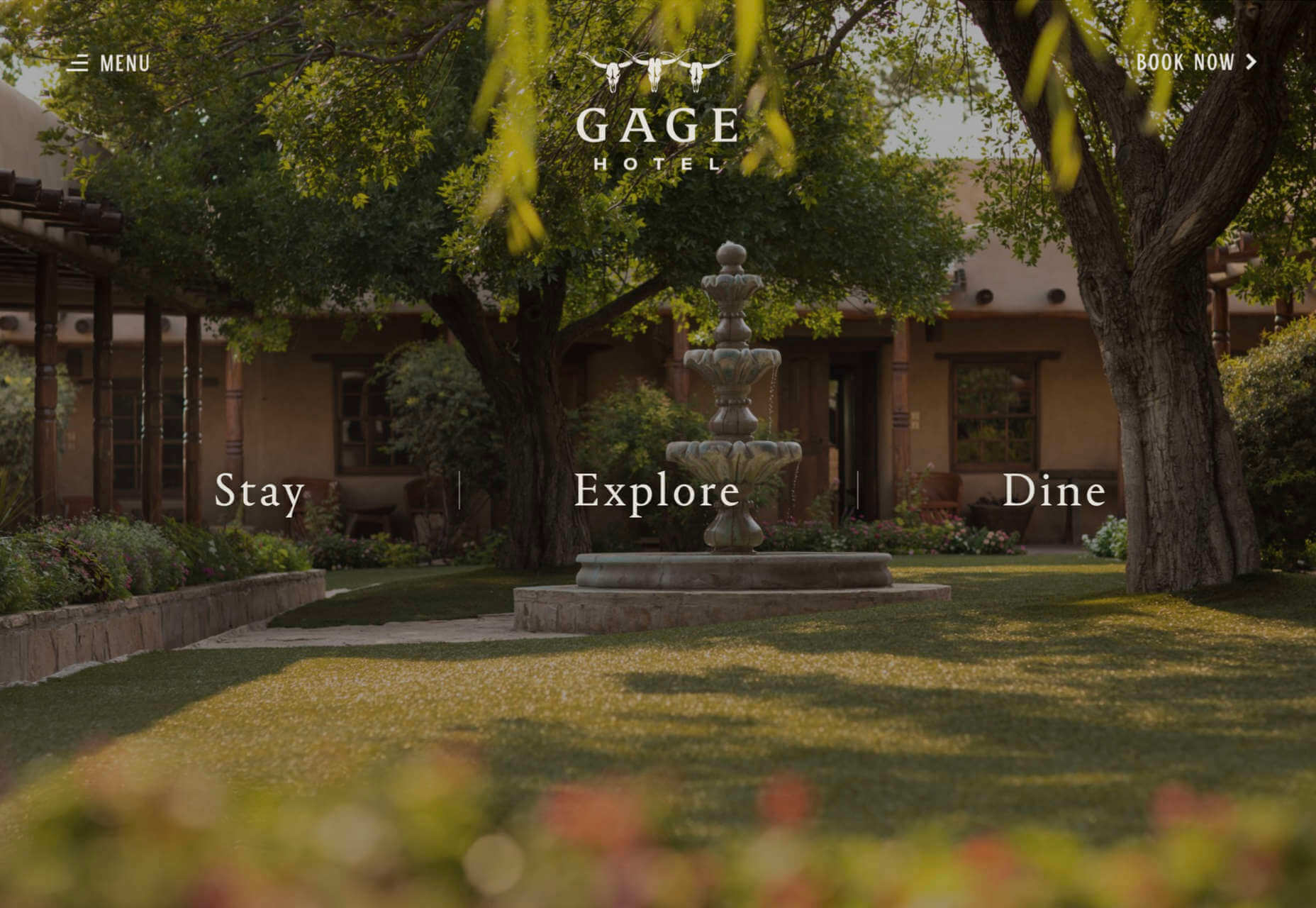
Gage Hotel
Good photography and a heritage-inspired color scheme give the Gage Hotel’s site a luxury feel.
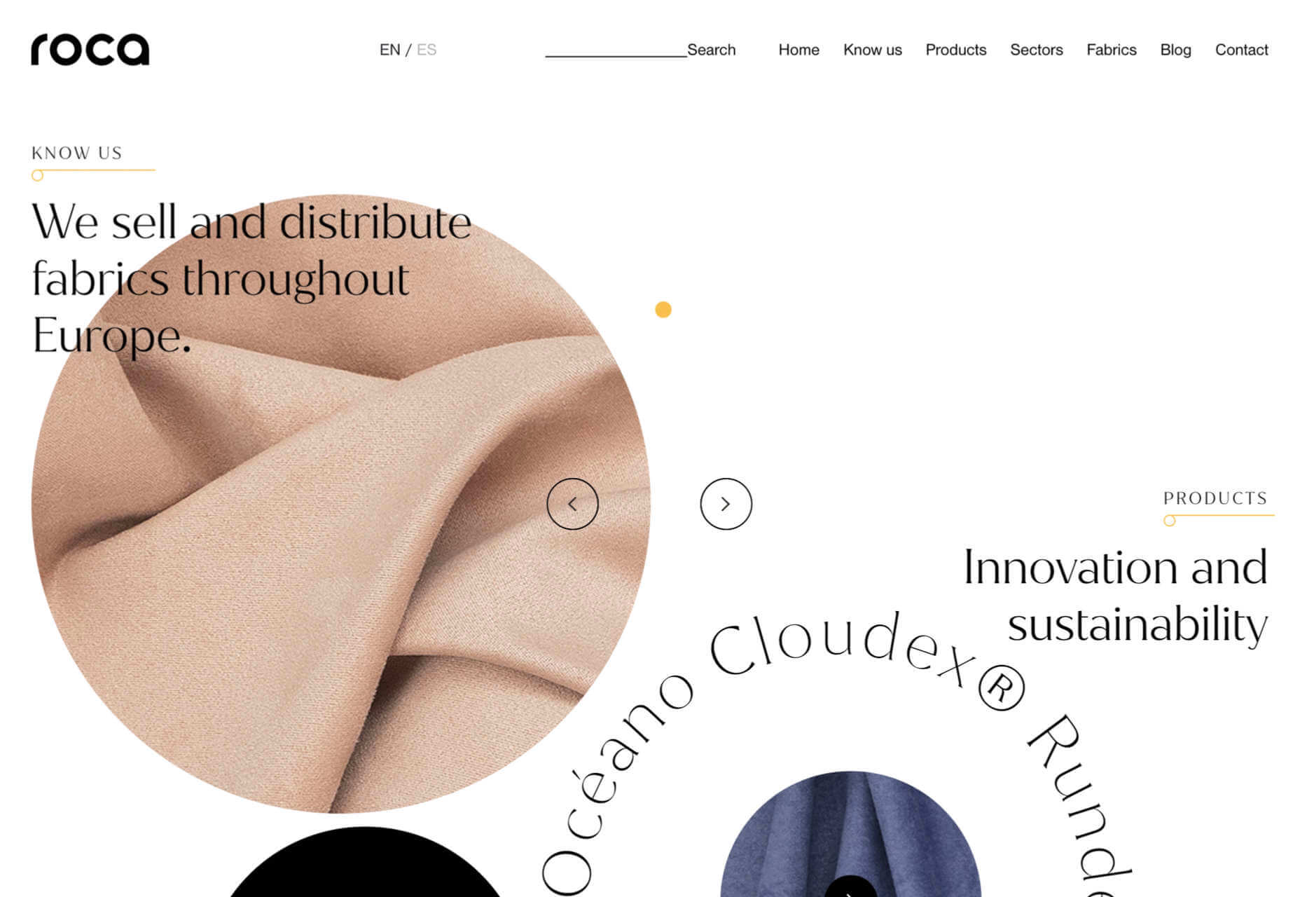
Tejidos Roca
Tejidos Roca is a fabric manufacturer, and the design of their site uses a circle motif to bring rolls of fabric to mind.
La Passation Synerghetic 2021
Synerghetic is part of the Junior Enterprises Europe scheme – a network of businesses run by students. This year they are not holding the usual handover ceremony, so Synerghetic created this rather fun little digital celebration instead.
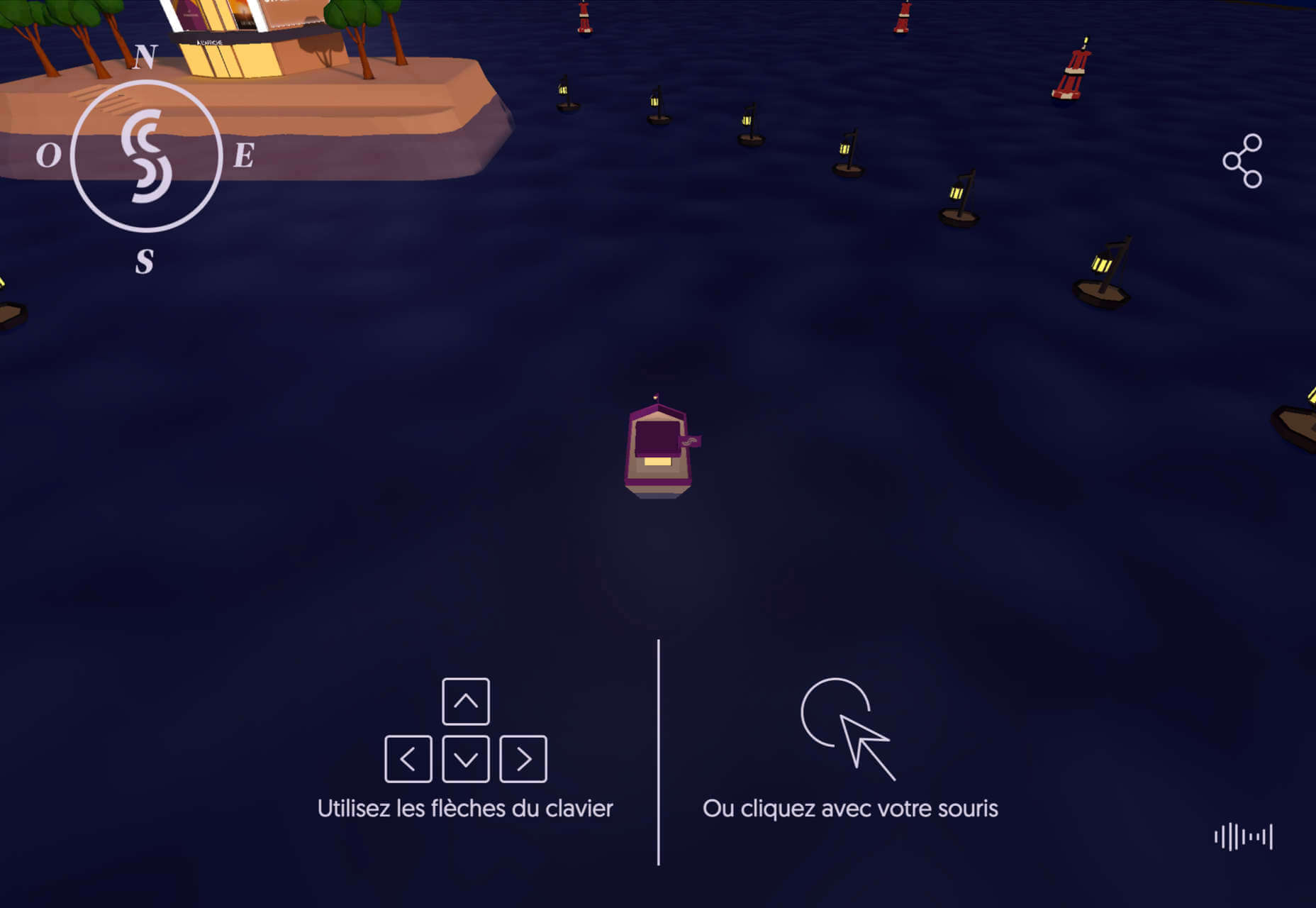
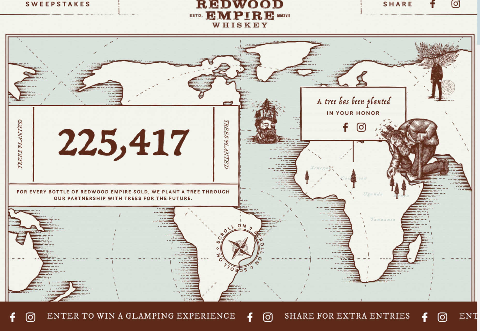
Redwood Empire
For Earth Month, Redwood Empire Whiskey has created a microsite promoting a competition styled to match their bottle labels.
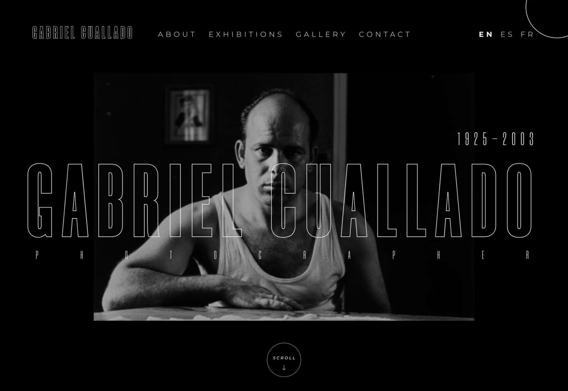
Gabriel Cuallado
This site focusing on Spanish photographer Gabriel Cullado’s life and work features some great transitions and good use of horizontal scrolling.
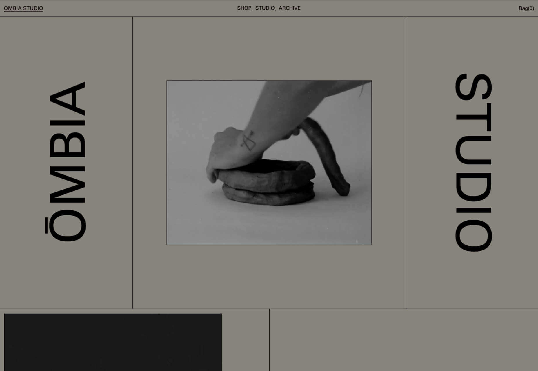
Ombia Studio
In Ombia Studio’s site, atmospheric photographs stand out in a minimal layout. There is a sense of almost gallery curation here.
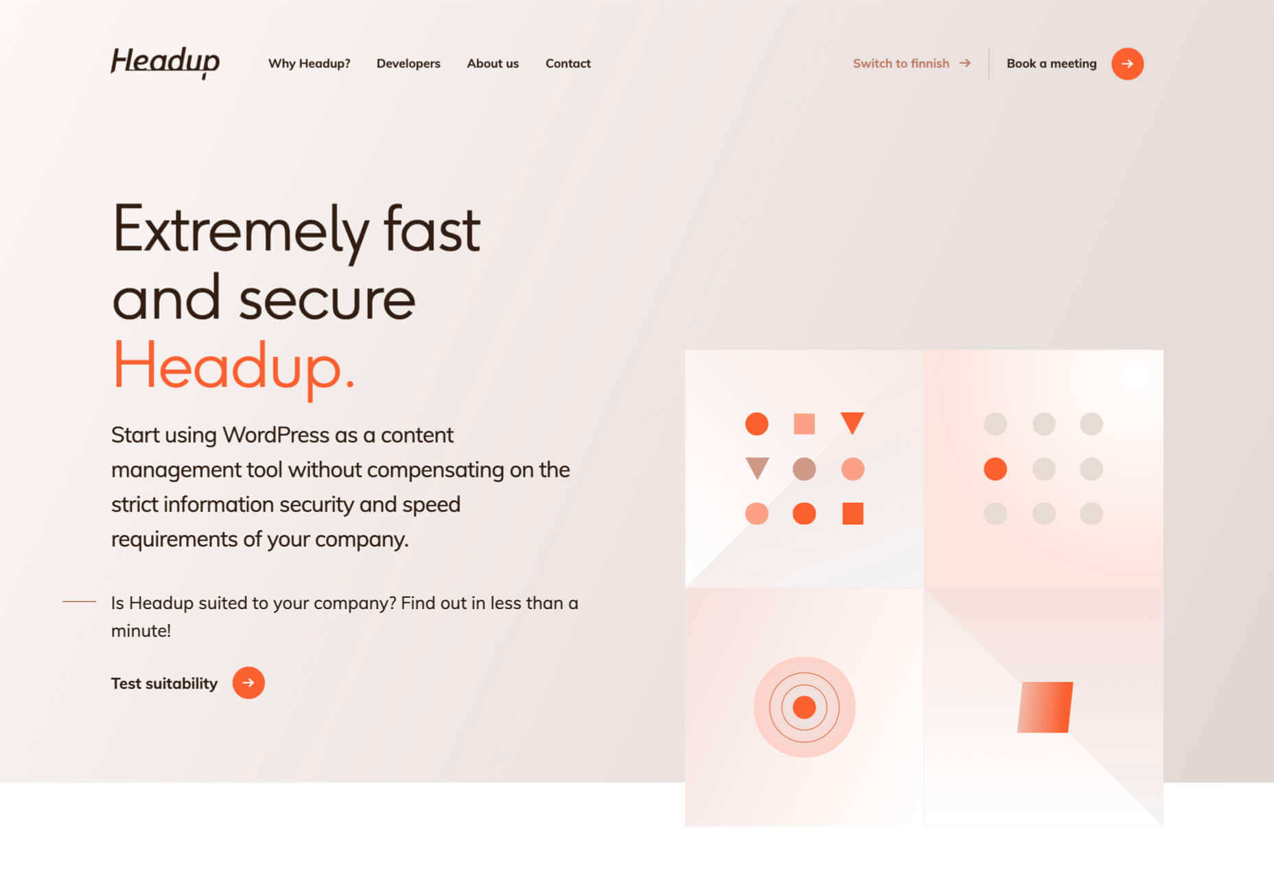
Headup
Headup uses a pleasing color scheme and geometric graphics to create a welcoming but businesslike approach.
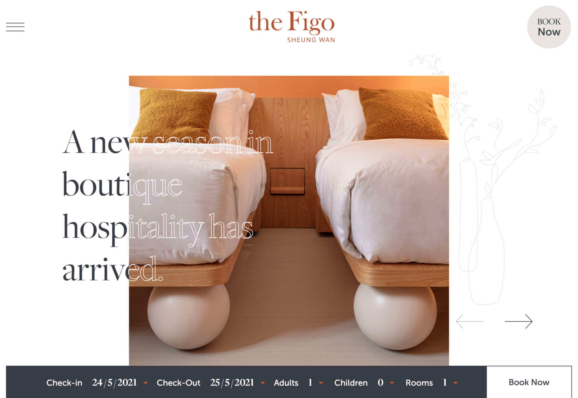
the Figo
Spherical curves and line animations create interest in this site for boutique hotel, the Figo.
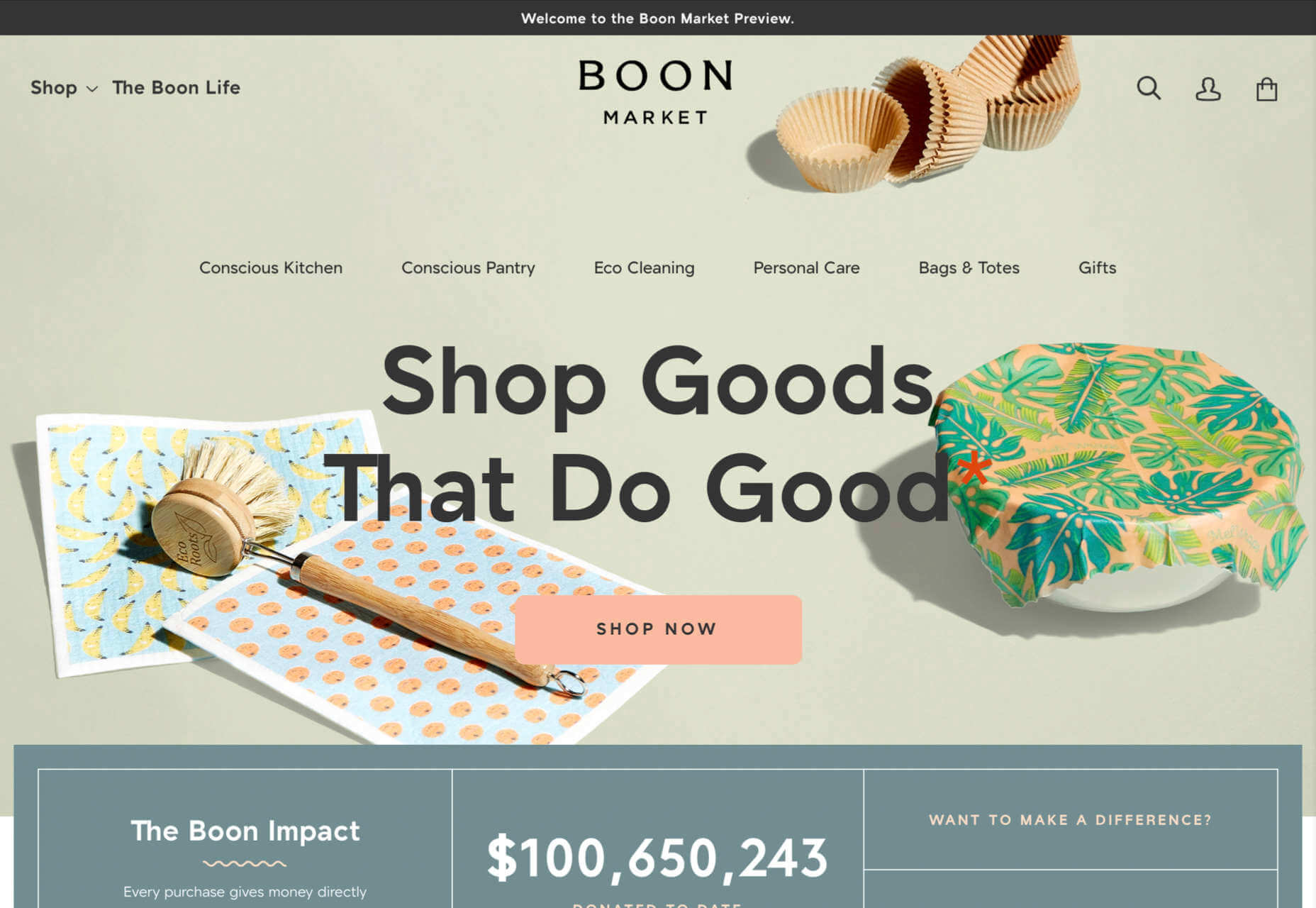
Boon Market
Boon Market is about promoting a toxin-free and waste-free lifestyle, and their site reflects this with its use of simple type and soft colors.
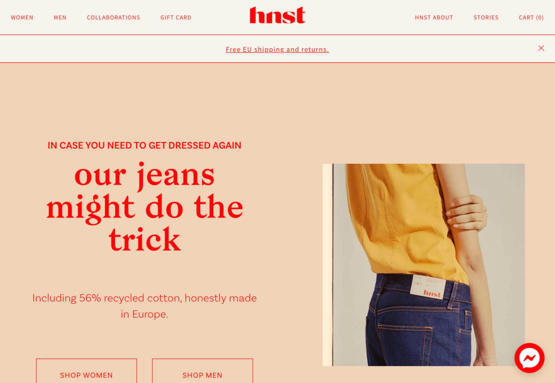
Another brutalist-inspired design here, but the use of bright red makes it fresh in hnst’s take on the style.
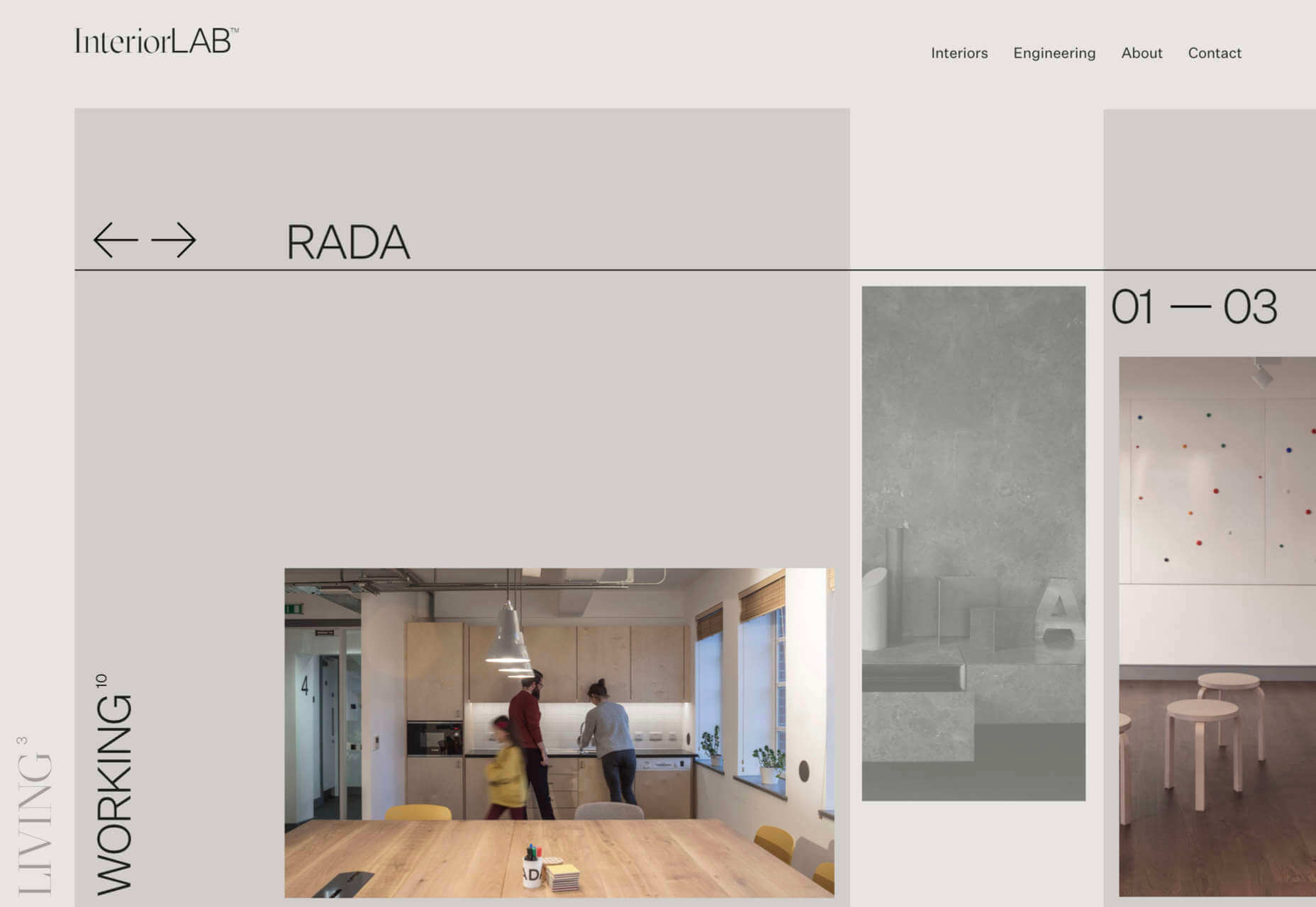
InteriorLAB
Part minimalist, part glossy magazine, InteriorLAB have succeeded in making the simple feel luxurious.
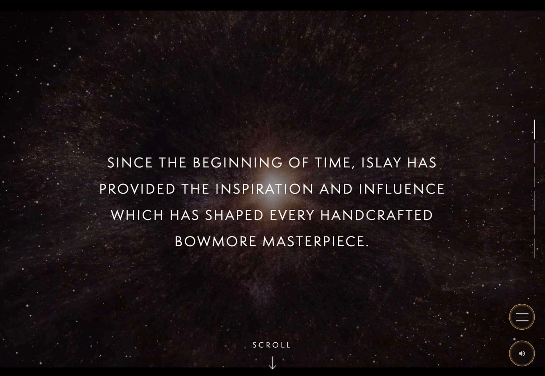
Bowmore Experience
Bowmore has opted for immersive video and visually beautiful images to present their limited-edition Timeless whisky range.
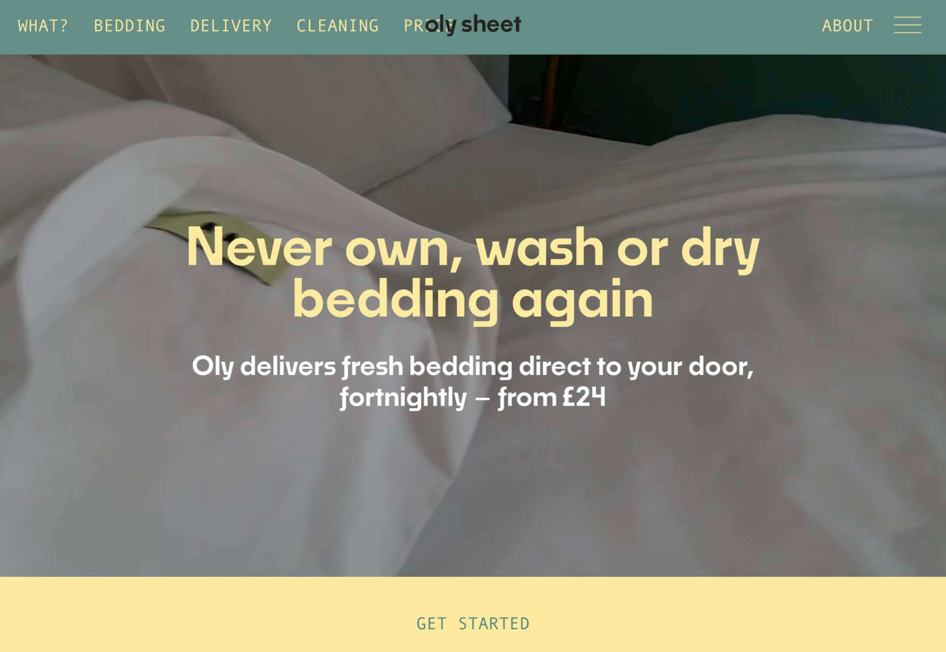
Oly Sheet
There is a slightly old-school start-up feel to Oly Sheet’s website, but it is still appealing with fresh, spring colors and well-organized content.
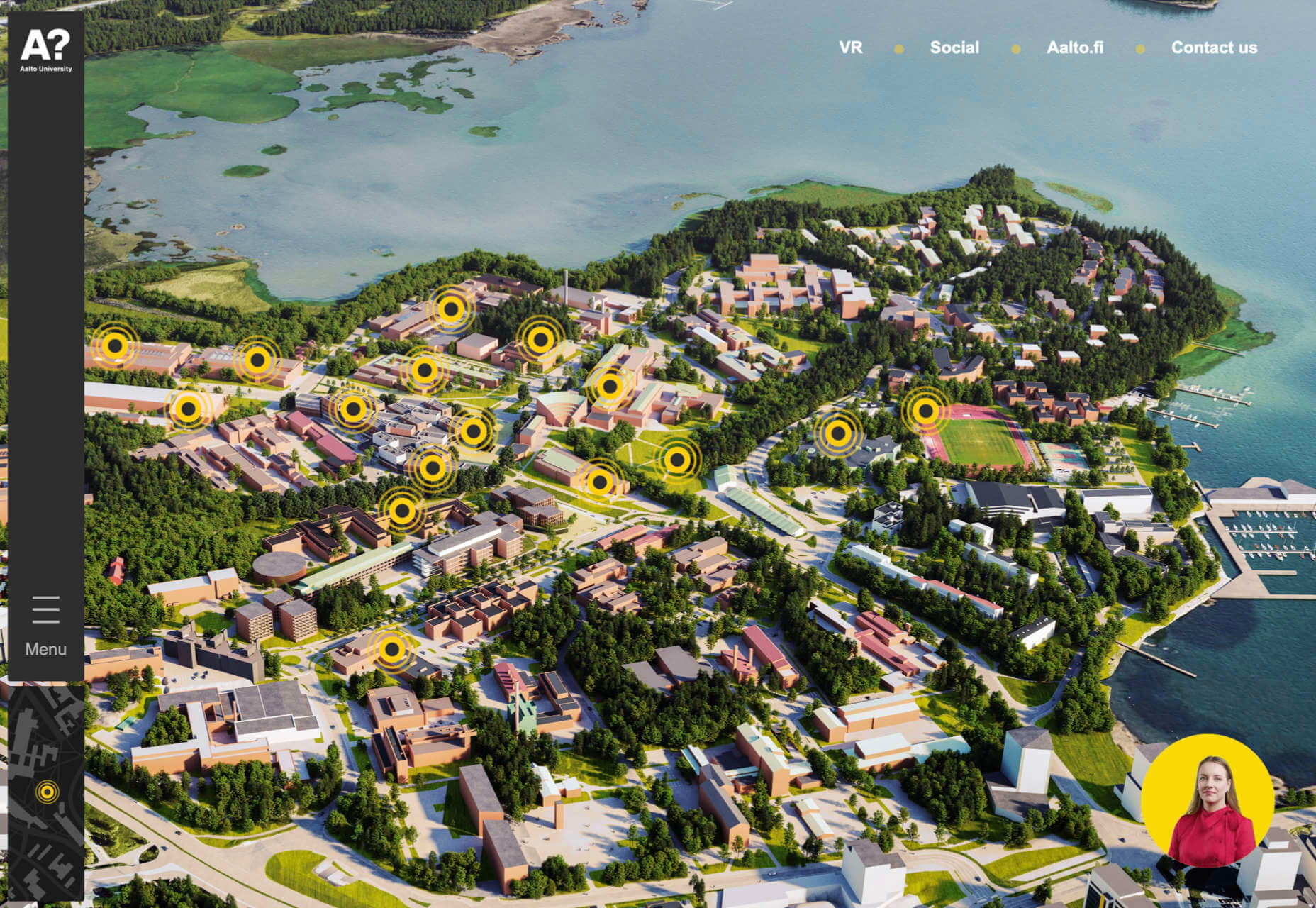
Aalto University
Aalto University has provided a pretty in-depth tour of its campus here. The navigation is clear, and the information is presented in ideal-sized chunks — enough detail, but not too much at once.
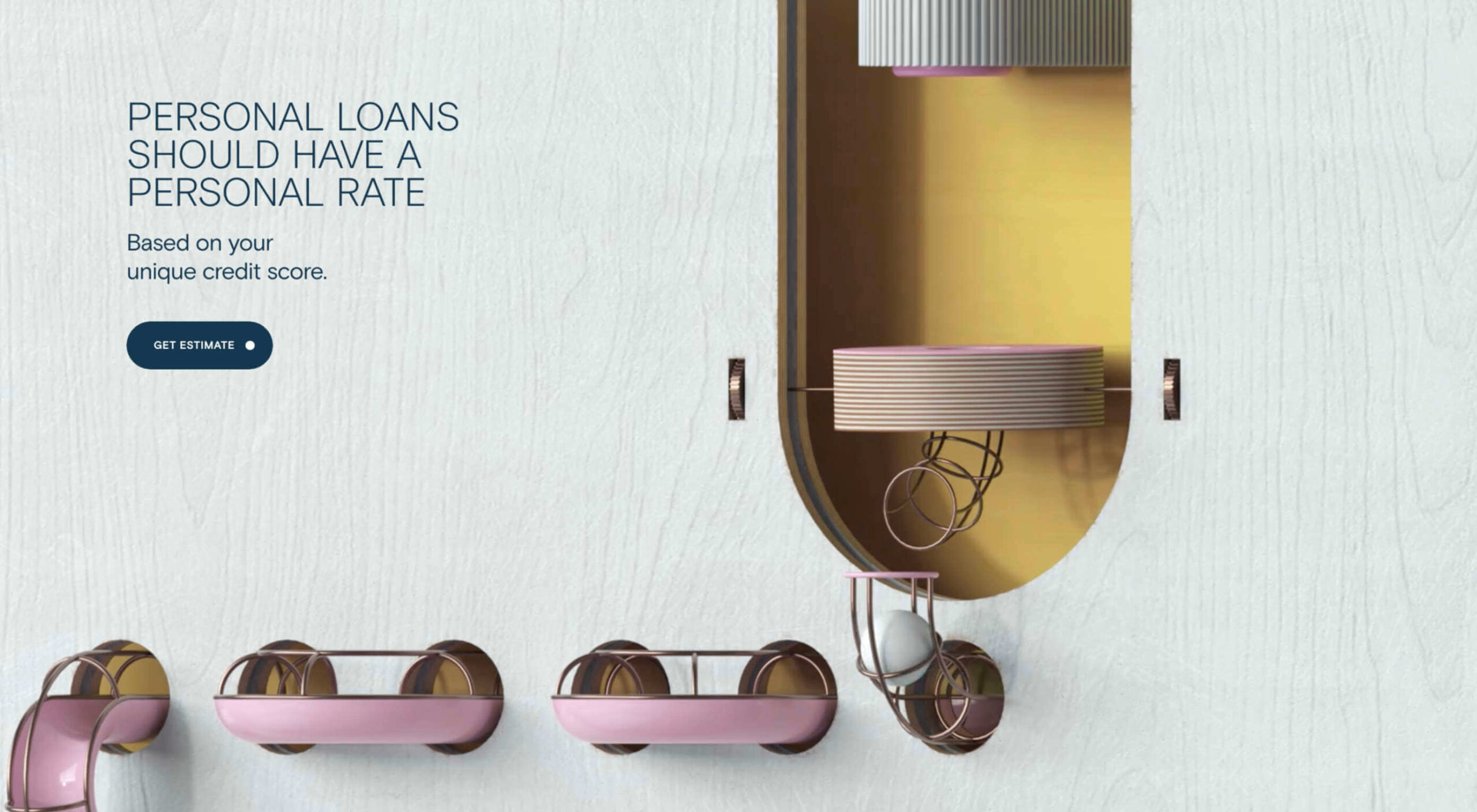
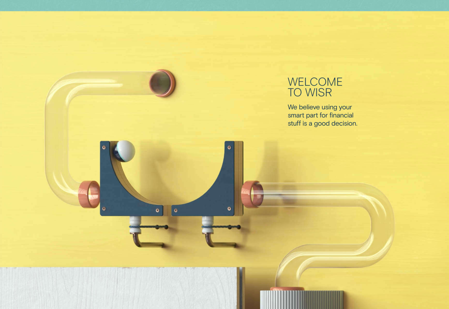
Wisr
Wisr features a Heath Robinson style machine that ‘runs’ as the user scrolls down the page. It provides a bit of interest (no pun intended) to the not very exciting subject of personal loans.
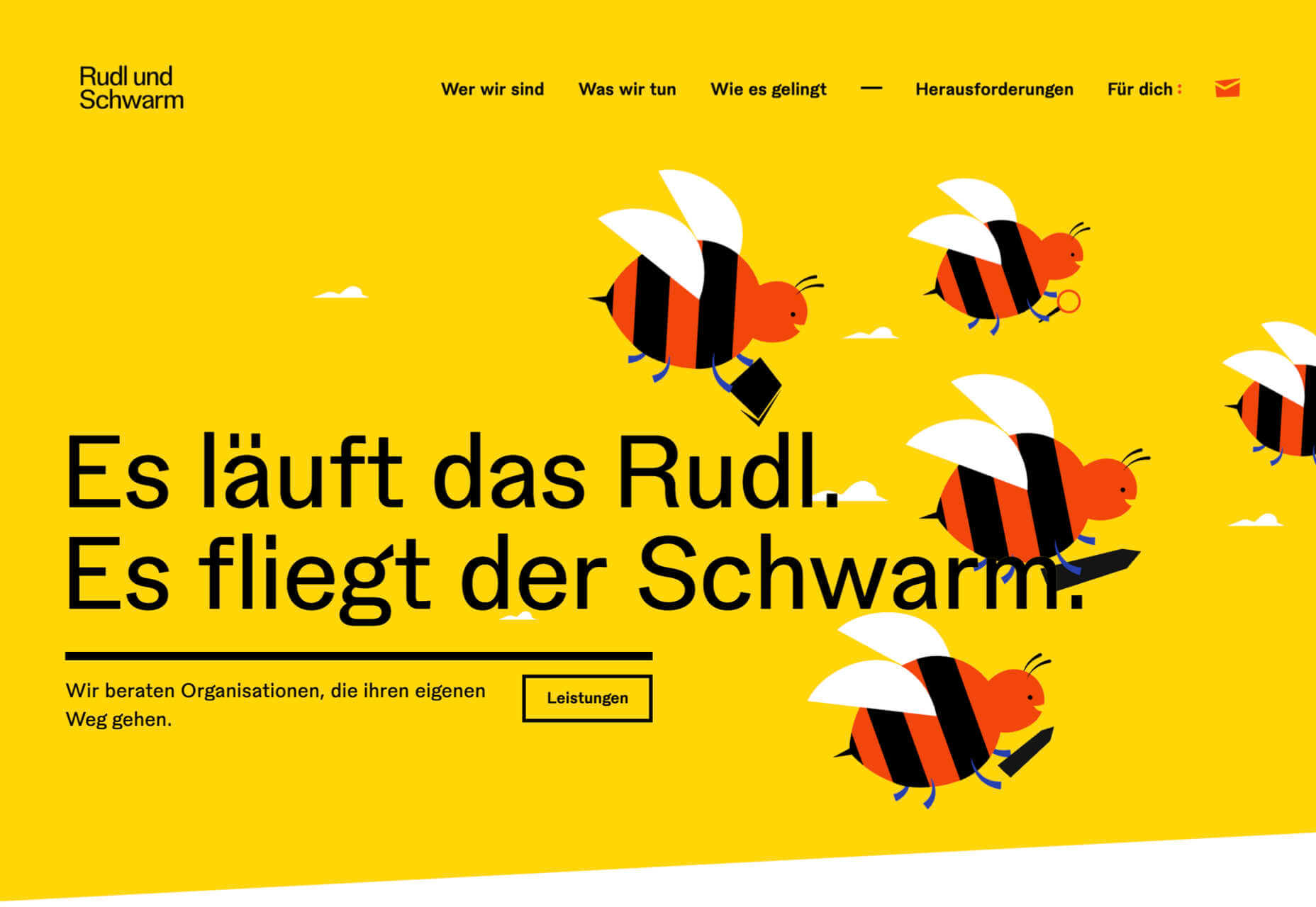
Rudl und Schwarm
Bright colors, cute, but not too cutesy, illustration, some nice scrolling, and transition effects are used really well on Rudl und Schwarm. And it’s got bees; bees are good.
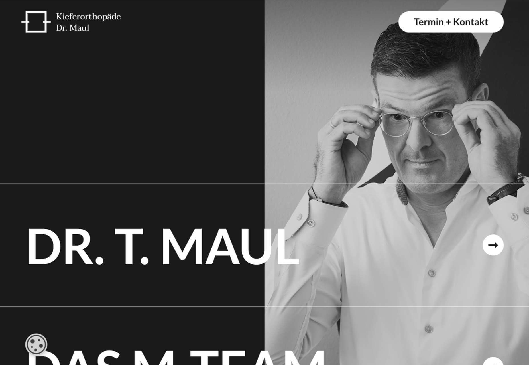
Dr. Maul
This site for Dr. T. Maul manages to take orthodontistry past the usual image of uncomfortable wiring, elastic bands, and ‘train tracks and make it seem just a little more glamorous.
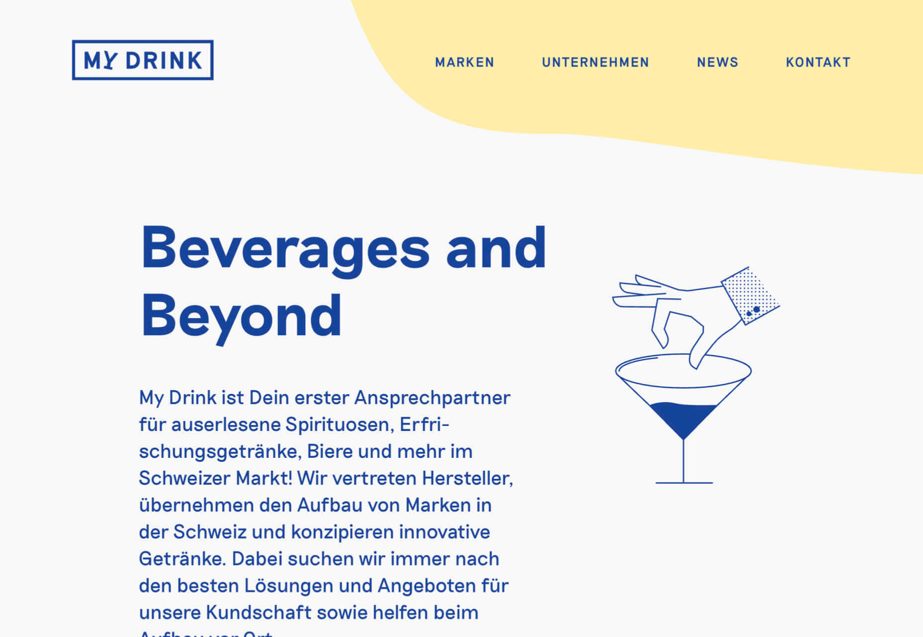
My Drink
There is a slightly vintage feel to this site for My Drink with its cocktail illustration. The blue text on grey is soothing without being bland.
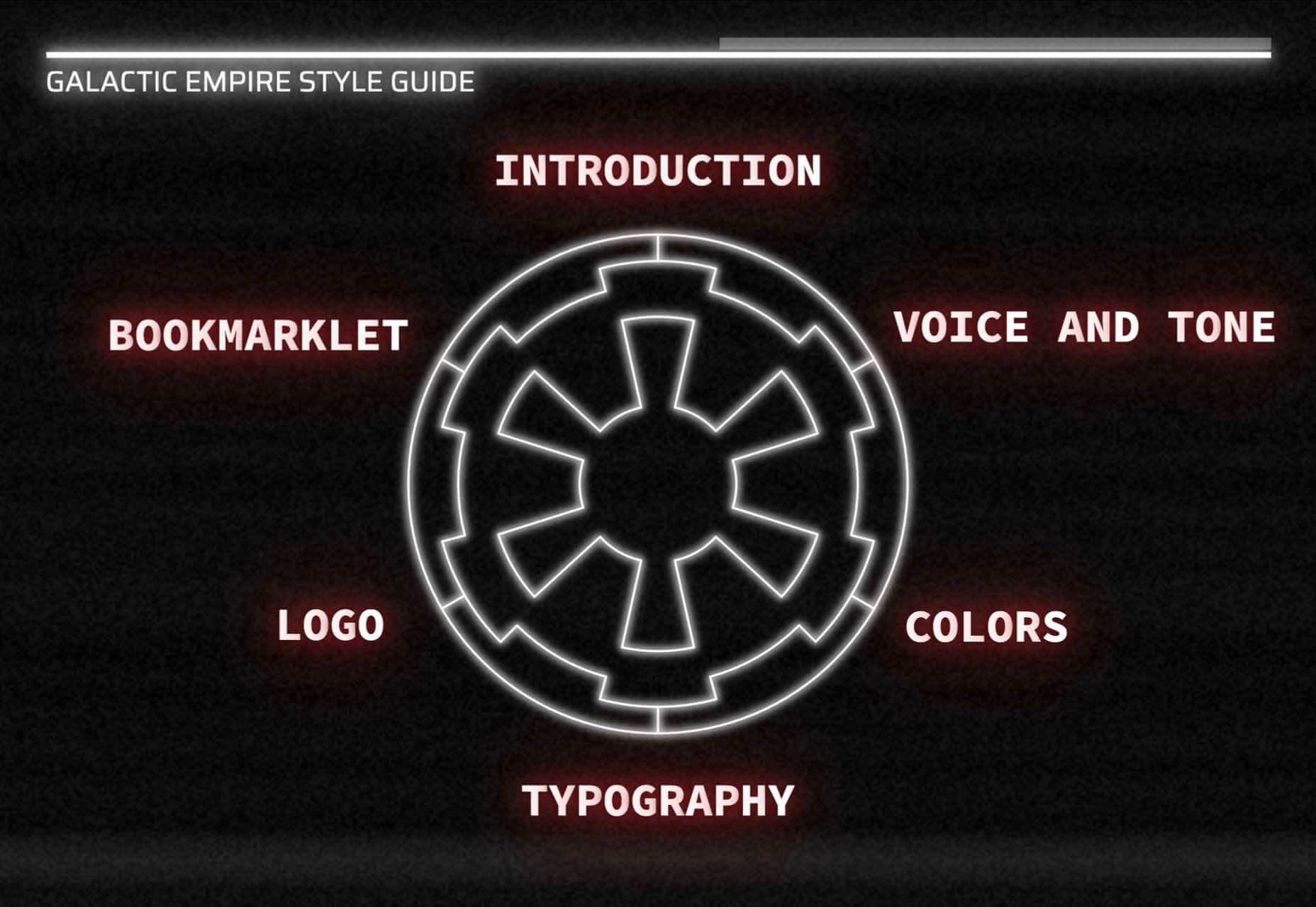
Bonus Site: Imperial Style Guide
And finally not new, but a bonus in honor of May 4th, the Imperial style guide. Well, the Web would get boring if it was serious all the time.
https://ankaa-pmo.com/wp-content/uploads/2021/05/20-best-new-websites-may-2021.jpg14082560Service comm.https://ankaa-pmo.com/wp-content/uploads/2017/04/Logo-Ankaa-engineering.pngService comm.2021-05-24 16:45:472021-05-24 16:45:4720 Best New Websites, May 2021
Parallax is a term that is applied loosely and frequently in the world of web design. As a trend, it has been popular and unpopular in equal measures for some time. However, it’s still one of the most valuable tools for animation in the digital world.
Parallax creates an illusion of depth when scrolling, a timeless effect that still has lots of value in the web design world.
Sure, parallax has its issues, from problems with usability, to concerns with mobile responsivity — but it’s also an interesting way to make a website stand out when done correctly.
Let’s take a closer look at some of the ways that parallax scrolling still works in 2021…
1. Parallax Tells A Story
Let’s start simple.
One of the most effective ways to use parallax scrolling in the modern age is to tell a story. Today’s consumers want to have an emotional connection with the brands they buy from – now more than ever. Five years ago, studies showed that around 80% of customers want brands to tell stories, and that trend remains consistent to this day.
In the age of digital consumerism, where people can’t get to know a company in person through face-to-face interactions with its salespeople, companies need new ways to connect with their clients. Telling brand-driven stories is a way to highlight that your company is more than just a faceless entity – it’s something with real soul.
Let’s look at the “Recap After Use” website, a portfolio belonging to the innovative Louie Sellers. This website showcases Louie’s skills with attention-grabbing visuals, including a parallax animation that makes it looks like Louie is drawing the page as you scroll through it.
This is the kind of exceptional animation that makes parallax scrolling more compelling. The animation isn’t there to make a visual difference to the page – it tells you something more about the person behind the website and what they can do.
2. Parallax Increases Website Visit Times
If a website effectively tells a story with parallax animation, you can also bet that’s going to keep customers or readers on a page for longer. Reducing bounce rate by increasing engagement is one of the main goals of any web designer. (Bounce rates, of course, refer to the percentage of site visitors that hit the back button after just seeing the first page of your website.)
While some people argue that parallax websites can hurt your SEO rankings if they slow down your site, there’s also the argument that the lack of a visually engaging page can harm SEO. Bounce rates drag down your ranking and make it harder to get audience attention.
A parallax animation that tells a story and engages your audience through carefully delivered information is a great way to keep people around – even just for a little longer than usual. For instance, if you check out Alex Dram’s portfolio page here, you’ll see several shapes coming together during the parallax scrolling animation.
The shapes merge to tell a story about the visual experiences that Alex can create for customers. It’s a way to draw the eye and connect with the viewer without just writing about what you do through text.
3. Parallax Develops Credibility
There’s a reason why both examples of parallax scrolling we’ve looked at so far are from creative portfolios. Parallax scrolling, with its excellent storytelling capabilities, is great for demonstrating your credibility as a digital expert. Basically, it’s a version of “showing” and not “telling” customers about your skills.
You can tell someone that you know how to use tricky techniques like parallax animation correctly, but they’re less likely to believe you that way. If you can show that you have the skills to create something amazing, that’s more engaging.
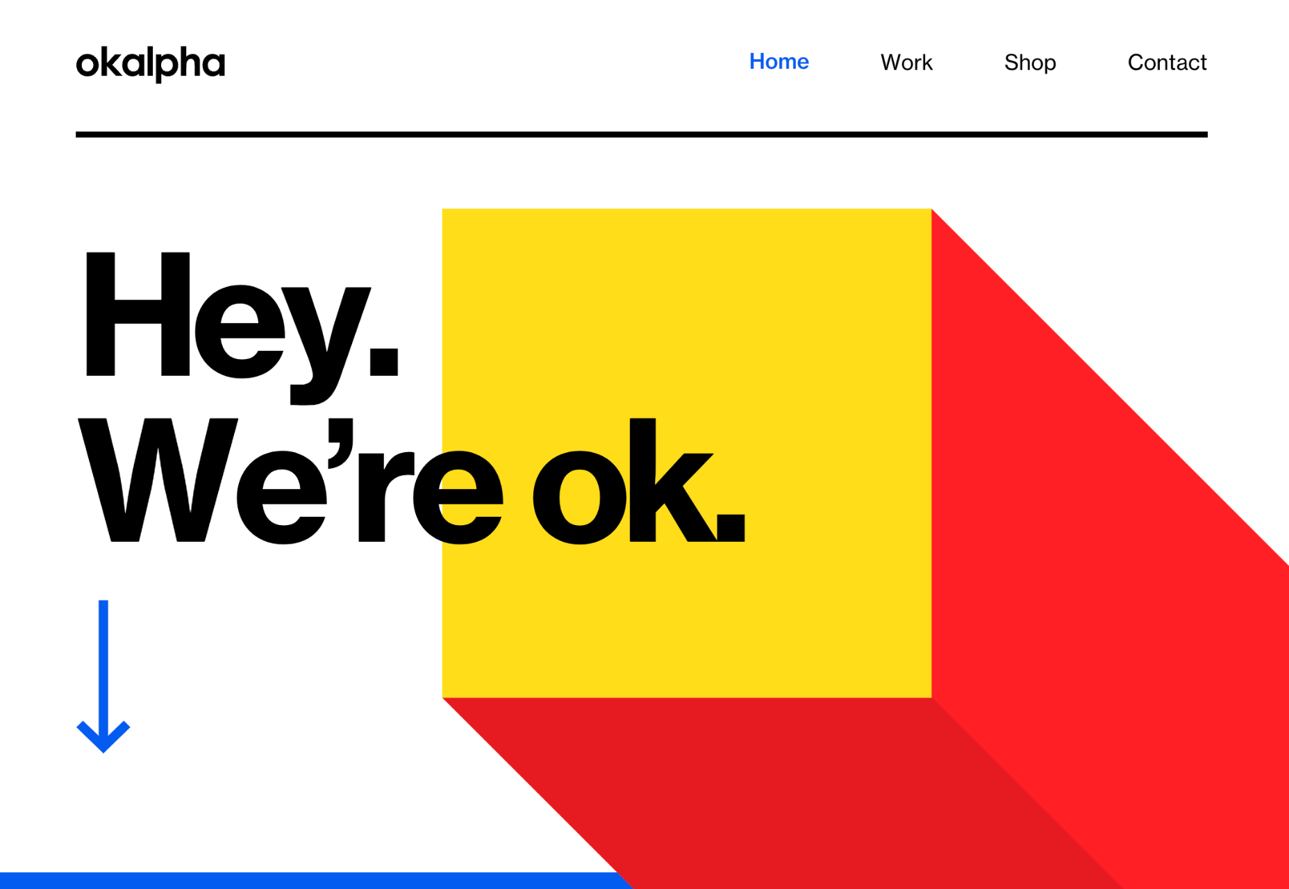
The OK Alpha team is a great company to reference when it comes to sensational design. This company seems to always be on the cutting edge of the latest trends, whether it’s bold typography or bright colors. To add to the impact of their website, the company has combined parallax effects into the mix to make everything more immersive as you scroll.
This is a beautiful example of how companies in the design landscape can use techniques like parallax scrolling to show what they’re capable of.
4. Parallax Makes Information More Fun
Most of us are naturally visual learners. We like to consume information in a way that’s refreshingly eye-catching and attractive. That’s why visual content generally earns more social shares and attention than written content. With parallax scrolling, companies that want to deliver valuable information and educational content to their audience can do so effectively.
Rather than just scrolling through a page and seeing lots of text, your customers can see images and graphs come to life alongside the blocks of text they’re reading. It’s like adding video demonstrations next to a textbook to help people better understand what they’re reading about.
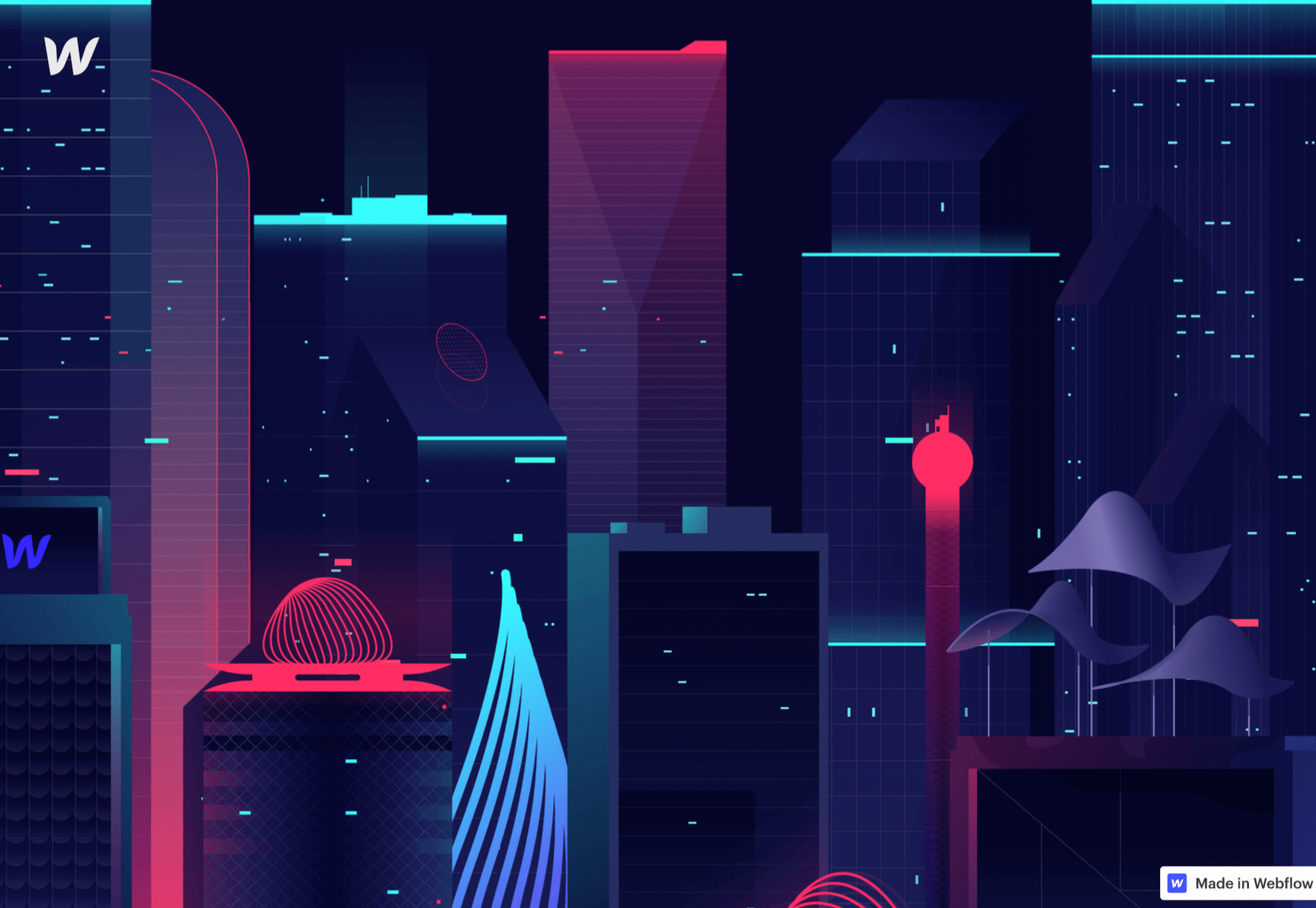
Look at the Web Design and Art History microsite from Webflow as an example. The company wants you to understand how web design and art have evolved over the years, but it doesn’t want to deliver that information in a boring format. The bright graphics and parallax animation work together to give you a more contextual, meaningful experience.
5. Parallax Replicates Another Medium
What if you could remind someone of their experience when reading a book or watching a video while telling them about a video or a novel? Parallax scrolling and animation can help with that. It’s a way of making your website feel like a video presentation or slideshow without the added components of implementing video players into your back end.
Parallax scrolling also has another slight benefit over a standard video-based website. On a website that uses a video for a background, the video often plays automatically. This means that your visitors can’t control how quickly the video plays.
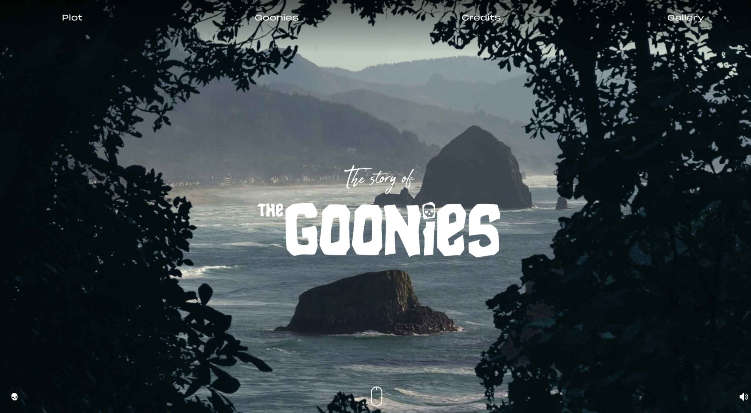
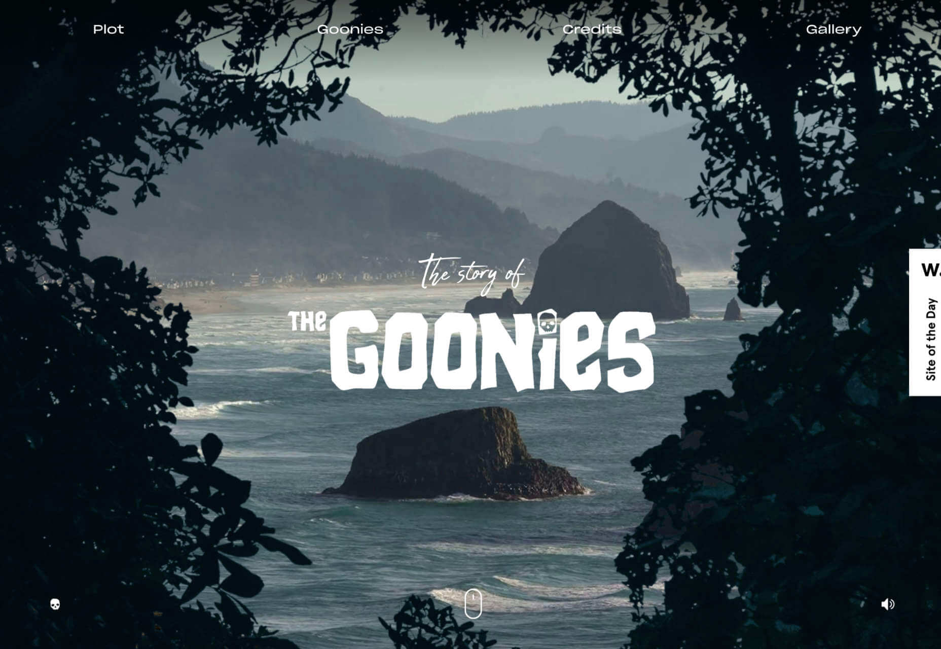
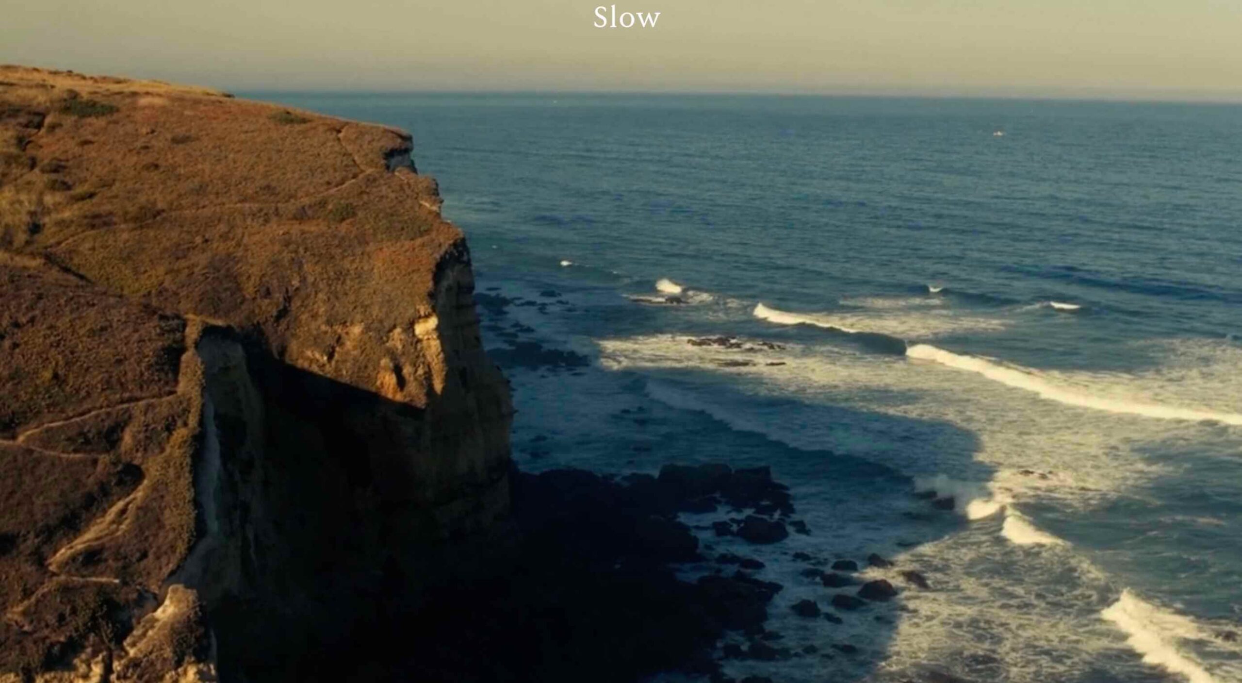
On the other hand, parallax animations driven by scrolling action allow your customer to collect information at a pace that suits them. Take a look at the Story of the Goonies website, for instance. This stunning parallax site introduces you to the details you need to know about the movie in a way that makes it feel like the intro to a film.
The great thing about the parallax on this site is that the slow video-style design also gives you a dose of nostalgia – which ties in perfectly with the movie.
6. Parallax Is More Memorable
What’s the main reason any designer does anything special to a website? To make it stand out, of course. Web design is all about conveying the unique essence of a brand, business, or entity in a way that’s going to make that client unforgettable. Although parallax isn’t as novel as it once was, it can still be a way to make your site stand out – if it’s used correctly.
The key to success with parallax scrolling for memorability is making it smart. The layout needs to feel simple and intuitive. Everything needs to work well together, from the lightly shifting font to the various parallax effects that work together to draw the viewer’s eye (and attention).
A great example comes from Jomor Design – another designer with a portfolio that really grabs your focus from the first second. The layout is beautifully done, with plenty of mini moments for engagement and interactions throughout. As you scroll through the site, you get a better idea of what the designer is all about. The little moments of animation make the whole experience so much more memorable.
When your site is more memorable and engaging than that of your competition, you can drive many major benefits for your brand, including an improved bounce rate.
What To Remember When Using Parallax
Parallax is just like any other design technique. There are ways you can do it wonderfully, which engage and delight your audience. However, there are also a lot of areas where you can easily go wrong. When using any design element, the main thing to remember is that the primary focus should always be your users’ experiences. Parallax shouldn’t just be a way to show off your design knowledge. It’s just another feature that you can use to create an amazing website.
Remember that user experience and visual appeal need to work perfectly together for parallax to work. If scrolling through the page is practically impossible for people on a mobile device, then you’re not going to get the results you want. If it’s difficult to take in the message you’re trying to send because the content is moving too quickly, again, your users will suffer.
Remember the following tips:
Simple is better: Reduce the amount of content and visual elements on your page whenever you can. The less information there is to capture your customer’s attention, the less likely it is that you’re going to end up with a problem.
Compress file sizes: Make sure that you’re not reducing the speed of your website by creating a huge single page with tons of high-quality images. You’re going to need to use the smallest possible file sizes.
Check responsiveness: Make sure that the parallax effect works just as well on your smartphone or tablet as it would on a desktop. As more people move their browsing experiences into their palms, you can’t afford to ignore responsivity.
Find the “wow”: Look at these examples of parallax websites. Every one stands out because it does something special with the scrolling effect. If you’re going to be using this strategy with your website, you need to make sure it’s worth the effort. Don’t just follow the same guidelines as everything else. Find the idea that’s going to make people take notice.
https://ankaa-pmo.com/wp-content/uploads/2021/05/6-ways-parallax-still-works-in-2021.jpg14072560Service comm.https://ankaa-pmo.com/wp-content/uploads/2017/04/Logo-Ankaa-engineering.pngService comm.2021-05-19 16:45:172021-05-19 16:45:176 Ways Parallax Still Works in 2021
Each day design fans submit incredible industry stories to our sister-site, Webdesigner News. Our colleagues sift through it, selecting the very best stories from the design, UX, tech, and development worlds and posting them live on the site.
The best way to keep up with the most important stories for web professionals is to subscribe to Webdesigner News or check out the site regularly. However, in case you missed a day this week, here’s a handy compilation of the top curated stories from the last seven days. Enjoy!
https://ankaa-pmo.com/wp-content/uploads/2021/05/popular-design-news-of-the-week-may-10-2021-may-16-2021.png15292780Service comm.https://ankaa-pmo.com/wp-content/uploads/2017/04/Logo-Ankaa-engineering.pngService comm.2021-05-16 16:45:542021-05-16 16:45:54Popular Design News of the Week: May 10 2021 – May 16, 2021
This month’s collection contains a combination of big and bold, and clean and minimal. Although basic minimalism is still trendy, with lots of white space and greyscale type, we are seeing it softened with color. This is implemented differently, ranging from hints of off-whites in images to gentle pastels as section backgrounds.
Playing around with type and using typefaces with a few characteristic quirks is another way minimalism is being tempered without negating the overall effect. Plus, we’ve got some strong examples of type rules being deliberately broken to good effect. Enjoy!
Crusta C
The new website for seafood company Crusta C makes clever use of the company’s simple logo mark ‘C’ with a cutout video effect.
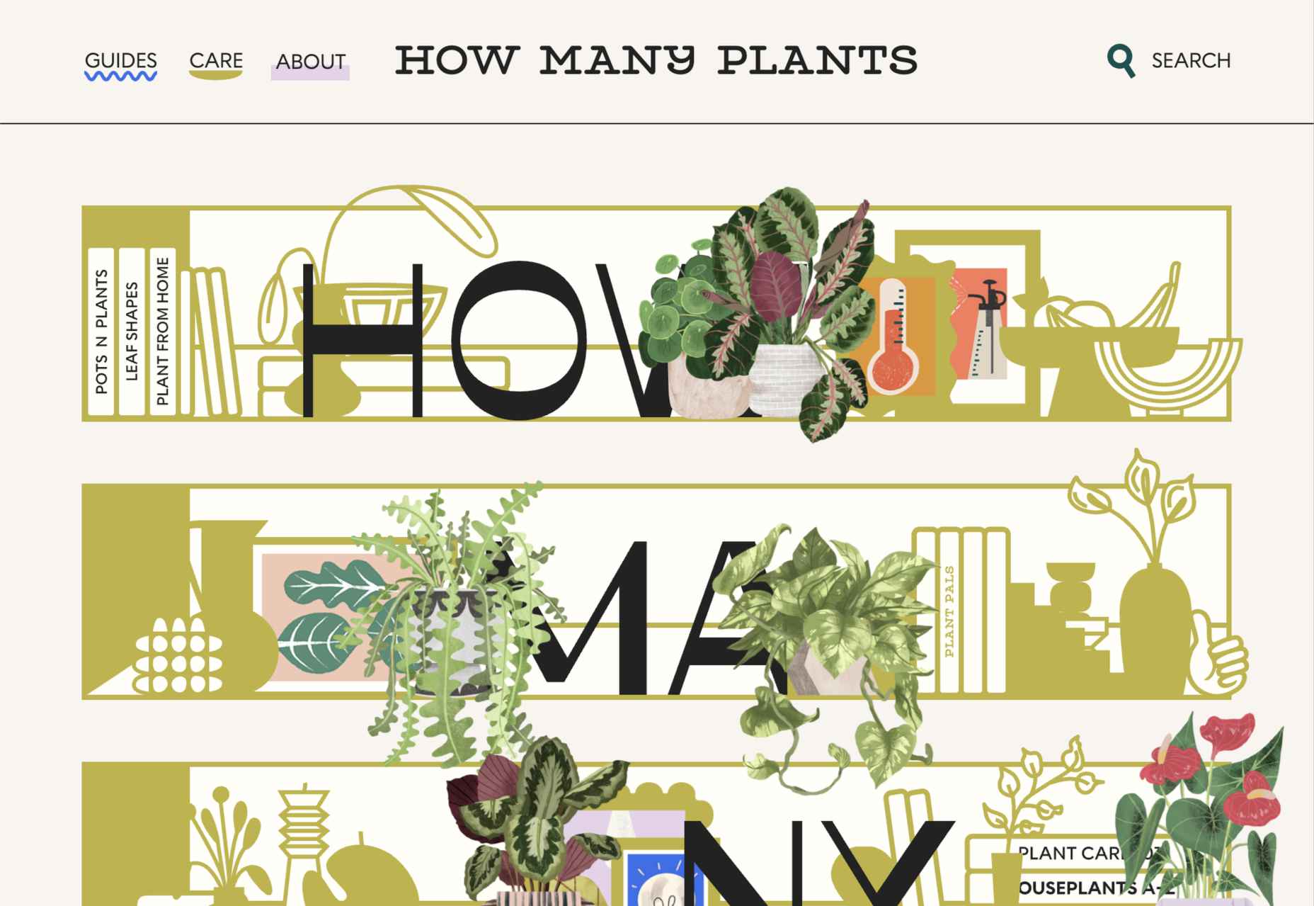
How Many Plants
How Many Plants is a guide to house plants and how to look after them. A good combination of illustration and space gives a friendly but efficient feel.
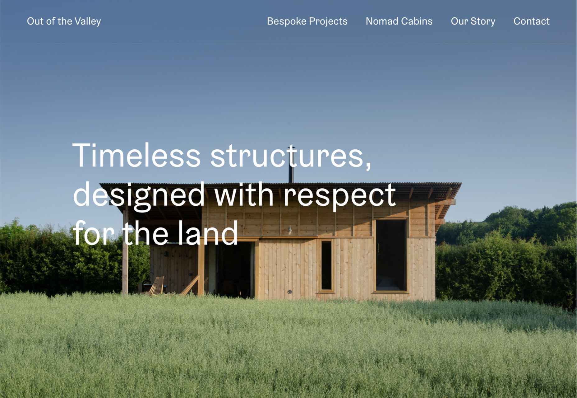
Out of the Valley
Out of the Valley, make bespoke and prefabricated cabins focusing on natural materials and traditional craft. The subtle changes in background color add warmth to the minimal layout.
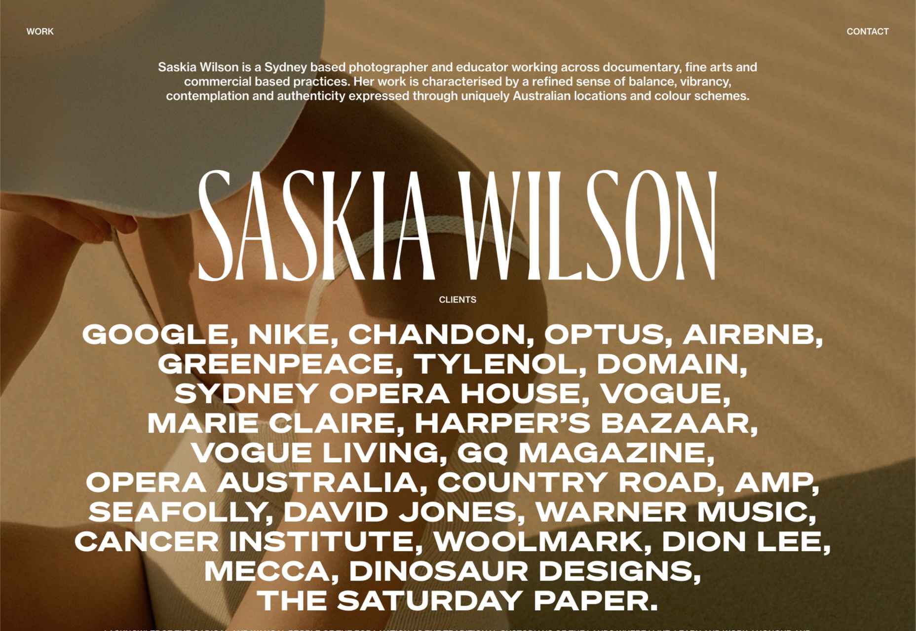
Saskia Wilson
Portfolio site for photographer Saskia Wilson. This is absolute simplicity, with a clear grid and nice, bold type to bare minimum text.
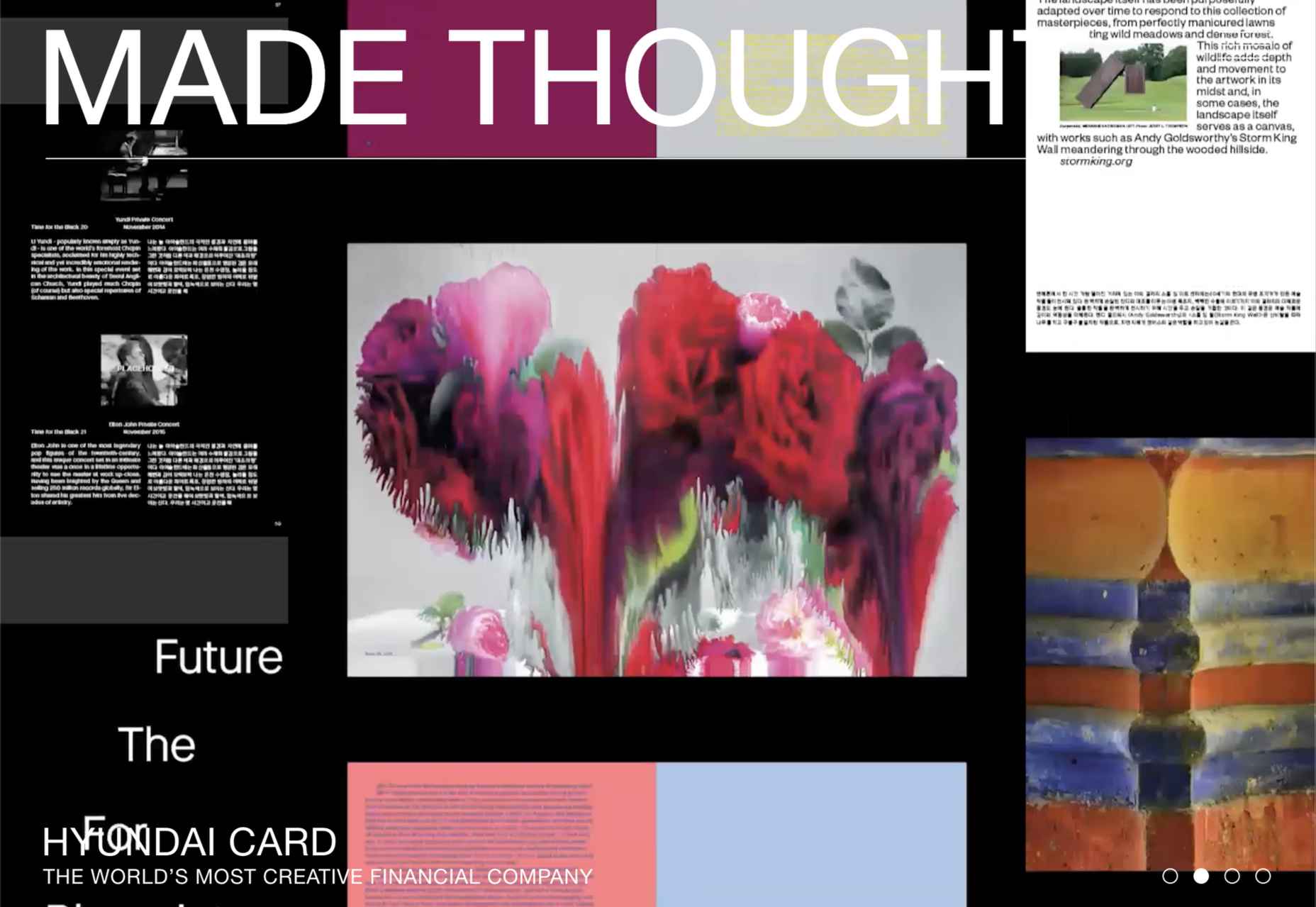
Made Thought
Design studio Made Thought has some pretty prestigious clients; for a designer, it doesn’t get more prestigious than creating a new brand identity for MoMA. Their bold aesthetic and approach explain their success.
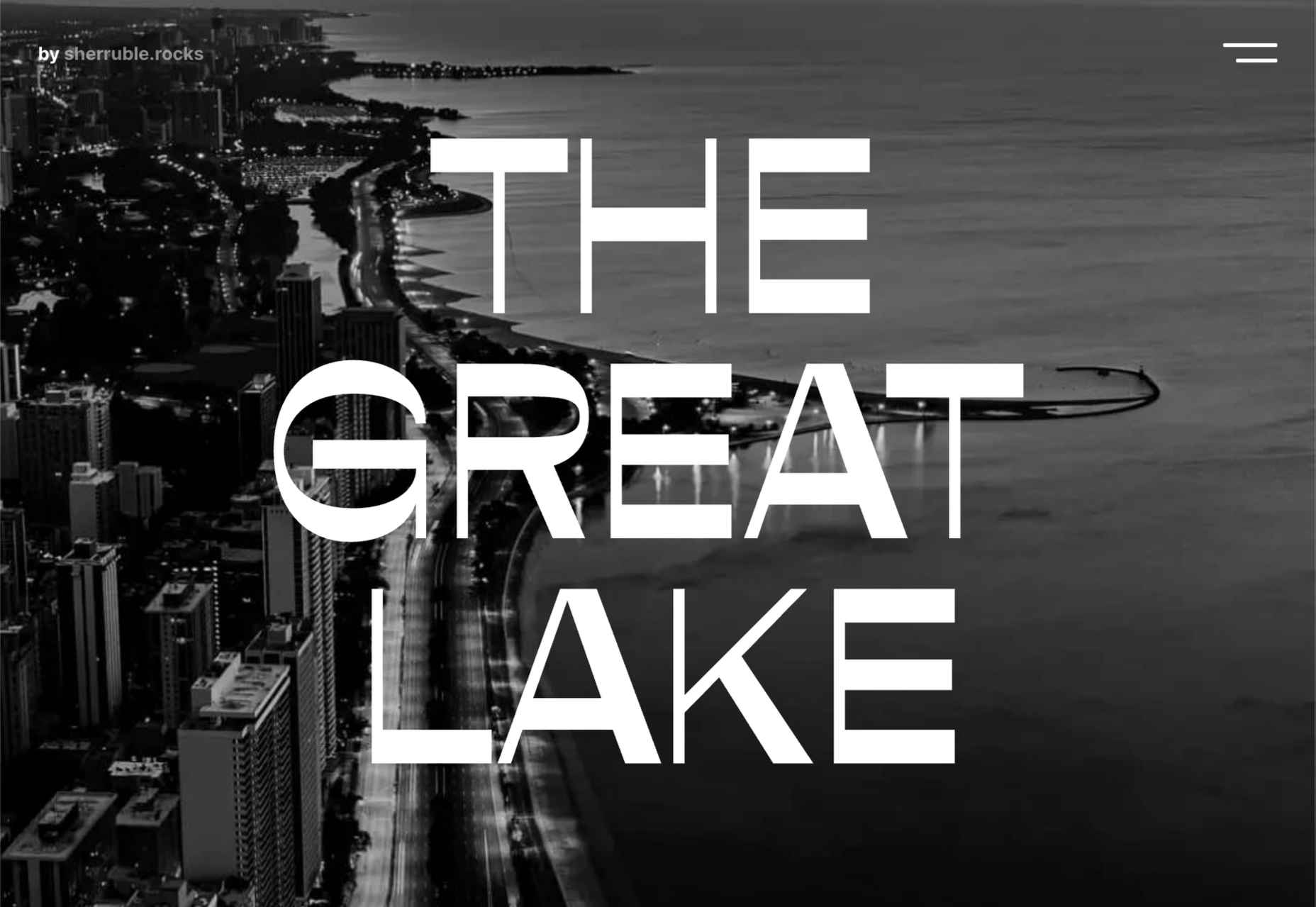
The Great Lake
For-fun sites like The Great Lake are a great way for web creatives to show their skills. This one from designer and front-end developer Anna Sherruble is visually appealing and has some informative content.
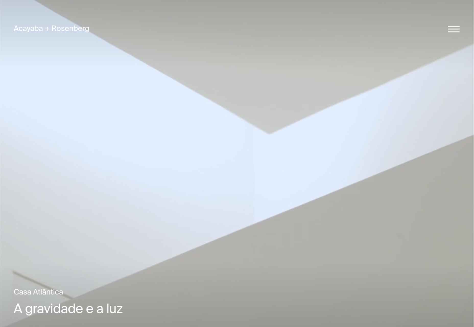
Acayaba + Rosenberg
Architects Acayaba + Rosenberg use carefully curated photography and subtle scrolling animation to pull the user in and create a pleasing browsing experience.
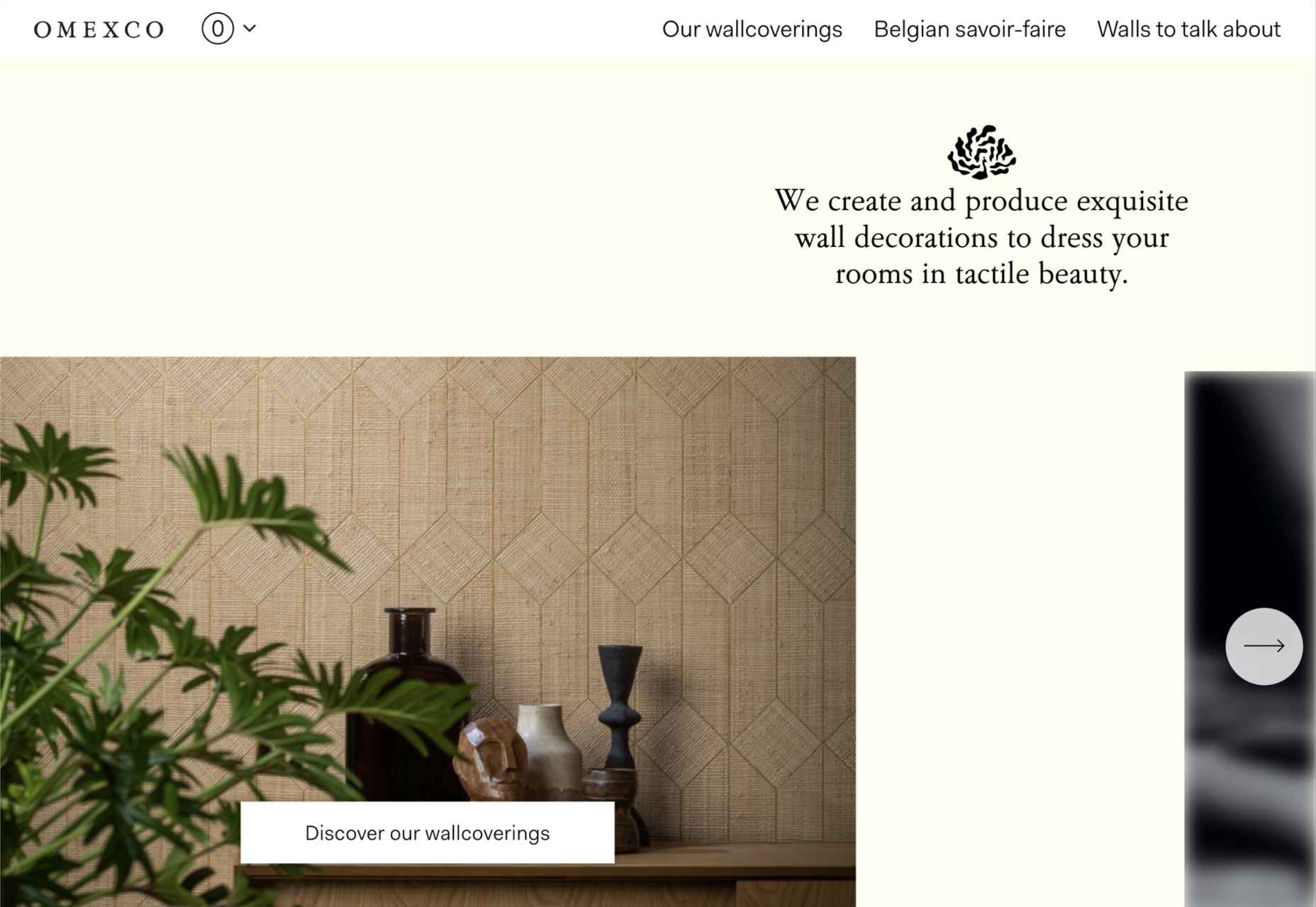
Omexco
Soft colors and a well-ordered grid recreate the feel of a mood board that prevents this site for Omexco from appearing cluttered and overly busy while showcasing multiple products.
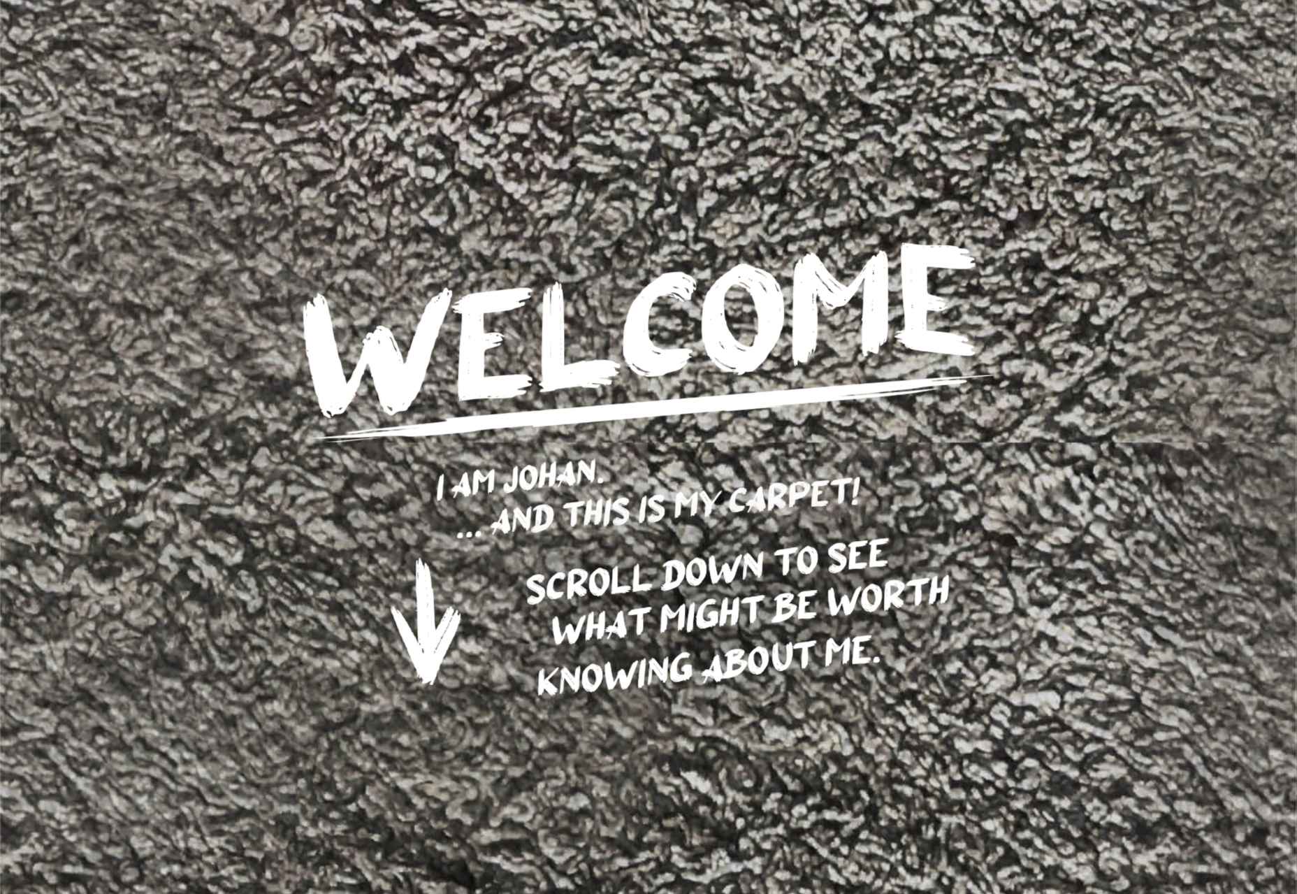
Johan Belin
For his own site, digital creator Johan Belin has opted to show off his skills by creating this single-page site instead of simply showing work. This can be a risky tactic, but it works here.
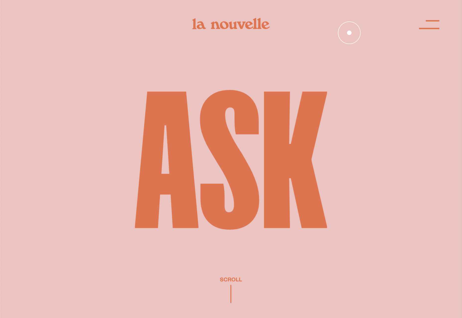
La Nouvelle
A combination of contrasting and complementary color combinations creates freshness in this site for digital agency La Nouvelle.
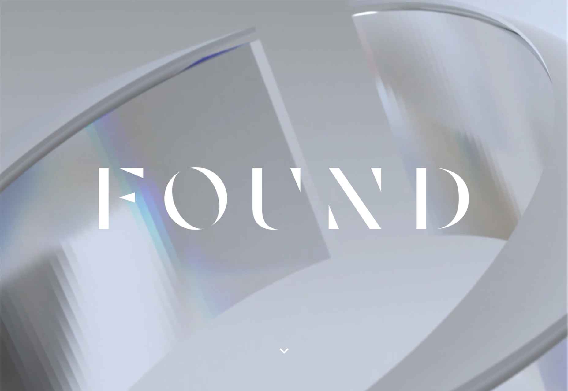
Found
Found Studio’s website uses a very basic grid layout to allow the work to stand out; varying the typeface, weight, and style within sections of text creates individuality.
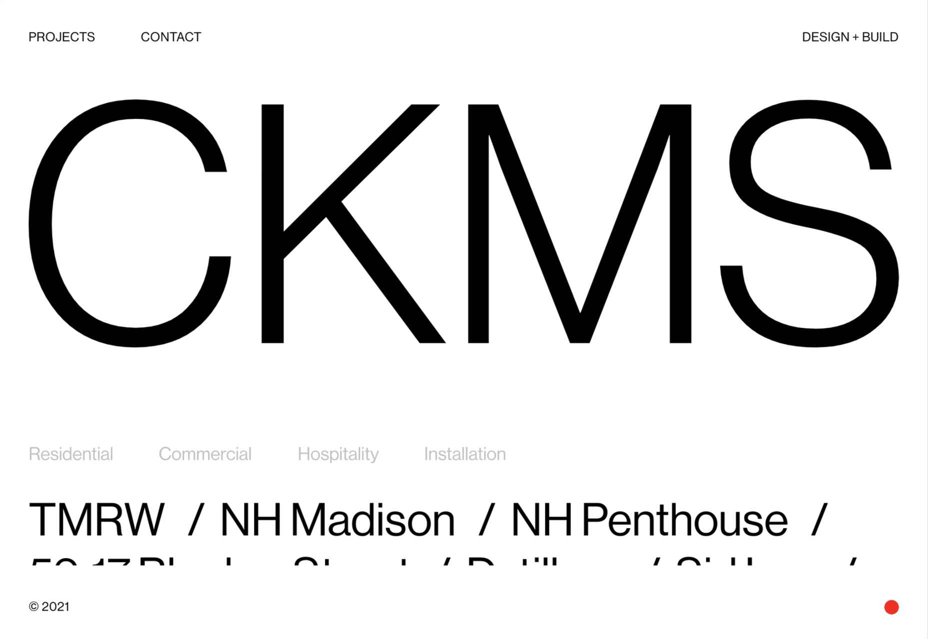
CKMS
CKMS is a design and build company. Their site is minimal but with a few nice little touches, like the background color change button in the bottom right corner.
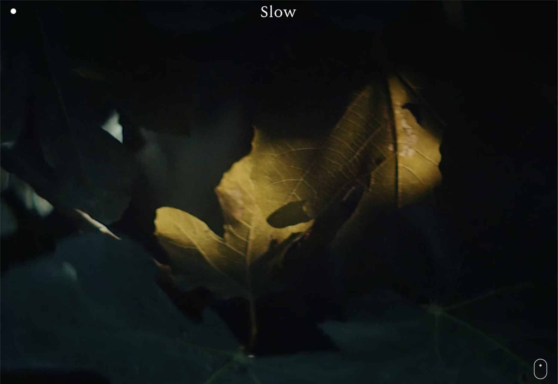
Slow
Slow is a collective of people–largely artists, designers, artisans–aiming to implement and live by the slow movement principles. The design of their site reflects these aims, creating a sense of calm and deliberation.
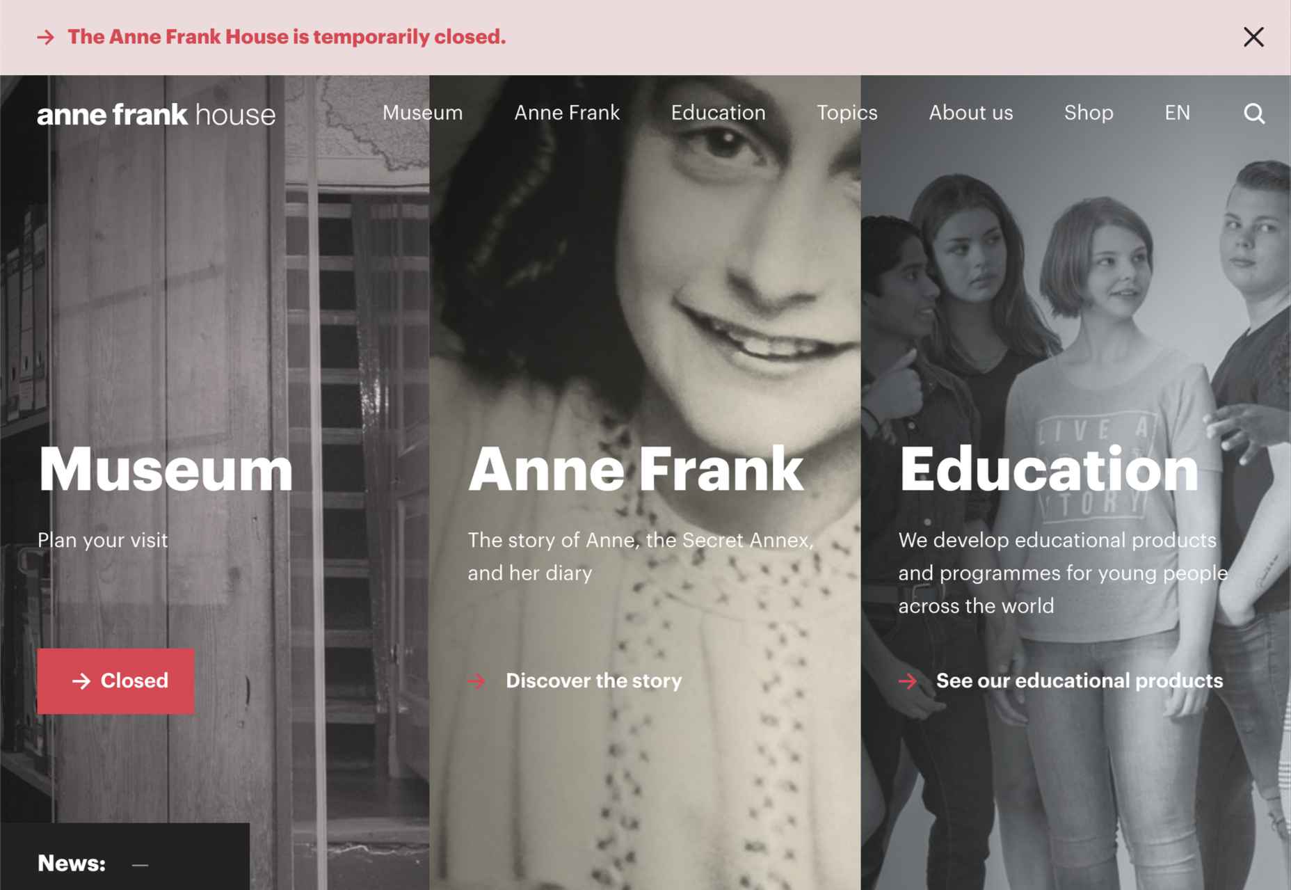
Anne Frank House
Practical information for visiting the Anne Frank House and museum is combined with historical information and educational resources in this thoughtfully structured and visually engaging site.
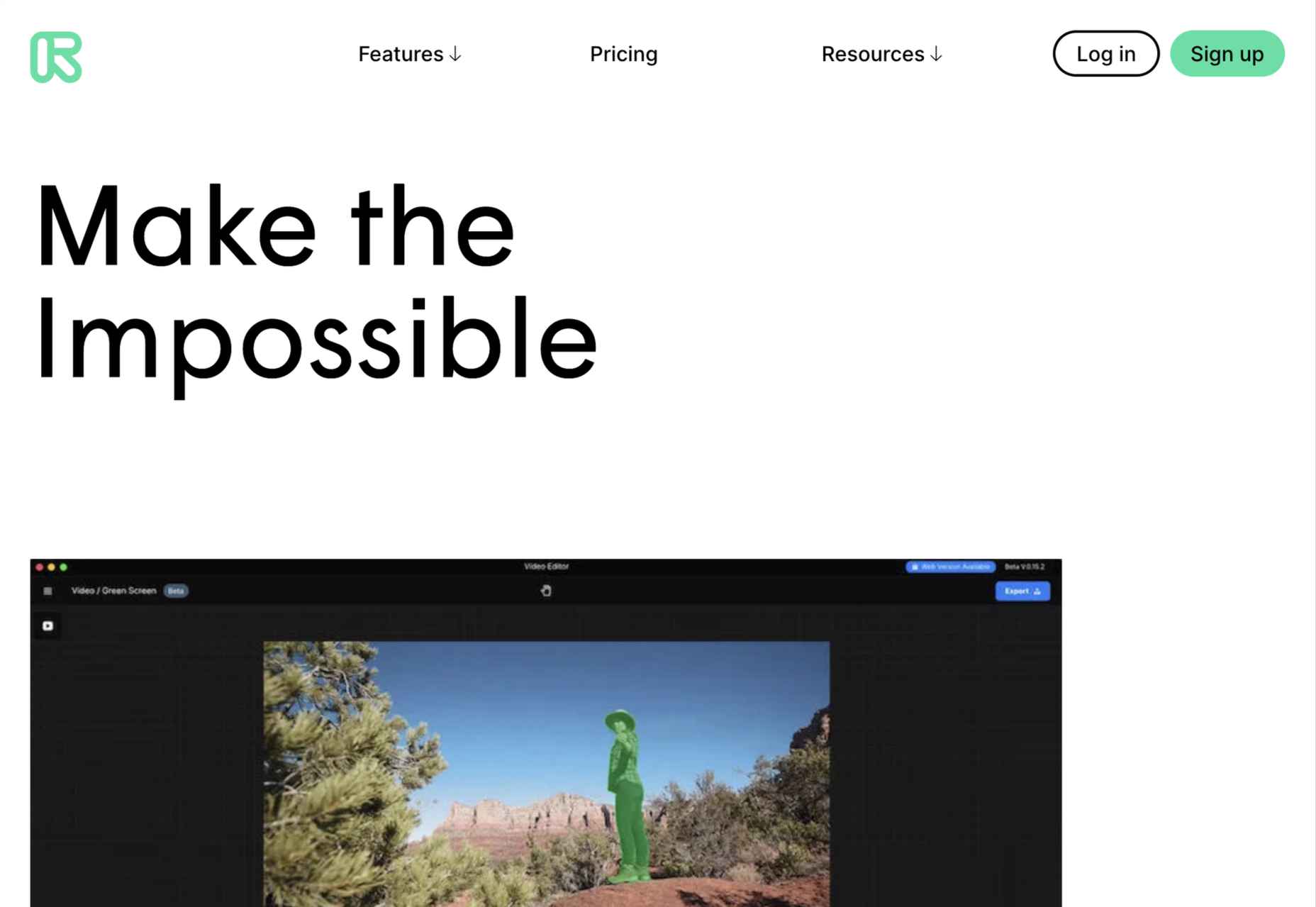
Runway
Runway is a platform for publishing open-source, pre-trained machine learning models, as well as for training your own models aimed at artists and filmmakers. If this site aims to make the user want to try Runway, it succeeds.
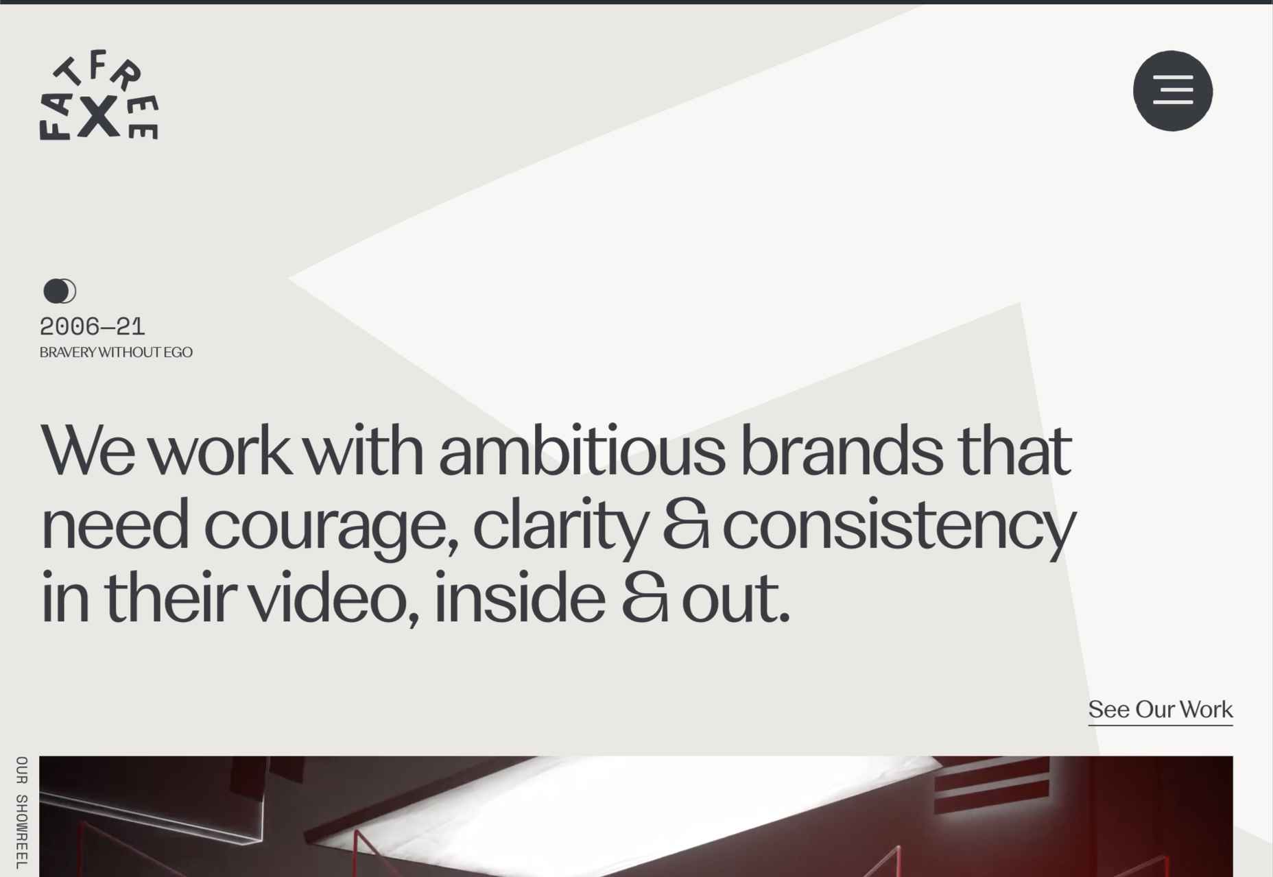
Fat Free
Fat Free video branding agency add warmth to their minimal site with soft color and occasional illustration.
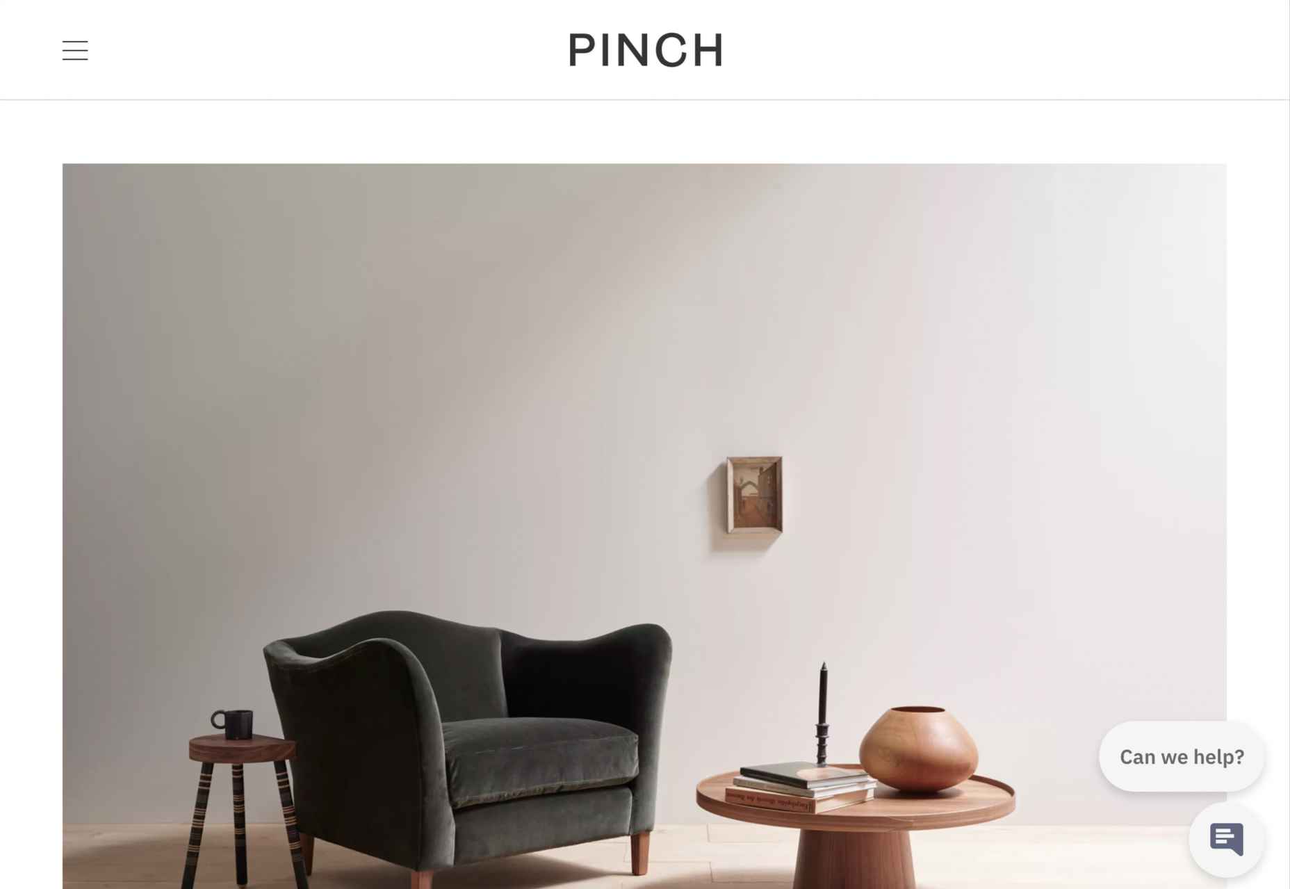
Pinch
The furniture and other interior products produced by Pinch Design aim for a quiet, elegant aesthetic, and their website reflects that with pale grey and generous spacing.
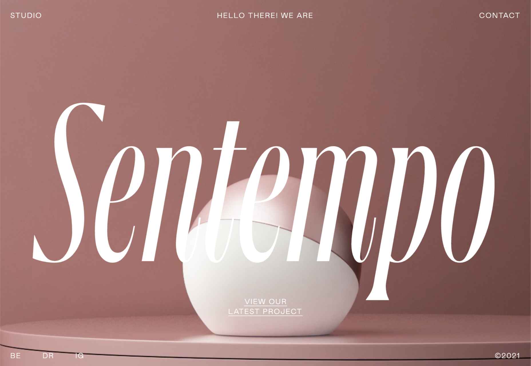
Sentempo
Digital studio Sentempo manages to achieve glossy without being overdone. The star dividers are a nice detail.
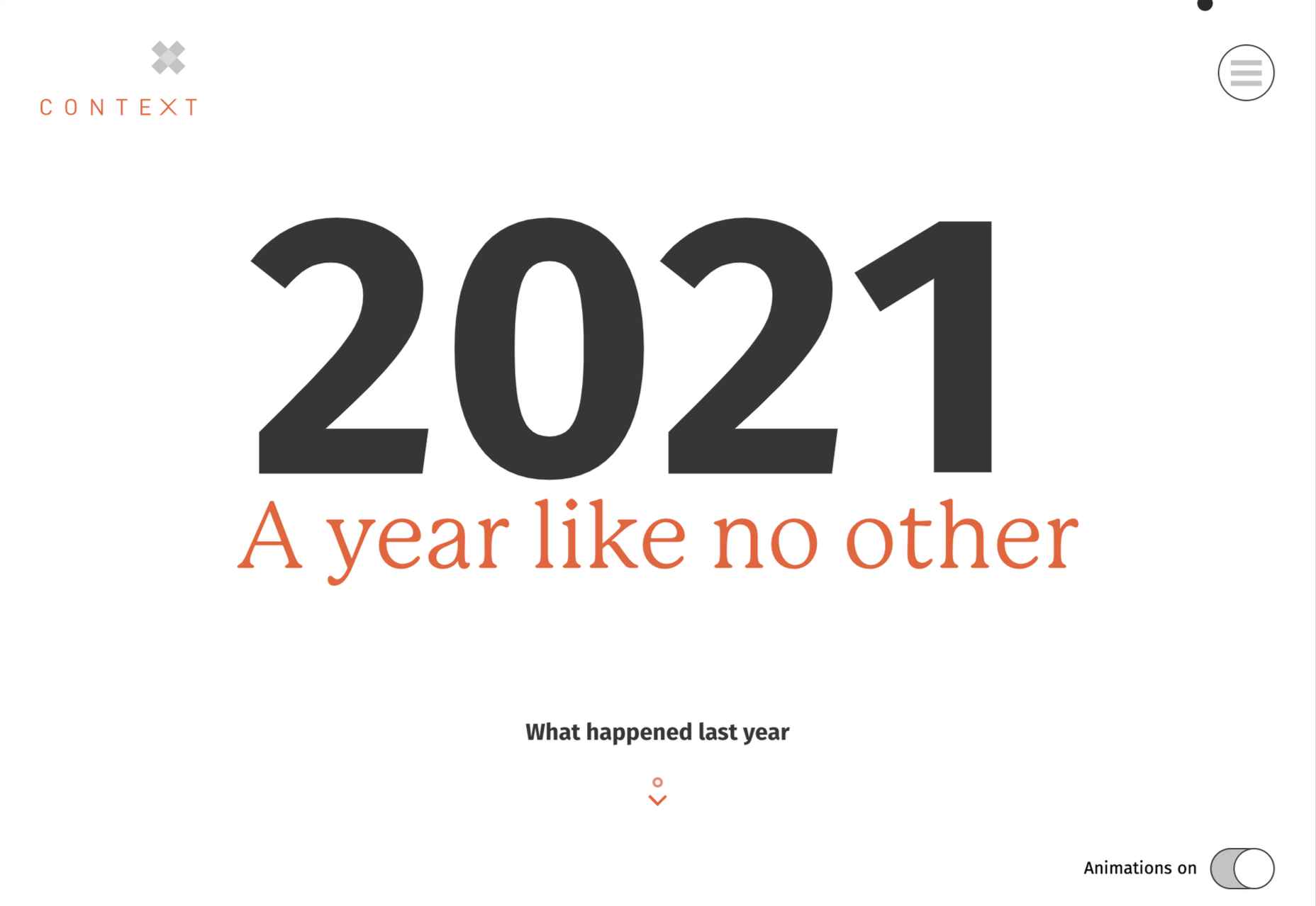
One Year
Many companies, including creative agencies, have come up with ‘what we did/achieved in the last year’ microsites. This one from Context Creative succeeds as a good advert for them.
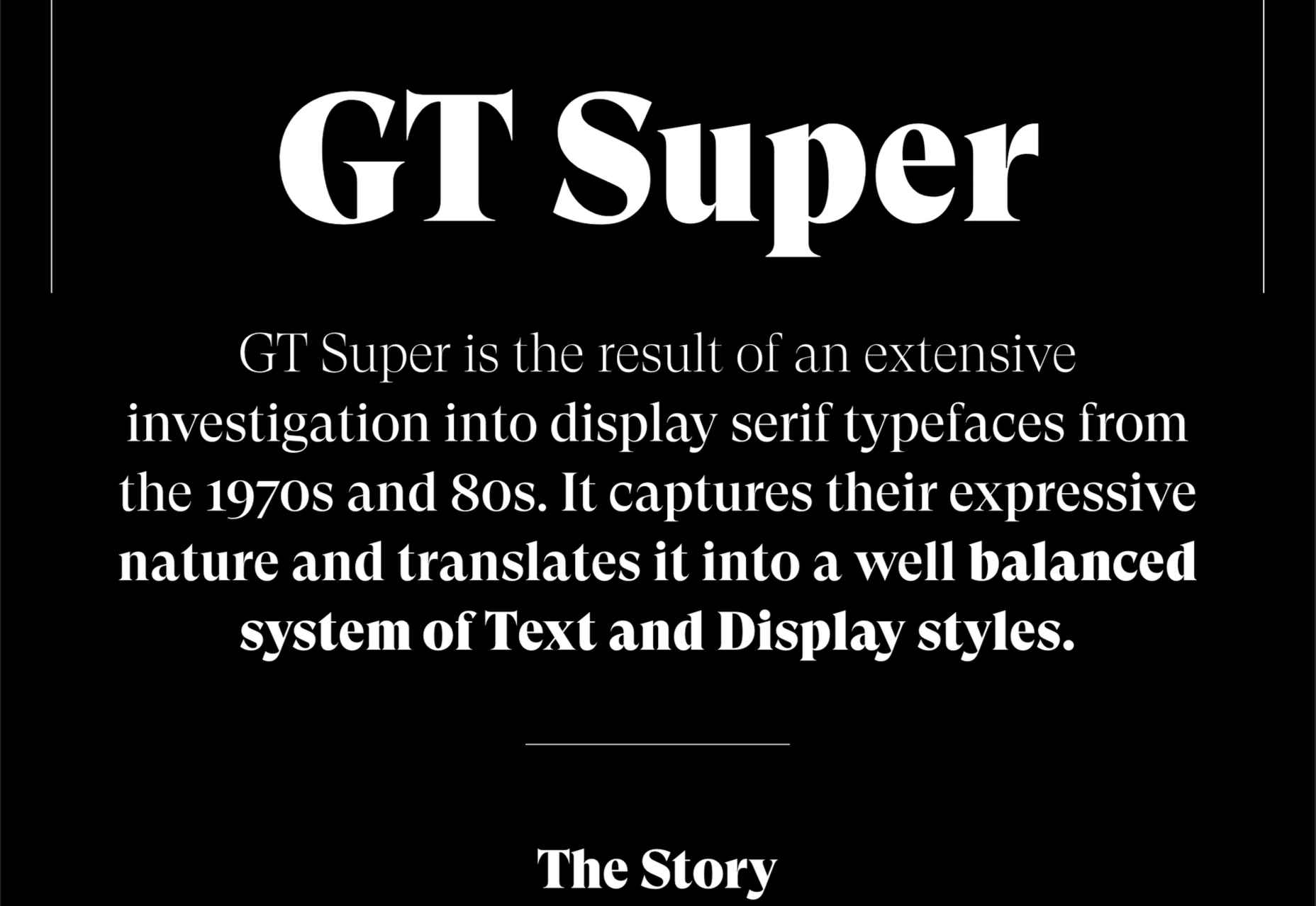
GT Super
This single-page intro to GT Super font has a certain drama in keeping with the font itself and allows you to play around with the size, weight, and style of the font in most sections of the text.
https://ankaa-pmo.com/wp-content/uploads/2021/04/20-best-new-websites-april-2021.jpg14072560Service comm.https://ankaa-pmo.com/wp-content/uploads/2017/04/Logo-Ankaa-engineering.pngService comm.2021-04-26 16:45:252021-04-26 16:45:2520 Best New Websites, April 2021
Have you ever wondered why we’re so amazed by motion? A moving image is more likely to grab your attention than a static one. Motion is exciting and attention-grabbing – plus, it allows us to access more information in a short space of time.
For a while now, companies have been experimenting with all kinds of motion and animation in their design choices. We’ve seen the rise of animated website backgrounds or live-playing videos instead of images on a home page. There are videos and 360-degree pictures on product pages to help people get a better view of certain items and immersive AR experiences on apps.
So why has the power of motion not made its way into the logo design landscape yet?
Sure, there are a few examples of animated logos out there, but they haven’t had the same long-lasting impact as animated websites. Perhaps that’s because people don’t have the right tools to bring their animated logos to life?
Today, we’re going to cover some top tips for live logo design.
1. Understand What “Live Logo” Means
An animated logo or live logo can be a powerful tool in a company’s branding strategy. Although there’s more to a company’s identity than its logo, it’s fair to say that logos make a huge difference to how we feel about brands and their identity.
A powerful logo can make an emotional connection with your target audience and help your brand to thrive in virtually any environment. Live logos, or animated logos, bring more attention to the brand image, by helping a customer to focus on the logo’s action. A live logo might tell a story about what the business does through motion, or just be eye-catching.
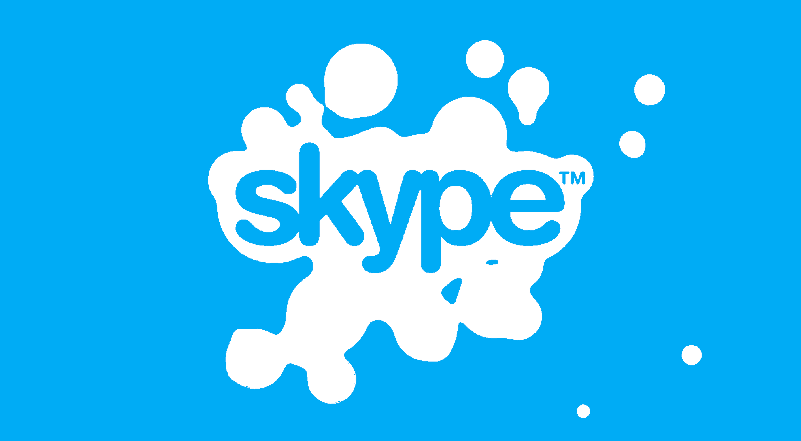
The level of animation varies depending on the designer, but it can go all the way from a short video presentation to a few simple moves. The Skype logo is an excellent example of something simple, that multiple designers have played with to great effect.
Today, there are plenty of open-access tools helping to create more immersive animated graphics in the logo design world. Additionally, the types of animation available are becoming more impressive all the time.
2. Explore the Types of Logo Animation
The next stage of properly leveraged live logos, is knowing what kinds of logo animation are available. There are plenty of different styles of animation to explore today, depending on the kind of impact you want to have.
For instance, sometimes the animation you choose will be connected to your business. A vehicle company might have a logo that seems to “drive” into the central space on the screen. An electricity company might choose a logo that pulses like an electric charge. This animated FedEx logo is an excellent example of how animation can show what a business does.
Options for animation might include:
Rotation: Make an emblem stand out by moving it to the sides or allowing it to move on its axis. Rotation gives a logo a sense of 3D space.
Appearance/Disappearance: You can make a logo grow on the screen by bringing to life one pixel at a time, or have it dissolve and disappear in a similar way.
Transformation: Your logo doesn’t have to start out in the shape it’s going to achieve. You might start with a seed that gradually grows into a tree-shaped logo for a gardening company, for example.
Replacement: Another great way to tell a story is to replace a graphic related to the company in question with the logo through an immersive animated experience.
3. Set Goals for the Live Logo
If you’re not sure what kind of animations to experiment with, then it’s a good idea to start with some solid goals. Your goals will give you a direction to move in with your logo choices. An animated logo can be a dynamic and modern way to present a brand to an audience, but it’s only going to be effective when implemented carefully.
Let’s look at some of the goals you can choose for your live logo:
Differentiation: While it’s true that animation and live content is gaining more attention lately, it’s still relatively new as an overall concept. With an animated logo, you could help a brand to create a more unique image for themselves, which sets them apart from the other organisations in the same space.
Storytelling: As mentioned above, animated logos can tell a story about what the company or product actually does. In this example for Firefox, for instance, the logo mimics a loading wheel to demonstrate a speedy internet browser.
Brand awareness: Dynamic logos and animations are more likely to capture your audience’s attention than static images. They’re also more of a novel experience, which means that customers might want to share them with other people too.
Memorability: Today’s customers are bombarded by hundreds, if not thousands of logos all the time. They need something special to convince them that one image deserves a spot at the front of their mind. Animation can help to make a business more memorable.
4. Do Your Research
Doing your own research is an excellent way to get some inspiration for a live logo or animation. Ideally, you’ll want to focus on the industry you’re already working in, as this will give you some guidance as to the kind of movement that can attract the most attention from the correct audience.
Watch as intros to brand videos and check out as many live logos as you can. Check out the kind of animations that people use in their videos when they’re showcasing products online. You can learn a lot about what works just by evaluating what other people have done before. Just be careful not to simply copy what you’ve found elsewhere.
The aim of your live animation should be to tell a unique story about the company
The aim of your live animation should be to tell a unique story about the company in question. If you’re not sure how to start with differentiating the image, check out the brand guidelines for the company in question. The guidelines that the company used to choose the right brand colors, fonts, and other visual assets can work just as well for your animation strategy.
Remember, the aim here is to tell a specific story, send a message, or evoke a certain emotion. Don’t make the mistake of designing something that looks cool but doesn’t have much of a purchase. Most human beings will naturally look for the meaning behind the content that they see. If there isn’t anything there, it’ll just lead to confusion.
5. Use Live Logos on Brand Websites
The most obvious way to begin experimenting with animated logos in web design, is to implement live logos into a client’s website. Some companies have a “welcome screen” for their site which uses an animation to introduce visitors to the home page and other navigation options. There are also brands out there who love the impact that animation can have but want to use it more subtly.
In these cases, live logos can be an excellent way to draw the eye to a specific spot on a website, perhaps the area just above the “contact” button that encourages a client to reach out. Crucially, to avoid weighing down the website and distracting visitors, companies and designers will need to make some important choices.
Although it might be tempting to keep the animation looping at all times, just in case someone misses the first round, this requires a lot of extra processing power. Too much animation also makes it harder for businesses to push the focus of their visitors to other points on the website, like landing pages for products, or testimonial pages.
Often, as with most innovative decisions in web-design, the best bet is usually to start small and work your way up. Don’t over-do it with animation on day one. See how the visitors to the website respond first.
6. Find the Right Balance
Animations in a live logo are there to grab attention quickly, and effectively. They shouldn’t go on for too long, or you risk overwhelming your audience before they have a chance to browse the rest of the website or check out other content. A live logo should only be active for a few seconds at most, and in that time, it needs to say something valuable.
Often, the best strategy is to start by building up curiosity, and getting your viewer engaged so that they’re keen to see more. Every frame will count to pull the customer in and make them feel connected to the brand in question.
Make sure that the logo animation is dynamic so that it doesn’t just capture the attention of the viewer but maintain their interest for the full time required. During the motion, the viewer’s brain should be working to figure out what’s going to happen next.
Just like most logo design and graphic animation strategies, the key to success is finding the right balance between clever experiences, and simplicity. You want to do something meaningful that earns your viewer’s attention, but you need to compete with the fact that attention spans are plummeting all the time.
7. Explore Logo Animation in Video
One of the best ways to use logo animation, is to draw interest for a company at the beginning of a video. Video is gaining incredible levels of popularity lately, particularly in a world where you can view video content almost anywhere. Companies are adding videos to their product pages, social media accounts, applications, websites, and so much more .
For the majority of companies, a live logo at the start of a video can help their brand to seem more professional. It’s a reminder to viewers of the brand that they’re learning about with that video content. Plus, a logo at the beginning of a piece of video content can also build on the consistency that companies attempt to create by using the same brand assets in various mediums online.
(Starting a video with an animated logo is great for presentation, but it can also be frustrating to customers in certain pieces of content where they’re looking for quick answers to questions. If an animated logo is more than a couple of seconds long, it may be better placed at the back of a video instead.)
With videos for news reports or announcements where you want to get straight to the point and generate excitement about a new product or service, it can be better to jump straight into action. Ending a video with a live logo keeps the brand image front of mind for the customer for longer, even after the message has ended. On the other hand, ending a video with a logo could increase the chances that customers miss the animation, because they click away from the content too quickly.
If you’re new to adding live logos into videos, consider experimenting with different strategies to see which works best. Different companies might get unique results.
8. Bring Logo Animation to the Real World
Another interesting option for live logo design, could be to step outside of the computer screen for a while. In today’s digitally transforming landscape, it’s becoming more common to see the real and digital worlds converging. Most events and trade-shows come with presentations that rely on digital content, like animated presentations and slide shows.
Depending on the signage solutions available at industry events, companies could even use an animated logo above their booth to draw attention in a cluttered environment. Around 48% of exhibitors agree that a more eye-catching stand or booth is often the most effective way to attract visitors and customers at an event.
Animation and live logos may have started life on the computer screen, but they can appear in much more diverse environments today. Offices could use a live logo in the reception room or lobby to make their on-premises environment more appealing. Retail locations could display ads on digital signage, followed by live logos that work to both separate messages, and keep shoppers entertained when they’re enjoying the bricks-and-mortar experience.
9. Include Live Logos in Brand Signatures
Remember, a live logo doesn’t just have to sit on a company’s app or website until someone discovers it. Sometimes, the right logo can also be a powerful way to “sign off” on a message from a brand or its management team. For instance, email remains to be one of the most valuable tools for business marketing and customer relationship building today.
It’s the third most influential source of content and news for a lot of B2B audiences, and yet, most companies aren’t taking full advantage of what their email marketing software solutions are capable of. If you can display gifs and animated videos in an email (which most software solutions can), then you can also add a live logo to the brand signature.
The important thing to remember is that if you’re going to be adding a signature to a lightweight thing, like an email, it needs to be lightweight too. Don’t make the live logo too long and complicated, or it might prevent the email from loading properly.
Outside of email, don’t forget to consider options for live logos in things like social media profile pictures too. According to experts, around 80% of companies use visual assets in their social media marketing. A live logo is a great way to go beyond the basics with a company’s imagery. Motion grabs attention, and video content is quickly gaining steam on a lot of social media platforms.
Embracing a New World of Live Animation
Designers are only just beginning to scratch the surface of what’s possible with animated logos. For many companies, live logos are an excellent way to capture audience attention and encourage engagement with a brand.
A live logo at the beginning of a video, at the start of an app loading screen, or even at the top of a website can differentiate a company and make them stand out. As technology continues to evolve, and customer expectations continue to expand, the options for live animation could continue to grow. You might even be able to infuse live logos with elements of VR and AR, to impart brand essence in a brand-new digital world.
If you haven’t begun experimenting with live logo design yet, now could be the time to start.
https://ankaa-pmo.com/wp-content/uploads/2021/04/9-tips-for-better-live-logo-design.png15292780Service comm.https://ankaa-pmo.com/wp-content/uploads/2017/04/Logo-Ankaa-engineering.pngService comm.2021-04-14 16:45:092021-04-14 16:45:099 Tips for Better Live Logo Design
The best thing about writing about website design trends each month is looking at all the great sites that are being developed. Designers are stretching creatively and exploring new techniques and ways of doing things all the time.
It’s refreshing and inspiring. This month, some of those trends include a style that nods to brutalism, slide scrolling that’s interesting and fresh, and animated typography.
Here’s what’s trending in design this month…
1. Almost Brutalism
Brutalism can be a lot to handle and only really works for certain types of projects. That being said, some of the elements of brutalism can be the foundation for an interesting aesthetic.
So, it’s not surprising that an “almost brutalism” trend has emerged.
Designers are working with some of the design elements – slab fonts, simple color schemes with a lot of contrast, twitchy animation, mono typefaces, and overall design patterns that are almost over-simplified.
The result is a striking design that isn’t so harsh that it turns users away. It’s the right combination of brutalism and usability to create something with a harder-edge feel that people understand.
Good Garms uses a typewriter-style typeface, simple patterns, and one of the most streamlined designs you might find for an ecommerce store. It’s effective and makes you look because it is different.
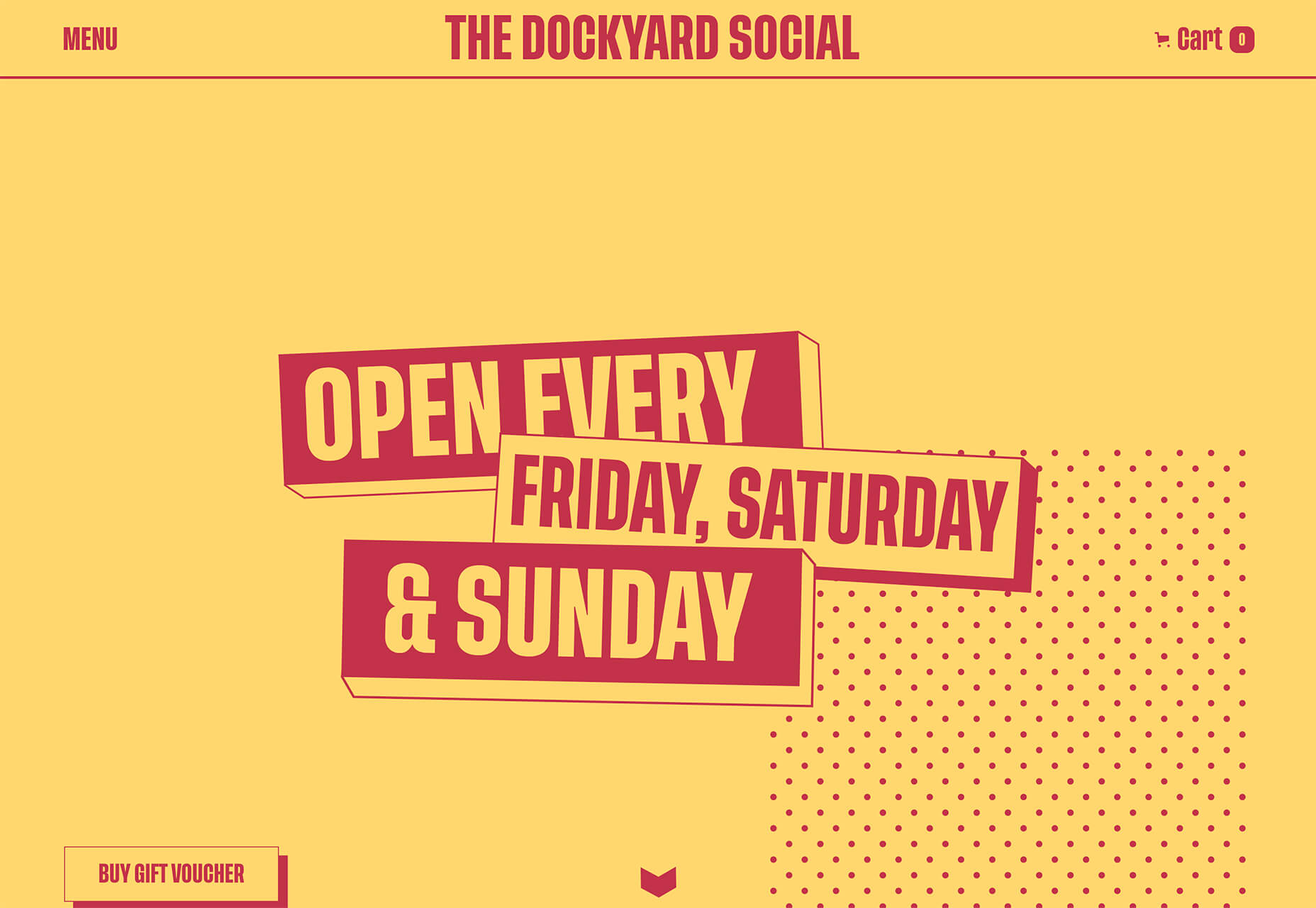
Dockyard Social uses an unexpected color combination with high contrast, sharp shapes, and design elements, and bold slab typography to grab your attention right away. The theme continues on the scroll with new color combinations with equally brutal design elements. It feels a little tight and uncomfortable in places but still highly usable – exactly what almost-brutalism intends to do.
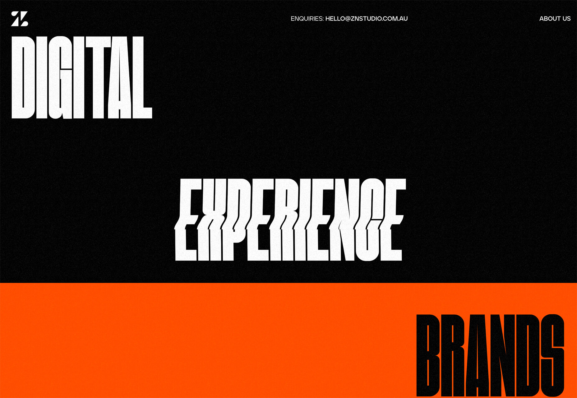
ZN Studio uses the same big, bold type elements as the previous example with a twitchy-style animation to draw you into the design. The entire design uses clever animation effects with a brutal aesthetic to keep you scrolling.
2. Beautiful Slide Scrolling
You can argue the value – or lack thereof – of website sliders as long as you want to. The reality, though, is that, for the most part, they are clunky and get in the way of the content. It’s a lazy option that keeps you from having to make a content choice.
Not with these beautiful slide-scrolling website designs.
Each of these designs uses side-scrolling as a design asset. Here’s the trick that makes it work: Slide scrolling isn’t a “feature” above a bunch of other content. It is how the content is featured.
These examples show you how to use the trend well and should get you excited about slide (or side) scrolling.
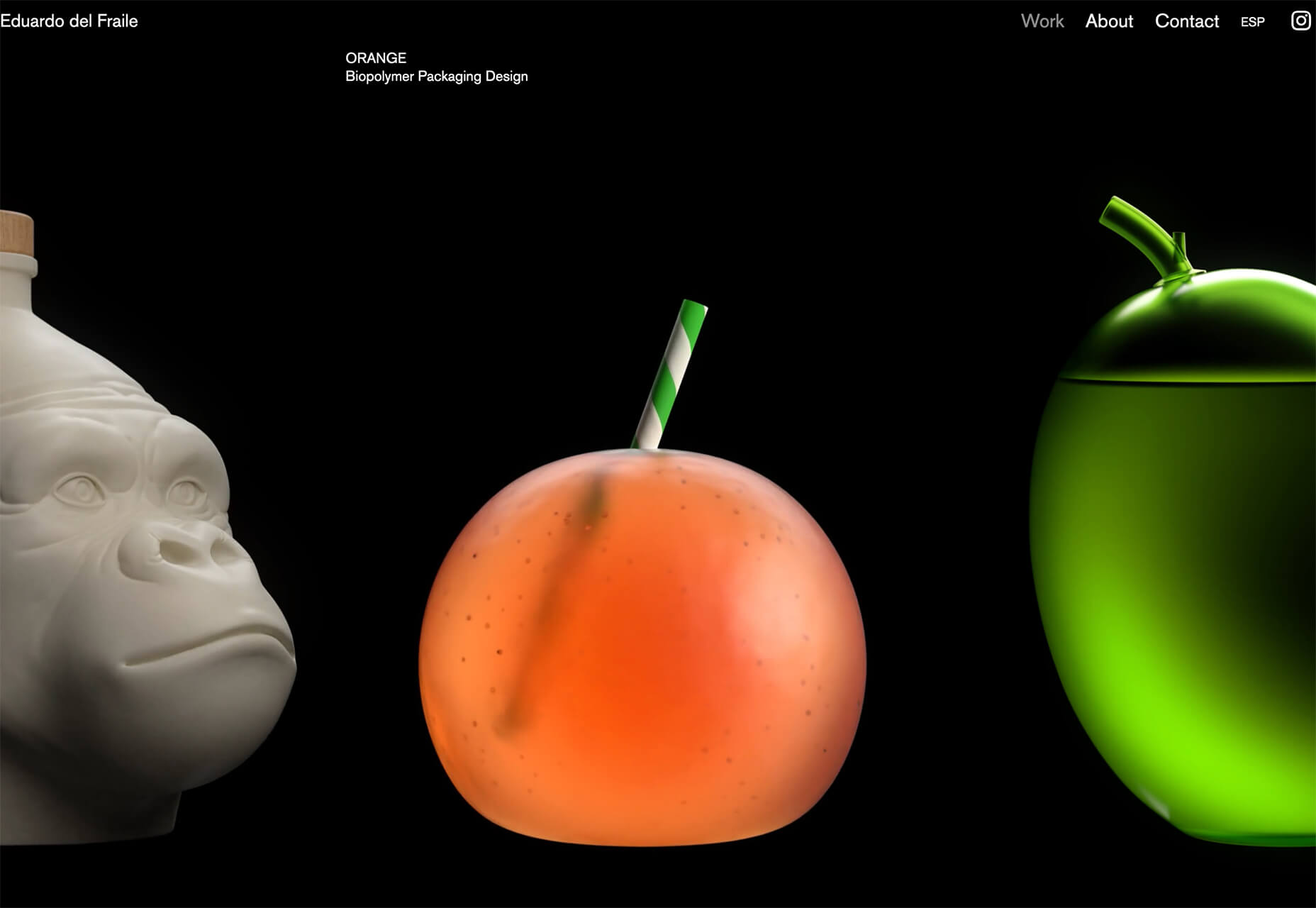
Eduardo del Fraile uses a side scroll to show different projects in his portfolio. In addition to scroll, each element also has a simple and beautiful animation that allows you to see each product he has designed. Everything about the scrolling motion is intuitive, and the site never scrolls vertically, which is where many side scrollers go wrong.
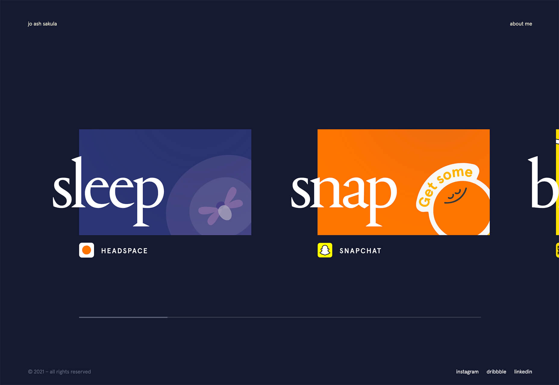
Jo Ash Sakula uses a similar concept for the side scroll here but with different design elements. The bold card elements are striking in terms of color, contrast, and design. You know the scroll will move horizontally because a third element sneaks into your field of vision on the right side. It’s simple, clean, and highly usable.
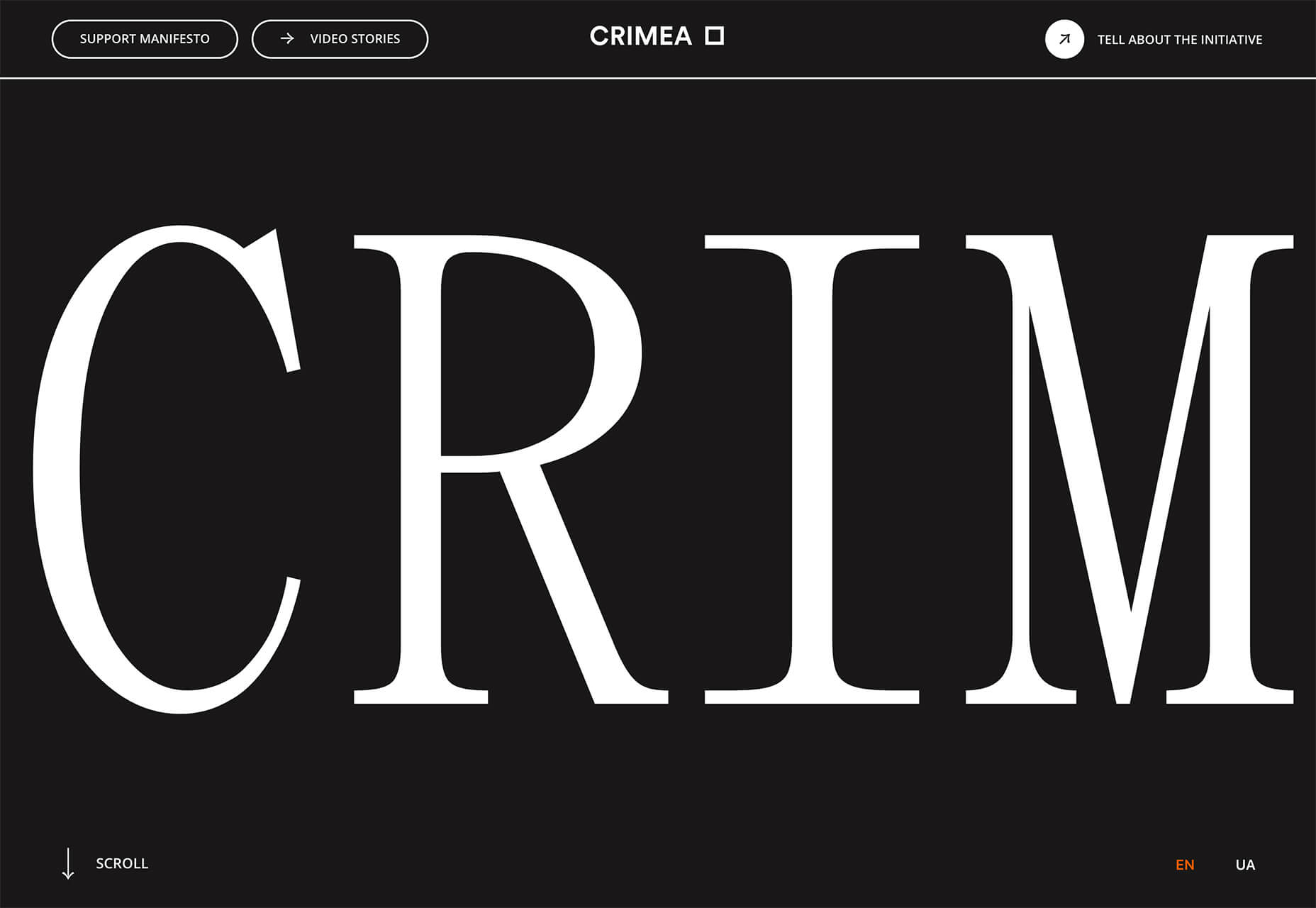
Crimea is interesting because it has an “almost brutalism” style design and uses a side-scrolling pattern. The design is bold and almost overwhelming, but the scroll works to tell a nice story with visuals and content.
3. Typography Animations
Web typography can make or break a design from font choice to size and color to animation, every detail with text elements matters.
This trend explores and pushes the boundaries of animation with text elements in website design. And it is so tricky. The difference between an amazing result and a design fail is a thin line that can be quite subjective.
Each of these examples does something unique with text and animation together to create just the right feel. The flow for each is seamless and text elements – while incorporating movement – maintain readability.
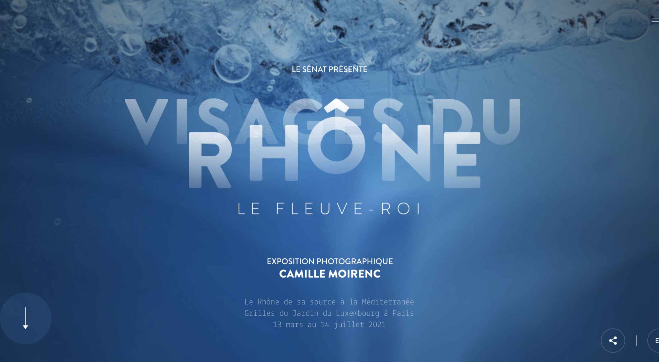
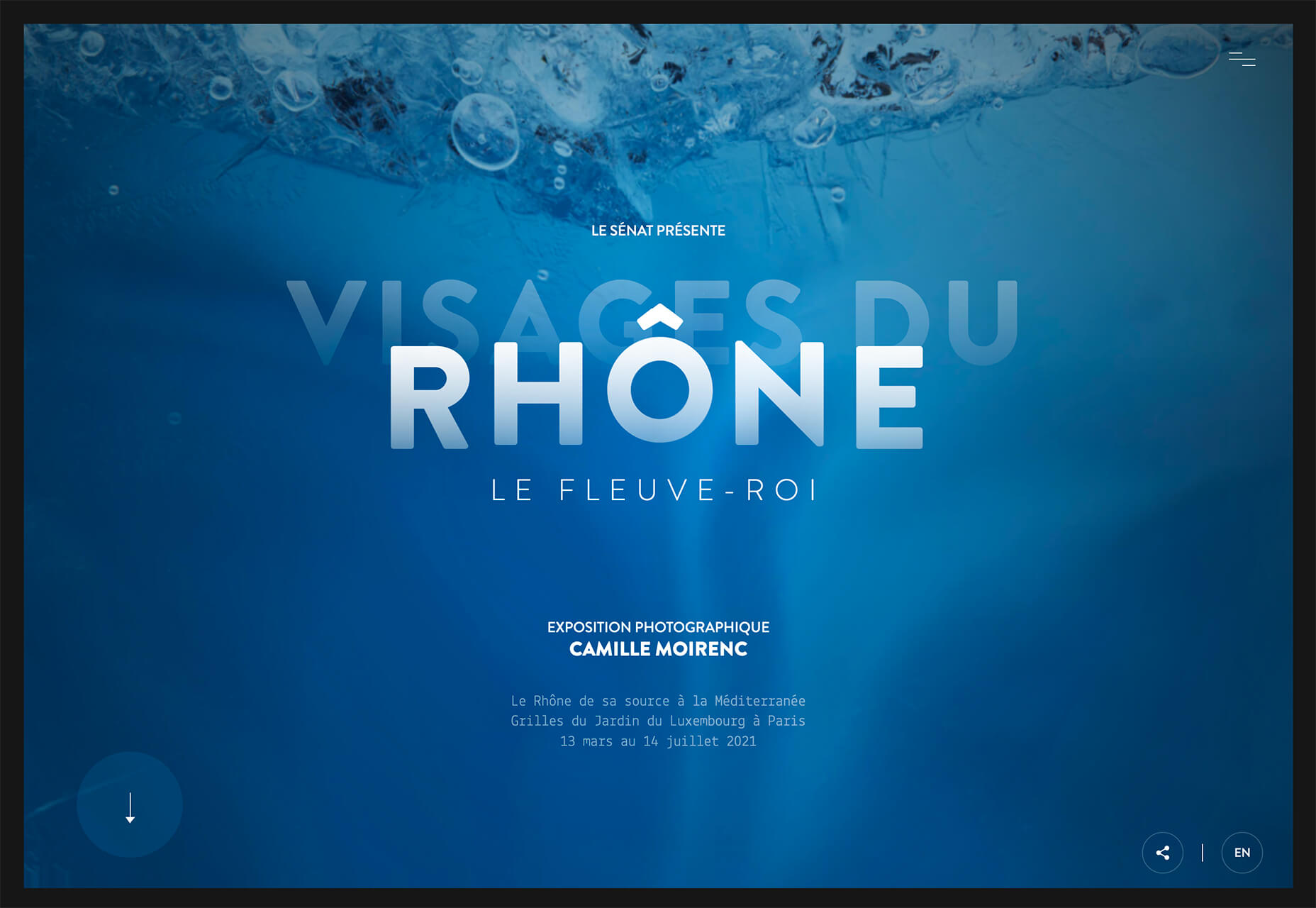
Visages Du Rhone has two layers of animation. The first happens as the words come onto the screen as the color and fade change within the letters. The second is a subtle hover state with a fluid feel for the letters that match the design’s underwater theme. What’s special about the typography animation is that it happens without distorting the letters, something many other liquid text animations do.
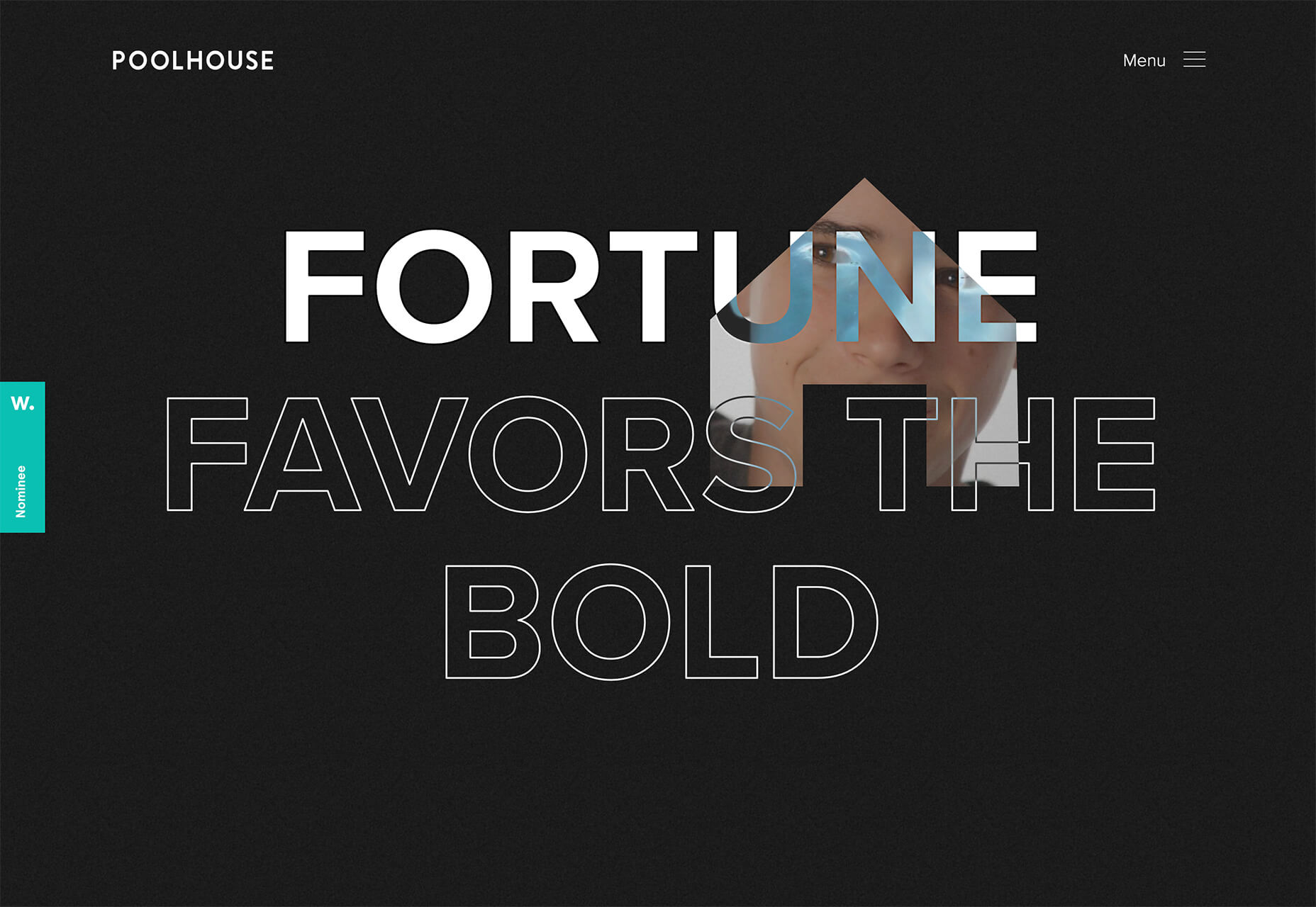
Poolhouse uses transparent letters with movement in a layer behind the words. What’s very neat here is the additional filtering so that the background motion still works while maintaining the integrity of each letterform. Again, the focus on keeping text readable is what sets this design apart and makes it trend-worthy.
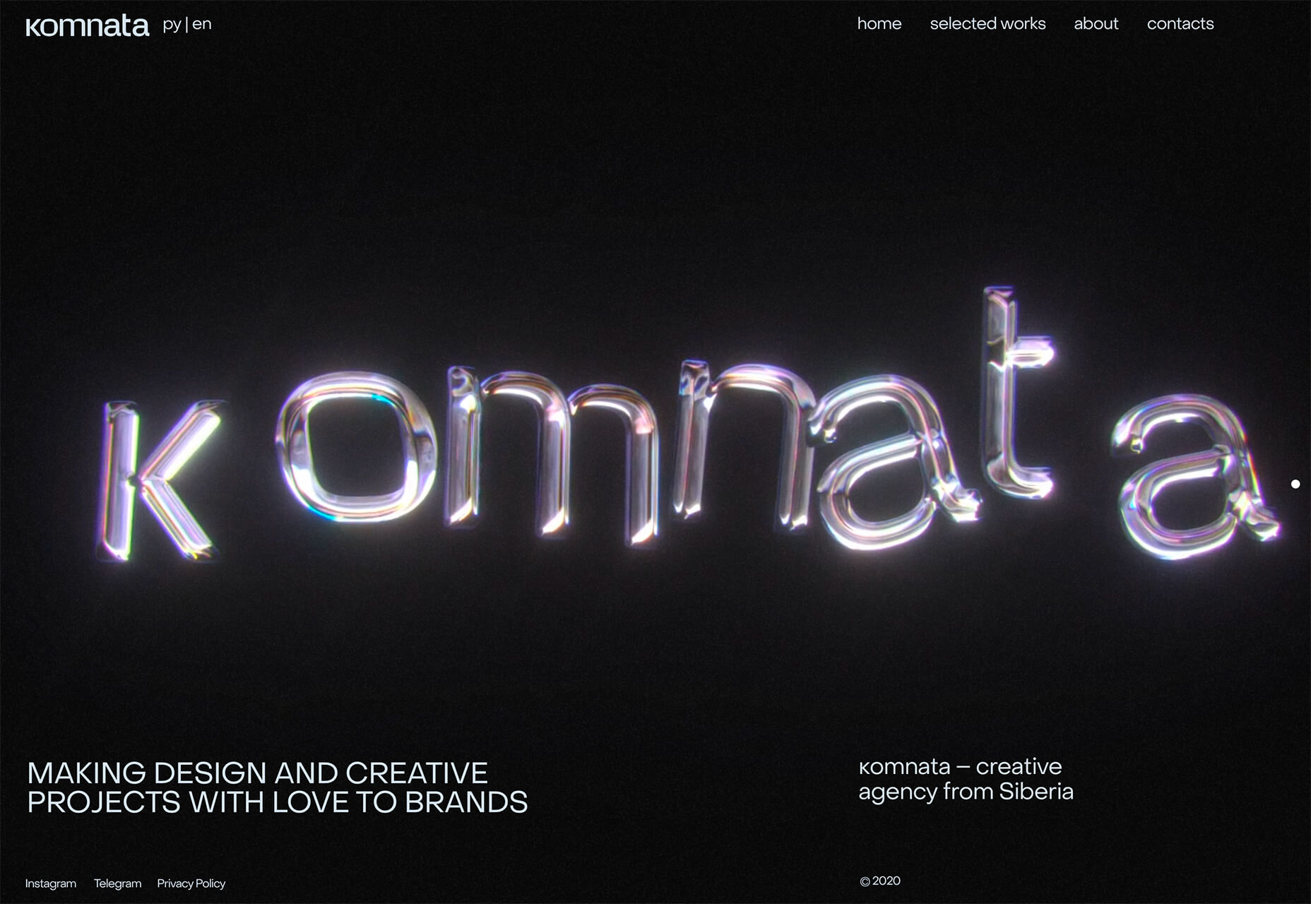
Komnata takes a wholly different approach with letters that float and look like balloons. The motion mimics what you would expect from an element that looks and feels like something in the real world. The user doesn’t have to do anything for this motion to take place. The animation might be even more effective if the scroll and pointer did not have a tail that “draws” on the screen as a distracting element.
Conclusion
The good thing about looking at variations of different trends is that you can see the practical application and apply it to your projects. While you might not move to a full sliding scroll on your website homepage, you could use that concept in another part of the design.
Experiment, have fun and draw inspiration from trending website designs.
This month’s collection of the best new websites launched or updated in the last four weeks features color, and more color, and then — just for good measure — a bit more color. Yellow is a hue of choice, but you’ll also find burnt orange, rich purples, and greens and blues in equal measure. What is missing is the tech-blue of years past, replaced with something altogether more Mediterranean. Enjoy!
Cevitxef
This site for Cevitxef ceviche restaurant in Bilbao creates drama with oversized text, heavily styled photography, white on black, and lots of movement.
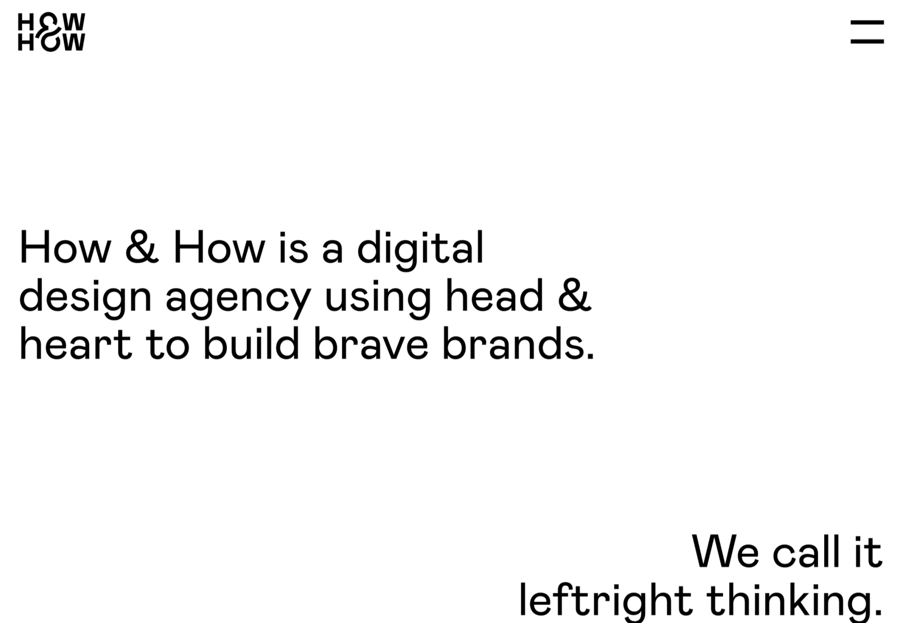
Digital design agency How & How keep things light and clean for their own website.
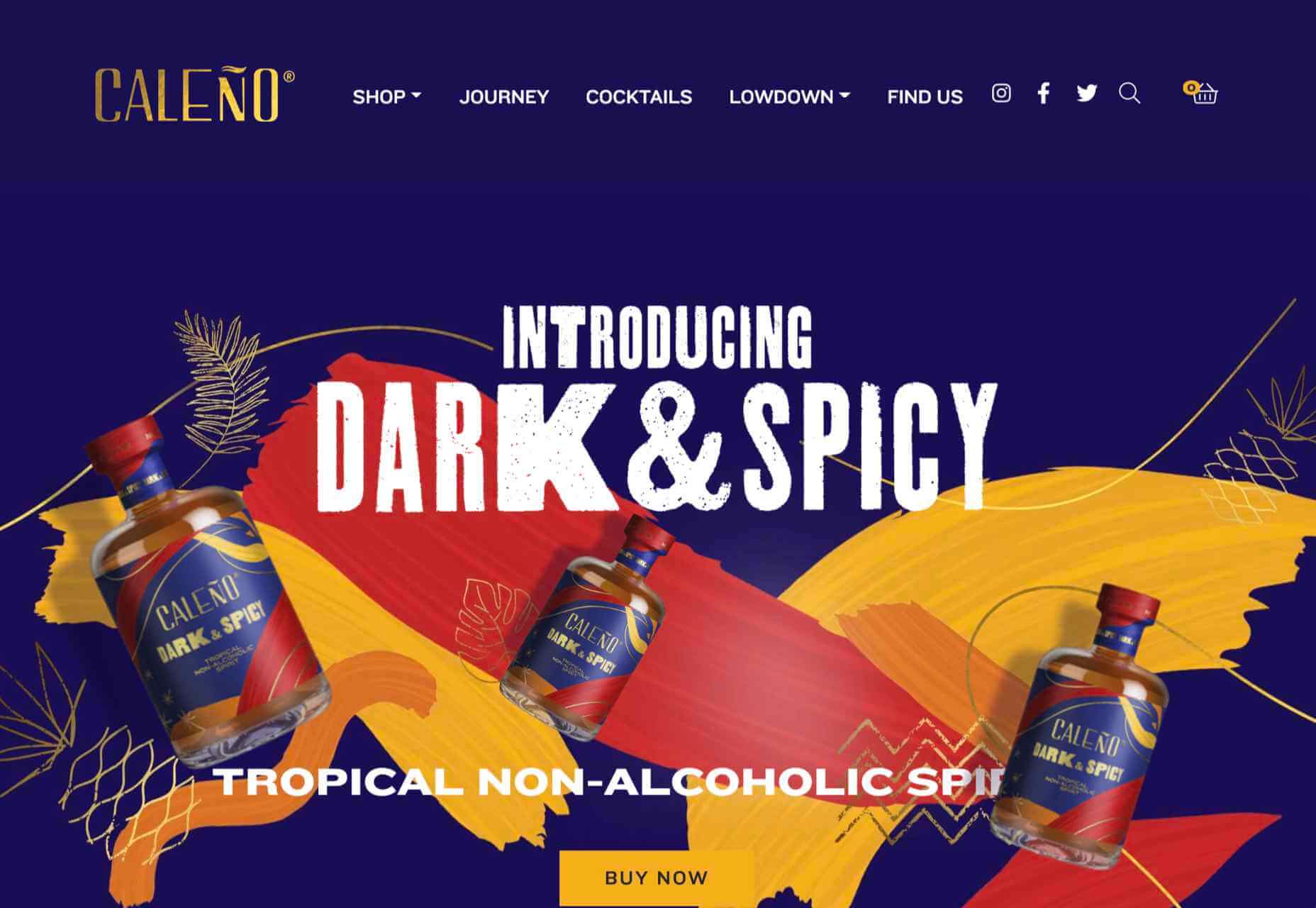
Caleño
Caleño makes non-alcoholic distilled spirits. Their relaunched website is bright and joyful, reflecting the character of the brand.
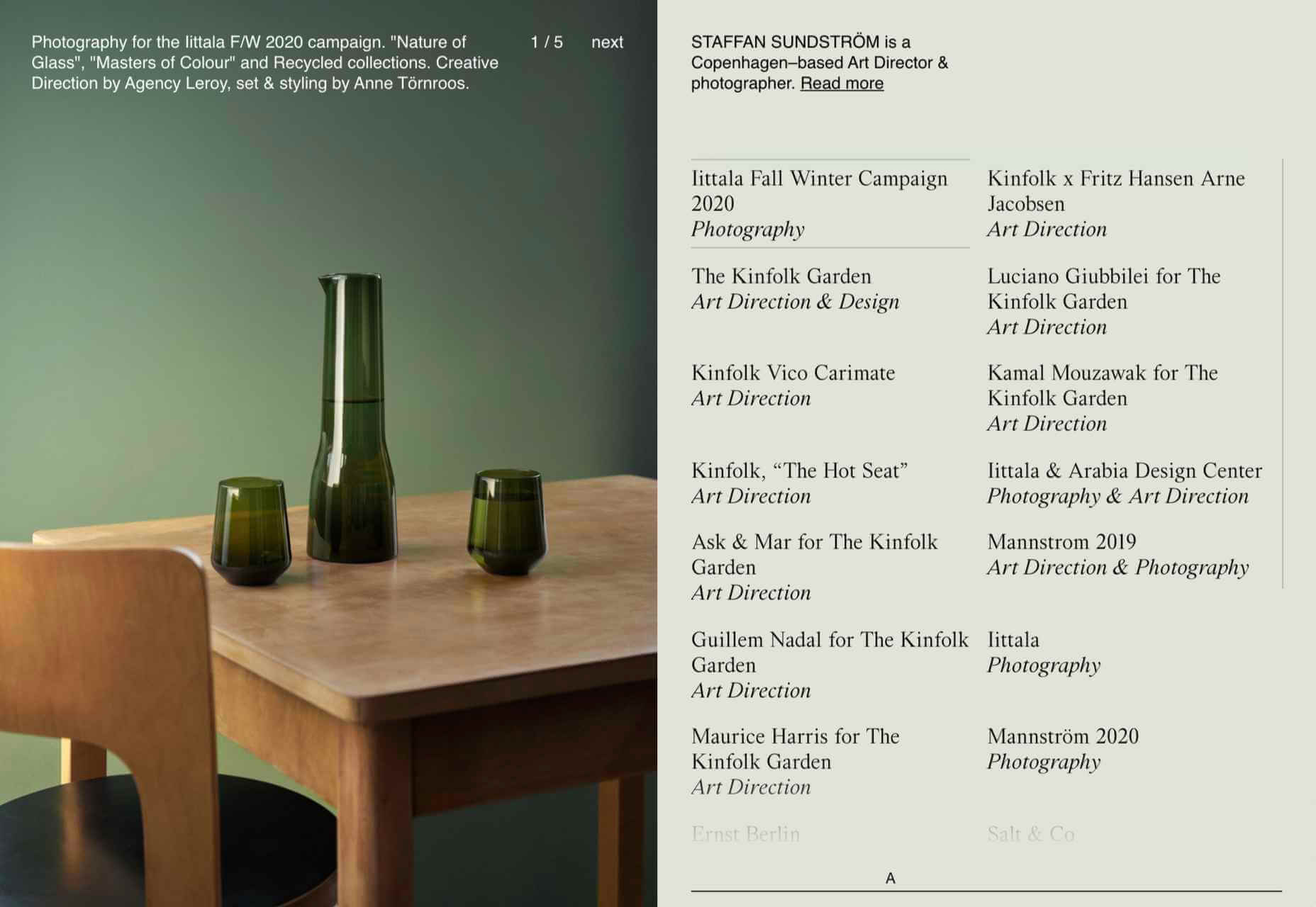
Staffan Sundstrom
Art director and photographer Staffan Sundström has a simple portfolio site that matches his work’s calm, minimalist aesthetic.
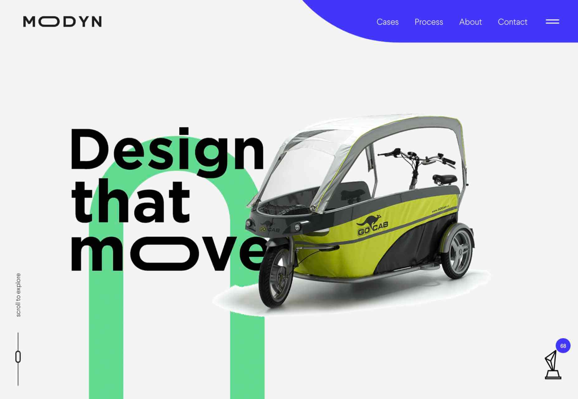
Modyn
Modyn is a product design agency with a focus on mobility. The flexing of logo text and occasionally other elements adds a nice touch to an otherwise simple design.
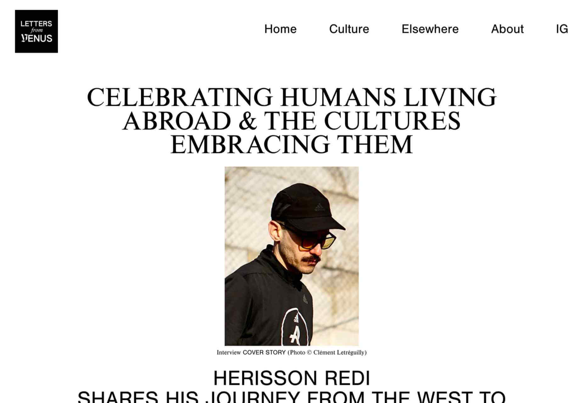
Letters from Venus
Letters from Venus celebrate people living abroad and the cultures that embrace them. An asymmetric grid creates light and space.
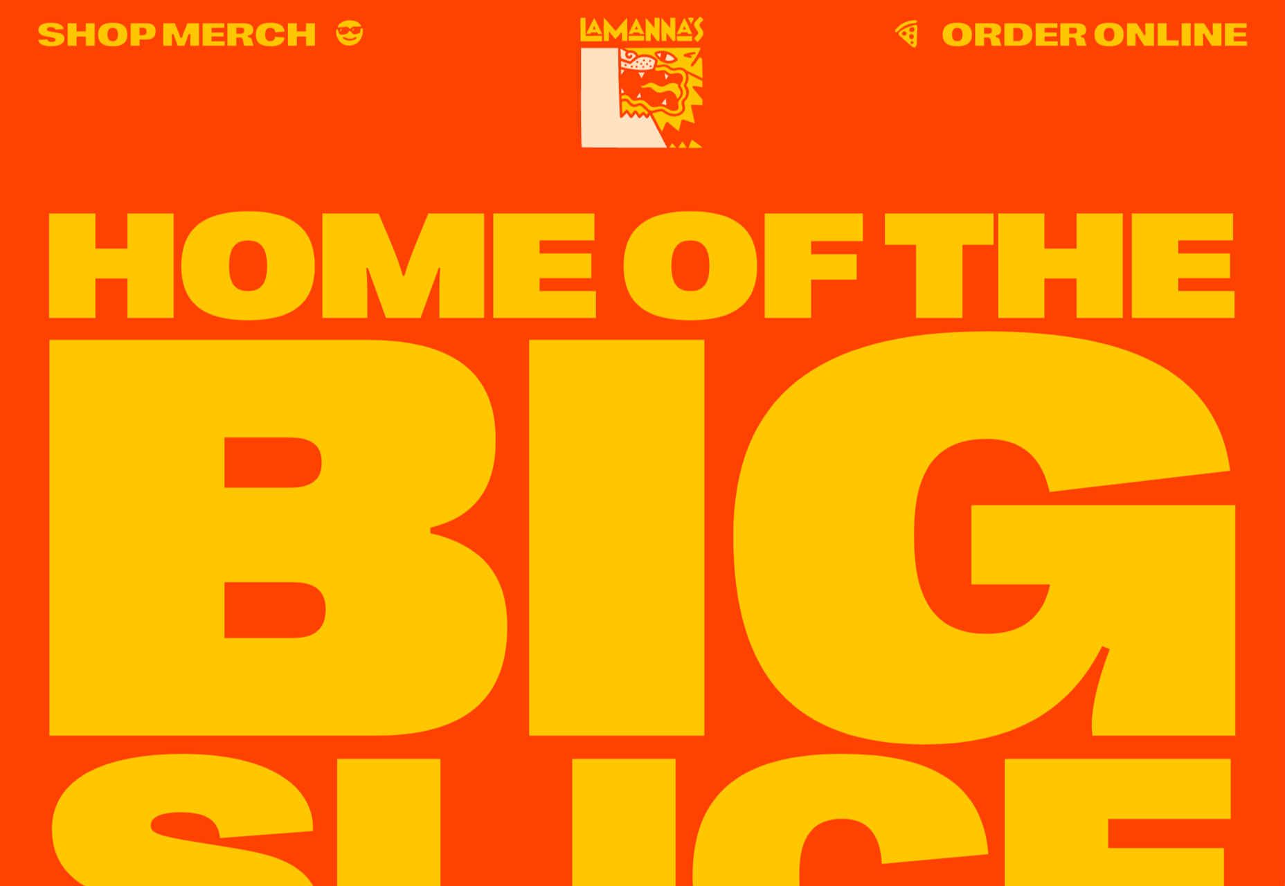
La Manna’s
La Manna’s makes giant pizza slices and pizza cake slices. Their site has a larger-than-life feel with a nod to the 1970s.
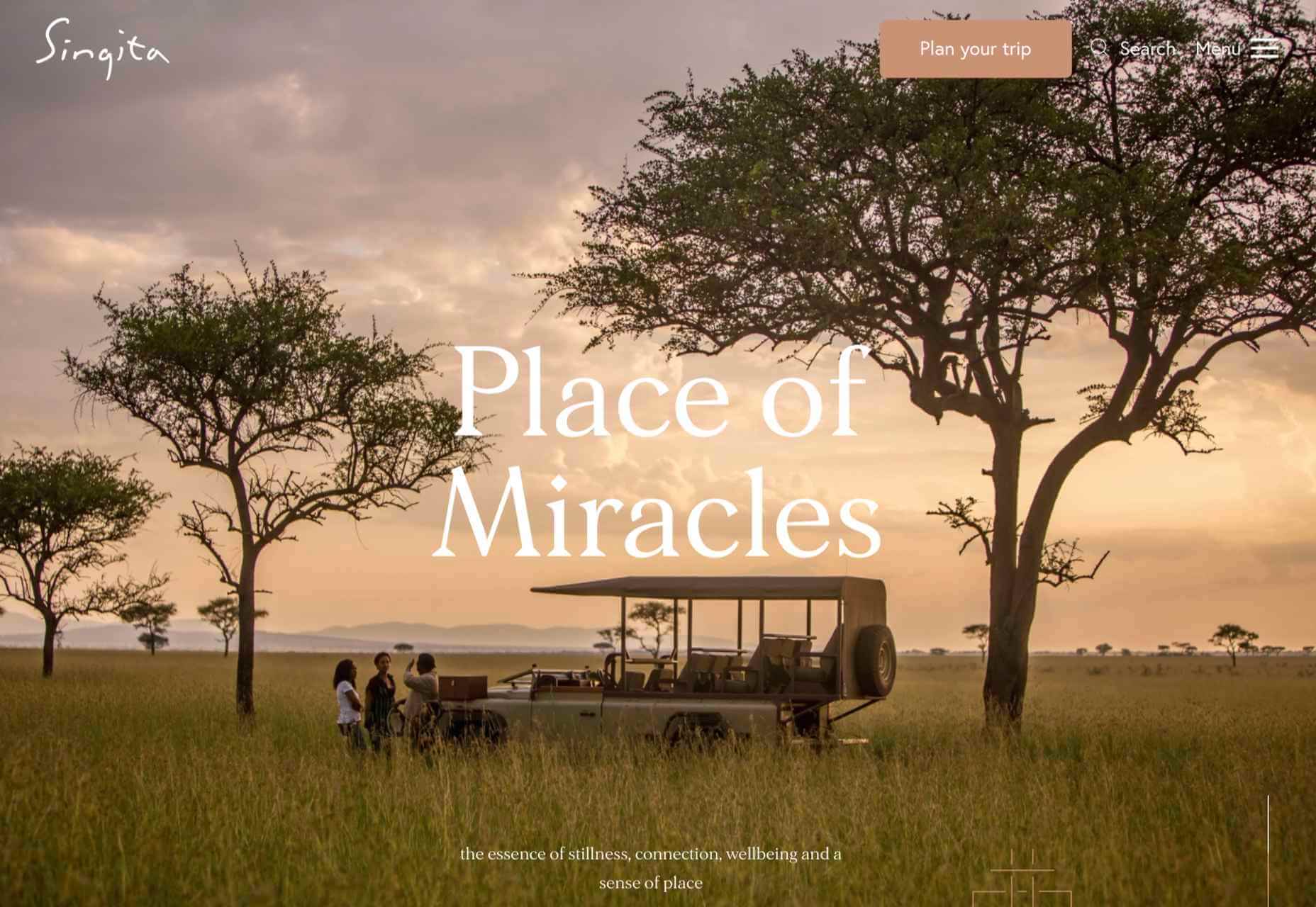
Singita
Singita is an ecotourism and conservation brand based in south and east Africa. High-quality photography and a warm, terracotta-based color scheme create an inviting ambiance.
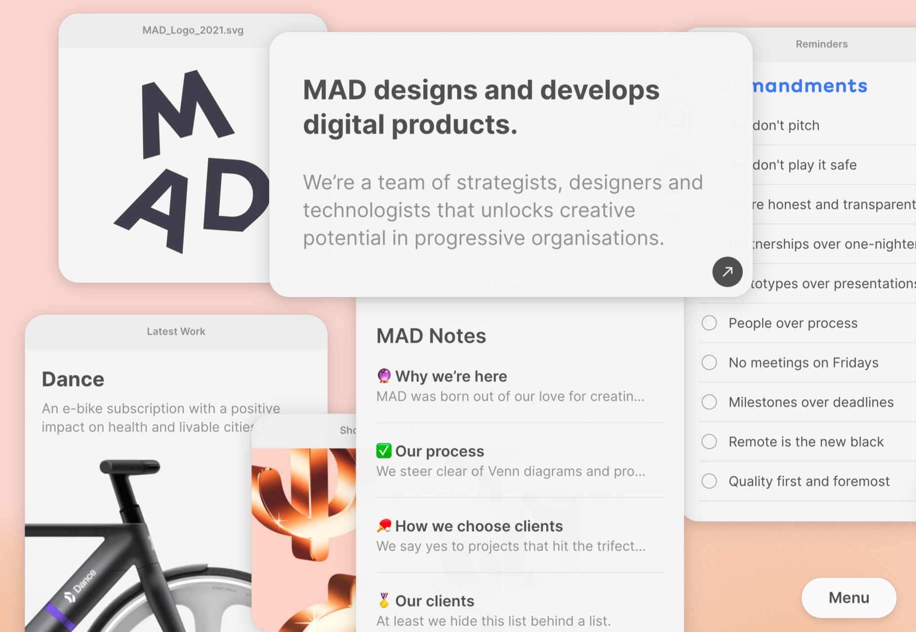
MAD
Digital product design agency MAD has gone for an app-like feel to their website. There is some nice user interaction, and they stay just the right side of cutesy.
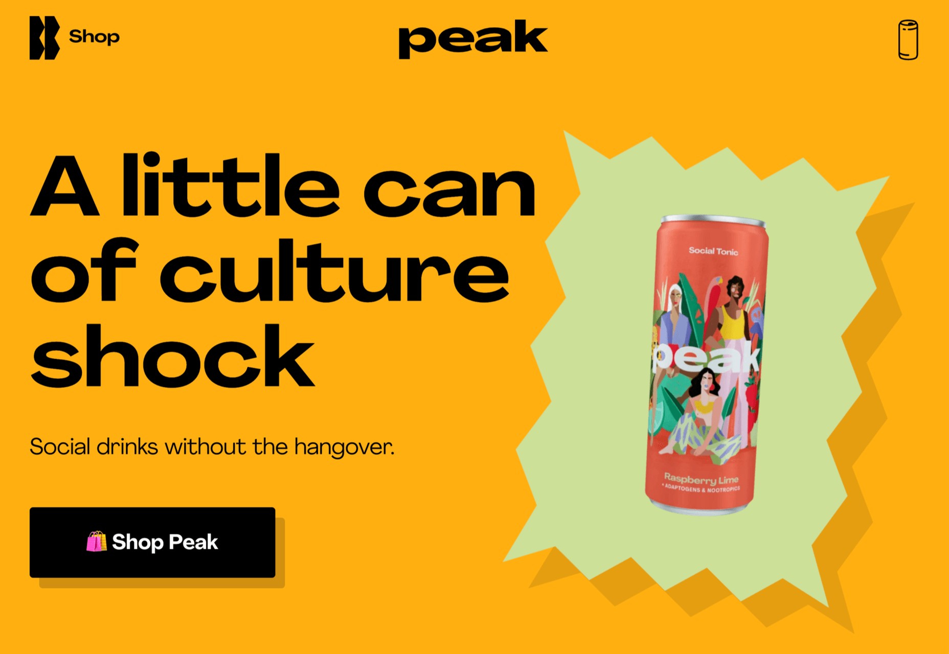
Peak
Another non-alcohol drink, Peak, has chosen the healthy angle, with further emphasis on the social. The site is colorful but minimal.
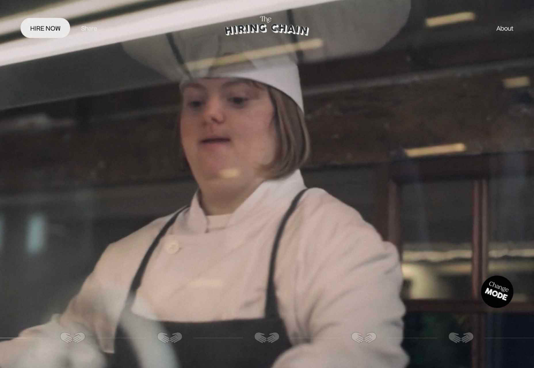
The Hiring Chain
The Hiring Chain website is part of a campaign encouraging businesses to offer employment to people with Down Syndrome. The centerpiece is a video, but the about information is clearly presented appealingly.
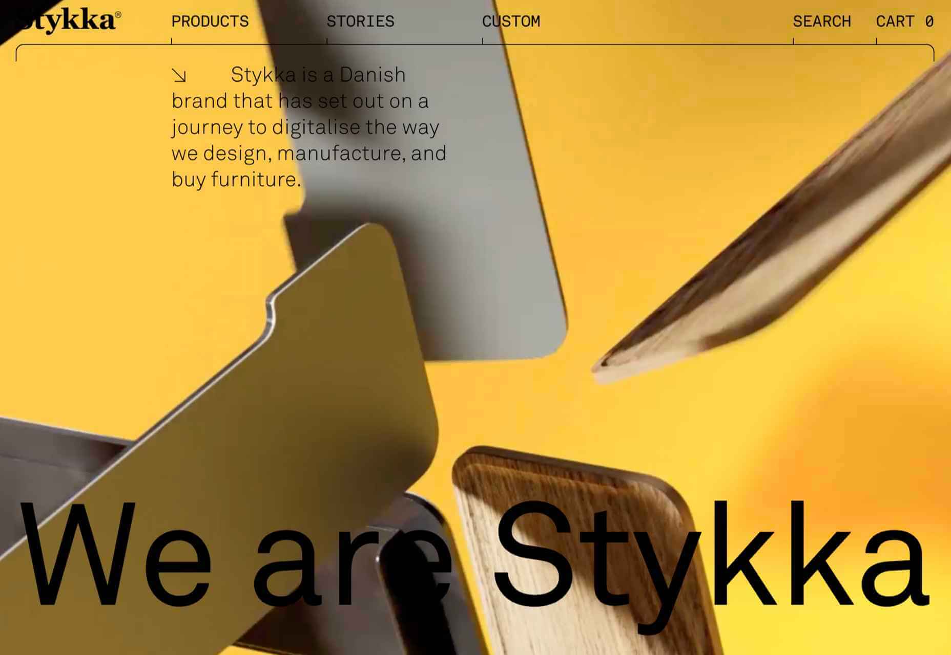
Stykka
Stykka’s aim is to digitize the design, manufacture, and buying of furniture. The site has a very light feel, with a simple type and good use of white space.
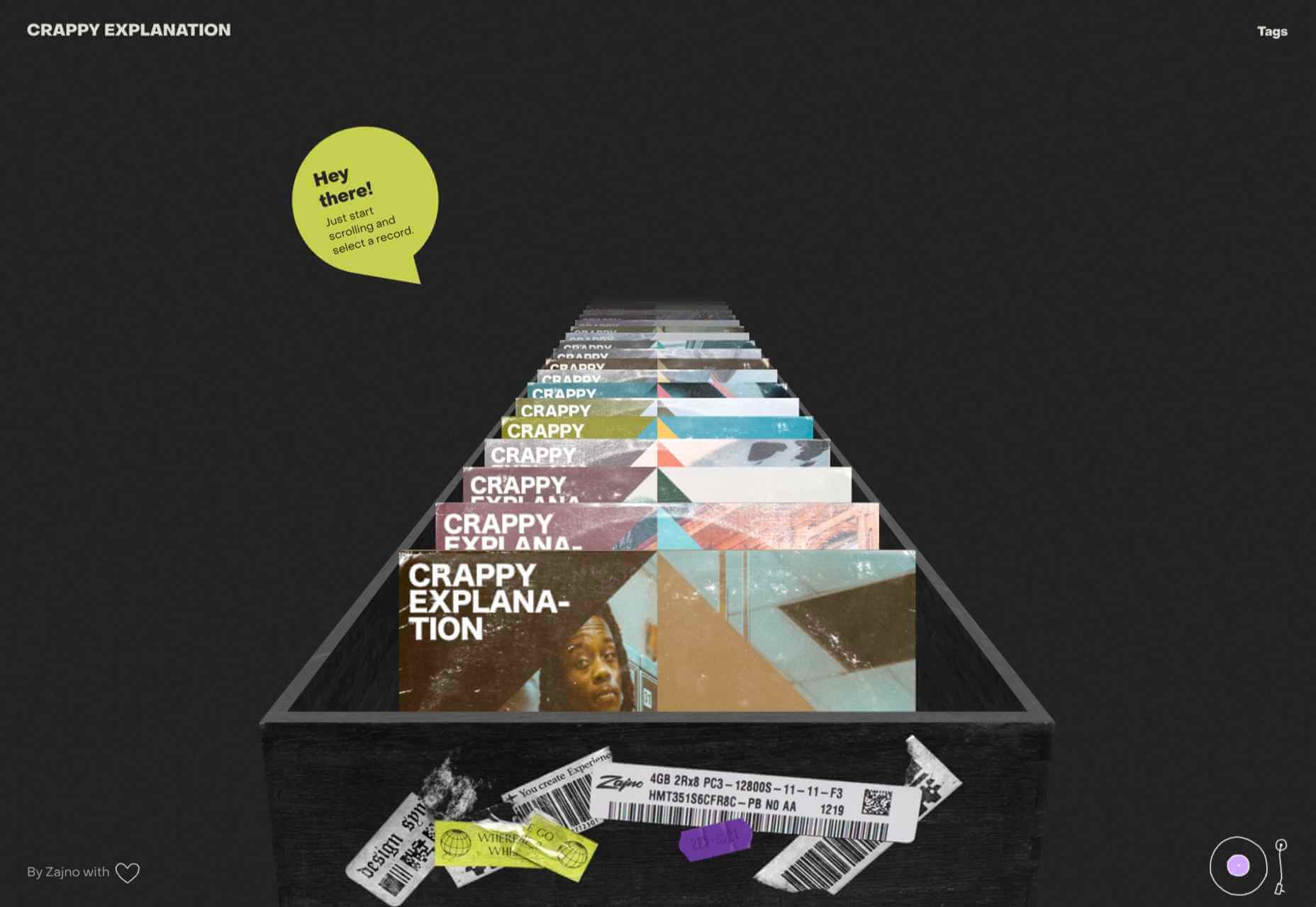
Crappy Explanation
Crappy Explanation is a fun microsite from design agency Zajno that links to various playlists in Spotify. As a promotional piece, it’s well done without being too flashy.
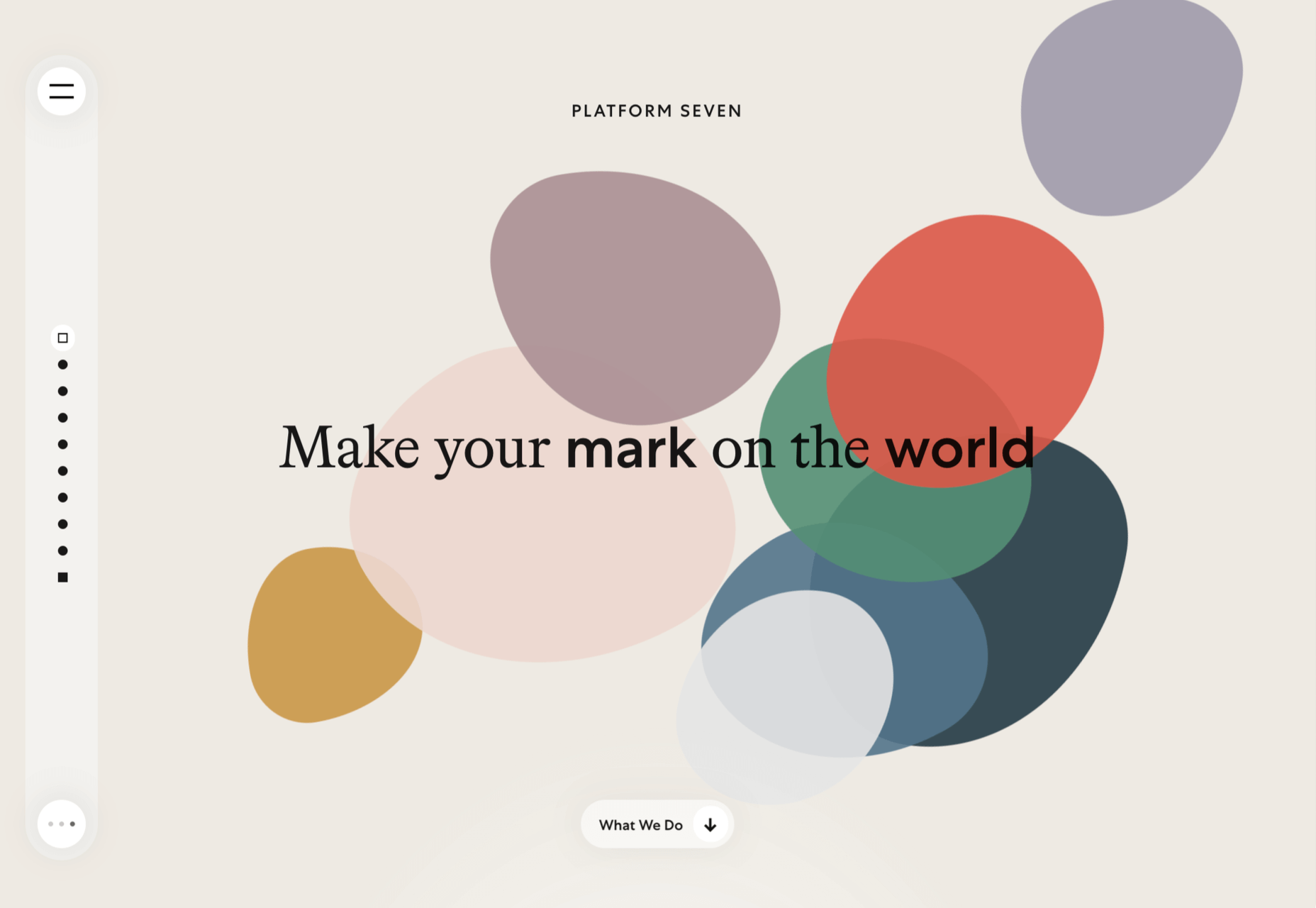
Platform Seven
Platform Seven offers career mentoring for young people. The site is well structured with a strong narrative flow and a positive feel to the color scheme.
Moth Drinks
This time the drinks are alcoholic: Moth does classic cocktails in a can. As holding pages go, this makes a statement with its black and white graphics and masking effects.
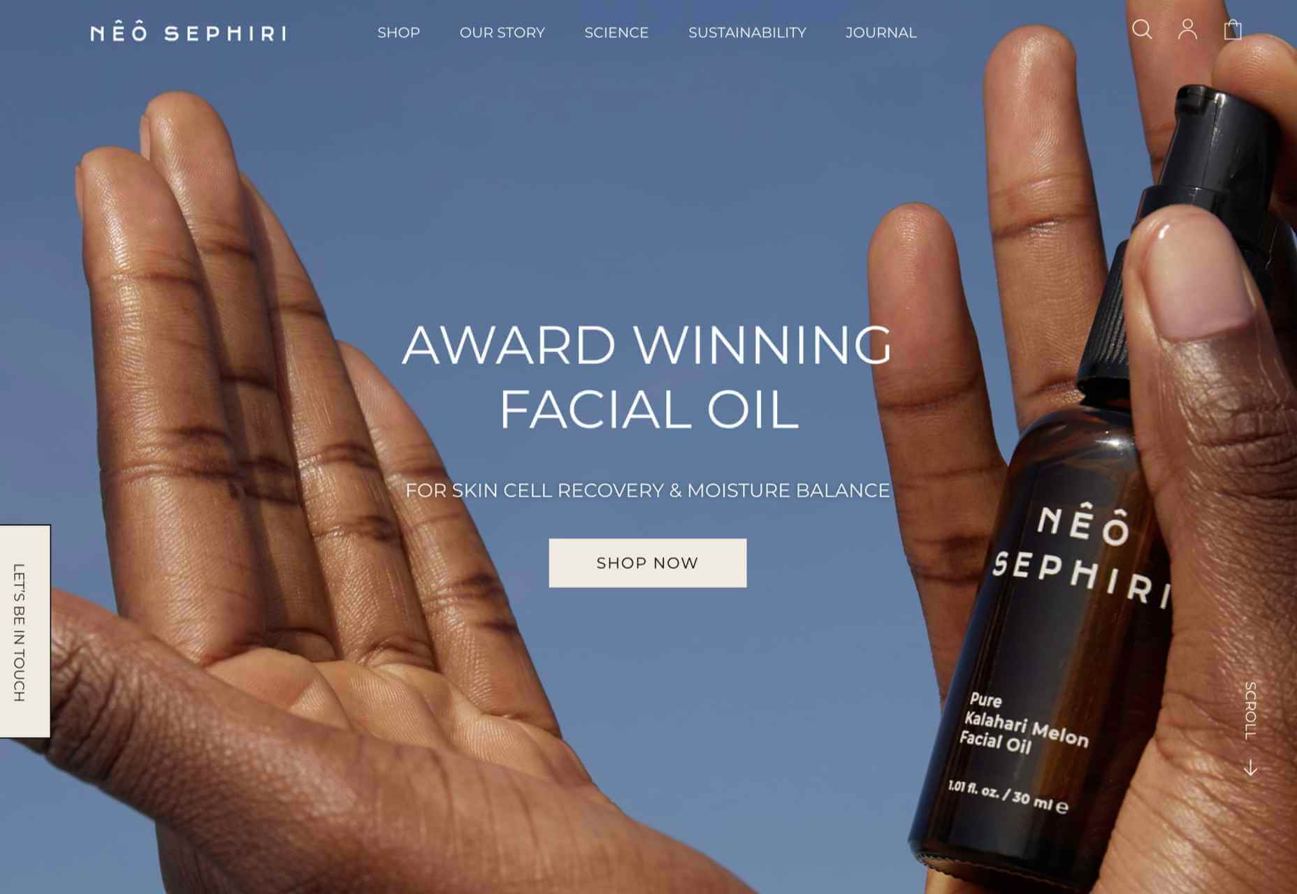
Nêô Sephiri
Nêô Sephiri is a facial oil produced from melon seed grown in the Kalahari. A nice blend of simple illustration and atmospheric photography underlines the nature angle with this product.
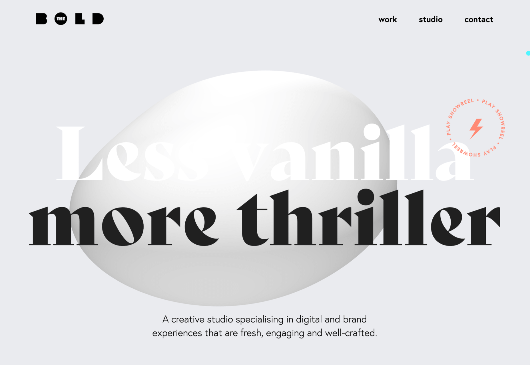
The Bold
Digital design studio Bold’s own site has some pleasing transitions and scrolling animation, teamed with fresh colors.
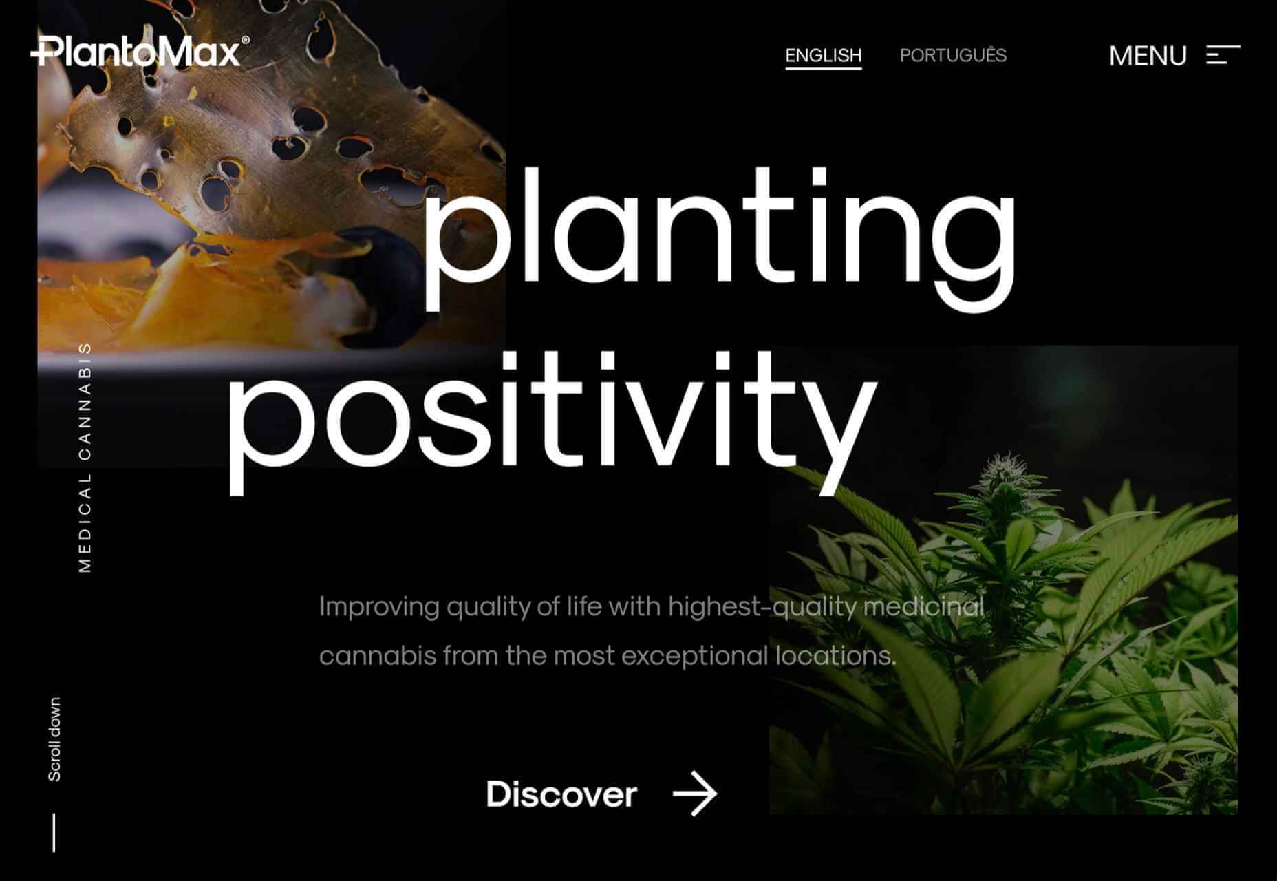
PlantoMax
PlantoMax produces medicinal cannabis from plantations in southern Europe. This is a glossy site, taking a clear step away from the usual hippy image of cannabis.
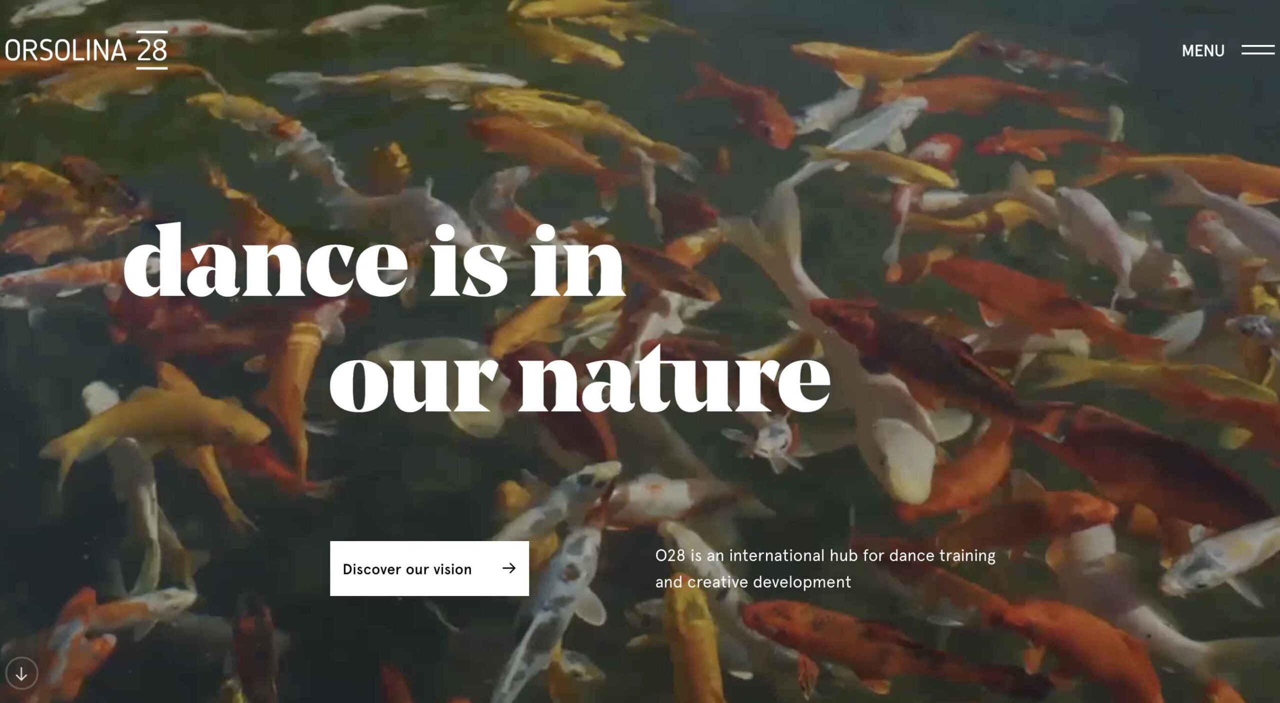
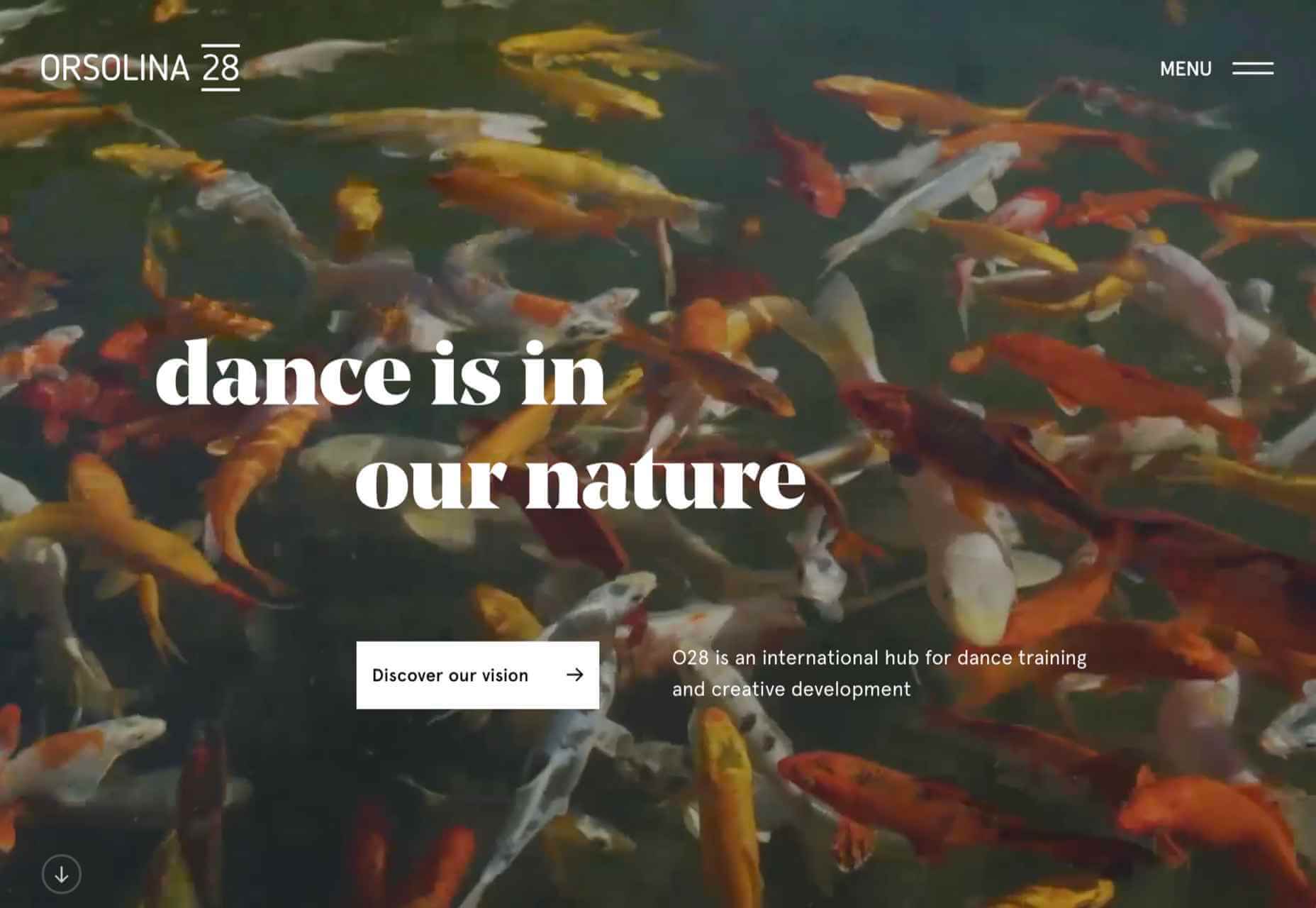
Orsolina28
Orsolina28 describes itself as a hub for dance training and creative development. Its setting in the Monferrato hills in northern Italy provides some great photography. The inline links to video are a nice touch.
https://ankaa-pmo.com/wp-content/uploads/2021/03/20-best-new-websites-march-2021.jpg14072560Service comm.https://ankaa-pmo.com/wp-content/uploads/2017/04/Logo-Ankaa-engineering.pngService comm.2021-03-22 11:45:422021-03-22 11:45:4220 Best New Websites, March 2021
Everyday design fans submit incredible industry stories to our sister-site, Webdesigner News. Our colleagues sift through it, selecting the very best stories from the design, UX, tech, and development worlds and posting them live on the site.
The best way to keep up with the most important stories for web professionals is to subscribe to Webdesigner News or check out the site regularly. However, in case you missed a day this week, here’s a handy compilation of the top curated stories from the last seven days. Enjoy!
https://ankaa-pmo.com/wp-content/uploads/2021/03/popular-design-news-of-the-week-march-15-2021-march-21-2021.jpg14082560Service comm.https://ankaa-pmo.com/wp-content/uploads/2017/04/Logo-Ankaa-engineering.pngService comm.2021-03-21 11:45:372021-03-21 11:45:37Popular Design News of the Week: March 15, 2021 – March 21, 2021
Looking for something new to get you excited about design work? This list is packed with all kinds of goodies to help you feel inspired and ready to work.
Here’s what new for designers this month.
Top Picks for March
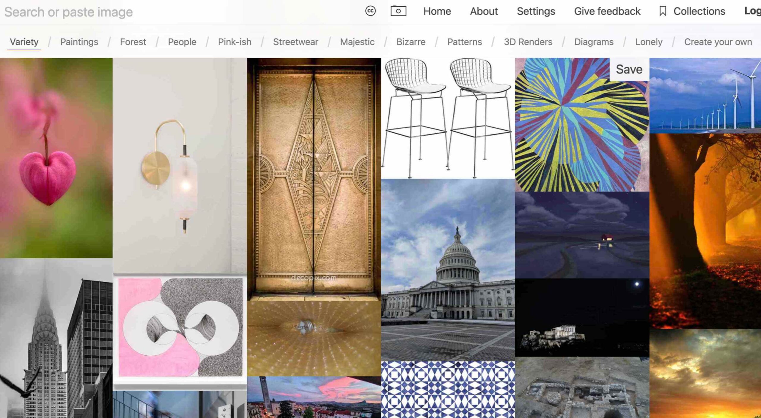
Same Energy
Same Energy, in beta, is a visual search engine. You can search with a minimum number of words or an image. The website is designed to help you find art, photography, decoration ideas, and practically anything. It uses deep learning and algorithms to create images on the home page, and you can create feeds in the same manner. The coolest part of this tool is that it tries to match the visual and artistic style you ask for with image mood and objects.
SVG Repo
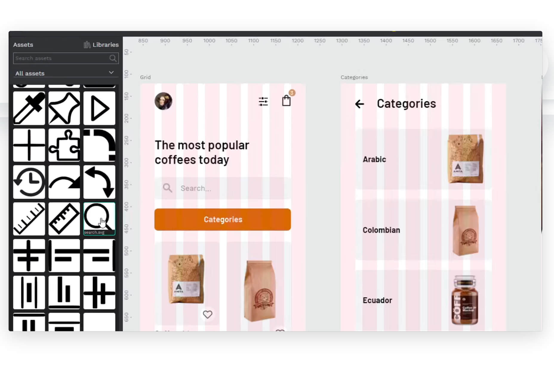
SVG Repo is a collection of more than 300,000 SVG vectors and icons that you can download and use in projects for free (even commercial use). The site has a powerful search tool to help you find the right image, and the platform is designed so that you can contribute.
Penpot
Penpot is an open-source design and prototyping platform for cross-domain teams. It is a web-based tool that isn’t dependent on any operating system and works with open web standards. It’s designed to be zippy and interactive so your team can work fast.
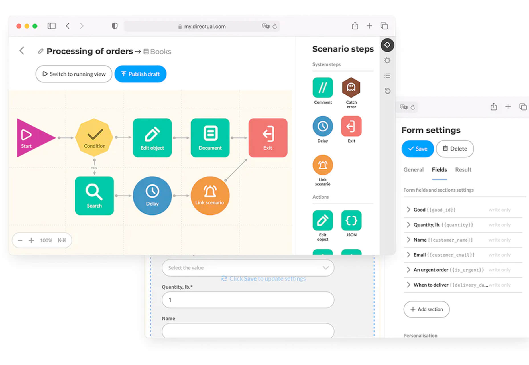
Directual
Directual is a no-code platform for building scalable apps using a visual interface. (Perfect for designers with less development experience.) It includes integrations with other popular tools and is free to use while figuring out how the app works and how you can make it fit your business goals.
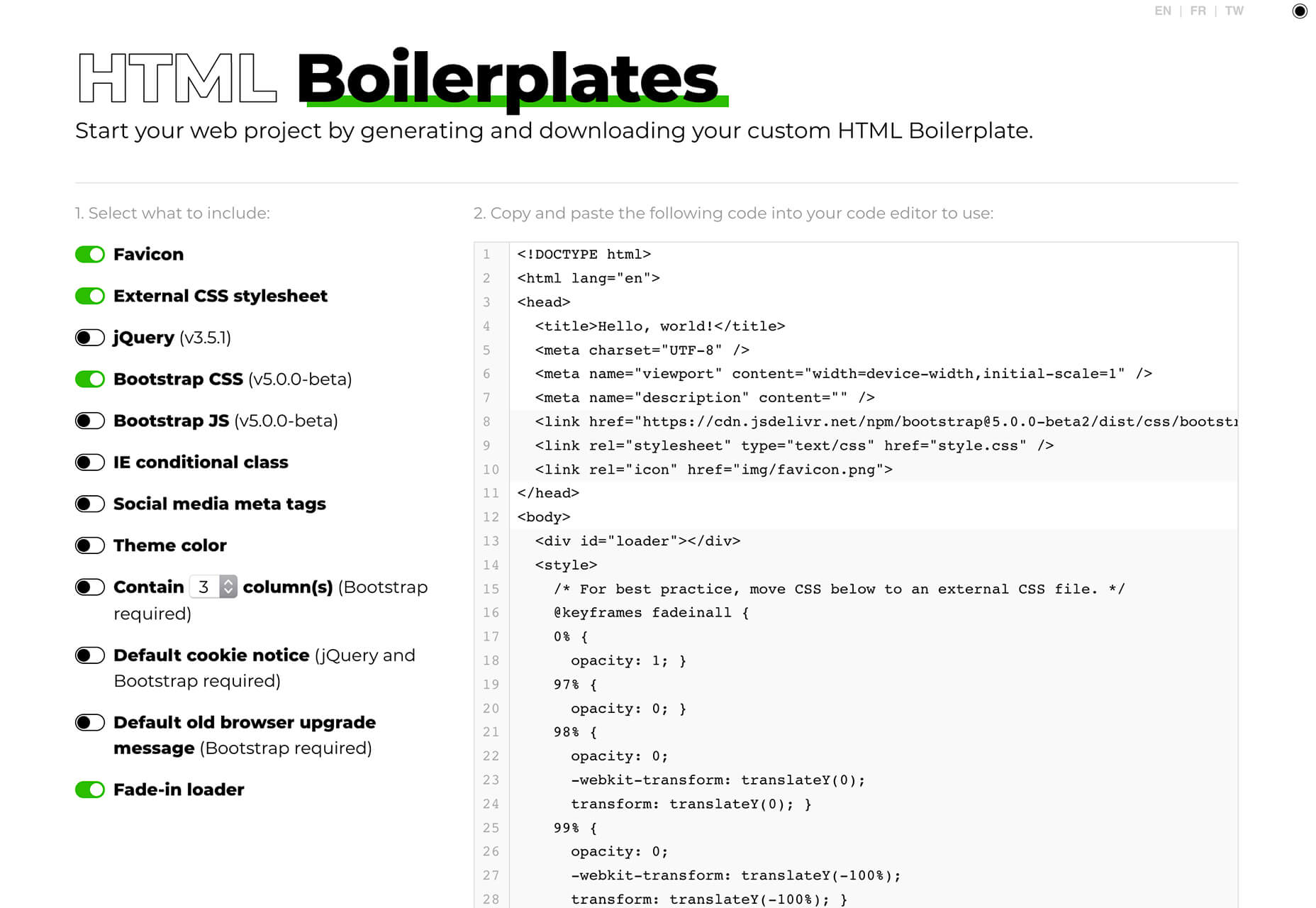
HTML Boilerplates
HTML Boilerplates helps you start web projects by generating a custom HTML boilerplate that you can download. Just choose the elements you want to include and then copy and paste the code into your editor.
6 Productivity Boosters
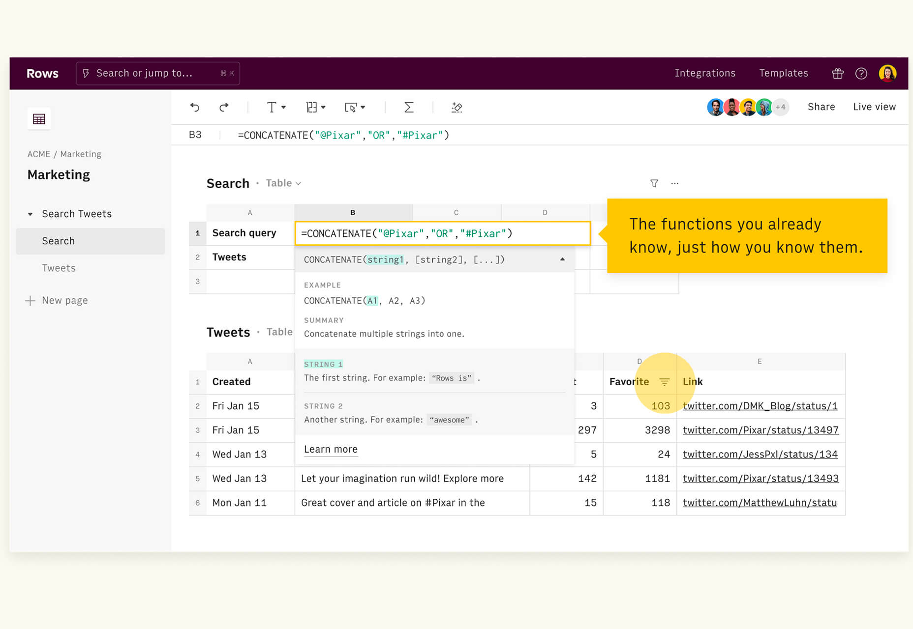
Rows
Rows is a spreadsheet tool with built-in web integrations that’s made for team collaboration. It works with other tools you already use, such as Google Analytics, Twitter, LinkedIn, Mailchimp, and so many others. Without scripts, you can use it to automate workflows, analyze data, share dashboards, and build forms and tools that make work simpler.
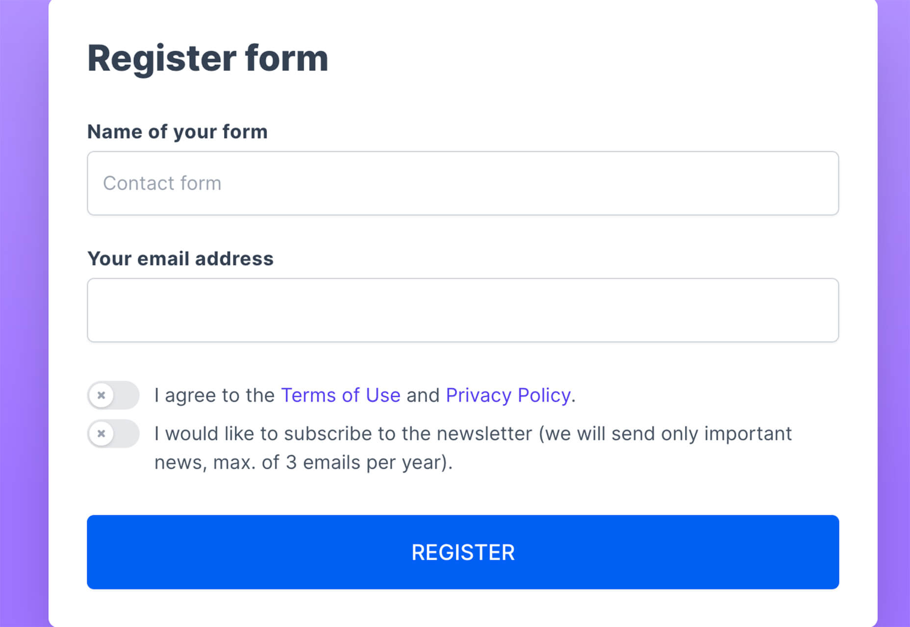
Form.Taxi
Form.taxi is a premium web-based form tool. You can create web forms without code or programming and connect them to your website. The tool then stores information, filters for spam, and notifies you of form submissions.
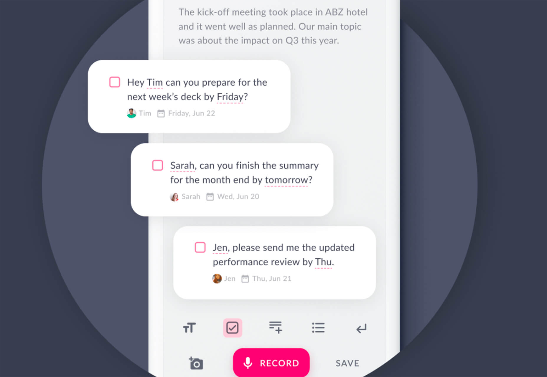
Verbz
Verbz is a voice productivity app that allows you to create notes, assign tasks, make announcements, run standups, or chat. Talk or type, listen or read. It works as your own voice assistant for teams. It’s available in Beta from the App Store, and there’s a waitlist for Android users.
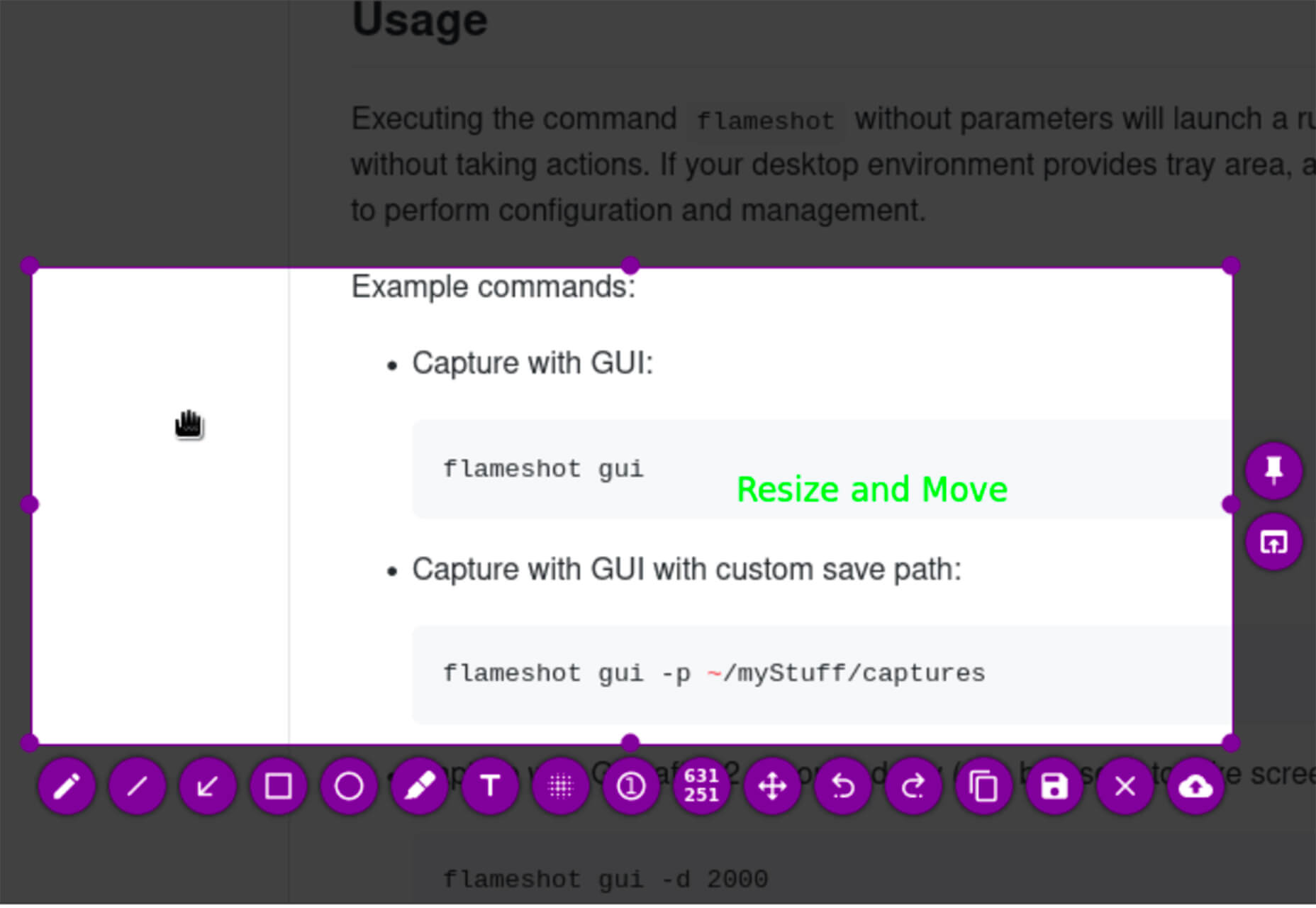
Flameshot
Flameshot is a tool for grabbing screenshots. It has a customizable appearance, is easy to use, and lets you draw and edit screenshots as you work.
Kitemaker
Kitemaker is a collaboration tool for development processes. It can help you keep track of everything from tools such as Slack, Discord, Figma, and Github in one place. It helps you structure projects and keep discussions about work moving forward in one place.
This Code Works
This Code Works is a place to save code snippets that work for when you need them again. You can group and organize snippets and share with others. You might think of it as the “Pinterest of code.”
3 Icons and User Interface Elements
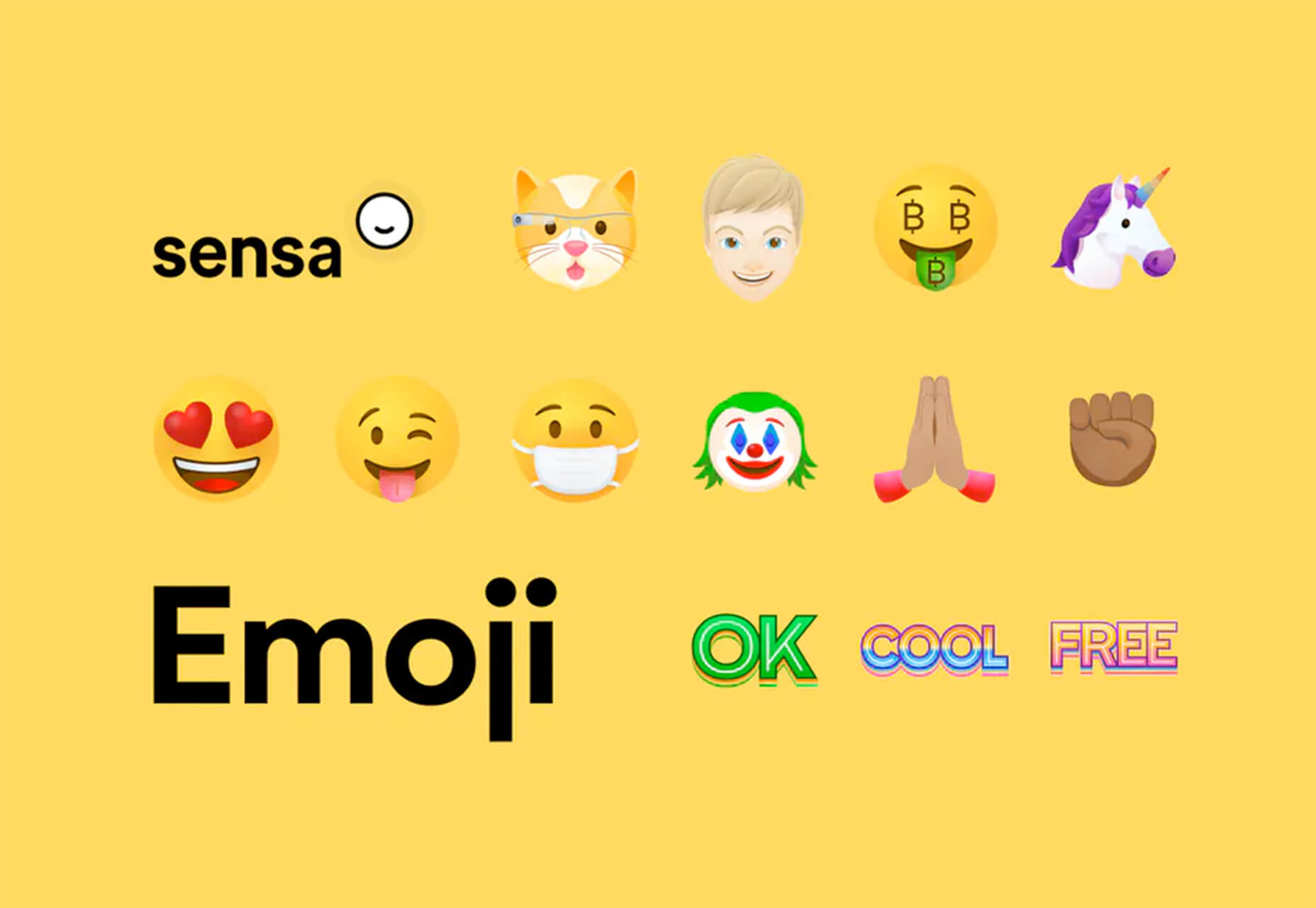
Sensa Emoji
Sensa Emoji is a collection of common emoji icons that you can use in your materials. Every element is fully vector and free to use.
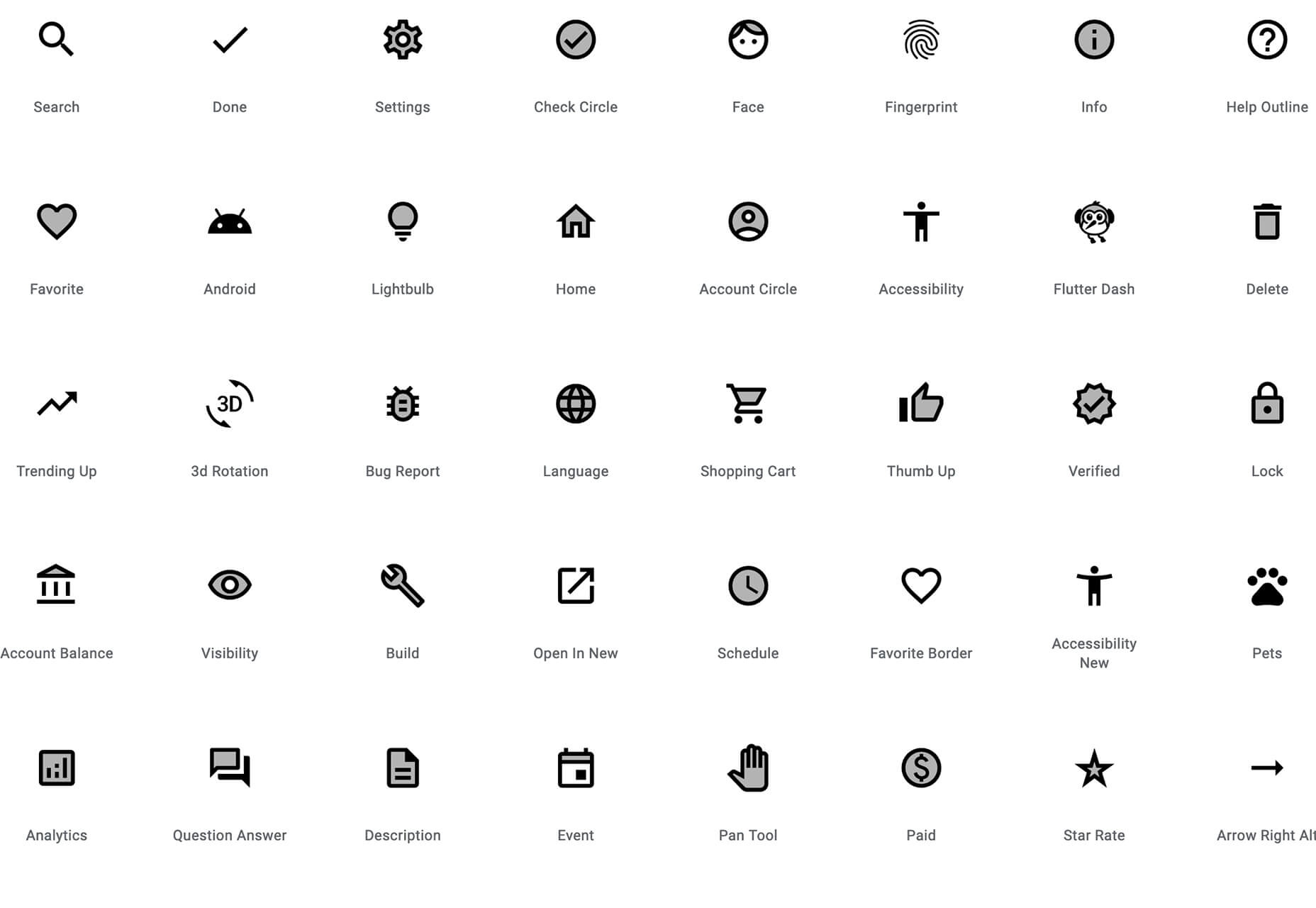
Google Fonts Icons
Google Fonts now supports icons, starting with Material Icons. Choose between outlined, filled, rounded, sharp, or two-tone options in the open-source library.
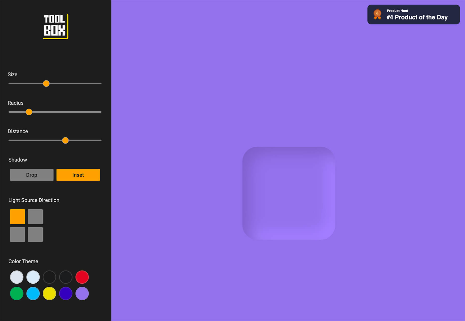
Toolbox Neumorphism Generator
Toolbox Neumorphism Generator is a design tool that helps developers to generate CSS in the soft UI /neomorphism style for the elements with real-time output.
3 Tutorials and Demos
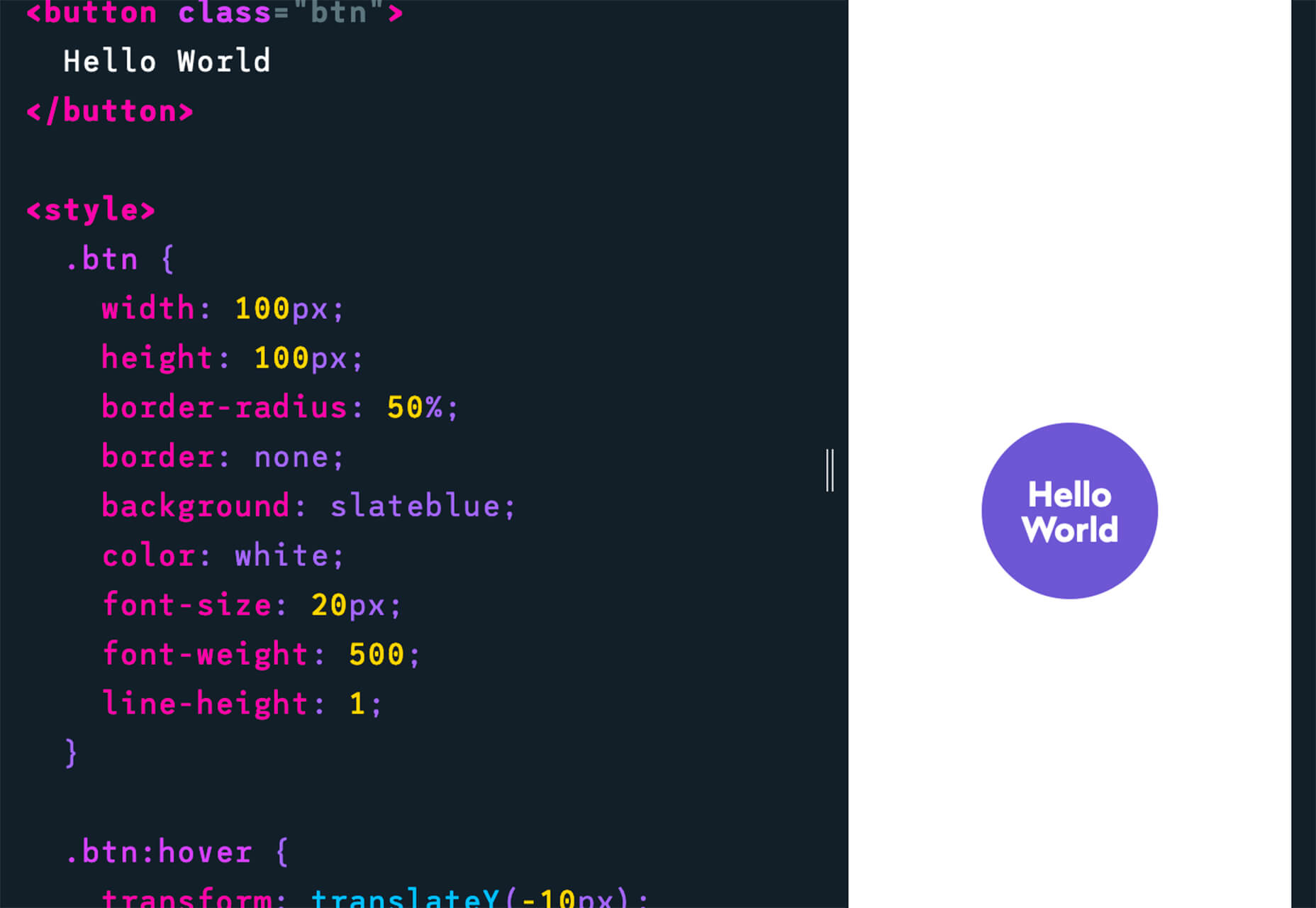
An Interactive Guide to CSS Transitions
An Interactive Guide to CSS Transitions explains everything you need to know about this great animation tool for website designers. This tutorial digs in with code and examples to help you create more polished animations and is designed for anyone from beginners to experienced designers with some pro tips throughout.
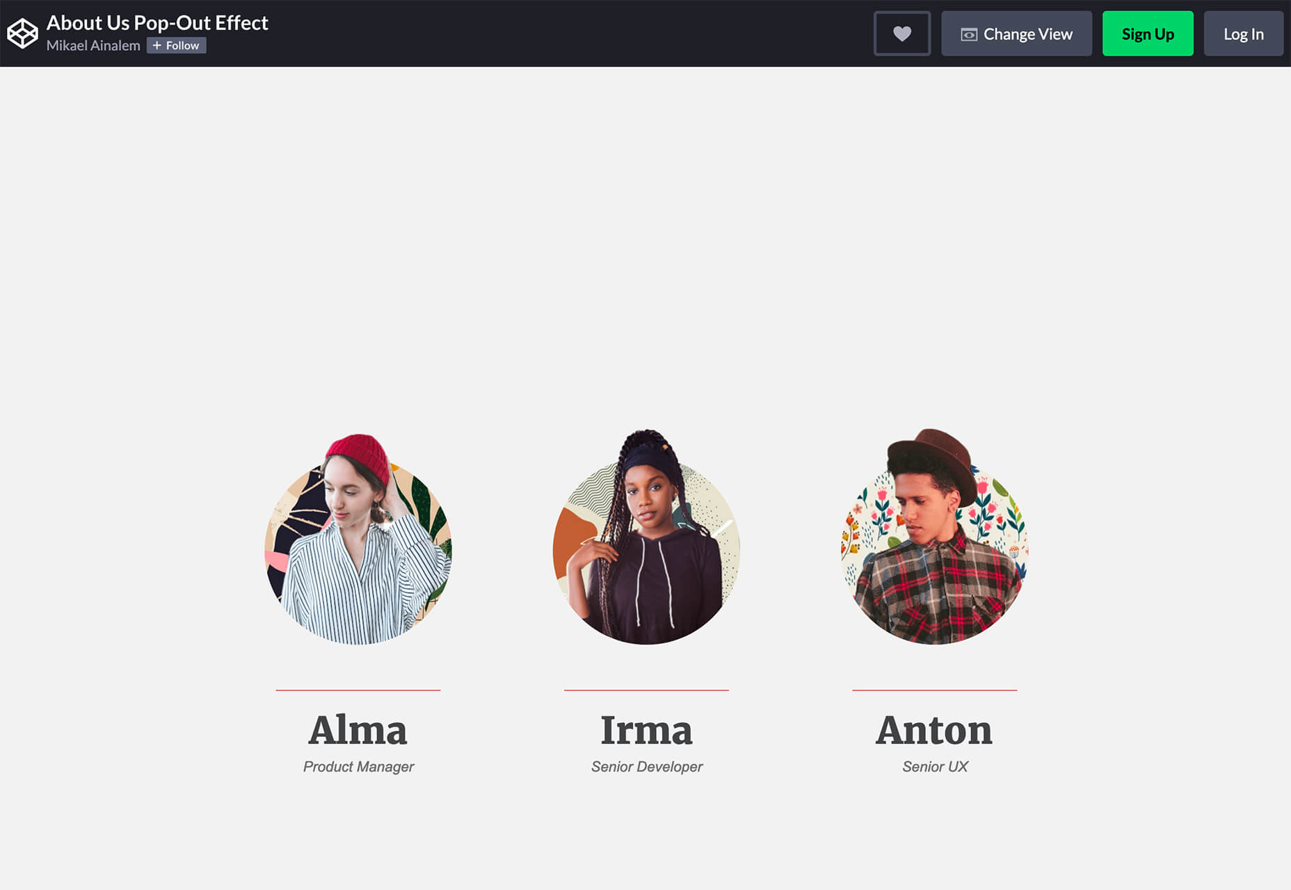
About Us Pop-Out Effect
The About Us Pop-Out Effect adds a special element to any team or contact page with a nifty pop animation. Each person seems to lift out of the circle frame in this pen by Mikael Ainalem.
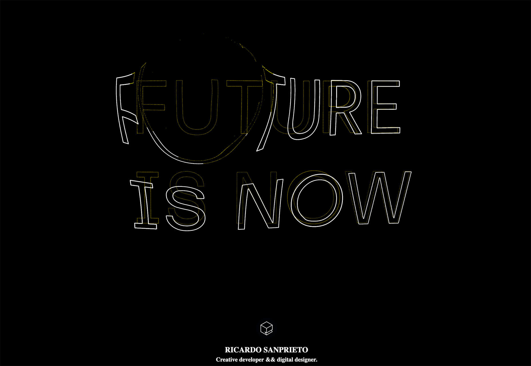
Interactive Particles Text Create with Three.js
Interactive Particles Text Create with Three.js is a web element you could play with all day. Text shifts into particles and follows mouse movement in a fluid motion in the pen by Ricardo Sanprieto.
10 Fresh Fonts and Text Tools
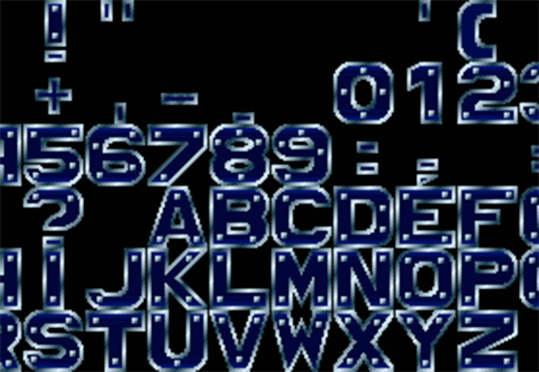
Bitmap Fonts
Bitmap Fonts is a collection of various bitmap typefaces all pulled and stored in a single location. This is the perfect solution if you are looking for a bitmap option.
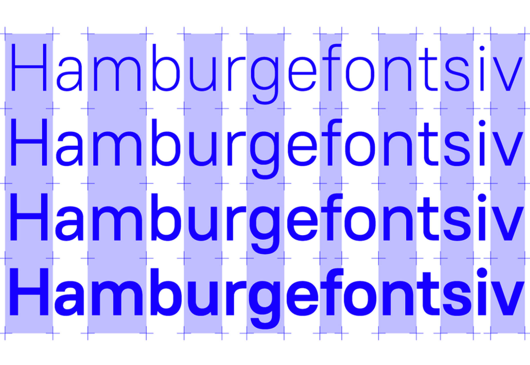
Uniwidth Typefaces
Uniwidth Typefaces for Interface Design is another collection of fonts for a specific purpose – here universal widths for interface design. Uniwidth fonts are proportionally-spaced typefaces where every character occupies the same space across different cuts or weights. This is both a tutorial on the type style as well as font collection.
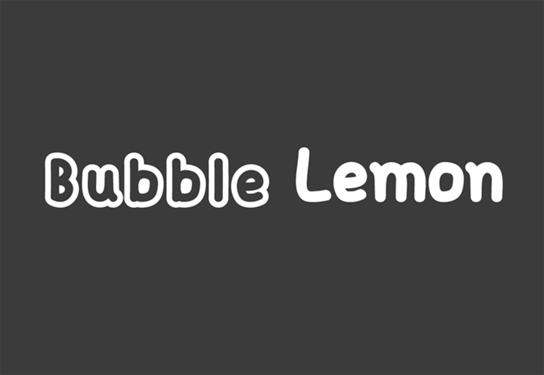
Bubble Lemon
Bubble Lemon is a typeface for projects with a childlike feel. With an outline and regular style, the thick bubble letters look like some of the sketches you may have done in grade school.
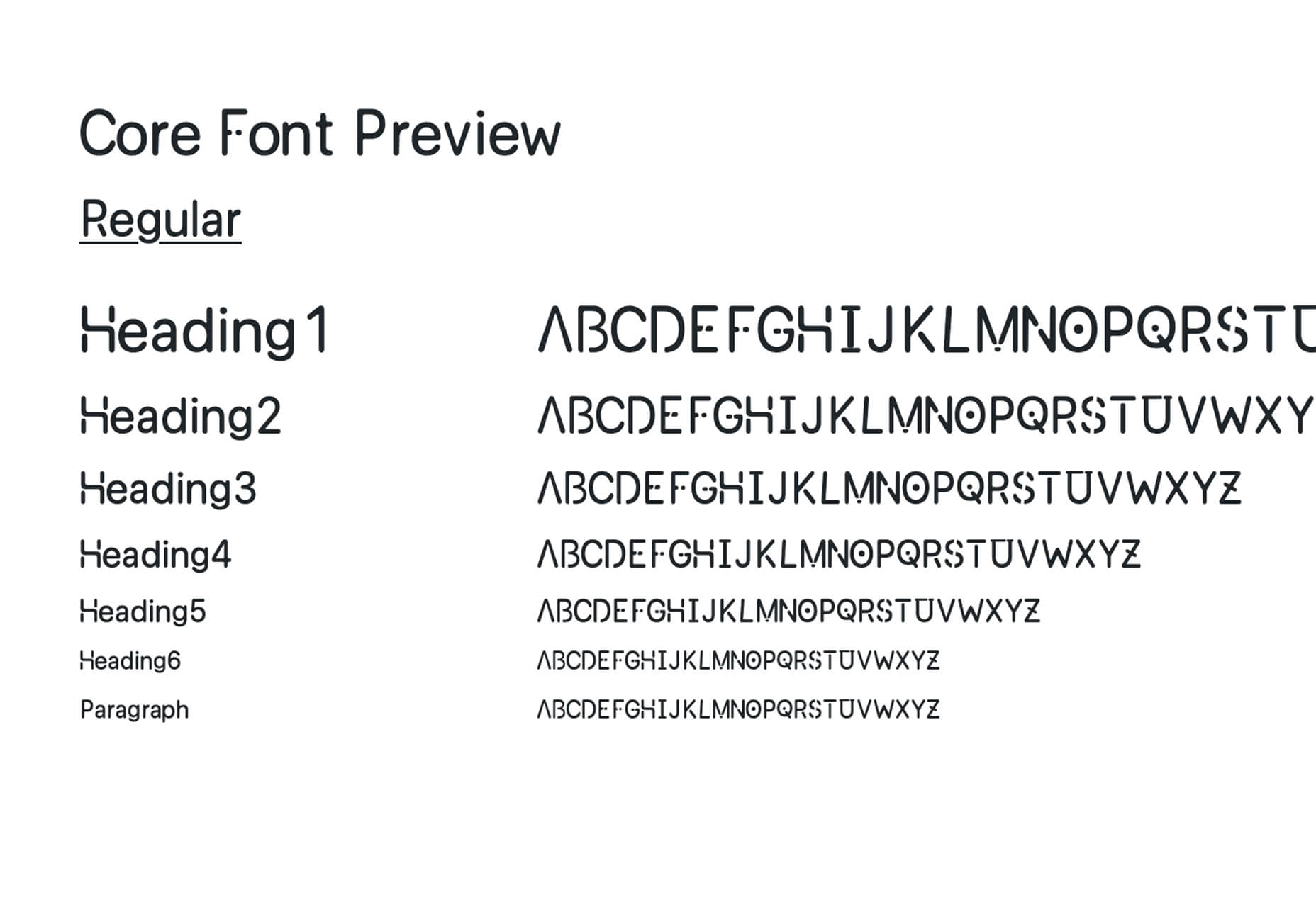
Core Font
Core Font is an open-source project with a funky and modern style. It has a full upper- and lower-case character set, numerals, and a few punctuation marks.
GHEA Aram
GHEA Aram is a superfamily with a Central European flair, according to the type designer. The premium typeface includes everything from light to black italic and even some Armenian ligatures.
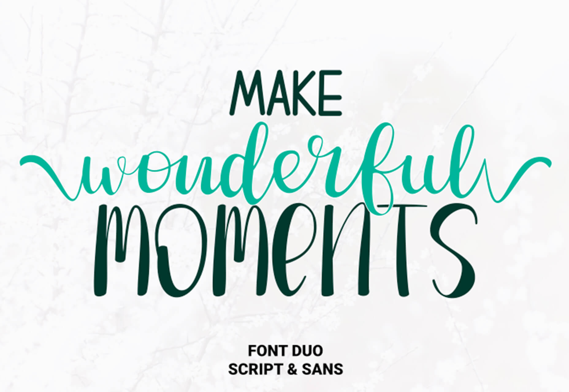
Make Wonderful Moments Duo
Make Wonderful Moments Duo is a script and sans serif font pair with a lighthearted feel and highly readable character set. The regular (sans serif) only has uppercase characters.
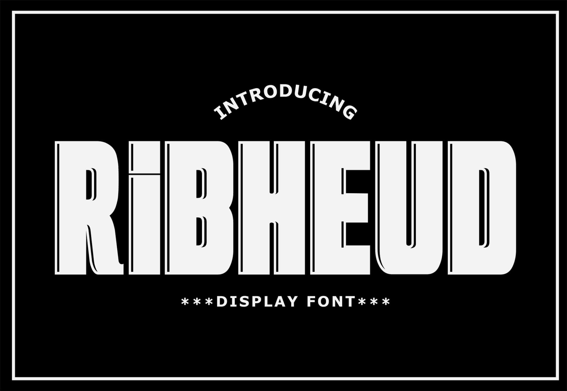
Ribheud
Ribheud is a slab-style display font with a heavy look and strong presence. What makes it interesting is the left-outline/shadow on each character.
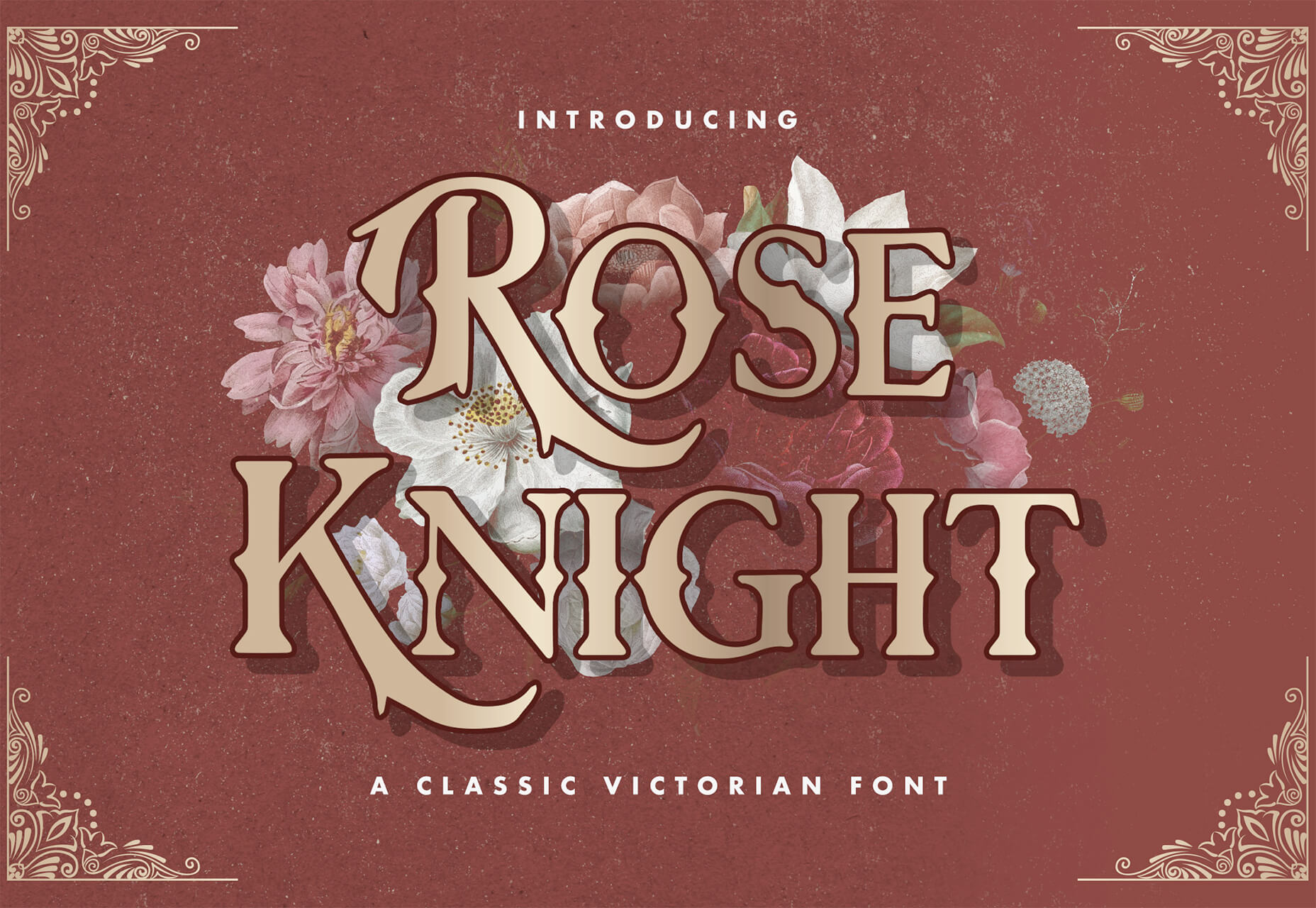
Rose Knight
Rose Knight has an old-style feel that can take on multiple moods, depending on supporting design elements. All of the characters are uppercase with alternates. It could make a fun branding option.
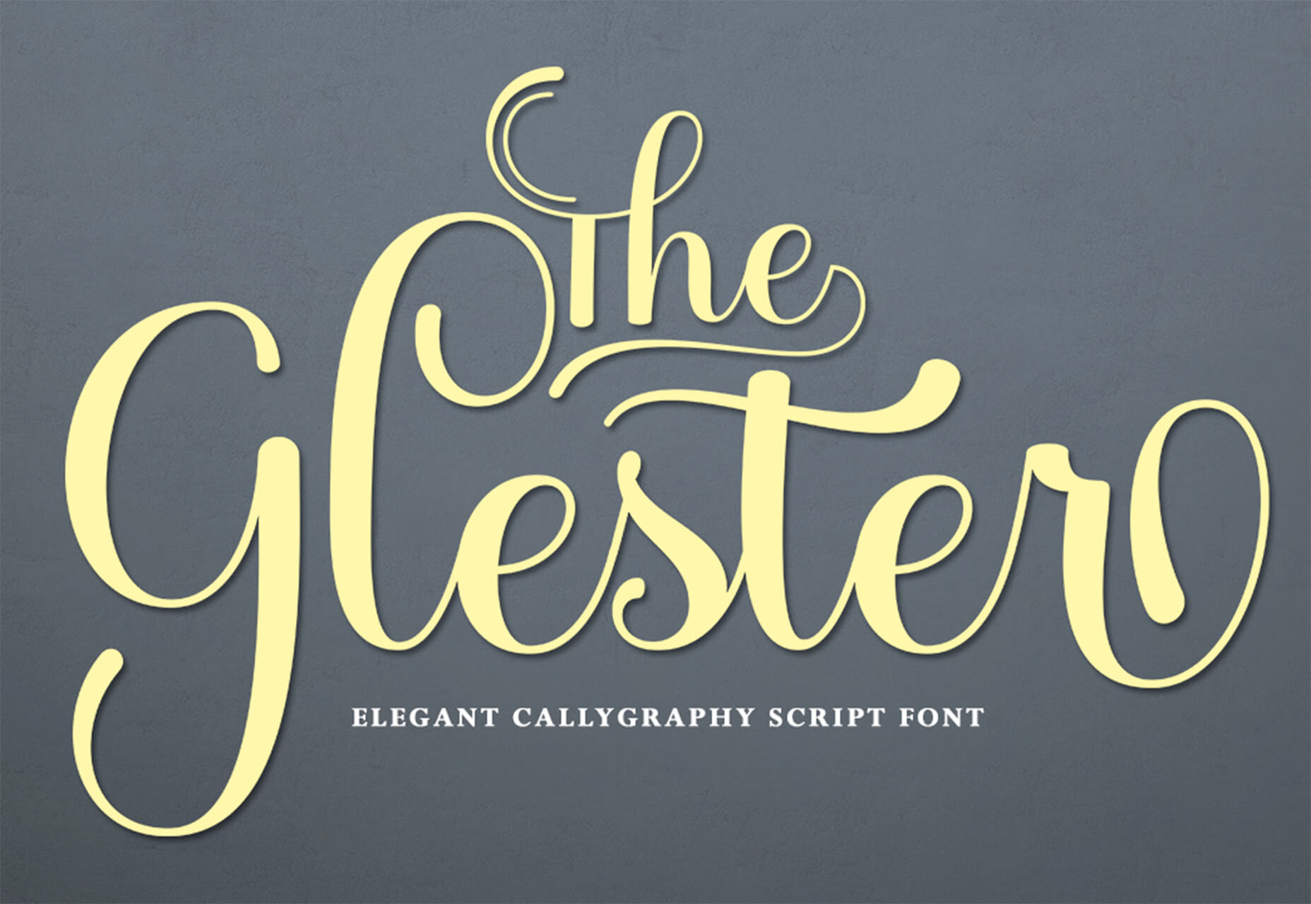
The Glester
The Glester is a beautiful premium typeface in a calligraphic style. The most interesting element of this typeface is all of the extra decorations that allow you to change individual characters (380 glyph alternates).
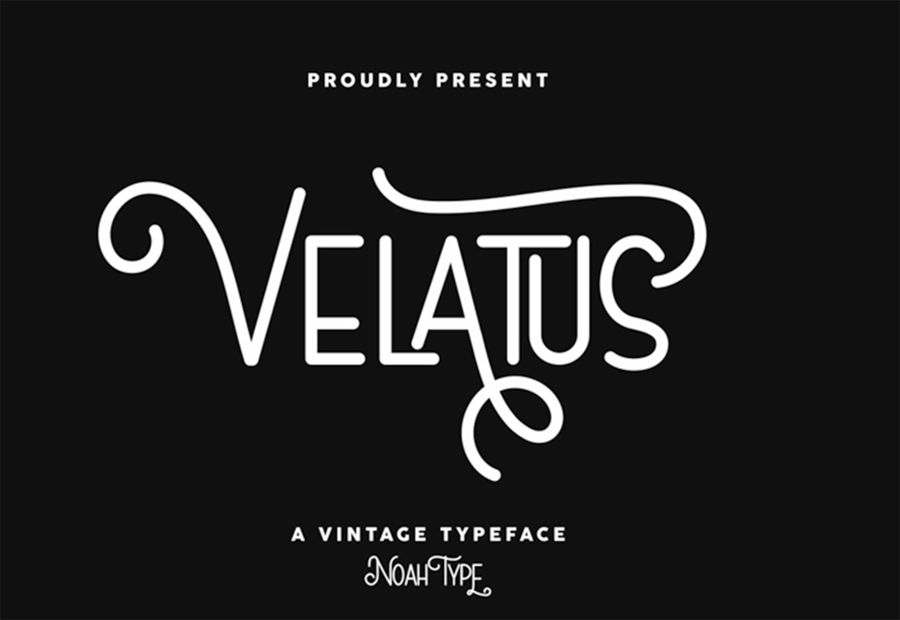
Velatus
Velatus is a vintage-style typeface with plenty of swashes and flourishes that make it unique. It comes with 157 characters and 96 glyphs.
https://ankaa-pmo.com/wp-content/uploads/2021/03/27-exciting-new-tools-for-designers-march-2021.jpg14082560Service comm.https://ankaa-pmo.com/wp-content/uploads/2017/04/Logo-Ankaa-engineering.pngService comm.2021-03-08 11:45:462021-03-08 11:45:4627 Exciting New Tools For Designers, March 2021
March is that time of year where the feeling of newness starts, from the first Spring days to fresh design projects. These trends are no exception, with fun new takes on some classic concepts.
Circles are always popular, but the top trend is an animated take on the traditional element; plus, fun pink and purple color palettes and a few faux split screen designs round out trending styles.
Here’s what’s trending in design this month.
Circle Animations
Circles are one of those shapes that never leave the design sphere. They have a lot of classical meaning and are flexible in terms of design options.
Designers are having a lot of fun with this shape right now. From animations to text circles to image frames, they seem to be all over the place.
More recently trending is more circle-shaped animations. This trend maintains a circle’s properties as a unified and harmonious element with movement to create more engagement and make you look at the design just a little bit more.
Each of these examples uses circles in a different but equally interesting – and animated – way.
Universal Favourite uses a circular blob. It’s almost like a giant bubble. It wiggles and flows, and stretches within the space without any help from the user. It has a smoothly quality that makes you want to stare at it. The color here helps, with the circle and background not having an immense amount of contrast. Also, note the cute little circle button in the bottom corner.
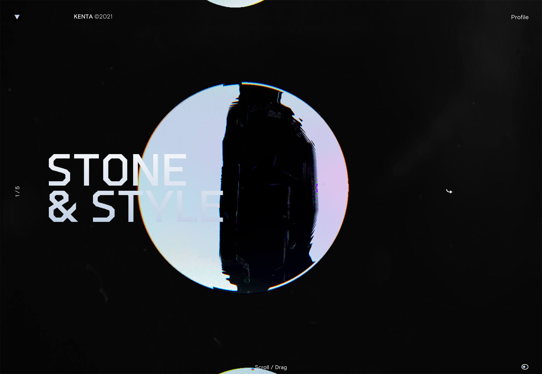
Kenta Toshikura put most of the subtle animation for this design inside the circle. With a hover state, the entire circle moves on the screen with a second layer of animation, and the cursor is also a circle that hops around the black background.
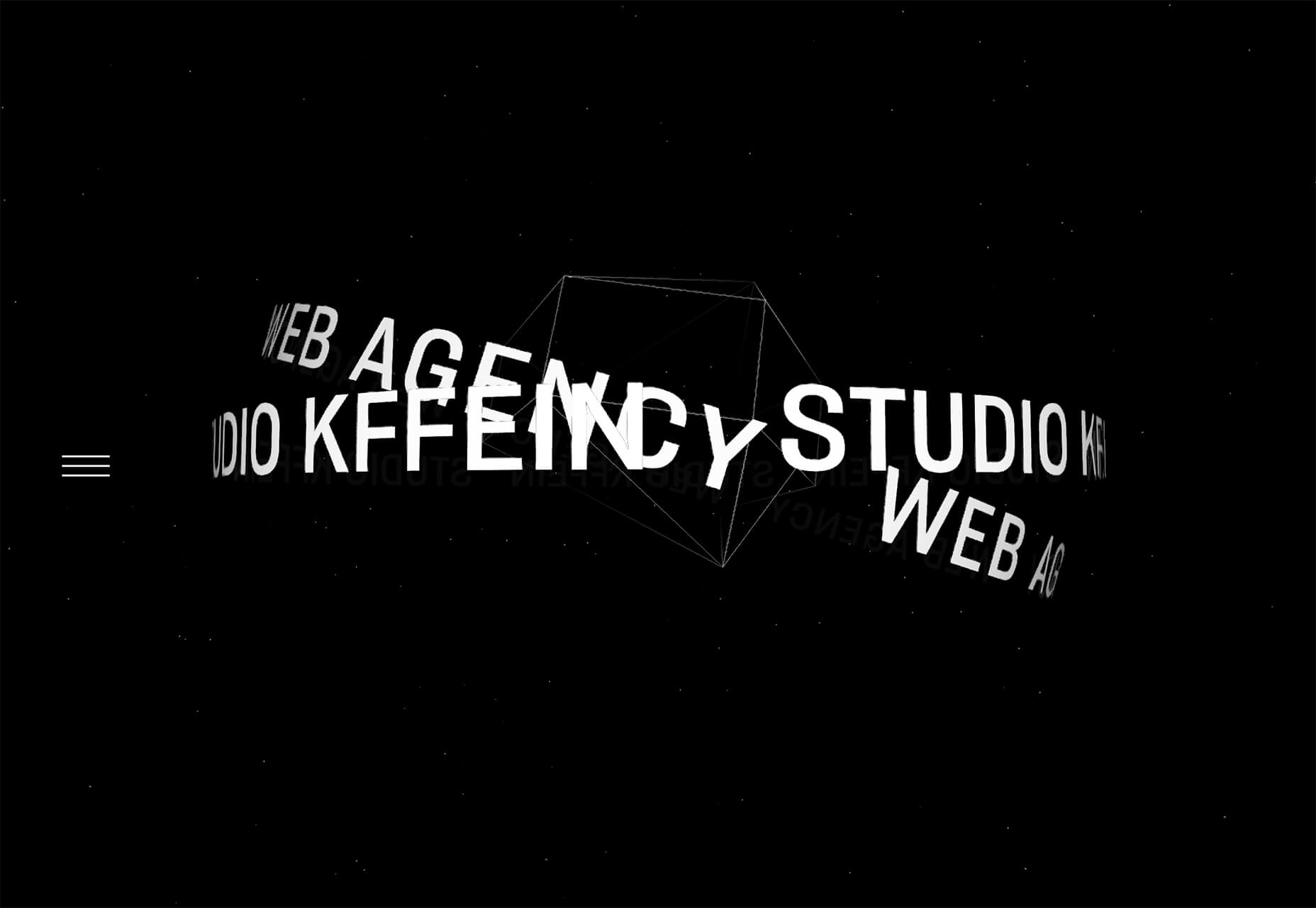
Kffein takes a totally different approach with a circle made from the primary test elements. Identifying website information rotates in a circle around another geo shape on the main plane. Not only is there a circular animation, but an almost three-dimensional effect that happens due to the way elements are layered here.
Pink and Purple Palettes
The prevalent pink and purple color combination isn’t for everyone – although you wouldn’t know it from the number of designs using similar colors.
This bright combination almost screams “spring” and has a lightness to it that almost seems to lift the mood of any project. (Maybe color selection is a reflection of how we all want to feel.)
What’s nice about these colors is that they flow into one another nicely. They can also be expanded to fall into neighboring hues on the color wheel, such as red from pink and blue from purple.
Maybe the most popular use of this color pair is as a gradient. You can find pink to purple everywhere, from background gradients to image overlays to buttons and user interface elements. There’s no lack of use here.
Each of these examples shows opportunities with this color combination.
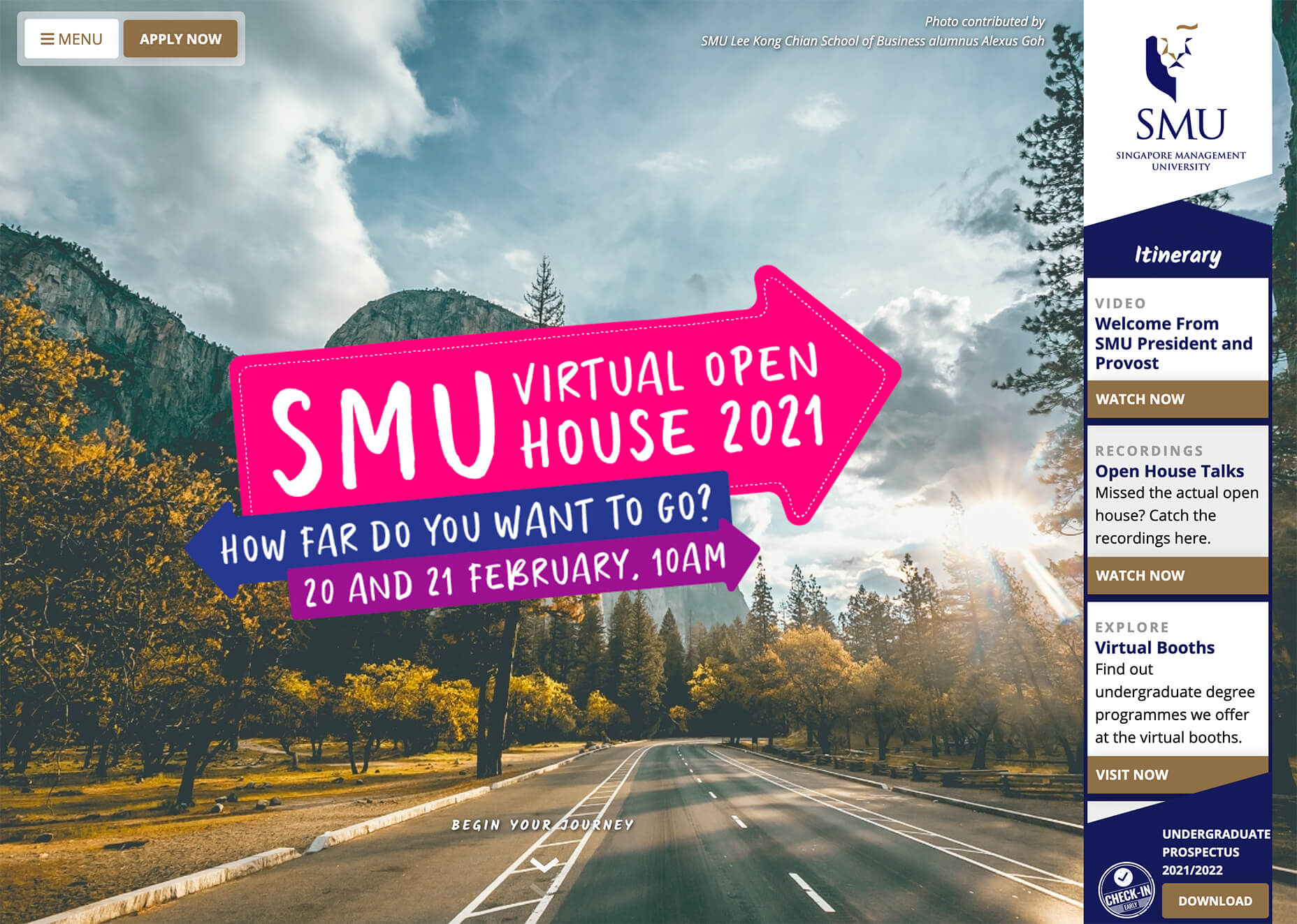
SMU uses bright pink, blue, and purple to create a giant “road sign” in the design that jumps out from the rest of the project. The sign almost seems out of place and doesn’t fit as part of the normal color palette. This is what draw you right to it.
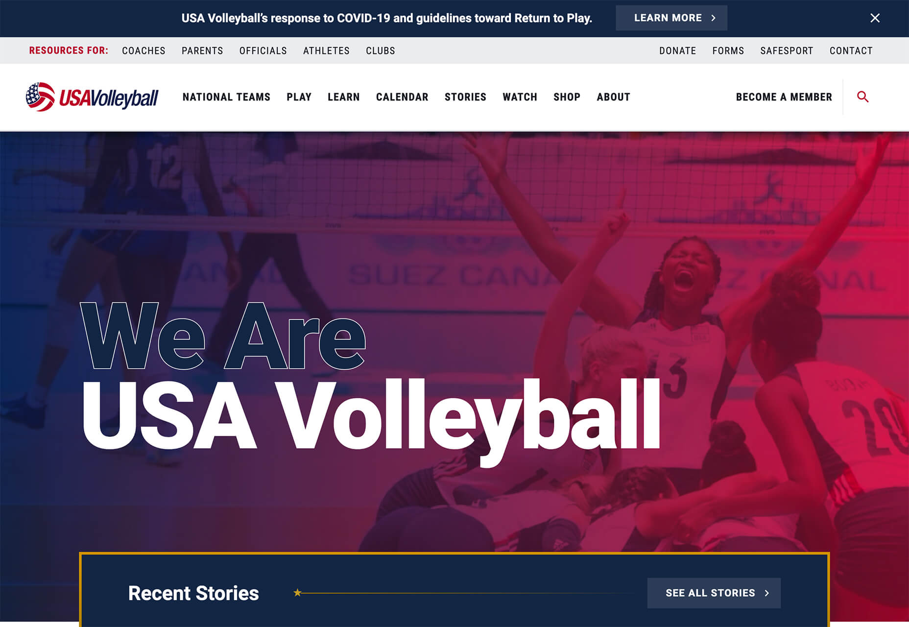
USA Volleyball uses the popular gradient option and extends the pink to the purple palette to hints of blue and red. What’s great about this design is that it uses a super trend element and color option and makes it work with their current color palette. You can almost imagine the design conversation when someone wanted to use a pink to purple gradient for a brand that features red, white, and blue. The gamble paid off, and it works beautifully without being off-brand.
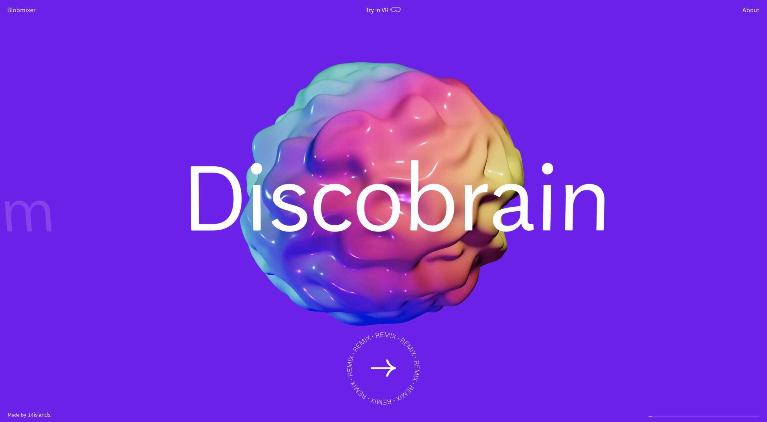
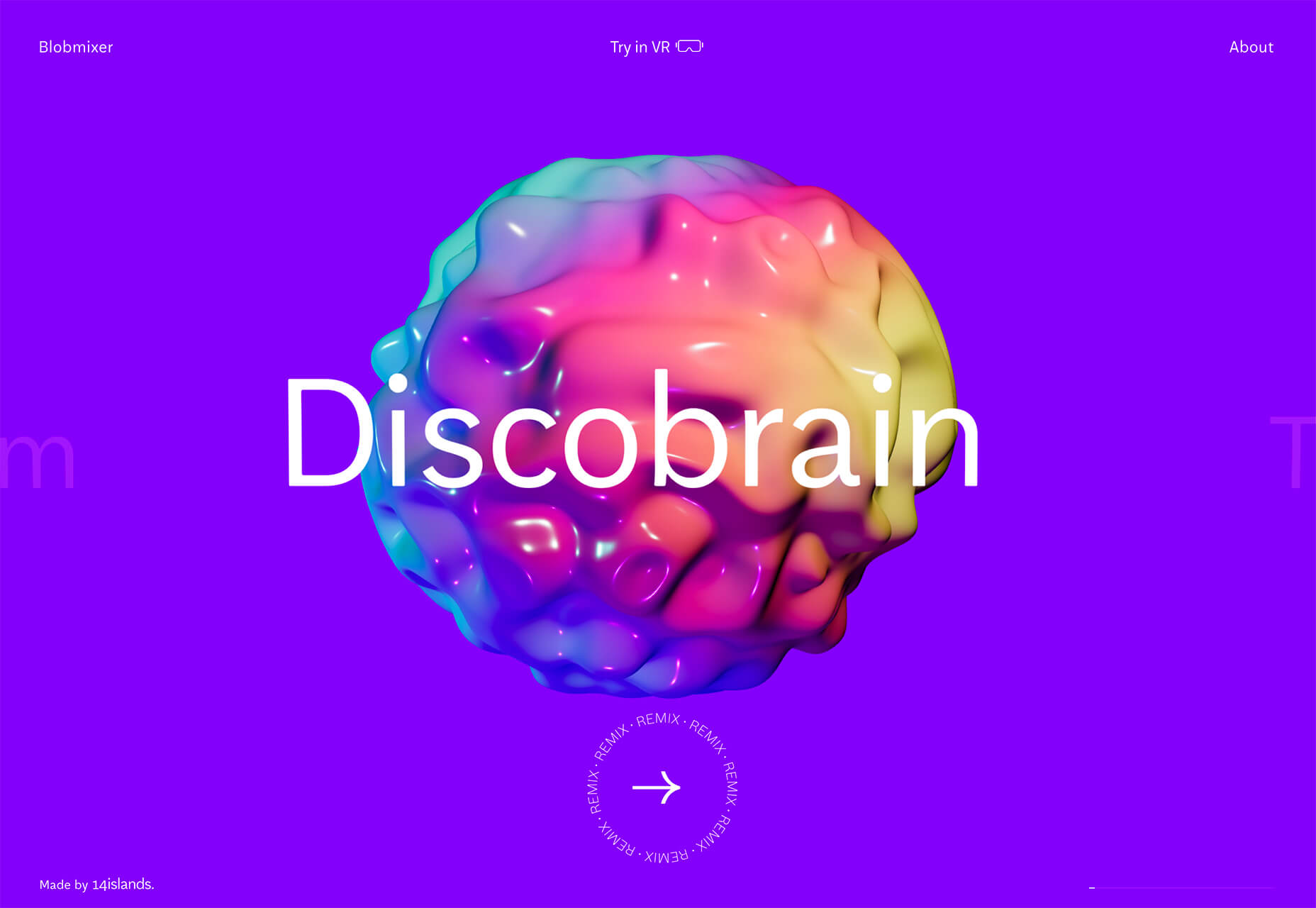
Blobmixer uses purple, pink, and a few other bright colors – note the animated circles, too – to draw users into the design. The entire project is a fun, customizable experience that you can play with, and the color choices are what make you interested enough to try. This design also offers a great example of tactile animation and elements that feel real even when you interact with them using a mouse on the screen.
Faux Split Screens
Split-screen designs were a huge trend for about two years. The aesthetic was also functional for content that required a this or that choice on the part of users.
Now, we see the design elements but without the function. (Maybe because it just looks nice and creates a sense of balance without a symmetrical design.)
These projects look like they might offer multiple gateways to content, but there is only one call to action on the dual-screen aside from navigation elements.
What this design option does is help draw the eyes across the screen. One side will immediately appeal to you, and when done well, you’ll feel a subtle push of pull from the color, text, and images to look at the other side as well.
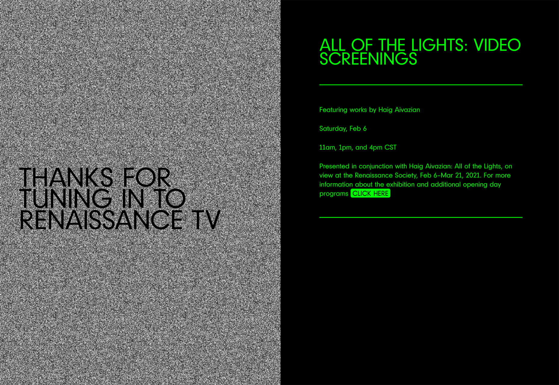
Renaissance TV does it with heavy animation with “dancing dots” from an old TV that doesn’t work. But then you need to look at the green text to understand what is happening.
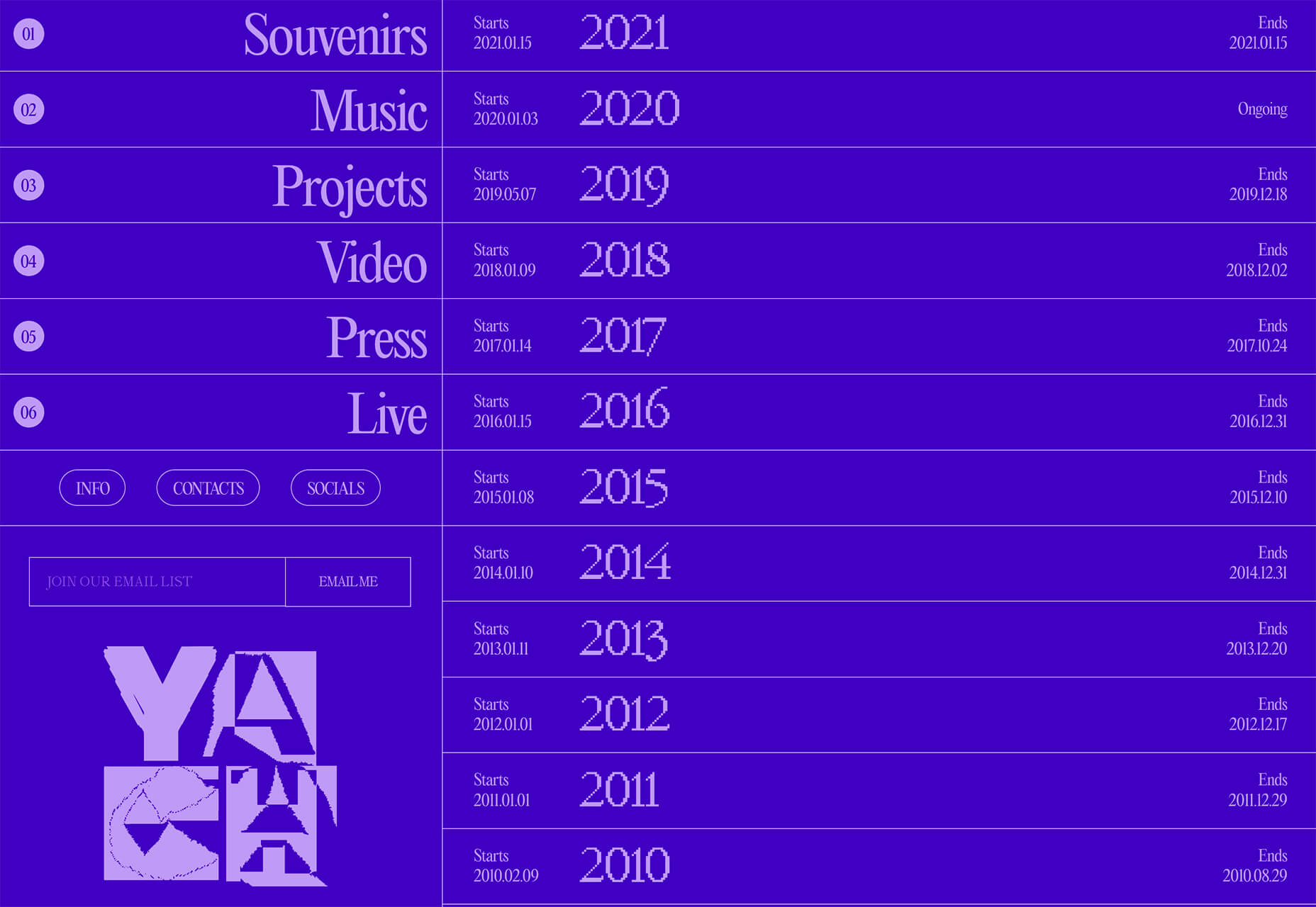
Yacht uses text weight and space to push the eyes across the screen. Almost everyone will go to the heavier areas first and then gaze across the screen through blocks of space to the final small text on the right side. And it all happens in a fraction of seconds.
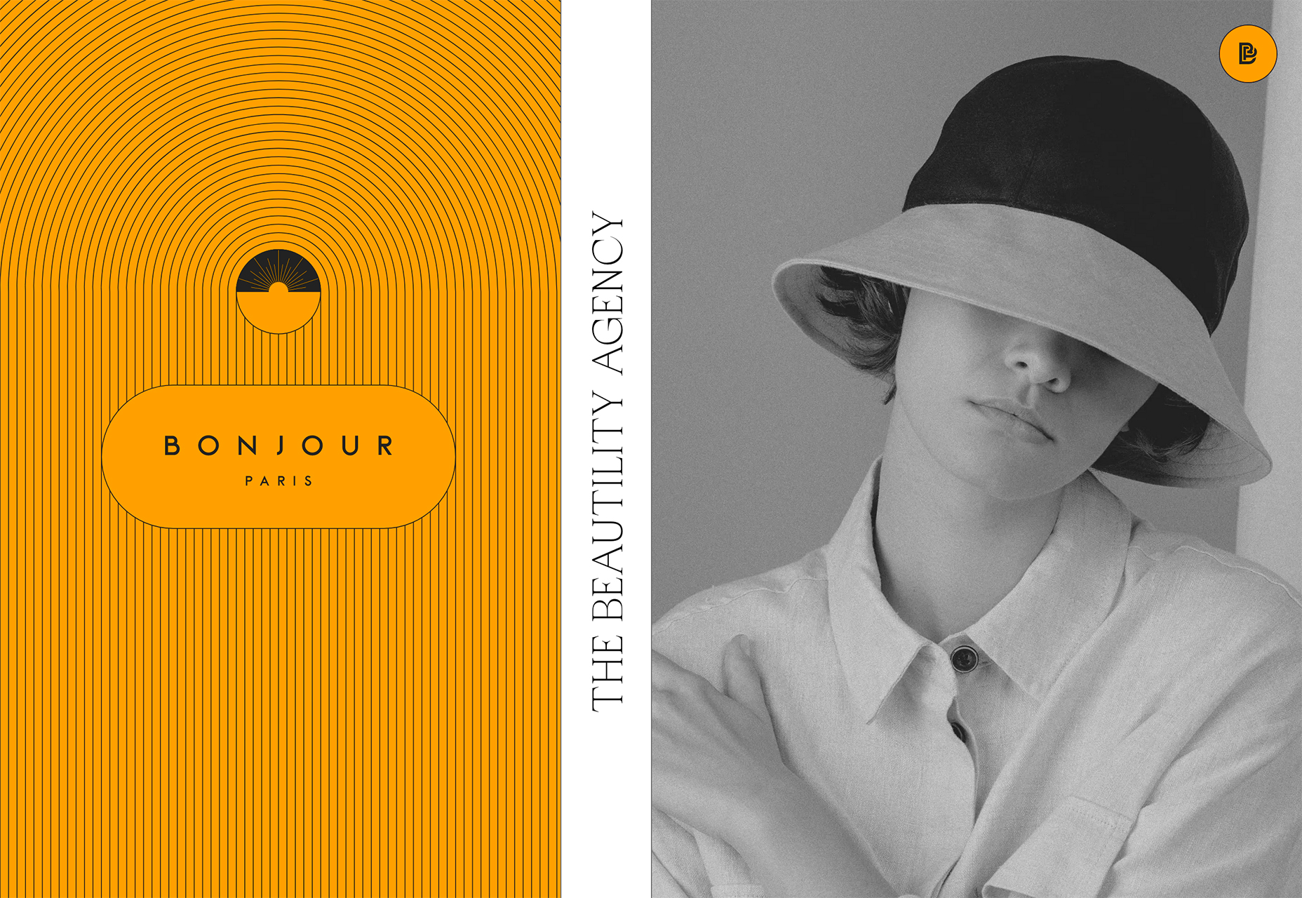
Bonjour Paris pairs bold color with black and white images. You may look at either side first, depending on personal preference, but the other half of the screen is necessary for a complete understanding of the website.
Conclusion
While all of these design trends are evident in new and recent projects, the use of pink and purple color palettes – particularly with a gradient – seems to be everywhere you look. These color choices are popular and come in a lot of forms.
Maybe the most obvious is with brighter pink and purple gradients, but other variations are also trending. It’s definitely one to watch in the longer term.
Paramètres des cookies et politique de confidentialité
Comment nous utilisons les cookies
Nous utilisons les cookies pour nous faire savoir quand vous visitez nos sites Web, comment vous interagissez avec nous, pour enrichir votre expérience utilisateur et pour personnaliser votre relation avec notre site Web.
Cliquez sur les différents titres de catégories pour en savoir plus. Vous pouvez également modifier certaines de vos préférences. Notez que le blocage de certains types de cookies peut avoir un impact sur votre expérience sur nos sites Web et les services que nous sommes en mesure d'offrir.
Cookies essentiels sur ce site
These cookies are strictly necessary to provide you with services available through our website and to use some of its features.
Because these cookies are strictly necessary to deliver the website, you cannot refuse them without impacting how our site functions. You can block or delete them by changing your browser settings and force blocking all cookies on this website.
Cookies Google Analytics
Ces cookies recueillent des renseignements qui sont utilisés sous forme agrégée pour nous aider à comprendre comment notre site Web est utilisé ou l'efficacité de nos campagnes de marketing, ou pour nous aider à personnaliser notre site Web et notre application pour vous afin d'améliorer votre expérience.
Si vous ne voulez pas que nous suivions votre visite sur notre site, vous pouvez désactiver le suivi dans votre navigateur ici :
Autres services
Nous utilisons également différents services externes comme Google Webfonts, Google Maps et les fournisseurs externes de vidéo. Comme ces fournisseurs peuvent collecter des données personnelles comme votre adresse IP, nous vous permettons de les bloquer ici. Veuillez noter que cela pourrait réduire considérablement la fonctionnalité et l'apparence de notre site. Les changements prendront effet une fois que vous aurez rechargé la page.
.
Paramètres de Google Webfont Settings :
Google Map :
Vimeo et Youtube :
Politique de confidentialité
Vous pouvez lire nos cookies et nos paramètres de confidentialité en détail sur la page suivante

 This month we have several examples of brutalism used to good effect as a foil to showcase products and/or work. By contrast, at the other end of the scale, we have brands who have chosen to go more of an immersive experience route, using full-screen images, sound, animation, and even VR.
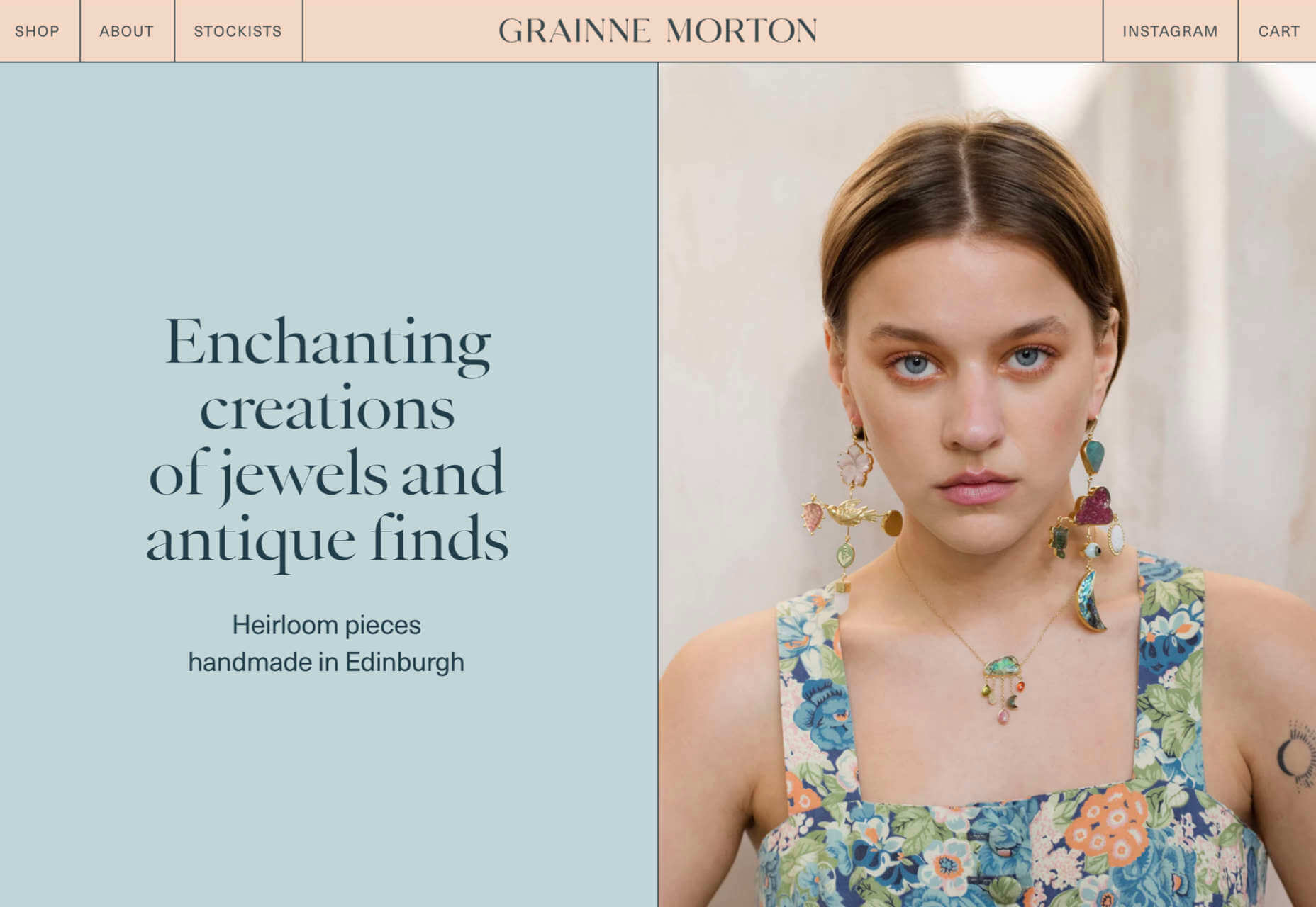

 Parallax is a term that is applied loosely and frequently in the world of web design. As a trend, it has been
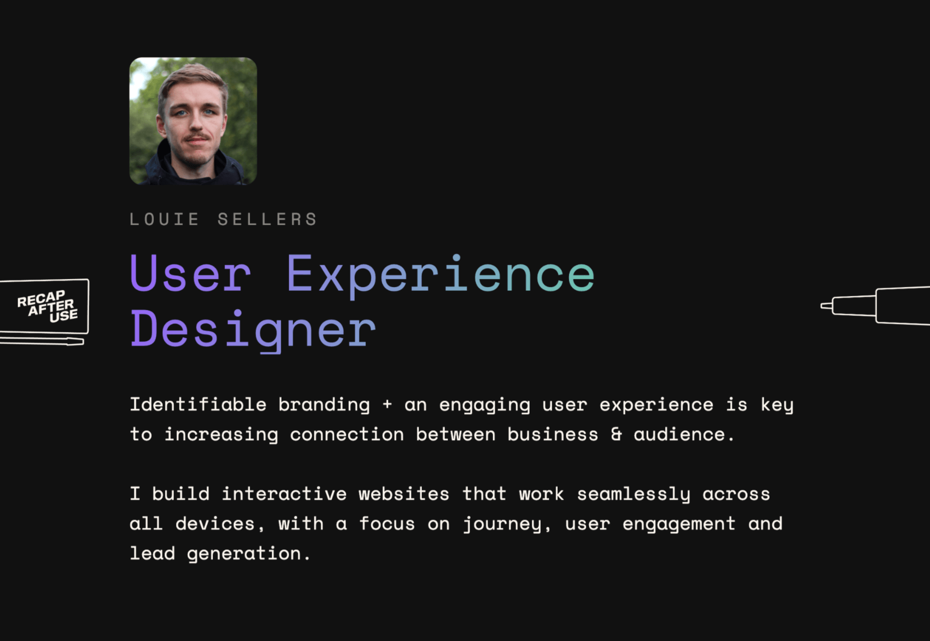

 Each day design fans submit incredible industry stories to our sister-site,
 This month’s collection contains a combination of big and bold, and clean and minimal. Although basic minimalism is still trendy, with lots of white space and greyscale type, we are seeing it softened with color. This is implemented differently, ranging from hints of off-whites in images to gentle pastels as section backgrounds.
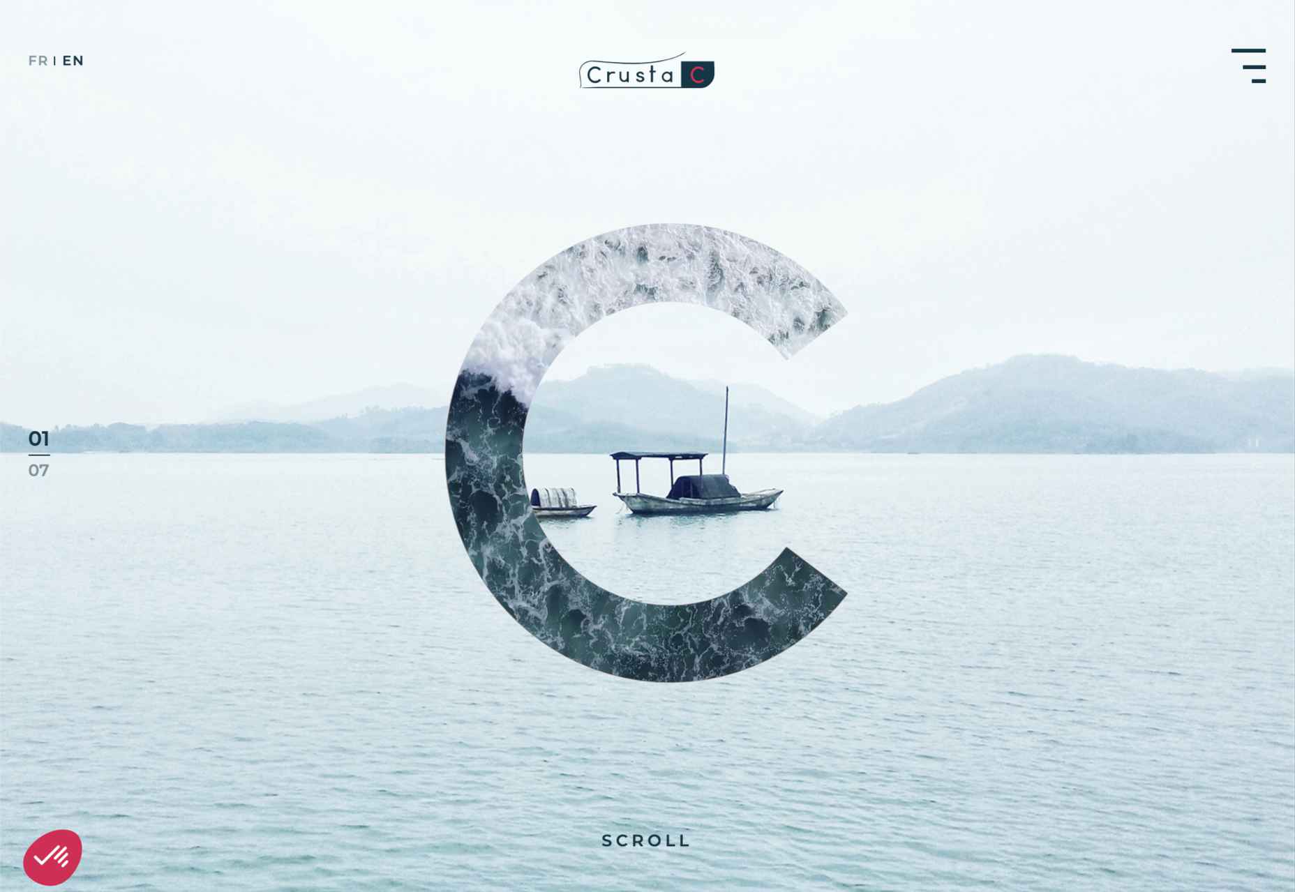
 Have you ever wondered why we’re so amazed by motion? A moving image is more likely to grab your attention than a static one. Motion is exciting and attention-grabbing – plus, it allows us to access more information in a short space of time.
 The best thing about writing about website design trends each month is looking at all the great sites that are being developed. Designers are stretching creatively and exploring new techniques and ways of doing things all the time.
 This month’s collection of the best new websites launched or updated in the last four weeks features color, and more color, and then — just for good measure — a bit more color. Yellow is a hue of choice, but you’ll also find burnt orange, rich purples, and greens and blues in equal measure. What is missing is the tech-blue of years past, replaced with something altogether more Mediterranean. Enjoy!
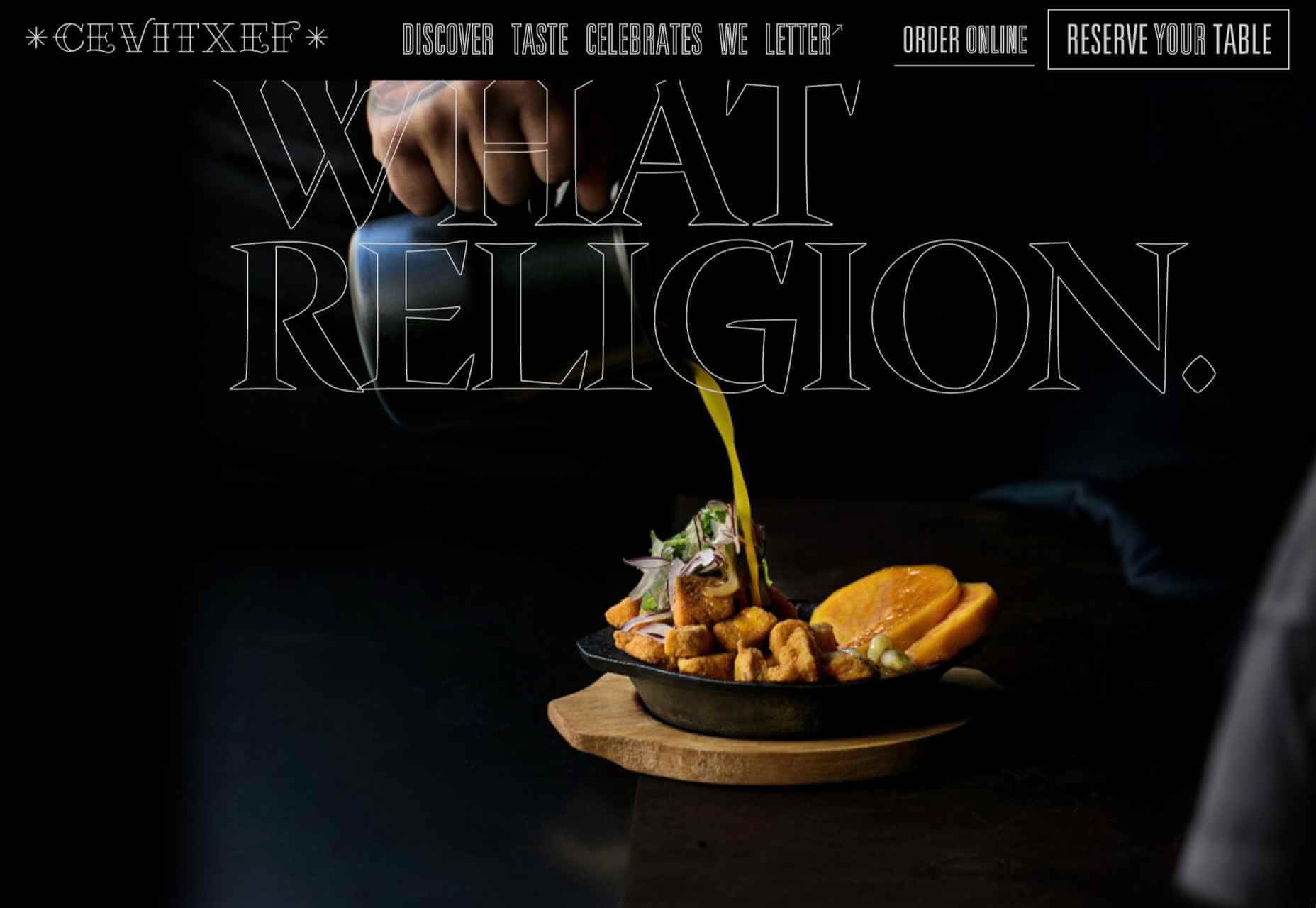

 Everyday design fans submit incredible industry stories to our sister-site,
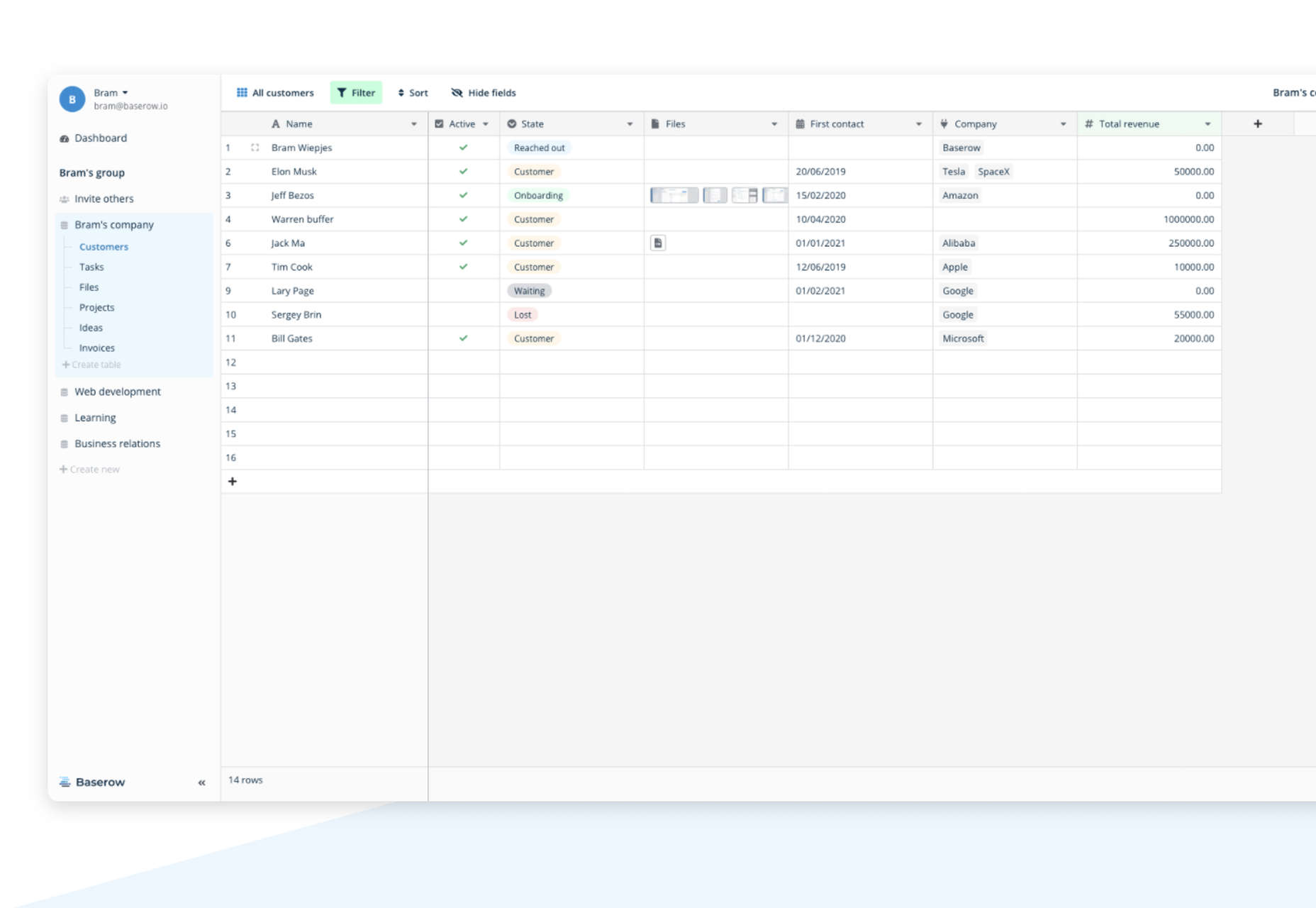
 Looking for something new to get you excited about design work? This list is packed with all kinds of goodies to help you feel inspired and ready to work.
 March is that time of year where the feeling of newness starts, from the first Spring days to fresh design projects. These trends are no exception, with fun new takes on some classic concepts.
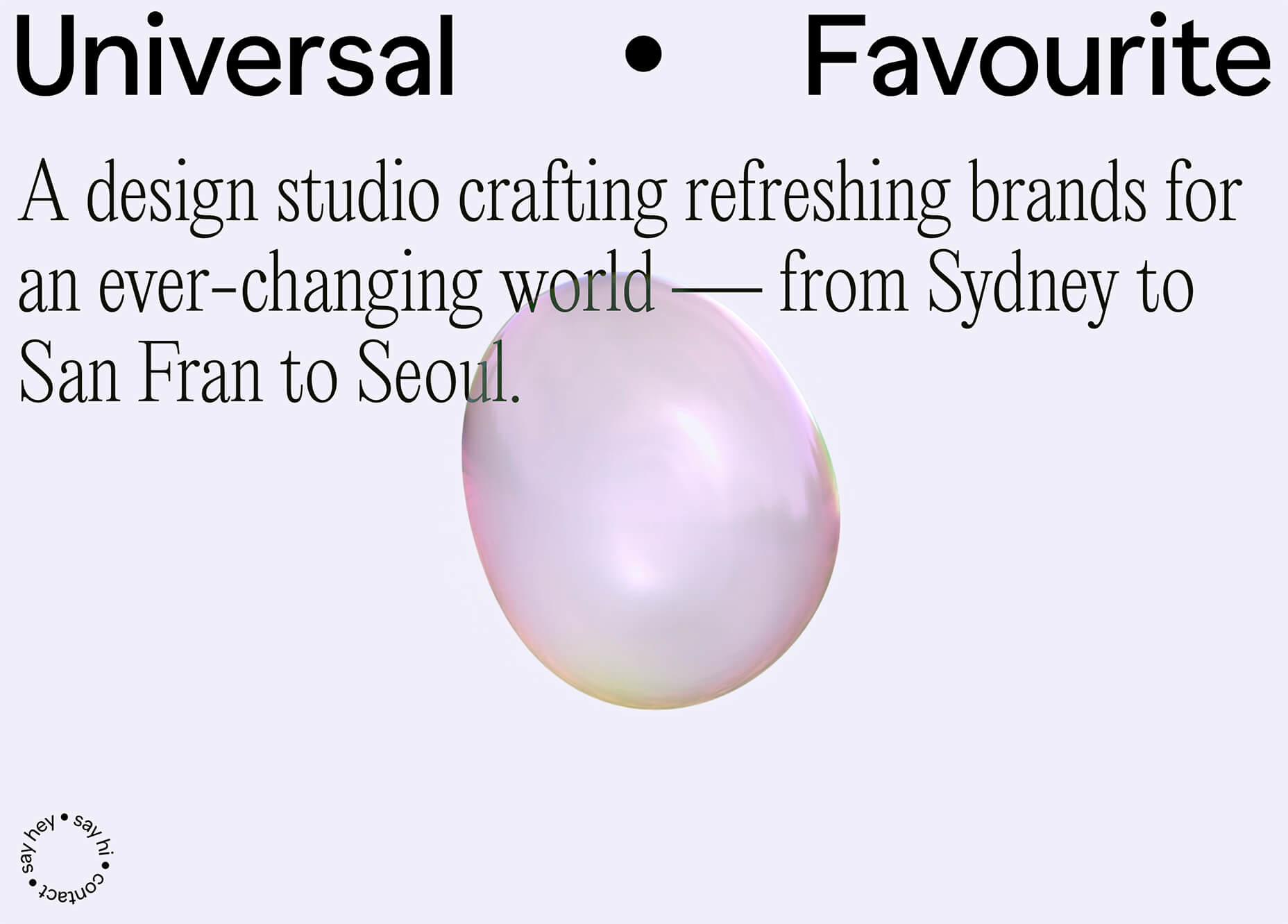