 User experience is one of the most important aspects of web design, but many experts overlook that UX doesn’t just apply to web pages. User experience as a concept encompasses all aspects of end-user interaction with a company.
That means you need to discover the right UX strategies for everything from your homepage to your email marketing and even your listings on Google.
Today, we’re going to explore some of how you can apply UX principles to your client’s image on search engines.
Why Your Search Engine Listing Matters
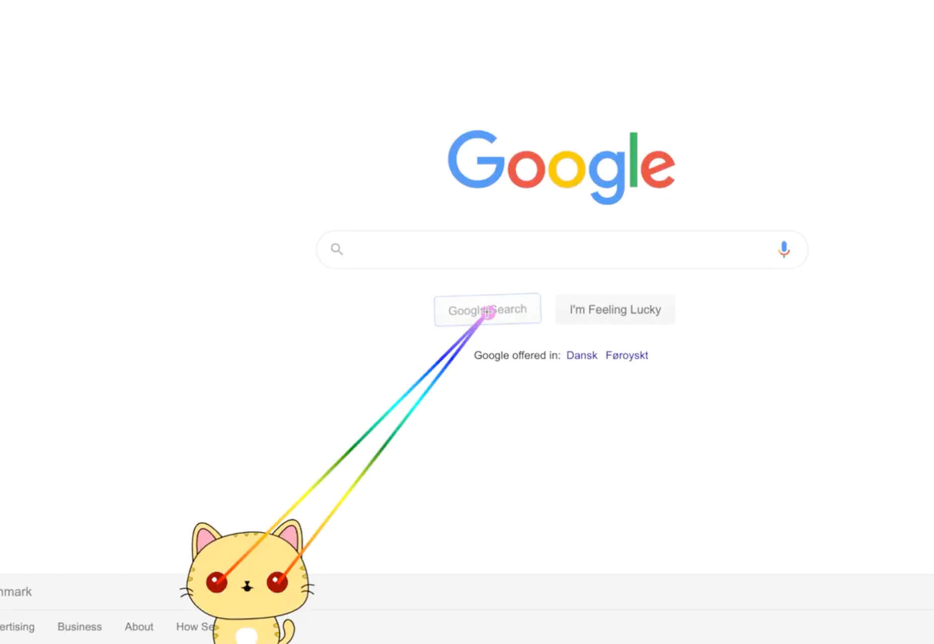
Let’s start with the basics: 89% of customers start their purchasing process with a search engine. That means that whether you’re creating a portfolio to sell your services or building a website for a client, the first connection a customer has with your design isn’t on the homepage.
Most of the time, you’re driving a specific experience for an end-user before you even realize it. Before you can wow an audience with a beautiful site design or an amazing CTA offer, you need to convince them to click on your Google link.
When you invest in user experience, you think carefully about the journey that an end-user goes through when interacting with a brand. This often means considering things like the user’s intent, their needs, and their pain points.
Those same principles apply to create an impressive search engine listing.
UX on a website is all about giving your audience what they need in an informed, and strategic manner; UX in the search engine results works the same way.
How to Make Your Search Listing Stand Out with UX
So, how do you begin to apply the principles of UX to your Google Search results?
It’s much easier than you’d think.
Step 1: Show Immediate Value
Delivering an excellent experience on a website often means providing end-users with the information they need as quickly as possible. Imagine designing a landing page; you wouldn’t want your audience to scroll forever to find what they need. Instead, you’d make sure that the value of the page was immediately obvious.
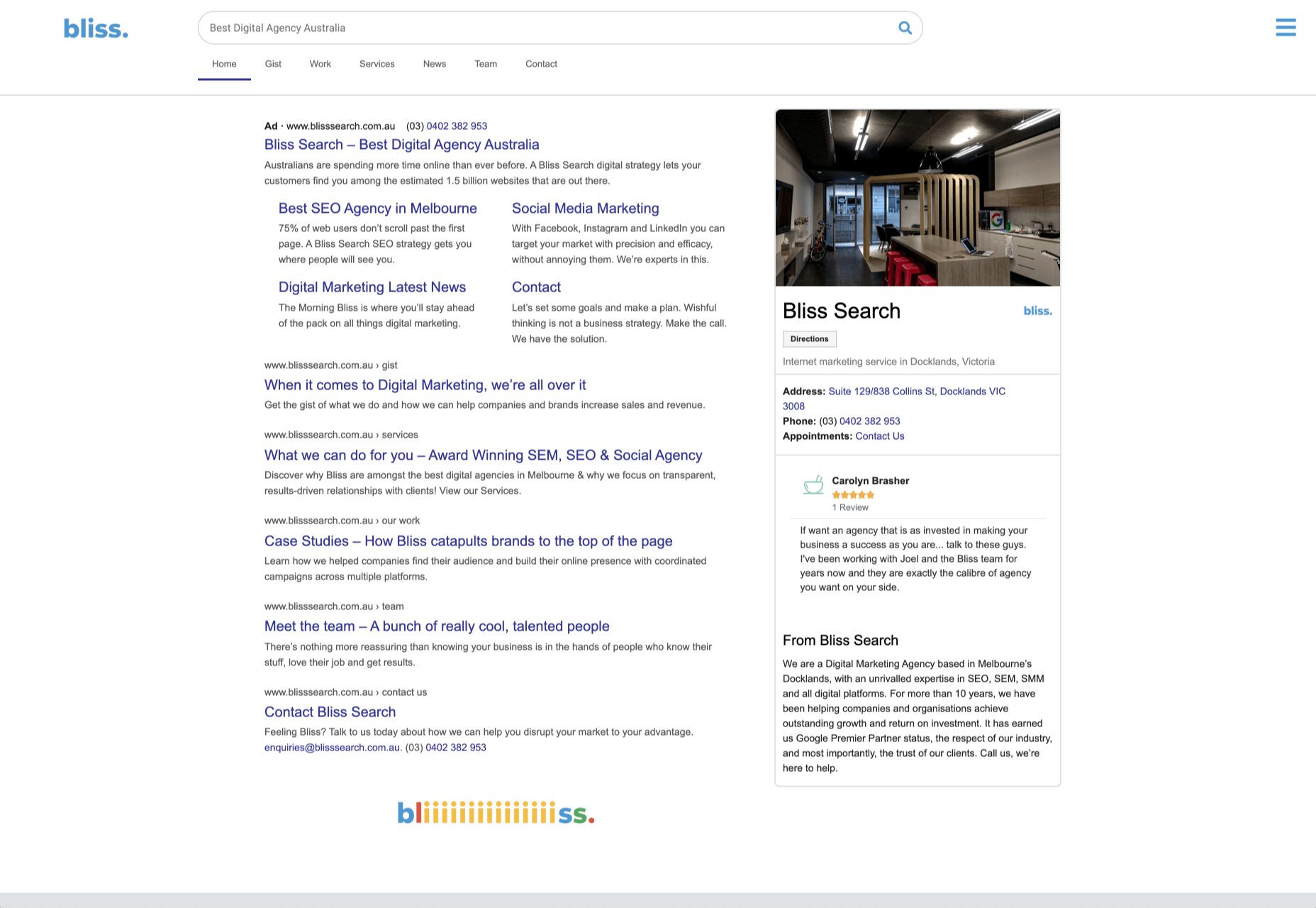
When creating an image for your search engine listing, you’ll need to take the same approach. This often means thinking carefully about two things: your headline and your meta description.
Around 8 out of 10 users say that they’ll click a title if it’s compelling. That means that before you do anything else to improve your SEO strategy, you need to make sure that your web page’s title is going to grab your audience’s attention.
The best titles deliver instant value. These titles tell the audience exactly what they’re going to get when they click onto the page. The promise drives action, while clarity highlights the informed nature of the brand.
The great thing about using an excellent title for a page is that it doesn’t matter where you’re ranked on the search results. Whether you’re number 2 or number 5, your customers will click if they find something they want.
It’s just like using a CTA on a landing page. Make sure your titles are:
- Informative — show your audience value immediately;
- Optimized for mobile — remember, your audience might not see your full title on some screens; this means that you need to make the initial words count;
- Easy to read — keep it short, simple, and clear, speak the end-users’ language.
Step 2: Build Trust with Your URLs
Trust factors are another essential part of good UX.
When you’re designing a website for a new brand, you know that it’s your job to make visitors feel at ease. Even in today’s digital world, many customers won’t feel comfortable giving their money or details to a new company.
Within the website that you design, you can implement trust symbols, reviews, and testimonials to enhance brand credibility. On search engines, it all starts with your URL.
Search-friendly URLs that highlight the nature of the page will put your audience’s mind at ease. When they click on a page about “What is SEO” in the SERPs, they want to see an URL that matches, not a bunch of numbers and symbols
Use search-friendly permalink structures to make your listing seem more authoritative. This will increase the chances of your customer clicking through to a page and make them more likely to share the link with friends.
Once you decide on a link structure, make sure that it stays consistent throughout the entire site. If a link doesn’t appear to match the rest of the URLs that your audience sees for your website, they may think they’re on the wrong page. That increases your bounce rate.
Step 3: Be Informative with Your Meta Description
To deliver excellent UX on a website, you ensure that your visitor can find all of the answers to their most pressing questions as quickly as possible. This includes providing the right information on each page and using the correct navigational structure to support a visitor’s journey.
In the SERPs, you can deliver that same informative experience with a meta description. Although meta descriptions often get ignored, they can provide a lot of value and help you or your client make the right first impression.
To master your meta descriptions:
- Use the full 160 characters — make the most of your meta description by providing as much useful information as you can within that small space;
- Include a CTA — just as CTAs help to guide customers through the pages on a website, they can assist with pulling in clicks on the SERPS; a call to action like “read about the” or “click here” makes sense when you’re boosting your search image;
- Focus on value — concentrate on providing your customers with an insight into what’s in it for them if they click on your listing.
Don’t forget that adding keywords to your meta description is often helpful too. Keywords will boost your chances of a higher ranking, but they’ll also show your audience that they’re looking at the right result.
Step 4: Draw the Eye with Rich Snippets
You’ve probably noticed that the search engine result pages have changed quite a bit in the last couple of years. As Google strives to make results more relevant and informative, we’ve seen the rise of things like rich snippets. Rich snippets are excellent for telling your audience where to look.
On a website, you would use design elements, like contrasting colors and animation, to pull your audience’s attention to a specific space. On search engines, rich snippets can drive the same outcomes. The difference is that instead of telling a visitor what to do next on a page, you’re telling them to click on your site, not a competitor’s.
When Google introduced rich snippets, it wanted to provide administrators with a way of showcasing their best content. Rich snippets are most commonly used today on product pages and contact pages because they can show off reviews.
Install a rich snippet plugin into your site if you’re a WordPress user or your client is. When you enter the content that you need into the website, use the drop-down menu in your Rich snippet tool to configure the snippet.
Ideally, you’ll want to aim for the full, rich snippet if you want to stand out at the top of the search results. Most featured snippets have both text and an image. It would help if you aimed to access both of these by writing great content and combining it with a relevant image.
Step 5: Provide Diversity (Take Up More of the Results)
As a website designer or developer, you’ll know that different people on a website will often be drawn to different things. Some of your visitors might immediately see a set of bullet-points and use them to search for the answer to their question. Other visitors will want pictures or videos to guide them. So, how do you deliver that kind of diversity in the SERPS?
The easiest option is to aim to take up more of the search result pages. Google now delivers a bunch of different ways for customers to get the answers they crave. When you search for “How to use Google my Business” on Google, you’ll see links to blogs, as well as a list of YouTube Videos and the “People Also Ask” section.
Making sure that you or a client has different content ranking pieces for the same keywords can significantly improve the experience any customer has on the search engines. Often, the process of spreading your image out across the SERPs is as simple as creating some different kinds of content.
To access the video’s benefits, ask your client to create YouTube videos for some of their most commonly asked questions or most covered topics. If you’re helping with SEO marketing for your client, then make sure they have an FAQ page or a way of answering questions quickly and concisely on articles, so they’re more likely to appear in “People Also Ask”:
Step 6: Add Authority with Google My Business
Speaking of Google My Business, that’s another excellent tool that’s perfect for improving UX in the search results. GMB is a free tool provided by Google. It allows business owners to manage how information appears in the search results.
With this service, you can manage a company’s position on Google maps, the Knowledge Graph, and online reviews. Establishing a company’s location is one of the most important things you can do to help audiences quickly find a business. Remember, half of the customers that do a local search on a smartphone end up visiting the store within the same day.
Start by setting up the Google Business listing for yourself or your client. All you need to do is hit the “Start Now” button and fill out every relevant field offered by Google. The more information you can add to Google My Business, the more your listing will stand out. Make sure you:
- Choose a category for a business, like “Grocery store”;
- Load up high-quality and high-resolution images;
- Ensure your information matches on every platform;
- Use a local number for contact;
- Encourage reviews to give your listing a five-star rating.
Taking advantage of a Google My Business listing will ensure that your audience has all the information they need to make an informed decision about your company before they click through to the site. This means that you or your client get more warm leads and fewer people stumbling onto your website that might not want to buy from you.
Step 7: Use Structured Data Markup to Answer Questions
If you’re already using things like rich snippets in your Google listings, you should also have a structured schema markup plan. Schema markup on Google tells the search engines what your data means. This means that you can add extra information to your listings that will guide your customers more accurately to the support they need.
Providing additional schema markup information to your listings gives them an extra finishing touch to ensure that they stand out from the competition. You might add something like a “product price” to a product page or information about the product’s availability.
Alternatively, you could provide the people who see a search result with other options. This could be an excellent option if you’re concerned that some of the people who might come across your listing might need slightly different information. For instance, you can ask Google to list other pages along with your search results that customers can “jump to” if they need additional insights.
Baking structured data into your design process when you’re working on a website does several positive things. It makes the search engine’s job easier so that you can ensure that you or your client ranks higher. Additionally, it means that your web listings will be more thorough and useful.
Since UX is all about giving your audience the best possible experience with a brand, that starts with making sure they get the information they need in the search results.
Constantly Improve and Experiment
Remember, as you begin to embed UX elements into your search engine listings, it’s important to be aware of relevant evolutions. Ultimately, the needs of any audience can change very rapidly. Paying attention to your customers and what kind of links they click on the most will provide you with lots of valuable data. You can use things like Google analytics to A/B test things like titles, pictures, featured snippets, and other things that may affect UX.
At the same time, it’s worth noting that the Google search algorithms are always changing. Running split tests on different pages will give you an insight into what your customers want. However, you’ll need to keep an eye on the latest documentation about Google Search if you want to avoid falling behind the competition.
Like most exceptional UX aspects, mastering your SERP position isn’t a set it and forget it strategy. You’ll need to constantly expand your knowledge if you want to show clients that you can combine UX and SEO effectively.
It’s easy to forget that there’s more to UX than making your buttons clickable on mobile devices or ensuring that scrolling feels smooth. For a designer or developer to deliver wonderful UX for a brand, they need to consider every interaction that a company and customer have. Most of the time, this means starting with the way a website appears when it’s listed on the search engines. Getting your SEO listing right doesn’t just boost your chances of a good ranking. This strategy also improves your reputation with your audience and delivers more meaningful moments in the buyer journey.
Featured image via Unsplash.
Source

Source de l’article sur Webdesignerdepot

 This article is brought to you by 4Kdownload.com, a suite of video tools that help you make the most of YouTube, Instagram, Vimeo, and many more popular resources.
 Welcome to our roundup of the best plugins for popular CMS, this month. We’re going to cover plugins built to enhance WordPress, Shopify, Craft CMS, and Joomla. Enjoy!
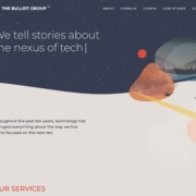
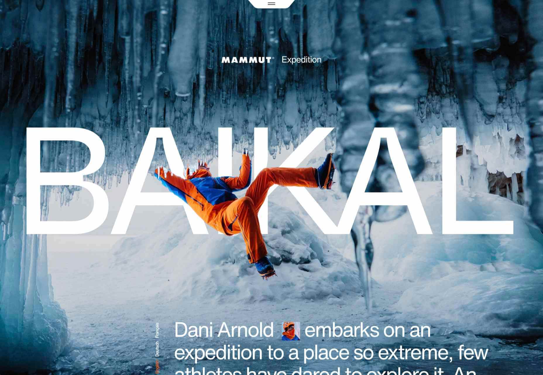
 It’s hard to believe we are more than a month into 2021 already. But that means more trends to dive into this year, right?
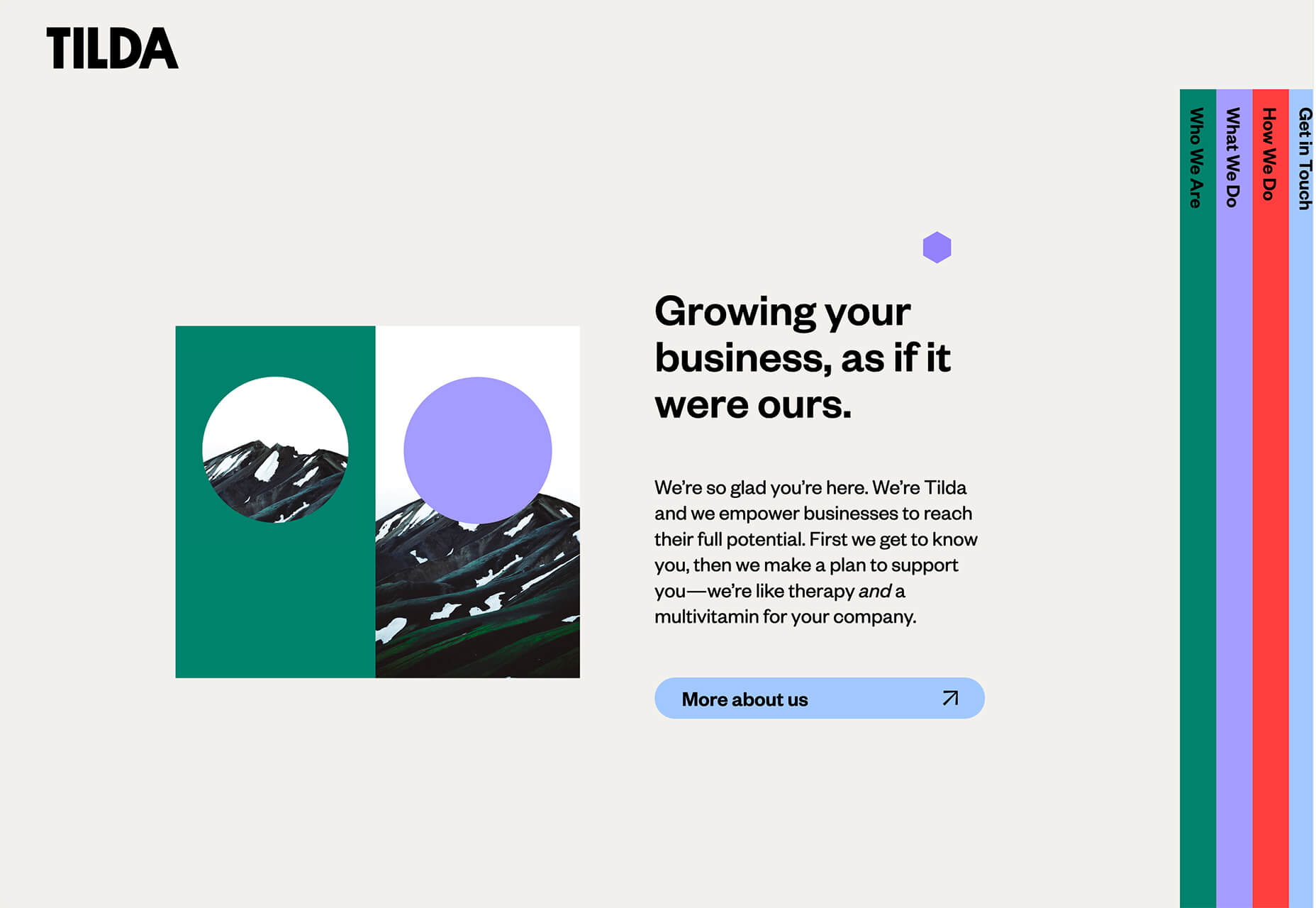

 Here we are into a brand new year, and although we’re far from out of the woods yet, there is a feeling of renewed hope on many fronts.
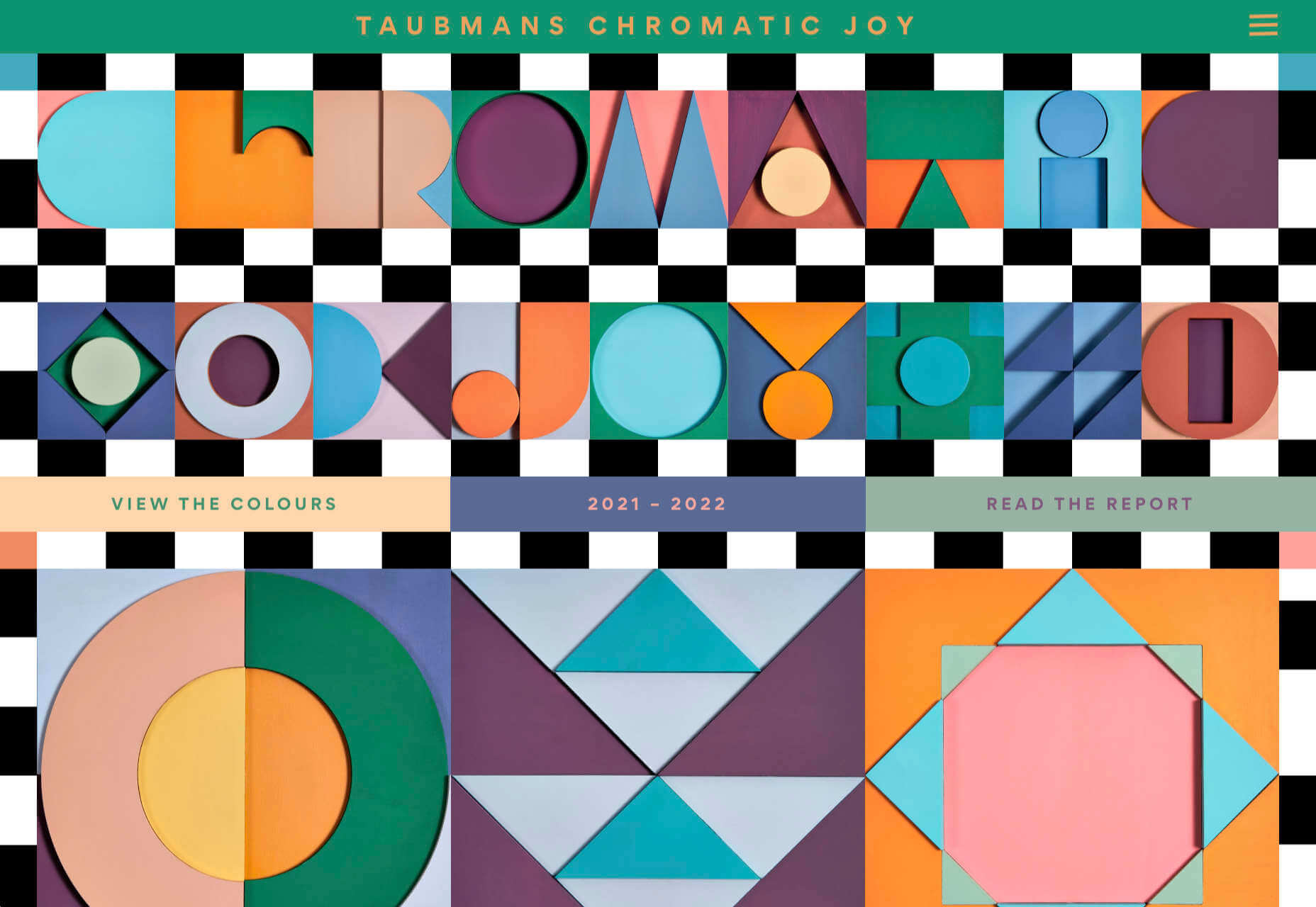
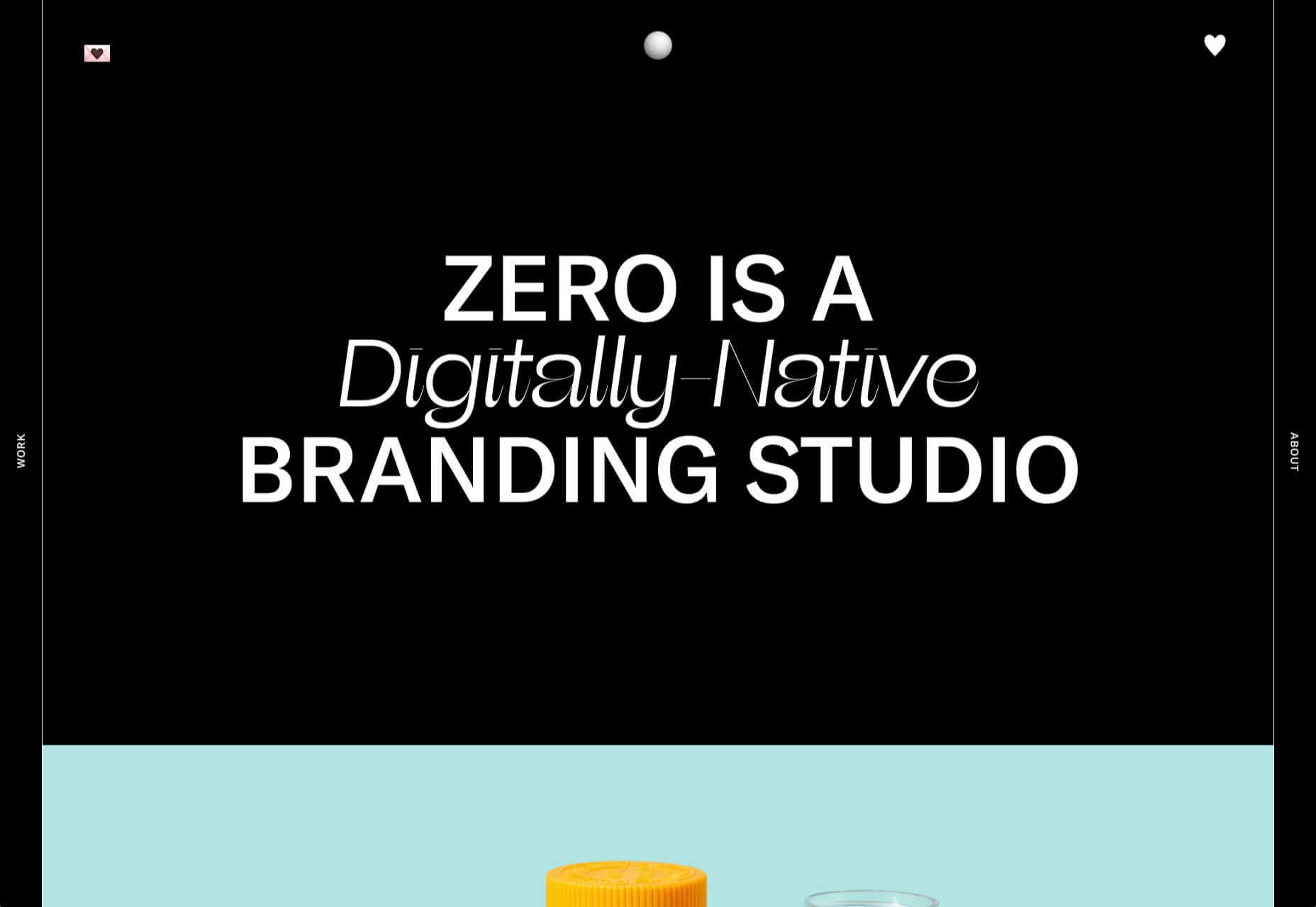
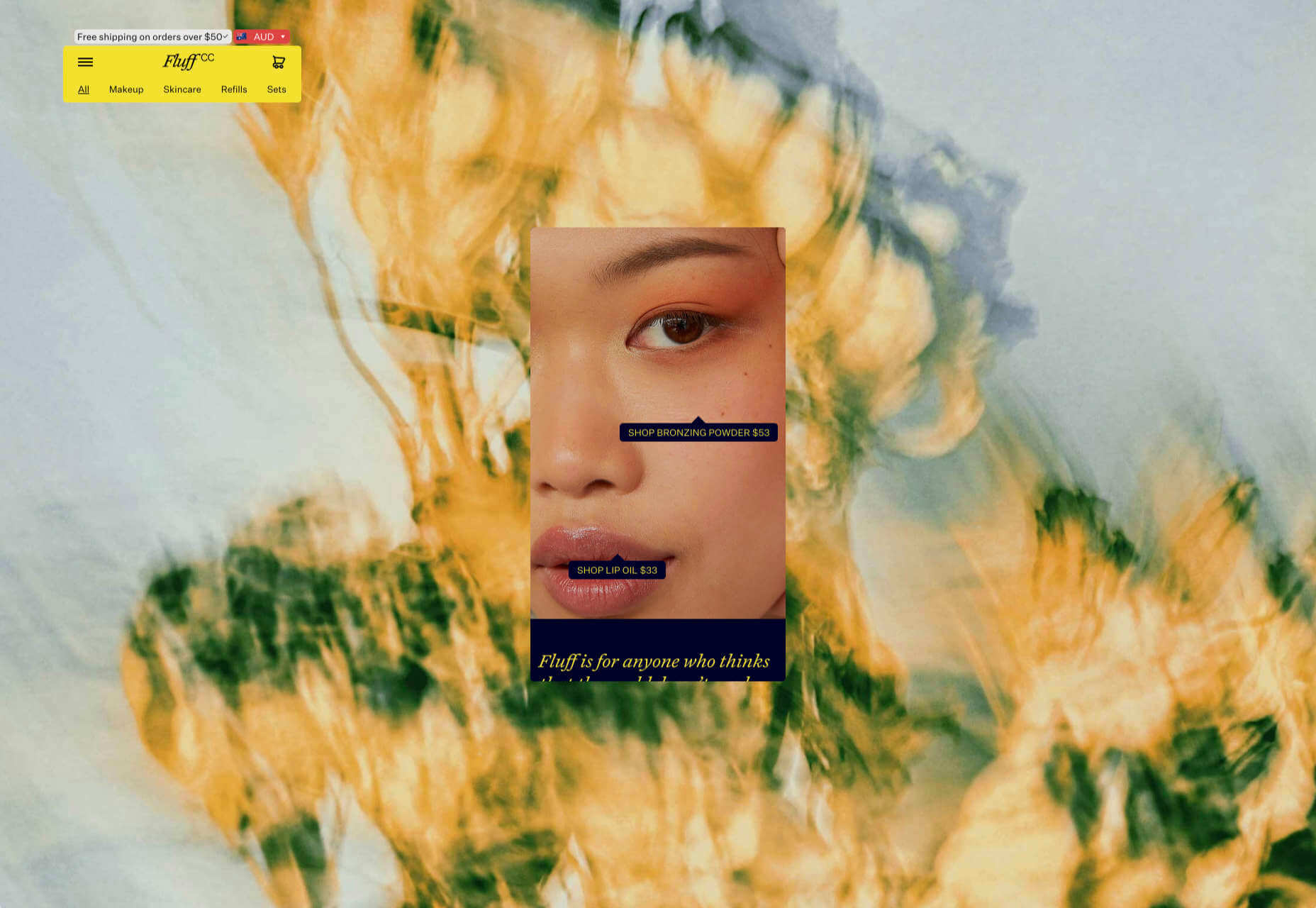
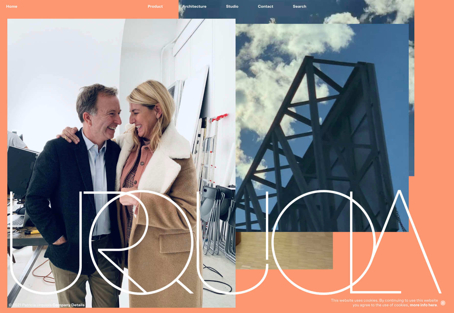
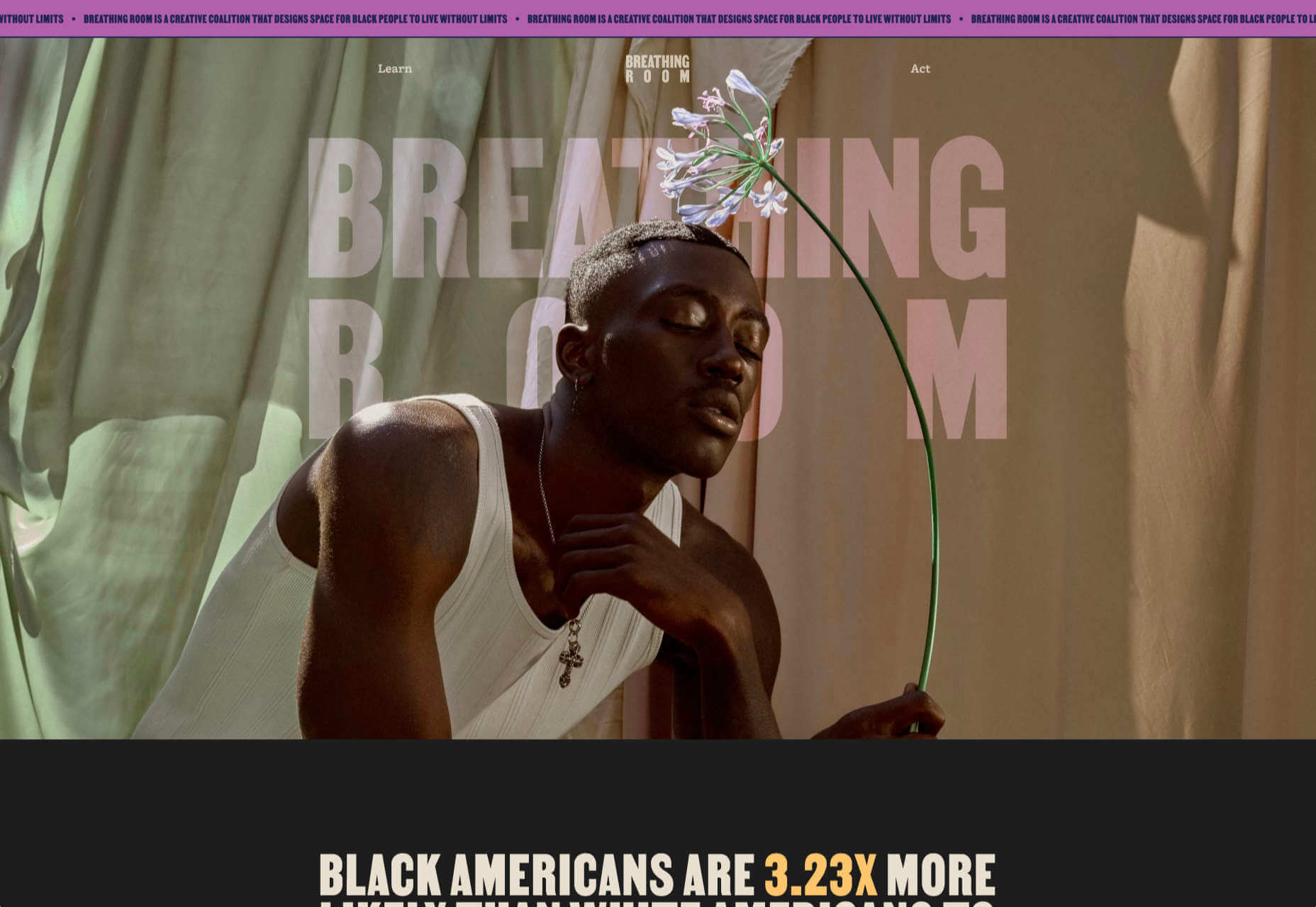
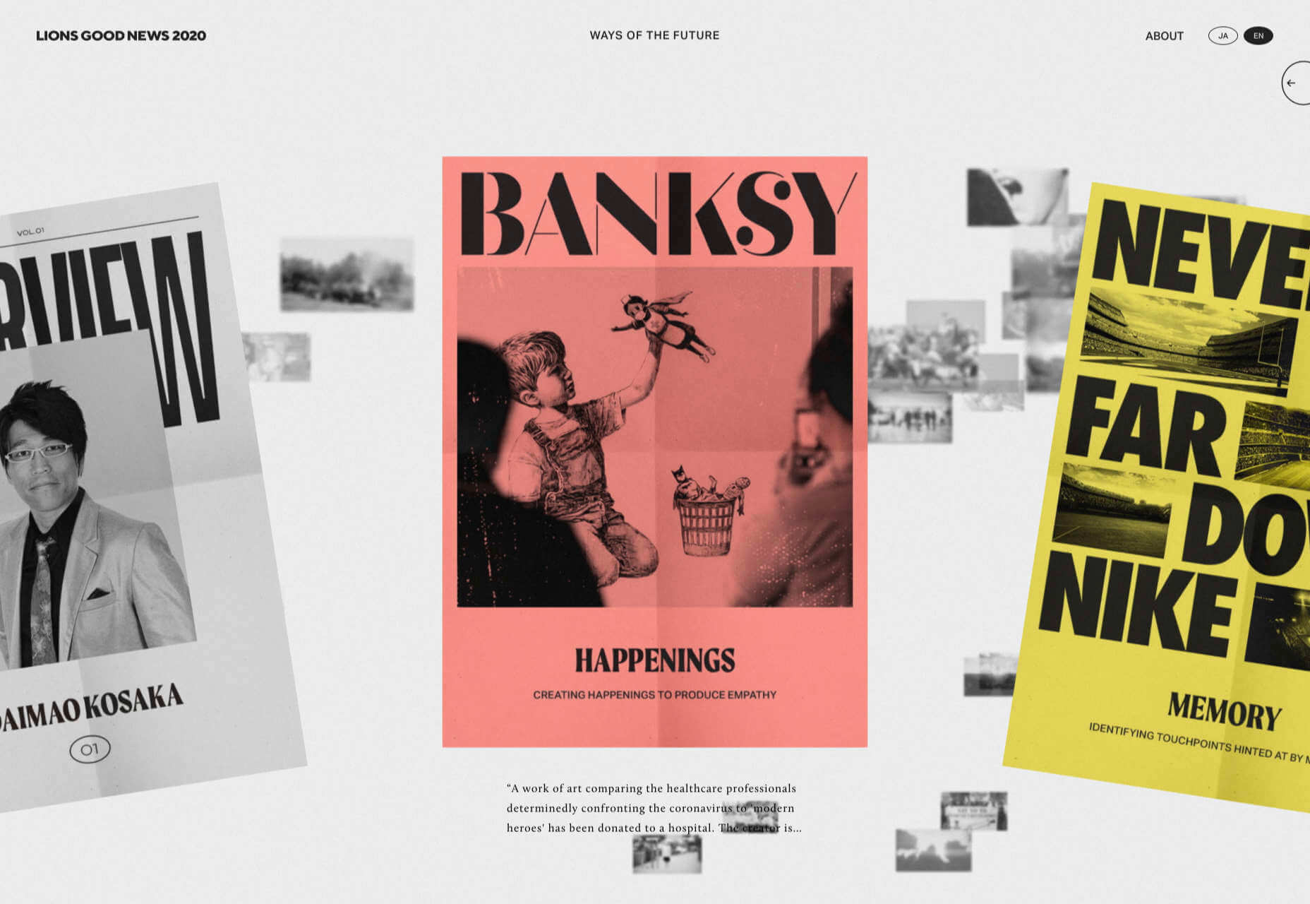


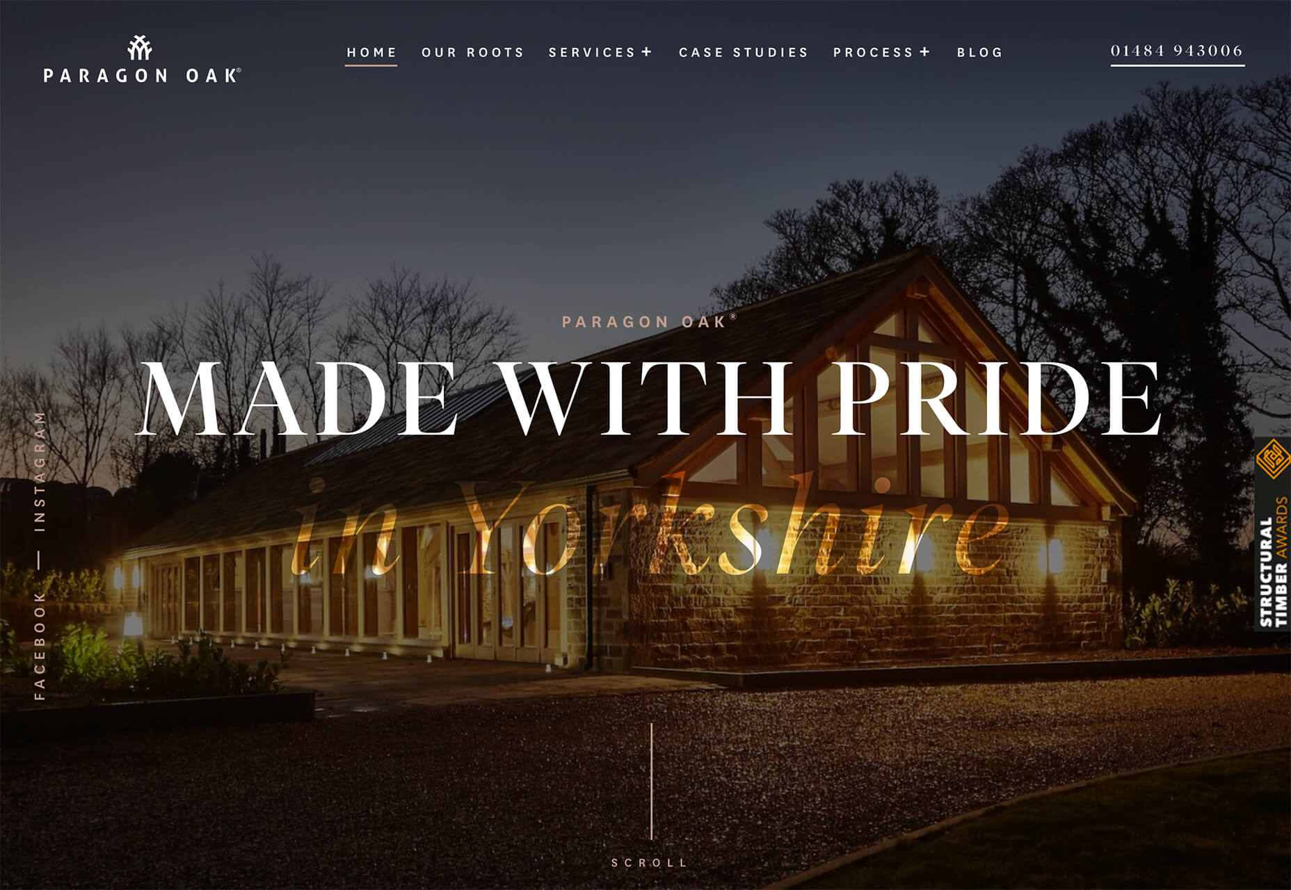
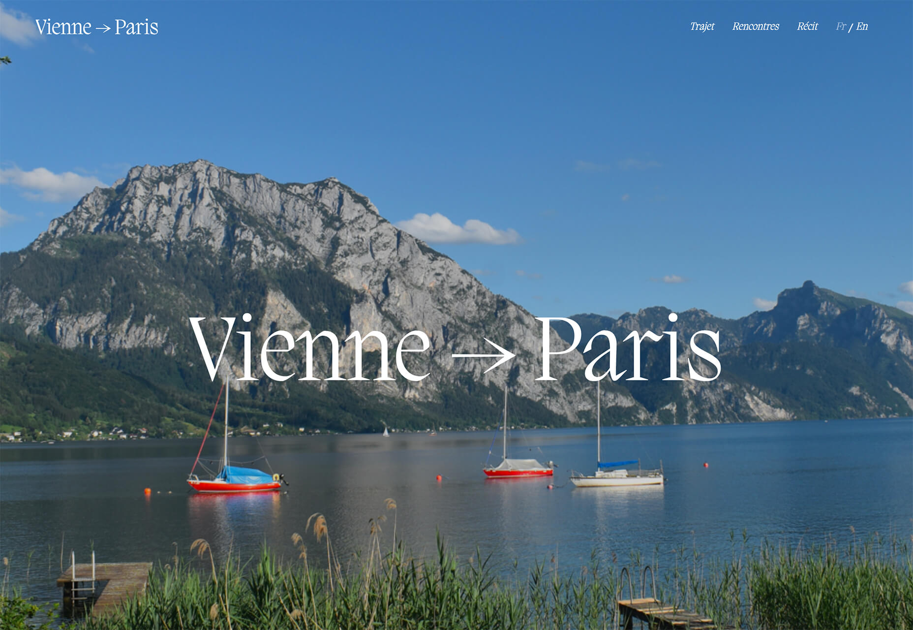
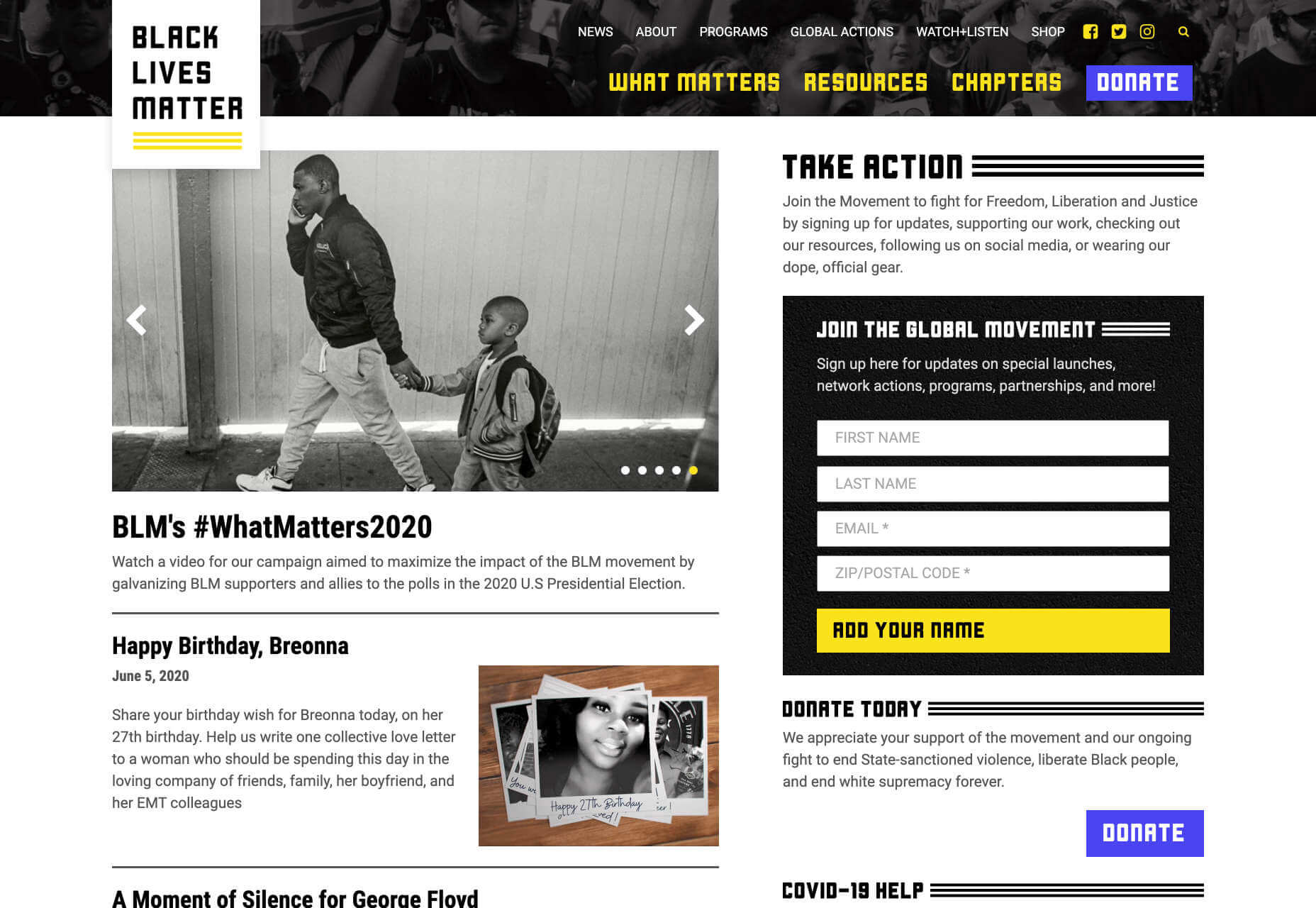
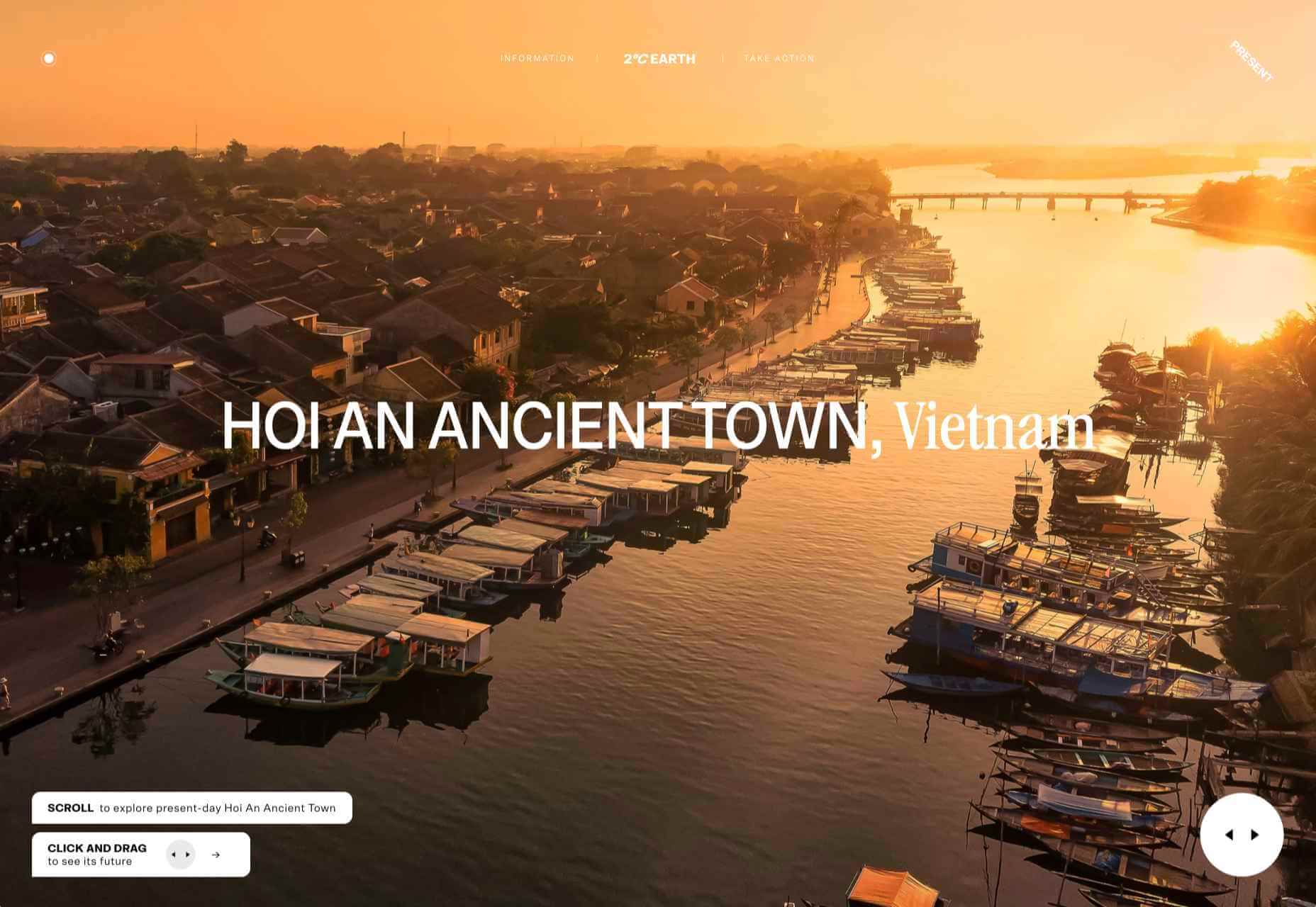
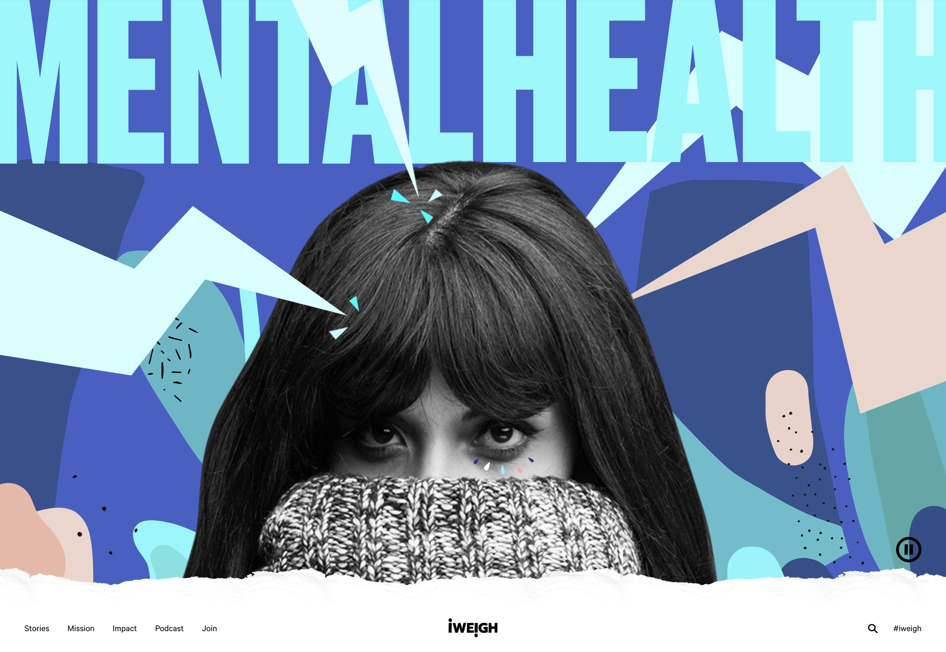
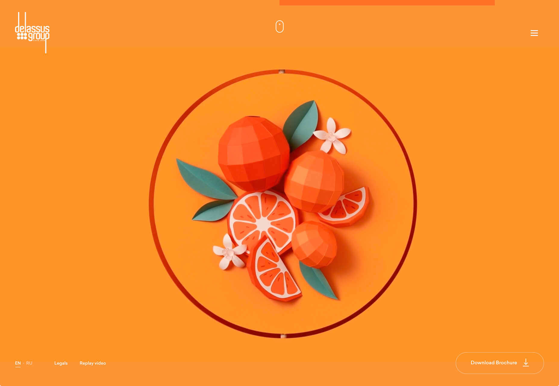
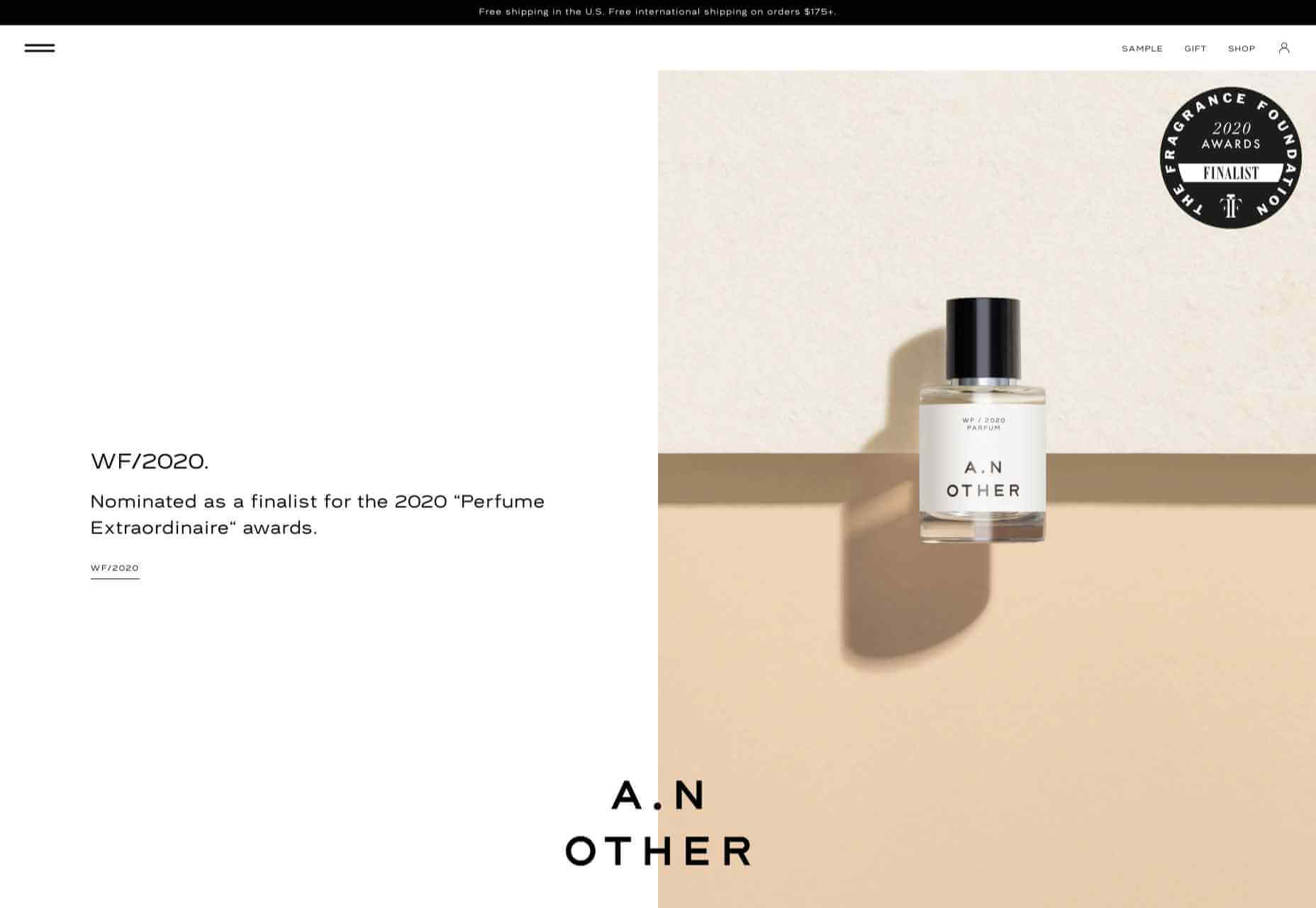
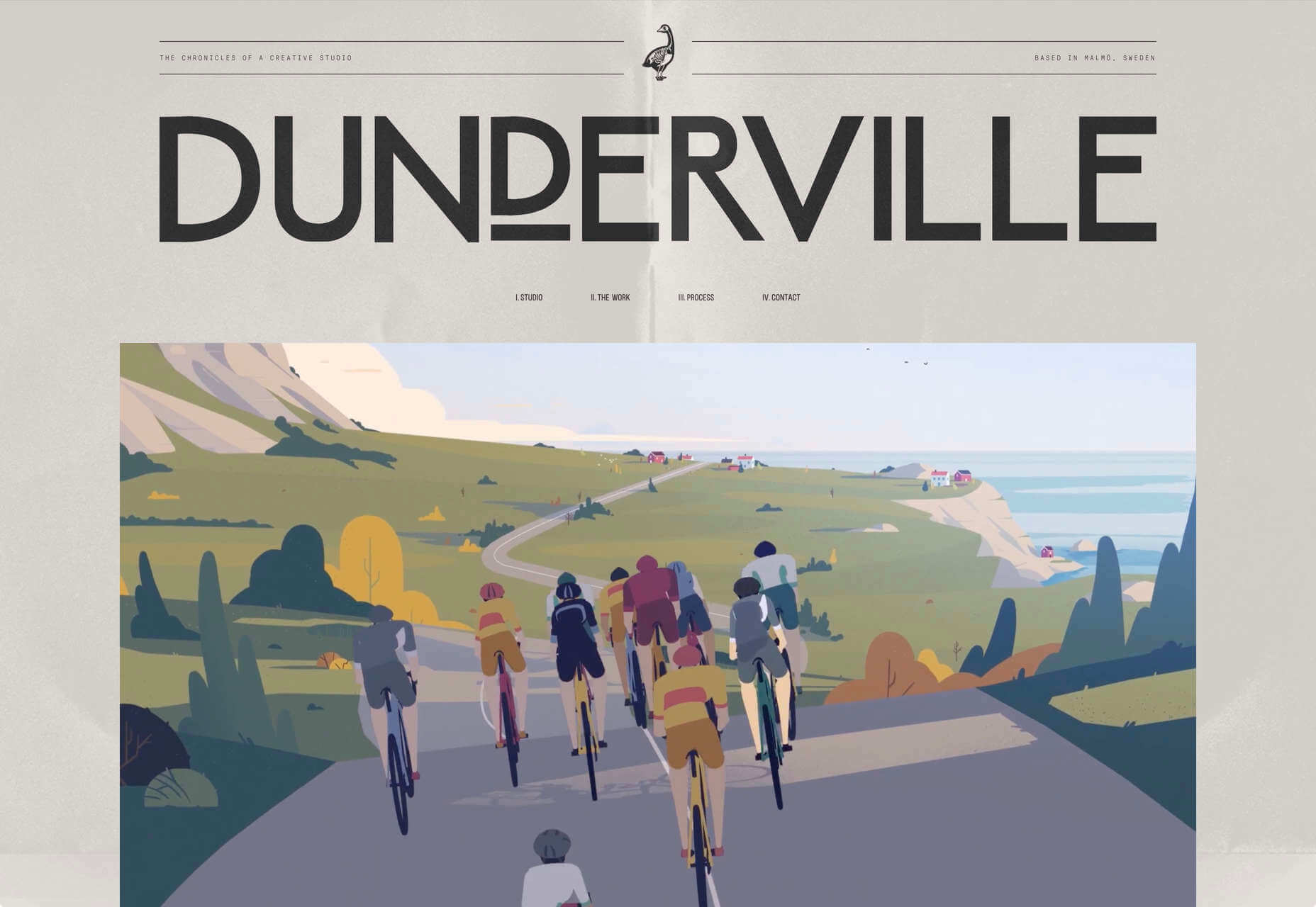
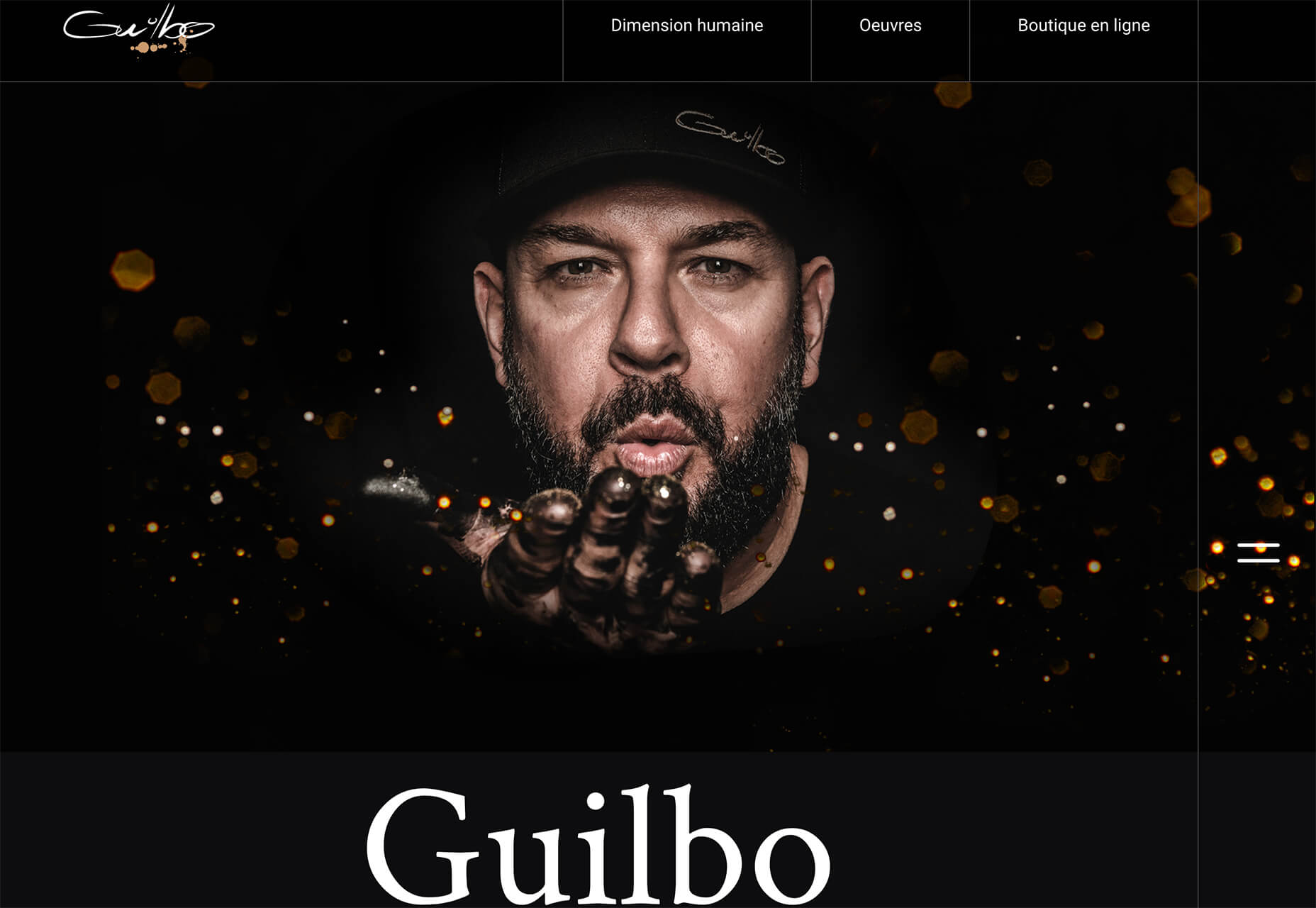
 Don’t drop the ball on these website design trends for the new year. All of the trends featured here this month are visual in nature – not as many user interface elements as previous months, but all just as stunning and usable.
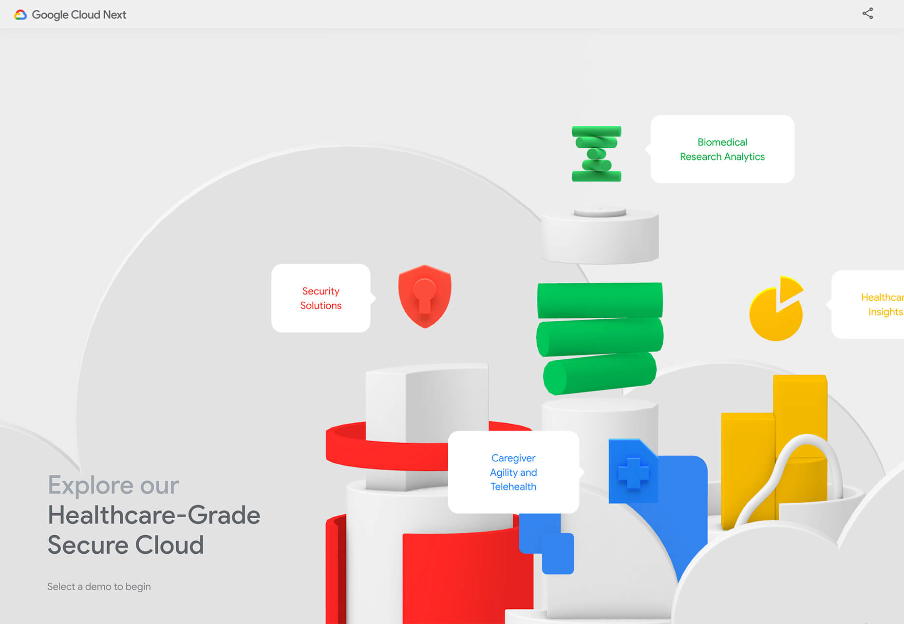
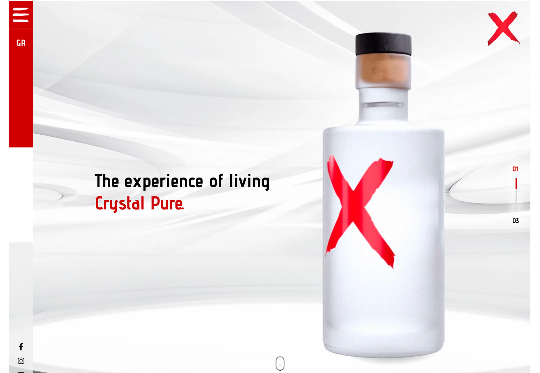
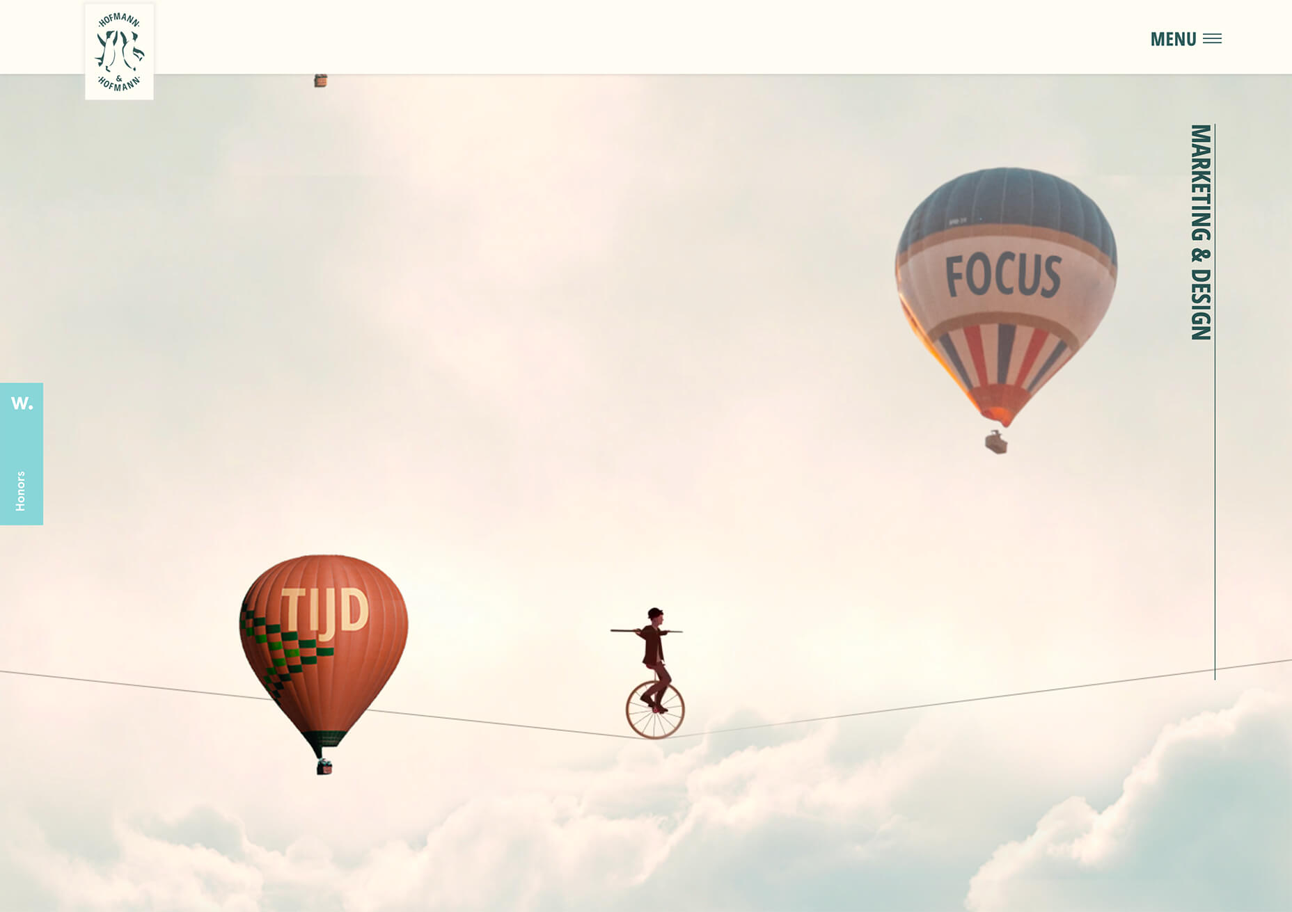
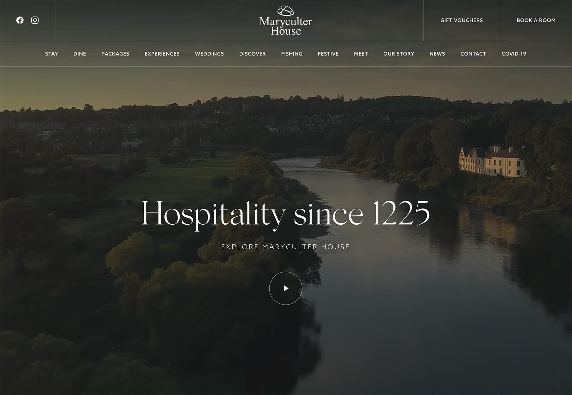

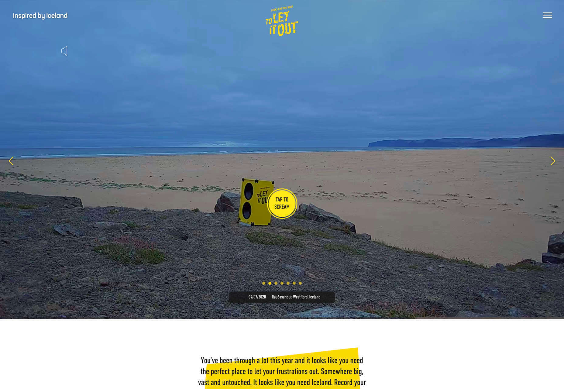
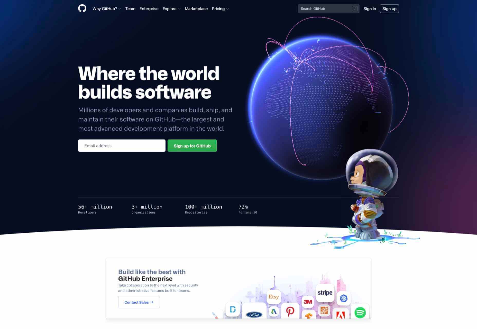
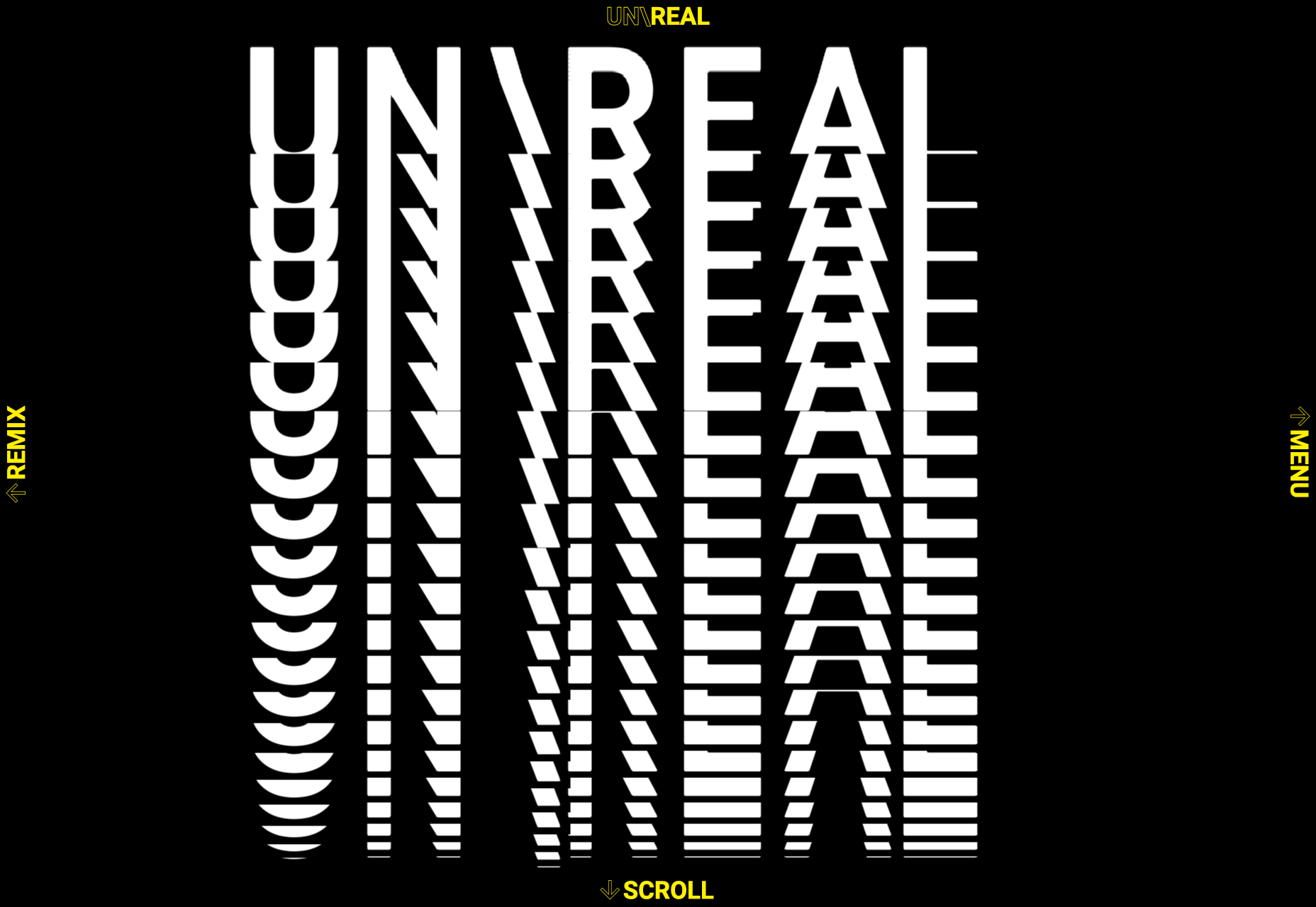
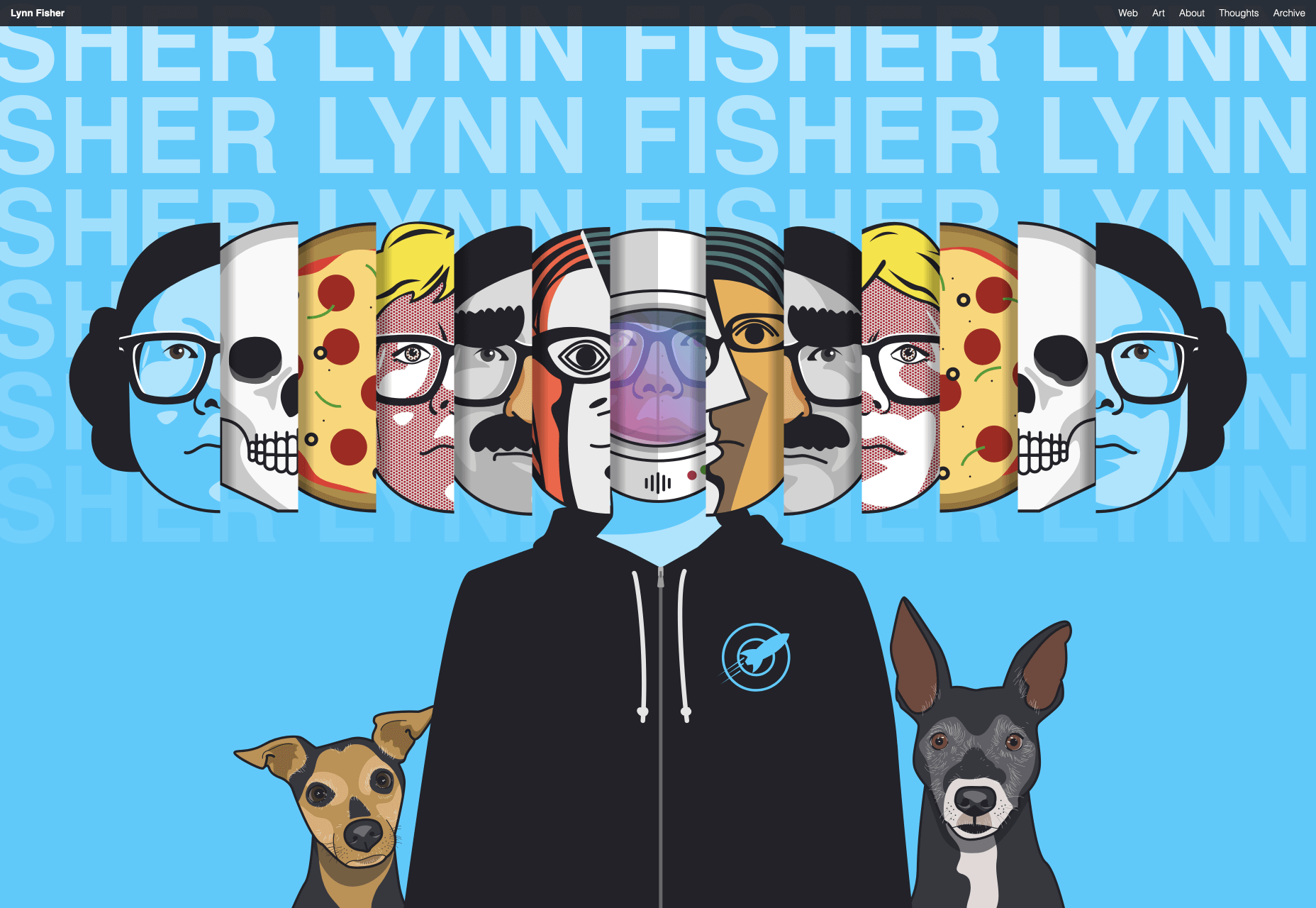
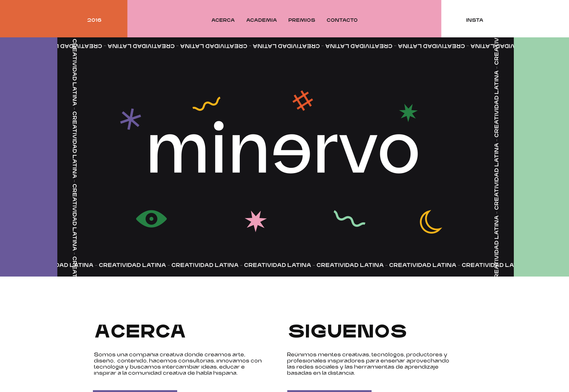
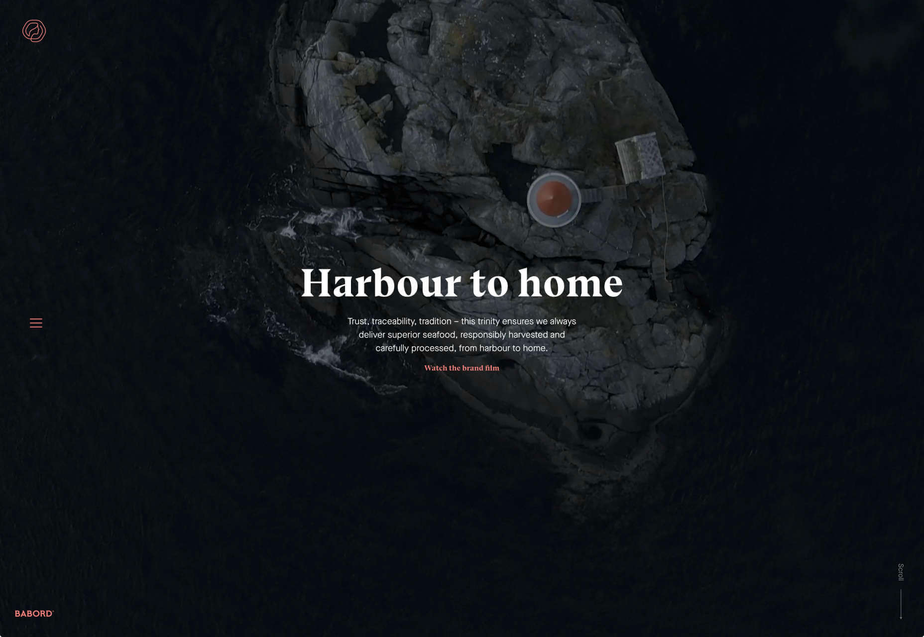
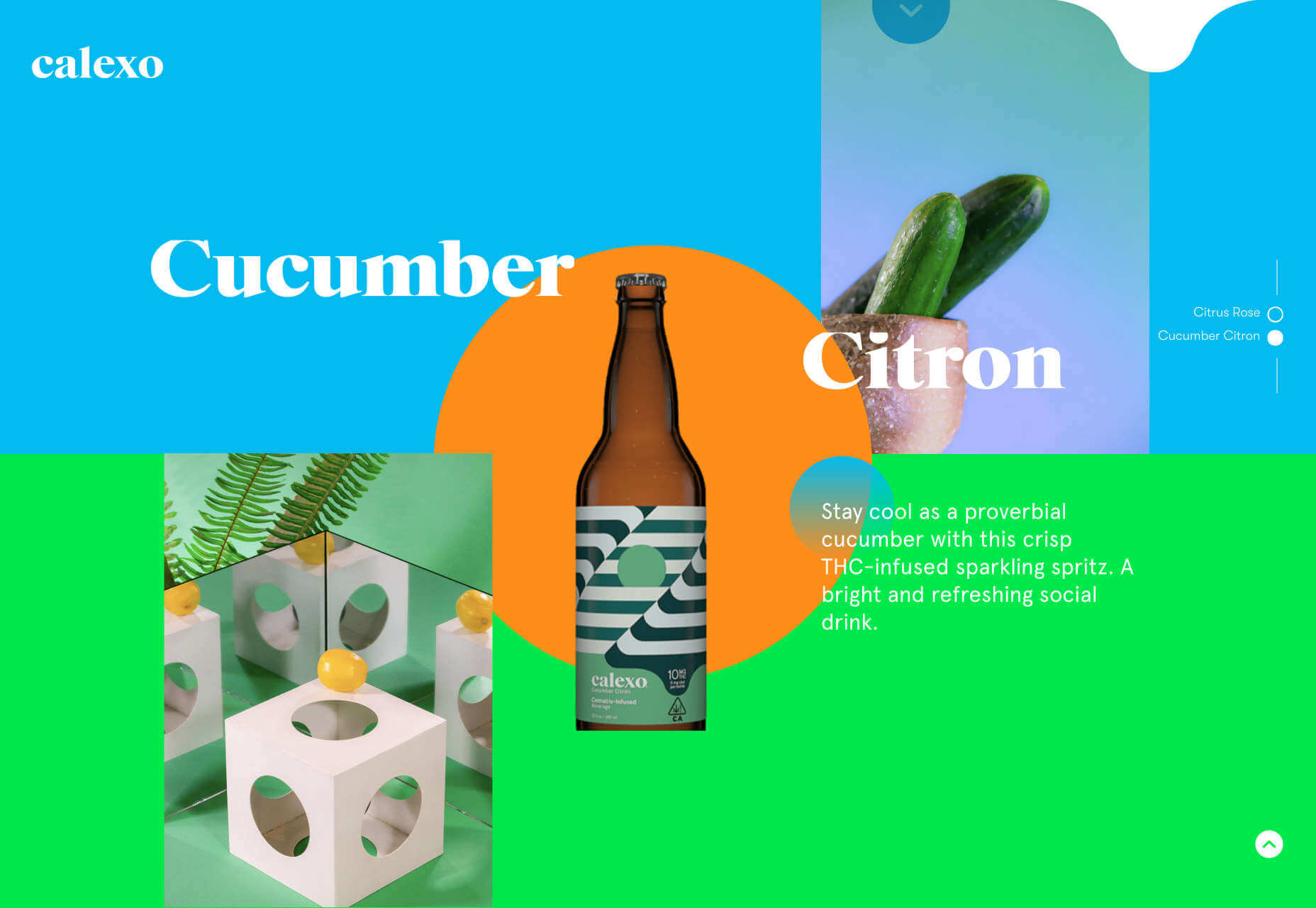
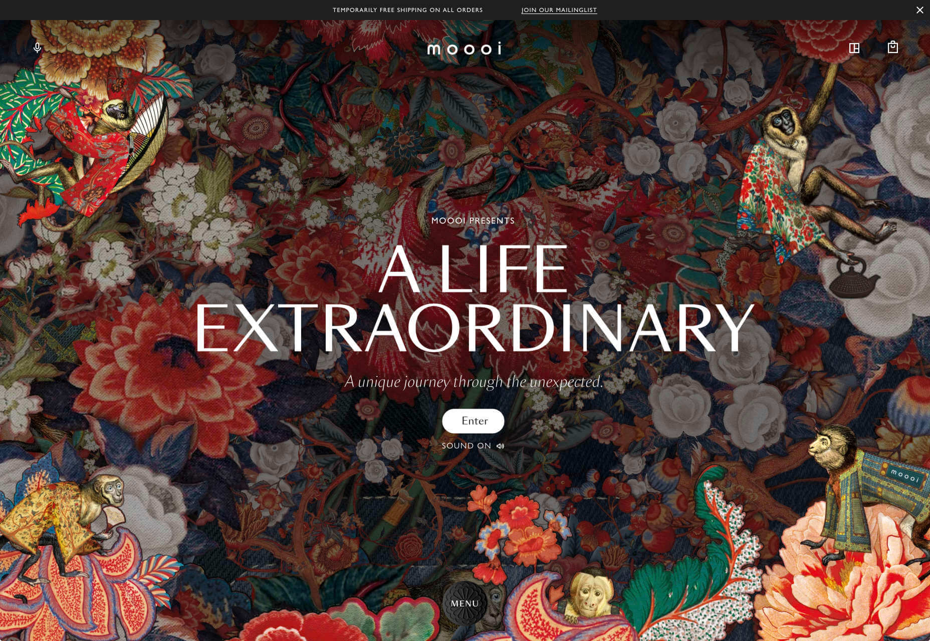


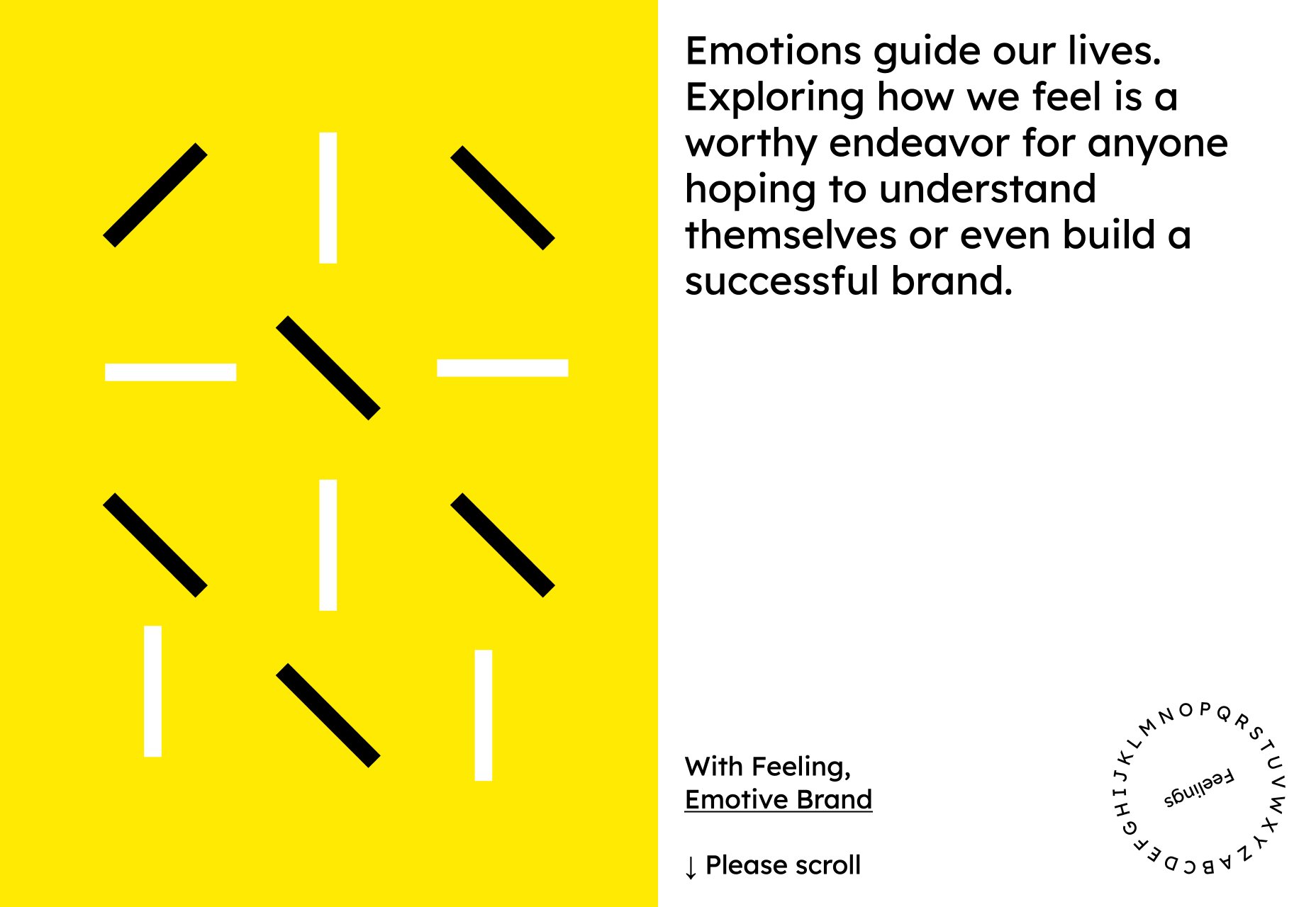
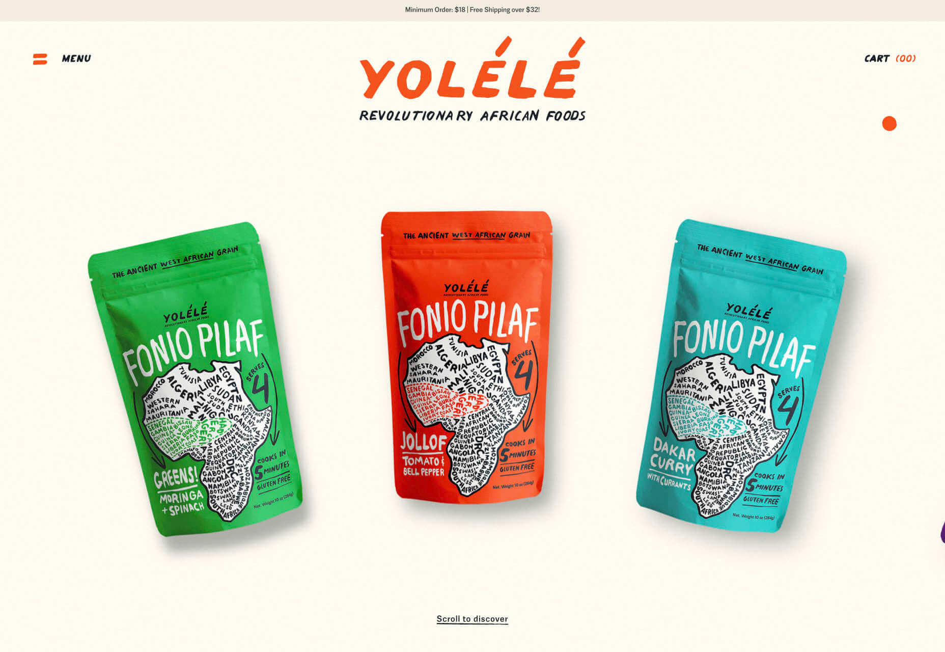
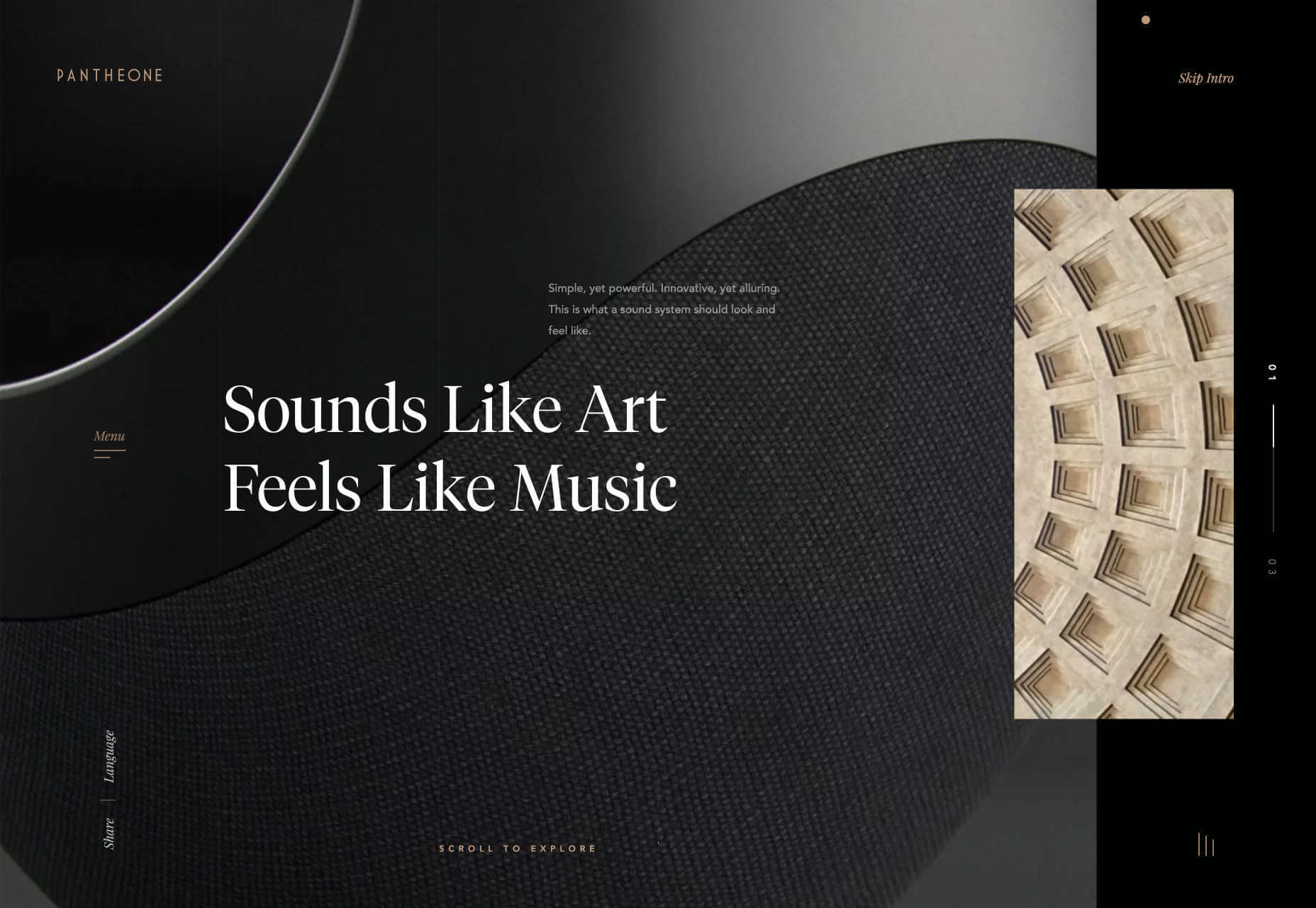
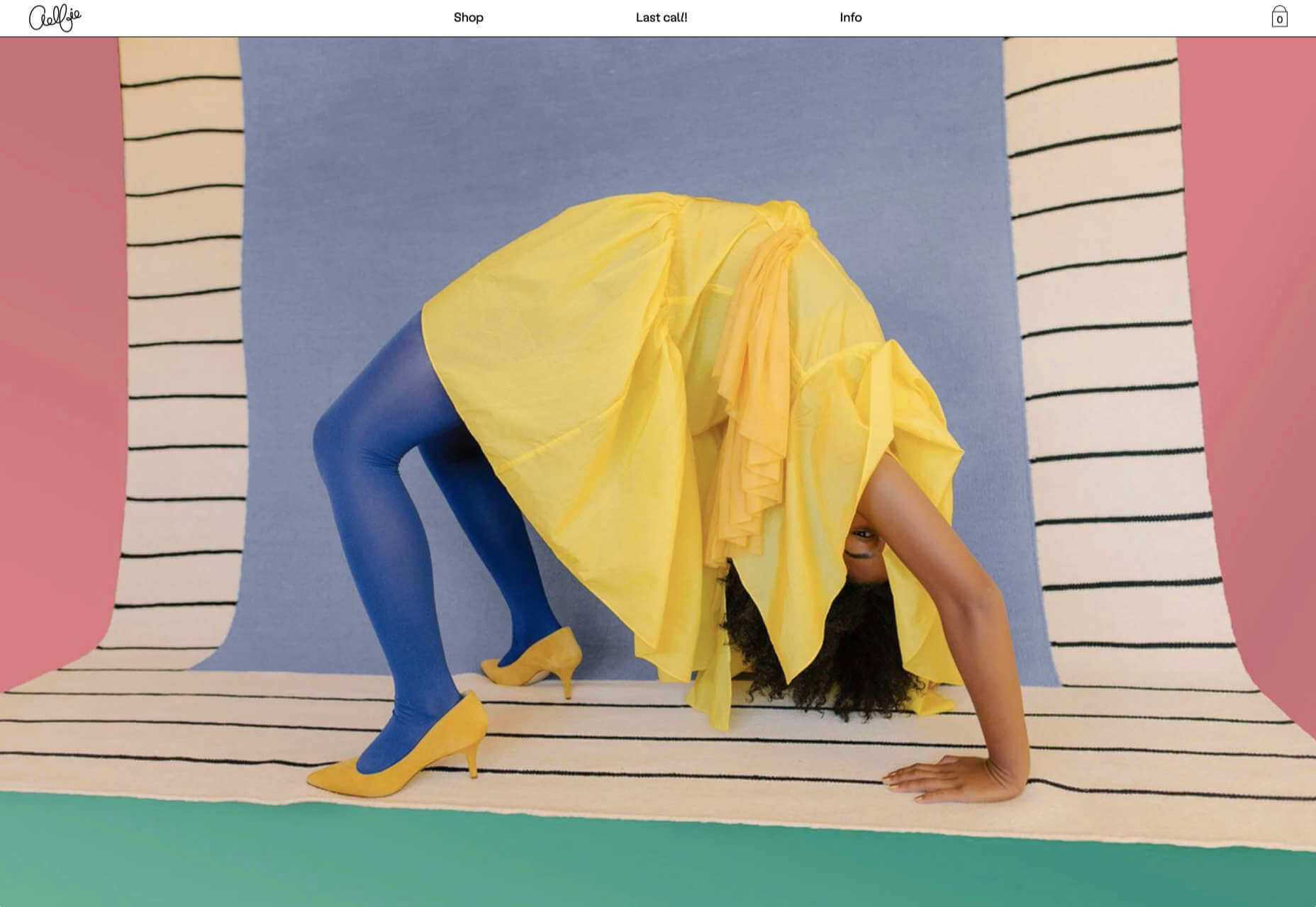
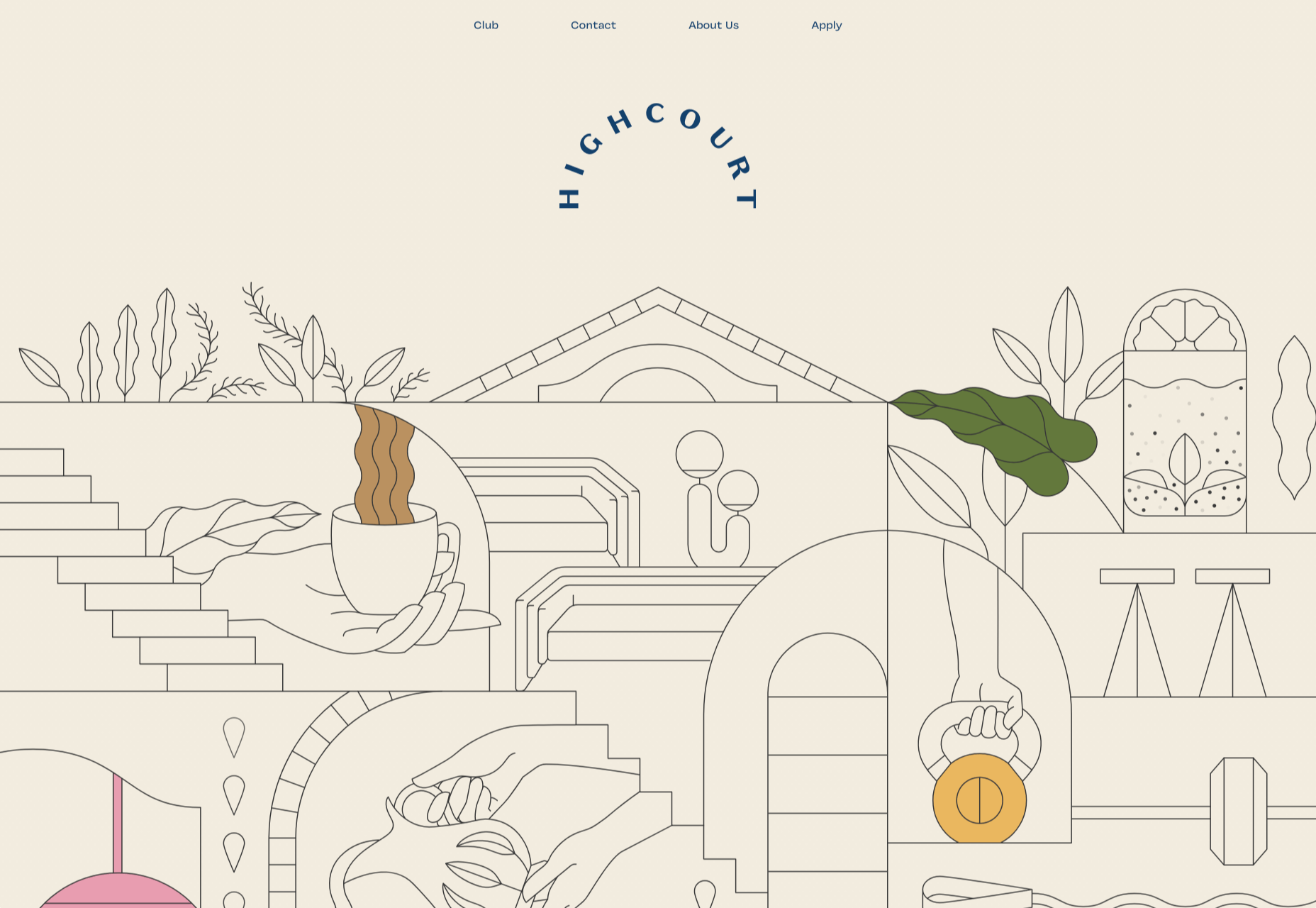
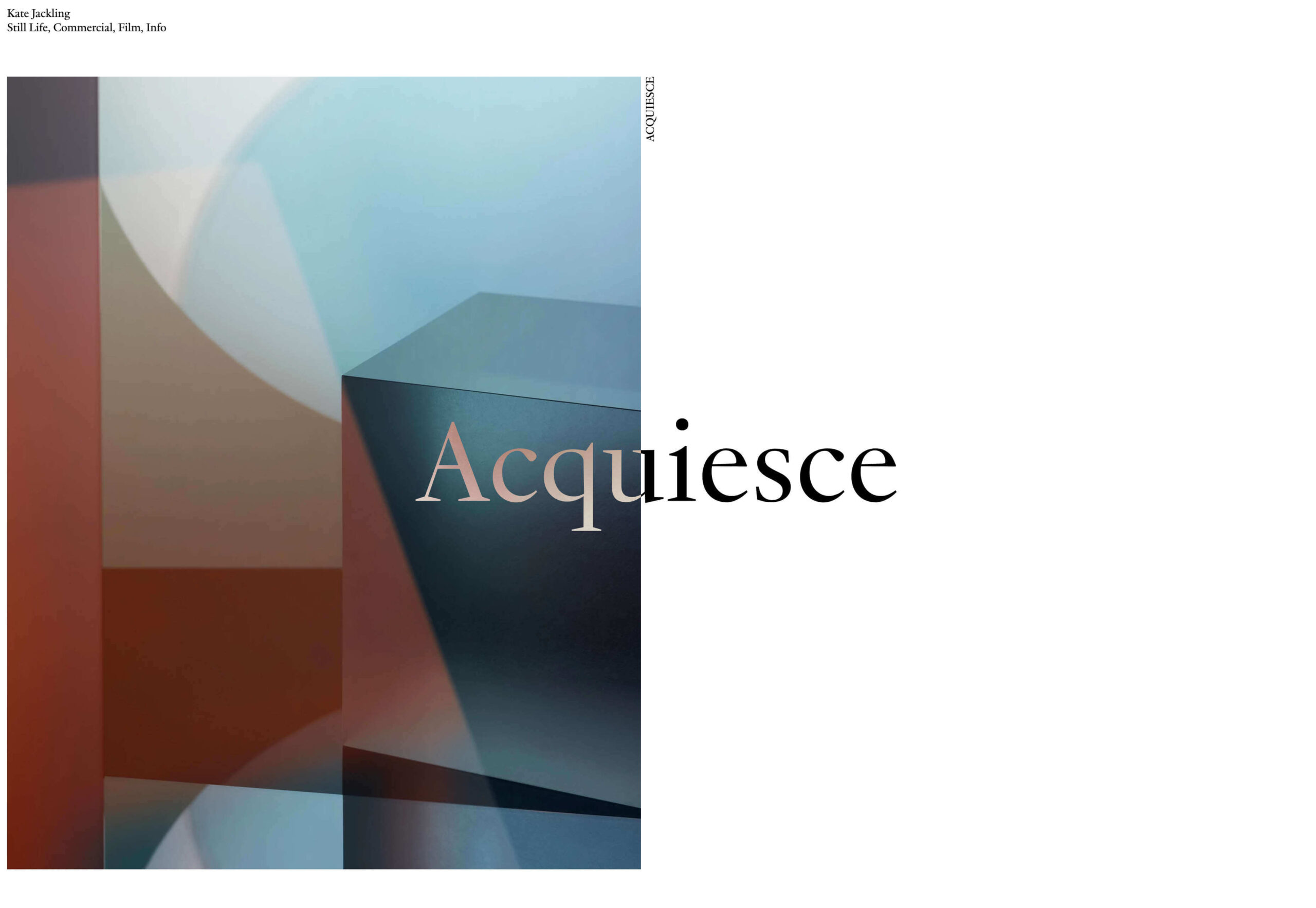
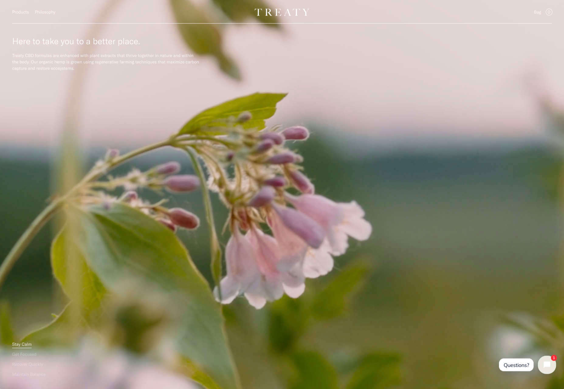

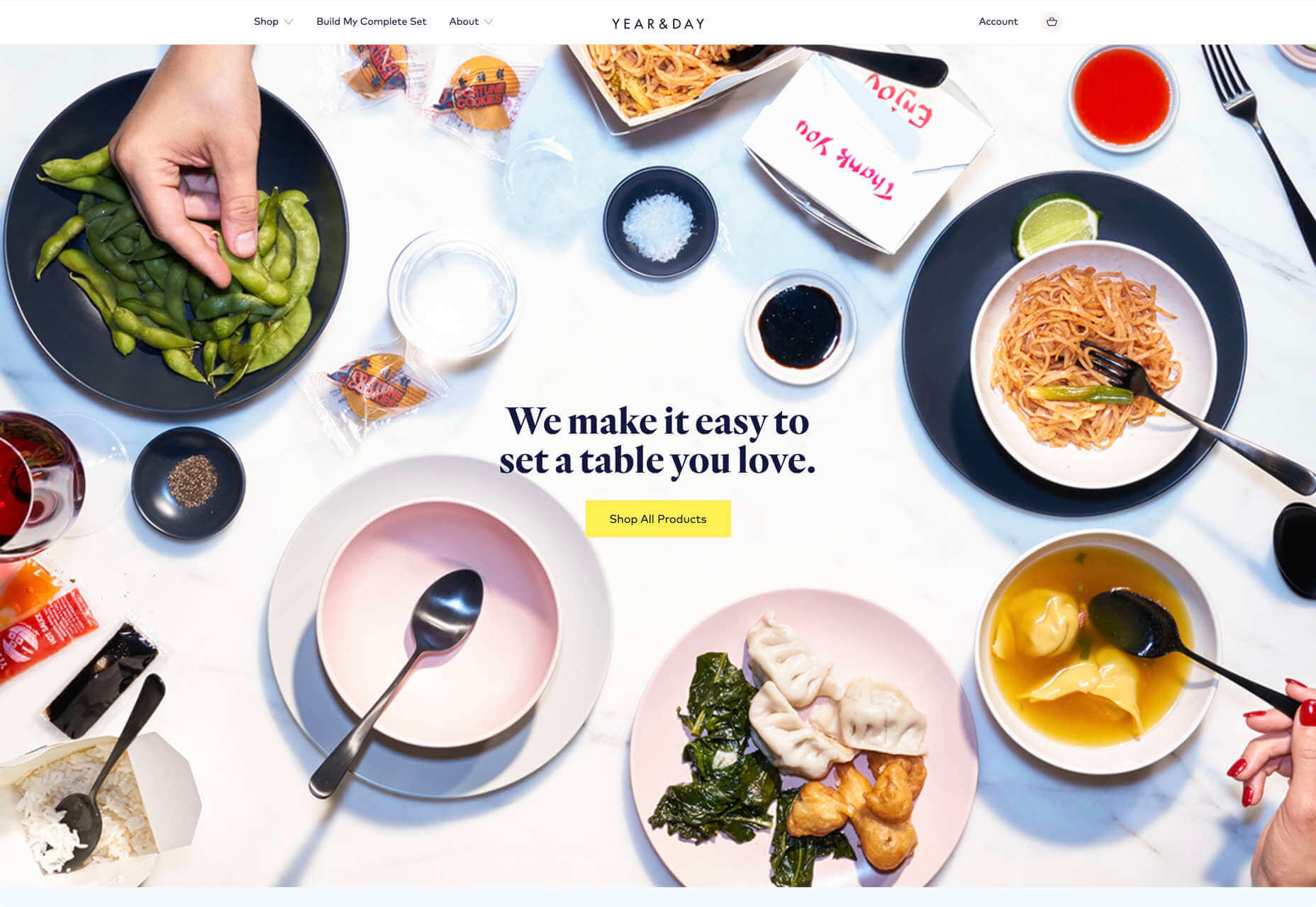

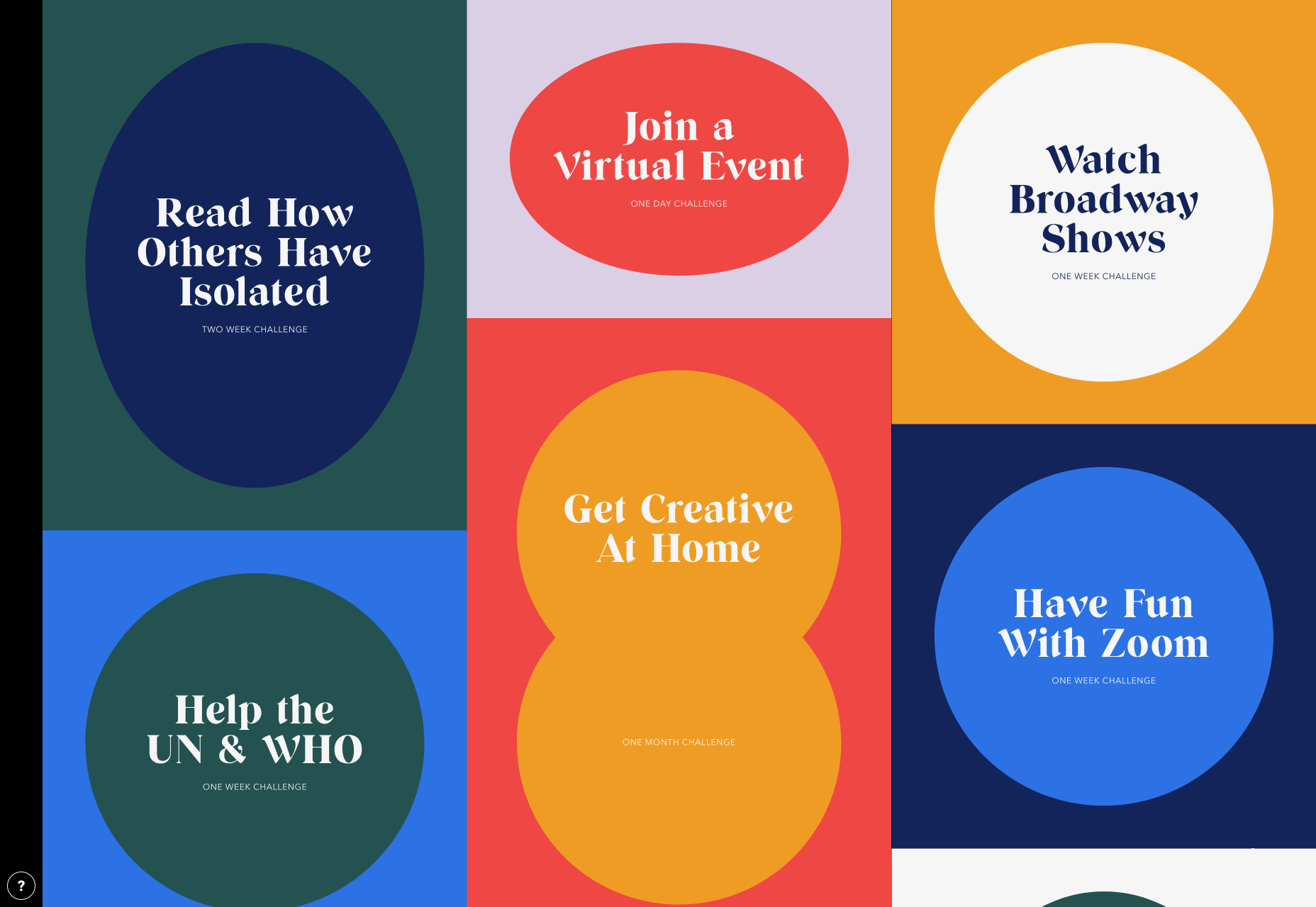


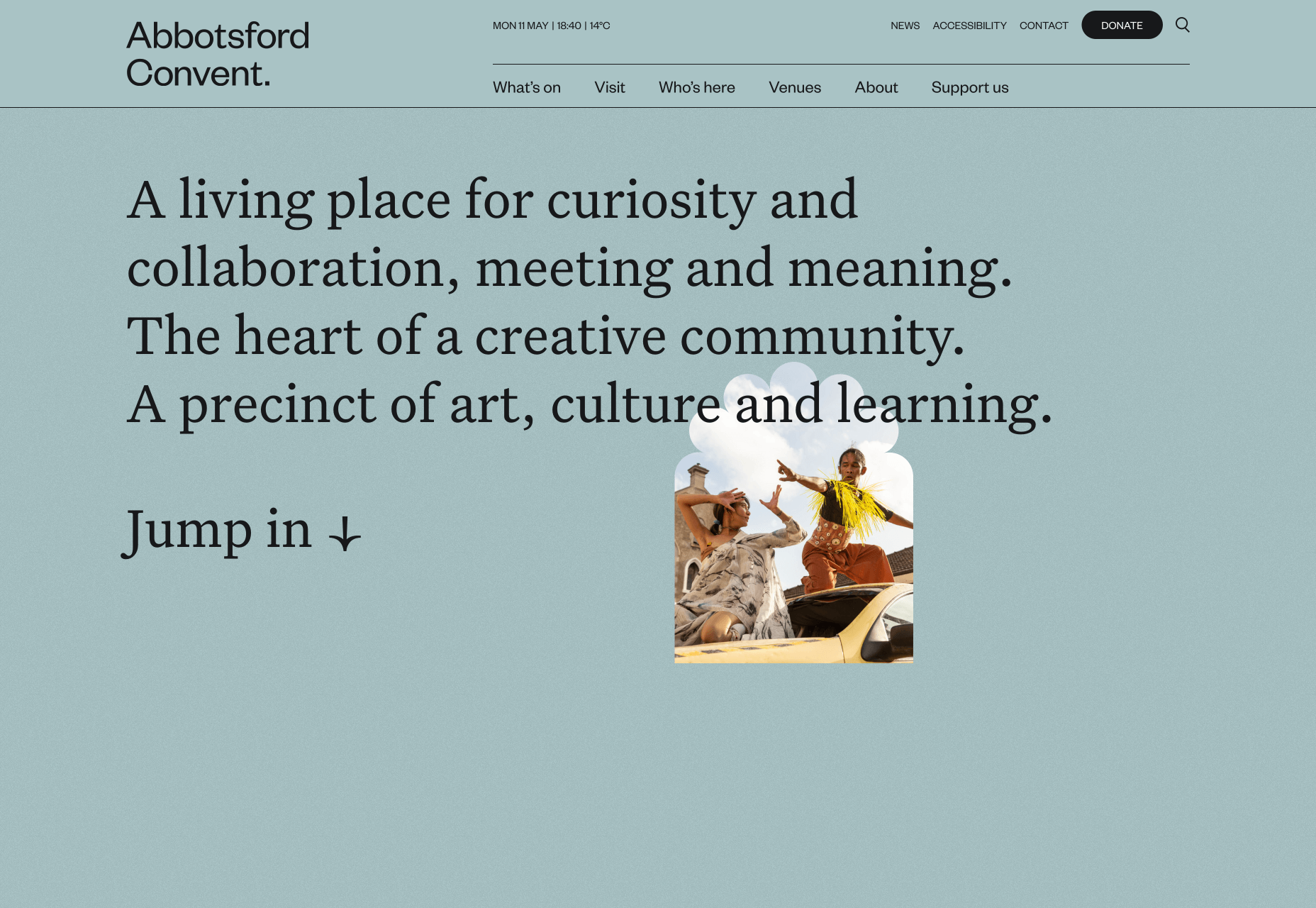
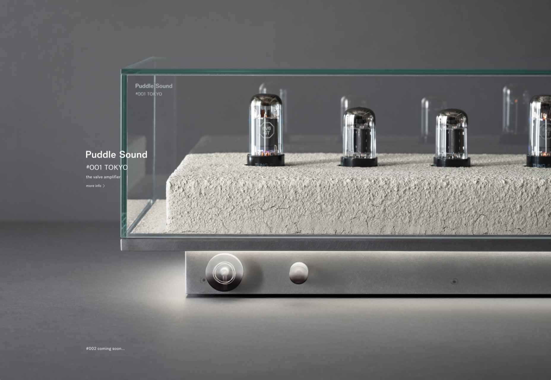

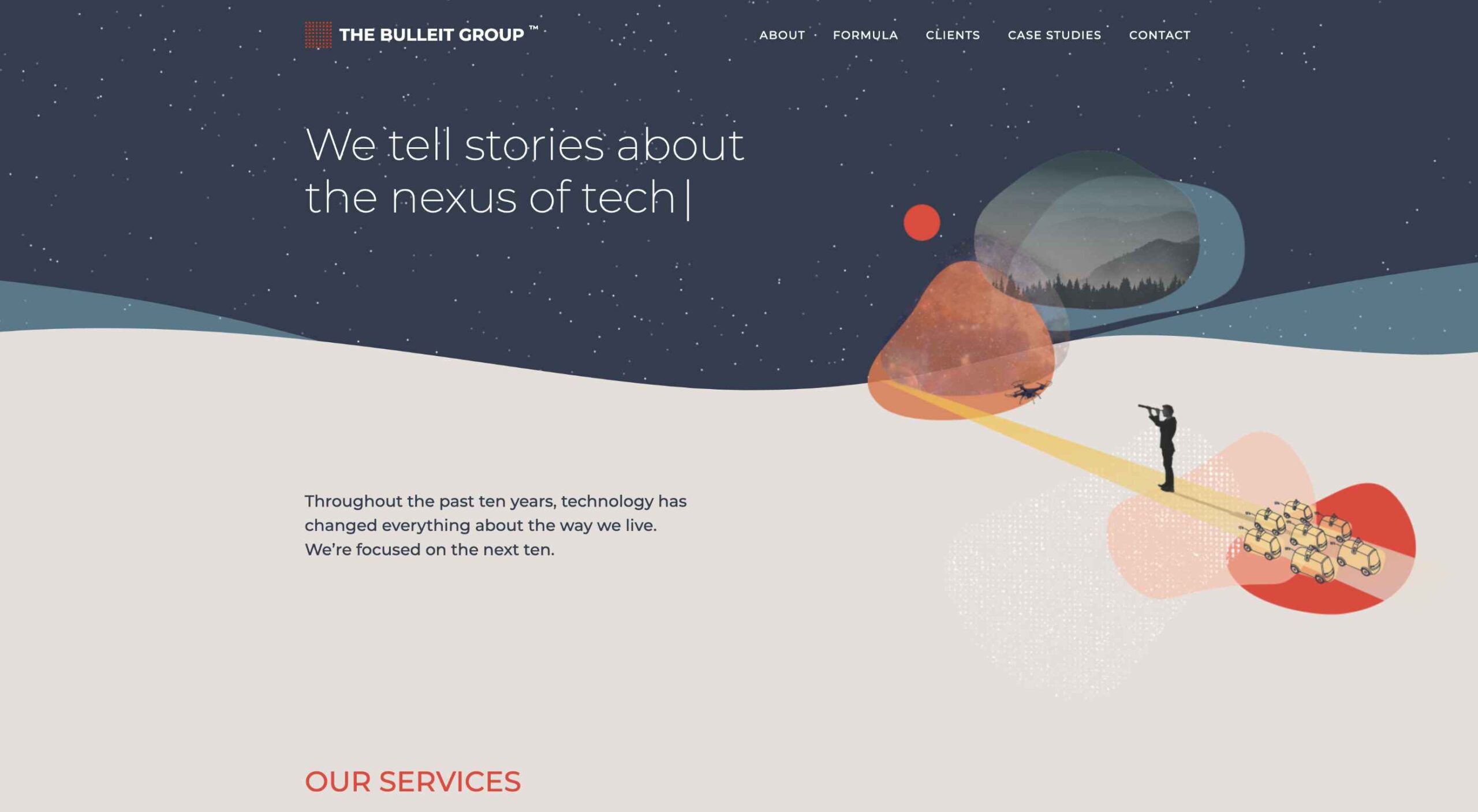
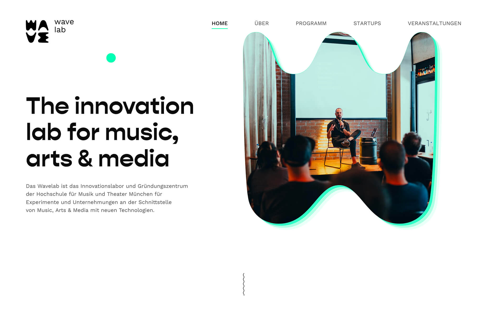
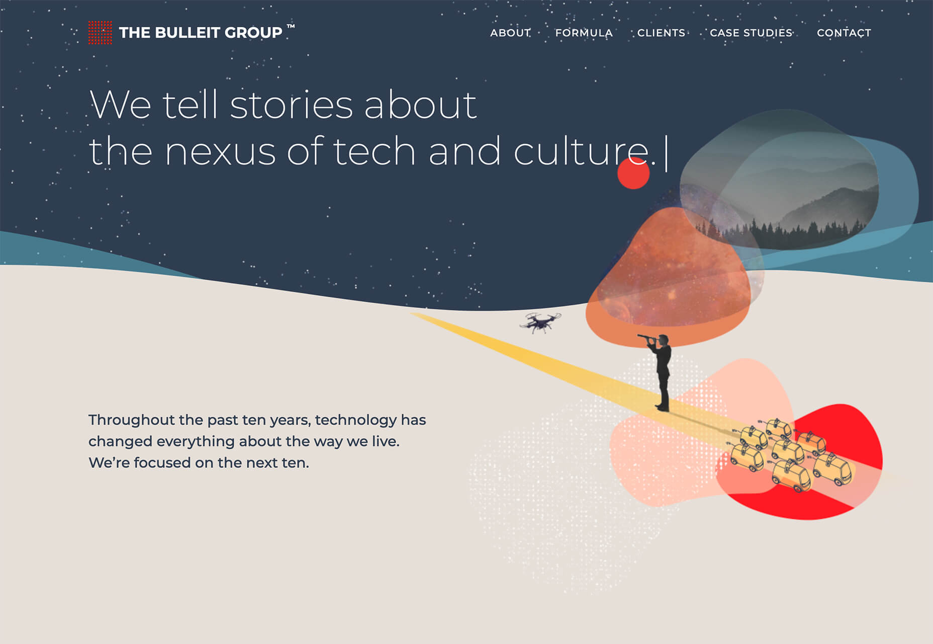
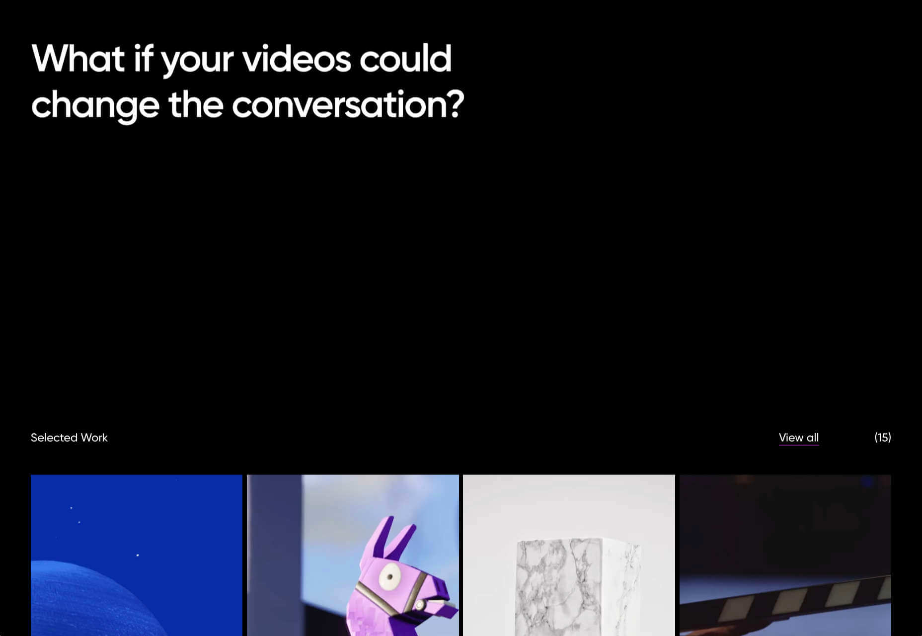
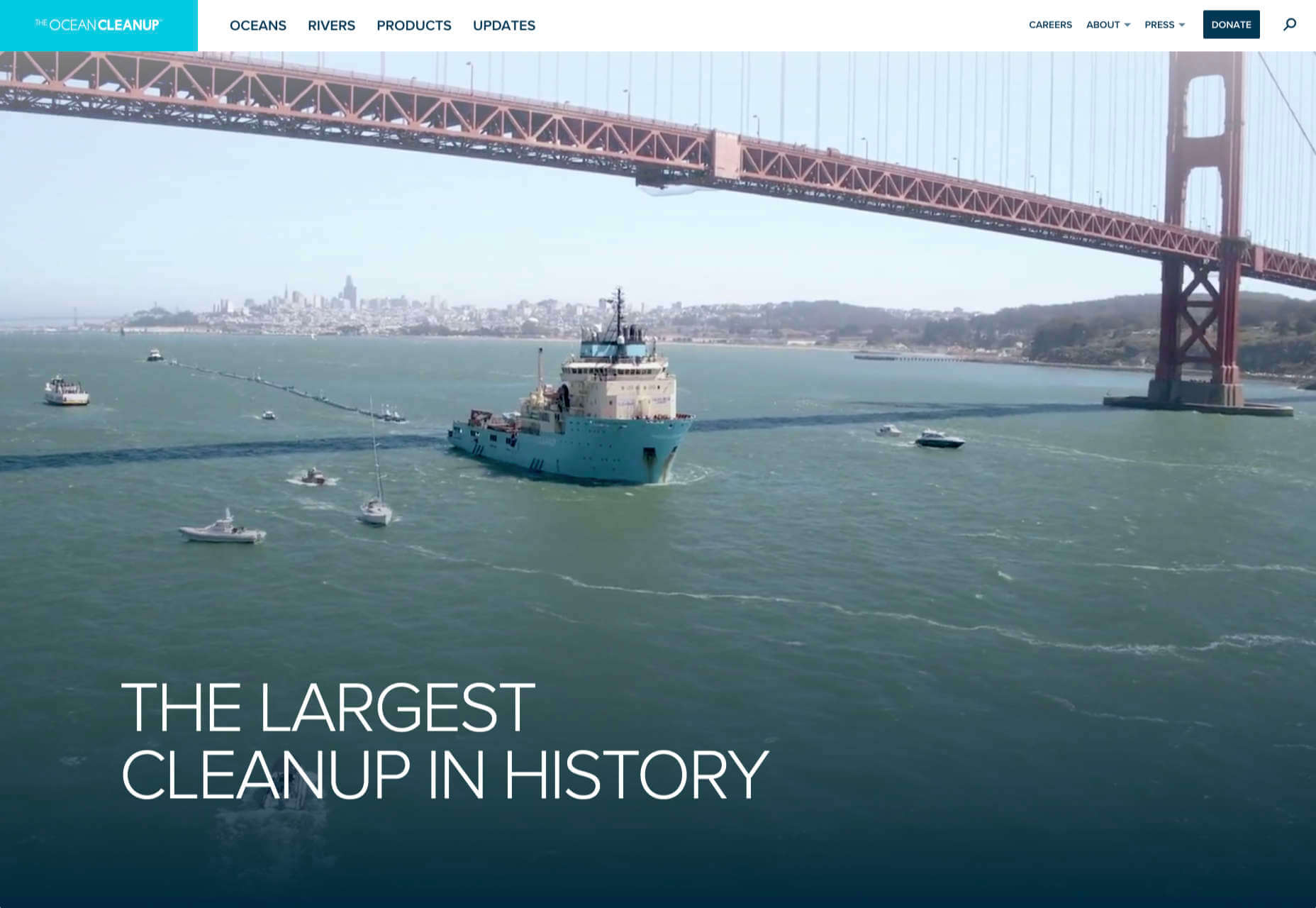
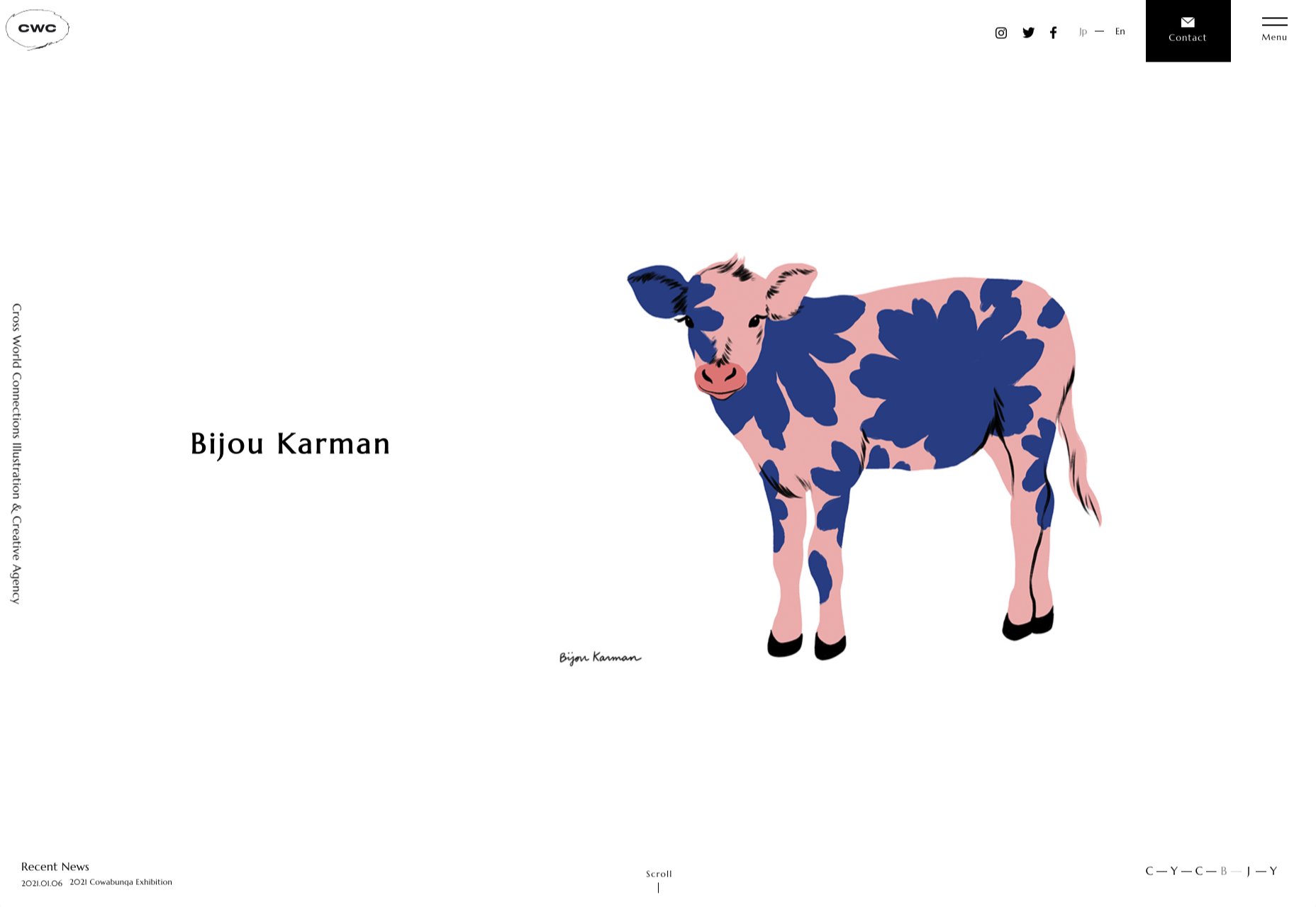
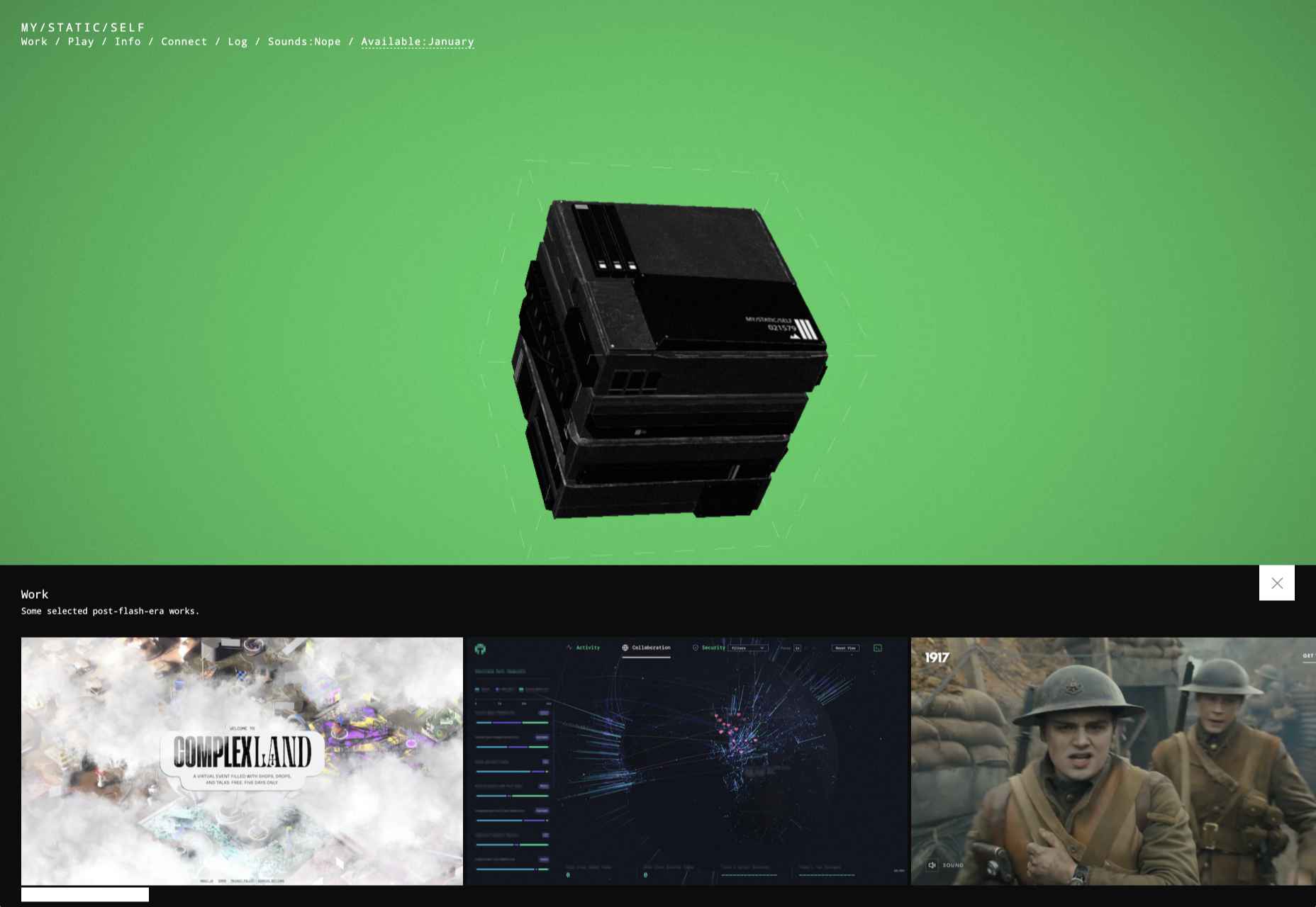
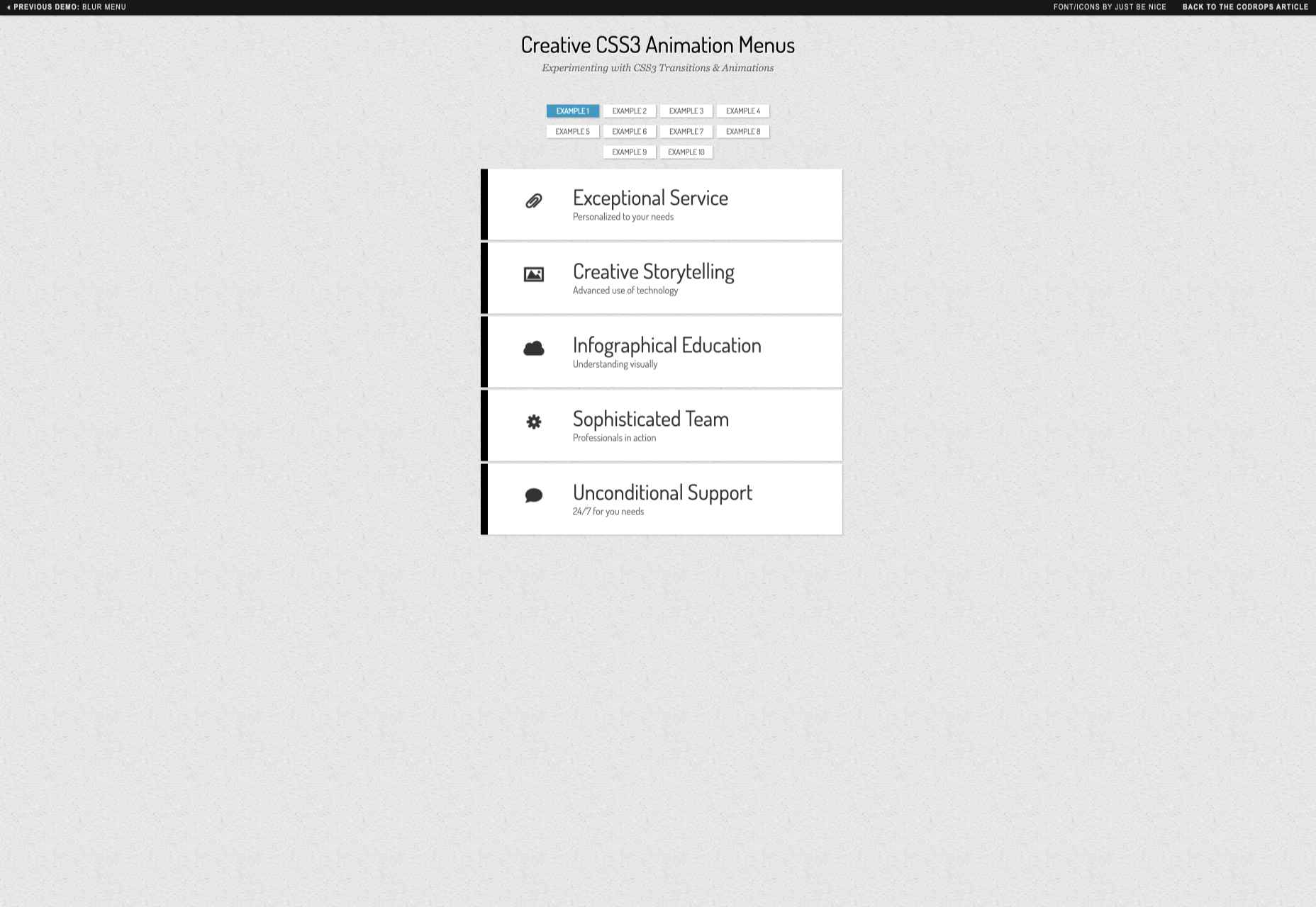
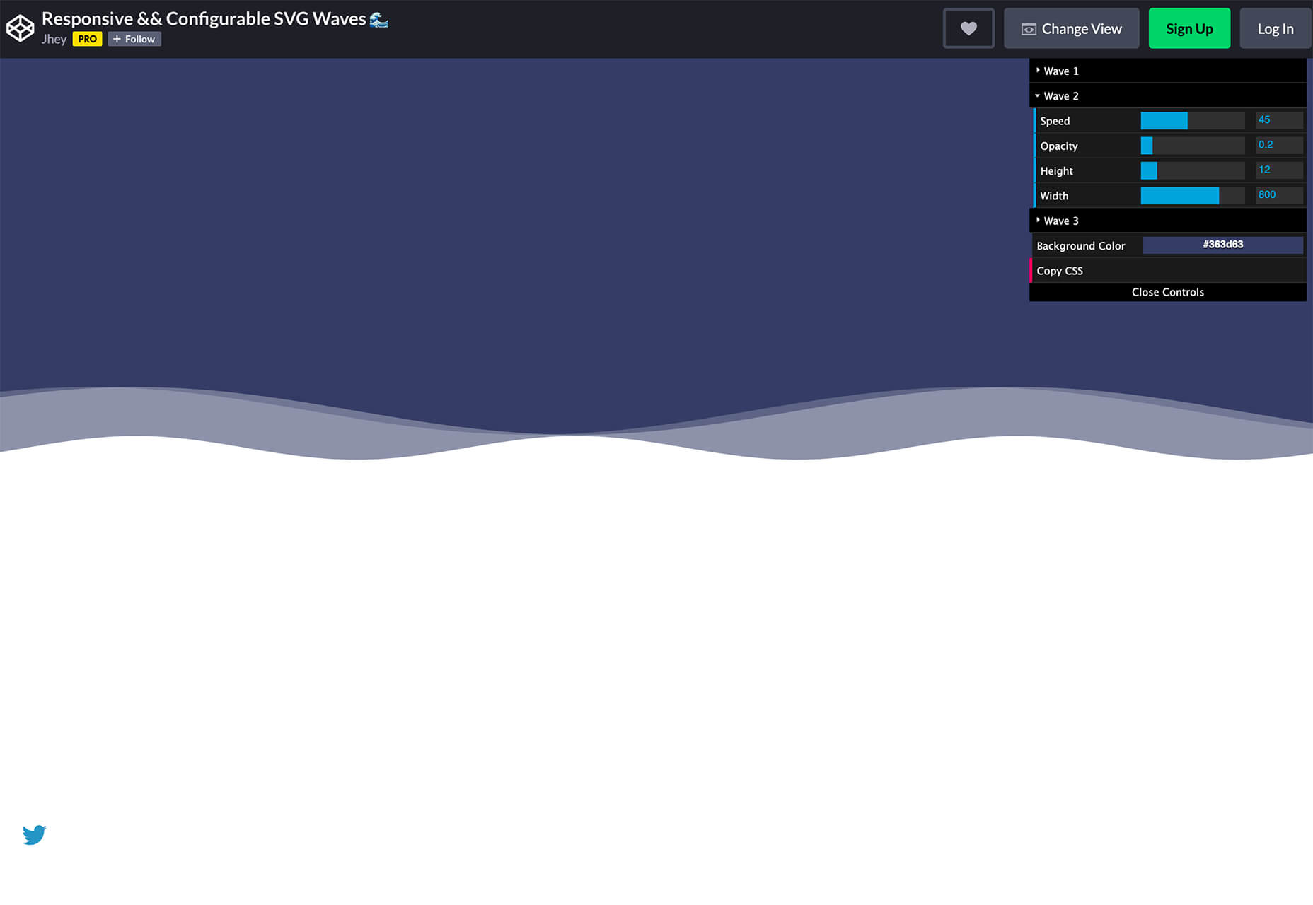
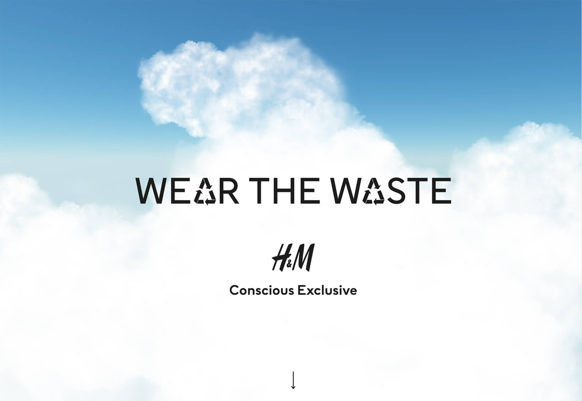
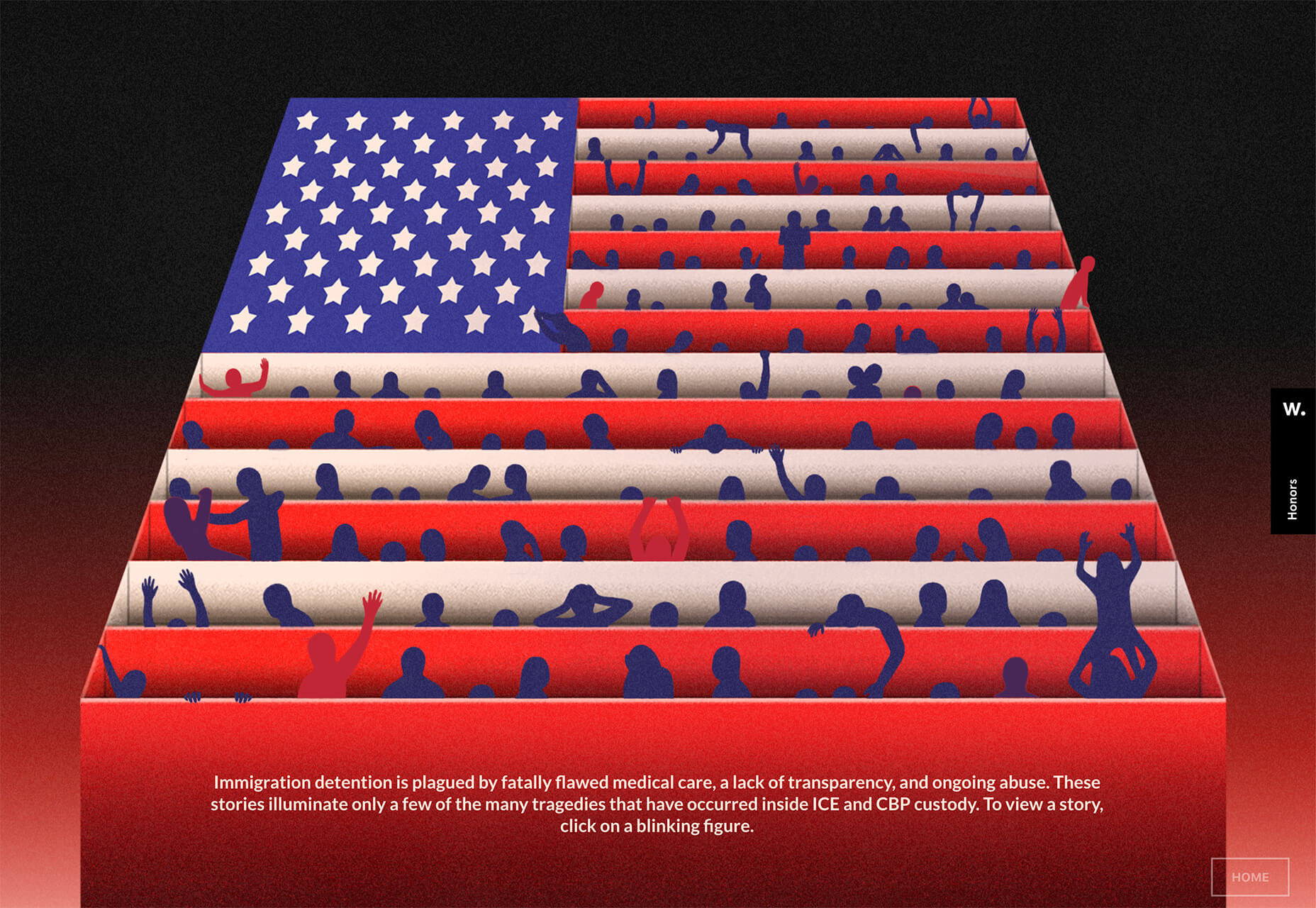
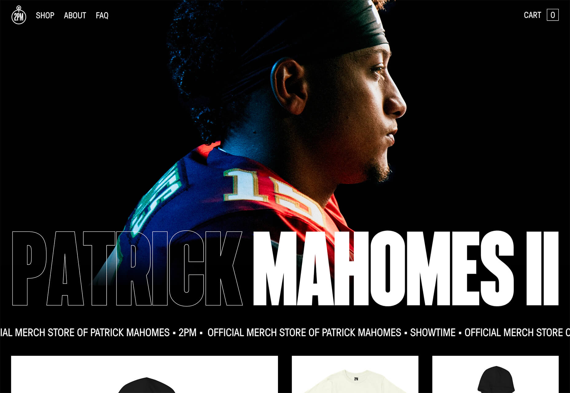
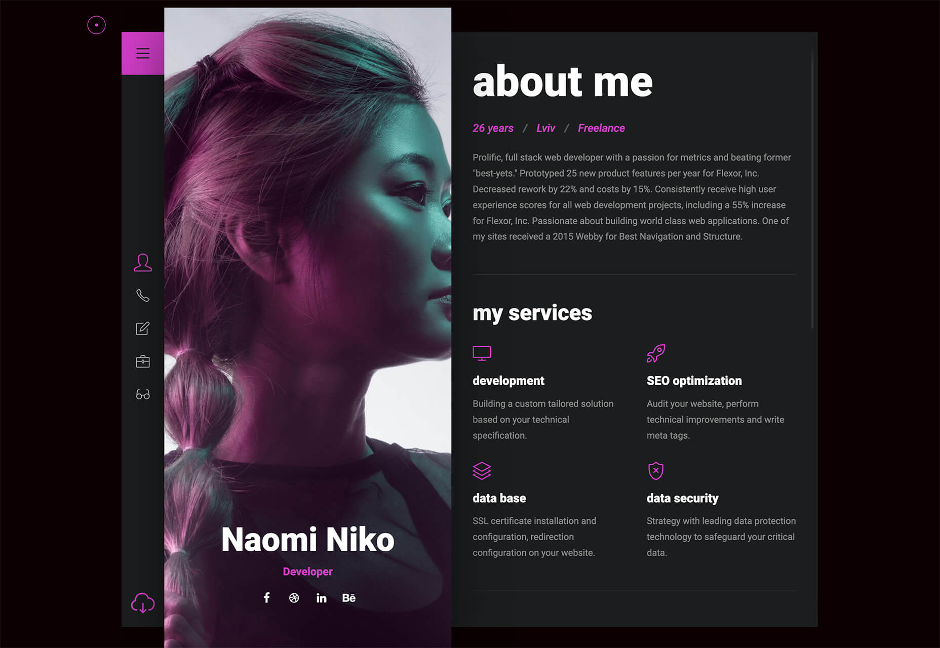
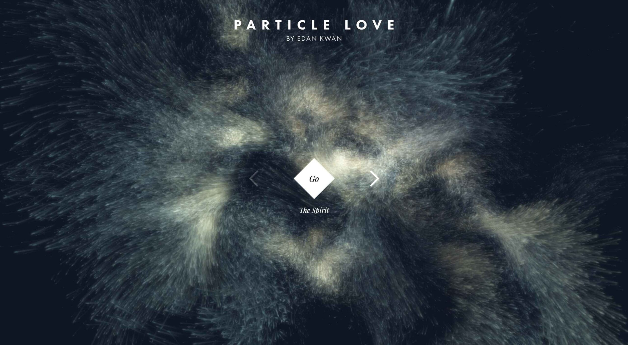 Animation is a fun and interesting way to bring life to a website. Used correctly, it can capture audience attention, make your website more engaging, and even improve your chances of delivering conversions for your clients.
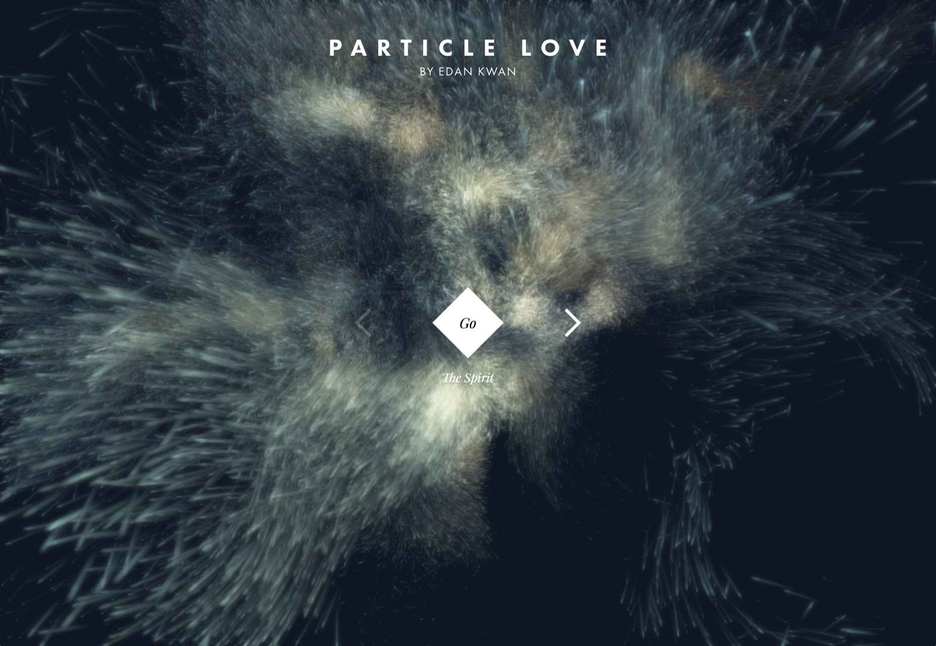
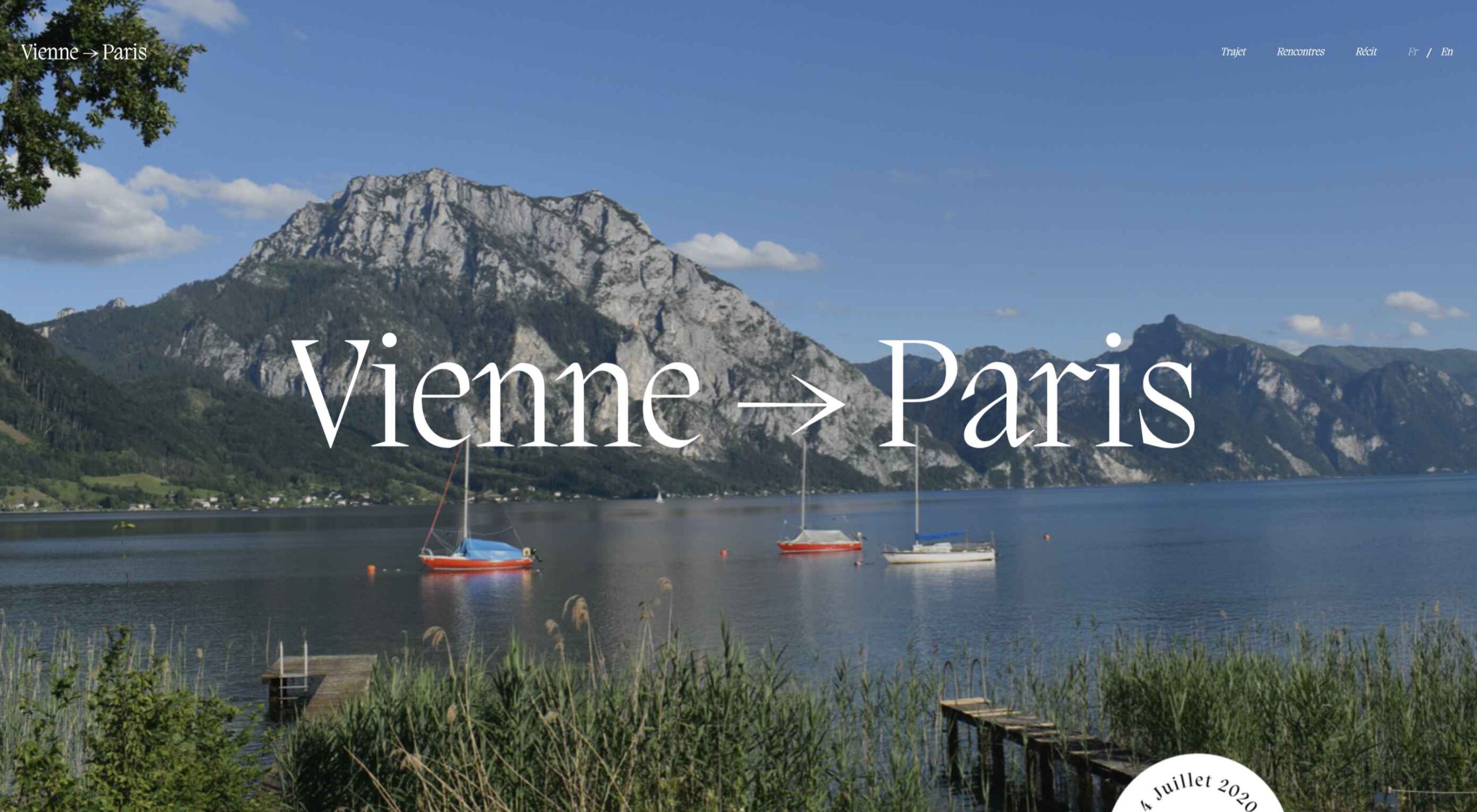
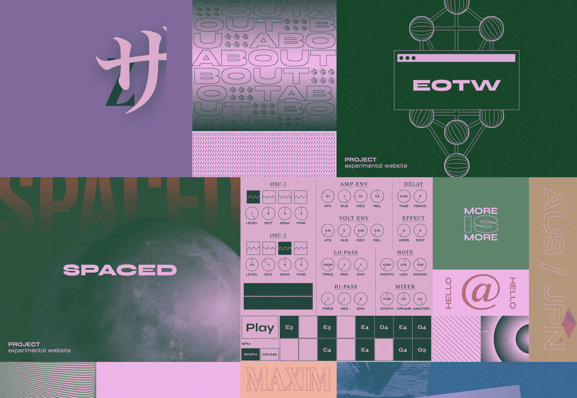
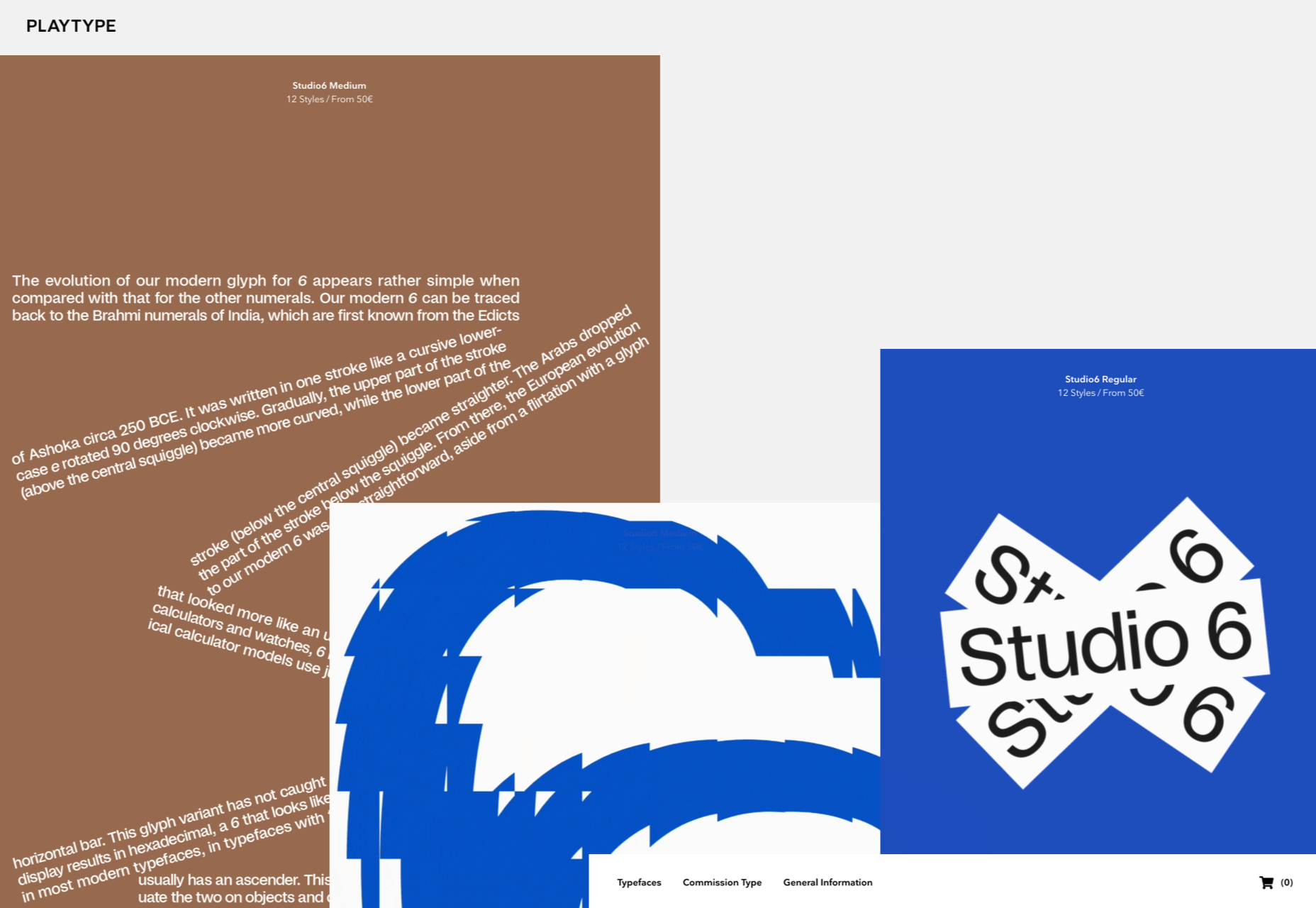
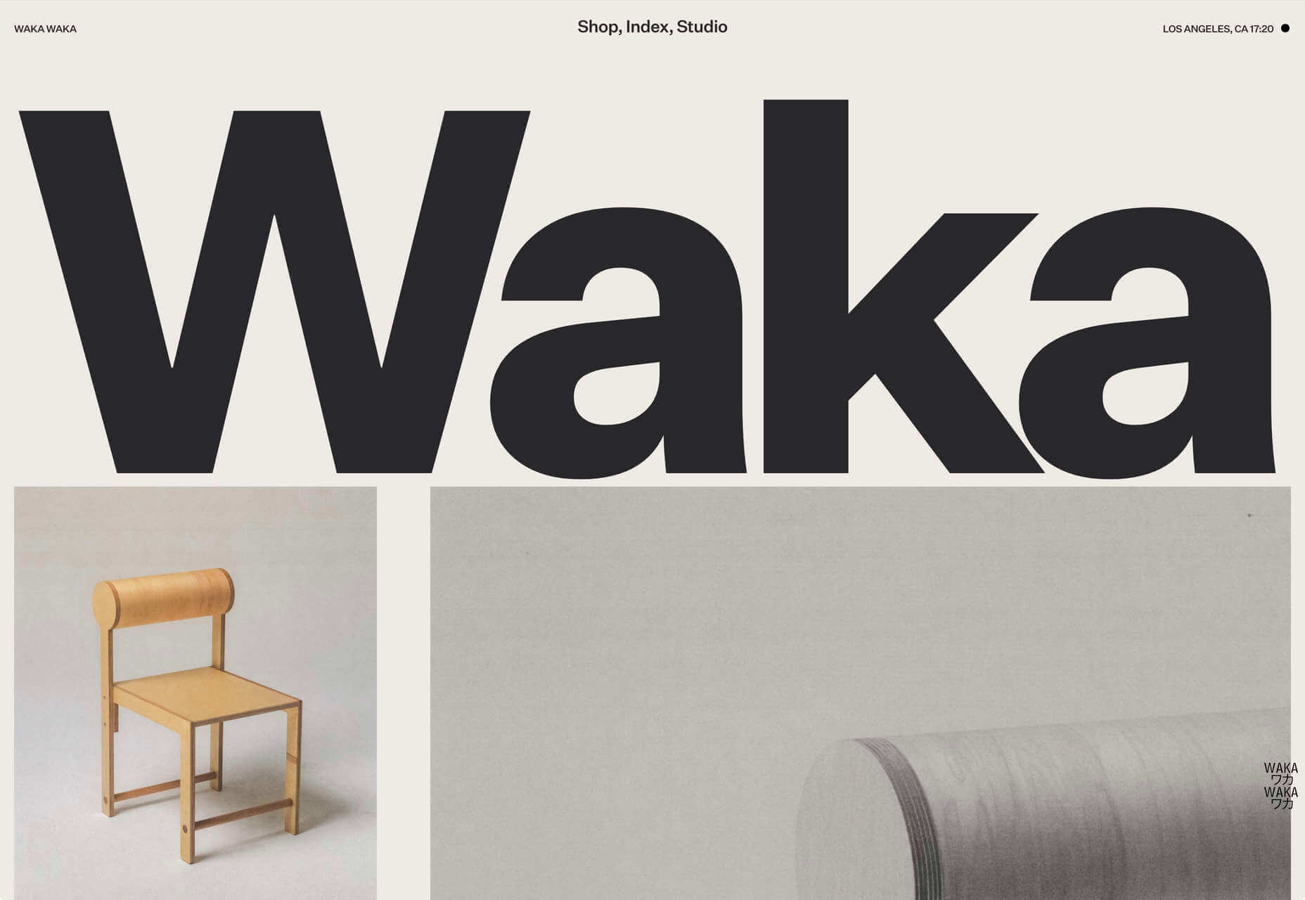
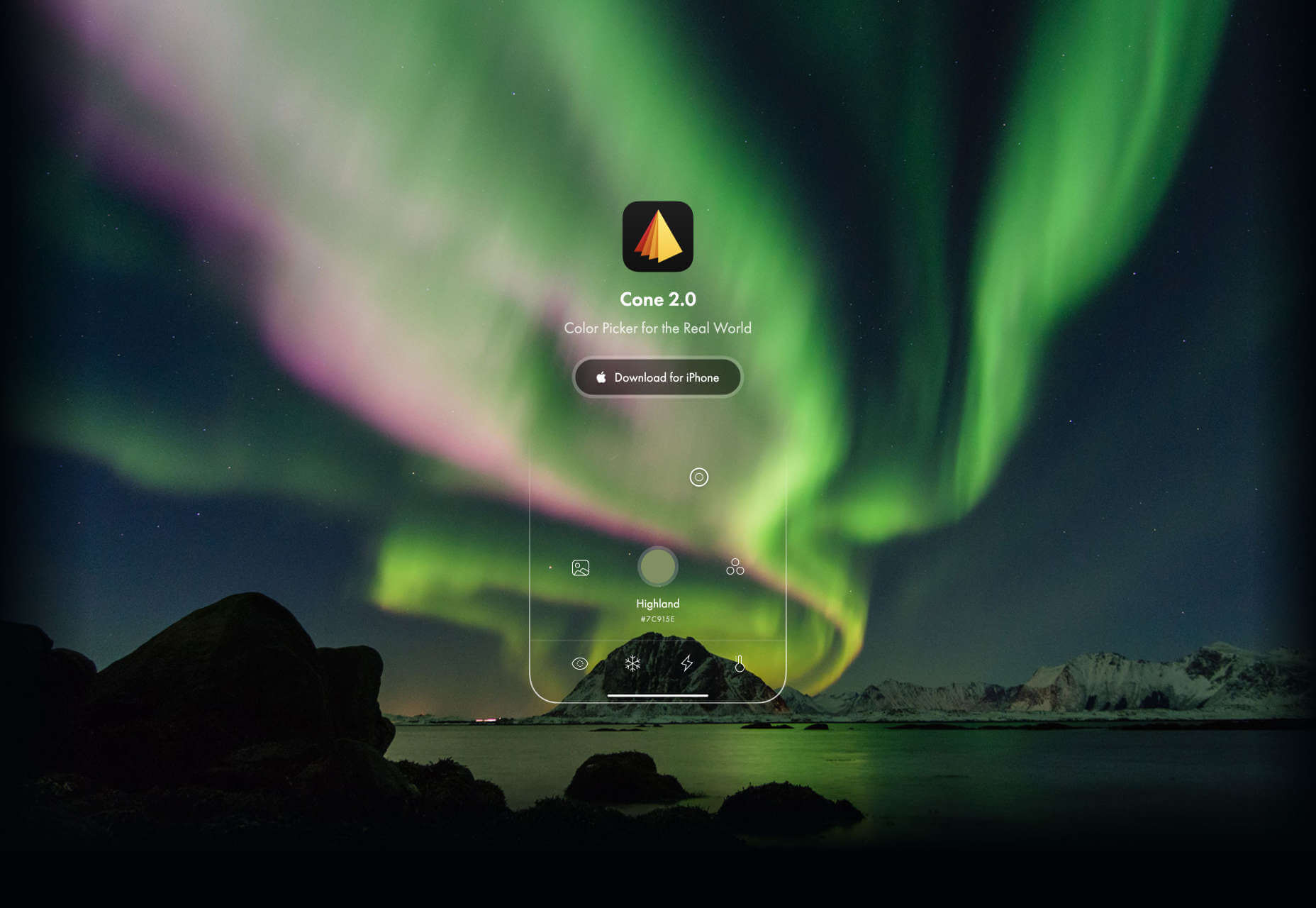
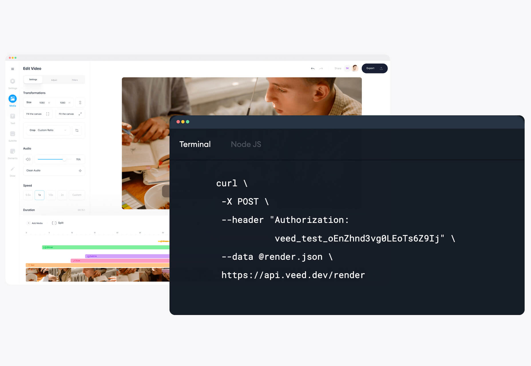
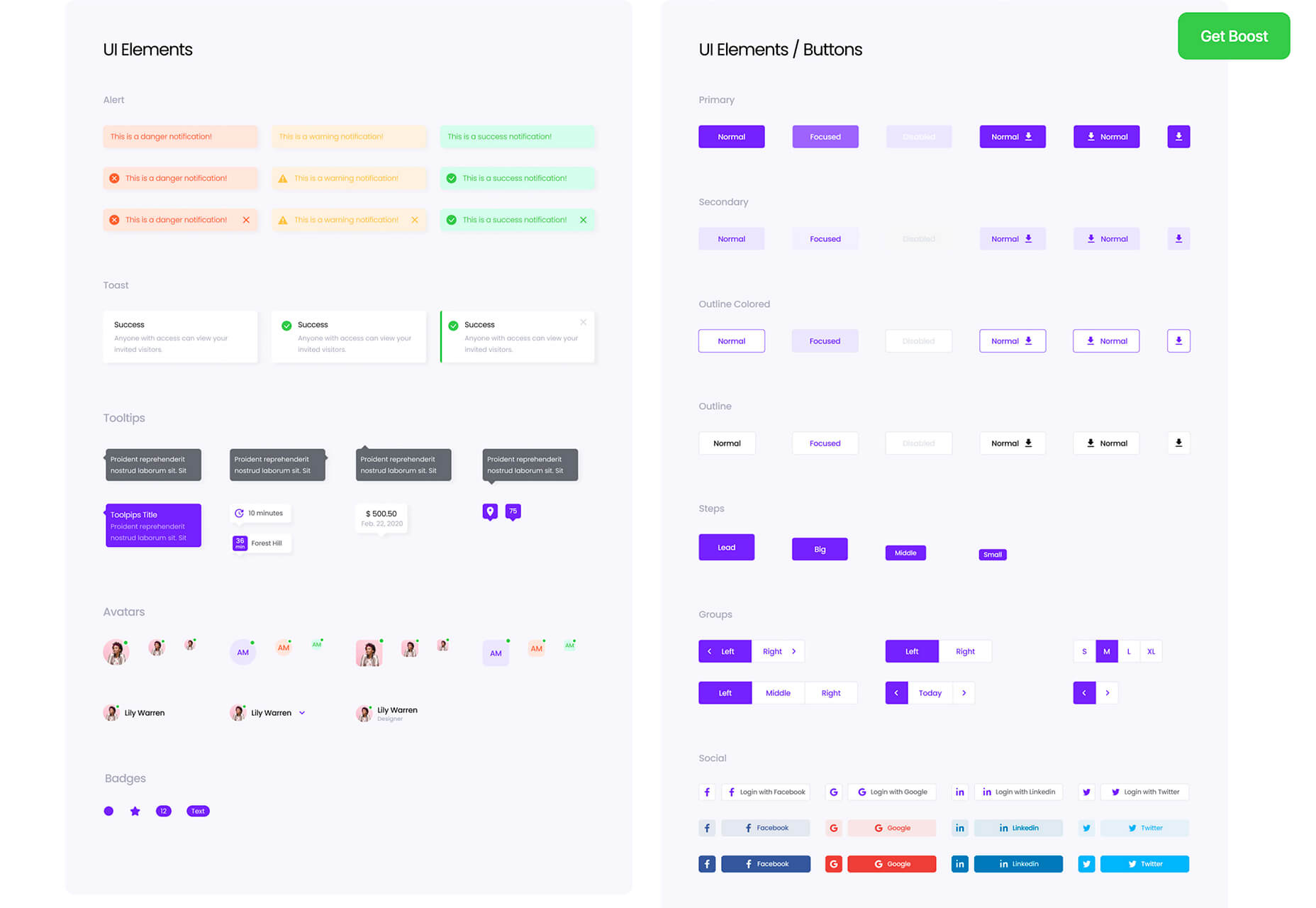
 Jumpstart your next design project or speed up a workflow with some of these new tools and resources. With so many new tools being developed all the time, you are almost certain to find something that can help you with projects.

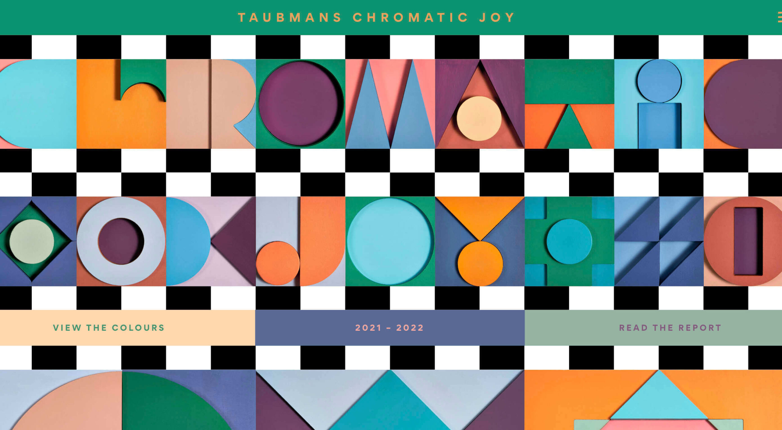
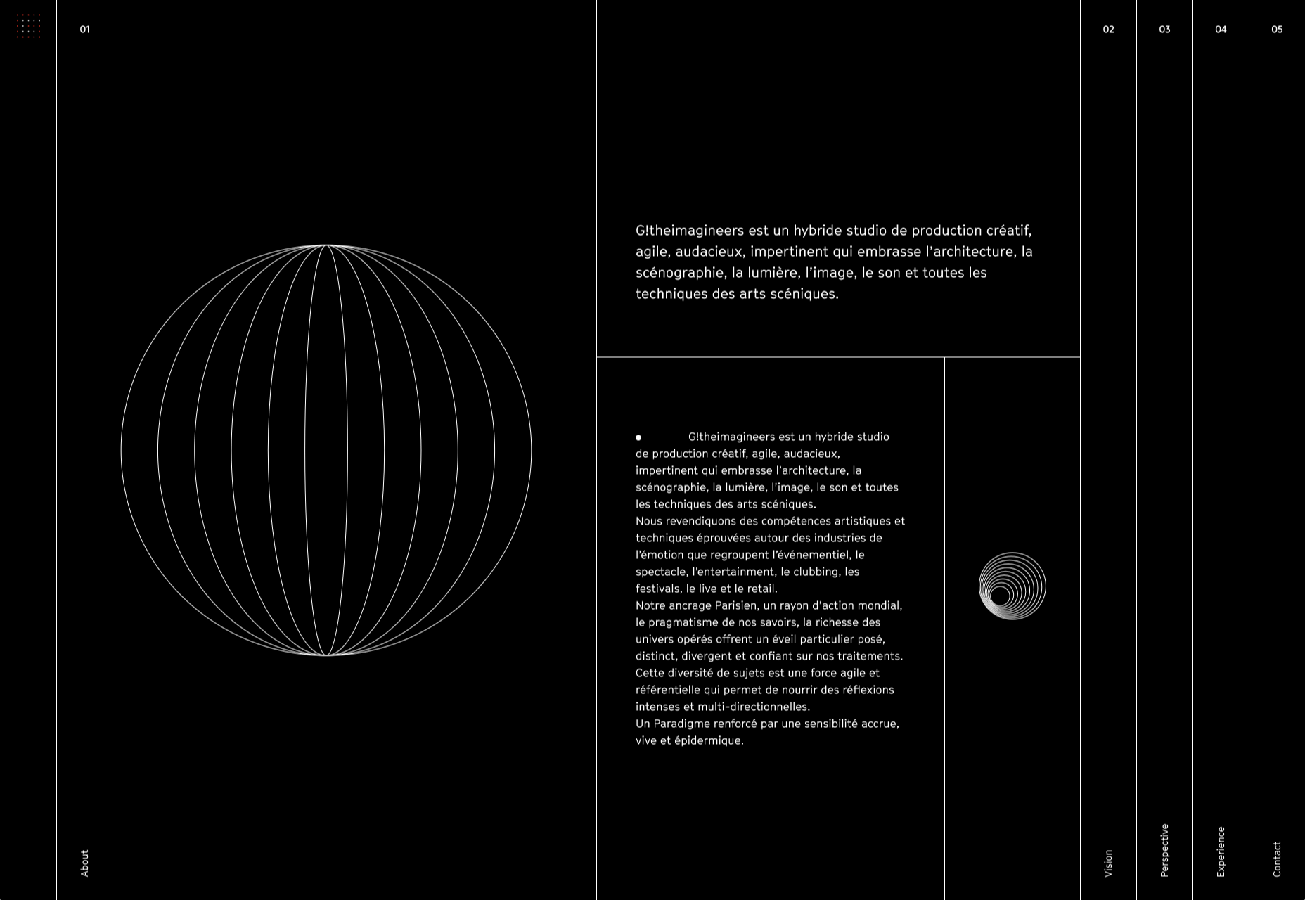
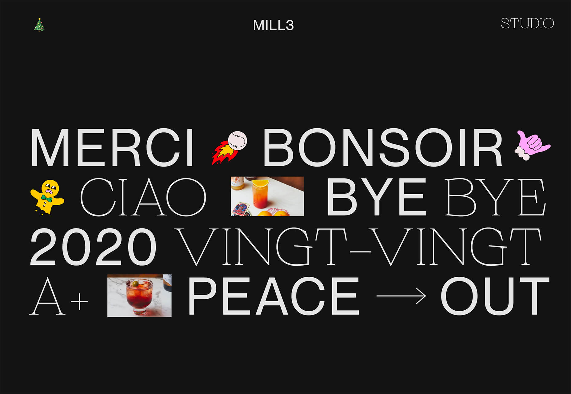
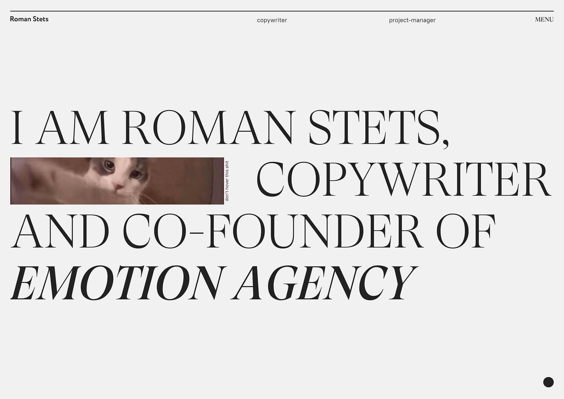
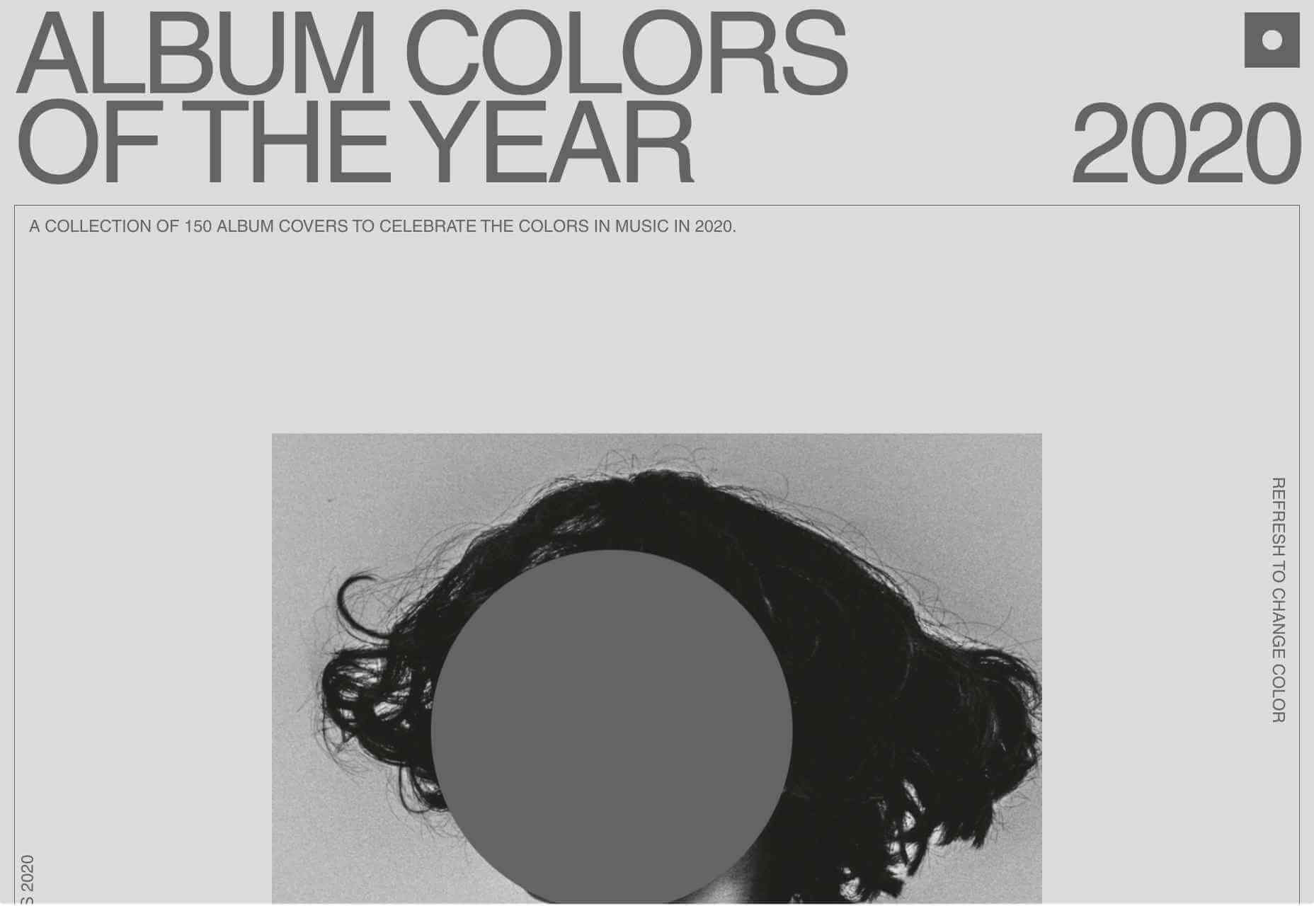
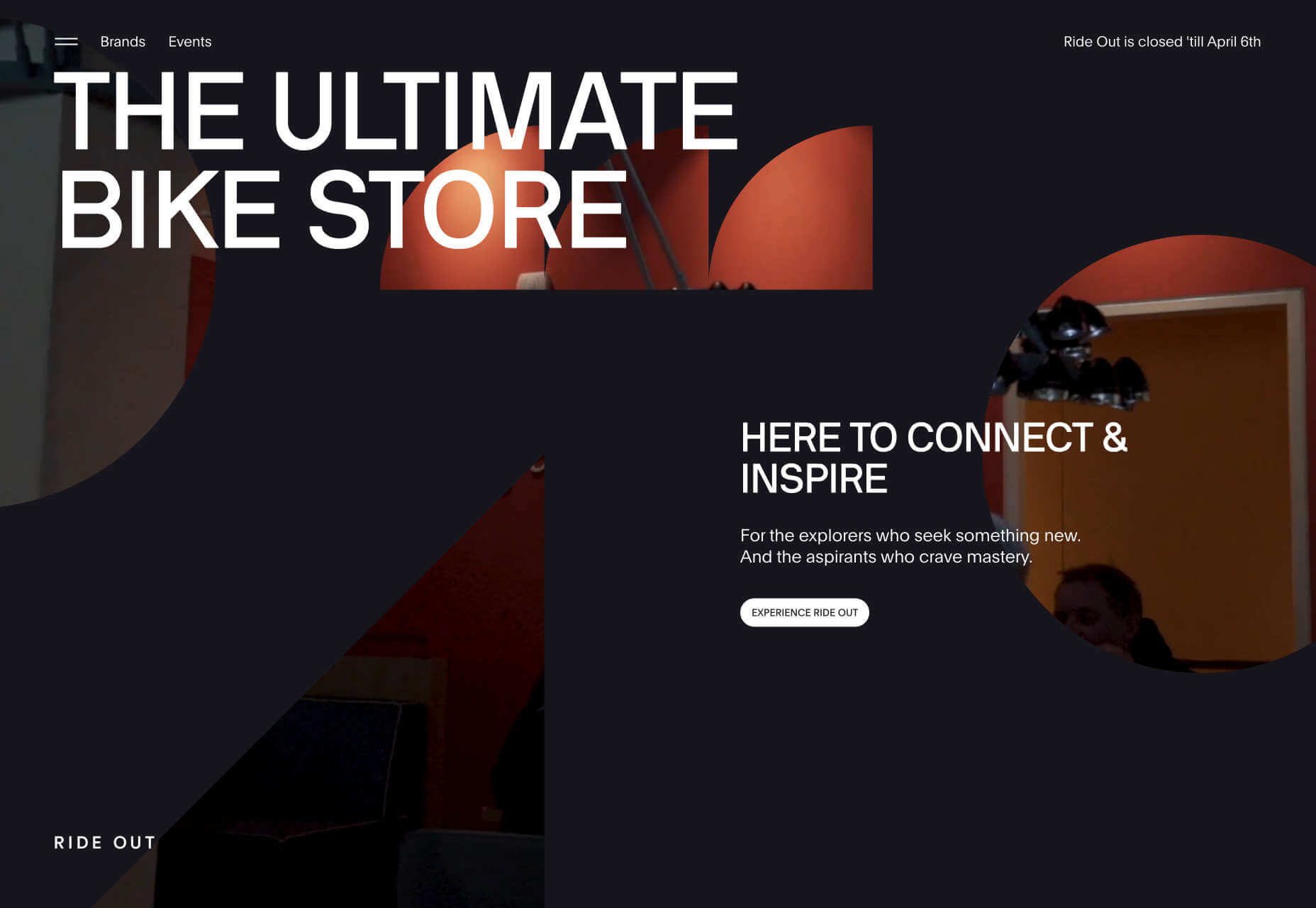
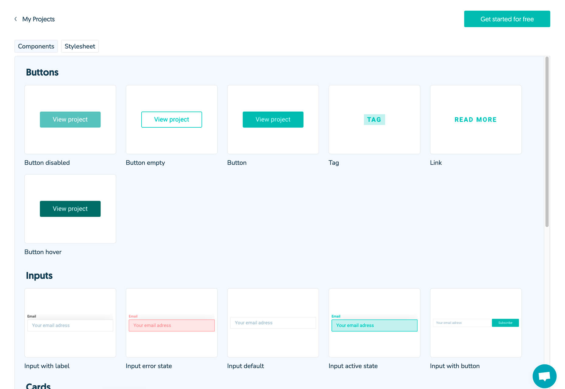
 The end of the year tends to be busy for a variety of reasons and it can limit some of the freshness we see in designs during much of the year. Regardless, there are a few trending design elements.

