Articles

As human beings, we like to think that we’re rational creatures.

We tell ourselves that we make our decisions based on fact and logic. However, that’s rarely the full truth. As much as we try to make choices guided by rationality, the truth is that we’re often highly emotional people, driven by the way that things make us feel.

So, what does that mean for a website designer?

Though designing a functional and logical website is important, it’s crucial not to forget about the emotional impact of each interaction that your customer has with the sites that you build.

Sites that don’t elicit any kind of emotional response aren’t just boring; they’re forgettable.

A forgettable website is poison to any website designer’s portfolio.

That’s why we’re going to introduce you to some easy ways to use emotion in your designs this year.

Getting to the Bottom of Emotion in Web Design

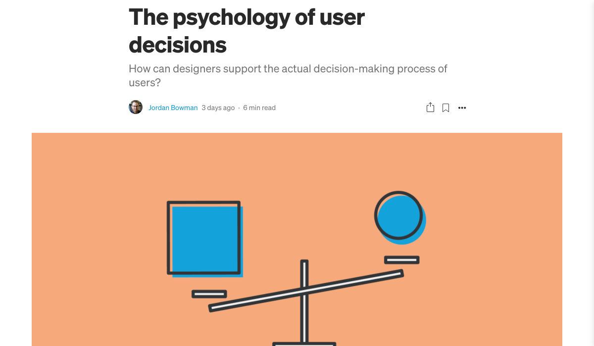
First, you need to understand the part that emotion plays in user decisions.

Don Norman’s book Emotional Design says that there are many things that designers can do to make their designs more emotional. Even something as simple as focusing on the aesthetic impact of your website can make it more likely that you’ll reach your audience on an emotional level.

One important thing to remember about emotional design, is that it’s not just about making your customers feel good. Emotion can be both positive and negative. Sometimes negative emotion is more impactful than positive feelings – it all depends on the kind of site you’re trying to create.

A website selling health products to customers needs to make that audience feel comfortable and confident that they’re buying a trustworthy item. However, it may also need to trigger small feelings of worry or concern in the audience about what might happen if they don’t buy.

Knowing how to walk that balance between positive and negative feelings is how a designer takes a simple website design and turns it into something incredible.

So, where do you get started?

Step 1: Use Visual Elements to Trigger Emotion

Visual elements are one of the easiest points to get started with when you’re designing for emotion. That’s because visuals are fantastic at drawing out feelings.

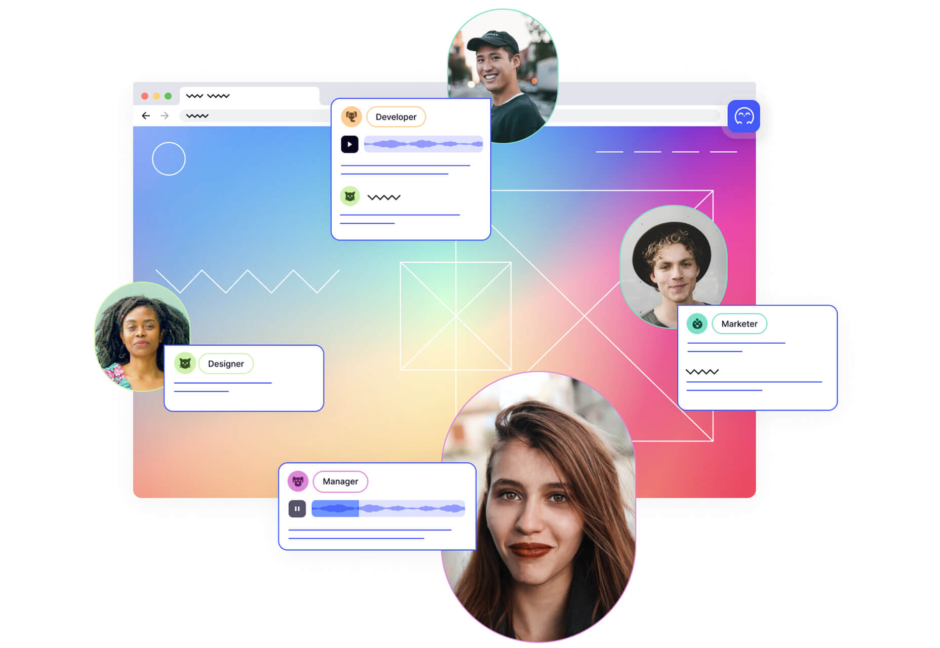
An animation can create an emotional connection with your audience by helping them to understand how your product works or making them laugh when they land on your page. A genuine photograph of your team working together can inspire trust and feelings of affinity.

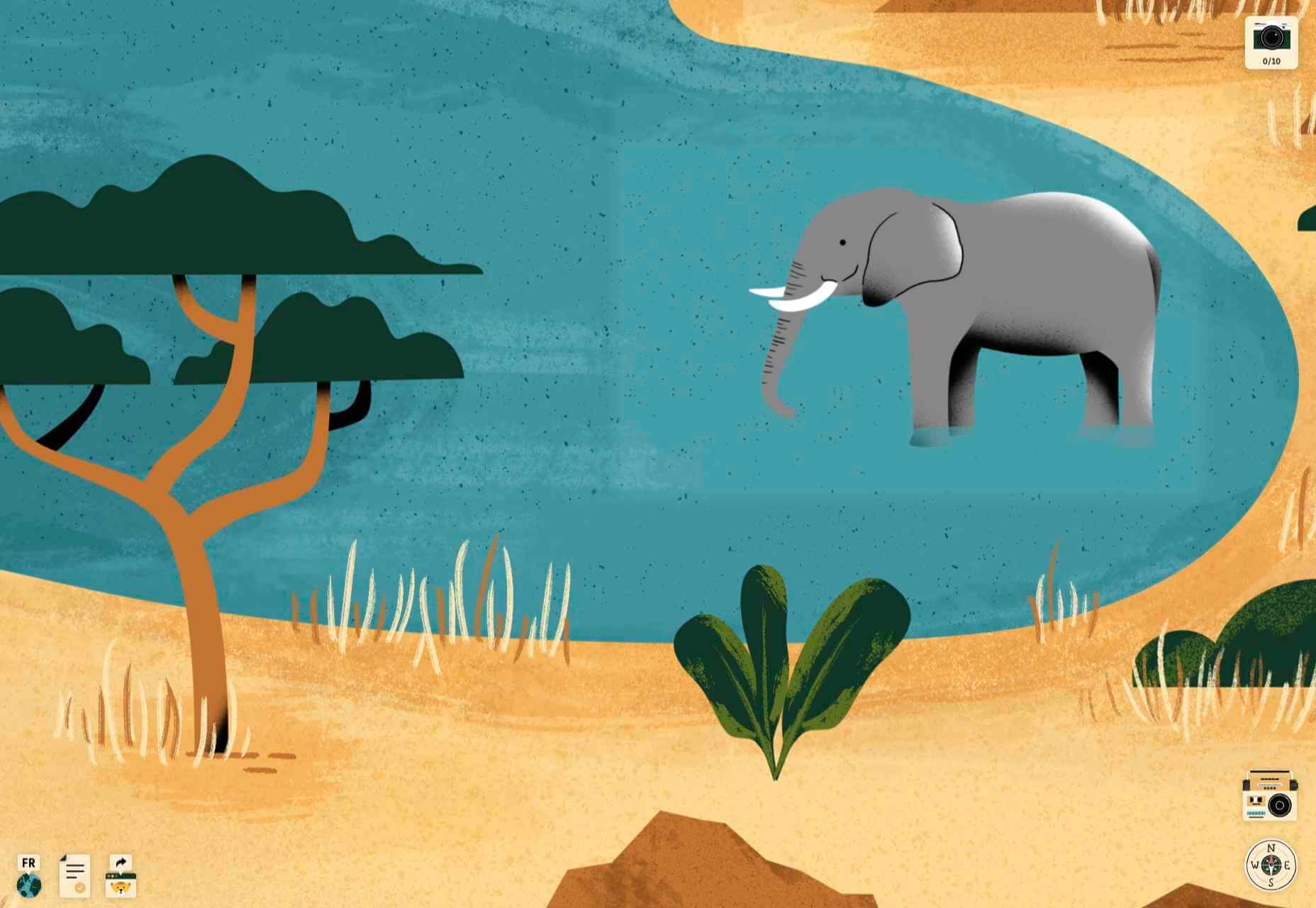
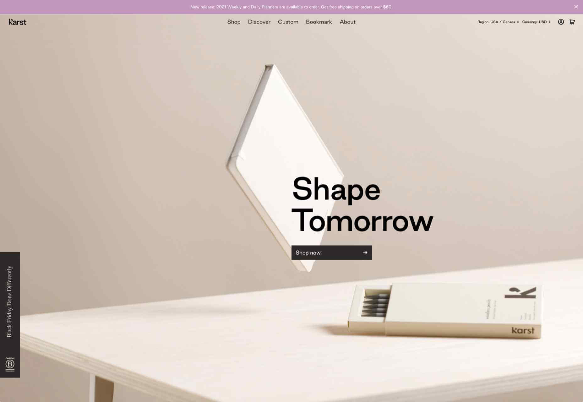
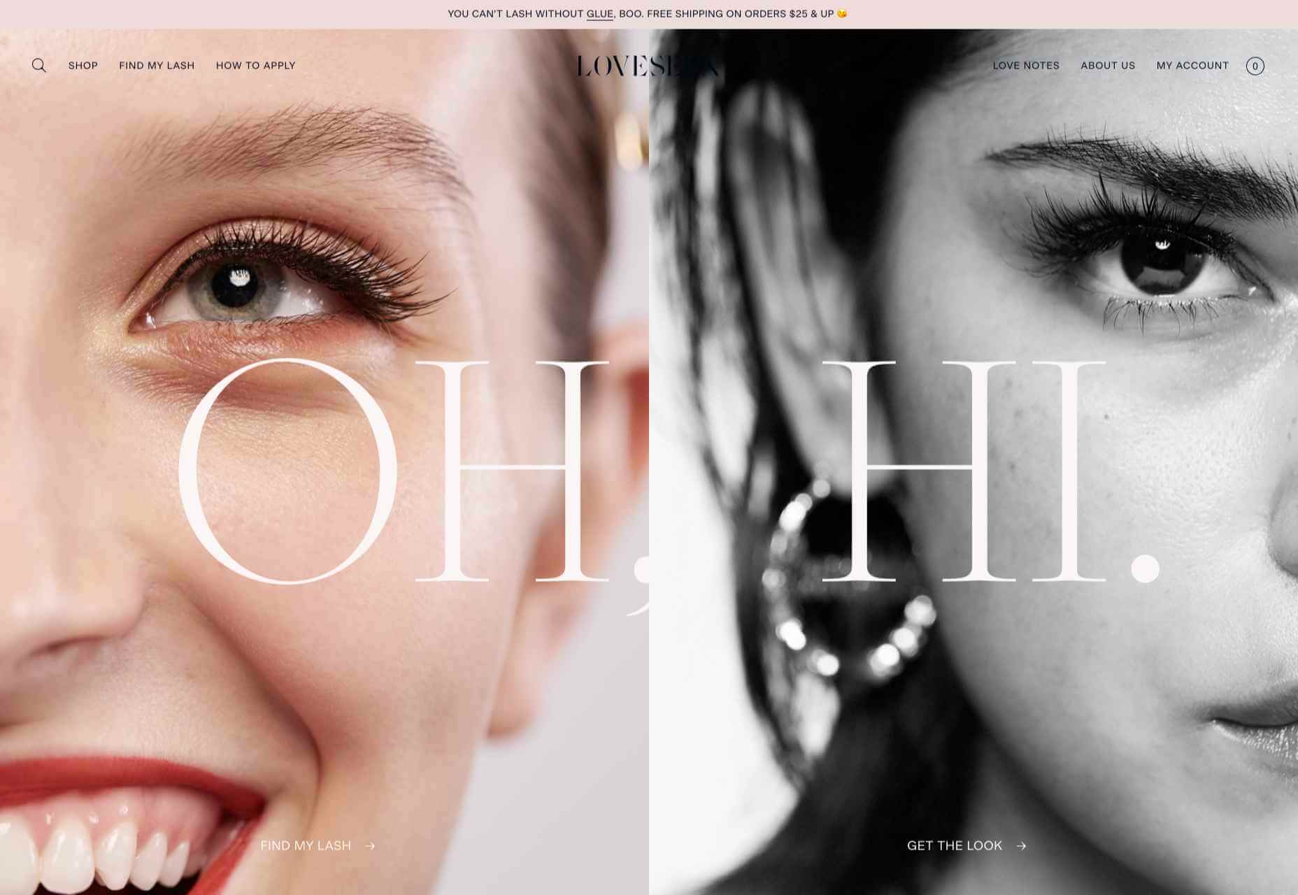
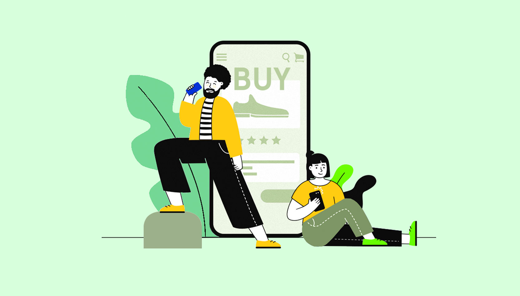
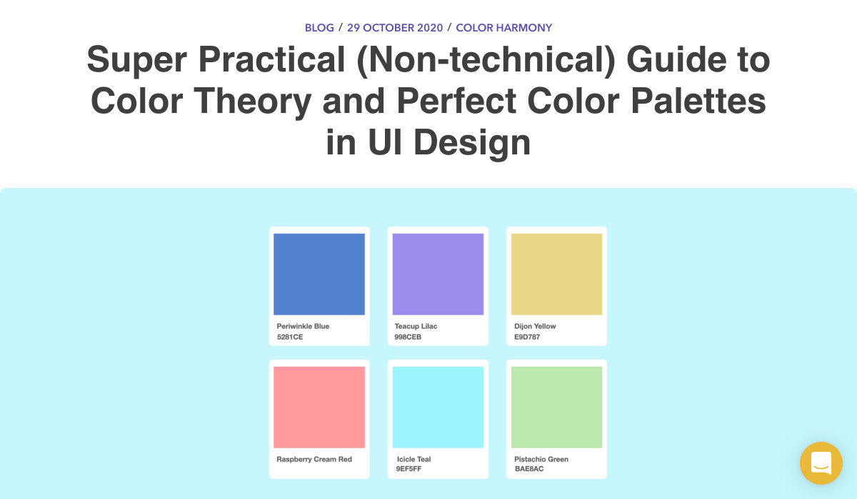
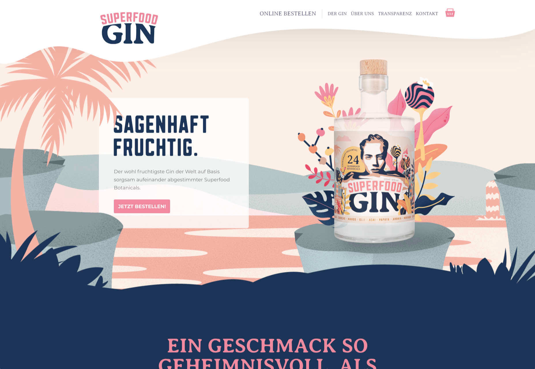
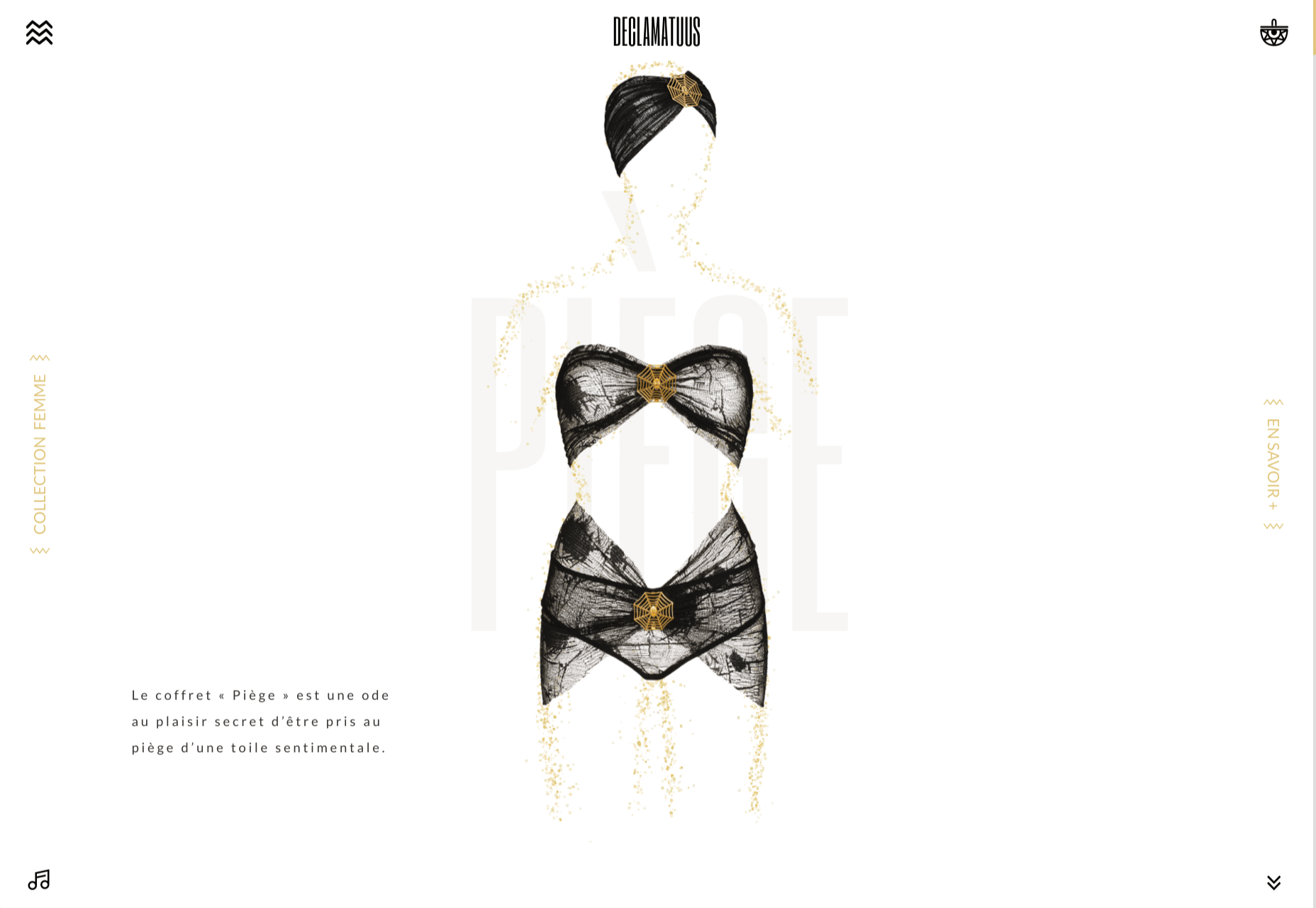
One of the most common visual elements used to trigger emotion is color.

Shades like blue and green in the digital design world are more likely to drive feelings of calmness and comfort. On the other hand, red and yellow often encourage feelings of enthusiasm and happiness.

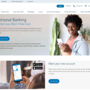
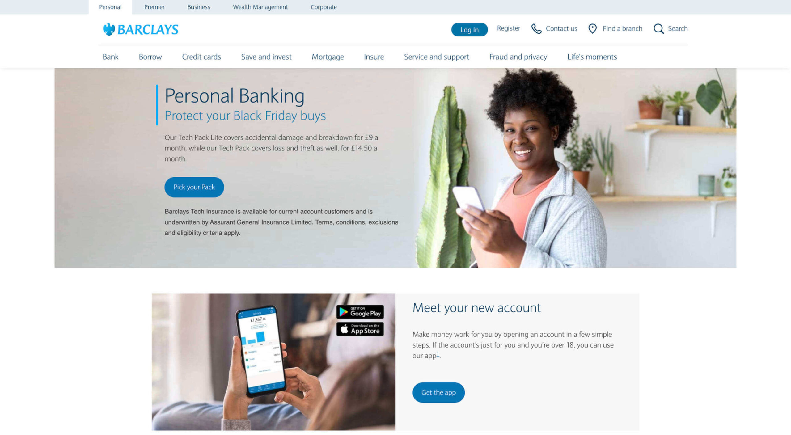
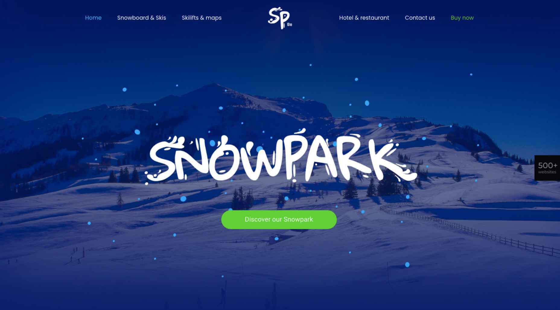
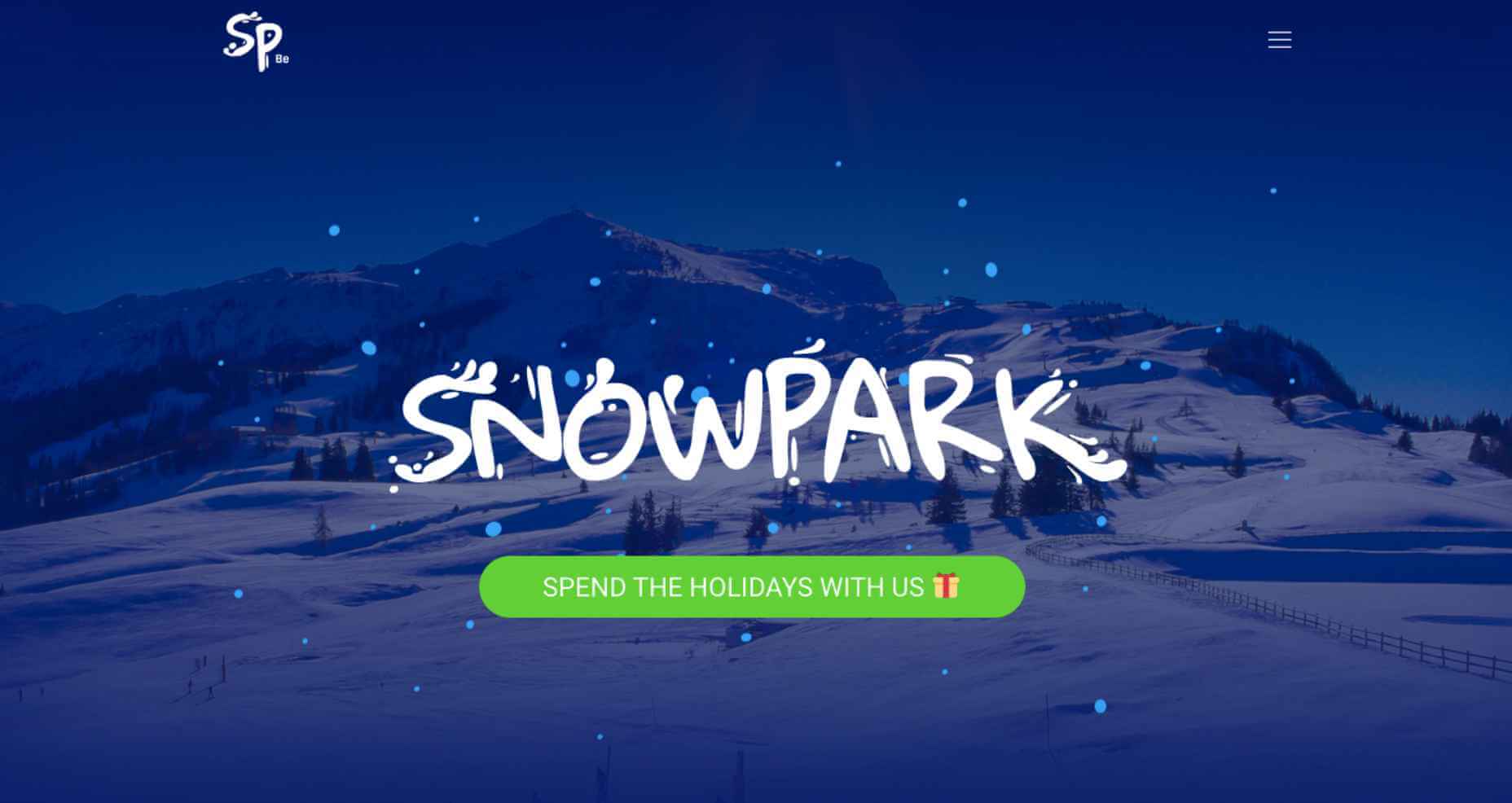
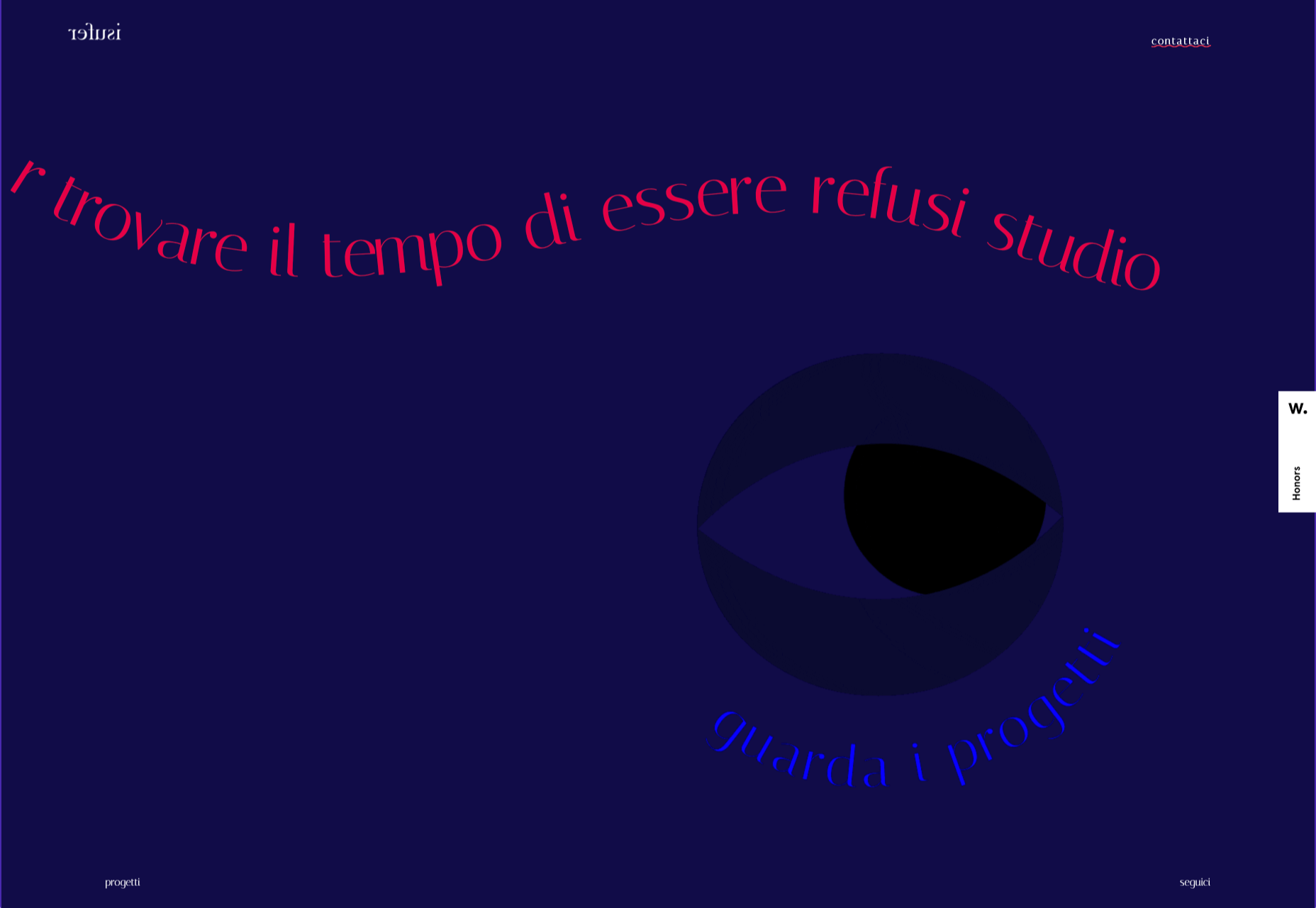
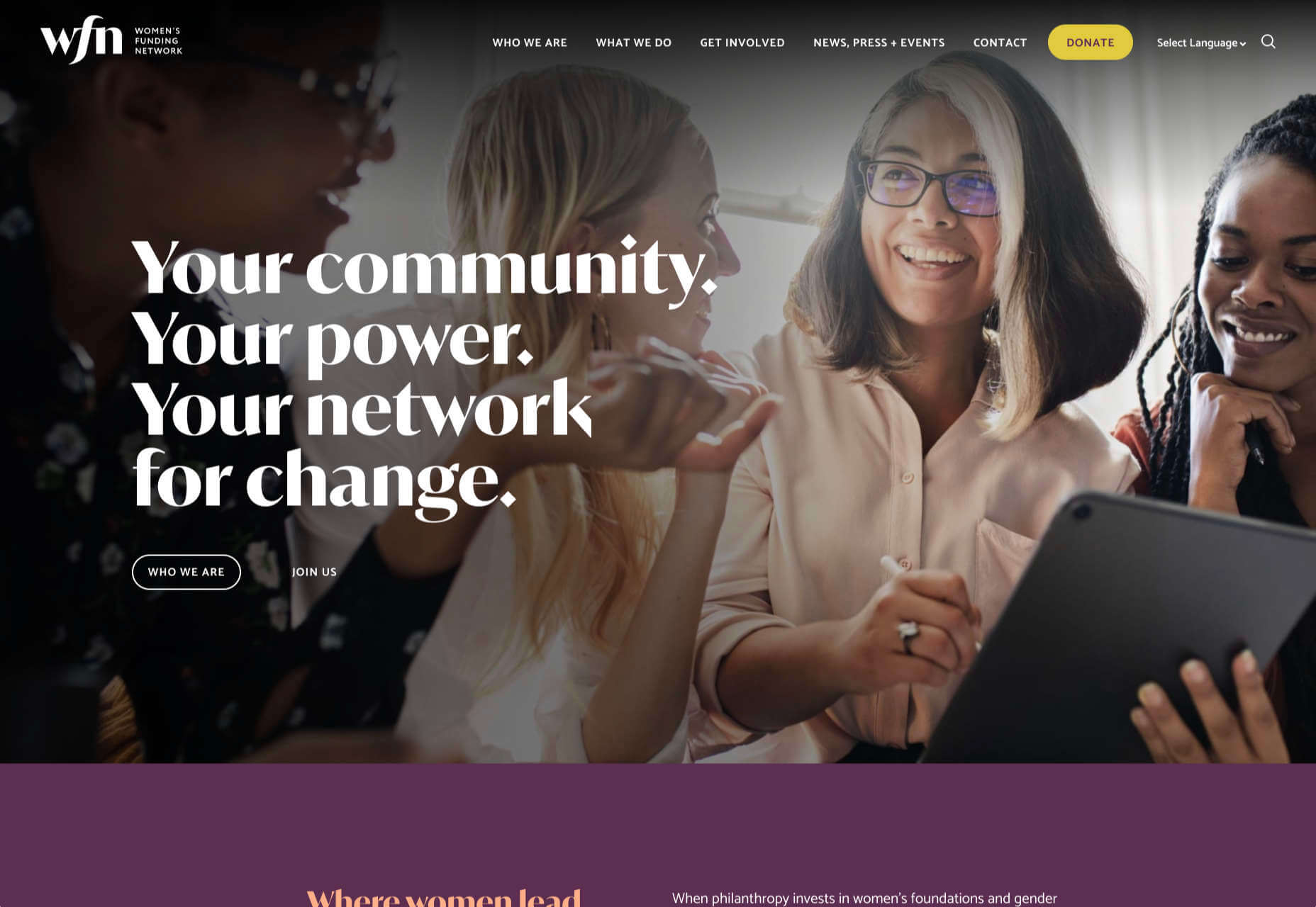
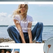
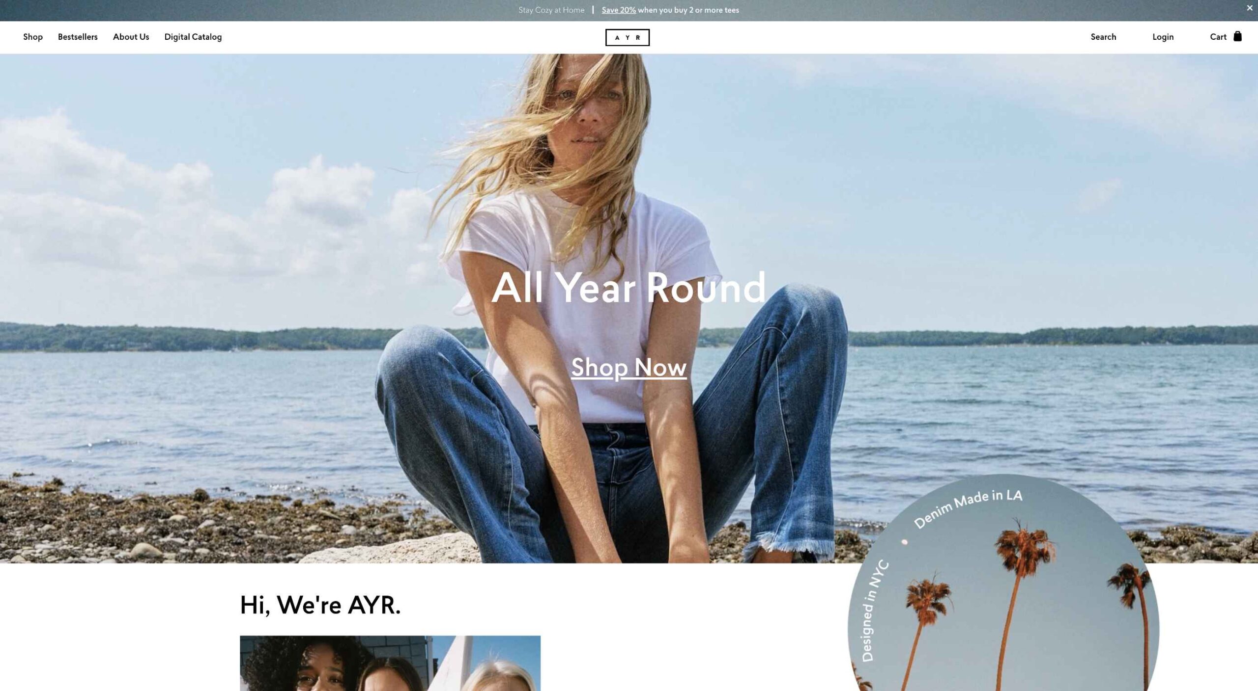
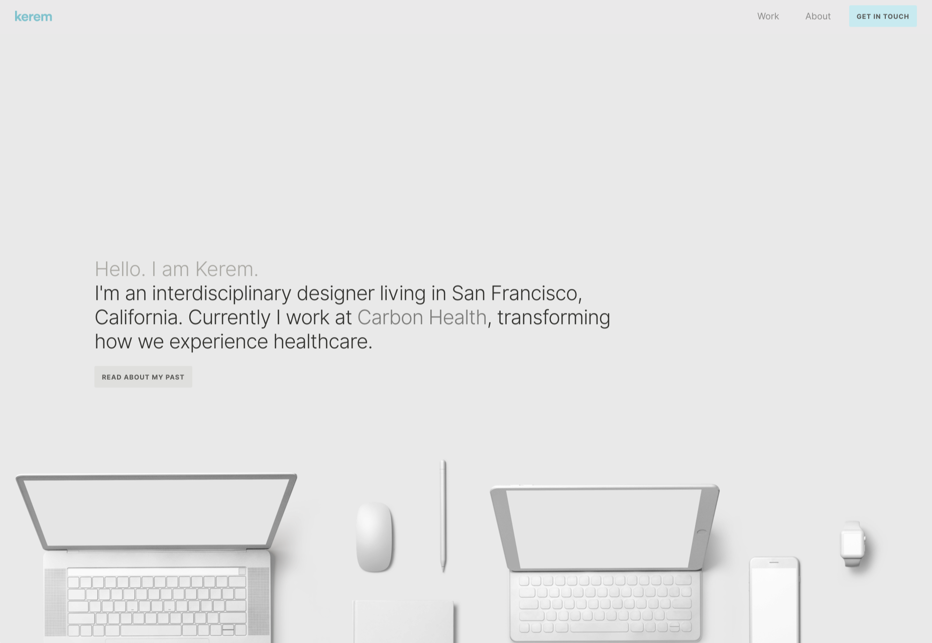
The way that you use color can make a massive difference to how users feel when they arrive on a website. For instance, the Barclay’s website would have been pretty boring if it was just a basic black and white screen. However, a banking site can’t afford to go over the top with animations or illustrations in most cases, as this can detract from its professional image.

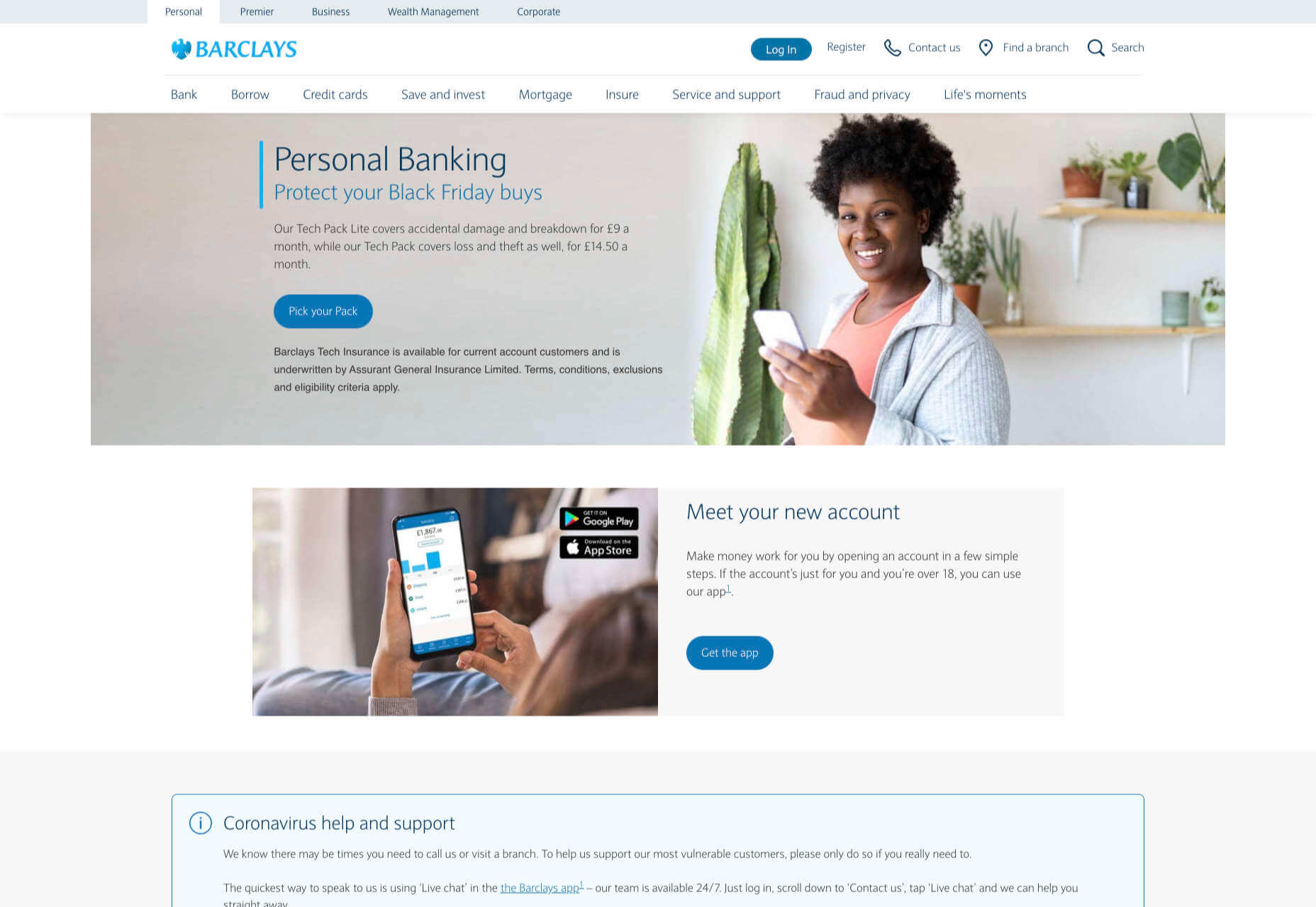
Adding small patches of blue in a way that complements the brand’s color palette is a great way to generate feelings of trust. Combined with the image of a genuine real-life person, and calm tones, the bank instantly presents itself as something approachable and honest.

At the same time, the clear hierarchical layout of the bank’s website, with an easy-to-follow navigation bar, easy-to-read font, and clear headings and buttons comfort the customer. Users get exactly what they expect when they come to a financial website, and that makes users feel as though they’re in the right place.

Step 2: Create Engaging and Emotional Interactions

Visual elements are a great way to embed emotion into digital design. However, they’re just the first step. The emotional aspects of your web design choices should also appear throughout the interactions that customers have with the website.

A good interaction on a website or app needs to be simple and straightforward enough that users feel comfortable taking the next step in their journey. However, it also needs to drive the right emotional response from users too.

For instance, when you sign up for a free account trial from Box.com, you don’t just get a form full of information that you need to fill out.

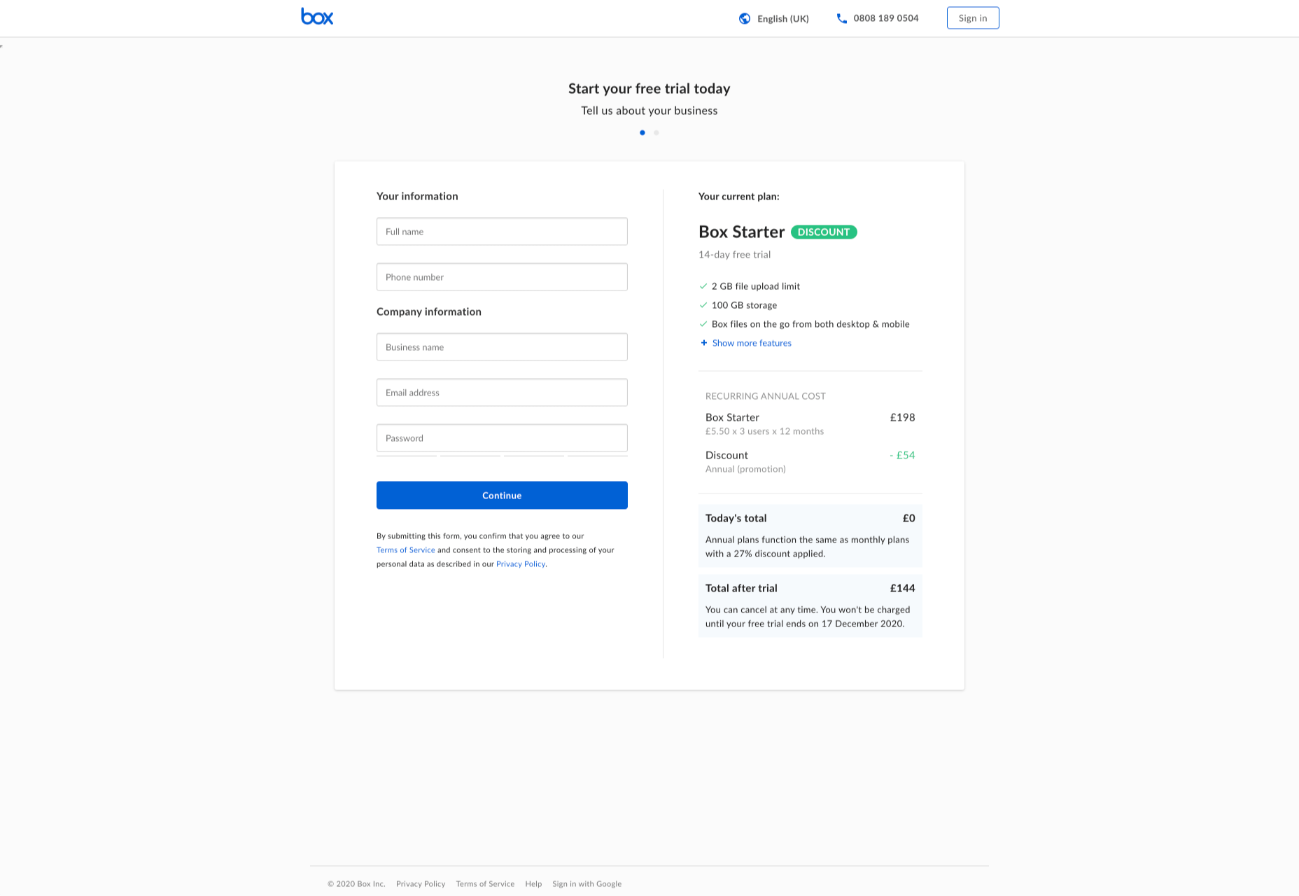
Next to the form, you also get information about what you’re signing up for, complete with small checks next to each of the free features you’re getting. This helps to put the customer’s mind at ease and remind them that they’re in the right place.

The use of a box, including discount information next to the sign-up form also helps to make the interaction more emotional, by reminding customers that they’re getting something for free.

Every time a customer interacts with a website, there’s another opportunity to engage them on an emotional level. On the Firebox website, when a customer adds something to their cart, there’s a small animation on the cart icon that informs them that something is waiting for them.

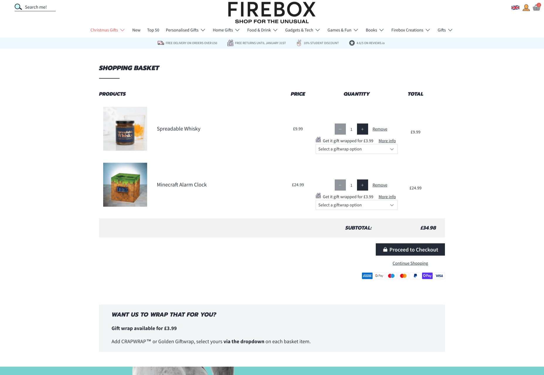
When they click through to the checkout, they get instant information, including what they can do to “gift wrap” their item, and buttons showing the various payment options available.

Whenever you’re designing a page for a website, whether it’s the checkout page, a product page, or something else entirely, think about the interaction that the visitor is having at that moment. How can you ensure that each customer feels more comfortable, delighted, informed, or engaged?

Step 3: Leverage Microcopy and Detail to Express Emotions

Visuals are an excellent way to express emotions.

However, they’re not the only option.

As a designer, you’ll need to think about how you can combine web design with the use of microcopy to connect with customers on a deeper level.

Rather than drawing attention to tedious, dull, or impersonal instructions, notifications, and error messages on a site, how you can you make sure that everything on the website delivers the same emotional impact?

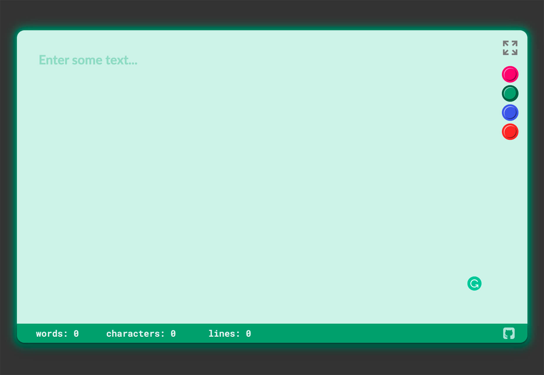
The simple addition of a tiny illustration is enough to provide a much more emotional experience to customers. Compelling micro copy and illustrations on 404 pages can also strengthen the connections that customers have with the sites they visit.

Just look at how Google added a dinosaur game to the page that customers are sent to when they don’t have an internet connection.

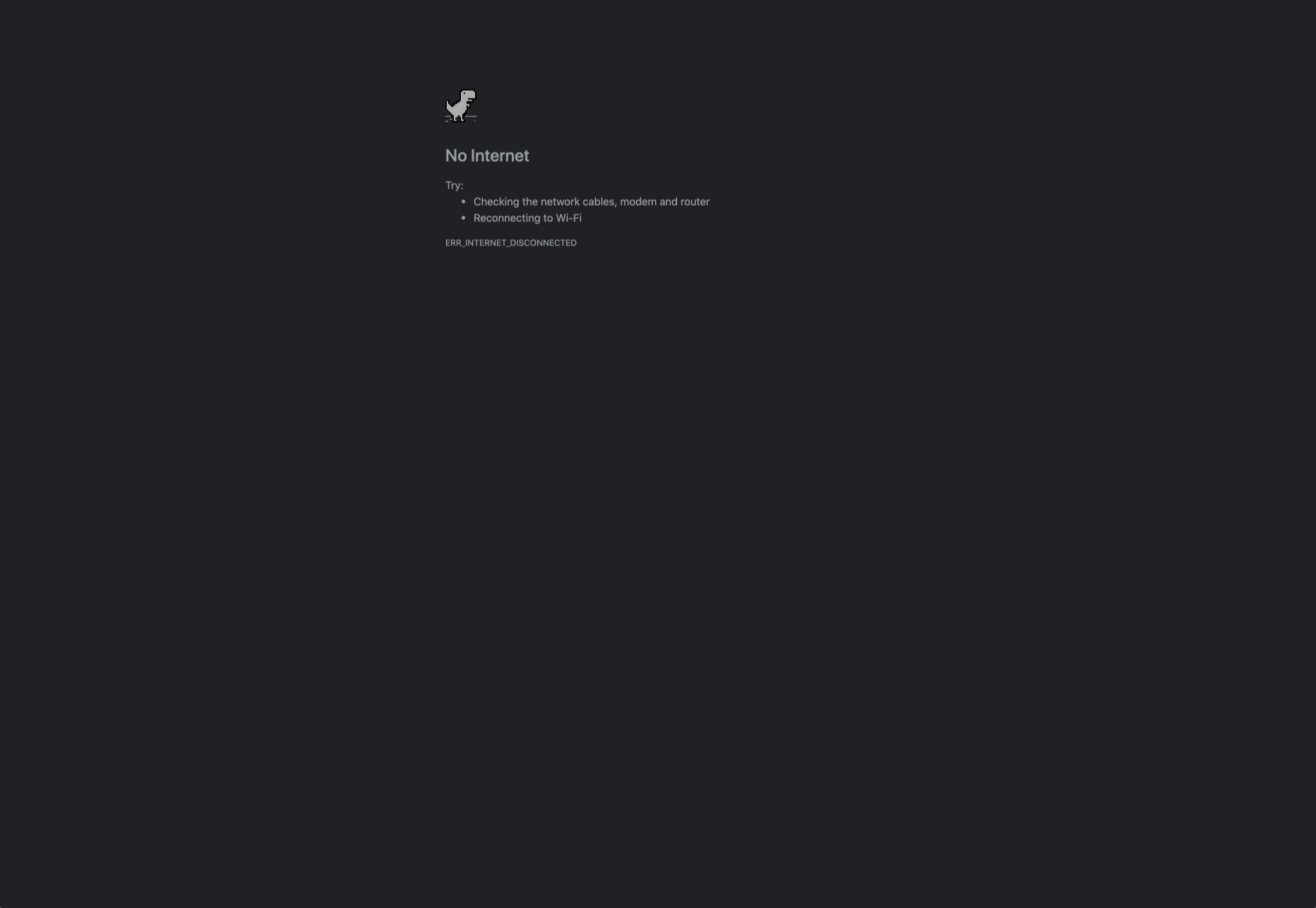
The right micro copy and interactions can instantly transform even a negative experience, like not being able to connect to the internet, into something emotionally engaging and positive.

When it comes to making an emotional connection between your customer and their end users, web designers need to remember that often the smallest details can make the biggest differences. Little extra features, like implementing a way for customers to have fun when their internet connections aren’t working, are the things that make websites more memorable from an emotional perspective.

Don’t Choose Emotion Over Functionality

Although emotional impact can be an essential aspect of a fantastic website design, it’s important not to get carried away. Adding too much to a website in the form of little extra graphics and unique interactions could end up weighing down a site and making it slow to load.

Although it’s valuable to think about how every interaction an end-user has with a website will make them feel, it’s important not to overlook the basics of web design when you’re at it. You’ll still need to ensure that the finishing design is easy to use, engaging, and attractive.

Pay attention to the basics of user experience design, and make sure that the extra emotional elements you’re infusing into your sites aren’t going to damage the experience that end-users get.

If you can get the blend right between emotional impact and functionality, then you could create the kind of website that audiences will never forget.

It pays to implement emotion into your design portfolio.

Source


Source de l’article sur Webdesignerdepot

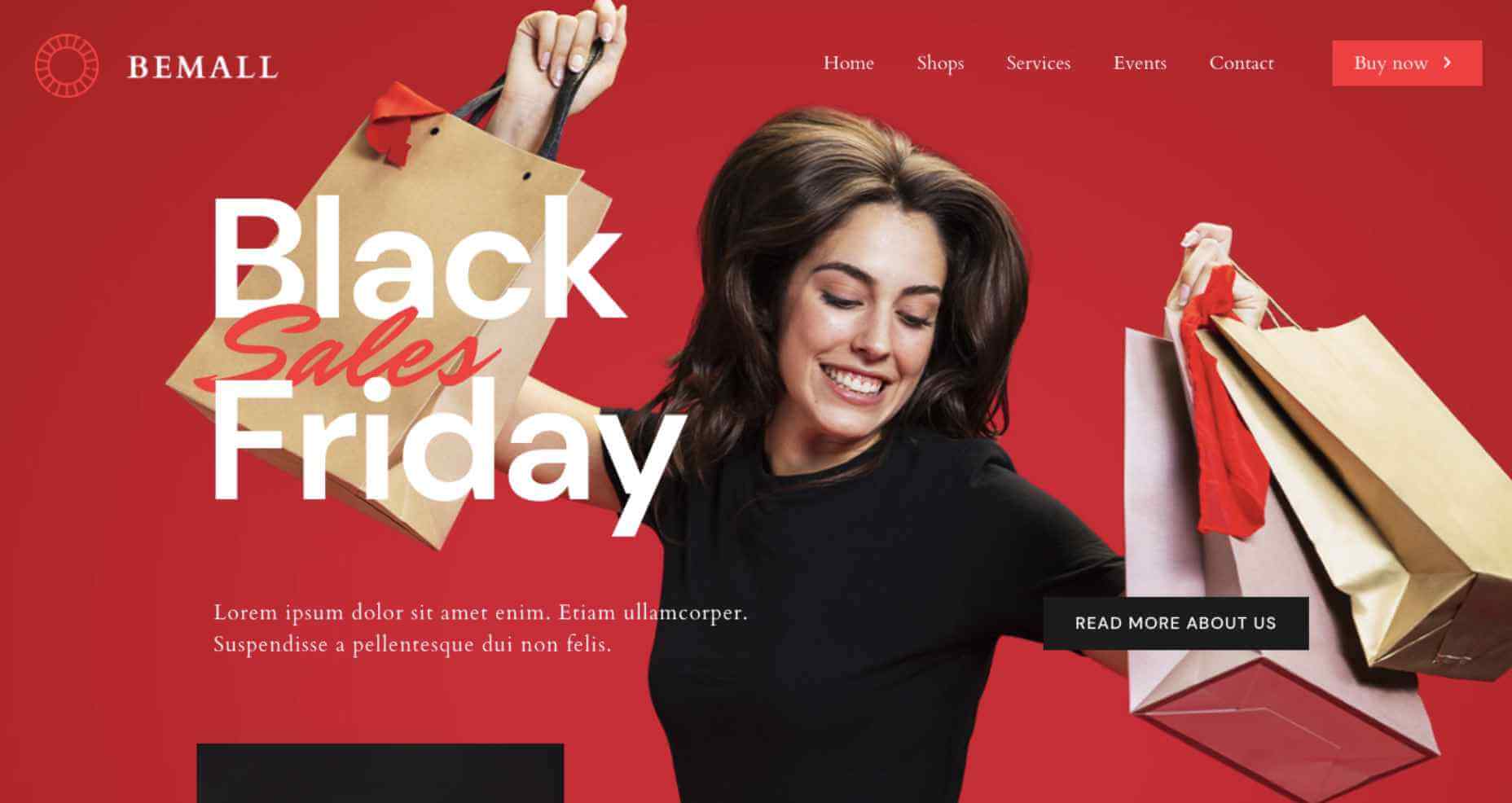
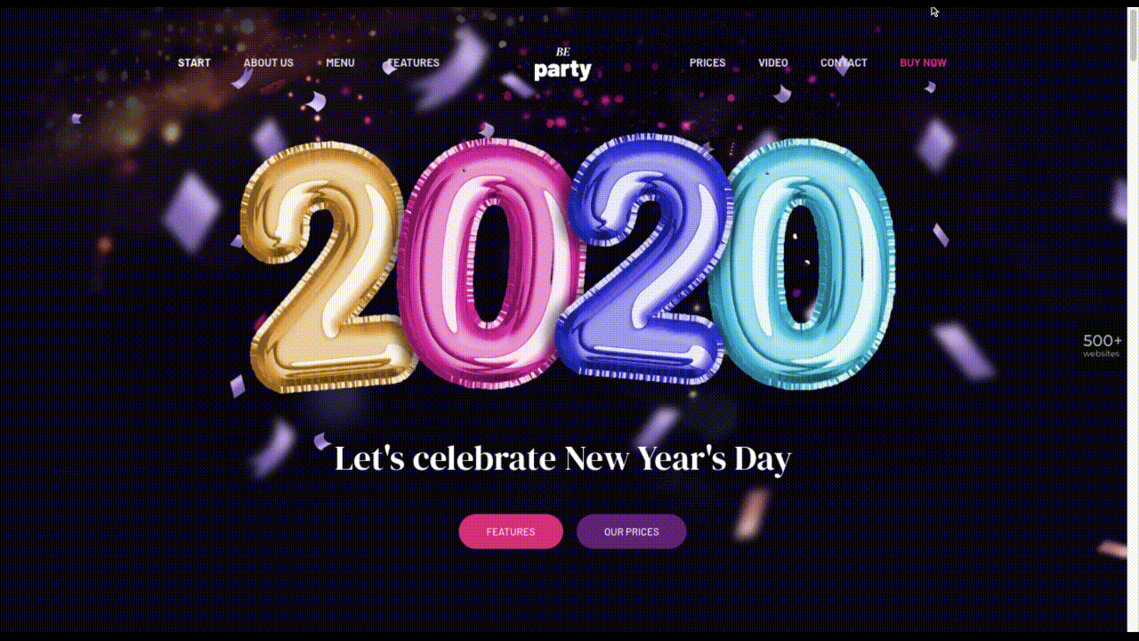
The holidays are fast approaching. But that doesn’t mean it’s too late to get a new website online or to make your existing one look festive for the holiday season.

When it comes to decking the halls of your website with a little festive cheer, how do you do this without spending loads of money and time on it?

You’re in luck. BeTheme has a variety of pre-built websites to help you do just that. Not only that, but you can use these festive websites for a variety of occasions, like:

  • Hanukkah
  • Kwanzaa
  • Christmas
  • Boxing Day
  • New Year’s

You could also just use one of these sites to make your website feel more seasonal as the temperatures get colder and the snow starts to fall. (If that’s what your winter wonderland looks like!)

Let’s have a look at 4 ways you can bring a little seasonal or holiday cheer to your visitors with a festive website from BeTheme:

Tip #1: Use a Page Builder That Makes it Easy to Swap in Festive Content

Unless you’re running a business like the Christmas Tree Shops, it doesn’t make a lot of sense to have holiday imagery up all year long.

The only problem, though, is that it can be a real pain having to go in, find a new theme, and then redesign your site around it… For only a month or two.

That issue is easily resolved with BeTheme, which comes with over 600 pre-built websites and two page builders — Muffin and Elementor.

Because there are so many pre-built sites available, you can easily switch to a non-festive website once the holiday season is over.

In order to swap out this design with a festive website, you’d first have to reset your theme (which Be provides instructions on how to do). Then, install the new site you want to use.

Like BeXmas:

And if you only want, say, a new hero image in the top of your website, you can cherry-pick which parts of the pre-built site you install.

Tip #2: Effortlessly Switch From One Holiday to the Next

Let’s be honest, the winter holiday season can feel a little nuts — not just because your business has to keep up with the change of pace, but because your website has to keep in step with what’s going on.

So, let’s say you have an ecommerce site that changes frequently for upcoming sales, holidays, events, and so on. For this, you could use the BeMall pre-built site (all year long, mind you):

As you can see, it currently has a Black Friday message on the homepage. It’s not uncommon to have to transition from Black Friday or Cyber Monday into the December holidays.

Here’s how you might do that:

The update can be as minor or major as you want. So long as you use graphics and content that stay on-brand, you can easily swap out as much of your imagery as you like.

Tip #3: Use Small Animations to Bring the Holidays to Life

Holidays should be a time to lift spirits. Having a website that’s able to satisfy your customers’ needs during the holiday season will certainly help.

You might also want to think about adding small animations to your design, too.

The animations themselves don’t have to be festive, but you can use them to call attention to holiday-themed content. Take, for instance, BeParty:

You don’t need to have champagne bottles popping or streamers flying across the screen to get your point across.

This animation gives the New Year’s party balloons a gentle and natural feeling of bobbing up and down. An attention to a detail this small is sure to bring a smile to your visitors’ faces.

Tip #4: A Little Hint of Seasonal Flavor Can Go a Long Way

Holiday celebrations aren’t always big blowouts. Unless your entire business is going all-in on the holidays (or it’s a totally holiday-themed business), there’s no reason your site should have to go all out either.

Sometimes a more understated approach is best.

In that case, you’d keep your normal branded elements, imagery, and content in place on the website. But to make it feel a little more festive, you could infuse your site (at the very least, the homepage) with slight seasonal or festive touches.

For instance, let’s say you’ve built a website for a popular ski resort. Your website might look like the BeSnowpark site does normally:

The main draw of the resort is skiing, so it wouldn’t make much sense to change the graphics. However, you could do something like this:

It’s a small enough change, but the gift emoji and bigger lettering in the green button might inspire loyal snowbirds as well as first-time visitors to more quickly book their much-needed holiday getaway.

Get Your Festive Website for Christmas, New Year’s, and More

There are many science-backed reasons why a festive website is a good idea.

Holiday decorations, in general, stir up positive feelings of nostalgia for many people. They can also help alleviate some of the stress that’s built up over the course of the year:

What’s more, holiday decorations can visually signal to others that you’re friendly and accessible, even if they don’t know you.

Sounds exactly like how you want visitors and prospects to feel, right?

As you can see, there are many ways to decorate your website for the holidays. To do it quickly and affordably — and not completely turn your regular website upside-down — a BeTheme pre-built site is the way to go.


[– This is a sponsored post on behalf of BeTheme –]

Source


Source de l’article sur Webdesignerdepot

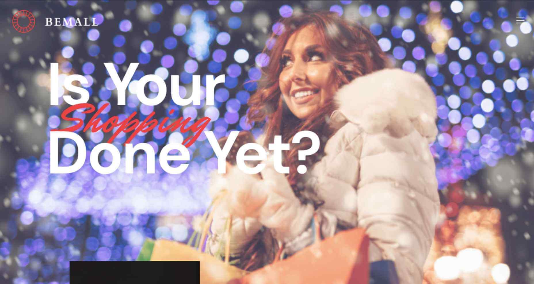
As we approach our first winter holiday season since the pandemic set in, the world could feel like a very scary place; there is a great deal of uncertainty about the future for businesses, for young people in education, for jobs, for travel. Celebrations are certainly going to be a lot quieter this year.

And yet, the web is far from showing doom and gloom. We’re seeing confidence and positivity in designs across the board. As businesses and people adapt to the demands of social distancing and WFH, we’re seeing a focus on simplifying, appreciating quality over quantity, taking better care of ourselves and our world, and making the most of our time. And this is reflected through design in a variety of ways: visually minimal style, pared down content, fresh colors, statement type, great photography, illustration.

There is confidence in abundance on the web. Enjoy…

Mammut Expedition Baikal

Mammut make outdoor clothing and equipment, and this microsite is for its Eiger Extreme collection. Stunning photographs of Swiss speed climber Dani Arnold climbing at Lake Baikal in Siberia are cleverly interspersed with details of the company’s products he can be seen wearing, along with links to buy. It feels natural, rather than forced.

Wavering Stripes

This a beautifully made site highlighting the experiences of people held in immigration detention centers in the US. The illustrations belie the grimness of the stories told — on the landing page there is a warning as to the nature of the content.

Juan Mora

Proof that holding pages don’t have to be boring, this ‘under construction’ site for interface designer Juan Mora is a far cry from the warning-barrier and stick-figures-at-work gifs of the web’s early days.

Cafecrema

Cafecrema’s simple, one page site creates the atmosphere of 1950s coffee shops through its illustration style, a jazz soundtrack, and a very mid-century modern color palette.

A N Other

Perfume brand A. N Other prioritises quality ingredients and materials, simplicity, craftsmanship, and the environment. Its website captures this perfectly, and invokes a sense of luxury as the result.

Puddle Sound

Puddle is an architectural and interior design company, who also do product and furniture design. For a Tokyo hotel project they created a vacuum tube amplifier, that is the subject of this site. It is as simple as can be with only the barest essential information, and with all attention focused on the product shots.

Hous

Hous Luxe Woningen are a Dutch company who build luxury homes. The high quality images, muted color scheme and generous use of white space in its website reflects this sense of luxury perfectly.

Who Cares?

Who Cares? is an interactive game designed to raise public awareness of endangered animal species. The illustration style is very pleasing, and there are some lovely little details in the animation and sound.

Ugly

This site for sparkling water company Ugly, uses bold, cartoonish typography and illustrated characters to add a lot of character to, well, water.

Glyphs

Glyphs font editor version 3 was released on 16th November. The accompanying site has a fresh feel, mainly due to its striking color scheme. The on scroll animation showcasing variable fonts is a nice touch.

Ruler Agency

Ruler Digital Agency uses color only in the images of work on its own site. Everything else is grayscale, even the images, which can be a really effective technique when it is used well, as it is here.

Zoë Pepper

Zoë Pepper is a collective of freelance brand strategists who work with early stage startups. The site is minimal without feeling empty, and utilises quirky illustration and scrolling animation to good effect.

Karst

Karst make notebooks using paper made from stone, and woodless pencils. Its site has a simple, clean feel with a muted, neutral color scheme that complements the colors of its notebook covers.

London Alley

London Alley is a production company who concentrate on music videos and advertising. Its site is simple and striking with plenty of video, and effective use of split screen.

LoveSeen

LoveSeen makes false eyelashes, and nothing else. The site has a fun, inclusive feel — more girl(and boy)friends together than glossy, high fashion magazine. It’s appealing and persuasive.

Chartogne-Taillet

This site for wine-growers Chartogne-Taillet uses illustration and an animated, ‘hand’ drawn map to create a sense of heritage, appropriate for a family with a long history of making wine in the Champagne region. It is reminiscent of a label on a good bottle of wine.

Refusi Studio

Refusi Studio is a design agency from Italy. This portfolio site is simple, with strong colors and big, statement typography. And a giant cartoon eye.

Yesterday, Today, Tomorrow

Yesterday, Today, Tomorrow is an interactive project from the National Film Board of Canada. It uses tweets to trace emotional ‘waves’ throughout the Covid-19 pandemic.

Boost

Boost is a gummy (chew) vitamin supplement for the immune system. Big type, big graphics and lots of orange and purple — the colors associated with vitamin C and antioxidants — make vitamins cool.

Philiber

Philiber is a meal delivery subscription service, available in urban centers in Quebec. The site is clean and modern, with a comforting color scheme and a nice mix of photography and flat style illustrations.

Source


Source de l’article sur Webdesignerdepot

Since there are so many CMS plugins out there, it can be overwhelming to choose the best ones for your website. We’ve done the research for you; this list contains the top new CMS plugins for November 2020. You’ll find useful plugins for WordPress, Craft, Shopify, and Joomla.

Let’s get started…

WordPress

404 Page Editor

404 Page Editor is a simple WordPress plugin that helps you add custom text to the default 404 page on your website. The plugin comes with seasonal and industry-related 404 templates. One useful feature of the plugin is that it backups your current 404 page before changing it. So you can restore the backup page anytime you choose. The plugin duplicates your current 404.php page to wp-content/uploads/404-page-editor/ so you can easily find it. You can also change the text on the plugin to fit your local dialect. 

UnusedCSS Power-Up

Most WordPress themes and plugins load their CSS in the wrong areas of your website. This can slow down your site. A slow website will reduce user experience and lead to increased bounce rates.

UnusedCSS will help reduce the size of your website’s CSS files by up to 95%. The best part is that the plugin works automatically. It will remove any unused CSS when visitors view any page on your website. UnusedCSS will automatically reduce your website’s load times by reducing your CSS files and page size. The plugin also optimizes the performance of other WordPress plugins and extensions. UnusedCSS also works with WooCommerce themes and plugins.

Simple Redirects

Simple Redirects is a WordPress plugin that helps you to automatically redirect requests to another page on your site or any other place on the web. The plugin allows you to easily redirect users from your old web pages to new pages using 301 or 302 redirects. You don’t have to worry about losing backlinks or page rank. Any incoming links to the old web page will be automatically passed along to the new page. The page rank on the old page is also transferred to the new page. The plugin is useful when migrating a WordPress site when don’t want to retain the URL structure. 

HTML Validation

HTML Validation plugin helps you identify any HTML validation errors on your website. The plugin works automatically in the background of your website and will send you regular reports. There is a progress bar on the report screen to show you the progress of the scan. The plugin uses WordPress Cron to scan the content of your website. There is also an option for the plugin to automatically fix any HTML validation issues on your website. You can also choose to fix the issues manually. 

Just Highlight

Just Highlight is a simple WordPress plugin that helps you highlight text in your posts or pages. You can use this plugin to highlight any portion of the page you want to draw the reader’s attention to. You can highlight the background of the page and also add animation to the highlighted text. In the WordPress admin area, you can change the speed and color of the animation. The plugin is compatible with Gutenberg, and the WordPress classic editor. 

DeviantArt Embed

DeviantArt Embed is a simple plugin that helps you embed any work from Deviant Art into a post. The plugin provides a block for the WordPress block editor so you can easily embed the image. It uses a DeviantArt oEmbed API to pull the images and their descriptions, and creates an embedded image. 

Static Optimizer

Static Optimizer is a static file optimization plugin that serves and optimizes static files on your website. The plugin will help you increase your website speed by automatically compressing your static files. It is easy to set up, you just need an API key to get started. Other useful features that the plugin offers include automatic JS and CSS minification, automatic image optimization, and processing of responsive images. You don’t have to worry about losing your files if their server is down. The plugin automatically backs up your files and will load your original files when their servers are down (either because of an upgrade, maintenance, or outage).  By default, only images are compressed when you activate the plugin; you can also choose to optimize fonts, CSS, and JS files. 

RankBear

RankBear is a keyword rank tracker plugin that helps you analyze your SEO efforts. With RankBear, you can track the keywords for each of the posts and pages on your site. While the plugin has a paid plan, you can track up to five keywords for free. On the free plan, you will receive weekly reports on each keyword you are tracking. You can search for the rank and volume of a keyword in every location supported by the Google search engine. RankBear is a lightweight software-as-a-service plugin hosted by Amazon Cloud Services. The plugin also offers the option to download the keyword reports to CSV. 

Table of Contents Block

Table of Contents Block is a plugin that allows you to easily create a Table of Contents for your WordPress posts. The plugin is lightweight and will automatically add a Table of Content in your website’s posts and pages. You can select the heading tags you want to add to the Table of Content. It also has a dedicated support team to assist you. The plugin works fine with all standard WordPress themes. 

Markease For WooCommerce

Markeaze is an all-in-one communication plugin that allows you to add live chat to your online stores. The plugin will help you improve your customer service by decreasing your response times. With the plugin, you can collect your visitor’s contact information via a widget. This feature is useful in building a subscriber database. You can also use the plugin to track customer behavior on your site, inform customers about new products, help customers with active orders, and collect customer feedback. You can also use the auto-reply function to answer commonly asked questions. 

Craft CMS

Image Toolbox

Image Toolbox is a Craft CMS plugin that offers image-related tools for your templates. The plugin will automatically create a WebP variant of the images you upload. It also has a fallback for browsers that do not support WebP images. Other useful features the plugin offers include automatic creation of placeholder images and generation of responsive images with multiple variants. The plugin also supports Imager-X (or old Imager). 

Element Panel

Element Panel plugin allows you to add elements and an eager-loading panel to the debug toolbar. This feature will help you benchmark your templates in Craft CMS. For elements, the panel has a dashboard that shows how many elements are populated. It also shows how many elements are duplicates. The plugin also shows you how many eager-loading elements are detected. Duplicate elements are grouped by field name. 

Shopify 

VStore Shoppable Videos

VStore Shoppable Videos is a Shopify plugin that allows your customers to shop directly from your videos. The plugin allows you to embed your products into any video. Since videos have a high engagement rate, this plugin will significantly improve your store’s conversion rates. 

ProofMotion Video Testimonials

ProofMotion Video Testimonials plugin helps you to easily collect video testimonials. The plugin sends an automated email or SMS requests to customers asking for their satisfaction feedback after making a purchase. The responses are analyzed to determine whether the customer had a negative or positive experience. Customers that offer negative feedback are sent to customer care to help them with the problem they encountered. Happy customers are prompted to make video testimonials of their positive shopping experience. ProofMotion guides the customer through the interview so they can give the best testimonial. They also offer an on-site widget so you can easily share your testimonials. 

Real ID

Real ID is a Shopify plugin that allows you to verify customers’ real identity using a photo ID and facial biometrics. The plugin is perfect for orders that have an age restriction, verifying flagged fraud goods, and selling expensive goods. Real ID will help you identify whether a government-issued-ID is fake during fulfilment. All the customer needs to do is take a selfie on their phone. This way, even if a customer has access to a stolen physical ID, they won’t still be able to make any purchase. The plugin can verify documents such as passports, visas, national IDs, driver licenses, and more. Real ID will help you handle GDPR compliance. The plugin is available in hundreds of countries around the world. 

Joomla

Accessibility

Accessibility is a Joomla plugin that allows your website visitors to easily access your website content. The plugin will remove any barrier between the visitor and your Joomla site. There is no coding required and you can customize the plugin directly from the module manager. The plugin has a useful feature called Dyslexic Readability; this feature allows your visitors to set the entire document font to a dyslexic-friendly font. Visitors can also grayscale the page, resize the fonts, and resize the word space. From the backend module, you can add any custom CSS and JS. The plugin is also available in 12 different languages. 

Reading Time

Reading Time is a simple plugin that will help you easily show the reading time of your Joomla articles. The plugin is easy to set up and does not require any coding. You can customize every parameter, including the text, in minutes. You can also choose to exclude categories, articles, and menu items. Reading Time also allows you to easily add custom CSS code from the plugin parameters. 


Featured image via Pexels.

Source


Source de l’article sur Webdesignerdepot

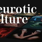
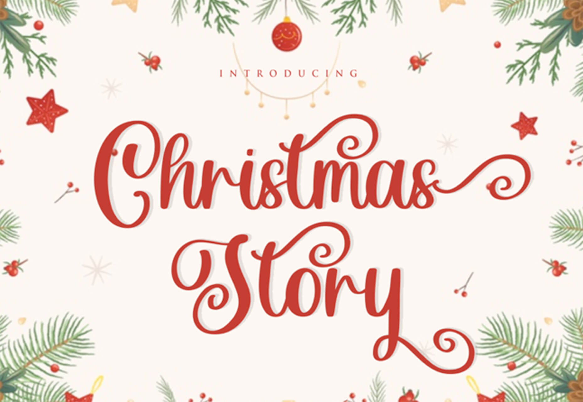
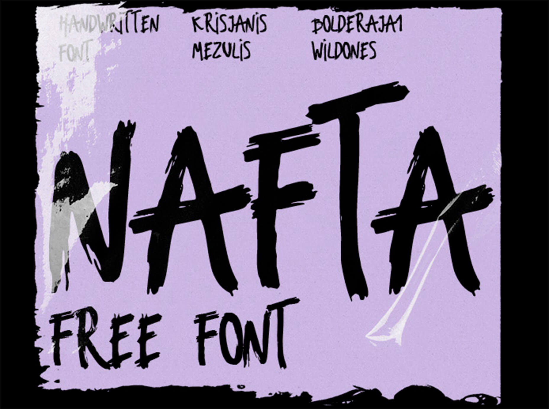
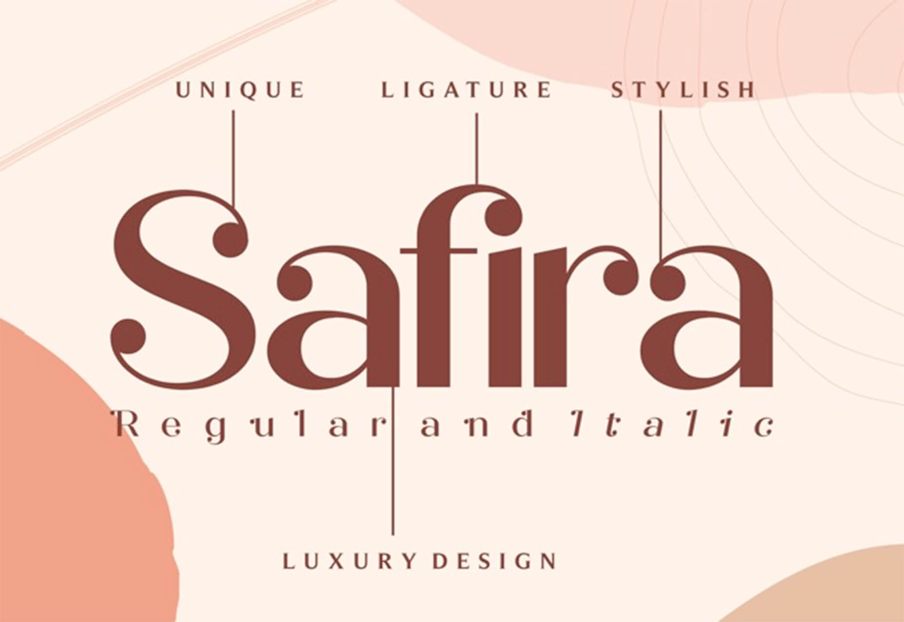
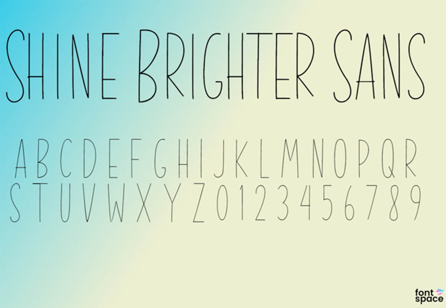
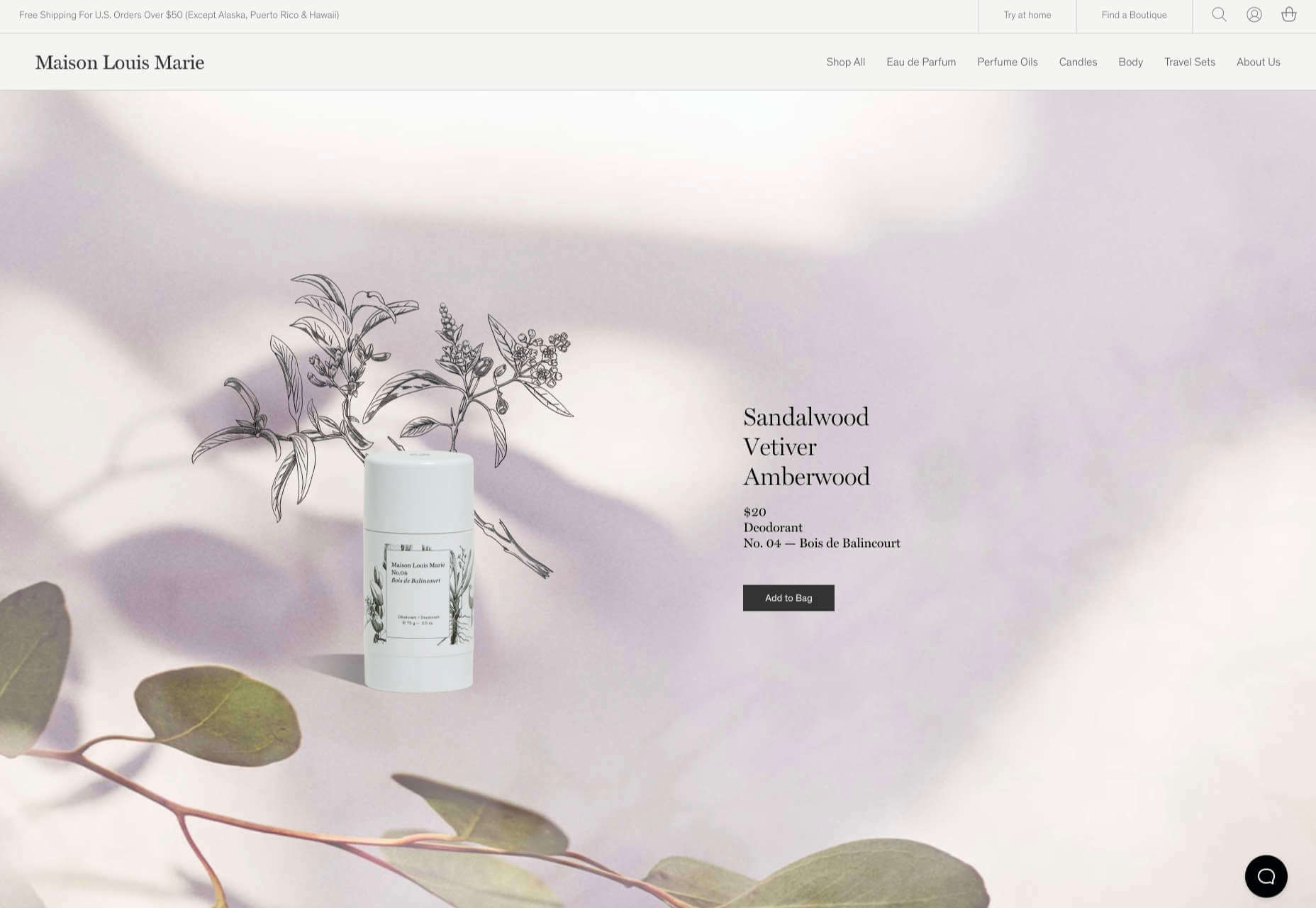
In the spirit of fall feasts, this month’s collection of tools and resources is a smorgasbord of sorts. You’ll find everything from web tools to icon libraries to animation tools to great free fonts. Let’s dig in.

Here’s what new for designers this month.

The Good Line-Height

The Good Line-Height is the tool you won’t be able to live without after using it a few times. The tool calculates the ideal line-height for every text size in a typographic scale so that everything always fits the baseline grid. Set the font size, multiplier, and grid row height to get started.

Link-to-QR

Link-to-QR makes creating quick codes a breeze. Paste in your link and the tool creates an immediate QR code that you can download or share. Pick a color and transparency, plus size, and you are done.

Quarkly

Quarkly allows you to create websites and web apps both using a mouse and typing code – you get all the pros of responsive editing, but can also open the code editor at any time and manually edit anything and it all synchronizes. The tool is built for design control and is in beta.

UnSpam.email

Unspam.email is an online spam tester tool for emails. Improve deliverability with the free email tester. The service analyzes the main aspects of an email and returns a spam score and predicts results with a heat map of your email newsletter.

Filmstrip

Filmstrip allows you to create or import keyframe animations, make adjustments, and export them for web playback. It’s a quick and easy tool for modern web animation.

CSS Background Patterns

CSS Background Patterns is packed with groovy designs that you can adjust and turn into just the right background for your web project. Set the colors, opacity, and spacing; then pick a pattern; preview it right on the screen; and then snag the CSS. You can also submit your own patterns.

Neonpad

Neonpad is a simple – but fun – plain text editor in neon colors. Switch hues for a different writing experience. Use it small or expand to full browser size.

Link Hover Animation

Link Hover Animation is a nifty twist on a hover state. The animation draws a circle around the link!

Tint and Shade Generator

Tint and Shade Generator helps you make the most of any hex color. Start with a base color palette and use it to generate complementary colors for gradients, borders, backgrounds, or shadows.

Pure CSS Product Card

Pure CSS Product Card by Adam Kuhn is a lovely example of an e-commerce design that you can learn from. The card is appealing and functional.

Free Favicon Maker

Free Favicon Maker allows you to create a simple SVG or PNG favicon in a few clicks. You can set a style that includes a letter or emoji, font and size, color, and edge type and you are ready to snag the HTML or download the SVG or PNG file.

Ultimate Free iOS Icon Pack

The Ultimate Free iOS Icon Pack is a collection of 100 minimal icons in an Apple style. With black and white version of each icon and original PSD files, you can create sleek icons for your iPhone screen in minutes. And it’s completely free! No email address or registration required.

Phosphor Icon Family

Phosphor is a flexible icon family for all the things you need icons for including diagrams and presentations. There are plenty of arrows, chats, circles, clocks, office elements, lists, business logos, and more. Everything is in a line style, filled, or with duotone color. Everything is free but donations are accepted.

3,000 Hands

3,000 Hands is a kit of hands that includes plenty of gestures and style in six skin tones and with 10 angles of every gesture. They have a 3D-ish shape and are in an easy to use PNG format. This kit has everything you need from a set of hand icons.

Radix Icons

Radix Icons is a set of 15px by 15px icons for tiny spaces. They are in a line style and are available in a variety of formats including Figma, Sketch, iconJar, SVG, npm installation, or GitHub.

Deepnote

Deepnote is a new kind of data science notebook. It is Jupyter-compatible with real-time collaboration and running in the cloud and designed for data science teams.

ZzFXM Tiny JavaScript Music Generator

ZzFXM is a tiny JavaScript function that generates stereo music tracks from patterns of note and instrument data. Instrument samples are created using a modified version of the super-tiny ZzFX sound generator by Frank Force. It is designed for size-limited productions.

Image Tiles Scroll Animation

Image Tiles Scroll Animation is a different type of scrolling pattern using Locomotive Scroll. The grid creates a smooth animation in a fun and modern style.

Bubbles

Bubbles is a Chrome extension that allows you to collaborate by clicking anywhere on your screen and then dropping a comment to start a conversation with anyone. This is a nice option for work from home teams.

Tyrus

Tyrus is a toolkit from the design team at Airbnb to help illustrators make the most out of their design businesses. It is broken into sections to help you with design briefs, originality, deadlines, and feedback.

PatchGirl

PatchGirl is an automated QA tool for developers. You can combine SQL and HTTP queries to build any possible state of your database.

Apparel

Apparel is a beautiful premium typeface family with plenty of versatility in a modern serif style. It is a contemporary, classy, and fresh serif typeface with a laid-back. Its medium-large x-height makes it ideal for headlines and brand identity design.

Christmas Story

Christmas Story is a nice solution if you are already starting to think ahead to holiday projects or cards. The long swashes and tails are elaborate and fun.

Nafta

Nafta is a fun handwriting style font that has a marker-style stroke. It’s a modern take on the popular Sharpie font. It includes all uppercase letters.

Safira

Safira is a wide and modern sans with ligatures and a stylish feel. The rounded ball terminals are especially elegant.

Shine Brighter Sans

Shine Brighter Sans is a super-thin sans-serif with a light attitude. The limited character set combined with its light weight is best for display use.

Source


Source de l’article sur Webdesignerdepot

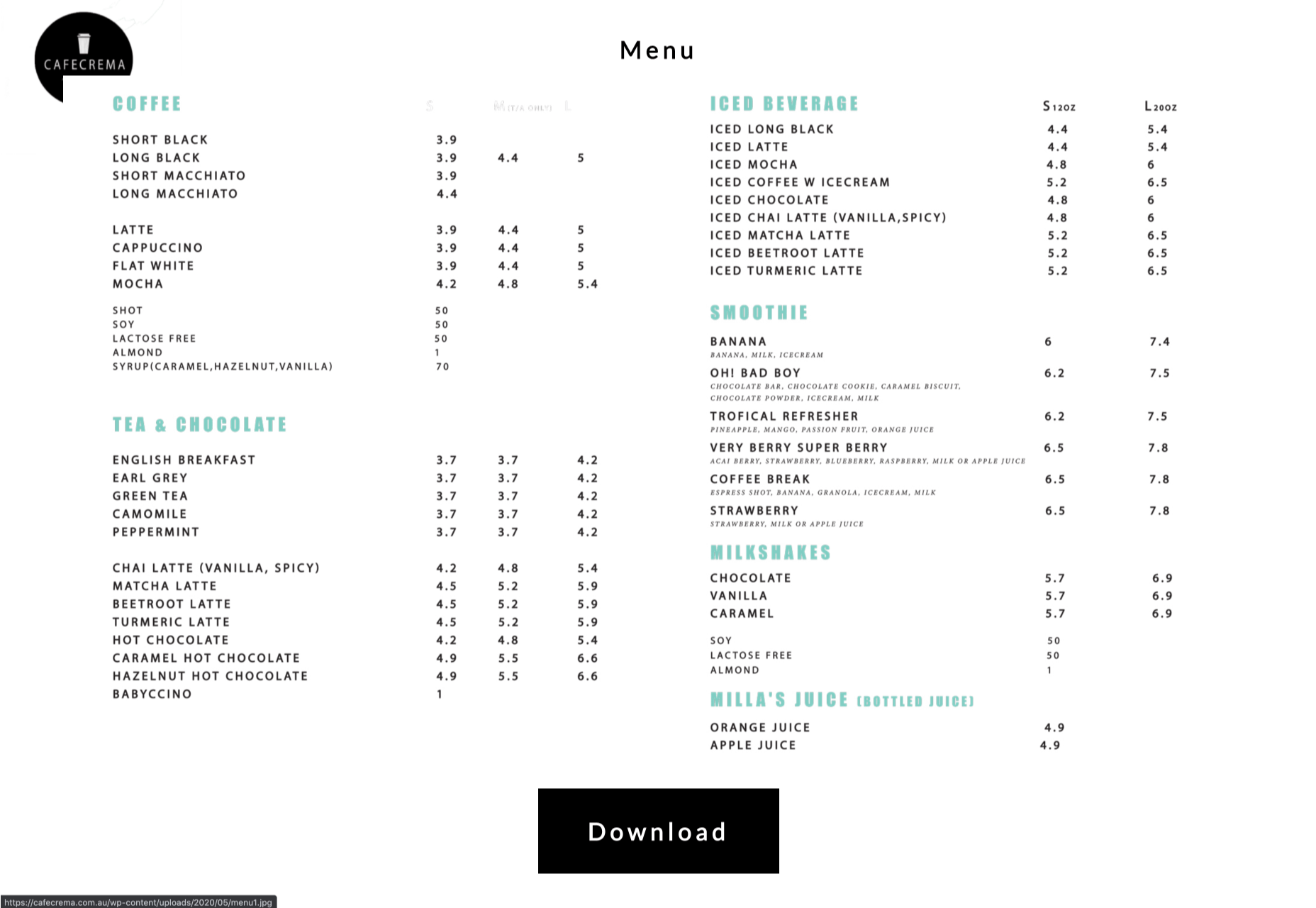
As we turn the corner into the final part of the year, many of the new websites and redesigns that we see during much of the rest of the year tend to slow down. Many businesses are focusing on fourth quarter and holiday sales.

With that being said, there are plenty of holiday flourishes already showing up on many websites. But there are still a few trends that don’t have a holiday theme.

Here’s what’s trending in design this month.

1. Beautiful Connectivity

Web elements that merge and flow into one another can be difficult to design but the payoff is totally worthwhile. This website design trend exemplifies connected elements in a way that’s beautiful and mesmerizing.

You can accomplish it with static elements or interactivity; the common theme is that design parts enter the space of one another and merge in ways that are seamless and visually interesting.

The thing that makes it exceptionally tricky is responsiveness. To ensure that pieces work well at all sizes when they overlap or encroach on the space of one another takes a lot of planning and testing.

Here are a few examples of projects that do it well – and each one does it in a different way.

Kirk Whayman’s website uses a floating ice cube over simple lettering. The interactivity is spot on here with hover actions that allow you to move the block with the letters refracting in an expected manner. (It would be easy to play with it all day.) But the coolest interaction happens when you “break it” (click on the cube). The elements continue to merge and interact in a new and different way.

Kikk Festival uses animations and giant scrollable illustrations and plenty of elements that overlap within the space. What’s neat is that everything on this canvas seems to touch everything else. The staircase design encourages scrolling and lettering and smaller animated elements all connect to the steps in the sky motif.

Multi Options Nursing takes a totally different approach. It uses a static split screen with a photo on the right side that merges into a round graphic element. It takes two not-s-interesting images and makes something out of them. The design carries this theme below the scroll as well and this style of image presentation carries a nice visual weight without feeling heavy.

2. Almost Brutalism

Brutalism just seems to keep coming back around. For those that love this trend, it keeps evolving as well.

The latest styles of brutalism are a little less mono but still pretty sharp with harsh lines, questionable type readability, and a lot going on in a compressed space. These projects also seem to be embracing color and alternative font choices more readily.

Fledge uses a split screen – still a dominant trend two years running – with a blue that’s almost too bright with an almost white offset color. The text is big and smooshed into the space tightly. Depending on the breakpoint, you might not even get the whole phrase on the left side. The design challenge is what are you supposed to do here? There are some hover animation cues, but they aren’t very direct.

Loeven Morcel’s design has hints of brutalism and elements of elegance. What makes this design skew toward the brutal side is use of space and typography. Like the previous example, it falls into the territory of “what should I do here” with some concerns about readability. Most of these issues are resolved on the scroll if you move beyond the homepage.

Szymon Michalczyl’s site is another that is close to brutal in style but has an element of sleekness that doesn’t quite carry it over the edge. The simple framework has that brutalist feel but the use of simple, clean fonts with plenty of space pulls it back into a more mainstream design scheme.

3. Beige Everything

Is a shade of beige the color of the year for 2020? Or is it just how we all feel?

Beige backgrounds are everywhere, making this one of those design trends that you can’t miss. The good news is that designers are playing with different shades of beige as well as warm and cool variations. Beige on its own can take on some of the color from accent hues and imagery, so that’s important to keep in mind when using this in the background.

The other variable is how saturated to make beige coloring. Most designs are using some of the more muted options while mostly playing with the levels of green and red. But darker beiges are also an option.

Simon Daufresne uses a beige that is the color that comes to mind when you think beige. It’s simple, a hint reddish, and is used with black only to maintain true color.

Discovered Wildfoods uses a more neutral feeling beige with a more green undertone (or is that color feel coming from other design elements). The neutral and natural color fits the brand and association this website is trying to create.

Aebele Interiors also uses a more traditional beige but with a bold mustard accent that makes the color feel exceptionally warm. What’s nice about this color combination is that in small sizes the mustard colored-type almost falls into the beige background, but at larger sizes seems to almost jump off the screen. It’s an interesting color juxtaposition.

Conclusion

Personally, this month’s trends are a mixed bag. I love the lines and interactivity of the beautifully connected examples. It shows that elements can cross and work together well.

On the flip side, brutalism and beige just aren’t my style. But apparently, they appeal to a lot of people based on the number of projects using these styles. What do you think? I’d love to know how you feel about these trends. Let me know on Twitter.

Source


Source de l’article sur Webdesignerdepot

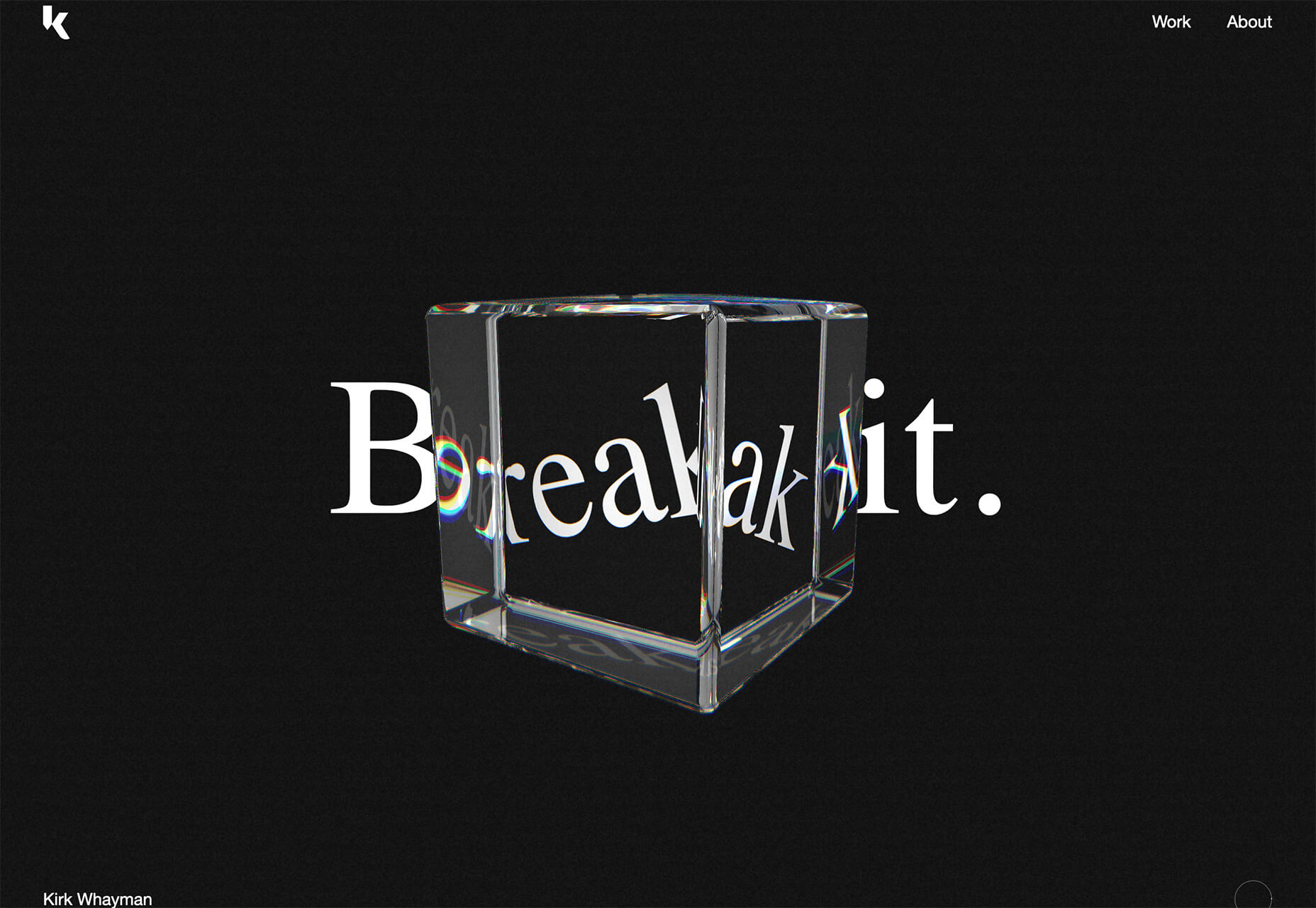
Every week users submit a lot of interesting stuff on our sister site Webdesigner News, highlighting great content from around the web that can be of interest to web designers.

The best way to keep track of all the great stories and news being posted is simply to check out the Webdesigner News site, however, in case you missed some here’s a quick and useful compilation of the most popular designer news that we curated from the past week.

Minimal CSS Frameworks


Responsive Grid Design: Ultimate Guide


The New Facebook Design Sucks


The No-Code Generation is Arriving


15+ Text Typing Effect CSS Animation Examples


AppSheet by Google Workspace – No-code App Building Platform


Ecommerce Development Trends: The 2021 Edition


How Videos Can Boost your Website Ranking Results


5 Small Business Website Essentials You Need for your Site


The Psychology of User Decisions


Overflow for Windows – User Flow Diagramming Tool for Designers


How to Create an AI that Chats like You on WhatsApp


‘50 Shades of Blue’


Here’s Why Developers are in Love with Functional Programming


Apple Building Search Engine to Take on Google, Report Claims


A Faster Way to View Search Results with Less Clicking


Dark Mode in UI Design for Mobile Apps: Beauty Born in the Darkness


EncryptLab – A Collection of Free and Comprehensive Encryption Tools


Part of your World: Why We’re Proud to Build a Truly Native Mac App


Why I will not Call Myself a Junior Designer - and Neither Should You


10 Usability Mistakes Most Designers Make on Checkboxes


People Problems


Practical Guide to Color Theory for UI Designers


Following the 2020 U.S. Election with Google


React Vs Svelte – A Comprehensive Comparison Between Javascript Libraries


Want more? No problem! Keep track of top design news from around the web with Webdesigner News.

Source


Source de l’article sur Webdesignerdepot

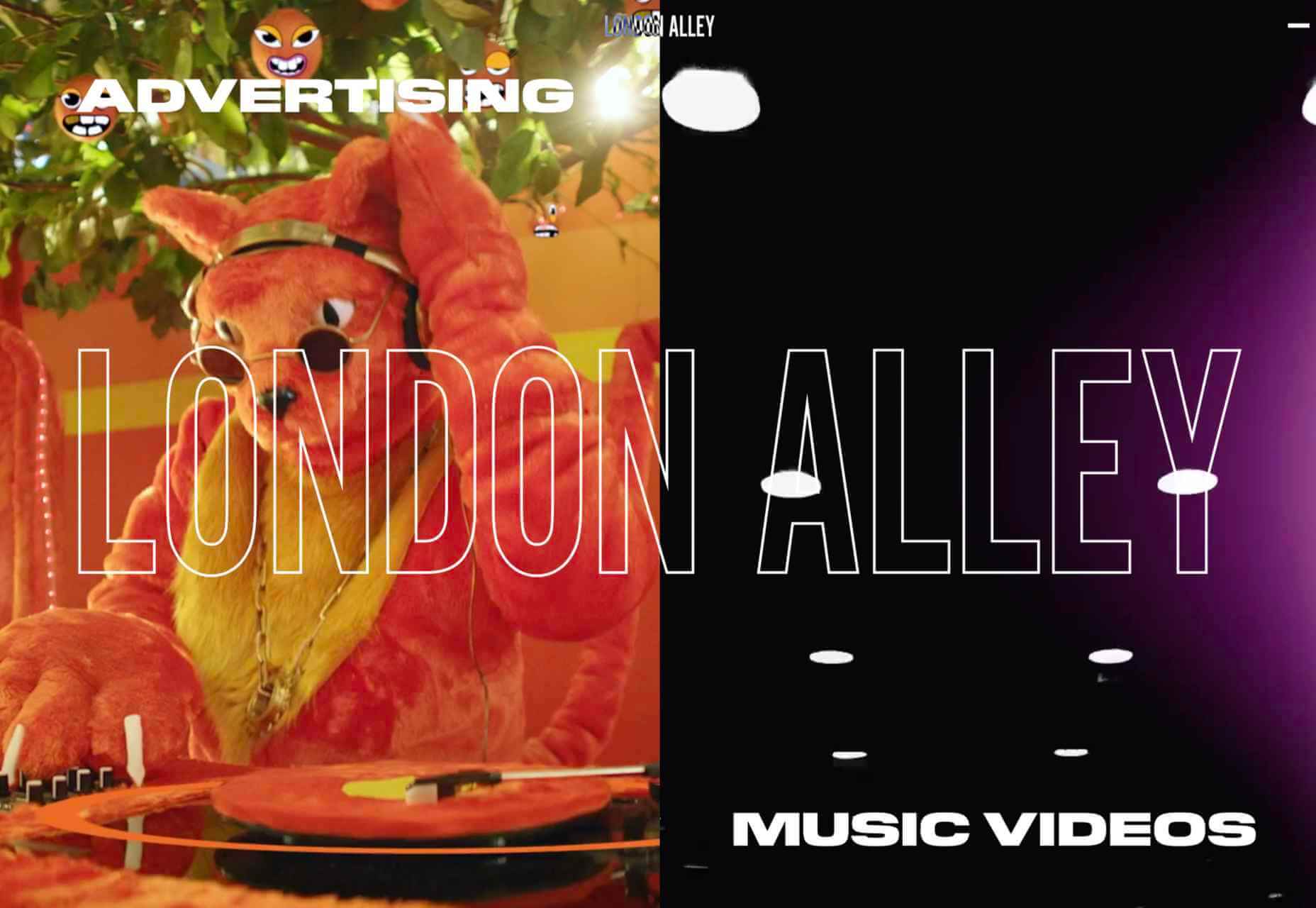
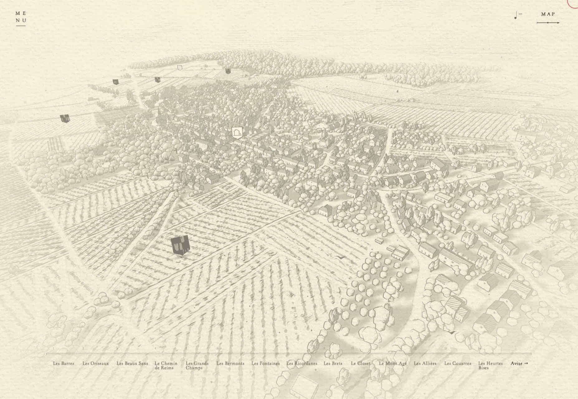
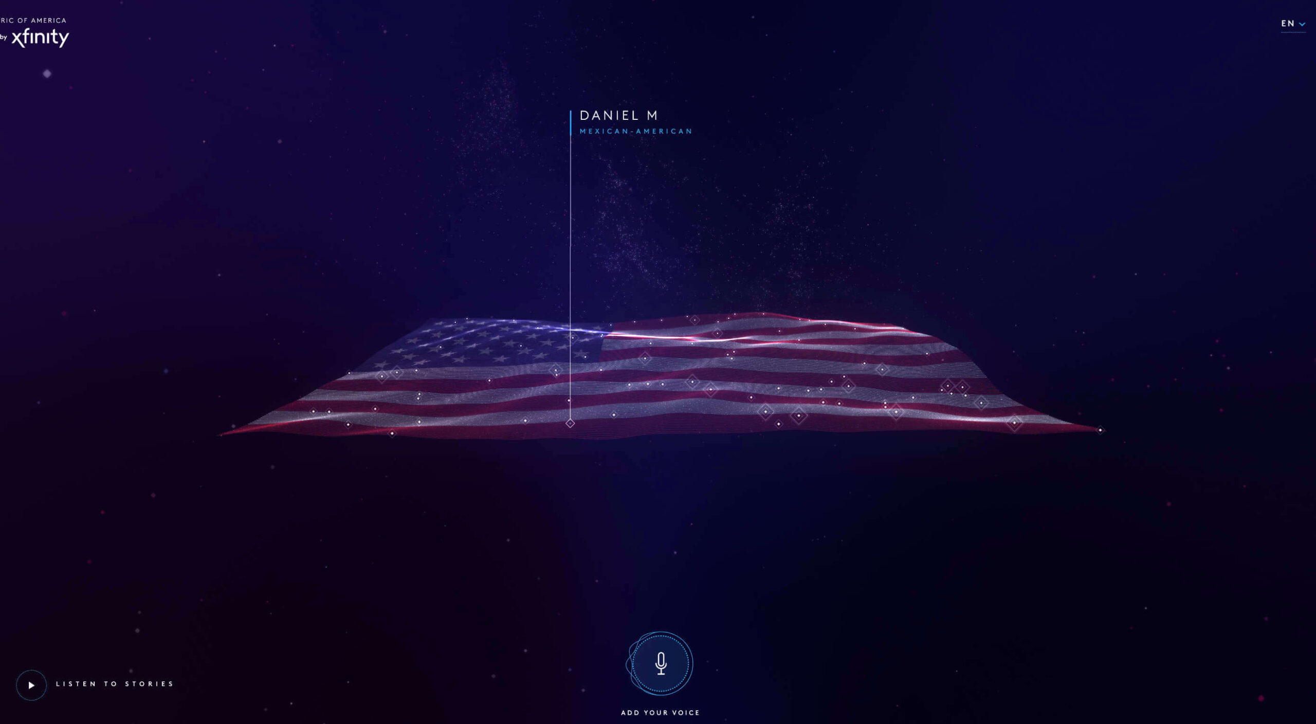
We have become so used to using web sites just to buy stuff that it is easy to forget that the web has more to offer. So this month we’ve included some because-it’s-interesting sites, some micro-sites and some just-for-the-sake-of-it projects.

Many of these are about selling or promoting products and services too, but in a more oblique way that is frequently more engaging than a straightforward sales site.

Micro sites can be a great way of including content that doesn’t fit in neatly with the rest of the main site, or is temporary, or to show a lighter, more fun side of a brand. And a well thought out micro site can act as a gateway to pull in even more visitors to its ‘parent’ site.

Your World Your Way

Your World Your Way is an interactive portal for the University of Auckland. An optional questionnaire customizes the experience, and clearly a lot of effort has gone into this in terms of the questions and possible answers, and the presentation. It is engaging and enjoyable to use, and the information provides links to the main University of Auckland website.

Blind Barber

This micro site is to celebrate 10 years of barber shop chain Blind Barber, which started as one shop with a bar in the back room, in New York’s East Village. An entirely black and white design provides a clean backdrop for color photos and videos, and some great scrolling animations give a pleasing flow to the content.

Brews & Grooves

Brews & Grooves pairs records with different beer. Although a ‘fun’ project, it is still a well designed piece of work with some vintage style typography and some pleasing rollover animation effects. It is an effective advert for those involved in creating it, as listed in on its ‘credits’ page.

Gucci Bloom

As part of a new campaign to promote it’s ‘Bloom’ perfumes, Gucci have created a Gucci Bloom game. The player has to pick up flowers and perfume bottles, but miss a flower and the vines get in your way.

808303Studio

808303Studio is a digital musical instrument that emulates a Roland TR-808 drum machine and TB-303 bass synthesizer, created in conjunction with the Design Museum (London). It’s fully programmable and there is even short video tutorial with A Guy Called Gerald on how to use it.

Aelfie

Aelfie is a home furnishings brand with a focus on bold patterns and bright color. Their site reflects this with its use of block color, irregular grid, drawings, and type that feels a little off-kilter. It creates a hand-made feel that embodies the brand aesthetic rather well.

Media Election 2020

As we approach one of the most significant, not to mention acrimonious, elections in US history, Media Election 2020 uses AI to analyze the volume of media attention each candidate receives, in real time.

Curbed

Magazine website Curbed has now become a part of New York magazine, and had a redesign in the process. It follows a discernible grid, but distorts it just enough to create an edge. The highlighter color frames, and underlines on rollover, add movement and ‘cool’.

WFN

The WFN (Women’s Funding Network) is an alliance of funds and foundations working to promote gender equity and social change internationally. The site is clean, with strong typography and a sophisticated color palette.

The Fabric of America

Internet, telephone and TV service provider Xfinity is behind the Fabric of America project. It is a collection of voice recordings, the idea being that each voice, and each person’s story, is a thread that makes up the flag that we see on the screen.

Minimal Ceramics

Minimal Ceramics is a concept site, showcasing the work of London based potter, Tom Crew. The design of the site reflects the simplicity of the showcased work, using great photography and simple typography.

Normal Now

Normal Now is part of an awareness campaign to highlight to consumers the positives of electric cars. Taking a fun approach to engage consumers in a serious subject, it uses a fake retro tech style.

Superfood Gin 

Superfood Gin is a gin made using superfood botanicals, that claims to be fruity and fresh rather than crisp and peppery. The soft color palette, along with the soft lines and curves in the background illustrations, reflect this well.

Maison Louis Marie

Maison Louis Marie is a natural fragrance company. While this site does nothing really groundbreaking, it does it well. Botanical drawings on a white background, along with clean typography, help create a refined, luxury feel.

Think Economia

Think Economia is a platform taking a fresh look at economics and the future of economic growth. It doesn’t sound like the most exciting subject, but it is presented here in a playful and intriguing way.

Chernobyl

From Uprock, a Russian design studio that also offers courses in web design, Chernobyl is a thought provoking exposition of the Chernobyl disaster. The design aesthetic is muted, allowing the images their deserved impact, and the brief sections of text to be absorbed.

Declamatuus

Declamatuus is a lingerie company selling gift sets. What stands out here is what you don’t see — live models in underwear. Instead the outline of the body is created with animated particles.

Odisea

Odisea Expedition is a documentary series following two friends, a surfer and a snowboarder, as they explore remote parts of the world. The photographs and video are everything here, and all other elements are kept minimal to avoid detracting from them.

Riffyn

Riffyn Nexus is a ‘Process Data System’ for storing and analyzing scientific data for laboratories. It is a very corporate site and yet it is put together in such a way that doesn’t feel dull.

Maison du Net

This site for digital design agency Maison du Net takes a risk mixing corporate with cutesy, but it works. Offset frames and underlines create interest without overdoing it, and the very bright green is used sparingly enough to liven things up without being overwhelming.

Source


Source de l’article sur Webdesignerdepot

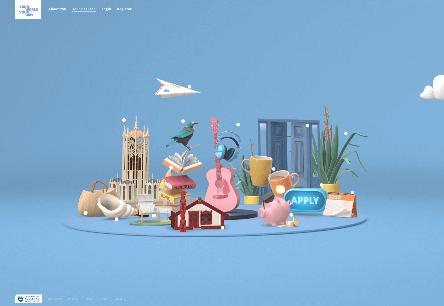
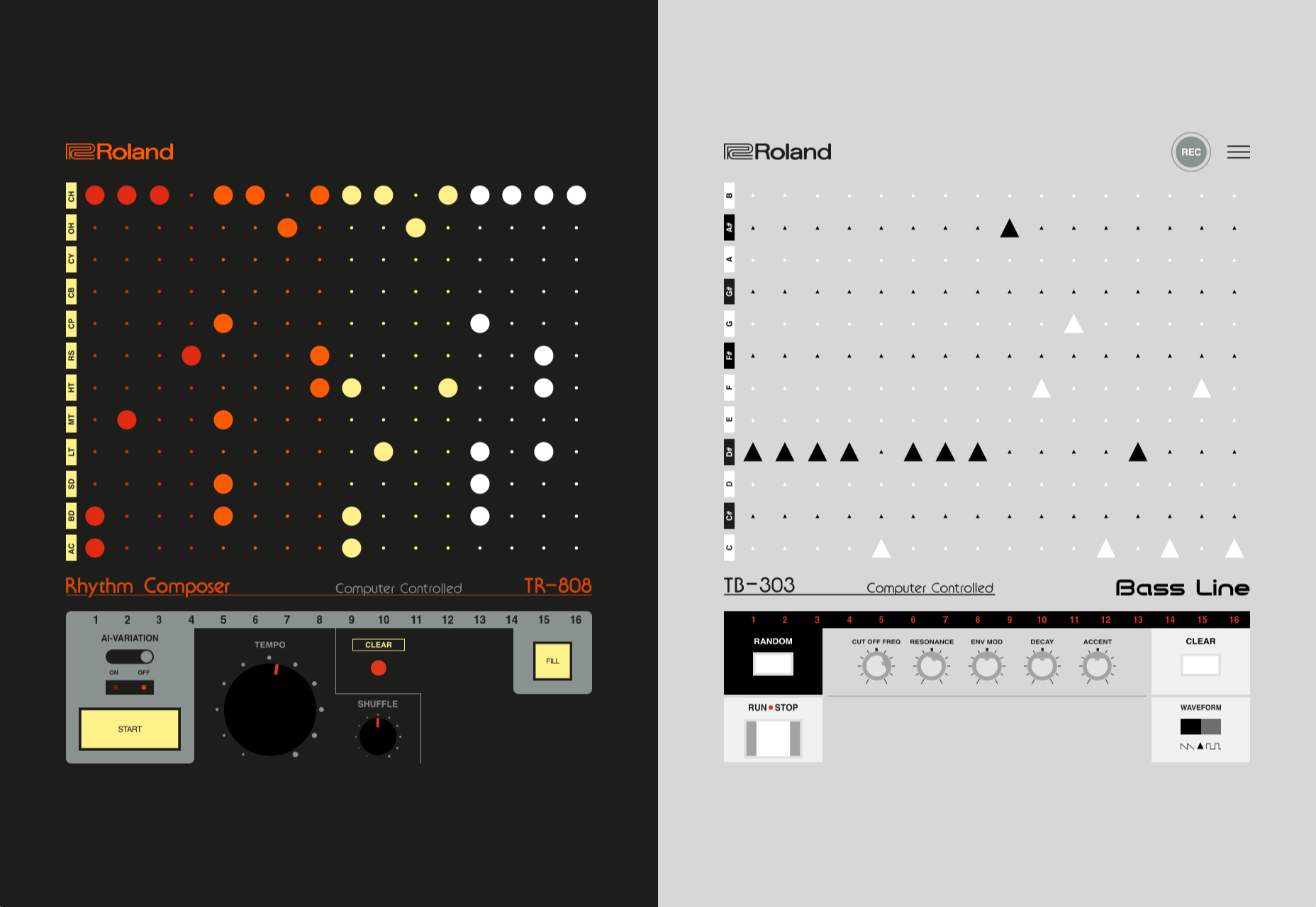
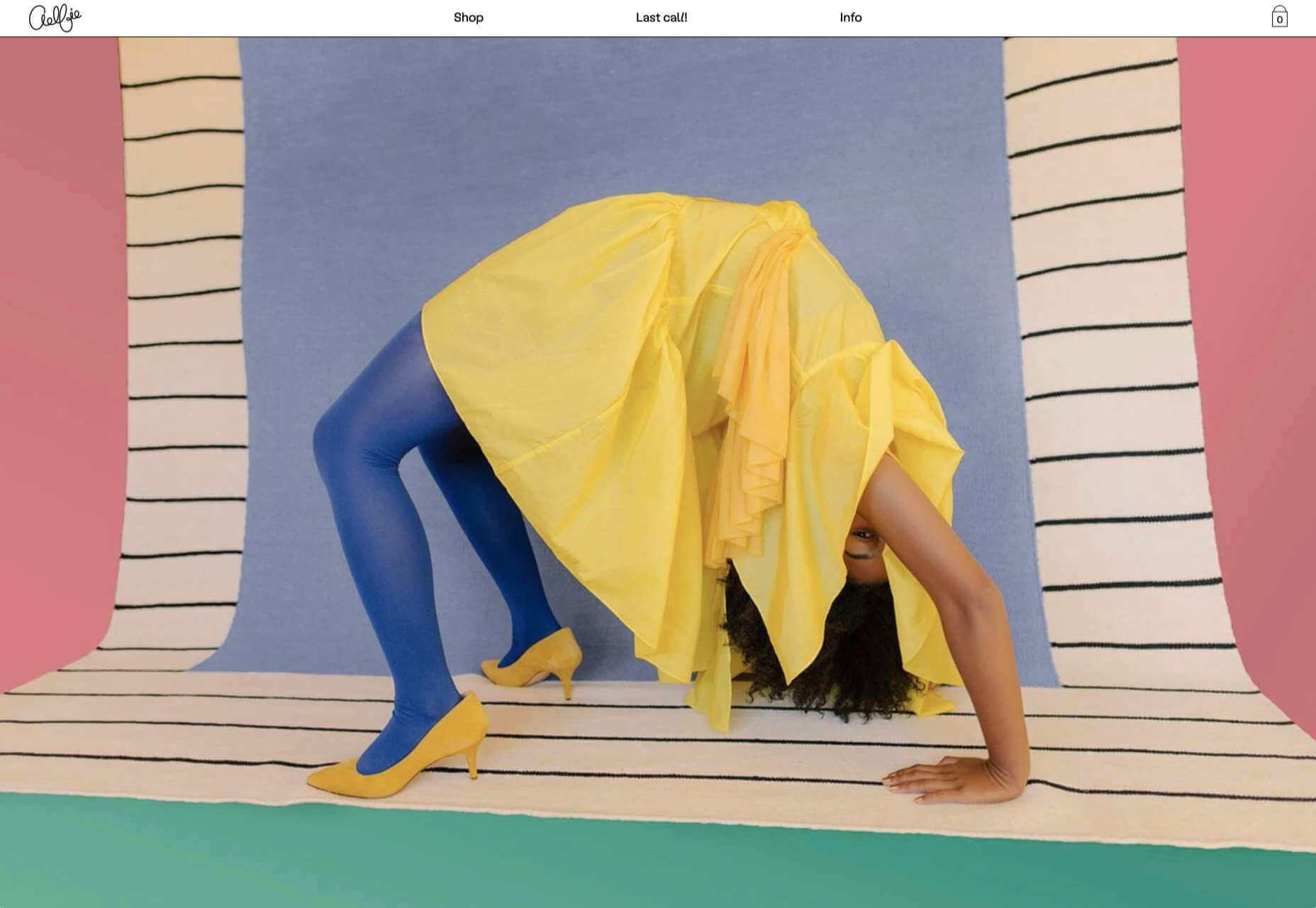
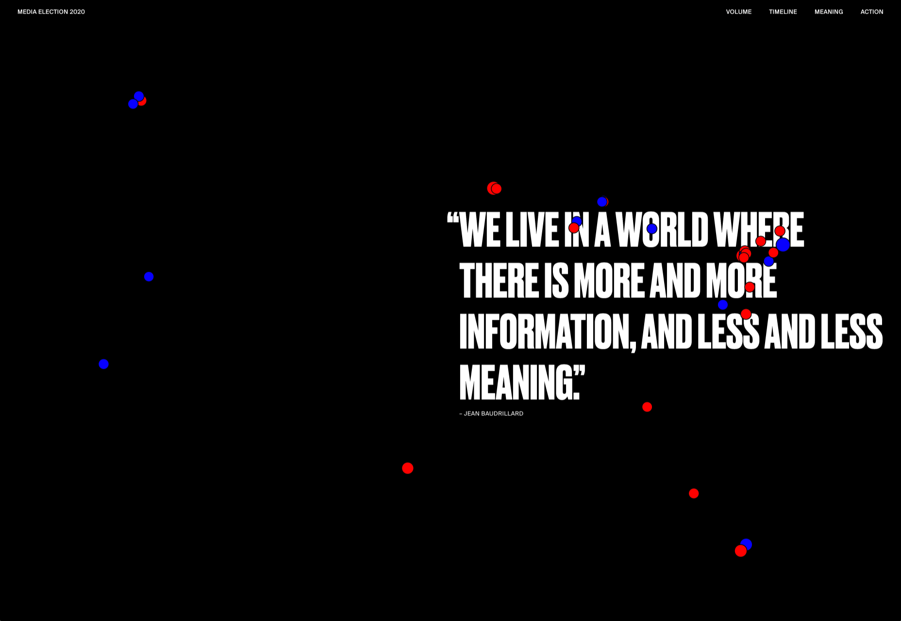
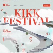
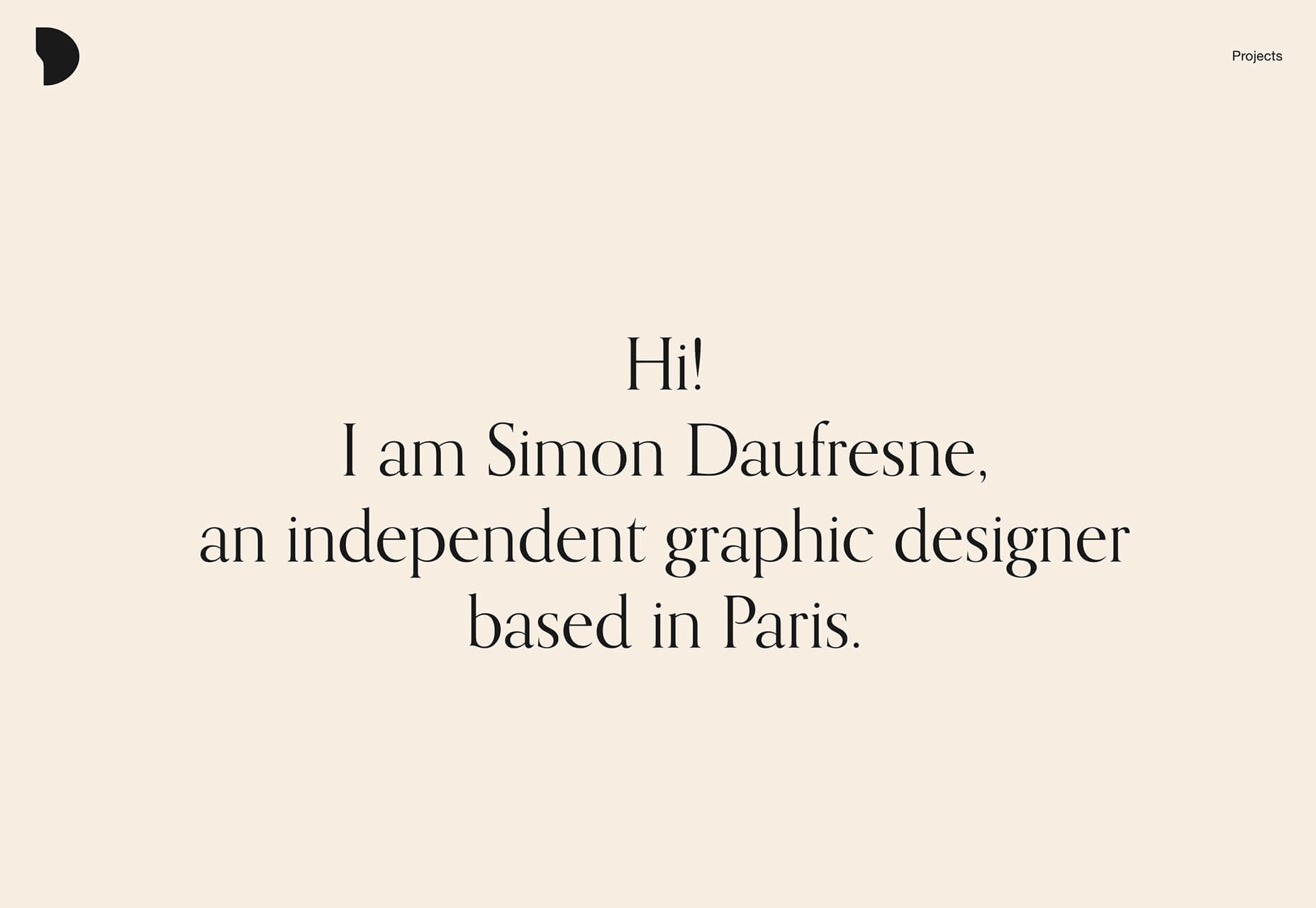
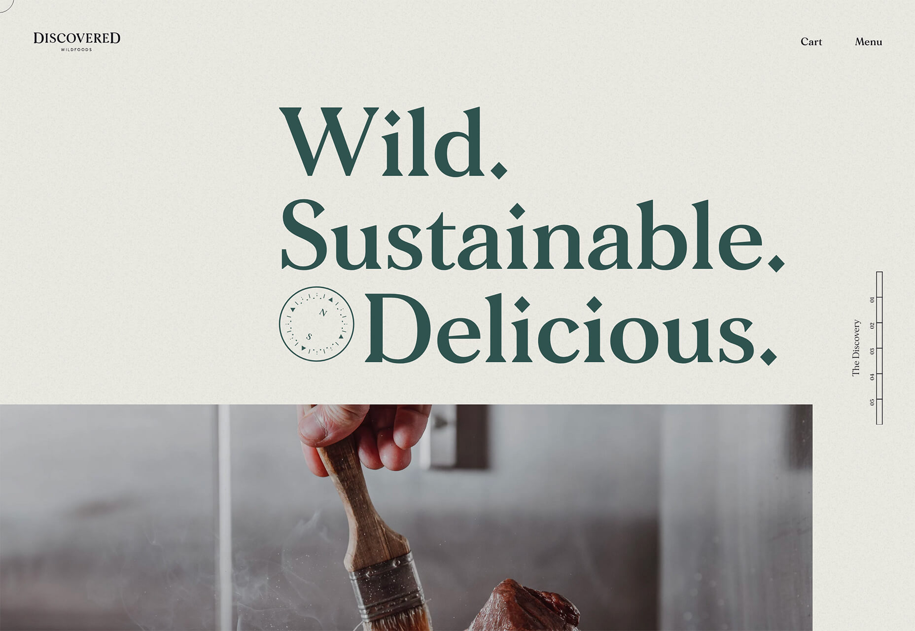
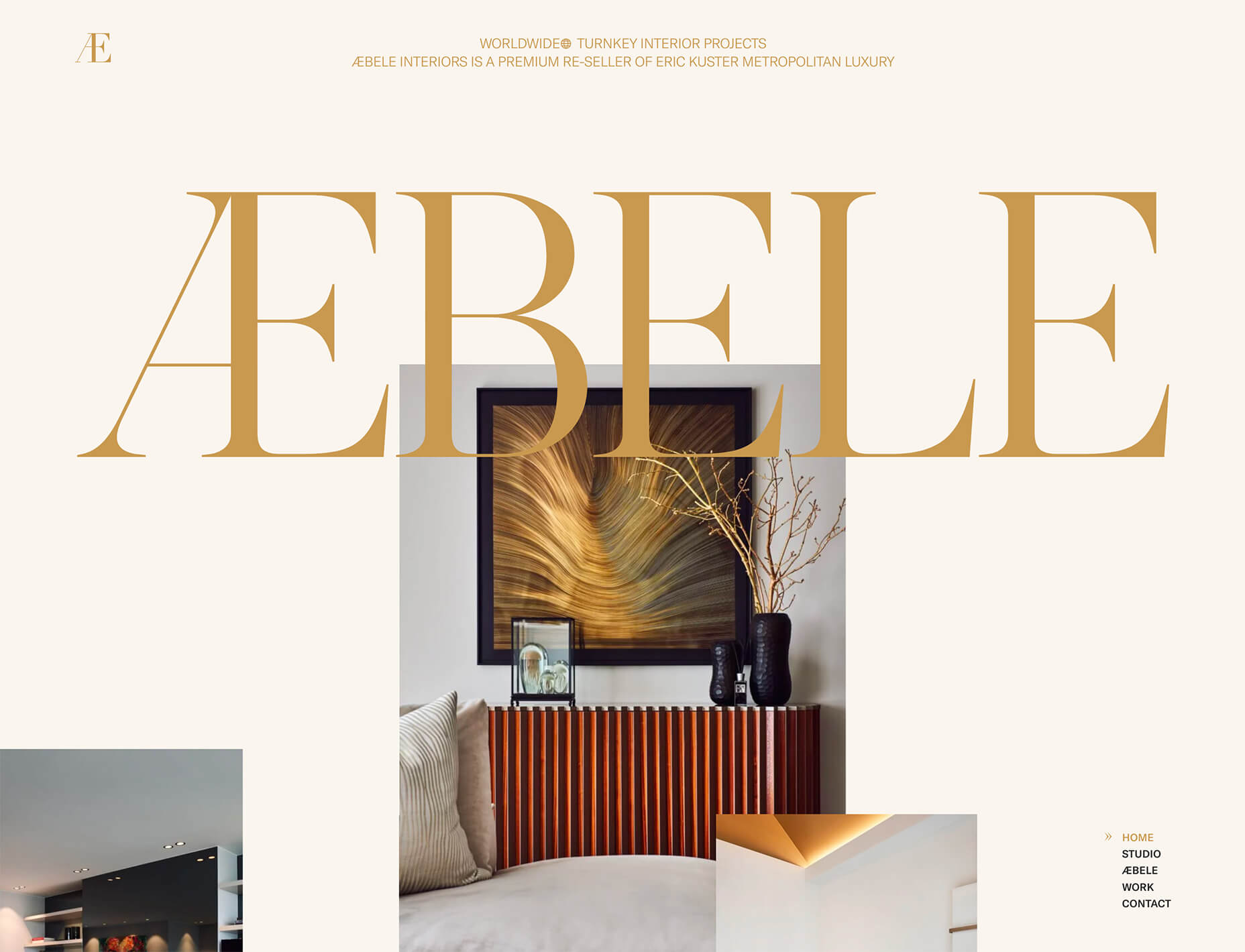
Today, great design isn’t just about conveying the right amount of information in a certain number of pages. 

There’s more to creating the perfect website than experimenting with visuals and sound. Designers need to think carefully about how each element of their site impacts the overall user experience. 

After all, with billions of websites available to explore, it takes something truly immersive to convince your client’s audience that they should stay on their pages. The more convenient and attractive your websites are, the more likely it is that visitors will want to stick around. 

Minimalism, one of the more popular styles of web design from the last few years, can sometimes assist designers in making attractive and effective websites more functional.

The less clutter and confusion there is on a page, the easier it is to navigate. 

So, how do you embrace the benefits of functional minimalism?

Understanding Functional Minimalism

Many webs designers are convinced that minimalism is all about aesthetics. 

They see a website like Hugeinc.com and assume that the minimalist appearance is all about making the website as attractive as possible.

However, the underlying ideas of minimalism in web design go much deeper than this.  The history of minimalist design begins with Japanese culture. Japan has long focused on balancing simplicity and beauty with its architecture, interior design, and even graphic design. In the Western world, minimalism got its day in the sun in the web design environment, after customers endured years of cluttered and complicated web pages with difficult navigation, overwhelming information and clashing graphics. 

Designers began to experiment with the idea that less really could be more — particularly when it came to the digital landscape. 

The Functional Rules of Minimalist Web Design

For a while, minimalism was the most popular style for a website. During 2018, in particular, minimalist web design soared to the top of the designer demand list, as companies fell in love with a combination of white space, simple navigation and bold text. 

While now, there are other design trends stepping into the industry, designers can still benefit from exploring some of the essential rules of functional minimalism. After all, visual complexity has been proven to damage a person’s perception of a website

Additionally, a study conducted by the EyeQuant group found that a clean and simple design can lead to a lower bounce rate. Minimalism gives viewers less to contend with on a page, which can allow for a simpler and more straightforward experience. Additionally, a clean website can also drive additional benefits, including faster loading times, better responsivity between screen sizes and more.

Because you’re only using a few images and well-spaced text, you can even experiment with different strategies, like graphics and dynamic fonts. Look at the Manuel Rueda website, for instance, it’s a great example of how a minimalist design can be brimming with activity.

So, how can any designer use the principles of functional minimalism?

1. Focus on the Essentials

First, just like when designing a landing page, designers need to ensure that they’re concentrating only on the elements in the page that really need to be there.

This means removing anything on the website that doesn’t support the end-goals of the specific page that the viewer is using. Any pictures, background noise, buttons, or even navigation features that aren’t going to support the initial experience that the visitor needs, must go. 

Think about what’s going to distract your visitors from the things that are important and concentrate on giving everything a purpose. For instance, the Plus63.org website instantly introduces the visitors to the purpose of the website, then allows users to scroll down to get more information. The data is spread clearly through the home page, pulling the viewer into a story. 

2. Embrace the Positives of Negative Space

Negative space is one of the fundamental components of good minimalist web design. 

Every part of a good website doesn’t need to be filled with noise to make a difference. White, or negative space can help to give your viewer the room they need to fully understand the experience that they’re getting. 

From a functional perspective, it’s the difference between placing someone in an overflowing storage container and asking them to find what they need or placing them in a room where items are carefully spaced out, labelled, and waiting for discovery. 

The Hatchinc.co website uses negative space to ensure that information is easy to consume. You can find the different pages of the site easily, the social media buttons, and the newsletter subscription tool. Plus, you get a chance to see some of the work behind the site.

3. Make it Obvious

One of the biggest problems that consumers have encountered in recent years, is the concept of “choice overload”. 

Whether you’re in a store, or on a website, you’re never sure what to do first. Do you check out the blog posts on the site to learn more about the authority of the company? Do you visit the “About” page, to see where the brand come from? Do you head to their product pages?

As a designer, functional minimalism can help you to make it obvious what your audience should do next. As soon as you arrive on the AYR.com website, you’re not overwhelmed with choice. You can either head to your bag, “shop now”, or check the menu. 

Since the “Shop Now” CTA is the biggest and most compelling, the chances are that most visitors will click that first, increasing the company’s chance of conversions. 

4. Simplify the Navigation (But Don’t Hide It)

The AYR.com example above brings us to another concept of functional minimalism. 

While minimalism and simplicity aren’t always the same thing, they should go hand-in-hand. When you’re designing for functional minimalism, you should be concentrating on helping visitors to accomplish tasks as quickly and easily as possible, without distraction. 

That means that rather than overwhelming your audience with a huge selection of pages that they can visit at the top or side of the screen, it may be worth looking into simpler navigation options. A single menu icon that expands into a full list of items remains a popular design choice – particularly in the era of mobile web design. 

For instance, look at the simple menu on newvision-opticien.com.

With this basic approach, designers can ensure that visitors are more likely to click through to the pages that their clients want their customers to visit. They can still find what they need in the menu, but it’s not taking up space on the page, or distracting them. 

5. Set Great Expectations with the Top of the Screen

Functional minimalism can also help today’s designers to more quickly capture the attention of their visitors from the moment they click into a website. 

The content that’s visible at the top of the page for your visitors is what will encourage them to take the next step in their online experience. Make sure that you’re providing something that keeps your audience interested and gives them the information they need. 

That way, you’ll lower the risk of high bounce rates for your clients, while also taking advantage of minimalism’s ability to deliver quick access to information for your audience. 

At the top of the page, the Kerem.co website instantly introduces the visitor into what the website is all about, and what they should do next. 

You can even deliver more information in one chunk at the top of the page, without cluttering the environment, by using good UI animation. 

Consider implementing a slideshow of pictures that flip from one image to the next, or a font section that dynamically changes as your audience has chance to read each sentence. 

6. Use Functional Minimalism in the Right Spaces

Remember, functional minimalism isn’t just for home pages. 

Depending on what you want to accomplish for your client, you could also embed the components of minimalism into landing pages, portfolios, and squeeze pages too. 

After all, when there’s less clutter and confusion on a page to distract a potential audience, there’s a greater chance that your visitors will scroll to the bottom of the page and complete a conversion. For instance, look at how simple and attractive the Muzzleapp.com landing page is.

The page provides useful information and tells customers exactly what they need to do next. There’s no confusion, no complexity, and nothing to hold visitors back. 

Just be careful. While functional minimalism can be very useful, it won’t be right for every website. A lack of elements can be harmful to websites that rely heavily on content. That’s because low information density will force your user to scroll excessively for the content that they need. Using functional minimalism correctly requires a careful evaluation of where this technique will be the most suitable. 

Minimalism Can be Functional

A minimalist design isn’t just an aesthetic choice. The right aspects of minimalism can simplify interfaces on the web by eliminating unnecessary elements and reducing content that doesn’t support an end goal. 

The key is to ensure that you’re focusing on a combination of aesthetics and usability when creating the right design. An easy-to-navigate and beautiful website can be a powerful tool for any business.  

Source


Source de l’article sur Webdesignerdepot

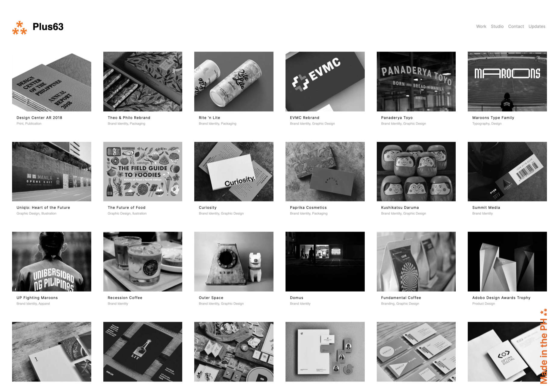
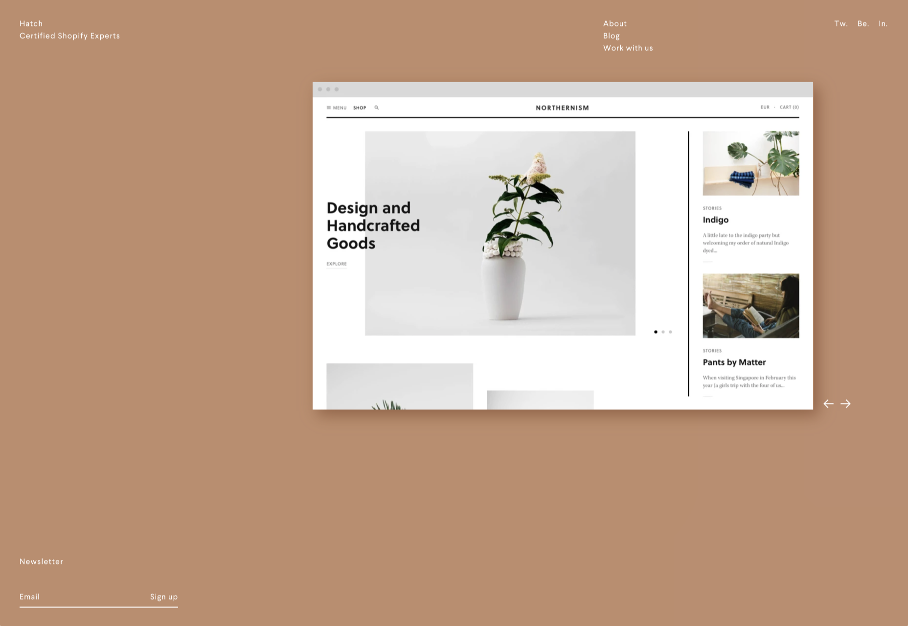
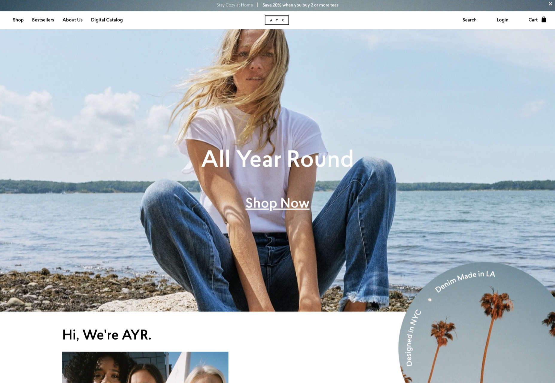
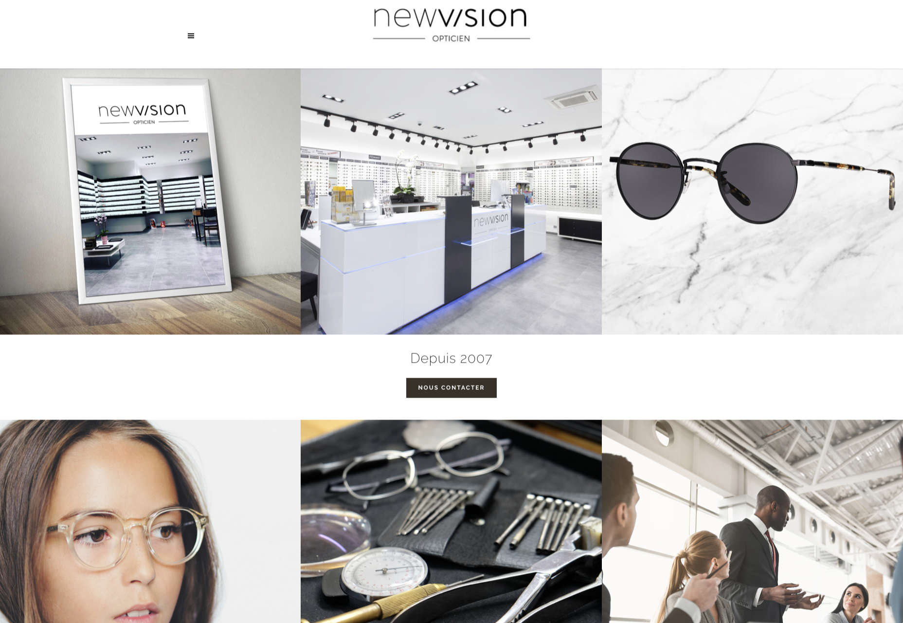
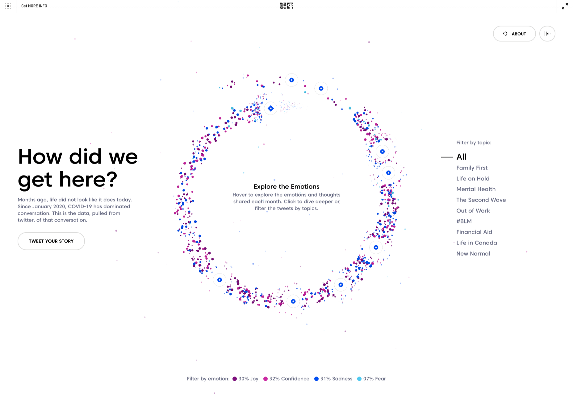
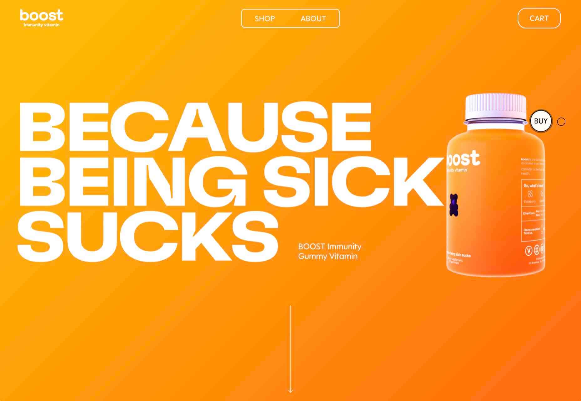
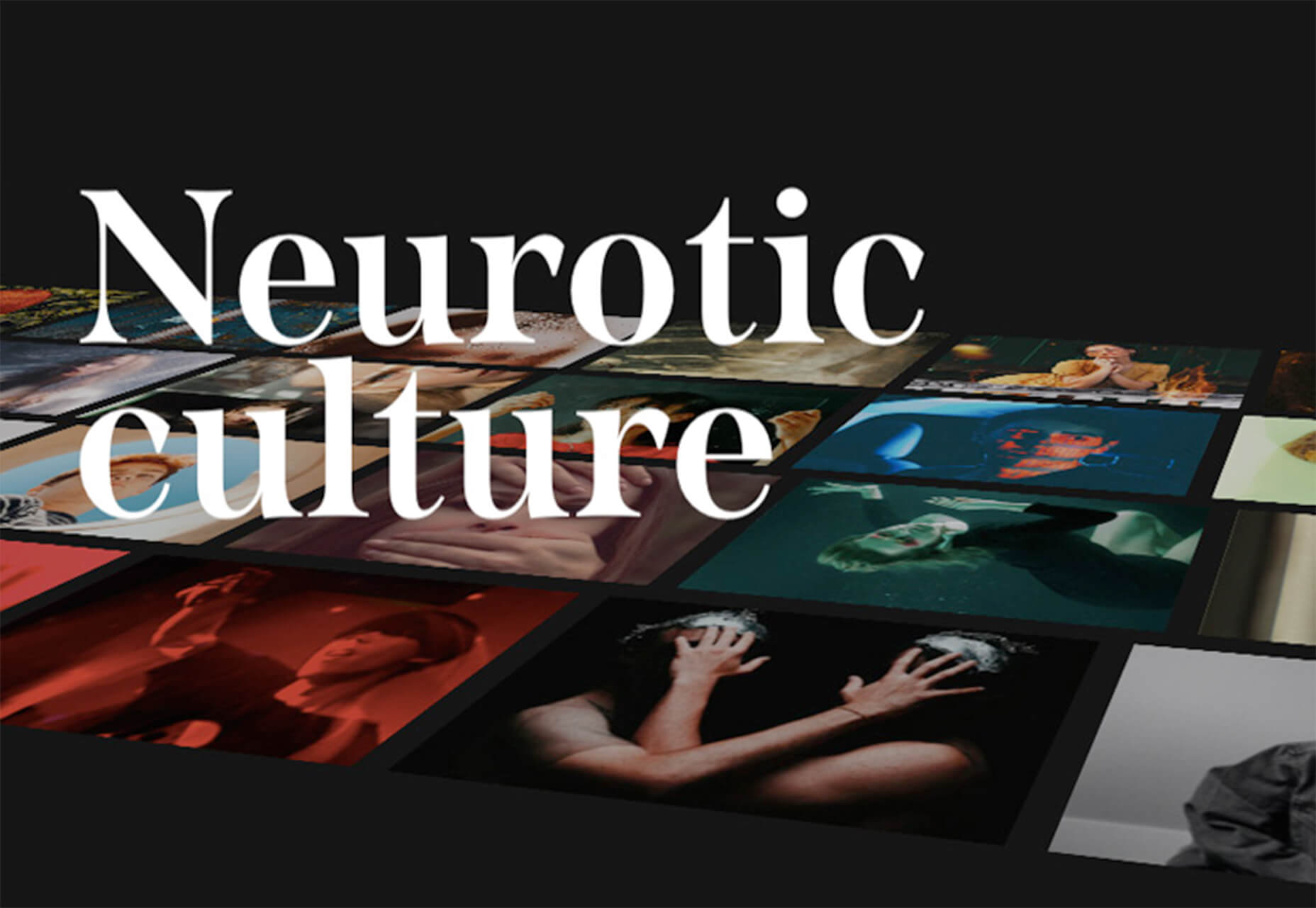
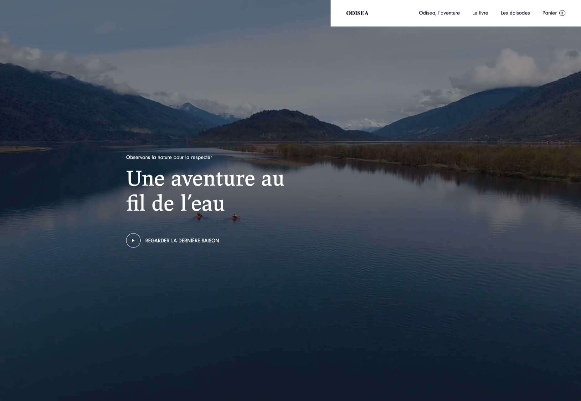
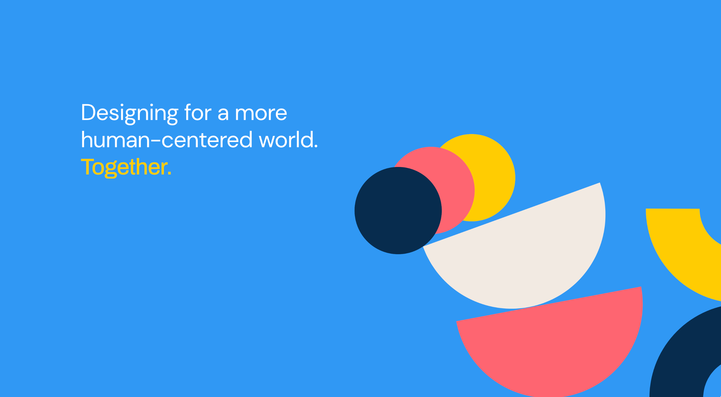
Design can make a statement. It evokes feeling and can encourage thought and conversation. That’s the common theme among the three trends in website design this month.
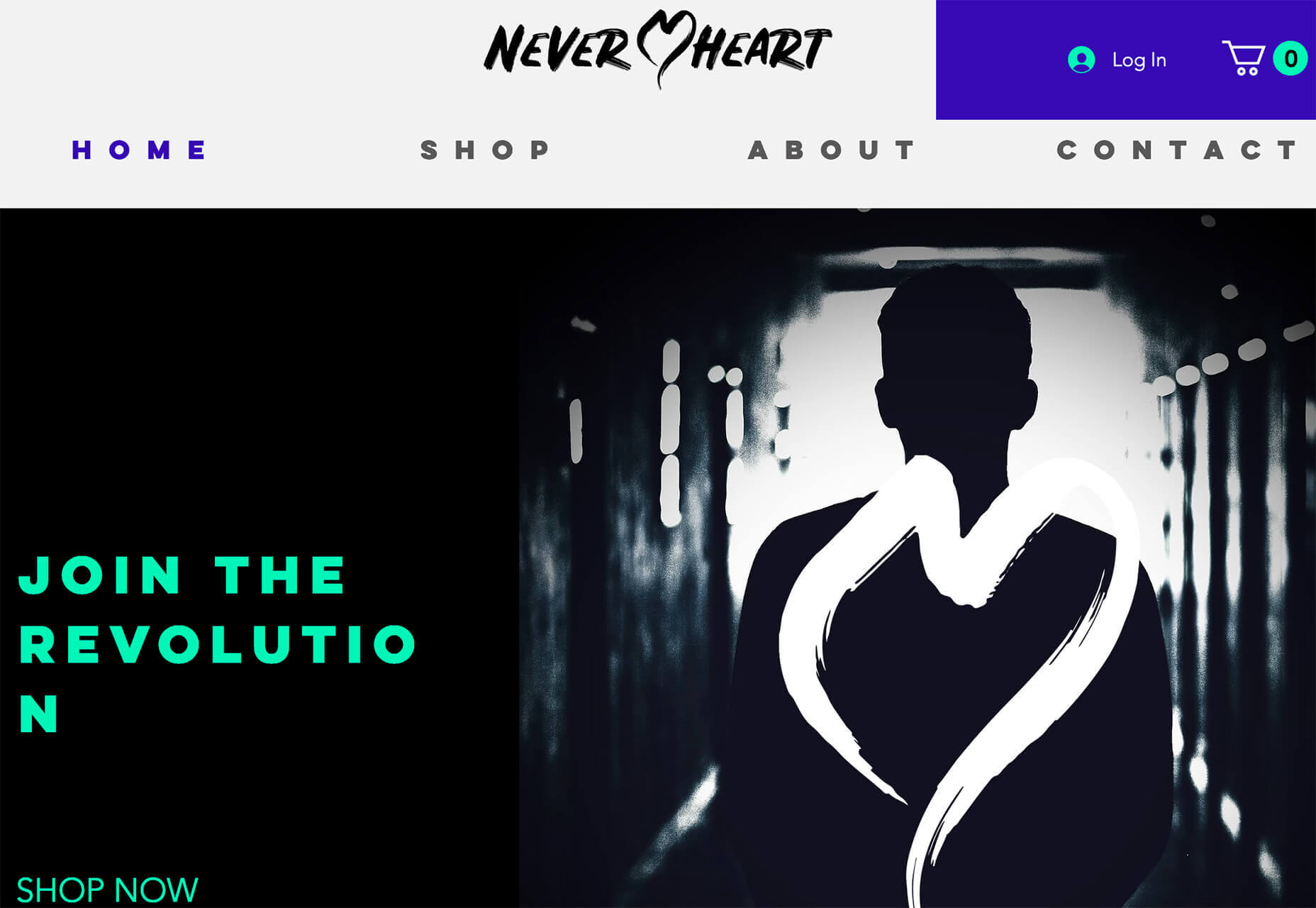
Each trend is rooted on the time and place where we live and includes elements that provoke thought. Kudos to these designers and design teams for jumpstarting conversations. Here’s what’s trending in design this month.

1. “Taking a Stance” Design

From social to environmental issues, design projects are echoing the sentiments of their audiences and organization in a way that take a stance on an issue.

Once taboo, this is becoming increasingly used as a technique for brands who are no longer worried about turning off a certain segment. The goal is to rally the core audience and people who feel the same way about an issue or cause.

There’s also a secondary thing happening here. Some designs aren’t really position based, but use imagery and language that resonates with a movement to associate with that feeling.

Never Heart uses “Join the Revolution” and a dark image with a heart to tug at your feelings. It can help create an association to a cause that you believe in without stating that cause directly. The design feels strong and inviting while making you feel like part of something.

Skye High uses “powerful” twice in the headline to convey a particular messages to women. The agency is looking to work with “powerful” women. It’s a timely statement and message that could resonate with a lot of business-women at various levels of their careers.

Discovered Wildfoods is a brand that is rooted in sustainability. The corporate model and responsibility of the brand shows through in the website. This type of design helps connect people with mutual feelings to the brand and products.

It’s refreshing to see more websites and brands embracing social causes and issues. It can be tricky for a number of reasons. But for some brands, it pays off.

2. Abstract Art Elements

If you are worried about a lack of images, or not sure how to portray images in an appropriate way due to the worldwide pandemic – groups or not, masked or not – abstract art elements can be the solution.

Widely used for startups and apps, more abstract design elements are everywhere. It’s an easy way to create strong visual interest without photography.

The most common use of abstract art elements is often in the form of geometric shapes with animation. This is something that almost anyone can understand and simple shapes and movement can be quite stunning when done well.

The good news is this aesthetic can work for almost any type of website. Try it for a redesign when you don’t have photography that feels appropriate in the current environment or if you want to create focus for content that drives website visitors to the words or scroll. This works with more abstract concepts when they are simple and help you move quickly from the visual to text.

Here’s how each of the examples handles abstract art elements:

Indicius uses bouncing circles that move toward text and down the screen to drive users to the headline and scroll action.

With Code uses a fun fuzzy circle with different animations to draw you in.

Appimized uses bright color and a monotone scheme with geometric shapes to sell its services.

3. Images That Make You Think

This might be the most visually interesting, and thought-provoking, website design trend we’ve seen in a while. These designs all feature images with a little something different or unusual that make you think.

There are a lot of different ways to do this – marry photographs and illustrations, create imaginary imagery, animations or effects, visual tricks that play on depth perception or create pseudo-3D effects.

The commonality is that the visual is so striking and unusual that website visitors stop and engage with the design. What do the “oddball” visuals mean? What message do they convey? How did they do that?

All of the questions could be associated with this different style of visual representation.

Bling uses a combination of a photo with illustrated animated elements to draw the eye. The yin and yang between reality and fantasy is quickly evident and makes you want to know more. (It doesn’t hurt that the animation uses dollars and lightning.)

Kibun is interesting because the photo choices create an optical illusion of depth. It matches the content of the design well because the website features artistic textile panels with an artistic design. The illusion is in the angles and coloring of photographs and their placements on the screen. The only downside of this design is that it loses the artistic panache on mobile because the images stack.

Oddball images can sell. We Are Mad stands out because it uses a contrived image, but doesn’t go oversized with it. The more subtle placement is ideal and arguably more attention-grabbing.

Conclusion

Website design can be a powerful thing, as these trends and examples show. Don’t discredit the power of choices in color, imagery, animation, and text when creating a digital experience. Design can mean a lot of different things depending on the audience as these examples show.

At the same time, these design trends are powerful and meaningful. They provide context into our world, our time, and our feelings. Don’t be afraid to experiment and make a statement with your design work. Just remember to keep in mind all potential impacts (positive and negative) before taking the project live.

Source


Source de l’article sur Webdesignerdepot