
 You have been looking for a theme for your website. You haven’t yet settled on all the design details or come across a specialty theme that appears to have what you might need. Then, a multipurpose theme would be a wise choice.
Multipurpose WordPress themes have become extremely popular because of the flexibility they offer. Also, because of their relative ease of use and the powerful tools, you will usually find built into them.
With a good multipurpose theme at your fingertips, you are usually in a position to build anything. You can build a simple personal blogging site or a complex multifunctional site for a client. To make life a little easier, most multipurpose WordPress themes have features to help you get started quickly and in the right direction.
Here is a superb collection of 7 of the top multipurpose WordPress themes on the market today. These themes can help you build virtually any kind of website.
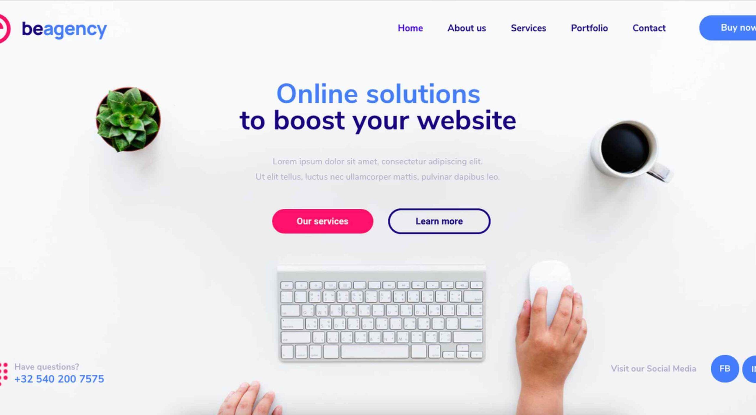
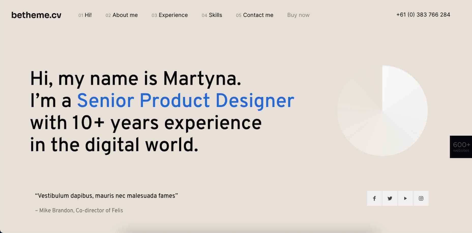
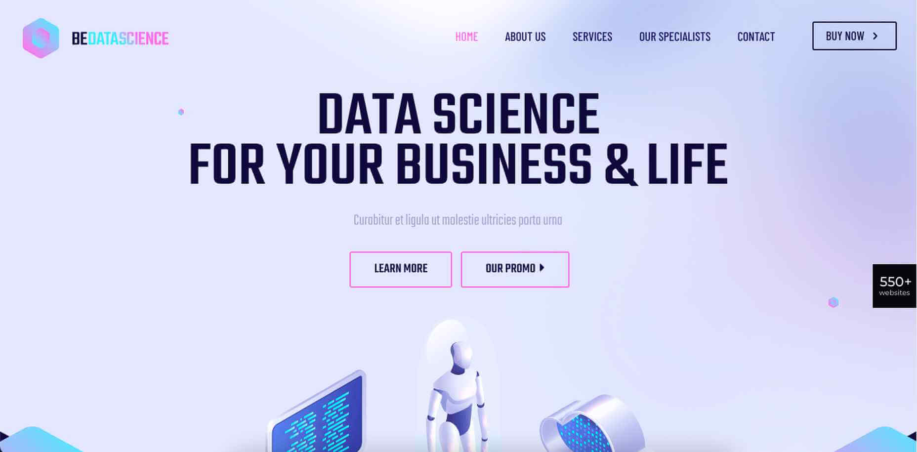
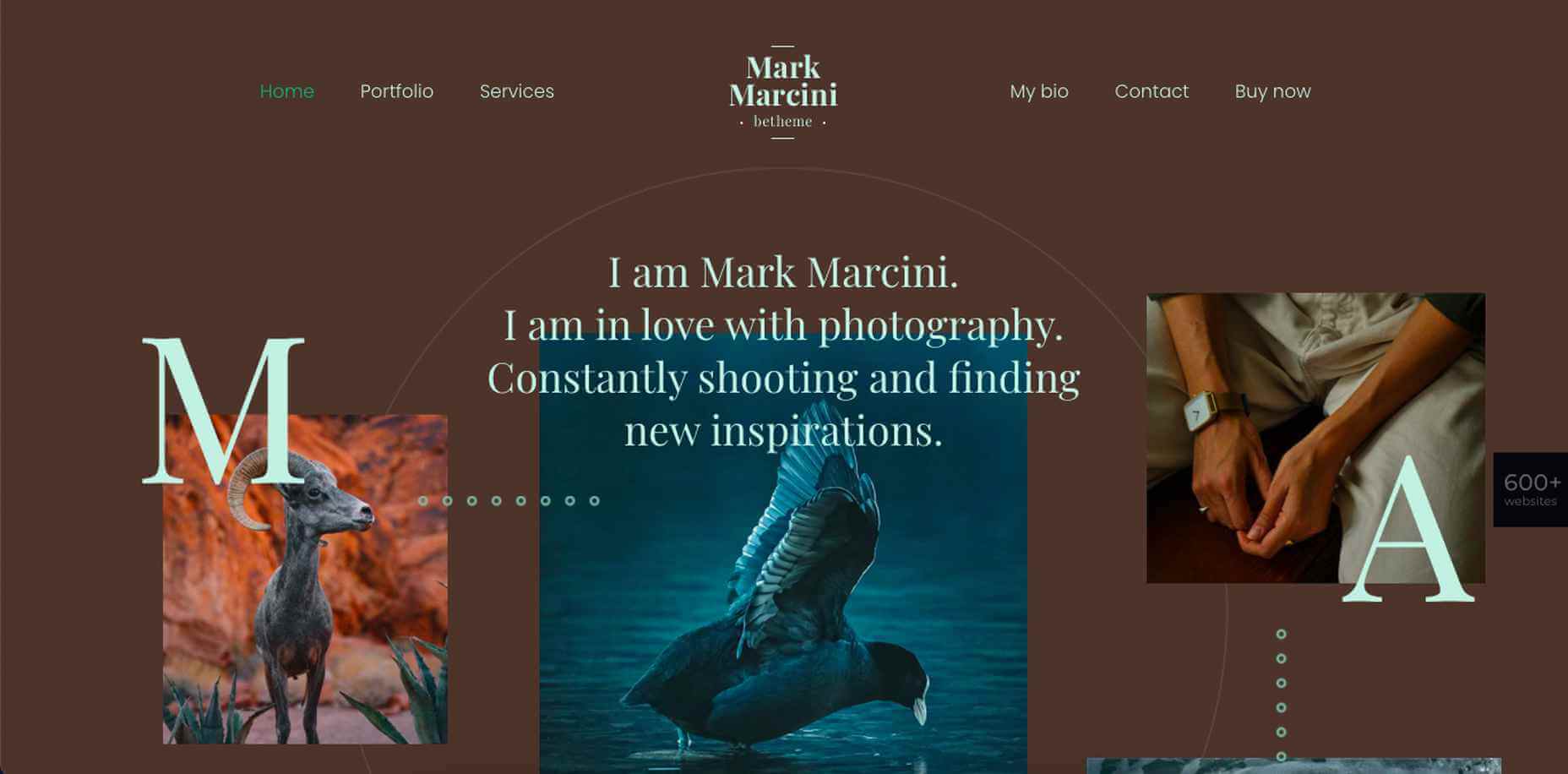
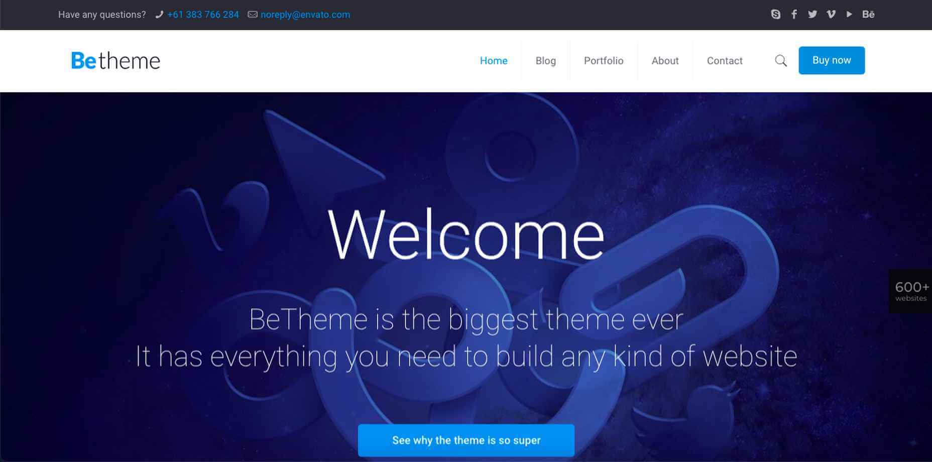
1. Betheme – Website Builder for WordPress with 600+ Pre-Built Websites
BeTheme has long been one of the most popular multipurpose WordPress themes. Not content to rest on their laurels, BeTheme’s authors took suggestions from their customers and created a better builder.
The Live Builder is 60% faster. Its UI is so intuitive that you won’t waste time learning how to use it. It features exciting new and powerful capabilities and performs familiar page-building features better than ever.
With the Live Builder, you can –
- Edit live content visually without switching between backend and frontend; you can view an element and customize it simultaneously.
- Use the Revisions feature to create, save, and restore what you want; no more lost changes thanks to the Autosave, Update, Revision, and Backup options.
- Access the Pre-built Sections Library: find the section or block you need and add it to your page.
- Select from the large and diverse selection of Items; categories include typography, boxes, blocks, design elements, loops, etc., to help you create exactly what you have in mind.
Click on the banner to learn more.

2. Total WordPress Theme
The introduction emphasized the ease of use and flexibility most multipurpose themes provide. Total has both in abundance thanks to its drag and drop frontend page builder and hundreds of built-in styling options.
Highlights include –
- An advanced version of the WPBakery page builder.
- 40+ single click importable demos, 100+ page-building modules, and 500+ styling settings to help you create exactly what you want.
- Dynamic Template and Pre-styled Theme Cards to tailor dynamic templates for your posts.
- Templatera and Slider Revolution plugins plus full WooCommerce compatibility.
- A selection of developer-friendly hooks, filters, and snippets for future theme customization.
Even though Total was designed with perfection in mind, or perhaps because of it, it is the right choice if you need to get a high-quality website up and running in a short period of time. Total’s 47,000+ customers seem to agree.
Click on the banner to learn more.

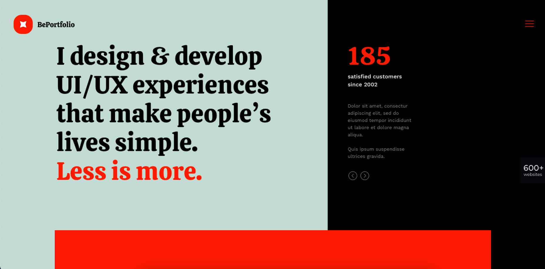
3. Avada Theme
The fact that Avada is the all-time best-selling WordPress theme with more than 450,000 sales to date might be all the reason you need to choose it, but there are plenty of other good reasons for doing so as well.
For example –
- Avada’s drag and drop page builder, together with the Fusion Page and Fusion Theme options, makes building a website quick and easy.
- Single-click import demos, stylish design elements, and pre-built websites are there to help speed up your project’s workflow and impart a high level of quality to the finished product.
- Avada’s Dashboard organizes your work, and its Dynamic Content System gives you maximum flexibility and full control over your project.
Click on the banner to find out more about this fast, responsive, and WooCommerce-compatible theme.

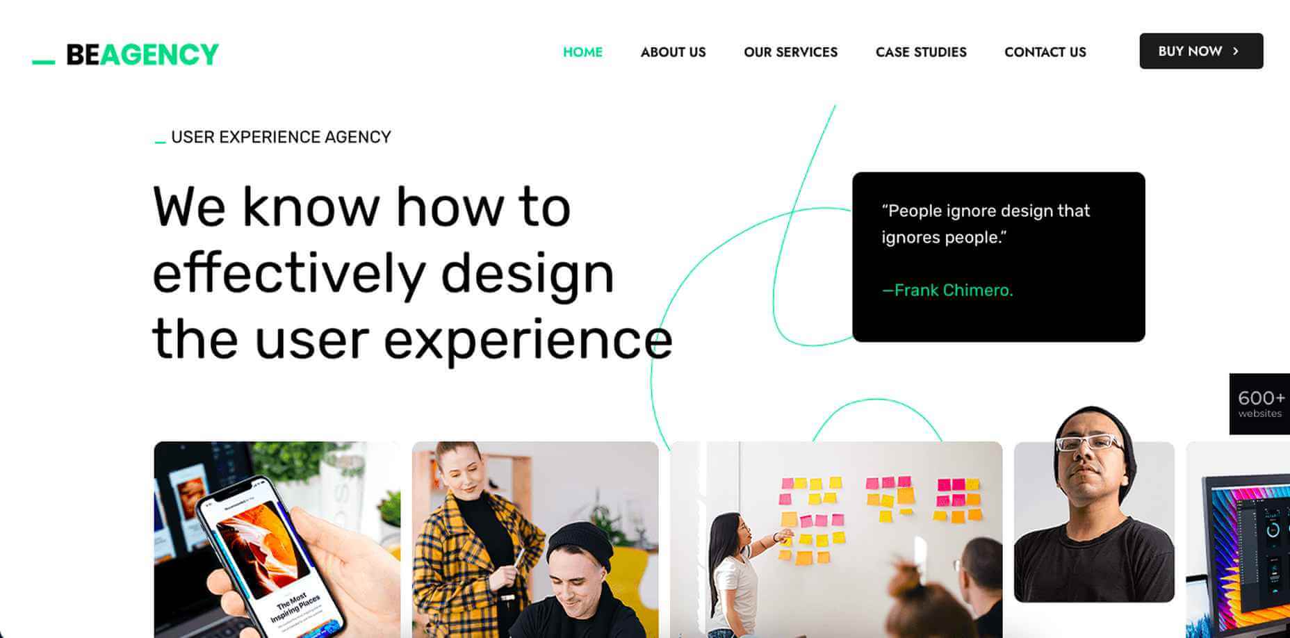
4. Uncode – Creative Multiuse & WooCommerce WordPress Theme
Uncode will be an ideal choice for building creative, magazine, and blogging websites and for building agency sites as well. This fast, sleek, pixel-perfect multipurpose theme has sold more than 80,000 copies to date.
Uncode’s impressive features include –
- More than 450 Wireframe section templates that can easily be modified and combined.
- A Frontend Editor on steroids coupled with the WooCommerce custom builder.
- A “must-see” gallery of user-created websites.

5. TheGem – Creative Multi-Purpose High-Performance WordPress Theme
TheGem is literally a Swiss Army knife of website building tools that make it ideal for creating business, portfolio, shop, and magazine websites.
Among the many gems included in the package are these –
- The popular and industry-leading WPBakery and Elementor front-end page builders.
- 400+ beautiful pre-built websites and templates together with 300+ pre-designed section templates.
- A splendid collection of WooCommerce templates for shop-building projects.

6. Impeka – Creative Multipurpose WordPress Theme
With Impeka, flexibility is almost an understatement. This intuitive, easy-to-work-with multipurpose theme gives beginners and advanced users alike complete freedom to dream up their ideal website and then make it happen – and fast.
You can –
- Choose among the Enhanced WPBakery, Elementor, and Gutenberg page builders.
- Select from 50 handcrafted design elements and Impeka’s 10 custom blocks.
Impeka is perfect for building every website type, from blogging and online stores to commercial businesses and corporations.

7. Blocksy – Gutenberg WordPress Theme
Blocksy is a blazing fast and lightweight WordPress theme that was built with the Gutenberg editor in mind and is seamlessly integrated with WooCommerce.
- Blocksy is responsive, adaptive, translation ready, and SEO optimized.
- Blocksy plays well with all the popular WordPress page builders, including Elementor, Beaver Builder, and Brizy.
This popular multipurpose WordPress theme can be used to create any type of website in no time.

Of all the design choices a WordPress user needs to make, choosing a WordPress theme for the task at hand is perhaps the most important.
That choice, more often than not, involves a multipurpose theme. Most multipurpose WordPress themes are extremely flexible. So, you can avoid the tedious and time-consuming task of trying to find exactly the right one for your niche and for the job.
Multipurpose themes work for any website niche and offer whatever an admin might need.
Choose one from these 7 Best Multipurpose WordPress Themes, and you should be able to create your website with relative ease.
The post 7 Top Multipurpose WordPress Themes You Should Check Out first appeared on Webdesigner Depot.

 Looking to give your homepage a well-needed design update in late 2021 or 2022? Not a bad idea; first impressions are crucial when it comes to business websites. But, fixing your homepage and website design is no easy feat.


 The dog days of summer are here. From vacations to pool time, you might not be thinking about work that much. But there are still plenty of new tools and resources popping up to help you become a better or more efficient designer.


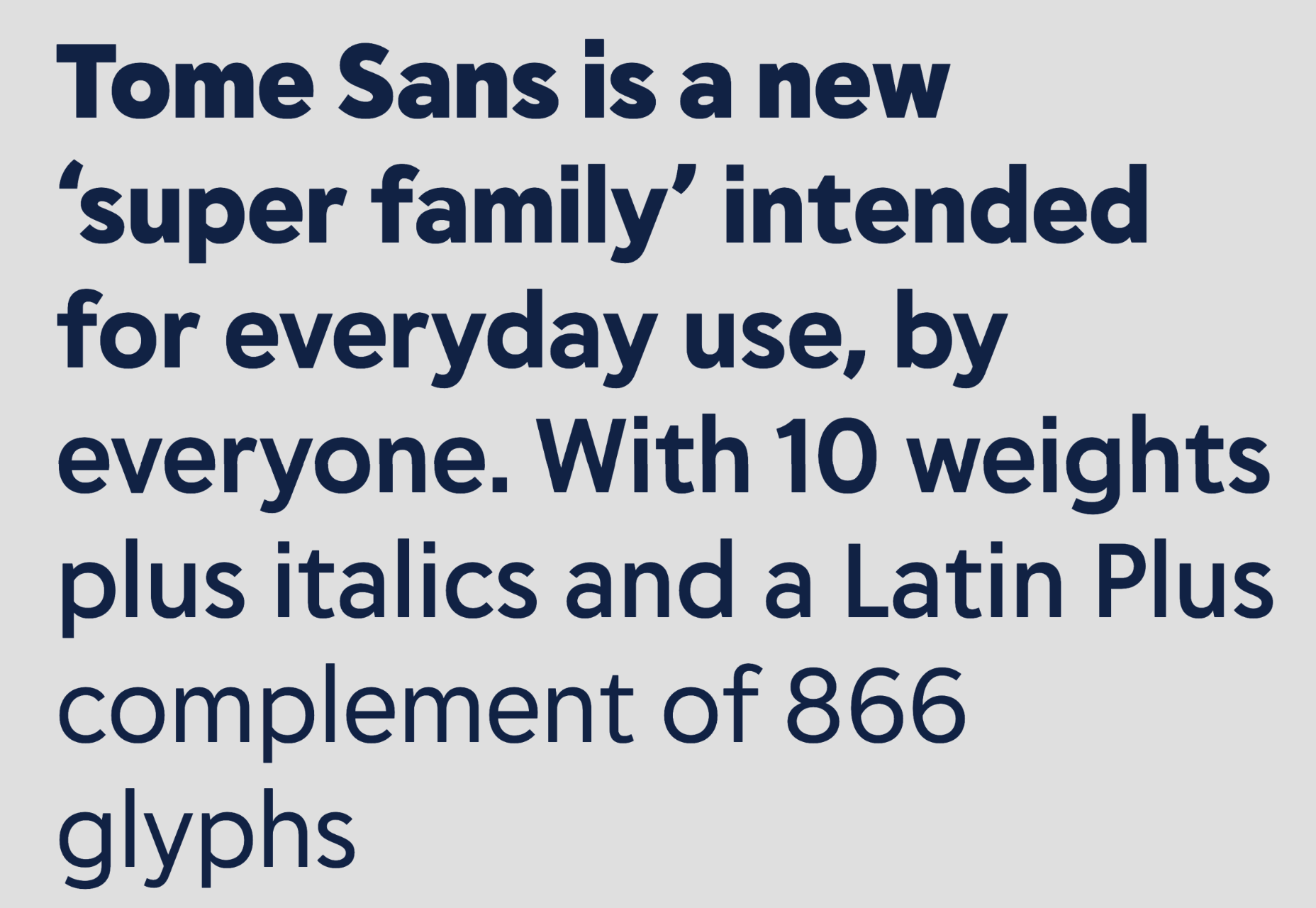
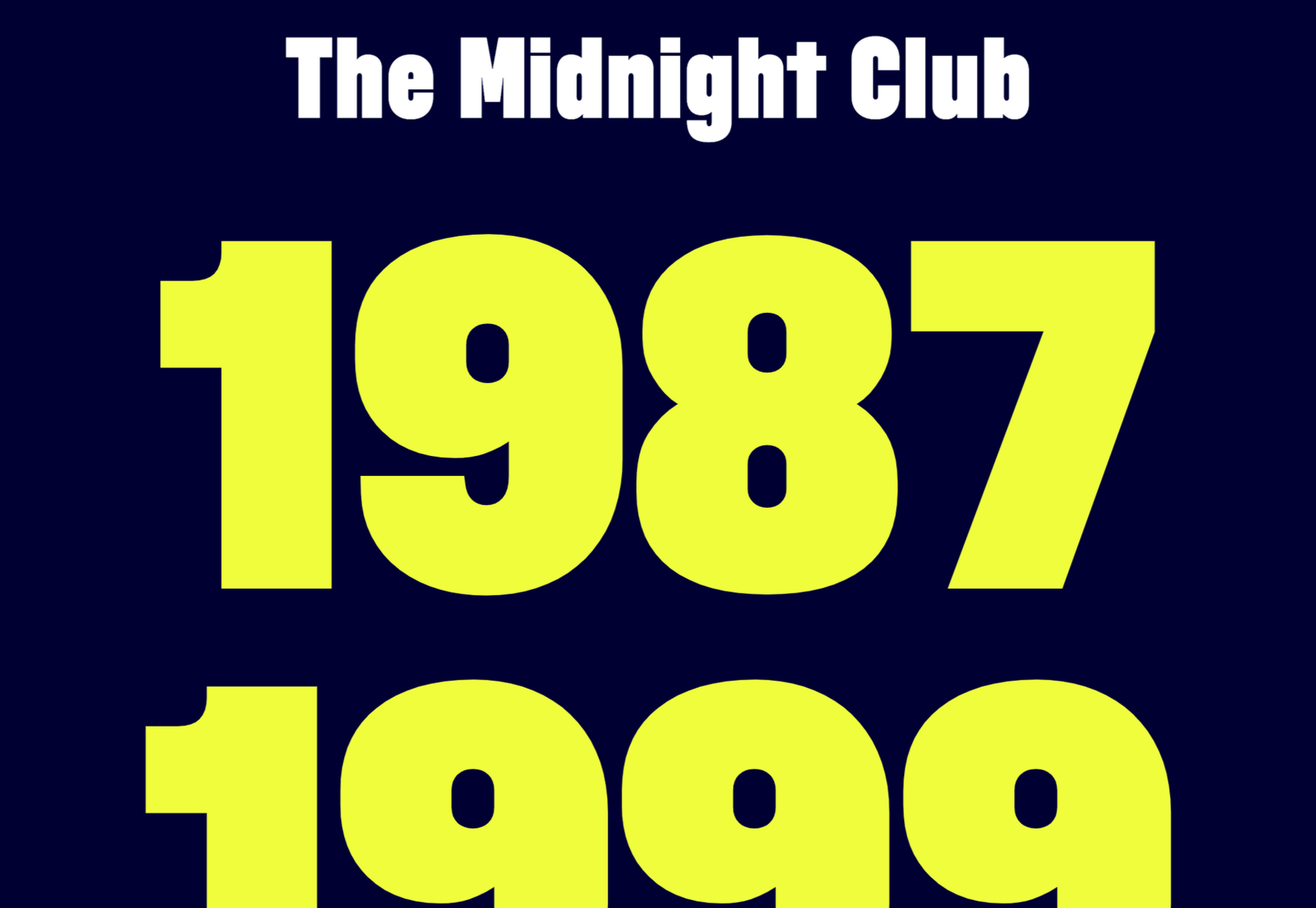
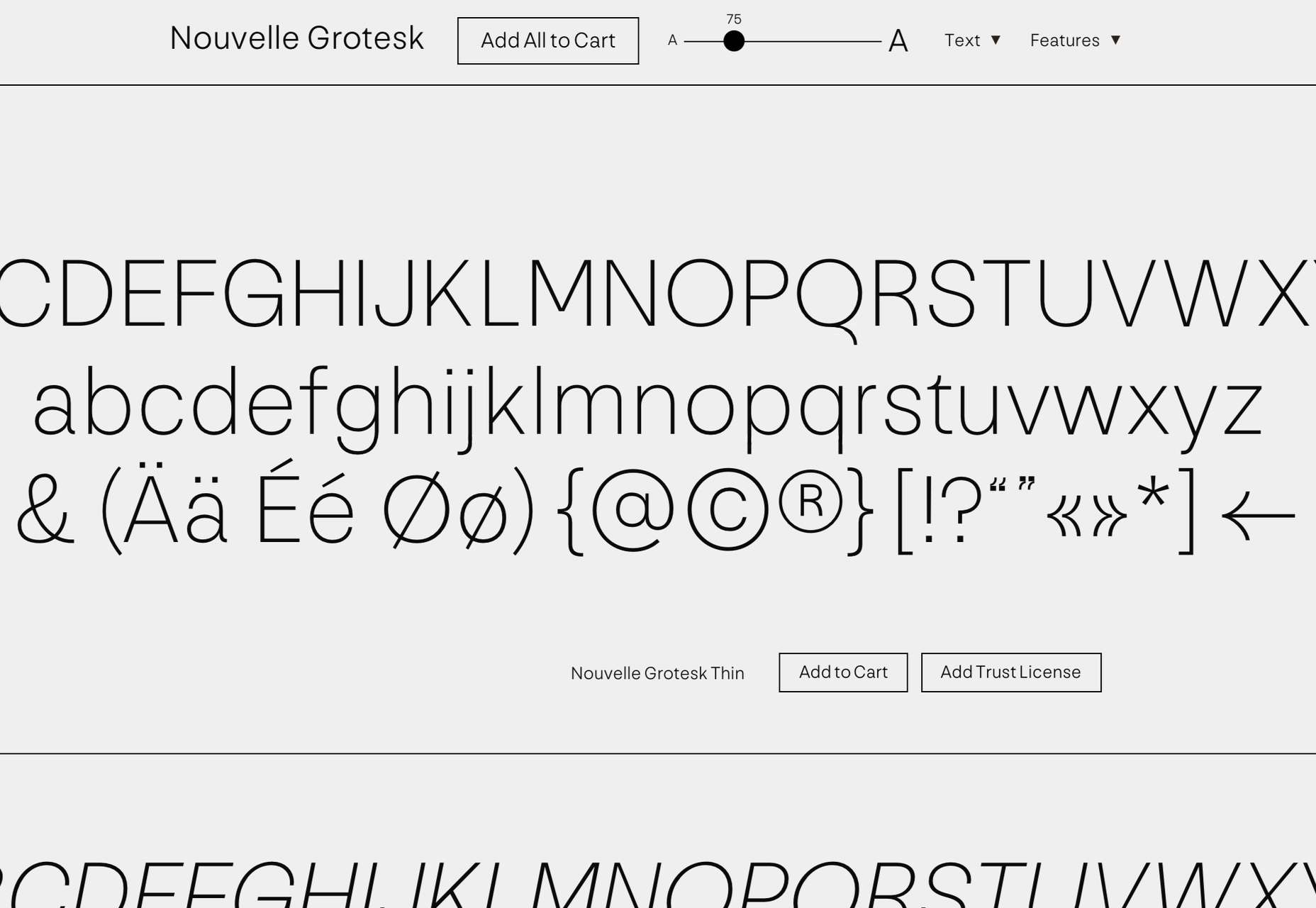
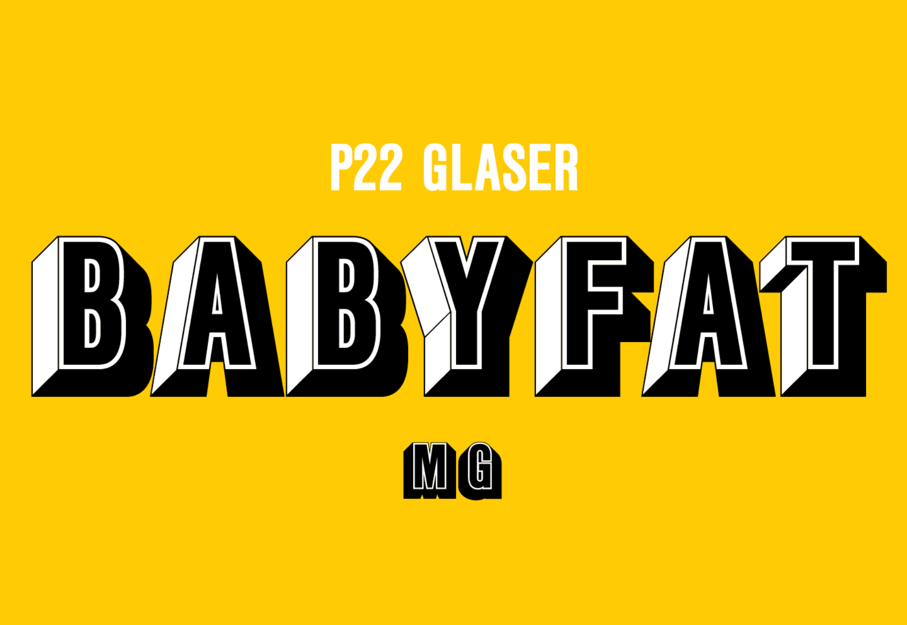
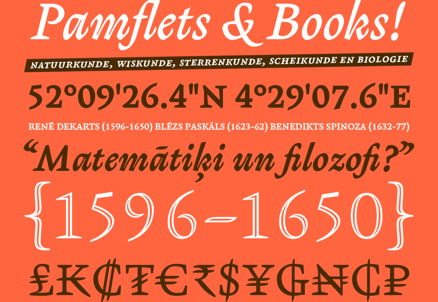
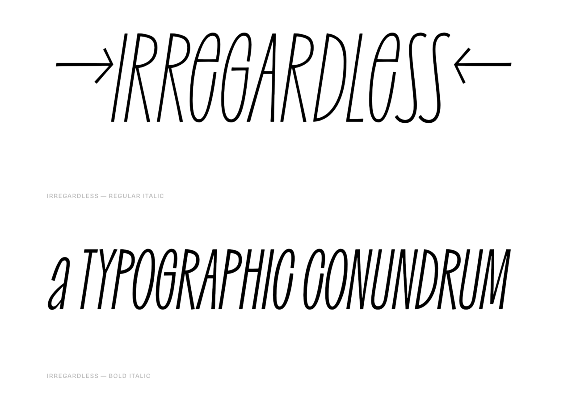
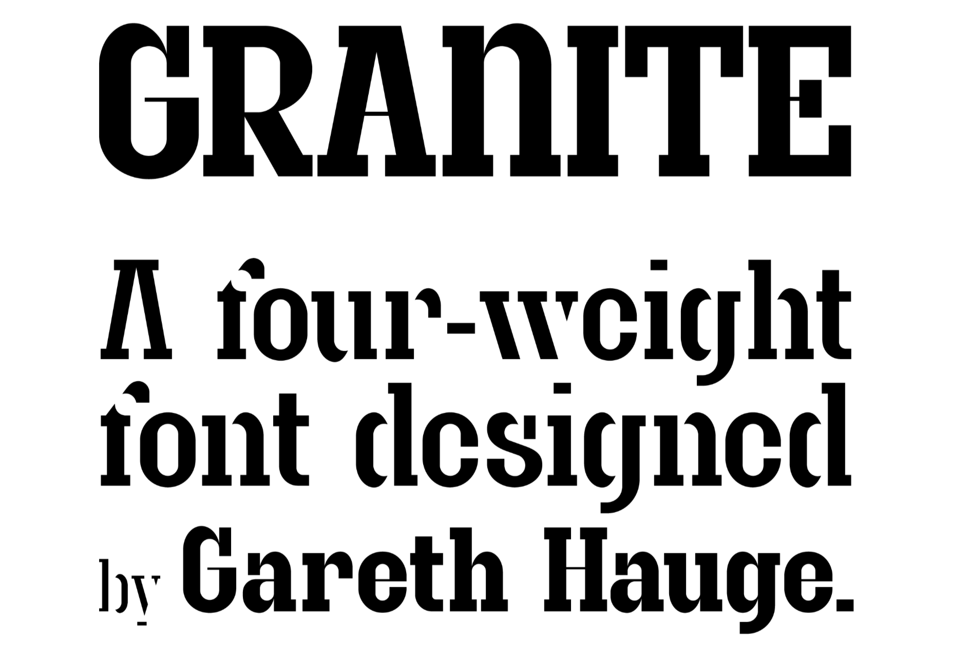
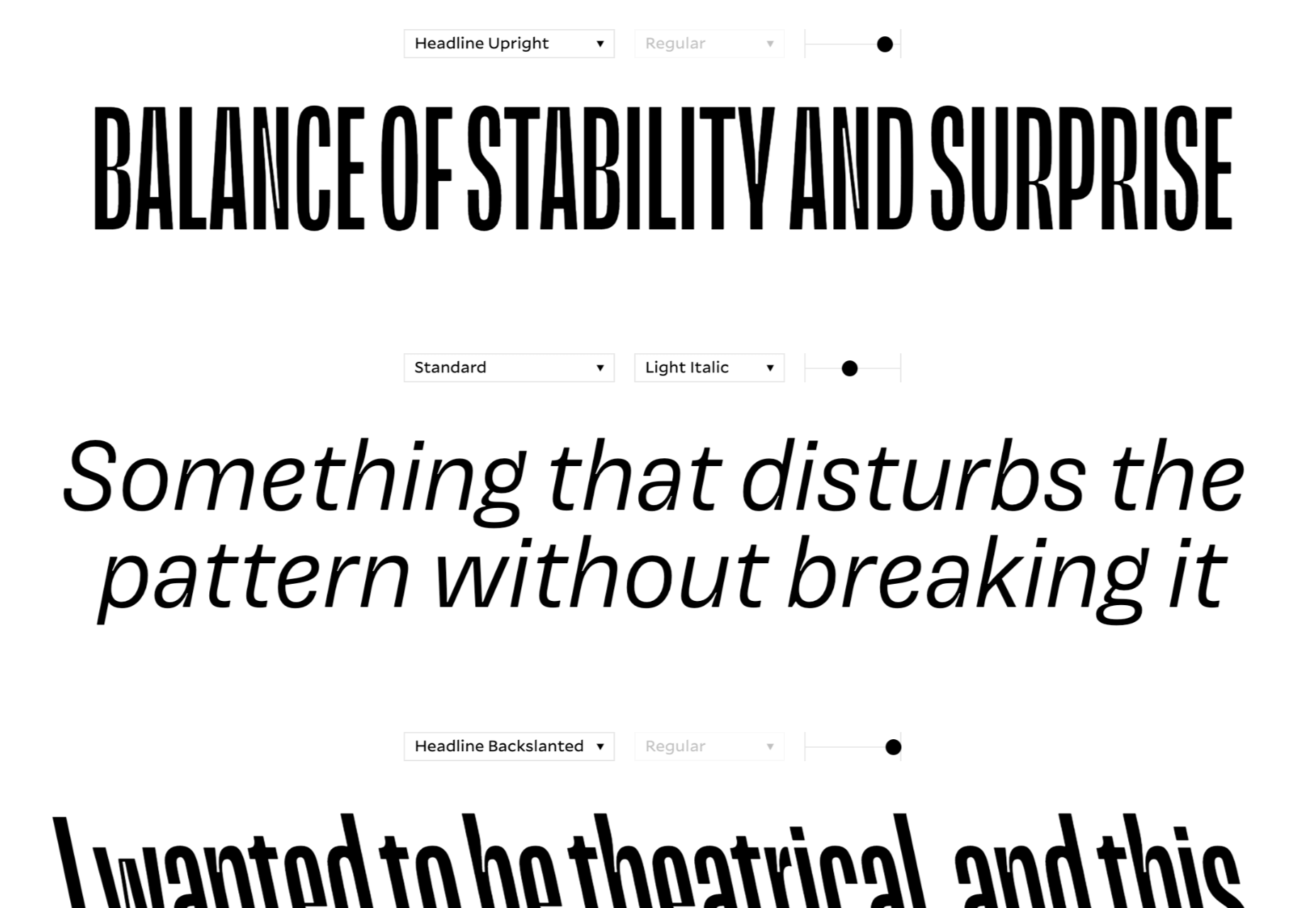
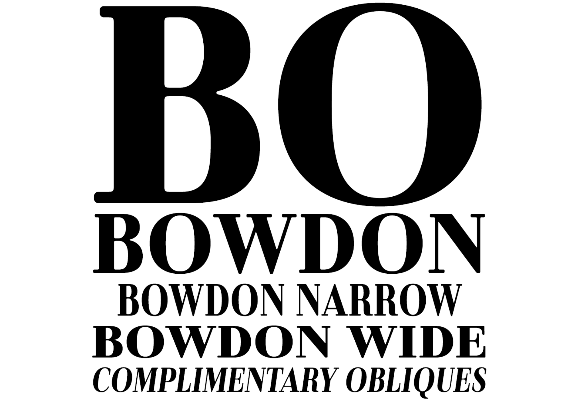
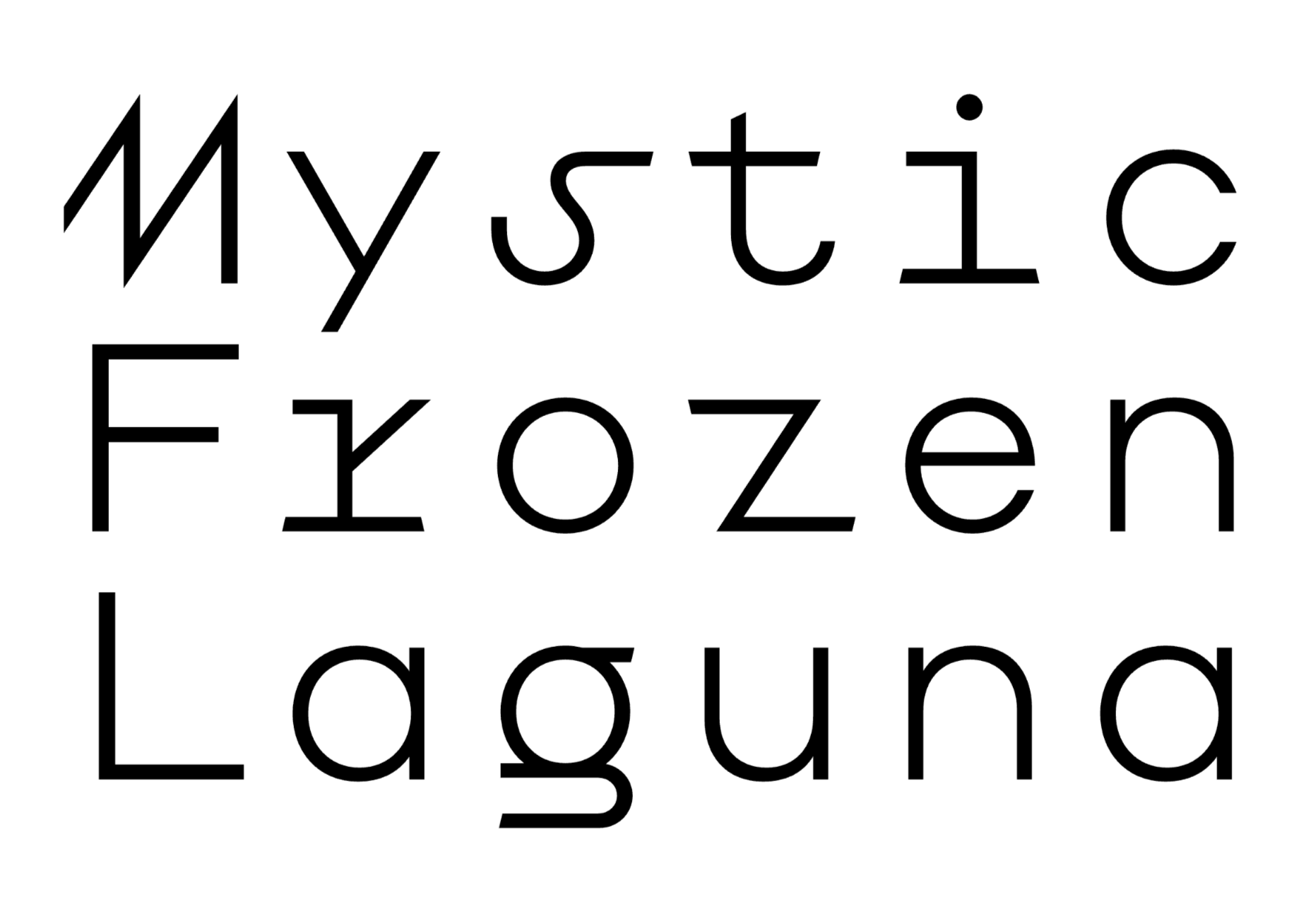
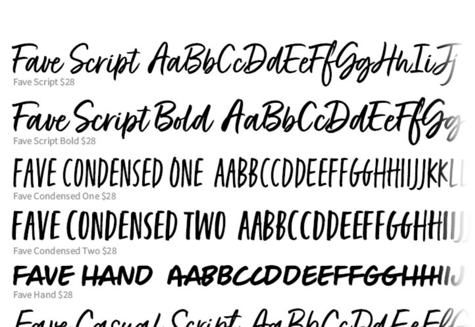
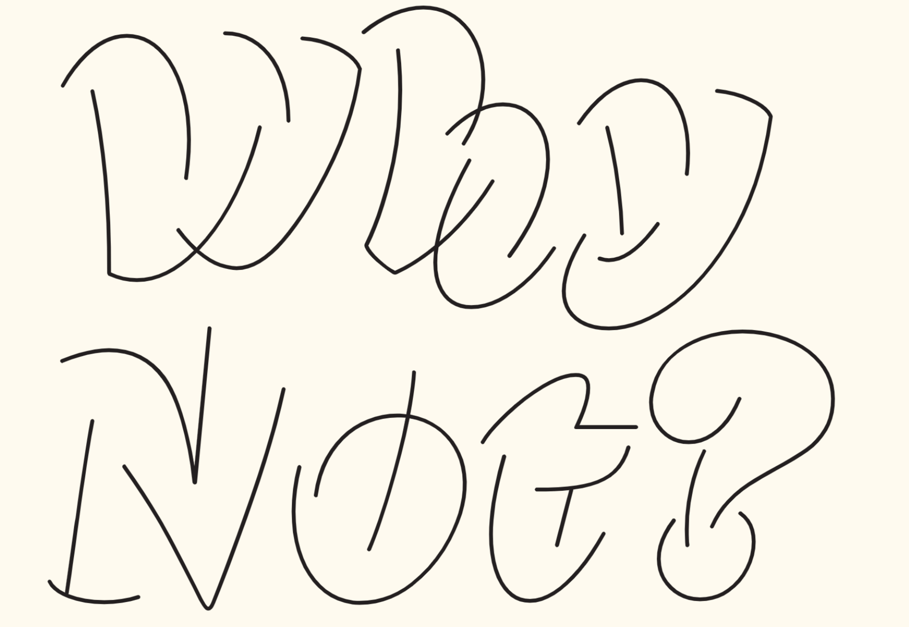
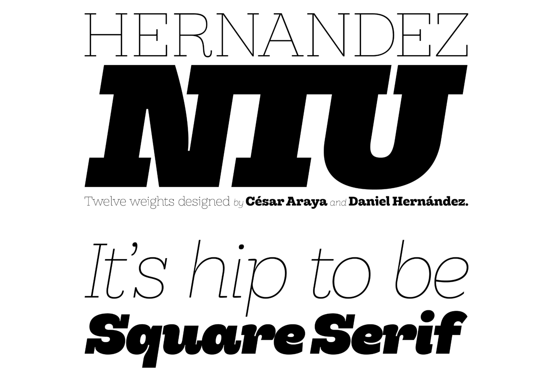
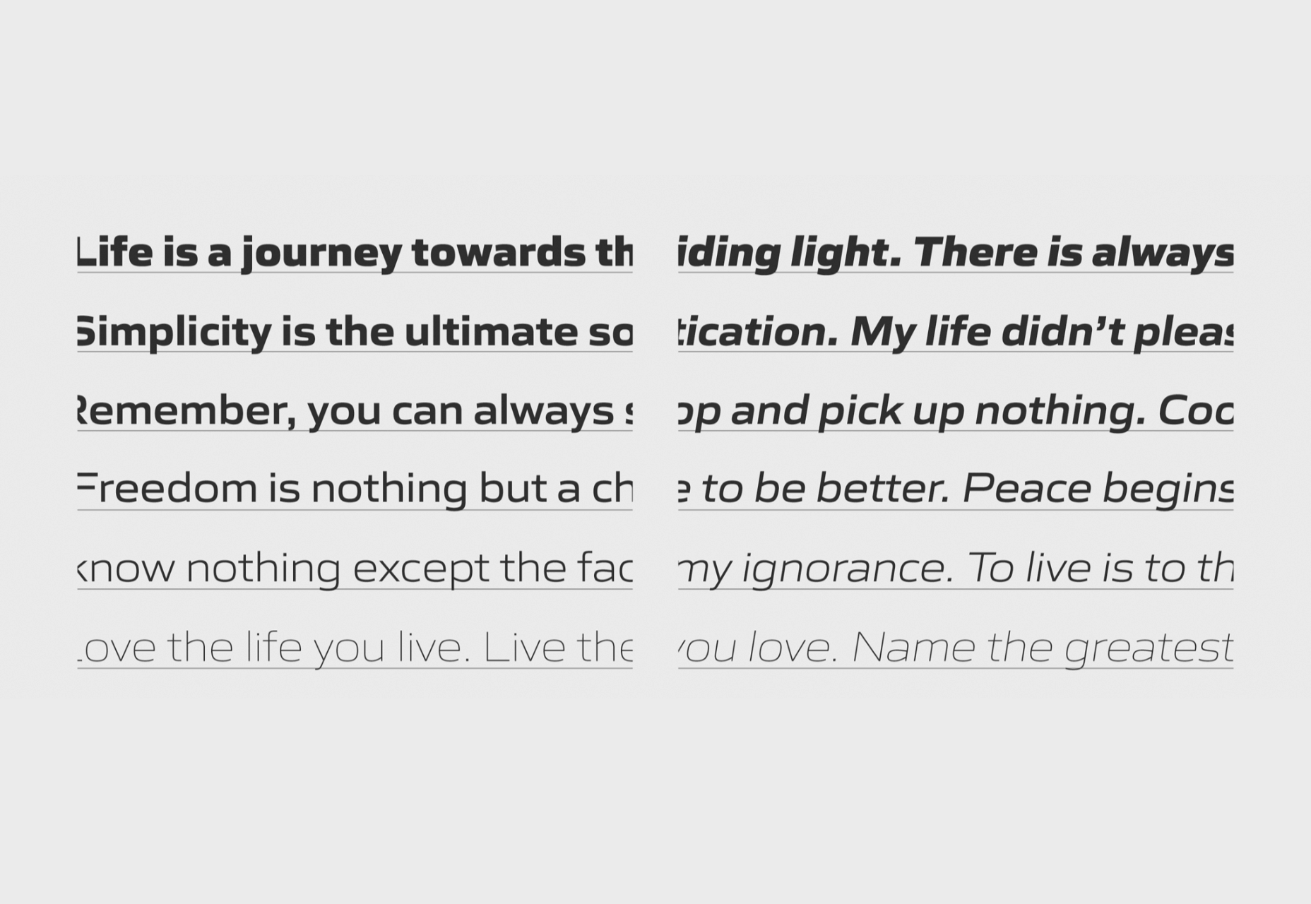
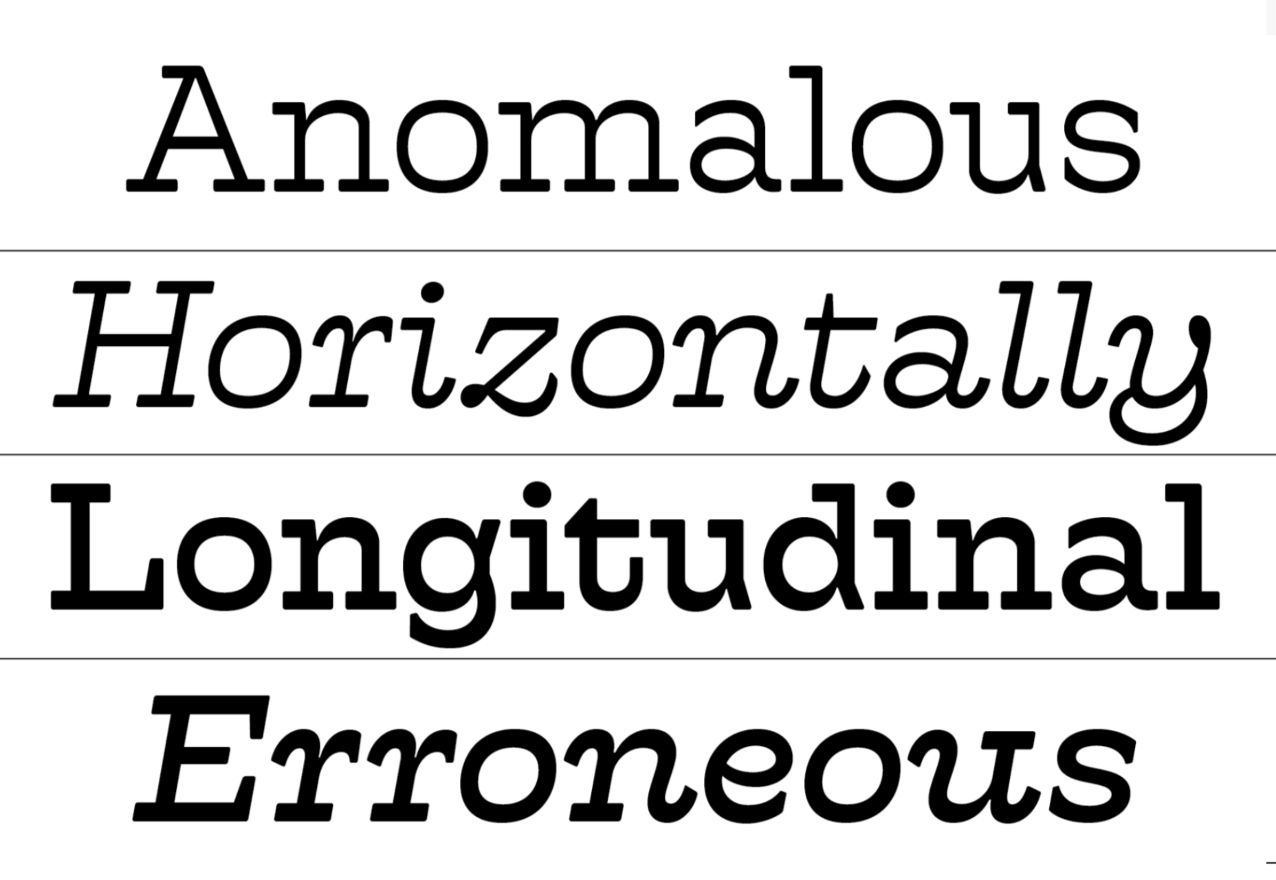
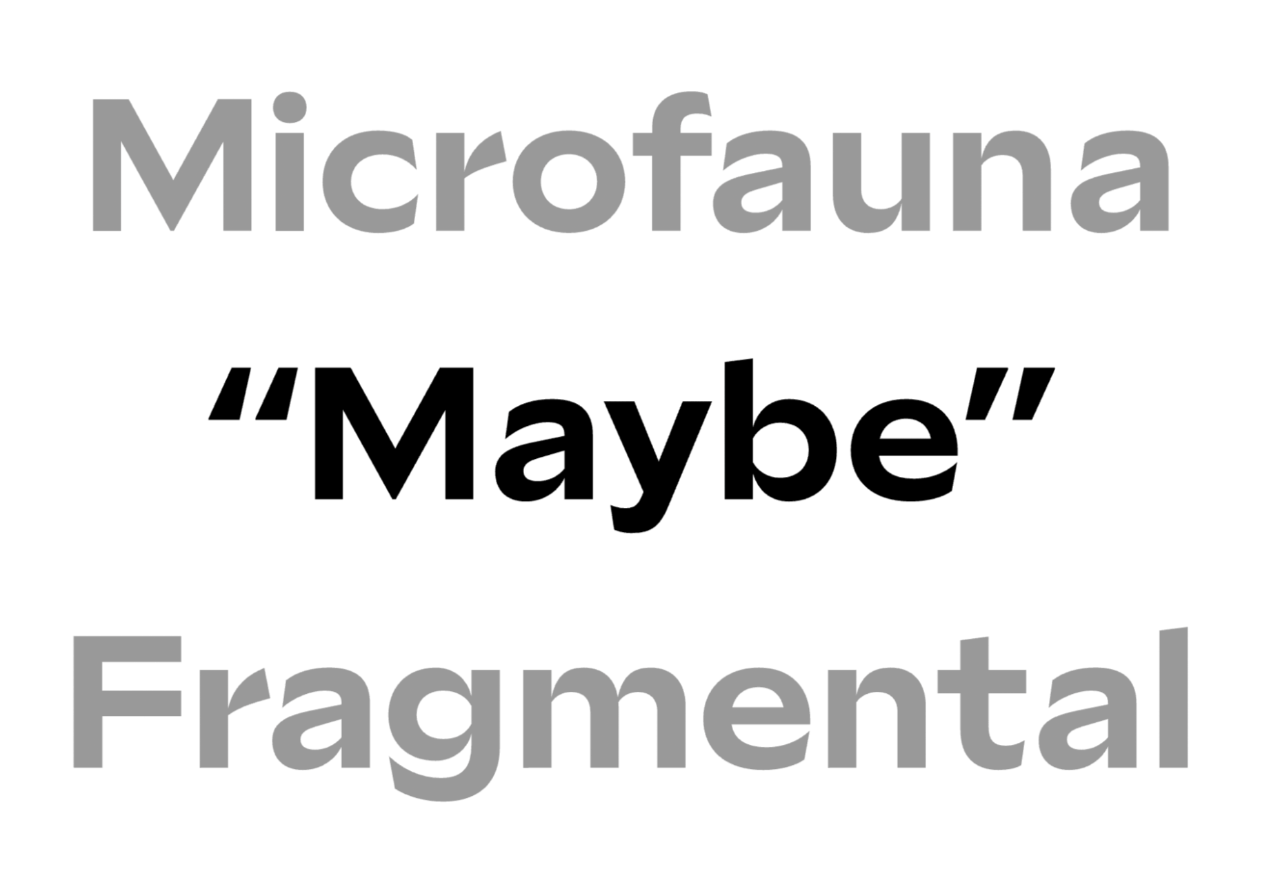
 Welcome to a new series of articles, in which we round up the best new fonts released from some of the top designers on the Web.
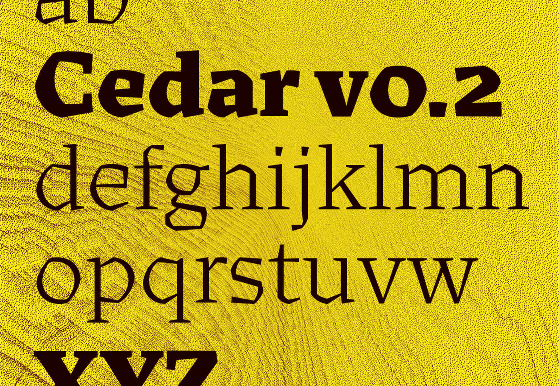


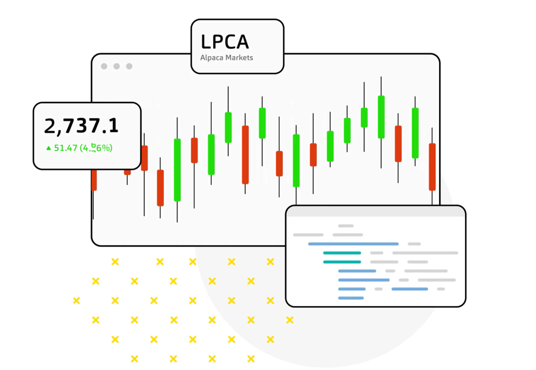
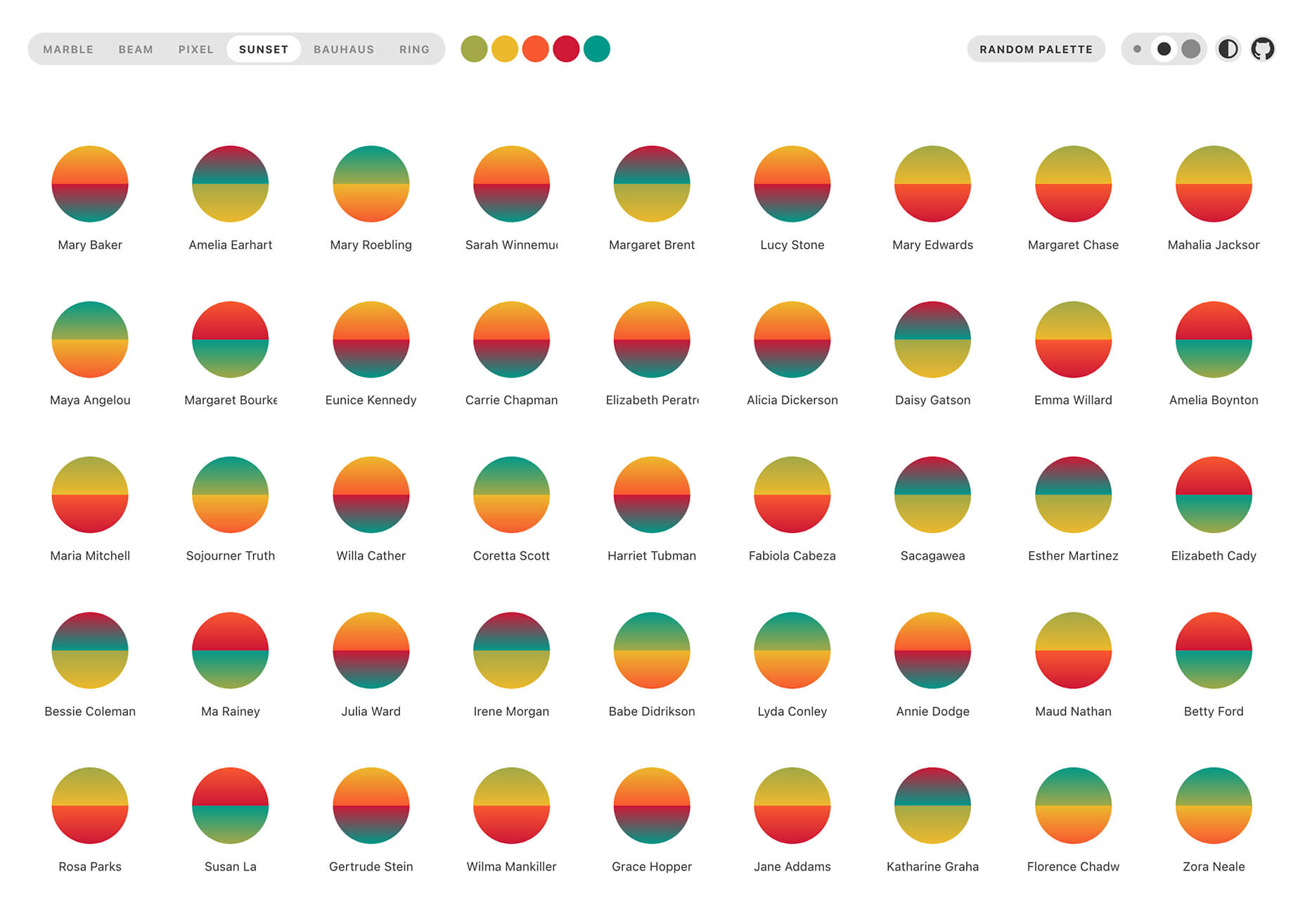
 This month’s new tools and resources collection is a mixed bag of elements for designers and developers. From fun little divots to tools that can speed up development, you are sure to find something usable here.


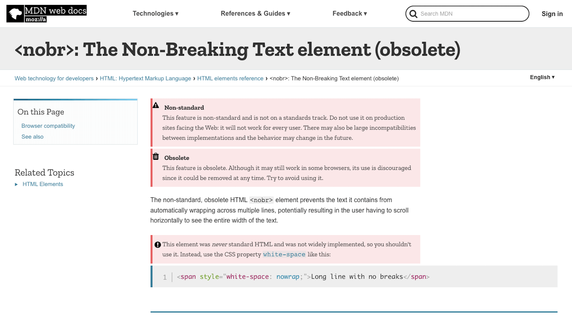
 HTML is one of the foundational building blocks of the Web. But just as web design best practices and techniques change over time, so does the code we use. As HTML evolves, some of its older markup has been deprecated while other parts have been repurposed.
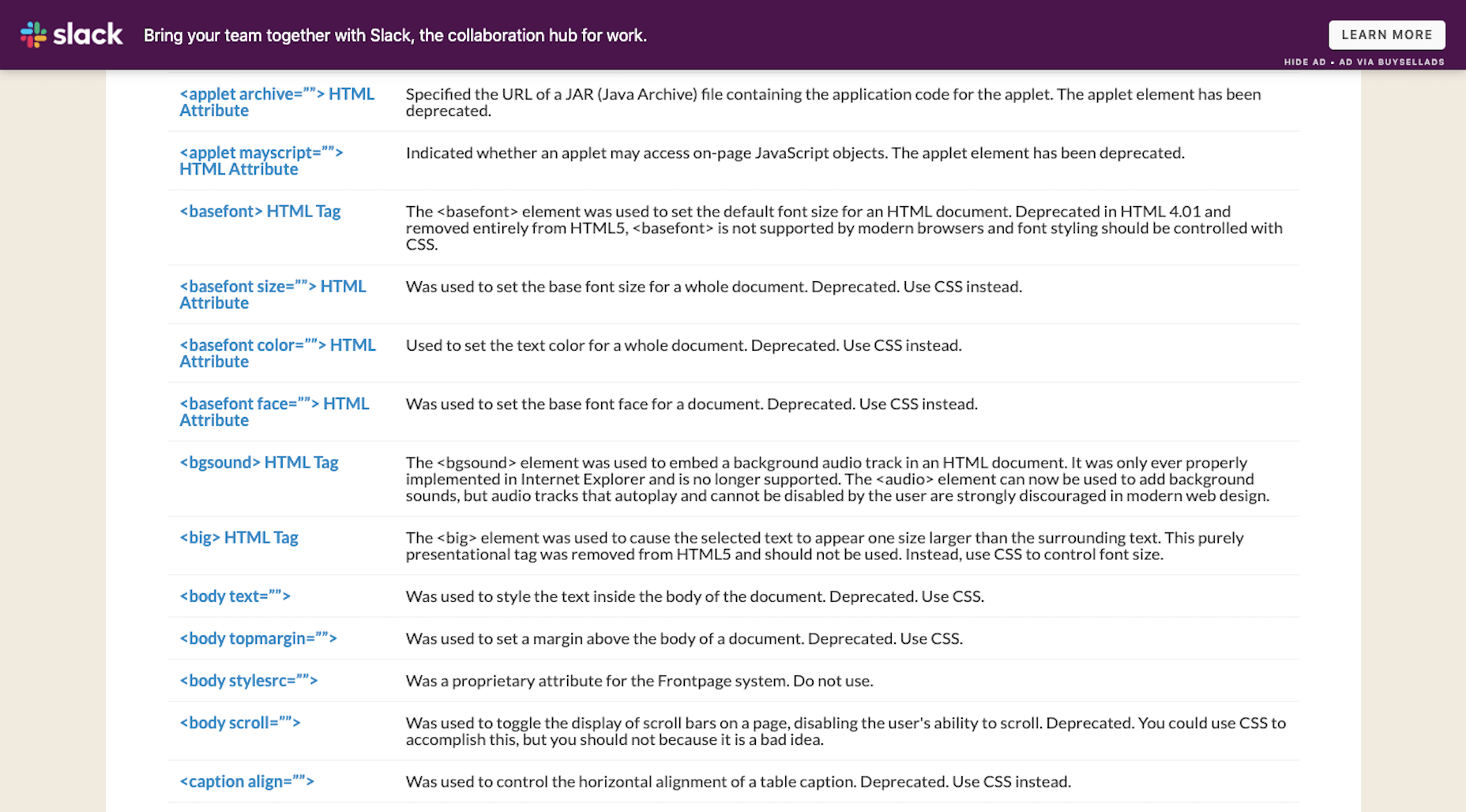

 This week at I/O, Google unveiled the latest version of its Material Design design system, Material You.
 Parallax is a term that is applied loosely and frequently in the world of web design. As a trend, it has been


 Creatives need a digital space to call their home. A place from which they can show off their best work, and from where people can get in touch with them to buy or hire from them.


