Articles

From dev tools to productivity to a little bit of fun with sudoku, this month’s collection of new tools is packed with something for everyone.

Here’s what new for designers this month.

May’s Top Picks

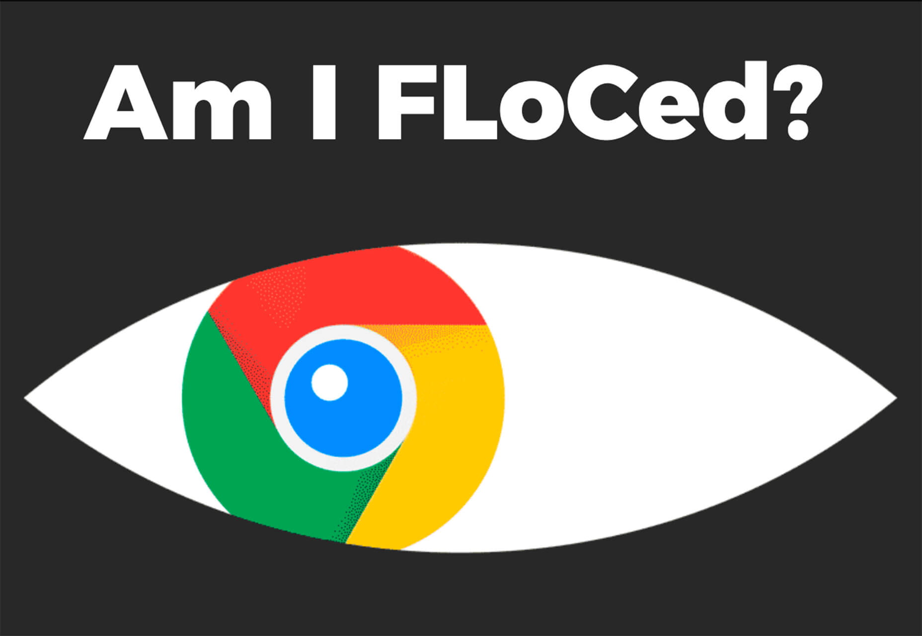
Am I FLoCed?

Am I FLoCed? Is a tool to see if you are part of a Google Chrome origin trial. It tests a new tracking feature called Federated Learning of Cohorts (FLoC). According to Google, the trial currently affects 0.5% of users in selected regions, including Australia, Brazil, Canada, India, Indonesia, Japan, Mexico, New Zealand, the Philippines, and the United States. The page will try to detect whether you’ve been made a guinea pig in Google’s ad-tech experiment.

According to the designers of Am I FloCed: “FLoC runs in your browser. It uses your browsing history from the past week to assign you to a group with other ‘similar’ people around the world. Each group receives a label, called a FLoC ID, which is supposed to capture meaningful information about your habits and interests. FLoC then displays this label to everyone you interact with on the web. This makes it easier to identify you with browser fingerprinting, and it gives trackers a head start on profiling you.”

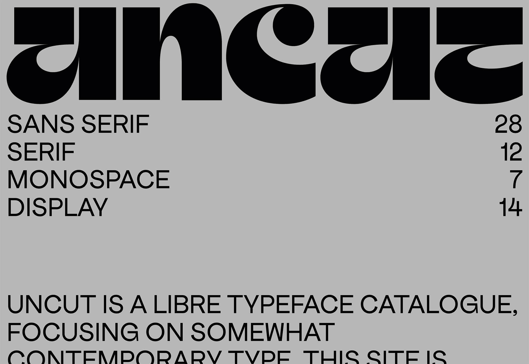
Uncut

Uncut is a Libre typeface catalog that just got started in April. It features contemporary typefaces and styles and is set to be updated regularly. Sort by sans serif, serif, monospace, or display typefaces. Plus, you can submit a typeface for inclusion.

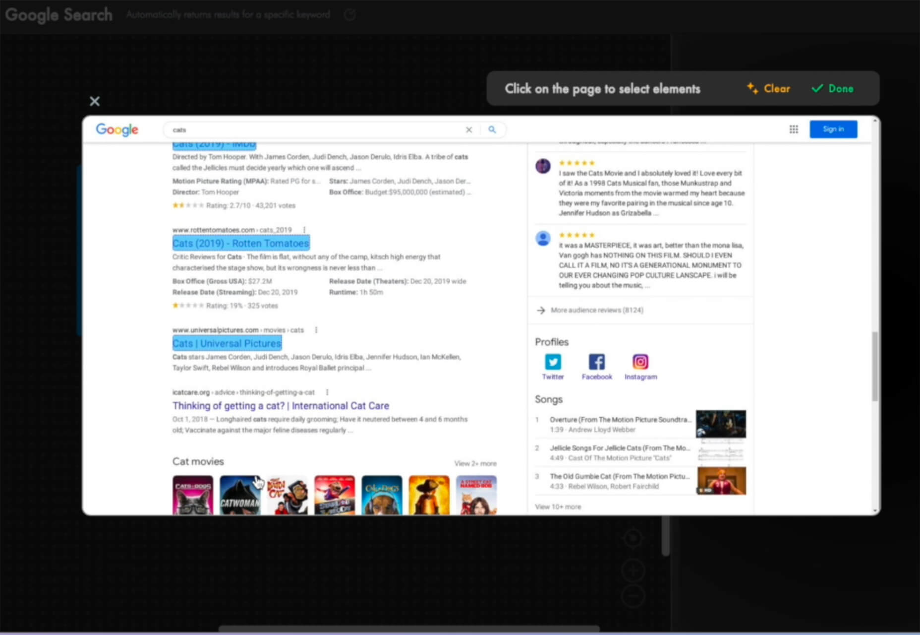
Dashblock

Dashblock allows you to build automations without coding. Use it to create visual automations, or turn blocks into use-cases. (It is a premium tool, but comes with a 14-day free trial to test it out.)

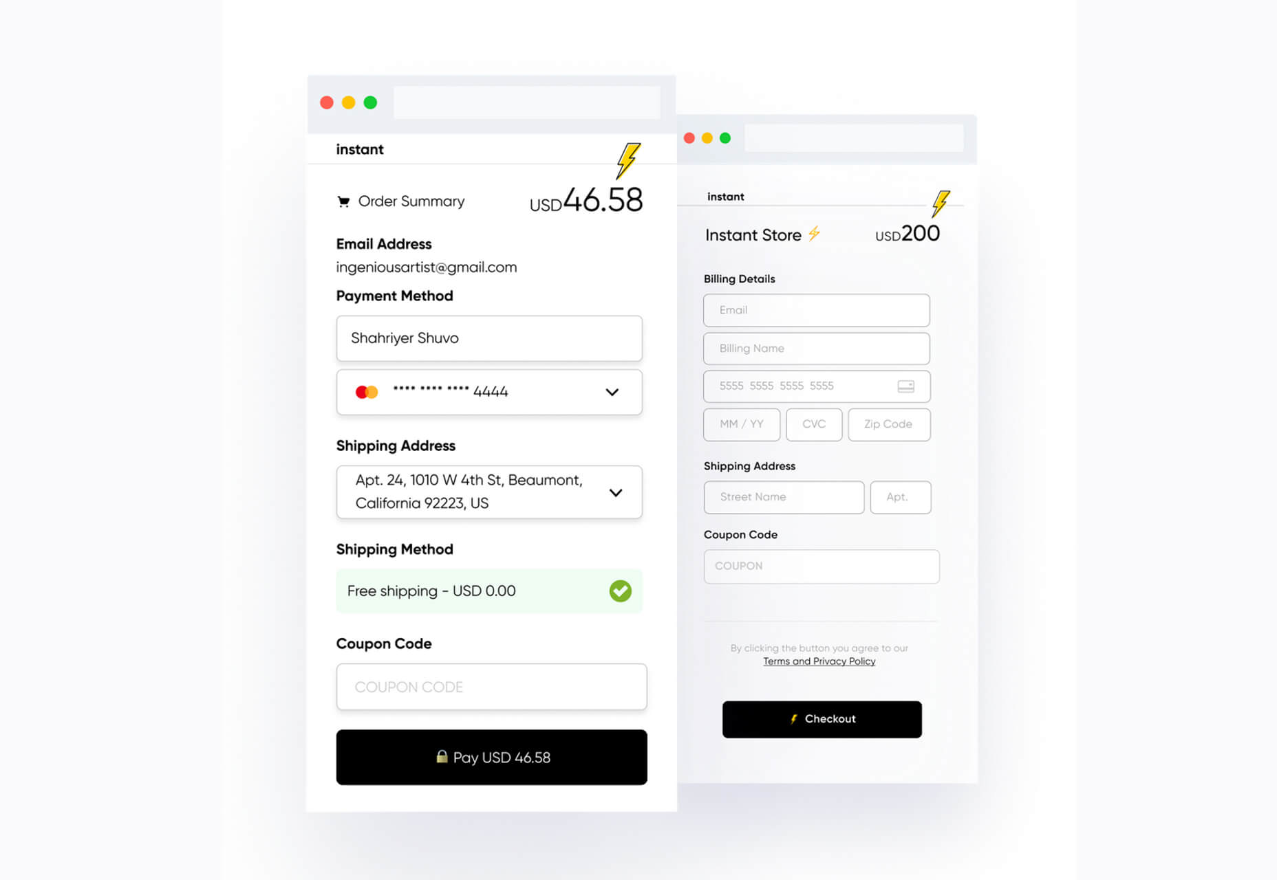
Instant

Instant is a fast and secure one-click checkout tool that works with WooCommerce. Users fill out a short form the first time they shop and then join the network to enable instant, frictionless, 1-click checkouts without passwords. It makes shopping easier and cuts abandoned carts.

5 Image Tools

Triangula

Triangula uses a modified genetic algorithm to triangulate images. It works best with images smaller than 3000px and with fewer than 3000 points, typically producing an optimal result within a couple of minutes. The result is a nifty-looking image.

Content-Aware Image Resizing in Javascript

Content-Aware Image Resizing in Javascript solves that problem with images where you have a photo but it just doesn’t quite fit. A crop doesn’t work because you lose important information. The carver slices and cuts photos to give you the image elements you want in the size you want them. It’s probably a good idea to read through the tutorial before jumping into the open-source code on GitHub.

Globs Design

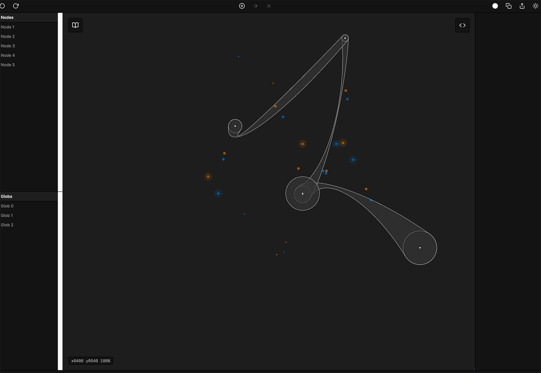
Globs Design uses toggles and drag and drop to help you create funky shapes and fills that you can save in SVG format for projects.

Root Illustrations

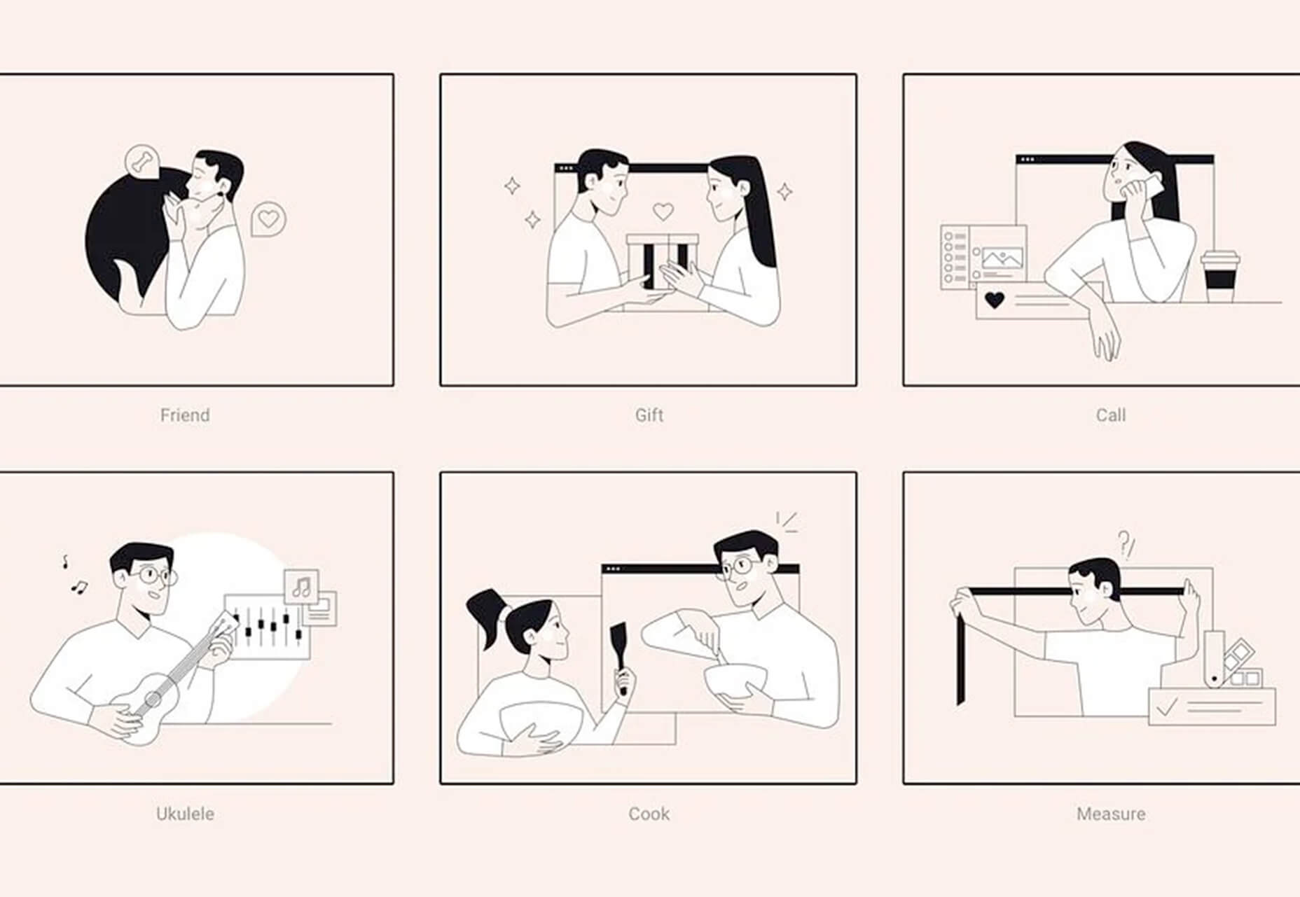
Root Illustrations is a stylish set of people-based illustrations that you can customize to create scenes for your projects. Construct a scene and then snag your set of vector graphics that also work with Sketch and Figma. The set includes 24 characters, more than 100 details, and the ability to change colors and styles.

Make Your Photo 16×9

Make Your Photo 16×9 is as simple as it sounds. It is a cropping tool that allows you to upload any shape of photo – even vertical – and pick options to fill the space to make it fit the standard 16×9 aspect ratio.

6 Dev Tools

Devbook

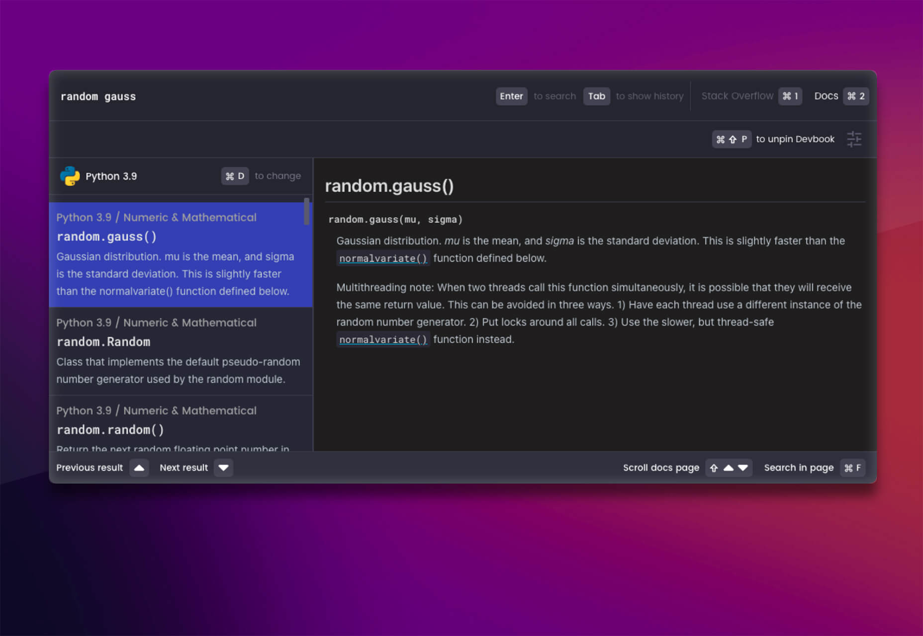
Devbook is a search engine for developers that helps them to find the resources they need and answer their questions faster. Fast, accessible right from a code editor, and fully controllable with just a keyboard.

Madosel

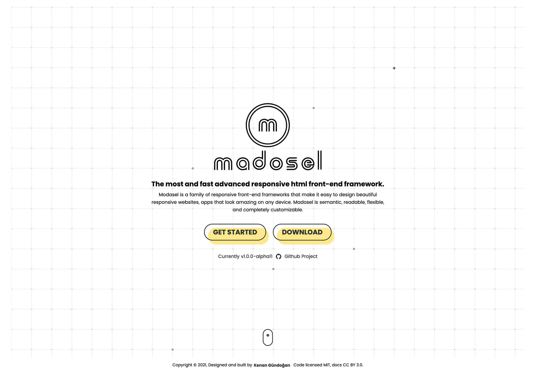
Madosel is a fast, advanced responsive HTML front-end framework that’s in an alpha version. The open-source tool is made to create websites and apps that look great on any device. Plus, it is semantic, readable, flexible, and customizable.

Say Hello to CSS Container Queries

Say Hello to CSS Container Queries helps solve a problem with media queries and smart stacking of elements. CSS Container Queries allow you to make a fluid component that adjusts based on the parent element and everything is independent of viewport width. This post takes you through everything you need to do to implement this yourself.

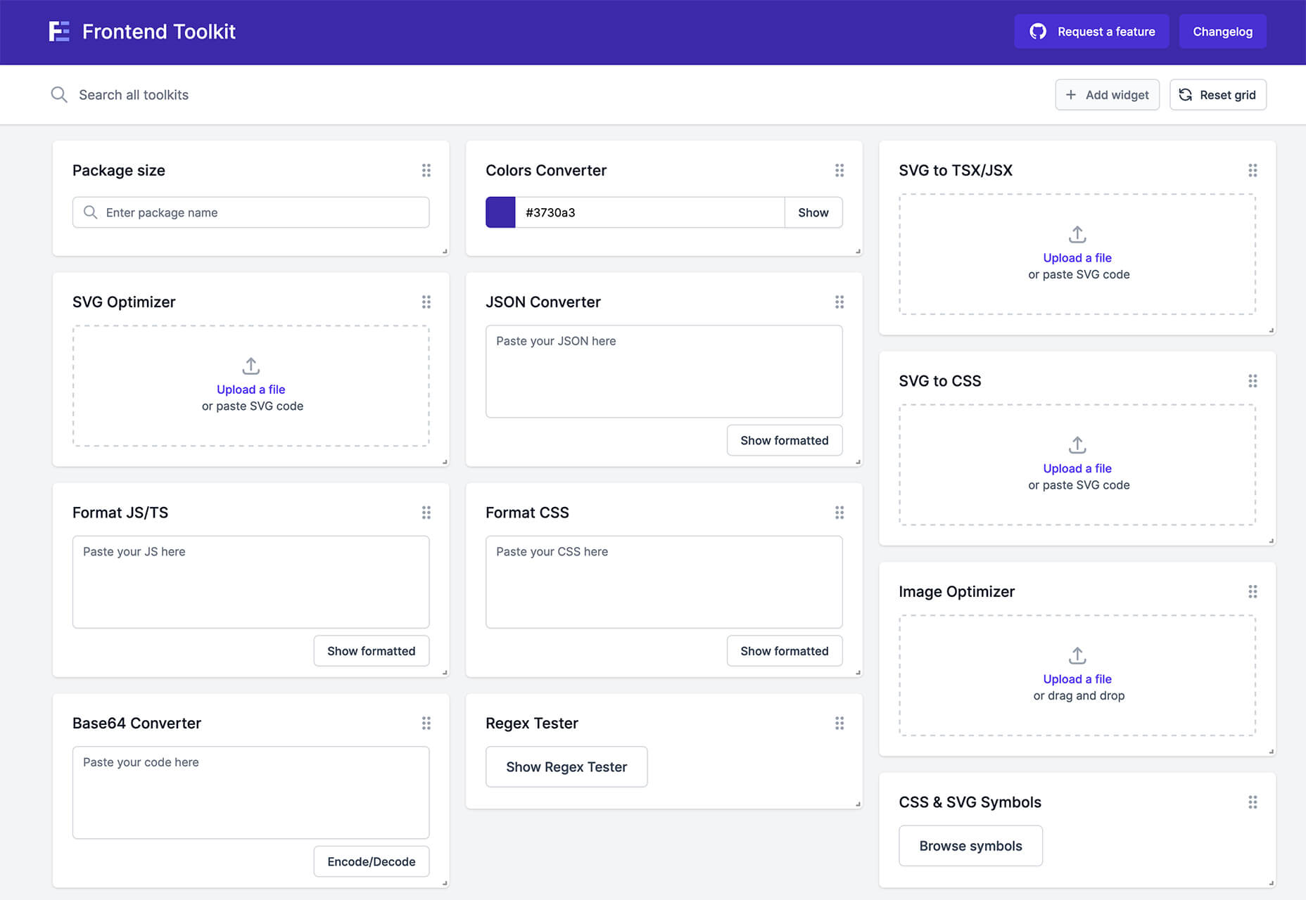
Frontend Toolkit

Frontend Toolkit is a customizable dashboard that you can use to keep up with recurring tasks. It’s one of those little tools that can speed up workflows.

Flatfile

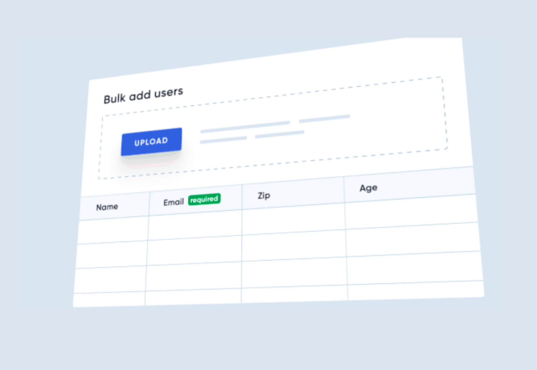
Flatfile is a production-ready importer for SaaS applications. It allows you to auto-format customer spreadsheets without manual cleaning of data and you can do it all without a CSV parser. The tool also includes an elegant UI component to guide users through the process.

Plasmic

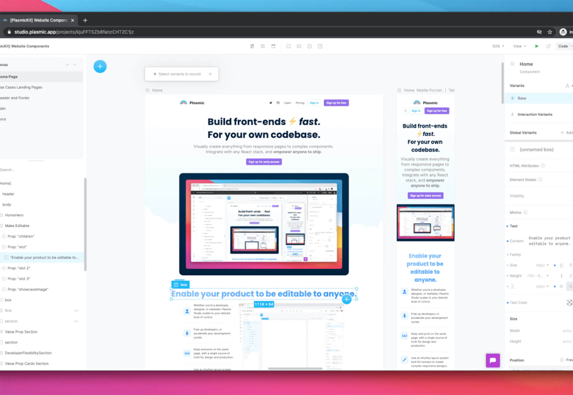
Plasmic is a visual website builder that works with your codebase. It’s designed to speed up development with developers focusing on code (not pixel pushing) and allows non-developers to publish pages and content. The premium tool works with any hosting, CMS, or framework and you can adapt it by the component, section, or page.

2 Productivity Tools

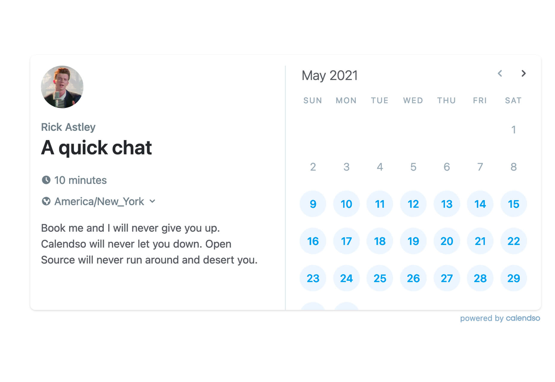
Calendso

Calendso is an open-source calendar scheduling tool. It’s flexible with the ability to host it yourself or with the makers of the calendar. It is API-driven and allows you to control events and information. The interface is simple and sleek and can integrate into your website.

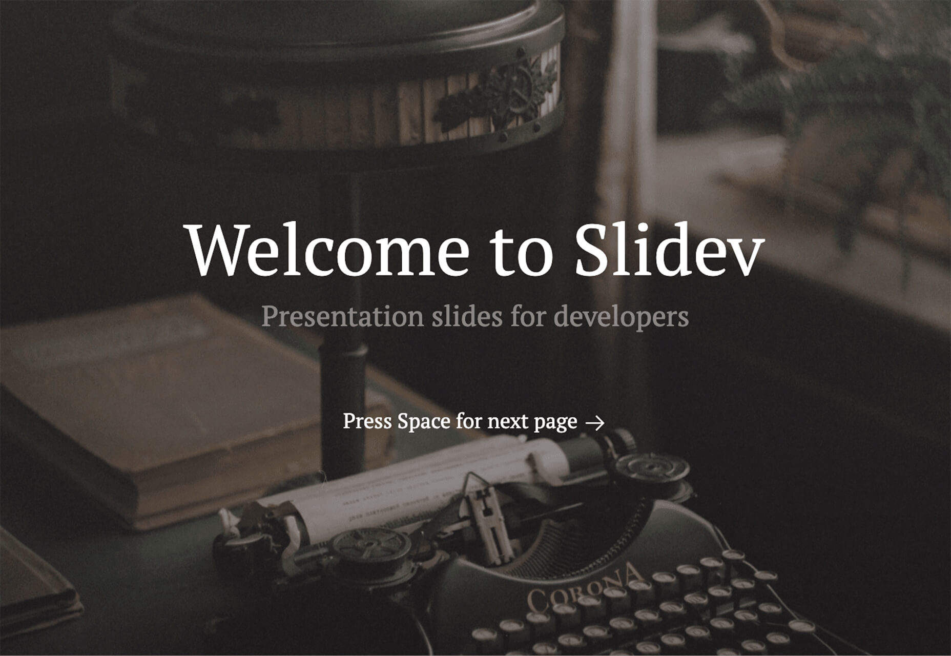
Slidev

Slidev is a set of presentation slides for developers. What’s different about this presentation deck is that you can write slides in a single markdown file with themes, code blocks, and interactive components.

4 Icons and UI Kits

Iconic

Iconic is a set of pixel-perfect icons that gets updated each week. The collection of 24×24 px elements in SVG format contains 160 icons and counting. The simple style is easy to implement and you can search for just what you need by category.

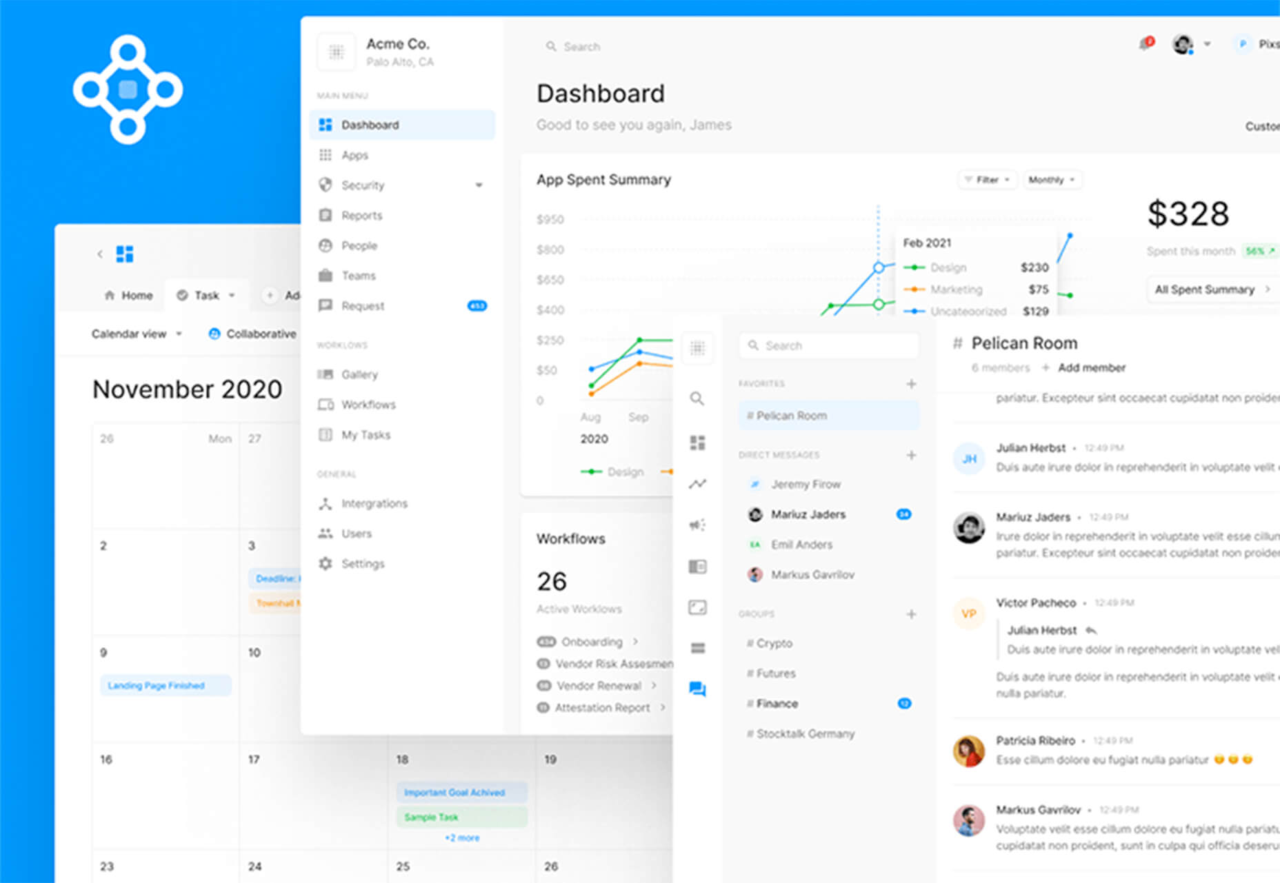
5 Dashboard Templates for Figma

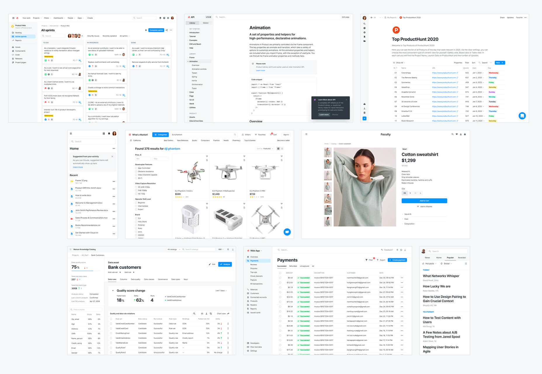
5 Dashboard Templates for Figma is a set of free ready-made screens with light and dark modes for each that you can use with components such as calendars, charts, tables, and more. The free elements are a preview of a larger premium Figma set if you like how they look and work.

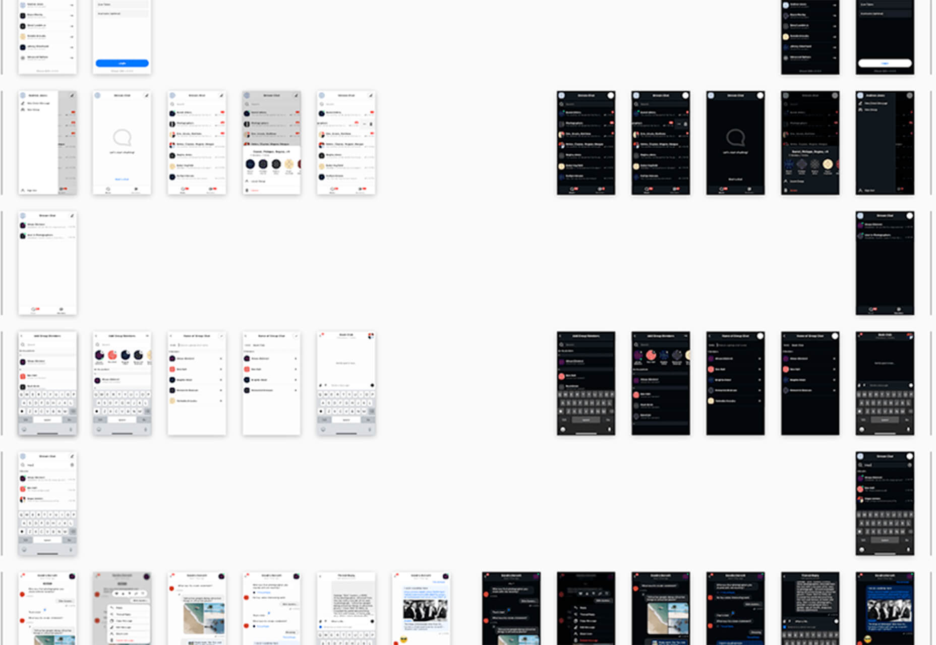
Free Mobile Chat UI Kit

Free Mobile Chat UI Kit is a tool of components for Sketch, Figma, and Adobe XD that includes more than 50 messaging screens with light and dark modes.

Stratum UI Design Kit

Stratum UI Design Kit is a collection of more than 9,000 consistent elements for Figma. It’s packed with elements and tools that make this premium UI kit a tool that gets projects moving quickly.

4 Type Tools and Fresh Fonts

Fluid Typography

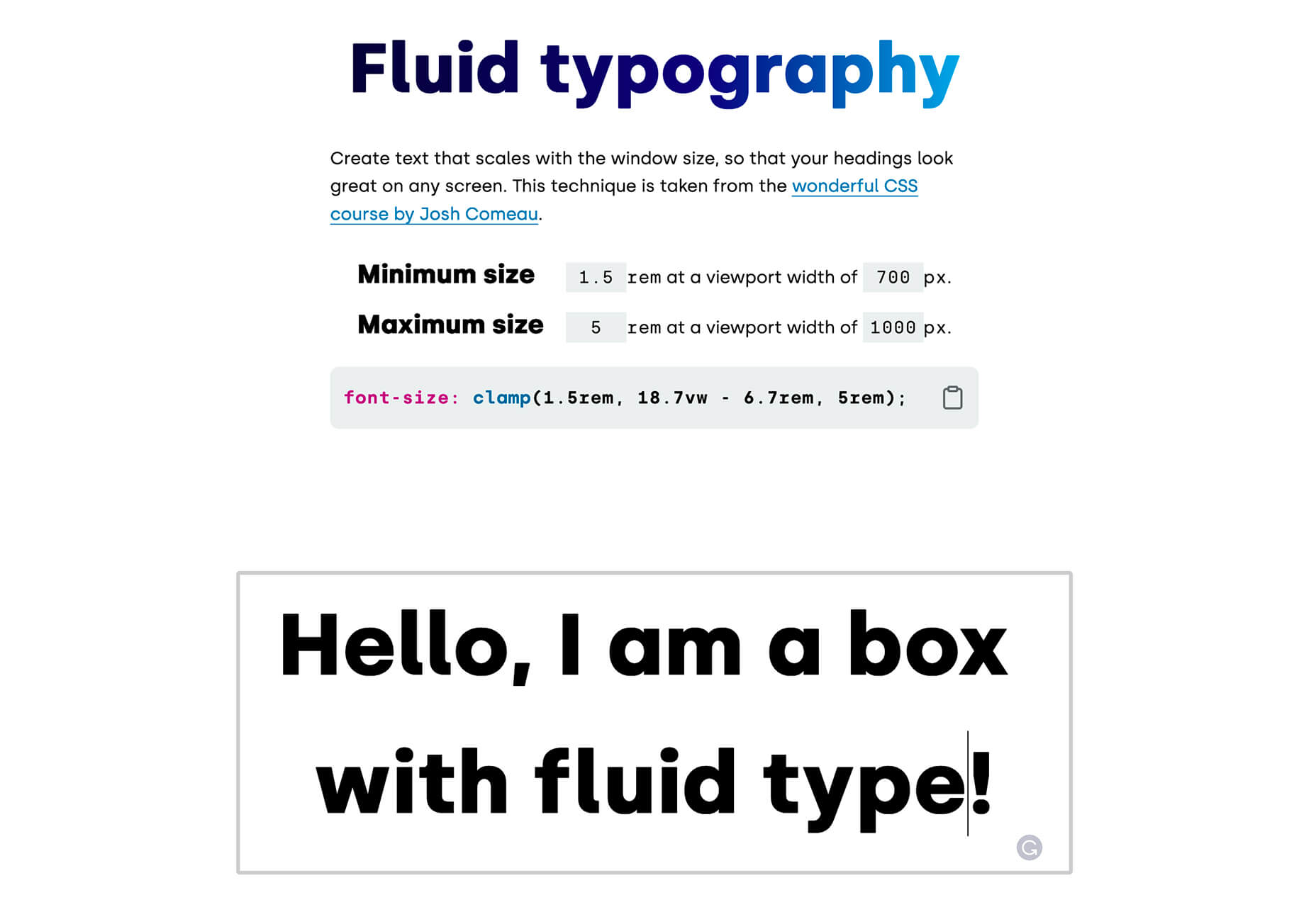
Fluid Typography is a nifty tool that allows you to test headings in any size at different viewports to ensure it looks great everywhere. Then you can copy the CSS and use it in your projects.

Eighty-Eight

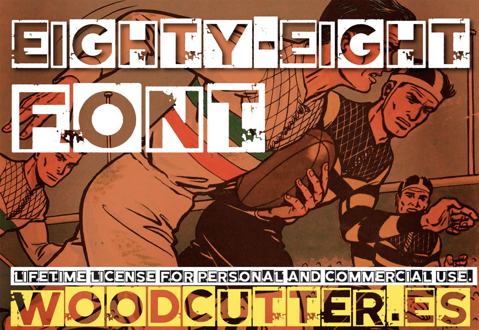
Eighty-Eight is a funky block-style typeface for display use.

Harmonique

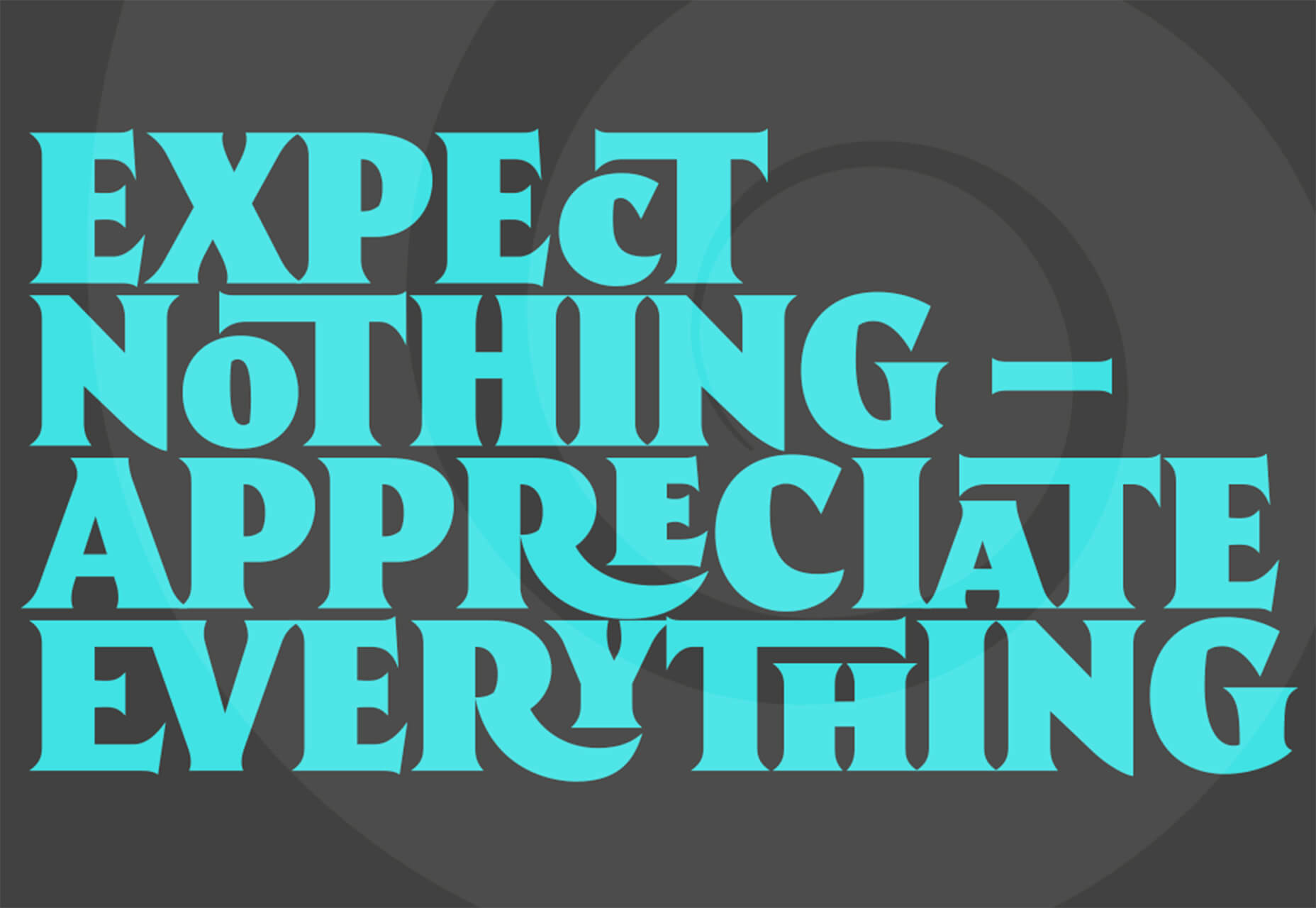
Harmonique is a robust typeface family with lovely serifs and alternates. It’s a type family of two styles that work in harmony together to add distinction and personality to your own typographic compositions. Harmonique’s low contrast forms have the appeal of a humanist sans serif typeface.

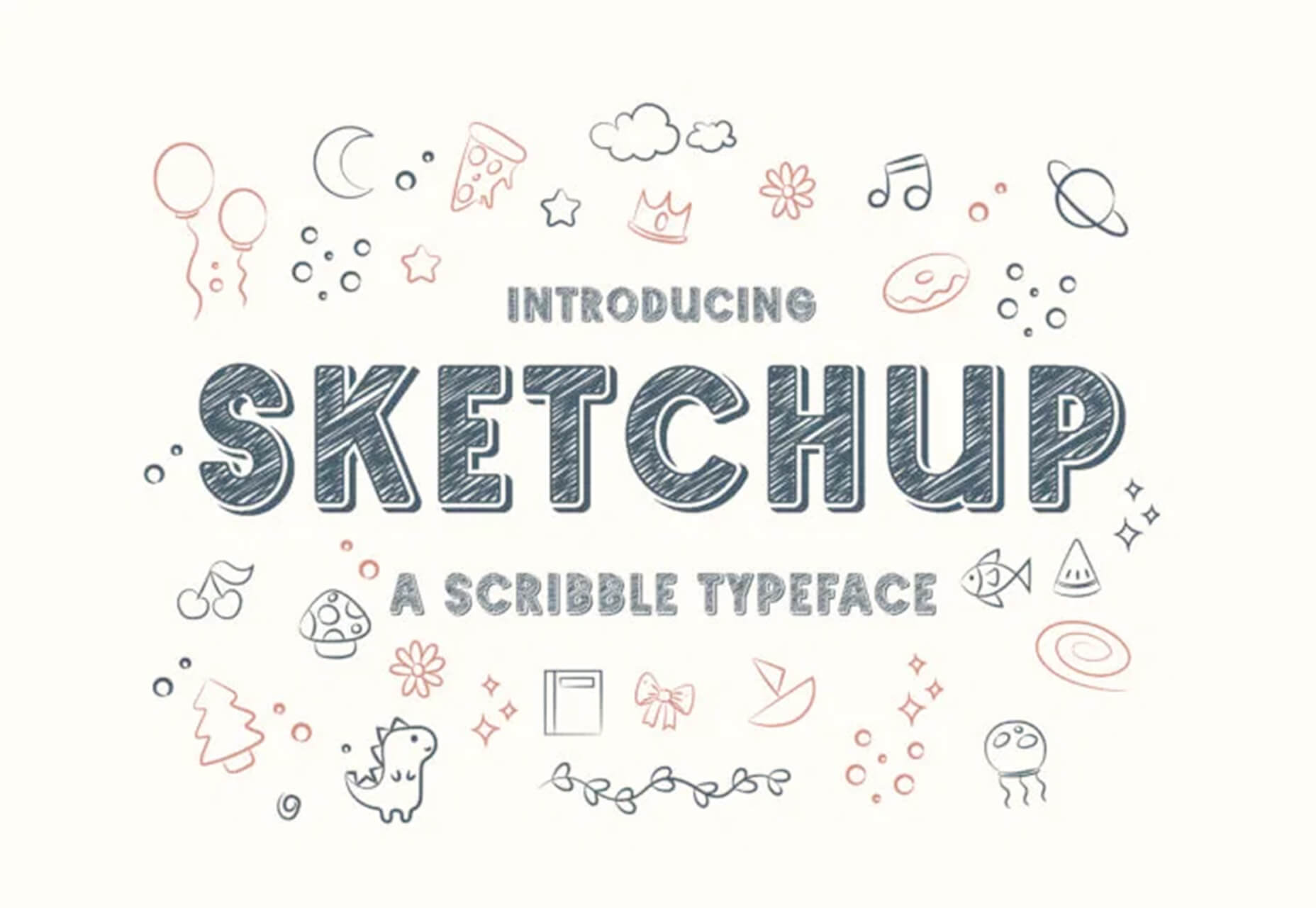
Sketchup

Sketchup is a charming display typeface that has a nice pen style. The free version has a limited character set.

Just for Fun

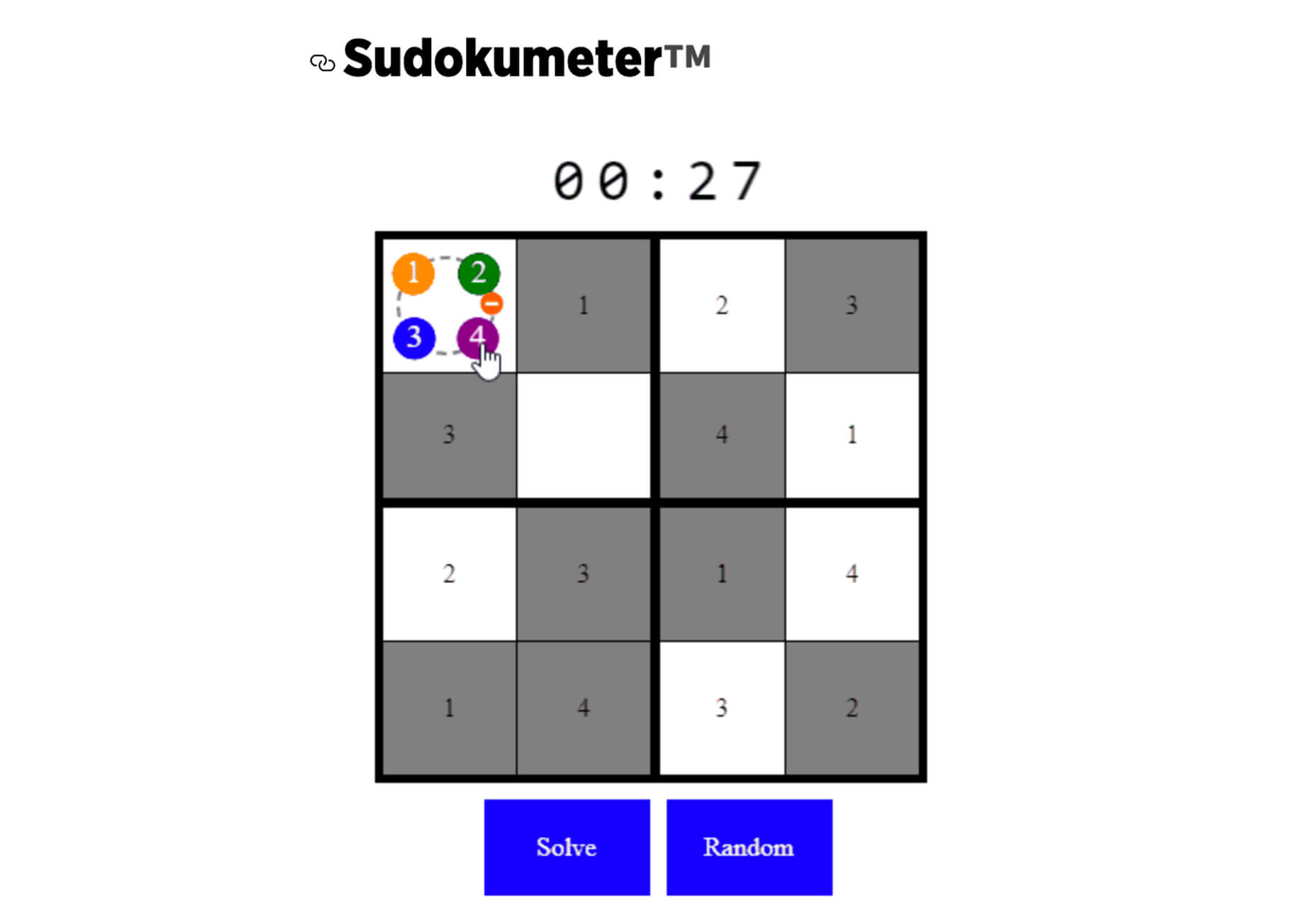
Generating and Solving Sudokus in CSS

Generating and Solving Sudokus in CSS by Lee Meyer for CSS-Tricks is a fun deep dive into using CSS for something you might not expect. It’s a complicated – but fun – look at some of the things CSS can do with plenty of code snippets. The final result is a solvable puzzle with 16 squares.

Source

The post 26 Exciting New Tools For Designers, May 2021 first appeared on Webdesigner Depot.


Source de l’article sur Webdesignerdepot

Gartner predicts that by 2023, over 50% of medium to large enterprises will have adopted a Low-code/No-code application as part of their platform development.
The proliferation of Low-code/No-code tooling can be partially attributed to the COVID-19 pandemic, which has put pressure on businesses around the world to rapidly implement digital solutions. However, adoption of these tools — while indeed accelerated by the pandemic — would have occurred either way.
Even before the pandemic, the largest, richest companies had already formed an oligopsony around the best tech talent and most advanced development tools. Low-Code/No-code, therefore, is an attractive solution for small and mid-sized organizations to level the playing field, and it does so by giving these smaller players the power to do more with their existing resources.
While these benefits are often realized in the short term, the long-term effect of these tools is often shockingly different. The promise of faster and cheaper delivery is the catch — or lure — inside this organizational mousetrap, whereas backlogs, vendor contracts, technical debts, and constant updates are the hammer.
So, what exactly is the No-Code trap, and how can we avoid it?

What is a No-Code Tool?

First, let’s make sure we clear up any confusion regarding naming. So far I have referred Low-Code and No-Code as if they were one term. It’s certainly easy to confuse them — even large analyst firms seem to have a hard time differentiating between the two — and in the broader context of this article, both can lead to the same set of development pitfalls.
Under the magnifying glass, however, there are lots of small details and capabilities that differentiate Low-code and No-code solutions. Most of them aren’t apparent at the UI level, leading to much of the confusion between where the two come from.
In this section, I will spend a little bit of time exploring the important differences between those two, but only to show that when it comes to the central premise of this article they are virtually equivalent.

Low-Code vs. No-Code Tools

The goal behind Low-Code is to minimize the amount of coding necessary for complex tasks through a visual interface (such as Drag ‘N’ Drop) that integrates existing blocks of code into a workflow.
Skilled professionals have the potential to work smarter and faster with Low-Code tools because repetitive coding or duplicating work is streamlined. Through this, they can spend less time on the 80% of work that builds the foundation and focuses more on optimizing the 20% that makes it different. It, therefore, takes on the role of an entry-level employee doing the grunt work for more senior developers/engineers.
No-Code has a very similar look and feel to Low-Code, but is different in one very important dimension. Where Low-Code is meant to optimize the productivity of developers or engineers that already know how to code (even if just a little), No-Code is built for business and product managers that may not know any actual programming languages. It is meant to equip non-technical workers with the tools they need to create applications without formal development training.
No-Code applications need to be self-contained and everything the No-Code vendor thinks the user may need is already built into the tool.
As a result, No-Code applications create a lot of restrictions for the long-term in exchange for quick results in the short-term. This is a great example of a ‘deliberate-prudent’ scenario in the context of the Technical Debt Quadrant, but more on this later.

Advantages of No-Code Solutions

The appeal of both Low-Code and No-Code is pretty obvious. By removing code organizations can remove those that write it — developers — because they are expensive, in short supply, and fundamentally don’t produce things quickly.
The benefits of these two forms of applications in their best forms can be pretty substantial:
  • Resources: Human Capital is becoming increasingly scarce — and therefore expensive. This can stop a lot of ambitious projects dead in their tracks. Low-Code and No-Code tools minimize the amount of specialized technical skills needed to get an application of the ground, which means things can get done more quickly and at a lower cost.
  • Low Risk/High ROISecurity processes, data integrations, and cross-platform support are all built into Low-Code and No-Code tools, meaning less risk and more time to focus on your business goals.
  • Moving to Production: Similarly, for both types of tools a single click is all it takes to send or deploy a model or application you built to production.
Looking at these advantages, it is no wonder that both Low-Code and No-Code have been taking industries by storm recently. While being distinctly different in terms of users, they serve the same goal — that is to say, faster, safer and cheaper deployment. Given these similarities, both terms will be grouped together under the ‘No-Code’ term for the rest of this article unless otherwise specified.

List of No-Code Data Tools

So far, we have covered the applications of No-Code in a very general way, but for the rest of this article, I would like to focus on data modeling. No-Code tools are prevalent in software development, but have also, in particular, started to take hold in this space, and some applications even claim to be an alternative to SQL and other querying languages (crazy, right?!). My reasons for focusing on this are two-fold: 
Firstly, there is a lot of existing analysis around this problem for software development and very little for data modeling. Secondly, this is also the area in which I have the most expertise.
Now let’s take a look at some of the vendors that provide No-Code solutions in this space. These in no way constitute a complete list and are, for the most part, not exclusively built for data modeling. 

1. No-Code Data Modeling in Power BI

Power BI was created by Microsoft and aims to provide interactive visualizations and business intelligence capabilities to all types of business users. Their simple interface is meant to allow end-users to create their own reports and dashboards through a number of features, including data mapping, transformation, and visualization through dashboards. Power BI does support some R coding capabilities for visualization, but when it comes to data modeling, it is a true No-Code tool.

2. Alteryx as a Low-Code Alternative

Alteryx is meant to make advanced analytics accessible to any data worker. To achieve this, it offers several data analytics solutions. Alteryx specializes in self-service analytics with an intuitive UI. Their offerings can be used as Extract, Transform, Load (ETL) Tools within their own framework. Alteryx allows data workers to organize their data pipelines through their custom features and SQL code blocks. As such, they are easily identified as a Low-Code solution.

3. Is Tableau a No-Code Data Modeling Solution?

Tableau is a visual analytics platform and a direct competitor to Power BI. They were recently acquired by Salesforce which is now hoping to ‘transform the way we use data to solve problems—empowering people and organizations to make the most of their data.’ It is also a pretty obvious No-Code platform that is supposed to appeal to all types of end-users. As of now, it offers fewer tools for data modeling than Power BI, but that is likely to change in the future.

4. Looker is a No-Code Alternative to SQL

Looker is a business intelligence software and big data analytics platform that promises to help you explore, analyze, and share real-time business analytics easily. Very much in line with Tableau and Power BI, it aims to make non-technical end-users proficient in a variety of data tasks such as transformation, modeling, and visualization.

You might be wondering why I am including so many BI/Visualization platforms when talking about potential alternatives to SQL. After all, these tools are only set up to address an organization’s reporting needs, which constitute only one of the use cases for data queries and SQL. This is certainly a valid point, so allow me to clarify my reasoning a bit more.

While it is true that reporting is only one of many potential uses for SQL, it is nevertheless an extremely important one. There is a good reason why there are so many No-Code BI tools in the market—to address heightening demand from enterprises around the world — and therefore, it is worth taking a closer look at their almost inevitable shortcomings.

Source de l’article sur DZONE

As a web designer, you face plenty of challenges, both good and bad. One of the bad ones is to suddenly find out that you’re either in danger of missing a client’s deadline or will be unable to meet it at all.

A missed deadline could be due to something beyond your control and no fault of your own. There are measures you can take to avoid what you do have control over. Such as not having the right design tool or design resources to do a task that has to be done.

An ounce of prevention can definitely be worth a pound of cure in this case. Before starting a project, make sure the tool or tools you will be using will be up to the task.

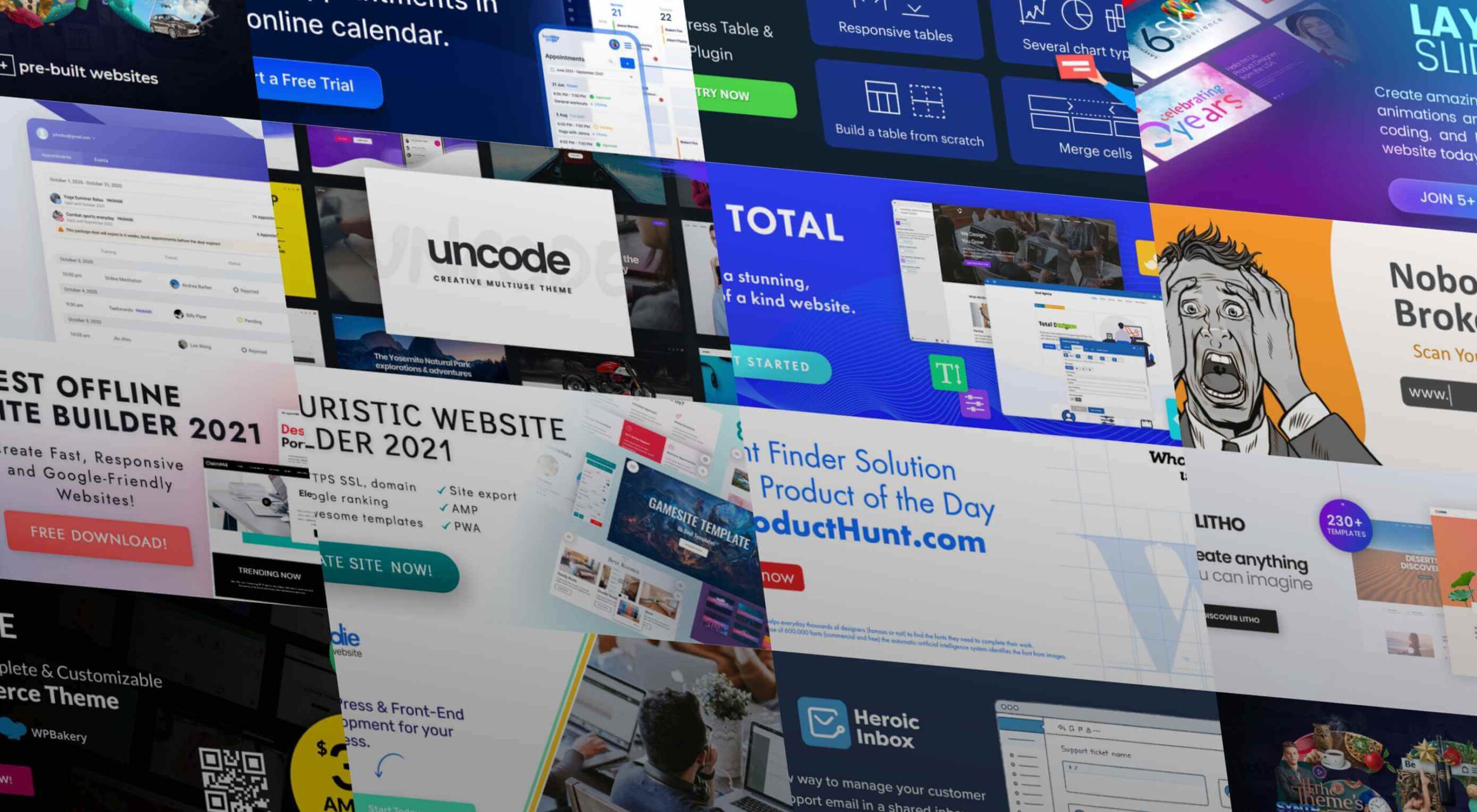
The 15 design tools presented here are the tops in their respective categories. You should be better able to handle whatever is thrown at you.

1. Be Theme

Its more than 200,000 sales to date have certainly established the BeTheme multipurpose WordPress theme as an all-time favorite among web designers.

In truth, “multipurpose” doesn’t do BeTheme justice. Users might argue that “all-purpose” would be a more accurate description.

Be’s 40+ core features give web designers plenty to work with in terms of page-building tools, design aids, design options, and special effects.

Most notably:

  • The Muffin Builder, which when used with other core features, makes building a website quick, easy, and coding-free;
  • The Admin Panel/Shortcode Generator combo gives all the flexibility designers need;
  • BeTheme’s 600+ customizable pre-built websites could well be the star of the show. They cover 30 business sectors and all the popular website types, they are customizable, responsive, and feature cool UX features, and they can get any project off to a rapid start.

Click on the banner to learn more about Be’s other core features.

2. Timezy Booking Software

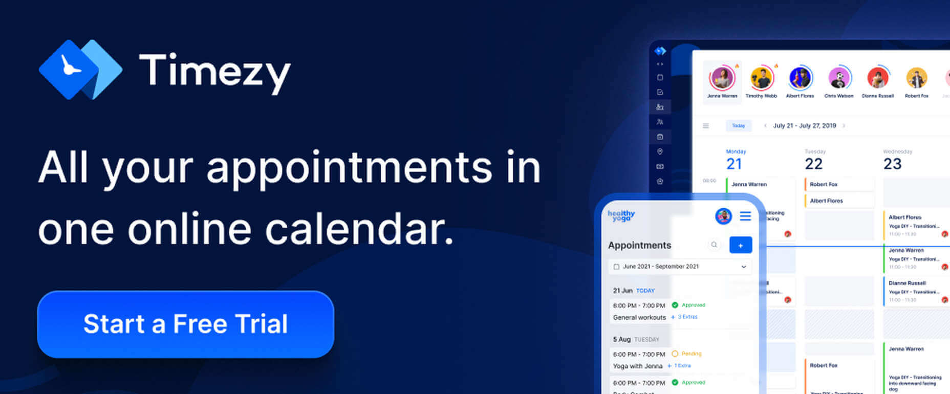
Timezy will help you create a booking environment that works best for your business by allowing clients and customers to book your services as easily as possible. You can then integrate Timezy into your website to streamline and speed up your booking operation.

  • Clients and customers can book appointments online 24/7;
  • They can receive real-time email notifications and reminders;
  • Timezy can be integrated with Zoom;
  • You can reorder steps on the booking form to fit your needs;
  • Timezy can be used to manage employee assignments and schedules, vacations, and special days.

If you lack a website of your own, Timezy will provide you with a modern web page you can customize to fit your brand for clients to book appointments at any time.

3. wpDataTables

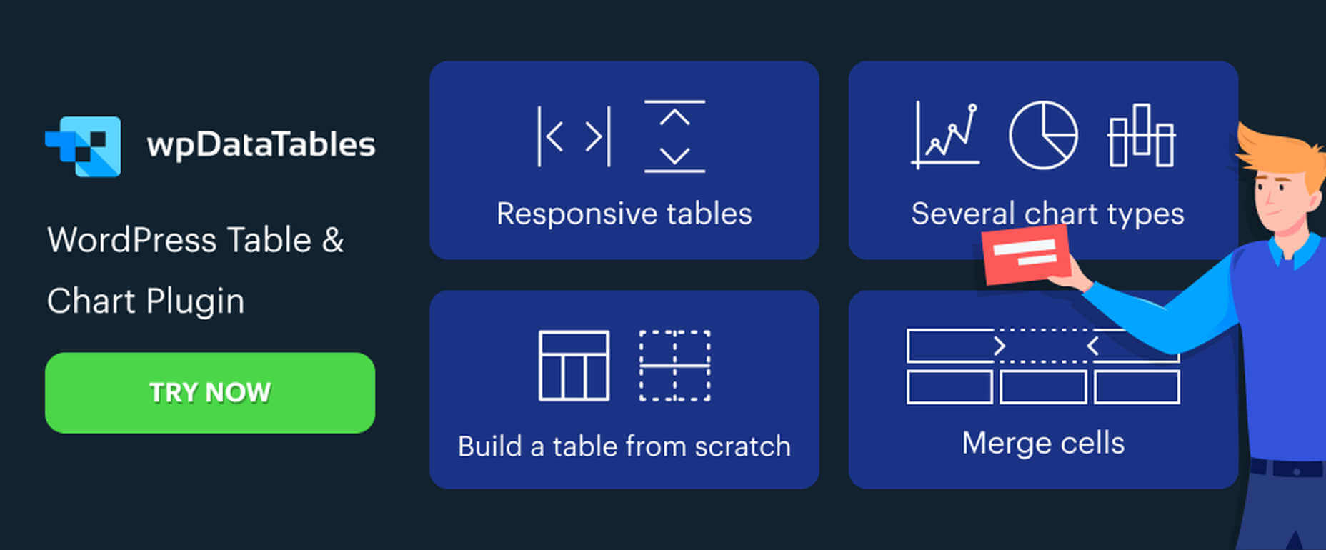
wpDataTables is the top-selling and most powerful WordPress table and chart-building plugin on the market. There are other good ones, but their table and chart-building capabilities quickly become inadequate as you go down the list of what wpDataTables can do that most others cannot.

wpDataTables key features and capabilities:

  • The ability to create interactive and responsive tables and charts;
  • The ability to create frontend editable and easily maintainable tables and charts;
  • The ability to rapidly process massive amounts of data that come in various formats and from various sources;
  • The ability to build tables and charts using real-time data.

You can also brighten up or improve a table or chart’s readability by highlighting or color-coding key information.

Click on the banner to find out more about what this plugin can do for you.

4. LayerSlider

LayerSlider is not for sliders only. This multipurpose WordPress tool can also be used to create eye-catching animations and engaging content.

  • Add a little spice to a stale website;
  • Create popups with stunning effects to interact better with visitors;
  • Avoid coding, since LayerSlider is drag and drop.

This popular design tool has been assisting web designers for nearly a decade and serves millions of active monthly users.

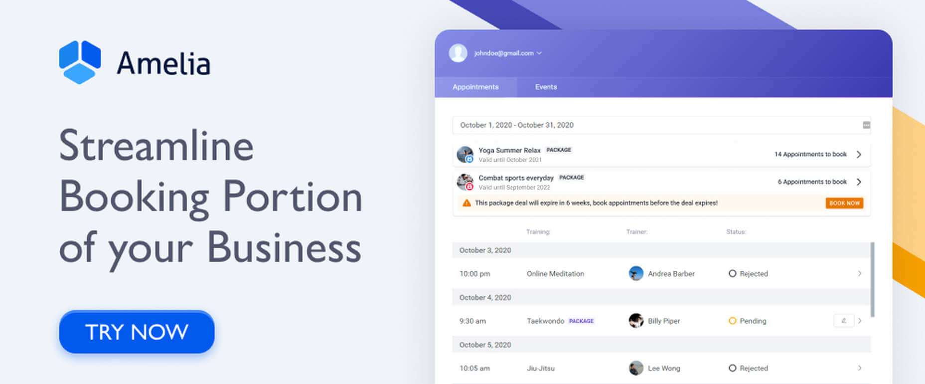
5. Amelia Booking Plugin

Amelia is a user-friendly WordPress booking plugin you can use to manage your appointments and events on a single platform.

  • Clients can instantly book, change, or cancel appointments online 24/7;
  • Employees and customers can manage meetings, appointments, and events from their own dashboards;
  • Amelia can be integrated with Zoom to conduct training or consultation sessions;
  • Amelia can also create packages of services with discounts and validity periods.

Amelia can service multiple business locations.

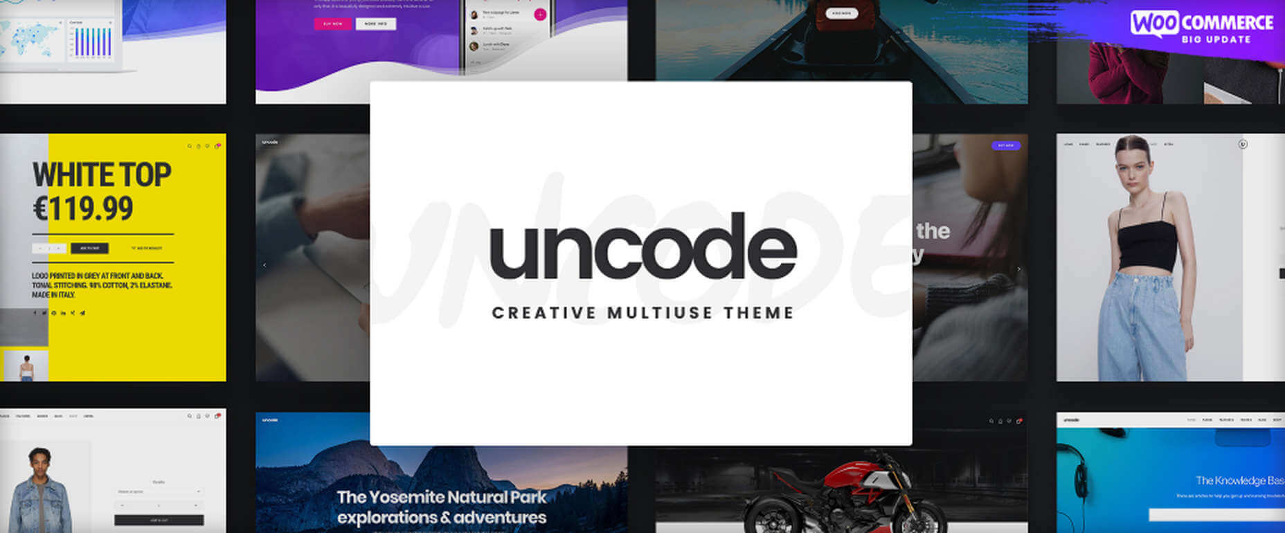
6. Uncode – Creative Multiuse & WooCommerce WordPress Theme

With its more than 80.000 sales to date, Uncode has become one of ThemeForest’s all-time best sellers.

  • You can create custom layouts and designs with Uncode’s Dynamic Content feature and use them as templates for category pages;
  • Uncode features the WooCommerce Product Builder, custom Checkout, Cart, My Account, Quick-View, etc.

Uncode has a comprehensive library of tutorial videos and a showcase of user-created websites that is well worth visiting.

7. Total WordPress Theme

Created with perfection in mind, Total is nonetheless an extremely user-friendly WordPress theme.

  • This drag and drop website building tool’s extreme flexibility allows users to create any type or style of website;
  • The WPBakery page builder is accompanied by an assortment of custom modules;
  • Total is RTL and Translation-ready and easily integrates with WooCommerce;
  • Total is developer-friendly.

Click on the banner to learn more.

8. Dr. Link Check

Dr. Link Check saves you the inconvenience of having to periodically conduct a manual search of your site for broken links.

Dr. Link Check inspects for:

  • Broken links and improper URL formatting;
  • Blacklisted malicious content links;
  • Websites that do not contain any valuable content, including ad-only sites.

Dr. Link Check publishes downloadable daily, weekly, or monthly reports.

9. Mobirise Website Builder

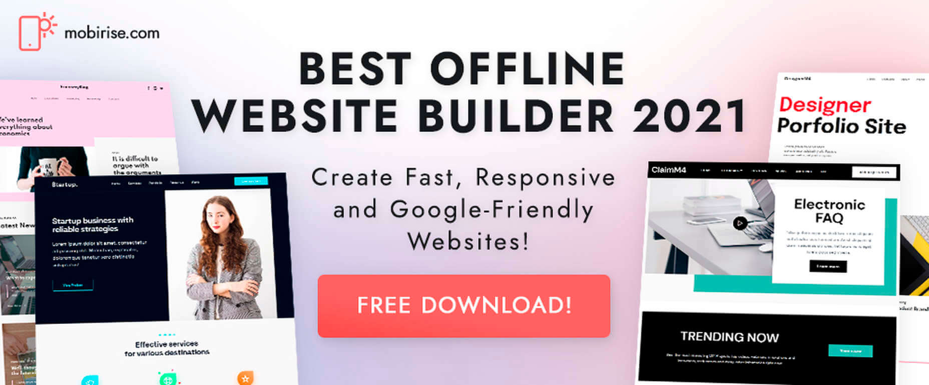
Mobirise is not only a top tool for creating fast, responsive, user-friendly websites. It also has the advantages of being offline. Mobirise is also free.

Factors that contribute to Mobirise’s excellent performance include:

  • Google Amp and Bootstrap 4 frameworks;
  • Professionally-crafted website templates, popups, sliders, and eCommerce features;
  • Mobirise is all drag and drop.

Click on the banner to download your very own copy.

10. 8b Website Builder

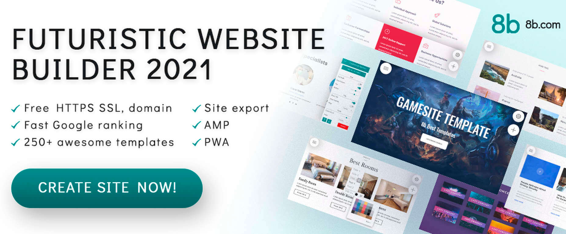
When a website builder is fast, free, responsive, user friendly, and Google-friendly as well, it is certainly worthy of consideration.

The 8b website builder:

  • Allows you to create websites at home or on the go on any device;
  • Features templates and website sections designed to get projects off to a rapid start;
  • It gives your site a Google ranking with a couple of clicks;
  • It can be hosted wherever you want.

Download your copy now.

11. WHATFONTIS

WhatFontIs, with its database of more than 700K commercial and free fonts and font-finding AI functionality enables you to identify fonts from images you upload.

This top-of-the-line font-finding tool:

  • Identifies an uploaded font 90% of the time;
  • Gives answers in seconds;
  • Identifies cursive fonts (the letters in the image must be separated);
  • Displays 60+ similar fonts for each uploaded image.

12. Litho – The Multipurpose HTML5 Template

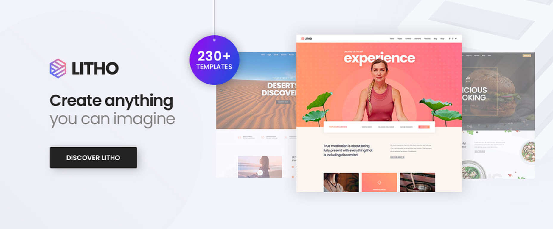
Litho is a responsive multipurpose Bootstrap 4 HTML5 template that gives startups, design agencies, and other businesses an ideal website-building starting point.

Litho’s features include:

  • Cool selections of ready-made home pages, inner pages, and template blocks;
  • Page styles for portfolio, shop, and blogging sites;
  • Sliders, banners, forms, and other creative design elements.

Litho offers 5-star professional support.

13. XStore – The Most Customizable WooCommerce Theme Ever

XStore may be the best tool anyone could have at their fingertips when looking for a fast and easy way to create a high-performance eCommerce website –  for only $39.

XStore’s key features include:

  • 100+ customizable ready-to-go shops;
  • $500+ worth of premium WordPress plugins;
  • A Single Product builder and a Header builder.

14. Goodiewebsite

GOODIE’s web development platform assists clients who are eager to get a professionally-coded website quickly up and running.

GOODIE’s services focus on:

  • Web designers seeking a development partner;
  • Startups looking for ways to test their ideas and concepts;
  • Small businesses seeking an online presence or improvement of an existing one.

GOODIE’s specialties include 1-10 page, WordPress, and eCommerce websites.

15. Heroic Inbox

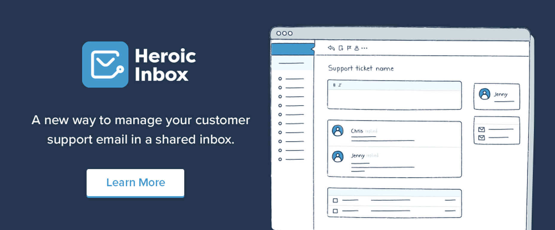
There are several excellent reasons for letting Heroic Inbox manage your business’s departmental email inboxes.

They include:

  • Encouraging efficient staff collaboration on email assignments and responses;
  • Helping staff members accomplish and maintain Inbox Zero status;
  • Tracking key team performance metrics.

Two key Heroic Inbox features are its smart workflows and a fast and friendly UI.

Every web designer owns a toolbox of tips and tricks they use in their website building projects. Even when a toolbox is superbly stocked, it is always challenging to keep it up to date. Doing so requires maintaining a knowledge of the latest and greatest web design resources and tools—some of which you may need to meet ever-changing industry demands.

This article features the top tools & resources for designers and agencies for 2021. Choosing one or more of them could not only help you stay on top of your game but could even make your day.

Source

The post 15 Useful Tools & Resources Worth Checking Out first appeared on Webdesigner Depot.


Source de l’article sur Webdesignerdepot

March is that time of year where the feeling of newness starts, from the first Spring days to fresh design projects. These trends are no exception, with fun new takes on some classic concepts.

Circles are always popular, but the top trend is an animated take on the traditional element; plus, fun pink and purple color palettes and a few faux split screen designs round out trending styles.

Here’s what’s trending in design this month.

Circle Animations

Circles are one of those shapes that never leave the design sphere. They have a lot of classical meaning and are flexible in terms of design options.

Designers are having a lot of fun with this shape right now. From animations to text circles to image frames, they seem to be all over the place.

More recently trending is more circle-shaped animations. This trend maintains a circle’s properties as a unified and harmonious element with movement to create more engagement and make you look at the design just a little bit more.

Each of these examples uses circles in a different but equally interesting – and animated – way.

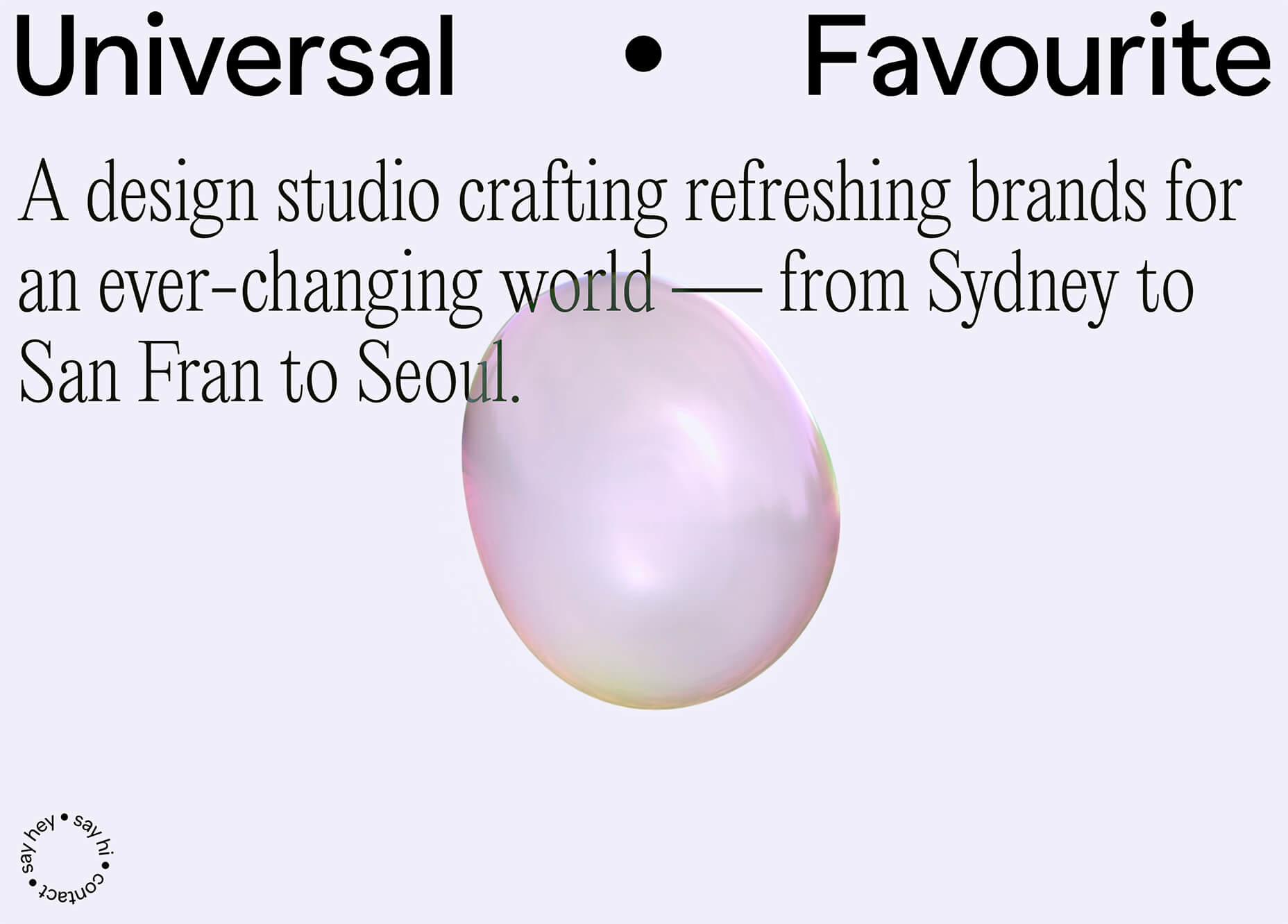
Universal Favourite uses a circular blob. It’s almost like a giant bubble. It wiggles and flows, and stretches within the space without any help from the user. It has a smoothly quality that makes you want to stare at it. The color here helps, with the circle and background not having an immense amount of contrast. Also, note the cute little circle button in the bottom corner.

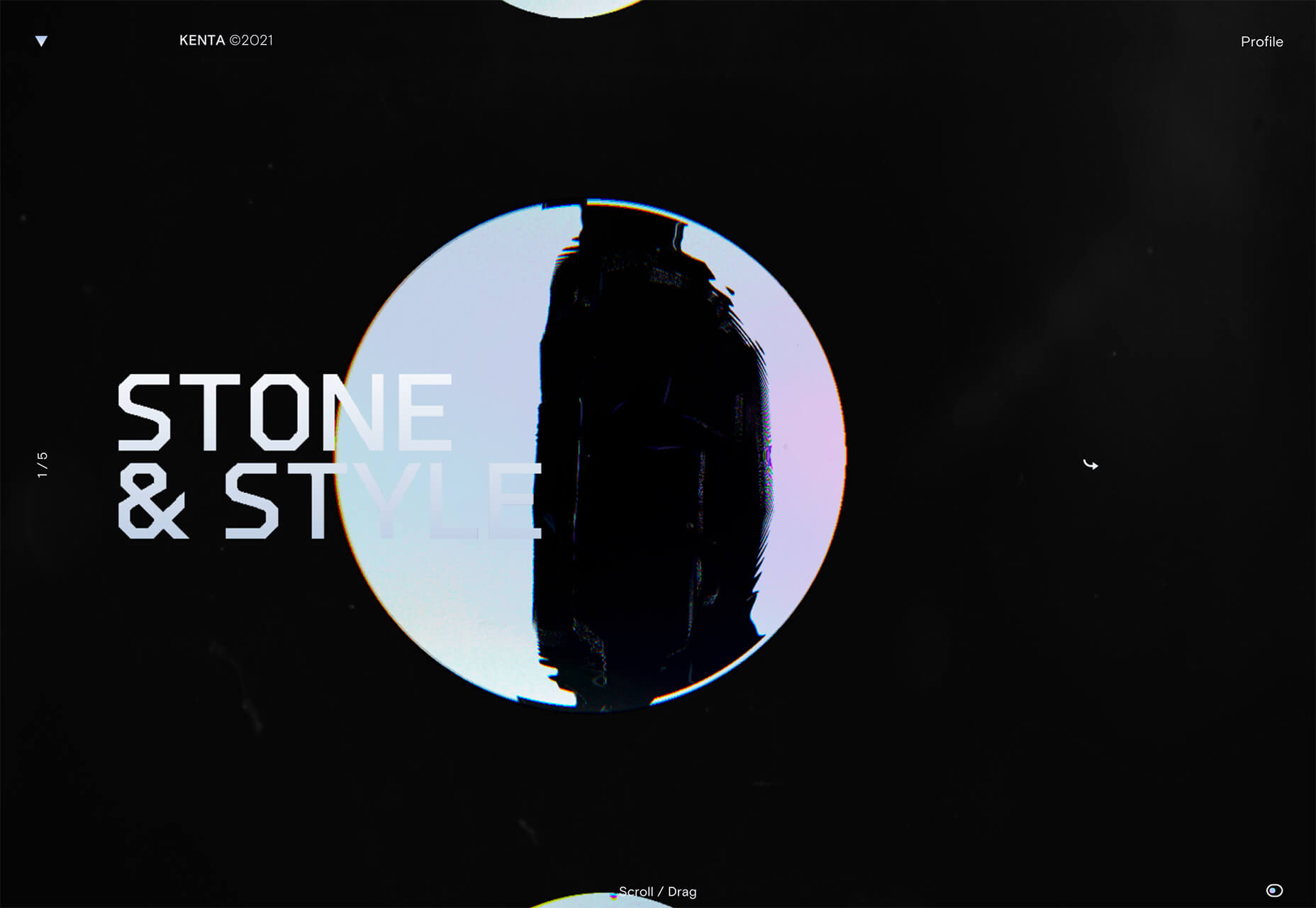
Kenta Toshikura put most of the subtle animation for this design inside the circle. With a hover state, the entire circle moves on the screen with a second layer of animation, and the cursor is also a circle that hops around the black background.

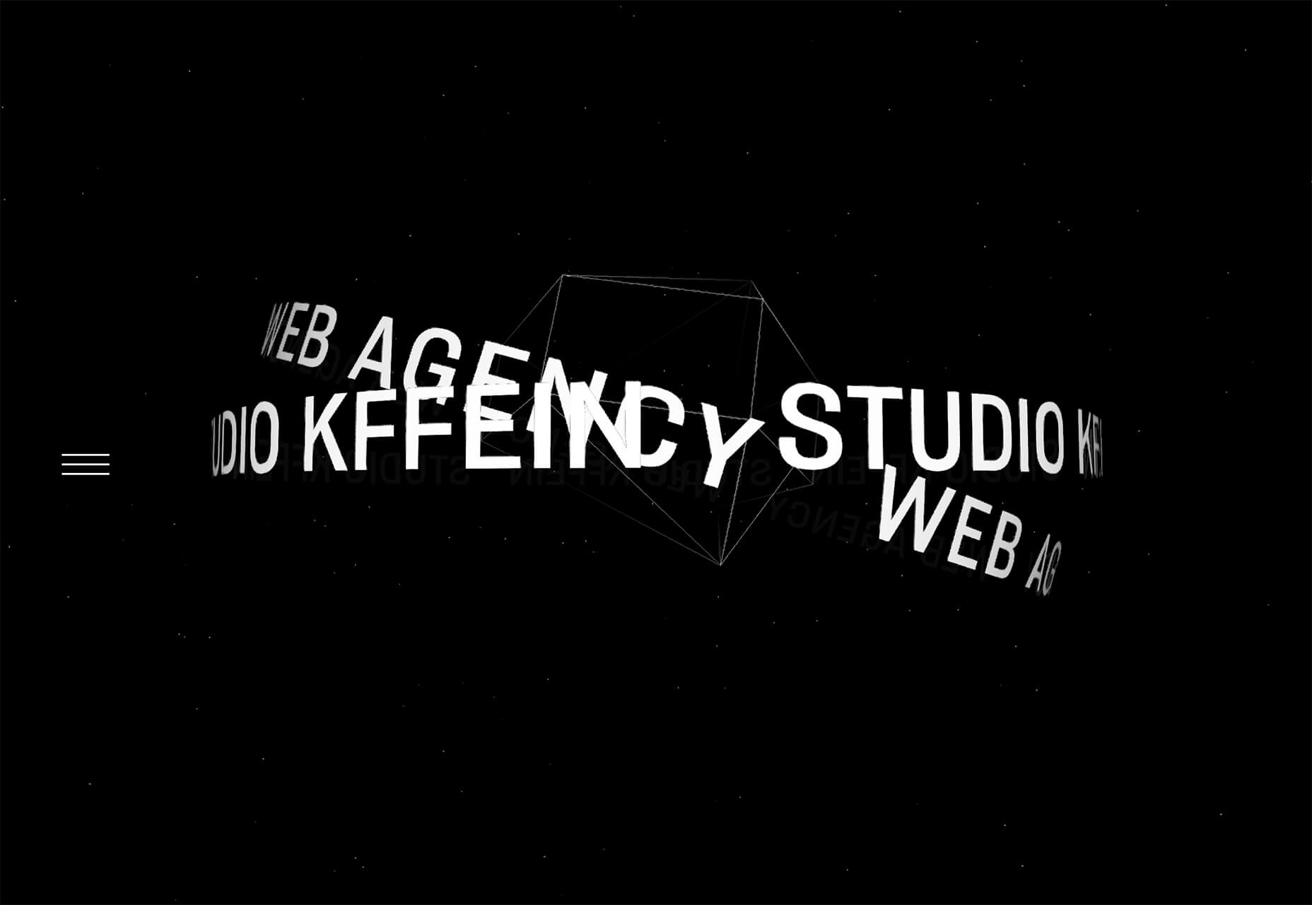
Kffein takes a totally different approach with a circle made from the primary test elements. Identifying website information rotates in a circle around another geo shape on the main plane. Not only is there a circular animation, but an almost three-dimensional effect that happens due to the way elements are layered here.


Pink and Purple Palettes

The prevalent pink and purple color combination isn’t for everyone – although you wouldn’t know it from the number of designs using similar colors.

This bright combination almost screams “spring” and has a lightness to it that almost seems to lift the mood of any project. (Maybe color selection is a reflection of how we all want to feel.)

What’s nice about these colors is that they flow into one another nicely. They can also be expanded to fall into neighboring hues on the color wheel, such as red from pink and blue from purple.

Maybe the most popular use of this color pair is as a gradient. You can find pink to purple everywhere, from background gradients to image overlays to buttons and user interface elements. There’s no lack of use here.

Each of these examples shows opportunities with this color combination.

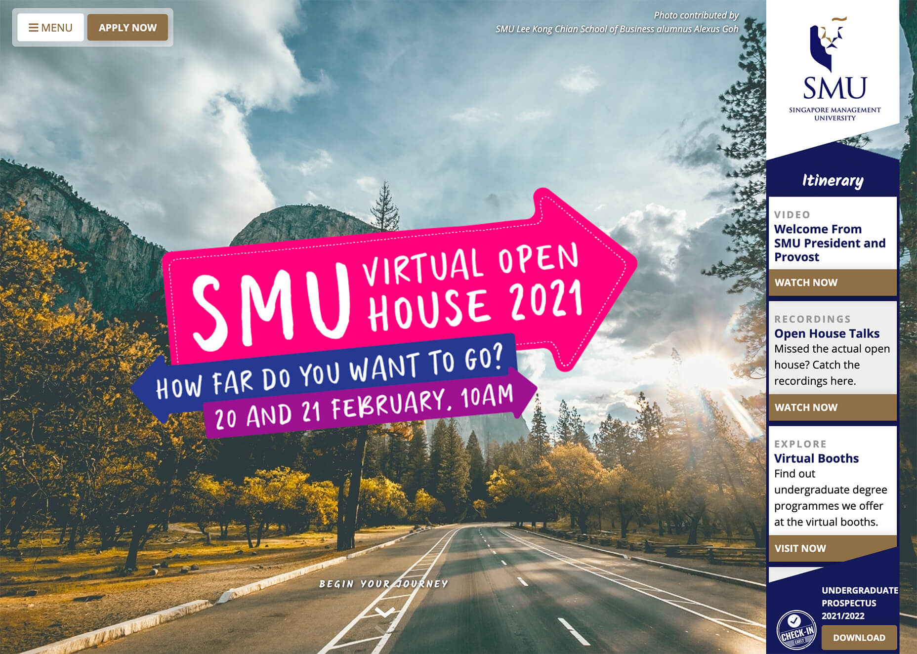
SMU uses bright pink, blue, and purple to create a giant “road sign” in the design that jumps out from the rest of the project. The sign almost seems out of place and doesn’t fit as part of the normal color palette. This is what draw you right to it.

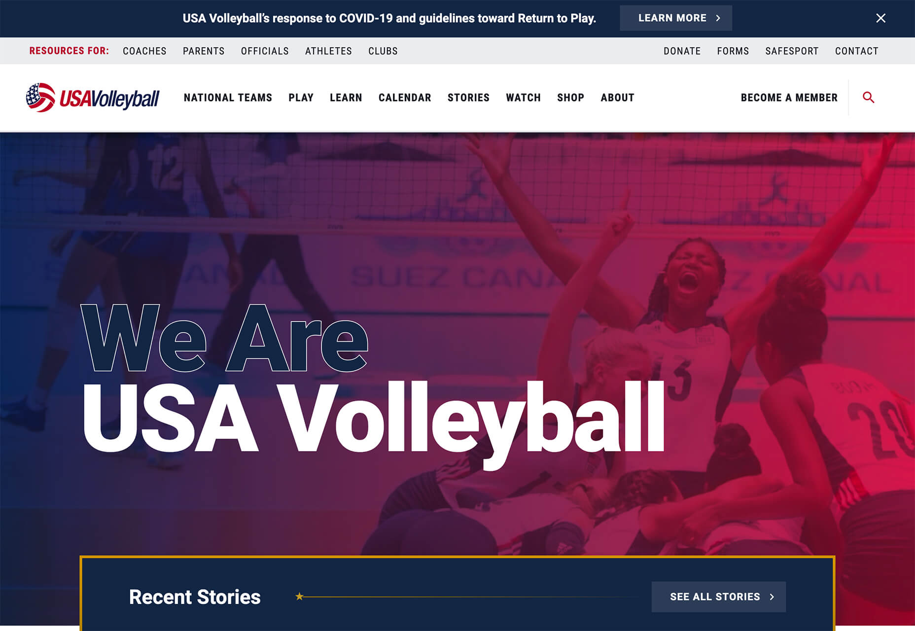
USA Volleyball uses the popular gradient option and extends the pink to the purple palette to hints of blue and red. What’s great about this design is that it uses a super trend element and color option and makes it work with their current color palette. You can almost imagine the design conversation when someone wanted to use a pink to purple gradient for a brand that features red, white, and blue. The gamble paid off, and it works beautifully without being off-brand.

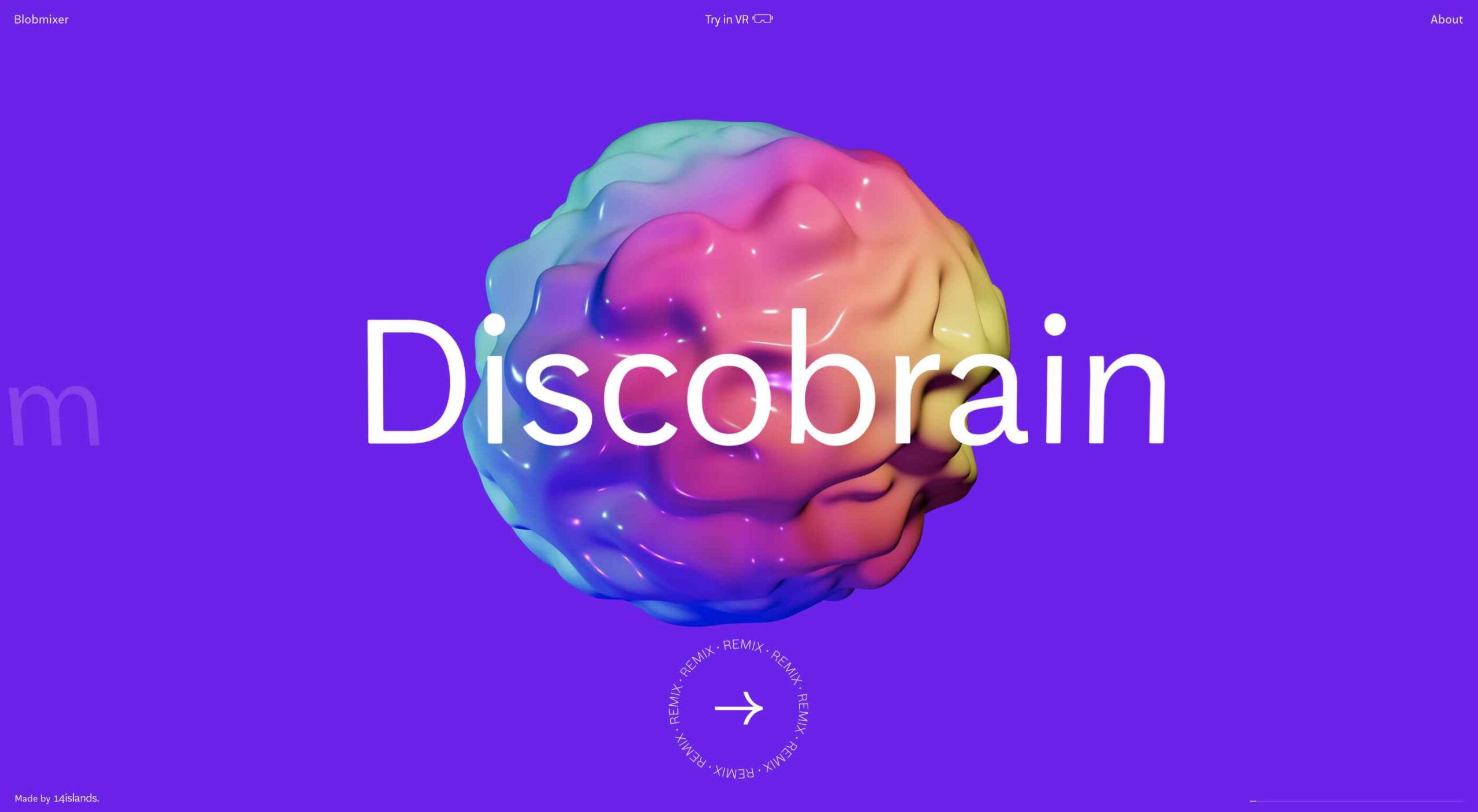
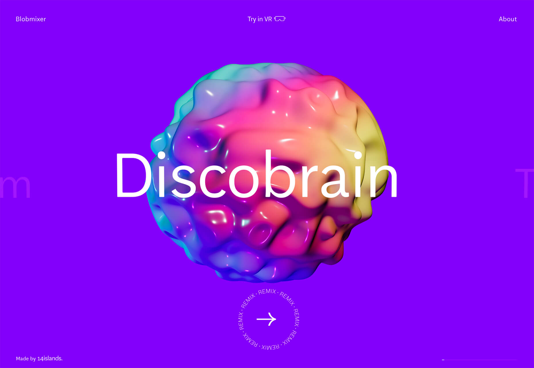
Blobmixer uses purple, pink, and a few other bright colors – note the animated circles, too – to draw users into the design. The entire project is a fun, customizable experience that you can play with, and the color choices are what make you interested enough to try. This design also offers a great example of tactile animation and elements that feel real even when you interact with them using a mouse on the screen.


Faux Split Screens

Split-screen designs were a huge trend for about two years. The aesthetic was also functional for content that required a this or that choice on the part of users.

Now, we see the design elements but without the function. (Maybe because it just looks nice and creates a sense of balance without a symmetrical design.)

These projects look like they might offer multiple gateways to content, but there is only one call to action on the dual-screen aside from navigation elements.

What this design option does is help draw the eyes across the screen. One side will immediately appeal to you, and when done well, you’ll feel a subtle push of pull from the color, text, and images to look at the other side as well.

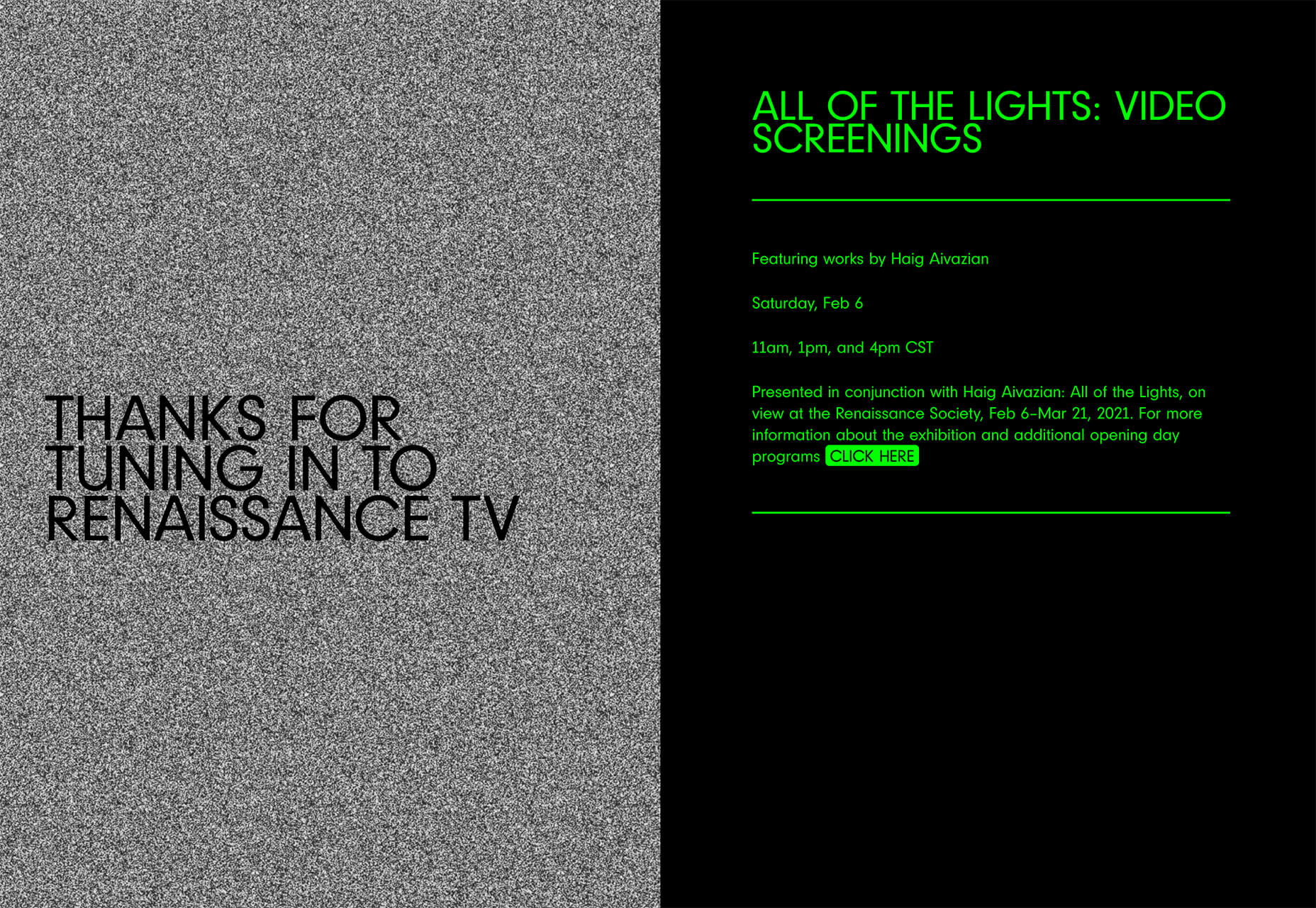
Renaissance TV does it with heavy animation with “dancing dots” from an old TV that doesn’t work. But then you need to look at the green text to understand what is happening.

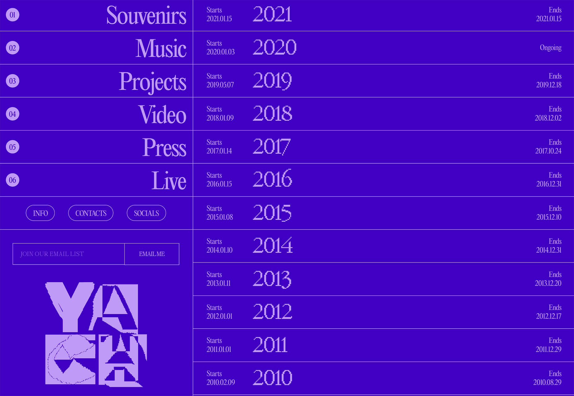
Yacht uses text weight and space to push the eyes across the screen. Almost everyone will go to the heavier areas first and then gaze across the screen through blocks of space to the final small text on the right side. And it all happens in a fraction of seconds.

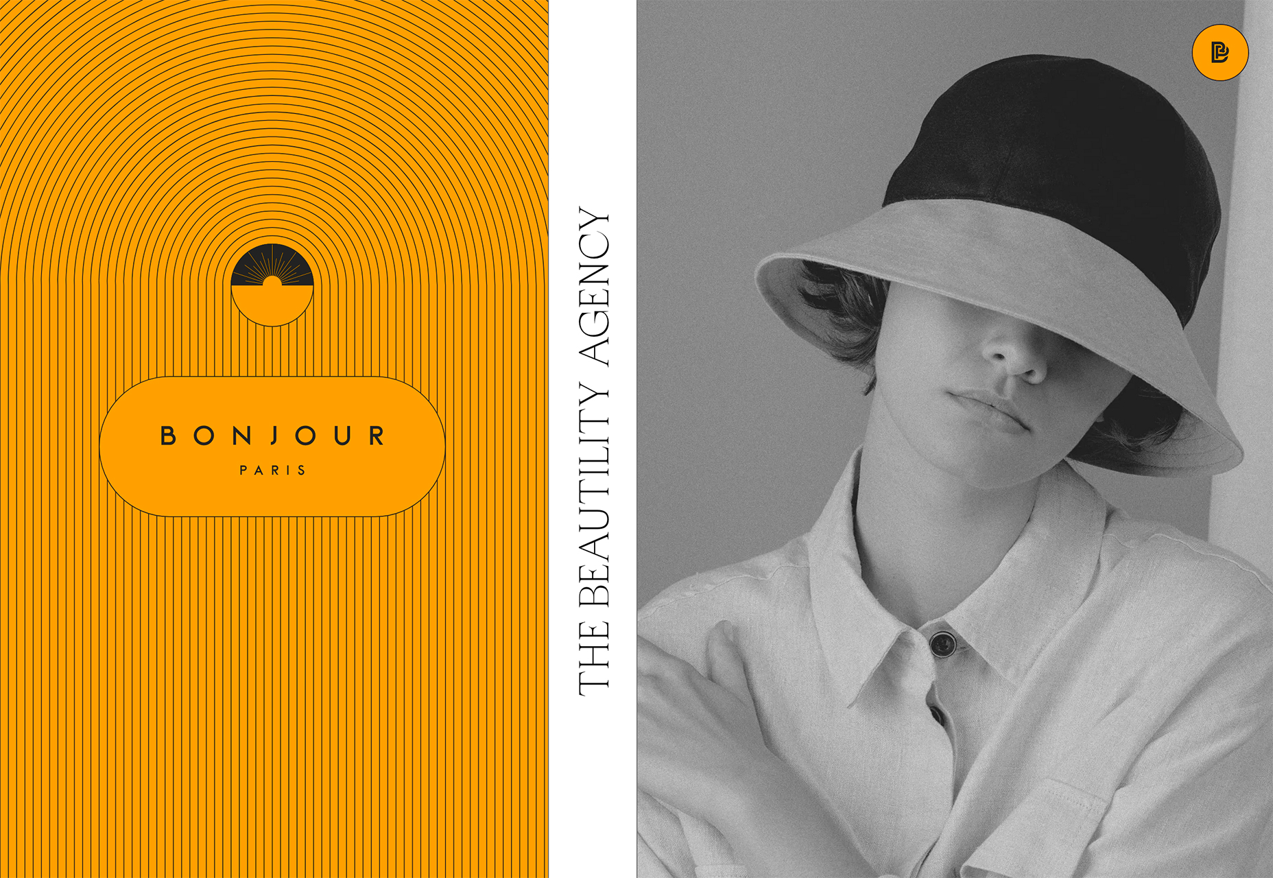
Bonjour Paris pairs bold color with black and white images. You may look at either side first, depending on personal preference, but the other half of the screen is necessary for a complete understanding of the website.


Conclusion

While all of these design trends are evident in new and recent projects, the use of pink and purple color palettes – particularly with a gradient – seems to be everywhere you look. These color choices are popular and come in a lot of forms.

Maybe the most obvious is with brighter pink and purple gradients, but other variations are also trending. It’s definitely one to watch in the longer term.

Source

The post 3 Essential Design Trends, March 2021 first appeared on Webdesigner Depot.

Source de l’article sur Webdesignerdepot

Traditionally, testing has been perceived as a bottleneck in SDLC, something that causes delays in delivery. Organizations have long adopted the Agile/DevOps model, but not without its pitfalls and stumbling blocks, especially in achieving the ideal speed/quality balance.

For enterprise DevOps, it is vital to rethink testing approaches to achieve agility at scale. There is much of an overlap of roles, for instance between business analysts and QA testers. Is the tester’s role diminished because of this overlap or because of automation?

Source de l’article sur DZONE

It’s February, and the spring sun is finally starting to peep through the winter clouds. While many of us are still largely restricted to our homes, the web has kept on growing.

We see a shift in attitude towards natural health, wellbeing, and sustainability, and these are now being branded less often as outliers and increasingly mainstream. We’re also seeing more and more color all the time, ranging from an emotional signifier in the background to being a functional element in its own right.

GOOD Meat

Gorgeous color in the background image and the scrolling narrative pull the user in on this site for lab ‘grown’ meat.

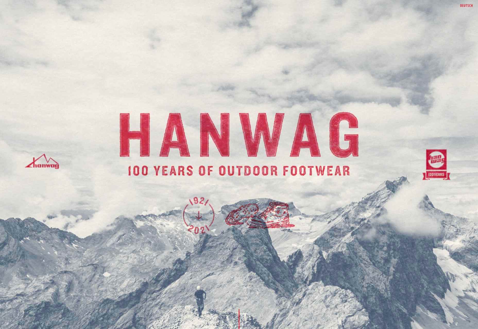
Hanwag 100 Years

This page celebrating 100 years of outdoor footwear company Hanweg uses a mix of illustrations and photographs to create a timeline marking the company’s highlights alongside what else was happening at the time. Any excuse to get Yoda in.

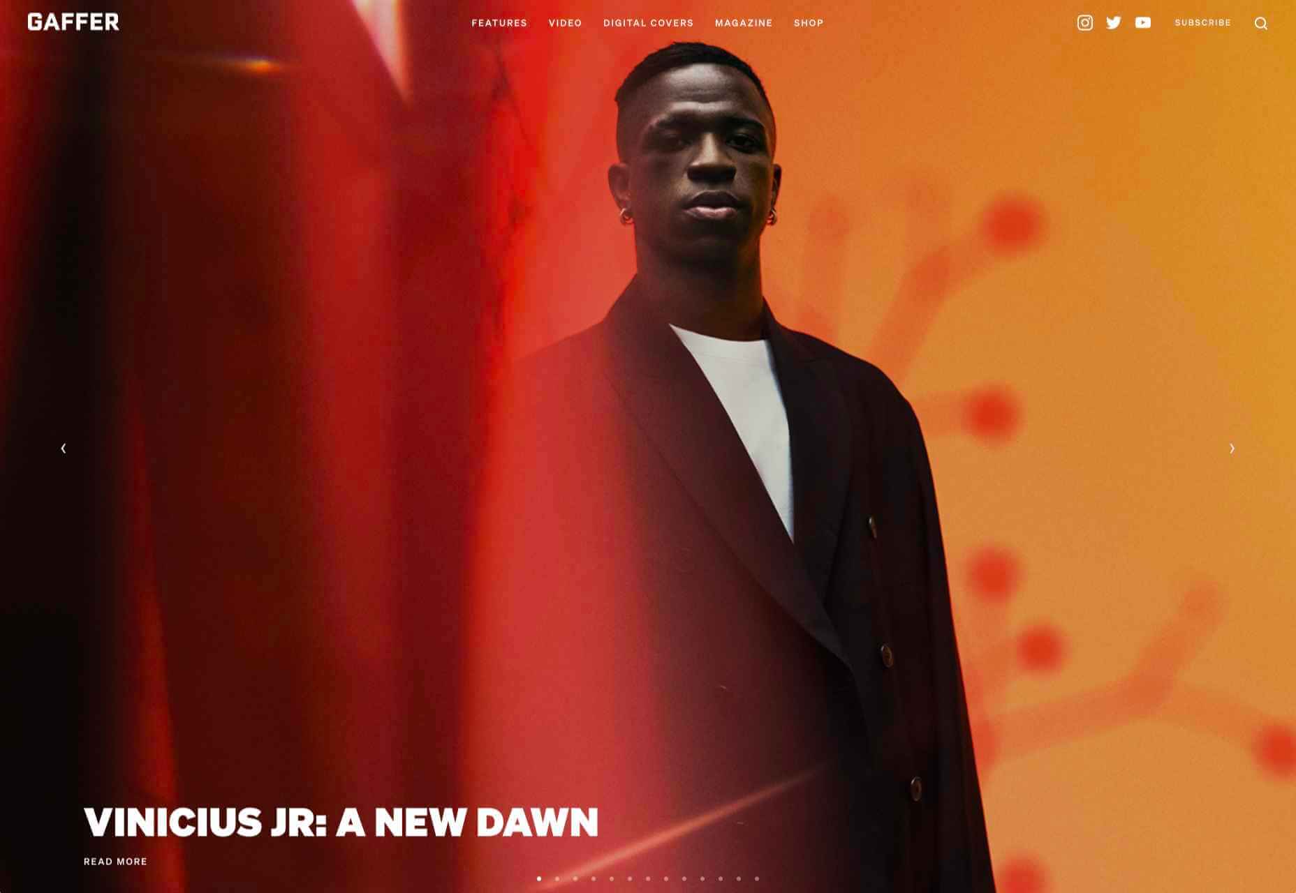
Gaffer

Gaffer describes itself as bridging the gap between football, music, fashion, and culture. The site has a glossy feel, with strong art direction and an easily navigable architecture.

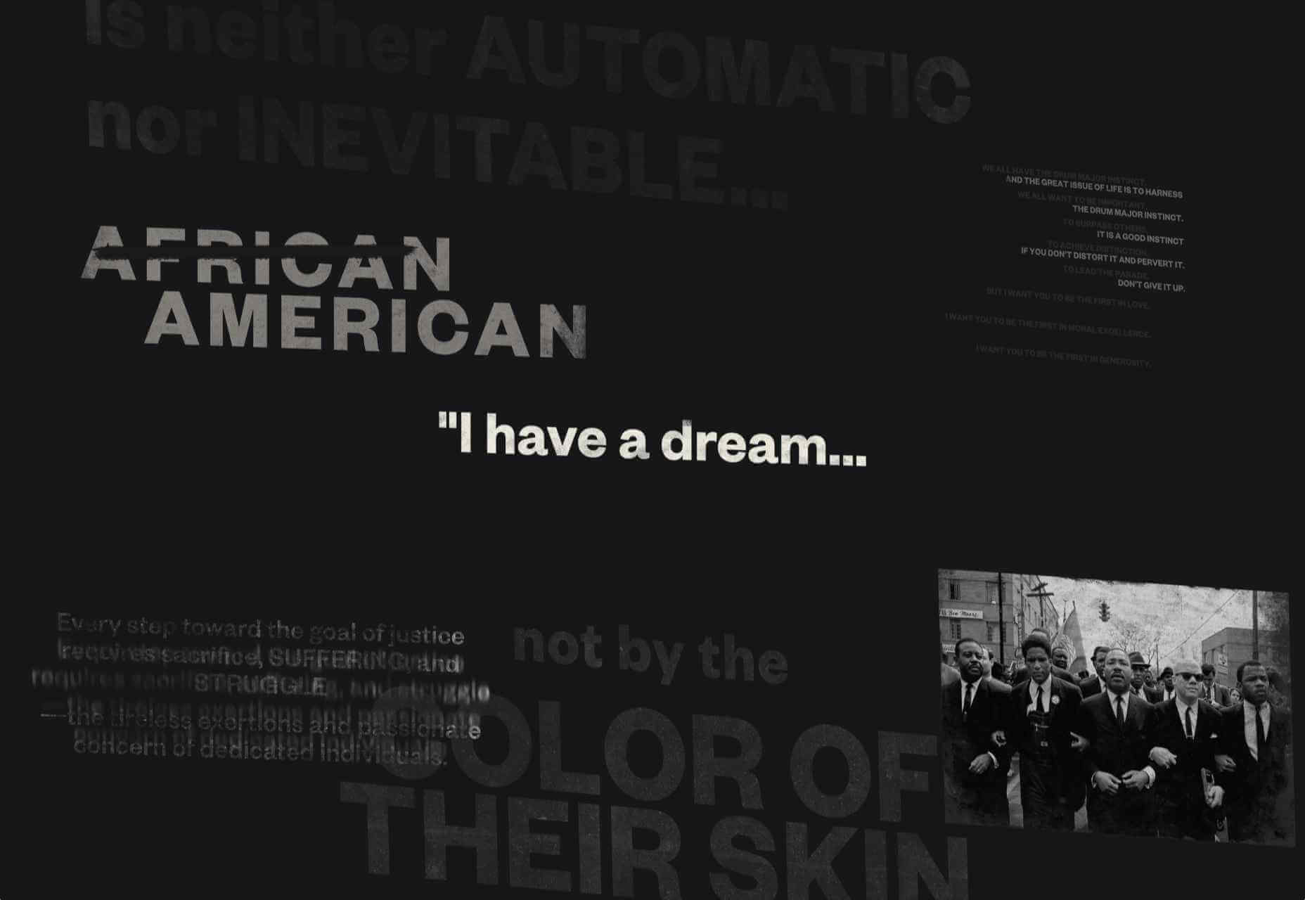
Remember MLK

This rather beautifully made tribute to Martin Luther King uses some great typographic effects, and the variations, in contrast, create a layering of the different content elements.

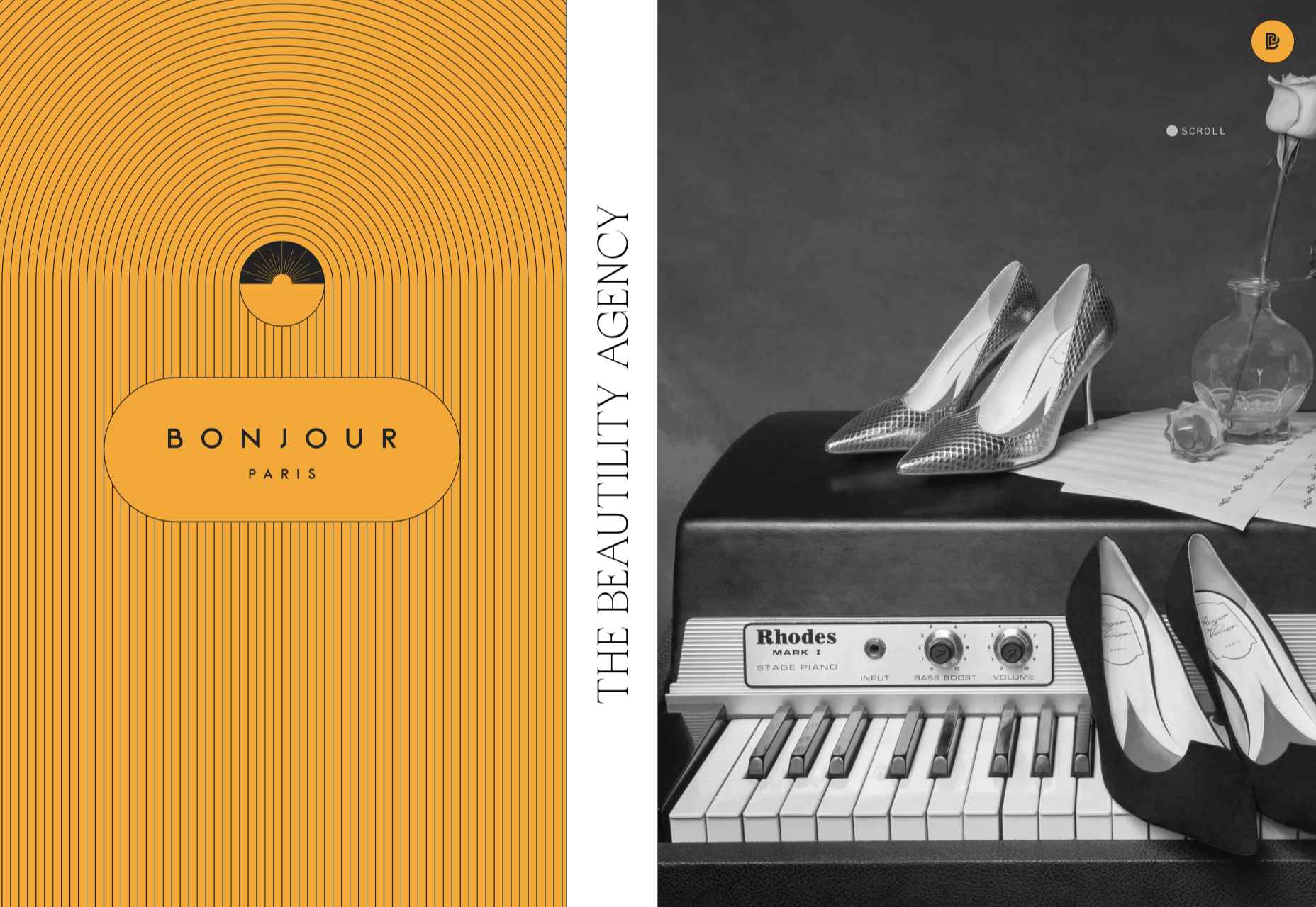
Bonjour Agency

The home page for design agency Bonjour Paris uses sideways scrolling to give an overview of the whole site. There is a lot of content, but it doesn’t feel like waffle, and exploring the site is a pleasant experience in itself.

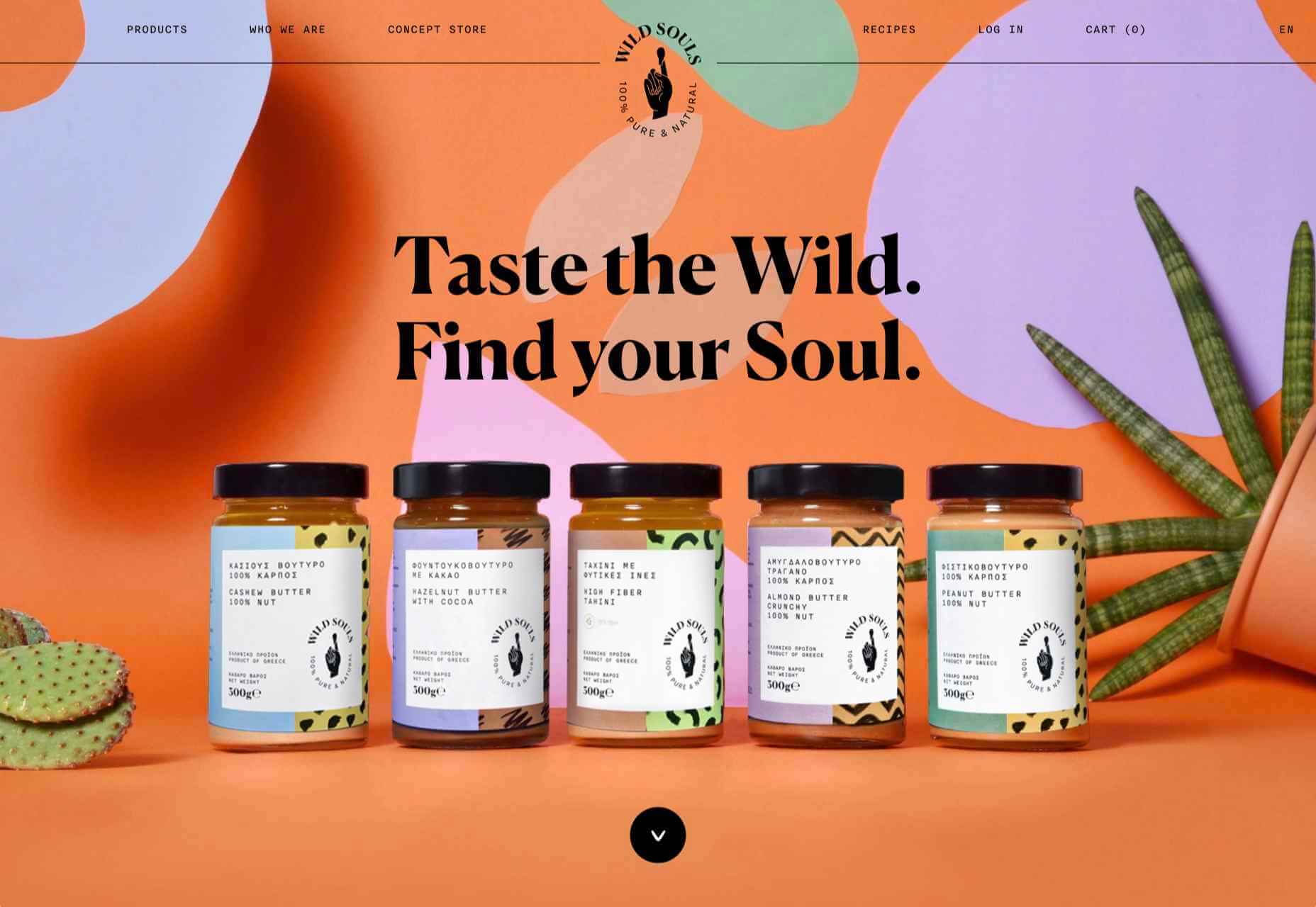
Wild Souls

Wild Souls is a Greek company that principally makes nut butters, tahini, and halva. The site is very colorful but warm, and the display type — Canela — has a slight softness to it that is appealing.

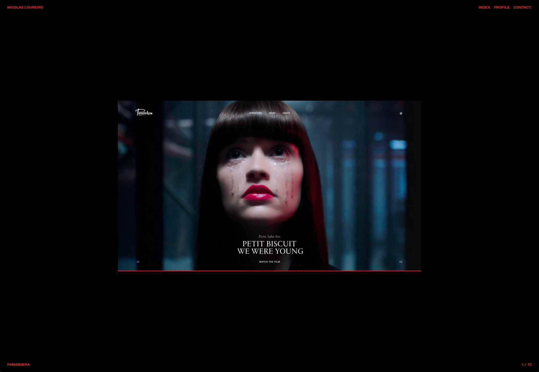
Nicolas Loureiro

This is a strong portfolio site for interactive and graphic designer Nicolas Loureiro. The work is front and center, and the navigation is pleasing.

Studio Nanna Lagerman

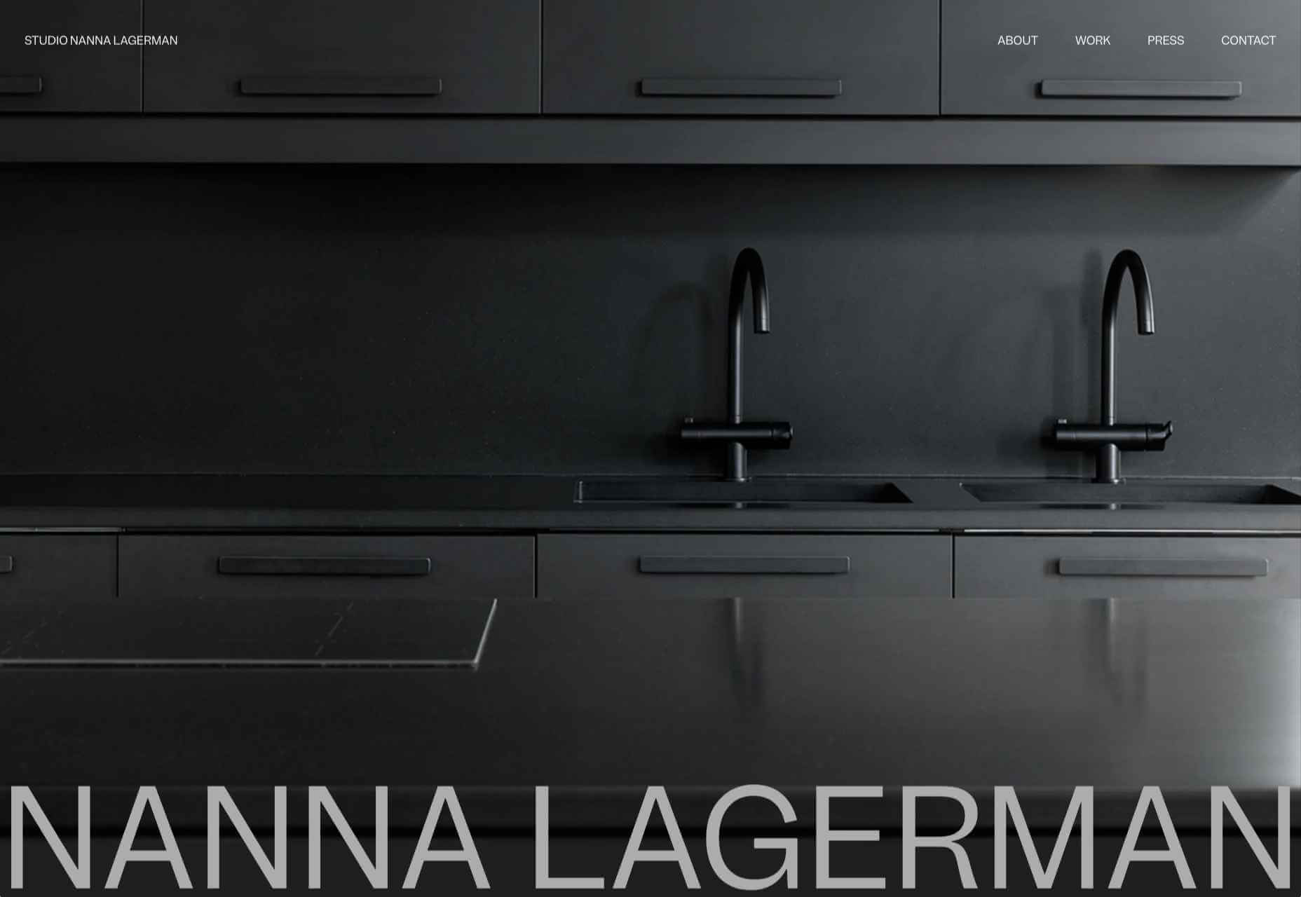
Studio Nanna Lagermann is a small interior design studio that works on private homes, public spaces, and set design. The site creates a feeling of space and calm. Colors are soft and neutral, and the type, although massive in places, is clean and sophisticated.

Aurelia Durand

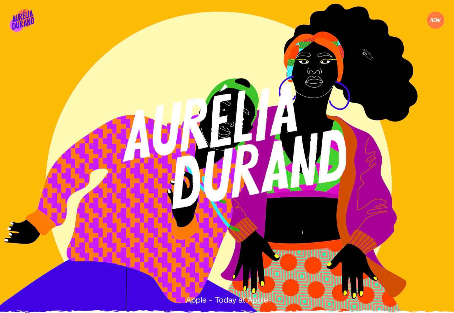
Illustrator Aurelia Durand created her own typeface that she uses in her work, and it is used as the main display font here too. This site has a sense of joy about it that is hard to resist.

Archivio Mario Russo

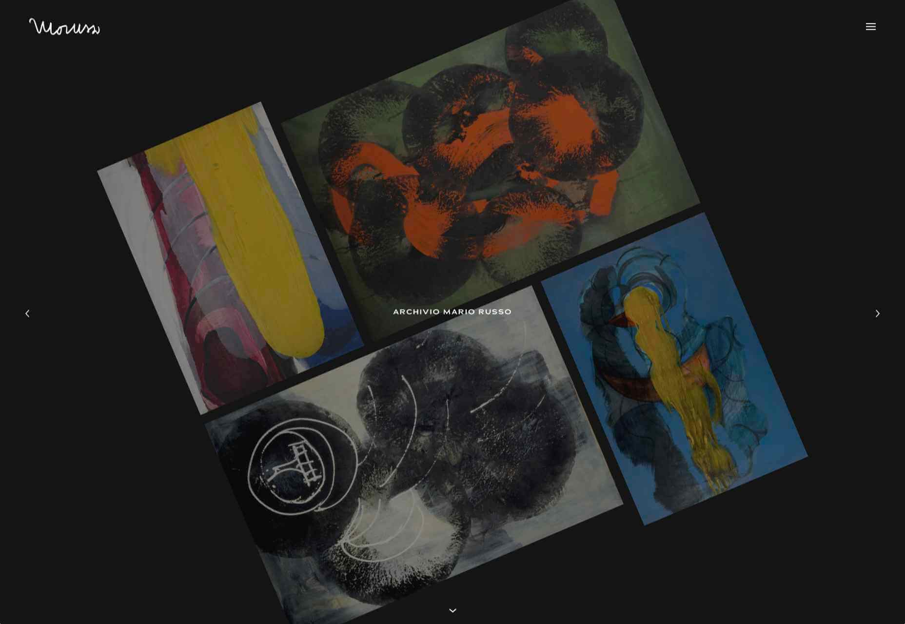
This site documents the life and work of 20th-century Italian artist Mario Russo. The layout is thoughtful, and the text, while informative, doesn’t detract from the work being shown.

Gigantic Candy

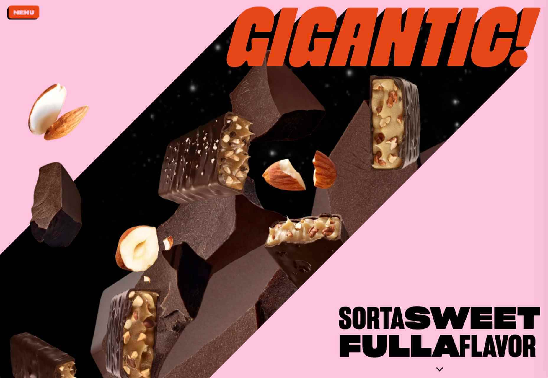
Gigantic Candy makes vegan chocolate candy bars. The site is big, bold and lo-fi, and has a sense of fun to it.

dBodhi

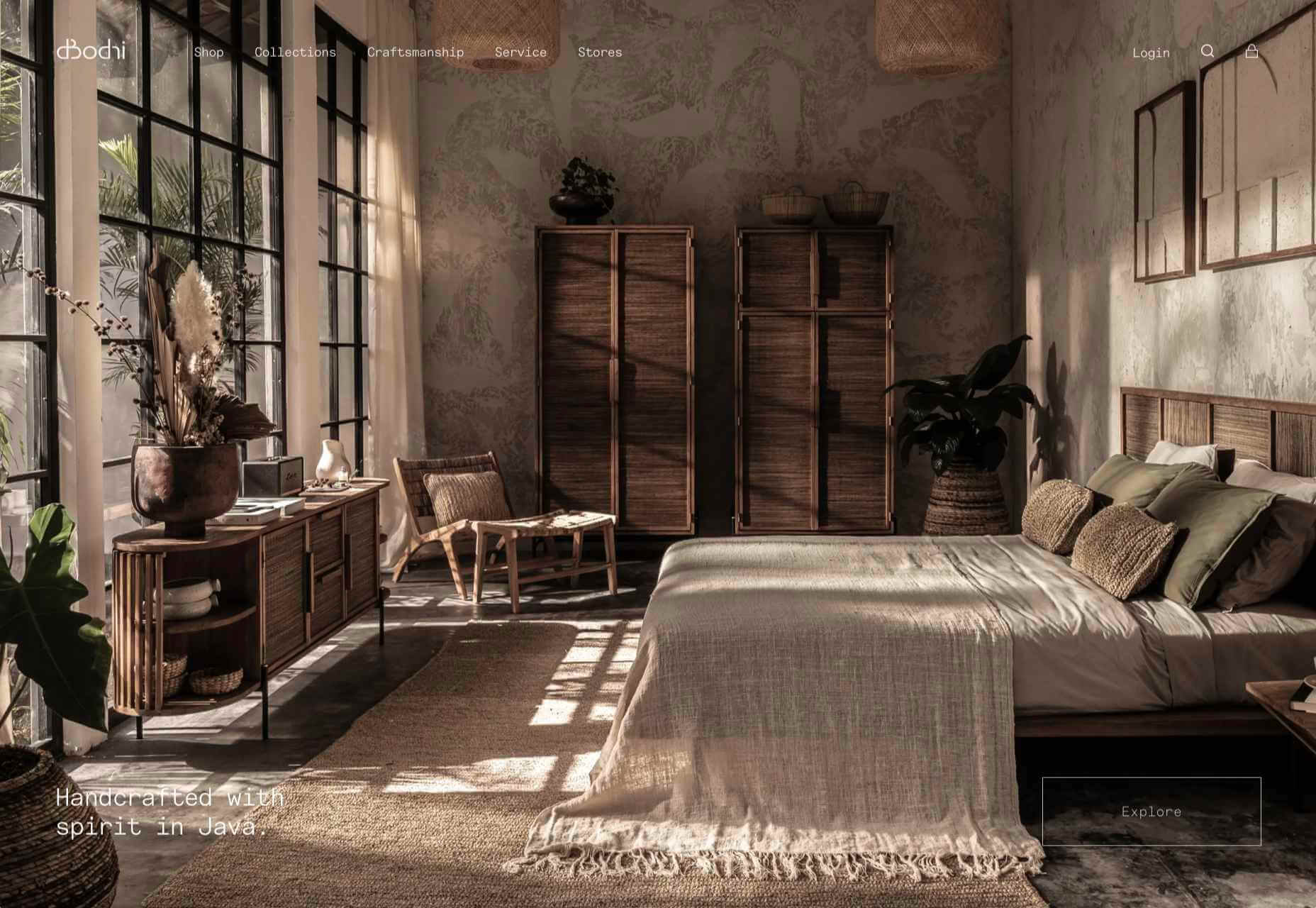
dBodhi sells handcrafted furniture from Java, made from reclaimed teak and locally grown plant materials. The clean layout combined with a slight sepia tone on all the photography creates a feeling of quietness and nature.

Menu Durable

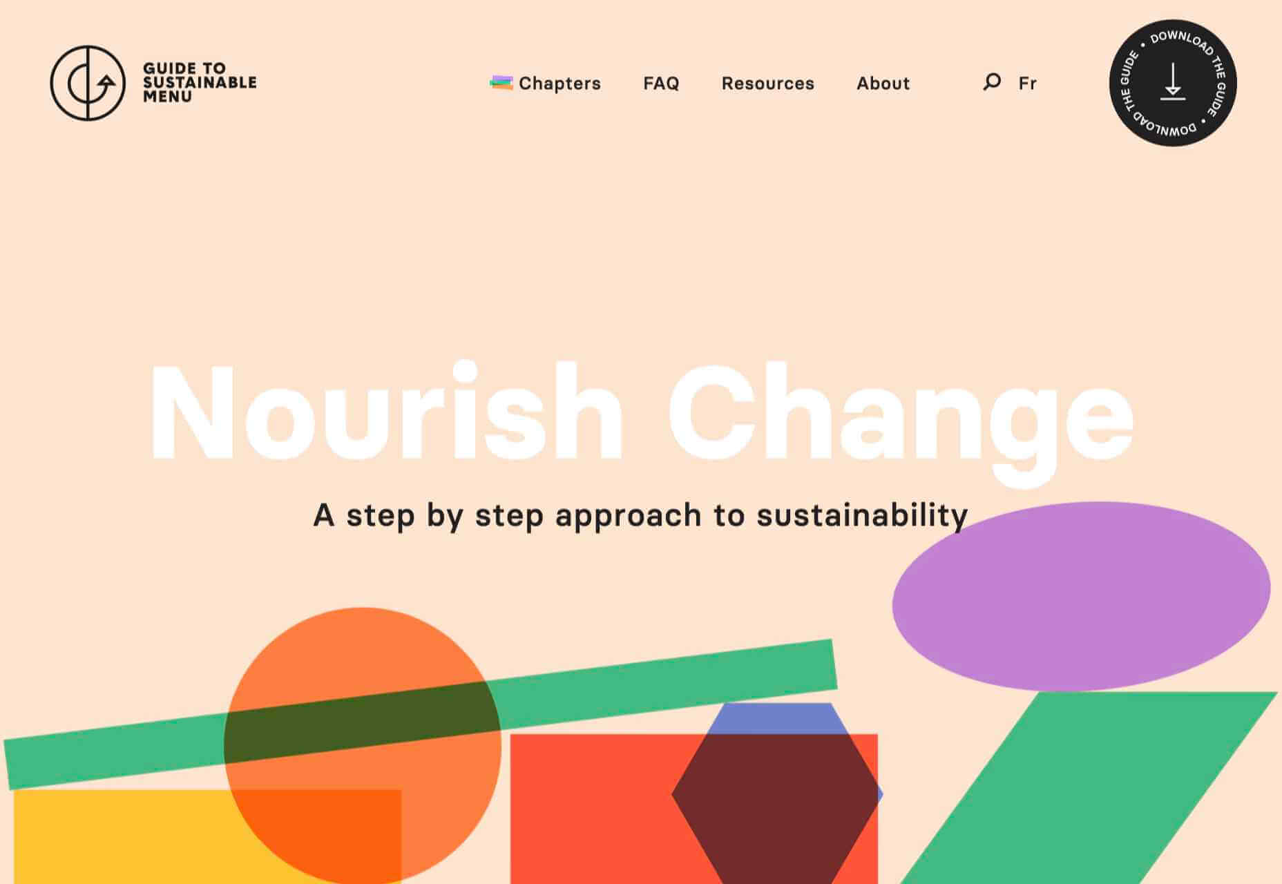
Menu Durable is a guide to creating healthier, sustainable food menus in Canadian healthcare facilities. There is a lot of information here, and it is well written and attractively presented with clear color coding.

Virgile Guinard

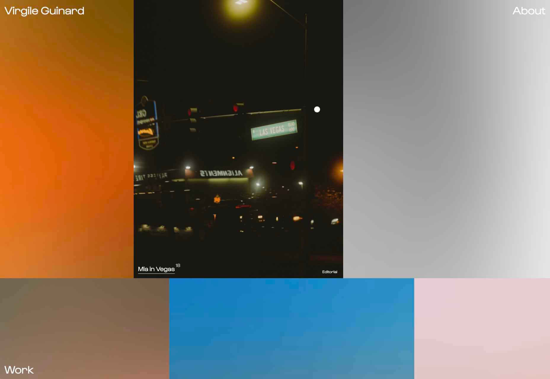
This is a lovely, simple portfolio site for photographer Virgile Guinard. By using blocks of color pulled from each photograph’s predominant color and only revealing each photograph on rollover, each image is allowed to stand out.

The Bold Type

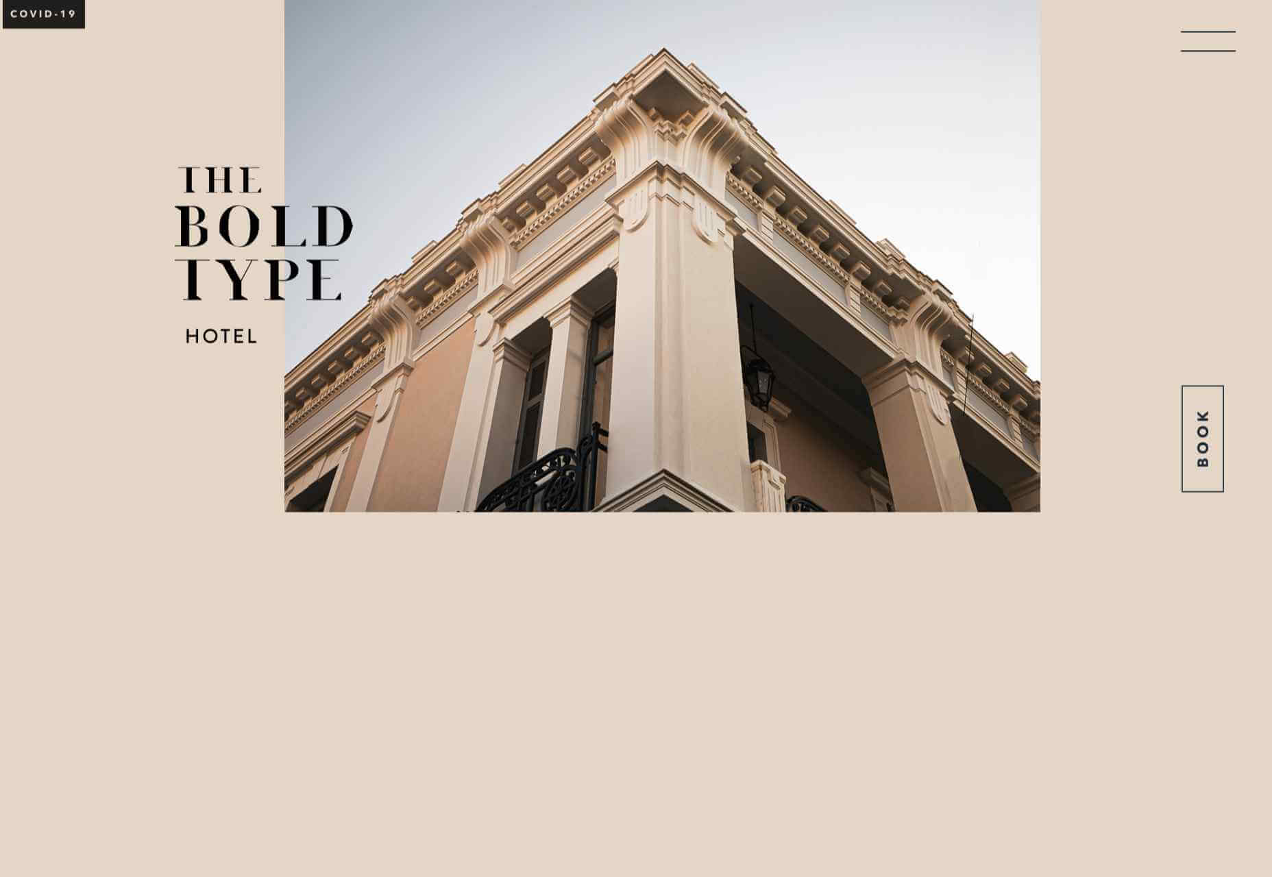
This site for The Bold Type Hotel in Patra, Greece, is a boutique hotel website archetype, but it is done well. The pinky sand background color is a good choice, and the photographs are excellent.

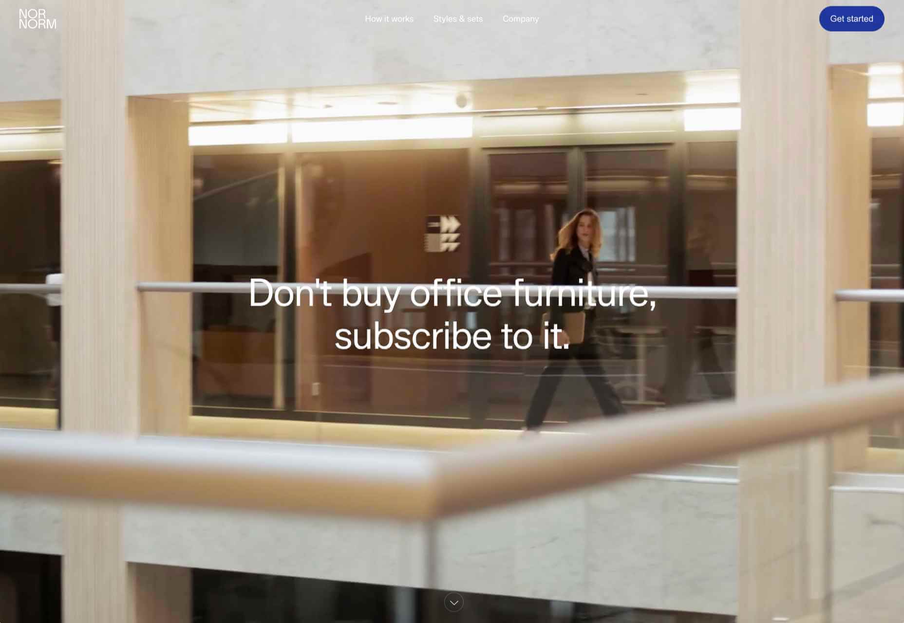
NOR NORM

Nor Norm provide an office furniture subscription service. The site is clean with a feeling of light and space. There is a good balance between an overview of the process and details of the individual items available.

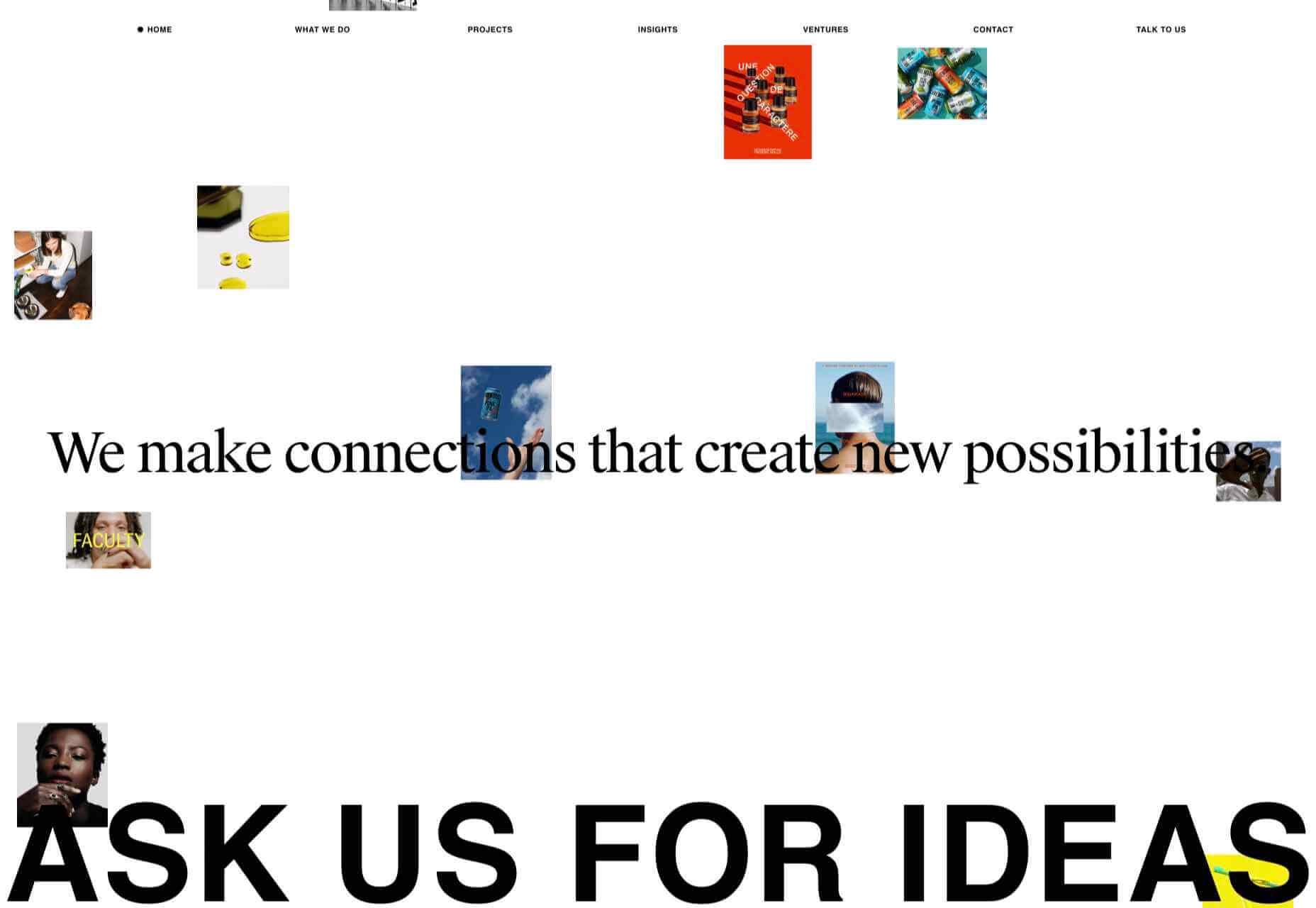
Ask Us For Ideas

At first glance, Ask Us For Ideas looks like a creative agency, but it is actually a creative broker, matching clients with agencies.

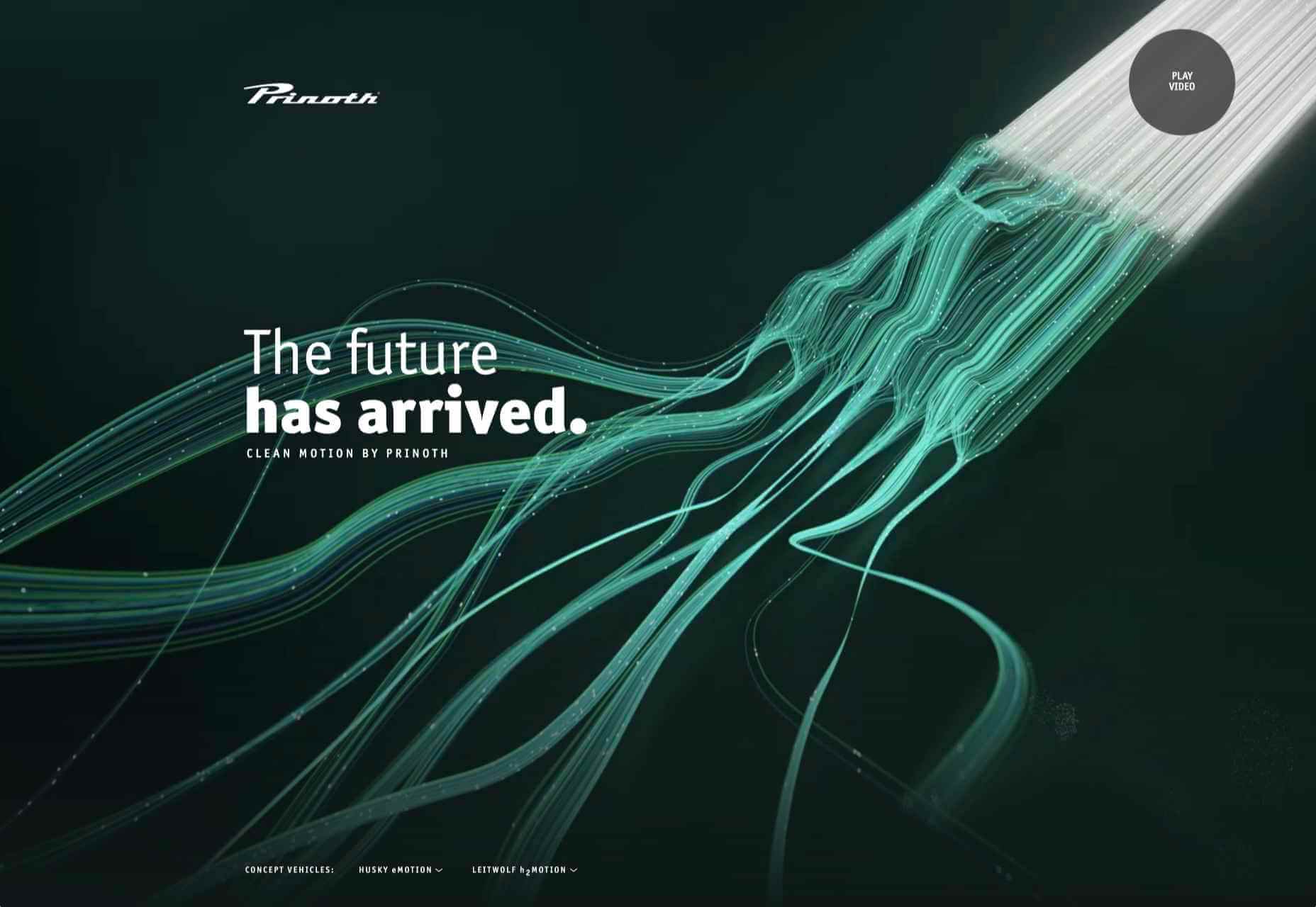
Prinoth Clean Motion

Prinoth has been making snow groomers since the 1960s, and this microsite is to mark the launch of their new hydrogen and electric versions. It is as slick and glossy as any luxury car website. And now I know what a snow groomer is.

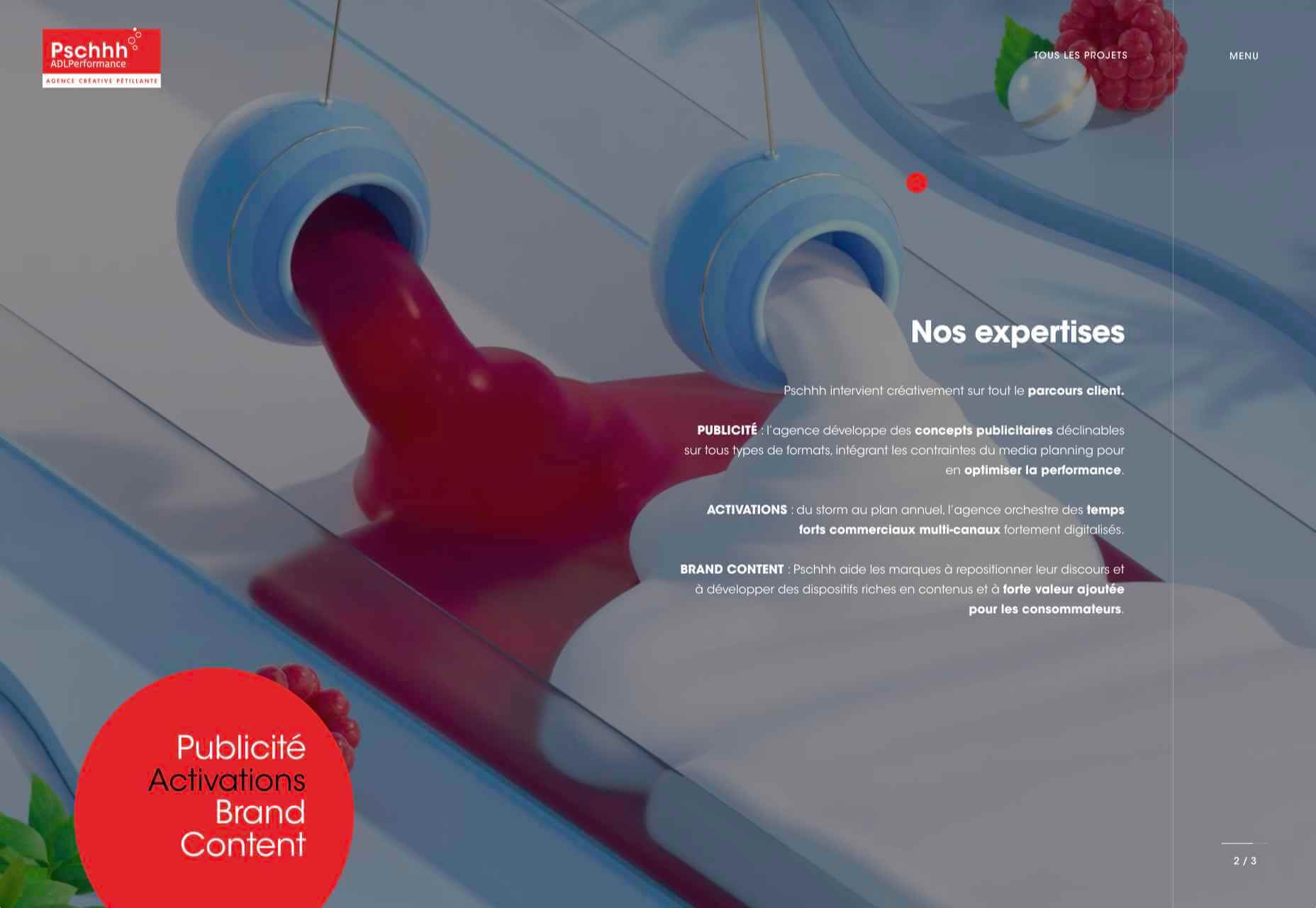
Pschhh

Design agency Pschhh has embraced the use of circles, reflecting the sound of bubbles their name suggests.

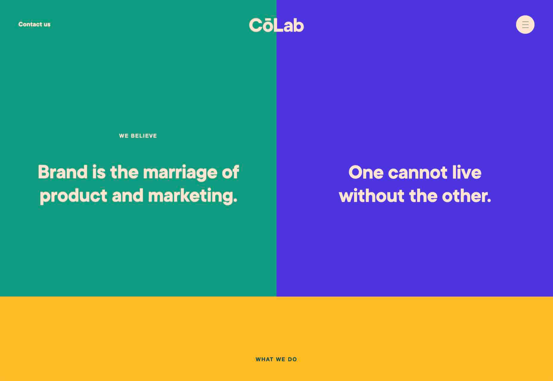
CōLab

CōLab is a design and marketing firm. There is a great use of color and movement here, and you don’t really notice initially that there is no actual work on show.

Source

The post 20 Best New Websites, February 2021 first appeared on Webdesigner Depot.

Source de l’article sur Webdesignerdepot

One of the few bright spots in 2020 has been the creativity companies and individuals alike have exhibited in dealing with what, at times, seemed to be overwhelming problems.

The world of web design was no different. Designers and agencies had to adapt and implement new color schemes or design new shopping experiences, which made some of the previous design trends not fit for the current design problems.

We’ll take a look at these newest design trends and the rationale behind them. As we do so, we’ll also take a look at some of BeTheme’s 600+ pre-built sites that have already put them to good use.

1. Comforting Color Palettes Lighten the Load

In years past, bolder color schemes were one of the hallmarks of web design trends. Their purpose was to quickly engage a visitor and prompt him or her to respond emotionally.

Given all the drama and turmoil we were subjected to through most of 2020, we’ve come to welcome the use of toned-down colors in marketing instead of the bolder, brasher, and more “in-your-face” color schemes. 

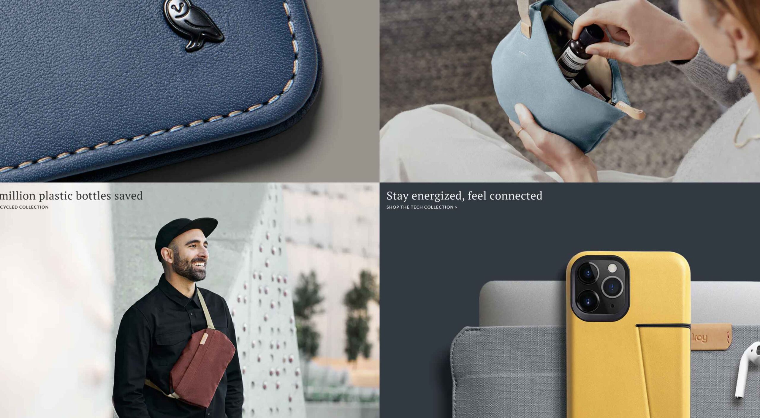
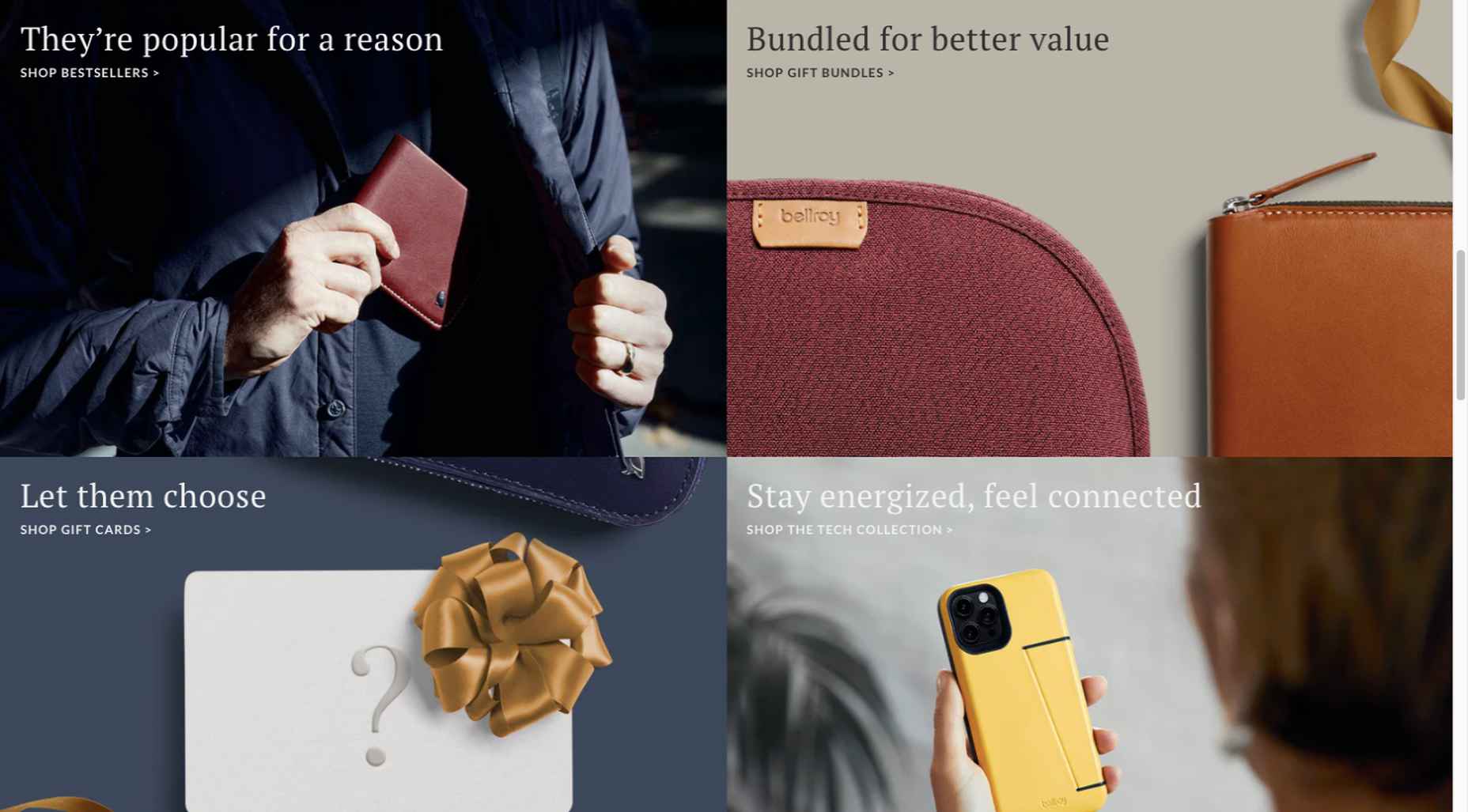
Bellroy’s website puts toned-down colors to good use. This company’s product line of wallets, bags, and the like, are designed to keep people’s belongings organized, safe, and secure. A wild color scheme simply wouldn’t be fitting.

How, then, are brightly-colored products dealt with? Thanks to judicious uses of white space and background photos, this website still emphasizes a toned-down color palette.

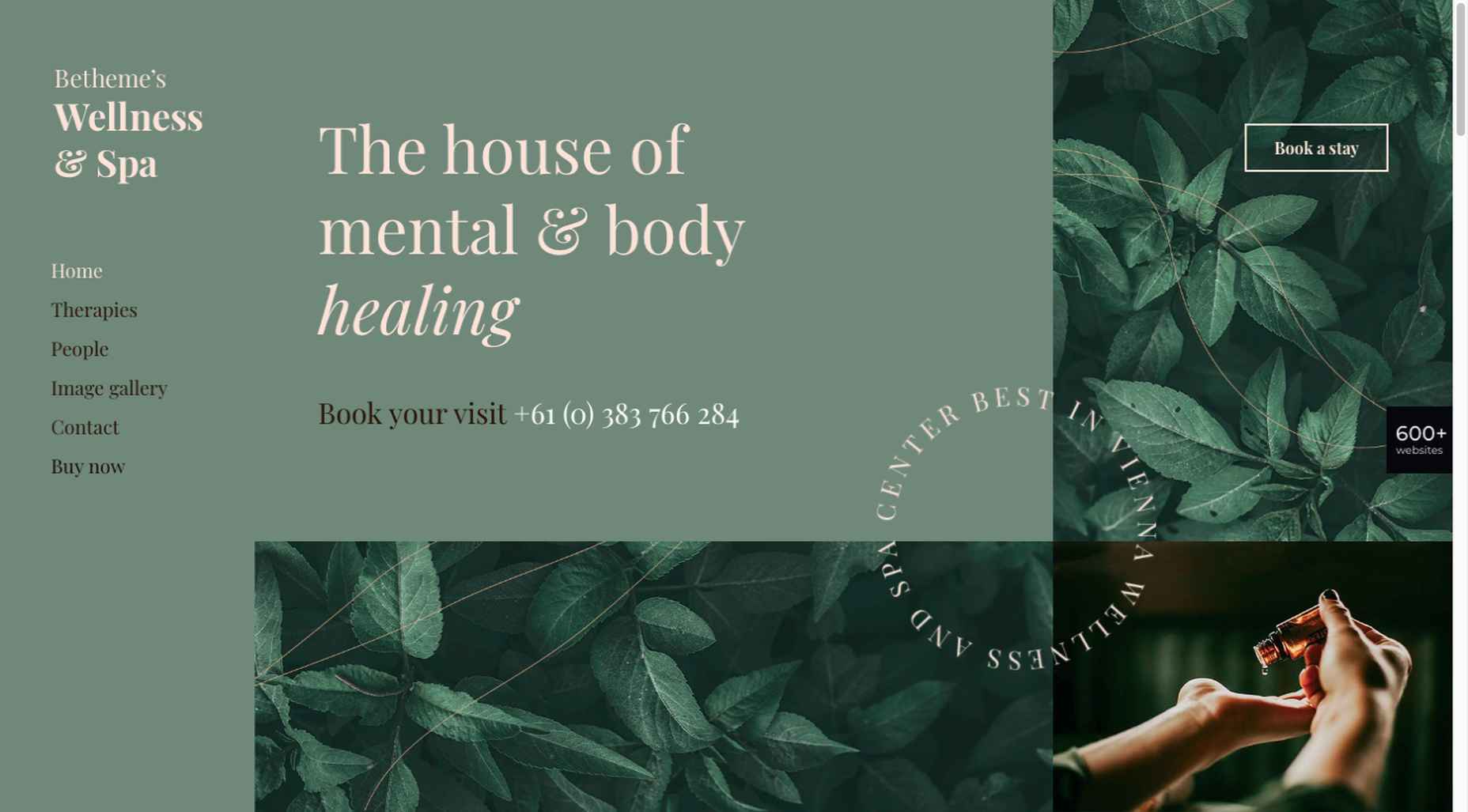
The BeSpa pre-built website is another example of a color scheme that almost immediately puts the mind at ease.

Calm and soothing? Yes.

Boring? Definitely not.

Comfort and security are the emotional drivers in this example.

2. Seamlessly Intermingle and Balance Physical and Digital Imagery

People confined to their homes because of Covid-based restrictions spent many more hours looking at their screens in 2020. Online programming began to take on the appearance of a reality show that blurred the boundaries between the real and the digital.

Whereas web designers tended in the past to rely on either photos or illustrations in their designs, these same designers have started to integrate these blurring effects into their designs, with results that range from amusing and quirky to highly informative.

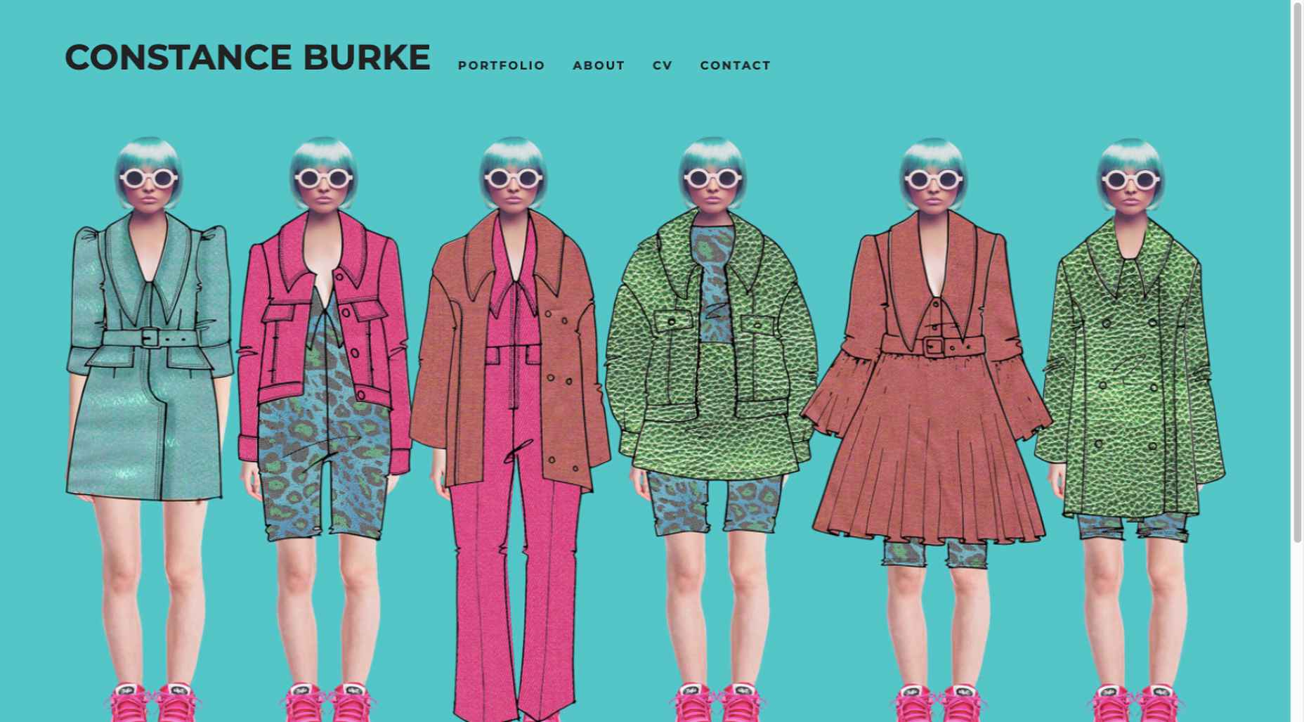
Check out this example from fashion designer Constance Burke

It’s not every day you see real models wearing hand-drawn fashion sketches. But it’s just one example of how the physical can be blended with the digital.

The BeSki pre-built site does the same blending of the two, but in a totally different way:

The sections’ designs switch from predominantly physical to largely digital and back again, an excellent approach that provides a maximum amount of useful information.

It’s also worth noting how snowbanks are effectively used to seamlessly transition from one section to the next.

3. Create Well-Organized and Helpful Shopping Experiences

More people spending more time at home has created a surge in online shopping. As a result, many online store owners are now feeling the effects of increased competition.

Consumers look for brands they believe they can trust. At the same time, they want their online shopping experiences to be as quick and painless as possible. They look for (and expect) quick and effective product search capabilities, helpful and effective product displays, one-page product descriptions, and the like.

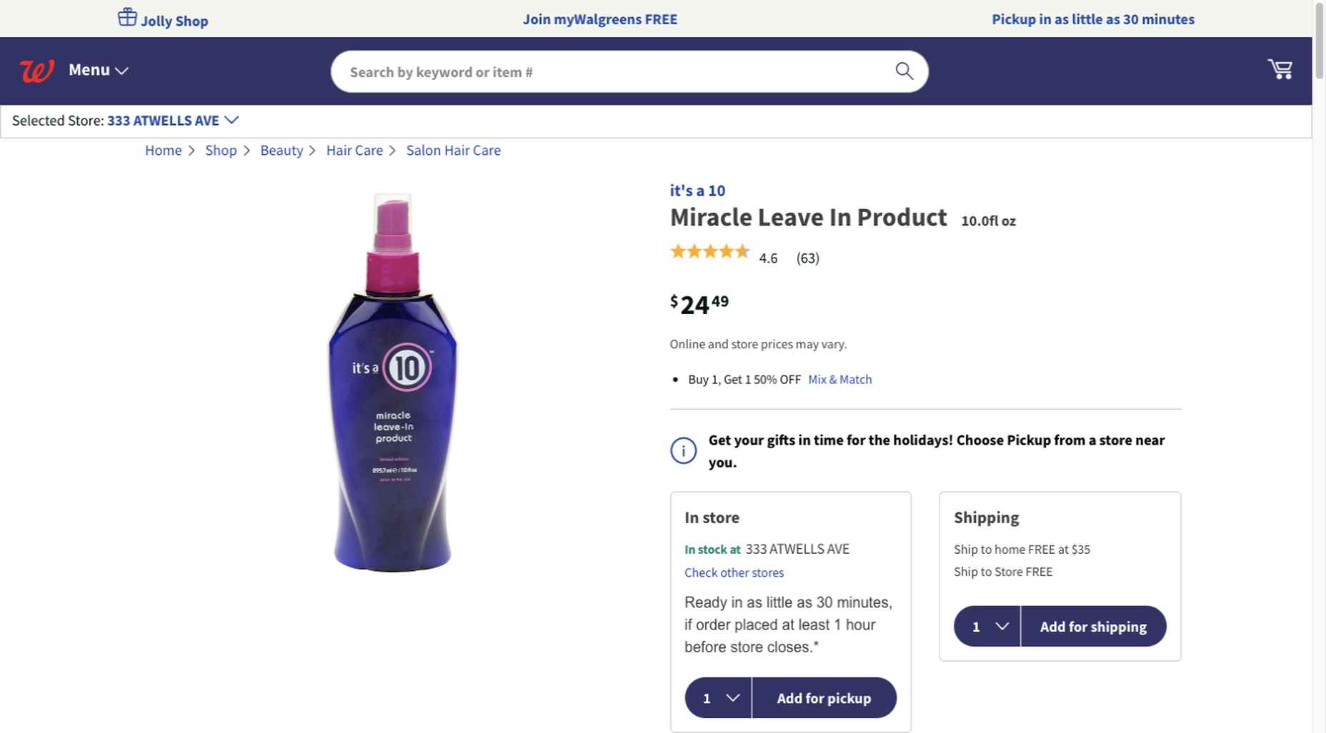
Walgreen’s product page design is especially well-suited for 2021 ecommerce shoppers: 

Everything shoppers usually need to know is presented above-the-fold. They can easily proceed to the next step or scroll down for reviews or additional product specifications. 

BePestControl’s pre-built website uses a similar product design approach: 

In this example, the main selling points are up-front and are kept short and sweet. The shopper can either hit the ‘Add to Cart’ button or look below the button for additional information.

In both examples, a visitor doesn’t have to mull over what step to take next since one of the design objectives is to make the shopping experience as easy and as satisfying as possible.

4. Take Advantage of the Benefits of User-Controlled Video Content

Once upon a time, video content was “the thing” to incorporate in a website. Hero background videos proved to be particularly engaging, and “how-to” videos presented much more useful information than illustrations or blocks of text could.

On the other hand, Auto-play videos, those that started on their own, all too often had a tendency to irritate rather than inform, especially when their content didn’t address a visitor’s immediate concern.

Thanks to Zoom and similar video platforms that came into widespread use in 2020 and to website designs that include video “Play” buttons, users have become much more comfortable with the medium. As an example, Shoppers have been given total control over if or when they want to view a given video. 

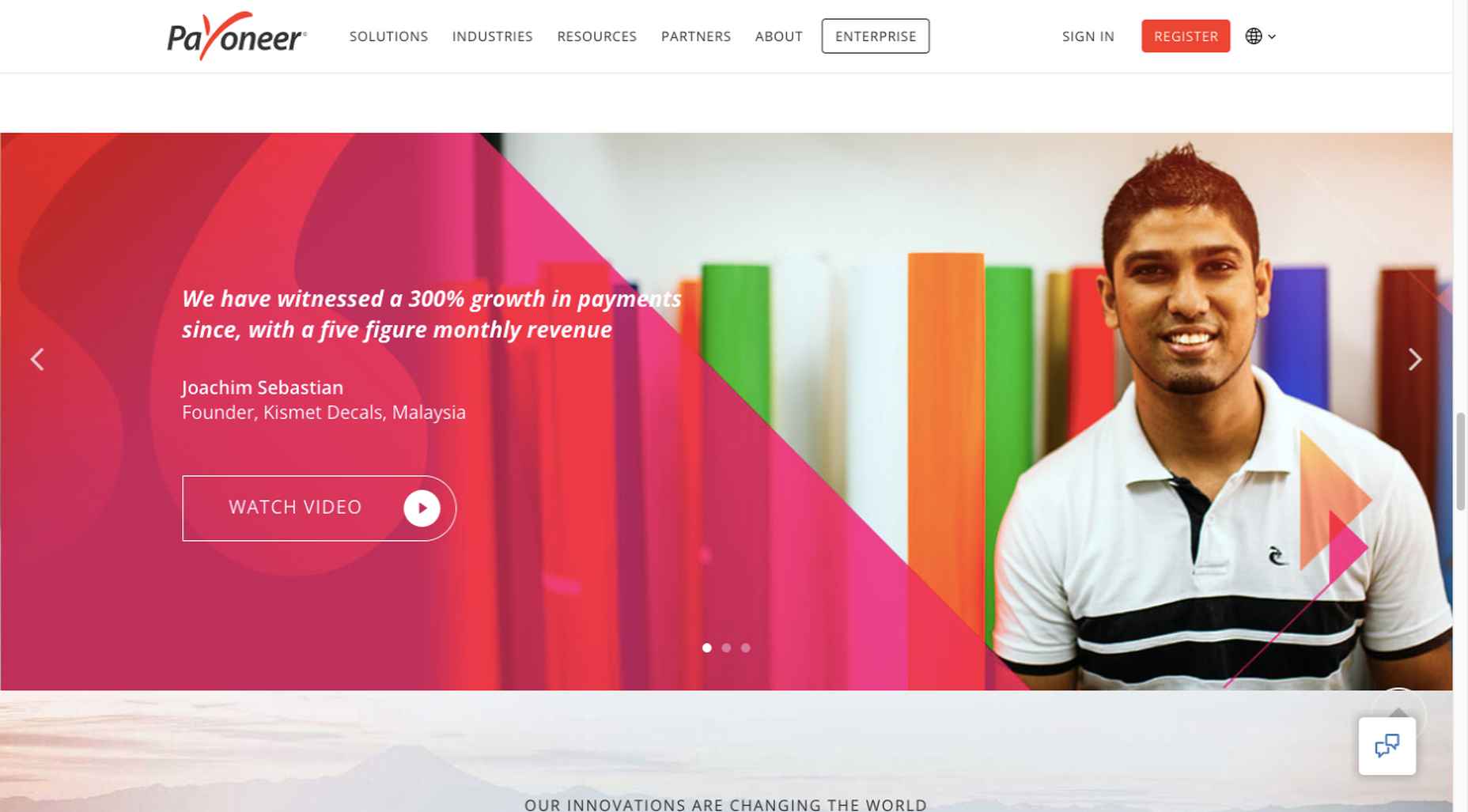
This is the design approach Payoneer has taken: 

The white “Pay” button is impossible to miss, and while it is designed to encourage a visitor to watch a testimonial, doing so is completely optional.

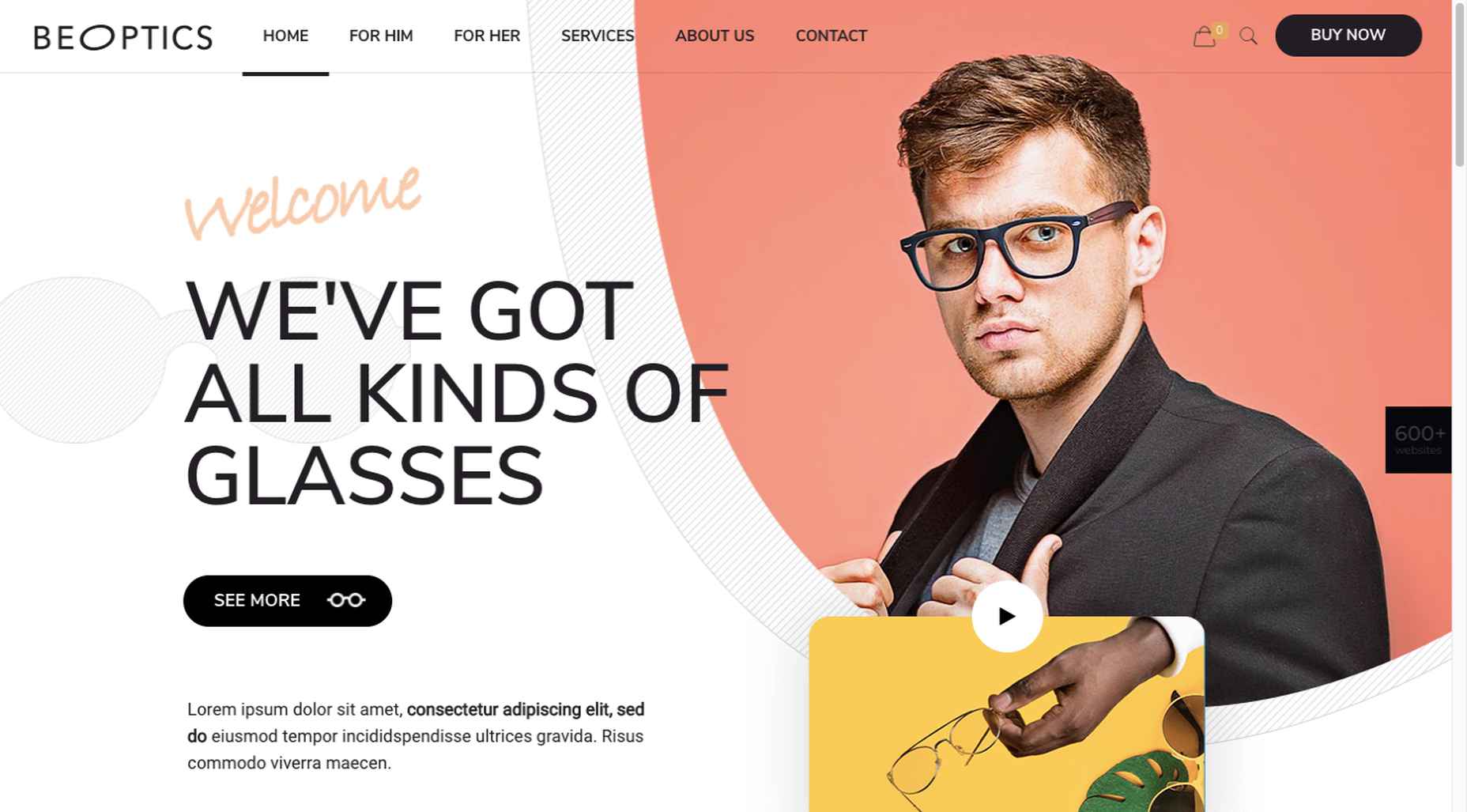
The BeOptics pre-built website cleverly slips in a video play option as well: 

In this example, when visitors hover over the “See More” button, it lets them know that they have the option to watch the video if they want to learn more.

5. Trust Builders Should be Non-Negotiable Web Design Elements

There are various ways in which products are organized or showcased in brick and mortar businesses to instill trust. Helpful and friendly staff also contribute to instilling trust.

Some of these trust-builders are easily incorporated into eCommerce designs. Others, though more difficult to fit in, can usually be satisfactorily addressed.

Digital trust builders can include.

  • Logos (familiar, whimsical, innovative, engaging)
  • Portfolios and/or product pages
  • Customer reviews, product ratings, and client testimonials
  • Case studies and product or price comparisons
  • Safety and security seals, e.g., Better Business Bureau, PayPal checkout
  • Charts, graphs, counters, and other data visualization techniques
  • Proof of social, charitable, or community-related actions and contributions

Put, trust-building content will beat hard-sell techniques every time, especially if you would like your customer base to include referred and repeat customers.

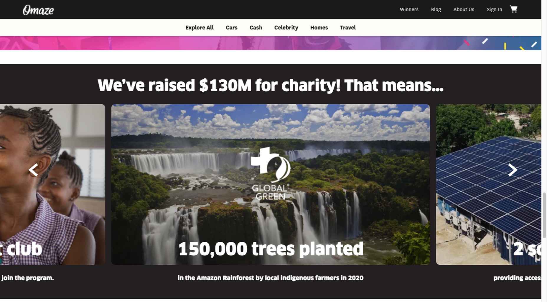
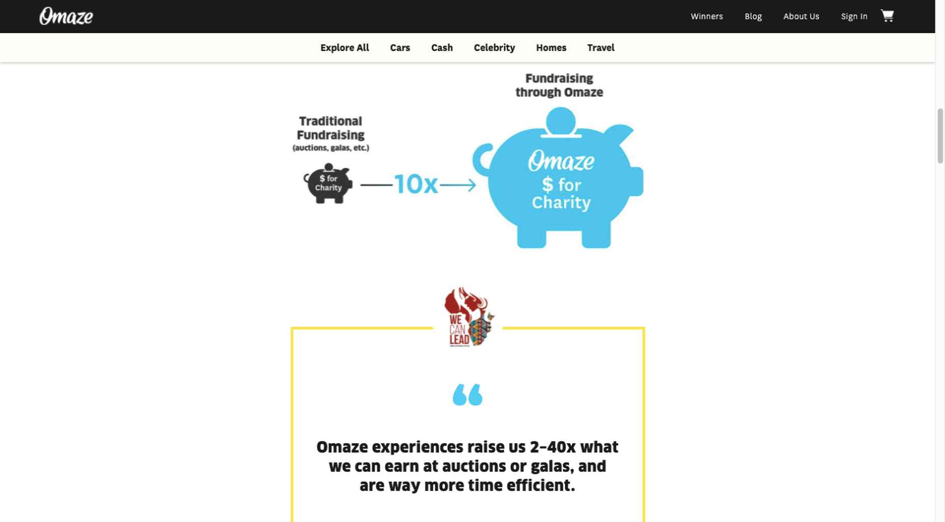
Omaze, for example, gives people entries for prizes based on their donations while at the same time highlighting the good things it and its donors have brought about.

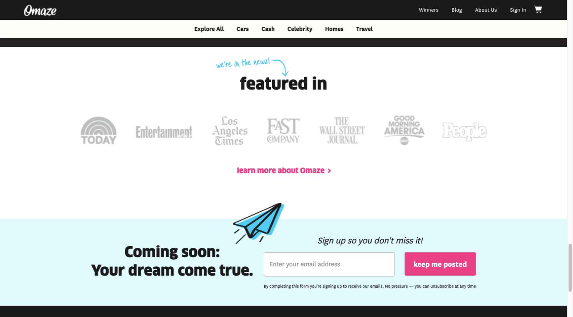
To help build trust, the site devotes space to highlighting publications that have featured Omaze and the work it has done and is doing.

Plus, it puts data visualization and non-profit testimonials into play to give visitors an added insight into what is going on behind the scenes: 

As you can see, it doesn’t have to be difficult to incorporate genuine trust-building content into your website designs.

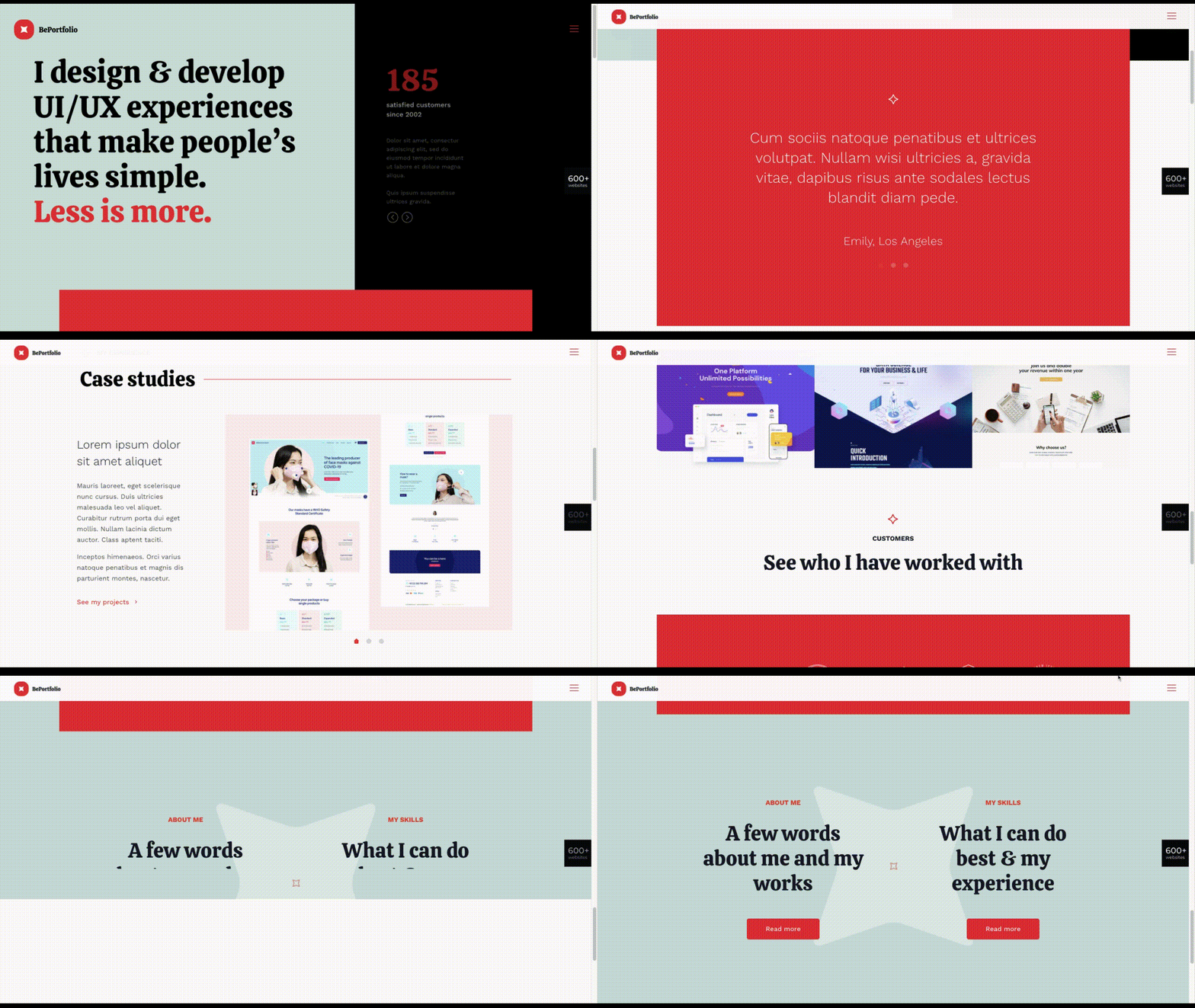
BePortfolio is a great example of how you might go about doing this for a portfolio site, whether it’s your own or a site for a client:

The home page alone has plenty of space for including trust-building content:

  • A satisfied customer counter
  • Product usage case studies and testimonial
  • Portfolio highlights
  • Client and partnership logos

And it can only get better as a visitor moves through the site, but only if you’ve chosen to make that happen.

Have You Started to Take These New Web Design Trends to Heart?

We’re not suggesting that you throw the baby out with the bathwater, but some trends will need to be discarded to enable you to adjust to a new normal. Other 2020 design trends, like minimalism and headline topography, are likely to remain popular for years to come.

New trends that incorporate calming color palettes, image blending, more efficient eCommerce UX designs, user-controlled video, and trust-building elements should give your customers the feeling of comfort and security they will be seeking in 2021.

If you want to implement some or all of these new trends in your 2021 website designs, BeTheme’s 600+ pre-built sites make doing so an easy task.


[– This is a sponsored post on behalf of BeTheme –]

Source

The post 5 Web Design Trends and Ideas for 2021 first appeared on Webdesigner Depot.

Source de l’article sur Webdesignerdepot

Typography is one of the most important elements of any site, having a measurably large impact on brand and experience.

So fundamental is it that making wholesale changes to your typography — opting for a new font, changing the measure, increasing leading — is complex and fraught with potential time-sinks.

But there are some simple changes that you can make to your typography that won’t break your grid and can be achieved in 30 minutes or less. Here are eight of the easiest.

1. Increase Color Contrast

When laying out text, it’s common for designers to see text as a block within a visual design. A designer’s relationship to text is very different from a user’s; a designer positions text as a shape, a user reads it line by line. Consequently, designers tend to underestimate the amount of contrast text requires.

Light grey text is aesthetically beautiful but functionally useless. Text is meant to be read and needs to meet WCAG AA standards on desktop and WCAG AAA standards on mobile — or in any situation with many ambient light sources. The larger the text is, the more leeway you have.

Text should be thoroughly tested for contrast, but as a starting point, 18px text on a white background should never be lighter than #595959.

2. Tighten Heading Spacing

The vast majority of typefaces are designed for use as body text — large blocks of running text, multiple lines long. When the font was made, it was spaced for this use.

Unlike running text, headings tend to be short and are surrounded by more whitespace — especially above and below. Extra whitespace visually floods the negative space in the word shapes and forces letters apart.

To compensate, tighten the letter-spacing and word-spacing of headings by 1–5%.

3. Loosen Non-Word Spacing

When we read, our brain doesn’t spell out words letter by letter; it recognizes word shapes and even word groups’ shapes.

Most micro-typography is concerned with not disrupting those word shapes. However, there are times when you do want to prevent words from forming and allow individual characters.

Loosen the letter-spacing on any text intended to be read as a series of characters, such as serial numbers, tracking codes, and tabular data.

4. Use System Fonts for Inputs

Privacy is a big issue for users. Anything you can do as a designer to reassure users their data is safe will increase your site’s positive UX.

Style your HTML inputs to use system fonts — the default fonts set by the OS your user is accessing the site with. This creates a clear delineation between the brand data in the brand fonts and the user’s data in the user’s fonts.

Using system fonts in this way encourages the user to feel ownership of their data, builds trust, and increases conversions.

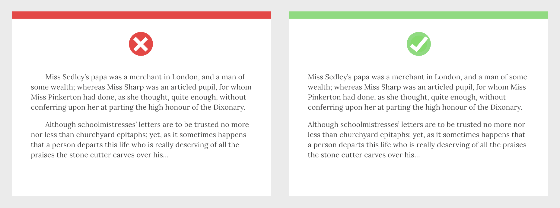
5. Mark Paragraphs Once

Paragraphs of text need a visual indication that they have begun. There are three ways in which this is normally conveyed: following a heading, with a vertical space before the paragraph, or indenting the first line.

Each paragraph should use one of these indicators and one only. Due to the nature of web content and the benefits headings have for quickly scan-reading content, for most sites, the best choice is a combination of following a heading and vertical spacing.

6. Use Genuine Styles

For various reasons ranging from the availability of fonts to aggressive optimization, it’s common for sites to fake alternative styles using CSS. Italics can be faked as obliques with a skew, bold weights can be faked by using the browser’s defaults, and small caps can be faked by setting text to uppercase and reducing the font-size.

These tricks do more harm than good, creating distorted word shapes that interrupt the natural flow of text.

If you cannot deploy genuine italic, bold, and small caps, then don’t fake them. Find alternative ways of creating emphasis, such as changing colors.

7. Use the Correct Quotes

Apostrophes, single, and double-quotes are specific characters. Most fonts provide a glyph for them that is distinct from the quick single or double-quote key on your keyboard.

These quote marks are most commonly referred to as “smart” quotes because word-processing apps usually have the option to be “smart” about which glyphs they use.

Using the correct quotes is one of the simplest ways to deliver a refined piece of text.

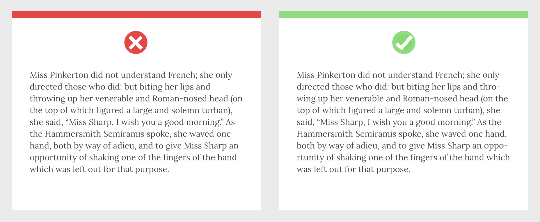
8. Hyphenate Text Properly

Hyphenation is the breaking of a word over two lines. It allows a less extreme ragged-right text, and it is vital on mobile devices where the available page width is relatively small compared with desktop.

The web has surprisingly poor support for correct hyphenation, but it is gradually improving, and it can be applied as a progressive enhancement.

CSS allows you to set hyphenation to none (no hyphens), auto (the browser inserts automatically), and manual (in which you specify where hyphens should appear using the soft hyphen character).

Typographically, a hyphen may be inserted in any word that is five characters or longer; there must be at least two characters preceding the hyphen and at least three following the hyphen.

You should never hyphenate three consecutive lines of text, but addressing this requires JavaScript. You can minimize this problem by increasing your measure.


Featured image via Unsplash

Source

The post 8 Easy Ways to Improve Your Website Typography in Under 30 Minutes first appeared on Webdesigner Depot.

Source de l’article sur Webdesignerdepot