 Adobe has launched Creative Cloud Express to help anyone make beautiful, stand-out content for the web.
Unlike Adobe’s other products that need a little training and practice to make the most of, Creative Cloud Express is aimed at those with no prior design experience as part of Adobe’s mission to enable creativity for all.
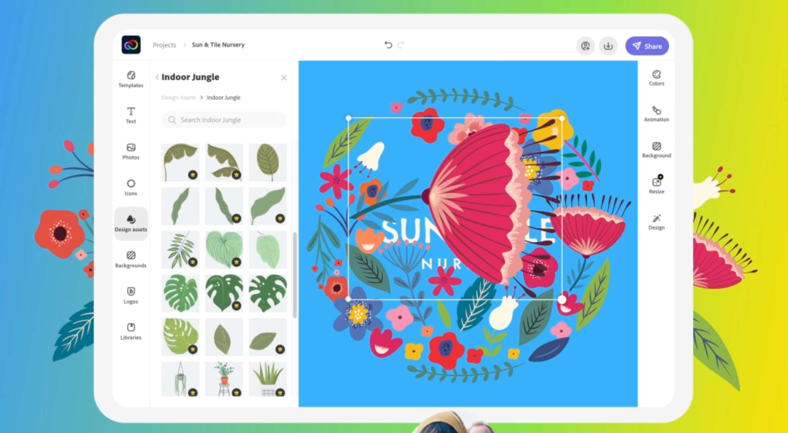
Creative Cloud Express is a series of web, and mobile apps (iOS and Android), that uses a templating system to allow anyone to create social media posts, logos, ads, and more. Simple to use, Creative Cloud Express uses guided tools that hold the user’s hand throughout the process, making it easy to achieve beautiful results with no previous experience.
Creative Cloud Express makes producing creative work a viable option for anybody, regardless of experience. However, it is most suited to social media posting — even though it’s possible, it’s unlikely anyone is seriously going to use Creative Cloud Express to design a logo, given the extensive design insights needed to approach that task.
Creative Cloud Express is great for anyone who wants to dip their toe into Adobe’s product range but isn’t ready for the full Create Cloud Suite of tools. However, it’s really beneficial to companies whose design teams are tied up producing assets for the marketing department. It’s perfectly suited to marketing teams that need to output a lot of professional-standard design assets quickly; designers can make brand assets once and leave the marketers to create the content they need, safe in the knowledge that they’ll end up with professional-looking results regardless of skill.
Adobe describes Creative Cloud Express as being “template-first,” meaning that the starting point for your design will be one of the thousands of professionally designed templates included in the app. Once you have your starting point, you can add your images, content, and videos using a simple drag and drop interaction. In addition, creative Cloud Express has thousands of high-end illustrations, brushes, stickers, and fonts. Creative Cloud Express even gives you access to the entire Adobe Stock photo collection. So, even if you don’t have an extensive set of company assets ready to go, you can still create something truly unique.
Professional designers will also benefit from Creative Cloud Express thanks to the tight syncing with the Creative Cloud Suite. You can quickly toggle between rich and straightforward tools, allowing you to take advantage of powerful apps when needed and fall back on fast automation when suitable.
Powered by Sensei, Adobe’s proprietary AI and machine-learning technology — the same tech that powers design-app giants like Adobe Photoshop and Adobe Premiere Pro — Creative Cloud Express takes the hard work out of producing design assets with quick actions. For example, you can remove the background from photos, trim or merge videos, and export PDFs, all in a few clicks.
One of the must-have features of any design app these days is collaboration, and Creative Cloud Express has it built into the core experience. Adobe’s Shared Libraries, Shared Templates, and Shared Brands are all built-in so that teams can work seamlessly together.
Creative Cloud Express is already an impressive tool, but it’s just the beginning for Adobe. Future updates will include even tighter integration with Creative Cloud apps, more quick actions, and new templates. Adobe plans to release new features every week, making for an exciting learning curve.
Creative Cloud Express is all about enabling creativity and helping those professionals that haven’t previously thought of themselves as designers to build a career as part of the creator economy.
Creative Cloud Express is free on the web at adobe.com/express and can be downloaded for free from the Apple App Store or Android Store. Premium features can be added for $9.99 per month.
The post Have You Tried Adobe Creative Cloud Express Yet? first appeared on Webdesigner Depot.

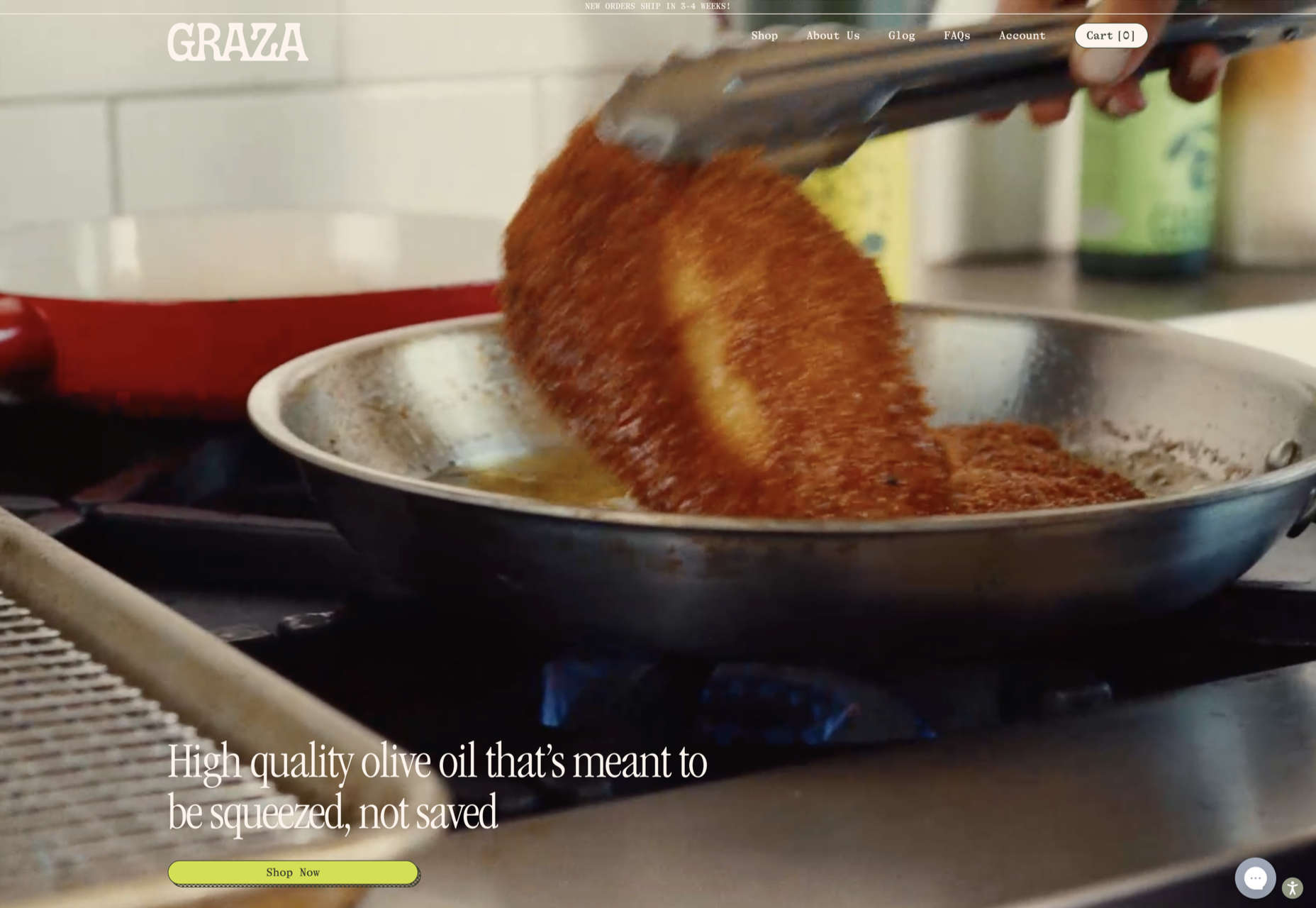
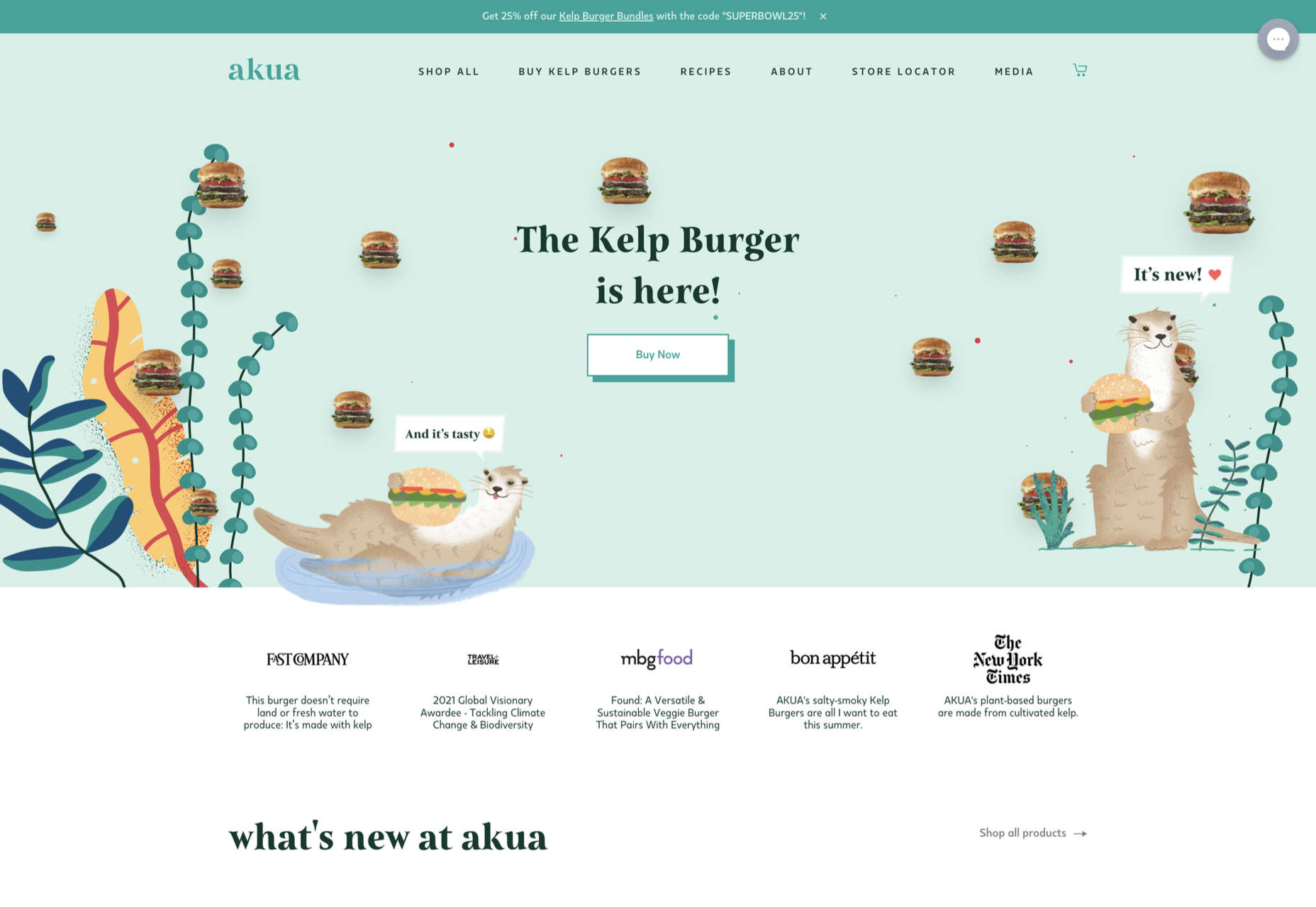
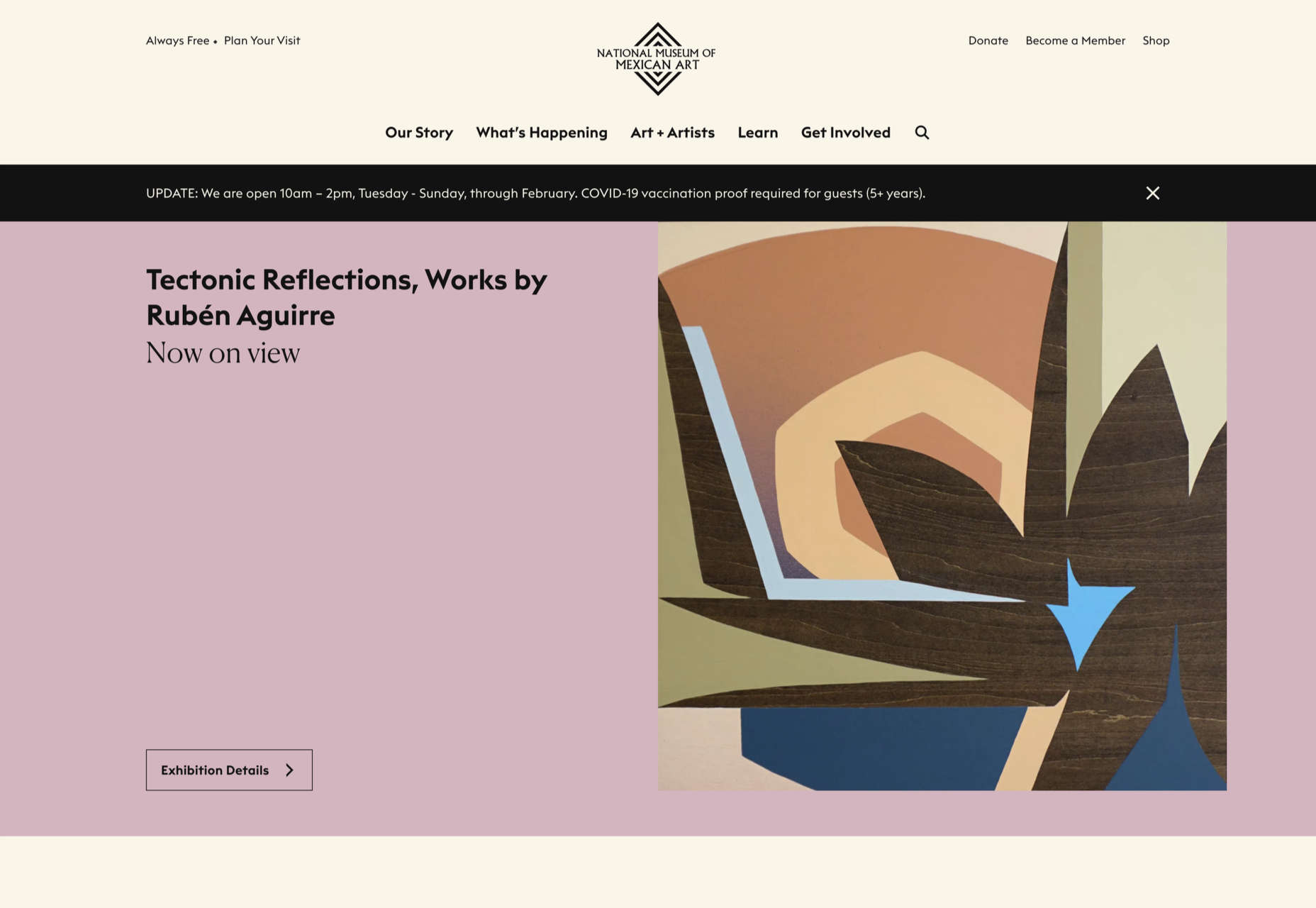
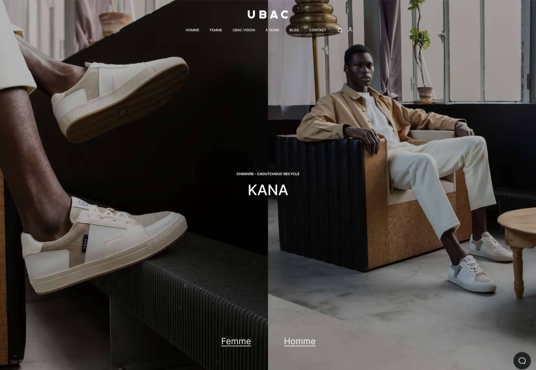
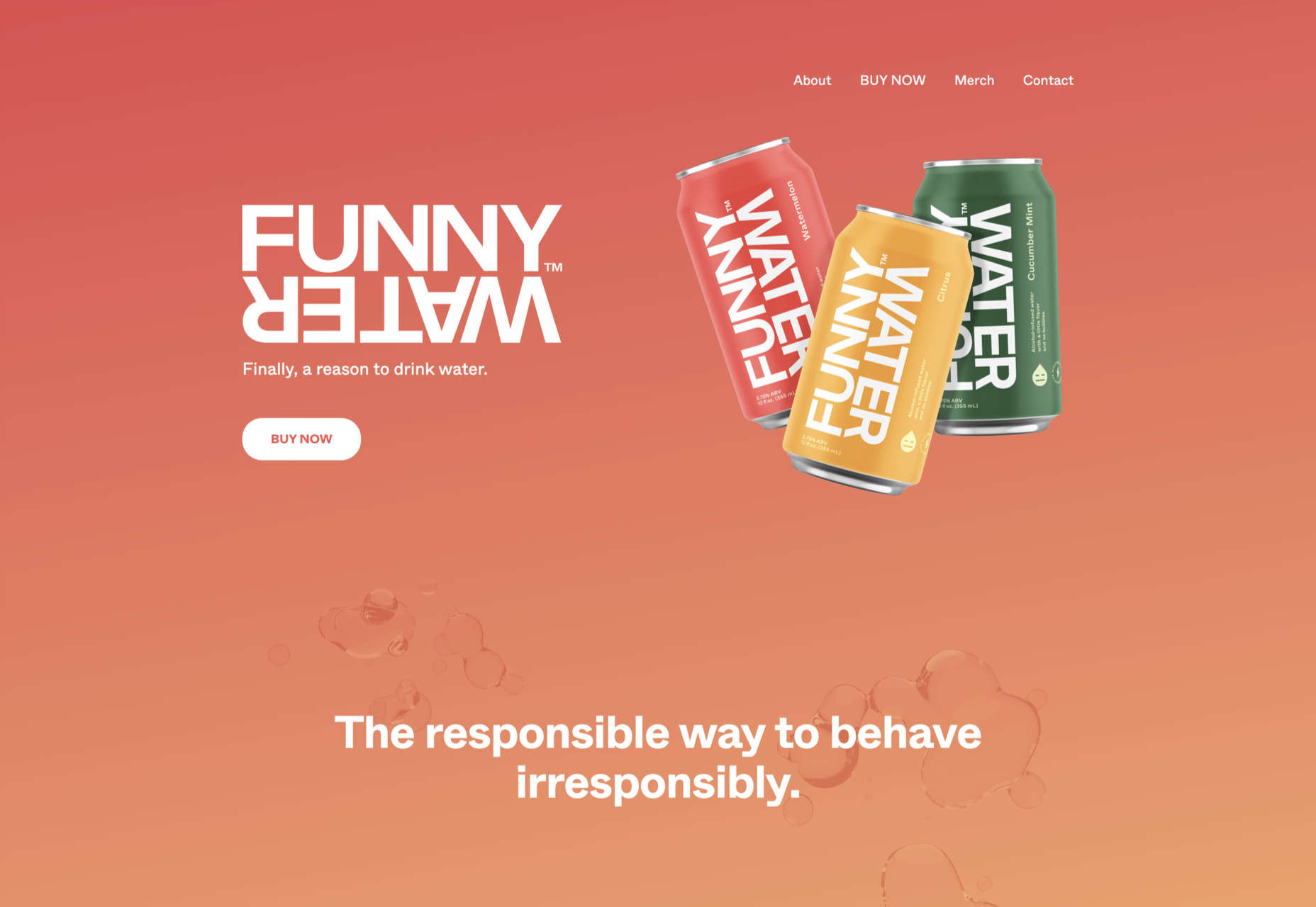
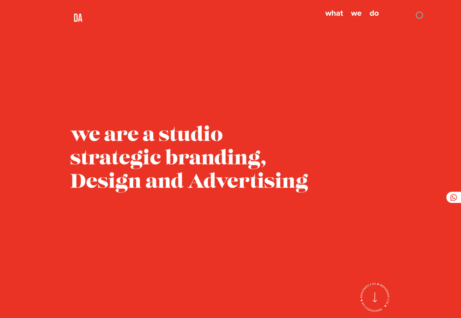
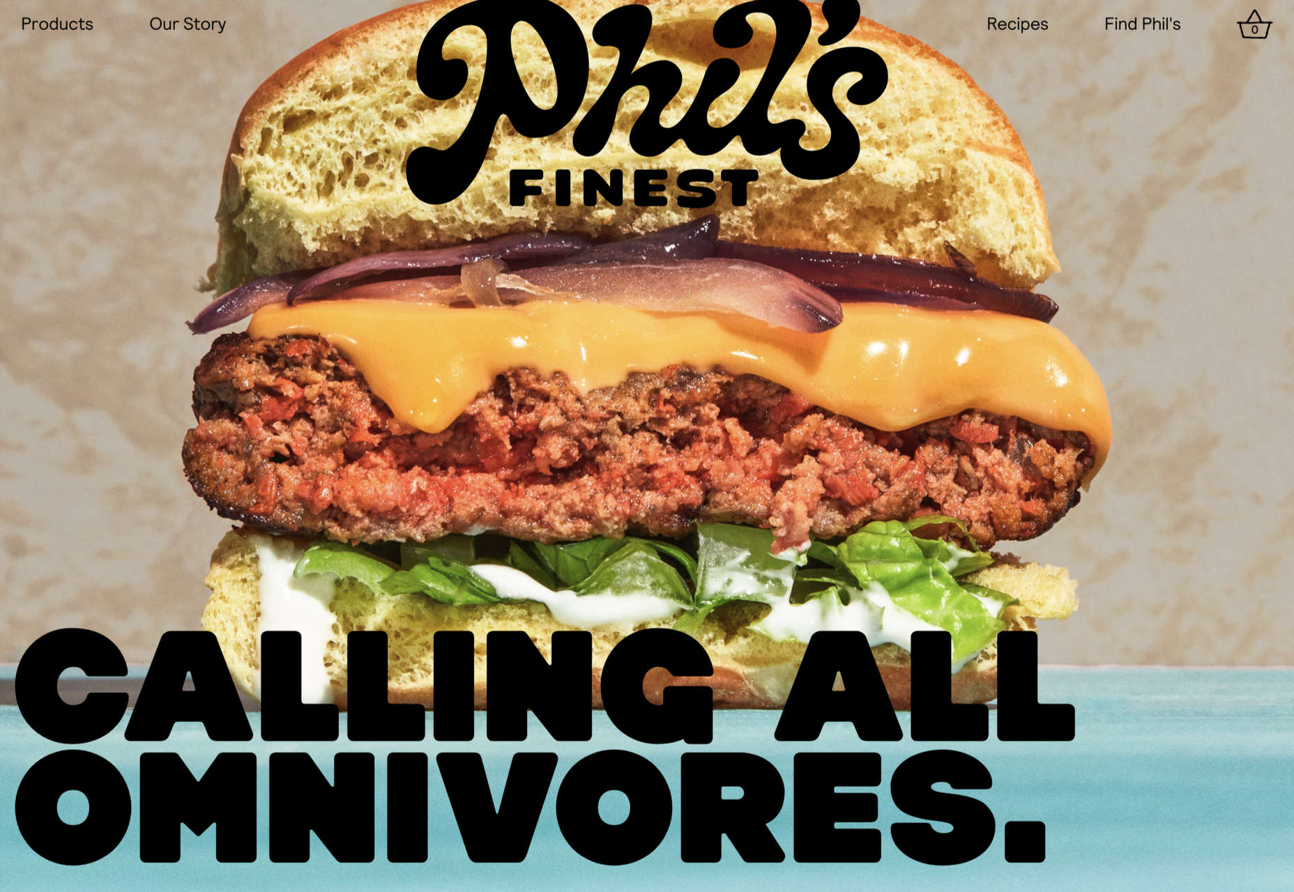
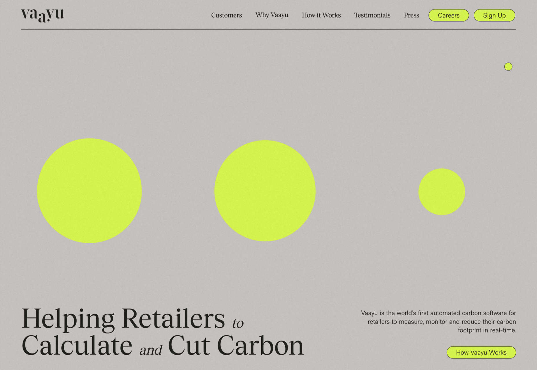
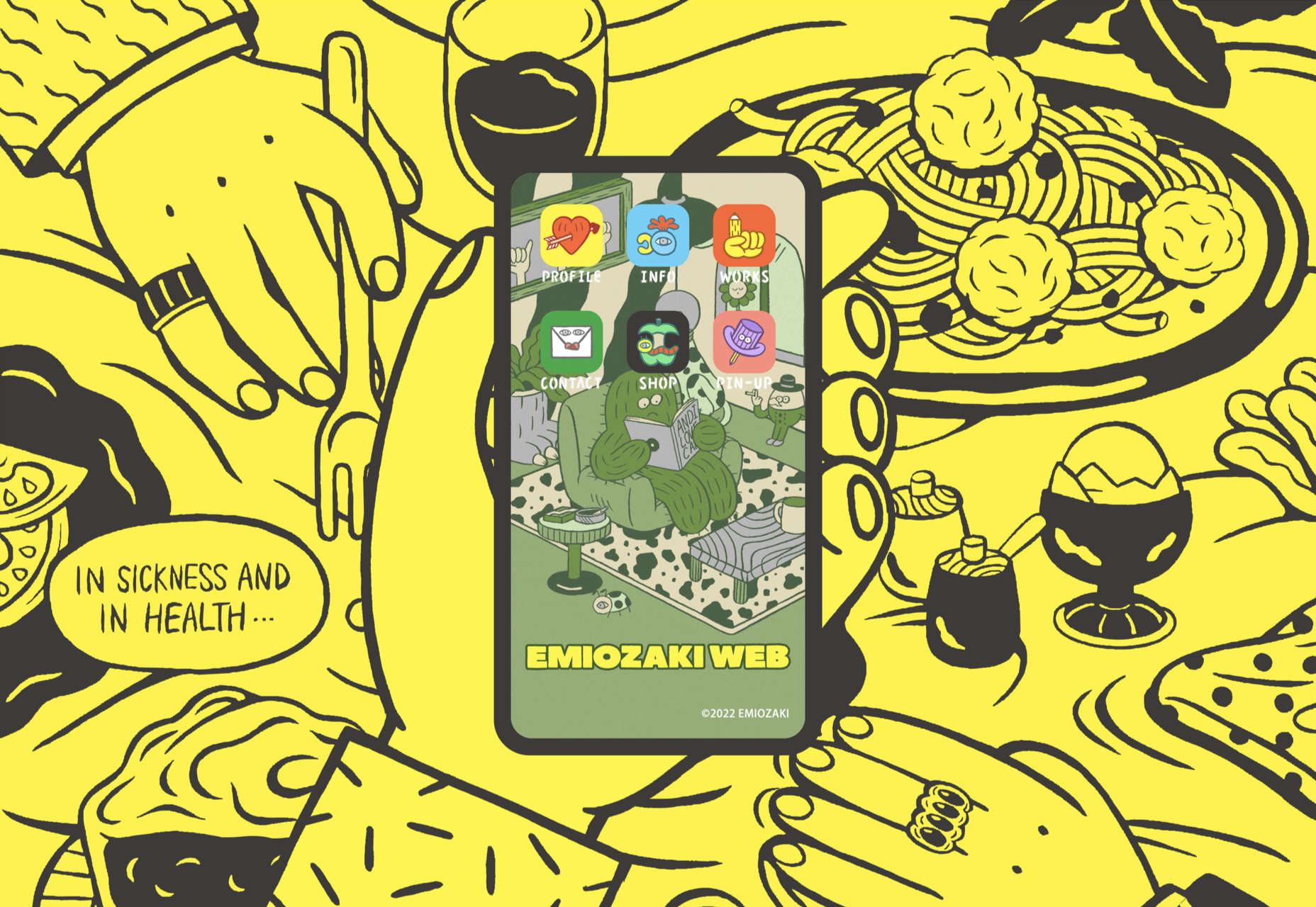
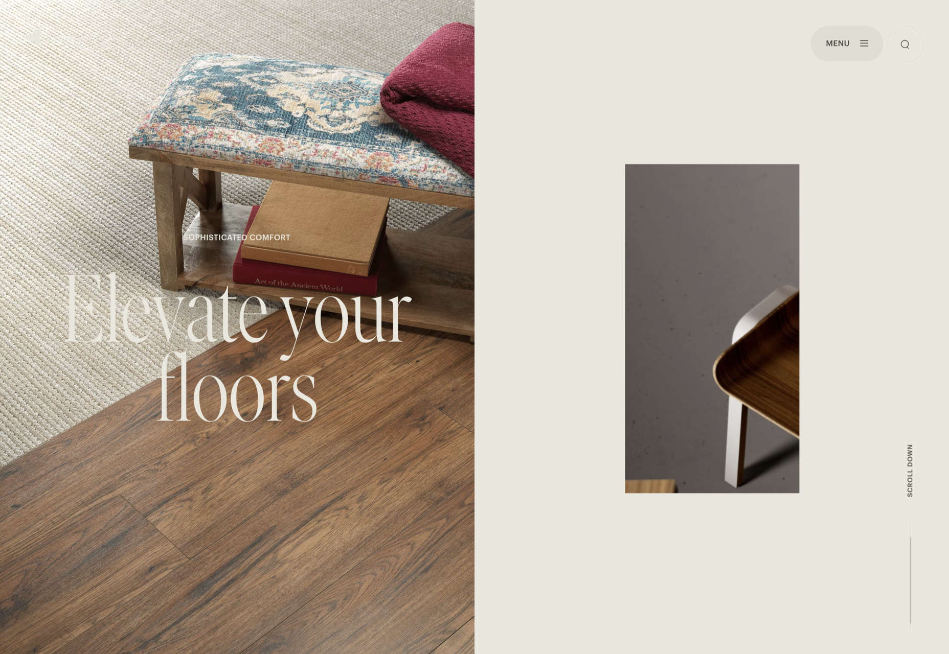
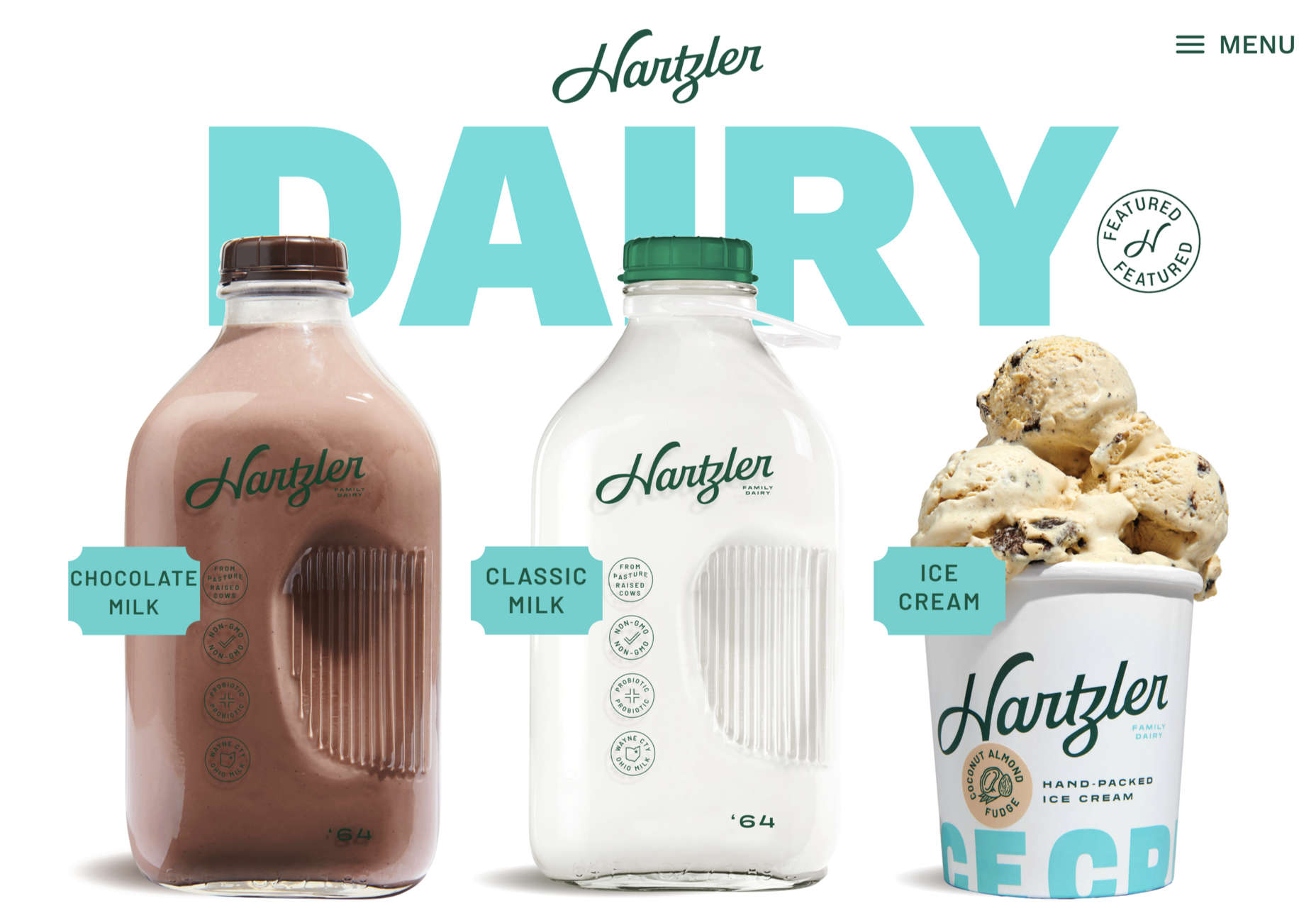
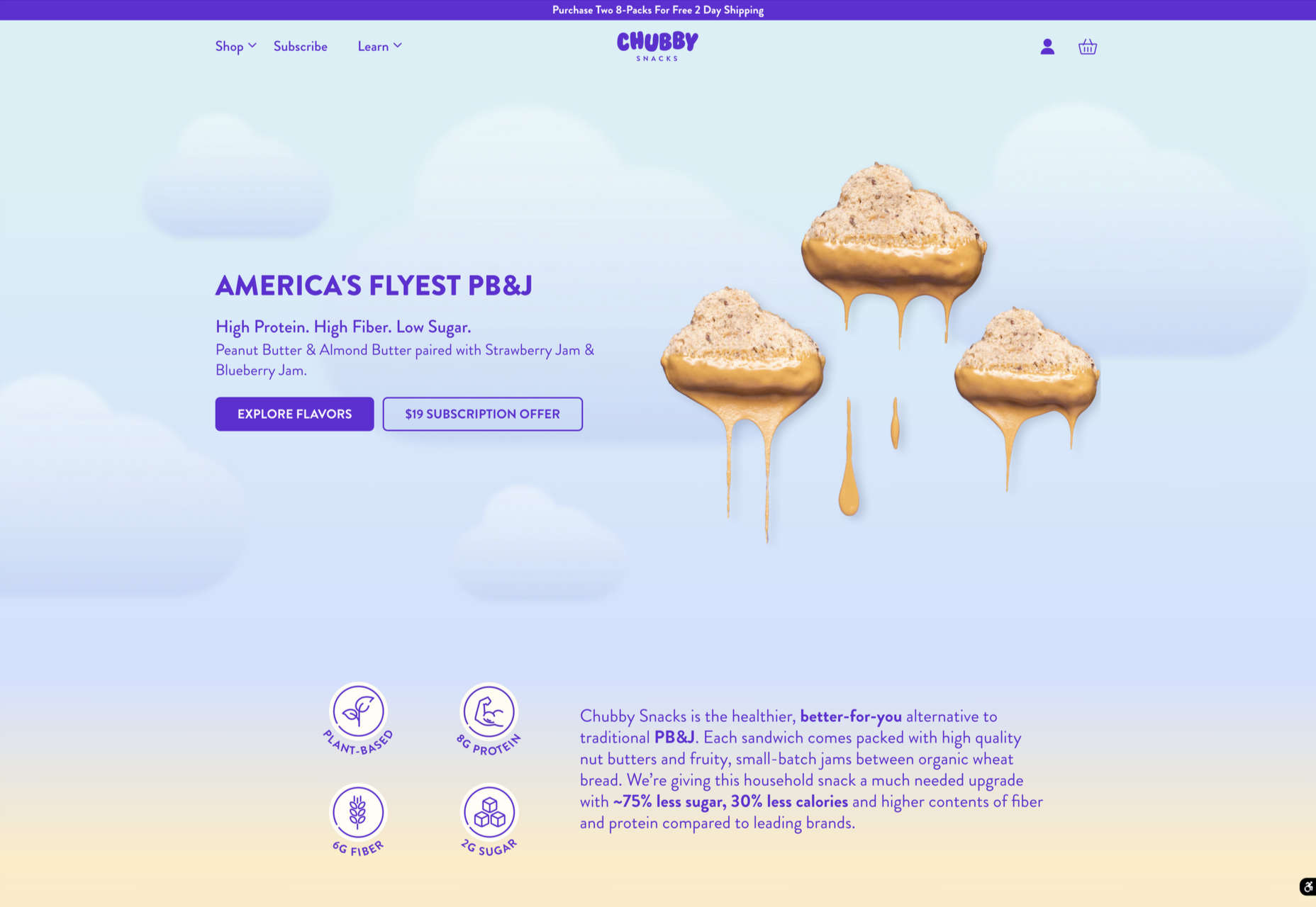
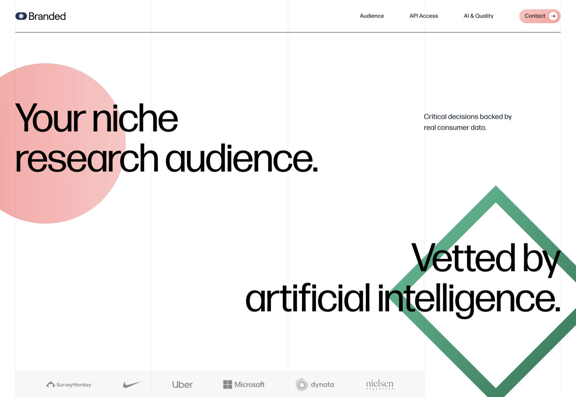
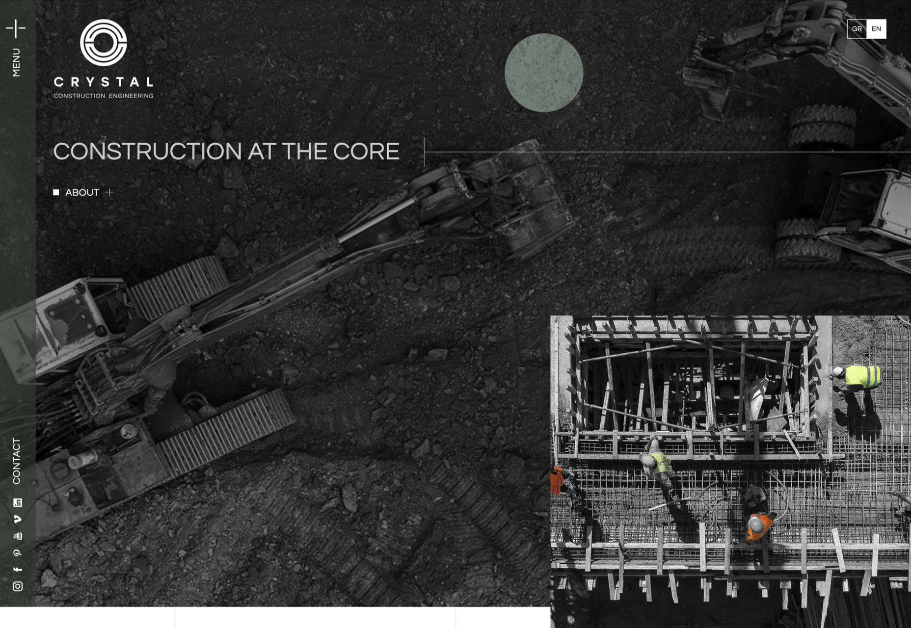
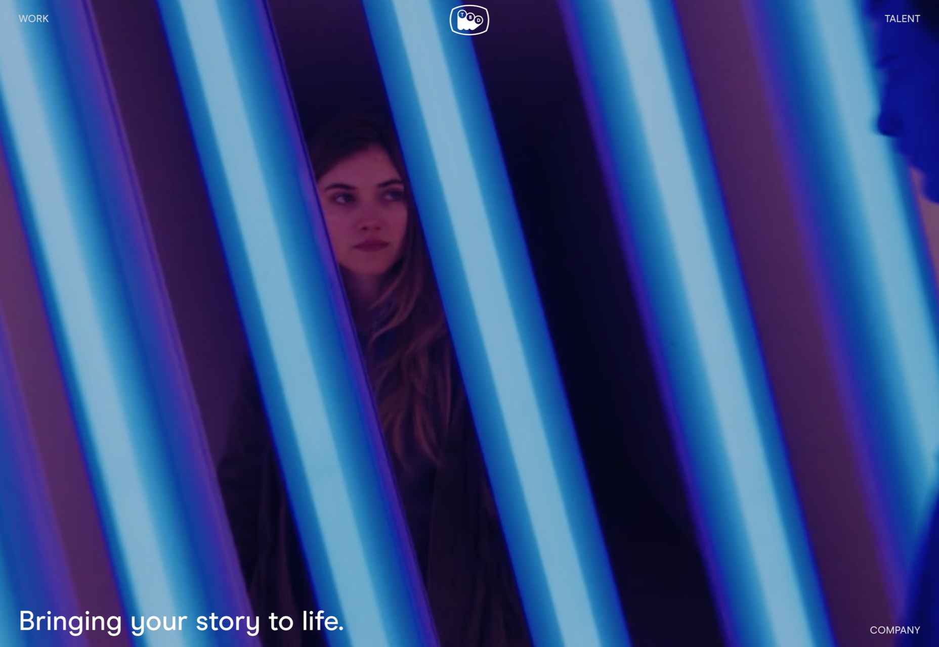
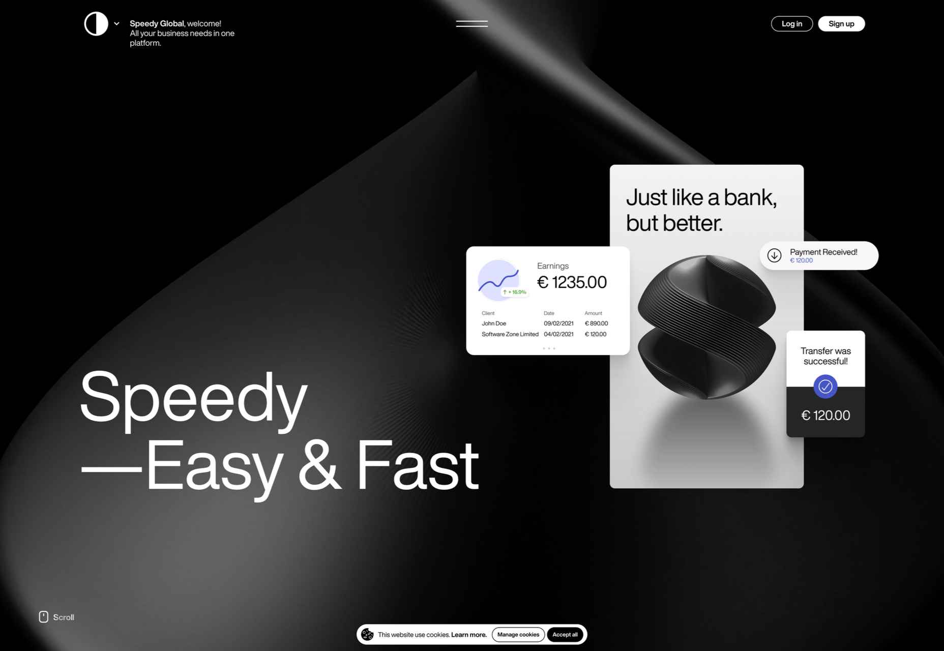
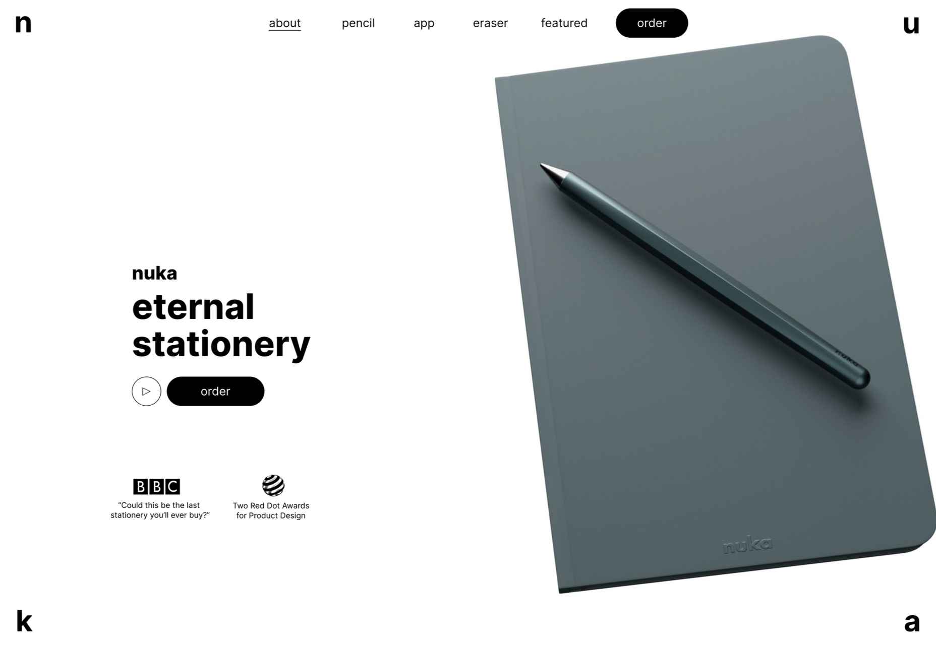
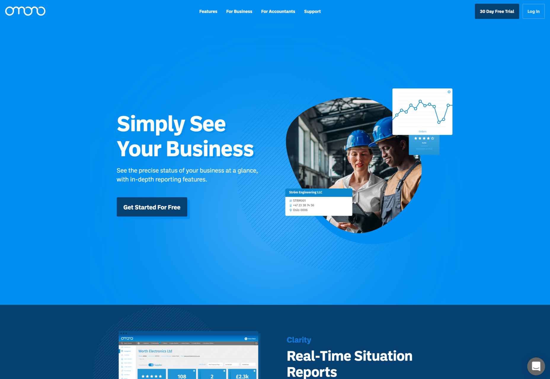
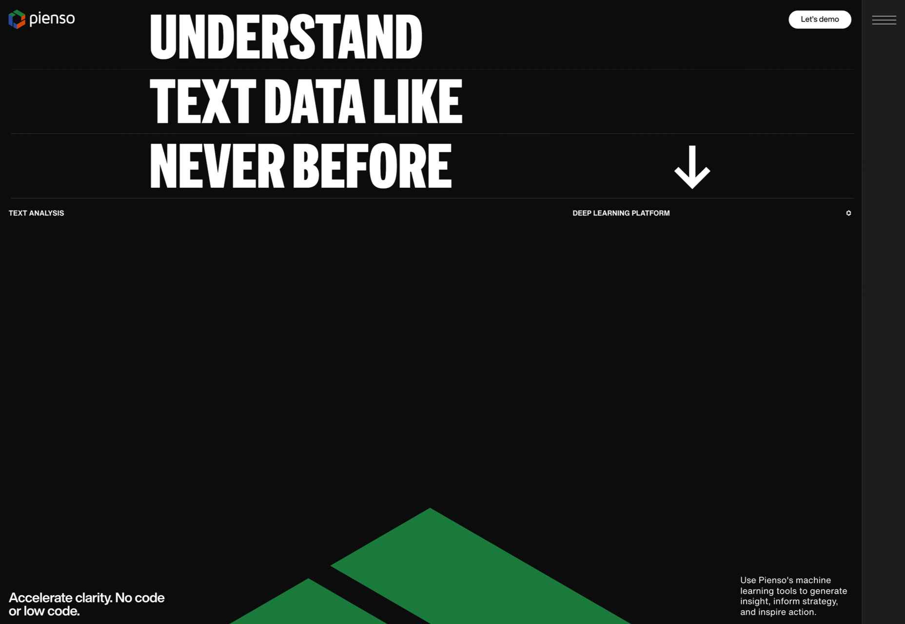
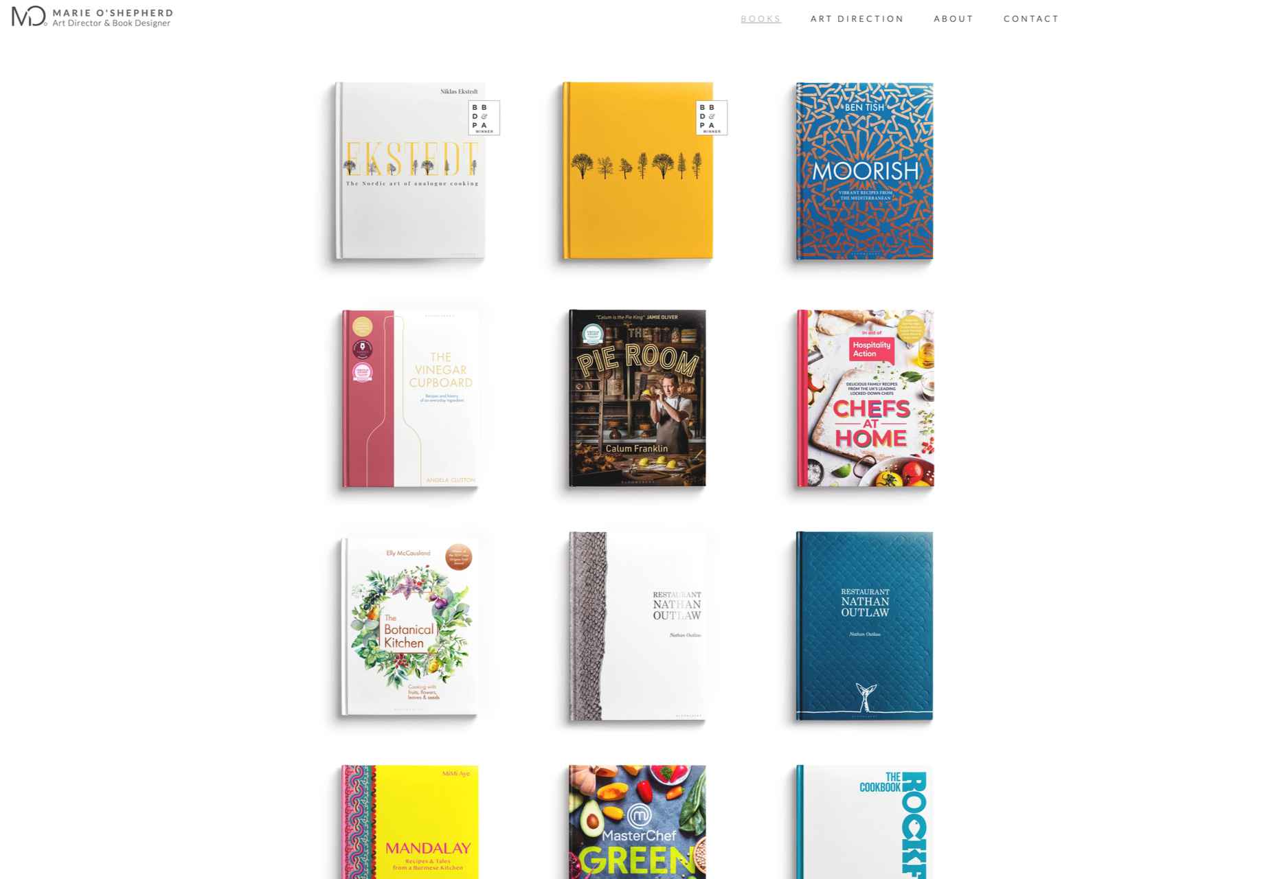
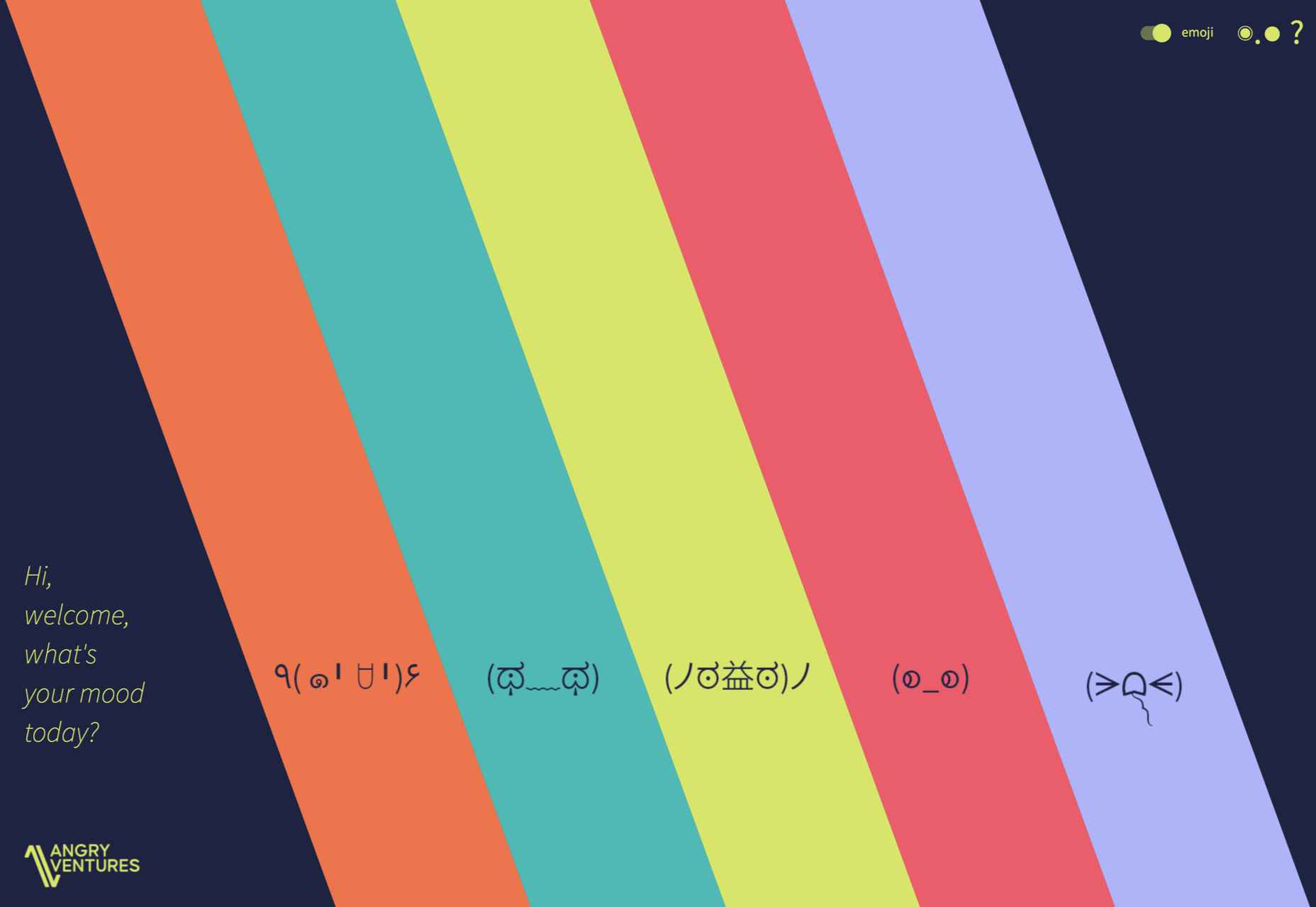
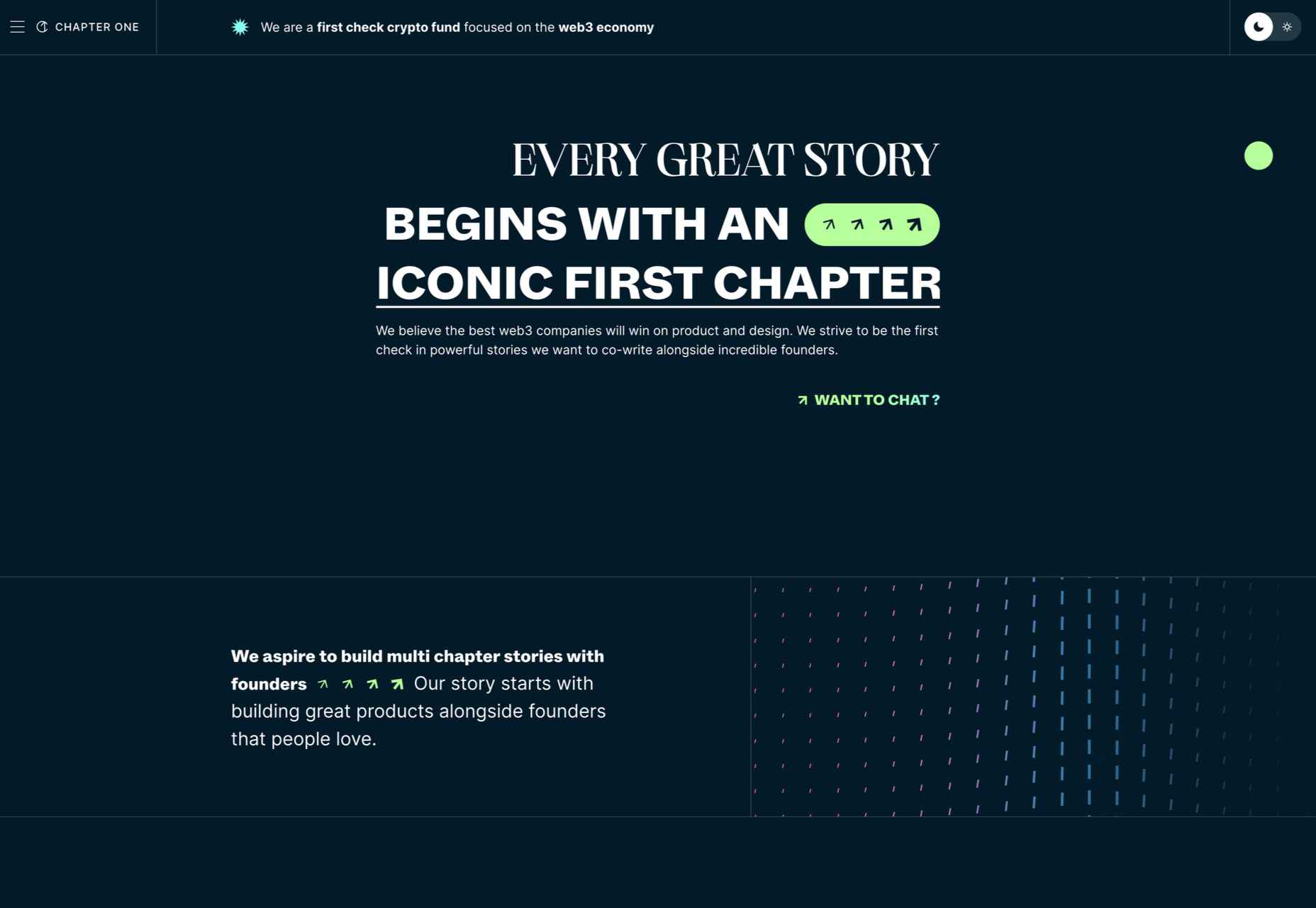
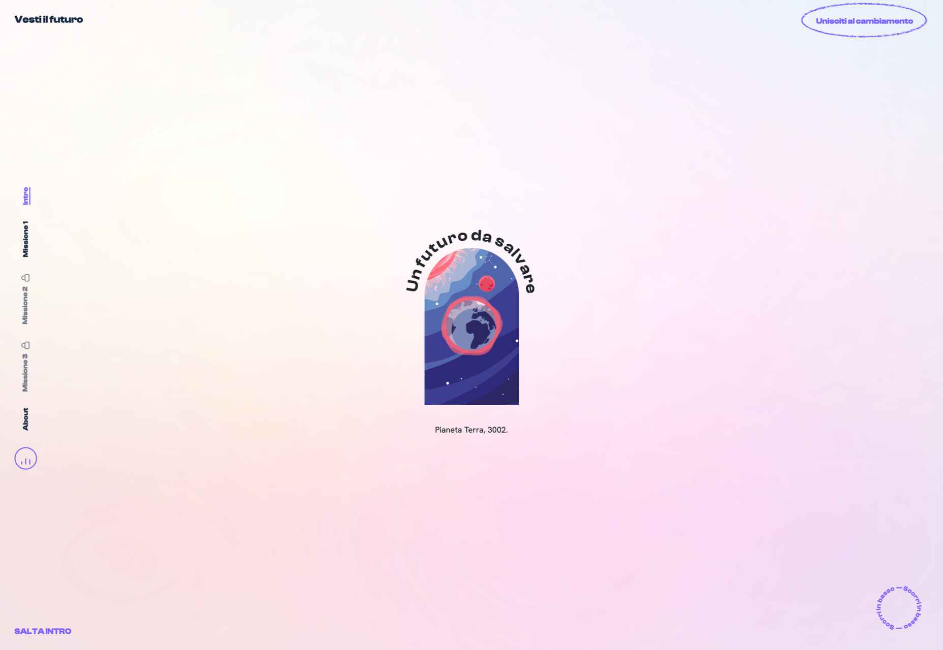
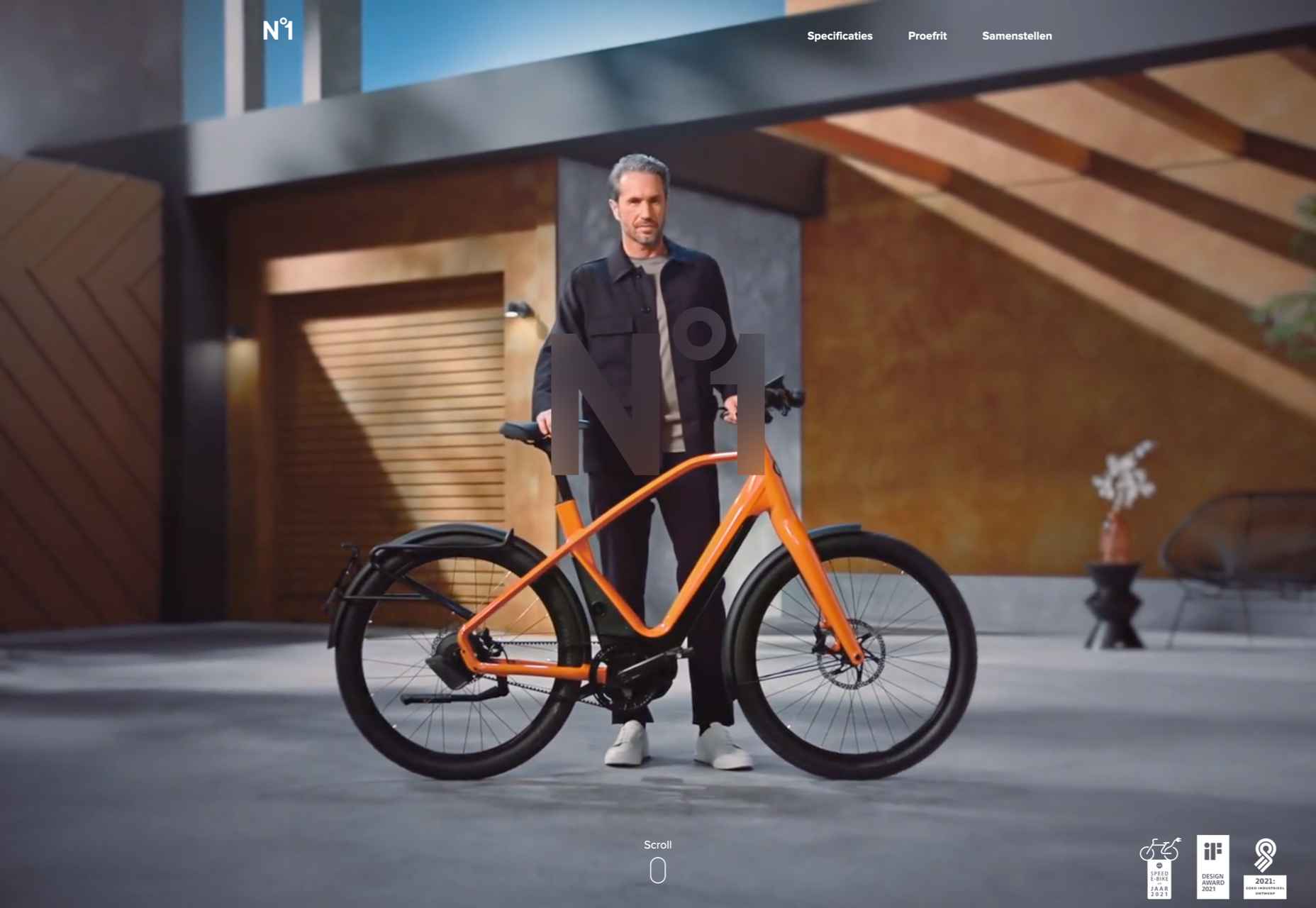
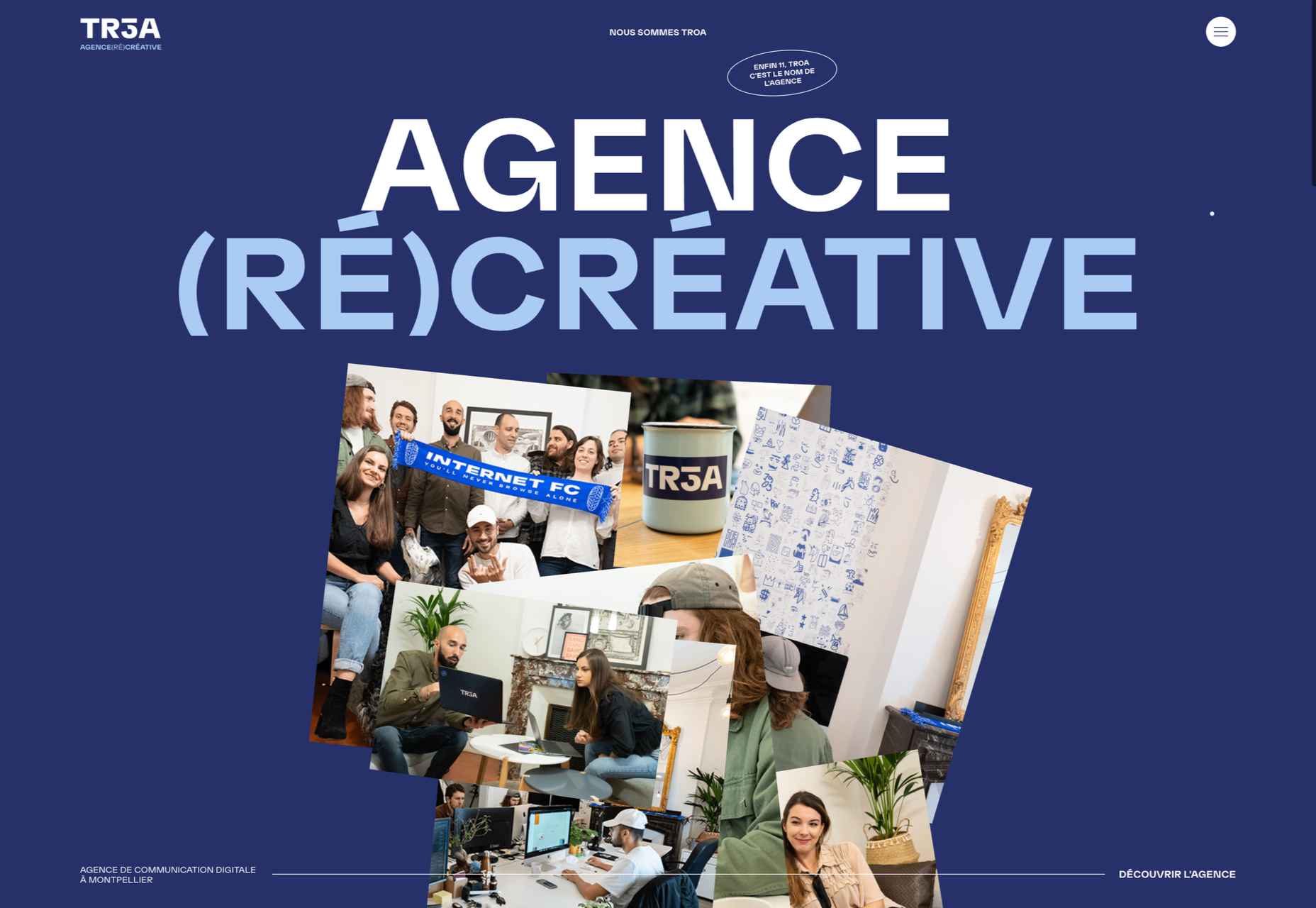
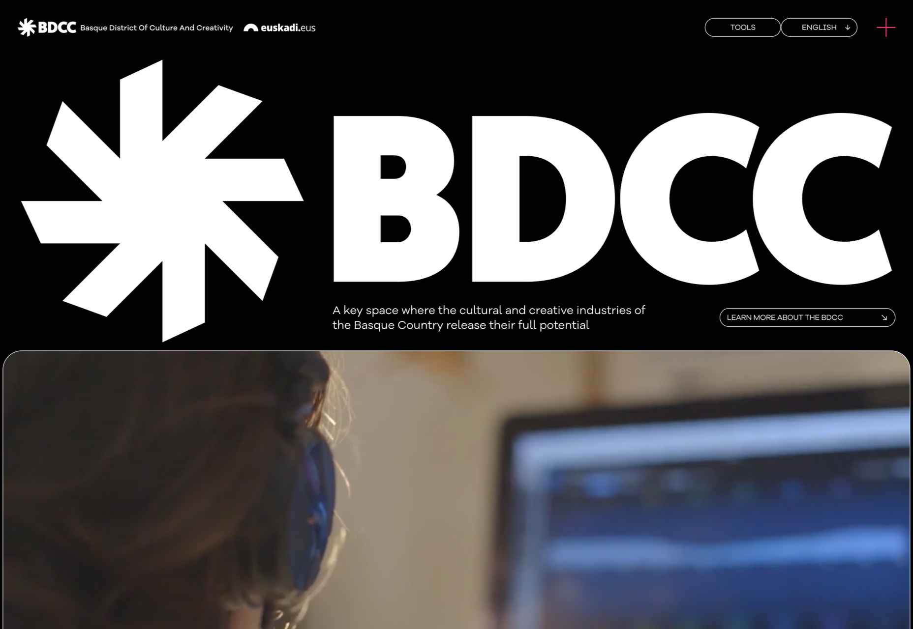
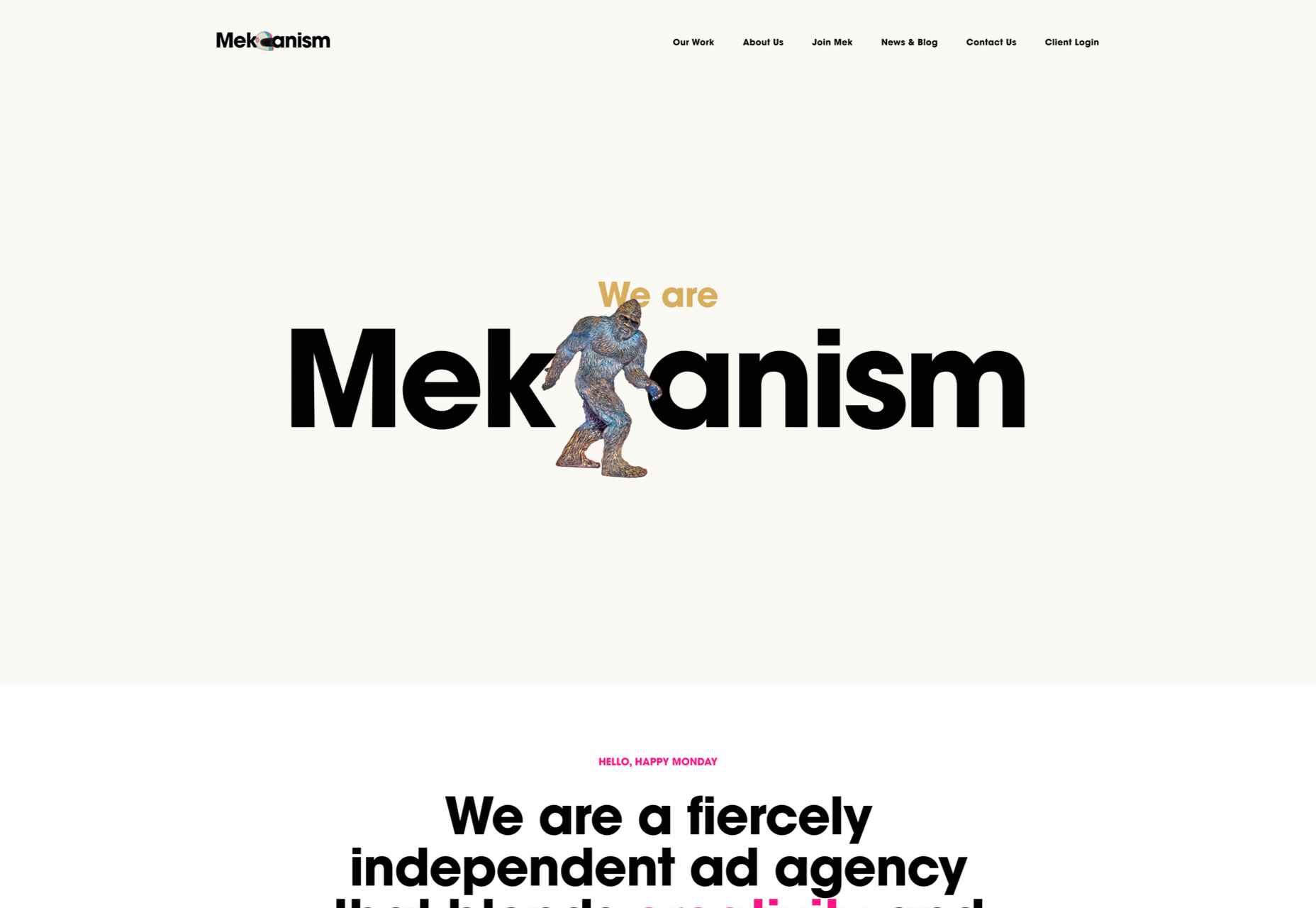
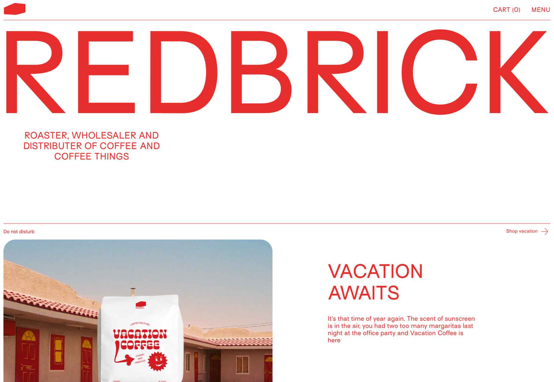
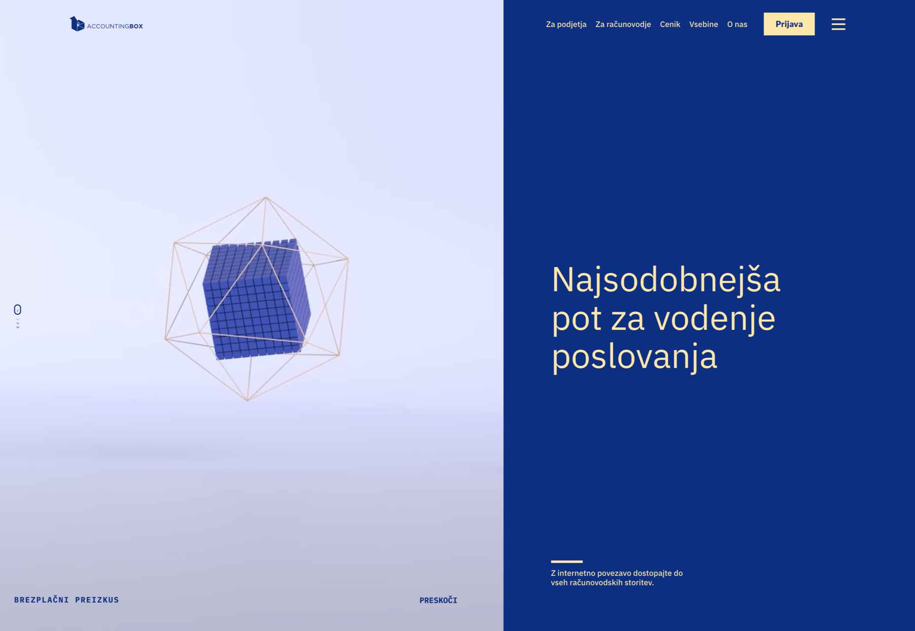
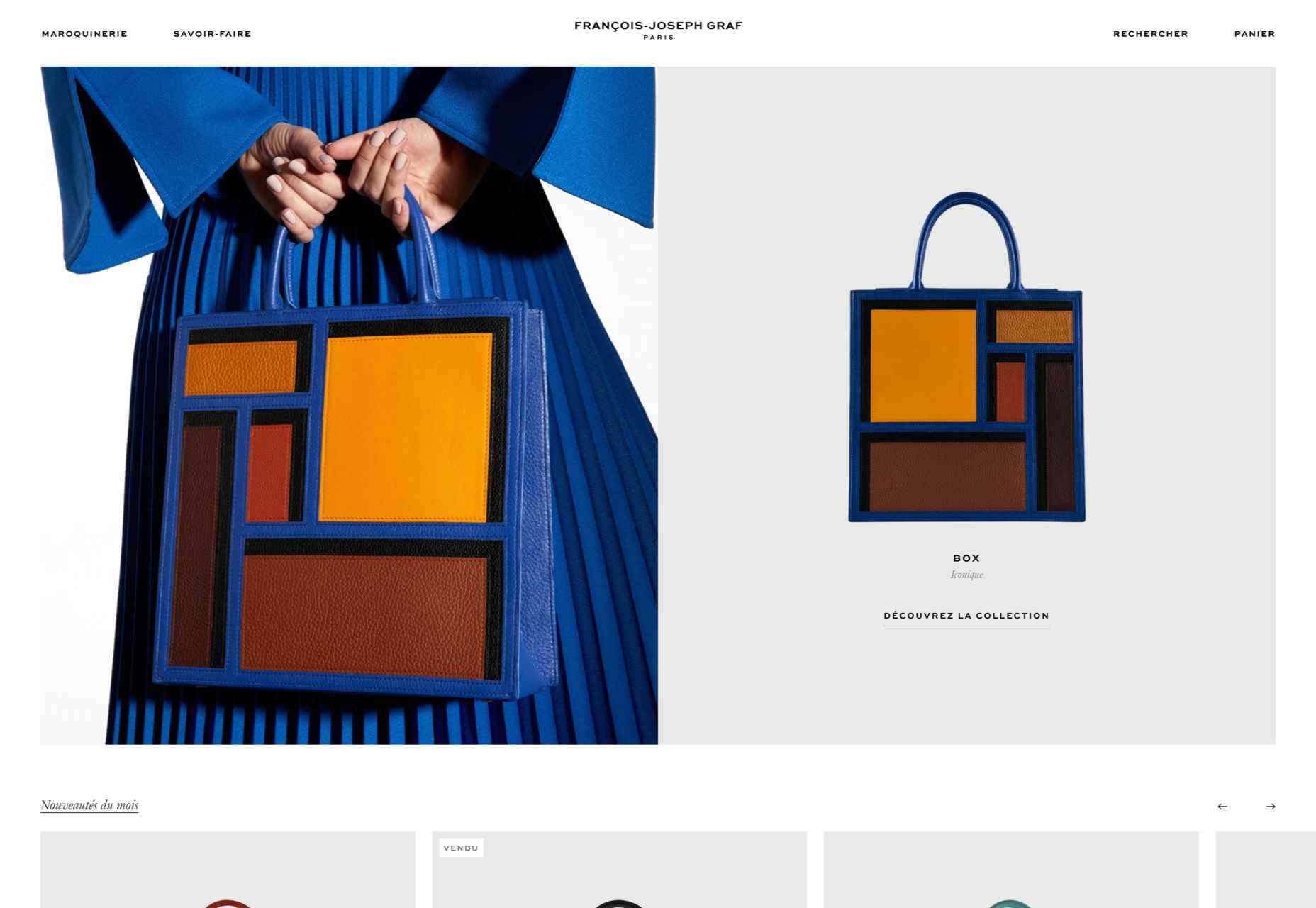
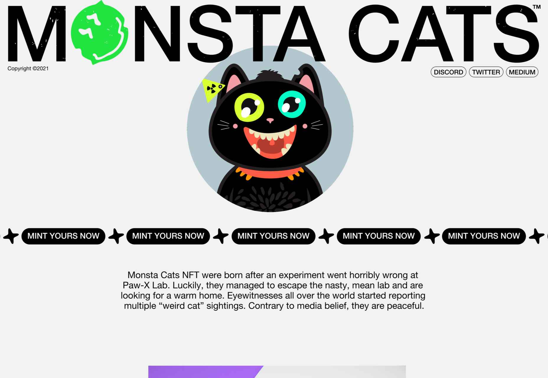
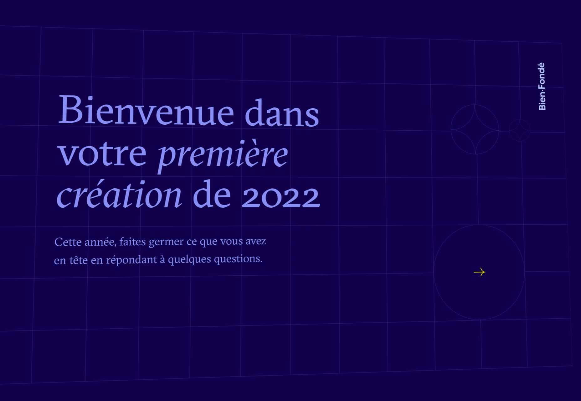
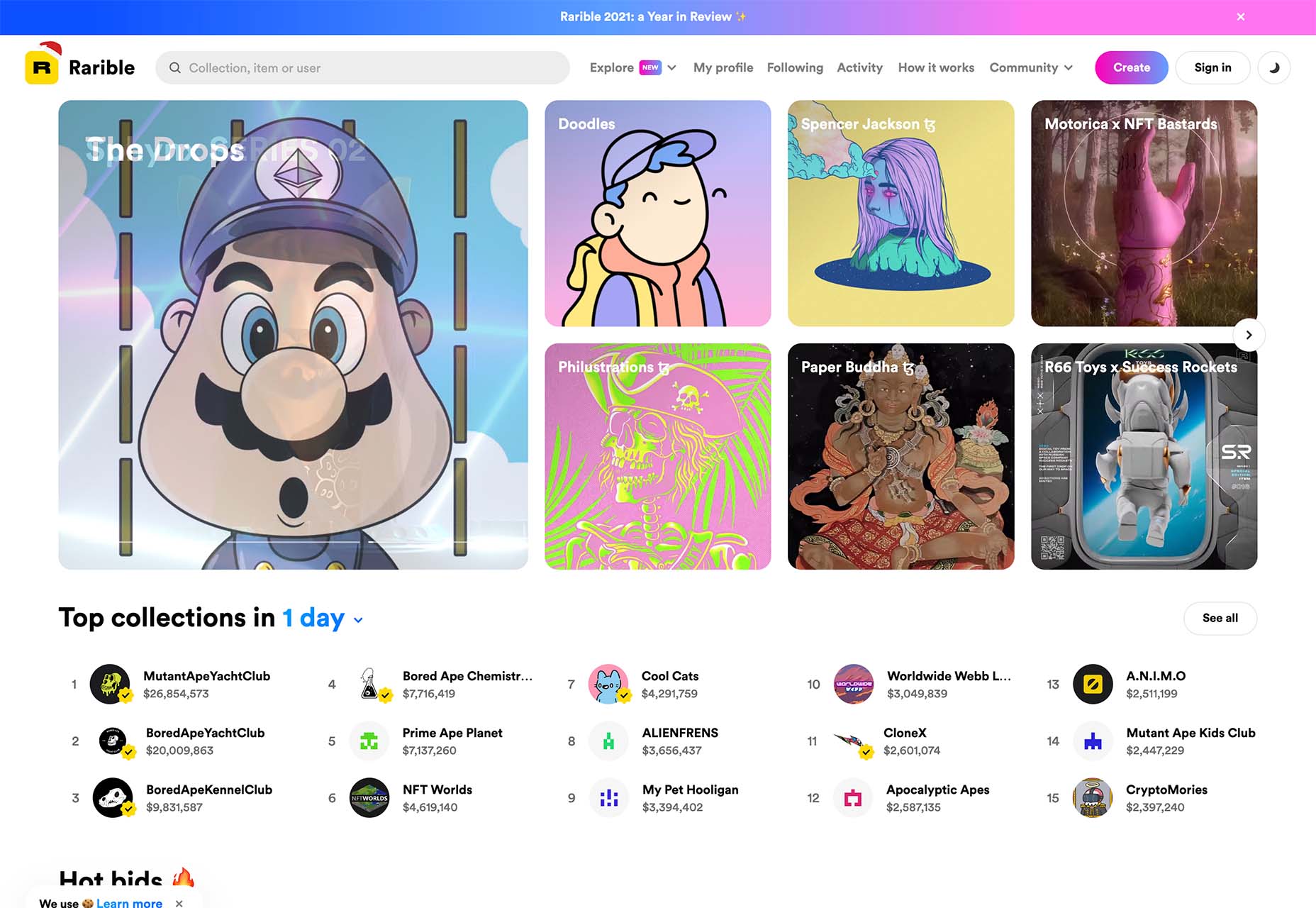
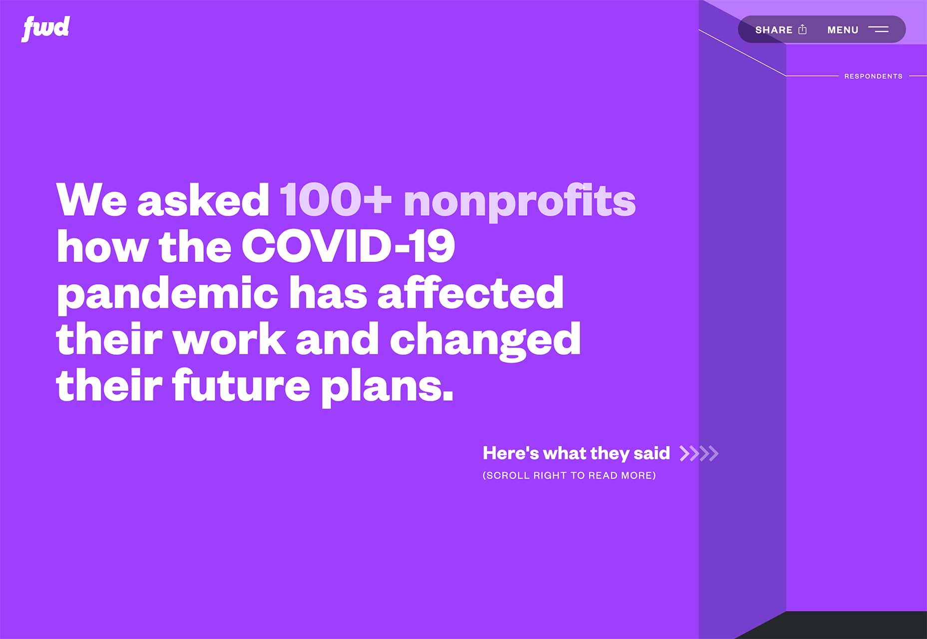
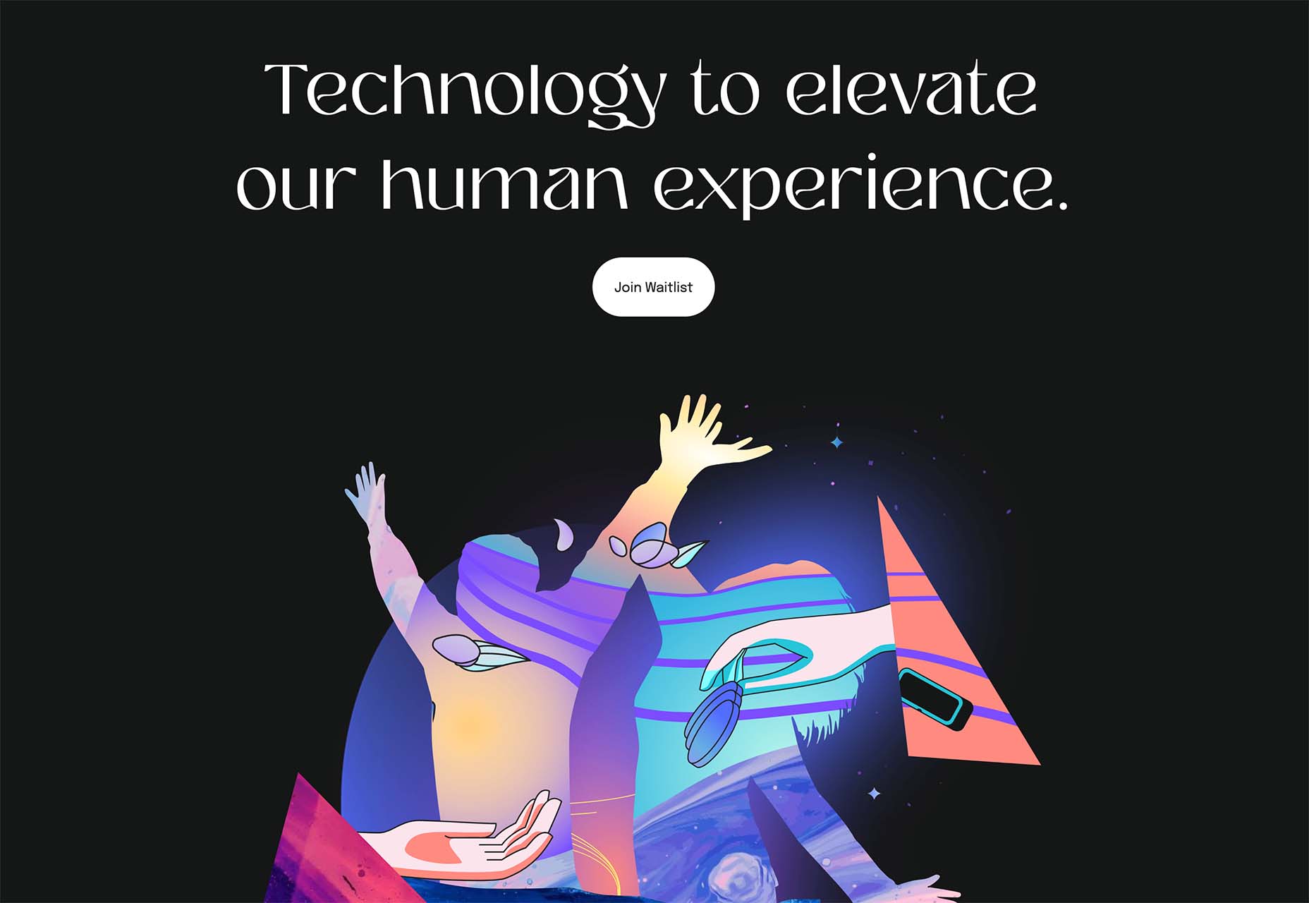
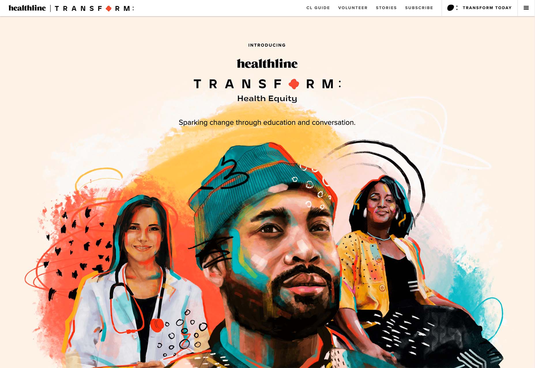
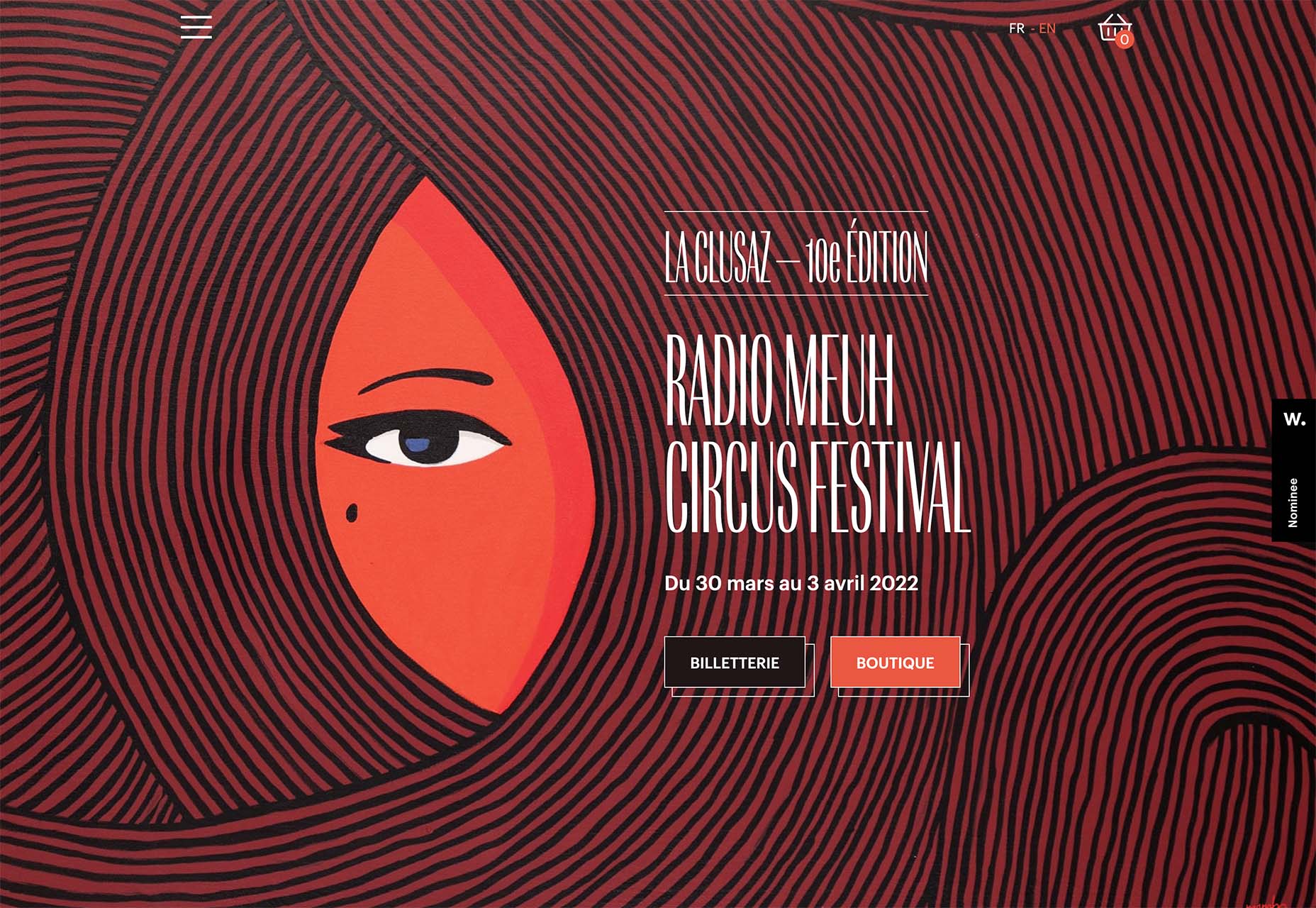
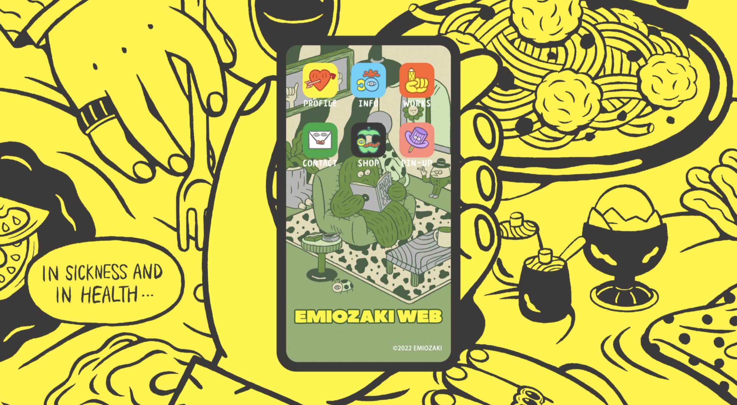 Welcome to the latest edition of our top 20 sites of the month. In this February’s collection, the overall feel is lighthearted and optimistic, as we are seeing the positivity of a new year persisting across the web.
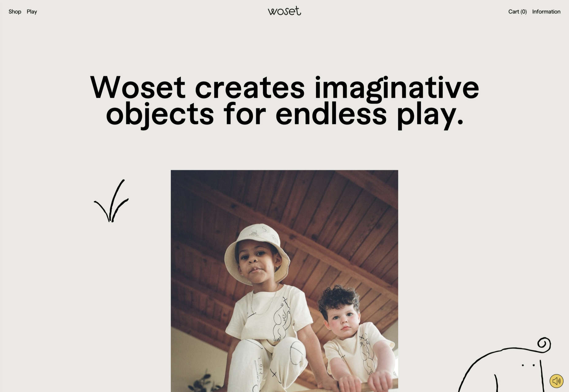


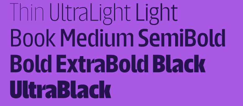
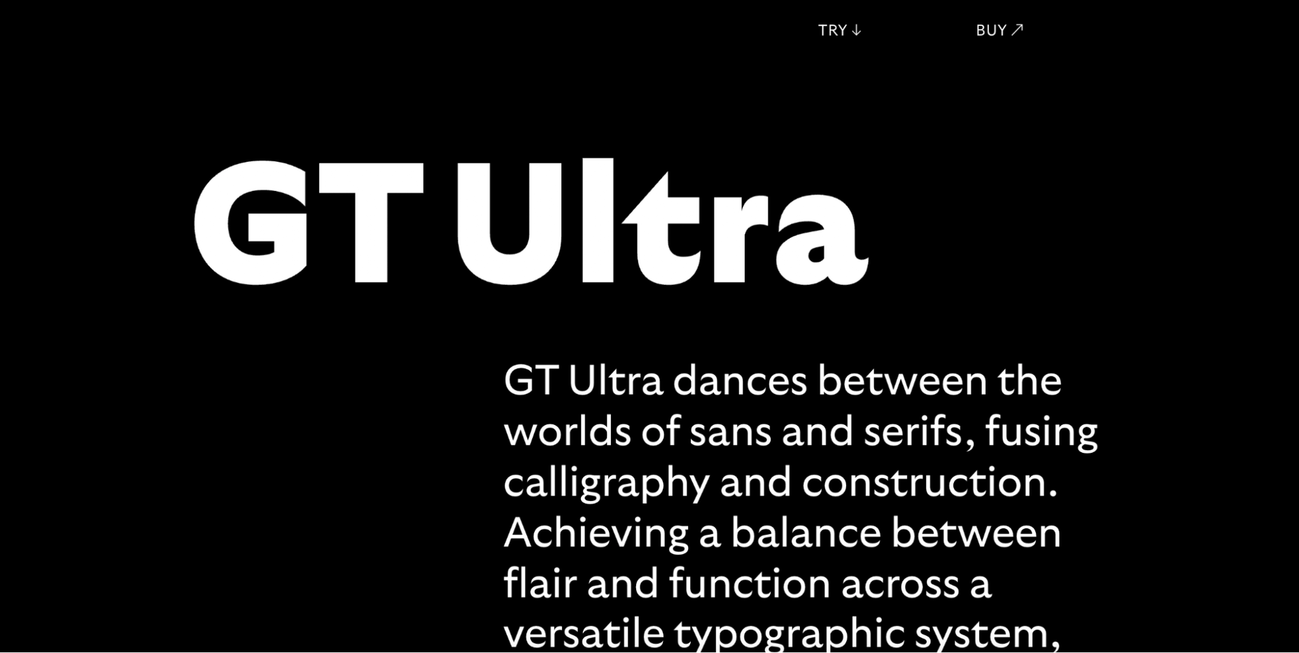
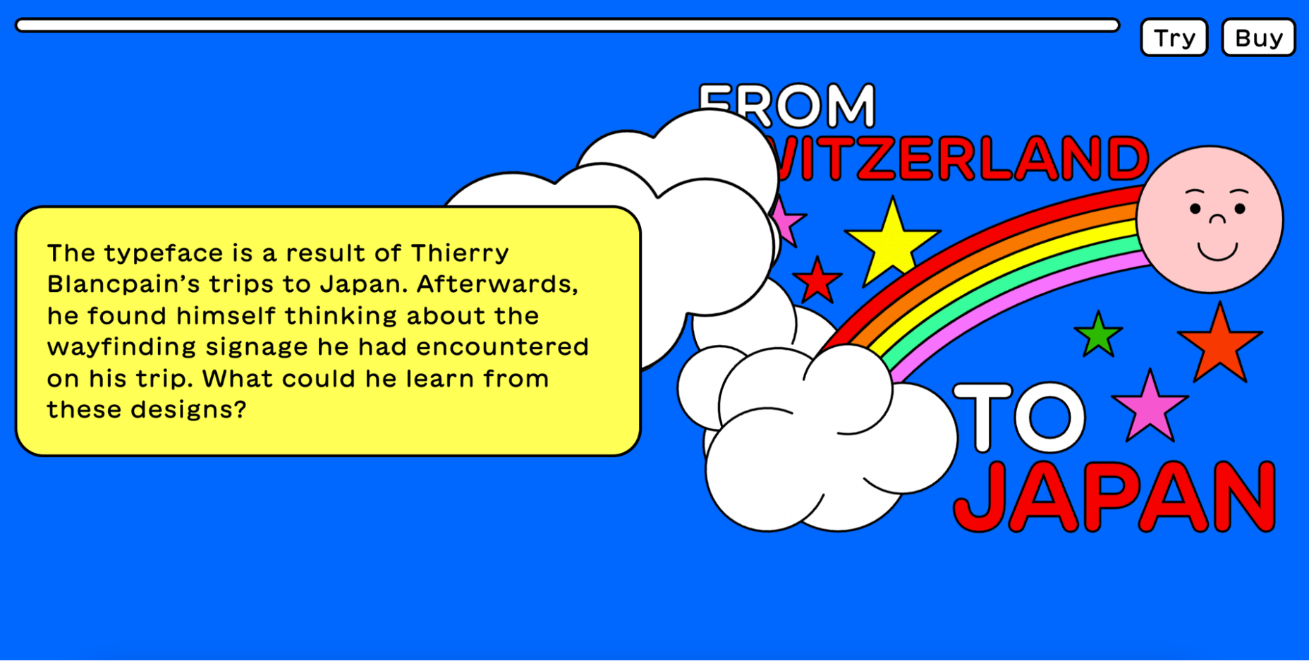
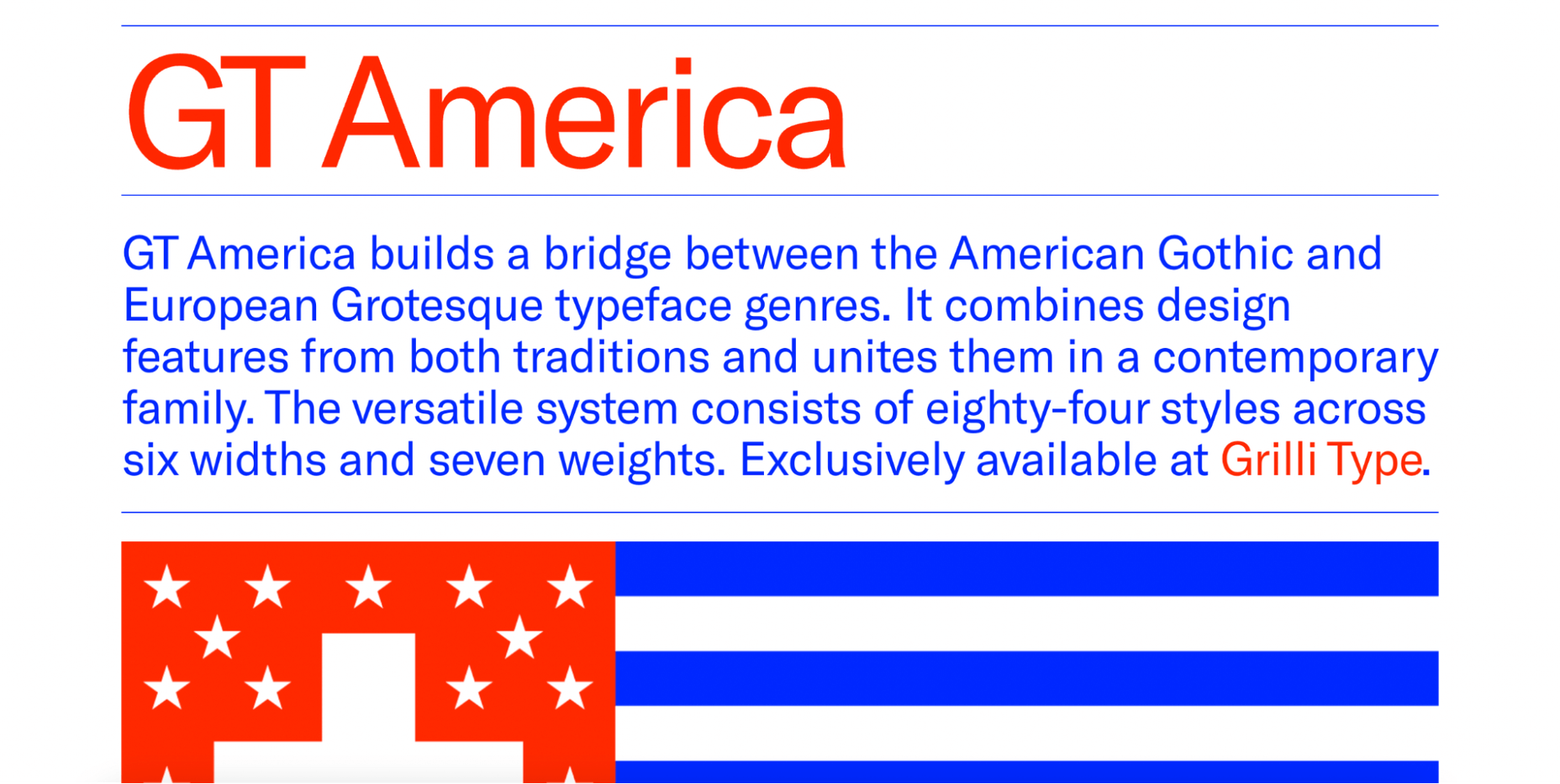
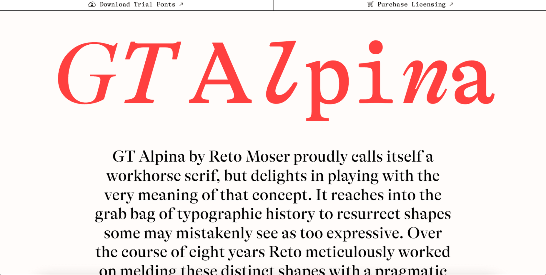
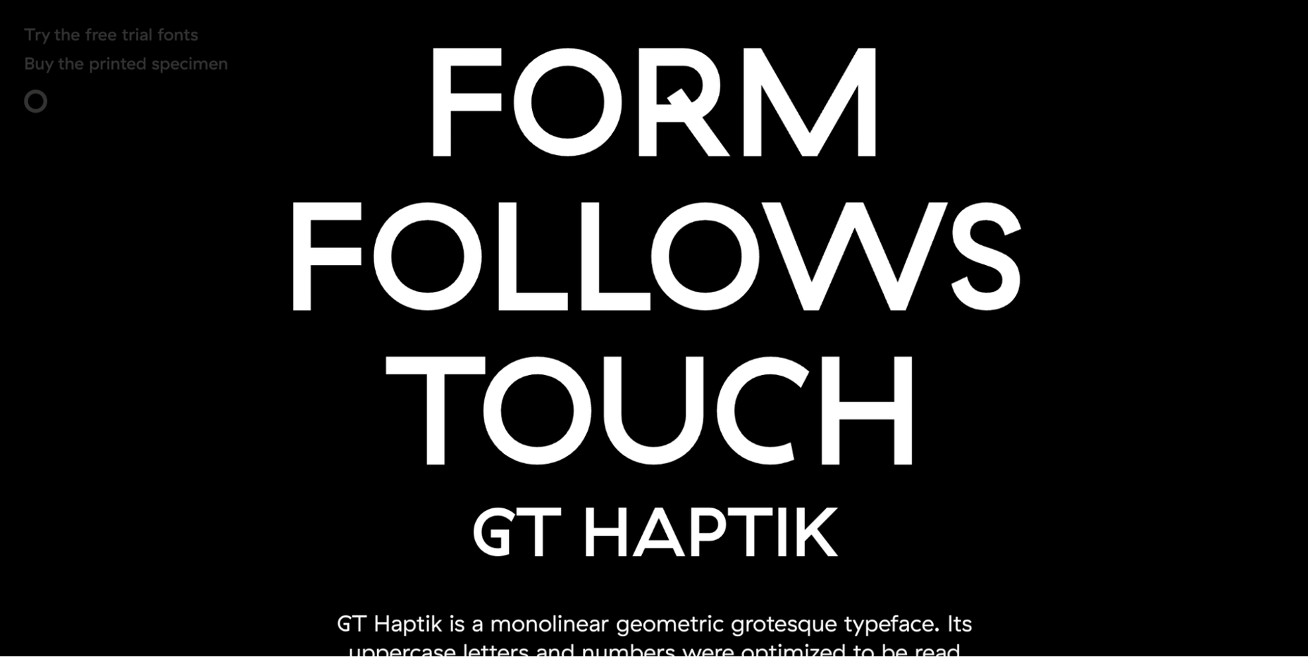
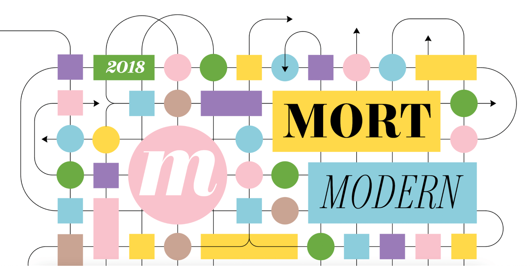
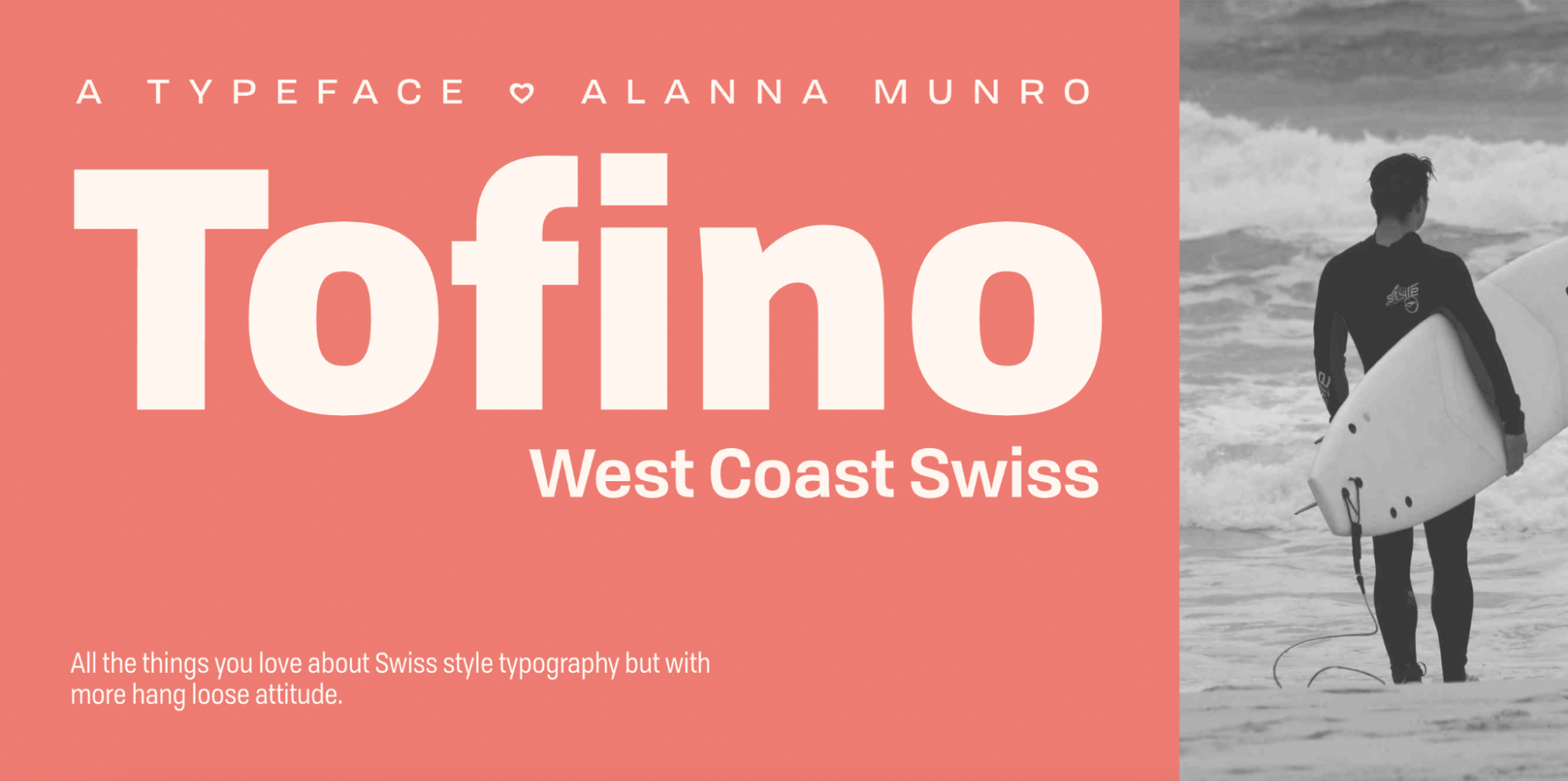
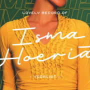
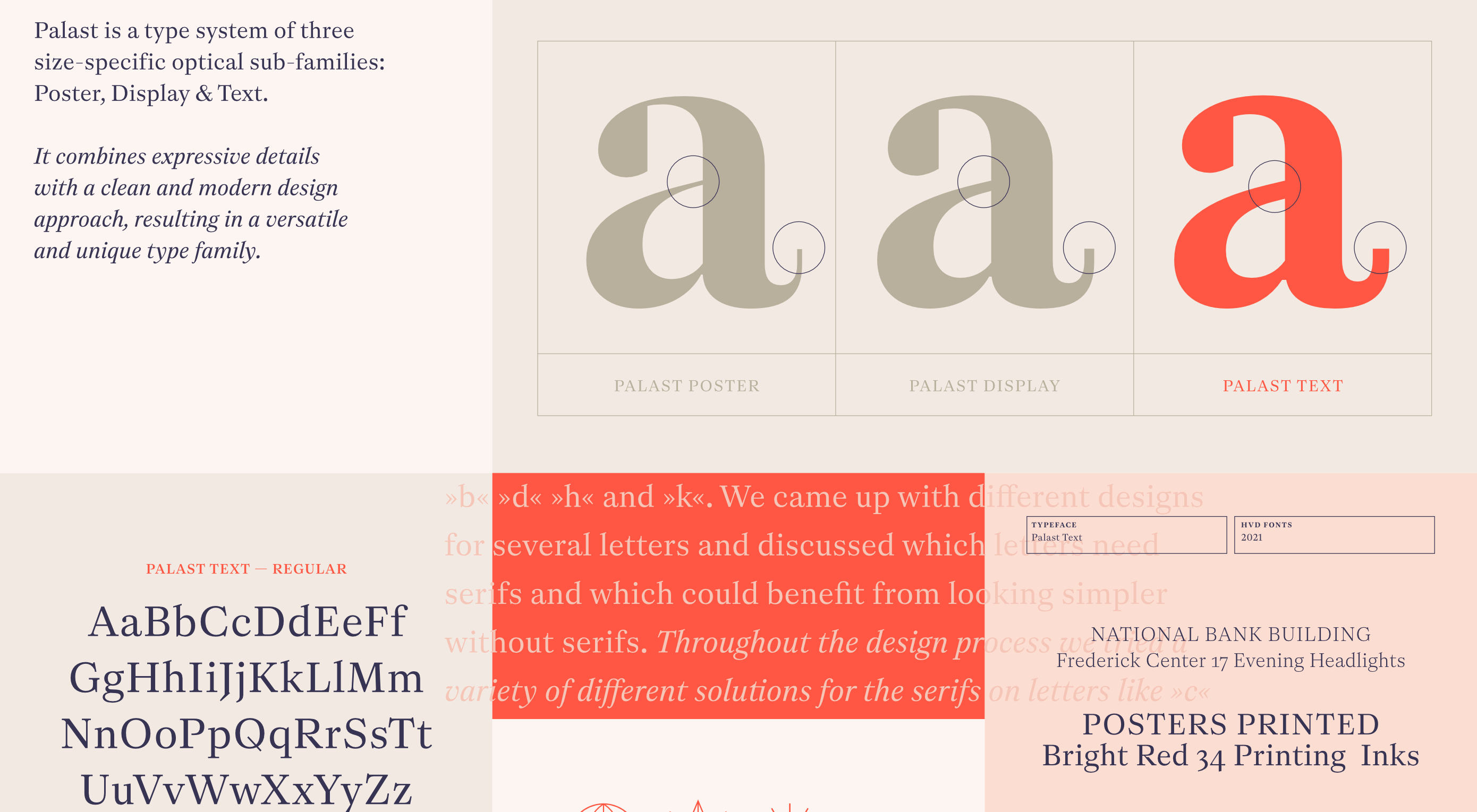
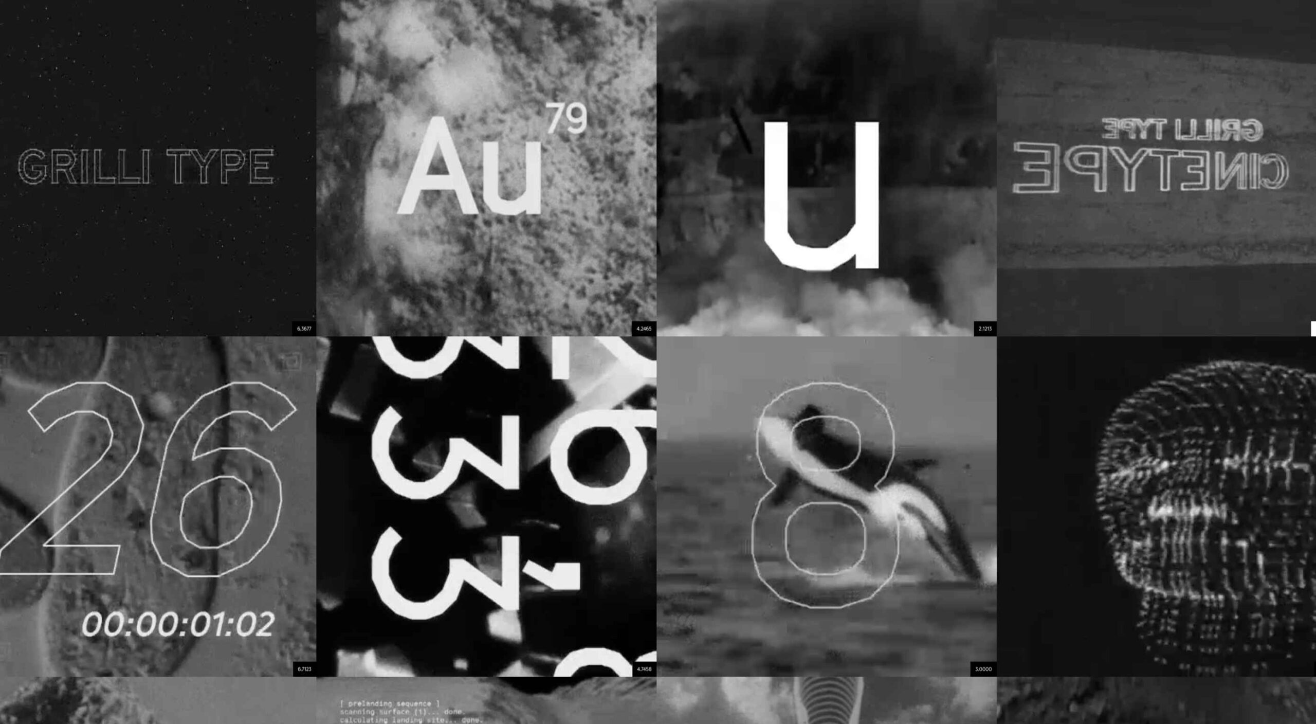 Are you looking for a unique font that will make your next project shine? Or maybe you need a typeface with a beautiful design and rich history behind it. Luckily, mini-sites for fonts allow us to creatively explore a font’s origins and history. We know (from our own experience) how important it is for UI and UX designers to have a variety of fonts for our designs.
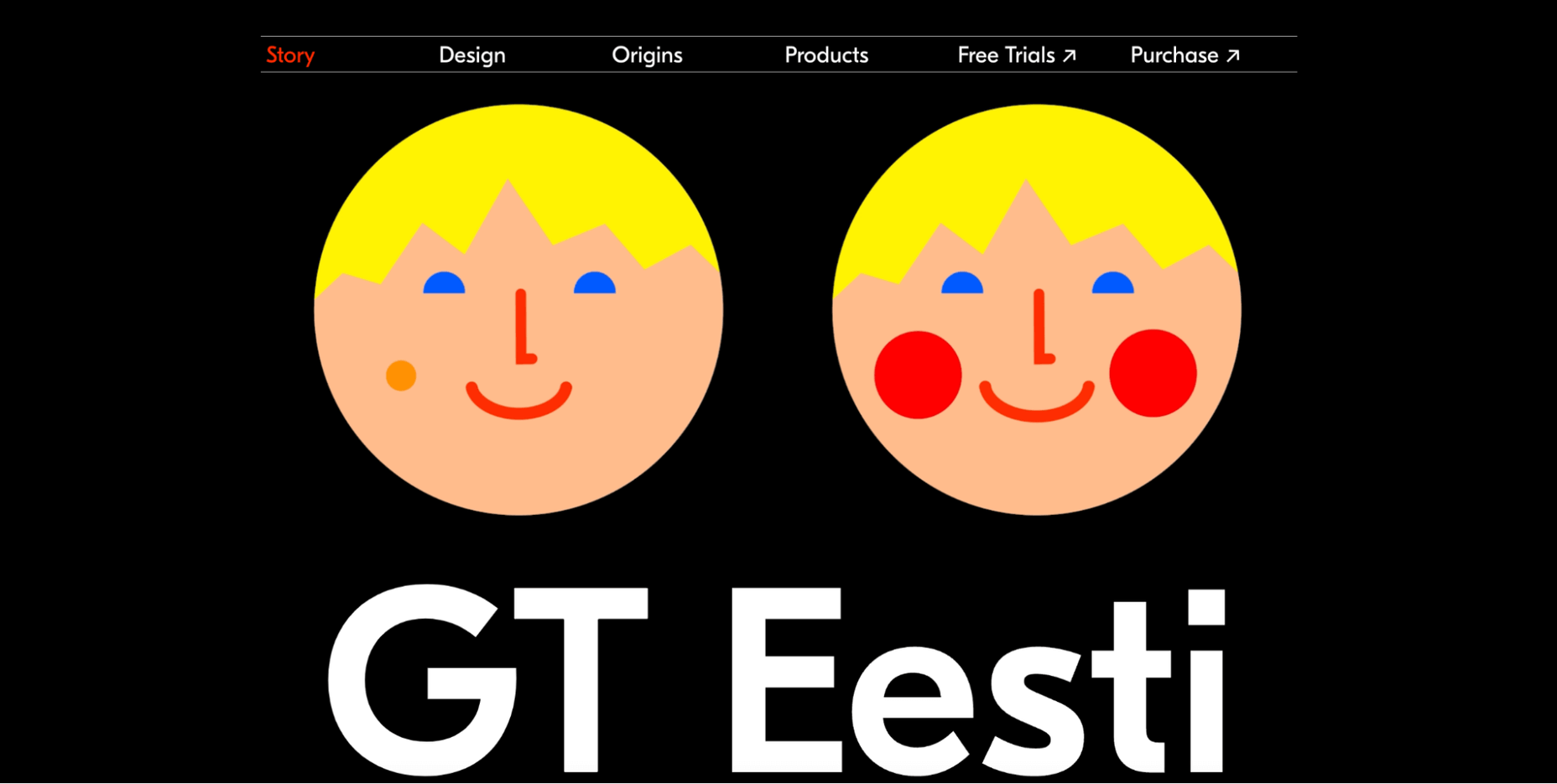
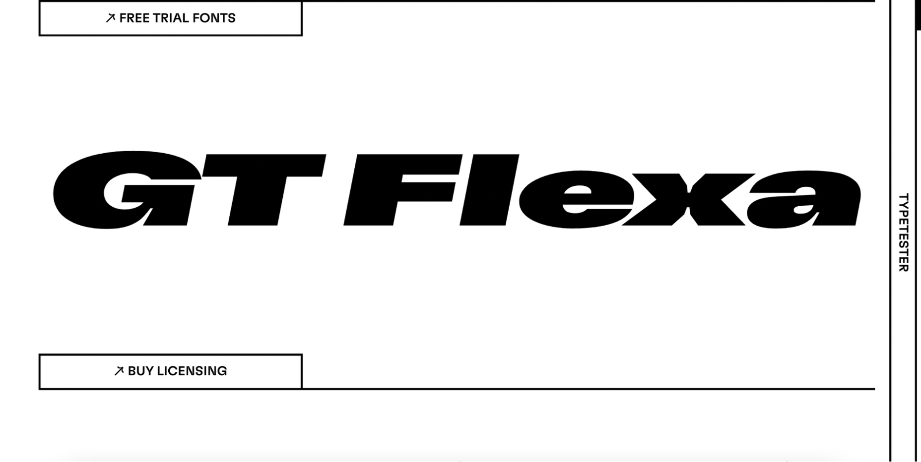
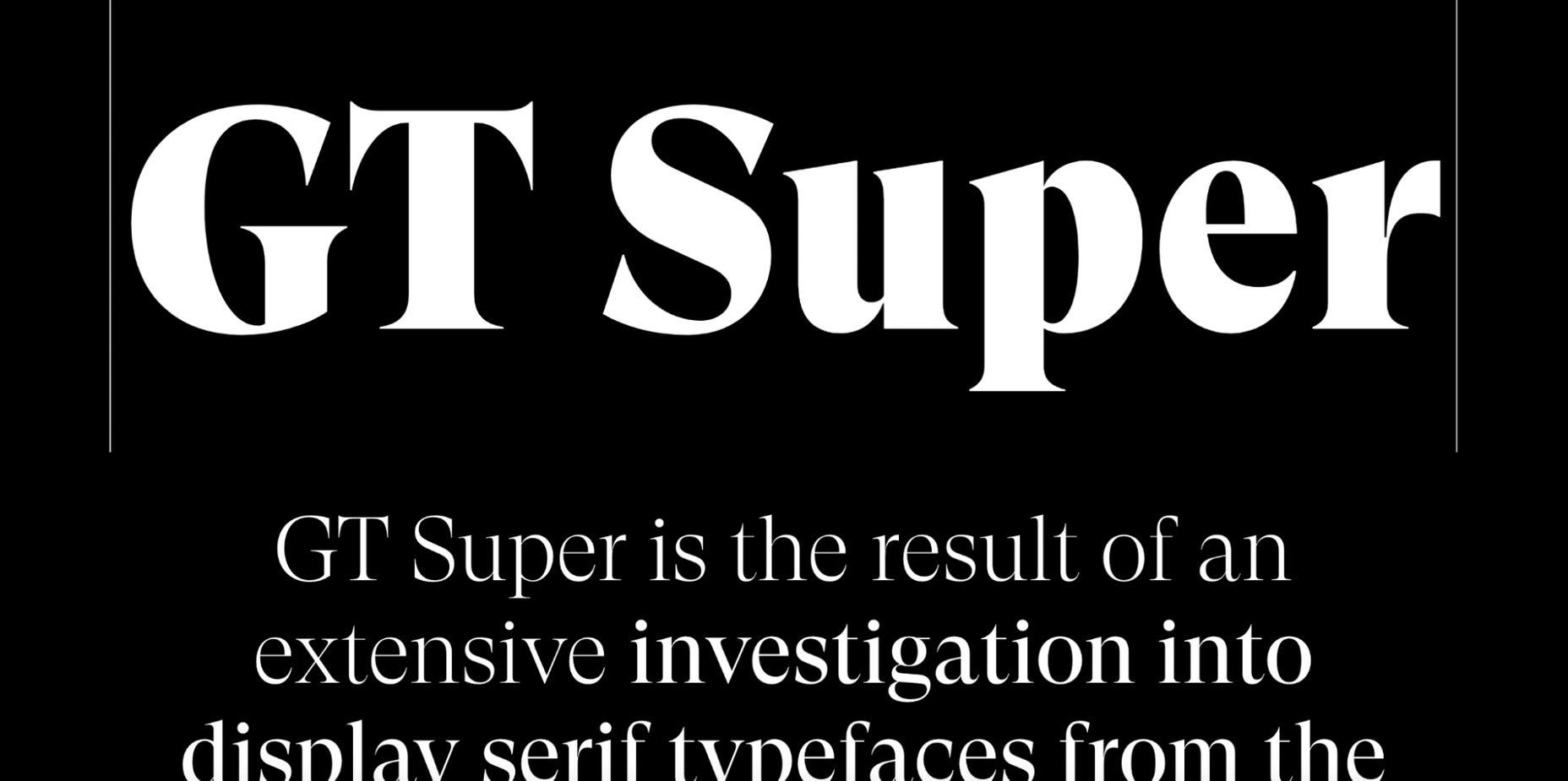
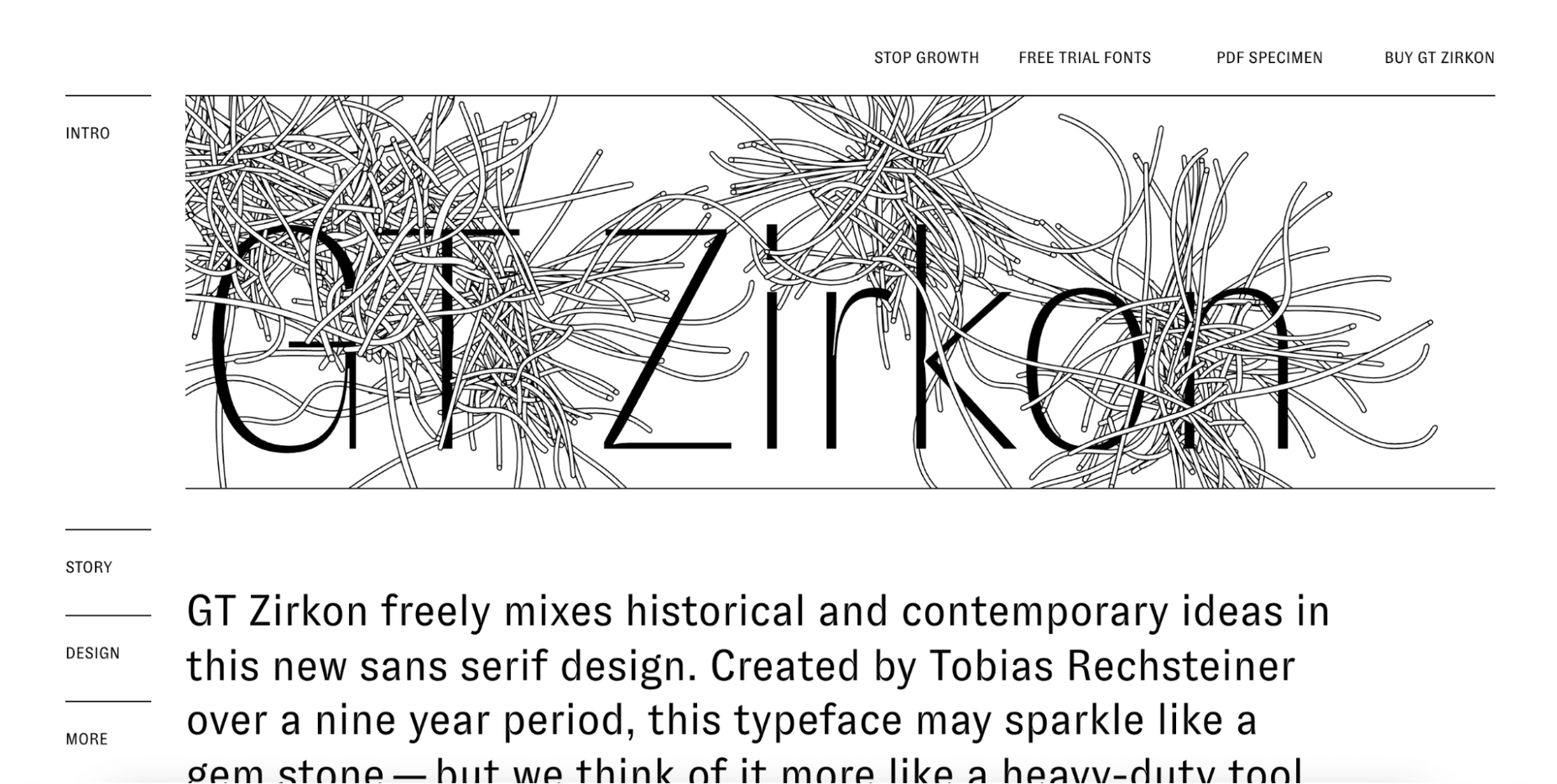

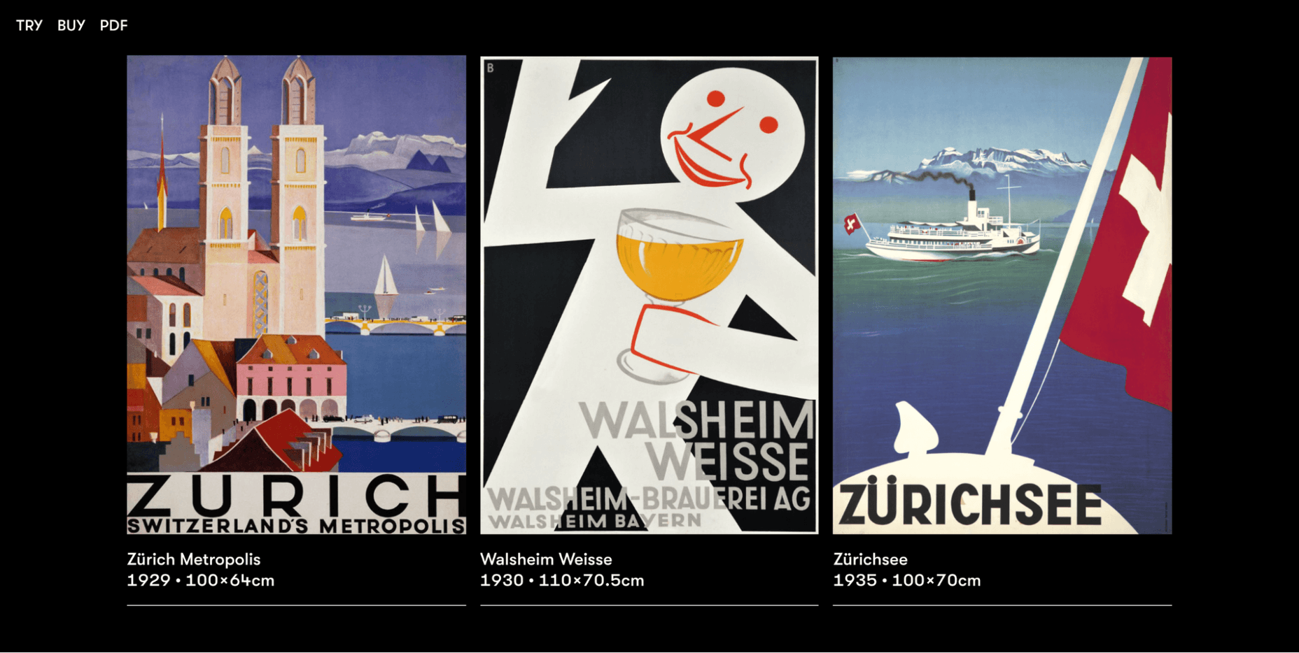
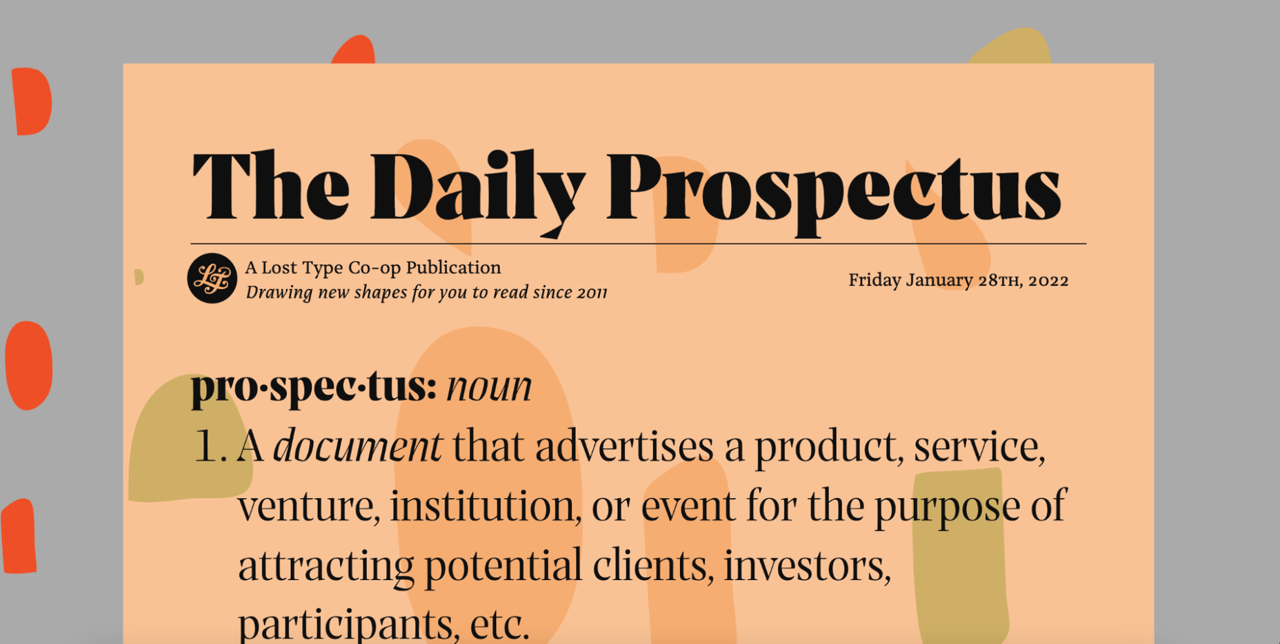
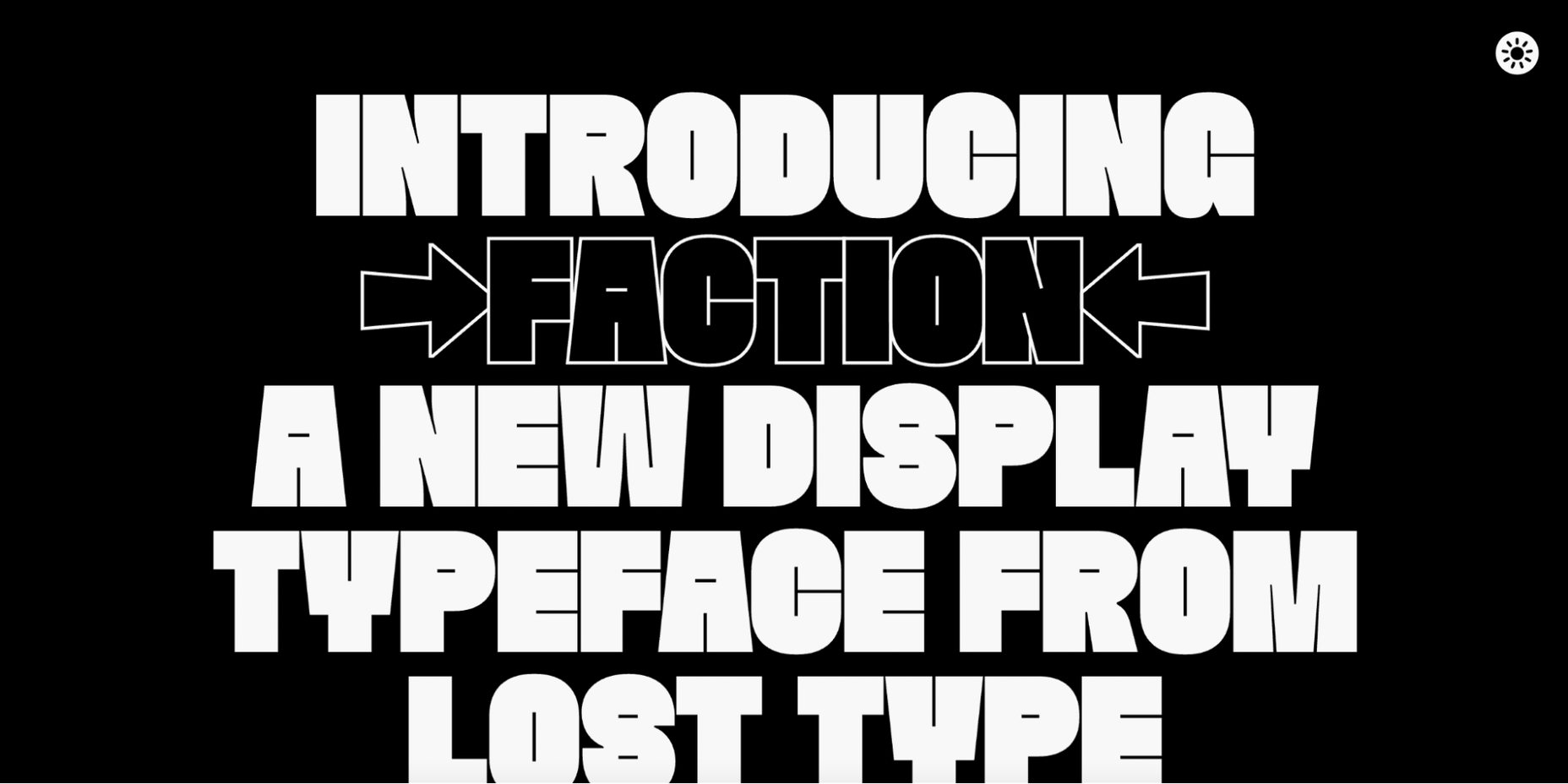
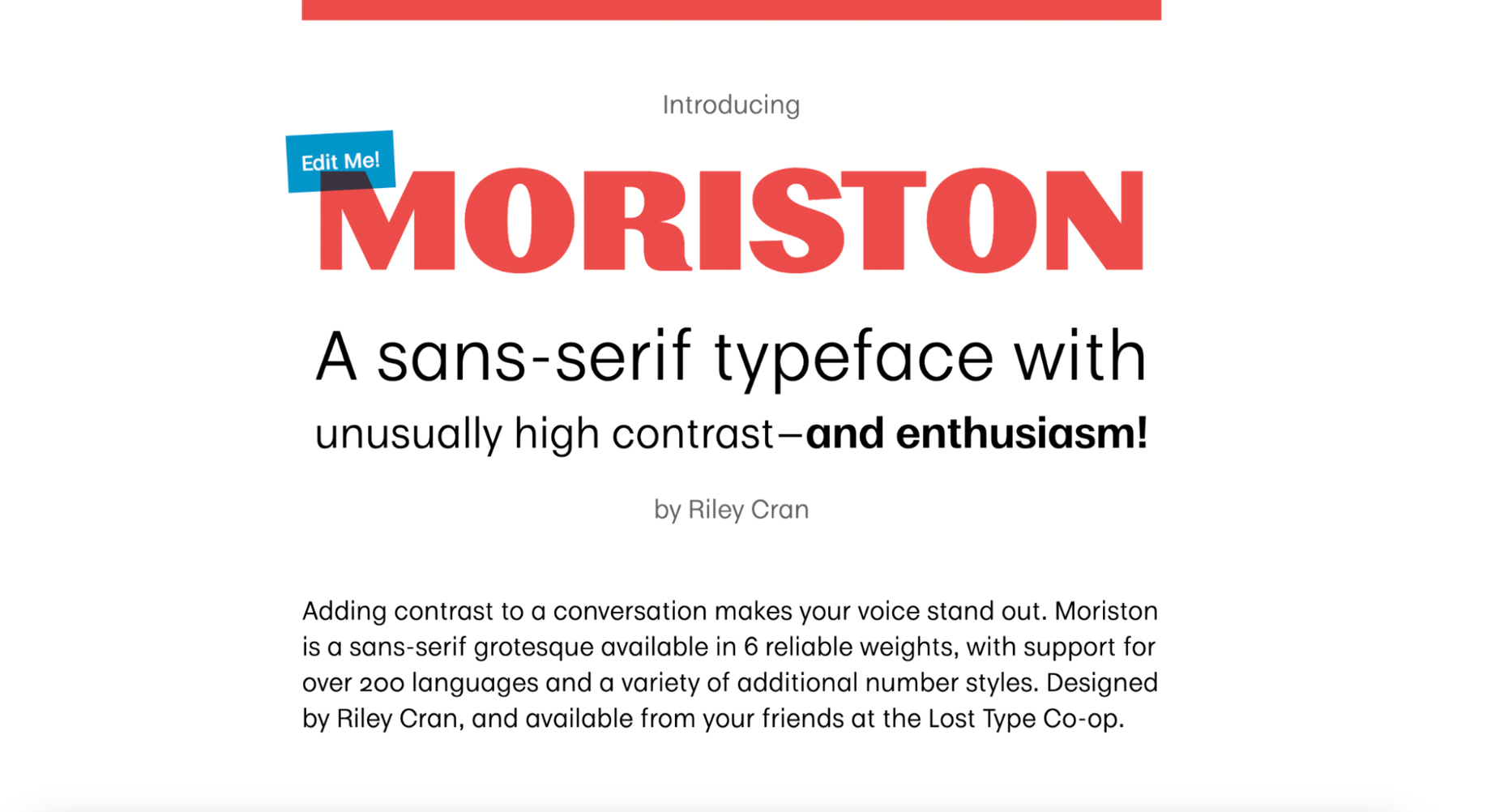
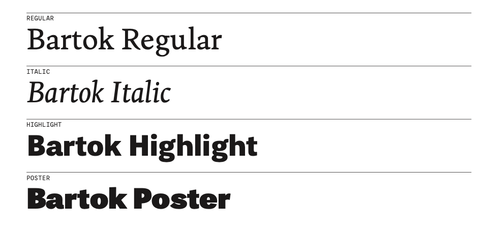
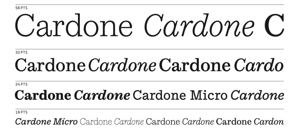
 Type foundries have been putting out some really interesting fonts these last few months. Based on the collection of the best new fonts for February 2022, it looks like we’re going to see lots of throwbacks to the ‘70s in the coming year.


 The importance of scientific research cannot be overstated. User research is crucial to the success of any UX design, and this article will explain all the reasons why.
 So here we are, in a brand spanking new year—time for looking forward with fresh ideas and renewed hope for the year ahead. We are kicking off 2022 with a mixed bag and, we hope, something for everyone.
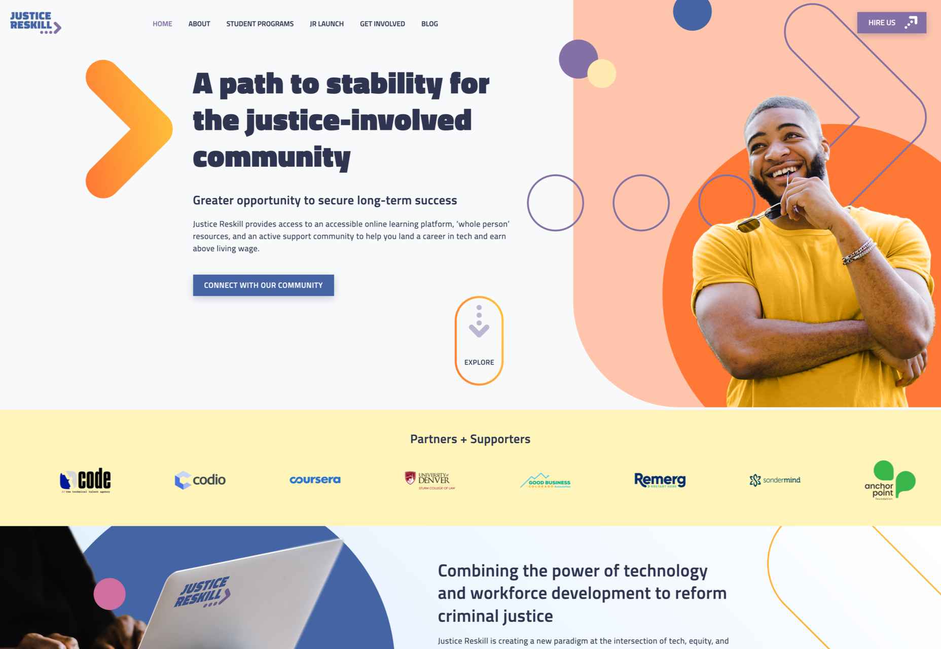

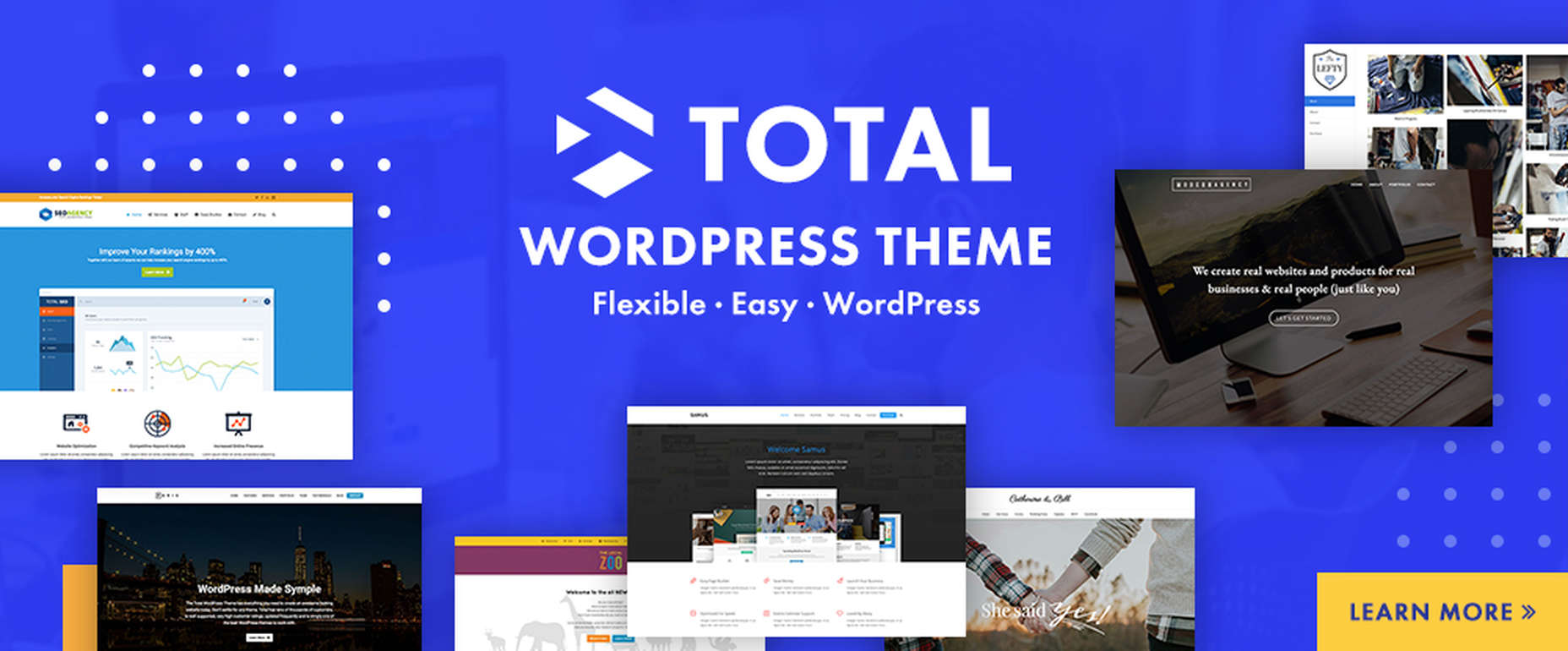
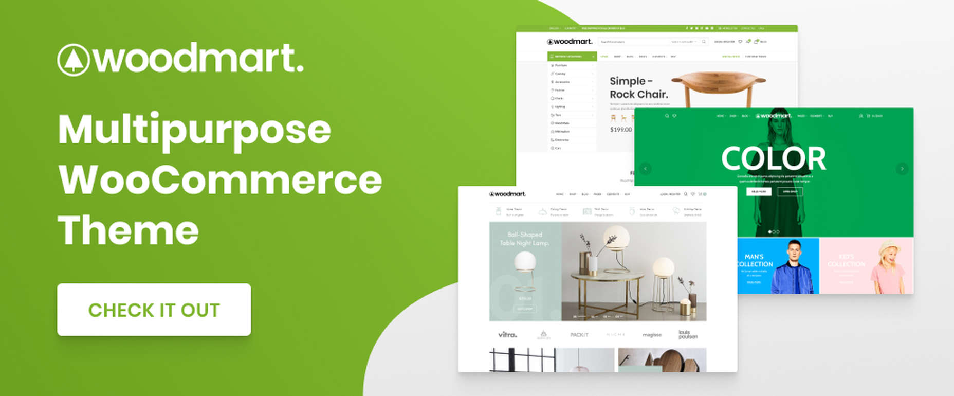
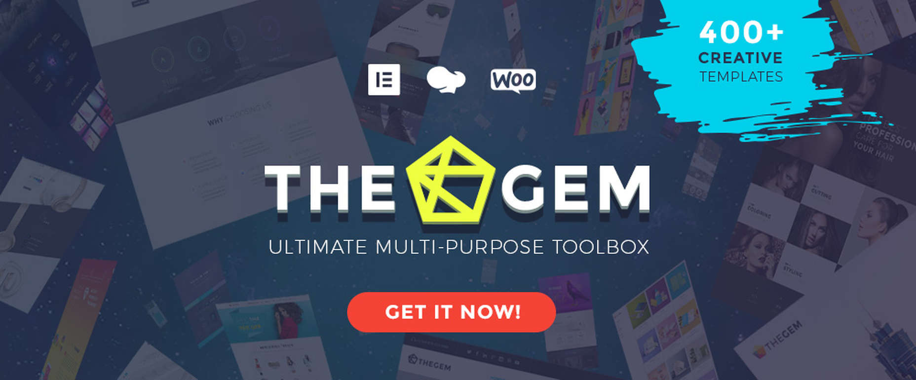
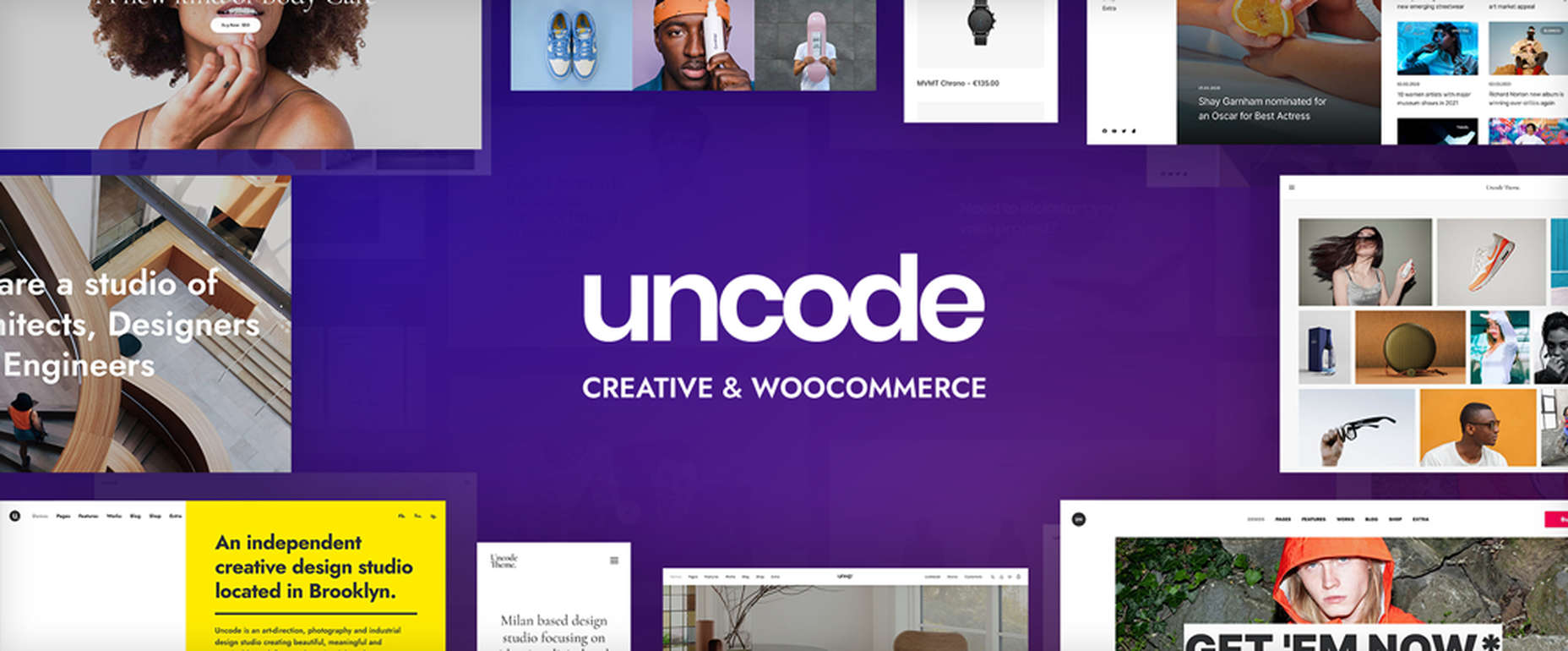
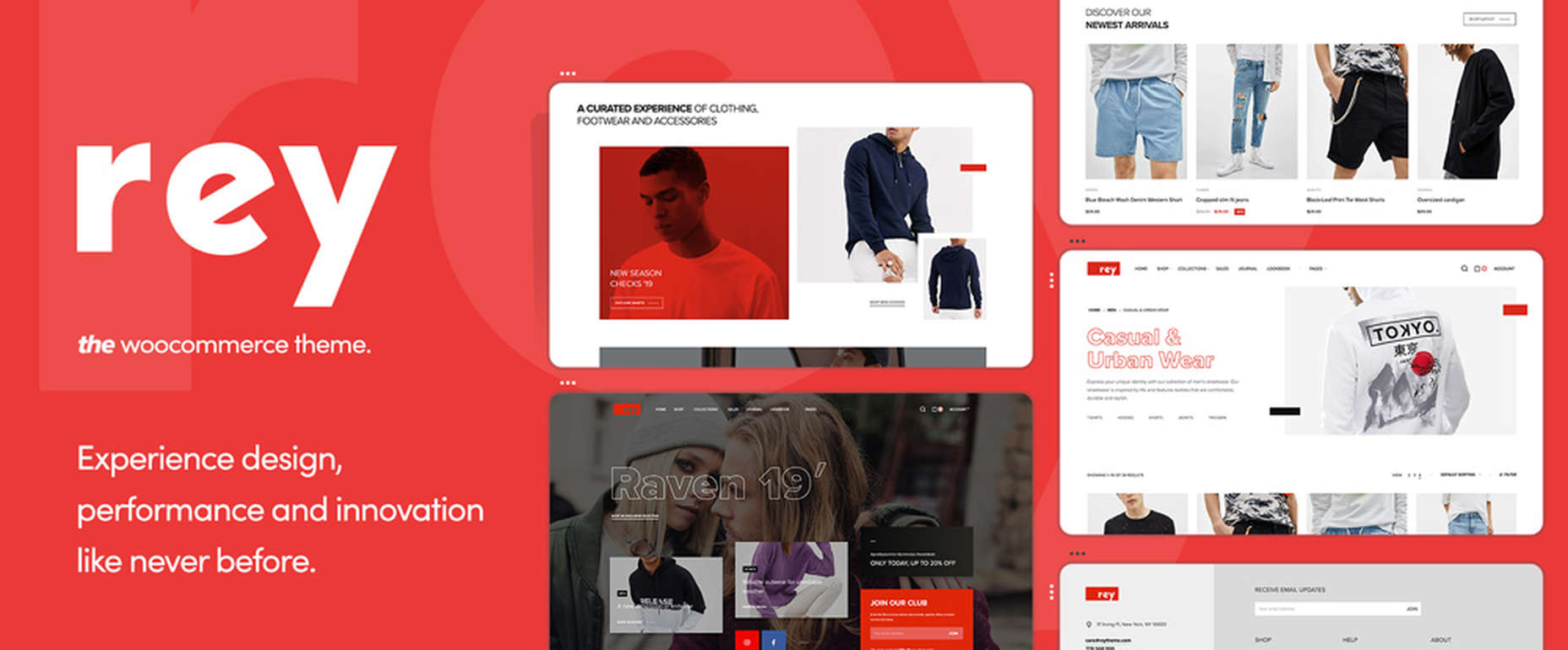
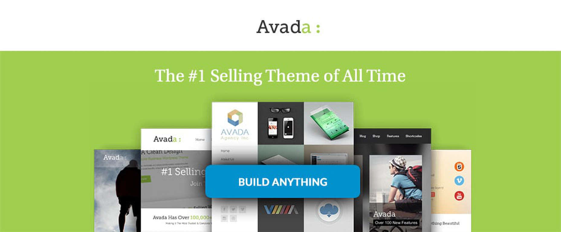
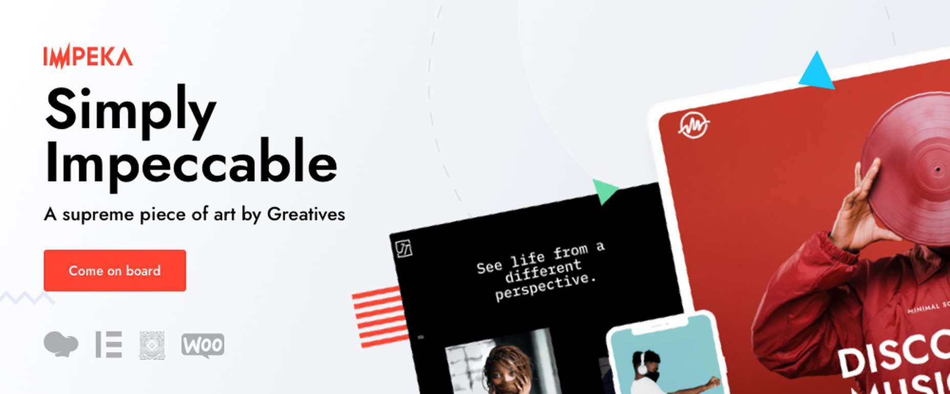
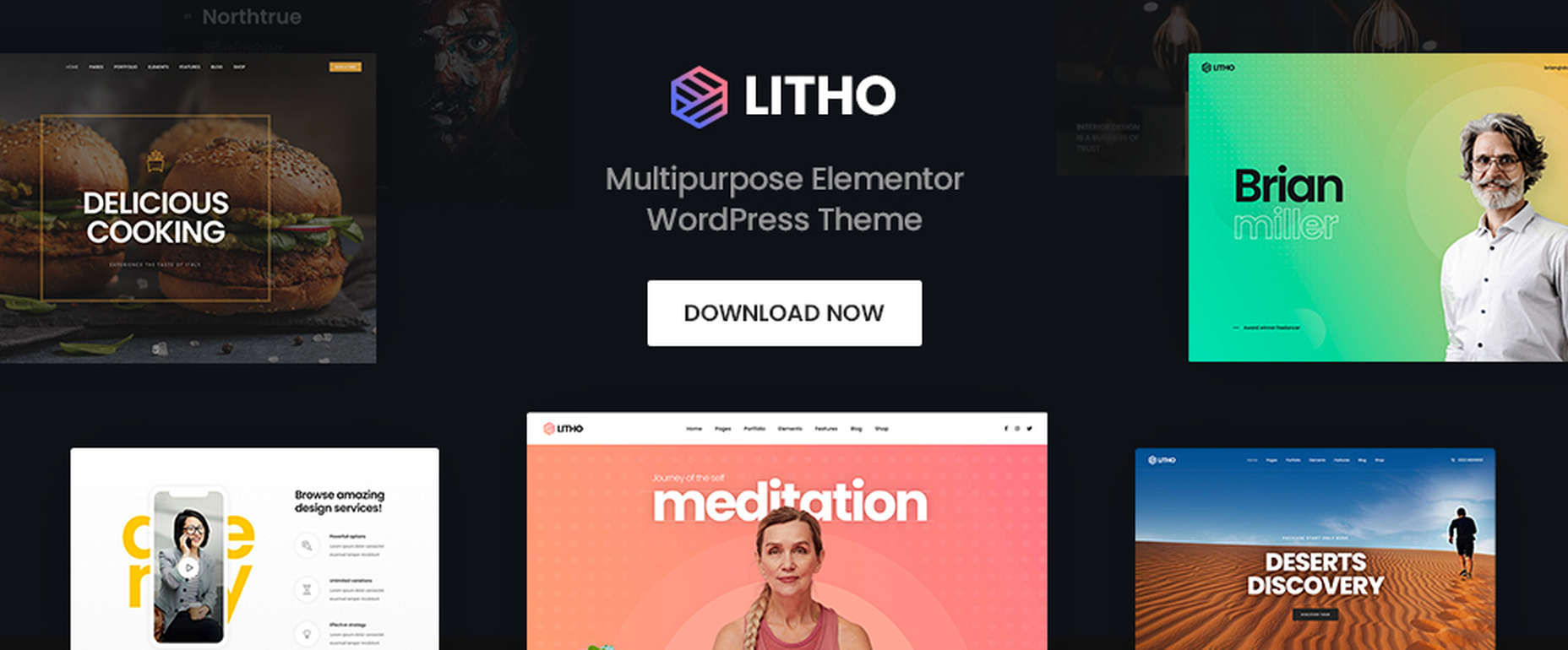
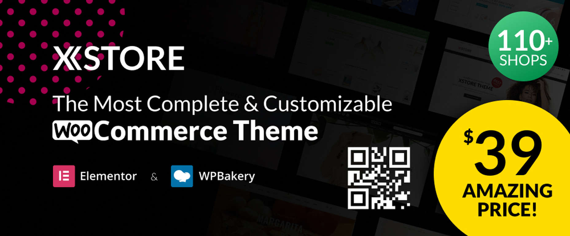
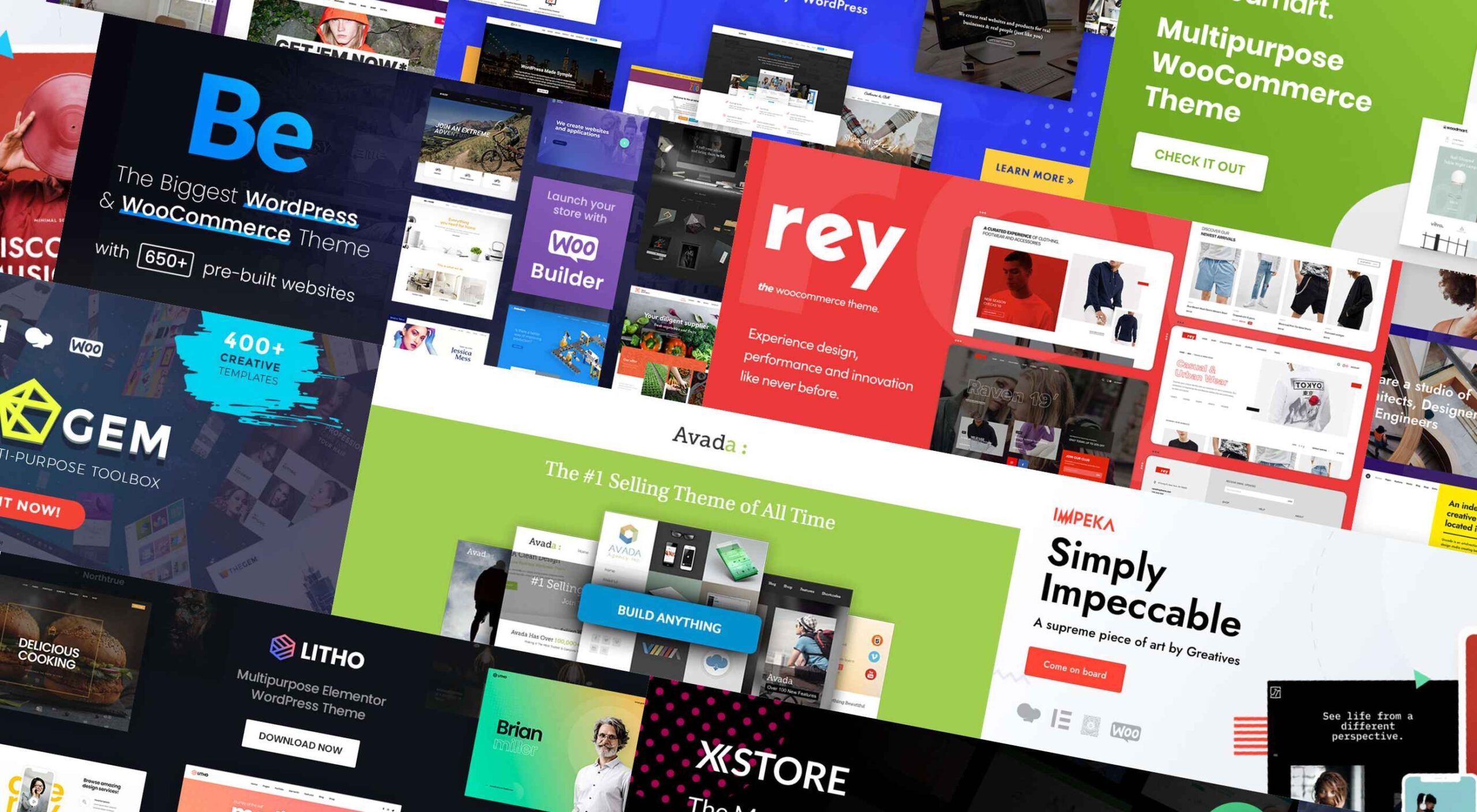 If you’re looking for a WordPress theme for your 2022 projects, it never hurts to see what the experts consider to be the best of the bunch. That’s not to say that experts don’t have their favorites. They often do, and we are no different.
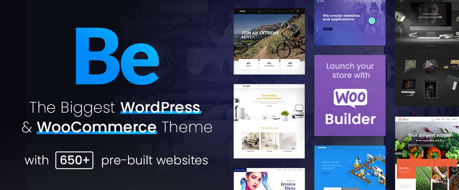

 Happy New Year, fabulous new website design trends!


 Are you tired of using the same old Google fonts from website to website? You’re in luck!