Articles

This week, we have details of compromised Google Cloud accounts being used to mine cryptocurrency (mainly with weak or no passwords on API connections), there’s an article on how GraphQL can be used as an API gateway (including security controls), a very comprehensive guide to all things relating to API security, and a new API security training course from AppSecEngineer.

Vulnerability: Compromised Google Cloud Accounts Used to Mine Cryptocurrency

The main story this week comes from HackerNews and describes how attackers are able to exploit improperly secured Google Cloud Platform (GCP) tenants. The impact on affected users included compromising their cloud resources, like uploading cryptocurrency mining software, and ransomware and phishing attacks.

Source de l’article sur DZONE

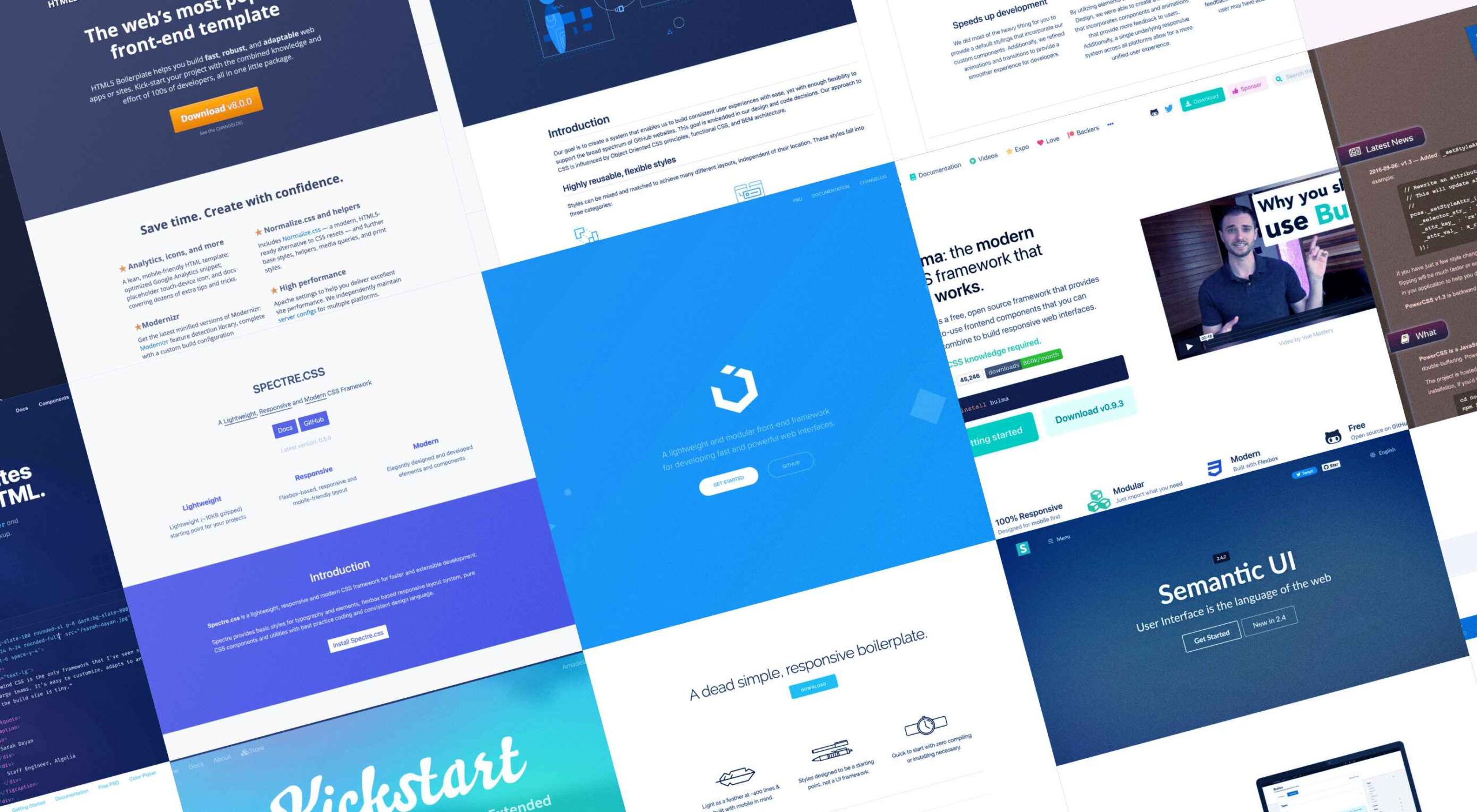
Whether you are a CSS expert or a front-end beginner, using the right CSS framework is crucial for your daily tasks. There are numerous frameworks whose ultimate goal is the same: helping developers target multiple screens, in the simplest possible way.

This is why Bootstrap is by far the most popular framework on the market. All developers have heard of Bootstrap, and more than 80% of them say they are happy using it.

But that doesn’t mean that there aren’t some great alternatives if you’re willing to shop around. Bootstrap won’t be top dog forever, and there are numerous new lightweight and powerful CSS frameworks.

If you are bored of coding with Bootstrap and Foundation and tired of using complex CSS rules, this list is for you. 

From frameworks that take a pure CSS approach to minimalist frameworks with fully customizable themes, nothing is left out. Let’s get started…

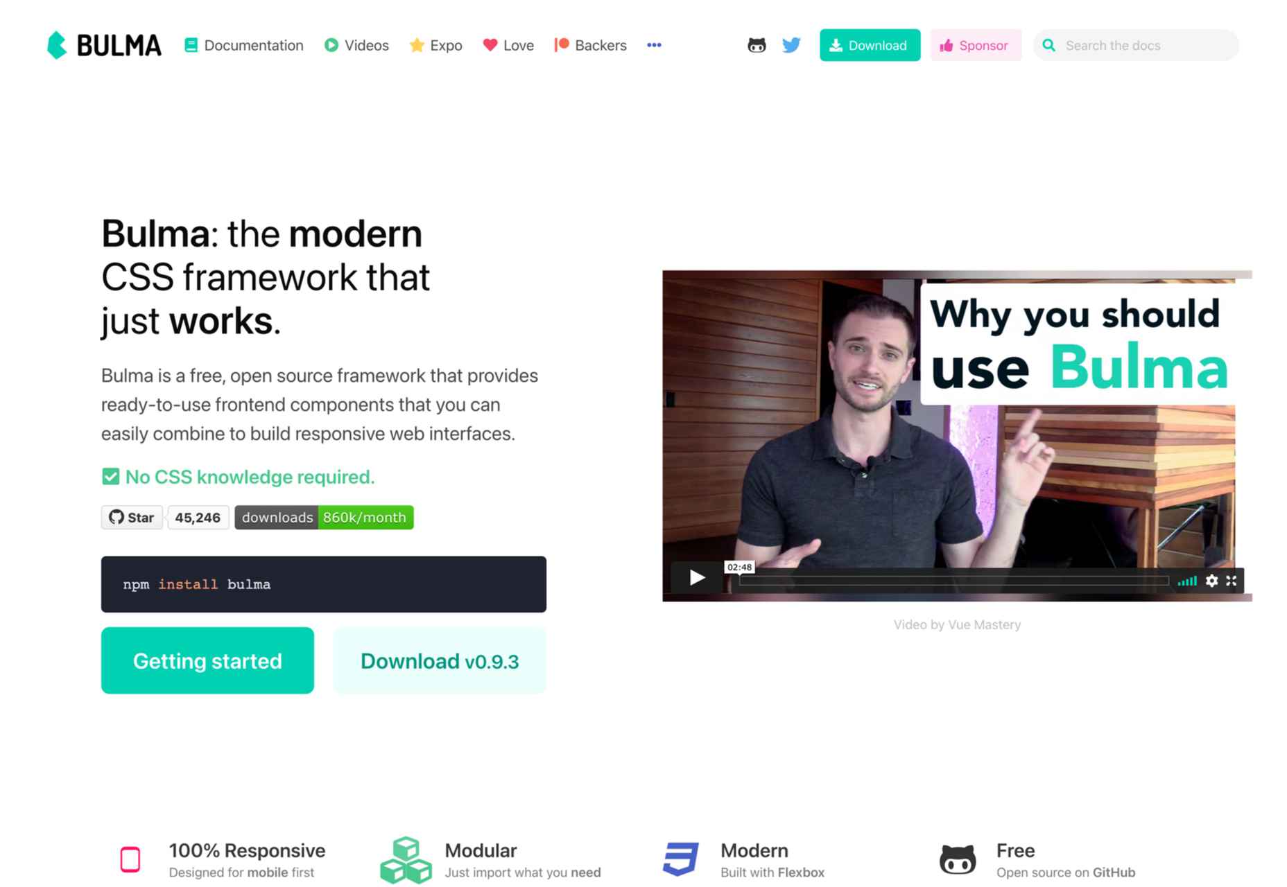
1. Bulma

Bulma is one of the most popular alternatives to Bootstrap and Foundation. It is an entirely free, open-source CSS framework that does not have a steep learning curve. No prior CSS knowledge is required to use Bulma.

When you add the variety of colors, responsiveness, and clean flexbox-based grid it offers, it’s no wonder Bulma is becoming more popular every day. Bulma is a well-documented framework that you should definitely try out.

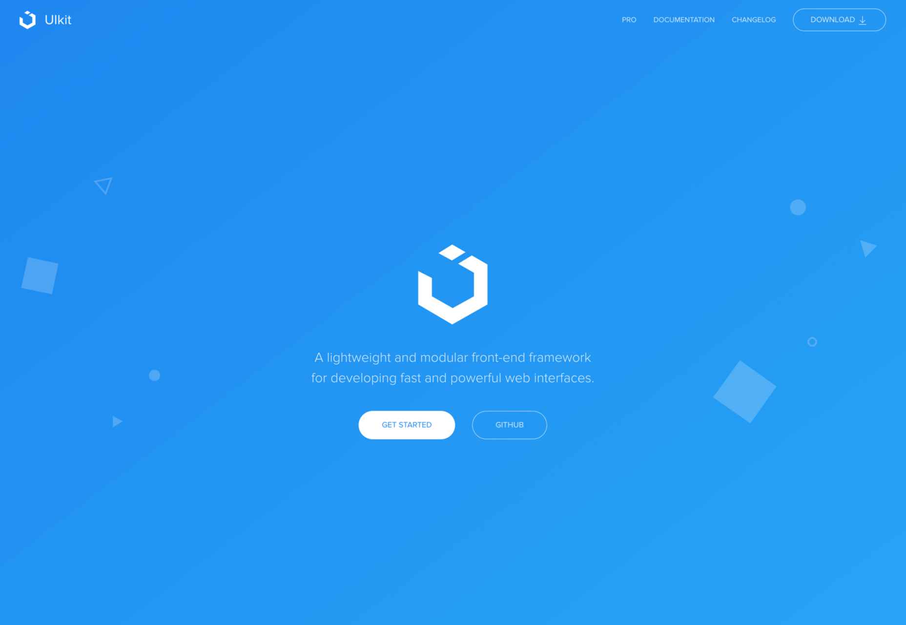
2. UIkit

If you’re looking for a lightweight yet powerful CSS framework that can be wired with HTML and JS, Ulkit is for you. It fully supports right to left languages and has one of the best icon libraries out there.

Keep in mind that Ulkit is also easy to use. All in all, Ulkit is an excellent Bootstrap alternative that is perfect for designing web layouts for desktop and mobile screens.

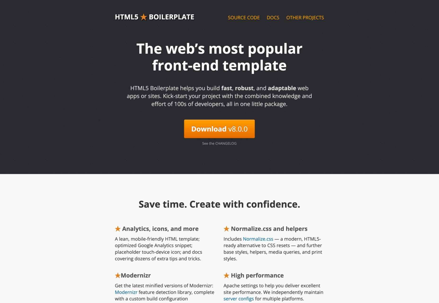
3. HTML5 Boilerplate

Even though Bootstrap is relatively easy to learn, it is much more than just a front-end template. So what if you need a fully compatible JavaScript, CSS3, and HTML5 template? In this case, HTML5 Boilerplate is a good choice.

Of course, since it’s a template, this framework does not include layouts and component modules. However, if you need a reliable CSS template that offers extensive documentation, HTML5 Boilerplate is a great solution.

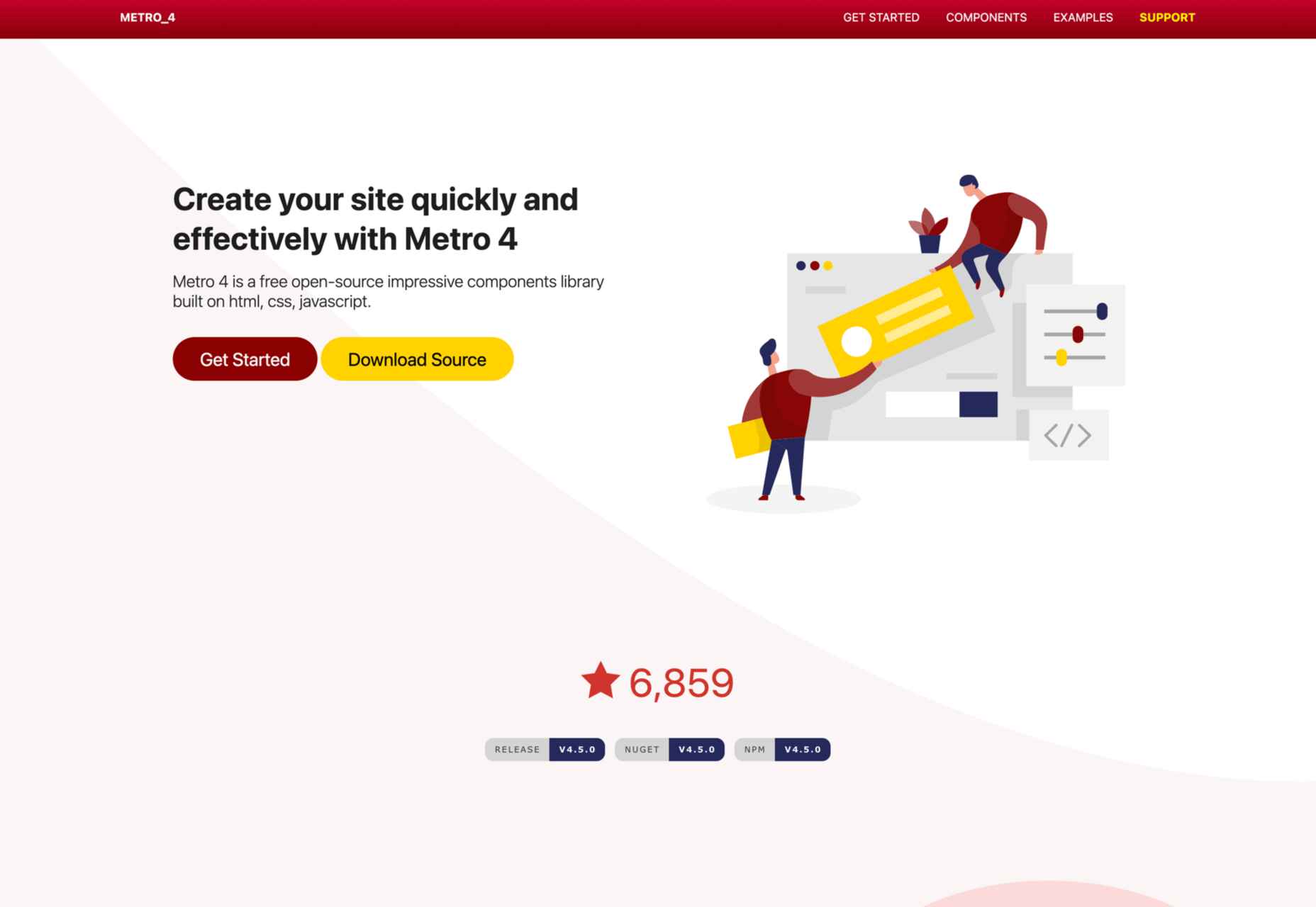
4. Metro UI

Metro UI is one of the most flexible CSS frameworks on the market. This front-end framework can be easily combined with JavaScript-based frameworks like Angular, React, etc.

We found Metro UI to be an excellent open-source CSS framework and a great alternative to Foundation during our testing.

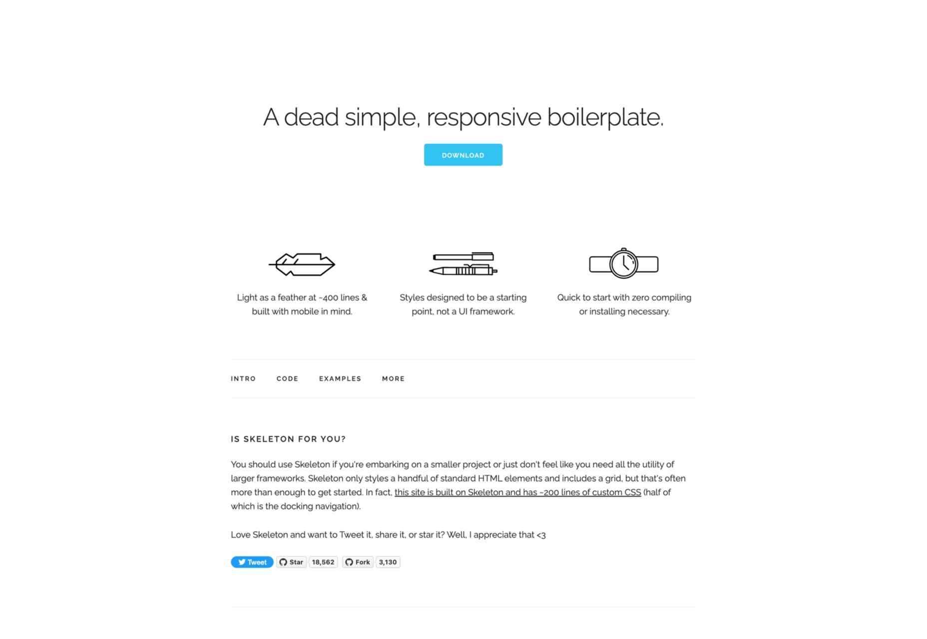
5. Skeleton

As a two-in-one solution, Skeleton quickly made it on our list. This is both a boilerplate and a comprehensive CSS framework. We enjoyed customizing its 12-column grid during our testing, and we found out that it has virtually no learning curve. 

The automatic width resizing works like a charm, and the syntax is fully responsive. This is why we consider Skeleton to be an excellent Bootstrap alternative.

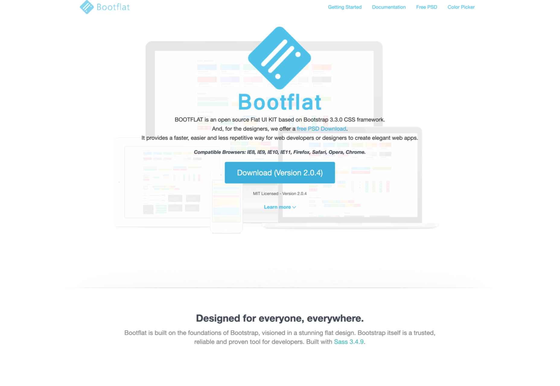
6. Bootflat

If you are looking for a quick way to create a web app, Bootflat is the framework you need. Bootflat’s components are built with CSS3 and HTML5, and the framework offers a comprehensive panel of color schemes for you to choose from. 

Bootflat looks and acts like a simplified version of Bootstrap. However, that doesn’t mean that this CSS framework isn’t scalable and robust. On the contrary, you can fully manipulate the size and performance of the web designs you create. 

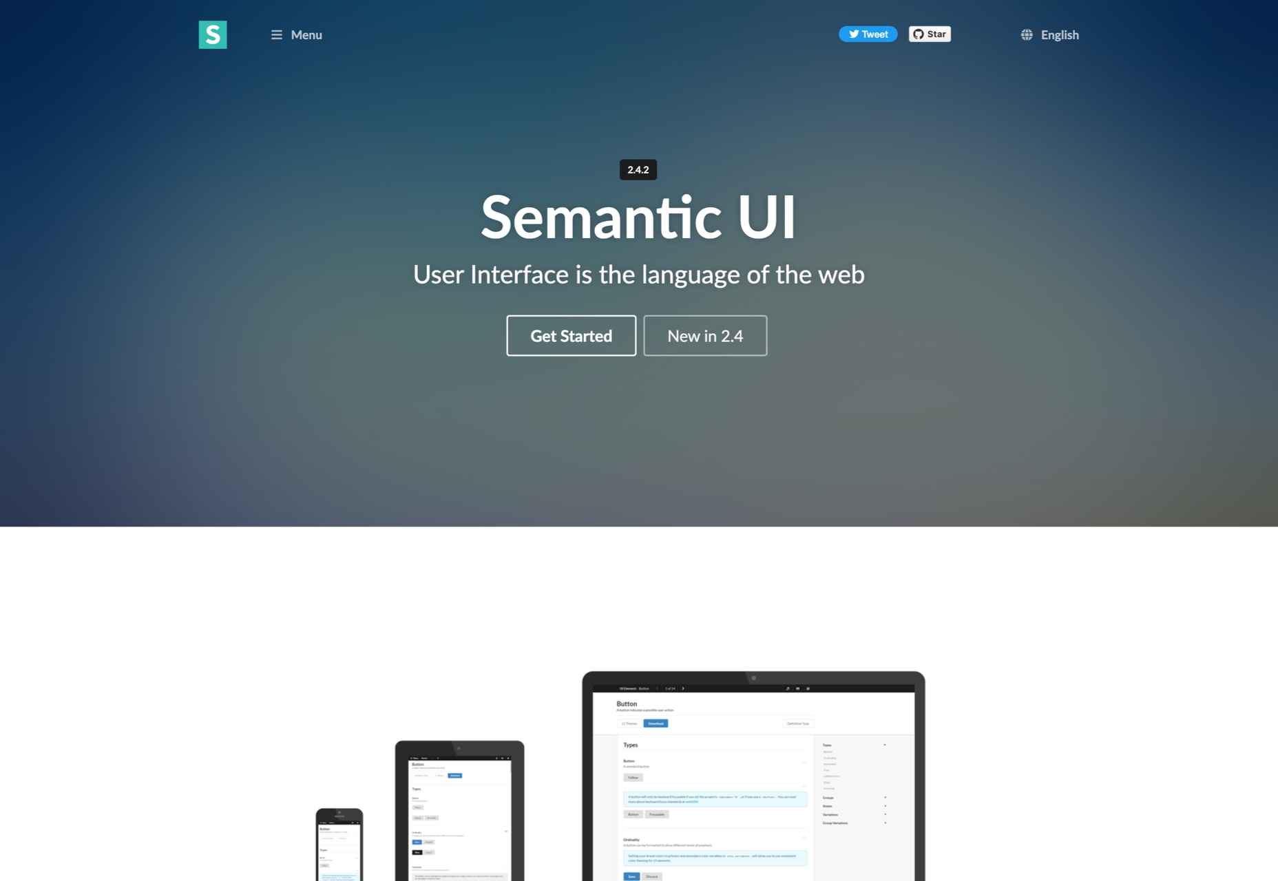
7. Semantic UI

If you exclude the fact that Semantic UI doesn’t have the utility classes Bootstrap offers, it is a comprehensive CSS framework that you should try. The best Semantic feature allows you to write HTML code without using BEM methodologies. 

So, if you need a framework that will help you write readable codes in minutes, Semantic is the one for you. 

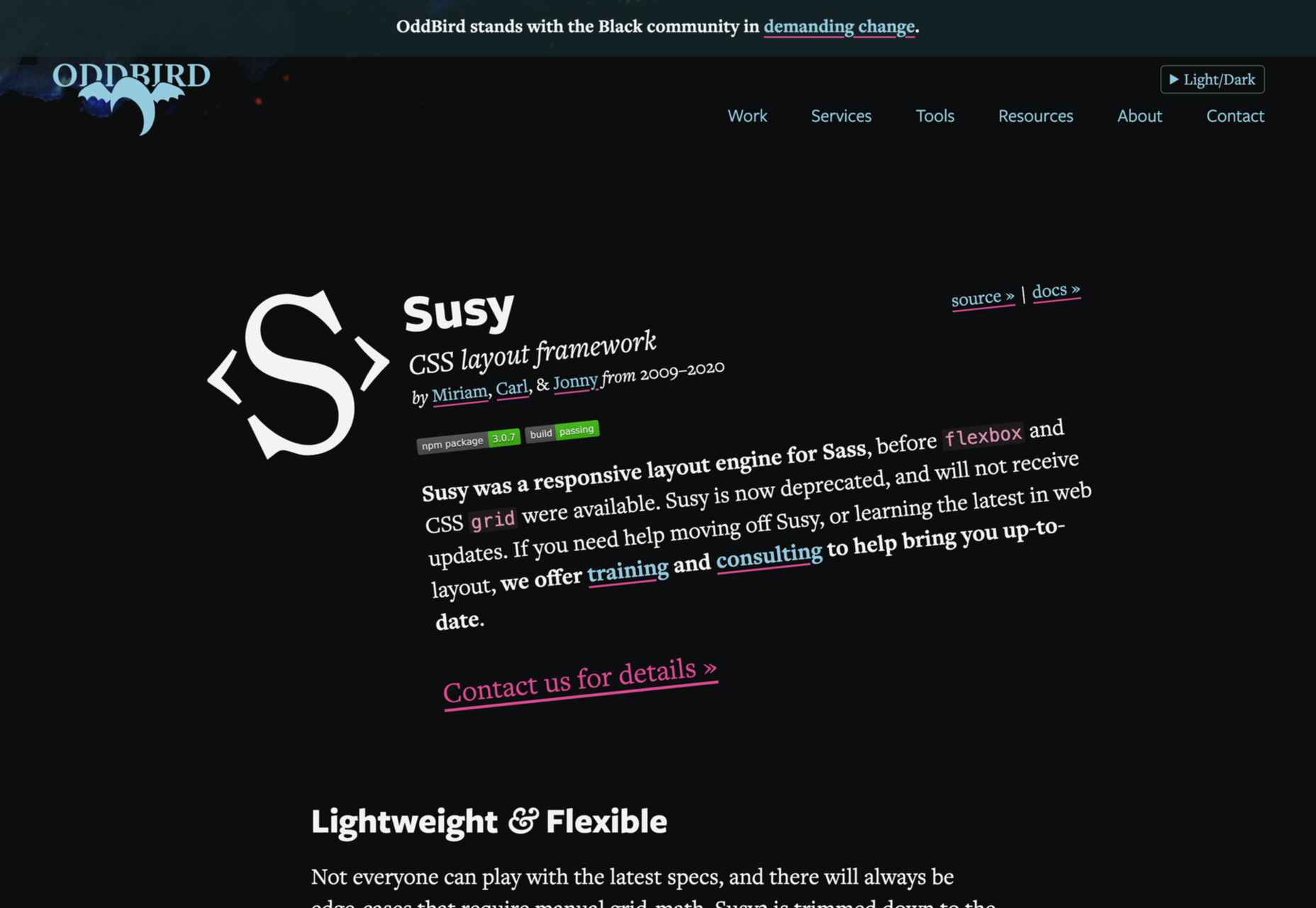
8. Susy

We know that most developers nowadays use flexbox and native CSS grids. Still, there’s nothing better than Susy if you need a grid system that supports legacy browsers. Although Susy is no longer maintained, it is one of the most flexible old-school grid systems. 

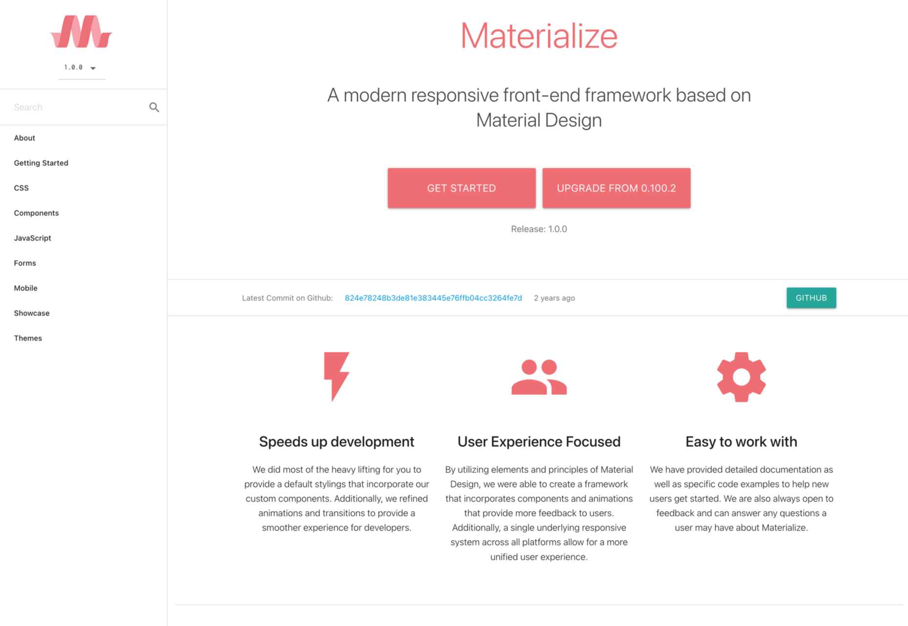
9. Materialize

Like most CSS frameworks on this list, Materialize is built with HTML, CSS, and JavaScript. 

It’s specifically designed to help you develop faster using a standard template and customizable components. As the name suggests, Materialize is based on the basic principles of Material Design.

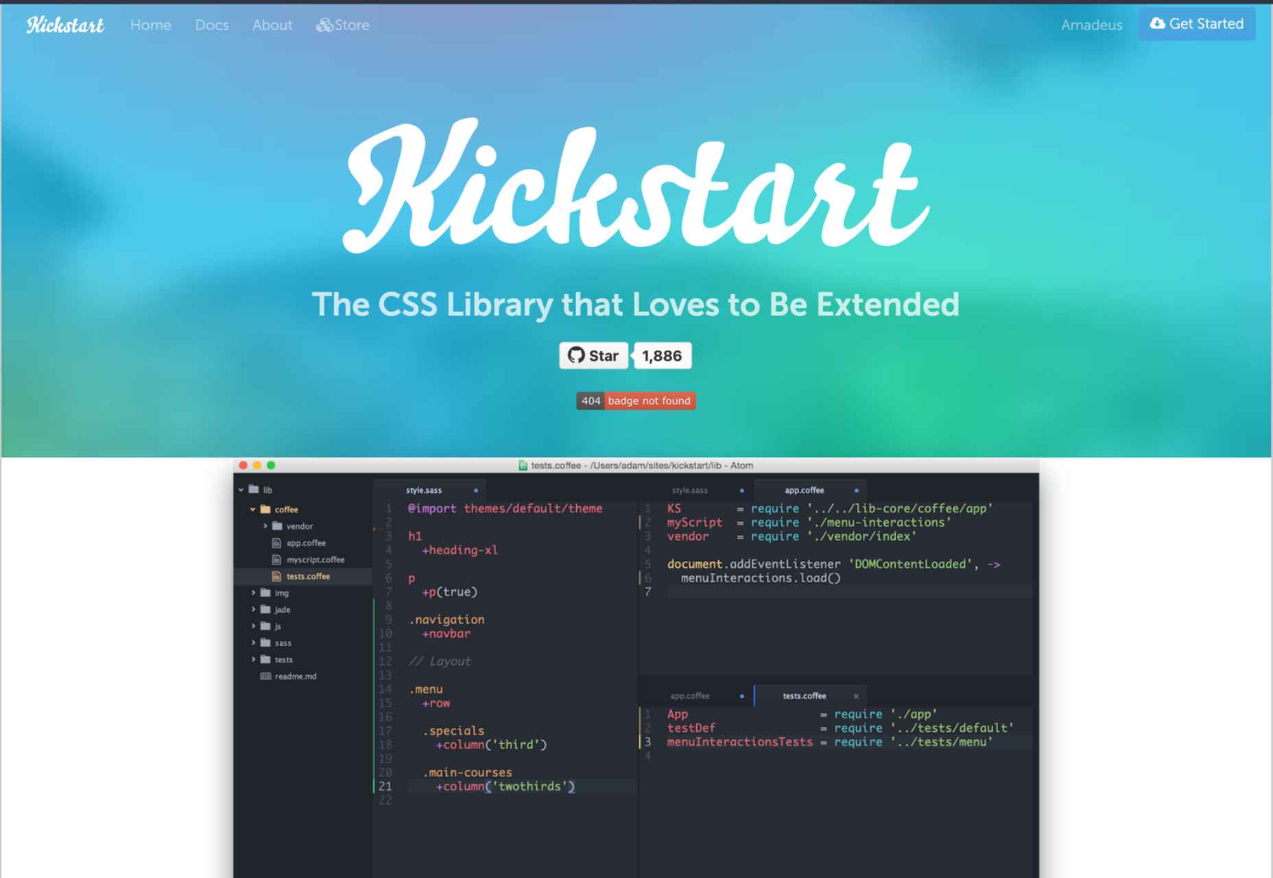
10. Kickstart

If you need a lightweight alternative to Bootstrap, Kickstart is the CSS library for you. A great thing about Kickstart is that it doesn’t require jQuery which makes it very small. 

Of course, like a pruned version of Bootstrap, this CSS framework isn’t as robust. Still, this is an excellent choice for those who need a UI framework and a comprehensive boilerplate library. 

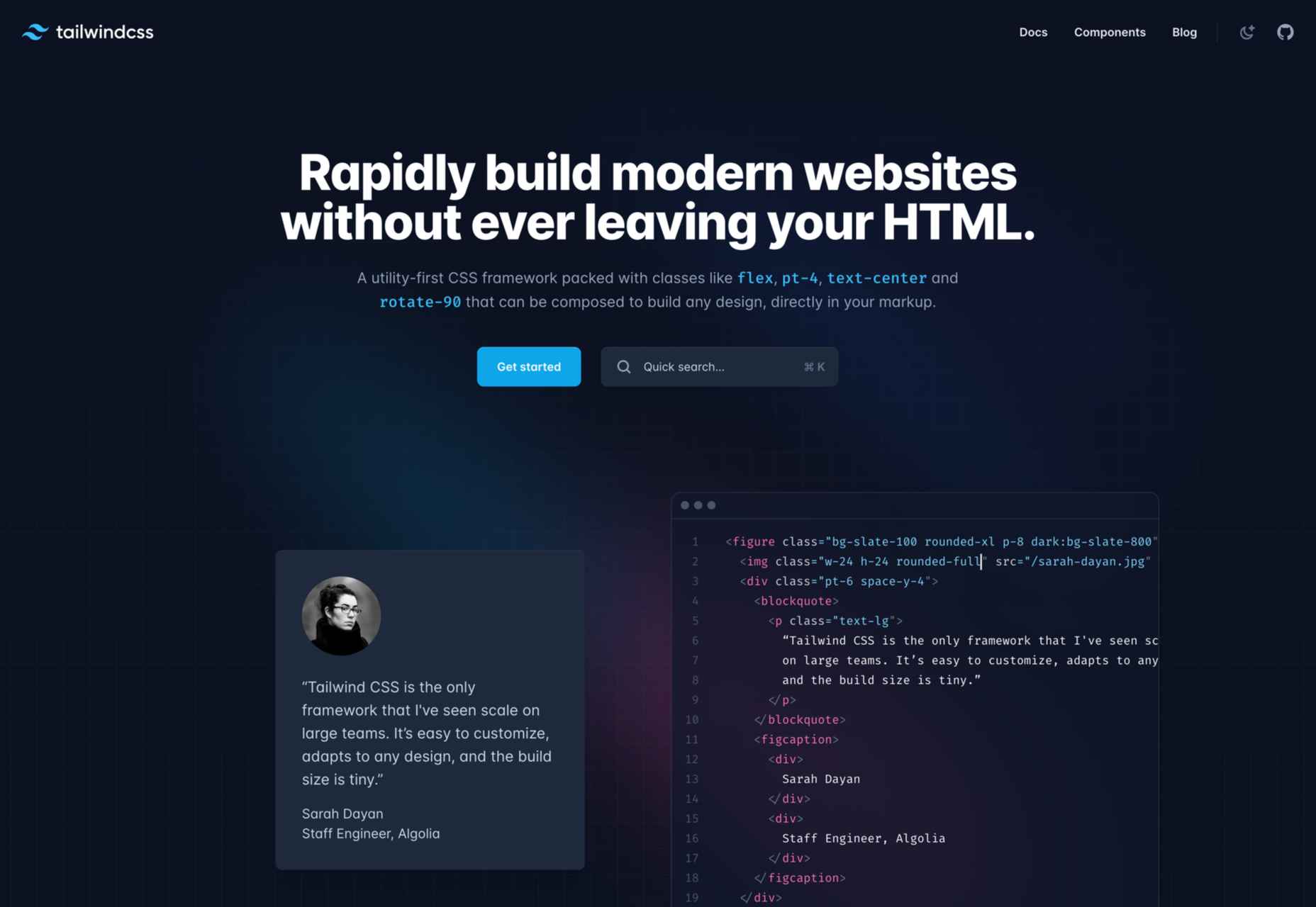
11. Tailwind CSS

With a fast styling process and the ultimate freedom it provides, Tailwind is extremely popular among some developers. This is a utility-first, front-end framework that is fully responsive and stable. 

Unfortunately, Tailwind CSS requires some time to learn, and it is not the most flexible choice when it comes to revising CSS rules.

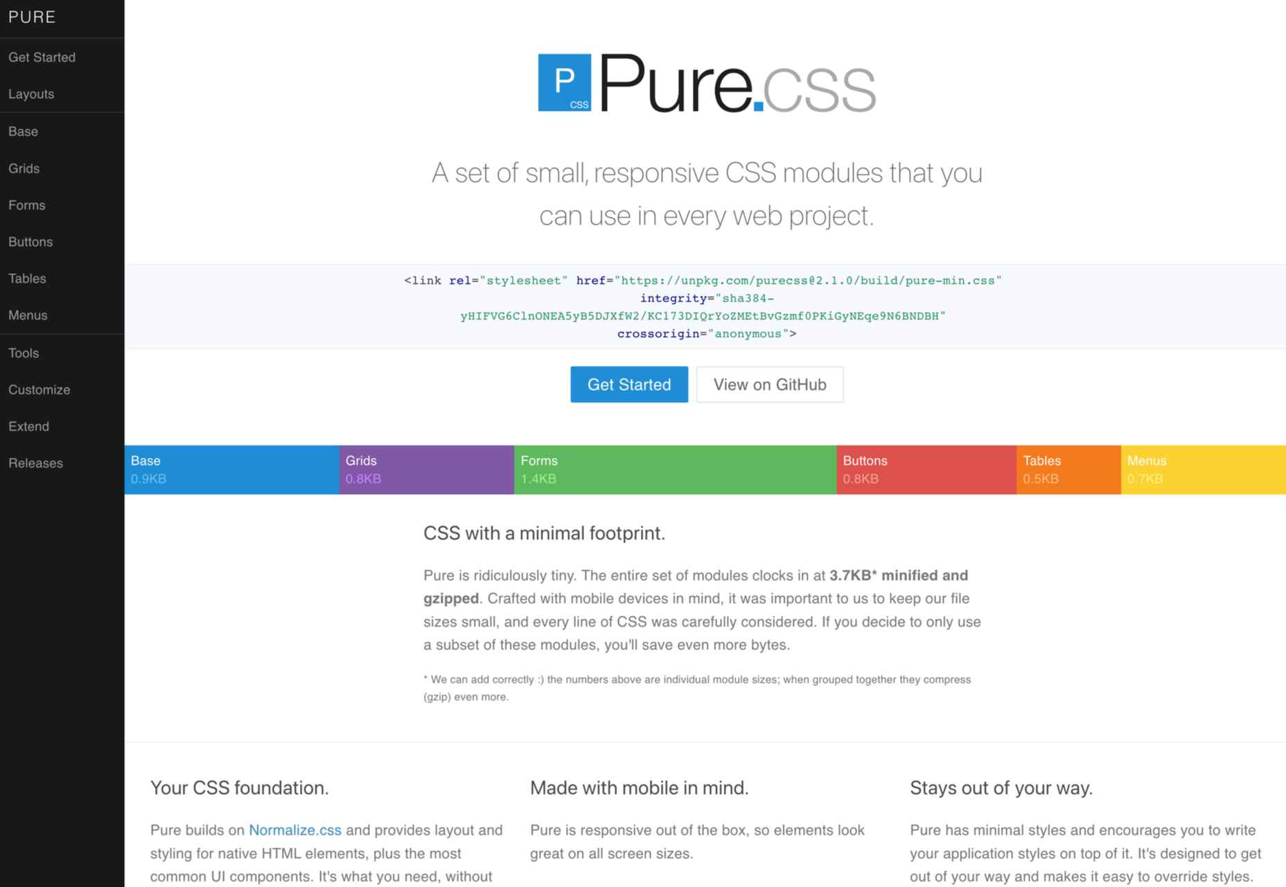
12. Pure CSS

Yahoo specially developed Pure CSS to help developers create fully responsive web pages. 

We consider Pure a minimalist alternative to Bootstrap that offers every module a beginner needs (navigation menu, grid, tables, etc.).

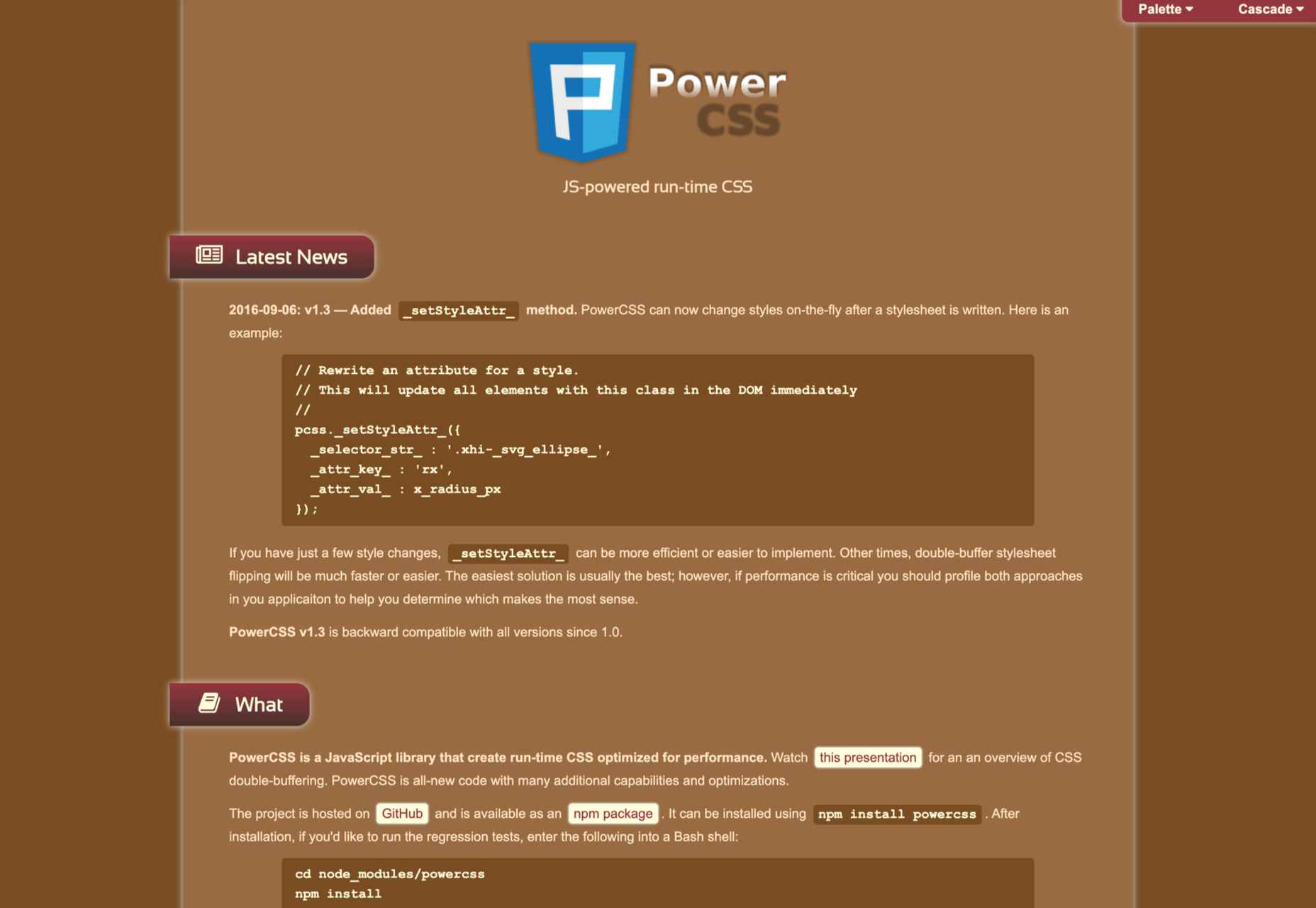
13. PowertoCSS

PowertoCSS is on this list for a good reason. This is an ultimately responsive CSS framework that you can use to create grids and scale web apps on any platform. 

PowertoCSS is based on Modular Architecture and Scalable when it comes to design.

Unlike other CSS frameworks, PowertoCSS is very lightweight, beginner-friendly, and comes with detailed documentation. 

The coding process is simple, and we found the learning curve to be shallow.

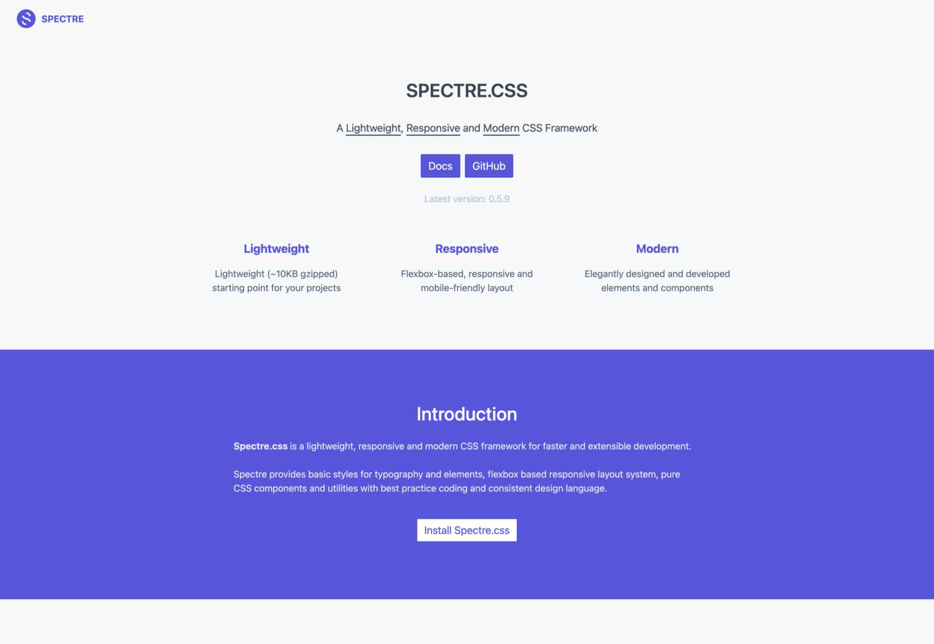
14. Spectre

Spectre is one of the most flexible and lightweight CSS frameworks we tested for this article. 

It has a modern (flexbox) layout system; it is fully customizable and allows you to get quick, attractive results. 

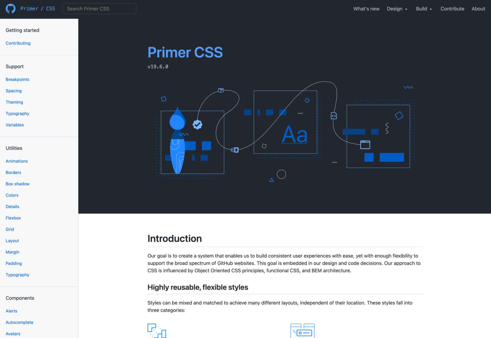
15. Primer

Our last suggestion is Primer, a great open-source CSS framework. 

To be precise, Primer is more of a design system that lets you use a BEM CSS framework and create your projects quickly and efficiently.

So, even though Primer is not a CSS framework in the strict sense, it will help you use React and Figma components, icons, and advanced documentation to unify all of that.

Wrap Up

Choosing the right CSS framework is not easy. It all depends on your personal needs and preferences as a front-end developer. 

Although Bootstrap and Foundation are still the most popular frameworks, many of the alternatives presented above will continue to gain popularity for good reasons.

Source

The post 15 Best CSS Frameworks: Professional Bootstrap and Foundation Alternatives first appeared on Webdesigner Depot.

Source de l’article sur Webdesignerdepot

Whether you’re new to the job or are an experienced designer, the anxiety of a new project can sometimes – often unexpectedly – cause us to freeze in our tracks. This creative paralysis sees us staring at a blank page, unable to come up with ideas, and the knowledge that time is slowly ticking away.

We’ve all been there. So we thought it would be helpful to share our tips and tricks for overcoming the tyranny of the blank page and help you get back to doing great work.

The first thing to know is that you are not alone; blank page syndrome has a basis in science, with a clearly identifiable set of symptoms that consistently occur together. 

The first thing to know is that you are not alone; blank page syndrome has a basis in science

It starts when you become stressed. Stress causes your brain to produce hormones that slow down neural functions, which only serves to increase the feelings of inadequacy over a lack of creative spark – and fuel anxiety. Understandably, this causes a spiral as your mind seems to get emptier and the blank page more threatening.

But don’t fear! Because there are ways to move past blank page paralysis and get back to productivity. 

Just Relax

Once you’re in a negative spiral, it’s notoriously difficult to get out of. The best solution is to avoid the spiral entirely – by starting in the right frame of mind. This means setting up a calm work environment before you even sit down. 

Do your best to avoid major distractions – such as young children who need your attention or colleagues who like to play music that vexes your soul. We’re not saying that you need a sound-proofed home office – the kitchen table might be fine – but schedule your work time for when the kids are at school or with a minder, or work from home if the office is likely to be noisy. A pair of noise-canceling headphones can be handy, too.

Avoid Distractions

Seemingly small things can also get in the way of your work. Chat and email notifications are the digital equivalents of a person calling your name from across a room. Try to avoid or silence anything that stops you getting into the creative mindset, even if you just mute things for a few hours. It’ll help you mentally separate your creative workspace from everything else.

all of those notifications will still be there when you resurface

Ultimately, you need to create a mood that you subconsciously associate with being productive. But even when the space around you is perfect, it can still take a while to get into the zone. Brains don’t just flip into creativity at the flick of a switch, so be kind to yourself. And remember – all of those notifications will still be there when you resurface later in the day. 

Do a Warm-Up

Studies have shown that a blank page is particularly stressful because it makes the task in front of you feel bigger than it really is. Gazing at an empty page is like seeing the whole project stretching out before you. The stress comes from the feeling of having to fill the whole journey, all the way from A to Z.

So don’t start with A! Instead, begin with a warm-up. Just as dancers always start with a series of exercises to warm up their muscles, creative designers can benefit from something similar. You could start by talking things through with colleagues or sketch some ideas using pen and paper, before opening your design app. 

Alternatively, you could start by planning your content hierarchy. You don’t need all the final words – but it can be helpful to work out how many headings you’re going to have, where images will sit, and whether your copy will be in paragraphs or lists. 

By doing this, you’ll have elements to place and a rough idea of their relative importance. It’s easy to get overawed by the importance of actual content – so start by getting a grip on the type, density, and length of content. 

Take Inspiration

The world around us is filled with inspiration and according to an icon designer Yannick Lung:

It helps to observe things in the real world and play around with them.

It can also help to borrow an idea. Obviously, we never condone copying someone’s work, but using existing work as a reference or jumping-off-point can help. Think of it as putting your own twist on an existing idea.

“I sometimes find it useful to reverse engineer a good example of the sort of thing I’m trying to write (and this works for design too). I usually break down a successful example into its constituent parts and swap them out for things more relevant to the project at hand, then refine from there,” says Harvey, one of Sketch’s brand storytellers.

Let Templates Take the Strain

Instead of putting pressure on yourself to instantly start designing, begin by creating templates or wireframes. This isn’t an avoidance tactic. Spending time creating an outline template saves time in the long run – plus, doing practical work that doesn’t need lots of detail will act as a warm-up. It might even help you catch potential issues in your designs earlier. 

Be Collaborative and Welcome Early Feedback

In general, people don’t work well in isolation – so collaborating with colleagues is a great way to get design ideas flowing. At the start of a project, reach out to your colleagues to let them know what you’re going to be working on and set up a session to collaborate on ideas and ask for direct input.

Never wait until the end of a project to ask for feedback. Involving your colleagues in the process early helps counter blank page paralysis and involving stakeholders can help you manage expectations. Aim to get regular and consistent feedback rather than waiting for it – which could cause a delay in your project. 

And of course, you should always choose a design software that enables real-time collaboration so that everyone working on a project can avoid version conflicts.

Avoid Burnout

When work isn’t physical, it can be hard to judge how much it takes out of us

When work isn’t physical, it can be hard to judge how much it takes out of us. If you’re suffering from blank page paralysis, it’s probably a sign that you’re starting to get burnt out. Try setting an alarm on the other side of the room so you have to get up to turn it off regularly – or just scheduling some time into your day to take a break, stretch, or even take a walk. Stepping away from your screen is good for your brain and your body.

In the end, the most important thing to remember when it comes to blank page syndrome is that you have to be kind to yourself. Nobody can be productive 100% of the time – we’re only human, after all. What matters is that you do whatever you need to get your creativity flowing.


Featured image via Pexels.

Source

The post Overcoming Blank Page Paralysis first appeared on Webdesigner Depot.

Source de l’article sur Webdesignerdepot


Abstract

Continuing our exploration of the multi-model capabilities of SingleStore DB, we’ll discuss SingleStore DB’s support for Full-Text Index and Search in this article.

Using the example of medical journal articles from the SingleStore self-paced training course on Full-Text Index and Search, we’ll store the text from journal articles and then perform a variety of queries using the full-text capabilities of SingleStore DB.

Source de l’article sur DZONE

You might have noticed that resources comprising some Azure services such as Azure Kubernetes Service (AKS) span multiple resource groups by default. In some cases, you might intentionally want to segregate resources such as disks and network interfaces from VMs by placing them in different resource groups for better management. A common problem arising from the resource spread is that you might find it challenging to delete multiple resources and resource groups to entirely remove a service from a subscription.

We can solve the problem by using resource tags to associate resources and resource groups to a service. Tags are key-value pairs that can be applied to your Azure resources, resource groups, and subscriptions. Of course, you can use tags for many other purposes apart from resource management. The Azure docs website has a detailed guide on the various resource naming and tagging strategies and patterns.

Source de l’article sur DZONE

Have you been feeling a little unproductive lately? Well, you are not the only one. Of course, we all want to be as productive as possible at work, but that’s not always the case.

According to recent research, we are fully productive for less than 3 hours a day. Stress and poor planning are just two of the reasons why. And this is true in all work environments. No one is exempt from this problem, from employees in central offices to freelancers or managers working from home.

That’s why we have researched and selected the eight best ways to increase your productivity at work. In our search for solutions to boost creativity, we have come across numerous promising approaches and tips that you can use. Here are the best tips you can follow to get the most out of a workday:

1. Plan your Tasks

I can safely say that there is nothing more important than efficient task planning. Planning your tasks can free you from stress and procrastination. Planning everything before the day even starts is probably the best approach.

This is also where time management comes into play. Think about it. How often have you been more productive after setting a specific time frame for a task? You need to plan for the project at hand and then map each workday.

The more you plan your projects and workdays, the more productive you will be. However, it would help if you tried not to spend hours and hours planning.

2. Minimize Distractions

So you have successfully planned your tasks. That should be enough to be productive, right? Well, unfortunately, no. Whether you work in the office or from home, numerous things can distract you daily.

Distractions are ubiquitous, from a colleague wanting to chat about last night’s game to TV at home. When you minimize such distractions, you become better at what you do.

Of course, it’s not always easy to resist temptation. But if you do, you’ll spend more hours focused and engaged in your task. The same goes for leadership positions. You can ask your employees to turn off their cell phones and minimize chats.

We all feel the need to check our phones or chat with our colleagues. This is precisely why the next tip is crucial to your productivity.

3. Take Regular Breaks

According to psychologists, taking regular breaks at work will help you minimize stress and thus improve your performance. Whether you work from home or at headquarters, relaxing and social breaks are necessary. But that’s not all.

As we mentioned earlier, regular breaks are a smart way to avoid distractions. If you know your next break is coming up, you will not need to chat or look at your phone.

This will help you maintain a high level of concentration. On the other hand, if you do not take regular breaks, your performance will continue to decline throughout the day.

4. Stop Multitasking

Once you have scheduled your tasks and breaks, it’s time to think about the actual work process. Contrary to what many believe, multitasking does not make you more productive.

Conversely, multitasking can decrease your performance, drain your energy faster, or even damage your brain. This is another reason why planning is so important. You should always try to engage your brain with one task at a time.

5. Optimize Workplace Conditions

This is one of the most efficient but often underestimated ways to increase productivity. Ensuring that the working temperature is between 20-24 degrees C (68 and 76 degrees F) will help you stay concentrated for more extended periods.

This will also save you a lot of time, whether at home or in the office. On the other hand, if you feel cold or hot, you will be distracted. Therefore, you should think about the working temperature before you start working.

6. Enough Sleep is Key

It’s not news that sleep deprivation can affect our performance. And that’s not just it. Lack of sleep leads to a massive decrease in:

  • Ability to concentrate
  • Working memory
  • Mathematical capacity
  • Logical reasoning

So sleep is crucial to our overall well-being. According to the National Sleep Foundation, you should try to get between 7 and 8 hours of sleep a night (for adults between 18 and 65).

It becomes evident that getting enough sleep is one of the best ways to increase your productivity at work.

7. Communication is Crucial

Communication is essential, especially for those of you who work from home. You should always have a conversation with the people you live with during your breaks. This can also help you avoid distractions during your work hours.

Try to make everyone around you (including yourself) understand what closed, and open doors mean. This will help you increase your productivity while communicating sufficiently with your loved ones.

The same goes for people who work in offices. You should always try to engage with your colleagues during breaks. Remember that feeling part of a group and sharing your experiences is the key to increasing your productivity.

8. Avoid Social Media

Our last tip is one of the hardest to follow, especially working from home. You may think that this is not a problem for you. Recent studies show that we spend an average of 145 minutes on social media every day. Of course, it’s not a bad idea to cut down on that time.

But, even if you do not, you should try to keep any engagement with social media outside of your work hours. This will help you focus on your tasks and get you one step closer to your goals.

Wrap Up

Keep in mind that we all get stuck at times when working on a project. The more you worry about it, the more stressed you will be. It’s essential to take care of yourself and your mental health. In any case, we hope you will find it easier to increase your productivity now that you have read our tips. All you have to do is follow them.

Featured image via Pexels.

Source

The post 8 Proven Ways to Turbo-Charge Your Productivity first appeared on Webdesigner Depot.

Source de l’article sur Webdesignerdepot

The email channel is known for multiple advantages. It is convenient to implement practically, offers many options, and has a fantastic ROI of up to 4200%.

But we also face problems, the most disappointing of which is people ignore emails, not performing the desired action, or worst of all unsubscribing. Why does it happen?

The web is constantly progressing. It offers many tools like modern HTML template builders, ESP services, and other digital assistants that help us at all stages. But even the best tools are not enough; the secret of success still rests with us.

In this post we’ll cover the 7 cardinal sins of email marketing, to help you avoid them.

1. Being Too Late

I can define this mistake as probably the worst. It’s worse than broken links, incorrect dates, or prices. Even more harmful than ugly design.

We lose a lot when postponing email strategy implementation. Beginners often focus all their attention on the content, social media activities, SEO issues… All that is important, right. But ignoring email campaigns is a hard fail.

Thousands of visitors never come again to your website. In other words, they leave the very first levels of the marketing funnel. While regular emailing keeps them engaged and prevents churn.

So delays here are only profitable for competitors. Don’t wait until you collect “enough” contacts. Start as soon as possible. 

Frequency matters too. Don’t bomb people with emails; it annoys and causes unsubscribes. Email frequency is an individual parameter depending on many factors.

2. Disregarding Clients’ Expectations

A fundamental axiom: people unsubscribe when emails are irrelevant. The same goes for neglected expectations. Even the best content with next-gen features won’t save the situation.

I mentioned the email frequency a bit above. Notice that if you announce the weekly emails but send them every day, this is an example of ignoring expectations. Be honest with readers.

Another typical issue is off-topic. If your subscribers are waiting for content related to smartphones, send them newsletters about smartphones, not dresses or domestic turtles :)

But in some cases, getting off-topic can be good. It all depends on the target audience, actual situation, and communication style. 

3. Bad Segmentation 

Once again, relevance is vital. So we must avoid generic emails. Instead, especially if your contact list is extensive enough, apply all the possible parameters: age, gender, location, customers history, etc.

Where to get the respective data? A typical solution is to use update preferences forms in emails or on the website. Let clients choose the topics that are interesting for them.

Use surveys, sign-in forms, AI-based techniques of segmentation… Smart algorithms are great helpers that track clients’ behavior and then process the data for segmentation purposes. 

The better we know our subscribers, the deeper we segment the contact list. It allows sending precisely targeted newsletters to respective segments.

4. Insufficient Personalization 

As Hubspot stats say, personalized emails’ open rate is 26% higher, and their click-through rate is 14% better. But even besides index data, poor personalization is just nonsense today.

Clients are looking for content that matches their preferences, so marketers have to consider these expectations. Segmentation and dynamic range are essential here, but they are not the only techniques.

Everything is much more sophisticated here, in addition to personalized subjects and content. Another solution is to generate recommendations that include the previously browsed products.

AI-powered automation comes to help. Machines will upgrade the classical personalization to the next level called hyper-personalization.

5. Underestimating Mobile-Friendliness 

It’s simply unacceptable to send non-responsive emails today. With so many people opening email on different devices, this is a huge fail.

The modern world is full of gadgets and devices. Email has been opened on smartphones more frequently than on desktop PCs and notebooks in recent years. Up to 70% of readers will read messages on mobiles very soon. No wonder that responsivity turned into a mobile priority.

Regarding layout and design, there are no problems: modern template editors are featured with automated responsivity. But mobile-first means not only layout/design adjustment for mobiles, full-width buttons, or larger fonts. We have to work with content too. Don’t overwrite text remember that recipients read inbox emails on the run. 

Just imagine yourself reading emails in the cafe or cab. And ask yourself: is everything convenient? Would you take the desired action on the run?

6. Non-Professional Approach 

People are quite skeptical of new brands. We need to do our best to attract them. So everything must be done professionally.

The best solution: be a perfectionist. If newsletters look amateurish, they are likely to repel.  

Being amateurish will also ruin your brand identity and reduce customers’ trust. Pay close attention to design, stick to your corporate style, analyze each detail in the context of overall harmony.

7. Overlooking Tests and Improvements 

Testing is vital. Before sending an email campaign, check it via Litmus or Email on Acid to be sure that message looks just as planned. These tools allow testing email rendering by +90 combinations of email clients, devices, and OS.

Knowledge is power. Always try and test your marketing strategies. Are you satisfied with your actual performance? Run A/B tests and focus on the most significant wins and failures. 

Summing Up

Of course, threats are not limited to these seven failures. The last piece of advice: never ignore trends. 

Accessibility? Don’t forget about clients with special requirements. Get whitelisted and incorporate these technologies in your campaigns.

And constantly strive for perfection. With this doctrine, you’ll win!


Featured image via Pexels.

Source

The post 7 Worst Fails in Email Marketing first appeared on Webdesigner Depot.

Source de l’article sur Webdesignerdepot

Welcome to the latest edition of our top 20 sites of the month. In this February’s collection, the overall feel is lighthearted and optimistic, as we are seeing the positivity of a new year persisting across the web.

There is a continued inclination towards warmth and personableness and away from a more corporate, impersonal feel. We see this most in the color palettes used and in the use of illustrations as accents to add character and charm. Of course, as always, type plays a big part too. Enjoy!

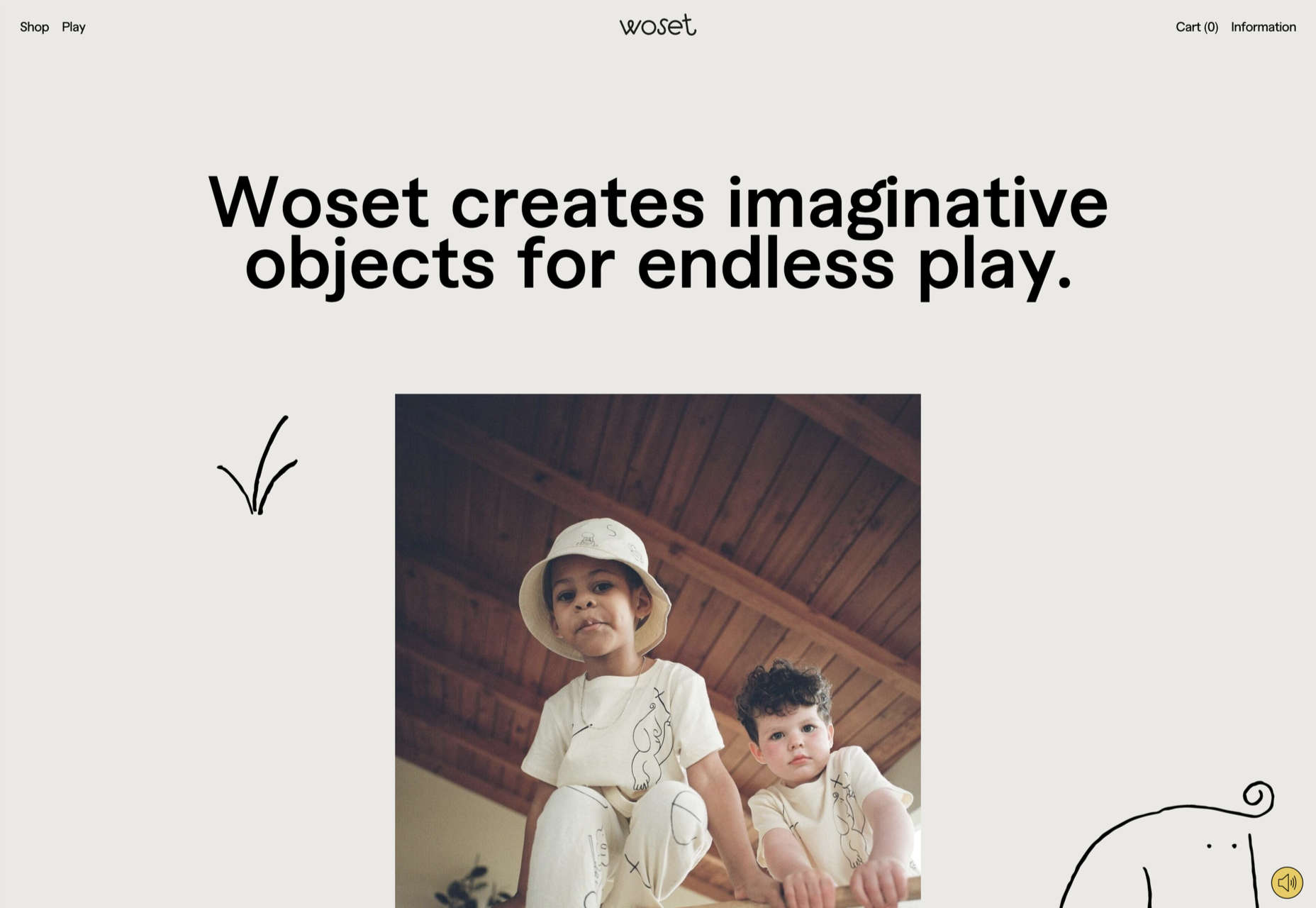
Woset

Woset has a simple aesthetic and features a charming illustration style on this site for its creative toys. The interactive ‘play’ section is a nice touch.

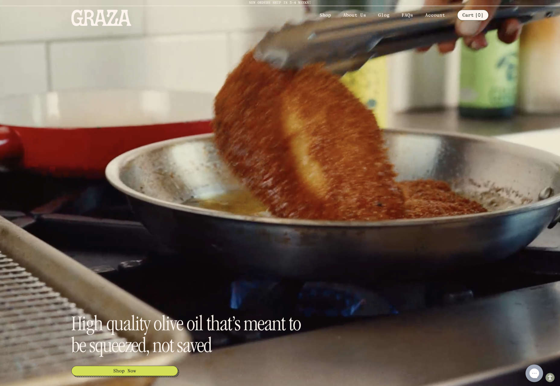
Graza

This site for Graza olive oil has a fun feel, with comic style illustration and bright splashes of color while making a serious sales pitch.

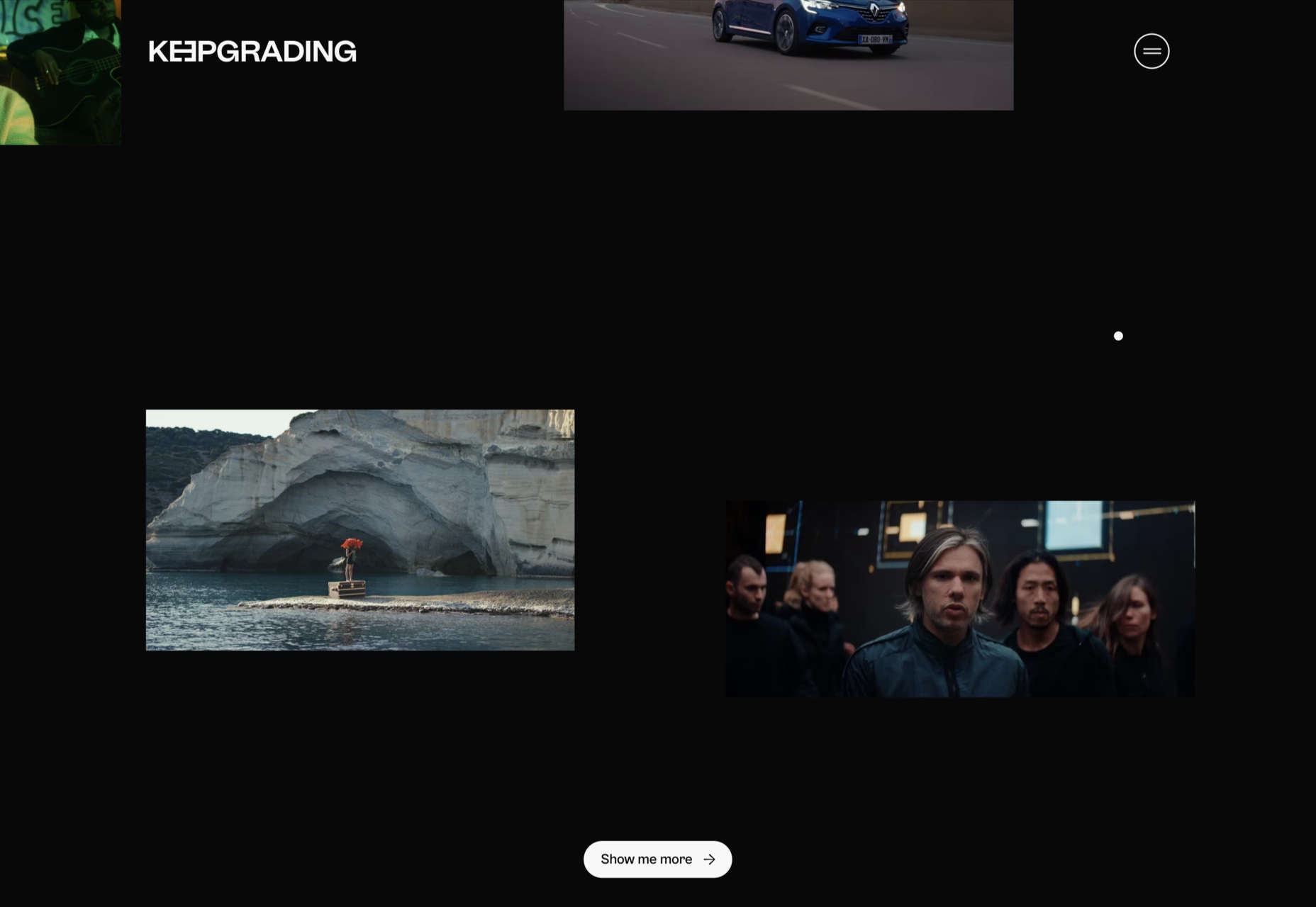
KeepGrading 

KeepGrading is a post-production color studio. Their portfolio site showcases a lot of work but keeps it well organized and pleasing to navigate.

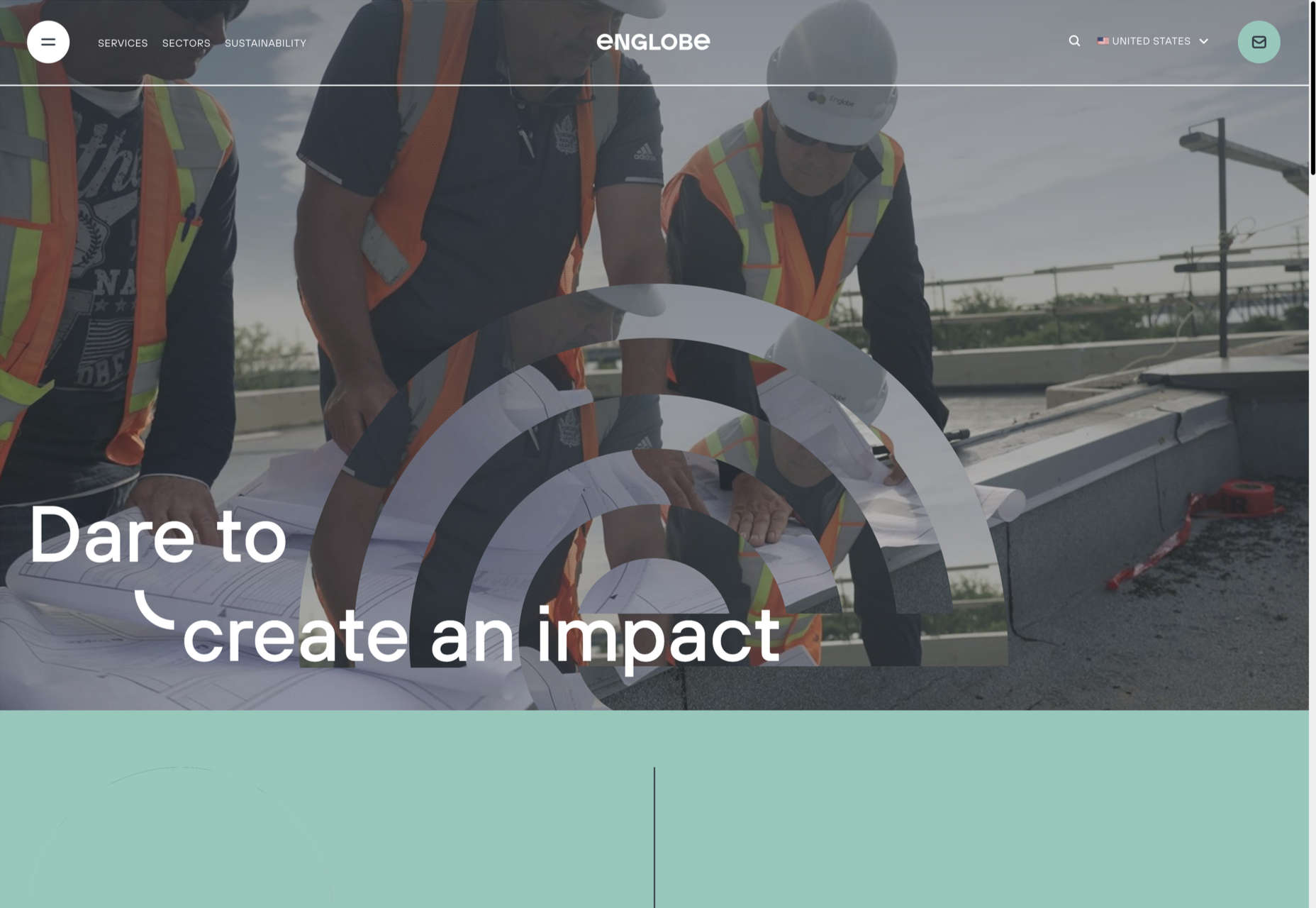
Englobe

By using soft colors and slightly rounded type, Englobe has managed to portray a warm, friendly, and human aspect with this website, despite being a huge company.

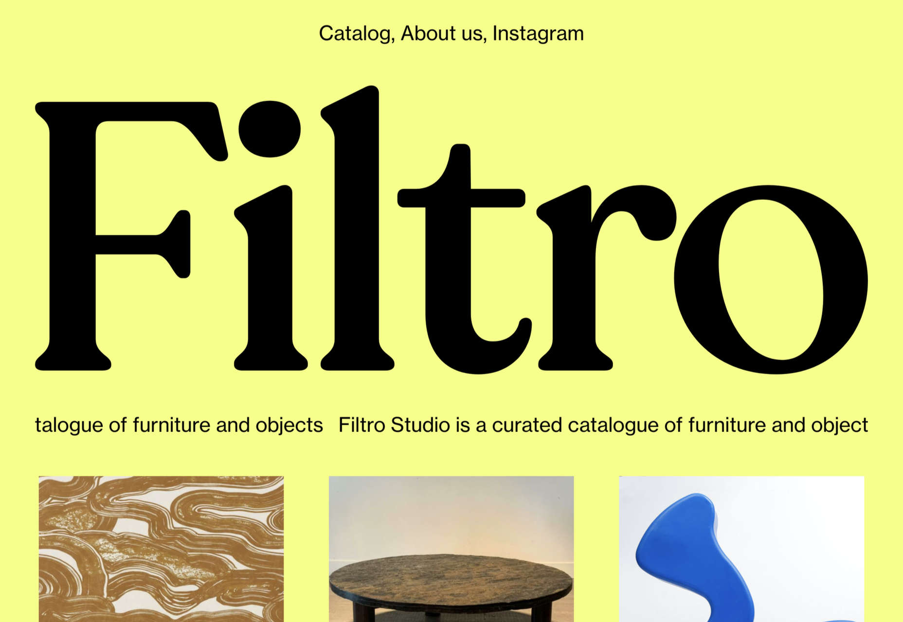
Filtro

Filtro’s design is about as basic as it gets, and yet it has a certain charm to it.

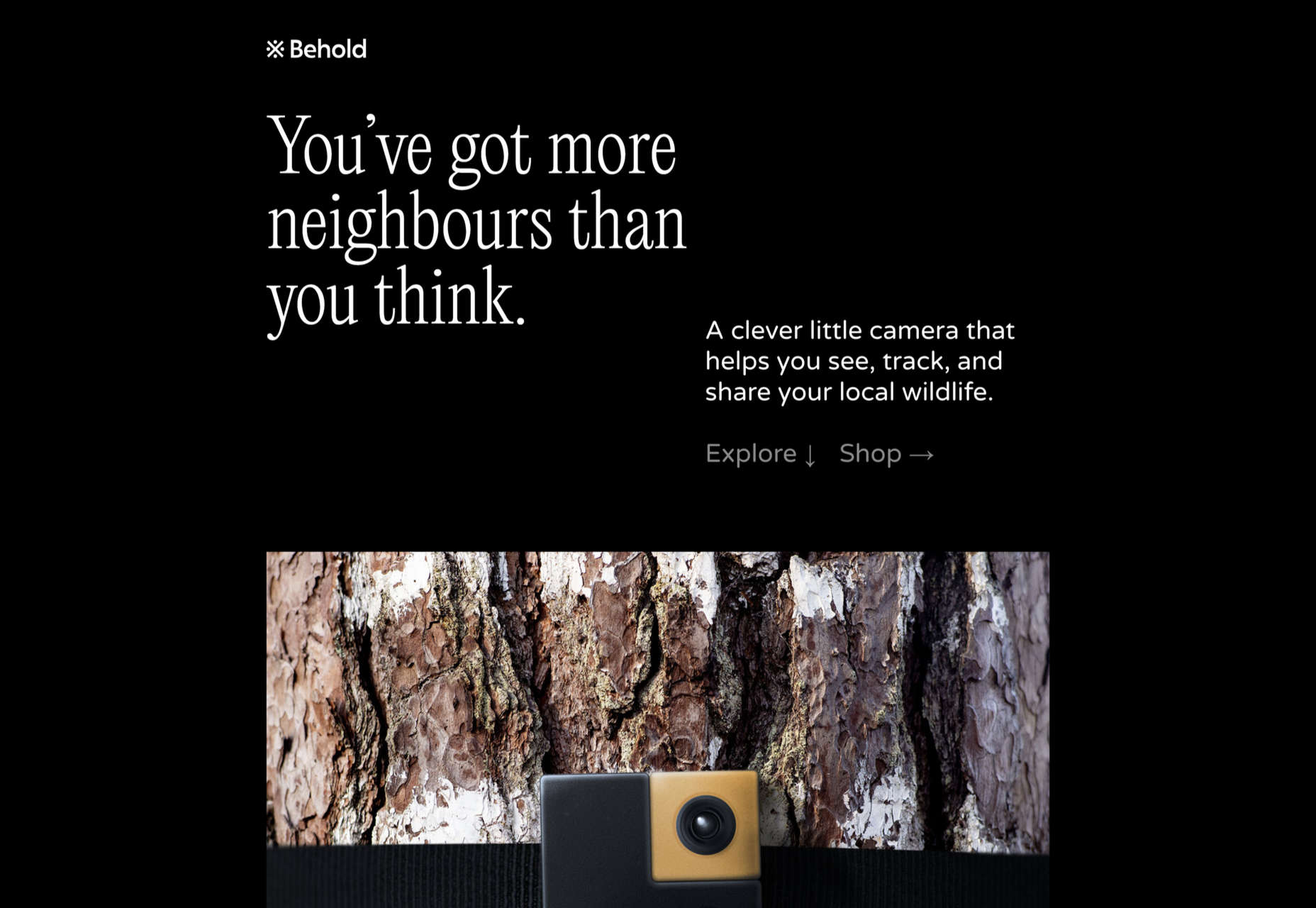
Behold

Behold is a wildlife camera that is currently in development. This landing page does an excellent job of creating interest with just enough information.

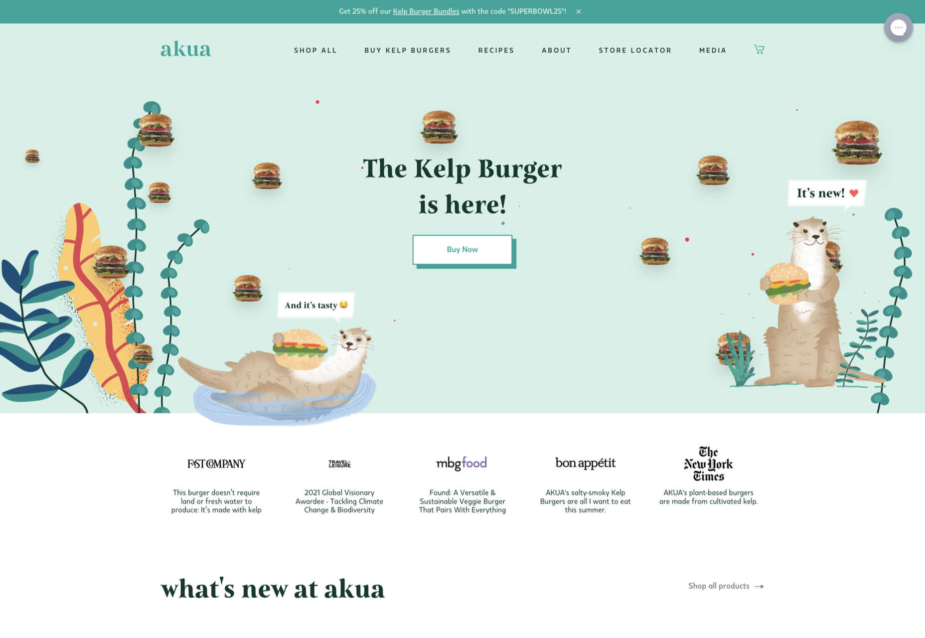
Akua

Some rather sweet illustration work creates a good balance with technical information on this site for Akua kelp burgers.

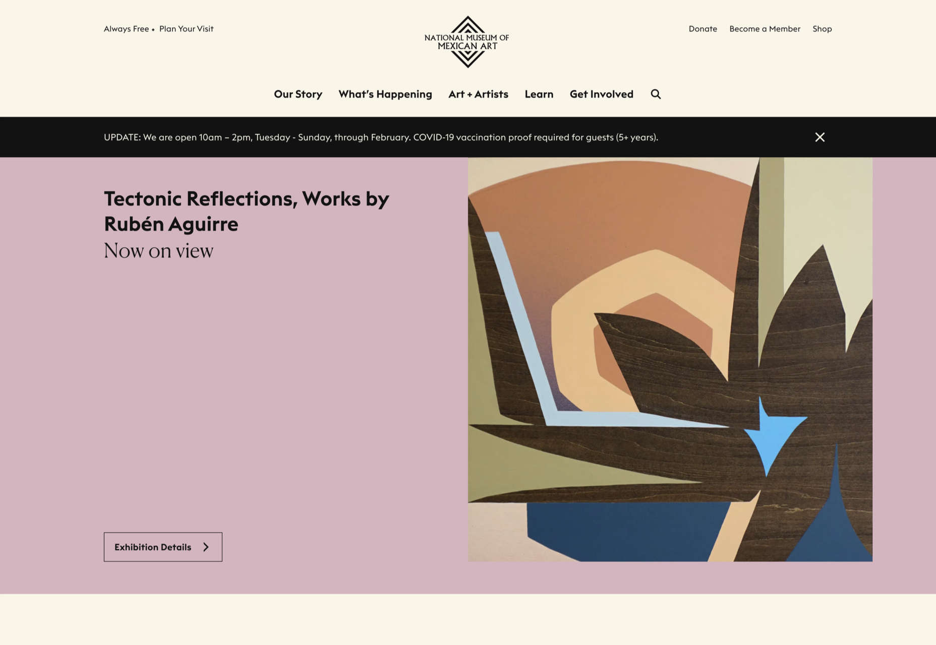
National Museum of Mexican Art

A color scheme of warm, earthy tones and a carefully thought-out type pairing create an inviting presence for the National Museum of Mexican Art.

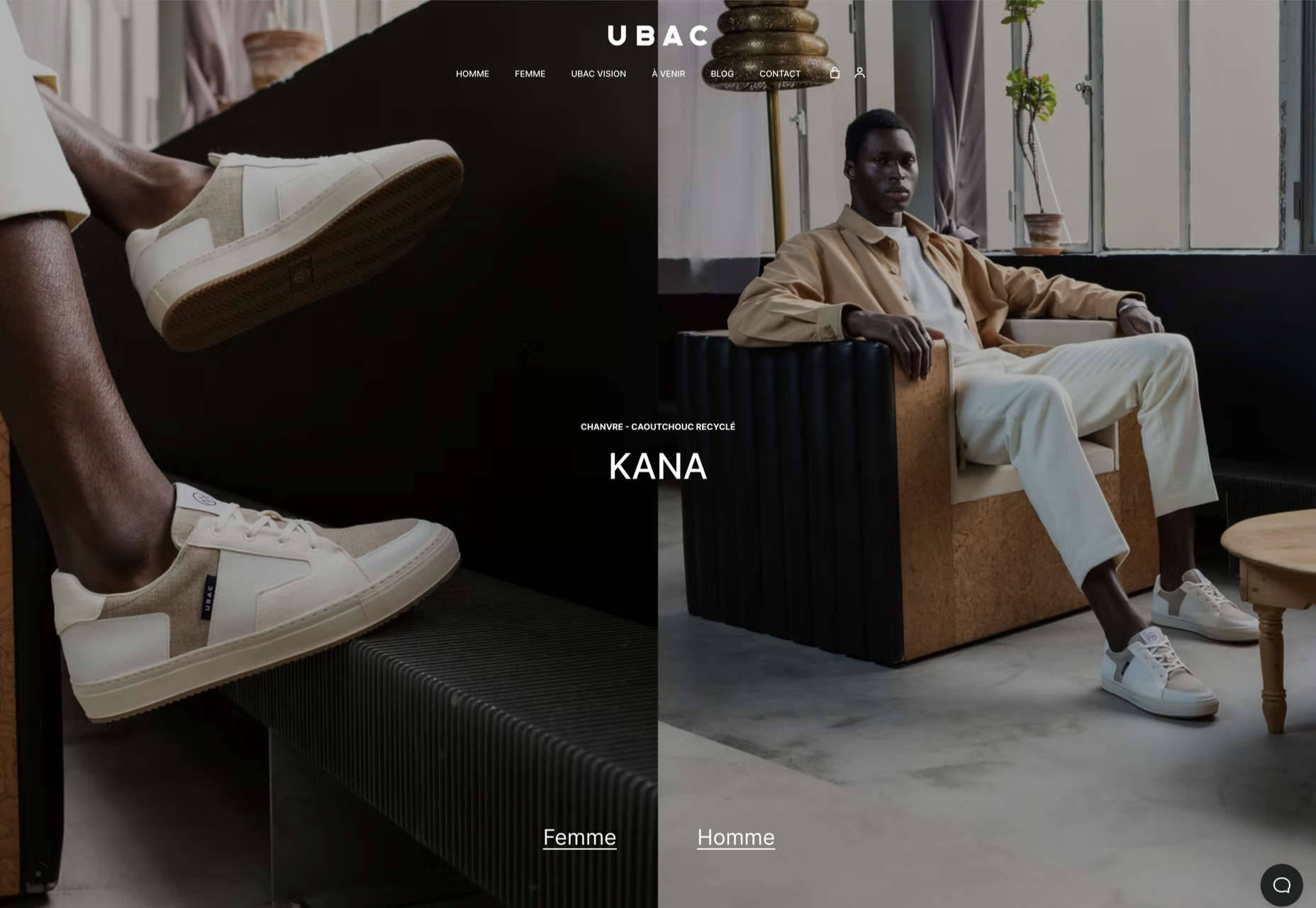
Ubac

This site for Ubac trainers feels clean and modern with some nice and mostly functional, scroll-activated animation.

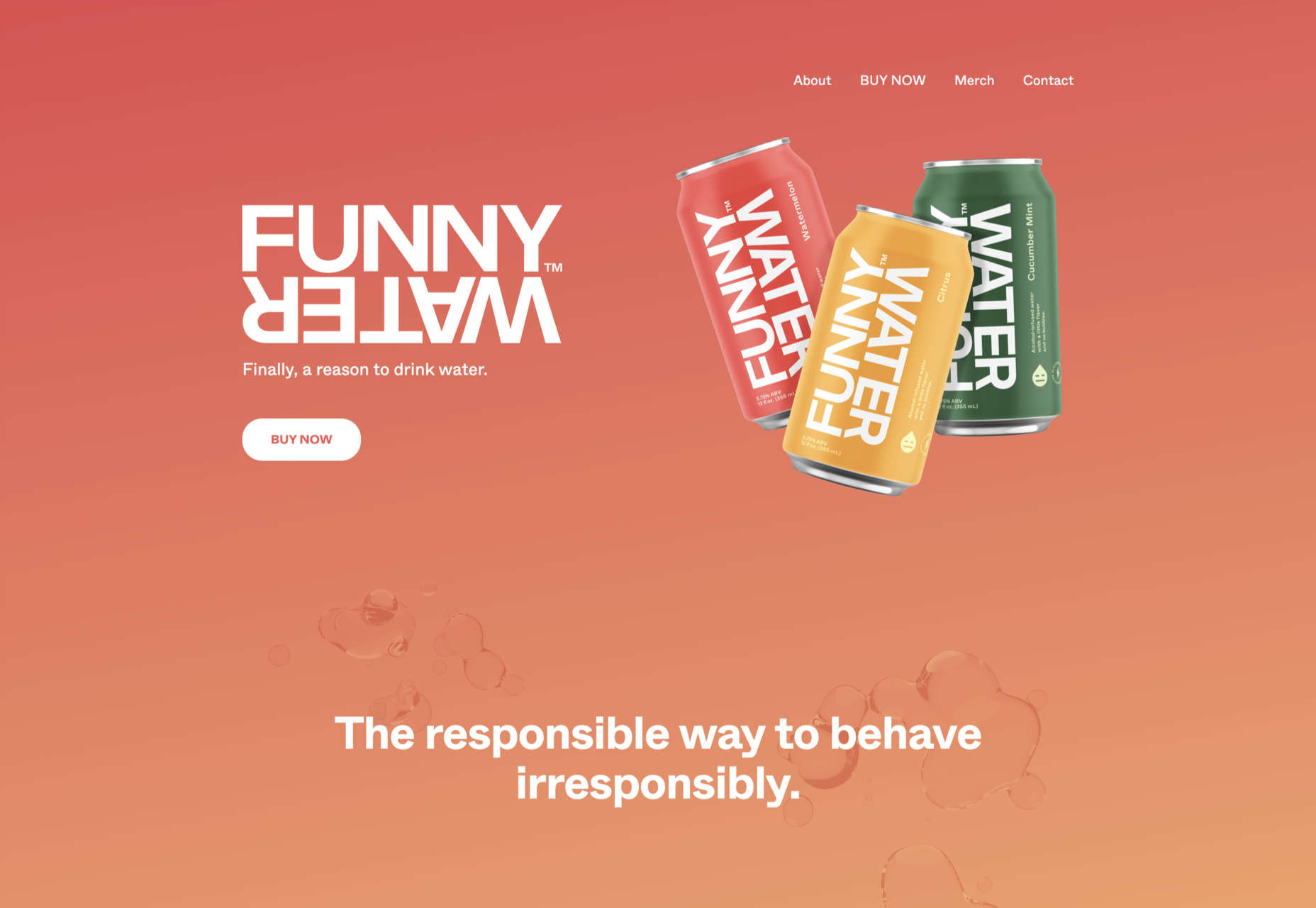
Funny Water

The background gradient is really nicely done on Funny Water’s otherwise very minimal site.

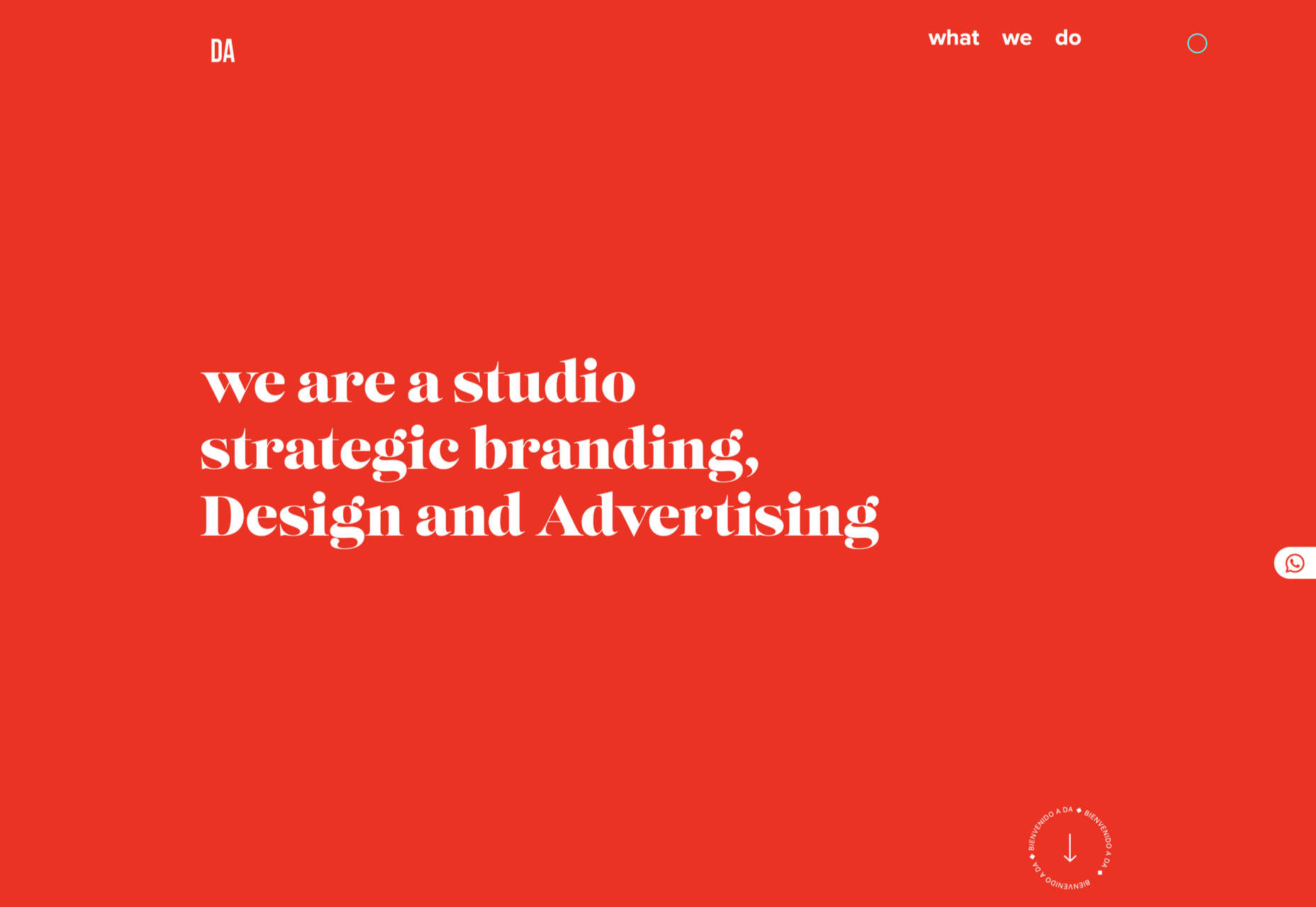
DA

DA is a strategic branding, design, and advertising studio, and this site is a good, polished example of a site for such an agency. What stands out is the clever menu text.

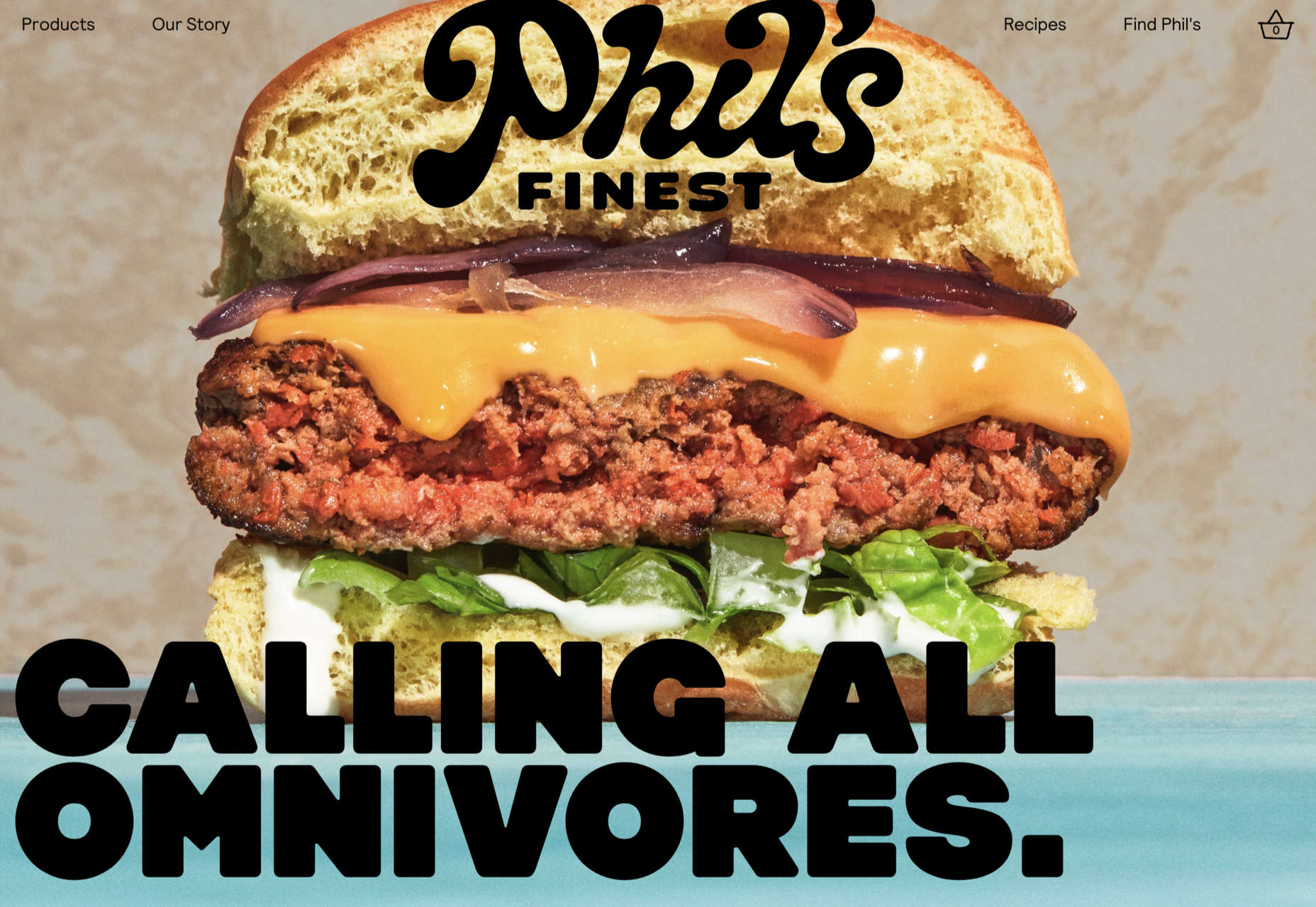
Phil’s Finest

Phil’s Finest makes good use of color, oversized type, and occasional illustration mixed in among the well-styled photography.

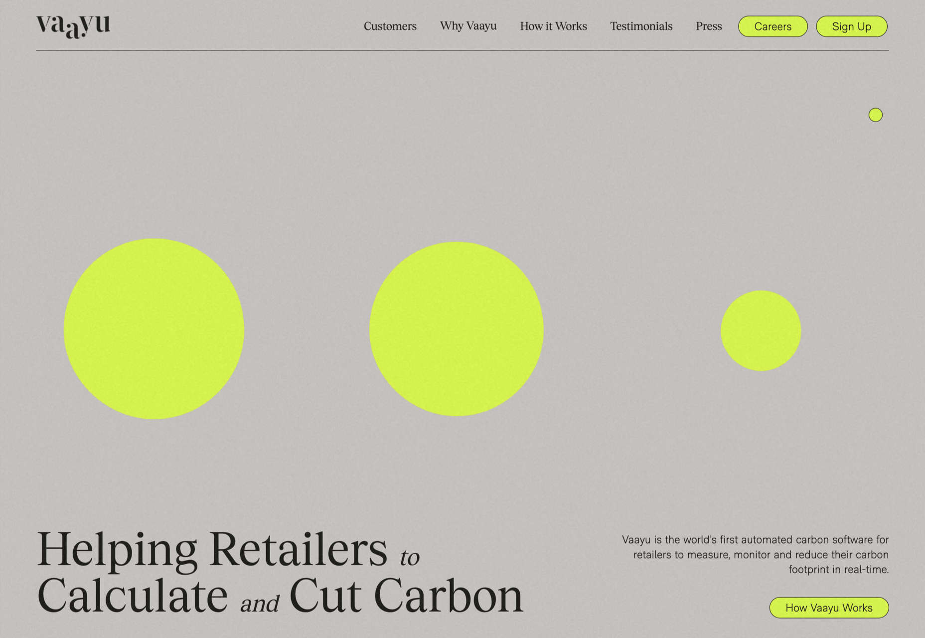
Vaayu 

Grey and black are enlivened by neon yellow in Vaayu’s minimalist, single-page presentation.

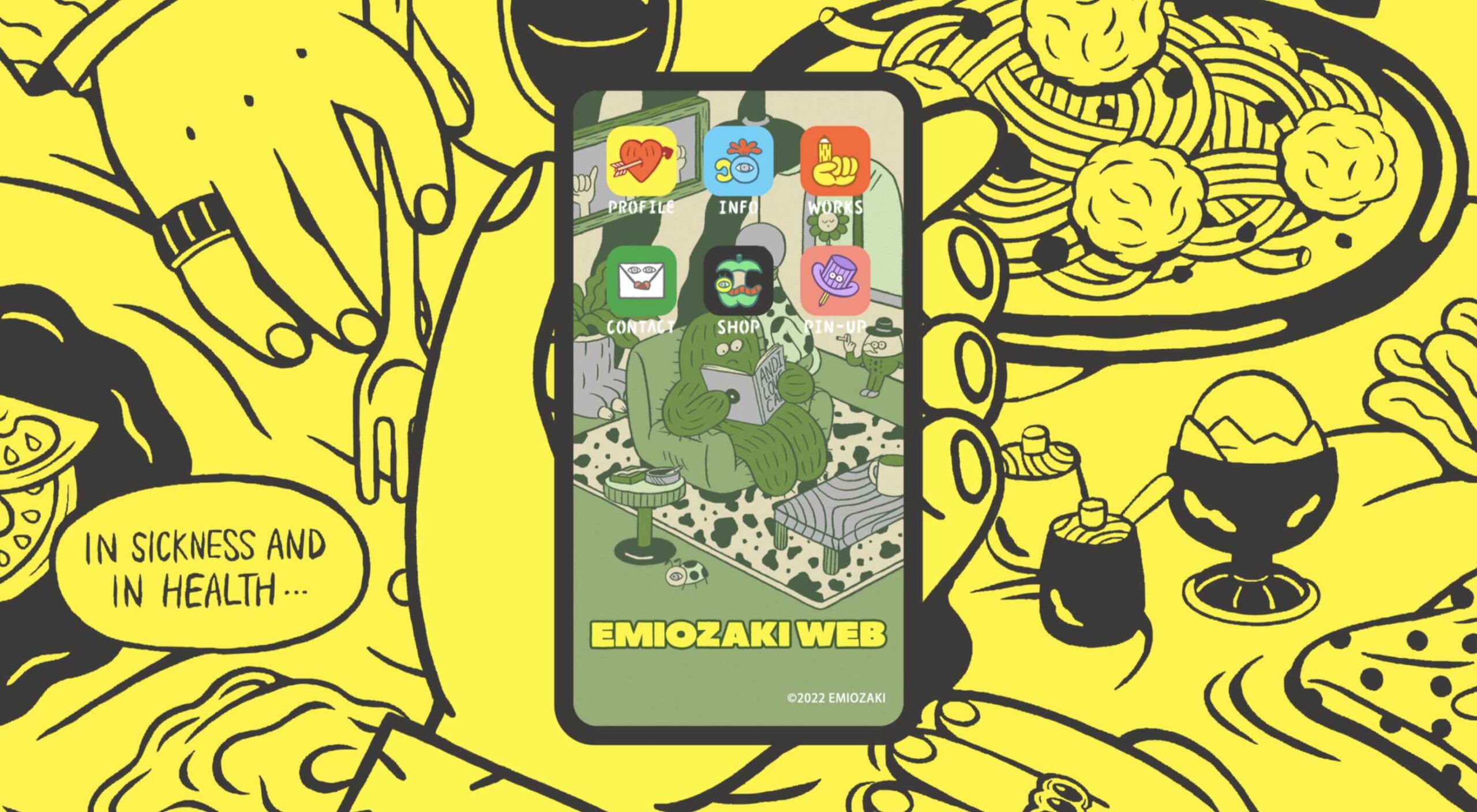
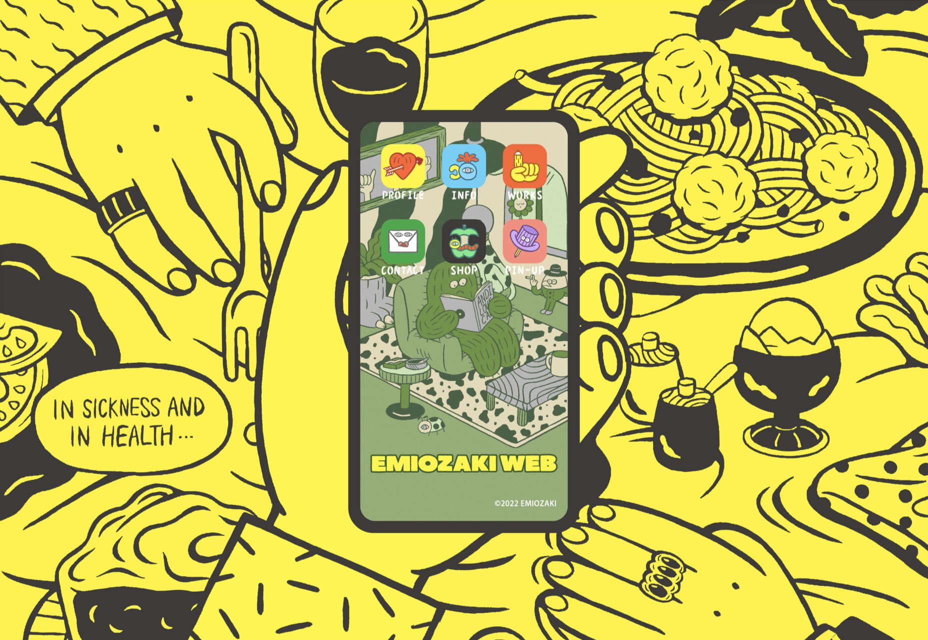
Emi Ozaki

Artist and illustrator Emi Ozaki has created a stylized phone interface for her portfolio site, which showcases her illustration aesthetic.

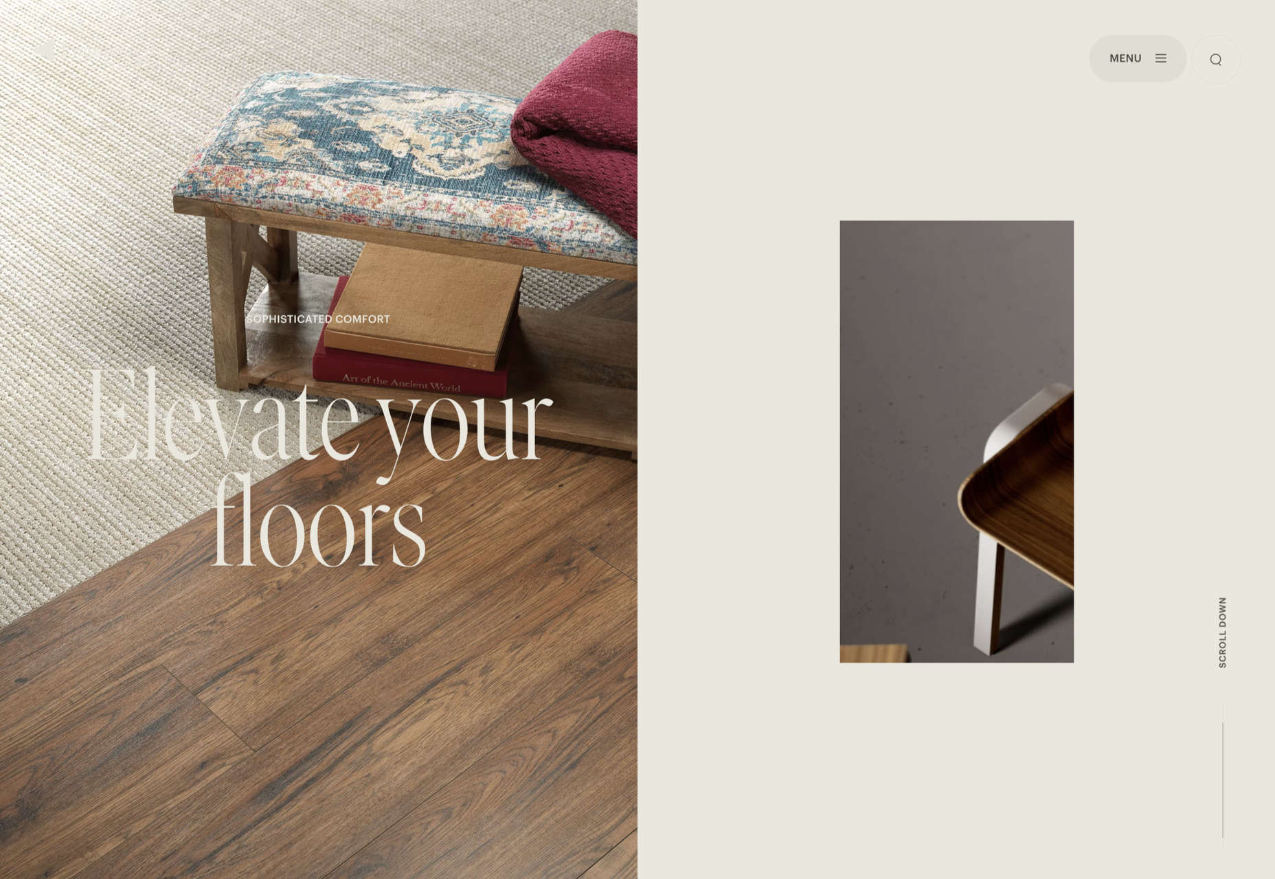
Engineered Floors 

The home page scrolling is the centerpiece of Engineered Floors’ site, and it works especially well on mobile.

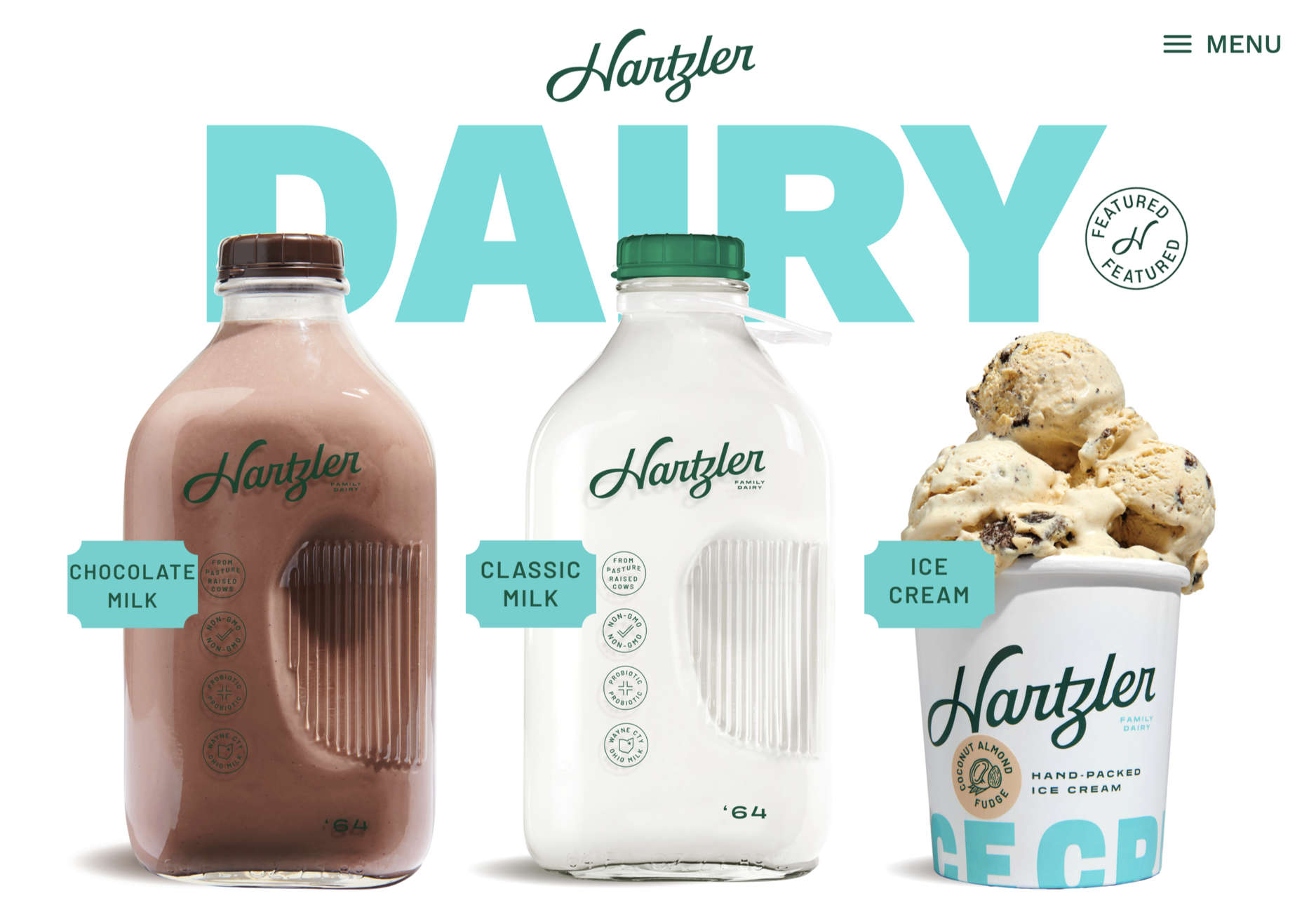
Hartzler Dairy

Hartzler Dairy goes for a nostalgic feel to match the company’s classic mid-20th century style branding.

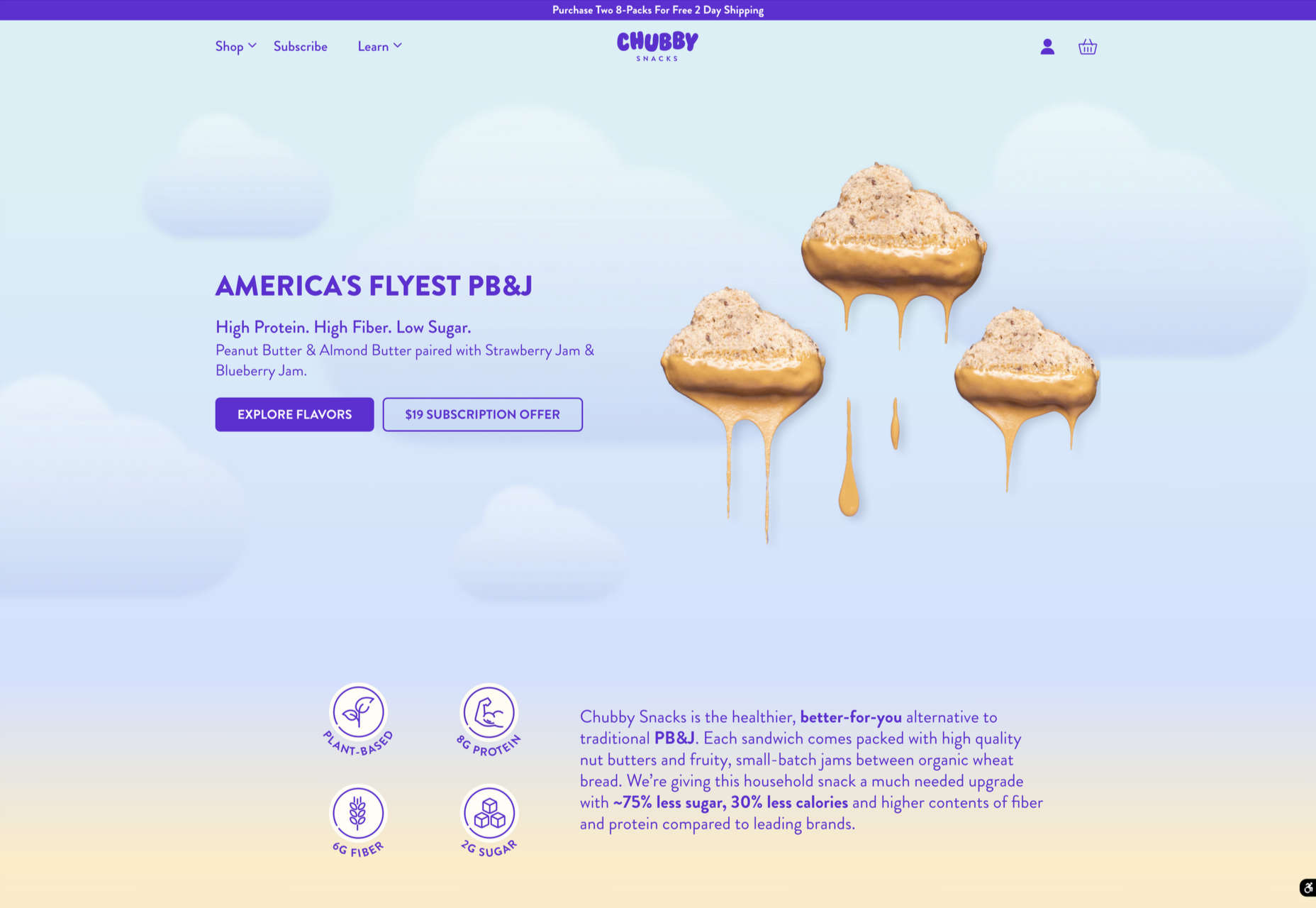
Chubby Snacks

Chubby Snacks is PB&J in your pocket; it sells itself! Having said that, the site is pretty appealing in its own right.

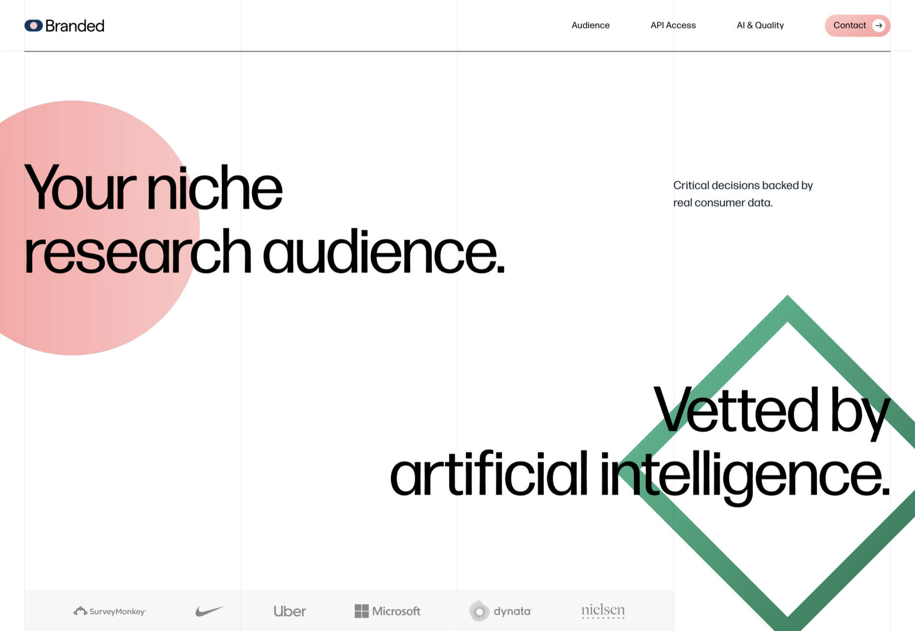
Branded

Market research company Branded goes down the flat design road for this site, which could feel a little dated but actually works quite nicely here.

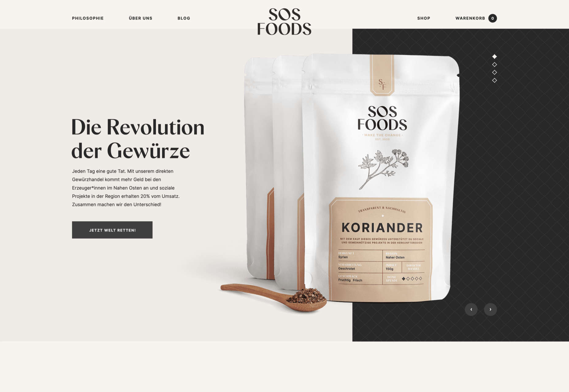
SOS Foods 

SOS Foods is an excellent example of a responsible/sustainable goods site, with a design aesthetic aimed at the ethical consumer.

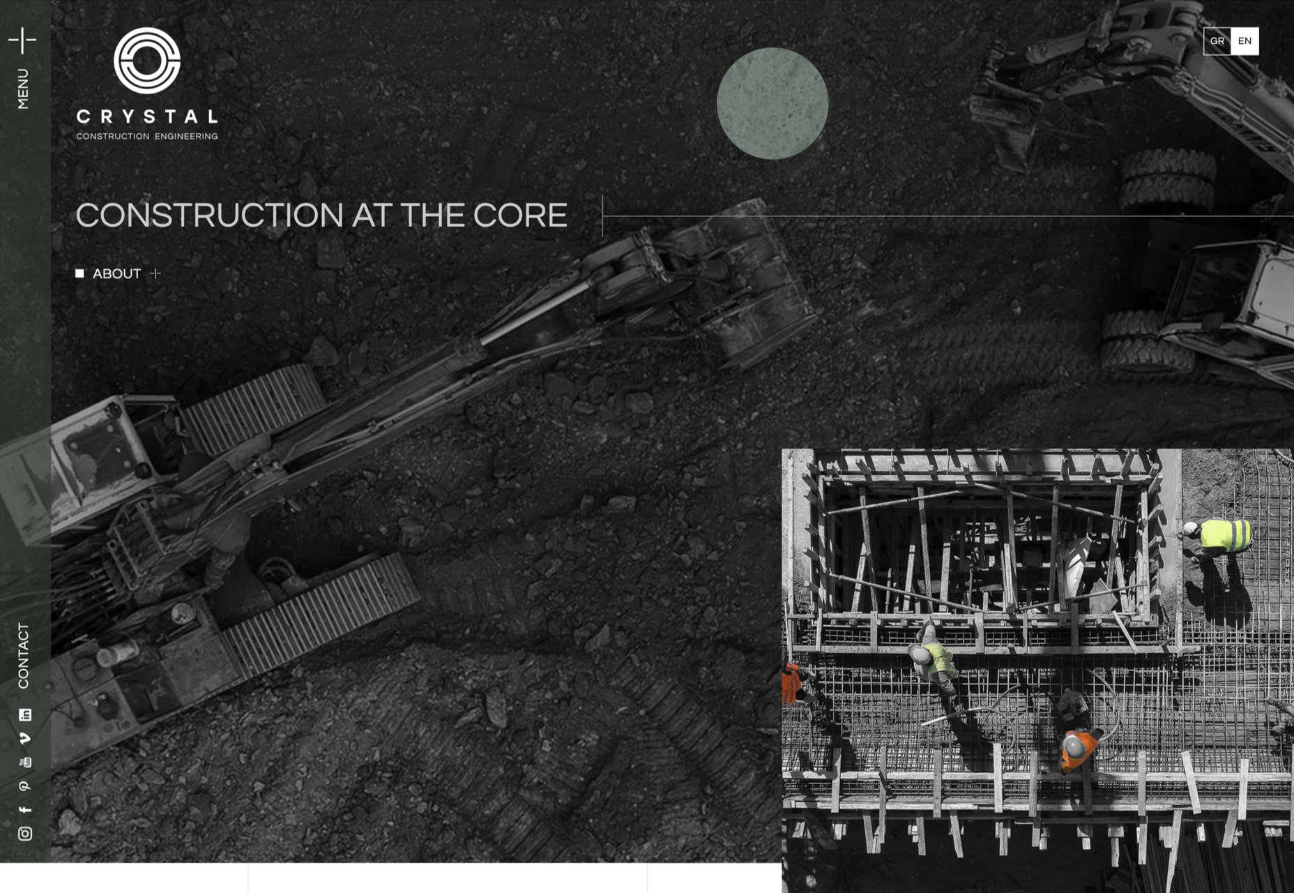
Crystal Construction Engineering

Some nice use of masonry-style layout and overlapping elements create space, but also a pleasing flow in this site for Crystal Construction Engineering.

Source

The post 20 Best New Websites, February 2022 first appeared on Webdesigner Depot.
Source de l’article sur Webdesignerdepot