 When you hear the word “leadership,” do you think of a particular person?
If you’d been asked that question anytime before the 1900s, chances are you’d think of an accomplished politician or a battle-tested general. These were the people leading society for most of recorded history. Today, you might have someone else in mind.
Since the industrial era, the US has birthed a pantheon of founders who’ve arguably led our society as much as any statesman or president. We put Rockefeller and Ford right next to Lincoln and Jefferson. Think about it; these guys haven’t just changed the US; they’ve changed how the entire world lives and does business.
Founders of successful companies today command even larger amounts of capital and power than JD and Henry. With the rise of social media, they are often thrust to the forefront of their brands and the public, whether they like it or not. Some manage the responsibility better than others.
In my opinion, the best businesses use all that capital, manpower, and name recognition to do more than simply make a profit. By leading with authenticity, inspiring positive action, and influencing their brand’s vision for innovation – they try to make a change.
I wanted to take a minute to reflect on some modern founder-led brands I think are doing a killer job of creating unique, world-changing businesses and company cultures. I also want to discuss the lessons I have learned from them.
Elon Musk – Tesla
When talking about founder-led brands of the 21st century, it’s hard to pass over electric vehicle manufacturer Tesla and its outspoken CEO, Elon Musk. Love him or loathe him, he belongs in any conversation on influential founders.
While Musk isn’t technically the founder of Tesla, he is one hundred percent responsible for the company’s direction over the past decade. I think two of the strongest leadership points for Musk are his focus on branding and innovation.
Tesla created showrooms and charging stations long before his business had the sales to justify the expense. People saw the name Tesla everywhere, got curious about it, and now that’s paying off big time. Tesla today is at the forefront of the EV industry while all the other car companies play catch-up.
Behind the scenes, Tesla was also early to create a vertically-integrated supply chain – giving it almost complete control over its product and logistics. That’s another feature with a hefty upfront price tag but paid off when the pandemic hit. Now the biggest automakers in the world are rushing to copy that model.
Musk arguably even convinced China to deregulate foreign ownership of automotive companies. That’s hard to prove. However, China changed its rules around foreign ownership of EV companies shortly after he refused to enter the country.
Arguably, Tesla today is one of the frontrunners in redefining how traditional companies run. Musk is known to hate bureaucracy and traditional hierarchies. He hires other people to take care of bureaucratic processes for him.
Musk is also known for hiring relatively young, hard-working employees into high-power management positions in the company and letting them prove themselves. That inspires extreme loyalty from his employees from an early age. Musk’s focus on efficiency and rejection of traditional hierarchies has sparked a small revolution in tech companies.
Finally, I respect Musk because he has goals beyond showing year-over-year growth to shareholders. That’s hard to do day in and day out.

Sara Blakely – Spanx
Sara Blakely is an example of a founder with her hands in every part of her business, from product creation to sales. Most importantly, she created an authentic company culture with values she felt the business world lacked.
For those who know her story, Spanx very nearly didn’t happen. Blakely pitched her slimming undergarment to multiple women’s brands run by men. Most told her it would never work.
It might seem silly now, but men used to think they knew women’s fashion better than women. It wasn’t until one executive gave Blakely’s product to his daughters to try out that he agreed to start stocking Spanx. It’s a great example of how businesses can make a lot of money by listening to their customers.
Besides founding a women’s clothing company that sells products women want, Blakely strived to bring “feminine energy” into the workplace. I saw this poignant quote from her in an article:
“Twenty-one years ago when I started Spanx, I ended up in the paper in Atlanta, and I was at a cocktail party and a couple of guys came up to me and they said, ‘Sara, we read about you. Congratulations! We heard you invented something.’ And I said, ‘Yes I did, I’m so excited.’ They said, ‘Business is war,’ and then they pat me on the shoulder and they kind of laughed at each other. I went back home to my apartment that night. I was 29 and I just thought, I’m not going to war. I’m going to do this very differently. I’m going to honor a lot of feminine principles — intuition, empathy, kindness. Just allowing myself to be vulnerable through this process. And of course, a lot of the masculine energy has helped me also — it was a balance. But I wasn’t going to do it by squashing the feminine.”
Blakely worked hard to create a sales-oriented company culture that was purposely welcoming from that point forward. She regularly scheduled “oops meetings” where employees could stand up and say how they messed up and turn it into a funny story. At Spanx, it was okay to make mistakes and learn from them.
Blakely wanted everything about her product to be fun, including the way it was sold. She created a mandatory boot camp for salespeople, which, among other things, requires employees to perform standup comedy. Little things like that resonated with people and made Spanx synonymous with “fun.” Even famous actresses were flashing their Spanx on the red carpet.
The lesson we can all learn from Spanx and Blakely is that fun and positive energy are great marketing tools for any business. Many companies try to push a fun culture publicly without any authentic leadership that genuinely exemplifies that narrative, they won’t have the same effect. Blakely’s story of Spanx is not just a story of the brand but a story of her life and the experiences that shaped her vision and goals.

Jack Dorsey – Block (FKA Square)
While better known for founding Twitter, Jack Dorsey has recently been in the news for his move to solely running payment processing business Block. I admire Dorsey because he radically encourages his teams to think differently about how they work.
Dorsey is known for optimizing ways to stay productive and focused throughout the day. He manages through unconventional tactics like communicating only through voice memos on his phone that he runs through transcription apps. He says this prevents him from being sidetracked by distractions on his computer. I think that kind of mindfulness is necessary now more than ever.
Dorsey tries to bring this level of focus to his interactions with his employees too. I saw a great quote from him in this article discussing computer-less meetings at Block.
“When phones are down and laptops are closed, the team can discuss any issue at hand without distraction. We can actually focus and not just spend an hour together but make that time meaningful — and if that time is 15 minutes, then it’s 15 minutes and then we move on with our lives.”
Besides limiting distractions, Dorsey is known to walk five miles to work daily, theme each day, and create detailed agendas and goals for each team meeting. In his former company, Twitter, the culture was frequently described as a space where employees could speak freely to management about things they wanted to change.
On that subject, Dorsey has been known to push hard for employee control in his companies. Perhaps ironically, he was also quoted saying he wants Twitter to break away from its co-founders’- vision and control, calling founder-led companies “severely limiting.” However, it still seems he has some sort of vision for the world that he wants to bring around via Block.
His business goals are visionary, pushing the boundaries of innovation in the financial world.
Dorsey is a known cryptocurrency enthusiast but had pushback from the Twitter team, including his CFO, about making a crypto-centric product. His move to payments processor, Block, seems to be a bid to follow his passion and exert his vision on the world.
Block has since made headlines for being extremely bullish on cryptocurrencies, while many have expressed doubts. Dorsey even changed the business’s name to Block to better reflect its focus on blockchain and famously purchased $50 million worth of Bitcoin in 2020. All the while, Dorsey has been quietly creating arms of his business in the hopes of improving BTC’s usefulness. That may pay off down the line.

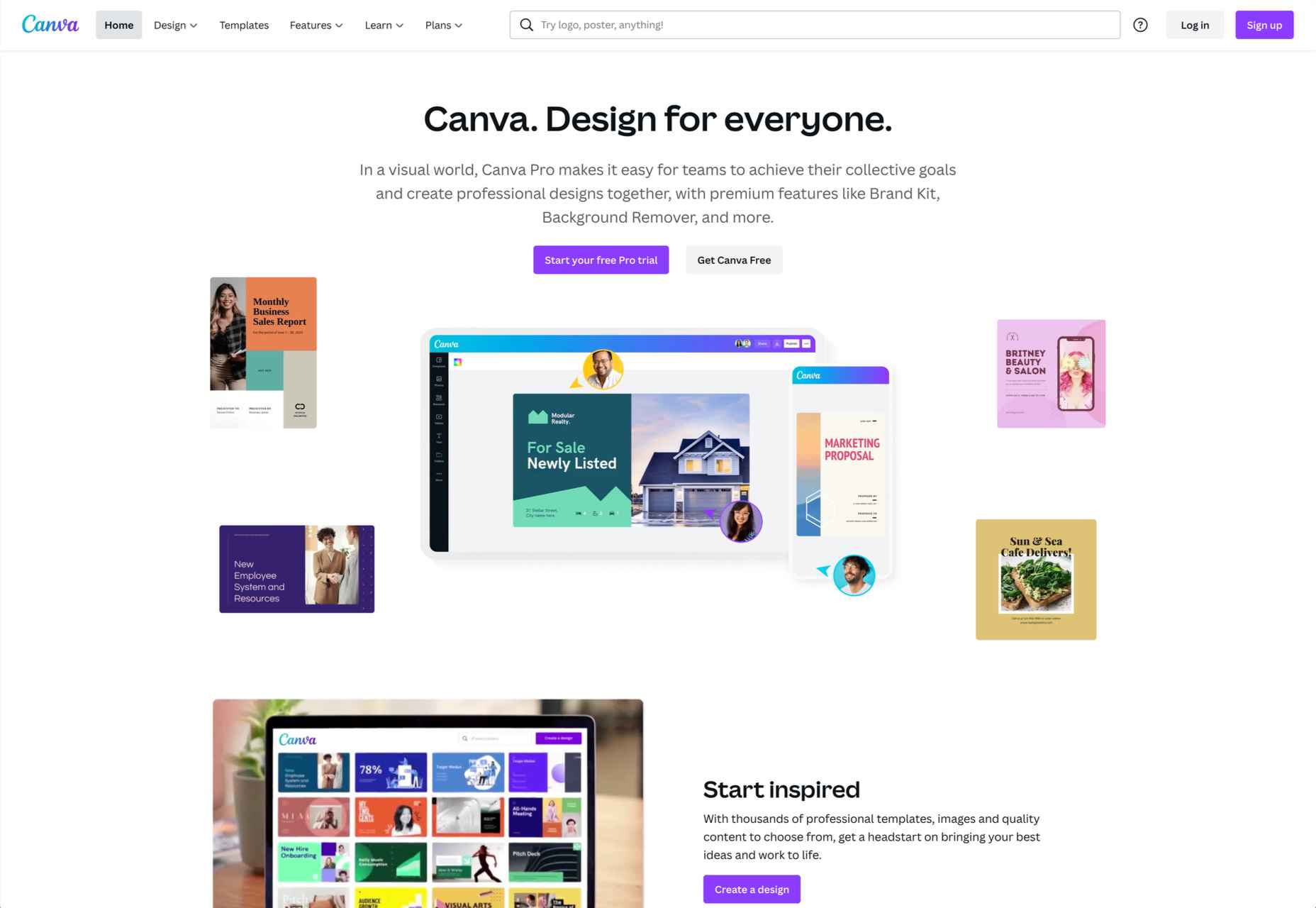
Melanie Perkins – Canva
I identify strongly with Melanie Perkins, co-founder of graphic design SaaS, Canva. Besides being roughly the same age, we both came from nondescript beginnings with no background in entrepreneurship or tech.
Canva is an excellent example of a business created by becoming intimately familiar with a customer problem and executing. Perkins spent years teaching people how to use design platforms like Adobe Creative Suite because they were so complicated. Taking that knowledge, she started a simple product to help customers create high school yearbooks. That expanded into a super app covering every aspect of design.
This super-app has unlocked a way for millions to learn design and produce high-quality content at any skill level. The cost to use Canva is many times lower than anything else on the market.
While Canva is an amazing product, what I like most about Perkins is that she believes business serves a higher purpose than maximizing profits.
When she was suddenly thrust into the limelight with a $40 billion valuation, people were even more impressed by Perkins’ philanthropic goals. She vowed to donate a 30 percent stake in Canva to a charity dedicated to eliminating poverty (about $12 billion). She is also known to regularly fundraise for 25,000 different nonprofits through her app. She doesn’t just inspire people with words, but by actions, she’s actually taking.
Canva is very public about its ethos. I like their values because they are general yet avoid the jargon many companies fall into. They are:
- To be a force for good and empower others;
- Pursue excellence;
- Be a good human;
- Make complex things simple;
- Set crazy big goals and make them happen.
Besides revolutionizing how modern businesses design and harness goodwill marketing, Canva was also one of the forerunners of the remote work trend.
Most of Canva’s “Canvanauts” worked from homes worldwide even before the pandemic. Canva showed a lot of tired old businesses that you could still run a successful company without having employees in the office 24/7.
How I Try to Learn From the Best
Finally, I want to talk about what I am trying to contribute to my team and society with my current business, startup acquisition marketplace, MicroAcquire.
As I’ve mentioned, I think it is very much on myself as a founder to set the tone of my business – and that starts with who I hire. When I’m searching for new employees to join the “#Micromafia” I not only look for productive workers, I look for people I genuinely enjoy spending time with. It’s the best feeling in the world to go to meetings where you leave thinking, “That was really fun.”
Besides creating a great team, I’ve tried to address another problem I see again and again at major tech companies: employee burnout. There’s a reason the average tenure of a tech employee is three years.
I love working on startups. It’s like playing a video game for me, and it’s probably why I’m a founder. That said, I know my employees don’t always feel the same way. As CEO, I make sure my team knows I want them to live their lives outside of MicroAcquire.
On the business side of things, I take cues from the best. Like Musk and Dorsey, I want to preemptively create features that I know our customers will love. I knew people wanted an easy way to sell their startups because I wished I’d had one back when I was doing it.
Like Spanx and Tesla, I also strongly believe in the power of innovative branding – and I make sure we spend in areas that will give us significant returns down the line.
For example, we’ve made it easy to get MicroAcquire merchandise online completely free. The extra exposure we get from tech people rocking MicroAcquire t-shirts is more than worth the cost. We also created our own media publication Bootstrappers.com to tell the founder stories we thought major publications had missed. That’s been a huge hit with our customers, who also happen to be founders. These people traditionally have had to spam inboxes and pay for press because they didn’t raise billions in funding.
Finally, like Blakely and Perkins, I also want to actively listen to customer feedback and make sure we create a necessary and desired product. That’s why I make sure we’re constantly engaging with our community both on our website and social media. Many of the features we’ve added are just things we’ve heard mentioned multiple times from customers.
So far, I love the community we’ve created online and in the office. I don’t claim to have the winning formula, but I feel we are making a real difference out there. We’re lucky to live in a world with so many smart people getting their ideas out and making a positive change in the world.
Featured image via Unsplash.
Source
The post 4 Founder-Led Brands That Are Done Right first appeared on Webdesigner Depot.
Source de l’article sur Webdesignerdepot

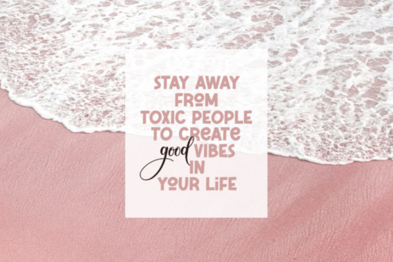
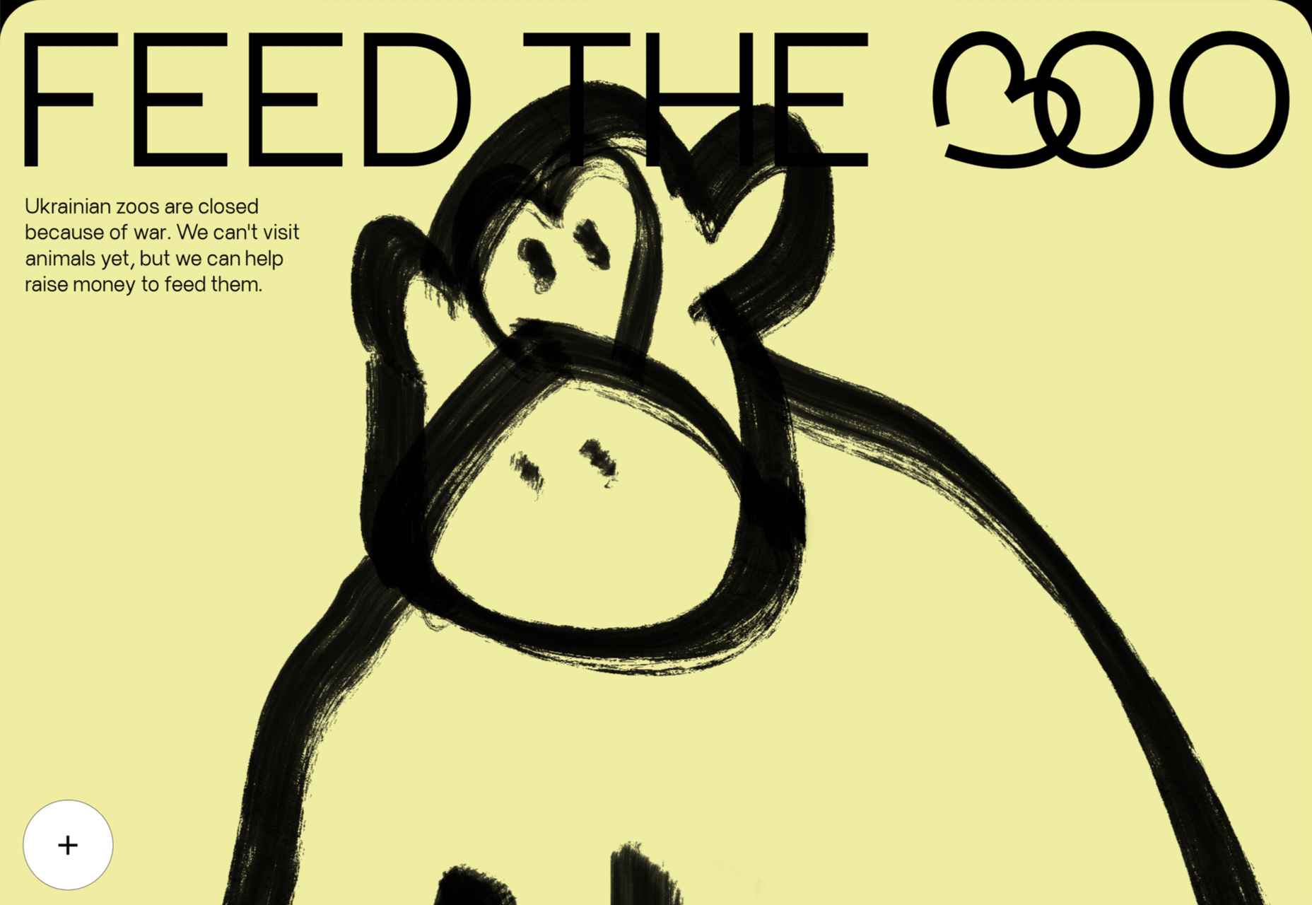
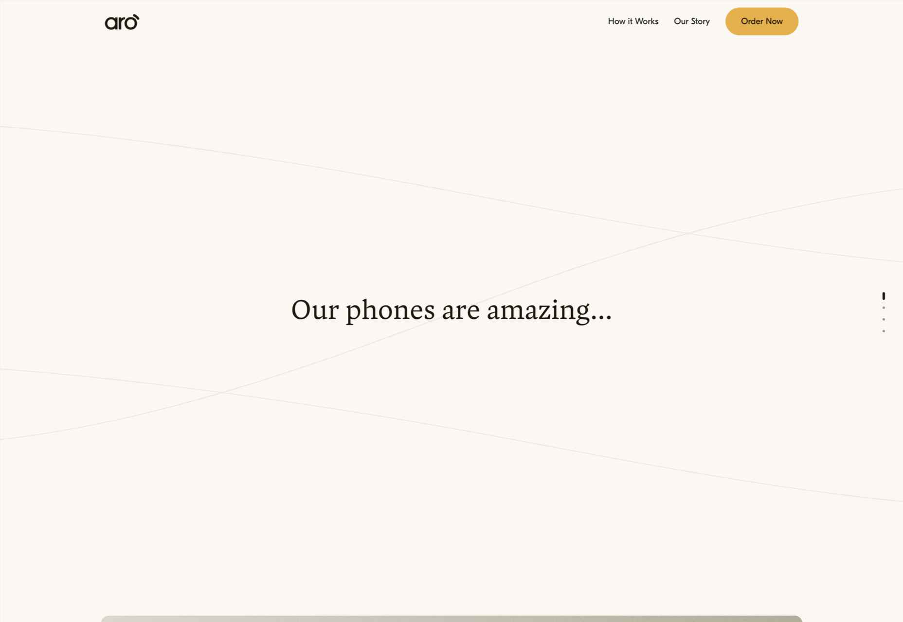
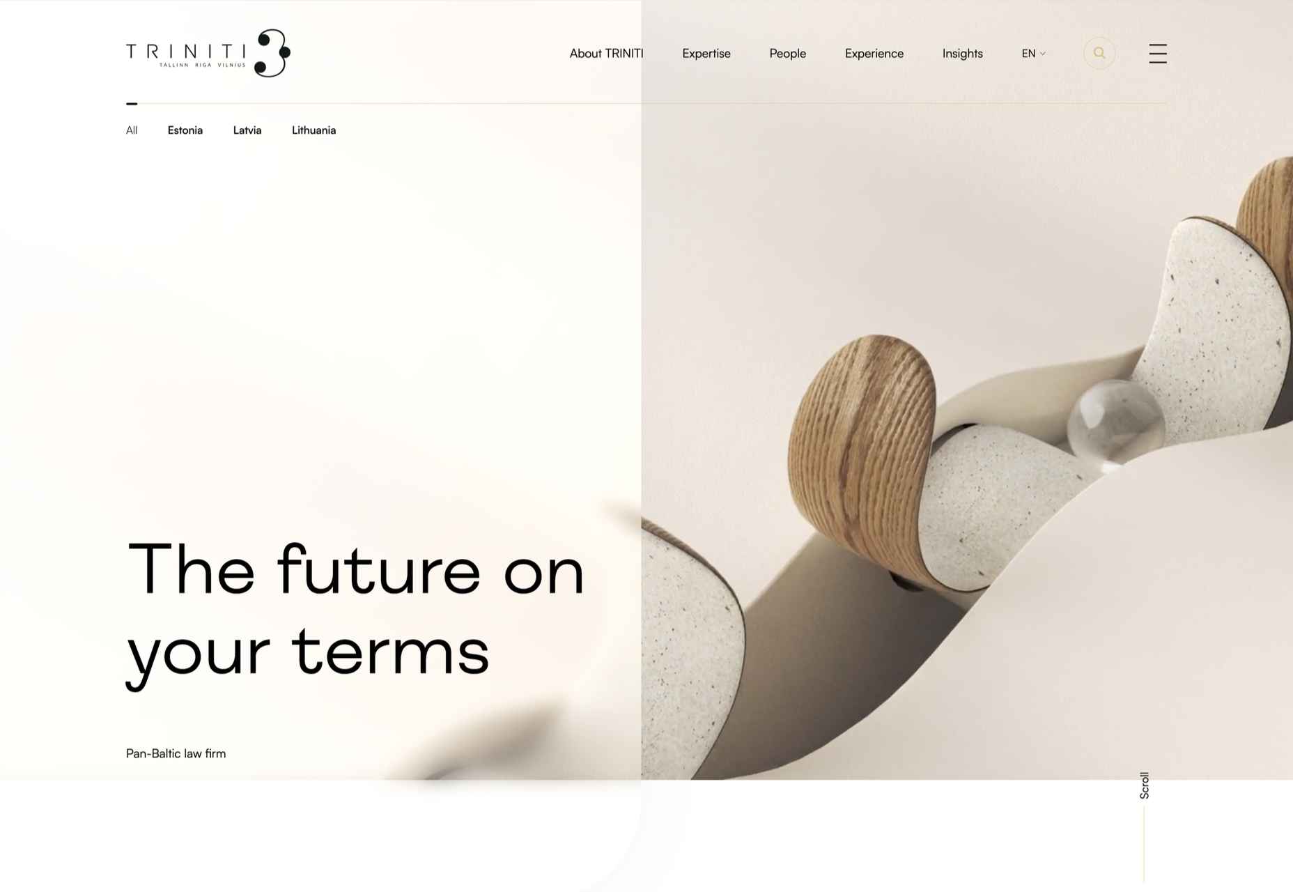
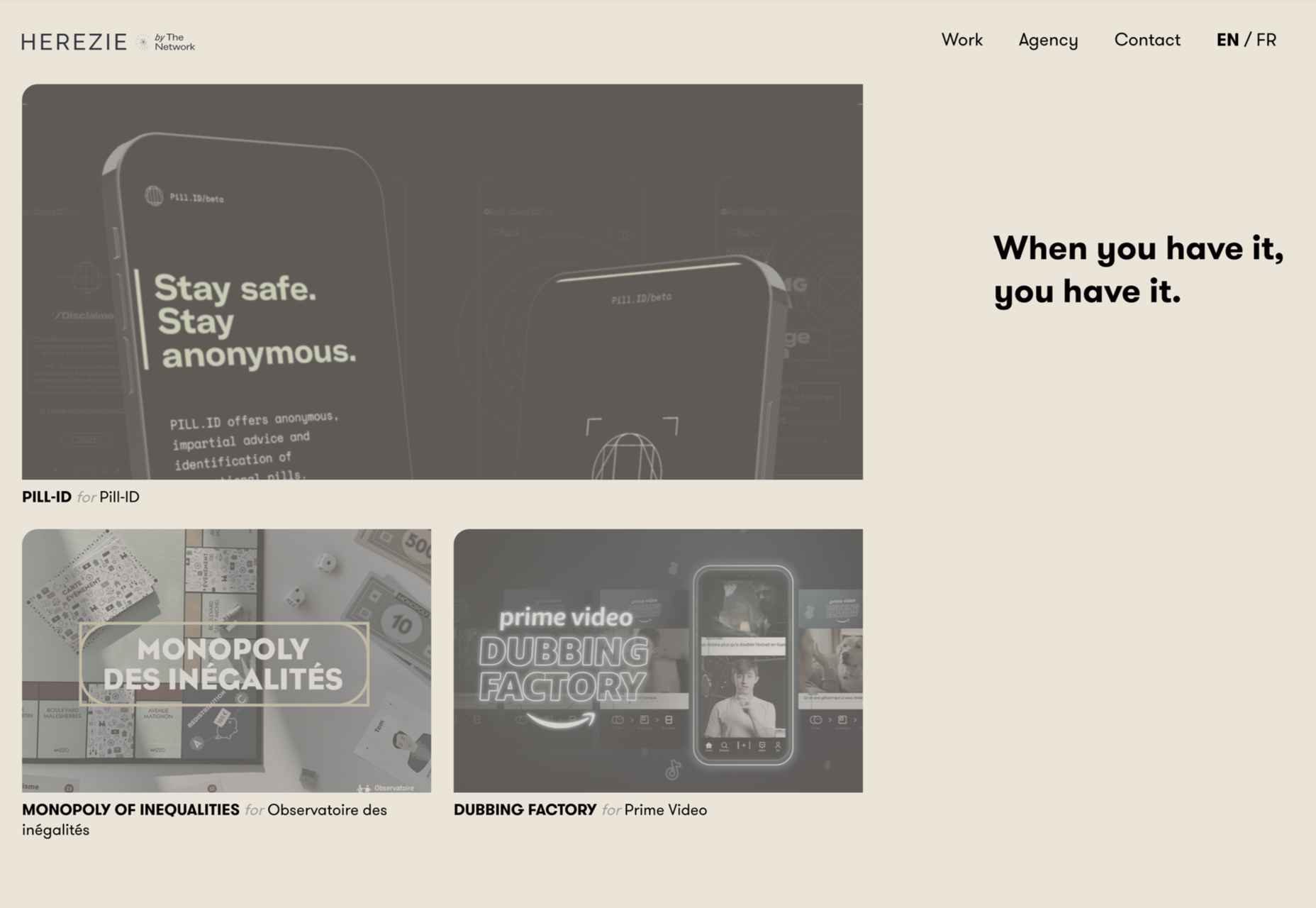
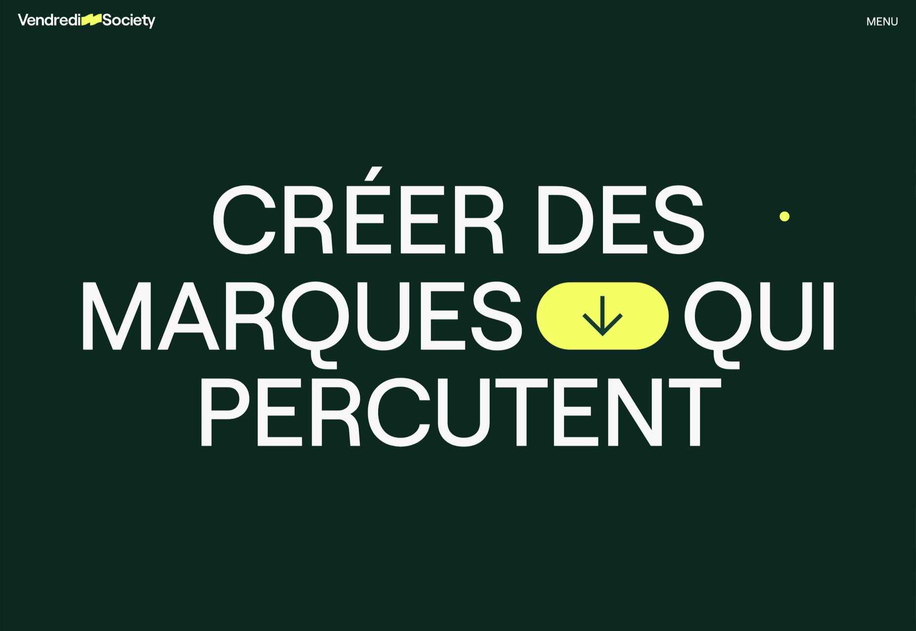
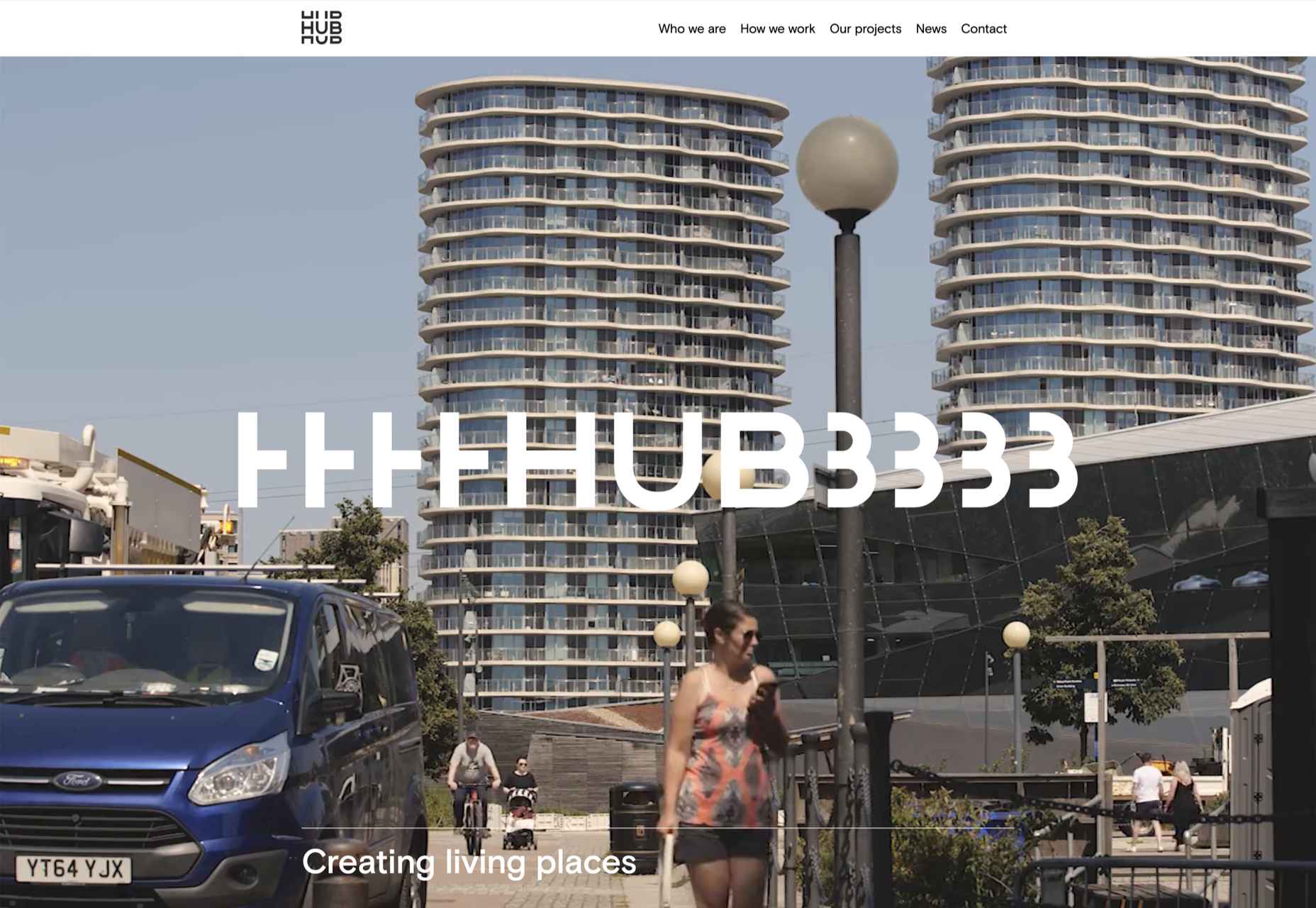
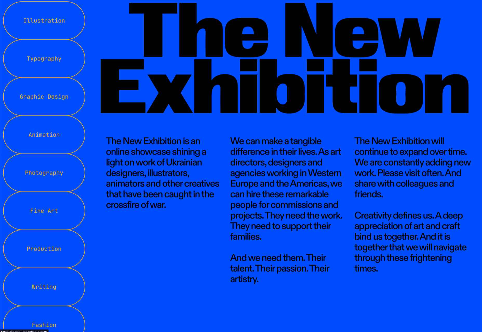
 Are you bored with some of your current design projects? This month’s collection of website design trends can help break you out of that rut with some fun and funky alternatives.


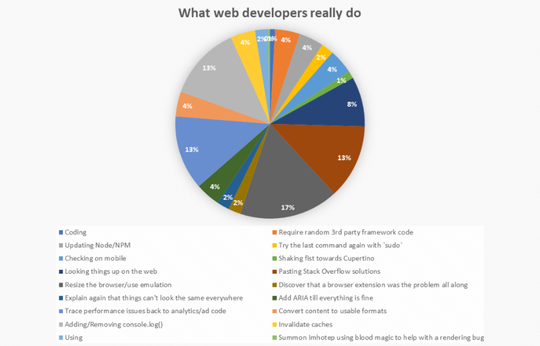
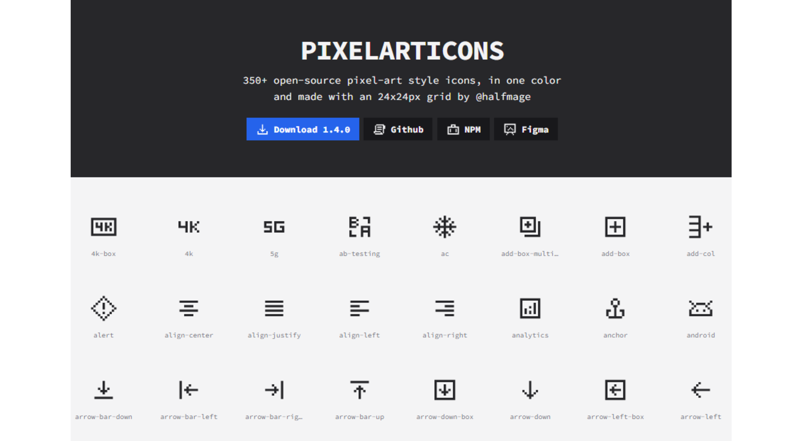
 Every day design fans submit incredible industry stories to our sister-site, Webdesigner News. Our colleagues sift through it, selecting the very best stories from the design, UX, tech, and development worlds and posting them live on the site.


 WordPress 6.0 has been released, and another niche jazz musician will be enjoying extra Spotify royalties next month.
 Websites haven’t always been as adaptable as they are today. For
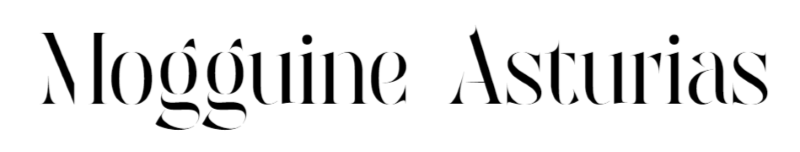
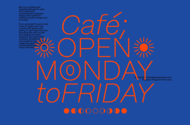
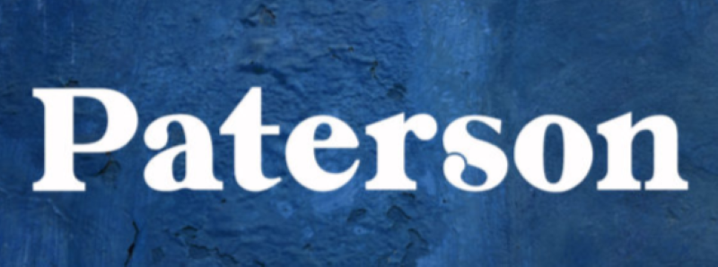
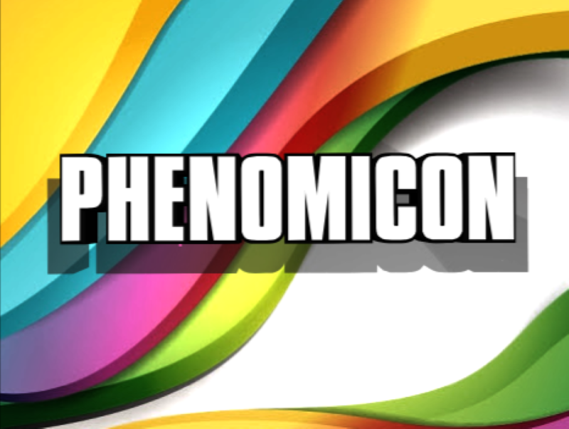
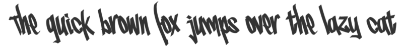
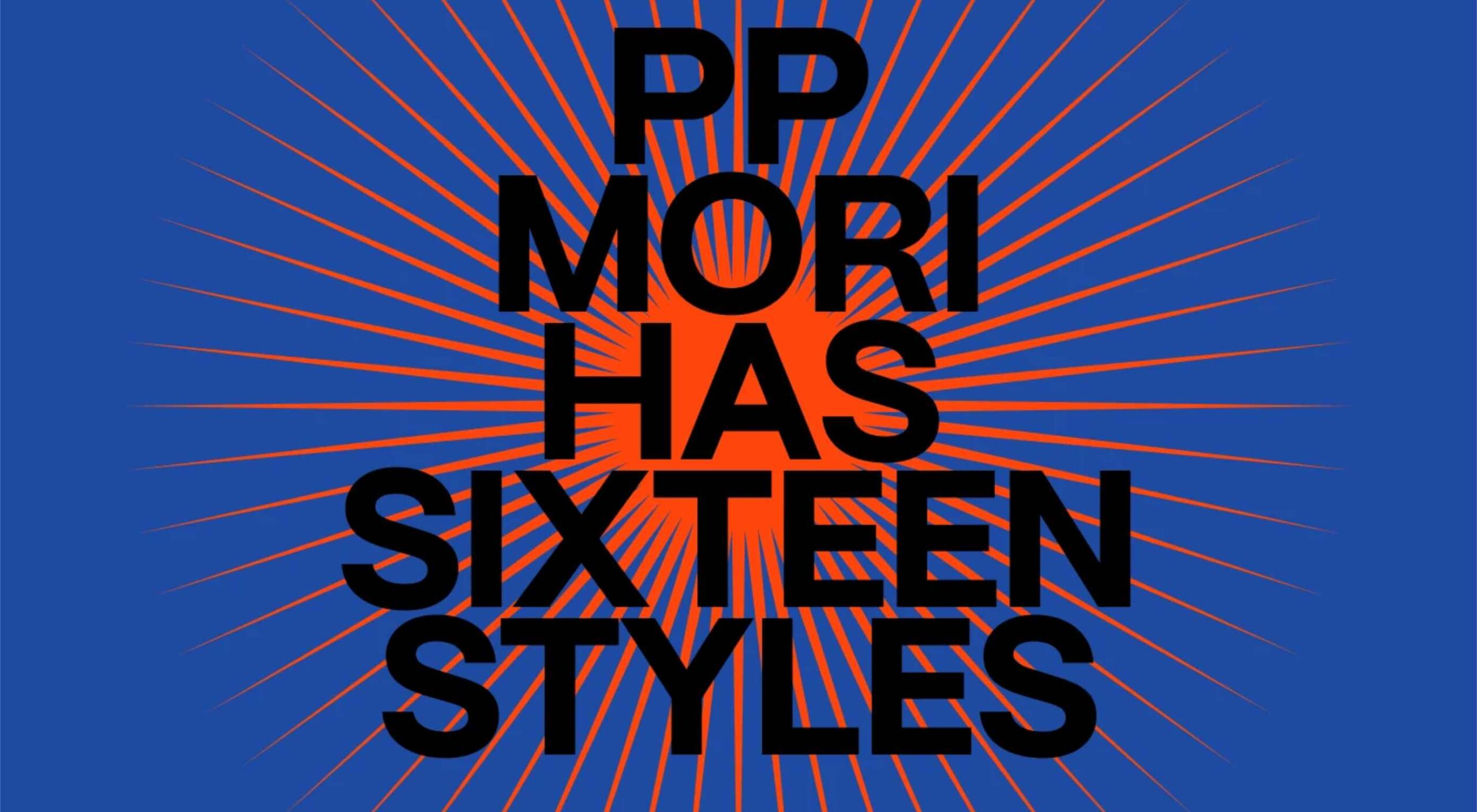 In this month’s collection of the best new fonts, we’re going to see some fonts that test the limits of weight, height, and gravity. We’re also going to see font families that merge unexpected styles with one another.


 Every day design fans submit incredible industry stories to our sister-site, Webdesigner News. Our colleagues sift through it, selecting the very best stories from the design, UX, tech, and development worlds and posting them live on the site.


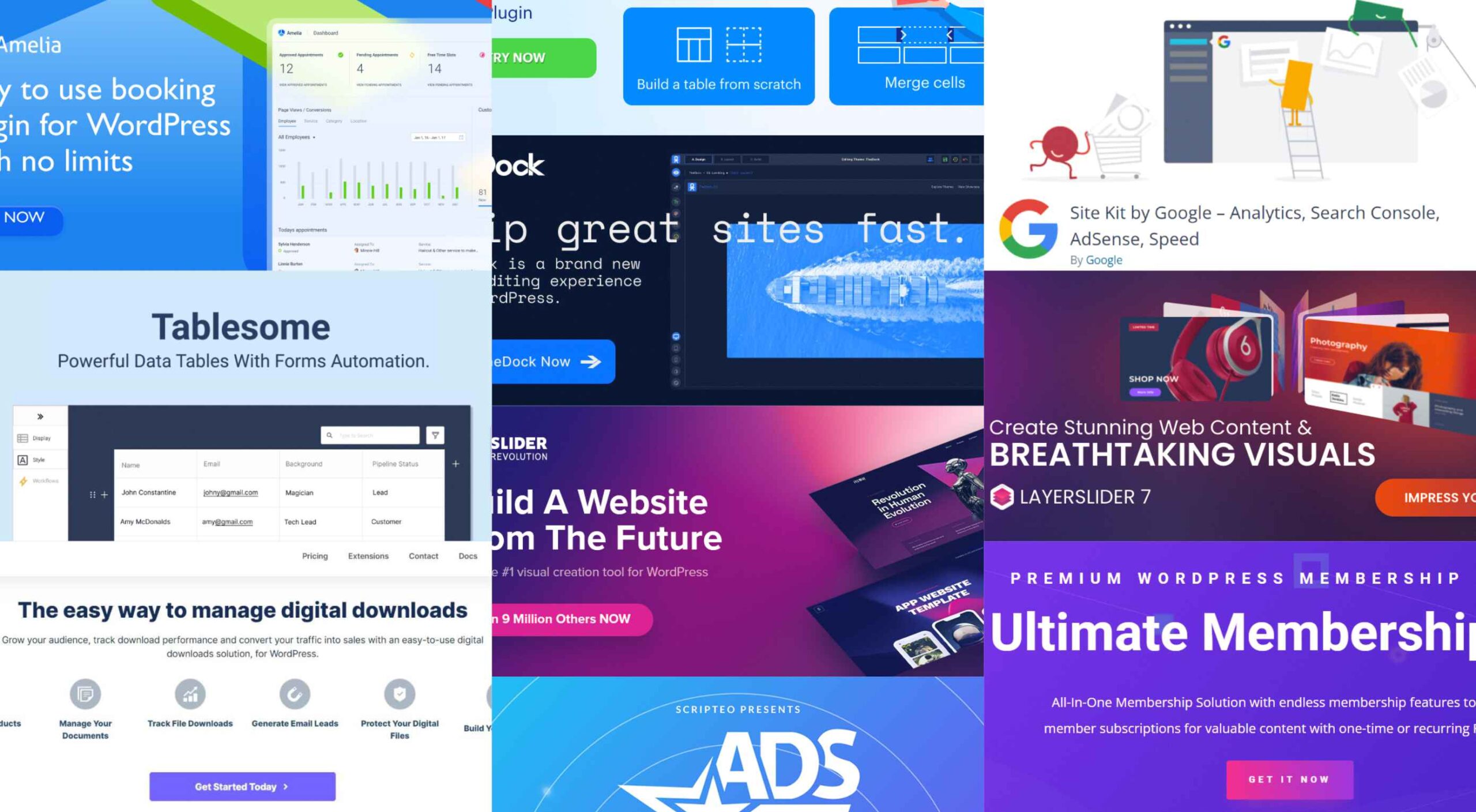 Having the right WordPress plugins on hand can do wonders for your business or online presence. WordPress offers a vast collection to choose from.


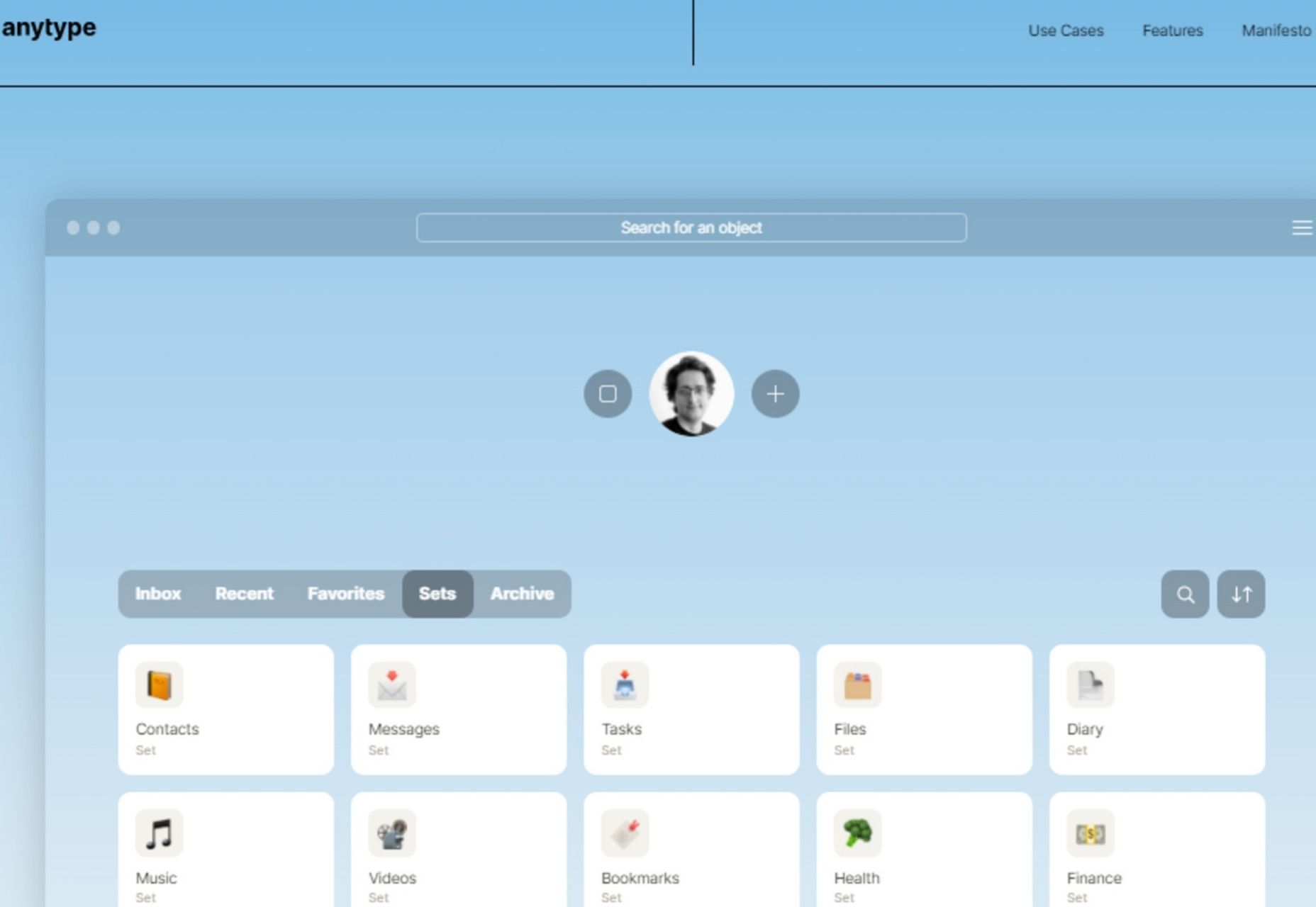
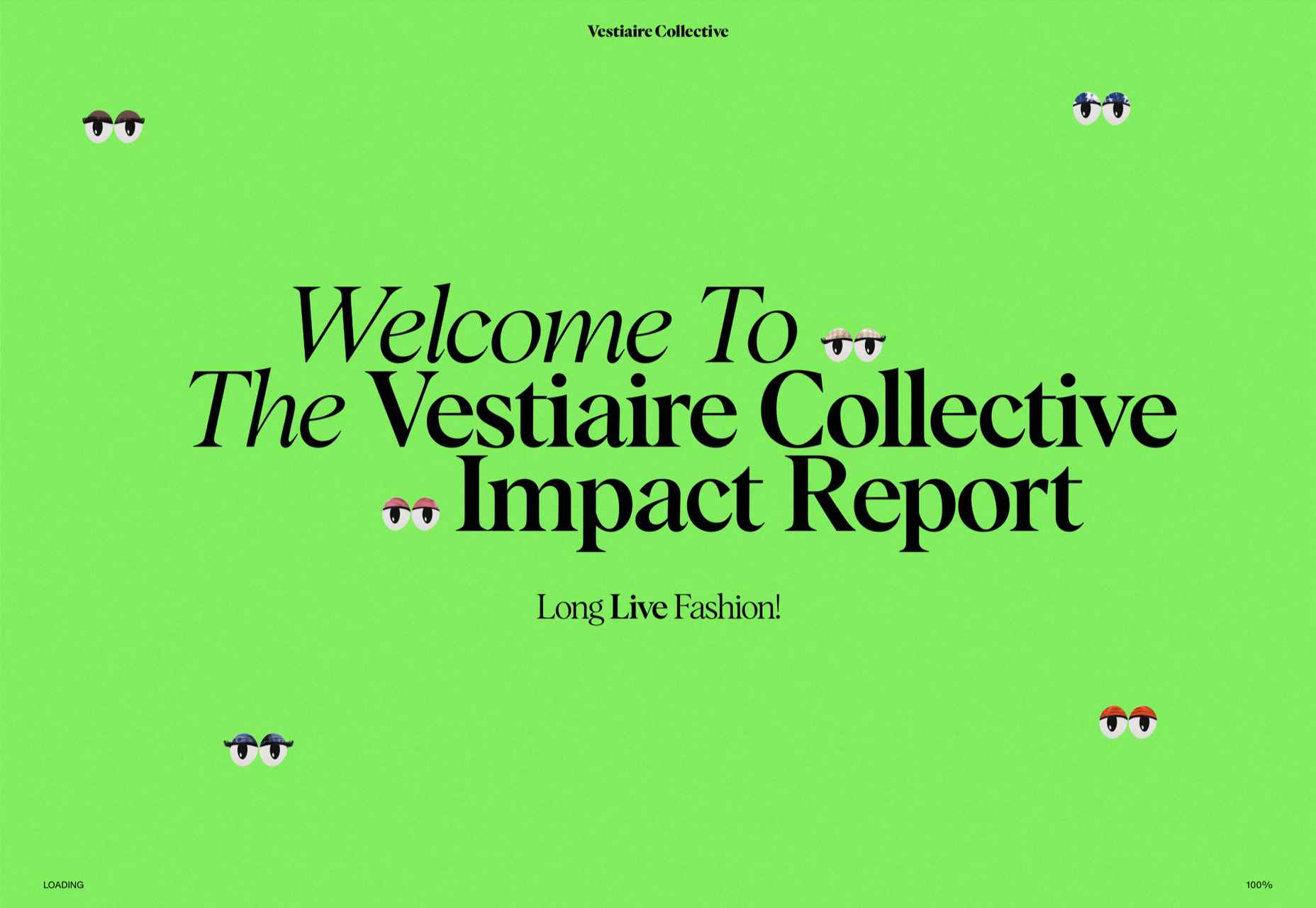
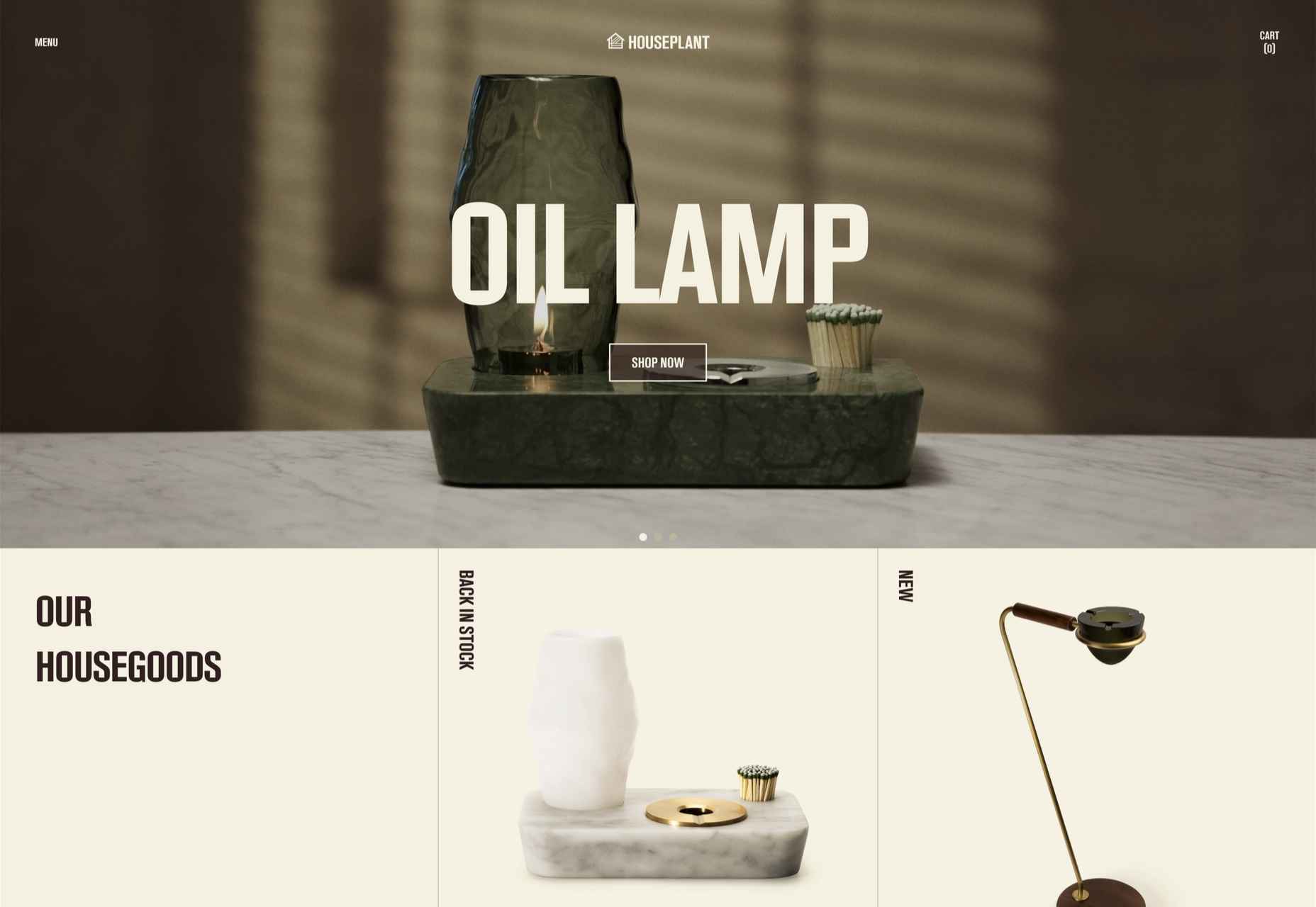
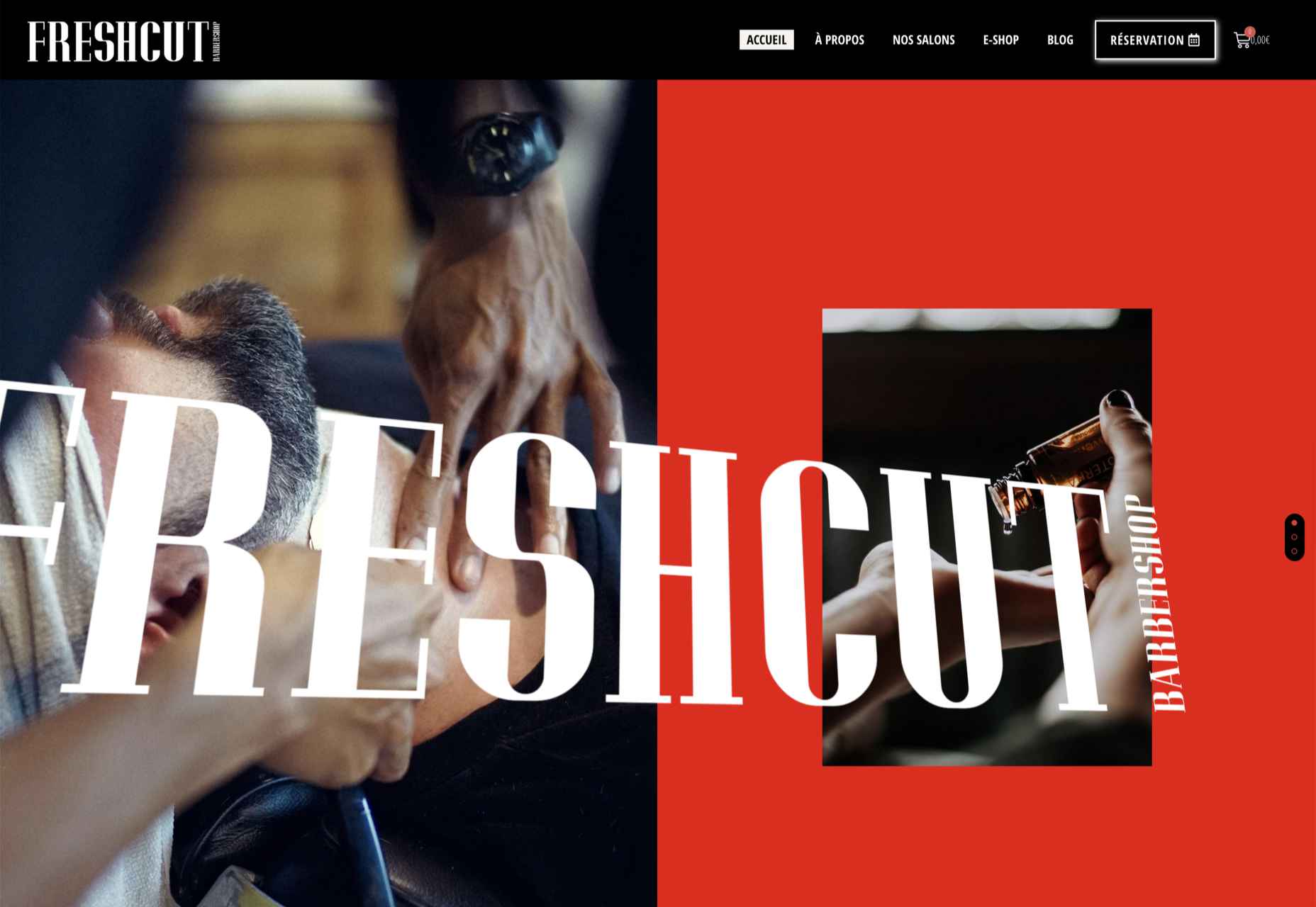
 This month’s collection of the best new sites is a mixed bag. Positivity remains from
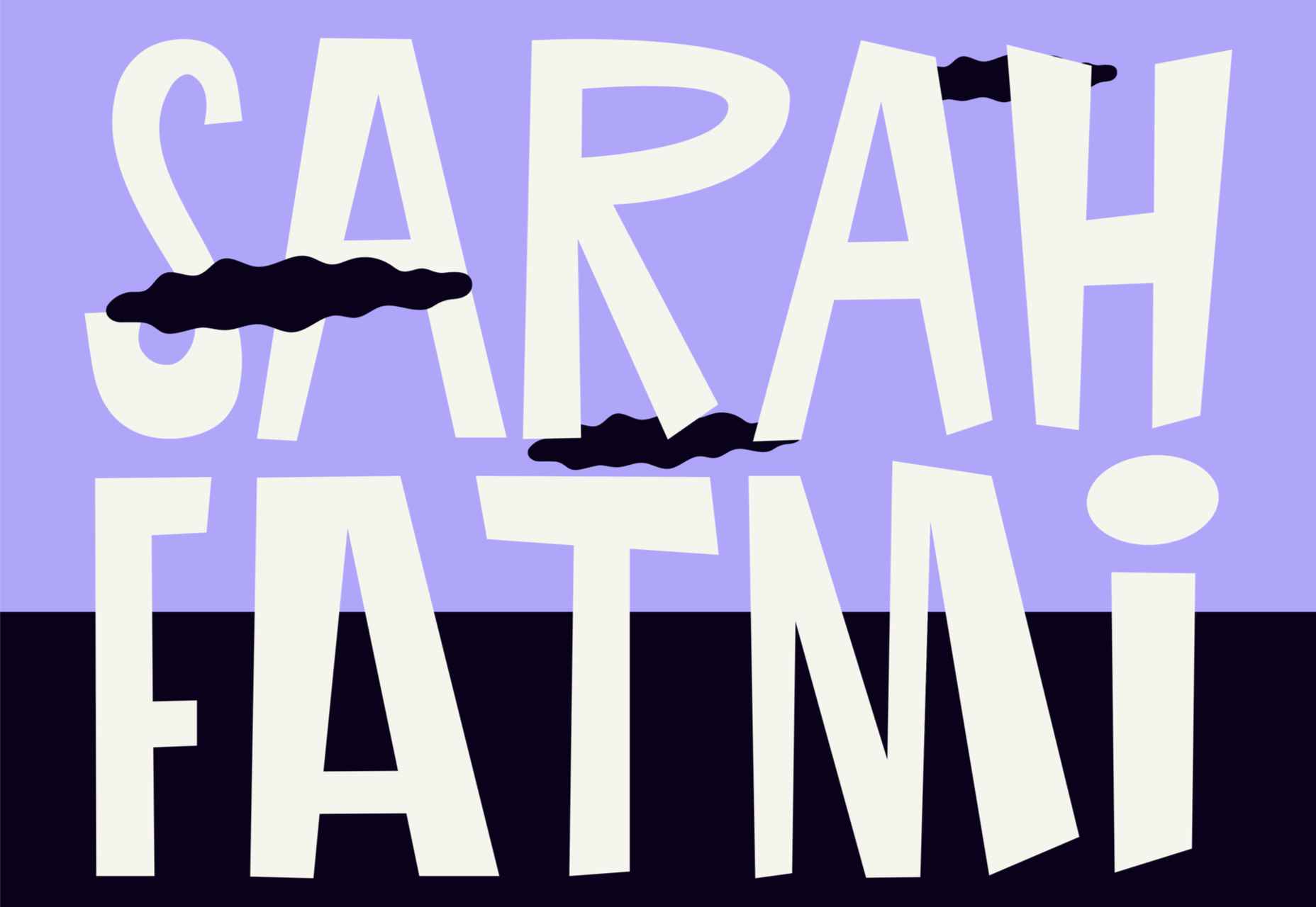


