 With billions of internet users worldwide spending several hours online each day, the online presence of brands is now a necessary avenue for building, boosting, and maintaining positive value and attracting and interacting with customers.
This has created increasing pressure for web design agencies when creating and managing websites. This pressure is multiplied by all the projects that web design agencies have to handle at one time. This is because different clients demand different things for their websites, whether it’s a signature feature or specialized functionality.
Hence, it’s vital that the tools the agencies use to work are simple enough and suited to the tasks they have to accomplish in order to build and maintain these projects. Having the right tools can increase efficiency and effectiveness in managing websites.
Challenges in Modern Web Design
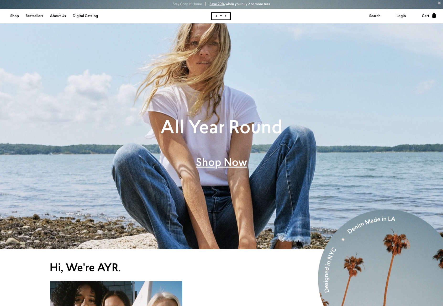
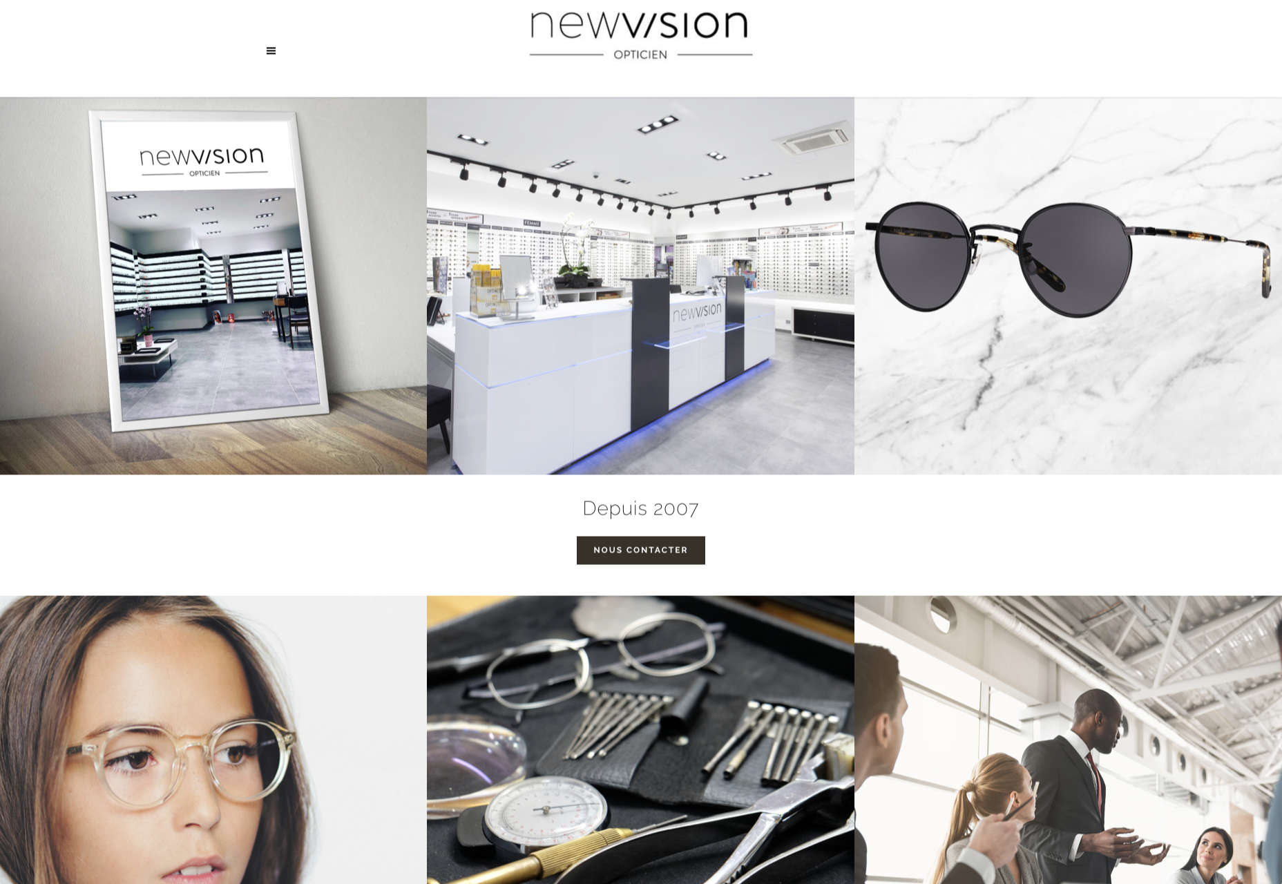
Building a website with all the essentials in mind is always easier said than done. Websites have to be both functional and easy on the eyes to invite traffic, disseminate information, or appeal a product or service to a target audience, and all while having an attractive and convenient interface.
The good news is that it’s perfectly possible to design a quality website and without spending a fortune to do so. Below are some of the challenges that web design agencies face when trying to deliver and reconcile efficient user experience and effective user interface in web design.
1. Appealing User Experience
Designing a good website means ensuring that the user experience is appealing to a general audience, but this is one of the most difficult parts of web design. Agencies must be careful not to turn off users with a confusing user experience. For instance, making important information difficult to find on web pages, using technical jargon that ordinary users wouldn’t understand, and focusing too much on the design rather than the overall experience are a few big mistakes that no designer should ever commit.
Instead, web design agencies should focus not only on making the design look good but also on making the experience smooth and fast for the regular site visitor. This includes improving design elements to make navigation easier as well as optimizing webpage load speeds.
2. Working With a Budget
It’s common for the client and the web design agency’s budgets to not line up at all times. Either the client will find the project quote too high, or the designer will find the client’s budget too low. The cost of a web design project can vary greatly, depending on what needs to be done.
Although having to build a good website on a budget may be difficult, it’s important for both parties to come up with a set amount before the project even starts. The client should always specify what they want to achieve and how much they’re willing to pay to get it, and the agency should let the client know beforehand if this is possible.
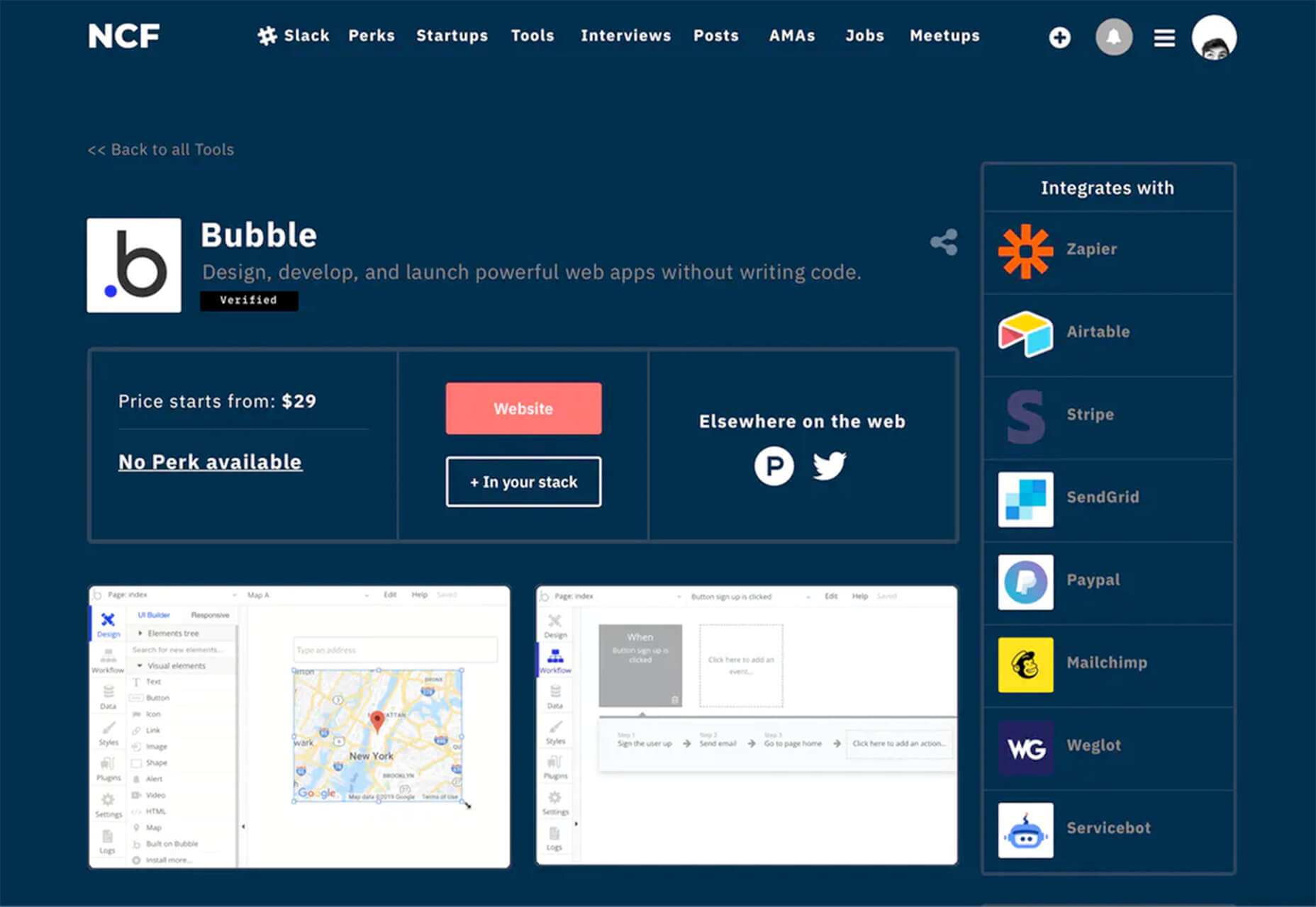
3. Integrating Third-Party Functionality
Sometimes, clients may make requests for third-party functions that may not be easily integrated into the site. To prevent this, web design agencies should always consider integration when building a site. Most businesses and companies now have at least one social media account, so it doesn’t make sense for their site to remain disconnected.
When a website visitor shares an excerpt on a social media site like Facebook, Pinterest, or Twitter, other people who can see their posts may become interested in visiting the original post on the website. Properly integrating third-party applications and functions into a website can get it more online presence and popularity.
4. Suitability to Different Devices
There are many devices that people can use to access the web. From smartphones to desktop computers, from cars to game consoles, and even wristwatches and digital cameras, all of these can be web-enabled as long as there’s an available internet connection.
Websites nowadays should always be compatible with any of the devices people might use to go to the website. They should look pleasing and load fast regardless of what device a visitor is using.
5. Security of Personal Information
Most websites require personal or financial information, whether for account verification, for website subscription, or something else. Websites should be designed with personal security in mind, which is even more important since hacking has been on the rise since the coronavirus hit.
One of the biggest threats that websites face today is phishing, or when an attacker will pretend to be a trusted contact and attempt to compel you to click a malicious link. Another is ransomware, or where cybercriminals hold customer data for ransom and attempt to extort online business owners. Yet one more is SQL injections, or where hackers will attempt to execute malicious SQL commands in your website’s database.
The best practices in regards to web design to mitigate these risks include third-party plugins and themes, keeping all of your software up to date, setting your web applications so they run the fewest privileges possible, and utilizing SSL certificates and HTTPS protocols.
Adopting Site-Building Platforms
Gone are the days where you had to be technologically gifted to design a website from scratch, usually through manual HTML codes. Back then, you had to know your way around the web if you wanted to set-up and manage a site of your own.
Now, there are a lot of good website builders that allow you to create websites in a faster period of time. Even web design agencies now make use of such builders in order to make the job easier and more convenient. Not to mention, it allows agencies to focus on the design alone.
Although these platforms offer predesigned templates based on the most common purposes of websites, they normally allow the user to white label the website into the branding specific to the business or agenda of the website owner. The text styles, colors, and sizes coordinated to the website’s theme, and colors can be designed specifically to match the business or organization’s image and identity.
Simply put, creating websites through a web builder platform can provide web design agencies with easy-to-understand tools that their teams and members can all uniformly use to more effectively and more efficiently handle all their projects.
With services that allow mobile optimization, site management, and even drag-and-drop editing, web design agencies can now better manage their projects and finish with their tasks more quickly.
Not only that, by using white labelling, services can conserve their time and energy into focusing on creating the best website for their client. With all the website builders currently available on the market today, just picking the right one can give web design agencies the best tools to use when creating, designing, and maintaining websites.
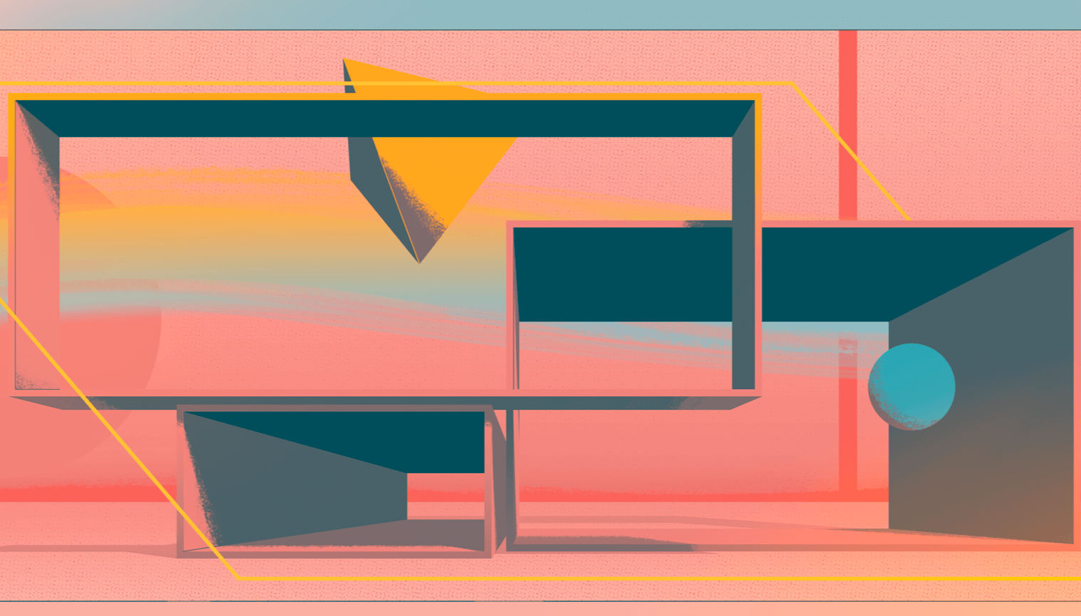
Featured image via Pexels.
 Today, great design isn’t just about conveying the right amount of information in a certain number of pages.

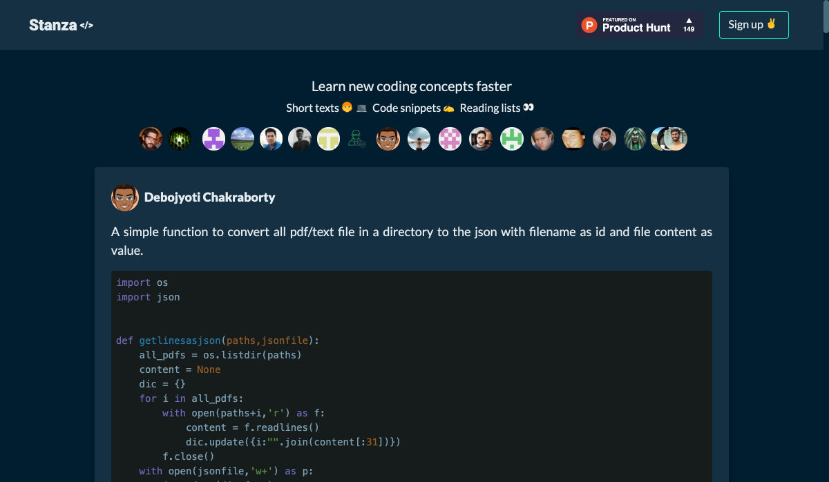
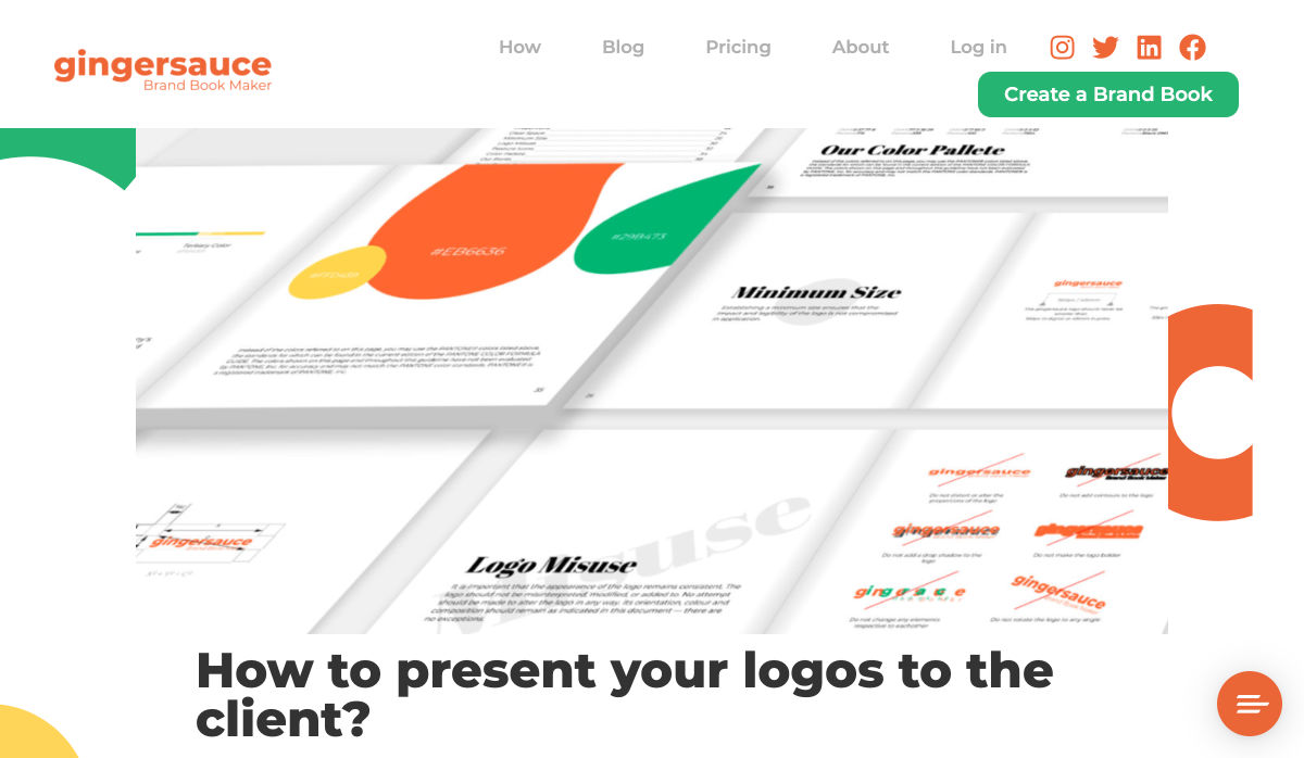
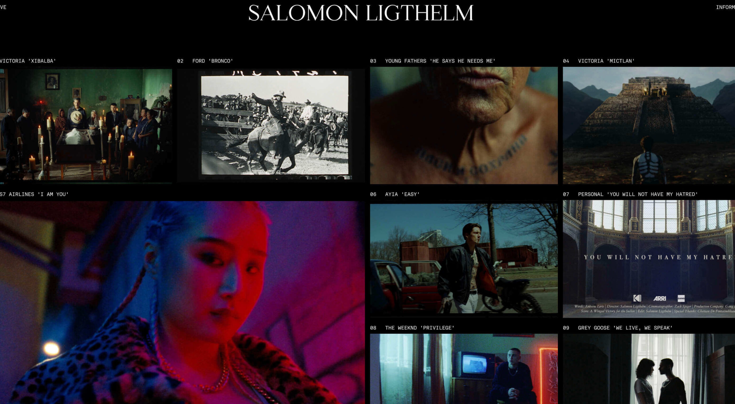
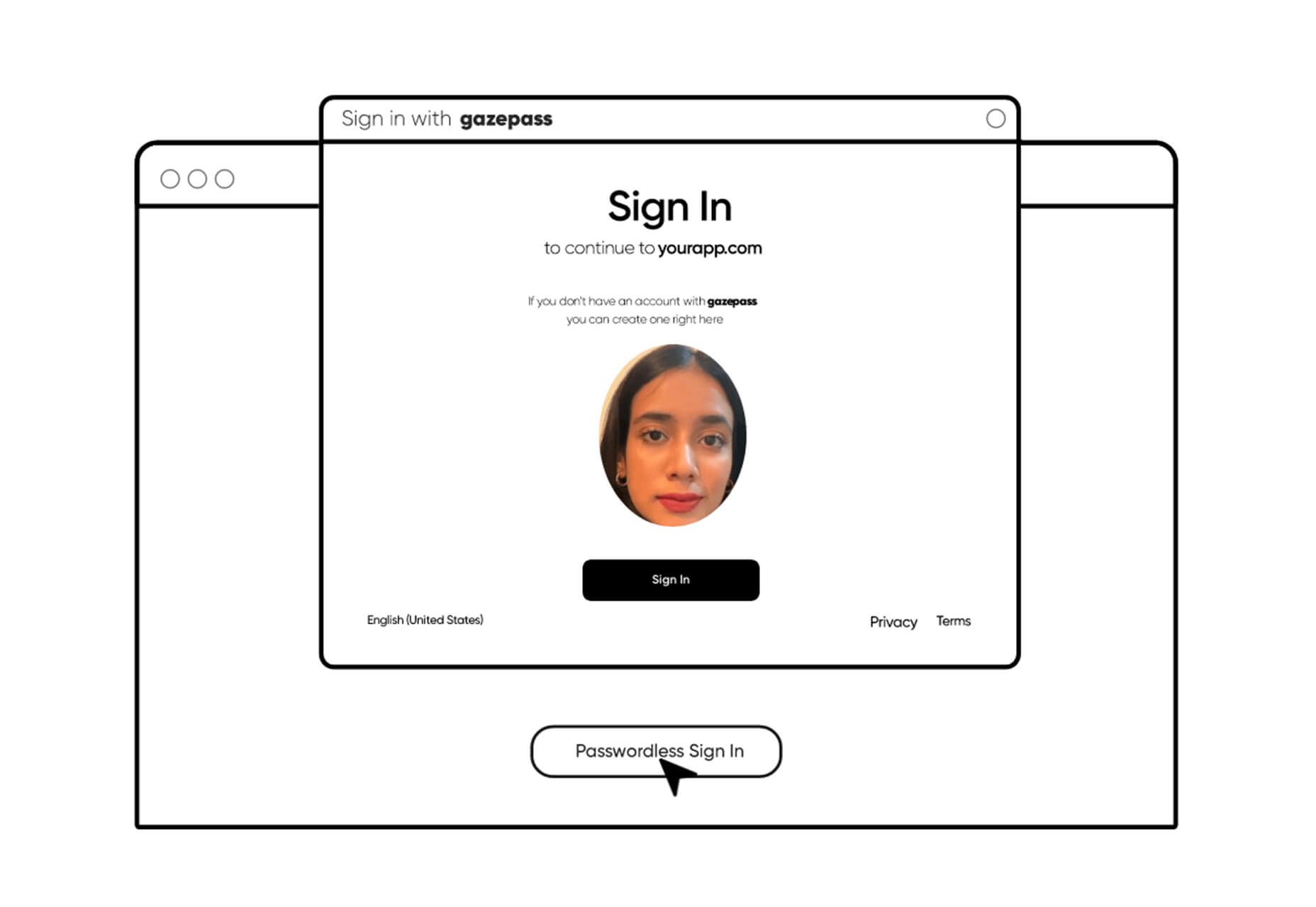
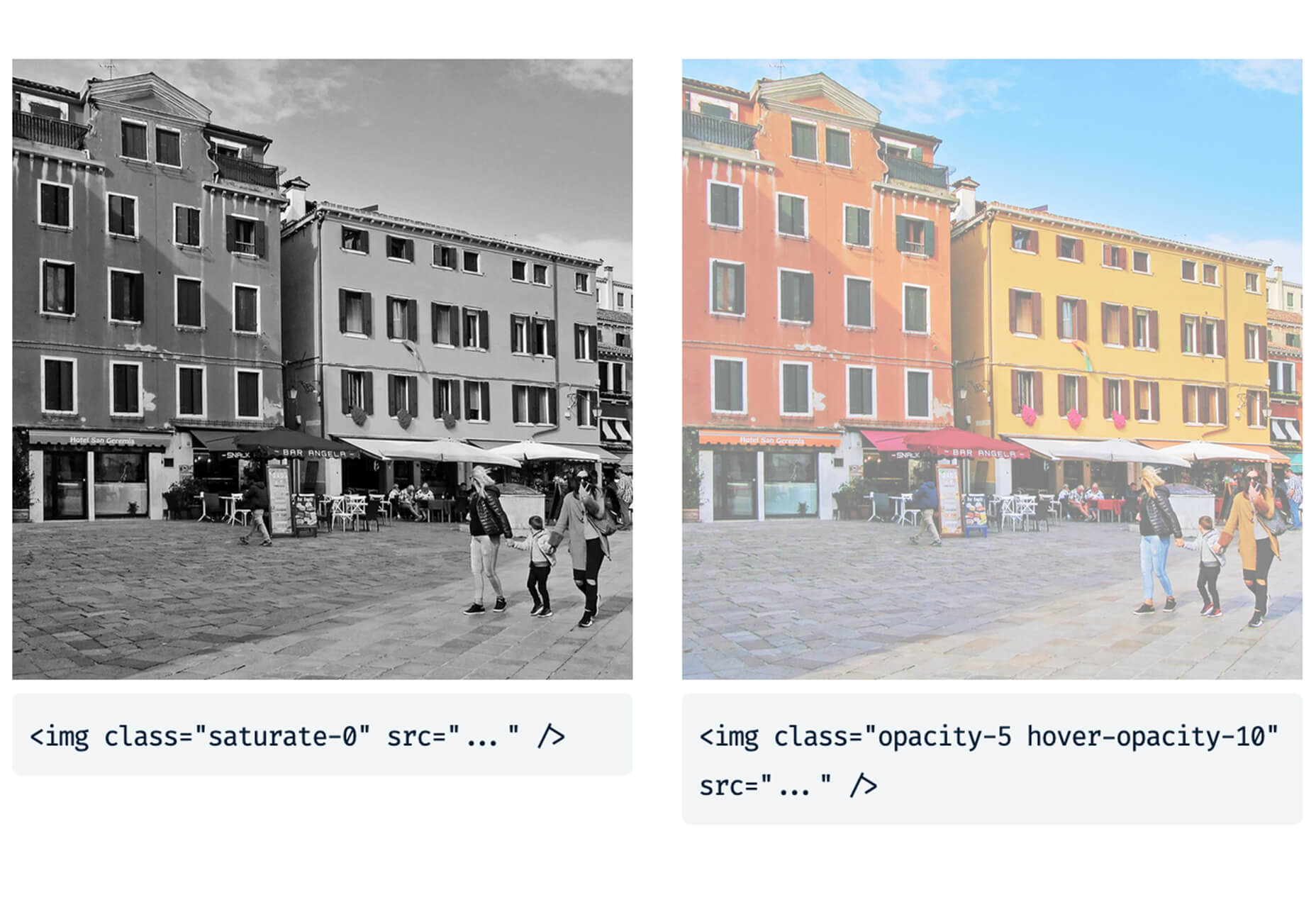
 Every week users submit a lot of interesting stuff on our sister site Webdesigner News, highlighting great content from around the web that can be of interest to web designers.


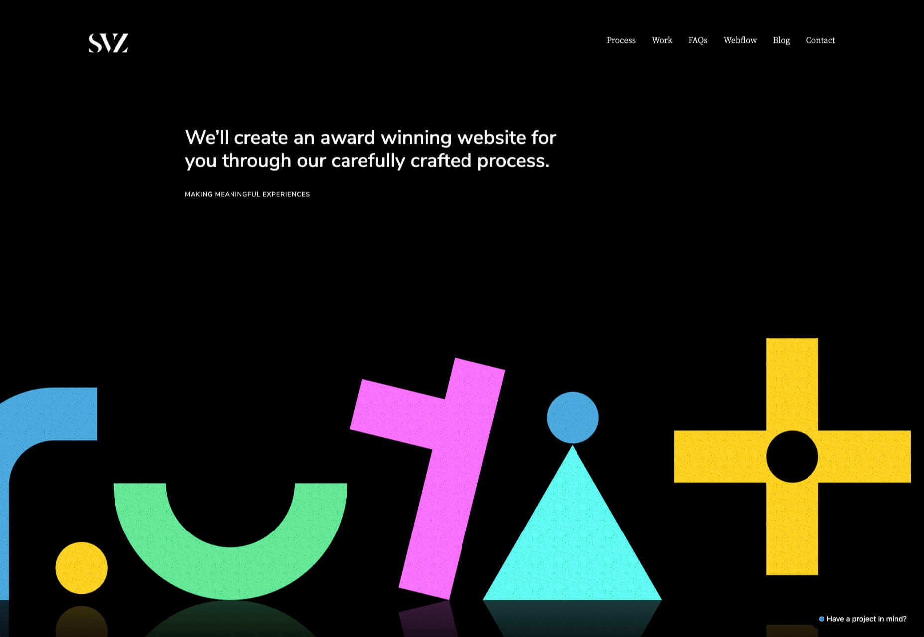
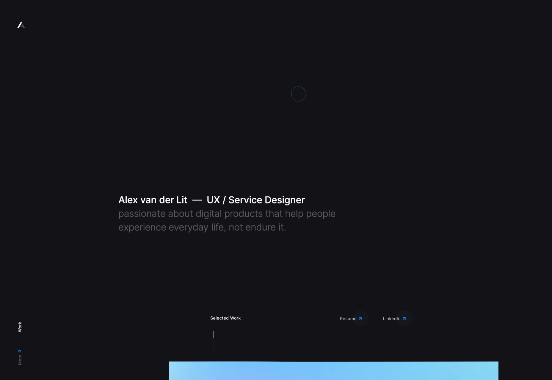
 Dark themes are everywhere these days.
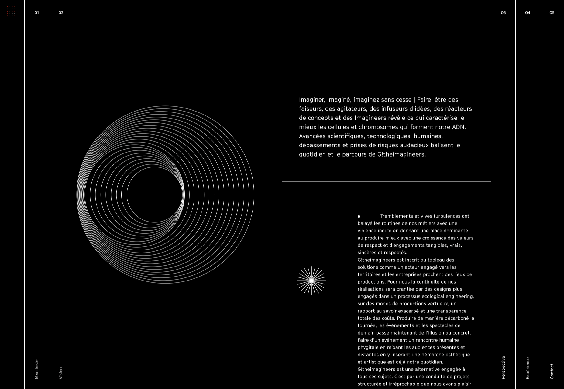


 When starting a new business (or even venturing into the world of freelancing for the first time), there are some really big, important steps you have to take.
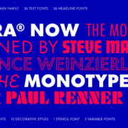
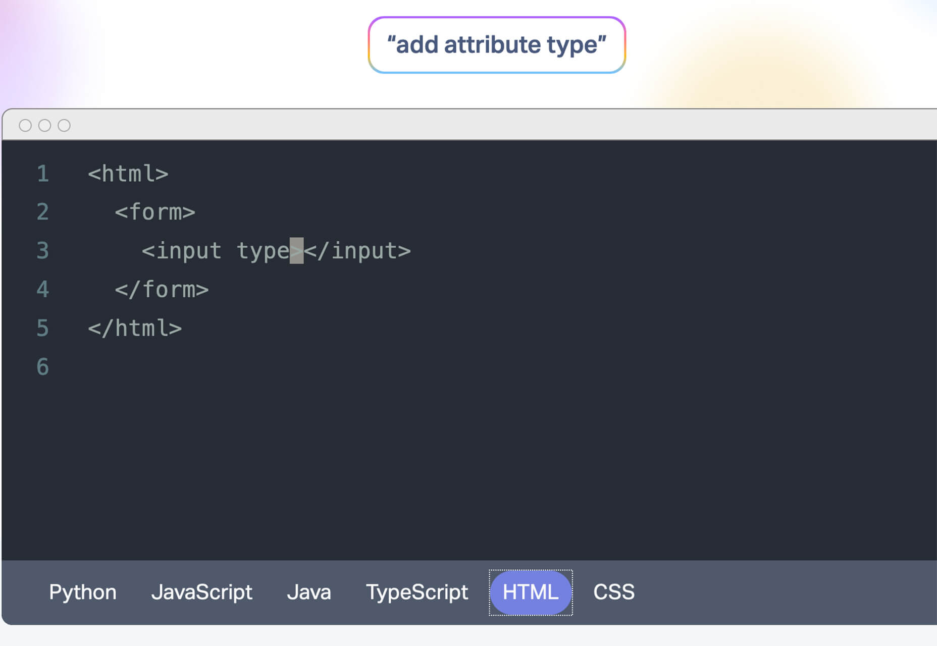
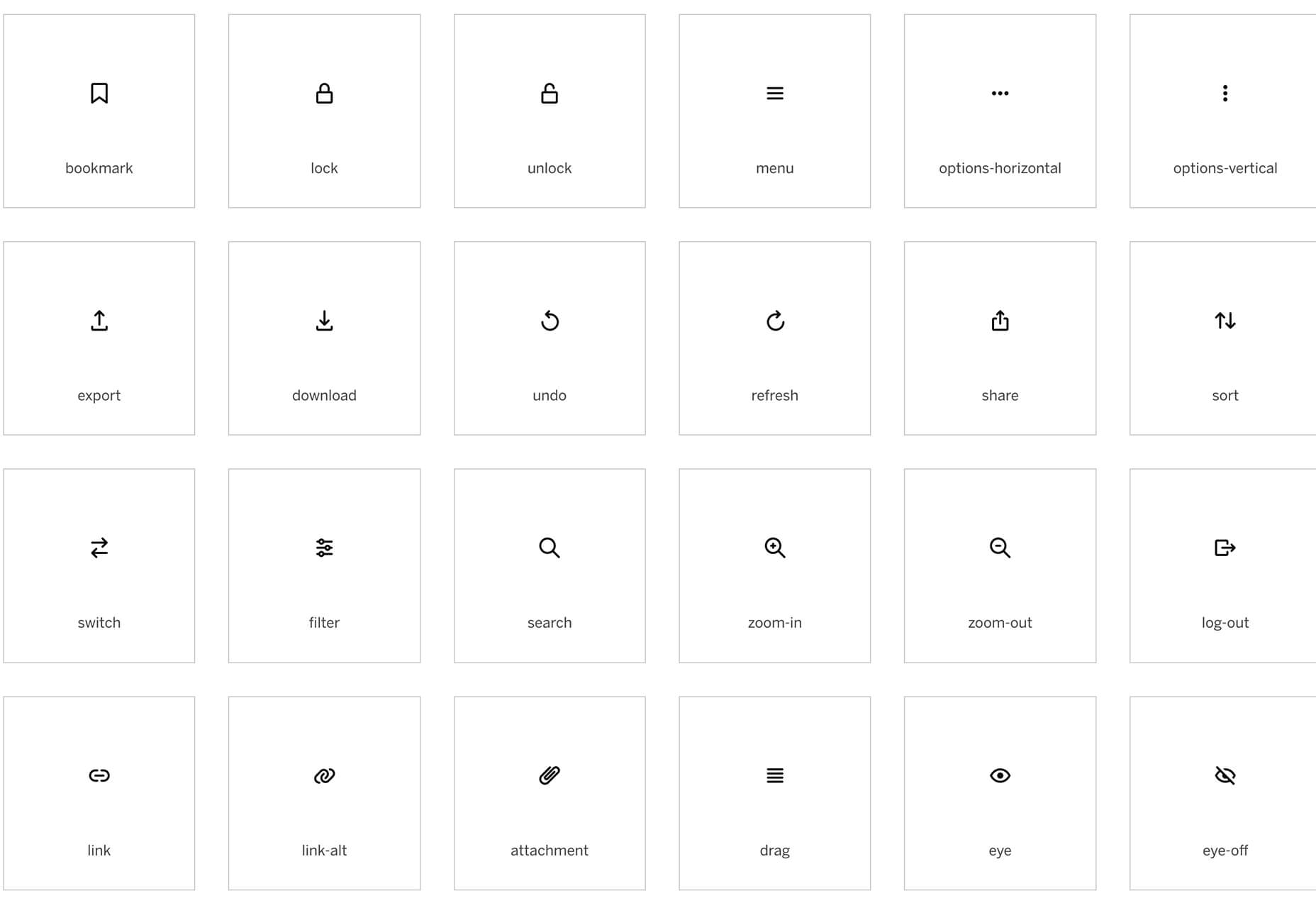
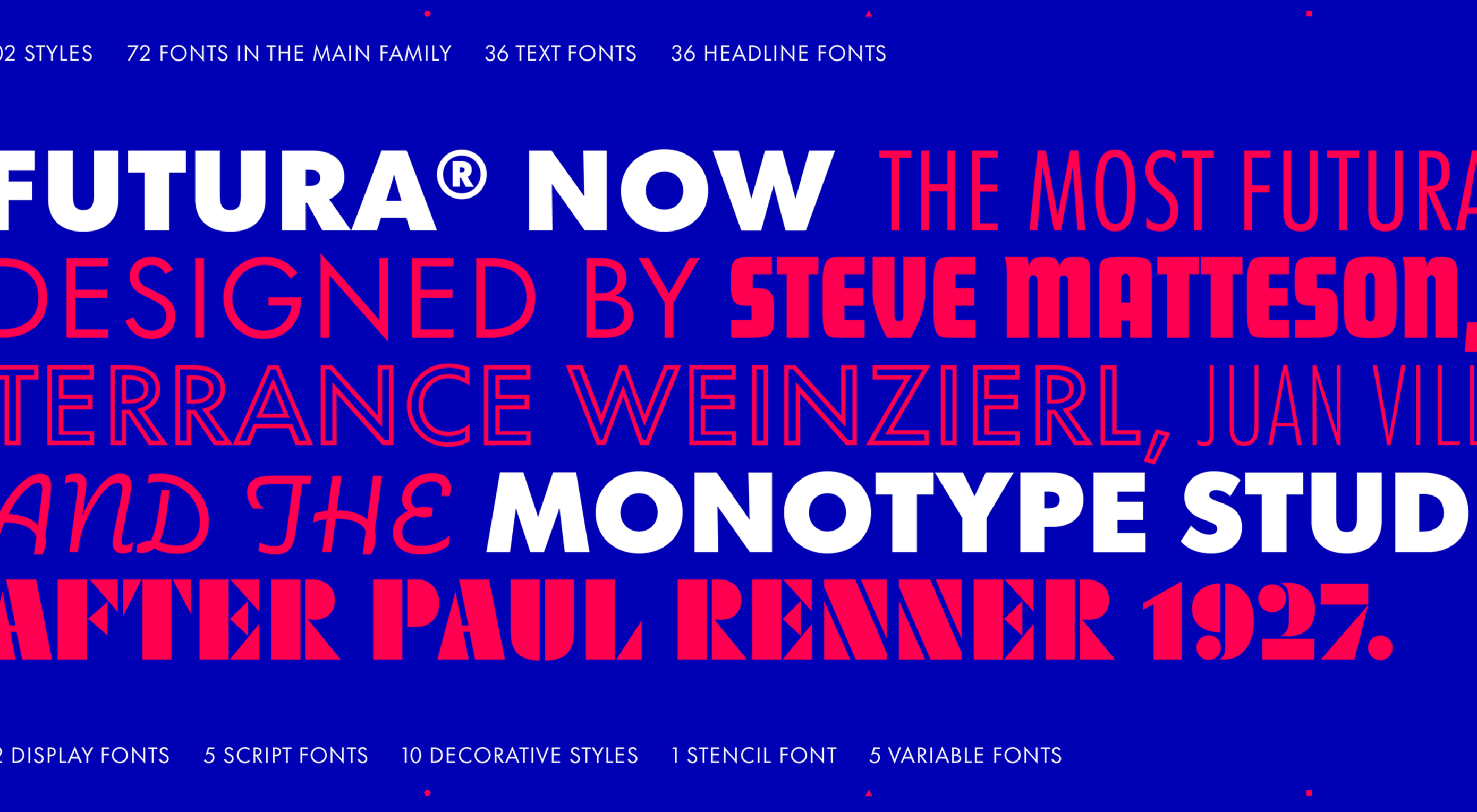 This month’s collection of new tools, resources, and freebies for designers is a smorgasbord of sorts. You’ll find everything from useful APIs to icons to tutorials to fonts.
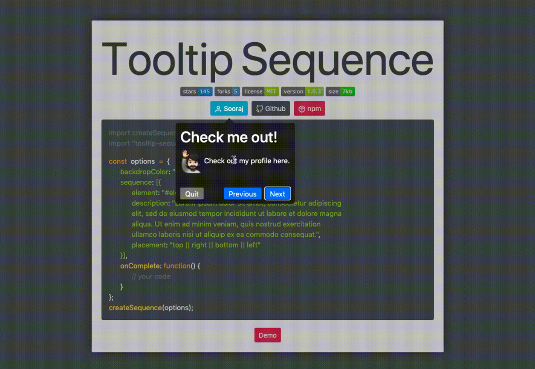


 Every week users submit a lot of interesting stuff on our sister site Webdesigner News, highlighting great content from around the web that can be of interest to web designers.


 The digital world is a place of constant change. Just as you get used to a new design trend, another one appears, forcing you to rethink the way that you approach each client project.