 This month, it’s all about the images. Each of the design trends we spotted has to do with the images you select – or don’t select – for a project and how you use them.
Here’s what’s trending in design this month.
1. Floating Images
Sometimes you design off the grid intentionally. Other times you are designing on a grid that’s maybe not-so-obvious. One of these things is happening with the floating images website design trend.
Here, you’ll see images and image containers that don’t seem to have any direction with their placements. They may or may not include animation, that further emphasizes the floating effect.
Floating images can include:
- Cutouts that aren’t anchored to anything or any container
- Images that are scattered on the canvas
- Images in oddball placements that don’t seem to serve a purpose
- Any image or element with an obvious off-the-grid location or spacing
- Images that use different orientations or lack depth for perception
The challenge with this style is that it can look cohesive and organized or can turn into a jumble of parts rather quickly. It can take a lot of user testing to find the right balance.
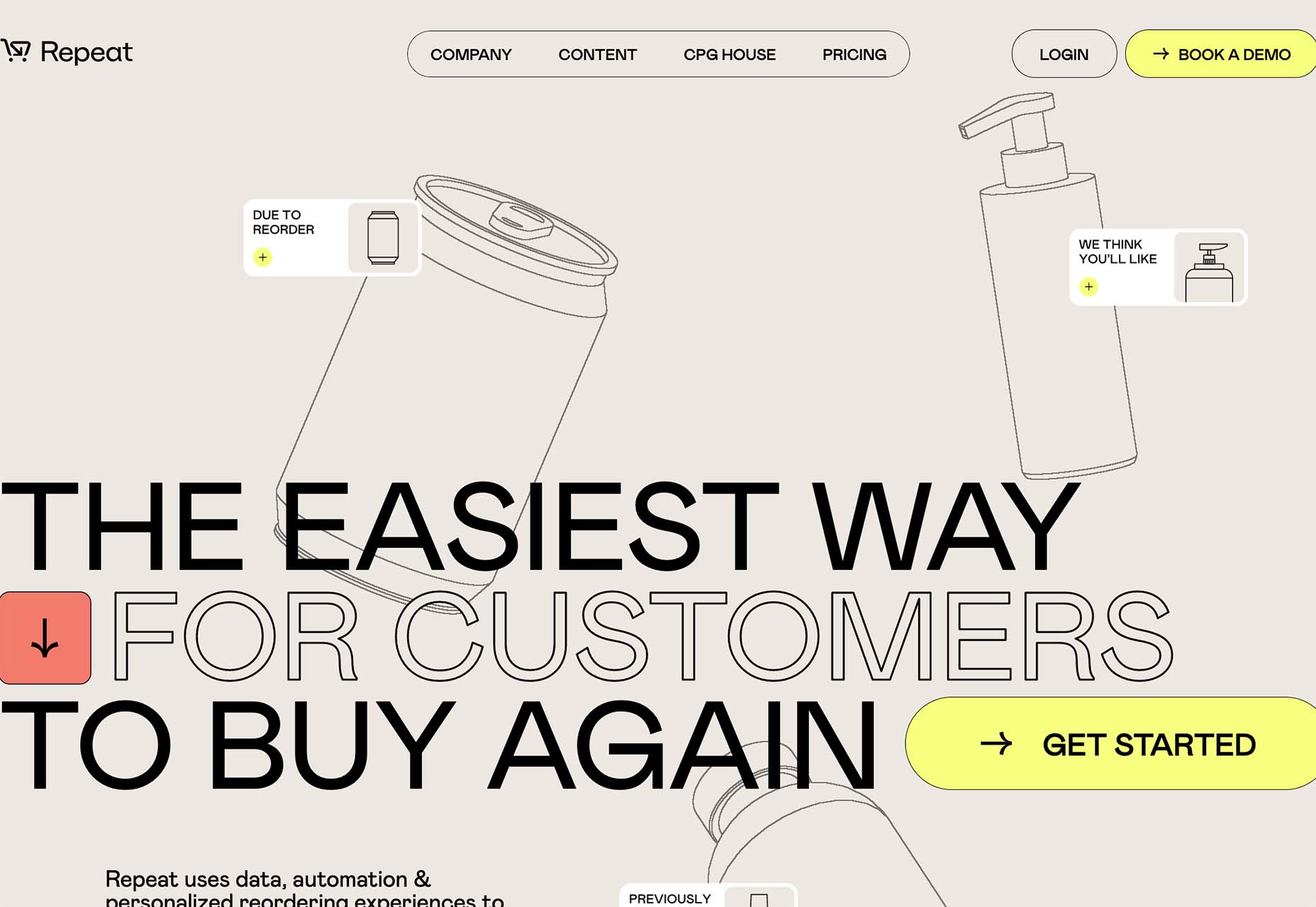
Repeat uses animated, outline-style images in the background that have seemingly random placements. The floating effect is further emphasized by animation and the overlapping of images and other elements.
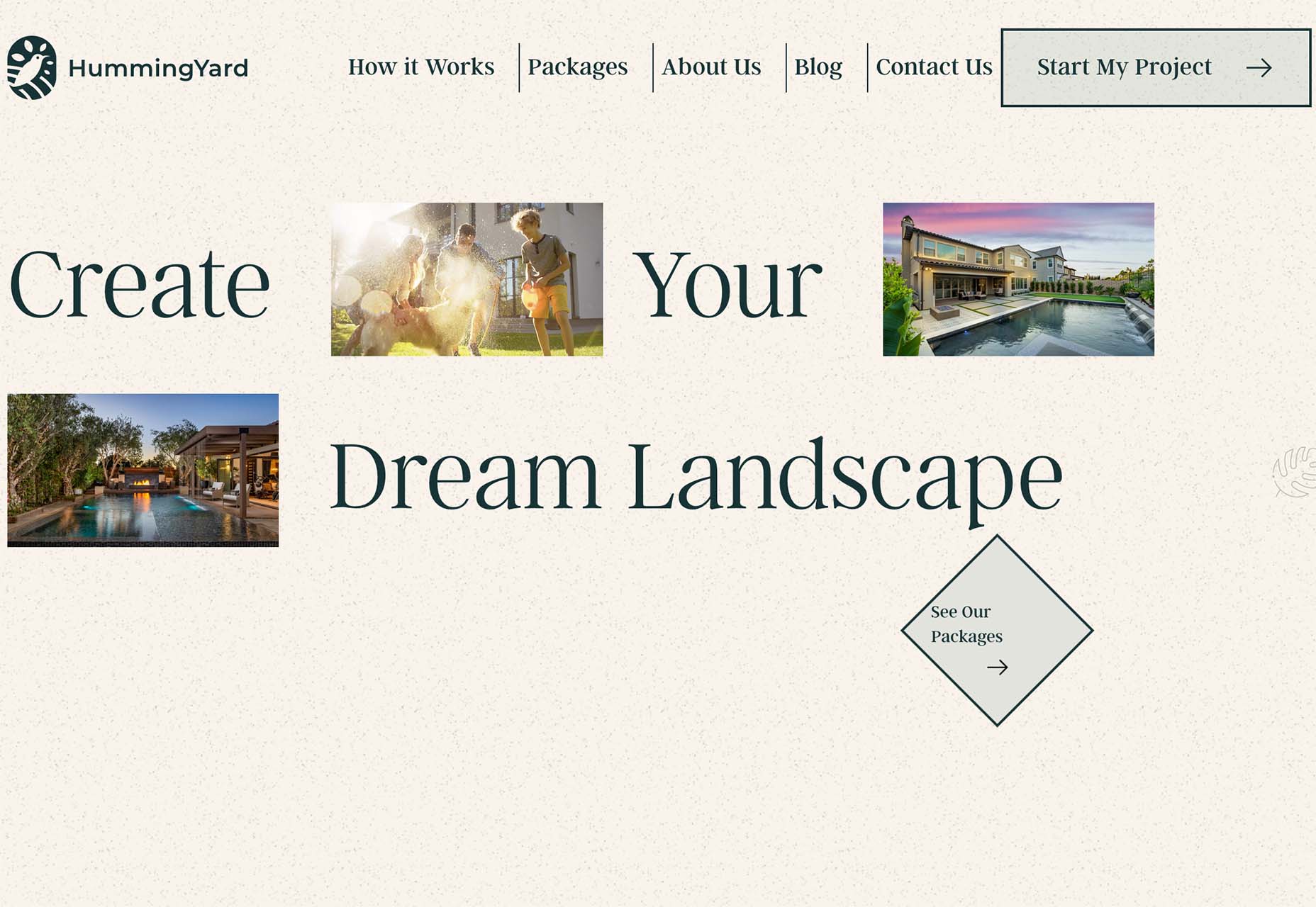
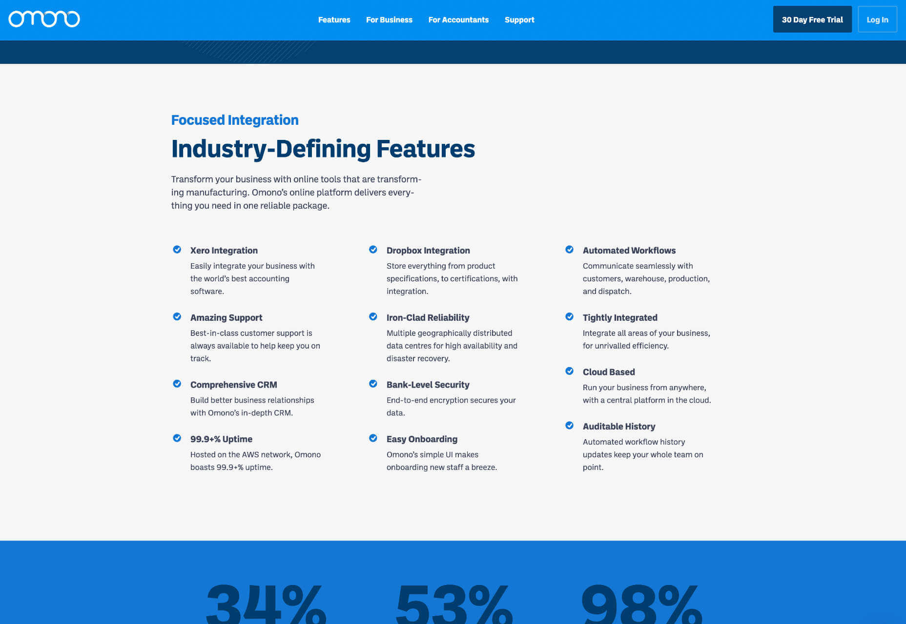
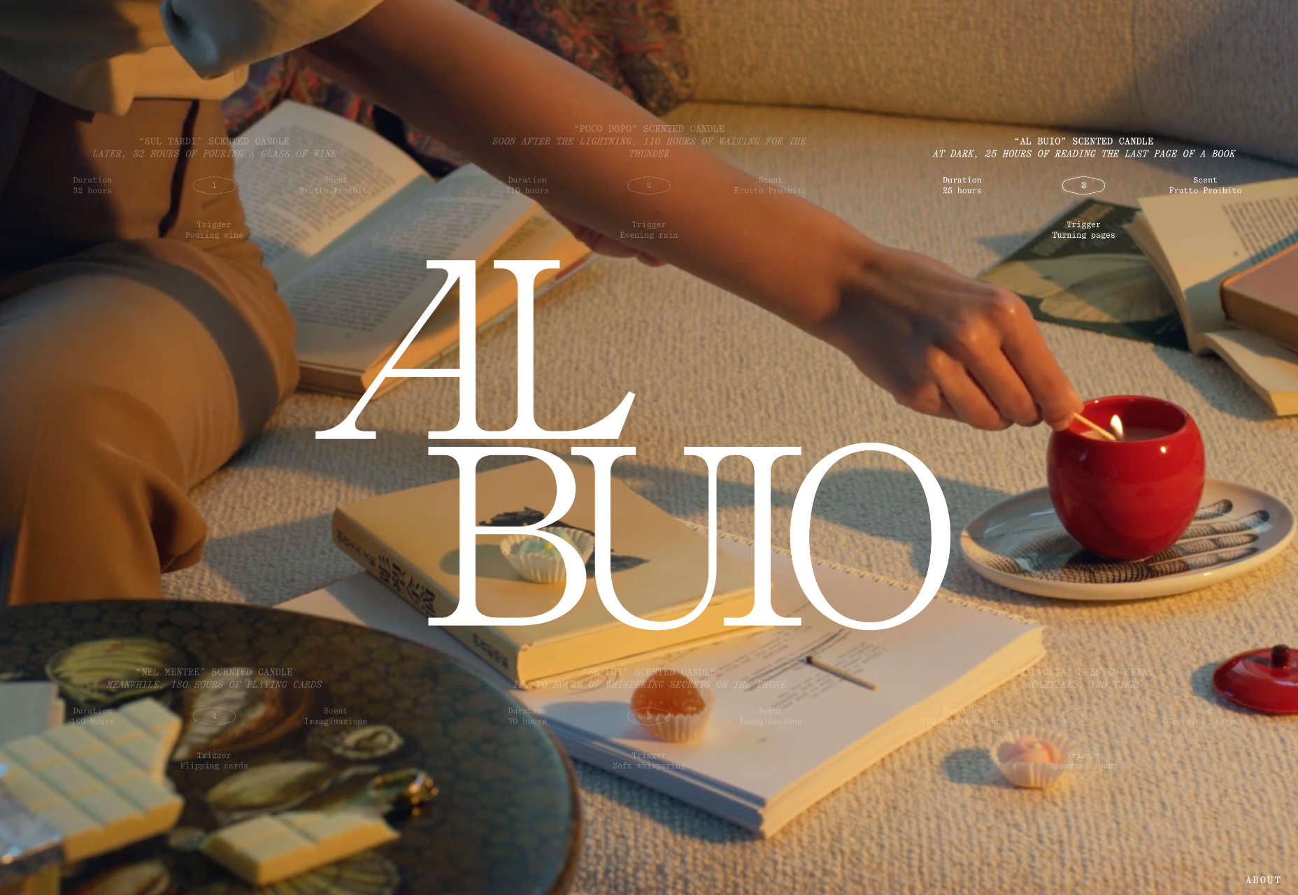
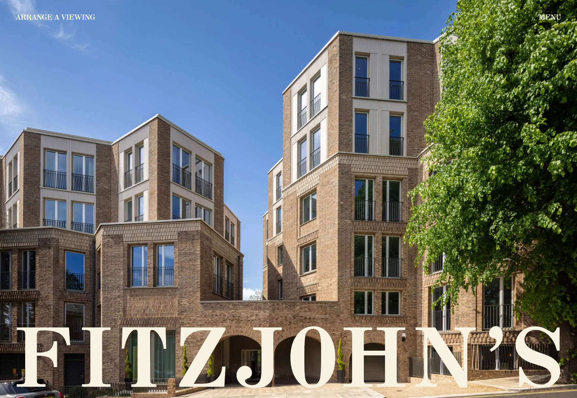
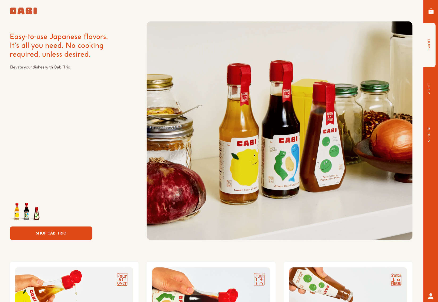
HummingYard uses images in a container in the design but the placements don’t have obvious meaning. There’s also a floating leaf on the right side of the canvas and a call to action button that appears to be off the grid as well. Each of the elements seems almost haphazardly placed, creating a floating effect for the entire design.
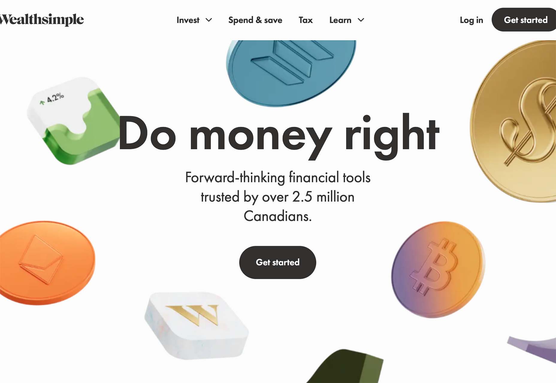
Wealthsimple uses a bunch of smaller different images to create a floating cascade of elements. The three-dimensional icons almost look like they are falling down the screen. Some overlap text elements, but most do not. It all feels a little random, but the images do frame and help bring the eyes toward the center-screen text elements and call to action.
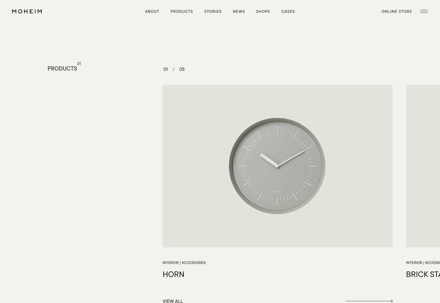
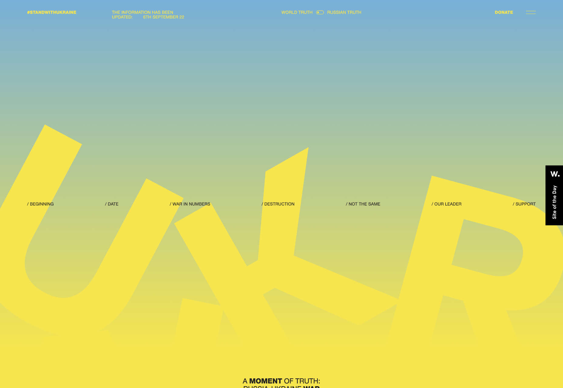
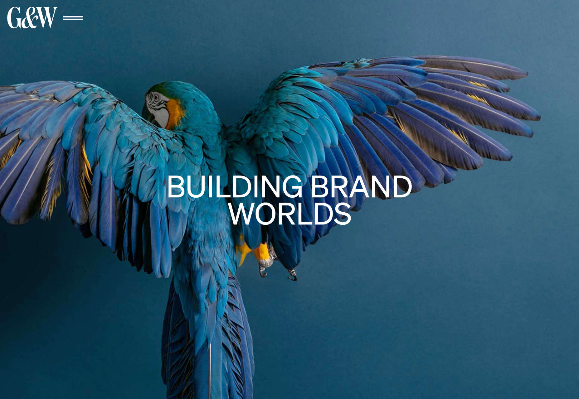
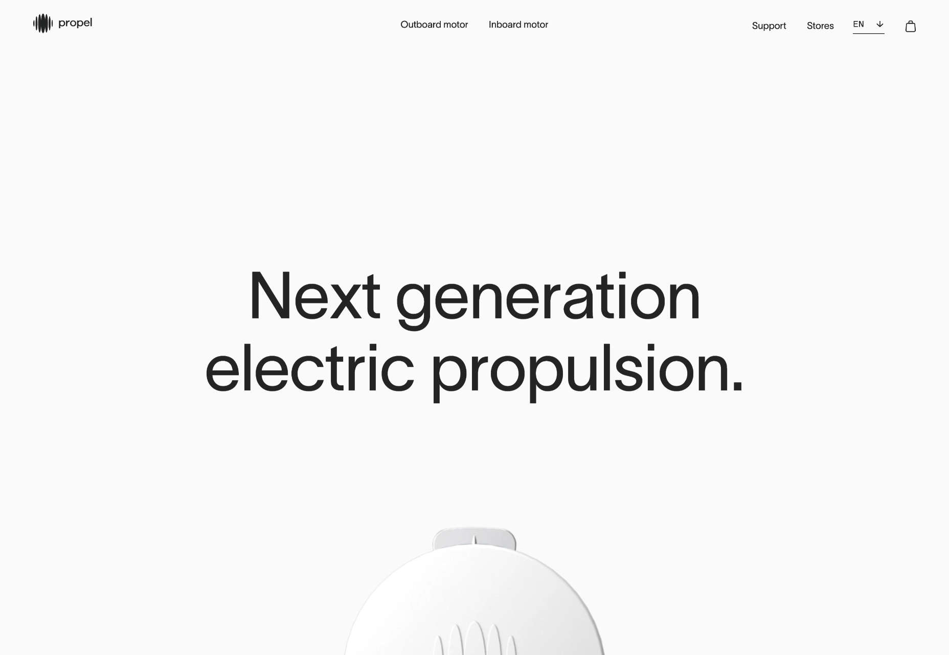
2. No Images
If floating images aren’t your thing when considering a trendy design element, maybe no images is the answer.
In this design trend, the aesthetic comes together without any true imagery. The design uses mostly text with maybe an icon, logo, or small divot. The result can be a fairly stark design, but there’s a distinct focus on the words.
This trend is not so difficult to design, but storytelling and language are vital if you want users to interact with the design. No images can sometimes be off-putting to users who are looking for something visual.
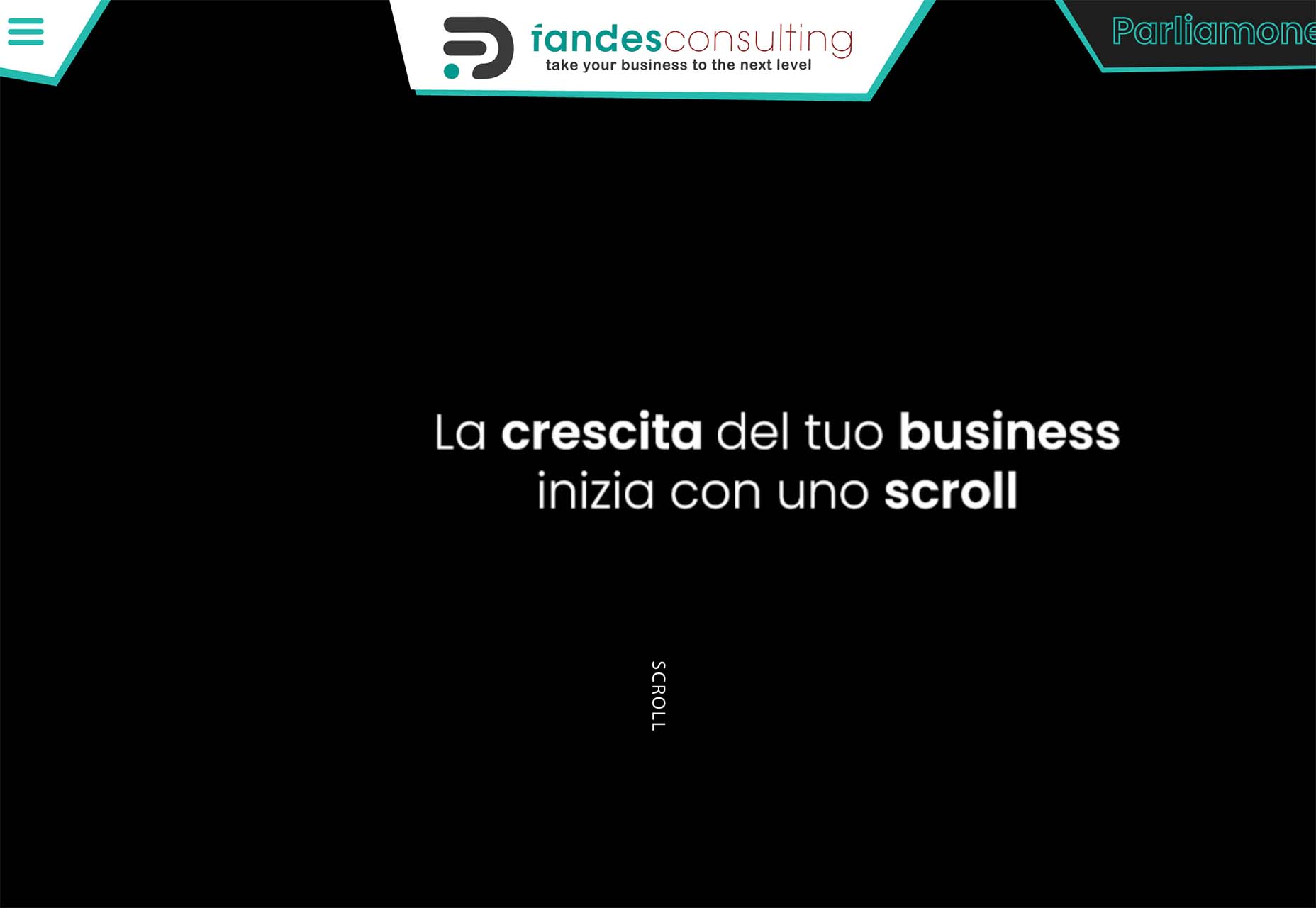
Fandes Consulting uses a super simple black and white design with a simple call to action on the homepage. The scroll cue has a nice animation that helps you get a little deeper into the design quickly. (There are also more interactive elements and images after the scroll.)
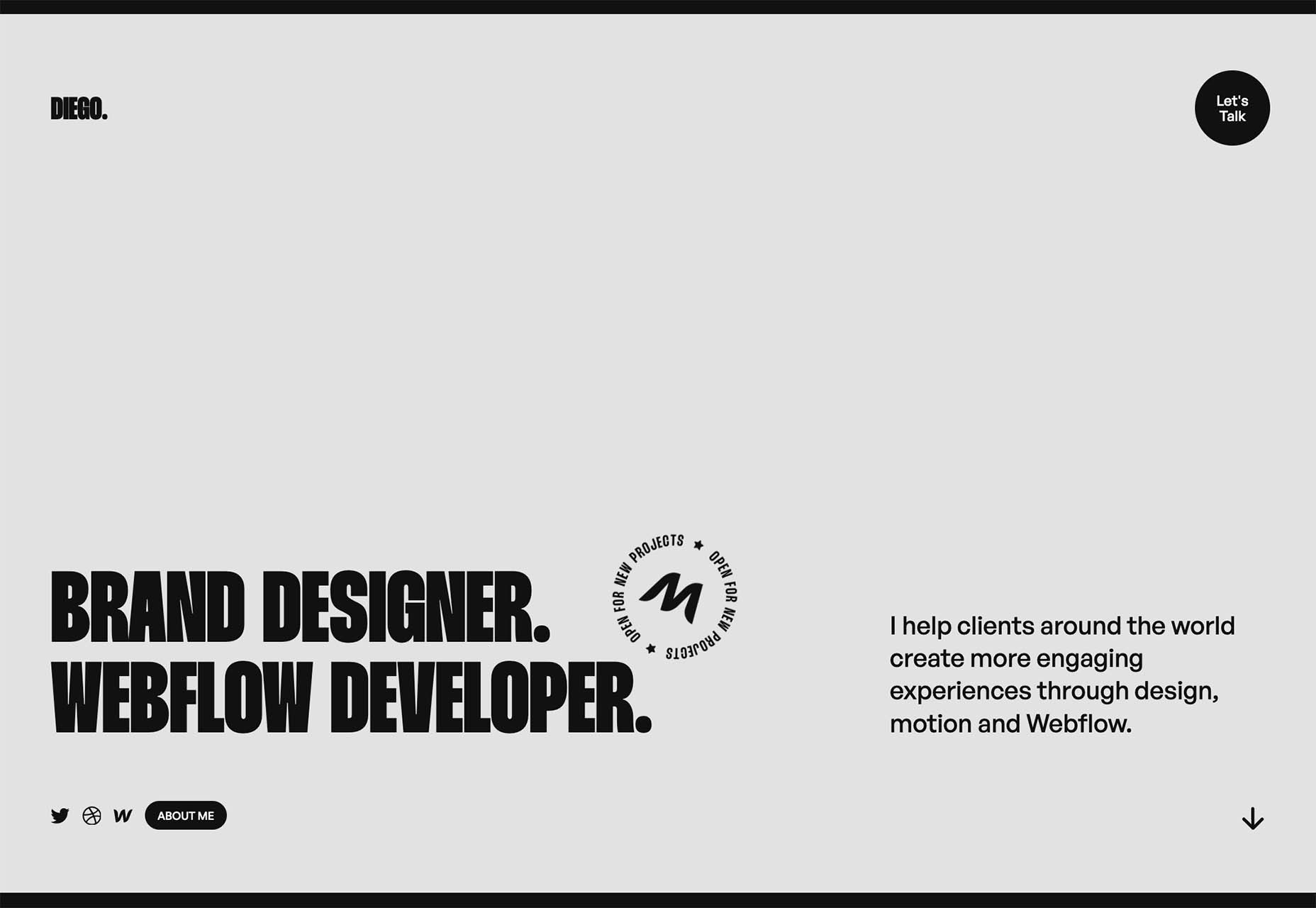
Diego also uses a simple and stark aesthetic for his website. Again, there’s a simple animation for engagement and there’s more color and some imagery beyond the scroll.
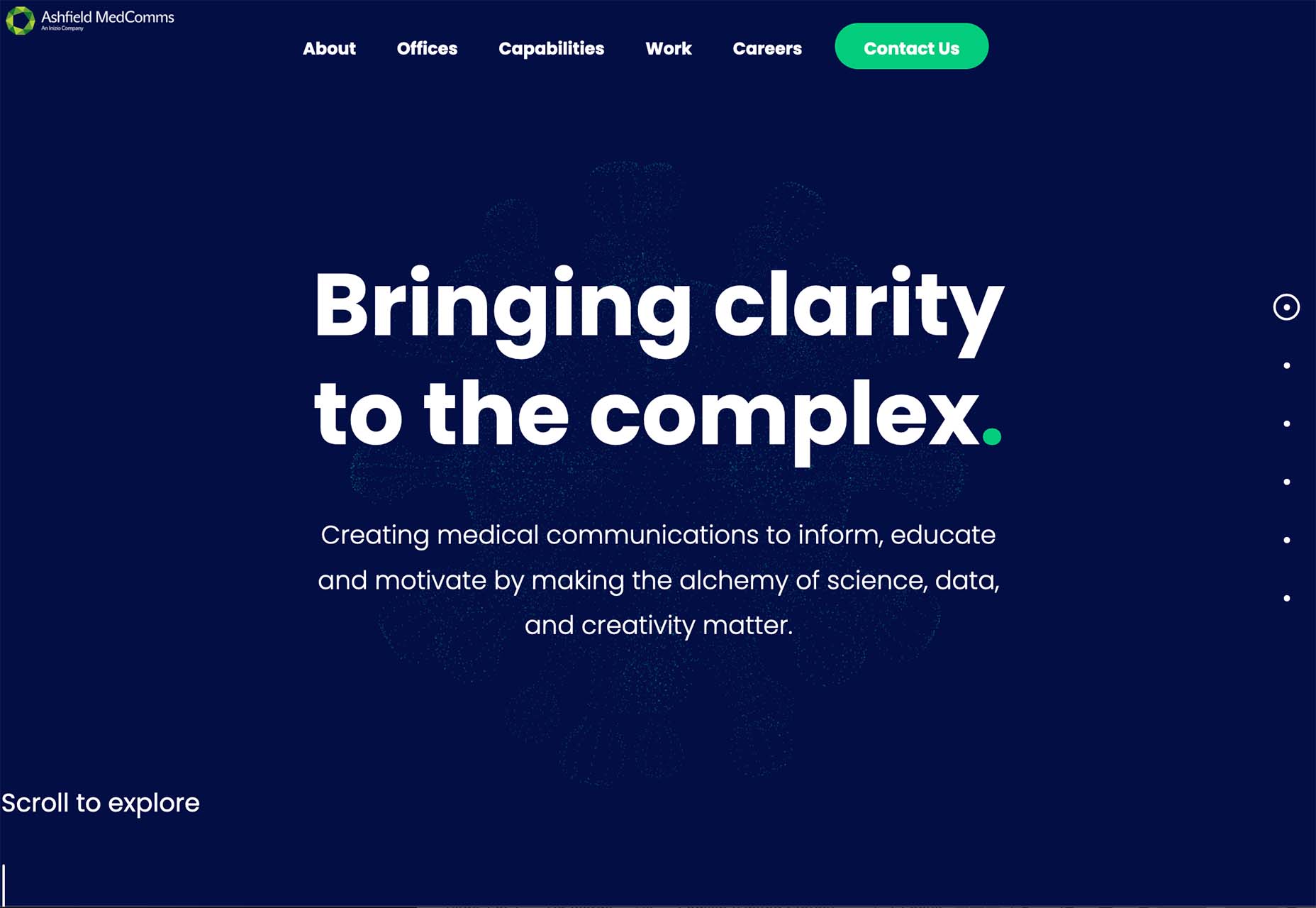
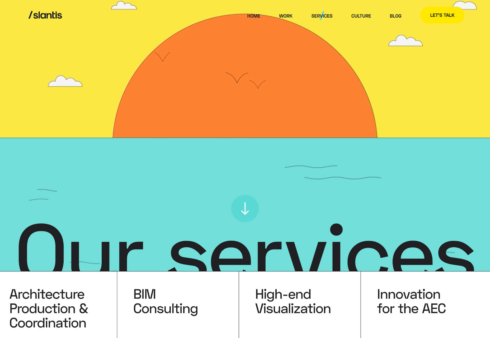
Ashfield MedComms has the most color of these no-image website examples. With a navy background and a green icon, you can feel your eyes moving more on the screen here. There’s also more to read and a scroll animation to further the engagement.
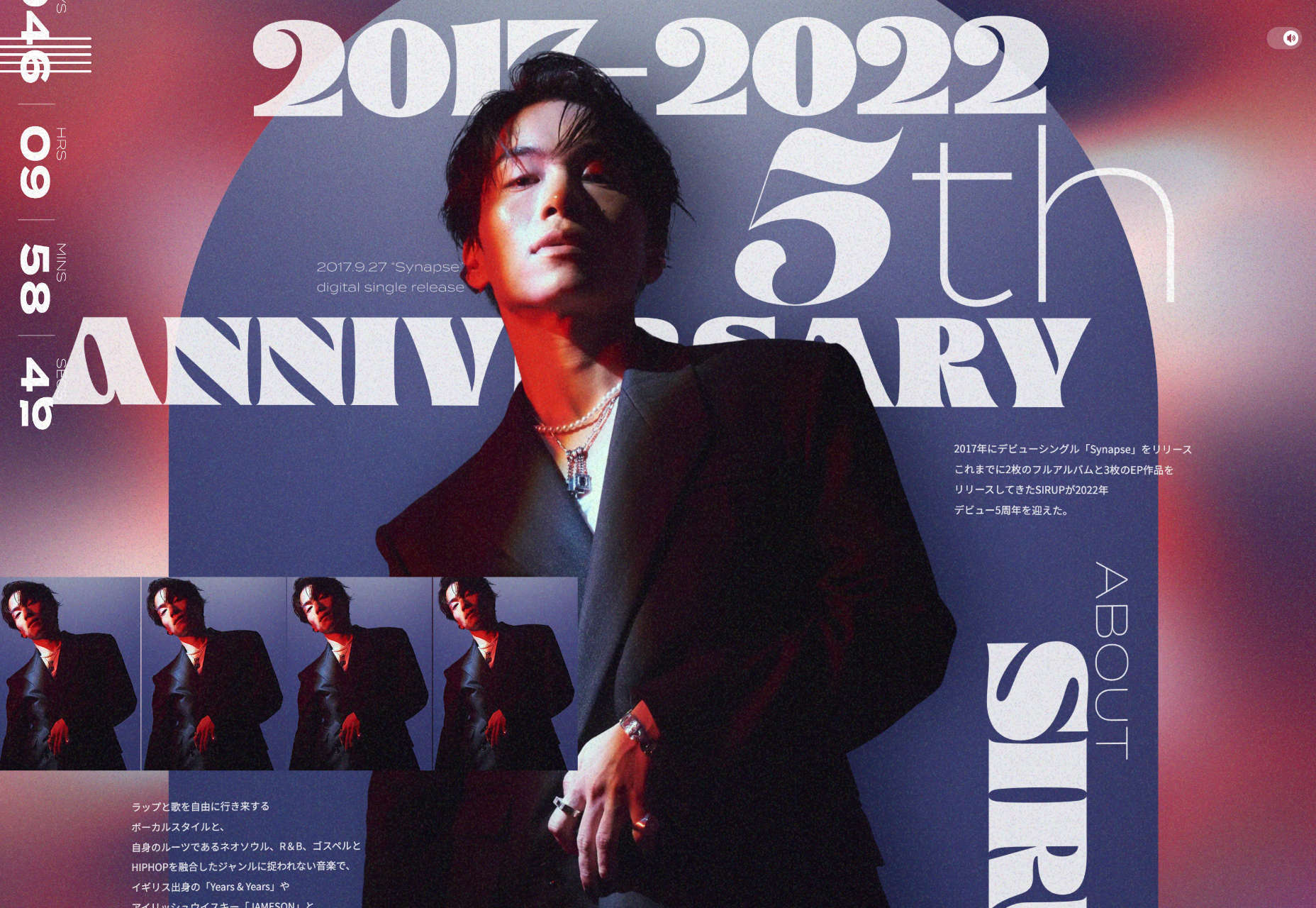
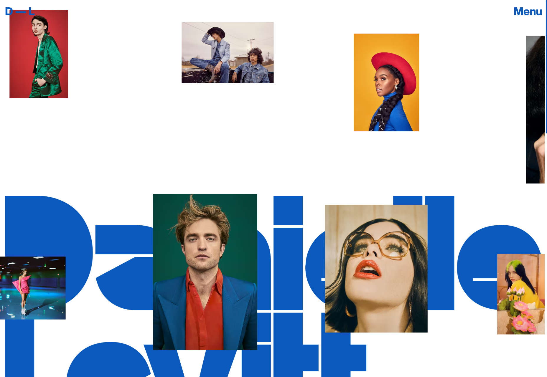
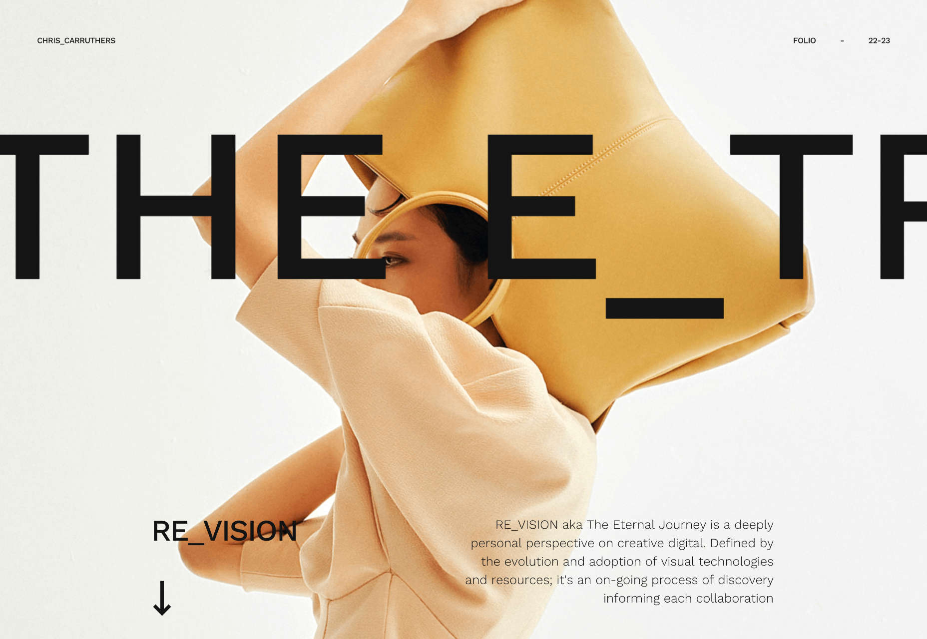
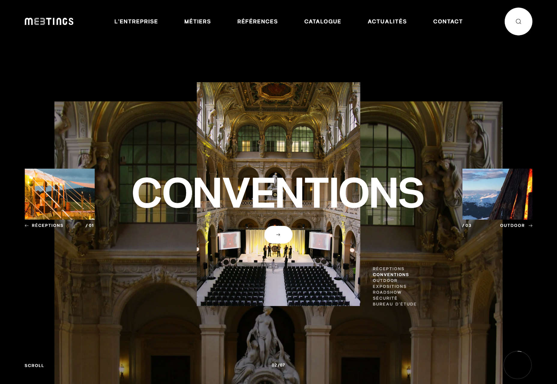
3. Merged Text and Images
The merged text and images trend is the most complex of these design examples. Here, designers are creating overlapping layers for text and image (or animated) elements on the screen so that there’s a lot to consume visually. This can be a highly engaging concept, but also one that’s difficult to develop.
This design trend can be immensely beautiful when done well. Layered elements are exciting and have a “designed” feeling to them.
The visual challenge is this: Maintaining the readability of words and letters, especially when you are thinking about the responsiveness of the website. Animation or motion can add another level of complication.
If you are planning a design like this, it is important to plan for breakpoints and even have a fallback for what to do when readability becomes a concern. The desktop and mobile aesthetics might have different feels here to ensure that you have an easy-to-understand visual theme for both.
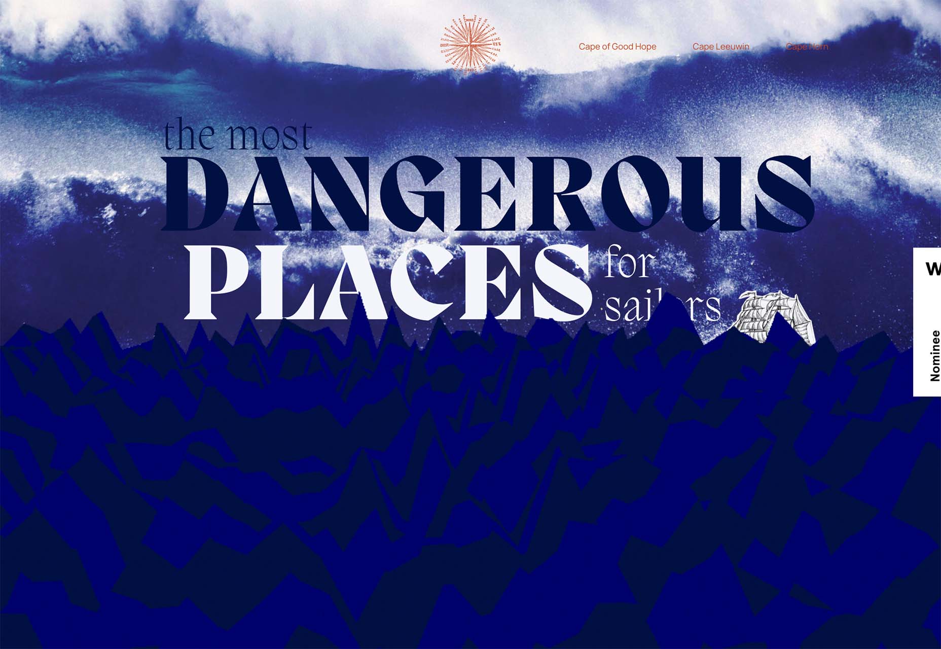
The Most Dangerous Places for Sailors includes text and an image element (the ship) that are tucked behind an animated water layer. What’s especially nice about this design is how the water looks just as dangerous as the words convey thanks to motion and the shape and color of the graphics.
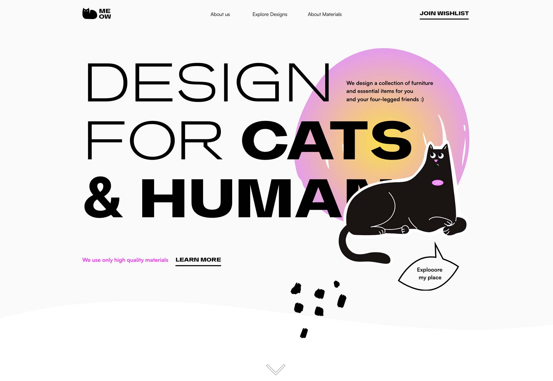
Meow overlaps text and an image in a way that almost obscured readability, but the word has enough context that it’s generally understood. If you click through, there’s a fun little animation with the cat as well.
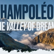
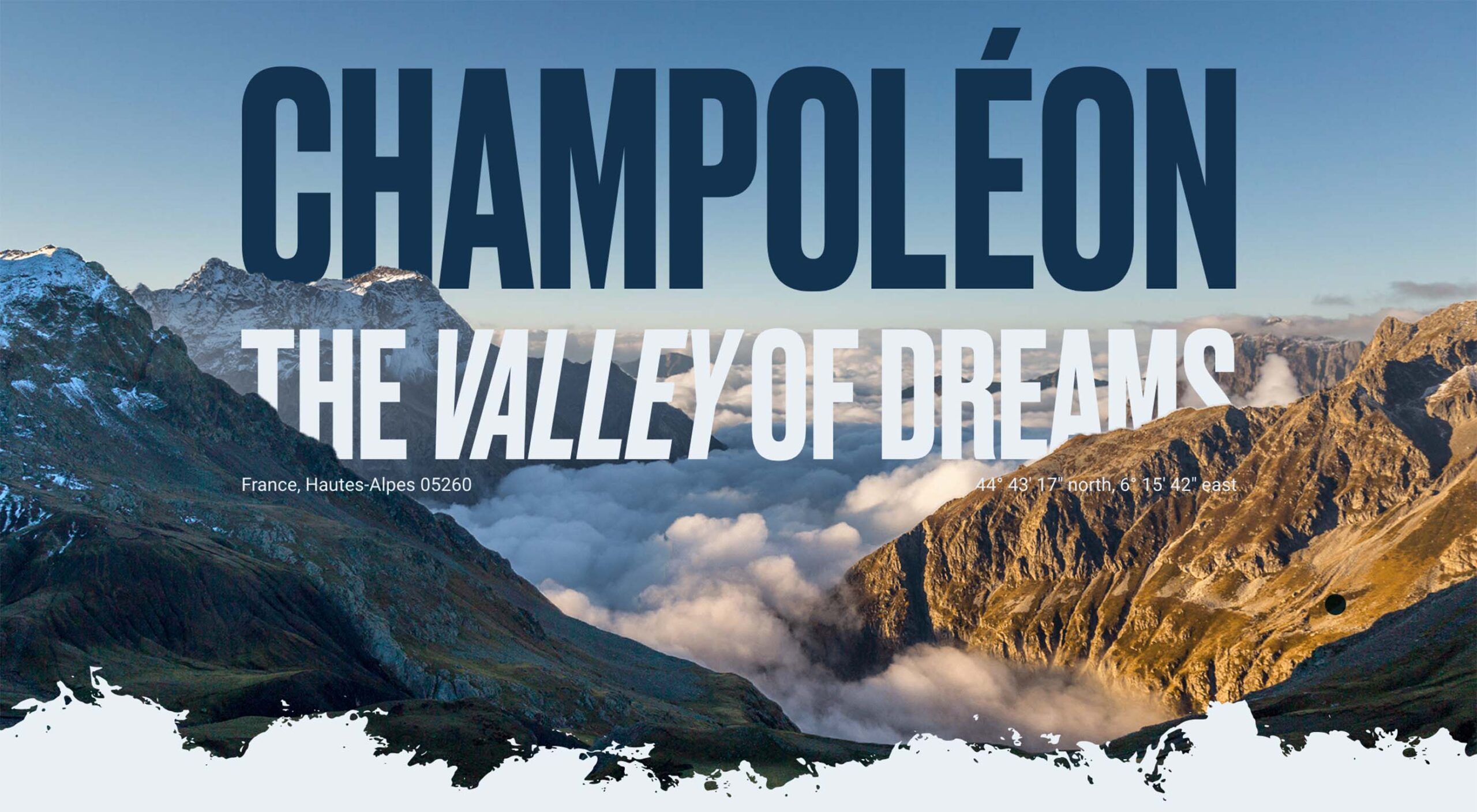
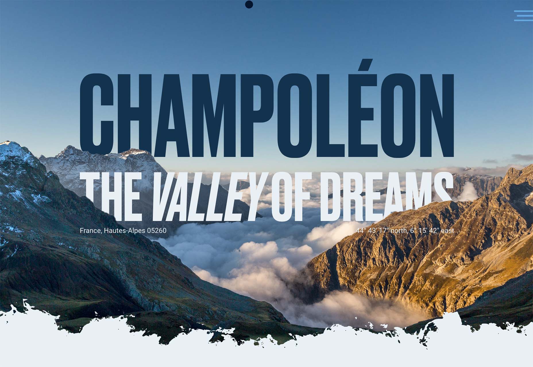
Champoleon the Valley of Dreams tucks part of the text into the mountains for a foreground to text to background layer set that’s beautiful and unified. There are a lot of layers in this design, making it much more complex than it appears on the surface. On the scroll, the rest of the site continues this layered theme with text and images that overlap and share space.
Conclusion
Which of these image trends is most appealing to you? They are vastly different approaches to website design and can work for different projects in different ways. They also range in development complexity, from super easy to manage – no images at all – to potentially challenging – merged text and images.
The post 3 Essential Design Trends, October 2022 first appeared on Webdesigner Depot.
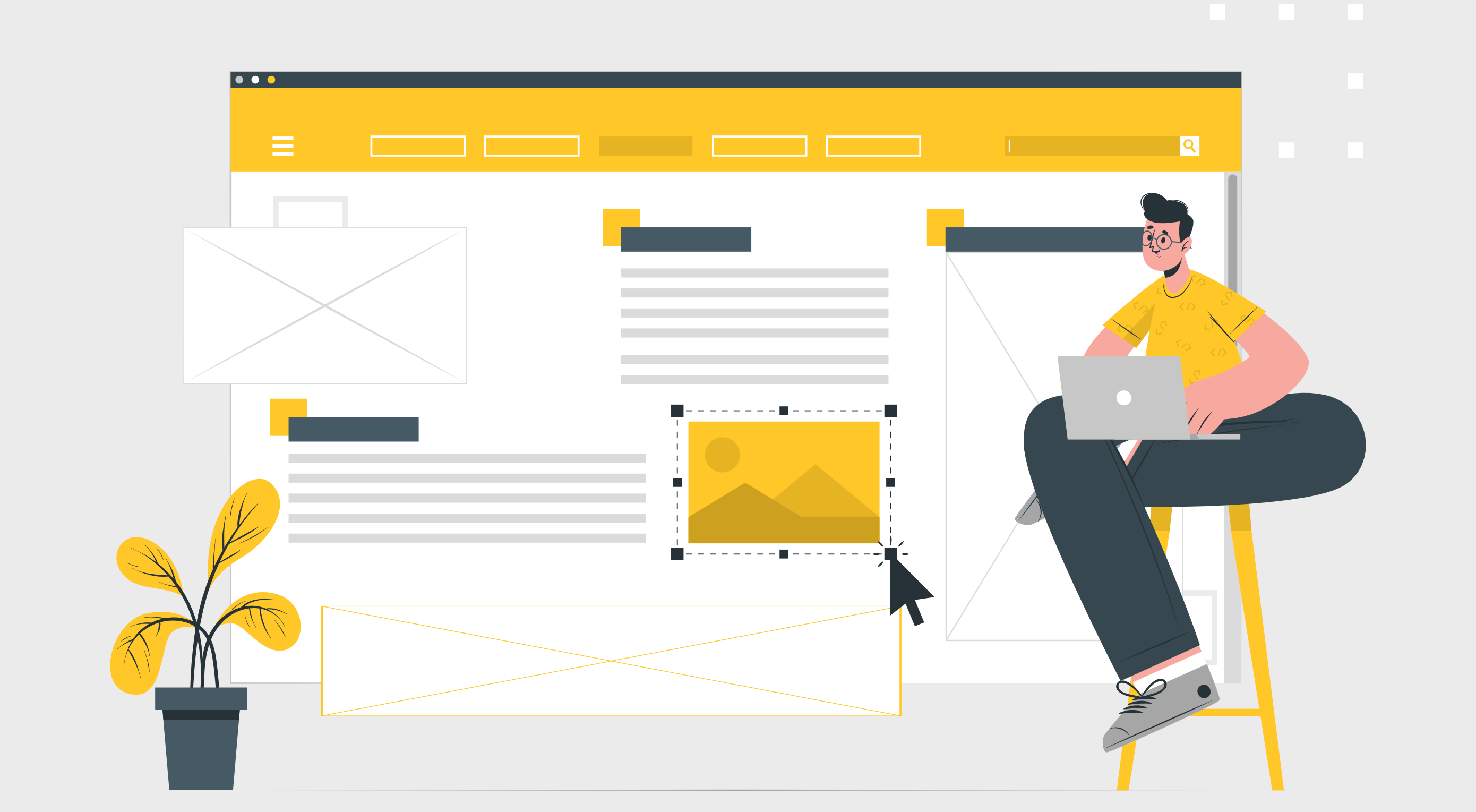 A design portfolio is an excellent way to demonstrate your skills as a freelancer. As a web designer, you compete with millions of other web designers. Therefore, you must have a strong portfolio to land a high-paying web designing job in such a competitive space. A strong portfolio sets you apart from others. Having no clients, however, can make it challenging to get your portfolio noticed and build up any momentum.
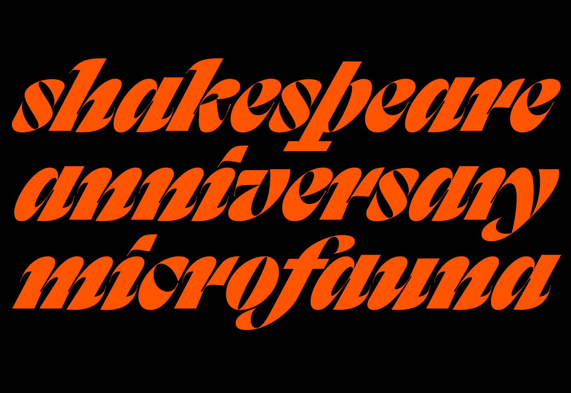
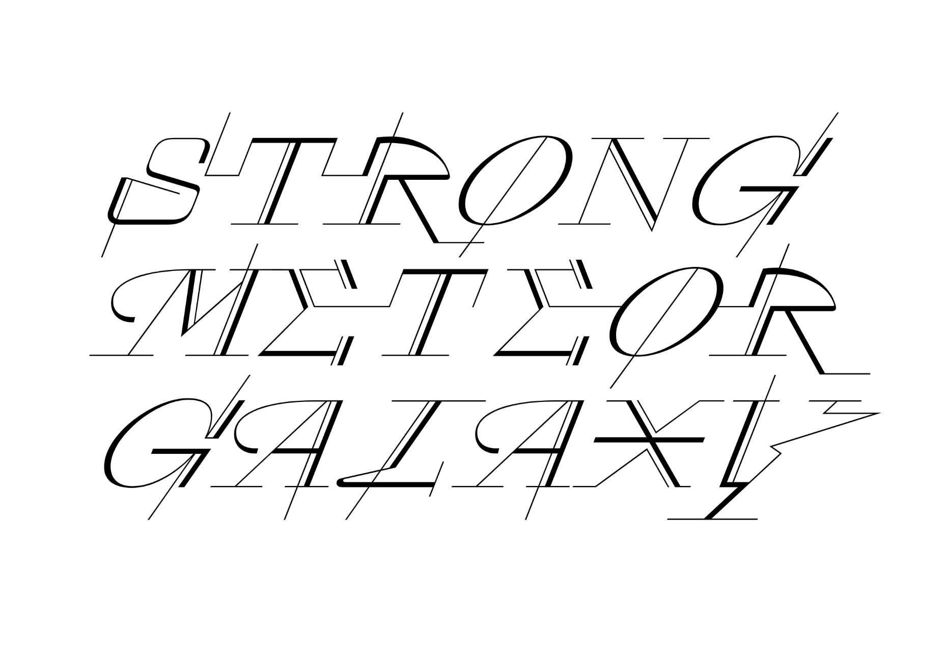
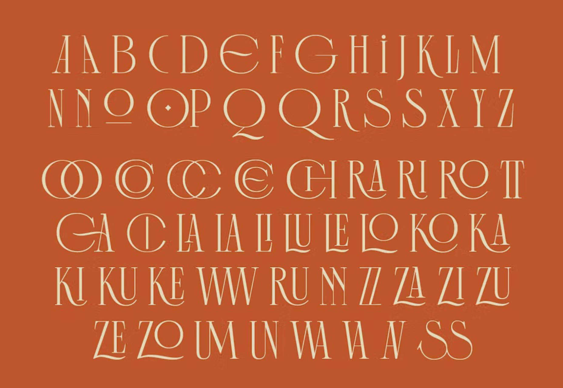
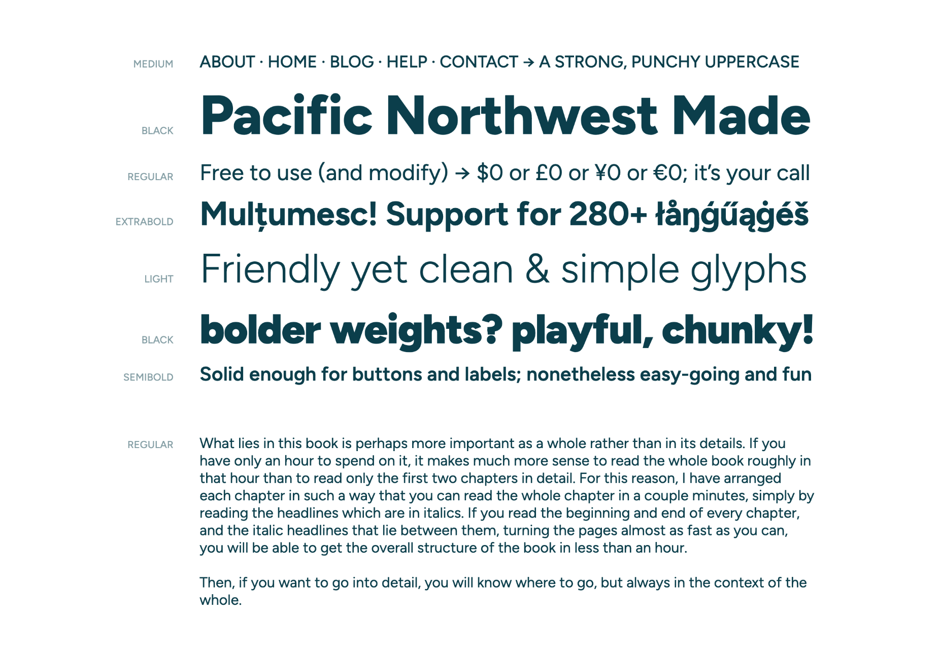
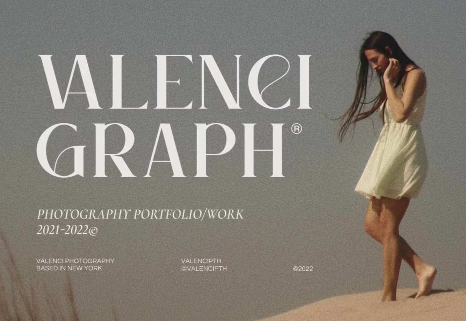
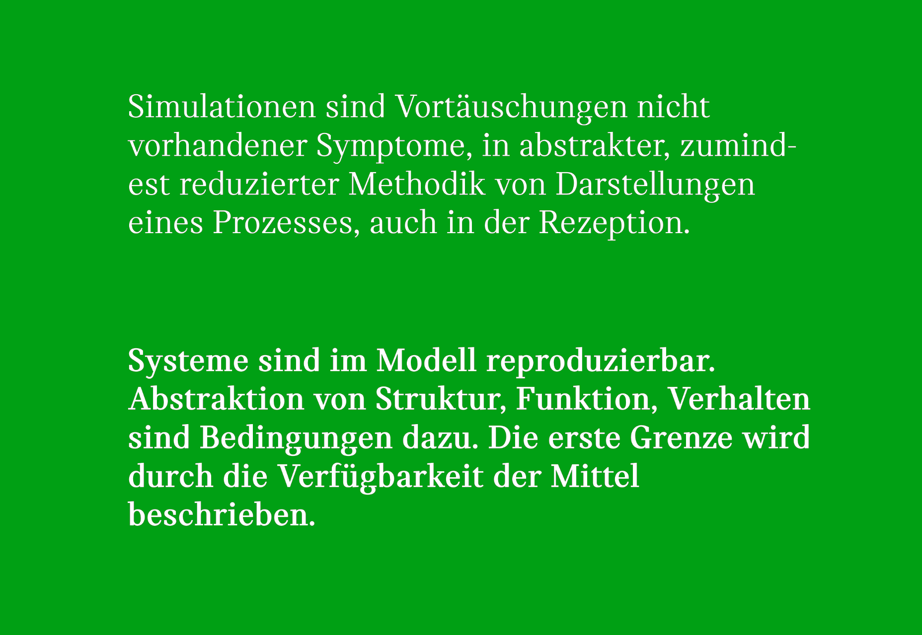
 Each month we publish this roundup of the best new fonts for designers to help you find new ways of packing personality into your designs.

 Jakob Nielsen’s
 The design world fluctuates back and forth, swerving between love and hate for different design trends. Sometimes we see a wide range of approaches, and sometimes designers all hop on the same idea.

 User Experience is a crucial consideration for any web developer or designer; the only way to ensure that you’re delivering a successful website is to ensure that the end-user or customer will feel comfortable using it.
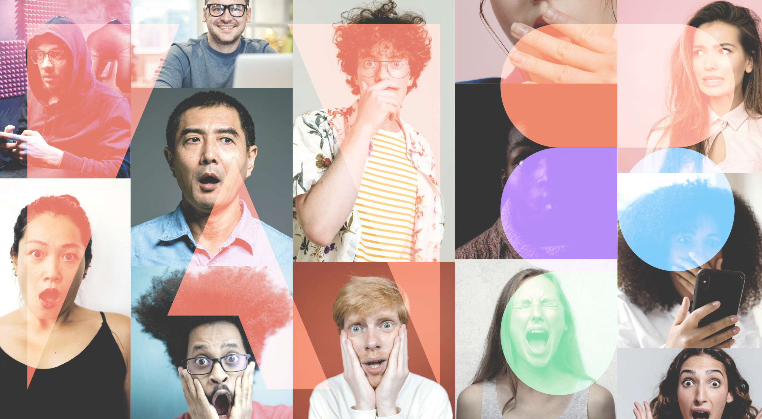 There were mixed reactions on Thursday morning when
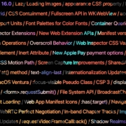
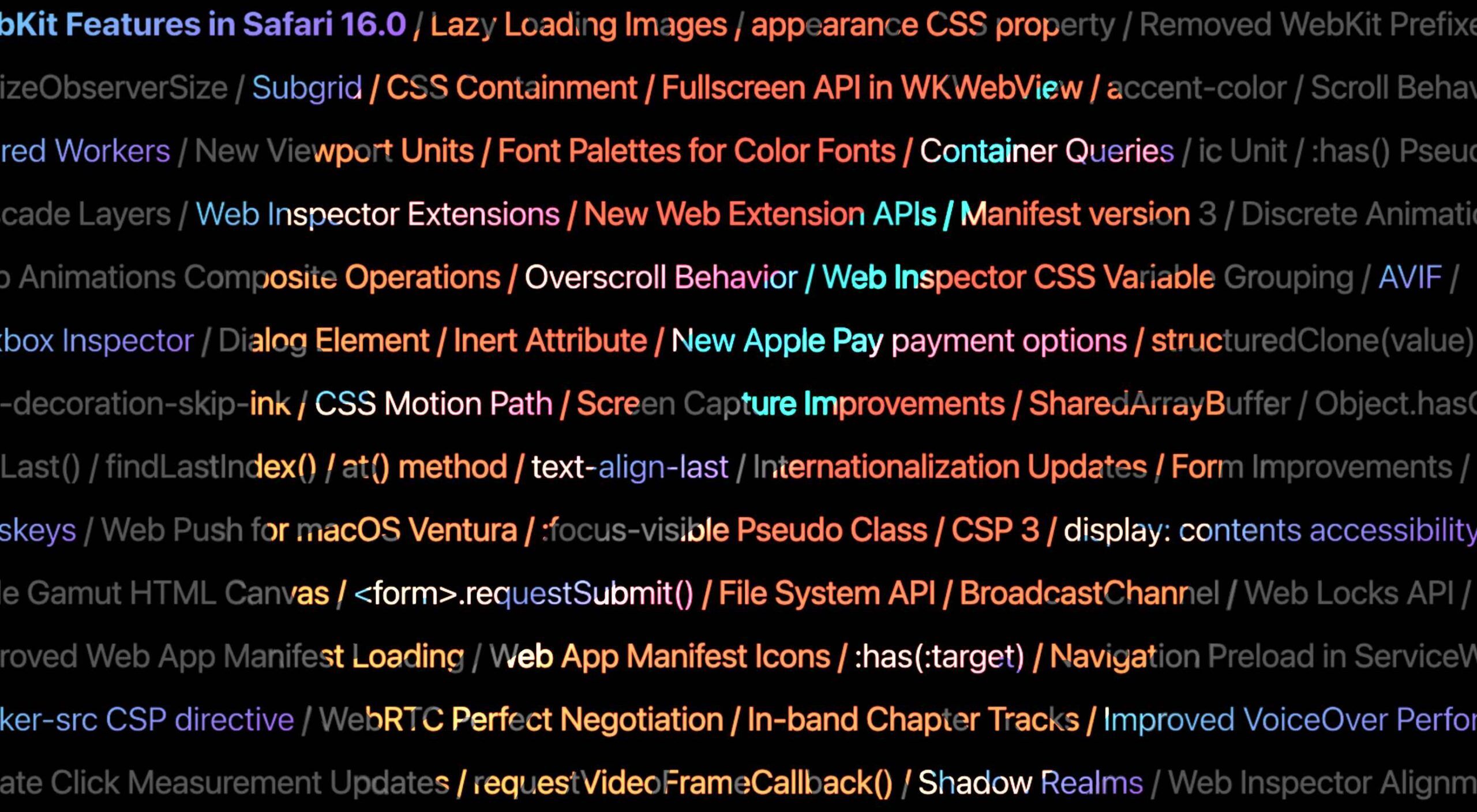 Apple has released an OS update. Packaged in with it is the latest version of Safari, 16.