 Two weeks ago, you started a web design agency. Last week you began to define your agency by choosing clients, setting red lines, and writing your elevator pitch.
This week, we will implement some practical solutions before problems occur. Remember one task per day; it’s a marathon, not a sprint.
Day Fifteen: Terms of Service
In the rush of excitement surrounding a new project, it’s too easy to skip the preliminaries and jump into work. Before you know it, you’re halfway through the job, and it’s too late to set terms.
Your terms of service document is a formal statement of the terms under which you agree to work. This document is best prepared by a legal professional with experience in your jurisdiction, but you can write it yourself with a bit of guidance. Fortunately, as a web design agency, you’re not supplying physical products, which simplifies the document considerably.
You should include a statement limiting your liability. You need to assert your intellectual property rights. Unfortunately, you also need to include details of what happens when a client fails to pay an invoice.
Write the document in clear, friendly language. Don’t use marketing speak, and do not try to disguise anything onerous. A good client will respect you for being upfront in a professional manner.
Your terms of service should be on your website and sent to potential clients alongside any quote — I know some people who send their terms in the same PDF as the quote, so the client can’t overlook them.
Day Sixteen: Project Management
Project management is probably the most crucial skill you’ll have to master. Meeting deadlines, bringing in enough work to cover the bills, and not pulling all-nighters depend on effective project management.
A huge and ever-growing number of apps promise to help you with project management. We have a list here of some of the best. However, if you already have a tool you use to manage your work that you’re comfortable with, consider sticking with it. Do not fall back on a notes app or a pen and paper.
Remember: organizing your work days is not billable. The more you can automate this process, the better.
Day Seventeen: Quotes & Invoices
Up until now, we’ve deliberately done one thing per day. Today, we will do two because they’re so closely related.
There are all kinds of business documents that pass money back and forth between companies, for example, purchase orders or credit notes. For a small web design agency, you’ll need two: a quote document and an invoice document.
Invoices are documents requesting payment and providing the details for payment. Quotes are previews of an expected invoice.
Some people like to have a receipt document that they send out to acknowledge payment. However, in my experience, sending a hand-written email is better; it’s an excellent opportunity to personalize your communication and foster a good relationship.
There are legal requirements that vary by jurisdiction, but an invoice typically includes: your trading name; the invoice number — an incrementing number code; your tax code if you have one; your address; the time the client has to pay — “Net 14,” meaning the total amount within 14 days is standard; the date issued; the client’s name and address; a list of services provided together with the rate for each service and the total; the pre-tax total; the total amount of tax; the total; and most importantly a way of paying.
Back on day two, you contacted your tax department to determine your liabilities. You may or may not have to charge sales tax or VAT. Always include the amount of tax on your invoice, even if the total is $0, so it’s clear whether or not it has been charged.
A quote document is virtually identical to an invoice, except that you remove the payment requests. You should also add a note stipulating how long the quote is valid — 3 months is standard.
Plenty of services will create these documents for you as part of an accounting system. For example, Xero, FreshBooks, or Bloom. Even PayPal will allow you to send invoices. If you prefer, you can create your own quotes and invoices and send them as PDFs — this option is best if you want total control over your documents’ design, but it will take longer, and it’s worryingly easy to make a mistake.
Day Eighteen: Social Media
Start today by researching social media accounts. Look at the list of target businesses you made on day eight; which social media channel do they use the most? For example, if the niche you picked on day three is restaurants, they probably use Instagram. If you chose retirement communities, they probably use Facebook.
Once you have a clear picture of your clients’ channels, pick one (yes, 1) and register an account.
Social media is a significant drain on your time and provides considerably less return on investment than you might expect. So, choose one service that your prospective clients use and start building your profile. It’s far better to invest your time and effort in a place your clients will notice you than to spread yourself too thin.
Day Nineteen: Domain & Hosting
It’s another two-task day. We’ve grouped these together because domains and hosting are frequently rented together.
Back on day nine, you selected your tech stack. You’ll be building your own site with the technology you offer clients, so it’s important to ensure your hosting enables this. If you intend to develop with WordPress, you need WordPress hosting. If you intend to build with Wix, you need a Wix account. If you’re planning on offering any kind of web app, you probably need Netlify.
Whatever you choose, choose something appropriate for your tech stack. The only exception is if you plan to specialize in a niche service like Shopify, which is entirely inappropriate for an agency portfolio.
There are endless debates over whether or not you should register a domain with the same company that hosts your site. Everyone seems to know someone who knows someone who registered a domain, and then something improbable happened to cause them to lose the domain that wouldn’t have happened if they’d hosted separately.
Back in the real world, simplicity is a gift you give yourself. Choose a reputable company, register a good domain, host in the same place, and let their support sort out your DNS for you — many good hosts will even give you free domain rental for a year to entice you to take up their hosting.
Good hosting is reliable, with plenty of room to grow. If it can be cheap too, that’s a bonus. It’s common to start with bottom-end(ish) shared hosting and expand to a VPS (Virtual Private Server) at some point in the future.
Day Twenty: Email
Despite the massive growth in messaging apps over the last decade, email is still your most important business tool.
Depending on the hosting you set up yesterday, email inboxes may have been included. If not, you’ll need to set up a separate email provider.
You’ll need a general email address. Traditionally this has been info@, but hi@, hey@, hello@, and ciao@ are a little more friendly.
You need a personal email address that’s just for you. For example, I use ben@.
You also need a separate account for finances that you can use for invoicing and services like Stripe and PayPal. accounts@ or billing@ are fine.
Finally, you’ll need to set up a catch-all email forwarder for all the times people guess your email, mistype your email or assume you used info@. Forward those emails to your general address.
Once that’s done, set up an email signature for each account. Include your logo, contact details, and the social media address you set up a couple of days ago.
Finally, update your email address with your hosting company, social media account, and business accounts.
Day Twenty-One: Rest
That’s it for this week. So shut down your machine, go outside, ride a bike, go on a hike, learn to skateboard, and relax with family and friends.
We’re approaching the sharp end of this process, and next week will be busy, so do whatever you do to recharge your batteries.
Featured image via Pexels.
Source
The post How to Start a Web Design Agency in 28 Days: Week Three first appeared on Webdesigner Depot.
Source de l’article sur Webdesignerdepot

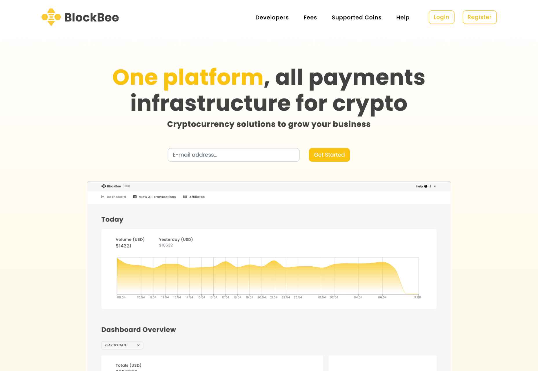
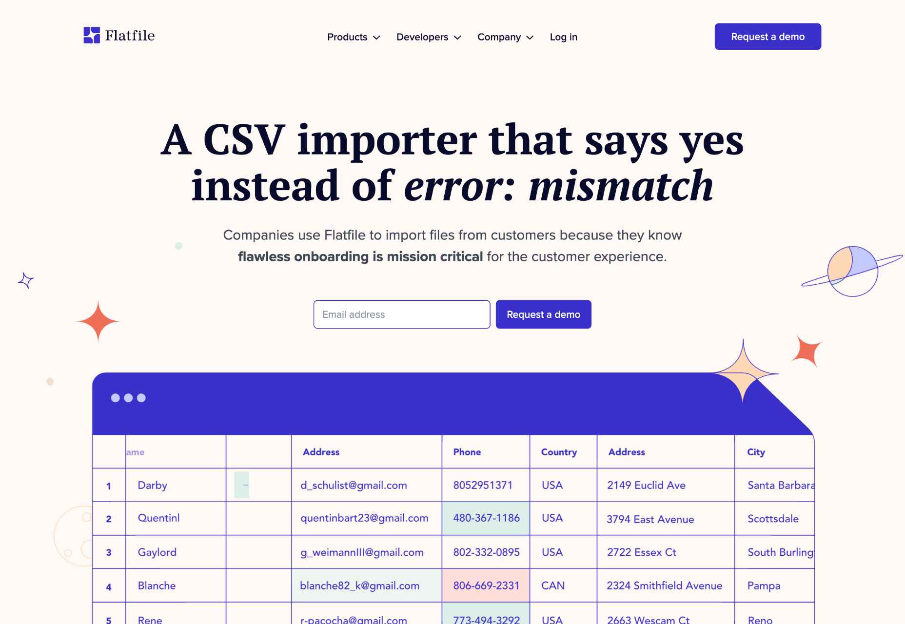
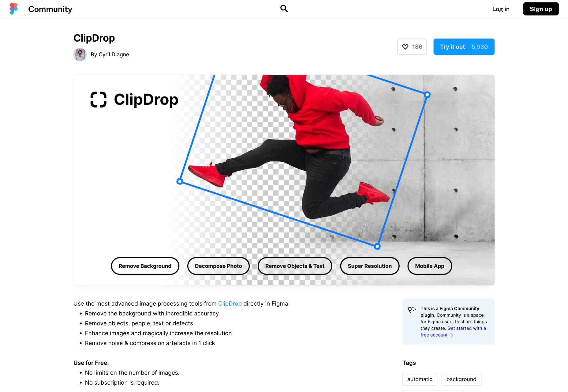
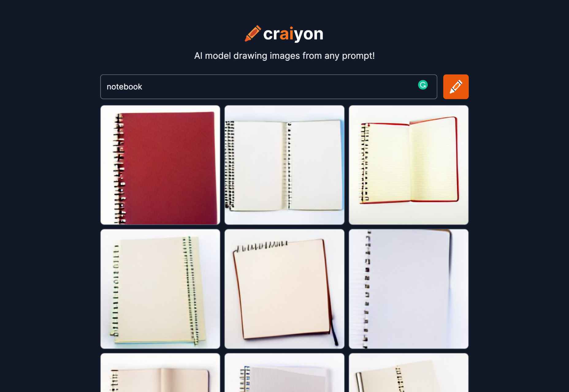
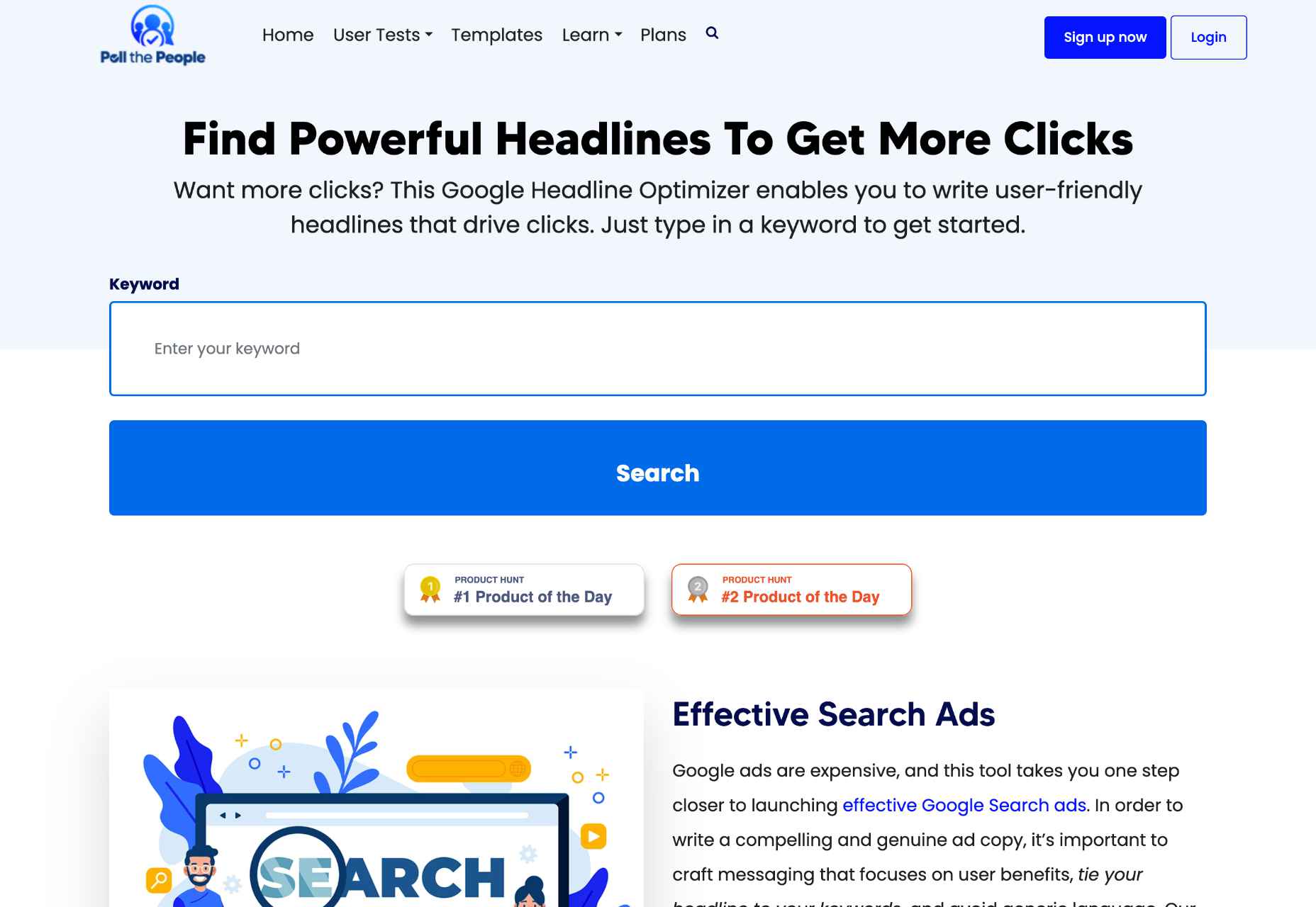
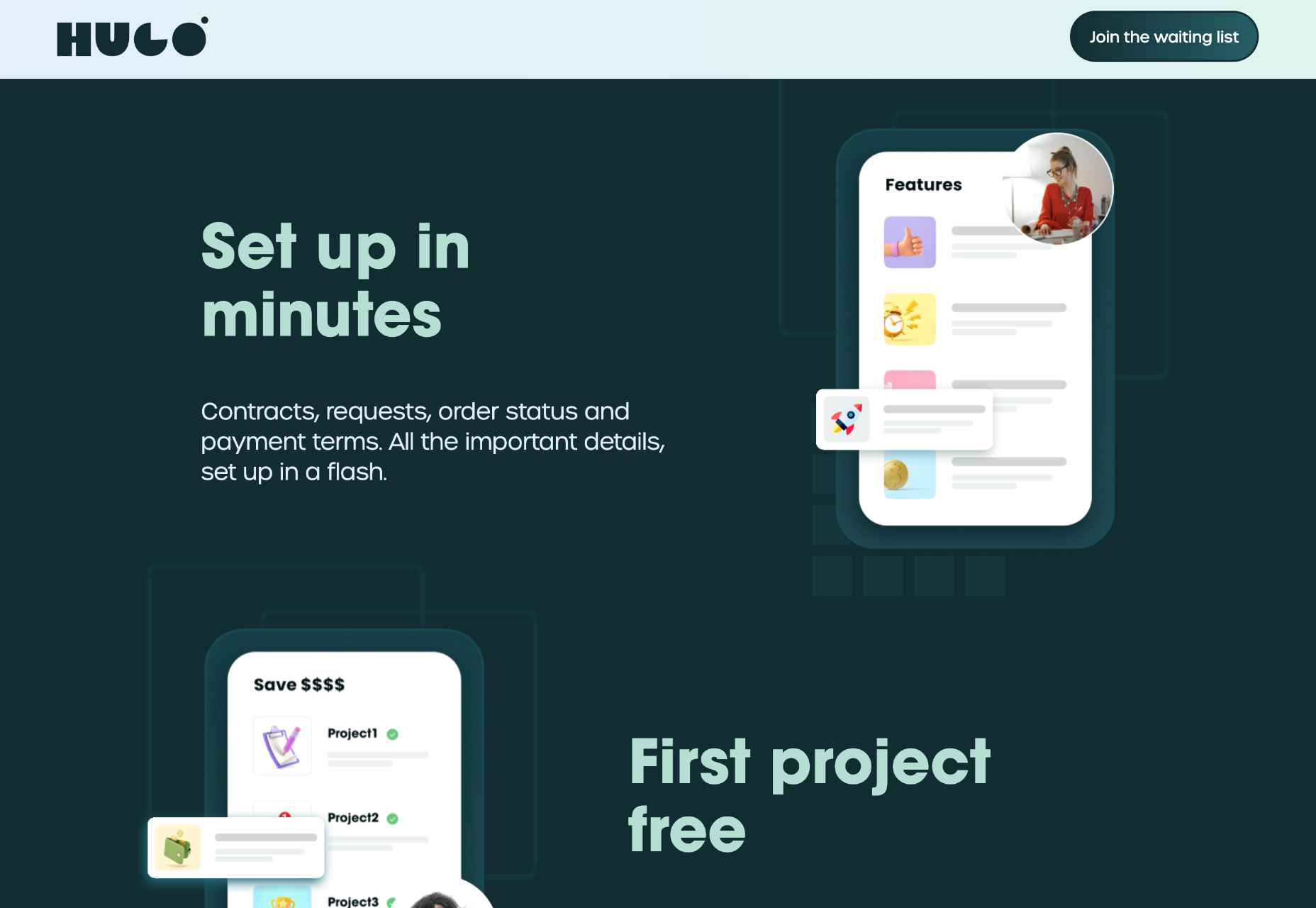
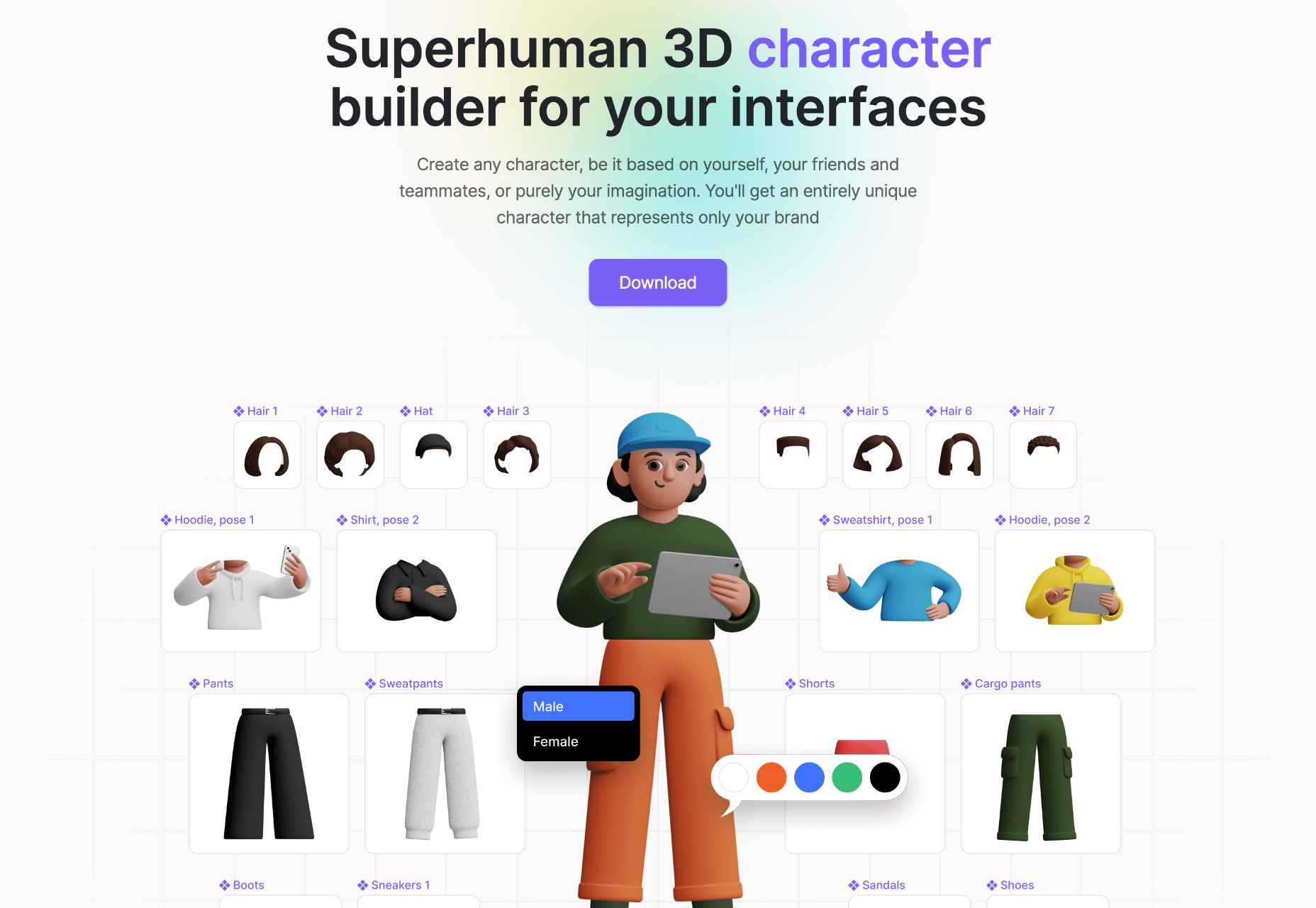
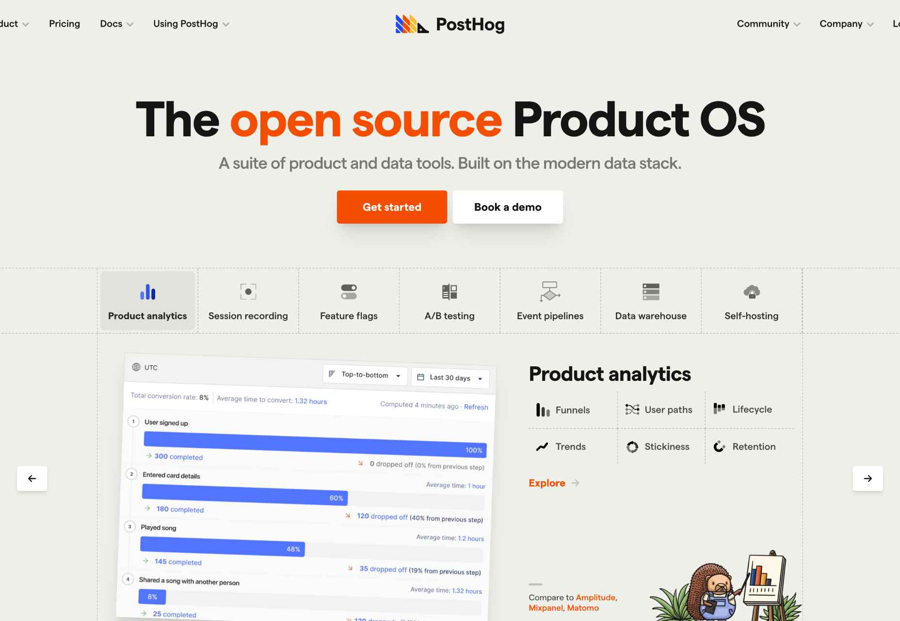
 The Summer’s over, and we’re back at our desks to discover that the web’s best app builders, font designers, asset creators, and developers have been hard at work to deliver this bumper collection of exciting new tools for designers and developers.


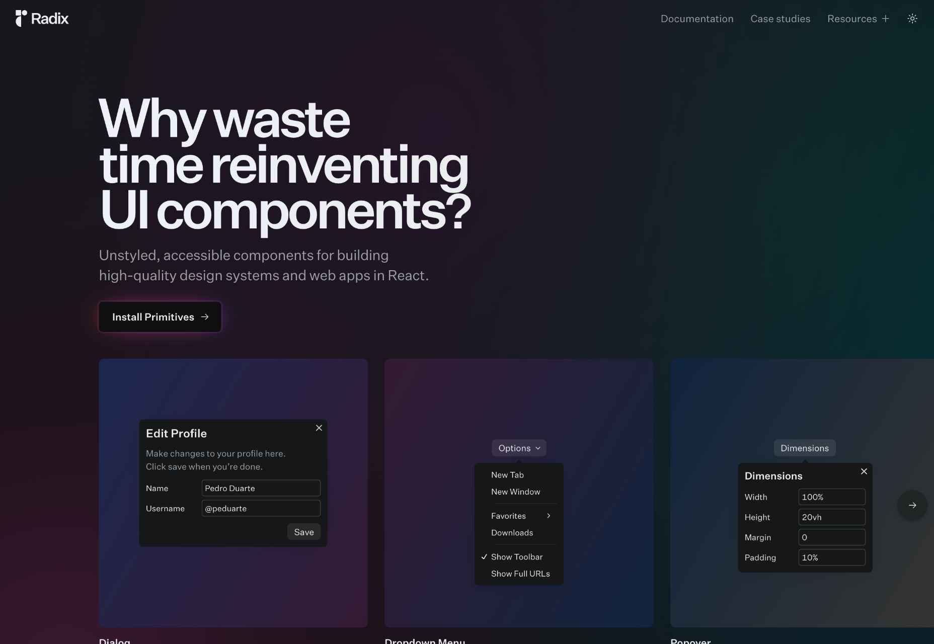

 Modals, a nifty little feature that allows you to display different messages at the top of your website, have been touted as extremely useful. Some even claim that they are helpful enough to completely replace the banner ads we all hate so much. But are modals in web design a UX disaster?

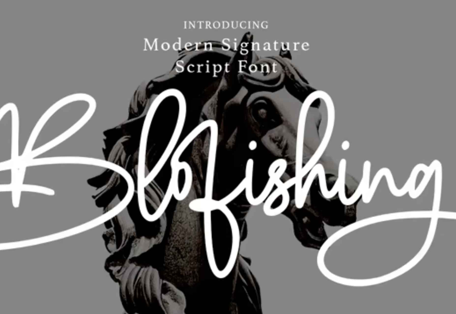
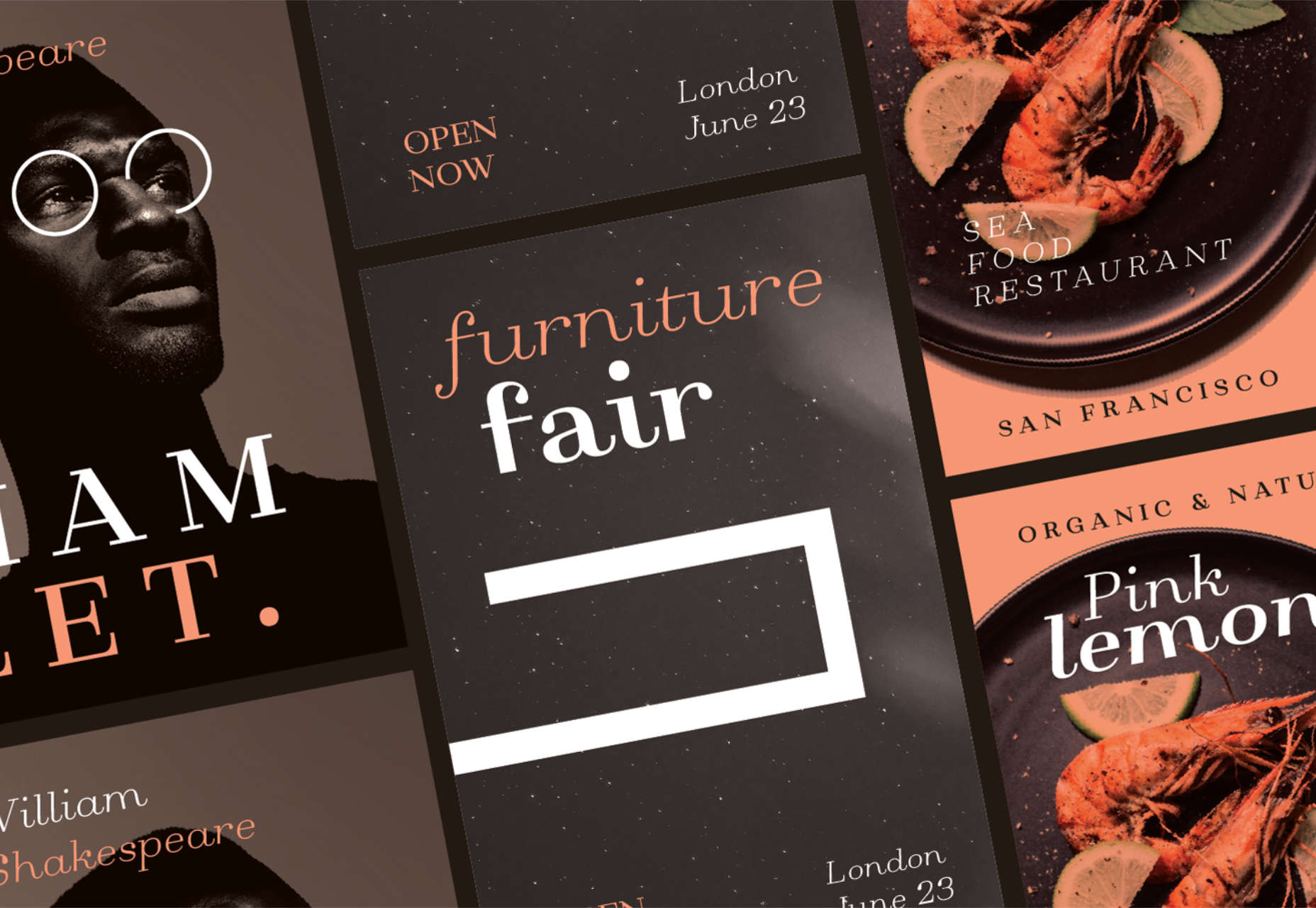
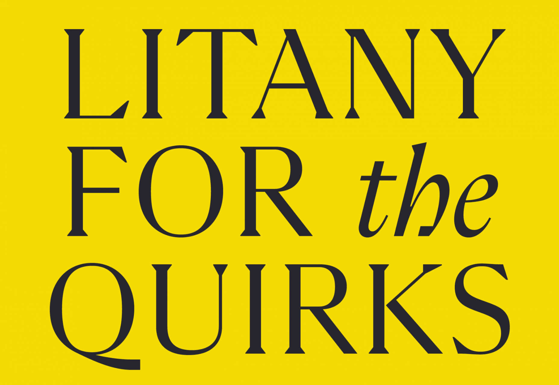
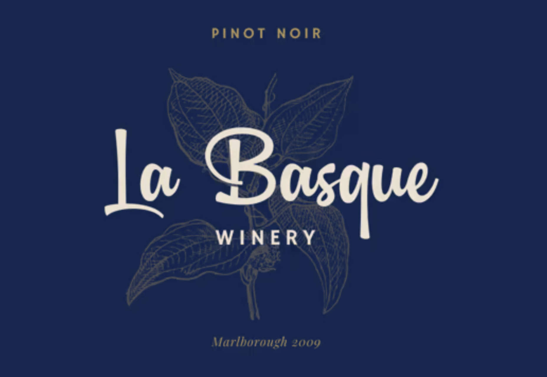
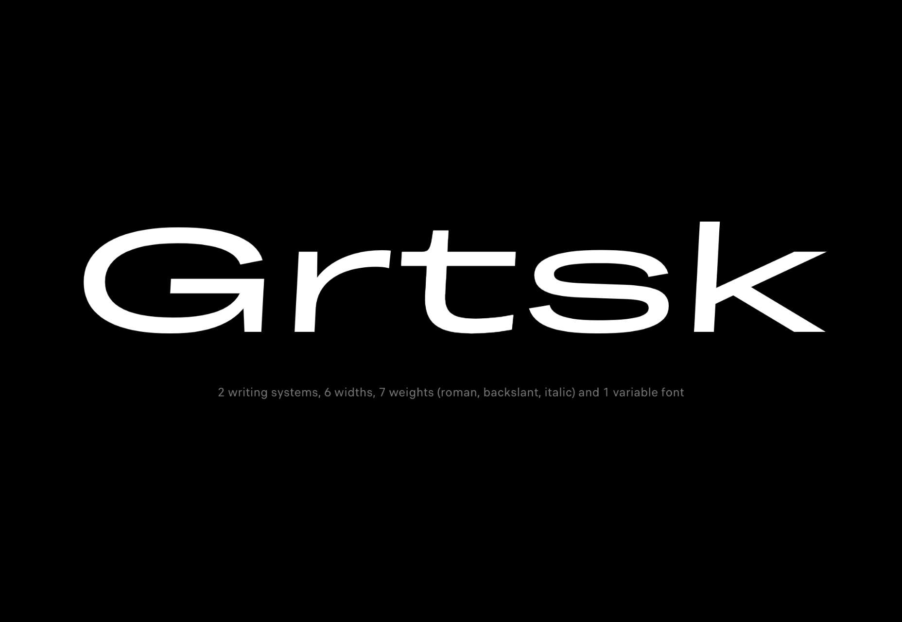
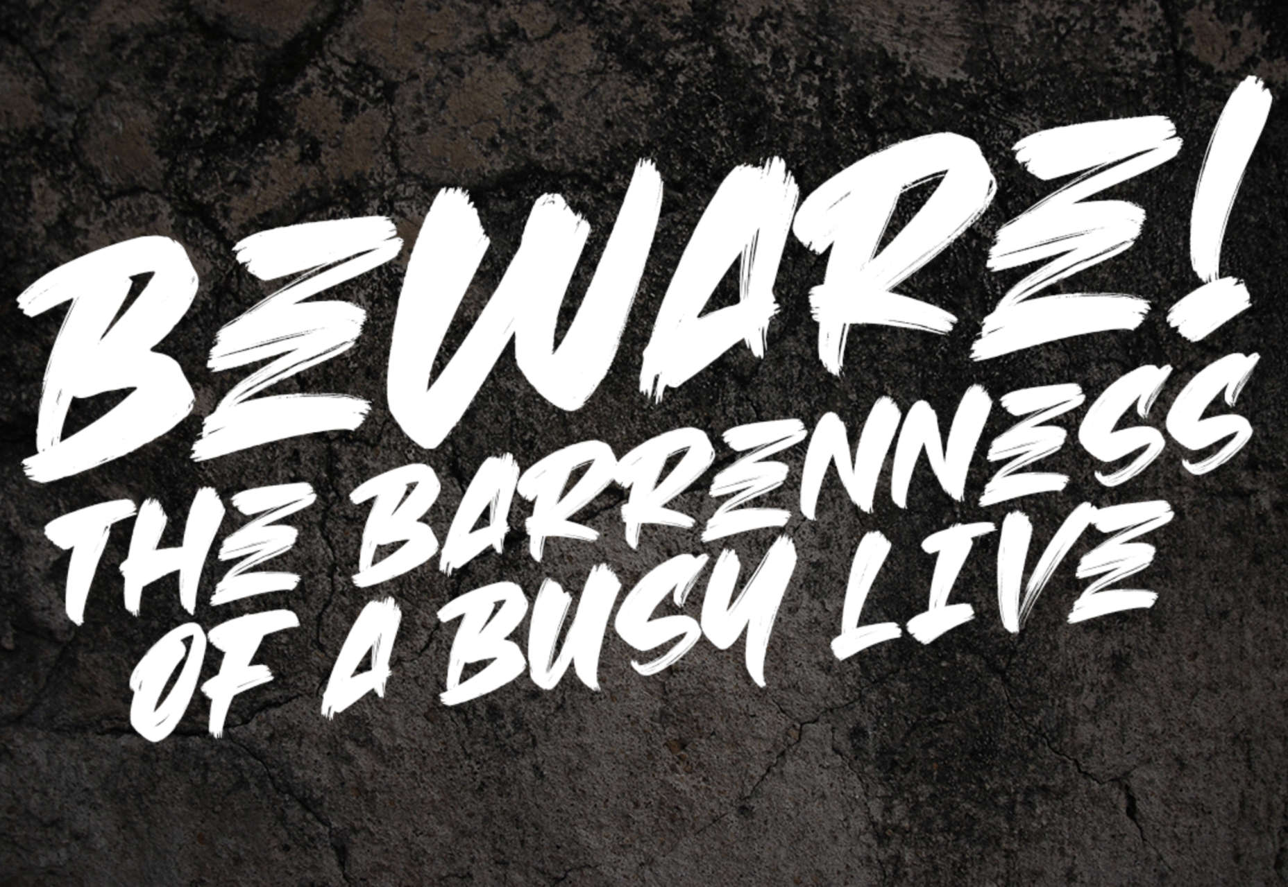
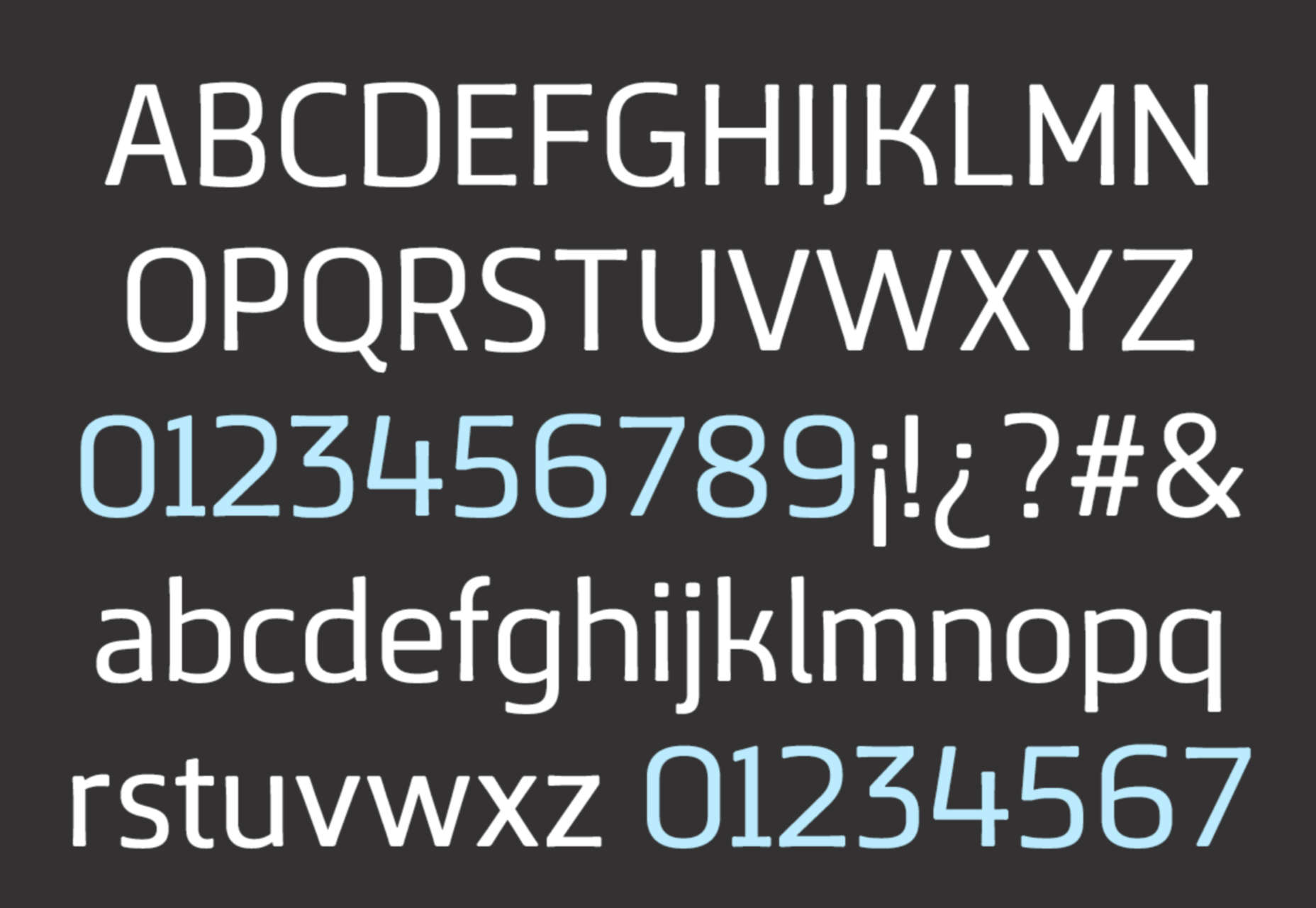
 Typefaces give expression to text, communicating personality in a way that no other design element can. And so, we put together this collection of the best new fonts we’ve seen on the web each month.


 Three weeks ago,
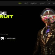
 As the season starts to change, so do some of the trends that web designers are using in projects. From a return of blur to interesting frame edges for images to neon color, there’s a lot to get excited about.
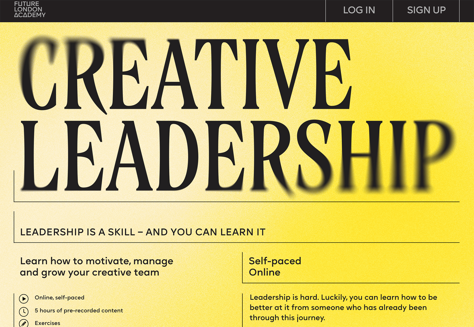


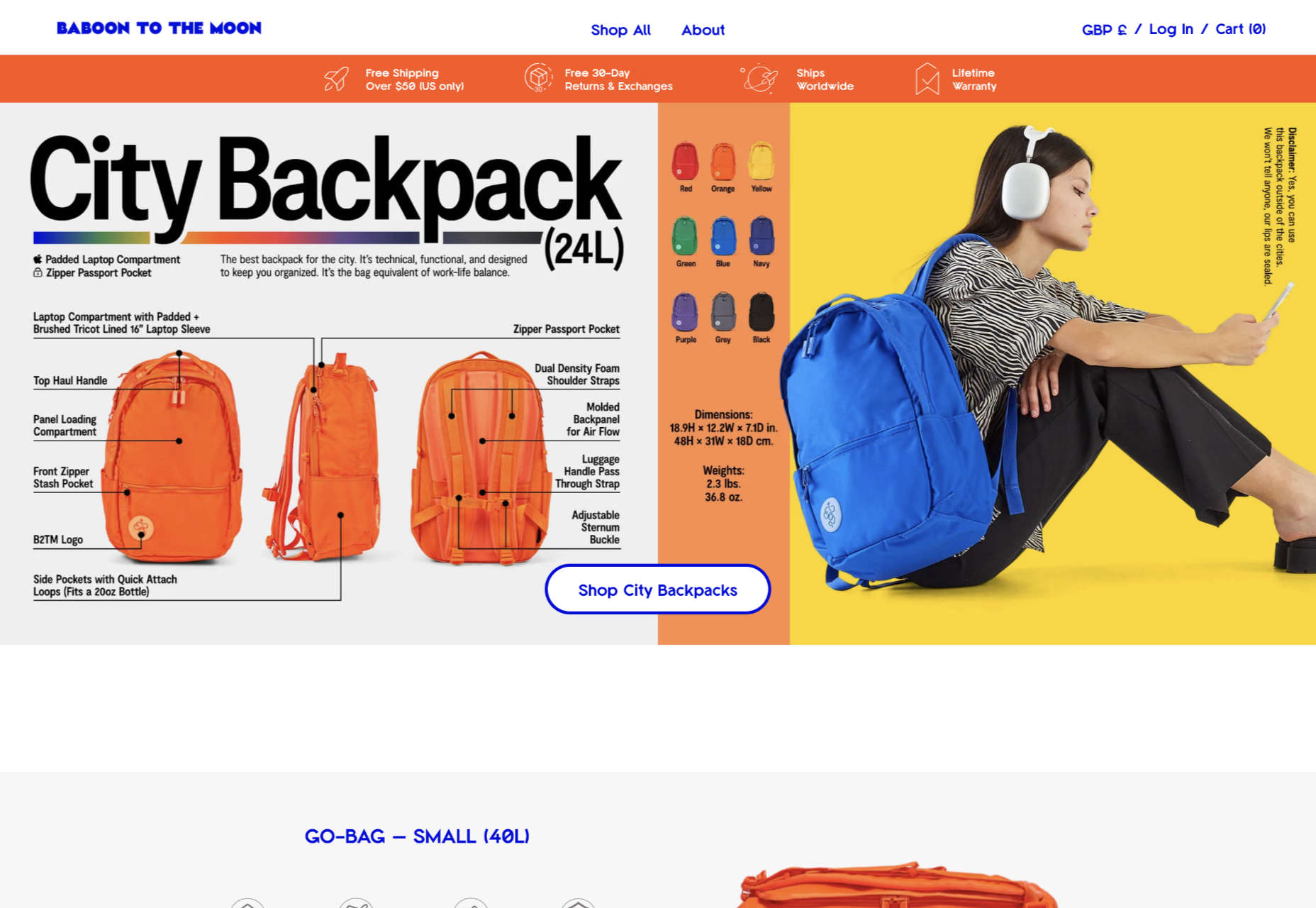
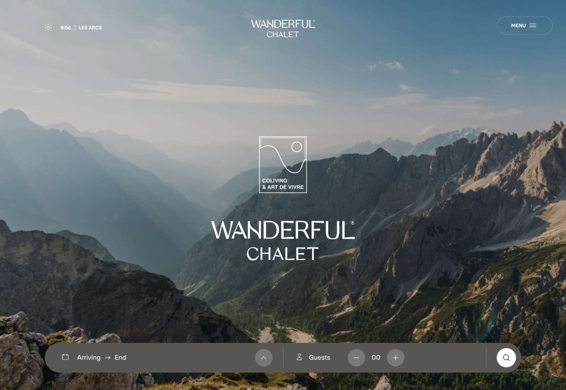
 The purpose of a website is to reach new customers and keep current ones engaged. Therefore, customer-first should be at the top of your list for design features. After all, without your clients, your business won’t grow or succeed.
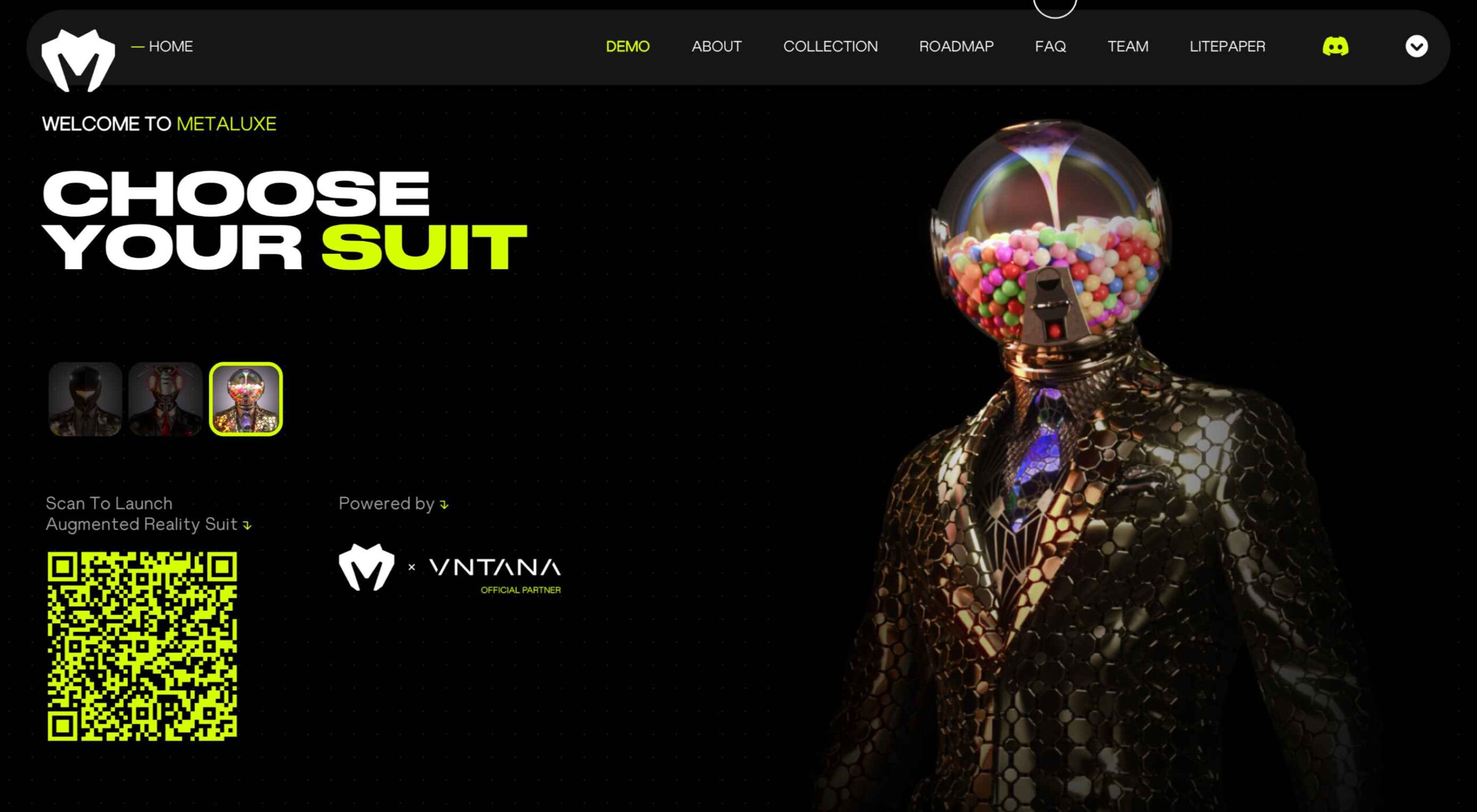
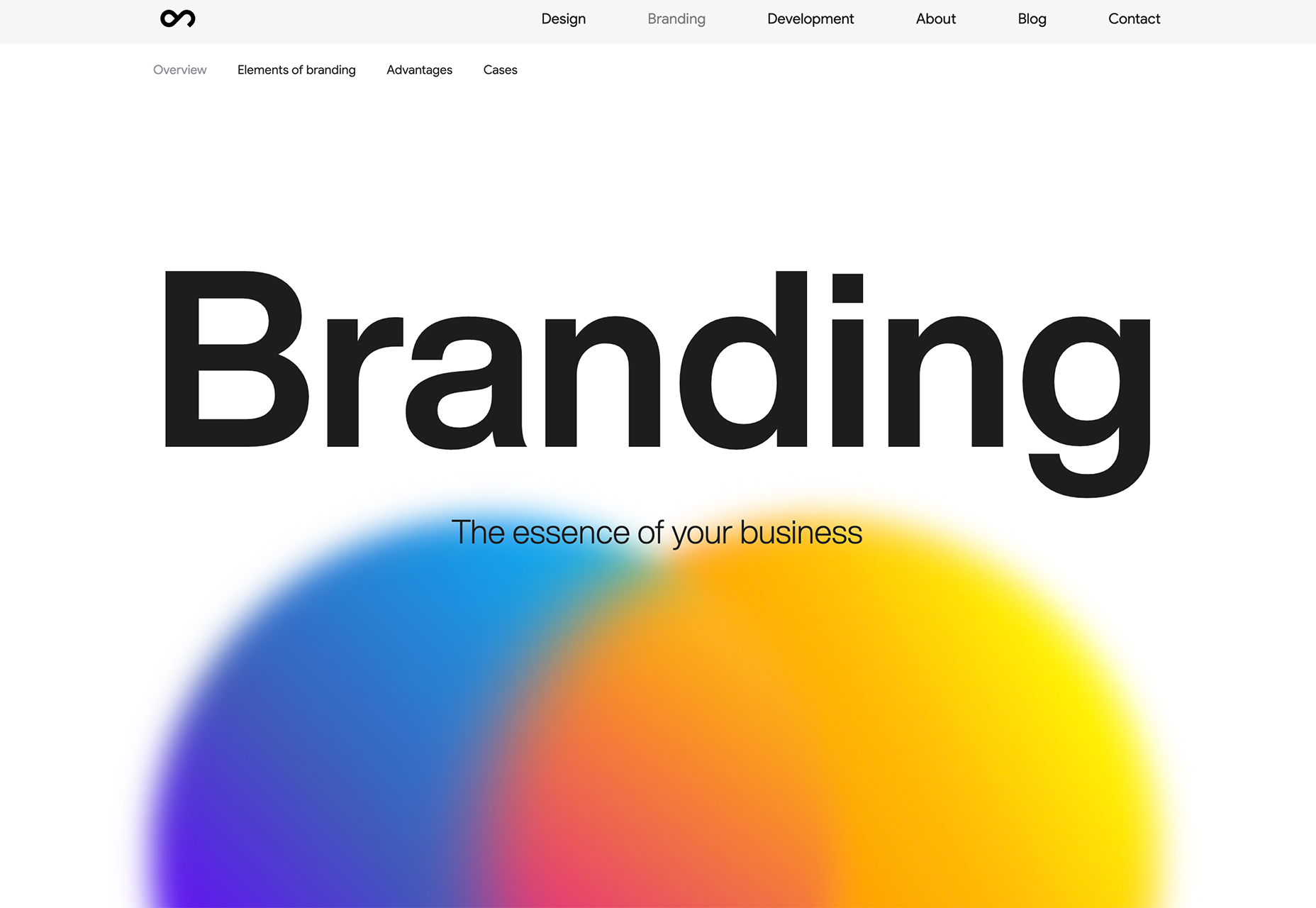
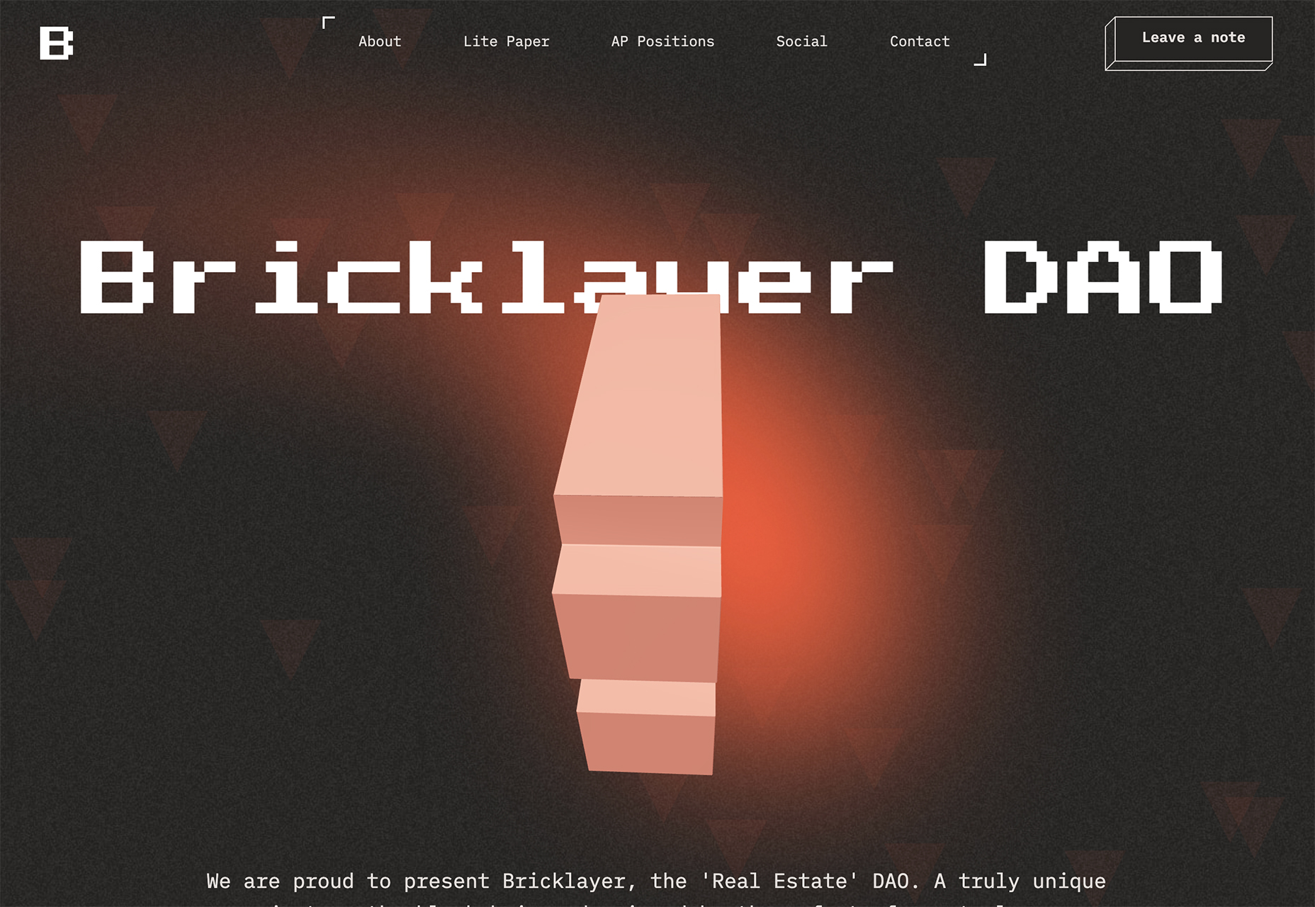
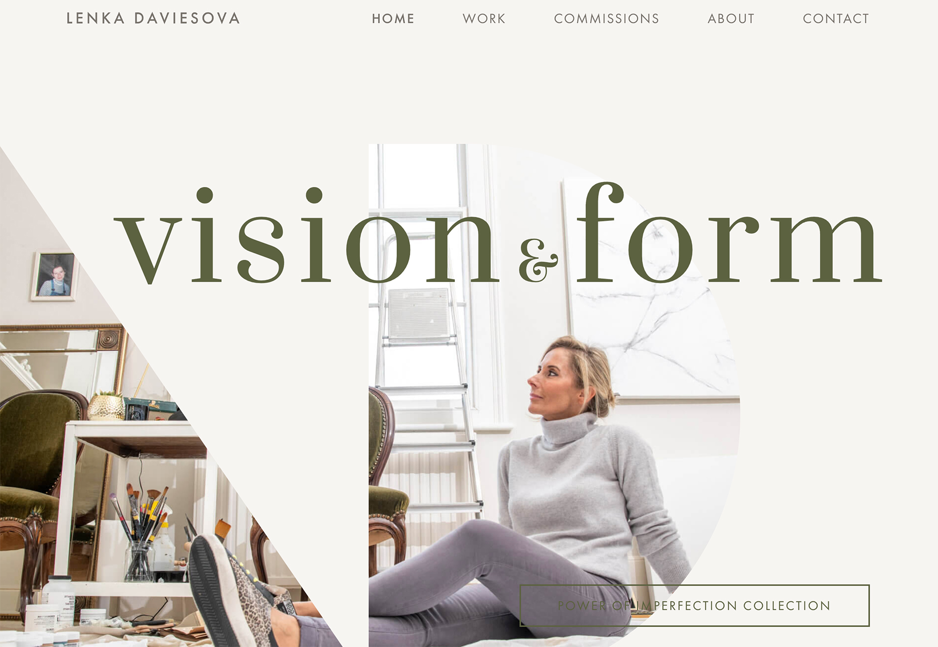
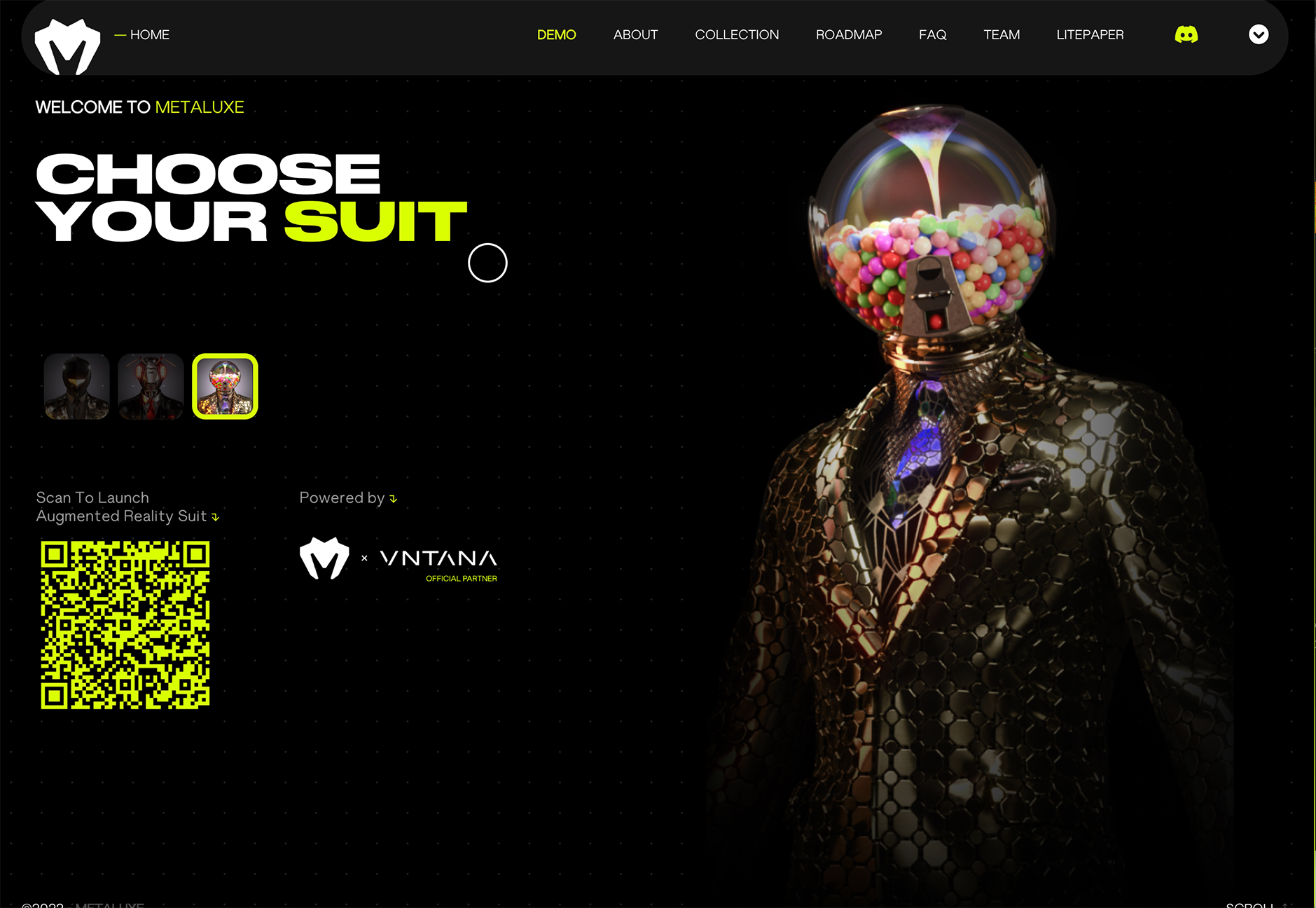
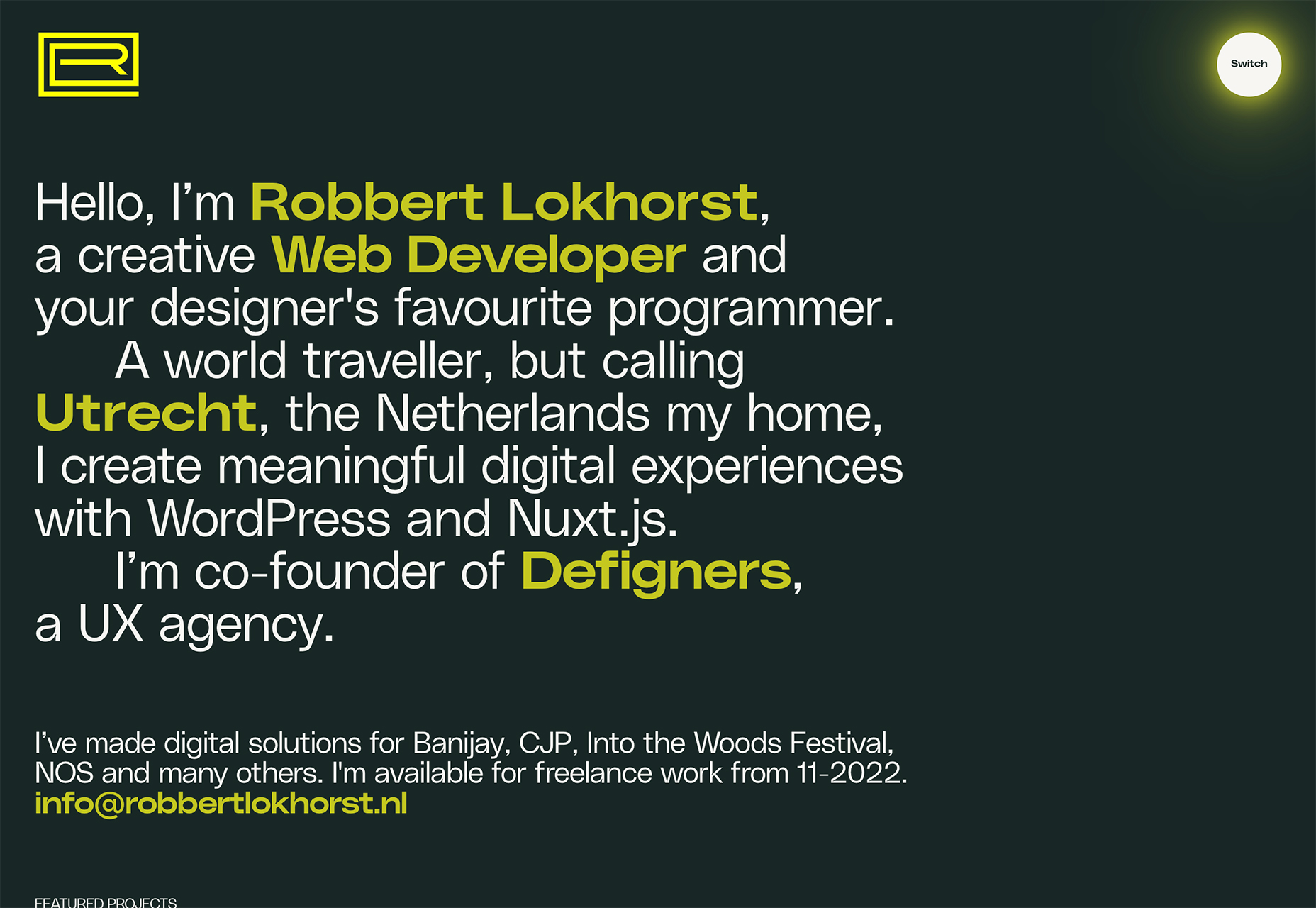
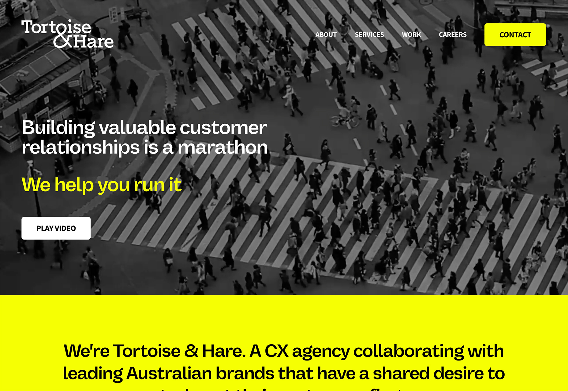
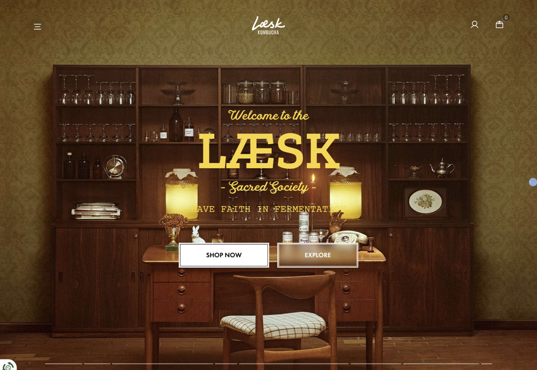
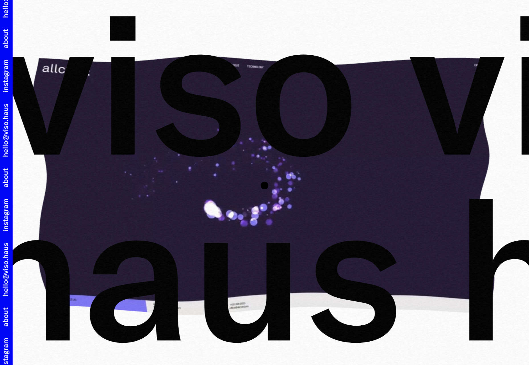
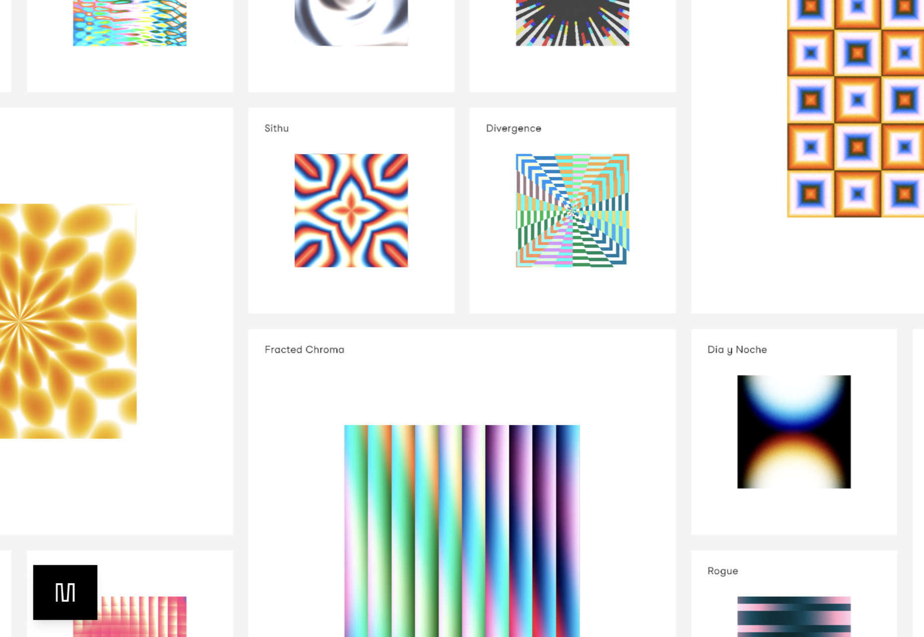
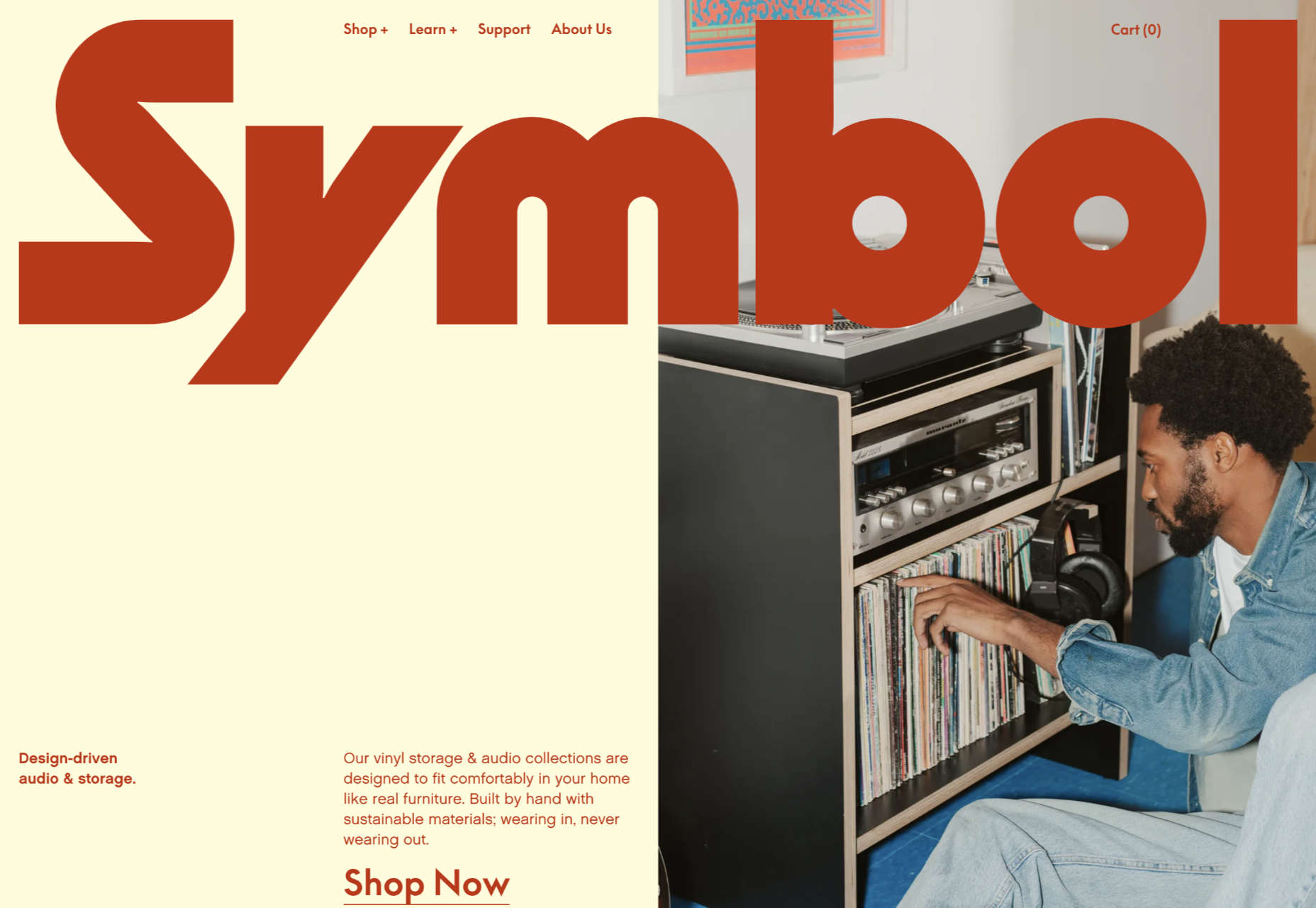
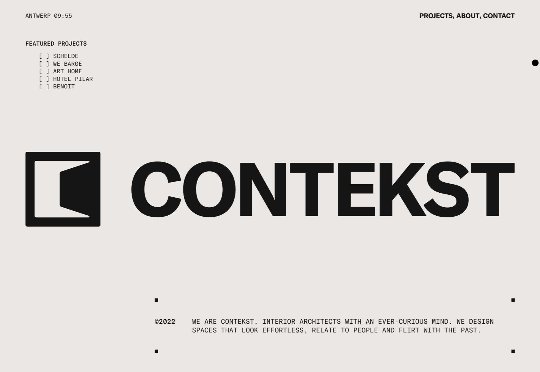
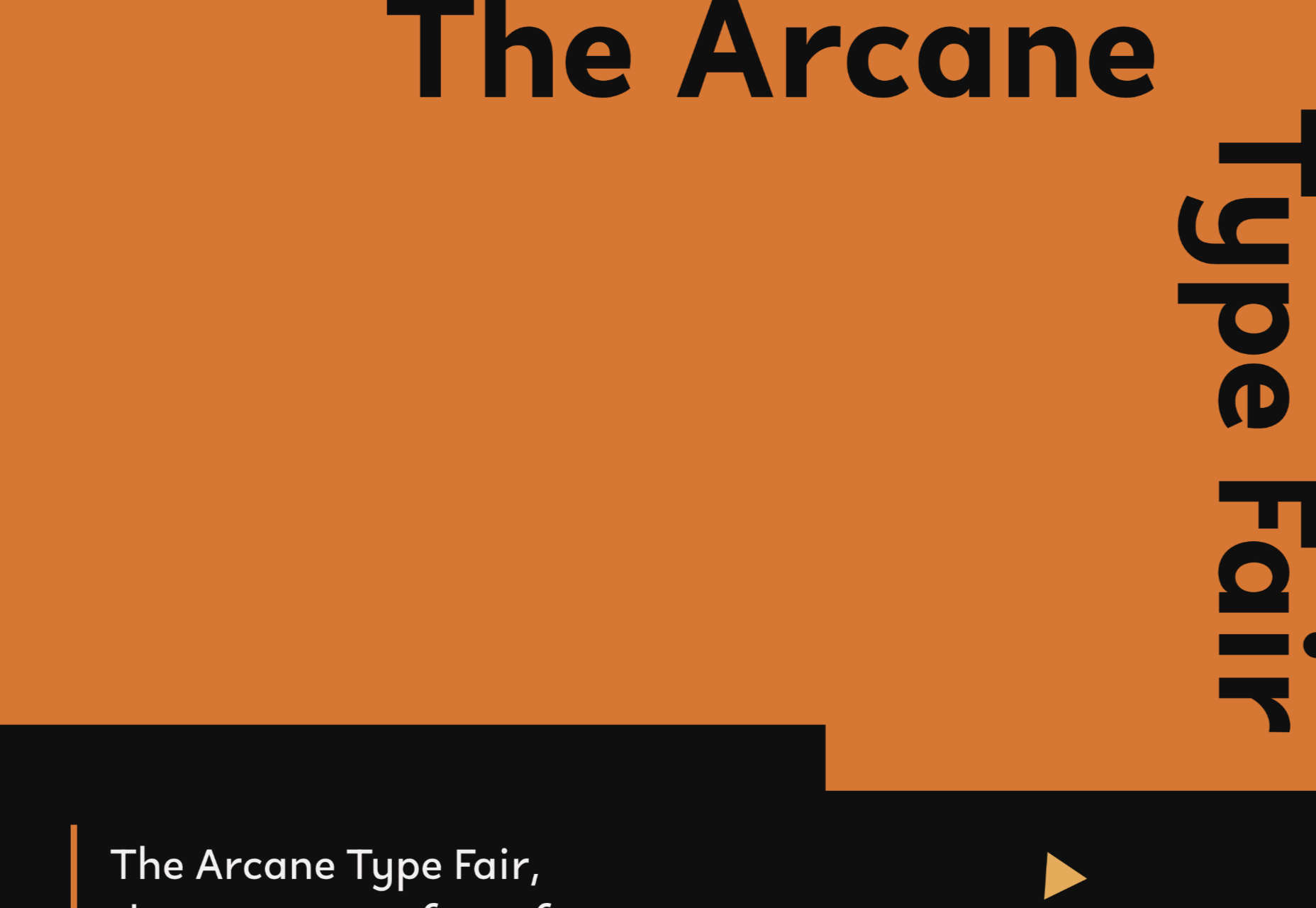
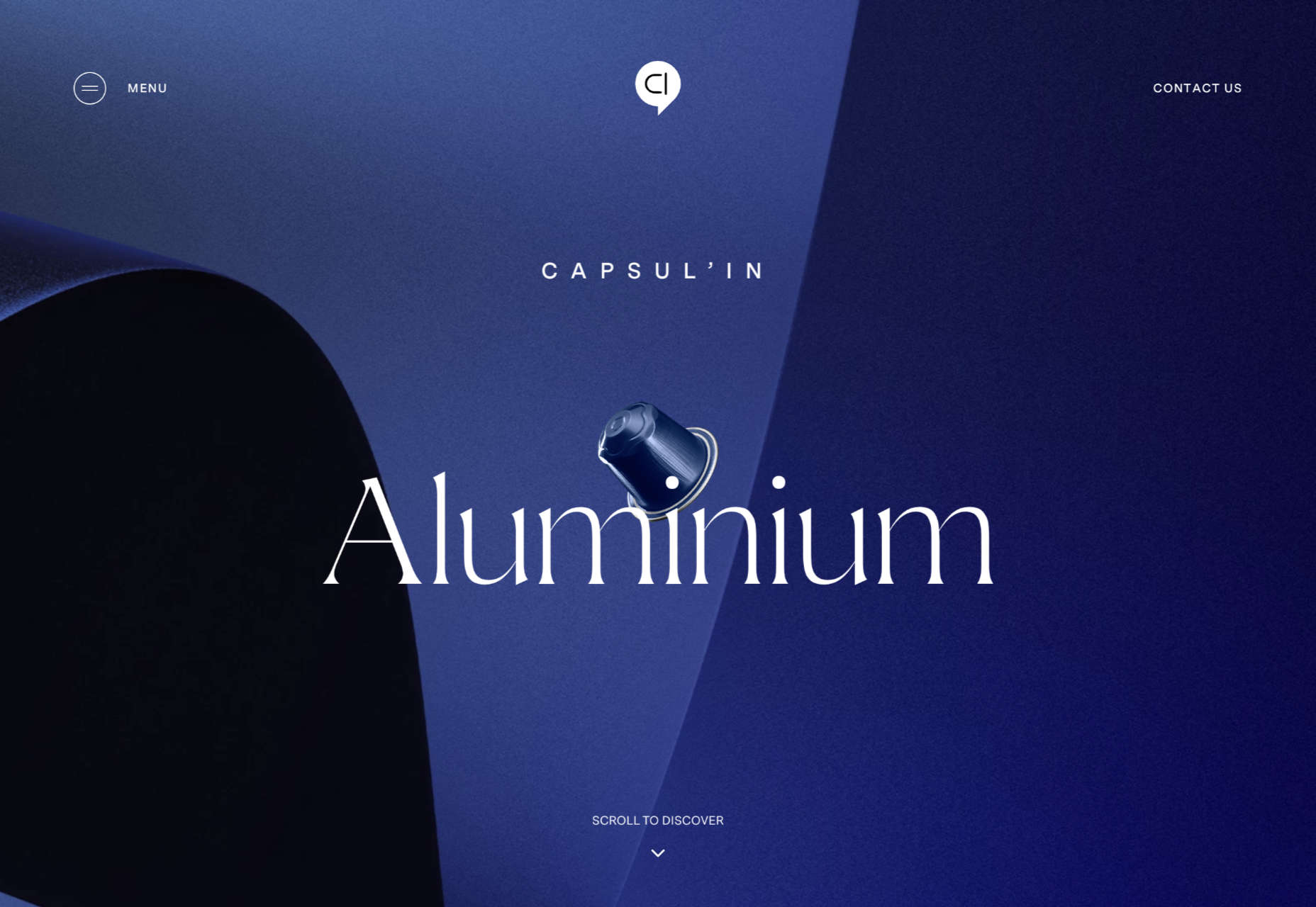
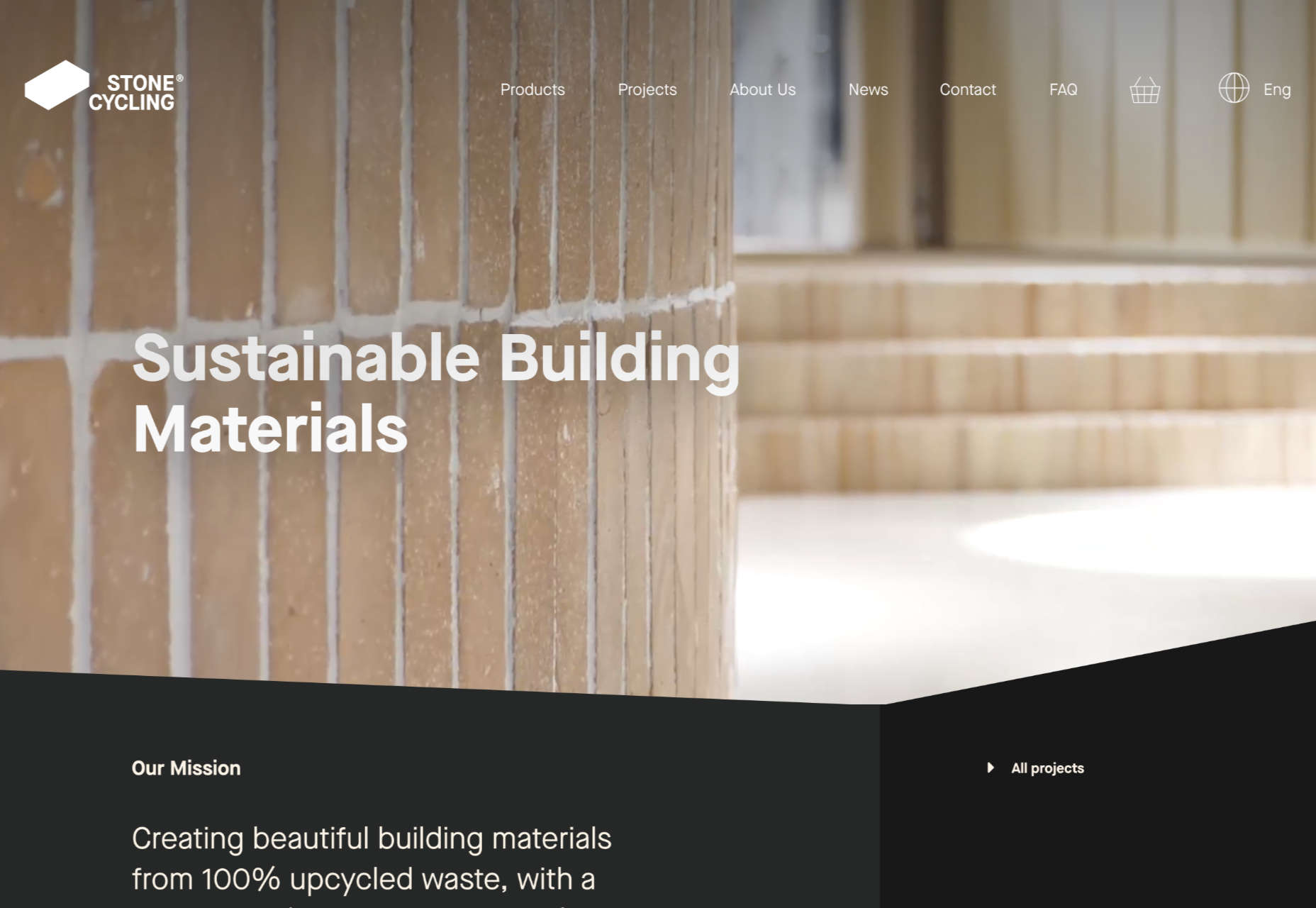
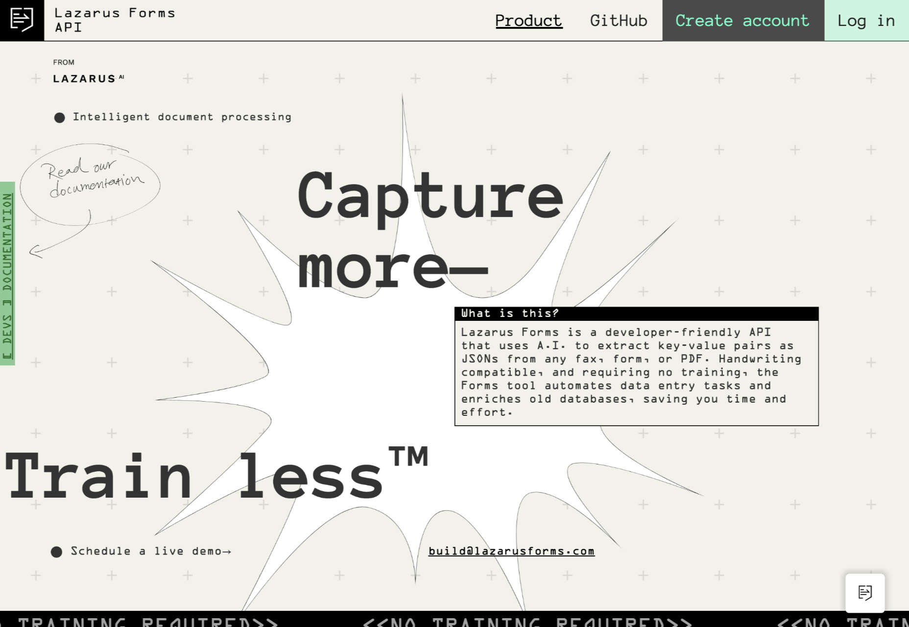
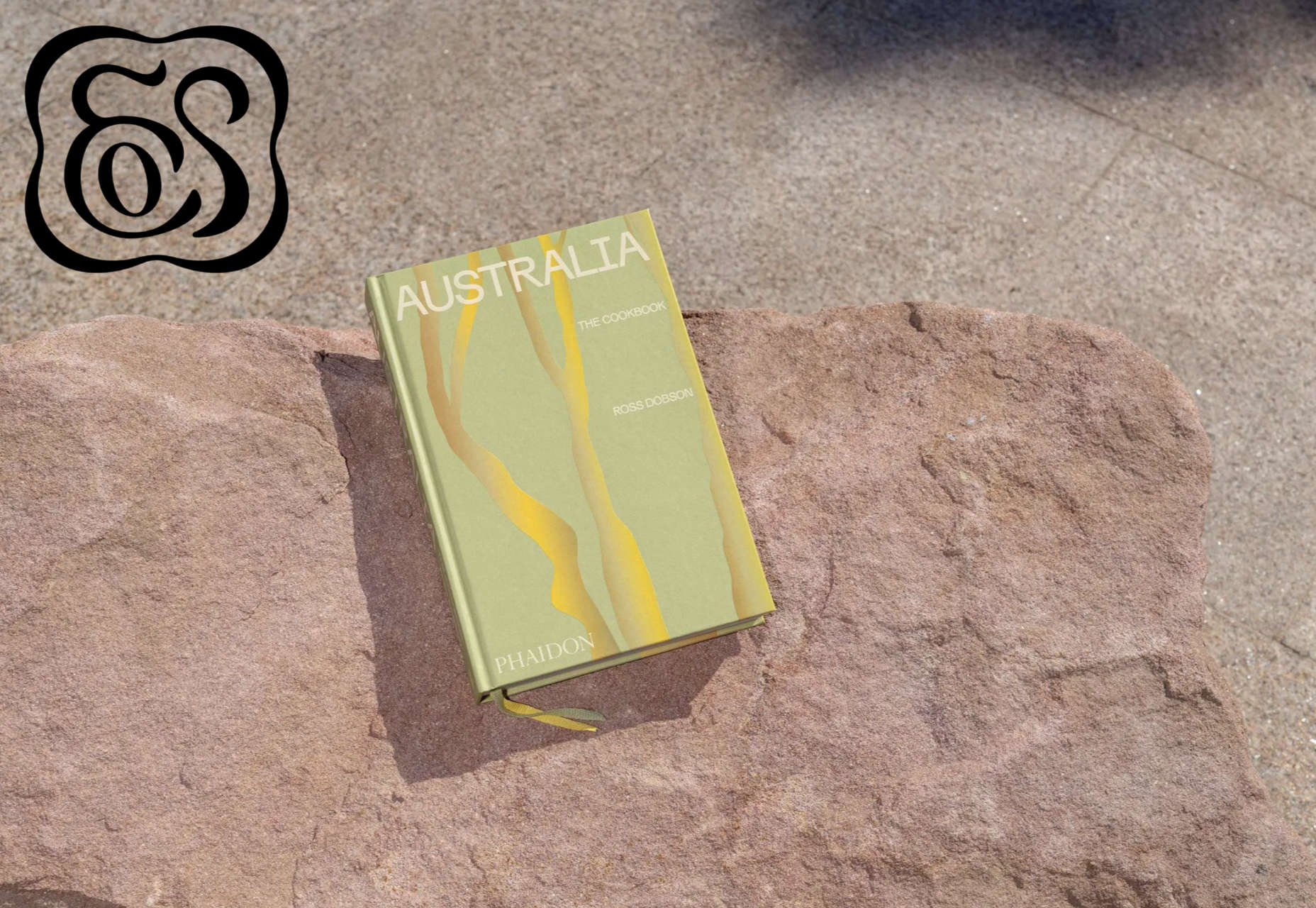
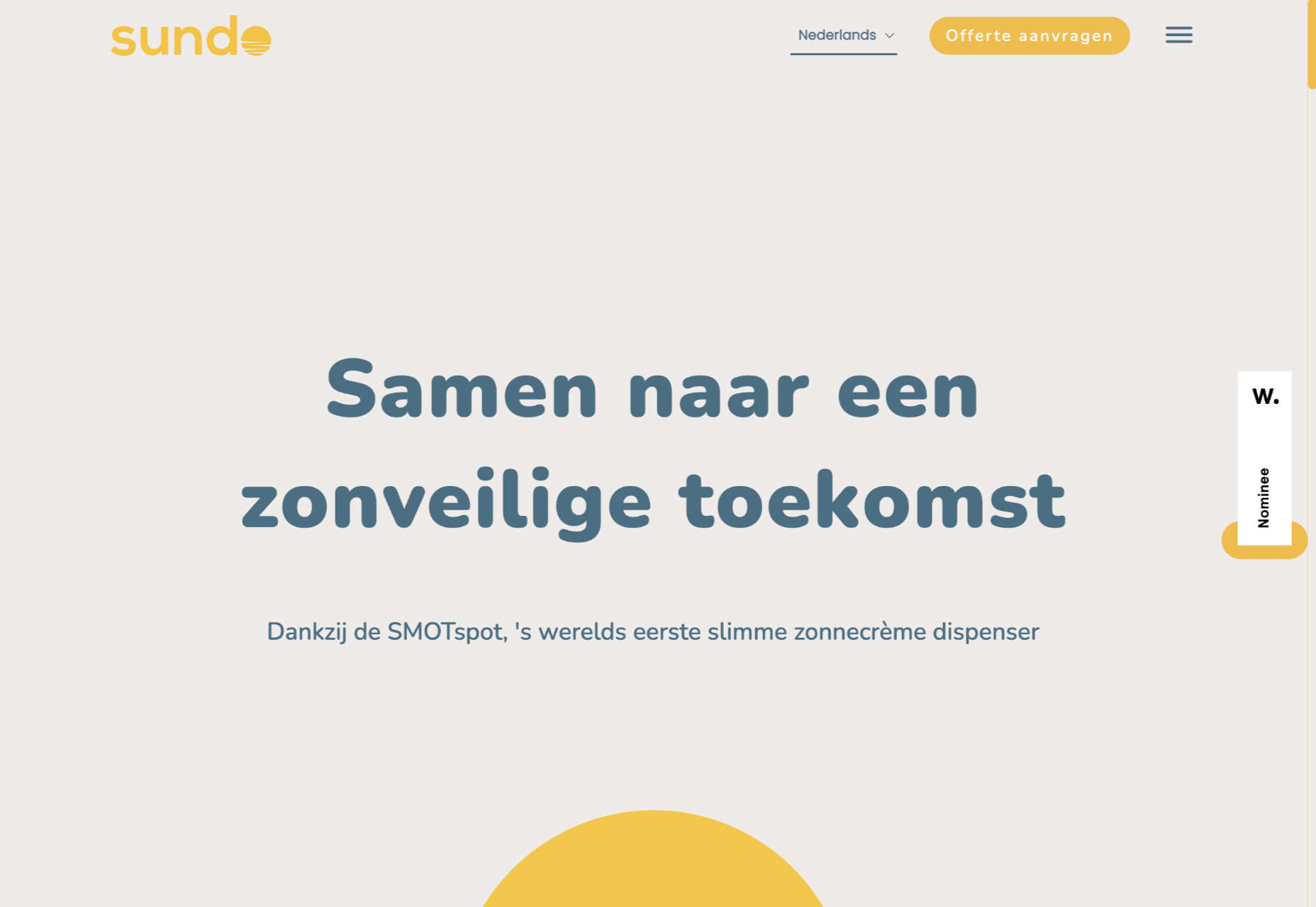
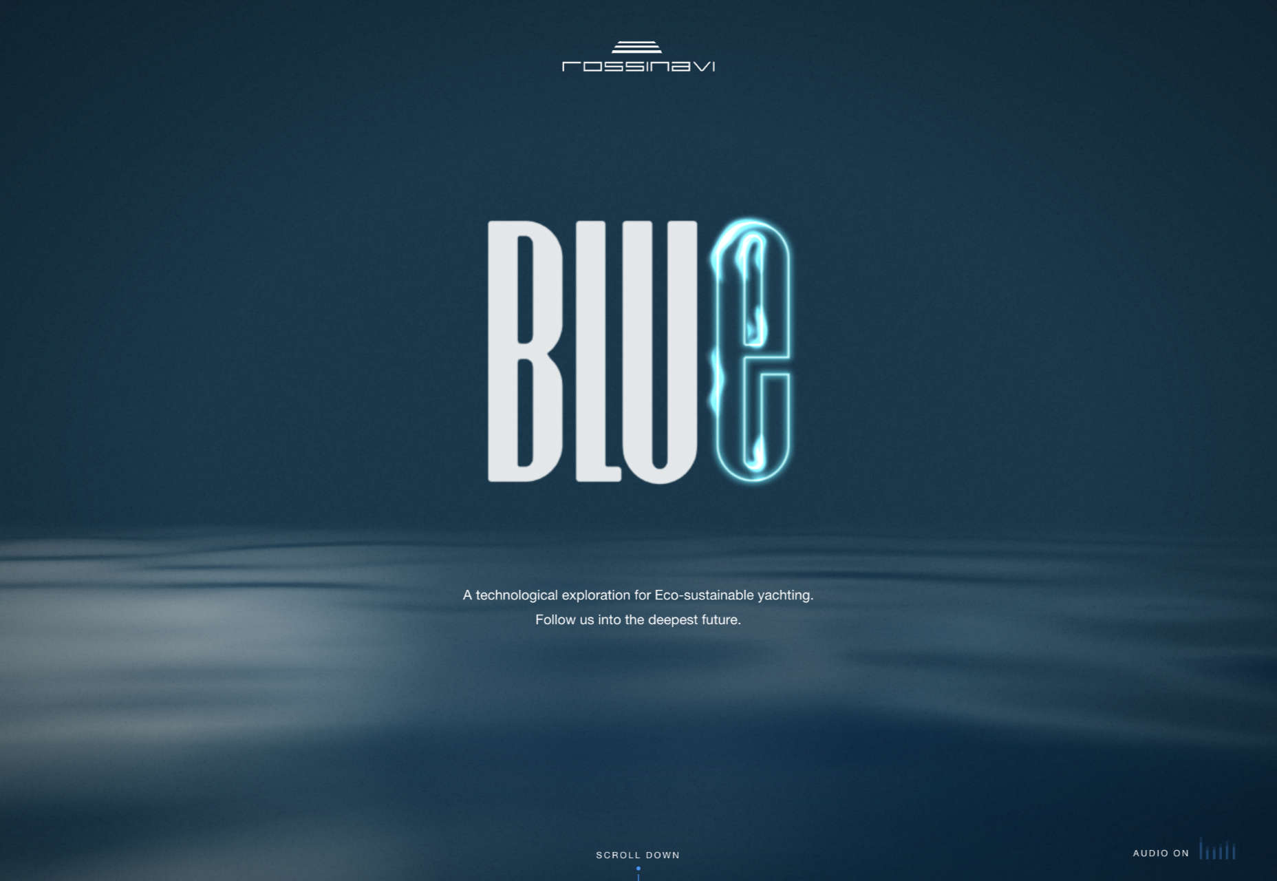
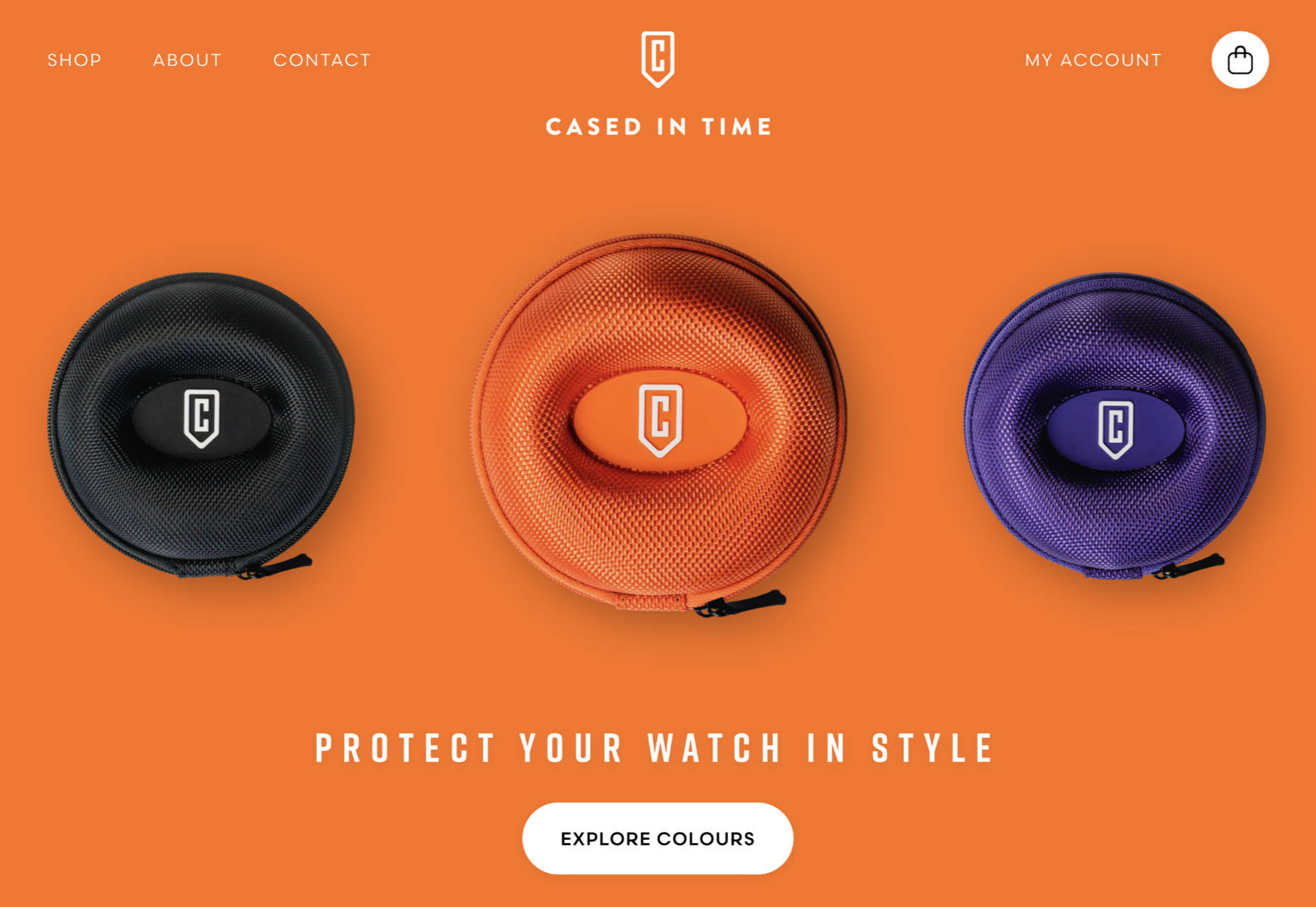
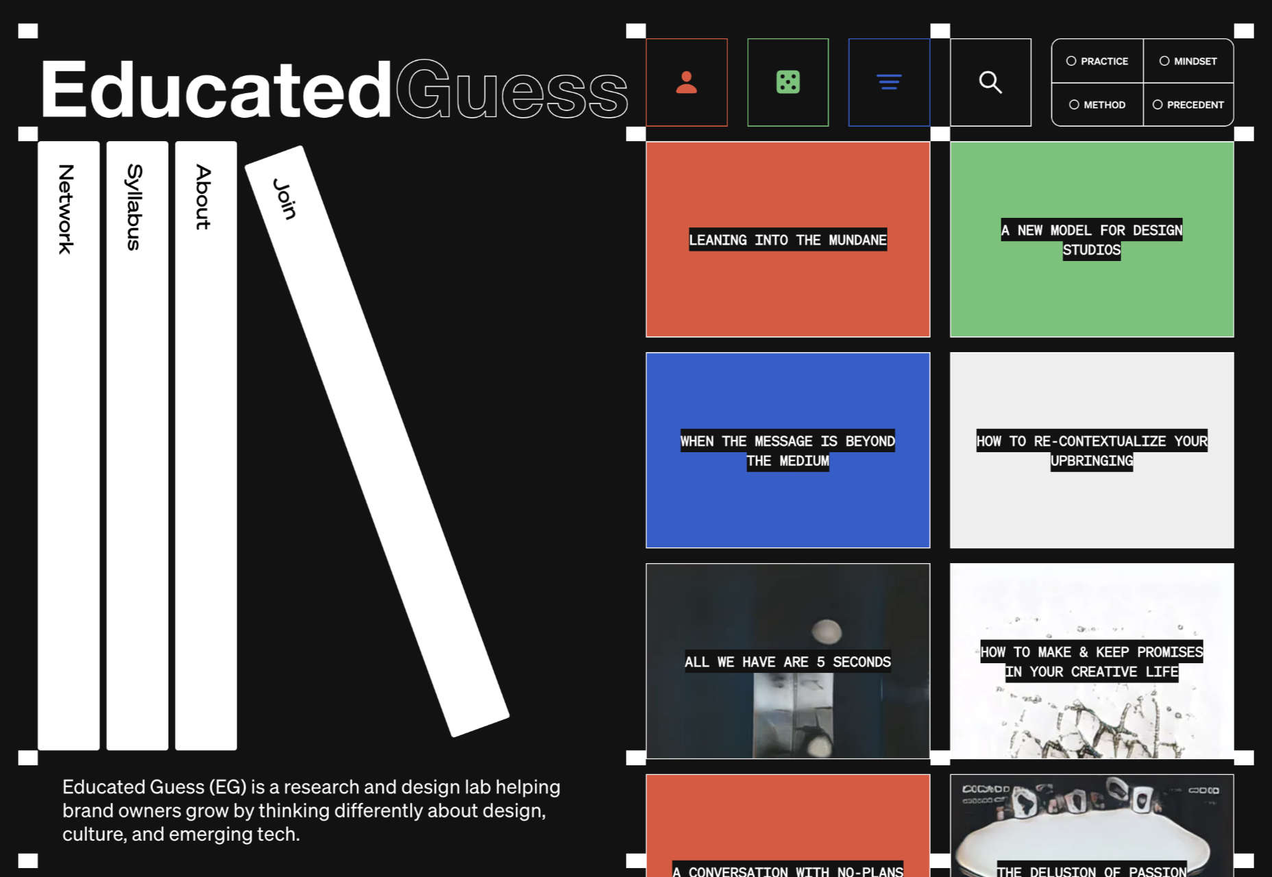
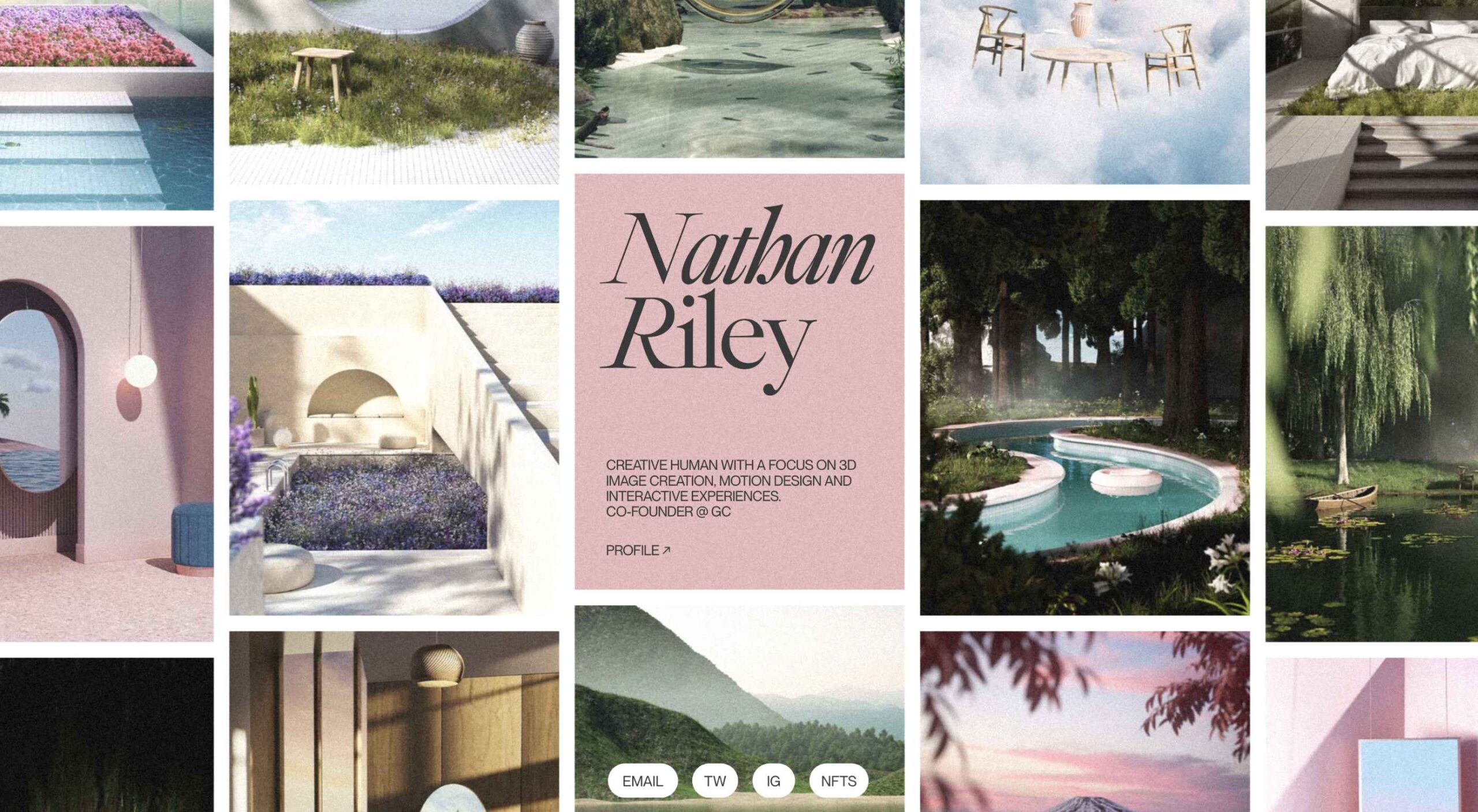 This month we’re seeing websites that are very conscious of the design trends they’re following. Designers are making conscious choices to adopt styles, and opting out when it doesn’t suit the site. What we end up with is a crop of sophisticated, well-designed websites that use style as a technique to further their aims.
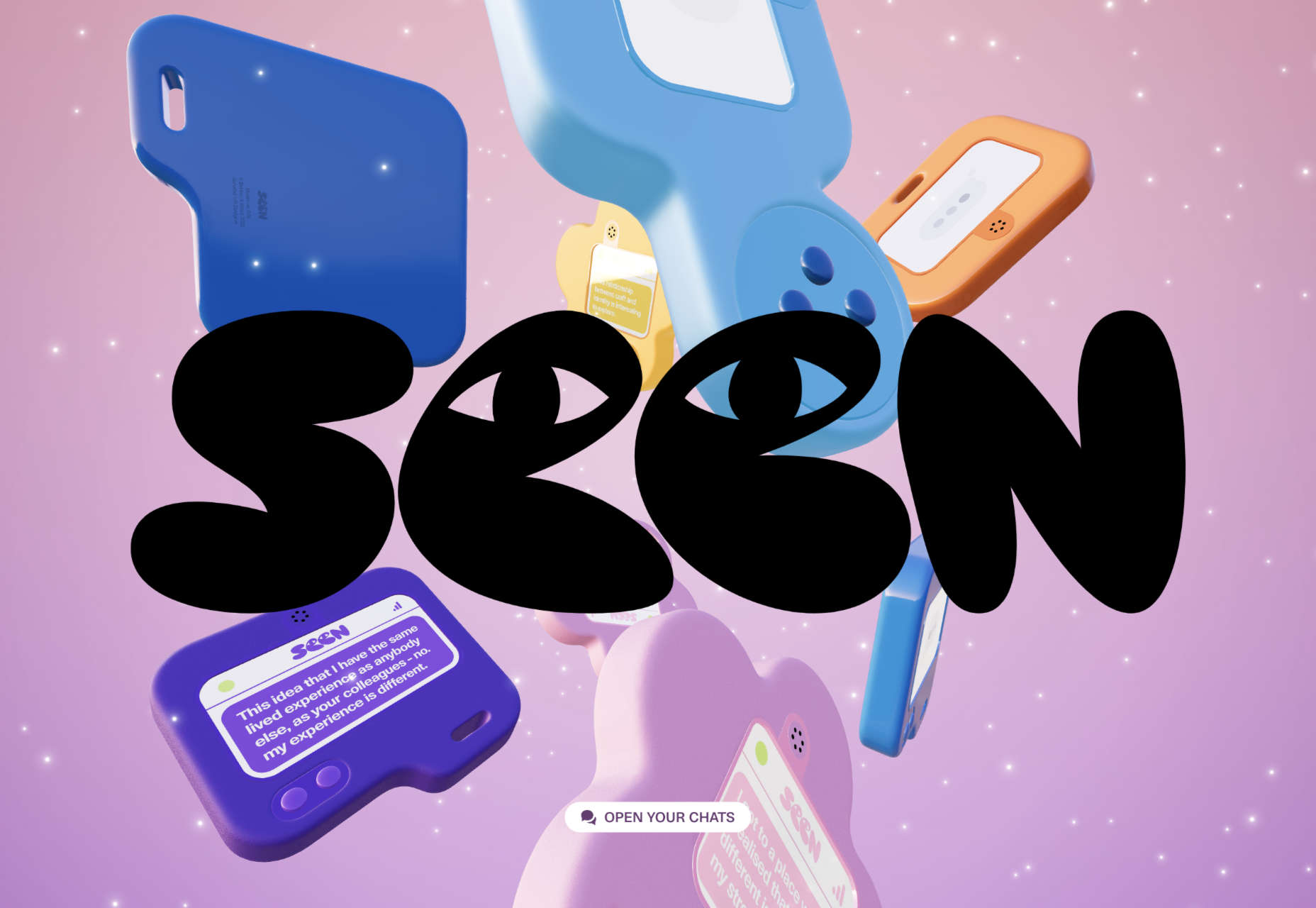


