
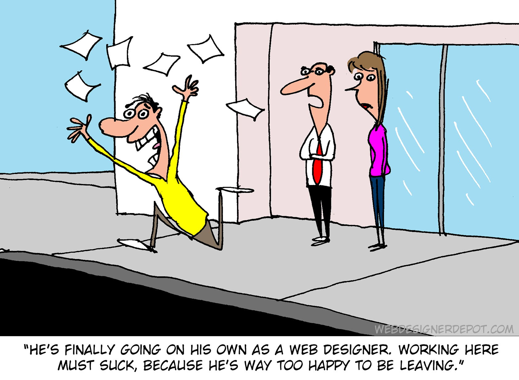
 Inclusive design is often mistaken for accessibility, or even used as an interchangeable term, which is a good indication that most designers don’t know what it means.
Accessibility is a process that seeks to mitigate issues in a design that is not sufficiently universal; inclusive design increases the universality of the design. In real-world terms, an accessible building may replace its front steps with a ramp; an inclusive building is constructed at the same level as the sidewalk.
Accessibility is concerned with objective, measurable improvements. It’s a UI concern. Inclusive design is subjective, more difficult to measure, and is a UX concern. By designing inclusively, we extend our designs to the widest possible user group and contribute to a better society. Here are three ways to get started.
1. You’re the Edge Case
When designing, it’s normal to assume that we are normal. After all, we are the center of our experience of the world. Everything from our preferences to our empathy stems from our individual place in time and space.
When we use the term “edge case,” what we’re referring to is a minority experience, a way of using our design that is uncommon or distinct from our own expectations.
But what would happen if we treat ourselves as the edge case? What if all of the experiences that we deem to be minority experiences are actually the core, common user experience of our design?
If we start from the position that we are the one out-of-step with the design, that most people will not think or act as we do, then we’re eliminating thousands of biased decisions about how our design should be.
Draw From Life
It has always surprised me that in Europe’s dark ages — ranging from the decline of the Roman empire to the Proto-Renaissance — it didn’t occur to anyone to draw from life. Artists drew things the way they thought they should look, which is why so many Byzantine icons of the infant Jesus look like a middle-aged blonde man that has been shrunk.
It’s important to draw from real life as much as possible. That means abandoning personas — which are by definition under-representative and frequently loaded with bias — and engaging with actual users. Most of all, it means taking a step back and opening your eyes.
2. Stop Making Inclusive Design Part of Your Practice
Inclusive design cannot be a part of your practice; it’s an all-encompassing attitude. Your design practice must be inclusive. At least, it should aspire to be…
As human beings, we are biased—all of us. The reason for that is that bias — be it racism, misogyny, nationalism, homophobia, or anything else — is cultural. And we all exist within society. We’re all bombarded with information that reinforces those biases every day.
Accept that you have biases and that your biases will pull your design work away from the inclusive solution you aspire to. But equally, accept that by acknowledging your biases you’re limiting the influence they have over your decision-making.
Do Not Require Users to Self-Identify
It’s divisive and abusive to partition users into groups, especially when the act of doing so perpetuates bias.
One of the most encouraging developments of the last decade has been the introduction of the answer “prefer not to say” in response to personal questions about race, gender, status, and so forth. But if “prefer not to say” is a valid option, in other words if you don’t actually need to know, then why ask at all?
Beware Occam’s Razor
Occam’s Razor is an often misquoted idea that (to paraphrase) states that when making a decision, the one with the least assumptions is the correct choice.
The problem is that Occam’s Razor implies that there is a ‘correct’ decision. But in fact, inclusive design benefits most from a flexible UI and a high tolerance for deviation.
If you can identify the assumptions in a design decision sufficiently to count them, then you’re best served by testing, not comparing, those assumptions.
3. Design Flexibility Into Everything
There is no such thing as a “natural normal,” but there is “perceived normal.” Much of our behavior is governed by the experiences we’ve had since we were very young. Despite existing somewhere on a scale of ability and preference, most of us have inched towards what we have been told is a “normal” range all our lives.
However, it is a physiological fact that every characteristic exists somewhere on a spectrum. There are no black and whites; it’s all grey.
When we design a site or app, we tend to silo certain characteristics into one. Someone who is visually impaired is treated to the same ‘solution’ as someone who is blind, even though visual impairment can range from screen reflections on a sunny day to someone who was born without optic nerves.
There are people who have lost their sight through degeneration or accident and will be able to make visual connections based on remembered visuals. Other people have never seen anything and their conscious mental process isn’t figurative at all.
To accommodate the full gamut of possible interactions with our design, we need to design to a scale, not with absolute values. This means thinking less about set colors and sizes and more in terms of contrast and scale.
Avoid Communicating in Color
Few areas are more indicative of a spectrum of experiences than color.
Color is instantly problematic for designers because quite apart from color blindness, color has deeply personal associations.
Over the last couple of decades, it’s been repeatedly proven that it is contrast, not hue, that increases engagement. Green does not always mean go; red does not always mean stop.
Color involves so many biases and assumptions that it’s simply better to work with contrast than select the ‘right’ hue.
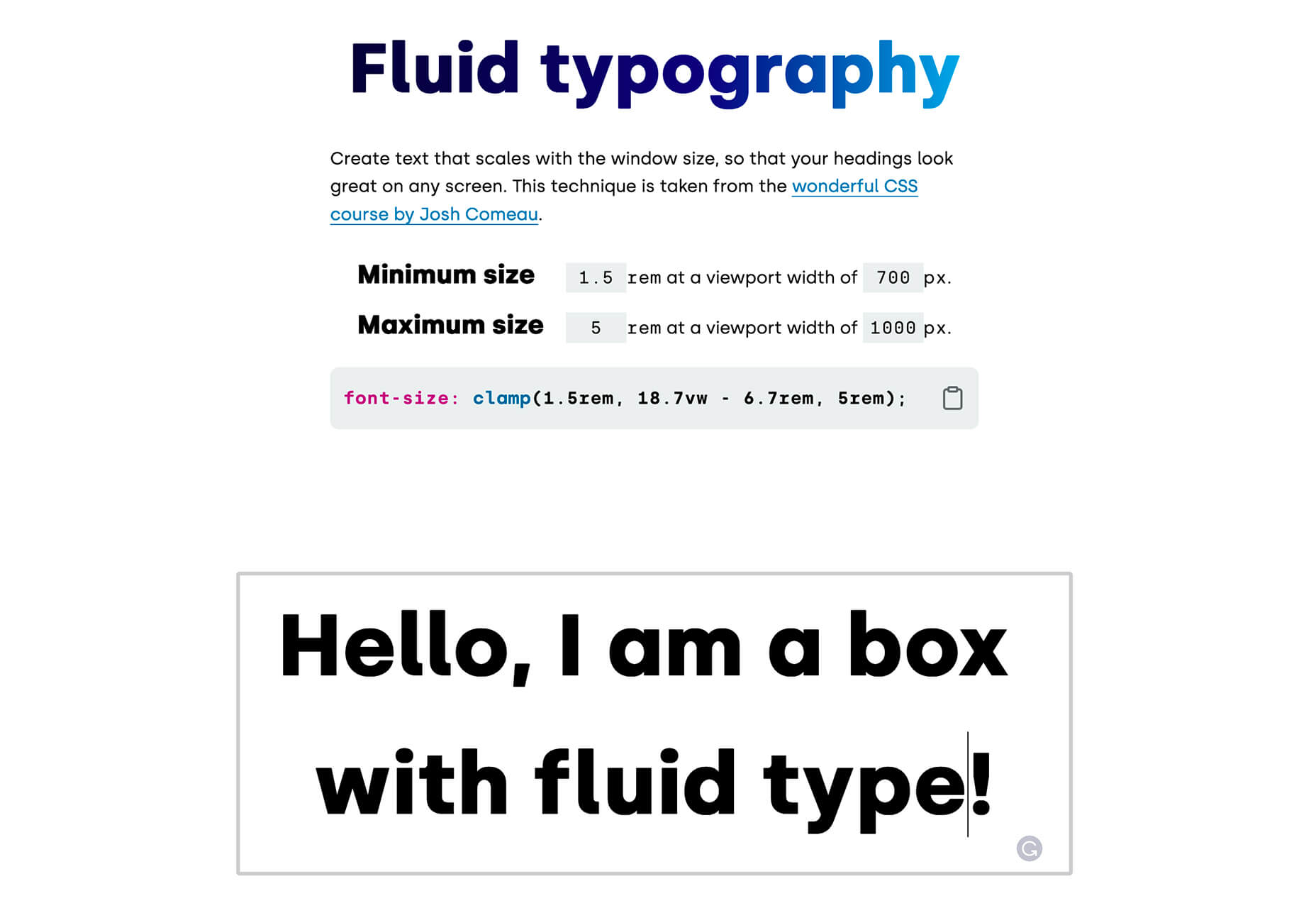
Bigger Typography (Sometimes)
In the first draft of this article, I wrote that increasing the scale of your typography was always good.
My rationale was that some users will benefit from larger type, and zero users will be hindered by it. But that’s not true. Larger type means fewer lines per viewport, which means more scrolling; not a problem for some users, but potentially an issue for those with motor control issues.
That was one of my biases right there.
Congratulations, You’re Now An Inclusive Designer
Good design is self-aware in origin and unselfconscious in execution.
Inclusive design isn’t about enabling access for everyone; it’s about designing for a user experience that is welcoming and respectful. Every one of your users should feel not just enabled but validated.
Inclusive design isn’t a series of items on a checklist; it’s an ideal, like harmony or beauty, that we may struggle to achieve but that we should strive for nonetheless.
Image via Pexels.
The post 3 Ways to Design More Inclusively first appeared on Webdesigner Depot.

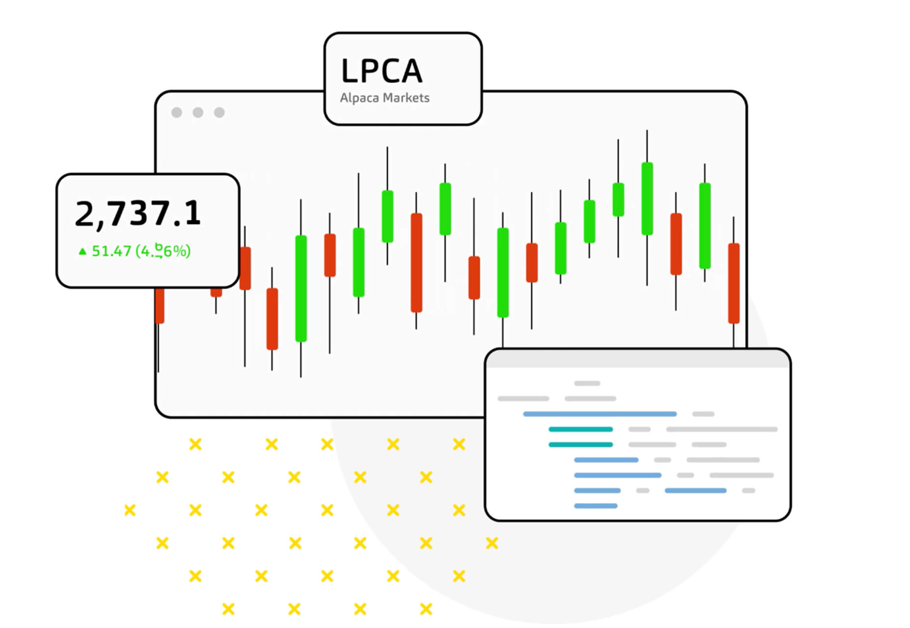
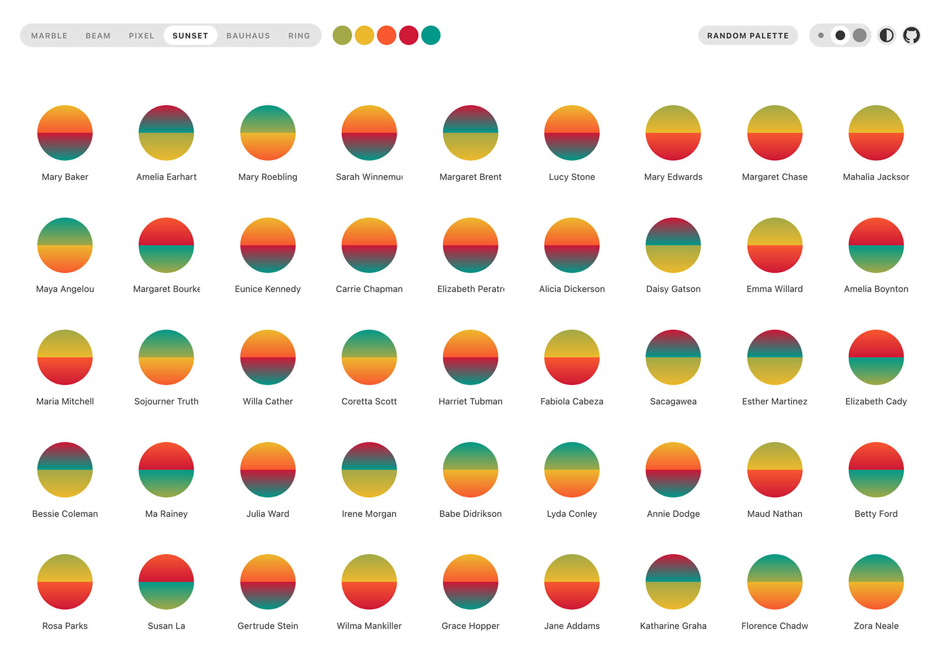
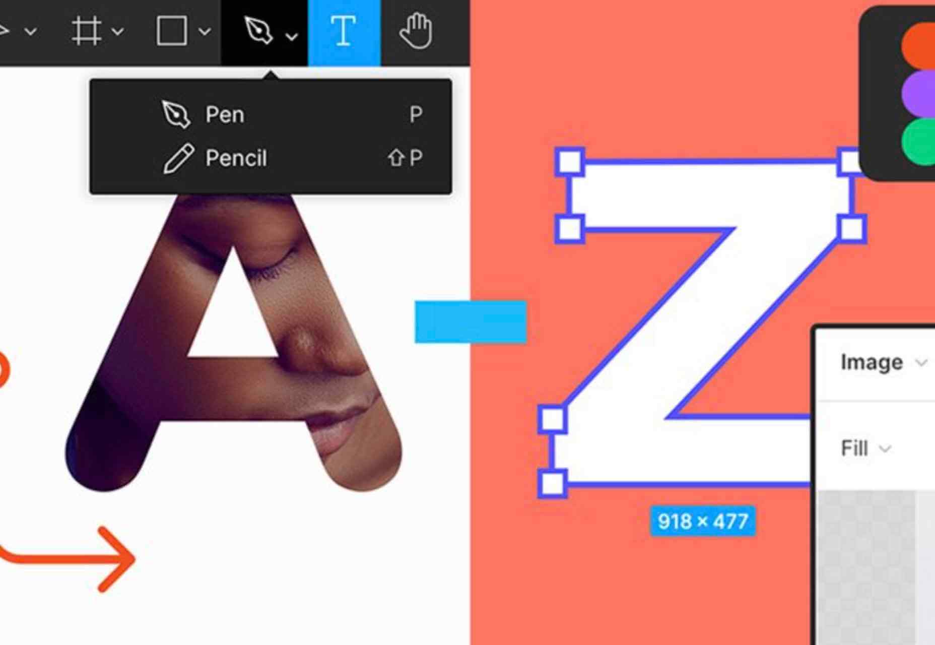
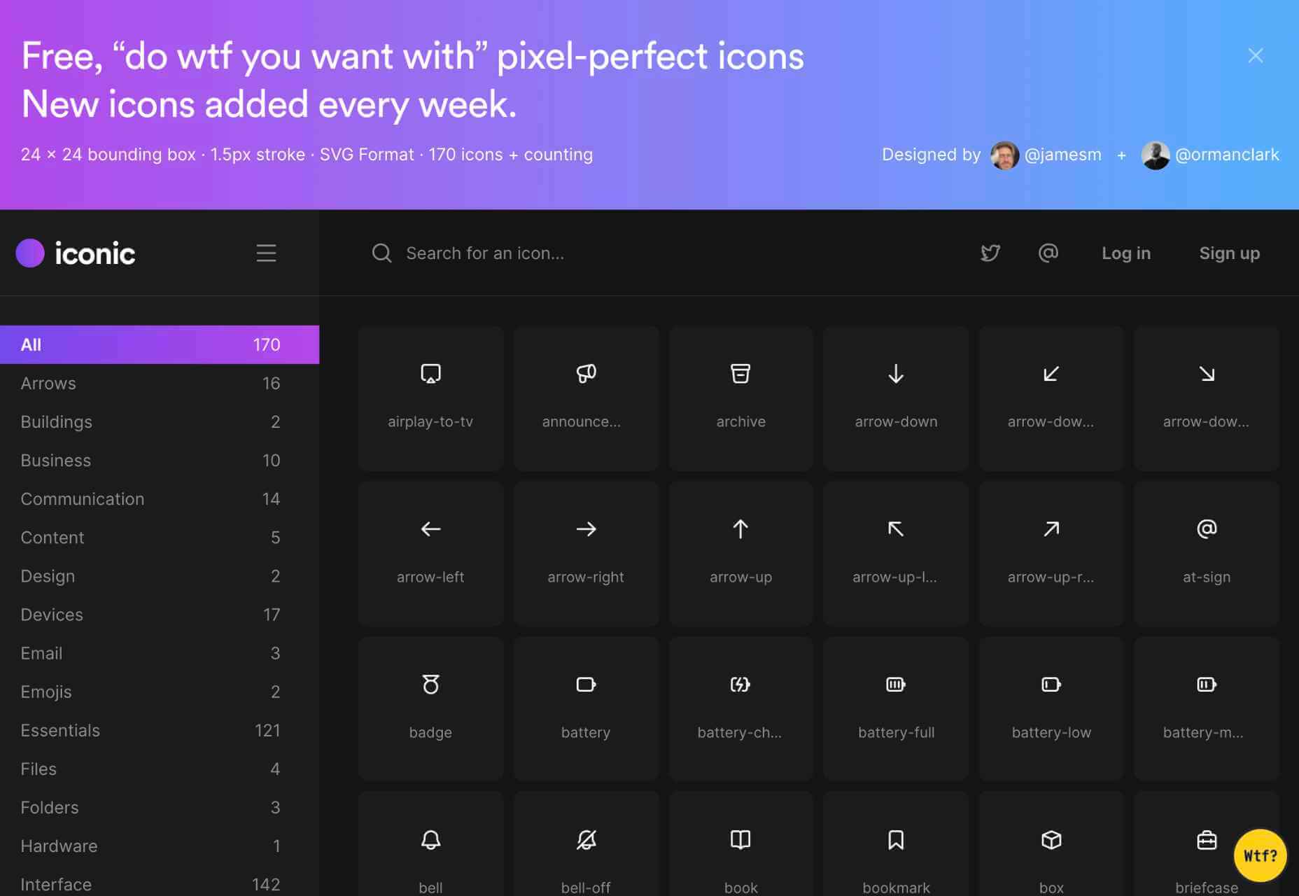
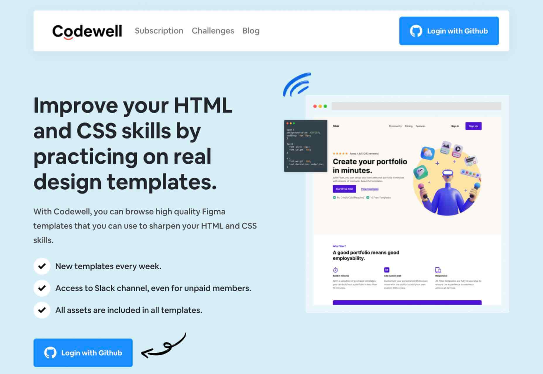
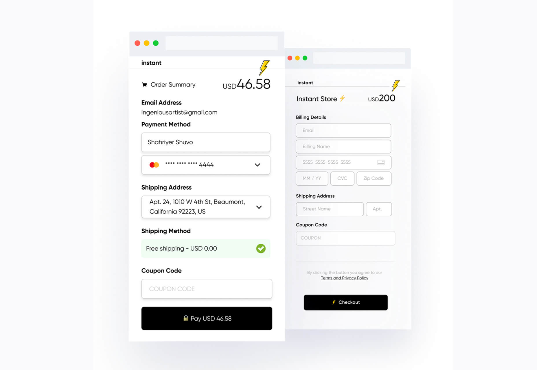
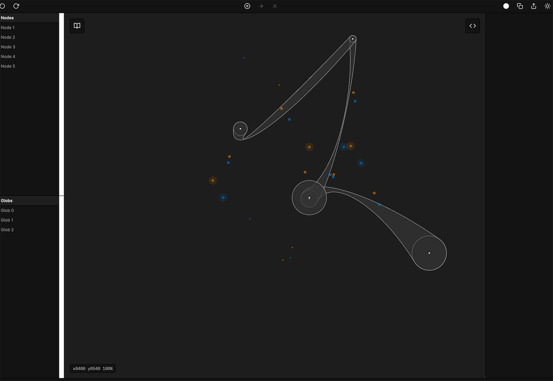
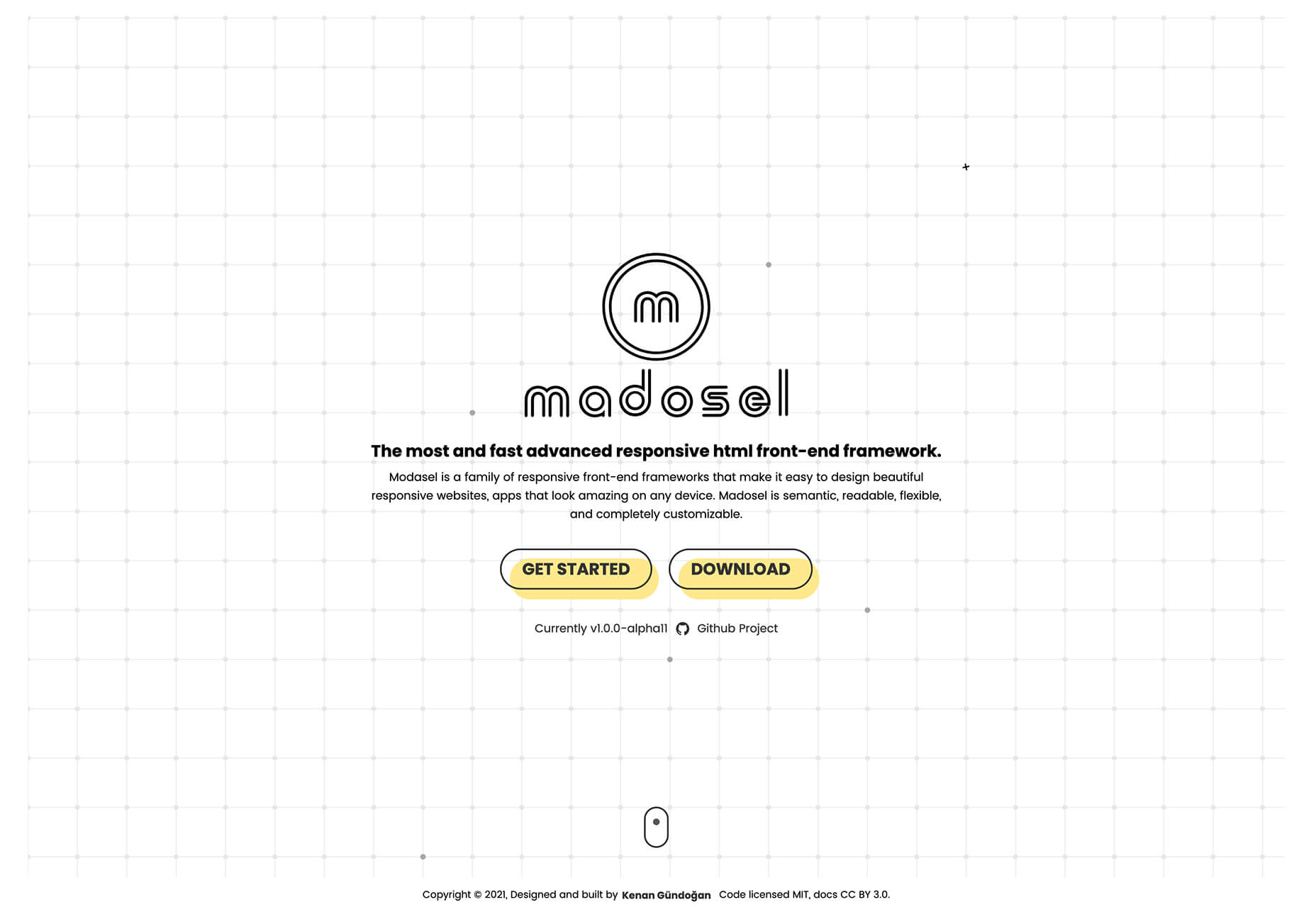
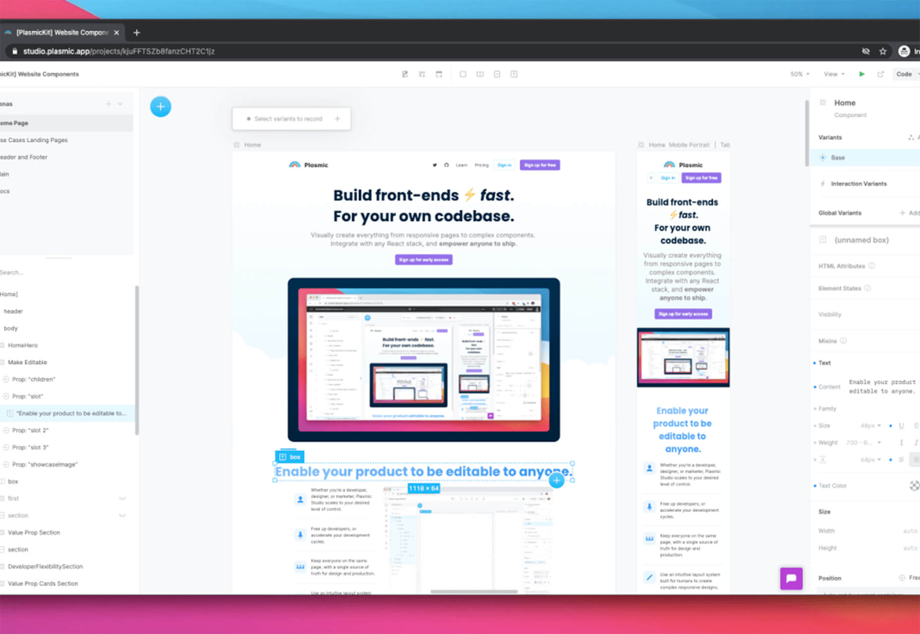
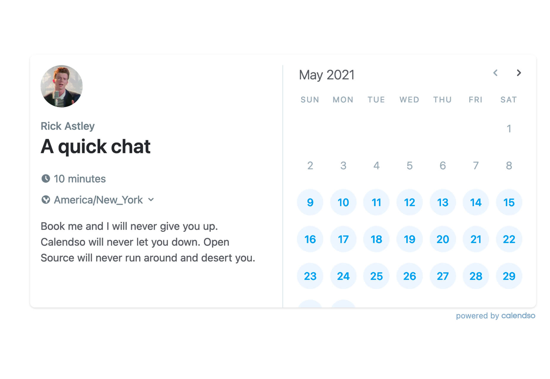
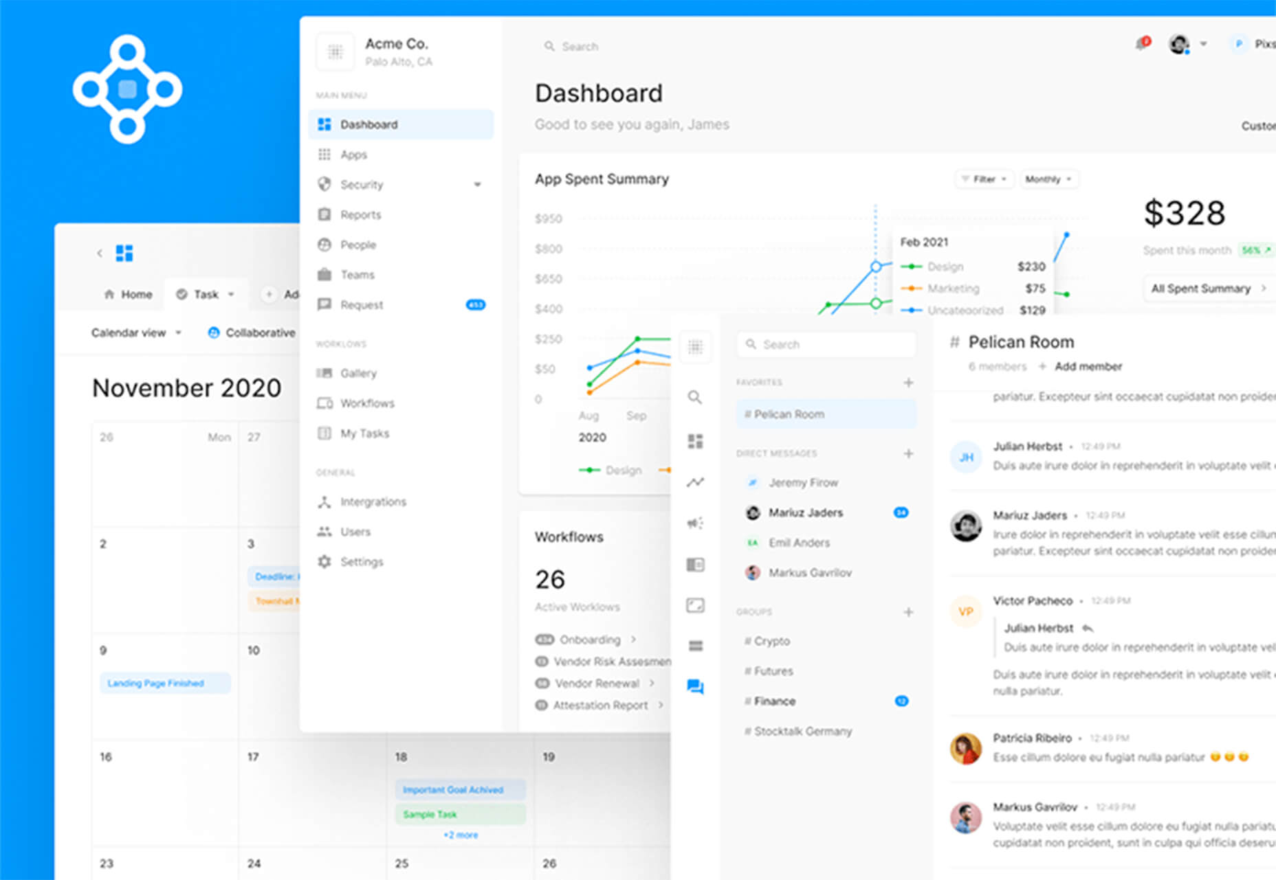
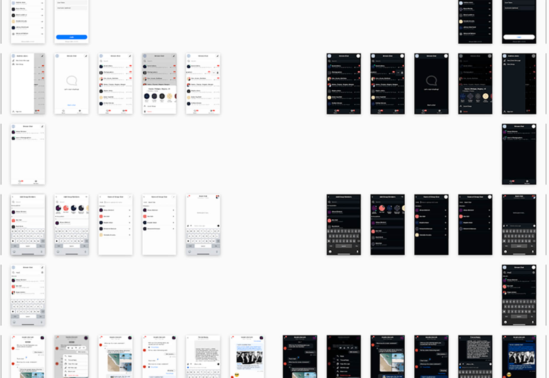
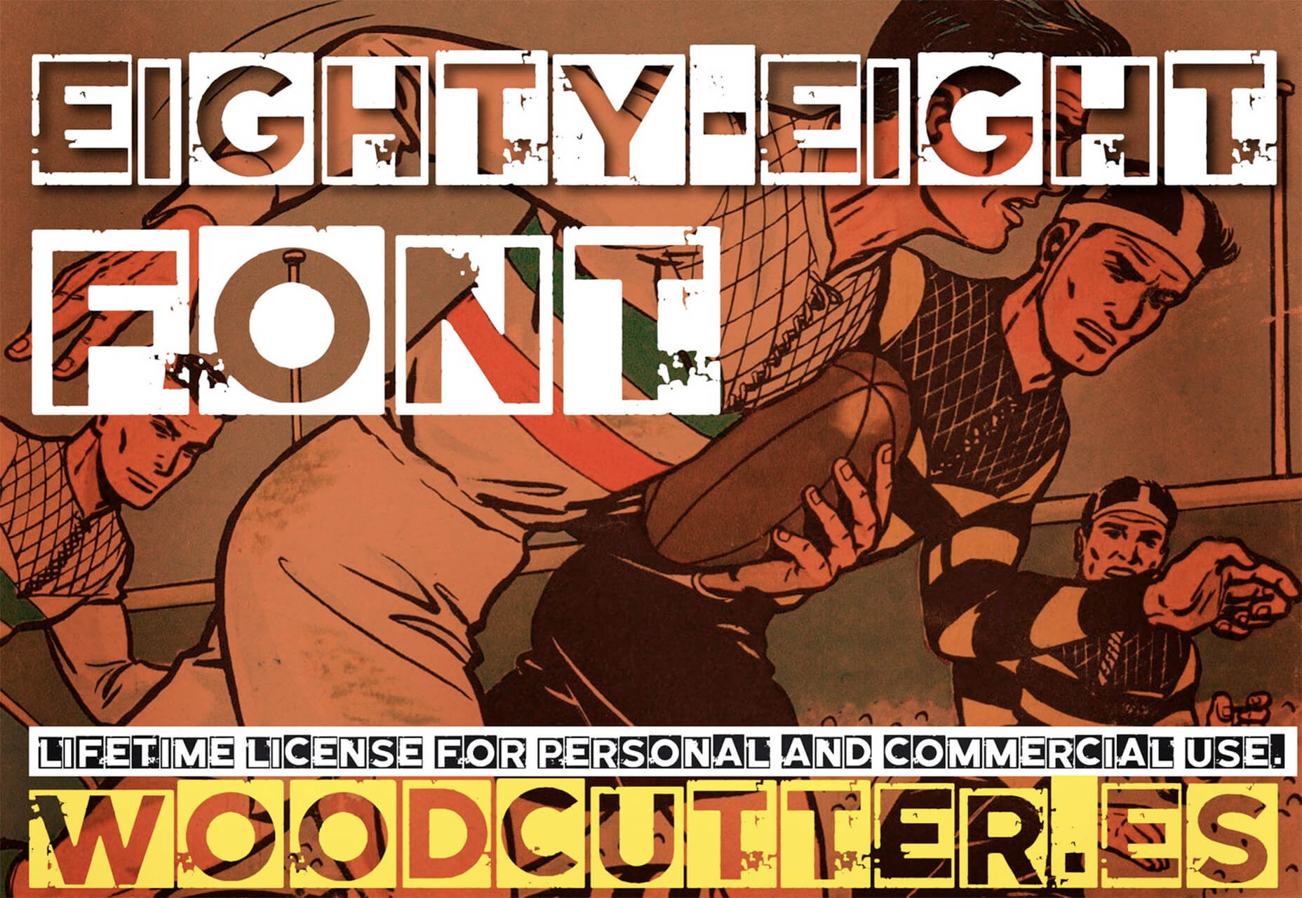
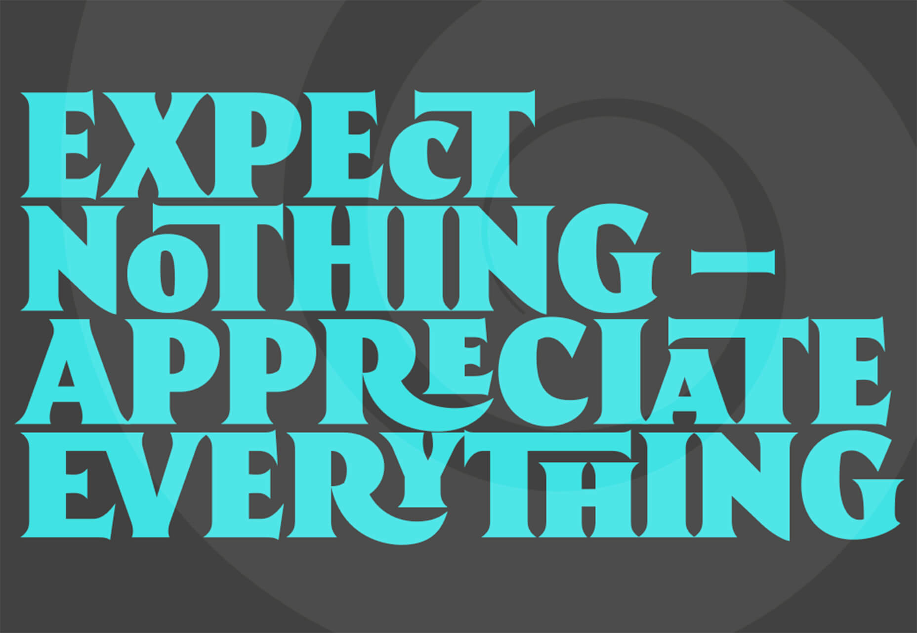
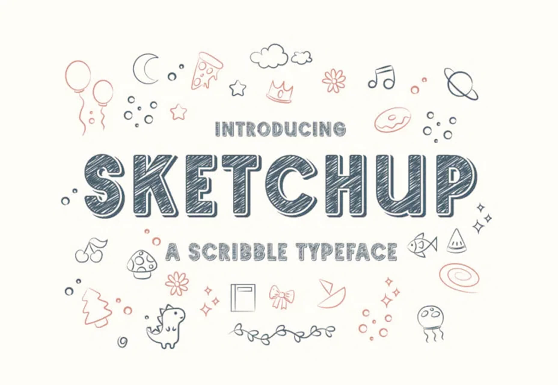
 This month’s new tools and resources collection is a mixed bag of elements for designers and developers. From fun little divots to tools that can speed up development, you are sure to find something usable here.


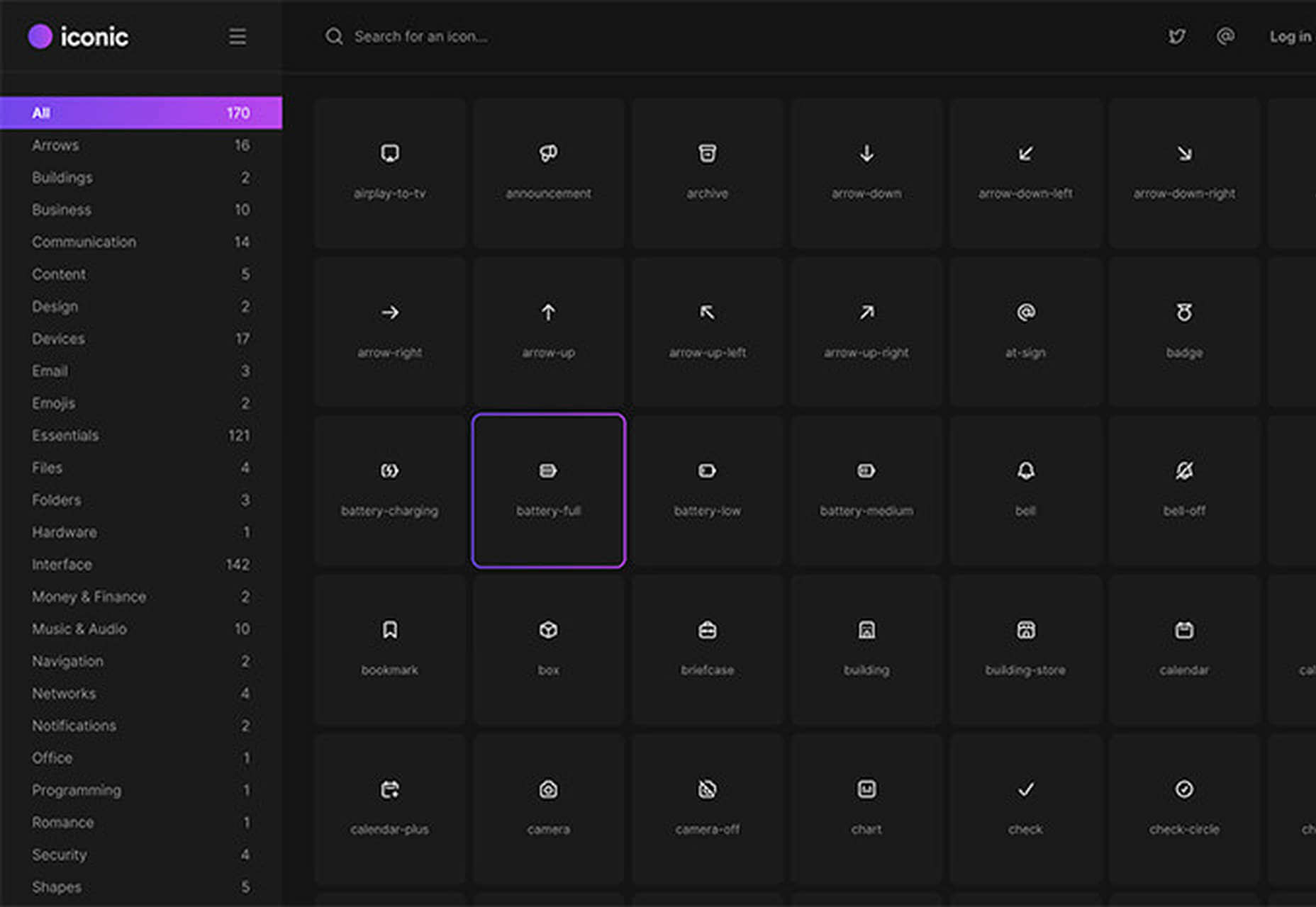
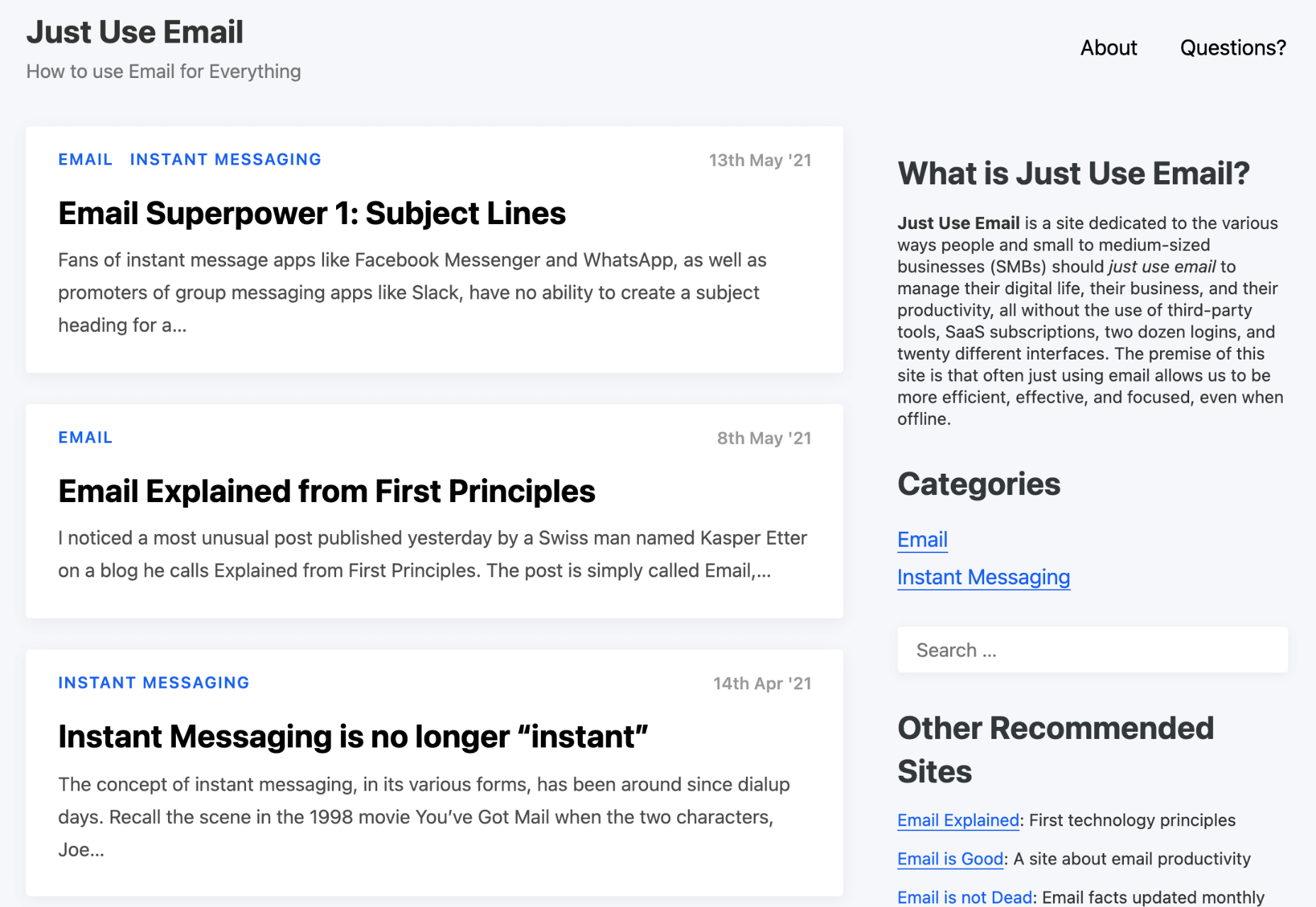
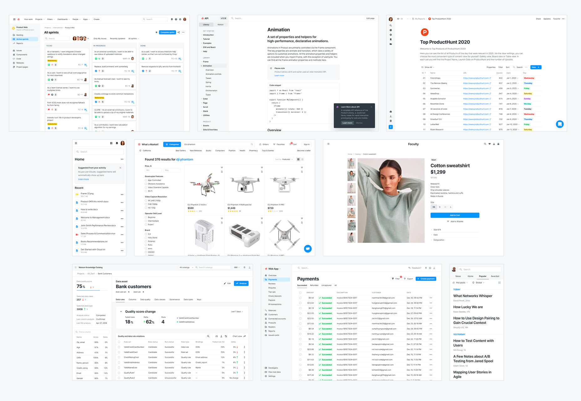
 Every designer has their own preferred strategy for collecting resources. Some pluck brushes, fonts, and templates from different “stock photo sites” and public marketplaces. Others collect graphics from swipe files and forums around the web.


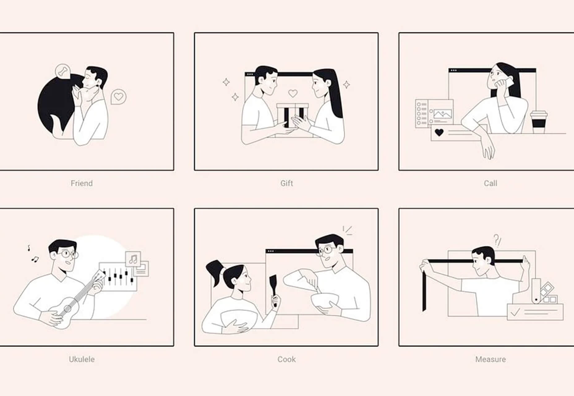
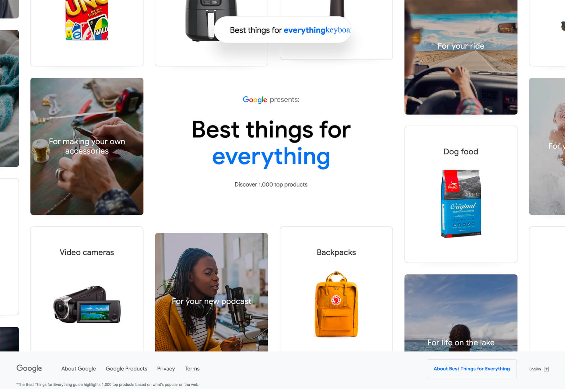
 If you are feeling like me right now, you have mixed emotions about the world in general. And this is translating into a pretty distinct design trend that’s happening almost across the board: Websites aren’t using many images of people right now.
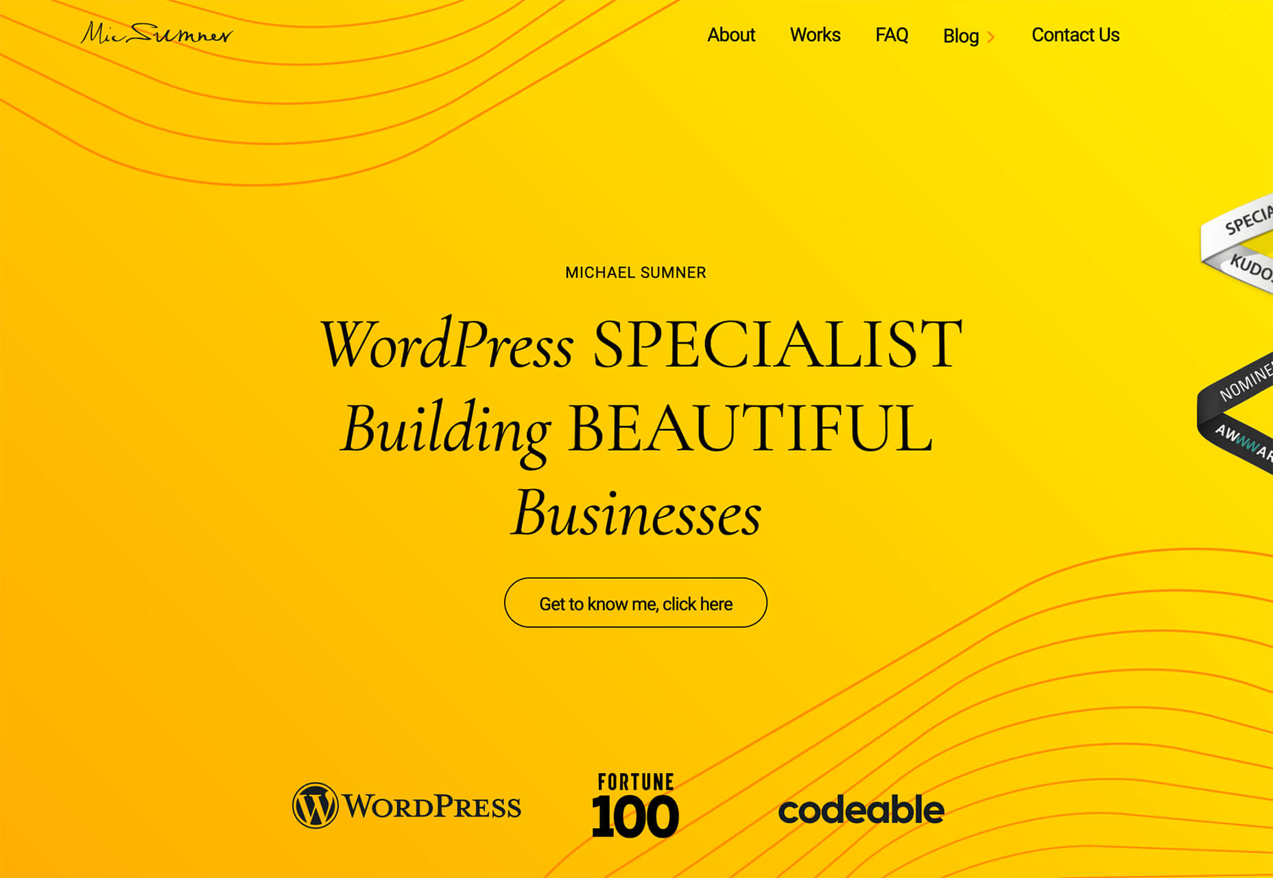

 Every day design fans submit incredible industry stories to our sister-site,
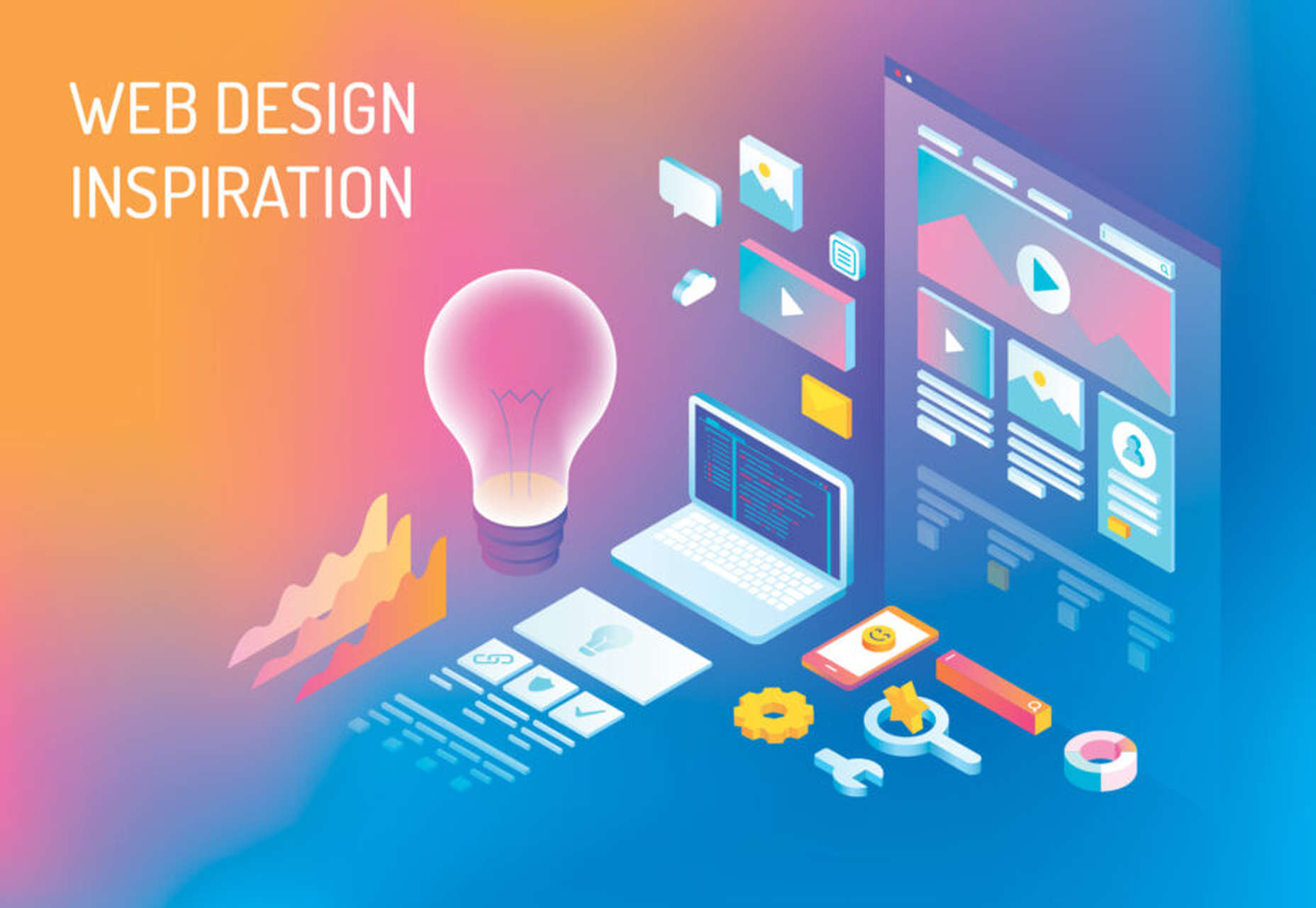


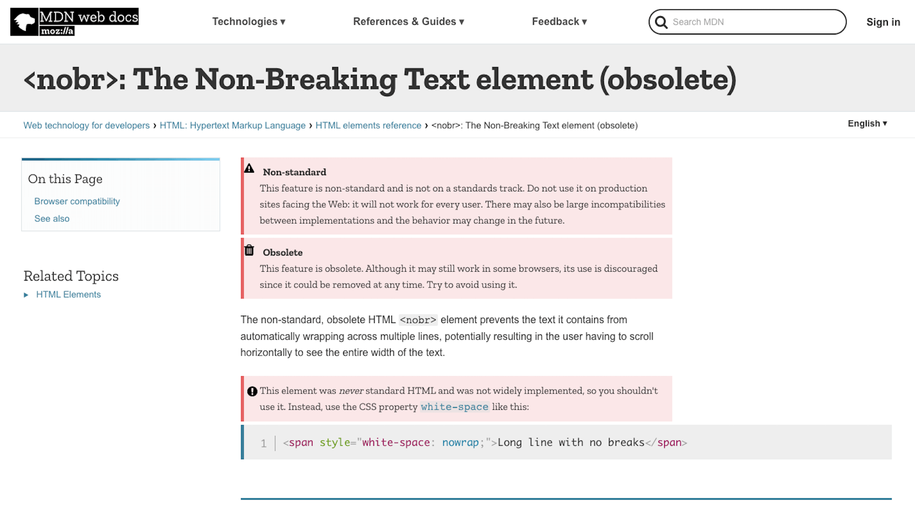
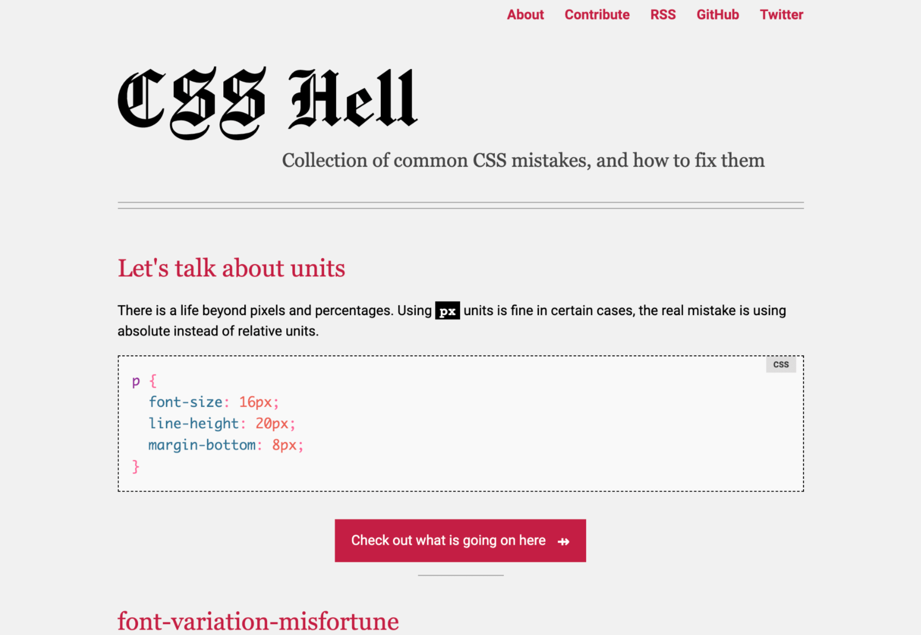
 HTML is one of the foundational building blocks of the Web. But just as web design best practices and techniques change over time, so does the code we use. As HTML evolves, some of its older markup has been deprecated while other parts have been repurposed.
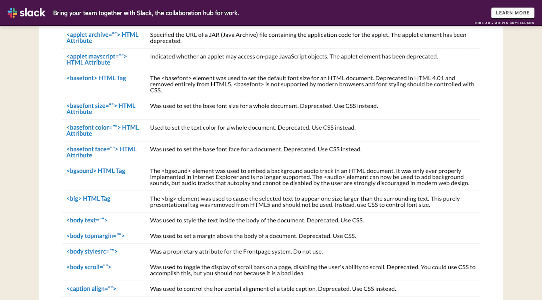

 Each day design fans submit incredible industry stories to our sister-site,

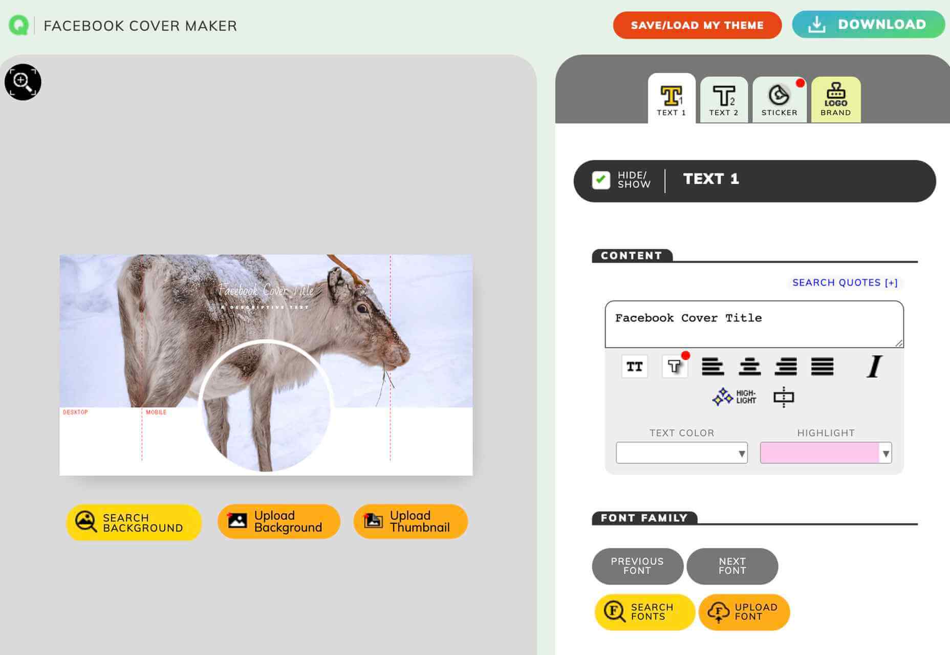
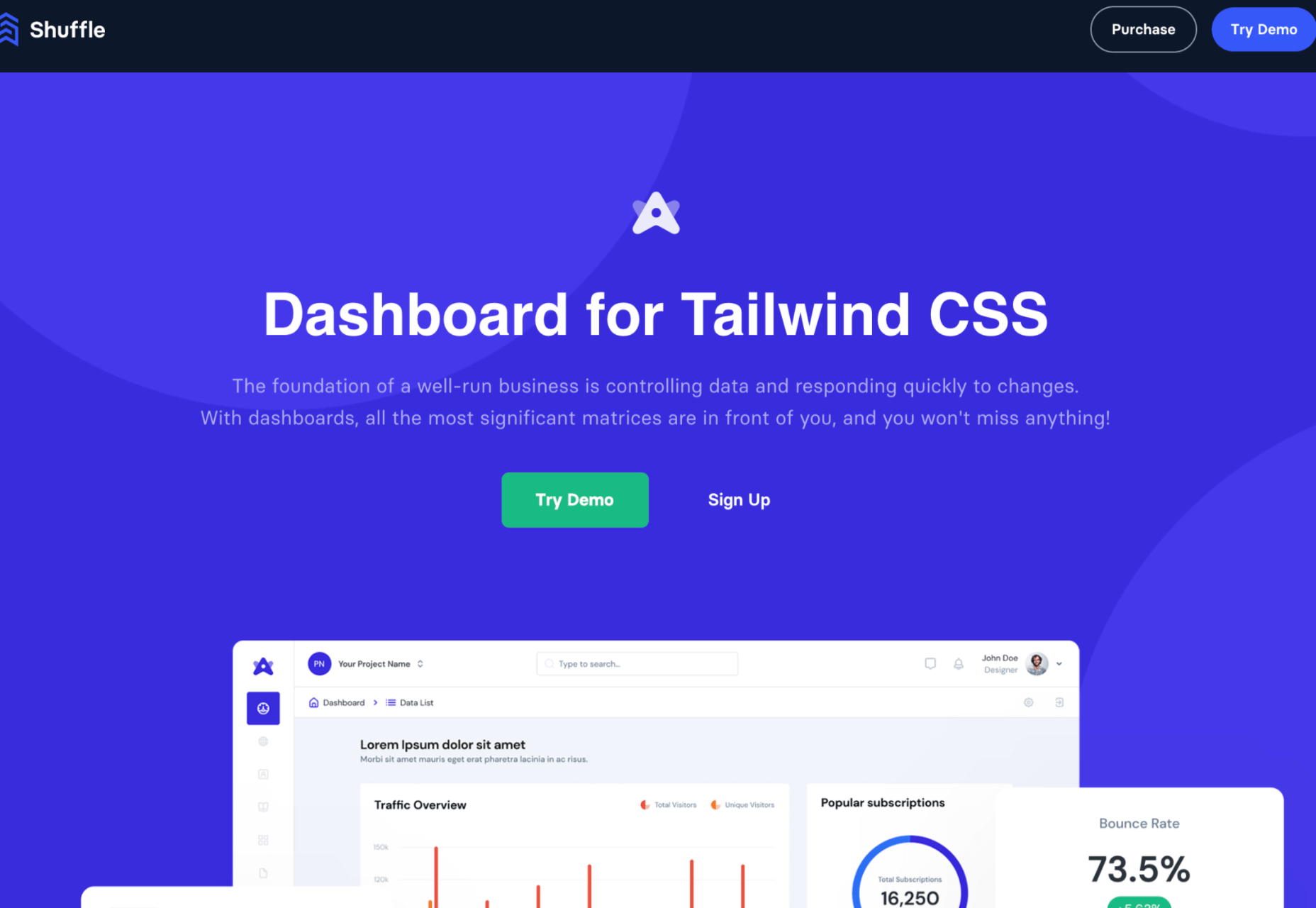


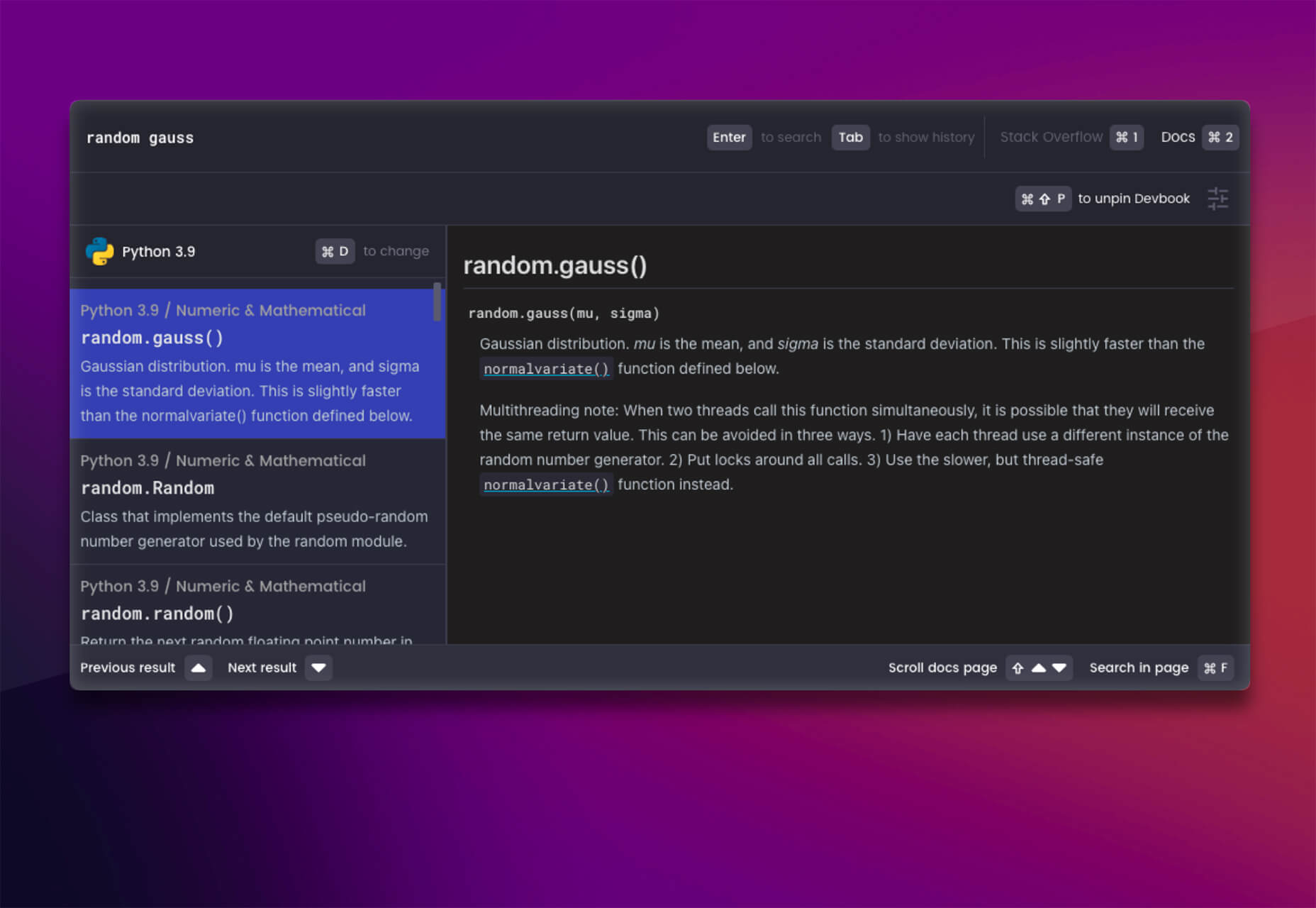
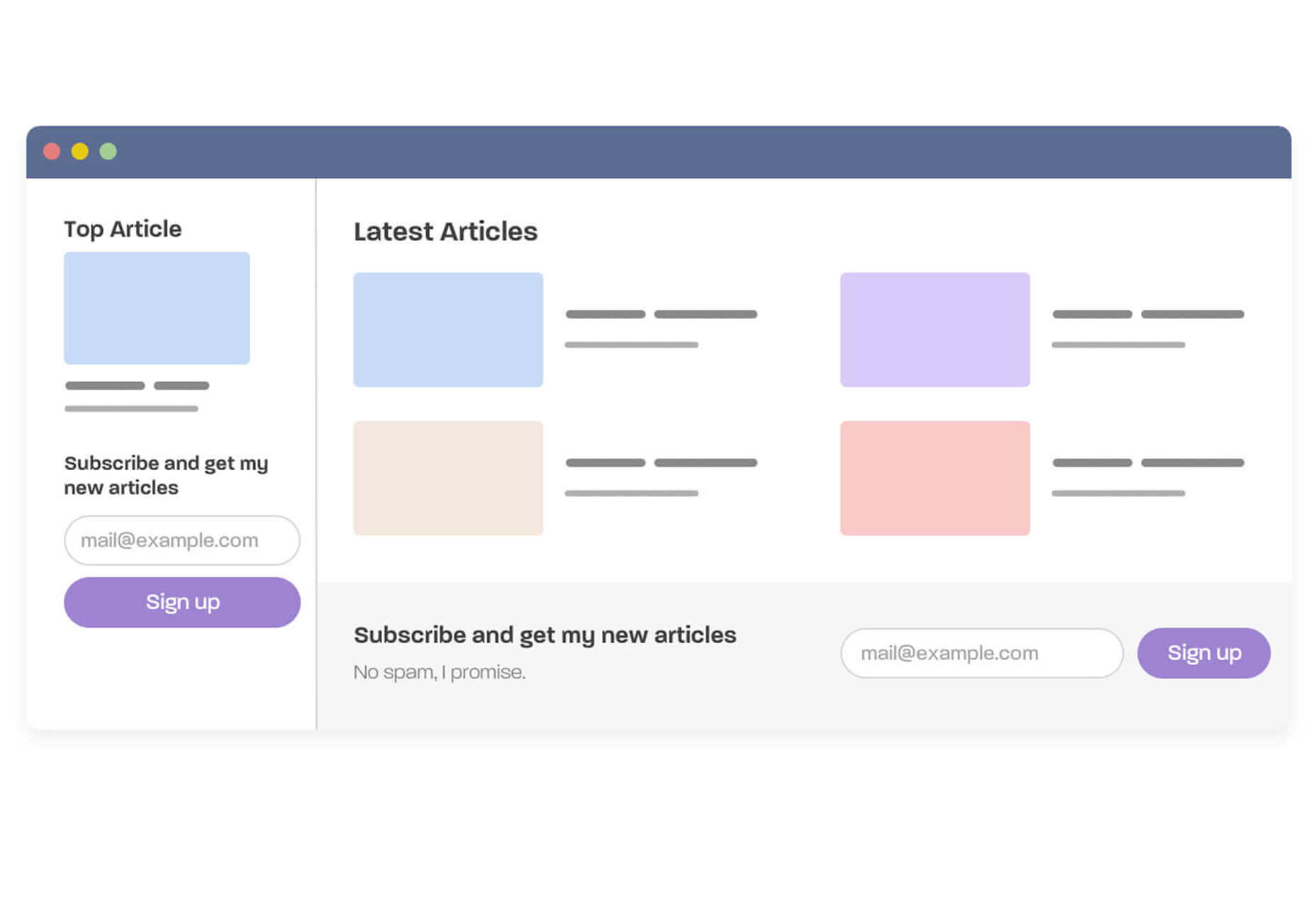
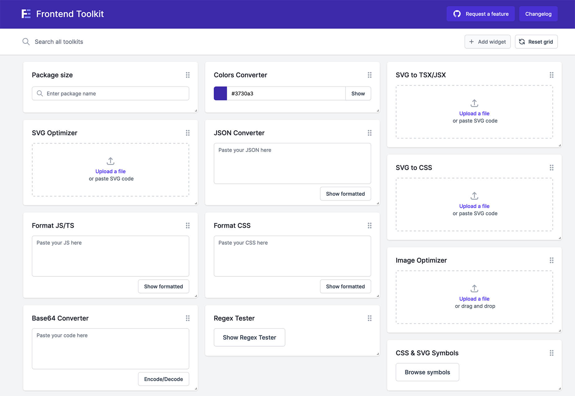
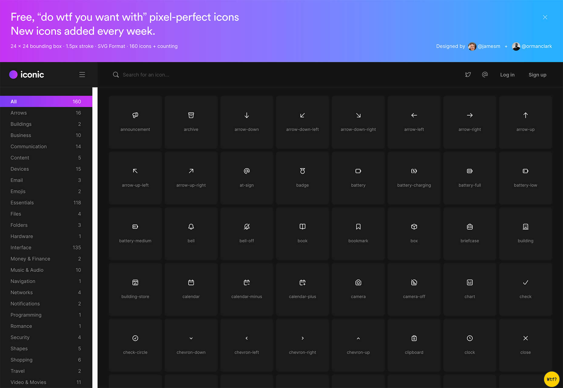
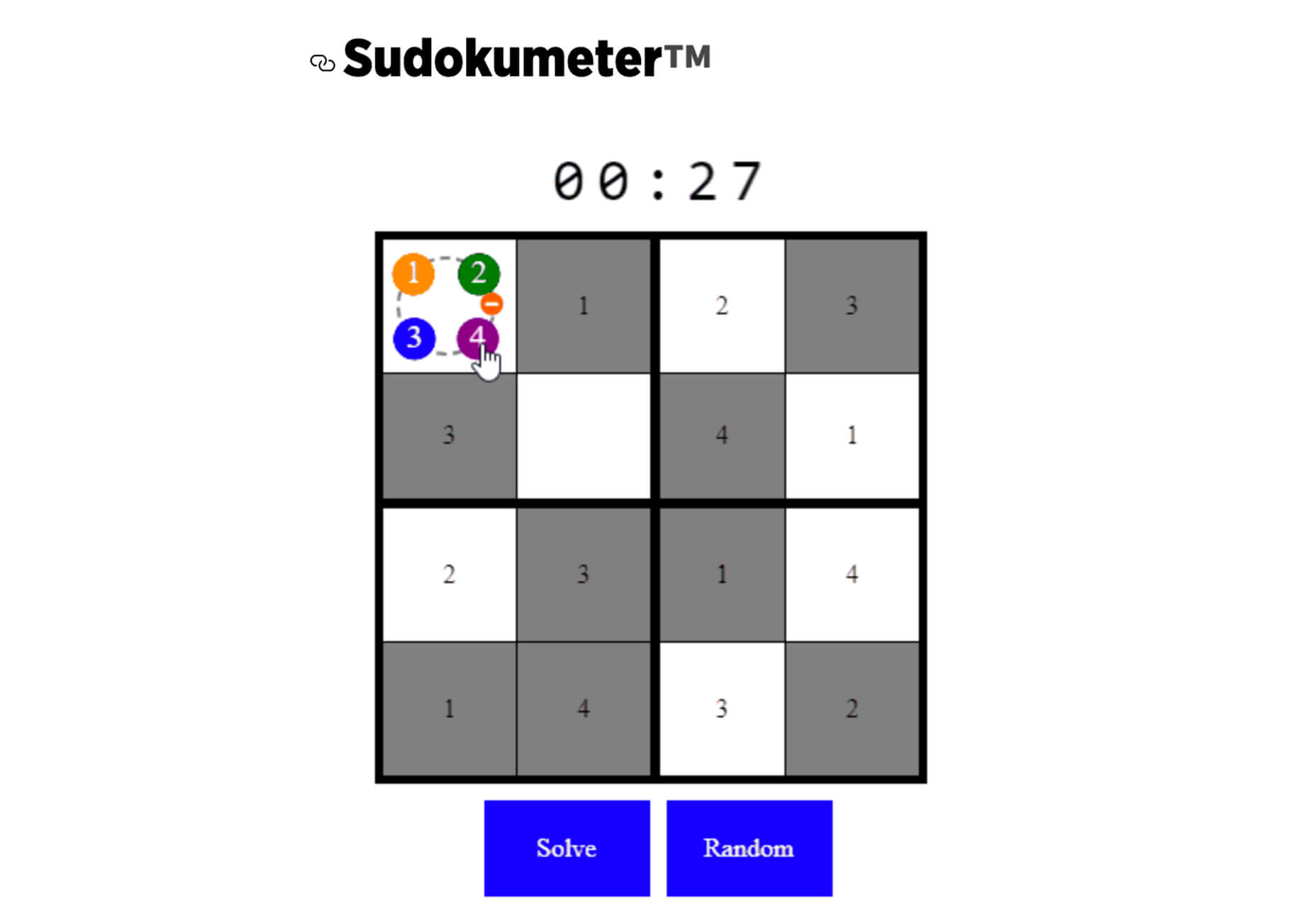
 From dev tools to productivity to a little bit of fun with sudoku, this month’s collection of new tools is packed with something for everyone.


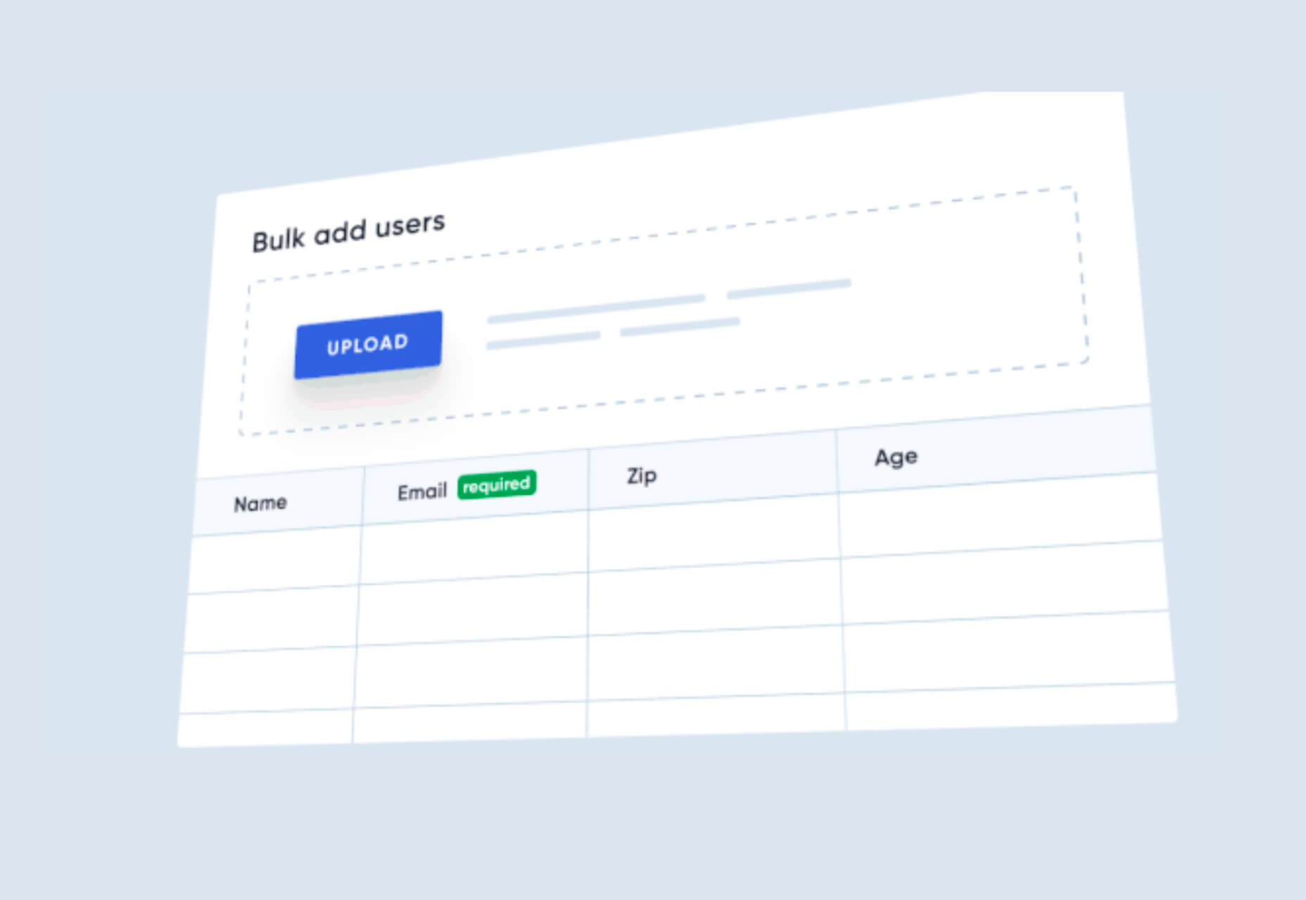

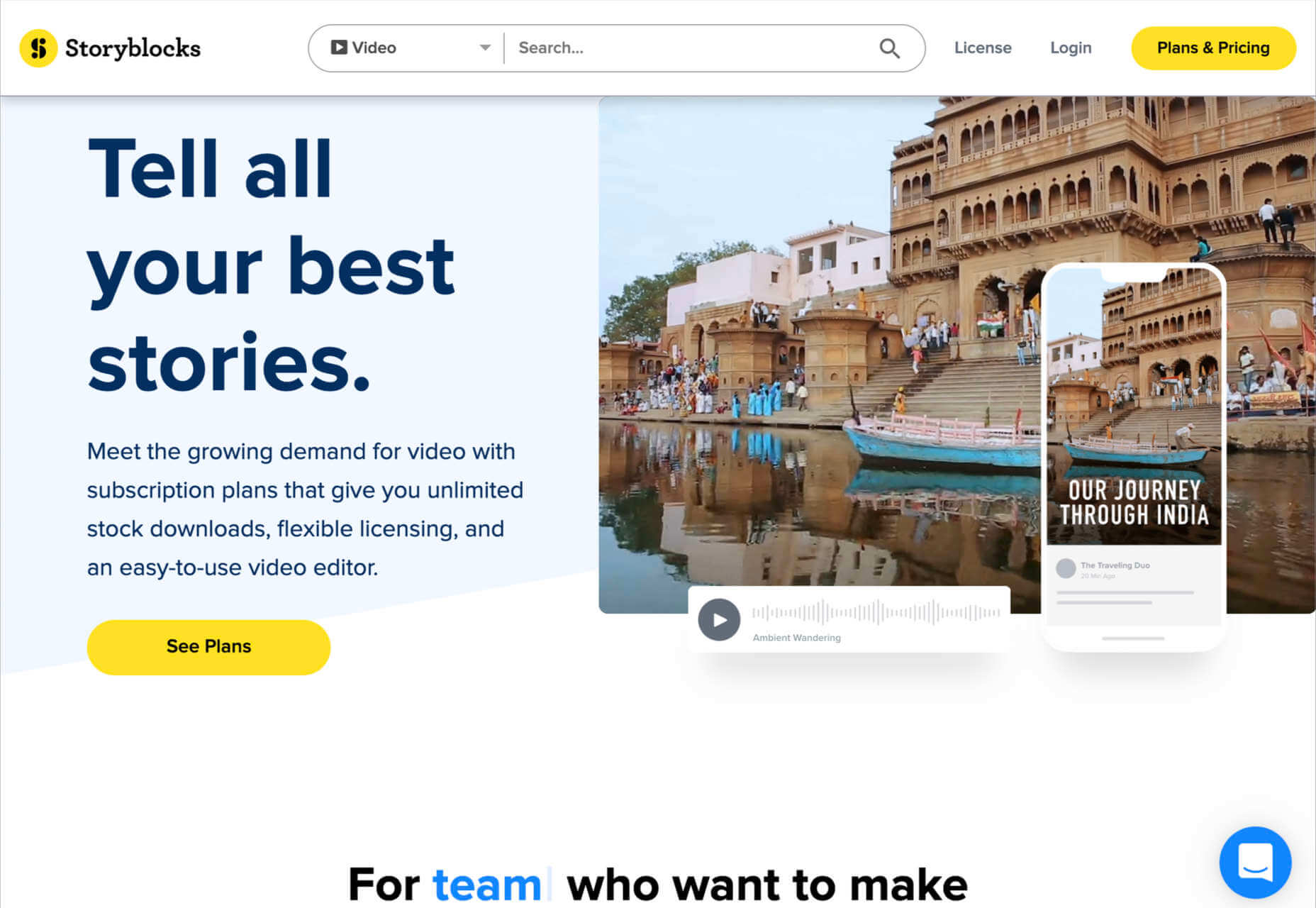
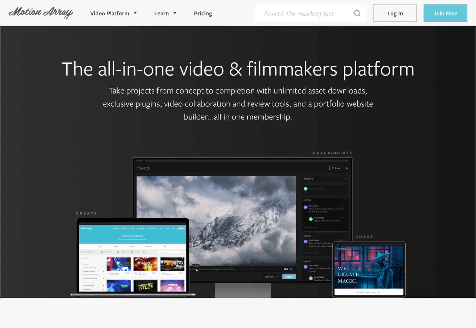
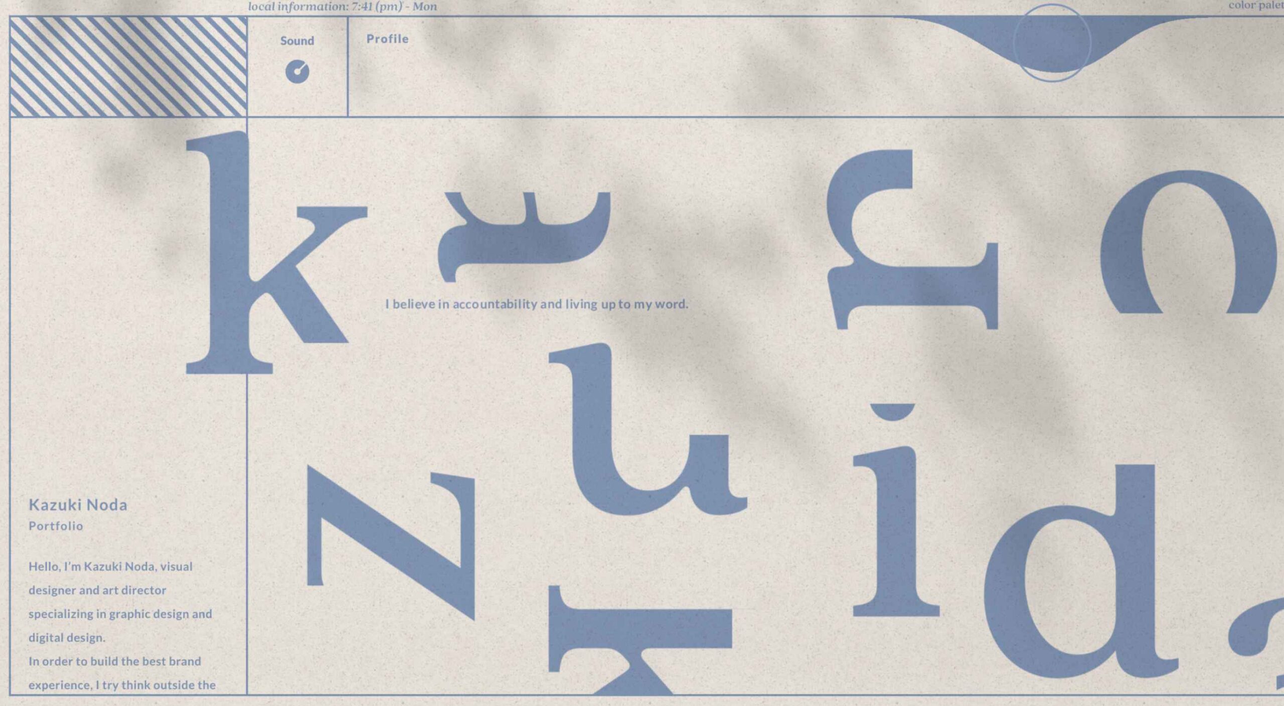
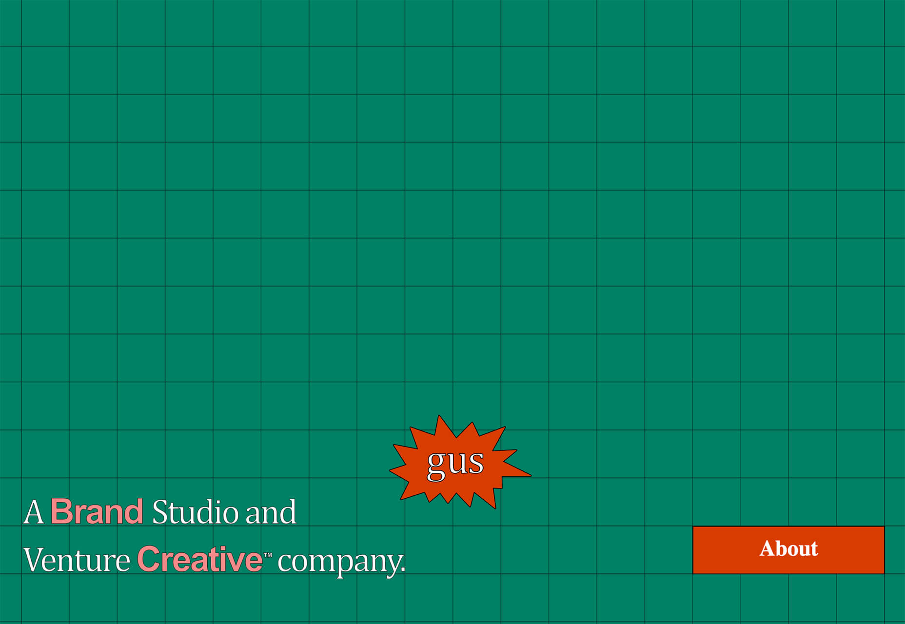
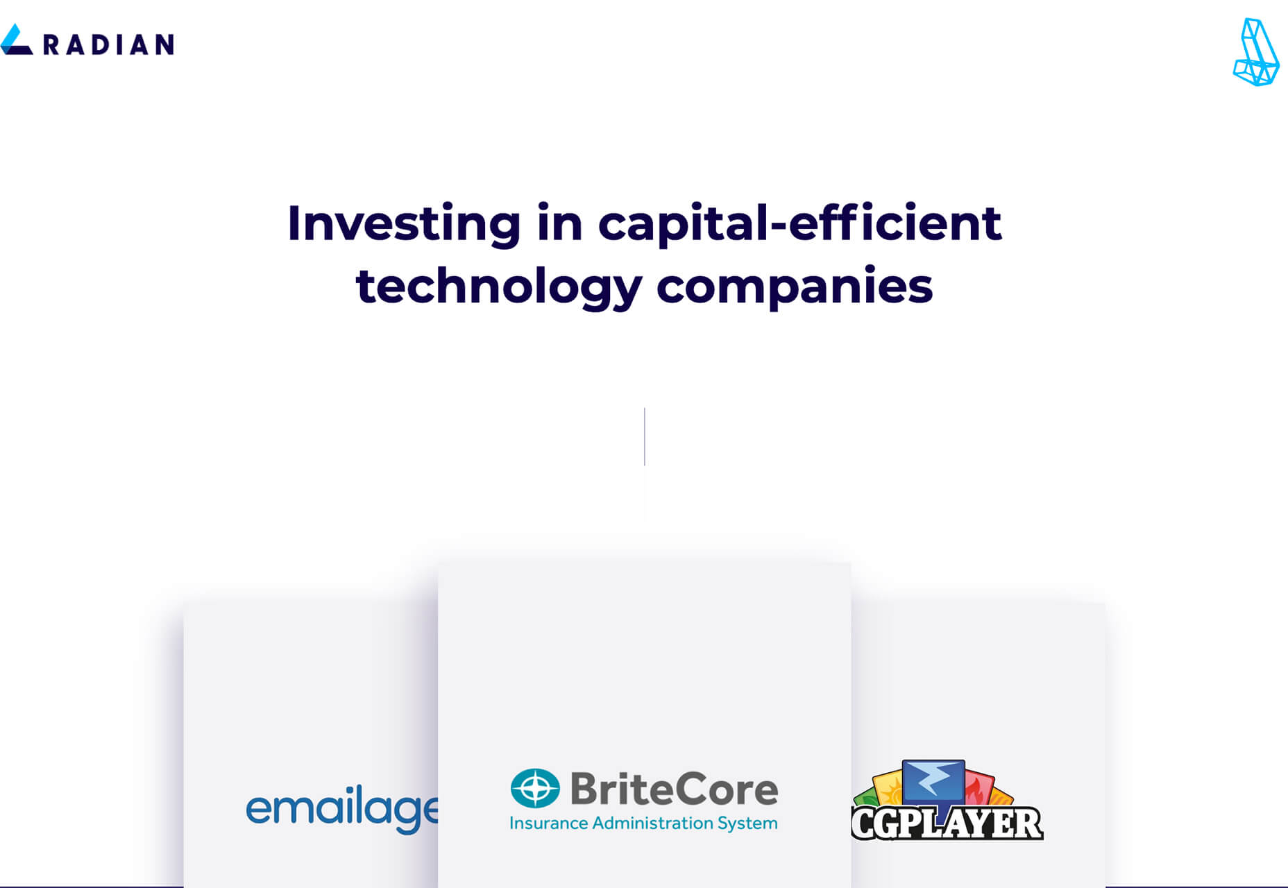
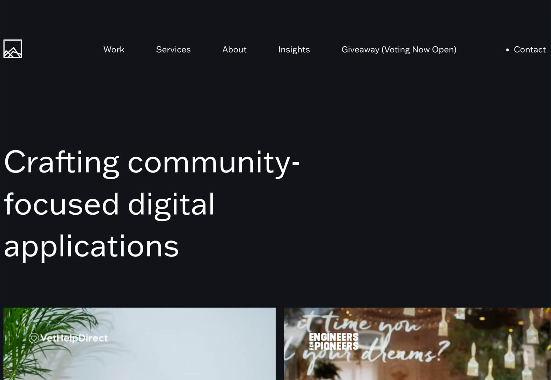
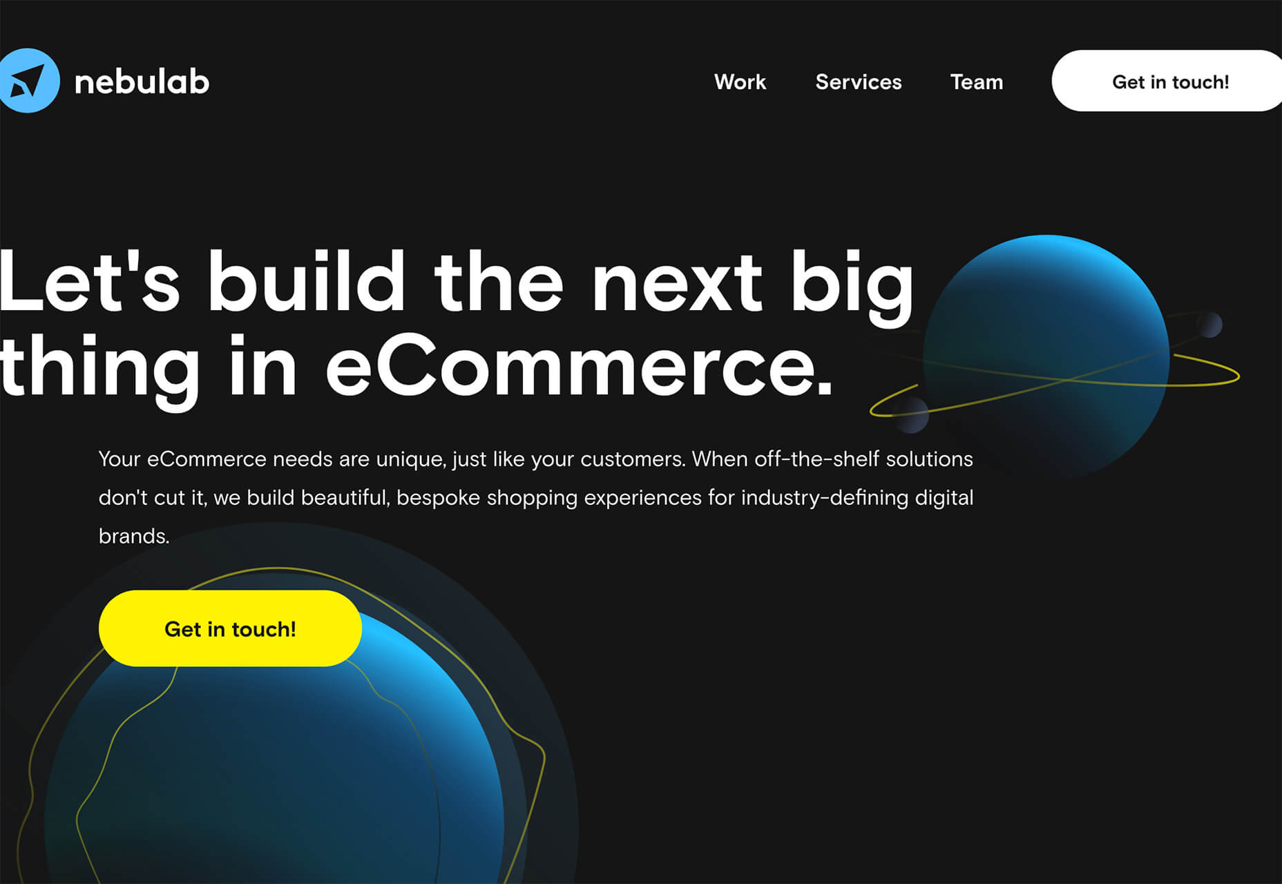
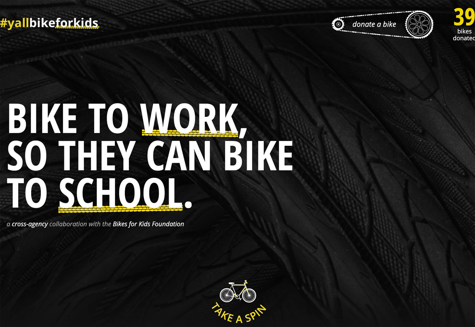
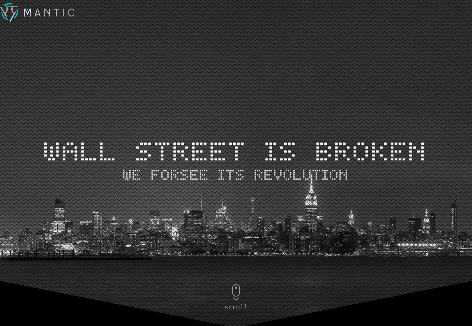
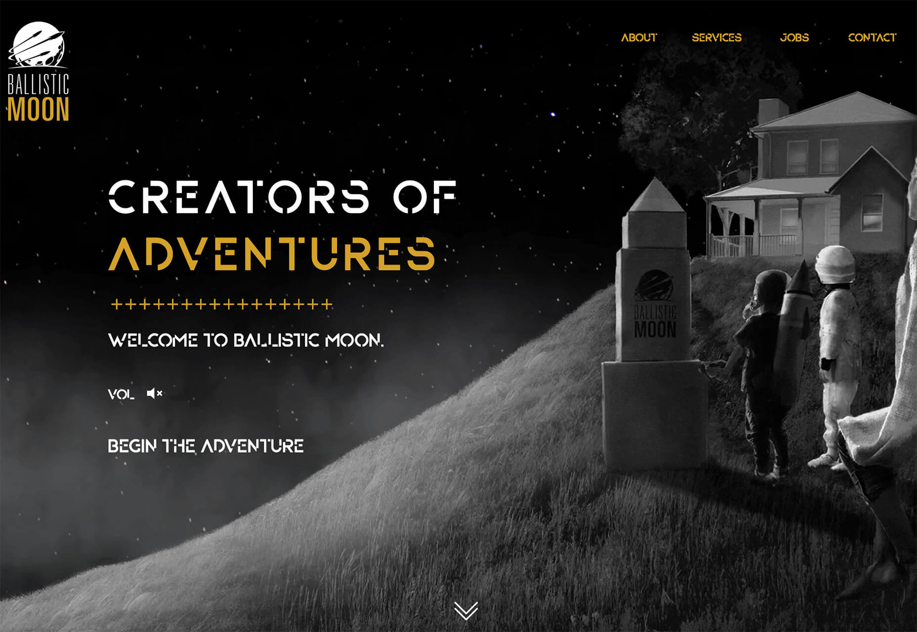
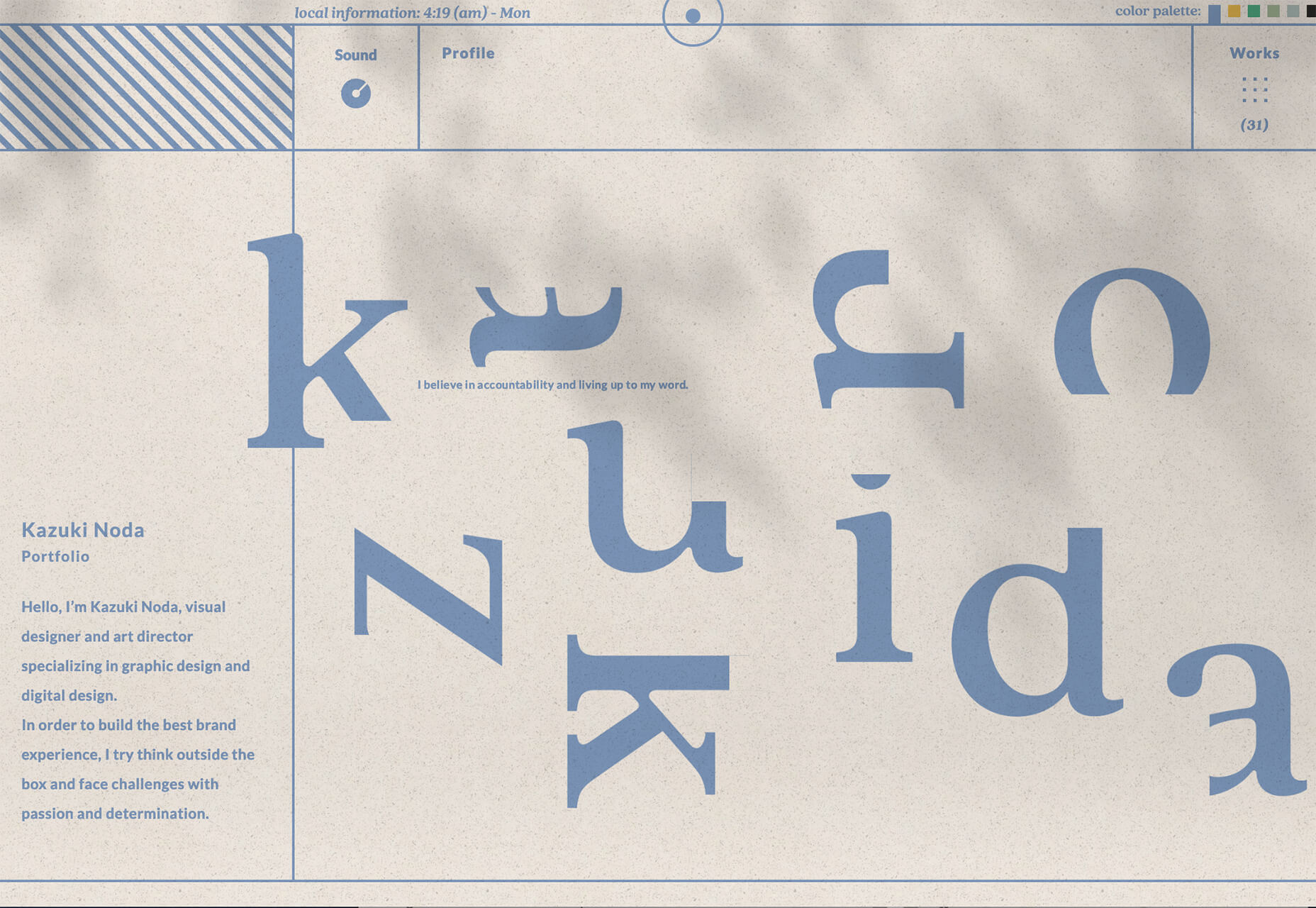
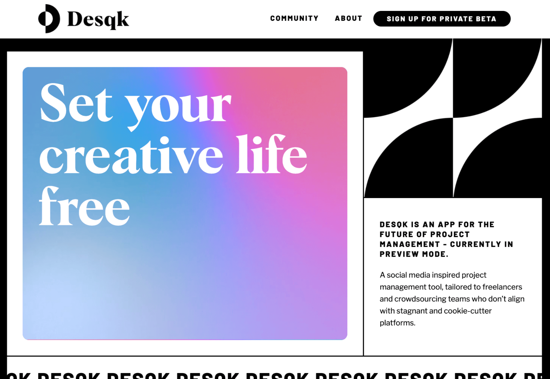
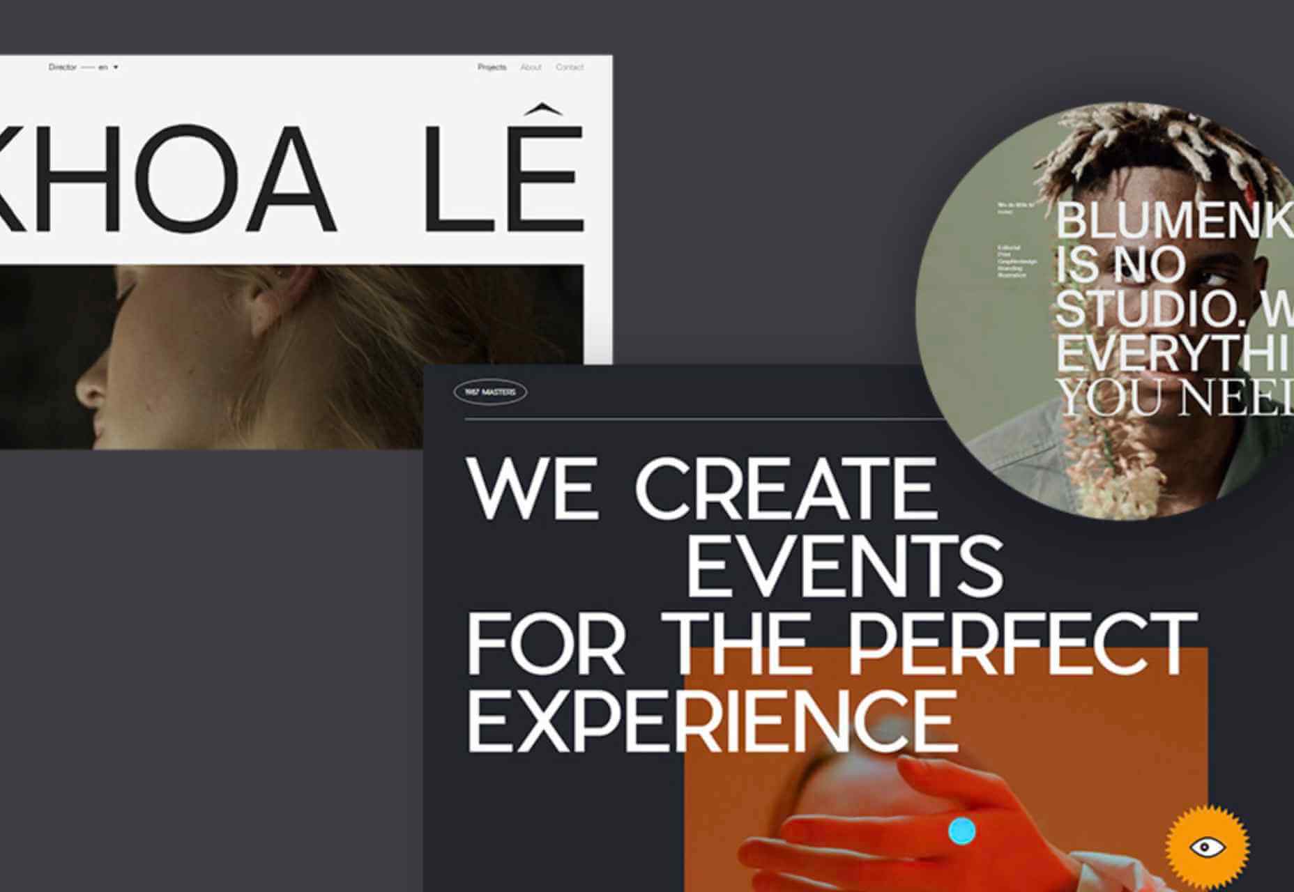
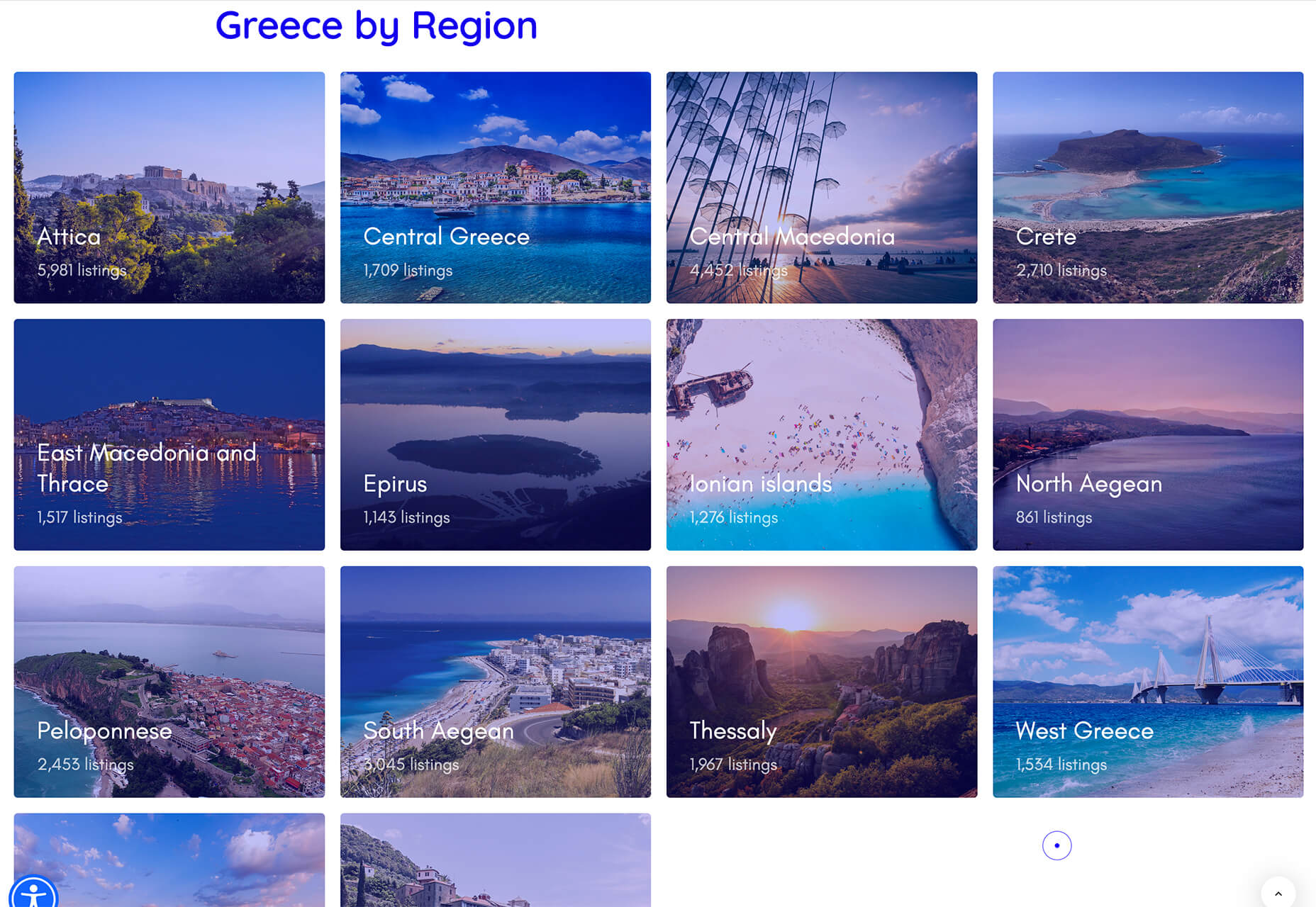
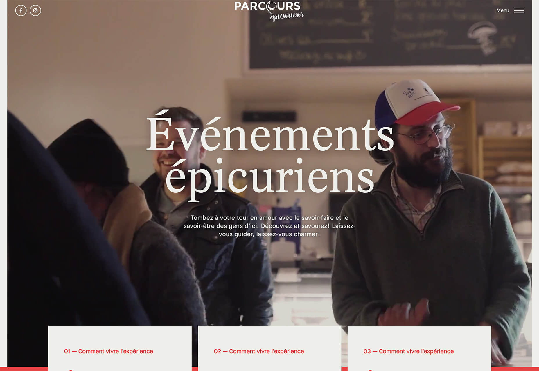
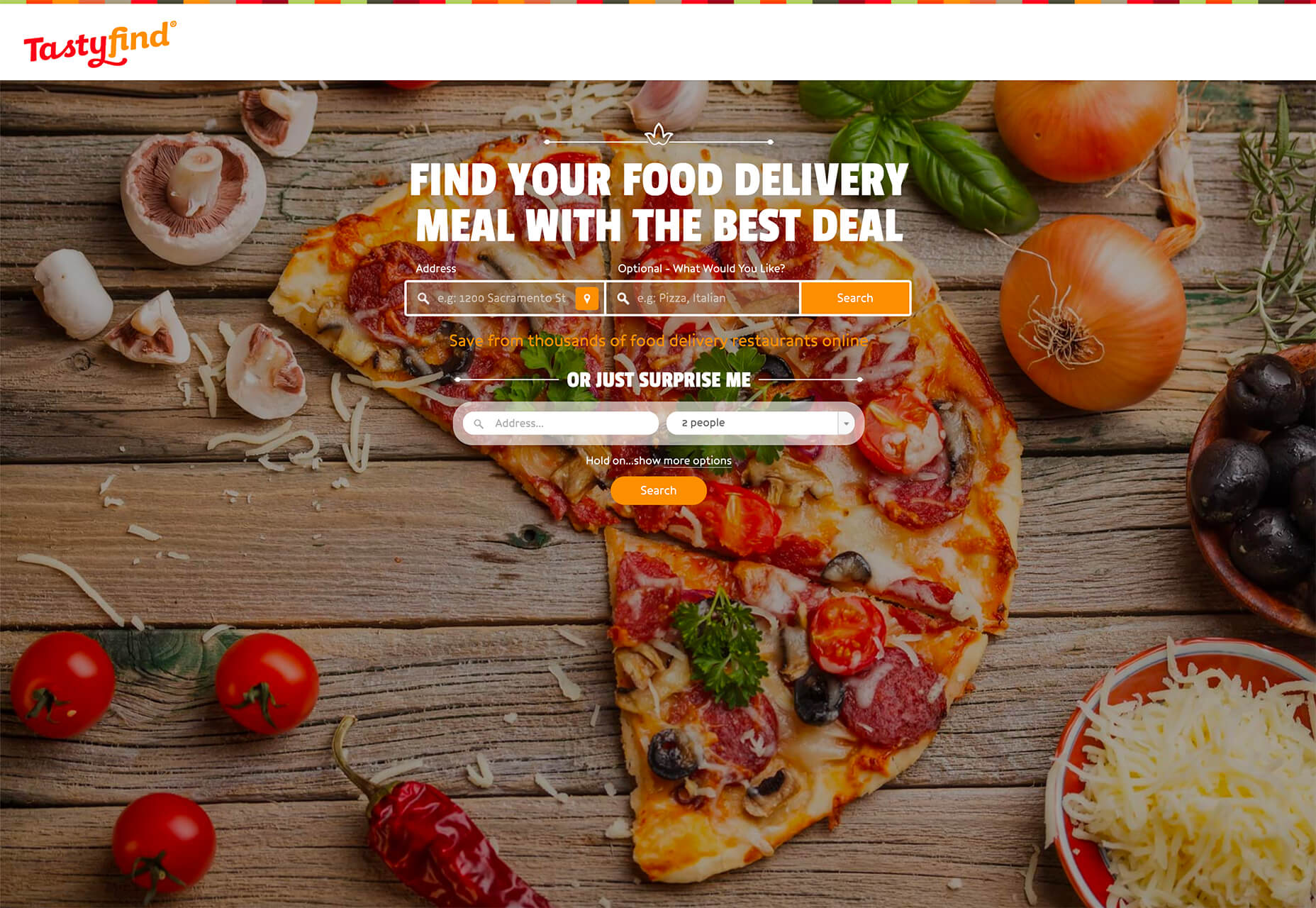
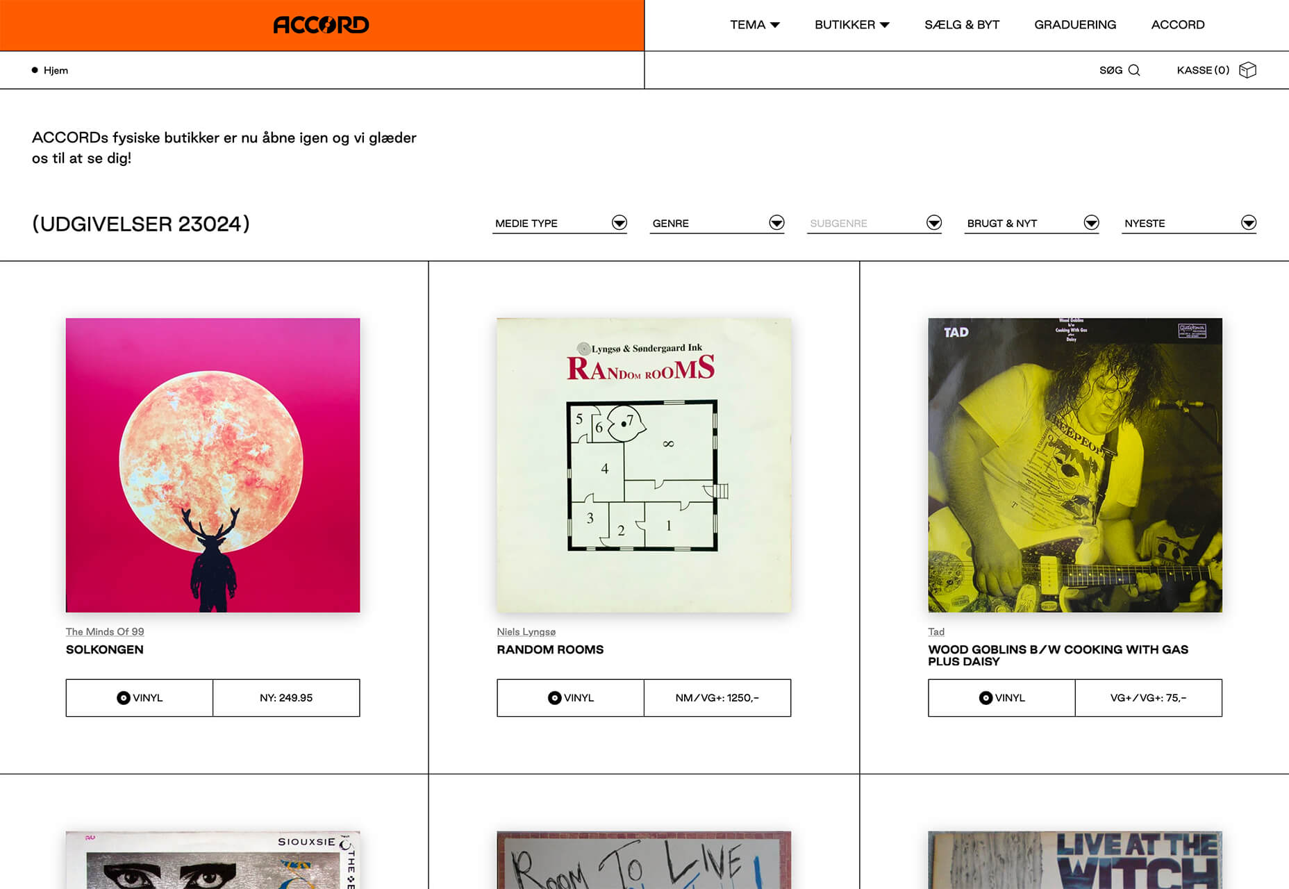
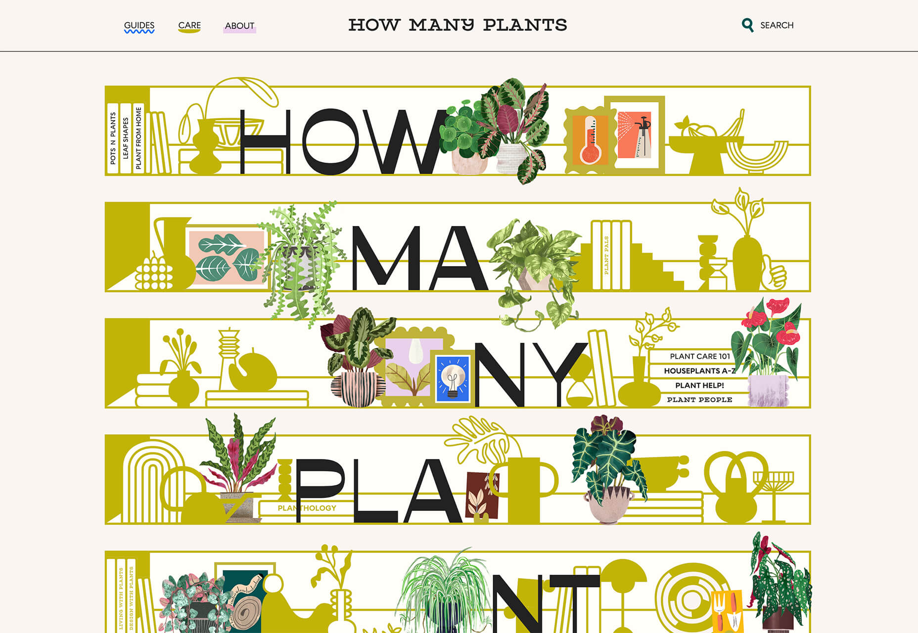
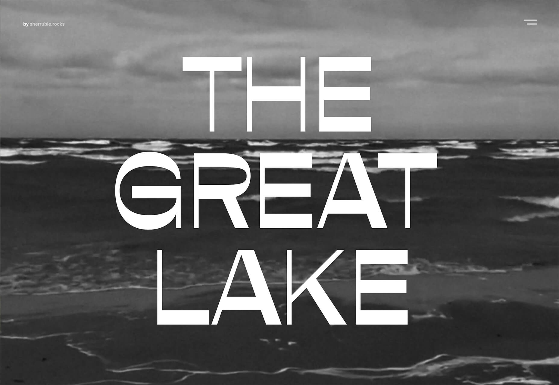
 Spring and fresh designs are in the air. This month, it’s obvious that designers are feeling creative with new and interesting concepts that range from a new style for cards, homepage experimentation with multiple entry points or calls to action, and risky typography options.
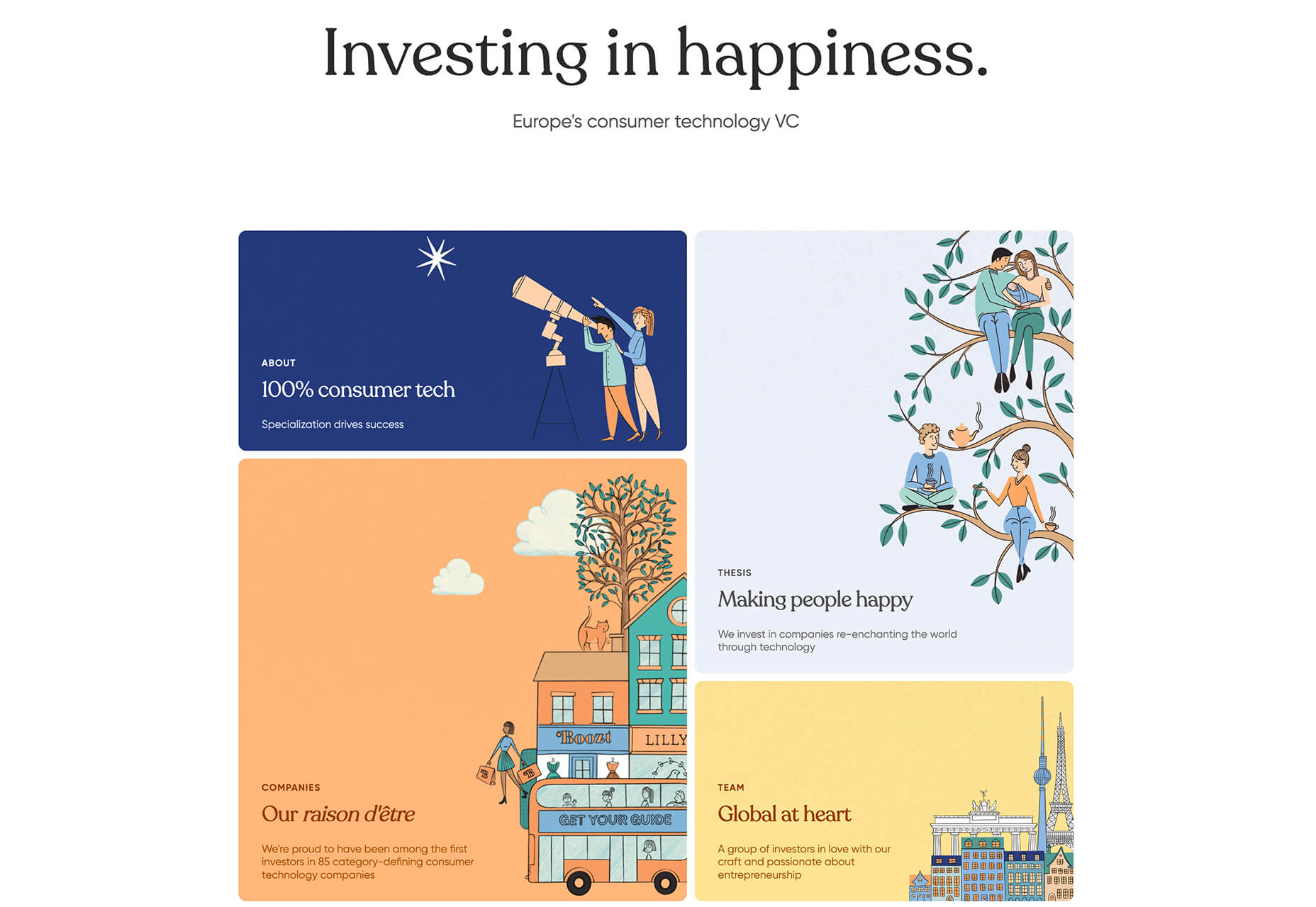
