This week, in a move like something from a particularly eventful episode of The Office, popular project management app company Basecamp banned political and societal discussion in the company’s internal communications.
In a post that has been revised for “clarification,” the company’s co-founder Jason Fried listed six rules for employees: No societal or political discussions at work; No more ‘paternalistic’ benefits; No more committees; No more lingering on past decisions; No more 360 reviews; No forgetting what we do here.
A follow-up post from Heinemeier Hansson notes that Basecamp will still permit discussion of issues deemed central to its business like anti-trust and privacy; certain civil liberties are to be championed, while others, like racism and climate change, are not.
On the surface, it seems reasonable, Fried and co-founder David Heinemeier Hansson would like you to believe that it is. After all, people are paid to work, not soapbox, right?
So why, if they’re the ones being protected, are Basecamp’s employees angry about the move?
It turns out, multiple sources from inside Basecamp are reporting that the ‘political’ and ‘societal’ issues referred to in Fried’s public memo were, in fact, frank and open conversations about Basecamp itself.
As reported by The Verge, way back in 2009, a list of ‘funny’ customer names began circulating at the company — hardly respectful, potentially racist, and certainly inappropriate. The misalignment between co-founders and staff occurred when staff members attempted to hold discrete conversations about this and numerous other diversity and inclusivity failings at the company. Fried’s move appears to be a direct attempt to halt criticism of the status quo at Basecamp.
Basecamp itself is a highly political organization: The co-founders have written several books advocating certain societal change; they even provided a campaign headquarters and substantial donation for a candidate for Chicago mayor. Both co-founders are highly active on social media, using their business positions to elevate their personal views.
The truth is that the solo entrepreneur is an almost mythical beast. Successful startups require contributions from a range of skills and experience beyond any one individual. Jason Fried may be the frontman, strutting up and down the stage in spandex pants, with David Heinemeier Hansson playing lead guitar with his teeth, but behind them, there’s a drummer keeping time, and behind them all, there’s a crew of roadies without whom none of the equipment will arrive, let alone sound good.
Basecamp’s founders argue that the company has a mission, and that mission is to create apps that streamline the workplace. But how can you develop a product that is inclusive if staff cannot discuss what inclusive means? The answer is, you can’t.
Discussing racial bias in advertising or the impact of company wastage, climate change, or gender pay gaps in HR meetings are all political and societal and lead to a healthier, more united company.
As designers, we often say that you cannot not communicate; every decision is a design decision; there is no such thing as “adesign.” Likewise, choosing to be apolitical is itself a political choice. The only way it is feasible to run a company like this is to treat employees like robots (in the word’s original sense).
If employees feel the need to discuss exclusionary policies in the workplace, do the company founders, who benefit from those policies (or they would not be in place), have a moral or legal right to restrict those discussions?
Although it is the first point in Fried’s list that has drawn most ire, it is the fourth item on the list that is most telling: “No more lingering or dwelling on past decisions.” Like a parent answering, “Because I said so,” Fried’s attitude to his staff is laid bare in one statement.
It turns out two wealthy white men would rather their employees not try to change the world or even their workplace.
When Coinbase announced a similar move last year, it lost 5% of its staff. If Basecamp suffered the same loss, it would amount to three people. Hardly a disaster. The question for the founders — who, judging by the number of follow-ups and clarifications they’ve published, are aware the ice they’re on is perilously thin — is whether this kind of controversy creates irreparable reputational damage.
https://ankaa-pmo.com/wp-content/uploads/2021/04/poll-is-basecamp-right-to-shutdown-politics-at-work.jpg14082560Service comm.https://ankaa-pmo.com/wp-content/uploads/2017/04/Logo-Ankaa-engineering.pngService comm.2021-04-29 20:45:282021-04-29 20:45:28Poll: Is Basecamp Right To Shutdown Politics At Work?
Landing pages are central to successful marketing campaigns; they allow you to target particular customers with particular solutions to particular problems.
It’s easy to confuse what a landing page is because users “land” on many pages. When we talk about landing pages, we mean a page that is entirely dedicated to a particular type of customer. In fact, if we could create a unique landing page for each individual user, that would be awesome.
You might think your homepage is a landing page, but it’s not; users reach your landing page in various ways — directly, via organic search, or backlink. A landing page is normally dedicated to a specific marketing campaign. It is accessed from a link in an email, via social media, or most often via a PPC (Pay Per Click) advert.
Here are 10 elements of landing pages that are proven to convert successfully:
1. Use A Single Call To Action
Your potential customers must know how to move forward with your product or service as early in the experience as possible.
Are they signing up for a free trial? Are they signing up for your newsletter? Are they buying a product? Are they contacting you? Whatever you need them to do, make it clear.
The Hick-Hyman law of UX says the more choices you give a user, the less likely they are to make any choice at all; conversely, the fewer choices, the greater the likelihood that they’ll move forward.
Give the user one choice: click the button, or don’t click the button. A single CTA will out-perform multiple options.
2. Keep Forms Simple
Often, your landing page will need a potential customer’s information. They might be creating an account, setting up a trial, or just joining your newsletter.
If the potential customer is signing up for a trial, by all means, ask for their email address. But you don’t need their cell number, their mother’s name, the street they grew up on, their birthday, or any of that other junk that’s used to profile users.
Whatever the purpose, keep your form ultra-simple. That means as few fields as possible. If you really want it, give the user the option to fill it in later as part of an onboarding process — when they’re already invested — but not on the landing page.
3. Make the Headline Punchy
The first thing your potential customer sees on your landing page is the headline, so make it count.
Half a dozen words are usually more than enough. Your goal is to keep it short enough that the potential customer has read the headline before they realize it.
Often, you’ll want to clarify the statement with more information. That’s fine as a sub-heading after you’ve grabbed their interest, but make sure you grab their attention first.
The headline “Coyote Anvils” is best followed by the sub-heading “You’ll be eating roadrunner for dinner!”
Your goal for your headline is to explain your product or service in 2–3 seconds.
4. Center Your Content Around Your Value Proposition
What makes your product or service stand out? What makes it better than the competition? If you’re not sure, spend some time checking out companies in your space.
Creating a value proposition can be one of the toughest challenges a business faces because you need to put yourself in your potential customer’s shoes. But if you get this right, it will carry your marketing. You need to find the benefits within your product or service, not the features.
Value propositions are best when backed by facts. The “World’s Most Accurate Anvils” is best backed by proof: “9/10 coyotes said they were more likely to hit their target than themselves when using our patented AccuAnvil.”
5. Lists, Lists, and More Lists
You’ve got seconds to engage your potential customer, perhaps even less. One way to grab them is with a great headline, but you have to keep them interested beyond the headline.
One great way is bullet lists with short entries. Short-item lists naturally pull our eyes down the page because our eyes take in the whole line in one glance; we don’t need to read to absorb the information.
The longer you can keep someone on the page, the greater the likelihood they’ll keep looking, so pulling them down the page with lists is a great tactic.
6. Exploit the Zeigarnik Effect
The Zeigarnik Effect says that people remember incomplete experiences better than they do completed ones. This is because when a task is seen as completed, it can be filed away as a memory, but if it’s incomplete, then it remains at the front of your mind.
This is a boon for designers creating landing pages because we can create a situation where the potential customer begins an onboarding process and is aware that it hasn’t been completed — they might need to verify their email address, for example.
The lack of completion keeps the landing page and the product or service fresh in the potential customer’s mind. So when they see that onboarding email, they’ll use it.
7. Proof
Anyone can put up a website. It’s easy. And as a result, potential customers don’t necessarily trust you.
One way you can combat this is with some form of proof. That may be in the form of official certifications, or featured testimonials, or just independent reviews.
It rarely occurs to potential customers that you’re cherry-picking the testimonials and reviews you’re choosing to display, so even if only some of your reviews are good, it’s worth including them.
But be careful not to sound too good. If you post nothing but 5* reviews, people will smell a rat; that 3* review may actually do you a favor by making the 5*s seem more genuine.
8. Predictive Images
Potential customers lack imagination, they don’t have all the facts, and unless your product or service is very basic, they may not fully understand what the product does for them.
Use images to quickly show them what life may be like using your product or service. Paint an appealing picture. If they can see themselves in the image, they’ll grant you a little more time to persuade them in the form of further content.
9. Continuity
How did the potential customer arrive at your landing page? Chances are it was via a PPC link, or if you were lucky an organic search link. However they arrived, they were in a certain frame of mind, with a certain problem they wanted to solve; they aren’t going to take kindly to being diverted onto a different train of thought.
Your landing page has to match the tone, style, and value proposition of your adverts. The potential customer’s experience of your organization begins with the advert, not the landing page, so make sure that you don’t break the spell. If your landing page doesn’t match your advert, you could lose the potential customer altogether — and increase your bounce rate while you’re at it.
Remember: the customer was attracted by something in your advert, so give them the same attractive qualities on your landing page.
10. Drop the Nav
Most sites have a single main menu and a rich footer with links to customer service, contact pages, and so forth. These are detrimental on a landing page because you’ll leak traffic to other, less-focused parts of your site.
Your landing page is a streamlined selling machine. The only link you want on the page is your CTA.
It’s fine to keep legal text and even links to privacy policies — users rarely click those anyway. You can also link to your homepage using your logo. But don’t add any navigation that invites a click, or you’ll dilute all the work you’ve put in.
https://ankaa-pmo.com/wp-content/uploads/2021/04/10-elements-of-landing-pages-that-convert.jpg14082560Service comm.https://ankaa-pmo.com/wp-content/uploads/2017/04/Logo-Ankaa-engineering.pngService comm.2021-04-28 16:45:452021-04-28 16:45:4510 Elements of Landing Pages That Convert
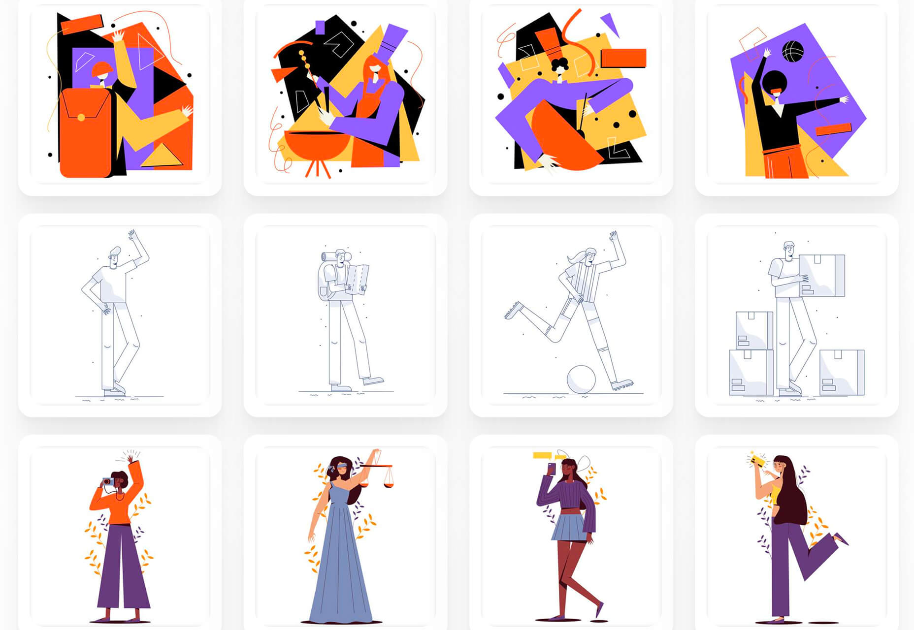
This month’s collection contains a combination of big and bold, and clean and minimal. Although basic minimalism is still trendy, with lots of white space and greyscale type, we are seeing it softened with color. This is implemented differently, ranging from hints of off-whites in images to gentle pastels as section backgrounds.
Playing around with type and using typefaces with a few characteristic quirks is another way minimalism is being tempered without negating the overall effect. Plus, we’ve got some strong examples of type rules being deliberately broken to good effect. Enjoy!
Crusta C
The new website for seafood company Crusta C makes clever use of the company’s simple logo mark ‘C’ with a cutout video effect.
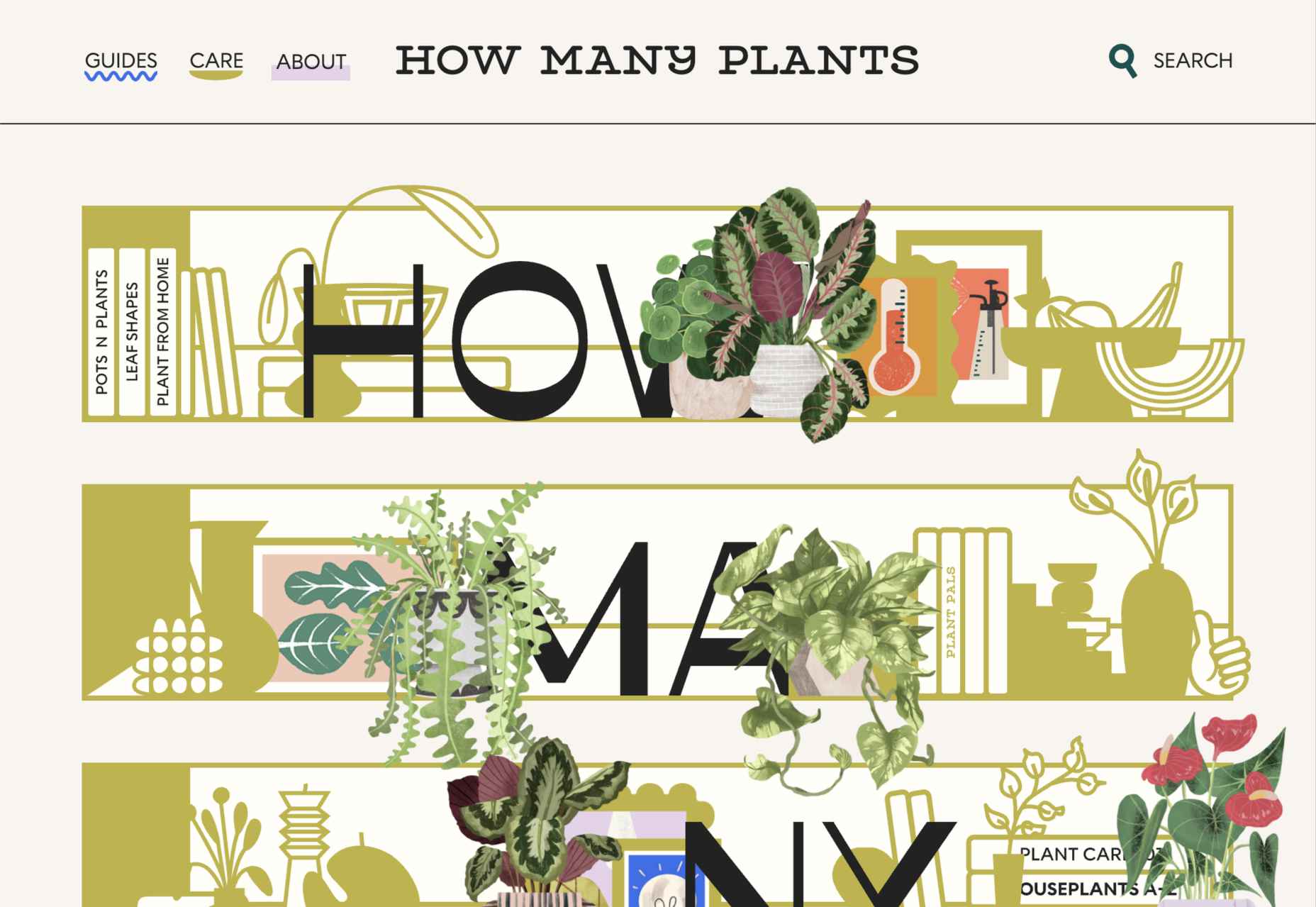
How Many Plants
How Many Plants is a guide to house plants and how to look after them. A good combination of illustration and space gives a friendly but efficient feel.
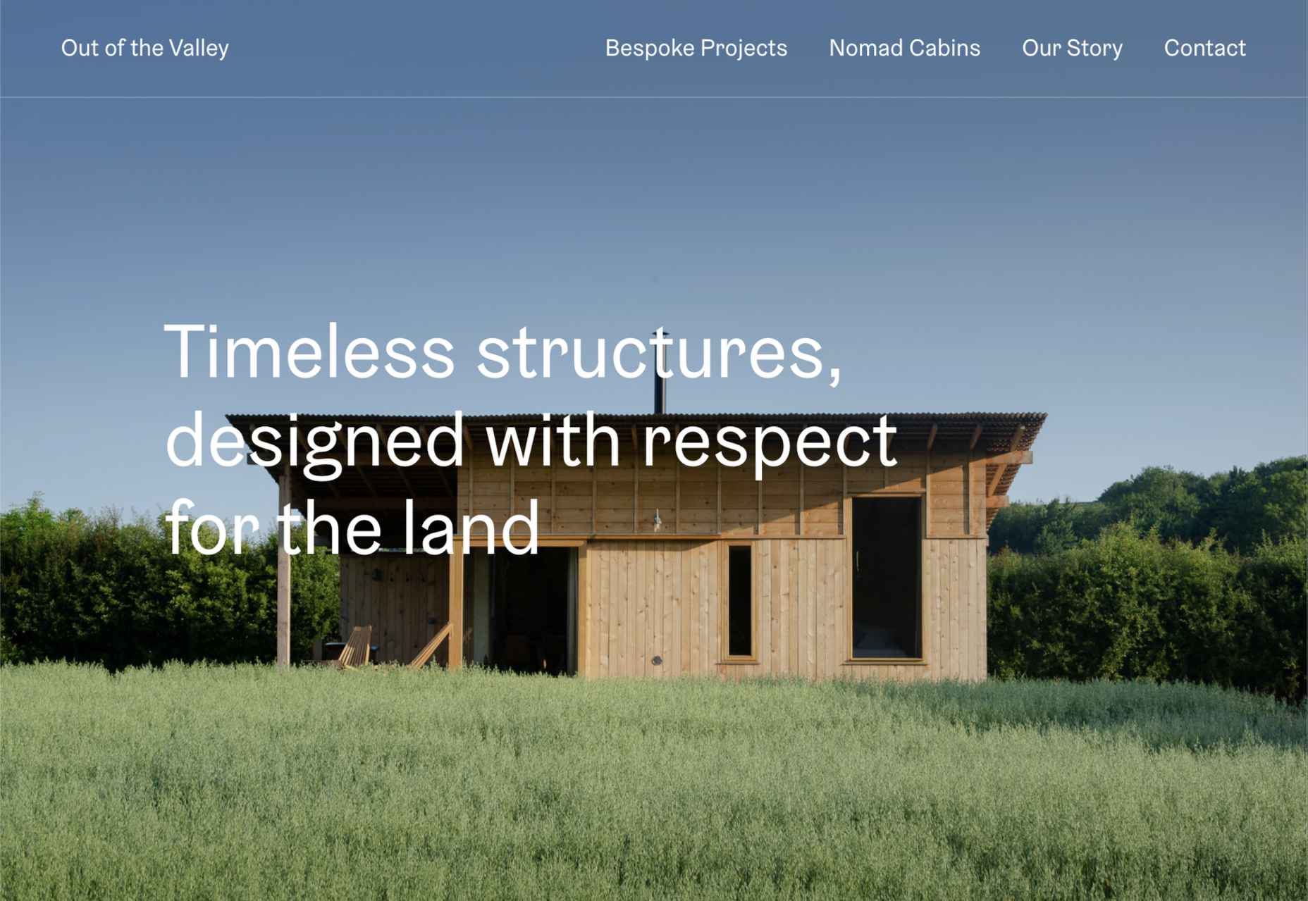
Out of the Valley
Out of the Valley, make bespoke and prefabricated cabins focusing on natural materials and traditional craft. The subtle changes in background color add warmth to the minimal layout.
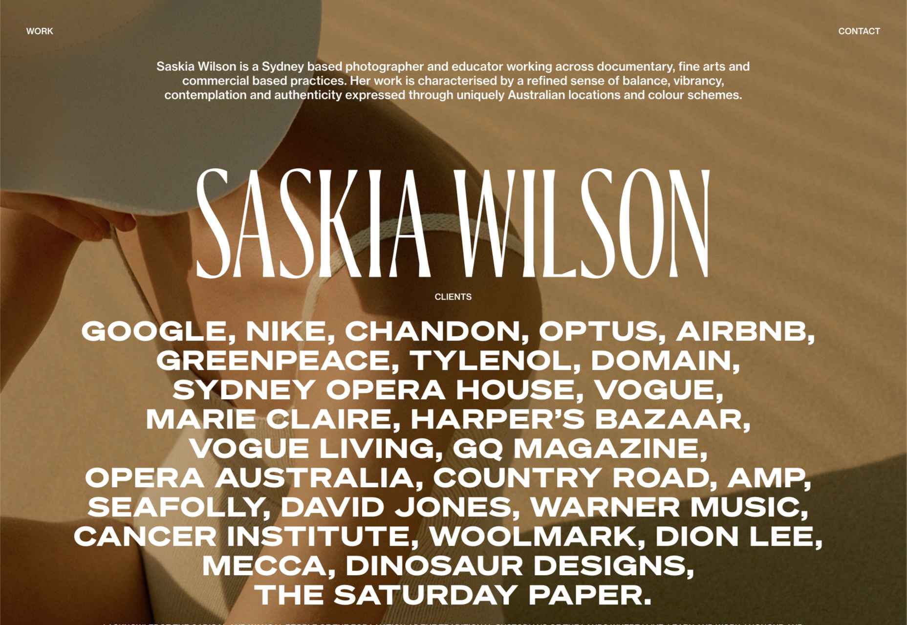
Saskia Wilson
Portfolio site for photographer Saskia Wilson. This is absolute simplicity, with a clear grid and nice, bold type to bare minimum text.
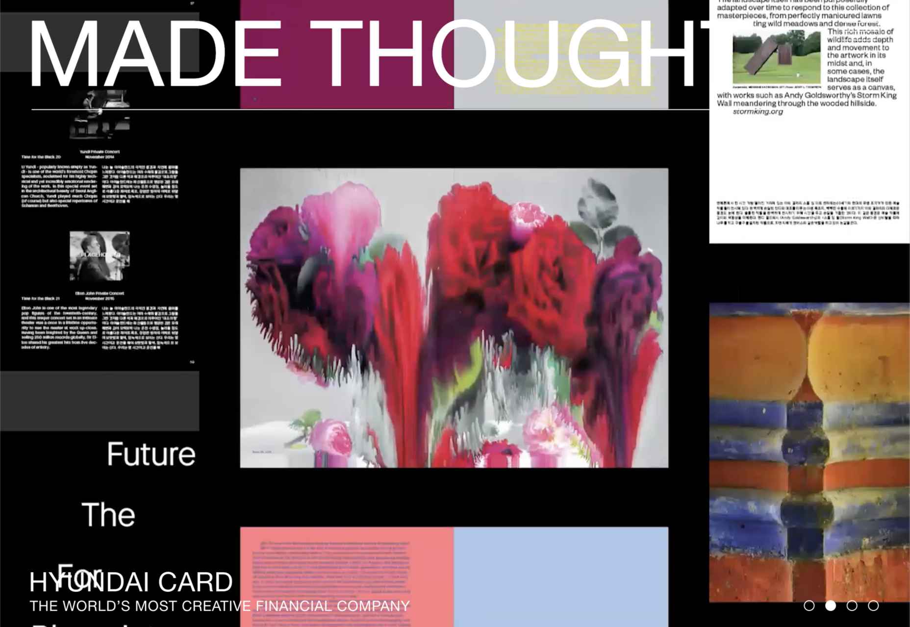
Made Thought
Design studio Made Thought has some pretty prestigious clients; for a designer, it doesn’t get more prestigious than creating a new brand identity for MoMA. Their bold aesthetic and approach explain their success.
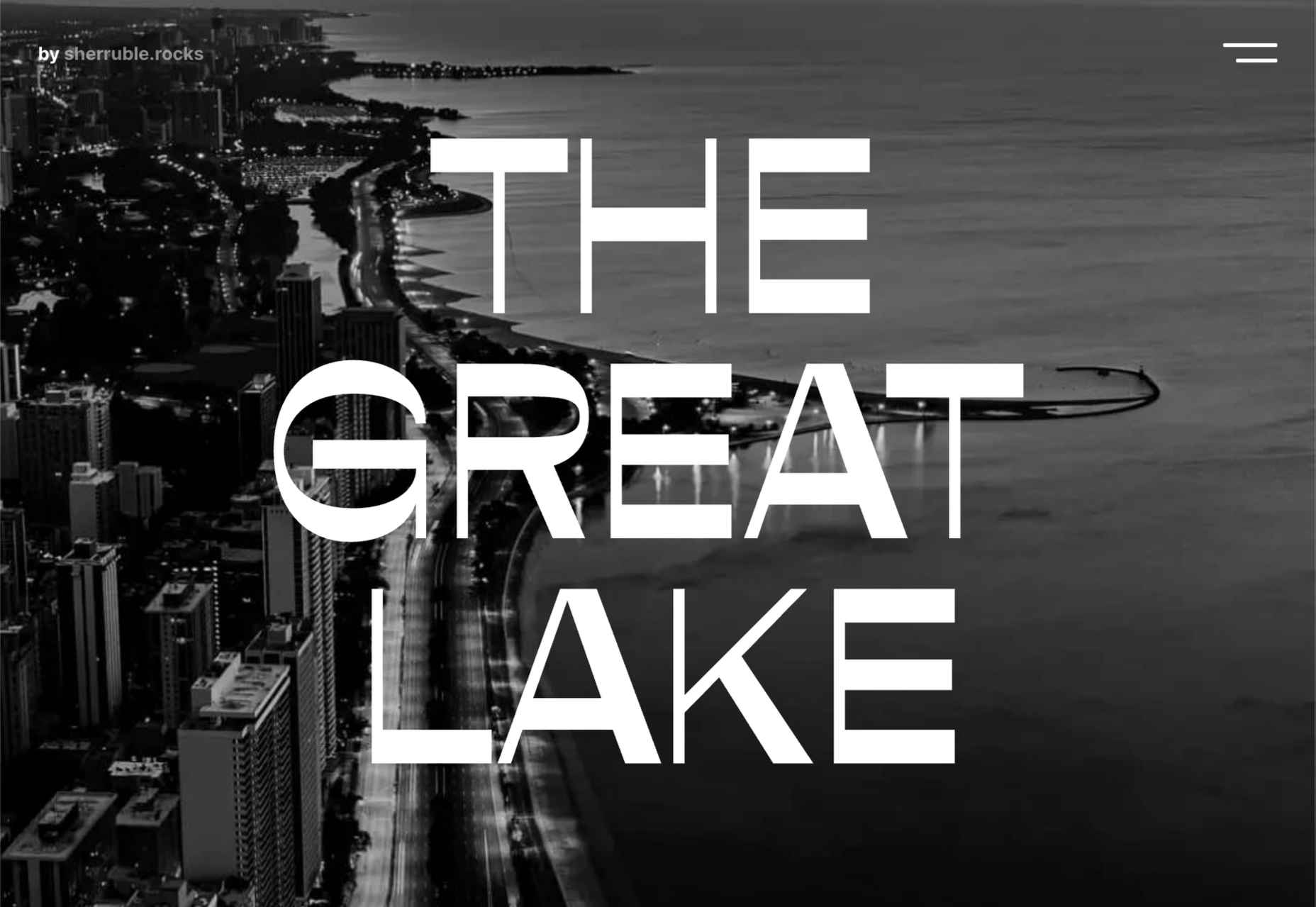
The Great Lake
For-fun sites like The Great Lake are a great way for web creatives to show their skills. This one from designer and front-end developer Anna Sherruble is visually appealing and has some informative content.
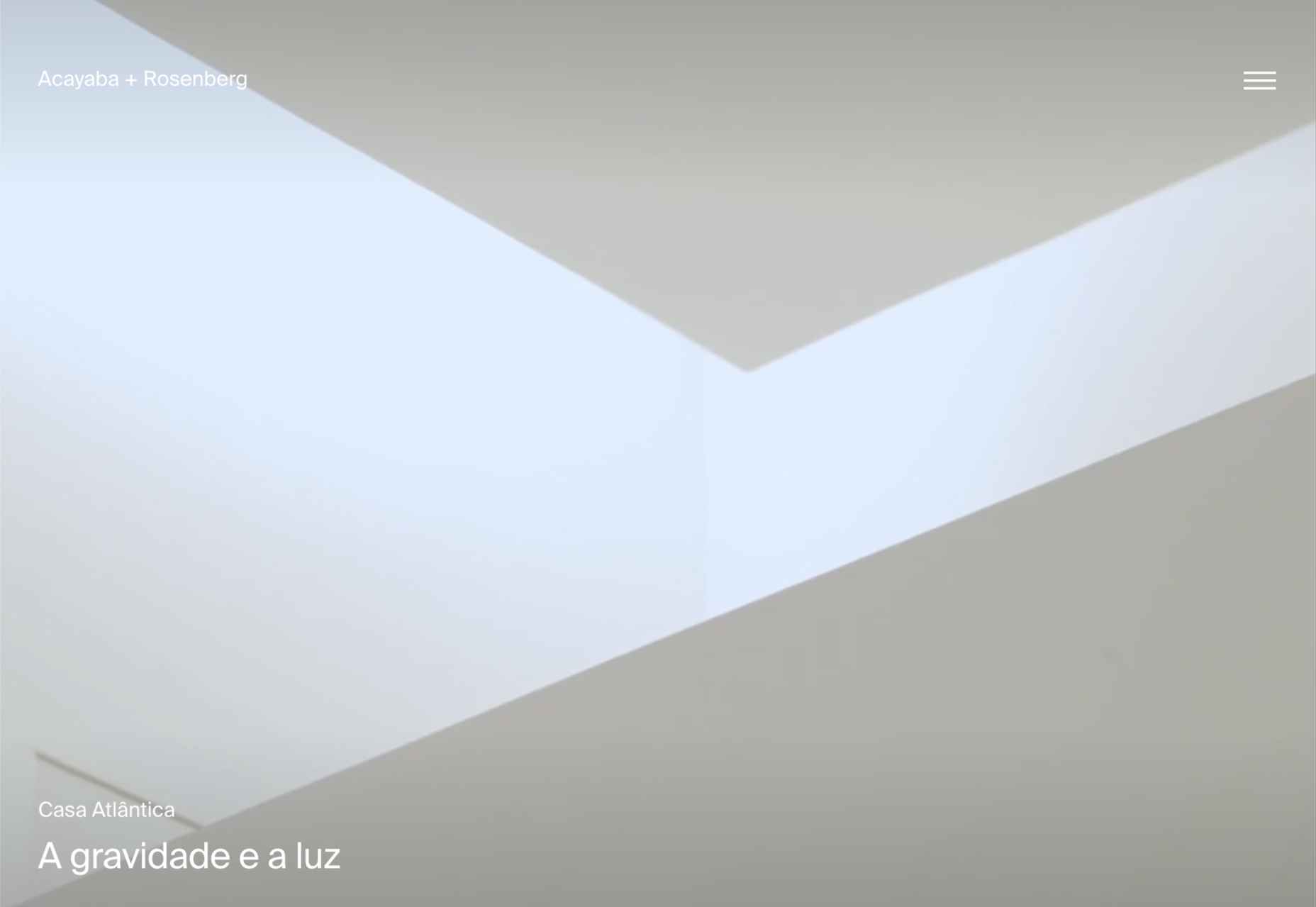
Acayaba + Rosenberg
Architects Acayaba + Rosenberg use carefully curated photography and subtle scrolling animation to pull the user in and create a pleasing browsing experience.
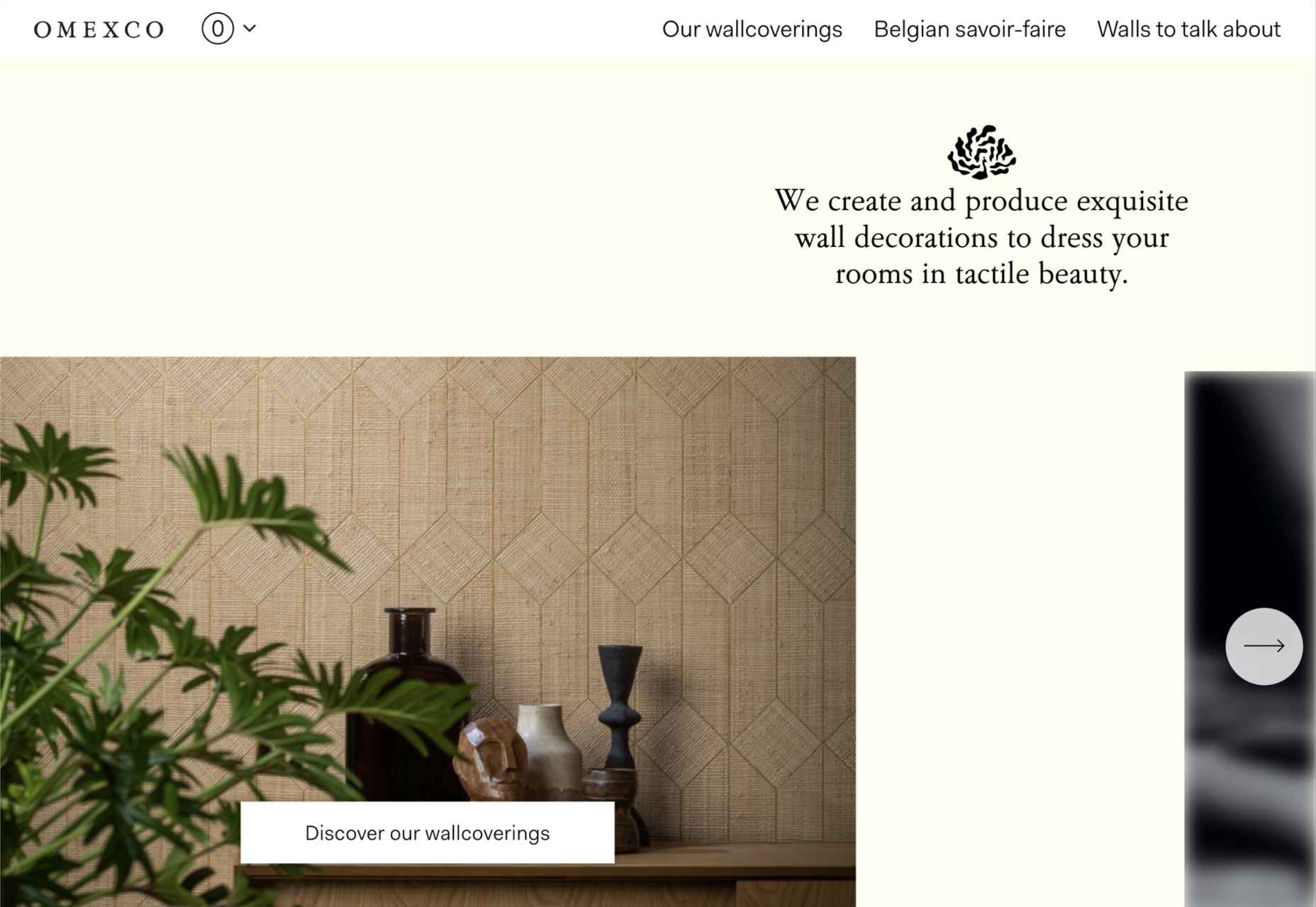
Omexco
Soft colors and a well-ordered grid recreate the feel of a mood board that prevents this site for Omexco from appearing cluttered and overly busy while showcasing multiple products.
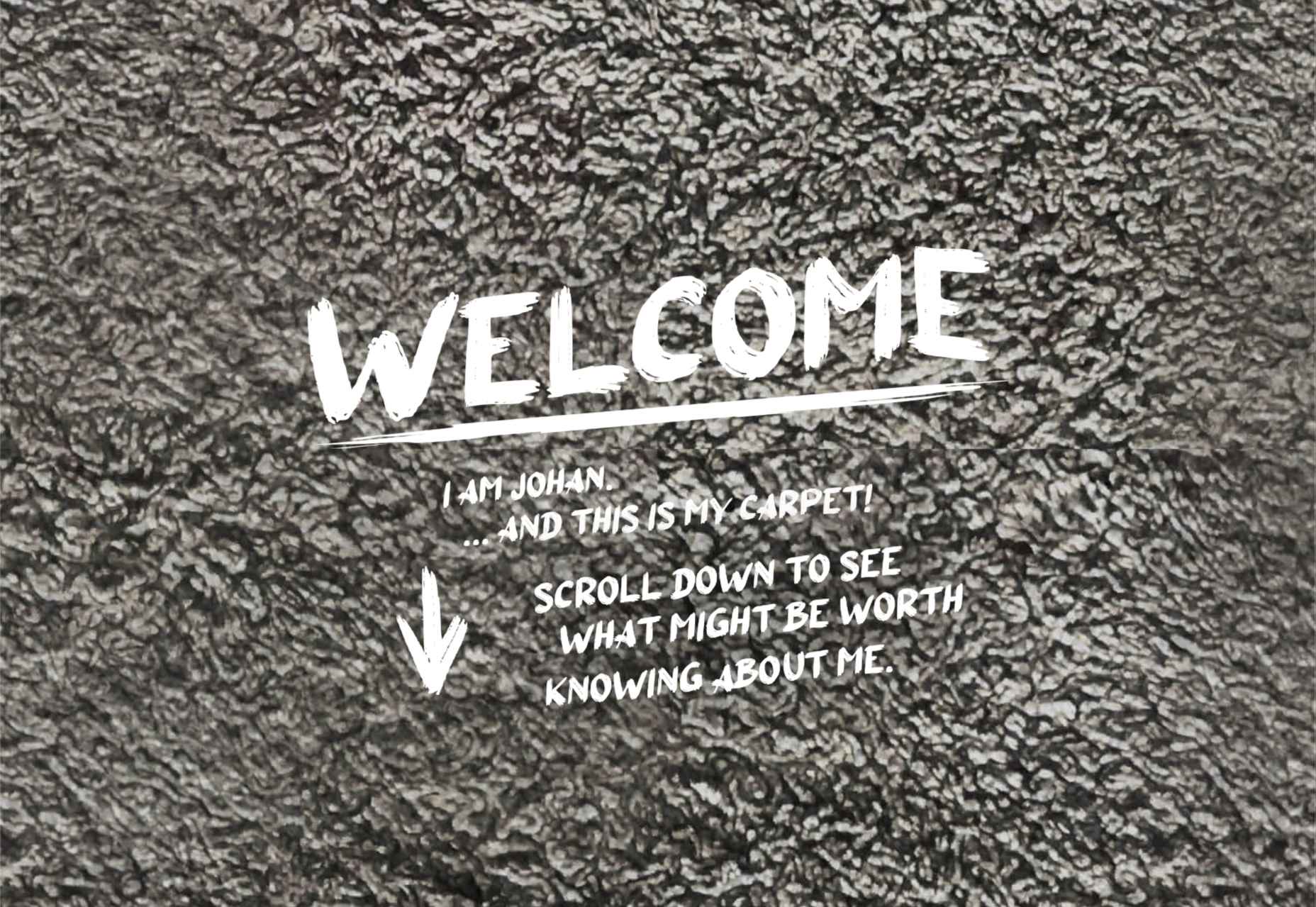
Johan Belin
For his own site, digital creator Johan Belin has opted to show off his skills by creating this single-page site instead of simply showing work. This can be a risky tactic, but it works here.
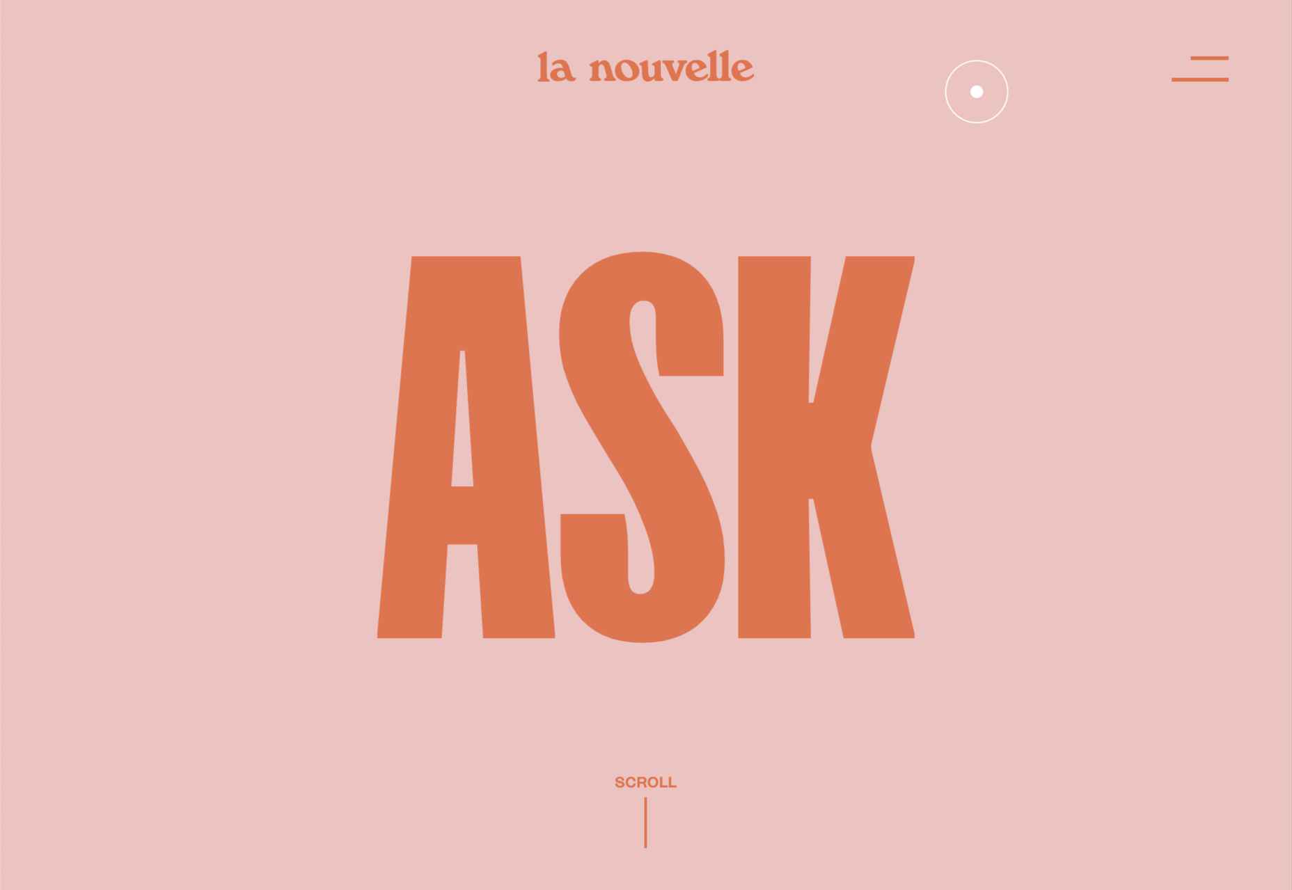
La Nouvelle
A combination of contrasting and complementary color combinations creates freshness in this site for digital agency La Nouvelle.
Found
Found Studio’s website uses a very basic grid layout to allow the work to stand out; varying the typeface, weight, and style within sections of text creates individuality.
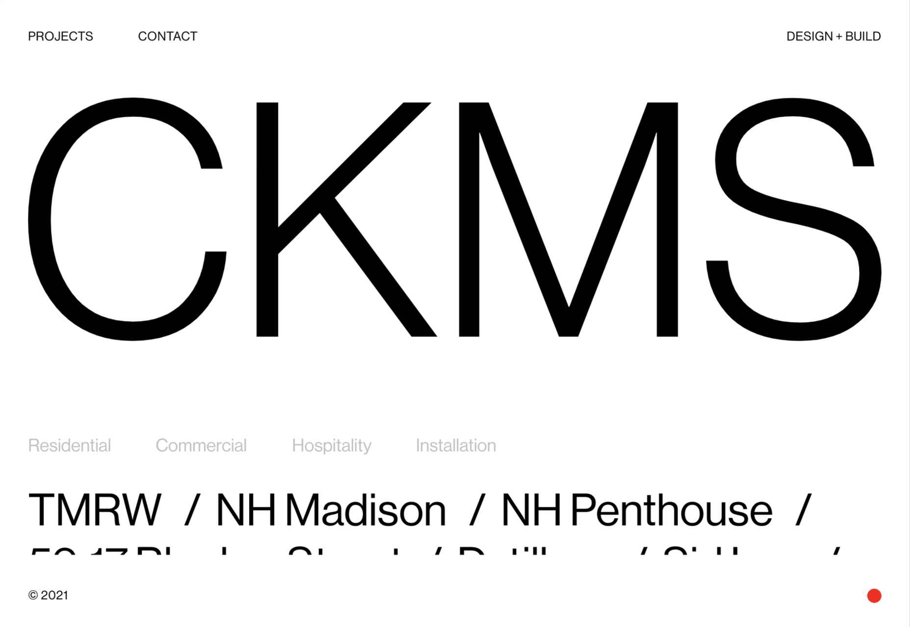
CKMS
CKMS is a design and build company. Their site is minimal but with a few nice little touches, like the background color change button in the bottom right corner.
Slow
Slow is a collective of people–largely artists, designers, artisans–aiming to implement and live by the slow movement principles. The design of their site reflects these aims, creating a sense of calm and deliberation.
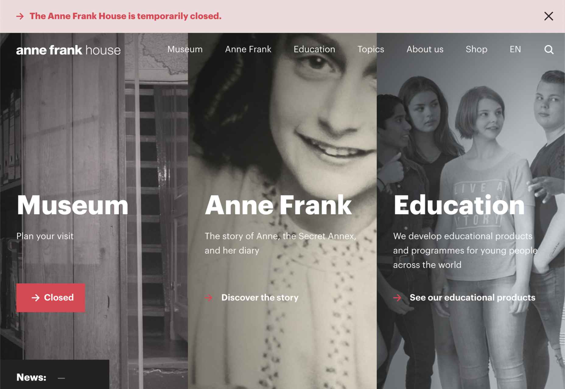
Anne Frank House
Practical information for visiting the Anne Frank House and museum is combined with historical information and educational resources in this thoughtfully structured and visually engaging site.
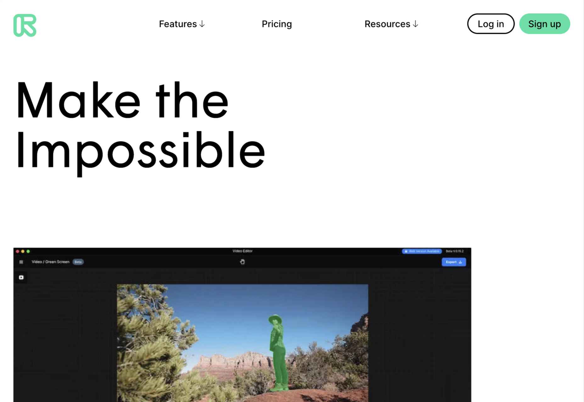
Runway
Runway is a platform for publishing open-source, pre-trained machine learning models, as well as for training your own models aimed at artists and filmmakers. If this site aims to make the user want to try Runway, it succeeds.
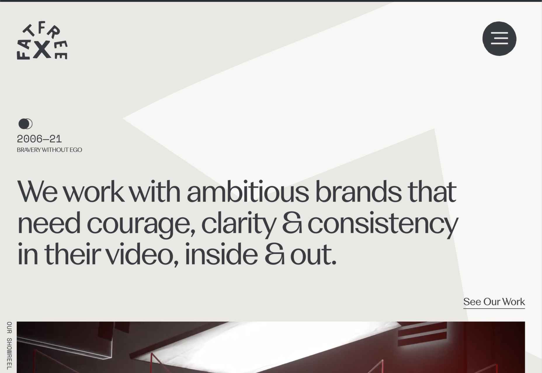
Fat Free
Fat Free video branding agency add warmth to their minimal site with soft color and occasional illustration.
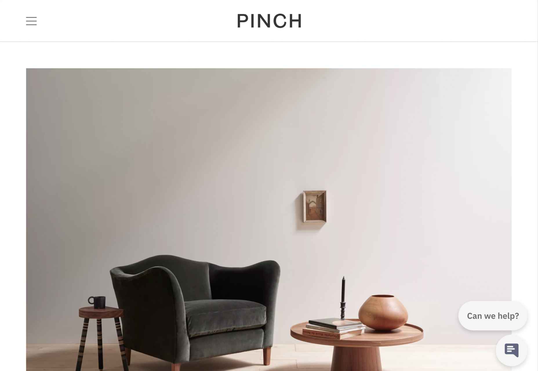
Pinch
The furniture and other interior products produced by Pinch Design aim for a quiet, elegant aesthetic, and their website reflects that with pale grey and generous spacing.
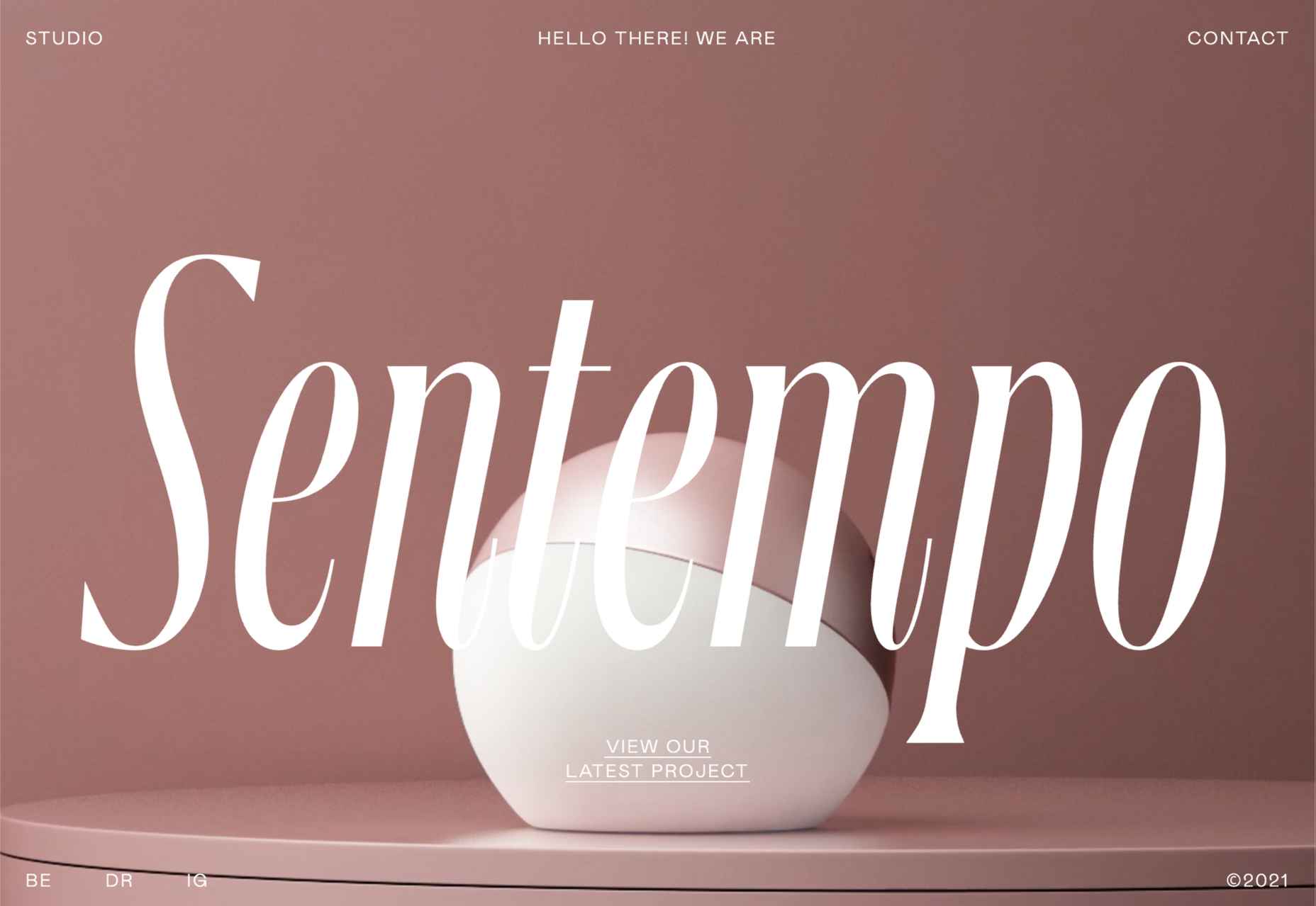
Sentempo
Digital studio Sentempo manages to achieve glossy without being overdone. The star dividers are a nice detail.
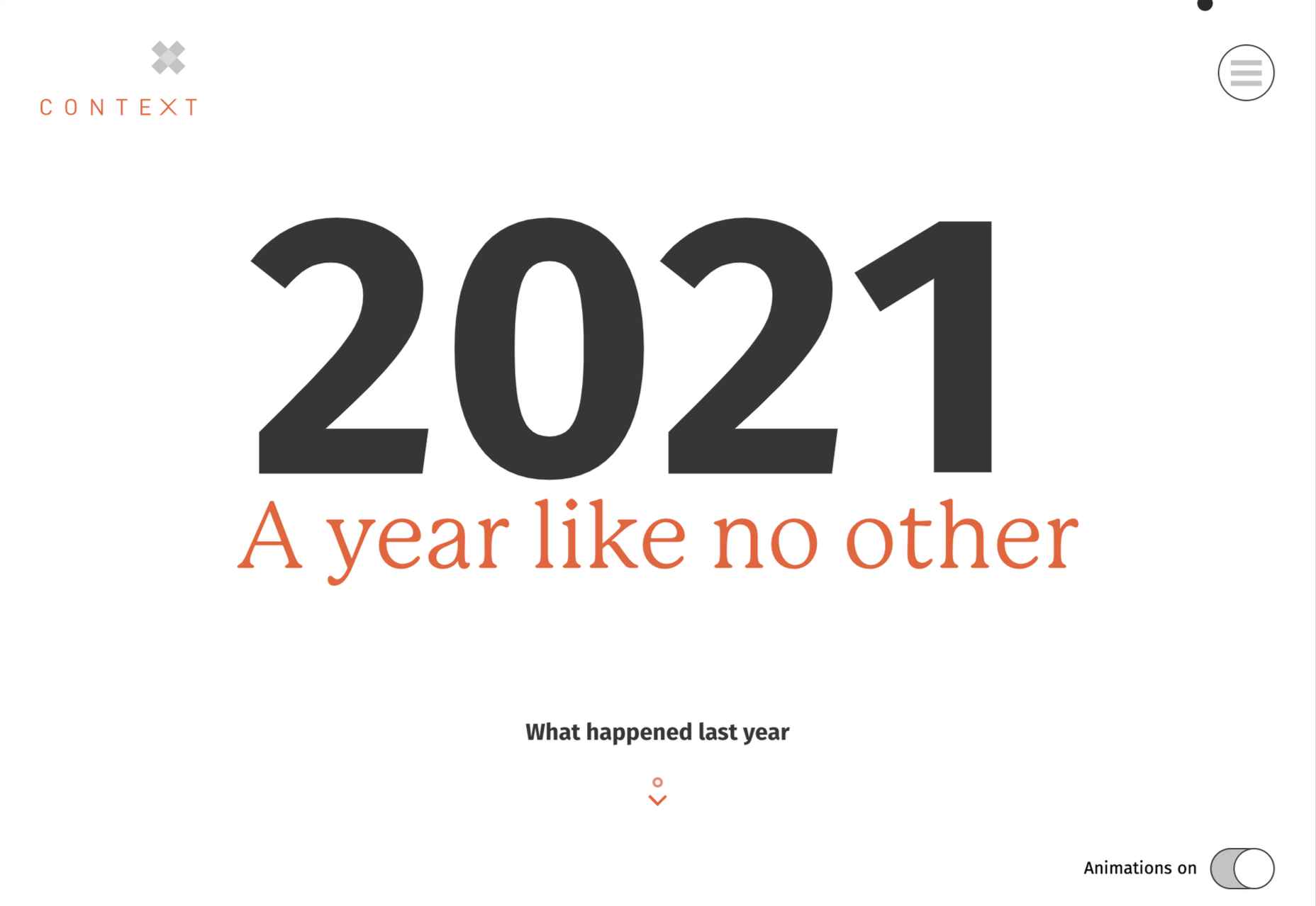
One Year
Many companies, including creative agencies, have come up with ‘what we did/achieved in the last year’ microsites. This one from Context Creative succeeds as a good advert for them.
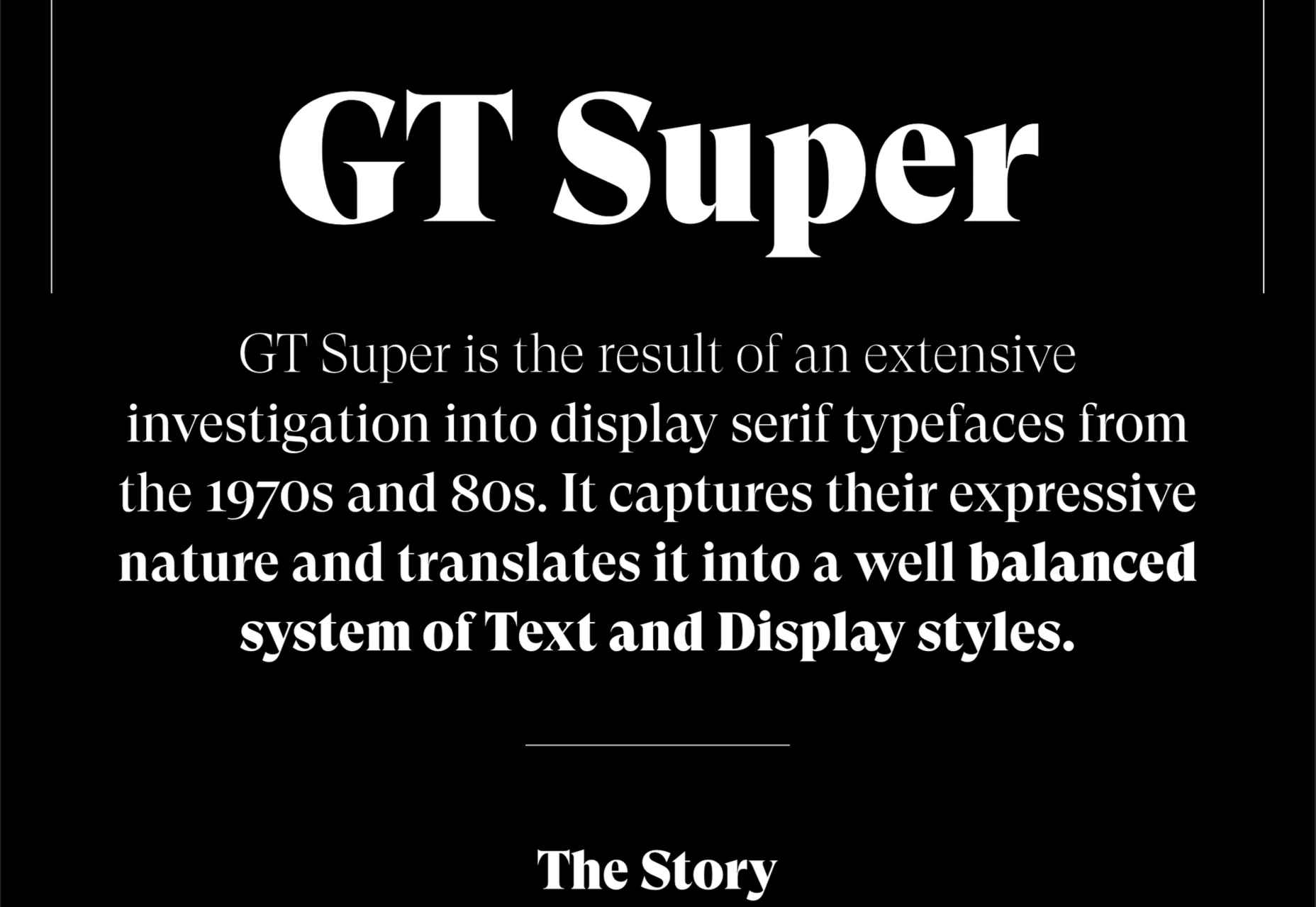
GT Super
This single-page intro to GT Super font has a certain drama in keeping with the font itself and allows you to play around with the size, weight, and style of the font in most sections of the text.
https://ankaa-pmo.com/wp-content/uploads/2021/04/20-best-new-websites-april-2021.jpg14072560Service comm.https://ankaa-pmo.com/wp-content/uploads/2017/04/Logo-Ankaa-engineering.pngService comm.2021-04-26 16:45:252021-04-26 16:45:2520 Best New Websites, April 2021
Every day design fans submit incredible industry stories to our sister-site, Webdesigner News. Our colleagues sift through it, selecting the very best stories from the design, UX, tech, and development worlds and posting them live on the site.
The best way to keep up with the most important stories for web professionals is to subscribe to Webdesigner News or check out the site regularly. However, in case you missed a day this week, here’s a handy compilation of the top curated stories from the last seven days. Enjoy!
https://ankaa-pmo.com/wp-content/uploads/2021/04/popular-design-news-of-the-week-april-19-2021-april-25-2021.jpg14082560Service comm.https://ankaa-pmo.com/wp-content/uploads/2017/04/Logo-Ankaa-engineering.pngService comm.2021-04-25 16:45:092021-04-25 16:45:09Popular Design News Of The Week: April 19, 2021 – April 25, 2021
Ten years ago, people began talking about the “Independent Web.” Although we don’t commonly use the term anymore, that doesn’t mean that it’s not still as vital a topic of discussion today as it was a decade ago.
Today, I want to look at where the term came from, what it refers to today, and why it’s something that all of us in business, marketing, and web design should be thinking about.
What Is The Independent Web?
The Independent Web is a term that was coined back in 2010 by John Battelle.
In “Identity and The Independent Web,” Battelle broaches the subject of internet users losing control of their data, privacy, and decision-making to the likes of social media and search engines.
“When we’re ‘on’ Facebook, Google, or Twitter, we’re plugged into an infrastructure that locks onto us, serving us content and commerce in an automated but increasingly sophisticated fashion. Sure, we navigate around, in control of our experience, but the fact is, the choices provided to us as we navigate are increasingly driven by algorithms modeled on the service’s understanding of our identity.”
That’s the Dependent Web.
This is how Battelle explains the Independent Web:
“There is another part of the web, one where I can stroll a bit more at my own pace, and discover new territory, rather than have territory matched to a presumed identity. And that is the land of the Independent Web.”
In 2010, this referred to websites, search engines, and apps where users and their activity were not tracked. But a lot has changed since then, and many websites that were once safe to peruse without interference or manipulation are no longer.
What Happens When the Dependent Web Takes Over?
Nothing good.
I take that back. It’s not fair to make a blanket statement about Dependent Web platforms and sites. Users can certainly benefit from sharing some of their data with them.
Take Facebook, for instance. Since its creation, it’s enabled people to connect with long-lost friends, stay in touch with distant relatives, enable freelance professionals like ourselves to find like-minded communities, etc.
The same goes for websites and apps that track and use visitor data. Consumers are more than willing to share relevant data with companies so long as they benefit from the resulting personalized experiences.
But the Dependent Web also has a darker side. There are many ways that the Dependent Web costs consumers and businesses control over important things like:
Behavior
If you’ve seen The Social Dilemma, then you know that platforms like Facebook and Google profit from selling their users to advertisers.
That’s right. They’re not just selling user data. They’re selling users themselves. If the algorithms can change the way users behave, these platforms and their advertisers get to cash in big time.
Many websites and apps are also guilty of using manipulation to force users to behave how they want them to.
Personal Data
This one is well-known thanks to the GDPR in the EU and the CCPA in California. Despite these initiatives to protect user data and privacy, the exploitation of personal data on the web remains a huge public concern in recent years.
Content and Branding
This isn’t relevant to websites so much as it is to social media platforms and Google.
Dependent Web platforms ultimately dictate who sees your content and when. And while they’re more than happy to benefit from the traffic and engagement this content brings to their platforms, they’re just as happy to censor or pull down content as they please, just as Skillshare did in 2019 when it deleted half of its courses without telling its course creators.
What’s more, while social media and search engines have become the place to market our businesses, some of our branding gets lost when entering such oversaturated environments.
Income
When algorithms get updated, many businesses often feel the negative effects almost immediately.
For example, Facebook updated its algorithm in 2018 to prioritize “meaningful content.” This pushed out organic business content and pulled regular user content to the top of the heap.
This, in turn, forced businesses to have to pay-to-play if they wanted to use Facebook as a viable marketing platform.
Access
The Dependent Web doesn’t just impact individuals’ experiences. It can have far-reaching effects when one company provides a critical service to a large portion of the population.
When Amazon Web Services burps and half the Internet goes down maybe just maybe it’s not a great idea to have a single company with so much control over what has essentially become our society’s critical infrastructure?
It wasn’t just Amazon’s servers that went down, though. It took out apps and sites like:
1Password
Adobe Spark
Capital Gazette
Coinbase
Glassdoor
Roku
The Washington Post
And there’s absolutely nothing that these businesses or their users could do but sit around and wait… because Amazon hosts a substantial portion of the web.
Innovation
When consumers and businesses become dependent on platforms that predominantly control the way we live and work, it’s difficult for us to stand up for the little guys trying to carve out innovative pathways.
As a result, we really lose the option to choose what we use to improve our lives and our businesses. And innovative thinkers lose the ability to bring much-needed changes to the world because Big Tech wants to own the vast majority of data and users.
How Can We Take Back Control From The Dependent Web?
Many things are happening right now that are trying to push consumers and businesses towards a more Independent Web:
Consumer Privacy Protection: GDPR and CCPA empower consumers to control where their data goes and what it’s used for.
Private Search Engine Usage: Although Google dominates search engine market share, people are starting to use private search engines like Duck Duck Go.
Private Browsing Growth:Over 60% of the global population is aware of what private browsing is (i.e., incognito mode), and roughly 35% use it when surfing the web.
Self-hosted and Open Source CMS Popularity: The IndieWeb community encourages people to move away from Dependent platforms and build their own websites and communities. This is something that Matt Mullenweg, the founder of WordPress, talked about back in 2012.
“The Internet needs a strong, independent platform for those of us who don’t want to be at the mercy of someone else’s domain. I like to think that if we didn’t create WordPress something else that looks a lot like it would exist. I think Open Source is kind of like our Bill of Rights. It’s our Constitution. If we’re not true to that, nothing else matters.”
As web designers, this is something that should really speak to you, especially if you’ve ever met a lead or client who didn’t understand why they needed a website when they could just advertise on Facebook or Instagram.
A Decentralized Web: Perhaps the most promising of all these initiatives are Solid and Inrupt, which were launched in 2018 by the creator of the Web, Tim Berners-Lee.
”The Web was always meant to be a platform for creativity, collaboration, and free invention — but that’s not what we are seeing today. Today, business transformation is hampered by different parts of one’s life being managed by different silos, each of which looks after one vertical slice of life, but where the users and teams can’t get the insight from connecting that data. Meanwhile, that data is exploited by the silo in question, leading to increasing, very reasonable, public skepticism about how personal data is being misused. That in turn has led to increasingly complex data regulations.”
This is something we should all keep a close eye on. Consumers and businesses alike are becoming wary of the Dependent Web.
Who better than the creator of the web to lead us towards the Independent Web where we can protect our data and better control our experience?
https://ankaa-pmo.com/wp-content/uploads/2021/04/what-is-the-independent-web-and-does-it-matter-in-2021.jpg14082560Service comm.https://ankaa-pmo.com/wp-content/uploads/2017/04/Logo-Ankaa-engineering.pngService comm.2021-04-21 16:45:552021-04-21 16:45:55What Is The Independent Web And Does It Matter In 2021?
Rather than spring cleaning, do some spring “shopping” for tools that will make your design life easier. Packed with free options this month, this list is crammed full of tools and elements that you can use in your work every day.
Here’s what new for designers this month:
April’s Top Picks
Charts.css
Charts.css makes creating beautiful online charts that much easier. It’s a modern CSS framework that uses CSS utility classes to style HTML elements as charts. It’s accessible, customizable, responsive, and open source. There’s a quick start option and available source code to work with.
Haikei SVG Generator
Haikei is a web app that helps you generate SVG shapes, backgrounds, and patterns in all types of shapes to use in projects. Everything can be exported into the tools you are already using for easy integration, and every element is customizable. The tool is free right now – no credit card needed – and you get access to 15 generators and can export in SVG and PNG format. A premium option is on the way, and you can sign up to get notified for access.
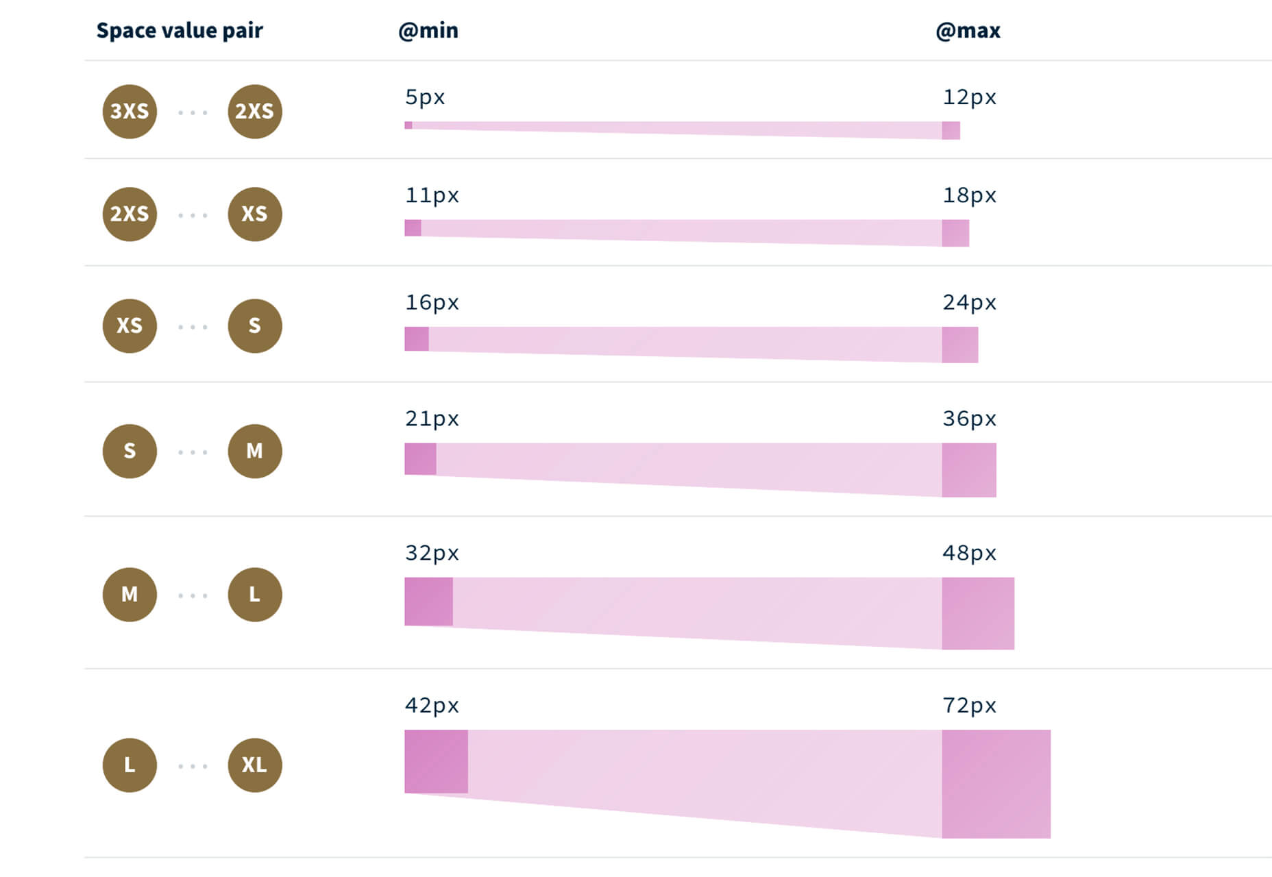
Fluid Space Calculator
Fluid Space Calculator helps you create a related space system and export the CSS to implement it. The calculator allows you to add space value pairs and multipliers and see the impact on the screen before snagging the related code. It’s great for determining how things will look in different viewports and for creating custom space pairs.
Night Eye WordPress Plugin
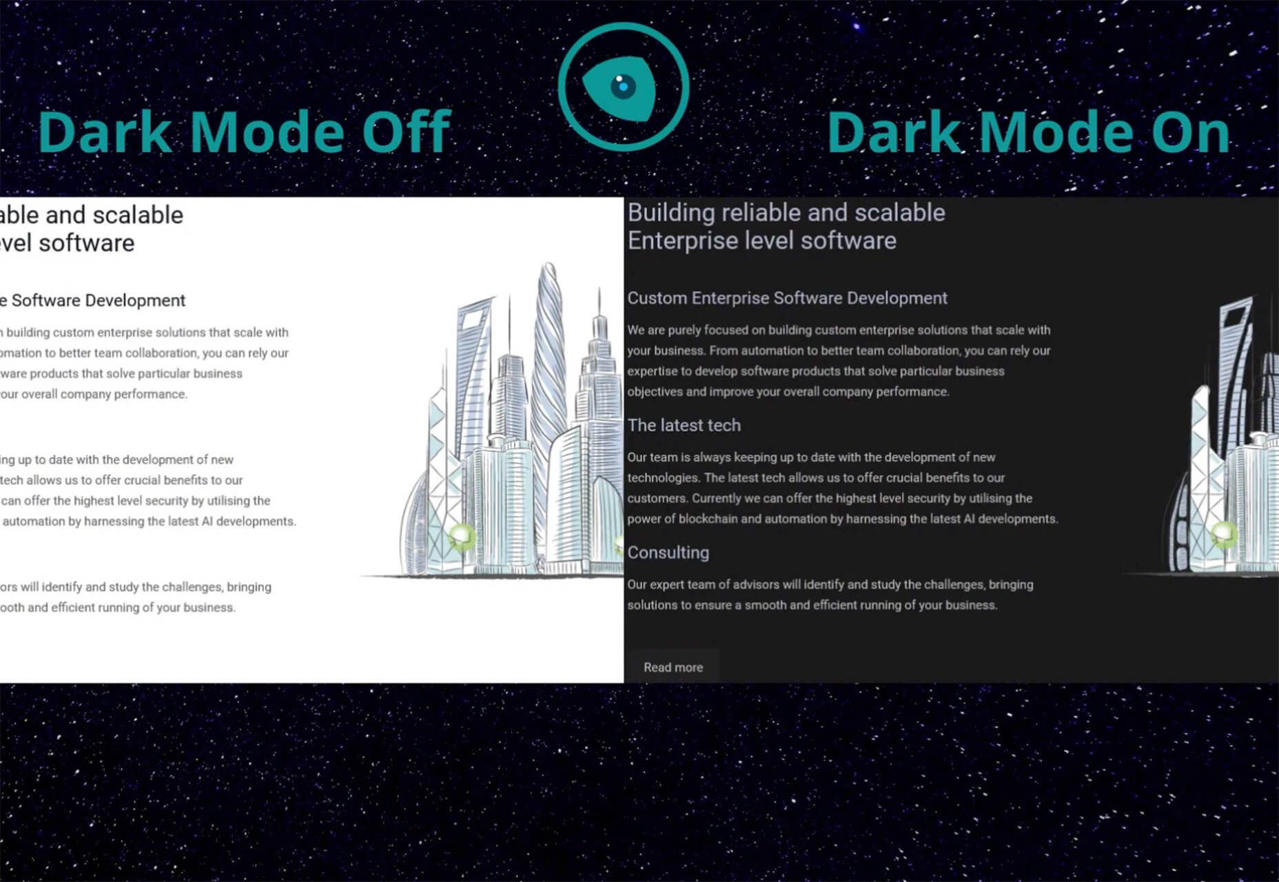
Night Eye WordPress Plugin helps you create a dark mode option for your WordPress website with ease. It’s completely customizable, schedulable, and one of those things that users are starting to expect. The plugin has free and paid versions – the only difference is a link to credit the developer.
3 Productivity Boosters
Macro
Macro is a supercharged checklist app for recurring processes. It’s designed to help teams document, assign, track, and automate for maximum efficiency. Now is the time to test this tool because it is free in public beta.
Writex.io
Writex.io is a free writing app that uses AI and smart features to help you write more efficiently. It can check readability as you write, make suggestions, check spelling, and allows you to work with versioning. All the settings are customizable, so you can get help and suggestions when you want them and avoid things you don’t want.
Taloflow
Taloflow, which is in beta, is a tool that helps you find the top cloud and dev tools for your use case. This is designed to be a time-saving solution to finding the right infrastructure and API products for your work.
8 Kits with Illustrations and User Interface Elements
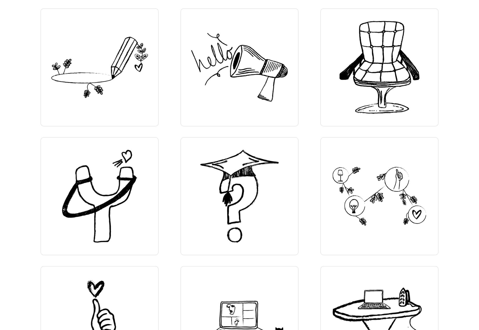
Skribbl
Skribbl is a collection of free, hand-drawn illustrations in a light and fun style. The black and white sketches are friendly, and the collection keeps growing. Plus, the illustrators are allowing them to be used free for any use.
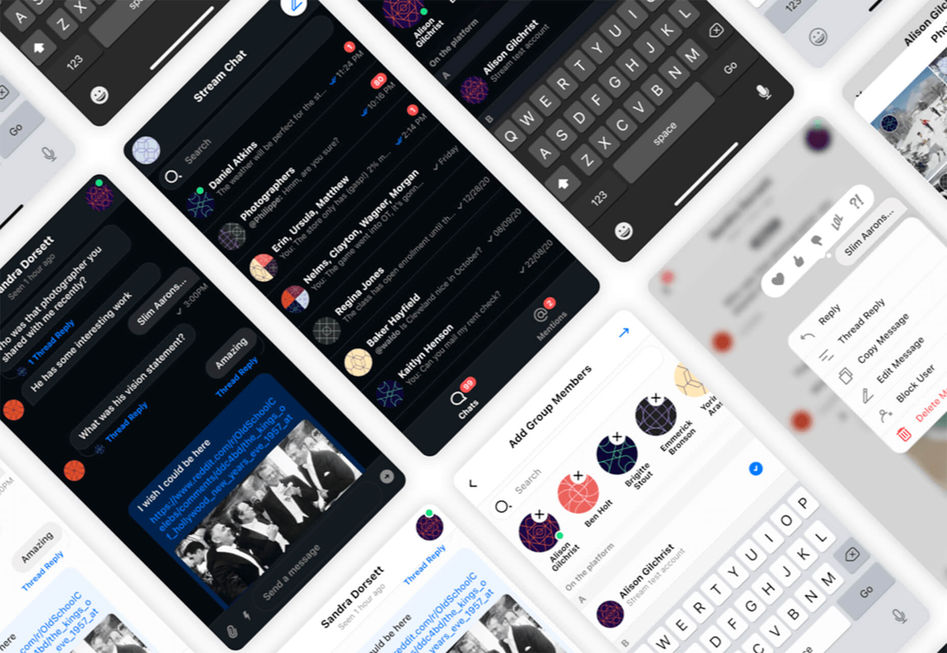
Mobile Chat Kit
Mobile Chat Kit is a free starter kit for building apps in Figma, Sketch, and Adobe XD. It includes more than 50 screen options with mapped-out flows for a quick-start project.
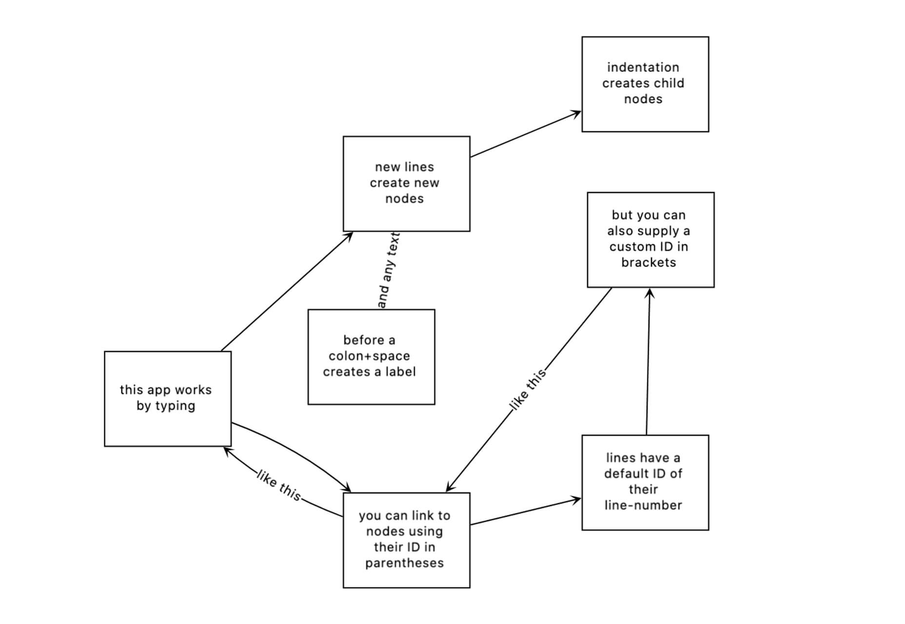
Flowchart.fun
Flowchart.fun is exactly what the name implies. The app allows you to type, create nodes, and link elements to develop simple flow charts quickly. Then you can alter shape and size with drag and drop. Export it for use as an SVG, JPG, or PNG.
Shuffle
Shuffle is a marketplace packed with UI libraries to help you with a variety of digital projects. There are more than 1,500 pre-built components to choose from with professional designs. This premium tool comes with a monthly subscription or lifetime license.
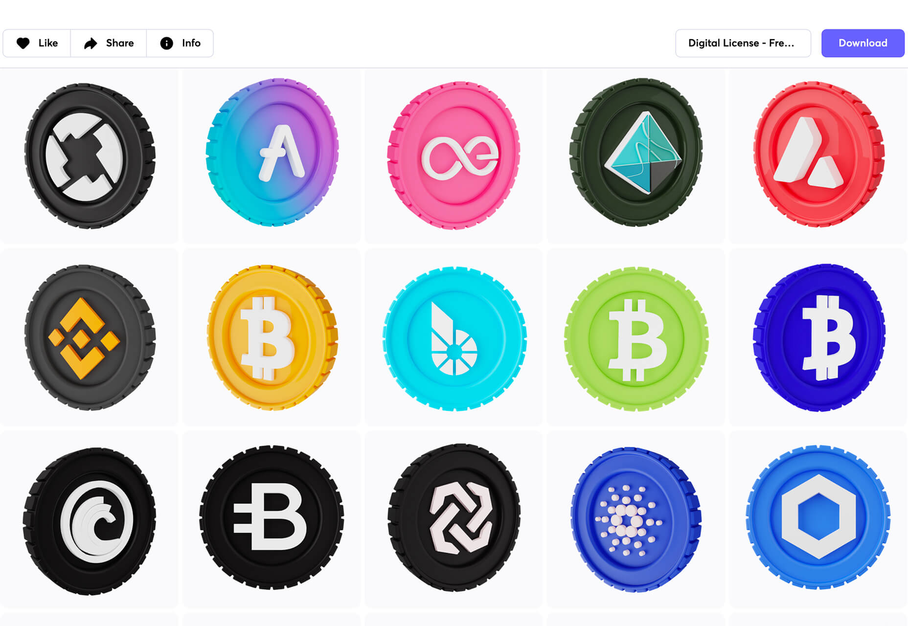
Cryptocurrency 3D Pack
Cryptocurrency 3D Pack is a set of icons with fun colors in three-dimensional shapes that you can use to represent different crypto elements. The pack includes 55 #D icons in PNG and BLEND formats.
Stratum UI Kit for Figma
Stratum UI Kit for Figma includes nine free screens that are ready to use. Options include API documentation, Kanban, document, data dashboard, ecommerce product list, ecommerce product options, payments spreadsheet, cloud storage, and newsfeed.
Conic.css
Conic.css is a collection of simple gradients that you can browse and then click to copy the code into your CSS to use them in projects. It’s quick and easy while using trendy color options.
Artify Illustrations
Artify Illustrations is a Figma plugin that allows you to access more than 5,000 SVG and PNG illustrations within the app. It’s got a built-in search feature, everything is high-resolution, and the huge library includes various styles.
2 Tutorials
A Complete Guide to Accessible Front-End Components
A Complete Guide to Accessible Front-End Components is an amazingly comprehensive guide from Smashing Magazine with everything you need to know about accessible components. From tabs to tables to toggles to tooltips, you’ll find it all here and learn how to use it the right way.
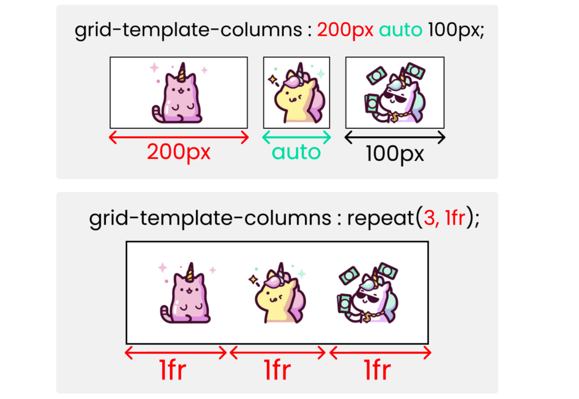
Grid CheatSheet in 2021
Grid CheatSheet in 2021 is a useful guide of everything you can do with CSS Grid. Plus, it has plenty of fun illustrations and an accompanying video.
8 Fresh and Fun Fonts
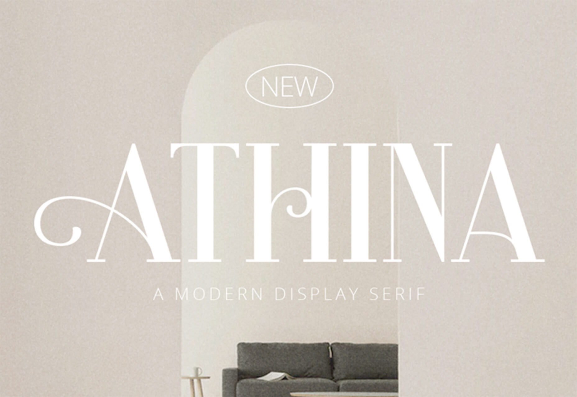
Athina
Athina is a modern display serif with beautiful connector strokes. The free version is a demo, and there’s a full family that you can buy.
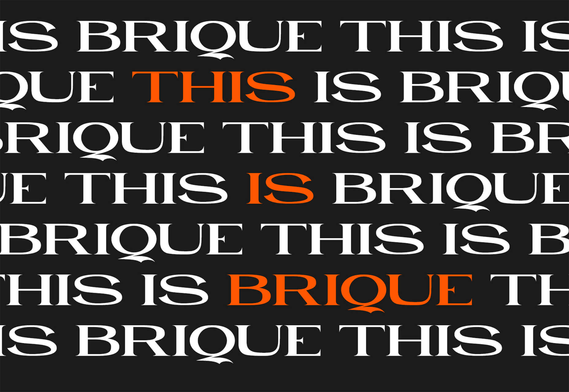
Brique
Brique is a free (personal and commercial) display font with a wide stance and uppercase character set. The letters have a lot of personality and a readable configuration.
Code Next
Code Next is a great geometric sans serif with a full family of styles. Including two variable fonts. It’s highly readable and would work for almost any application.
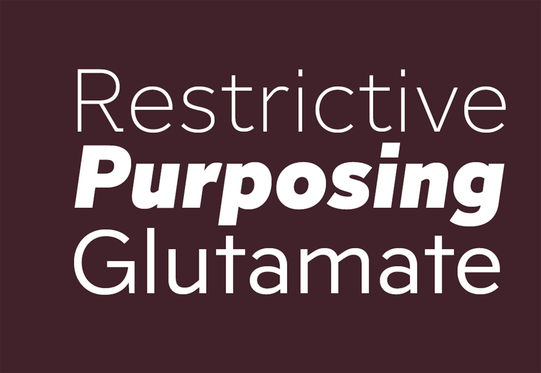
Inter
Inter is a simple and functional sense serif family with everything from extra light to heavy weights. The extra character personality makes this a fun and functional font option.
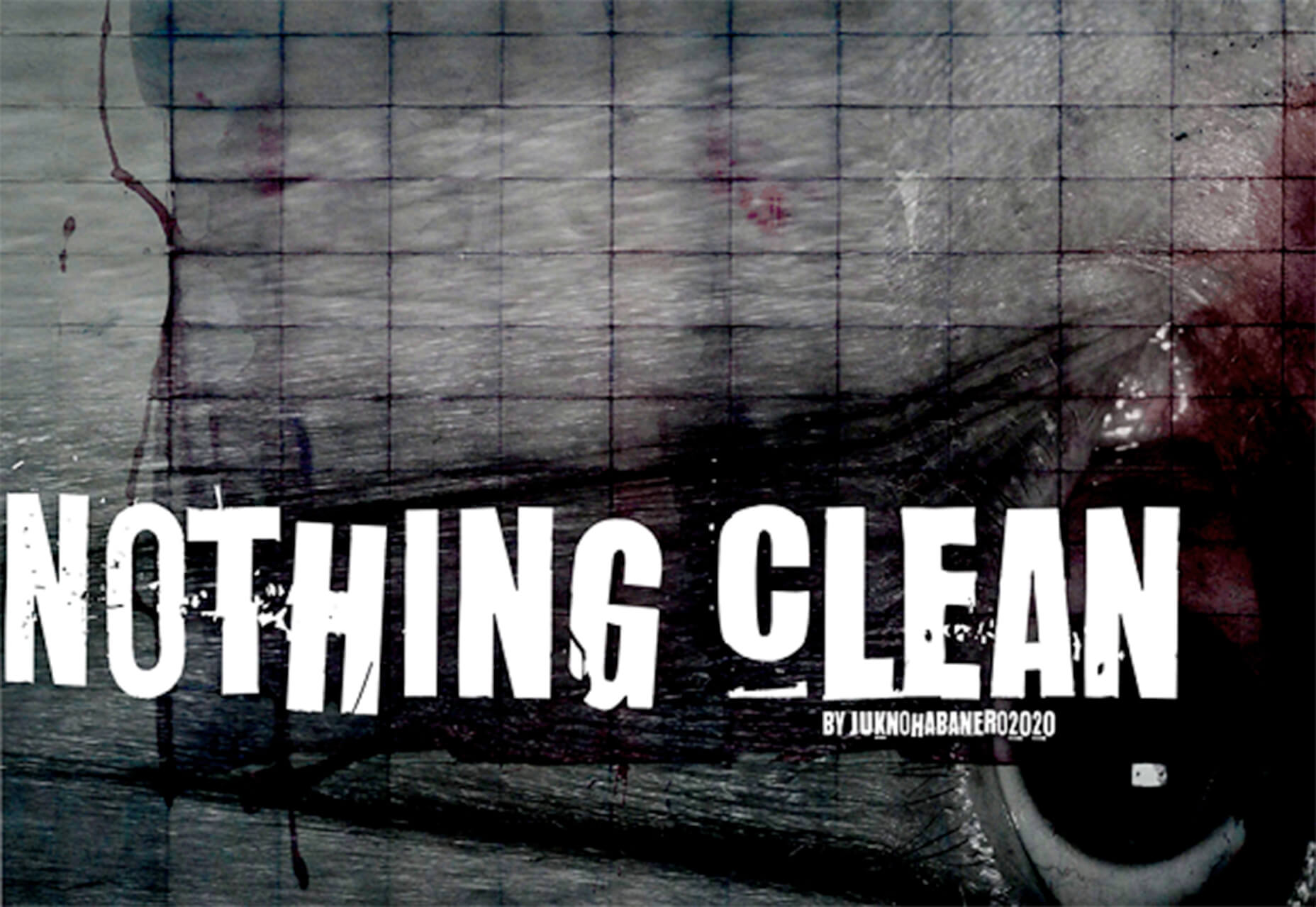
Nothing Clean
Nothing Clean is a fun grunge-type option. It’s an all uppercase character set with alternates.
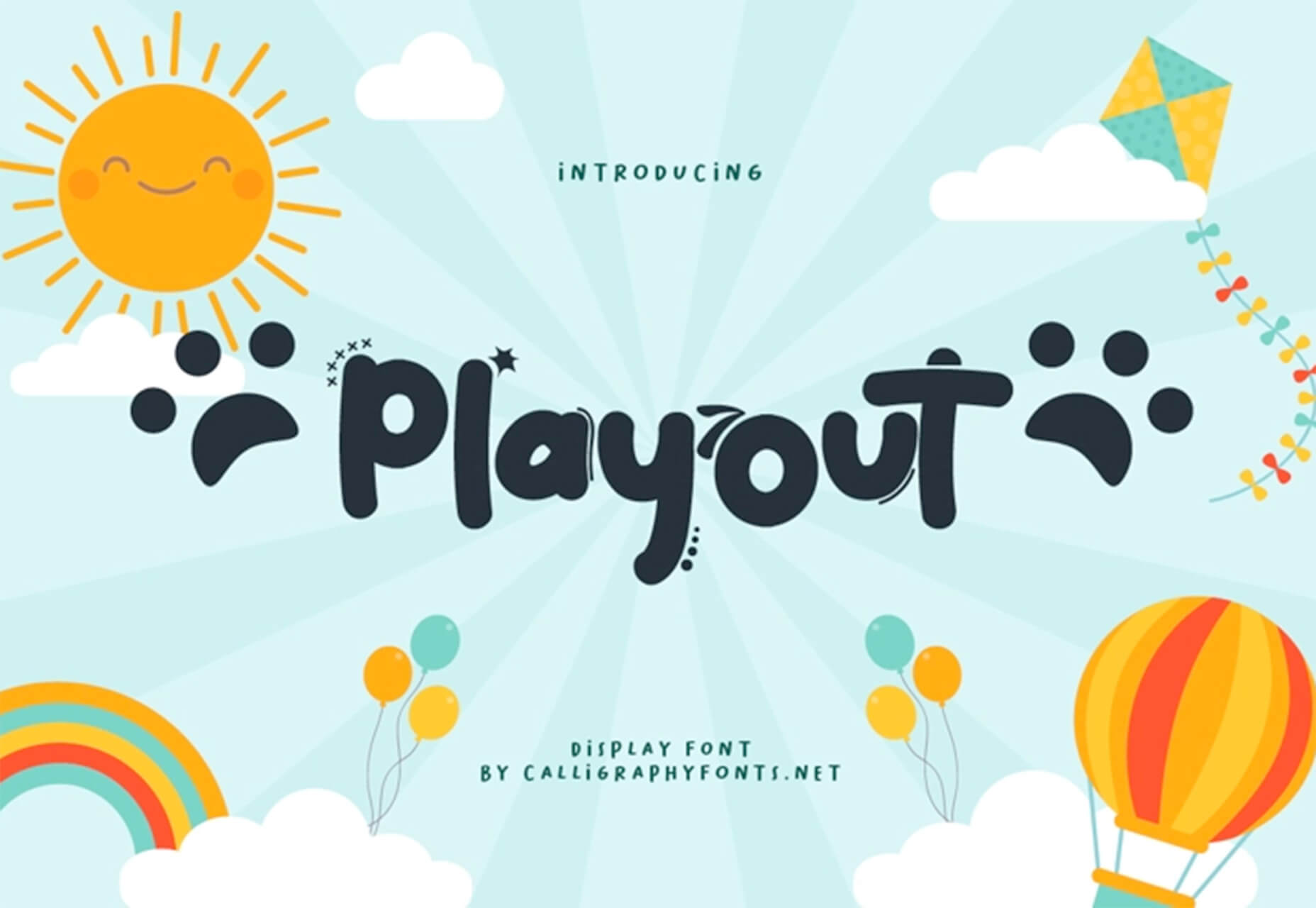
Playout
Playout is a fun, hand-drawn style typeface with interesting glyphs and alternate characters. The most fun feature might be the pawprint characters in the demo set.
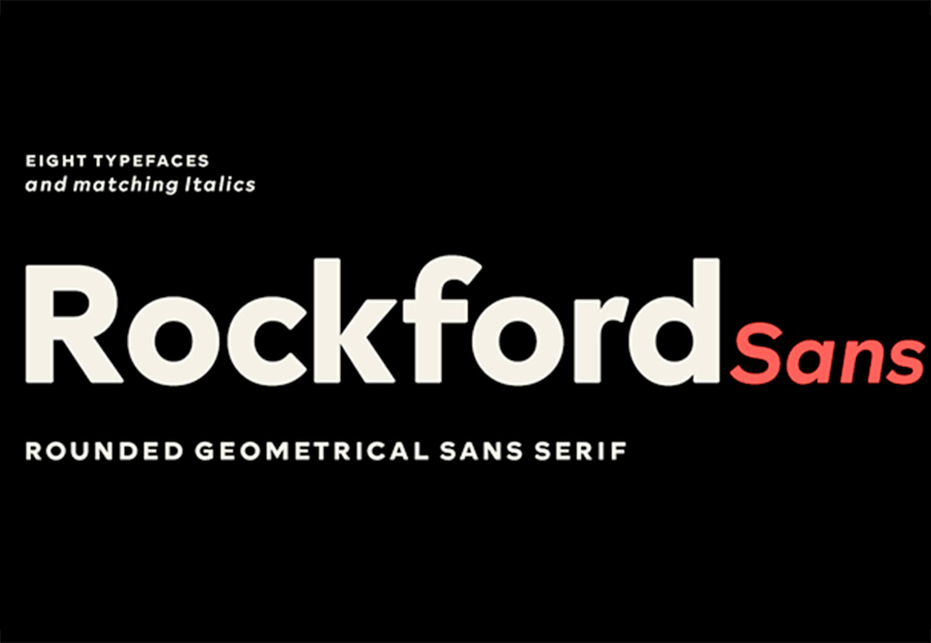
Rockford Sans
Rockford Sans is a geometric typeface with subtly rounded edges. It has eight weights and italics. With its large x-height and round features, it’s legible and friendly. It’s suited to cover a wide variety of tasks from editorial to brand design and advertising.
SpaceType
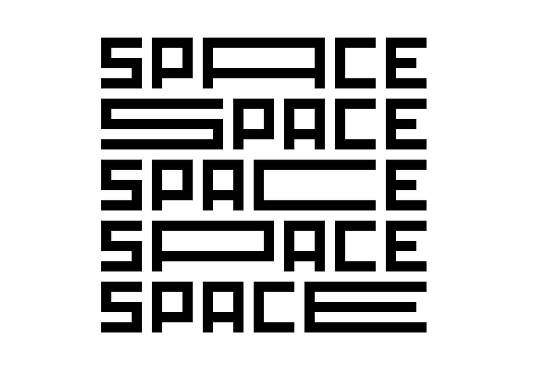
SpaceType is a fun and funky typeface in regular and expanded styles. The stretched letterforms make interesting alternates for display purposes.
https://ankaa-pmo.com/wp-content/uploads/2021/04/25-exciting-new-tools-for-designers-april-2021.jpg14082560Service comm.https://ankaa-pmo.com/wp-content/uploads/2017/04/Logo-Ankaa-engineering.pngService comm.2021-04-19 16:45:302021-04-19 16:45:3025 Exciting New Tools For Designers, April 2021
Have you ever wondered why we’re so amazed by motion? A moving image is more likely to grab your attention than a static one. Motion is exciting and attention-grabbing – plus, it allows us to access more information in a short space of time.
For a while now, companies have been experimenting with all kinds of motion and animation in their design choices. We’ve seen the rise of animated website backgrounds or live-playing videos instead of images on a home page. There are videos and 360-degree pictures on product pages to help people get a better view of certain items and immersive AR experiences on apps.
So why has the power of motion not made its way into the logo design landscape yet?
Sure, there are a few examples of animated logos out there, but they haven’t had the same long-lasting impact as animated websites. Perhaps that’s because people don’t have the right tools to bring their animated logos to life?
Today, we’re going to cover some top tips for live logo design.
1. Understand What “Live Logo” Means
An animated logo or live logo can be a powerful tool in a company’s branding strategy. Although there’s more to a company’s identity than its logo, it’s fair to say that logos make a huge difference to how we feel about brands and their identity.
A powerful logo can make an emotional connection with your target audience and help your brand to thrive in virtually any environment. Live logos, or animated logos, bring more attention to the brand image, by helping a customer to focus on the logo’s action. A live logo might tell a story about what the business does through motion, or just be eye-catching.
The level of animation varies depending on the designer, but it can go all the way from a short video presentation to a few simple moves. The Skype logo is an excellent example of something simple, that multiple designers have played with to great effect.
Today, there are plenty of open-access tools helping to create more immersive animated graphics in the logo design world. Additionally, the types of animation available are becoming more impressive all the time.
2. Explore the Types of Logo Animation
The next stage of properly leveraged live logos, is knowing what kinds of logo animation are available. There are plenty of different styles of animation to explore today, depending on the kind of impact you want to have.
For instance, sometimes the animation you choose will be connected to your business. A vehicle company might have a logo that seems to “drive” into the central space on the screen. An electricity company might choose a logo that pulses like an electric charge. This animated FedEx logo is an excellent example of how animation can show what a business does.
Options for animation might include:
Rotation: Make an emblem stand out by moving it to the sides or allowing it to move on its axis. Rotation gives a logo a sense of 3D space.
Appearance/Disappearance: You can make a logo grow on the screen by bringing to life one pixel at a time, or have it dissolve and disappear in a similar way.
Transformation: Your logo doesn’t have to start out in the shape it’s going to achieve. You might start with a seed that gradually grows into a tree-shaped logo for a gardening company, for example.
Replacement: Another great way to tell a story is to replace a graphic related to the company in question with the logo through an immersive animated experience.
3. Set Goals for the Live Logo
If you’re not sure what kind of animations to experiment with, then it’s a good idea to start with some solid goals. Your goals will give you a direction to move in with your logo choices. An animated logo can be a dynamic and modern way to present a brand to an audience, but it’s only going to be effective when implemented carefully.
Let’s look at some of the goals you can choose for your live logo:
Differentiation: While it’s true that animation and live content is gaining more attention lately, it’s still relatively new as an overall concept. With an animated logo, you could help a brand to create a more unique image for themselves, which sets them apart from the other organisations in the same space.
Storytelling: As mentioned above, animated logos can tell a story about what the company or product actually does. In this example for Firefox, for instance, the logo mimics a loading wheel to demonstrate a speedy internet browser.
Brand awareness: Dynamic logos and animations are more likely to capture your audience’s attention than static images. They’re also more of a novel experience, which means that customers might want to share them with other people too.
Memorability: Today’s customers are bombarded by hundreds, if not thousands of logos all the time. They need something special to convince them that one image deserves a spot at the front of their mind. Animation can help to make a business more memorable.
4. Do Your Research
Doing your own research is an excellent way to get some inspiration for a live logo or animation. Ideally, you’ll want to focus on the industry you’re already working in, as this will give you some guidance as to the kind of movement that can attract the most attention from the correct audience.
Watch as intros to brand videos and check out as many live logos as you can. Check out the kind of animations that people use in their videos when they’re showcasing products online. You can learn a lot about what works just by evaluating what other people have done before. Just be careful not to simply copy what you’ve found elsewhere.
The aim of your live animation should be to tell a unique story about the company
The aim of your live animation should be to tell a unique story about the company in question. If you’re not sure how to start with differentiating the image, check out the brand guidelines for the company in question. The guidelines that the company used to choose the right brand colors, fonts, and other visual assets can work just as well for your animation strategy.
Remember, the aim here is to tell a specific story, send a message, or evoke a certain emotion. Don’t make the mistake of designing something that looks cool but doesn’t have much of a purchase. Most human beings will naturally look for the meaning behind the content that they see. If there isn’t anything there, it’ll just lead to confusion.
5. Use Live Logos on Brand Websites
The most obvious way to begin experimenting with animated logos in web design, is to implement live logos into a client’s website. Some companies have a “welcome screen” for their site which uses an animation to introduce visitors to the home page and other navigation options. There are also brands out there who love the impact that animation can have but want to use it more subtly.
In these cases, live logos can be an excellent way to draw the eye to a specific spot on a website, perhaps the area just above the “contact” button that encourages a client to reach out. Crucially, to avoid weighing down the website and distracting visitors, companies and designers will need to make some important choices.
Although it might be tempting to keep the animation looping at all times, just in case someone misses the first round, this requires a lot of extra processing power. Too much animation also makes it harder for businesses to push the focus of their visitors to other points on the website, like landing pages for products, or testimonial pages.
Often, as with most innovative decisions in web-design, the best bet is usually to start small and work your way up. Don’t over-do it with animation on day one. See how the visitors to the website respond first.
6. Find the Right Balance
Animations in a live logo are there to grab attention quickly, and effectively. They shouldn’t go on for too long, or you risk overwhelming your audience before they have a chance to browse the rest of the website or check out other content. A live logo should only be active for a few seconds at most, and in that time, it needs to say something valuable.
Often, the best strategy is to start by building up curiosity, and getting your viewer engaged so that they’re keen to see more. Every frame will count to pull the customer in and make them feel connected to the brand in question.
Make sure that the logo animation is dynamic so that it doesn’t just capture the attention of the viewer but maintain their interest for the full time required. During the motion, the viewer’s brain should be working to figure out what’s going to happen next.
Just like most logo design and graphic animation strategies, the key to success is finding the right balance between clever experiences, and simplicity. You want to do something meaningful that earns your viewer’s attention, but you need to compete with the fact that attention spans are plummeting all the time.
7. Explore Logo Animation in Video
One of the best ways to use logo animation, is to draw interest for a company at the beginning of a video. Video is gaining incredible levels of popularity lately, particularly in a world where you can view video content almost anywhere. Companies are adding videos to their product pages, social media accounts, applications, websites, and so much more .
For the majority of companies, a live logo at the start of a video can help their brand to seem more professional. It’s a reminder to viewers of the brand that they’re learning about with that video content. Plus, a logo at the beginning of a piece of video content can also build on the consistency that companies attempt to create by using the same brand assets in various mediums online.
(Starting a video with an animated logo is great for presentation, but it can also be frustrating to customers in certain pieces of content where they’re looking for quick answers to questions. If an animated logo is more than a couple of seconds long, it may be better placed at the back of a video instead.)
With videos for news reports or announcements where you want to get straight to the point and generate excitement about a new product or service, it can be better to jump straight into action. Ending a video with a live logo keeps the brand image front of mind for the customer for longer, even after the message has ended. On the other hand, ending a video with a logo could increase the chances that customers miss the animation, because they click away from the content too quickly.
If you’re new to adding live logos into videos, consider experimenting with different strategies to see which works best. Different companies might get unique results.
8. Bring Logo Animation to the Real World
Another interesting option for live logo design, could be to step outside of the computer screen for a while. In today’s digitally transforming landscape, it’s becoming more common to see the real and digital worlds converging. Most events and trade-shows come with presentations that rely on digital content, like animated presentations and slide shows.
Depending on the signage solutions available at industry events, companies could even use an animated logo above their booth to draw attention in a cluttered environment. Around 48% of exhibitors agree that a more eye-catching stand or booth is often the most effective way to attract visitors and customers at an event.
Animation and live logos may have started life on the computer screen, but they can appear in much more diverse environments today. Offices could use a live logo in the reception room or lobby to make their on-premises environment more appealing. Retail locations could display ads on digital signage, followed by live logos that work to both separate messages, and keep shoppers entertained when they’re enjoying the bricks-and-mortar experience.
9. Include Live Logos in Brand Signatures
Remember, a live logo doesn’t just have to sit on a company’s app or website until someone discovers it. Sometimes, the right logo can also be a powerful way to “sign off” on a message from a brand or its management team. For instance, email remains to be one of the most valuable tools for business marketing and customer relationship building today.
It’s the third most influential source of content and news for a lot of B2B audiences, and yet, most companies aren’t taking full advantage of what their email marketing software solutions are capable of. If you can display gifs and animated videos in an email (which most software solutions can), then you can also add a live logo to the brand signature.
The important thing to remember is that if you’re going to be adding a signature to a lightweight thing, like an email, it needs to be lightweight too. Don’t make the live logo too long and complicated, or it might prevent the email from loading properly.
Outside of email, don’t forget to consider options for live logos in things like social media profile pictures too. According to experts, around 80% of companies use visual assets in their social media marketing. A live logo is a great way to go beyond the basics with a company’s imagery. Motion grabs attention, and video content is quickly gaining steam on a lot of social media platforms.
Embracing a New World of Live Animation
Designers are only just beginning to scratch the surface of what’s possible with animated logos. For many companies, live logos are an excellent way to capture audience attention and encourage engagement with a brand.
A live logo at the beginning of a video, at the start of an app loading screen, or even at the top of a website can differentiate a company and make them stand out. As technology continues to evolve, and customer expectations continue to expand, the options for live animation could continue to grow. You might even be able to infuse live logos with elements of VR and AR, to impart brand essence in a brand-new digital world.
If you haven’t begun experimenting with live logo design yet, now could be the time to start.
https://ankaa-pmo.com/wp-content/uploads/2021/04/9-tips-for-better-live-logo-design.png15292780Service comm.https://ankaa-pmo.com/wp-content/uploads/2017/04/Logo-Ankaa-engineering.pngService comm.2021-04-14 16:45:092021-04-14 16:45:099 Tips for Better Live Logo Design
Google has been talking about the Core Web Vitals tool and the Page Experience Update for about a year now.
With the update scheduled to roll out in May 2021, now is the time to make sure your websites are prepared for it. It’s taking a lot of the best practices Google has recommended over the years and making them an official part of the search algorithm, so not taking this seriously could negatively impact your sites’ rankings.
Today, we’re going to look at everything Google has told us about the update and how to use the Core Web Vitals tool to ensure your site rankings don’t drop once it rolls out.
What We Know About the Google Page Experience Update
Google first told us about the page experience update back in May 2020. Here’s what we know about the upcoming update:
Google’s Search Algorithm Will Change in May 2021
Although there’s no specific day given, we do know that the page experience update will go live sometime in May 2021.
The Goal is to Reduce Friction on the Web
It’s not as though user experience is something that designers and developers overlook when building websites. Heck, there’s an entire disciple of UX design dedicated to it.
That said, Google hasn’t taken too hard line of an approach in enforcing its page experience suggestions, like mobile-first design, removing intrusive pop-ups, or improving page speed. With this update, though, Google is now telling every site owner that performance, accessibility, technical best practices, and SEO must be built into their websites.
Of course, the goal isn’t to create more work on your side of things. Google believes that by encouraging developers to build better web experiences that consumers will experience less friction and businesses will be more profitable as a result.
The Update Will Include Older Signals
According to Google, the page experience update is going to combine a bunch of older signals with the new Core Web Vitals:
The Core Web Vitals tool will now merge all of that data we once had to gather from various Google apps. That’ll make it more convenient for designers and developers to improve the on-page experience across a variety of areas.
The Page Experience Algorithm Will Change Over Time
Per Google:
Because we continue to work on identifying and measuring aspects of page experience, we plan to incorporate more page experience signals on a yearly basis to both further align with evolving user expectations and increase the aspects of user experience that we can measure.
So, don’t expect this to be a one-and-done thing. You’ll have to rely on the Core Web Vitals tool, and pay close attention to updates out of Google, to ensure your sites are keeping up with Google’s page experience standards.
Your Other Google Apps Have Already Been Updated with Core Web Vitals
If you hadn’t noticed, Google has already updated its other apps in anticipation of the page experience update.
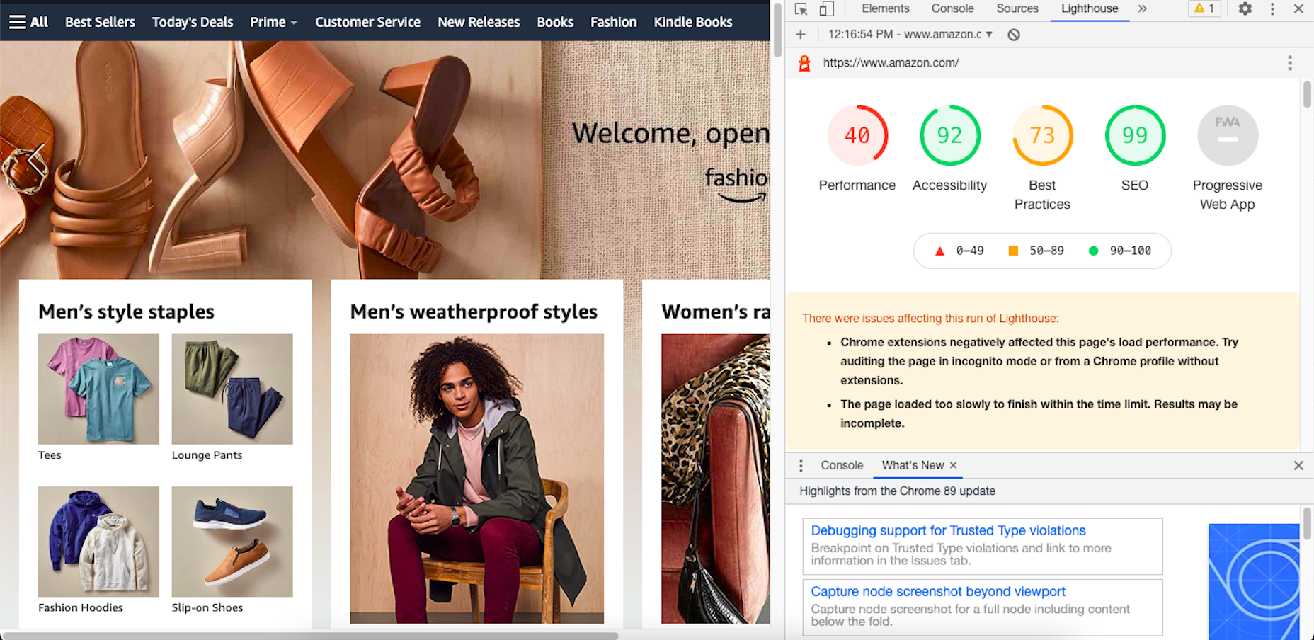
Here’s an example of how Lighthouse’s report on the Amazon website now looks:
By including these metrics within the tools you’re already using, you don’t necessarily have to add the Core Web Vitals tool to your growing toolbox. That said, there are some really valuable reports in there, so I’ll show you why you may want to add it anyway.
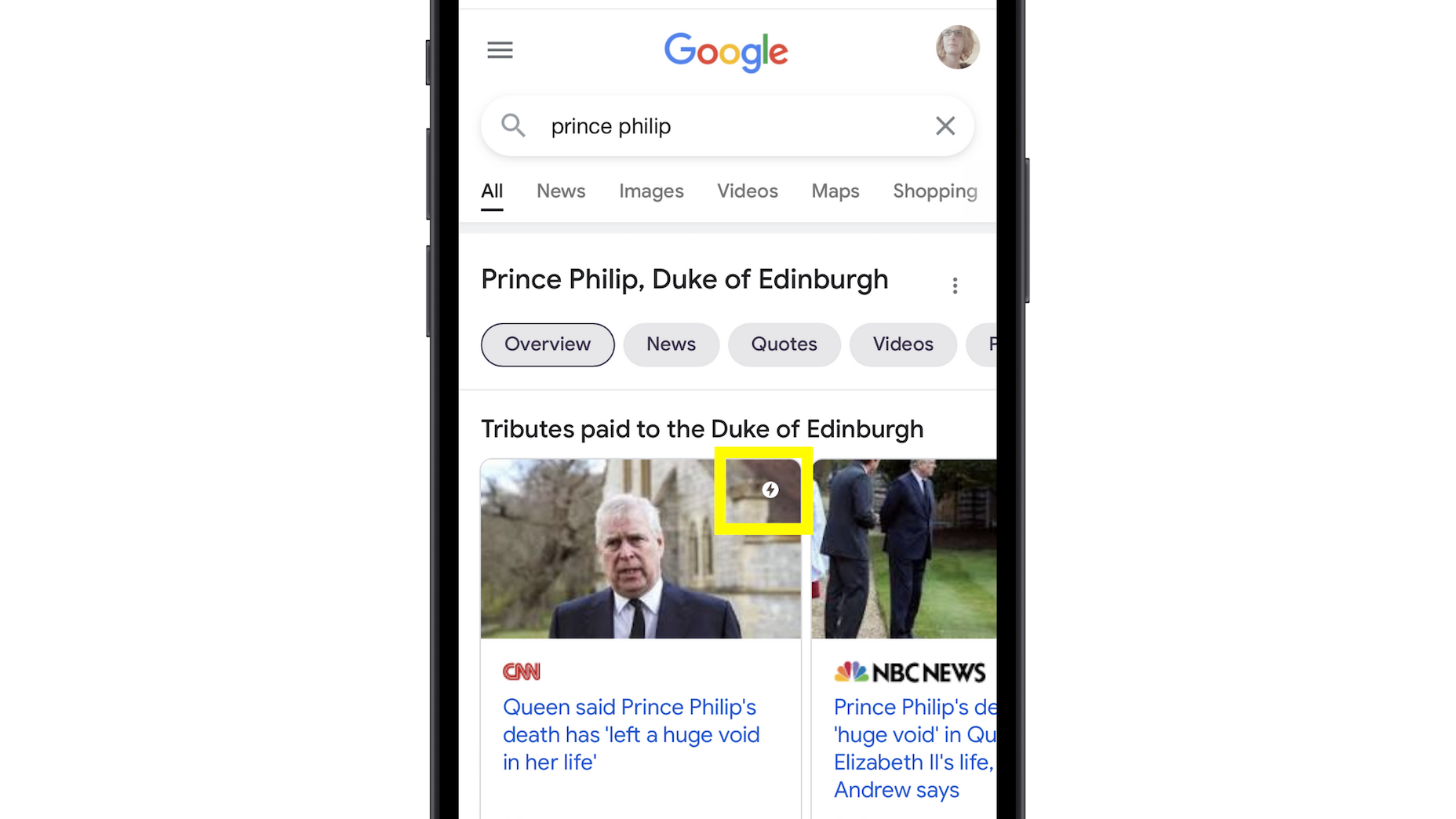
Google’s Top Stories Will Be Affected
In the past when someone did a news-related search on Google, they’d see “Top Stories” results like this one:
Until now, the only pages shown here were AMP-enabled ones.
Once the page experience update goes live, though, the AMP requirement is going away. So long as a page meets the page experience criteria along with Google News content policies, it can now rank in this section.
Google Search Results May Show a Page Experience Indicator
In the Top Stories example above, notice the AMP indicator I highlighted in yellow. Google is thinking about adding something similar to any search result that fulfills its page experience criteria.
While I think a small, eye-catching icon might draw a little more attention from Google users, I’m not sure if it’ll be that big of a deal to them. People working in this industry certainly know what that lightning bolt means, and we’ll also be the ones who recognize the page experience indicator, but I’m not convinced it’ll matter to users.
That said, this is something Google is thinking about rolling about, so it’s something to be aware of. At the very least, you can consider it a badge of honor when showing your websites to clients and prospects who want to see what you can do for them.
Content Is Still More Important Than Page Experience
Even if a website checks off all the page experience boxes, there’s no guarantee that it’ll start to rank better than websites that haven’t. The quality and value of the content on the page still matters greatly.
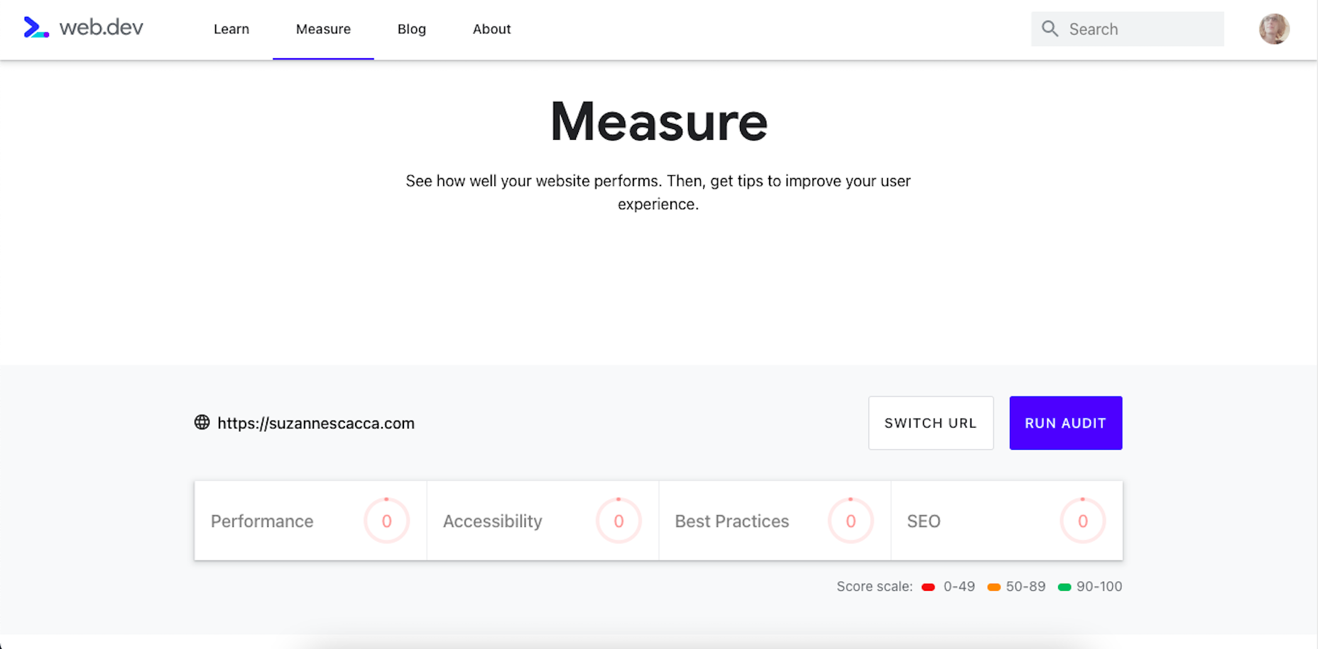
Using Core Web Vitals to Measure Page Experience
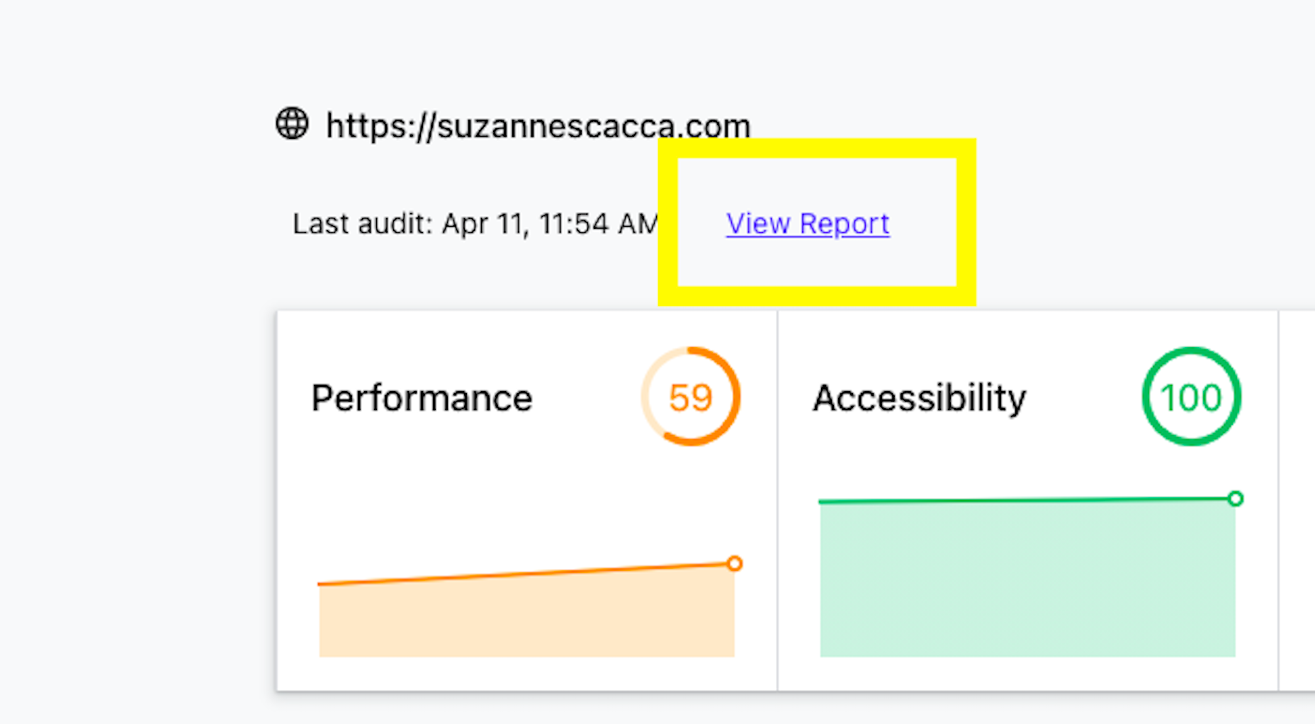
Alright, so let’s take a look at this Core Web Vitals tool. Here’s what the tool looks like when you enter the “Measure” tab:
It’s like most other Google analyzer tools. You enter the URL you want to audit and let the tool run. The results then spit out something that looks like this:
Core Web Vitals are graded on four categories:
Performance measures the loading speed, interactivity, and stability of the page.
Best Practices focus on the technical aspects of the page, including things like having an SSL certificate and making sure images fit within the parameters of the mobile screen.
SEO checks on the typical SEO signals like metadata, structured data, and so on.
Accessibility reports any issues with visitors not being able to see or access parts of the page.
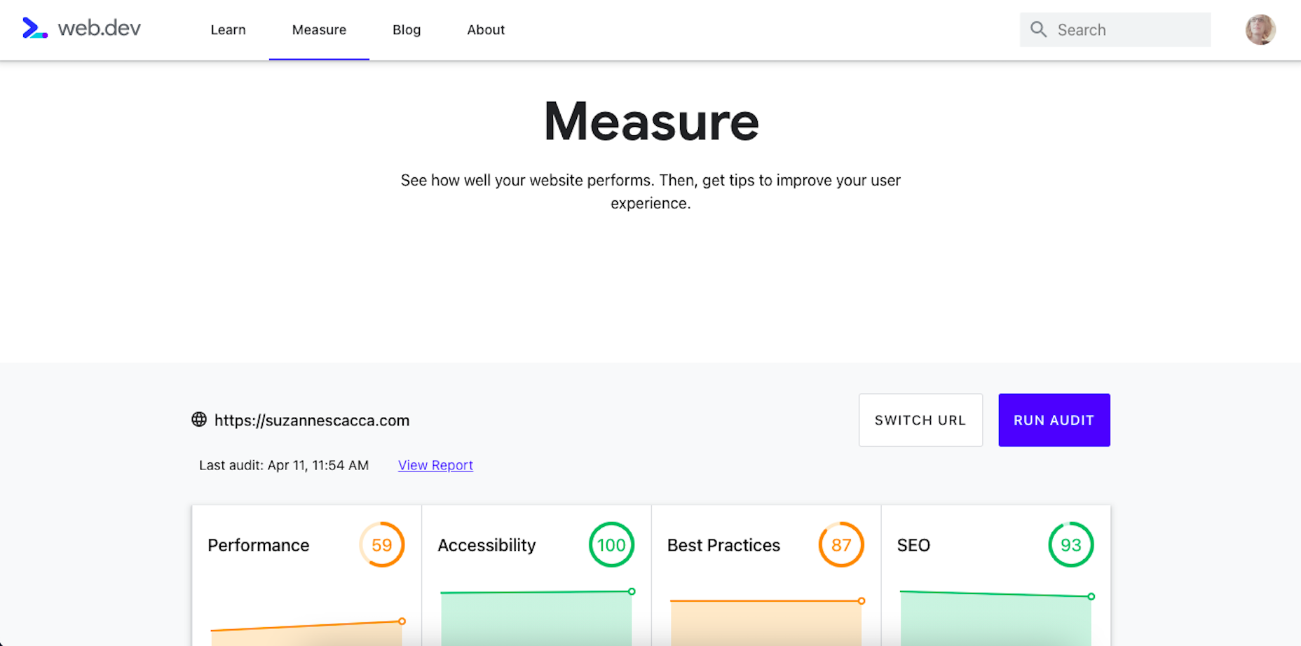
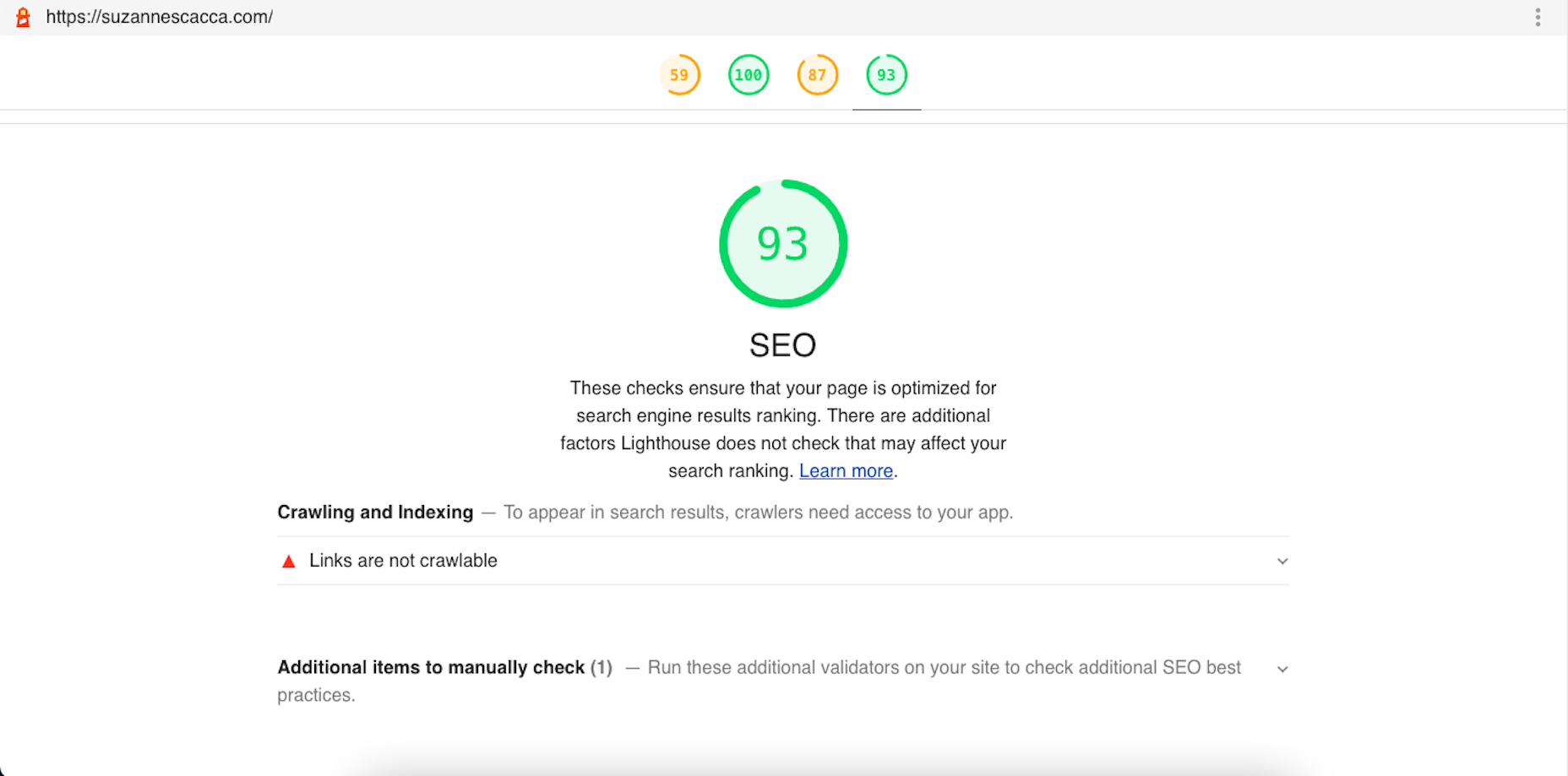
If you scroll down just a little bit on the page, there’s more data available. It mainly has to deal with the technical stuff, like page speeds and unoptimized code:
Now, this isn’t really anything new. We can get this data about load time, interactivity, and content stability from Google’s other apps.
The real value is in the report, which you can access up top next to the date of your audit.
Open the report and you’ll find specific suggestions and pro tips to optimize each part of the page experience, like this SEO report:
Just like other Google tools, this one can teach you a lot about what makes one site more rankable than another. So, make sure you update your web design strategy going forward to integrate all of these ranking signals.
While you’ll have to do annual audits on your sites to see how much Google has changed the page experience signals, you’ll create less work for yourself if this baseline set of criteria are met with every site you build.
https://ankaa-pmo.com/wp-content/uploads/2021/04/get-ready-for-next-months-google-shakeup.png15292780Service comm.https://ankaa-pmo.com/wp-content/uploads/2017/04/Logo-Ankaa-engineering.pngService comm.2021-04-12 12:45:202021-04-12 12:45:20Get Ready For Next Month’s Google Shakeup
Inclusive design is all about designing sites with everyone in mind instead of designing for your own preferences. It’s an essential component in a professional-grade site and the cornerstone of a successful project.
Accessibility (A11y for short) is the technical branch of inclusive design. Accessibility is a science: it knows what markup is required to make the text available to the visually impaired; it knows the minimum button size for someone with limited motor control; it knows how complex navigation can be for someone with cognitive dysfunction. Accessibility is the engine that powers an inclusive design.
Because accessibility is so complex, it takes a huge wealth of knowledge to do it well. Luckily for you and me, there’s now a free resource you can use to brush up on your skills and improve the ROI of your site.
Stark has just acquired a11yresource and relaunched it as the Stark Public Library — reportedly the largest accessibility resource on the web. The library contains around a thousand different resources. You’ll find blog articles, checklists, formal courses, tools, links to web standards, and a whole lot more. As the library grows, the expectation is that Stark will add new features aimed at fostering a community.
Stark is a suite of accessibility tools for designers that integrates with XD, Sketch, and Figma. It’s free to use the basic package, and the commercial plan is $60 per year. The Public Library is free for everyone to access.
https://ankaa-pmo.com/wp-content/uploads/2021/04/stark-launches-public-library-for-accessibility.jpg14082560Service comm.https://ankaa-pmo.com/wp-content/uploads/2017/04/Logo-Ankaa-engineering.pngService comm.2021-04-09 20:45:232021-04-09 20:45:23Stark Launches Public Library For Accessibility
Web design is an ever-evolving field. Those of us that have been in the industry a long time (i.e., six months plus) have seen the launch of more products, the establishment of more ideas, and the promise of more growth than most industries see over a whole career.
While the tools we use, the terminology we employ, and the goalposts we shoot for are constantly changing, core skills are transferable and long-lasting and will ensure you not only survive in the industry but thrive in it.
These skills are characteristics that you can learn, that will help you grow in 2021, 2022, and beyond.
1. Decision Making
Life is a series of decisions, from which pair of socks to wear to which crypto to store your life savings in. Each of us has a finite amount of decision-making fuel in the day — the more decisions you make, the sooner you reach decision fatigue.
Most people burn their decision-making fuel by second-guessing themselves; they make a decision and then remake the same decision over and over as doubt creeps in.
The ability to make a decision, and stick to it, separates those people who still have the fuel to make strategic decisions after close of business and those people who can’t decide what to have for dinner.
2. Clarity of Purpose
It’s never a bad idea to brush up on design fundamentals. From color theory to typography to UI and layout, these core skills are not only beneficial to your design practice, but they help you think about design on a higher level.
Too often, designers fail to see the wood for the trees, focusing on the project at hand instead of a wider picture. The wider picture doesn’t mean your portfolio; it means the whole history, culture, and design context.
Many musicians can play multiple styles, but they tend to favor one instrument; they made a fundamental decision that freed them to explore music in greater depth
Despite the term, design fundamentals aren’t universal; they’re personal to you. For example, should you pair a script with a serif? Your answer is probably, “it depends” because you’re an awesome designer; my answer is “no,” because, for me, that is a design fundamental.
Design fundamentals can be limiting, but by providing default answers to common questions, they also free you to consider larger questions about what you’re doing and why, which leads to clarity of purpose.
Many musicians can play multiple styles, but they tend to favor one instrument; they made a fundamental decision that freed them to explore music in greater depth.
3. The Holy Trinity
The holy trinity in web design is HTML, CSS, and JavaScript. Learn what they are and what they do.
You need to understand them well enough to hold an intelligent boardroom-level conversation about them. You don’t actually need to know how to code them — although I’ve never actually met someone who knew enough about their roles to hold a strategic conversation, who didn’t also know how to code them from scratch.
I’m not talking about frameworks, libraries, or the latest build tools. Those things are just macros for coders. I’m talking about understanding the building blocks of a site, so if someone asks you whether you really need the company logo in the site footer, you can answer, and back your answer up with facts.
4. Simple Presentation
No matter what field of design you’re in, you’re going to need to present your ideas to someone who doesn’t share your knowledge. Whether you’re explaining the basics to a client or explaining your decision-making to a colleague, presenting your ideas simply is the best way to be heard.
a pitch is most effective when you exclude extraneous detail
Often, a persuasive presentation utilizes the less-is-more approach. Just as a design is finished when you’ve removed everything unnecessary, so too a pitch is most effective when you exclude extraneous detail.
Often you’ll find metaphor useful, especially if you have a passing knowledge of the person’s own area of expertise because it translates a concept into a format the person understands and is comfortable with.
“We should…because it will improve [a metric] by approximately…%” is often the most welcome language. If the person you’re selling your decision needs more detail — and they probably don’t need to know details, that’s what they have you for — they can ask.
5. Strategic SEO
SEO (Search Engine Optimisation, for the two people in the world who don’t know what that acronym stands for) is a vast field with as many sub-divisions as there are UX job titles.
There are various branches of SEO that a site needs to consider. Technical SEO is the stuff that coders do; if you’re not a coder, you can ignore that. Content SEO is the stuff that marketers do; if you’re not a marketer, you can ignore that. Strategic SEO is a macro-view of a site’s plans; everyone on every project should understand strategic SEO.
Strategic SEO covers topics like landing pages, single-page sites, whether a blog is necessary, how, if at all, social media is employed. Strategic SEO feeds all other branches of SEO. It is so fundamental that it informs the earliest decisions about a site. If you want to do more than make things look pretty, learn more about strategic SEO.
6. A Second Language
You’ve probably noticed by now that the web extends beyond your town limits. It’s a global force, which means billions of people who don’t speak the same language.
If you’re not a native-English speaker, then it’s a no-brainer to learn a little English. You don’t need to be fluent; you certainly don’t need to be poetic, but the vast majority of documentation, GUIs, blog posts, forums, conferences, and the Web itself are in English, and translation code only gets you so far.
If you are a native English speaker, then learn something relevant to your region or the industry you specialize in. It doesn’t really matter what you learn; picking up a language, and culture, makes you a more rounded human being. And provided you don’t pick something obscure, you’re opening yourself up to millions or even billions of users you were previously missing out on.
7. Saying, “No.”
It doesn’t matter whether you’re a freelancer sofa-diving for spare pennies to meet the rent or a seasoned in-house designer with targets to meet; everyone struggles to say, “no.”
The fear is that if we decline a project, or a feature request, that we won’t be asked next time; eventually, we’ll be passed over for all projects until we have no career left.
The problem is that we only have so many hours in a day. If we do too much, we end up doing it badly, so there have to be limits. Every time you say “yes,” you’re increasing the chances that you will have to say “no,” to a future opportunity that’s great for you.
By all means, decline gracefully. Do it politely. Be kind. Offer to refer the client elsewhere. But it’s better to say “no” than to have to say “no” to the perfect project because you’re over-stretched.
https://ankaa-pmo.com/wp-content/uploads/2021/04/7-skills-you-need-to-thrive-as-a-web-designer-in-2021.jpg14072560Service comm.https://ankaa-pmo.com/wp-content/uploads/2017/04/Logo-Ankaa-engineering.pngService comm.2021-04-07 16:45:592021-04-07 16:45:597 Skills You Need To Thrive As A Web Designer In 2021
Paramètres des cookies et politique de confidentialité
Comment nous utilisons les cookies
Nous utilisons les cookies pour nous faire savoir quand vous visitez nos sites Web, comment vous interagissez avec nous, pour enrichir votre expérience utilisateur et pour personnaliser votre relation avec notre site Web.
Cliquez sur les différents titres de catégories pour en savoir plus. Vous pouvez également modifier certaines de vos préférences. Notez que le blocage de certains types de cookies peut avoir un impact sur votre expérience sur nos sites Web et les services que nous sommes en mesure d'offrir.
Cookies essentiels sur ce site
These cookies are strictly necessary to provide you with services available through our website and to use some of its features.
Because these cookies are strictly necessary to deliver the website, you cannot refuse them without impacting how our site functions. You can block or delete them by changing your browser settings and force blocking all cookies on this website.
Cookies Google Analytics
Ces cookies recueillent des renseignements qui sont utilisés sous forme agrégée pour nous aider à comprendre comment notre site Web est utilisé ou l'efficacité de nos campagnes de marketing, ou pour nous aider à personnaliser notre site Web et notre application pour vous afin d'améliorer votre expérience.
Si vous ne voulez pas que nous suivions votre visite sur notre site, vous pouvez désactiver le suivi dans votre navigateur ici :
Autres services
Nous utilisons également différents services externes comme Google Webfonts, Google Maps et les fournisseurs externes de vidéo. Comme ces fournisseurs peuvent collecter des données personnelles comme votre adresse IP, nous vous permettons de les bloquer ici. Veuillez noter que cela pourrait réduire considérablement la fonctionnalité et l'apparence de notre site. Les changements prendront effet une fois que vous aurez rechargé la page.
.
Paramètres de Google Webfont Settings :
Google Map :
Vimeo et Youtube :
Politique de confidentialité
Vous pouvez lire nos cookies et nos paramètres de confidentialité en détail sur la page suivante

 This week, in a move like something from a particularly eventful episode of The Office, popular project management app company Basecamp banned political and societal discussion in the company’s internal communications.
 Landing pages are central to successful marketing campaigns; they allow you to target particular customers with particular solutions to particular problems.


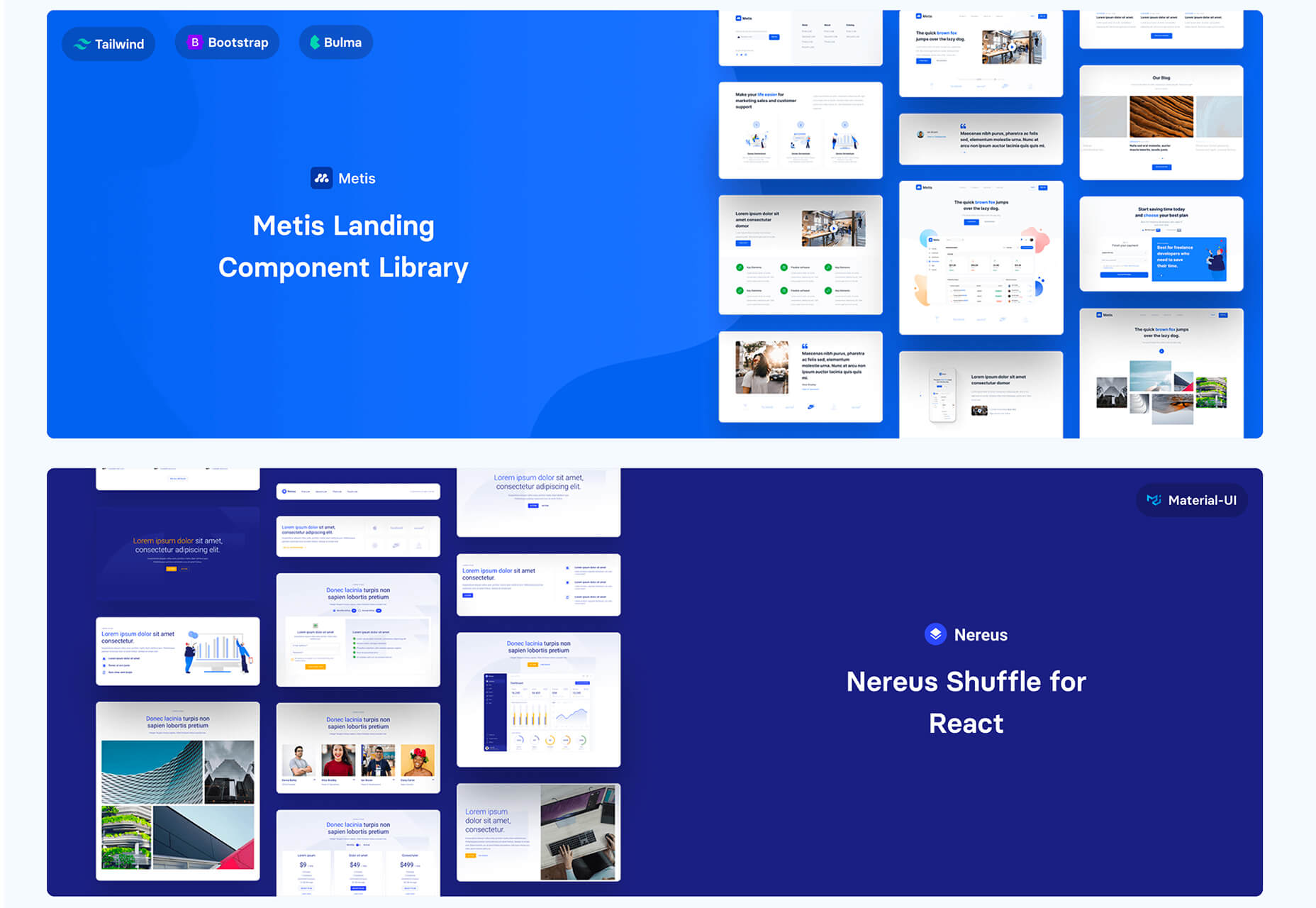
 This month’s collection contains a combination of big and bold, and clean and minimal. Although basic minimalism is still trendy, with lots of white space and greyscale type, we are seeing it softened with color. This is implemented differently, ranging from hints of off-whites in images to gentle pastels as section backgrounds.
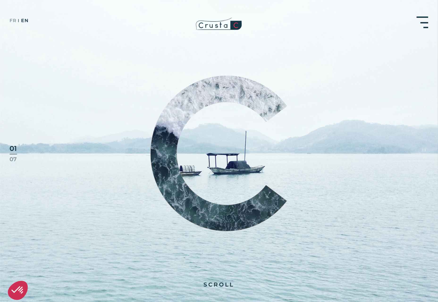


 Every day design fans submit incredible industry stories to our sister-site,


 Ten years ago, people began talking about the “Independent Web.” Although we don’t commonly use the term anymore, that doesn’t mean that it’s not still as vital a topic of discussion today as it was a decade ago.
 Rather than spring cleaning, do some spring “shopping” for tools that will make your design life easier. Packed with free options this month, this list is crammed full of tools and elements that you can use in your work every day.


 Google has been talking about the Core Web Vitals tool and the Page Experience Update for about a year now.
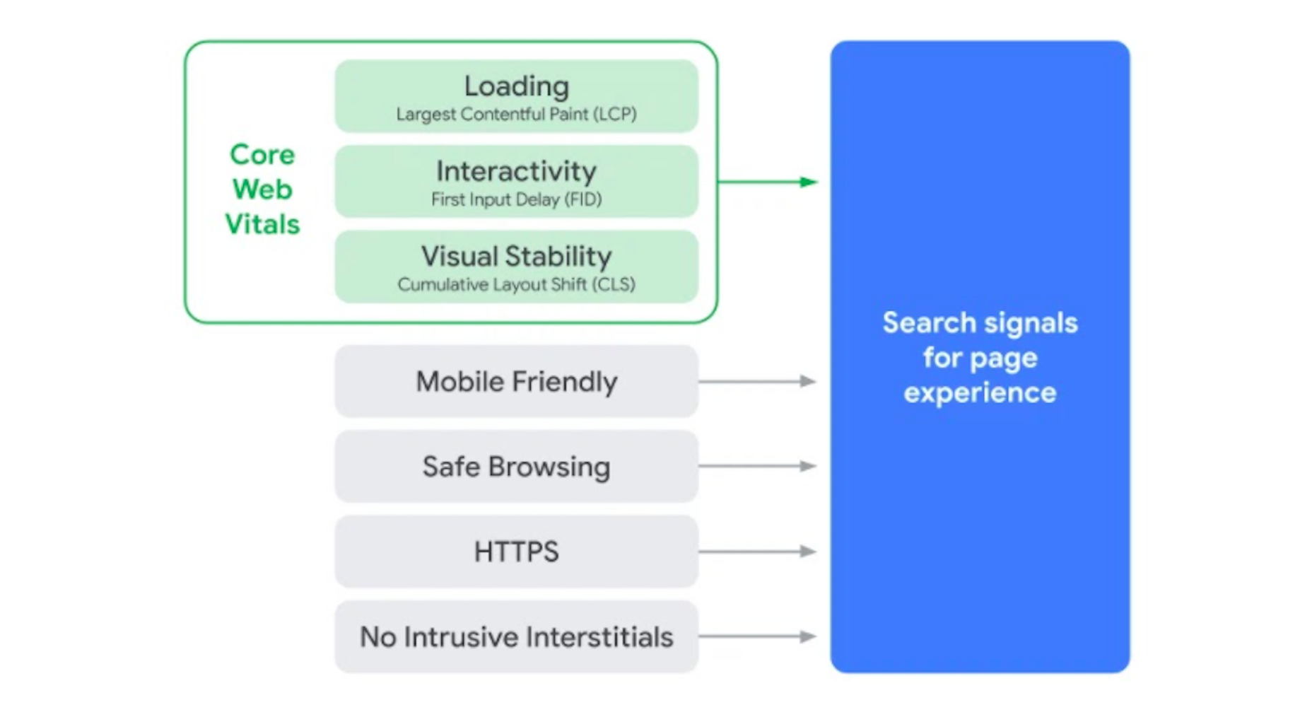

 Inclusive design is all about designing sites with everyone in mind instead of designing for your own preferences. It’s an essential component in a professional-grade site and the cornerstone of a successful project.

 Web design is an ever-evolving field. Those of us that have been in the industry a long time (i.e., six months plus) have seen the launch of more products, the establishment of more ideas, and the promise of more growth than most industries see over a whole career.