Articles

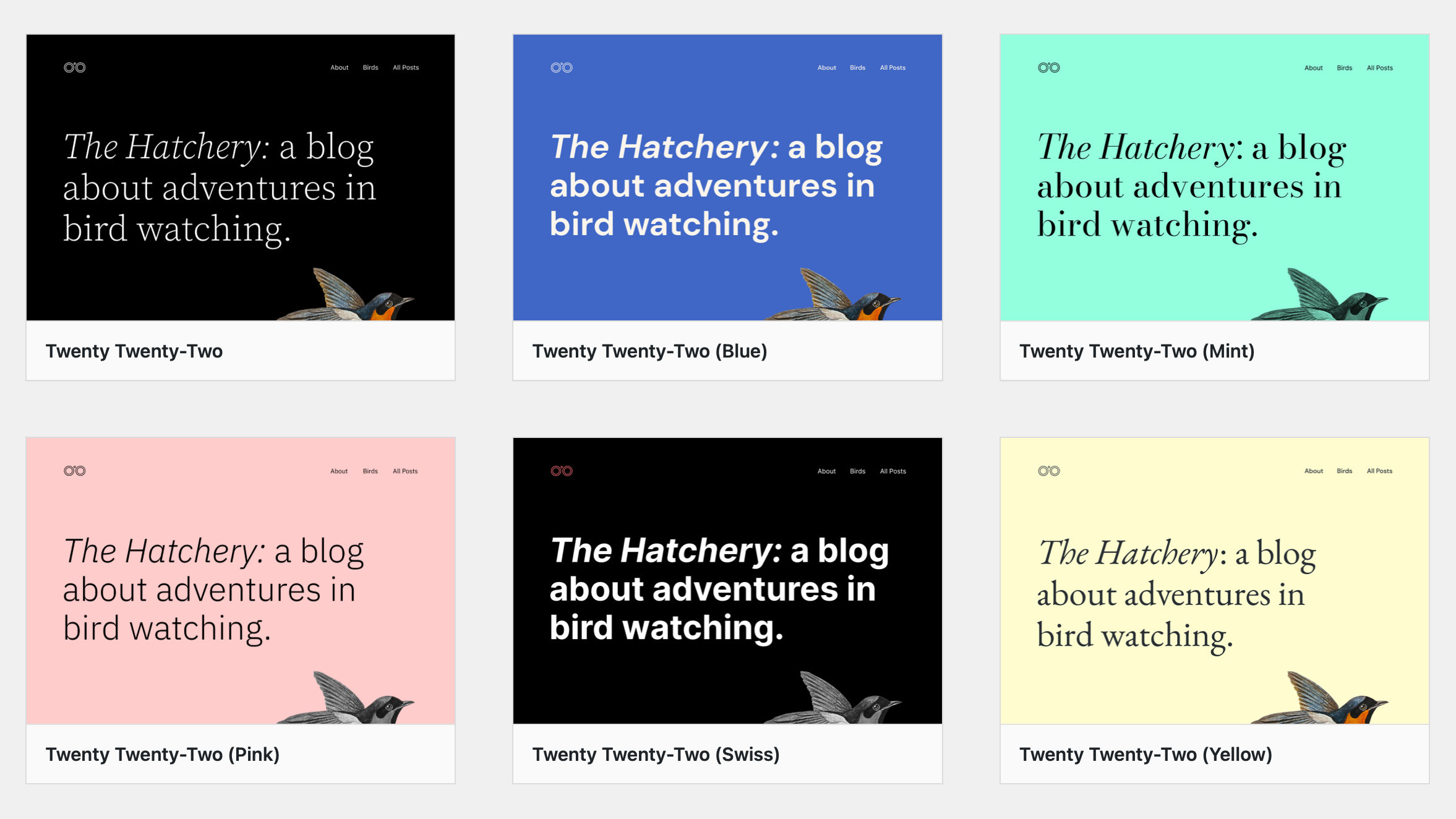
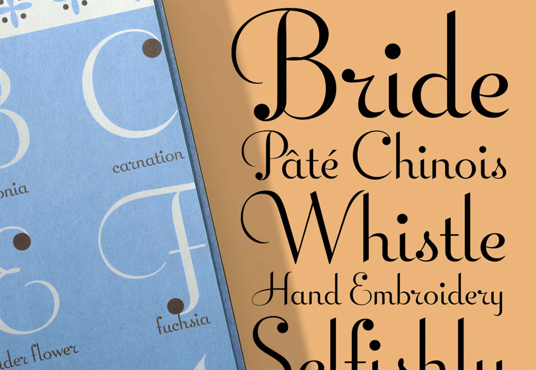
Are you looking for a unique font that will make your next project shine? Or maybe you need a typeface with a beautiful design and rich history behind it. Luckily, mini-sites for fonts allow us to creatively explore a font’s origins and history. We know (from our own experience) how important it is for UI and UX designers to have a variety of fonts for our designs.

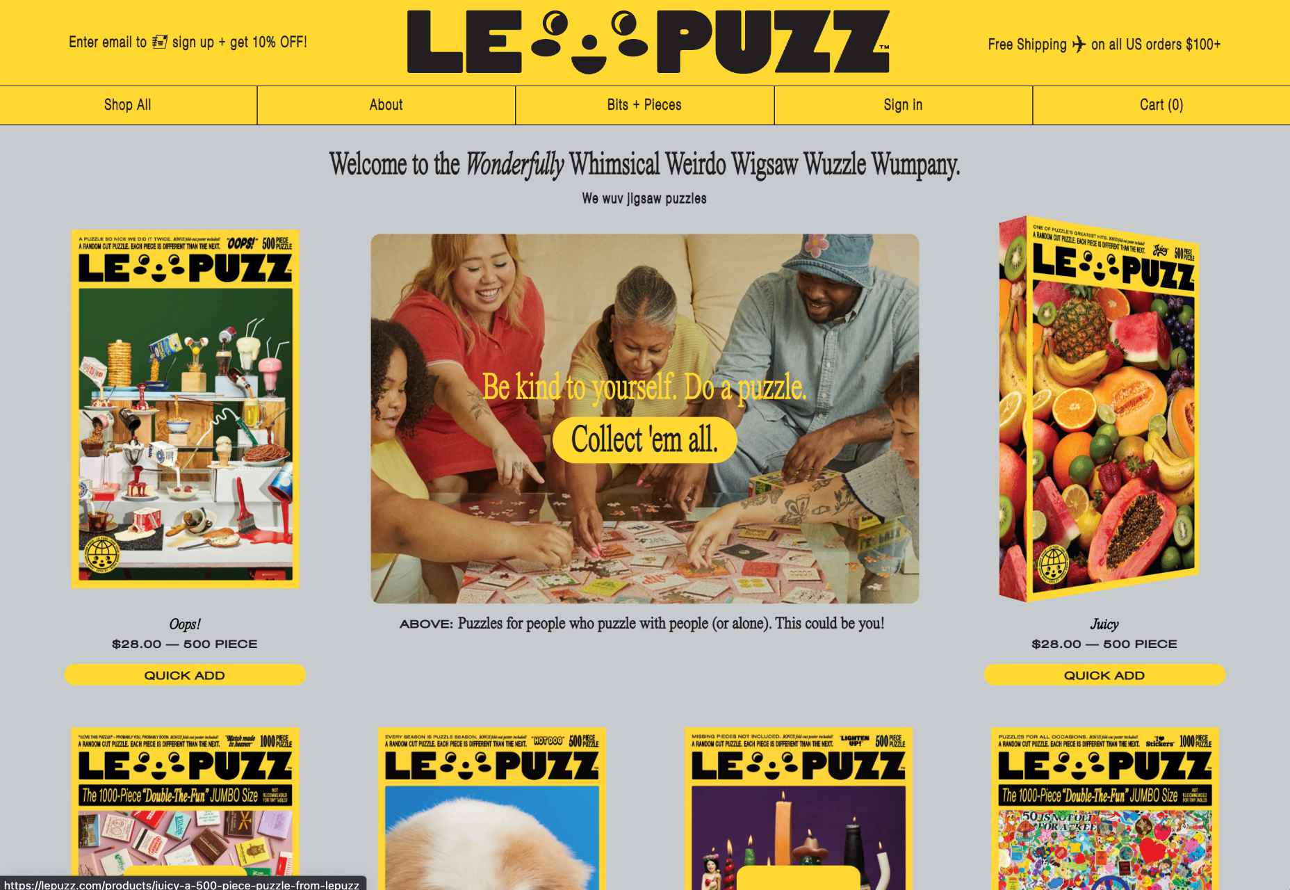
Now that 2022 is here, it’s time to expand our font collection. That’s why, after extensive research, we have created the ultimate list of the best 16 creative mini websites for fonts.

Are you ready to take a look at the most creative, cute, and fun font websites available on the market?
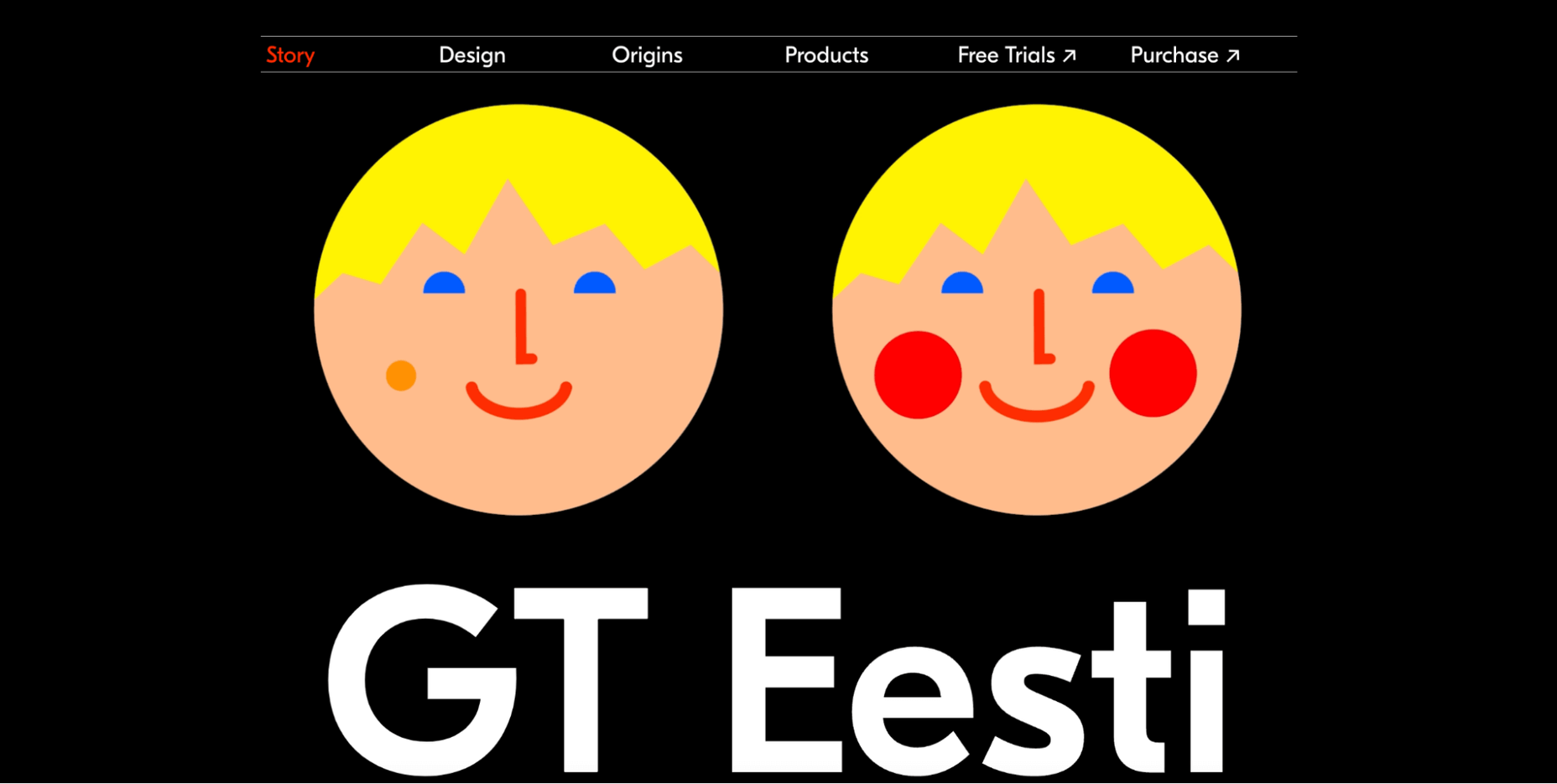
1. GT Eesti

This website is about the history of one of the most popular fonts on the market, GT Eesti. As you will notice, the typeface has a long history (more than 80 years) and was recently reborn in Switzerland.

As for the font, GT Eesti is a flexible geometric sans serif that can be used in almost any project. As one of the most creative websites for fonts, full of animations and interesting information, GT Eesti quickly made it onto our list.
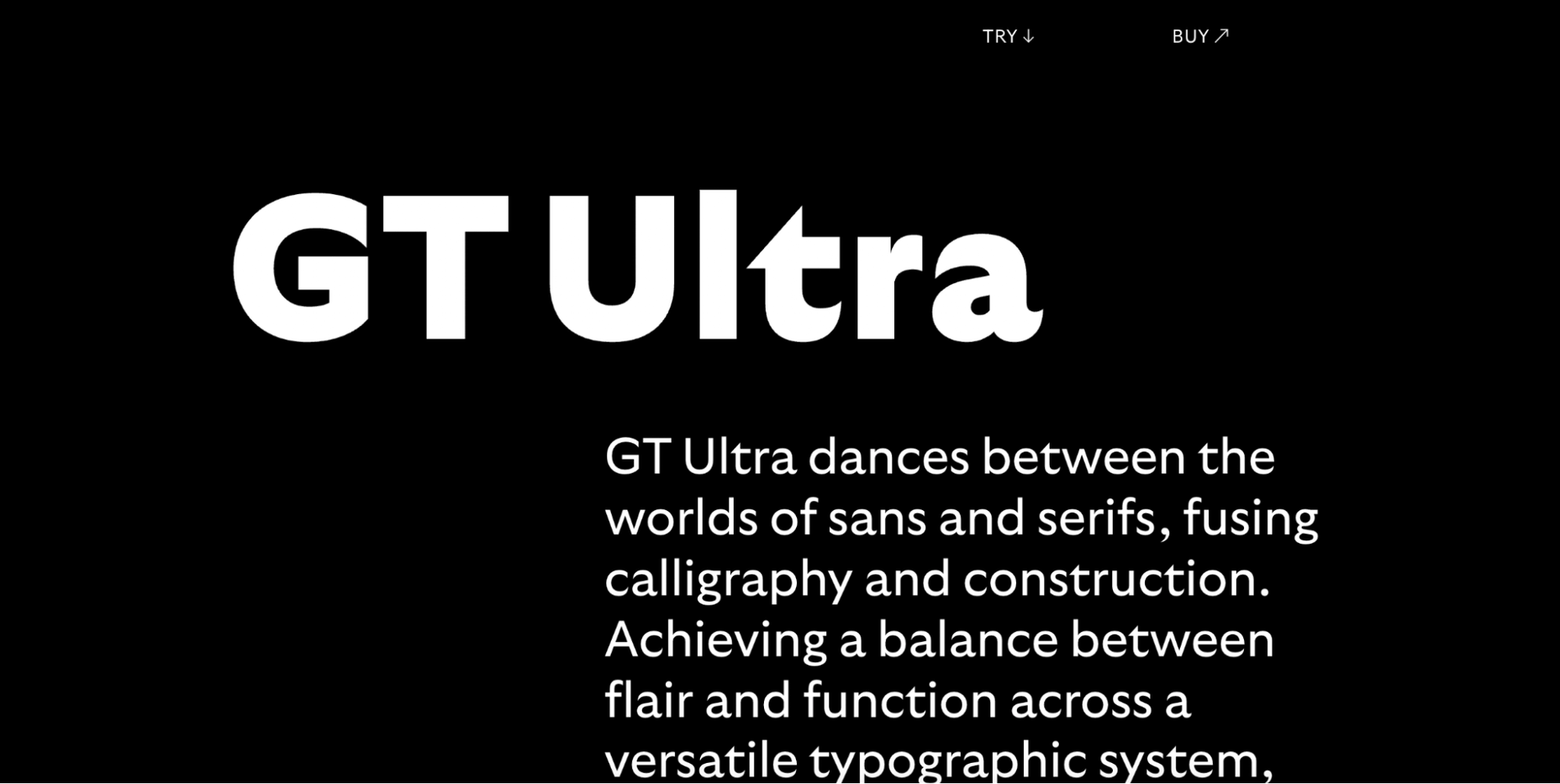
2. Ultra Font

Are you looking for a font that combines calligraphy and elegance and sits between the sans and serif styles? 

Then GT Ultra is just what you need. We loved how the creator tells the story and structure of Ultra with beautiful animations on this unique, one-page website.
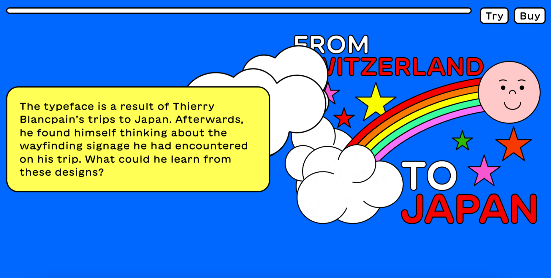
3. Maru Typeface

Maru is by far the cutest design on this list. The website is a vertical narrative of the typeface’s history. 

The typeface was inspired by the designer’s travels to Japan, and the mini-site fully reflects that. Best of all, Maru also includes a great collection of cute emojis and stickers.
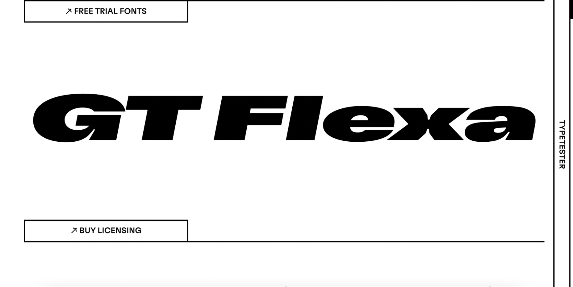
4. GT Flexa

GT Flexa is a very flexible font that you can easily use for a responsive UI design. We enjoyed navigating through the minimalist mini-site and exploring the creation and history of Flexa. 

Flexa also offers a free trial that allows you to try the font before you buy.
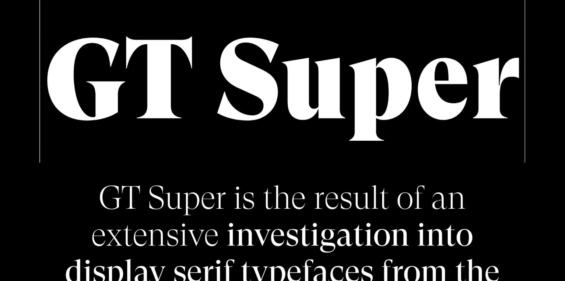
5. Super

Super’s mini-site reminded us of earlier decades. GT Super is a vintage typeface inspired by the serif fonts of the 70s and 80s. 

Therefore, it can beautifully frame nostalgic designs. The font was designed by Noel Leu and is available in two styles (text and display).
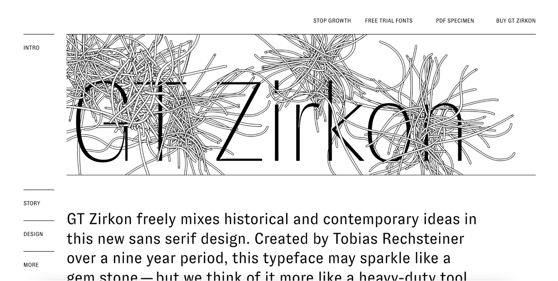
6. GT Zirkon

GT Zircon is located in a place where creativity meets minimalism. This is one of our favorite mini-sites for fonts. 

The site showcases Zirkon’s history and design process through creative graphics, videos, and animations.
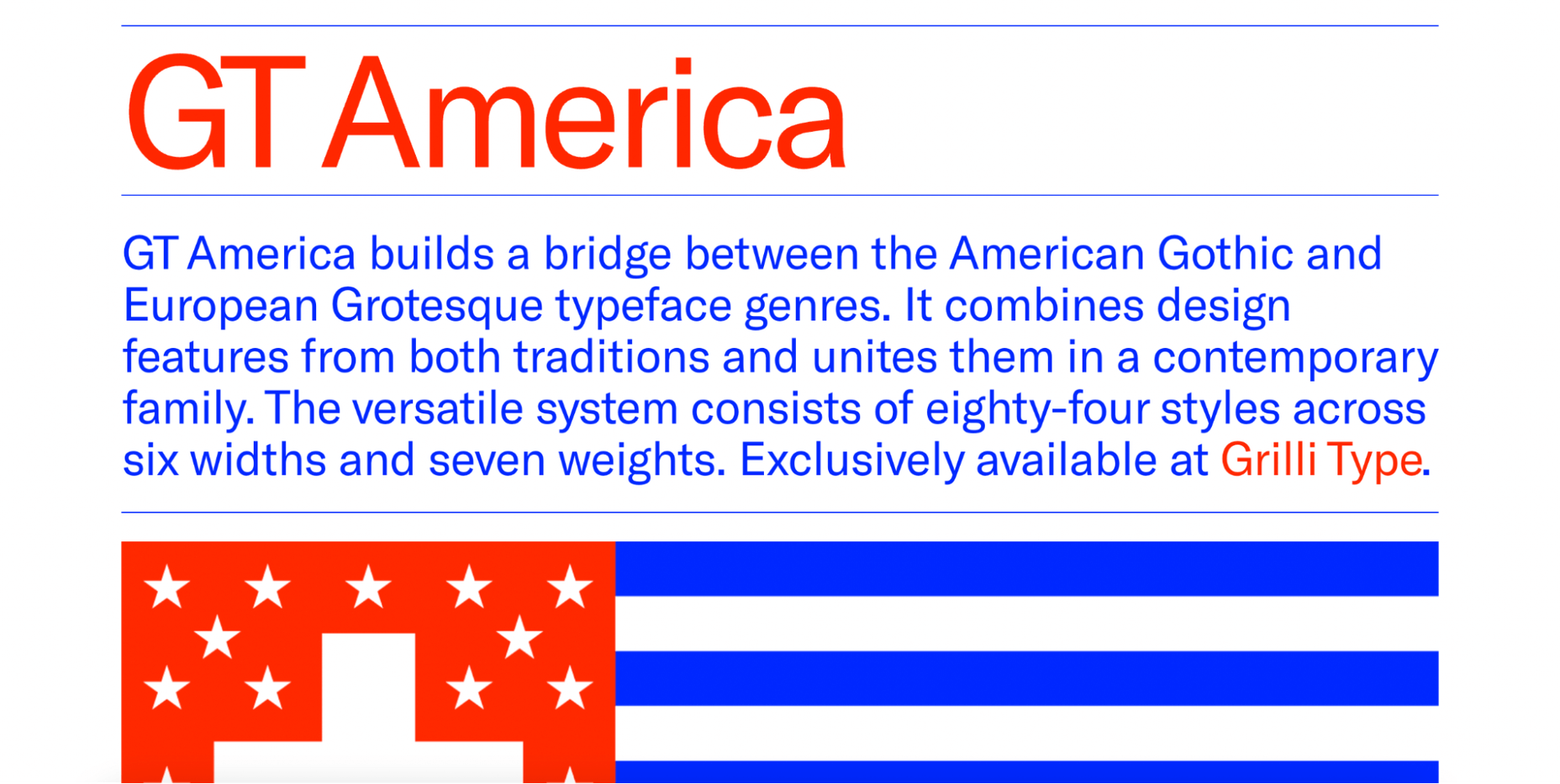
7. America Font 

This mini-site allows you to explore the history, style, and character overview of GT America, a contemporary font family. 

The designer has used elements from American Gothic and European Grotesque to create one of the most flexible typefaces available.
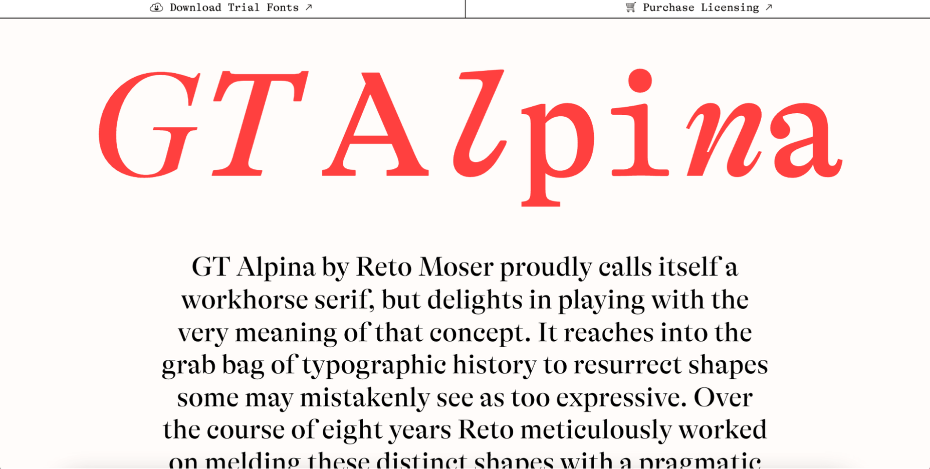
8. Alpina

Reto Moser recently designed one of the most popular GT typefaces, the Alpina “Workhorse” serif. 

This innovative, one-page website tells us the story of Alpina and explains how the designer jazzed up, posed, and flexed the classic book typography to create a wide range of typeface variations.
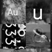
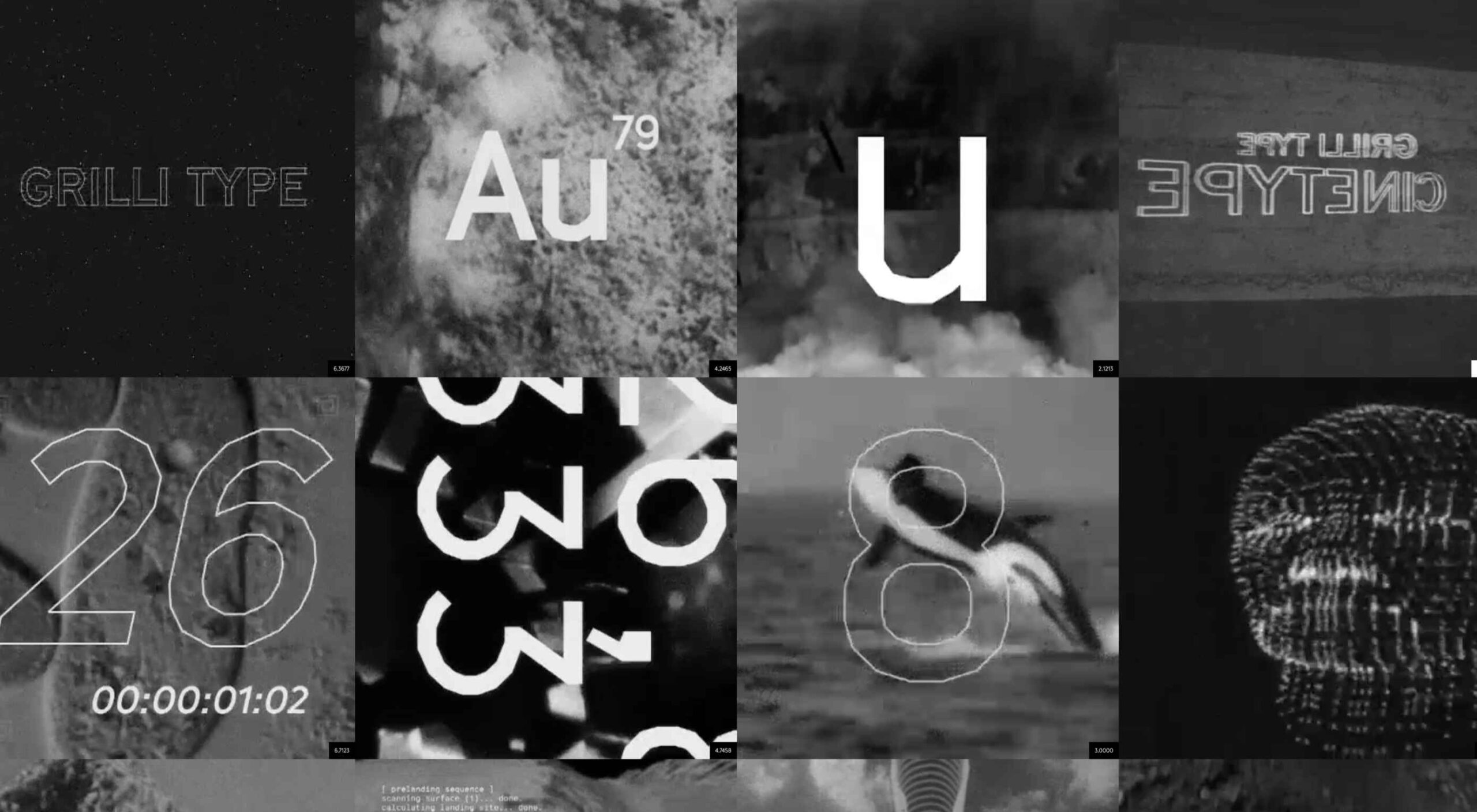
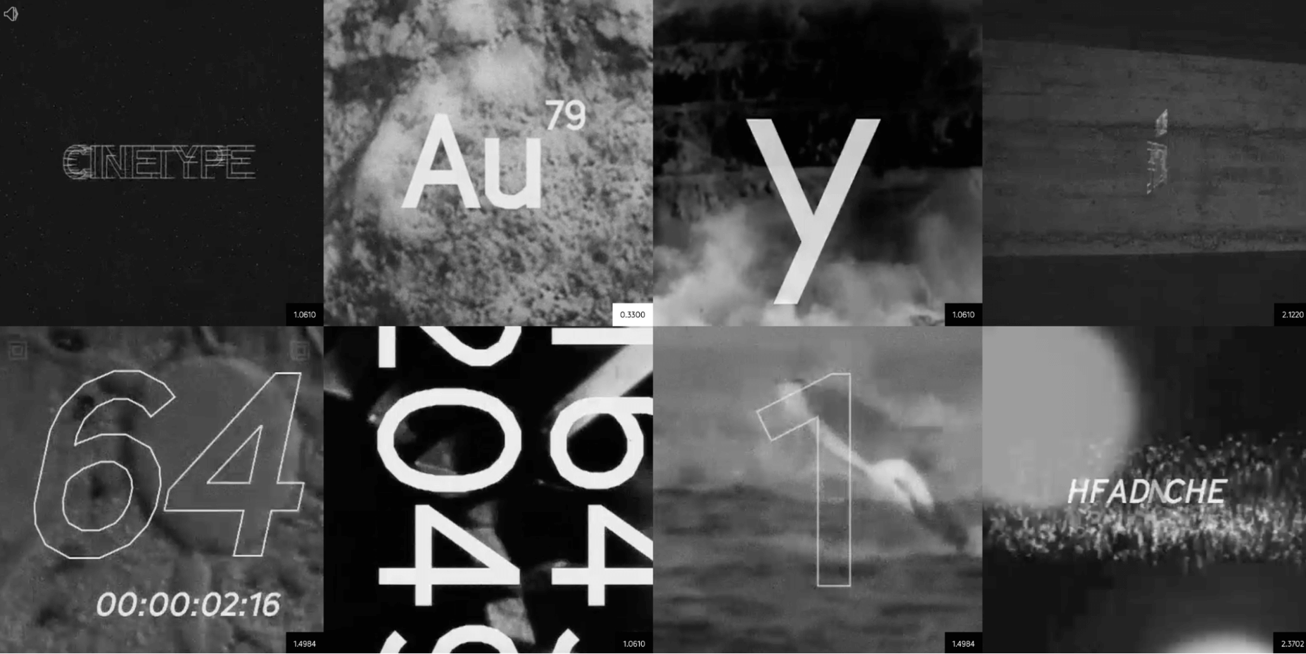
9. Cinetype

As the name suggests, this mini-site is inspired by classic cinematic movie reels. If you’re looking for a font inspired by the fascinating world of cinemas, Cinetype is simply the best choice. And on this creative website, you will learn all the reasons why.
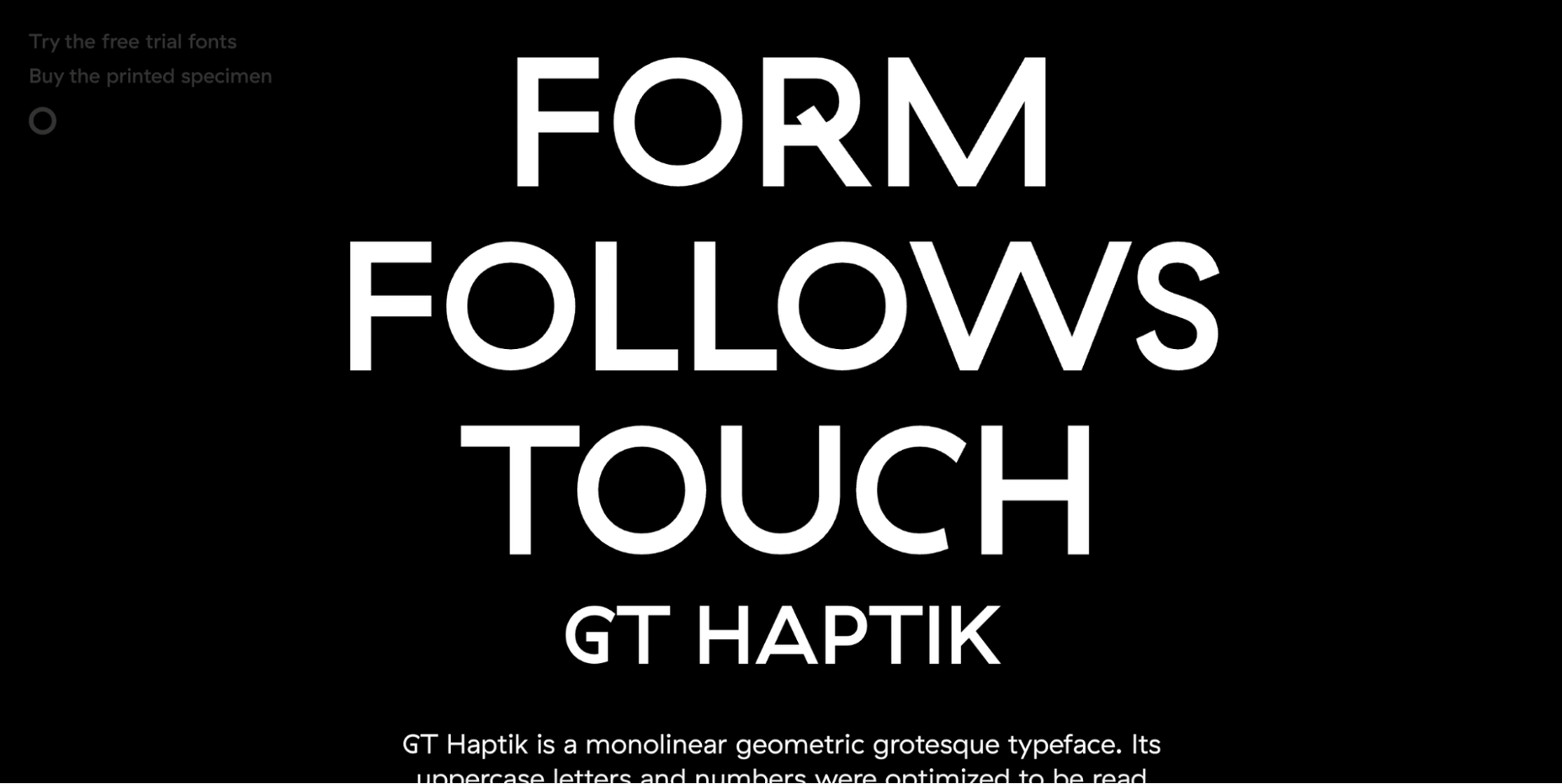
10. Haptik Typeface

When it comes to monolinear geometric typefaces, Haptik is one of the best. This innovative mini-website tells how the Haptik font came to be and highlights the history of the font. 

The hand gesture gifs at the bottom of this one-page site are some of the most creative mini-videos we have seen in a long time.
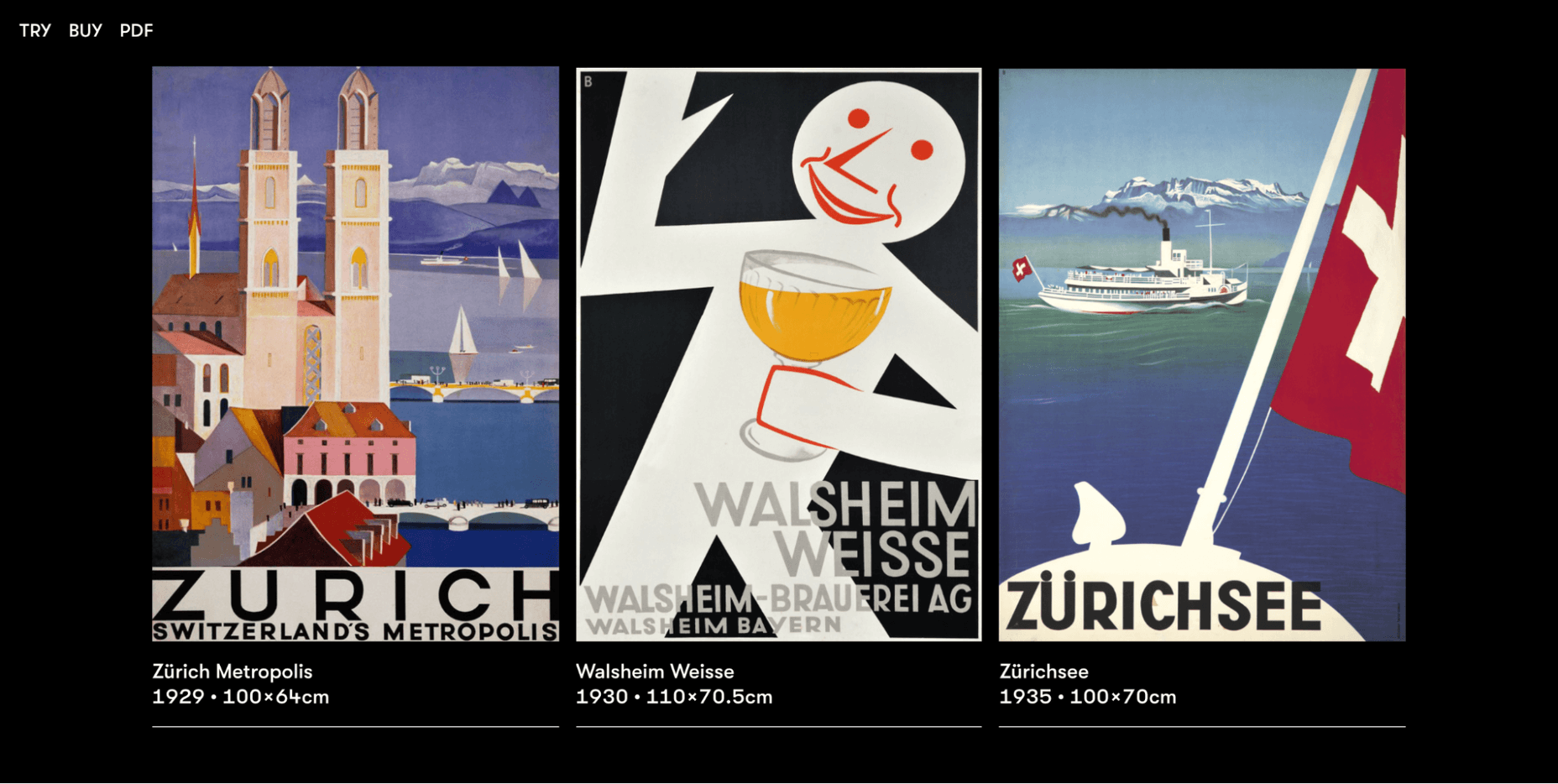
11. Walsheim

Walsheim is a typeface designed by Noel Leu. This mini-site explains how the designer was inspired by the fascinating poster designs of Otto Baumberger, a successful Swiss painter of the 20th century (1889-1961). If you like fonts with a deep backstory, Walsheim is a must-have for you.
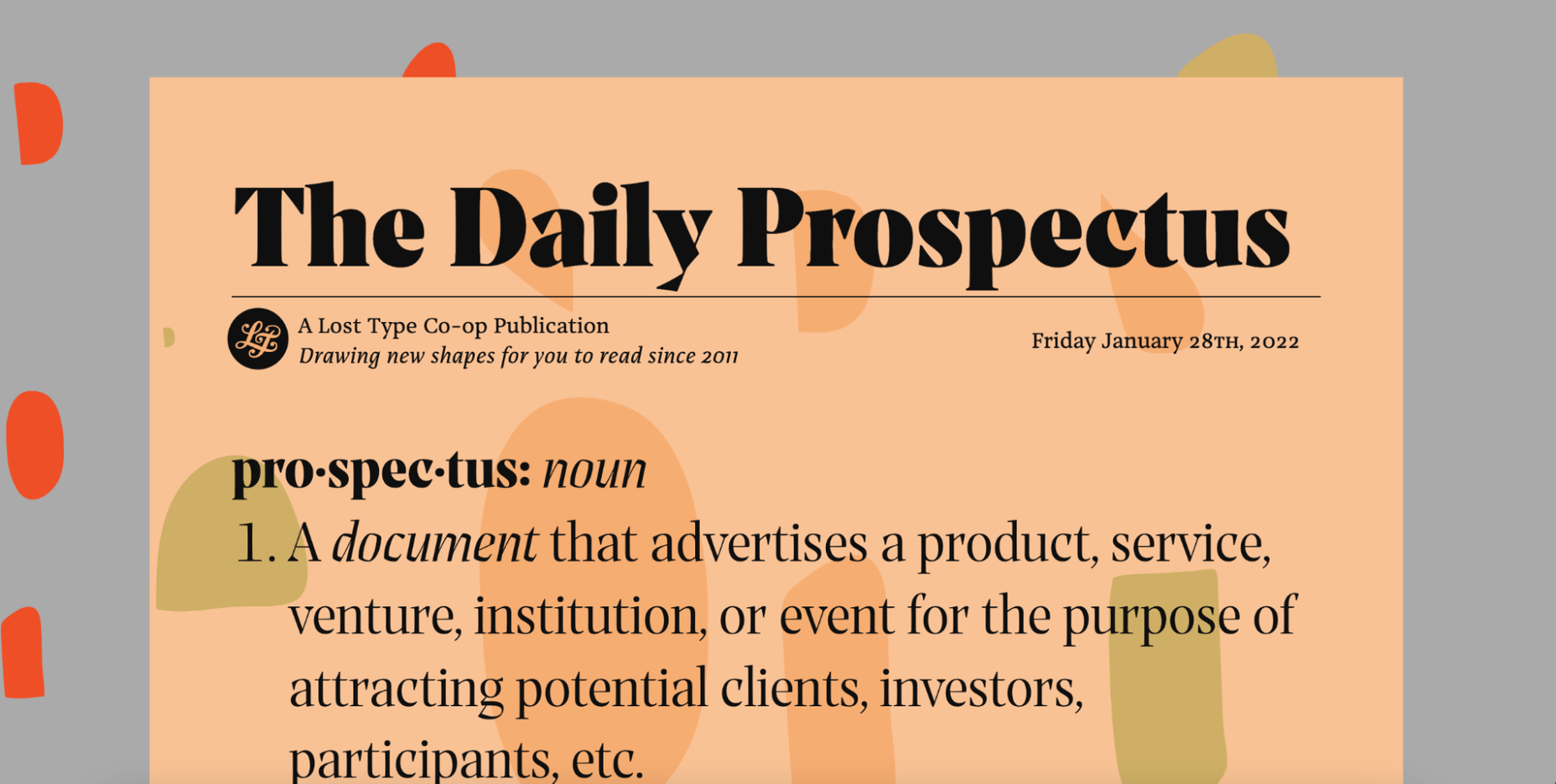
12. Prospectus

The Prospectus mini-site is specially designed to look like a newspaper. And let us say: the result is extraordinary. 

This one-page website explores the origins, construction phase, and classifieds of the Prospectus typeface, allowing us to experiment in real-time with the weight, height, tracking, and size of the typeface.
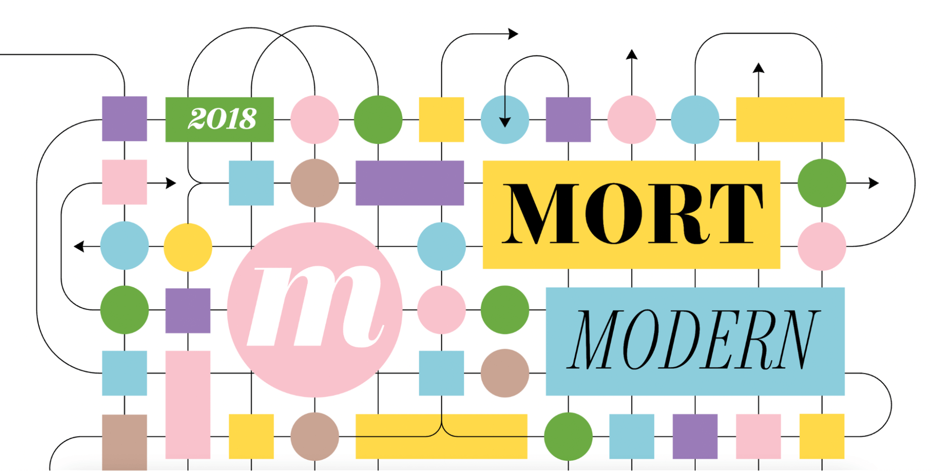
13. Mort Modern

Mort Modern is a unique serif typeface designed by Riley Cran in 2018. The mini-site provides information about the typeface in a creative, cartoon-like way. 

We really liked this responsive, one-page website because it is elegant and colorful at the same time. The font is available in 56 (!) styles and promises to beautifully frame any kind of modern design.
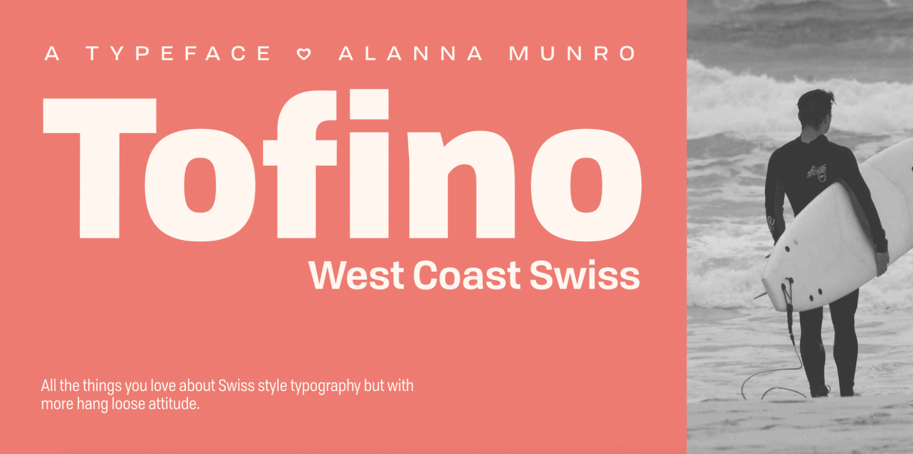
14. Tofino

The Tofino mini-site is a creative, one-page portal that allows us to discover one of the most adventurous Swiss-style fonts on the market. 

Tofino is a top choice for any travel-related project and comes in 75 unique styles. When it comes to creating a well-crafted report on a font, there’s nothing better than this.

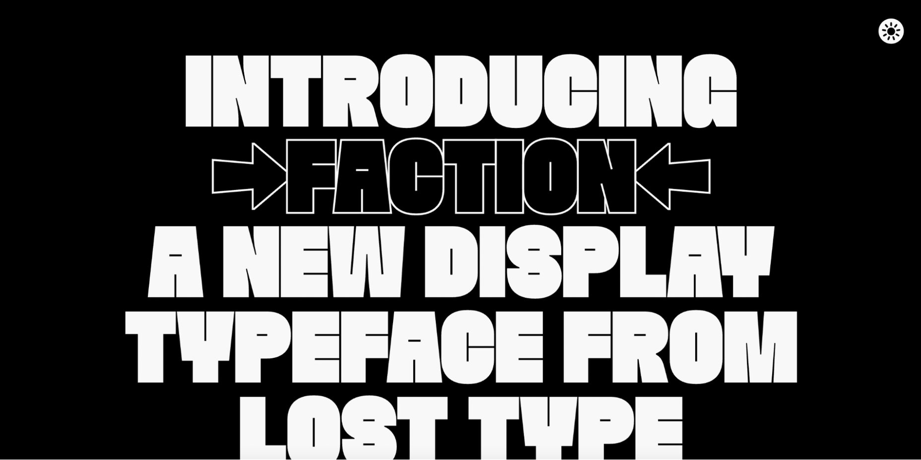
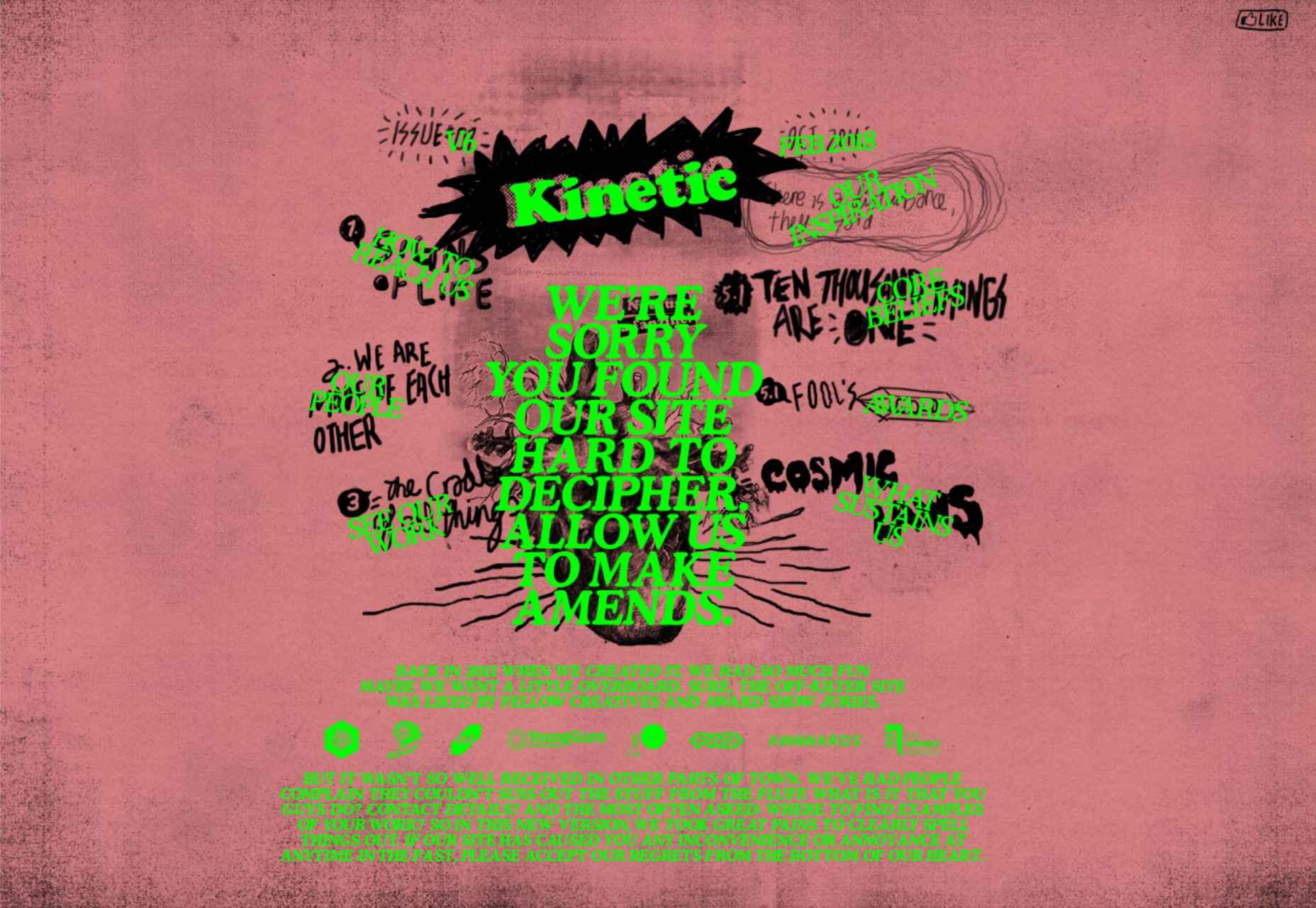
15. Faction Typeface

We love websites that offer both a dark and light theme. And the Faction mini-site is one of them. 

In this mini-site, you’ll learn how the Faction typeface was created and why it’s one of the most popular display typefaces for modern designs.
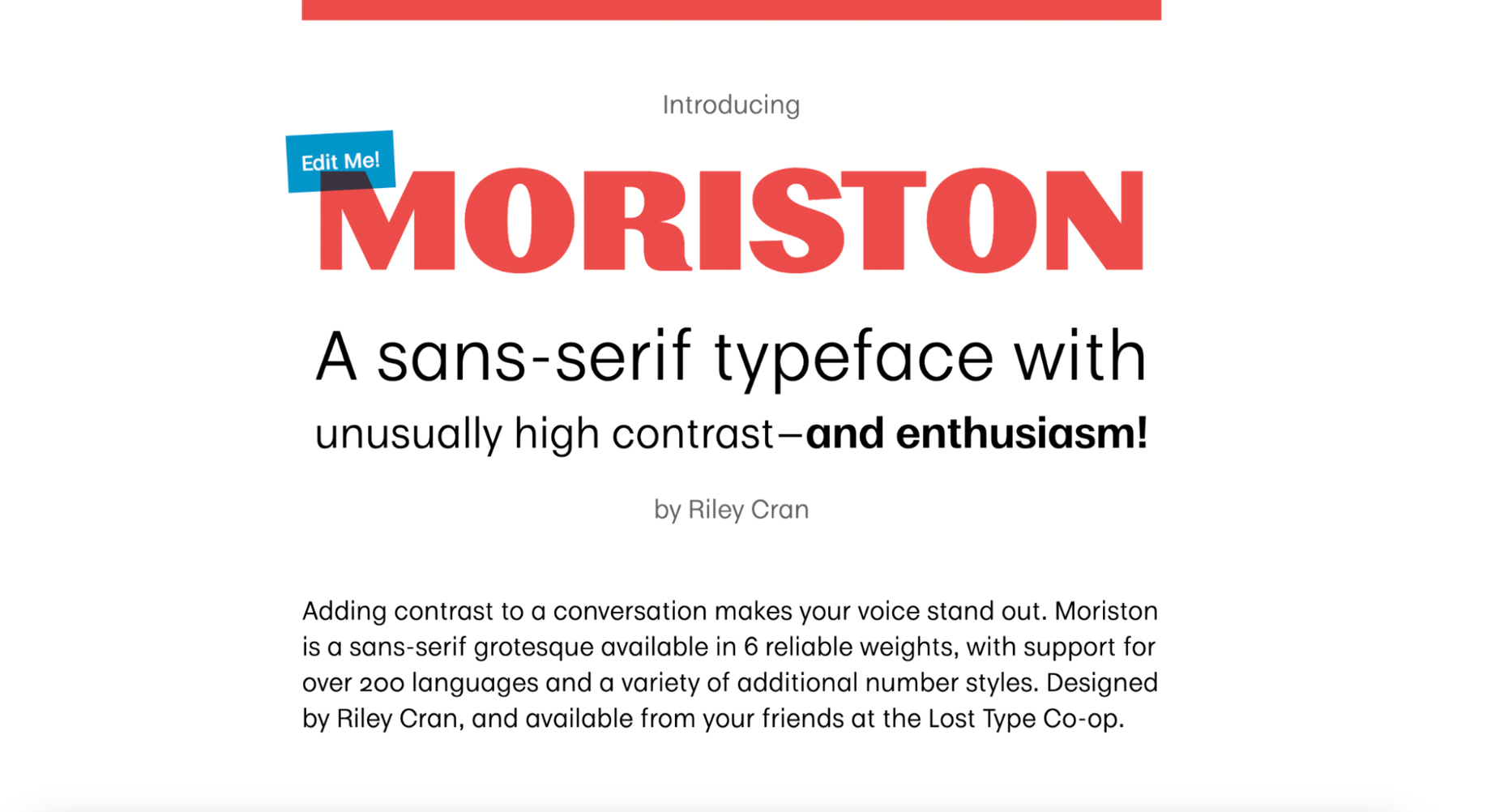
16. Moriston

If you’re looking for a unique sans serif font with extended multilingual support, Moriston is the font for you. 

In this one-page mini-site, Riley Cran tells the story behind this typeface and explains why Moriston is the best choice for Risograph posters, monograms, and more. 

Source

The post 16 Best Typeface Micro-Sites first appeared on Webdesigner Depot.

Source de l’article sur Webdesignerdepot

Type foundries have been putting out some really interesting fonts these last few months. Based on the collection of the best new fonts for February 2022, it looks like we’re going to see lots of throwbacks to the ‘70s in the coming year.

Do we have Burger King’s most recent and successful rebranding campaign to thank for that? I don’t know, but it looks like many font designers are going to try and emulate those fun retro vibes going forward.

1. Crafty Signs

Crafty Signs is a display font that draws inspiration from old game shows — think Family Feud or anything on Nickelodeon in the ‘90s. This playful bubble font would work well for brands targeting children or ones that have a big personality and old school vibe.

2. Epicene Collection

Epicene is a Baroque font with beautifully exaggerated calligraphic details (like swirls and strokes). There are two families within Epicene — one for Display and one for Text — so you can use this single font collection to style your entire site.

3. Kingsad

It’s hard to call Kingsad a sans serif font when it has such a distinctly unique design to it. The font’s creator suggests using Kingsad for branding. I’d add that the curious structure of the characters would make this font perfect for branding in the science and tech spaces.

4. Lucius

Lucius is a lively-looking font, combining serif and sans serif characteristics. There are eight weights in this font family, which can be used both for display and text purposes.

5. Manju

Manju is a retro font that the designer describes as “soft and chewy”. You don’t see it as much in the thinner styles, but the bolder, thicker styles definitely feel like the kinds of fonts you’d see on food packaging and candy wrappers in the ‘70s and ‘80s.

6. Midnight Sans

Midnight Sans is a font that comes in a single weight (Black) and also has two variants: Midnight Sans RD and Midnight Sans ST. It was originally designed for When Midnight Comes Around, a book about the emerging punk music scene in NYC in the ‘70s, so it has a somewhat grungy, nostalgic feel to it.

7. Nagel

Nagel is technically still in beta, so this may not end up being the finished font when it’s done. For instance, they still have the italic and variable styles to develop. That said, it’s a neat-looking sans serif font — easy to read, but has a bit of an edge to it as well.

8. Painless

What you see is what you get with Painless. It has just one style — a textured, bold sans serif. Because of its casual, hand-brushed feel, it won’t fit well with just any brand. Where it would look cool is on websites for brands that sell hardware, furniture, and other DIY products.

9. Recipient

Recipient is a monospaced font inspired by the typefaces that appeared on old typewriters. With five weights and a set of matching italics, this font can be used for standard paragraph text as well as for smaller headlines.

10. Sea Angel

Sea Angel is a beautiful serif font with elegant curves. This easy-on-the-eyes font would look great on websites for high-end retailers, luxury magazines, museums, fashion brands, beauty companies, and more.

11. Smack Boom

Comic books and graphic novels will never go out of style. Especially as their stories branch out into other channels, like TV and movies. Smack Boom will enable you to bring that exciting and heroic look to your logos and web designs.

12. Stoner Sport

Stoner Sport is an outline display font that brings a modern touch to a retro sporty style. This font would work especially well for sporting industries as well as businesses that are associated with them—retailers, sports complexes, automakers, publications, and so on.

13. Stormland

Stormland is a good example of what makes Scandinavian design so striking. The lettering is clean and simple, built using uniformly sized lines. However, the characters are wide, which gives them a sturdy and strong feeling as well.

14. Tellumo

Tellumo is a humanist sans serif font family, ranging in styles from Thin to Extra Bold. What you see in the example below demonstrates some of the charm and warmth you can add to branding and designs with Tellumo’s swash caps. However, if you want to keep things simple and reap the benefits of the font’s clean and tidy design, you can use the regular character set.

15. Yamet Kudasi

Yamet Kudasi is a script font that comes in just the one style. Based on where it’s used (like in a signature line vs. a hero image) and the background it’s framed against, this versatile font can be used in a variety of ways and for various niches.

Source

The post 15 Best New Fonts, February 2022 first appeared on Webdesigner Depot.

Source de l’article sur Webdesignerdepot

Every day design fans submit incredible industry stories to our sister-site, Webdesigner News. Our colleagues sift through it, selecting the very best stories from the design, UX, tech, and development worlds and posting them live on the site.

The best way to keep up with the most important stories for web professionals is to subscribe to Webdesigner News or check out the site regularly. However, in case you missed a day this week, here’s a handy compilation of the top curated stories from the last seven days. Enjoy!

Web 3.0: How Web Design will Change Forever

Cookie Notice for Websites

The Most Popular JavaScript Frameworks of 2022

Exciting New Tools for Designers, February 2022

The CSS From-font Value Explained in 4 Demos

A UX Designer Walks into a Tesla Bar

Looking Ahead to WordPress 6.0: The Early Roadmap

What’s the Difference Between Good UI and Good UX?

22+ CSS Dropdown Menus

Famous Logos in the Grotesque Art Style Typical for the Middle Ages

Source

The post Popular Design News of the Week: January 31, 2022 – February 6, 2022 first appeared on Webdesigner Depot.

Source de l’article sur Webdesignerdepot

What stands out as an incredible web design project for you? Do you count your creation as a success if it’s modern, minimal, and accessible? Maybe you’re the kind of designer that’s constantly experimenting with the latest dynamic design tools or state-of-the-art technology. Perhaps your websites are vivid, animated, and brimming with unique components?

Sometimes, creating the ideal design means thinking carefully about what you want to accomplish for your client. The purpose of your web creation has a significant impact on the components that you need to consider. For instance, if you’re hoping for a highly emotive and human design, it may be worth combining some of your sleek lines and graphics with hand-drawn elements. 

The Value of Hand-Drawn Graphics in Web Design

Hand-drawn elements are just like the other components of web design; that way may use to express individuality in a cluttered digital environment. In a world where everyone focuses on futuristic and virtual creations, hand-drawn elements can pull attention back to the importance of humanity in your content. 

As web designers, we know that visual components often impact people more than text-based content. Illustrations are highly engaging functional elements that capture audience attention and convey relevant information. 

The main difference between hand-drawn elements and graphics built with vectors and other digital components is that one appears to be more influenced by the human hand than the other. Even if your illustrations are created on a screen, just like any other web design component, it pushes an audience to see something more straightforward, more natural, and authentic. 

For a brand trying to convey innocence and humanity in its personality, hand-drawn design can speak to the part of the human psyche that’s often unappreciated by web design. Perhaps more than any other visual, the content reminds your audience that there’s a human behind the web page

The Value of Hand-Drawn Features in Web Design

Any image can have a massive impact on the quality of your web design. Visuals deliver complex information in an easy-to-absorb format. In today’s world of fast-paced browsing, where distractions are everywhere, visuals are a method of capturing attention and delivering value fast. 

However, with hand-drawn elements, you go beyond the basic functionality of images to embrace the emotional side of the content. Benefits include:

  • A memorable experience: Web illustrations are becoming more popular among leading brands like Innocent Smoothies and Dropbox. However, the time that goes into these components means that they’re still scarce. If you want to stand out online, illustrations can help you do that. 
  • Brand personality: One of the most significant benefits of hand-drawn web design is showcasing your brand personality. The blocky lines of imperfect content that go into illustrated images highlight the human nature of your company. So many businesses are keen to look “perfect” today to make the human touch much more inviting. 
  • Differentiation: As mentioned above, hand illustrations are still rare in the digital design landscape. If you’re struggling to find a way to make your brand stand out, this could be it. Although there needs to be meaning behind your design, the result could be a more unique brand if you can convey that meaning properly. 

Tips for Using Hand Drawn Elements in Web Design 

Hand-drawn components, just like any other element of visual web design, demand careful strategy. You don’t want to overwhelm your websites with these sketches, or you could end up damaging the user experience in the process. 

As you work on your web designs, pulling hand-drawn elements into the mix, think about how you can use every illustration to accomplish a crucial goal. For instance:

Create Separation

Hand-drawn design components can mix and match with other visual elements on your website. They work perfectly alongside videos and photos and help to highlight critical points. 

On the Lunchbox website, the company uses hand-drawn elements. This helps make the site stand out, and it provides additional context for customers scanning the website for crucial details.

Engage Your Audience

Sometimes, hand-drawn elements are all about connecting with end-users on a deeper, more emotional level. One of the best ways to do this is to make your hand-drawn elements fun and interactive pieces in the design landscape. 

One excellent example of this is in the Stained Glass music video here. This interactive game combines an exciting web design trend with creative interactive components so that users can transform the web experience into something unique to them.

Highlight Headers with Typography

Sometimes, the best hand-drawn elements aren’t full illustrations or images. Hand-drawn or doodle-like typography can also give depth to a brand image and website design. 

Typography styles that mimic natural, genuine handwriting are excellent for capturing the audience’s attention. These captivating components remind the customer of the human being behind the brand while not detracting from the elegance of the website. 

This example of hand-drawn typography from the Tradewinds hotel shows how designers can use script fonts to immediately capture customer attention. Notice that the font is still easy to read from a distance, so it’s not reducing clarity. 

Set the Mood

Depending on the company that you’re designing for, your website creation choices can have a massive impact on the emotional resonance that the brand has with its audience. Hand-drawn elements allow websites to often take on a more playful tone. They can give any project a touch of innocence and friendliness that’s hard to accomplish elsewhere. 

A child-like aesthetic with bright colors and bulky fonts combines with hand-drawn elements on the Le Puzz website. This is an excellent example of how web designers can use hand-drawn elements to convey a mood of creativity and fun.

Animated Elements

Finally, if you want to combine the unique nuances of hand-drawn design with the modern components of what’s possible in the digital world today, why not add some animation. Animated elements combined with illustrations can help to bring a website to life. 

In the Kinetic.com website, the animated illustrated components help to highlight the punk-rock nature of the fanzine. It’s essential to ensure that you don’t go too over-the-top with your animations here. Remember that too many animations can quickly slow down a website and harm user-friendliness.

Finishing Thoughts on Hand-Drawn Elements

Hand-drawn elements have a lot to offer to the web-design world. 

Even if you’re not the best artist yourself, you can still simulate hand-drawn components in your web design by using the right tools and capabilities online. 

Although these features won’t fit well into every environment, they can be perfect for businesses that want to show their human side in today’s highly digitized world. Hand-drawn components, perhaps more than any other web design feature, showcase the innocence and creativity of the artists that often exist behind portfolio pages and startup brands. 

Could you experiment with hand-drawn design in your next project?

Source

The post How to Use Hand-Drawn Elements in Web Design first appeared on Webdesigner Depot.

Source de l’article sur Webdesignerdepot

User Experience (UX) design and User Interface (UI) design are two terms people sometimes mistakenly use interchangeably. While aspects of each are interconnected, there are distinct differences between UI/UX design.
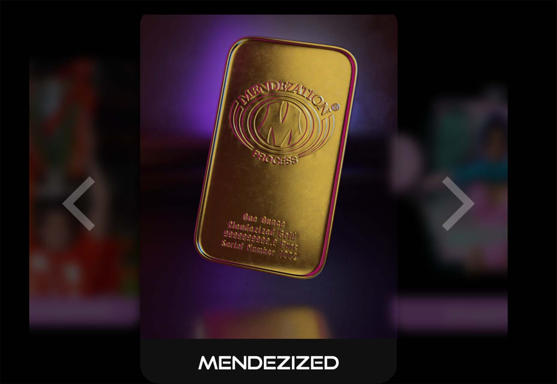
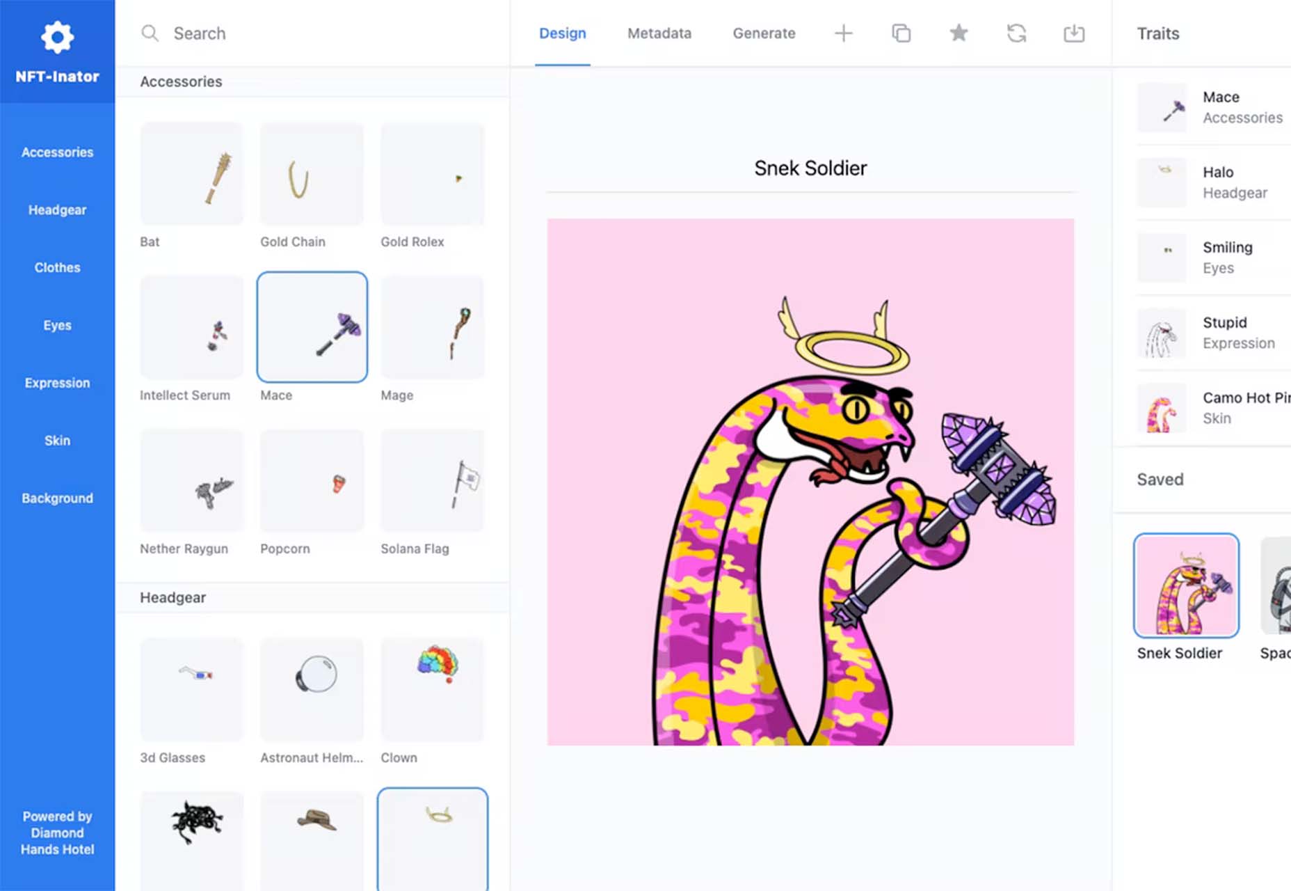
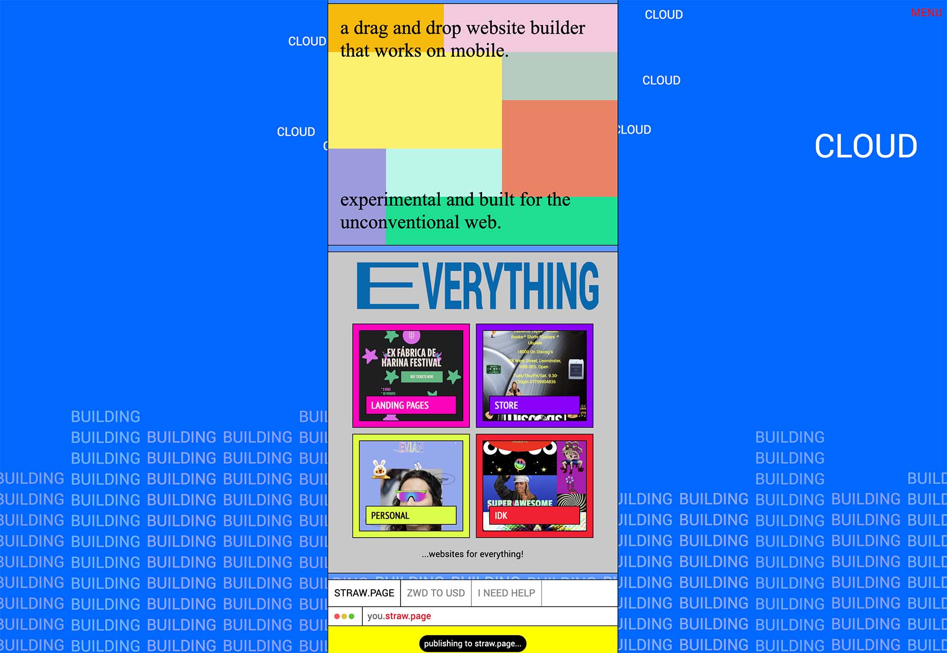
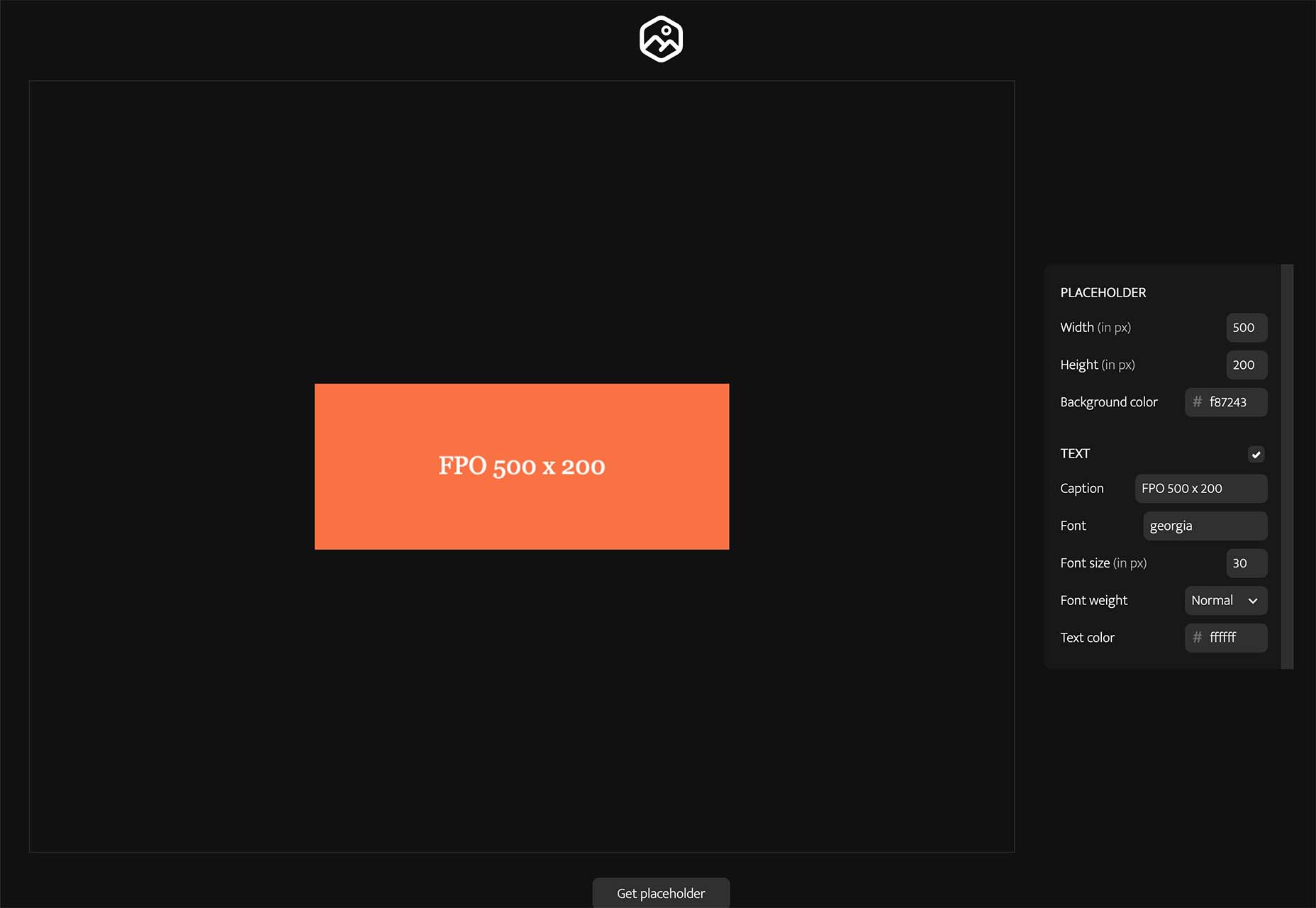
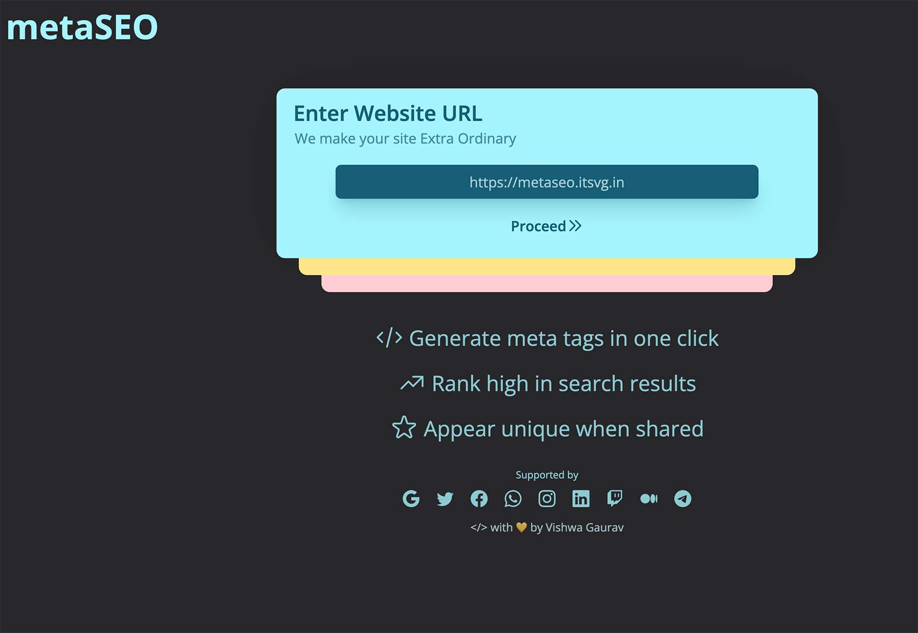
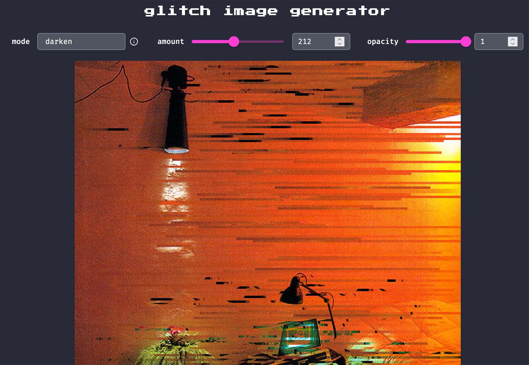
According to Internet Live Stats, there are over 1.9 billion websites, but not all are active at the same time. No matter how you slice it, there’s a lot of competition to grab and keep user attention. Good UX is just part of the equation. For a genuinely stellar site, you must also offer an excellent interface.

Learning the ins and outs of good UI and UX requires a bit of knowledge of how the two differ and what works. Although they weave in and out of the same design, they are different.

What Is the Biggest Difference Between Good UX and UI?

UI is the functionality of the design and what users see. How do they interact with various elements? UX is more the way things come together — both visual and interactive features — to create a feel for the user. You can certainly see why people confuse the two as they both apply to interacting with a website or app.

Top design firms often have team members specializing in each discipline. However, UX designers are also aware of UI, and UI designers are also mindful of UX. How can you ensure you’re offering excellent UI/UX design while covering the full spectrum of requirements for each?

Ensuring Effective UX Design

Good UX design increases conversion rates by 400% or more. The site visitor walks away feeling understood and not frustrated. What are some of the most important aspects of good UX design?

1. Create a Good Structure

What is the hierarchy of your site? What is the first thing the user sees when they pull it up? How do they navigate from one page to the next? A well-designed website classifies different aspects of the page, and new content naturally falls into the appropriate category as it grows.

When creating a structure for your site, think about how it might expand in the next five years. You want the hierarchy to work from day one, but you also want to think through significant shifts in the content you might see down the road.

Even your navigational hierarchy should accommodate new areas easily. Plan for the unexpected, so you know how to work it into the overall design when you must.

2. Choose Beautiful Aesthetics

You have a few seconds to make an excellent impression on your site visitors. Take the time to make sure your design functions and is visually appealing. Your color palette should work, images should be crisp and relevant, and typography should be readable and engaging.

Step back from your computer and look at your design from a distance. Does anything stand out that isn’t pleasing to the eye? Get feedback from visitors about what they like and dislike. Since the focus is on user experience, your best source of constructive criticism is from your target audience. Listen to their concerns and ideas.

3. Communicate With Site Visitors

Most experts agree that users want an element of interactivity on sites and apps. People want to know you hear them and get a response. Some ideas include adding a live chat option to your site or engaging in SMS customer support.

Put yourself in their shoes. A customer may visit your site for the first time, having never heard of your brand. They have no reason to trust you or that you’ll follow through on your promises. Potential leads may have a few questions before parting with their hard-earned dollars.

Adding various ways to communicate shows them you’ll be there should they have a problem. It’s much easier to trust a company when you know you can phone, engage in live chat or shoot off an email and get an almost immediate response.

4. Add Clear Direction

Excellent UX is intuitive. You should add calls to action (CTAs) and images pointing the user where they should go next. You can use graphics of arrows, people looking or pointing toward the next step, words, or CTA buttons.

Get feedback on how clear the directions are and tweak them as needed. The user should never have to stop and ponder what to do next. Everything on the page should guide them toward the ultimate goal.

5. Break Down Complex Data

Every industry has complicated data that is difficult for non-experts to understand. Part of good UX is breaking down complex information and sharing it in a simplified way.

One example might be the registration process. Instead of just showing text, a good UX designer would number the steps. Visualizations help add to understanding.

Embracing Effective UI Design

User Interface impacts UX and involves how the design works. The UI designer thinks through visitor expectations and then creates an interface that isn’t frustrating. UI works within the framework of a website to develop functional features. User experience isn’t the complete focus of UI, but it does tie into the planning phases. What are some elements of good UI design?

1. Set Standards

For a design to have good UI, it must perform as expected. Have you ever clicked on a button, and nothing happened? Determine how you want things to work and the minimum acceptable standards for your site.

For example, what happens when someone clicks on a link or button? How does the user know their action created the expected result? Consistency is crucial to how a site performs.

2. Choose the Right Colors

While UX designers look at the emotional impact of various colors, UI designers look at whether the shades match branding and how well the different ones contrast for readability and usability. UI/UX design often bridges a single designer’s work, so the employee ensures everything works as intended, both emotionally and functionally.

You may work with another designer to make the site aesthetically pleasing while also tapping into the emotions driving users. For example, some people love blue, so a blue button can have positive results.

UX and UI designers utilize split testing to see which users respond best to. Then, make adjustments as indicated by how site visitors respond.

3. Focus on Cognitive Matters

According to the Interaction Design Foundation, people can only retain around five things in their short-term memory. Designers should work with recognition instead, as users tend to rely on cues to find what they need.

UI designers may develop an intuitive navigation system and then use the same cues on every page, such as placement, color, and language. Users can then recognize the system without having to memorize it.

4. Prevent Errors

Your job is to ensure errors are kept to a minimum when designing a website or app. One of the most significant parts of a designer’s job is testing and retesting.

Think about all the potential problems a user might run into, such as broken links, images not showing, or incomplete actions. How can you keep those problems from occurring in the first place?

Error prevention is particularly vital when designing software as a service (SaaS) or apps. Users grow frustrated quickly and will find another solution rather than troubleshooting an issue. You’re much better off avoiding the error in the first place.

How Do UX and UI Work Together?

You’ve likely already figured out how closely UX and UI entwine to create a usable experience. The UX designer pays attention to function and interactivity, and the UI designer thinks through how the interface looks.

UX pays attention to the flow of the website and where users start, go next and end up. On the other end, UI figures out how the elements look to the viewer and where everything is placed.

The UX team may decide to add an extra button to the page. The UI team must determine where to place it, if any sizing needs must occur, and how it impacts usability on desktop and mobile devices.

Although each has a different function, user experience and user interface must work together to create a usable site the target audience responds to. You can’t have excellent UX without excellent UI, and vice versa. The best designers consider both and implement them to their fullest potential.


Featured image via Pexels.

Source

The post What’s the Difference Between Good UI and Good UX? first appeared on Webdesigner Depot.

Source de l’article sur Webdesignerdepot

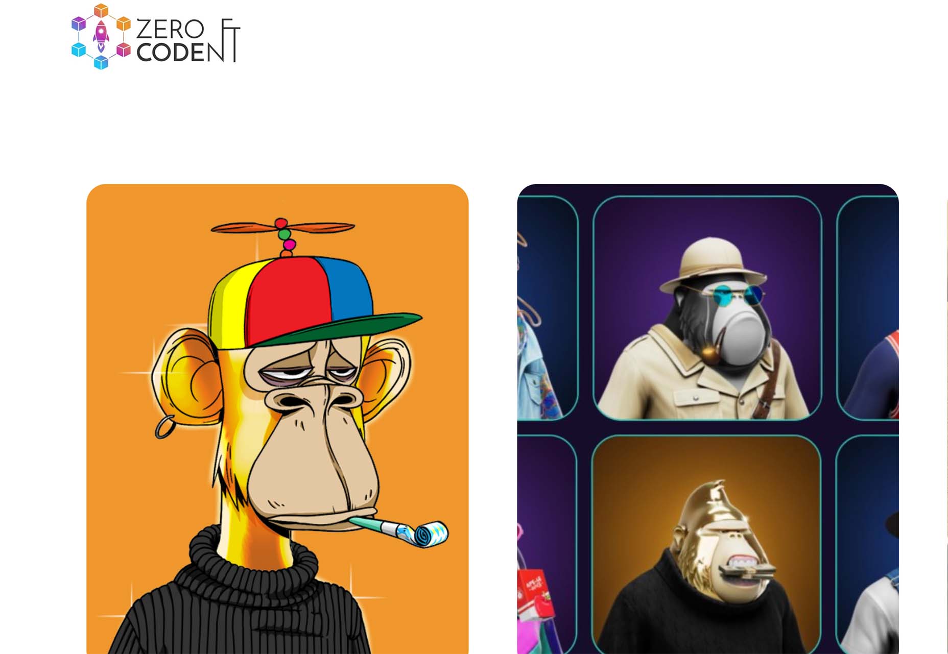
The importance of scientific research cannot be overstated. User research is crucial to the success of any UX design, and this article will explain all the reasons why.

But first, we will explore what UX research is and how it can give you valuable tools. Then we will analyze why user research is an ongoing, dynamic process.

By the end of this 5-minute read, you will know every efficient research method (qualitative and quantitative) and how to choose the right one(s) for a new or existing UX project.

What is UX Research?

In a few words, we could say that UX research is about observation techniques, feedback methods, and analysis of the whole user experience of a project. As in any scientific research, UX research analyzes how users think and what their motivations and needs are.

The research methods of UX can be divided into two main types: quantitative and qualitative.

Quantitative Research Methods

These methods are all about statistics and focus on numbers, percentages, and mathematical observations. UX designers later transform such numerical data into useful statistics that you can use in UX designs.

To be precise, there are numerous data collection platforms that UX designers use like Google Analytics, Google Data Studio, etc.

Qualitative Research Methods

Qualitative research aims to understand people’s needs and motivations through observation. This includes numerous methods: from interviews and usability testing to ethnographic and field studies.

In general, qualitative research is crucial for us UX designers because it is easier to analyze than quantitative and we can use it quickly in our projects.

Why is UX Research an Ongoing Process?

Suppose you are about to create a UX wireframe. The process is pretty simple. You start with research, proceed with sketching, then prototype and build. But how many times have you gone back to the previous step of the process?

A UX design is completely dynamic and rarely finished. For this reason, UX research should be viewed as an ongoing process. When I stopped worrying about going through this loop over and over again, I immediately became a better UX designer.

Why Should You Invest in UX Research? 

There are many reasons why you should always conduct UX research before you start sketching and prototyping a wireframe:

  1. Stay relevant: Via UX research, you will ensure that you understand what your users need and tailor your product accordingly.
  2. Improve user experience: With comprehensive UX research, you’ll be one step closer to delivering a great user experience.
  3. Clarify your projects: With UX research, you can quickly identify the features you need to prioritize.
  4. Improve revenue, performance, and credibility: When you successfully use UX research, you can boost the ROI (Return on Investment).

9 Effective UX Research Methods  

It becomes clear that UX research is very important to the success of any UX project. All successful approaches derive from three basic foundations: Observation, understanding, and analysis.

So let us take a look at the most popular and effective qualitative and quantitative research methods.

Interviews 

UX designers can conduct one-on-one interviews to communicate with users and analyze the context of the project. This is a very effective UX research method. You just need to set your goals.

  • Difficulty: Medium/Low
  • Cost: Average
  • Phase: Predesign, During Design Phase

Surveys And Questionnaires

This is a very effective approach if you want to gather valuable information quickly. There are many tools like PandaDoc and Wufoo that allow you to create engaging questionnaires and surveys.

  • Difficulty: Low
  • Cost: Low
  • Phase: Predesign, Post Design Phase

Usability Tests

Usability testing is an essential method if you want to test your product in terms of user experience. It can be applied during or after the creation of an app, site, etc.

  • Difficulty: Medium
  • Cost: Average
  • Phase: During Design Phase

A/B Tests

A/B testing is by far the best way to overcome a dilemma. If you do not know which element to choose, all you have to do is organize an A/B test and show each version to a number of users. Based on their feedback, you can then decide which version is the best.

  • Difficulty: Low
  • Cost: Low
  • Phase: During Design Phase

Card Sorts 

With card sorts, you can help your users by providing them with some product content categories (labeled card sets). This is a very cheap and easy way to understand what your users prefer and how they interact with the content you have just designed.

  • Difficulty: Medium
  • Cost: Average
  • Phase: During Design Phase

Competitive Analysis

Analyzing what your competitors are doing differently is critical to the initial stages of a UX design. This will help you identify their strengths and weaknesses and optimize your product.

  • Difficulty: Medium
  • Cost: Average
  • Phase: Predesign

Persona And Scenario Building 

Creating a user persona and a specific scenario for your project is critical. First, you need to build a user persona by integrating the motives, needs, and goals of your target audience.

Then, you can create a scenario that leverages all of this valuable information to deliver a top-notch user experience.

  • Difficulty: Medium
  • Cost: Average
  • Phase: Predesign

Field Studies 

Although a field study is a very effective UX research method, it is also expensive and difficult to conduct. However, there is nothing like field research when it comes to obtaining real-life data.

  • Difficulty: High
  • Cost: High
  • Phase: Predesign, During Design Phase

Tree Tests

Tree testing is a UX research method that you can apply to your designs during or after the construction phase. The process is fairly simple: you provide users with a text-only version of your product and ask them to complete certain tasks. This tactic is a great way to validate your product’s architecture.

  • Difficulty: High
  • Cost: High
  • Phase: During and Post Design Phase

How to Choose the Right UX Research Method?

Good planning is the most important thing for us UX designers. If you know exactly what the UX problem is, you can solve it quickly.

The methods analyzed above are just some of the research tactics used by UX designers. Choosing the right user research method for a project is not easy. To do so, you should first define your goals.

Source

The post How to Get Started With UX Research first appeared on Webdesigner Depot.

Source de l’article sur Webdesignerdepot

Few things are more important to a web designer or developer’s chances of success than having the proper workflow. The term “workflow” applies to the set of standardized steps you or your company uses to create, test, and deploy designs or products.

Over the years, as development processes have evolved, so too have the workflows experts use to bring their ideas to life. The MVP workflow, or “Minimum Viable Product” strategy, is one of the most popular options in 2022.

Here’s what you need to know about the MVP workflow and how it differs from some of the other standard workflows developers may be used to.

What is the Designer/Developer Workflow?

As mentioned above, the designer/developer workflow is a series of steps used by experts in the web design world to achieve a creative goal. The process includes the steps taken to start a project, evolve it, and finish it. Since software is never developed without tools, the technology you’ll access throughout the development process is also considered in most workflows.

An example of a standard development workflow might look like this:

  • Scaffolding: This is the stage wherein you start your new web project, creating a git repo, downloading libraries, preparing file structures, and completing other tasks to make sure your product is ready to roll out into the world.
  • Develop: This is where you’ll spend most of your time writing code for your application or website. The development process may include various specific tools and support from other staff members.
  • Test: In this stage, you examine the functionality of your code to determine if everything works as it should. If there are errors or issues, you can go back and develop fixes to the potential problems. Your code may go through the development/test process several times before you can move to the next stage.
  • Integrate: This is when you merge the code for your part of the development process with the rest of the team. You can also integrate your code into websites and existing apps at this point. If you’re working solo, you can skip this process.
  • Optimize: You prepare all your assets for use on a production server during the optimization stage. Files are generally optimized to ensure your visitors can view your site easily or access your applications with ease.
  • Deploy: In the deployment stage, developers push code and assets up into the server and allow for changes to be viewed by the public.

What is MVP? (Minimum Viable Product)

Now you know what a developer workflow looks like, you can begin to assess the concept of the “MVP” workflow. The term “MVP” stands for Minimum Viable Product.

The idea of “Minimum Viable Product” applies to a range of industries, from education to healthcare and government entities. This term comes from lean start-up practices and focuses heavily on the value of learning and changing during the development process.

When you adapt your workflow to focus on an MVP, you’re essentially adjusting your focus to a point where you can create a stripped-back version of something new – like an app or a website. The MVP is built just with the core features (the minimum), so you can bring the idea to market and test it as quickly as possible.

For instance, if your goal were to create an attractive new website for a client, an MVP would focus on implementing the crucial initial tools, and nothing else. While you may create checkout pages, product pages, and other aspects of the site, you wouldn’t populate it with content or start experimenting with bonus widgets and apps.

So, how does this offer a better alternative to the standard workflow?

Simply put, an MVP workflow is quick, agile, and easy. The idea is you can validate key concepts with speed, fail quickly, and learn just as fast. Rather than having to build an entire app and almost start over from scratch every time you find an error, you can race through the iteration and development process.

MVP workflows are also highly appealing to start-ups and entrepreneurs hoping to validate ideas without a massive amount of upfront investment.

Examples of MVP Workflows

Still confused? The easiest way to understand how an MVP workflow works is to look at an example.

Let’s start with a conceptual example. Say you were building a voice transcription service for businesses. The desired features of this product might include the ability to download transcription, translate them into different languages, and integrate them into AI analytics tools.

However, using the MVP approach, you wouldn’t try to accomplish all of your goals with your software at once. Instead, you’d focus on something simple first – like the ability to download the transcripts. Once you confirm you can do that, you can start a new workflow for the next most important feature for the app.

One excellent example of a company with an MVP approach is Airbnb. The entrepreneurs behind this unicorn company, Joe Gebbia and Brian Chesky, didn’t have a lot of cash to build a business with at first. They had to use their own apartment to validate the idea of creating a website where people could share their available “space” in a home or apartment with the public.

To begin, Airbnb only created a very basic website, published photos of their property, and waited to see the results. After discovering people were genuinely interested in renting another person’s home, the company was able to begin experimenting with new ideas to make a site where people could list their properties for travelers.

The Pros and Cons of an MVP Workflow

There are a lot of benefits to the MVP workflow – particularly when it comes to gaining agility and developing new products quickly. However, there are downsides too.

Pros

  • With an MVP approach, you can maximize your learning opportunities and create a more innovative, successful product at speed. You get to test every step of the way.
  • You release iterations or versions of your product quickly, which means you discover problems faster, allowing you to quickly solve these issues.
  • You build on the benefits of customer fans, “evangelists” in the marketplace who are keen to help your product or service grow.
  • An MVP gives you more freedom to try out unique ideas and “risks” you might otherwise avoid with a traditional workflow.
  • Because you’re focusing on creating only the “minimum viable product,” you don’t have to spend a fortune on initially setting up your workflows.

Cons

  • Agile work with an MVP flow requires a lot of effort in collecting constant feedback from customers and releasing iterations.
  • You’ll need to dedicate yourself to releasing many small and frequent product releases on a tight schedule.
  • You might have to revise the functionality of your product or app a number of times.

Creating Your MVP Workflow

If you believe an MVP workflow might be effective for you, the first step is defining your “Minimum Viable Product.” The app, website, or product you design needs to align with your team’s strategic goals, so think about what your company is trying to achieve at this moment – before you get started. If you have limited resources, or specific purposes, like improving your reputation as a reliable company, now might not be the right time to develop a new MVP.

Ask what purpose your minimum viable product will serve and what kind of market you’re going to be targeting. You’ll need to know your target customer to help you test the quality and performance of each iteration of your MVP. Once you know what your ideal “product” is, ask yourself what the most important features will be.

You can base these decisions on things like:

  • User research
  • Competitive analysis
  • Feedback from your audience

For example, if you’re producing an AI chatbot that helps companies to sort through customer inquiries, the most important “initial feature” may be the ability to integrate that bot into existing websites and apps owned by the company.

MVP Approach Guidelines

Once you have your hierarchy of most valuable features for your minimum viable product, you can translate this into an action plan for development. Remember, although you’re focusing on the “minimum” in development, your product still needs to be “viable.” In other words, it still needs to allow your customer to achieve a specific goal.

  • Review your features: Reviewing your prioritized product requirements and the minimum level of functionality you can deliver with each of these “features.” You need to ensure you’re still providing value to your customer with anything you produce.
  • Build your solution: Build your minimum set of features for the product or service. Remember to build only what is required. You can use methodologies like the agile or waterfall method to help guide your team during this process.
  • Validate your solution: Release your offering into the market, and ensure you have tools in place to gather feedback from early adopters. Use beta programs, focus groups, and market interviews to understand how your solution works for your customers and where you can improve on your current offer.
  • Release new iterations: Based on what you learn from your target audience, release improvements to your product quickly. Use your validation strategies to collect information from your audience with each release.
  • Review again: Go back to your product requirements and desired features and start the process over again, this time focusing on the next most valuable functionality. Over time, the value of your minimum viable product will increase.

Using the MVP Workflow Approach

While the MVP workflow approach might not be the right solution for every development or design team, it can work very effectively in the right circumstances. The MVP approach doesn’t minimize the importance of understanding market problems and delivering value. Instead, the focus is on delivering quick value that gradually increases and evolves over time.

As many developers and designers know, the most useful form of product validation in most cases is real-world validation. When your customers have had an opportunity to use a product on a day-to-day basis, they can provide much more effective feedback.

Just keep in mind that committing to the MVP approach also means changing your workflow and committing to iterations – otherwise, other features may never be completed. You’ll need to be willing to work quickly and in small bursts without getting too heavily caught up in one feature or functionality.


Featured image via Pexels.

Source

The post How to Get Started with the MVP Workflow first appeared on Webdesigner Depot.

Source de l’article sur Webdesignerdepot

Picture a dark office, blinds drawn. Picture a UX designer smoking a cigar. See the light filtered through the smoke whipped to fog by a spinning ceiling fan. Watch as the UX designer sits at a desk and considers the website.

The UX designer has devised a series of tests to determine if a green button is better than a red button. One of them involves tipping a tortoise onto its back. He looks the website over carefully and says, “Describe in single words, only the good things that come to mind about your mother.”

The website pauses, sweating under pressure, then replies, “Let me tell you about my mother…”

BLAM! The website pulls the trigger of an unseen gun, and the UX designer collapses, leaving the project to be rebuilt from scratch in Material by Harrison Ford, with overuse of Post-its delegated to Edward James Olmos.

Who Does UX Testing Actually Serve?

In the past’s bleak dystopian future (1982’s Blade Runner was set in 2019) no one benefitted from asking the wrong questions. And little has changed.

Designing any test to verify UX is fraught with as many complications as administering the test. Questions are skewed by bias, conscious or otherwise, and competing agendas. Even with something as apparently simple as a split test, the potential for distortion is immense.

When planned by a designer, a UX test offers little benefit to a client; the benefit is to the designer, who can then say their ideas are validated (or not).

Imagine hiring a developer to code a website, only to discover that the developer didn’t know CSS and expected to be paid to learn it before completing the work. You would hire someone else because that developer isn’t qualified.

From a client’s perspective, a UX designer should know, through experience, whether a green button is better than a red button. Designing an elaborate test to split-test the button color serves little purpose other than indemnifying the designer against mistakes.

The ROI of UX Testing

It’s widely accepted that there is substantial ROI (Return On Investment) from UX testing. We’ve all heard apocryphal stories about sites that split-tested their checkout and improved retention by 5%.

I’m going to go out on a limb and say that without user testing, that site could have improved its checkout retention by 4.9% simply by hiring a competent, experienced designer. But what about the remaining 0.1%? Well, for most sites, 0.1% represents very little profit. And the cost of recovering it via testing far exceeds the benefits.

When a company the size of Amazon, Netflix, Spotify, or Google split tests a website, it can afford to allocate $25k for user testing because it stands to gain 0.1%, and that represents far more than $25k. To meet the same 0.1% improvement, a small business has to design and run the same tests, incurring the same costs. But in the case of a small business, $25k could eat up all of its profits.

UX testing almost always works. But it is only profitable at scale.

If a good UI designer with a grounding in UX can improve checkout retention by 4.9%, tripling the project budget for just 0.1% more is a tough sell. Bluntly, that $25k is better spent on advertising.

What UX Designers Can Learn From Psychiatry

We all have the tendency to think we’re unique. It’s a survival trait attributed to our prehistoric brain. That belief in uniqueness is particularly strong in highly competitive people. We all think our site, our side-project, our approach are original. And we’re all wrong.

When a psychiatrist sits down with a patient, they have two immediate goals: categorize that patient into an established diagnosis, and assess the severity of the condition. It may be that the patient is depressed or anxious or even suffering from a potentially more debilitating condition like schizophrenia. What the psychiatrist is not trying to do, is define a new illness.

Occasionally — perhaps once per decade — a genuinely unusual patient will present themselves, and a new form of illness is considered. New treatments are found and tested. These treatments are rarely developed on behalf of individual patients; doctors work with grants from governments, medical schools, or the pharmaceutical industry and publish their results.

The vast majority of websites face similar problems. They deal with similar demographics, work within a similar culture, and deal with similar technology. As such, they can be categorized in the same manner a psychiatrist categorizes patients.

The key to delivering successful UX solutions is not UX testing in individual cases, but rather UX research, examining similar projects, and cribbing their solutions. If you categorize a project accurately, you’ll find a solution readily available.

Replacing User Testing With UX Best Practices

Your client doesn’t need to pay for UX testing to benefit from it. Enterprise sites, government sites, and even personal projects will test UX patterns. Sites like Shopify or Stripe will user-test their checkout processes at scale and enable companies to benefit from the results by adopting their platforms.

If you’re currently testing designs for small business, one of two things is true: either you’re wasting your client’s money investigating a problem someone else has already solved, or you’re designing something so original that it has no precedent (and you probably shouldn’t be).

Designers should be opinionated. Designers should know UX best practices and how they apply to a range of scenarios. Designers should be capable of making an educated guess. Designers should be self-validating.

Once or twice in your career, you may find a legitimate need to test something. However, the vast majority of the time, the correct answer is to tip the tortoise back onto its feet and choose whichever color button has the higher contrast.

Featured image: Still of Brion James in Blade Runner. Copyright Warner Bros. Entertainment

Source

The post The Case Against UX Testing first appeared on Webdesigner Depot.

Source de l’article sur Webdesignerdepot

There was a point at which I was very close to losing my business, and I didn’t realize how close.

I wasn’t always a good planner, and I didn’t plan to start an agency. One day I was a freelance graphic designer, my job list grew, I hired some help, and suddenly I was managing a team.

There isn’t a guidebook for new business owners, you have to learn on the job, and there’s no one-size-fits-all approach. We expanded rapidly from two to four people, then seven, and suddenly we hit 16 employees in just 18 months. It was pretty scary and felt like driving on the freeway without brakes. A client shared a story that they were turning over $20m, and the owner was only taking home $30k. It felt like where I was headed. At that point, I could easily have lost it all.

I took a hard look at the numbers and realized that we were barely breaking even, let alone profitable. That needed to change to stabilize the business and regain control of my operations. The change wasn’t easy, and there were some hard lessons, but 11 years later, with a strong local team and 40+ awards for our work, I’m thankful for that wake-up call.

There are other people in my position struggling with the same issues I faced, so I’d like to share the four key things I did that helped turn things around and move us from surviving to thriving.

1. Don’t Diversify Your Services

I wanted to do it all, and as the business owner, it was hard to turn down a new client. Our instincts are to help, and declining opportunities feels wrong. In our industry, digital agencies, especially web design agencies, try to cover all bases from marketing, SEO, adwords, design, photography, and coding. Everyone wants to be a one-stop shop for clients. I used to be that person: I would wash your car and shine your shoes if I could.

Do not give in to that fear.

When you’re a generalist, you spread yourself too thin. I know: a decade ago, we were offering dozens of services outside of the web design realm: packaging, branding, copywriting, sticker design, SEO, hosting, analytics, you name it, we provided it. We used over seven different CMS for our projects. If a client wanted it, we tried to offer it, no matter how unsuitable it was for us.

On the surface, we fulfilled our projects, and our clients were always thrilled with the results. But below the surface, our operations were dissolving into a mess. Our eyes weren’t on the prize; we were always chasing after each little job for cash. It took too much time to learn new skills. When I looked at our timesheets and deducted the unbillable hours, our projects would hardly break even.

What hurt us even further is that with diversifying, we had to manage multiple workflows, software, and systems: Sketch, Illustrator, Photoshop, WordPress, Joomla, Drupal, Google Analytics, Final Cut Pro, etc. It was expensive with minimal return. It was like an Olympic swimmer signing up for a swimming-diving-ice-skating club when their passion is swimming.

So I took a step back. I boiled it down to what we enjoyed and excelled at. Ask yourself: for what do you want to be known? For us, it was psychology-driven, conversion-focused web design. This was the service our team had the most skills in and collectively could give the best value to our clients. Once I’d figured that out, it was easy to eliminate those other services and specialize.

You can niche down by service or industry and be the specialist in what you offer.

2. Know Your Numbers

The first red flag that my business was in trouble was when I said to my accountant, “I feel like my business is doing great.” He replied, “I don’t care how you feel. The facts are in the numbers. Show me your accounts, and I’ll tell you if you’re actually doing well.” As an intuition-driven guy, it was a real eye-opener; I’d only ever relied on gut instinct.

At one point, we had a ton of work coming in, so I hired a few juniors to help the rest of the team. The team grew to 16, and the vibes in the studio were great, but the numbers weren’t. Instead of increasing efficiency, projects took 40 hours longer than they should have done. Why? The seniors and mid-level designers were taking time out to train the juniors! Reassessing the team showed me I needed to hire experienced staff, so projects ran on time and budget. It was a hard decision but a necessary one to keep us afloat.

The crucial numbers for any design agency are your timesheets, where bottlenecks lie, how much you’re spending, how long a project takes; these determine your actual margins. Setting up quantitative software like Toggl, Gantt, and Asana were a game-changer for us. They gave our project management real purpose and potential. Knowing the average hours our primary type of project took made it easy to give clients realistic deadlines, anticipate the need for fresh hiring, and know when our plates were full. You do not want to bite off more than you can chew.

3. Become The Best Fit For Your Target Market

You can’t please everyone, and frankly, you shouldn’t be trying to. One type of bait won’t attract every kind of fish. First, identify the type of fish you want to catch, the pond where this type of fish lives, and finally, bait your hook with something that type of fish can’t resist.

Your sales team should be able to identify them instantly, and all you then need to do is streamline your team, process, and systems towards being the best fit for them.

4. Double Down On Marketing That Works

There are many different marketing avenues you can go down, but go down too many, and it becomes a tangled web of confused messaging.

Remember, just because your competitors are doing it does not mean it’s the most effective approach for your target market.

There are really only inbound and outbound types of strategies, and it’s a great idea to list out the pros and cons (and the ROI of each) concerning your target market. Or, you can approach marketing based on your existing skillset — for example, if you detest being in front of a camera and don’t want to do video marketing, then just don’t do it.

Identify what works for you, and then be consistent. Consistency is the secret to a successful marketing strategy.

Source

The post How I Saved My Design Agency & Tripled My Profits first appeared on Webdesigner Depot.

Source de l’article sur Webdesignerdepot