Articles

Combler les lacunes en matière de compétences est une responsabilité permanente des ressources humaines. Et à mesure que les conditions sociétales, business et macroéconomiques changent, les RH doivent réimaginer la force de travail de demain. Car le sol se dérobe constamment sous leurs pieds. Aujourd’hui, avec la crise du COVID-19, la vitesse à laquelle les RH doivent déployer les initiatives d’upskilling et de reskilling va en s’accélérant.

Upskilling et reskilling, de quoi parle-t-on ?

  • Définition de l’Upskilling (en français, « perfectionnement professionnel ») : former les salariés dans le but d’améliorer leurs performances dans leurs fonctions actuelles.
  • Définition du Reskilling (en français « requalification ») : former les salariés en vue d’une nouvelle fonction, en particulier lorsque les objectifs de l’entreprise ont changé.

La formation, une priorité renforcée par le contexte COVID-19

Malheureusement, il n’existe aucun plan reproductible pour une formation réussie. Chaque entreprise a des besoins spécifiques qui évoluent avec le temps. Dès mars 2020, les e-commerçants se sont empressés de recruter et de former (upskilling), afin de répondre à la hausse de la demande. Les services publics étaient, quant à eux, déjà engagés dans le reskilling. Avec l’introduction de technologies intelligentes permettant d’automatiser certaines tâches répétitives, ils ont pu donner une responsabilité accrue ou plus stratégique à leurs employés. Mais bien que l’intensité et la nature des efforts de formation aient varié d’un secteur à l’autre, le constat est général : le COVID-19 a forcé la main à toutes les entreprises. Reskilling et upskilling ne sont plus des mots à la mode : les efforts doivent être entrepris, et rapidement.

De nombreuses études montrent que les entreprises mènent une vraie guerre des talents, recrutant agressivement des candidats aux compétences identiques ou similaires. Pour certains postes il pourrait pourtant être plus économique, rapide et efficace de former les collaborateurs. Afin qu’ils puissent occuper des fonctions supérieures ou entièrement nouvelles. Mais il ne s’agit pas de choisir entre recruter et former. Ce qu’il faut, c’est un recrutement efficace associé à une stratégie de formation. Car investir dans les collaborateurs apporte plusieurs avantages : une réduction du turn-over ainsi qu’une amélioration de la productivité et de l’innovation.

HXM: The Importance of Continuous UpSkilling and Reskilling

Click the button below to load the content from YouTube.

HXM: The Importance of Continuous UpSkilling and Reskilling

Aujourd’hui l’urgence est plus forte que jamais. S’engager dans l’upskilling et le reskilling peut être la clé de la survie à la crise du COVID-19. Aussi bien pour les jeunes entreprises qui doivent réussir rapidement que pour les organisations installées qui recherchent de la stabilité et une croissance à long terme. La difficulté étant que, maintenant et dans un avenir prévisible, les RH devront trouver le juste équilibre entre embauches, formations et licenciements. Et ce à chaque heure de la journée.

Comprendre les besoins organisationnels et être capable d’y répondre rapidement sera la clé, non seulement de la carrière des professionnels RH mais aussi du succès des organisations qui les entourent.

Du télétravail à l’upskilling et reskilling

Arrêtez-vous un instant et pensez à quel point tout a changé en seulement quelques mois. À la fin de l’année 2019, si un DRH était entré dans le bureau du PDG et lui avait recommandé de commencer à planifier un futur avec des salariés majoritairement en télétravail, on l’aurait sans doute sèchement renvoyé à son bureau. Aujourd’hui le télétravail est devenu normal, si ce n’est la norme.

Mais le principal enseignement est que les organisations se sont révélées plus agiles et réactives que prévu. Et si chacun a été capable d’adopter le télétravail tout en restant efficace, pourquoi les entreprises n’arriveraient-elles pas à former les employés à de nouvelles compétences, rapidement, afin d’atteindre les objectifs fluctuants de l’organisation ? L’upskilling et le reskilling dans un environnement de travail à distance est un défi mais également une nécessité. Et gardons aussi à l’esprit que l’apprentissage « sur le tas », par la pratique, fera partie du chemin. En effet, trouver l’équilibre demande aujourd’hui une adaptation continue, voire même à la volée.

Pensez-y de cette manière : il a fallu des décennies avant que les téléphones portables ne puissent être glissés dans nos poches. Puis le smartphone est arrivé. Aujourd’hui, une application ou un jeu mobile peuvent devenir viraux à l’échelle mondiale, en quelques minutes.

La fonction RH connaît la même évolution rapide. Il y a quelques décennies le passage des documents papier aux fichiers informatiques s’opérait lentement. Aujourd’hui les RH ont délégué les tâches répétitives à des intelligences artificielles ou à des portails en ligne et élaborent des stratégies d’e-learning et de modélisation des effectifs. Si leur fonction est d’aligner les objectifs de formation sur les besoins de l’entreprise, alors les RH ont, comme tout le monde, besoin d’upskilling. Une stratégie de formation pertinente et agile, prête à être déployée à tout moment, est la carte que les professionnels RH ont en main avec leur siège à la table des décisions.

L’avenir du travail est là

Pour les RH, le défi n’est pas simplement d’identifier les lacunes en matière de compétences et de décider s’il faut embaucher ou former. Il s’agit de quantifier l’impact, revoir le plan d’action, puis de quantifier encore, etc. Dans un monde où chaque décision repose sur un calcul de ROI, même subjectif, il est essentiel pour les RH de relier les initiatives de formation aux objectifs immédiats et long terme de l’entreprise. Prenons deux exemples :

  • Delaware Consulting (1700 employés), en implémentant des solutions logicielles de formation robustes, a pu réaliser des économies grâce à un suivi plus précis de ses dépenses. Delaware a ainsi réduit de 5 % les coûts liés aux annulations de formations et de 12 % le temps consacré à l’administratif RH.
  • Newcrest Mining, en Australie, a utilisé des solutions logicielles similaires pour économiser 1,6 million de dollars US en frais de formation au cours des six premiers mois et a également dégagé 3,2 millions de dollars d’économies par gains de productivité la première année.

Le défi, cependant, est le temps : quand et comment les employés peuvent-ils être formés ? C’est particulièrement délicat lorsque l’on sait qu’un employé dispose en moyenne de 14 minutes de temps libre par semaine pour se former. Trouver un moyen d’ajouter une formation à la journée de travail est plus compliqué que de décider s’il faut ou non former. De plus, toute initiative d’upskilling ou de reskilling doit plus largement s’inscrire dans une planification stratégique des effectifs.

Cela signifie que certains salariés seront sélectionnés pour développer de nouvelles compétences quand d’autres seront laissés de côté. Les employés sont intelligents et savent ce qui se passe autour d’eux. C’est pourquoi les initiatives de formation doivent être accompagnés d’un plan de communication solide. Afin que les rumeurs, notamment sur les réductions d’effectifs, ne s’ébruitent pas. Toute stratégie de reskilling ou d’upskilling doit également être associée à un plan de communication interne solide. Un domaine où les RH assument une responsabilité croissante. Dans le cadre d’un vaste effort à l’échelle de l’entreprise, il est essentiel de veiller à ce que chacun, qu’il participe ou non à l’effort de requalification, comprenne les objectifs de l’organisation et la manière dont son travail sera affecté.

Les pièges et obstacles de l’upskilling et du reskilling

Il est également important de garder en tête différents scénarios. Comme la possibilité pour les salariés requalifiés d’exporter leurs nouvelles compétences ailleurs, voire chez un concurrent. Le turn-over est toujours une préoccupation, même en temps normal. Mais si l’attrition peut affecter le ROI associé à un effort de reskilling ou d’upskilling, l’alternative consistant à ne pas former, et donc à ne pas répondre à l’évolution du contexte, serait bien pire.

C’est pourquoi il est essentiel de relier directement les efforts de formation aux résultats de l’entreprise. Par exemple : si l’objectif est de stimuler les ventes en formant de nouveaux commerciaux, il faut mesurer la hausse des ventes. Cherchez des partenaires dans l’entreprise qui peuvent s’appuyer sur des outils ou localisez des parties prenantes pour vous aider à mesurer l’impact de votre travail. Les craintes d’attrition ou de perte de temps équivalent, en fin de compte, à une paralysie par l’analyse. S’engager dans le reskilling et l’upskilling est une question de capacité de l’entreprise à faire face à la concurrence. C’est pourquoi les RH ne doivent pas être considérées comme une entité administrative mais comme une entité pouvant s’attaquer de front aux déficiences de l’entreprise.

Être compétitif dans le contexte business moderne exige à la fois de réimaginer la fonction RH et de créer une culture de l’apprentissage. L’un ne va pas sans l’autre. Les efforts de formation exigent également des RH qu’ils aient une stratégie claire sur les personnes qui recevront de nouvelles compétences et sur ce qu’elles sont censées apporter à l’avenir. Enfin, il faut tenir compte de la manière dont la technologie peut évoluer et avoir un impact sur l’efficacité de tout effort de formation. Un système de gestion de la formation (LMS) moderne peut vous aider à atteindre vos objectifs d’upskilling et de reskilling.

Alors que la pandémie de COVID-19 est un facteur de complication, il faut considérer la formation comme un facteur clé de stabilité et de croissance à long terme. Qui aide à pivoter face aux défis. Le COVID-19 a accéléré les tendances déjà en place et a mis en évidence ce que les entreprises savaient déjà : les organisations dont vous entendrez parler comme des « success stories » dans quelques années seront celles qui se seront activement engagées dans l’upskilling et reskilling de leurs salariés en vue des défis à venir. En raison de la pandémie, les entreprises doivent simplement évoluer à un rythme plus rapide. Et pour ce faire, elles doivent, de même que leurs employés, être plus « smart ».

Publié en anglais sur insights.sap.com

The post Upskilling et reskilling de vos effectifs : pourquoi est-ce important ? appeared first on SAP France News.

Source de l’article sur sap.com

Have you come across situations where your build tools suddenly stop working after you update the operating system? Do you want a simple way of setting up your build environment each time you change or format your machine?

One option is to use Docker-based build environments. In this approach, you can create Docker images with the necessary build tools and dependencies. However, you will still have to remember the tags, mount your source code manually, and execute Docker commands with multiple arguments each time. This approach is right but needs some effort.

Source de l’article sur DZONE

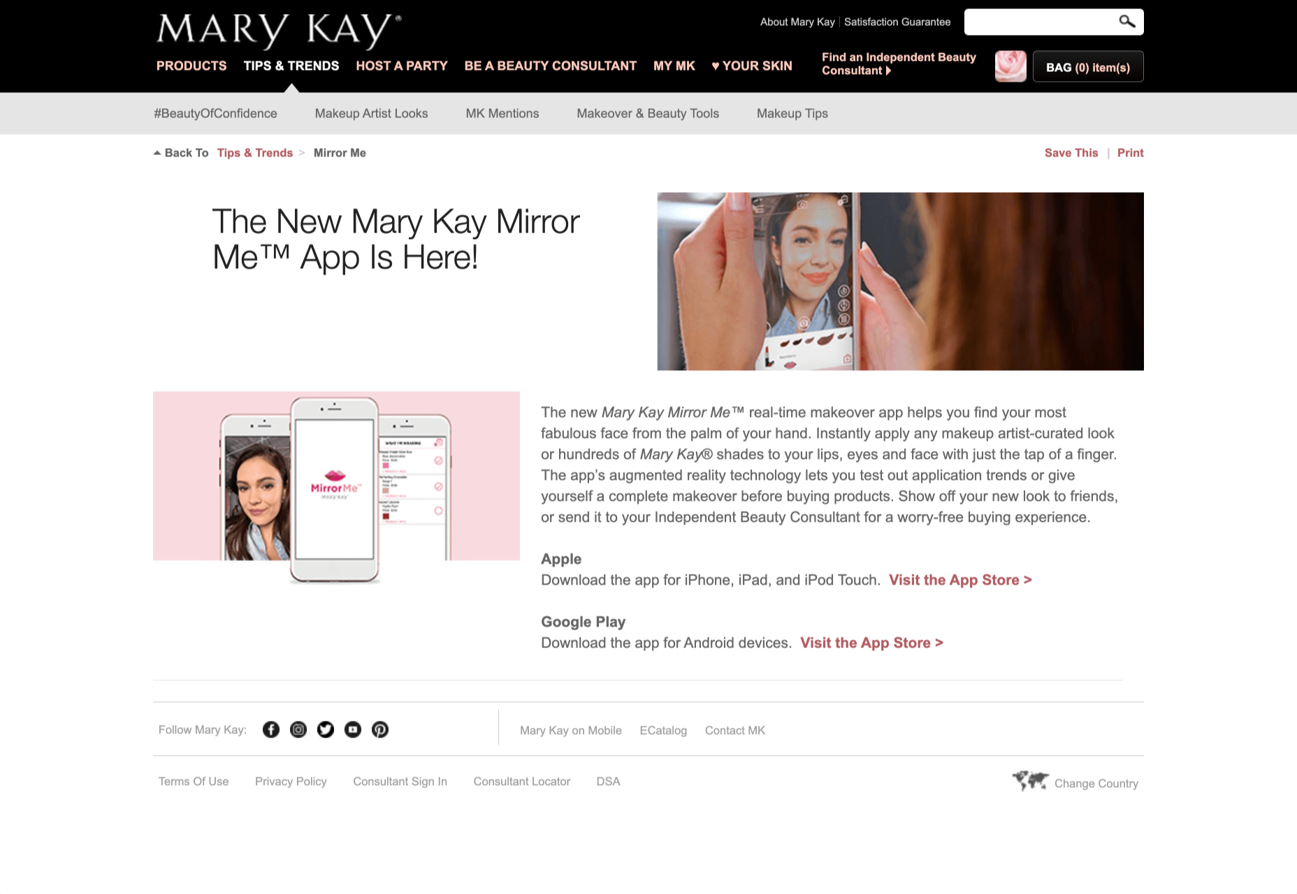
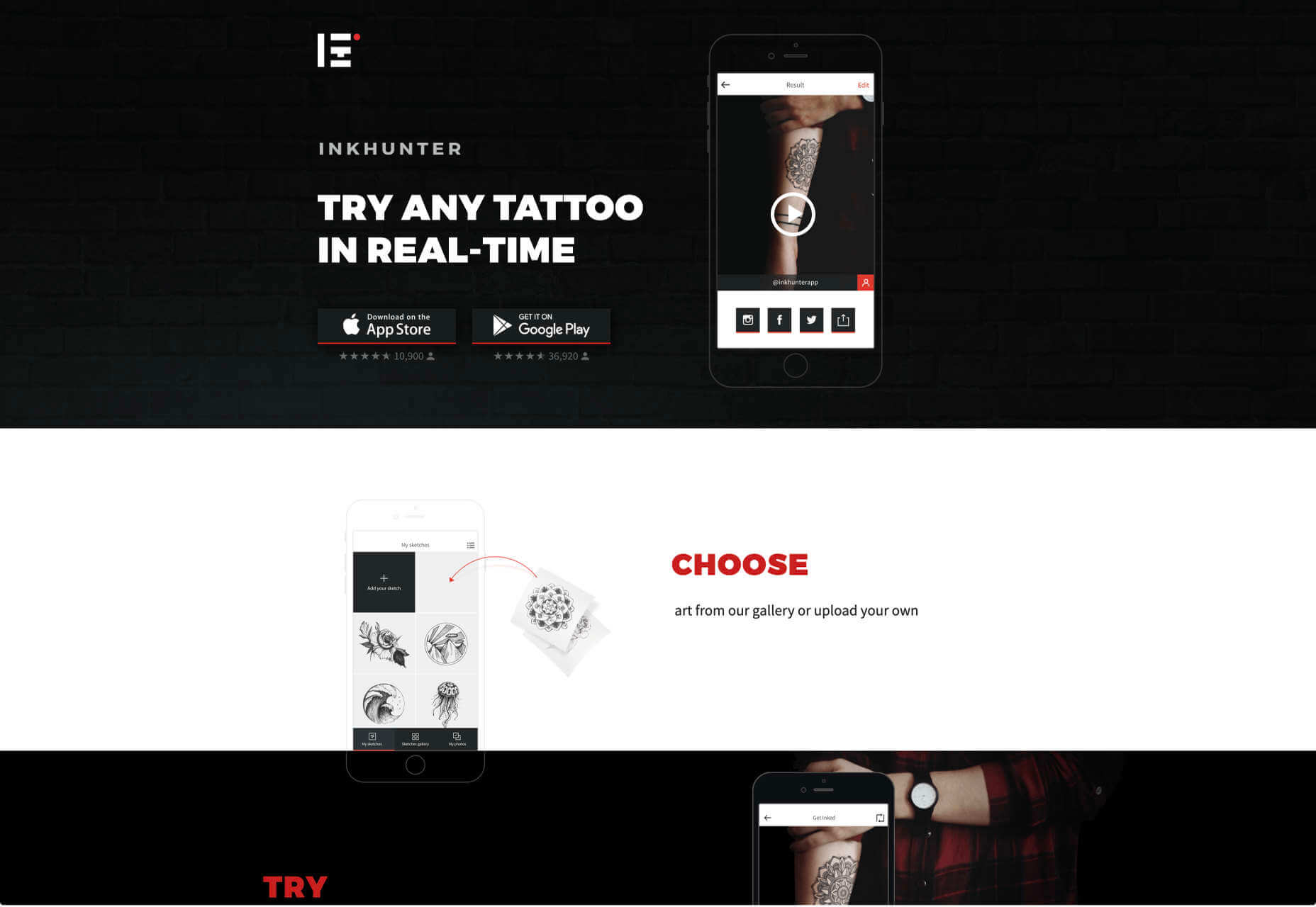
Over the years, experts have repeatedly discussed the possible impact of mixed realities on web design. Concepts like AR and VR are expected to have the potential to change the way that we interact with websites on a fundamental level.

Now that we’re in the year 2021, however, discussions about AR aren’t just observational anymore. The age of mixed-reality interfaces is here, in everything from Pokémon Go, to Snapchat filters.

The question is, how do web designers create incredible user experiences in a world where there are now multiple digital realities to consider?

The Benefits of Experimenting with AR

Before we look at some of the steps that web designers can take to enhance their projects with AR, it’s worth examining the benefits of interacting with augmented reality in the first place. 

While virtual reality replaces the typical world around us completely with digital components, AR augments it. This means that developers and designers need to learn how to thrive in an environment where the real world and the digital one work together. 

The most common AR application for website owners is to provide a solution for real-time and remote product visualization. Imagine being able to try on a pair of shoes before you buy them online. That’s a service that the Vyking brand can deliver by creating technology that “reinvents” the digital shopping experience. 

This test functionality plays a massive role in purchasing decisions. In a world where people can’t see a shade of make-up in person when they’re shopping online, or check how an item of furniture looks in their home, AR has a crucial role to play. 

In simple terms, AR helps shoppers to make more informed purchases. 

Here’s how you can use augmented reality to deliver incredible UX. 

1. Focus on Real-Time Feedback

Augmented reality is all about connecting the real world to the virtual world. 

Doing this provides users a unique experience – one that’s filled with real-time feedback that can deliver crucial and insightful information. For instance, an augmented reality system in a GPS app can calculate the average time before reaching a destination based on previous trips.

Another option is for an augmented reality to use solutions like face-mapping to help customers determine how a certain makeup product will look before they buy it. For instance, that’s the case for the Mary Kay Mirror Me app, which simplifies the process of shopping for make-up. 

When designing for AR, experts need to consider how they can provide customers with real-time information that they can use to make better purchasing decisions. 

2. Define input and output

Although you’ve probably performed similar exercises when designing for traditional websites and applications in the past, defining inputs and outputs of UX in AR environments can be tough.

Defining inputs and outputs allows you to determine which elements of an interface your user can actually interact with, in your interface. This gives you a better idea of what to “augment.” For instance, you might decide that physical gestures like a swipe of the hand will be essential for AR inputs. However, you’ll also need to consider how each mobile device offers different input possibilities. 

Outputs are a little simpler. For instance, you could offer a three-dimensional model of a product that your customers are interested in. Once you have that output, you can think about how the customer will interact with it by changing colors or position.

3. Embrace Customer-Friendly Performance

Another feature at the heart of AR applications is interactivity. 

Good designs in the augmented reality world need to be simple to access and use, otherwise customers will end up avoiding them. For instance, 60% of customers say they want to use AR when they’re shopping for furniture. However, they’re only going to use your app if it actually works. 

The Décor Matters website and app mix gamification with home decorating features that help customers get a better view of the home goods they’re planning on buying. The website even has inspiration pages available to help users find and try new design options with their AR technology. 

When designing for AR, think about how you can make your applications or technology as simple to use as possible, so customers actually want to interact with it. 

4. Address the Environment

In augmented and virtual reality applications, it’s important to remember that interfaces aren’t bound by physical screens. The viewport will move with the user, shifting perspectives in response. Most AR designers will use four different signifiers to describe AR environments:

  • Public environment: The entire body of the user is involved as a controller, like with the Xbox Kinect or Nintendo Wii;
  • Intimate environment: Where a user can be seated – often in a desktop environment;
  • Personal environment: AR on smartphones, mobile devices, and tablets, like Pokémon Go;
  • Private environments: Completely private spaces, such as with wearable technology like the Google Glass solution.

The environment that you’re designing for will be crucial for your project outcomes. Remember, spatial considerations need to be carefully considered when accounting for how users will interact with objects in a frame. 

5. Remember User Fatigue

Another thing to keep in mind when designing for AR technology is that user fatigue is likely to be a much more significant consideration. After all, people interact with websites and applications in a much more intimate and in-depth way when AR is involved. 

AR applications can often use the entire body of a customer as a controller. Because of this, designers need to be careful about exhausting interactions. High-effort and repetitive interactions could tire the user out mentally and physically, causing them to give up on the interaction. 

When designing, you’ll need to consider how you might over-stimulate the user with too many interaction-focused elements at once. Keep it simple.

6. Remember the Essential Principles of UX Design

Remember, just because you’re tapping into a relatively new technology doesn’t mean that you should abandon all the basic tenets of user experience design that you’ve come to understand over the years. Although UX is constantly evolving and changing, it’s always going to keep a few fundamental principles in mind. 

For instance, you’ll always strive to give users the best digital experience in exchange for the lowest amount of effort on their part. Additionally, you’ll need to think about how you can make end-users as comfortable as possible when they’re interacting with new types of technology on websites and apps. 

For instance, since AR is most commonly associated with gaming in the current environment, it might be a good idea to implement gamification concepts into your AR design. What can you do to make sure your customers are having fun?

For instance, Inkhunter is an app that allows users to try on tattoos just like using a filter on Snapchat. The experience feels familiar, comfortable, and exciting.

Unlocking the Potential of AR Web Design

Augmented Reality technology has come a long way over the years. Today, developers and designers can access simple plug-in tools like WordPress VR, allowing designers to upload 360-degree videos into WordPress sites and other unique web extensions. 

Augmented reality is becoming much more readily available on sites and apps of all shapes and sizes. Additionally, customers are accessing more ways to unlock AR’s power through everything from headsets to mobile interfaces. 

However, just like any new technology in the web design world, designers need to think carefully about how they will overcome the challenges in user experience that AR can present. For instance, though AR can offer more information for a customer and help them make purchasing decisions faster, there are also risks. For instance, add too many interactive features to a single website or application, and you could scare users off with too much information. 

In the short-term, web designers need to explore the new tools that are available to them and think about the customers they’re designing for. Only this way will we be able to make any considerable advances in the possibilities of AR. 

Are You Ready to Embrace AR?

Designing for augmented reality applications and websites can be an intimidating concept – even for seasoned designers. However, this is just another technology that creatives can use to drive better experiences for end-users. 

Learn how the latest technology works and get an insight into your customers’ needs, and you’ll be amazed at what you can accomplish in the AR world.

Source


Source de l’article sur Webdesignerdepot

You have probably read about Kubernetes, and maybe even dipped your toes in and used it in a side project or even at work. But understanding what Kubernetes is all about, how to use it effectively, and what the best practices are requires much more effort. Kubernetes is a big open-source project and ecosystem with a lot of code and a lot of functionality. Kubernetes came out of Google, but joined the Cloud Native Computing Foundation (CNCF) and became the clear leader in the space of container-based applications.

Let’s hear from Gigi Sayfan, author of the bestseller Mastering Kubernetes, Third Edition, about his methodologies and the approach he followed to create a powerful resource to acquaint learners all over the globe with the fundamentals and more advanced concepts of Kubernetes.

Source de l’article sur DZONE

Aujourd’hui les entreprises s’efforcent de plus en plus à offrir une expérience employé exceptionnelle. Et elles ont de bonnes raisons de le faire.

Les recherches révèlent que l’expérience employé a une incidence sur la façon dont les salariés perçoivent leur travail et les efforts qu’ils fournissent. Cette expérience a ensuite un impact sur la satisfaction client, la fidélisation, le rendement des actifs et les ventes (1).

Bien que de nombreux facteurs entrent en jeu, environ 30% de l’expérience employé est liée à l’utilisation de la technologie par leur organisation. Grâce à elle, les salariés peuvent gagner en productivité, flexibilité, améliorer leurs relations professionnelles, mieux gérer le travail à distance. A l’inverse, elle peut aussi les distraire, créer un sentiment d’isolement et limiter leur capacité à se « déconnecter ».

Pour en savoir plus, SAP SuccessFactors a mené des entretiens avec des employés dans le monde entier. Nous avons étudié l’influence de la technologie sur le bien-être, l’engagement, le sentiment d’appréciation et de valeur, la productivité, ainsi que l’expérience globale des processus RH

Bien que cette recherche soit toujours en cours, les résultats préliminaires révèlent trois insights sur la façon dont la technologie peut contribuer à une expérience employé exceptionnelle.

Les employés ont besoin d’outils pour effectuer le travail qu’ils trouvent important et se décharger de ce qu’ils jugent inutile. Nous les avons interrogés sur les tâches, activités, ce qu’ils apprécient le plus et les motive à se lever chaque matin. Selon eux, le « travail utile » est un travail qui implique :

  • La mise en œuvre de quelque chose, par exemple un projet
  • La collaboration avec des collègues dans le but d’atteindre un objectif commun
  • La contribution à une solution et voir les résultats de ces efforts

Sans surprise, lorsqu’on leur demande des exemples illustrant comment la technologie les a aidé, les employés mentionnent des outils conçus pour les soutenir dans ces activités (pour la productivité, Microsoft 365, pour la collaboration, Microsoft Teams et Skype). Avec des résultats plus prononcés chez les employés régulièrement en déplacement ou télétravail.

Mais ils mentionnent aussi des outils qui leur permettent de gagner du temps sur les tâches opérationnelles et administratives. En voici quelques exemples :

  • Une application qui indique les places de parking disponibles lorsqu’on se rend au travail
  • Une application pour commander le déjeuner à l’avance et éviter de faire la queue
  • Les solutions SAP Concur : un employé interrogé a indiqué qu’il a réduit d’au moins 1/3 son temps passé à envoyer ses frais de voyage
  • Des outils qui définissent des modèles fondés sur des comportements antérieurs et qui présentent des propositions de manière proactive. Un employé mentionne une application de navigation GPS qui propose automatiquement un itinéraire en fonction des comportements précédents. Un autre affirme : « J’aime avoir accès au système pour effectuer une tâche, et que le système reconnaisse à l’avance la façon dont j’agis habituellement et prenne en charge certaines étapes à ma place afin que je puisse m’occuper de mon travail […]. Plus vite le système gère les informations, mieux c’est, car ce sont généralement des choses que je […] ne veux pas faire ».

Moins de systèmes séparés et disparates

Les employés soulignent que devoir passer par plusieurs systèmes pour accomplir une tâche ou trouver des informations est extrêmement frustrant et chronophage. Certaines recherches ont démontré que les employés passent jusqu’à 30 % de leur journée de travail à chercher des informations qui peuvent être stockées dans des systèmes et des bases de données disparates.

« J’aimerais faire certaines choses en exactement 20 secondes », confie un employé. « Je ne veux pas avoir à me demander si je dois accéder au portail RH, au portail informatique ou au facility portal. Peu importe qui résout mon problème, je veux juste qu’il soit résolu ».

De meilleures solutions en libre-service avec une assistance humaine

Pendant trop longtemps les solutions technologiques RH des entreprises (surtout celles en libre-service) ont été conçues en tenant compte des RH plutôt que des utilisateurs finaux : les employés. Par conséquent, les employés sont souvent obligés d’utiliser quotidiennement des solutions libre-service obsolètes, non intuitives et mal conçues.

Comme le décrit un employé : « J’essayais de réserver un vol et je recevais sans cesse un message d’erreur, mais le message ne précisait pas ce qui n’allait pas. Ce qui aurait dû me prendre cinq minutes a fini par me prendre plus de trois heures Et quand j’ai finalement réussi à joindre quelqu’un au téléphone, mon interlocuteur n’a pas pu m’en dire plus […]. C’était vraiment frustrant ».

Les conséquences d’une expérience frustrante liée à la technologie vont bien au-delà de la perte de temps. Elles peuvent avoir des effets négatifs sur le bien-être psychologique et physique des employés. Des recherches ont démontré que les expériences frustrantes liées à la technologie peuvent entraîner une perte d’efficacité et un sentiment de colère, impacter l’humeur et les interactions avec les autres, diminuer à la fois le niveau de satisfaction professionnelle et la qualité du travail, compromettre la productivité et même augmenter la pression sanguine ainsi que la tension musculaire (2).

Des recherches antérieures ont démontré que l’élément indispensable des solutions libre-service est la possibilité, si besoin, de parler à quelqu’un. Et cela sans effort important et sans avoir à répéter sans fin une tâche (3).

L’effet de la technologie sur les moments importants : pas toujours positif

Qu’il s’agisse de rejoindre une entreprise, fêter une promotion, s’occuper d’un proche malade ou d’accueillir un nouvel enfant dans sa famille, les moments qui définissent la carrière ainsi que la vie personnelle sont des occasions essentielles de montrer aux employés qu’ils sont reconnus et appréciés. Pourtant, l’expérience technologique associée à ces moments véhicule souvent le message inverse.

Par exemple, un employé interrogé confie : « J’étais très excité quand j’ai trouvé ce travail. Mais le fait d’avoir dû entrer manuellement les informations relatives à mon CV dans le système à plusieurs reprises ne m’a pas laissé une première impression positive de l’entreprise ».

Une récente enquête auprès des candidats et employés de la génération Z est éclairante. 54% d’entre eux déclarent qu’ils ne soumettraient pas une candidature si les méthodes de recrutement de l’entreprise sont dépassées. 26% s’accordent à dire qu’un manque de technologie tout au long du processus d’embauche les dissuaderait d’accepter un emploi.

Alors que les entreprises continuent d’investir dans l’expérience employé, elles doivent être attentives aux solutions technologiques fournies aux collaborateurs. Des solutions dépassées, difficiles à utiliser, qui n’ont pas été conçues en pensant aux employés, désavantageront grandement les organisations lorsqu’il s’agira d’attirer et de fidéliser les talents dans l’économie de l’expérience d’aujourd’hui.

En fin de compte c’est l’un de nos clients interrogés qui le souligne le mieux : « Lorsque nous lançons de nouveaux services de ressources humaines, nous ne voulons pas seulement avoir des utilisateurs. Nous voulons avoir des fans ».

Publié en anglais sur news.sap.com


Lauren Bidwell est chercheuse en gestion du capital humain pour SAP SuccessFactors chez SAP.

(1) The Financial Impact of a Positive Employee Experience ; A Beginner’s Guide to Employee Experience

(2) Ceaparu et al. (2004) ; Lazar et al. (2006) ; Norman (2004) ; Scheirer et al. (2002) ; Murrell & Sprinkle (1993)

(3) Howard & Worboys (2003)

The post Comment créer une expérience employé engageante : le rôle de la technologie appeared first on SAP France News.

Source de l’article sur sap.com

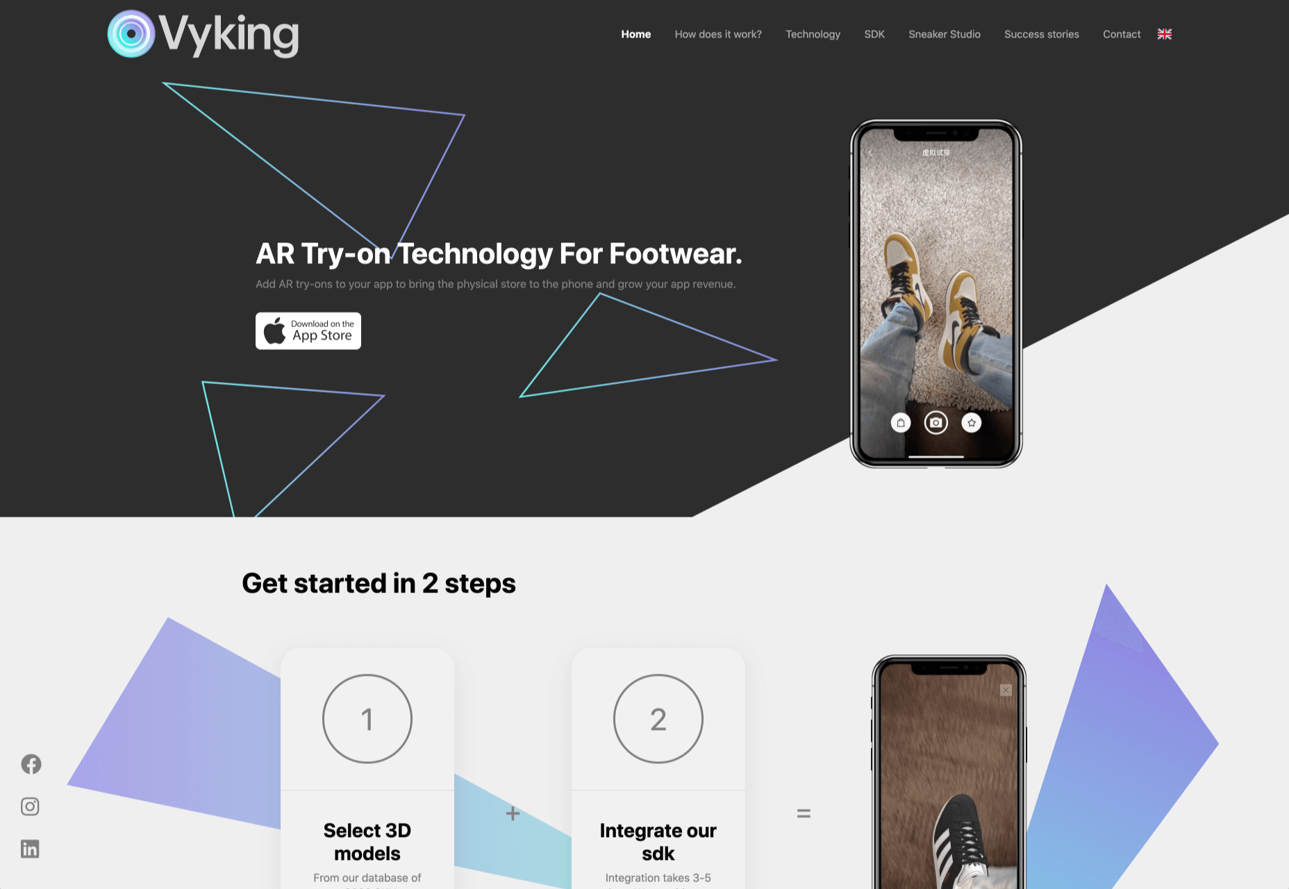
If you’re interested in a sneak peek of this year’s best Black Friday deals, stick around. You’ll find a few web designers’ favorites, including a stellar deal or two.

This year, more than a few of the popular retail outlets are shifting away from the traditional “camp out all night and bust open the doors when the store opens” shopping model. You might just prefer this less chaotic, ecommerce approach.

All of us are trying to adjust to what may eventually become a “new normal”. We may not like some aspects of this new normal, but there are bright spots as well.

More shoppers are likely going to shop online because of the coronavirus. That means you don’t have to fight the crowds while desperately attempting to socially distance. The shelves aren’t as apt to go bare, and shopping is easy, convenient, and safe.

1. Slider Revolution

You will find the Slider Revolution plugin incorporated in a host of WordPress theme tools and products. This premium plugin can in fact boast of more than 7 million users around the globe.

What you may not be aware of is that it is much more than just a WordPress slider. With it in your web design toolbox, you can in fact create just about anything you can imagine.

Expect to find:

  • A stunning selection of elements including sliders and carousels;
  • Attention-getting hero sections designed to make your home pages really stand out;
  • Single-page websites with layouts unlike anything you’ve seen before;
  • Modular structuring that allows you to rearrange and reuse sections however you choose and the ability to mix and match modules with any WordPress content;
  • Add-ons whose cutting edge features push the boundaries of web design possibilities.

There’s more of course. To celebrate Black Friday and Cyber Monday you can NOW get any Slider Revolution subscription plan or one-time payment at a 33% discount.

Just click on the banner and use the BLACKFRIDAY code at checkout.

2. Amelia

When done manually, booking and managing appointments can be tedious and subject to mistakes and errors. Amelia provides an automated booking process that is oh-so easy to work with and is error free; just what you need to help you acquire more happy customers.

Key features of Amelia’s fully responsive design include:

  • A dashboard system that enables you to track approved and pending appointments, booking changes, and revenue;
  • Zoom Integration, Google Calendar, and Outlook Calendar sync;
  • The ability to accept and easily manage recurring appointments that customers can schedule;
  • Front-end customer and employee appointment and event managing and backend appointment adding, editing, and rescheduling;
  • Email notifications for pending and approved appointments and events.

And much more that will save you loads of energy and a ton of time. Give Amelia a try, and if you like what you see (and you will), take advantage of the 30% Black Friday discount.

3. wpDataTables

wpDataTables 3.0, with its fresh, new look, gives you a host of different ways to generate attractive, customizable, and responsive tables and charts, and a host of different ways to present them.

  • Tables can be created from most data sources, the most common being MySQL query, PHP array, Google Spreadsheet, Excel files CSV files, and JSON and XML inputs;
  • A working knowledge of SQL is not required!
  • Addons include Gravity Forms, Formidable Forms, Report Builder, and Powerful Filter;
  • wpDataTables users can generate Tables and Charts quickly from massive amounts of data (saving hours of effort);
  • Tables and charts are customizable and maintainable (editable once placed in use);
  • Tables can be created manually if you wish.

Click on the banner now and take advantage of wpDataTables 30% Black Friday discount on all licenses and addons.

4. TheGem – Creative Multi-Purpose High-Performance WordPress Theme

In TheGem, the ultimate WordPress multipurpose toolbox, you will find:

  • A rich selection of 400+ premium pre-built multi-page and one-page websites, all available for Elementor and WPBakery page builders;
  • The ability to mix and match any of this demos, layouts and page sections to create your own unique look;
  • Extended WooCommerce layouts & tools for making online shops, which convert better;
  • TheGem Blocks: an ultimate tool for building webpages at the speed of light.

And much more. Just click on the banner and check this 5-star product out.

5. Mobirise Website Builder

Creating a Google-friendly can take time, unless you have Mobirise at your fingertips, in which case you have a number of helpful tools to speed things up.

  • No coding, it’s all drag and drop;
  • 3,600+ website templates are at your disposal plus sliders, popups, forms, and more;
  • Many eCommerce features, including a shopping cart;
  • Latest Google Amp and Bootstrap4;
  • You can download Mobirise for free.

And, because it’s Black Friday, everything is yours at a 94% discount!

6. Get Illustrations

Get Illustrations offers royalty free and landing page Illustrations ready to drag and drop into your web design. You’ll have access to:

  • An extensive library of 4000+ illustrations with more added every week;
  • A wealth of design formats, including AI, PNG, SVG, Figma, Adobe XD, and Sketch;
  • Free updates and new illustrations weekly (included in the bundle).

Click on the banner and use the Coupon Code BLACKDEAL for your 30% discount.

7. XStore | Responsive Multi-Purpose WooCommerce WordPress Theme

For anyone planning on creating an eCommerce store, the XStore name says it all. Key features you’ll find in this powerful and flexible WooCommerce theme include:

  • More than 95 good-to-go-shops plus a full AJAX shop to get you started;
  • 300+ pre-defined shop/page sections, a header builder, and a single product page builder;
  • Elementor, WPBakery and $510+ worth of premium plugins.

Click on the banner and sign up to become one of XStore’s 55,000+ happy customers.

8. Kalium – Creative Theme For Multiple Uses

Kalium is an easy-to-use, easily maintainable multipurpose theme for WordPress users that is always updated to use the latest WordPress standards.

  • Kalium provides its users with a host of professionally-designed pre-built demos and elements;
  • Many plugins such as: Slider Revolution, WPBakery, Elementor, Layer Slider, Advanced Custom Fields PRO, Product Filter for WooCommerce, Product Size Guide,WooCommerce and other premium plugins are included.

Kalium is responsive, GDPR compliant, and gives you full eCommerce and top-quality customer support. It has a 5-star rating after 36k sales on ThemeForest – seriously impressive!

***** 

If you hit the retail stores remember to social distance.

Or, if you would rather take a brief break from the demands of Covid-19, take advantage of one or more of the above ecommerce sales. As you can see, there are some excellent ones!


[– This is a sponsored post –]

Source


Source de l’article sur Webdesignerdepot

How can your customer reach you? If a client arrives on your website after searching on Google, what can they do to take the next step in a relationship with your brand, without buying anything?

One of the primary aims of any website is to drive conversions. However, it usually takes between 5 and 8 touchpoints to generate a viable sales lead. People don’t want to convert straight away.

Since building a relationship with customers is crucial to success, it makes sense that the contact page would be an essential part of driving results. Unfortunately, a lot of website owners pay virtually no attention to that page. They ask their designer to create a page with their address and phone number on – and that’s it.

What many business owners don’t realize, is that the contact page is the door to deeper, more lucrative relationships with potential prospects. The design of this essential website element needs to be fantastic to drive results.

So, where do you start?

Defining a Well-Designed Contact Page

Let’s start with the basics, what makes a great contact page?

The complete answer to that question depends on the target audience. Some customers will want to see fun and friendly contact pages, complete with social media sharing buttons. Others will want to see a map that shows them exactly how to reach an office or business.

There are a few golden rules to keep in mind, of course. Contact pages should be:

  • Easy to find: Don’t hide the link to the contact page on the website footer. Make it easy for customers to find out how they can get in touch.
  • Simple: Don’t put too much content on this page or it will overwhelm your audience. Just let them know where they can go to get answers to various questions.
  • Professional: Even if you have a friendly brand personality, your contact form still needs to be grammatically correct and well-designed to show a professional edge.
  • Convenient: Make your phone number clickable so customers can use it on Skype. The same can apply for your email address. Provide easy access to social media profiles, and if you have a contact form – keep it short and sweet.
  • Informative: Include all of your contact information in the same place. This may include your address, a map to your location, social media pages, email addresses, and even forums.
  • Accurate: Ensure that the information on your contact page matches the information listed elsewhere. Check directories and Google my Business listings to be sure.
  • Attractive: Yes, a contact page needs to look good too. Plenty of white space will make essential information stand out. A good layout will guide the eye through the page.
  • Consistent: Make sure the contact form on your website matches the brand personality that appears on all of your other pages.

Take a look at the Tune Contact page:

It’s beautifully laid out, with clear information that’s easy to read. The company shows exactly why customers might want to get in touch and how they can reach out. As you scroll through the page, you’ll find additional office locations, email addresses for different teams (sales and support), and links to social media accounts too.

How to Drive Engagement on a Contact Us Page

A good contact page needs to look fantastic, showcase the company’s personality, and capture audience attention. However, there’s a big difference between a contact page that gets the job done, and one that convinces your audience they have to connect with you.

Here are some excellent ways to make your contact us page stand out.

Step 1: Using Color Correctly

Color and color psychology have a massive impact on user experience.

Studies constantly demonstrate the conversion powers of having the right shades on certain pages throughout your website. For instance, changing a CTA button from red to green can increase click-through rates by 27%.

However, every audience is different. The colors that drive engagement on a contact page for your company will depend on your target customer. A/B testing color palettes that match your brand personality is a good way to get started.

One interesting example of colors that make the right impact on a Contact Us page comes from Hubspot. Here, the brand maintains it’s brand color (orange), but it also introduces some new shades that convey trustworthiness and professionalism.

Blue is the most calming and credible color for any brand, The gradient that Hubspot uses here blends perfectly with its brand identity, allowing for a stunning contact page, with CTA buttons that still stand out.

Experiment with colors that can generate the right emotional response from your audience, but don’t ignore the golden rules of color in web design. You still need to showcase your brand identity, and you still need a way of making crucial information stand out.

Step 2: Humanizing the Customer Service Team

Some of the customers that arrive at a contact page are interested in your product or inspired by the potential of your service. Other customers will be looking for assistance because they’re frustrated with something or stressed out.

If you’ve ever had a problem with a product and wanted to reach out to the brand about it, you’ve probably noticed how annoying it is to find a blank contact page with nothing but an email address. The lack of effort and humanity in the contact page is enough to convince you that you probably won’t get a response.

But what if you add some happy smiling faces to the page?

Research indicates that brains are fine-tuned to recognize and appreciate human faces. Having a picture of your customer service team, or just any human being on your contact page makes you instantly more approachable. Your customers start to feel like they’re reaching out to a person – not an empty website.

Look at how engaging and personalized this contact page from Amber McCue looks:

Although you can show any human face on your contact page and potentially get results, showing your actual agents will be more likely to drive positive results. It’s a great way to showcase the authenticity and humanity of your team.

Step 3: Making it Easy to Find

A surprisingly large amount of the time, companies shove their contact information into the footer of their website, forcing customers to spend forever looking for them. However, your audience might not want to spend an age searching for your details if they’re in a hurry to get answers.

Stowing a contact page in a footer is also a problem for those visiting your website via mobile, as they might not be able to see all your footer details and links as well.

A Contact Us page doesn’t have to be a massive part of your website navigation if you don’t want it to be. However, it should be one of the first things your audience can see. Putting the information on the header of your website, or even sticking it to the top of the page as your users scroll is very helpful.

Zendesk makes it easy for customers to get in touch in multiple ways. First, the Contact section of the website is clear at the top of the page. Secondly, if you start scrolling through the Zendesk website, a “Get Help” button pops up, so you don’t have to scroll back to find assistance:

Remember, aside from making sure that your contact page appears in the right part of your website, it’s also worth ensuring that it’s easy to understand. Don’t use unusual terms like “Chat”, or “Chill with us”. Stick to tried-and-true options like Help, Contact, or Support.

Step 4: Making the Experience Relevant

There’s a reason why it’s practically impossible to find a one-size-fits-all contact page.

It’s because different customers need different things from your brand.

Some customers will be looking for the answer to a question; others will want to discuss something with your sales team. That’s why many companies are using adaptive contact pages that can change to suit the situation.

For instance, you may start by asking customers what they need help with. Zapier takes this approach with its Contact page:

By asking the client what they need straight away, Zapier can make sure that the visitor finds the right information, and the right number or email address for the appropriate agent. You can even scroll down the help page and look for something in the available help centre, using the search bar. Or you can click on View our experts to hire a Zapier pro.

Creating a dynamic and customized experience like this does a few things. First, it ensures that the customer will reach the right person to help them first-time around. This reduces the number of inappropriate calls your employees have to deal with, and the number of transfers.

Secondly, you deliver a better experience overall for your client, because they don’t have to repeat their issue to multiple people or start a massive email thread. They get the support they need immediately.

Dynamic contact pages can even save you some money and time. If clients decide to solve an issue themselves, using your resources, that’s great for your busy agents.

Step 5: Direct People to the Right Place

The central focus of your contact us page needs to be the available contact options. Centralizing the contact options on a page is an excellent way to make sure that they get the right amount of attention. Centralizing also means that your customers can spend less time searching for the contact details that they need, which is great for usability.

The Melonfree.com website uses a contact us form that’s centralized to immediately pull attention to the customer’s options for getting help.

Centralization isn’t the only way of using design principles to guide visitors on a contact page. According to Ray Hyman and Edmund Hick, increasing the number of choices on a page often increases the time it takes for people to make a decision.

When it comes to connecting with a brand, the right option for each customer will depend on the person and the situation they’re trying to overcome. For instance, a customer that needs to reset their password will probably be able to get the solution they need from an FAQ page.

On the other hand, someone who needs help using a new feature might need the guidance of a professional. To help guide customers to the right solution, Basecamp gives customers a variety of steps to follow to get the right solution fast.

The main purpose of the contact page is to help customers get the right answer with an informative form. However, there are unobtrusive alternative options available too. If all you’re looking for is a way to help yourself fix a problem, you can click on the help guides link before you ever scroll down to the form.

Step 6: Support the Contact Team Too

The best contact us pages aren’t just a great way to improve customer experience. Well-designed solutions also help the customer service team to save time and stay productive.

One of the primary metrics that companies consider when evaluating the success of a service team, is the number of replies required before an issue is resolved. However, if the initial question from a customer doesn’t contain enough information, this number often increases.

Using the design of the contact form to access the right information helps with:

  • Automatically routing people to the right team member: Companies can set up segmentation rules that automatically send certain emails to different employees based on keywords. You might have questions that go to the sales team, and separate queries that you direct straight to the customer service team.
  • Show appropriate support options and FAQs: Remember to give the audience a chance to help themselves before they reach out for extra support. Links to an FAQ page or self-service options can really reduce the pressure on a team. Some companies even add automated chatbots to the mix to help with self-service.
  • Prompt for extra context: Although not every customer will take advantage of an opportunity to add extra information to a form, some will. Adding a box to your contact form for “anything we need to know?” is a great way to generate more information. Ban.do includes a simple “question” box where customers can add as much detail as they like. An option to add screen shots or documents might be a nice touch too.

Building Your Own Contact Us Page

Every customer has their own specific set of needs. The right contact page for another business might not be the right one for you. That’s why it’s so important to take some time getting to know your customers and speaking to your support team.

When you’re planning your contact page, it helps to ask yourself some basic questions about what you want to achieve. For instance:

  • What kind of channels will our customers want to use to connect with us? Look at things like social media messaging, email, or phone calls. If you’ve got a relatively tech-savvy audience, then they might want to use things like instant messaging with chat bots too.
  • How can we direct clients to the appropriate channels in as little time as possible? Having a system in place to automatically route your customers to the right agent will reduce the time to resolution for your customers. The faster you solve problems, the better your reputation becomes.
  • What can we do to set customer expectations and build confidence before they speak to us? Designing a professional-looking contact page will increase customer confidence, while an FAQ section shows that you’re ready to answer common questions.
  • How can we showcase a unique brand personality without making the page complicated? Everything from using distinct brand colors on a contact page, to adding images and illustrations reminds customers that they’re in the right place.
  • What can we do to reduce the friction points in a customer’s path to contact? Avoid adding too many input options to a contact form and ensure that it’s easy to reach out when your clients have a problem.

Understanding exactly what your audience needs from you, and what they’re looking for when they come to your team for help reduces the effort involved for your client when they reach out for help. Remember, today’s digitally-savvy customers expect their interactions with companies to be as streamlined and simple as possible.

Make the Most of Your Contact Page

Contact pages are frequently an afterthought in the website design process. However, they’re one of the most valuable tools your company has. With a good contact page, you ensure that your customers can always reach you when they have problems. What’s more, you boost your chances of people wanting to reach out to the sales team too!

Good luck creating a contact page that encourages engagement from your target audience. Don’t forget to track your results from each design, and A/B test for optimization.

Source


Source de l’article sur Webdesignerdepot

The world of search engine optimization was born with all sorts of different hacks and shortcuts that many people use in an effort to grow their business.

Knowing effective SEO tricks would be incredibly profitable, but unfortunately it’s not that easy

This becomes evident as soon as you do a Google search about anything SEO-related, only to find pages and more pages replete with blog posts and videos disclosing all the tips and tricks you “need to know” in order to achieve the best SEO results, in the fastest way possible.

Knowing effective SEO tricks would be incredibly profitable, but unfortunately it’s not that easy.

In its essence, SEO isn’t about hacks, shortcuts, and hidden optimizations, but rather about resource allocation. Keep reading to learn why!

Be Careful About Over-Reliance on Hacks

Before we start talking about resources, it’s important to understand why the quick and easy SEO hacks we’ve all read about online aren’t as reliable as they might seem.

The reality is that yes, there are some traditional hacks and optimization tactics that many people swear by. However, SEO has become way too competitive for these hacks to still work.

Think about it: anyone can learn about these hacks and shortcuts in a matter of seconds, which means that anyone can use them, which means that they’re not going to help your website stand out. By way of example, when thinking about keyword usage, many websites simply decide to put them everywhere on their website, without actually planning and strategizing. Perhaps years ago, doing so would lead to excellent results, but that’s not the case anymore.

What I want to go over, and what I mean with this article, is that when developing your SEO plan, you should think less about hacks, and try to focus on strategy and resources instead.

As tempting as they might be, most SEO hacks won’t really go that far.

What does go far are those strategies and resource allocation decisions, which you can master as long as you know three things:

  • Who your competitors are;
  • What you have;
  • and What strengths you can double down on.

Base Your SEO Strategies on Your Business’s Resources

So, SEO is about resource allocation – we know that now…but what exactly does that mean?

Well, this logic is based on something you might have heard of before, and that is the three pillars of SEO.

As a refresher, everything in SEO revolves around three pillars:

  • Link building and referring domains;
  • Content development and content marketing;
  • Technical SEO.

Many businesses have a limited digital marketing budget and, as if that wasn’t enough, their SEO budget tends to be even more restricted.

This means that we can’t try every hack out there or do every campaign we can come up with, hoping it will lead to positive results. On the contrary, it means we need to be methodical and understand which strategies have the most potential and are actually worth exploring.

In summary, there’s one big challenge that every SEO team and company experiences, and that is the limitation of resources versus possible operations, and that leads us to a question: what mix of SEO pillars will give us a good shot at ranking high and surpassing our competitors?

Develop Your SEO Strategies Based on Your Inherent Strengths

The mistake that a lot of business owners make after reading SEO articles or hearing about amazing case studies is that they try and copy the strategies they learned about, from beginning to end.

However, contextually, each case study or article could refer to a strategy that was specifically optimized for a different type of business.

So, although copying what other successful businesses can work in certain situations when speaking about SEO, it’s best to borrow ideas and use the ones that fit your inherent strengths.

Based on the pillars of SEO that we discussed earlier, there are three strong points that a company can have:

If You Have a Strong Network…

Some businesses don’t have the resources to create an in-house content development team or outsource writing services.

However, they have another strong suit, which lies in their ability to go out into their community, speak, and be heard. They can do this because they have built a strong network over the years and, in cases like this, what we often do is use a backlinking approach.

When working with businesses that have a strong community presence, go out and double down on their network. Pitch their relevant contacts for guest speakership and guest posts, building thought leadership, while also driving links to their website.

If You’re Not That Popular But Are Good With Words…

Right now, some of you might be thinking: “Yeah, well, that’s easy when you’ve built the exposure, but not all of us are lucky enough to be well-known”.

Listen, I get it, we’ve all been in that position.

For clients and businesses that feel like they don’t have the brand equity or exposure to develop a strong backlinking strategy, opt for another route, and invest much more on content (and/or technical SEO, see below).

If the client has a team who’s ready to put its head down and get to work, then focus on producing a lot of content for their website.

Ultimately, the goal is to build a content library that is thorough and expansive, and that provides the client with more opportunities for keyword rankings, while also reinforcing the relevance of their website for those specific SEO keywords.

If Technical Knowledge is Your Forte…

You may not like (or have time) to write and you may not have a strong community presence, but if you have advanced technical skills and the ability to create a strong website quickly, then there’s another approach you can take.

This leads us into the third pillar of SEO: technical SEO.

This solution is indicated for technical teams that can create large websites, databases and user experiences in no time, and it is typically adopted by tech startups that are trying to create an app that provides user value.

First and foremost, winning at technical SEO requires strong technical skills that will allow you to build the web assets that you need, but that’s not all. It also requires you to understand how you can double down on these skills and manage large websites in the rather complex Google ecosystem.

So you need, for example, to know how you can get Google to notice and properly index the new pages you create on your website, even if you already have 100,000 pre-existing pages.

Or to ensure that each of your new pages is properly optimized for the best keywords.

Needless to say, using technical SEO does become a complex operation. However, when done right, it can lead your SEO to grow by sheer size, with the hopes that certain relevant keywords will start to rank for your business naturally.

Conclusion: Your Strategy Will Probably Be a Combination of the Three Pillars

When it comes to SEO, honing in on your strengths and accepting the fact that you can’t do everything is definitely the way to go.

When you’re running an SEO campaign, you should always focus on what you’re good at, know your resources, and augment what you already master – and that will put you in the right direction.

By focusing your resources on any of the pillars of SEO (or even a mix of them), you substantially increase your chances of achieving long-term success, which will not happen if you go for hacks and shortcuts instead.

A long-term, highly-organized, resource-allocated SEO strategy won’t only guarantee continuous success, but it can ultimately become self-sustaining, meaning that it will allow you to keep growing and growing, becoming an organic part of your marketing plan.

I’ve seen a lot of people try SEO hacks for two weeks, only to realize that they didn’t work and that their efforts had been in vain. 

It’s unfortunate because by doing so, you’re turning your back on a marketing channel that is very valuable to a lot of people, and these hacks trick people into thinking it’ll be overnight.

So remember, resource allocation over hacks and shortcuts!

Source


Source de l’article sur Webdesignerdepot

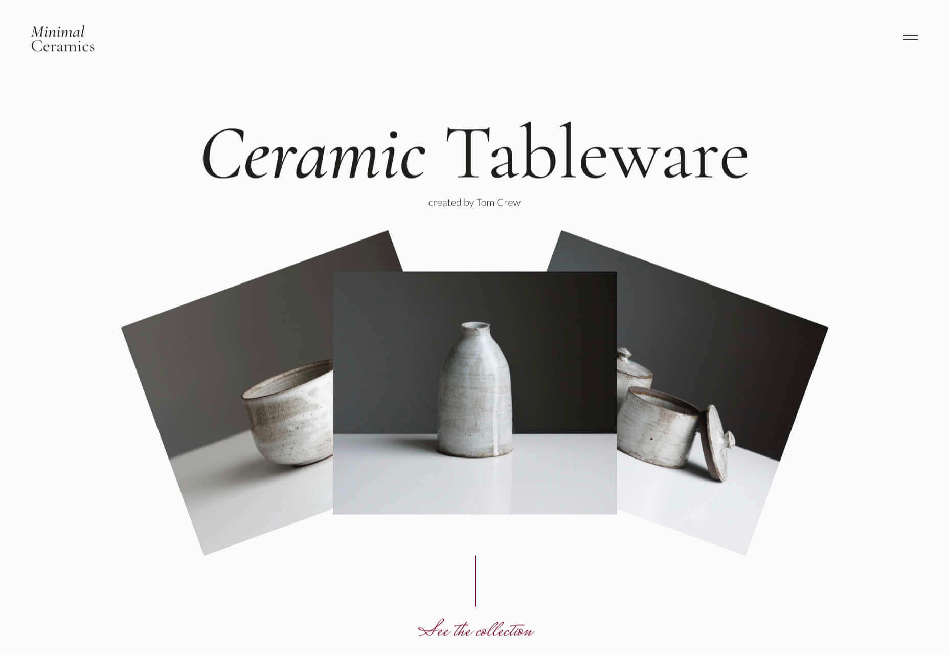
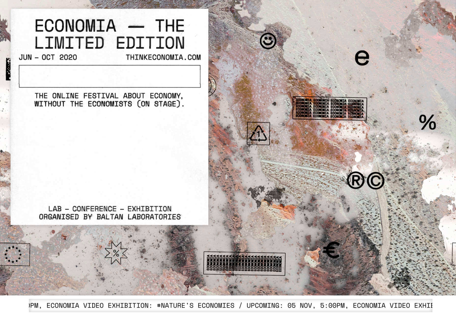
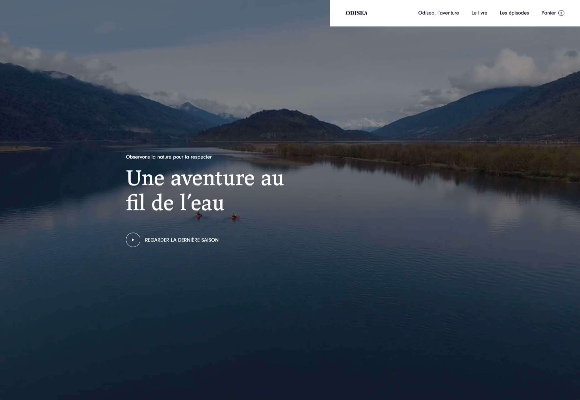
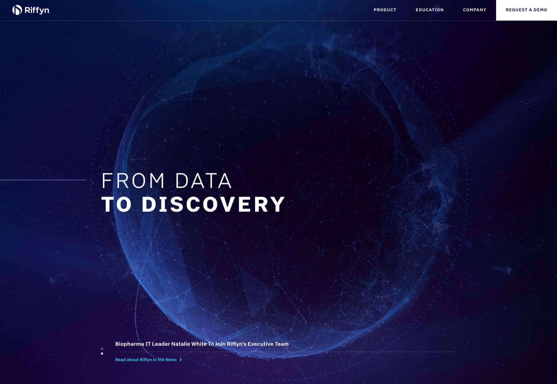
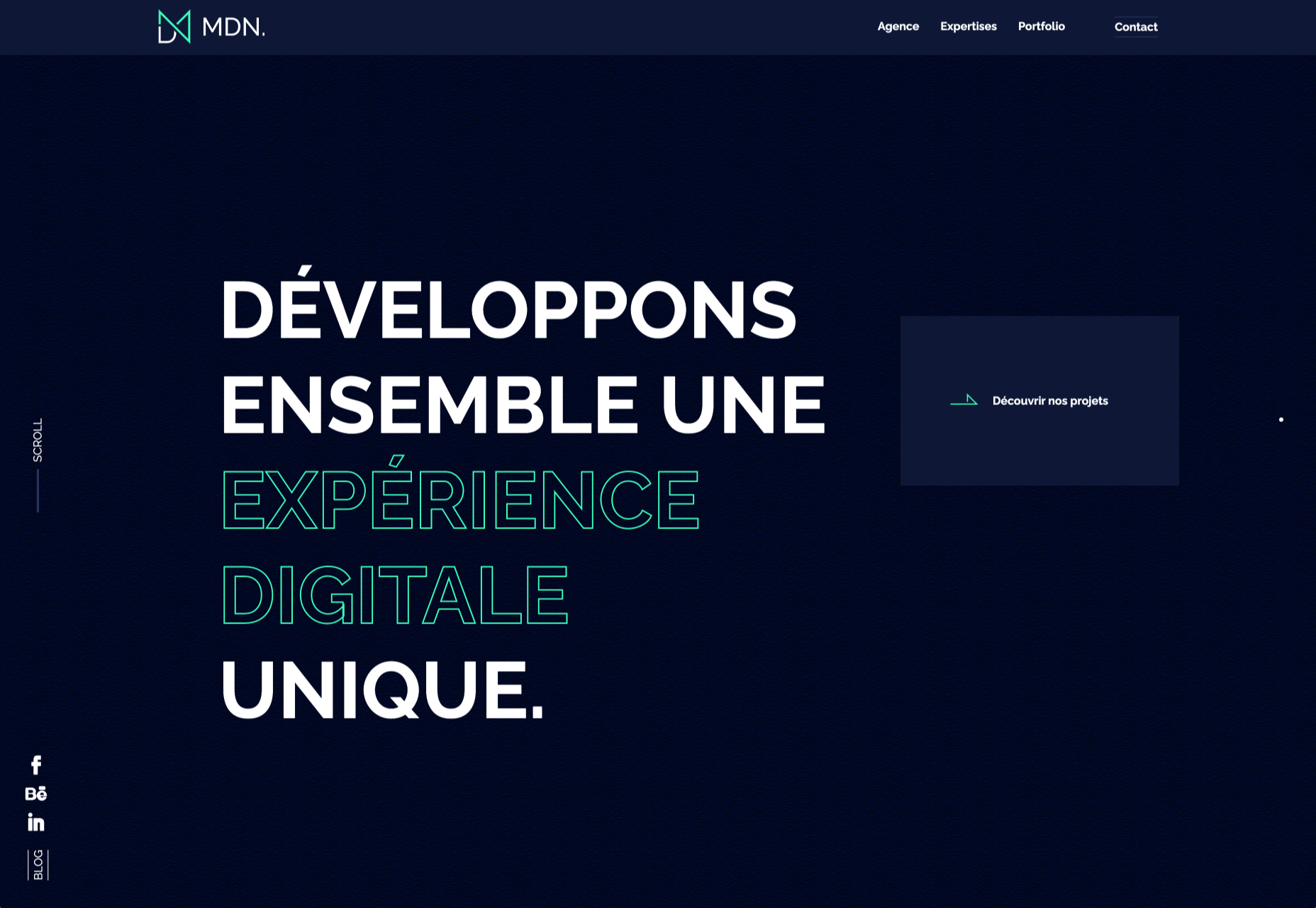
We have become so used to using web sites just to buy stuff that it is easy to forget that the web has more to offer. So this month we’ve included some because-it’s-interesting sites, some micro-sites and some just-for-the-sake-of-it projects.

Many of these are about selling or promoting products and services too, but in a more oblique way that is frequently more engaging than a straightforward sales site.

Micro sites can be a great way of including content that doesn’t fit in neatly with the rest of the main site, or is temporary, or to show a lighter, more fun side of a brand. And a well thought out micro site can act as a gateway to pull in even more visitors to its ‘parent’ site.

Your World Your Way

Your World Your Way is an interactive portal for the University of Auckland. An optional questionnaire customizes the experience, and clearly a lot of effort has gone into this in terms of the questions and possible answers, and the presentation. It is engaging and enjoyable to use, and the information provides links to the main University of Auckland website.

Blind Barber

This micro site is to celebrate 10 years of barber shop chain Blind Barber, which started as one shop with a bar in the back room, in New York’s East Village. An entirely black and white design provides a clean backdrop for color photos and videos, and some great scrolling animations give a pleasing flow to the content.

Brews & Grooves

Brews & Grooves pairs records with different beer. Although a ‘fun’ project, it is still a well designed piece of work with some vintage style typography and some pleasing rollover animation effects. It is an effective advert for those involved in creating it, as listed in on its ‘credits’ page.

Gucci Bloom

As part of a new campaign to promote it’s ‘Bloom’ perfumes, Gucci have created a Gucci Bloom game. The player has to pick up flowers and perfume bottles, but miss a flower and the vines get in your way.

808303Studio

808303Studio is a digital musical instrument that emulates a Roland TR-808 drum machine and TB-303 bass synthesizer, created in conjunction with the Design Museum (London). It’s fully programmable and there is even short video tutorial with A Guy Called Gerald on how to use it.

Aelfie

Aelfie is a home furnishings brand with a focus on bold patterns and bright color. Their site reflects this with its use of block color, irregular grid, drawings, and type that feels a little off-kilter. It creates a hand-made feel that embodies the brand aesthetic rather well.

Media Election 2020

As we approach one of the most significant, not to mention acrimonious, elections in US history, Media Election 2020 uses AI to analyze the volume of media attention each candidate receives, in real time.

Curbed

Magazine website Curbed has now become a part of New York magazine, and had a redesign in the process. It follows a discernible grid, but distorts it just enough to create an edge. The highlighter color frames, and underlines on rollover, add movement and ‘cool’.

WFN

The WFN (Women’s Funding Network) is an alliance of funds and foundations working to promote gender equity and social change internationally. The site is clean, with strong typography and a sophisticated color palette.

The Fabric of America

Internet, telephone and TV service provider Xfinity is behind the Fabric of America project. It is a collection of voice recordings, the idea being that each voice, and each person’s story, is a thread that makes up the flag that we see on the screen.

Minimal Ceramics

Minimal Ceramics is a concept site, showcasing the work of London based potter, Tom Crew. The design of the site reflects the simplicity of the showcased work, using great photography and simple typography.

Normal Now

Normal Now is part of an awareness campaign to highlight to consumers the positives of electric cars. Taking a fun approach to engage consumers in a serious subject, it uses a fake retro tech style.

Superfood Gin 

Superfood Gin is a gin made using superfood botanicals, that claims to be fruity and fresh rather than crisp and peppery. The soft color palette, along with the soft lines and curves in the background illustrations, reflect this well.

Maison Louis Marie

Maison Louis Marie is a natural fragrance company. While this site does nothing really groundbreaking, it does it well. Botanical drawings on a white background, along with clean typography, help create a refined, luxury feel.

Think Economia

Think Economia is a platform taking a fresh look at economics and the future of economic growth. It doesn’t sound like the most exciting subject, but it is presented here in a playful and intriguing way.

Chernobyl

From Uprock, a Russian design studio that also offers courses in web design, Chernobyl is a thought provoking exposition of the Chernobyl disaster. The design aesthetic is muted, allowing the images their deserved impact, and the brief sections of text to be absorbed.

Declamatuus

Declamatuus is a lingerie company selling gift sets. What stands out here is what you don’t see — live models in underwear. Instead the outline of the body is created with animated particles.

Odisea

Odisea Expedition is a documentary series following two friends, a surfer and a snowboarder, as they explore remote parts of the world. The photographs and video are everything here, and all other elements are kept minimal to avoid detracting from them.

Riffyn

Riffyn Nexus is a ‘Process Data System’ for storing and analyzing scientific data for laboratories. It is a very corporate site and yet it is put together in such a way that doesn’t feel dull.

Maison du Net

This site for digital design agency Maison du Net takes a risk mixing corporate with cutesy, but it works. Offset frames and underlines create interest without overdoing it, and the very bright green is used sparingly enough to liven things up without being overwhelming.

Source


Source de l’article sur Webdesignerdepot

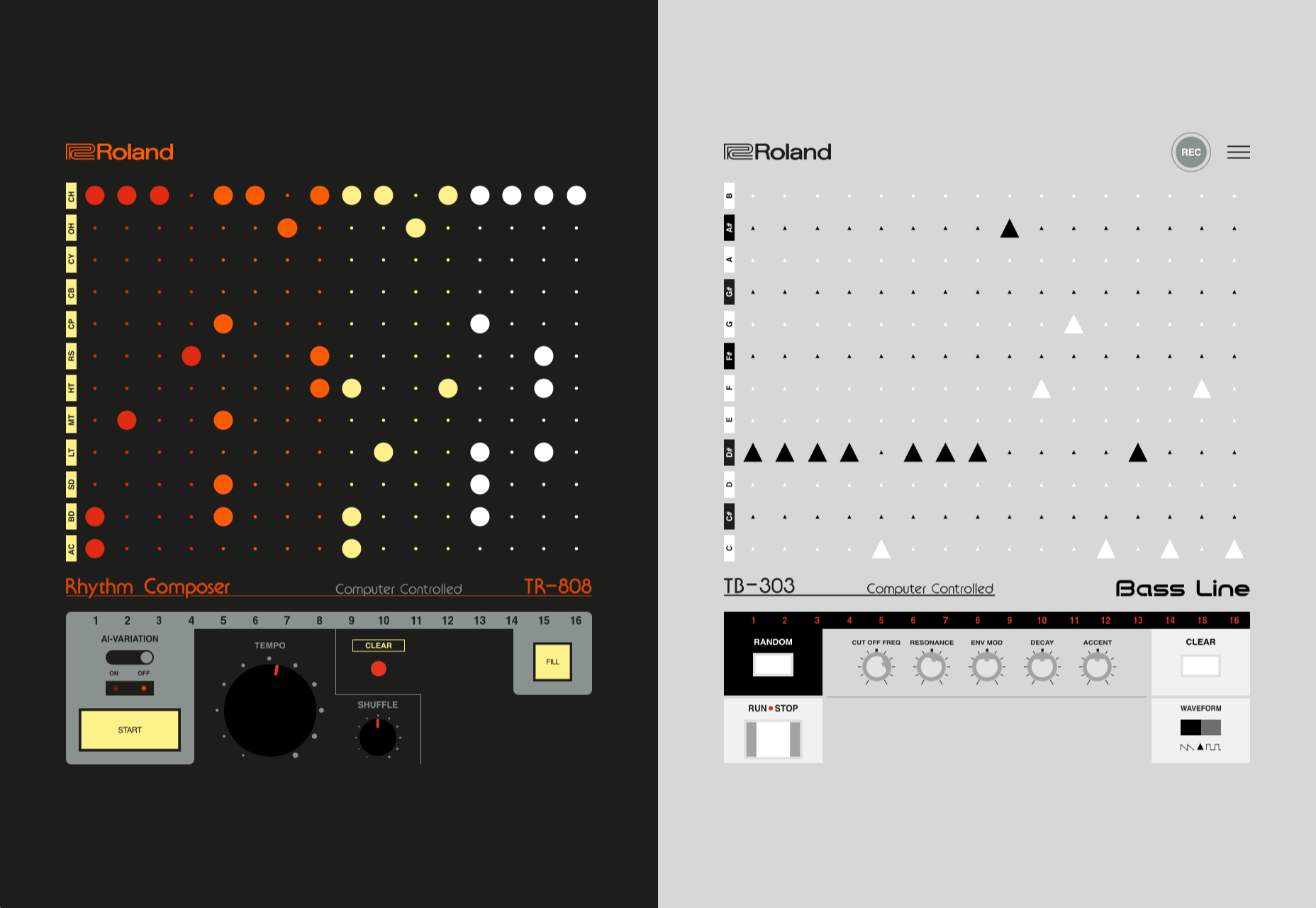
Dark themes are everywhere these days. 

As human beings continue to spend more of their time interacting with technology, dark themes provide a more relaxing way to engage with the digital world. More often than not, these themes are easier on the eyes, more attractive, and perfect for the dedicated user

Throughout 2020, countless leading brands have debuted their own version of the dark theme. Google has a solution for your Drive, while Apple and Android have built dark theme performance right into their operating systems. 

If you haven’t learned how to make the most out of dark mode yet, then you could be missing out on an excellent opportunity to differentiate your design skills, and earn more clients going forward. 

Why Dark Mode?

Before we dive too deeply into the possibilities of creating your own dark theme, let’s examine what dark mode is, and why it’s so effective. 

Ultimately, dark themes are created to reduce the amount of luminance emitted by everything from your desktop and laptop, to your smartphone and smartwatch. Dark themes help to improve the visual ergonomics of design, by reducing eye strain, adjusting brightness to suit current lighting conditions, and more. Additionally, many dark mode offerings are also fantastic at conserving battery life. 

Here are some of the main benefits of adding dark themes to your design portfolio

  • Better user experience: A focus on user experience is one of the most important trends of the digital age. You need to be willing to deliver incredible experiences to everyone who visits your website if you want to stand out today. Dark mode reduces everything from eye strain, to battery power consumption. This helps to keep customers on a website for longer.
  • Innovation and cutting edge appeal: Most companies want to prove that they can stay on the cutting edge of their industry. The ability to offer an opt-in dark mode version of a website theme or appearance can help your clients to stand out from the crowd. As the environment becomes more mobile-focused, more companies will be looking for designers that can provide the best mobile experiences. 
  • Support for universal design: Dark mode isn’t just great for people who have light sensitivity at night. This solution could be more comfortable for visually-impaired users who would struggle with eye strain when visiting your websites otherwise. If you want your content to be more inclusive for a wider range of viewers, then learning how to design for dark mode is a good way to start.

Best Practices When Designing for Dark Mode

Designing for dark mode is easier than you’d think. Most of the time, it involves simply thinking about how you can replace some of the brighter, more overwhelming aspects of your site, with something deeper and darker. 

Here are some useful tips that will get you moving in the right direction. 

1. Experiment with Colors

A big issue for a lot of web designers when it comes to developing a dark mode solution is that they get too caught up with things like pure white text against pure black backgrounds. However, this high-contrast option can be a little much after a while. 

It’s often much easier to use a dark grey as your primary surface color, instead of a true black. Additionally, rather than using bright white, think about slightly off-white alternatives that will be warmer to the eye.

Experiment with surfaces and color combinations that are unlikely to cause too much eye strain. Dark grey foundations often offer a wider range of depth, too, because you can demonstrate shadows on grey. 

Additionally, when you are experimenting with colors, remember that saturated colors often vibrate painfully against very dark surfaces, making them harder to read. Desaturating your colors will help to reduce the contrast and make your websites more welcoming. 

Lighter tones in the 200-50 range will have better readability on dark themes. However, you can always experiment with your choices. Google Material Design recommends using a contrast level of around 15:8:1 between your background and text. 

2. Consider the Emotional Impact

Much of the effort involved with dark mode design is figuring out how certain colors work together. It’s easy to get carried away with stark contrasts, particularly when you’re used to working with a white background. However, you need to remember that you’re designing for a user that’s primarily looking for an easier and more subdued browsing experience.

While you’re working, remember to consider the emotional aspect of the design too. The emotion in colors can make or break a buyer’s journey in any environment. However, an often overlooked-aspect of color psychology, is that people perceive shades differently when they’re on a black background

For instance, think of the color green. On a light background, it conveys nature and even financial wealth. However, on a dark background, the same green could come across as something venomous, toxic, or even sickly. It’s important to think about the kind of impressions end users are going to get when they arrive on your site.

3. Give Users the Freedom to Choose

One of the biggest mistakes you can make when you begin designing for dark mode, is thinking that you should focus entirely on your dark themes, and nothing else. This lines you up for a problem if you interact with users who want the best of both worlds. If you’re designing for apps in particular, you’re going to need web pages that can switch naturally between light and dark themes. 

Learning how to implement both a dark mode and a light mode option into the desks you create will help you to reach a wider selection of customers. Remember, you’ll need to test the performance and impact of your designs in both themes, to check that they deliver the same kind of experience, no matter how your user chooses to browse. 

Although dark mode should offer a different experience to end-users, it still needs to feel as though they’re browsing on the same website. That means that you’re going to need to experiment with the most natural combination of light and dark mode options.

4. Remember the Basics

Remember, although the three tips above will help you to get on the right path for dark mode design, you’ll also need to consider the opportunities and limitations of the platforms that you’re designing for. The kind of dark mode experience you can deliver for Google Chrome websites is going to be very different to what you can create for something running on iOS.

Examining the documentation provided by the system that you’re designing for will help you to develop something with a close insight into what’s actually possible. 

Other top tips for dark mode design include:

  • Focus on your content: Make sure that your content stands out on the page, without being too overwhelming. 
  • Test your design: In both light and dark appearances, you need to make sure everything is working as it should be.
  • Adopt vibrancy for your interfaces: Vibrancy helps to improve the contrast between your background and foreground. 
  • Use semantic colors: Semantic colors adapt to the current appearance of a website automatically. Hard-coded color values that don’t adapt can seem more aggressive. 
  • Desktop tinting: Try experiment with things like transparency and filters to give your websites and apps a slightly warmer tint – ideal for late-night browsing
  • Icons: Use individual glyphs and icons for dark and light modes if necessary. 

Ready to Design for Dark Mode?

Preparing your web development and design portfolio for an era addicted to dark mode can be a complex experience. You need to think carefully about how people are going to browse through your websites and apps when they’re searching for something more subtle, and less visually overwhelming than the websites that we’re used to making. 

The most important thing to remember is that everything on your website or application should look just as beautifully tailor-made in dark mode as it does in light mode. Simply adding a dynamic black background when people want to switch settings in an app isn’t enough. You need to go in-depth with your designs and examine how different fonts, colors, and images work together.

Source


Source de l’article sur Webdesignerdepot