Articles

Votre prochaine grande décision lorsque vous envisagez un nouveau système ERP ? La façon dont il sera déployé. Vous avez le choix entre plusieurs approches, notamment le déploiement traditionnel sur site, le déploiement dans le cloud ou une combinaison hybride des deux. 

Vous voudrez tenir compte des différences financières et examiner les forces et les attraits de chaque stratégie de déploiement ERP, ainsi que les limitations ou les défis uniques. Il est essentiel d’examiner toutes les options et de choisir l’approche de déploiement qui répondra le mieux aux besoins de votre entreprise aujourd’hui – et dans un avenir prévisible. 

Avant de vérifier les options de déploiement de votre ERP, voyez comment – et pourquoi – le cloud est devenu un environnement vital pour la réussite des entreprises dans l’économie numérique. 

Pourquoi cette tendance d’un déploiement cloud ? 

Nous observons tous avec un vif intérêt l’évolution de la technologie informatique à un rythme toujours plus rapide. Les premiers systèmes d’entreprise et les premiers systèmes ERP étaient hébergés sur de gros ordinateurs centraux et de milieu de gamme avec des terminaux pour la saisie des données par les utilisateurs – après avoir remplacé les cartes perforées et la saisie sur disque, bien sûr ! La technologie de pointe suivante était l’architecture client/serveur, dans laquelle les terminaux étaient remplacés par des PC (appelés aujourd’hui clients) qui pouvaient gérer une partie de la charge de travail. Cela a permis de réduire la quantité de données qui devaient faire l’objet d’allers-retours avec l’ordinateur serveur. 

Aux alentours du millénaire, deux évolutions importantes ont changé le monde de l’informatique et de l’ERP : l’Internet et le cloud. Il n’était plus nécessaire d’acheter et de prendre en charge du matériel et des logiciels pour gérer votre entreprise. La totalité ou la majeure partie de la technologie pouvait désormais être « louée » ou externalisée dans le cadre d’une offre groupée comprenant toute la maintenance et une grande partie des opérations techniques. L’omniprésence d’Internet a fourni l’infrastructure de communication nécessaire pour rendre le cloud pratique et disponible partout dans le monde. 

Mais les entreprises n’ont pas immédiatement migré leurs systèmes ERP vers un déploiement dans le cloud. Il a fallu un certain temps pour que la technologie et les applications arrivent à maturité et pour que les entreprises réalisent que l’ordinateur n’a pas besoin d’être sur place pour bénéficier d’un accès fiable et d’une sécurité pour les applications essentielles à l’entreprise. Une partie de cette évolution a impliqué que les développeurs apprennent à : 

  • Tirer pleinement parti du déploiement dans le cloud 
  • écrire ou réécrire des applications de manière appropriée 
  • Reconstruire leur infrastructure (technologie et ressources humaines) pour prendre en charge les systèmes dans le cloud. 

Et, surtout, les systèmes ERP dans le cloud offrent désormais des technologies avancées telles que l’intelligence artificielle (IA) et l’apprentissage automatique pour améliorer la productivité et le service, des expériences utilisateur personnalisées pour favoriser l’adoption, ainsi que des fonctionnalités étendues et des analyses intégrées pour fournir une vue complète de l’entreprise, ce qui, au final, favorise l’innovation et la croissance de l’entreprise. 

Le modèle tarifaire du SaaS 

Dans le passé, la plupart des logiciels étaient installés dans les locaux de l’entreprise et la seule option de licence était l’achat d’une licence perpétuelle – l’application étant concédée pour un montant initial plus un contrat de maintenance annuel pour les mises à niveau et les corrections de bogues. Les licences de logiciels sont le plus souvent facturées par utilisateur. La maintenance annuelle est généralement facturée à 18 % ou 20 % du prix courant du logiciel. Cela signifie que la licence du logiciel est essentiellement « rachetée » tous les cinq ou six ans. 

Avec l’ERP sur site, tout le matériel et le logiciel sont achetés ou loués et installés sur le(s) site(s) de l’entreprise. L’entreprise est responsable de la maintenance, de l’assistance et des éventuelles mises à niveau ou extensions du matériel, des systèmes et des logiciels d’application, ainsi que des locaux, de l’assurance, des ressources de basculement et du stockage de sauvegarde hors site. 

Les systèmes ERP basés sur le cloud, en revanche, ne sont généralement pas installés sur site et sont pris en charge par un fournisseur dans le cadre d’une redevance mensuelle ou annuelle. Ils font l’objet d’une licence sur la base de ce que l’on appelle un logiciel en tant que service (SaaS). Les licences SaaS peuvent être facturées par utilisateur, par application ou par ensemble d’applications (tout l’ERP, par exemple), en fonction de la taille de votre entreprise ou d’autres variations. 

Un aspect intéressant des licences de déploiement dans le cloud est leur évolutivité. Si la licence est accordée par « siège » d’utilisateur, vous pouvez ajouter ou réduire le nombre d’utilisateurs et payer un prix plus ou moins élevé en fonction du nombre de nouveaux utilisateurs. Si vos besoins en termes de volume de transactions, de capacité de stockage ou de puissance de calcul changent, le fournisseur est chargé de mettre à niveau ses installations pour tenir compte de ce changement, ce qui signifie que vous n’aurez pas à acheter et à installer plus de serveurs ou plus de stockage sur disque. 

L’analogie la plus proche pourrait être la télévision par câble. Vous payez pour ce dont vous avez besoin, et ce prix comprend l’utilisation et l’exploitation de toutes les installations physiques, le personnel, la maintenance et toutes les autres dépenses liées au service de câble à votre emplacement. Si vous avez besoin de plus de chaînes et que vous en ajoutez, vous payez simplement ce que vous avez demandé et vous ne vous inquiétez pas de savoir comment ils parviennent à fournir les chaînes supplémentaires. 

Cloud public vs. privé vs. hybride cloud vs. deux-tiers 

Il existe quatre façons possibles de mettre en œuvre un véritable système ERP dans le cloud : 

4 façons de mettre en œuvre un système ERP dans le cloud

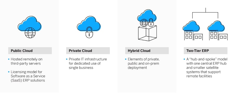
1. ERP sur le cloud public

Le cloud public est le principal modèle de licence pour les solutions ERP de type « software-as-a-service » (SaaS). Le fournisseur du système dispose de son propre centre de données – ou peut louer un espace sur un nuage public pour héberger ses applications et ses systèmes. Tout le matériel, les systèmes et les services d’assistance sont fournis par le biais du cloud public. La mise en œuvre est ainsi plus rapide et plus facile pour l’entreprise utilisatrice car, avec tous les éléments matériels et logiciels déjà en place, elle peut commencer directement par le transfert des données et la formation des utilisateurs. 

Avec cette option de déploiement de l’ERP dans le cloud, votre fournisseur de logiciels s’occupera également de l’installation, de la maintenance et de l’assistance, y compris de toutes les mises à jour et mises à niveau logicielles telles que l’ajout de puissance de calcul ou de stockage. De plus, les systèmes, les applications et les ressources peuvent être « autoscalés », c’est-à-dire augmentés ou diminués automatiquement pour répondre à des besoins changeants. Il n’est donc plus nécessaire de payer pour des ressources informatiques qui peuvent rester inutilisées la plupart du temps, comme c’est le cas avec les systèmes ERP sur site.

L’ERP SaaS basé sur le cloud public a un coût initial faible ou nul (une « dépense d’investissement ») mais un coût mensuel un peu plus élevé (une « dépense d’exploitation »), par rapport à une installation sur site typique. Si l’on considère la période normale de coût du cycle de vie de cinq à sept ans, le coût total de possession (TCO) est similaire, voire inférieur, à celui d’une installation sur site et offre potentiellement un meilleur service, un meilleur support et une meilleure sécurité.

L’ERP en cloud public offre également le chemin le plus rapide vers l’innovation, ce qui le rend idéal pour les entreprises qui veulent poursuivre agressivement leur stratégie de transformation numérique. Cette option de déploiement permet aux entreprises de réimaginer, d’optimiser et d’adapter facilement leurs processus métier en fonction des besoins, et de tirer parti des meilleures pratiques standardisées que les fournisseurs d’ERP modernes devraient prendre en charge.

2. ERP en cloud privé 

Bien qu’ils soient similaires à l’option du cloud public, le matériel, les logiciels système et l’assistance du cloud privé peuvent être détenus, gérés et exploités par l’entreprise, un tiers ou une combinaison des deux pour l’usage exclusif d’une seule organisation. Dans le cadre d’un déploiement dans le cloud privé, l’entreprise utilisatrice doit généralement payer la licence du logiciel ERP.   

L’option de propriété tierce est populaire auprès des services informatiques qui souhaitent externaliser le matériel, la base de données et une grande partie des tâches de mise en réseau, ce qui leur permet de bénéficier de certains des avantages d’un cloud public. Cette option de déploiement est également privilégiée par les entreprises qui souhaitent passer au cloud par étapes, que ce soit rapidement ou progressivement, ou comme étape intermédiaire vers le cloud public. Cela est particulièrement vrai pour les grands fabricants mondiaux et les autres entreprises dont les systèmes sont complexes, fragmentés ou hautement personnalisés.  

Le déploiement d’un cloud privé implique généralement un investissement initial plus important (dépenses d’investissement), mais le coût du cycle de vie peut se situer quelque part entre celui du cloud public et celui des systèmes sur site. Certains fournisseurs modifient ce calcul en proposant des packs de mise en œuvre groupés qui réduisent les coûts initiaux et incluent tous les outils et services, l’infrastructure et les exigences du réseau par le biais d’une tarification par abonnement. Les entreprises peuvent profiter d’un coût total de possession plus faible grâce à l’économie du cloud, d’une architecture moderne basée sur le cloud, ainsi que d’une fonctionnalité ERP complète qui inclut les modules complémentaires, les extensions et les améliorations des partenaires.    

3. ERP en cloud hybride 

Les éléments d’un déploiement ERP dans un cloud privé, un cloud public et sur site peuvent être combinés pour créer un cloud hybride, qui offre la flexibilité de choisir le déploiement optimal pour chaque application. L’ERP dans le cloud hybride peut être utilisé comme un tremplin vers le cloud public, ou pour répondre à des questions de réglementation sectorielle et à des exigences de sécurité particulières qui peuvent imposer le recours à des applications sur site dans certaines situations. D’autres restrictions ou préférences peuvent également rendre les applications sur site souhaitables pour certaines applications. La complexité d’une entreprise et de son environnement actuel, ainsi que le désir d’une vitesse de changement plus lente, sont des facteurs déterminants dans la décision de déployer un scénario hybride. 

Une mise en œuvre hybride permet aux applications et aux données de passer d’une option à l’autre en fonction de l’évolution de la charge de travail. Elle offre les avantages du cloud pour la partie du système qui se trouve dans le cloud. Cependant, elle nécessite une plus grande implication de l’informatique locale pour prendre en charge les éléments sur site, ainsi que la coordination entre les deux – ou plus – environnements de système ERP. 

4. ERP deux-tiers 

Véritable variante de l’approche hybride mise en œuvre pour les mêmes raisons, le déploiement d’un ERP à deux niveaux – parfois appelé déploiement en étoile – fait appel à un système central et à des systèmes satellites plus petits qui prennent en charge les installations distantes. Imaginez que l’ERP de l’entreprise est le centre, et que les systèmes ERP individuels des usines, entrepôts ou bureaux des filiales renvoient tous leurs données au centre. Cette idée n’est pas nouvelle ; elle est apparue au cours de la phase de traitement distribué des années 1990, lorsque les entreprises ont choisi de mettre en œuvre des systèmes plus petits, plus simples et moins coûteux sur des sites distants, tout en conservant le système d’entreprise plus grand et plus performant au siège de la société. Tous les systèmes d’un réseau à deux niveaux, ou certains d’entre eux, peuvent être installés sur site ou dans le cloud, achetés ou sous licence SaaS. 

Le coût global d’un déploiement ERP à deux niveaux – avec des systèmes moins coûteux aux nœuds au lieu du même système d’entreprise partout – permettra de réduire le coût de l’achat initial. Toutefois, l’intégration et le support peuvent entraîner un coût global continu plus élevé, car les interfaces doivent être construites et entretenues. Et, année après année, il faudra davantage de soutien informatique pour assurer la coordination avec les multiples fournisseurs, ainsi que pour gérer les calendriers de mise à niveau et les changements d’interface non coordonnés. 

Que signifie l’expression « faux cloud » ? 

Le faux cloud, également connu sous le nom de « cloud washing », fait référence à un système ERP existant porté vers le cloud et peut-être « enveloppé » d’un logiciel supplémentaire pour adapter le système à cet environnement. Mais ces applications ne sont pas écrites pour être déployées dans le cloud et ne peuvent donc pas vraiment bénéficier de ce que le cloud a à offrir. Il s’agit exactement des mêmes applications ERP héritées installées sur du matériel externalisé. Le « wrapper » peut présenter aux utilisateurs des écrans modernes de type Web, mais les informations saisies doivent être traduites en fonction des exigences de saisie du système existant et retransmises aux écrans enveloppés pour affichage – une approche peu efficace. Pour l’utilisateur, cela ressemble au nuage, mais il ne fonctionnera pas comme une application dans le cloud et ne sera pas en mesure de tirer parti de la connectivité dans le cloud, des fonctionnalités avancées ou des performances opérationnelles optimisées. 

Les véritables fournisseurs d’ERP dans le cloud conçoivent leurs solutions de A à Z, spécifiquement pour le cloud. Les applications patrimoniales enveloppées dans le cloud n’ont pas été conçues pour le cloud et des problèmes de performance peuvent donc survenir. Les personnalisations et les intégrations peuvent également poser problème, et ces solutions doivent toujours être mises à jour et entretenues, souvent par les ressources informatiques de l’entreprise utilisatrice. 

Étant donné que les applications patrimoniales portées sur le cloud sont essentiellement les mêmes que les applications sur site, la tarification est rarement basée sur les besoins d’utilisation, d’où un risque de sur-achat. En outre, le modèle SaaS n’est pas couramment appliqué, ce qui signifie que l’entreprise utilisatrice conserve en interne toute la responsabilité du support et des mises à jour. 

Quand choisir un système ERP sur site plutôt que dans le cloud ? 

De plus en plus d’entreprises passent à l’ERP dans le cloud, mais cette solution ne convient pas à toutes les entreprises. La principale raison de conserver une solution ERP sur site est le besoin de conformité, qu’il s’agisse des exigences des clients, du secteur ou des pouvoirs publics en matière de réglementation et de normes. Des exigences plus strictes nécessitent parfois une mise en œuvre sur site dans les secteurs plus réglementés.  

Le manque de fiabilité du service Internet est cité par certaines entreprises comme une raison de ne pas passer au cloud. Pour les applications ERP critiques, il est crucial d’être opérationnel et disponible 99 % du temps. Cependant, avec les réseaux, serveurs et processus modernes, les temps d’arrêt ne sont généralement plus un problème et empêchent rarement le déploiement d’un ERP dans le cloud.  

La gestion des données peut être une autre raison de conserver votre système ERP dans vos locaux. Dans le cas d’un déploiement dans le cloud, vous pouvez ou non être en mesure de déplacer facilement vos données, selon les politiques de votre fournisseur de services. Assurez-vous qu’il prend en charge les services dont vous avez besoin.  

Une autre raison est la perte de contrôle (par exemple, sur la sécurité, les données ou les mises à niveau). Avec un ERP basé sur le cloud, votre entreprise se décharge de nombreuses responsabilités informatiques sur un tiers. Il est donc important de s’assurer que ce tiers est fiable et qu’il a fait ses preuves. Cependant, certaines entreprises choisissent encore de tout garder « en interne ».   

Les déploiements d’ERP sur site présentent certains inconvénients, notamment la nécessité de procéder à des mises à niveau manuelles du système et l’absence de services intégrés d’installation, de maintenance et d’assistance. Heureusement, pour les entreprises qui ont besoin de ce type de mise en œuvre, certains fournisseurs proposent des services qui offrent certains des avantages des logiciels basés sur le cloud. 

Astuces pour la sélection des processus 

Choisissez d’abord le logiciel ERP par le biais d’un processus d’évaluation minutieux, puis examinez les options de déploiement en fonction des capacités de déploiement du logiciel, des besoins de votre entreprise et du retour sur investissement potentiel de l’ERP. Certains logiciels ERP ne sont disponibles qu’en mode cloud ou SaaS, tandis que d’autres fournisseurs proposent des solutions cloud, on-prem et hybrides. Les options de déploiement disponibles peuvent être un critère d’inclusion dans la liste restreinte, mais elles ne doivent pas être le seul déterminant du choix du système. . 

  • Évitez les applications ERP héritées du faux cloud pour les raisons mentionnées ci-dessus.  
  • Les entreprises à croissance rapide et celles qui prévoient des changements prochains dans le nombre d’utilisateurs (à la hausse ou à la baisse) devraient probablement se concentrer sur les vrais systèmes ERP dans le cloud pour leur évolutivité et leur tarification à l’usage.  
  • Assurez-vous que tous les membres de l’équipe de sélection comprennent les caractéristiques et les avantages de l’ERP dans le cloud public, privé ou hybride.  

Synthèse 

Au départ, les entreprises peuvent être attirées par le déploiement d’un ERP dans le cloud pour des raisons financières (peu ou pas de dépenses d’investissement et coût total du cycle de vie réduit), mais elles sont enthousiasmées par les avantages techniques et opérationnels qu’offre le cloud, notamment 

  • Un ERP qui est toujours à jour avec les dernières mises à niveau (sans coût ni effort supplémentaire). 
  • Une évolutivité quasi illimitée 
  • Paiement uniquement pour ce dont vous avez besoin/ce que vous utilisez 
  • une mise en œuvre plus rapide 
  • Une meilleure sécurité et de meilleurs contrôles d’accès, et plus encore 

Le déploiement intégral dans le cloud n’est pas la seule option. Il est parfois plus judicieux de conserver certaines applications sur place et d’utiliser le cloud pour le reste. Heureusement, de nombreux choix de configuration et de déploiement sont disponibles afin que vous puissiez choisir le déploiement qui vous convient le mieux sur le plan financier et opérationnel. 

Le passage à un nouveau système ERP est un changement important pour les utilisateurs du système, le service informatique et l’ensemble de l’entreprise. Il est judicieux d’explorer toutes les options et de choisir la configuration du système qui offre les meilleures performances au meilleur coût. Ensuite, prévoyez comment vos ressources internes et votre structure devront changer pour tirer le meilleur parti de votre investissement, quels que soient la configuration et le déploiement. 

Publié pour la première fois en anglais sur insights.sap.com 

The post Planifier le déploiement de votre ERP dans le cloud appeared first on SAP France News.

Source de l’article sur sap.com

SAP propose des outils et méthodes pour toutes les étapes de la migration vers l’ERP intelligent SAP S/4HANA. Des solutions qui pourront être complétées par la méthodologie et les outils de SOA People, afin d’accélérer et de sécuriser encore plus ce processus.

L’approche Move to SAP S/4HANA, complétée par les méthodologies et outils de SOA People, offre de mieux préparer, mener et réussir son projet de migration vers l’ERP intelligent SAP S/4HANA. Un outillage qui permet aux entreprises d’envisager sereinement leur projet de migration.

Premier temps : la préparation

« Le premier temps est celui de la réflexion, celui du quand, du comment… et du combien », résume Christian Charvin, Head of Program Move to SAP S/4HANA chez SAP. SAP fournit un ensemble d’outils qui permettent de mener la réflexion de bout en bout, en mesurant précisément quel effort devra être fourni et quels gains attendre.

SOA People ajoute à ceci un outil spécifiquement dédié à la construction du business case, Performer. « Performer va se brancher sur l’ERP du client, en extraire les données de façon anonyme et évaluer le niveau de performance de l’entreprise par rapport à son utilisation de l’ERP, explique Pierre-Edouard Hamon, Presales Director, SOA People. À cet effet, le client va être comparé à un panel d’entreprises représentatives. Ceci permet d’évaluer son niveau de maturité en vue de la migration vers SAP S/4HANA, puis de proposer des plans d’action adaptés, comprenant les améliorations recommandées. Ce plan d’action permet d’évaluer les coûts de mise en œuvre du projet, mais aussi les gains potentiels attendus, qu’ils soient uniques ou récurrents. »

Techniquement, les outils proposés par SAP sont capables de proposer une approche similaire : SAP Process Dicovery crée une image de l’utilisation de l’ERP. SAP Transformation Navigator définit le paysage applicatif et fonctionnel, suivant le périmètre et les améliorations choisis. Enfin, SAP Value LifeCycle Manager construit le business case. Performer présente toutefois plusieurs atouts : une couverture plus large en matière de domaines fonctionnels ; plus d’indicateurs mesurés (2600, contre 1380 chez SAP) : une meilleure automatisation du processus.

Second temps : la migration

Les conversion factories ont le vent en poupe. Les conversion factories assurent une migration technique, sans modification massive des processus. Elles permettent de basculer de SAP ECC vers SAP S/4HANA dans des délais courts, avec un minimum de changements fonctionnels. Une fois cette étape réalisée, les processus peuvent être revus avec les métiers, de façon progressive et suivant les priorités fixées par l’entreprise. Une approche à privilégier lorsque le saut technologique est important : passage de SAP ECC à SAP S/4HANA ou passage d’un environnement sur site à une solution en mode cloud, comme RISE with SAP.

« L’emploi d’une conversion factory permet d’industrialiser toutes les étapes de la migration, à périmètre constant, avec parfois la modification de quelques processus clés. Cette méthode permet de capitaliser sur les investissements réalisés précédemment, en reprenant les paramétrages de l’ERP et en convertissant les spécifiques existants. Quant à la conduite du changement, elle peut être ajustée, en ne déployant pas d’entrée de jeu l’intégralité des nouveautés de SAP S/4HANA », explique Christian Charvin.

« Nous sommes tellement fans de l’approche conversion factory que nous proposons un outil de conversion automatisée capable d’assurer automatiquement certaines tâches (finance, gestion des immobilisations, business partners…), ainsi que la conversion de 93% à 95% des spécifiques, ajoute Pierre-Edouard Hamon. La conversion des spécifiques est réalisée à l’aide d’un moteur d’intelligence artificielle autoapprenant très efficace. À un point tel que nous avons réussi à assurer la migration technique d’un industriel en seulement trois mois ! »

Troisième temps : les travaux post-migration

Une conversion réussie nécessite l’alignement des bonnes personnes, des bonnes méthodes et des bons outils. Toutefois, deux aspects sont à considérer après la conversion, et tout au long du cycle de vie de l’ERP : l’amélioration continue et les tests.

Une solution comme Signavio permet d’analyser les processus utilisés à un instant T et de les comparer aux bonnes pratiques du secteur. Un outil précieux qui réalignera les processus avec ces bonnes pratiques. « Nous recommandons à nos clients de réaliser régulièrement cette analyse, dans le cadre d’une stratégie d’amélioration continue de leurs processus », poursuit Pierre-Edouard Hamon. Mais également pour s’assurer que leurs processus restent dans un état optimal.

Lorsque l’ERP est déployé dans le cloud, il va évoluer au rythme des évolutions proposées par SAP. Mais même lorsqu’il est déployé sur site, il est recommandé d’assurer des montées de versions régulières pour profiter de l’innovation SAP. Que ce soit lors de la refonte de processus existants ou lors d’une montée de version, les tests – de bon fonctionnement ou de non-régression – sont essentiels. « Des outils comme Tricentis (distribué par SAP) permettent d’industrialiser ce que les clients font encore trop souvent à la main. Cette solution permet pourtant d’accélérer sensiblement la phase de test lors d’une conversion ou d’une montée de version », explique Christian Charvin. « Tricentis permet de réduire la phase de test et de libérer du temps pour se concentrer sur la formation des utilisateurs finaux. C’est un outil qui participe lui aussi à l’adoption de SAP S/4HANA », confirme Pierre-Edouard Hamon.

The post Quels outils pour faciliter la migration vers l’ERP SAP S/4HANA ? appeared first on SAP France News.

Source de l’article sur sap.com

Looking to give your homepage a well-needed design update in late 2021 or 2022? Not a bad idea; first impressions are crucial when it comes to business websites. But, fixing your homepage and website design is no easy feat.

Web design trends are evolving faster. Blame the ever-decreasing user’s attention span. The average visitor now spends just 0.5 seconds scanning your homepage to form an opinion about your brand and decide whether to click through or bounce.

Increased user expectations and uncertainty in the user’s response, which is highly impacted by the site’s first impression, are other reasons to consider. This is why the designs which were trending in 2019 are no longer viable in 2021 or 2022.

We have curated the ten best examples of homepage designs to inspire your business in 2022, including a rundown of the best strategies and tips.

Let’s start by highlighting why homepage optimization is necessary for 2022:

Why Your Homepage Will Be So Important in 2022

Your website — especially your homepage — is your brand’s first chance to attract, build trust with, and connect with visitors.

According to recent statistics on why website design is important:

  1. 38% of visitors will stop interacting with a website if they think the layout isn’t visually appealing or intuitive. This creates a higher bounce rate and fewer conversions.
  2. 94% of a visitor’s first impression is based on website design (including colors, fonts, layout, navigation menus, etc.).
  3. 46% of people base a business’s credibility on the aesthetics of its website. Brands with less-than-stellar homepage designs are seen as less trustworthy than companies investing in the visitor experience.

Think of it the same way as walking into a brick-and-mortar store. Visitors are more enticed by a carefully curated ambiance of neatly stocked shelves and welcoming employees than a store that’s dark, messy, or seemingly unfriendly.

Using this logic, your homepage’s above-the-fold section is where you’ll greet visitors and reel them in for more.

10 Homepage Design Comparisons (2019 vs. 2021) To Inspire Your Business Website Design in 2022

Homepage design has come a long way since 2019. In this section, you will explore how.

These homepage designs crush it above the fold. Take just a few of these tips to heart, and your website will be poised to attract leads and conversions — no matter which industry you’re in.

1. Netflix – Crafting The Perfect Call To Action That Reduces Friction With An Additional FAQs Section

Most businesses make the mistake of adding a CTA button that first persuades the user to click on it and then asks for the visitor’s email address.

Netflix also did the same in its 2019 design.

However, Netflix combined both steps in its 2021 homepage design.

The new, improved 2021 homepage design asks for the user email address right up front along with the CTA button.

Here is a good comparison of both the designs:

2019 homepage design

vs.

2021 homepage design

Key Takeaways:

  • The design encourages visitors to enter their email address right when they land on the homepage. As a result, form submission is much easier when the user has started the process. Hence, Netflix makes it easier for visitors to move along their conversion funnel nicely by reducing the friction.
  • The 2021 design also has a nice FAQ section that provides quick information about the company’s services and improves the overall user experience.
  • FAQs also help increase the organic presence of the website in the search engines because Google presents snippets from the FAQ section in the form of an answer box in the search results.

2. Spotify – Revamped Color Combinations For Improved CTA Visibility And Using The ‘Rule of Three’ For Heading Text

The older 2019 Spotify homepage design used light pink and orange colors in its home page main area. The CTA color was green, but if you look closely, the CTA lacks visibility.

The new 2021 design uses blue and green colors with a much larger font size for the main heading. The colors are attractive, and the CTA is visible clearly.

Here is the comparison of the Spotify homepage 2019 design vs. 2020 design:

2019 homepage design

Vs.

2021 homepage design

Key Takeaways:

  • Blue is the most versatile color, and green is the perfect choice for the CTA button. Spotify used universally accepted color combinations to redesign its homepage and made the CTA more visible.
  • The main heading is also made larger than it was in the 2019 design, and it follows the rule of three in writing which is effective and satisfying. It uses just three words in the main heading to allow the human brain to process information as a pattern that is more memorable.

3. Hulu – Give Priority To Your Brand Name And Hide Pricing

If you compare the Hulu 2019 vs. 2021 Hulu homepage, the brand name has been prioritized and shown as the main heading.

Moreover, the older homepage had pricing information everywhere, which has been reduced intelligently in the new design.

2019 homepage design

vs.

2021 homepage design

Key Takeaways:

  • The brand name ‘Hulu’ is displayed as the main heading of the homepage, which helps to build audience trust.
  • The older design persuaded the users to pick a paid plan even though they had a free trial option—this discouraged users from trying their service. The new 2021 design encourages users to try the platform for free. In addition, the packages have prominent CTAs that mention “try for $0”. This design move improves conversions on the website.
  • The new design makes it easier for the visitors to select a viewing plan with easy comparison of the three available plans. The best part is, customers can start all the plans for $0. It’s a win-win situation for the users, and they can quickly pick a plan to start watching Hulu.

4. Nextiva – Reduce Visual Noise And Add Pictures In Menu To Improve UX

Nextiva realized the importance of reducing visual noise in its newly designed 2021 homepage. Visual noise happens when you use too many colors to attract user attention. Different colors compete with each other resulting in diluted customer observation.

In the old 2019 homepage, Nextiva used orange, blue, and green as the primary colors, while in the 2021 revamped design, they have used blue as the main color.

Here is a comparison of the two designs:

2019 homepage design

vs.

2021 homepage design

Moreover, the older homepage didn’t have an image in the product menu, but the new 2021 homepage improves the UX further.

Below is a comparison:

2019 homepage design

vs.

2021 homepage design

Key Takeaways:

  • Nextiva used blue as their base color for the homepage design and removed orange and green colors to reduce visual complexity. This is an excellent change to keep the user’s attention focused. Notice the green colored bar at the top of the homepage in the 2019 version now replaced with blue.
  • The 2021 design has a clean look compared to the 2019 design, which looks scattered with too many different elements, including CTAs that confuse the users.
  • The product menu does an excellent job of linking intelligently to service pages such as phone systems and video meetings. The image of a smiling lady attracts users to click on Nextiva’s products to learn more about them. Improving UX is an impressive way to reduce bounce rates and increase time on site.

5. GoToMeeting – Avoid Lengthy Sign Up Form, Educate Users About Your Products, and Add Images That Depict The Current Needs of The Audience

GoToMeeting does a great job educating the users about their product by adding more content on the homepage that comprehensively explains their product features.

Moreover, they have replaced the older hero image with a new picture that portrays the changing needs of their audiences. Nowadays, there is a rise in work from home culture due to Covid-19. Hence, the photo and the heading text clearly target the needs of their users.

Here is a comparison of the 2019 vs. 2020 homepage of GoToMeeting:

2019 homepage design

vs.

2021 homepage design

Key Takeaways:

  • The 2019 homepage design had a sign-up form on the homepage, which GoToMeeting removed in the 2021 design. People hate to fill in so much information right when they land on the home page. Hence, GoToMeeting did the right thing by removing the signup form from their homepage.
  • The hero image steals the show of the 2021 redesign because the picture of a working mom with her kid playing studying in front of her is a great way to portray the current needs of the society when over 60% of the employees are working from home. Audiences can quickly relate their working environment with the hero image leading to more sign-ups.
  • The older 2019 design was confusing, and it made little effort to help the users understand the different features of the product. The new 2021 homepage design has a product features section that explains the different features of the software. When users are educated about the product, they earn the confidence to try the product.

6. Zillow – Apply Hick’s Law To Allow Visitors To Take Faster Decisions

Zillow does an impressive job of applying Hick’s Law in allowing visitors to make faster decisions. Hick’s law states that the more options you present to the users, the faster they will decide. Therefore, it is a major factor in improving website usability.

The old 2019 homepage design of Zillow offered too many options to the users, like they want to buy, rent, or sell a property. The users first select either one of the three options and then enter the zip code to start their search.

The new 2021 homepage design changed that. Now, Zillow offers users a single option. They only need to enter the zip code to get started.

By reducing the number of actions that users need to take to just one, the homepage design eases the overall decision-making process of the site visitors.

2019 homepage design

vs.

2021 homepage design

Key Takeaways:

  • The new homepage design has a simple search bar that persuades visitors to take prompt action.
  • The Hero image is placed smartly behind the search bar to depict the needs of the users accurately.
  • The homepage does have three different panels for buying, renting, or selling a home when the users scroll below. The old design is missing that. The new design removed so many options above the fold and kept just a single option for the users to encourage more users to search properties on the site.

7. Plex – Placement of Prominent Calls-to-Action On Homepage

The CTA is a key element of every website. It helps the users decide on their next action and helps to convert the visitors into leads.

Plex lacked an optimized CTA placement in its 2019 home page design. Hence, the 2021 design received an uplift to better place the CTA for increased visitor engagement.

Take a look at the home page designs of Plex from two different years. If you compare the two home pages of 2019 vs. 2021, the primary difference that will grab your attention is the CTA.

2019 homepage design

vs.

2021 homepage design

Key Takeaways:

  • The call-to-action buttons are more prominent and have actionable texts.
  • The number of CTA buttons is increased to two to encourage users to take action.
  • The additional CTA button is wisely placed at the center to get immediate attention.
  • Note that the color choice for the button is also bright and highly contrasts with the background yet matches the color theme.
  • The old heading text ‘Stream Smarter’ was confusing because it didn’t help the users understand what Plex does. Hence it is now revised to ‘Watch Free Movies and TV on Plex.’ The new text is easy to understand and has the word ‘Free’ to increase the number of visitors clicking on the CTA.

8. Dropbox – More Above The Fold Content And Change of Fonts

Dropbox has significantly worked on its main content, which is clearly visible in the comparison homepage design images of 2019 vs. 2021.

The 2021 homepage is seen fixing faded, minimalistic, and less engaging content in the older homepage.

2019 homepage design

vs.

2021 homepage design

Key Takeaways:

  • Sans serifs, with their clean readability, are included for longer bouts of the homepage.
  • Bold sans text is doing the job of drawing user attention effortlessly.
  • The color contrast of the text with the background is increased, which improves the visibility.
  • The right side image of a laptop is replaced with a screenshot of the software, which intrigues users to know more.

9. Cisco – Moving Blocks To Outsmart Competitor Websites

The homepage design of American technology company Cisco has seen a drastic change in 2021; it deserves to appear on this list. The company website smartly represents an appeal for future development through its killer homepage design.

Here is a comparison of the old 2019 homepage design vs. the new moving block design of 2021:

2019 homepage design

vs.

2021 homepage design

Key Takeaways

  • The home page contains moving blocks with news from the blog. As you hover over the image, it widens up, and a CTA button appears. The blocks represent a design of the future which the competitors might find hard to replicate.
  • Every block has a CTA, which was missing in the 2019 design. Each block represents a specific Cisco service and caters to the different needs of the visitors.
  • The new design is elegant and cleaner with lots of information.

10. Slack – Product Video On Home Page For More Conversions

Slack has made it easier for the users to understand the product well by using a video on the homepage.

The 2019 design has an image, while the 2021 design has a video that helps the visitors understand how the product works.

Here is a comparison of the 2019 design vs. 2021 design:

2019 homepage design

vs.

2021 homepage design

Key Takeaways

  • The inclusion of a product video leaves a great impression in the minds of the visitors and shows them what your product does.
  • Video helps Slack to make its value proposition clear and super fast.
  • Video has a strong correlation to conversions, and they work well as compared to hero images. Slack used a hero image on the homepage in 2019, but they replaced it with a video in 2021.

Final Thoughts on Using These Homepage Designs for Inspiration in 2021

By making it to this point in our guide, you now have plenty of inspiration to run with when upgrading your homepage. You should also have a better understanding of how powerful this tool may become for your brand.

So now it’s time to brainstorm how to use these ideas for your own 2021 homepage design. First, jot down the key points from this guide and honestly assess how your website currently compares.

Accomplish this task, and your brand might see an uptick in website traffic and conversions. It may even earn a spot in a roundup of killer website designs just like this one.

Source

The post 10 Homepage Design Comparisons to Inspire Your Business in 2022 first appeared on Webdesigner Depot.


Source de l’article sur Webdesignerdepot

Does it ever cross your mind that praise can be negative? I guess not. After all, it looks harmless and seems to be quite effective. Conventional wisdom says that if you praise people, they are motivated to do better.
People who have been praised throughout their life by their well-meaning parents, friends, and teachers for their talent and smartness or those who have experienced extreme focus on talent and smartness throughout their childhood learn to value only intelligence. No wonder when these people enter the workforce, they continue to seek approval and demand praise every step of the way.
Every opportunity is a measure of their intelligence — do I look smart, how will I be judged, what if others find my ideas dumb. With a single-minded focus on validating themselves, all their actions are rooted in establishing their worth. Every mistake hurts their reputation and every failure is a reflection of their competence. They care less about learning and more about proving themselves. Their sense of morality sometimes takes a hit as they resort to brutal behaviors — demeaning others by yelling, insulting, controlling, or taking undue credit — all in an attempt to boost their self-esteem.
Carol Dweck, professor of Psychology at Stanford University summarised this unfortunate reality from Morgan McCall’s book High Flyers:

People often like the things that work against their growth. . . . People like to use their strengths . . . to achieve quick, dramatic results, even if . . . they aren’t developing the new skills they will need later on. People like to believe they are as good as everyone says . . . and not take their weaknesses as seriously as they might. People don’t like to hear bad news or get criticism. . . . There is tremendous risk . . . in leaving what one does well to attempt to master something new.

What Do Organizations Do with Such People?

They feed and promote this mindset. They praise people for their brilliant ideas conveying the message “we value talent and smartness.” They shower people with rewards and bonuses for their achievements communicating to everyone else around “all we care about is success.”
What happens when these people take on a leadership role? Their mindset of valuing brilliance above everything else amplifies leading to disastrous results. History is full of leadership fiascos with great promises that turned out to be the biggest disasters. This article from Malcolm Gladwell in The New Yorker is as valid now as it was 18 years ago. Describing the talent mindset at Enron and the consultants at McKinsey who wandered the hallways at the company’s headquarters, he points out “They were there looking for people who had the talent to think outside the box. It never occurred to them that, if everyone had to think outside the box, maybe it was the box that needed fixing.”
He also talks about the impact of an environment that values innate talent and what happens when times get tough and that self-image is threatened “They have difficulty with the consequences. They will not take the remedial course. They will not stand up to investors and the public and admit that they were wrong. They’d sooner lie.”
Really, is praising people for their intelligence and achievements the only way to develop people who will be the leaders of tomorrow? Is there a better way out?
What if we praised people for their hard work, for their ability to persist despite failures and setbacks, for taking initiatives to build new skills, for standing up to their mistakes, for believing in their growth, and implementing the right strategies to overcome their shortcomings. What does this kind of praise tell them?
It tells them the value of effort in building abilities. It teaches them the importance of implementing the right strategies to solve problems. It encourages them to seek help to make progress on their task. It creates a passion for learning that’s not driven by the need to look smart, but with a desire to cultivate skills, to stretch themselves to grow.
When these people take on leadership positions, this mindset guides them to put the well-being of the company and its people before their own needs, to place value on teamwork over individual accomplishment, and to foster growth and development of their people.

As growth-minded leaders, they start with a belief in human potential and development — both their own and other people’s. Instead of using the company as a vehicle for their greatness, they use it as an engine of growth — for themselves, the employees, and the company as a whole.
– Carol Dweck

Unlike leaders who pull their companies down with their focus on brilliance, these leaders lead their companies into greatness and gratitude filled in their own hearts and those of the people around them.
Choose your praise carefully as you will see the tremendous benefits in praising for growth over brilliance.

When Leaders Focus on Brilliance

They live in a world of personal greatness and entitlement, vie for labels, and will do anything to boost their image. Instead of building a long-lasting company, they spend time and money on enhancing their image.
With the constant need for validation, they use people in the company to feed their egos and showcase their superiority. Everything is about pleasing the boss. They surround themselves with people who boost their self-esteem. Agreement earns them admiration and disagreement is an attack on their intelligence. Instead of hearing people out, they punish dissent and shut people down.
They pounce at the less talented for their lack of intelligence and find those who are more talented than they are as threatening. They mistreat employees, yell, insult, control and abuse them into their way of doing things. They feel better about themselves by making other people feel worse. Employees worry about being judged all the time. When people are ridiculed for mistakes, they soon learn to keep their heads down, stop putting their critical thinking skills to use, and give in to groupthink.
Their belief in their superiority blinds them to see reality. They turn a blind eye to complaints, ignore warning signs, and fire people who tell them what they don’t want to hear. Their decision-making criteria are based on what would make them look good as opposed to what’s good for the company long term.

What happens when a leader refuses to confront the brutal facts? “The minute a leader allows himself to become the primary reality people worry about, rather than reality being the primary reality, you have a recipe for mediocrity, or worse. This is one of the key reasons why less charismatic leaders often produce better long-term results than their more charismatic counterparts.
– Jim Collins

Since success and failure are a part of their identity — success means they are smart and failure means they are not — they find excuses and blame others for failures instead of taking personal responsibility. Instead of investing in the future growth of their company, they play safe with fear of failure, become less responsive to challenges from competition, go with what’s tried and tested, and refuse to take risks. Why take up the challenge that can hurt their reputation? On the other extreme, they may not shy away from crossing ethical boundaries to beat the competition at all costs. Success is what they are after and it doesn’t matter how they get it.
With more focus on talent and less on potential, they do not invest in mentoring and coaching employees. Instead of putting practices in place to develop employees and help them collaborate together, they make them compete against each other.
Carol Dweck sums up their brilliant mindset “My genius not only defines and validates me. It defines and validates the company. It is what creates value. My genius is profit. Wow!”

When Leaders Focus on Growth

They operate with a learning mode. They don’t claim to be genius but promise to invest in development, their own development, and the development of their people. The drive and enthusiasm to grow their companies make them adopt long-term strategies over short-term tactics. They aren’t in the game to boost their ego or establish their self-esteem. It’s the pure joy of shaping the future of their company that excites and motivates them. More than prestige, they are in it for the challenge.
They understand that the path to success goes through failure. Why lose the opportunity that can drive their future growth? So instead of hiding behind their failures, they face them head-on. Failures don’t define their competence, they are glaring moments of self-reflection. They are opportunities to build skills, explore possibilities, experiment, and invest in the promise of a better future.
They lead with vulnerability. They accept mistakes to shift the focus in the organization from hiding mistakes to finding solutions. When they don’t know something, instead of pretending to hide their ignorance, they say “I don’t know”. These three powerful words show humility and self-confidence. To make decisions, they invite others to share their opinion which promotes the culture of constructive criticism. Since they do not connect their identity to their opinion, more value is placed on seeking the right answers which require open disagreements and championing flexibility of opinion over their sense of righteousness.
Difficult situations make them uncomfortable, no doubt. Instead of letting their discomfort get in the way of meaningful conversations, they embrace it. They choose to look past their discomfort in the value that these discussions provide — saving a lot of time that can be wasted due to stress and anxiety that comes from misalignment of expectations and lack of clarity of purpose.
They are tough but compassionate. They do not shy away from giving critical feedback while also challenging the people in their organization to step outside their comfort zone. They empower people to make decisions with the right channels of feedback to assist in better decision-making in the organization.
Leaders with the growth mindset operate with what Lou Gerstner, who turned IBM’s fortunes around by saving it from near bankruptcy said “Hierarchy means very little to me. Let’s put together in meetings the people who can help solve a problem, regardless of position.” Not blinded by reality, they focus on finding solutions that will push their company forward. This requires keeping an open eye to change in market trends, identifying and investing in future growth areas, and taking calculated risks.
With a focus on potential and growth, they invest in identifying and building future skills of the organization — skills that will be useful during difficult circumstances giving them an advantage over the competition. They foster productivity through coaching and mentoring, place value on teamwork by encouraging collaboration and defining shared measures of success.
Warren Bennis, a scholar, author, and widely regarded as a pioneer of the contemporary field of Leadership studies, writes in Organizing Genius:

Leaders are people who believe so passionately that they can seduce other people into sharing their dream.

His most admirable view on leadership says:

Good leaders make people feel that they’re at the very heart of things, not at the periphery. Everyone feels that he or she makes a difference to the success of the organisation. When that happens people feel centred and that gives their work meaning.

What kind of leaders think like this — those focused on brilliance or the ones driven by growth?
Previously published here.

Source de l’article sur DZONE

Parallax is a term that is applied loosely and frequently in the world of web design. As a trend, it has been popular and unpopular in equal measures for some time. However, it’s still one of the most valuable tools for animation in the digital world.

Parallax creates an illusion of depth when scrolling, a timeless effect that still has lots of value in the web design world.

Sure, parallax has its issues, from problems with usability, to concerns with mobile responsivity — but it’s also an interesting way to make a website stand out when done correctly.

Let’s take a closer look at some of the ways that parallax scrolling still works in 2021…

1. Parallax Tells A Story

Let’s start simple. 

One of the most effective ways to use parallax scrolling in the modern age is to tell a story. Today’s consumers want to have an emotional connection with the brands they buy from – now more than ever. Five years ago, studies showed that around 80% of customers want brands to tell stories, and that trend remains consistent to this day.

In the age of digital consumerism, where people can’t get to know a company in person through face-to-face interactions with its salespeople, companies need new ways to connect with their clients. Telling brand-driven stories is a way to highlight that your company is more than just a faceless entity – it’s something with real soul. 

Let’s look at the “Recap After Use” website, a portfolio belonging to the innovative Louie Sellers. This website showcases Louie’s skills with attention-grabbing visuals, including a parallax animation that makes it looks like Louie is drawing the page as you scroll through it.

This is the kind of exceptional animation that makes parallax scrolling more compelling. The animation isn’t there to make a visual difference to the page – it tells you something more about the person behind the website and what they can do.

2. Parallax Increases Website Visit Times

If a website effectively tells a story with parallax animation, you can also bet that’s going to keep customers or readers on a page for longer. Reducing bounce rate by increasing engagement is one of the main goals of any web designer. (Bounce rates, of course, refer to the percentage of site visitors that hit the back button after just seeing the first page of your website.)

While some people argue that parallax websites can hurt your SEO rankings if they slow down your site, there’s also the argument that the lack of a visually engaging page can harm SEO. Bounce rates drag down your ranking and make it harder to get audience attention. 

A parallax animation that tells a story and engages your audience through carefully delivered information is a great way to keep people around – even just for a little longer than usual. For instance, if you check out Alex Dram’s portfolio page here, you’ll see several shapes coming together during the parallax scrolling animation.

The shapes merge to tell a story about the visual experiences that Alex can create for customers. It’s a way to draw the eye and connect with the viewer without just writing about what you do through text. 

3. Parallax Develops Credibility

There’s a reason why both examples of parallax scrolling we’ve looked at so far are from creative portfolios. Parallax scrolling, with its excellent storytelling capabilities, is great for demonstrating your credibility as a digital expert. Basically, it’s a version of “showing” and not “telling” customers about your skills. 

You can tell someone that you know how to use tricky techniques like parallax animation correctly, but they’re less likely to believe you that way. If you can show that you have the skills to create something amazing, that’s more engaging. 

The OK Alpha team is a great company to reference when it comes to sensational design. This company seems to always be on the cutting edge of the latest trends, whether it’s bold typography or bright colors. To add to the impact of their website, the company has combined parallax effects into the mix to make everything more immersive as you scroll. 

This is a beautiful example of how companies in the design landscape can use techniques like parallax scrolling to show what they’re capable of. 

4. Parallax Makes Information More Fun

Most of us are naturally visual learners. We like to consume information in a way that’s refreshingly eye-catching and attractive. That’s why visual content generally earns more social shares and attention than written content. With parallax scrolling, companies that want to deliver valuable information and educational content to their audience can do so effectively.

Rather than just scrolling through a page and seeing lots of text, your customers can see images and graphs come to life alongside the blocks of text they’re reading. It’s like adding video demonstrations next to a textbook to help people better understand what they’re reading about. 

Look at the Web Design and Art History microsite from Webflow as an example. The company wants you to understand how web design and art have evolved over the years, but it doesn’t want to deliver that information in a boring format. The bright graphics and parallax animation work together to give you a more contextual, meaningful experience.

5. Parallax Replicates Another Medium

What if you could remind someone of their experience when reading a book or watching a video while telling them about a video or a novel? Parallax scrolling and animation can help with that. It’s a way of making your website feel like a video presentation or slideshow without the added components of implementing video players into your back end. 

Parallax scrolling also has another slight benefit over a standard video-based website. On a website that uses a video for a background, the video often plays automatically. This means that your visitors can’t control how quickly the video plays. 

On the other hand, parallax animations driven by scrolling action allow your customer to collect information at a pace that suits them. Take a look at the Story of the Goonies website, for instance. This stunning parallax site introduces you to the details you need to know about the movie in a way that makes it feel like the intro to a film.

The great thing about the parallax on this site is that the slow video-style design also gives you a dose of nostalgia – which ties in perfectly with the movie. 

6. Parallax Is More Memorable

What’s the main reason any designer does anything special to a website? To make it stand out, of course. Web design is all about conveying the unique essence of a brand, business, or entity in a way that’s going to make that client unforgettable. Although parallax isn’t as novel as it once was, it can still be a way to make your site stand out – if it’s used correctly. 

The key to success with parallax scrolling for memorability is making it smart. The layout needs to feel simple and intuitive. Everything needs to work well together, from the lightly shifting font to the various parallax effects that work together to draw the viewer’s eye (and attention). 

A great example comes from Jomor Design – another designer with a portfolio that really grabs your focus from the first second. The layout is beautifully done, with plenty of mini moments for engagement and interactions throughout. As you scroll through the site, you get a better idea of what the designer is all about. The little moments of animation make the whole experience so much more memorable. 

When your site is more memorable and engaging than that of your competition, you can drive many major benefits for your brand, including an improved bounce rate.

What To Remember When Using Parallax

Parallax is just like any other design technique. There are ways you can do it wonderfully, which engage and delight your audience. However, there are also a lot of areas where you can easily go wrong. When using any design element, the main thing to remember is that the primary focus should always be your users’ experiences. Parallax shouldn’t just be a way to show off your design knowledge. It’s just another feature that you can use to create an amazing website. 

Remember that user experience and visual appeal need to work perfectly together for parallax to work. If scrolling through the page is practically impossible for people on a mobile device, then you’re not going to get the results you want. If it’s difficult to take in the message you’re trying to send because the content is moving too quickly, again, your users will suffer. 

Remember the following tips:

  • Simple is better: Reduce the amount of content and visual elements on your page whenever you can. The less information there is to capture your customer’s attention, the less likely it is that you’re going to end up with a problem. 
  • Compress file sizes: Make sure that you’re not reducing the speed of your website by creating a huge single page with tons of high-quality images. You’re going to need to use the smallest possible file sizes. 
  • Check responsiveness: Make sure that the parallax effect works just as well on your smartphone or tablet as it would on a desktop. As more people move their browsing experiences into their palms, you can’t afford to ignore responsivity. 
  • Find the “wow”: Look at these examples of parallax websites. Every one stands out because it does something special with the scrolling effect. If you’re going to be using this strategy with your website, you need to make sure it’s worth the effort. Don’t just follow the same guidelines as everything else. Find the idea that’s going to make people take notice.

Source

The post 6 Ways Parallax Still Works in 2021  first appeared on Webdesigner Depot.


Source de l’article sur Webdesignerdepot

WordPress powers nearly 40% of all websites, thanks to its commitment to making publication possible for everyone, for free. Combined with premium plugins and themes, it’s possibly the ultimate tool for building attractive, unique, and feature-rich websites without any coding or design experience.

However, you do pay the price for this experience, with WordPress and its third-party products not always being built for performance – whether it’s page loading times or SEO.

Image optimization is a particularly big concern. Images are one, if not the largest, contributors to page weight, and it’s growing significantly by the year. So, while images are crucial for beautifying your website pages, they are also one of the biggest factors slowing it down.

In terms of image optimization, WordPress+Elementor brings very little to the table. WordPress core now comes with both responsive syntax and lazy-loading. Elementor itself also only comes with responsive syntax out-of-the-box. However, these are baseline techniques for image optimization that will deliver the bare minimum of improvements.

This means that, while Elementor makes it easy to design sweet-looking WordPress pages (with tonnes of creatively utilized images), you will probably pay the price when it comes to performance. But don’t worry. We will show you how to dramatically improve web performance by over 30 points on scoring tools like Google’s PageSpeed Insight

Why Optimize Your Elementor Images with ImageEngine?

In general, image CDNs use various techniques to get image payloads as small as possible and deliver image content faster, all while minimizing the visual impact. ImageEngine is no different in that regard.

Firstly, ImageEngine, when used in auto mode, will apply all of the following optimizations that web performance tools like Google’s PageSpeed Insight recommend. For example:

  • Properly size images – ImageEngine automatically resizes images for optimal size-to-quality ratios depending on the screen size of the user device. ImageEngine supports Retina devices.
  • Efficiently encode images – Applies different rates of compression depending on the PPI of the user devices. For example, ImageEngine adapts and more aggressively compresses on higher PPI devices without losing visual quality.
  • Next-gen format conversion – Automatically converts images to the optimal next-gen format according to the browser, device, or OS. ImageEngine can convert images to WebP or JPEG-2000 as well as GIFs to MP4 or WebP.  AVIF is also available in a manual directive mode.
  • Strip unnecessary metadata

While these features are standard for most image CDNs, ImageEngine is unique for its use of WURFL device detection. This gives ImageEngine much deeper insight into the user device accessing a website page and, by extension, its images. Using the screen size, resolution, PPI, etc., ImageEngine can make more intelligent decisions regarding how to reduce image payloads while maintaining visual quality.

This is why ImageEngine brands itself as an “intelligent, device-aware” image CDN and why it can reduce image payloads by as much as 80% (if not more).

ImageEngine also provides a proprietary CDN service to accelerate image delivery. The CDN consists of 20 globally positioned PoPs with the device-aware logic built-in. This allows you to deliver image content faster in different regions while also serving images straight from the cache with a ~98% hit ratio.

ImageEngine also supports Chrome’s save data setting. If someone has a slow connection or has activated this setting, ImageEngine will automatically compress image payloads even more, to provide a better user experience on slower connections.

How to Use ImageEngine with WordPress and Elementor

If you’re using WordPress and Elementor, then chances are you want to spend as little time on development and other technicalities as possible. Luckily, ImageEngine is a highly streamlined tool that requires little to no effort to integrate or maintain with a WordPress site.

Assuming you already have a WordPress website with Elementor, here are the step-by-step instructions to use ImageEngine:

  1. Go to ImageEngine.io and sign up for a 30-day free trial.
  2. Provide ImageEngine with the URL of the website you want to optimize.
  3. Create an account (or sign up with your existing Google, GitHub, or ScientiaMobile account).
  4. Provide ImageEngine with the current origin where your images are served from. If you upload images to your WordPress website as usual, then that means providing your WordPress website address again.
  5. Finally, ImageEngine will generate an ImageEngine delivery address for you from where your optimized images will be served. This typically takes the form of: {randomstring}.cdn.imgeng.in. You can change the delivery address to something more meaningful from the dashboard, such as myimages.cdn.imgeng.in.

Now, to set up ImageEngine on your WordPress website:

  1. Go to the WordPress dashboard and head to Plugins -> Add New.
  2. Search for the “Image CDN” plugin by ImageEngine. When you find it, install and activate the plugin.

  1. Go to Settings -> Image CDN. OK, so this is the ImageEngine plugin dashboard. To configure it, all you need to do is:

a. Copy the delivery address you got from ImageEngine above and paste it in the “Delivery Address” field.

b. Tick the “Enable ImageEngine” box.

That’s literally it. All images that you use on your WordPress/Elementor pages should now be served via the ImageEngine CDN already optimized. 

ImageEngine is largely a “set-it-and-forget-it” tool. It will provide the best results in auto mode with no user input. However, you can override some of ImageEngine’s settings from the dashboard or by using URL directives to manipulate images.

For example, you can resize an image to 300 px width and convert it to WebP by changing the src attribute like this:

<img src="https://myimages.cdn.imgeng.in/wp-content/uploads/2021/03/banner-logo.png?imgeng=/w_300/f_webp">

However, use this only when necessary, as doing so will limit ImageEngine’s adaptability under different conditions.

What Improvement Can You Expect?

Let’s see what results you can expect from using an image CDN to improve your page loading times.

For this, I created two identical WordPress pages using the Elementor theme. The one page purely relied on WordPress and Elementor, while I installed and set up ImageEngine for the other. The page had some galleries as well as full-size images:

The pages used many high-quality images, as you might expect to find on a professional photography gallery, photography blog, stock photo website, large e-commerce site, etc. I then ran page performance tests using Chrome’s built-in Lighthouse audit tool, choosing scores representing the average results I got for each page.

For thoroughness, I tested both the mobile and desktop performance. However, I focused on the mobile results as these showcase more of the image CDN’s responsive capabilities. Mobile traffic also accounts for the majority share of internet traffic and seems to be the focus for search engines going forward.

So, first of all, let’s see the mobile score for the page without ImageEngine:

As you can see, there was definitely a struggle to deliver the huge amount of image content. Google has shown that 53% of mobile users abandon a page that takes more than 3s to load. So, clearly, this page has major concerns when it comes to user experience and retaining traffic.

The desktop version fared much better, although it still left much to be desired:

When digging into the reasons behind the slowdown, we can identify the following problems:

Most of the issues related somehow to the size and weight of the images. As you can see, Lighthouse identified a 3.8 MB payload while the total image payload of the entire page was close to 40 MB.

Now, let’s see what kind of improvement ImageEngine can make to these issues by looking at the mobile score first:

So, as you can see, a major improvement of 30 points over the standard WordPress/Elementor page. The time to load images was cut down by roughly 80% across the key core web vital metrics, such as FCP, LCP, and the overall Speed Index.

In fact, we just reached that critical 3s milestone for the FCP (the largest element on the visible area of the page when it initially loads), which creates the impression that the page has finished loading and will help you retain a lot of mobile traffic.

The desktop score was also much higher, and there was further improvement across the key performance metrics.

If we look at the performance problems still present, we see that images are almost completely removed as a concern. We also managed to bring down the initial 3.8 MB payload to around 1.46 MB, which is a ~62% reduction:

An unfortunate side effect of using WordPress and WordPress plugins is that you will almost inevitably face a performance hit due to all the additional JavaScript and CSS. This is part of the reason why we didn’t see even larger improvements. That’s the price you pay for the convenience of using these tools.

That being said, the more images you have on your pages, and the larger their sizes, the more significant the improvement will be.

It’s also worth noting that lazy-loaded images were loaded markedly faster with ImageEngine if you quickly scroll down the page, again making for an improved user experience.

Thanks to its intelligent image compression, there was also no visible loss in image quality, as you can see from this comparison:

Conclusion

So, as you can see, we can achieve significant performance improvements on image-heavy websites by using the ImageEngine image CDN, despite inherent performance issues using a CMS. This will translate to happier users, better search engine rankings, and an overall more successful website.

The best part is that ImageEngine stays true to the key principles of WordPress. You don’t have to worry about any of the nuts and bolts on the inside. And, ImageEngine will automatically adjust automation strategies as needed, future-proofing you against having to occasionally rework images for optimization.

Source

The post Create Beautiful WordPress Pages with Optimized Images Using Elementor and ImageEngine first appeared on Webdesigner Depot.


Source de l’article sur Webdesignerdepot

Sometimes you just don’t give a damn anymore. Possibly the only thing worse than designer’s block is designer’s apathy: that sinking feeling you get when you realize that you just don’t care about this particular piece of work anymore is disheartening.

The dread of going back to it is paralyzing.

There are many reasons you can stop caring about your work. Maybe you’ve just done the same thing too many times in a row. Maybe your client is insisting on asking for things you know won’t work for them. Maybe something much more important just happened in your life, and you’ve got bigger things to worry about. You could be discouraged by the apparent ‘sameness’ of bandwagon-hopping designs.

I’ve been not caring about my work ever since I was first asked to pick up my toys

Whatever the reason, we all experience times when we know exactly what we have to do… we just don’t care.

I’m something of an expert on this phenomenon. I’ve been not caring about my work ever since I was first asked to pick up my toys. Worse, I have the attention span of a goldfish, even now.

Web design is different. When I discovered it, it was new, exciting, and I could do it on the computer. I loved it, and I still do. Writing code that makes design happen in a browser window will never get old for me.

But even so, sometimes, a particular project will make me want to throw up my hands in exasperation and play video games ‘til Judgement Day. I’d welcome Skynet with tacos and RPGs.

So what do we do about it? First, answer this question: who is the project for?

For A Client

If the project is for a client, it’s just gotta get done. There’s no way around that. You made a commitment. You’re going to follow through and give it your best possible effort because you’re a professional. Anything less would be wrong.

However, that doesn’t mean you have to just power through with only coffee and misery for company. There are things you can do to make the work easier on yourself. The less miserable you are while you work, the better quality you can deliver.

For Yourself

There are a couple of schools of thought here. The first is that it’s perfectly fine to give up on personal projects when you stop caring. I mean, it’s your free time. Why spend it on something you don’t care about?

On the other hand, is a commitment made to yourself any less important than a commitment made to someone else? Many people seem to be perfectly fine with breaking promises to themselves when they’d never willingly do that to a client. Is that wrong?

I usually buy myself a drink and forgive myself, but it’s worth thinking about.

The deciding factor for me is whether my personal project will have any sort of lasting benefit. If whatever I’m designing, writing, or making counts as a long-term investment in my career or quality of life, then it absolutely has to get done, even when I’m not feeling it. Otherwise, I call it a learning experience and move on.

How To Power Through

So, for whatever reason — whether because you have to, or you want to — you’re gonna power through. Here are five ways to do it in style:

1. Start

The hardest part of doing work you don’t care about is starting. This is when you’ll be tempted to procrastinate until the last minute. Try not to.

2. Switch To A Different Part Of The Project

If you can safely (without causing problems) work on a different aspect of the project for a while, try that. The mere variety, the break from the work in front of you before, can boost your morale.

Indeed, working on a different part of the project can give you ideas of getting the most troubling bits done faster or more easily.

3. Do Something Old In A New Way

This one has its pros and cons.

Pro: You can look at this project as a chance to try out a new grid framework, script, code editor, or another tool of some kind. Injecting the process of discovery into an otherwise boring project can make it a lot more fun and even make you look forward to working on it.

Con: You’ll need to plan for extra hours and use some version control; because bringing a new tool or process into play is almost guaranteed to make something interesting go wrong — when this happens, you probably shouldn’t bill the client for the extra hours spent on StackOverflow.

4) Make Like Aziz Ansari And Treat Yo’self

Celebrate the milestones of your project. Don’t celebrate with video games if you need to get any more work done that day. That can go very wrong. But do celebrate. Reward yourself because you’re doing something difficult.

Have a snack. Give yourself a round of applause. Whatever it takes, make yourself look forward.

5) Outsource It

As a last resort, you can always outsource the project to someone else. Just make sure it’s someone you can trust to deliver the same quality of work you would normally provide yourself. Make sure to check it over before handing it off to a client.

Alternatively, you could just outsource the bits of the work that you don’t like. Either way, this is a risky strategy because whoever you outsource to might experience delays or, ironically, not care about the project.

Conclusion

You can do it! I believe in you. The really, really boring projects can seem like huge sinkholes of sadness, but they don’t last forever.


Featured image via Pexels.

Source

The post How To Power Through Designer Apathy first appeared on Webdesigner Depot.


Source de l’article sur Webdesignerdepot

Project Lambda is an effort to bring Java into the world of functional programming. 

Lambda is a function without a name. It is an implementation of functional interfaces. A functional interface is an interface that has only a single custom abstract method that isn’t inherited from the object class. In Java, interfaces such as Runnable, Comparable, and many others are the example of Functional Interfaces. It defines an anonymous implementation for one-time use and significantly streamlines your code.

Source de l’article sur DZONE

De tous les défis auxquels le monde est confronté aujourd’hui, le changement climatique représente la plus grande menace. Des points de basculement que nous ne nous attendions pas à voir franchir avant de nombreuses années ont déjà été atteints. Il reste peu de temps pour arrêter les changements irréversibles et désastreux des systèmes climatiques de la Terre.

L’objectif mondial de zéro émission carbone est un gigantesque challenge. Une transition significative vers les énergies renouvelables ne peut à elle seule résoudre que 55 % des émissions mondiales. Les 45 % restants résultent des transports, de l’utilisation des sols, de la gestion des bâtiments et de la production de biens de consommation et industriels. L’action en faveur du climat nécessite de nombreuses solutions différentes et interdépendantes. Elle doit être un effort conjoint des nations, des sociétés civiles et des entreprises.

L’évolution vers des pratiques commerciales durables est impulsée par les gouvernements, les consommateurs, les investisseurs et même les employés. Si la plupart des entreprises surveillent et mesurent les émissions de CO2 de leurs sites de production, les clients exigent de plus en plus de connaître l’empreinte carbone complète des produits qu’ils achètent.

En conséquence, les entreprises doivent passer du modèle linéaire qui domine encore aujourd’hui le secteur à une économie circulaire – un changement systémique qui renforce la résilience à long terme, génère des opportunités commerciales et économiques et procure des avantages environnementaux et sociétaux.

Dans cette nouvelle équation, le carbone devient de plus en plus un nouveau vecteur de transformation. Il s’agit effectivement d’une « monnaie » mondiale et universelle qui peut être suivie, échangée, gérée et minimisée comme toute autre ressource. Pourtant, pour la plupart des entreprises, la gestion du carbone est considérée soit comme un coût nécessaire à la conduite des affaires, soit comme une taxe qui sert de pénalité. D’une manière ou d’une autre, elle est considérée comme corrosive pour les bénéfices.

Mais que se passerait-il si nous pouvions convertir la gestion du carbone en stratégie d’investissement qui puisse également générer des bénéfices ? Et si nous pouvions rendre la durabilité rentable et la rentabilité durable, sans sacrifier l’une à l’autre ?

Cette idée est tout aussi visionnaire que prometteuse. Prenons l’exemple d’une grande entreprise de biens de consommation. À un horizon de cinq à dix ans, en fonction de l’évolution de la législation, il est possible d’éviter des dépenses de compensation de 1 à 2 % du chiffre d’affaires par an, d’augmenter le chiffre d’affaires de 1 à 3 % par an et de réaliser des économies de 2 à 5 millions d’euros par an grâce à une comptabilisation et une déclaration plus précise et plus efficace des émissions.

Pour ce faire, les entreprises ont besoin de logiciels qui les aident à mesurer, à comptabiliser et à prendre les bonnes actions – et SAP est très bien positionné pour répondre à ce challenge. Nous gérons les chaînes logistiques des plus grandes entreprises du monde, nous pouvons jouer un rôle central en aidant les entreprises à gérer leur Green Line* en minimisant l’empreinte carbone et l’impact environnemental négatif de leurs produits.

Inscrivez-vous dès maintenant au SAP Sustainability Summit pour les détails sur la manière dont nous aidons les entreprises à gérer leur Green Line* de manière responsable.

* en plus du pilotage traditionnel de la « top line » – c’est-à-dire la génération de chiffre d’affaires – et de la « bottom line » – l’optimisation des résultats nets et la profitabilité, les entreprises doivent maintenant piloter la « green line », c’est-à-dire la production responsable et durable.

Article original posté sur Linkedin en anglais

The post Empreinte carbone : on ne peut pas gérer ce que l’on ne mesure pas appeared first on SAP France News.

Source de l’article sur sap.com

We’ve been big fans of Ghost since it first launched via a Kickstarter campaign way back in 2013. Ghost 4.0 has just been released, and the host of new features is another giant leap forward for the popular blogging platform.

The content management space is one of the most crowded for startups; there are traditional CMS, headless CMS, site builders, and the omnipresent WordPress, which, if current trends persist, will power 729% of the web by next Thursday.

Ghost is a blog-focused CMS, as WordPress is. Unlike WordPress, it’s minimal, fast, and a pleasure to use.

To survive in the competitive space, Ghost has niched-down to specializing in monetized content — charging membership for sites to bring in revenue for the site owner (Ghost doesn’t charge any commission on this income). As part of that effort, Ghost 4.0’s new engagement-centered dashboard is designed to help you fine-tune your content for profitability.

For any release right now, a dark mode is almost mandatory, and Ghost 4.0 includes it. It may sound like a vanity feature, but once you find yourself working late writing and editing content, your battery and your eyes will thank you for it.

Other notable features include a brand new theme store with professional templates that install with a single click and built-in email newsletters to help foster a sense of site-loyalty among your fanbase.

Ghost is one of the best writing experiences in its class and one of the best publishing experiences for individual creators. If you like publishing on Medium, but wish you had more ownership of your content, then you should give Ghost a try.

You can trial Ghost 4.0 free for 14 days; after that, plans start at $9/month.

Source

The post Ghost 4.0 Released first appeared on Webdesigner Depot.


Source de l’article sur Webdesignerdepot