Articles

Ask any seasoned web app developer about their choice of programming language, and they are sure to mention PHP. PHP is a widely-used general-purpose scripting language that is especially suited for Web development and can be embedded into HTML. As per Builtwith, 3,090,319 live websites are still using PHP. However, when it comes to developing massive projects without lag or stability issues, developers tend to use frameworks, and PHP has two remarkable frameworks: 1) Laravel and 2) Yii. Both frameworks have a lot of followers in terms of full-grown communities globally, and there may be questions arising about which to choose.

What Are Laravel and Yii?

Laravel is a simple PHP framework frequently used for web-based or web application development initially created as a better alternative to Codeigniter. It is known for MVC Support, articulated ORM systems, reliability, modularity, and uncomplicated coding rules. Some of the key features of Laravel Framework are:

Source de l’article sur DZONE

Ever since the Python programming language was born, its core philosophy has always been to maximize the readability and simplicity of code. In fact, the reach for readability and simplicity is so deep within Python’s root that, if you type import this in a Python console, it will recite a little poem:

    Beautiful is better than ugly. Explicit is better than implicit. Simple is better than complex. The complex is better than complicated. The flat is better than nested. Sparse is better than dense. Readability counts…

Simple is better than complex. Readability counts. No doubt, Python has indeed been quite successful at achieving these goals: it is by far the most friendly language to learn, and an average Python program is often 5 to 10 times shorter than equivalent C++ code. Unfortunately, there is a catch: Python’s simplicity comes at the cost of reduced performance. In fact, it is almost never surprising for a Python program to be 10 to 100 times slower than its C++ counterpart. It thus appears that there is a perpetual trade-off between speed and simplicity, and no programming language shall ever possess both.
But, don’t you worry, all hope is not lost.

Taichi: Best of Both Worlds

The Taichi Programming Language is an attempt to extend the Python programming language with constructs that enable general-purpose, high-performance computing. It is seamlessly embedded in Python, yet can summon every ounce of computing power in a machine — the multi-core CPU, and more importantly, the GPU.
We’ll show an example program written using taichi. The program uses the GPU to run a real-time physical simulation of a piece of cloth falling onto a sphere and simultaneously renders the result.
Writing a real-time GPU physics simulator is rarely an easy task, but the Taichi source code behind this program is surprisingly simple. The remainder of this article will walk you through the entire implementation, so you can get a taste of the functionalities that taichi provides, and just how powerful and friendly they are.
Before we begin, take a guess of how many lines of code this program consists of. You will find the answer at the end of the article.

Algorithmic Overview

Our program will model the piece of cloth as a mass-spring system. More specifically, we will represent the piece of cloth as an N by N grid of point-masses, where adjacent points are linked by springs. The following image, provided by Matthew Fisher, illustrates this structure:
The motion of this mass-spring system is affected by 4 factors:
  • Gravity
  • Internal forces of the springs
  • Damping
  • Collision with the red ball in the middle
For the simplicity of this blog, we ignore the self-collisions of the cloth. Our program begins at the time t = 0. Then, at each step of the simulation, it advances time by a small constant dt. The program estimates what happens to the system in this small period of time by evaluating the effect of each of the 4 factors above, and updates the position and velocity of each mass point at the end of the timestep. The updated positions of mass points are then used to update the image rendered on the screen.

Getting Started

Although Taichi is a programming language in its own right, it exists in the form of a Python package and can be installed by simply running pip install taichi.
To start using Taichi in a python program, import it under the alias ti:
import taichi as ti
The performance of a Taichi program is maximized if your machine has a CUDA-enabled Nvidia GPU. If this is the case, add the following line of code after the import: ti.init(arch=ti.cuda)

If you don’t have a CUDA GPU, Taichi can still interact with your GPU via other graphics APIs, such as ti.metal, ti.vulkan, and ti.opengl. However, Taichi’s support for these APIs is not as complete as its CUDA support, so, for now, use the CPU backend: ti.init(arch=ti.cpu)And don’t worry, Taichi is blazing fast even if it only runs on the CPU. Having initialized Taichi, we can start declaring the data structures used to describe the mass-spring cloth. We add the following lines of code:

Python


 N = 128 x = ti.Vector.field(3, float, (N, N)) v = ti.Vector.field(3, float, (N, N))

Source de l’article sur DZONE

Steady growth in the FinTech industry has taken place in the past decade. It is revising the lines in financial services. 2021 has witnessed significant innovation like never before. FinTech companies made a 96% increase in global funding and are turning out to be the « Decacorns. » The rise of FinTech as a Service (FaaS) platforms fueled the expansion of digital banks and the rapid adoption of biometric technology in onboarding. Further paradigms, such as embedded finance and autonomous finance, are emerging components of the sector, and 2022 is expected to see significant maturity.

The question that often turns up is: « What is the future of FinTech in 2022? » The prime predictions will be detailed in the sections below. 

Source de l’article sur DZONE

AR (Augmented Reality) continues to build as one of the most exciting technology innovations to appear in recent years. More accessible than virtual reality experiences, since no specialist headset is required, AR has quickly emerged as a crucial tool for building unique experiences.

Although interest in AR as a tool for customer interaction and experience has been growing, demand has skyrocketed in recent years. In addition, since the pandemic of 2020, companies no longer have the same in-person opportunities available to create meaningful relationships with customers.

To ensure a client is fully invested in your brand today, you need to find a new way of building that emotional link. As an immersive, experience-led solution for brand building, AR can improve a company’s chance of earning brand loyalty. What’s more, around 71% of consumers say they would shop more often if AR technology were available.

The question is, how do you develop your own AR branded experiences?

Creating Branded Experiences in AR

For an augmented reality experience to be effective, you need more than just the right technology; you need a strategy for how you’re going to engage, empower, and support your target audience.

The best AR branded experiences aren’t just multi-dimensional advertisements; they’re tools intended to engage, inform, and entertain your audience in a new, highly immersive realm. Before you can begin to work on your AR app, you need to think about what kind of branded experience you want to develop. Here are some excellent examples to get you started.

AR Try-Before-You-Buy Interactions

Globally, ecommerce sales are growing at an astronomical pace. Going forward, there’s no question that the digital landscape will become the new platform for shopping and transactions. But, unfortunately, there are some limitations when it comes to shopping online.

While the right website developer or designer can create a stunning site packed with information about a product or service, there’s only so much that a webpage can do. Delivering a truly immersive user experience for your target audience involves replicating the kind of in-person experiences they would get in a digital format.

The best example of this is the “try-before-you-buy” AR app. Most commonly seen in the clothing and beauty industries, this app allows customers to use AR filters to see what everything from a new hair color to a shade of lipstick might look like on them. The experience is highly accessible and engaging because it builds on customers’ familiarity with filters and similar effects on social media channels like TikTok and Instagram.

A popular example of an AR try-before-you-buy experience comes from Sephora, with the “Virtual Artist” application. Originally installed within the Sephora app in 2016, the technology uses Modiface to scan and track the eyes and lips of the customer using a smartphone camera. After that, the system can overlay eye-shadows, lipsticks, and other products, to give the customer idea of what they might look like in real-life.
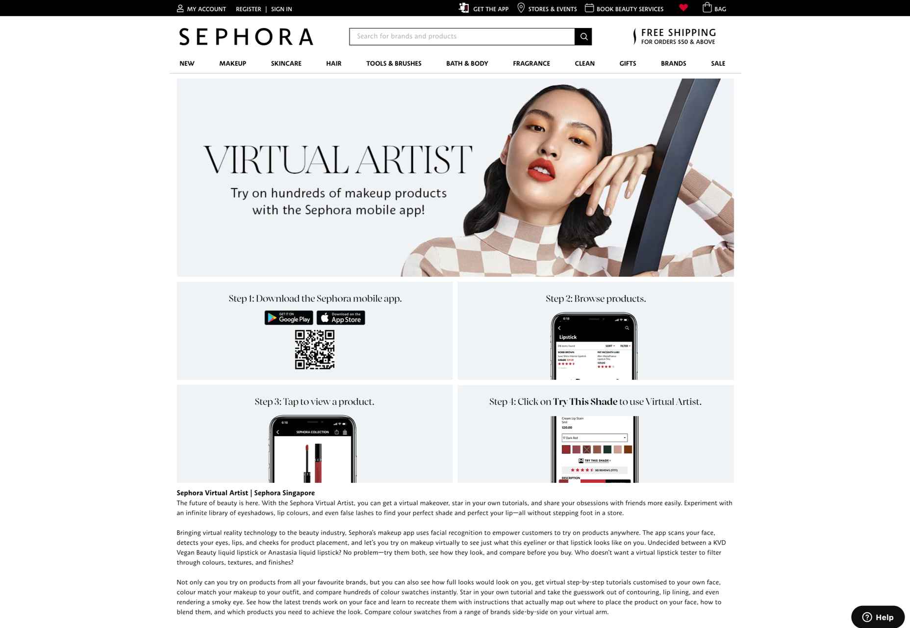
As AR applications become more mainstream, new solutions are emerging for companies concerned about things like privacy. Consumers who don’t want to load their image into a system for try-before-you-buy experiences can still access the benefits of AR with the right tools.

For instance, ASOS created the new “See My Fit” service in 2020 to help customers shop for clothing during the pandemic. The solution allows users to see what clothing will look like on a model with a similar body type to their own. This helps to show shoppers how products realistically look in similar bodies while reducing the risk of returns.

ASOS certainly saw the benefit of this innovation, with an increase in revenues of around 24% in the six months leading to the end of February 2021.

AR for Product Catalogs and Visualization

We all remember what it was like to flick through the glossy pages of a magazine or catalog for our favorite stores. Unfortunately, in today’s digital age, these paper brochures are far from the most efficient tool for shopping. We need a more digital experience that allows us to select products, see what they will look like, and add them to our virtual baskets.

One excellent example of how companies can use AR to improve the overall shopping and visualization experience for customers comes from Home Depot. The brand was one of the first to upgrade its user experience strategy with a new Project Color application in 2015. Although this app might seem a little outdated by today’s standards, it’s still an excellent insight into what companies can do to improve their customer’s brand experience.
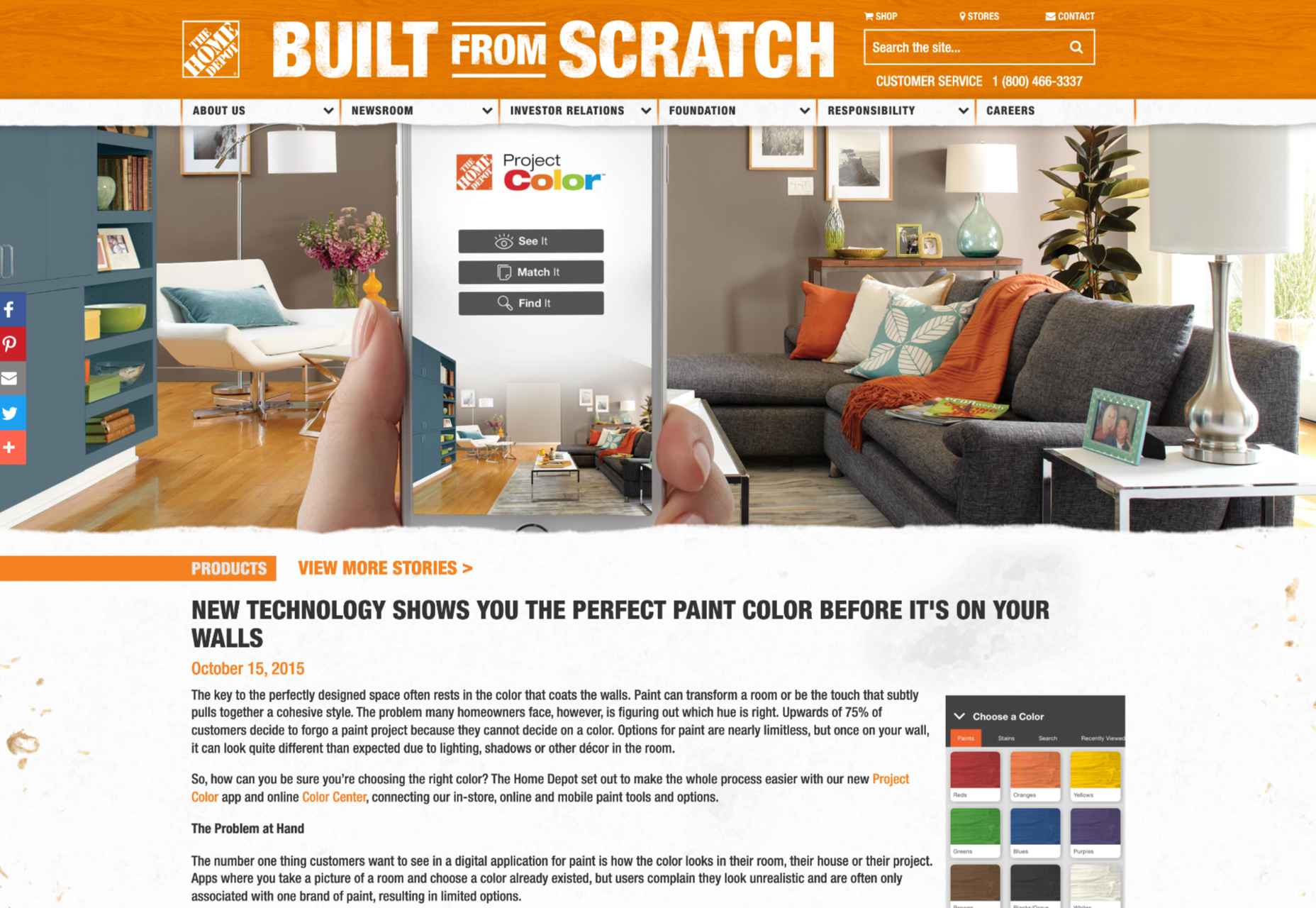
The Home Depot app used AR to scan a room and implement the color a customer chose for their walls into that space, considering things like furniture, shadow, and lighting, to allow for a more realistic insight. The app has updated significantly over the years to become increasingly immersive.

Visualizing products in a real, contextual space is hugely beneficial for a customer’s purchasing experience and perception of a specific brand. If your customer sees buying the right product from you as simple and convenient, they’re more likely to stick with your organization long-term.

The product catalog and visualization approach to AR in brand development has grown increasingly popular in the last two years, perhaps driven by the demand for more online shopping opportunities. In 2020, Wayfair announced the release of an updated version of its “View in Room” app, which now uses LiDAR technology to provide enhanced utility when shopping for home products.

According to Wayfair, the LiDAR technology and “RealityKit” software give customers a more authentic and realistic view, so they can make better decisions about what they want to buy. According to Apple, customers are 11 times more likely to buy an item of furniture if they have seen how it looks in their home using AR.

Creating Unique Brand Experiences

AR is one of the technology innovations in our current landscape, helping blur the lines between digital worlds and reality. In a future defined by the rise of the metaverse, AR could have a significant impact on how we spend our time in a more virtual world.

Already, companies are taking advantage of this, with things like virtual pop-up shops and temporary experiences intended to differentiate their brands. For instance, Machine-A, a London-based concept store, is usually committed to showcasing contemporary fashion designs.

When it became apparent that London fashion week for 2020 would be virtual, Machine-A came up with a virtual boutique enabled by AR. By scanning a QR code embedded into billboards and posters across London, users could enter the boutique virtually from their phones and experience the designs themselves.

The concept created by Machine-A has opened the minds of countless business brand teams and marketers to new methods of increasing engagement and awareness among customers. In a world where you can’t necessarily interact with your top customers in person, providing them with a new and immersive experience can be a great way to generate loyalty.

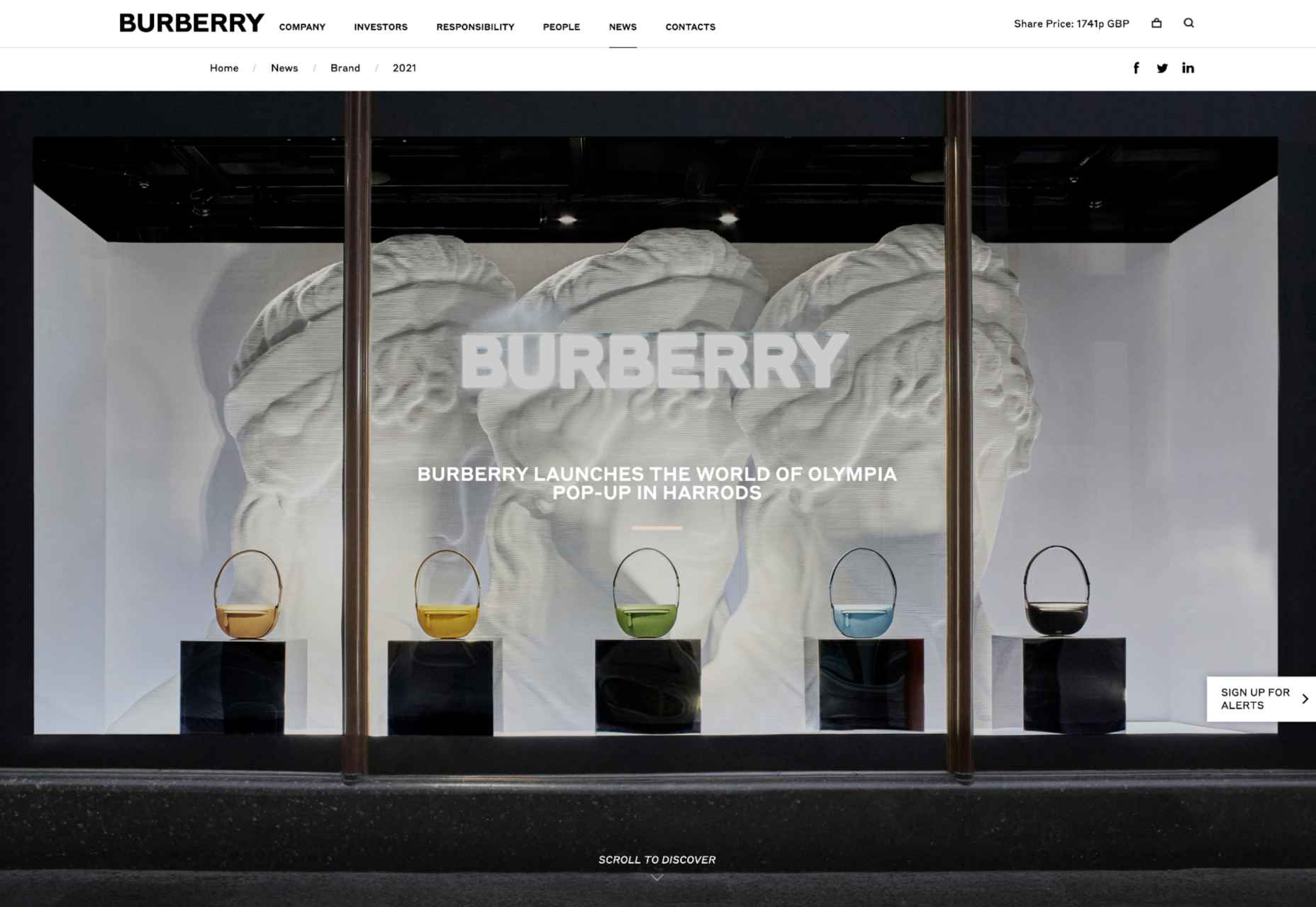
The companies more willing to invest in innovative solutions like AR are also more likely to stand out as innovators in their field. Other companies have experimented with similar “pop-up” experiences and unique ways to capture audience attention. For example, Burberry placed a QR code in a Harrods store, which customers could scan to visit a branded experience, where an Elphis statue walked around in their surroundings through the lens of their smartphone camera.
It’s even possible to use AR experiences to attract the attention of new audience groups. For instance, the retail brand, Pull & Bear launched an AR game created with Facebook to help the company reach the 90% of Gen Z customers who identify as “gamers.”

Provide New Levels of Customer Support

As many of today’s businesses know, memorable branding isn’t just about having the right image or website; it’s also about providing the correct level of customer service and support. Most purchasing and brand loyalty decisions made today are based on customer experience.

Providing customers with unique experiences to improve their shopping journey is sure to make your company stand out in the new digital age. But it’s also possible to go even further with AR in your brand CX strategy too.

Amazon Salon, for instance, the first bricks-and-mortar hair salon created by Amazon, was partially established to test new technology. The “point and learn” service, for example, allowed customers to point a product they were interested in on a display or shelf and immediately access educational content. Users could also scan QR codes to visit the product page on the QR site.
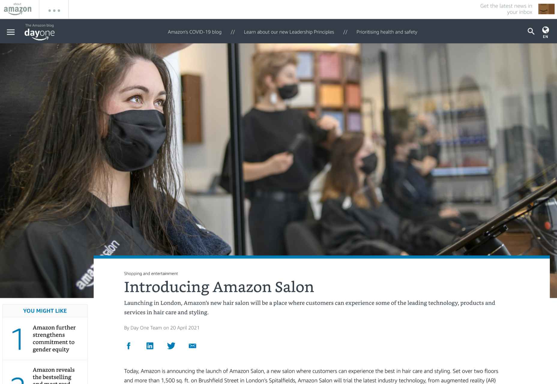
This helps customers immediately get to the product they want to buy without relying on input from human services agents. In a similar vein, AR could be an excellent way to onboard a customer, learning how to use a new product for the first time.

Imagine having a user’s manual your customer can enjoy scanning through, thanks to AR technology. All your customer needs to do is scan the QR code on the back of a product, and they can see the item they need to build or install coming to life in front of them. This reduces the risk of customers having to call for help from tech support and means clients can see the value in their purchases a lot faster.

Companies can embrace AR as a virtual learning experience, helping users collect information and learn how to do things through an immersive first-hand experience. This kind of immersive technology could help to make any brand stand out as more user-experience-focused. Even car companies could essentially provide their customers with a complete virtual HUD showing them how each button and dial on their dashboard works.

Upgrade Website Design

Perhaps the most common way companies will be using AR to create branded experiences today is by updating their website. You’ve probably already seen examples of AR being used in a host of retail sites, with new experiences designed specifically for the age of augmented reality.

360-degree images, for instance, allow customers to essentially “look around” a product, and see it from different angles, just like they would if they were looking at the item in-store. We can see an excellent example of this on the BMW build-your-own web page, where vehicle browsers can see their vehicles from every angle.

The 360-degree product viewing experience lets you check everything from the side molding to the sculpted edges in perfect detail.  
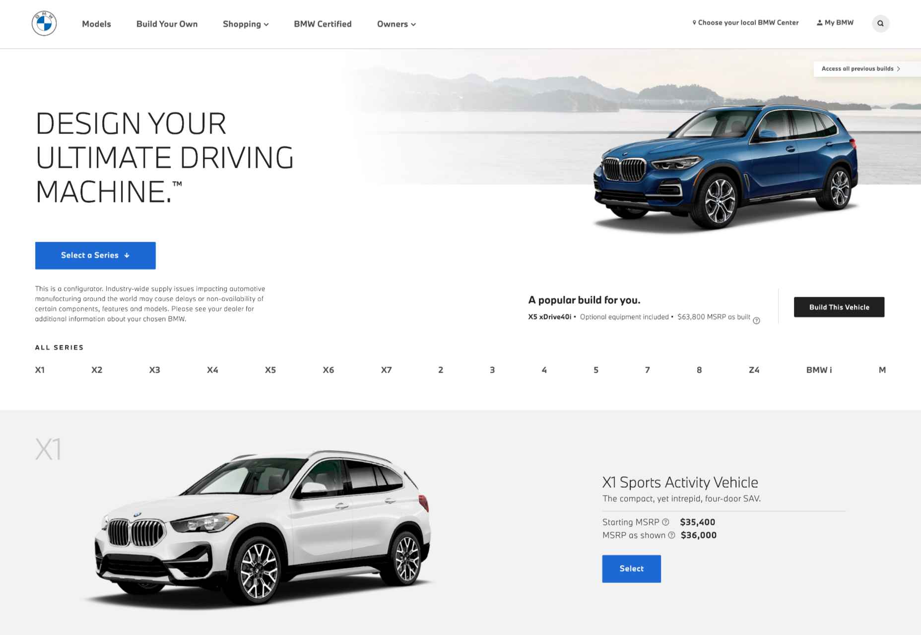
QR codes and app downloads can also allow customers to take their AR experience even further, looking at things like what life would be like behind the wheel of one of these virtually augmented vehicles.

As AR becomes more commonplace and the tools available for designers in this arena continue to expand, there will be even more opportunities available to bring AR into the website experience. Even essential website upgrades today might include allowing customers to upload pictures of themselves or their homes, then using augmented reality technology to implement parts of a product catalog into the space.

AR Virtual Events

Finally, when it comes to exploring all the unique ways you can build a better brand experience and excellent customer relationships with AR, it’s worth looking at the event space. The event landscape has struggled significantly over the last couple of years. The pandemic forced most live events to be canceled, and although the post-pandemic era holds new hope for upcoming in-person experiences, the landscape will be very different.

Going forward, most companies plan to avoid a complete shift back to in-person events by creating “hybrid” experiences and augmented reality events instead. Augmented and virtual reality tools allow customers to step into an event arena from wherever they are.

For instance, the Pot Noodle Unilever brand hosted a virtual alternative careers fair in AR, where people could use their phones to navigate through a range of graduate employer booths. The unique career fair experience was designed to replace the more common in-person interactions graduates might have as they approached the end of their education.
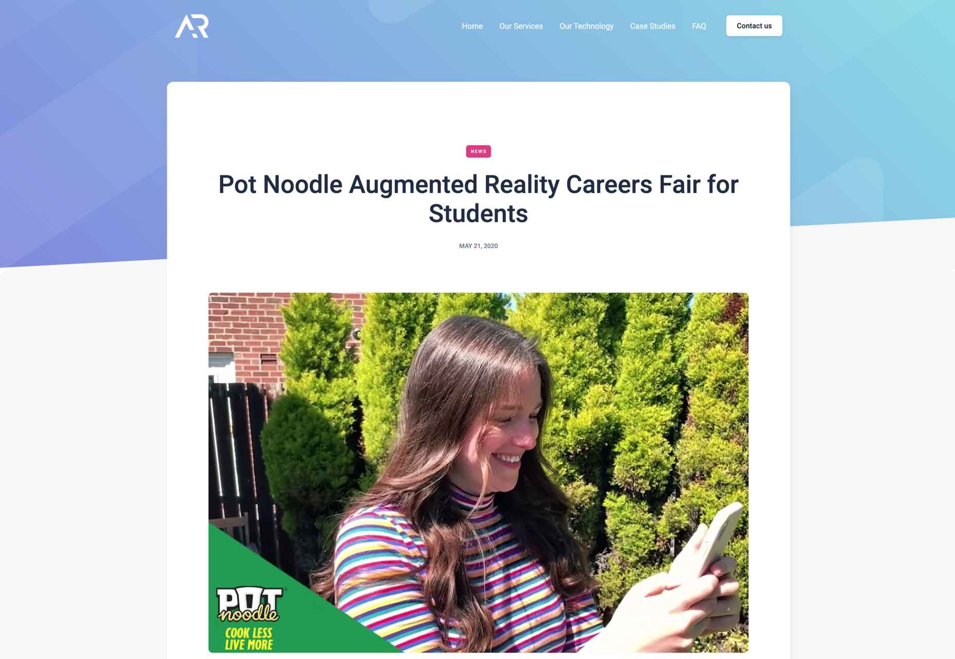
The custom-developed 3D booths featured a range of different employers, and students could tap on the booth screen they were interested in to see a video from each employer. As an added bonus, the connection to the Pot Noodle AR careers fair website meant that students could also instantly apply for any of the jobs they were interested in.

Similar events could help brands recreate some of the meaningful experiential experiences that their customers have been missing out on in the last couple of years. They could also act as a valuable tool for bringing together people in a hybrid event, where someone visiting an in-person demo table could scan a QR code to send virtual demonstrations of a product back to their team.

This would reduce the number of people who needed to be present in an event environment at any given time, reducing the risk of health issues.

Bringing Brands to Life with AR

In the new consumer landscape, brand relationships are more important than ever. As a result, customers are making more careful choices about who they purchase from, based on their understanding of that company’s values and differentiators.

Now that you won’t always have an opportunity to interact with customers in-person to earn their trust, AR could be the solution for a lot of companies in search of new engagement tools. All you need to do is figure out how you’ll leverage all the benefits AR can offer.

Will you be creating an app, building a new website with enhanced 360-degree photos, or designing in-person experiences? Hopefully, these examples have inspired you to start exploring your options.


Featured image via Unsplash.

Source

The post How to Use AR in Brand Experiences first appeared on Webdesigner Depot.

Source de l’article sur Webdesignerdepot
Google Fonts may be the single most significant contribution Google has made to the evolution of the web — yes, more significant than search, advertising, or analytics.

Google Fonts gives every business access to a visual voice with which to distinguish itself. Fonts can be downloaded for use in design software and then embedded using best practices for a consistent experience on the web.

If there’s anything wrong with Google Fonts, it’s that its default listings are based on “Trending,” a self-fulfilling criterion that keeps Noto Sans high up the list, destined to be over-used.

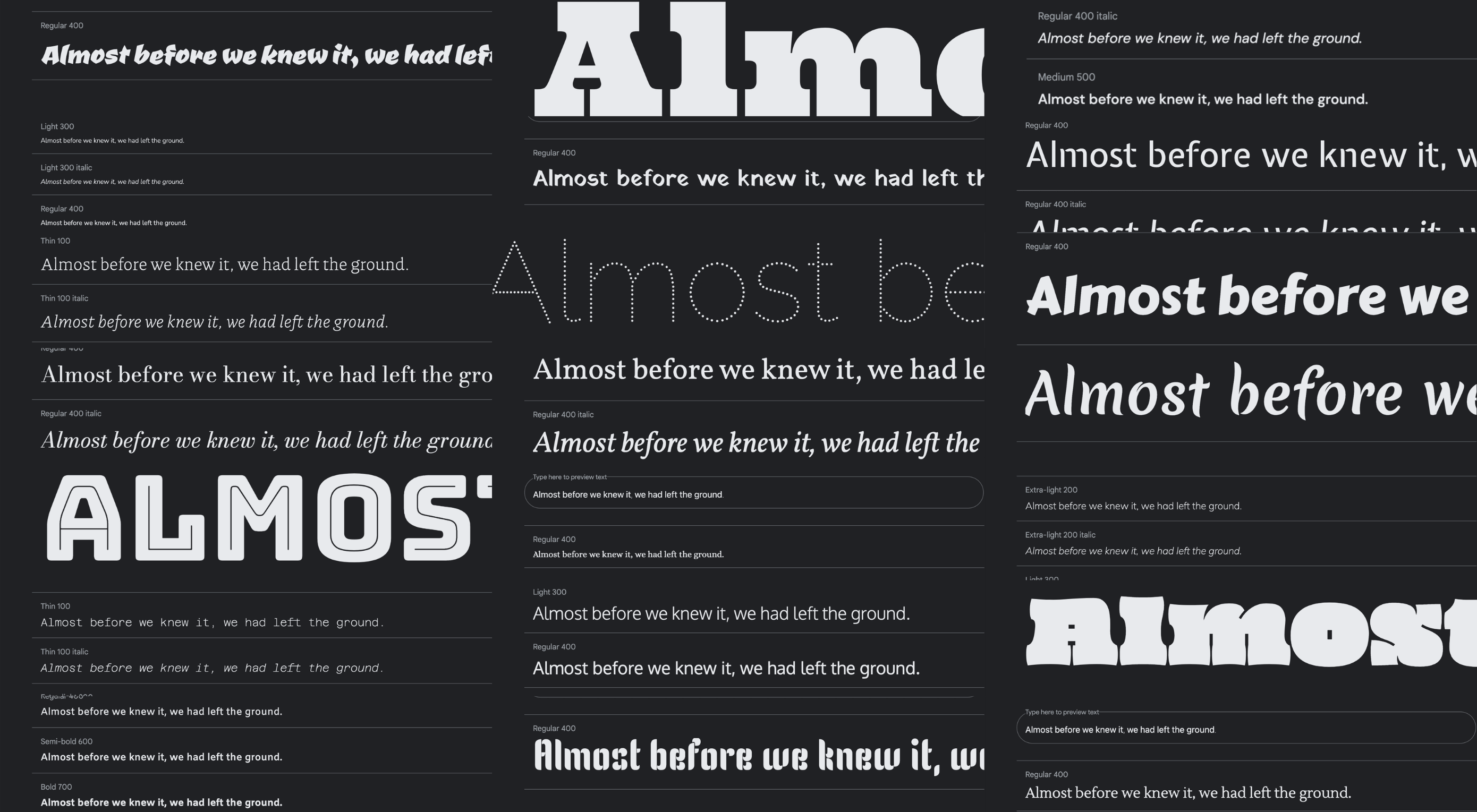
But if you spend a little time lower down the listings, you’ll find some exceptional typefaces that are hardly used. Yes, some of them are highly stylized, but there are also usable sans, serifs, and display fonts worthy of your consideration.

All you have to do is scroll; here’s a selection of some of the treasures you’ll find if you do…

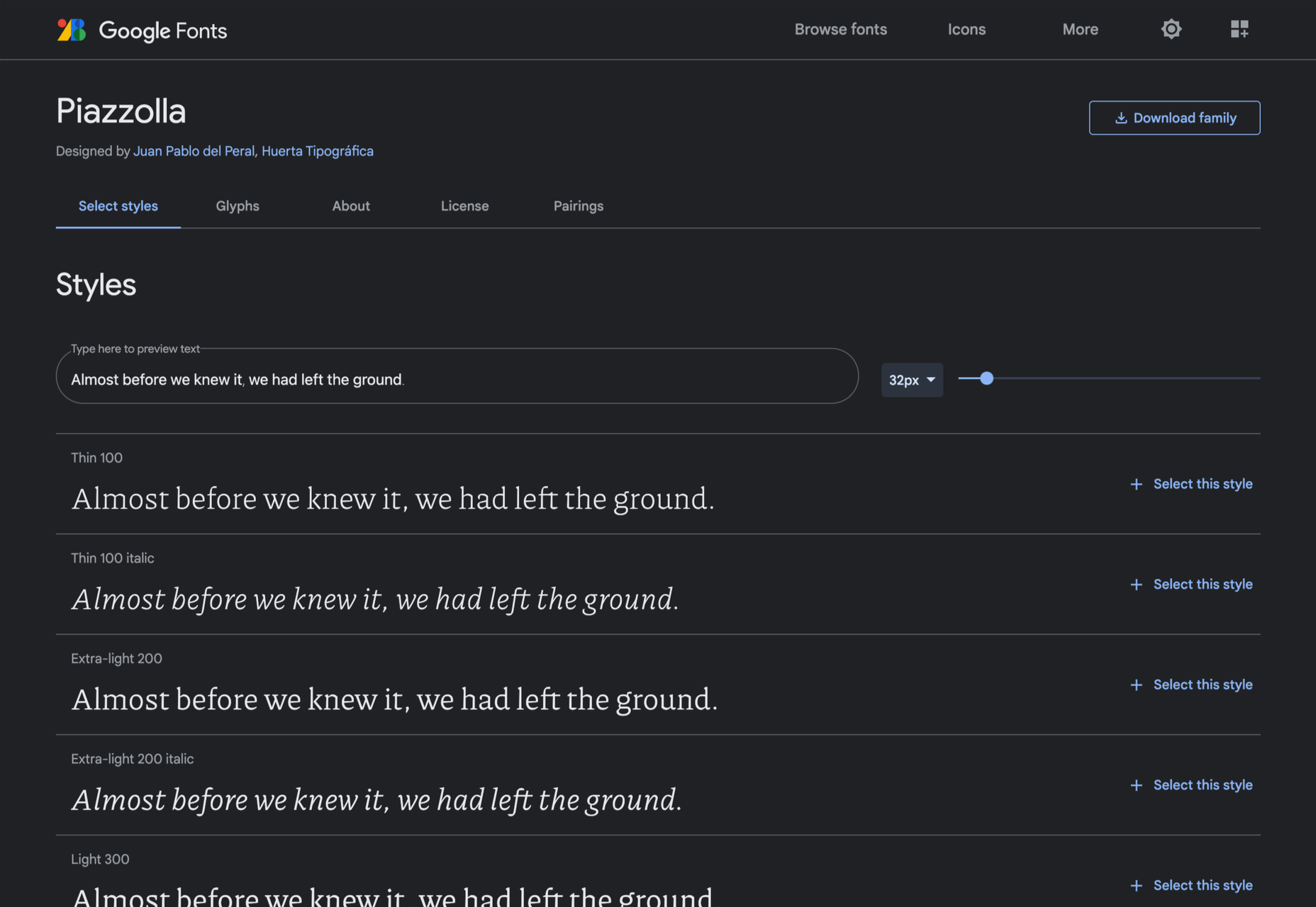
Piazzolla

Piazzolla features dramatic and expressive angular shapes when previewed in large sizes, but its real strength is in setting large amounts of body text.

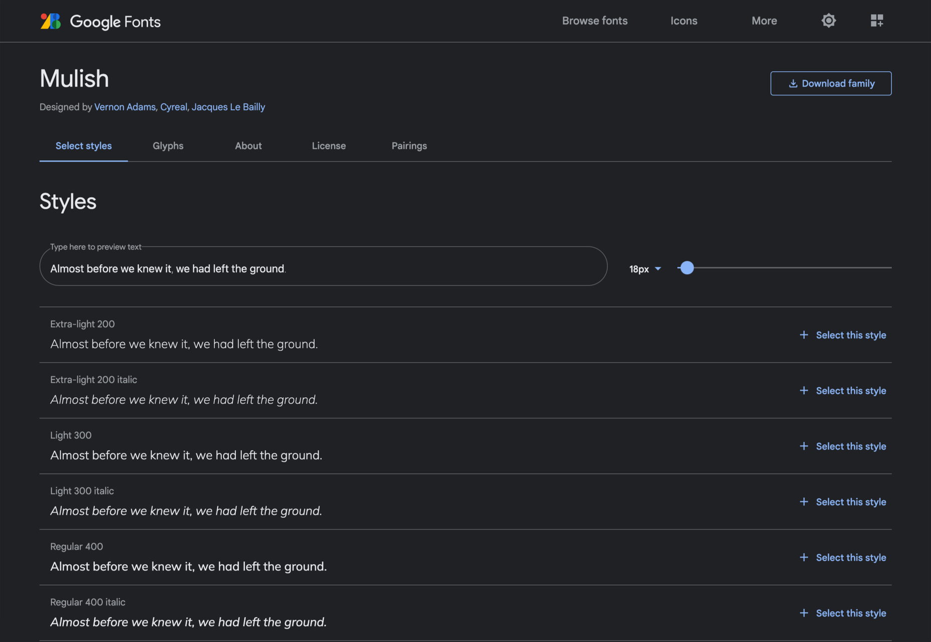
Mulish

If you’re looking for a solid workhorse sans, look no further than Mulish. Halfway between a humanist and geometric sans, there’s even a variable font version.

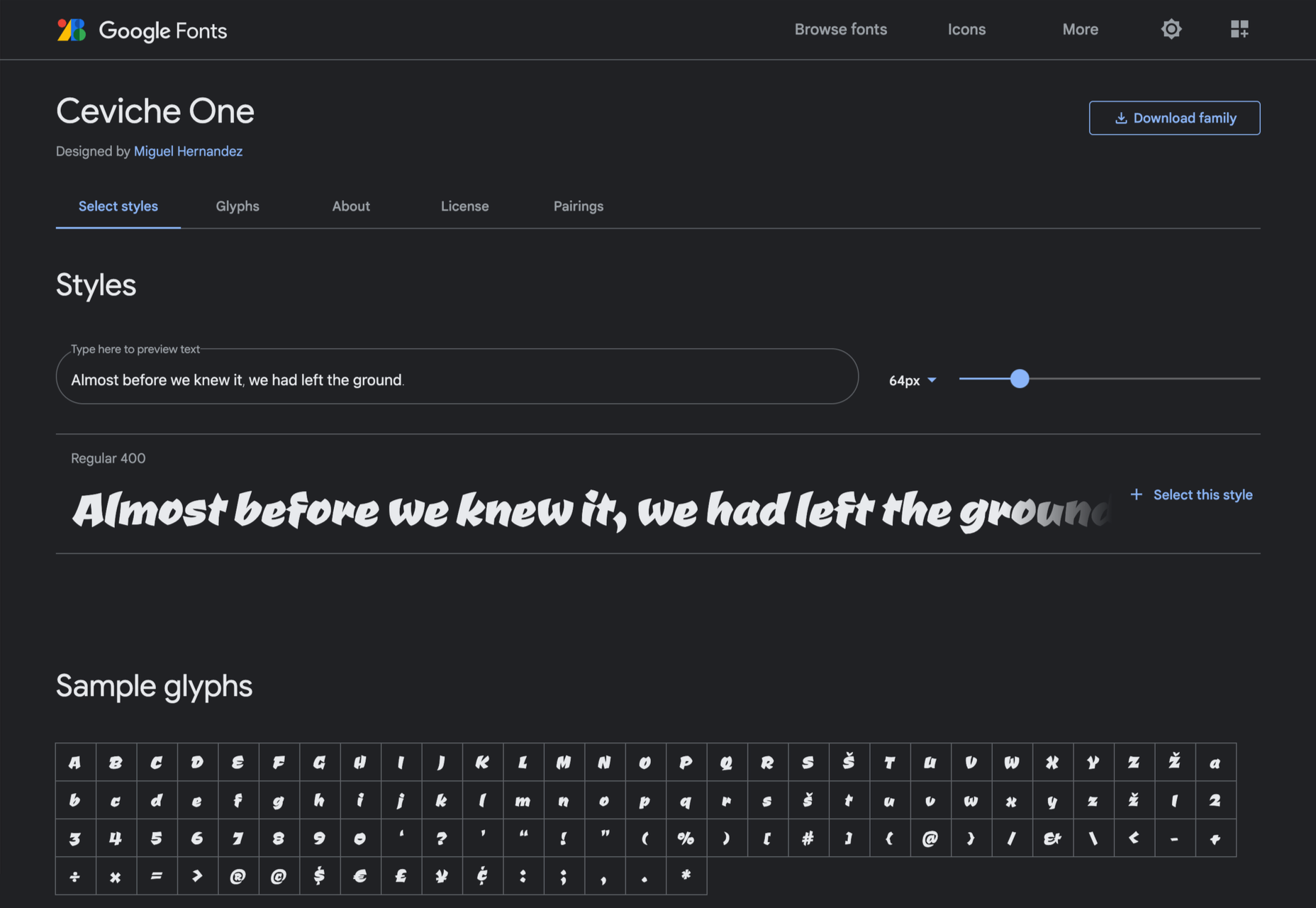
Ceviche One

Reminiscent of the cool lettering of 60s advertising, Ceviche One is packed with energy, thanks to the dramatic zig-zag formed along its baseline.

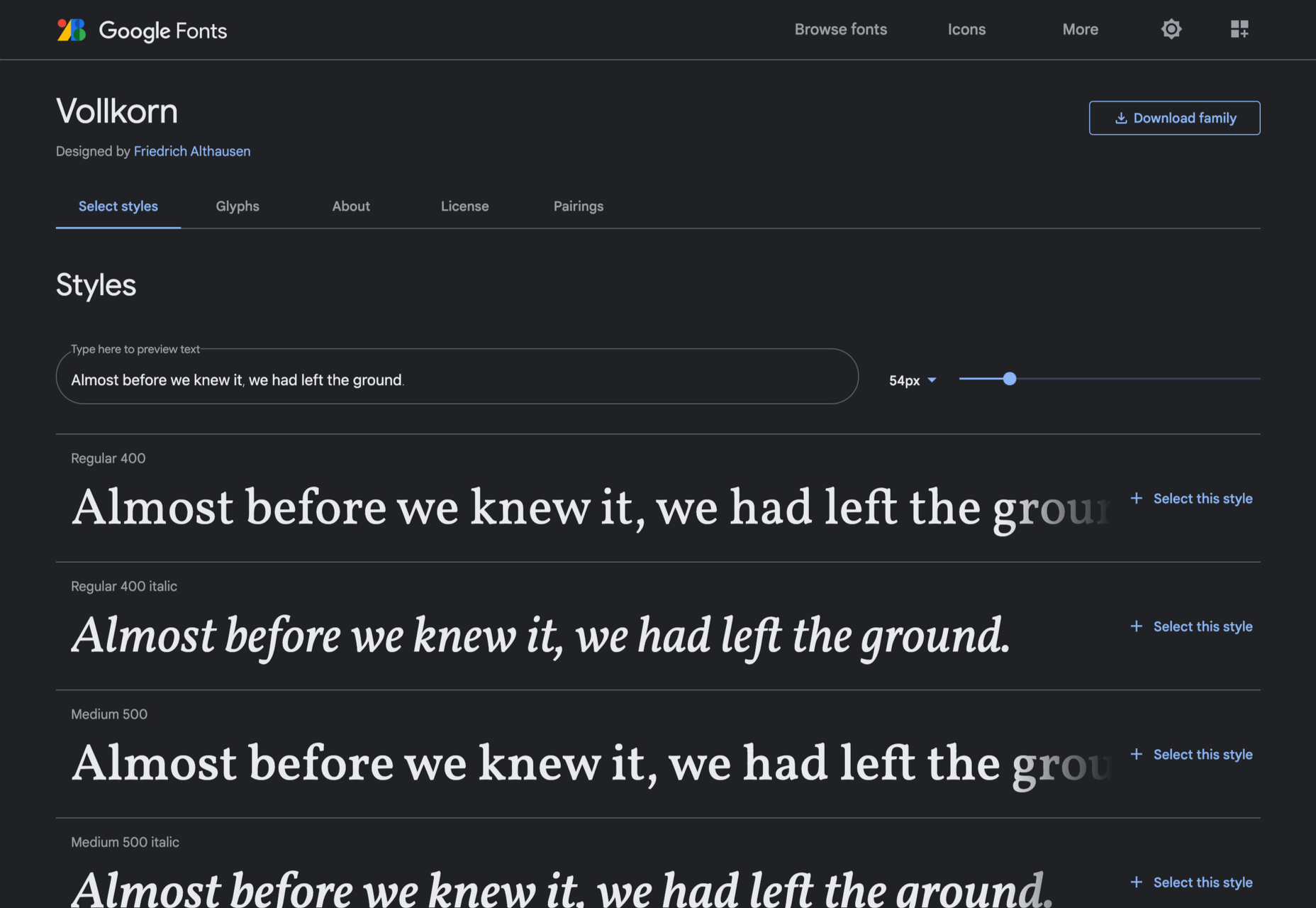
Vollkorn

Released by Friedrich Althausen in 2005, Vollkorn is an excellent typeface for body copy, excelling at small sizes. It now boasts a variable font option.

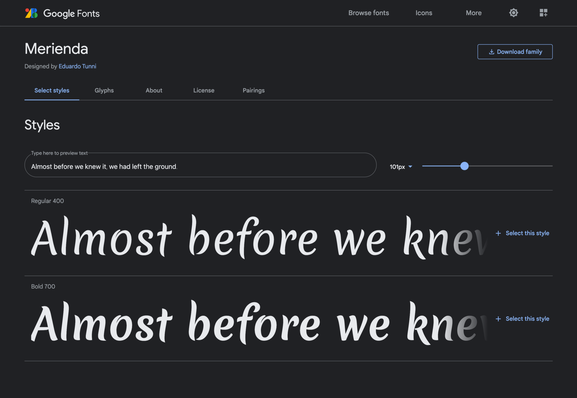
Merienda

Merienda is a delightfully energetic display script. The bold weight feels more confident, but both weights have a dancing rhythm that brings the page alive.

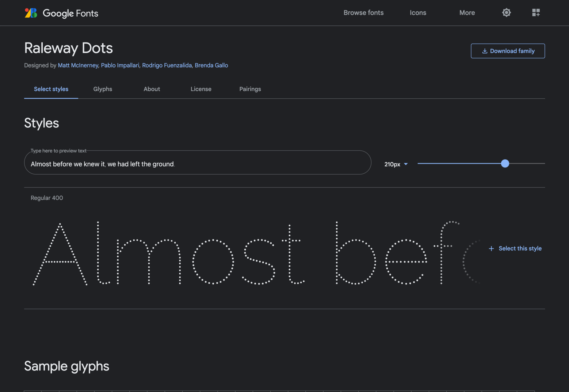
Raleway Dots

Raleway is a hugely popular — and perhaps overused font — but this dotted version is less known. It’s a simple geometric sans that functions as a display face.

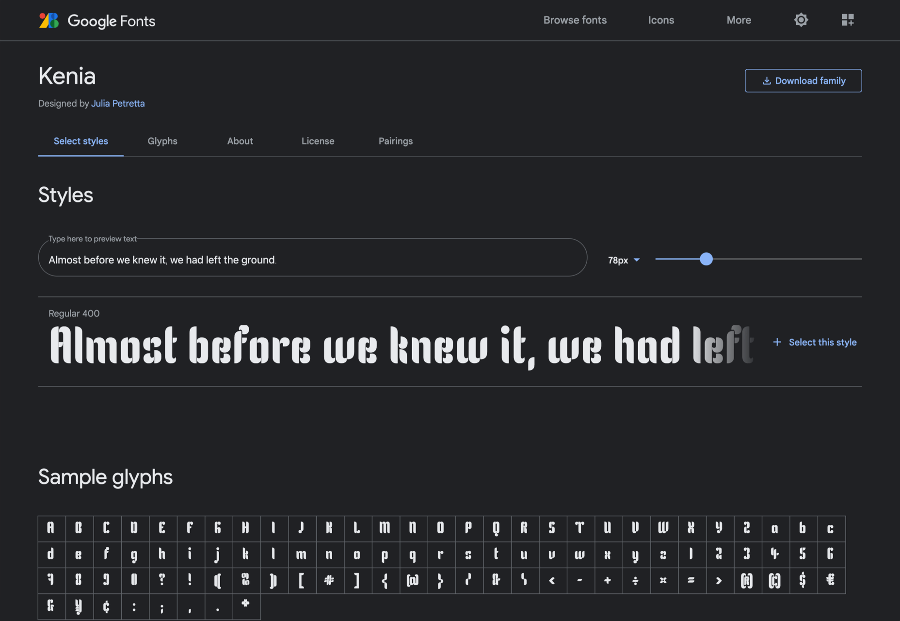
Kenia

Kenia is a wonderful, uncategorizable typeface. The stencil forms result in entirely original letter constructions, and the lowercase s is magnificent.

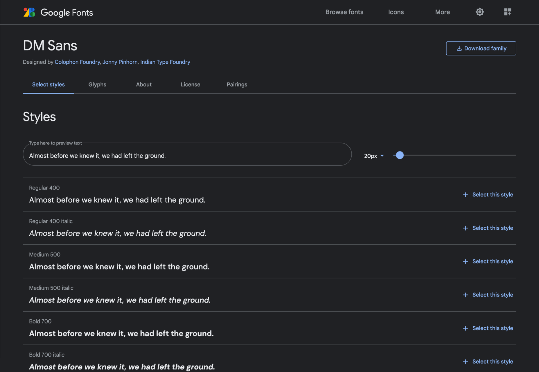
DM Sans

DM Sans is a low-contrast geometric sans-serif that performs wonderfully well at smaller sizes. It only has three weights, but each comes with a matching italic.

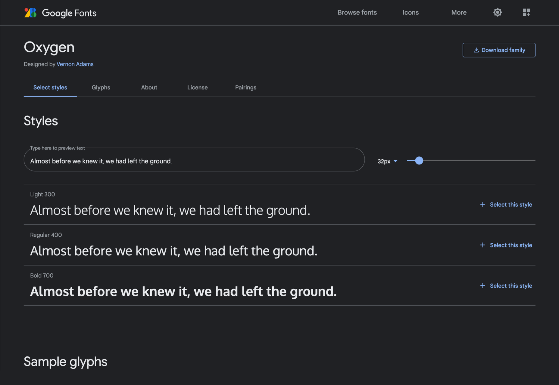
Oxygen

Designed by Vernon Adams as part of the KDE project for GNU+Linux, Oxygen is a very readable sans-serif, with a generous x-height and a hint of pen stroke.

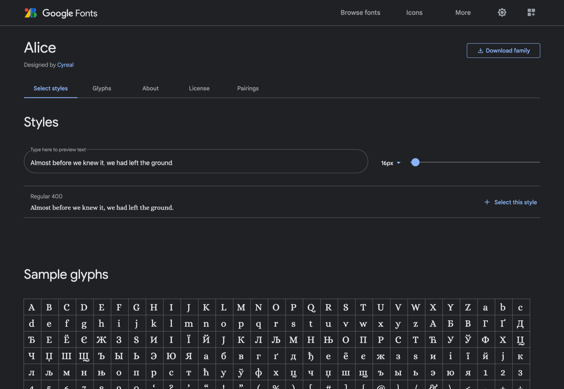
Alice

Ksenia Erulevich’s Alice was inspired by Lewis Carrol’s novel Alice’s Adventures in Wonderland. It presents itself as an Edwardian serif with fanciful flourishes.

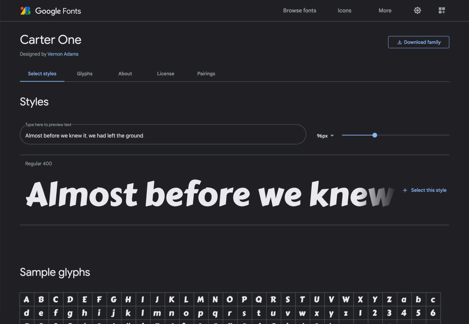
Carter One

Carter One uses bold strokes, with a medium amount of contrast, to create a sans-style script. It has dozens of beautiful details like the notch on the lowercase o.

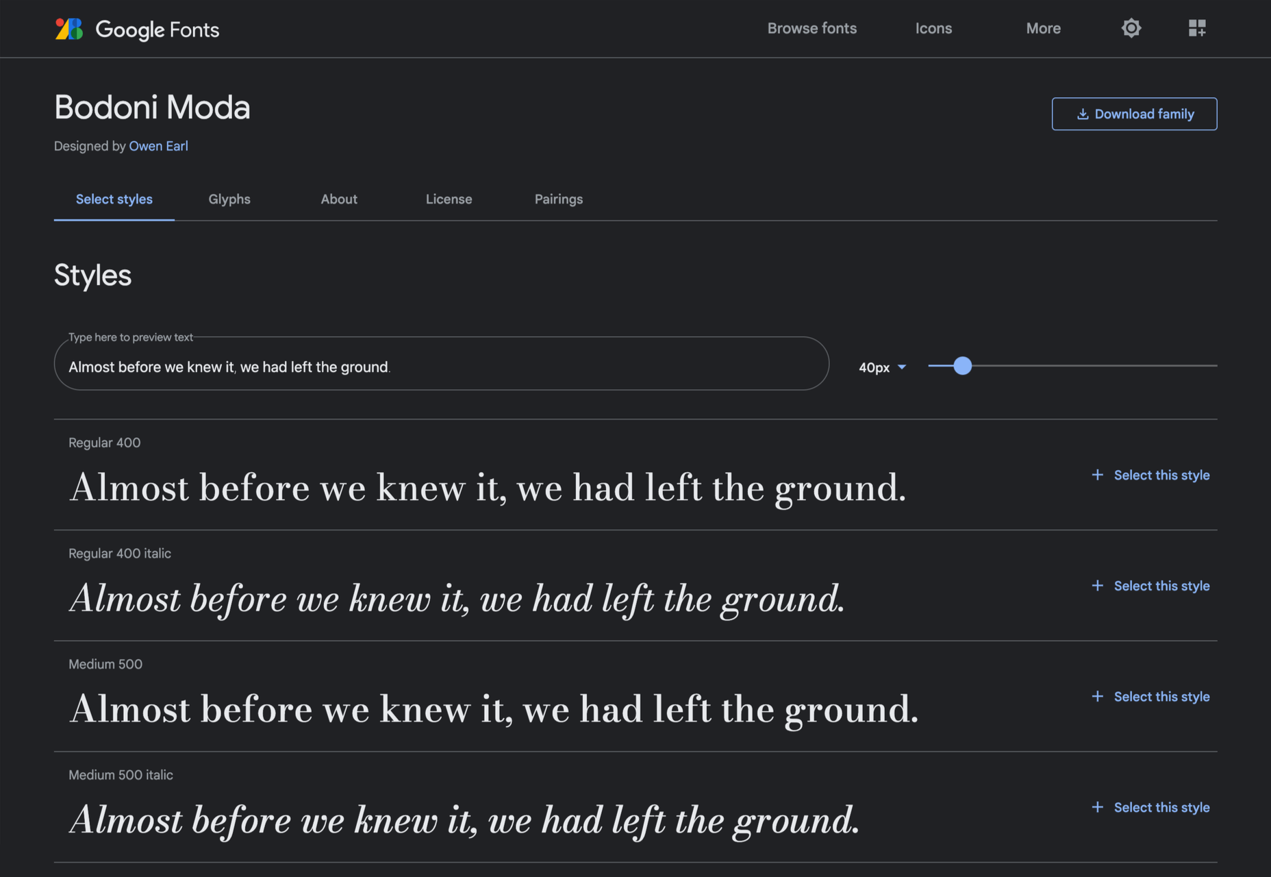
Bodoni Moda

Bodoni Moda is a didone-style serif with strong vertical strokes and high-contrast slab-like serifs. It’s the best variable font in this genre that I’ve found.

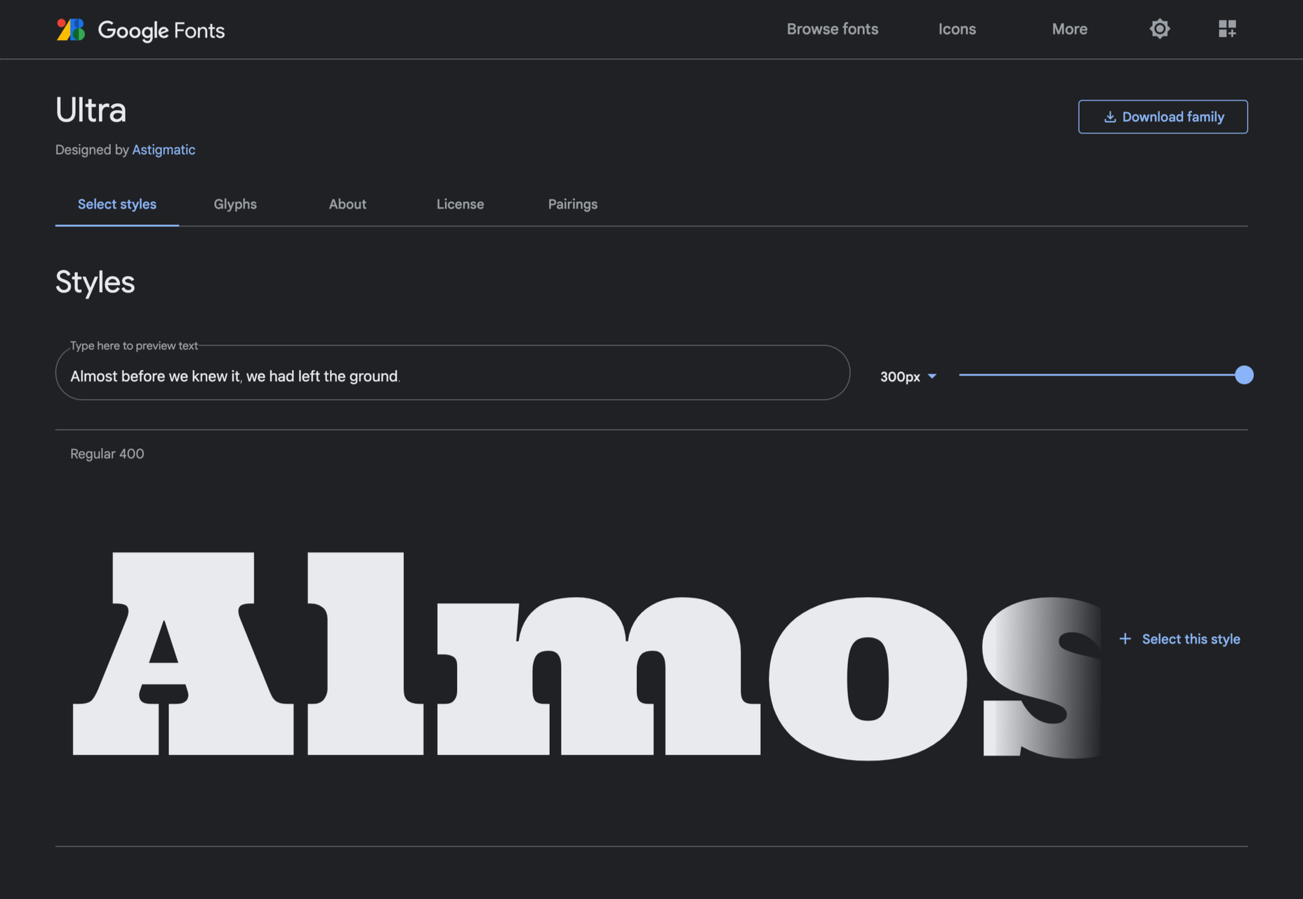
Ultra

Ultra is a slab-serif that you won’t even consider for body text. Its sculptural shapes are almost American-western. The counter on the lowercase n is charming.

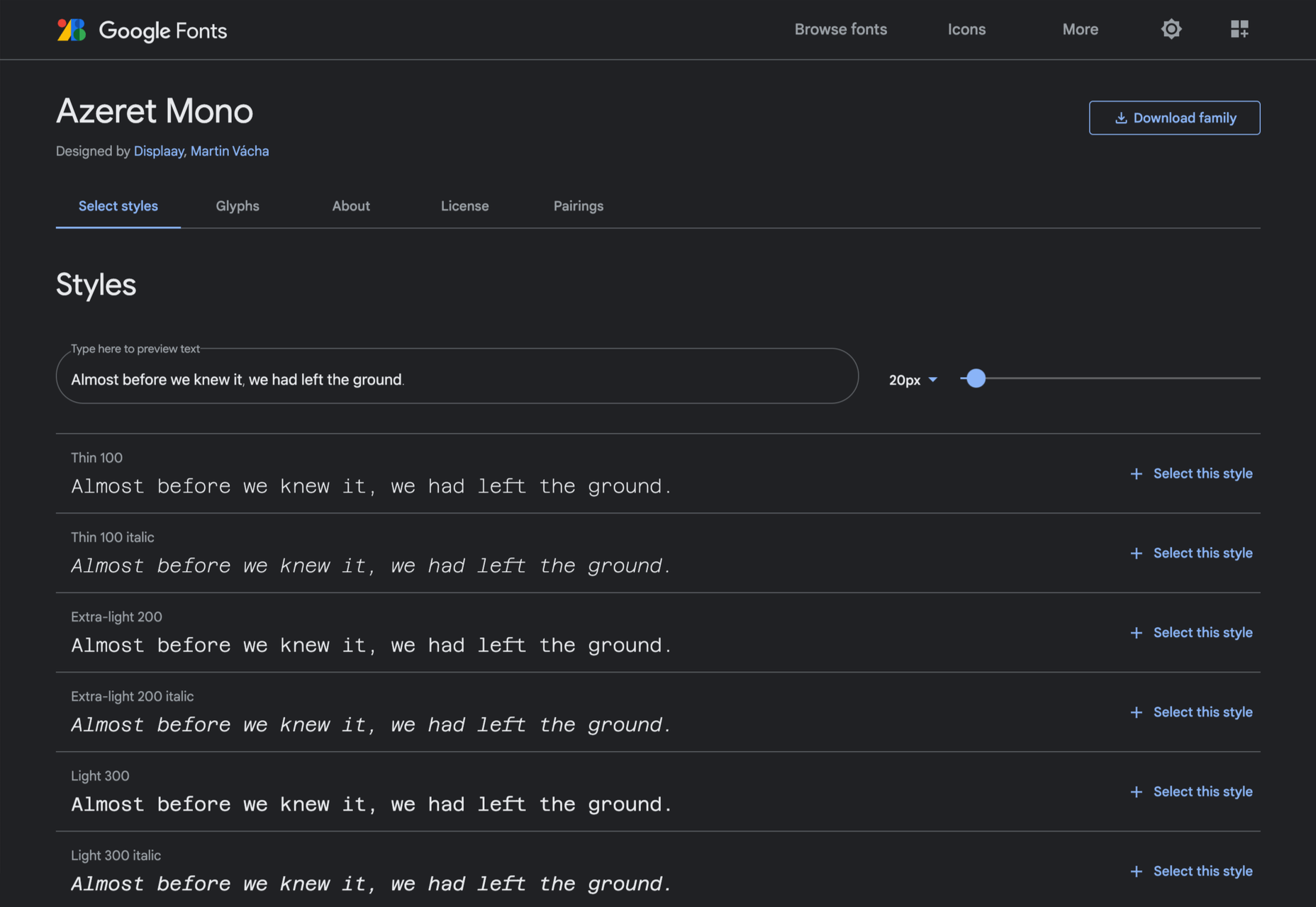
Azeret Mono

Most mono-spaced fonts fail to inspire; practical they can be, charming they are not. But Azeret Mono bucks that trend, its bold weights being particularly fantastic.

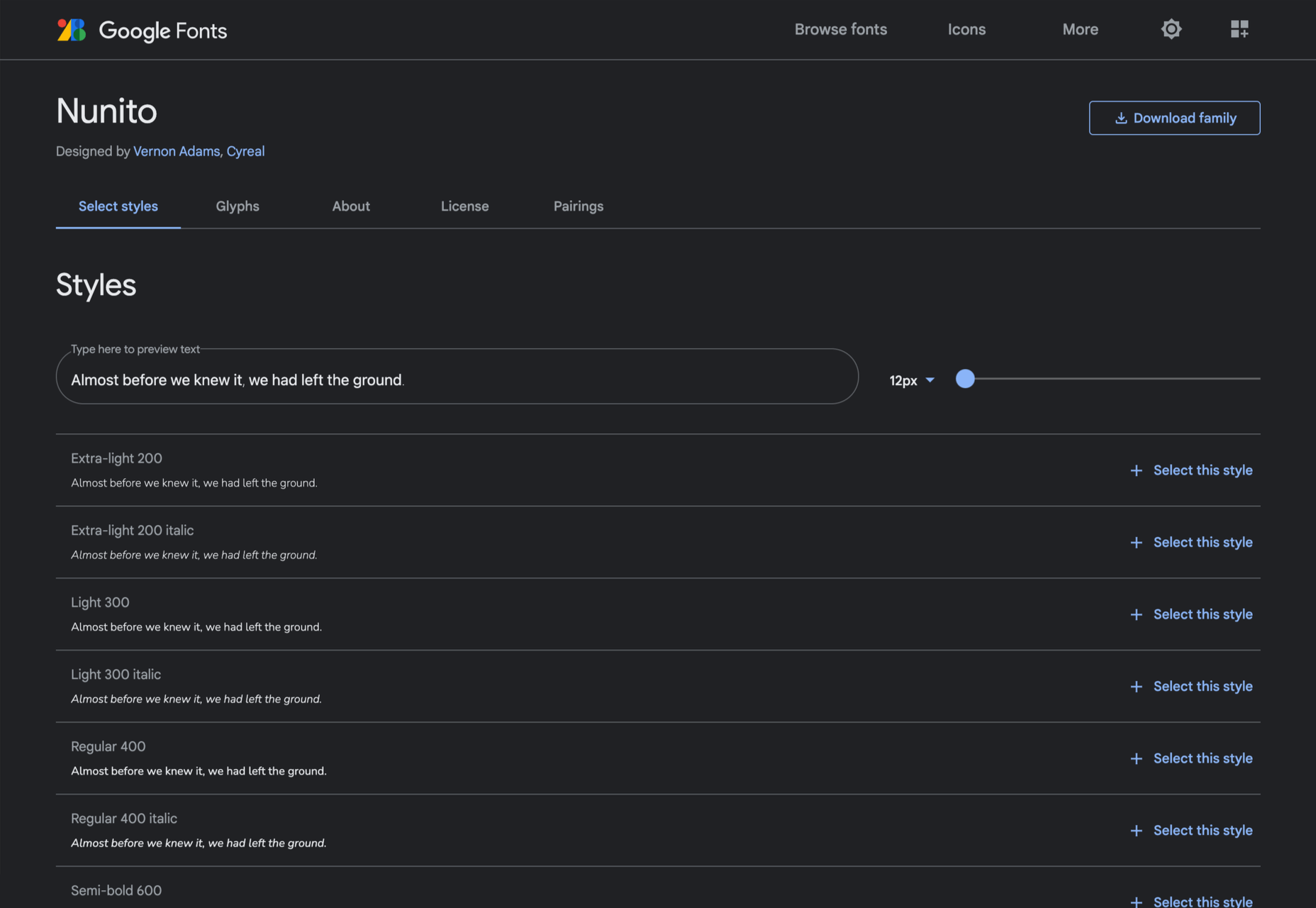
Nunito

It’s tough to find a serious sans-serif with rounded terminals, but Nunito is it. There’s also a Nunito Sans with square terminals, but I love the rounded tips.

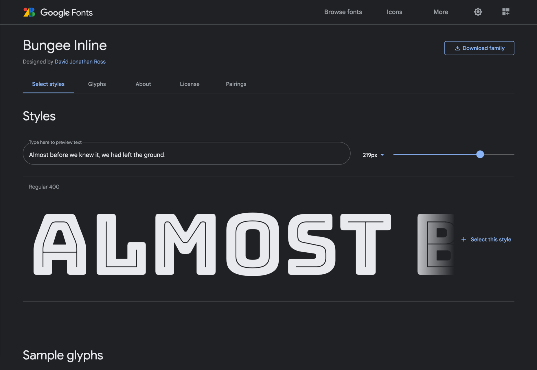
Bungee Inline

Designed for signage, Bungee is great for display sizes and works well vertically. There are several versions, but my favorite is this classy inline version.

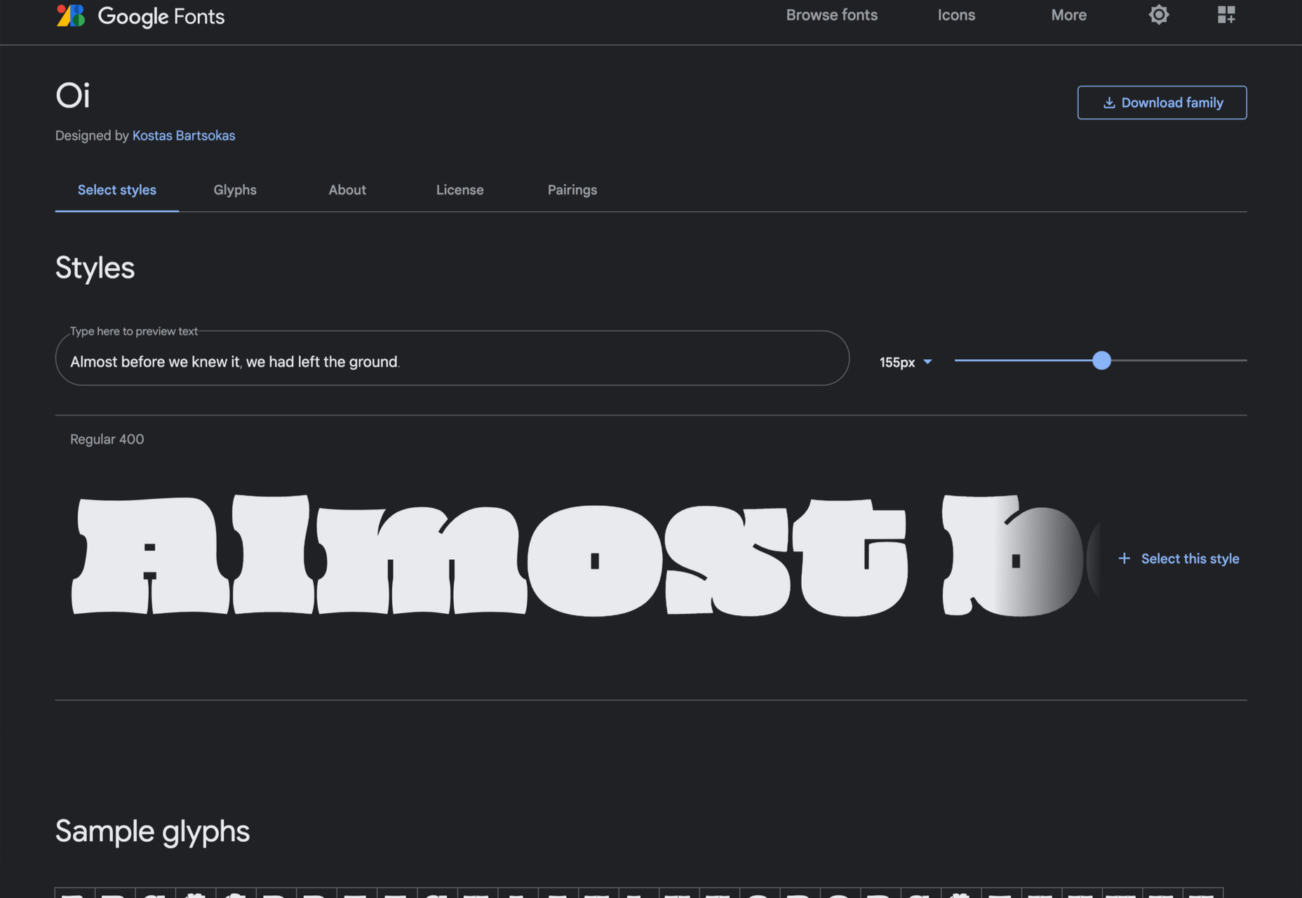
Oi

Oi is unapologetically loud. A slab-serif that swallows its own detail, the counters and ink traps give it a 3D quality, and the curves feel almost nautical.

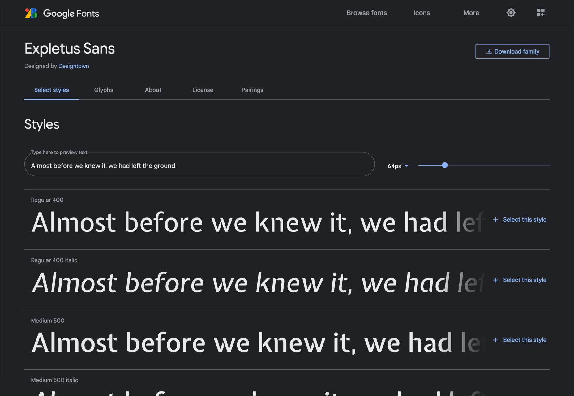
Expletus Sans

One of the significant trends in typography is the angled clip of adjoining strokes, creating the effect of shadow. This effect is brilliantly achieved in Expletus Sans.

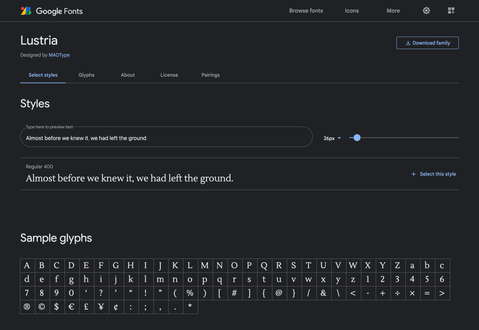
Lustria

It’s comparatively unusual to find a serif face designed to work well at display sizes. At large sizes, Lustria’s rounded terminals evoke ink spread delightfully.

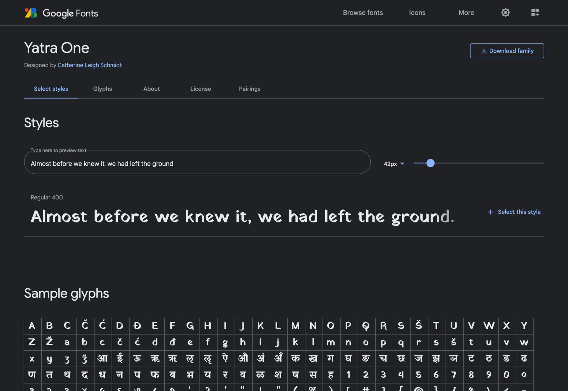
Yatra One

Yatra One is a Devanagari and Latin typeface that uses the Devanagari brush angle for its strokes, giving the Latin text an unusually slanted, stand-out character.

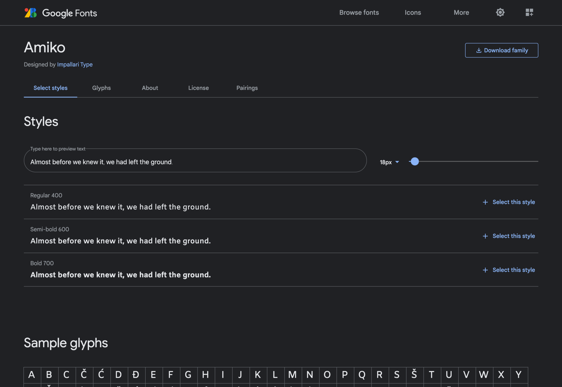
Amiko

Amiko is a highly legible typeface and excellent at tiny font sizes. It’s perfect as a secondary font if your main font is too fancy for elements like legal notices.

Keep Scrolling

It’s always tempting to leap at the first typeface you find that meets your needs, but if you dig a little deeper into Google Fonts, you’ll find a vast range of typefaces that offer both practicality and character.

Source

The post 21 Exceptional Google Fonts You Probably Haven’t Discovered Yet first appeared on Webdesigner Depot.


Source de l’article sur Webdesignerdepot

Landing pages are crucial for conversions. User-friendly landing pages rank higher in the search engines and generate the maximum leads.

Interestingly, user behavior changes every year, and new website design trends should be kept in mind to continue acquiring sales from your existing landing pages.

If your high-performing landing pages in 2019 have suddenly started underperforming in 2021, then it is a clear indication that your landing pages need a strategic revamp to record higher conversions.

Landing page revisions are necessary for reduced bounce rate, more visitor time on the page, and better user actions.

This article will discuss some of the top web design trends of 2021 that brands have adopted to revamp their landing page designs. You can learn from the trends and apply your own custom design intelligence to redesign your landing pages for 2022 and convert the maximum number of visitors.

Let’s begin…

Why Landing Page Design Is Crucial For Conversions

Landing pages are the first stop on your consumers’ online buying journey and the first chance to put an impression.

People on the internet are becoming less patient. It takes only about 50 milliseconds for a visitor to form an opinion about a brand and decide whether they want to stay or leave the website.

Convincing modern customers to buy products or fill up query forms on a landing page is not easy with traditional website elements.

In 2021, it is now harder to impress visitors landing on your website than in 2019. Keeping in mind the audience of 2021 and beyond, an ideal landing page should be user-friendly, engaging, innovative and should encourage users to take action.

Here are some of the top reasons why landing page design is so crucial for conversions:

  • You get barely 7 seconds to create a strong impression. It is a time span in which visitors roughly scan the page and make their decisions.
  • Publishing 40+ effective landing pages at regular intervals can generate 12X more leads.
  • The average conversion rate from the landing page across all industries is only 2.35%.
  • Using the right types of targeting and testing can boost landing page conversion rates by up to 300%.

Considering the above stats, it can be easily said that a landing page has to be impressive and quick enough to impact the visitors positively.

7 High Converting Landing Pages & Lessons You Can Learn From Each

Below are some of the best high-converting landing pages, which were just updated recently in 2021. For each page, we list a lesson you can learn to inspire your next design revision in 2021 and ahead:

Example #1 – Replace Boring Customer Info Forms With An Interactive Quiz

Landing Page: Nextiva’s Unified Communications Readiness Quiz Landing Page

Industry: Voice Over IP software

Conversion Measured By: Leads fill out a form if they are interested

Redesign focus: Improve the quantity and quality of leads

Solution: Substitute online form with an interactive quiz

In 2019 and even 2020, many businesses were practicing the trend of including a customer form on their landing pages as a call to action to initiate a quick customer action.

The customer information form was useful for businesses because it helped them generate quick leads. However, at the same time, there was no real reason pushing the customer to fill in the lead forms especially if it consisted of more than 2-3 fields.

Nextiva used its creativity to replace boring lead forms with interactive quizzes. In its 2021 page design, the company added a quiz for visitors to participate in.

The aim is to have interactive pages to keep visitors engaged and persuade them to stay on the page.

Here are the comparisons of both the designs:

2019

2021

Key Takeaways:

  • The 2021 landing page now has a free Unified Communications Readiness Quiz that allows business owners to fill the form interactively. Adding a quiz with the number of pages mentioned at the top tells the user how many steps are left to complete the quiz, making their waiting time easier.
  • The background image is replaced with communication icons to simplify the message of the kind of services they offer.
  • The page looks neater and appears to be easier to scan at a glance.

Example #2 – Emphasize Strong Visuals and Copy that Stresses on Product Details

Landing Page: Western Rise Homepage Variation

Industry: Ecommerce

Conversion Measured By: Apparel purchase

Major redesign focus: Improve the number of leads

Solution: Improve the copy and visuals

Western Rise, a clothing eCommerce company, realized the importance of having impressive images and detailed product information on its landing page.

The 2021 page replaced ordinary product images with strong visuals of the models wearing Western Rise clothing. Also, the product image includes extensive product details, which were missing on the older page.

Here is a clear comparison of the 2019 vs. 2021 landing pages of Western Rise:

2019

2021

Key Takeaways:

  • The new landing page has a powerful headline – Performance Clothing for Travel, Work, and Play. In just a couple of words, the brand tells everything about itself. ‘Performance Clothing’ is their unique selling proposition (USP) that tells the customers that their product is durable. Besides, the caption ‘Travel, Work, and Play’ tells what the product is about. Modern customers like products that fulfill a particular need, and Western Rise made it easier for the users to realize the importance of their products which fulfilled their specific needs.
  • The bold visuals in the new page capture contemporary shots of the models that put a strong impression on the audience. Every image is clicked mindfully to explain the style and quality of the Western Rise clothing line.
  • The products displayed on the new page include every minor detail and feature that often other clothing brands ignore, such as the specialty of the product, occasions to wear, and weight other than colors, fabric, fitting, etc.

Example #3 – Use Strong Social Proof To Increase Conversions

Page: Aura Save 50% Landing Page

Industry: Identity Theft Software

Conversion Measured By: Online registration or an inbound call

Major redesign focus: Improve the number of signups

Solution: Add strong social proof

It is a known fact that social proof on sales pages is essential for increased conversions. But in 2021, the importance of social proof has gone too far.

Aura is an identity theft protection service that aims to build trust with its prospective customers when they first browse their landing page. Take a look at how Aura displays customer reviews above the fold to catch user’s attention.

Unlike others, Aura combined the rating stars and the review to prove customer satisfaction and emphasize their expertise in the field.

BONUS:

Another example of using strong social proof is the Exploding Topics newsletter landing page.

Exploding Topics is a newsletter with a pro subscription for content marketers and anyone interested in trending topics about any topic. It’s an excellent example that uses a lot of social proof on landing pages that give something away for free, like a weekly newsletter or an eBook.

If you could notice, the latest landing page below has multiple forms of social proof on a single page. First, they feature a list of brands that trust Exploding Topics. Secondly, they quote Wired Magazine founder Kevin Kelly’s feedback, followed by the logos and tweets praising the newsletter.

Key Takeaways:

  • Exploding Topics uses several different types of social proof that appeal to different demographics.
  • Their “trusted by” logos of world-renowned companies stand out to potential B2B subscribers.
  • Kevin Kelly’s quote is catching the attention of tech-savvy readers.
  • Despite packing the page with social proof, the opt-in form is still well above the fold. It is the best landing page practice that applies to nearly all pages.
  • The landing page uses actually embedded tweets (not screenshots), which help demonstrate that the tweets are legit.

While Exploding Topics have smartly used social proof on its page, the ideas of leveraging social proof are not limited to this only.

Example #4 – Focus On Visually Appealing Above the Fold Content

Landing Page: Perfect Keto Homepage Variation

Industry: Supplements

Conversion Measured By: Online purchase

Major redesign focus: Improve the number of purchases

Solution: Improve Above The Fold Content

Above the fold content greatly impacts customer’s decision-making. Perfect Keto lacked that appeal on its 2019 landing page design.

Hence, the 2021 design was revamped with better visuals and more professional looks.

The 2021 page received major changes in above-the-fold content, such as the top menu bar with the brand name not losing the user’s attention anymore and an additional menu bar giving a quick overview of what the brand offers.

The older page did have many social proofs, but those were limited to customers only. The 2021 design also highlighted the publications where the brand appeared, which proved exceptional in building customer trust.

Take a look at the two landing pages of Perfect Keto in 2019 and 2021:

2019

2021

Key Takeaways:

  • The 2021 landing page heading is more compelling because it clearly conveys what their product is all about. The older page was missing the actual purpose of the product.
  • An additional section on the new page to educate customers about the Keto diet and how to start it helps visitors understand the product even better.
  • The inclusion of a product image above the fold attracts user attention and makes the product trustworthy. People now know what they will be buying right at first sight of the page.
  • The new page proudly displays the products featured in the publications, such as Women’s Health, Healthline, Reader’s Digest, and Popsugar, which again helped customers trust the brand.
  • The page also features a video of the Perfect Keto founder that is brilliantly working in gaining visitor’s attention and faith.

Example #5 – Make The Call to Action More Compelling

Landing Page: Zendesk HelpDesk Softwage Landing Page

Industry: SaaS

Conversion Measured By: Online registration

Major redesign focus: Improve the number of registrations through the website

Solution: Make The CTA More Compelling

Zendesk did a clever job by replacing the sign-up form with a single button. On the older page, it was unclear to the user if the company has a trial option for free unless they move to linked pages. Such confusions often resulted in traffic bounces.

Adding the start free trial button on the 2021 page makes it easier for the users to understand that the product comes with a free trial. At the time, it helps the user take quick action.

Similarly, the ‘Get started’ button at the top was replaced with ‘Free trial’ with the same intention.

Moreover, chat support was added to guide users at any stage of the buyer journey. Live chats are vital to help visitors better understand the product and move a step ahead in the customer journey.

Take a look at below two images:

2019

2021

Key Takeaways

  • The CTA buttons have more actionable text and look more prominent.
  • The color choice for the button is in contrast with the background but matches the page theme.
  • The older page missed sales support, which is included in the new page for a better customer experience.
  • The tabs in the menu bar were reduced to four to make the page simple to use for users.

Example #6 – Use Contrast To Highlight Specific Copy On The Page

Landing Page: GetResponse Website Building Landing Page

Industry: Online Software

Conversion Measured By: Online signup

Major redesign focus: Improve the number of signups

Solution: Use contrast around important copy on the page

GetResponse focuses on attracting visitors’ attention towards the offerings from their business. Starting from above the fold section, the landing page highlights the texts that are important and need the visitors’ attention.

The infographic on the landing page is the next thing that promises to grab user attention while beautifully describing how this website builder works and is useful to the user.

Key Takeaways:

  • The text highlighted on the landing page draws the user’s attention towards what the business has to offer or unique selling points.
  • The infographics briefly explain the working of the tool in an easy-to-understand manner.
  • The Yellow color is used prominently on the landing page to attract user attention and persuades users to try the tool by listing its advantages.

Summary

Landing pages provide the first opportunity to create an impression in the minds of the consumers. A well-structured and mindfully designed page sets the right tone for your brand message and encourages users to choose your business.

However, the strategy for landing pages needs innovations from time to time for better results. The examples and tips shared above prove how landing pages in 2019 have seen significant improvement in 2021.

In the coming year, use these ideas to create landing pages that influence customer decisions and encourage them to take quick actions.

Source

The post 7 Landing Pages Comparisons To Improve Your Conversions in 2022 first appeared on Webdesigner Depot.


Source de l’article sur Webdesignerdepot

The first-ever RT-Thread IoT OS Global Tech Conference will be held from September 16–17,2021 features embedded technologies, new projects showcase, community contributors track. We welcome embedded developers from across different countries to come together to exchange ideas, showcase projects, identify solutions, discuss future strategies, and provide mutual learning opportunities on a wide variety of topics, let’s exploring embedded technologies.

Register for free here!

RT-Thread Tech Conference

About RT-Thread

RT-Thread is an embedded real-time operating system, with its rich middle-tier components and great hardware & software ecosystem delivered great support for the Internet of Things (IoT) industry. Born in 2006, till now, RT-Thread has powered 1 billion devices, applied in Wearable Devices, Smart Home Appliances, Energy, Automotive Electronics, Medical Electronics, Consumer Electronics, and many other industries.

Source de l’article sur DZONE