We’re living in a world where video content is everywhere. So if you’re not creating videos, you’re probably consuming them. It’s a massive part of our online lives.
Video is also more popular than ever before. According to statistics, 78% of people watch online video content weekly, while about 55% of internet users view videos daily. And that number is only increasing as time goes on.
That means that if you want to be successful, it’s essential that you learn how to use video editing software and create compelling visual content for your business or personal brand.
When you’re ready to start editing your videos, you’ll want to consider a platform that’s easy to use, has plenty of features, and makes it easy to share and collaborate with others.
There are many video editing programs, each with its strengths and weaknesses. Some are free, and others cost money, but they all have something to offer.
Here are some of the best video editing tools on the market today:
1. Adobe Premiere Pro
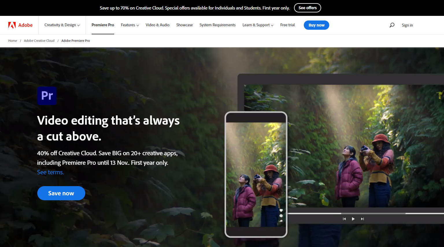
Adobe Premiere Pro is one of the most popular video editing software packages, and for a good reason. It’s an excellent tool for both beginners and professionals alike.
With Adobe Premiere Pro, you can create professional-quality videos, add motion graphics and effects, create titles, and much more. The software is easy to use, but there is a steep learning curve. If you’ve used Adobe Creative Cloud applications before, Premiere Pro will seem more familiar. That said, Creative Cloud Learning Center offers many materials for users at every level.
To start, open a project and import your video and audio files using the media browser. You can also use dynamic linking to bring in Illustrator, Photoshop, and After Effects files. Then create or edit the sequence, add titles to your video, and add transitions and effects. You can edit colors, mix audio, change speed, and export your video file.
The user interface isn’t too complex, considering it’s a video editing platform with many editing options. The UI consists of panels, a workspace, and a blue highlight. After using Photoshop and Illustrator for so long, the panels were easy to understand.
The best part? Premiere Pro’s customizable workspace!
You can arrange the panels however you want and save different setups for different projects or tasks. For example, you could have one workspace with your video and audio files open and another workspace with only your timeline open.
As you resize one panel, the other gets resized to adjust automatically—this makes it a cinch to move around the interface to find what you’re looking for.
Here’s a quick breakdown of the workspace:
- On top, you will see a menu including assembly, editing, color, effects, audio, graphics, and library.
- Assembly is where you import your files. You cannot simply drag & drop your files here.
- Editing is where you can mix your audio and video and drag & drop them into your timeline.
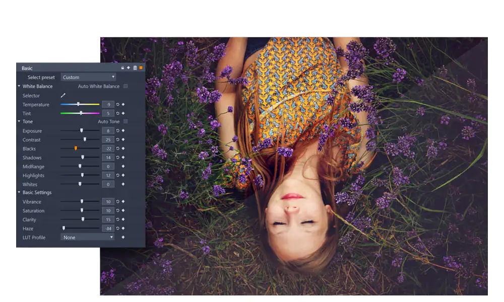
- The color area will give you outstanding control over your video colors.
- On the right side, you will see color balance details; on the left, you will see the Lumetri Scopes of your video clip.
Key Features:
- You can import single or multiple images from other Adobe applications such as Illustrator and Photoshop.
- You can add animated graphics and edit them.
- With Fram.io, you can get time-stamped feedback from the reviewers.
- It offers stunning video and audio transition effects and lighting effects.
- Version 23.0 offers the best titling toolsets, with the ability to bulk-edit your clip titles in the timeline and flexible alignment controls.
Pros:
- It offers a 7-day trial period, where you can try out all of its features to see if it is the right fit for your business.
- It has a flexible and customizable workspace.
- The site’s learning center is packed with valuable resources.
Cons:
- It takes some time to get used to it.
- It doesn’t offer a freemium version.
- The program has a lot of effects you may never use.
Pricing:
It starts at $20.99 for 100 GB of cloud storage.
2. Pinnacle Studio 26 Ultimate
Pinnacle Studio 26 Ultimate is one of Pinnacle’s more powerful video editing software. It lets you create stunning videos with accurate keyframing, high-level performance, and professional-level editing.
Pinnacle Studio’s interface looks like a mini version of Adobe Premiere Pro, but some crucial differences exist. For example, Pinnacle Studio doesn’t have as many effects or color correction tools as Premiere Pro.
The first thing I noticed when I started using the editor was its color grading controls. The toolkit lets you adjust your clip’s tone, brightness, hue, and other color levels.
You can also create animated video overlays to direct viewers’ attention to a specific part of the screen. These overlays can contain any image, logo, graphic, or text with a transition.
In addition to these features, you can also create video masks and edit YouTube videos, drone videos, 360 videos, and other types of videos.
Key Features:
- It lets you make targeted edits with motion tracking.
- You can create two types of video masks: shape masks & panel masks. You can use them to add creative effects to your video, censor a part of the video, overlay some elements of the video, and even use it to hide objects.
- Smart object tracking lets you create shape-aware masks in the video, and smart technology means you don’t have to recreate masks for each frame.
- Have you seen those popular gaming videos on YouTube? You can make them with MultiCam Capture 2.0 Lite, which allows you to record your screen and add audio overlays. This product is also suitable for making tutorial videos.
Pros:
- It offers MultiCam editing.
- Its UI is clean and easy to navigate.
- In addition, they have plenty of helpful information and learning material on their website.
Cons:
- It’s costly.
- With so many effects and detailed masking features, it can confuse some users.
Pricing:
It starts at $129.99 for the complete version.
3. Apple Final Cut Pro
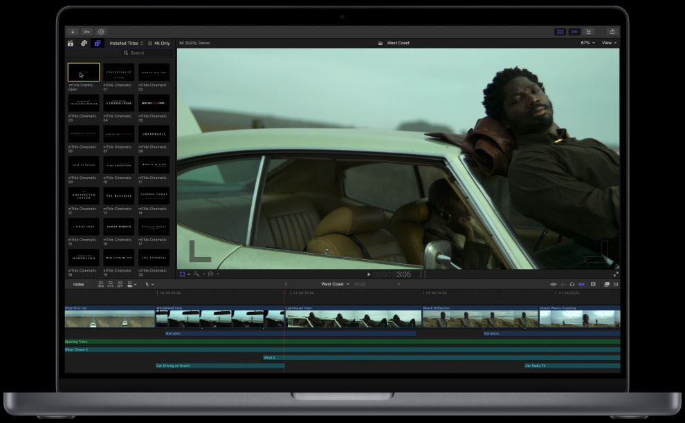
Apple Final Cut Pro is a powerful video editing tool for Mac users. It’s been around for years, but it’s still one of the most popular options for video editing. The software has many features, from basic video editing to advanced compositing.
From editing, mixing, audio, motion graphics, object tracking, and color grading to plugins, cinematic mode, and effects, it offers everything a professional video editor would want.
There are many built-in effects and transitions which you can use to enhance your videos. For example, you can add titles and text to your footage by dragging the product onto your footage or clicking on it directly from the library window. This is much faster than using hundreds of effects individually, which takes much more time than this method!
In addition, the newest version of the Final Cut Pro 10.6.2 makes it easier to track down duplicate clips in the timeline and timeline index, as they’ll be highlighted automatically. It also improves speech clarity by using machine learning to minimize or adjust background noise levels. And it’s easier to move, rotate, and resize clips.
Final Cut Pro is also optimized for Apple Silicon, Mac Studio, and Macbook Pro, which means you can work with high frame rates with high performance. Let’s take a look at some of its key features.
Key Features:
- Apple Final Cut Pro lets you move and trim your clips seamlessly. It also enables you to pack multiple video and audio clips into one bundle with its compound clips feature.
- You can add metadata tags to your clips, which will help you find them quickly. You can create custom column views and sort your clips by proxy or media types.
- The Duplicate Detection feature highlights duplicate clips in the timeline.
- With its Multicam editing feature, you can automatically sync up to 64 angles of videos with different frame sizes, frame rates, and formats.
Pros:
- UI is easy to understand and navigate.
- It offers magnetic timelines.
- It provides a free trial.
Cons:
- Available for Mac OS systems only.
- Very expensive. If you need it for a shorter period, you cannot get a monthly or yearly subscription.
Pricing:
It costs $299.99 for a one-time purchase.
4. CyberLink PowerDirector
CyberLink PowerDirector 365 is a powerful video editing program that is especially easy for beginners.
What’s appealing about it is that you don’t need to have any experience working with editing software—PowerDirector provides amazing customizable templates. The templates save plenty of time, as they are organized into proper categories such as Beauty, Business, Design, Education, and more.
Focused on making video editing easier for people without technical know-how, PowerDirector offers essential editing tools with advanced features – such as Mask Designer for creating images, text, and custom masks.
It also has a Title Designer that lets you add animated stickers, shapes, and call-outs to your video. Choose from a drag-and-drop menu for motion graphics, sound effects, and special effects. You can also add animated stickers, shapes, and call-outs to your video using its PIP Designer.
Key Features:
- It offers AI Motion Tracking, which means you can add text and graphics that will directly follow the object’s motion in your video.
- It offers automatic AI Object Detection.
- You can use its Chroma Key feature to use the green screen effect.
- It lets you correct the colors in your video in one click.
- You can also use its preset lens correction feature to remove distortion in your video and change video speed.
Pros:
- You can add multiple trackers and apply different effects to each for motion trackers.
- A free trial is available.
Cons:
- If you apply reverse, it gets applied to the entire video.
- Expensive monthly subscription.
Pricing:
It starts at $99.99.
5. Apple iMovie
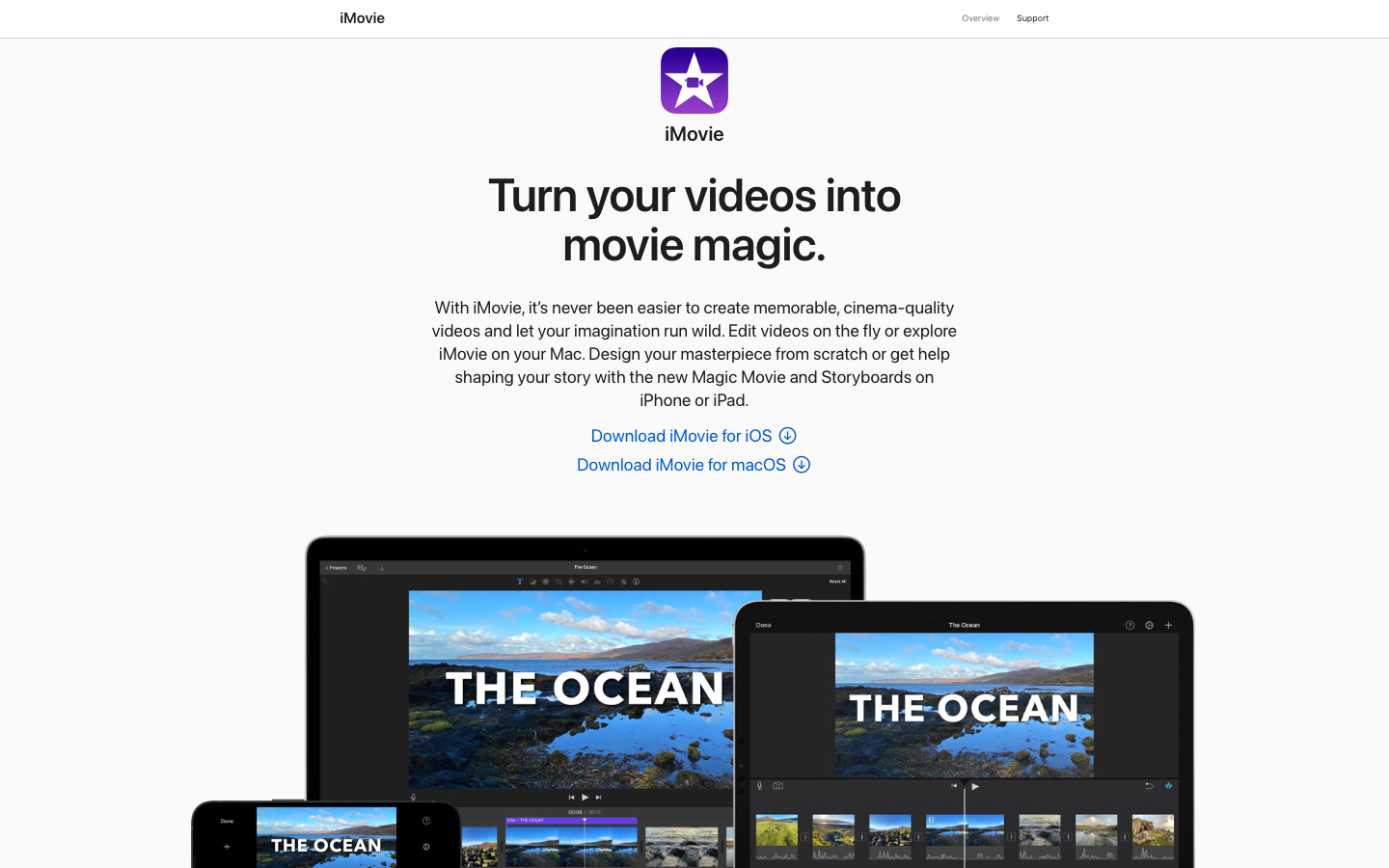
Apple iMovie is the best free video editing app that comes with all Macs and iOS devices. It’s also an excellent choice for beginners.
You can use iMovie to edit videos, add music and effects, and create slideshows. It’s also great if you need to make simple edits, such as trimming clips or adding transitions.
It allows you to create/edit your videos in 4 simple steps:
To start a trailer using iMovie, first select a theme from Apple’s pre-designed themes. Then add visual effects to your video. Next, add the music of your choice, choose one of Apple’s pre-designed templates, and your video is ready to export.
To make a movie, select a project and photos and videos to add from the library. You can record directly in iMovie before editing. Like other phone apps, you can add text, effects, and music to your video.
Next, trim and arrange your clips and images in the timeline. When you’re done with that, click the Add Media button to add a soundtrack to your project. Your track will be automatically placed in the beginning and will fit your clip length. You can also add sound effects by browsing and selecting from their built-in sound effects.
Next, add your titles and text. You can make title screens, end credits, or other text elements with this feature. In your timeline, click the clip and then click Titles in the toolbar and choose from the title styles to add your titles.
You can now add filters to your videos to give them a complete makeover. Click the Filter button and choose from the built-in filters, and then preview your video as you choose the effect.
Now, you’re ready to export your video file. To do so, click on the Share button in the project browser and then choose Email or Text Message.
Yes—it’s that simple. So simple that even a complete newbie can get started right away.
However, note that iMovie is suitable only if you want to create basic videos, such as slideshows, short clips, and home movies. If you’re looking for more advanced features like motion graphics or adding filters to your videos, then Adobe Premiere Pro or Apple Final Cut Pro might be better suited for you.
Key Features:
- The Magic Movie feature allows you to create videos with pre-styled templates and added titles, music, and transitions.
- Storyboards: You can select from 20 storyboards with different genres, such as cooking or science experiment, and more.
- Cinematic Mode: You can edit clips shooted in Cinematic Mode on iPhone 13.
- Extra Special Effects: Add special effects such as slow-motion, speed it up, and use picture-in-picture and split-screen effects.
- High-Fidelity Filters: It comes with 13 video filters to help you add a professional and cinematic look to your video.
Pros:
- It’s free! If you have an iPad, Macbook, (or iPhone), then you already have access to iMovie.
- The app lets you crop, trim, and adjust the brightness of your footage before you start editing it, making it easier to start creating a movie right away.
- Lots of different templates are available for creating different types of videos (like slideshows with music)
Cons:
- Not available for Android, Windows, or Linux systems.
- It’s a basic video editing software – with limited editing options for professional video editors.
Pricing:
It’s free for all users.
6. Adobe Premiere Elements
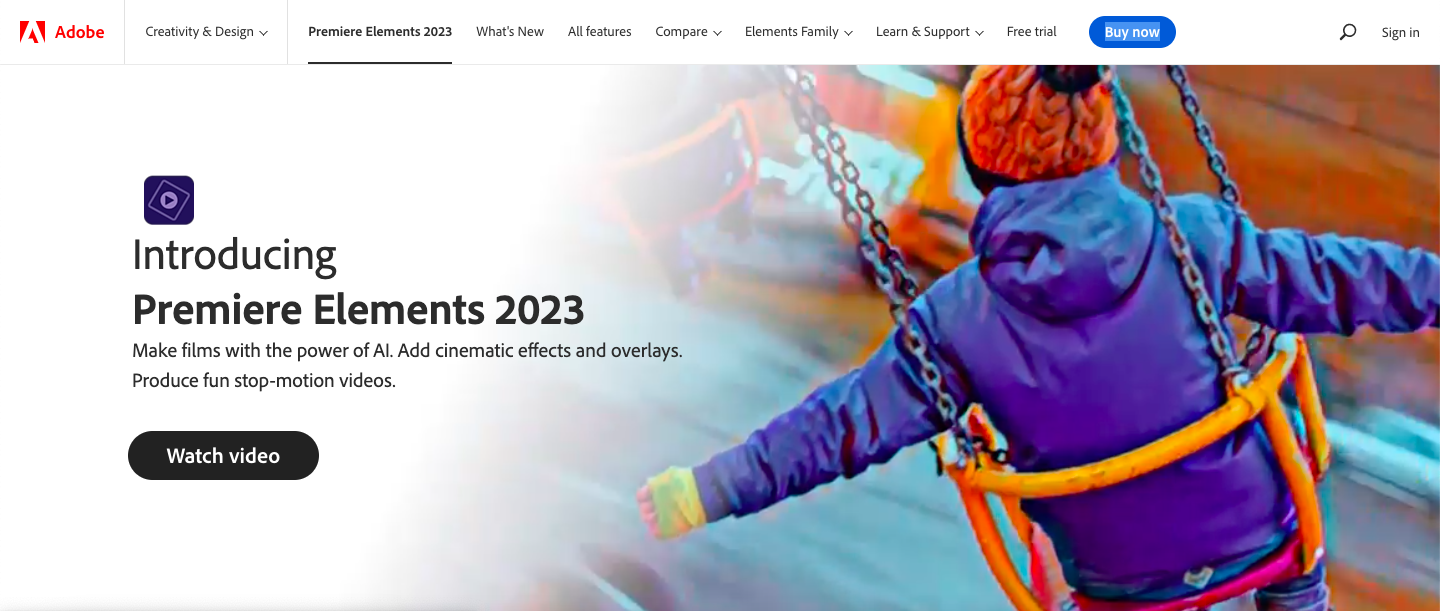
Adobe Premiere Elements is a video editing program that offers the best of both worlds: it’s simple enough for beginners to use yet has enough advanced video editing features for professional editors to create stunning content.
The software also uses artificial intelligence to help you add cinematic effects to your movies.
Starting with the specifications, Premiere Elements offers a range of tools to help you resize and trim clips, add effects or overlays, and much more. In addition, its 2023 version comes with Adobe Sensei, which means you can add effects to your videos with one click. You can also use its newly-added audio tracks and slideshow templates to change the look and feel of your entire video.
You can also arrange your photos and videos in any way you want in the element organizer. It brings together all the photos from different locations on your computer and saves them there, so you don’t have to find them separately in different folders.
You can also import files from your camera or card reader by selecting the import option ‘From Camera or Card Reader.’
Adobe Premiere Elements offers a user-friendly workspace that groups its features into Quick, Guided, and Exper views. You can choose any of these depending on your level of expertise.
If you choose Quick, you can trim video clips, create a movie by putting photos and videos together, and also choose never to see this option again.
In Guided view, you can get a step-by-step guide throughout the creation.
Expert view offers more advanced tools and features – for example, an audio mixer or time-stretches abilities.
In addition, video tools let you mark and extract favorite moments, freeze a frame as an image, track moving objects, and smart-trim low-quality parts of the clip. You can adjust the audio balance with the audio mixer and narrate clips.
However, most of its features are designed for beginners rather than for professional videographers.
Key Features:
- AI & Automation: Premiere Elements uses Adobe Sensei AI technology to automate common video editing tasks. You can add effects used in some popular artworks, and the program will automatically adjust them to match the aspect ratio you choose.
- Guided Edits: It offers 26 different guided edits that you can customize to suit your needs.
- Templates: It offers plenty of slideshow templates, backgrounds, and patterns.
- Organization: It automatically organizes your files according to date, subject, people, and places.
Pros:
- It offers three views based on complexity.
- It provides in-depth guides for users.
- Guided edits are available.
- It offers a free trial.
Cons:
- It has limited features for professional filmmakers.
Pricing:
7. Clipchamp
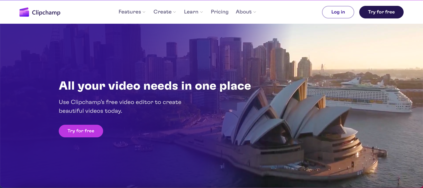
Clipchamp is another easy-to-use video software for beginners on this list – and it’s ideal for small businesses looking to create videos for marketing purposes. It’s a template-based video editing program, so each stage of the process is faster.
The app comes with pre-shot videos that you can use in your projects. These videos are in a 16:9 aspect ratio, and they are royalty-free. Click on the stock video tab to add these videos to your project.
There will be multiple categories to choose from, and once you find your video, drag it and drop it into the timeline. Now you can start editing them!
You can also use its beginner-friendly video templates from the video editor homepage. Once you add a video to your timeline, it will automatically fit into the aspect ratio. But if you want to edit the video size, just click on the aspect ratio on the right side and choose from the options.
Now, you can make changes to the text and title. On the right side of your screen, click the text box and edit the text in the window that opens. You can also change other aspects of your project this way, such as the font, alignment, color, or transparency.
With its branding features, you can add logos or brand colors to your videos, which you can use in all of your videos.
Now, you can either use templates audio or add your own. If you want to upload your audio, upload it to the editor and drag and drop it into the timeline.
After that, you’re all set to export your video. Again, you can choose from three video resolutions: 480p, 720p, or 1080p.
Key Features:
- Video Editor: It comes with customizable templates, which you can trim, cut, rotate, crop, and add images and audio to. You can also balance color and do much more.
- Stock Library: Its stock library has free stock videos and audio tracks – you just have to add your own titles and other minor changes. It also comes with a free camera recorder which lets you add filters, balance colors, and adjust contrast in your footage.
- Text-to-speech: With its AI voice generator, you can choose from 170 voices to add a voiceover to your video.
- Green Screen: Remove unwanted elements while shooting using the green screen, then remove them while editing with the background removal feature.
- Video Overlay: You can spice up your videos with animated graphics, stock videos, transitions, and more using its built-in styles.
Pros:
- There Are so many templates to choose from.
- It’s very affordable and also offers a free version.
Cons:
- It offers limited options for professional filmmakers.
- Rendering takes more time than it should.
Pricing:
It starts at $11.99 per month or $119.99/per year (if you pay yearly).
8. Coral VideoStudio Ultimate
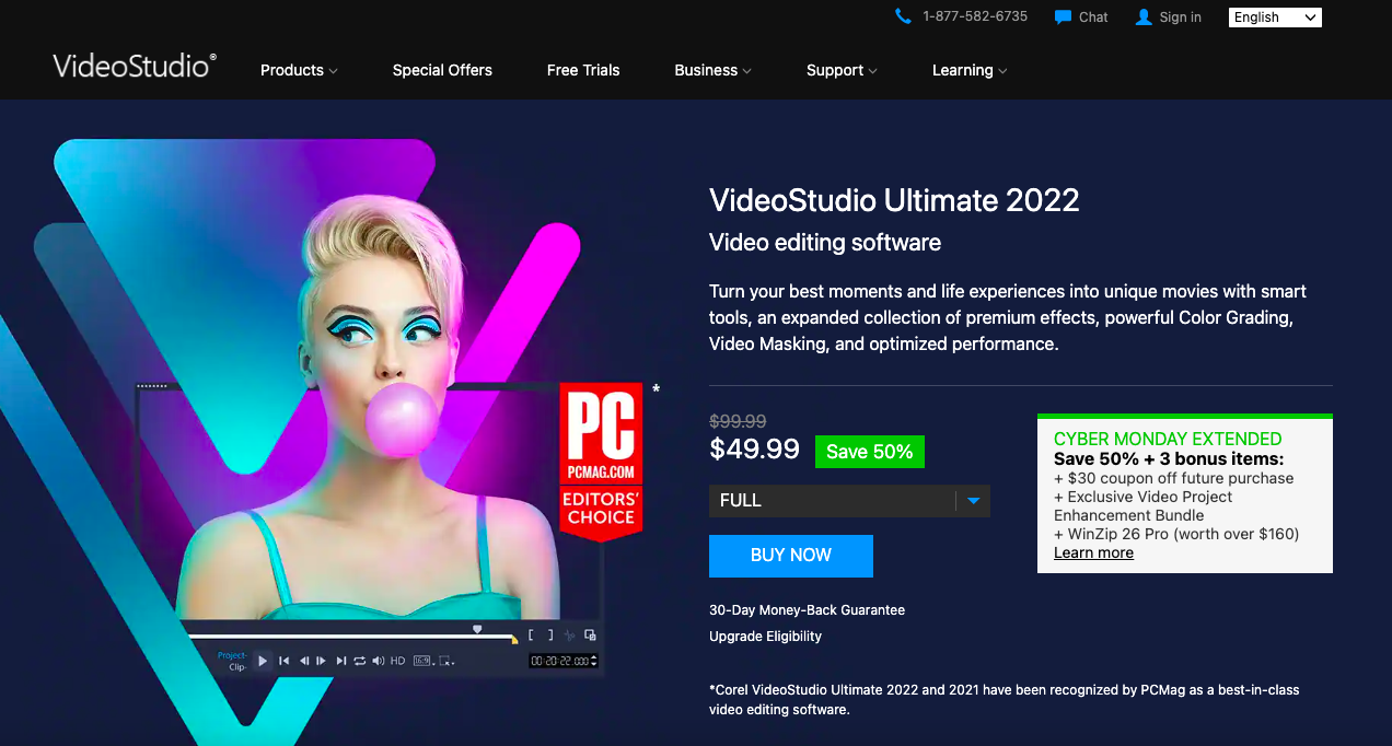
Coral VideoStudio Ultimate is one of the powerful video editors that starts you with basics and takes you through very advanced editing features.
To get started, you have to import your media into the library folders. Then, you can simply drag and drop your files or click on the import button and choose your file from the media browser.
Just like any other video editing software, you can drag and drop your media files to your timeline to start editing them.
Choosing an instant project template will help you get the result quickly. Now you can trim your clips, adding transitions, effects, and more.
To add a title to the video, click the title button [T] and add text. In addition, you can add transitions between your clips by dragging the transition thumbnail to your timeline.
Once you have added your video, you can add filters, effects, and music. Just click the respective button and follow the instructions. Once everything is done, you can save it and share it on blogs or websites, email or social media channels, YouTube, and more.
Key Features:
- Drag and Drop: Drag and drop elements in your timelines, such as a text box, an effect, or a transition.
- Color Grading: Using color grading, you can enhance your video by boosting the colors and correcting their balance.
- Premium Effects: Use animated AR stickers, Face Effects, blend overlays, and more.
- Advanced Tools: Make your videos stand out with cinema-grade effects using masking, facial recognition technology, dynamic split screen templates, and more.
Pros:
- Online reviews hint at its fast rendering speed.
- Screen Recording is available.
- One-time fee structure.
Cons:
- There aren’t enough effects and transitions available.
Pricing:
It costs $99.99 / one-time payment.
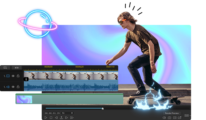
9. Movavi Video Editor
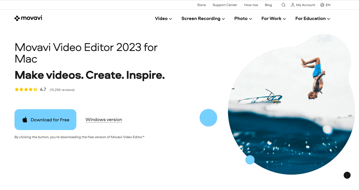
If you’ve been in the industry for a considerable time, you must have heard of Movavi Video Editor.
It’s a powerful video editing software that allows you to edit videos, create slideshows and convert videos from one format to another. It is an award-winning video editor with readymade intros, keyframe animations, and many special effects.
Let’s see how to edit a 4K video in Movavi. As you see in the screenshot below, the user interface is spotless and straightforward. You just have to click on the “Add file” option to start importing your 4K video into the library and then add it to your timeline to begin editing it.
You’ll see icons for transitions, filters, and more on the left panel. From there, you can add different effects to your video. To cut your video into multiple parts, look above the timeline — you’ll see an icon for “Split Clip.” Select the clip and move the red marker to where you want to cut. Then click on the split icon.
You can also add titles to your video by clicking on the title tag in the left pan. Simply select the one that you want to use and drag it to the timeline. Now double-click on the title in the timeline and start editing the text.
After adding titles and special effects or transitions, save your file. Make sure you save in ultra-high definition.
Key Features:
- AI background removal: Change your video background without using a green screen – with the power of AI.
- AI noise removal: Its AI-based noise removal tool will help you remove car sounds, wind sounds, or other unwanted sounds.
- Special effects for Youtube: It offers five frames and an exclusive pack of effects for YouTube.
Pros:
- You can directly upload your finished video on TikTok.
- Clean user interface.
- Free version available.
- The video editing app has sound-accompanying transitions.
Cons:
- Slow rendering.
- It does not offer more advanced features for filmmakers.
Pricing:
It costs $74.95 for a one-time license.
10. DaVinci Resolve
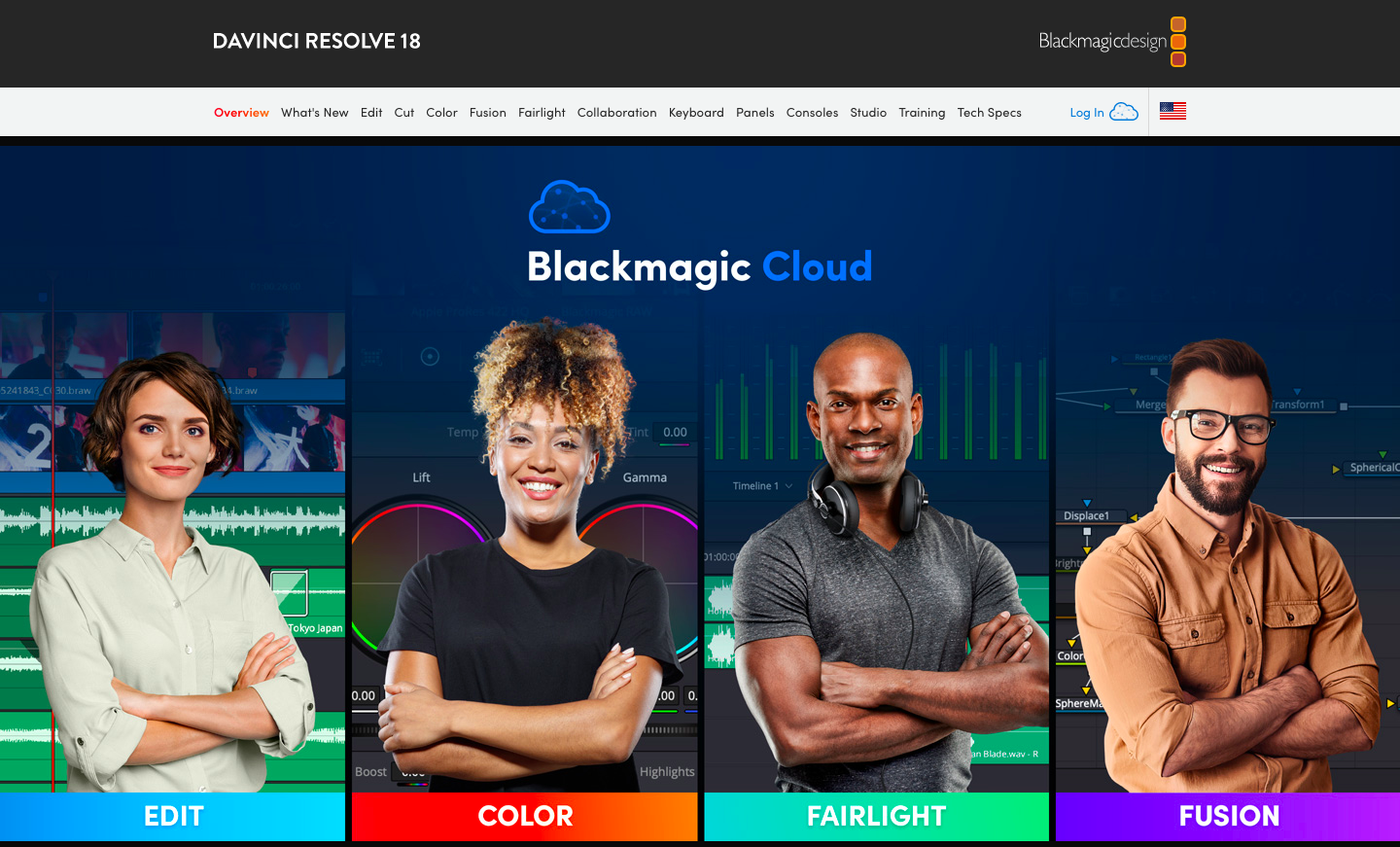
DaVinci Resolve is an excellent video editing program – with a free version with many high-level features that you would expect from a much more expensive product. DaVinci Resolve also makes other products specifically for editors, including keyboards, color grading panels, and more.
In its latest release, they have included support for Blackmagic Cloud and Blackmagic Proxy Generator. You can host your media library on this cloud and share your work with other collaborators and editors.
To start editing in DaVinci Resolve, you must import your video by dragging and dropping your videos from the hard drive to the media pool on the top of the screen.
Many professional video and audio file formats are supported, including H.264, H.265, DNX, Blackmagic RAW, and more. You can mark the part of the clip that you want to use by specifying a start and endpoint for it.
Once you’re done adding clips to the timeline on the right side of the screen, you can edit them further using options from the editing overlay. This tool can replace, insert and overwrite clips in your movie project.
DaVinci Resolve has a library of 30 different transition effects, including wipes, dissolves, warps, flares, and more. All you have to do is select the effect you want and drag it into your timeline on top of a clip.
You can also add 2D and 3D titles to your project from the title library. Drag Fusion Titles from the library onto the timeline to add a title. You can then customize the text, font, color, etc.
You can do much more with videos, such as making animations, creating soundtracks, controlling the speed of your video, and adding picture-in-picture effects, dynamic zoom effects, and timeline curves.
Key Features:
- Multi-User Collaboration: It’s possible to work with editors, visual effects artists, colorists, and sound engineers who are also online at the same time.
- Fairlight: It features tools to produce audio. You can use up to 2K tracks at a time.
- Media and Delivery Page: It offers a fullscreen workspace to prepare clips, sync audio, and organize media files into bins.
- Resolve FX: You can add advanced effects such as blur, noise, light effects, beauty enhancement, image restoration, and more.
- Color Collector: DaVinci’s 32-bit image processing enhances your photos, making them look their best.
Pros:
- It offers a free version with various editing options.
- The paid version is also affordable, considering the features you get.
- Clean and easy-to-use UI.
Cons:
Pricing:
It costs $295 for features like stereoscopic tools, Resolve FX filters, more Fairlight FX audio plugins, and advanced HDR grading.
11. Wondershare Filmora
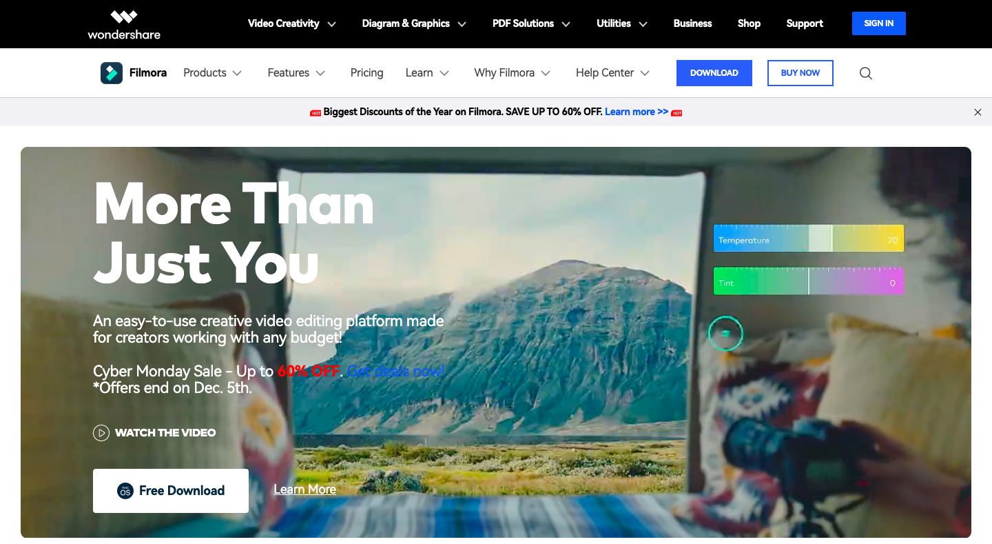
Wondershare Filmora is an easy and simple video editing software that frequently updates with new features and advancements.
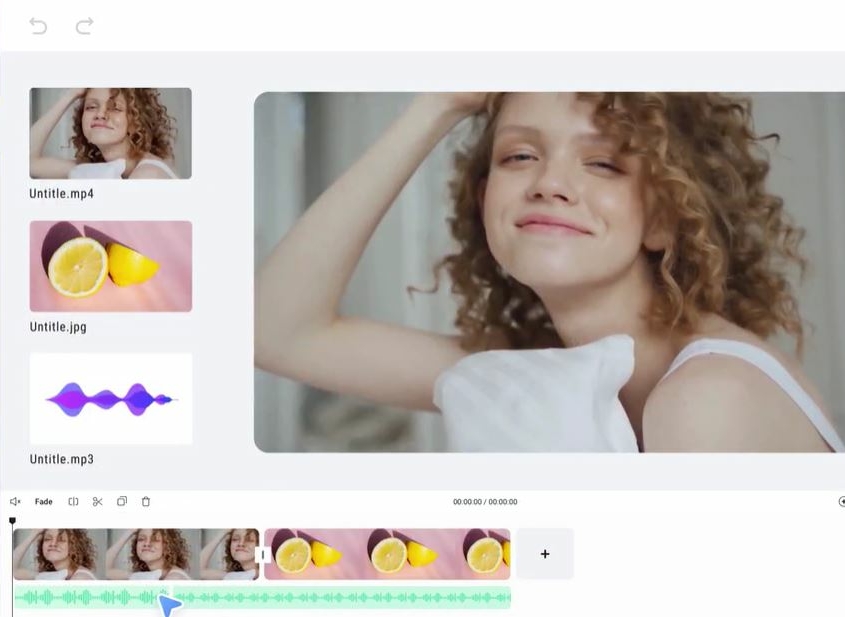
Using the software is incredibly easy. You can create a new project for every video or start working on an existing project from the file menu.
Then you can import video, audio, or image by clicking on Import Media from the drop-down menu. You can either drag and drop your files in the library area, click on import media in the library, and select from the media browser.
Now add this video file from the library to your timeline to start editing.
This can be done in two ways: drag and drop it to the timeline or right-click on the clip and choose the action from the insert, add to a new track, overwrite and append options.
This UI is straightforward, you don’t have to go back and forth, and mostly all options are on a single page. You can start adding titles, effects, animations, etc., by dropping them in the timeline. Then, select the option from the top of the window.
That’s it. Your first video in Wondershare Filmora is ready to be saved and exported. Click on the Export link on the topmost menu, choose the location, enter the video name, choose format, and click the Export button.
Filmora has the edge over other video editors, such as Adobe Creative Cloud, in its price point. Its rendering speed and performance are comparable to those of Creative Cloud products, but it lacks more advanced features, such as motion tracking and speed remapping. If you don’t require those features at all, though, it’s a good choice.
Key Features:
- Split Screen: It offers a split-screen template where you can add multiple videos in one to make it more fun. It has more than 30 split-screen templates.
- Keyframing: Enlarge, narrow, or rotate your clips with its Keyframig feature and create many more visual animations.
- Motion tracking: It automatically tracks the object movement and lets you pin the graphic or other elements to move in the same motion.
- Screen Recorder: It allows you to record your screen with system and microphone audio.
- Video effects: It offers over 900 video effects, including titles, filters, transitions, motion, and more.
- Green Screen: You can change your video backgrounds or elements with the green screen.
Pros:
- Great selection of features
- Easy-to-use interface
- Fast rendering.
- A free version is available.
Cons:
- So many features might be overwhelming for new users.
- Users have reported that the software sometimes crashes.
Pricing:
It starts at $19.99 per month.
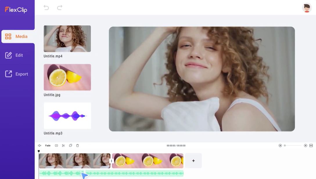
12. FlexClip
With FlexClip It’s very easily to create and edit videos for the brand, marketing, social media, family, and any other purpose.
You can make a Video in 3 Steps :
- Add videos or photos from computer or stock libraries,
- Add text, music, elements, and more to customize your video,
- Export your video, then share it via a link or post to social media platforms.
FlexClip is a simple yet powerful video maker and editor for everyone. It help users easily create compelling video content for personal or business purposes without any learning curve.
Key Features:
- AI auto subtitle generator, GIF maker, image background remover, screen recorder and video converter supported.
- Millions of Royalty-free Stock Media including photos, videos, and music.
- 4000+ exquisitely-designed templates in diverse categories.
- Cloud-stored function for trans-devices editing, anywhere and anytime.
- Storyboard and timeline mode for both beginners and professionals.
Pros:
Cons:
Pricing:
It starts with a free licence and go at $19.99 per month for the business licence.
Frequently Asked Questions about Video Editing Platforms
What is a video editing platform?
A video editing platform is a software platform that allows you to edit your videos, photos, and other media files.
How do I choose the right video editing platform?
The first thing you should do when choosing a video editing platform is to find out whether it supports the features you need for your project. Then check if it supports multiple file types and if it has tools for basic editing.
How much does a professional video editing platform cost?
You can find affordable professional-grade video editing software for less than $100 per year. The more advanced platforms with additional features cost more, but they also offer more capabilities than basic ones like iMovie or Windows Movie Maker that come free with your operating system.
How do I edit a video?
Editing a video can be done on any video editing platform. The process of editing varies from platform to platform, but the basic steps are the same:
- Import your media (photos and videos) into the program
- Arrange your media into a sequence for your video
- Add transitions between scenes or clips
- Add titles and other text elements to enhance visual storytelling
- Save the project file
What features do video editing platforms have?
Video editing platforms provide many features to help users create their own videos. Some of these features include:
- Video creation and editing tools
- Audio mixing capabilities
- The ability to add titles, images, and animations
Over to You!
The choice of a video editing platform can be one of the most important decisions you make when creating your video. First, you must choose a platform that will allow you to create high-quality videos suitable to your requirements. And if you’re looking for a basic and free video editor, there are options for that too.
If you’re a professional, use advanced video editing software tools like Adobe Premiere Pro, Pinnacle Studio 26 Ultimate, and Apple Final Cut Pro. They will take time to get used to, and you’d have to shell out a considerable budget, but it will be well worth it.
If you’re an amateur or a beginner, I recommend using Movavi Video Editor Wondershare Filmora or Clipchamp. They are easy to use and the best bang for the buck.
And if your purpose is just to create personal videos for your family and acquaintances on social media, then you can use a free video editing software like Apple iMovie.
Source
The post 11 Best Video Editing Apps first appeared on Webdesigner Depot.
Source de l’article sur Webdesignerdepot

 As we head into the final month of 2022, plenty of new ideas and website design trends are still emerging. The evolution throughout the year has been exciting and designed to help website designers and developers create greater engagement and interactivity while pushing the envelope. These trends are no exception.
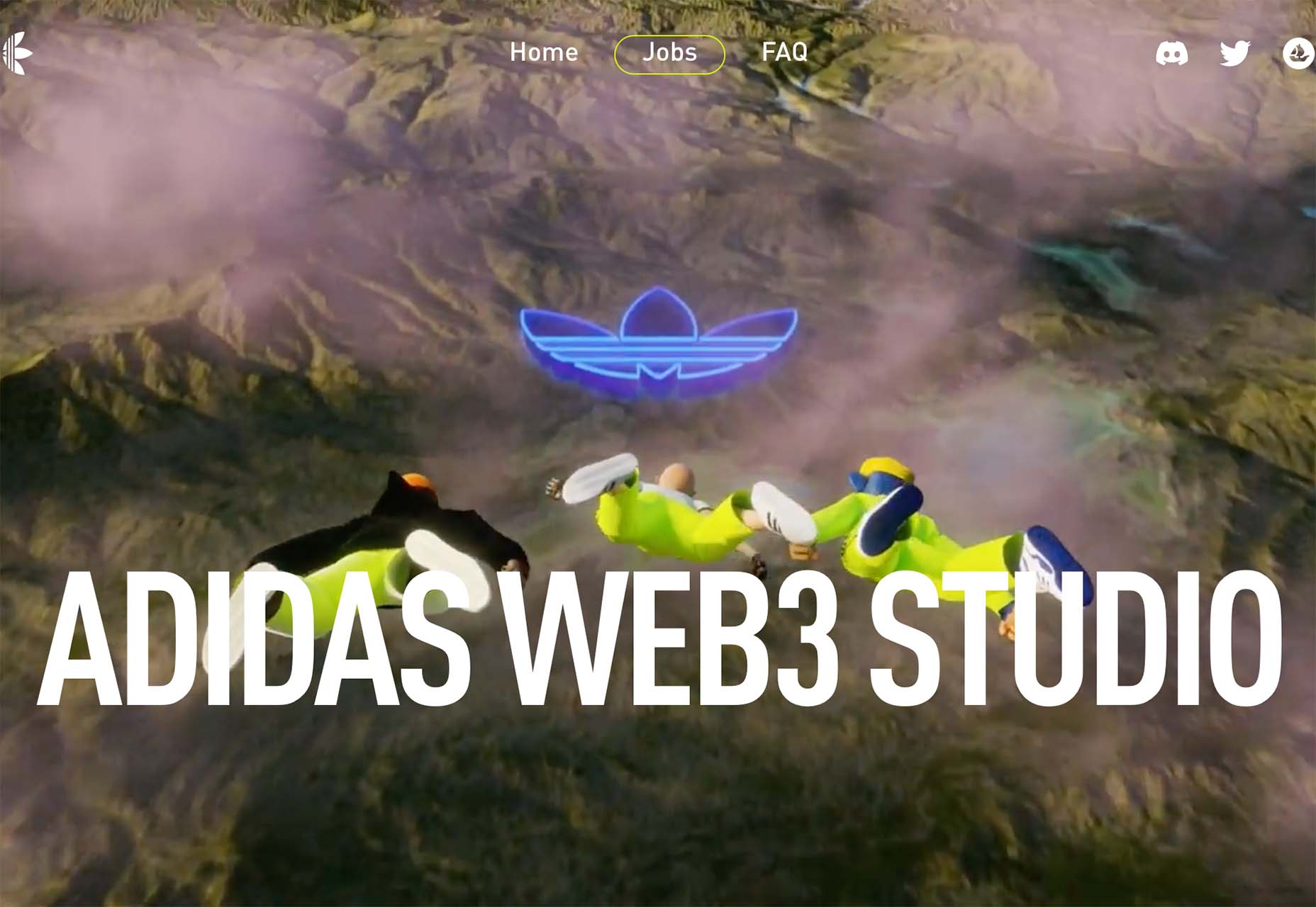

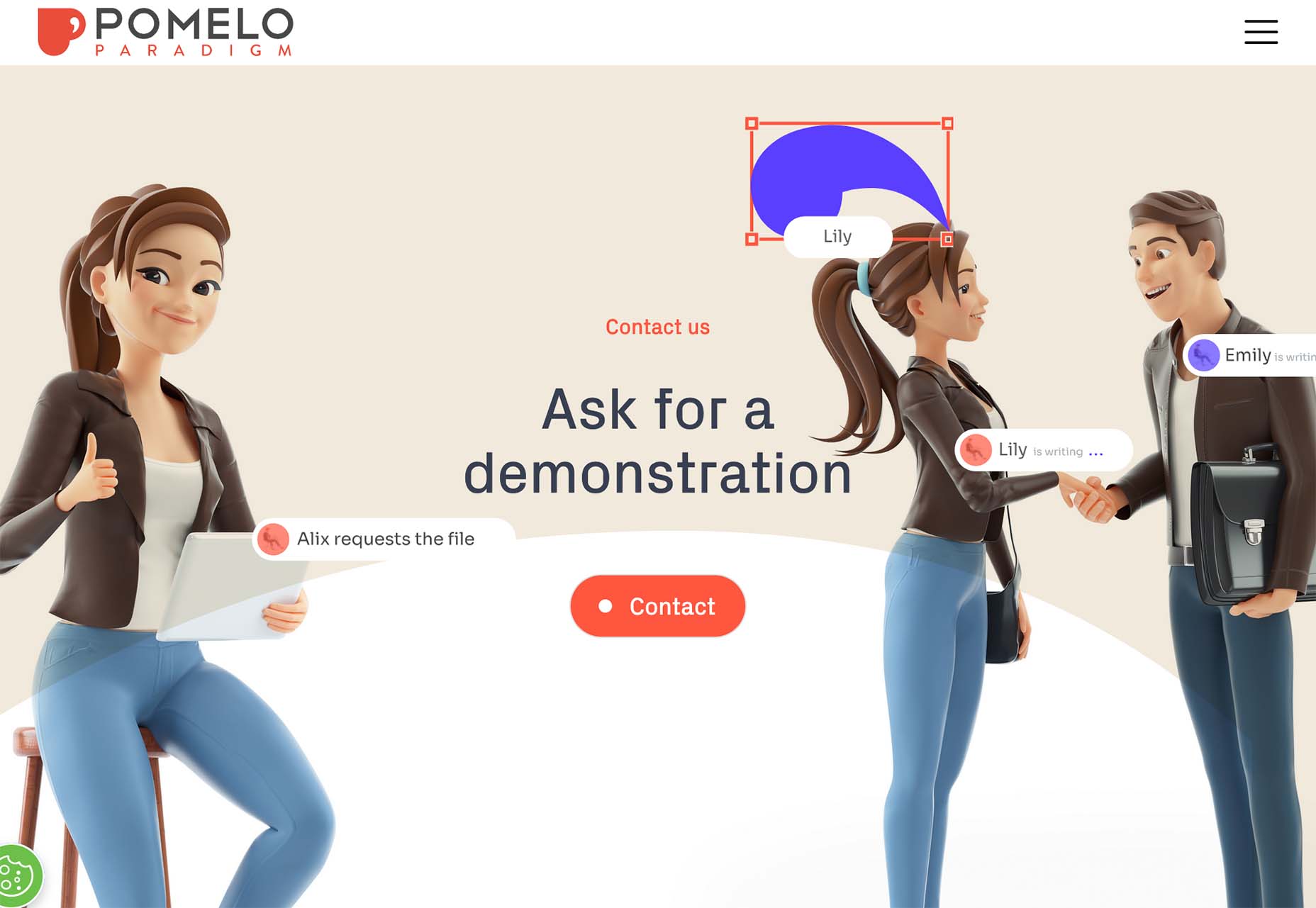
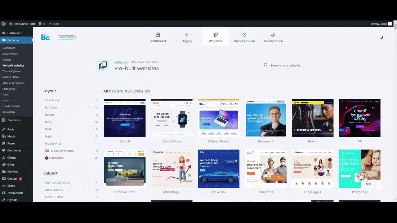
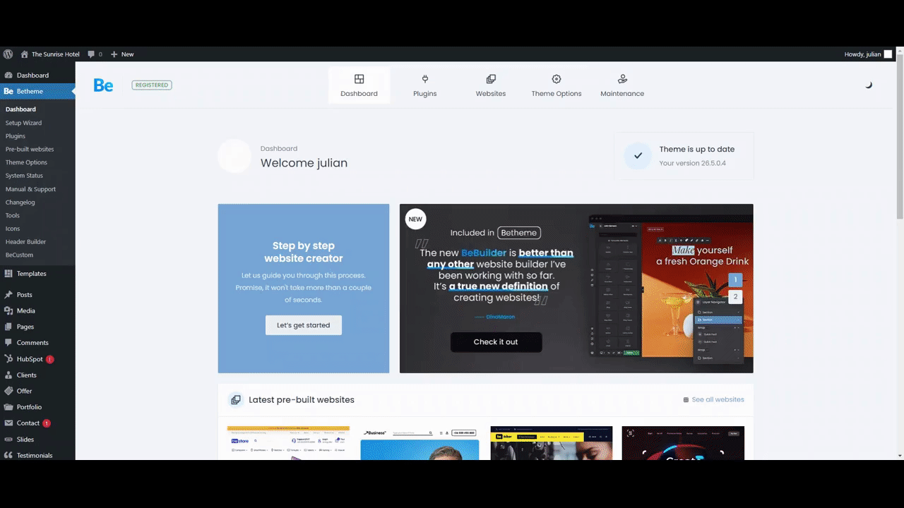
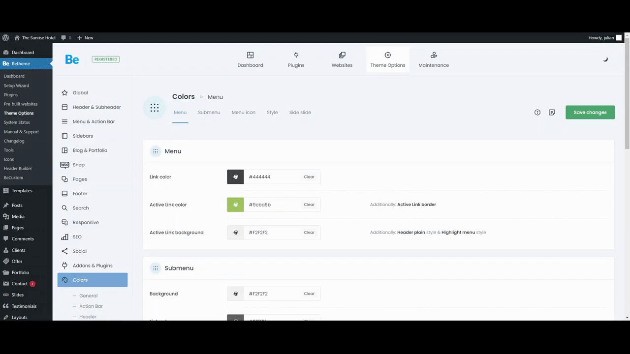
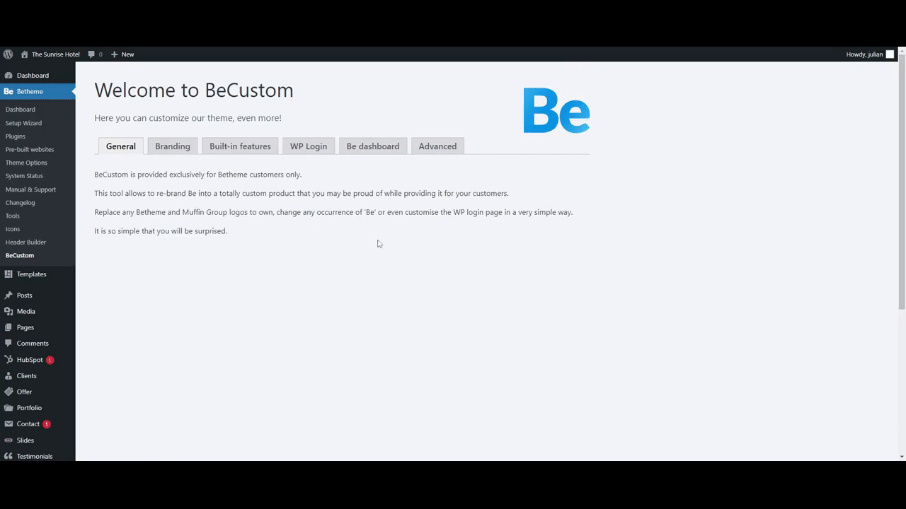
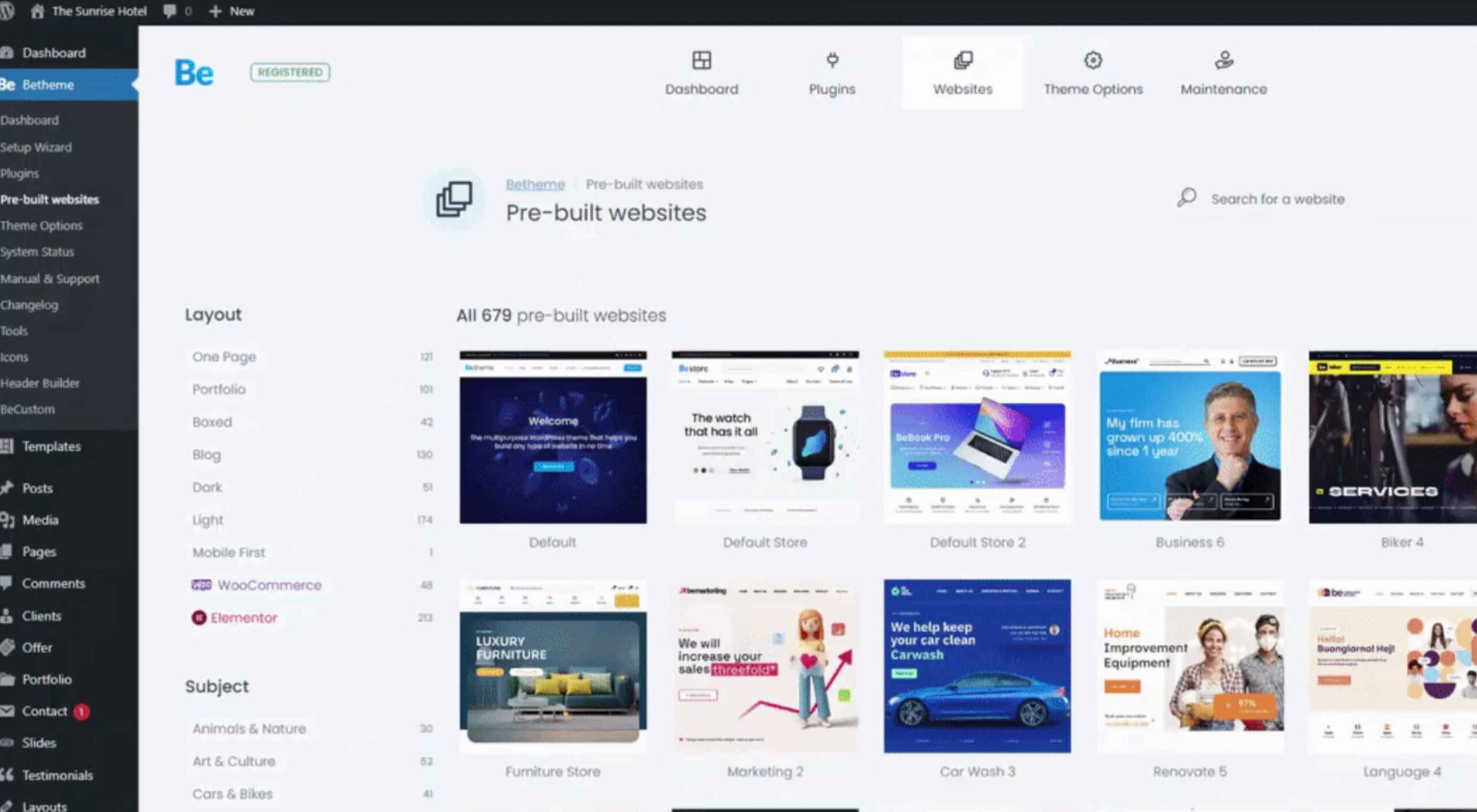 Whether you’ve worked with a few WordPress themes to design websites or worked with many of them, you’ll no doubt agree that plenty of WordPress themes that are visually gorgeous on the front end can be terribly unattractive and extremely awkward to use on the backend.


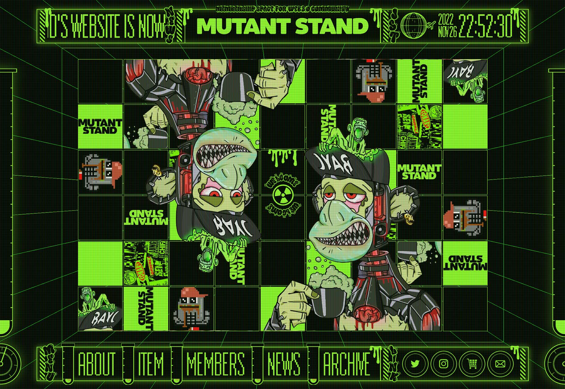
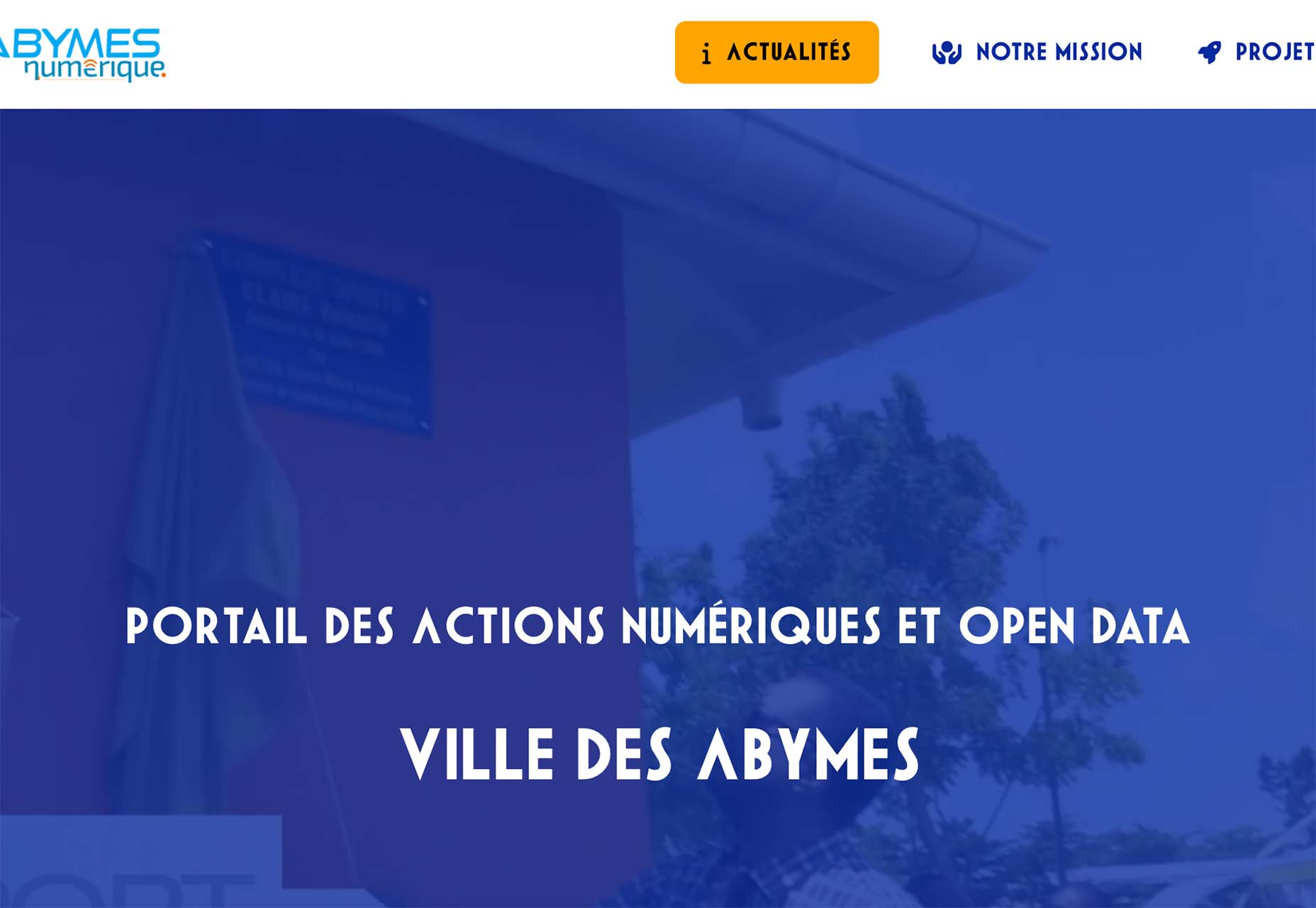
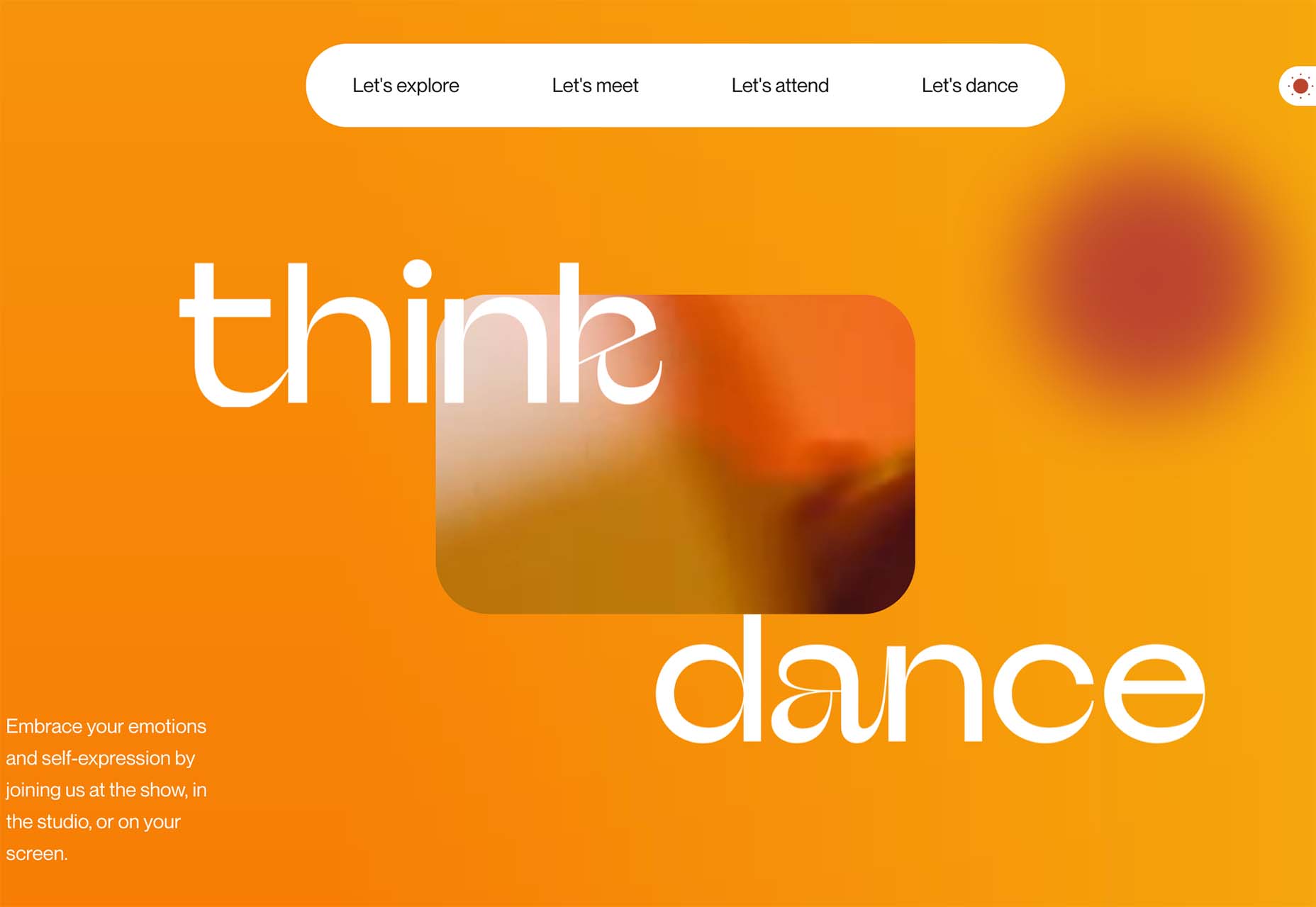
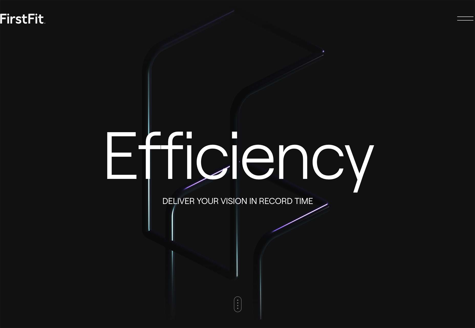
 There are a lot of dark, retro vibes trending in website design right now. Although there are still some light projects popping up – including a pastel trend below – a lot of what we are seeing has a quite moody feel.


 UX laws are an invaluable tool, providing guidelines for designers that ensure we don’t have to continually reinvent the wheel when crafting experiences for the web.

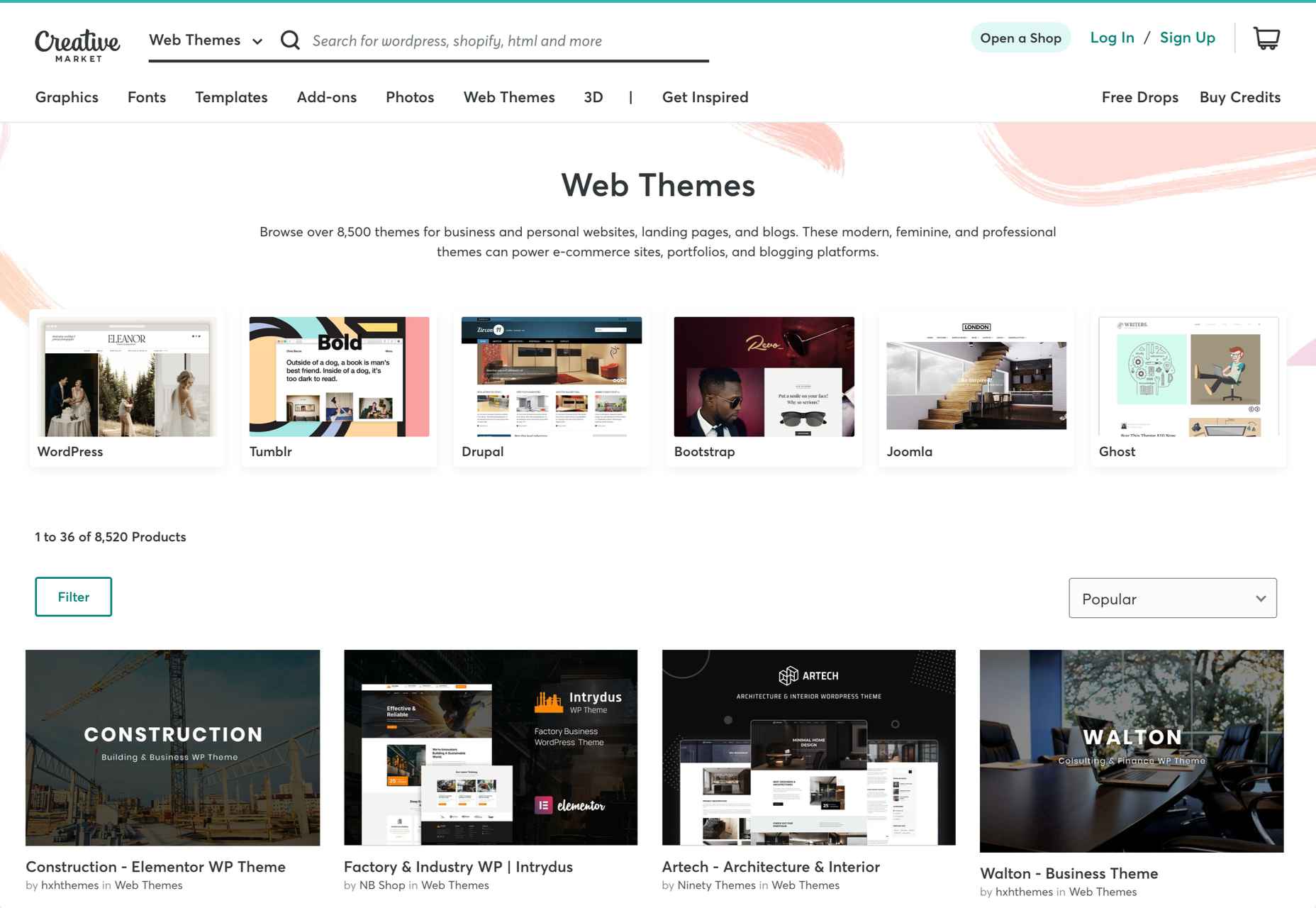
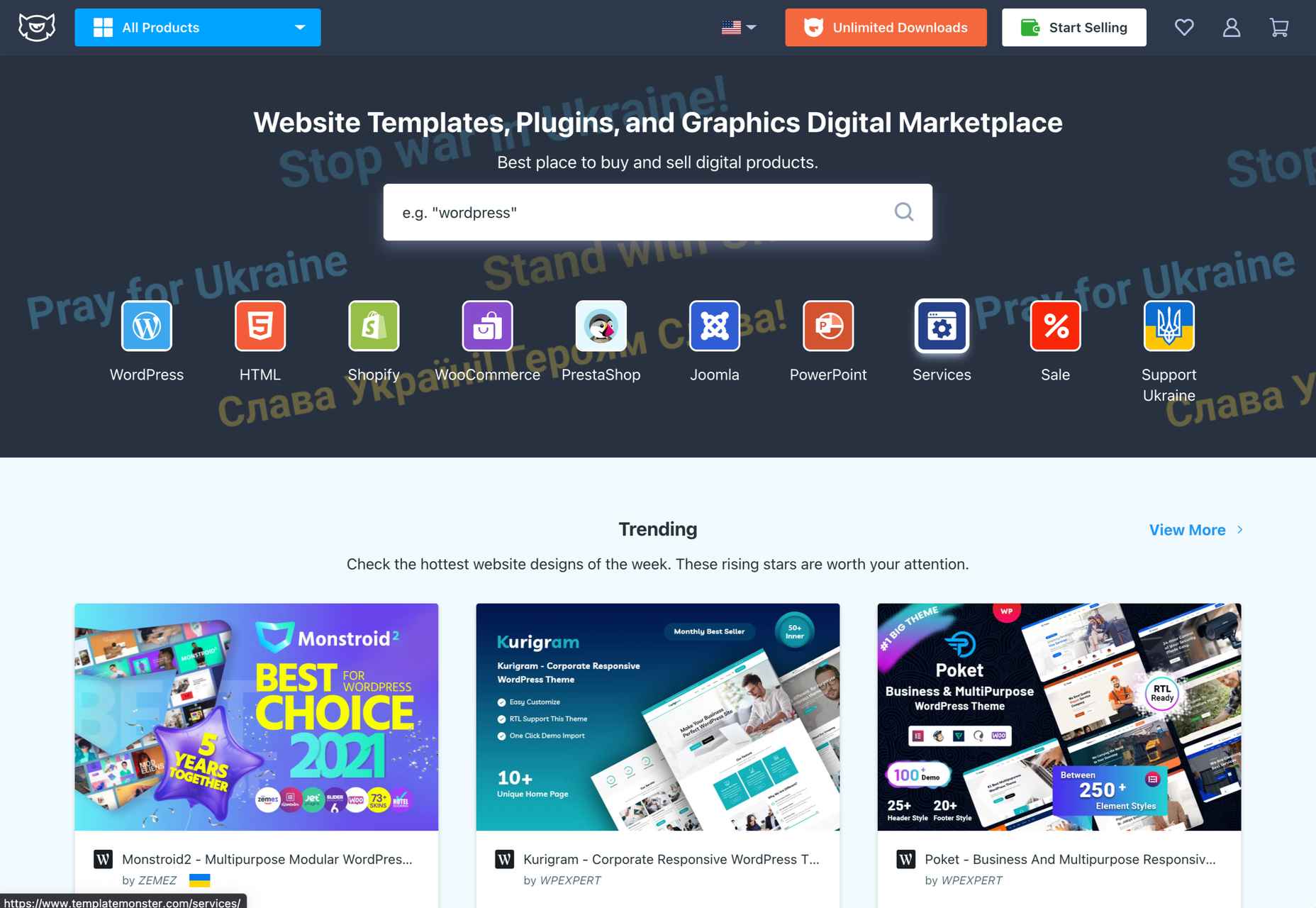
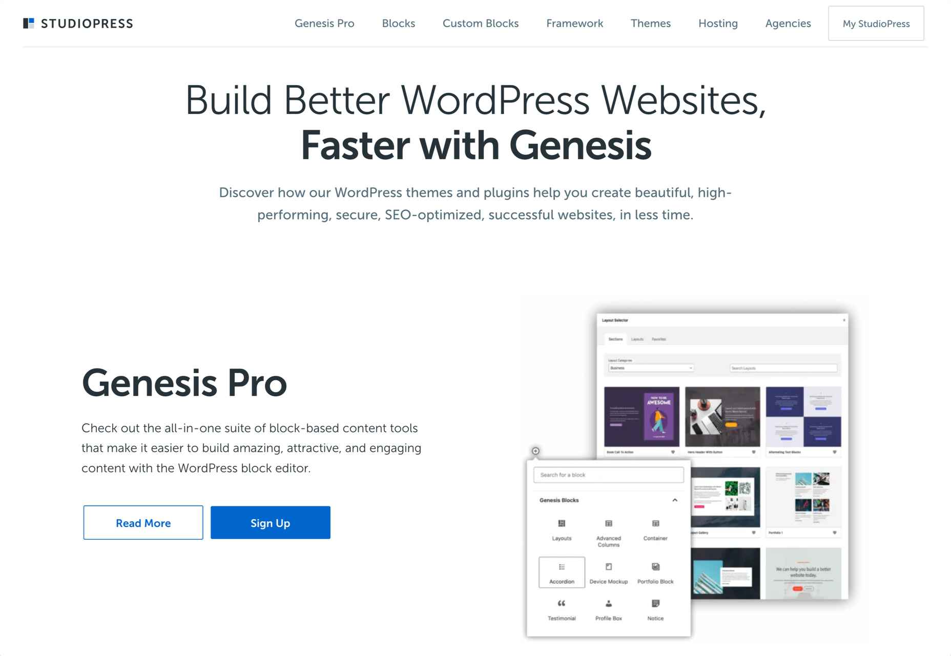
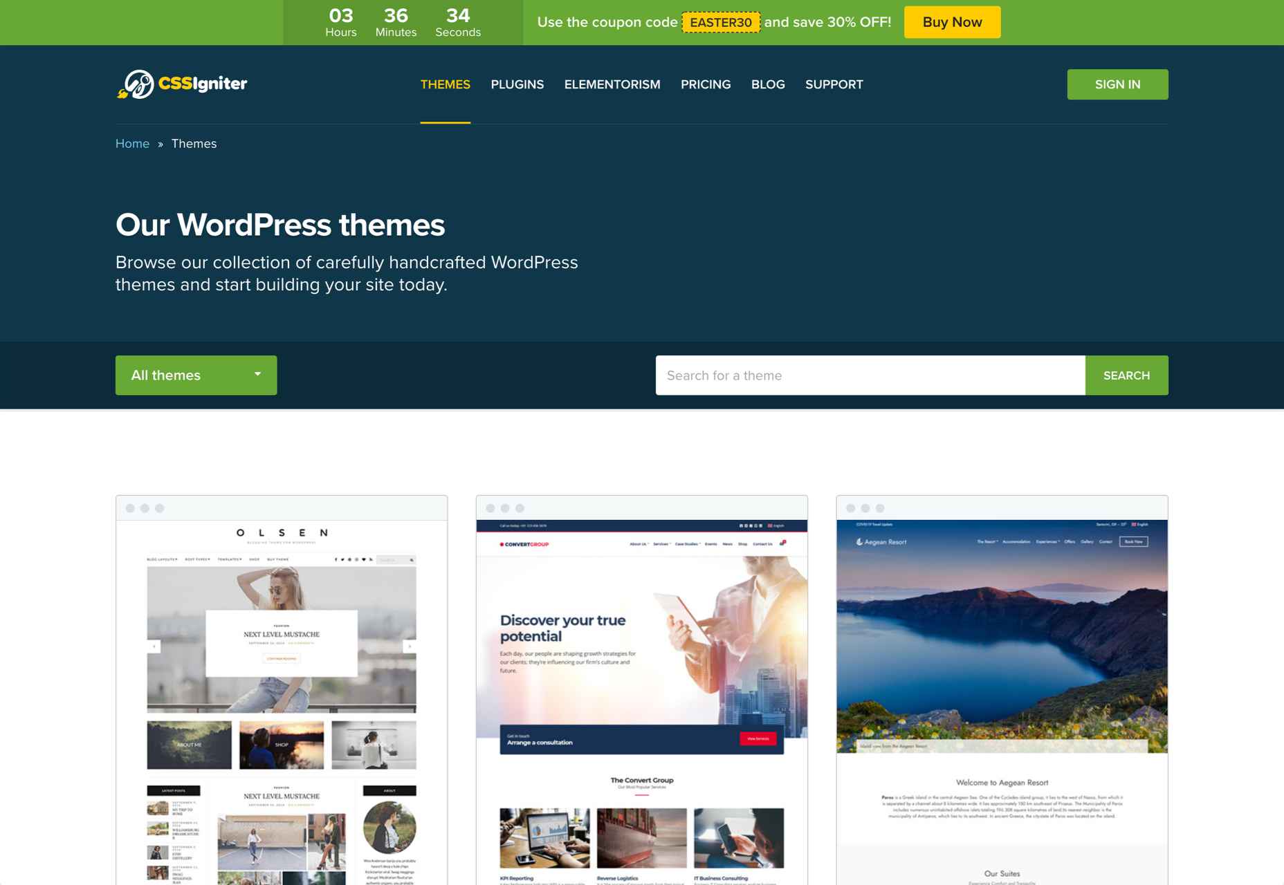
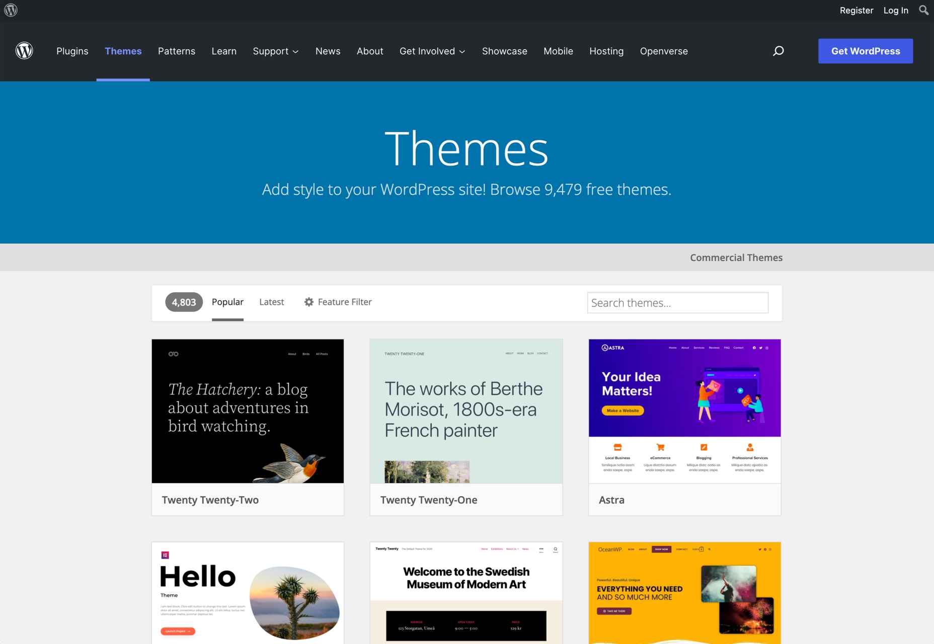
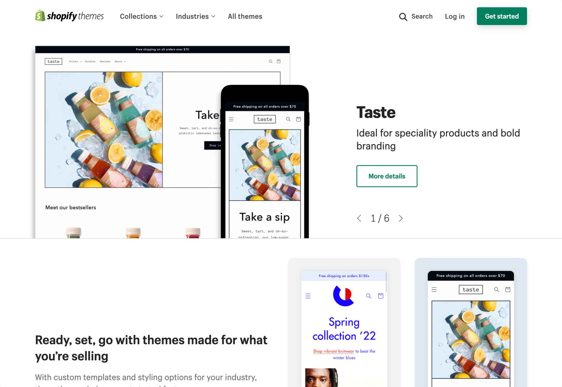
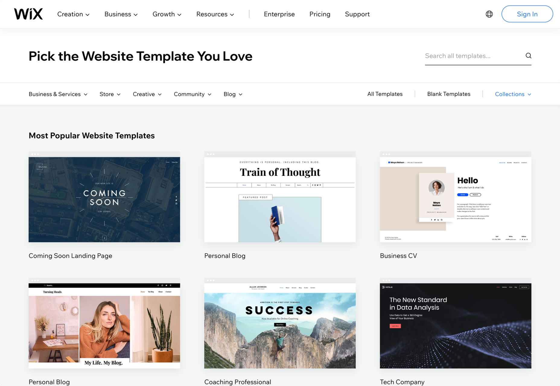
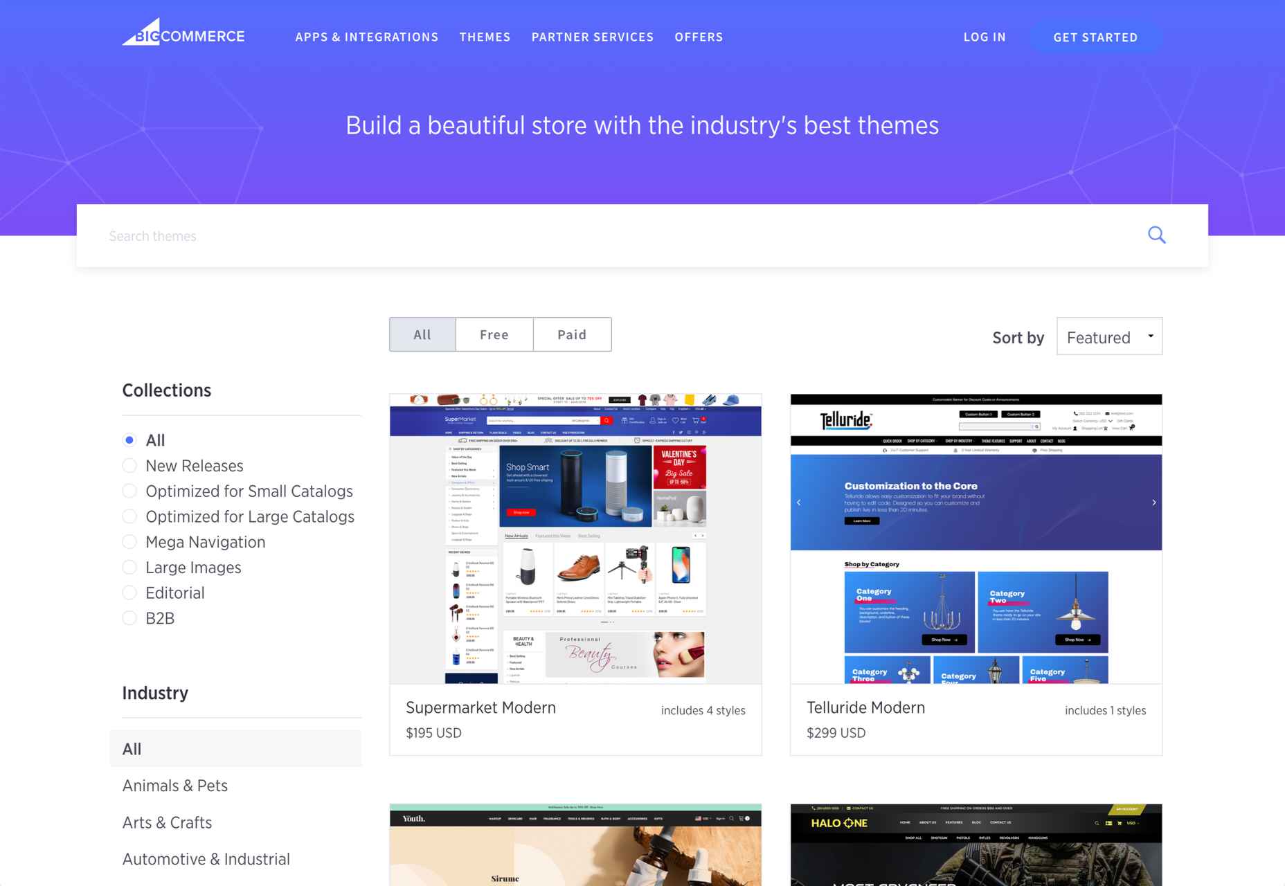
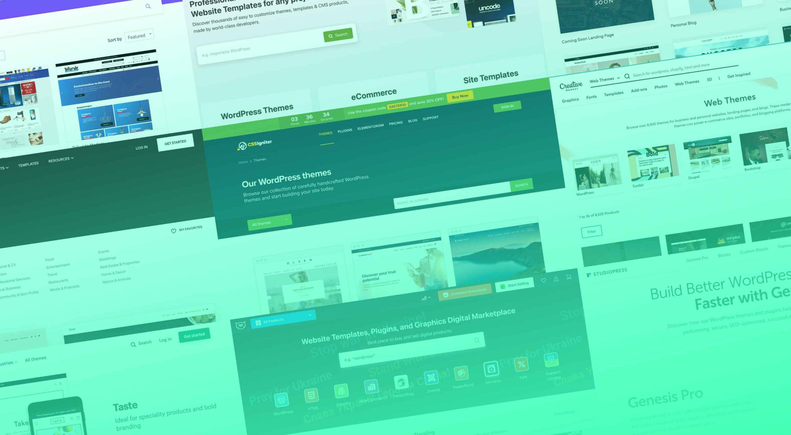 Whether you are a designer looking for the best themes for your clients or a new website/blog owner, there are numerous theme marketplaces to cover your needs.
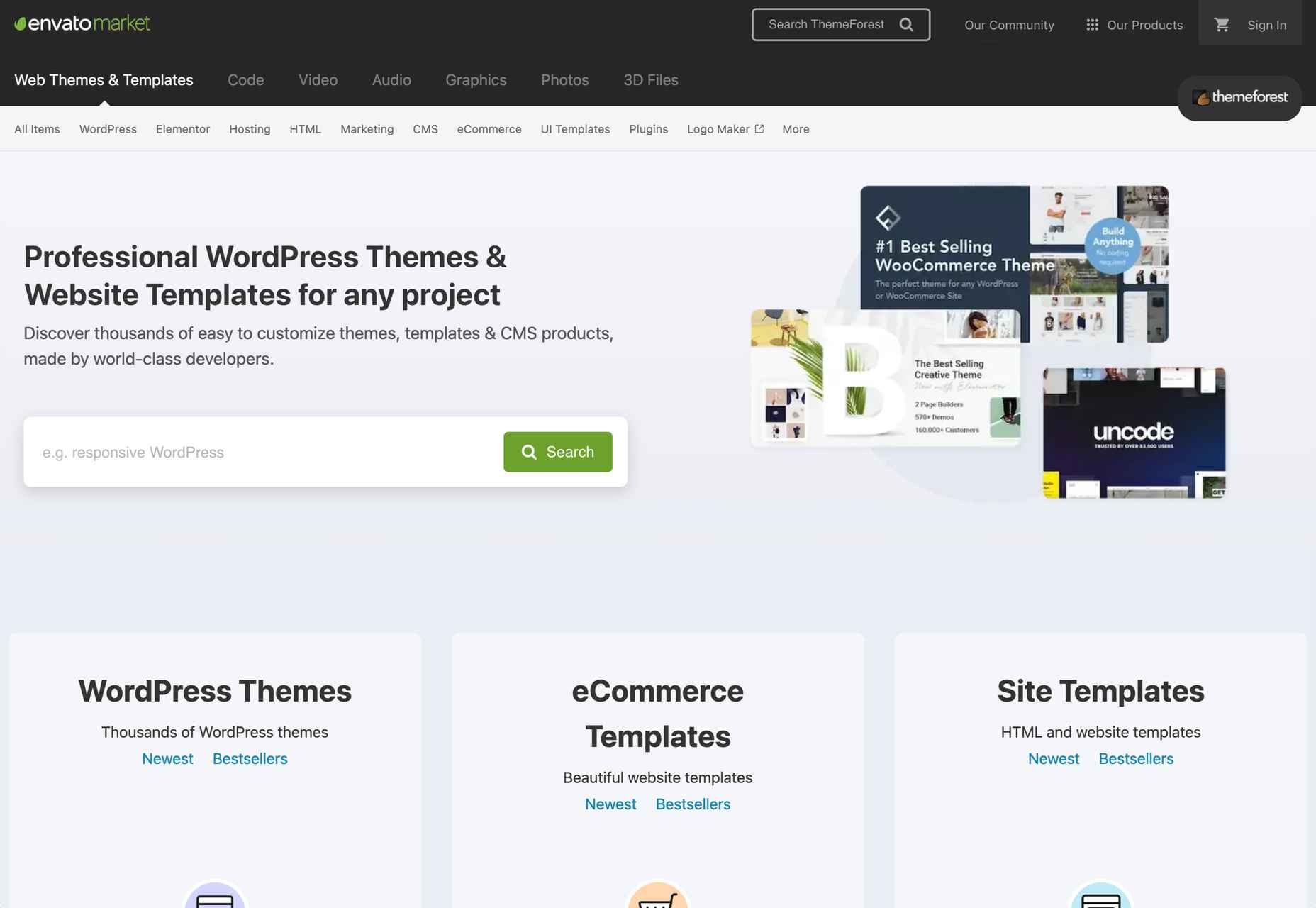

