Articles

This month’s collection of the best new sites released in the previous four weeks might seem like a mixed bag, but if you look carefully you’ll see distinct themes emerging. Full-page images and videos are back with a vengeance, and designers are embracing large-scale 20th century-inspired typography from Art Nouveau to ’80s corporate.

Here are the sites that grabbed us this month. Enjoy!

I Killed a Cactus

I Killed a Cactus is a beautifully rendered 3D site that guides the less-horticulturally inclined of us in the best ways to care for our houseplants.

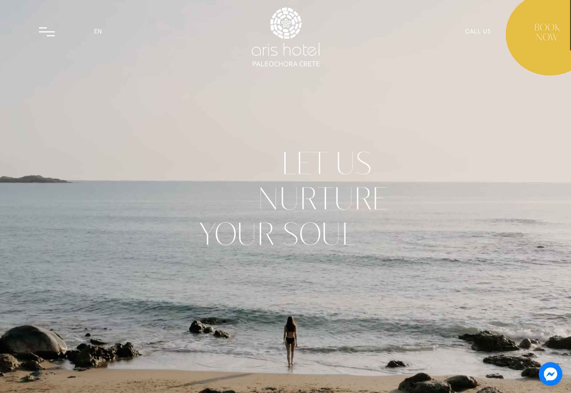
Aris Hotel

After a couple of years in which travel has been restricted, we’re itching to get moving again, and this elegant site for Aris Hotel is steering us in the direction of Crete.

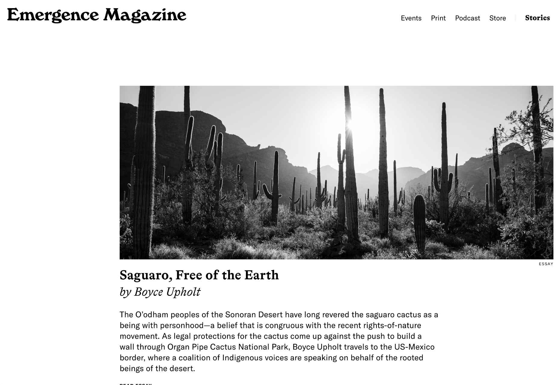
Emergence Magazine

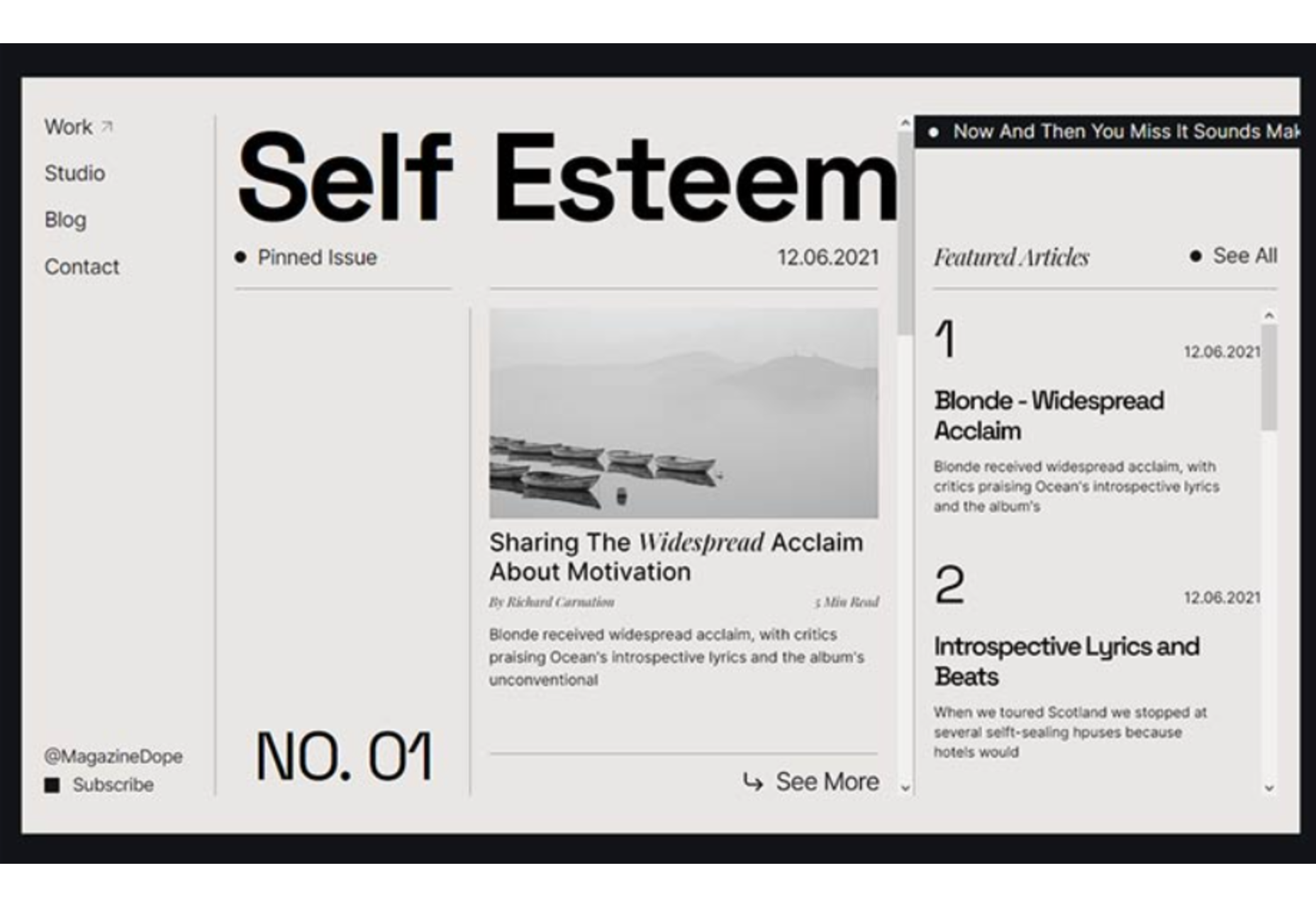
With excellent writing and great photography, Emergence Magazine is dedicated to stories that intertwine ecology and spirituality. Its bold typography epitomizes its ethos.

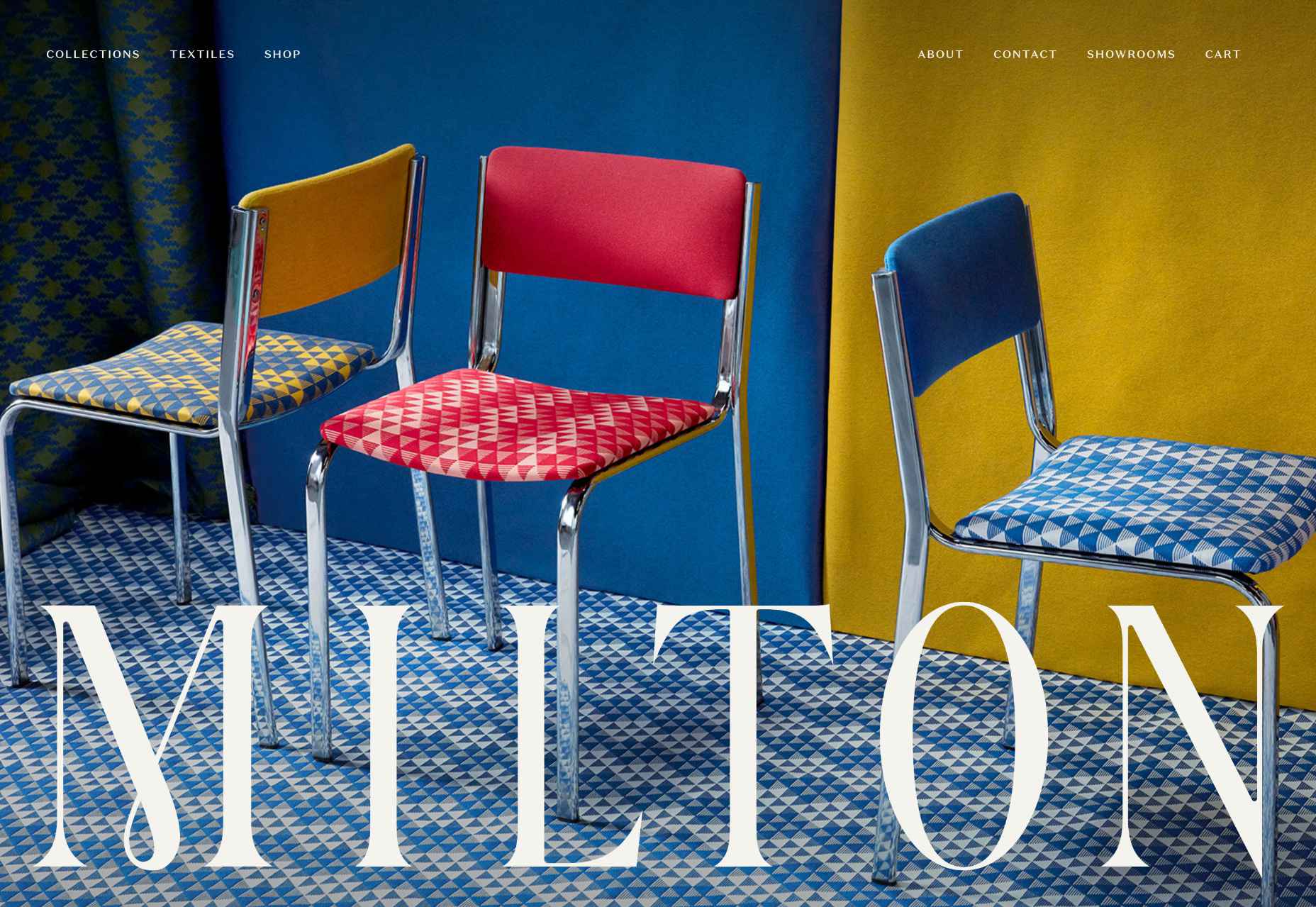
Milton Textiles

Milton is a textiles manufacturer with an eye for design. Its site showcases its art-inspired collection with big, bold, colorful photography.

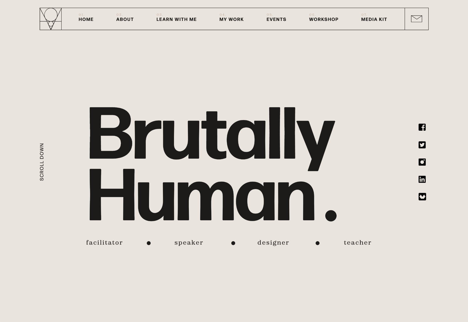
Brutally Human

Brutally Human is the one-page portfolio/pitch of designer Stanley Vaganov. He has an impressive client list, and his site exudes the confidence that comes with that.

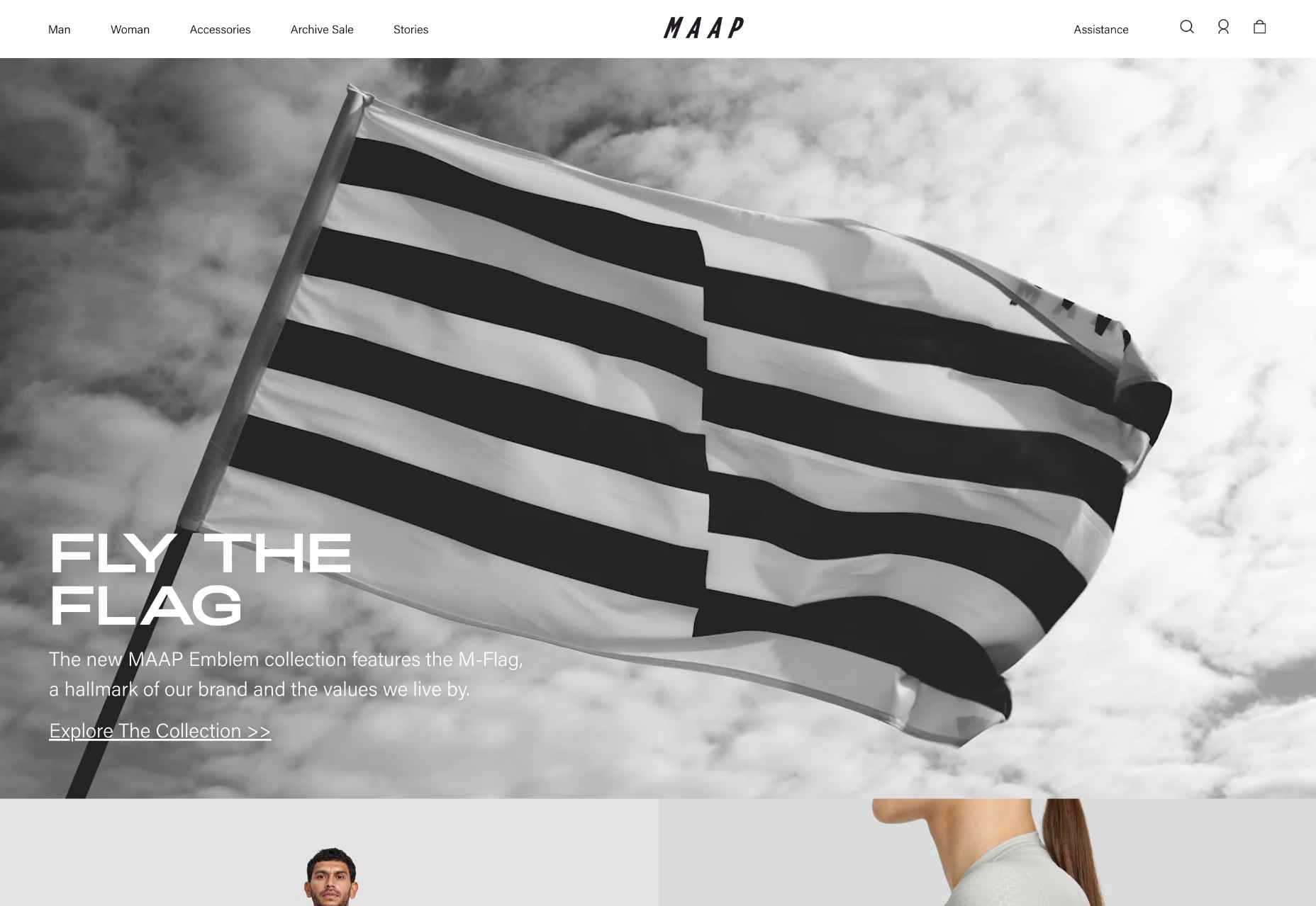
MAAP

MAAP uses a billowing flag to grab your attention as soon as you land on the site. The whole site is clean, efficient, and cool; exactly what you’d expect from a cycling apparel company.

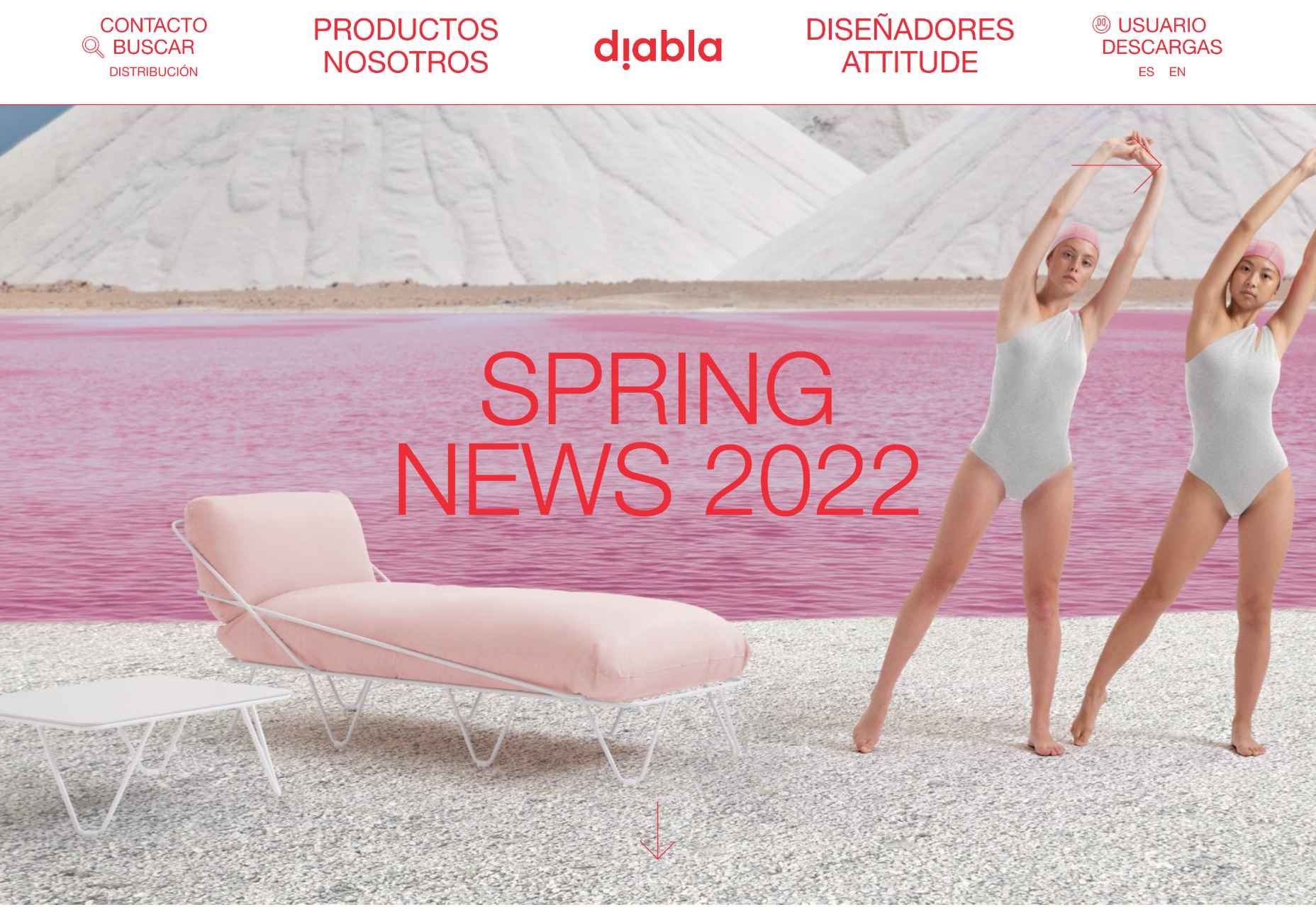
Diabla

Outdoor furniture is typically presented as minimal and sophisticated. Diabla throws surrealism into the mix by introducing brand colors to its large-scale photography.

Steffie de Leeuw

The site for designer and artist Steffie de Leeuw features large typography that appears to be woven through layers of intricate illustration.

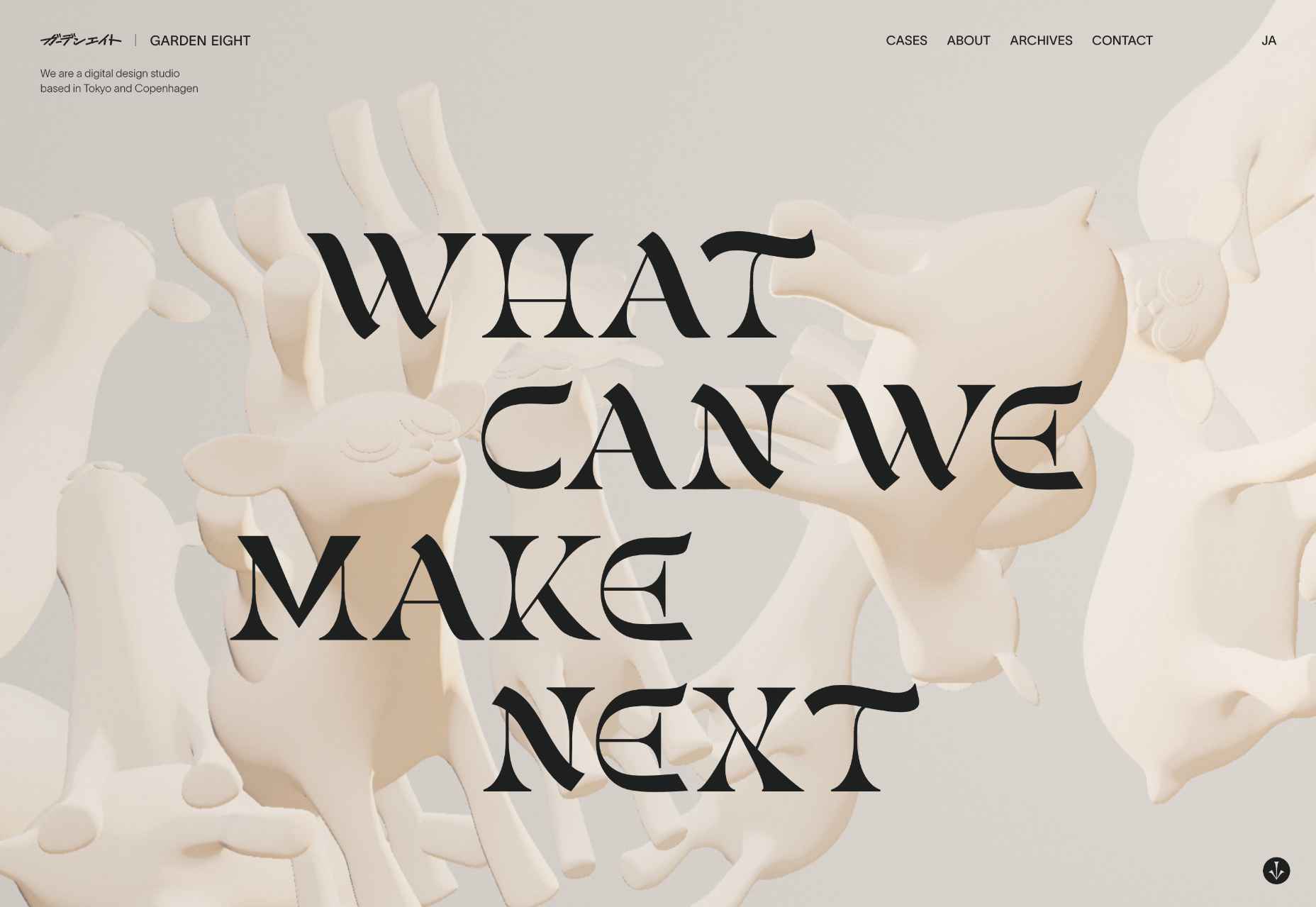
Garden Eight

What could be better than Garden Eight’s gaggle of 3D-rendered cartoon creatures floating around a page, twisting and transforming into new shapes?

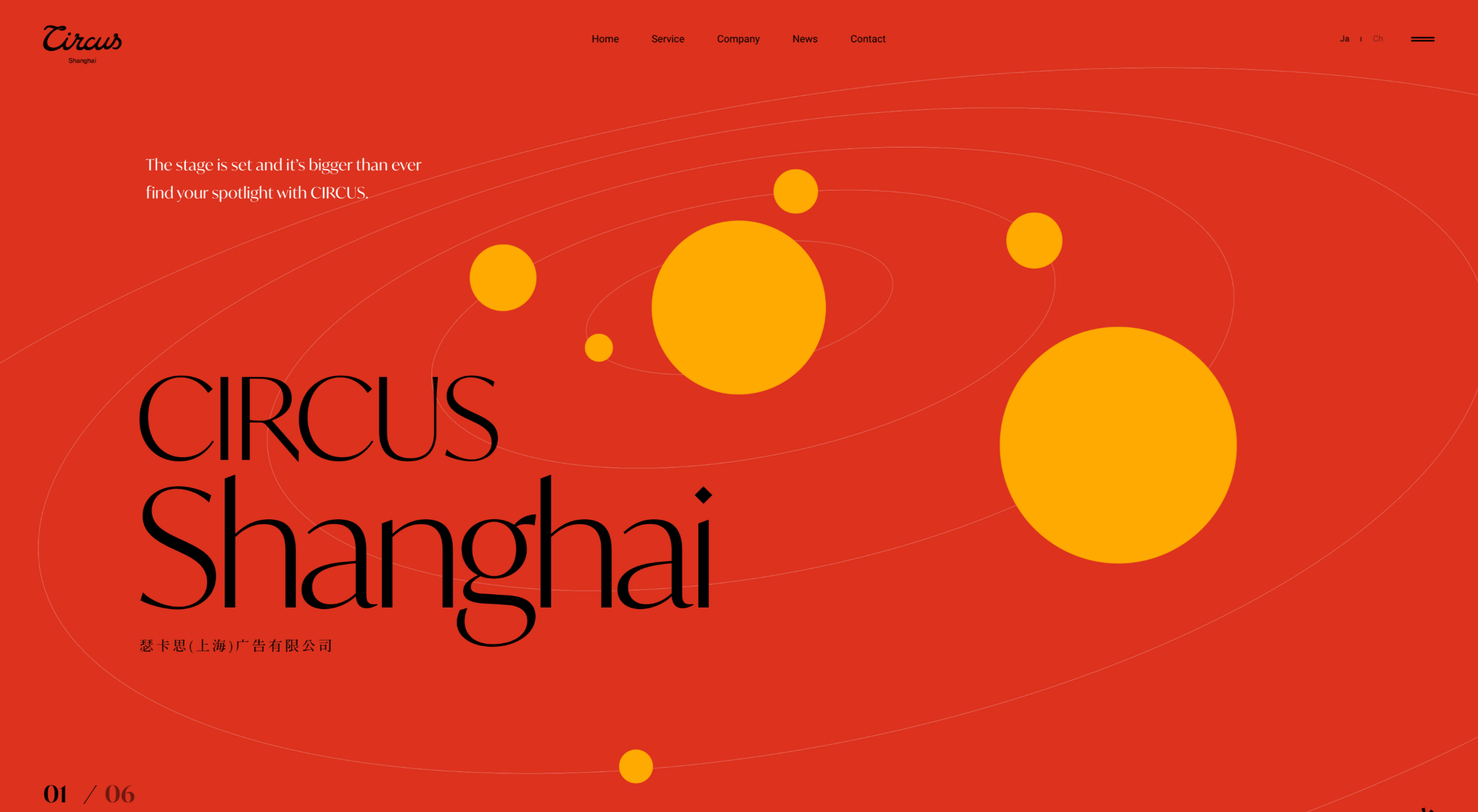
Circus Shanghai

The site for Circus Shanghai uses a rich mid-century illustration to reference both the solar system and the Chinese flag; it’s an arresting combination.

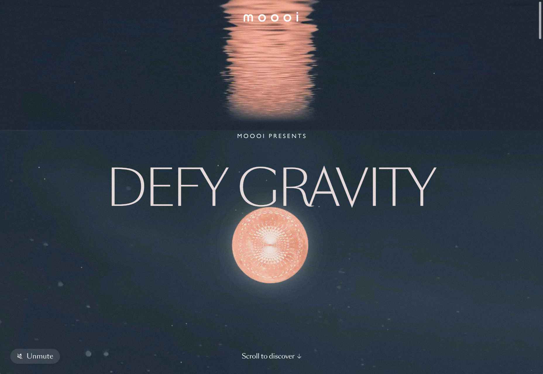
Moooi

Ever inventive, the new micro-site for Moooi asks you to defy gravity with an engaging scroll through collages based on its product range.

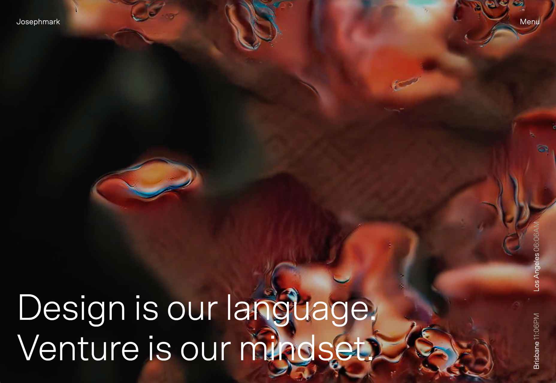
Josephmark

More full-page motion, this time for design studio Josephmark. The site blends rich colors with a brutalist layout and minimalist typography to create its own identity.

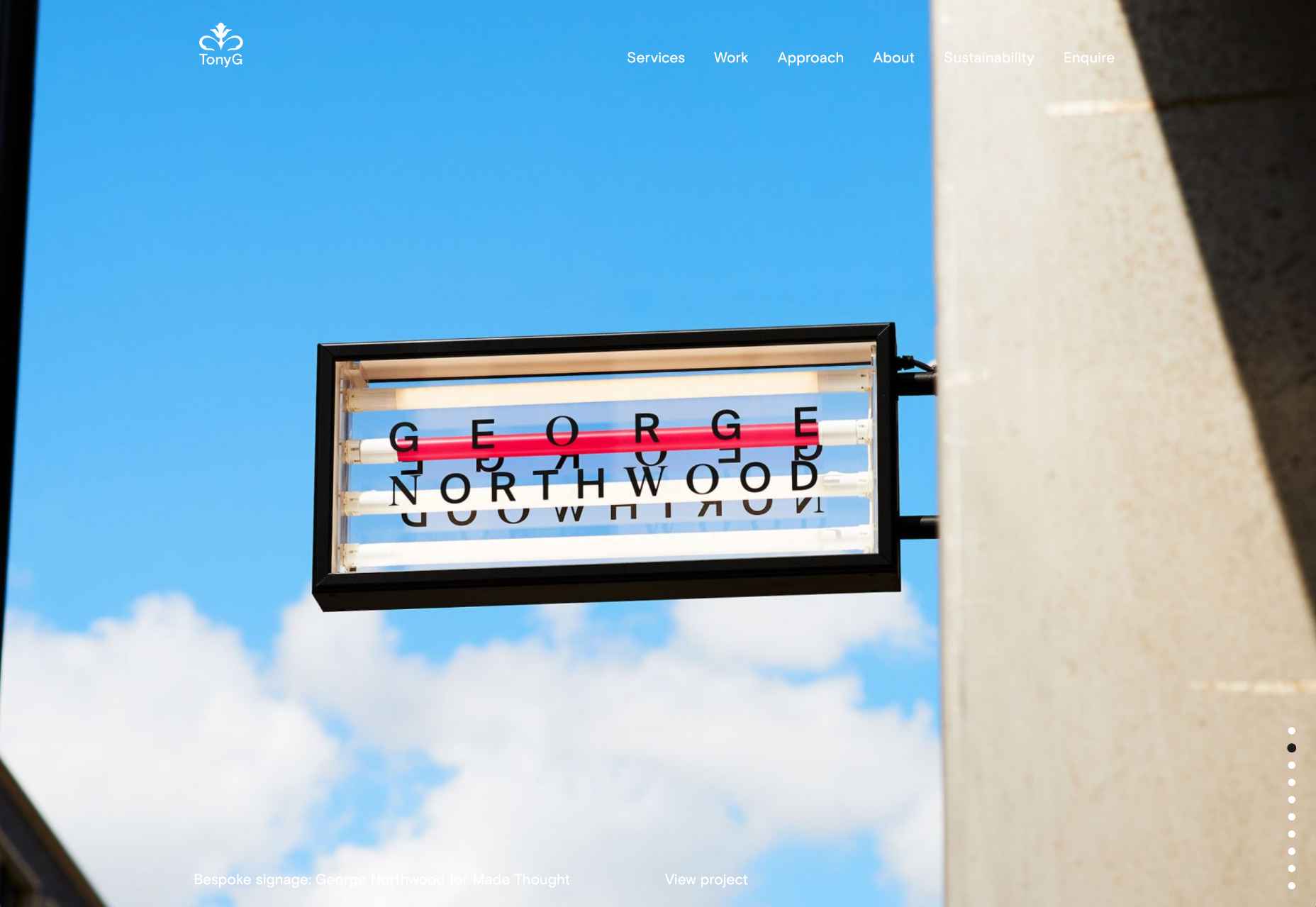
Tony G

We love the infinite scroll on the homepage for creative agency Tony G. It’s a great way to add a slideshow to your homepage without the flaws of slideshows.

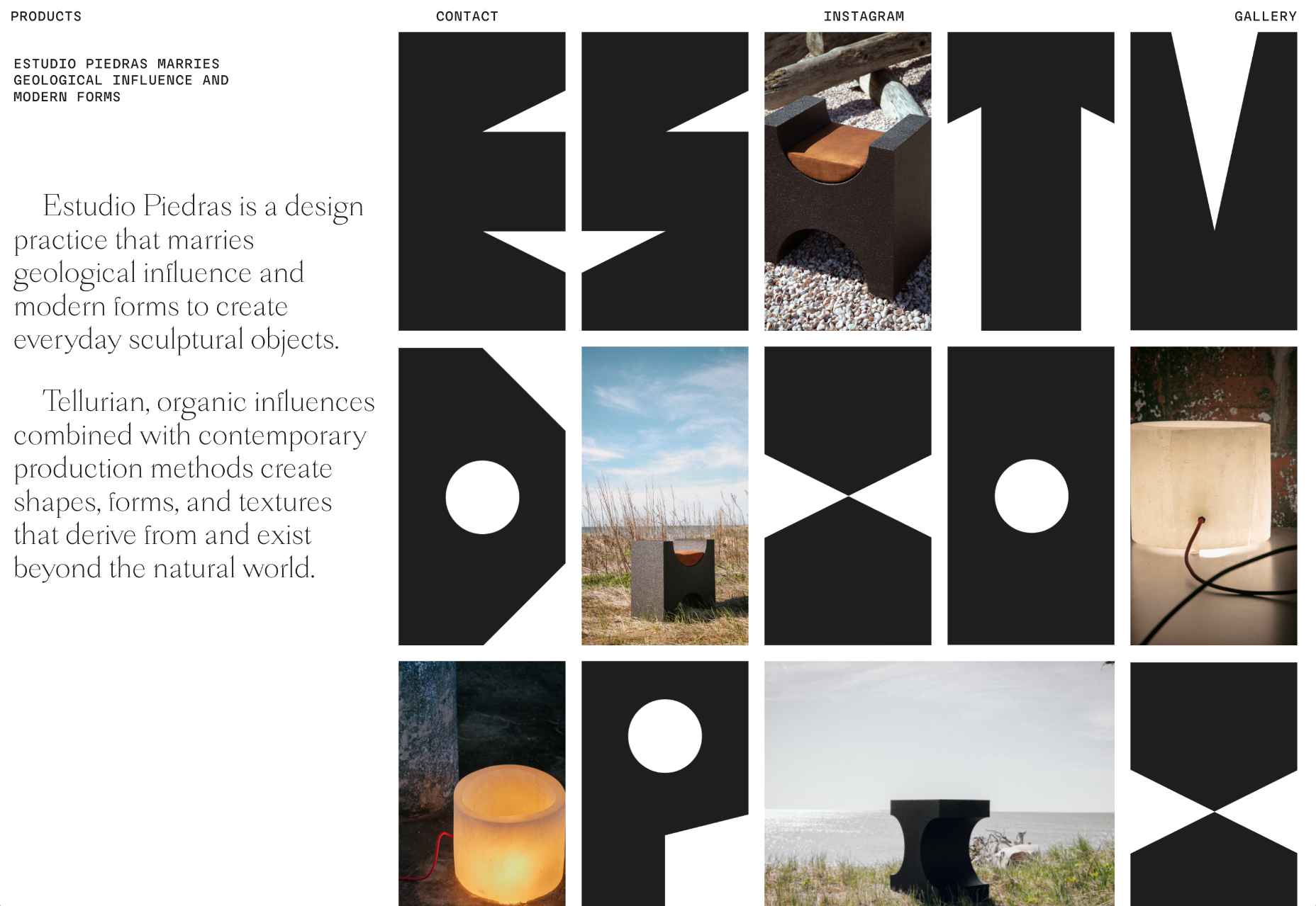
Estudio Piedras

This site for furniture design studio Estudio Piedras uses bold lettering mixed with product shots. The straightforward site is punchy and mimics the solidity of the materials used.

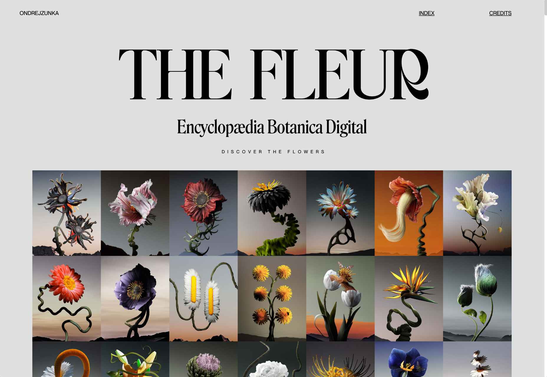
The Fleur

The Fleur is a botanical encyclopedia of fictional flowers that Ondre Jzunka has created as NFTs on the Ethereum blockchain.

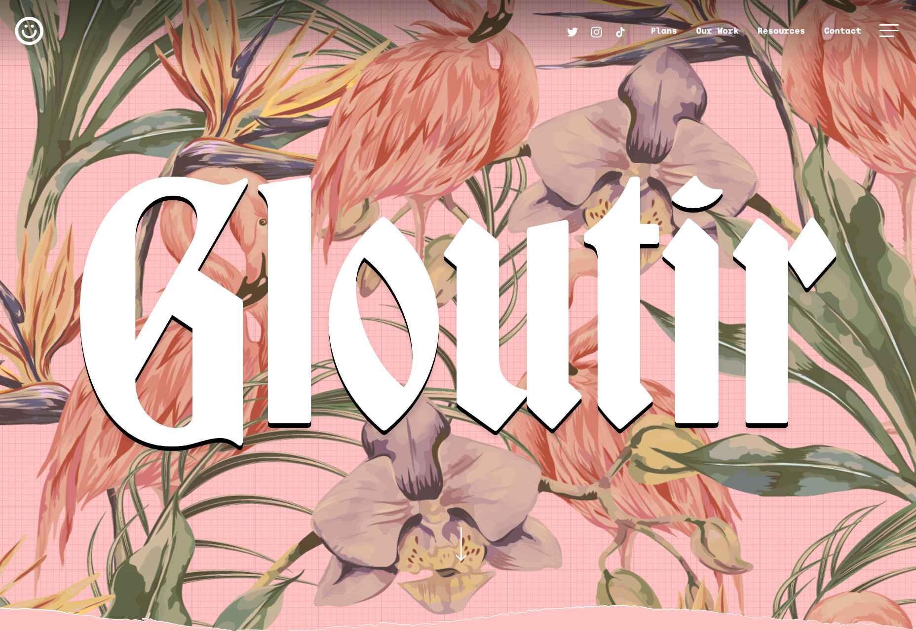
Gloutir

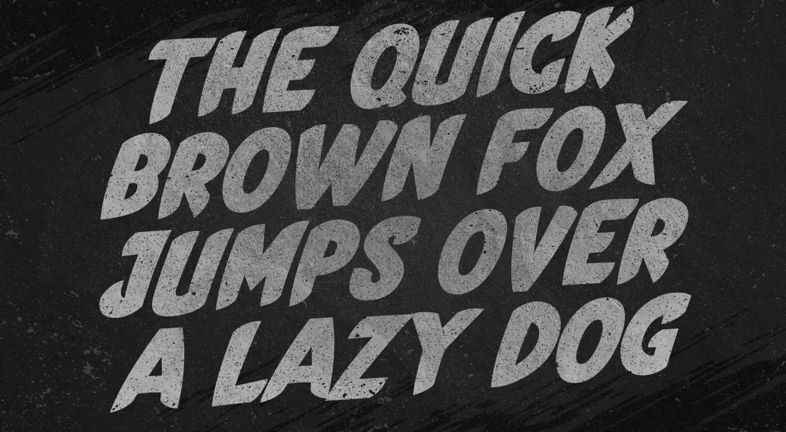
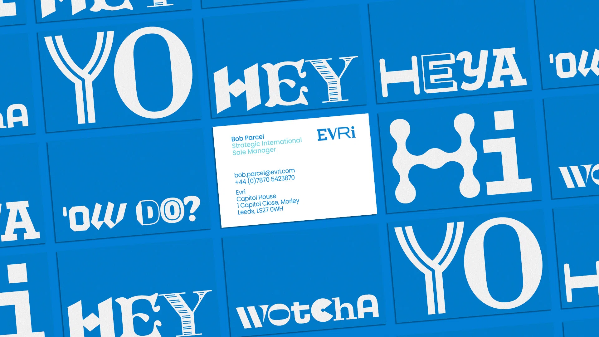
Gloutir is the site for a “subscription-based workhorse design and development studio” that breaks all the rules of typography, and yet somehow it works.

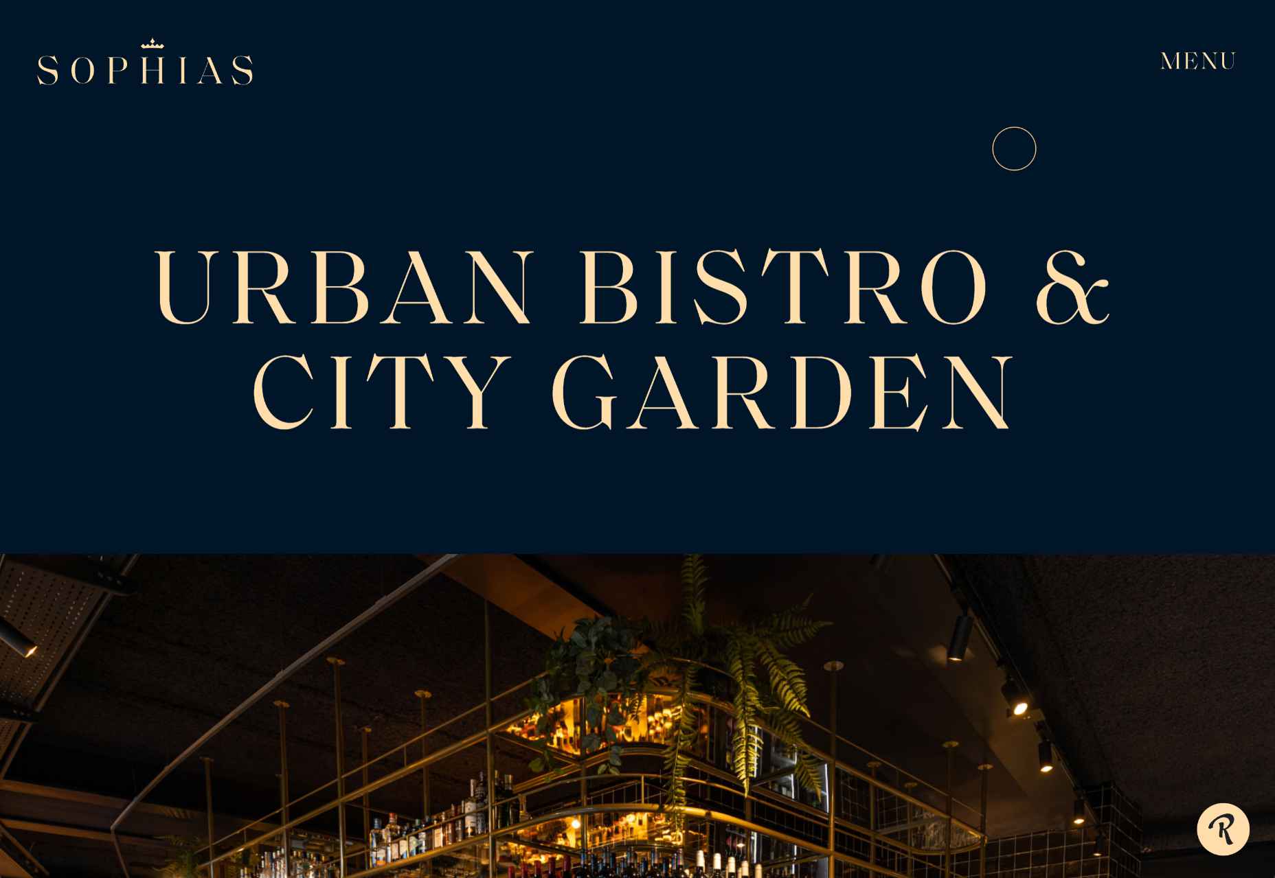
Sophias

The rich blue and bright cream of the site for Sophias urban bistro and city garden echoes the welcoming real-world interiors and ties the brand together.

Lucalem

Lucalem is the portfolio site of designer and developer Lucas De Melo. A little more fun than the typical freelancer’s site, it features a disturbingly phallic character.

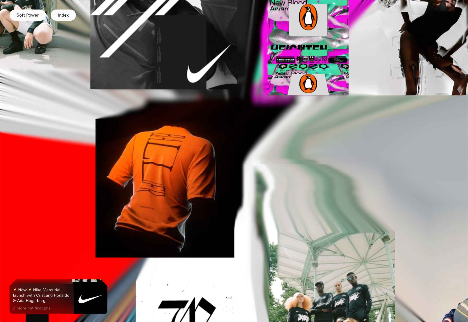
Soft Power

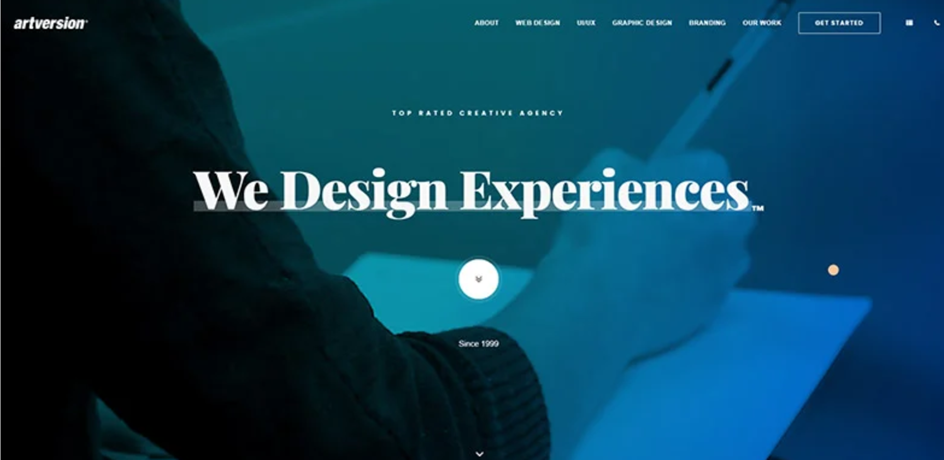
Soft Power is a creative design studio with an eye-popping list of international clients. Its advertising-style site uses a trendy glitch effect expertly.

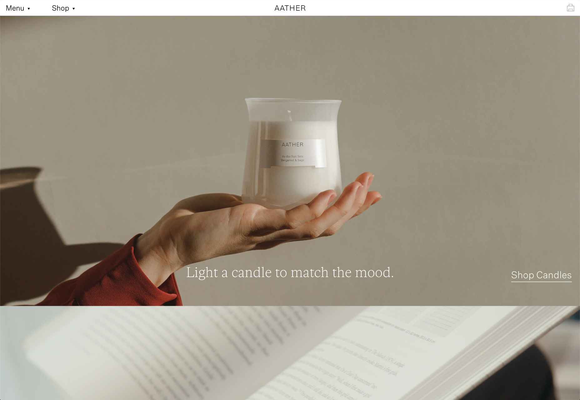
Aather

Pastel colors and subtle textures evoke a calm mood, ideal for candle company Aather. It’s challenging to visually present smell, but this site does it well.

Source

The post 20 Best New Sites, April 2022 first appeared on Webdesigner Depot.
Source de l’article sur Webdesignerdepot

Every organization adopting DevOps has stories to tell to the world. Some of them turned out to be success stories, while others are more like lessons to learn. While it’s true that Etsy is one of such organizations that benefited a lot from their DevOps adoption, they also learned a few lessons from their mistakes during their journey. Today, we will be talking in brief about those lessons in detail. But first, let’s try to understand why Etsy first became interested in DevOps.

Why Did Etsy Adopt DevOps?

Back in 2005, Etsy’s engineering teams were siloed into developers, operations teams, and database admins. Although the team was relatively small — close to 35 employees — they faced many team collaboration challenges. This barrier was hindering Etsy’s progress as an organization. 

Source de l’article sur DZONE

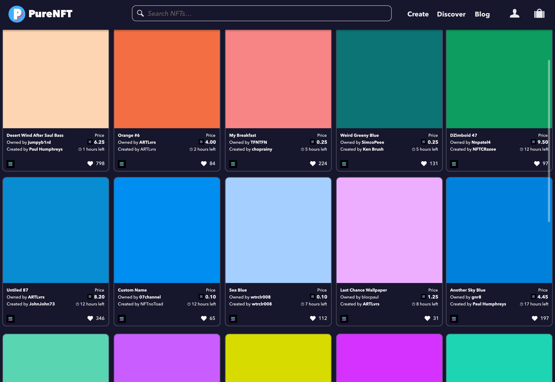
Combining minimalist aesthetics with the ongoing trend for digital art, PureNFT is an awesome new app that lets anyone break into the lucrative NFT market.

The app aims to lower the bar for prospective NFT creators by creating a minimal artwork from a single-pixel captured anywhere on your viewport. You can mint your NFT directly in the app — the process of recording your artwork on the blockchain — and list it for free on PureNFT’s dedicated marketplace.

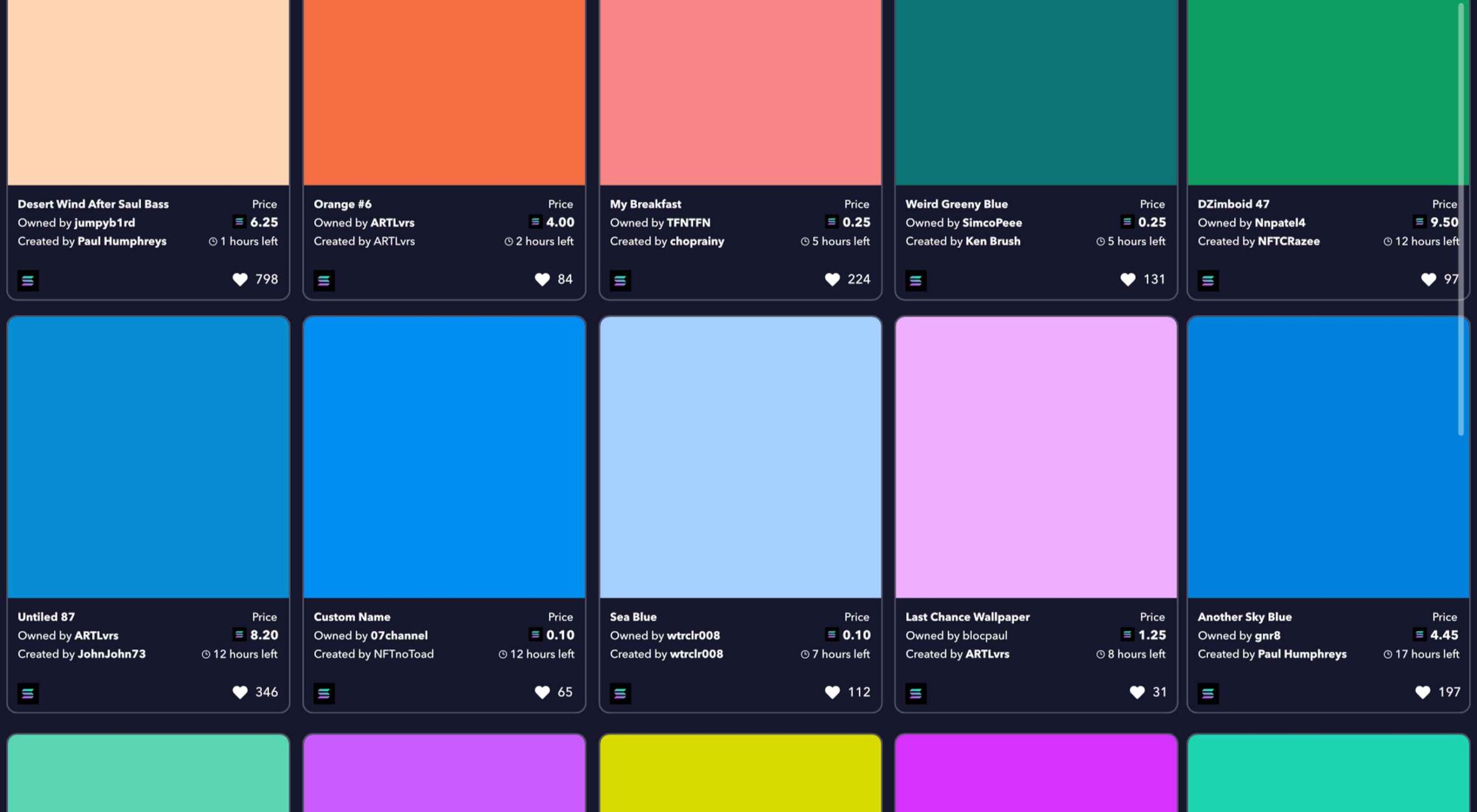
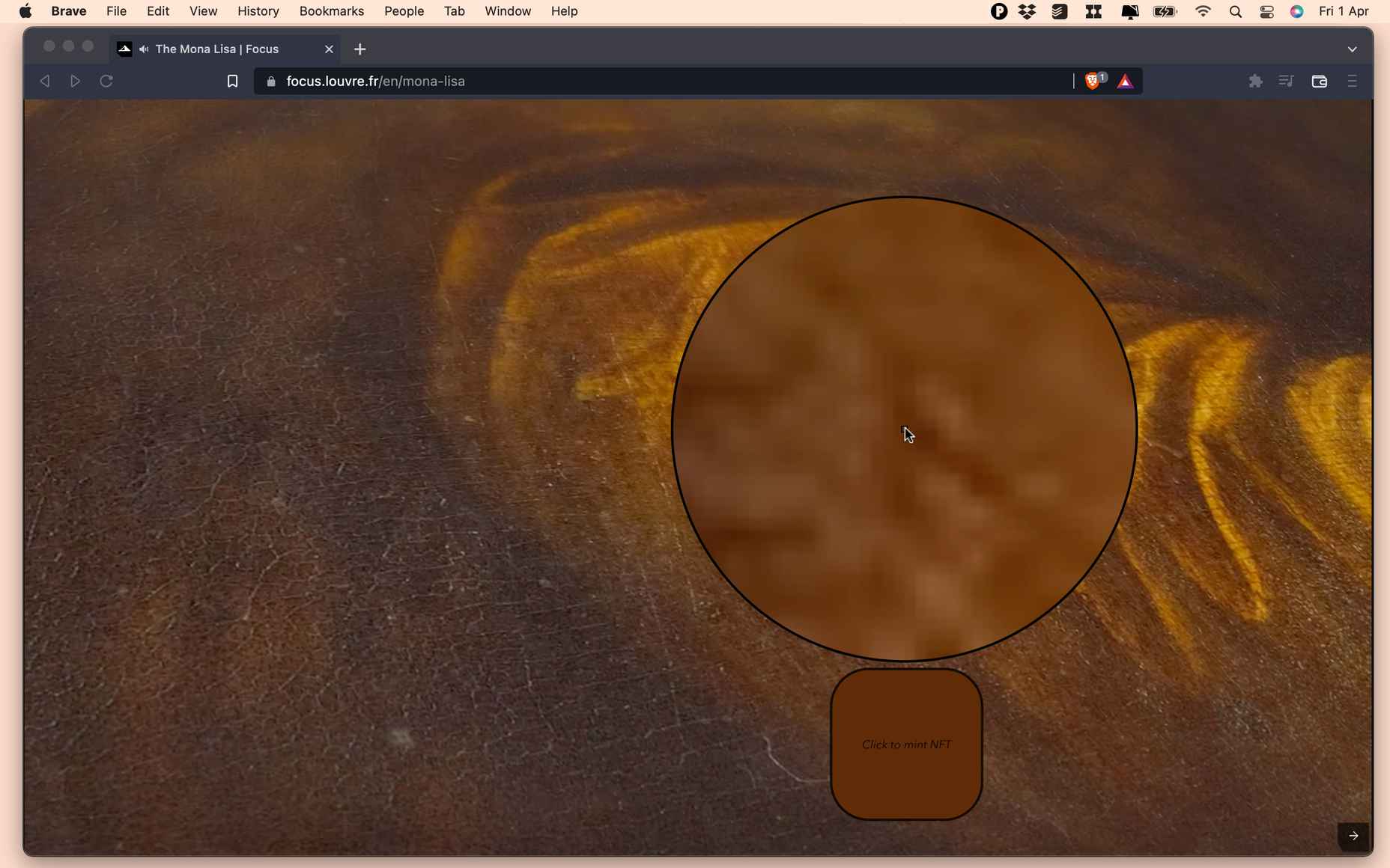
Using PureNFT’s ArtPicker tool, hover the tool over any part of your screen, click a pixel to generate your NFT, and then click the “Mint Now” button to mint it. The app will upscale the pixel to a solid-color artwork with an ultra-high resolution of 5,000 x 5,000px. On the pro plan, PureNFT will automatically generate a 250 x 250px thumbnail to ensure your artwork isn’t pirated.

One of the best features of PureNFT is that you don’t need any drawing ability to break into the exciting NFT trend. Just point your mouse at a pixel and click, and the app will generate a pure high-resolution version of the pixel for you.

Unlike most marketplaces that favor Ethereum, PureNFT is powered by the Solana blockchain, which is far more energy-efficient, and, consequently, environmentally friendly. Despite this, PureNFT’s tokens are platform-agnostic, which means you can mint them on the native platform and then transfer them to popular marketplaces like OpenSea and Rarible.

The potential for NFTs created with PureNFT is limitless. You can literally click any pixel, mint it as an NFT, and wait for the money to start rolling in.

NFTs are a hugely popular way of monetizing artwork, but they are limited in scope; you can only sell one unique NFT of the Mona Lisa, and even then, you have to be the Louvre to do it. But with PureNFT, anyone can visit Wikipedia and open an image of the Mona Lisa that is 7,479 x 11,146px. That translates to 83.3 million potential NFTs; if each pixel sells for an average of $1,000, you might make enough to buy the actual Mona Lisa!

Minting an NFT on PureNFT currently costs 1 SOL (approximately $125 at the time of writing). The first NFT minted by PureNFT — an azure pixel from an unknown screen grab — has an asking price of 375 SOL (approximately $46,875 at the time of writing), but not all PureNFT users have been so lucky, with some early beta users complaining of returns as low as 300%. Nonetheless, the potential for substantial financial gains is evident.

According to Brendan Lewes, co-founder and CTO of PureNFT, the team is interested in introducing AI-powered automation in the near future: Imagine an automated tool searching for popular images, breaking them down into pixels, minting them, and selling them for you, while you live your life. NFT mining could be the next big area of crypto.

However, automation isn’t likely to come anytime soon, according to Lewes:

For now, we’re focussed on maintaining a stable platform. But…we’re super excited about the journey we’re on, and [co-founder Max Schriebport ] and I can’t wait to see where it take us.

PureNFT is currently in beta on macOS, Windows, and iOS, with an Android version on the way. There’s a free plan that allows you to preview up to 5 NFTs, and pro plans start at $399/month.

Source

The post PureNFT Disrupts the NFT Market first appeared on Webdesigner Depot.

Source de l’article sur Webdesignerdepot

Le cœur du système d’information d’Atos, comprenant 42 systèmes et 500 interfaces, a été basculé vers le cloud Microsoft Azure, au travers de l’offre RISE with SAP. Un projet mené en seulement 9 mois par les équipes d’Atos.

Atos est un des leaders mondiaux des entreprises de services du numérique, avec une présence dans 71 pays et un effectif de 105.000 collaborateurs, pour un chiffre d’affaires annuel de près de 11 milliards d’euros. Atos est un acteur engagé : partenaire des Jeux olympiques et paralympiques depuis 2001, le groupe met également en œuvre une stratégie net-zéro visant à la fois à atteindre la neutralité carbone en interne, mais aussi à proposer des services et produits décarbonés à ses clients.

Jusqu’alors, Atos hébergeait son système d’information dans ses propres datacenters, dont l’ERP Nessie. Une offre basée sur des solutions SAP, ayant basculé en 2020 vers l’ERP Intelligent SAP S/4HANA. Fin 2020, l’entreprise a décidé de migrer Nessie vers le cloud.

« Plusieurs raisons ont mené à ce choix, explique Frédéric Aubrière, DSI groupe d’Atos. Chaque changement opéré sur un SI on-premise se traduit par des dépenses d’investissement (CAPEX), qu’il faut valider auprès de la direction financière. Avec le cloud, la discussion peut se recentrer sur les seules dépenses d’exploitation (OPEX), ce qui participe à lever certains verrous. En déléguant la gestion des infrastructures à un hyperscaleur, nous libérons également des ressources IT internes, qui peuvent se concentrer sur leur cœur de métier. Enfin, la crise sanitaire a démontré que la flexibilité apportée par le cloud était un atout pour les entreprises. »

Un des arguments mis en avant par Atos est que le cloud est devenu suffisamment mature pour supporter des workloads critiques. « Pendant longtemps, le cloud a été réservé à des systèmes connexes, l’ERP restant hébergé sur site. Aujourd’hui, le cœur du SI n’est plus un terrain interdit au cloud. J’estime qu’il peut et doit basculer vers le cloud. » En migrant le cœur de son système d’information vers le cloud, Atos entend lancer un message fort en direction des entreprises qui hésiteraient encore à adopter ce modèle de déploiement. Le projet est donc particulièrement stratégique pour le groupe. « Ce que nous avons réalisé avec notre SI, nous pouvons le faire pour celui de nos clients », confirme Frédéric Aubrière.

Un projet mené à bien en seulement 9 mois

Atos a mis en œuvre tout son savoir-faire – et la force de frappe de ses nombreux experts – pour réaliser cette migration en un temps record. Le choix s’est porté sur l’offre RISE with SAP, avec un déploiement effectué sur les infrastructures Microsoft Azure de Francfort. Un choix stratégique là encore, les serveurs utilisés dans ce datacenter Microsoft étant des Bull Sequana S. Du matériel conçu par Bull, filiale d’Atos, et certifié SAP, avec des instances pouvant atteindre les 12 To en scale up (et plus d’une centaine de téraoctets en scale out).

Le projet a démarré fin 2020. Dès avril 2021, le système de test basculait en live, suivi par les instances de développement et de qualité. L’instance de production est entrée en fonction le 13 septembre 2021, soit environ 9 mois après le début du projet. Un tour de force de la part d’Atos. Si l’ERP a été migré sans modifications majeures, le périmètre du projet reste en effet particulièrement important. « Nous avons migré notre ERP vers le cloud, mais aussi l’ensemble des systèmes connexes gravitant autour de lui », explique Frédéric Aubrière. Au total, 42 systèmes ont été migrés et 500 interfaces. 5000 tests ont été effectués afin de couvrir un large spectre de cas d’utilisation.

« Hormis quelques ajustements dans les paramètres de connexion, la bascule a été transparente pour les utilisateurs. Le portail MyAtos est toujours accessible de la même façon et permet toujours d’accéder aux mêmes services. Notre SI est par ailleurs toujours aussi stable et performant. » Les performances des infrastructures correspondent jusqu’à maintenant au cahier des charges d’Atos, avec un SLA de 99,7% et un RPO très proche de zéro (30 minutes). « Nous allons exécuter un dry run du DRP dans les prochains mois, afin de mesurer le délai de reprise d’activité de notre SI », confie le DSI d’Atos.

SAP BTP et décarbonisation en ligne de mire

Avec son contrat unique, l’offre RISE with SAP est un facteur de simplification lors du passage au cloud. « Avoir un unique contrat, signé en direct avec SAP, nous permet de nous affranchir de la complexité de la tarification des hyperscaleurs, confirme Frédéric Aubrière. C’est une forme de contrat plus confortable pour les clients et apportant une meilleure prédictibilité sur les coûts. RISE with SAP nous permet également de conserver notre code et nos applications. Il permet de basculer vers le cloud de façon non violente, en respectant les processus et spécificités du groupe. »

Une fois le SI stabilisé et les processus calés entre SAP et Atos, l’entreprise compte travailler sur la prochaine génération de son ERP. Au menu, un nettoyage du code spécifique et son adaptation à la SAP Business Technology Platform (SAP BTP). En parallèle, une connexion avec certains services Microsoft Azure sera mise en place. Autre tâche confiée à la DSI d’Atos, la décarbonation du fonctionnement de sa nouvelle plate-forme cloud. L’élasticité propre aux infrastructures cloud devrait permettre au groupe d’ajuster les ressources au plus près des besoins. L’objectif d’Atos est d’atteindre la neutralité carbone d’ici 2028.

The post Atos bascule son ERP SAP S/4HANA vers le Cloud avec l’offre RISE with SAP appeared first on SAP France News.

Source de l’article sur sap.com

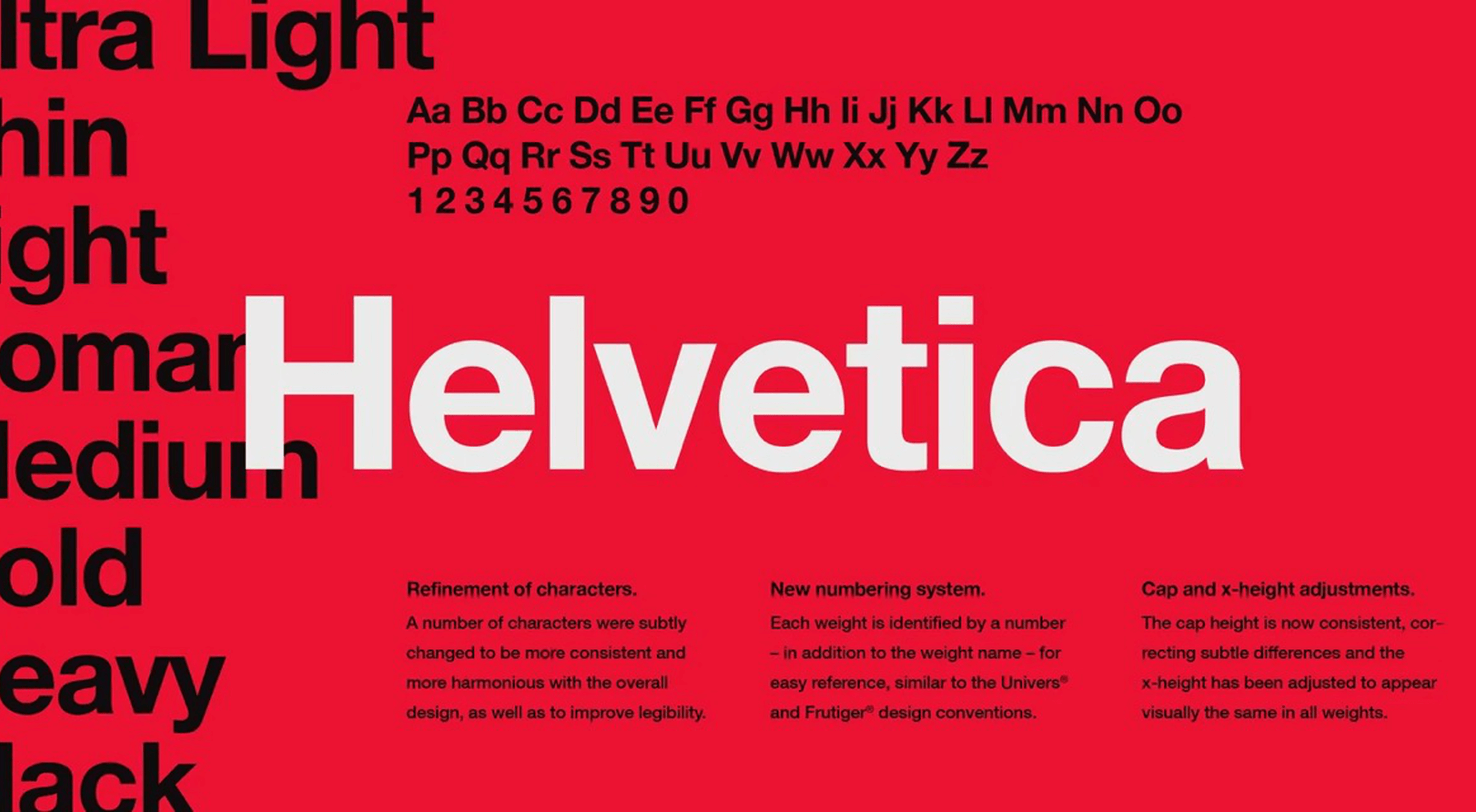
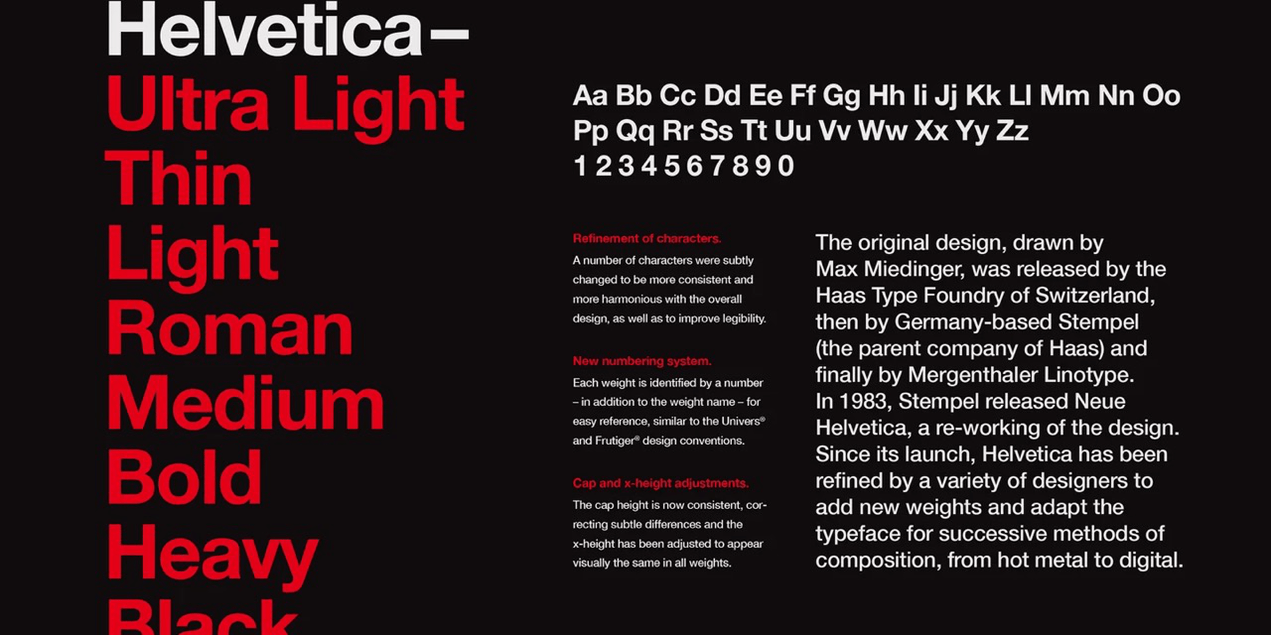
Few fonts in the world have become a part of the cultural landscape that they have an entire documentary film and a MOMA exhibition made about them. Helvetica, however, is different. It has been the go-to font for everyone from government agencies to hip pop-up shops whenever clean and modern text is called for. It has become so much a part of our daily lives that it has created a long list of detractors. 

It is strange for a humble font to be so used and so hated at the same time. Is Helvetica the font that symbolizes hip, cool and modern? Or is it a ’60s anachronism loved by boomer designers that deserves to go the same way as the 8-track and gasoline?

Birth of a Legend

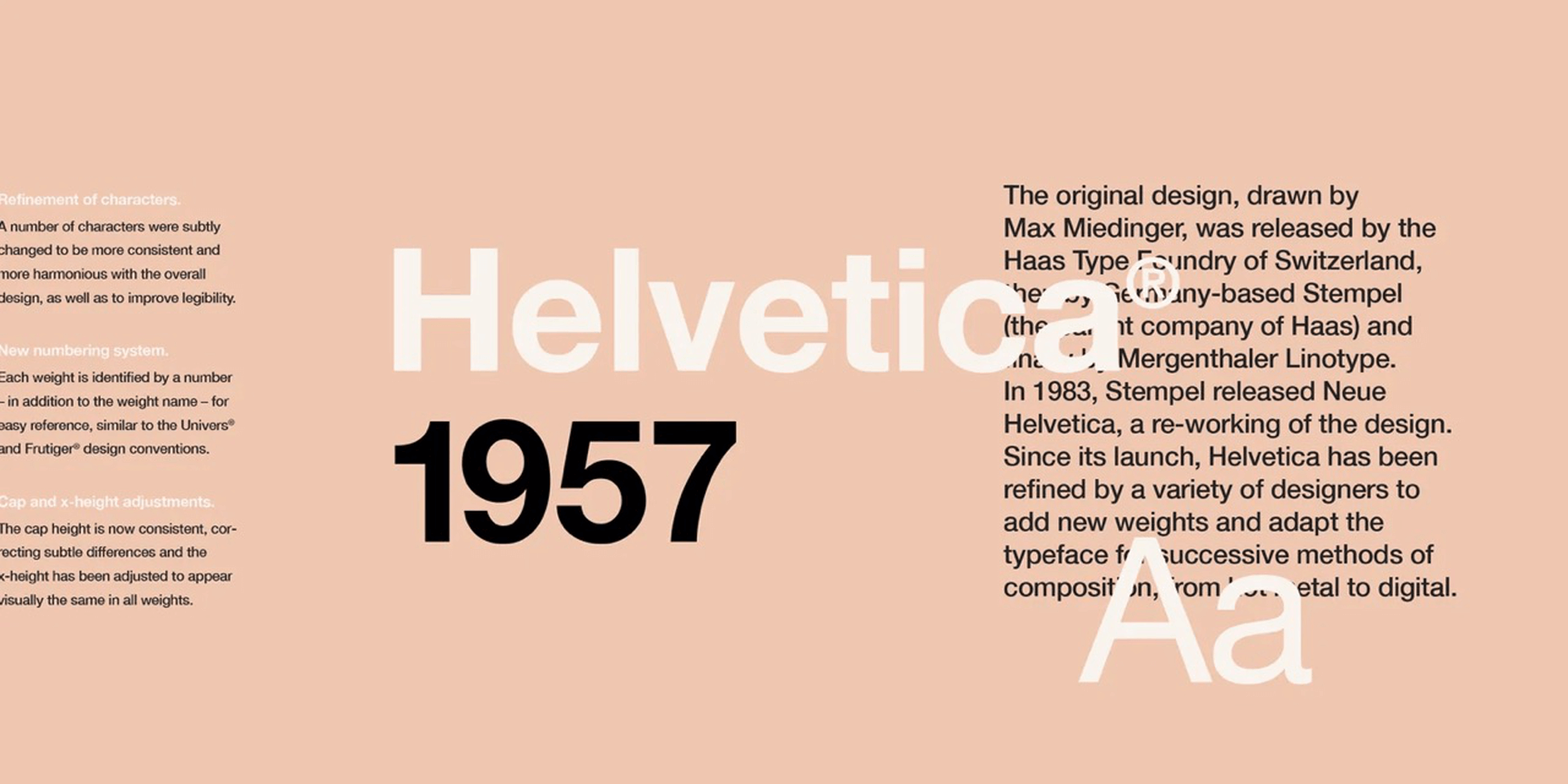
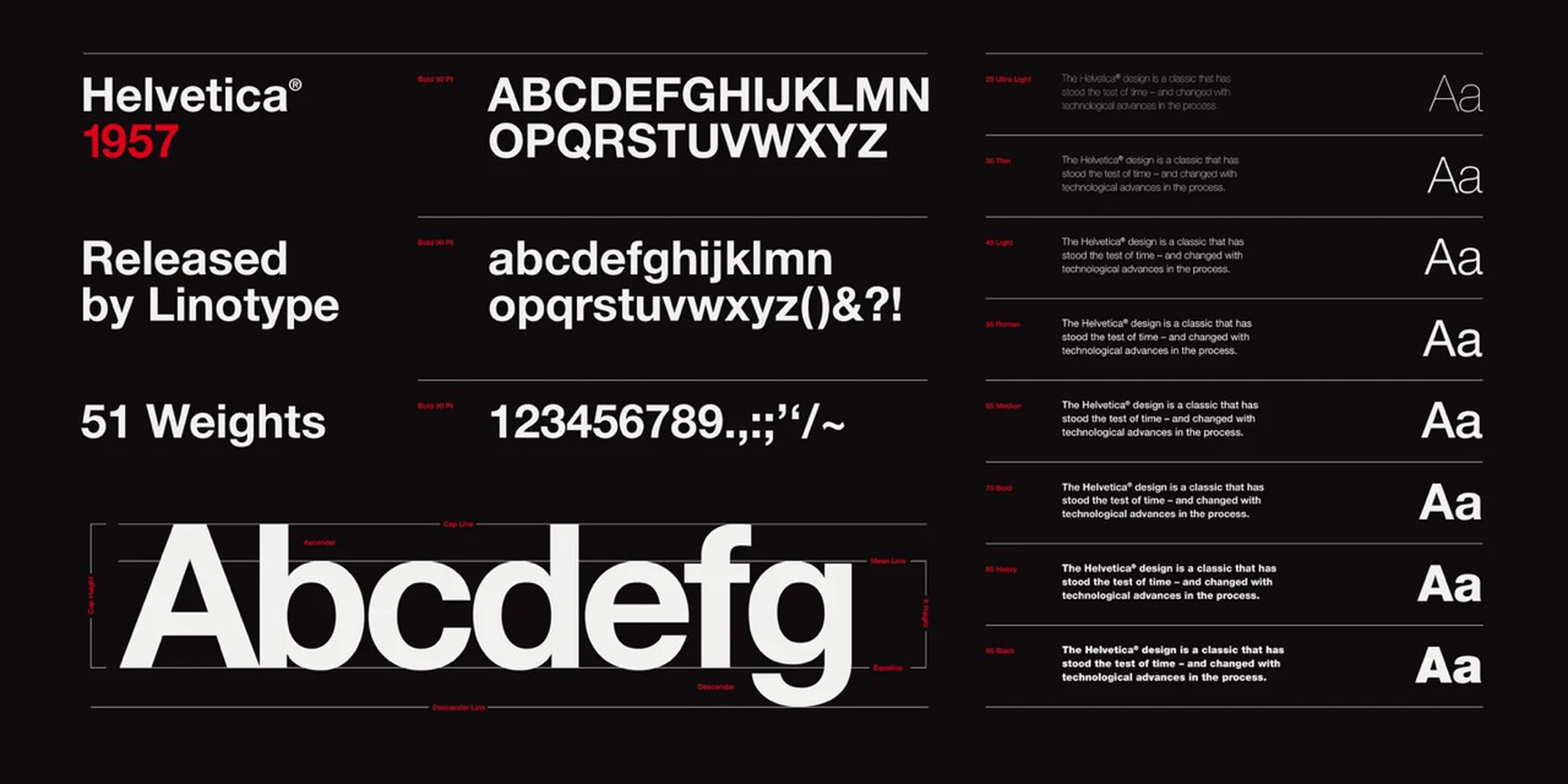
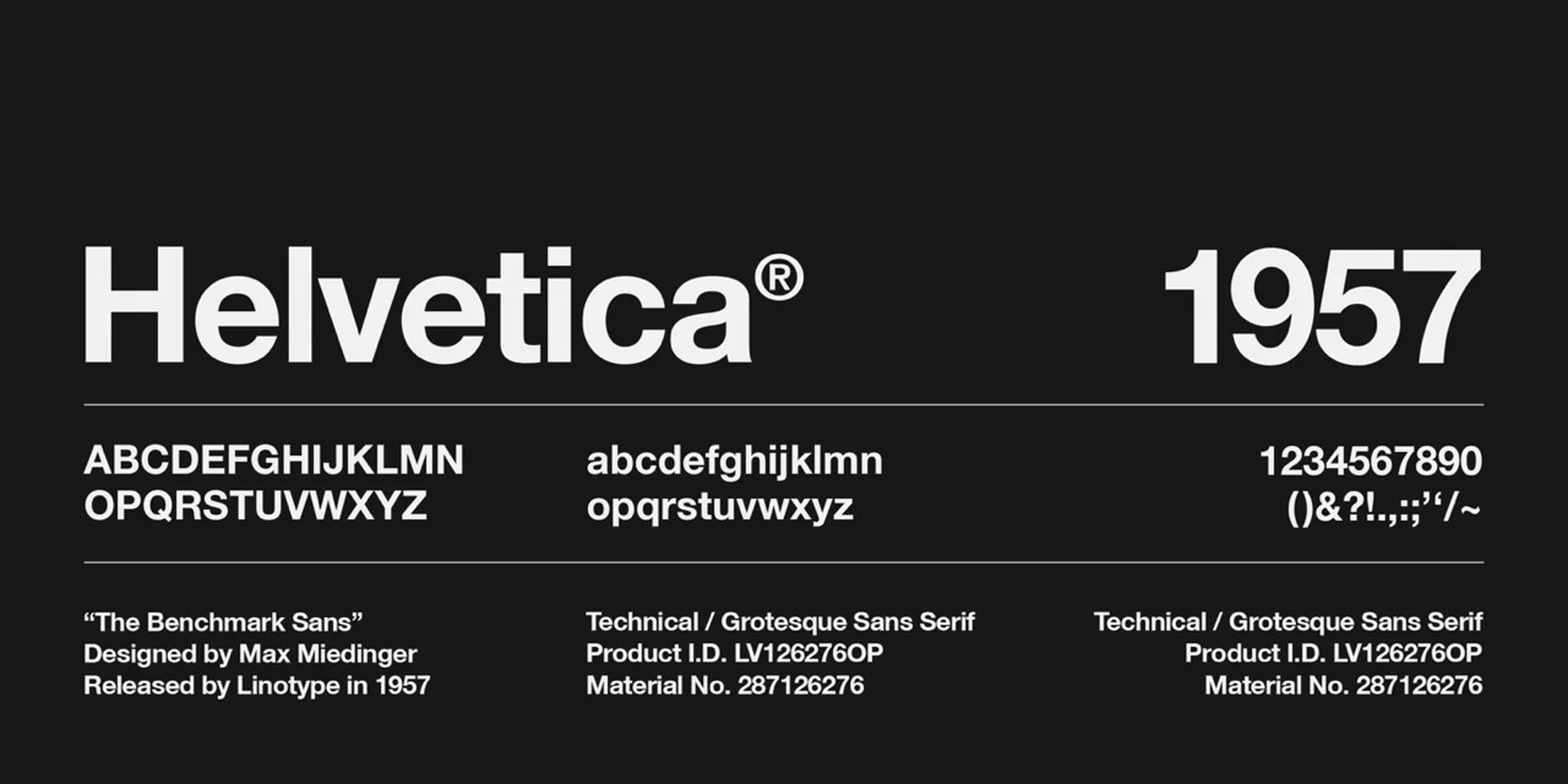
Helvetica is the Latin word for Switzerland, the birthplace of this font. It was created in 1957 in the middle of a boom of fonts created by Swiss designers that today is known as the International Typographic Style. It was the handiwork of two designers, Max Miedinger and Eduard Hoffmann. 

They designed this simple sans-serif font to be — ironically enough, given today’s divided opinions — a neutral font. It was modern, in the popular style, but simple, dense, and legible. It was something that could be put on a sign and easily be read from a distance. 

Helvetica represented a clean break from the fonts that came before. The designers upended the more formal and intricate serif fonts of the 19th and early 20th centuries with bold, clean simplicity. Perhaps it was a product of a new era, maybe it defined a new era as it went, but Helvetica was a revolution in font design. 

The new font was an enormous hit. One of its earliest fans was the United States Government, who put it everywhere from the sides of space shuttles to agriculture policy reports. The European Union went so far as to require its use on all health warning information. In addition, the font spread to languages as diverse as Khymer, Urdu, and Korean. 

The font was initially cast in hot metal typeset and has been altered and redesigned as the world and printing technology have changed. There have been several updates, all modifying the original design to exaggerate or change the font for greater legibility, particularly on computers where many claim the font falls short. And as with anything popular in the design world, the number of imitators and ripoffs far exceeds the scope of the original.

Where Helvetica Stands Today

Today in the 2020s, despite now being old enough to qualify for a pension, this font is everywhere. Why, though, is something so ubiquitous so controversial among designers?

Any style that becomes the ‘next big thing’ will attract critics, particularly if that ‘next big thing’ sticks around longer than expected. For some, the International or Modern fonts era is simply a piece of history. Not unlike the art or architecture from those eras, the pieces are lovely to look at, but it has been done. To continue it now would be imitation, or worse, a lack of imagination. 

Why the Haters Hate

For some critics, Helvetica has fallen victim to the banality of overuse. The day the US Department of Agriculture decides it loves a style, that style is officially uncool. Too many ‘squares with no taste’ have decided that Helvetica represents what must be cool, so the people in the know reflexively reject it. The trend makers define their role in the art world by being avant-garde and neophilic. They have to use the next new thing before anyone else or their tenure as a trend maker is finished. For these critics, Helvetica isn’t bad per se, just old and worn out. 

Lastly, there is the ever snarky group of critics who have come to loathe Helvetica for what it represents: boring corporate design. Helvetica became the darling of every group of people who wanted to give the image of clean modernity. It’s a boring choice, uninspiring, damn near default. It makes designers look lazy, their work stale. Helvetica’s success in becoming a near-ubiquitous font has made it too much of a default to be cool.

Why Helvetica is Well Used and Well-Loved

There are an equal number of fans for every salty critic who has come to dislike Helvetica. Those who favor the font love that it is true to its design, simple and legible. For a government agency or large corporation, it is clean and efficient. It is stylish enough to give a little life and flavor to the publication but is subdued enough to show professionalism and erudition. 

The font’s connection to the Modernist and International era can be appealing to others. Some styles retain their popularity throughout the years, seen as cultural hallmarks and high points of culture and expression. Helvetica was a product of an optimistic age where the dense, dark expressions of the past were replaced with light and airy styles. These looks have fluctuated in public opinion but have never totally gone out of style. This enduring appeal has kept Helvetica in many designers’ good graces. 

Finally, many fans like it because they have been steeped in its use so long it has become part of their style. From the original modernist era designers to the students they taught, and now their students’ students, it was a look many incorporated into their own style. All designers are products of their education and stand on the shoulders of previous generations; Helvetica has been such a part of the design landscape that many people have made it their own. Perhaps this was conscious, perhaps unconscious, but either way, many cool new designers at the forefront of new styles still choose this font to express text in their works.

Cliché or Classic

Perhaps in a twist of ironic fate, the two designers of Helvetica aimed to create a font that would be, in their words, “A neutral font that should not be given additional meaning.” This clean neutrality was a goal worthy of anything named after Switzerland. And this might very well be the true source of division; it is a plain, clean font into which all designers can place some or no meaning. It is a blank canvas, and just as any blank canvas hung in a museum, it would attract positive and negative opinions by its very nature. 

To call it a cliché, or classic, though, is Helvetic’s conundrum. It is undoubtedly classic, and its rampant overuse causes it to stray pretty far into cliché territory. The strange situation it finds itself in is that it seems to exist as both cliché and classic at the same time. It has become a default but a beautiful default.

Helvetica is everywhere, and like anything that is everywhere, it is both divisive and ignorable. Either way, love it or hate it; it isn’t going anywhere. 

Source

The post Helvetica: Overused Cliché or Modernist Classic? first appeared on Webdesigner Depot.

Source de l’article sur Webdesignerdepot


Introduction 

In our previous article, we discussed two emerging options for building new-age data pipes using stream processing. One option leverages Apache Spark for stream processing and the other makes use of a Kafka-Kubernetes combination of any cloud platform for distributed computing. The first approach is reasonably popular, and a lot has already been written about it. However, the second option is catching up in the market as that is far less complex to set up and easier to maintain. Also, data-on-the-cloud is a natural outcome of the technological drivers that are prevailing in the market. So, this article will focus on the second approach to see how it can be implemented in different cloud environments.

Kafka-K8s Streaming Approach in Cloud

In this approach, if the number of partitions in the Kafka topic matches with the replication factor of the pods in the Kubernetes cluster, then the pods together form a consumer group and ensure all the advantages of distributed computing. It can be well depicted through the below equation:

Source de l’article sur DZONE

Même dans les périodes difficiles, certaines choses demeurent inchangées. La musique est pour beaucoup un exutoire et le moyen de partager des moments uniques. Dans un même temps, la réduction des émissions carbone est une priorité essentielle pour tous, et ce dans le monde entier. Pour répondre à cet enjeu, Coldplay s’associe cette année à SAP afin que sa tournée mondiale « Music Of The Spheres » soit la plus neutre possible en carbone.

Quand la date du concert tant attendue approche, vous vous demandez probablement comment vous comptez vous y rendre. La réponse à cette simple question peut avoir un impact important sur le déroulement de votre soirée, mais elle pourrait avoir un impact encore plus grand sur votre empreinte carbone, et par conséquent sur notre planète et ses habitants.

Croyez-le ou non, les déplacements du public pour aller et revenir d’un concert contribuent largement aux émissions de carbone et s’accumulent à chaque tournée. Tous les fans n’en ont pas conscience mais en les sensibilisant, nous pouvons en responsabiliser des millions.

Coldplay, l’un des groupes de musique les plus célèbres et engagés, s’est fixé une mission pour sa prochaine tournée mondiale : la rendre la plus éco responsable possible. Pour y parvenir, ils souhaitent réduire leur consommation globale mais également avoir davantage recours à des technologies vertes, dans le but de réduire les émissions totales de CO2. Ce projet est aussi le moyen de sensibiliser la communauté de fans à une cause qui concerne tout le monde.

Coldplay souhaite ainsi continuer d’offrir une expérience de concerts unique à ses fans tout en leur donnant la possibilité de s’engager à ses côté. Pour donner vie à ce projet, le groupe avait besoin d’un peu d’aide ; c’est là qu’intervient SAP.

Grâce à notre technologie et à nos solutions, nous donnons aux organisations du monde entier les moyens de favoriser le développement durable“, a déclaré Christian Klein, PDG et membre du Conseil Exécutif de SAP SE. “Coldplay et SAP partagent un engagement commun et profond pour le développement durable, et nous sommes ravis d’unir nos forces pour rendre leur tournée aussi écologique que possible.”

SAP a collaboré avec Coldplay pour développer et lancer l’application Coldplay Music Of The Spheres World Tour. Cette application combine des expériences interactives et immersives avec des fonctionnalités qui permettent aux fans de prendre des décisions plus respectueuses de l’environnement lors de leurs déplacements. Une fois que les utilisateurs auront téléchargé l’application, ils commenceront leur voyage et exploreront différentes sections qui offrent toutes des moyens uniques de faire partie de l’univers Coldplay tout au long de la tournée.

Les fans peuvent commencer par l’axe durabilité dans la section “Voyage” de l’application. Ils peuvent y visualiser et mieux comprendre en quoi leur mode de déplacement impacte leur empreinte carbone. En choisissant parmi sept modes de transport différents – voiture, taxi, train, transports en commun, vélo, à pied ou en avion – les fans peuvent voir en temps réel l’impact de leurs décisions sur l’environnement. Et pour promouvoir des modes de transports plus durables, l’application offre des récompenses sous forme de codes promo sur la boutique en ligne de Coldplay à tout spectateur qui s’engage à utiliser les transports à faible émission carbone.

L’application comporte également d’autres rubriques :

  • La tournée : il est possible de consulter les dates et les lieux des concerts, de trouver des billets ou même de partager ses concerts préférés directement sur les réseaux sociaux.
  • Planet : cette rubrique permet de plonger dans des jeux interactifs sur le thème de la réduction des gaz à effet de serre, tout en apprenant davantage sur les actions mises en place par Coldplay et ses partenaires de tournée dans le domaine.
  • Univers : Grâce à cette rubrique, l’utilisateur peut créer son propre contenu sur le thème de Coldplay en utilisant la réalité augmentée. Il est possible d’y prendre des photos, créer des vidéos, et même de danser avec des extraterrestres, puis de partager ses créations sur les réseaux sociaux. Cette rubrique donne également accès à du contenu exclusif sur le groupe.

Pour donner vie à cette expérience d’envergure mondiale, SAP a exploité deux solutions de premier ordre : SAP Business Technology Platform et SAP Cloud for Sustainable Enterprises. Coldplay utilise également SAP Analytics Cloud pour obtenir des informations sur l’empreinte carbone des fans qui voyagent, à partir des données capturées dans l’application, ce qui aidera le groupe à déterminer comment la tournée compense les émissions de carbone calculées.

Ces dernières années, nous avons cherché à placer le développement durable au cœur de nos tournées et l’application joue un rôle important dans la concrétisation de cette vision et de cet engagement. Nous sommes très fiers de la collaboration avec notre partenaire SAP, qui a créé une application à la fois efficace et attrayante permettant à nos fans de choisir des moyens plus durables pour se rendre à nos concerts“, a déclaré Coldplay.

Les difficultés rencontrées par Coldplay pour gérer les émissions de carbone liées aux déplacements du public ne sont pas propres à l’industrie musicale. Partout dans le monde, les entreprises sont confrontées à la gestion des émissions de carbone qui ne font pas partie de leurs activités ou qui ne sont pas sous leur contrôle direct, autrement dit, les émissions de niveau 3. SAP aide ainsi les entreprises du monde entier à devenir des entreprises durables et intelligentes, en leur fournissant des solutions et des outils numériques pour gérer de manière optimale leurs performances en matière de développement durable, à tous les niveaux de leur activité.

Ce n’est qu’en s’engageant collectivement que nous pourrons commencer à améliorer notre impact sur l’environnement. Avec l’application Music Of The Spheres World Tour, nous sommes heureux de montrer au monde entier que lorsque nous travaillons conjointement, nous pouvons sensibiliser, agir, et surtout changer les choses.

Pour vivre vous-même l’expérience, l’application Music Of The Spheres World Tour de Coldplay est déjà disponible en téléchargement sur iOS et Android.

The post Quand la technologie donne le LA à la tournée eco-friendly de Coldplay appeared first on SAP France News.

Source de l’article sur sap.com

This month’s collection of the best new fonts is headed in a lighter and quirkier direction than previous months. What’s more, font foundries seem to be getting more creative with their designs as many of these fonts come with alternative stylistic sets, giving you more control over the resulting typeface.

If you’re looking for some fun new fonts to spice up your web designs with, start here:

1. Beauty Rose

Beauty Rose is a whimsical script font that can add a touch of romance and warmth to header text and hero images. It would also look great when promoting holidays and events like Mother’s Day, Valentine’s Day, and weddings.

2. Black Sharp

Black Sharp is a bold display font that works equally well for website logos as it does for physical products (e.g., signage, packaging, book covers, etc.). What’s especially neat about this font is how it transforms when you change its texture. It takes on a very different tone with a grainy look instead of a shiny one, for instance.

3. Goat & Qalvigo

Goat & Qalvigo is a classic serif font with a modern twist. While many of the examples provided by the type designer show off the funky side of the font, thanks to the additional ligatures and alternative styles, you can always use the regular character sets. Either way, you’ll have a classy new font to use all over your website.

4. Happy Comic

Happy Comic is a font filled with personality. Looking at it makes me think of a goofy cartoon character or maybe even an older Adam Sandler movie. This would be a good font for branding lighthearted and humorous brands or publications.

5. Helsa Display

Helsa Display is a slim and compact serif. While serifs usually work pretty well for paragraph text, this one belongs in headlines and sub-headlines because of how thin the characters are. It also has a bit of a dark side (see the examples at the link to see what I mean), so reserve this font for boundary-pushing brands and personalities.

6. Lab Antiqua Variable

Lab Antiqua is a font that took years to create. The most recent release for this font family is called Lab Antiqua Variable. Like other variable fonts, Lab Antiqua will effortlessly transition through a range of font sizes without losing the characteristics that make this serif font so unique.

7. Monomorium

Monomorium is a monospaced typeface with open apertures and a flowing style. In addition, this quirky font comes with additional ligatures, stylistic alternates, parentheses, and more, depending on how fun or buttoned-up you want it to look.

8. Neumond

Neumond is a serif font that pushes the boundaries of legibility. This font gives you the ability to equip the characters with razor-sharp lines, overlap the letters, and push them towards extreme angles. If you have a brand that’s challenging the norm, a font like this that does the same will go really well with it.

9. Pratico Slab UI

Pratico Slab UI is a slab serif font that would add strength and character to the text of a website. You can also experiment with the weight and size if you’re looking for a not-so-boring but highly legible header font.

10. PT Nature

PT Nature is an exciting collection of script fonts. While they all technically belong to the PT Nature family, each font is modeled after different people’s handwriting. So this font family could be really useful if you use a lot of script fonts in your work. Or if you want to make one site and brand look like it has multiple personalities.

11. Rosehot Typeface

Rosehot Typeface is a pretty font that straddles the line between serif and sans serif. With its elegant curves, unexpected twists, and additional angles, this font would beautifully elevate designs for high-end retailers, fashionistas, and others with luxury offerings or services.

12. Shorai Sans

Shorai Sans is a sans serif font inspired by both calligraphic brushstrokes as well as geometric outlines. You can use it to style Latin text as well as Japanese. The font’s creators suggest pairing it with Avenir Next for greater harmony in your designs.

13. Shoutyperson

Shoutyperson is a bold all-caps font. Because of the grungy, stenciled style of the font, it’s not really applicable for many projects. That said, Shoutyperson would be an effective font choice for military, ammunition companies, or brands or personalities associated with a strict, regimented lifestyle (like personal trainers).

14. Simple Farmhouse

Simple Farmhouse is a basic handwriting font that’s highly legible. It resembles the style of writing you’d use to jot down notes on a whiteboard or in a notebook, so it would work well for brands that want to convey a casual and low-key vibe.

15. Sweet Pancakes

Sweet Pancakes is a fun font with full-bodied characters. Most of the examples provided frame the font against food, so this could be used on restaurant websites or food blogs. However, that’s not to say it couldn’t be used elsewhere. It’s a lighthearted and easy-to-read font, so it could just as well be used to style websites and branding for companies and personalities with a bubbly personality and/or positive mission.

Source

The post 15 Best New Fonts, April 2022 first appeared on Webdesigner Depot.

Source de l’article sur Webdesignerdepot

Every day design fans submit incredible industry stories to our sister-site, Webdesigner News. Our colleagues sift through it, selecting the very best stories from the design, UX, tech, and development worlds and posting them live on the site.
The best way to keep up with the most important stories for web professionals is to subscribe to Webdesigner News or check out the site regularly. However, in case you missed a day this week, here’s a handy compilation of the top curated stories from the last seven days. Enjoy!”

3 Essential Design Trends, March 2022

40 Impressive Design Agency Websites

7 Web Design Trends for 2022

Hermes Rebrands with 194,481 Logos

We Need More Calm Design

Write HTML, the HTML Way (Not the XHTML Way)

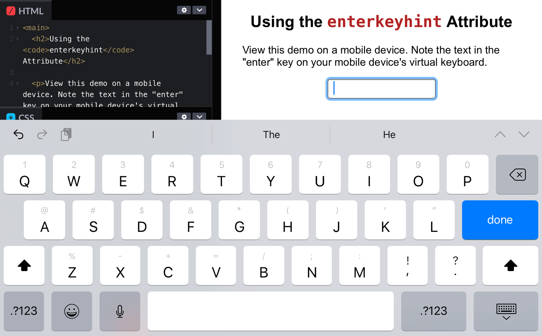
Those HTML Attributes You Never Use

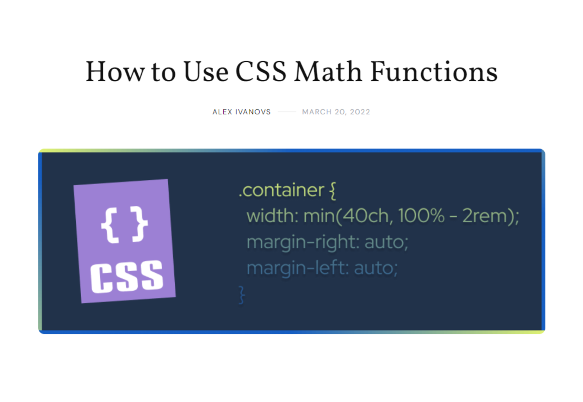
How to Use CSS Math Functions

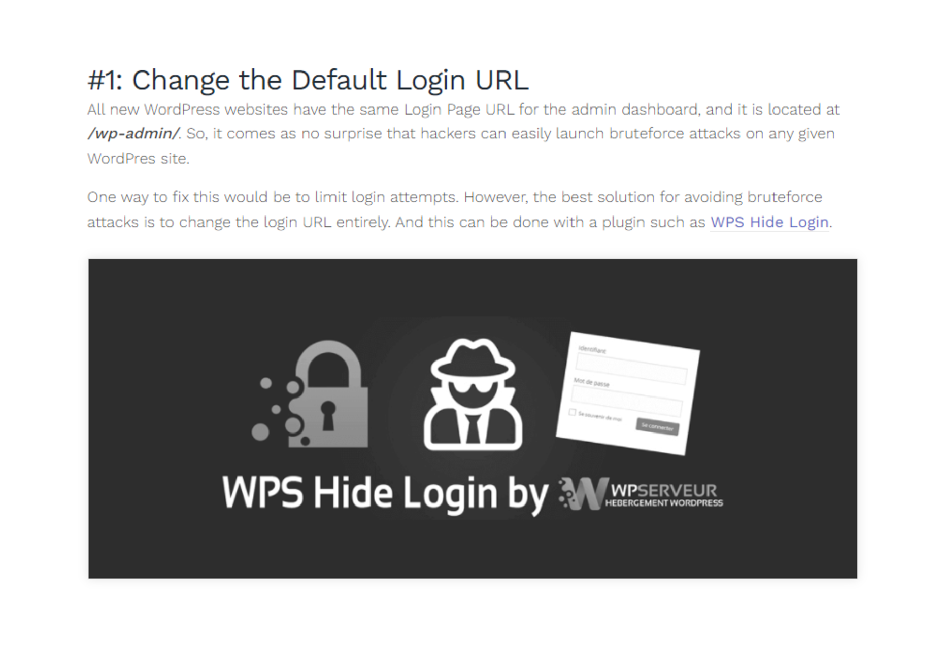
5 Tips to Help You Improve WordPress Security

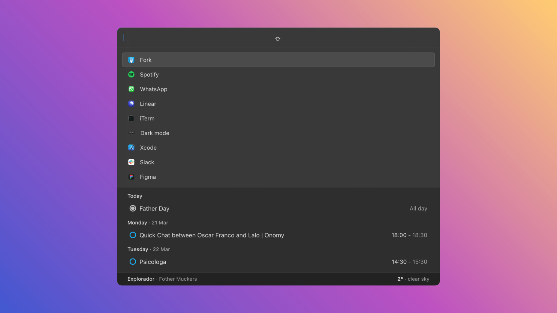
Sol – Open Source MacOS Command Palette

Kodezi – Grammarly for Programmers

Source

The post Popular Design News of the Week: March 21, 2022 – March 27, 2022 first appeared on Webdesigner Depot.
Source de l’article sur Webdesignerdepot