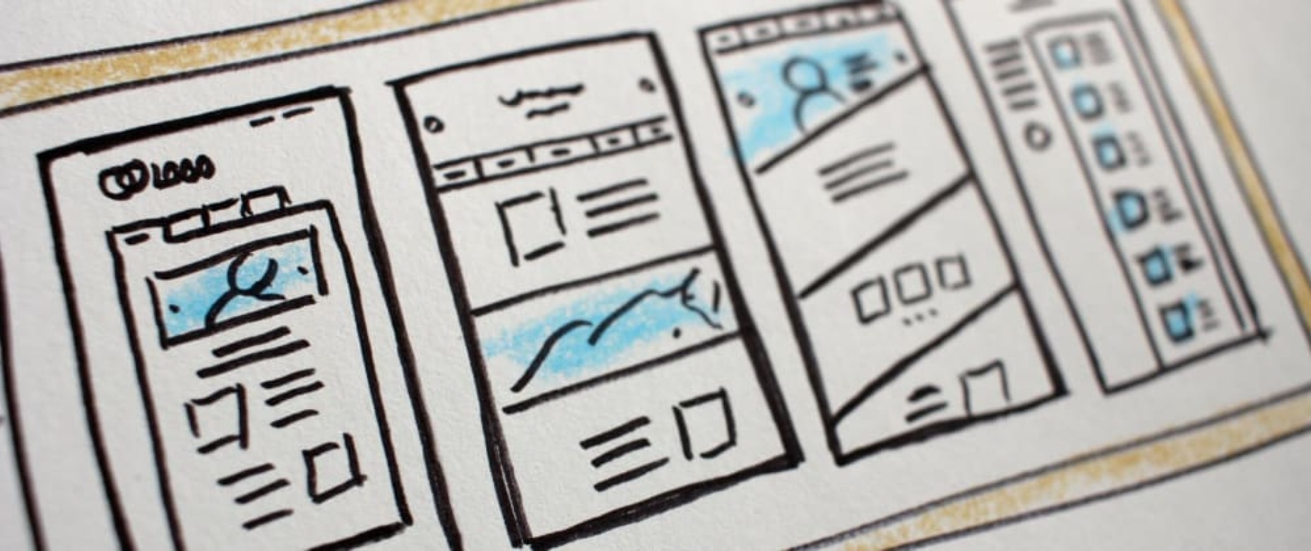
 There are a lot of factors that contribute to a better user experience on a website. Pages need to load quickly to give users peace of mind and efficiency. Navigation must be clear and straightforward, with direct pathways for visitors to follow when finding your contact pages, blog posts, and products. Your colors need to work seamlessly together while providing just enough contrast in the areas that need it most.
Excellent user experience needs to be considered for every part of your website that acts as a touchpoint with a potential customer or user.
One of the most significant touchpoints of all is your forms.
All websites need some form of interactive content to thrive. Users need to be able to do something with the site, whether it’s looking for information with a search bar, contacting a team for a quote, making a booking, or completing a purchase. Forms power the majority of the interactive activities available on websites.
If you know how to master great UX on a form, you can contribute to more meaningful interactions between your brands and their customers. But not all web forms are the same. Here are some of the top types of forms you need to master and how you can optimize them.
The “Opt-In” Form
The Opt-in Form is probably the best-known form in the digital landscape. It’s essentially a form that asks visitors to “opt-in” to a specific offer. Sometimes, this means signing up for a webinar; other times, it’ll be agreeing to an email newsletter or a regular series of blog updates.
Opt-in forms grab attention quickly and ask for something specific from the audience. For instance, this example from HuffPost encourages visitors to “Subscribe to the Morning Email.”

Opt-in forms are all about generating action.
Sometimes, they’re placed at the bottom of a landing page after a company has had a chance to explain precisely what they’re offering. Other times, you’ll find the opt-in form situated on a sidebar of a website, constantly enticing people to “sign up” if they like what they see on a blog post or article.
It’s also common for opt-in forms to appear as pop-ups and exit pop-ups on modern websites. For example, a brightly colored opt-in form that promises an immediate benefit to a customer could encourage them to hand over their details before they abandon your website.
How to Design a Great Opt-In Form
So what kind of best practices go into an excellent opt-in form?
- Start with simplicity: If you’re asking your visitors to do something, don’t overwhelm them with too big of a request straight away. Keep the form short and simple, so it doesn’t seem like too much extra work for the visitor. Something like “Subscribe to our newsletter” should ask for nothing more than an email.
- Highlight the benefits: Most customers won’t want to give you a place in their inbox or the opportunity to interact with them further unless you can offer something in return. Even if you’re asking for something small, like an email address, let the customer know what’s in it for them. In the HuffPost example above, the company highlights that you can wake up to the day’s “most important news.”
- Give the visitor the power: Let your visitor know they’re in control here. They want to see that they’re getting exactly what they need from you in exchange for their contact details. This means reassuring them that their email address won’t be used for spam, like H&B Sensors does here:

The Contact Form
The Contact Form is another crucial part of building an effective UX for your website – but it’s also an element that web designers and business owners often overlook. When customers decide they want to learn more about a business, they need a quick and easy way to get in touch.
Contact forms need to be easy to find and use on any website. Usually, your user will expect to see a link to the contact form situated somewhere at the bottom of your webpage. It might be called “Contact Us” or “Customer Support.” Avoid anything that would go over the user’s head.
Aside from being easy to track down, your contact form also needs to reassure an audience that they’re making the right decision by getting in touch. Therefore, the content needs to be short, sweet, and authoritative—highlight why the user might contact your company and how they can do so.
Avoid any unnecessary information in the contact form. For example, you don’t need to know your client’s age and their job to answer a question about where their nearest physical branch is. Keep form fields to the point, or you’ll chase customers away.
How to Design a Great Contact Form
Design something personalized but straightforward to make the most of your contact form. Use features like smart content and conditional logic, if possible, to adapt the page to the user’s needs. Dynamic content is becoming increasingly valuable these days. Other best practices include:
- Set the right expectations: Let your customers know how active you are and how quickly they can expect to hear back from you. Imagery and the right fonts can also set expectations about the kind of communication your audience can expect. For example, this contact page from the Marvel app is fun and playful, like the company itself:

- Provide multiple options: If your customer doesn’t want to use your contact form, give them another way to get in touch. Ensure the contact page includes information like where to find you on social media and your professional phone number.
- Simplify things on your end: To ensure that you can contact your audience as quickly as possible, allow your customers to choose a specific subject that their query is connected to. Allowing them to choose “Sales” or “Order issues” means you can automatically direct the message to the right team member on the back-end.
The Online Payment Form
Sometimes, when your customers have seen what you have to offer and they’ve checked out the competition, they decide to go ahead with their purchase. To facilitate this, you’re going to need an online payment form. Online forms ensure that your customers can safely enter their credit or debit card details to purchase whatever you have to offer.
Most payment processing companies like PayPal, Square, and Stripe come with payment forms included, so you can easily embed them into a website in minutes. However, there’s always the option to customize those payment forms.
For instance, ideally, you’ll need a payment form that keeps your customer on the same page, so they don’t have to log into another browser to make their purchase. The fewer transitions your client has to make, the safer they’ll feel.
How to Design a Great Payment Form
When designing any payment form, simplicity and security are the two most important factors. Your customer should be able to enter their information quickly and easily and get through the transaction process without worrying about their details.
Remember to:
- Keep it simple: The fewer fields the visitor has to fill out, the better. Customers still feel uncomfortable sharing personal information and payment details online. Make the experience as painless as possible. If your client already has an account with your business, you might create a system that automatically fills some of the fields, such as their email address, name, and billing address.
- Offer the right integrations: The proper payment forms will integrate with the payment services your customers prefer to use. Options include PayPal, Stripe, Square, Verified by Visa, and Mastercard. Get a developer to integrate the right APIs with your form to give your customers the broadest range of options.
- Ensure security: Give customers peace of mind by providing as much security evidence as possible. An SSL certificate that places the padlock on the top of the browser next to the URL is a great way to make customers feel more secure. Integrating verification options so your customers can avoid fraud issues is another significant step. Sometimes just putting logos from the card types you accept on the page will make a customer feel more secure.
Support Forms
Some companies bundle the contact form and the support form together. Others have a separate support form to get their queries routed directly to the people most capable of helping them. If you want to take the second route, it might be a good idea to design a “help” section on your website where you can locate the support form.
The “Help” section on a site often appears alongside other links on the footer. For instance, it could appear alongside “About” links and “Contact” options. Here’s an example of Hubspot’s Customer Support options:

The best customer support pages come with various ways for clients to help themselves and find answers to their most pressing questions. For example, you might have a search bar where your audience can search for the answers to their queries or a knowledge base full of helpful blogs.
Hubspot allows users to choose between a blog, knowledge base, academy training center, community forum, developer discussion board, and assistance from a certified partner.
How to Design a Great Customer Support Form
Designing a good customer support form is about getting your audience the information they need as quickly as possible. Once again, you’ll need to stick to as few form fields as possible here to avoid angering an already frustrated customer. Also, remember to:
- Ask for the right information: Find out what the query is about by giving the customer a drop-box menu full of possible topics to choose from. If you need a product reference number or something similar, ask for that at the top of the form, then allow the customer to provide extra information about their query underneath.
- Set expectations: Let your customers know when they can expect to get a response to their concerns and provide them with advice on what to do next. For instance, you could invite them to check out your knowledge base while they wait for a response.
- Keep it simple: Avoid using technical jargon on your support request forms. Be direct in your requests for summaries of the issue at hand, contact information, and other supplemental data.
Customer Feedback Forms
According to Microsoft, around 96% of customers say that customer service is crucial in determining their loyalty to a specific brand. Another 52% of global customers believe that companies need to respond to the feedback provided by customers.
To ensure your customer service strategies are on-par with what your customers expect, you need to get feedback from your audience. That’s where a feedback form comes in. Customer feedback forms often appear after a client has finished purchasing on the “thank you” screen. They may also occur after a customer has completed a service interaction online.
Here’s an example of an Apple feedback form:

How to Design a Great Customer Feedback Form
By leaving you feedback, your customer is doing you a massive favor. They’re giving you a chance to learn from your mistakes and improve the service you can give next time around. Feedback is one of the best tools for any business that wants to grow and thrive.
If you want your customers to use your feedback forms, you’ll need to make them as simple as possible. Your customers don’t have time to waste on a complex form.
- Don’t make any fields mandatory: Don’t stop your customers from submitting a form unless they’ve completed every field. Allow them to enter the information they consider to be the most important, and that’s it. You can even fill some of the form out for your customer, if possible, by entering their name and email address if they’re already a member of your site.
- Make it mobile responsive: Remember there are around 3.5 billion smartphone users worldwide. You can’t afford to lose feedback because your form isn’t responsive. Every form should look and feel incredible on any device.
- Include a rating option: If your customers don’t have much to say about your service, or they’re not wordsmiths, they might prefer a rating option instead. A one-to-five rating system that allows your customer to judge your product or service on a scale of poor to wonderful is a great way to gain quick information. Check out the Uber Engineering example here:

Though you can pre-enter some information on a feedback form to make your customer’s life easier, don’t overstep your bounds. Adding your customer’s email address to the form is fine if they’re already a customer with you. Pre-selecting the “very satisfied” rating above would look presumptuous.
Top Tips to Improve Every Form Design
The online form is an essential part of any web design project, but it’s also frequently overlooked. Unfortunately, without a good set of forms, your customers will struggle to interact with your company in a meaningful way.
When creating any form, remember:
- Reduce friction: Reduce the friction for your customers by asking as few questions as possible. The less your customer has to answer, the better. If you can pre-populate forms with information like your customer’s name and email address, this could help.
- Keep it simple: Make sure that the form is clean and easy to use. Your customers shouldn’t be confused about where to click or how to submit their information. A single-column design is often better than a multi-column option.
- Be clear in error messages: Don’t just tell your visitors that something has gone wrong. Let them know what they need to do to submit the form successfully. If possible, use inline validation with real-time feedback to let your audience know that you recognize the information they’ve submitted.
- Keep data secure: Make sure your audience feels safe by letting them know how you will use this information and why you’re asking for it. If you’re asking for an email address, make the benefits of entering that information clear.
- Make fields optional: Allow your audience to add more information to a form if they want to – but don’t demand it. Give some freedom to the visitor.
The better your forms are, the more effective your interactions with customers will be. Remember, it’s not just the face-to-face interactions that your customers judge when making decisions about your business and whether to trust you. Today’s digital world has prompted a new demand for more meaningful virtual experiences.
Your form could be the first interaction you have with a client, whether it’s a contact form, a booking form, or something else entirely. Get that right, and you can improve your chances of your customers coming back to interact with you again later.
Featured image via Pexels.
Source
The post The Top 5 Form Types to Use in Your Web Design first appeared on Webdesigner Depot.
Source de l’article sur Webdesignerdepot

 Every day design fans submit incredible industry stories to our sister-site, Webdesigner News. Our colleagues sift through it, selecting the very best stories from the design, UX, tech, and development worlds and posting them live on the site.


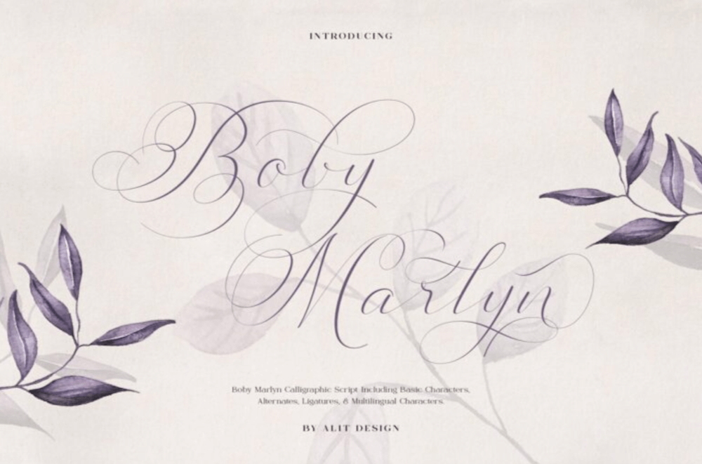
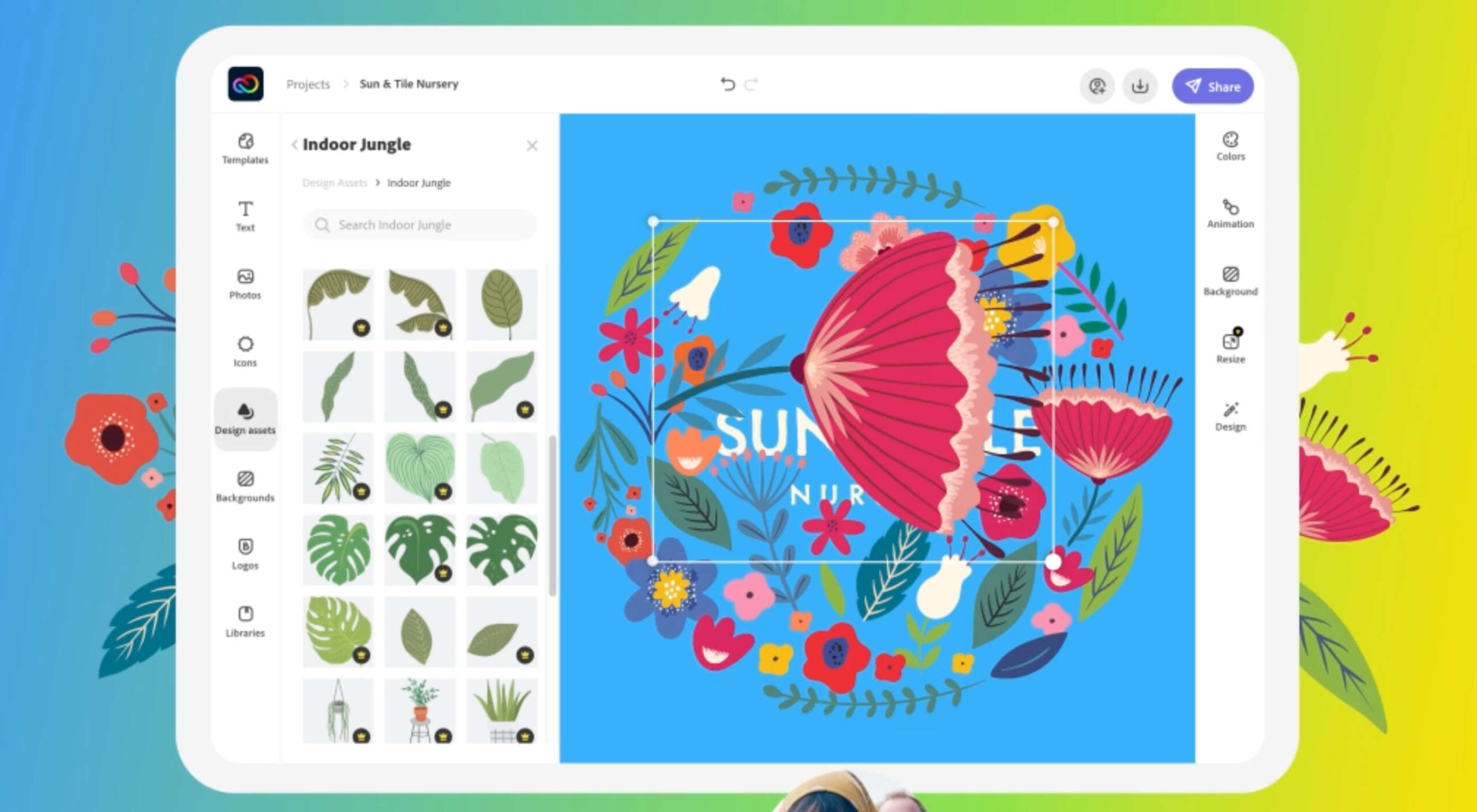
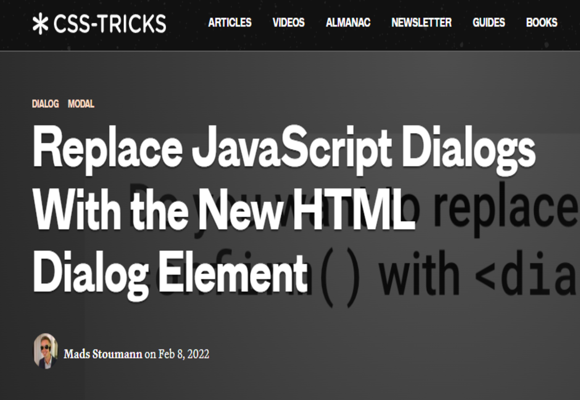
 As we move closer to spring, we’re going to see a change in typography styles come with it. While we always need new serifs and sans serifs to design with, in the spring, it’s not uncommon to use more nature-inspired and whimsical fonts to usher in the warmer temps, wedding season, and holidays like Earth Day and Mother’s Day.


 The email channel is known for multiple advantages. It is convenient to implement practically, offers many options, and has a fantastic
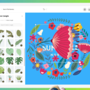
 Adobe has launched
 Every day design fans submit incredible industry stories to our sister site, Webdesigner News. Our colleagues sift through it, selecting the very best stories from the design, UX, tech, and development worlds and posting them live on the site.


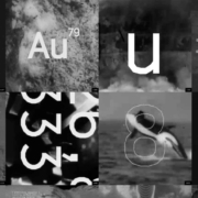
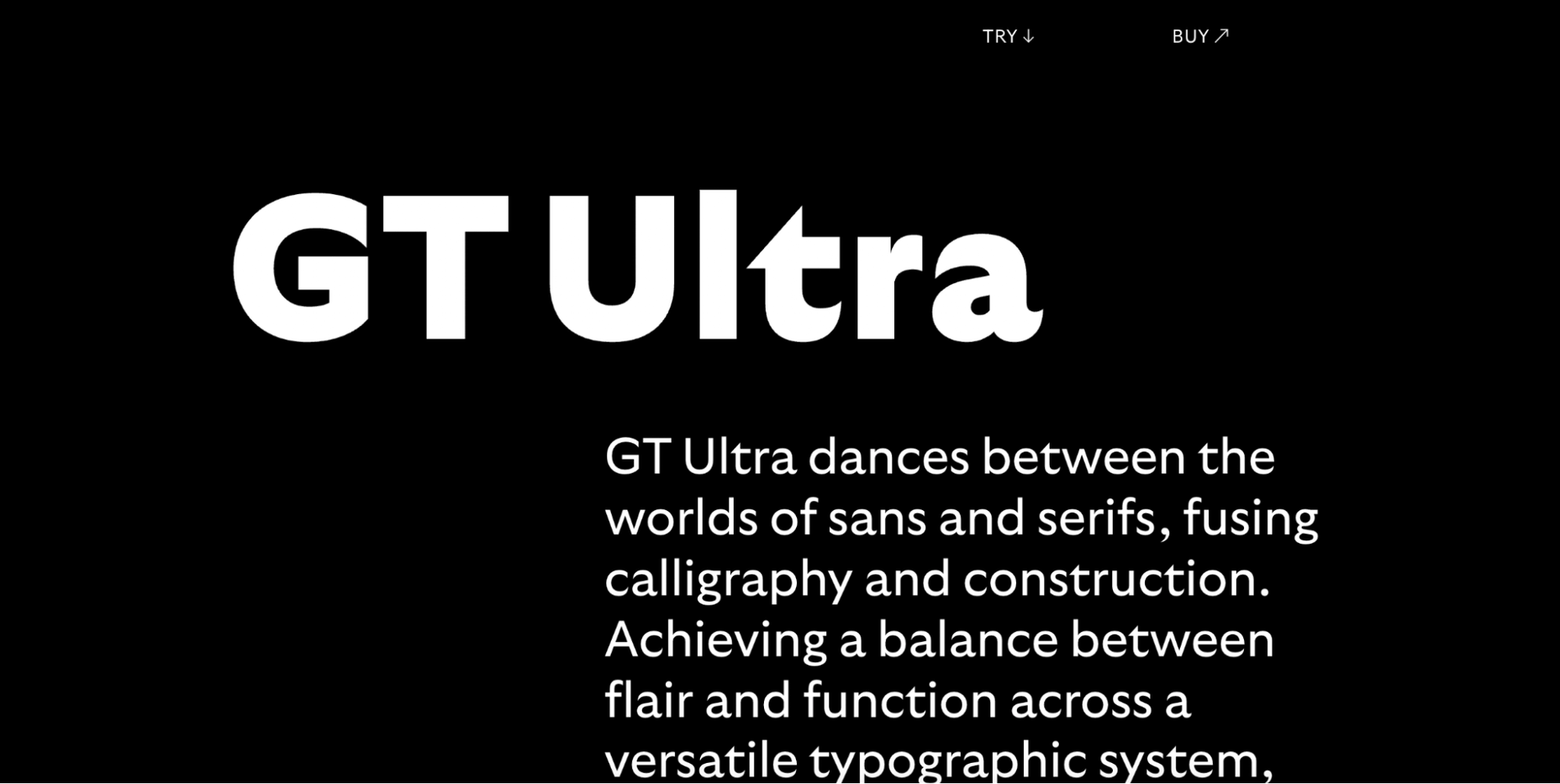
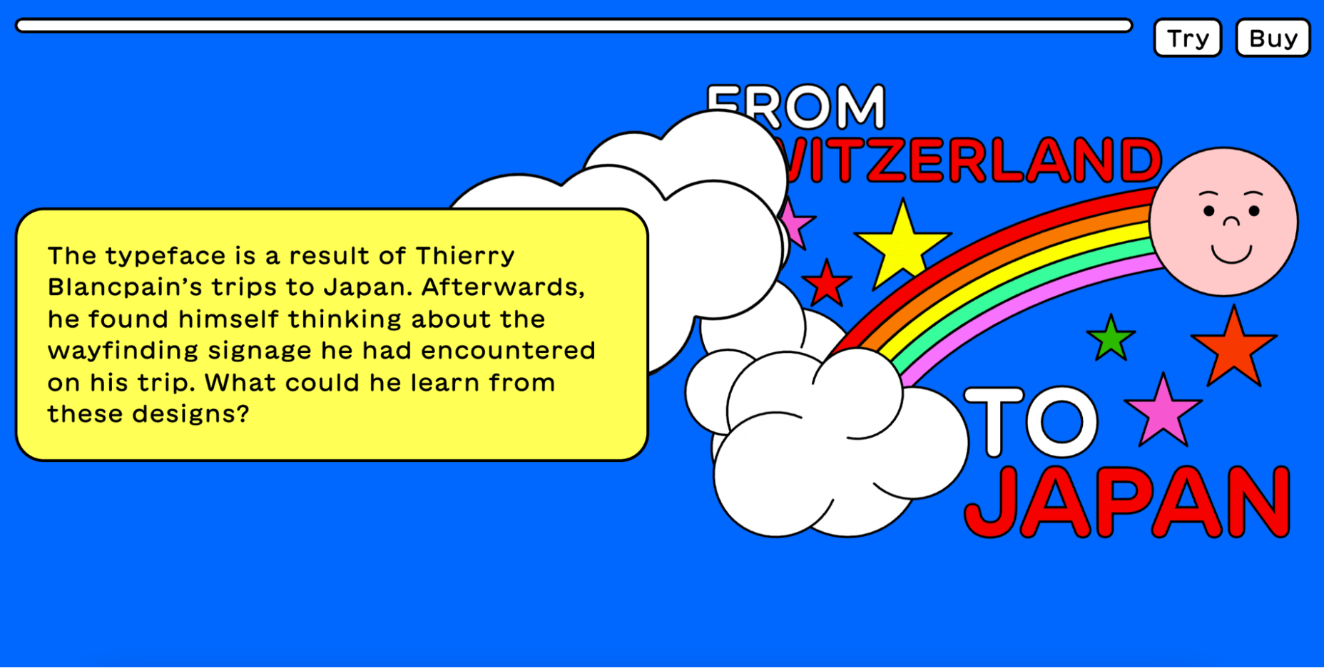
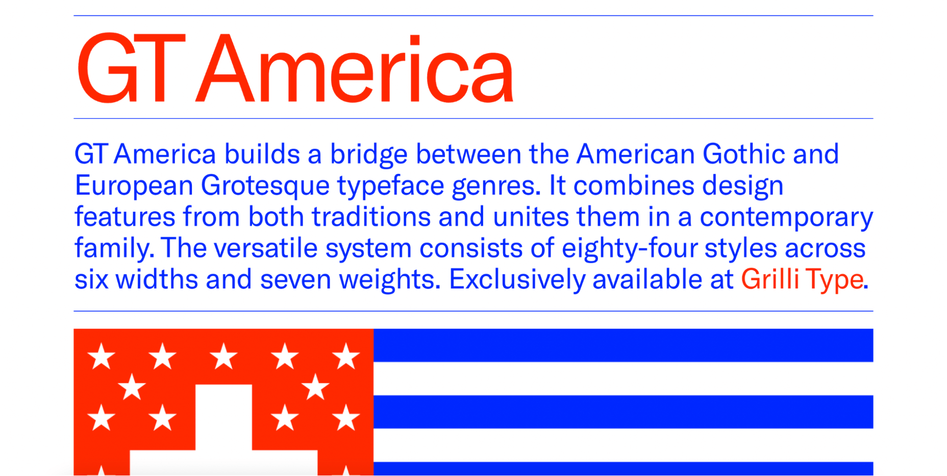
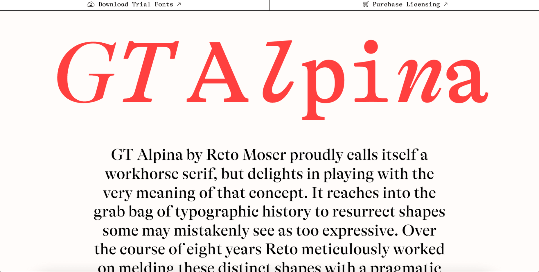
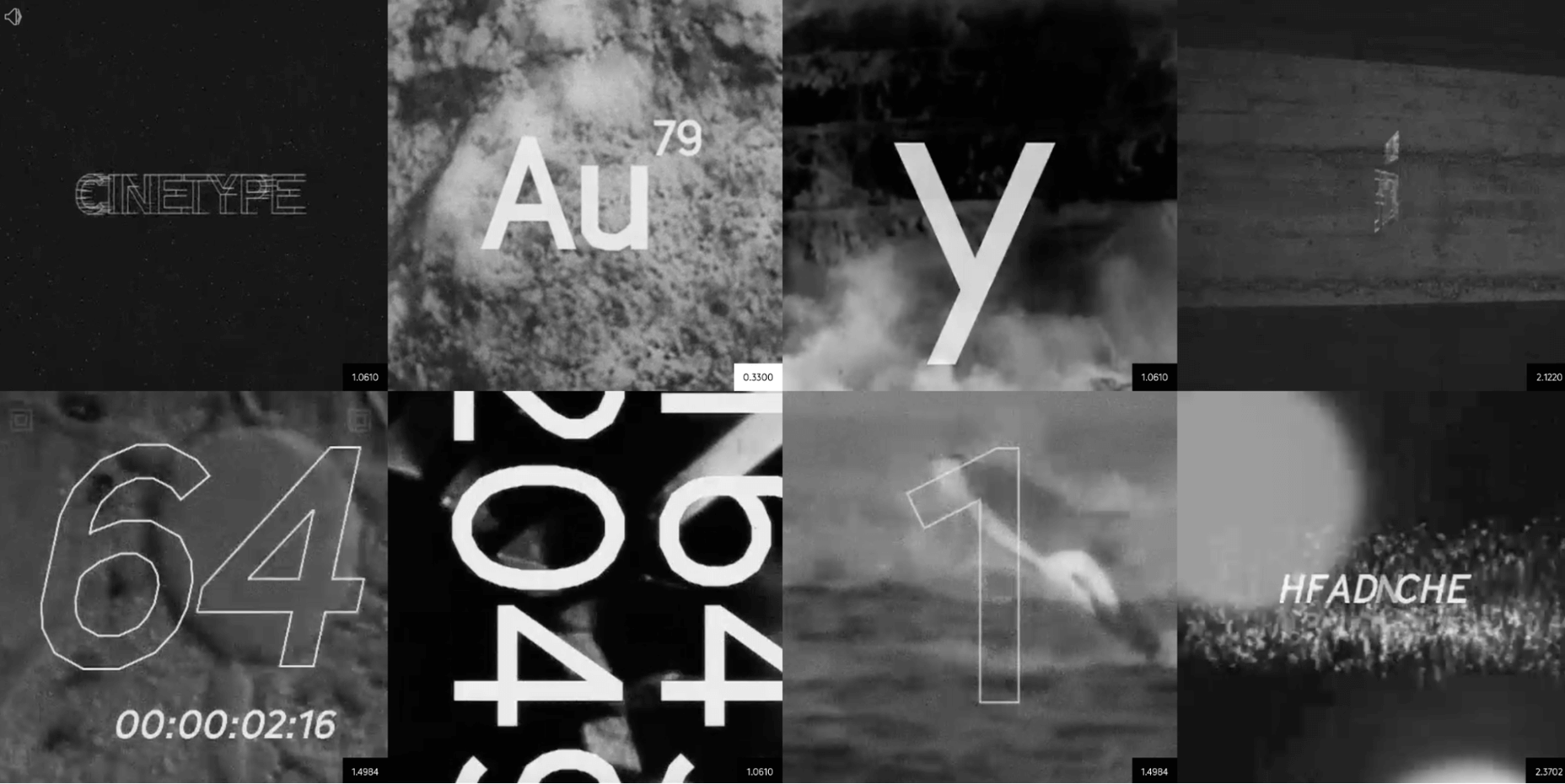
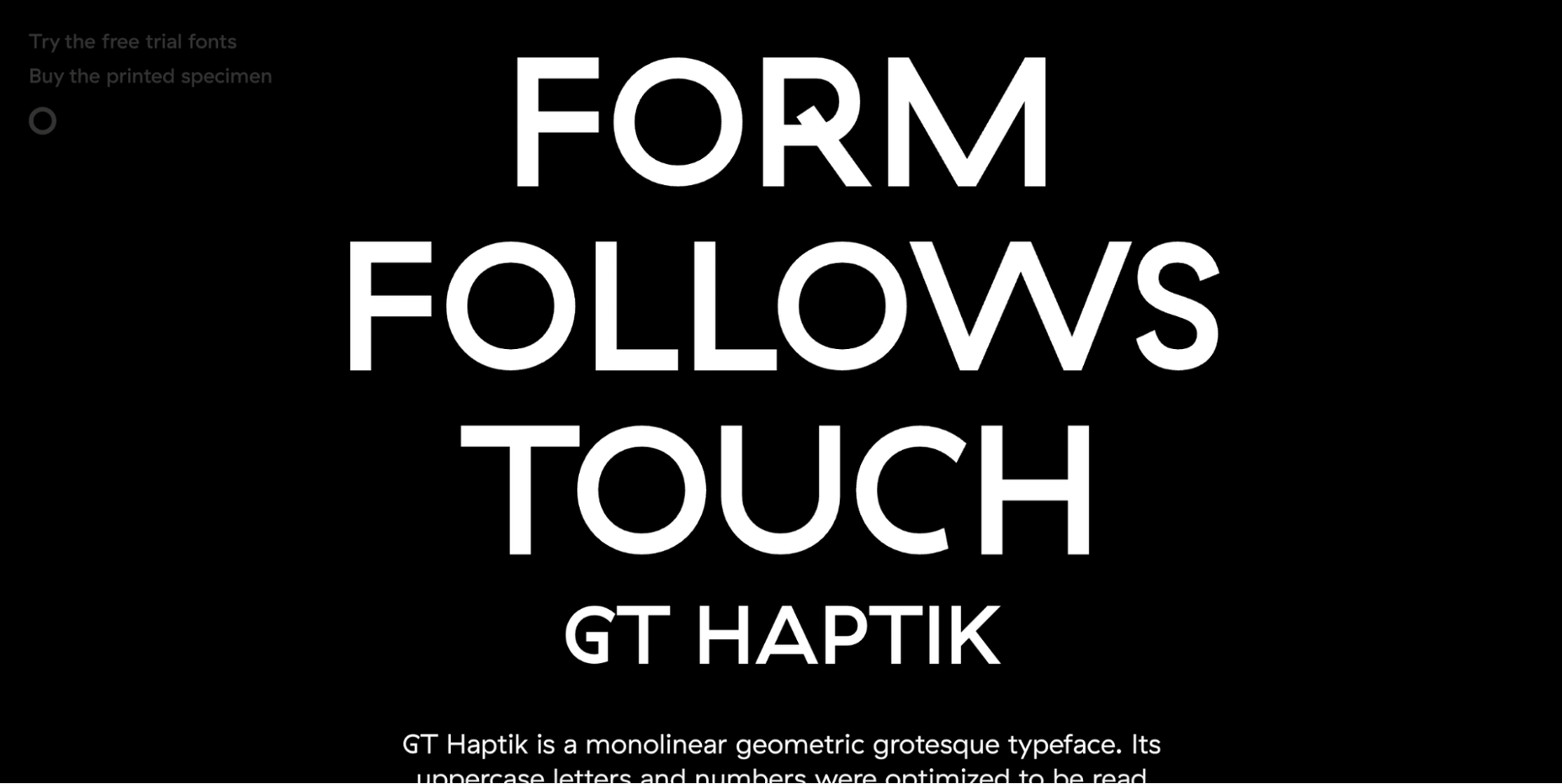
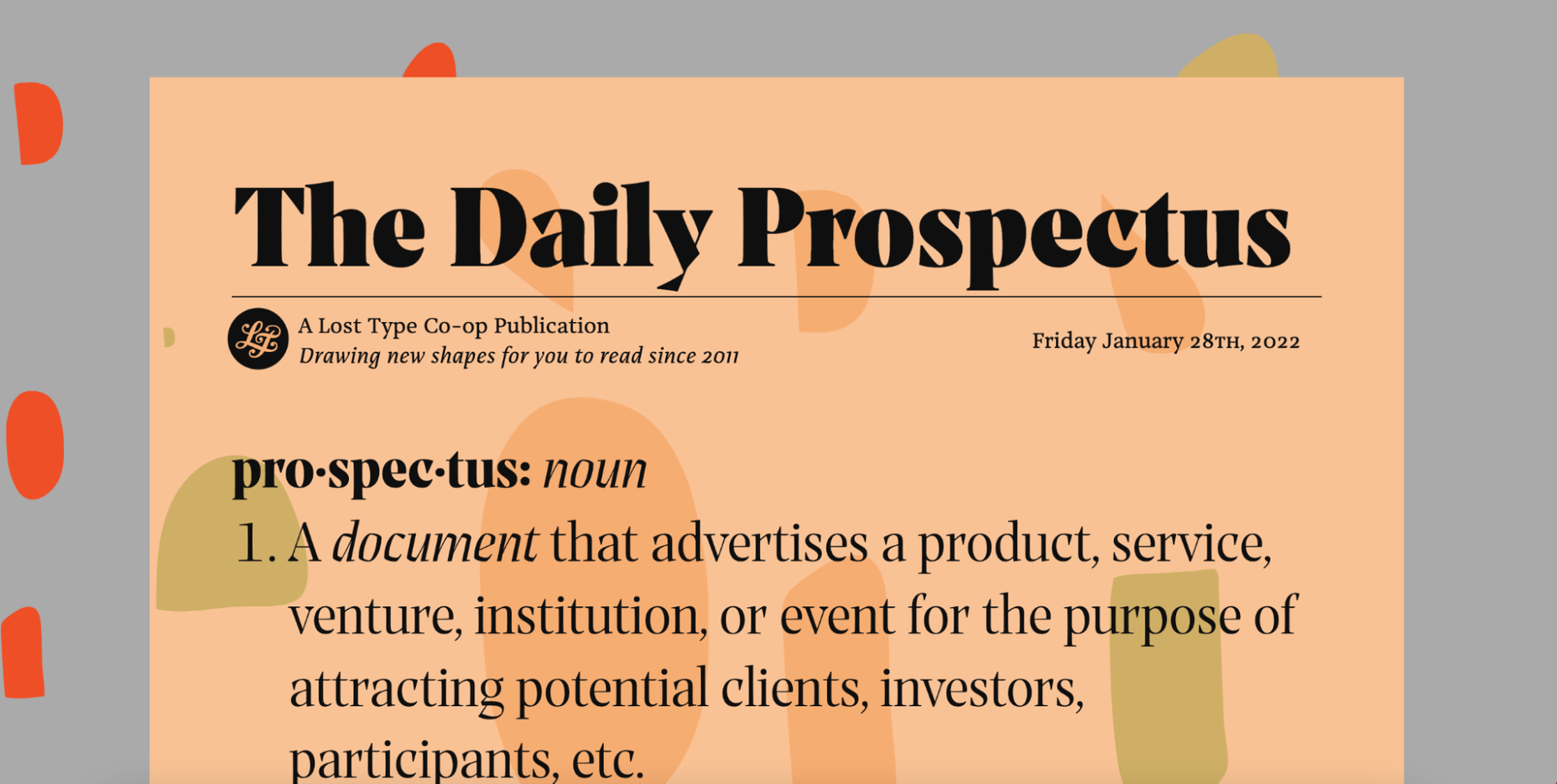
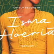
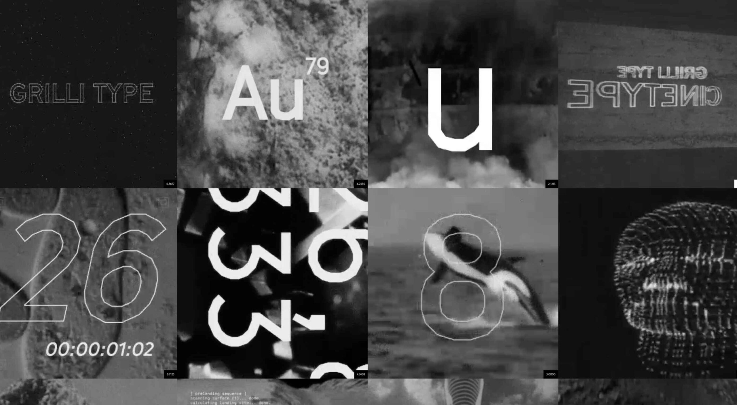 Are you looking for a unique font that will make your next project shine? Or maybe you need a typeface with a beautiful design and rich history behind it. Luckily, mini-sites for fonts allow us to creatively explore a font’s origins and history. We know (from our own experience) how important it is for UI and UX designers to have a variety of fonts for our designs.
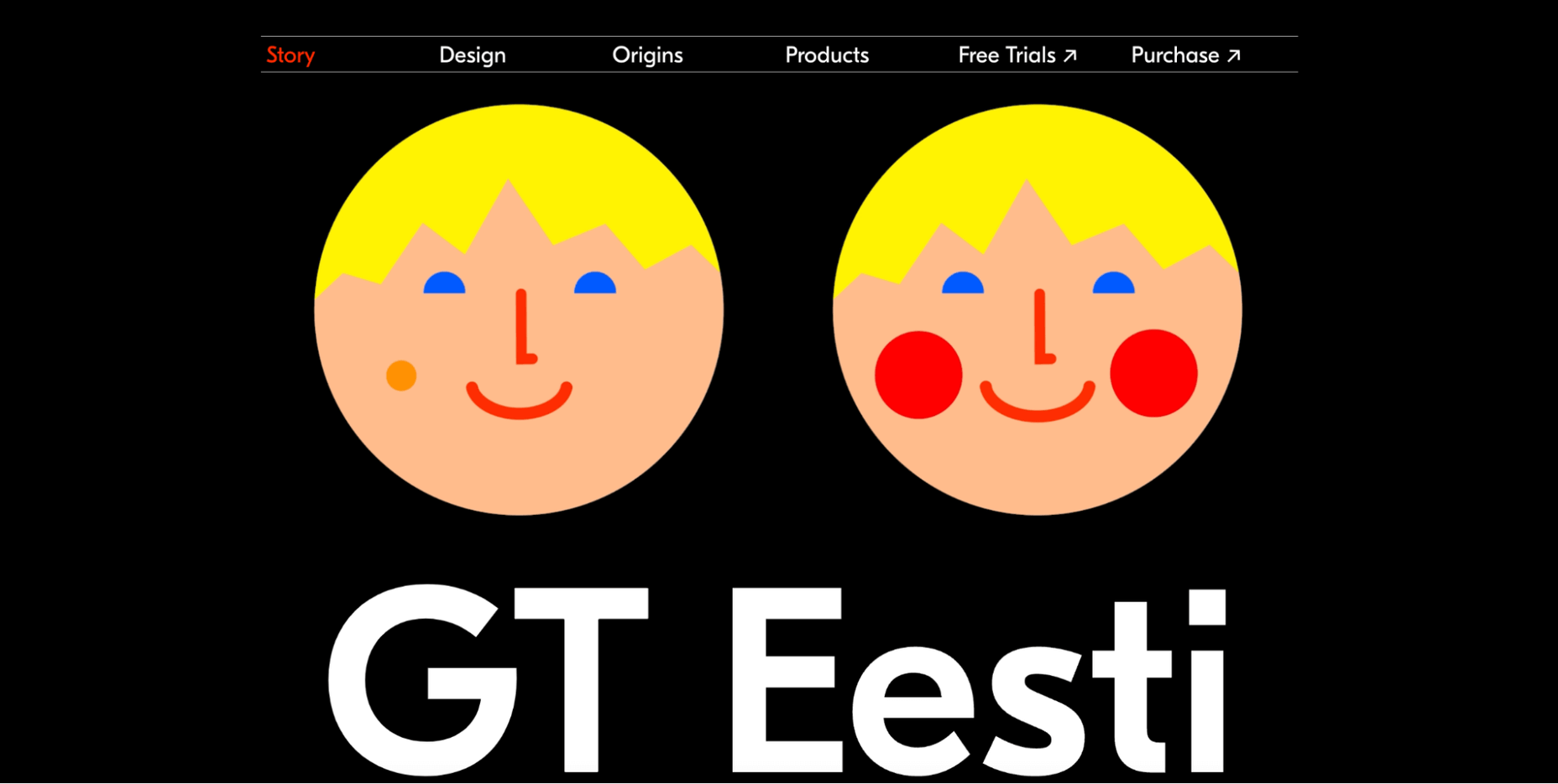
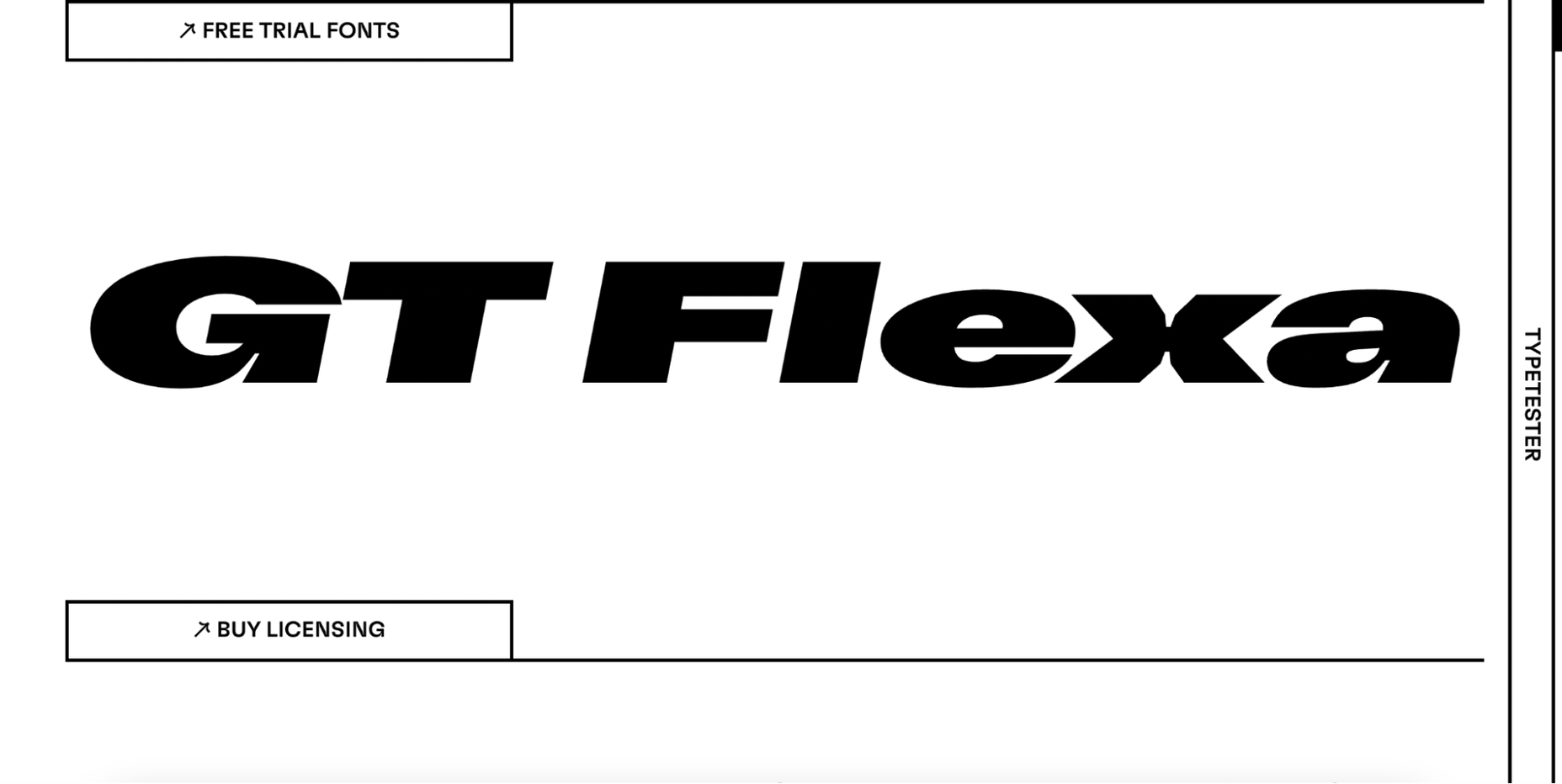
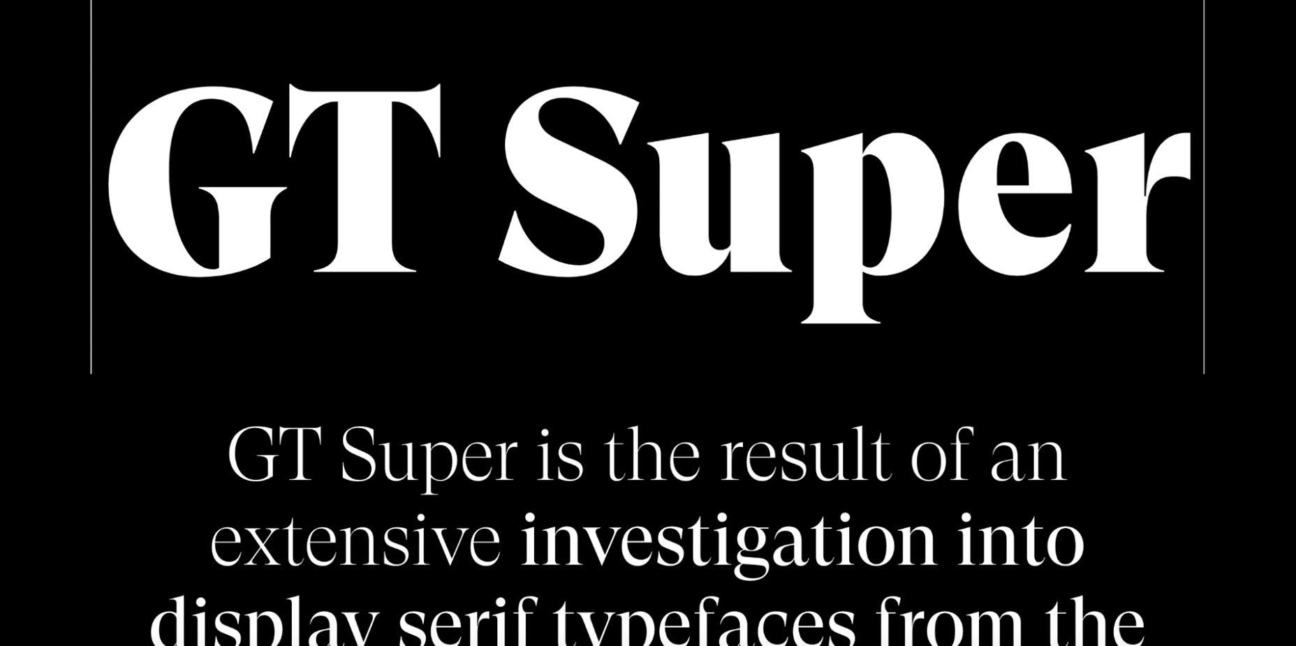
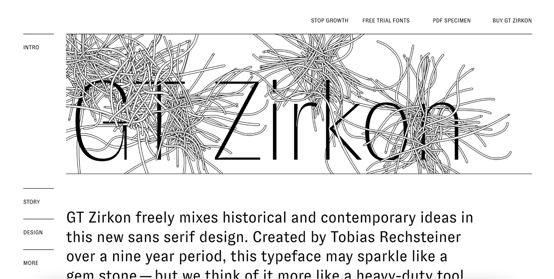
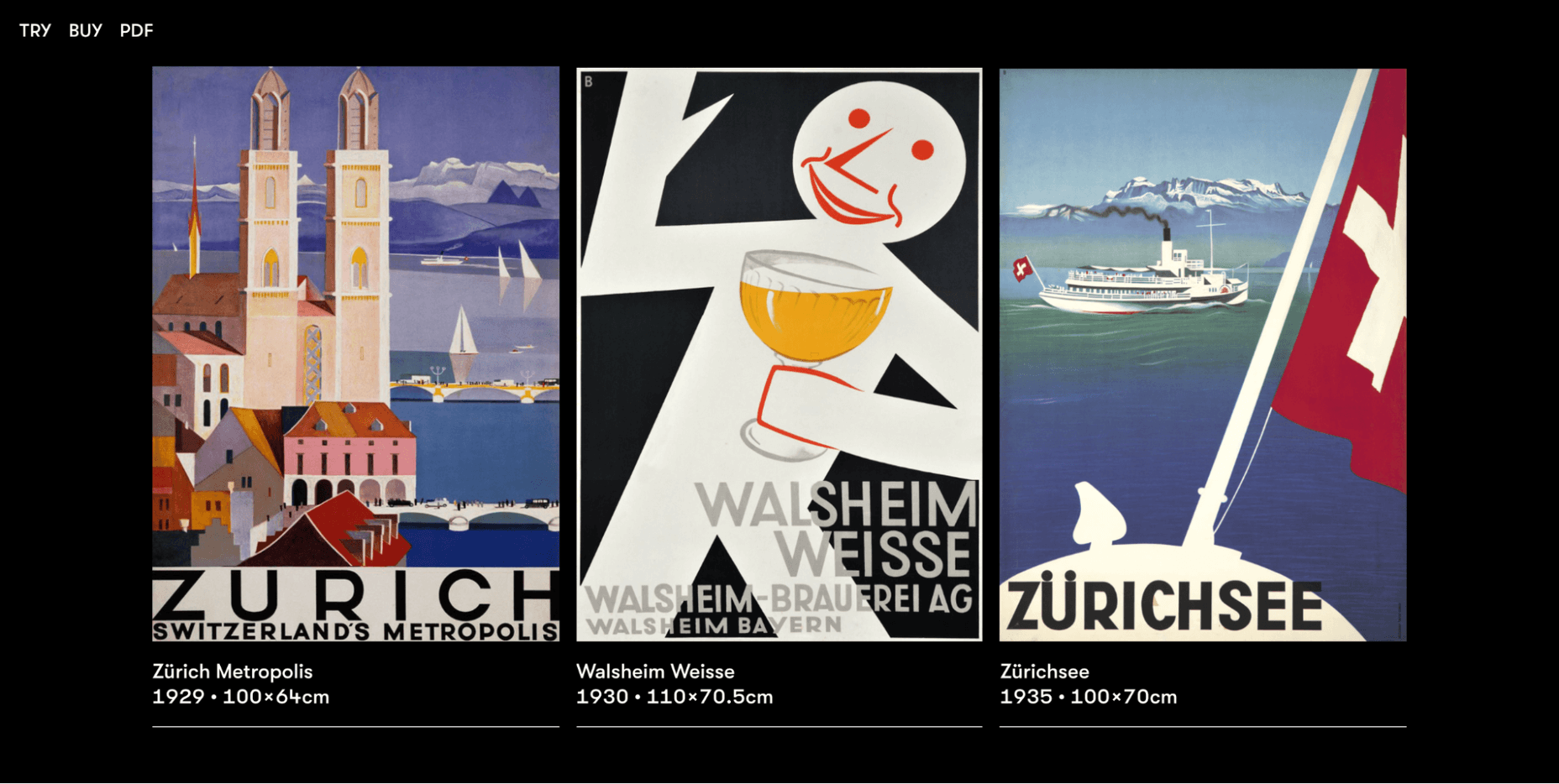

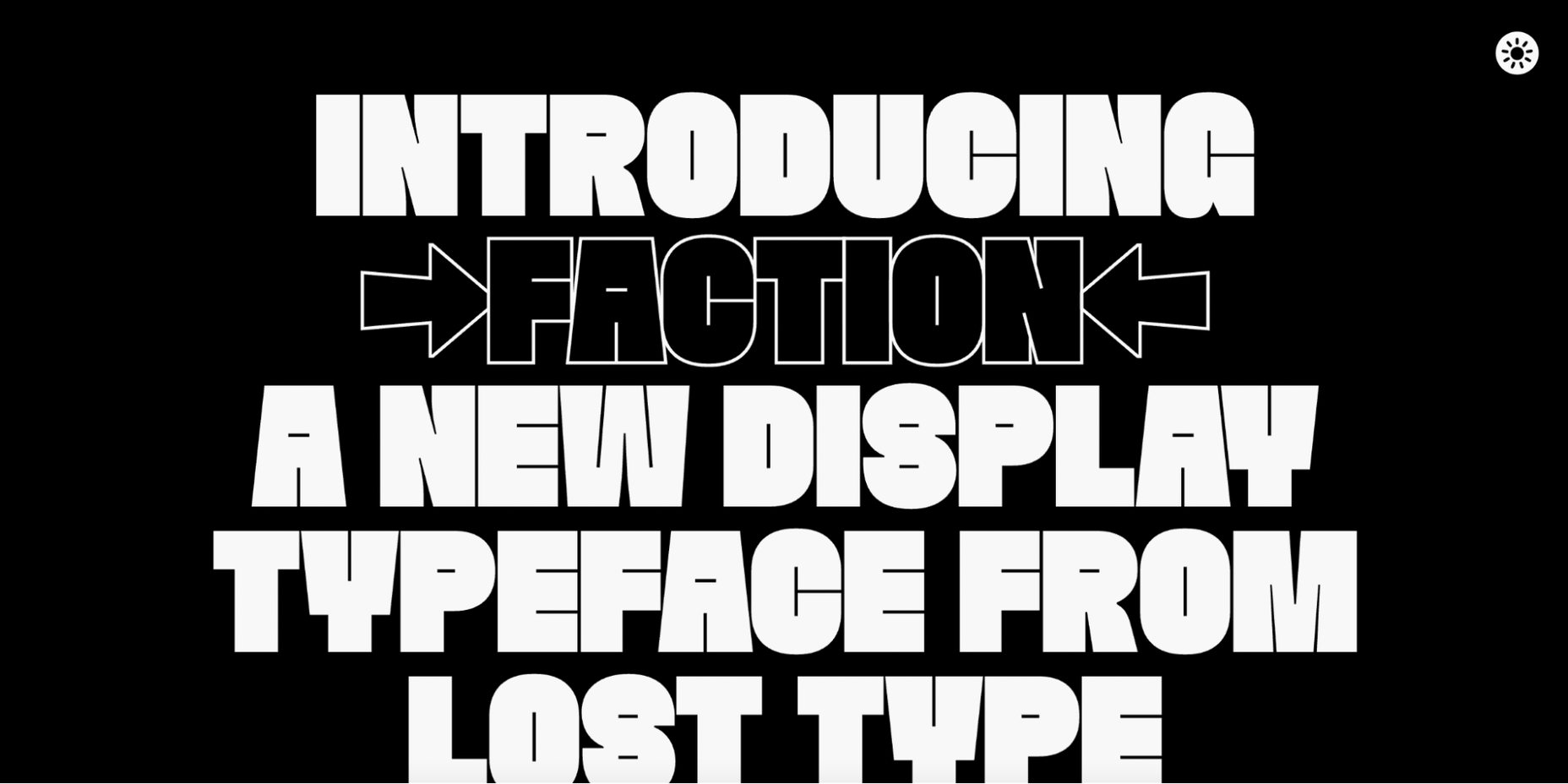
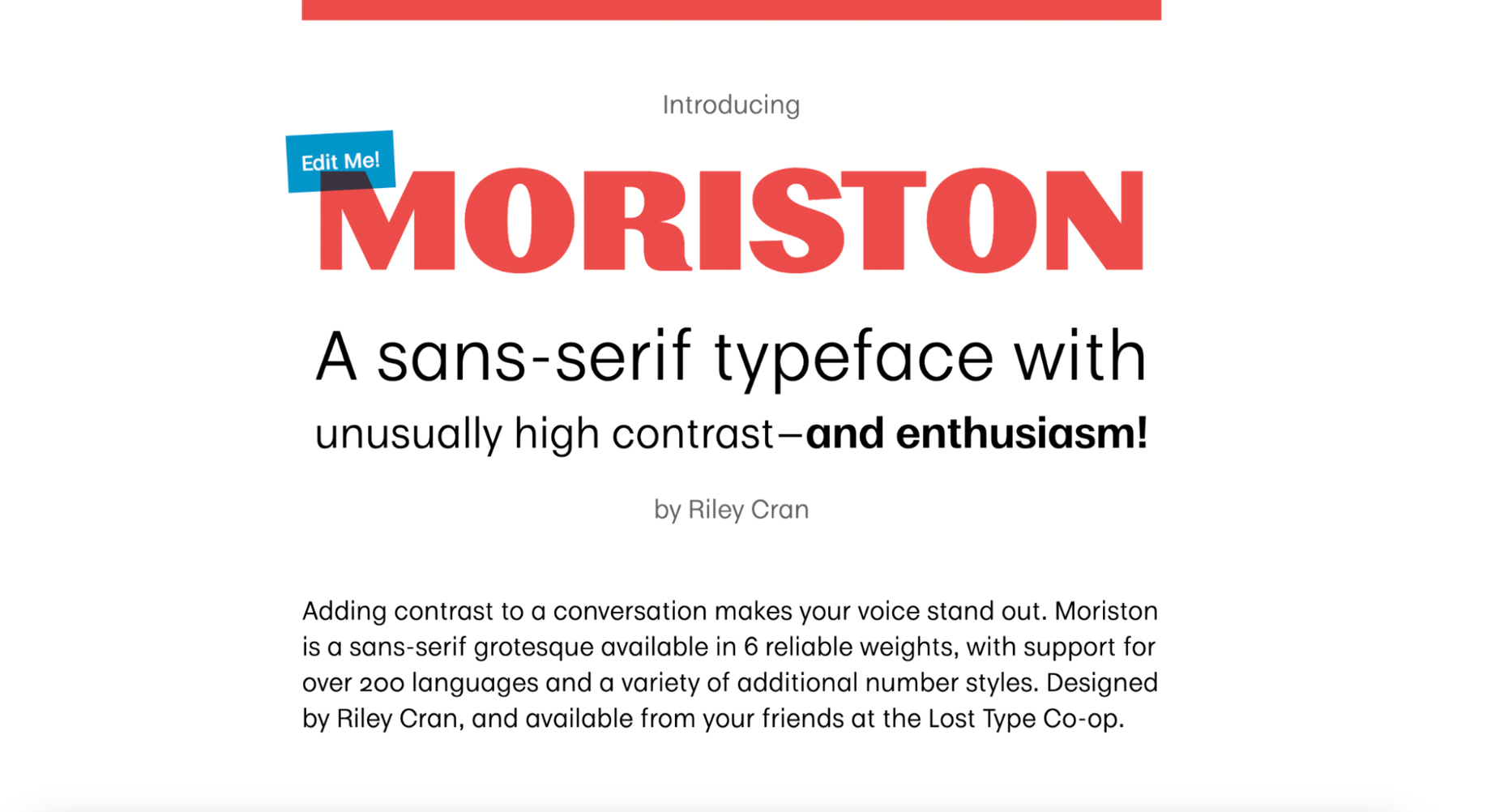
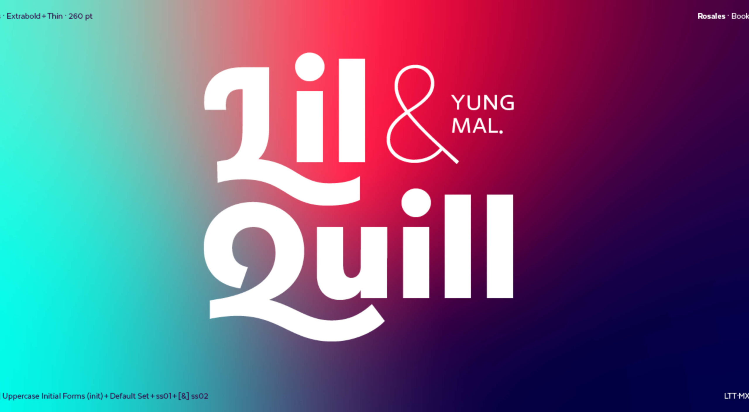
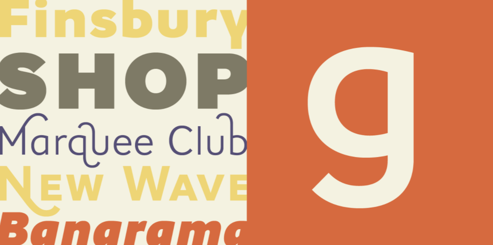
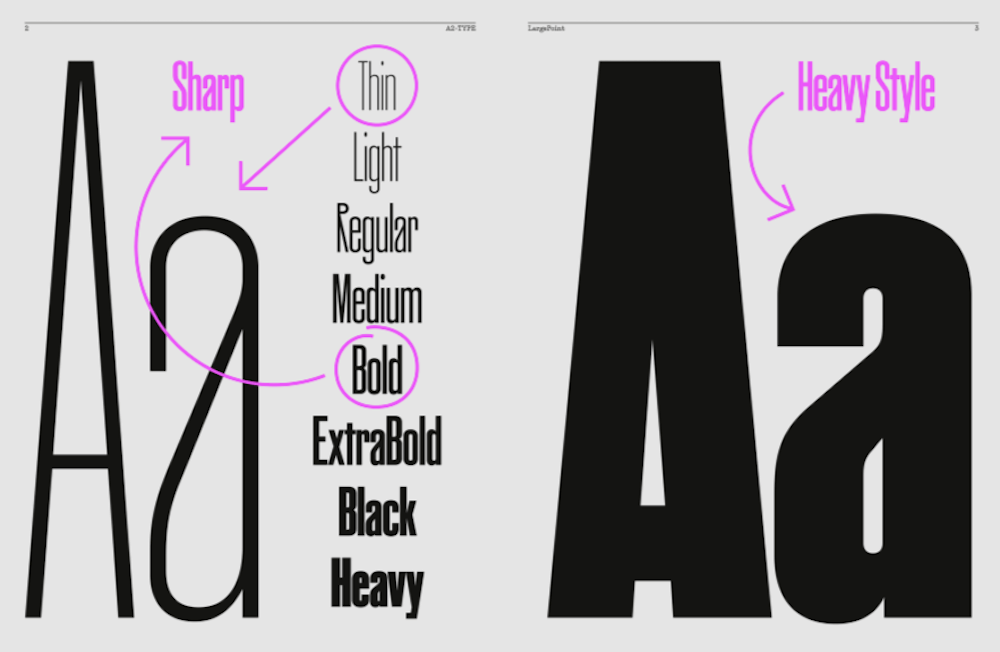
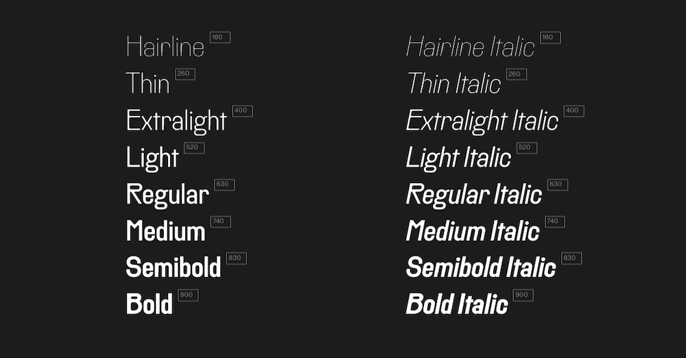
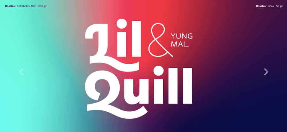
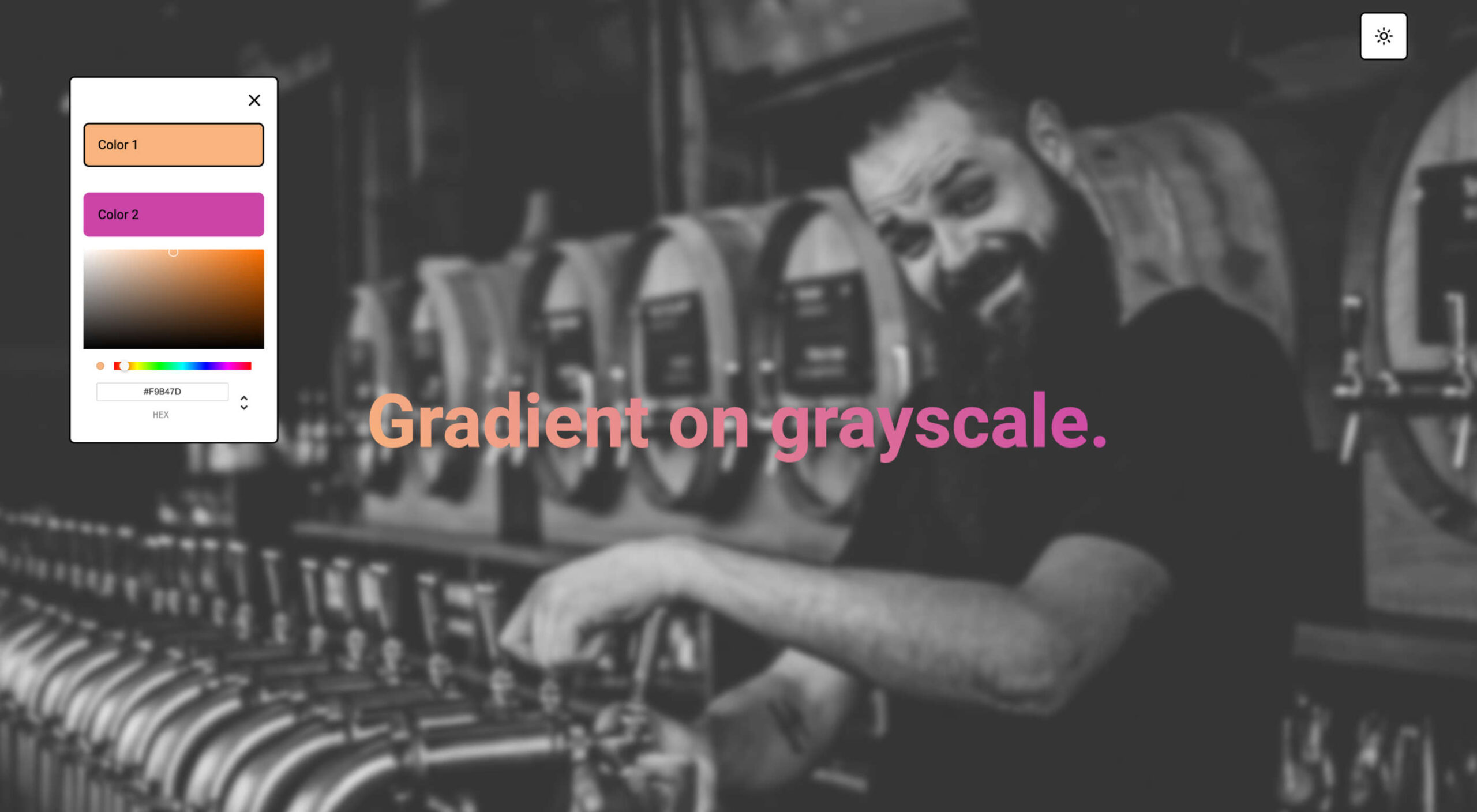
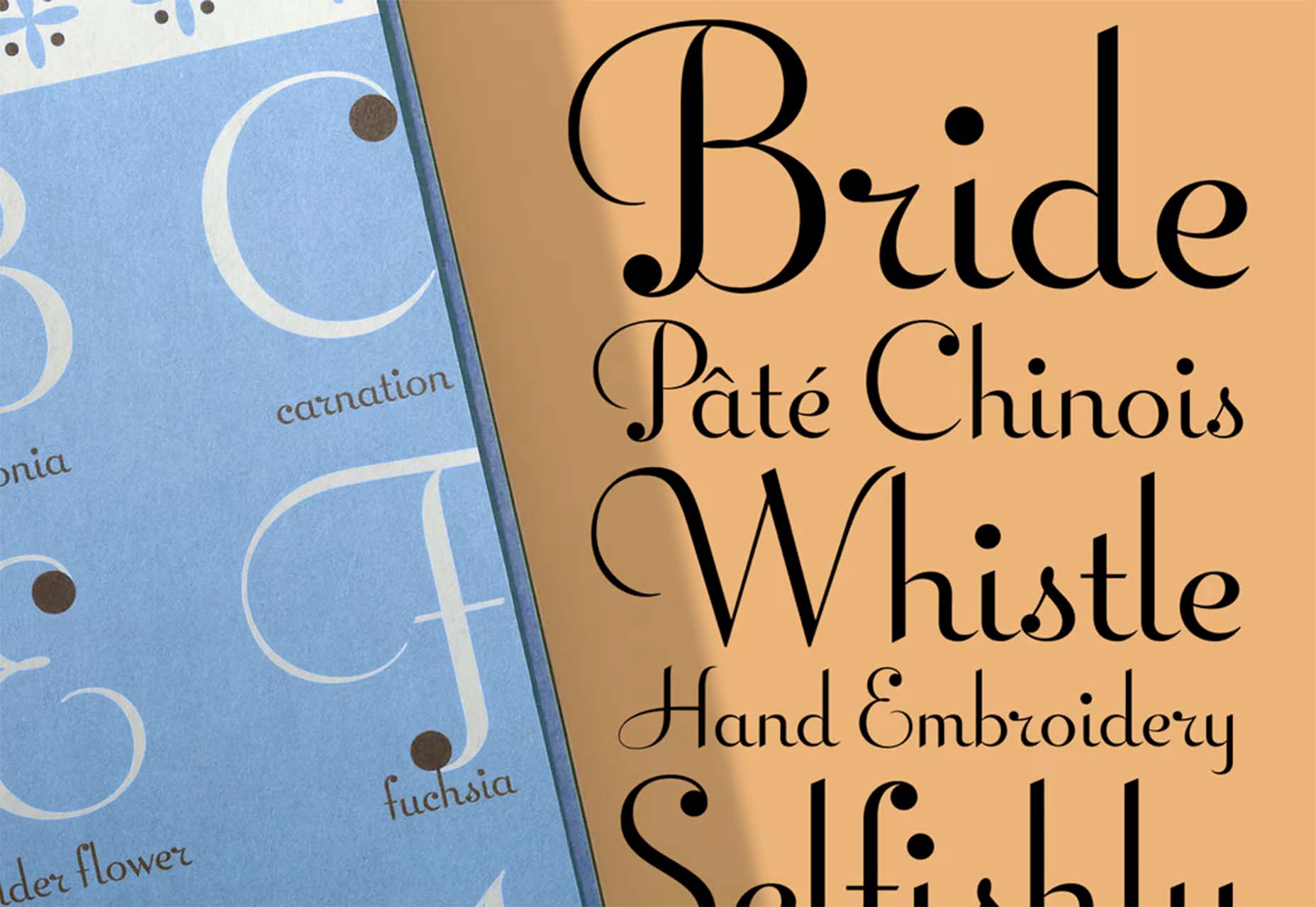
 Type foundries have been putting out some really interesting fonts these last few months. Based on the collection of the best new fonts for February 2022, it looks like we’re going to see lots of throwbacks to the ‘70s in the coming year.


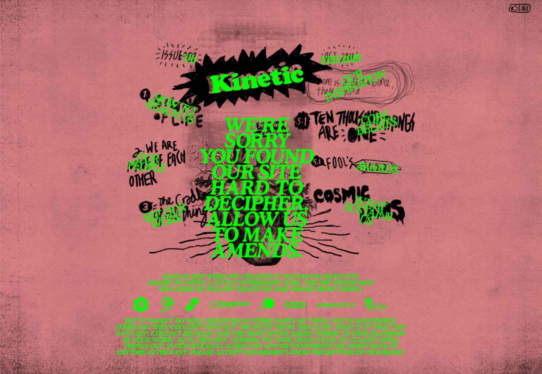
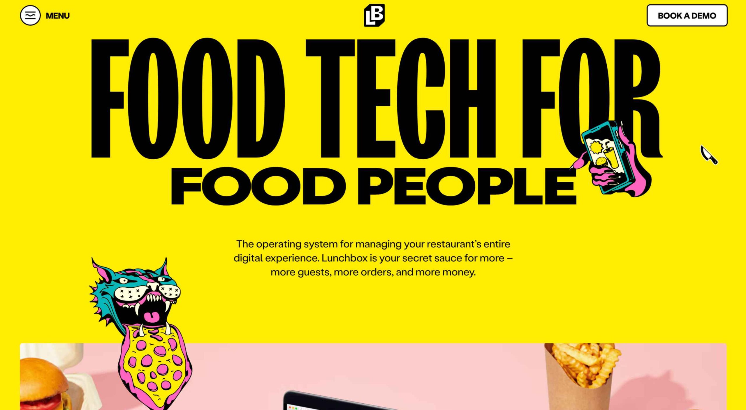 What stands out as an incredible web design project for you? Do you count your creation as a success if it’s modern,
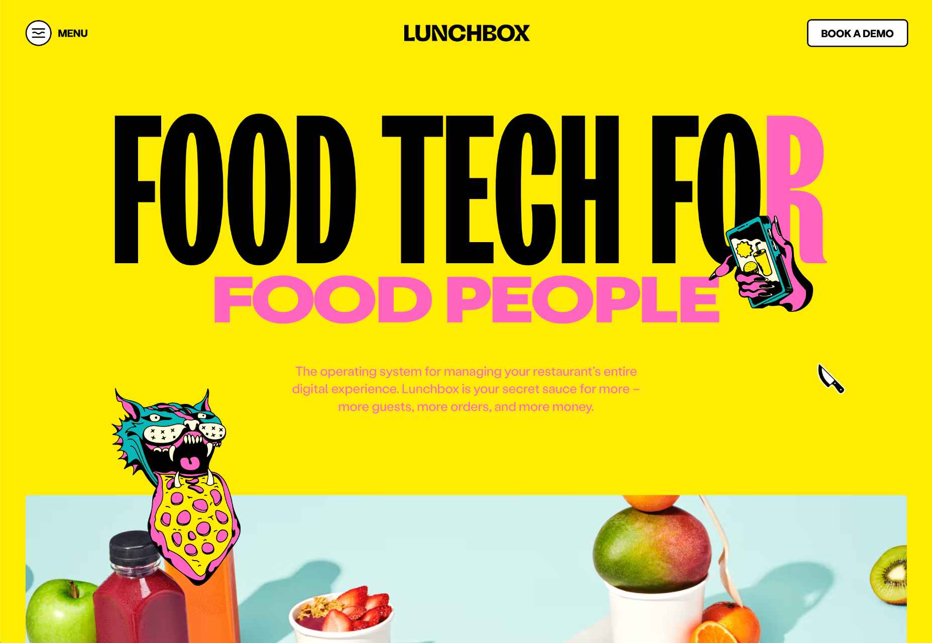

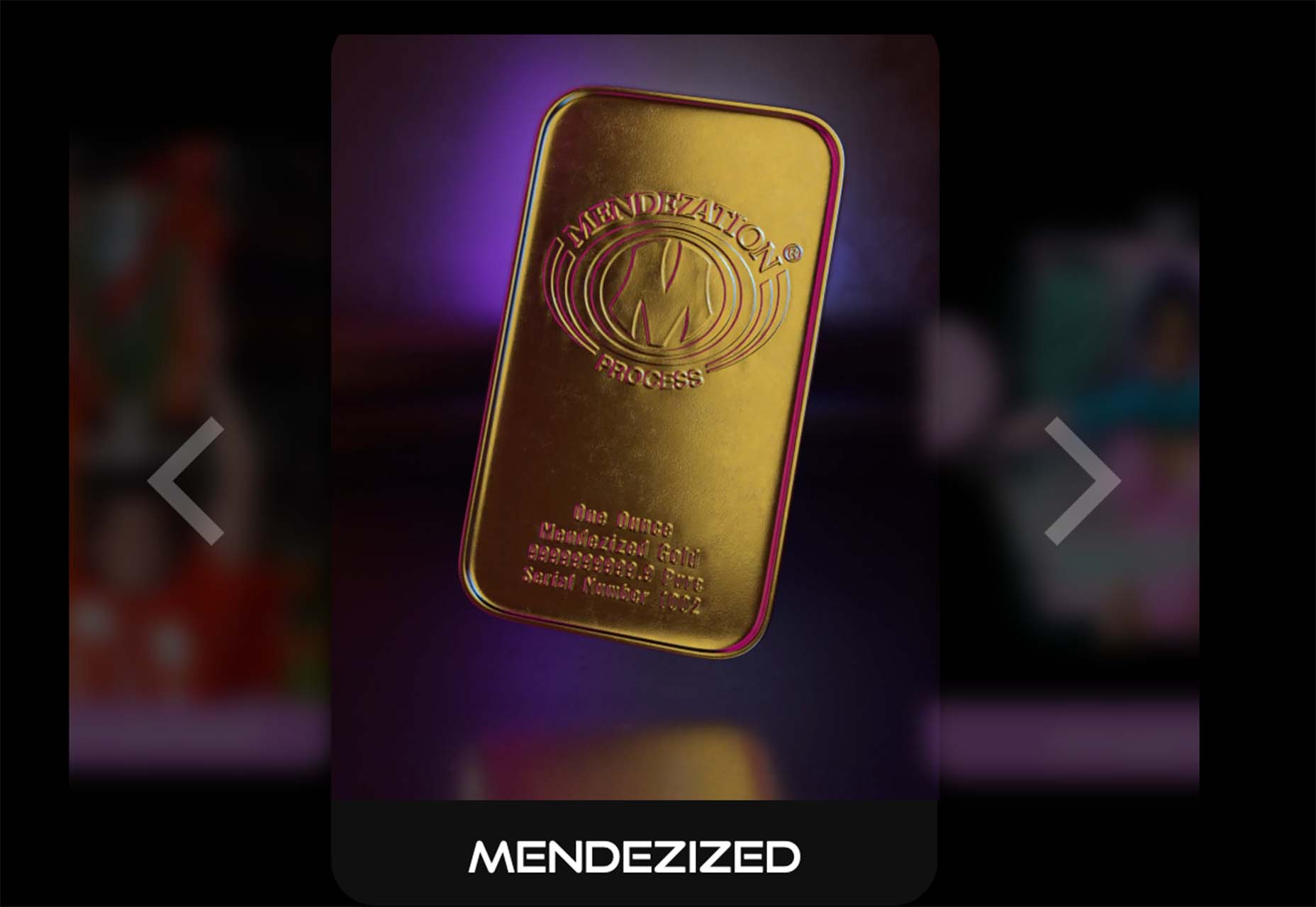
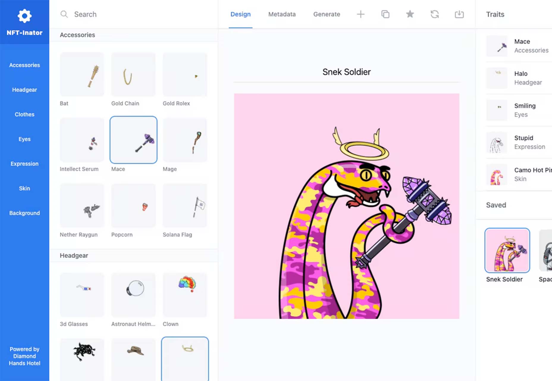
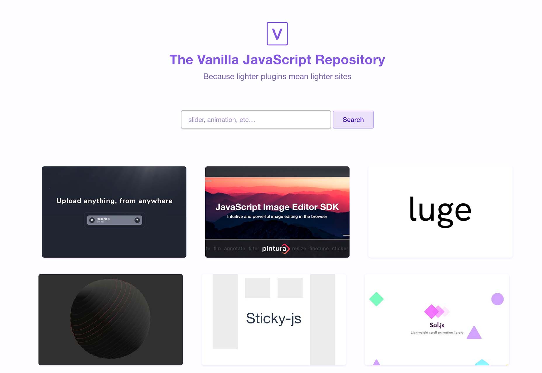
 One of the most talked-about digital elements of the new year leads our roundup of tools and resources this month – NFTs. The NFT landscape seems to be exploding right now and that includes tools for designers to get in on the game as well.
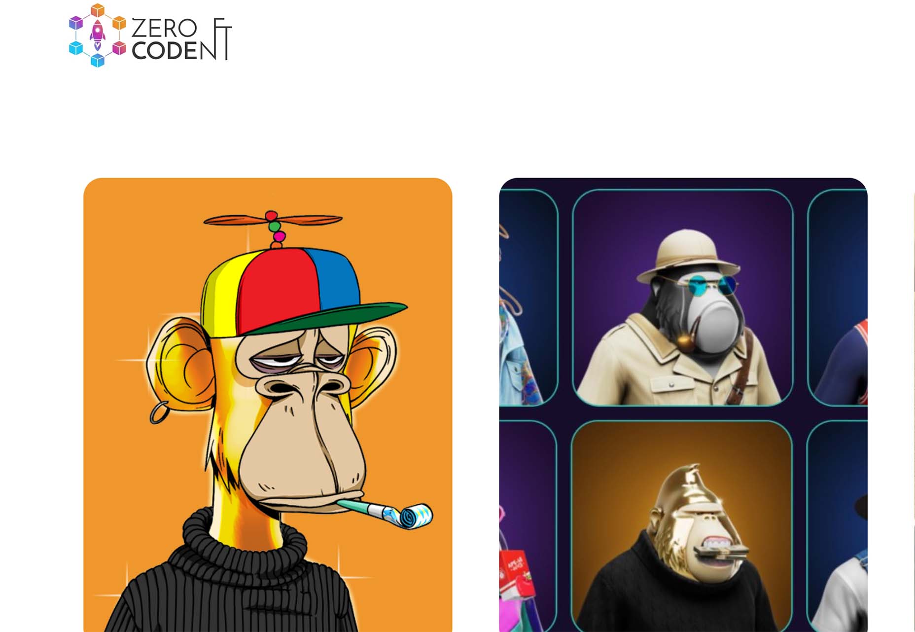


