 Not so long ago, customers only had a couple of ways to interact with brands.
If you had an issue with a product or service, you could reach out through the customer service phone number or send an email. Occasionally, sites would introduce dedicated forms on their website that allowed consumers to send support tickets straight to the service desk – but that was it.
The problem with this kind of service was all the waiting.
Send an email or ticket, and you have no idea when the company is going to get back to you. Customers end up refreshing their inbox all day, waiting for a response. Call the company, and 9 times out of 10, you’ll be placed on hold. You can’t exactly do much when you’re stuck listening to hold music, so customers are gradually getting more frustrated as they wait for a response.
Fortunately, the evolving digital age has introduced a new solution: live chat.
Transforming Your CX With Live Chat
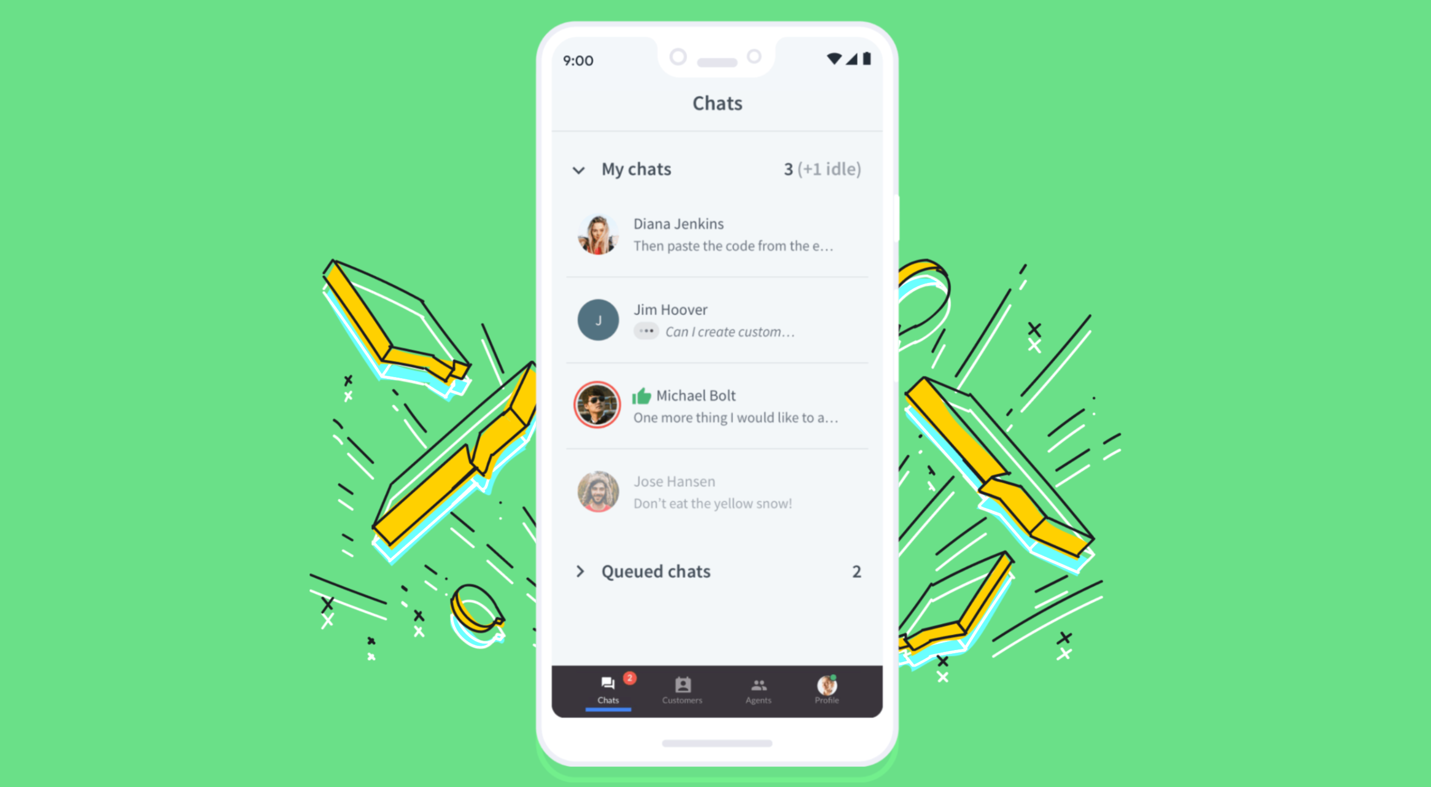
Live chat is a quick and convenient way for your customers to contact your business and get a response immediately. The result is happier clients, better customer satisfaction scores, and even opportunities for bigger sales.
More than 41% of customers say they expect to see live chat on a site.
Even if you don’t have an agent on hand to answer a chat message immediately, you can create an automated system that notifies your customer when someone is available. That means they can go and do other things while they’re waiting for a response. Live chat solutions with bots can even allow your customers to fix problems for themselves. That’s pretty convenient!
Widgets equipped with answers to commonly asked questions can automatically deal with customer queries or help them find solutions to their problems before passing them over to an agent. This means that your customer gets a solution faster, and your agents don’t have as much pressure to deal with. It’s a win-win – as long as you get it right.
Unfortunately, a lot of companies don’t know how to implement live chat experiences correctly.
Kayako’s study into 400 customers found that 47% couldn’t remember the last time they’d had a positive experience through a live chat tool.
How to Upgrade Live Chat CX
The evidence shows that customers love the idea of live chat, but the reality of how businesses implement this technology isn’t always ideal.
However, since 86% of customers say they’re willing to spend more on a better customer experience, it’s worth figuring out what separates a good live chat interaction from a bad one.
1. Set Expectations Instantly
Setting the right expectations is crucial if you want to generate better satisfaction for your customers at a later date. When customers know what to expect from your live chat strategy, they can also make more informed decisions about which support channels they’re going to use, and whether they want to hang around for someone to answer their messages.
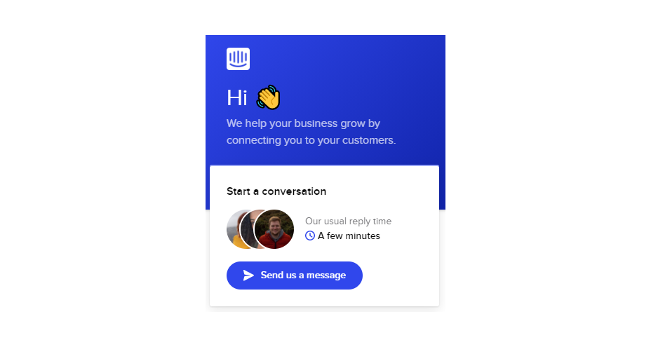
The first thing you should do is showcase your agent’s availability. In this example from Help Scout, you can see whether the team is active, online, and ready to talk. The company also sets expectations for how quickly you can get an email response if you don’t want to chat.
Other ways to set expectations include:
- Showing your opening hours: List when team members are usually available to answer questions if you’re not currently online.
- Topics: Offer your customers some topics that they can ask about or use the welcome message on your chat tool to direct your customers to an FAQ page.
- Restrictions: If there’s anything you can’t deal with over live chat, like changing a customer’s password, let them know in advance so they don’t waste time.
2. Leverage Pre-Chat Forms
Pre-chat forms are some of the most important parts of the live chat experience. They ask your customer to explain their issue to your chatbot so that they can be directed towards the right agent. Using these forms correctly ensures that your agent has all the information they need to solve a problem fast.
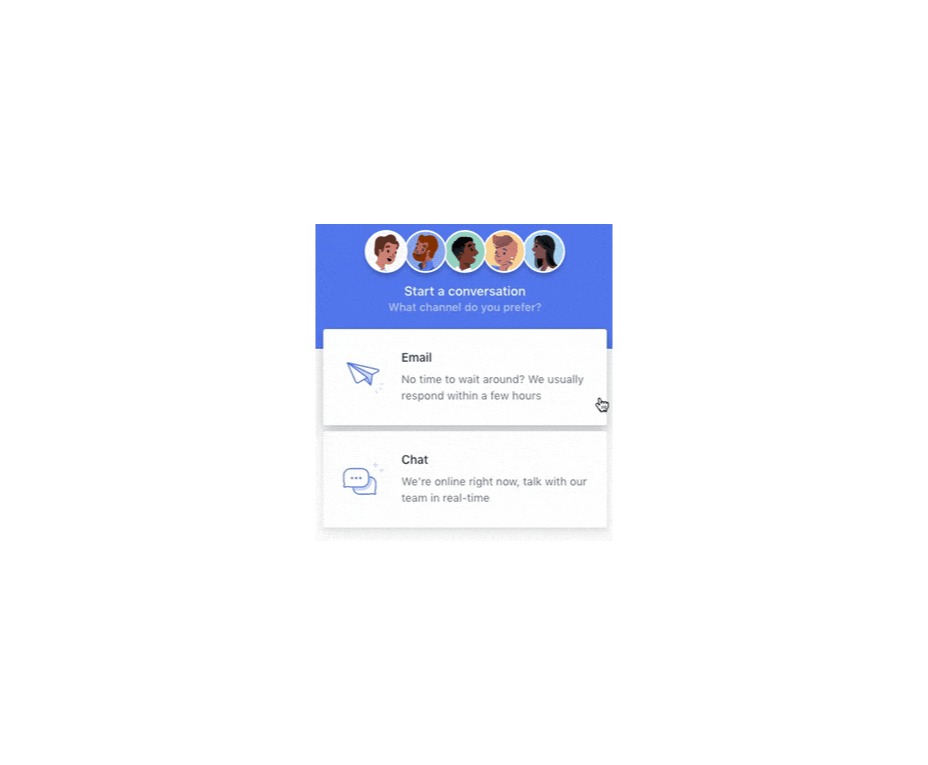
You can even set up automated systems that direct customers to different agents and teams based on their needs. For instance, the live chat app on Outgrow.co gives customers the option to fill out different forms depending on whether they want answers to a question, a demo, or something else.
The button you click on dictates which professional you’ll get through to. Although filling out a form can seem like an extra friction point for your customer at first, it helps to streamline the customer journey. After all, if you can direct the customer to the right agent the first time, there are fewer chances that they’ll need to explain their issue to various different people.
Here are a few things you can ask for in the live chat form to make it more effective:
- The customer’s name: This will help to personalize the conversation. It could also be an opportunity to track down any background information you have about an existing customer and the orders that they may want to speak to you about.
- An email address: Having an email address will allow you to bring up a customer’s record on your CRM. It also means that you can send any information that the customer needs to their email inbox at the end of the conversation.
- A brief explanation: Ask your customers to share what they’re reaching out to you about and use keywords in their message to assign the chat to the right agent or professional. You could even add a drop-down menu of topics for them to choose from.
Remember, don’t ask for too much information straight away, or you’ll risk your clients feeling that the service experience is too complicated.
3. Make Sure It Works Everywhere
We’ve reached the point now where every customer expects a brand’s website to be responsive on any device. Most web-building templates automatically work on mobile tablets and smartphones. Additionally, it’s becoming increasingly easy for companies to transform their website and online store experiences into dedicated apps too.
However, while most businesses know that their site needs to be responsive, they often forget about the mobile element when it comes to live chat. If your live chat function is only available on the web browser version of your website, then this is going to end up making your mobile customers pretty unhappy. They don’t want to have to stop browsing on their phone just to connect with you.
Ideally, you’ll want to create a separate component for your mobile app where your customers can easily access the same live chat functions they’d have on your browser-based site.
If you’re just offering live chat through a mobile version of your website, make sure that it’s easy for your customer to click into the chat section and send messages without accidentally ending up on a different tab or page. It might also be worth setting up functions that allow your chat app to send push notifications to your customer’s phone whenever they get a new message.
Being able to put their smartphone down or switch to another app while they wait for a response will provide a much more intuitive experience for your audience.
4. Make Sure You Support All the Right Languages
You’d think that this CX tip for live chat would be obvious, but it’s shocking how many companies fail to offer support for all the languages that their customers might use. If you’re selling your products throughout the world, and you know you have customers in China, then it doesn’t make much sense to only offer live chat in English.
Some of the available live chat apps on the market today come with features that allow you to automatically translate languages when your agents are talking to foreign customers. For instance, LiveChat currently supports 45 languages.
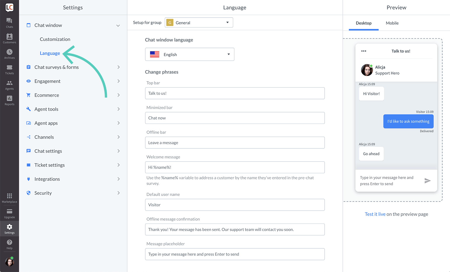
If you’re creating your own chat app from scratch, then you’re going to need to work with your developer or designer to make sure that the right languages are supported. Remember, you don’t have to cover everything, but at least make sure that you can connect with the most common groups of customers in your CRM.
Ensure that if you are using multiple languages, your customers know how to switch to their preferred option too. Usually, the best way to do this is with a drop-down menu. You could also use little flag icons of the countries that you support.
5. Find Ways to Reduce First Response Time
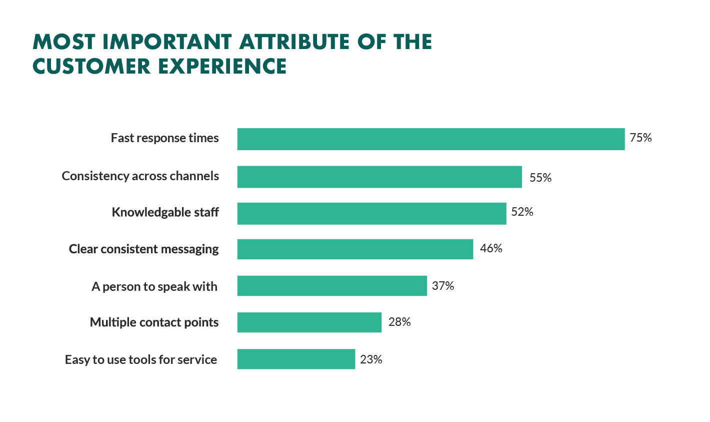
Speed is probably one of the biggest advantages of live chat, and the main reason that customers like it so much. According to the CMO council, fast response time is the number one thing that a customer looks at when measuring satisfaction.
While you might not be able to have someone on-hand to answer your customers 24/7, you can improve the way they perceive your load times in a variety of ways. For instance, start by making it clear when your people are online to talk to your customers. Setting expectations on when you’ll be available to immediately respond should help to avoid frustration.
- Keep all chats in the same place for agents: Having a combined contact center solution on the back-end makes responding to queries much easier for your agents. If they can see all of your brand’s live chat, social, and email conversations in one place, they don’t have to waste time jumping between different platforms and tabs.
- Set routing queues: Use an automated system to send every message you get to the most appropriate agent available. You can intelligently route conversations based on the issues that your customers have or the things they want to discuss. It’s also worth ensuring that your system prioritizes routing conversations to the first agent available.
- Send notifications: Make sure that you set your live chat system up to send push notifications to agents when a new message is waiting. It’s also with notifying your customer when they have a response, just in case they’ve switched to another tab.
The notifications you send to your agents could come with access to a customer’s CRM file, so that your agent can go into a conversation with the context they need. Agents that instantly get context on a conversation don’t have to waste as much time tracking down the right information. Giving your agents context also means that they don’t have to ask repetitive questions, which could annoy your customer.
6. Make the Chat Experience On-Brand
Every company wants to give their customer a slick experience with live chat. The solution you build needs to be easy to use, and responsive across every device. However, it also needs to be something that your customer associates with your brand.
Companies generally have a lot of options for how a live chat window can look. You can adjust the appearance to suit your brand by picking specific colors, tweaking button shapes, and even changing the available fonts.
Working the visual elements of your brand into the design of the live chat experience is the best way to make your customers feel comfortable and confident that they’re dealing with your company. For instance, Hubspot uses matching colors, rounded edges on chat bubbles, and even a fun illustration to make their chat experience more “branded.”
Remember, when you’re creating a Live Chat experience that’s “on brand”, it’s also a good idea to think about things like voice and tone. Infusing live chat with the unique personality of your brand will make the experience more memorable.
If you usually stick with informal language and use a lot of slang, then it makes sense to continue that in live chat – even when you’re sending automated messages. To make sure your brand identity really shines through:
- Write scripts for your automated messages in your brand’s tone of voice
- Write guidance scripts for employees that highlight your tone for agents
- Provide training on brand tone of voice for your support team
- Encourage support agents to connect with customers on a personal level
- Remember to set guidelines on how to use things like gifs, slang, and emojis too!
7. Make a Checklist For Security and Tech Issues
One of the most significant things that will affect the experience your customer has with your live chat service, is technical and security issues. Choose the right developer or designer to help with your app, and the risk of problems dwindle. You can also address the issue of having to constantly maintain, check, and update your live chat experience by using a pre-existing solution, like Intercom.
No matter how you choose to approach live chat, these are the things you’ll need to check for most:
- Page load times: Page load times are crucial for user experience and SEO, so you should be taking them seriously already. Check your web chat software isn’t dragging down the performance of your page or causing unnecessary problems.
- Cross-channel conversations: If your website has various subdomains, make sure that moving through these in chat won’t mean you lose the session. Customers don’t want to have to repeat themselves!
- Functionality with browsers: Your chat app needs to work just as well on every browser and operating system – including mobile devices.
- Data management: Under things like GDPR, you need to ensure that you’re controlling user information safely. Ensure you have a DPA in place, and make sure that your web channel doesn’t affect any PCI-DSS compliance systems you have in place. Your chat solution may need to automatically mask credit card information, for instance.
Time to Enhance Your Live Chat Strategy
Ultimately, whether you like it or not, your customers love live chat technology, and they’re not going to stop looking for it on your website. Today’s consumers expect you to serve their interests by delivering customer support on the channels that they choose. Unfortunately, most companies just aren’t living up to expectations.
Following the tips above could help you to transform the way that you interact with your clients and improve your chances of better satisfaction overall.
Source
The post 7 Tips for Transforming CX with Live Chat first appeared on Webdesigner Depot.

Source de l’article sur Webdesignerdepot

 With a new year here, it’s time to try out some new fonts.


 Every day design fans submit incredible industry stories to our sister-site,


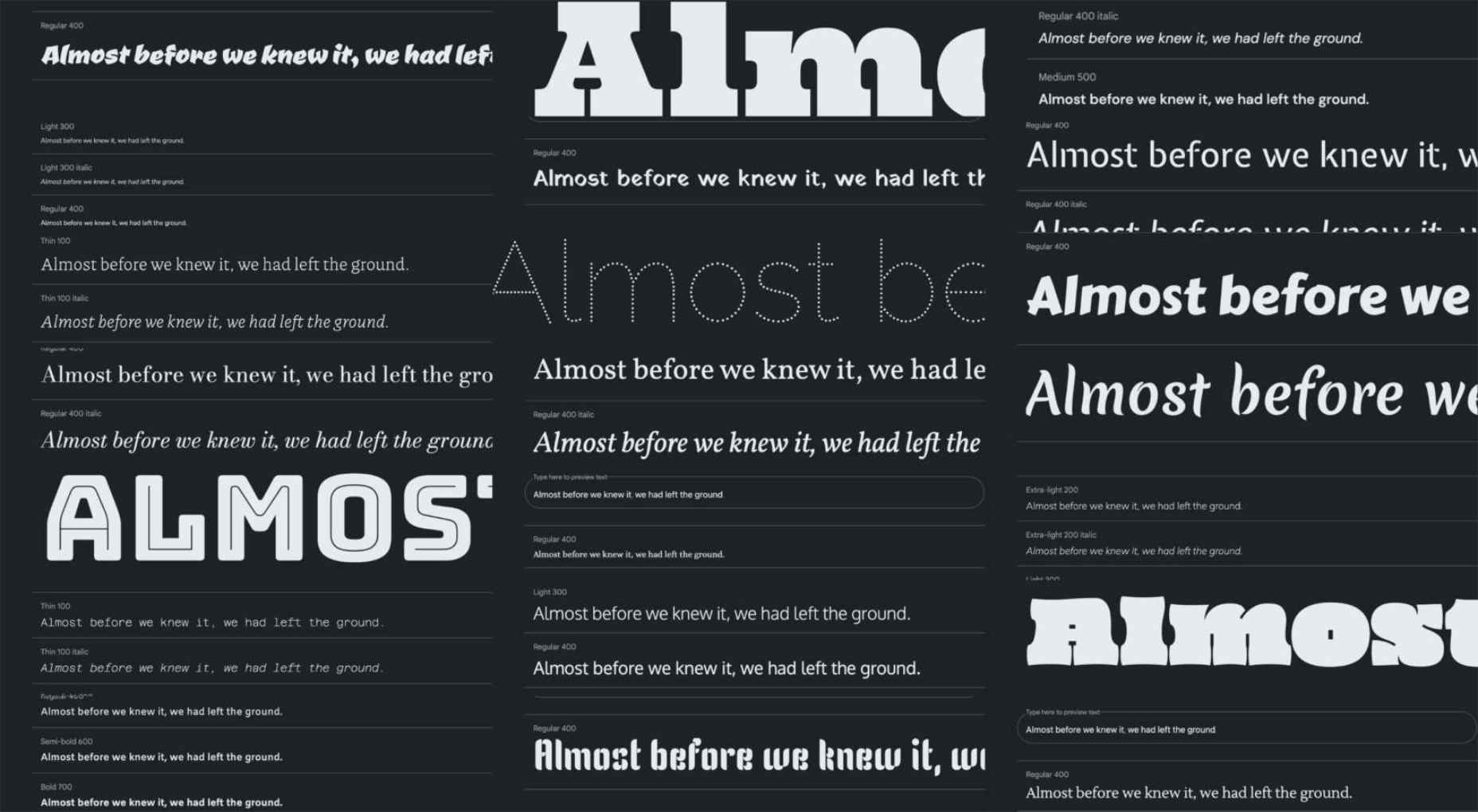
 The choice of typeface is one of the most critical factors in any design; it gives the text its voice. It can be desperately frustrating to find the right voice for your project, only to discover it’s outside your client’s budget.

 Every day design fans submit incredible industry stories to our sister-site,


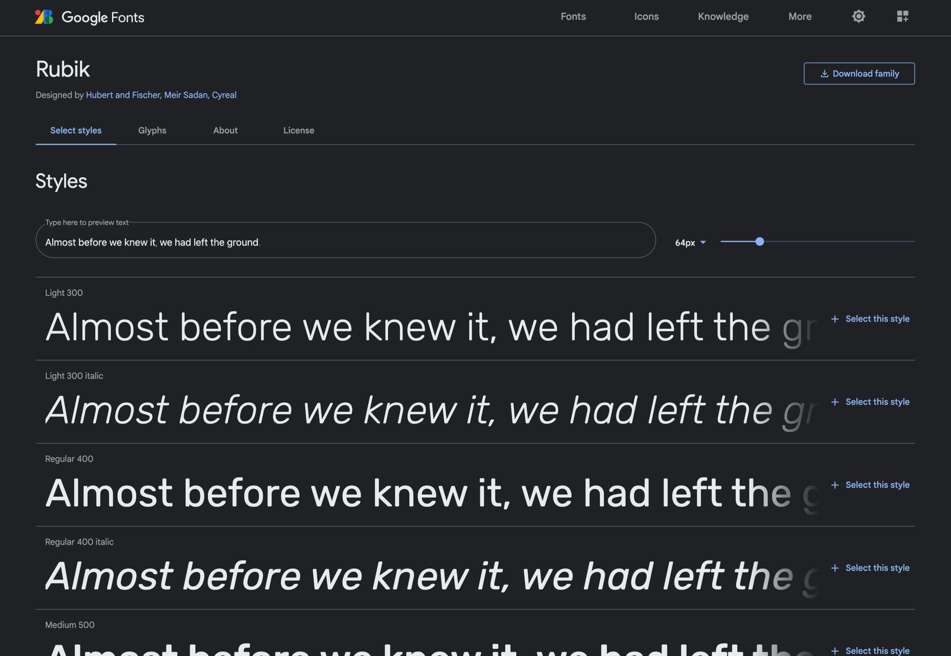
 Are you tired of using the same old Google fonts from website to website? You’re in luck!


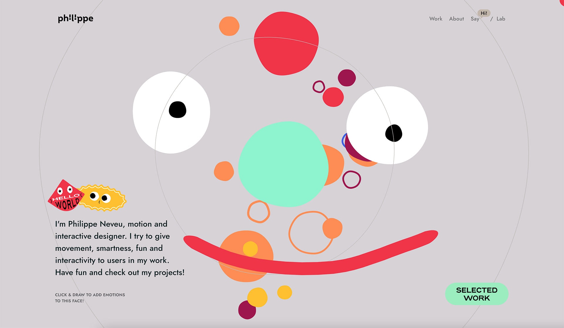
 The year might be coming to an end, but plenty of design trends are still beginning to emerge. It’ll be interesting to see how many of these website design elements remain popular into the new year. From vintage elements to circles to happier feelings, there’s a lot to play with here.


 Every day design fans submit incredible industry stories to our sister-site,


 Every day design fans submit incredible industry stories to our sister-site,