 What makes a company special? There are hundreds of organizations out there selling fast food, but only one McDonalds. You’ve probably stumbled across dozens of technology companies too, but none of them inspire the same kind of loyalty and commitment as Apple. So why do people fall in love with some companies more than others?
Most of the time, it comes down to one thing: brand essence. Your brand essence, or brand identity, represents all of the unique components of your business that separate it from the competition. It’s not just about your logo or the brand colors you choose for your website. Your brand essence entails all of the visual assets you use and those less tangible concepts like brand values and personality.
When your customers decide which companies to buy from, they’re not just looking for another dime-a-dozen venture with the cheapest products. Instead, your audience wants to buy from a business that they feel connected with. That’s where your brand comes in.
Infusing brand essence into your website helps give your digital presence that extra touch that differentiates you from other similar companies.
So, how do you get started?
What is Brand Essence?
Your brand essence is a collection of core characteristics responsible for defining your brand. More than just a single asset, your essence encompasses everything from your unique tone of voice, from your brand image, your message, and even what you stand for.
More than just a single asset, your essence encompasses everything
When you’re trying to boost your chances of sales, a brand essence helps build a kind of affinity with your customers. Your clients see aspects of your character that they can relate to, such as a modern and playful image or a commitment to sustainable practices. It’s that affinity that convinces your customer to choose your company instead of your competition time after time.
Your website is one of the first places that your customer will visit when looking for answers. They might happen across your site when searching for a key phrase on Google or stumble onto it from social media. When they arrive on your product or home page, everything there should help them make an immediate emotional connection.
The only problem?
It’s challenging to portray a unique brand identity through a standard website template. If your site looks the same as a dozen other online stores, how can you convince your customers that you’re better?
Why Your Website Needs Brand Essence
First impressions are a big deal.
In a perfect world, your visitors would land on your website and instantly fall in love with what they find there. So everything from the unique design of your homepage to the pictures on your product pages should delight and impress your audience.
Unfortunately, if just one element is wrong, then you could also make the wrong impression entirely on your customers too. Adding elements of brand essence to your site will:
- Build trust with your audience: Your brand should be a consistent component of everything your business does, from selling products to interacting with customers. When your consumers land on your website, everything from your logo to your chosen colors should remind them of who you are and what you stand for. This consistency will lead to better credibility for your business.
- Make you stand out: How many other companies just like yours are on the internet today? Your brand essence helps to differentiate you as special by showing what’s truly unique about you. It’s a chance to remind your audience of your values and make them forget all about your competitors.
- Create an emotional connection: Brand essence that shows off your unique values, mission, and personality will help create an emotional link with your audience. Remember, people fall in love with the human characteristics behind your brand!
Easy Ways to Add Brand Essence to your Website
Since there are so many elements that add up to a strong brand essence, there are also a variety of ways you can add your brand to your website. Whether it’s using specific colors to elicit an emotional response from your fans or adding your unique tone of voice into content, there’s no shortage of ways to show off what makes you special.
1. Use Your Brand Colors Carefully
Brand colors are an important part of your brand essence. Walk into Target, and the bright shades of red will instantly energize you. Likewise, when you see a McDonalds, that golden arch logo might instantly remind you of joy and nourishment.
Color psychology plays a significant role in every brand asset you create, from the packaging you choose for your products to the shades in your logo. With that in mind, you should be using your colors effectively on your website too. Stick with the same selection of shades in every digital environment online.
For instance, the Knotty Knickers company uses different shades of pink and white to convey feelings of femininity and comfort. Not only is the website packed with this color, but the company also follows through with similar shades on its social media pages too.

Everything from the highlights on the Knotty Kickers Insta to the decorations in their images feature the soft tones of pink that make the company recognizable.
Remember, consistent use of color is psychologically proven to help improve recognition by up to 80%. So let your colors shine through.
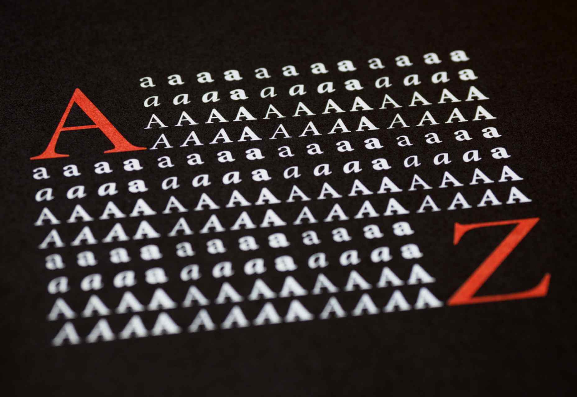
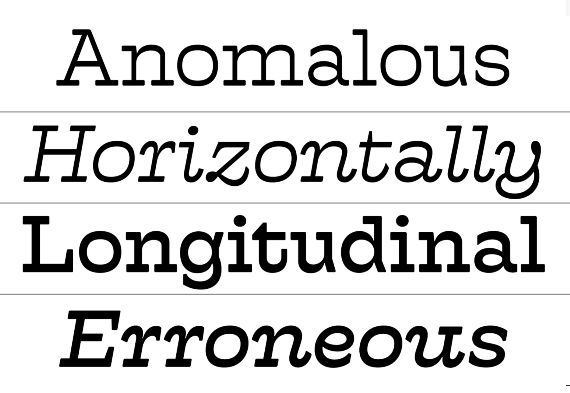
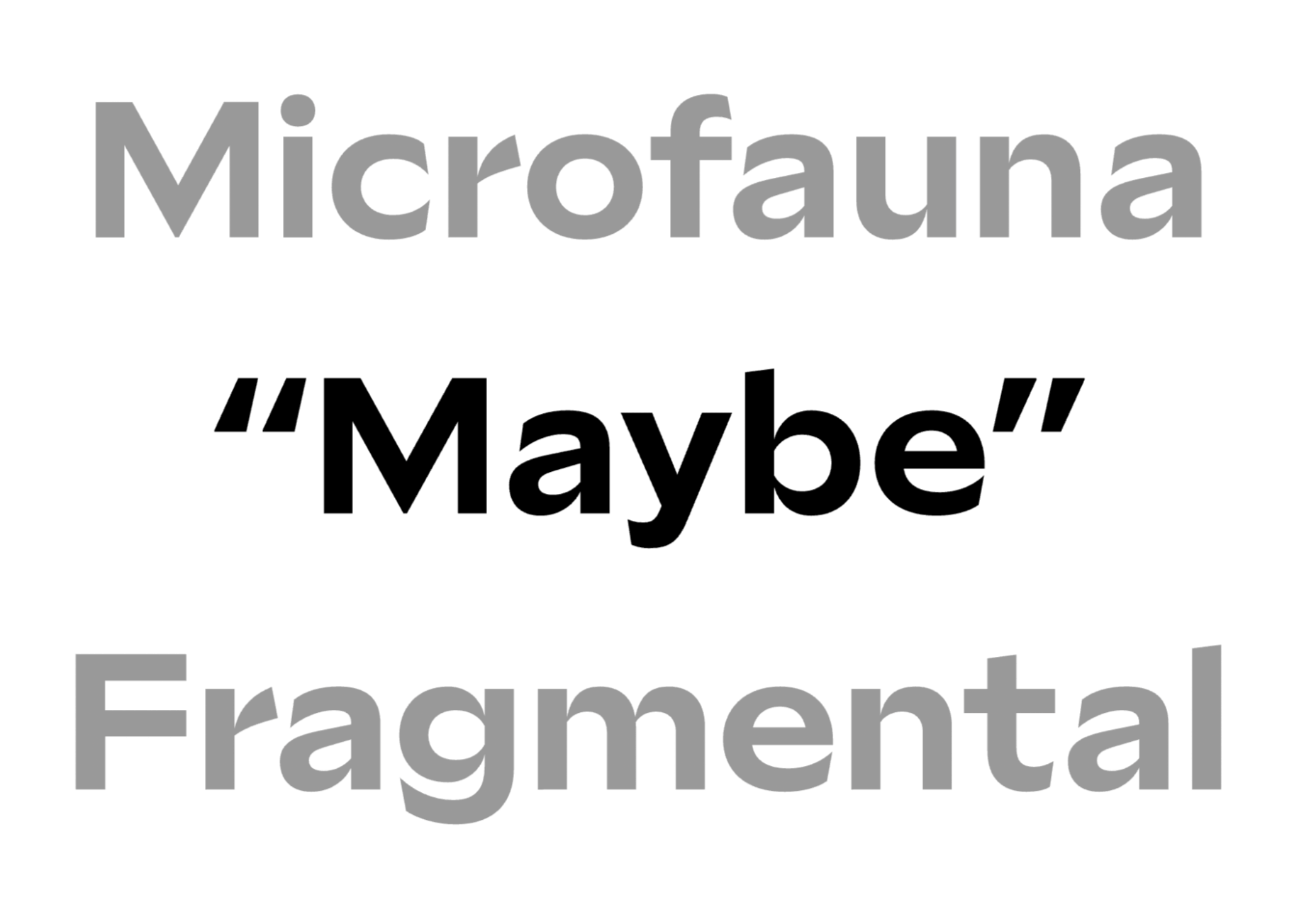
2. Know Your Type
Your colors are just one component of your brand essence.
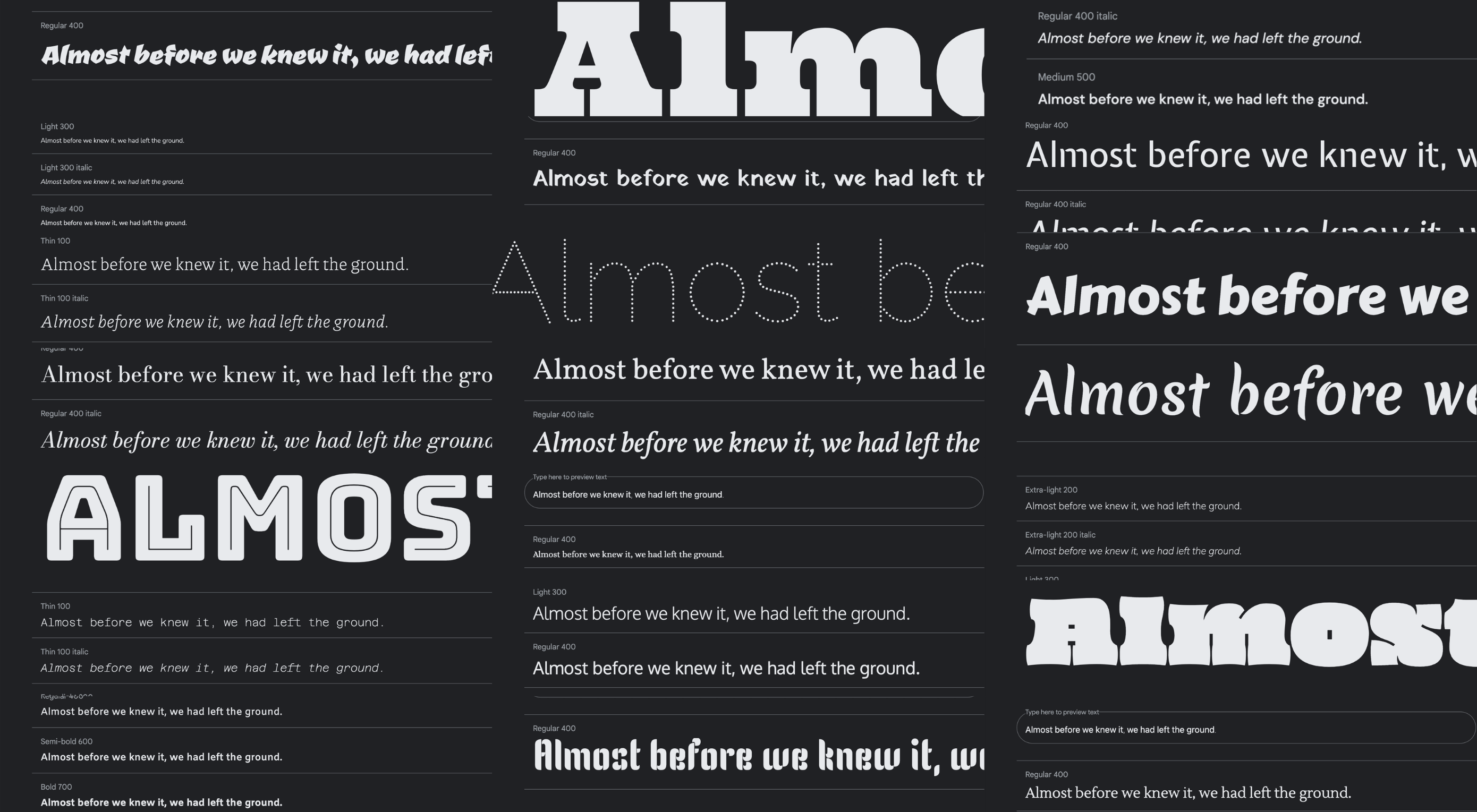
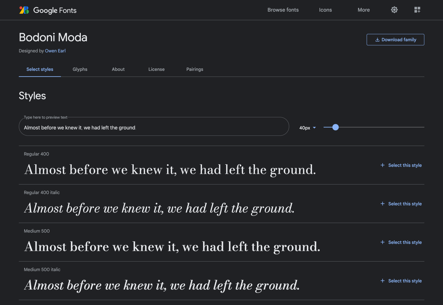
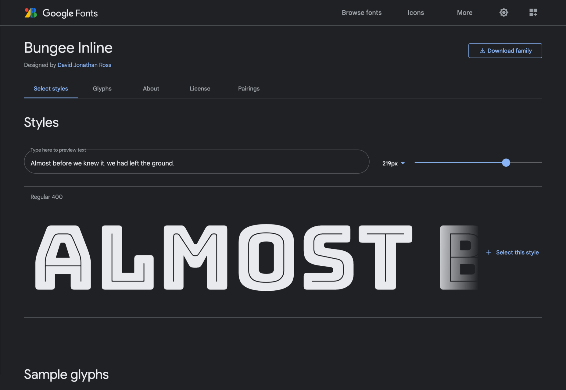
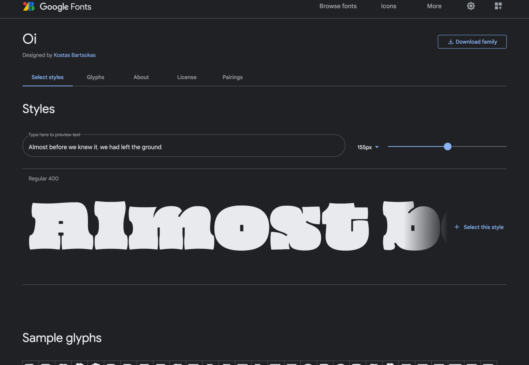
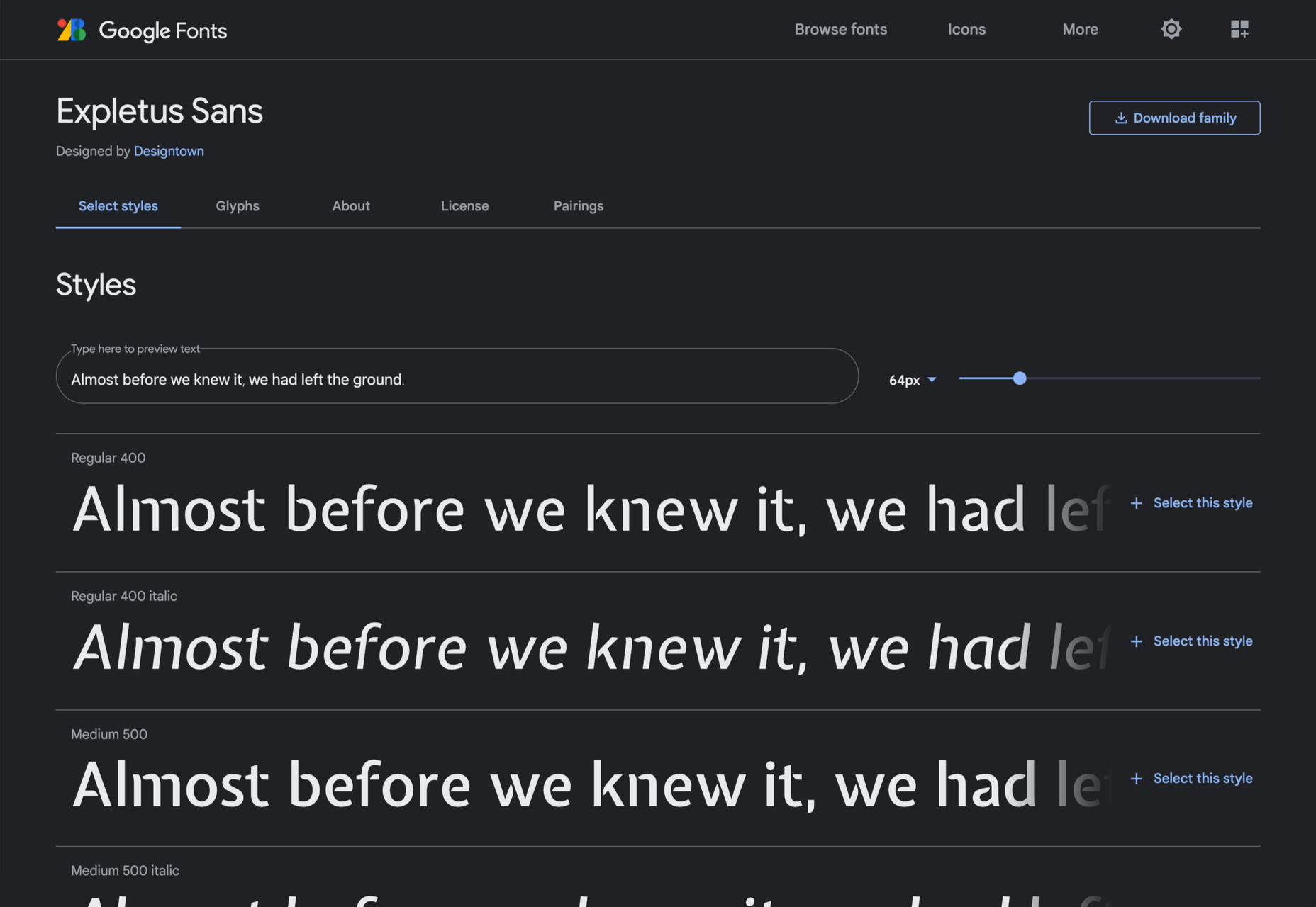
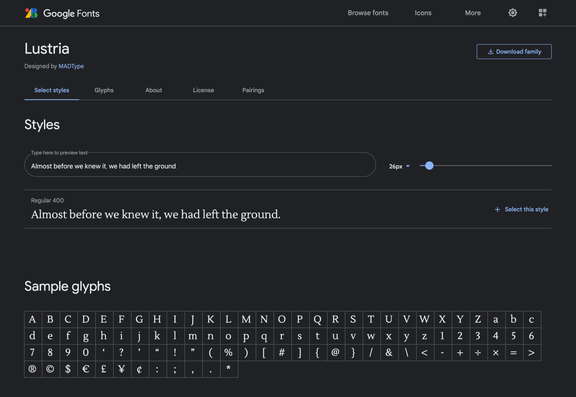
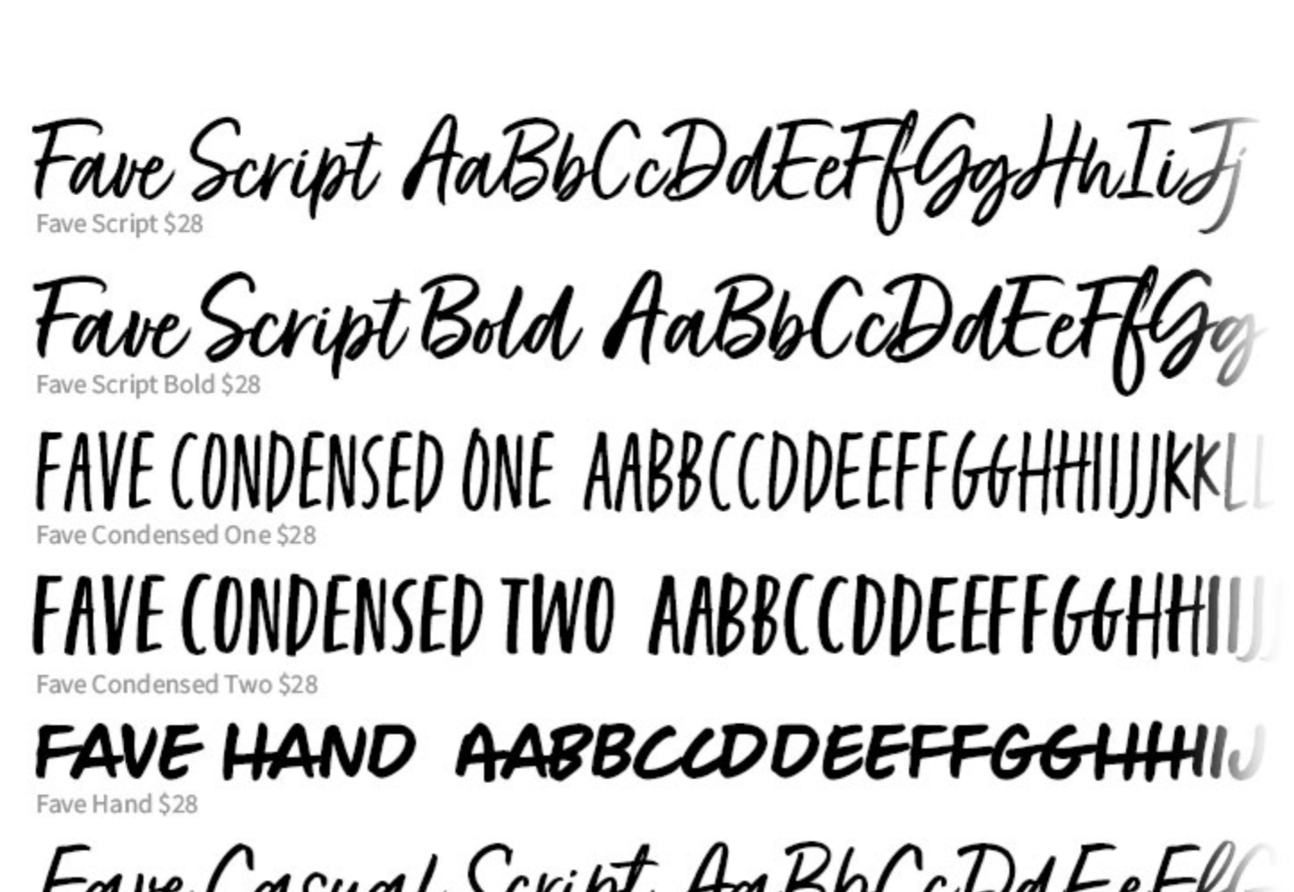
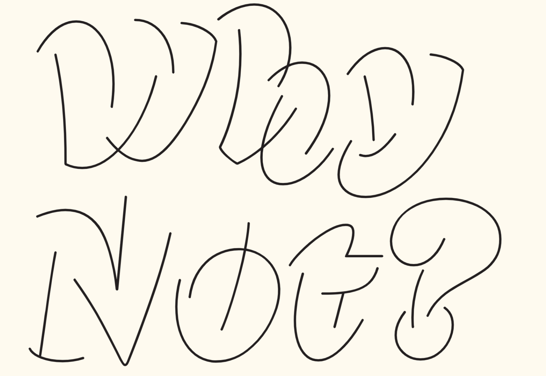
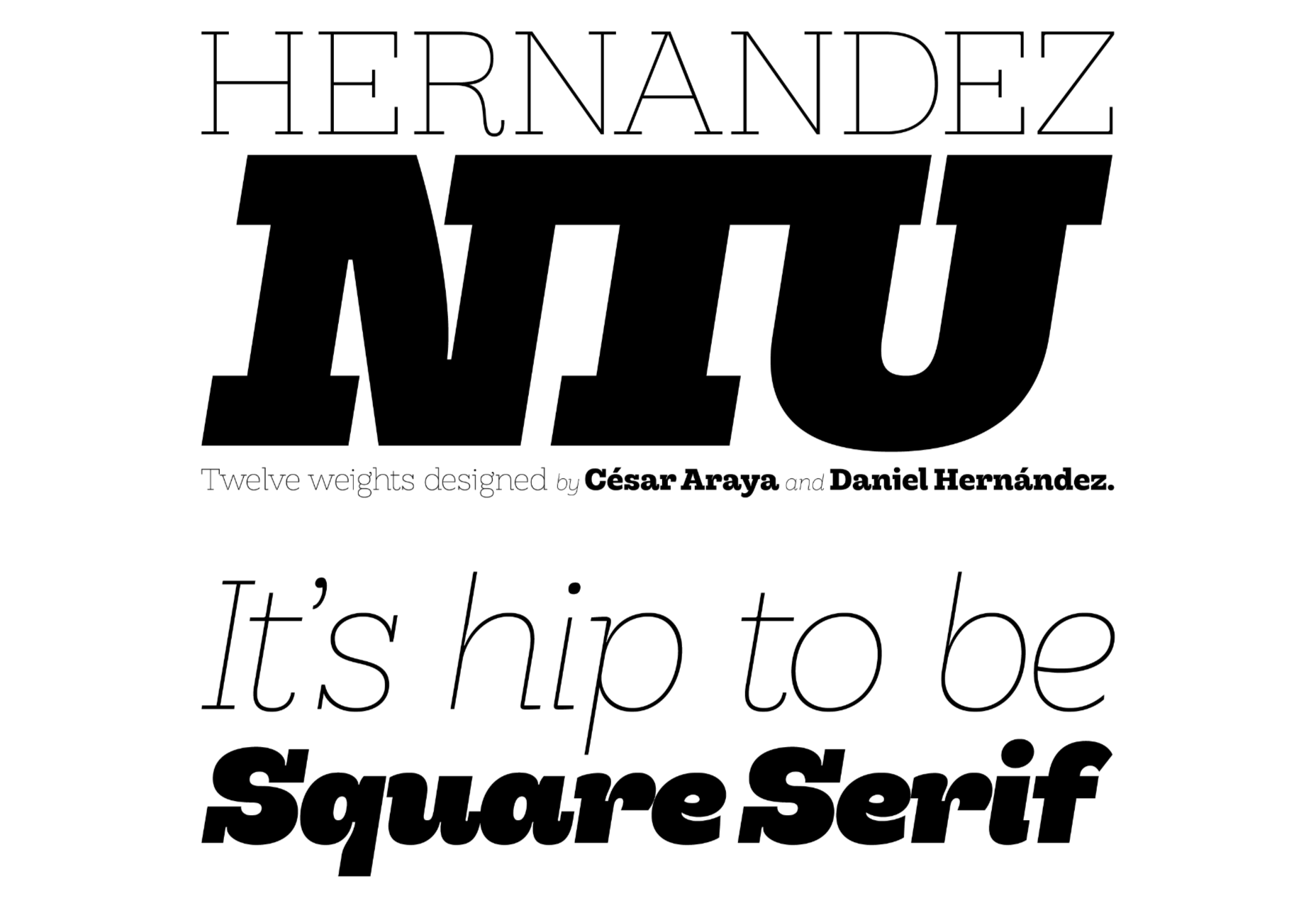
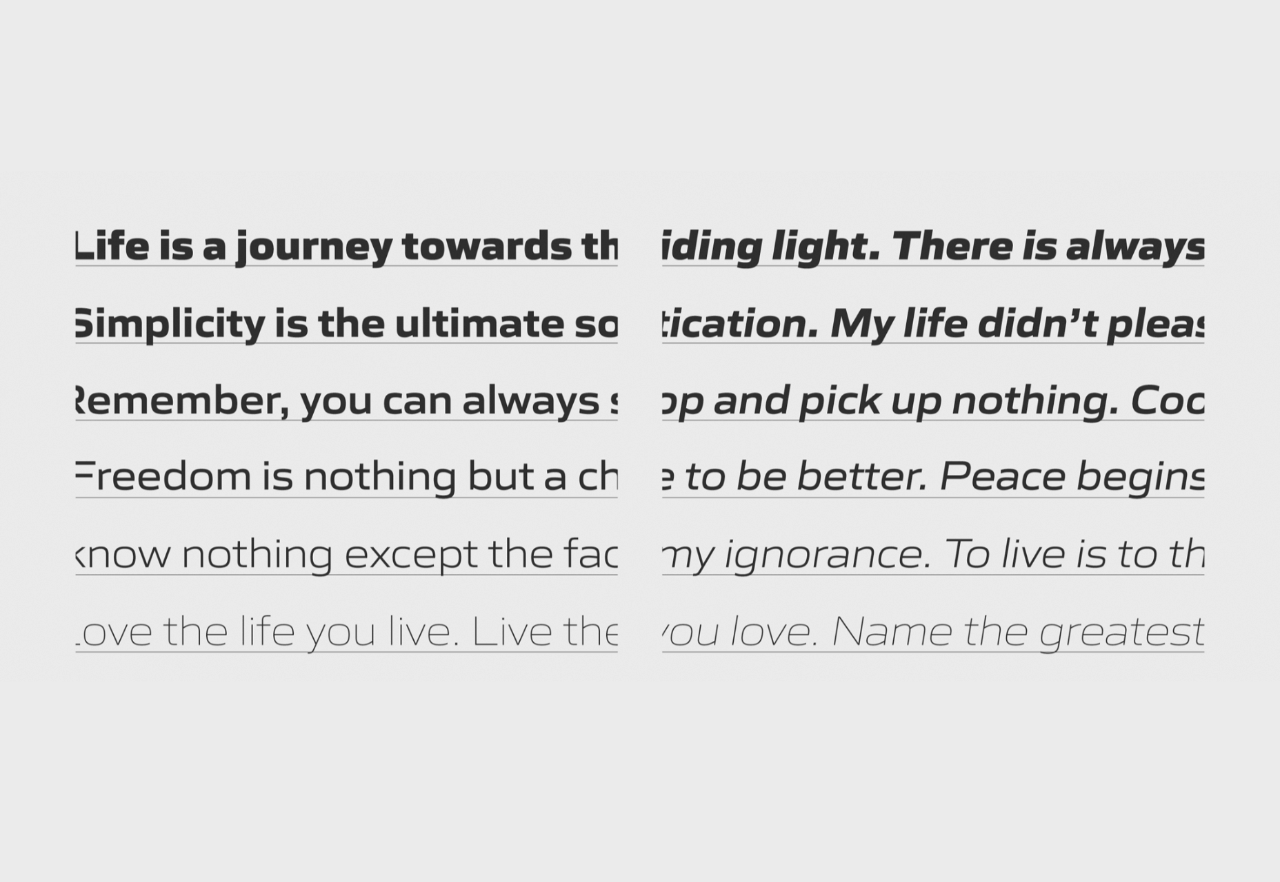
Fonts and typography are other components that your customers use to recognize and understand your business. There are many different styles of font, and new ones appear all the time. However, your company should have a specific selection of fonts that it uses everywhere.
If you have a typeface logo, then you might have one specific kind of font for this, like Original Stitch’s logo here:

On top of that, you may also use one font for the “heading” text on your website and something slightly different for the body text. Your heading and body text need to be extremely clear and easy to read on any device if you want to appeal to your target audience.
However, there’s more to getting your fonts right than choosing something legible. The fonts you pick need to say something about your company and what it stands for. For example, the modern sans-serif font of Original Stitch’s website conveys a sense of forward-thinking cleanliness and style.
The fonts feel trendy and informal, perfect for a luxury fashion company. Alternatively, a serif font like Garamond might look more formal and professional. So what do you want your customers to think and feel when they see your typography?
3. Know Your Images
Stock images look out-of-touch, cliché, and fake. If you cover your website in images like that, then you’re not going to earn the respect of your customers. Instead, it’s up to you to ensure that every graphic on your website conveys the sentiment and personality of your brand.
Bringing your brand essence into your website design means thinking about how you can convey your values in every element of that site. From the photos of your team that show the real humans behind your products and services to the pictures that you use on your product pages, choose your graphics wisely. If you have dedicated brand colors, you can even include these in your photos.
Of course, the most valuable graphic on your website should always be your logo. This is the thing that you need to include on all of your website pages to ensure that your audience knows who they’re shopping with. So ensure that no matter how much visual content you have on your page, your logo still stands out.
Firebox places its logo at the top of the page in the middle of your line of sight, no matter where you go on the website. This ensures that the logo is the thing that instantly grabs attention and reminds consumers of where they are.

Remember to ensure that each of the images you do include in your website is surrounded by plenty of white space so that your customers can see them properly too.
4. Use the Right Tone of Voice
It’s easy to get stuck focusing on things like logos and colors when you’re trying to make your brand essence shine through in your website. However, one of the most common things that your customer will recognize you by is your tone of voice.
Your brand tone of voice is what gives the content you share online personality and depth. It can come through in the kind of words you use, including slang and colloquialisms. In addition, you can add humor to your voice (if it’s appropriate) and even include emojis if that makes sense for your brand.
With formal words, you can make sure that you come across as reliable, dependable, and sophisticated. With informal words, you’re more likely to convince your audience that you’re friendly and relatable. Sticking with the Firebox example, look at how the company writes its product descriptions.
Everything from the length of the sentences to the humor in the tone of voice helps to convey something unique about the brand.
Like all of the elements that bring your brand essence into your website, your tone of voice must remain consistent wherever your customers see it. Make sure that your customer service agents know how to use your voice in chat with customers and that you include that personality on social media too.
5. Focus on Your Message
The tone of voice and personality that you showcase in your website and content is crucial to driving success for your business. However, under all of that, the most important thing to do is ensure you’re sending the right message. In other words, what do you want your customers to think and feel when they land on your website?
If your whole message is that you can make great skincare easy to obtain without asking people to compromise on animal safety, this should be the first thing that comes across when someone arrives on your homepage. That’s why Lush combines clean, simple web pages with credibility-boosting badges that tell customers everything they need to know instantly.

Ensuring that your message can come across correctly means learning how to use all the different brand assets you rely on consistently and effectively. Everything from the colors on your website to how you place trust badges along the bottom of every page makes a difference to how significant and believable your message is.
Notably, when you know what your core message is, it’s important to repeat it. That means that you don’t just talk about what your ideals and values are on your homepage. You also include references to your message on every product page and the “About” page too. Lush has an entire “ethical charter” on its website, where you can learn more about its activities.
Having a similar component included within your web design could be an excellent way to confirm what your most crucial considerations are for your customers.
6. Never Copy the Competition
Exploring other website designs and ideas created by your competitors is one of the easiest ways to get inspiration. Competitive analysis gives you an insight into the trends and design strategies that are more likely to work for your target audience. It’s also an opportunity for you to learn from your competitors’ wrongs and what they’re doing right.
However, it would be best if you never allowed your initial research and exploration to go too far. In other words, when you see something great that your competitor is doing, don’t just copy and paste it onto your own website. This is more likely to remind your customers of the other company and send them to that brand than it is to improve your reputation.
Instead, focus on making your website unique to you. If you’re having trouble with this, then start by looking at your About page. How would you describe your background and your mission as a business to someone who has never heard of you before? What makes your company different from all of the other organizations out there?
Take the unique features that you rave about on your About page and the personality you try to convey through your employees and bring it into the rest of your website design. The whole point of bringing brand essence into your web design strategy is that it helps to differentiate you from the other companies out there.
It’s a good idea to protect any assets that other people might try to steal from you too. Copyrighting your logo, your name, and other essential components of your brand will stop people in your industry from treading on your toes too much.
Make the Most of Your Brand Essence
Your website is one of the most valuable tools that you’ll have as a brand. It’s an opportunity for you to share your products and services with the world, capture the attention of your target audience, and potentially make sales too. However, it’s important not to forget that your website is also a chance for you to demonstrate what your brand is truly all about.
Through your brand essence, you can share the unique values and messages that make your company special. But, more importantly, you can use those components to build a deeper relationship with your audience – the kind of connection that leads to dedicated repeat customers and brand loyalty. People connect with other people – after all, not just faceless corporations.
Once you’ve identified your brand essence, the next step is to make sure that you know how to connect with your customers consistently. Every aspect of your website, application, social media pages, and anything else you make for your business sends the same message.
Source
The post Making Your Mark: 6 Tips for Infusing Brand Essence into Your Website first appeared on Webdesigner Depot.

Source de l’article sur Webdesignerdepot

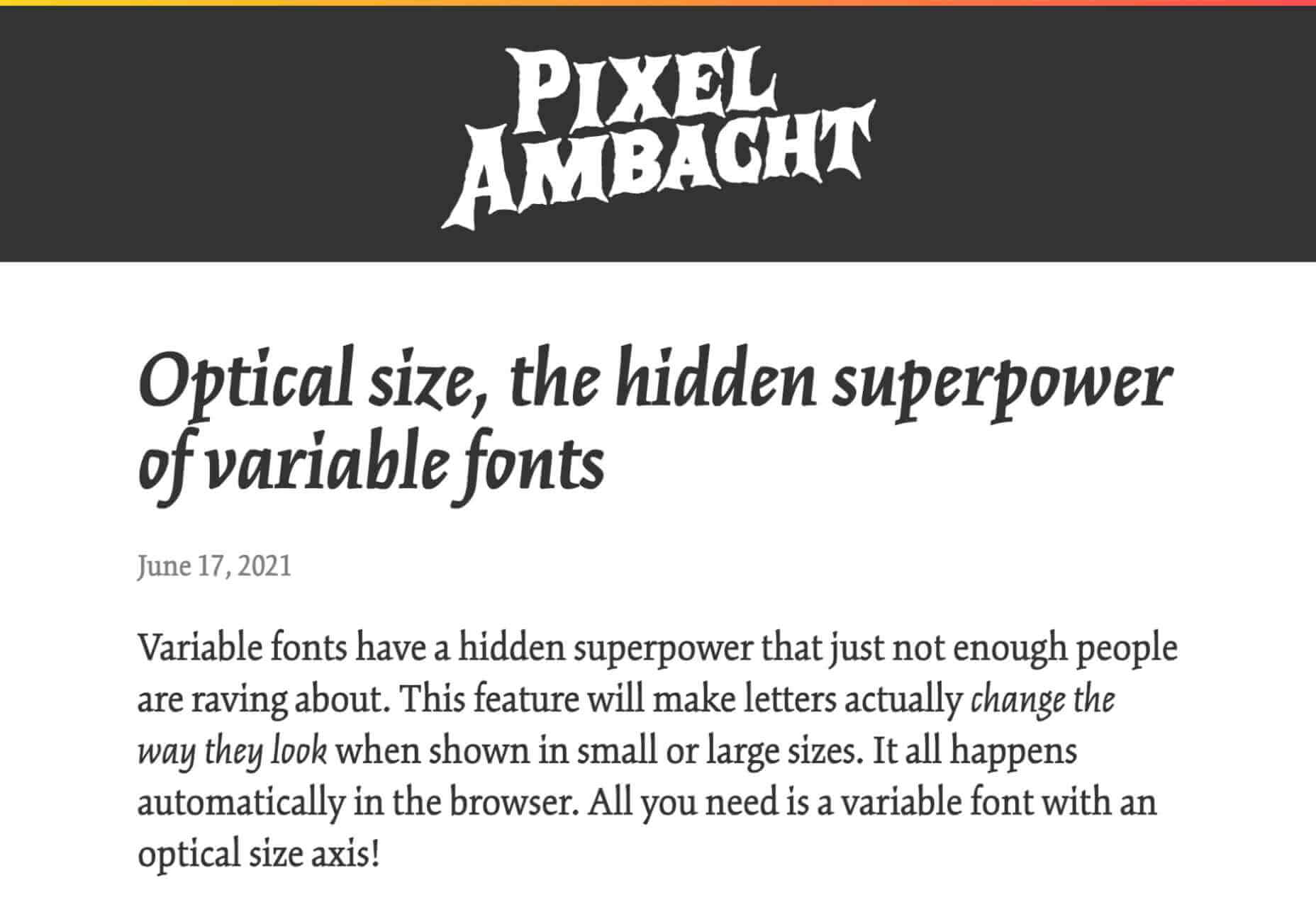
 Google Fonts may be the single most significant contribution Google has made to the evolution of the web — yes, more significant than search, advertising, or analytics.

 Creating an incredible brand experience for an end-user is about more than just designing the right home page or lining up a series of great product pages.


 Every day design fans submit incredible industry stories to our sister-site,


 Every day design fans submit incredible industry stories to our sister-site,


 Looking to give your homepage a well-needed design update in late 2021 or 2022? Not a bad idea; first impressions are crucial when it comes to business websites. But, fixing your homepage and website design is no easy feat.


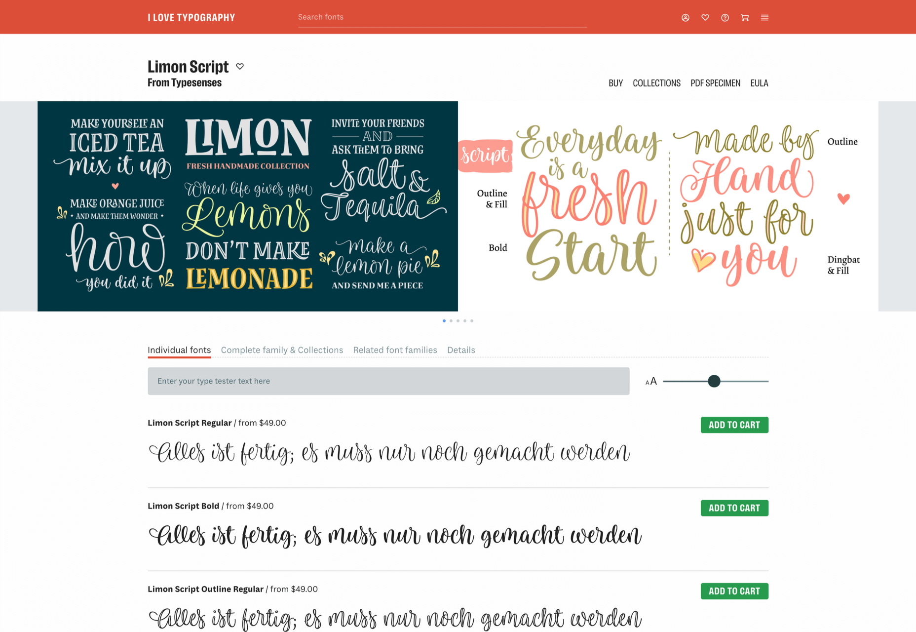
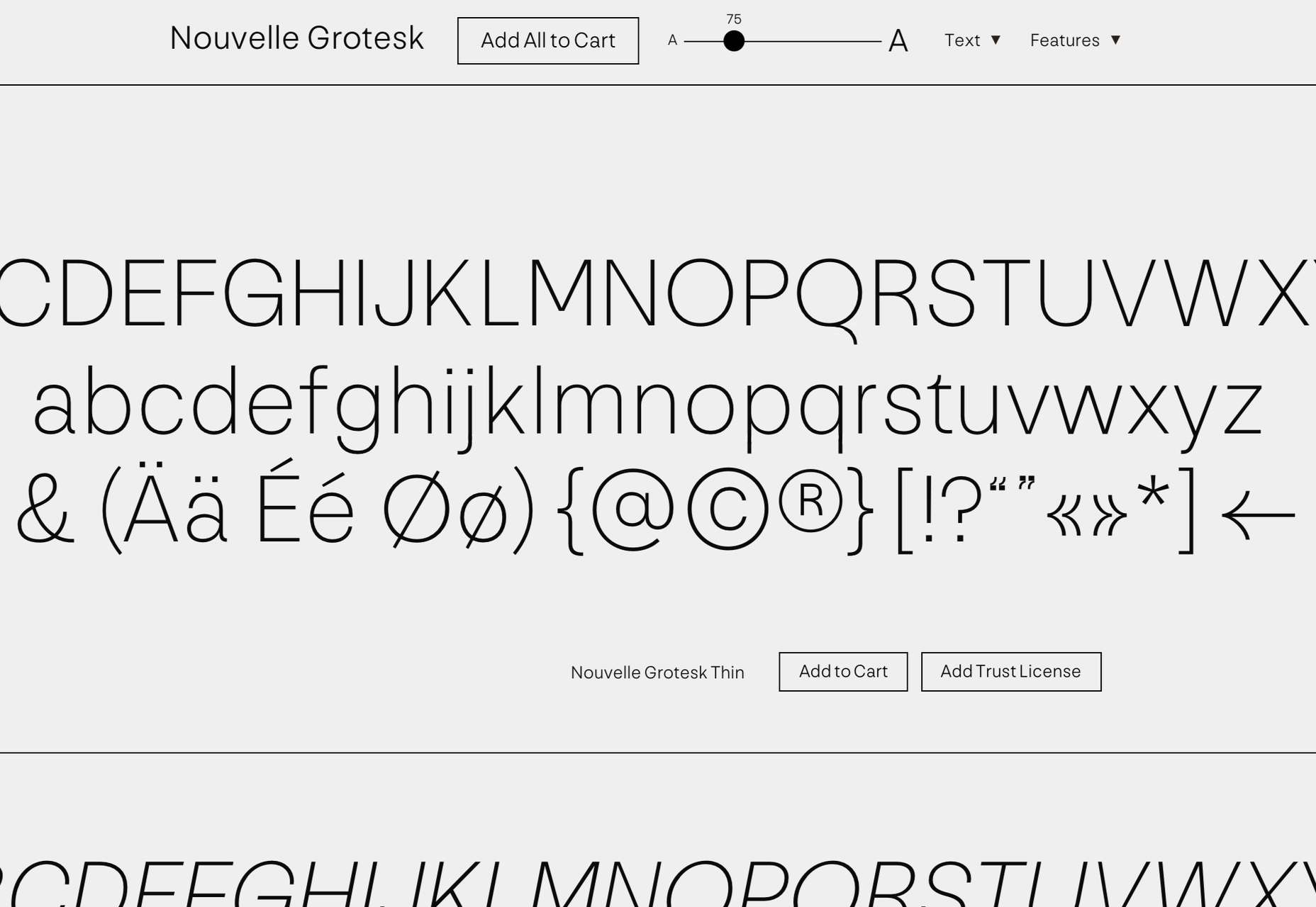
 There is no shortage of places to buy fonts online, but the quality of what is on offer is variable, and the way of searching catalogs has remained largely unchanged since the first stores appeared decades ago.

 Every day design fans submit incredible industry stories to our sister-site,


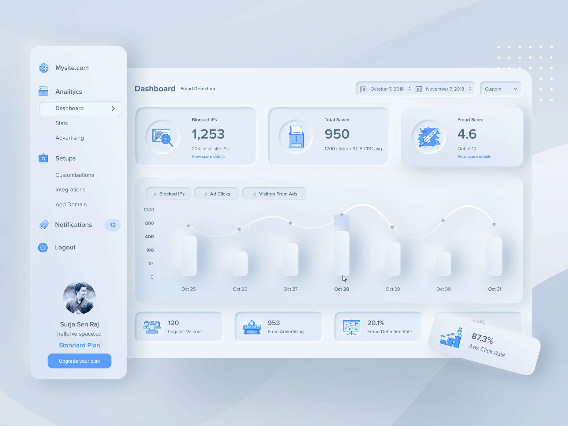
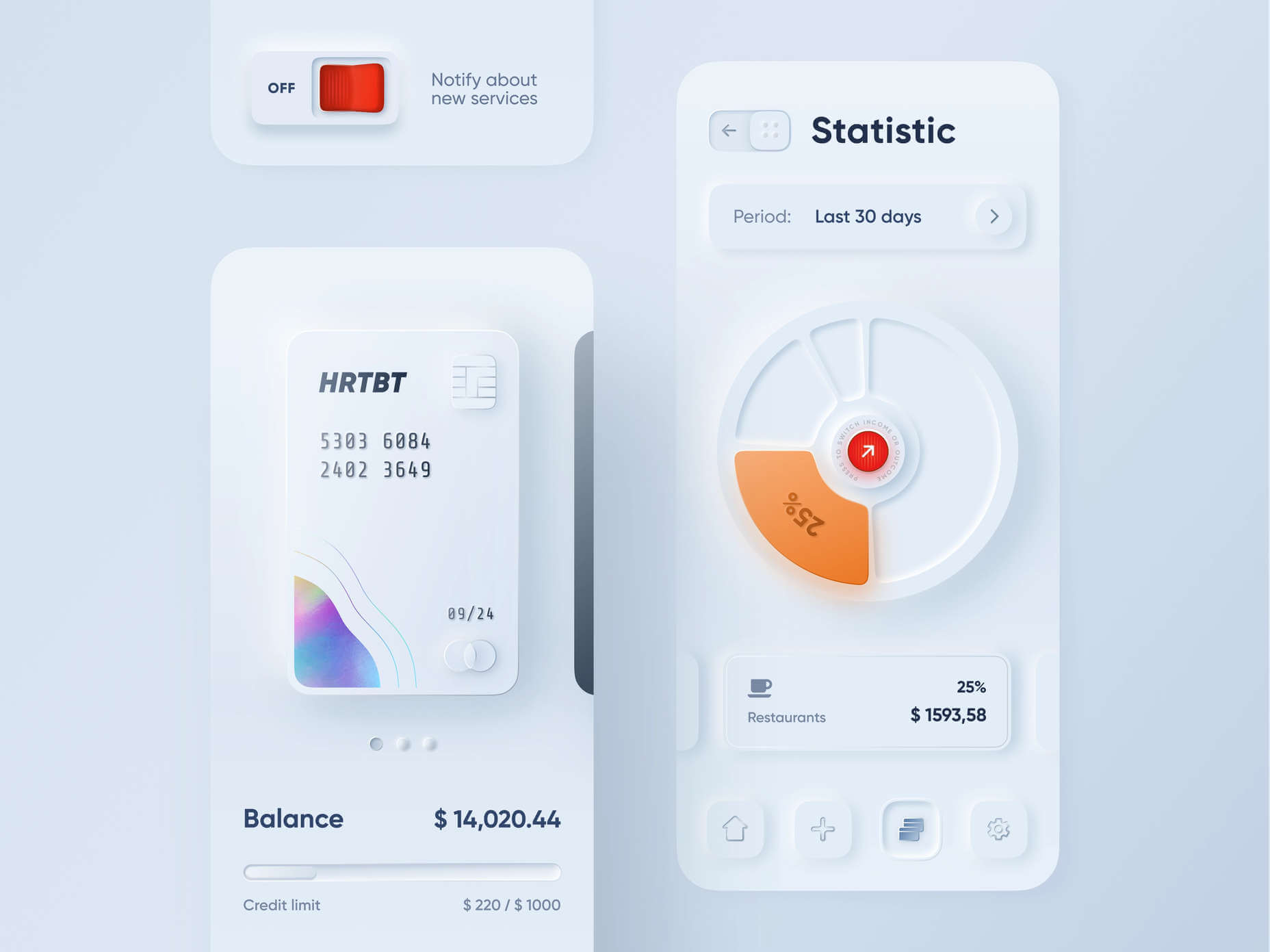
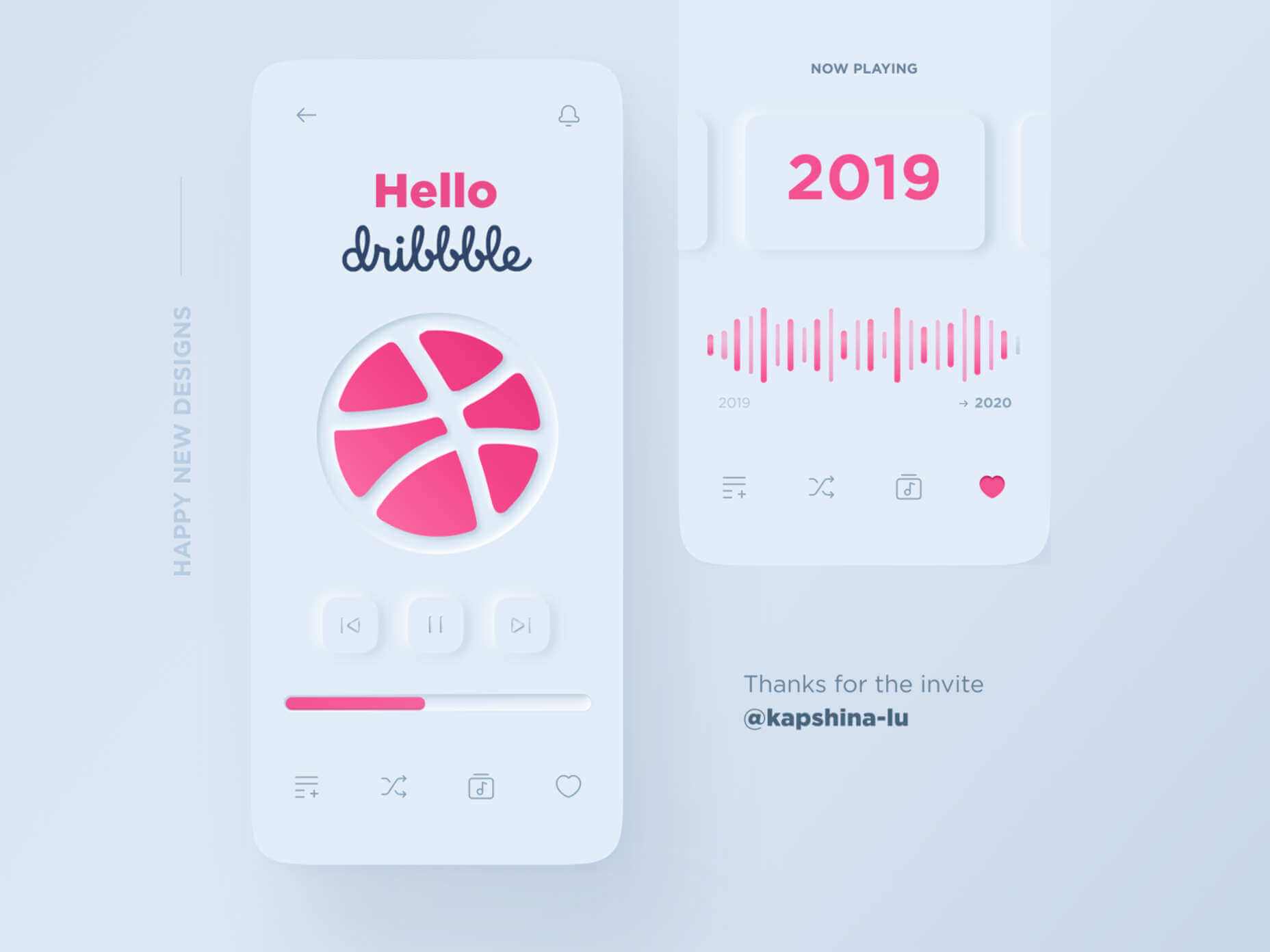
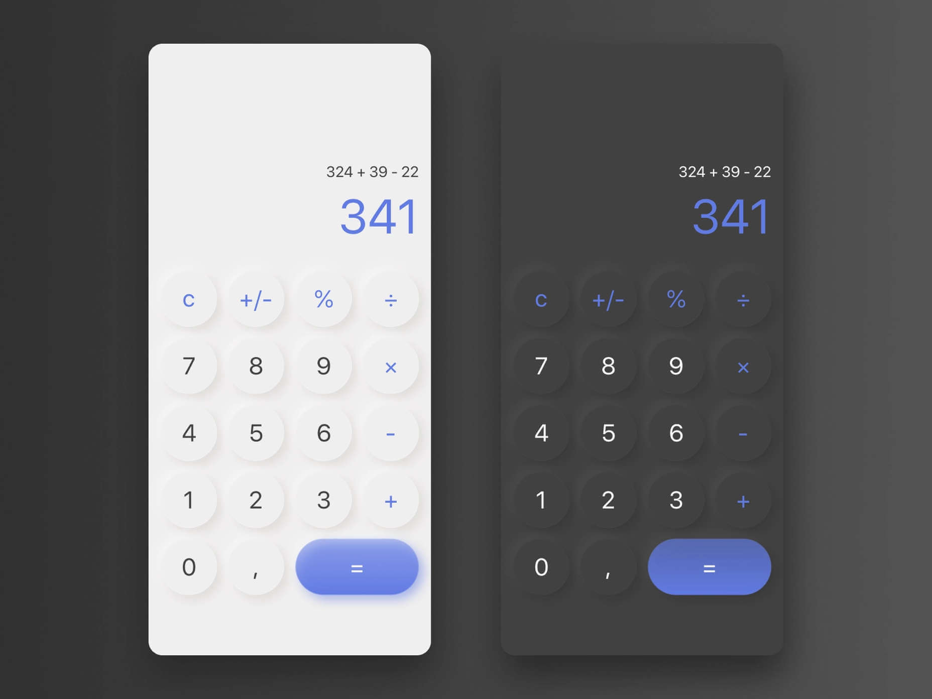
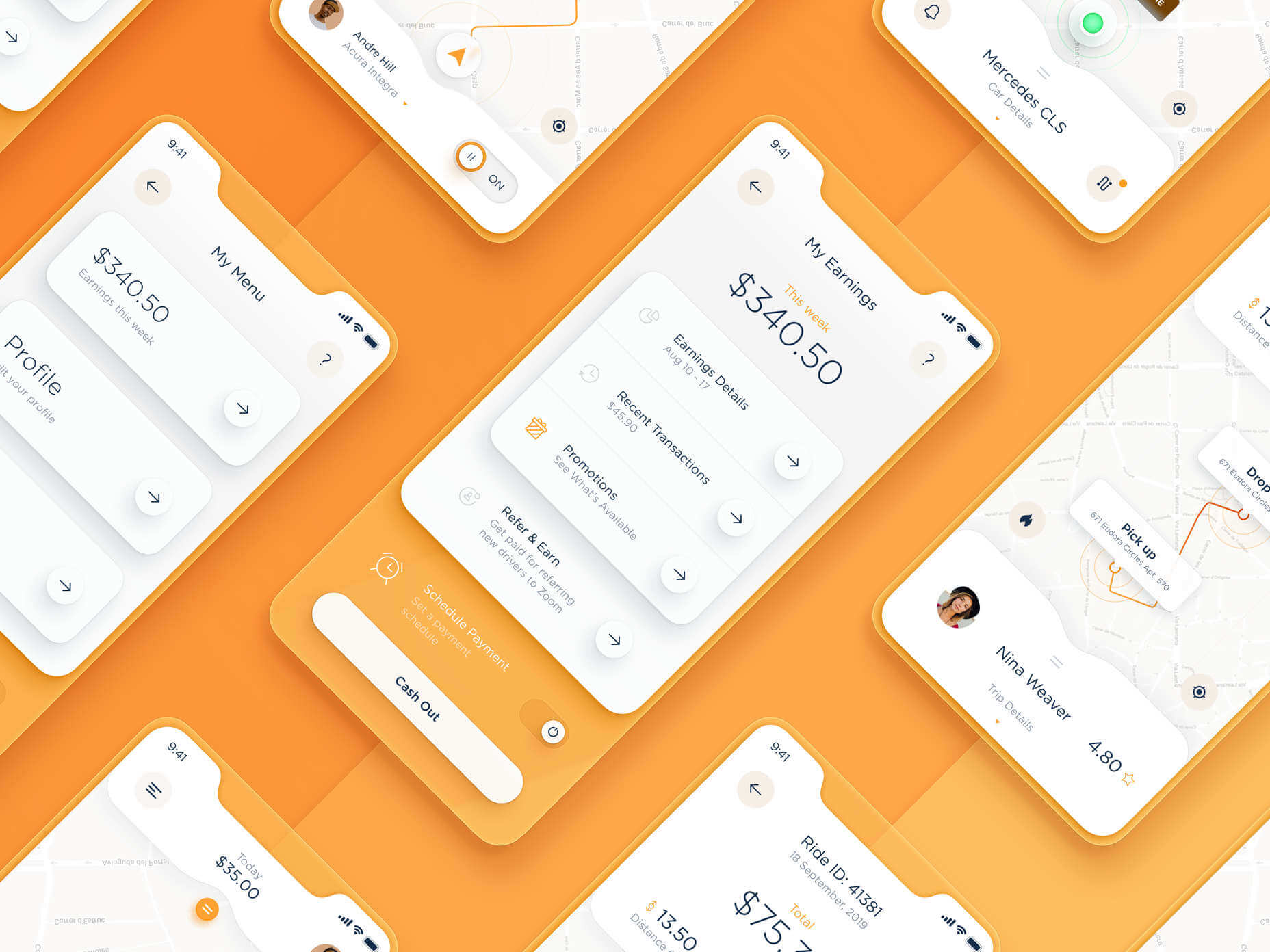
 A new design trend has emerged in the last year: Soft UI or Neumorphism is everywhere.
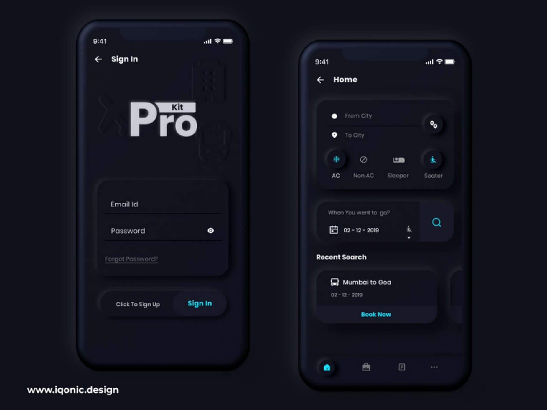

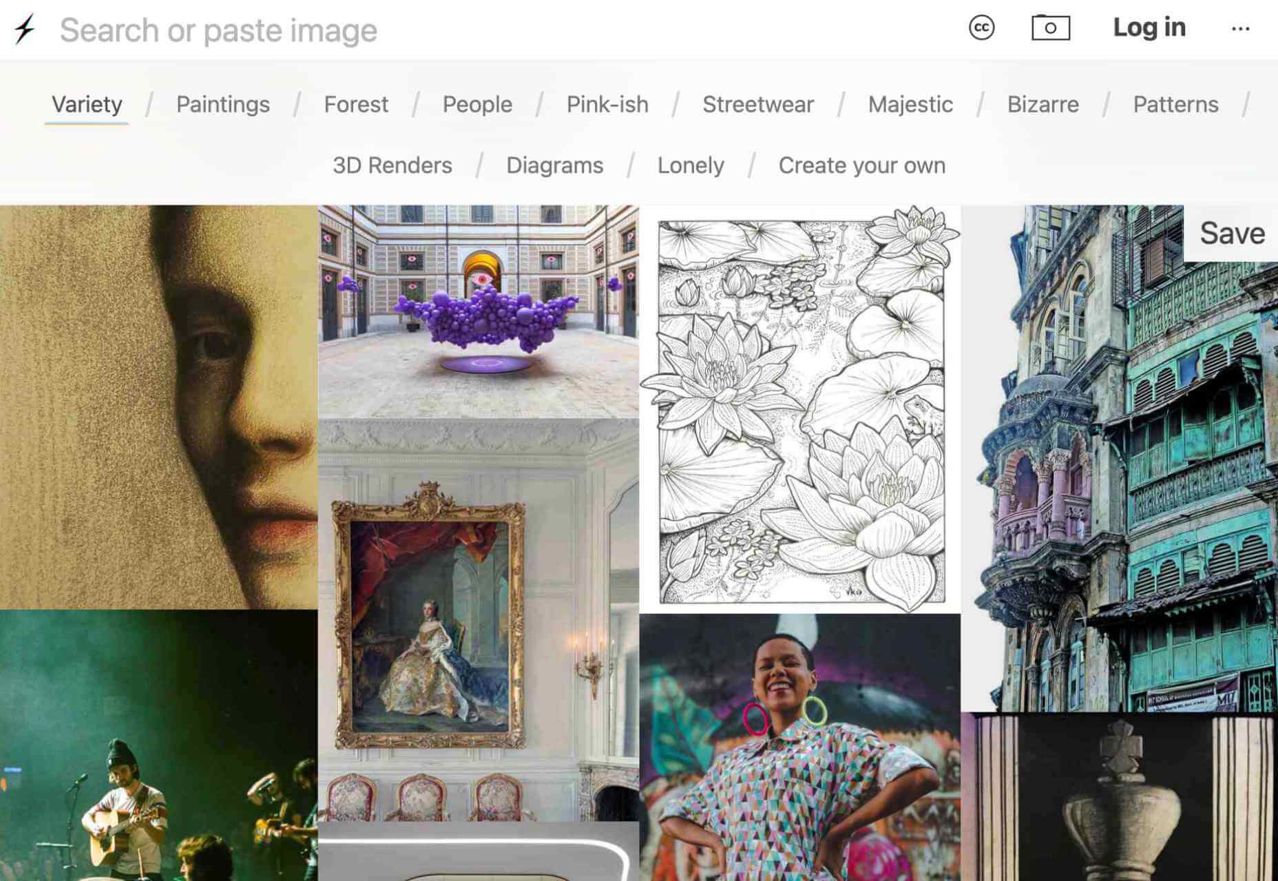
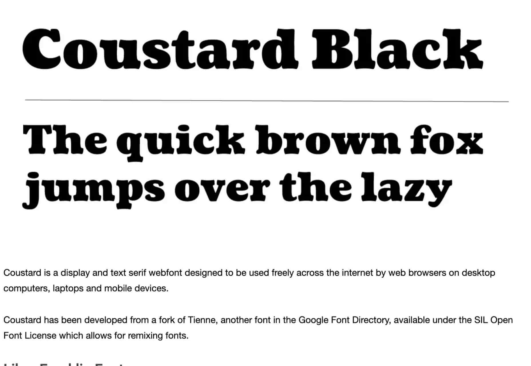
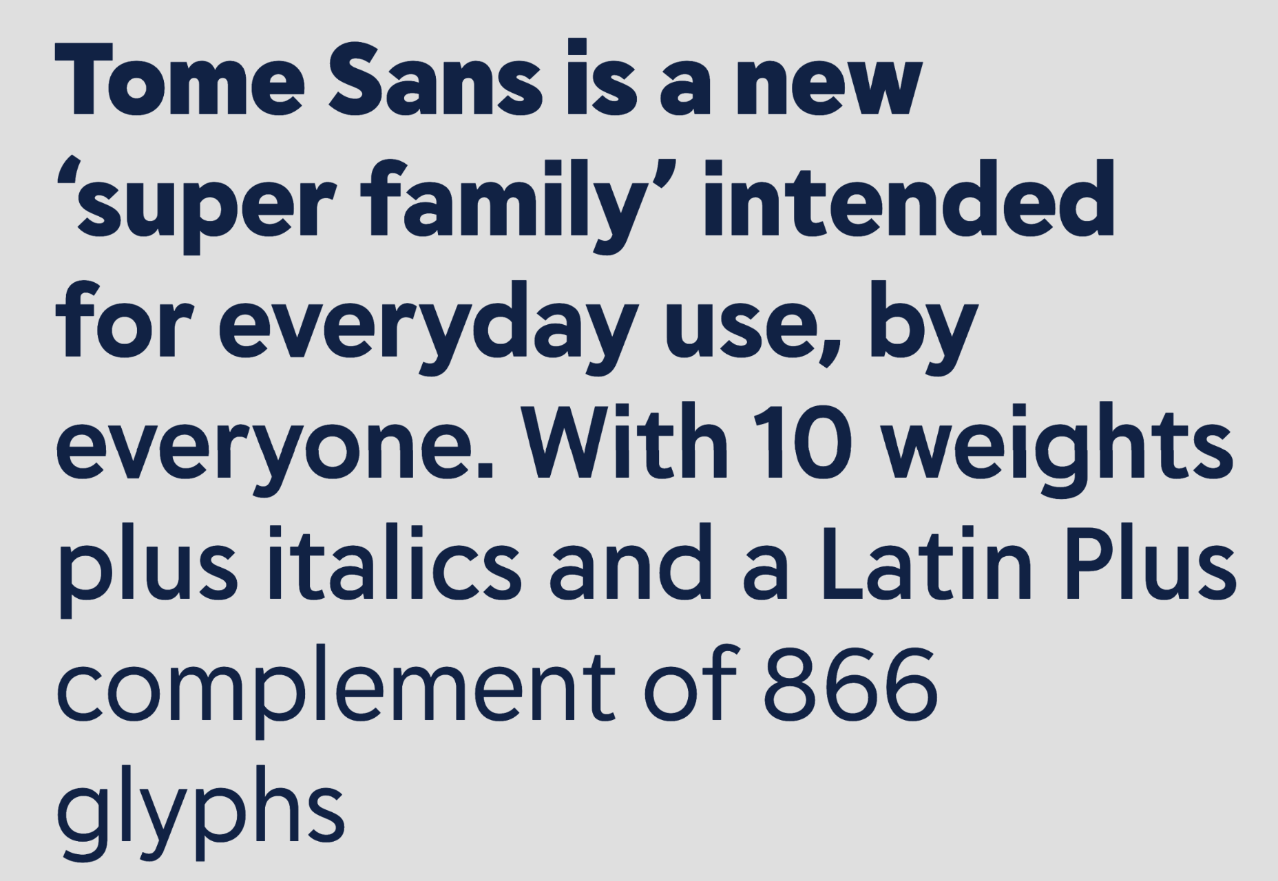
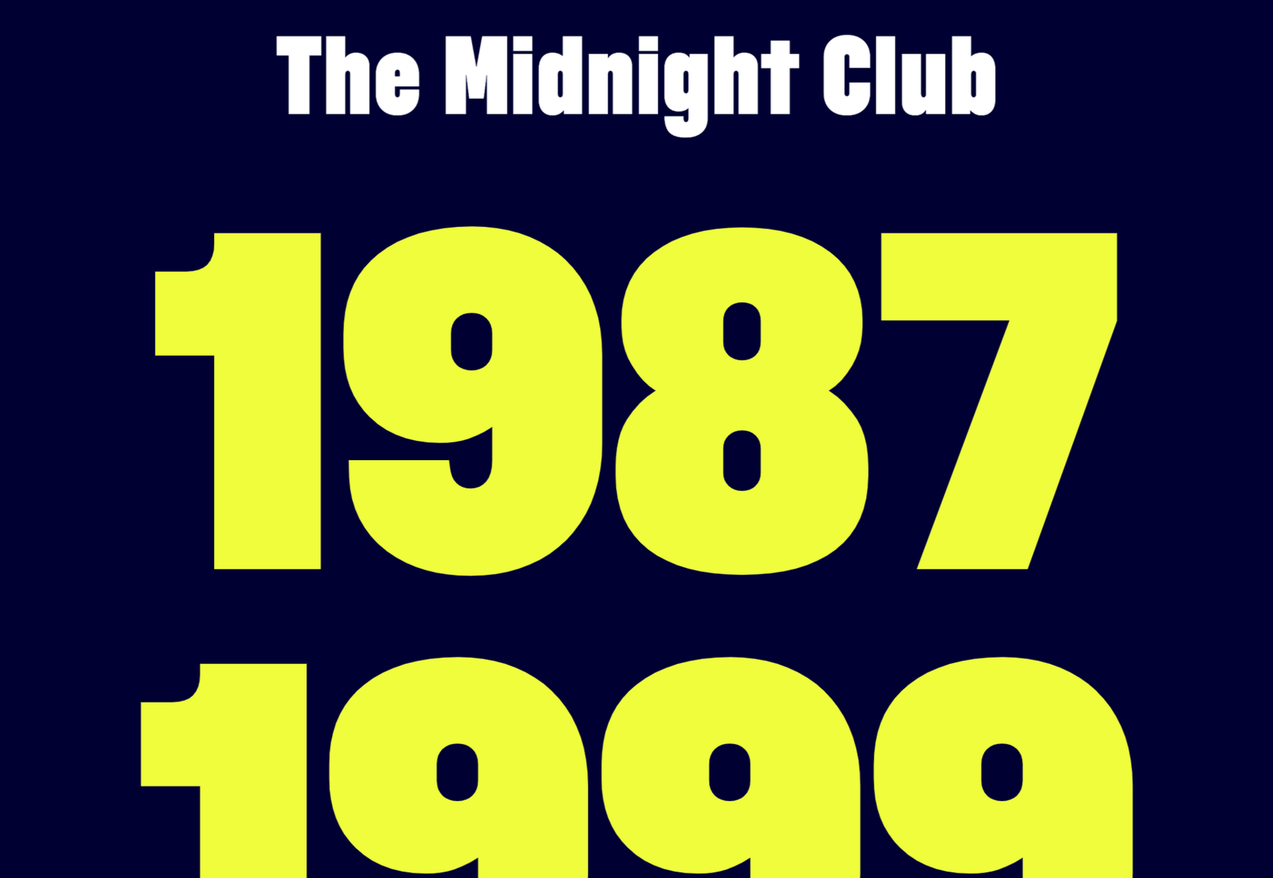
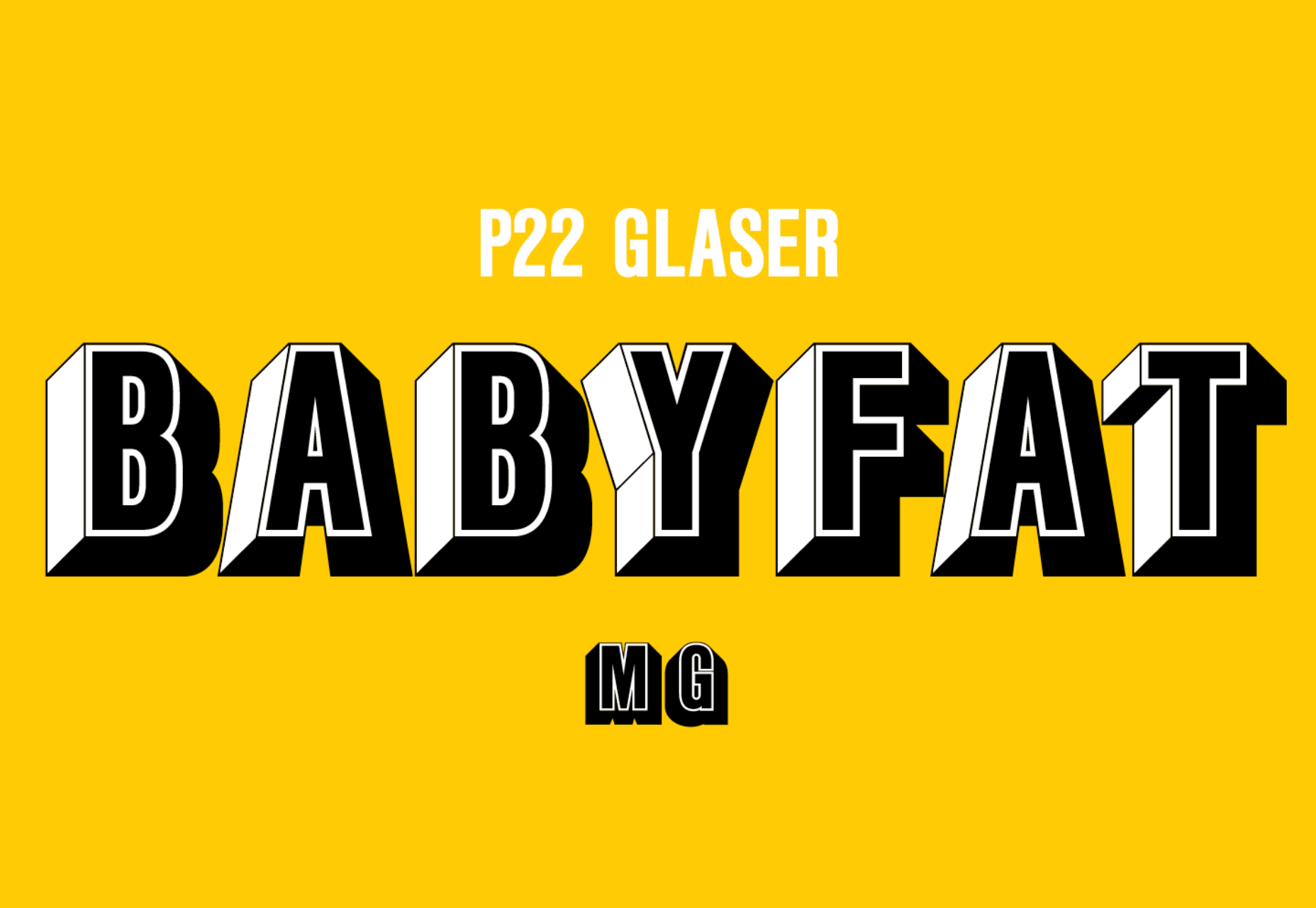
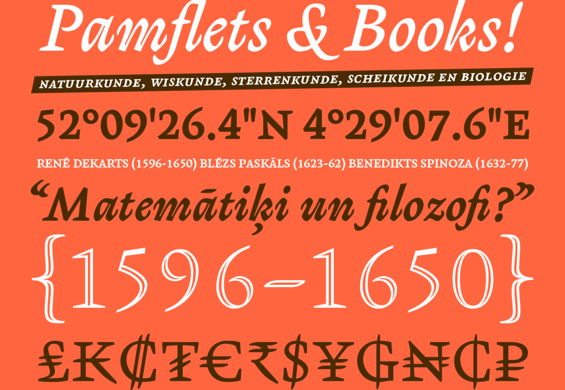
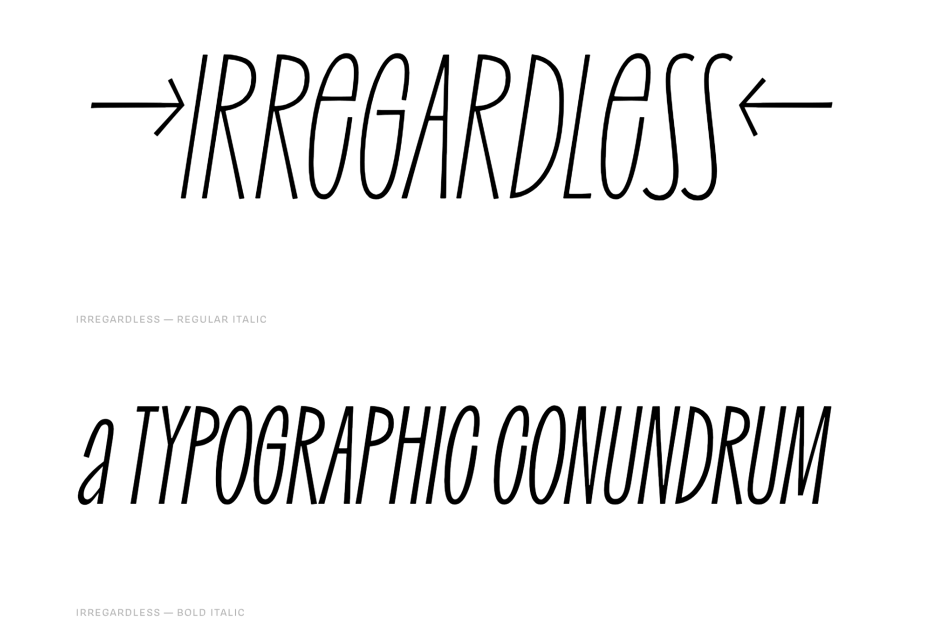
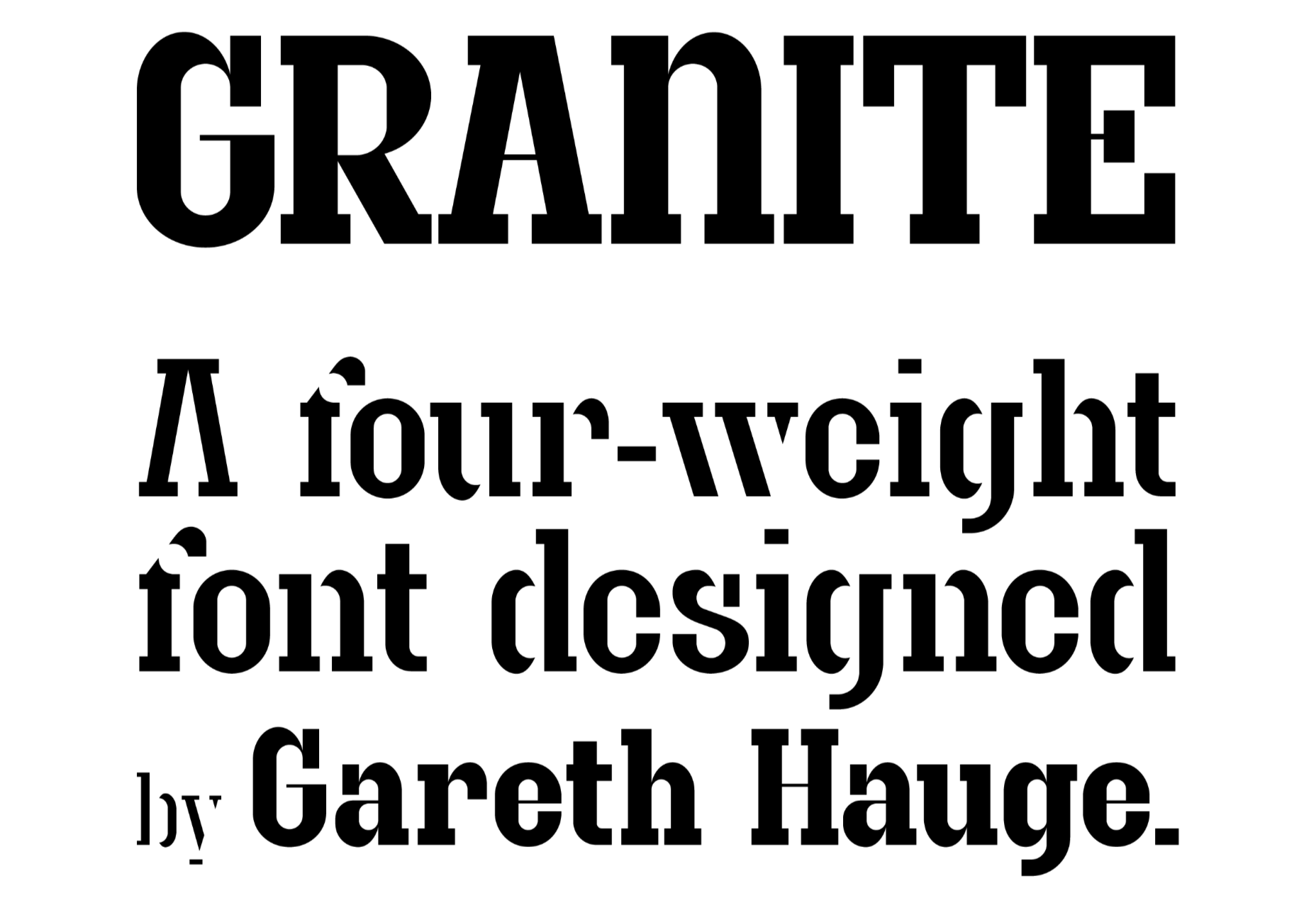
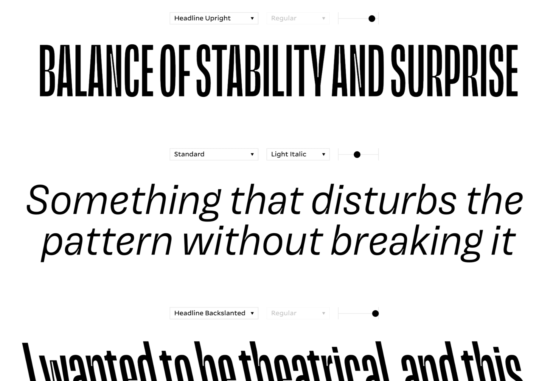
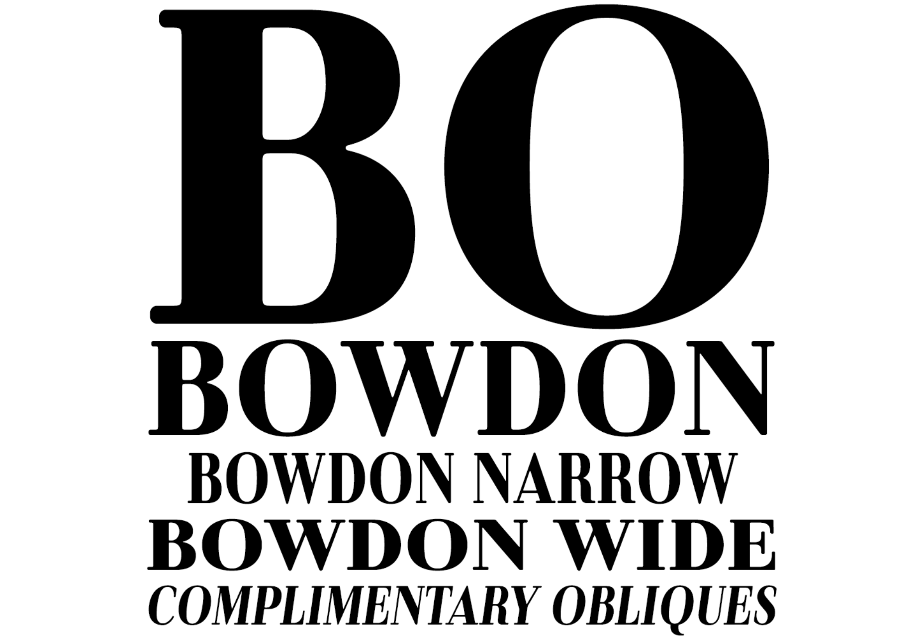
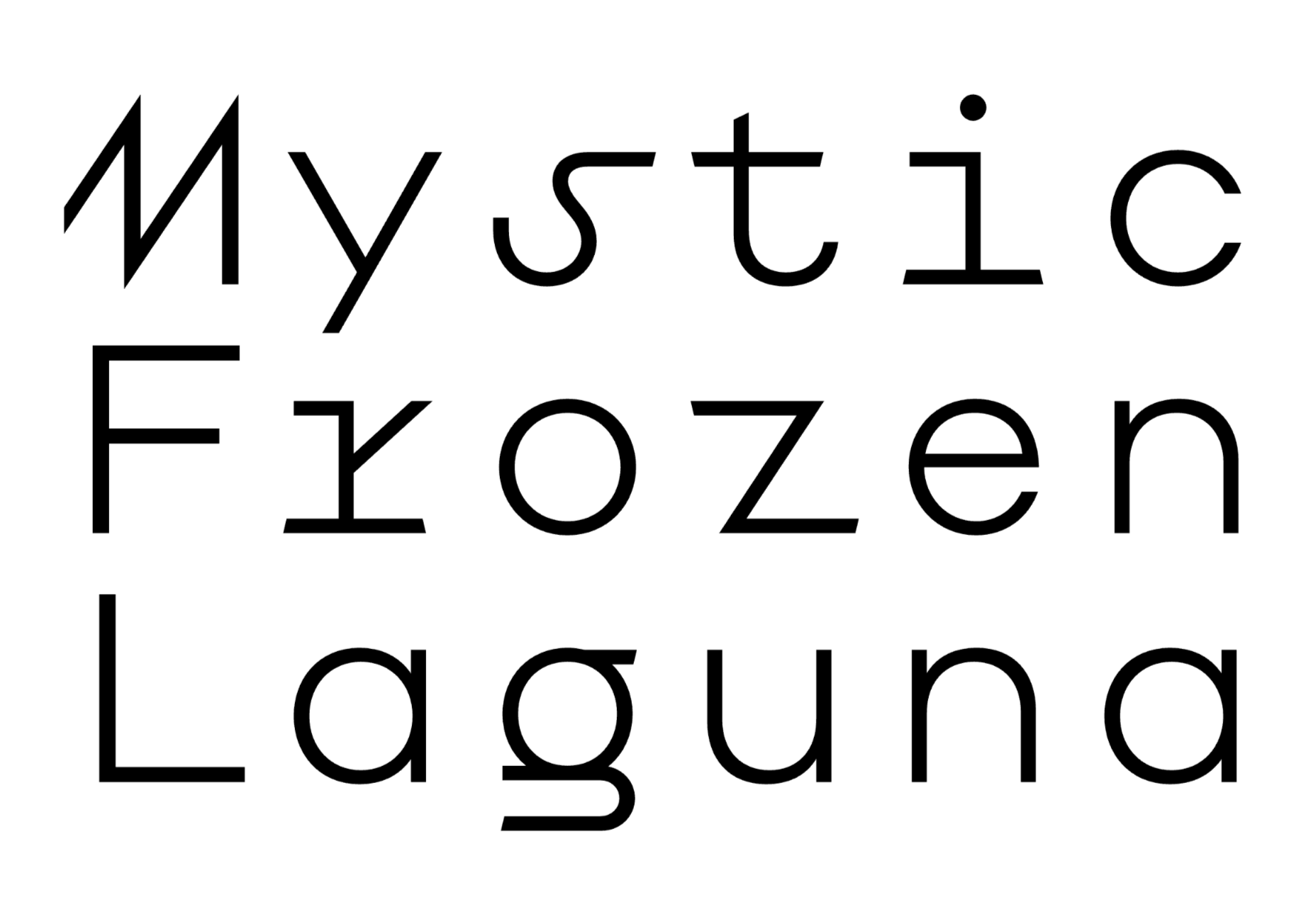
 Welcome to a new series of articles, in which we round up the best new fonts released from some of the top designers on the Web.
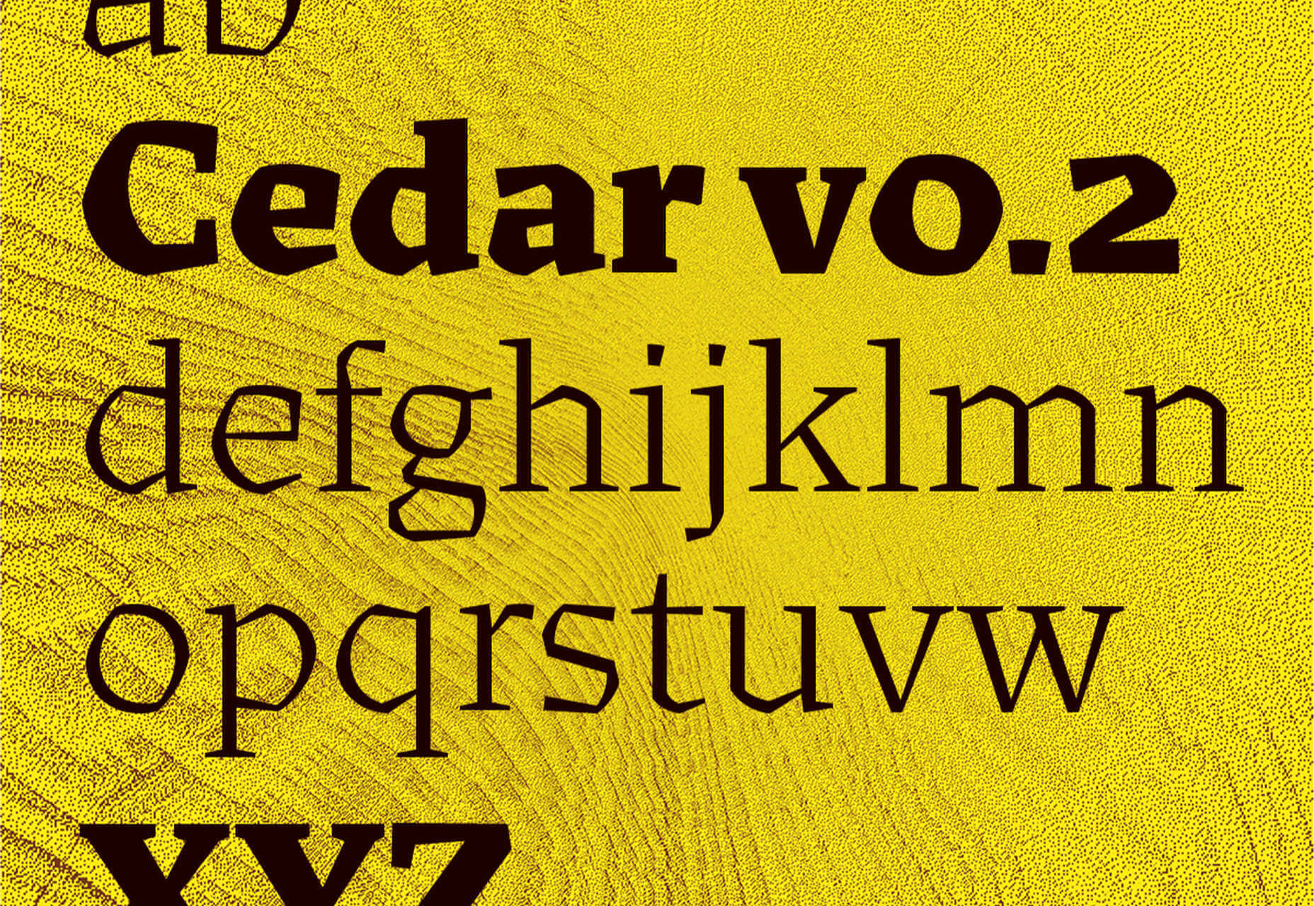


