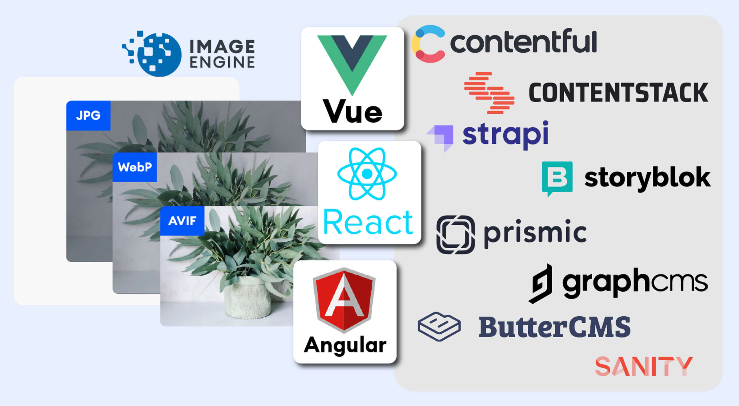
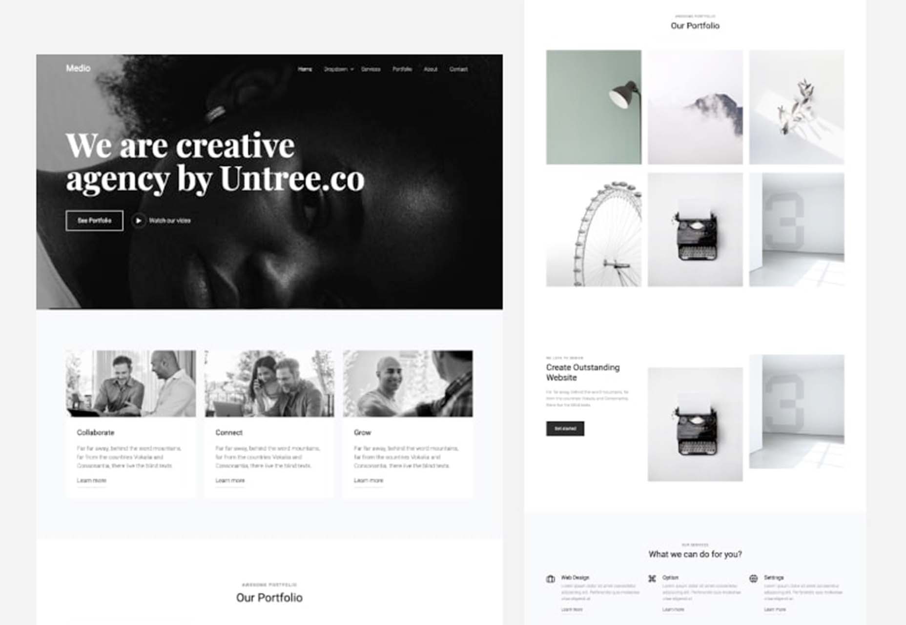
 The headless CMS trend is gaining traction growing at over 20% annually. The driving force behind the headless CMS trend is developer’s increasing need for flexibility and control. Using the headless CMS’s API, front-end developers can use JavaScript frameworks like React, Vue, or Angular to quickly deploy content and designs in various web pages and apps.
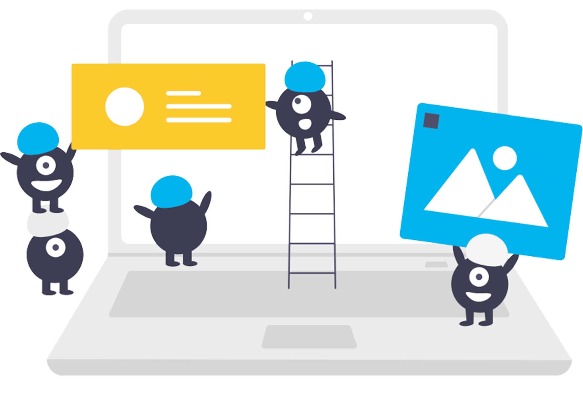
Images Are A Crucial Part Of Any Web Experience
A headless CMS holds potentially thousands of images. How quickly images are rendered has a huge impact on user experience. This is why developers and designers need to focus on streamlining how they access, optimize, cache, and deliver images in a performant way.
ImageEngine is an image CDN that provides a simple solution for accelerating performance, and saves you time and delivery costs. With its multiple components and plugins for React, Vue, and Angular, ImageEngine makes it easy for developers to achieve superior image performance scores on tools like Google’s PageSpeed Insights.
Plan for Image Performance. It is Worth It
Performance is not always the first thing designers and developers consider when designing a website. But performance has a huge impact on eCommerce sales, conversion rates, and SEO. That’s why setting aside budget and time to solve image performance issues yields substantial benefits.
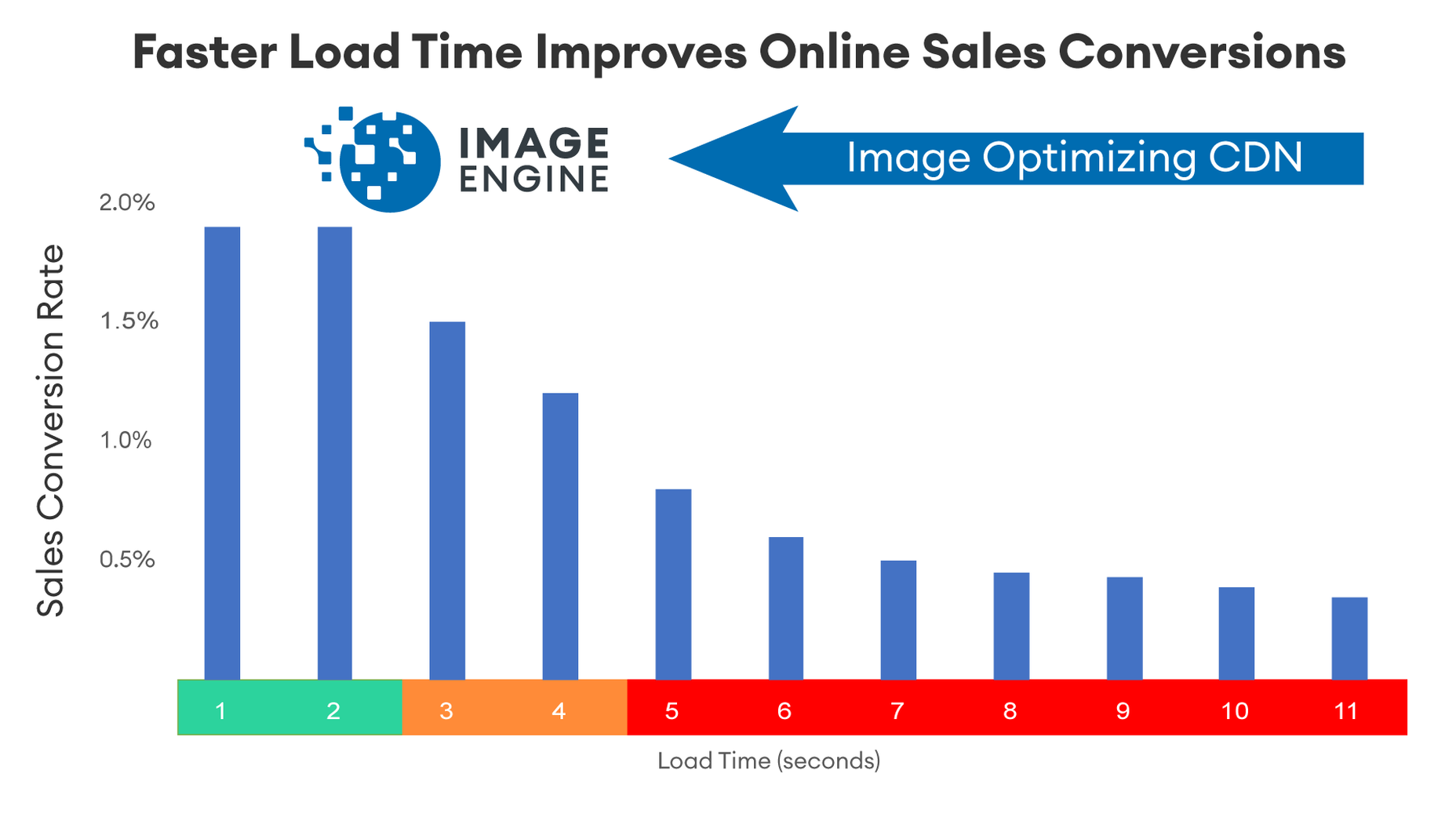
The most compelling reason to work on image performance is the upside from sales or website conversions. Google estimates that the average website on mobile takes around 9 seconds to load. However, 75% of users will consider abandoning a site that takes over 5 seconds to load.
Companies like Amazon and Walmart have closely scrutinized the relationship between load times and sales conversion rates. For Amazon, they estimate that for every 100 milliseconds they accelerate their site, it increases revenue by 1%. For them, that means millions of dollars. But even if you are a relatively small company, performance boosts sales and pays for the time you put into it.
Images are a big reason why websites load slowly. The average website payload is 2MB in 2021, and 50% of that is images. Frequently, images are larger than they need to be and can be optimized for size with no impact on quality…if you do it right.
However, image optimization can be challenging. Knowing the requesting device screen dimensions, pixel density, ability to handle next-gen image formats becomes very complicated. That is where ImageEngine comes in. It simplifies and offloads all the complexity to an expert image optimization solution.
Performance Drives Google SEO Rankings
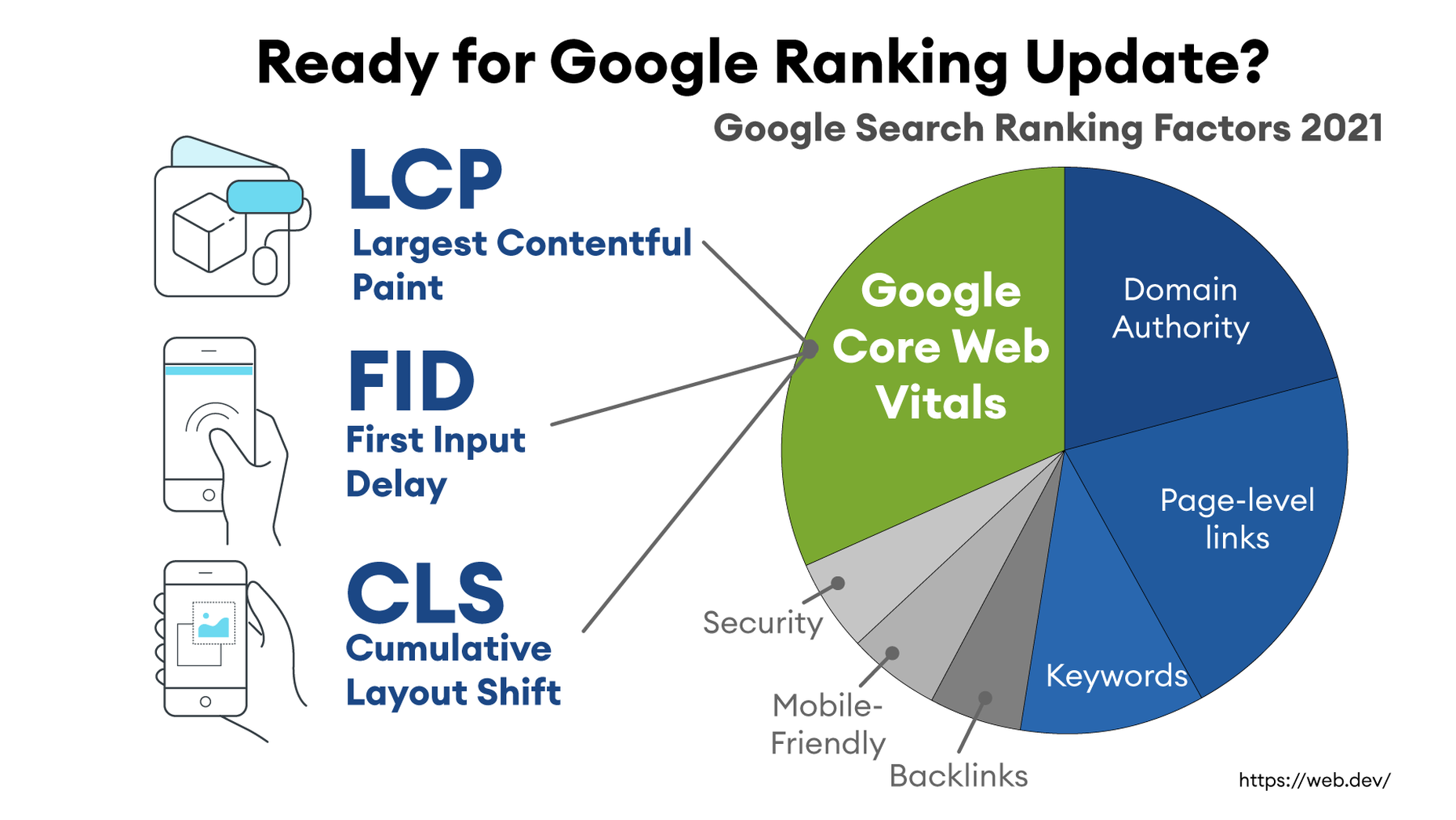
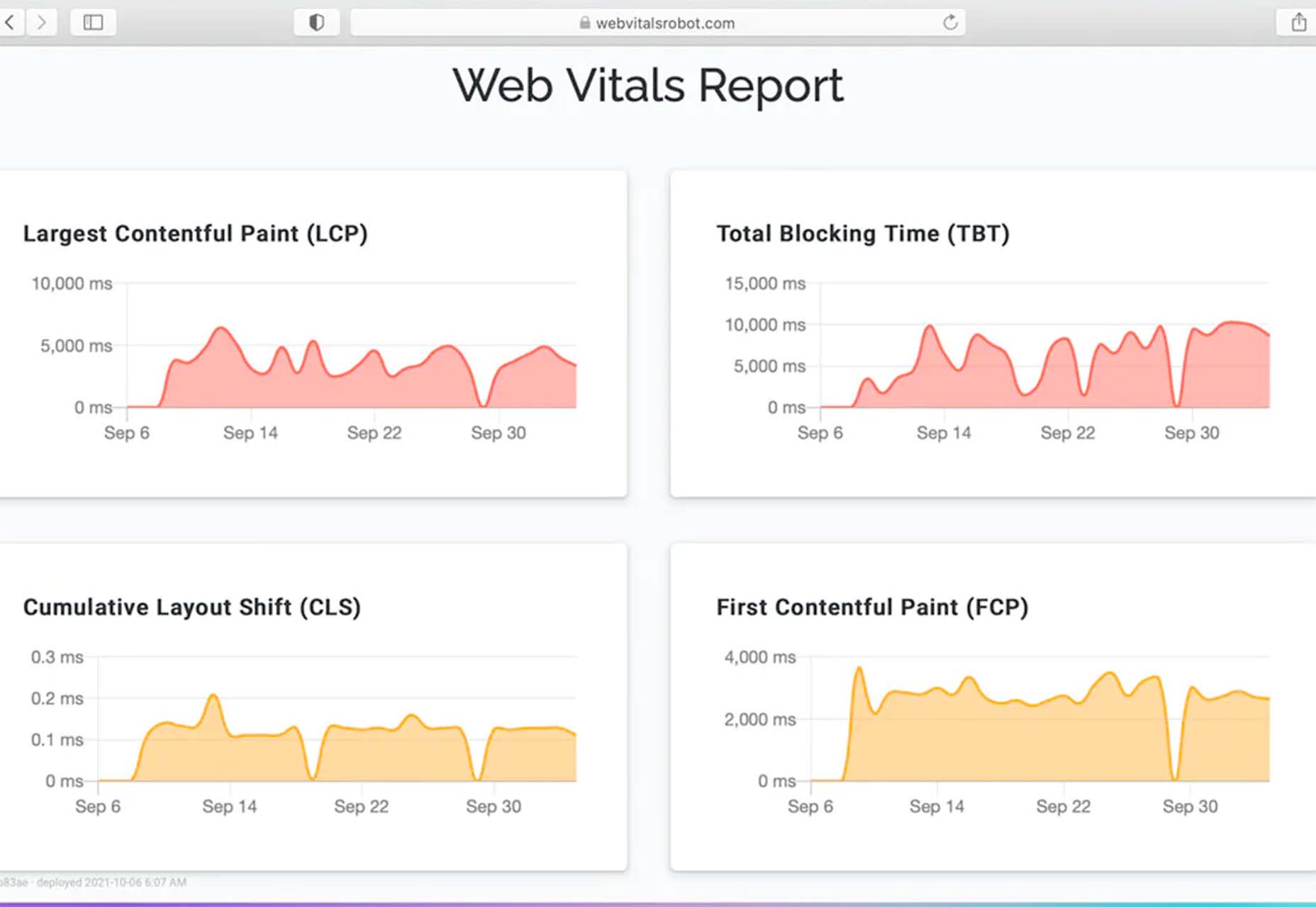
Even before users come to your site, performance has a critical impact. You may have heard of Google’s latest Page Experience update to their search engine ranking algorithm. It integrates a new set of performance metrics called Core Web Vitals. These metrics are:
Largest Contentful Paint (LCP): Measures the render time (in seconds) of the largest image or text block visible within the viewport, relative to when the page first started loading. Typically, the largest image is the hero image at the top of pages.
First Input Delay (FID): Measures the time from when a user first interacts with a page (i.e. when they click a link, tap on a button, or use a custom JavaScript-powered control) to the time when the browser is actually able to begin processing event handlers in response to that interaction.
Cumulative Layout Shift (CLS): Measures the layout shift that occurs any time a visible element changes its position from one rendered frame to the next.
LCP is an image-centric performance metric. The more optimized your images are (particularly your hero images at the top of a page), the faster your LCP will be.
Why do Core Web Vitals matter? Isn’t SEO ranking all about content relevance, backlinks, and domain authority? Yes, but now performance matters more than it did a year ago. In a market where websites are constantly jockeying to match their competition’s pages (for content relevance, keywords, and other SEO issues), performance is making a difference in keyword search engine rankings.
ImageEngine customers that have optimized their images have improved their Core Web Vitals and PageSpeed Insights scores and seen search ranking improve dramatically. Frequently this means moving onto the first search results page, or even the #1 or #2 spot.
Avoid Code Bloat and Exponential Image Variants from Responsive Images
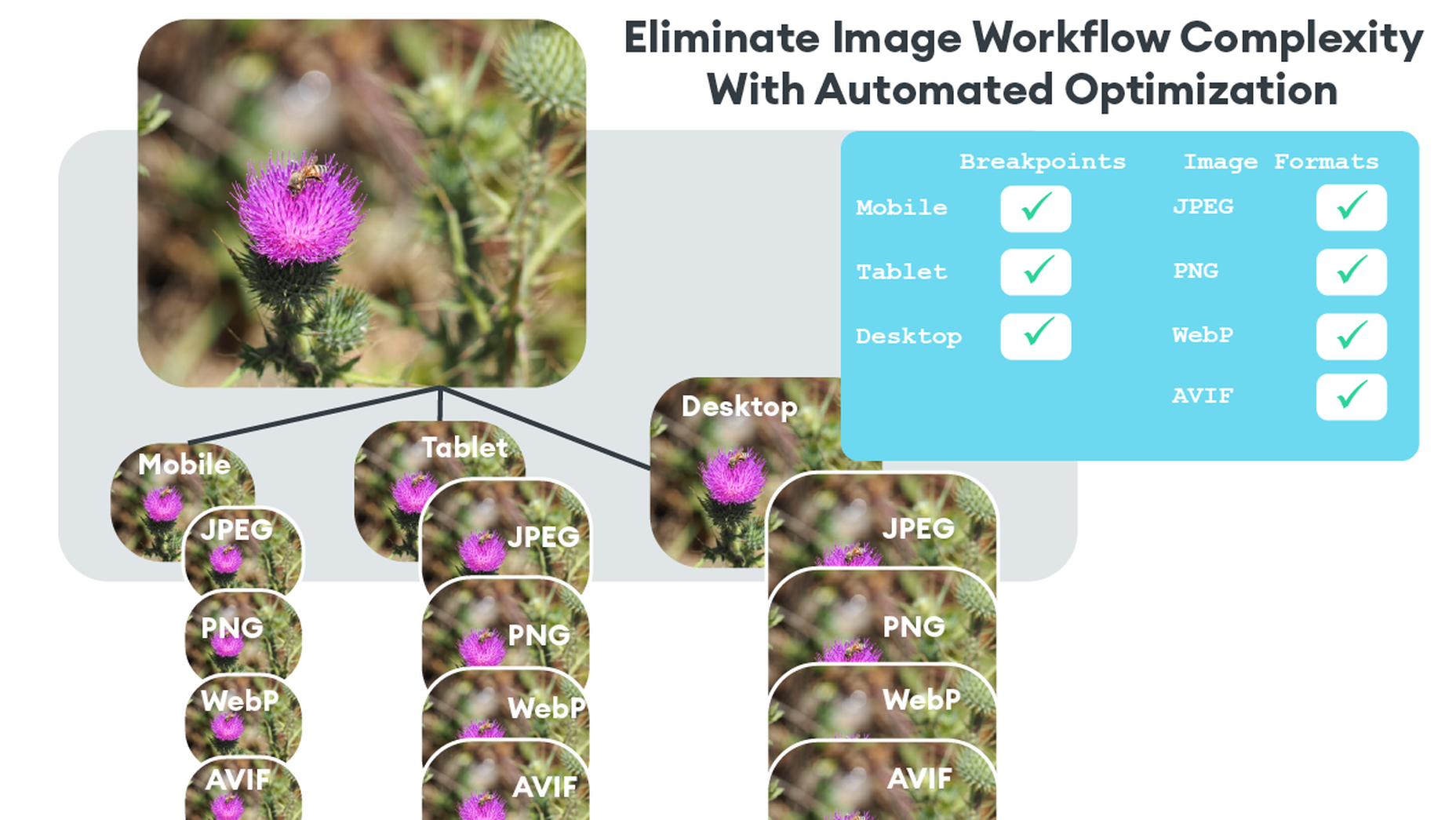
When they hear “image optimization,” many web designers think of the practice of generating multiple image sizes, multiple file formats (JPEG, PNG, WebP, AVIF), and massive amounts of code using tags to select appropriate variants. While this approach works, it leaves much to be desired and often yields a sub-standard optimization and a maintenance headache.
That is where the automatic settings of an image CDN like ImageEngine solve yet another problem. ImageEngine detects mobile devices and their image-related parameters, optimizes images for these parameters, and then delivers images through its global CDN. In most cases, the automatic mode of ImageEngine will provide optimization up to 80% on most images, with no perceptible impact on quality.
Combine an Image CDN with your JavaScript Front-End Framework
If you are already using a headless CMS or eCommerce platform, then how can you integrate image optimization into your front-end system?
There are a number of options for integrating ImageEngine. From the headless CMS side, the only thing required is to store high-quality, large images in your CMS. Don’t worry about their size or format in the CMS. ImageEngine will pull the images and perform optimization immediately and tailor them specifically for any requesting device.
Next, you will need to sign up for a free trial from ImageEngine. In the example below, we will address how to configure for Contentful, a popular headless CMS. To set up an ImageEngine account that pulls images from Contentful, all you need to do is to create a user account and set images.ctfassets.net as your image origin. “images.ctfassets.net” is where all images are served from when using Contentful.
At the end of the signup process, you will receive a Delivery Address. You will need to copy this and insert it after installing the ImageEngine component.
For your front end, ImageEngine offers components for many popular JavaScript frameworks.
For the following example, we will use Contentful CMS with React framework. A full example and explanation can be seen here. Another example can be found here.
Install React NPM Package
First, install the ImageEngine NPM package
npm i @imageengine/react
Integrate ImageEngine Into Your App
We will only be working in “App.js”. Make sure to delete all the code from it.
Import ImageEngine Components
In the “App.js” file, import the necessary components from the ImageEngine NPM package like so:
import { ImageEngineProvider, Image } from "@imageengine/react"
Add the “ImageEngineProvider” component inside your app’s main div. This allows all child components to access images from ImageEngine.
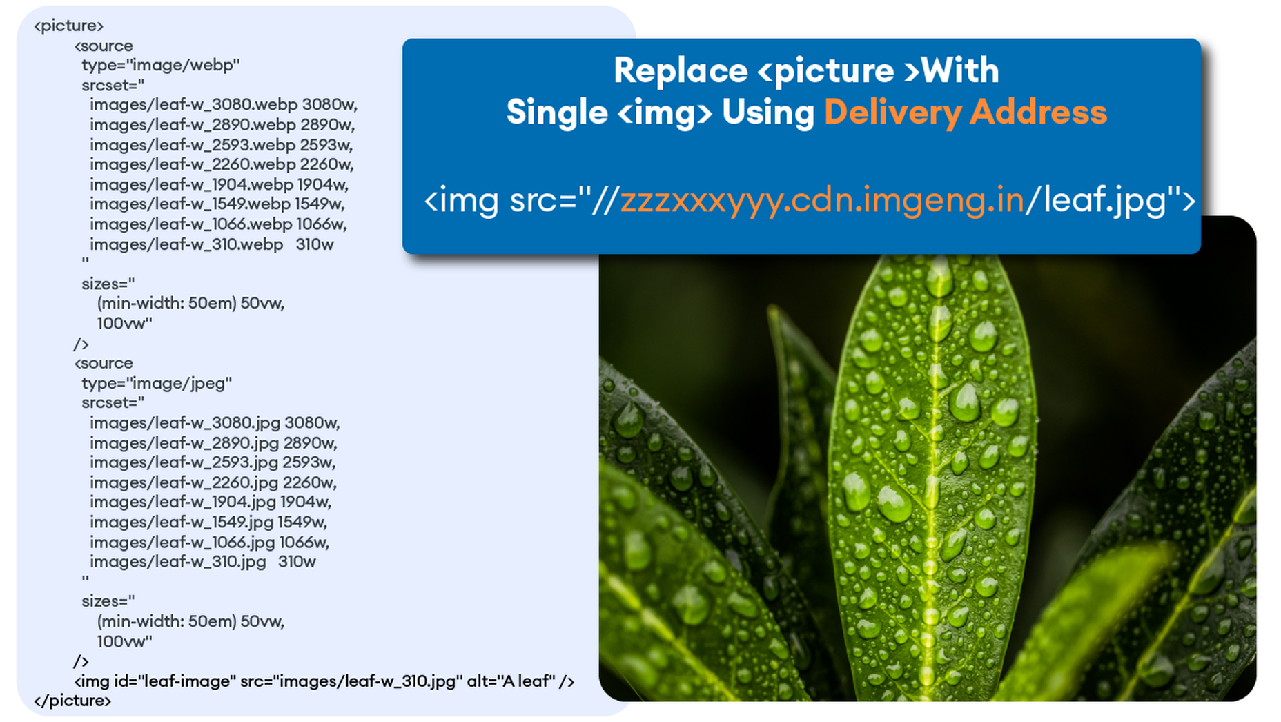
Insert Delivery Address Into ImageEngine Provider
When you sign up for an ImageEngine account, you receive a Delivery Address. You can find it in your ImageEngine dashboard after logging into your account. This Delivery Address is how the component will point to ImageEngine and start optimizing and delivering images. Make sure the origin related to your delivery address is images.ctfassets.net. This is where all the images from Contentful can be reached.
In the ImageEngineProvider, modify and insert your own “deliveryAddress,” replacing “blazing-fast-pics.cdn.imgeng.in” shown below.
return ( <ImageEngineProvider deliveryAddress="https://blazing-fast-pics.cdn.imgeng.in" stripFromSrc="https://images.ctfassets.net"> <Image src={page.logo.url} className="App-logo" alt="logo"></Image> </ImageEngineProvider>
Insert “Image” Component
Lastly, add an “Image” component inside the “ImageEngineProvider” providing the image source.
The image source may be local to your app or fetched from Contentful using the GraphQL API. The following example renders an image from Contentful.
Completed App.js example
Your final App.js should look like this:
import { ImageEngineProvider, Image } from "@imageengine/react" function App() { return ( <ImageEngineProvider deliveryAddress="https://blazing-fast-pics.cdn.imgeng.in" stripFromSrc="https://images.ctfassets.net"> <Image src={page.logo.url} className="App-logo" alt="logo"></Image> </ImageEngineProvider> ) } export default App;
Note that the example is also using the stripFromSrc property. This will replace any occurrences of https://images.ctfassets.net in the image source url that the Contentful API returns, with the deliveryAddress which is already mapped to the Contentful origin in the ImageEngine control panel.
Automatic Image Optimization By Default
For most images, the automatic mode of ImageEngine will deliver perfectly optimized images. For example, in many cases, this will be a resized image WebP that can be up to 80% lighter payload. You can inspect the final image and see the Delivery Address, the new image format (e.g. WebP), and the ImageEngine CDN server.
Device Intelligence in Action
In auto-mode, the most notable optimizations applied to an image are format conversion, change in pixel size, and compression rate. ImageEngine in auto-mode will make sure that your customers get the highest quality image with the lowest possible byte size.
Format Conversion
Thanks to ImageEngine’s built-in device detection, the most efficient format for a given image is automatically chosen. The input needed to make this decision comes from ImageEngine’s device-aware servers and an advanced ruleset. For example, ImageEngine can accurately identify devices and browsers that support the WebP format. This means ImageEngine can confidently convert from JPEG to WebP, deliver huge savings in terms of byte size, and dramatically improve the web browsing experience.
Resizing
On the web today, where the majority of traffic comes from mobile devices, one size is not enough to offer a great user experience. Again, the built-in device detection knows the size of the screen – both in pixels and millimeters – and is able to resize the image to perfectly fit the viewport. This is further enhanced by ImageEngine’s support for Client Hints. It can also handle high-resolution displays, like Retina, out of the box and will scale the image at the actual pixel size needed to produce high-quality images.
Using Directives
If you want more granular control over how the image is presented, you may use ImageEngine’s directives. Use the “directives” prop to do so without having to modify the source image.
<Image src="/images/pic_2.jpg" directives={{ outputFormat : 'webp', rotate: 45, inline: true }}/>
Conclusion
After implementation, you will have 30-days of ImageEngine and on-boarding support so you can be sure that you are seeing the improvements you need from an image CDN like ImageEngine. You can even schedule a call with our Customer Success team to help you get set up with ImageEngine today!
[– This is a sponsored post on behalf of ImageEngine –]
Source
The post Improve Performance by Combining Headless CMS with an Image CDN first appeared on Webdesigner Depot.

Source de l’article sur Webdesignerdepot

 The year’s winding down as everyone segues into a much-needed holiday R&R. But that doesn’t mean there aren’t some awesome new tools and resources for website design projects.


 Websites as we know them are going to change very soon. The days of text, images, and basic interactions in a 2D browser window have served us well, but virtual, augmented, and mixed reality experiences are getting better all the time. Developers and designers need to think beyond the browser window and prepare for an immersive future.


 There are some spook-tacular finds in this month’s October collection of resources and tools for designers and developers. From interesting tools that can help in the design process to boo-tiful typefaces, there’s something for everyone here.
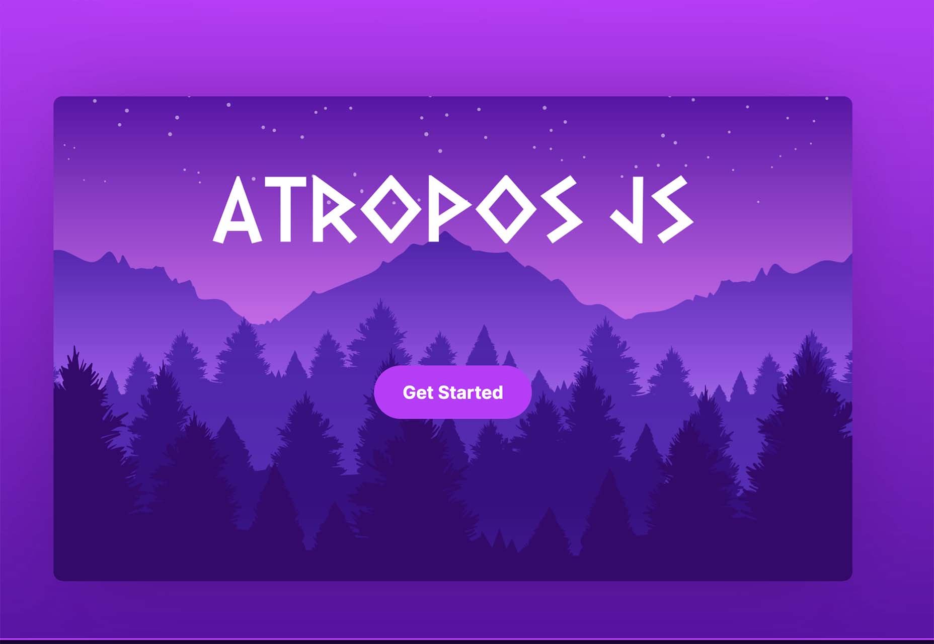


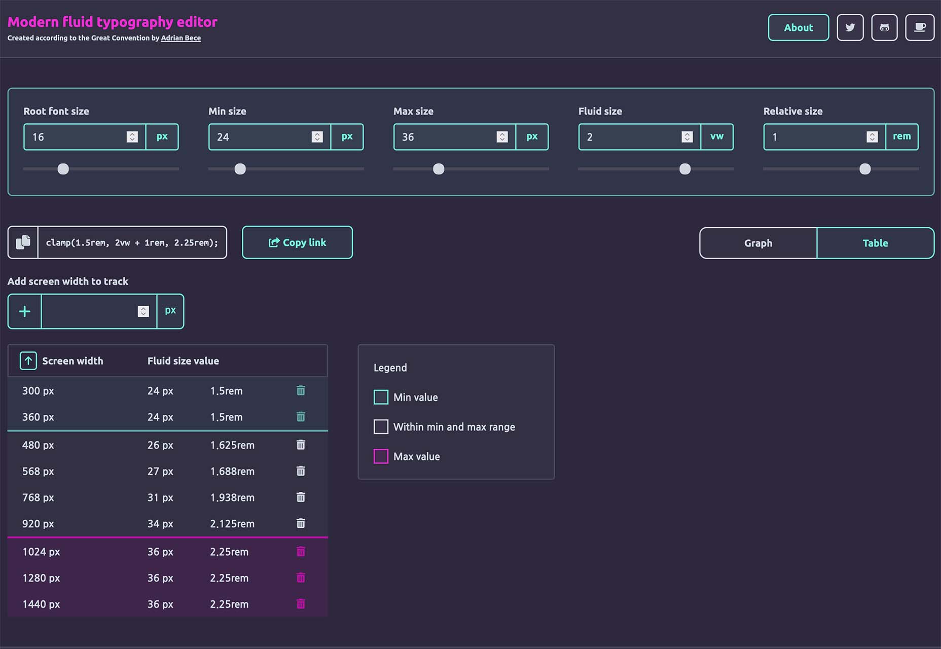
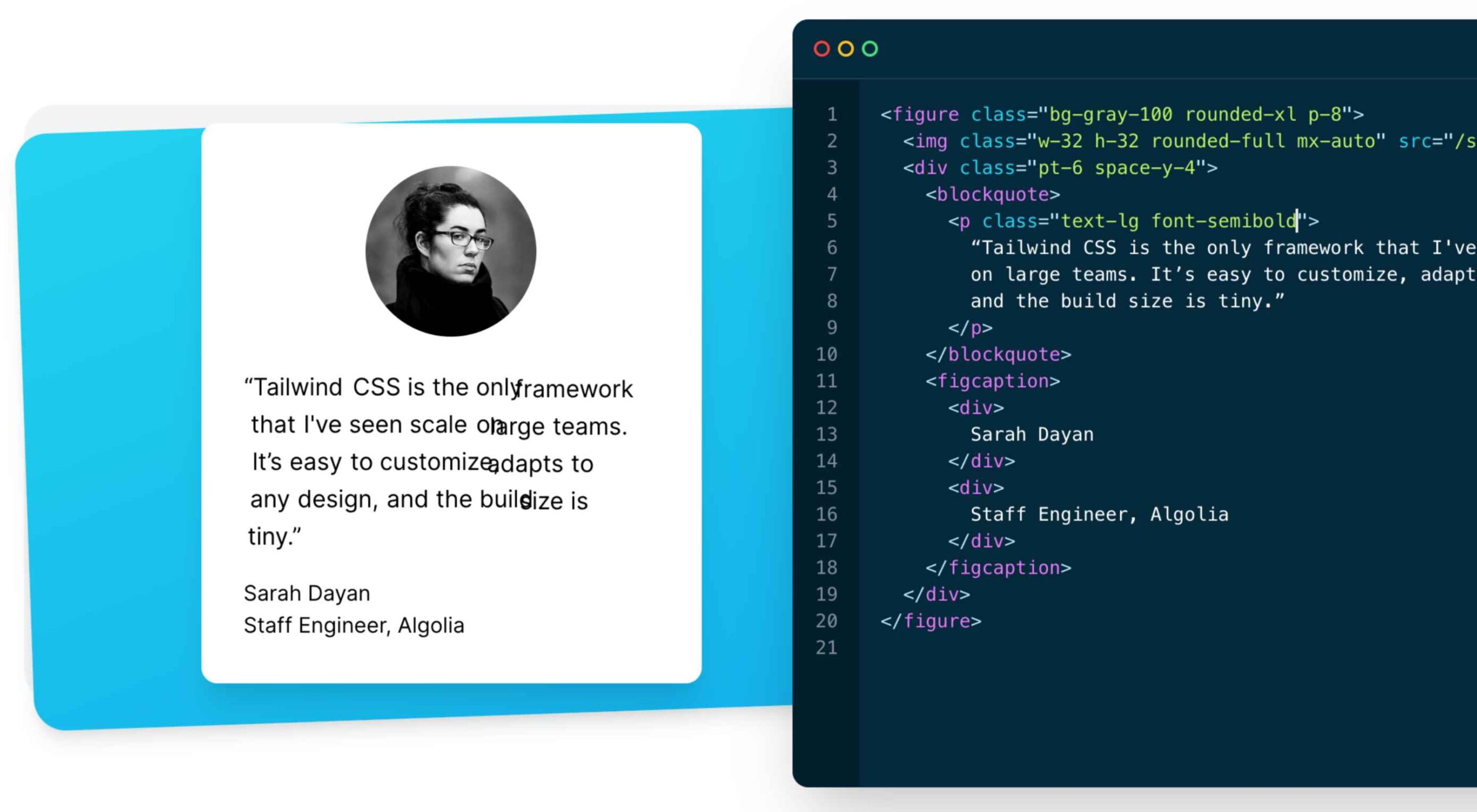 As a utility-first CSS framework,