Articles

March is that time of year where the feeling of newness starts, from the first Spring days to fresh design projects. These trends are no exception, with fun new takes on some classic concepts.

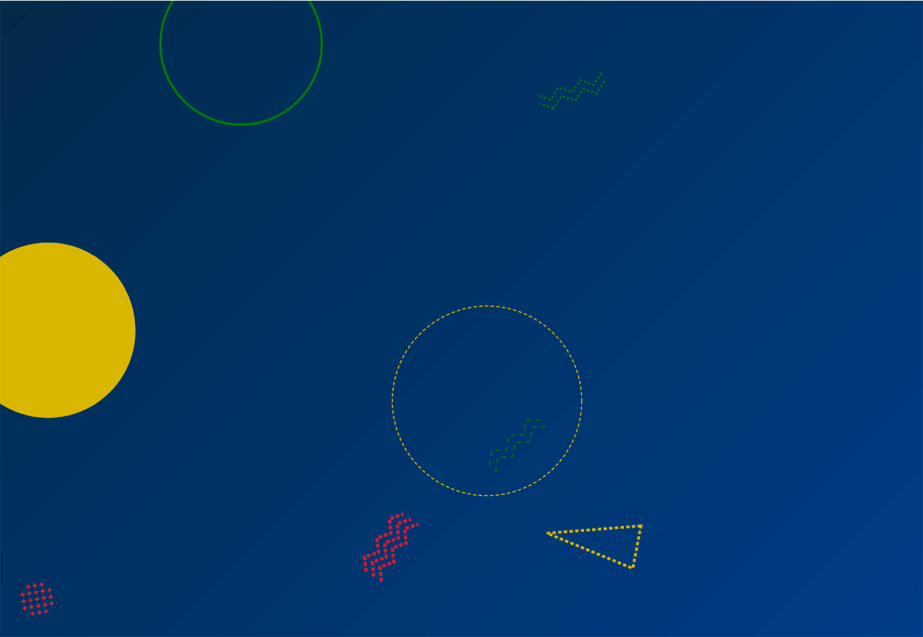
Circles are always popular, but the top trend is an animated take on the traditional element; plus, fun pink and purple color palettes and a few faux split screen designs round out trending styles.

Here’s what’s trending in design this month.
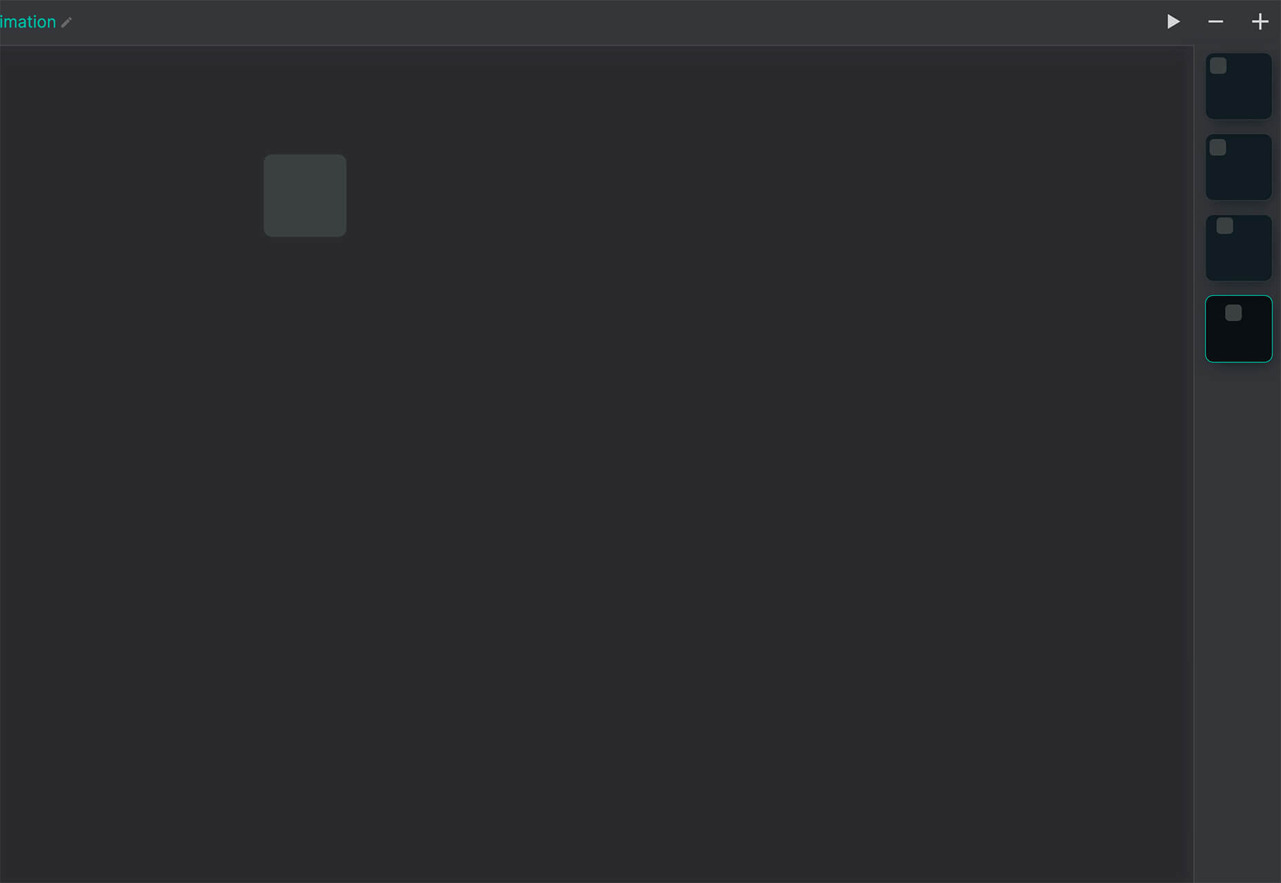
Circle Animations

Circles are one of those shapes that never leave the design sphere. They have a lot of classical meaning and are flexible in terms of design options.

Designers are having a lot of fun with this shape right now. From animations to text circles to image frames, they seem to be all over the place.

More recently trending is more circle-shaped animations. This trend maintains a circle’s properties as a unified and harmonious element with movement to create more engagement and make you look at the design just a little bit more.

Each of these examples uses circles in a different but equally interesting – and animated – way.

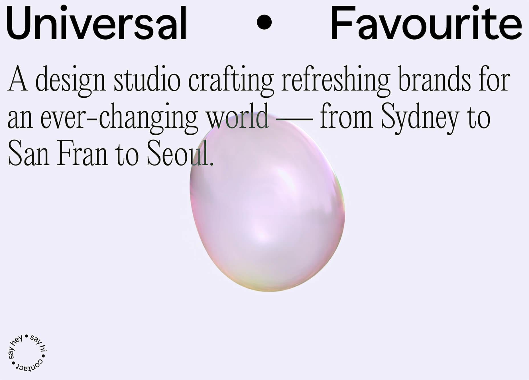
Universal Favourite uses a circular blob. It’s almost like a giant bubble. It wiggles and flows, and stretches within the space without any help from the user. It has a smoothly quality that makes you want to stare at it. The color here helps, with the circle and background not having an immense amount of contrast. Also, note the cute little circle button in the bottom corner.

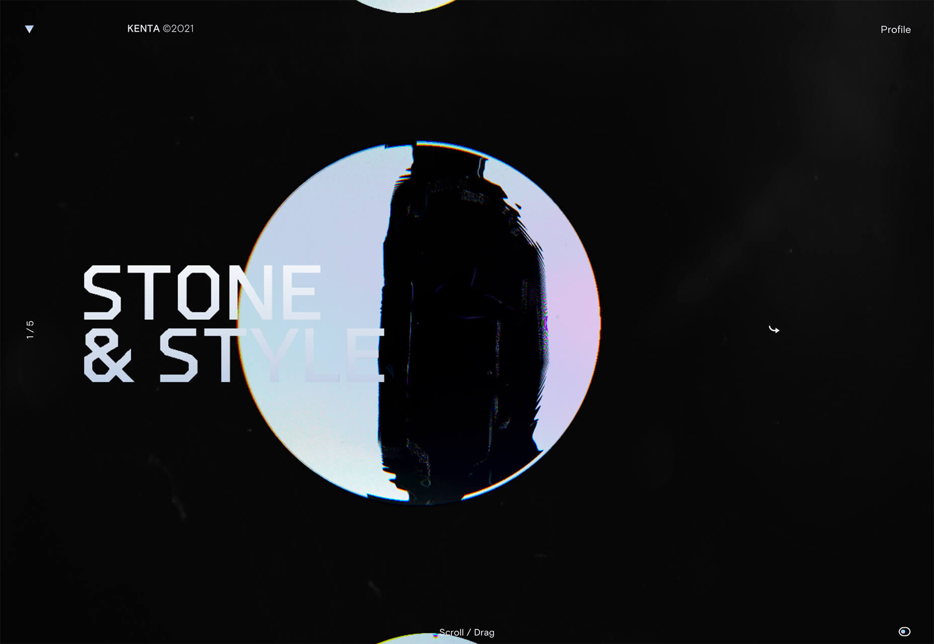
Kenta Toshikura put most of the subtle animation for this design inside the circle. With a hover state, the entire circle moves on the screen with a second layer of animation, and the cursor is also a circle that hops around the black background.

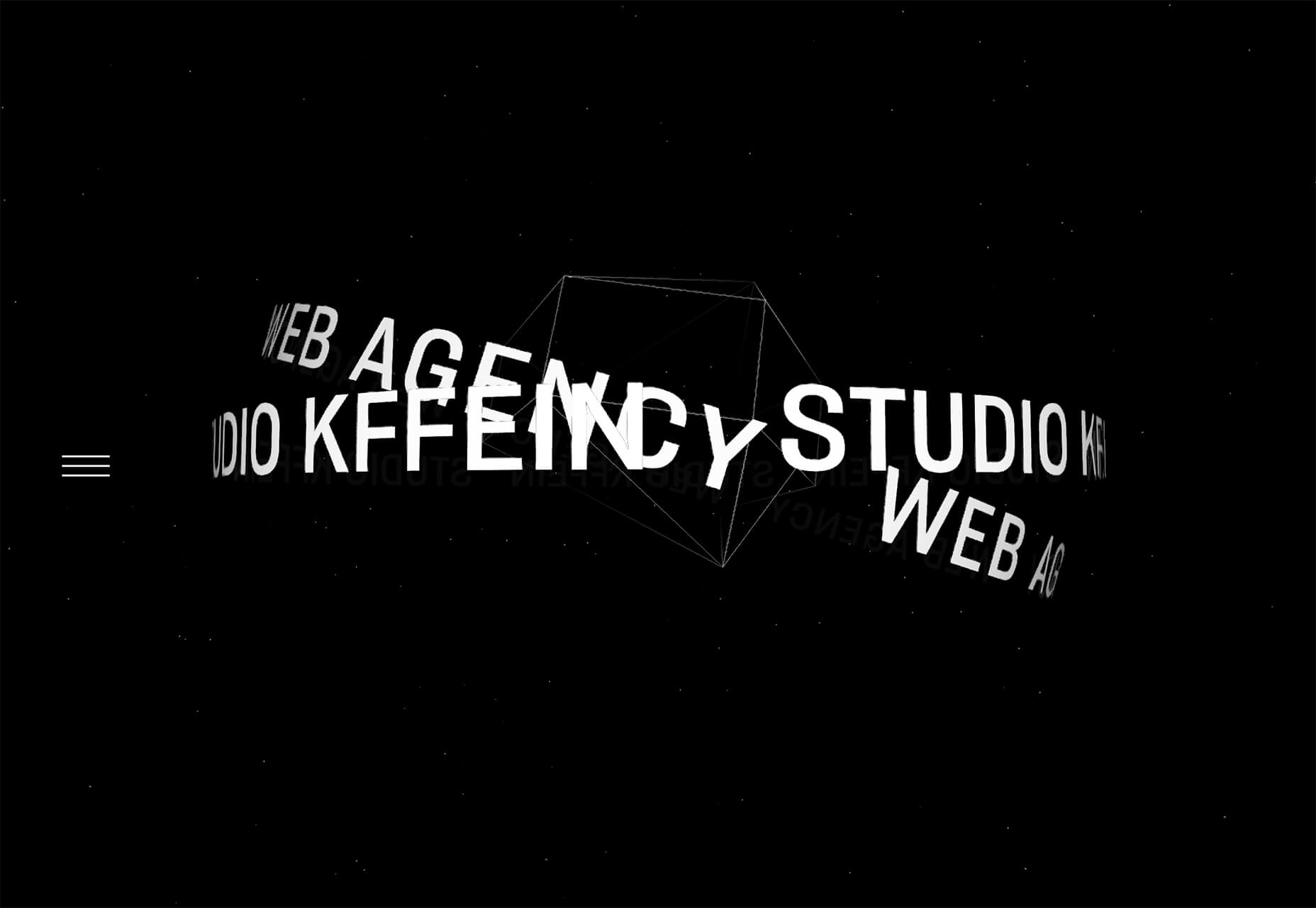
Kffein takes a totally different approach with a circle made from the primary test elements. Identifying website information rotates in a circle around another geo shape on the main plane. Not only is there a circular animation, but an almost three-dimensional effect that happens due to the way elements are layered here.


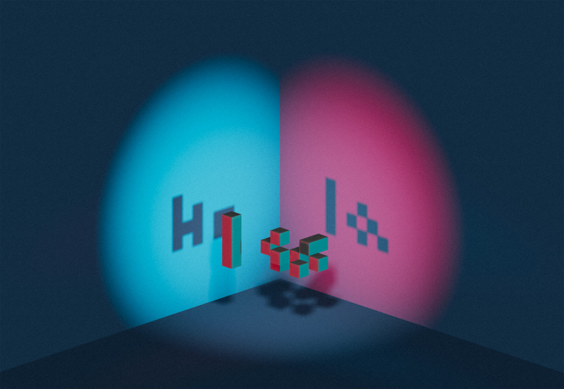
Pink and Purple Palettes

The prevalent pink and purple color combination isn’t for everyone – although you wouldn’t know it from the number of designs using similar colors.

This bright combination almost screams “spring” and has a lightness to it that almost seems to lift the mood of any project. (Maybe color selection is a reflection of how we all want to feel.)

What’s nice about these colors is that they flow into one another nicely. They can also be expanded to fall into neighboring hues on the color wheel, such as red from pink and blue from purple.

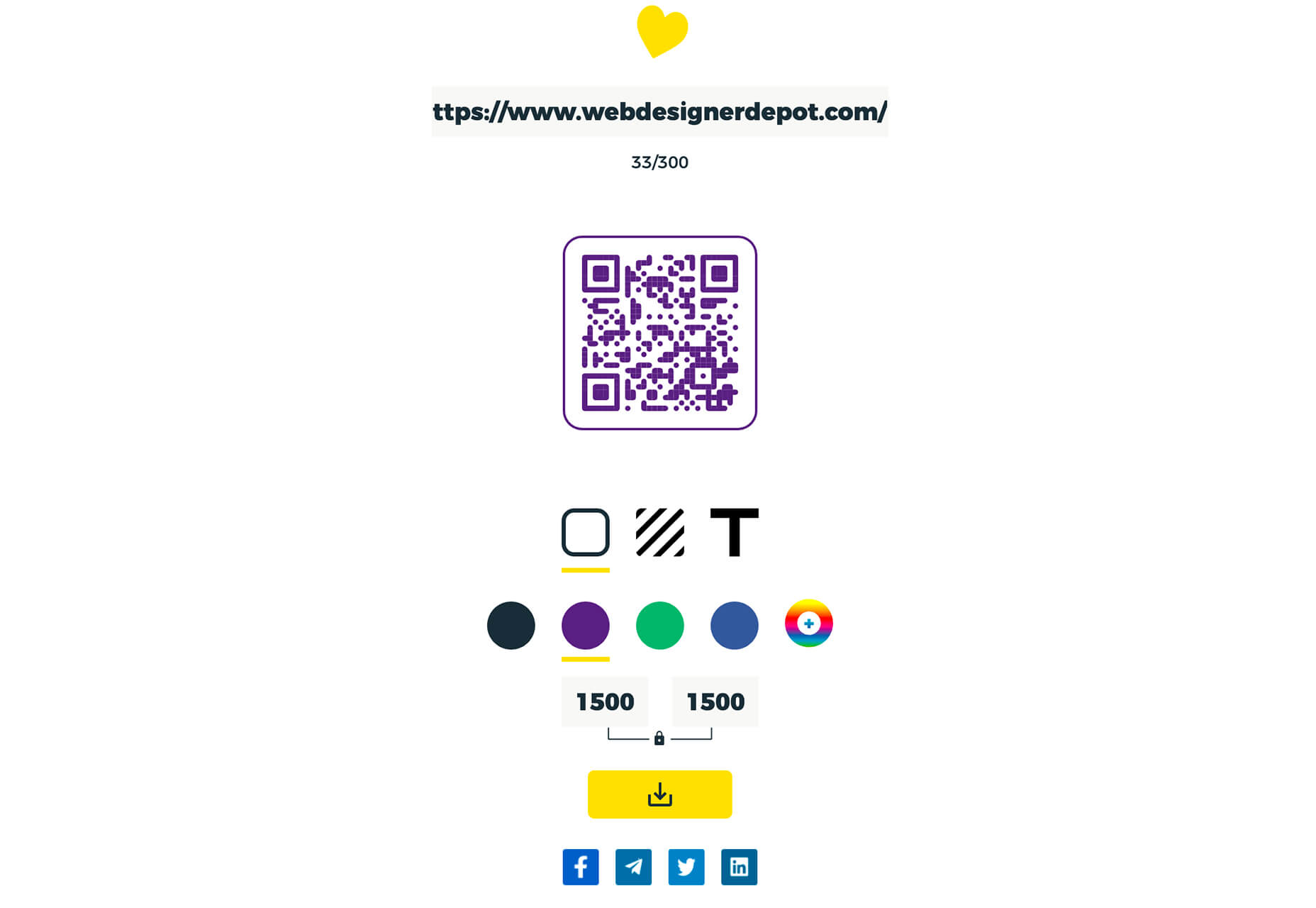
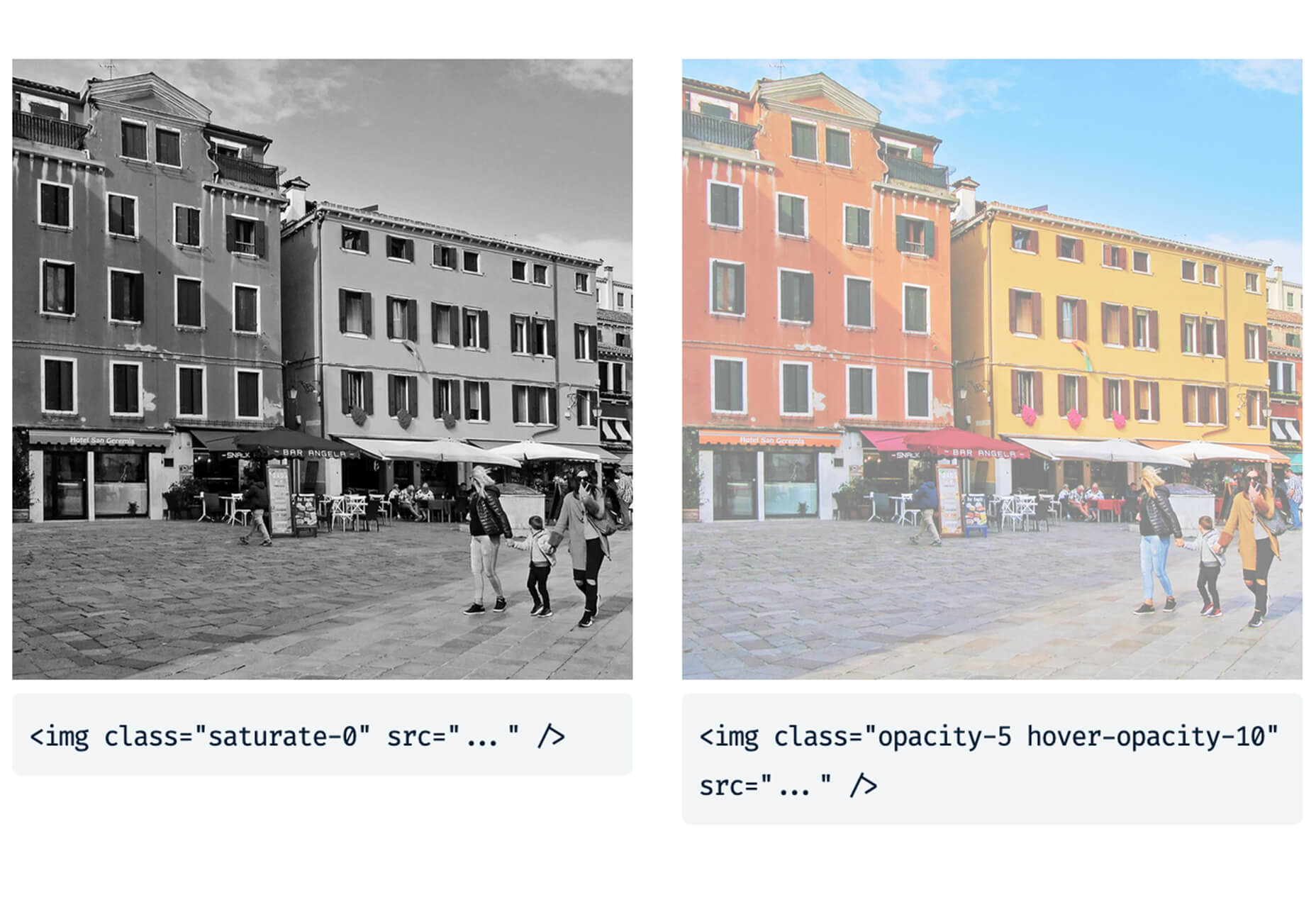
Maybe the most popular use of this color pair is as a gradient. You can find pink to purple everywhere, from background gradients to image overlays to buttons and user interface elements. There’s no lack of use here.

Each of these examples shows opportunities with this color combination.

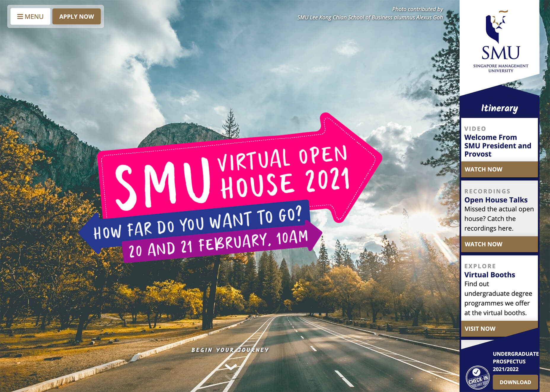
SMU uses bright pink, blue, and purple to create a giant “road sign” in the design that jumps out from the rest of the project. The sign almost seems out of place and doesn’t fit as part of the normal color palette. This is what draw you right to it.

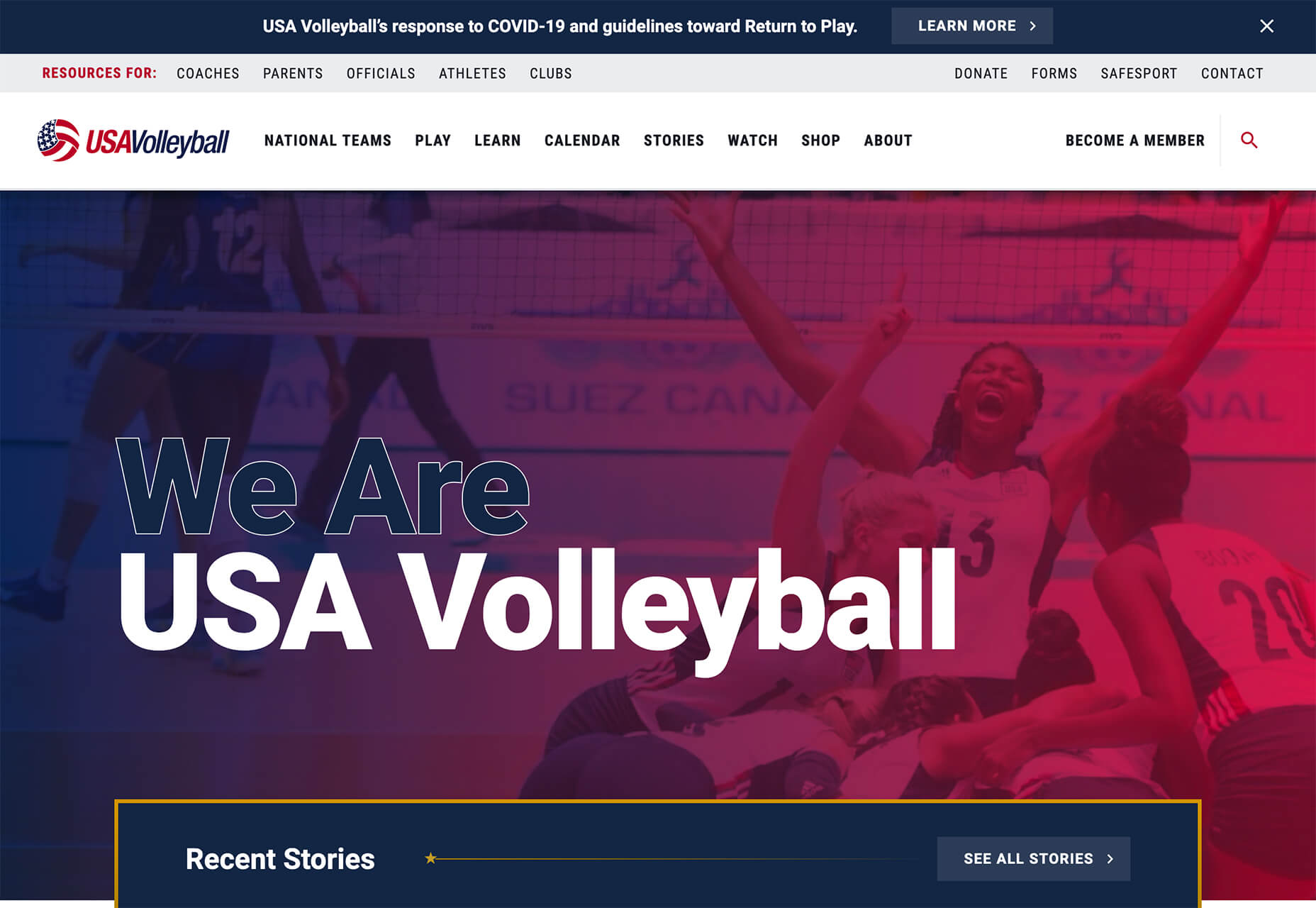
USA Volleyball uses the popular gradient option and extends the pink to the purple palette to hints of blue and red. What’s great about this design is that it uses a super trend element and color option and makes it work with their current color palette. You can almost imagine the design conversation when someone wanted to use a pink to purple gradient for a brand that features red, white, and blue. The gamble paid off, and it works beautifully without being off-brand.

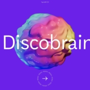
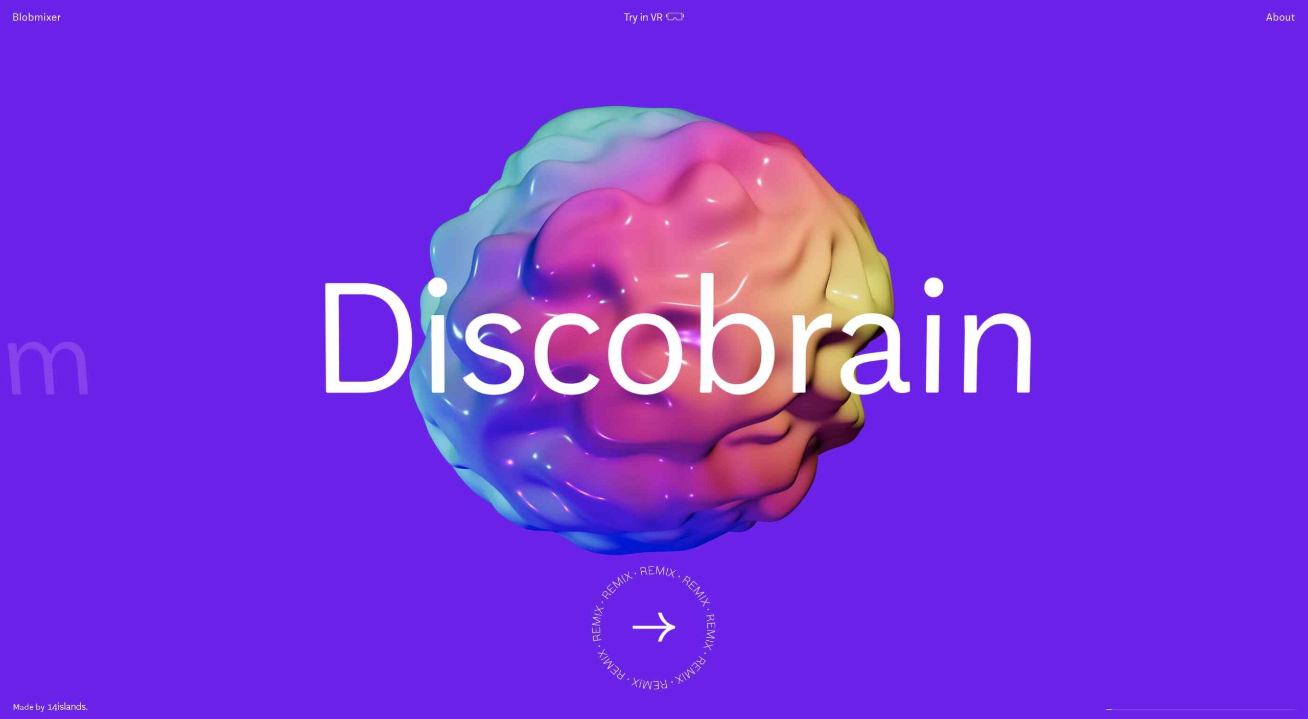
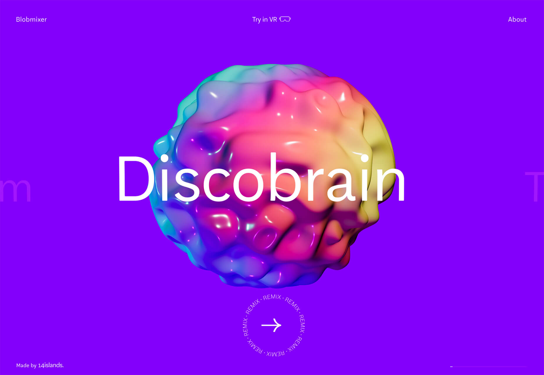
Blobmixer uses purple, pink, and a few other bright colors – note the animated circles, too – to draw users into the design. The entire project is a fun, customizable experience that you can play with, and the color choices are what make you interested enough to try. This design also offers a great example of tactile animation and elements that feel real even when you interact with them using a mouse on the screen.
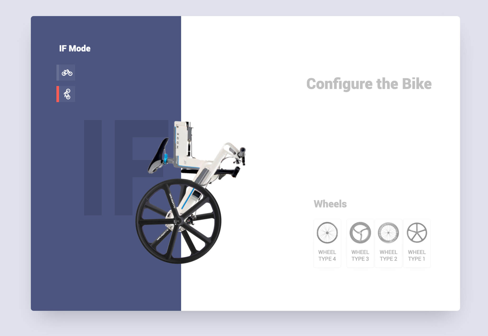


Faux Split Screens

Split-screen designs were a huge trend for about two years. The aesthetic was also functional for content that required a this or that choice on the part of users.

Now, we see the design elements but without the function. (Maybe because it just looks nice and creates a sense of balance without a symmetrical design.)

These projects look like they might offer multiple gateways to content, but there is only one call to action on the dual-screen aside from navigation elements.

What this design option does is help draw the eyes across the screen. One side will immediately appeal to you, and when done well, you’ll feel a subtle push of pull from the color, text, and images to look at the other side as well.

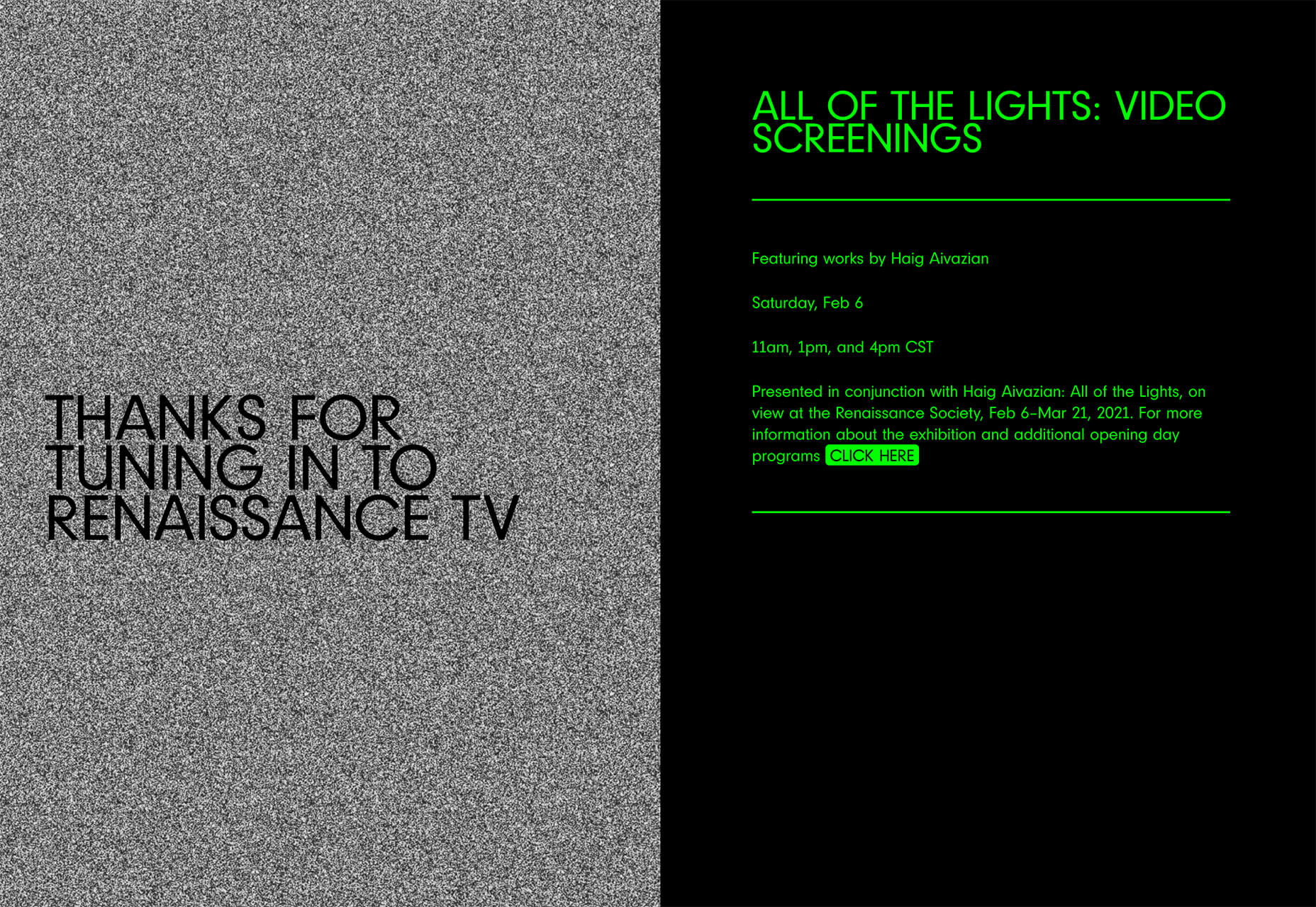
Renaissance TV does it with heavy animation with “dancing dots” from an old TV that doesn’t work. But then you need to look at the green text to understand what is happening.

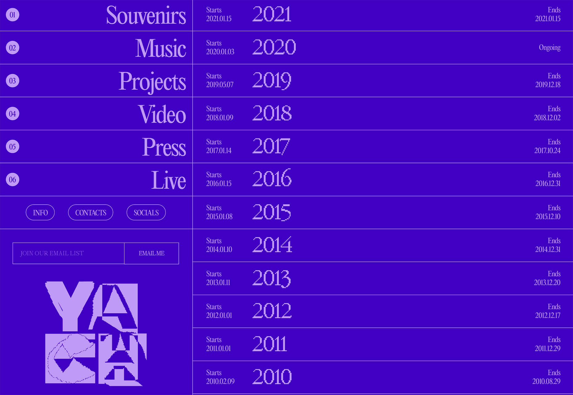
Yacht uses text weight and space to push the eyes across the screen. Almost everyone will go to the heavier areas first and then gaze across the screen through blocks of space to the final small text on the right side. And it all happens in a fraction of seconds.

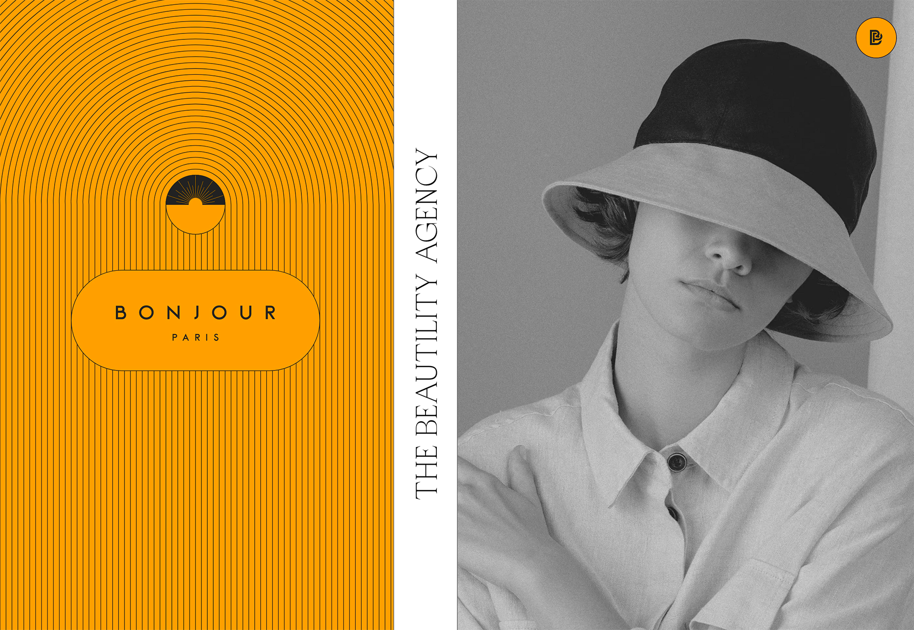
Bonjour Paris pairs bold color with black and white images. You may look at either side first, depending on personal preference, but the other half of the screen is necessary for a complete understanding of the website.


Conclusion

While all of these design trends are evident in new and recent projects, the use of pink and purple color palettes – particularly with a gradient – seems to be everywhere you look. These color choices are popular and come in a lot of forms.

Maybe the most obvious is with brighter pink and purple gradients, but other variations are also trending. It’s definitely one to watch in the longer term.

Source

The post 3 Essential Design Trends, March 2021 first appeared on Webdesigner Depot.


Source de l’article sur Webdesignerdepot

Since the skeuomorphism of the early 00s, the design trend of choice has been minimalism. In fact, minimalism has been de rigueur for substantially longer than that.

You can make a fair case that minimalism was the defining theme of the 20th century. Beginning with the widespread adoption of grotesque typefaces in mass advertising the century before, continuing through the less-is-more philosophies of the middle part of the century, and culminating in the luxury of 80s and 90s consumerism.

Minimalism has been central to the design practice of almost every designer that we recognize as a designer. It underpins the definition of the discipline itself.

With the weight of such illustrious history, it’s no wonder that the fledgling web — and in the scale of history, the web is still a very new phenomenon — adopted minimalism.

And then there’s the fact that a minimalist approach works on the web. Multiple viewports, multiple connection speeds, multiple user journeys, all of these things are so much easier to handle if you reduce the number of visual components that have to adapt to each context.

And yet, despite this, an increasing number of designers are abandoning minimalism in favor of a more flamboyant approach where form is function. It’s clearly happening. What’s not clear is whether this is a short-lived, stylistic fad or something altogether more fundamental. In other words, are designers about to abandon grids, or are they just slapping some gradients on an otherwise minimal design?

Featured image via Pexels.

Source

The post Poll: Is Minimalism a Dead Trend Walking? first appeared on Webdesigner Depot.


Source de l’article sur Webdesignerdepot


read Function

read function is used to read the string or binary and returned parsed content. It is a very useful function when the reader isn’t able to determine the content type by default.

It takes three parameters:

Source de l’article sur DZONE

If you already have a good idea of what you want a new website to look like, the next step would be to decide on the tools you’ll need to put into play to turn that vision into a reality.

  • Tools enable you to present its content in ways that will engage and captivate its audience and gain their trust.
  • Tools that will make your website perform flawlessly in all respects.

That is why choosing the right WordPress theme to get the job done is so important. You want a theme that features the page building tools and design aids that make your task far easier than anticipated.

The following 12 top WordPress themes and plugins have been selected with those purposes in mind. They will not only get the job done for you but do it better than most of the other website-building tools in the marketplace are capable of doing.

The choice is up to you. Whatever that choice may be, it should prove to be a winner.

1. BeTheme

A website-building toolkit that can boast of 40+ core features sounds like a pretty good-sized toolkit, and BeTheme is just that. In fact, this popular (200,000 sales) theme is the biggest WordPress theme of them all.

It’s unlikely you will need to put every one of these core features to use for your next project, but some will be essential, such as –

  • The Muffin Builder page builder, Admin Panel, and Shortcode Generator combine to make BeTheme easy to use, give you a ton of flexibility, and enable you to build your website without any need for coding.
  • Be’s library of shortcodes together with the many Header, Footer, and Grid options, and the new Header Builder extends your design options even more.
  • The Layout Generator will come in handy if you want to start a page from scratch.
  • You’ll love what may be the most important core feature of them all; Be’s selection of 600+ customizable pre-built websites. They cover most industry sectors and website types plus a variety of business niches.

Click on the banner to learn more.

2. Total Theme

Designed with excellence in mind, Total features an exceptional selection of tools and design aids to work with. Total is also well-known for its speed, ease of use, and the flexibility it offers its users.

  • Since you can disable any feature you want to, you won’t be distracted by or bothered with those you don’t intend to use.
  • Total’s 40+ quick import demos and one-of-a-kind theme cards are designed to get your projects off to a rapid start.
  • The Dynamic Template function is a driving force behind this WordPress theme’s remarkable flexibility.
  • You’re given a wealth of design options to work with, thanks to the live customizer and the advanced theme panel.
  • Total is a WordPress plugin and WooCommerce friendly.

Click on the banner to learn more.

3. Avada Theme

When a WordPress theme has the distinction of being the #1 best seller of all time, you can safely assume that those who created it got it right. Avada’s 450,000+ sales can’t easily be ignored.

Look closer, and you’ll see some of the many reasons behind Avada’s popularity.

  • There’s an impressive selection of one-click import demos, pre-built websites, and a wealth of supporting design elements.
  • The Fusion drag and drop builder and Fusion page and theme options enable designers to create complex websites without resorting to coding.
  • 5-star support and free updates ensure users that they will always be able to follow the latest design trends and create websites as they envision them.

Click on the banner to learn more.

4. MaxCoach – Online Courses, Personal Coaching & Education WP Theme

MaxCoach is a specialty tool that enables web designers to create an online distance learning and/or tutoring platform. This LearnPress theme was last year’s #1 coaching theme, and it will most likely be so in 2021 as well.

  • The platform is learner-centric
  • MaxCoach’s design is modern, trendy, and unique
  • Elementor is the drag and drop page builder of choice

Visit the site to see for yourself why this specialty theme has generated so much interest.

5. TheGem – Creative Multi-Purpose High-Performance WordPress Theme

TheGem, WordPress’s ultimate multiuse toolbox, gives its users:

  • A selection of more than 400 professionally-crafted pre-built multi-page and single-page websites
  • Two popular page builders – WPBakery and Elementor
  • Demos, layouts, and page sections you can mix and match to create a look that’s uniquely yours

The GemBlocks with its 300+ pre-designed section templates to speed up your workflow, plus WooCommerce layouts and design aids

6. Uncode – Creative Multiuse & WooCommerce WordPress Theme

The Uncode multi-use WordPress theme is ideal for entrepreneurs, creative individuals, agencies, and small businesses.

  • Its 80.000+ sales to date have made it a ThemeForest best-seller.
  • Features include a unique WooCommerce Custom Builder you can use to give site visitors a supreme shopping experience.

Viewing Uncode’s showcase of user-built websites is a must. Click on the banner to visit the site and prepare to be impressed.

7. Rey Theme

This highly modular popular theme is definitely worth a close look. It is simply one of the most innovative website building tools you’re likely to find on the market today,

  • Rey’s features include a library of professionally-designed templates and an imposing selection of WooCommerce site-building tools
  • It is easy to set up and easy to use
  • You will be more than satisfied with Rey’s robust performance

Rey has built-in SVG support and is user and developer-friendly.

8. Aurum – Minimalist WordPress Theme

With this multiuse minimalist WordPress theme at your fingertips, you’ll be able to create an online store that will give shoppers a fully satisfying shopping experience.

  • With Aurum, you can design megamenus to accommodate huge selections of products
  • Aurum’s page load times are super-fast, and Aurum’s pages are responsive to every screen size
  • Popular plugins are included, and all the popular WordPress plugins are supported

Click on the banner and check it out.

9. Hongo – Modern & Multipurpose WooCommerce WordPress Theme

Its trendy selections of creative design elements and ready-to-go store demos make Hongo an ideal choice for company, blogging, and eCommerce websites.

  • Premium plugins and WPBakery custom shortcodes are among the most popular of Hongo’s website-building features
  • This multipurpose theme also features an attractive selection of product-related tools that include product compare, quick view, wish lists, and product filter

You can expect and receive exceptional user support.

10. XStore – The Most Customizable WooCommerce Theme Ever

With its $39 price tag, XStore gives you more value for your money than you’ll find in any other WooCommerce theme.

  • For starters, there are 100+ good-to-go shops
  • A full Ajax shop is another popular feature
  • As is XStore’s single product page builder and its selection of product filters and display features

Check XStore out if you’re looking for a way to create an awesome online store in no time at all.

11. KnowAll – Knowledge Base Theme

Have you ever come across a FAQ page you really liked? It doesn’t happen often. 

Visitors that can’t find a good answer might decide to make a phone call (and be placed on hold). That answer is OK, but additional information would be more helpful.

With AI-based KnowAll, customers get answers 24/7, and they can search for other relevant information. They will be happier customers, which is obviously good for business.

12. Pofo – Creative Portfolio, Blog, and eCommerce WordPress Theme

Bloggers, creatives, agencies, and those looking to create an eCommerce site should give Pofo a good, hard look.

Pofo is fast, flexible, SEO optimized, and packed with useful features that include:

  • Trendy selections of pre-built design elements, ready-to-go home pages, and one-click import demo pages.
  • Premium plugins, including Revolution Slider and the WPBakery page builder.

Detailed online documentation is provided, and you’ll be more than pleased with this theme’s customer support.

A modern, fast-loading, and smoothly performing theme is what you need. It will help you create a website that will have a significantly positive impact on your business’ growth.

Themes like those presented here can do just that by enabling you to give your website the professional touch you’re looking for. You can do it without having to rely on a single line of code.

These 12 top WordPress themes are modern, trendy, and easy to work with. Trying to find the “best” of the bunch could admittedly be somewhat daunting. But, you can take comfort in the fact that you really can’t make a wrong or bad choice.


[– This is a sponsored post –]

Source

The post 12 Best WordPress Themes for 2021 first appeared on Webdesigner Depot.


Source de l’article sur Webdesignerdepot

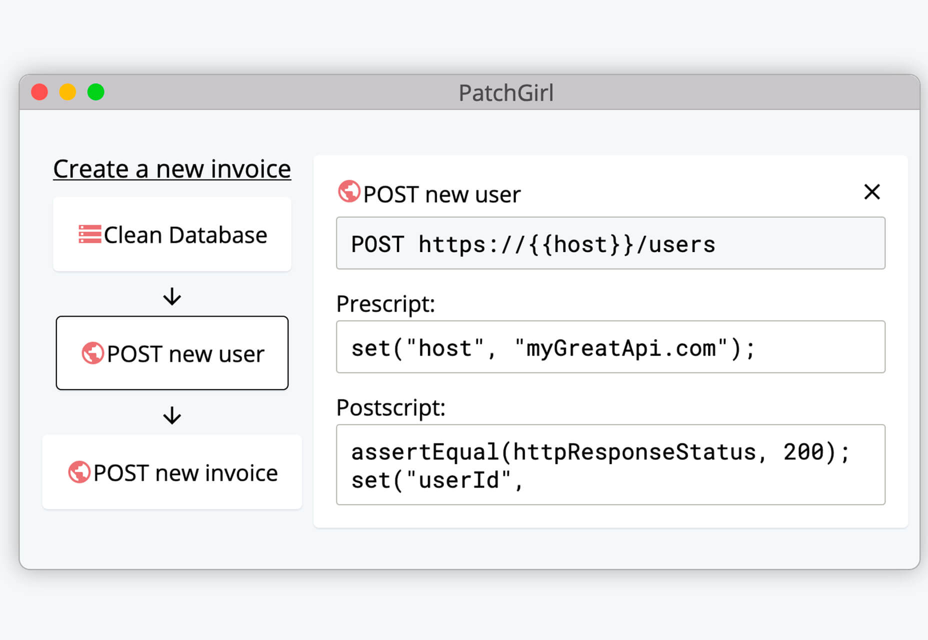
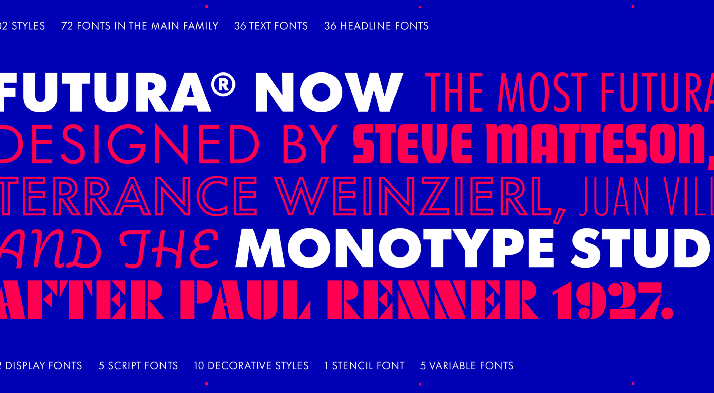
Since there are so many CMS plugins out there, it can be overwhelming to choose the best ones for your website. We’ve done the research for you; this list contains the top new CMS plugins for November 2020. You’ll find useful plugins for WordPress, Craft, Shopify, and Joomla.

Let’s get started…

WordPress

404 Page Editor

404 Page Editor is a simple WordPress plugin that helps you add custom text to the default 404 page on your website. The plugin comes with seasonal and industry-related 404 templates. One useful feature of the plugin is that it backups your current 404 page before changing it. So you can restore the backup page anytime you choose. The plugin duplicates your current 404.php page to wp-content/uploads/404-page-editor/ so you can easily find it. You can also change the text on the plugin to fit your local dialect. 

UnusedCSS Power-Up

Most WordPress themes and plugins load their CSS in the wrong areas of your website. This can slow down your site. A slow website will reduce user experience and lead to increased bounce rates.

UnusedCSS will help reduce the size of your website’s CSS files by up to 95%. The best part is that the plugin works automatically. It will remove any unused CSS when visitors view any page on your website. UnusedCSS will automatically reduce your website’s load times by reducing your CSS files and page size. The plugin also optimizes the performance of other WordPress plugins and extensions. UnusedCSS also works with WooCommerce themes and plugins.

Simple Redirects

Simple Redirects is a WordPress plugin that helps you to automatically redirect requests to another page on your site or any other place on the web. The plugin allows you to easily redirect users from your old web pages to new pages using 301 or 302 redirects. You don’t have to worry about losing backlinks or page rank. Any incoming links to the old web page will be automatically passed along to the new page. The page rank on the old page is also transferred to the new page. The plugin is useful when migrating a WordPress site when don’t want to retain the URL structure. 

HTML Validation

HTML Validation plugin helps you identify any HTML validation errors on your website. The plugin works automatically in the background of your website and will send you regular reports. There is a progress bar on the report screen to show you the progress of the scan. The plugin uses WordPress Cron to scan the content of your website. There is also an option for the plugin to automatically fix any HTML validation issues on your website. You can also choose to fix the issues manually. 

Just Highlight

Just Highlight is a simple WordPress plugin that helps you highlight text in your posts or pages. You can use this plugin to highlight any portion of the page you want to draw the reader’s attention to. You can highlight the background of the page and also add animation to the highlighted text. In the WordPress admin area, you can change the speed and color of the animation. The plugin is compatible with Gutenberg, and the WordPress classic editor. 

DeviantArt Embed

DeviantArt Embed is a simple plugin that helps you embed any work from Deviant Art into a post. The plugin provides a block for the WordPress block editor so you can easily embed the image. It uses a DeviantArt oEmbed API to pull the images and their descriptions, and creates an embedded image. 

Static Optimizer

Static Optimizer is a static file optimization plugin that serves and optimizes static files on your website. The plugin will help you increase your website speed by automatically compressing your static files. It is easy to set up, you just need an API key to get started. Other useful features that the plugin offers include automatic JS and CSS minification, automatic image optimization, and processing of responsive images. You don’t have to worry about losing your files if their server is down. The plugin automatically backs up your files and will load your original files when their servers are down (either because of an upgrade, maintenance, or outage).  By default, only images are compressed when you activate the plugin; you can also choose to optimize fonts, CSS, and JS files. 

RankBear

RankBear is a keyword rank tracker plugin that helps you analyze your SEO efforts. With RankBear, you can track the keywords for each of the posts and pages on your site. While the plugin has a paid plan, you can track up to five keywords for free. On the free plan, you will receive weekly reports on each keyword you are tracking. You can search for the rank and volume of a keyword in every location supported by the Google search engine. RankBear is a lightweight software-as-a-service plugin hosted by Amazon Cloud Services. The plugin also offers the option to download the keyword reports to CSV. 

Table of Contents Block

Table of Contents Block is a plugin that allows you to easily create a Table of Contents for your WordPress posts. The plugin is lightweight and will automatically add a Table of Content in your website’s posts and pages. You can select the heading tags you want to add to the Table of Content. It also has a dedicated support team to assist you. The plugin works fine with all standard WordPress themes. 

Markease For WooCommerce

Markeaze is an all-in-one communication plugin that allows you to add live chat to your online stores. The plugin will help you improve your customer service by decreasing your response times. With the plugin, you can collect your visitor’s contact information via a widget. This feature is useful in building a subscriber database. You can also use the plugin to track customer behavior on your site, inform customers about new products, help customers with active orders, and collect customer feedback. You can also use the auto-reply function to answer commonly asked questions. 

Craft CMS

Image Toolbox

Image Toolbox is a Craft CMS plugin that offers image-related tools for your templates. The plugin will automatically create a WebP variant of the images you upload. It also has a fallback for browsers that do not support WebP images. Other useful features the plugin offers include automatic creation of placeholder images and generation of responsive images with multiple variants. The plugin also supports Imager-X (or old Imager). 

Element Panel

Element Panel plugin allows you to add elements and an eager-loading panel to the debug toolbar. This feature will help you benchmark your templates in Craft CMS. For elements, the panel has a dashboard that shows how many elements are populated. It also shows how many elements are duplicates. The plugin also shows you how many eager-loading elements are detected. Duplicate elements are grouped by field name. 

Shopify 

VStore Shoppable Videos

VStore Shoppable Videos is a Shopify plugin that allows your customers to shop directly from your videos. The plugin allows you to embed your products into any video. Since videos have a high engagement rate, this plugin will significantly improve your store’s conversion rates. 

ProofMotion Video Testimonials

ProofMotion Video Testimonials plugin helps you to easily collect video testimonials. The plugin sends an automated email or SMS requests to customers asking for their satisfaction feedback after making a purchase. The responses are analyzed to determine whether the customer had a negative or positive experience. Customers that offer negative feedback are sent to customer care to help them with the problem they encountered. Happy customers are prompted to make video testimonials of their positive shopping experience. ProofMotion guides the customer through the interview so they can give the best testimonial. They also offer an on-site widget so you can easily share your testimonials. 

Real ID

Real ID is a Shopify plugin that allows you to verify customers’ real identity using a photo ID and facial biometrics. The plugin is perfect for orders that have an age restriction, verifying flagged fraud goods, and selling expensive goods. Real ID will help you identify whether a government-issued-ID is fake during fulfilment. All the customer needs to do is take a selfie on their phone. This way, even if a customer has access to a stolen physical ID, they won’t still be able to make any purchase. The plugin can verify documents such as passports, visas, national IDs, driver licenses, and more. Real ID will help you handle GDPR compliance. The plugin is available in hundreds of countries around the world. 

Joomla

Accessibility

Accessibility is a Joomla plugin that allows your website visitors to easily access your website content. The plugin will remove any barrier between the visitor and your Joomla site. There is no coding required and you can customize the plugin directly from the module manager. The plugin has a useful feature called Dyslexic Readability; this feature allows your visitors to set the entire document font to a dyslexic-friendly font. Visitors can also grayscale the page, resize the fonts, and resize the word space. From the backend module, you can add any custom CSS and JS. The plugin is also available in 12 different languages. 

Reading Time

Reading Time is a simple plugin that will help you easily show the reading time of your Joomla articles. The plugin is easy to set up and does not require any coding. You can customize every parameter, including the text, in minutes. You can also choose to exclude categories, articles, and menu items. Reading Time also allows you to easily add custom CSS code from the plugin parameters. 


Featured image via Pexels.

Source


Source de l’article sur Webdesignerdepot

In the spirit of fall feasts, this month’s collection of tools and resources is a smorgasbord of sorts. You’ll find everything from web tools to icon libraries to animation tools to great free fonts. Let’s dig in.

Here’s what new for designers this month.

The Good Line-Height

The Good Line-Height is the tool you won’t be able to live without after using it a few times. The tool calculates the ideal line-height for every text size in a typographic scale so that everything always fits the baseline grid. Set the font size, multiplier, and grid row height to get started.

Link-to-QR

Link-to-QR makes creating quick codes a breeze. Paste in your link and the tool creates an immediate QR code that you can download or share. Pick a color and transparency, plus size, and you are done.

Quarkly

Quarkly allows you to create websites and web apps both using a mouse and typing code – you get all the pros of responsive editing, but can also open the code editor at any time and manually edit anything and it all synchronizes. The tool is built for design control and is in beta.

UnSpam.email

Unspam.email is an online spam tester tool for emails. Improve deliverability with the free email tester. The service analyzes the main aspects of an email and returns a spam score and predicts results with a heat map of your email newsletter.

Filmstrip

Filmstrip allows you to create or import keyframe animations, make adjustments, and export them for web playback. It’s a quick and easy tool for modern web animation.

CSS Background Patterns

CSS Background Patterns is packed with groovy designs that you can adjust and turn into just the right background for your web project. Set the colors, opacity, and spacing; then pick a pattern; preview it right on the screen; and then snag the CSS. You can also submit your own patterns.

Neonpad

Neonpad is a simple – but fun – plain text editor in neon colors. Switch hues for a different writing experience. Use it small or expand to full browser size.

Link Hover Animation

Link Hover Animation is a nifty twist on a hover state. The animation draws a circle around the link!

Tint and Shade Generator

Tint and Shade Generator helps you make the most of any hex color. Start with a base color palette and use it to generate complementary colors for gradients, borders, backgrounds, or shadows.

Pure CSS Product Card

Pure CSS Product Card by Adam Kuhn is a lovely example of an e-commerce design that you can learn from. The card is appealing and functional.

Free Favicon Maker

Free Favicon Maker allows you to create a simple SVG or PNG favicon in a few clicks. You can set a style that includes a letter or emoji, font and size, color, and edge type and you are ready to snag the HTML or download the SVG or PNG file.

Ultimate Free iOS Icon Pack

The Ultimate Free iOS Icon Pack is a collection of 100 minimal icons in an Apple style. With black and white version of each icon and original PSD files, you can create sleek icons for your iPhone screen in minutes. And it’s completely free! No email address or registration required.

Phosphor Icon Family

Phosphor is a flexible icon family for all the things you need icons for including diagrams and presentations. There are plenty of arrows, chats, circles, clocks, office elements, lists, business logos, and more. Everything is in a line style, filled, or with duotone color. Everything is free but donations are accepted.

3,000 Hands

3,000 Hands is a kit of hands that includes plenty of gestures and style in six skin tones and with 10 angles of every gesture. They have a 3D-ish shape and are in an easy to use PNG format. This kit has everything you need from a set of hand icons.

Radix Icons

Radix Icons is a set of 15px by 15px icons for tiny spaces. They are in a line style and are available in a variety of formats including Figma, Sketch, iconJar, SVG, npm installation, or GitHub.

Deepnote

Deepnote is a new kind of data science notebook. It is Jupyter-compatible with real-time collaboration and running in the cloud and designed for data science teams.

ZzFXM Tiny JavaScript Music Generator

ZzFXM is a tiny JavaScript function that generates stereo music tracks from patterns of note and instrument data. Instrument samples are created using a modified version of the super-tiny ZzFX sound generator by Frank Force. It is designed for size-limited productions.

Image Tiles Scroll Animation

Image Tiles Scroll Animation is a different type of scrolling pattern using Locomotive Scroll. The grid creates a smooth animation in a fun and modern style.

Bubbles

Bubbles is a Chrome extension that allows you to collaborate by clicking anywhere on your screen and then dropping a comment to start a conversation with anyone. This is a nice option for work from home teams.

Tyrus

Tyrus is a toolkit from the design team at Airbnb to help illustrators make the most out of their design businesses. It is broken into sections to help you with design briefs, originality, deadlines, and feedback.

PatchGirl

PatchGirl is an automated QA tool for developers. You can combine SQL and HTTP queries to build any possible state of your database.

Apparel

Apparel is a beautiful premium typeface family with plenty of versatility in a modern serif style. It is a contemporary, classy, and fresh serif typeface with a laid-back. Its medium-large x-height makes it ideal for headlines and brand identity design.

Christmas Story

Christmas Story is a nice solution if you are already starting to think ahead to holiday projects or cards. The long swashes and tails are elaborate and fun.

Nafta

Nafta is a fun handwriting style font that has a marker-style stroke. It’s a modern take on the popular Sharpie font. It includes all uppercase letters.

Safira

Safira is a wide and modern sans with ligatures and a stylish feel. The rounded ball terminals are especially elegant.

Shine Brighter Sans

Shine Brighter Sans is a super-thin sans-serif with a light attitude. The limited character set combined with its light weight is best for display use.

Source


Source de l’article sur Webdesignerdepot

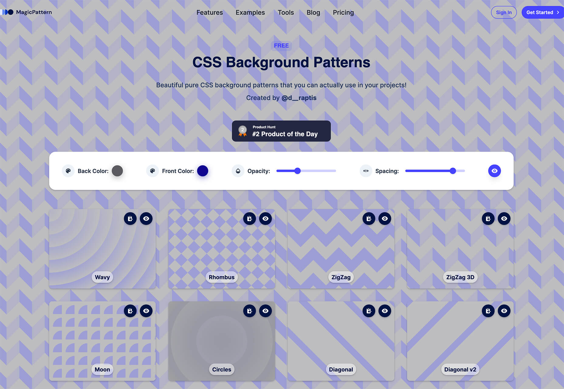
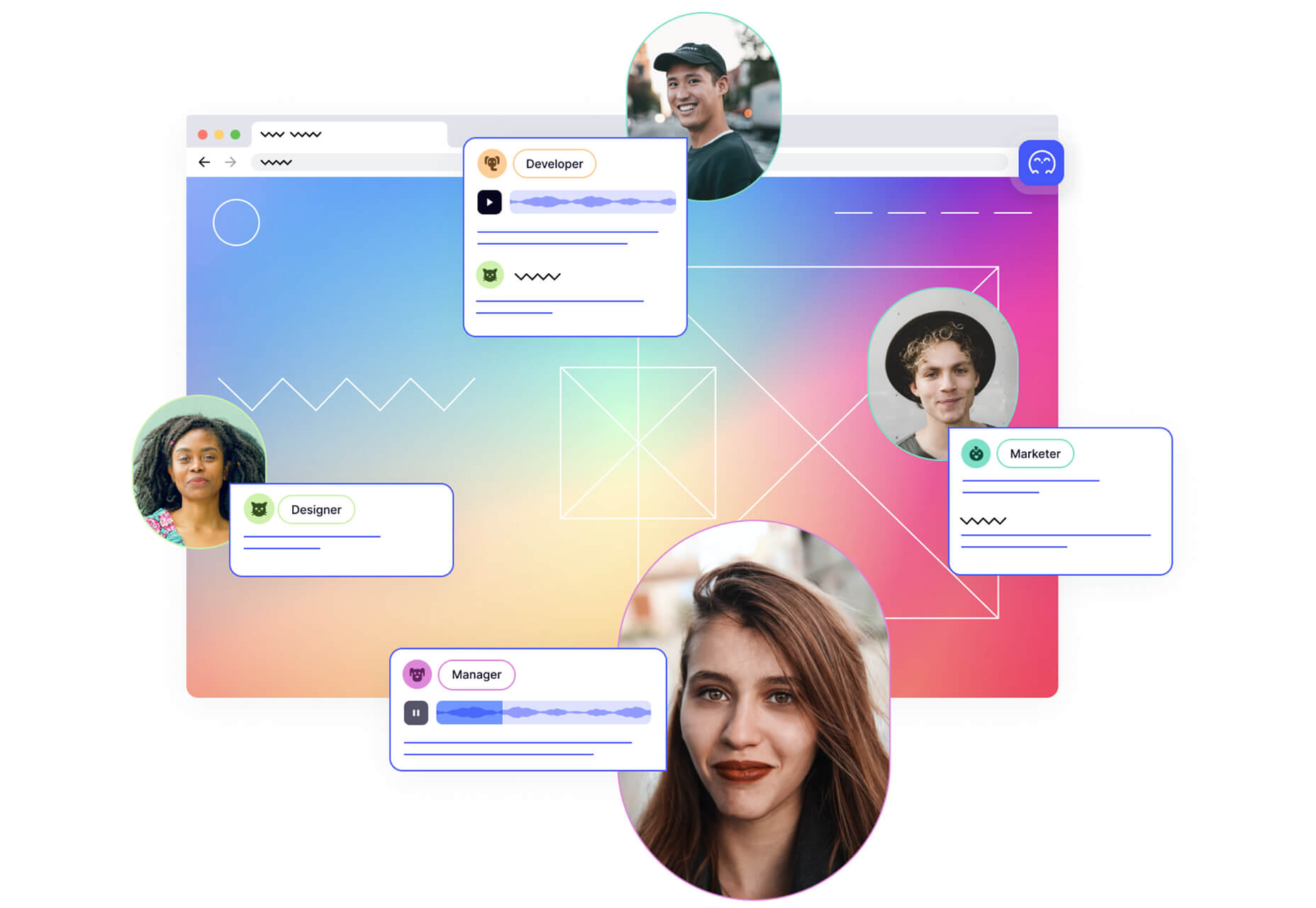
This month’s collection of new tools, resources, and freebies for designers is a smorgasbord of sorts. You’ll find everything from useful APIs to icons to tutorials to fonts.

Let’s get right into it, here’s what new for designers this month:

Tooltip Sequence

Now that your app or website is ready, you might need to help users engage with it. Tooltip Sequence is a simple JavaScript package that helps you create a series of small tooltips that will guide users through product features with a small description of what they need to know. It looks great and the best part is this tool saves you from having to create each tooltip description manually on each page and link them together.

Serenade

Serenade allows you to free up your hands with voice coding technology. Use natural speech and stay productive with this tool that allows you to code without typing. It works across multiple coding languages and platforms. It’s as easy as “add function hello” and the tool knows what syntax to use.

Gazepass

Gazepass, which is still in beta, is a nifty API that allows for passwordless multi-factor authentication for any website or mobile app. It uses biometrics on any device or platform to make getting into apps or websites easier for users.

Filters.css

Filters.css is a CSS-only library to apply color filters to website images. Installation only takes three steps and includes a variety of filers, such as blur, grayscale, brightness, contrast, invert, saturate, sepia, and opacity.

Sidebar Webring

Sidebar Webring is a collection of blogs and websites that are focused on web design. The curated list is handpicked for superb content for designers and developers. But, what’s a webring? It’s a collection of linked websites in a circular structure that are organized around a theme. The term is a throwback to the early days of the web in the 1990s and 2000s.

Wicked Templates

Wicked Templates is a set of responsive HTML templates made with Bulma and Tailwind CSS that you can style and use as you wish. Use these templates to jumpstart projects. Free and paid options available.

WP Umbrella

WP Umbrella will help you keep sites running in a healthy and safe manner on WordPress. Monitor uptime and performance, PHP errors, and keep up with hundreds of websites from one dashboard.

Servicebot

Servicebot helps you create customer-facing embeddable billing pages that work with Stripe payments. This premium tool is quite user-friendly and works with websites or SaaS.

Custom, Accessible Checkboxes with Perfect Alignment

Create custom, accessible checkboxes with perfect alignment every time. This walkthrough shows you how to use CSS to align elements and labels.

Sombras.app

Sombras.app is a nifty tool that creates 3D object shadows. Use the easy on-screen controls to get just the right orientation and shape.

urlcat

Urlcat is a tiny JavaScript library that helps you build URLs with dynamic parameters and without mistakes. The friendly API has no dependencies, includes TypeScript types, and is just 0.8KB minified and gzipped.

Reacher

Reacher is a real-time email verification API that lets you check the validity of an address before you send the email. Reduce bounce rates in an instant. (The personal version is free.)

Swell

Swell is a most powerful headless ecommerce platform for modern brands, startups, and agencies. Create fast and flexible shopping experiences with the API and headless storefront themes. This is a premium tool but does have a free trial.

No Code Founders 2.0

No Code Founders 2.0 is a platform for discovering the latest startups built with no-code and the tools used to build them. Browse startups, tools, perks, interviews, jobs, meetups, posts, and more as part of the no-code movement. The community engages on Slack and requires an email to sign up.

How to Pick More Beautiful Colors for Your Data Visualizations

Beautiful color choices will make your data visualizations that much more impactful. This tutorial by Lisa Charlotte Rost will help you make better color choices on the way to better infographics and charts. Plus, it’s well developed, designed, and packed with useful information.

IconPark

IconPark is a collection of more than 1,200 high-quality icons with an interface that allows you to customize them. It uses a single SVG source file that can be transformed into multiple themes. The library includes cross-platform components and is free to use.

Mono Icons

Mono Icons is a simple and consistent open-source icon set that uses mono spacing. The collection includes 136 icons.

BGJar

BGJar is a free SVG background generator for digital projects. Pick a category and customize the result to fit your project or needs.

HitCount

HitCount is almost too simple to be true. This tiny tool lets you add a hit counter to your website that’s as easy as adding an image. Copy the code and make any customizations you want. Then paste it to your design. That’s it!

Blacklight

Blacklight is a real-time website privacy inspector. The tool by Surya Mattu scans any website you enter in the scan bar and shows what user-tracking technologies are used on the website. This allows you to see who might be gathering data about your visit.

Alter

Alter is a customizable – and experimental – three-dimensional typeface that you can experiment with. It’s as fun to play with as use.

Autobus Omnibus

Autobus Omnibus is a simple all capitals font with new wave styling. The character set has 96 glyphs that are perfect for display use.

Deathmatch

Deathmatch is a seasonal blackletter font that’s ideal for the upcoming Halloween holiday. The character set includes plenty of options and there’s a full version (paid) for commercial use.

Futura Now

Futura Now is a premium typeface and update to a font you may already know and love. The new version has 107 styles in a massive family.

Pumpkin Soup

Pumpkin Soup is a fun almost handwriting style typeface with a cartoonish vibe. It includes a regular and italic style and is most appropriate in limited use.

Source


Source de l’article sur Webdesignerdepot

Hyper implies web, and lambda implies function – Hence, Hyperlambda translates into "web functions", and this is a fairly accurate description. However, hyper also implies "super fast", and by super fast here, I mean super fast! 1 minute and 45 seconds was what I needed to create CRUD endpoints wrapping my database table, manually creating my endpoints in the following video, while explaining how I did it simultaneously.

According to modern studies in the subject, the number of lines of code your project consists of, is directly proportional to the amount of energy and resources you’ll need to spend maintaining it. Hence, the fewer lines of code, the fewer resources are required to maintain it. In the video above, I copy and paste 50 lines of code, and I end up with 4 HTTP REST CRUD endpoints. Comparing this to C# is arguably unfair. Simply the boiler plate code for my Controller, would probably end up exceeding this number. You can find my code for all endpoints below.

Source de l’article sur DZONE

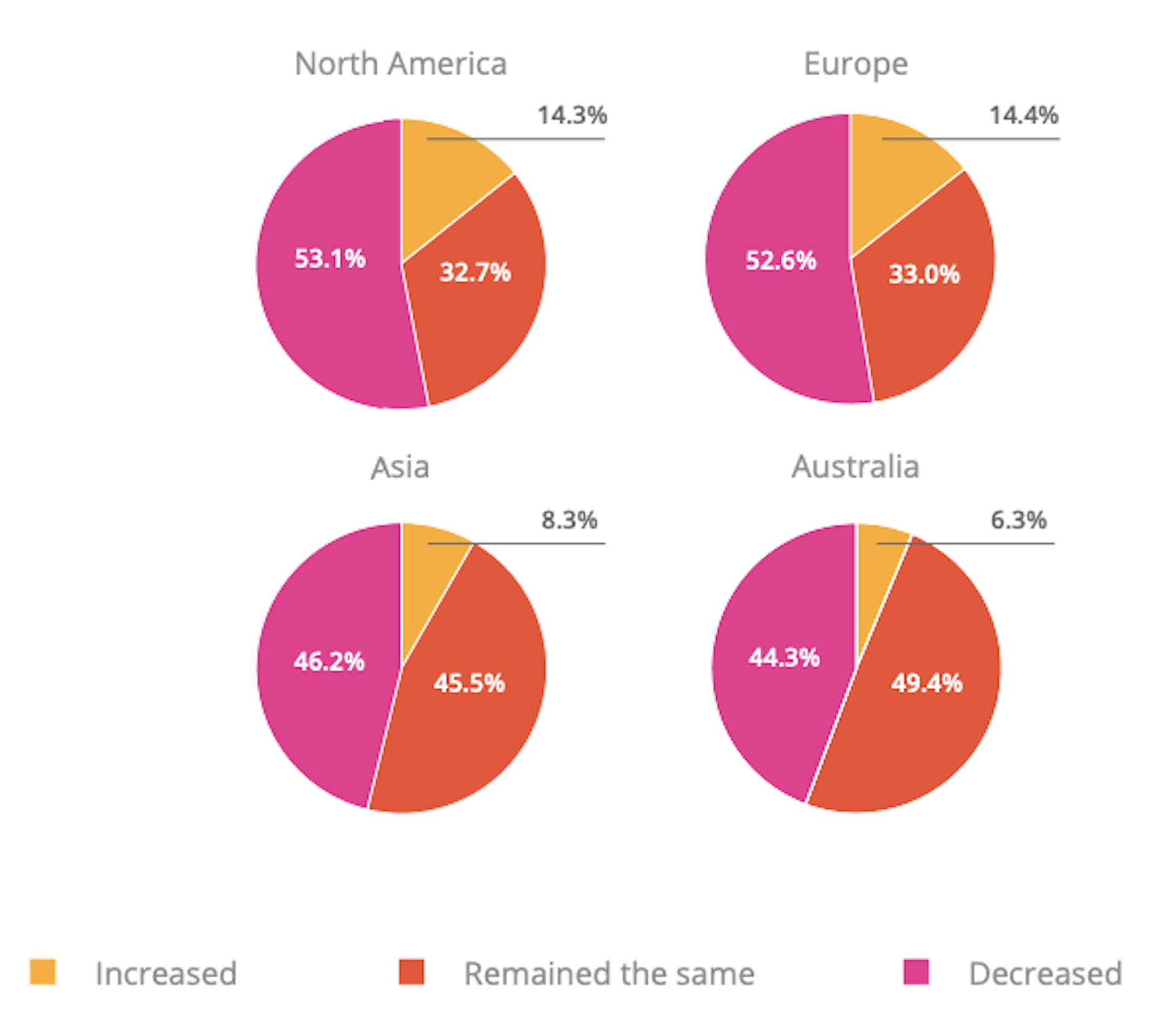
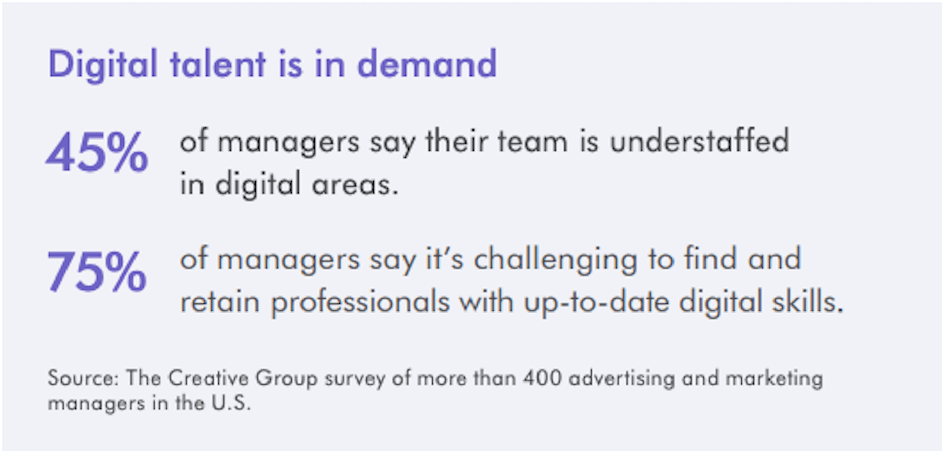
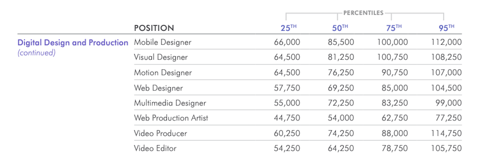
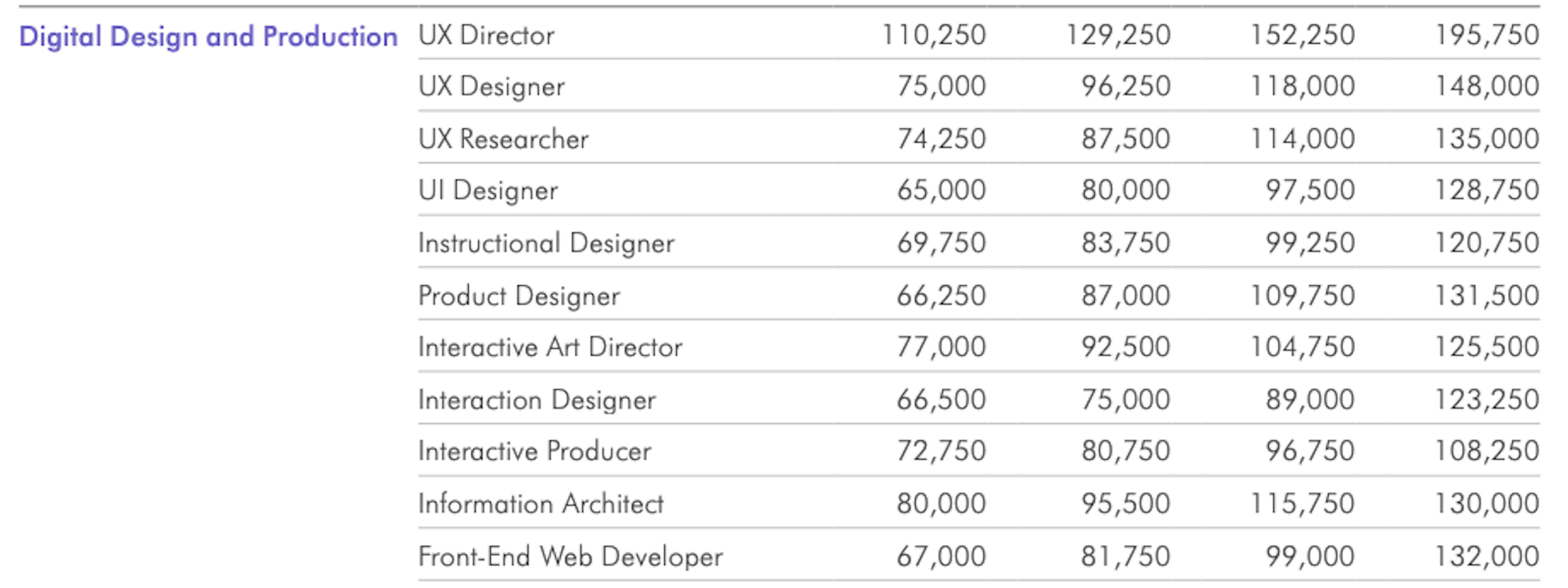
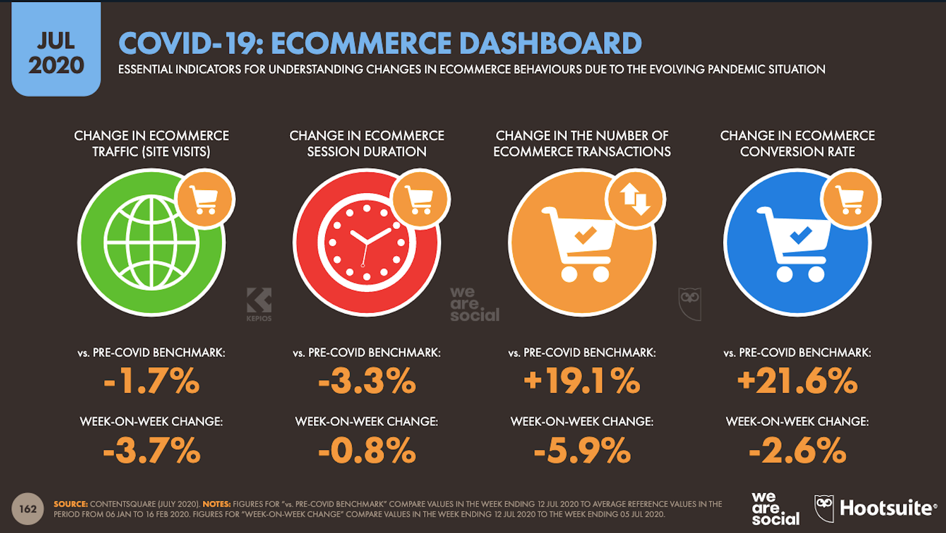
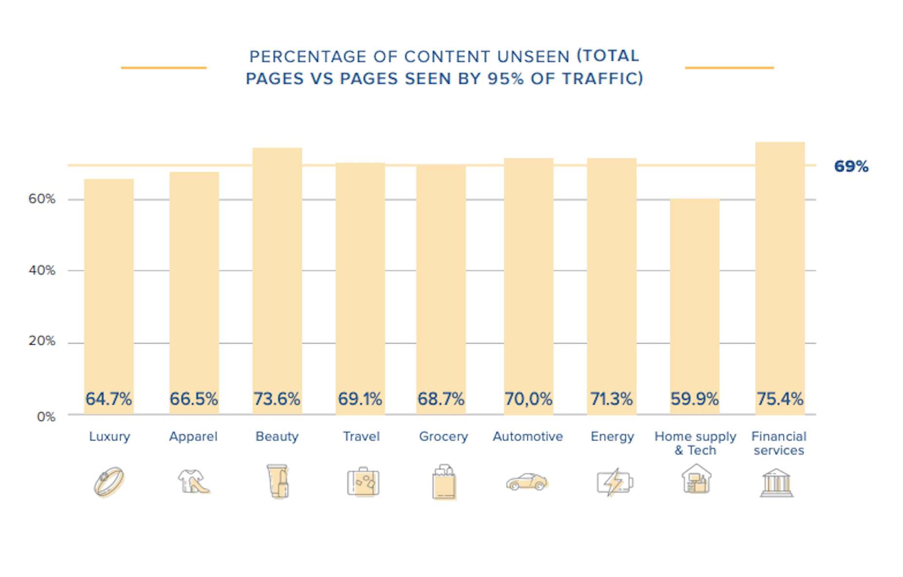
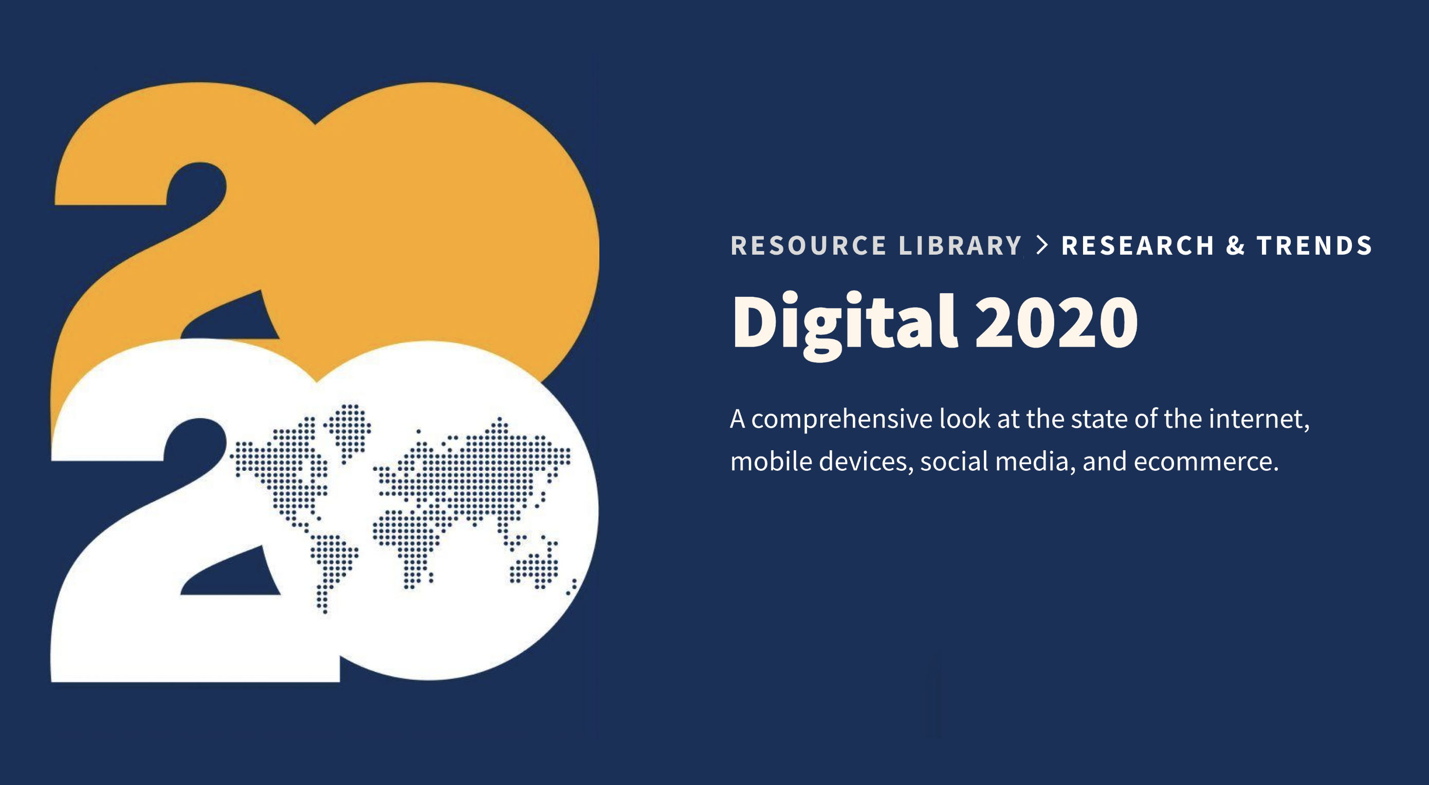
In today’s look at the latest research for web designers, we’re going to look at studies and reports from Payoneer, Robert Half, Hootsuite, and Contentsquare to see what they have to say about things like:

  • Current freelancer demand
  • Web designer earning potential
  • A change in ecommerce shopping trends
  • Unseen content rates

1. There’s Light At the End of the COVID-19 Tunnel for Freelancers

Payoneer’s The State of Freelancing During COVID-19 had to take a different approach to reporting on the freelancer workforce than in years passed.

Here’s why:

When 1000+ freelancers around the globe were asked how demand for their services changed during COVID-19, this was the response:

Less than 17% of freelancers experienced an increase in demand for their services and less than 23% saw demand remain the same.

An overwhelming majority of freelancers experienced a shrink in demand, with nearly 29% saying it slightly decreased while almost 32% said it greatly decreased.

However, the data collected wasn’t just assessed on a global scale. Payoneer also looked at freelancing demand trends in various parts of the world:

Notice the differences between Asia and Australia (who were hit with COVID-19 earlier) and North America and Europe (where the pandemic arrived a little later).

It appears as though Asian and Australian freelancers are, economically speaking, already starting to feel the effects of recovery from the pandemic with demand working in their favor.

So, if you’re feeling like there’s no end to the hardships you’ve faced during COVID-19, and were considering dropping your prices, hold on for just a little bit longer. Freelancers are starting to feel optimistic about demand for their services increasing. If you go devaluing yourself now, it’ll be hard to return to where you were before COVID-19 when things get back to normal.

2. Robert Half’s Salary Guide Breaks Down the Earning Potential for Web Designers

On a related note, let’s talk about demand from the employer’s point of view.

According to Robert Half’s 2020 Salary Guide for creative marketing professionals, there’s big demand for digital talent:

So, that’s number one. We know that almost 50% of hiring managers feel as though their digital teams are inadequately staffed. That’s good news for web designers.

However, these same managers complain about creative marketing professionals’ lack of up-to-date skills as the biggest barrier to hiring or retaining them. Although the report doesn’t say so, I’m going to assume this refers both to employees as well as contractors.

This should be a no-brainer. By keeping up with the latest web design trends and techniques, you can make top-dollar for your services — and hold onto those valuable client relationships for a long time.

According to the report, this is how much you stand to earn working in web design (in the U.S.) today:

If you’re eyeballing those salaries in the 95th percentile, then you know what you need to do. Hiring managers have spoken up about what’s holding them back from hiring.

For those of you who feel as though you’ve gone as far as you can as a web designer, it might be worth exploring a new specialty. Like one of the following:

As you can see, designers in the UI, UX, and interactive space (along with web developers) have the opportunity to make more money, even earlier on in their careers. You may also find that more job opportunities are available as you move into these niches (because of less competition), which might cut down on any demand issues you’ve been experiencing because of COVID-19.

3. Hootsuite’s Digital 2020 Report Reveals an Interesting Trend in Ecommerce

Hootsuite’s Digital 2020 report is always a great resource for learning about social media marketing trends. That said, that’s not why I read it.

It’s for hidden gems like these:

It’s no surprise that we’re seeing changes in retail and ecommerce during COVID-19. What is a surprise, however, is how consumers’ online shopping habits have changed.

Here’s what we’re seeing when we compare 2020 ecommerce data with the pre-COVID benchmarks:

Site visits are 1.7% lower than expected. That would make sense considering how budget-conscious consumers are right now. It likely keeps them from going on unnecessary shopping sprees.

Session durations are 3.3% lower. This could be related to fewer site visits. It might also indicate greater consumer confidence. If they come to a website with a plan for what they need to buy, they’re going to take a straight line to conversion instead of spending time window shopping that prolongs their session.

The number of transactions is 19.1% higher and the conversion rate is 21.6% higher. Considering shoppers aren’t spending as much time with ecommerce websites, this point suggests that there’s a massive shift happening from in-store shopping to online shopping.

If that’s the case (even if consumers are currently spending less money), that means web designers need to set their sights on the ecommerce space. With the holiday shopping season expected to start sooner rather than later this year, now is the time to get in there and make sure these sites provide as streamlined an experience as possible.

4. Contentsquare Studies the Unseen Content Rates By Industry

Contentsquare analyzed more than 7 billion user sessions globally to create the 2020 Digital Experience Benchmarks report.

There’s some interesting data in here about website traffic and conversion trends, but what I find the most valuable is the breakdown by industry.

It was this chart, in particular, that really caught my eye:

According to Contentsquare’s data, between 60% and 75% of a website’s content is unseen. Some industries fare better than others, like home supplies and luxury retailer websites, but the numbers still aren’t flattering.

For example, what does it mean when consumers miss 75% of a financial service provider’s content?

Does this mean that the financial advisory content — which I’m assuming comprises the bulk of the pages on the site — is useless or irrelevant? Or perhaps it’s an issue of discoverability since blog content and other resources often take a backseat to service and product promotion?

What about ecommerce brands in the apparel or beauty space?

If two-thirds of their pages are unseen, does that mean their websites are overrun with obsolete inventory? Or, again, is it an issue of navigability and discoverability around the store?

As a web designer, I’d suggest performing your own unseen content analysis on the websites you’ve built. If over 60% of your pages never get any views, you’re going to have to decide what to do with them:

Option 1: Fix the navigation or search function so people can actually find these unseen pages.

Option 2: Remove them from the site and make room for content your visitors actually find valuable.

Wrap-Up

As you encounter research and reports online — whether it’s written specifically for web designers or other creative professionals — spend some time looking for hidden gems.

As you can see above, there’s a ton of relevant research for web designers out there, even if it’s hiding behind the mask of a larger issue or matter. And it’s this data that will help you get a leg up on the competition since it’ll get you thinking about your business and your approach to design in different ways.

Source


Source de l’article sur Webdesignerdepot

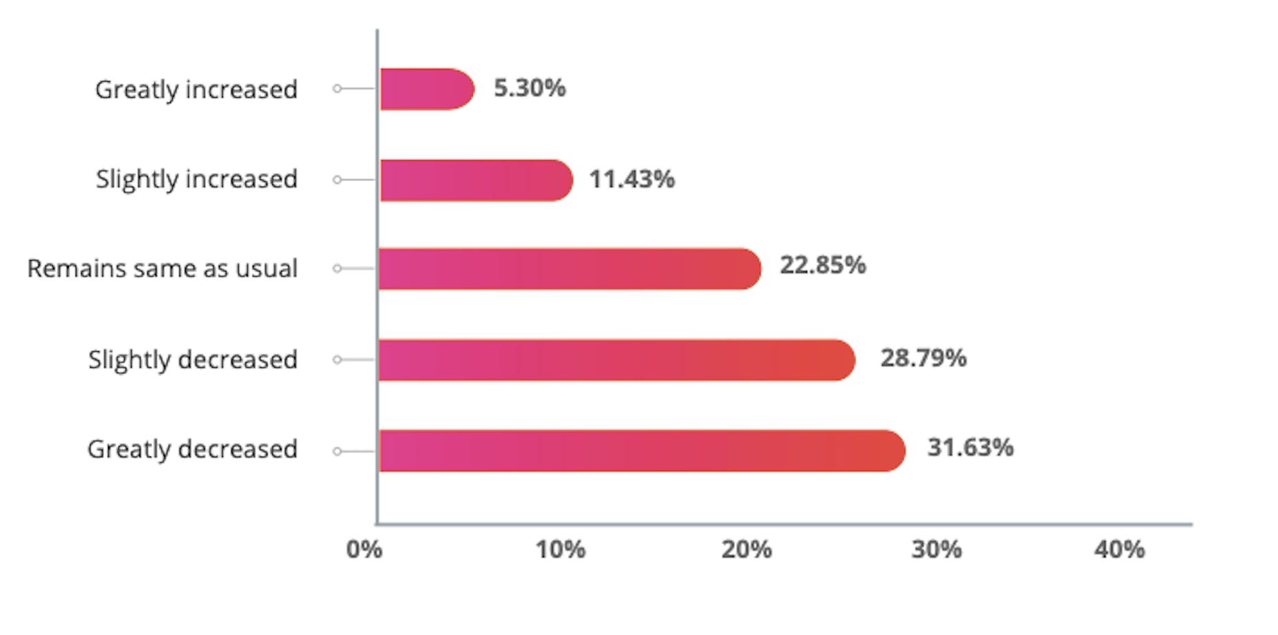
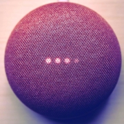
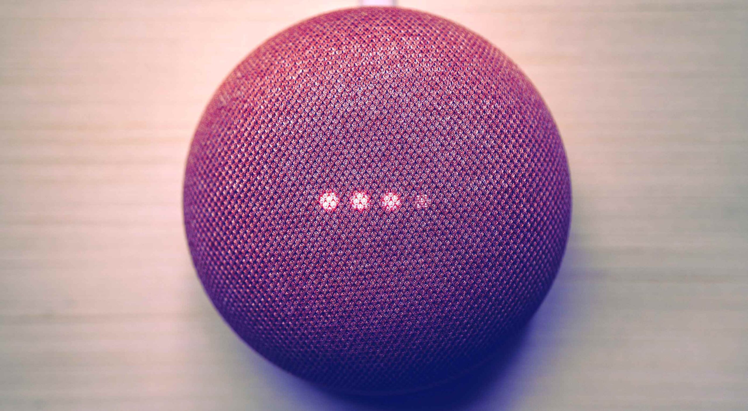
Voice is one aspect of technology that is getting bigger and bigger, and showing little sign of relenting. In fact, 2019 data revealed that 22% of UK households owned a voice-controlled digital home assistant device such as an Amazon Echo or Google home. This is double the figure recorded in 2017 and it is predicted that over the next five years nearly 50% of all homes will have one. Smart home adoption rates are increasing, and it shows how voice control is something we are all becoming more accustomed to.

With these high figures, does it follow that voice should be something web designers build into sites? Or is it merely a gimmick that will die out and render sites with hardware and complex design issues? You only have to look at the failed introduction of Google glass to see that certain technological advancements don’t always have the outcome that might be expected.

Multiple Voices

One of the first issues with voice is establishing whether you want sites to recognise everyone’s voices, or just those who have registered. If you’re using the site in a crowded room will it pick up on snippets of conversation from others and think these are instructions? Google Home has a feature whereby you have to register your voice with its app to use more personalised features such as the shopping list. Is this the sort of thing websites would need?

Accents

The implementation of voice is complex, not only does it need to understand certain languages (such as English), but all the accents and variations too. With 160 English dialects alone, that is a lot that the technology needs to understand – not including mispronunciations, slang, and colloquialisms. Also, if a site is used all over the world (which many are) how many languages will it need to know?

Privacy Issues

if there are clips of your voice out there on the web…it can easily be imitated

If a website involves a feature such as online shopping or other functions which require sensitive details to be input, this could put people off using voice. Users need to know where this saved data is being stored, how it will be used and if it is secure. In 2018, HMRC had signed up about 6.7 million people to its voice ID service and HSBC said over 10,000 were registering each week. This shows many trust the service, but experts say that if there are clips of your voice out there on the web (such as in a podcast) it can easily be imitated. Bringing with it security and privacy issues.

According to futurologist Dr Ian Pearson, who invented the text message back in 1991, it won’t be long until we can complete a financial transaction with just a few words and a gesture. This can be a time-saver for things such as online shopping, but we need to ensure there are the correct security steps in place.

Users Don’t Talk The Way They Type

When speaking we tend to use shortened and more colloquial language as opposed to when we type. The voice function on a website will need to be able to adapt for this. One example is if you are filling in a form or comment box by voice for a website, you will need to tell it what to punctuate, letting it know where to add a comma, exclamation mark etc.

Website Processes Need to be Simpler

With the web as we use it now, we often browse through pages, reading other snippets of information before clicking through to the page we want. With voice recognition it will cut out these middle steps. For example, if you are looking for a recipe of something specific, you will just say the command “Show me the … recipe” and it will take you straight there. This direct access to what we are looking for could lead to a simplification of websites.

Regular Updates

With websites as they are now, they need updates semi-regularly, depending on how they are built, how complex they are, and what features we have built into them. A voice-based site will need updating regularly, whether to add new words or processes or to keep up with the fast-adapting technology. It might end up being quite a complex process.

Mistrust

While there are more of us now than ever using voice control via tech such as Alexa, Google, and Siri, there is still a level of mistrust over it. It’s still not quite clear where data is being stored, if it is being stored, and how easy it could be to abuse.

Larger Storage and Bandwidth

If a site is built for voice, will it utilise a ready-built plugin or will it have its own software built by developers? Will this feature require a greater amount of storage and bandwidth to cope with it? These are further factors to consider when thinking of the future of implementing voice to websites.

We Still Don’t Know Where It Will Go

Voice technology while working in some respects, is still a bit of a grey area when it comes to future use. Will it be the next big thing as many have predicted, or will it simply die down?

Look at Google Glass – highlighted as the big new technology, they soon died down and were eventually discontinued. Smart watches were another thing. You can see their initial downfall by reading an article published in 2017 about smartwatches – how major smartwatch makers such as Apple and Samsung rushed into the market before the technology was ready and they subsequently failed. Motorola exited the smartwatch market, Pebble and Jawbone shut down and Fitbit sold 2.3 million fewer devices than in their previous quarter. It was perceived as being a fad. However, fast forward to 2020 and more people than ever are wearing and using smartwatches. The smartwatch market was valued at shipment volumes of 47.34 million in 2019 and is expected to reach 117.51 by 2025, reaching a growth of 15.4 over the next five years.

Will voice follow a similar trend?

No More Impulse Buying

People enjoy browsing websites and many businesses rely on user’s impulse buying and ask their websites to be designed to reflect this. With voice taking you directly to the page’s users want to find, will they bypass these potential selling traps and just buy what they want – rather than added extras? Will it end up being a negative for businesses and see users not as satisfied for the experience?

Voiceless Still Matters

You will also have to remember that not all devices might work with voice, or people might be browsing somewhere where voice cannot be used. This means in the design process it needs to work both for voice instruction and manual use. It needs to work just as well for both to ensure the customer journey isn’t affected.

There are many ways voice can affect how we design websites in the upcoming future. It’s important to take note of market trends and usage – seeing how people use voice and thinking of the customer journey. It’s vital we don’t forget the end goals of websites – whether it’s to inform or to sell, the implementation of voice needs to assist this process not make it harder.


Featured image via Unsplash.

Source


Source de l’article sur Webdesignerdepot