Articles

You’ve been working away at your latest design project, and the client has given the go-ahead on your lovingly created digital concepts. Now it’s time to bring those designs to life, and you have a developer queued up to do just that.

So your part’s done, right? Not quite. You’re going to want to make sure your developer has the best head start they can in order to create the site as you imagined.

Below are a few tips to make that handover process a little easier.

Communicate to Make It Great

Get Talking

Scheduling a face-to-face meeting with your developer to talk over your project’s specifics and ambitions will help align your expectations and make the intent behind your concepts more clear. It’s quite likely they’ll even ask questions and request assets you haven’t even thought of yet!

It’s not just a one-and-done thing either, your developer’s going to have questions or requirements that arise as the project progresses. Deciding on a communication channel to allow easy discussion will help you both immensely.

Annotating Your Concepts

Developers might seem like magicians with the way they bring your websites to life, but they’re not clairvoyant! Annotating your concepts where advanced functionality is required reduces ambiguity and makes it more likely that your cool, quirky idea is going to make it to production. If it’s a feature that’s particularly unusual, you might want to find an example of a website or code sandbox that does something similar.

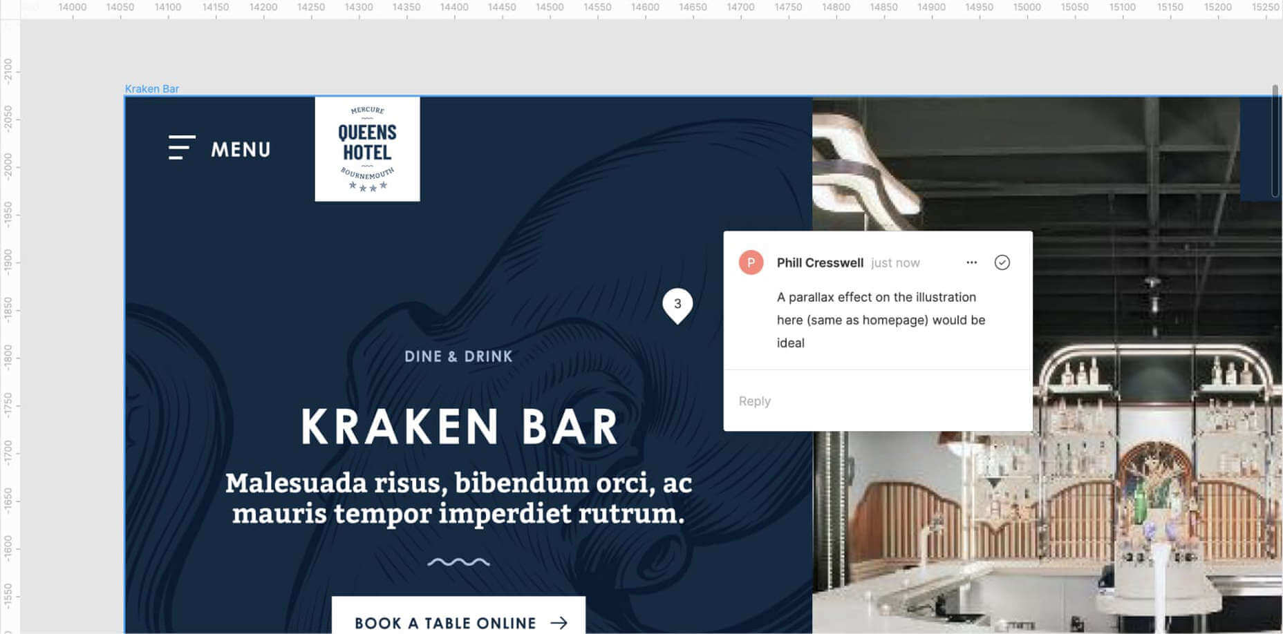
An example of Figma’s comment tool in use to make developer notes.

Figma and Sketch both have comment functionality in order to make annotations a little easier, also allowing multiple parties to comment. If dealing with PDFs, there is also an annotation tool available through Adobe Acrobat.

Specify the Basics

The basis of modern front end development revolves around DRY thinking. Some might argue thinking about code can be pretty dry, but we’re not talking about that – in this case, DRY stands for Don’t Repeat Yourself.  Most developers will tackle a project by starting with defining variables: what colors, font sizes, grid columns… anything that can be reused! Good, consistent design follows this same principle – although it’s a habit that can be hard to get going at first.

Tip: It’s always easier to define variables if this mentality is approached towards the start of the project!  
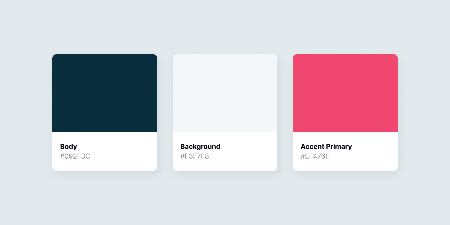
Colors

Make a style guide that specifies the colors you’ve used in your designs. Think about their logical applications to help signpost how they might work as a variable – for example, what colors did you use for paragraph text, hyperlinks and backgrounds? Did you consider colors to convey status messaging, such as successes, warnings and errors?

Typefaces

Which fonts have you used for your project? Is there a consistent set of font sizes you used throughout? If you haven’t already, maybe consider a ratio-based type scale – I like to use ModularScale to help with this.

Basic HTML Elements

Think about general styling for these basic html tags:

  • Paragraphs <p>
  • Headings <h1–h6>
  • Bullet lists <ul> and numbered lists <ol>
  • Emphasized text <b>, <strong> and <em>

Buttons

How about buttons and links? What should they do when they’re hovered over, focused (using the tab key on a keyboard) or disabled?

Forms Fields and Inputs

What should form fields look like? Is there any validation checking that should occur when a form is submitted?  How about checkboxes and radio buttons?

It’s unlikely that you’re going to be able to cover absolutely every single eventuality – allow your developer to use some common sense to fill in the gaps, and be available to them if they have any questions. In the words of John Maxwell and your aunt’s home office wall sticker, teamwork makes the dream work.

Get Your Favic-on

Favicons are widely recognized as the small icon that appears to the left of the site title on your browser’s tab bar. Nowadays, the application of your site’s favicon is much further reaching, showing up in Google search results and app tiles. There’s also extra theming options available, such as the ability to customize the color of Google Chrome Android’s browser bar color for your site.

Using a generator site such as realfavicongenerator takes the pain out of much of this decision-making, allowing you to upload specific graphics as desired, creating silhouettes of your icon for Windows Metro tiles and macOS Safari pins, and packaging everything into easy-to-use files and code.

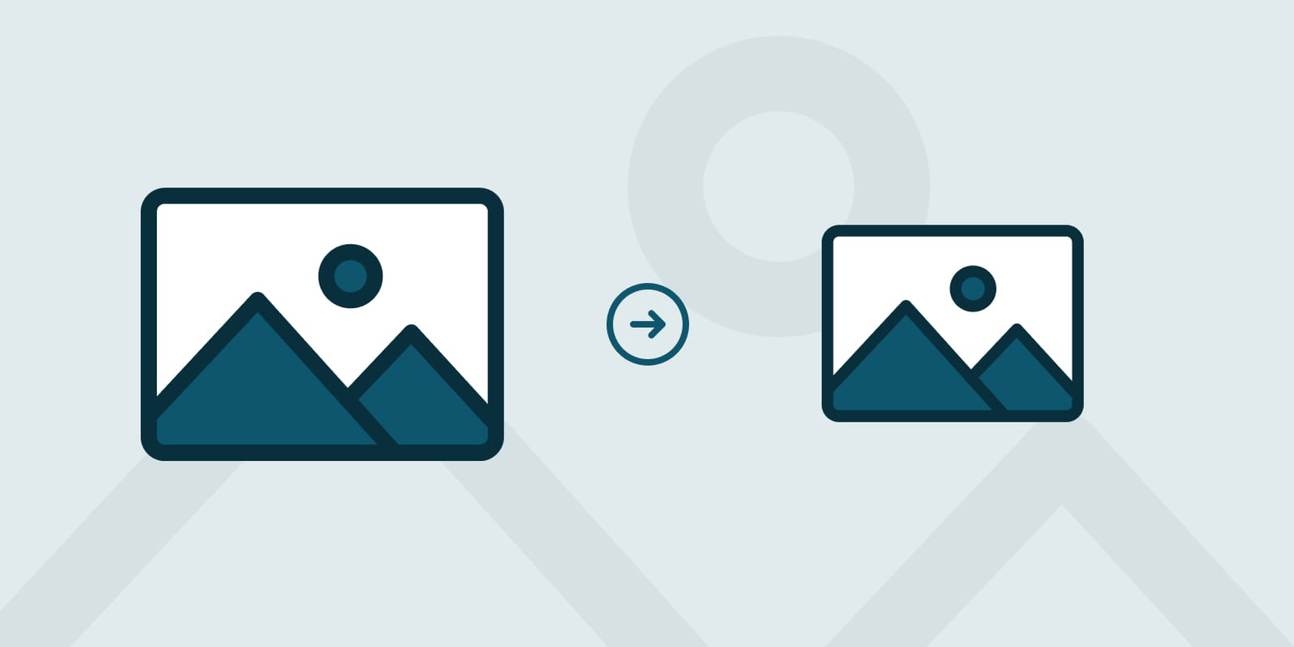
 Compress Your Images

Nobody wants to load a 20MB image when they’re on a slow connection or a data plan – it pays dividends to plan ahead and downsize your images so that they’re production-ready for the web. If you’re worried image compression is going to harm your image quality, fear not – you can go a long way with image compression before quality is seriously compromised.

  1. Start by reducing the image resolution – for batch jobs, I use Adobe Photoshop’s image processor script to downsize images to fit 1920 x 1200 pixels
  2. Alternatively, if you’re working on a static project – where specific images will be used only in specific places – you could use your design software (nearly all mainstream UI software allows you to do this now) to export your images at 2x size to support devices with high pixel densities.
  3. I also convert my image color profiles to SRGB to ensure consistency across most modern display types (this one’s optional)
  4. I then take my newly downsized images and run them through imageOptim at 80% quality. Generally I would aim to get my images under 300kb – if there are any that are still significantly over this target once compressed, I’d run these through again at 70% quality (I wouldn’t recommend going lower than this, though).

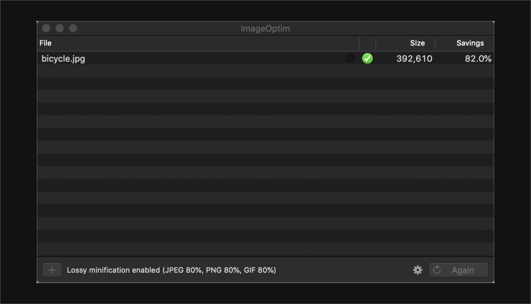
Don’t forget you can also do this for PNGs! Enabling PNGCrush in imageOptim will let you significantly reduce the size of PNGs… just be ready for it to take a while.

Make Your Vectors SVG-Easy to Use

If your design contains graphics or illustrations you created using vector software, it can be used on the web as an SVG file. Usually, these files will be a lot smaller than JPGs or PNGs. You can export graphics in most (if not all) vector software in this format.

Optionally, you could use imageOptim or SVGOMG to compress the SVG code without sacrificing quality. Your developer might already use a script that does this automatically when processing the site for production, so it may be worth asking ahead.

Get Your Licenses in Check

If you’re using premium fonts, make sure you’ve purchased a webfont license so you can hand over the correct files to the developer. I’d recommend doing this sooner rather than later – although not often, occasionally web versions of fonts can have slightly different bounding boxes to their desktop counterparts, making it a real pain for developers to work with further down the line.

If you’ve been using samples of stock photos (or if you’ve been going crazy lifting whatever you can find on Google Images), make sure everything is kosher before you go live. Make sure you purchase licensed photos, and if certain photos you want to use require attribution, make the developer aware of this.

Source

p img {display:inline-block; margin-right:10px;}
.alignleft {float:left;}
p.showcase {clear:both;}
body#browserfriendly p, body#podcast p, div#emailbody p{margin:0;}

Source de l’article sur

Having “no company strategy” is one of the biggest issues facing product managers, according to a recent survey of over 600 product people. After all, how can you set a reasonable direction for your product when you don’t know where your company is headed?

It’s an issue that confronted me recently, when I started work with a higher education provider in the UK.

A few months on, and we’ve found we’ve been able to solve it. And it landed pretty well, we’ve been given the green light (and extra cash) to deliver it!

Here’s how we did it.

Step 1. Define Your key Objective

Initially, the project was presented to me as something to “increase the number of people who apply to, and join the university”. While these numbers may be useful to measure, they’re also vanity metrics, much like website visitors for an e-commerce website.

Here’s why.

UK universities typically get paid by the student every three or four months, receiving the first payment about three weeks into the first semester. So a student is of no commercial value until this point. Getting paid enables the university to deliver its mission of providing education services and helping people into employment.

So, as a minimum, our key objective had to be something like, “to increase the number of people who pay their first tuition fee instalment”. But we felt that wasn’t enough really, because if the student leaves after the first semester then the university would lose on a significant amount of revenue – around 89% for a three-year course.

The key objective, therefore, had to be focused on retention. Something like, “to increase the number of people who complete their studies with the university”. And you could go a step further and add, “…and enter their chosen field of employment”, given that this is typically a student’s end goal and hence a factor in their likelihood to recommend the university.

What we were talking about, of course, was customer lifetime value (LTV) – a term that’s widely used in SaaS and subscription-based businesses – and Net Promoter Score (NPS).

We made one final tweak – to focus on the percentage of applicants rather than total numbers, as it was more within our control – and went with “to increase the percentage of applicants who complete their studies with the university, and enter their chosen field of employment”.

The key objective we defined as part of our product strategy

In hindsight, we basically answered two questions to determine our key objective. These were, why does the company exist (i.e. what’s its mission)? And what needs to happen to allow the company to keep working towards its mission?

Step 2. Define Your Target Customer

The university had a number of distinct customer segments spanning across qualification levels (e.g. undergraduate, postgraduate), study type (e.g. full-time, part-time), demographics (e.g. age, residency) and more. It would have been nigh-on impossible to try to create something for every combination from day one.

Fortunately, there was enough data available on the student population and the market to be able to determine which combinations were the most significant. A lot of this information was freely available online, for example, Universities UK’s Higher education in numbers report, which gave us the rich insight displayed below.

We learned that an overwhelming number of students are undergraduates…

…and choose to study full-time.

Likewise, a high number of students came from the UK, which was important because the application process differs slightly depending where the student is coming from.

So, based on this, we decided to focus our efforts on full-time, undergraduate students, who came from the UK, with a view to expanding to all segments as soon as possible.

Step 3. Map the Steps to Your key Objective

To understand where the existing experience could be improved and where we should focus first, we mapped out the milestones a student must go through to reach our key objective. In other words, we mapped out a conversion funnel.

Here are the milestones we came up with.

The milestones a typical student will go through before reaching the key objective

These milestones could also be used as lead metrics, to help determine whether a student is making meaningful progress towards the key objective, which in this case could take over three years to achieve.

Step 4. Collect the Data

Next, we cobbled together data from a variety of sources and populated the conversion funnel. We didn’t have useful data for the final step (entering chosen employment) so we left it out and made a request to start collecting it.

We ended up with something like this.

The number of people at each stage of the funnel and as a percentage of the total number of applicants, figures are illustrative only

At this point, there was still no way of telling what was good or bad so we gathered benchmarks for each of the figures based on competitor and sector averages, where known, as well as any internal year-on-year trends.

This gave us a number of areas to investigate further, for example, the withdrawal rates during the first year, which were among the highest in the sector and the “application” to “offer” rates, which were were notably lower than competitor averages.

Step 5. Determine the “why” Behind the “What”

Analysing data was great for telling us what was happening but it didn’t tell us why. So, we took the outputs of the steps above and laid out each one as a question. Then we dug deeper.

You could use an infinite number of methods here but we focused on three things: speaking with people (colleagues and students) to understand what happens at different milestones and why, analysing reams of secondary research and consumer reports, and scouring the largest UK student forum, The Student Room (TSR).

The Student Room was particularly useful. We found thousands of people in our target customer segment openly discussing the same questions we’d laid out, from why they wanted to go to university to how they decide between institutions. The legwork was in finding the answers and drawing logical conclusions, and Google’s Site Search function helped with this.

C:UsersliamsAppDataLocalTempenhtmlclipImage(10).png
We used Google’s site search function to trawl The Student Room
C:UsersliamsAppDataLocalTempenhtmlclipImage(5).png
An example of one of the more helpful threads on The Student Room – a survey showing why people choose to go to university

To help us draw conclusions from the research, we created a mind map. This had our key objective at the centre, our most important questions surrounding it, then any insight and best-guess answers coming off as branches. By the end, it covered most the stuff you’d expect to find on something like a Product Vision Board from the market and customer needs to internal objectives and product requirements.

We built a mind map to help draw conclusions from the data and research we were gathering

We were able to deduce that a number of the “problematic” areas actually had more to do with the perception of the university, which was way beyond the scope of this work to change (though was noted in our recommendations). Improving the areas later in the funnel, as well as internal efficiency, were perhaps more within our control to change. We then formed a number of hypotheses about how we might achieve our key objective and agreed specific targets (as percentage point increases). This gave us the focus we needed to proceed.

Step 6. Scope the Solution

The next step – and perhaps the simplest – was to think about a solution.

Based on what we’d learned so far, we layered in high-level user experience designs alongside the conversion funnel.

We layered in high-level user experience designs alongside the conversion funnel, which provided a useful template

Three or four distinct – but connected – products emerged from our first pass of the experience design, for example, an application product and a separate customer support product. This in turn gave us ideas for the high-level architecture, team structures and skills needed.

Then, using the insight we’d gathered plus some additional technical discovery, we were able to form a view on the relative priority of the products and features and a rough Now, Next, Later-style product roadmap.

We also created a Now, Next, Later-style product roadmap based on what we’d learnt so far

All that was left was to share it with senior management and get the go-ahead…

So, how did it Turn out?

Surprisingly well, actually. We were successful in “selling” our vision and strategy, and were allocated funds to deliver it. And because we’d involved a number of teams in the process, our peers were (and still are) generally supportive too.

The products and services that are delivered will inevitably be quite different from our early designs. That’s fine, at least we have overcome one of the biggest hurdles to corporate innovation – the urge to procrastinate and do nothing.

Perhaps the most valuable part of this work, however, was the template and process that were created – connecting company strategy (objectives), data and insights to the product strategy, and then seamlessly to the user experience and what’s delivered. This is something I’ve personally struggled to do in the past, having wrestled with tools like the Business Model Canvas and Product Vision Board. Similar to these tools though, the Product Funnel (as we now call it) can continually be updated as the team inevitably learn more – everything is stuck on with Post-it Notes and Blu Tack after all.

Want to give it a try? Download the Product Funnel template.

The post How to Create a Product Strategy Without a Clear Company Strategy appeared first on Mind the Product.