Articles

There is no shortage of places to buy fonts online, but the quality of what is on offer is variable, and the way of searching catalogs has remained largely unchanged since the first stores appeared decades ago.

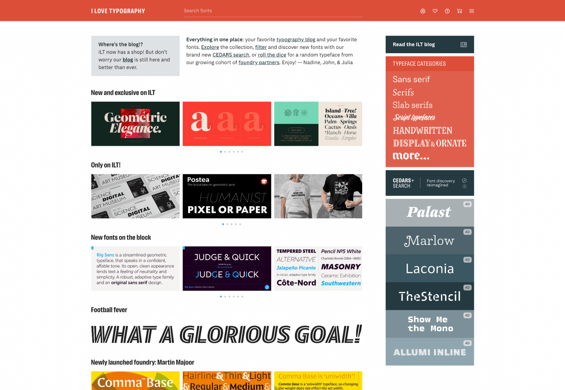
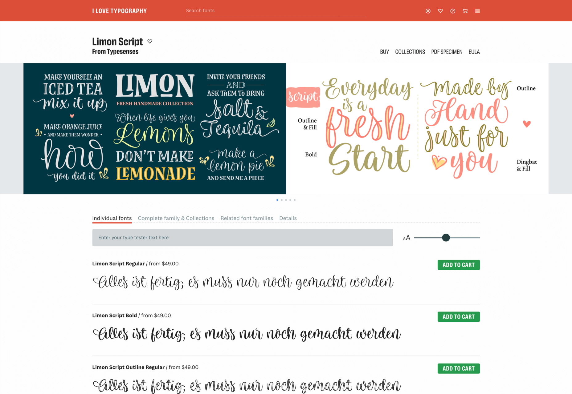
I Love Typography — a popular source of news about typography and type design since 2007 — has stepped into the marketplace, starting by inviting some of the world’s top designers to contribute to its new store, resulting in 40 foundries joining the project and 15 new type families available at launch.

ILT’s boldest move is to step away from the traditionally shallow type categories and attempt to devise a system that drills down into the nuances of type design, all to aid discovery.

The approach is named CEDARS+, which is a method of describing the formal characteristics of a (mainly Latin) typeface based on the characteristics of the marks if made by a writing tool such as a pen or chisel.

CEDARS+ can be broken down as follows:

  • Contrast: the difference between the thickest and the thinnest strokes in a character. Permissible values range from ‘none’ through ‘medium’ to ‘extreme.’
  • Energy: the visual energy in the letterform. Values range from ‘calm’ to ‘lively’ and ‘very high.’
  • Details: with several sub-categories, details is a catch-all category that covers aspects such as how strokes end and intersect.
  • Axis: the angle at which the tool would be held to create the form. Axis uses degrees, with 90 degrees being a vertical axis.
  • Rhythm: covers both the tightness or looseness of letters varying from ‘very tight’ to ‘very loose, and the difference in width between the narrow and wide letters varying from ‘highly regular’ to ‘highly irregular.’
  • Structure: another catch-all category that covers the structure of loops with values such as ‘triangular’ and ‘oval,’ and the general construction, which can be ‘formal,’ ‘cursive,’ ‘organic,’ ‘layered,’ ‘stencil,’ or ‘modular.’
  • +: the plus covers several characteristics that don’t fit neatly into an acronym, including the shape of crossbars, and single or double storey ‘a’s and ‘g’s.

With a way to browse font families that is based on the feel of the design, rather than popularity (or alphabetical order!) ILT hopes to expose lesser-known designs and designers, and to encourage more creative typography on the web.

Source

The post I Love Typography Launches Font Store first appeared on Webdesigner Depot.


Source de l’article sur Webdesignerdepot

Après avoir mis SAP HANA au cœur du SI financier de SCOR, SAP annonce que son client a finalisé avec succès sa roadmap finance. Annoncée en 2015, cette dernière permet aux différents métiers de la finance de SCOR de répondre sereinement aux objectifs des années à venir. La raison d’être du projet : être au service des métiers pour soutenir l’excellence opérationnelle du domaine finance.

Quatrième réassureur mondial, SCOR offre à ses clients une gamme innovante et diversifiée de solutions et de services pour le contrôle et la gestion des risques via une assise financière solide. Fidèle à sa devise « l’Art et la Science du Risque », le Groupe met son expertise reconnue au sein du secteur et ses solutions financières de pointe au service du bien-être et de la résilience des populations.

Répondre à de nombreux enjeux business et numérique pour évoluer technologiquement

SCOR concrétise sa roadmap 2015-2020 avec la conversion vers S/4HANA opérée en Juillet 2020, point d’orgue d’une ambition métier supportée par SAP HANA visant à mettre en place une plateforme financière unique et intégrée pour l’ensemble des besoins de la Finance.

Ce plan sur 5 ans a permis la mise en place des axes suivants :

  • Le passage des portfolio Analytics (SAP BW) et EPM (SAP BFC) sur une instance SAP HANA unique
  • La migration du General Ledger (ECC) sur S/4HANA;
  • La création et le développement de la Reporting Factory, s’appuyant sur un catalogue analytique en temps réel et réconcilié « by design » par une consolidation très précise grâce à 3 outils SAP intégrés :
    • Analysis For Office (AO) pour l’analyse et la manipulation des données
    • SAP Analysis Cloud (SAC) pour le dashborading
    • Disclosure Management (DM) pour le reporting statique
  • La digitalisation et la robotisation des processus Finance au sein du Groupe

Un déploiement prenant en considération tous les paramètres, coûts, délais et qualité grâce à l’expertise consolidée métier, projets et systèmes du SAP Competency Center de SCOR dirigé par François Bossard, qui s’est vu être complétée par le déploiement sur une instance unique de la gestion de la trésorerie (SAP TRM), de la communication bancaire (SAP BCM), de la gestion budgétaire (SAP eBPC) et de la sécurisation du cycle de développement (Solution Manager).

SCOR est désormais doté d’un avantage concurrentiel indéniable pour les 3 prochaines années dans le domaine de la Finance en termes d’innovations technologiques. Sa plateforme est complètement intégrée et dotée d’interfaces répondant en temps réel voire en streaming, un niveau d’intégration que de nombreux acteurs commencent tout juste à entrevoir. Ces avancées sont dues à un concept fonctionnel clé : la réconciliation « by design » de l’ensemble des domaines de la finance au sein d’une plateforme unifiée.

« SCOR posait il y a 10 ans les bases d’une vision rationnalisée de son système d’information financier en migrant l’ensemble de ses comptabilités dans SAP. Ces cinq dernières années, il nous paraissait naturel de faire fructifier cet acquis via une roadmap de développement ambitieuse, associant enrichissements fonctionnels et innovations technologiques pour en tirer tous les bénéfices, optimisant nos processus financiers et nos capacités analytiques. Grâce à ces acquis et à une migration fluide vers S/4HANA réalisée en quelques mois, nous pouvons compter sur une plateforme financière performante qui est en mesure d’encaisser les impacts des prochaines échéances d’évolution règlementaire IFRS9 et IFSR17 », précise Marc Philippe, Directeur des Systèmes d’Information du Groupe SCOR.

Une implémentation réussie pour aller plus loin dans l’excellence opérationnelle

Déployée en juillet 2020, SAP S/4HANA, montre déjà de nombreux bénéfices : des économies sur de nombreux projets, des gains de temps pour mieux redéployer les ressources, la mise en place de process plus intégrés, plus automatisés, plus simples et plus informés pour permettre aux équipes de se concentrer sur leur valeur ajoutée et ainsi libérer du temps aux collaborateurs pour se concentrer sur l’opérationnel. Cette nouvelle étape répond à une logique stratégique sur le moyen long-terme. En effet, elle permet de se rapprocher tactiquement de la roadmap SAP, d’avoir toujours un œil sur l’innovation, d’aller encore plus loin dans l’excellence opérationnelle ou encore de se rapprocher davantage de la réalité comptable tout en abordant de manière plus sereine les challenges normatifs de l’industrie pour les 3 prochaines années.

A l’initiative et à la direction de cette roadmap, y compris la conversion vers S/4HANA venant la conclure, Marc Henry, Head of Finance Projects, Systems, Processes and Controls du Groupe SCOR, précise que « S/4HANA nous permet de construire et développer IFRS9 et IFRS17 sur la nouvelle plateforme sans avoir à faire de migration par la suite. La solution nous permet aussi de développer de nouvelles fonctionnalités clés comme l’ajout de devises, de ledger, de GAAPs et d’aller encore plus loin dans l’intégration du domaine de la finance ».

La solution SAP Analytics Cloud permet de déployer un ensemble de best practices, de capitaliser sur l’ensemble des efforts consentis sur HANA et de s’inscrire comme early-adopter de la roadmap de SAP pour assurer une co-innovation et un partage constant avec toutes les parties prenantes. La solution fournit également au top management des données en temps réel leur permettant d’avoir un avis fiable et factuel sur plusieurs process comme la santé financière de leur division dans le cadre d’un projet ou encore sur le pilotage de KPIs plus globaux. Enfin, SAC permet de rendre les utilisateurs de la solution plus indépendants afin d’être davantage sur l’accompagnement et la certification de la donnée plutôt que sur sa production par les équipes métier.

SAP Business Planning and Consolidation (eBPC) a offert à SCOR la possibilité d’adapter ses plans de planification, de budgétisation, de prévision pour améliorer l’ensemble du processus budgétaire du Groupe. La solution a également permis d’entrevoir des gains additionnels au regard de la roadmap SAP et de son intégration avec d’autres outils déjà existants comme SAP Analytics Cloud Planning. L’objectif : accélérer les cycles budgétaires et de clôture financière, et renforcer l’expérience utilisateur.

« Après le succès de la première implémentation avec SAP, nous souhaitions poursuivre la collaboration. Nous avons pu mettre en place une plate-forme mondiale intégrée, dotée d’une base de données unique disponible en temps réel. SCOR a pu capitaliser sur tout le travail effectué précédemment, avoir un seul point d’accès pour la donnée Finance et rendre certains modules plus flexibles. Nous sommes très fiers d’être une vitrine pour SAP qui nous offre de réels bénéfices opérationnels à court terme », ajoute Marc Henry.

A propos de SAP

La stratégie de SAP vise à aider chaque organisation à fonctionner en “entreprise intelligente”. En tant que leader du marché des logiciels d’application d’entreprise, nous aidons les entreprises de toutes tailles et de tous secteurs à opérer au mieux : 77 % des transactions commerciales mondiales entrent en contact avec un système SAP®. Nos technologies de Machine Learning, d’Internet des objets (IoT) et d’analytique avancées aident nos clients à transformer leurs activités en “entreprises intelligentes”. SAP permet aux personnes et aux organisations d’avoir une vision approfondie de leur business et favorise la collaboration afin qu’elles puissent garder une longueur d’avance sur leurs concurrents. Nous simplifions la technologie afin que les entreprises puissent utiliser nos logiciels comme elles le souhaitent – sans interruption. Notre suite d’applications et de services de bout en bout permet aux clients privés et publics de 25 secteurs d’activité dans le monde de fonctionner de manière rentable, de s’adapter en permanence et de faire la différence. Avec son réseau mondial de clients, partenaires, employés et leaders d’opinion, SAP aide le monde à mieux fonctionner et à améliorer la vie de chacun. Pour plus d’informations, visitez le site www.sap.com.


Contacts presse :

Daniel MARGATO, Directeur Communication : 06 64 25 38 08 – daniel.margato@sap.com
Pauline BARRIERE : 06.13.73.93.11 – presse-sap@publicisconsultants.com
SAP Press Room; press@sap.com

The post SAP conclut avec succès la roadmap finance de SCOR appeared first on SAP France News.

Source de l’article sur sap.com

WordPress powers nearly 40% of all websites, thanks to its commitment to making publication possible for everyone, for free. Combined with premium plugins and themes, it’s possibly the ultimate tool for building attractive, unique, and feature-rich websites without any coding or design experience.

However, you do pay the price for this experience, with WordPress and its third-party products not always being built for performance – whether it’s page loading times or SEO.

Image optimization is a particularly big concern. Images are one, if not the largest, contributors to page weight, and it’s growing significantly by the year. So, while images are crucial for beautifying your website pages, they are also one of the biggest factors slowing it down.

In terms of image optimization, WordPress+Elementor brings very little to the table. WordPress core now comes with both responsive syntax and lazy-loading. Elementor itself also only comes with responsive syntax out-of-the-box. However, these are baseline techniques for image optimization that will deliver the bare minimum of improvements.

This means that, while Elementor makes it easy to design sweet-looking WordPress pages (with tonnes of creatively utilized images), you will probably pay the price when it comes to performance. But don’t worry. We will show you how to dramatically improve web performance by over 30 points on scoring tools like Google’s PageSpeed Insight

Why Optimize Your Elementor Images with ImageEngine?

In general, image CDNs use various techniques to get image payloads as small as possible and deliver image content faster, all while minimizing the visual impact. ImageEngine is no different in that regard.

Firstly, ImageEngine, when used in auto mode, will apply all of the following optimizations that web performance tools like Google’s PageSpeed Insight recommend. For example:

  • Properly size images – ImageEngine automatically resizes images for optimal size-to-quality ratios depending on the screen size of the user device. ImageEngine supports Retina devices.
  • Efficiently encode images – Applies different rates of compression depending on the PPI of the user devices. For example, ImageEngine adapts and more aggressively compresses on higher PPI devices without losing visual quality.
  • Next-gen format conversion – Automatically converts images to the optimal next-gen format according to the browser, device, or OS. ImageEngine can convert images to WebP or JPEG-2000 as well as GIFs to MP4 or WebP.  AVIF is also available in a manual directive mode.
  • Strip unnecessary metadata

While these features are standard for most image CDNs, ImageEngine is unique for its use of WURFL device detection. This gives ImageEngine much deeper insight into the user device accessing a website page and, by extension, its images. Using the screen size, resolution, PPI, etc., ImageEngine can make more intelligent decisions regarding how to reduce image payloads while maintaining visual quality.

This is why ImageEngine brands itself as an “intelligent, device-aware” image CDN and why it can reduce image payloads by as much as 80% (if not more).

ImageEngine also provides a proprietary CDN service to accelerate image delivery. The CDN consists of 20 globally positioned PoPs with the device-aware logic built-in. This allows you to deliver image content faster in different regions while also serving images straight from the cache with a ~98% hit ratio.

ImageEngine also supports Chrome’s save data setting. If someone has a slow connection or has activated this setting, ImageEngine will automatically compress image payloads even more, to provide a better user experience on slower connections.

How to Use ImageEngine with WordPress and Elementor

If you’re using WordPress and Elementor, then chances are you want to spend as little time on development and other technicalities as possible. Luckily, ImageEngine is a highly streamlined tool that requires little to no effort to integrate or maintain with a WordPress site.

Assuming you already have a WordPress website with Elementor, here are the step-by-step instructions to use ImageEngine:

  1. Go to ImageEngine.io and sign up for a 30-day free trial.
  2. Provide ImageEngine with the URL of the website you want to optimize.
  3. Create an account (or sign up with your existing Google, GitHub, or ScientiaMobile account).
  4. Provide ImageEngine with the current origin where your images are served from. If you upload images to your WordPress website as usual, then that means providing your WordPress website address again.
  5. Finally, ImageEngine will generate an ImageEngine delivery address for you from where your optimized images will be served. This typically takes the form of: {randomstring}.cdn.imgeng.in. You can change the delivery address to something more meaningful from the dashboard, such as myimages.cdn.imgeng.in.

Now, to set up ImageEngine on your WordPress website:

  1. Go to the WordPress dashboard and head to Plugins -> Add New.
  2. Search for the “Image CDN” plugin by ImageEngine. When you find it, install and activate the plugin.

  1. Go to Settings -> Image CDN. OK, so this is the ImageEngine plugin dashboard. To configure it, all you need to do is:

a. Copy the delivery address you got from ImageEngine above and paste it in the “Delivery Address” field.

b. Tick the “Enable ImageEngine” box.
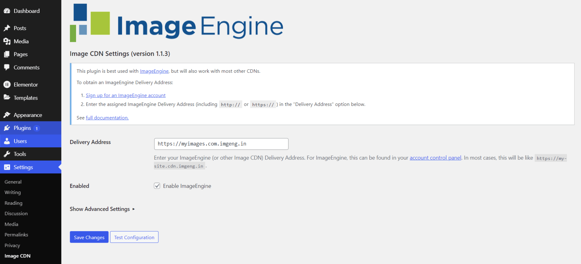
That’s literally it. All images that you use on your WordPress/Elementor pages should now be served via the ImageEngine CDN already optimized. 

ImageEngine is largely a “set-it-and-forget-it” tool. It will provide the best results in auto mode with no user input. However, you can override some of ImageEngine’s settings from the dashboard or by using URL directives to manipulate images.

For example, you can resize an image to 300 px width and convert it to WebP by changing the src attribute like this:

<img src="https://myimages.cdn.imgeng.in/wp-content/uploads/2021/03/banner-logo.png?imgeng=/w_300/f_webp">

However, use this only when necessary, as doing so will limit ImageEngine’s adaptability under different conditions.

What Improvement Can You Expect?

Let’s see what results you can expect from using an image CDN to improve your page loading times.

For this, I created two identical WordPress pages using the Elementor theme. The one page purely relied on WordPress and Elementor, while I installed and set up ImageEngine for the other. The page had some galleries as well as full-size images:

The pages used many high-quality images, as you might expect to find on a professional photography gallery, photography blog, stock photo website, large e-commerce site, etc. I then ran page performance tests using Chrome’s built-in Lighthouse audit tool, choosing scores representing the average results I got for each page.

For thoroughness, I tested both the mobile and desktop performance. However, I focused on the mobile results as these showcase more of the image CDN’s responsive capabilities. Mobile traffic also accounts for the majority share of internet traffic and seems to be the focus for search engines going forward.

So, first of all, let’s see the mobile score for the page without ImageEngine:
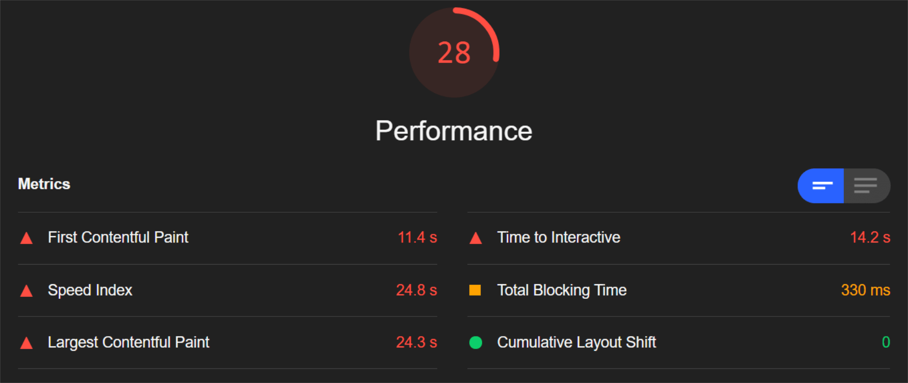
As you can see, there was definitely a struggle to deliver the huge amount of image content. Google has shown that 53% of mobile users abandon a page that takes more than 3s to load. So, clearly, this page has major concerns when it comes to user experience and retaining traffic.

The desktop version fared much better, although it still left much to be desired:
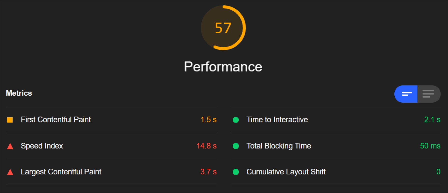
When digging into the reasons behind the slowdown, we can identify the following problems:

Most of the issues related somehow to the size and weight of the images. As you can see, Lighthouse identified a 3.8 MB payload while the total image payload of the entire page was close to 40 MB.

Now, let’s see what kind of improvement ImageEngine can make to these issues by looking at the mobile score first:
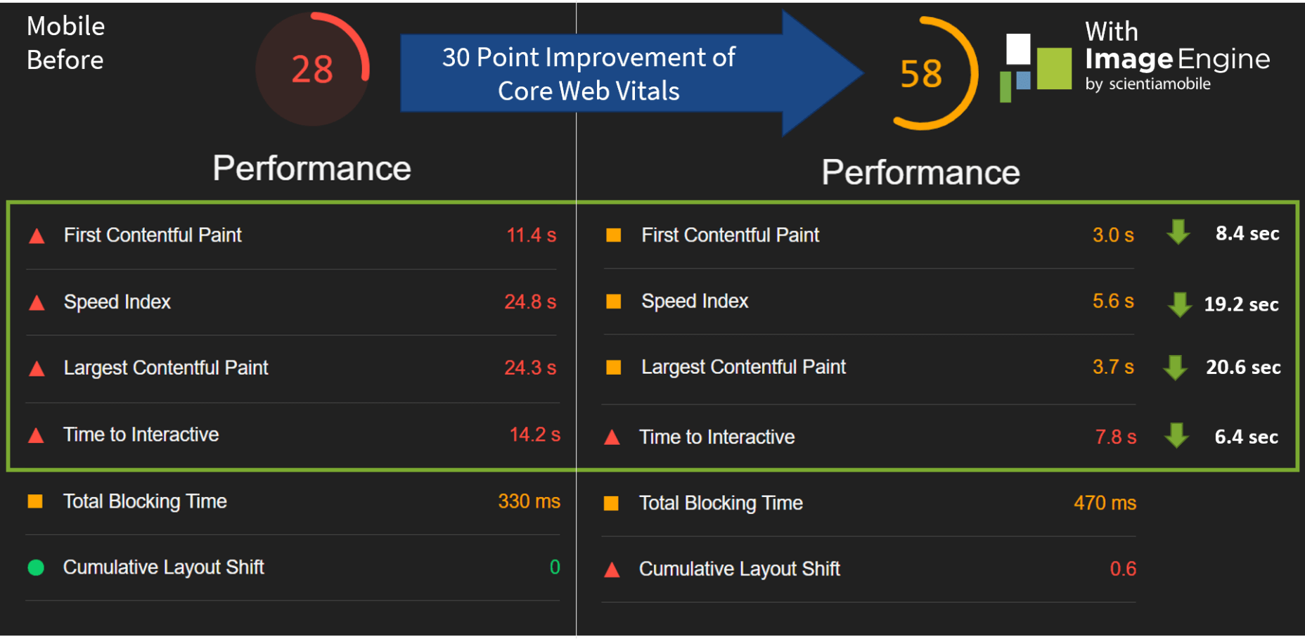
So, as you can see, a major improvement of 30 points over the standard WordPress/Elementor page. The time to load images was cut down by roughly 80% across the key core web vital metrics, such as FCP, LCP, and the overall Speed Index.

In fact, we just reached that critical 3s milestone for the FCP (the largest element on the visible area of the page when it initially loads), which creates the impression that the page has finished loading and will help you retain a lot of mobile traffic.
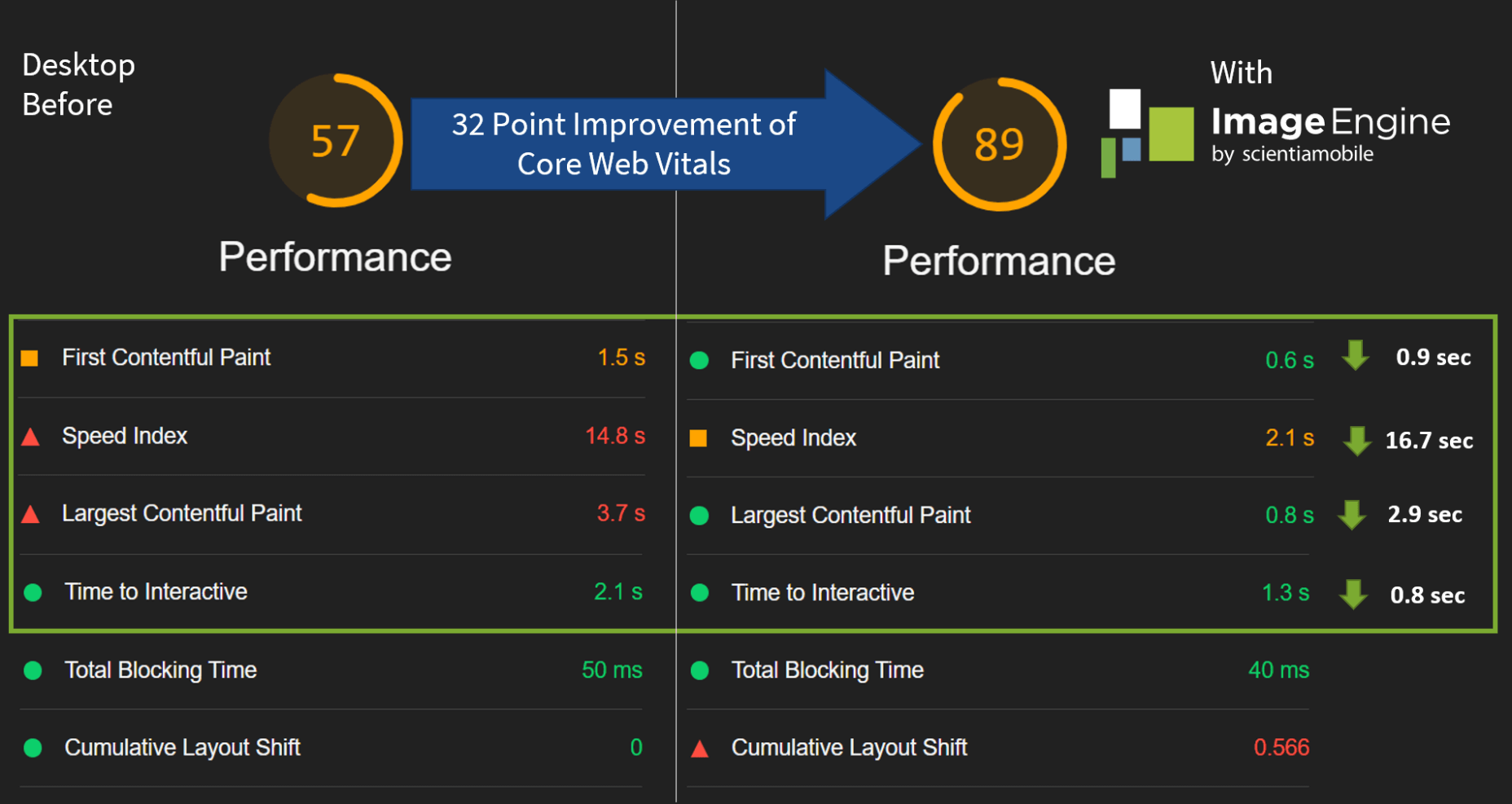
The desktop score was also much higher, and there was further improvement across the key performance metrics.

If we look at the performance problems still present, we see that images are almost completely removed as a concern. We also managed to bring down the initial 3.8 MB payload to around 1.46 MB, which is a ~62% reduction:

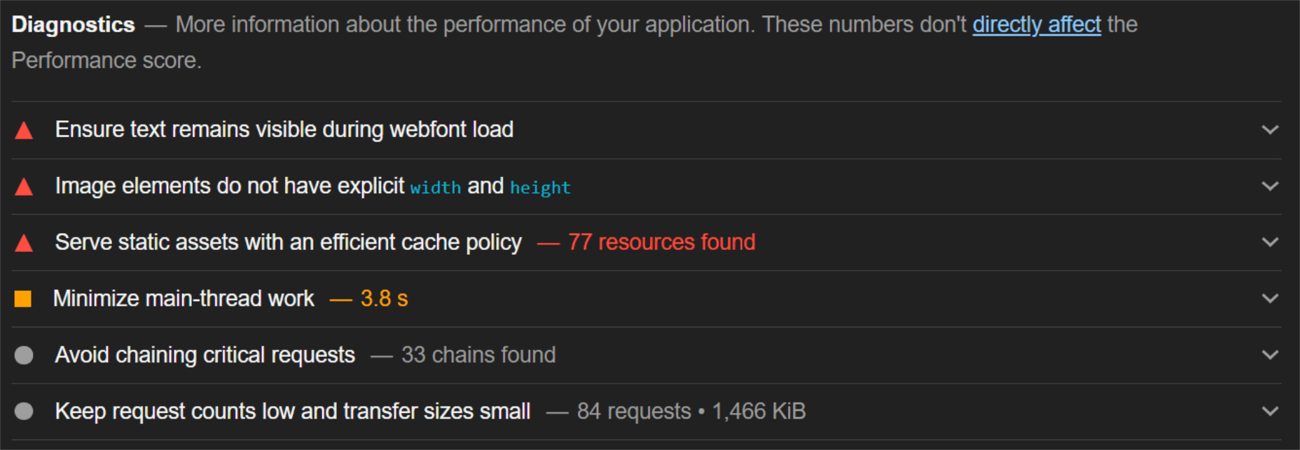
An unfortunate side effect of using WordPress and WordPress plugins is that you will almost inevitably face a performance hit due to all the additional JavaScript and CSS. This is part of the reason why we didn’t see even larger improvements. That’s the price you pay for the convenience of using these tools.

That being said, the more images you have on your pages, and the larger their sizes, the more significant the improvement will be.

It’s also worth noting that lazy-loaded images were loaded markedly faster with ImageEngine if you quickly scroll down the page, again making for an improved user experience.

Thanks to its intelligent image compression, there was also no visible loss in image quality, as you can see from this comparison:

Conclusion

So, as you can see, we can achieve significant performance improvements on image-heavy websites by using the ImageEngine image CDN, despite inherent performance issues using a CMS. This will translate to happier users, better search engine rankings, and an overall more successful website.

The best part is that ImageEngine stays true to the key principles of WordPress. You don’t have to worry about any of the nuts and bolts on the inside. And, ImageEngine will automatically adjust automation strategies as needed, future-proofing you against having to occasionally rework images for optimization.

Source

The post Create Beautiful WordPress Pages with Optimized Images Using Elementor and ImageEngine first appeared on Webdesigner Depot.


Source de l’article sur Webdesignerdepot

Gartner predicts that by 2023, over 50% of medium to large enterprises will have adopted a Low-code/No-code application as part of their platform development.
The proliferation of Low-code/No-code tooling can be partially attributed to the COVID-19 pandemic, which has put pressure on businesses around the world to rapidly implement digital solutions. However, adoption of these tools — while indeed accelerated by the pandemic — would have occurred either way.
Even before the pandemic, the largest, richest companies had already formed an oligopsony around the best tech talent and most advanced development tools. Low-Code/No-code, therefore, is an attractive solution for small and mid-sized organizations to level the playing field, and it does so by giving these smaller players the power to do more with their existing resources.
While these benefits are often realized in the short term, the long-term effect of these tools is often shockingly different. The promise of faster and cheaper delivery is the catch — or lure — inside this organizational mousetrap, whereas backlogs, vendor contracts, technical debts, and constant updates are the hammer.
So, what exactly is the No-Code trap, and how can we avoid it?

What is a No-Code Tool?

First, let’s make sure we clear up any confusion regarding naming. So far I have referred Low-Code and No-Code as if they were one term. It’s certainly easy to confuse them — even large analyst firms seem to have a hard time differentiating between the two — and in the broader context of this article, both can lead to the same set of development pitfalls.
Under the magnifying glass, however, there are lots of small details and capabilities that differentiate Low-code and No-code solutions. Most of them aren’t apparent at the UI level, leading to much of the confusion between where the two come from.
In this section, I will spend a little bit of time exploring the important differences between those two, but only to show that when it comes to the central premise of this article they are virtually equivalent.

Low-Code vs. No-Code Tools

The goal behind Low-Code is to minimize the amount of coding necessary for complex tasks through a visual interface (such as Drag ‘N’ Drop) that integrates existing blocks of code into a workflow.
Skilled professionals have the potential to work smarter and faster with Low-Code tools because repetitive coding or duplicating work is streamlined. Through this, they can spend less time on the 80% of work that builds the foundation and focuses more on optimizing the 20% that makes it different. It, therefore, takes on the role of an entry-level employee doing the grunt work for more senior developers/engineers.
No-Code has a very similar look and feel to Low-Code, but is different in one very important dimension. Where Low-Code is meant to optimize the productivity of developers or engineers that already know how to code (even if just a little), No-Code is built for business and product managers that may not know any actual programming languages. It is meant to equip non-technical workers with the tools they need to create applications without formal development training.
No-Code applications need to be self-contained and everything the No-Code vendor thinks the user may need is already built into the tool.
As a result, No-Code applications create a lot of restrictions for the long-term in exchange for quick results in the short-term. This is a great example of a ‘deliberate-prudent’ scenario in the context of the Technical Debt Quadrant, but more on this later.

Advantages of No-Code Solutions

The appeal of both Low-Code and No-Code is pretty obvious. By removing code organizations can remove those that write it — developers — because they are expensive, in short supply, and fundamentally don’t produce things quickly.
The benefits of these two forms of applications in their best forms can be pretty substantial:
  • Resources: Human Capital is becoming increasingly scarce — and therefore expensive. This can stop a lot of ambitious projects dead in their tracks. Low-Code and No-Code tools minimize the amount of specialized technical skills needed to get an application of the ground, which means things can get done more quickly and at a lower cost.
  • Low Risk/High ROISecurity processes, data integrations, and cross-platform support are all built into Low-Code and No-Code tools, meaning less risk and more time to focus on your business goals.
  • Moving to Production: Similarly, for both types of tools a single click is all it takes to send or deploy a model or application you built to production.
Looking at these advantages, it is no wonder that both Low-Code and No-Code have been taking industries by storm recently. While being distinctly different in terms of users, they serve the same goal — that is to say, faster, safer and cheaper deployment. Given these similarities, both terms will be grouped together under the ‘No-Code’ term for the rest of this article unless otherwise specified.

List of No-Code Data Tools

So far, we have covered the applications of No-Code in a very general way, but for the rest of this article, I would like to focus on data modeling. No-Code tools are prevalent in software development, but have also, in particular, started to take hold in this space, and some applications even claim to be an alternative to SQL and other querying languages (crazy, right?!). My reasons for focusing on this are two-fold: 
Firstly, there is a lot of existing analysis around this problem for software development and very little for data modeling. Secondly, this is also the area in which I have the most expertise.
Now let’s take a look at some of the vendors that provide No-Code solutions in this space. These in no way constitute a complete list and are, for the most part, not exclusively built for data modeling. 

1. No-Code Data Modeling in Power BI

Power BI was created by Microsoft and aims to provide interactive visualizations and business intelligence capabilities to all types of business users. Their simple interface is meant to allow end-users to create their own reports and dashboards through a number of features, including data mapping, transformation, and visualization through dashboards. Power BI does support some R coding capabilities for visualization, but when it comes to data modeling, it is a true No-Code tool.

2. Alteryx as a Low-Code Alternative

Alteryx is meant to make advanced analytics accessible to any data worker. To achieve this, it offers several data analytics solutions. Alteryx specializes in self-service analytics with an intuitive UI. Their offerings can be used as Extract, Transform, Load (ETL) Tools within their own framework. Alteryx allows data workers to organize their data pipelines through their custom features and SQL code blocks. As such, they are easily identified as a Low-Code solution.

3. Is Tableau a No-Code Data Modeling Solution?

Tableau is a visual analytics platform and a direct competitor to Power BI. They were recently acquired by Salesforce which is now hoping to ‘transform the way we use data to solve problems—empowering people and organizations to make the most of their data.’ It is also a pretty obvious No-Code platform that is supposed to appeal to all types of end-users. As of now, it offers fewer tools for data modeling than Power BI, but that is likely to change in the future.

4. Looker is a No-Code Alternative to SQL

Looker is a business intelligence software and big data analytics platform that promises to help you explore, analyze, and share real-time business analytics easily. Very much in line with Tableau and Power BI, it aims to make non-technical end-users proficient in a variety of data tasks such as transformation, modeling, and visualization.

You might be wondering why I am including so many BI/Visualization platforms when talking about potential alternatives to SQL. After all, these tools are only set up to address an organization’s reporting needs, which constitute only one of the use cases for data queries and SQL. This is certainly a valid point, so allow me to clarify my reasoning a bit more.

While it is true that reporting is only one of many potential uses for SQL, it is nevertheless an extremely important one. There is a good reason why there are so many No-Code BI tools in the market—to address heightening demand from enterprises around the world — and therefore, it is worth taking a closer look at their almost inevitable shortcomings.

Source de l’article sur DZONE

So, really, you’re in the business of designing websites for your clients’ audiences.

But how do you ensure you get it right? You could take what your client tells you at face value, but that’s only going to scrape the surface of who their audience is.

What you need to do is figure out how consumers think and why they respond to websites the way they do. A lot of this is already explained to us by psychology principles.

Once you memorize them, you’ll be able to design user journeys that get visitors to respond exactly as you and your client want them to.

15 Psychology Principles to Use in Web Design

We as humans think certain ways, and your design should cater to those underlying thought processes and natural responses.

Below are 15 psychology principles that’ll help you design better, more intuitive digital experiences for your end-users:

1. Aesthetics-Usability Effect

The Aesthetics-Usability Effect suggests that people equate more attractive interfaces with more usable ones. In other words, a good, modern, responsive design should always be your starting point.

2. Color Psychology

Color psychology tells us about color’s influence over how something is perceived. With color so strongly tied to emotion, you can do a lot to affect how visitors perceive a website and the brand behind it.

3. Psychology of Shapes

Just as a color has the ability to affect someone’s perception of a brand or the content they’re looking at, so too do individual shapes used within an interface. Each shape — circles, squares, triangles, hexagons, and polygons — has a unique psychological association.

4. Gestalt Principles

Gestalt Principles are a way for humans to make sense of chaotic data presented to them. So, rather than see a bunch of text, images, and space, the human brain recognizes patterns to simplify complexity.

About half a dozen principles are associated with this theory, and they’re related to factors like symmetry, similarity, and proximity.

5. Mere-Exposure Effect / Jakob’s Law

The Mere-Exposure Effect, or Familiarity Principle, suggests that people are more likely to prefer things that seem familiar.

Jakob’s Law applies this psychology specifically to the internet user experience. It suggests that users expect your website to work the same way as the other sites they spend their time on.

6. Von Restorff Effect

The Von Restorff Effect, or Isolation Effect, describes what happens when someone is exposed to identical stimuli, and then a unique element is introduced to the fold. It’s the outlier that will most effectively grab their attention.

7. Selective Disregard

Selective disregard is a type of “blindness” users develop to anything seemingly irrelevant to their main goal. This often occurs when a design or marketing trend grows stale — like websites that use the exact same cookie consent banner.

8. Hick’s Law

Hick’s Law states that the number of choices a person has to make will increase the amount of time it takes to make a decision.

This is a fundamental principle to pay attention to on ecommerce sites as you want to speed up the decision-making process, not slow it down.

9. Loss Aversion

Loss Aversion states that decision-making is more commonly driven by avoiding losses than acquiring gains.

If your website or the content within it gives visitors any reason not to trust it or feel confident in taking action, you’re more likely to see high abandonment rates than conversions.

10. Paradox of Choice

The Paradox of Choice is a response to the problem posited by Hick’s Law. It suggests that the reduction of choices makes consumers feel less anxious, which, in turn, increases confidence and satisfaction with purchases.

If your site suffers from high cart abandonment or product returns, the paradox of choice would be a useful principle to leverage.

11. Miller’s Law

Miller’s Law, also referred to as Cognitive Load Theory, has to do with memory capacity. On average, people can only have about seven items stored in their working memory at any given time.

This psychology principle encourages the reduction of options and the general reduction of content to improve focus and decision-making capabilities.

12. Feedback

Feedback is one of the principles of learning and plays a big part in interaction design.

Feedback is what designers use to tell people when they’ve made progress towards a goal or achieved it. You can also use it to teach visitors how a website will respond to their actions, which encourages faster and more confident engagements with your website.

13. Extrinsic Motivation

There are two types of motivation. Intrinsic motivation is an internal one, whereas extrinsic is external.

It’s Extrinsic Motivation that plays a role in getting users to complete more tasks online. As a designer, you have to make sure these kinds of “rewards” are obvious.

14. Social Proof

Not so much a psychological principle as it is a psychological phenomenon, Social Proof or Influence, suggests that people will copy the actions of the masses. It also refers to the assumption that the truth lies with the majority.

This is why customer reviews, client testimonials, and user-generated content have become so useful on websites.

15. Peak-End Rule

The Peak-End Rule states that people will judge an experience based on their very first and last impressions of it. This is somewhat related to the Serial Position Effect, whereby people will remember the first and last items in a group.

So, this is something to remember when you build out the top and bottom of each page as well as the start and expected end to the user journey.

Wrap-Up

Want to build better websites? Then, you need to design from the end users’ perspective.

The best place to start is with psychology principles, as they’ll tell you how most consumers think and what motivates them to respond. If you understand this inherent cause-and-effect relationship, you can design websites that elicit the right kind of response from your visitors.

Source

The post 15 Psychology Principles Every Designer Should Know first appeared on Webdesigner Depot.


Source de l’article sur Webdesignerdepot

La maintenance palliative cède progressivement la place à de la maintenance préventive, voire prédictive, grâce aux apports des capteurs et de l’Intelligence Artificielle. De nombreux industriels ont validé cette approche. Reste à passer à l’action.

La maintenance peut représenter de 10 % à 15 % des coûts de production. Le prédictif est en mesure d’aider à optimiser ces coûts. Toutefois, si 76 % des clients SAP interrogés pensent qu’il est important de pouvoir prédire la défaillance d’équipements, seuls 21 % sont satisfaits de leur politique de maintenance actuelle.

Mettre en place une maintenance prédictive demande :

  • des données de fonctionnement remontant rapidement et en quantité suffisante ;
  • l’utilisation d’algorithmes permettant de prédire les défaillances ;
  • l’appel à l’expertise des métiers : un élément clé de toute politique de maintenance.

Le recours à un jumeau numérique

« Les capteurs amènent un flot de données qui va remonter dans un jumeau numérique, lequel fonctionne en parallèle de l’équipement physique. Ce jumeau permet de prédire les besoins de maintenance, » explique Rodolphe Roy, directeur général d’ATS.

Réplique parfaite d’un objet ou d’un processus, le jumeau numérique est alimenté par les données venant du jumeau physique, ce qui permet d’en reproduire fidèlement l’état et de s’en servir comme base pour de la simulation.

« Il y a une vingtaine d’années, la simulation permettait de déterminer pourquoi les choses ne marchaient pas. Aujourd’hui, elle permet de prédire le fonctionnement physique d’objets très complexes, » témoigne Eric Bantegnie, vice-président et general manager Systems & Platform chez Ansys.

Le jumeau numérique ne répond pas seulement aux enjeux de maintenance, mais aussi aux enjeux de performance. « Nous pouvons dorénavant simuler le fonctionnement d’un processus de fabrication. Cela permet de confronter le résultat de la simulation aux performances du processus réel, afin de vérifier si son exécution est optimale. »

Enfin, l’utilisation des données d’exploitation est utile lors de la conception de nouvelles offres, qui ne repartiront alors pas d’une feuille blanche.

L’humain au cœur de tout

L’humain est essentiel dans la transformation des processus de maintenance. Les échecs dans les projets de transformation numérique sont en effet souvent liés à des soucis d’adoption des solutions et processus mis en place.

« C’est primordial, confirme Rodolphe Roy. Il faut accompagner cette transformation et aider à rapprocher les mondes de l’IT et de l’OT. L’IT doit proposer des outils parfaitement adaptés aux besoins des utilisateurs finaux, afin que cette courroie entre OT/IT ne se grippe pas. Il faut générer de la confiance : l’apport technologique ne doit pas inquiéter, mais au contraire rassurer. Il est crucial de repenser l’expérience homme-machine lors du passage à l’Industrie 4.0. »

La transformation numérique n’est pas seulement un défi, mais aussi une opportunité pour rendre l’industrie plus attractive et attirer de nouveaux talents. « Elle augmente la valeur des métiers et permet d’en créer de nouveaux, par exemple autour de la mise en œuvre et de la manipulation des jumeaux numériques, illustre Eric Bantegnie. L’opérateur de maintenance, spécialiste de la compréhension physique des équipements, gagne ainsi une compétence numérique. »

Vers du Product as a Service ?

La maintenance prédictive permet d’imaginer de nouvelles façons de commercialiser une offre, par exemple avec le Product as a Service, où c’est l’usage du produit qui est facturé et non le produit lui-même. Mais avant d’en arriver là, un défi attend les entreprises : le passage à l’échelle.

« Aujourd’hui, l plupart des industriels ont testé ces technologies, qui sont arrivées à maturité, explique Rodolphe Roy. Les grandes questions sont maintenant : comment passer à l’action ? Combien cela va-t-il me coûter ? Quel ROI attendre ? »

« Quelques centaines de milliers de jumeaux numériques seulement ont été déployés dans le monde, ajoute Eric Bantegnie. Mais nous sommes sur une trajectoire qui pourrait nous mener au milliard d’ici 3 à 5 ans. Il faudra toutefois savoir éviter une nouvelle guerre des standards, en assurant l’interopérabilité des solutions. »


En savoir plus sur les solutions SAP pour l’industrie 4.0


The post Le prédictif, l’allié d’une maintenance optimisée appeared first on SAP France News.

Source de l’article sur sap.com

The holidays are fast approaching. But that doesn’t mean it’s too late to get a new website online or to make your existing one look festive for the holiday season.
When it comes to decking the halls of your website with a little festive cheer, how do you do this without spending loads of money and time on it?

You’re in luck. BeTheme has a variety of pre-built websites to help you do just that. Not only that, but you can use these festive websites for a variety of occasions, like:

  • Hanukkah
  • Kwanzaa
  • Christmas
  • Boxing Day
  • New Year’s

You could also just use one of these sites to make your website feel more seasonal as the temperatures get colder and the snow starts to fall. (If that’s what your winter wonderland looks like!)

Let’s have a look at 4 ways you can bring a little seasonal or holiday cheer to your visitors with a festive website from BeTheme:

Tip #1: Use a Page Builder That Makes it Easy to Swap in Festive Content

Unless you’re running a business like the Christmas Tree Shops, it doesn’t make a lot of sense to have holiday imagery up all year long.

The only problem, though, is that it can be a real pain having to go in, find a new theme, and then redesign your site around it… For only a month or two.

That issue is easily resolved with BeTheme, which comes with over 600 pre-built websites and two page builders — Muffin and Elementor.

Because there are so many pre-built sites available, you can easily switch to a non-festive website once the holiday season is over.

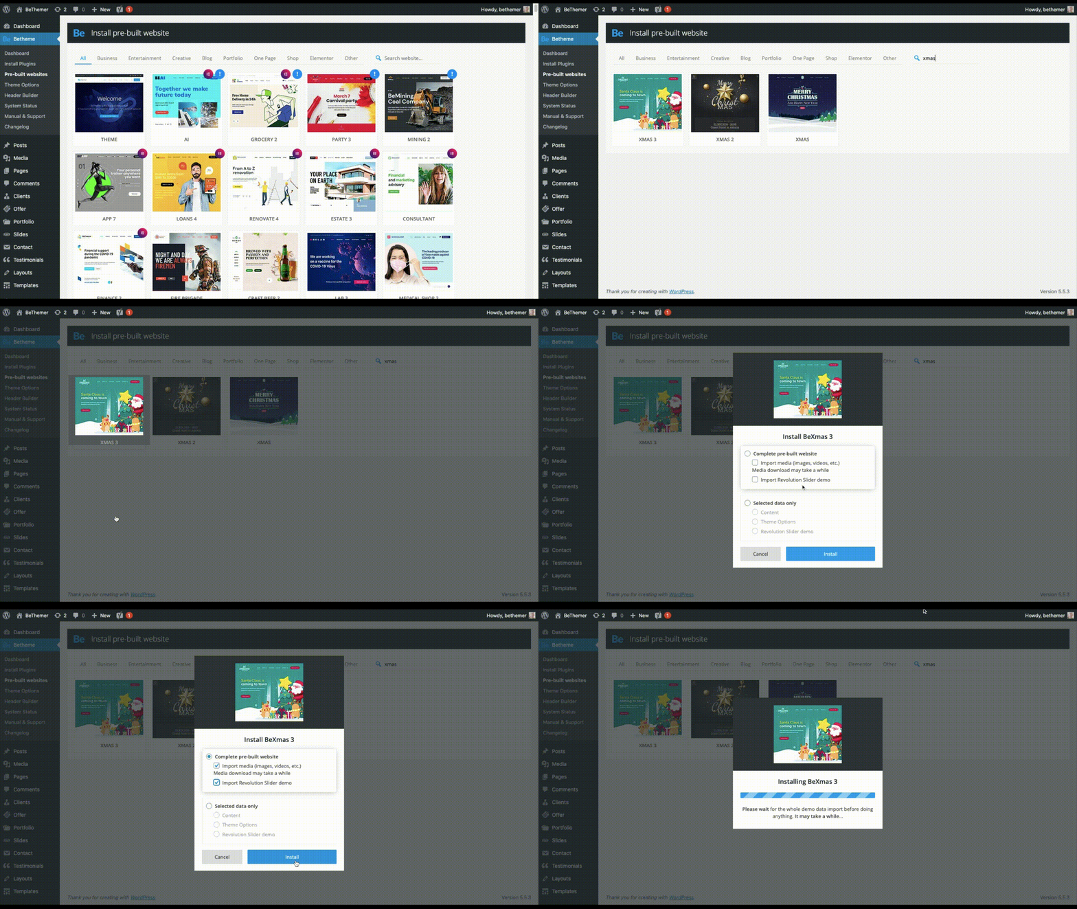
In order to swap out this design with a festive website, you’d first have to reset your theme (which Be provides instructions on how to do). Then, install the new site you want to use.

Like BeXmas:

And if you only want, say, a new hero image in the top of your website, you can cherry-pick which parts of the pre-built site you install.

Tip #2: Effortlessly Switch From One Holiday to the Next

Let’s be honest, the winter holiday season can feel a little nuts — not just because your business has to keep up with the change of pace, but because your website has to keep in step with what’s going on.

So, let’s say you have an ecommerce site that changes frequently for upcoming sales, holidays, events, and so on. For this, you could use the BeMall pre-built site (all year long, mind you):

As you can see, it currently has a Black Friday message on the homepage. It’s not uncommon to have to transition from Black Friday or Cyber Monday into the December holidays.

Here’s how you might do that:

The update can be as minor or major as you want. So long as you use graphics and content that stay on-brand, you can easily swap out as much of your imagery as you like.

Tip #3: Use Small Animations to Bring the Holidays to Life

Holidays should be a time to lift spirits. Having a website that’s able to satisfy your customers’ needs during the holiday season will certainly help.

You might also want to think about adding small animations to your design, too.

The animations themselves don’t have to be festive, but you can use them to call attention to holiday-themed content. Take, for instance, BeParty:

You don’t need to have champagne bottles popping or streamers flying across the screen to get your point across.

This animation gives the New Year’s party balloons a gentle and natural feeling of bobbing up and down. An attention to a detail this small is sure to bring a smile to your visitors’ faces.

Tip #4: A Little Hint of Seasonal Flavor Can Go a Long Way

Holiday celebrations aren’t always big blowouts. Unless your entire business is going all-in on the holidays (or it’s a totally holiday-themed business), there’s no reason your site should have to go all out either.

Sometimes a more understated approach is best.

In that case, you’d keep your normal branded elements, imagery, and content in place on the website. But to make it feel a little more festive, you could infuse your site (at the very least, the homepage) with slight seasonal or festive touches.

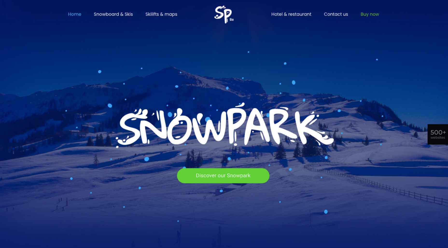
For instance, let’s say you’ve built a website for a popular ski resort. Your website might look like the BeSnowpark site does normally:

The main draw of the resort is skiing, so it wouldn’t make much sense to change the graphics. However, you could do something like this:

It’s a small enough change, but the gift emoji and bigger lettering in the green button might inspire loyal snowbirds as well as first-time visitors to more quickly book their much-needed holiday getaway.

Get Your Festive Website for Christmas, New Year’s, and More

There are many science-backed reasons why a festive website is a good idea.

Holiday decorations, in general, stir up positive feelings of nostalgia for many people. They can also help alleviate some of the stress that’s built up over the course of the year:

What’s more, holiday decorations can visually signal to others that you’re friendly and accessible, even if they don’t know you.

Sounds exactly like how you want visitors and prospects to feel, right?

As you can see, there are many ways to decorate your website for the holidays. To do it quickly and affordably — and not completely turn your regular website upside-down — a BeTheme pre-built site is the way to go.


[– This is a sponsored post on behalf of BeTheme –]

Source


Source de l’article sur Webdesignerdepot

We all love web badges. You might have spotted many of them in README of repositories, including the repository of my blog, The Cloud Blog. In general, web badges serve two purposes.

  1. They are visually appealing.
  2. They display key information instantly.

If you scroll to my website’s footer section, you will find GitHub and Netlify badges that display the status of the latest build and deployment. I use them to quickly check whether everything is fine with the world without navigating to their dashboards. In essence, a badge is an SVG image with dynamic content embedded in it.

Source de l’article sur DZONE

BitCoin is basically a digital ledger system, allowing for keeping transactions based upon cryptographic signatures in a decentralised database, ensuring the transaction was initiated by the person owning the private key. From a philosophical point of view, it’s simply authentication and authorisation based upon a private asymmetric key, period! What if I told you the same idea could easily be transferred to code in general. As in, keeping a ledger of invocations towards some HTTP endpoint, where the client decides what code the server should execute? The obvious example can be found below.

Plain Text


x
1

transfer.money

2

   to-account:1234567890

You’d have to be pretty stupid to not see the use case for the above snippet, especially considering it’s arguably (probably) the foundation of Revolut, a FinTech company, threatening to driver every single European bank out of business these days.

Source de l’article sur DZONE