
 With all the marketing aplomb of basement-coders worldwide, NFTs were named with an acronym that does little to clarify their utility.
You probably know by now that NFT stands for Non-Fungible Token; what is perhaps less clear is what “Fungible” actually means; in this context, it means interchangeable.
Consider an ounce of platinum. That platinum is fungible, meaning it can be exchanged for any other ounce of platinum. Now consider a piece of jewelry made from one ounce of platinum. That jewelry is not interchangeable with any other ounce of platinum; it has the same core materials, but it has unique characteristics that may be artistically valuable, such as shape, or craft. The jewelry is non-fungible.
The letter that actually matters in NFT is T for Token. Tokens are little chunks of a blockchain that is a universally agreed dataset. You don’t need to know how it works any more than you need to understand how a computer processor works; you just need to know it’s in there.
Like any new technology, NFTs are surrounded by propaganda, counter-propaganda, skepticism, evangelism, and Facebook-confusion. In this post, we’ll look at some of the common misconceptions so you can develop an informed opinion.
1. NFTs Are Bad For The Environment
We’ll tackle this one first because it’s the classic argument leveled against anything in the crypto-space, whether Bitcoin or NFTs, and it’s nonsensical.
The root of this myth is that cryptocurrency transactions use vast amounts of electricity, the generation of which is terrible for the environment. The answer is threefold:
Firstly, electricity is used to run computers that maintain a blockchain, such as Ethereum. The blockchain is maintained whether NFTs are minted (registered) or not.
Secondly, NFTs tend to be minted on blockchains like Ethereum that are moving to less resource-intensive models, blockchains like Solana that already have less resource-intensive models, or blockchains like Algorand that are already carbon-neutral.
Lastly, the fact is that electricity is not inherently planet-killing. Renewables like solar and wind are perfectly capable of powering the grid; it’s just that power companies make higher profits by burning fossil fuels. That swanky new electric car you’ve bought so you can drive guilt-free is fuelled with fossil fuels on the power company’s end (and that’s before you consider the damage done getting those minerals out of the ground).
Until the computer you’re using is solar-powered, repairable, and upgradable, anything digital is terrible for the environment; NFTs are as bad, but no more so, than anything digital.
2. NFTs Are Just [Insert Patronizing Economic Metaphor Here]
NFTs, and crypto in general, are frequently referred to as a Ponzi Scheme. In the 1920s, Charles Ponzi duped investors into handing over cash. Returns were paid to early investors with the income from new investors. Early investors made a lot of money, and later investors lost everything.
One of the key characteristics of a Ponzi Scheme is that it’s a confidence trick that presents itself as low-risk. NFTs as an investment are widely understood to be high-risk. Calling NFTs a Ponzi Scheme is an excellent way of letting people know you don’t know what a Ponzi Scheme is.
In the 17th century, the price of tulip bulbs reached astronomical proportions. The Dutch tulip trade was a complex economic investment system that eventually collapsed, thanks in part to a global pandemic. Ever since, Tulpenmanie (Tulip Mania, in English) has been a byword for an economic bubble.
NFTs are frequently linked to Tulip Mania, thanks partly to the prices and the expectation (or hope) that the market will collapse. However, if you drive through the Netherlands today, you’ll see vast fields of tulips. They’re not being grown because they’re worthless.
While demand may fluctuate, it doesn’t fluctuate as much as media hysteria implies. And ultimately, tulips are nice.
3. You Can Buy And Sell NFTs
This is where pedantry plays a role. You cannot buy and sell NFTs; NFTs are the vehicle by which you conduct transactions for digital (or, in some cases, physical) goods and services.
If you have software installed on your computer, you probably have a license key. The license key identifies you as holding certain rights over that software, such as being allowed to use it to produce digital goods of your own. The license key is how the company identifies you as the individual to whom it has sold those rights.
NFTs are license keys for digital goods that are recorded on a blockchain instead of being held in a single database.
4. NFTs Can Be Easily Copied
When I was a kid in the 90s, I would record music off the radio with a tape player. I’d make mix-tapes and give them away. I was, in every literal sense, pirating music. And it wasn’t just me; home-taping kept the cassette industry going for decades past its use-by date. Despite this, the music industry did not collapse.
Art is even easier to copy than music because there’s no risk of a vapid DJ wittering over the intro to I Wanna Be Adored.
On my morning commute, I pass a shop that sells art prints. Around 80% are screen prints of Marilyn Monroe. They are original prints made by an artist and sold for not inconsiderable amounts. Not one of those pieces diminishes the quality, importance, or financial value of Andy Warhol’s Marilyn Monroe prints in New York’s MoMA.
The difference is that MoMA’s Warhols have provenance — they can be tracked to a time and place and authenticated as by Warhol. Precisely the same provenance that NFTs provide digital artists.
5. You Can Get Rich From NFTs
Earning money, potentially a vast amount of money, is one of the main driving factors behind the boom in NFTs.
But the truth is that while it is possible to make a lot of money — some NFTs sell for millions of dollars — most NFTs sell for a modest amount.
If you are an accomplished artist with original ideas, you may make money from selling your art as NFTs. If you are an accomplished trader capable of recognizing quality, you may make money from buying and selling NFTs. However, very few people get rich.
6. NFT Resale Rights Undermine Value
NFTs have many potential uses, but the earliest adoption has been in digital art. The main economic benefit to artists is not just an easy way to sell their art but a widely accepted royalty system in which the original artist receives a commission every time the artwork is resold. It represents the ongoing investment the artist is making by continuing to produce and promote their work.
It might seem a strange way to approach ownership, but resale rights are not new in the art world. In the EU and the UK, the resale rights of artists are legally recognized. In France, the legal rights of the artist or the artist’s descendants to be compensated from the sale of artwork have been established in law for over a century.
Despite high-profile artists like Robert Rauschenberg fighting for resale rights, and legislation in New York and California supporting the concept, resale rights are still not recognized in the US.
NFTs introduce a fairer system that grants the same rights to all artists, that Europeans already enjoy.
7. NFTs Are Worthless
Anything with value, whether physical currency, NFTs, or a block of wood, only has value because two or more people agree it has value.
The most expensive baseball card in the world is reportedly a mint-condition Honus Wagner, priced at $3m. It might be hard to understand why anyone would pay $3m for a piece of cardboard with an image of a 1950s sportsman on it, but apparently, someone would.
All goods, all the things we spend money on, are worth what we agree they are worth. To me, a tulip bulb is worth more than a baseball card, but who knows, perhaps you don’t like tulips.
There are plenty of flaws in the systems that use NFTs, and there are plenty of detractors, but if you want to create and sell artwork and someone wants to buy it from you, NFTs are an excellent way of facilitating that transaction.
Featured image via Pexels.
The post Myth-Busting NFTs: 7 Claims Fact-Checked first appeared on Webdesigner Depot.

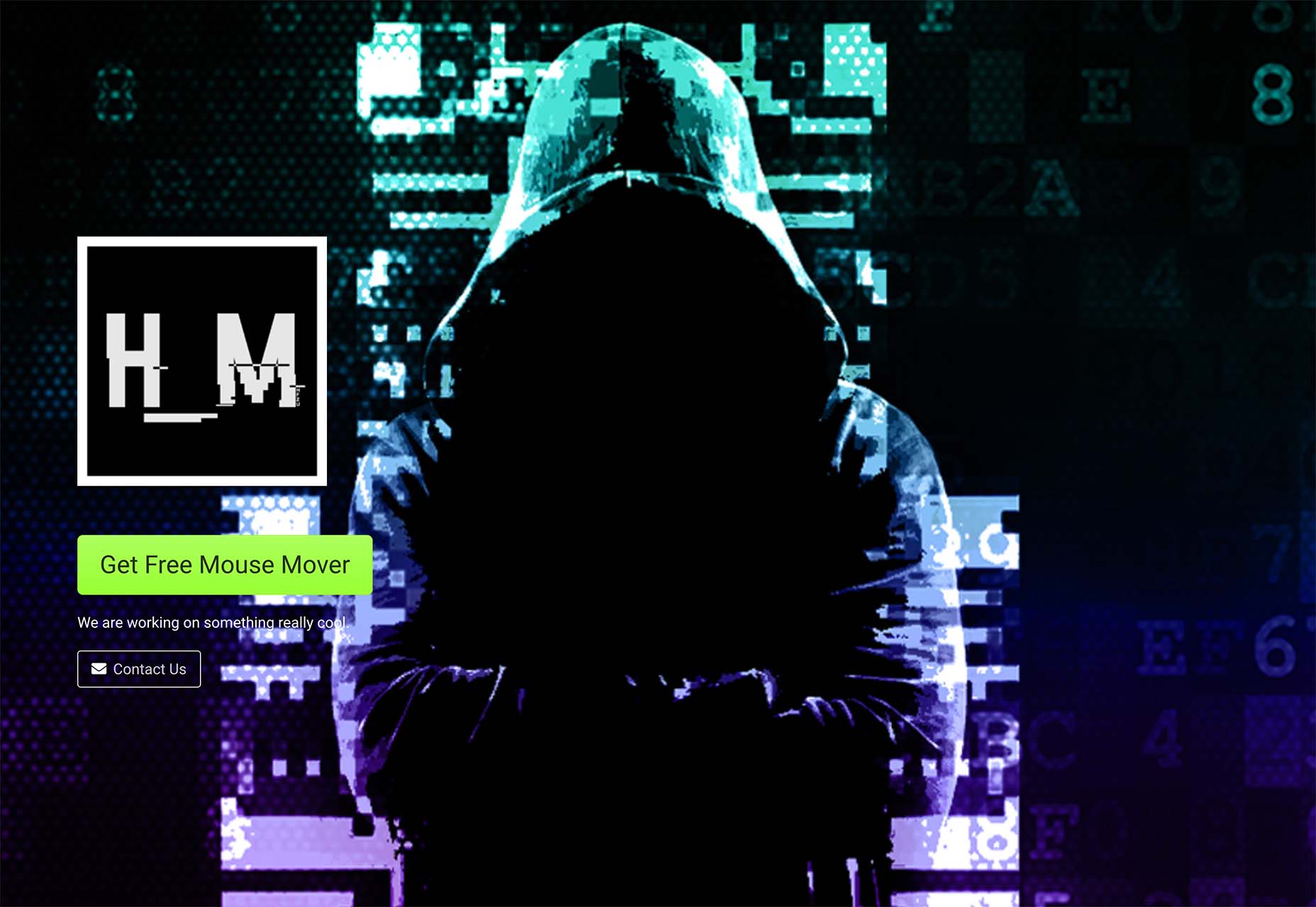
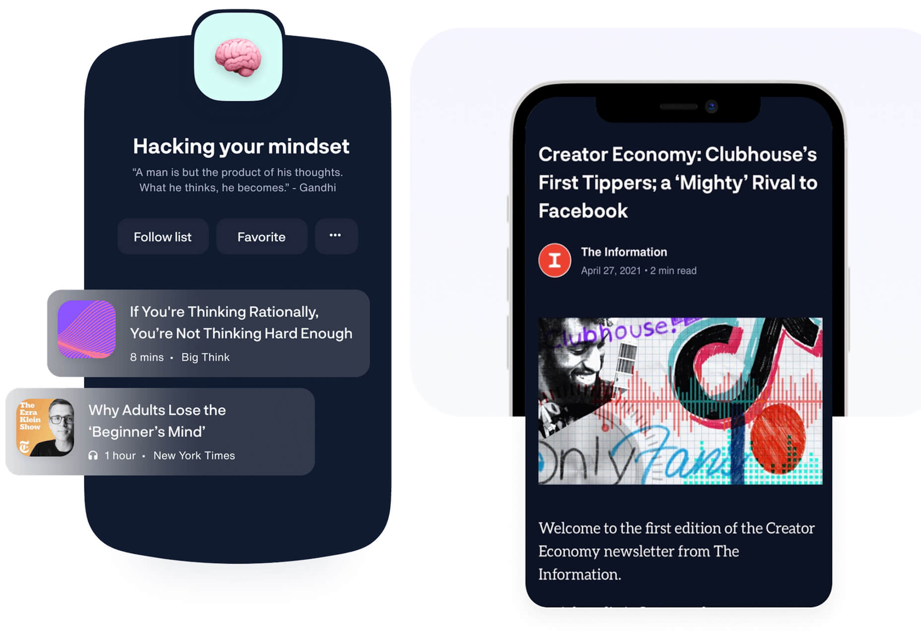
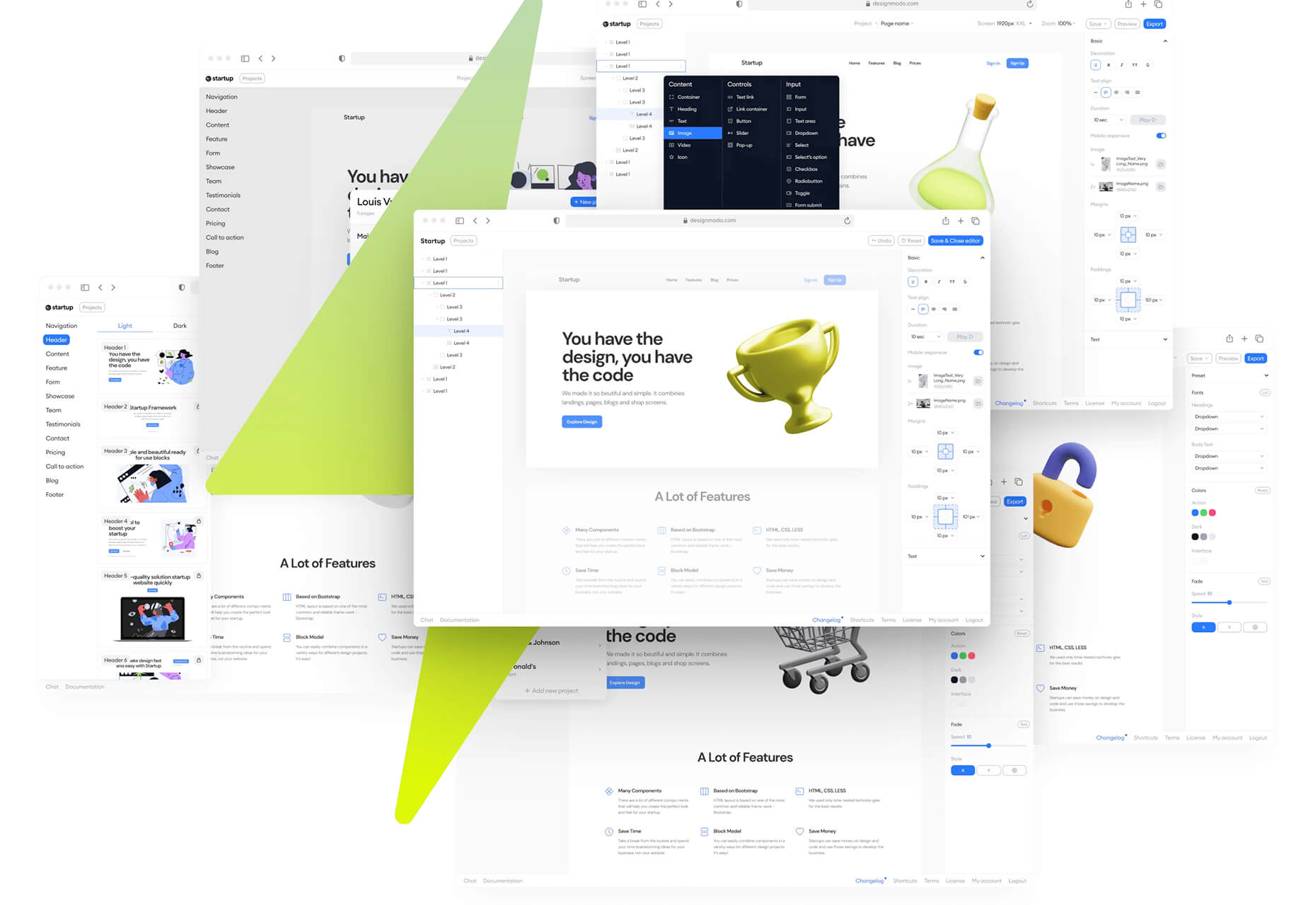
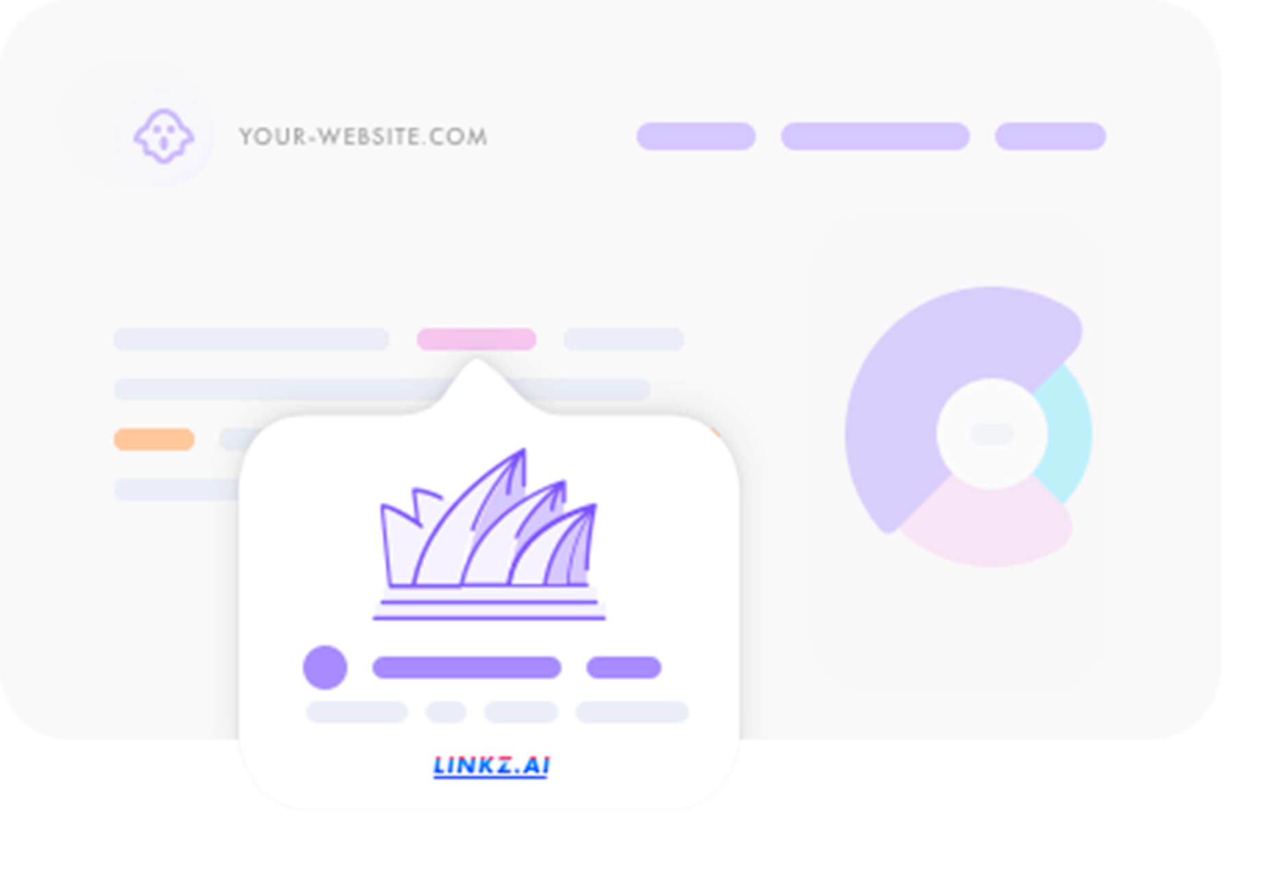
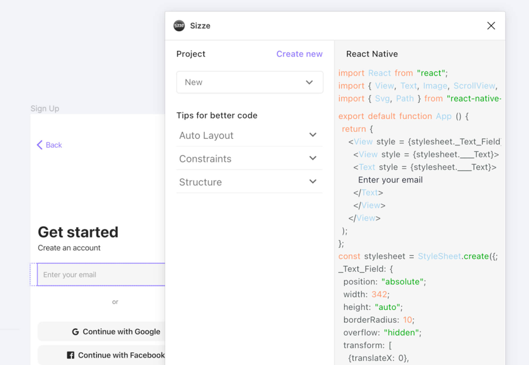
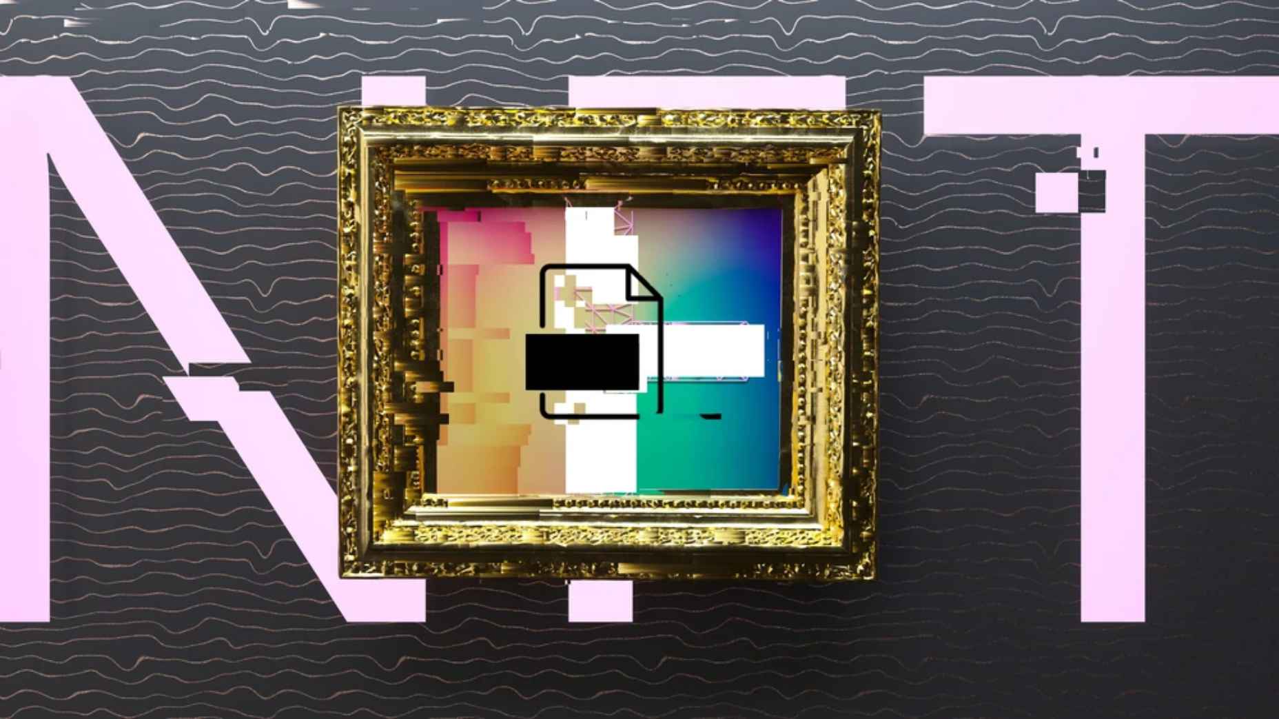
 One of the most talked-about digital elements of the new year leads our roundup of tools and resources this month – NFTs. The NFT landscape seems to be exploding right now and that includes tools for designers to get in on the game as well.
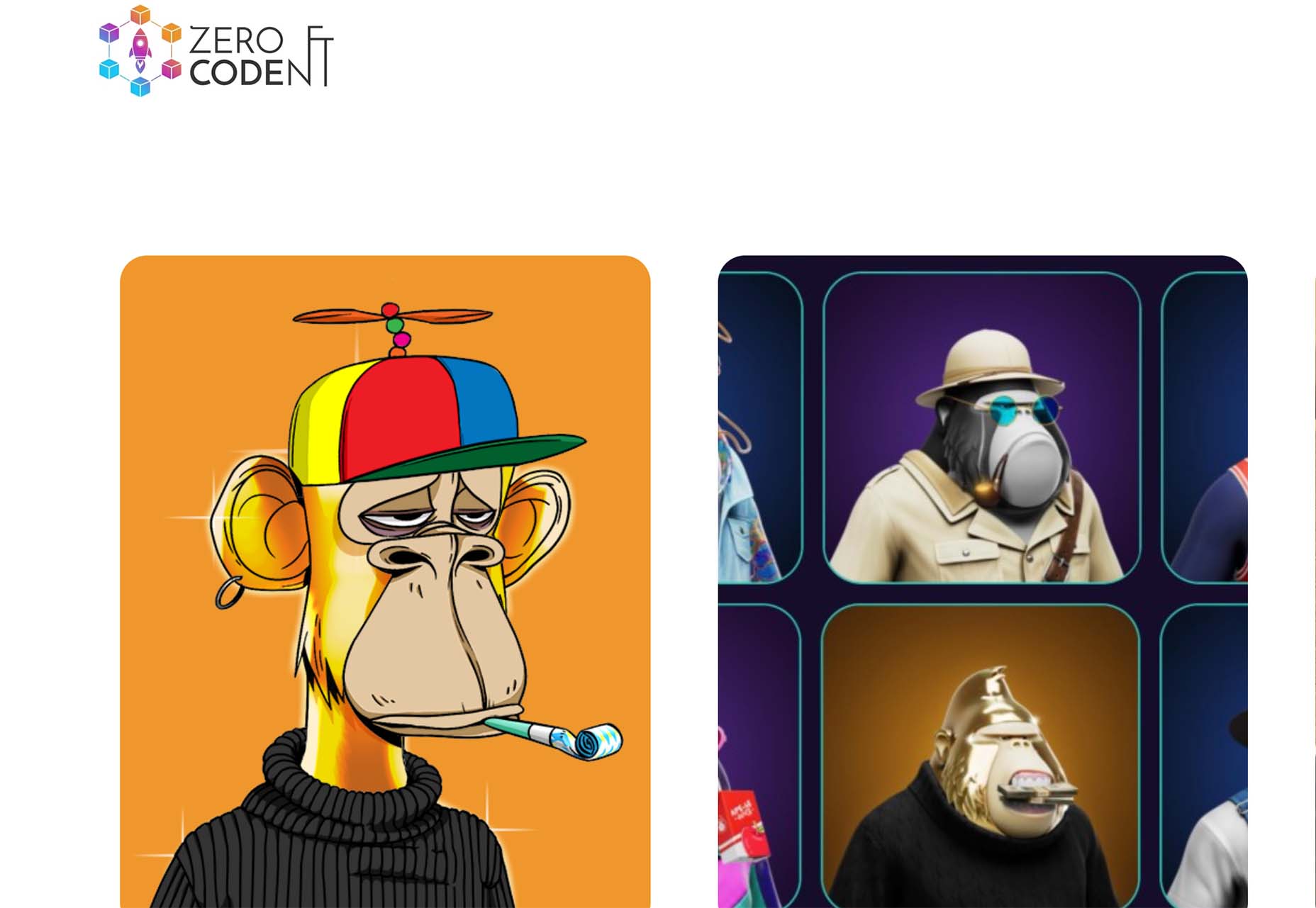


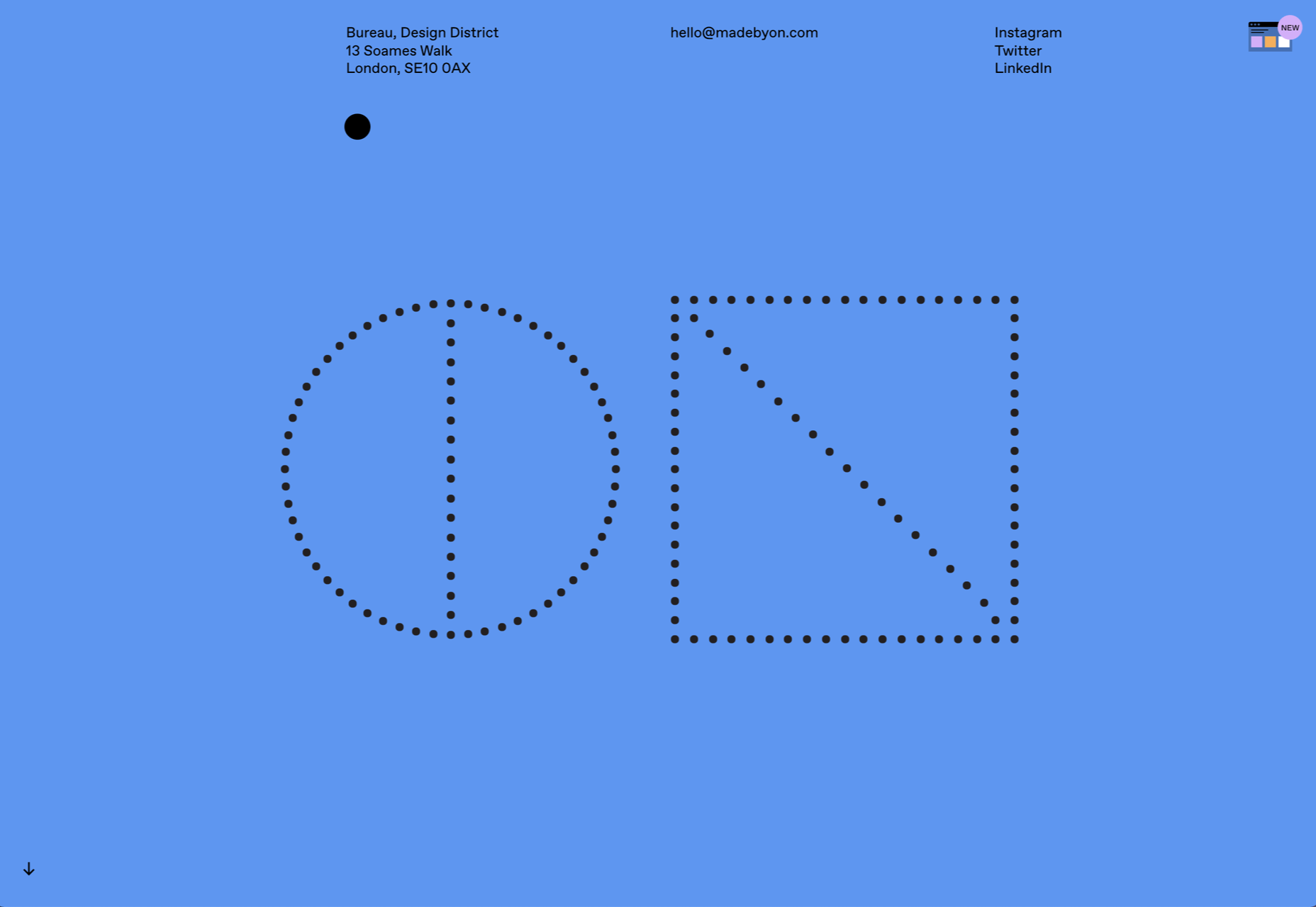
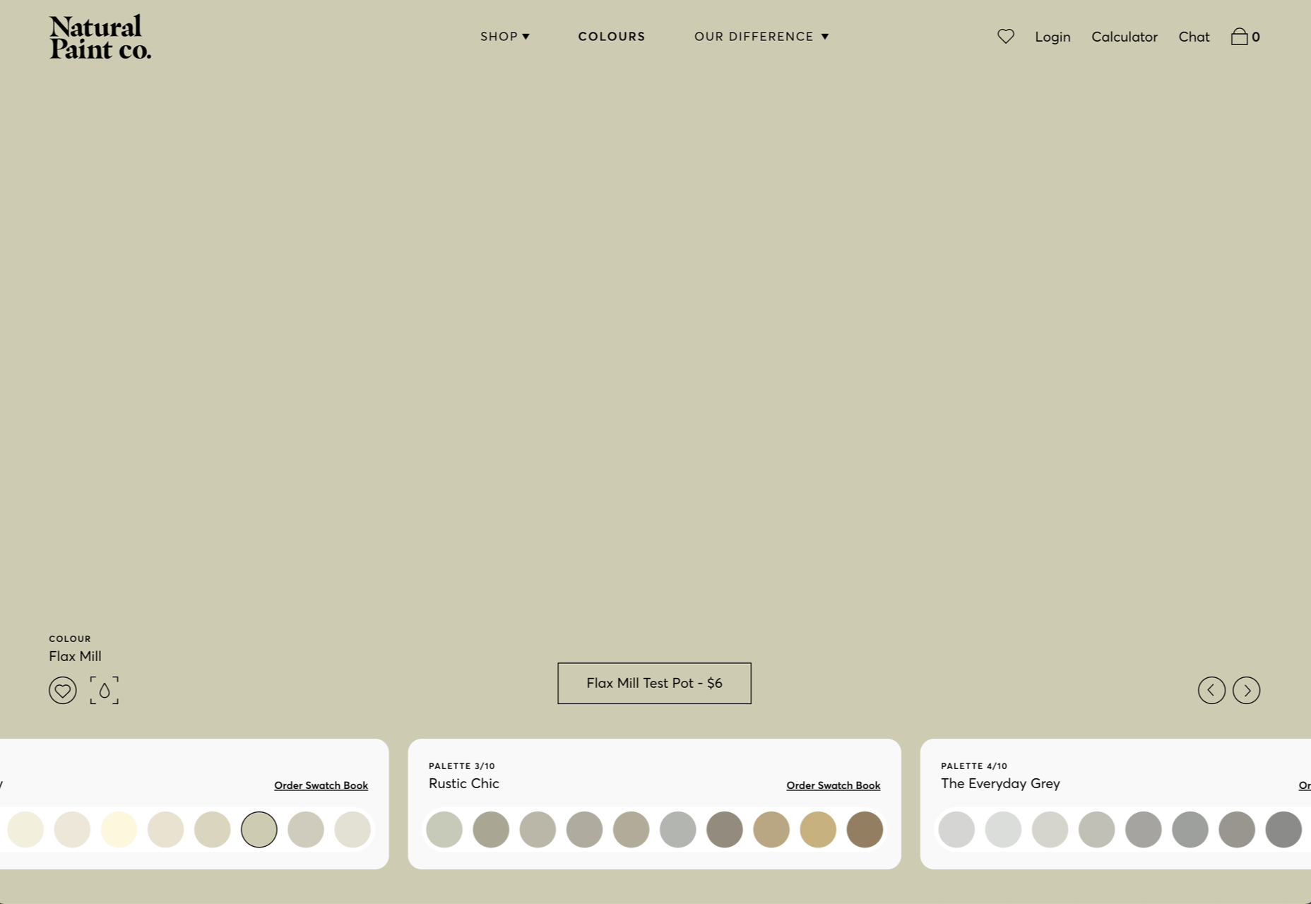
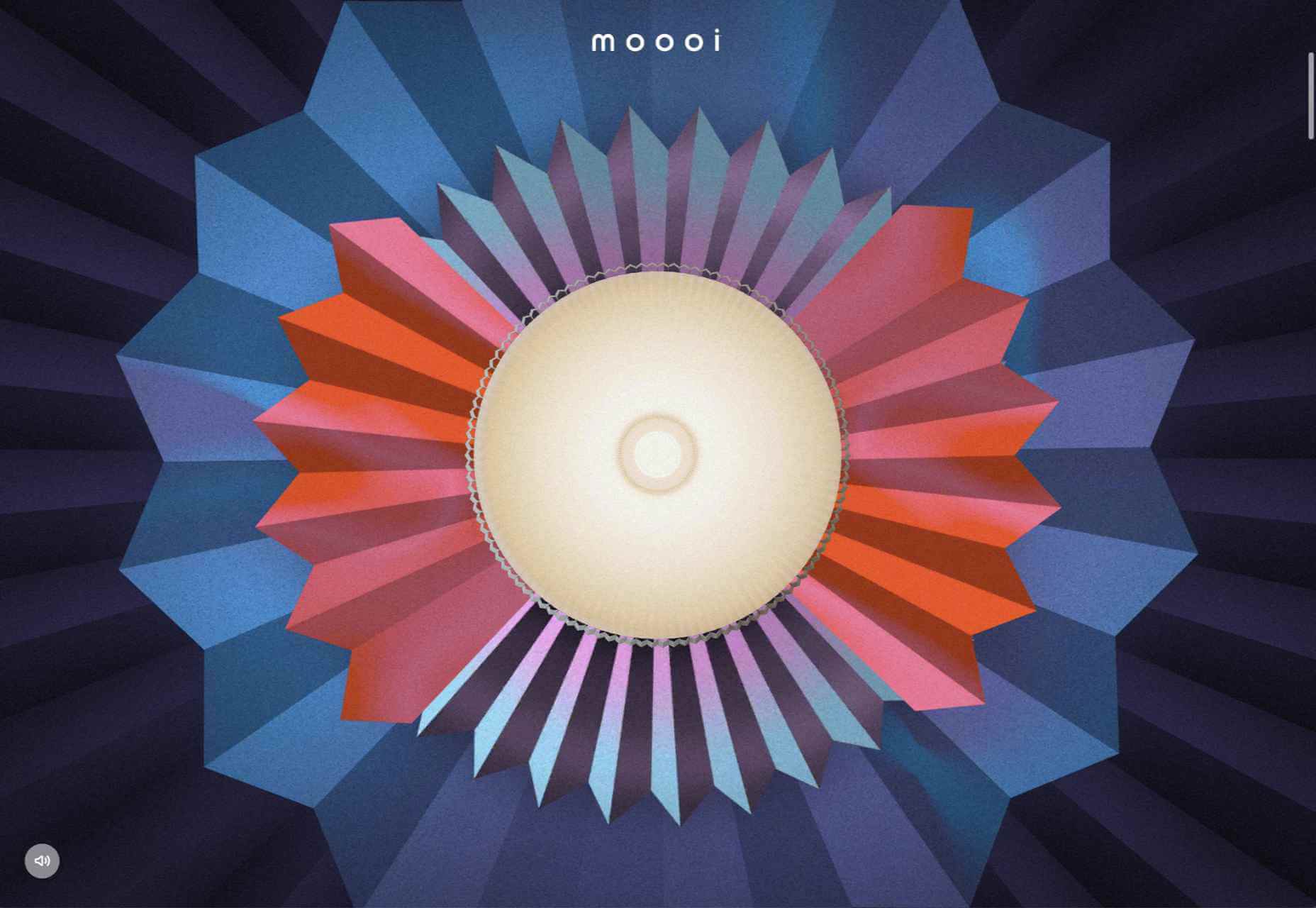
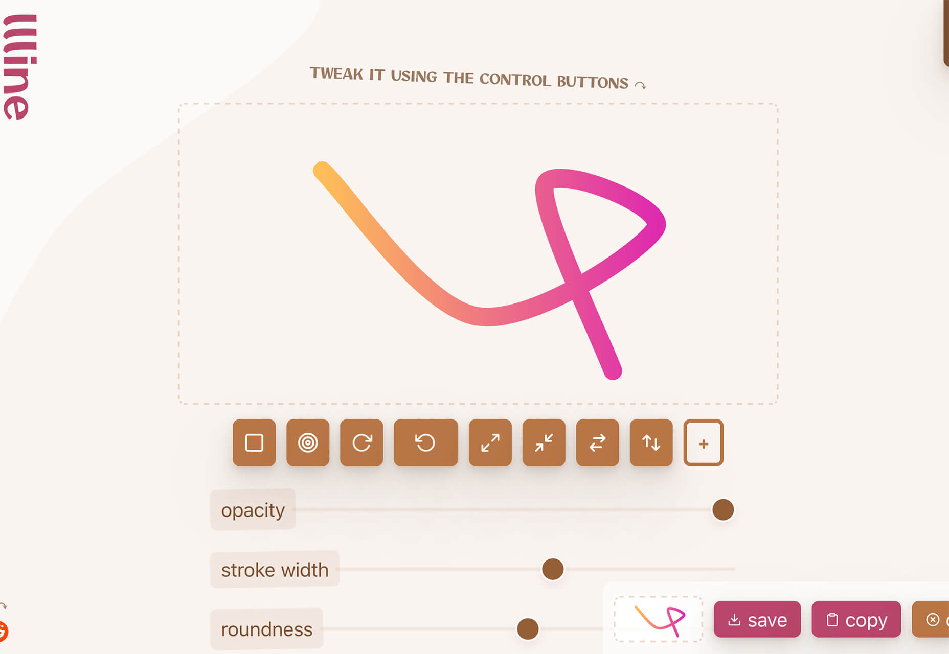
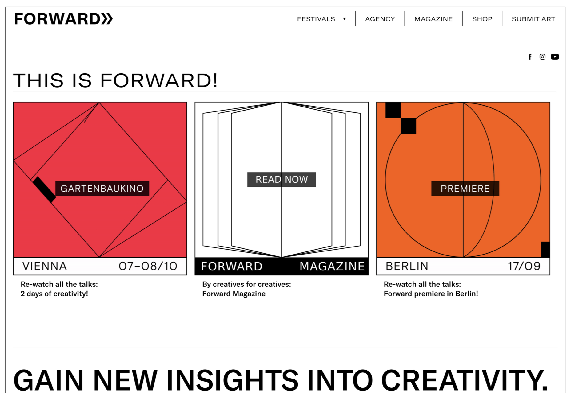
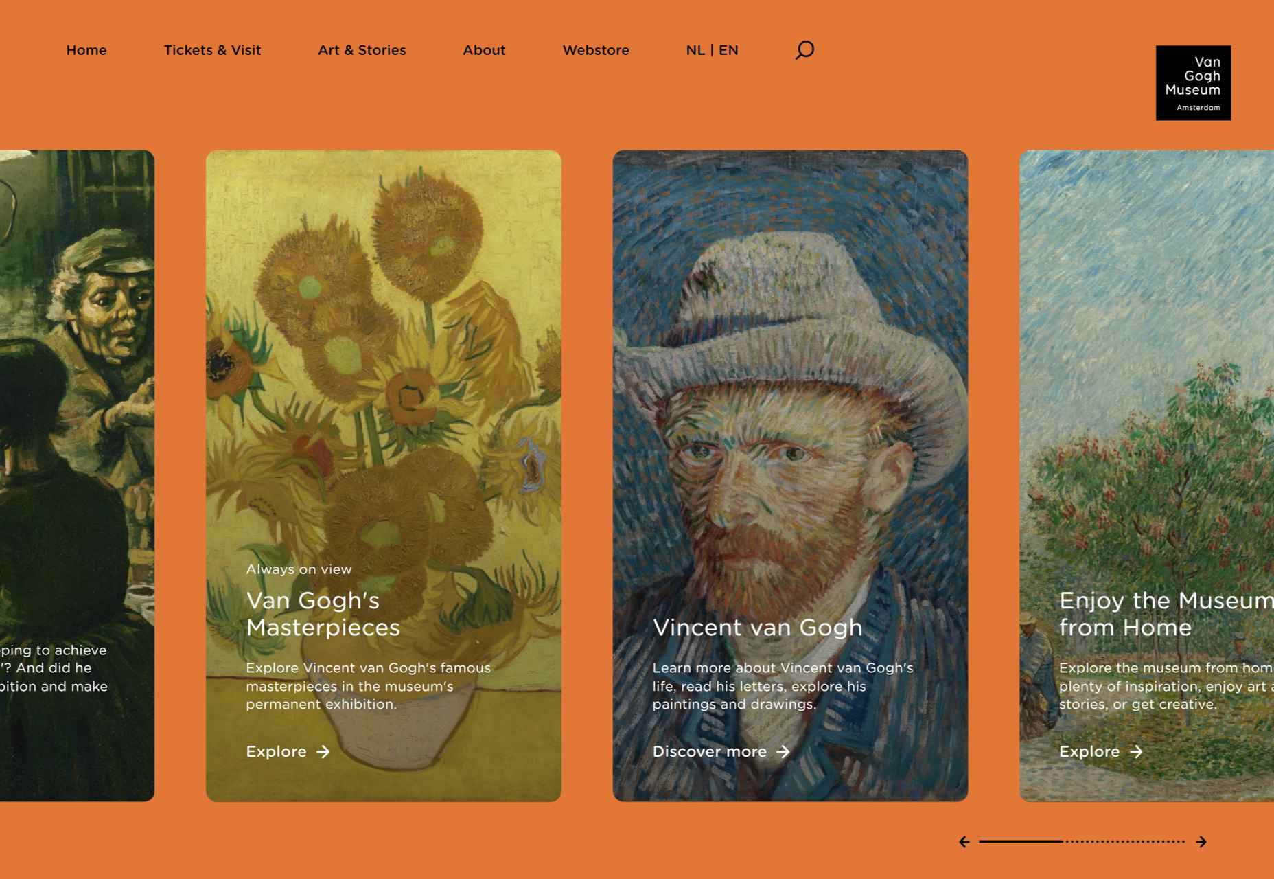
 Welcome to this month’s round up of what has caught our eye on the web. As it’s November we’re going to help chase those winter blues away with some color.
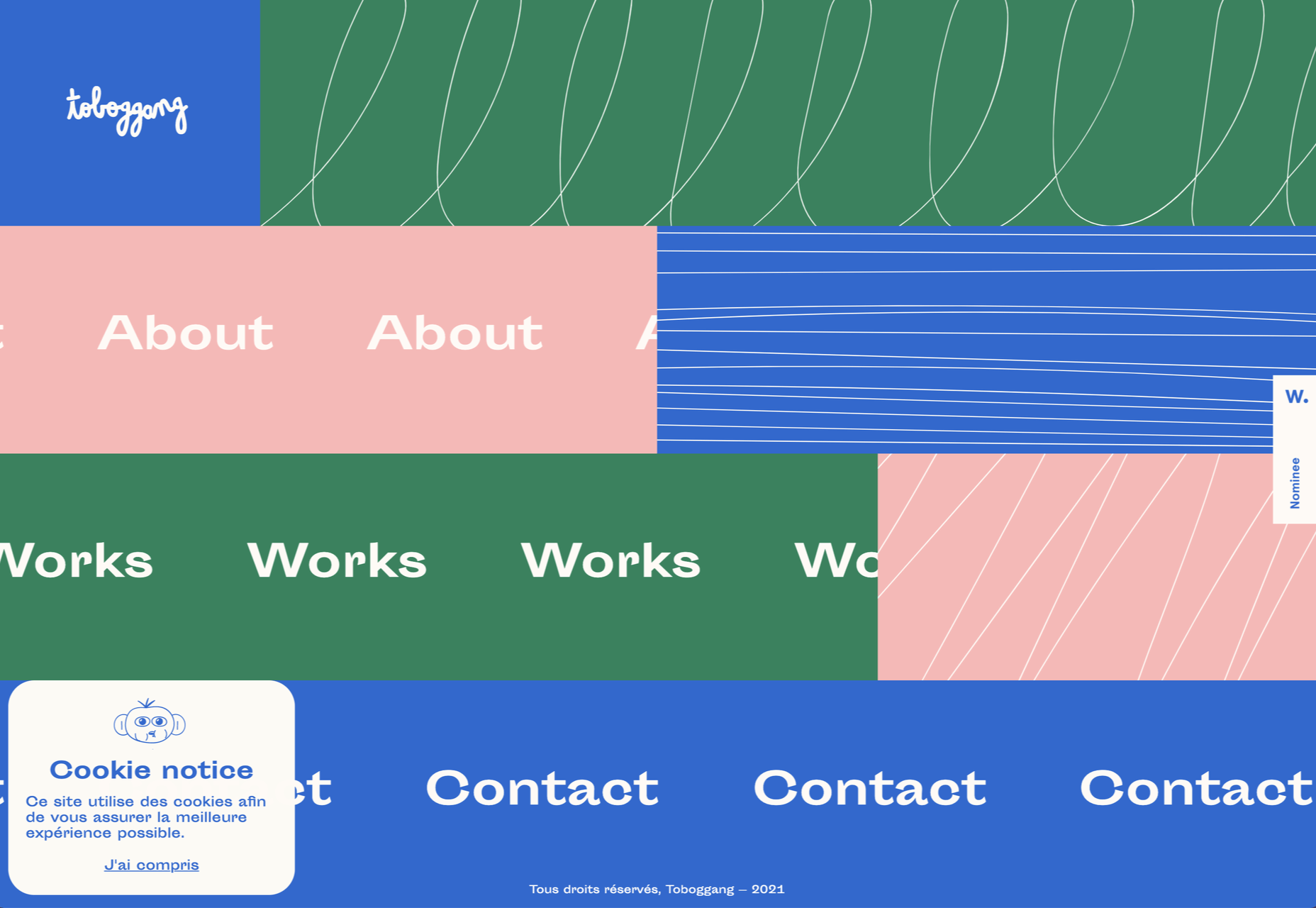
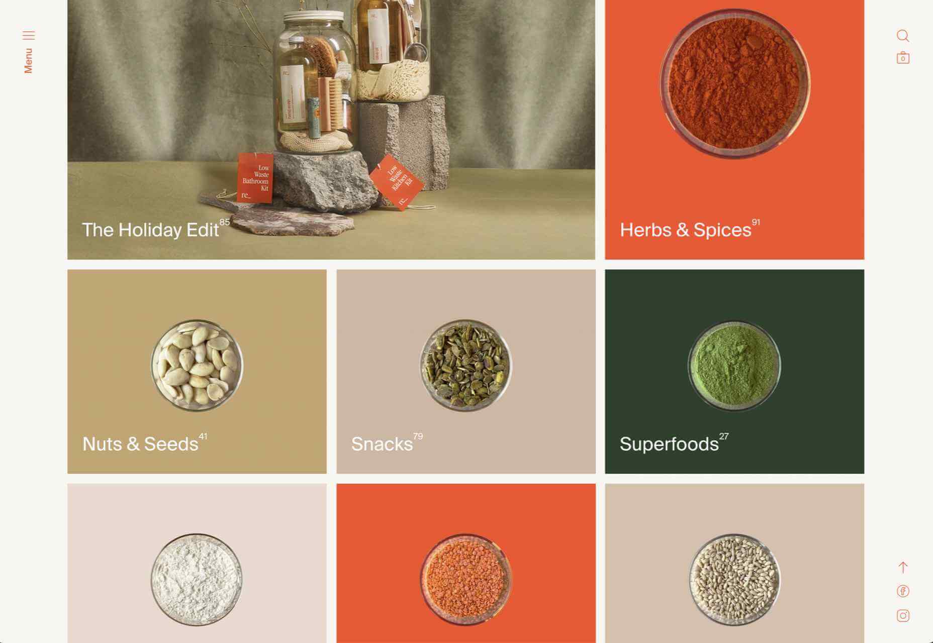


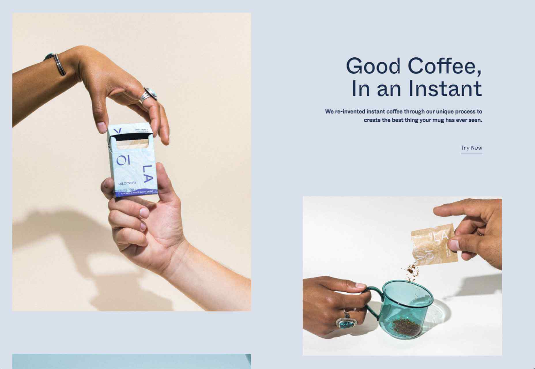


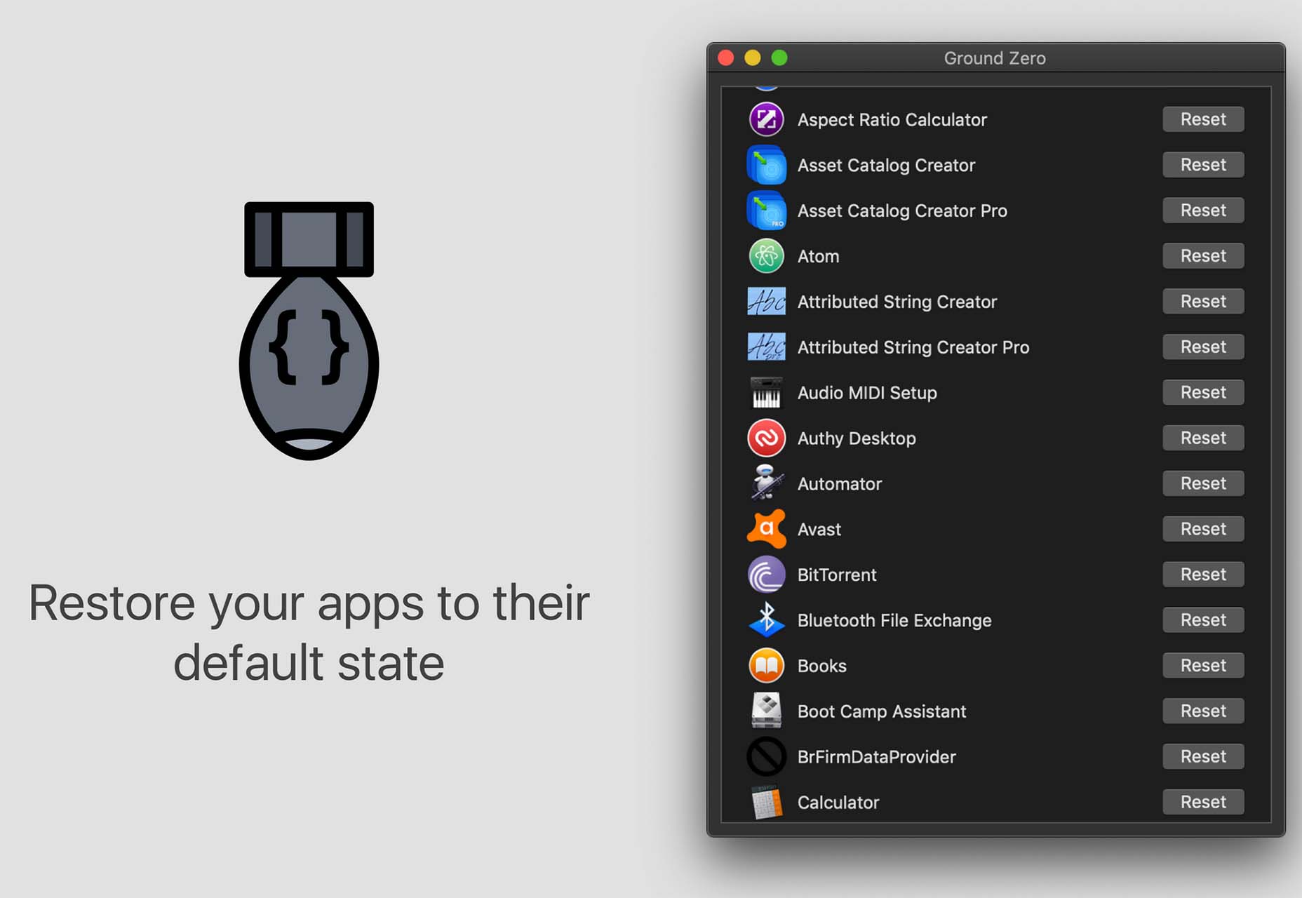
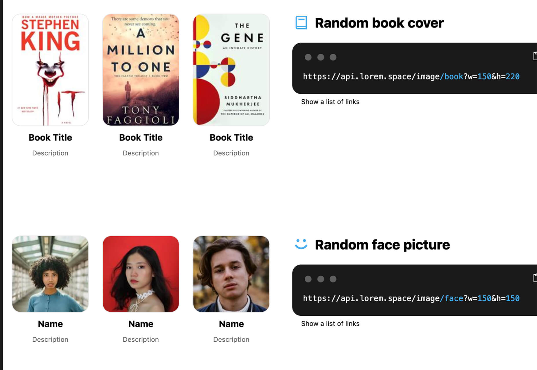
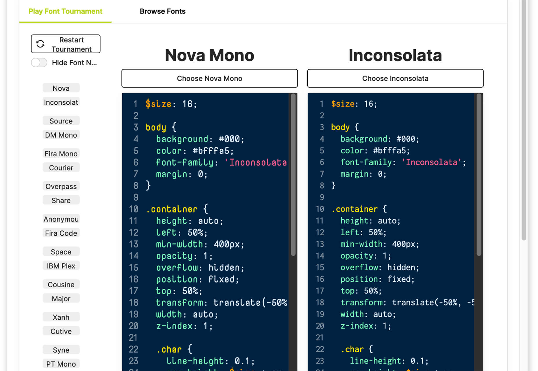
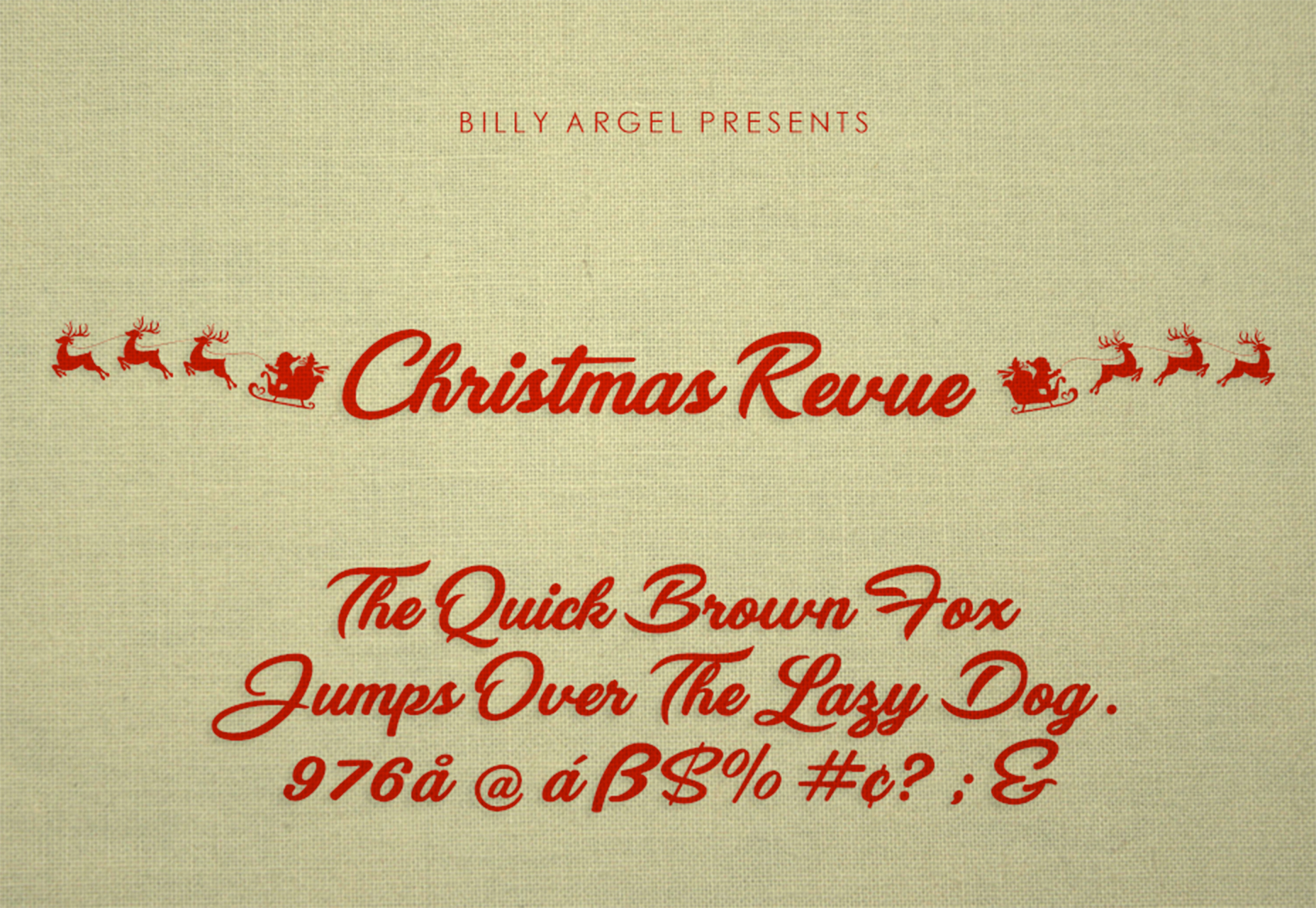
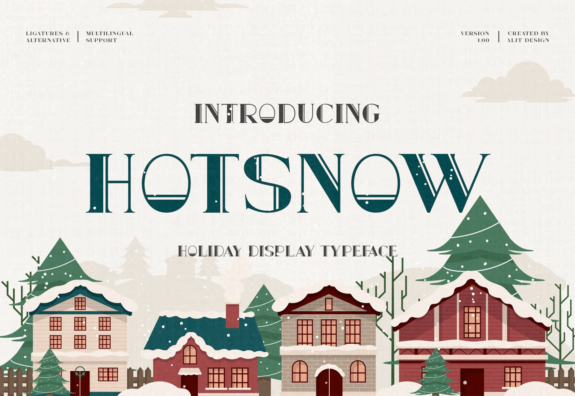
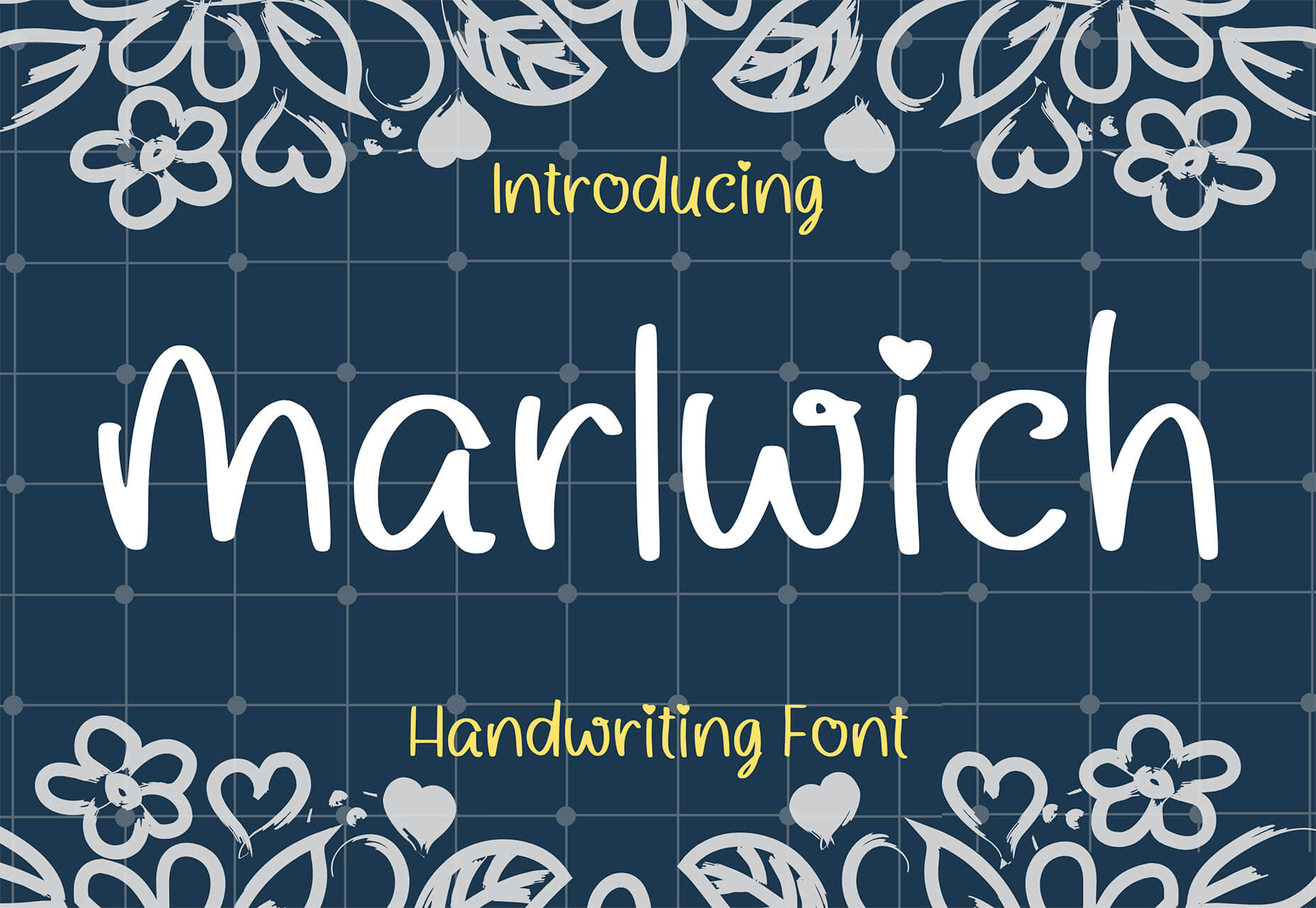
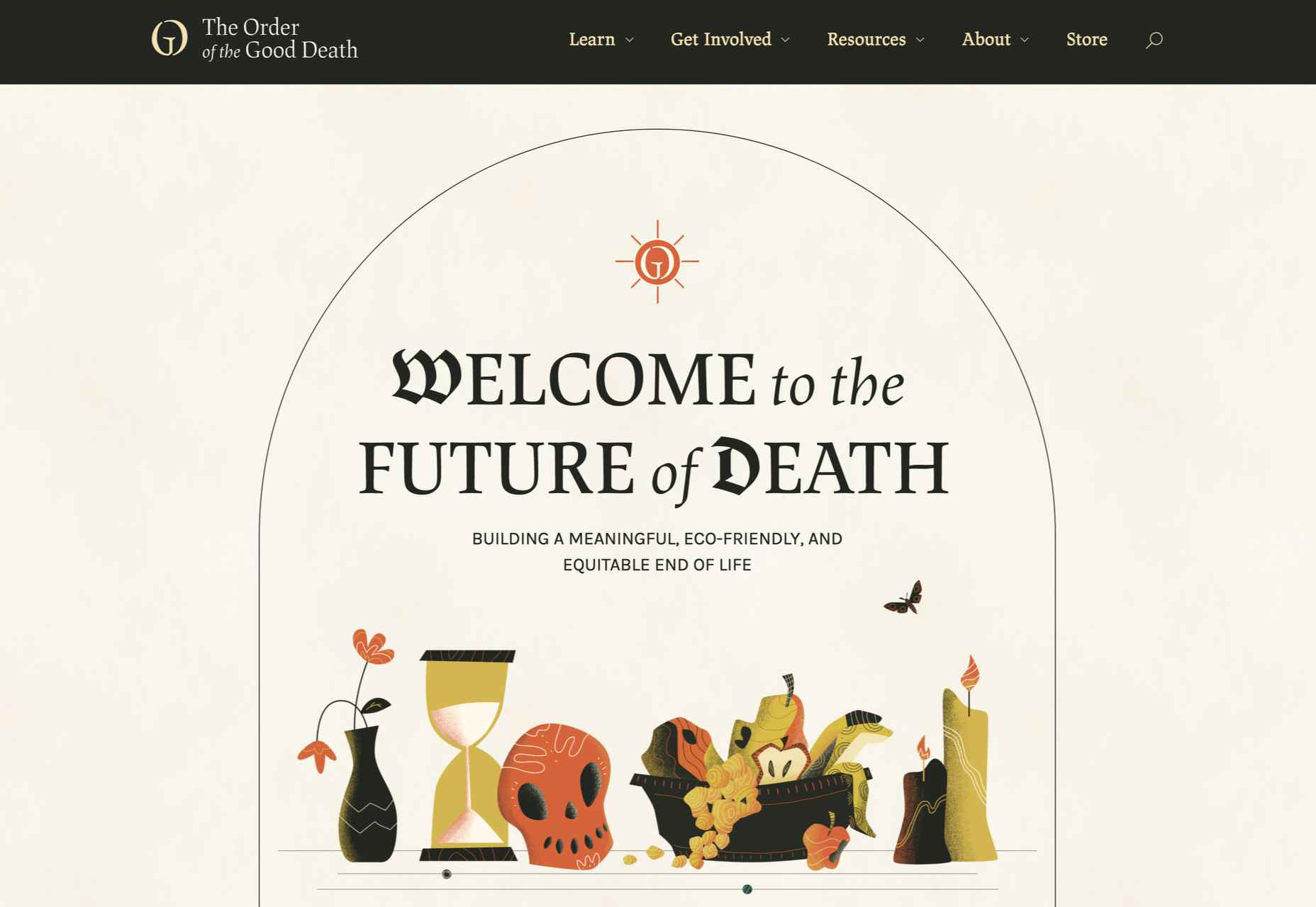
 With the holidays fast approaching, there are plenty of fun gifts for you in this roundup of new tools and resources for web designers. Make sure to share anything you find helpful with others to spread additional holiday cheer.
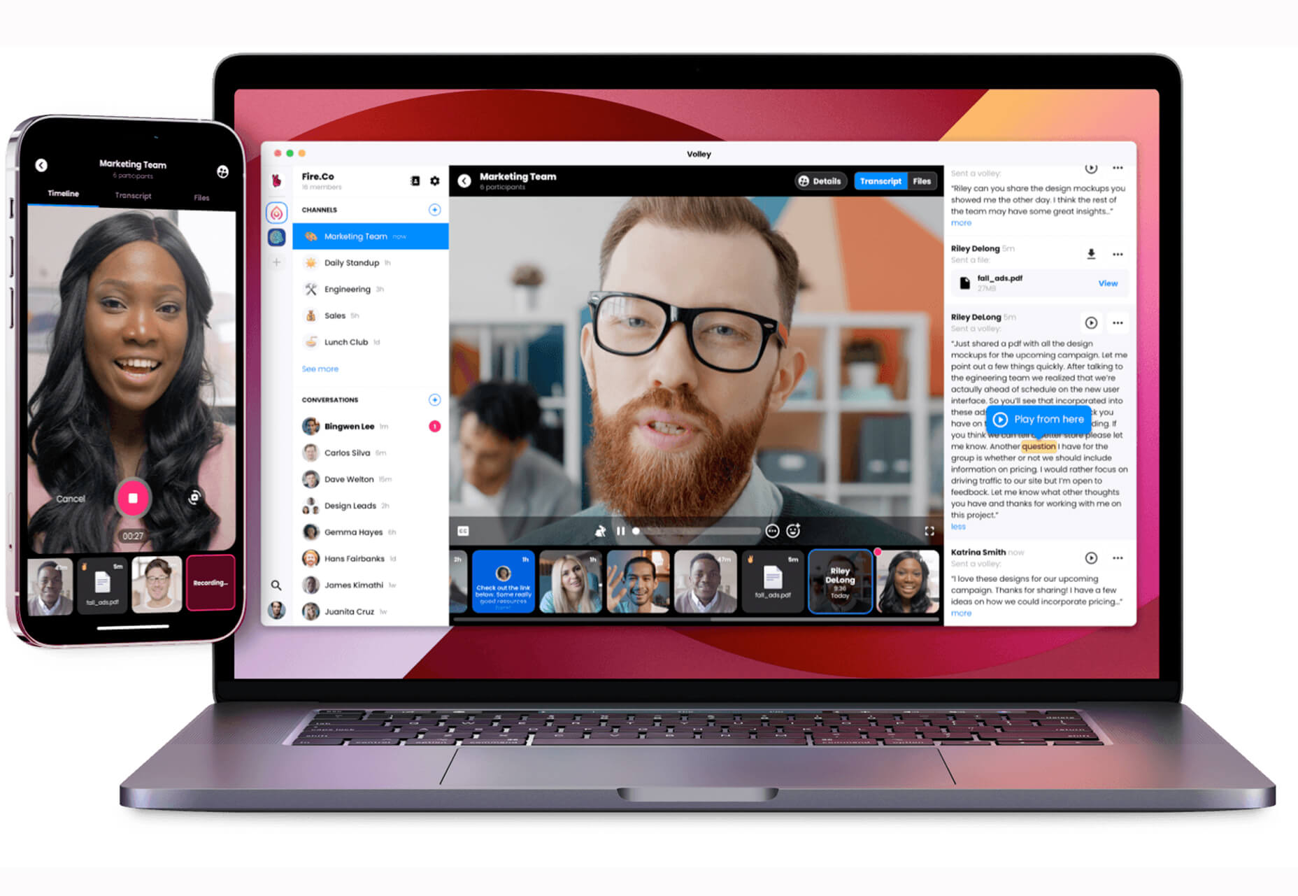


 Every day design fans submit incredible industry stories to our sister-site,


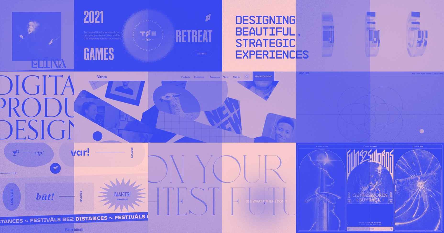


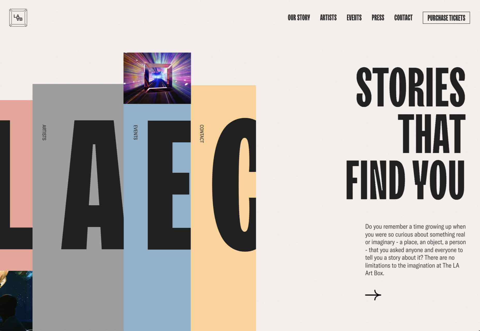
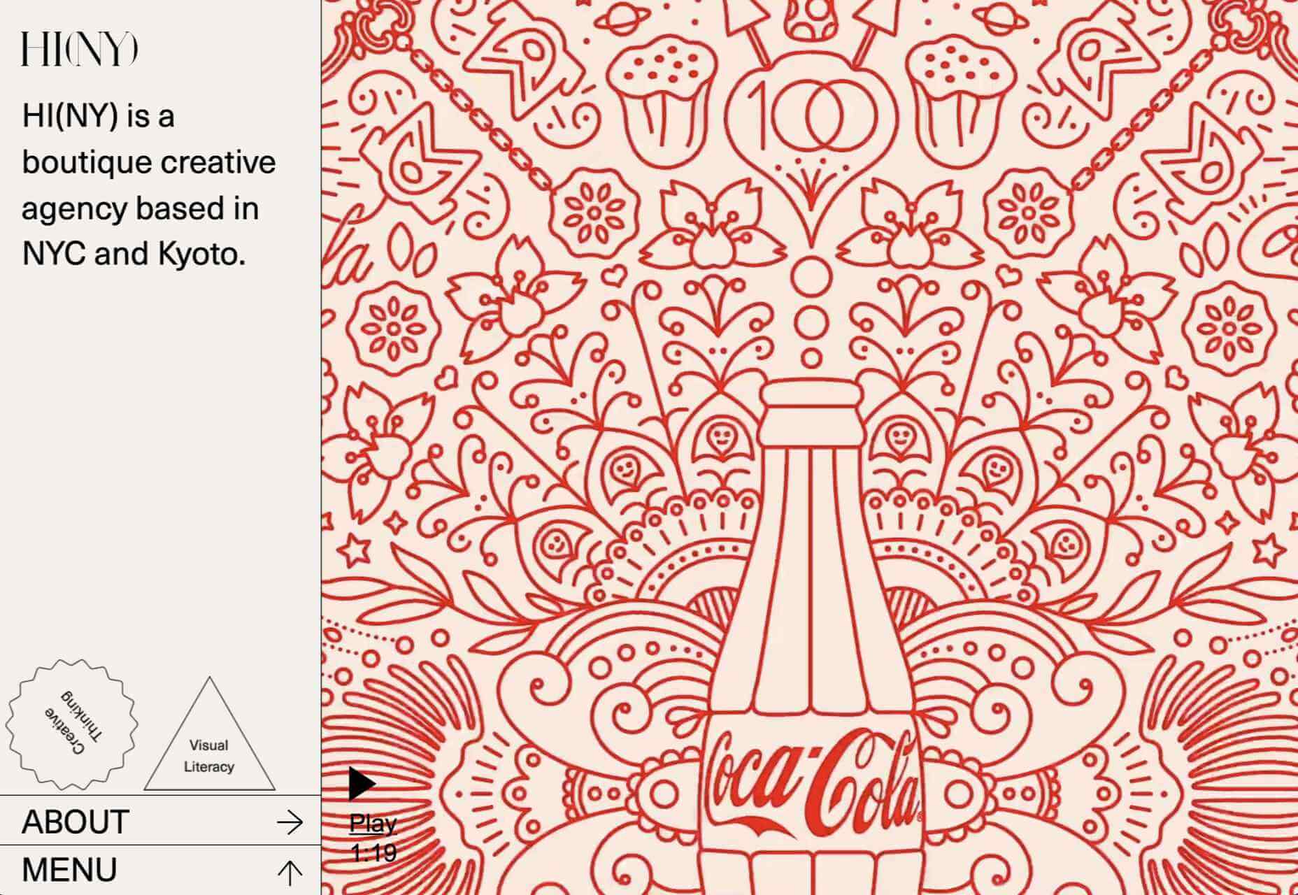
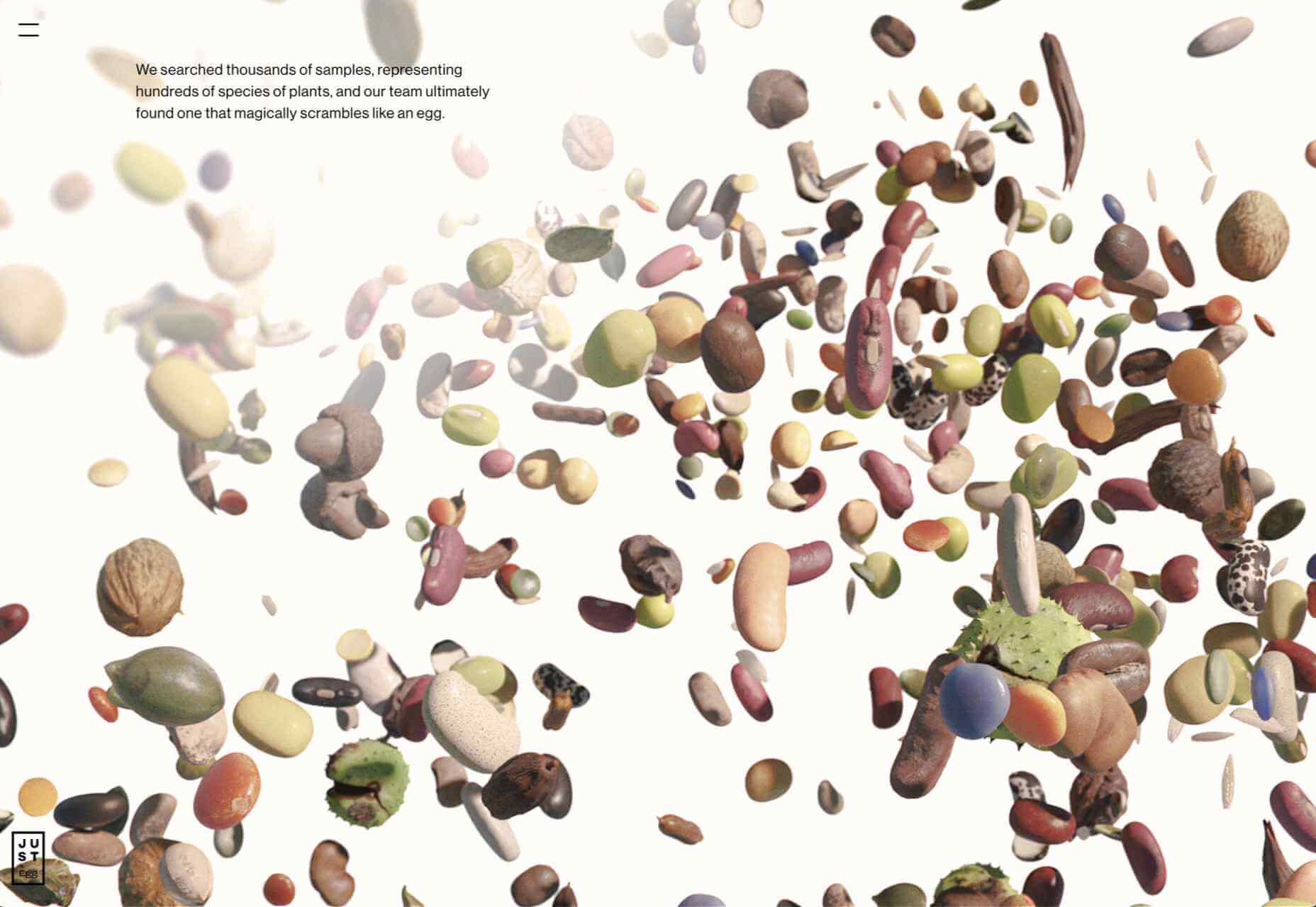
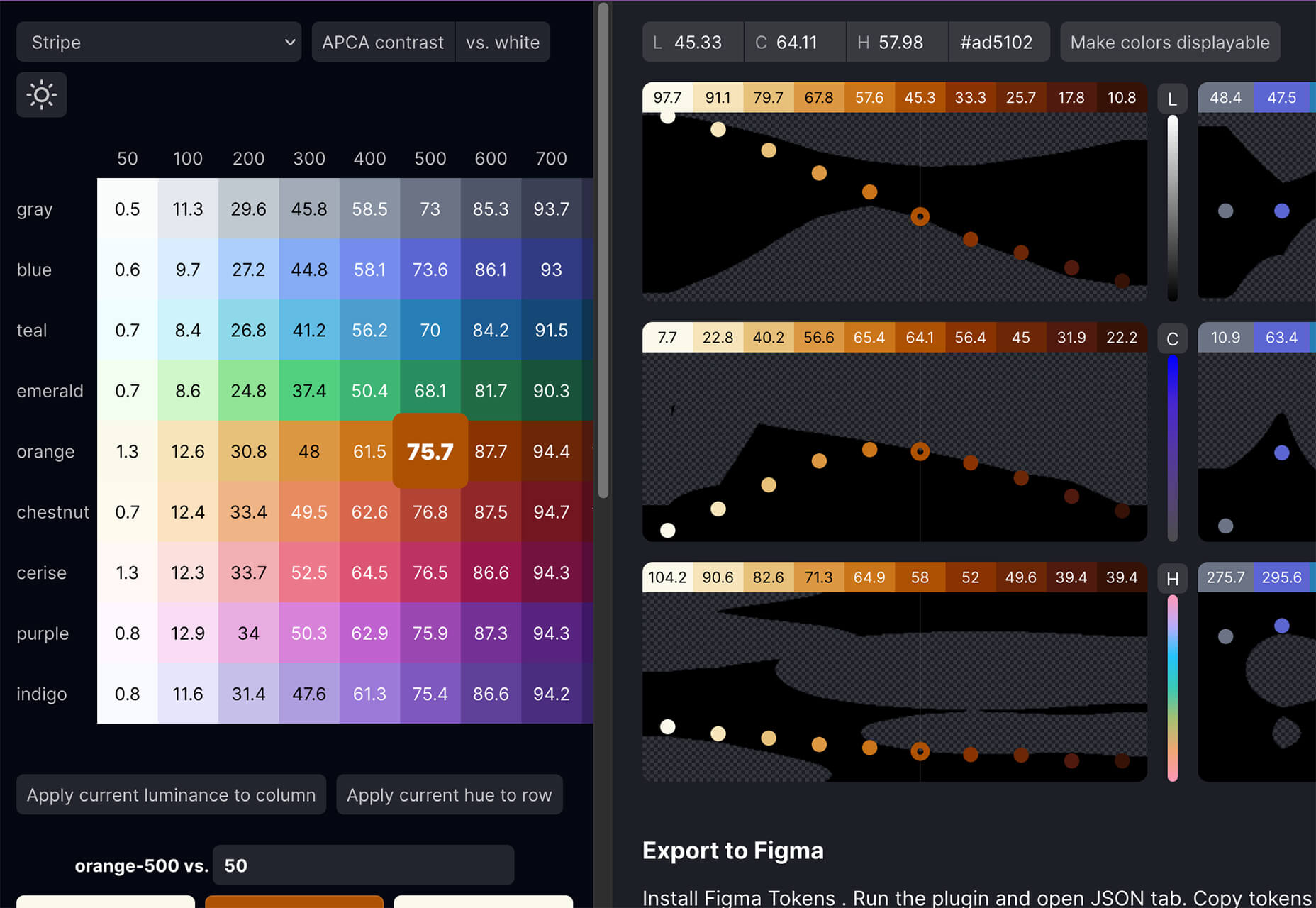
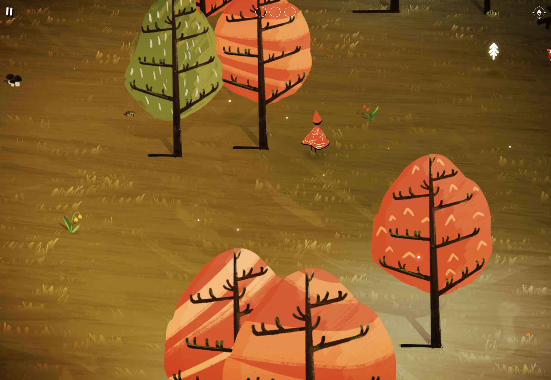
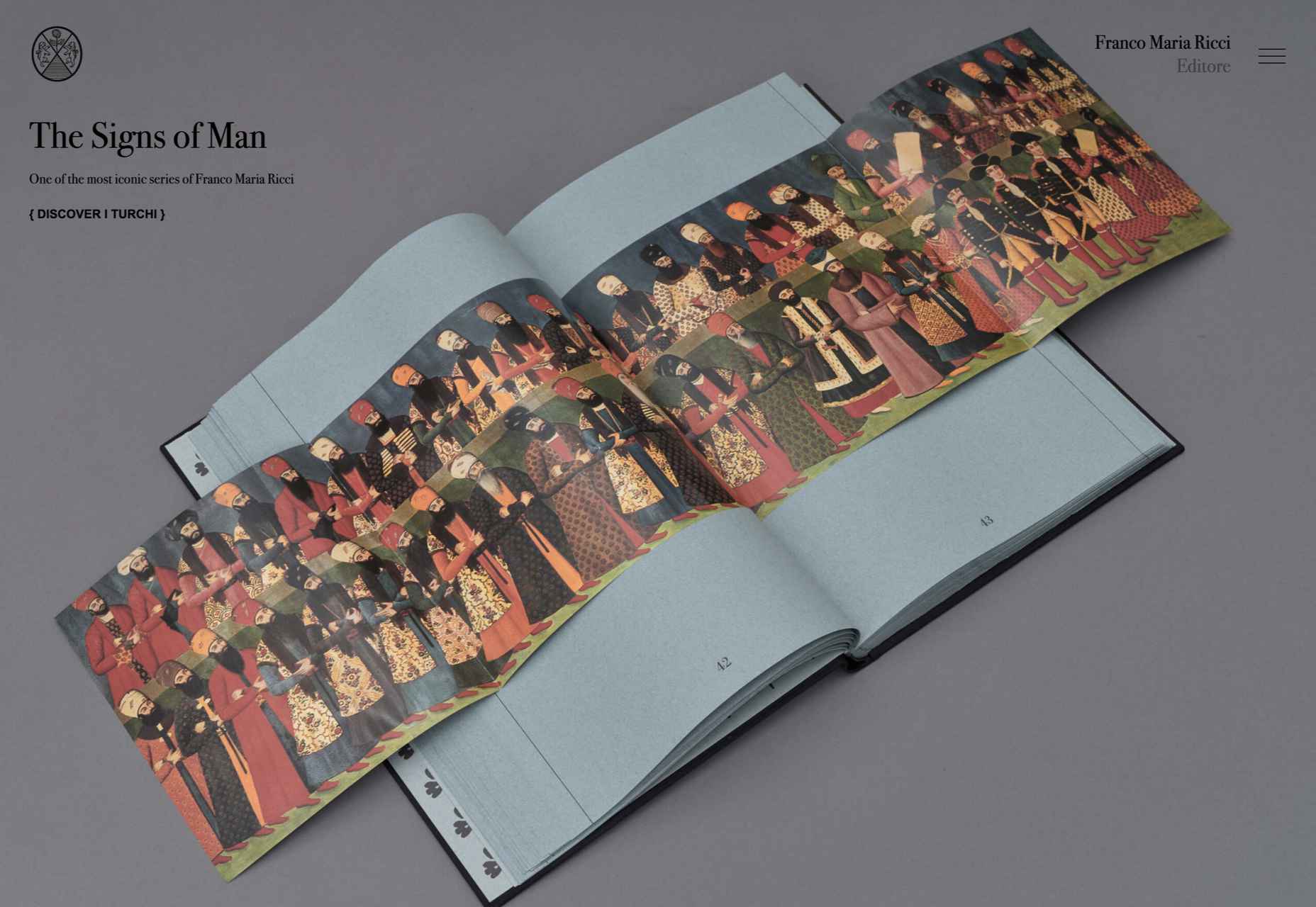
 We’re well on our way to Hallowe’en already, and it’s time for another collection of websites that have caught our eye.
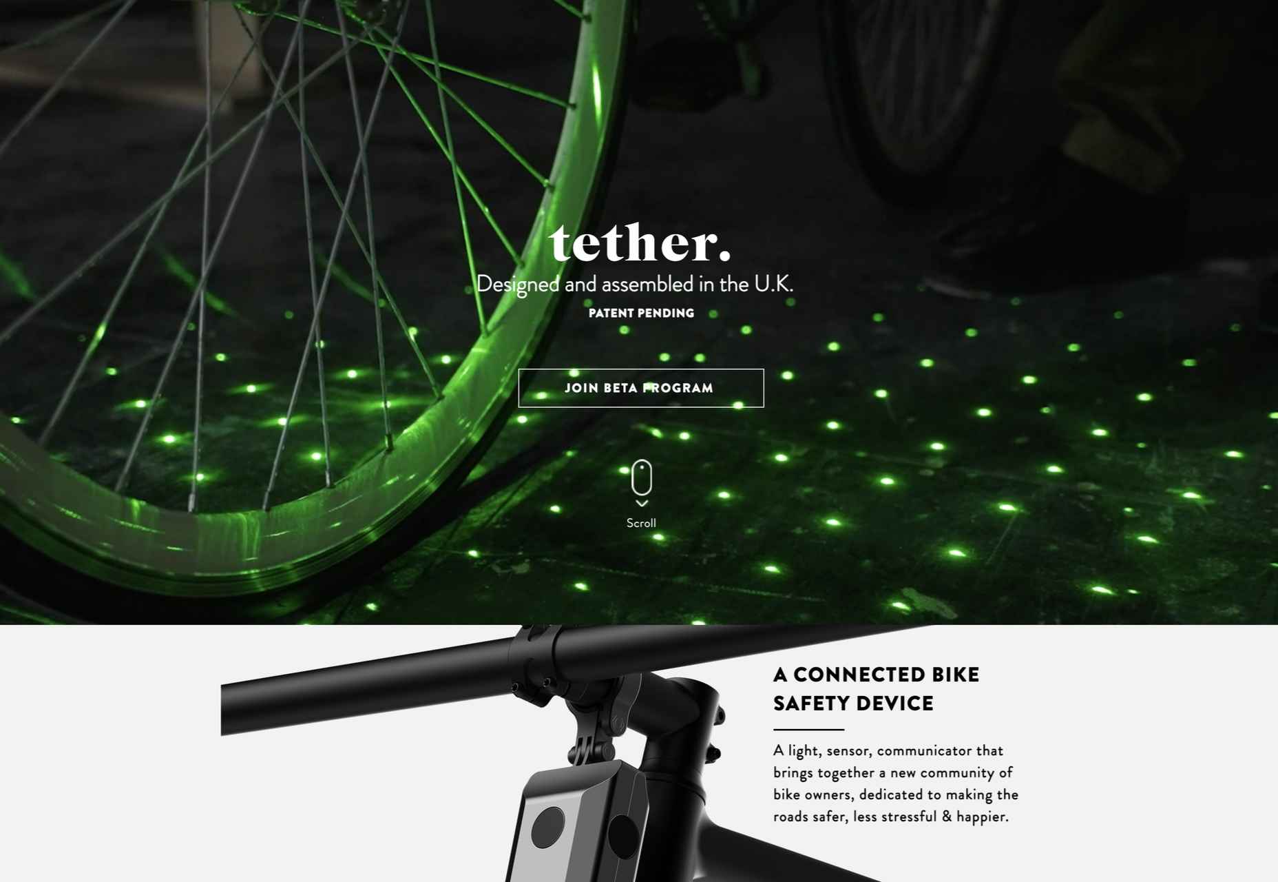


 Every day design fans submit incredible industry stories to our sister-site,


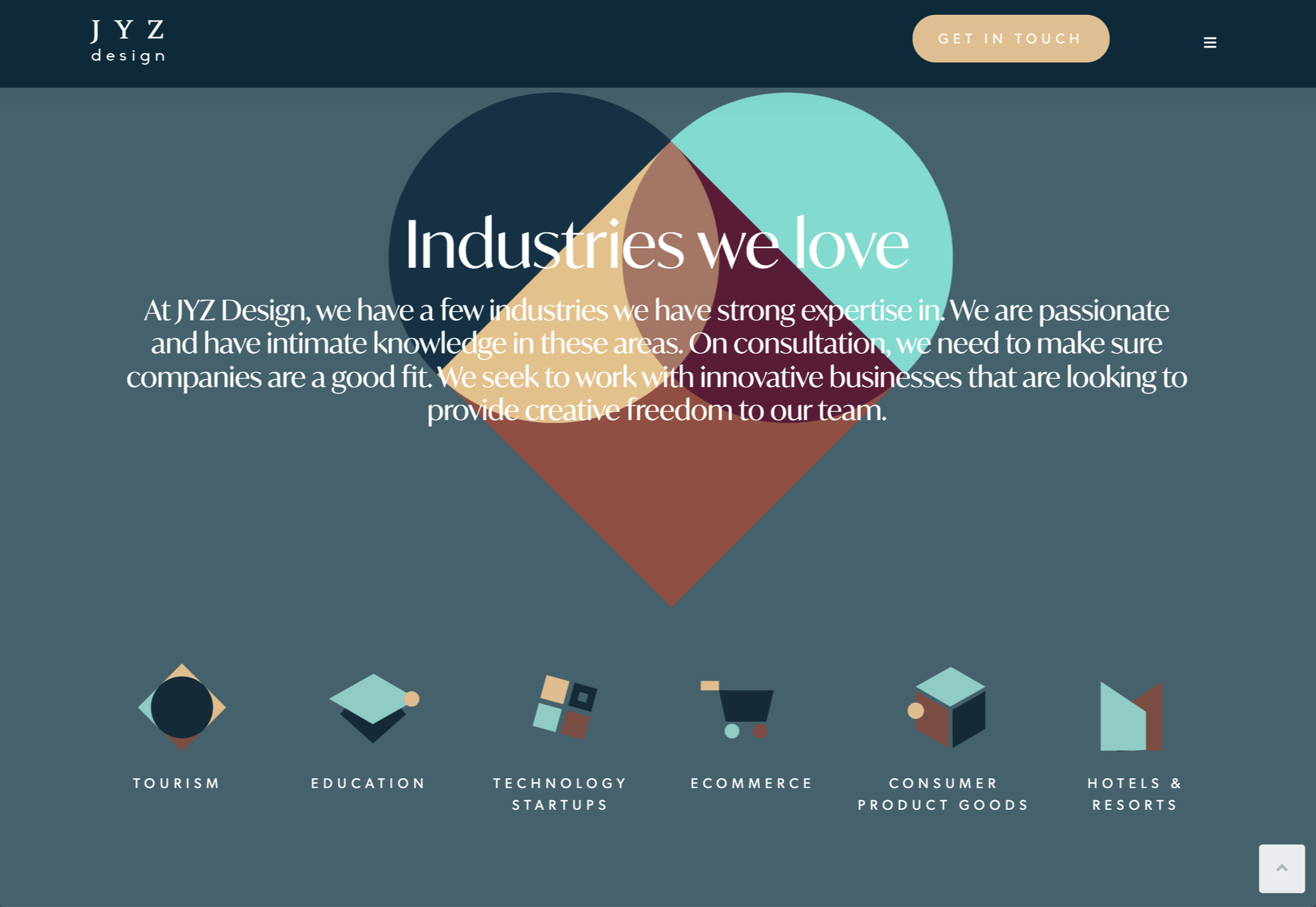
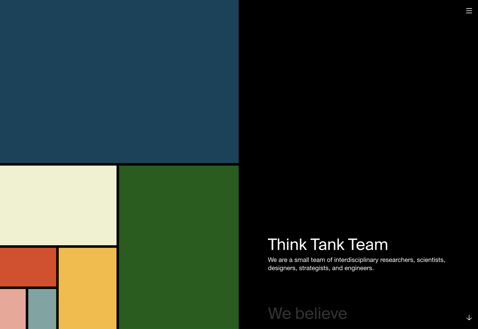
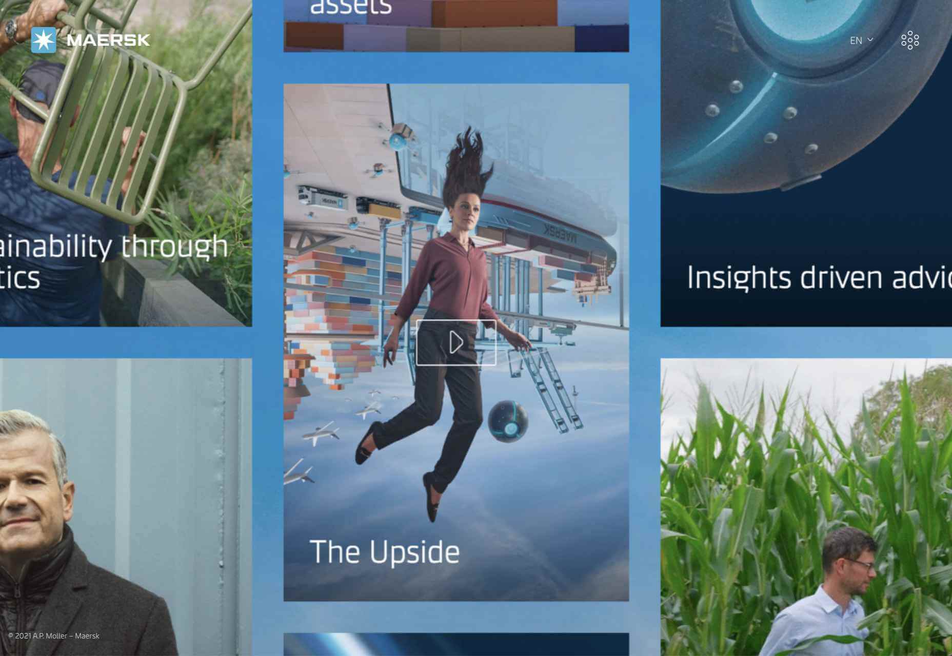
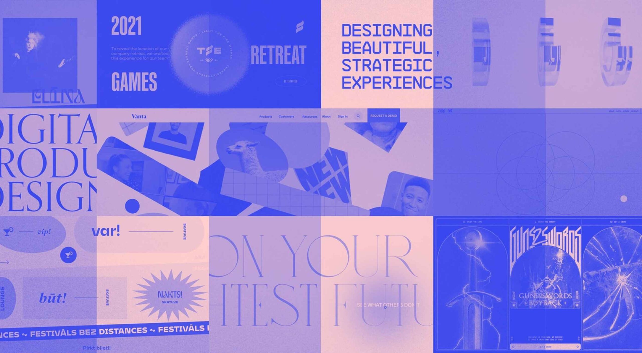
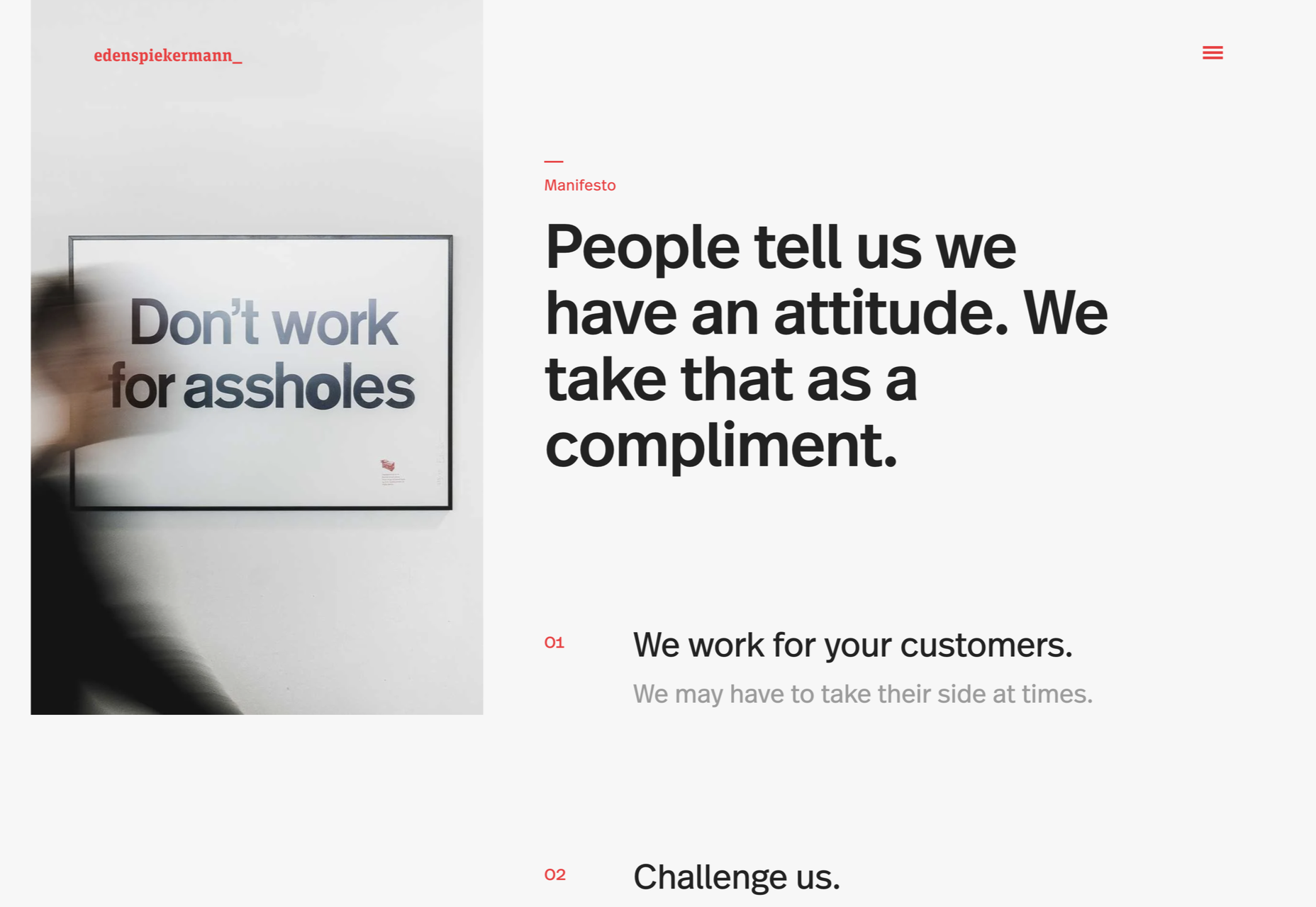
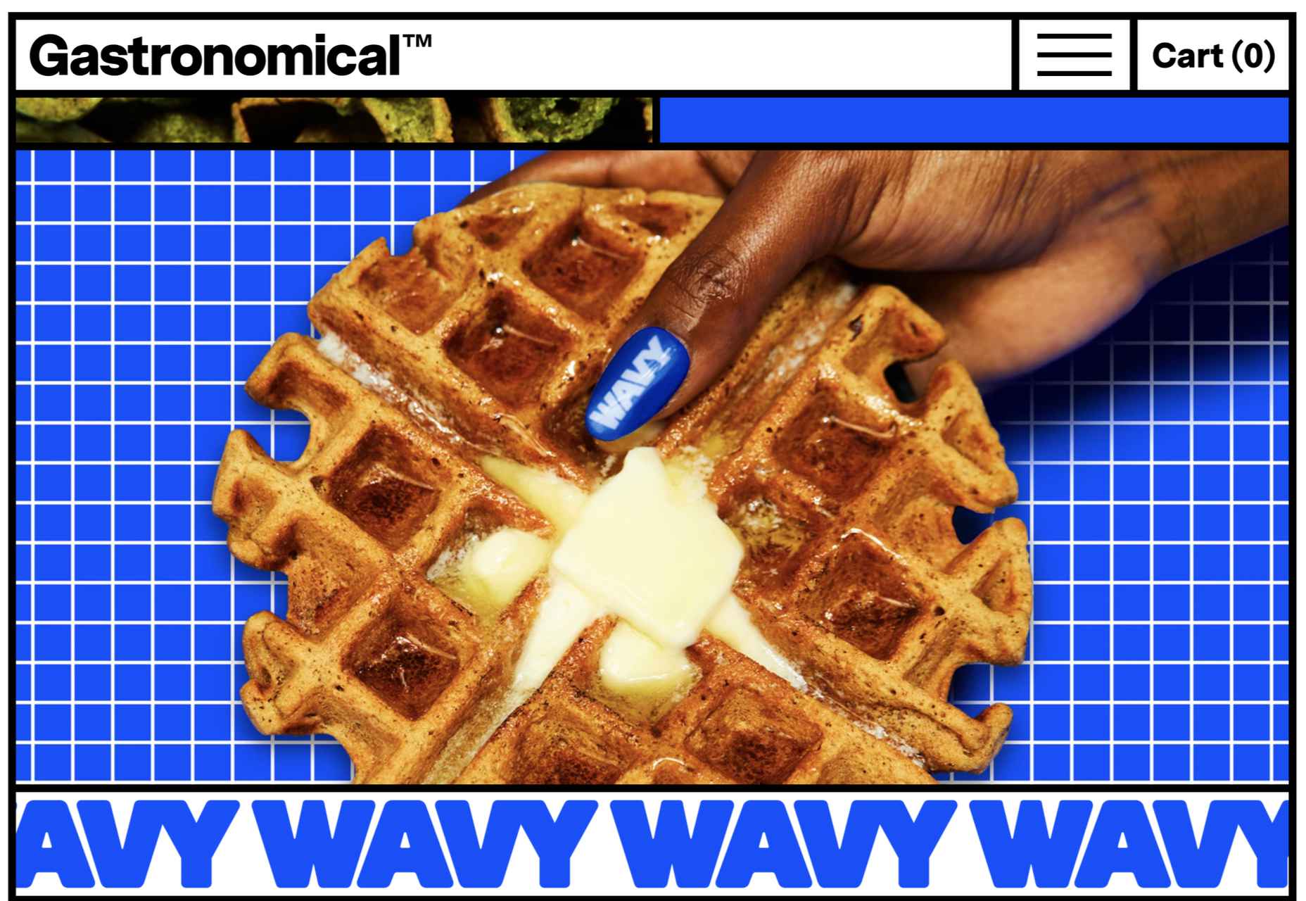
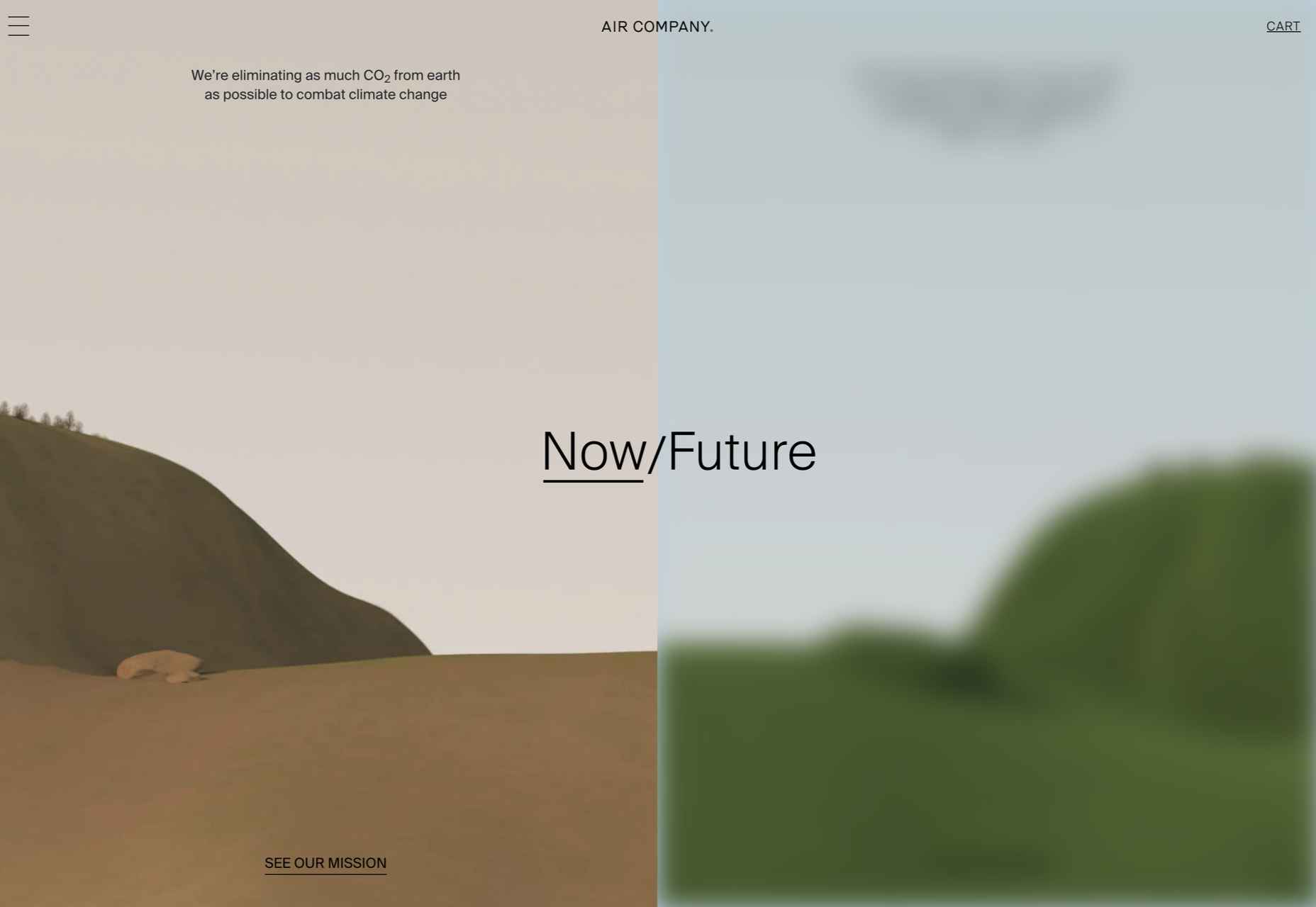
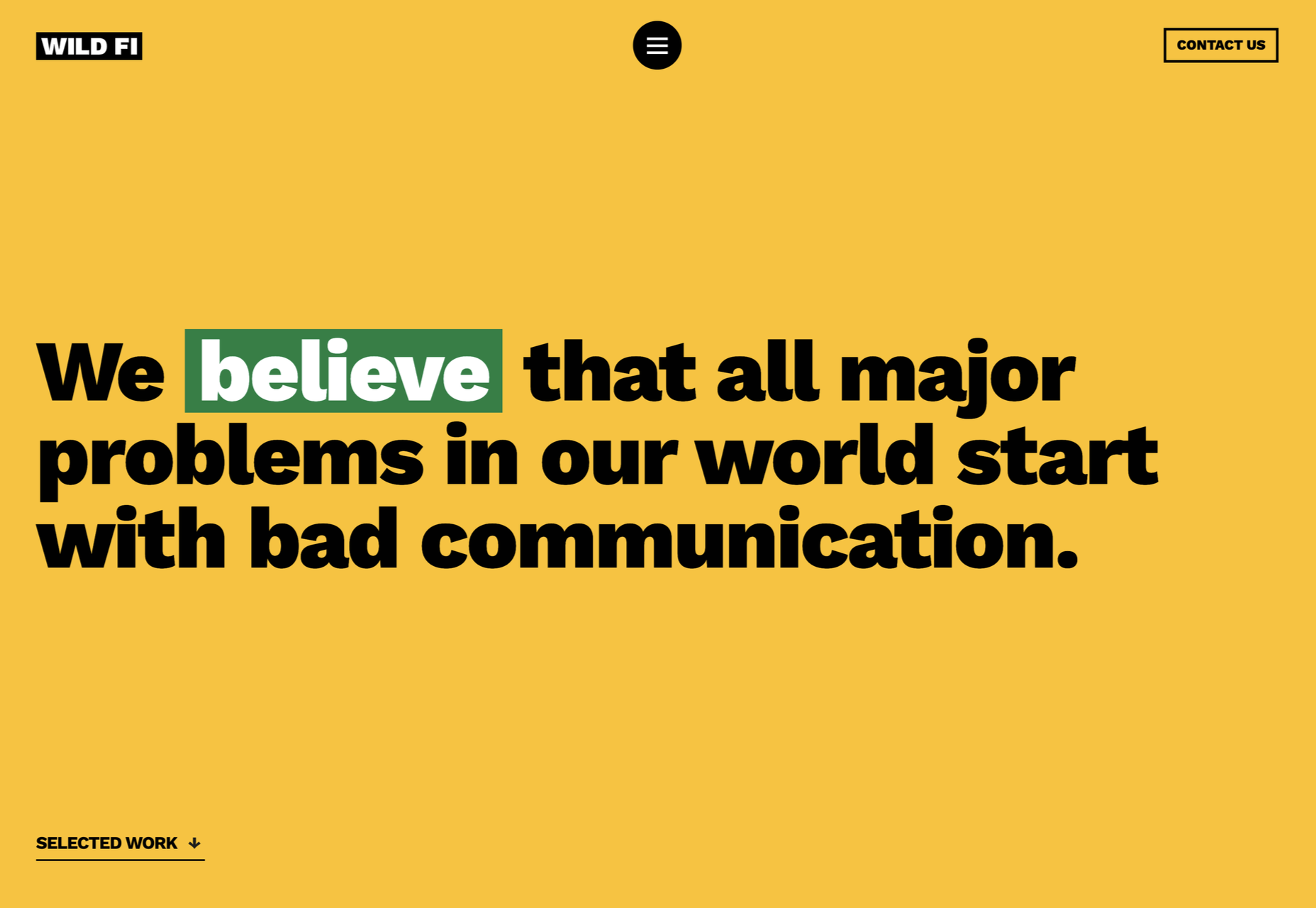
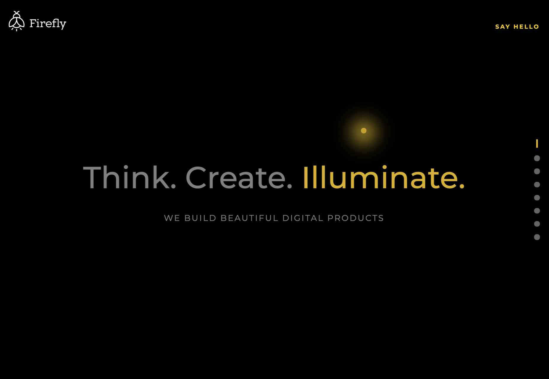
 Sometimes the designs that make the most impact do a lot of unexpected things and break some of the most tried and true rules of visual theory.


