 Whether you are looking for comprehensive tutorials on UX design or professional courses on topics like logo design, video or photo editing, there’s the perfect YouTube channel for you as a designer.
The best thing about YouTube is that you do not have to be a professional to jump into a video tutorial and gain the knowledge you need. There are many people who have become experts in, say, Photoshop by watching many hours of YouTube videos.
In 2022, there are established and emerging channels that you, as a designer, can use to get inspired and fix problems in your workflow.
Let us take a look at our 14 favorite YouTube channels for designers:
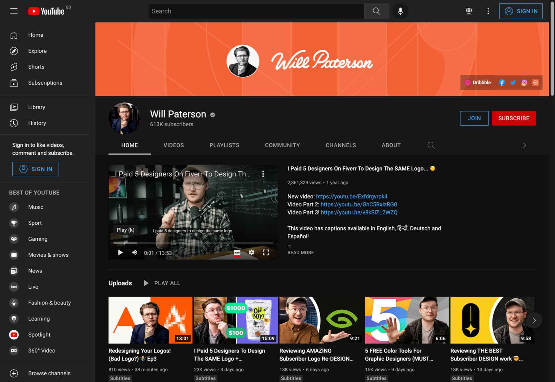
1. Will Paterson
Subject: Logo design, hand lettering, Illustrator tutorials
Subscribers: 608K
Creator: Will Paterson
Are you looking for a YouTube channel that will help you improve your logo designs and entertain you at the same time? If so, Will Paterson is the channel for you. Whether you are a professional designer or a beginner, this channel has everything you need: from logo design and Illustrator tutorials to product reviews and vlogs; nothing is left out.
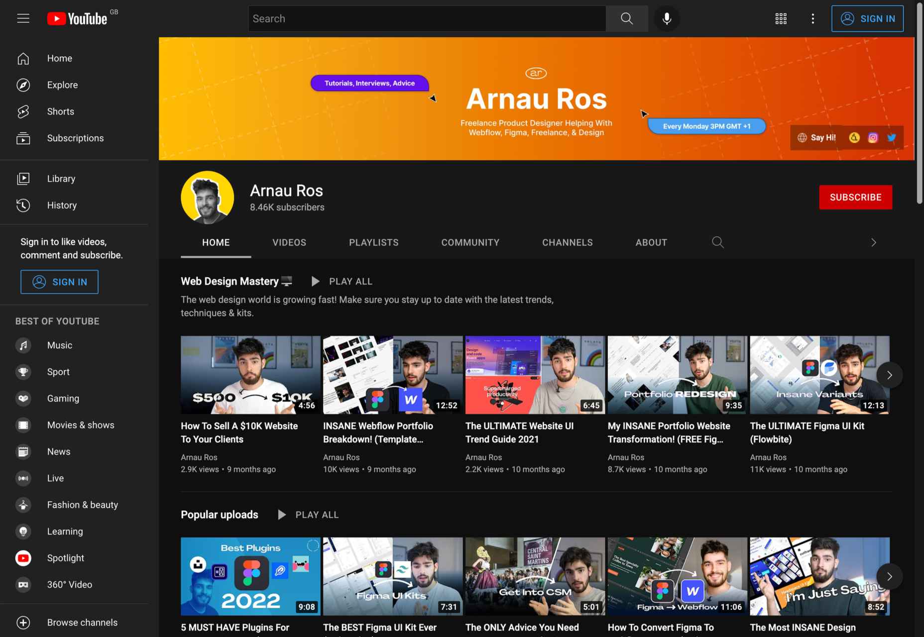
2. Arnau Ros
Subject: Web design (UI, UX), Freelancing, Figma tutorials
Subscribers: 7.7K
Creator: Arnau Ros
In about a year, Arnau Ros has managed to become one of our favorite YouTube channels. In a few words, Arnau is a very talented freelance product designer. He has published numerous videos on how to use Figma, one of the most popular problem-solving platforms for designers.
And that’s not all. Arnau has created a series of videos that will help you get started in the world of freelancing from scratch as a new designer.
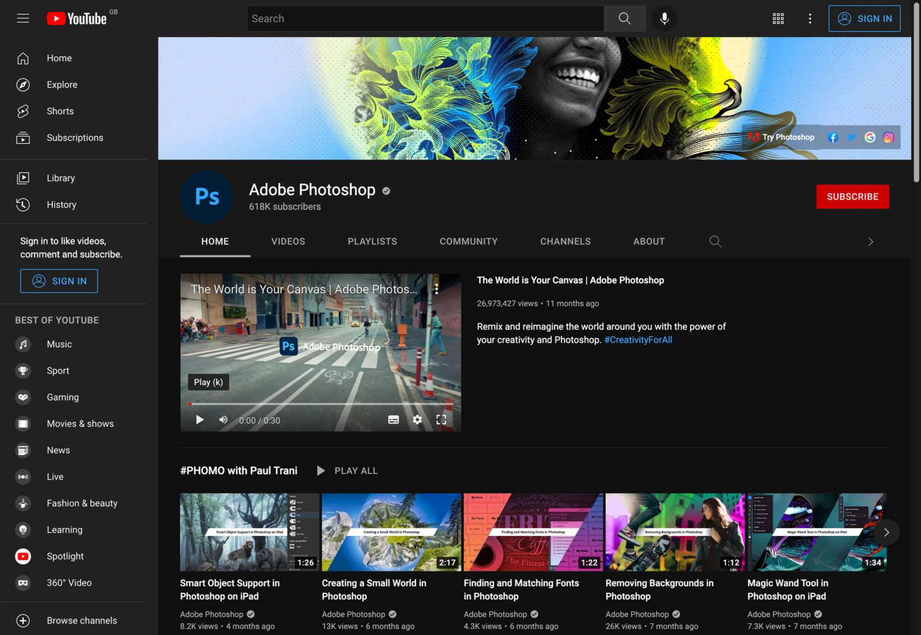
3. Adobe Photoshop
Subject: Photoshop tutorials
Subscribers: 618K
Creator: Adobe
Although there are numerous YouTube channels that offer top-notch Photoshop tutorials, the official Adobe Photoshop channel should not be underestimated. Adobe has created a quick start guide for most Photoshop features, toolboxes, etc. So if you need to quickly complete a task in Photoshop, this is the perfect channel for you.
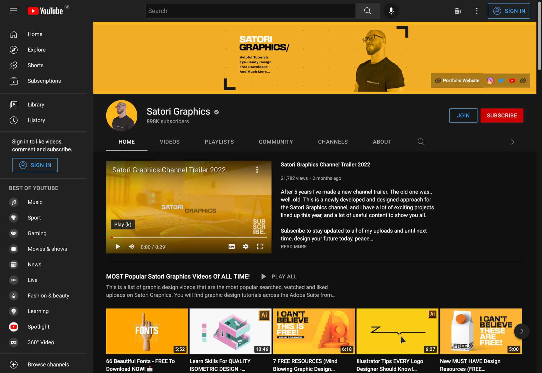
4. Satori Graphics
Subject: Freelancing, Graphic design guides (fonts, plugins, techniques, etc.)
Subscribers: 884K
Creator: Tom Cargill
From career development videos to poster and type designs to workflow tutorials, Satori Graphics has it all. We highly recommend this channel for beginners and designers who want to master Illustrator and create a top-notch portfolio for their design work.
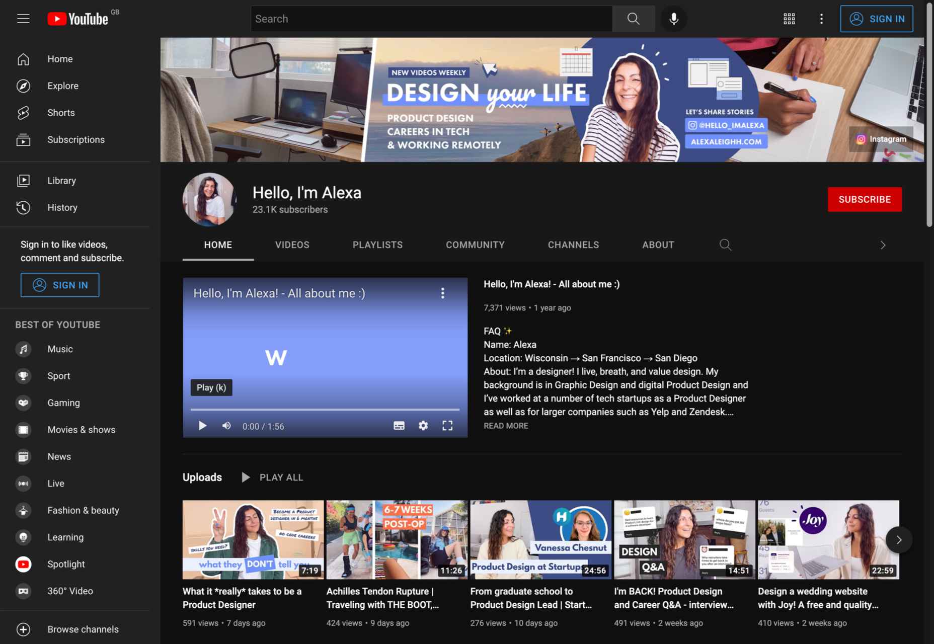
5. Hello, I’m Alexa
Subject: Freelancing, UX design, vlogs
Subscribers: 23K
Creator: Alexa Herasimchuk
Alexa’s YouTube channel is a great choice if you are a UX designer and want inspiration. What we love about Alexa is that her channel covers everything a UX and product designer needs to know. Be sure to check out the fascinating video discussions with other designers that she has uploaded.
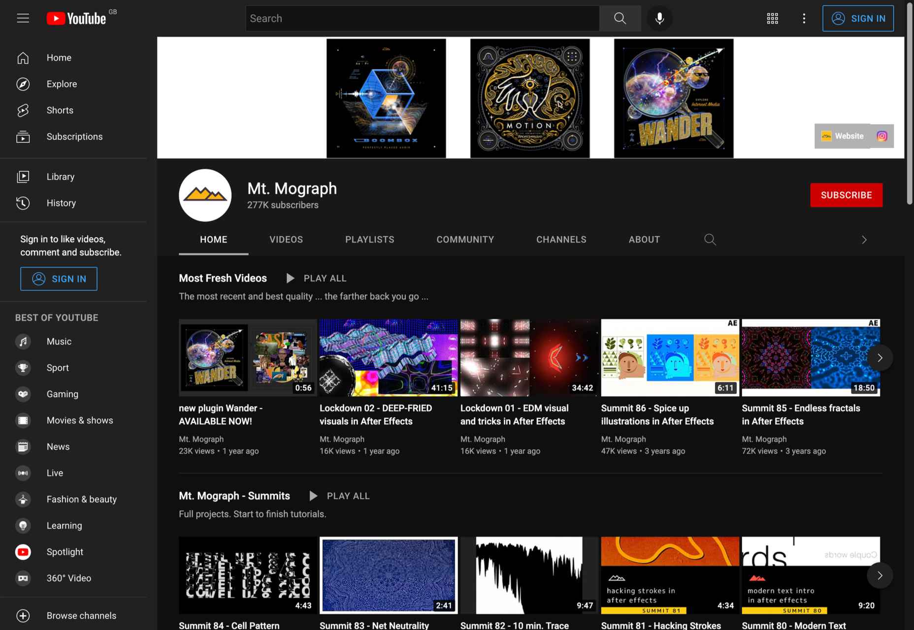
6. Mt. Mograph
Subject: 3D animation, motion graphics guides, Adobe After Effects
Subscribers: 277K
Creator: Mt. Mograph co.
For more than 3 years, Mt. Mograph has been one of the most popular YouTube channels for graphic designers. The channel is especially popular among creatives who want to learn more about 3D animation, geometric motion, and need the best After Effects tutorials.
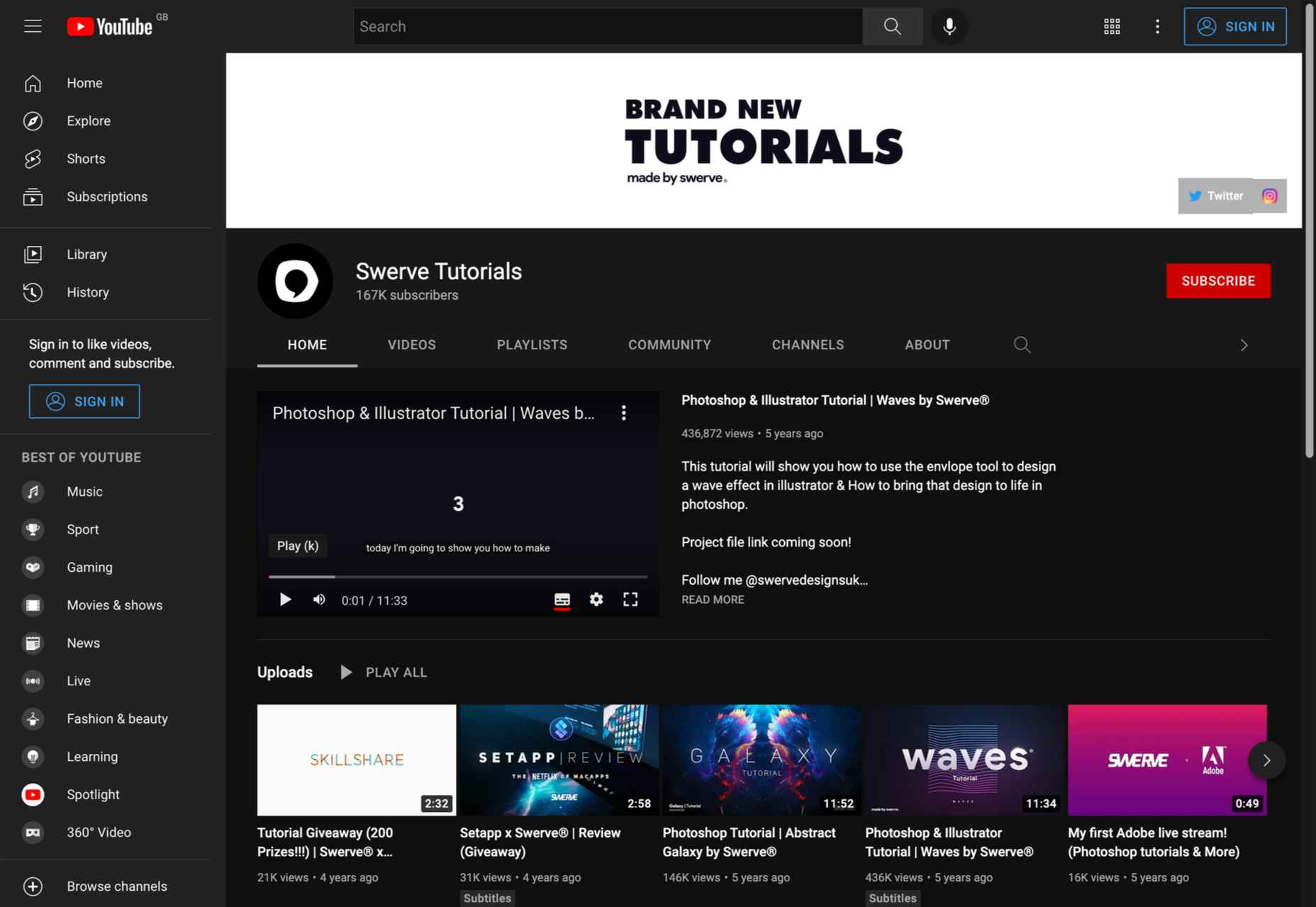
7. Swerve Tutorials
Subject: Photo editing, motion graphics
Subscribers: 167K
Creator: Swerve
Swerve has created some of the most comprehensive how-to videos for Photoshop, Illustrator, and Motion Graphics. The channel’s speed art videos are extremely inspiring. Even though the channel is not constantly updated, it already contains many videos that you should definitely watch.
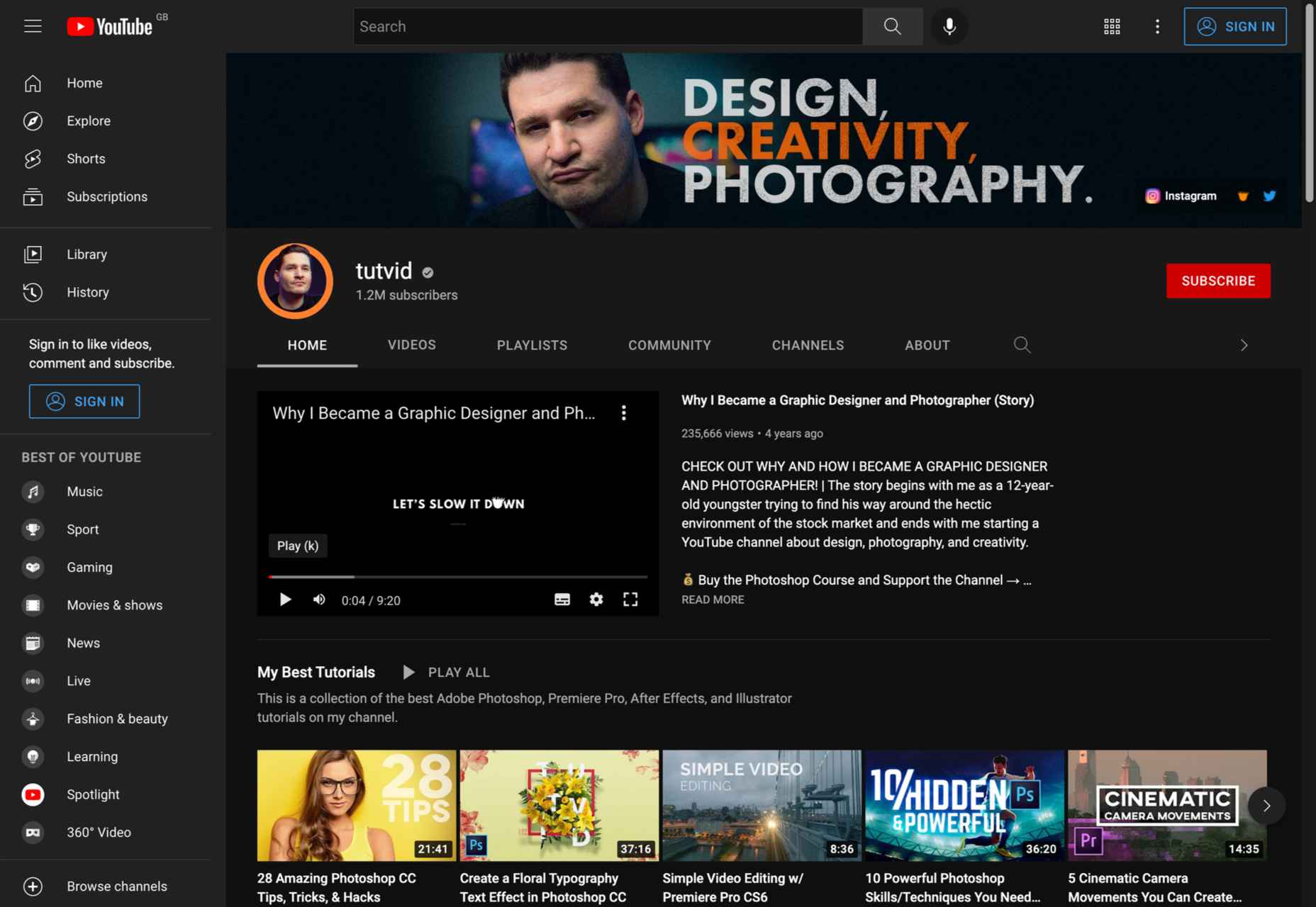
8. Tutvid
Subject: Graphic design software (Illustrator), Photo and video editing (Photoshop, Premiere, Lightroom)
Subscribers: 1.19M
Creator: Nathaniel Dodson
Tutvid needs no introduction. With more than 1 million subscribers, this has been one of the most popular YouTube channels for creatives for years. When it comes to tutorials about Adobe Creative Cloud software, nothing beats this channel.
If you are looking for comprehensive tutorials on Adobe Photoshop, Illustrator, Lightroom, and Premiere, Nathaniel Dodson is your man.
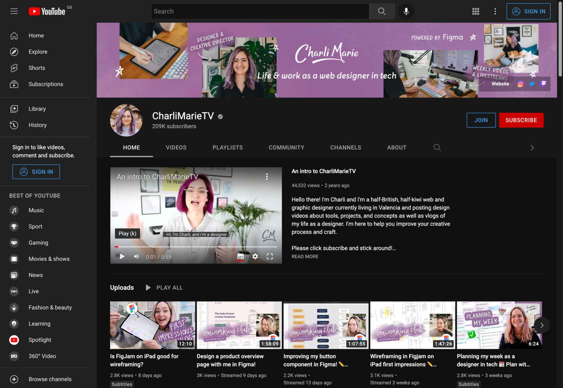
9. CharliMarieTV
Subject: Freelancing, web development, chats and vlogs
Subscribers: 209K
Creator: Charli Prangey
If you are not yet familiar with the digital nomad lifestyle, be sure to check out the CharliMarieTV channel. Charli is a freelance web designer and entrepreneur who has created some of the best videos on website design, coding, remote work, and more.
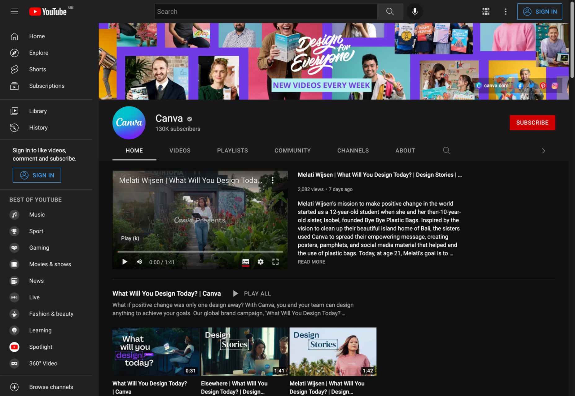
10. Canva
Subject: Canva tutorials
Subscribers: 126K
Creator: Canva
Canva is a popular web-based graphic design platform. Like the official Adobe Photoshop channel, this is the best way to quickly learn how to use Canva software. In addition to quick tutorials, this channel includes videos with all the important software updates and in-depth Canva workshops.
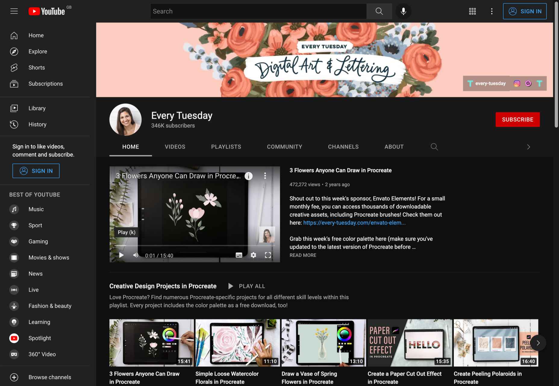
11. Every Tuesday
Subject: Graphic design guides for Procreate
Subscribers: 345K
Creator: Teela Cunningham
When it comes to Procreate tutorials, there’s nothing better than Every Tuesday. The channel has different playlists for beginners, intermediate and professional creatives. From hand lettering projects to watercolor flowers to digital gouache, you’ll find everything you need to master Procreate on Teela’s channel.
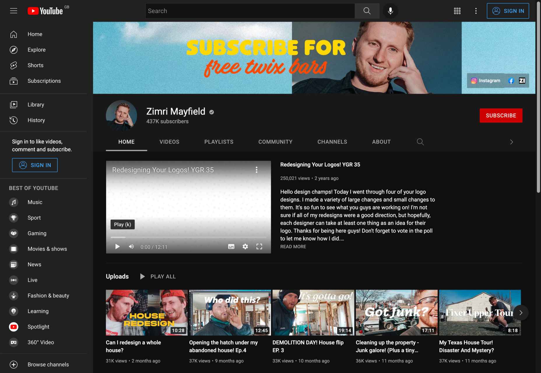
12. Zimri Mayfield
Subject: Logo design tutorials, vlogs, logo redesign
Subscribers: 437K
Creator: Zimri Mayfield
Those of you who love logo designs probably already know all about Zimri Mayfield’s channel. Professionalism and a great sense of humor are combined in one of the most inspiring YouTube channels for designers.
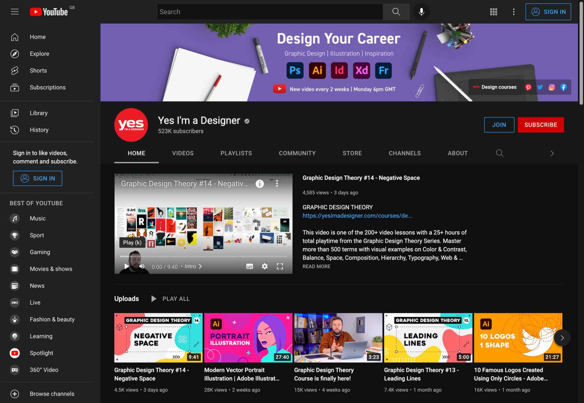
13. Yes I’m a Designer
Subject: Adobe creative cloud tutorials
Subscribers: 517K
Creator: Martin Perhiniak
As a certified Adobe design master and instructor, Martin Perhiniak has created a must-follow channel on YouTube. From basic Photoshop and Illustrator tutorials to advanced masking tutorials, you’ll find it all at Yes I’m a Designer.
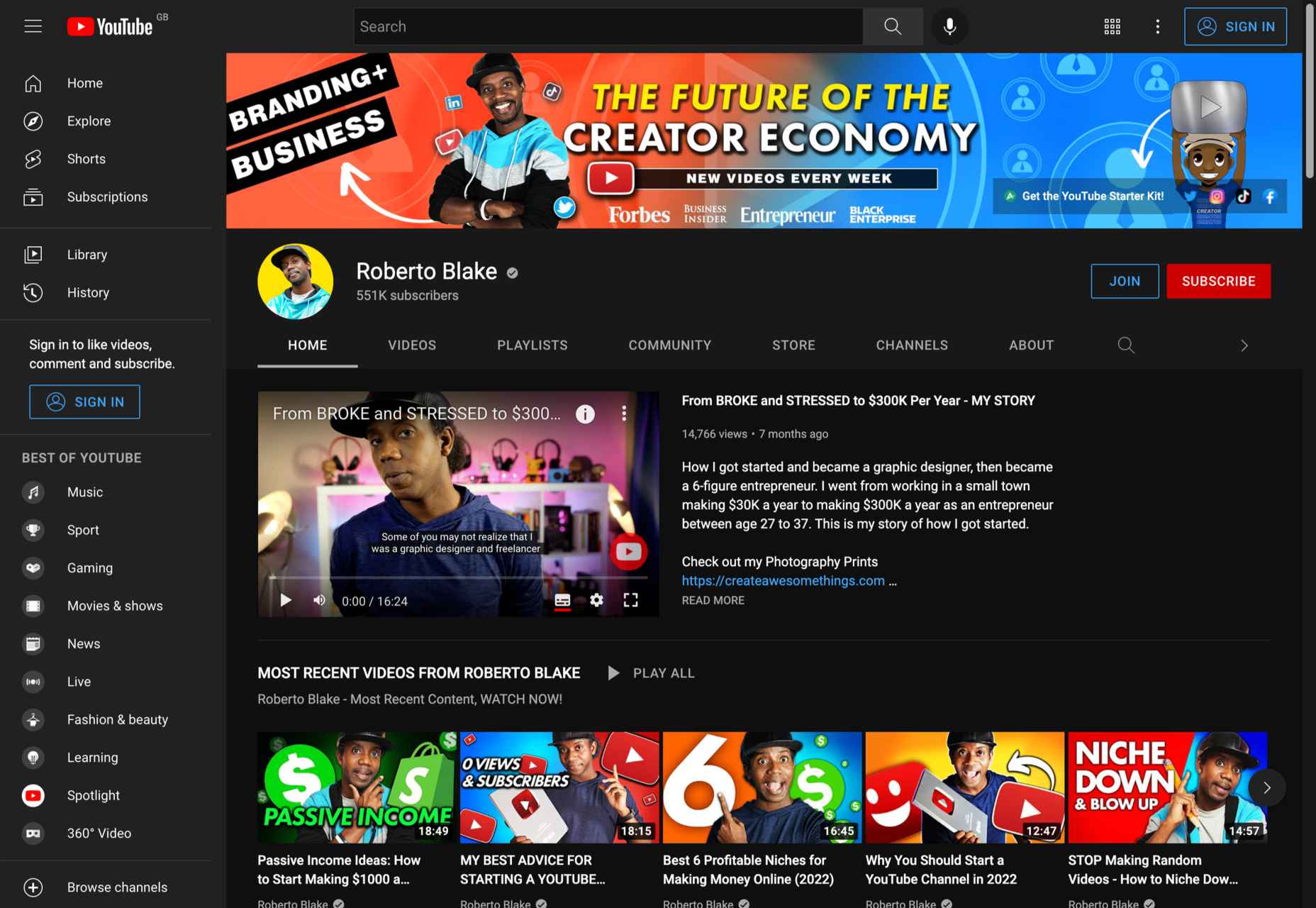
14. Roberto Blake
Subject: Adobe tutorials, brand/business development
Subscribers: 549K (as of March 2022)
Creator: Roberto Blake
If you are looking for something more than graphic design tutorials, our last suggestion is perfect. Roberto Blake has created numerous Photoshop, Dreamweaver, Illustrator, and Indesign tutorials, but also gives numerous talks and shares his knowledge on video marketing and brand development.
Wrap Up
Although there are numerous YouTube channels for designers, these are our absolute favorites. Of course, that does not mean there are not more equally successful and inspiring designers on YouTube. Made by Mighty, Sketch Together and Ch-Ch-Check It are just a few more examples of great YouTube video creators if you search for a specific topic.
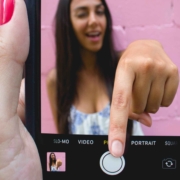
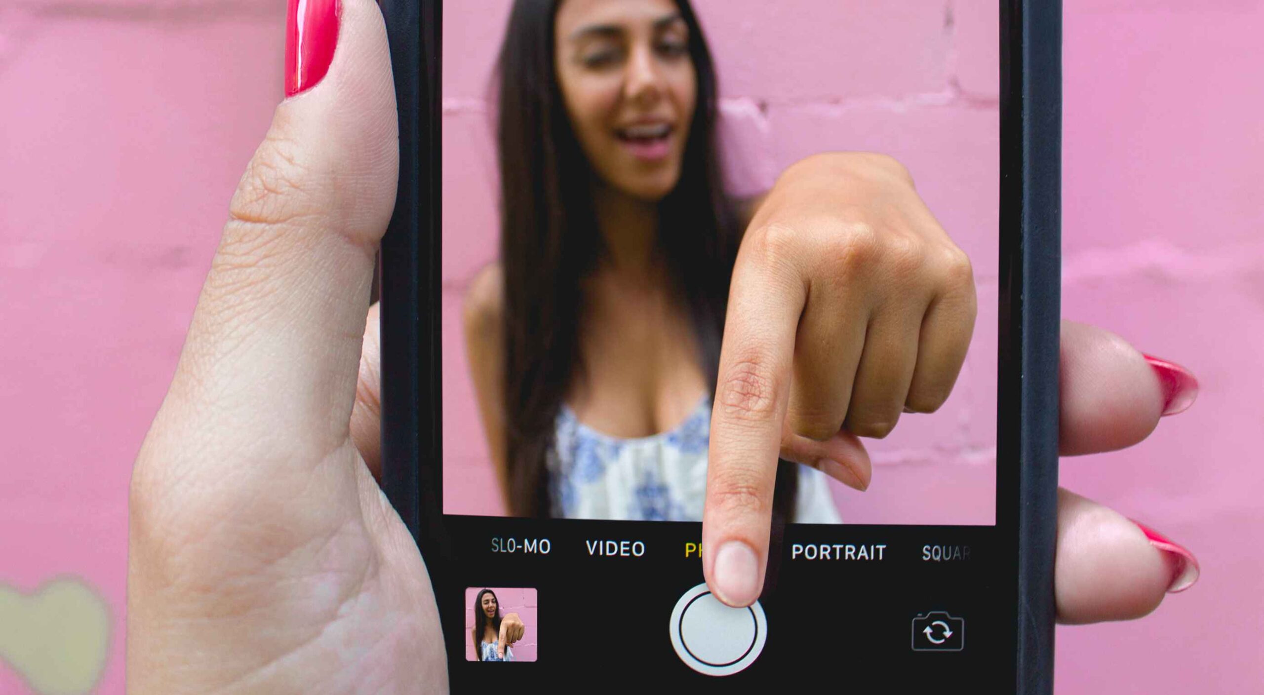
Featured image via Unsplash.
Source
The post 14 Best YouTube Channels for Designers in 2022 first appeared on Webdesigner Depot.
Source de l’article sur Webdesignerdepot
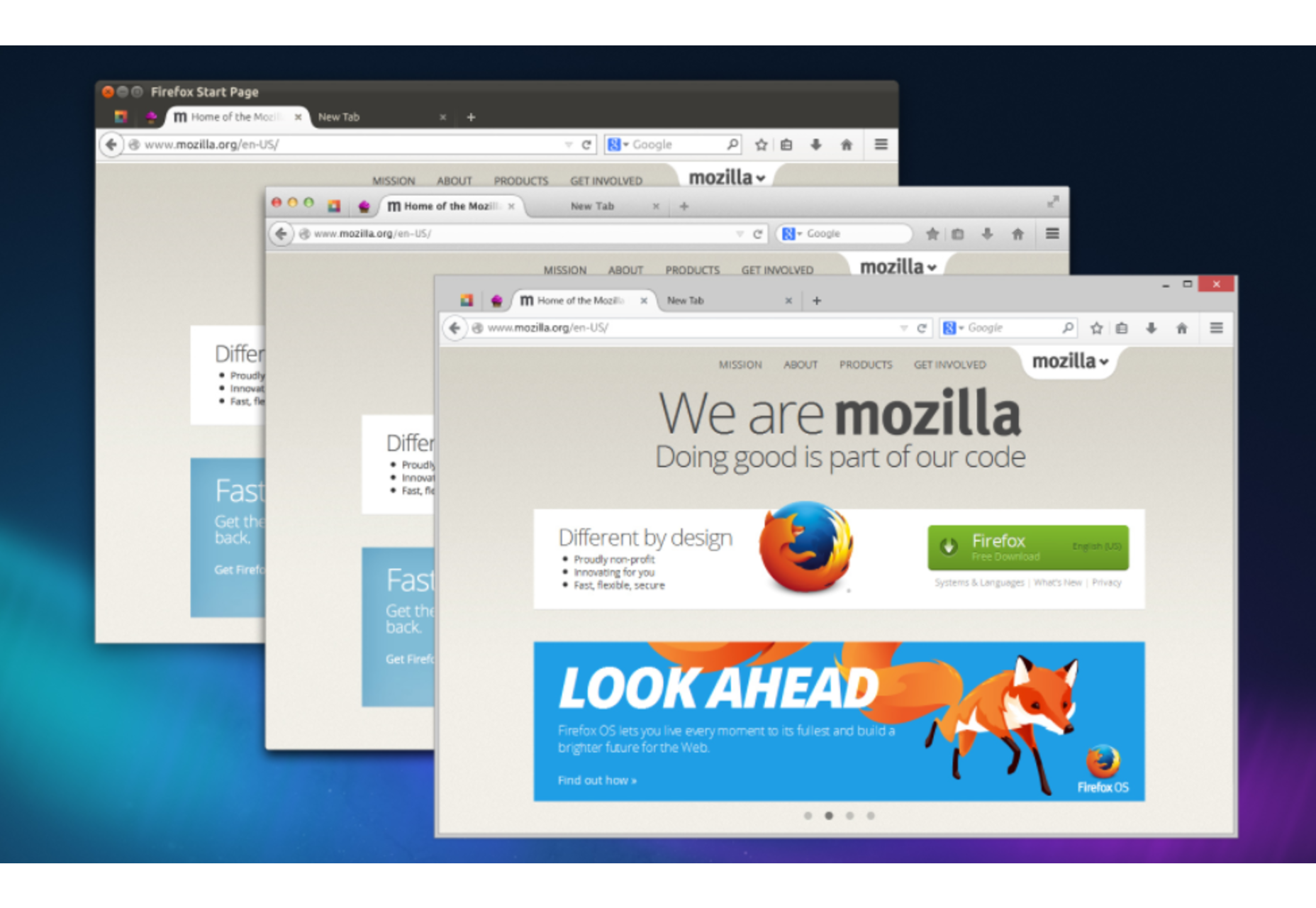
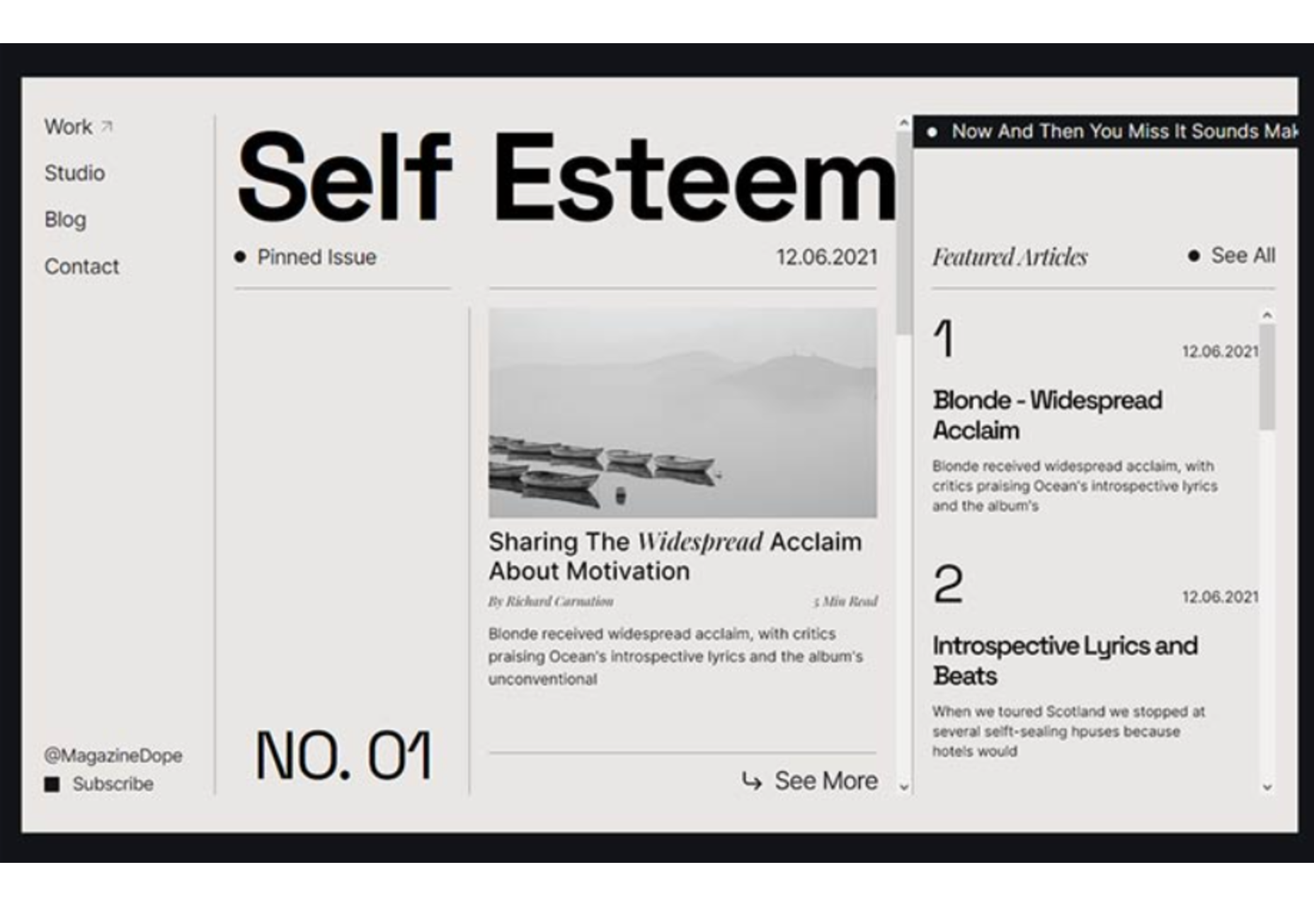
 Designing for user experiences is what all designers do. UX is often thought of as the preserve of app or web designers; however, even a print designer laying out a magazine anticipates reader reaction to the scale of type, the placement of adverts, and the art direction of successive stories.

 Every day design fans submit incredible industry stories to our sister-site, Webdesigner News. Our colleagues sift through it, selecting the very best stories from the design, UX, tech, and development worlds and posting them live on the site.


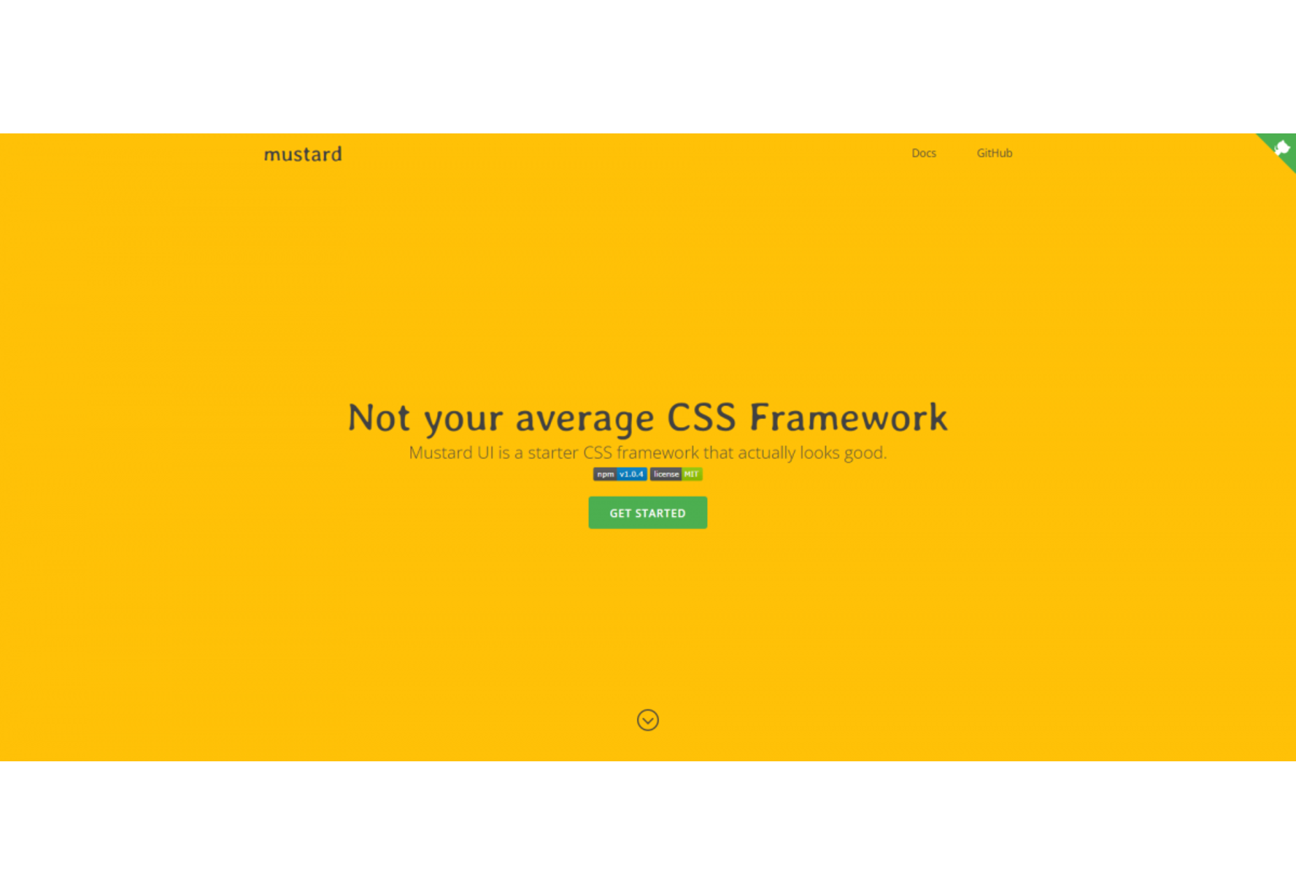
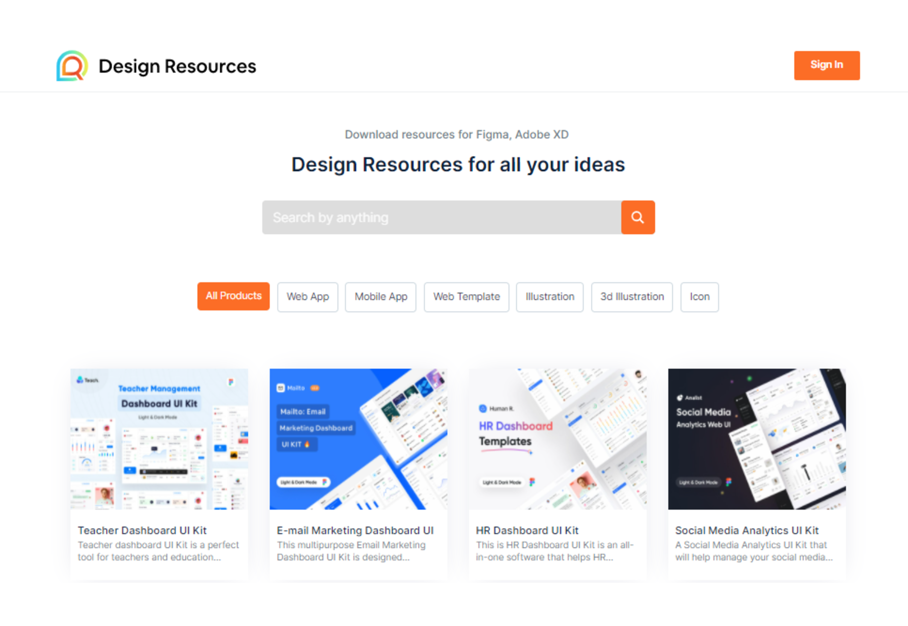
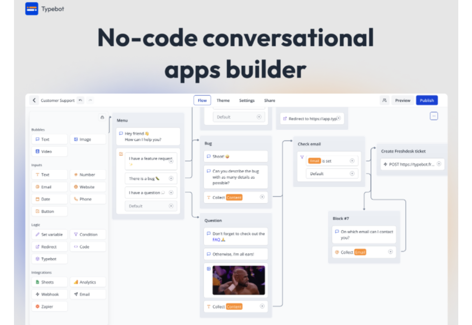
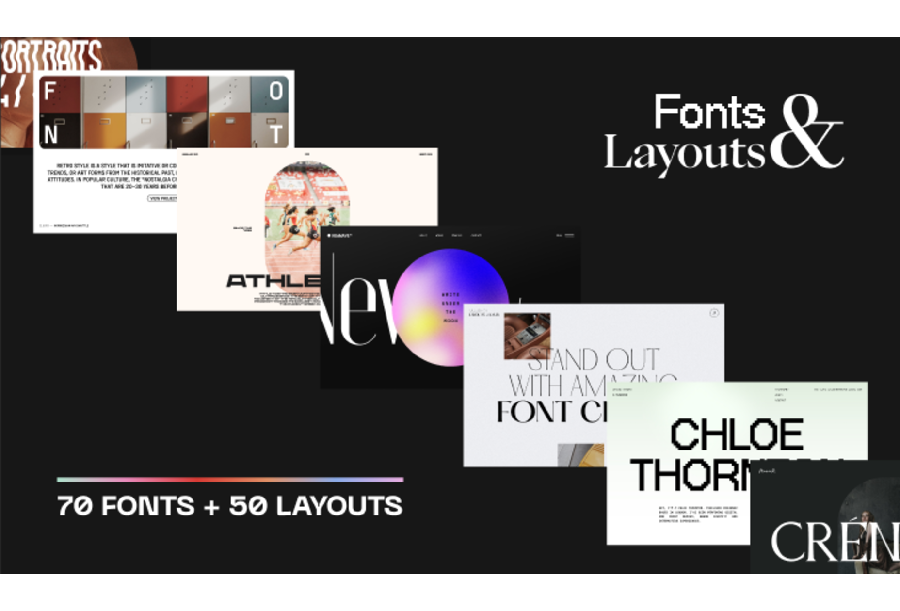

 Every day design fans submit incredible industry stories to our sister-site, Webdesigner News. Our colleagues sift through it, selecting the very best stories from the design, UX, tech, and development worlds and posting them live on the site.
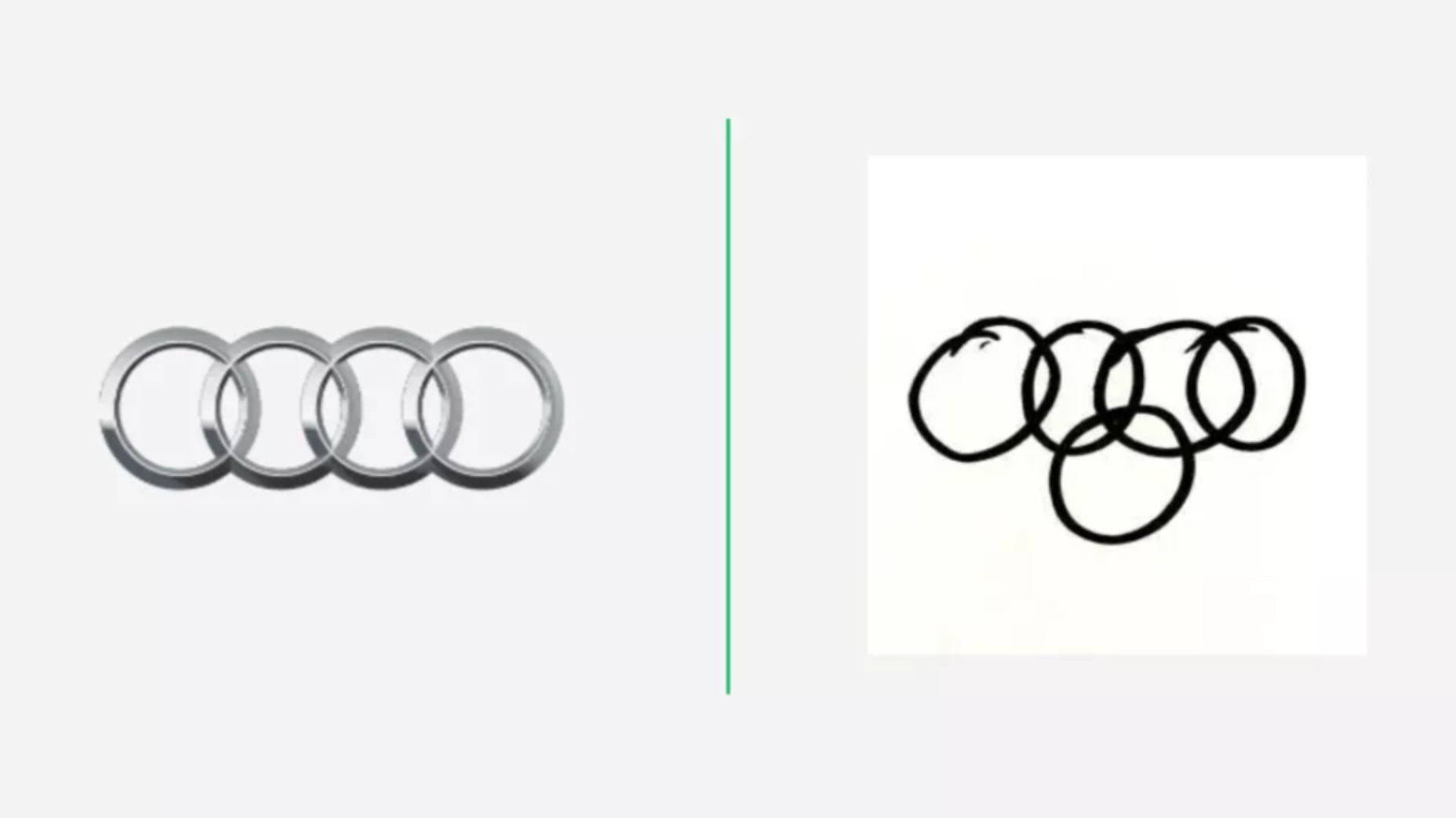

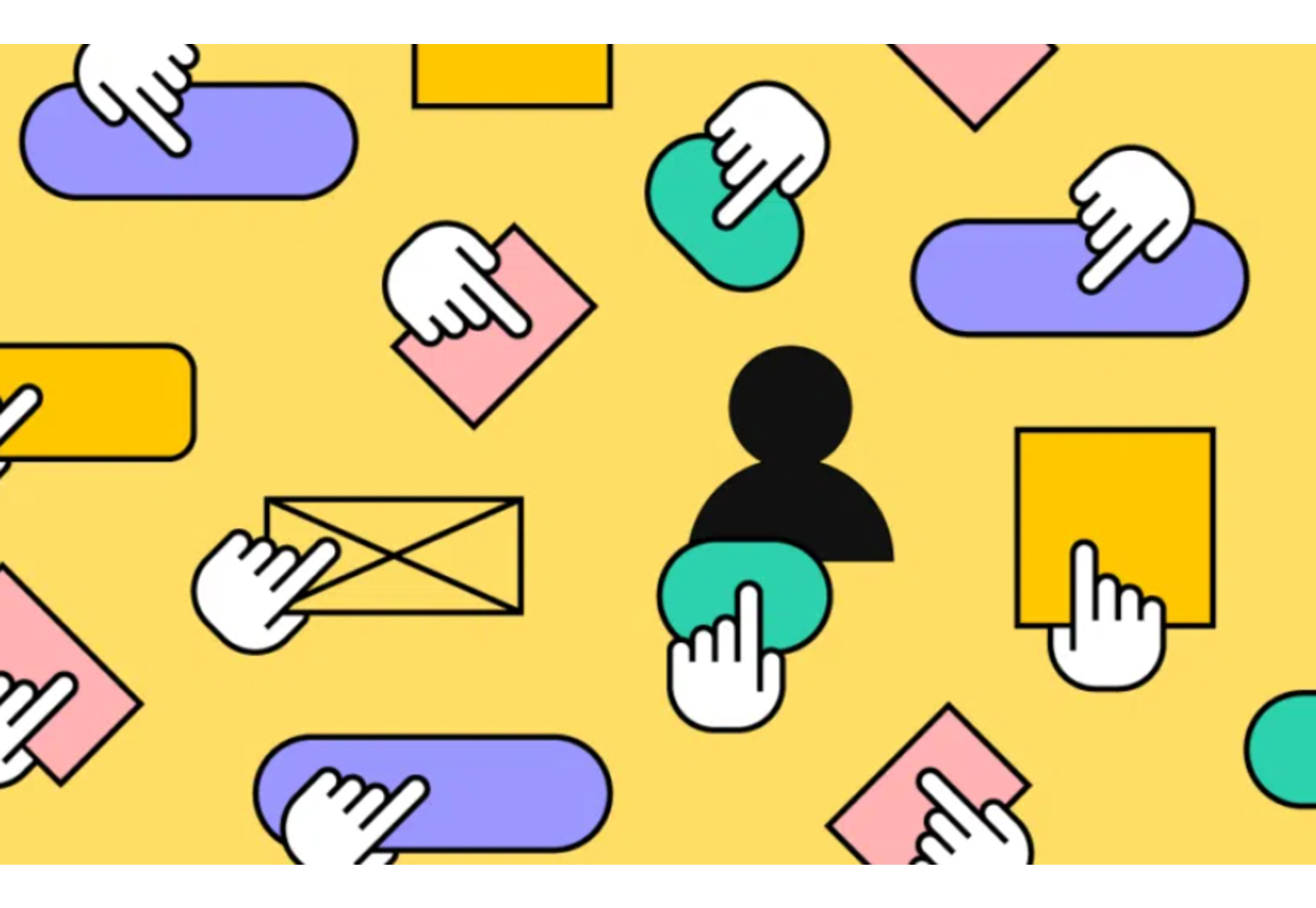
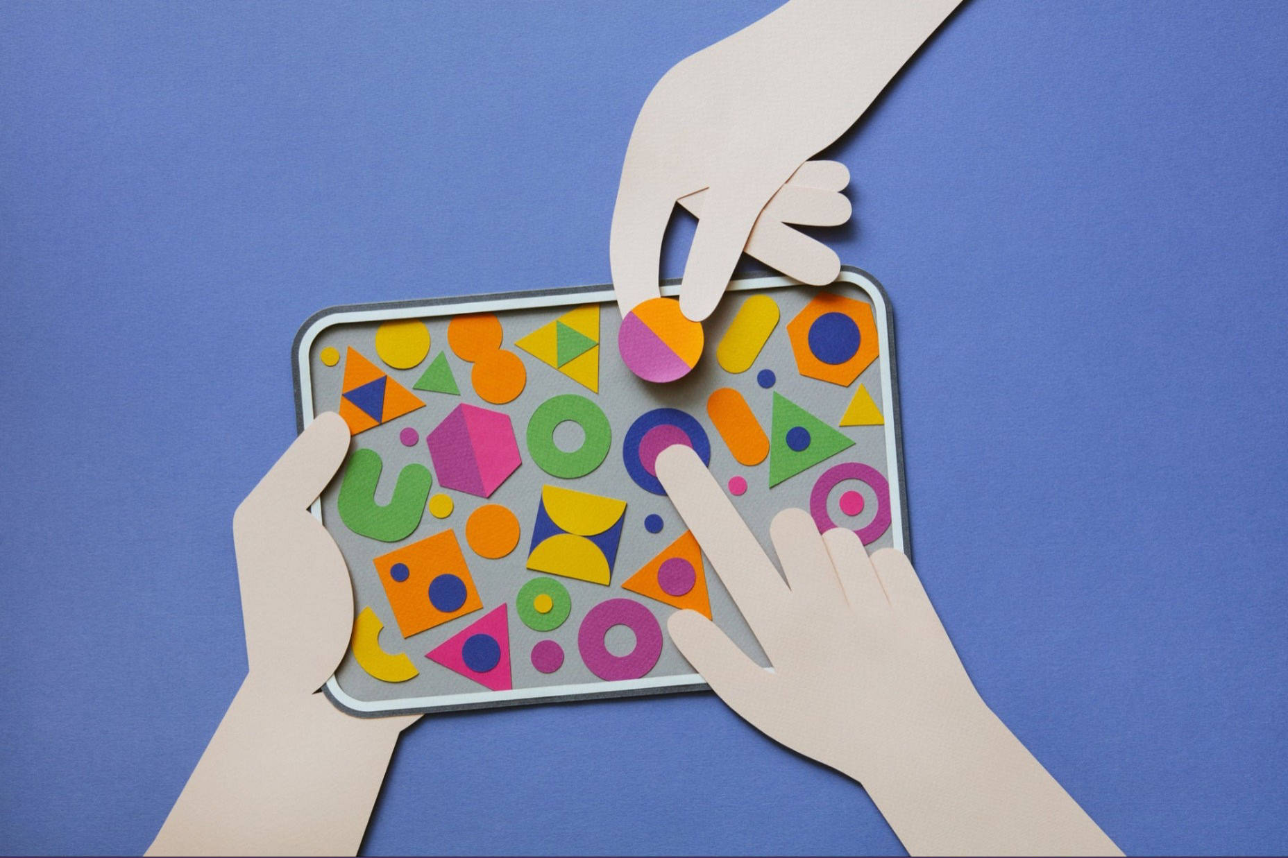
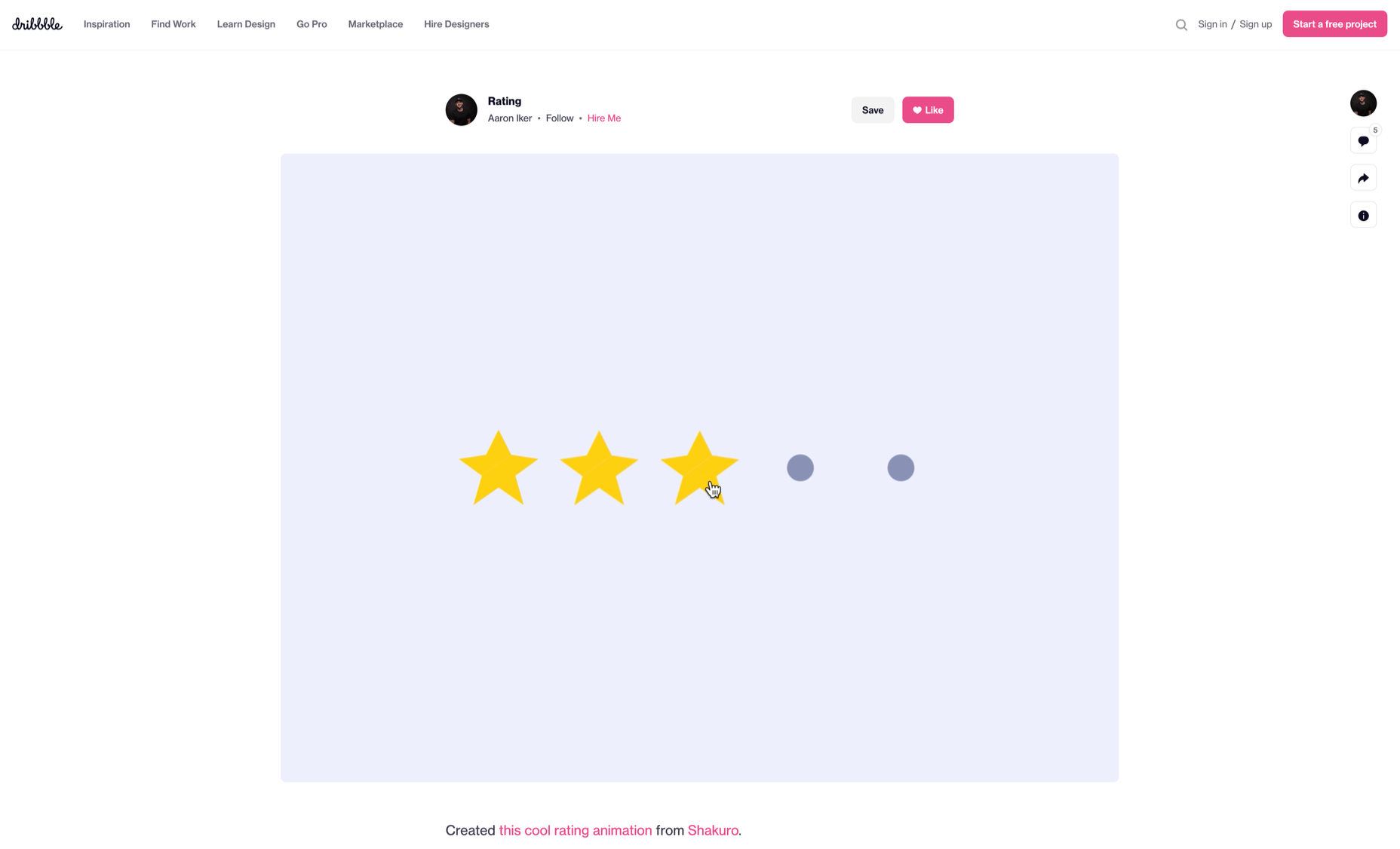
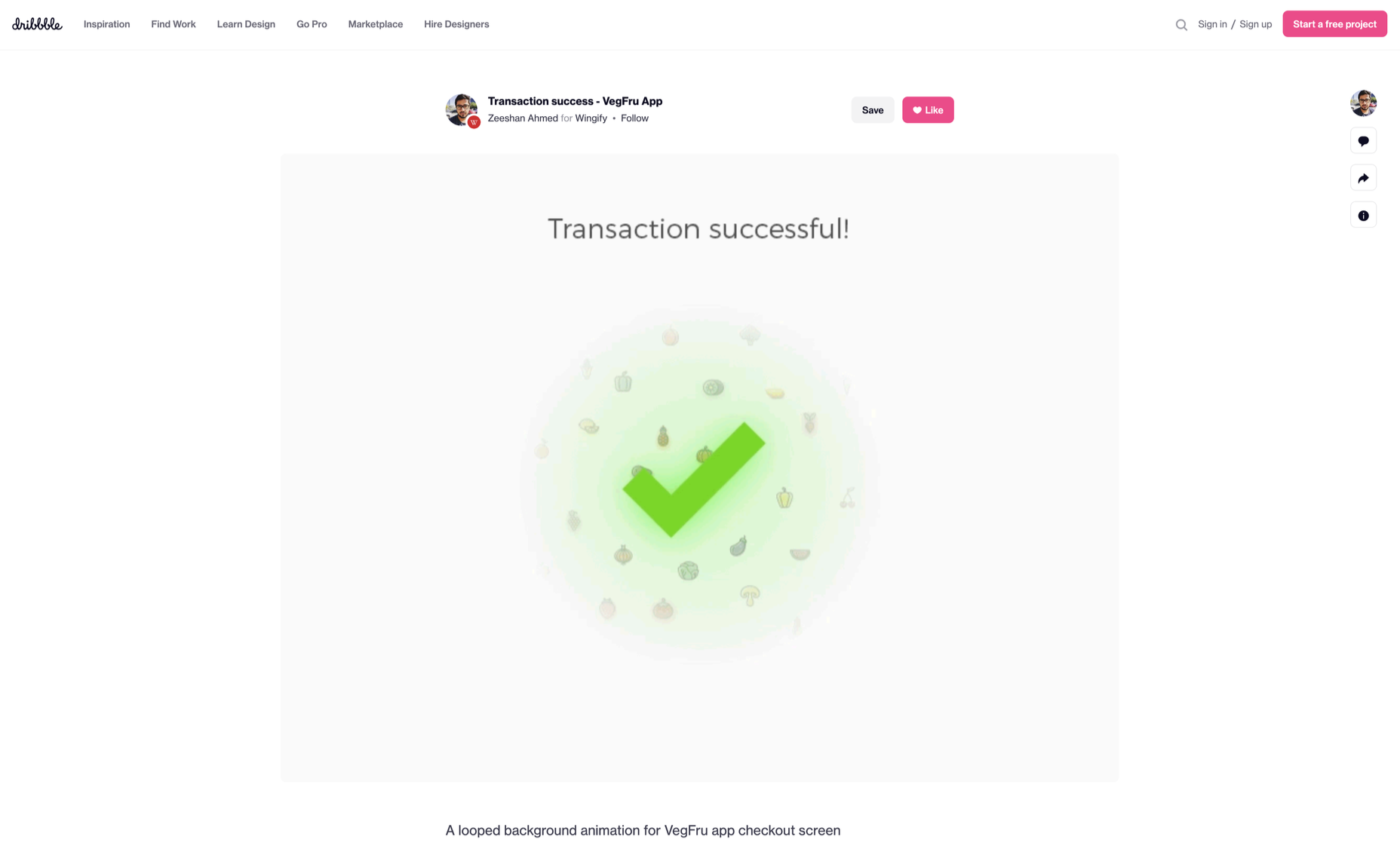
 Micro-interactions effectively communicate brand identity and ethos while strengthening ties with the customer. These habit-forming tools make for a fun and seamless user experience. Facebook’s ‘likes’ and Tinder’s ‘swipes’ are two classic examples.
 If you want to know how well-dressed someone is, look at their shoes. Shoes tell you a lot about a person’s style, activities, and choices. We often choose clothes to deceive people about who we are — we want to be brighter, more successful, more relaxed, more adventurous than we actually are. But, our shoes paint an honest picture and offer endless insights into who the wearer is.