Articles

Like so many others in the Apache Cassandra community, I’m extremely excited to see that the 4.0 release is finally here. There are many, many improvements to Cassandra 4.0. One enhancement that is more important than it might look is the addition of support for Java versions 9 and up. This was not trivial, because Java 9 made changes to some internal APIs that the most performance-oriented Java projects like Cassandra relied on (you can read more about this here).

This is a big deal because with Cassandra 4.0, you not only get the direct improvements to performance added by the Apache Cassandra committers, you also unlock the ability to take advantage of seven years of improvements in the JVM (Java Virtual Machine) itself.

Source de l’article sur DZONE

Every day design fans submit incredible industry stories to our sister-site, Webdesigner News. Our colleagues sift through it, selecting the very best stories from the design, UX, tech, and development worlds and posting them live on the site.

The best way to keep up with the most important stories for web professionals is to subscribe to Webdesigner News or check out the site regularly. However, in case you missed a day this week, here’s a handy compilation of the top curated stories from the last seven days. Enjoy!

How to Treat Clients Who Treat You Poorly

PC Users Are Furious About The New Windows 11 Design

20 Best New Fonts, June 2021

22 Free Web Design Tools from Spring 2021

10 Best Google Fonts for Headings 2021 Collection

Why Python is Not The Programming Language of the Future

The 6 Levels of UX Maturity

Top 20 JavaScript Tips and Tricks to Increase Your Speed and Efficiency

Drawing Graphics With The CSS Paint API

Creating Rhythm With Typography

Soft UI: Making Sense of the Latest Design Trend

Optical Size, The Hidden Superpower of Variable Fonts

WebP Images: A Primer

Perfect Tooltips With CSS Clipping and Masking

Source

The post Popular Design News of the Week: June 21 2021 – June 27, 2021 first appeared on Webdesigner Depot.


Source de l’article sur Webdesignerdepot

The author, Jordan Hoggart, was not compensated by Ahana for this review.

The Background

At the base of Carbon’s real-time, first-party data platform is our analytics component, which combines a range of behavioral, contextual, and revenue data, which is then displayed within a dashboard in a series of charts, graphs, and breakdowns to give a visual representation of the most important actionable data. Whilst we pre-calculate as much of the information as possible, there are different filters that allow users to drill deeper into the data, which makes querying critical.

Source de l’article sur DZONE

A new design trend has emerged in the last year: Soft UI or Neumorphism is everywhere. 

Even Apple is in on the trend; the company introduced a host of changes in both its mobile and desktop operating systems that use the style. The elements of Soft UI introduced by Apple reflect various aspects of the Microsoft Fluent UI design too. 

So, if soft UI is such a huge concept, what do we need to know about it? How does soft UI work, and what are the pros and cons of using it?

What is Soft UI (Neumorphism)?

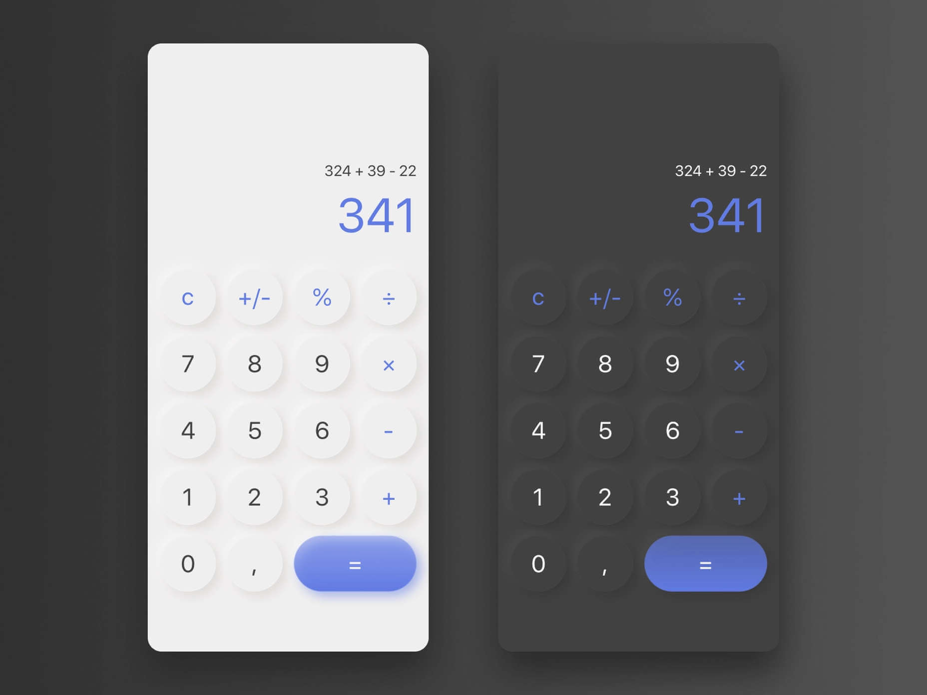
Soft UI involves using highlights and shadows in design elements to make them look as though they’re layered on the page. 

The term neumorphism is derived from a previous design style — skeuomorphism, where designers create something as close to its real-life counterpart as possible. If you remember the shift between iOS 6 and 7, you’ll remember the switch between skeuomorphic and flat designs. However, neumorphic design isn’t quite as dramatic. 

Neumorphism doesn’t focus excessively on things like contrast or similarities between real and digital elements. Instead, this “soft UI” practice creates a smoother experience for users. 

With neumorphism, you get the sense that buttons and cards are actually part of the background they’re on. This trend removes the flashier aspects of a typical interface and focuses on a softer style that stays consistent throughout the design. 

The Common Features of Soft UI

Soft UI is all about smoothing out the experience by making everything feel more connected. There’s nothing overly harsh in the aesthetic, hence the term “soft.”

So, what kind of features can you expect?

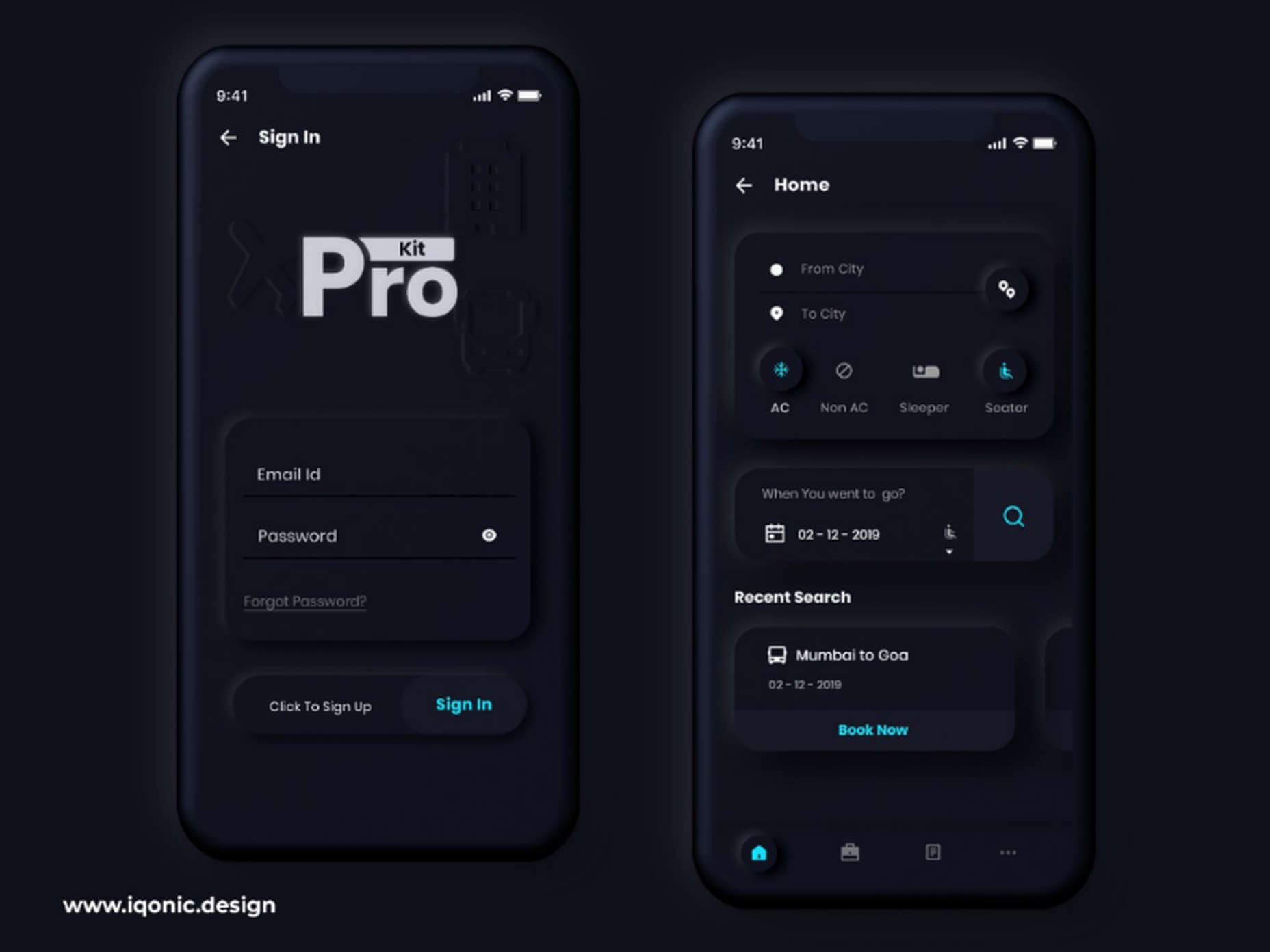
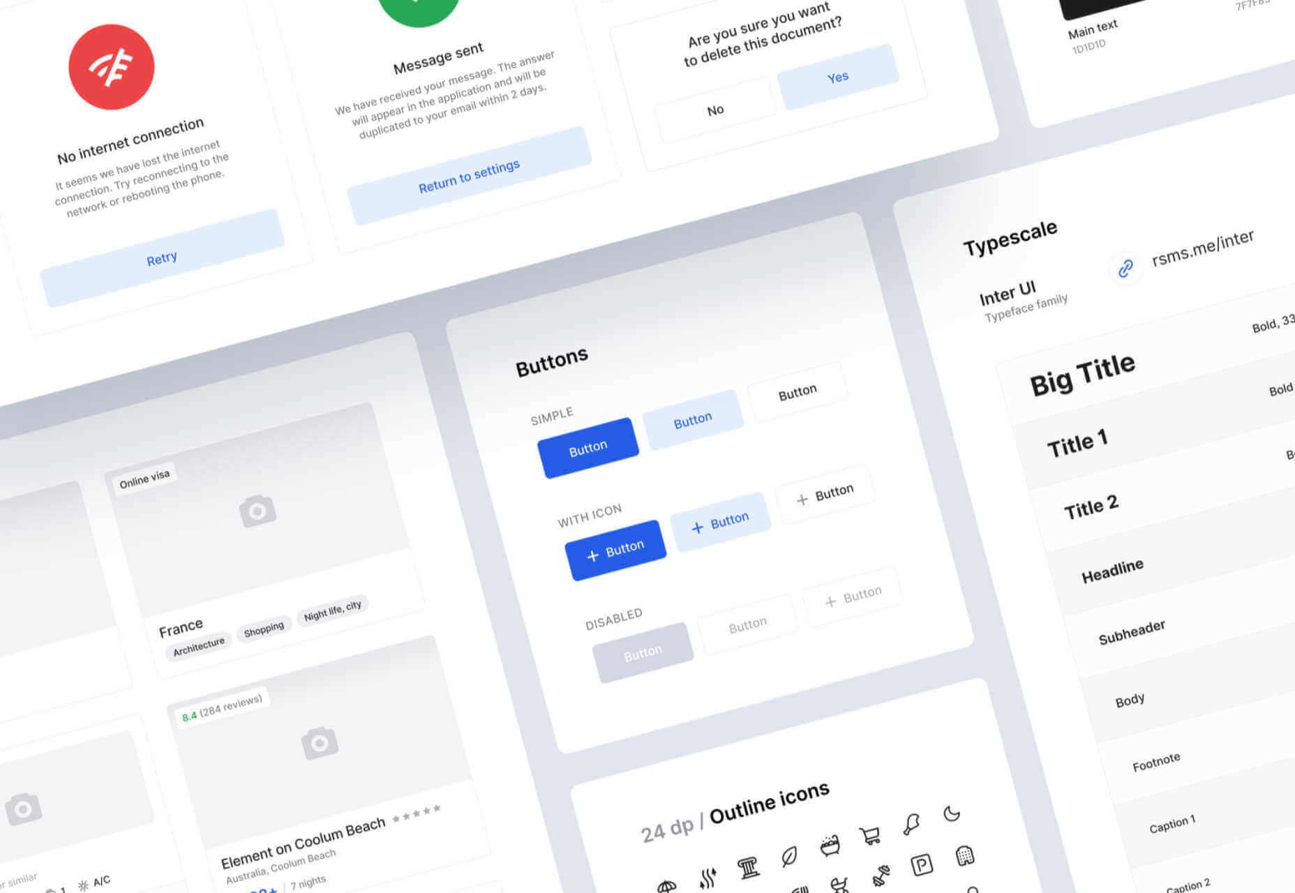
Rounded Corners: Soft UI removes some of the sharper parts of the interface, like the corners on modules and segments. This allows for a more gentle appearance overall. In this experimentation from Iqonic Design, we can see how the round corners tie everything together.

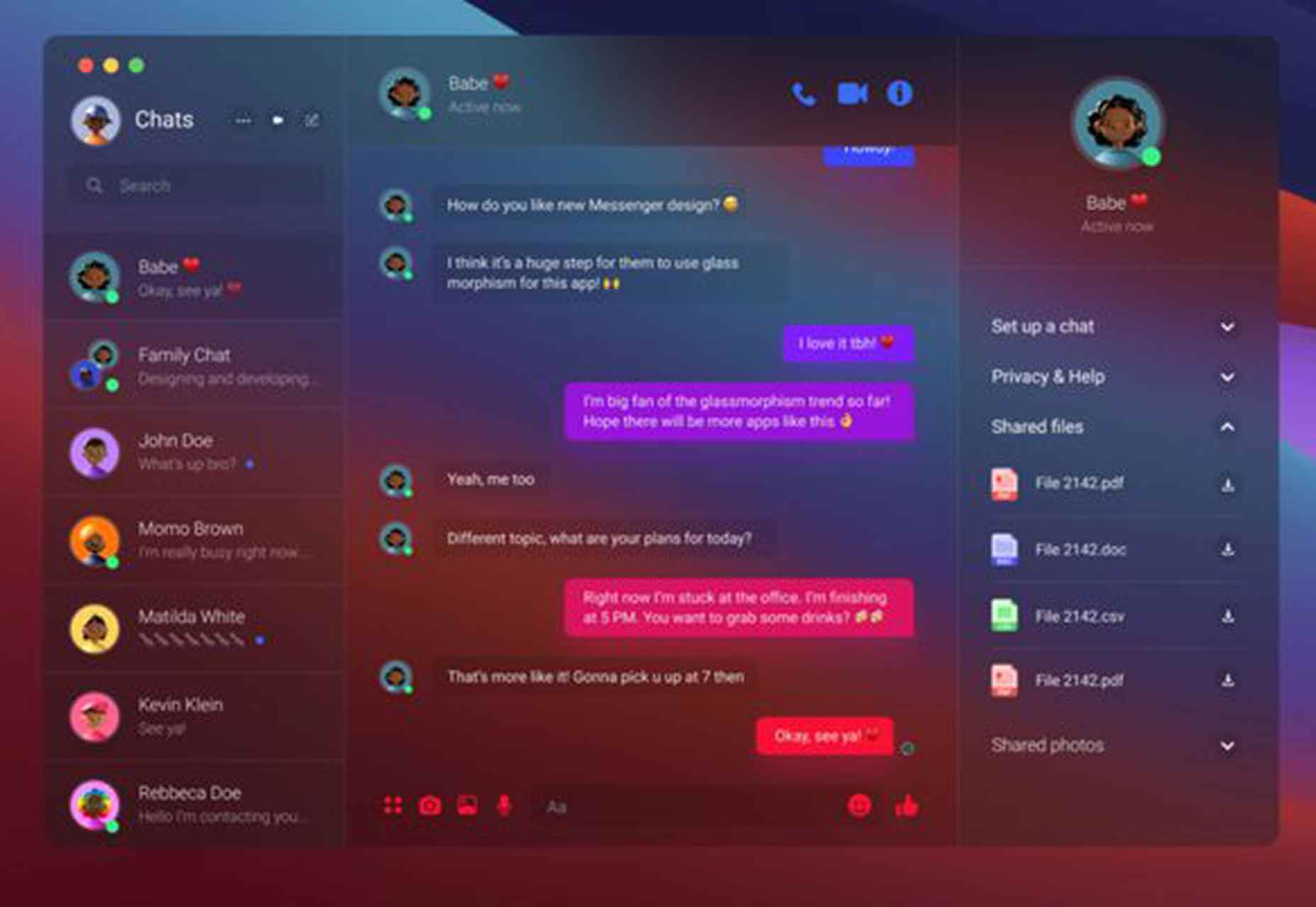
Transparency and Background Blur: Background blur and transparency are more popular today since the infamous iOS 7 solution emerged. Most people hated the appearance of ultra-minimalism, combined with thin fonts. However, the background blur effect was more popular. The blur in soft UI shows that part of the window is connected to the rest of the OS. It seems like parts of the background in the app are pushing through to the surface. 

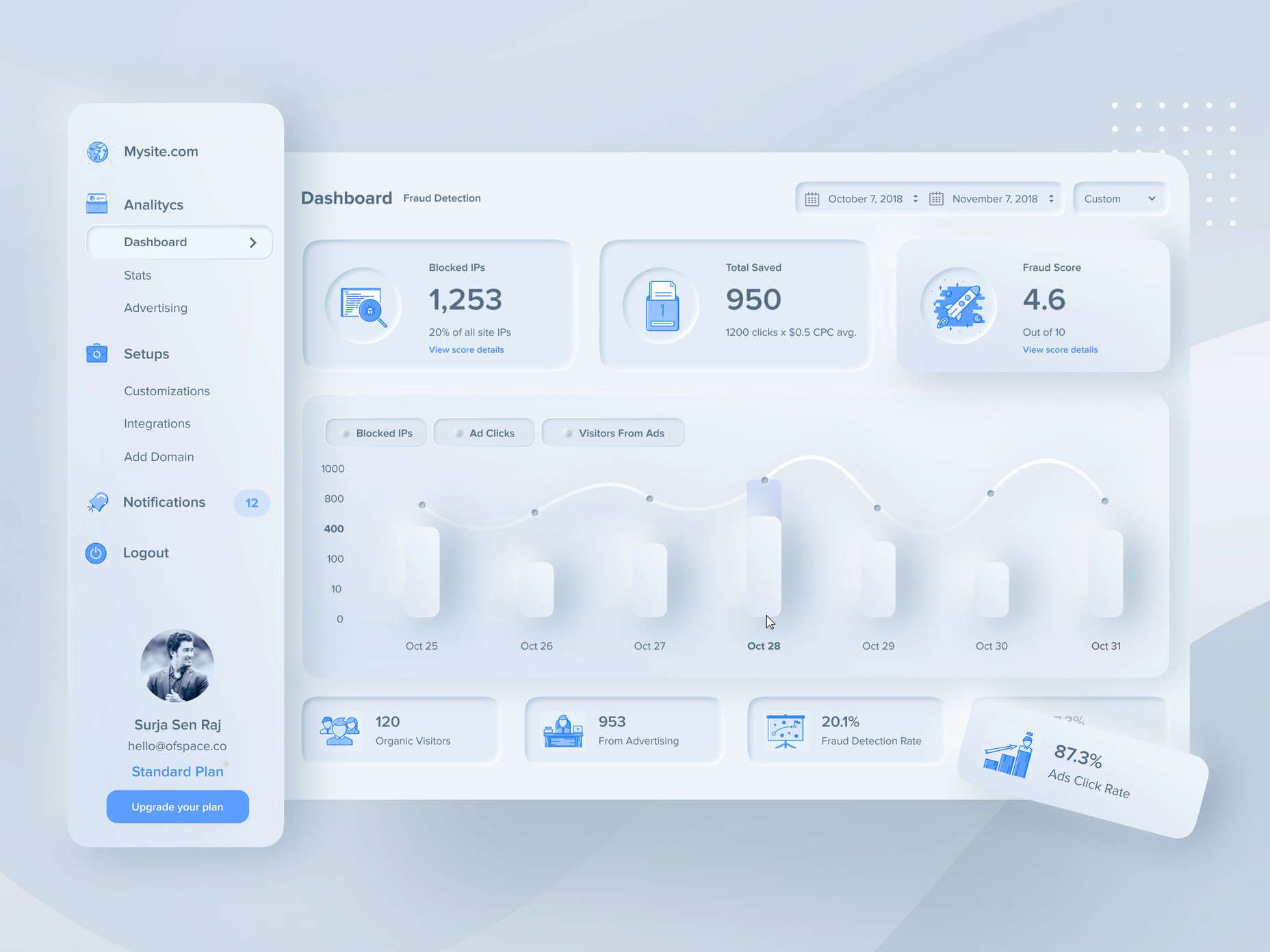
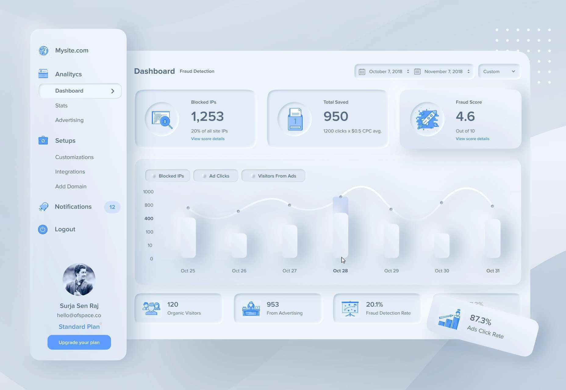
Unified Symbols: Everything needs to fit perfectly in a soft UI design. Anything that doesn’t look like it’s part of the same entity throws off the experience. In this design experiment by Surja Sen Das Raj, you can see how all the colors, shadows, and gradients tie together consistently. Because everything is more uniform, the experience flows perfectly for the end-user. 

Implementing Soft UI Elements in Your Design

So, what does neumorphism look like in your UI design process?

Ultimately, it’s all about subtle contrast and aligned colors. Every part of your interface needs to look like it’s part of the same form. Your element and background need to be the same color so that you can create a feeling of objects protruding from the background. 

With Soft UI, the keys to success are shadows and highlights. 

Let’s take a look at some key steps. 

Achieving the Soft Look

When you’re designing your interface, remember that sharp edges make the interface more serious and formal. Rounded corners are more playful and friendly. 

What also makes the design look lightweight and delicate is plenty of deep shadows and highlights. When you add shadows to elements, you create a visual hierarchy. The items that cast a larger, deeper shadow are the ones closest to you. That’s why only a few elements need to cast an intense shadow. Everything else should work in the background. 

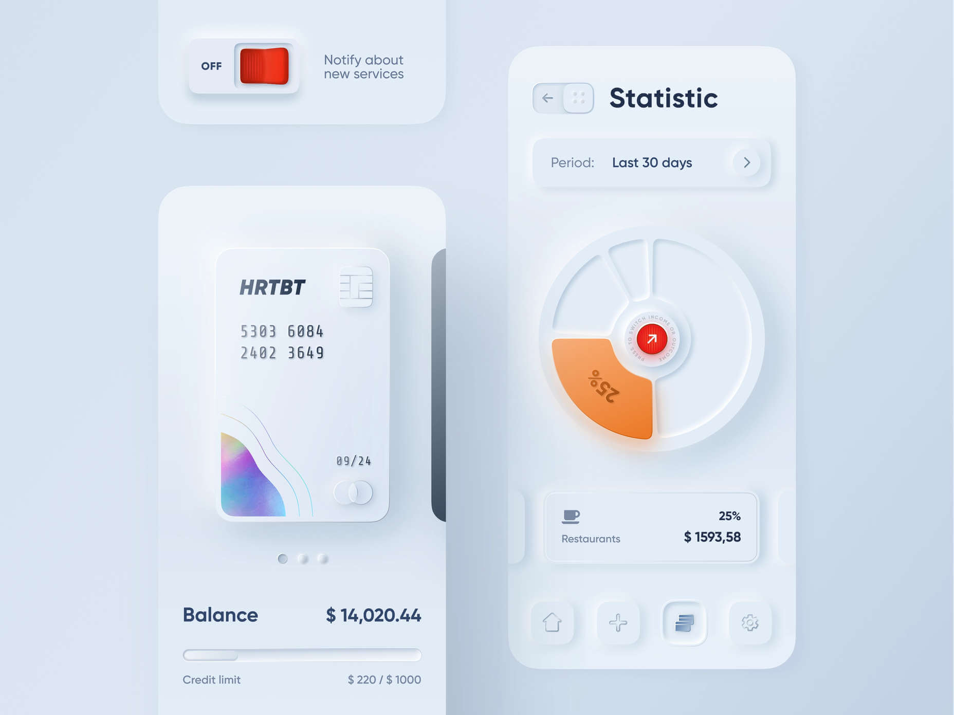
Take a look at this design by Alexander Plyuto, for instance.

Creating Smooth and Delicate Gradients

Gradients are part of the shadow and highlighting process in Soft UI design. Ideally, you’ll need to choose colors from the same palette, just toned down or brightened, depending on your needs. The gradient needs to be barely visible, but just enough to make the elements stand out. 

For white gradients, like highlights, use a very delicate color somewhere between white and your background shade. For instance, consider this design from Marina Tericheva.

Consider the Little Details

Finally, remember that the neumorphism design principle is all about little details. 

Choosing a font that visually matches the background is an excellent choice. However, you can also choose something more contrasting, as this will help information stand out

Adding a little bit of the background into your fonts might be suitable too. For instance, if you have a green font and a grey background, add a little grey into the mix. 

Extra elements in your design, like allowing a button to shift into a more recessed state after being clicked, are a great way to make the soft UI more engaging. Everything your end-user interacts with needs to feel smooth and perfectly unified. 

The Problems with Soft UI Design

Just because a design process is trending – doesn’t mean it won’t have its issues. 

Neumorphism is a fun way to make apps, operating systems, and websites feel more friendly and informal. However, this softer approach has a weak spot too. 

When you’re dealing with a small margin of contrast and color where neumorphism works well, it’s hard to get the effect right every time. For instance, this all-yellow design for Dtail Studio may be overwhelming for some.

A slight deviation in saturation or a problem with your shadowing could render the entire effect of Neumorphism completely pointless. 

Another major issue is accessibility. The soft UI design looks great for people who have a full visual range. However, visually impaired users might not see the same benefits. Anyone without perfect vision may see crucial objects disappearing into the background.

Your users don’t necessarily need significant vision problems to struggle with neumorphism, either. The design is all about softness that causes elements to almost blend together. People with low-quality screens that don’t have as many pixels to work with won’t see these elements. 

Issues With Buttons and CTAs

Another major issue of neumorphism is that its subtlety can lead to problems with attracting clicks and conversions. Usability is the most important consideration of any UI design. 

Unfortunately, when you focus on subtle elements throughout your entire interface, usability sometimes takes a hit. 

Let’s consider buttons, for instance – they’re essential to any interface. To simplify the customer journey, these buttons need to be noticeable, and they need to shift into different states when your customers interact with them. 

For the button experience to be excellent, users need to notice the design instantly. However, the heart of neumorphism revolves around the idea that nothing stands out too much. 

This isn’t just an accessibility issue; it’s a problem for conversions too. 

Neumorphism is soft on the eyes, with minimal color contrast and few color pops. This means that CTA buttons don’t stand out as much as they should. Buttons almost blend into the background, and the website struggles to pull attention to the areas that demand it most. 

How to Experiment With Soft UI (Free Kits)

The key to unlocking the benefits of soft UI interfaces without getting lost in the negative points – is proper experimentation. Like any new design trends, professionals and artists will need to learn how to merge the elements of soft UI together in a way that doesn’t compromise usability. 

Trends in UI design can’t focus exclusively on aesthetics, as a customer’s comfort will always be an essential part of the process. 

If you want to start exploring, here are some of the best kits and freebies to get you started:

Closing Thoughts on Soft UI

The world of design and the trends that we use are constantly changing. Companies are always searching for the best ways to connect with their users. Often, this means focusing on an interface that really connects with your target audience and delivers the best possible results. 

The soft UI design trend has its benefits and its downsides. On the one hand, the smooth appearance of every element on a combined screen can deliver a delightful aesthetic. Buttons feel less imposing, and elements are friendlier and easier to interact with. 

On the other hand, neumorphism also makes it difficult to truly capture your audience’s attention in the places where it matters most. It suffers from accessibility issues and requires plenty of care and practice.

Source

The post Soft UI: Making Sense of the Latest Design Trend first appeared on Webdesigner Depot.


Source de l’article sur Webdesignerdepot

Every day design fans submit incredible industry stories to our sister-site, Webdesigner News. Our colleagues sift through it, selecting the very best stories from the design, UX, tech, and development worlds and posting them live on the site.

The best way to keep up with the most important stories for web professionals is to subscribe to Webdesigner News or check out the site regularly. However, in case you missed a day this week, here’s a handy compilation of the top curated stories from the last seven days. Enjoy!

22 Exciting New Tools for Designers, June 2021

7.css

Does the Hamburger Menu Make Mincemeat of UX Design?

Top 15 Tools and Resources for Designers and Agencies

Loaf Animation SVG Library

WordPress 5.8 Introduces Support for WebP Images

Star Trek + Design

11 Landing Page Design Tips You Should Follow Today

Isometrica 3D Constructor

HTML Semantic Tags Cheat Sheet

What is a Design System?

Source

The post Popular Design News of the Week: June 14 2021 – June 20, 2021 first appeared on Webdesigner Depot.


Source de l’article sur Webdesignerdepot

Inclusive design is often mistaken for accessibility, or even used as an interchangeable term, which is a good indication that most designers don’t know what it means.

Accessibility is a process that seeks to mitigate issues in a design that is not sufficiently universal; inclusive design increases the universality of the design. In real-world terms, an accessible building may replace its front steps with a ramp; an inclusive building is constructed at the same level as the sidewalk.

Accessibility is concerned with objective, measurable improvements. It’s a UI concern. Inclusive design is subjective, more difficult to measure, and is a UX concern. By designing inclusively, we extend our designs to the widest possible user group and contribute to a better society. Here are three ways to get started.

1. You’re the Edge Case

When designing, it’s normal to assume that we are normal. After all, we are the center of our experience of the world. Everything from our preferences to our empathy stems from our individual place in time and space.

When we use the term “edge case,” what we’re referring to is a minority experience, a way of using our design that is uncommon or distinct from our own expectations.

But what would happen if we treat ourselves as the edge case? What if all of the experiences that we deem to be minority experiences are actually the core, common user experience of our design?

If we start from the position that we are the one out-of-step with the design, that most people will not think or act as we do, then we’re eliminating thousands of biased decisions about how our design should be.

Draw From Life

It has always surprised me that in Europe’s dark ages — ranging from the decline of the Roman empire to the Proto-Renaissance — it didn’t occur to anyone to draw from life. Artists drew things the way they thought they should look, which is why so many Byzantine icons of the infant Jesus look like a middle-aged blonde man that has been shrunk.

It’s important to draw from real life as much as possible. That means abandoning personas — which are by definition under-representative and frequently loaded with bias — and engaging with actual users. Most of all, it means taking a step back and opening your eyes.

2. Stop Making Inclusive Design Part of Your Practice

Inclusive design cannot be a part of your practice; it’s an all-encompassing attitude. Your design practice must be inclusive. At least, it should aspire to be…

As human beings, we are biased—all of us. The reason for that is that bias — be it racism, misogyny, nationalism, homophobia, or anything else — is cultural. And we all exist within society. We’re all bombarded with information that reinforces those biases every day.

Accept that you have biases and that your biases will pull your design work away from the inclusive solution you aspire to. But equally, accept that by acknowledging your biases you’re limiting the influence they have over your decision-making.

Do Not Require Users to Self-Identify

It’s divisive and abusive to partition users into groups, especially when the act of doing so perpetuates bias.

One of the most encouraging developments of the last decade has been the introduction of the answer “prefer not to say” in response to personal questions about race, gender, status, and so forth. But if “prefer not to say” is a valid option, in other words if you don’t actually need to know, then why ask at all?

Beware Occam’s Razor

Occam’s Razor is an often misquoted idea that (to paraphrase) states that when making a decision, the one with the least assumptions is the correct choice.

The problem is that Occam’s Razor implies that there is a ‘correct’ decision. But in fact, inclusive design benefits most from a flexible UI and a high tolerance for deviation.

If you can identify the assumptions in a design decision sufficiently to count them, then you’re best served by testing, not comparing, those assumptions.

3. Design Flexibility Into Everything

There is no such thing as a “natural normal,” but there is “perceived normal.” Much of our behavior is governed by the experiences we’ve had since we were very young. Despite existing somewhere on a scale of ability and preference, most of us have inched towards what we have been told is a “normal” range all our lives.

However, it is a physiological fact that every characteristic exists somewhere on a spectrum. There are no black and whites; it’s all grey.

When we design a site or app, we tend to silo certain characteristics into one. Someone who is visually impaired is treated to the same ‘solution’ as someone who is blind, even though visual impairment can range from screen reflections on a sunny day to someone who was born without optic nerves.

There are people who have lost their sight through degeneration or accident and will be able to make visual connections based on remembered visuals. Other people have never seen anything and their conscious mental process isn’t figurative at all.

To accommodate the full gamut of possible interactions with our design, we need to design to a scale, not with absolute values. This means thinking less about set colors and sizes and more in terms of contrast and scale.

Avoid Communicating in Color

Few areas are more indicative of a spectrum of experiences than color.

Color is instantly problematic for designers because quite apart from color blindness, color has deeply personal associations.

Over the last couple of decades, it’s been repeatedly proven that it is contrast, not hue, that increases engagement. Green does not always mean go; red does not always mean stop.

Color involves so many biases and assumptions that it’s simply better to work with contrast than select the ‘right’ hue.

Bigger Typography (Sometimes)

In the first draft of this article, I wrote that increasing the scale of your typography was always good.

My rationale was that some users will benefit from larger type, and zero users will be hindered by it. But that’s not true. Larger type means fewer lines per viewport, which means more scrolling; not a problem for some users, but potentially an issue for those with motor control issues.

That was one of my biases right there.

Congratulations, You’re Now An Inclusive Designer

Good design is self-aware in origin and unselfconscious in execution.

Inclusive design isn’t about enabling access for everyone; it’s about designing for a user experience that is welcoming and respectful. Every one of your users should feel not just enabled but validated.

Inclusive design isn’t a series of items on a checklist; it’s an ideal, like harmony or beauty, that we may struggle to achieve but that we should strive for nonetheless.


Image via Pexels.

Source

The post 3 Ways to Design More Inclusively first appeared on Webdesigner Depot.


Source de l’article sur Webdesignerdepot

Every day design fans submit incredible industry stories to our sister-site, Webdesigner News. Our colleagues sift through it, selecting the very best stories from the design, UX, tech, and development worlds and posting them live on the site.

The best way to keep up with the most important stories for web professionals is to subscribe to Webdesigner News or check out the site regularly. However, in case you missed a day this week, here’s a handy compilation of the top curated stories from the last seven days. Enjoy!

Patttterns

What I Learned by Relearning HTML

All You Need is 5 Fonts

What Is Glassmorphism? (With Examples)

Half the Internet Went Down Today — Here’s What Happened

3 Essential Design Trends, June 2021

50 Free Cursive Handwritten Fonts to Spice Up Your Design

The 4 Biggest UI Trends Shaping Apple’s Future

Google Changes Core Web Vitals Metrics

Storytelling In Design – Top Trends For 2021

Source

The post Popular Design News of the Week: June 7 2021 – June 13, 2021 first appeared on Webdesigner Depot.


Source de l’article sur Webdesignerdepot

Configuring your wireless network is one of the essential tasks to upkeep the security of your corporate wireless network.

At least among IT professionals, it is not a big secret how important it is for the Wi-Fi networks to be safe for any business. You can do a quick search on Google or skim through the social media or news feed to read about it. You will indeed read some interesting content about how vulnerable wireless networks are to attacks and data stealing.

Source de l’article sur DZONE

Les Sablières J. Leonhart ont refondu totalement leur Système d’Information en optant pour SAP S/4HANA Cloud Essentials, appuyé d’un spécifique déployé sur la SAP Business Transformation Platform (ex SAP Cloud Platform). Objectif : disposer d’un ERP standardisé et homogène, mais aussi fiable et évolutif.

Le Groupe Leonhart est un acteur historiquement spécialisé dans l’extraction et la valorisation de sable et de granulats. Il commercialise entre autres des agrégats, des pierres naturelles, du béton prêt à l’emploi et divers produits en béton pour la préfabrication lourde et légère. L’industriel alsacien dispose également de ses propres services de transport et de location d’engins de chantiers. Il a soufflé ses 100 bougies en 2020.

Le groupe réalise un chiffre d’affaires annuel de 120 millions d’euros, pour 600 salariés répartis sur une quinzaine de sites sur le territoire français. Il a connu une forte croissance sur les 20 dernières années. « Au fil de cette croissance, nous nous sommes retrouvés avec un SI très hétérogène, comprenant de nombreux outils spécifiques à chaque activité, plus ou moins bien connectés entre eux », explique Nicolas Battesti, Directeur Administratif et Financier.

La société a souhaité mettre en place un SI standardisé et structurant, couvrant l’ensemble de ses processus métiers et permettant un accès rapide aux données. « Nous avions besoin d’une plate-forme commune à toutes les sociétés du groupe, poursuit Nicolas Battesti. Notre responsable SI a défini un cahier des charges précis et détaillé de notre future solution, puis nous avons démarché les intégrateurs. »

Un ERP SAP, en mode SaaS

L’appel d’offres a été lancé fin 2020, avec comme objectif une étude exhaustive des solutions disponibles sur le marché et des modes de déploiement proposés. Le Groupe Leonhart a rapidement compris les avantages et inconvénients d’un déploiement sur site ou dans le cloud. C’est donc bien informé qu’il a opté pour du SaaS.

« Ce qui nous a plu dans le SaaS, c’est la maîtrise des coûts, explique Nicolas Battesti. Mais également la facilité à monter en version. Auparavant, on travaillait avec des outils qui n’étaient plus adaptés, faute d’avoir su évoluer. Disposer de solutions qui progressent au fil du temps était donc important pour nous. Nous voulions miser sur une offre pérenne. »

Au vu du cahier des charges de l’industriel, Nagarro ES a proposé l’ERP SAP S/4HANA Cloud Essentials, qui couvre les besoins métiers exprimés, avec la possibilité de se connecter au reste du SI de l’entreprise via la SAP Business Transformation Platform (anciennement SAP Cloud Platform). La seule partie non couverte nativement par l’ERP est la pesée des camions entrant et sortant des sablières. Nagarro ES s’est appuyé sur son laboratoire d’innovation pour proposer un développement spécifique reposant sur la SAP Business Transformation Platform et des technologies novatrices, comme la reconnaissance visuelle et l’Internet des Objets. Le résultat est un pont bascule connecté à SAP, avec une technologie qui permet la reconnaissance des plaques d’immatriculation internationales, la pesée du camion, et la génération automatisée du reçu.

Repartir de zéro

Le Groupe Leonhart a été séduit par la richesse fonctionnelle de la solution, mais aussi par la méthodologie SAP Activate, l’approche Fit-to-Standard et la capacité de Nagaro ES à répondre à des besoins métiers spécifiques. « Ce partenaire nous semble solide, en termes de taille, de santé financière et d’expertise des équipes, témoigne Nicolas Battesti. Nous avons jusqu’à maintenant toujours eu à faire à des consultants disponibles et expérimentés, avec la sensation que nos besoins étaient bien compris. »

L’industriel a souhaité repartir d’une page blanche pour son nouvel ERP, avec un périmètre fonctionnel assez large, allant du contrôle de gestion à la finance en passant par la production, la relation client et la logistique. Mais aussi l’analytique : « la BI intégrée nous a beaucoup plu, car elle reste facile d’utilisation, quoique puissante. »

Les ateliers ont commencé début mars 2021. La volonté du Groupe Leonhart de coller au plus près des standards et la trajectoire du projet clairement définie en amont augurent de travaux qui devraient se dérouler dans d’excellentes conditions. La mise en production de l’ERP SAP S/4HANA Cloud Essentials est programmée pour janvier 2022.


The post Leonhart mise sur le cloud pour son nouvel ERP SAP S/4HANA appeared first on SAP France News.

Source de l’article sur sap.com