Articles

La mise en oeuvre d’un nouveau système ERP offre une occasion majeure de transformer numériquement votre entreprise. Non seulement vous pouvez dépasser les fonctionnalités limitées ou la technologie obsolète de votre ancien système, mais vous pouvez également tirer parti des capacités du système ERP moderne pour vous aider à saisir de nouvelles opportunités commerciales.

Cependant, toutes les mises en place ne se déroulent pas sans heurts. Alors comment préparer votre entreprise à une mise en oeuvre réussie de l’ERP ? Comment éviter les coûts et les risques inutiles ? Ces meilleures pratiques de mise en œuvre d’un ERP peuvent vous aider à éviter les pièges les plus courants et à profiter plus rapidement des avantages de votre nouveau système ERP.

Par où commencer votre projet ERP ?

Lorsque les gens pensent à la mise en oeuvre d’un système, ils commencent souvent par envisager les fonctionnalités souhaitées. Mais les nouvelles fonctionnalités ou technologies ne sont pas le cœur du problème ; ce dont une entreprise a besoin pour se développer, ce sont des processus de gestion modernes. Ce n’est qu’avec des processus efficaces qui vous permettent d’être agile et réactif que vous pourrez stimuler votre compétitivité et mieux servir vos clients internationaux.

Souvent, les processus existants sont rigides et ne répondent pas aux besoins de l’entreprise. Même lorsque des processus éprouvés et rentables sont en place, ils doivent souvent être mis à jour pour répondre à l’évolution des besoins ou être enrichis de nouvelles fonctionnalités, comme l’accès mobile, les alertes et la veille économique. Il est donc important de toujours garder ces processus au cœur de votre plan de mise en œuvre.

Quel est le plus grand facteur de réussite ? Votre équipe de projet.

Toutes les études de cas sur la mise en oeuvre d’un ERP se rejoignent
: le facteur déterminant est l’équipe de mise en œuvre.

Un excellent logiciel n’est excellent que s’il est mis en œuvre par une équipe solide. Si les membres de l’équipe n’ont pas le temps, le soutien ou les compétences nécessaires pour effectuer le travail efficacement, ils ne réussiront pas – et le projet souffrira probablement de retards, de coûts supplémentaires et/ou d’un logiciel qui ne répond pas aux besoins de l’entreprise.

Les entreprises qui ont connu des revers ou des échecs en matière d’ERP ont souvent affecté des employés qui « avaient le temps » de travailler sur le projet. Mais pour réussir, vous devez recruter les personnes dont « vous ne pouvez pas vous passer ». Il s’agit des personnes bien occupées qui connaissent les processus opérationnels, travaillent bien avec les autres membres de l’organisation et ont le respect de la direction. Dédiez ces personnes au projet à plein temps (40 heures de disponibilité), ou autant d’heures que possible par semaine.

N’ajoutez à l’équipe de projet clé aucune personne qui ne peut pas consacrer au moins 25 % de son temps (minimum 10 heures) au projet chaque semaine. Les membres de l’équipe consacrant moins d’un quart de leur temps pourront rattraper les activités du projet mais n’y apporteront aucune valeur ajoutée.

Le soutien de la direction à votre équipe est essentiel. Dans toute mise en œuvre importante, des décisions doivent être prises concernant les priorités et les compromis en matière de ressources. Sans un soutien et un engagement fort, même les équipes qualifiées peuvent échouer.

La mise en oeuvre rapide d’un système ERP moderne est l’une des choses les plus importantes qu’une entreprise puisse réaliser. Cela vaut la peine d’y consacrer vos meilleurs éléments et de poser les bases du succès dès le départ.

Comment planifier la mise en œuvre de votre ERP

Planifiez la séquence de mise en place de façon réaliste. Tenez compte de la disponibilité de votre équipe de direction, des managers et des experts internes qui contribuent à l’effort.

Classez vos besoins par ordre de priorité afin de pouvoir vous concentrer sur les gains importants tout en constituant une base logicielle et technologique de base qui pourra évoluer en fonction des besoins de votre entreprise.

Votre plan détaillé et vos indicateurs clés de performance seront adaptés à vos besoins spécifiques. Toutefois, les activités clés suivantes sont des étapes communes à toutes les mises en place réussies :

Mise en oeuvre d'un ERP

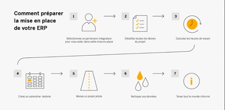
1. Sélectionnez un partenaire intégrateur pour vous aider à la mise en œuvre

Votre équipe de projet n’est probablement pas très expérimentée dans la mise en œuvre d’un logiciel ERP ; elle aura besoin d’aide. Cherchez et sélectionnez un ou plusieurs consultants qualifiés pour la mise en oeuvre de l’ERP, ayant une connaissance approfondie et une expérience de l’application ERP que vous allez installer. Confirmez qu’ils comprennent comment la nouvelle solution logicielle soutient vos processus d’affaires actuels et à venir. Interrogez leurs références pour le vérifier.

Vos partenaires intégrateurs doivent disposer d’un personnel formé à votre secteur d’activité et disponible sur vos sites. Si vous avez des clients et des fournisseurs internationaux, vos partenaires doivent avoir les compétences nécessaires en matière de commerce international, de langues et de devises pour rationaliser votre mise en œuvre.

Enfin, examinez le logiciel de gestion de projet que l’entreprise utilise pour vous assurer qu’il est compatible avec votre système interne de planification, d’ordonnancement et de suivi.

2. Détaillez toutes les tâches du projet

Votre partenaire de mise en place vous aidera à dresser une liste détaillée de toutes les tâches à accomplir. Cette liste sera longue. La formation seule, par exemple, comprend de nombreuses tâches :

  • Formation de l’équipe de projet : Votre équipe doit se familiariser avec le logiciel afin de pouvoir décider comment adapter vos processus d’entreprise.
  • Formation de l’équipe informatique : L’équipe informatique doit être formée afin de comprendre comment installer et maintenir le système de manière optimale.
  • Formation des utilisateurs métiers : Toutes les personnes appelées à utiliser le logiciel doivent apprendre comment il fonctionne.
  • Formation continue : Les nouveaux utilisateurs auront besoin d’être formés au fur et à mesure qu’ils rejoignent votre entreprise, vous devrez donc mettre en place un plan à plus long terme.

La liste des tâches doit être divisée en phases. Il faut prévoir du temps pour le pilote en salle de conférence, la personnalisation de l’application, l’intégration à d’autres applications et sources de données, la mise en œuvre de l’infrastructure, le nettoyage des données, l’acceptation par les utilisateurs, etc.

3. Calculez les heures de travail

Estimez soigneusement le temps nécessaire à chacune des tâches. Pour ce faire, comprenez la tâche et le travail qu’elle implique, puis déterminez le nombre d’ « heures de travail » nécessaires. Il peut s’agir d’une fourchette d’heures, mais elle doit être précise. Additionnez les heures de travail pour chaque phase du projet et désignez la personne chargée de les réaliser.

C’est pourquoi il est important de faire appel à un partenaire intégrateur qui connaît bien la solution logicielle. Si vous effectuez cette étape correctement, vous serez en mesure de calculer avec précision votre calendrier, de déterminer si vous avez besoin d’aide en dehors de votre équipe actuelle et de limiter les dérapages.

4. Créez un calendrier réaliste

Maintenant que vous avez calculé les heures de travail disponibles et nécessaires, vous pouvez créer un calendrier réaliste. Dans de nombreux cas, le premier passage révèle un problème de capacité par rapport au calendrier de mise en œuvre qui avait été présenté à l’origine aux dirigeants.

Voici un exemple de calcul qui illustre les écarts potentiels :

  • Délai de mise en service prévu = 12 mois ou 1 an
  • Nombre total d’heures de travail disponibles sur une période de 12 mois = 540/semaine ou 28 080 heures/an
  • Nombre total d’heures de travail nécessaires à la mise en place = 42 000 heures au total
  • Heures requises divisées par les heures disponibles par an = 1,496 années

Le résultat ? La date de mise en service est manquée avant le début du projet. Voici quelques solutions possibles :

  • Réduire le scope – même si l’équipe a convenu que ces tâches sont essentielles.
  • Repousser la date à une date réaliste
  • Ajouter plus de ressources internes et externes (heures de travail disponibles)
  • Décomposer le projet en phases

C’est ici que l’équipe de direction devra prendre la décision. Ce n’est qu’un exemple des raisons pour lesquelles ils doivent être impliqués dans le processus de sélection et de mise en œuvre du logiciel.

5. Menez un projet pilote

Une fois le projet lancé et avant la mise en service, effectuez un test ou un pilote (dans une salle de conférence) avant le déploiement complet. Ce pilote interne vous permettra de vous assurer que vous avez mis en place les processus opérationnels appropriés pour les besoins actuels et futurs de l’entreprise. Lorsque vous concevez vos nouveaux processus, il est important de comprendre l’éventail des options disponibles dans votre système ERP – et de valider vos processus avec l’équipe de projet et les parties prenantes de la communauté des utilisateurs.

Au cours de cette phase de plusieurs semaines, votre partenaire de mise en place installera un logiciel pilote qui vous permettra de tester tous vos processus et de vous assurer qu’ils fonctionnent comme prévu, sans surprise. Souvent, vous pouvez appliquer les meilleures pratiques pour gagner du temps, en particulier si vous disposez des outils de configuration pour effectuer des ajustements rentables à mesure que vous affinez vos opérations.

6. Nettoyez vos données

Cela semble simple, mais le nettoyage des données est une activité chronophage. Il est préférable de commencer à évaluer l’exactitude de vos données dès que possible, car il faut beaucoup d’efforts pour réaliser cette étape correctement. Au cours du projet, des changements de processus métiers se produiront – soyez donc prêt pour des étapes supplémentaires de gestion des données pendant la mise en œuvre.

7. Tenez tout le monde informé

Chaque semaine, un membre du personnel doit contacter toutes les parties prenantes clés afin qu’elles soient informées des points positifs et moins positifs de l’avancement du projet de mise en œuvre. Le pire scénario est celui où les gens ne sont pas tenus au courant et sont pris par surprise.

La plupart des bons systèmes de gestion de projet comportent des représentations visuelles de l’avancement du projet.

Commencez par les processus les plus importants de votre entreprise

Toutes les entreprises n’ont pas les mêmes problèmes. Il est donc préférable de passer en revue vos processus opérationnels et de classer par ordre de priorité ceux qui doivent être abordés en premier. Voici une liste de domaines à haute valeur ajoutée à prendre en compte :  

  • La veille stratégique, y compris les alertes de gestion et les tableaux de bord : Votre équipe a besoin de mises à jour rapides sur les problèmes de l’entreprise, ainsi que de la possibilité d’approfondir facilement les détails pour résoudre rapidement les problèmes – au bureau, à la maison ou sur la route. Vous avez besoin d’une intelligence d’affaires intégrée et de données qui se trouvent dans une base de données unique.
  • Gestion de la relation client (CRM) : Aujourd’hui, les processus CRM touchent généralement toutes les parties d’une entreprise. Les ventes directes, les distributeurs, les showrooms, le commerce électronique, le service client et les commerciaux partagent tous des informations sur les clients avec la gestion des commandes, les opérations, les achats, l’ingénierie, les comptes clients et l’expédition.
  • Finance et comptabilité : Des transactions financières précises et en temps réel, des indicateurs clés de performance et des analyses sont essentiels à toute entreprise, et ils doivent couvrir tous les sites et départements. Outre la comptabilité, elles doivent être intégrées à l’évaluation des coûts, à la budgétisation, aux prévisions, aux projets, à la gestion des actifs, à la conformité et à la gestion de la trésorerie.
  • Gestion de la chaîne logistique (DSC) et fabrication : Les délais serrés, les faibles marges et les perturbations de la chaîne d’approvisionnement constituent un défi pour toutes les entreprises. Leur gestion nécessite un travail d’équipe – collaboration avec les fournisseurs, les transporteurs, les sociétés d’import/export, les banques et d’autres partenaires – souvent sur des appareils mobiles répartis sur plusieurs sites.
  • Ressources humaines (RH) : La gestion d’une main-d’œuvre diversifiée est plus difficile aujourd’hui que jamais, et votre équipe a besoin d’un accès immédiat et sécurisé aux informations sur les employés pour la paie, les avantages sociaux, la budgétisation, la programmation et les besoins de conformité. De plus, le recrutement, le développement et la fidélisation des employés constituent une part importante de l’évaluation des plans d’affaires actuels et proposés.
  • Langues, devises et sites multinationaux : À mesure que vous développez votre entreprise, en particulier si vous vous implantez dans de nouvelles régions ou de nouveaux pays, vous devez être en mesure d’ouvrir et de développer de nouvelles opérations de manière cohérente et rapide. Cela nécessite des capacités logicielles étendues et avancées, ainsi que des services cohérents de la part de votre fournisseur de logiciels sur chaque site.
  • La mobilité : La capacité d’accéder à l’information et de travailler à distance est désormais vitale – comme l’a démontré la pandémie de COVID-19. Les entreprises qui disposent des outils nécessaires pour s’adapter rapidement peuvent prendre l’avantage en période de perturbation.

Conseils pour atténuer les risques liés à la mise en œuvre d’un ERP

Tous les projets comportent un élément de risque. Vous trouverez ci-dessous cinq conseils précieux pour améliorer vos chances de mener à bien votre projet dans les délais et les budgets impartis.

  1. Choisissez des partenaires expérimentés en matière de logiciels, de processus opérationnels et de mise en oeuvre qui possèdent un savoir-faire sectoriel et local. Interrogez toujours des références dans des entreprises comme la vôtre.
  2. Ne poussez pas une technologie dépassée au-delà de ses limites. Éliminez les anciens systèmes autonomes dépassés et, dans la mesure du possible, consolidez vos données dans une base de données unique (version unique de la vérité) avec une veille économique intégrée pour des performances multinationales.
  3. Dans l’économie numérique, les entreprises doivent souvent intégrer des systèmes entre les unités commerciales ainsi qu’avec les clients et les fournisseurs. Confirmez que vous disposez de capacités d’intégration dans le cloud et d’une expertise en matière de réseaux de fournisseurs.
  4. Évitez les dérives du projet. Il est fréquent de découvrir des besoins et des opportunités au cours de la mise en œuvre d’un ERP. Il est donc important de gérer les ordres de modification pour éviter les retards et les dépassements de coûts.
  5. Confirmez que vous disposez d’une expertise cohérente sur tous vos sites. Vous avez besoin d’une formation, d’une mise en place et d’une assistance, souvent fournies par la direction locale, les distributeurs de logiciels, les sociétés de conseil et votre partenaire logiciel.

Conseils pour éviter les coûts supplémentaires liés à la mise en œuvre d’un ERP

L’investissement dans un nouveau système ERP comprend l’engagement en temps de votre entreprise, le conseil en processus métier et en mise en œuvre, les logiciels et les services cloud, ainsi que l’équipement en ordinateurs, tablettes et téléphones – il est donc important de contrôler le projet et les coûts.

Voici quelques points clés à suivre :

  • Restez concentré sur le coût total de possession (TCO). Gérez vos coûts totaux – et les avantages au fil du temps pour minimiser les dépenses et maximiser le rendement. N’oubliez pas que la mise en œuvre d’un système ERP aura un impact important sur votre entreprise.
  • Respectez l’orientation de l’entreprise et n’imposez pas de changements de processus inutiles. Dans de nombreux cas, les entreprises sont contraintes de modifier leur mode de fonctionnement pour s’adapter à leur logiciel, ce qui augmente les coûts de mise en œuvre et d’exploitation.
  • Concentrez-vous sur les processus de routine qui apportent une valeur significative à l’entreprise.  La gestion des commandes des clients, la mise à jour des prix, l’ajout de nouveaux produits et services, la modification des détails de fabrication et l’intégration des nouveaux employés sont des exemples de ces processus de routine.
  • Évitez les personnalisations et tirez parti d’une interface utilisateur configurable, des tableaux de bord, des alertes, des flux de travail, de la veille économique et des fonctionnalités mobiles. Grâce à ces fonctionnalités, vous pouvez rationaliser le travail de tous vos services ainsi que procéder à des ajustements rapides et rentables si nécessaire.
  • Les piratages de systèmes et les violations de données coûtent cher. Lorsque vous utilisez Internet, utilisez une solution ERP en nuage sécurisée si nécessaire – confirmez que vos fournisseurs de logiciels et de services prennent en charge une gamme d’options de déploiement de logiciels sécurisés.

Quand votre mise en oeuvre ERP sera-t-elle terminée ?

Une fois votre mise en oeuvre initiale terminée, vous aurez toujours besoin de la flexibilité nécessaire pour ajouter des fonctionnalités supplémentaires à votre entreprise. De nombreux changements peuvent être à l’origine de ces opportunités, comme de nouveaux sites, de nouvelles gammes de produits et de services, et des acquisitions.

La transformation numérique offre également des possibilités supplémentaires de faire équipe avec les clients et les fournisseurs pour redéfinir la manière dont les affaires sont menées dans votre secteur. Souvent, ces projets incluent de nouvelles technologies, comme l’apprentissage automatique et l’intelligence artificielle (IA), ainsi que l’intégration avec des équipements et des véhicules utilisant l’Internet des objets (IoT) pour améliorer la vitesse et l’efficacité.

Prêt à passer à l’étape suivante ?

Dans tout projet ERP, il y aura des problèmes inattendus – alors attendez-vous à en rencontrer dans le vôtre. Mais, en suivant les meilleures pratiques pour une mise en oeuvre réussie de l’ERP, vous pouvez les identifier et les traiter dès qu’ils se présentent afin de gérer efficacement vos risques et vos coûts.

Essayez une solution ERP moderne cloud

The post Meilleures pratiques de mise en œuvre d’un ERP pour réduire les risques et les coûts appeared first on SAP France News.

Source de l’article sur sap.com

Looking to give your homepage a well-needed design update in late 2021 or 2022? Not a bad idea; first impressions are crucial when it comes to business websites. But, fixing your homepage and website design is no easy feat.

Web design trends are evolving faster. Blame the ever-decreasing user’s attention span. The average visitor now spends just 0.5 seconds scanning your homepage to form an opinion about your brand and decide whether to click through or bounce.

Increased user expectations and uncertainty in the user’s response, which is highly impacted by the site’s first impression, are other reasons to consider. This is why the designs which were trending in 2019 are no longer viable in 2021 or 2022.

We have curated the ten best examples of homepage designs to inspire your business in 2022, including a rundown of the best strategies and tips.

Let’s start by highlighting why homepage optimization is necessary for 2022:

Why Your Homepage Will Be So Important in 2022

Your website — especially your homepage — is your brand’s first chance to attract, build trust with, and connect with visitors.

According to recent statistics on why website design is important:

  1. 38% of visitors will stop interacting with a website if they think the layout isn’t visually appealing or intuitive. This creates a higher bounce rate and fewer conversions.
  2. 94% of a visitor’s first impression is based on website design (including colors, fonts, layout, navigation menus, etc.).
  3. 46% of people base a business’s credibility on the aesthetics of its website. Brands with less-than-stellar homepage designs are seen as less trustworthy than companies investing in the visitor experience.

Think of it the same way as walking into a brick-and-mortar store. Visitors are more enticed by a carefully curated ambiance of neatly stocked shelves and welcoming employees than a store that’s dark, messy, or seemingly unfriendly.

Using this logic, your homepage’s above-the-fold section is where you’ll greet visitors and reel them in for more.

10 Homepage Design Comparisons (2019 vs. 2021) To Inspire Your Business Website Design in 2022

Homepage design has come a long way since 2019. In this section, you will explore how.

These homepage designs crush it above the fold. Take just a few of these tips to heart, and your website will be poised to attract leads and conversions — no matter which industry you’re in.

1. Netflix – Crafting The Perfect Call To Action That Reduces Friction With An Additional FAQs Section

Most businesses make the mistake of adding a CTA button that first persuades the user to click on it and then asks for the visitor’s email address.

Netflix also did the same in its 2019 design.

However, Netflix combined both steps in its 2021 homepage design.

The new, improved 2021 homepage design asks for the user email address right up front along with the CTA button.

Here is a good comparison of both the designs:

2019 homepage design

vs.

2021 homepage design

Key Takeaways:

  • The design encourages visitors to enter their email address right when they land on the homepage. As a result, form submission is much easier when the user has started the process. Hence, Netflix makes it easier for visitors to move along their conversion funnel nicely by reducing the friction.
  • The 2021 design also has a nice FAQ section that provides quick information about the company’s services and improves the overall user experience.
  • FAQs also help increase the organic presence of the website in the search engines because Google presents snippets from the FAQ section in the form of an answer box in the search results.

2. Spotify – Revamped Color Combinations For Improved CTA Visibility And Using The ‘Rule of Three’ For Heading Text

The older 2019 Spotify homepage design used light pink and orange colors in its home page main area. The CTA color was green, but if you look closely, the CTA lacks visibility.

The new 2021 design uses blue and green colors with a much larger font size for the main heading. The colors are attractive, and the CTA is visible clearly.

Here is the comparison of the Spotify homepage 2019 design vs. 2020 design:

2019 homepage design

Vs.

2021 homepage design

Key Takeaways:

  • Blue is the most versatile color, and green is the perfect choice for the CTA button. Spotify used universally accepted color combinations to redesign its homepage and made the CTA more visible.
  • The main heading is also made larger than it was in the 2019 design, and it follows the rule of three in writing which is effective and satisfying. It uses just three words in the main heading to allow the human brain to process information as a pattern that is more memorable.

3. Hulu – Give Priority To Your Brand Name And Hide Pricing

If you compare the Hulu 2019 vs. 2021 Hulu homepage, the brand name has been prioritized and shown as the main heading.

Moreover, the older homepage had pricing information everywhere, which has been reduced intelligently in the new design.

2019 homepage design

vs.

2021 homepage design

Key Takeaways:

  • The brand name ‘Hulu’ is displayed as the main heading of the homepage, which helps to build audience trust.
  • The older design persuaded the users to pick a paid plan even though they had a free trial option—this discouraged users from trying their service. The new 2021 design encourages users to try the platform for free. In addition, the packages have prominent CTAs that mention “try for $0”. This design move improves conversions on the website.
  • The new design makes it easier for the visitors to select a viewing plan with easy comparison of the three available plans. The best part is, customers can start all the plans for $0. It’s a win-win situation for the users, and they can quickly pick a plan to start watching Hulu.

4. Nextiva – Reduce Visual Noise And Add Pictures In Menu To Improve UX

Nextiva realized the importance of reducing visual noise in its newly designed 2021 homepage. Visual noise happens when you use too many colors to attract user attention. Different colors compete with each other resulting in diluted customer observation.

In the old 2019 homepage, Nextiva used orange, blue, and green as the primary colors, while in the 2021 revamped design, they have used blue as the main color.

Here is a comparison of the two designs:

2019 homepage design

vs.

2021 homepage design

Moreover, the older homepage didn’t have an image in the product menu, but the new 2021 homepage improves the UX further.

Below is a comparison:

2019 homepage design

vs.

2021 homepage design

Key Takeaways:

  • Nextiva used blue as their base color for the homepage design and removed orange and green colors to reduce visual complexity. This is an excellent change to keep the user’s attention focused. Notice the green colored bar at the top of the homepage in the 2019 version now replaced with blue.
  • The 2021 design has a clean look compared to the 2019 design, which looks scattered with too many different elements, including CTAs that confuse the users.
  • The product menu does an excellent job of linking intelligently to service pages such as phone systems and video meetings. The image of a smiling lady attracts users to click on Nextiva’s products to learn more about them. Improving UX is an impressive way to reduce bounce rates and increase time on site.

5. GoToMeeting – Avoid Lengthy Sign Up Form, Educate Users About Your Products, and Add Images That Depict The Current Needs of The Audience

GoToMeeting does a great job educating the users about their product by adding more content on the homepage that comprehensively explains their product features.

Moreover, they have replaced the older hero image with a new picture that portrays the changing needs of their audiences. Nowadays, there is a rise in work from home culture due to Covid-19. Hence, the photo and the heading text clearly target the needs of their users.

Here is a comparison of the 2019 vs. 2020 homepage of GoToMeeting:

2019 homepage design

vs.

2021 homepage design

Key Takeaways:

  • The 2019 homepage design had a sign-up form on the homepage, which GoToMeeting removed in the 2021 design. People hate to fill in so much information right when they land on the home page. Hence, GoToMeeting did the right thing by removing the signup form from their homepage.
  • The hero image steals the show of the 2021 redesign because the picture of a working mom with her kid playing studying in front of her is a great way to portray the current needs of the society when over 60% of the employees are working from home. Audiences can quickly relate their working environment with the hero image leading to more sign-ups.
  • The older 2019 design was confusing, and it made little effort to help the users understand the different features of the product. The new 2021 homepage design has a product features section that explains the different features of the software. When users are educated about the product, they earn the confidence to try the product.

6. Zillow – Apply Hick’s Law To Allow Visitors To Take Faster Decisions

Zillow does an impressive job of applying Hick’s Law in allowing visitors to make faster decisions. Hick’s law states that the more options you present to the users, the faster they will decide. Therefore, it is a major factor in improving website usability.

The old 2019 homepage design of Zillow offered too many options to the users, like they want to buy, rent, or sell a property. The users first select either one of the three options and then enter the zip code to start their search.

The new 2021 homepage design changed that. Now, Zillow offers users a single option. They only need to enter the zip code to get started.

By reducing the number of actions that users need to take to just one, the homepage design eases the overall decision-making process of the site visitors.

2019 homepage design

vs.

2021 homepage design

Key Takeaways:

  • The new homepage design has a simple search bar that persuades visitors to take prompt action.
  • The Hero image is placed smartly behind the search bar to depict the needs of the users accurately.
  • The homepage does have three different panels for buying, renting, or selling a home when the users scroll below. The old design is missing that. The new design removed so many options above the fold and kept just a single option for the users to encourage more users to search properties on the site.

7. Plex – Placement of Prominent Calls-to-Action On Homepage

The CTA is a key element of every website. It helps the users decide on their next action and helps to convert the visitors into leads.

Plex lacked an optimized CTA placement in its 2019 home page design. Hence, the 2021 design received an uplift to better place the CTA for increased visitor engagement.

Take a look at the home page designs of Plex from two different years. If you compare the two home pages of 2019 vs. 2021, the primary difference that will grab your attention is the CTA.

2019 homepage design

vs.

2021 homepage design

Key Takeaways:

  • The call-to-action buttons are more prominent and have actionable texts.
  • The number of CTA buttons is increased to two to encourage users to take action.
  • The additional CTA button is wisely placed at the center to get immediate attention.
  • Note that the color choice for the button is also bright and highly contrasts with the background yet matches the color theme.
  • The old heading text ‘Stream Smarter’ was confusing because it didn’t help the users understand what Plex does. Hence it is now revised to ‘Watch Free Movies and TV on Plex.’ The new text is easy to understand and has the word ‘Free’ to increase the number of visitors clicking on the CTA.

8. Dropbox – More Above The Fold Content And Change of Fonts

Dropbox has significantly worked on its main content, which is clearly visible in the comparison homepage design images of 2019 vs. 2021.

The 2021 homepage is seen fixing faded, minimalistic, and less engaging content in the older homepage.

2019 homepage design

vs.

2021 homepage design

Key Takeaways:

  • Sans serifs, with their clean readability, are included for longer bouts of the homepage.
  • Bold sans text is doing the job of drawing user attention effortlessly.
  • The color contrast of the text with the background is increased, which improves the visibility.
  • The right side image of a laptop is replaced with a screenshot of the software, which intrigues users to know more.

9. Cisco – Moving Blocks To Outsmart Competitor Websites

The homepage design of American technology company Cisco has seen a drastic change in 2021; it deserves to appear on this list. The company website smartly represents an appeal for future development through its killer homepage design.

Here is a comparison of the old 2019 homepage design vs. the new moving block design of 2021:

2019 homepage design

vs.

2021 homepage design

Key Takeaways

  • The home page contains moving blocks with news from the blog. As you hover over the image, it widens up, and a CTA button appears. The blocks represent a design of the future which the competitors might find hard to replicate.
  • Every block has a CTA, which was missing in the 2019 design. Each block represents a specific Cisco service and caters to the different needs of the visitors.
  • The new design is elegant and cleaner with lots of information.

10. Slack – Product Video On Home Page For More Conversions

Slack has made it easier for the users to understand the product well by using a video on the homepage.

The 2019 design has an image, while the 2021 design has a video that helps the visitors understand how the product works.

Here is a comparison of the 2019 design vs. 2021 design:

2019 homepage design

vs.

2021 homepage design

Key Takeaways

  • The inclusion of a product video leaves a great impression in the minds of the visitors and shows them what your product does.
  • Video helps Slack to make its value proposition clear and super fast.
  • Video has a strong correlation to conversions, and they work well as compared to hero images. Slack used a hero image on the homepage in 2019, but they replaced it with a video in 2021.

Final Thoughts on Using These Homepage Designs for Inspiration in 2021

By making it to this point in our guide, you now have plenty of inspiration to run with when upgrading your homepage. You should also have a better understanding of how powerful this tool may become for your brand.

So now it’s time to brainstorm how to use these ideas for your own 2021 homepage design. First, jot down the key points from this guide and honestly assess how your website currently compares.

Accomplish this task, and your brand might see an uptick in website traffic and conversions. It may even earn a spot in a roundup of killer website designs just like this one.

Source

The post 10 Homepage Design Comparisons to Inspire Your Business in 2022 first appeared on Webdesigner Depot.


Source de l’article sur Webdesignerdepot

A press release is one of the most valuable tools in a marketing team’s arsenal. Though press releases have been around for decades, they remain one of the best ways to reach new customers, improve your brand reputation, and generate awareness. 

Press releases are also wonderfully cost-effective. Unless you’re using paid distribution channels, all you have to spend is your time to create your press release.

So, how do you get started?

What is a Press Release?

A Press Release is a short, simple, and compelling news story designed to promote the goods and services of a business. You’ll usually see these pieces of content published on industry websites, news channels, social media platforms, and even on the company’s blogs looking for awareness. 

The idea behind a press release is you provide a publication or group with all of the most valuable facts and insights into your latest newsworthy story. You might use a press release to announce a new product or to tell people about your recent partnership, for instance. 

A press release post then delivers this information to a wider potential audience by distributing the content in a range of different places. 

Why Should My Business Send Press Releases?

Why not simply tell people about your latest products and sales on social media, and leave it at that? The simple answer is Press Releases help you to gain the attention you might not get from your own media channels alone. With a press release, you can:

  • Set the record straight: In the middle of a PR disaster, a Press Release can give people the information they need to make their own decision about who’s right.
  • To improve your brand reputation: Launching press releases through well-known publications immediately boosts your credibility. The right publication shows you’re well-connected and professional. 
  • To gain media coverage: When launching a new product or service, a press release helps attract potential customers to your business and gives you more opportunities for sales.
  • To improve SEO: In the digital world, a press release allows you to earn backlinks from high-authority websites, improving your ranking.
  • To find new customers: Press publications and websites will reach a wider audience than you can find on your own. In addition, publishing press releases gives you new eyes on your business for minimal cost. 

You can send a press release for various reasons, including announcing breaking news, talking about newly launched products, discussing upcoming events, confirming partnerships, and more. It’s also worth creating a press release when new people join your executive team when you receive an award, or even if something bad happens (for crisis management)

What’s Included in a Press Release?

A press release will include different information depending on what you’re trying to accomplish. In general, PR posts feature:

  • A headline: This is where you share the most important info of your story
  • Contact details: How the media can get in touch with you
  • Location: Where you are and where the news event is taking place
  • Body copy: Information about the news event
  • Quotes: It’s common to see quotes in a press release from high-level staff
  • Boilerplate: Insights into what your organization is about

How to Write a Press Release (Step by Step)

Now you know what goes into a press release and why these tools are so valuable, it’s time to start planning your big announcement. 

Here are our top tips for creating an amazing press release.

1. Choose the Right Story

Press releases are focused on sharing valuable news with a specific audience. It would be best if you had something important and new to say, or you risk not getting your story published at all. You can’t just talk about a product or service that’s selling well (unless it’s breaking world, or brand records). 

Think about whether your PR topic is:

  • Timely: Is the event you’re talking about just about to happen, or has it happened recently? If something happened weeks or months ago, press groups aren’t going to be interested. Aside from ensuring your message is timely, make it topical too. Ensure this story is going to give something valuable to your audience. 
  • Relevant: Before you send a press release to anyone, make sure it will be relevant to the audience you’re targeting. Who does the story affect, and why is it important? What kind of benefits or opportunities will it deliver?
  • Unique: What’s unusual or unique about this story? You don’t want to comment on the same things that everyone in your industry is already talking about. 
  • Engaging: What about your story is going to make readers stand up and take notice? Is there any trouble or tension you’re going to overcome? Look at this press release from Target as an example. How can you frame your story in a way that makes people want to learn more about your business?

When asking yourself what your PR story should be about, consider whether you want to publish it if you were a publication leader. From an objective perspective, does this story have value?

2. Answer the Right Questions

A press release doesn’t just provide information. Written correctly, this content will also answer essential questions for your audience. For instance, let’s take a look at the questions you should answer, with an example. 

For this example, we’ll be looking at a social media marketing firm partnering with an SEO brand:

  • Who is doing this? What’s the name of the social media marketing firm and the SEO brand? Where do they come from? Which executives are involved?
  • Who is affected? This news would probably affect the stakeholders and shareholders for the business and the customers by providing access to new services.
  • What have the companies done? They’ve joined forces in a partnership, but which sectors and teams are actually going to be working together?
  • Where is this happening? Which area will these two companies now serve? Who will be able to access the service?
  • When did it happen? When is the partnership going to start when will customers see the first major changes?
  • Why has this happened? In this example, the why might be to offer customers more services and helpful products. 
  • Why does this matter? Why is it so important that this event is taking place for your target audience? How are they going to benefit?
  • How will you be implementing this change? For example, if you’re partnering with a new business, will you change your brand name and leadership team? Will you have a new headquarters?

3. Target the Right Sector

Like most pieces of great copy, a press release should generally be written with a specific audience in mind. The interesting thing about a press release is that you’re not just writing for the people who might be interested in your products and services. You’re also writing for a specific publication, journalist, broadcaster, or editor. 

When you’re writing your content, you’ll need to keep both audiences in mind to ensure that you get your message across. Focus on the kind of crucial messages which will appeal to your end-users and customers but address the preferences and needs of the editor too. Many publications will have guidelines to follow if you want a chance of getting your content on their site. 

If you’re sending your press release to multiple locations, you might need to look into doing several different versions of your press releases, each with slightly different wording and information, based on your target publication.

4. Get the Headline Right

There are few things more important in a press release than an amazing headline. 

A good headline will immediately attract the attention of your publication, as well as anyone who might end up reading your article. The media uses headlines to determine whether stories are worth reading or publishing. This means that you need to get attention quickly. 

Most press release headlines don’t try to be clever. There isn’t a lot of fancy language to worry about. Instead, your focus should be on sharing the main point of the press release fast.

For instance, if you’re announcing the arrival of new security measures in your business to protect hybrid workers, you might have a headline like:

  • [Company] implements end-to-end encryption for hybrid workers
  • [Company] uses new encryption techniques to support hybrid work
  • [Company] invests in encryption technology for hybrid employees

5. Use the Right Structure

Structuring a press release can be tough.

Some companies have specific requests on how your press release should look. For instance, you might have to place the date and time in a specific place. For instance, CNN always puts the date of the release before the headline:

If you don’t have to follow a specific format, you should stick with the inverted pyramid structure. This strategy involves placing the most critical information first and moving down the hierarchy to less important info – like contact details. 

When structuring your press release, make sure the headline immediately tells your customers and readers what the story is about and presents immediate value. The opening paragraph will then summarise the main factors and elements of the story, giving a fuller explanation of what the story is about. For instance, for the “[Company] implements end-to-end encryption for hybrid workers” example, the first paragraph might read:

[Company] recently announced an investment in the latest encryption tools for information at rest and transit for hybrid employees. This new security strategy is rolling out immediately to new and existing customers of [company], with access to extra features available for premium subscribers.

The second paragraph then follows up with contextual insight into why this story is important. For instance, in the example above, the second paragraph might say:

This new investment comes at a time when more employees are moving into the hybrid working model. [Company] believes that higher encryption is crucial for teams working in a cloud environment, even with access to VPNs and other security measures available. 

The third paragraph then presents details on the story, including information on who’s involved, how this story came about, and anything else that business leaders might need to know. If there is an additional paragraph, you might include some quotes from business leaders or industry authorities to add credibility or opinions. 

6. Perfect Your Writing

No matter how short or simple, any press release is an insight into your company and brand. Don’t rely on the publication company you choose to do all the editing for you. Make sure you proofread your content and ensure everything sounds fantastic. It’s also worth double-checking any details to ensure that stats and facts remain accurate. 

When boosting the writing of your press release, remember:

  • Address the topics that your readers will find most interesting: Choose relevant topics with obvious benefits and repercussions for your target audience. Don’t get bogged down in fluff, and don’t be overzealous with patting yourself on the back. It’s best to avoid too many adjectives like “world-leading” and “fantastic” when describing your brand.
  • Write in the third person: Third-person writing is common for press releases, even when you’re talking about yourself. For instance, you might say, “Dell’s marketing team recently shared information on a new computer series.” 
  • Keep it simple: Stick to one focus story per press release and try not to overwhelm your audience with too much information. Press releases are short, focused, and easy to read. If you have extra information to provide, you can make a note at the bottom of the release. The close of your PR is where you can provide contact details, links to products, and backlinks to further articles. 

Remember, a compelling, human quote can really make a difference to your press release too. This is a chance to allow the executive voices in your business to shine through. Make sure you highlight exactly why you’re so excited about the press release in the quote while using emotive language to connect with customers. For instance,

The company CEO said: “We’re proud to be offering our current and new customers access to this new security service. After working with the best encryption professionals in the industry, we’re confident we can reduce data breaches and security concerns for hybrid workers.”

7. Double-Check Your Press Release

Before you send your press releases to anyone, it’s best to do a quick check to ensure that everything sounds great and that you haven’t left any annoying errors unaddressed. Use this quick checklist to examine your content:

  • Is the release date and publishing date correct (make sure you’ve included information on any embargos)
  • Is the contact information correct and in the right-hand corner of the page? This includes the name of the company, phone number, and email address.
  • Does the formatting match the outline requested by the publication?
  • Is the boilerplate at the bottom of the template?
  • Is the headline eye-catching and meaningful?
  • Are all of the relevant details included throughout the press release in order?
  • Are names and information spelled correctly?
  • Is the press release free from any grammatical issues and complex jargon?

Make sure you include information on how to reach out to you if the publication notices anything wrong with your site’s performance. 

Where To Send Your Press Releases

Once you’ve worked through your press release (and double-checked it for quality and accuracy), you can think about where you’re going to send it. For example, you may send multiple versions of your press release to different companies and publications. Ideally, you’ll create an entire press kit, which might include pictures of your team, product, or service, as well as contact details and extra brand information. 

Some companies prefer to approach press relationships by pitching their story to a few carefully selected editors and publications. This is often a good idea if you’re trying to reach a particular audience or you want to improve your reputation by connecting with a certain brand. 

Alternatively, you can use PR wire services to send your information to multiple companies at once. There are various services online to help you get your press announcements to the right people. Options to look into include:

  • Industry publications for specific sectors (like technology or medicine)
  • Local newspapers and online news outlets
  • General news sites like Google News and Apple News
  • Blog sites that attract your target audience
  • Influencers and industry partners

Start small and gradually build a list of contacts to help you get your voice and business out there. Eventually, you’ll find it’s much easier to get publications to accept your press releases. You might even find that people start approaching you to find out if you have any upcoming news. 

Go and Get Published!

Now you’re equipped with everything you need to know to create a fantastic press release and attract new eyes to your business. The only thing to do next is to get out there and start sending your press releases to the right people. Remember, once your press release is published, make sure you promote it through your social channels, email, and website. 


Featured image via Pexels.

Source

The post How to Write a Press Release: The Complete Guide for 2021 first appeared on Webdesigner Depot.


Source de l’article sur Webdesignerdepot

This month, you will either love or hate the featured design trends.

The common theme among them is a strong design element that can create distinct emotional connections. They range from interesting monotone color choices to brutalist examples to AI-inspired faces and design elements.

Here’s what’s trending in design this month.

1. Interesting Monotone Color Palettes

Monotone color palettes aren’t something that we usually call a trending design theme because mono patterns are almost always in style. What makes these monotone website designs interesting is color choice.

The trend is to use a pretty unconventional color choice for monotone color palettes. For example, would you start the design process thinking of an all-mauve, canary yellow, or purple aesthetic?

For most designers, those probably aren’t the first choices. But, conversely, the outcome of those decisions is rather stunning in each of the examples below, whether you love the color choices or not.

What works (and what might fall short) with each of these trending examples:

Wookmama: This mauve color scheme might be the first one you’ve encountered? It uses varying hues that are pretty in-your-face. It works because the concept behind the website is to create custom color schemes. The challenge lies in contrast and that there’s not a lot of distinction between hues in the mono scheme.

BBC Storyworks: The deep purple color palette with pinkish highlights is bright and readable, despite the dark background. White text and elements with smooth animation bring out the regality of the color choice. The challenge with this color is that purple often has strong emotional associations for individuals (good and bad), and you don’t know what “baggage” users might bring to the design.

Yellow Pony: This design is incredibly bright and has some brutalist undertones. What makes this color choice work is that it stops you in your tracks. You can’t help but look at the bright yellow and oddly-colored pony. The challenge, like with Wookmama, is contrast. There’s also a lot going on here with the bright color.


2. Fairly Brutal Black and White

Brutalism and brutalist design themes seem to keep ebbing and flowing. Understandably, it seems like, as a whole, designers can’t quite decide how they feel about this overall visual theme.

This trio of fairly brutal designs shares more than starkness in technique. They also feature distinct black and white color schemes and animation.

Put it all together, and the overall theme is maybe more “fairly brutal” than straight brutalist, re-emphasizing the hesitancy with the trend.

What’s nice about each of these designs is that they feel special and content-focused. This is a little in contrast with some other brutalist designs that are so stark and harsh that it can be hard to figure out what you are supposed to do with the website or what information is most important.

The other interesting thing here is that while all three websites have a similar design theme, they are nothing alike. (Personally, I find this type of brutalism and the included animation a lot easier to understand and digest. It uses the harsh feeling that you want to associate with the style but adds an element of comprehension that’s incredibly valuable.)

Callshop Radio uses an almost magazine theme style, block design with big buttons, a simple animation, and flash of color.

BCKDRP features a more subtle richer, almost black background with blocky type and accented color without the harshness often associated with brutal styles.

Vision Get Wild may be the closest to true brutalism, but the animated element in the center of the screen has a simple softness that lightens the entire feel.


3. Futuristic Faces

The final trending design element this month is a fun take on faces. There’s a movement happening with a futuristic or artificial intelligence/cyborg-inspired look to the people featured in the designs.

It’s hard to say where this design inspiration is coming from, but it is fun to look at with so many ways to play the style. The other commonality seems to be the dominant use of female faces.

These computer-generated images start with photos that are brightened and smoothed so that all imperfections are lost. The faces have no lines, color that might not look 100% natural, and enhanced features that may or may not be realistic.

You aren’t quite sure if you are looking at a face from a video game or image in many instances.

The types of websites that are using this design trend are similar in content and fashion, art, gaming, portfolios, and AI themes, among the most popular.

The true common thread is imagination. This type of design element can’t come to fruition without a strong vision and the ability to see the vision through creation.

These examples use progressively more futuristic variations of the trend:

HueLe Museum: The least AI-looking of the examples, has imagery with super bright light on faces to remove lines and imperfections so that the models almost the look of mannequins.

Jenny Lin: The portfolio design shows the designer in a style representing her work with a headshot that features an augmented reality, or digital design feel with an almost plastic-looking, on-the-verge of cartoon style.

Ruby9100m: The imagery here is full-on futuristic. From coloring to facial features to an almost Frankenstein-pieced-together look, nothing about this image insists on reality. (Did you notice the blue hand?)


Conclusion

This month’s design trends are a lesson in experimentation and evolution of other visual concepts. They also create an immediate impact on you in terms of emotion because of strong design choices.

Trends like these tend to come and go quickly; nevertheless, it will be interesting to see how they evolve.

Source

The post 3 Essential Design Trends, July 2021 first appeared on Webdesigner Depot.


Source de l’article sur Webdesignerdepot

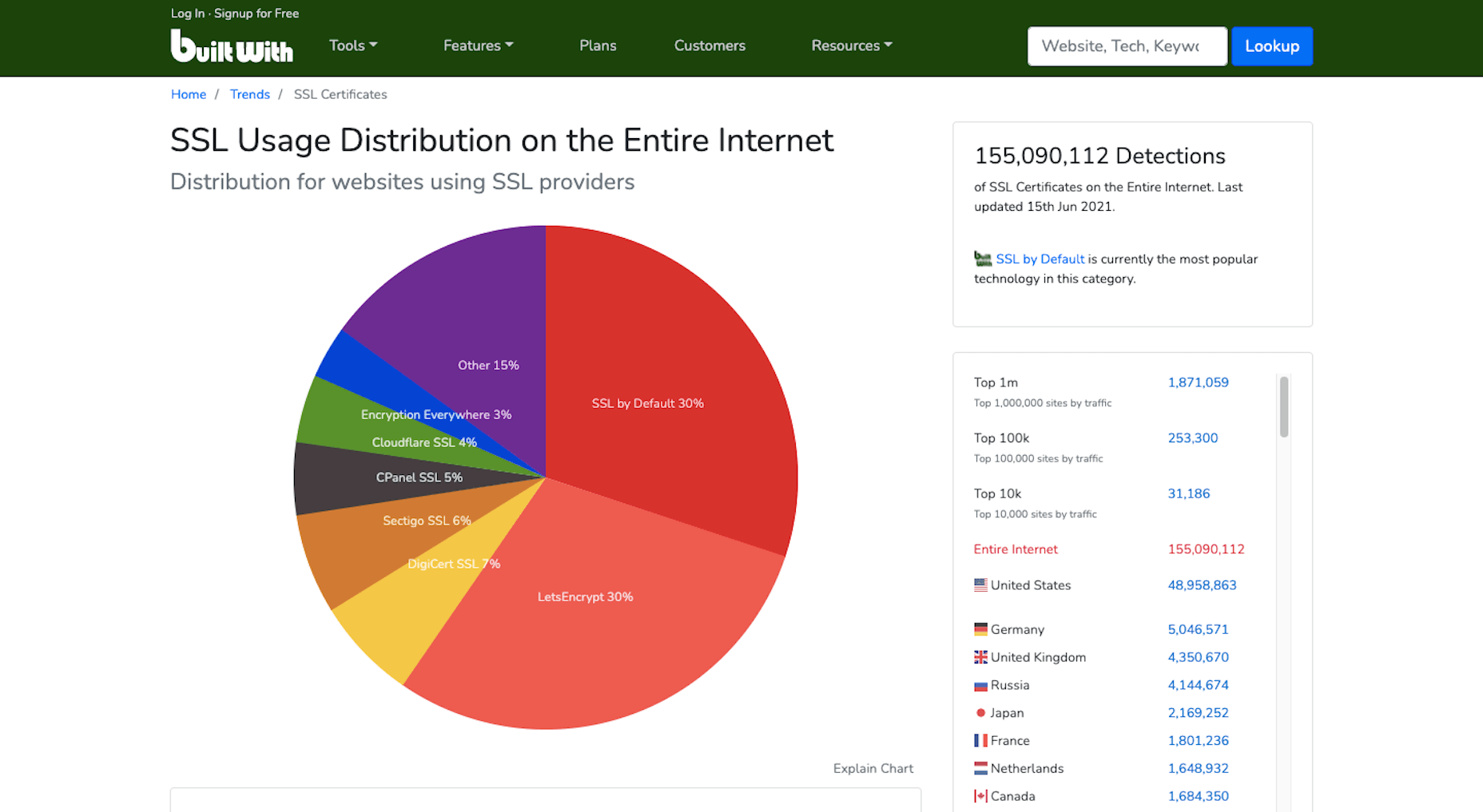
There’s no shortcut to success when it comes to Google search results. That is unless you count pay-per-click advertising.

While pay-to-play will shoot your site to the top of the SERP immediately, it’s not a sustainable strategy for maintaining your position there. So, you’re going to have to get serious about SEO.

This guide will show you what to do to improve your SEO ranking and start seeing results this year:

  1. Use Google Analytics to track metrics
  2. Get an SSL certificate
  3. Improve mobile page speed
  4. Design a mobile-first UI
  5. Make your site accessible
  6. Optimize your images
  7. Create great content
  8. Structure your content for scannability and readability
  9. Create click-worthy title tags and meta descriptions
  10. Choose one focus keyword per page
  11. Improve your internal link strategy
  12. Use only trustworthy external links
  13. Get your site listed as a featured snippet
  14. Get high-quality backlinks
  15. Create a Google My Business page
  16. Refresh Your Content
  17. Regularly monitor Google Search Console

How to Increase Your Website’s SEO Ranking

If you can improve your SEO ranking — and get your pages closer to, if not on the highly coveted top SERP — you will:

  • Boost your site’s overall visibility as its authority in search grows;
  • Bring high-quality traffic to your pages;
  • Drive-up your conversion rate.

That said, search engine optimization is most effective when it’s an ongoing strategy as opposed to something you set up and forget about. So, some of the suggestions below will only need to be implemented once, while others you’ll have to return to every six months or so to make sure your site is on track.

Let’s get started.

1. Use Google Analytics to Track Metrics

If you haven’t yet begun tracking your website’s activity with Google Analytics, it’s the very first thing you need to do.

While Google Analytics alone can’t tell you how well or poorly your website ranks, there’s valuable data in there about what happens to the traffic that arrives from Google. Or any search engine your visitors use.

You can find this information under Acquisition > Source/Medium:

What you want to see here is that (1) you’re getting lots of visitors from organic search results (as opposed to paid) and (2) that they’re highly engaged. So, that means:

  • Longer times on site;
  • Multiple pages visited;
  • Lower bounce rates.

And if you configure Google Analytics to track different conversions on your site, you can see how well those organic visits convert.

Obviously, there’s a lot more you can track here. But you must understand if your SEO efforts are working in the first place, and that’s where you’ll get your confirmation.

2. Get an SSL Certificate

HTTPS has long been one of Google’s SEO ranking factors. Yet, of the two billion-plus websites that are online today, BuiltWith data shows that only 155 million have an SSL certificate installed:

Security and privacy are major concerns for consumers. So if you want to increase their confidence in your website, installing an SSL certificate is an easy thing to do. And it’ll put you in Google’s good graces, too.

If you don’t have one already, get one for free from Zero SSL.

3. Improve Mobile Page Speeds

Mobile loading speeds became a Google ranking signal in July 2018.

It was something we saw coming ever since smartphones overtook the desktop as the primary device people used to access the Internet. Once it became a ranking factor, though, mobile page speed was something we could no longer treat as a “nice to have.” It became a must.

And with Google’s most recent Core Web Vitals algorithm update, there’s no ignoring how big of a role your site’s mobile loading speeds (i.e., performance) play in ranking it.

To ensure that your site meets Google’s expectations for speed, bookmark the Core Web Vitals tool. It’ll tell you how your site performs across all four of the major ranking categories.

You’ll find your speed-related issues at the bottom of the page, along with resources to help you resolve them.

Most of those tips will have to do with optimizing your code. However, there are other things you can do to make your site load quickly:

  • Use well-coded themes and plugins;
  • Remove unused themes, plugins, media, pages, comments, backups, and so on from your database and server;
  • Install a caching plugin that’ll minify, compress, and otherwise make your site lightweight and fast.

It’s also not a bad idea to review your web hosting plan. You might not have the right amount of server power or resources to keep up with your existing activity.

4. Design a Mobile-First UI

On a related note, a mobile-first design can also improve your site’s loading speeds. Rebekah Carter wrote a really helpful guide on how to do this last year.

In addition to speeding things up — since you won’t be trying to jam a bunch of desktop-first design and content into a smartphone screen — it’s going to help your site rank better.

Just be careful when you do this. A mobile-first design doesn’t mean creating a scaled-back version of the larger site for smartphone users.

In fact, Google explicitly tells us not to do that and why:

“If it’s your intention that the mobile page should have less content than the desktop page, you can expect some traffic loss when your site is enabled mobile-first indexing, since Google can’t get as much information from your page as before.”

And if your response is that the content on desktop-only doesn’t matter, then it really shouldn’t be there. Don’t waste your visitors’ time with useless or repetitive content, as it’ll only give them more reason to abandon your site.

5. Make Your Site Accessible

Accessibility has come to the forefront of the SEO discussion thanks to Core Web Vitals.

Now, running your site through the tool will tell you if there are any inaccessibility issues that Google will ping you for. But that doesn’t make your site completely accessible.

Considering the rise in website accessibility-related lawsuits, you’ll want to take this seriously.

Because a bad experience due to inaccessibility won’t just cost you visitors and a lower search ranking, it’ll cost you a lot of money, too.

Here are some things you can do to ensure that your site and all its content is accessible.

6. Optimize Your Images

Technically, image optimization falls under the page speed tip. However, that’s not the only way you should be optimizing your images, which is why I wanted to address this separately.

According to HTTP Archive, the average weight of a mobile web page these days is 1917.5 KB. Images take up a sizable chunk of that weight:

Because of this, bloated image sizes are often to blame for slow pages.

You can do several things to optimize your images for speed, like using lightweight formats, resizing them, and compressing them. You’ll find 6 other image optimization tips here.

While those tips will help you speed up your site and, consequently, improve your SEO ranking, there’s something else you need to do:

Add alt text to your most important images.

One reason to do this is to improve accessibility. Another is so your web page can rank in both the regular Google search results and image results as this search for “WordPress by the numbers” does:

If you can write alt text that perfectly describes your graphic and matches the image searchers’ intent, you can create another ranking opportunity for your page.

7. Create Great Content

There are many technical ranking factors you have to pay attention to if you want to create a good experience for your visitors and rank well as a result. However, none of that will matter if your content sucks.

So, how do you make great content? It really depends.

Think about the difference between a page describing your web design services and a product page for a blender.

Your web design services page would need to:

  • Explain why hiring a web designer is a must;
  • What your design services entail;
  • What they can expect in terms of results;
  • Include some proof in the form of testimonials or portfolio samples;
  • Have information on next steps or how to get in touch.

That would be a comprehensive and useful page. If business owners searched for “hire a web designer near me” or “should I hire a web designer?”, that page would sufficiently answer their query.

A product page, however, would need to:

  • Provide a brief summary of the blender;
  • Show photos of the blender, different angles of it, as well as different variations of the product;
  • Display the price;
  • Allow customers to Add to Cart or Save for later;
  • Include technical specs of the blender;
  • Recommend related products;
  • Display sortable customer testimonials and ratings.

The last thing a shopper would want is to be directed to a product page that reads like one of your services pages.

So, great content not only needs to be well-written and error-free, but it needs to match the searcher’s intent and expectations. If you can do that, your visitors will stay as long as they need to read through everything, which will help strengthen the page’s ranking.

8. Structure Your Content for Scannability and Readability

Including necessary details and in the right format is an important part of making a page’s content valuable to the visitor. The structure is going to help, too.

For starters, you want to make sure every page is human-readable. So, that involves:

  • Shorter sentences and paragraphs;
  • Linkable table of contents for longer pages;
  • Header tags every few hundred words;
  • Descriptive and supportive imagery throughout;
  • Text callouts like blockquotes and bolded phrases.

By making a page less intimidating to read and easier to scan for a quick summary of what it is, you’ll find that more visitors are willing to read it and follow your calls to action.

You can use a tool like Hemingway to improve your page’s readability. Quickly pop the text of each page into the editor and follow the recommended suggestions:

You’re also going to have to think about how well Google’s indexing bots can read your page. They’re smart enough to pick up on cues but not smart enough to sit down and read your article on the benefits of Vitamin D or how to install a new showerhead.

So, you’ll need to use HTML meta tags as well as hierarchical header tags to tell the bots what the page is about.

If you’re building a WordPress site, you can use the Yoast SEO plugin to analyze how scannable and readable each page of your site is (among other things):

9. Create Click-Worthy Title Tags and Meta Descriptions

To get eyeballs on your really great content, the brief preview users see of it in search results needs to be able to lure them in. Get more clicks to your site from search, and Google will take notice.

But they can’t just be superficial clicks. If Google notices that your page is getting a ton of traffic that almost immediately drops off once they see the content on the page, your page will not fare well in search results.

So, your goal is to stay away from clickbait-y title tags and meta descriptions and make them click-worthy.

The first thing to focus on is the length. Google only gives you a certain amount of space to make your pitch.

There are many tools you can use for this, but I prefer Mangools’s SERP Simulator:

It allows you to play around with your URL, title tag, and meta description and to watch in real-time as it fits the allotted space. You can also compare it to the pages that currently rank for the keyword you’re going after, which can be a really useful reference point. After all, if those sites have made it to the first SERP, then they’re doing something right.

Another thing to think about when writing click-worthy titles is how engaging they are.

The tool I recommend for this is CoSchedule’s Headline Studio:

I don’t find this useful so much for basic web pages. You don’t need to get creative with something like your About or Contact pages. But for content marketing? If you want to beat out competing articles for attention in Google, this tool will be very useful.

10. Choose One Focus Keyword Per Page

It’s not as though you can add a keyword tag to your page, and Google will automatically rank your site for it. That’s not what keyword optimization is.

Instead, what you do is select one unique keyword per page and write the content around it. So, it’s really more about creating a clear focus for yourself and then comprehensively unpacking the subject matter on the page.

Keep in mind, though, that if you want to improve your chances of ranking for the keyword, it needs to be relevant to your brand, useful for your audience, and your site needs to actually be able to compete for it.

You can use the Google Keyword Planner to find keywords that fit those criteria:

Ultimately, you should choose a keyword that:

  • Has a decent amount of monthly searches — over 1,000 is what I aim for;
  • Have “Low” to “Medium” amount of competition, but the lower, the better;
  • Matches the user intent. So take that keyword, put it into Google and see what you find. Then, look at the sites on that first page of search results. Do they match what your own page will address? If so, then you’ve found a keyword that aligns with your users’ search intent.

Now, if you’re writing great content that addresses your visitors’ questions and concerns, then optimizing for your focus keywords will happen naturally. The same goes for related keywords you might want to target. As you write the content for each page, the keywords will organically appear.

But remember how I said Google’s indexing bots need certain HTML and header tags to “read” the content on the page? This means you’ll need to include the focus keyword in some of those areas, so there is no question about what the page is about.

Here’s where your focus keyword should show up:

  • Title tag (H1);
  • Meta description;
  • Slug (hyperlink);
  • Within the intro;
  • The first H2 header tag;
  • Alt text for the most important image on the page;
  • Within the conclusion.

It should also appear throughout the page, along with variations of the keyword that people might search for.

You can use the Yoast SEO plugin to analyze this as well.

11. Improve Your Internal Link Strategy

Okay, so here’s where we start to get into SEO strategies that Google might not directly care about, but that can still drastically improve how well your site ranks.

Internal links, in particular, are valuable because they create an interconnected structure for your site. Here’s a basic example of why that’s important:

Let’s say these are the pages on your website. Each of them can be accessed from the home page and main navigation. This structure tells us that each page is related to the overall message and mission of the company, but they are not related to one another. And that doesn’t make sense, right?

When you’re educating visitors on your Web Design services, it’s naturally going to come up that you also happen to specialize in WordPress and eCommerce design. So, those internal links should appear on your Web Design page. And vice versa.

In addition, your Portfolio and Contact Us pages are likely going to be the most common CTAs on the site. Your prospective clients shouldn’t be forced to backtrack to the homepage or scroll up to the navigation to take action. By including these internal links or buttons within the content of the services pages, you’re giving them a quick and direct line to the next steps.

The more intuitive you make the user journey, the easier it will be for them to convert.

This is one reason why websites with a strong internal linking structure perform well in search results. Another reason is that internal links help Google’s bots find all of the content on your site and better understand how they relate to one another.

12. Use Only Trustworthy External Links

Link juice is one of the reasons why business owners are obsessed with getting backlinks. We’ll get to that shortly.

But it’s also something that comes into play when choosing external links to include on your site.

Link juice is the idea that one site can pass its authority to another through a dofollow link. So, by linking out to authoritative and trustworthy sources, your site may raise its own clout with the search engines because of that connection.

However, it works both ways. If you create external links to websites with misinformation that pose a security threat to visitors or are otherwise untrustworthy, that bad reputation can do your website harm.

So, make sure that every external link you use is necessary and reliable. If not, get rid of it.

13. Get Your Site Listed As a Featured Snippet

I said earlier in this post that pay-per-click advertising is the only way to shortcut the SEO process and get on the first page of Google. That’s not entirely true.

We’ve already seen how optimizing your images for Google Images search can shoot your site to the top of results. Another way to get ahead is by optimizing your page using structured data to land a spot as a featured snippet.

Like this page from Bankrate that answers the question “how do you get a loan”:

Remember that structured data alone won’t instantly move your web page into the featured snippet space. The content needs to be the best it can be, and the structured data needs to be well written.

Schema.org was created to help you pick the right category and write the structured data for it:

Use this to write up the relevant microdata for the pages to make the most sense to do so. For instance, an About page probably wouldn’t benefit from having structured data attached to it. However, a lengthy blog post that explains a step-by-step process would.

There are WordPress plugins (Yoast is one of them) that will help you insert this code into your pages if you prefer.

14. Get High-Quality Backlinks

Backlinks pointing to your website are a huge indicator to Google that your site is share-worthy and authoritative.

However, like everything else in SEO, you can’t cheat your way into a bunch of backlinks. They need to come from authoritative sources, and they need to be relevant. That’s why paying or bartering for backlinks isn’t usually effective. If your web page’s backlink doesn’t organically fit within the content on their site, visitors aren’t going to click on it.

There are lots of ways to go about building up a repository of backlinks that do generate authority for you and improve your SEO ranking in the process:

Get active on social media and become an authority there: The rule is generally that 80% of your posts need to be non-promotional. By sharing content from all kinds of sources that are relevant to your audience, you’re going to get more meaningful engagement. And this’ll eventually put the spotlight on your own content and get people to share it on social media, too.

This is something that Google will look at when ranking your site: What sort of social signals are coming from your brand?

Get featured as an expert: You don’t need to become an influencer for people to view you as an expert in your field. It’s all about your reputation.

By leveraging your reputation to get speaking gigs, you’ll grow your authority even more. Just make sure they’re relevant to what you do. So, look for podcasts, webinars, and conferences in your field that are looking for experts.

Become a guest blogger: If public speaking isn’t your forte, that’s okay. Turn your attention instead to lining up guest blogging gigs.

By writing high-quality content for authoritative websites (whether you get paid or not), you’ll bring more attention to your own brand. And Google will pass that authority onto your site.

15. Create a Google My Business Page

Any business can create a Google My Business page. There are a number of SEO-related benefits to doing this.

The first is that local businesses can literally put themselves on the map with Google My Business. Here’s what a Google search for “restaurants near me” looks like:

Even if your site doesn’t appear on the first SERP, the map that sits at the top of search results can give you a front seat anyway.

Another reason to create a My Business page is that you get to control your knowledge graph sidebar, like Ford’s Garage does here:

By including high-quality graphics, pertinent details about the business, and collecting positive customer reviews, this knowledge graph could do your brand’s reputation a lot of good in the eyes of Google and your prospects.

16. Refresh Your Content

This is useful for all of the content on your site, even your most high-performing pages.

If your site is starting to gain traction, take a close look at your Google Analytics data. You may find a few pages that no one seems to be paying attention to or, worse, that they always seem to bounce from.

In Google Analytics, go to Behavior > Site Content to figure out which pages are underperforming.

Then, ask yourself:

  1. Is this page even a necessary part of the user journey? If not, you can probably scrap it and have one less distraction on your site.
  2. If this page is necessary, what do you need to do to make it more valuable and relevant to your audience?

With the most popular pages on your site, it’s not unreasonable to expect that at least part of what you originally wrote will go stale or become irrelevant within a year or two. So, it’s a good idea to refresh these as well.

To do that, it’s simple. Do a search in Google for your focus keyword. Read through the top five results and see what sort of information your post is missing. Then update it accordingly.

Anything outdated or irrelevant should also be stripped out.

17. Regularly Monitor Google Search Console

Last but not least, you should keep your eyes on Google Search Console.

There’s a lot of valuable information in here that will tell you why your site might not be ranking as well as it could. You’ll find issues related to:

  • Indexing
  • Mobile usability
  • Security
  • Core Web Vitals

You’ll also find data on how well your site is ranking in general. You’ll find this under the Performance tab:

Use this to identify:

  • Which keywords you’re ranking for and are driving traffic to your site;
  • Which keywords you’re getting the most impressions from but not getting clicks from;
  • Which keywords you’re getting the most clicks from but not a lot of impressions;
  • Which keywords you rank low for and could stand to improve upon.

You can learn a lot about how strong your SEO strategy is. Just use the Clicks, Impressions, and Position tabs to sort your data so you can better understand what’s going on.

Then, prioritize fixing the pages that can and should be bringing your site highly qualified traffic but aren’t.

Wrap-Up

If you’re wondering how long it’ll take before you see an improvement in your SEO ranking, it depends. If your domain’s current authority is low, it can realistically take about six months to see major changes. That said, if you implement all of the suggestions above, you can certainly expedite that.

Just remember that there are no real shortcuts in SEO. You need to have an authoritative and trustworthy website and brand before anything else. So, take the time to build your credibility online so that these SEO tactics can really work.

Source

The post 17 Things You Can Do To Improve Your SEO Ranking In 2021 first appeared on Webdesigner Depot.


Source de l’article sur Webdesignerdepot

Ever since online stores first emerged they’ve faced one big challenge compared to their real world rivals; yes, it’s convenient to shop wherever, whenever you want, and delivery options permitting, buy from anyone anywhere in the world. But it’s a minimal experience compared to the fuller sensory experience of shopping in the real world.

Online stores can only access our sight and hearing, whereas physical shops can engage all our senses. How can a website compete with the experience created by walking into a physical space where lighting, layout, decor, and background audio are all carefully designed to create an appropriate atmosphere; where you can touch fabrics to check how they feel, try clothes or shoes on without having to buy them first? How do you sell scented products without allowing them to be smelled?

In this month’s round-up, we see a few different approaches to solving this dilemma, sites that focus the copy, visual, and auditory, to work on the imagination.

Go Love Yourself

This microsite to advertise The Body Shop body butters, uses sensuous imagery and video to create an atmosphere of indulgence while also offering comprehensive product information.

Niarra Travel

Sustainable, bespoke travel agency Niarra Travel makes good use of some beautiful photography. The background color scheme of earthy greens and neutrals fits both the luxury and eco-conscious aspects of the company.

by Humankind

by Humankind is a personal care brand making toiletries from natural ingredients. The focus of their pitch is reducing plastic waste. The site is appropriately sparse, with simple product shots and mostly warm neutral colors.

Mama Joyce Peppa Sauce

This one-page site for Mama Joyce Peppa Sauce is big and bold. Lots of scrolling type and vintage style illustration. You don’t need to look for a ‘buy now’ because the cursor itself is it. Click almost anywhere, and two bottles of sauce go into your cart.

Eadem

Eadem is a beauty company for women of color — their flagship product is a serum that fades dark spots without bleaching. Pinks and dark golds contrasted with fresher oranges and pale greens create a color scheme that feels rich but not heavy.

Pact Media

Pact Media is a full-service digital design agency whose work mainly focuses on agencies, businesses, and organizations involved in conservation. Large type and greyscale with red accents create a strong feel, while color on image rollover adds extra impact.

hueLe Museum

hueLe Museum is a collection of clothing brands. The philosophy behind it equates choosing clothes to choosing flowers, and there are some beautiful flower images. There is a sense of tranquility to the site, and it is even better on mobile.

Marnie Hawson

Photographer Marnie Hawson’s portfolio site is clean and simple, with a warm green (again) background and an engaging asymmetrical grid layout.

Kōpiko

Kōpiko is a micro-bakery that offers a sourdough delivery subscription service to its local area. It makes and sells only two products, and the single-page site is suitably simple. Putting the subscription form above the product and company information gets to the point without seeming pushy.

Banila Studio

Banila Studio is a branding and design studio in Basque Country. This is a nice example of sideways scrolling, and the alternate color scheme option is a fun touch.

Big Green Egg

Big Green Eggs are high-end barbecue/outdoor ovens. Lots of high-quality food photography is the key here, along with a clear build-your-own setup process.

Pawzzles

Pawzzles is a puzzle feeder toy for cats, and yes, there is a cat video. This has a fun feel, with some rather sweet illustrations and lots of silly puns. By cat lovers, for cat lovers.

Melopeion Organic Thyme Honey

The choice of display type on this site — crucially one that works well for both the latin and greek alphabets — emphasizes the Cretan origin of Melopeion honey. The illustrations are appealing, and the shopping basket icon is an especially nice detail.

Brendel Wines

This site for Brendel Wines is all about photography, large background photographs, and video, as well as product shots. More specifically, the lighting in the images creates an atmosphere, a sense of warm summer evenings.

imNativ

imNativ is an upholstery fabric: not the most exciting product to present enticingly. Some good, close-up photographs and well-styled images of the fabrics in use make them desirable.

Thursday Studio

Thursday design studio has produced a very pleasing, clean site for their own portfolio. The split-screen scrolling that changes to sideways scrolling on mobile is especially nice.

HALEYS Beauty

HALEYS Beauty uses a soft, powdery color palette and a clear, well-spaced grid, which gives it a modern, feminine feel.

Wookmama

The Wookmama app is a color visualizer which displays palettes and applies those palettes to real-world images. Colour is, as one would hope, used well here, along with plenty of screen mock-ups.

Planet of Lana

Planet of Lana is the first game from Wishfully Studios, due for release in 2022. This teaser web page really allows the game illustrations to do the talking.

The Future of Office

The Future of Office is a sales site for office space to rent. It has a fresh, airy feel which reflects the open, minimal aesthetic of the spaces on offer.

Source

The post 20 Best New Sites, June 2021 first appeared on Webdesigner Depot.


Source de l’article sur Webdesignerdepot

The author, Jordan Hoggart, was not compensated by Ahana for this review.

The Background

At the base of Carbon’s real-time, first-party data platform is our analytics component, which combines a range of behavioral, contextual, and revenue data, which is then displayed within a dashboard in a series of charts, graphs, and breakdowns to give a visual representation of the most important actionable data. Whilst we pre-calculate as much of the information as possible, there are different filters that allow users to drill deeper into the data, which makes querying critical.

Source de l’article sur DZONE

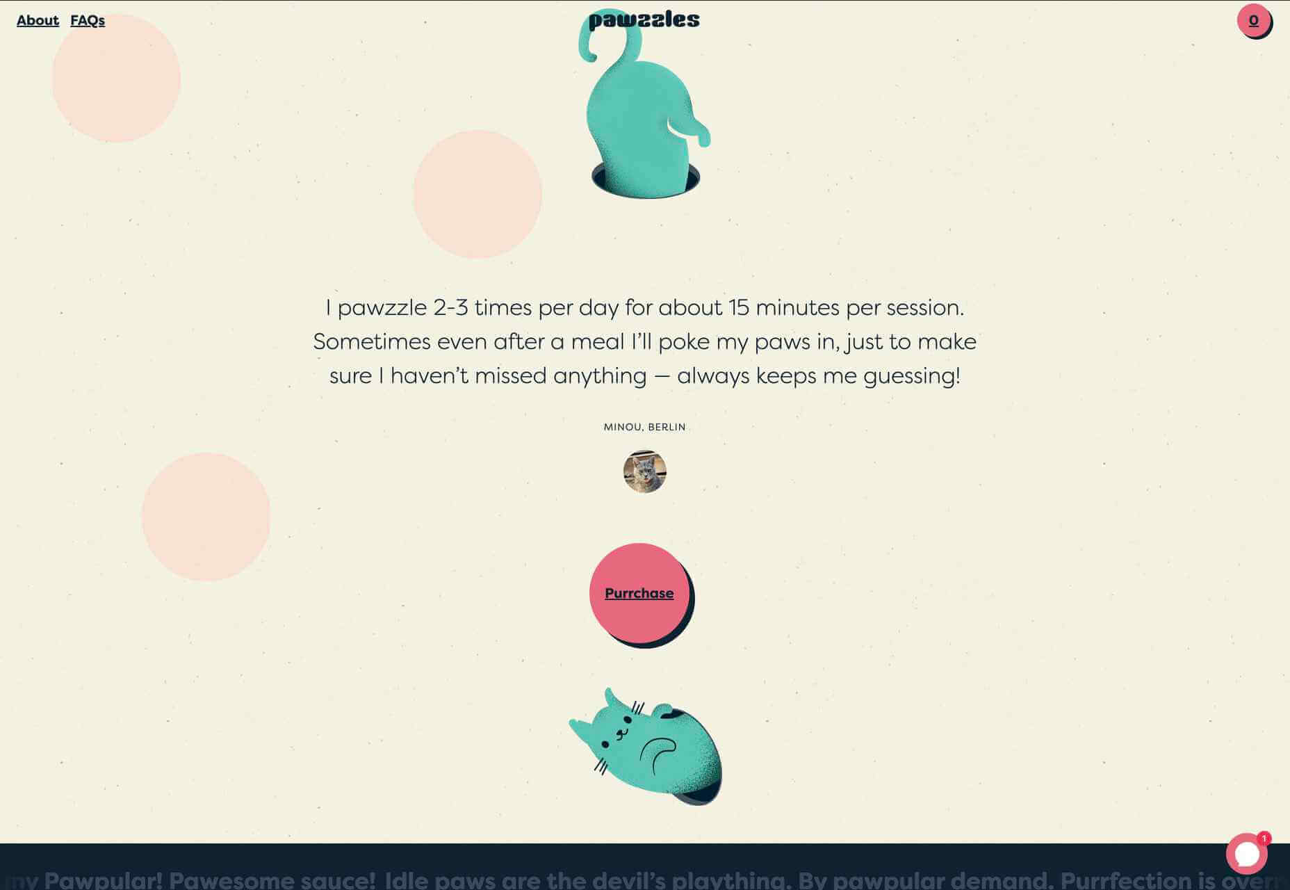
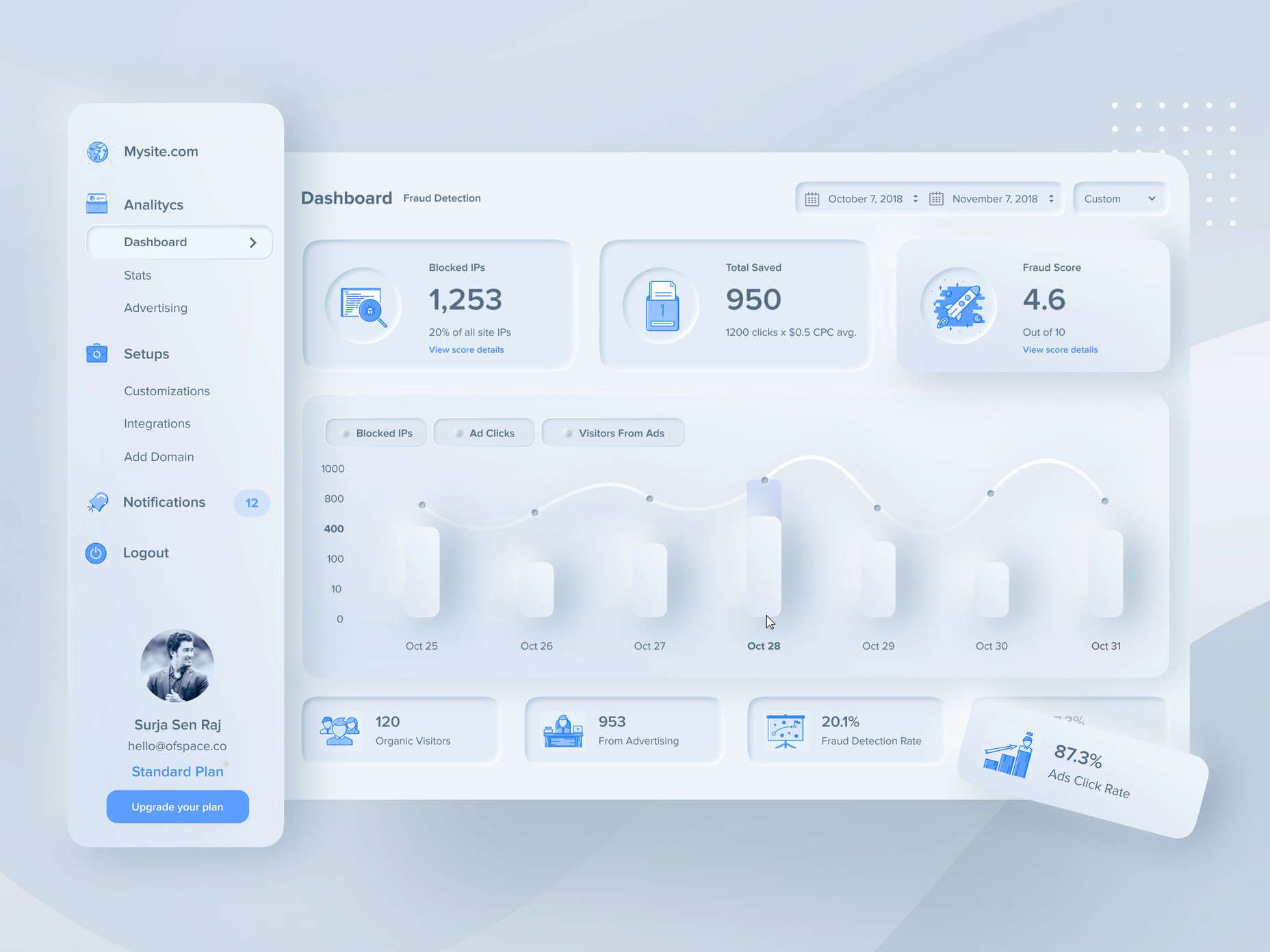
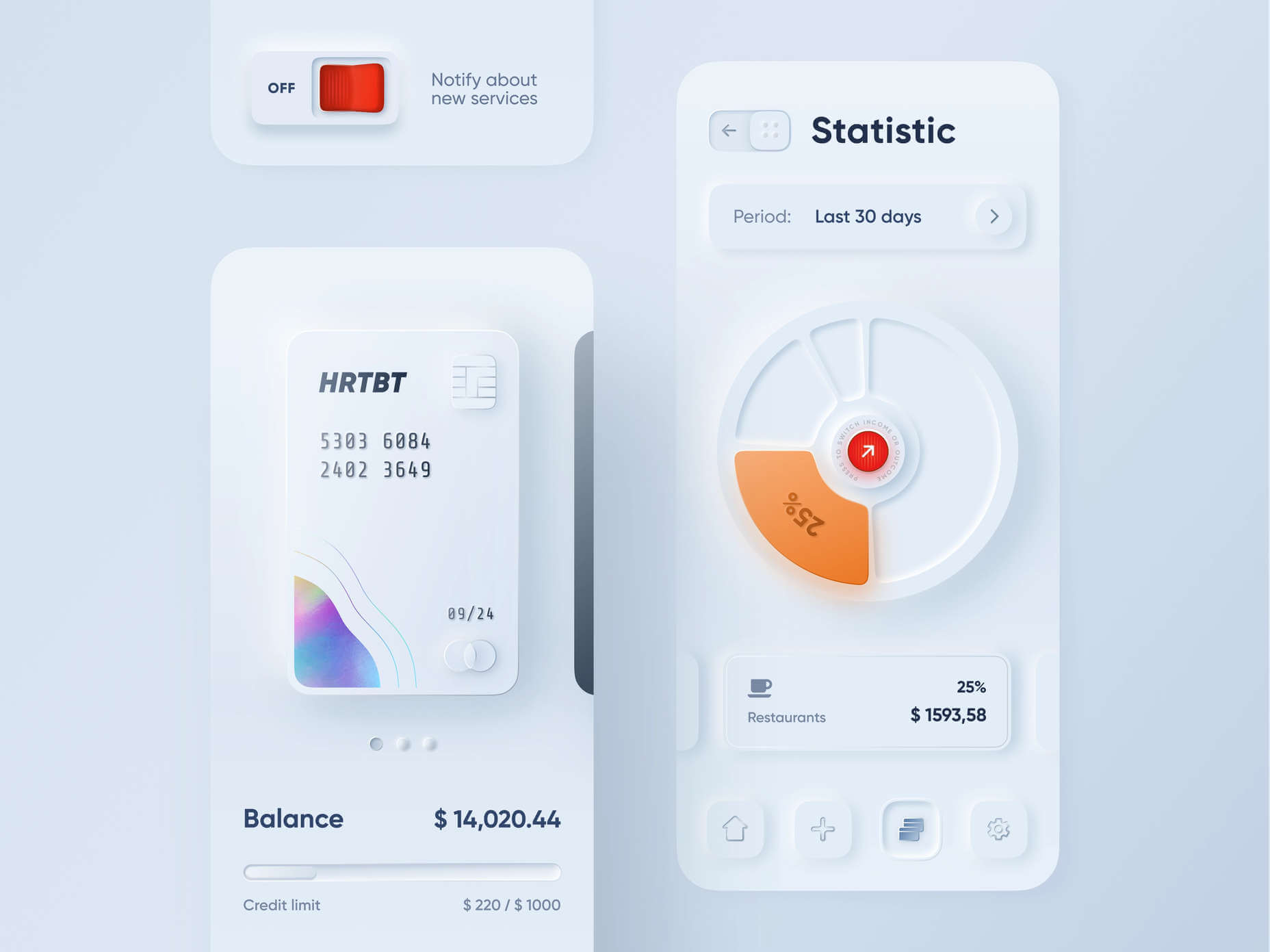
A new design trend has emerged in the last year: Soft UI or Neumorphism is everywhere. 

Even Apple is in on the trend; the company introduced a host of changes in both its mobile and desktop operating systems that use the style. The elements of Soft UI introduced by Apple reflect various aspects of the Microsoft Fluent UI design too. 

So, if soft UI is such a huge concept, what do we need to know about it? How does soft UI work, and what are the pros and cons of using it?

What is Soft UI (Neumorphism)?

Soft UI involves using highlights and shadows in design elements to make them look as though they’re layered on the page. 

The term neumorphism is derived from a previous design style — skeuomorphism, where designers create something as close to its real-life counterpart as possible. If you remember the shift between iOS 6 and 7, you’ll remember the switch between skeuomorphic and flat designs. However, neumorphic design isn’t quite as dramatic. 

Neumorphism doesn’t focus excessively on things like contrast or similarities between real and digital elements. Instead, this “soft UI” practice creates a smoother experience for users. 

With neumorphism, you get the sense that buttons and cards are actually part of the background they’re on. This trend removes the flashier aspects of a typical interface and focuses on a softer style that stays consistent throughout the design. 

The Common Features of Soft UI

Soft UI is all about smoothing out the experience by making everything feel more connected. There’s nothing overly harsh in the aesthetic, hence the term “soft.”

So, what kind of features can you expect?

Rounded Corners: Soft UI removes some of the sharper parts of the interface, like the corners on modules and segments. This allows for a more gentle appearance overall. In this experimentation from Iqonic Design, we can see how the round corners tie everything together.

Transparency and Background Blur: Background blur and transparency are more popular today since the infamous iOS 7 solution emerged. Most people hated the appearance of ultra-minimalism, combined with thin fonts. However, the background blur effect was more popular. The blur in soft UI shows that part of the window is connected to the rest of the OS. It seems like parts of the background in the app are pushing through to the surface. 

Unified Symbols: Everything needs to fit perfectly in a soft UI design. Anything that doesn’t look like it’s part of the same entity throws off the experience. In this design experiment by Surja Sen Das Raj, you can see how all the colors, shadows, and gradients tie together consistently. Because everything is more uniform, the experience flows perfectly for the end-user. 

Implementing Soft UI Elements in Your Design

So, what does neumorphism look like in your UI design process?

Ultimately, it’s all about subtle contrast and aligned colors. Every part of your interface needs to look like it’s part of the same form. Your element and background need to be the same color so that you can create a feeling of objects protruding from the background. 

With Soft UI, the keys to success are shadows and highlights. 

Let’s take a look at some key steps. 

Achieving the Soft Look

When you’re designing your interface, remember that sharp edges make the interface more serious and formal. Rounded corners are more playful and friendly. 

What also makes the design look lightweight and delicate is plenty of deep shadows and highlights. When you add shadows to elements, you create a visual hierarchy. The items that cast a larger, deeper shadow are the ones closest to you. That’s why only a few elements need to cast an intense shadow. Everything else should work in the background. 

Take a look at this design by Alexander Plyuto, for instance.

Creating Smooth and Delicate Gradients

Gradients are part of the shadow and highlighting process in Soft UI design. Ideally, you’ll need to choose colors from the same palette, just toned down or brightened, depending on your needs. The gradient needs to be barely visible, but just enough to make the elements stand out. 

For white gradients, like highlights, use a very delicate color somewhere between white and your background shade. For instance, consider this design from Marina Tericheva.

Consider the Little Details

Finally, remember that the neumorphism design principle is all about little details. 

Choosing a font that visually matches the background is an excellent choice. However, you can also choose something more contrasting, as this will help information stand out

Adding a little bit of the background into your fonts might be suitable too. For instance, if you have a green font and a grey background, add a little grey into the mix. 

Extra elements in your design, like allowing a button to shift into a more recessed state after being clicked, are a great way to make the soft UI more engaging. Everything your end-user interacts with needs to feel smooth and perfectly unified. 

The Problems with Soft UI Design

Just because a design process is trending – doesn’t mean it won’t have its issues. 

Neumorphism is a fun way to make apps, operating systems, and websites feel more friendly and informal. However, this softer approach has a weak spot too. 

When you’re dealing with a small margin of contrast and color where neumorphism works well, it’s hard to get the effect right every time. For instance, this all-yellow design for Dtail Studio may be overwhelming for some.

A slight deviation in saturation or a problem with your shadowing could render the entire effect of Neumorphism completely pointless. 

Another major issue is accessibility. The soft UI design looks great for people who have a full visual range. However, visually impaired users might not see the same benefits. Anyone without perfect vision may see crucial objects disappearing into the background.

Your users don’t necessarily need significant vision problems to struggle with neumorphism, either. The design is all about softness that causes elements to almost blend together. People with low-quality screens that don’t have as many pixels to work with won’t see these elements. 

Issues With Buttons and CTAs

Another major issue of neumorphism is that its subtlety can lead to problems with attracting clicks and conversions. Usability is the most important consideration of any UI design. 

Unfortunately, when you focus on subtle elements throughout your entire interface, usability sometimes takes a hit. 

Let’s consider buttons, for instance – they’re essential to any interface. To simplify the customer journey, these buttons need to be noticeable, and they need to shift into different states when your customers interact with them. 

For the button experience to be excellent, users need to notice the design instantly. However, the heart of neumorphism revolves around the idea that nothing stands out too much. 

This isn’t just an accessibility issue; it’s a problem for conversions too. 

Neumorphism is soft on the eyes, with minimal color contrast and few color pops. This means that CTA buttons don’t stand out as much as they should. Buttons almost blend into the background, and the website struggles to pull attention to the areas that demand it most. 

How to Experiment With Soft UI (Free Kits)

The key to unlocking the benefits of soft UI interfaces without getting lost in the negative points – is proper experimentation. Like any new design trends, professionals and artists will need to learn how to merge the elements of soft UI together in a way that doesn’t compromise usability. 

Trends in UI design can’t focus exclusively on aesthetics, as a customer’s comfort will always be an essential part of the process. 

If you want to start exploring, here are some of the best kits and freebies to get you started:

Closing Thoughts on Soft UI

The world of design and the trends that we use are constantly changing. Companies are always searching for the best ways to connect with their users. Often, this means focusing on an interface that really connects with your target audience and delivers the best possible results. 

The soft UI design trend has its benefits and its downsides. On the one hand, the smooth appearance of every element on a combined screen can deliver a delightful aesthetic. Buttons feel less imposing, and elements are friendlier and easier to interact with. 

On the other hand, neumorphism also makes it difficult to truly capture your audience’s attention in the places where it matters most. It suffers from accessibility issues and requires plenty of care and practice.

Source

The post Soft UI: Making Sense of the Latest Design Trend first appeared on Webdesigner Depot.


Source de l’article sur Webdesignerdepot

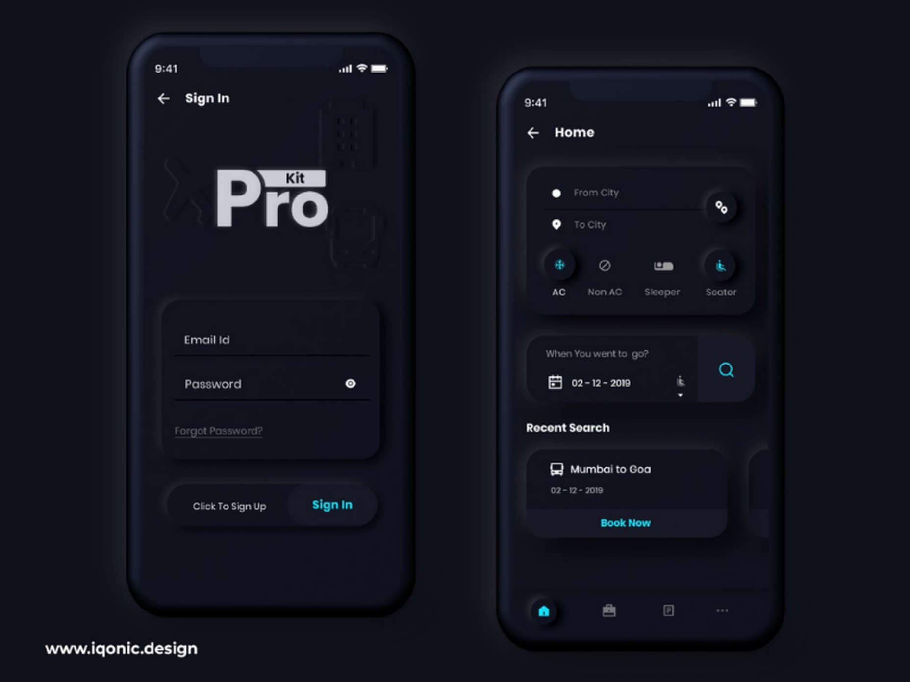
Inclusive design is often mistaken for accessibility, or even used as an interchangeable term, which is a good indication that most designers don’t know what it means.

Accessibility is a process that seeks to mitigate issues in a design that is not sufficiently universal; inclusive design increases the universality of the design. In real-world terms, an accessible building may replace its front steps with a ramp; an inclusive building is constructed at the same level as the sidewalk.

Accessibility is concerned with objective, measurable improvements. It’s a UI concern. Inclusive design is subjective, more difficult to measure, and is a UX concern. By designing inclusively, we extend our designs to the widest possible user group and contribute to a better society. Here are three ways to get started.

1. You’re the Edge Case

When designing, it’s normal to assume that we are normal. After all, we are the center of our experience of the world. Everything from our preferences to our empathy stems from our individual place in time and space.

When we use the term “edge case,” what we’re referring to is a minority experience, a way of using our design that is uncommon or distinct from our own expectations.

But what would happen if we treat ourselves as the edge case? What if all of the experiences that we deem to be minority experiences are actually the core, common user experience of our design?

If we start from the position that we are the one out-of-step with the design, that most people will not think or act as we do, then we’re eliminating thousands of biased decisions about how our design should be.

Draw From Life

It has always surprised me that in Europe’s dark ages — ranging from the decline of the Roman empire to the Proto-Renaissance — it didn’t occur to anyone to draw from life. Artists drew things the way they thought they should look, which is why so many Byzantine icons of the infant Jesus look like a middle-aged blonde man that has been shrunk.

It’s important to draw from real life as much as possible. That means abandoning personas — which are by definition under-representative and frequently loaded with bias — and engaging with actual users. Most of all, it means taking a step back and opening your eyes.

2. Stop Making Inclusive Design Part of Your Practice

Inclusive design cannot be a part of your practice; it’s an all-encompassing attitude. Your design practice must be inclusive. At least, it should aspire to be…

As human beings, we are biased—all of us. The reason for that is that bias — be it racism, misogyny, nationalism, homophobia, or anything else — is cultural. And we all exist within society. We’re all bombarded with information that reinforces those biases every day.

Accept that you have biases and that your biases will pull your design work away from the inclusive solution you aspire to. But equally, accept that by acknowledging your biases you’re limiting the influence they have over your decision-making.

Do Not Require Users to Self-Identify

It’s divisive and abusive to partition users into groups, especially when the act of doing so perpetuates bias.

One of the most encouraging developments of the last decade has been the introduction of the answer “prefer not to say” in response to personal questions about race, gender, status, and so forth. But if “prefer not to say” is a valid option, in other words if you don’t actually need to know, then why ask at all?

Beware Occam’s Razor

Occam’s Razor is an often misquoted idea that (to paraphrase) states that when making a decision, the one with the least assumptions is the correct choice.

The problem is that Occam’s Razor implies that there is a ‘correct’ decision. But in fact, inclusive design benefits most from a flexible UI and a high tolerance for deviation.

If you can identify the assumptions in a design decision sufficiently to count them, then you’re best served by testing, not comparing, those assumptions.

3. Design Flexibility Into Everything

There is no such thing as a “natural normal,” but there is “perceived normal.” Much of our behavior is governed by the experiences we’ve had since we were very young. Despite existing somewhere on a scale of ability and preference, most of us have inched towards what we have been told is a “normal” range all our lives.

However, it is a physiological fact that every characteristic exists somewhere on a spectrum. There are no black and whites; it’s all grey.

When we design a site or app, we tend to silo certain characteristics into one. Someone who is visually impaired is treated to the same ‘solution’ as someone who is blind, even though visual impairment can range from screen reflections on a sunny day to someone who was born without optic nerves.

There are people who have lost their sight through degeneration or accident and will be able to make visual connections based on remembered visuals. Other people have never seen anything and their conscious mental process isn’t figurative at all.

To accommodate the full gamut of possible interactions with our design, we need to design to a scale, not with absolute values. This means thinking less about set colors and sizes and more in terms of contrast and scale.

Avoid Communicating in Color

Few areas are more indicative of a spectrum of experiences than color.

Color is instantly problematic for designers because quite apart from color blindness, color has deeply personal associations.

Over the last couple of decades, it’s been repeatedly proven that it is contrast, not hue, that increases engagement. Green does not always mean go; red does not always mean stop.

Color involves so many biases and assumptions that it’s simply better to work with contrast than select the ‘right’ hue.

Bigger Typography (Sometimes)

In the first draft of this article, I wrote that increasing the scale of your typography was always good.

My rationale was that some users will benefit from larger type, and zero users will be hindered by it. But that’s not true. Larger type means fewer lines per viewport, which means more scrolling; not a problem for some users, but potentially an issue for those with motor control issues.

That was one of my biases right there.

Congratulations, You’re Now An Inclusive Designer

Good design is self-aware in origin and unselfconscious in execution.

Inclusive design isn’t about enabling access for everyone; it’s about designing for a user experience that is welcoming and respectful. Every one of your users should feel not just enabled but validated.

Inclusive design isn’t a series of items on a checklist; it’s an ideal, like harmony or beauty, that we may struggle to achieve but that we should strive for nonetheless.


Image via Pexels.

Source

The post 3 Ways to Design More Inclusively first appeared on Webdesigner Depot.


Source de l’article sur Webdesignerdepot

This month’s new tools and resources collection is a mixed bag of elements for designers and developers. From fun little divots to tools that can speed up development, you are sure to find something usable here.

Here’s what new for designers this month:

June’s Top Picks

Codewell

Codewell is a service to help you learn, practice, and improve HTML and CSS skills with real templates. The benefit here is pretty obvious. When working with real templates, you can see the result of actions and changes. The tool includes free and premium options with new templates to work on weekly. Everything works in a responsive environment, and free plans have access to free challenges and a Slack community; a paid plan also includes source files and premium challenges. You need a Github login to get started.

LoomSKD

LoomSDK is an easy and reliable way to add video messaging to your product – and it’s free. The SDK enables your users to record, embed, and view with Loom videos directly within web apps – adding clarity and context to any workflow.

Pintr New Image

Pinter New Image turns photos into funky and fun line images. Upload an image with plenty of contrast, use the controls to set the look you want to achieve, and download. The new images are available as PNG or SVG. Maybe use it to create your next profile photos for social media or a nifty avatar.

Terms & Conditions Apply

Terms & Conditions Apply is a game that explains all those little pop-ups that you accept to enter and interact with websites. You are tasked with a mission to start the game: Do not accept terms and conditions, say no to notifications, and opt-out of cookies. Can you do it?

Khroma

Khroma uses artificial intelligence (via personalized algorithm) to learn what colors you love and create palettes for you to discover, search, and save for use in projects. The beta tool is easy to get started with, although you do have a little color-picking homework to get started.

6 WebTools

Mmm

Mmm is a different type of website builder. The tool, which is still in alpha, allows users to create drag and drop websites in a simple manner. It works almost like making a digital collage. Users can get a custom URL, and every page is responsive. The interface is designed so that you can even build yours on a phone. And here’s the other feature – they encourage messy designs.

LightGallery

LightGallery is a lightweight, modular, JavaScript image and video lightbox gallery plugin. It works with React.js, Vue.js, Angular, and TypeScript. It includes plenty of demos and documentation to help you make the most of this gallery tool.

Vandal

Vandal is a nifty browser extension for Firefox or Chrome that allows you to navigate back in time without changing tabs. The utility of Vandal is to allow quick and easy access to all the archived snapshots for a URL, and it supports navigation to a snapshot as well.

CSS Layout Generator

The CSS Layout Generator is a tool for creating the CSS for layout components. It is also a learning tool for teaching what is possible in CSS for positioning elements in the browser. Tweak specifications to see how it impacts the layout, CSS, and HTML.

Alpaca Data API

Alpaca Data API is an easy-to-use feed that allows you to bring in stock market data for modeling and backtesting. (it includes free and premium options based on your needs.)

Mobile Palette Generator

Mobile Palette Generator is a color-picking tool that will help you select the best hues for mobile design projects. It then shows you all the specs for primary, secondary, and accent colors.

6 Icons and UI Kits

Iconoir

Iconoir is an open-source icon repository with more than 900 SVG icons. Search icons, browse by category or poke around for what you are looking for. Everything is ready to use without signups or forms to fill out.

Pmndrs Market

Pmndrs Market has a collection of more than 300 three-dimensional elements and drawings of things for use in projects. Model renders are in a rough style with a realistic feel.

Boring Avatars

Boring Avatars is a fun collection of semi-customizable avatars without faces, hence the name. It’s a fun playground that puts a new twist on something that you might not expect to do differently.

Spark

Spark is a free download with three different website design starters. The hero images are ready to build from and are made for Figma.

Venus Design System

Venus Design System is a premium UI kit packed with more than 2,000 components and states that allow you to design fast. There’s also a demo version for you to test before you buy.

ReadyUI

ReadyUI contains more than 200 blocks and designs for agencies, developers, startups, and more. Everything is production-ready using Bootstrap and Figma files. Choose from light or dark themes and search for a design that works for your project.

5 Tutorials

Creating Generative SVG Characters

Creative Generative SVG Characters is a marriage of JavaScript and SVG that creates fun characters derived from drawings. Using shapes and a little code, you can see how to draw smooth lines, create polygons, and add other shapes for a fun feel. There’s a full demo on Codepen.

5 Steps to Faster Web Fonts

5 Steps to Faster Web Fonts helps you remove some of the bulk from popular typography options. Iain Bean explains a set of methods you can deploy to ensure that load times are quick with some applicable code snippets. Here’s a preview: Tip 1 is to use the most modern file formats (WOFF2).

The Perfect Link

The Perfect Link walks you through some accessibility checks from the A11Y Collective for linking best practices. Some of the things you think are the “right way” may be challenged here. The information goes through everything from design to semantics and is wonderfully thorough. It’s a must-read.

Readsom

Readsom is a curated collection of newsletters and emails that you can read online or sign up for. Its catchphrase is to “discover content you’ll want to read.” It is a good way to find newsletters that interest you, including plenty of design and development options that you might not otherwise know about.

Famous First Websites

Famous First Websites isn’t a tutorial per se, but it does provide a good place to do some visual learning. See what your favorite websites looked like when they launched and the evolution of the designs.

Source

The post 22 Exciting New Tools For Designers, June 2021 first appeared on Webdesigner Depot.


Source de l’article sur Webdesignerdepot