Articles

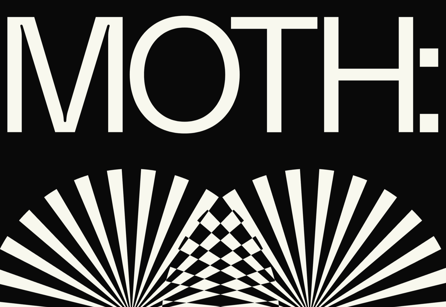
Type foundries have been putting out some really interesting fonts these last few months. Based on the collection of the best new fonts for February 2022, it looks like we’re going to see lots of throwbacks to the ‘70s in the coming year.

Do we have Burger King’s most recent and successful rebranding campaign to thank for that? I don’t know, but it looks like many font designers are going to try and emulate those fun retro vibes going forward.

1. Crafty Signs

Crafty Signs is a display font that draws inspiration from old game shows — think Family Feud or anything on Nickelodeon in the ‘90s. This playful bubble font would work well for brands targeting children or ones that have a big personality and old school vibe.

2. Epicene Collection

Epicene is a Baroque font with beautifully exaggerated calligraphic details (like swirls and strokes). There are two families within Epicene — one for Display and one for Text — so you can use this single font collection to style your entire site.

3. Kingsad

It’s hard to call Kingsad a sans serif font when it has such a distinctly unique design to it. The font’s creator suggests using Kingsad for branding. I’d add that the curious structure of the characters would make this font perfect for branding in the science and tech spaces.
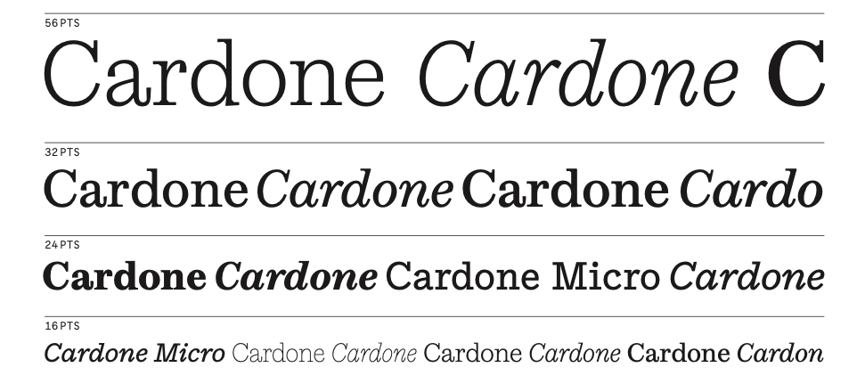
4. Lucius

Lucius is a lively-looking font, combining serif and sans serif characteristics. There are eight weights in this font family, which can be used both for display and text purposes.

5. Manju

Manju is a retro font that the designer describes as “soft and chewy”. You don’t see it as much in the thinner styles, but the bolder, thicker styles definitely feel like the kinds of fonts you’d see on food packaging and candy wrappers in the ‘70s and ‘80s.

6. Midnight Sans

Midnight Sans is a font that comes in a single weight (Black) and also has two variants: Midnight Sans RD and Midnight Sans ST. It was originally designed for When Midnight Comes Around, a book about the emerging punk music scene in NYC in the ‘70s, so it has a somewhat grungy, nostalgic feel to it.

7. Nagel

Nagel is technically still in beta, so this may not end up being the finished font when it’s done. For instance, they still have the italic and variable styles to develop. That said, it’s a neat-looking sans serif font — easy to read, but has a bit of an edge to it as well.

8. Painless

What you see is what you get with Painless. It has just one style — a textured, bold sans serif. Because of its casual, hand-brushed feel, it won’t fit well with just any brand. Where it would look cool is on websites for brands that sell hardware, furniture, and other DIY products.

9. Recipient

Recipient is a monospaced font inspired by the typefaces that appeared on old typewriters. With five weights and a set of matching italics, this font can be used for standard paragraph text as well as for smaller headlines.

10. Sea Angel

Sea Angel is a beautiful serif font with elegant curves. This easy-on-the-eyes font would look great on websites for high-end retailers, luxury magazines, museums, fashion brands, beauty companies, and more.

11. Smack Boom

Comic books and graphic novels will never go out of style. Especially as their stories branch out into other channels, like TV and movies. Smack Boom will enable you to bring that exciting and heroic look to your logos and web designs.

12. Stoner Sport

Stoner Sport is an outline display font that brings a modern touch to a retro sporty style. This font would work especially well for sporting industries as well as businesses that are associated with them—retailers, sports complexes, automakers, publications, and so on.

13. Stormland

Stormland is a good example of what makes Scandinavian design so striking. The lettering is clean and simple, built using uniformly sized lines. However, the characters are wide, which gives them a sturdy and strong feeling as well.
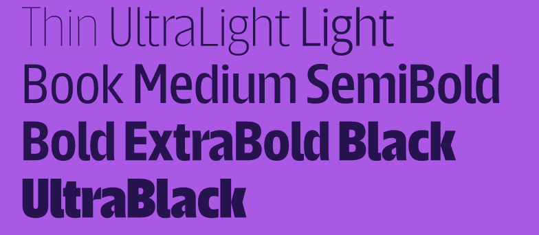
14. Tellumo

Tellumo is a humanist sans serif font family, ranging in styles from Thin to Extra Bold. What you see in the example below demonstrates some of the charm and warmth you can add to branding and designs with Tellumo’s swash caps. However, if you want to keep things simple and reap the benefits of the font’s clean and tidy design, you can use the regular character set.

15. Yamet Kudasi

Yamet Kudasi is a script font that comes in just the one style. Based on where it’s used (like in a signature line vs. a hero image) and the background it’s framed against, this versatile font can be used in a variety of ways and for various niches.

Source

The post 15 Best New Fonts, February 2022 first appeared on Webdesigner Depot.

Source de l’article sur Webdesignerdepot

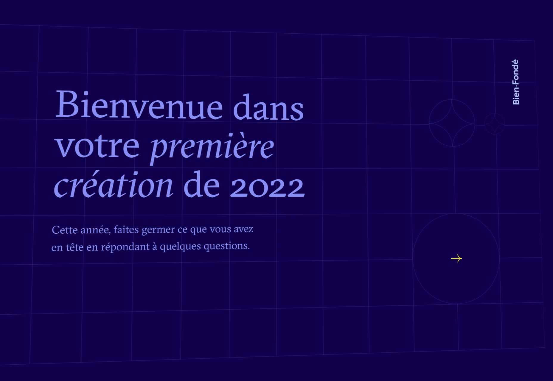
So here we are, in a brand spanking new year—time for looking forward with fresh ideas and renewed hope for the year ahead. We are kicking off 2022 with a mixed bag and, we hope, something for everyone.

Whether you’re looking for inspiration to update your site or a fresh approach to work for a new client or want to spend a little while browsing around some corners of the internet you might not usually, welcome to the first collection of the year. Enjoy!

Justice Reskill 

Justice Reskill offers a learning platform and support for people who have been through the justice system. Information is presented clearly in a positive, uplifting tone, emphasized by a bright color scheme and friendly type.

TBD Post 

TBD Post’s site is fuss-free, clean, and pleasant to navigate. Work is well presented, in an organized way, with just the right amount of supplementary information.

Speedy 

Speedy is an online business bank, and this is a pretty standard, slick fin-tech site for the most part. The added extra is that the five versions of the site–with the same content in each–have different color accents based on the flag of the specific country listed.

Nuka 

This site for Nuka eternal stationery is a beautifully simple single page. The use of handwritten type in places adds an intimacy while emphasizing the nature of the products.

Omono 

This site for online business management app Omono presents a lot of information clearly, and with a calmness projected by the use of blues and greys and subtle animation.

Pienso 

A combination of bold type, a slightly tweaked red, green, and blue color scheme, and on-scroll animations makes this site for Pienso pop.

Maison Margiela 

Maison Margiela fully embraces the digital alternative to a live catwalk with this blend of single video and edited clips.

Marie O’Shepherd 

This portfolio site for book designer and art director Marie O’Shepherd takes a minimal approach and allows the work to take center stage.

Angry Ventures

Angry Ventures add personality and humor to their site to draw the user in and entertain, while their actual portfolio is only available on request.

Chapter One 

Chapter One’s site has light and dark theme options and some engaging animated graphics.

Vesti il Futuro 

Vesti il Futuro for Mani Tese uses comic book-style interactive graphics to raise awareness of issues surrounding the environment and fast fashion.

Gazelle No.1 

Some scroll-activated video enlivens this single-page site for Gazelle’s No.1 model.

TROA 

This site for creative agency Troa is an excellent example of the effectiveness of a monochrome color scheme, and there are some pleasing transitions too.

BDCC 

BDCC’s site has a bold, slightly jumbled feel that works really well. The falling lozenge menu items are a nice feature.

Mekanism

This is a great example of a stylish website for an agency portraying itself as well-established and super polished.

Redbrick 

Redbrick’s site has a youthful, vibrant feel with colors that change to match the product branding.

Accounting Box 

This site for Accounting Box makes good use of split-screen swapping from a vertical split on desktop to a horizontal split on mobile. The animations are pleasing too.

François-Joseph Graf 

The design for François-Joseph Graf’s site does the right thing by getting out of the way to avoid competing with the rather stunning products on show.

Monsta Cats 

Monsta Cats is a site dedicated to community focussed NFTs. The site is suitably anarchic and fun to browse.

Bien Fondé 

And finally, some customizable good wishes for the year ahead from digital agency Bien Fondé.

Source

The post 20 Best New Websites, January 2022 first appeared on Webdesigner Depot.

Source de l’article sur Webdesignerdepot

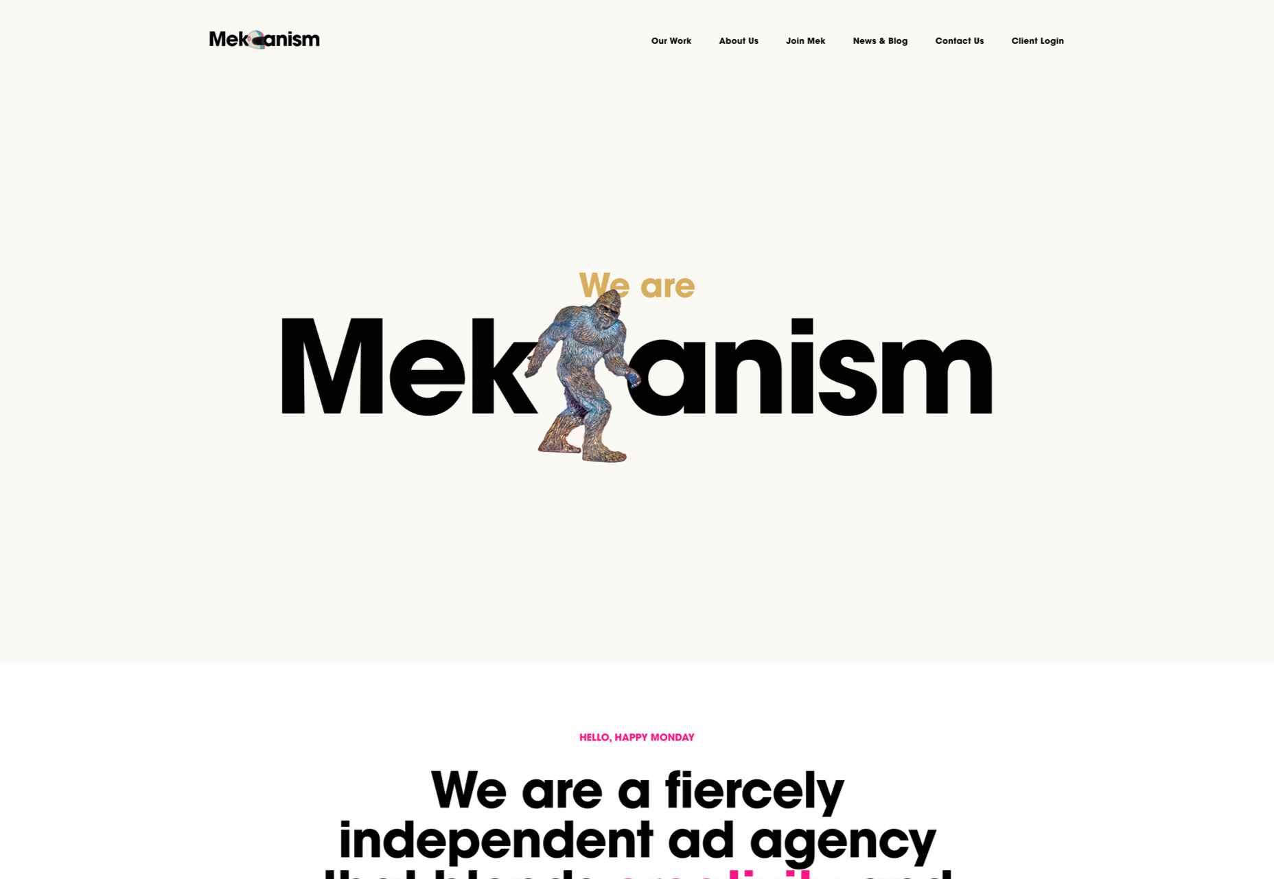
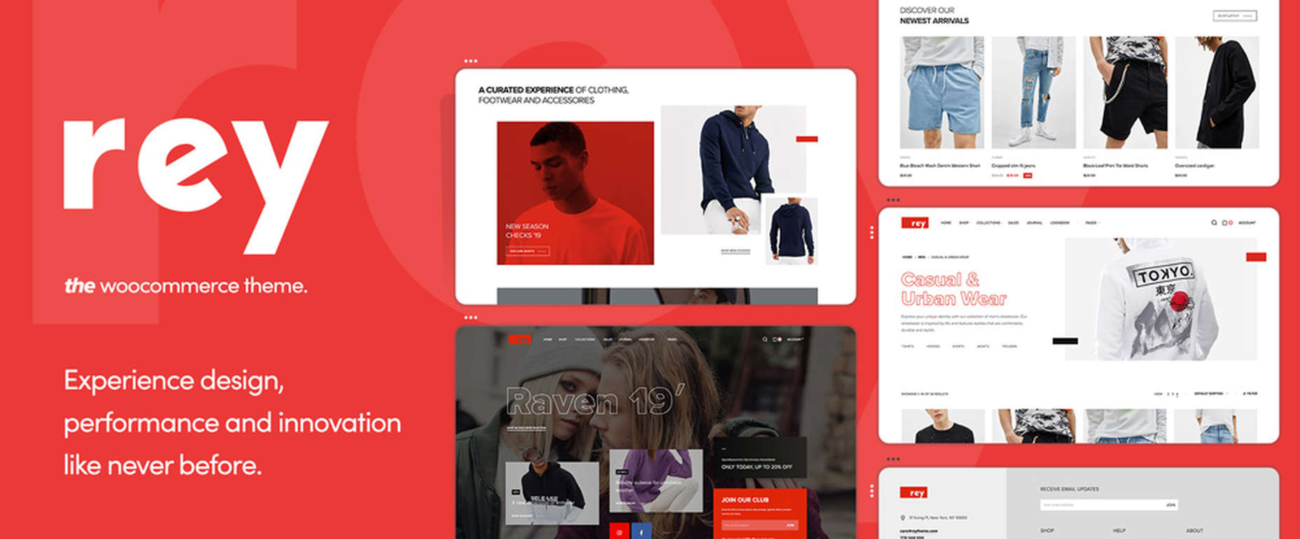
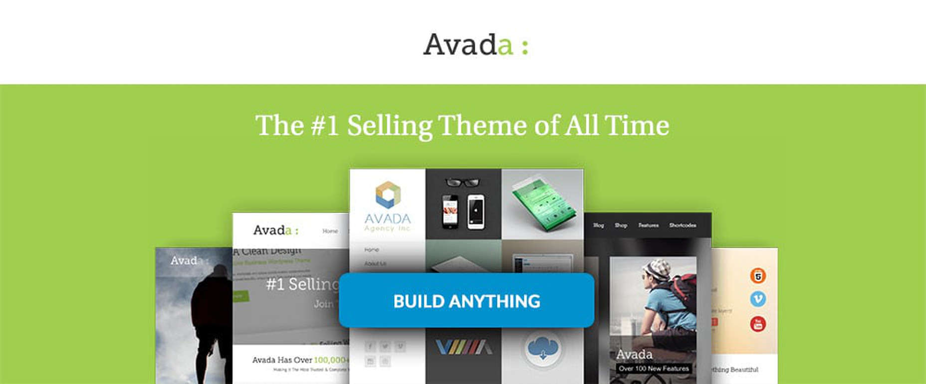
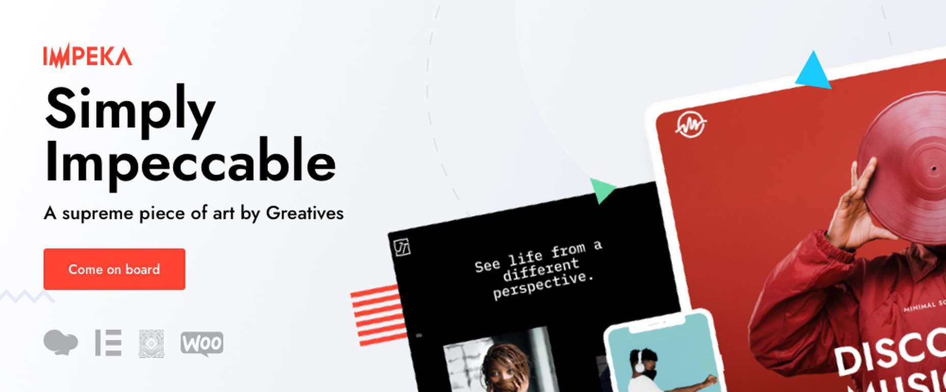
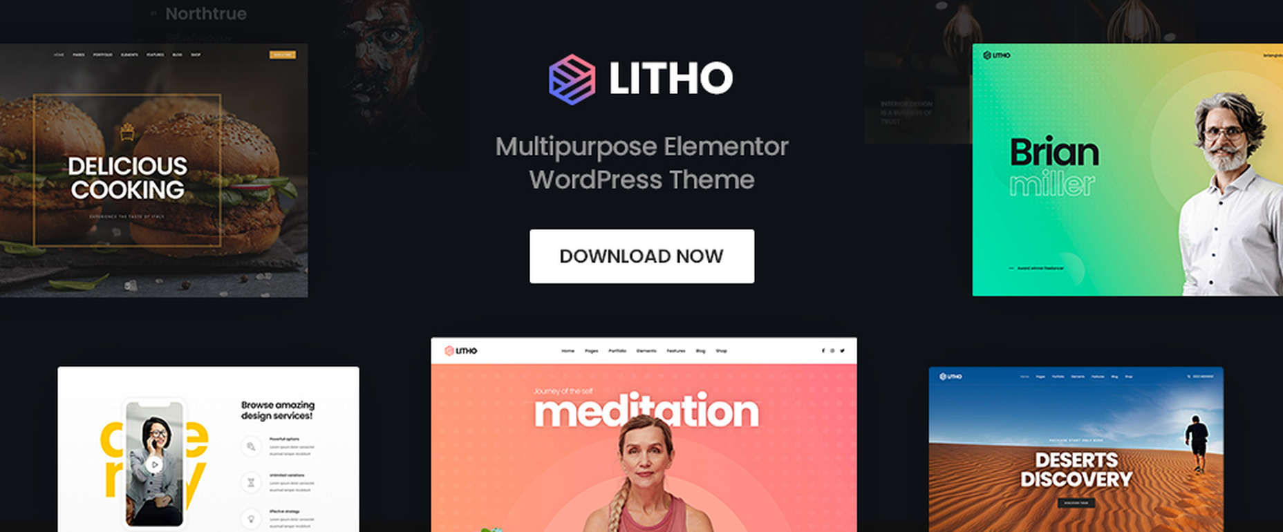
If you’re looking for a WordPress theme for your 2022 projects, it never hurts to see what the experts consider to be the best of the bunch. That’s not to say that experts don’t have their favorites. They often do, and we are no different.

We’ve tried, successfully, we believe, to avoid any biases we may have in compiling what we believe to be the 10 top WordPress themes going into 2022.

Working with a WordPress theme has the advantage of giving you a great starting point. It makes it much easier to create an attractive website that will charm any visitors who stop by and convince them to linger awhile.

Another advantage of using a theme can be its cost-effectiveness. Most of the popular WordPress themes are reasonably priced, they save you time, and they can save you money as well.

The main problem you’re apt to encounter is finding the right one since many of them are out there. You could spend hours and hours making comparisons among a host of candidates that appear to be reliable and easily customizable. Or you could select from among the following 10 top WordPress themes, all of which are guaranteed to give you your money’s worth and more. 

1. BeTheme – The Biggest Multipurpose WordPress Theme with 650+ Pre-Built Websites

BeTheme justifiably lays claim to being the biggest WordPress and WooCommerce theme of all for several reasons.

  • BeTheme’s 40+ core features give its users a complete tool kit to work with that includes 650+ pre-built websites and tons of design elements, aids, and options.
  • A 240,000+ customer base also contributes to making this the biggest WordPress theme of them all.

It’s not just about size, of course. Performance is all-important, and BeTheme has it in spades thanks to:

  • The Muffin Live Builder lets users edit live content visually and create, save, and restore design elements, blocks, and sections.
  • The WooCommerce Builder helps users design engaging shop and single product layouts and is packed with customer-centric features and options.
  • Full Elementor compatibility, with 30+ unique design elements and 120+ dedicated pre-built websites.
  • Assurance that every website is 100% responsive.
  • The Muffin Builder: this old standby is more intuitive than any other page builder on the market.
  • Regular Updates, plus BeTheme purchasers also receive free lifetime updates.

Click on the banner. There’s much, much more to see.

2. Total WordPress Theme

Total is aptly named because of the tools it gives its users; tools that include a premium page builder, demo and template libraries, an assortment of design and layout options, and cool navigation features.

  • The premium page builder is an extended version of the popular WPBakery frontend drag and drop page builder. Slider Revolution, another premium design aide, also comes with the package.
  • Design options include more than 500 live customizer options and 100+ customizable builder blocks, page builder block animation capabilities, custom backgrounds, and custom title backgrounds.
  • Layout options range from boxed and full-width and dynamic layouts to page and post designs and one-page site layouts.
  • Header styles, local scroll menus, and mobile menu styles contribute to website navigation capabilities.

Total is easy to set up and work with, plus it is 100% responsive. Click on the banner to find out more.

3. WoodMart

WoodMart is a premium WordPress theme that has been designed from the ground up to enable its users to create superlative WooCommerce online stores. WoodMart doesn’t require the use of multiple plugins as the most important tools, and features users simply must have come right out of the box.

They include:

  • For starters, a supply of 70+ demo layouts, 370 premade sections, plus an extensive template library for Elementor and WP Bakery.
  • A powerful Theme Settings Panel with a graphics interface to make changes quickly and easily.
  • AJAX techniques that guarantee the super-fast loading that is so important with multi-product pages and galleries.

WoodMart-built websites are search engine friendly, multilanguage ready, 100% responsive, and RTL and retina ready, and GDPR compliant.

Click on the banner to see what your WooCommerce store could look like.

4. TheGem – Creative Multi-Purpose & WooCommerce WordPress Theme

TheGem is the best-selling theme on ThemeForest, which isn’t surprising since its multiplicity of features has led to it being called the Swiss Army Knife of WordPress themes.

Key features include –

  • 400+ beautiful websites and templates for any purpose or niche.
  • TheGem Blocks with its 300+ pre-designed section templates to speed up your workflow – a genuine game-changer.
  • Elementor and WPBakery page builders.
  • An outstanding collection of WooCommerce templates for any shop type.

5. Uncode – Creative & WooCommerce WordPress Theme 

Uncode is a pixel-perfect theme packed with dozens of advanced and unique features designed to produce a pixel-perfect website.

These features include:

  • An enhanced Page Builder with a juiced-up Frontend editor
  • A WooCommerce Custom Builder
  • A wireframes plugin for importing 550+ professionally designed section templates

Uncode has sold more than 85,000 copies to date. It is the ideal WordPress theme for building an impressive blog, portfolio, eCommerce, and magazine sites.

6. Rey Theme for WooCommerce

eCommerce is said to rest on four pillars – filtering, search, navigation, and presentation. This WooCommerce-oriented WordPress theme fully addresses each one. Rey lets you experience design, innovation, and performance in ways you could only dream of before.

There’s:

  • The powerful and popular Elementor page builder with built-in features supplemented with Rey’s extra spices.
  • Ajax navigation, including infinite loading.

Rey is multilanguage-ready, obviously responsive, SEO friendly, developer-friendly, and performance-oriented.

7. Avada Theme

One easy way to know you’ve picked the right theme is to select Avada, the #1 best-selling theme of all time, a popular theme that is loved by 450,000+ happy users.

  • Avada’s Fusion Theme Options, Fusion Page Options, and Fusion Builder will give you more than enough flexibility, while its 40+ free eye-candy demos provide the inspiration.
  • Avada also gives you easy access to some of the most popular premium plugins.

And that’s just the beginning.

8. Impeka – Creative Multipurpose WordPress Theme

This simply impeccable WordPress theme is filled with potential for the advanced user and, at the same time, easy for a beginner to use. Using Impeka simply involves:

  • Selecting Elementor, Gutenberg, or an enhanced WPBakery as your page builder.
  • Using WooCommerce to build your online shop.
  • Sifting through a multitude of features that include the Mega Menu and Footer and Popup builders.

Your website will be super-attractive, lightning-fast, fully responsive, and SEO perfected.

9. Litho – Multipurpose Elementor WordPress Theme

This popular multipurpose WordPress theme is built with Elementor, the world’s #1-page builder.

  • Litho can be used to build websites of any type and for any business niche.
  • It is excellent for building portfolio, blog, and eCommerce websites.
  • There are 37+ home pages, 200+ creative elements, and 300+ templates to get you started and assist you along the way.

Litho-built websites are fast loading and deliver healthy SEO results.

10. XStore – Best Premium WordPress WooCommerce Theme for eCommerce

You can start with one of XStore’s more than 110 amazing pre-built shops, or start from scratch and let Elementor or WPBakery and more than 550 pre-built blocks help you along the way, together with:

  • $559 worth of premium plugins.
  • A Live Ajax theme option.
  • A header builder and a single product page builder.
  • A built-in WooCommerce email builder.

You can get this complete and highly customizable WooCommerce theme for an amazing $39.

One of the benefits of using WordPress is the number of great WordPress themes you can work with. Whatever your niche, your target audience, or your skill level may be, there’s a premium WordPress theme out there that looks and feels as though it was made, especially with you in mind.

If you’re planning to create a fresh and beautiful website for 2022, or you want to completely rebuild an existing one, or simply make some design changes, this roundup of the most popular and the best WordPress themes in the market is meant for you. And we really mean it!


This is a sponsored post.

Source

The post 10 Top WordPress Themes for 2022 first appeared on Webdesigner Depot.

Source de l’article sur Webdesignerdepot

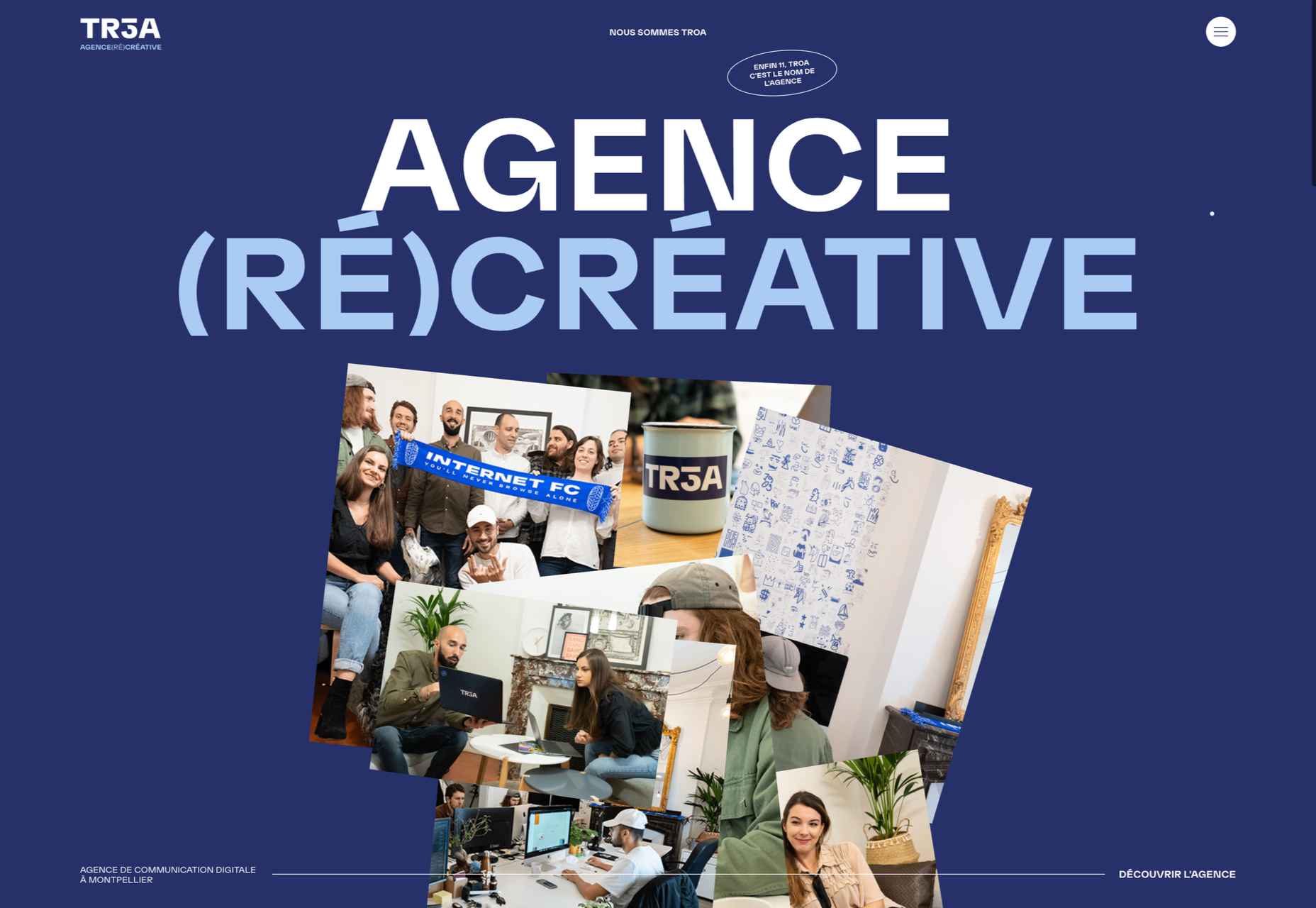
Happy New Year, fabulous new website design trends!

This month’s design trends are a collection of the somewhat unexpected – from NFT website design to large text to illustrations; you won’t see a single photo or video here. Here’s what’s trending in design this month.

NFT Websites

This website design trend has more to do with the greater trends in digital marketplaces and commerce but has value in the design space as well. NFT websites are popping up everywhere.

Marketplaces for non-fungible tokens use modern design effects to draw users in and help them make purchases and view available images. If you haven’t delved into the world of NFTs, they are data units – often in the form of gifs – stored on a blockchain digital ledger. You can buy, sell, and trade these digital nuggets on various marketplaces.

The designs of NFTs could be explained as a trend of their own. Here, we’re focusing on the look and feel of the websites surrounding them. While some designs are relatively primitive, the best marketplaces have a full e-commerce feel with easy-to-use interfaces and a modern design.

Each of these three NFT marketplaces does it a little differently.

Styllar puts a focus on NFT avatars with a minimal aesthetic that gives plenty of room to individual NFTs. Sit on the website too long, though, and hundreds of options begin to cover the screen. Each visual element has a small text element to match that explains each image. It feels like a modern e-commerce experience that instills trust with users because of clean visual patterns. The site itself is just a gateway to a more traditional marketplace, but the calls to action are large, clear, and easy to follow.

OpenSea treats the NFT marketplace more like an art gallery with card-style buttons to look at different elements and images. Everything about the website design is tailored for the mobile user and quick browsing with large areas to click in the card format and easy-to-read headers that help you find your way through the NFT space, whether you want to buy, create, or sell. The site also does one more thing that’s not as common with e-commerce – it explains how to get started in this new digital territory with plenty of resources.

Rarible has an almost social media feel with lots of small blocks showing different NFTs. Digestible content in a grid-based design helps you navigate from images to rankings to what’s trending in NFTs. This site design is set up for high interaction and engagement, also featuring card-style elements and the ability to favorite items before bidding.

The key commonality with NFT website designs is that they are made for mobile users. These sites look good on desktops, but they are highly focused on a mobile, instant gratification user.


Text-Based Hero Headers

A trend in website design from 2021 is bleeding into 2022 with a lot of popularity: Hero headers that are mostly text. These designs have background texture and color, but for the most part, they don’t have a lot of other visuals.

These designs often rely on powerful language or messaging to help get user engagement. A secondary theme is the use of bright colors to help add focus and attention to the typography.

Font choices seem to be fairly neutral, with a lot of thicker sans serifs for the main headline and something a little lighter for secondary text options.
WeTransfer uses a smaller text block with multiple lines to create weight. The off-center placement draws the eye and is interesting even with the neutral background. Stacking elements create a nice focal area that encourages reading.

Halborn Blockchain Security goes with a less traditional font option and flips the color to the text to enhance the visual display. This design also uses an off-center, asymmetrical approach to create focus on the text element. The dark counterweight on the screen is an excellent guide to draw you back to the main hero headline.

FWD goes with giant oversized text elements to create a strong visual focus with this design. Other than the faint animation of the arrows next to “Here’s what they said,” everything is still and static. The color and blocky depth of the background help draw the eye through the text and to clickable elements so that you know what to do next.


Intricate Illustrations

Another trending design element is the use of intricate illustrations on homepages. These highly detailed images can tell a visual story, help add meaning to messaging, or serve as a remarkable visual element when you don’t have a photo or video.

The great thing about this trend is that the only limitation is your imagination.

Once you find someone to create the illustration (if you can’t do it yourself), the world is open to interpretation.

We are seeing three major themes within this trend, as showcased in the examples.

Multi-layer illustrations with hints of animation, such as the one from Highvibe Network. This illustration used lots of colors, layers, unexpected elements within outlines, and a little animation to pull it all together. The effect is rather stunning and provides a lot of interest for the user.

Realistic, painting-style illustrations, such as the one from Healthline, bring the content to life without real people or images. This technique is especially nice for industries where you may want to anonymize people in images. (Perfect for a healthcare website design because you don’t know if the illustrations are of real people or not.)

Detailed geo shapes and lines, such as the design from Radio Meuh Circus Festival. With great color and lines that draw the eye, this design can keep you looking and finding new depth for a long time. Color also helps draw you into the striking imagery.


Conclusion

What’s nice about all these design trends is that they have flexible elements that you can use and replicate across industries and projects. The common factor is that they lack traditional dominant imagery, which works exceptionally well.

These trends are likely a result of the worldwide pandemic as well. With less social contact, creating without conducting photo or video shoots is an ideal situation. Good luck trying some of these trending design elements on your own.

Source

The post 3 Essential Design Trends, January 2022 first appeared on Webdesigner Depot.

Source de l’article sur Webdesignerdepot

If you are a designer and have never dealt with designer’s block, you are probably a superhero. For us mortals, designer’s block is a pretty common problem. There are occasions when we sit in front of our screen, and our creativity just evaporates.

I have spent many hours trying to get rid of this annoying wall. It took some time, but I have found some tactics that work best for me. So, do not panic! In this article, we will share five ways you can overcome designer’s block and get back on track.

From innovative sources of inspiration to the importance of collaboration and food, nothing will be left out. But first, let us analyze what designer’s block is and how common it is among creatives.

What is the Designer’s Block? Can You Force Creativity?

In a few words, designer’s block is nothing but a situation where you are stuck as a designer. In this unpleasant moment, you feel like you are losing your design skills and creativity.

Fortunately, this is not permanent. Of course, you are still a great designer. You should know and embrace that designer’s block happens to almost every creative out there. Even the most experienced of us. So the first thing you should do is to stay calm.

Remember that you can not force creativity. When designer’s block comes knocking on your door, you need some time to recover.

So instead of panicking, take to heart some practical tips that will help you regain your confidence and creativity.

How to Get Rid of Designer’s Block?

1. Take Care of Yourself

In some cases, designer’s block is your own body’s reaction. Think about it. How can you perform well when you are tense with pressure? There are many ways to take care of your mental and physical health. For example, you can take a break and have a snack.

Sleep is also critical when it comes to avoiding designer’s block. Recent research has shown that creative thinking is directly related to our periods of sleep. Lack of concentration, more mistakes, and erratic behavior are just some of the consequences of insufficient sleep.

For this reason, napping is a smart solution to designer’s block. So if you are feeling unproductive, first make sure you are not tired or hungry.

2. Change Your Location, Get Inspired

But what if you’re not hungry or tired? There are situations where we are stuck in front of a project. If that’s the case, you should decide to take an inspirational break.

The first thing you can do is to change your location. If you are working from home, you should get some fresh air. There are numerous sources of inspiration that can help you overcome designer’s block. Personally, I take a break and visit one of the following sources:

  • Parks: Nature will calm you and help you get inspired.  
  • Art Galleries: A designer’s best friend. Visiting an art gallery can help you find the missing elements for your upcoming project. 
  • Coffee shops: Quiet coffee shops are an intelligent way to get inspired. What’s better than a big mug of coffee and relaxing music?

Alternatively, watch a movie or a TV series. This may sound like an unorthodox way to get inspired, but it works perfectly when overcoming designer’s block.

3. Explore the Power of Collaboration

More than 90% of graphic designers in the world are freelancers. Although freelancing is an exciting job, it can be pretty lonely. The next time you are struggling with designer’s block, you might want to ask for some help.

Other UI or UX designers can help you see a project through different eyes and find the missing design elements. For this reason, collaborating with other designers is a great way to overcome designer’s block.

On the other hand, you can also ask your friends or family for ideas and feedback. Remember that inspiration can come from anyone.

4. Plan and Break the Project into Chunks

Most times, I get stuck as a designer, it is entirely my fault. To be precise, there are many cases when we do not plan the project efficiently. When the work is overwhelming, the lack of a well-organized plan can be why.

The best thing you can do is to take a step back. Take a look at the work that needs to be done. Then, you can start breaking your project down into small sections. If you reorganize everything, you can get rid of designer’s block in a matter of minutes.

Try not only to organize your tasks but also to manage the time you will spend on each chunk. This will probably help you understand that you have more time than you think.

5. Apply Some Pressure, Just Start

Unfortunately, few of us have infinite time to find inspiration. Most professional designers work with deadlines. That’s why putting pressure on yourself is not always a bad thing.

After following the above tips, all you have to do is start. Don’t forget that the designer’s block will remain until you start designing.

When I try to apply some pressure, my first drafts are usually bad. But after a while, everything comes back to normal.

Wrap Up

If none of the tactics analyzed above helped, you can always use one (or more) of the following quick tips:

  • Take a short break (5 minutes or so);
  • Start with the most challenging task;
  • Go for a walk or exercise;
  • Ask for more information about the project. Sometimes, the client can help you overcome designer’s block;
  • Think about what is distracting you and solve it.

Remember, every creative out there has faced designer’s block at least once. So there’s no need to panic at all. Of course, not all of us deal with it in the same way. That’s why you should first try out the tips above and find out what works best for you. This will help you overcome designer’s block and regain your skills as a designer.


Featured image via Pexels.

Source

The post 5 Brilliant Ways to Tackle Designer’s Block first appeared on Webdesigner Depot.

Source de l’article sur Webdesignerdepot

The choice of typeface is one of the most critical factors in any design; it gives the text its voice. It can be desperately frustrating to find the right voice for your project, only to discover it’s outside your client’s budget.

Who doesn’t love a free font? There’s no question that something for nothing is an attractive proposition. When it comes to fonts, the problem is that high-quality fonts require months, sometimes years of work; high-quality fonts are expensive to produce; as a result, many free fonts have to cut corners.

However, decreasing costs for font design software and an open-source culture is making the industry more accessible, leading to hundreds of free fonts as good, if not better, than their premium rivals.

The challenge for designers is where to look. The solution is Typewolf’s Definitive Guide to Free Fonts. This tremendous, 107 page PDF covers everything you need to know to find the best, high-quality free fonts on the web.

Typewolf is one of the most trusted names in digital typography, with an excellent track record of educational guides; you can be sure the suggestions in this guide are second to none.

The guide is split into four sections:

  • Section one covers the closest free alternative to every font on Typewolf. The free alternatives list focuses on the popular, and in many cases, the most expensive fonts used by professional designers. That means you’ll have access to over 1,000 recommendations, all listed alphabetically for easy look-ups. Simply find the premium font you want, and you’ll find the closest free font available listed alongside it. In many cases, there are multiple suggestions to give you some agency.
  • Google Fonts is an excellent source of free fonts, but its own recommendations are weak. So the second section of the guide is dedicated to the ten best serif and sans-serif combinations on Google Fonts. The best serif and sans-serif combinations include visual examples, and explanations of why these typefaces complement each other, so you don’t find yourself designing in the dark. This section is excellent for anyone who’s unsure where to start with free fonts and needs to identify an effective pairing quickly.
  • As good as Google Fonts is, it’s not the only source of free fonts, and if you only look there, you’ll miss out on some real gems. That’s why section three of this guide introduces the 40 best free fonts that aren’t on Google Fonts. Each font listed is carefully presented to preview it at display and body sizes.
  • Lastly, to finish off this excellent ebook are the ten best free “hipster” fonts. You know the ones: they’re perfect for coffee shops, small-batch brewers, tattoo parlors, and anywhere Rockabilly is still in style.

All told, there are enough recommendations in this guide to last you an entire career. So no matter what you’re looking for, whether it’s a free version of a particular typographic voice or some fresh inspiration, you’ll find it in this essential ebook.

What’s more, you’ll receive lifetime updates for free. With new content added weekly, this ebook will be a source of knowledge and inspiration you return to again and again. Lifetime access means you can re-download the guide every time you have a project that needs free fonts. You’ll also get access to an exclusive section of Typewolf that showcases only free fonts, so you can see how free fonts can be used well.

Every good designer understands the value of high-quality typography, but not every project has the budget to allow you to use premium fonts from top type foundries. This guide helps you leap that hurdle by offering carefully selected, free alternatives. If you’re new to the world of typography, this helpful guide will give you some practical insight on how to locate free fonts for use in your design work.

This guide will save you hours trying to find the suitable typeface for your project, as well as introduce you to some excellent designs that you might not have considered.

You can download Typewolf’s Definitive Guide to Free Fonts today for the bargain price of $39. You could even gift it to the typophile in your life.

Source

The post Typewolf’s Definitive Guide to Free Fonts first appeared on Webdesigner Depot.

Source de l’article sur Webdesignerdepot

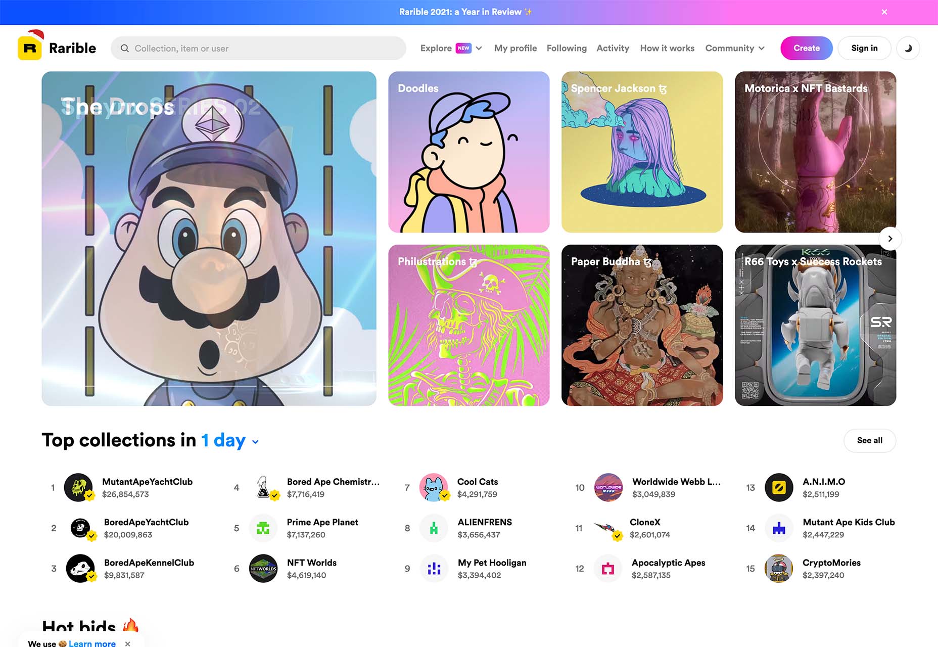
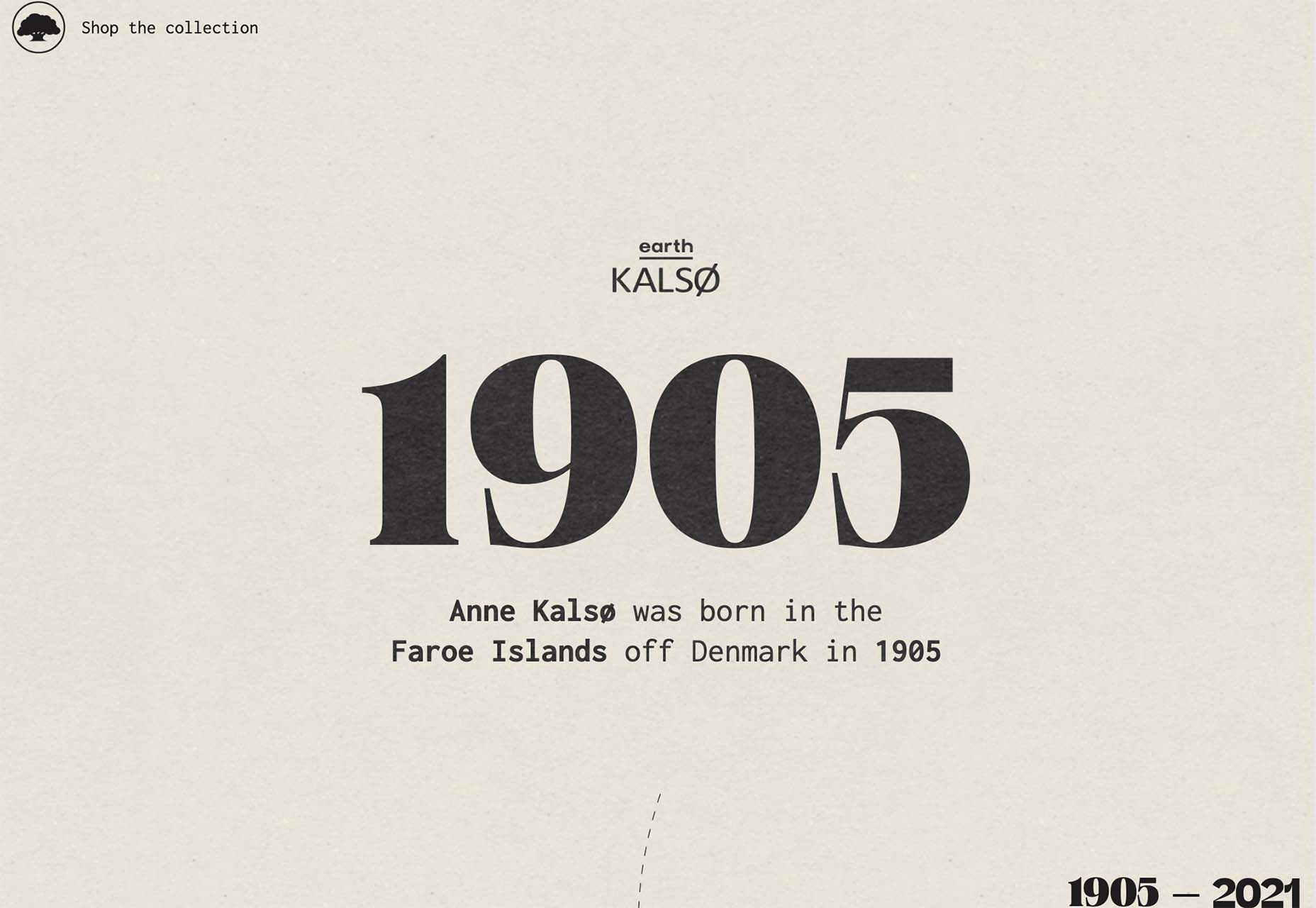
2021 has been both memorable and instantly forgettable. Pop stars were freed from modern-day servitude, some people tried to overthrow democracy, and we all vacationed at home.

Despite the weirdness of the times, the web kept growing, kept changing, and kept on pushing boundaries. We saw a wealth of new sites launch or relaunch with significant updates.

Here are the 50 best sites launched on the web this year. Enjoy!

Crusta C

In April, seafood company Crusta C cleverly used the simple logomark ‘C’ to apply a cutout video effect.

Slow

Slow is a collective of creatives aiming to implement slow movement principles. Its site reflects those aims, creating a sense of calm and deliberation.

hnst

2021 saw tons of brutalist-inspired design. hnst’s take on the style works thanks to the bright red in place of the standard black.

Marram

This site for boutique hotel Marram uses a soft color palette to create an impression of soft golden light and calm.

Levitate

In July, we loved this site for running-blade brand Levitate. The site is clean and light, with a sense of inherent motion in the photography.

Niarra Travel

There’s some beautiful photography on this site for eco-conscious, bespoke travel agency Niarra Travel.

Plunt.co

The core of this site for Plúnt is a combination chooser which feels pleasingly reminiscent of an animal flipbook.

Moth Drinks

Moth makes classic cocktails in a can. The striking black and white graphics and masking effects for its holding page stunned us back in March.

Seed

Selling supplements is hard; people are understandably skeptical. So this site for Seed packs in research and scientific information and avoids the hard-sell.

Wavemaker

Another excellent portfolio site in 2021, this time for creative media agency Wavemaker. The site is uber-confident while still being playful.

Wild Souls

Wild Souls makes nut butters, tahini, and other Greek delicacies. Its site is colorful and warm, and the site typography is soft and appealing.

JUST Egg

JUST Egg produces egg-like food from plant material. The huge photography and bold typography do a great job of making a new concept appealing.

Aalto University

One of the most popular designs of 2021 was Aalto University’s site with its in-depth campus tour. The simple navigation inspired several imitators.

Wisr

Scroll interactions were big in 2021, and Wisr features a Heath Robinson-style machine that ‘runs’ as the user scrolls down the page.

Cevitxef

This site for Cevitxef ceviche restaurant in Bilbao does a great job of making us hungry. Drama is created by oversized text, heavily-styled photography, and lots of movement.

On

The best digital agencies keep their own sites simple, like this site for On digital technology studio that uses black on light blue and adds infinite scrolling.

Acayaba + Rosenberg

We found Acayaba + Rosenberg’s use of architectural photography and subtle scrolling a pleasing browsing experience.

Madre

This site for home linen company Madre uses extraordinary fine-art style still-life photography to enrich a very simple site.

Hyperframe

“Show, don’t tell” is a well-worn mantra. Hyperframe’s site implements it by demonstrating the product’s major selling point on scroll.

Gemini

This exceptional WebGL experiment was built to show what’s possible in the technology. Have a play with the car; it’s a ground-breaking demo.

Felt

In 2021, collaborative mapping tool Felt launched in private beta. Its excellent site does a great job of creating interest while doubling as a recruitment notice.

imNativ

Not every project is exciting, but this excellent site for imNativ uses macro photography to great effect to promote upholstery fabric.

Websmith Studio

Excellently named Websmith Studio uses color to highlight, and the noise effect applied to the background adds subtle interest.

Singita

High-quality photography and a terracotta-based color scheme create an inviting ambiance for Singita, an African eco-tourism and conservation brand.

Fluff

A fullscreen background behind a mobile view for desktop? It sounds like a horrible idea, but this site for cosmetics brand Fluff pulls it off.

Chiwawa

This great site for Chiwawa cantina features wrestling masks, skeletons, and tone-on-tone color to create a lively and distinctly Mexican site.

Nothing

This site for Nothing’s ear(1) earbuds is packed with confidence. Appropriately, it looks even better on mobile.

Chérie Healey

Lots of experts have tried to tell us how to live our lives in the last couple of years, but Chérie Healey’s site manages to stay on the right side of positive without slipping into clichés.

Wayfinder

Wayfinder, a game about our connection to nature using generative code, AI, machine learning, and data mining, could not have been more 2021 if it tried.

Green Angel Syndicate

Not too many investment groups are thought of as ethical, but Green Angel Syndicate specializes in funding companies fighting climate change.

Tether

As the days got darker in the Northern hemisphere, we were wowed by this site for Tether, a cycle safety system using video and illustration to explain its clever approach to bike safety.

Patricia Urquiola

Back in January, we loved the new site for Patricia Urquiola design studio, thanks to its bright, bold colors that we thought inspired confidence.

Headup

Headup’s businesslike approach is created thanks to a pleasing color palette and geometric graphics.

Redwood Empire

For Earth Day on April 22nd, Redwood Empire Whiskey created a microsite promoting a competition styled to match their bottle labels.

GT Super

The one-pager for GT Super has a certain drama in keeping with the font itself and allows you to play around with the size, weight, and style.

Planet of Lana

Due for release in 2022, Planet of Lana is a game from Wishfully Studios, and its teaser page launched back in June has kept us intrigued ever since.

The Longest Road Out

This charming site for The Longest Road Out is a travel map and journal based on the creators’ road trip around Britain, Ireland, and the outlying islands.

Made Thought

Made Thought has a bold aesthetic and approach that explains its outstanding client list.

Miti Navi

Miti Navi makes extraordinary sailing boats. We were attracted to how its site presented a luxury product in an original way.

La Nouvelle

Another powerful digital design agency site was La Nouvelle’s, which used a combination of contrasting and complementary color combinations to catch the eye.

Caleño

Caleño makes non-alcoholic distilled spirits. They relaunched their website in March with bright, joyful colors that reflect the character of the brand.

Capsul’in — Aluminium

This demo site for a coffee pod manufacturer isn’t a site as such, but it demonstrates that even in 2022, there’s room for parallax scrolling.

How Many Plants

Everyone needs a few more houseplants, and How Many Plants is a great guide to how to own and look after them. The illustration style is friendly but efficient.

How & How

One of the most approachable design agency sites of 2021 was How & How’s. It keeps things light and clean, and effective.

The Hiring Chain

Part of a campaign encouraging businesses to employ talented people with Down Syndrome, The Hiring Chain website dispels myths with clearly presented facts.

Virgile Guinard

Back in February, we couldn’t get enough of photographer Virgile Guinard’s portfolio site. Blocks of color pulled from each image hide the image allowing you to focus on one image at a time.

Studio Nanna Lagerman

Studio Nanna Lagermann’s site excels at creating a sense of space and calm. The color palette is soft and neutral. The type is large but clean and sophisticated.

GOOD Meat

Veganism is a growing trend, and one of the sites promoting it with gorgeous colors is this site for lab ‘grown’ meat.

Mama Joyce Peppa Sauce

This one-page site for Mama Joyce Peppa Sauce is big and bold. Click almost anywhere, and two bottles of sauce go into your cart.

Ebb Dunedin

The site bucks the trend for luxury hotel design and instead is styled to complement its interiors. We could have done with time at this boutique hotel in 2021, maybe next year…

Source

The post 50 Best Websites of 2021 first appeared on Webdesigner Depot.

Source de l’article sur Webdesignerdepot

Are you tired of using the same old Google fonts from website to website? You’re in luck!

In this month’s roundup of the best new fonts, we’re showcasing the latest and greatest fonts from independent type foundries and designers worldwide.

Astronef Super

Astronef Super is a retro-futuristic font collection with seven styles that are meant to be mixed and matched. While the font is modular in design, there are wild variations in weight that you can have a lot of fun with.

Auguste

Auguste Serif and Auguste Sans Serif were originally drawn as a single stencil font that combined serif and sans serif styles. They ultimately became two separate fonts, with four weights apiece, that can be scaled up and down in size based on your needs.

Bartok

Bartok is an exciting font as it breaks with the concept of creating a family of unified styles. Instead, each of the four styles uses different structures and weights, meaning this font can be repurposed for a wide variety of brands and styles.

Cardone

Cardone is a type of serif known as Scotch Roman, designed for functionality and legibility. With its sturdy and brutal design, this serif is perfect for editorial content.

Champ

Champ is a fun and friendly font with nine weights. Because of its bold footprint, this serif performs best in branding and headlines.

Columba

Columba is modeled after old-style printing press typefaces. With its narrow, legible serif forms, Columba is most useful in text-heavy environments — both on the web as well as for printed brand materials.

Deia

Deia is a bracketed serif font with seven fonts. Thanks to the curved stroke transitions in Deia’s character set, this font is full of personality and would work great in product packaging and website branding.

Garton

Garton is a 19th century-inspired typewriter typeface that would look great on literary and editorial websites. This uniquely elegant font has three weights with italic companion sets for each.

Halisa

Halisa is an extensive font family with 60 styles, five widths, and six weights (plus italics). The designer drew inspiration from 19th-century factory signs to come up with this legible semi-constructed grotesque typeface.

Helvetica Now Variable

Helvetica Now Variable is an upgrade on Helvetica Now and the original 1957 Helvetica design. This one, however, adds over a million new Helvetica styles to the fold (all in one font file), which designers can use to create all kinds of digital and print content, including typographic animations.

Palast

Palast is a type system that consists of three sub-families: Palast Text, Palast Display, and Palast Poster. Designers can use this carefully crafted serif font family pretty much anywhere they want — from clients’ websites to promotional print graphics.

Parco

Parco is part of the new wave of humanistic typographic design. With Parco’s compact spacing and tall characters, this font will help designers craft eye-catching and highly legible headlines and branding.

Right Gothic

Right Gothic is a huge font family, containing 98 styles — seven weights, seven widths, 20-degree italics, and an adjustable contrast axis. While this contemporary font is a sans serif, it draws upon typical serif anatomy with its high contrast between thick and thin strokes.

Rund Text

Rund Text is a geometric sans serif that looks both stylish yet comfortable. It also has a companion Display family available to designers who want to bring the same type of functional design to larger headlines or branding.

Sculpin

Sculpin is another variable font to make this list of the best new fonts. This sans serif font was designed as if a chisel and brush had been used, giving it a structured, hand-crafted feel.

Source

The post 15 Best New Fonts, December 2021 first appeared on Webdesigner Depot.

Source de l’article sur Webdesignerdepot

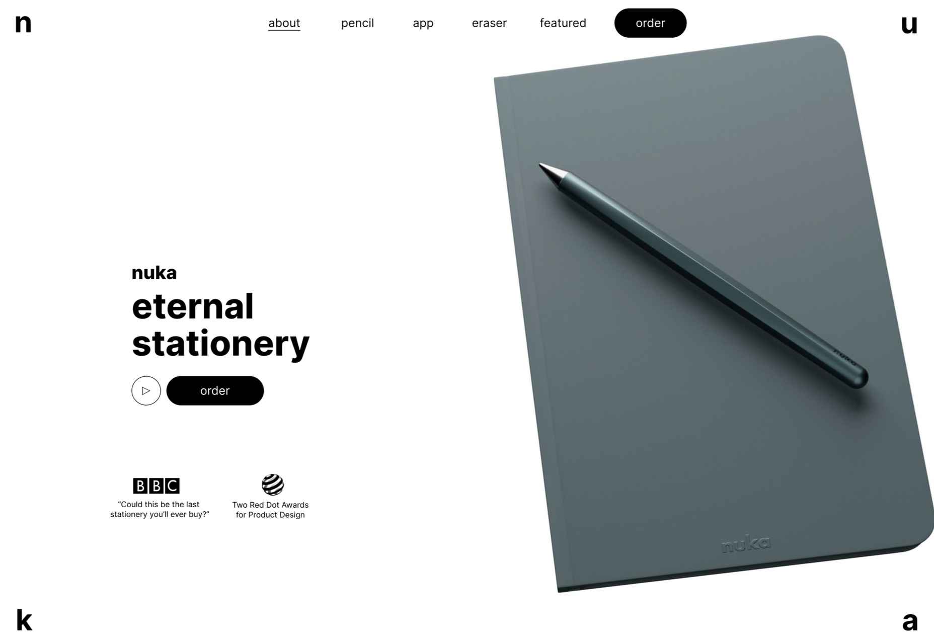
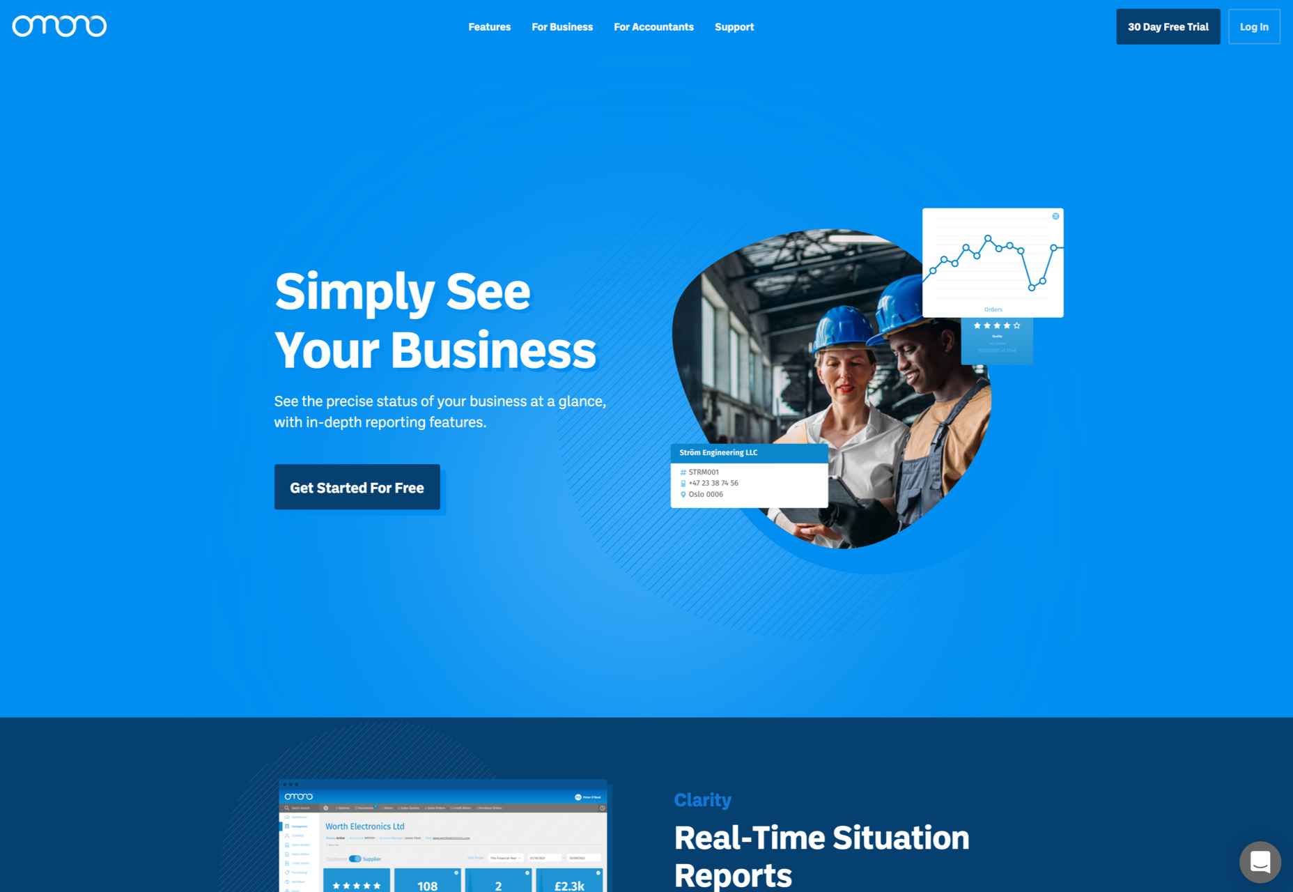
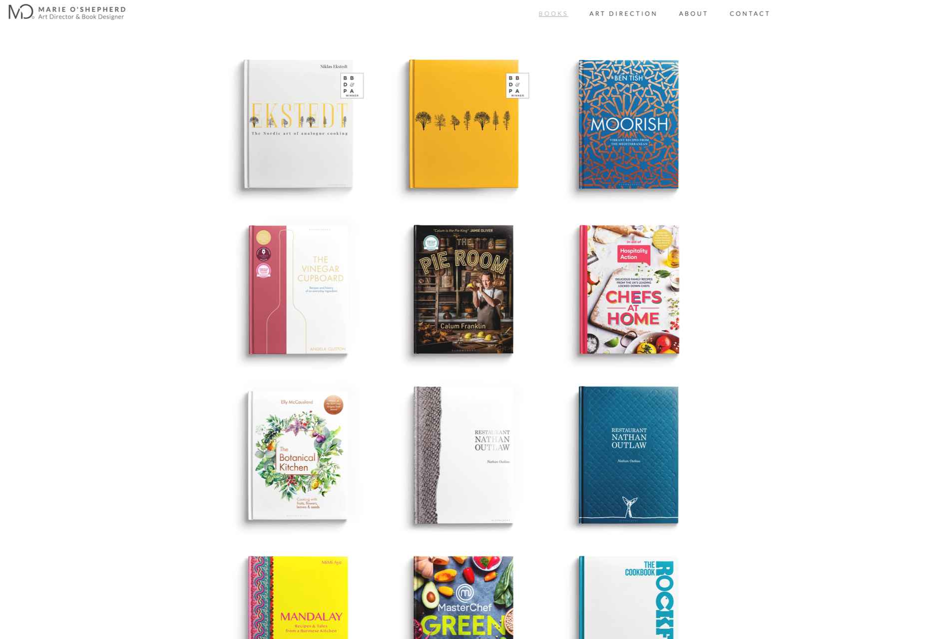
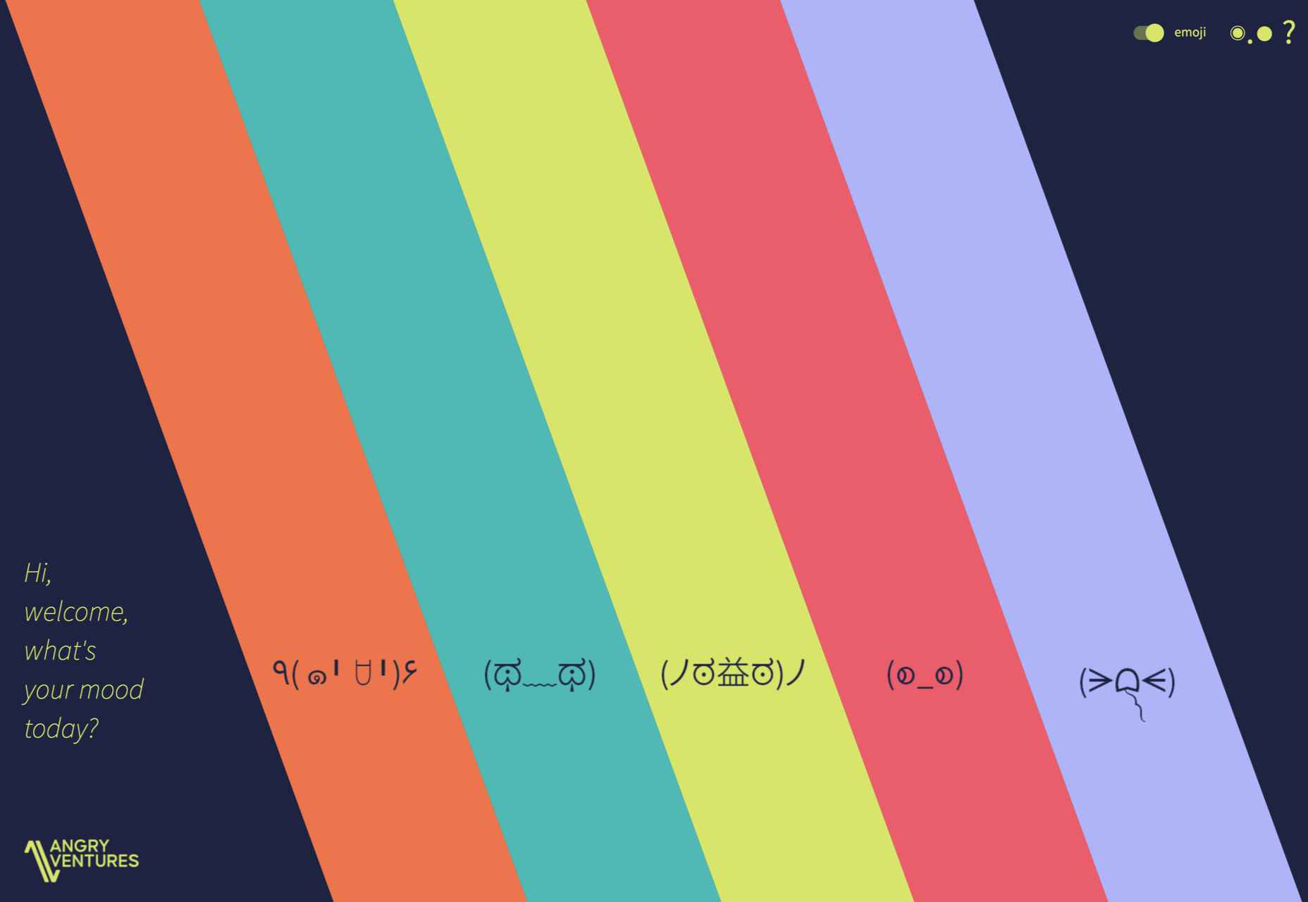
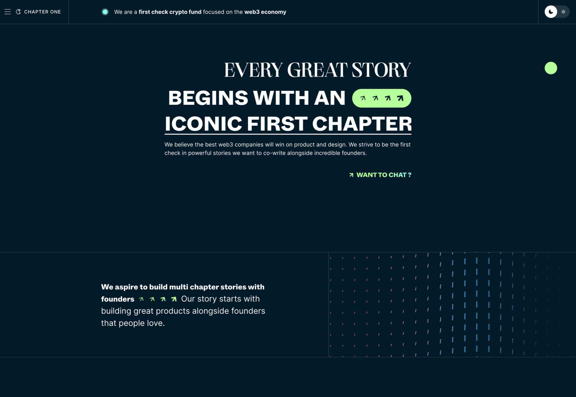
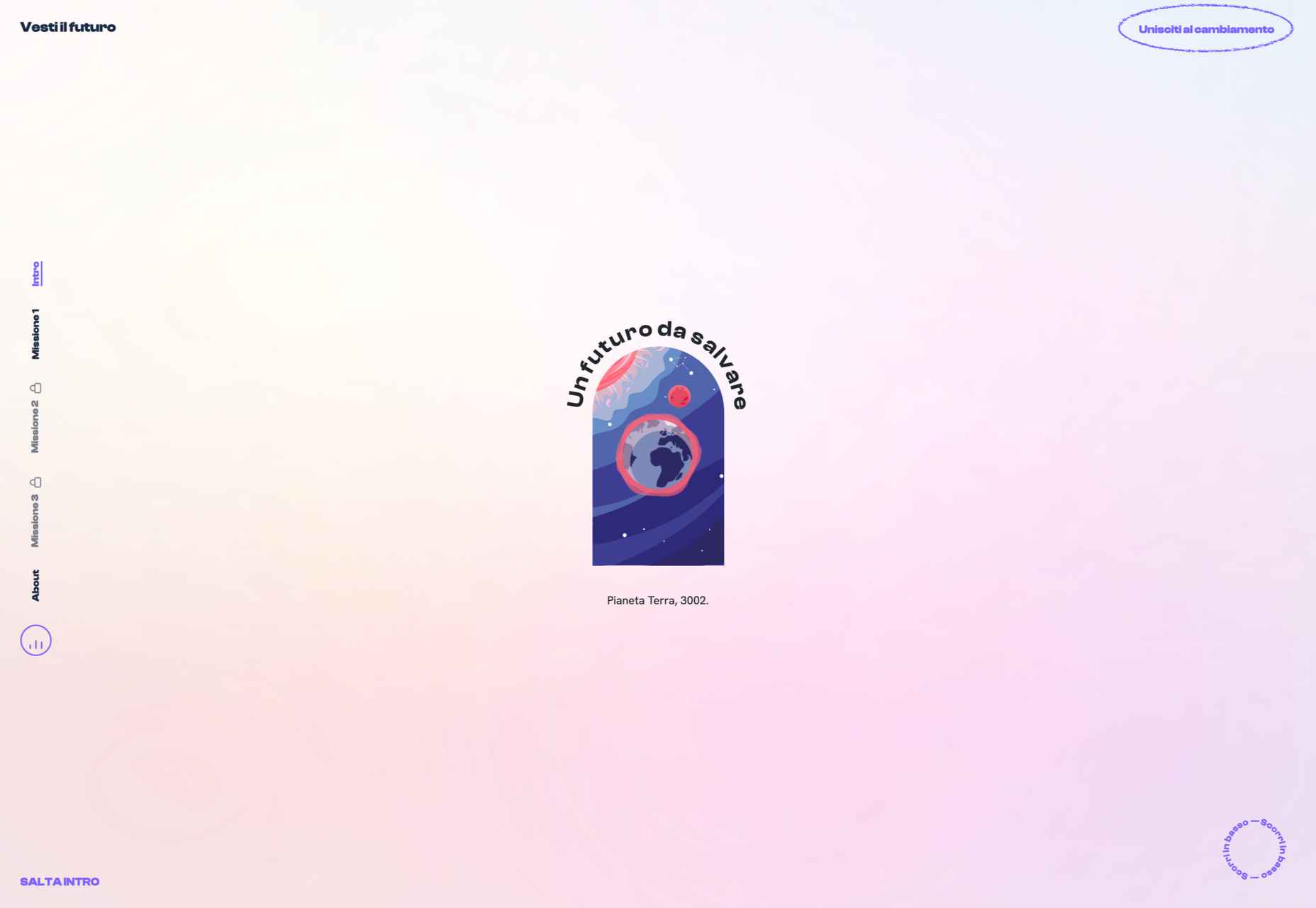
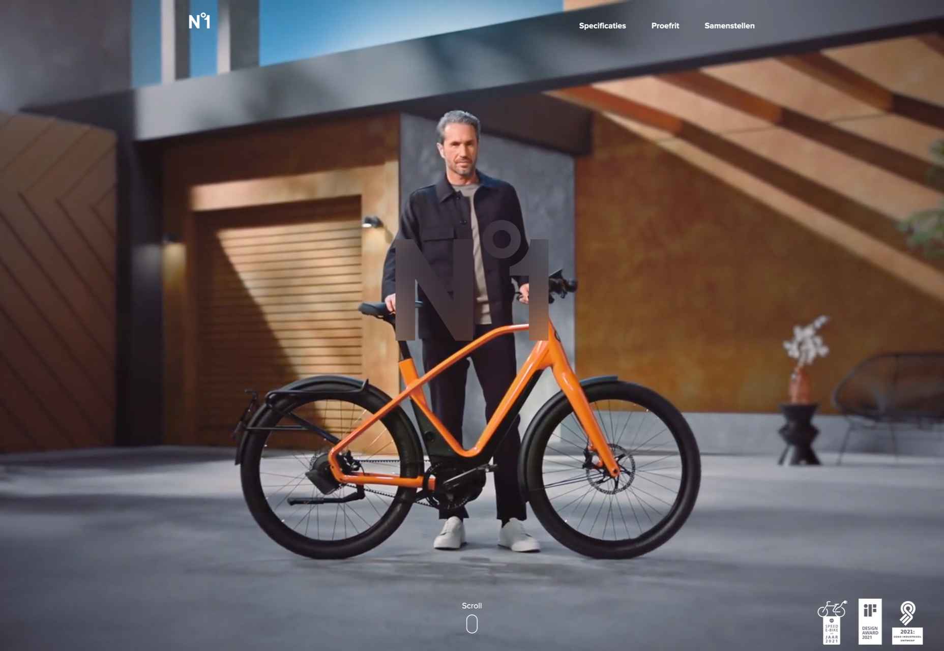
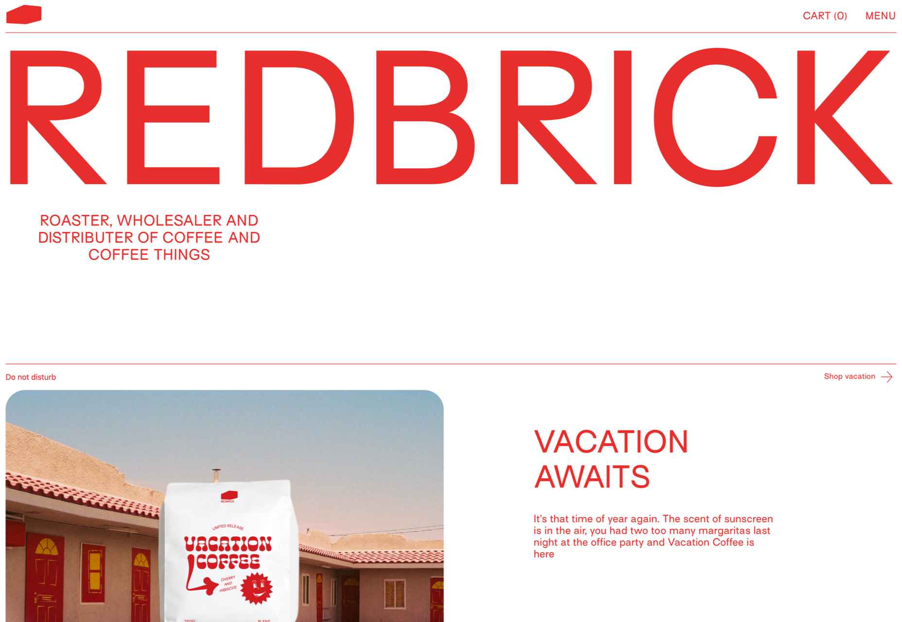
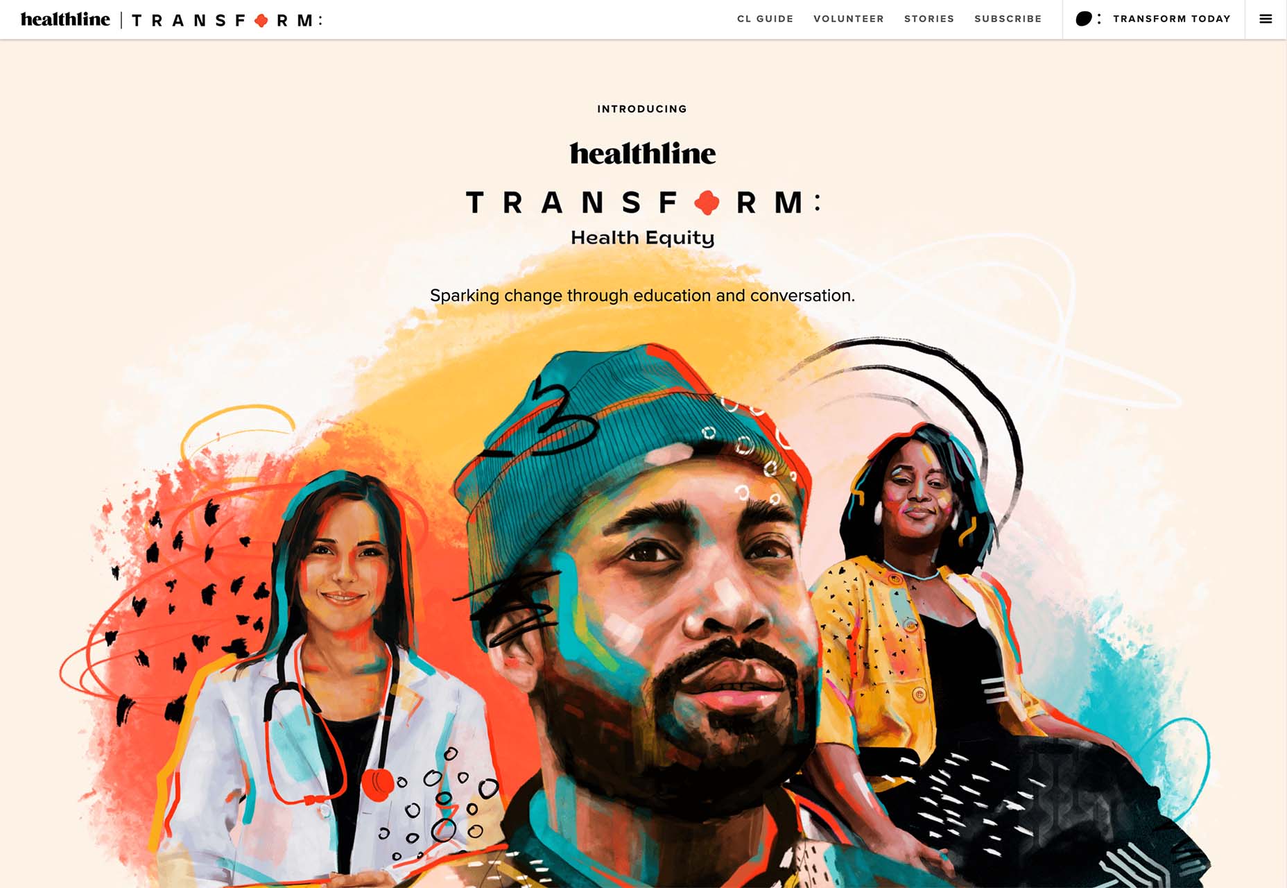
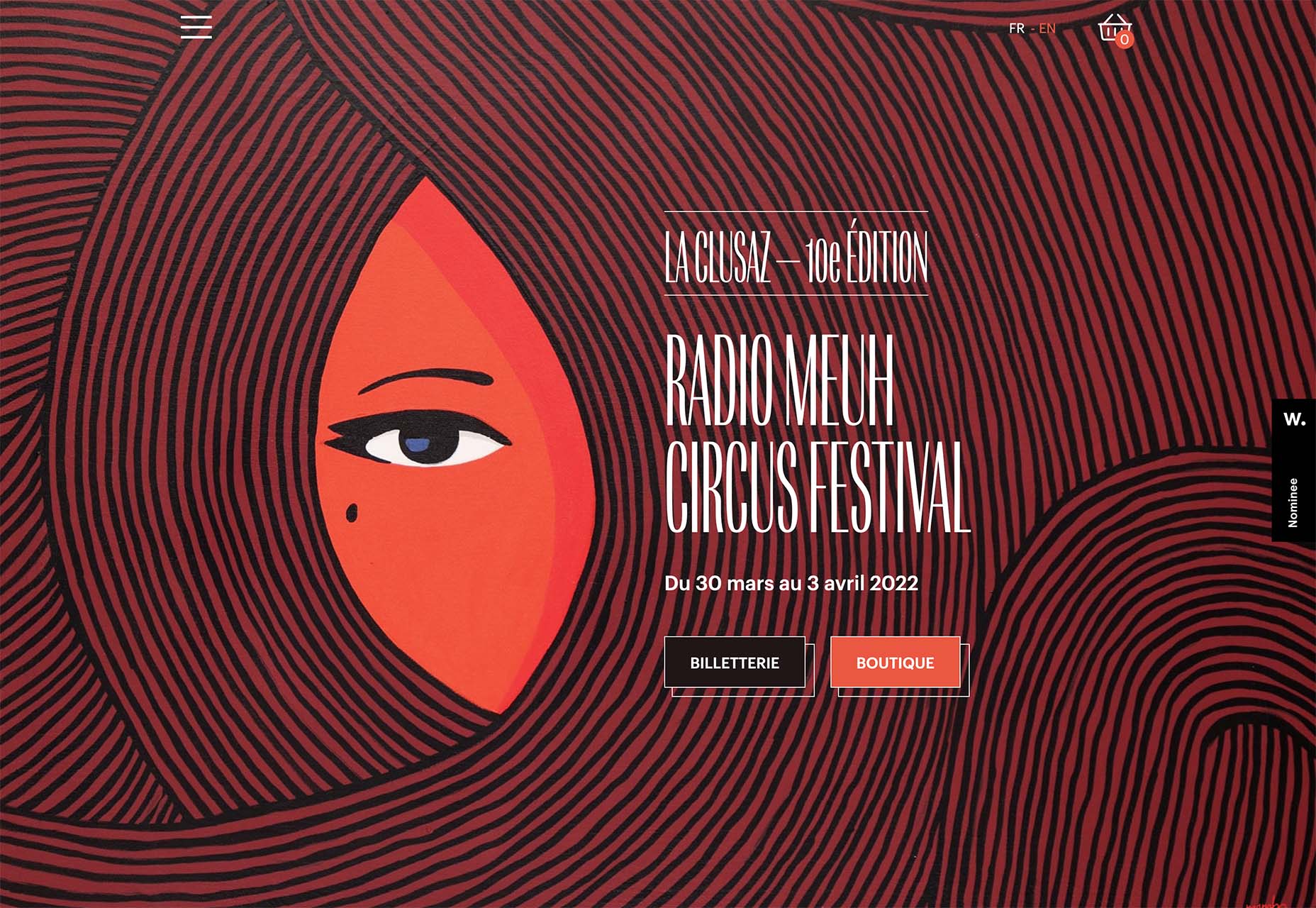
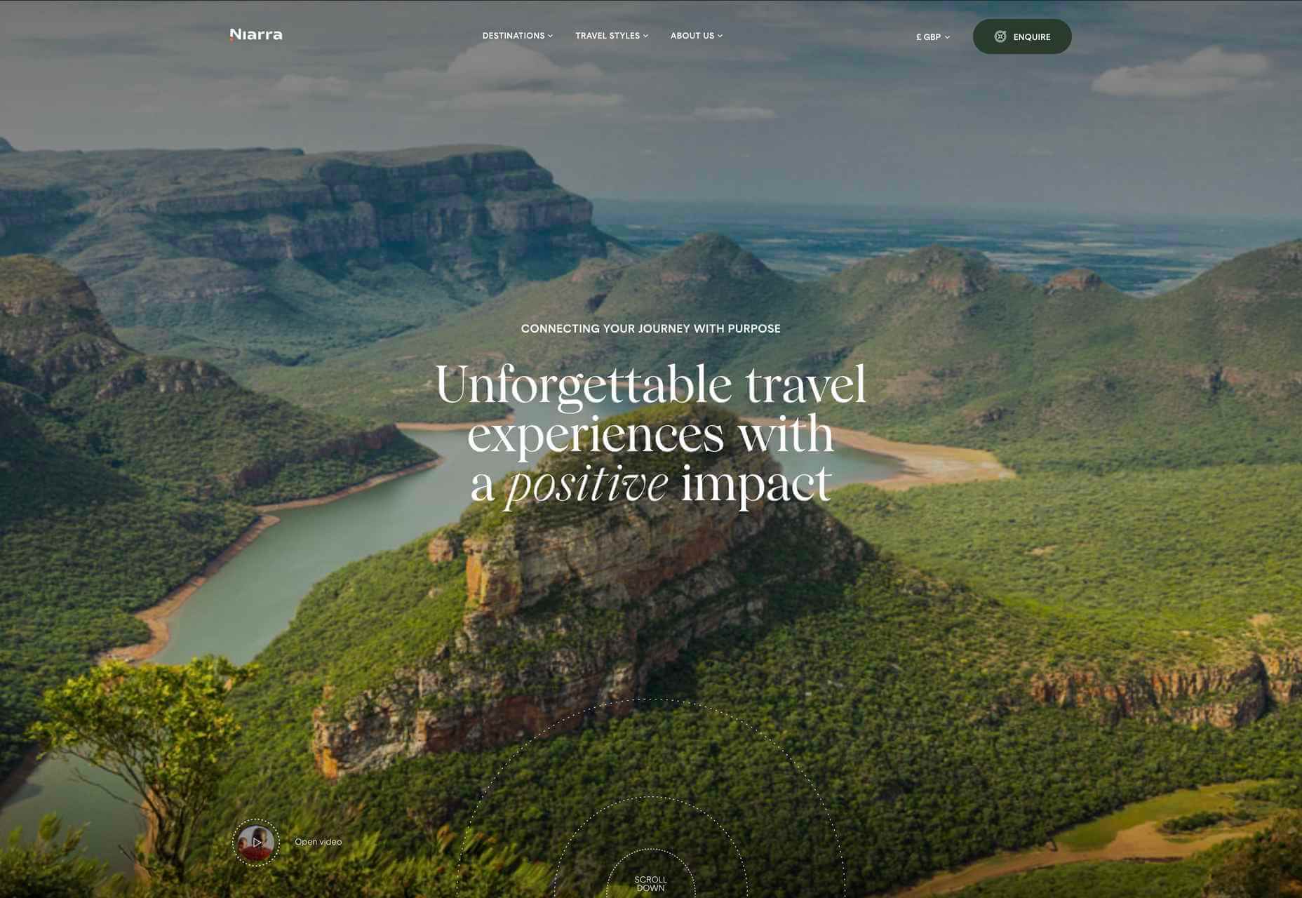
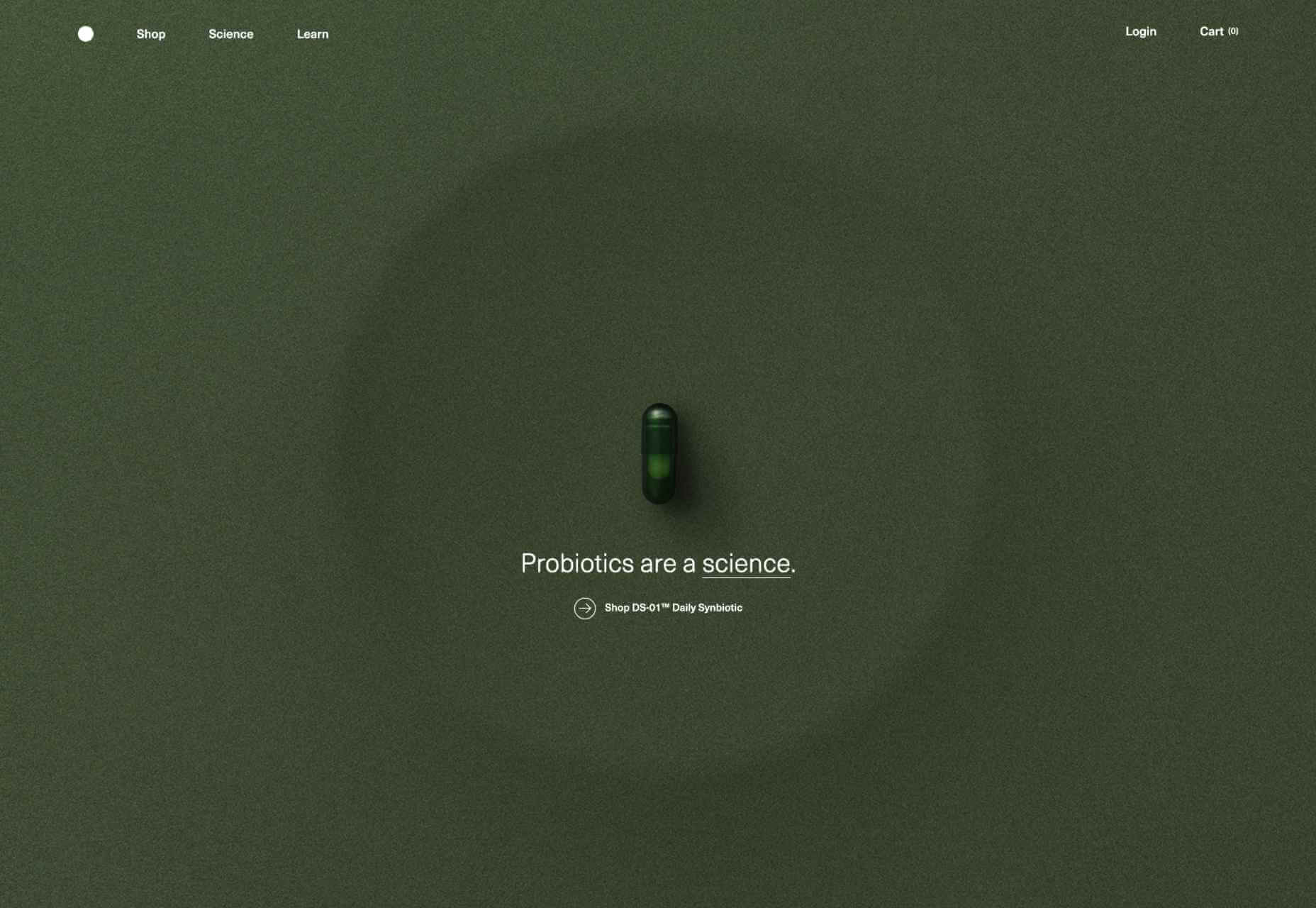
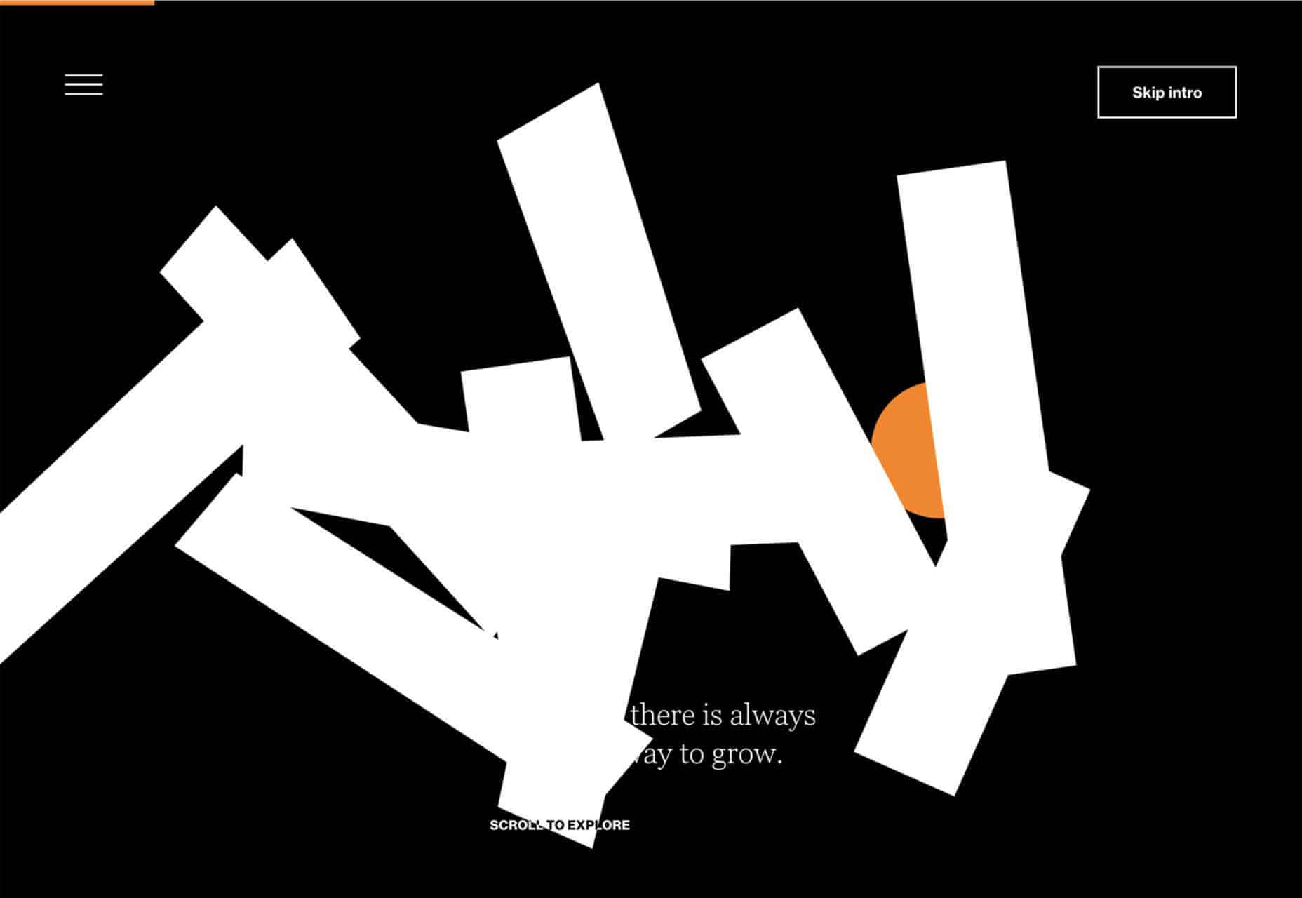
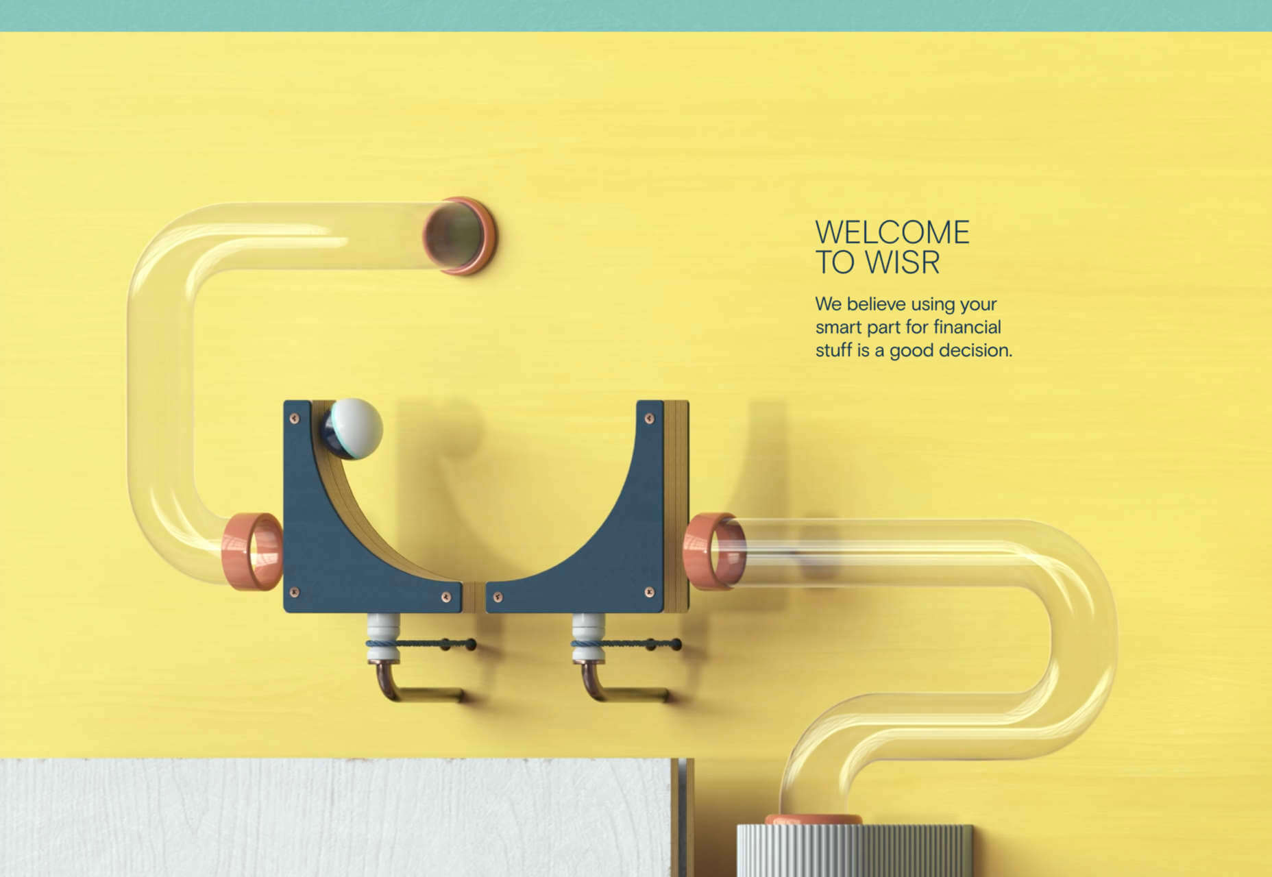
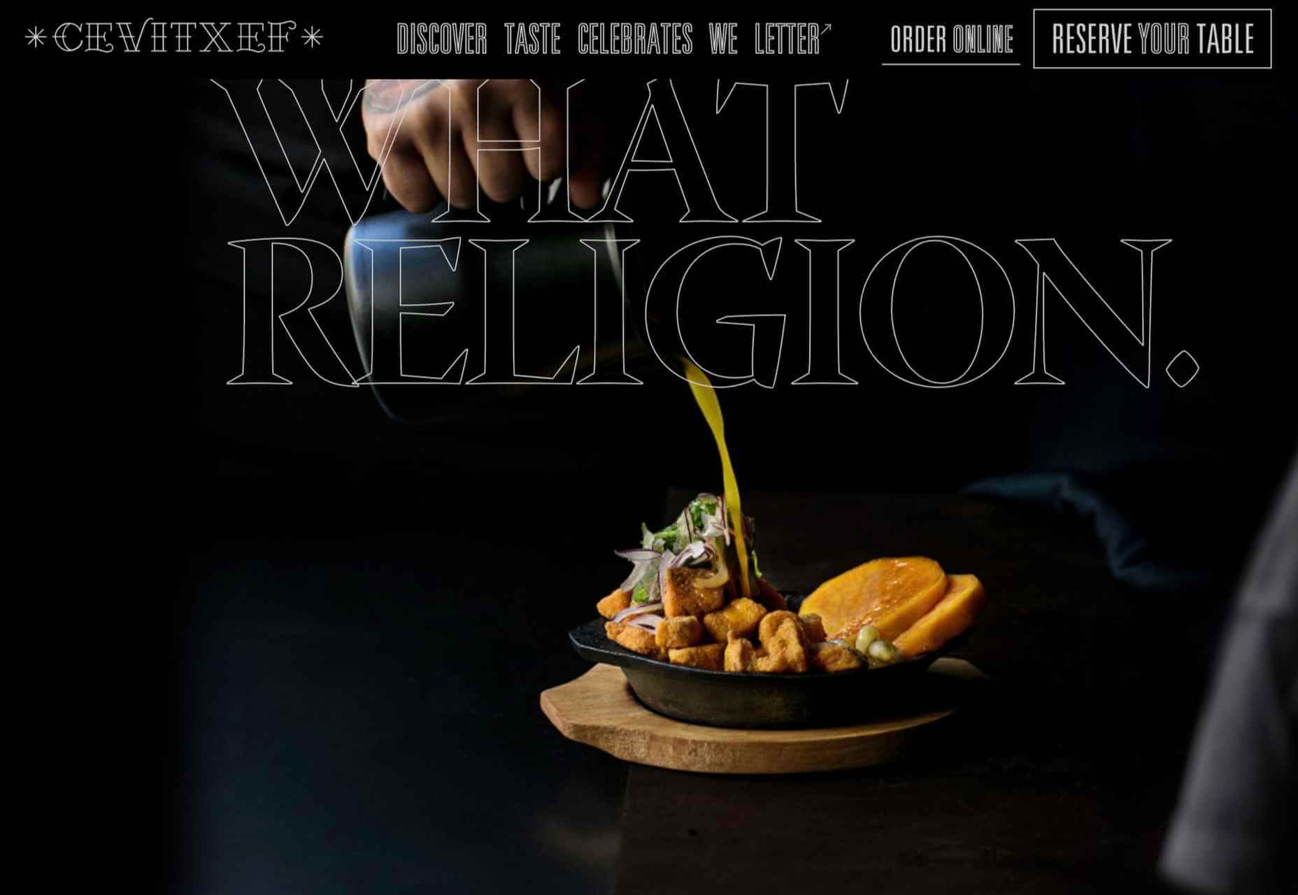
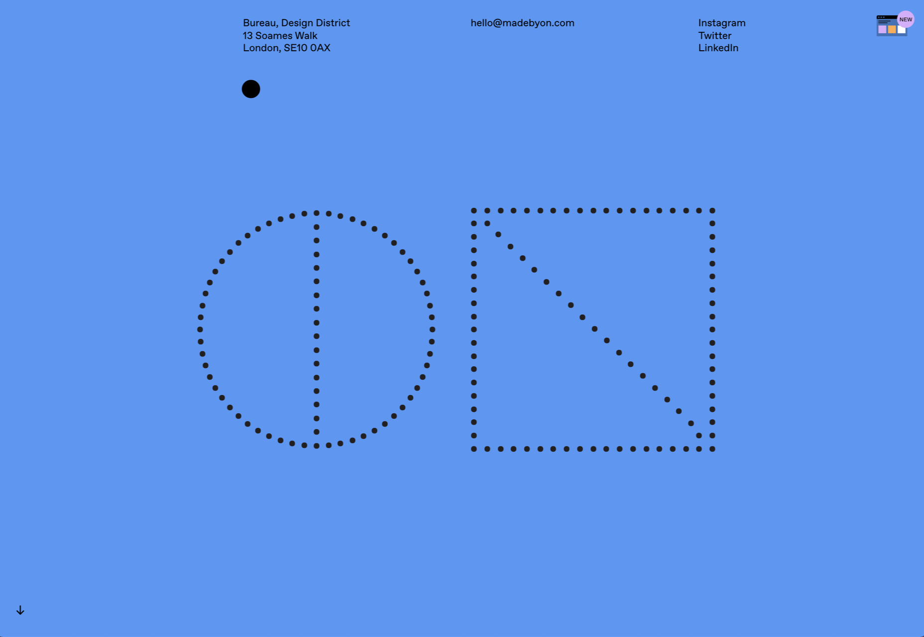
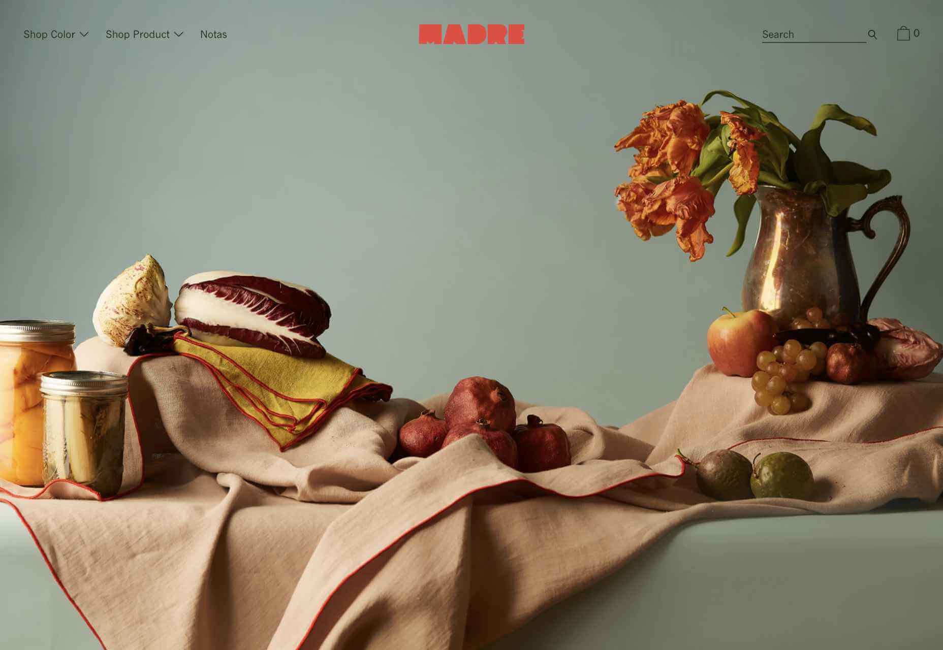
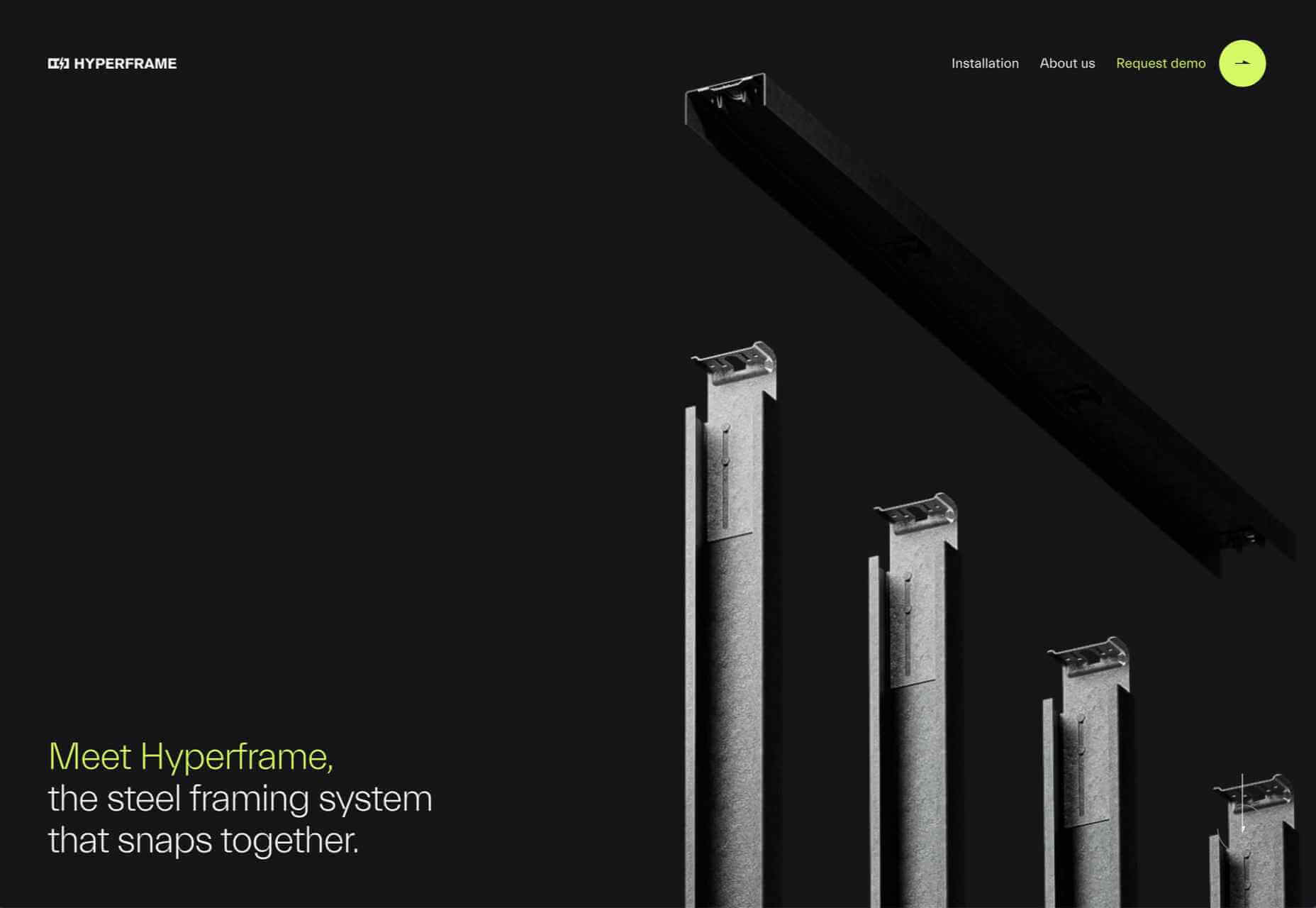
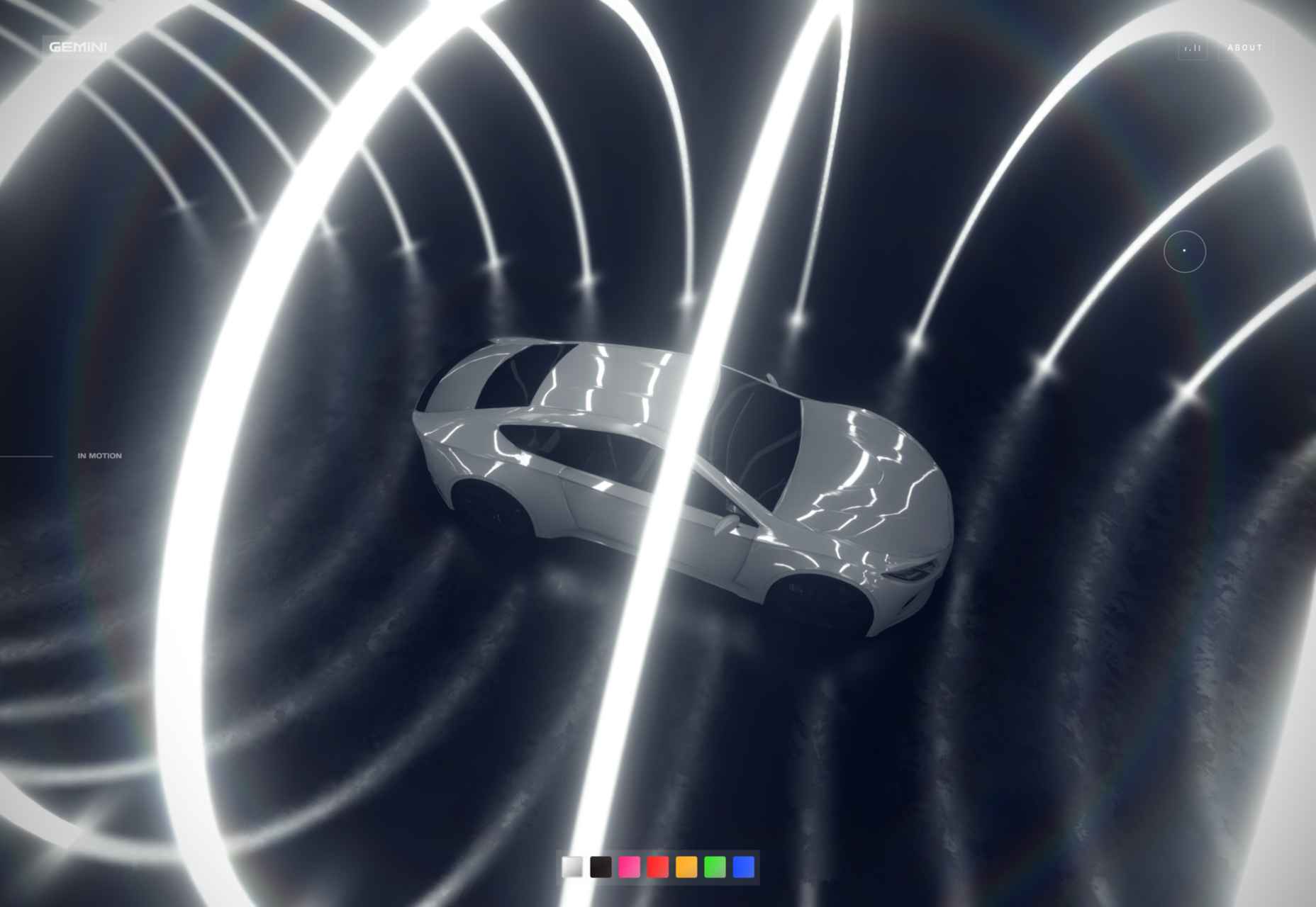
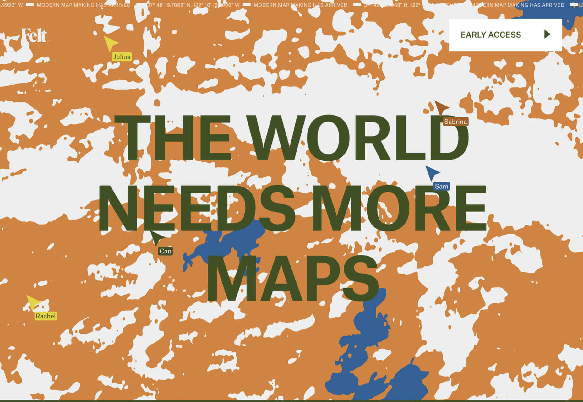
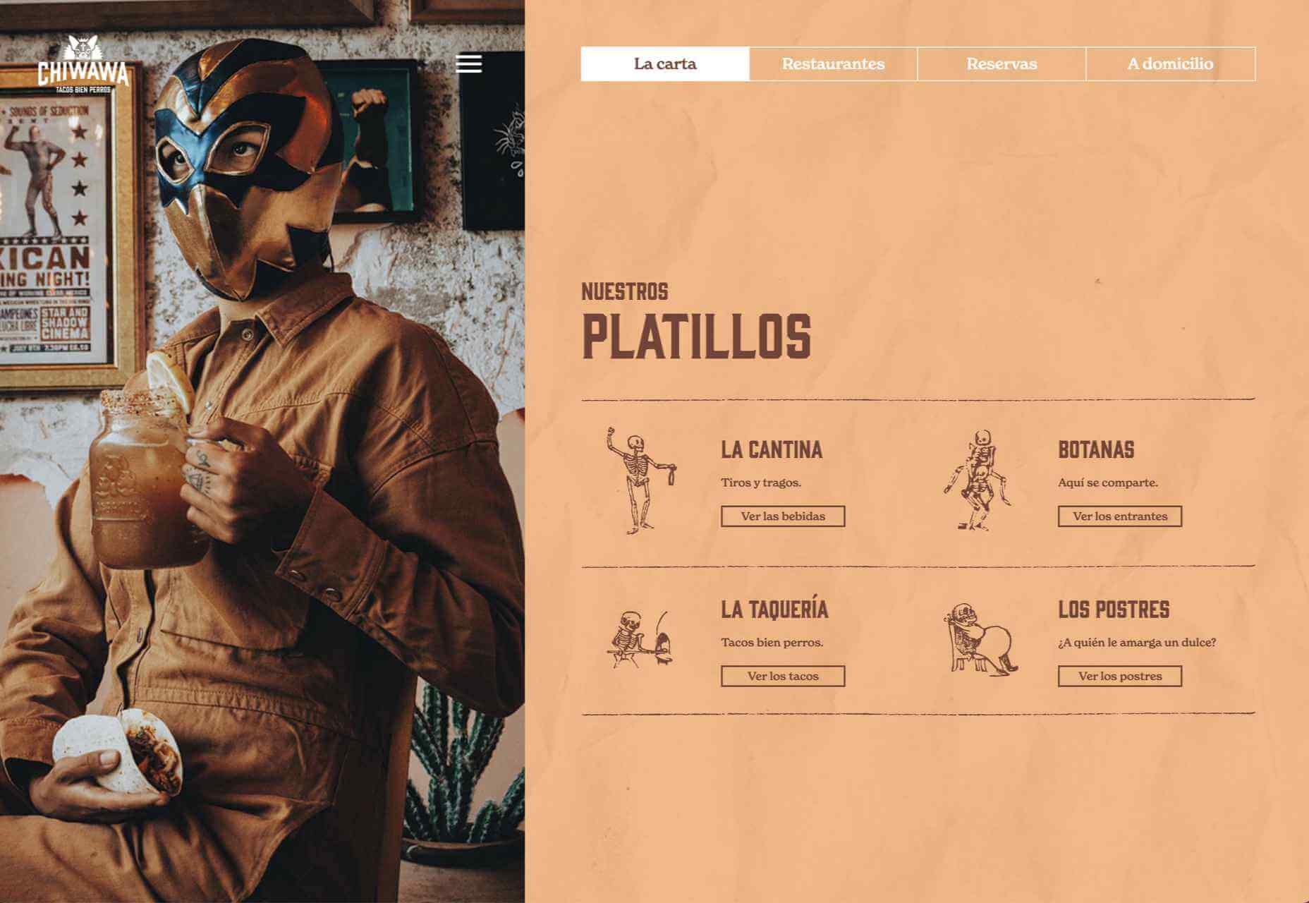
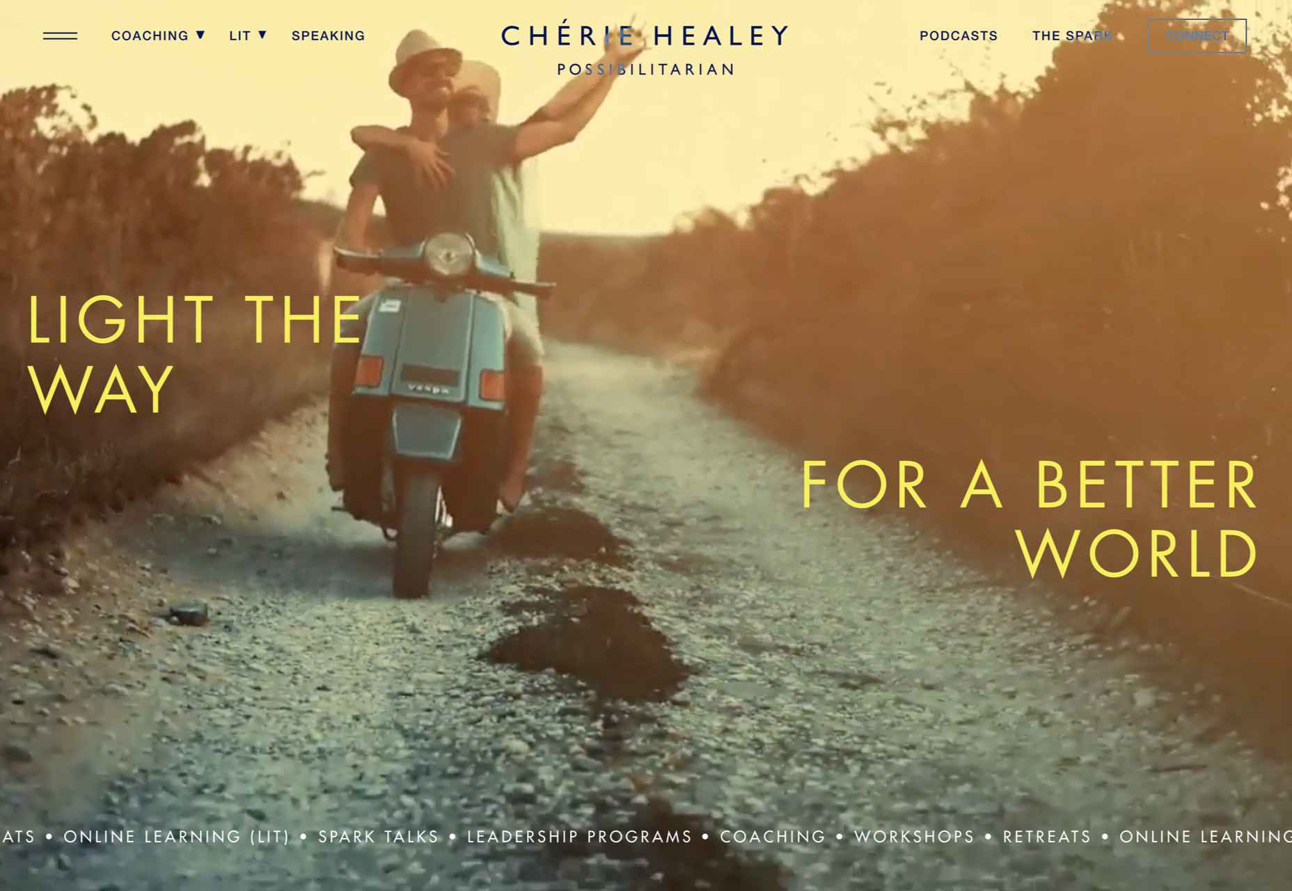
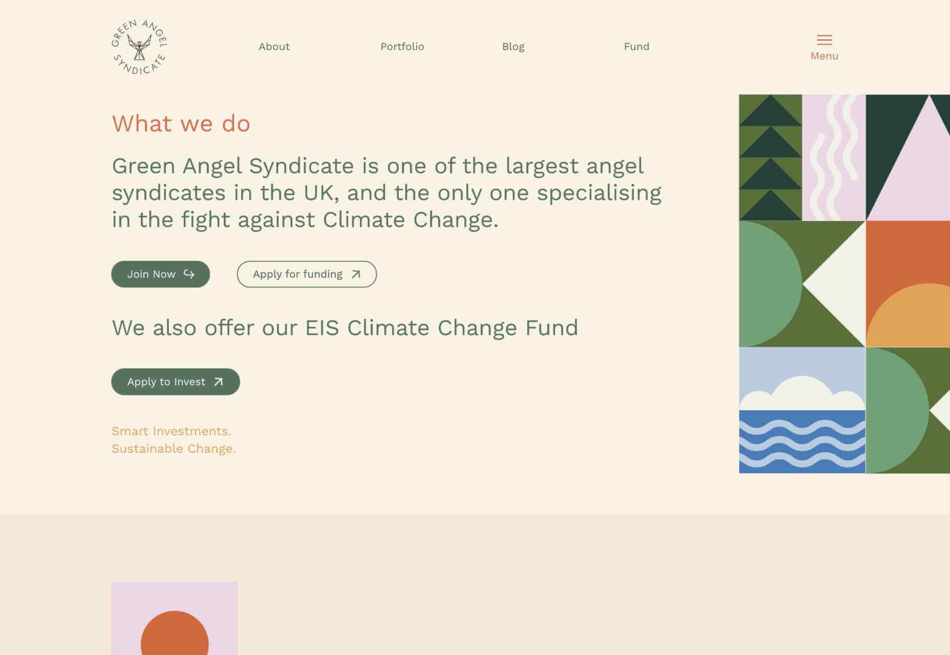
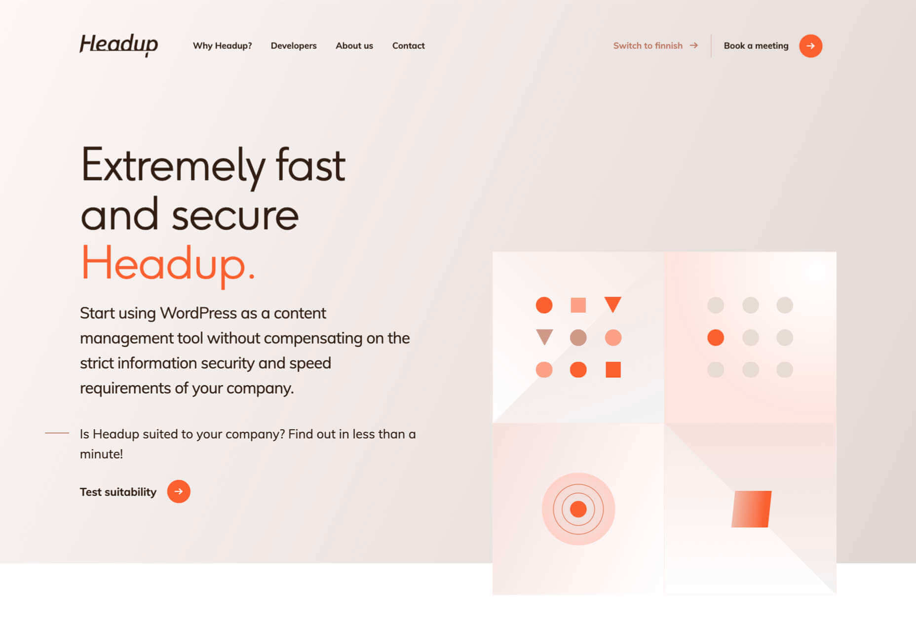
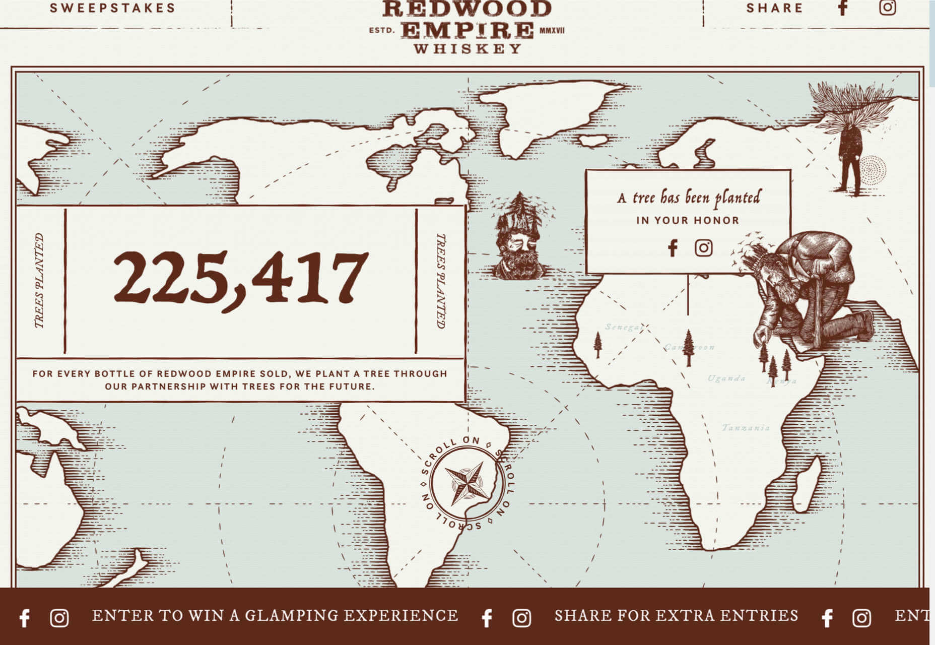
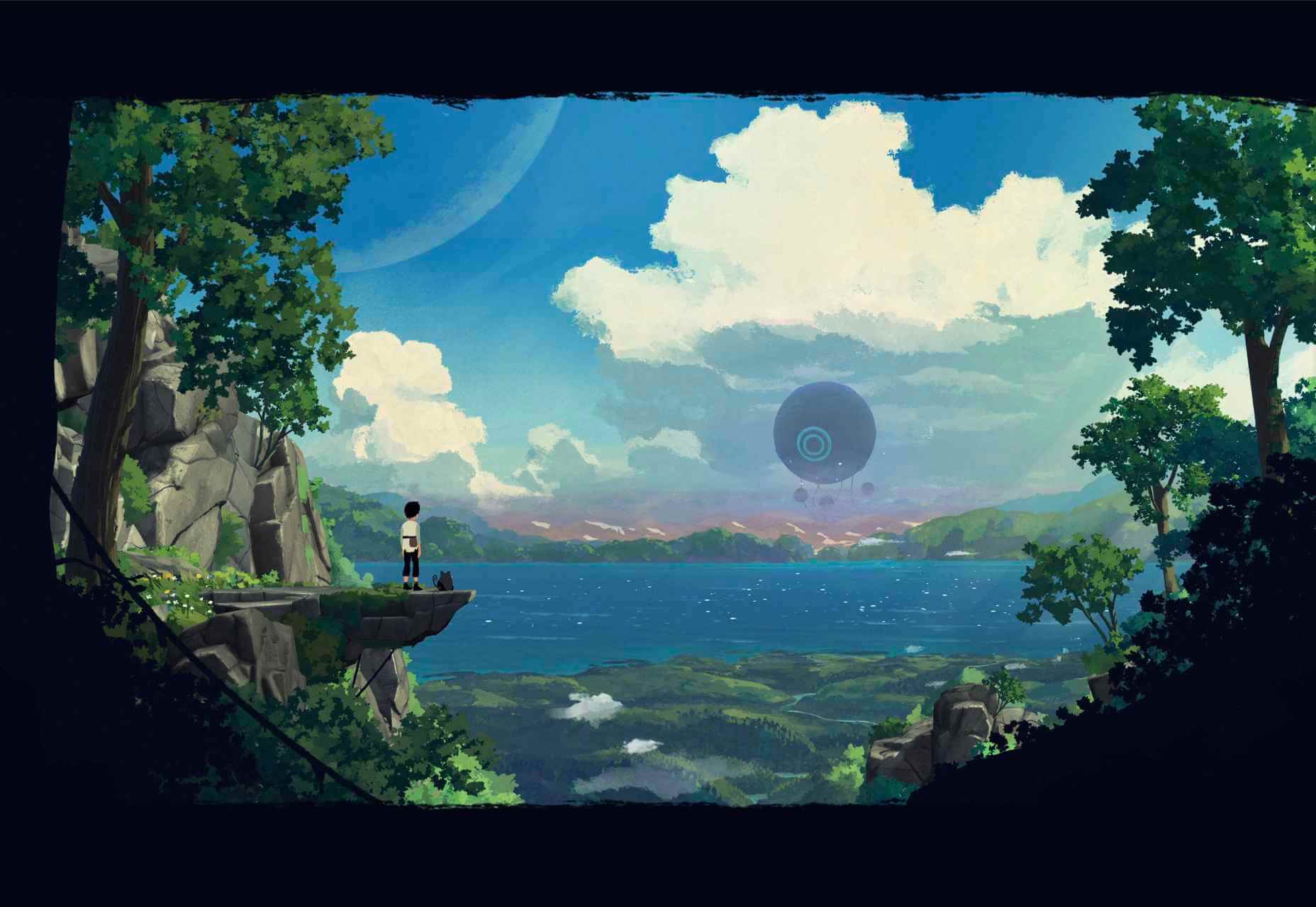
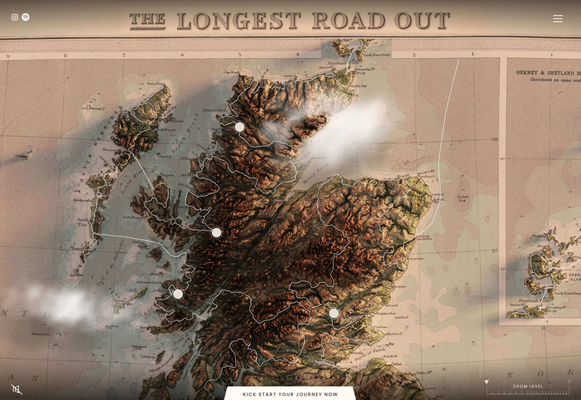
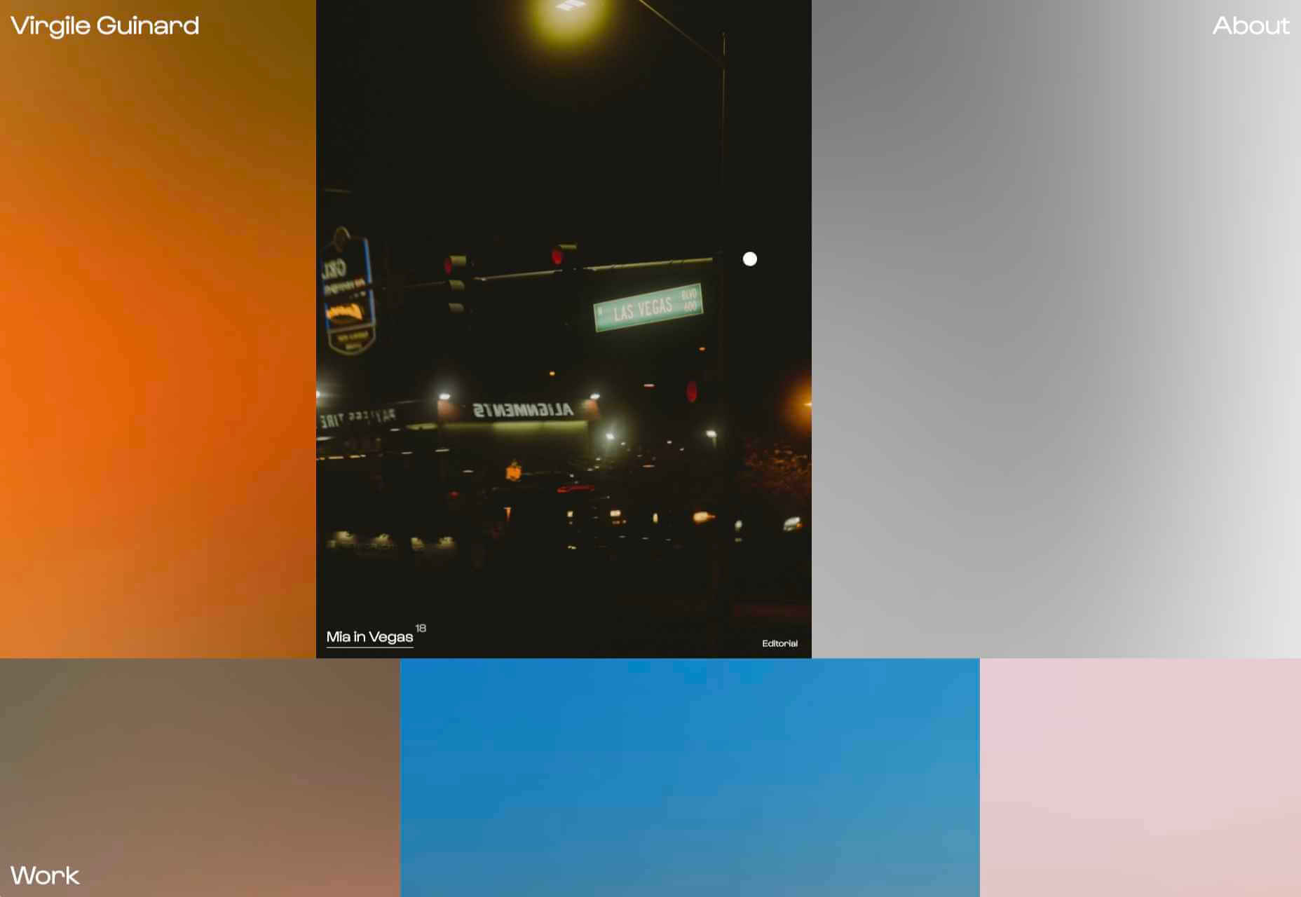
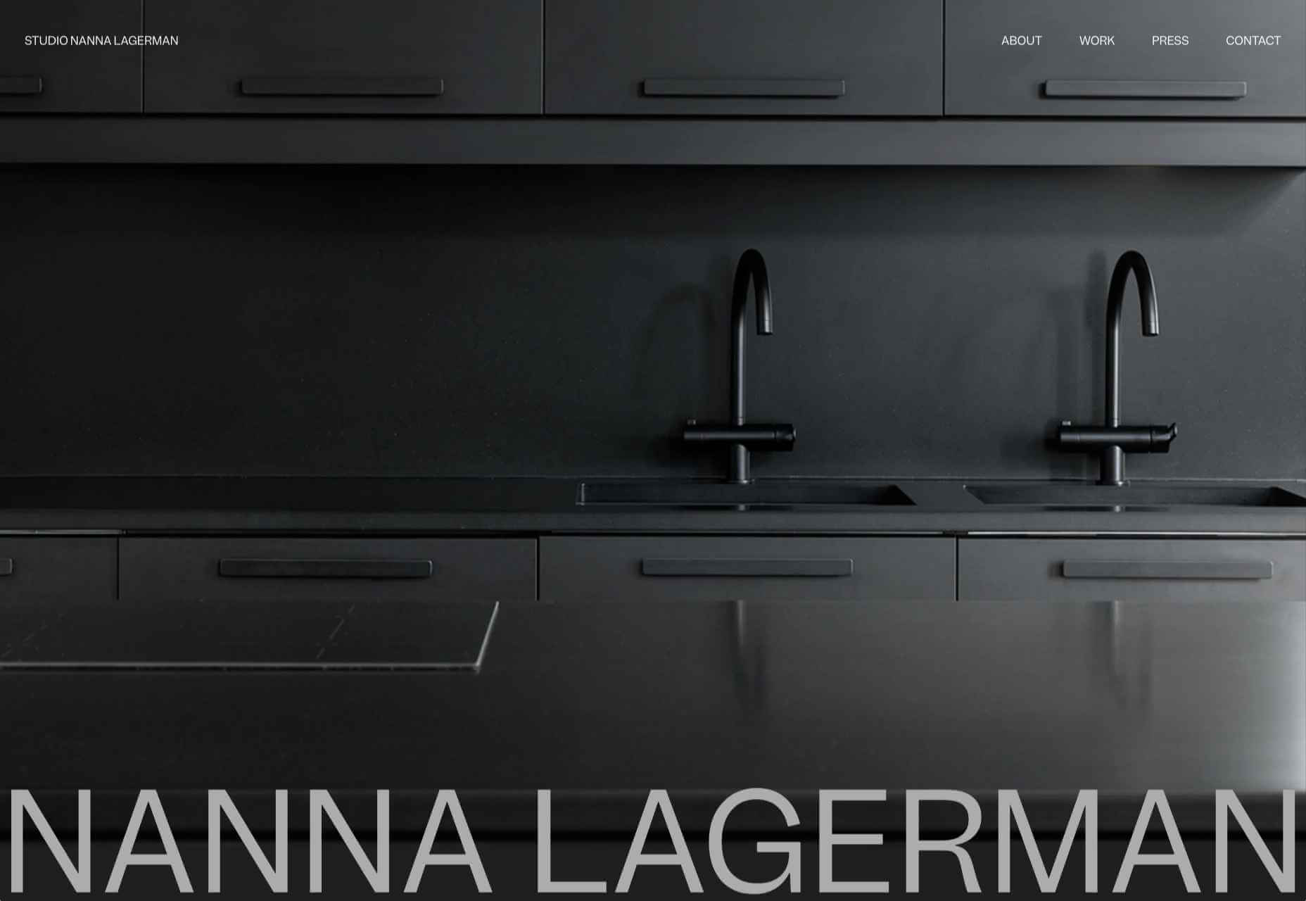
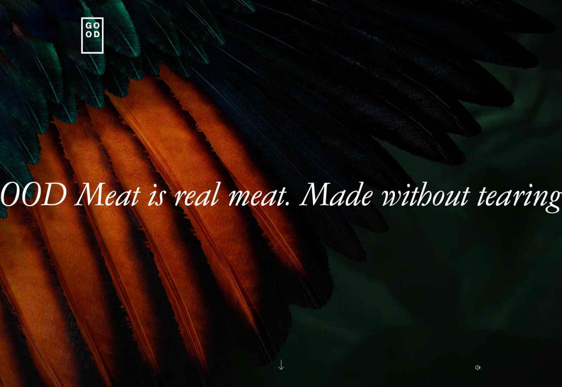
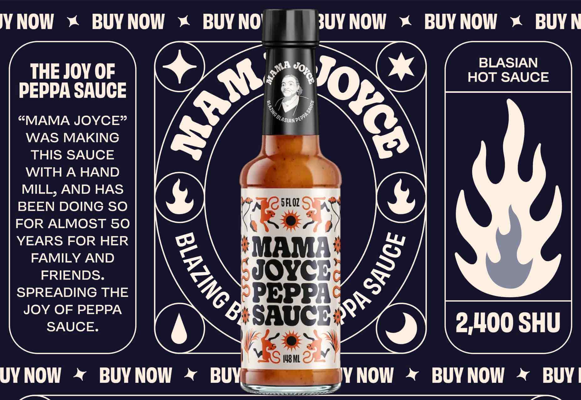
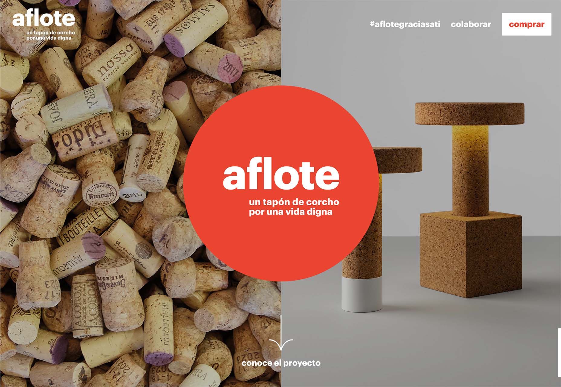
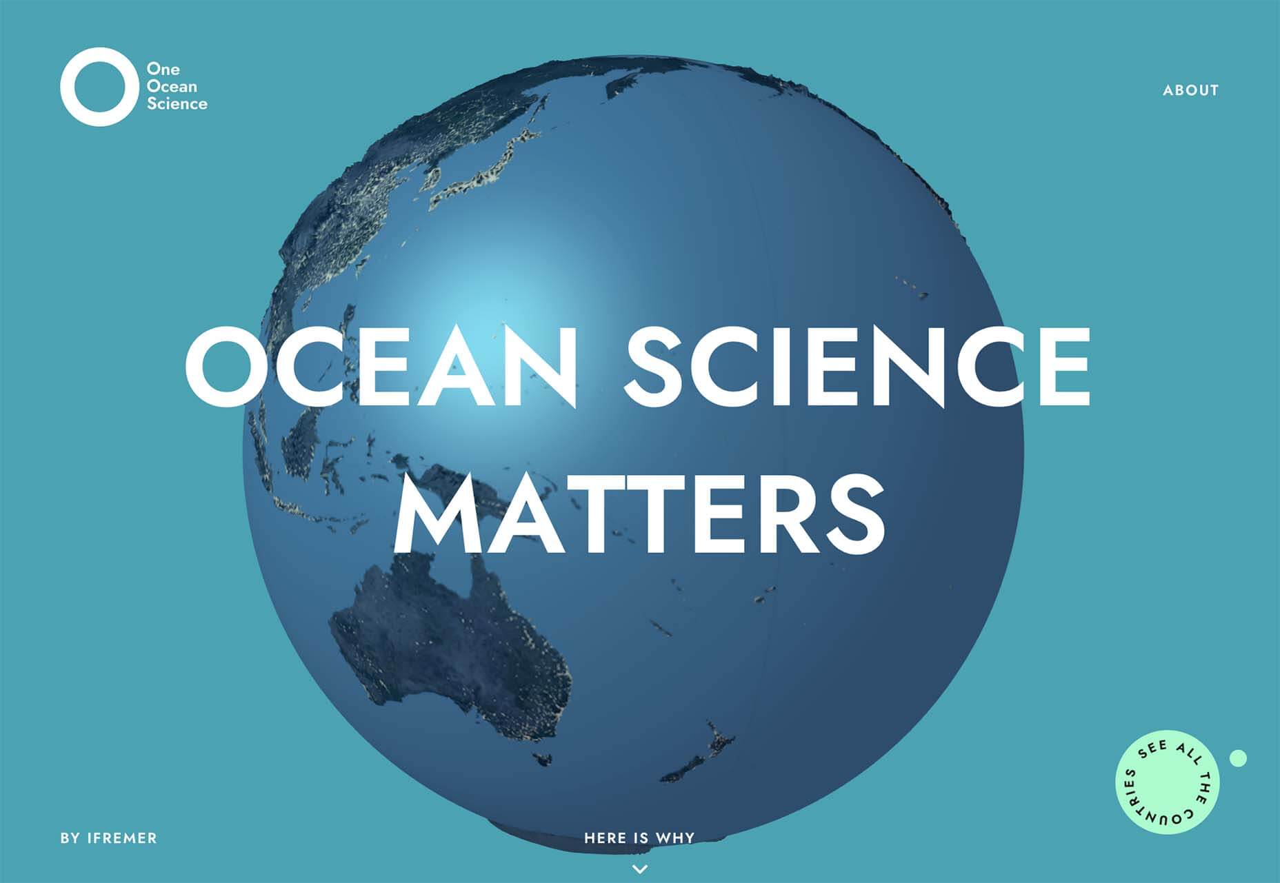
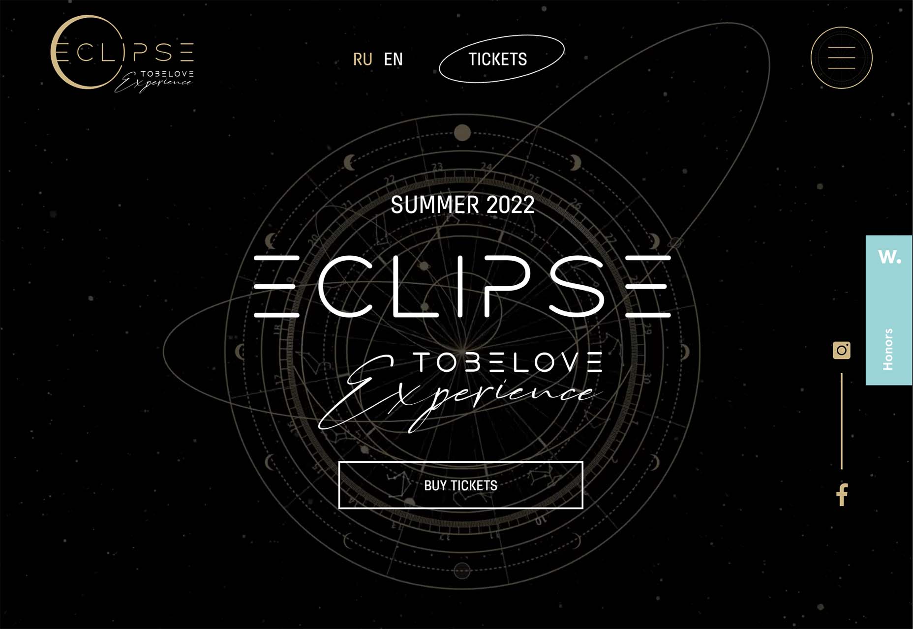
The year might be coming to an end, but plenty of design trends are still beginning to emerge. It’ll be interesting to see how many of these website design elements remain popular into the new year. From vintage elements to circles to happier feelings, there’s a lot to play with here.

Here’s what’s trending in design this month…

Old-School Print Inspired

Vintage design elements seem to circle back in new iterations at a pretty frequent pace. This time website designers are finding inspiration from old-school print design.

These projects mimic the look of old newspapers and magazines with styles that look like news or advertising content. One of the most exciting takeaways might be color, with beige backgrounds that almost seem like aged paper.

Note the font choices, scale, and imagery as well. All of these things have an old-school feel that’s modern enough to help encourage interaction.

Each of these designs keeps visitors engaged with trendy effects that pair with the vintage aesthetic so that while there’s an old-school look, the overall design is modern and fresh.

The portfolio of Niccolo Miranda feels like a “WAR” day on the front page of a major newspaper, but with modern touches – computer illustrations, animated images, and button-style icons.

Enfant Sauvage Music takes on the feel of an old-style newspaper or magazine ad with a single color design and grainy imagery. An oversized funky pointer on hover and side navigation keeps the design interesting.

Kalso uses a giant timeline with typography and effects that mimic the era on the screen. Animation and motion keep the design with the times and on-trend.

Center-Screen Circles

Circles seem to be a website design trend that just never goes out of style – it only evolves.

The newest iteration includes center-screen circles. And you can use them in all kinds of different ways. The nice thing about a circle is the shape is innately harmonious and can pull a design together and make everything feel together and unified.

They can be an excellent container for text or other elements or serve as a button.

Circles work with almost any overall design pattern, in any color, and with virtually any type of image or video. The shape is practically perfect! (That’s why it’s a trend that never really gets old.)

Each of these examples uses a center-screen circle in a slightly different way.

Aflote uses a center circle as part of its overall branding effort and to help draw the eye from the split-screen images to the center arrow, encouraging users to scroll to the next bit of content. Color helps here, and the circle is a container for brand and some other content with a nice layer on top of the images.

One Ocean Science uses one of the oldest circles we know – the globe – as a dominant art element that rotates in the center of the screen. The layer on top – the exact text in multiple languages – gets extra attention thanks to the center placement. The design also uses a top left corner circle for branding and a bottom right corner circle as a CTA, helping create a visual flow through the design from top to center to bottom to click.

To Be Love uses a fantastic animated set of concentric circles to pull together the name of the event and draw interest to the CTAs. The circle is just the right size in a sea of black sky to draw the eye to the content in the middle of the screen.

Lighter, Happier Designs

After a couple of years of pandemic life and a world that’s just been a little less than cheery, website designers include lighter, happier elements to projects. This might just be the design trend we all need right now.

This effect can be designed in several ways, including color, imagery, animation, scale, and even typography. It’s hard to pinpoint what makes a design lighter and happier until you see it, but when you do, you’ll know it. (It might just be that little grin at the corner of your mouth when you see it.)

Meanpug uses fun, animated illustrations as a load screen with a full-text homepage (you’ll have to click through to see it). Between color and animation, you can’t help but feel good looking at the design. What might be most interesting is that the website is for a marketing agency that works with law firms. (Probably not what you expected at all.)

Happy smiling faces are hard not to feel good about. Even the devil emoji seems somewhat joyful. Add in big, bold typography and the yellow smiley, and the world just feels a little less dark.

Oatly uses lots of small elements in a cartoon-style aesthetic that is light and interesting. In addition to fun fonts and animation, all of the words on the website also contribute to a feeling of ease and happiness. It’s a solid strategy for sales; make people feel good about what they are thinking of buying to help propel them toward a purchase.


Conclusion

One of the most exciting things that we’ve seen with design trends in the past year is how world events – from the pandemic to isolation to working remotely – have impacted design projects as a whole.

We’ve seen fewer faces, more illustrations and typography, and an overall shift in feeling to some of the lighter, happier design elements featured here. Cheers to 2022!

Source

The post 3 Essential Design Trends, December 2021 first appeared on Webdesigner Depot.

Source de l’article sur Webdesignerdepot

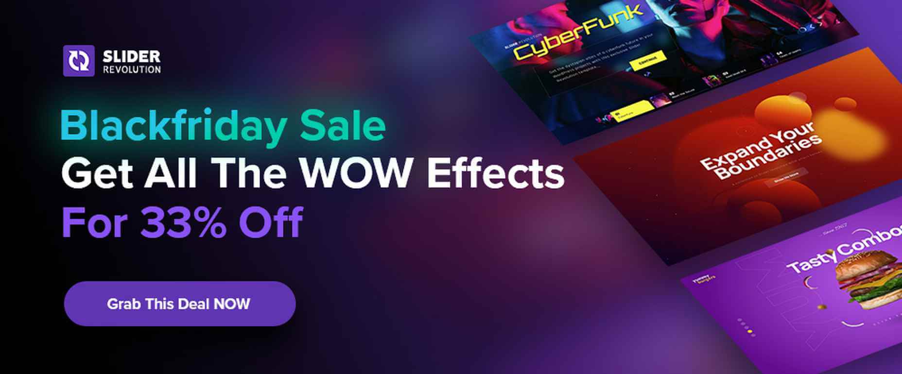
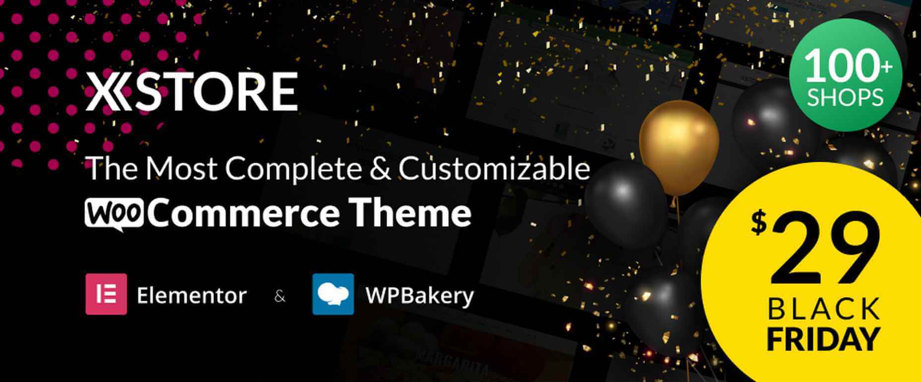
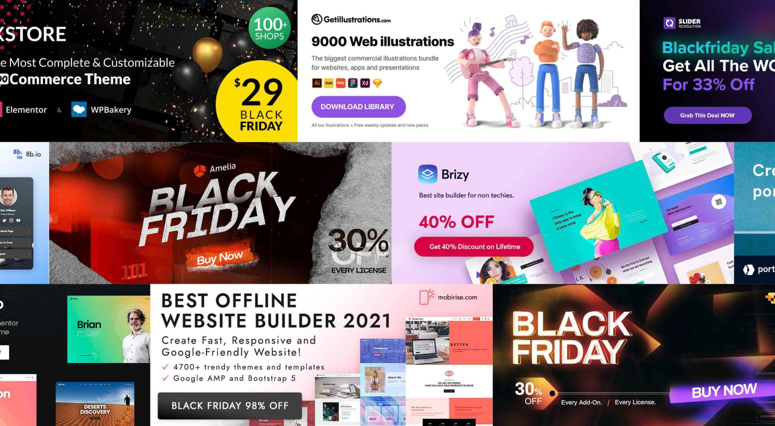
It’s that time again. Black Friday. November 26, to be exact. And the many enticing deals you’ve been looking forward to at this time of the year are here as well.

There are three types of Black Friday shoppers. Those who are successful because they have prepared. Those who are successful because they got lucky. And, those who let some good deals simply slip away.

Your best bet, of course, is to be prepared, which is the purpose of this guide.

As you go down this list, you’ll find discounts, some pretty amazing offers, a few surprises perhaps – and plenty of inspiration.

We’ve been keeping close tabs on the various Black Friday discounts and promotions, and we’ve corralled the best of the bunch for you.

Starting with:

1. Brizy – The No-Code Website Builder For Non-Techies

Brizy is a fast and easy-to-use website builder for designers and agencies. Take advantage of Brizy’s Black Friday special and tap into the skills of a team that has been creating website-building tools for over 11 years.

This premier website builder gets better with each update.

  • Web designers can choose between Brizy for WordPress and the Brizy Cloud website builder, which includes hosting;
  • Agencies can choose among several white-label options;
  • Brizy brings power to the novice; use the pre-made designs or start with a blank page and let the imagination be the guide.

Black Friday is a time to take advantage of great deals, and this year is no different.

  • Big discounts are available on Brizy’s white label agency plans;
  • Participate at no cost to win a MacBook PRO;
  • Partner perks and discounts;
  • And exclusive new designs.

Design or coding experience is not a requirement to use Brizy’s drag and drop visual builder.

Click on the banner to take advantage of these great Black Friday specials.

2. Portfoliobox

A 50% discount on any portfolio website builder would seem like a good deal. On the other hand, getting one at 50% off that enables you to quickly create a portfolio website that reflects your creative personality and will truly set you apart from the crowd is definitely worth taking advantage of.

Portfoliobox offers:

  • Mix and match templates to help achieve a unique look;
  • Powerful eCommerce functionality built right into the platform;
  • Safe and secure private client galleries;
  • An included Domain (custom domain with Pro plans);
  • Fantastic 24/7 support to keep problems to a minimum;
  • Affordable, transparent pricing plans that let you know what you are getting before you buy.

Click on the banner to find out more about this fast, affordable, and easy to work with a portfolio website builder for creatives.

3. wpDataTables

wpDataTables is a popular, power-packed plugin that can manage vast amounts of data in seconds and organize it to build a table or chart the way you want.

  • wpDataTables and charts are responsive, customizable, and easy to edit and maintain;
  • wpDataTables readily accepts data from a variety of data sources, from multiple database connections, and in the most used formats;
  • Tables and charts can be configured to nicely blend in with other website content and a website’s overall design, plus it is easy to add spice to a table or chart by using colors, adjusting font sizes, and highlighting key data using conditional formatting.

wpDataTables features Elementor and Gutenberg integration, provides the ability to connect WordPress tables with Google API, allows cascade data filtering, and much more.

Click on the banner to take advantage of the 30% off Black Friday special.

4. Amelia WordPress Booking Plugin

Amelia can be a genuine time and money saver for a variety of business types. Amelia automates and streamlines a business’s booking process.

  • Amelia relieves business owners and managers from the task of managing multiple appointments and events;
  • Clients and customers love the ability to make and manage their appointments 24/7;
  • Bookings and events are managed from a single platform, even when multiple locations are involved.

Annual and lifetime subscriptions are available.

5. Mobirise Free Website Builder

As it is an offline builder, Mobirise does not tie you to any platform, you can host it anywhere, and you have total control over creating the website you have in mind.

Mobirise:

  • is drag and drop and easy and simple use;
  • is based on the latest Google AMP or Bootstrap 5, so your site will be mobile-friendly and crazy fast;
  • comes with eCommerce, huge selections of themes, blocks and templates, and a shopping cart.

Mobirise is free for both personal and commercial use.

6. Slider Revolution

There is a difference between an “interesting” website and one whose WOW effects cause it to stand far above the competition.

Slider Revolution specializes in WOW effects that can take any website to the next level, and it can be yours on Black Friday at a 33% discount on all licenses.

The Slider Revolution package includes:

  • Innovative templates and add-ons;
  • Advanced automation and special effects tools.

Grab the Black Friday offer now.

7. Getillustrations Bundle – Commercial illustrations for the web

Digital illustrations help attract attention to and pique interest in your website.

Getillustrations.com features a package of more than 9000 commercial web and app illustrations in a wide range of topics.

  • This package features all the design formats you’re likely to need, e.g., Ai, SVG, PNG, Figma, Sketch, and more;
  • Great illustrations to spice up landing pages are included.

The package is available at a 25% discount. Use coupon code EliteDesingers25.

8. Litho – Multipurpose Elementor WordPress Theme

Litho is a creative, modern, and highly customizable theme that can be used for any type of business niche as well as for creating eCommerce, blog, and portfolio websites.

This multipurpose Elementor WordPress theme’s features include –

  • 36+ ready home pages, 200+ creative elements, and a 300+ template library;
  • One-click demo import;
  • Top loading speed and SEO result capabilities.

Litho also features detailed online documentation and top-of-the-line customer support.

9. 8bio – Linktree Alternative

Instagram and TikTok enthusiasts, take note!

With the 8bio tool at your fingertips, you can add a clickable URL to your social media platform profiles so visitors can visit your website, product page, or any other important page.

8bio offers:

  • Beautiful skins and catchy animated backgrounds;
  • The ability to link to your own domain or to *.8b.io;
  • Powerful SEO and tracking options.

The 8bio tool can also be used for your Twitter, Facebook, and YouTube posts.

10. XStore – Highly Customizable WordPress WooCommerce Theme

XStore is designed to work with the best page builders on the market and is fully compatible with the Elementor and WPBakery builders.

The XStore package includes

  • $510 worth of carefully handpicked Premium Plugins for WooCommerce;
  • More than 110+ awesome Prebuilt Shops;
  • A built-in AMP for WooCommerce, a Full Ajax Shop, multi-vendor support, and much more.

Become one of XStore’s more than 60,000+ happy customers by taking advantage of the Black Friday special.

Knowing that it’s the early bird that gets the worm, we’ve worked hard to place before you and your fellow website designers and agencies this enticing selection of the best Black Friday offers.

You will no doubt find some of the products familiar. A few might not be. In either case, the opportunities are here for you to get some great deals on some premier products.

Happy shopping!

Source

The post Live Now: Top 10 Black Friday 2021 Deals for Designers and Agencies first appeared on Webdesigner Depot.

Source de l’article sur Webdesignerdepot