Articles

Sometimes the designs that make the most impact do a lot of unexpected things and break some of the most tried and true rules of visual theory.

Sometimes these design elements work brilliantly, and other times they are fleeting or fall flat. This month all of the examples here seem to break some conventional design rules. Here’s what’s trending in design this month…

1. Alternative Homepage Image/Video Crops

This trend breaks some traditional standards and is pretty refreshing – alternative homepage crops for images and video.

The full screen or 16:9 aspect ratio is out the window with vertical and square options that prove you can do more with your photo collection.

What’s great about this trend is that it’s super attention-getting because of the interesting use of space and imagery. Almost any design without the full-width hero header will grab your attention because it is different. These examples prove that point, and each design does it differently.

Now here’s the challenge: You have to make sure that this style has a solid fallback for mobile so that the result is equally impressive.

Janmaat Fotografie does a great job accounting for interesting photo shapes and flips the script on mobile. (Rather than what you might expect with text then photos because of the desktop placement, the photo stack uses the same shape and layering and is above the text on mobile.) The result is phenomenal.

N3 uses a very vertical image in an almost split-screen style design. It’s a sharp contrast to many of the other split screens we are accustomed to with an equal divide. The distinct shape of the image is interesting and intriguing. It’s definitely not a shape we see in website design frequently.

Bounce uses a similar split-screen effect in the opposite manner as the example above, with the tall, vertical space as an “empty” area and the right side filled with a square video. The shapes help push and pull your eyes across the screen to look at all of the elements and take in the overall design. It’s one of those ideas that if you only talked about it, you might talk yourself out of it, but here, it’s pretty striking.


2. On-Screen “Stickers”

Stickers are a design trend that has made its way from social media to website design.

These website stickers break design rules because they cover content or seem to be put on the canvas haphazardly. And that’s why they are so attention-getting!

The benefit to these stickers is that they can highlight specific items or content or help focus a call to action.

Friesday uses stickers in conjunction with hover effects to keep users interacting with the design. Multiple stickers can even pop onto the screen in the same location. The animation is simple and fun and feels like a digital sticker book.

August Eighth uses a center sticker as a call to action. It’s a true focal point in the center of the screen with an almost three-dimensional effect that lifts it off the background video. It’s a borderline dark pattern since the only way to get the box off the screen is to click through to the shopping part of the website.

EasyGreen has a bright yellow sticker in the bottom corner that feels almost like the sticker on a piece of fruit. This style and placement work well for the content and product featured. It’s bringing the digital and real-world a little closer with this design element.


3. Breaking Design “Rules”

The third trend this month is kind of a catch-all for general rule-breaking. While the other trends show certain design elements that aren’t the norm, each of these examples really tosses everything you traditionally think about design out the window. (And that’s ok.)

The trick to a rule-breaking design is that it has to be focused and simple enough to keep users interested and provide intuitive elements that tell them how to interact with the design. It’s a delicate balance.

Here’s how these sites do just that.

Supercontinent has a lot going on. At least four typefaces on the screen at a time, movement (using different shapes and aspect ratios), overlapping elements, hidden navigation, and you may even find a few more broken rules if you look closely. And somehow, it still works.

What’s pulling this design together is a key unbroken rule – the chaos is rooted in a grid system that keeps it all somewhat organized. Plus, there’s plenty of white space to keep elements from feeling crowded and overwhelming.

Source of Plastic Waste combines elements in unexpected ways. There’s no real navigation; the site is just a continuous scroll. That’s a big website usability rule broken right out of the gate. There are other design elements as well, from the “header”/logo moving to the top right corner to the almost over-designed transparent box for text elements. There are a lot of scroll elements and actions happening and layers of text on text in some of the screens.

But here’s the thing about this design. As many rules as it breaks, the story is interesting enough to keep you scrolling. The question is, how long and how far do you go without getting lost or confused.

The Debris of Attention is designed to show “bad design” with elements that are frustrating and annoying on websites. The gamified design allows you to hover on each element to remove it and clean up the design.

While this site breaks the rules on purpose, it is still an experiment in how long a user will hang on with so many visual effects happening at once.


Conclusion

While most of the time, people think about “breaking the rules” as a bad thing, that’s not always true in the design space. Sometimes breaking the rules can result in an unexpected delight.

The challenge is to make sure that when you break the rules, the design is still usable, functional, and understandable. If so, you’ve found a winning combination.

Source

The post 3 Essential Design Trends, August 2021 first appeared on Webdesigner Depot.


Source de l’article sur Webdesignerdepot

This month we have a variety pack for you. There are all sorts, from the most conservative layouts and structures to more experimental navigation. And we see how even the most traditional and functional websites can connect with users through mood-enhancing color schemes, clever font choices, and illustrations.

Non-functional–that is, purely decorative–details can really improve the user’s reaction to a site when applied sparingly. Constant movement gets tiring, and adding too many elements can feel fussy and unfocused. Getting the balance right so that things are kept simple but not bare and boring can be difficult, but it is a skill worth mastering.

Enjoy!

Laboratorio Permanente

The site for this multi-disciplinary architecture studio makes very nice use of a scrolling concertina effect.

Sometimes Always 

Wine sellers Sometimes Always have gone for a retro vibe with their color scheme and type.

Empty State 

Split-screen contraflow scrolling and the pop of bright blue against neutrals give Empty State’s home page impact, while the clean layout and clear navigation make the rest of the site pleasant to use.

Kibana 

Quirky display type and illustrations give this single-page site for Kibana lodge a friendly, welcoming feel.

For Good Design Lab

For Good Design Lab’s site is simple and bold; it makes a strong statement. And its design works even better on mobile.

Levitate

Levitate is a sports brand that makes an affordable running blade. Their site has a clean minimal feel, contrasting spaciousness with a sense of movement in the photography used.

Sunst-studio 

Multidisciplinary creative agency Sunst Studio keeps things simple but impactful with oversized black type on white and smaller images.

Made By Nacho 

Strong colors and illustrations, with the occasional subtle animation, work well for Made By Nacho.

Flexe 

Flexe are logistics experts, not the first industry that springs to mind when we think of great website potential, but this one is very appealing.

Friesday 

This site for Friesday restaurant/takeaway is lively, colorful, and fun.

Go out{side}

This offshoot site from B.A.S.S. (Bass Anglers Sportsman Society) aims to promote angling as part of an outdoor lifestyle. Earthy colors and a lively visual rhythm create energy.

Protos Car Rentals

Illustration brings a touch of personality to this site for Protos Car Rentals, while attention to detail pays off in the usability.

21wallpaper 

21wallpaper offers downloadable screen savers from different illustrators (7 artists, 3 designs each) regularly, which at the same time acts as a showcase for the artists.

Elon’s Toilet 

This is a brilliant and vital piece of marketing that succeeds in presenting a serious subject in a lighthearted and engaging way. You’ll have to find out for yourself what it’s about.

Pa’lais

A fresh feeling color scheme, a distinct lack of straight lines, and a scattering of illustration work well for the site for this vegan food producer.

Benjamin Righetti

Using a primarily visual medium to effectively promote an artist whose medium is sound is not always easy. This website for organist Benjamin Righetti does an outstanding job.

Wavemaker

Wavemaker is a creative media agency. Their site is strong and confident but with a playfulness that is engaging for the user.

Dpt.

This site for Dpt. throws out the usual menu concept and has its navigation arranged around the screen. It can be a risky strategy, but here it works well.

Plunt.co

Plúnt sells mix and match plant and planter combinations. The site’s core functionality is the combination chooser, which is pleasingly reminiscent of an animal flipbook.

Kingdom & Sparrow

Branding agency Kingdom & Sparrow have gone for a fairly standard approach, but the little hand-drawn details here and there add just enough individuality without overdoing it.

Source

The post 20 Best New Websites, July 2021 first appeared on Webdesigner Depot.


Source de l’article sur Webdesignerdepot

Looking to give your homepage a well-needed design update in late 2021 or 2022? Not a bad idea; first impressions are crucial when it comes to business websites. But, fixing your homepage and website design is no easy feat.

Web design trends are evolving faster. Blame the ever-decreasing user’s attention span. The average visitor now spends just 0.5 seconds scanning your homepage to form an opinion about your brand and decide whether to click through or bounce.

Increased user expectations and uncertainty in the user’s response, which is highly impacted by the site’s first impression, are other reasons to consider. This is why the designs which were trending in 2019 are no longer viable in 2021 or 2022.

We have curated the ten best examples of homepage designs to inspire your business in 2022, including a rundown of the best strategies and tips.

Let’s start by highlighting why homepage optimization is necessary for 2022:

Why Your Homepage Will Be So Important in 2022

Your website — especially your homepage — is your brand’s first chance to attract, build trust with, and connect with visitors.

According to recent statistics on why website design is important:

  1. 38% of visitors will stop interacting with a website if they think the layout isn’t visually appealing or intuitive. This creates a higher bounce rate and fewer conversions.
  2. 94% of a visitor’s first impression is based on website design (including colors, fonts, layout, navigation menus, etc.).
  3. 46% of people base a business’s credibility on the aesthetics of its website. Brands with less-than-stellar homepage designs are seen as less trustworthy than companies investing in the visitor experience.

Think of it the same way as walking into a brick-and-mortar store. Visitors are more enticed by a carefully curated ambiance of neatly stocked shelves and welcoming employees than a store that’s dark, messy, or seemingly unfriendly.

Using this logic, your homepage’s above-the-fold section is where you’ll greet visitors and reel them in for more.

10 Homepage Design Comparisons (2019 vs. 2021) To Inspire Your Business Website Design in 2022

Homepage design has come a long way since 2019. In this section, you will explore how.

These homepage designs crush it above the fold. Take just a few of these tips to heart, and your website will be poised to attract leads and conversions — no matter which industry you’re in.

1. Netflix – Crafting The Perfect Call To Action That Reduces Friction With An Additional FAQs Section

Most businesses make the mistake of adding a CTA button that first persuades the user to click on it and then asks for the visitor’s email address.

Netflix also did the same in its 2019 design.

However, Netflix combined both steps in its 2021 homepage design.

The new, improved 2021 homepage design asks for the user email address right up front along with the CTA button.

Here is a good comparison of both the designs:

2019 homepage design

vs.

2021 homepage design

Key Takeaways:

  • The design encourages visitors to enter their email address right when they land on the homepage. As a result, form submission is much easier when the user has started the process. Hence, Netflix makes it easier for visitors to move along their conversion funnel nicely by reducing the friction.
  • The 2021 design also has a nice FAQ section that provides quick information about the company’s services and improves the overall user experience.
  • FAQs also help increase the organic presence of the website in the search engines because Google presents snippets from the FAQ section in the form of an answer box in the search results.

2. Spotify – Revamped Color Combinations For Improved CTA Visibility And Using The ‘Rule of Three’ For Heading Text

The older 2019 Spotify homepage design used light pink and orange colors in its home page main area. The CTA color was green, but if you look closely, the CTA lacks visibility.

The new 2021 design uses blue and green colors with a much larger font size for the main heading. The colors are attractive, and the CTA is visible clearly.

Here is the comparison of the Spotify homepage 2019 design vs. 2020 design:

2019 homepage design

Vs.

2021 homepage design

Key Takeaways:

  • Blue is the most versatile color, and green is the perfect choice for the CTA button. Spotify used universally accepted color combinations to redesign its homepage and made the CTA more visible.
  • The main heading is also made larger than it was in the 2019 design, and it follows the rule of three in writing which is effective and satisfying. It uses just three words in the main heading to allow the human brain to process information as a pattern that is more memorable.

3. Hulu – Give Priority To Your Brand Name And Hide Pricing

If you compare the Hulu 2019 vs. 2021 Hulu homepage, the brand name has been prioritized and shown as the main heading.

Moreover, the older homepage had pricing information everywhere, which has been reduced intelligently in the new design.

2019 homepage design

vs.

2021 homepage design

Key Takeaways:

  • The brand name ‘Hulu’ is displayed as the main heading of the homepage, which helps to build audience trust.
  • The older design persuaded the users to pick a paid plan even though they had a free trial option—this discouraged users from trying their service. The new 2021 design encourages users to try the platform for free. In addition, the packages have prominent CTAs that mention “try for $0”. This design move improves conversions on the website.
  • The new design makes it easier for the visitors to select a viewing plan with easy comparison of the three available plans. The best part is, customers can start all the plans for $0. It’s a win-win situation for the users, and they can quickly pick a plan to start watching Hulu.

4. Nextiva – Reduce Visual Noise And Add Pictures In Menu To Improve UX

Nextiva realized the importance of reducing visual noise in its newly designed 2021 homepage. Visual noise happens when you use too many colors to attract user attention. Different colors compete with each other resulting in diluted customer observation.

In the old 2019 homepage, Nextiva used orange, blue, and green as the primary colors, while in the 2021 revamped design, they have used blue as the main color.

Here is a comparison of the two designs:

2019 homepage design

vs.

2021 homepage design

Moreover, the older homepage didn’t have an image in the product menu, but the new 2021 homepage improves the UX further.

Below is a comparison:

2019 homepage design

vs.

2021 homepage design

Key Takeaways:

  • Nextiva used blue as their base color for the homepage design and removed orange and green colors to reduce visual complexity. This is an excellent change to keep the user’s attention focused. Notice the green colored bar at the top of the homepage in the 2019 version now replaced with blue.
  • The 2021 design has a clean look compared to the 2019 design, which looks scattered with too many different elements, including CTAs that confuse the users.
  • The product menu does an excellent job of linking intelligently to service pages such as phone systems and video meetings. The image of a smiling lady attracts users to click on Nextiva’s products to learn more about them. Improving UX is an impressive way to reduce bounce rates and increase time on site.

5. GoToMeeting – Avoid Lengthy Sign Up Form, Educate Users About Your Products, and Add Images That Depict The Current Needs of The Audience

GoToMeeting does a great job educating the users about their product by adding more content on the homepage that comprehensively explains their product features.

Moreover, they have replaced the older hero image with a new picture that portrays the changing needs of their audiences. Nowadays, there is a rise in work from home culture due to Covid-19. Hence, the photo and the heading text clearly target the needs of their users.

Here is a comparison of the 2019 vs. 2020 homepage of GoToMeeting:

2019 homepage design

vs.

2021 homepage design

Key Takeaways:

  • The 2019 homepage design had a sign-up form on the homepage, which GoToMeeting removed in the 2021 design. People hate to fill in so much information right when they land on the home page. Hence, GoToMeeting did the right thing by removing the signup form from their homepage.
  • The hero image steals the show of the 2021 redesign because the picture of a working mom with her kid playing studying in front of her is a great way to portray the current needs of the society when over 60% of the employees are working from home. Audiences can quickly relate their working environment with the hero image leading to more sign-ups.
  • The older 2019 design was confusing, and it made little effort to help the users understand the different features of the product. The new 2021 homepage design has a product features section that explains the different features of the software. When users are educated about the product, they earn the confidence to try the product.

6. Zillow – Apply Hick’s Law To Allow Visitors To Take Faster Decisions

Zillow does an impressive job of applying Hick’s Law in allowing visitors to make faster decisions. Hick’s law states that the more options you present to the users, the faster they will decide. Therefore, it is a major factor in improving website usability.

The old 2019 homepage design of Zillow offered too many options to the users, like they want to buy, rent, or sell a property. The users first select either one of the three options and then enter the zip code to start their search.

The new 2021 homepage design changed that. Now, Zillow offers users a single option. They only need to enter the zip code to get started.

By reducing the number of actions that users need to take to just one, the homepage design eases the overall decision-making process of the site visitors.

2019 homepage design

vs.

2021 homepage design

Key Takeaways:

  • The new homepage design has a simple search bar that persuades visitors to take prompt action.
  • The Hero image is placed smartly behind the search bar to depict the needs of the users accurately.
  • The homepage does have three different panels for buying, renting, or selling a home when the users scroll below. The old design is missing that. The new design removed so many options above the fold and kept just a single option for the users to encourage more users to search properties on the site.

7. Plex – Placement of Prominent Calls-to-Action On Homepage

The CTA is a key element of every website. It helps the users decide on their next action and helps to convert the visitors into leads.

Plex lacked an optimized CTA placement in its 2019 home page design. Hence, the 2021 design received an uplift to better place the CTA for increased visitor engagement.

Take a look at the home page designs of Plex from two different years. If you compare the two home pages of 2019 vs. 2021, the primary difference that will grab your attention is the CTA.

2019 homepage design

vs.

2021 homepage design

Key Takeaways:

  • The call-to-action buttons are more prominent and have actionable texts.
  • The number of CTA buttons is increased to two to encourage users to take action.
  • The additional CTA button is wisely placed at the center to get immediate attention.
  • Note that the color choice for the button is also bright and highly contrasts with the background yet matches the color theme.
  • The old heading text ‘Stream Smarter’ was confusing because it didn’t help the users understand what Plex does. Hence it is now revised to ‘Watch Free Movies and TV on Plex.’ The new text is easy to understand and has the word ‘Free’ to increase the number of visitors clicking on the CTA.

8. Dropbox – More Above The Fold Content And Change of Fonts

Dropbox has significantly worked on its main content, which is clearly visible in the comparison homepage design images of 2019 vs. 2021.

The 2021 homepage is seen fixing faded, minimalistic, and less engaging content in the older homepage.

2019 homepage design

vs.

2021 homepage design

Key Takeaways:

  • Sans serifs, with their clean readability, are included for longer bouts of the homepage.
  • Bold sans text is doing the job of drawing user attention effortlessly.
  • The color contrast of the text with the background is increased, which improves the visibility.
  • The right side image of a laptop is replaced with a screenshot of the software, which intrigues users to know more.

9. Cisco – Moving Blocks To Outsmart Competitor Websites

The homepage design of American technology company Cisco has seen a drastic change in 2021; it deserves to appear on this list. The company website smartly represents an appeal for future development through its killer homepage design.

Here is a comparison of the old 2019 homepage design vs. the new moving block design of 2021:

2019 homepage design

vs.

2021 homepage design

Key Takeaways

  • The home page contains moving blocks with news from the blog. As you hover over the image, it widens up, and a CTA button appears. The blocks represent a design of the future which the competitors might find hard to replicate.
  • Every block has a CTA, which was missing in the 2019 design. Each block represents a specific Cisco service and caters to the different needs of the visitors.
  • The new design is elegant and cleaner with lots of information.

10. Slack – Product Video On Home Page For More Conversions

Slack has made it easier for the users to understand the product well by using a video on the homepage.

The 2019 design has an image, while the 2021 design has a video that helps the visitors understand how the product works.

Here is a comparison of the 2019 design vs. 2021 design:

2019 homepage design

vs.

2021 homepage design

Key Takeaways

  • The inclusion of a product video leaves a great impression in the minds of the visitors and shows them what your product does.
  • Video helps Slack to make its value proposition clear and super fast.
  • Video has a strong correlation to conversions, and they work well as compared to hero images. Slack used a hero image on the homepage in 2019, but they replaced it with a video in 2021.

Final Thoughts on Using These Homepage Designs for Inspiration in 2021

By making it to this point in our guide, you now have plenty of inspiration to run with when upgrading your homepage. You should also have a better understanding of how powerful this tool may become for your brand.

So now it’s time to brainstorm how to use these ideas for your own 2021 homepage design. First, jot down the key points from this guide and honestly assess how your website currently compares.

Accomplish this task, and your brand might see an uptick in website traffic and conversions. It may even earn a spot in a roundup of killer website designs just like this one.

Source

The post 10 Homepage Design Comparisons to Inspire Your Business in 2022 first appeared on Webdesigner Depot.


Source de l’article sur Webdesignerdepot

This month, you will either love or hate the featured design trends.
The common theme among them is a strong design element that can create distinct emotional connections. They range from interesting monotone color choices to brutalist examples to AI-inspired faces and design elements.

Here’s what’s trending in design this month.

1. Interesting Monotone Color Palettes

Monotone color palettes aren’t something that we usually call a trending design theme because mono patterns are almost always in style. What makes these monotone website designs interesting is color choice.

The trend is to use a pretty unconventional color choice for monotone color palettes. For example, would you start the design process thinking of an all-mauve, canary yellow, or purple aesthetic?

For most designers, those probably aren’t the first choices. But, conversely, the outcome of those decisions is rather stunning in each of the examples below, whether you love the color choices or not.

What works (and what might fall short) with each of these trending examples:

Wookmama: This mauve color scheme might be the first one you’ve encountered? It uses varying hues that are pretty in-your-face. It works because the concept behind the website is to create custom color schemes. The challenge lies in contrast and that there’s not a lot of distinction between hues in the mono scheme.

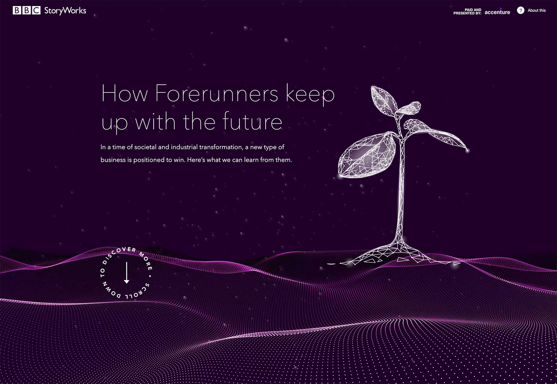
BBC Storyworks: The deep purple color palette with pinkish highlights is bright and readable, despite the dark background. White text and elements with smooth animation bring out the regality of the color choice. The challenge with this color is that purple often has strong emotional associations for individuals (good and bad), and you don’t know what “baggage” users might bring to the design.

Yellow Pony: This design is incredibly bright and has some brutalist undertones. What makes this color choice work is that it stops you in your tracks. You can’t help but look at the bright yellow and oddly-colored pony. The challenge, like with Wookmama, is contrast. There’s also a lot going on here with the bright color.


2. Fairly Brutal Black and White

Brutalism and brutalist design themes seem to keep ebbing and flowing. Understandably, it seems like, as a whole, designers can’t quite decide how they feel about this overall visual theme.

This trio of fairly brutal designs shares more than starkness in technique. They also feature distinct black and white color schemes and animation.

Put it all together, and the overall theme is maybe more “fairly brutal” than straight brutalist, re-emphasizing the hesitancy with the trend.

What’s nice about each of these designs is that they feel special and content-focused. This is a little in contrast with some other brutalist designs that are so stark and harsh that it can be hard to figure out what you are supposed to do with the website or what information is most important.

The other interesting thing here is that while all three websites have a similar design theme, they are nothing alike. (Personally, I find this type of brutalism and the included animation a lot easier to understand and digest. It uses the harsh feeling that you want to associate with the style but adds an element of comprehension that’s incredibly valuable.)

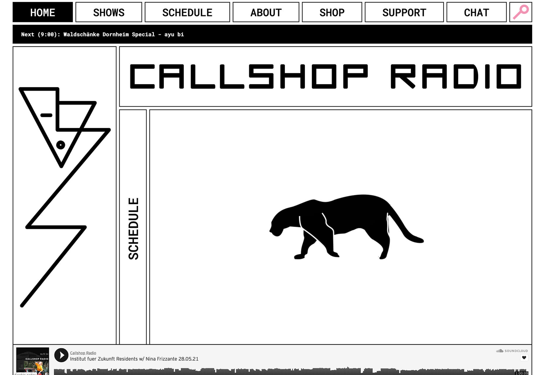
Callshop Radio uses an almost magazine theme style, block design with big buttons, a simple animation, and flash of color.

BCKDRP features a more subtle richer, almost black background with blocky type and accented color without the harshness often associated with brutal styles.

Vision Get Wild may be the closest to true brutalism, but the animated element in the center of the screen has a simple softness that lightens the entire feel.


3. Futuristic Faces

The final trending design element this month is a fun take on faces. There’s a movement happening with a futuristic or artificial intelligence/cyborg-inspired look to the people featured in the designs.

It’s hard to say where this design inspiration is coming from, but it is fun to look at with so many ways to play the style. The other commonality seems to be the dominant use of female faces.

These computer-generated images start with photos that are brightened and smoothed so that all imperfections are lost. The faces have no lines, color that might not look 100% natural, and enhanced features that may or may not be realistic.

You aren’t quite sure if you are looking at a face from a video game or image in many instances.

The types of websites that are using this design trend are similar in content and fashion, art, gaming, portfolios, and AI themes, among the most popular.

The true common thread is imagination. This type of design element can’t come to fruition without a strong vision and the ability to see the vision through creation.

These examples use progressively more futuristic variations of the trend:

HueLe Museum: The least AI-looking of the examples, has imagery with super bright light on faces to remove lines and imperfections so that the models almost the look of mannequins.

Jenny Lin: The portfolio design shows the designer in a style representing her work with a headshot that features an augmented reality, or digital design feel with an almost plastic-looking, on-the-verge of cartoon style.

Ruby9100m: The imagery here is full-on futuristic. From coloring to facial features to an almost Frankenstein-pieced-together look, nothing about this image insists on reality. (Did you notice the blue hand?)


Conclusion

This month’s design trends are a lesson in experimentation and evolution of other visual concepts. They also create an immediate impact on you in terms of emotion because of strong design choices.

Trends like these tend to come and go quickly; nevertheless, it will be interesting to see how they evolve.

Source

The post 3 Essential Design Trends, July 2021 first appeared on Webdesigner Depot.


Source de l’article sur Webdesignerdepot

Every day design fans submit incredible industry stories to our sister-site, Webdesigner News. Our colleagues sift through it, selecting the very best stories from the design, UX, tech, and development worlds and posting them live on the site.

The best way to keep up with the most important stories for web professionals is to subscribe to Webdesigner News or check out the site regularly. However, in case you missed a day this week, here’s a handy compilation of the top curated stories from the last seven days. Enjoy!

Embarrassing Coca-Cola Design Fail

Find Inspiration With a Curated List of Simple Buttons

Pandoc Markdown CSS Theme

20 Best New Sites, June 2021

7 Website Navigation Examples That Will Inspire You

Glassmorphism CSS Generator

Bauhaus Movement: Design Principles, Ideas, and Inspiration

UX Strategy: Giving Your Product an Edge

15 CSS Paper Effects

Radix Colors – A Gorgeous, Accessible, Open-Source Color System

Source

The post Popular Design News of the Week: June 28 2021 – July 4, 2021 first appeared on Webdesigner Depot.


Source de l’article sur Webdesignerdepot

Ever since online stores first emerged they’ve faced one big challenge compared to their real world rivals; yes, it’s convenient to shop wherever, whenever you want, and delivery options permitting, buy from anyone anywhere in the world. But it’s a minimal experience compared to the fuller sensory experience of shopping in the real world.
Online stores can only access our sight and hearing, whereas physical shops can engage all our senses. How can a website compete with the experience created by walking into a physical space where lighting, layout, decor, and background audio are all carefully designed to create an appropriate atmosphere; where you can touch fabrics to check how they feel, try clothes or shoes on without having to buy them first? How do you sell scented products without allowing them to be smelled?

In this month’s round-up, we see a few different approaches to solving this dilemma, sites that focus the copy, visual, and auditory, to work on the imagination.

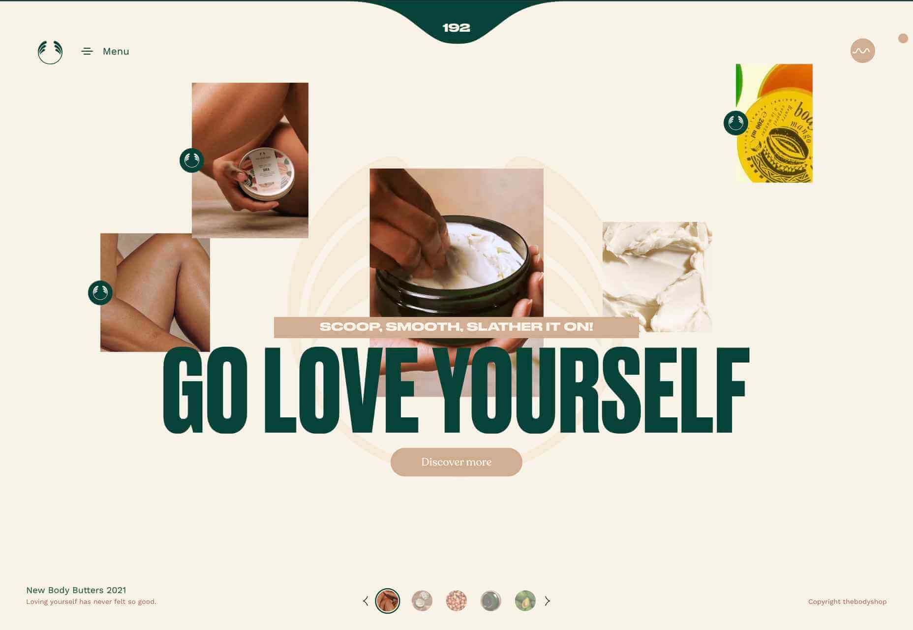
Go Love Yourself

This microsite to advertise The Body Shop body butters, uses sensuous imagery and video to create an atmosphere of indulgence while also offering comprehensive product information.

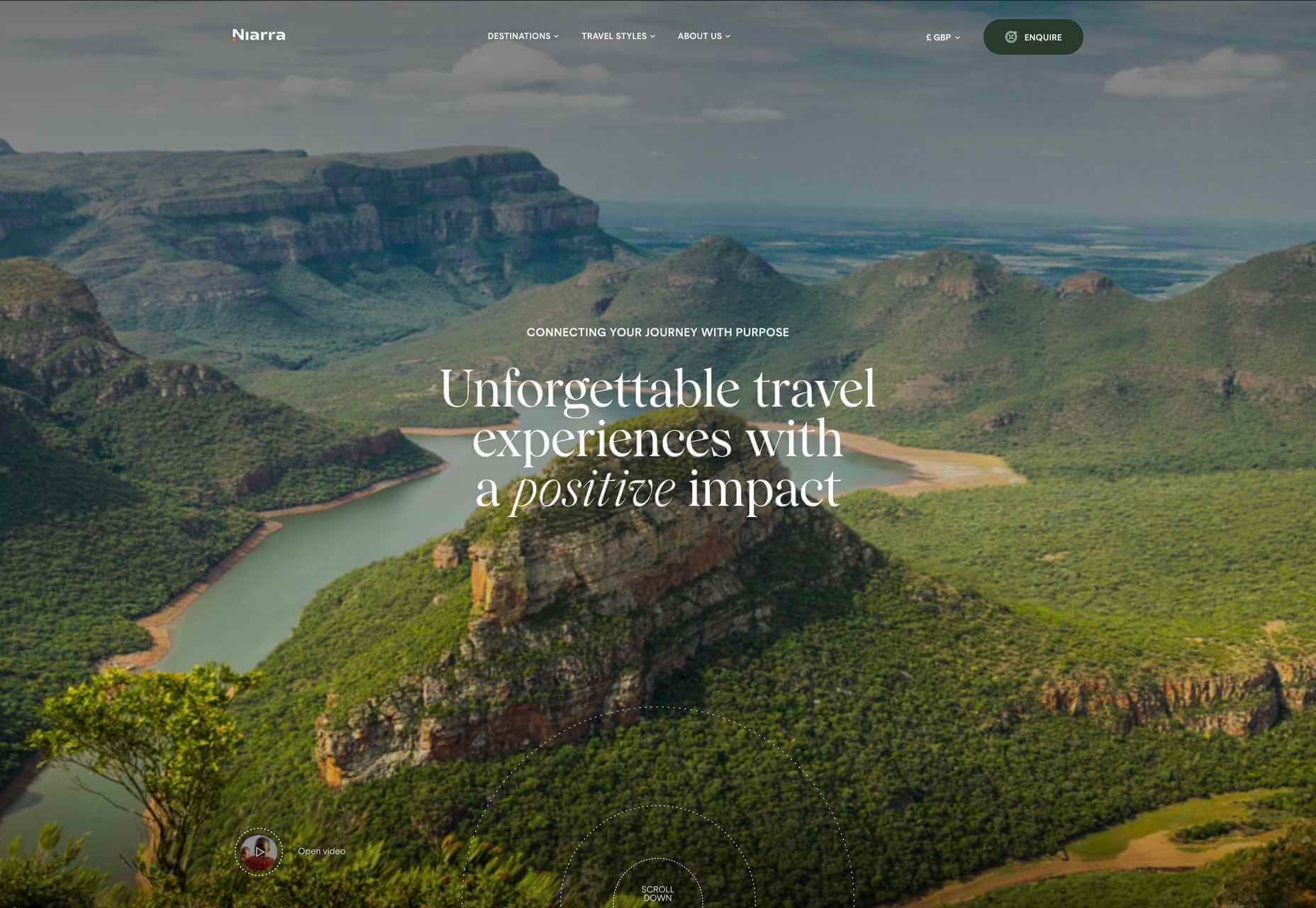
Niarra Travel

Sustainable, bespoke travel agency Niarra Travel makes good use of some beautiful photography. The background color scheme of earthy greens and neutrals fits both the luxury and eco-conscious aspects of the company.

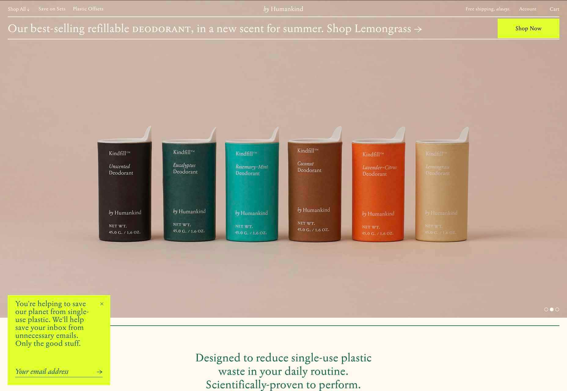
by Humankind

by Humankind is a personal care brand making toiletries from natural ingredients. The focus of their pitch is reducing plastic waste. The site is appropriately sparse, with simple product shots and mostly warm neutral colors.

Mama Joyce Peppa Sauce

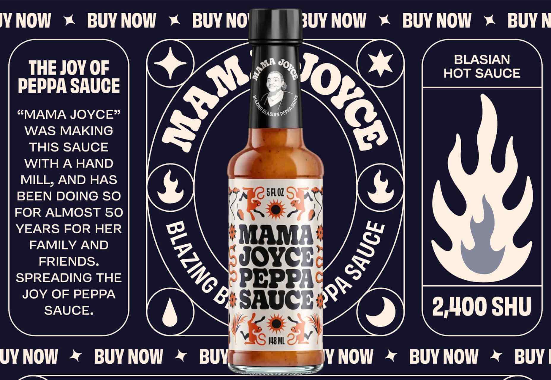
This one-page site for Mama Joyce Peppa Sauce is big and bold. Lots of scrolling type and vintage style illustration. You don’t need to look for a ‘buy now’ because the cursor itself is it. Click almost anywhere, and two bottles of sauce go into your cart.

Eadem

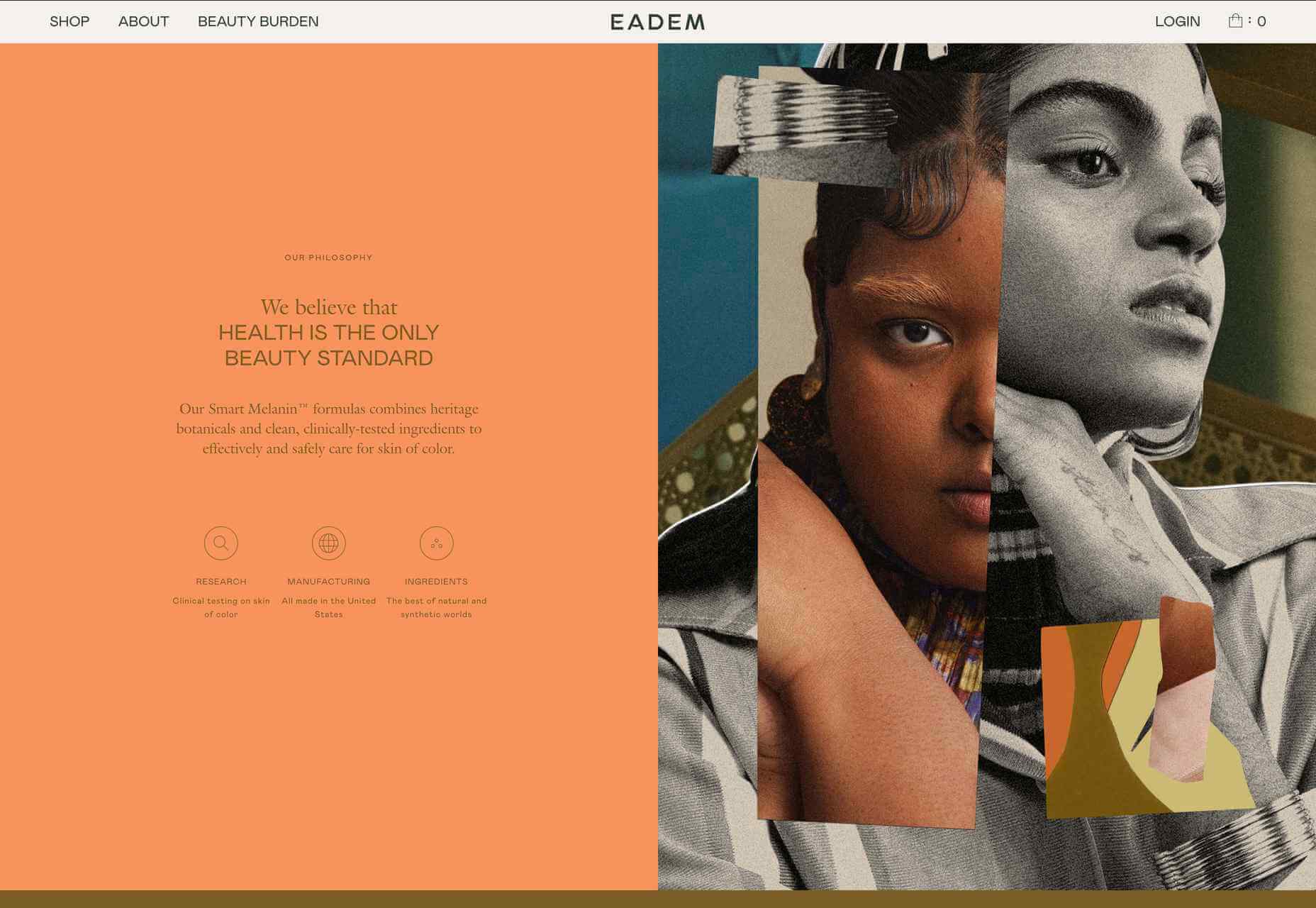
Eadem is a beauty company for women of color — their flagship product is a serum that fades dark spots without bleaching. Pinks and dark golds contrasted with fresher oranges and pale greens create a color scheme that feels rich but not heavy.

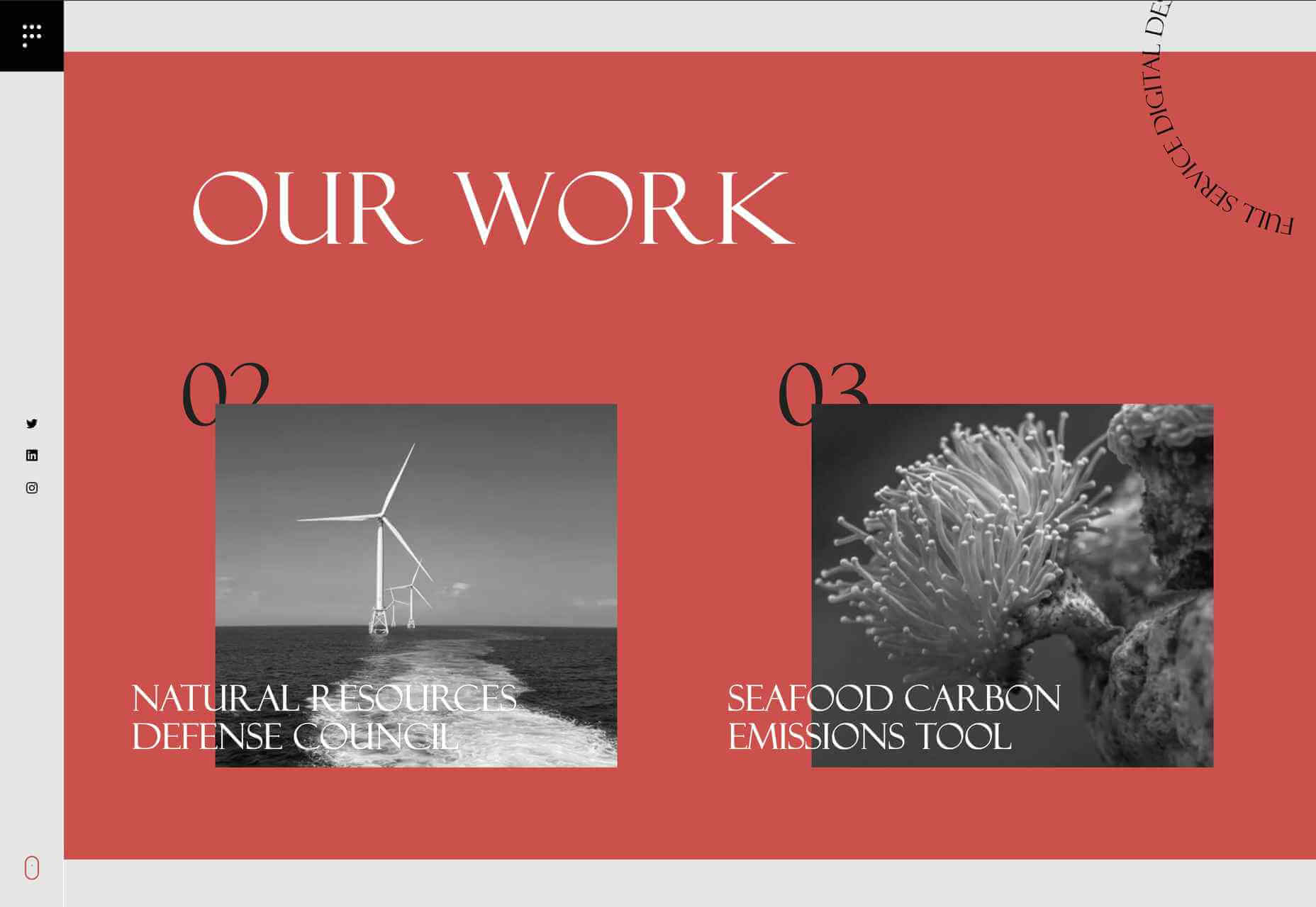
Pact Media

Pact Media is a full-service digital design agency whose work mainly focuses on agencies, businesses, and organizations involved in conservation. Large type and greyscale with red accents create a strong feel, while color on image rollover adds extra impact.

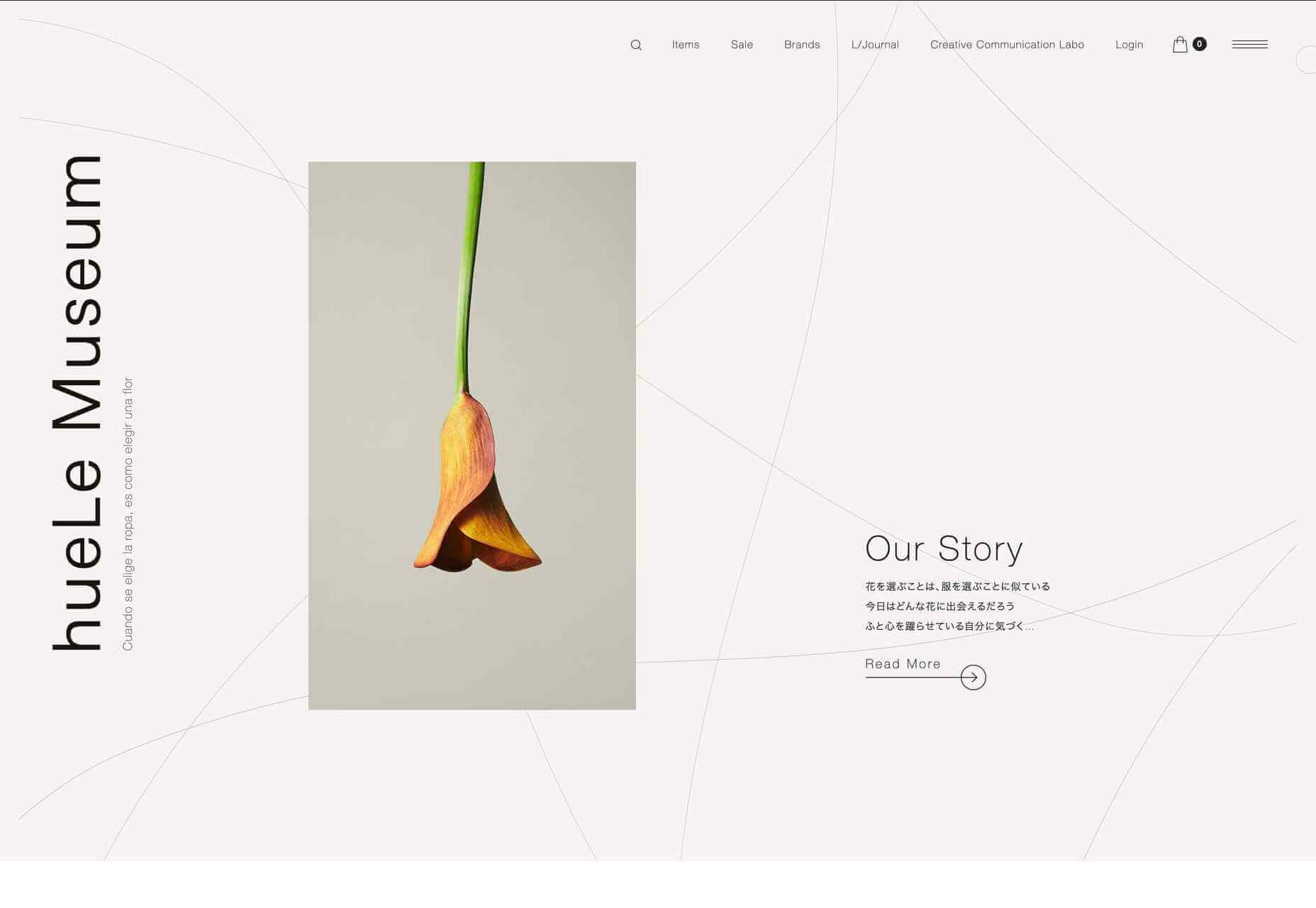
hueLe Museum

hueLe Museum is a collection of clothing brands. The philosophy behind it equates choosing clothes to choosing flowers, and there are some beautiful flower images. There is a sense of tranquility to the site, and it is even better on mobile.

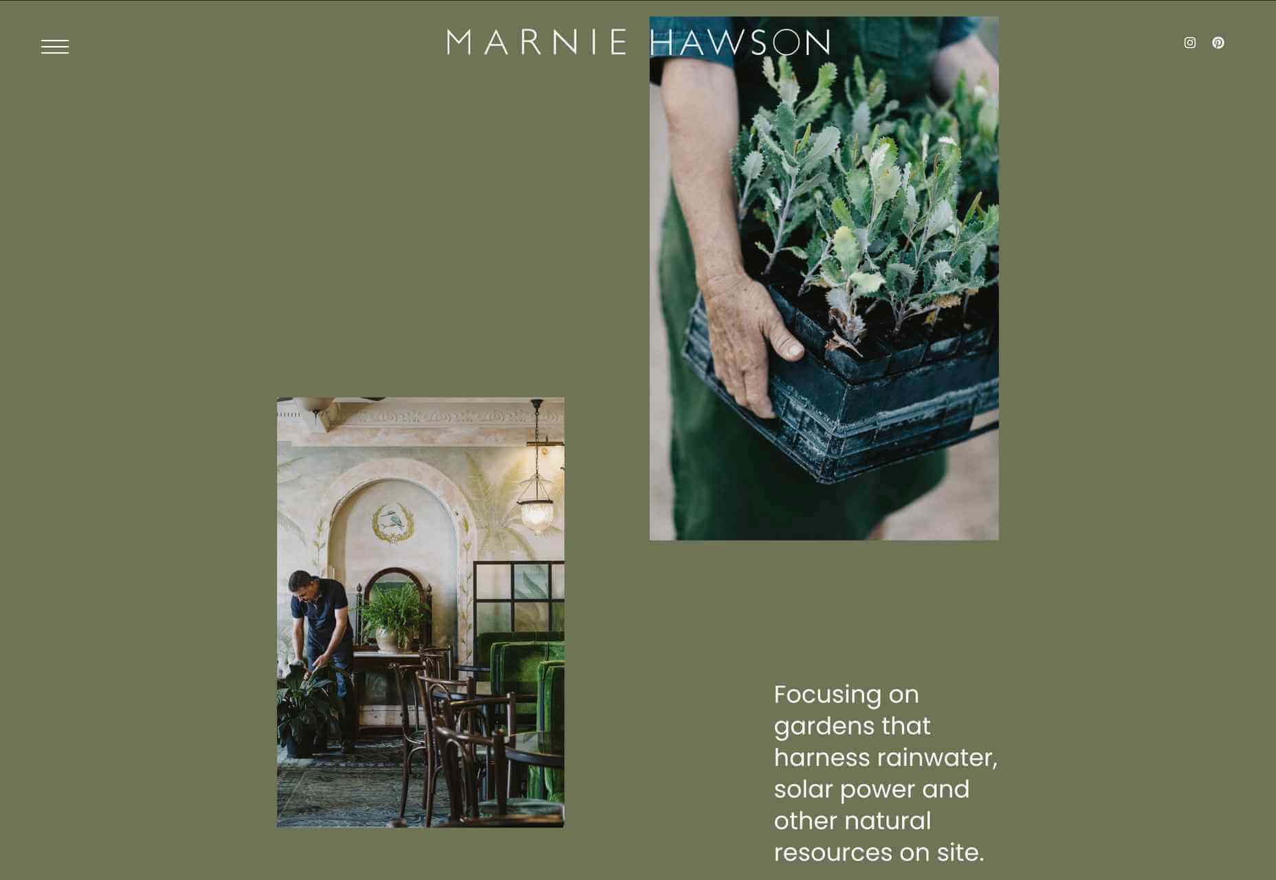
Marnie Hawson

Photographer Marnie Hawson’s portfolio site is clean and simple, with a warm green (again) background and an engaging asymmetrical grid layout.

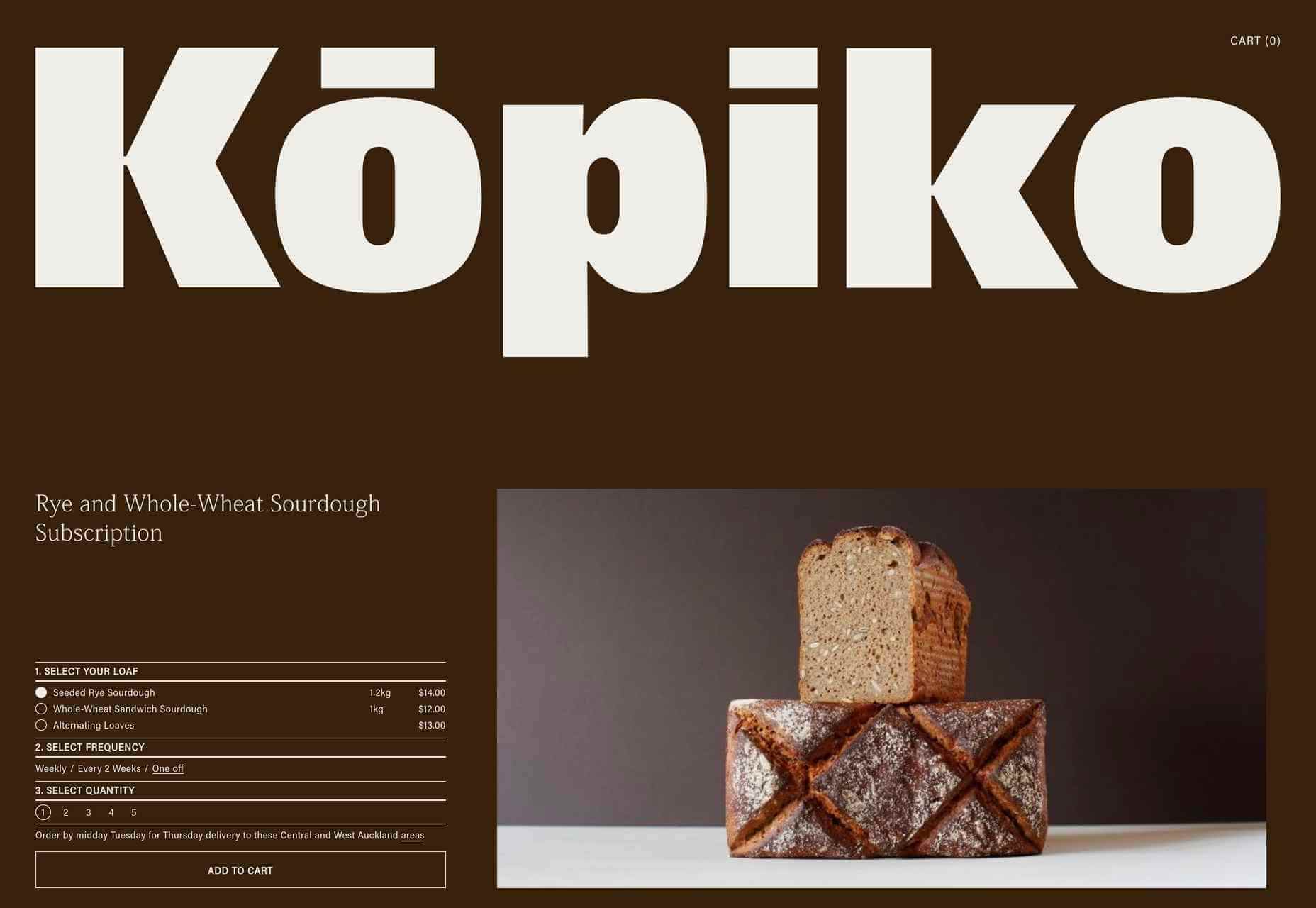
Kōpiko

Kōpiko is a micro-bakery that offers a sourdough delivery subscription service to its local area. It makes and sells only two products, and the single-page site is suitably simple. Putting the subscription form above the product and company information gets to the point without seeming pushy.

Banila Studio

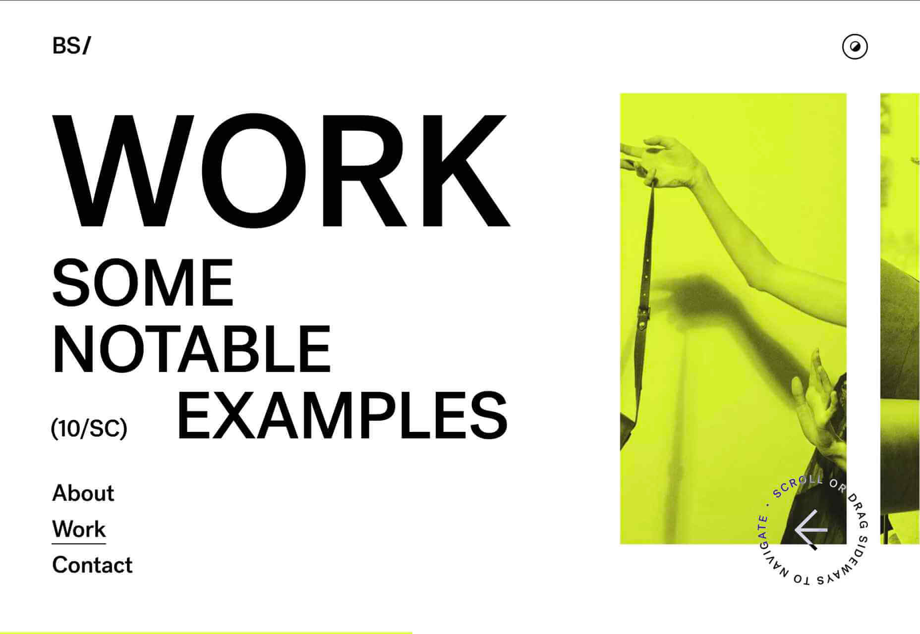
Banila Studio is a branding and design studio in Basque Country. This is a nice example of sideways scrolling, and the alternate color scheme option is a fun touch.

Big Green Egg

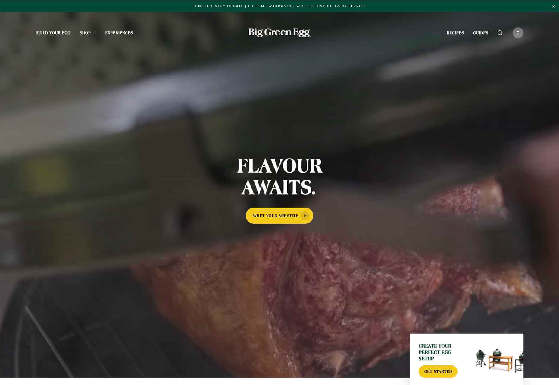
Big Green Eggs are high-end barbecue/outdoor ovens. Lots of high-quality food photography is the key here, along with a clear build-your-own setup process.

Pawzzles

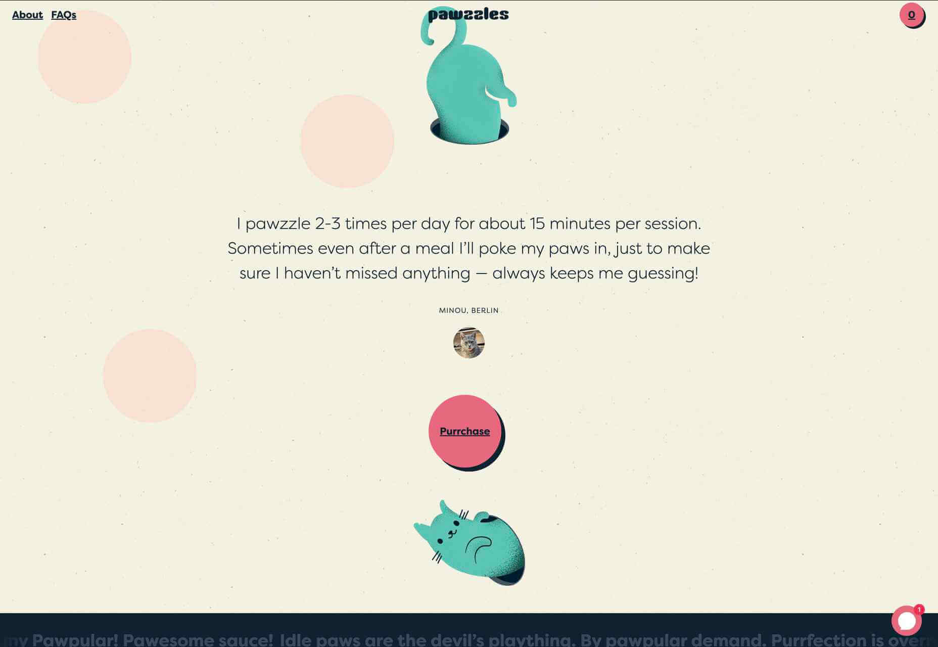
Pawzzles is a puzzle feeder toy for cats, and yes, there is a cat video. This has a fun feel, with some rather sweet illustrations and lots of silly puns. By cat lovers, for cat lovers.

Melopeion Organic Thyme Honey

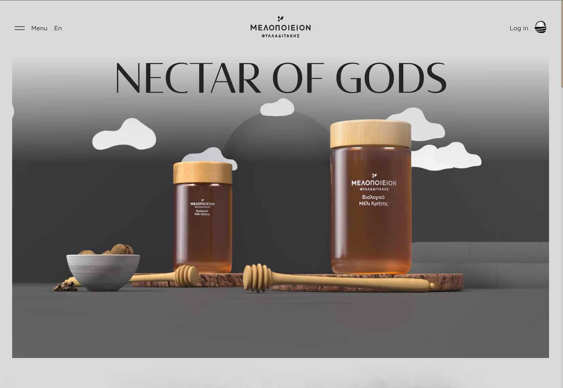
The choice of display type on this site — crucially one that works well for both the latin and greek alphabets — emphasizes the Cretan origin of Melopeion honey. The illustrations are appealing, and the shopping basket icon is an especially nice detail.

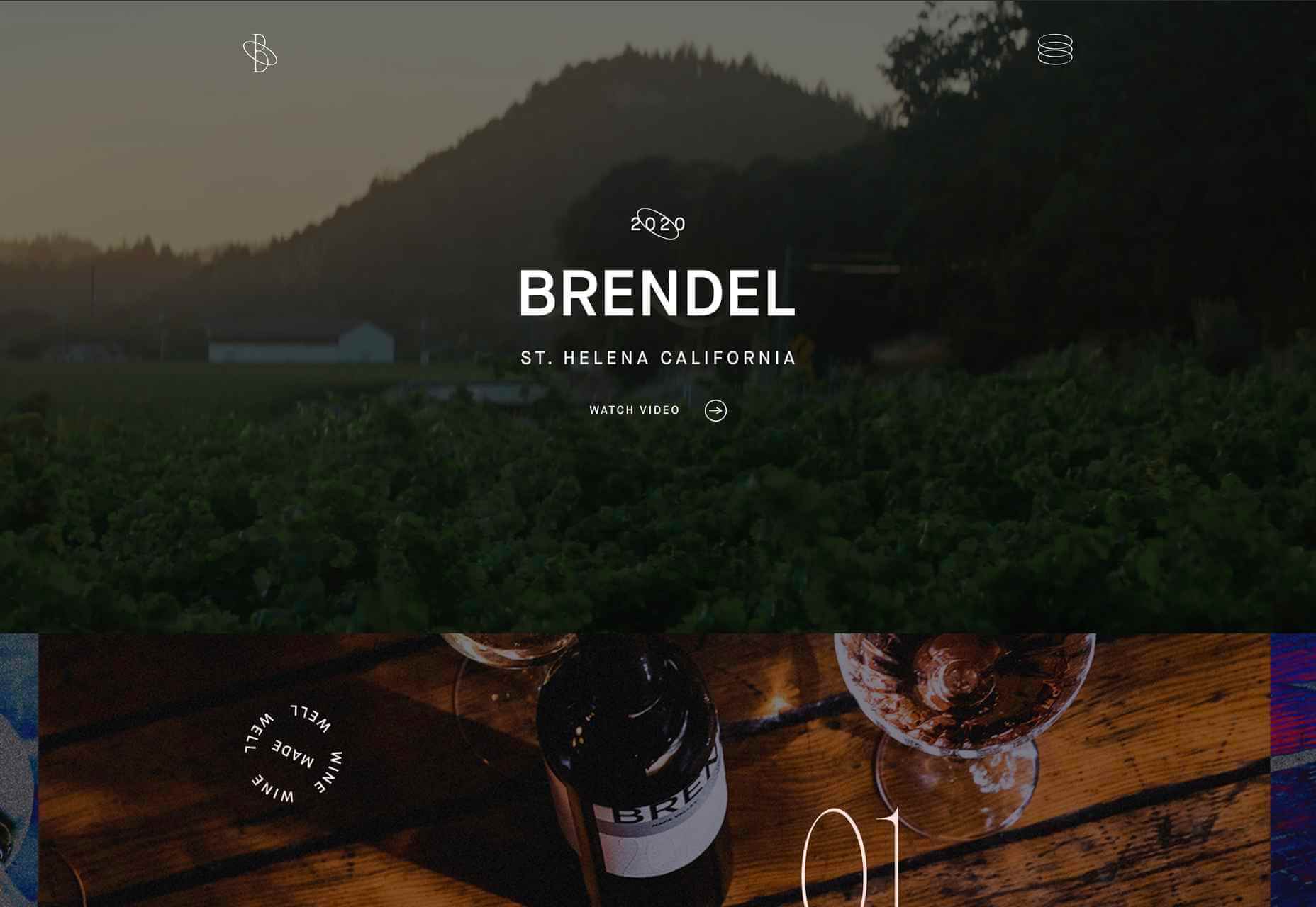
Brendel Wines

This site for Brendel Wines is all about photography, large background photographs, and video, as well as product shots. More specifically, the lighting in the images creates an atmosphere, a sense of warm summer evenings.

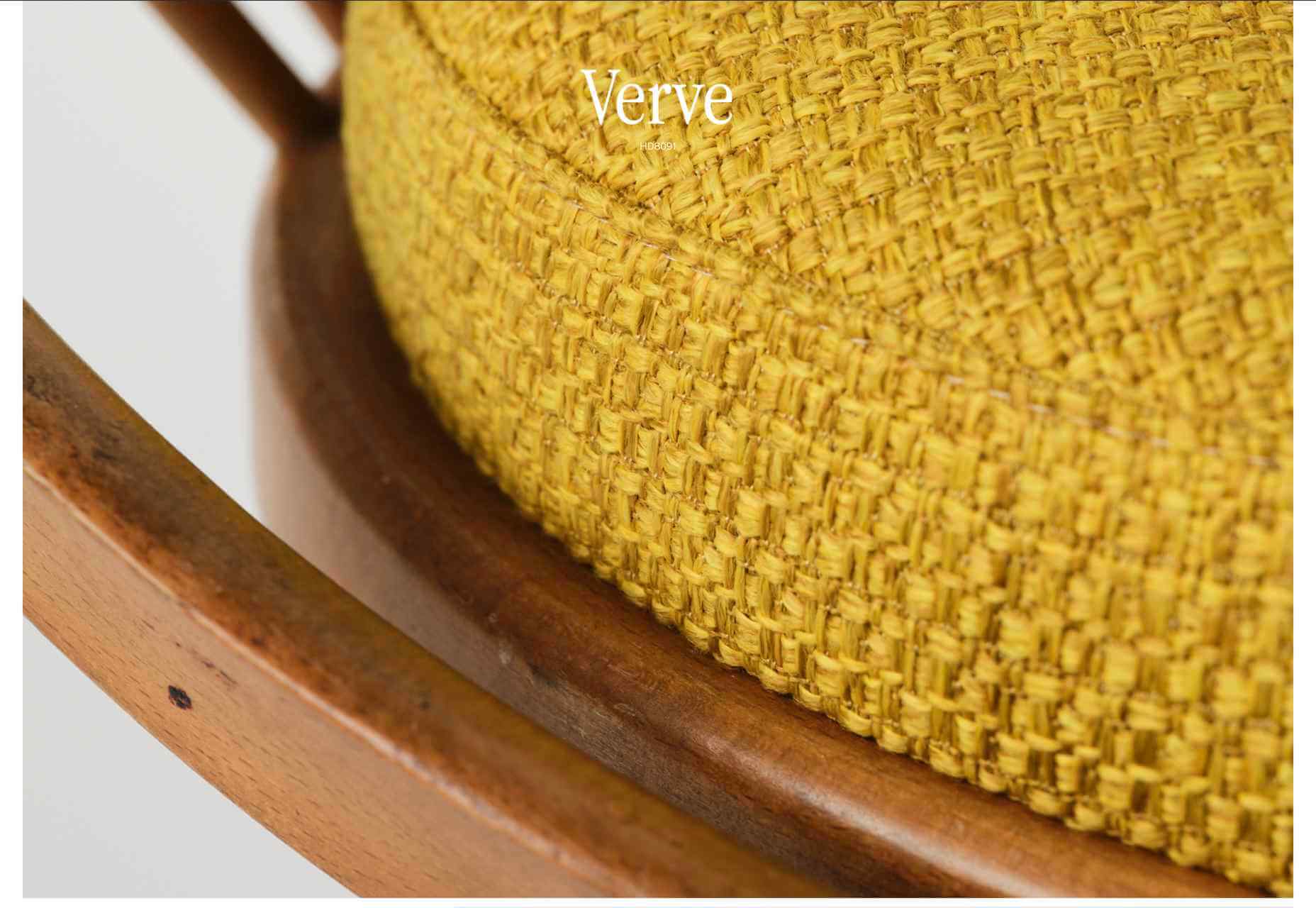
imNativ

imNativ is an upholstery fabric: not the most exciting product to present enticingly. Some good, close-up photographs and well-styled images of the fabrics in use make them desirable.

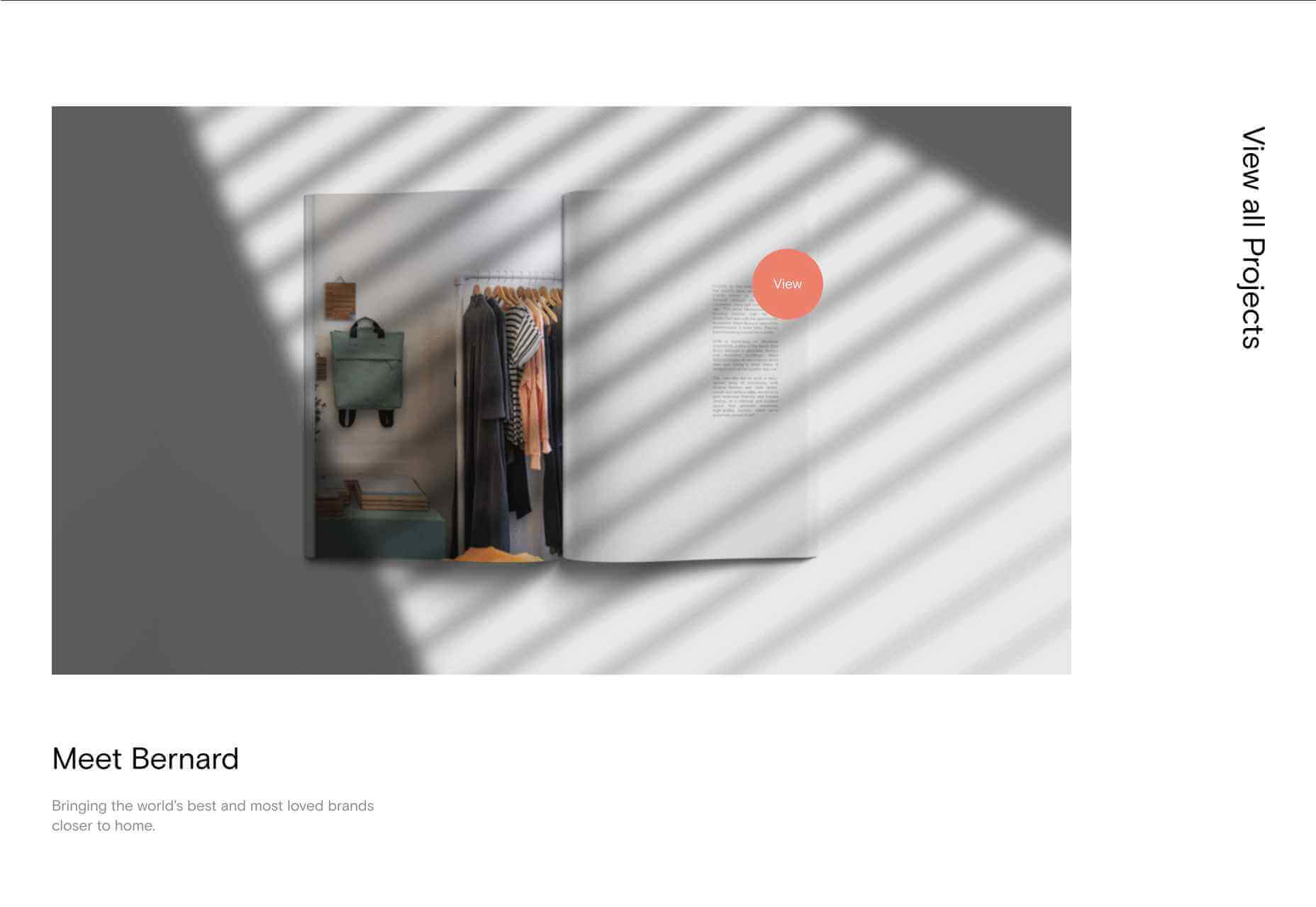
Thursday Studio

Thursday design studio has produced a very pleasing, clean site for their own portfolio. The split-screen scrolling that changes to sideways scrolling on mobile is especially nice.

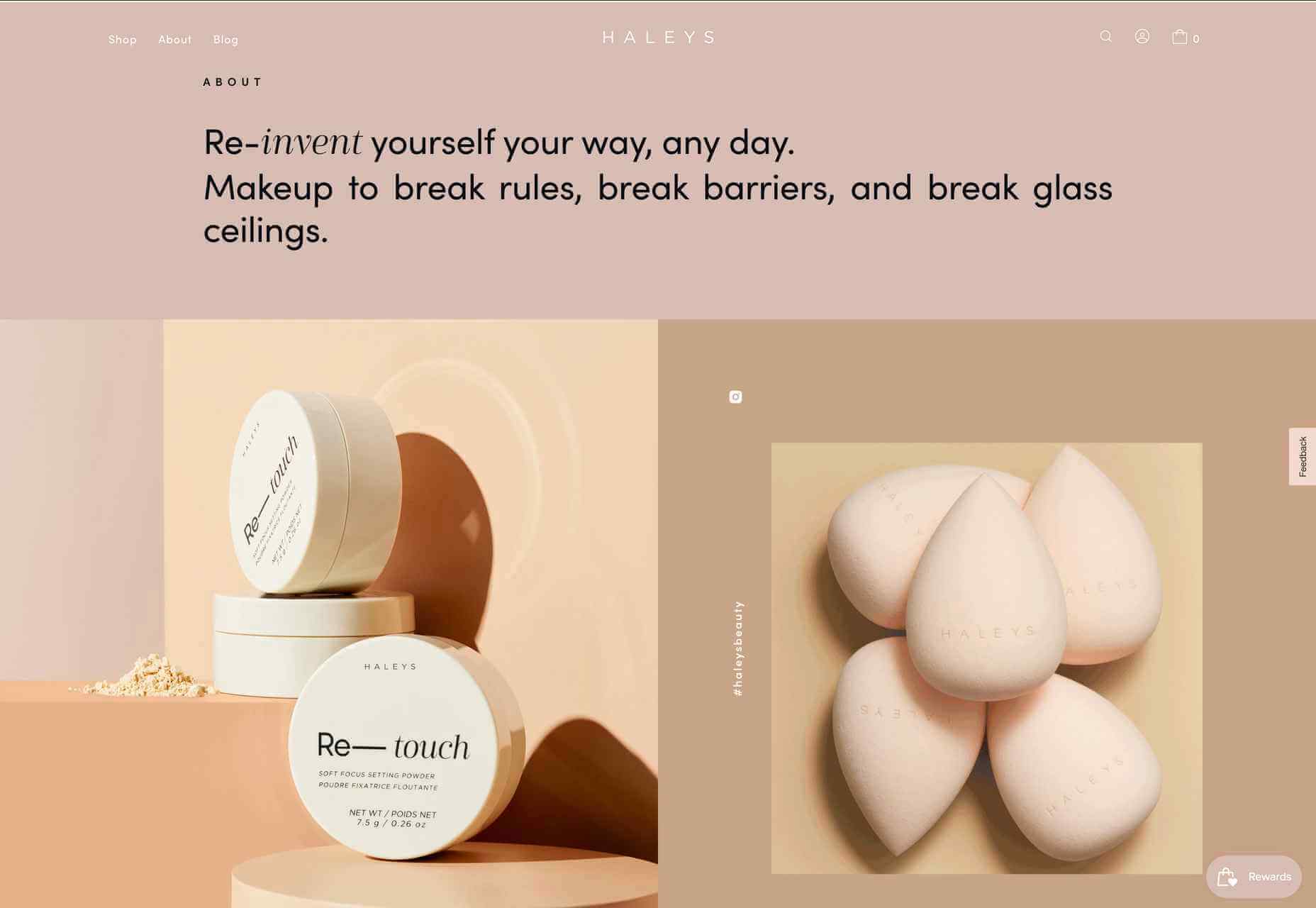
HALEYS Beauty

HALEYS Beauty uses a soft, powdery color palette and a clear, well-spaced grid, which gives it a modern, feminine feel.

Wookmama

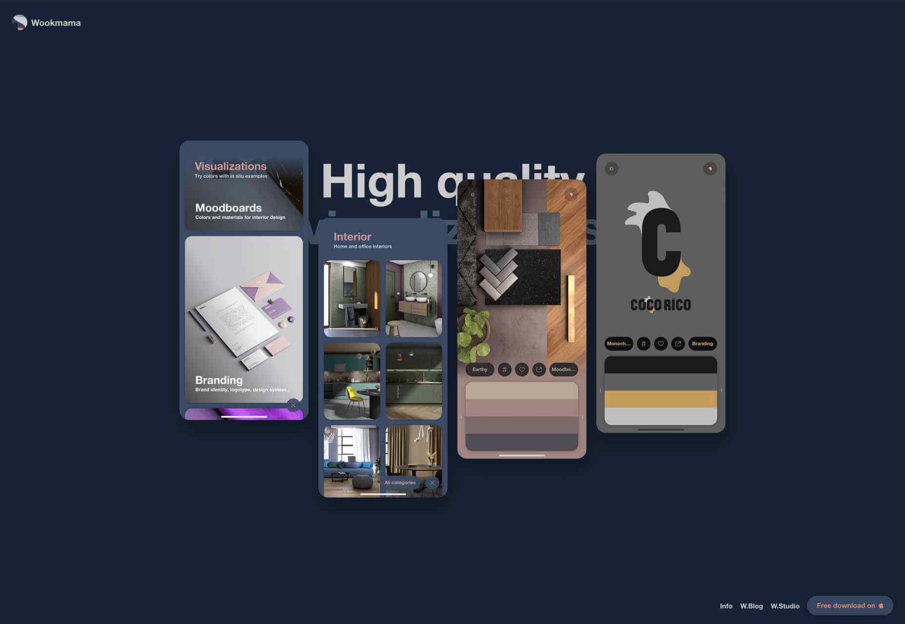
The Wookmama app is a color visualizer which displays palettes and applies those palettes to real-world images. Colour is, as one would hope, used well here, along with plenty of screen mock-ups.

Planet of Lana

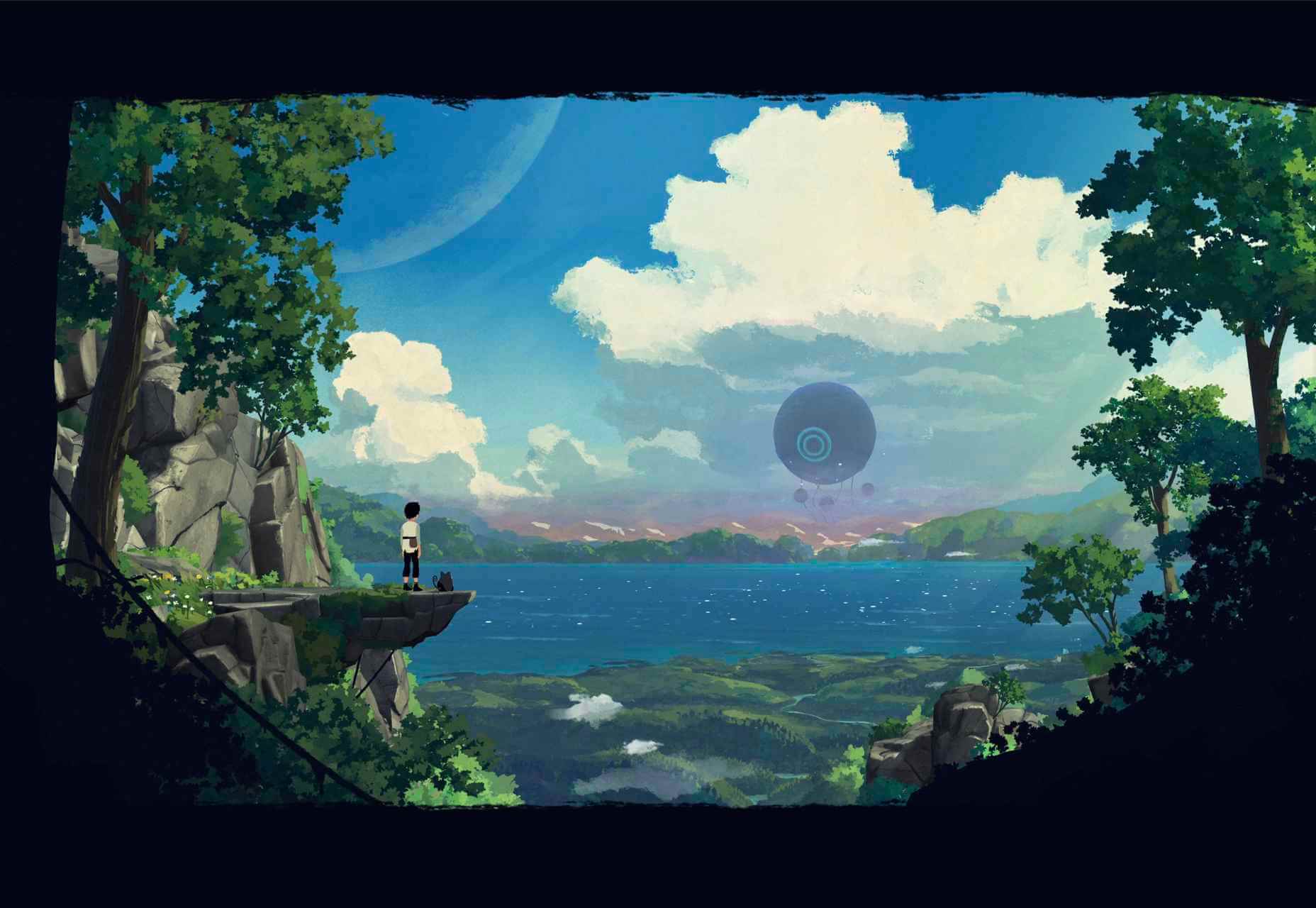
Planet of Lana is the first game from Wishfully Studios, due for release in 2022. This teaser web page really allows the game illustrations to do the talking.

The Future of Office

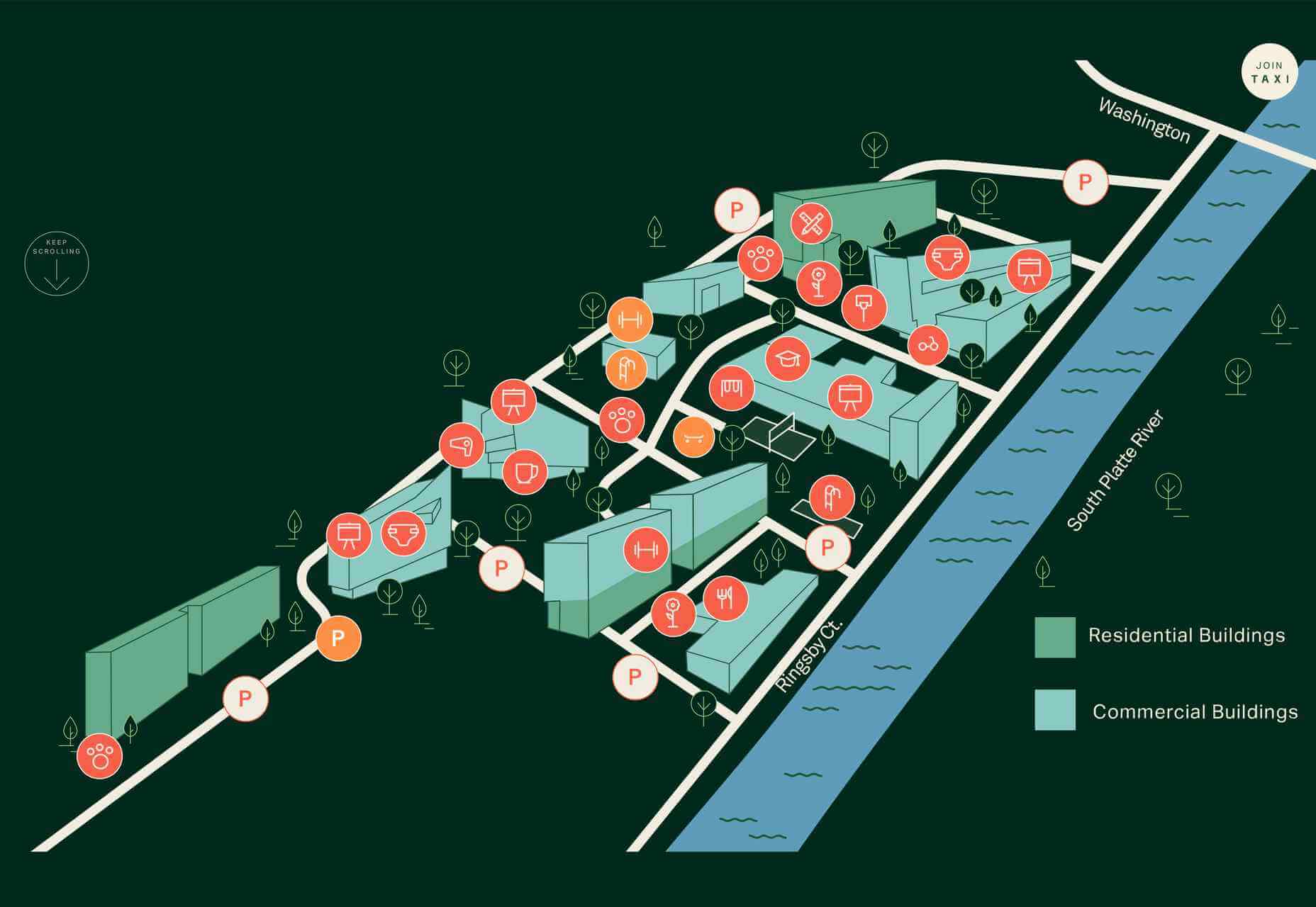
The Future of Office is a sales site for office space to rent. It has a fresh, airy feel which reflects the open, minimal aesthetic of the spaces on offer.

Source

The post 20 Best New Sites, June 2021 first appeared on Webdesigner Depot.


Source de l’article sur Webdesignerdepot

Welcome to a new series of articles, in which we round up the best new fonts released from some of the top designers on the Web.
In this inaugural edition, the collection includes fonts released or expanded over the last few months. Many of the fonts have free weights available. If you use any of them in your work, be sure to let us know!

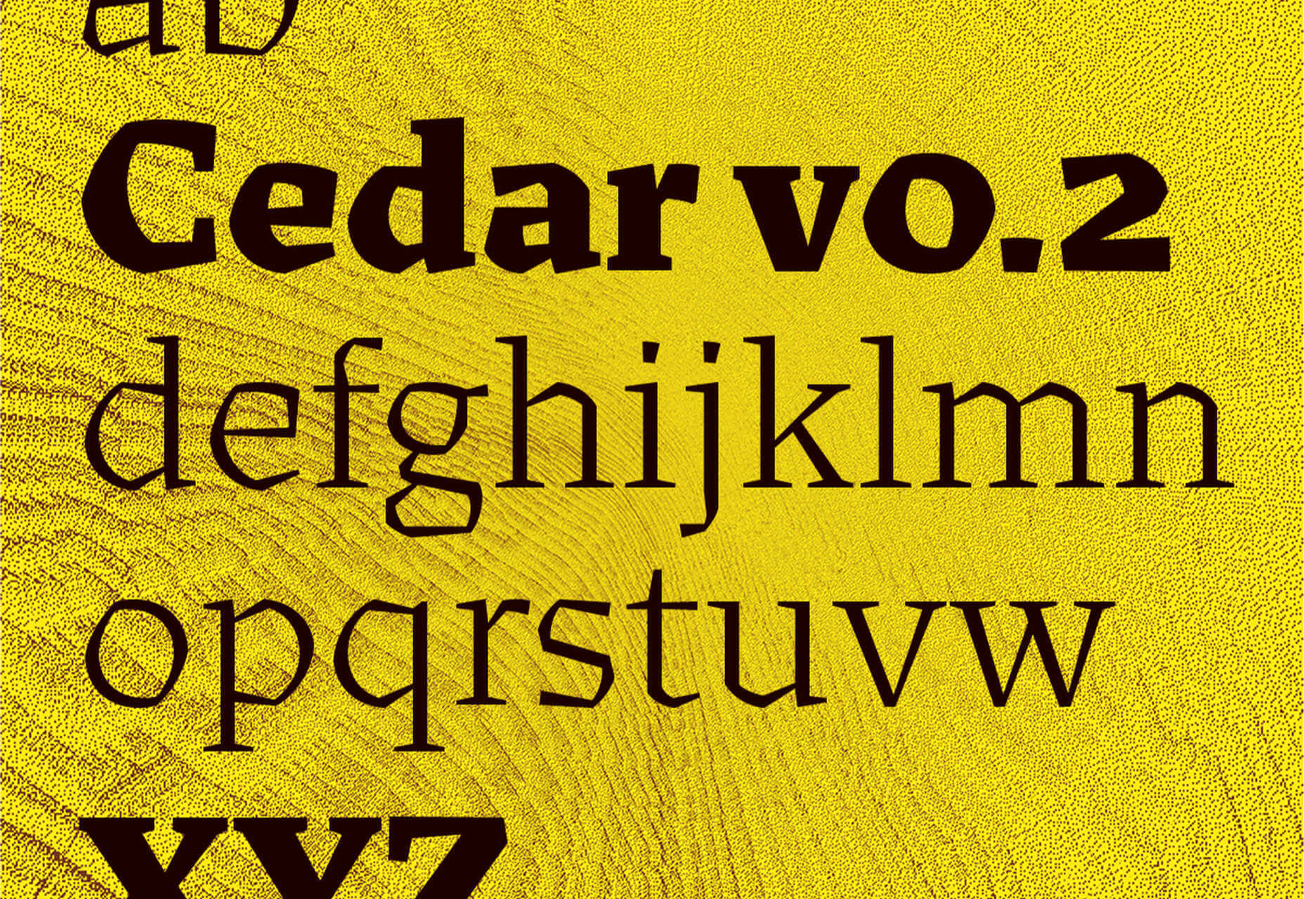
Cedar

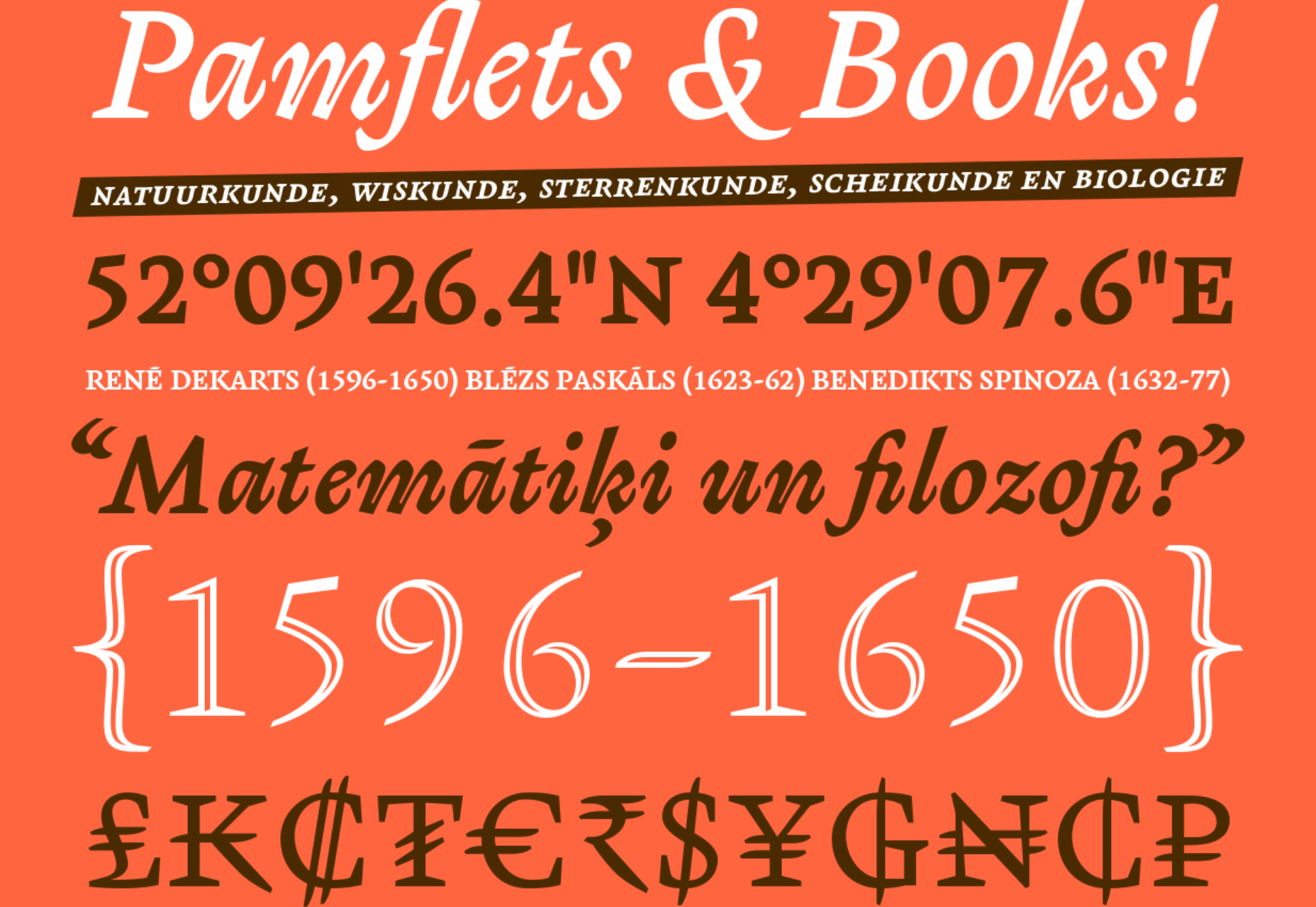
Cedar is a unique angular serif built by wrapping vector shapes around calligraphic structures. It has its roots in woodblock printing but creates a very modern aesthetic.

Tome Sans

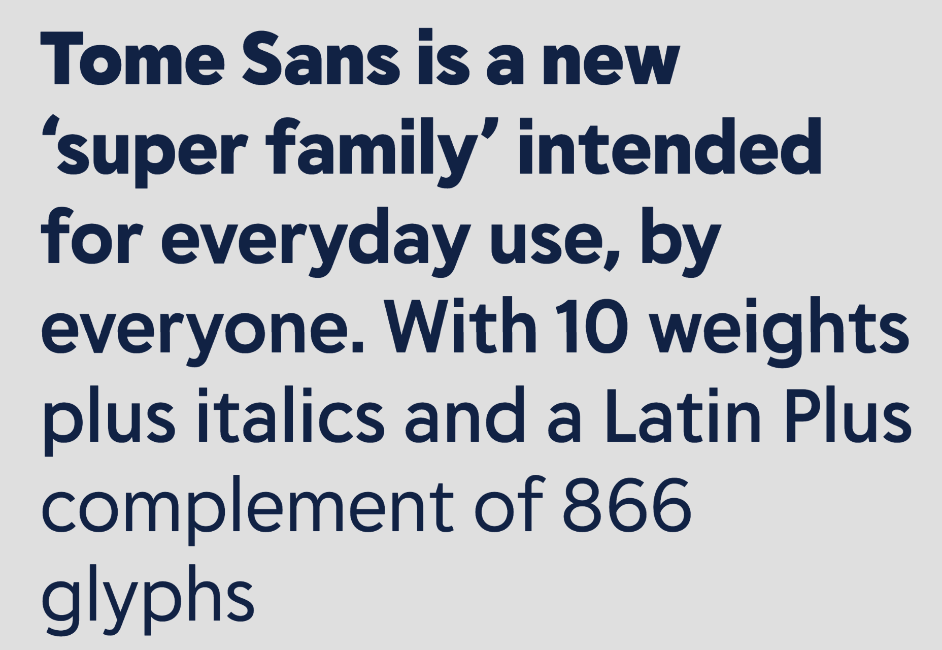
Tome Sans is a very usable business-like type family of ten weights, plus italics. It features some awesome ligatures that you don’t often find in a sans-serif.

Midnight Sans

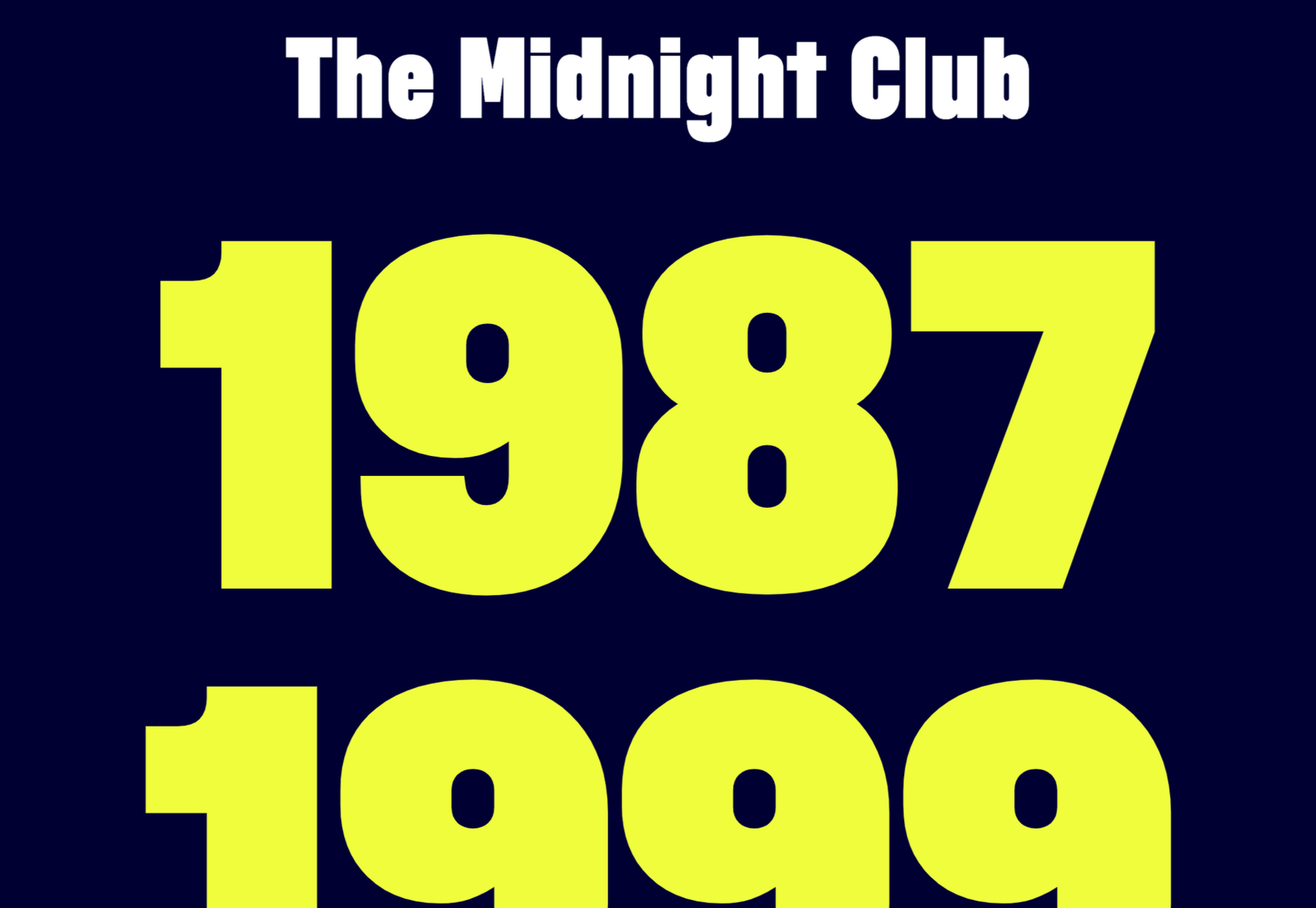
Midnight Sans is a chunky sans serif, suitable for display sizes. There’s a rounded variation for added warmth and dozens of OpenType features. It’s a good alternative to Impact.

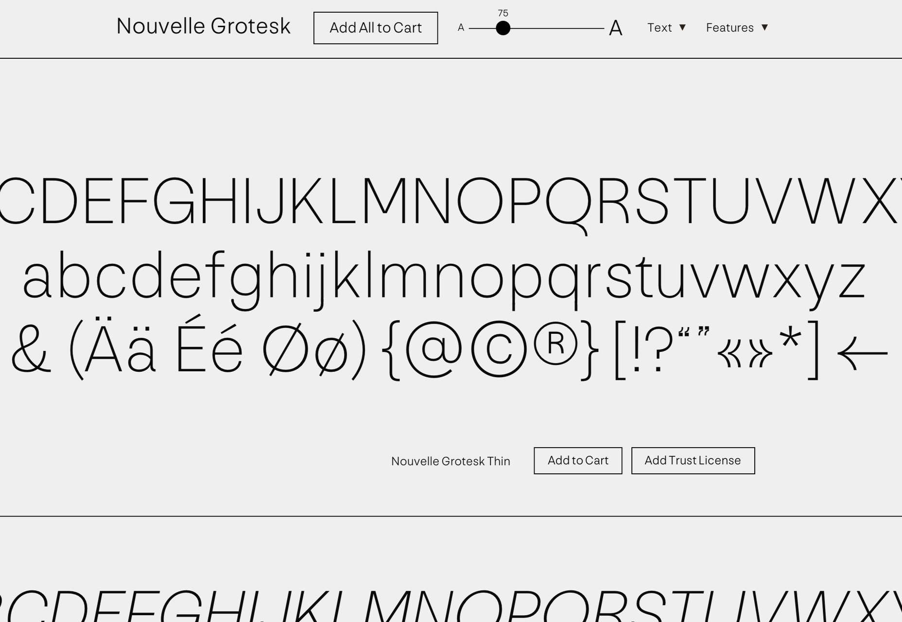
Nouvelle Grotesk

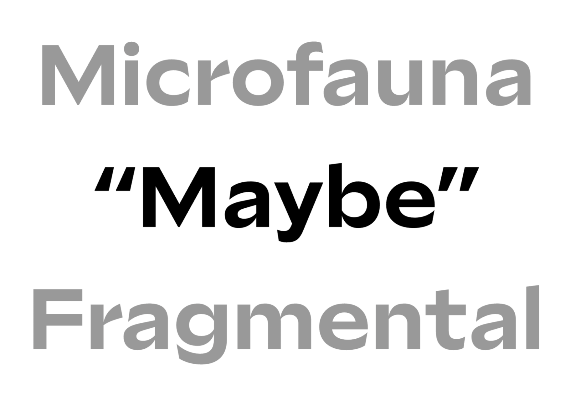
Nouvelle Grotesk is a workhorse sans serif that you’ll come back to all the time. The humanist forms are a little more considered for digital usage than Akzidenz Grotesque or Helvetica.

Glaser Babyfat

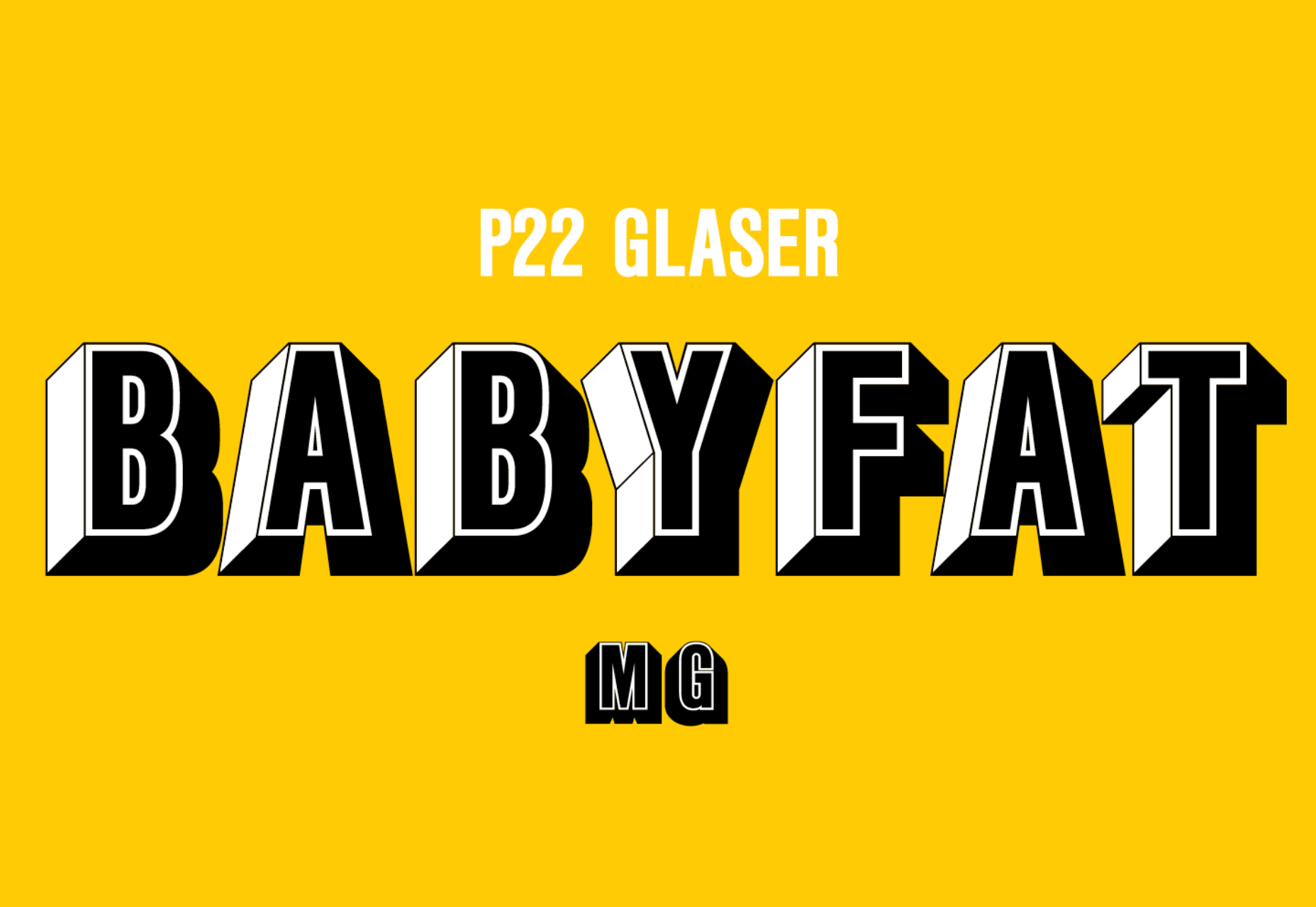
Glaser Babyfat is the first typeface designed by the late, great Milton Glaser. It has been released posthumously by P22 alongside three other fonts based on Glaser’s designs.

Kristal

Kristal is a flexible and highly readable serif, suitable for large blocks of text in small sizes. It has some beautiful details, including a selection of ligatures and a fine set of italics.

Lightbox 21

Lightbox 21 is a redesigned version of Lightbox; the original made use of the golden ratio for its geometry, the redesign completely abandons that resulting in a more readable typeface.

Irregardless

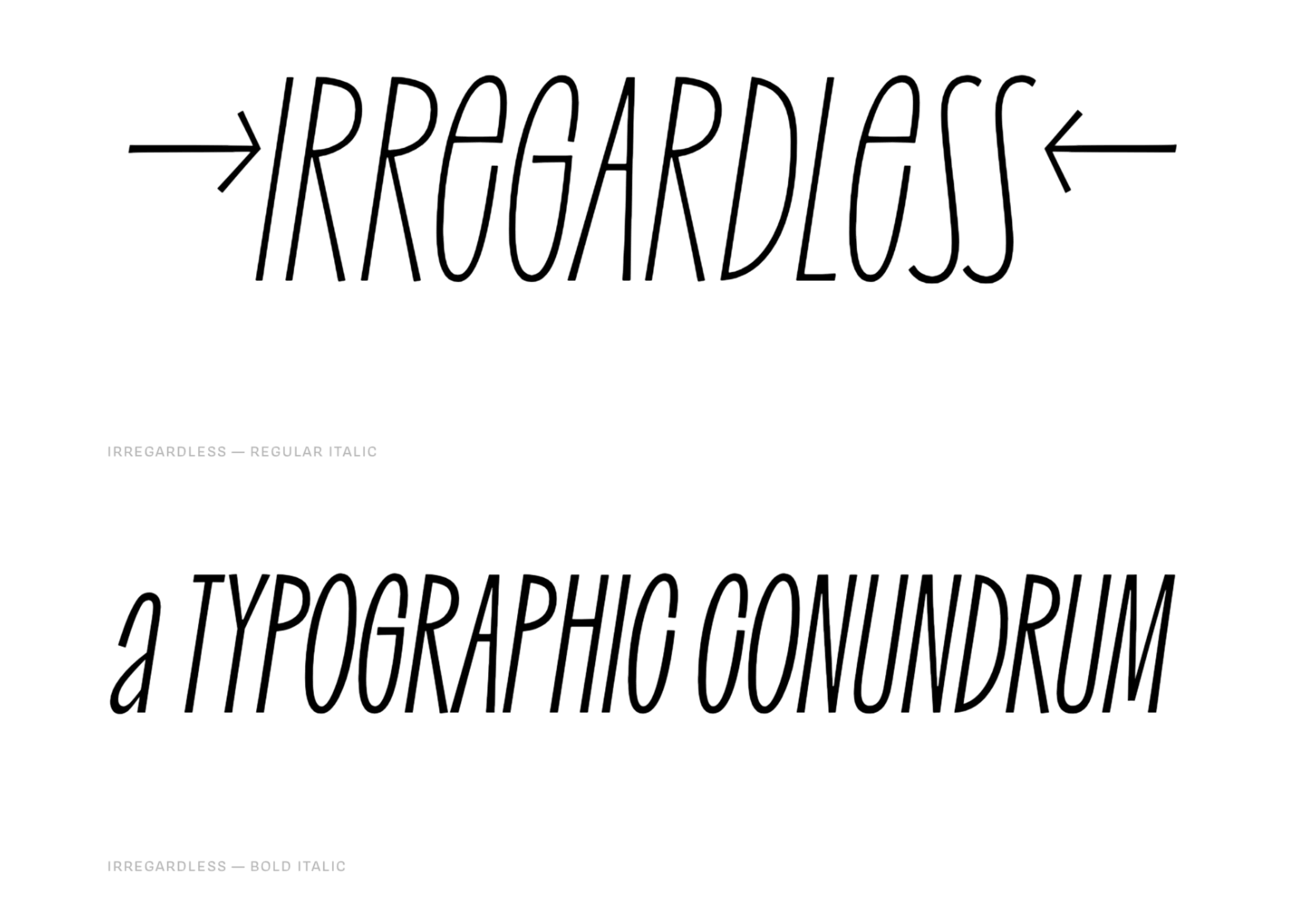
Irregardless is a tall sans serif with organic shapes that feels almost like lettering. Unusually for this style of typeface it has upper and lowercase letters. It’s perfect for a retro design.

Futura Now

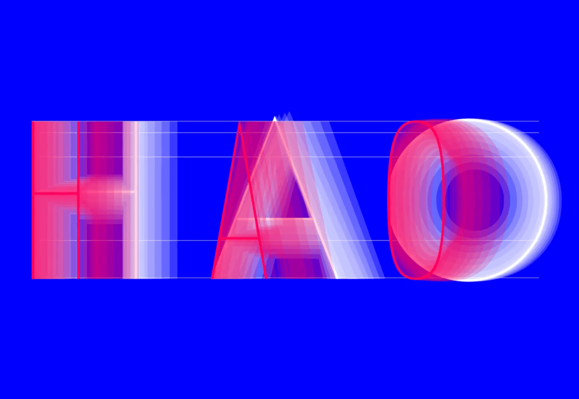
Futura Now is Monotype’s redrawn version of Paul Renner’s classic Futura. As well as being massaged for screens and expanded to cover more languages, it’s also now available as a variable font.

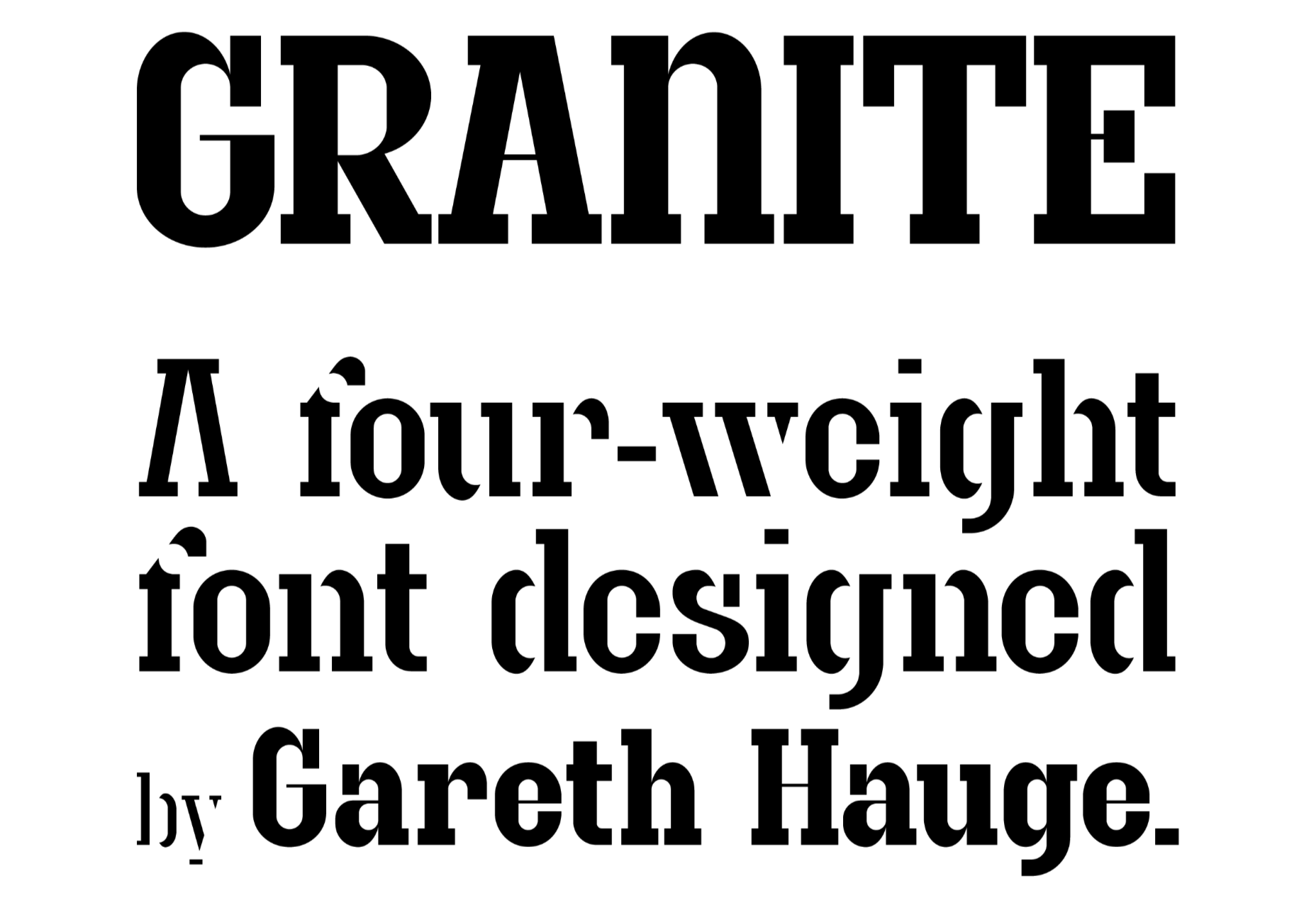
Granite

Granite is a slab serif with high-contrast strokes, giving it the feeling of an Old West woodblock font. There’s a stencil alternate set that adds to the rustic aesthetic.

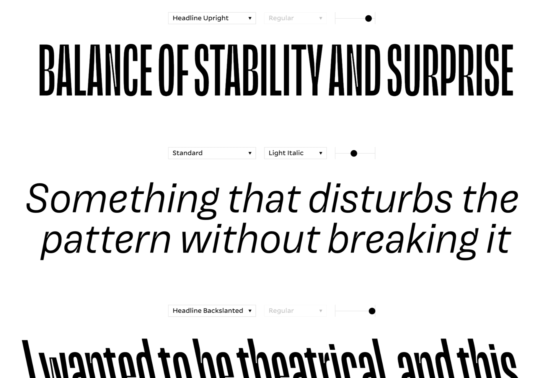
Magnet

Magnet is a sans-serif with heaps of character. There is a condensed headline variation that’s perfect for display purposes, but the real standout feature is the quirky ear on the lowercase g.

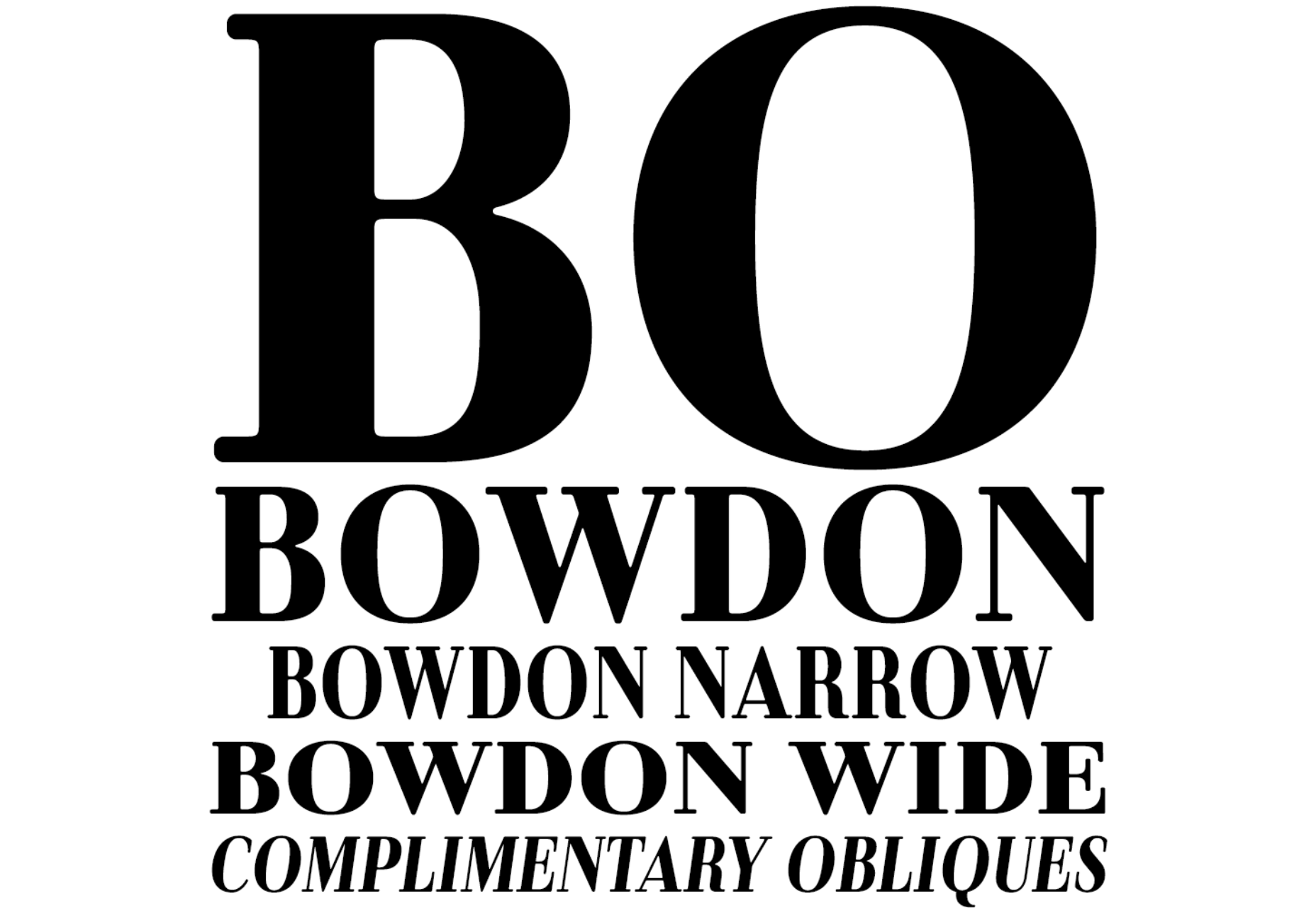
Bowdon

Bowdon is a warm serif in the Bodoni tradition. The contrast between serif and stroke creates a sense of luxury. It’s available in three weights: regular, narrow, and wide.

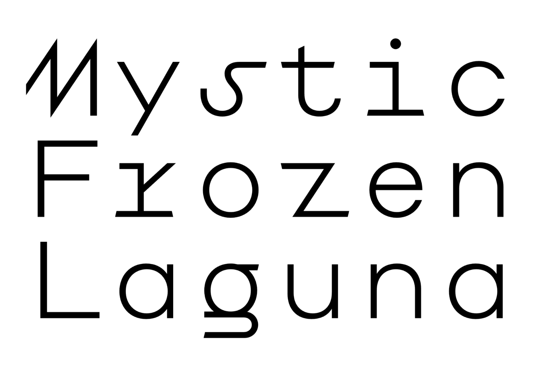
Euclid Mono

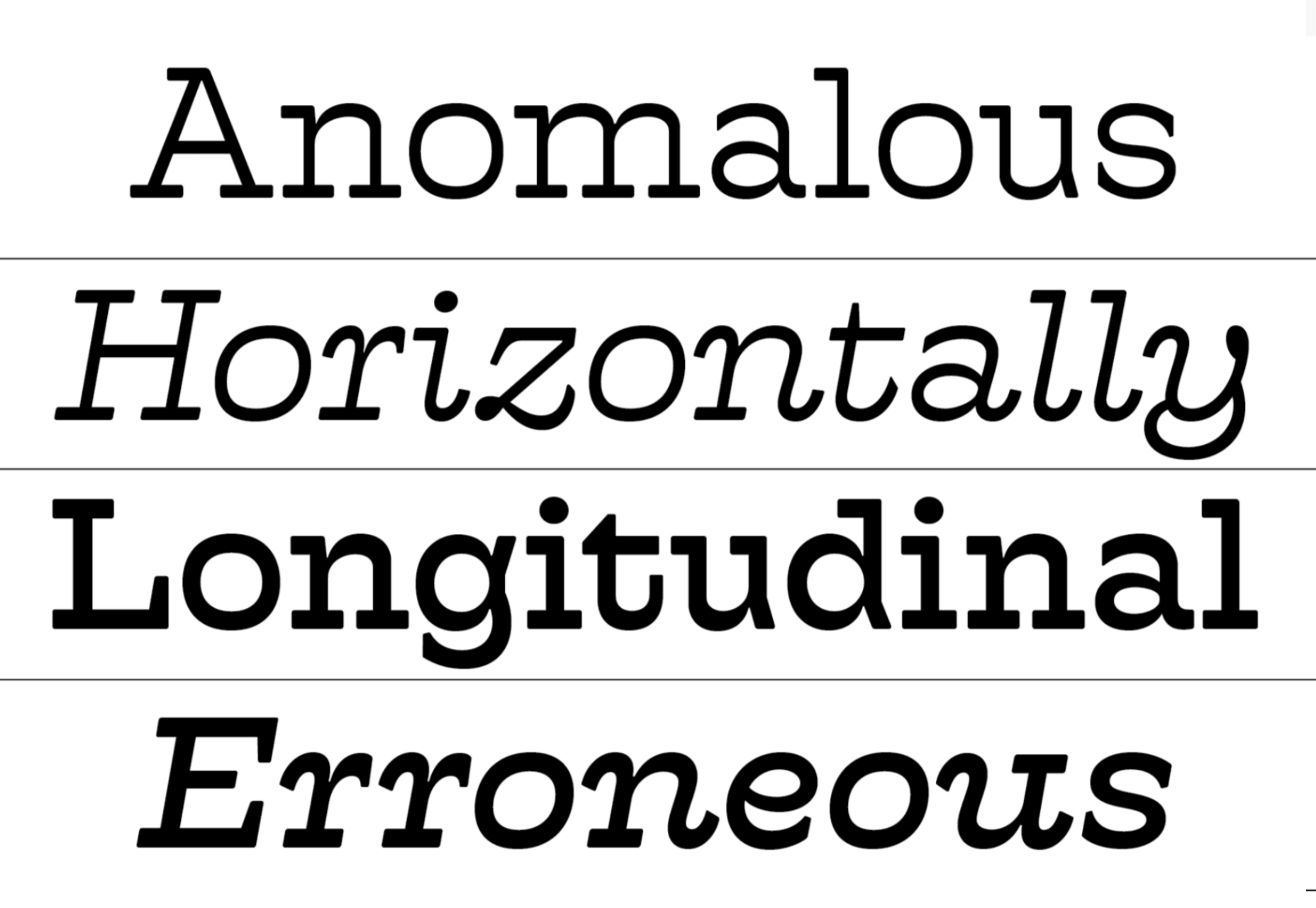
Euclid Mono is an attempt to design a monospaced font that doesn’t fit the traditional mold. The extended shapes create a dance-like composition with plenty of movement.

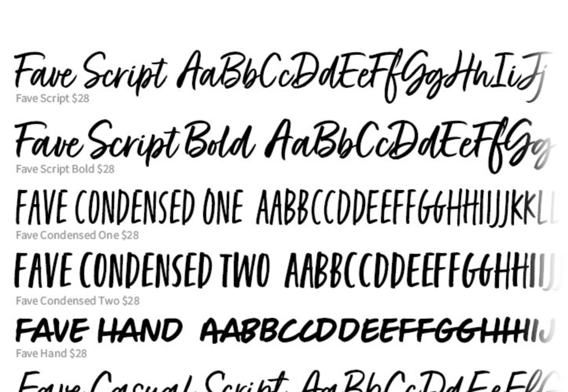
Fave Set

Fave Set is a collection of marker pen scripts that are always handy to have in your toolbox. There are ten fonts included in total, with condensed and extra casual styles adding to the number.

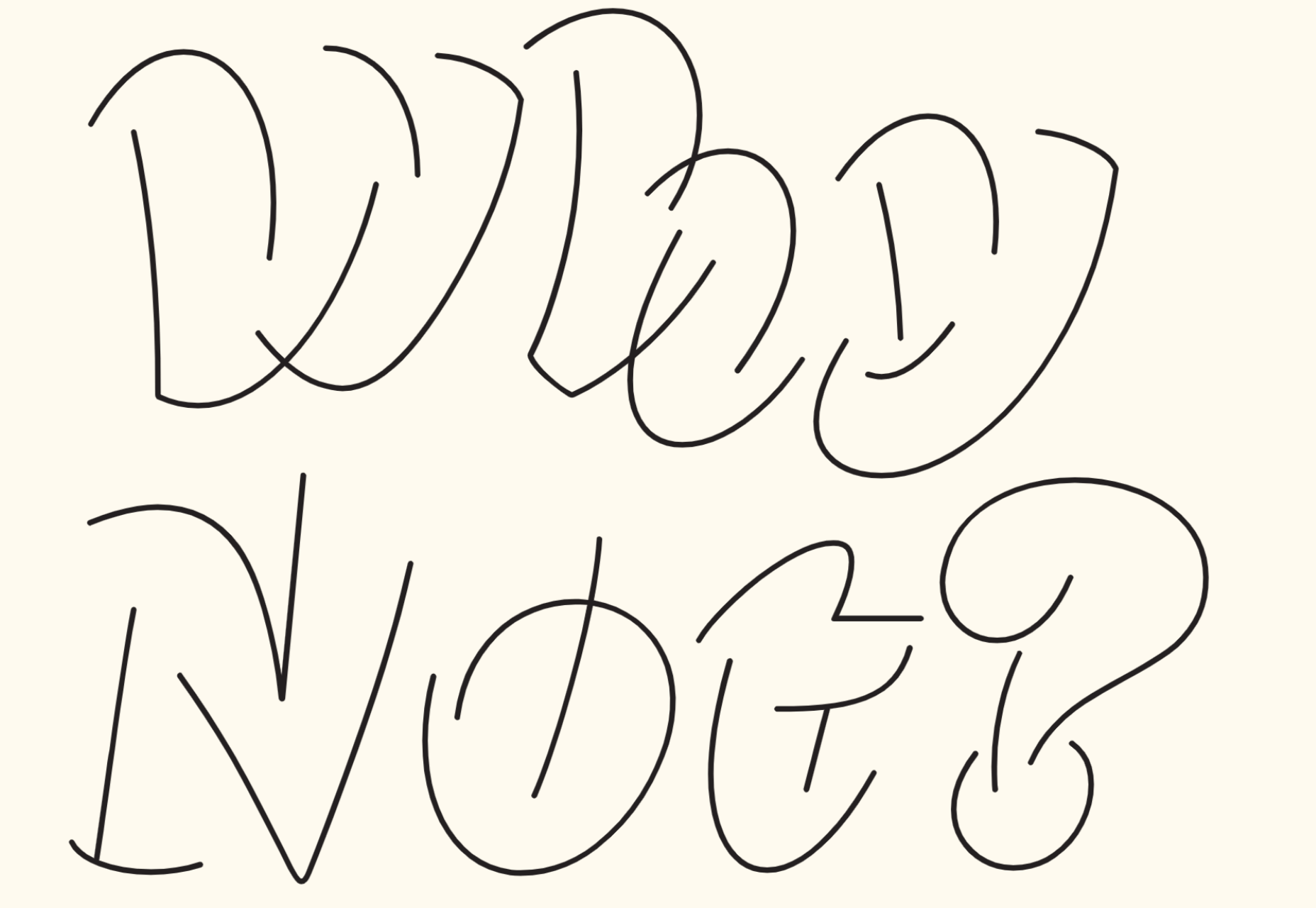
Saison

Saison is a wonderfully energetic outline font. It only works as a display option, but it’s perfect for editorial work or even branding.

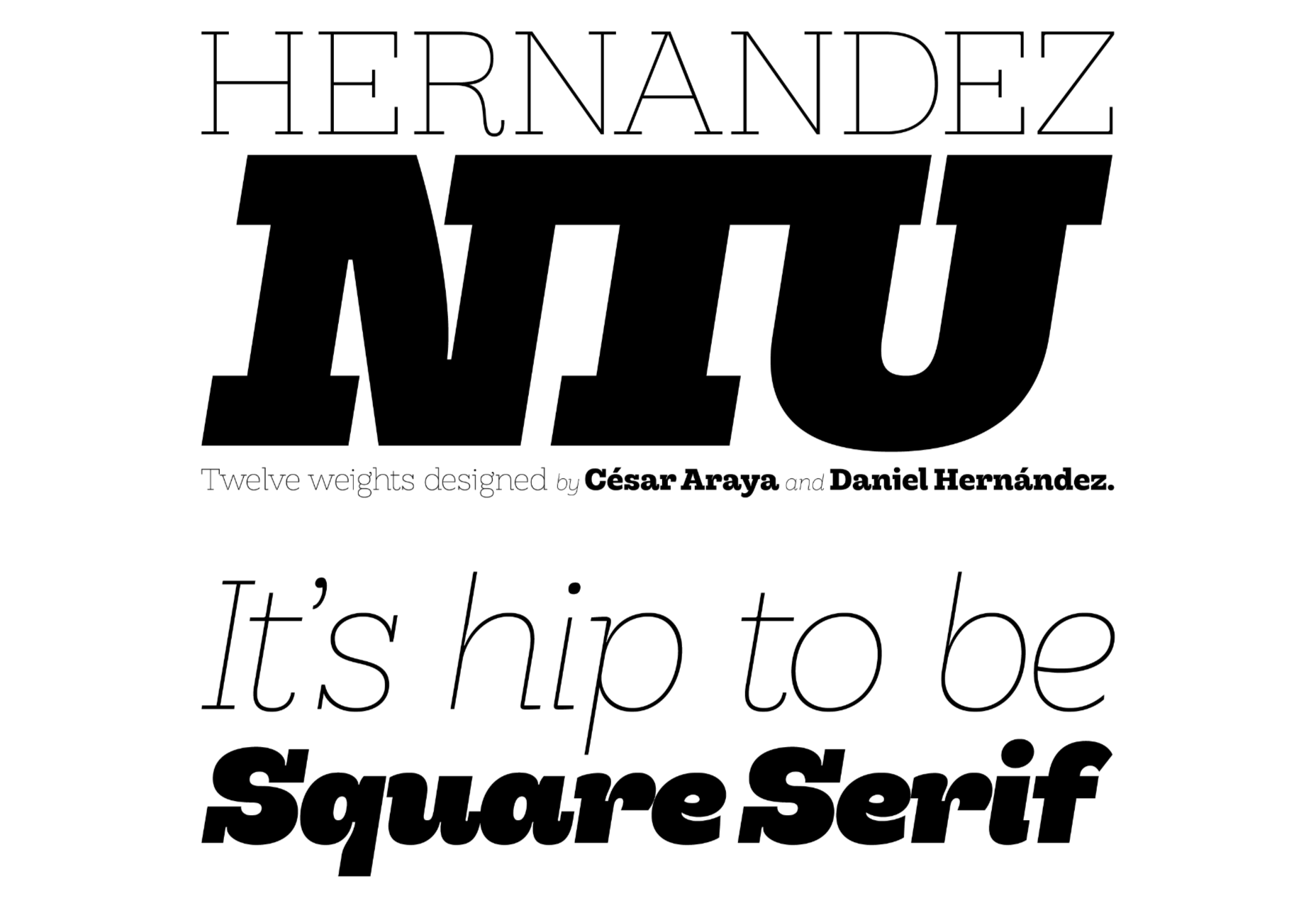
Hernandez Niu

Hernandez Niu is a slab serif that takes lots of character from its exaggerated ink traps in weightier sizes.

Gomme Sans

Gomme Sans is a typeface with 12 weights. The extended style creates a modern feel, and it’s suitable for display or short to medium amounts of text.

Dobb

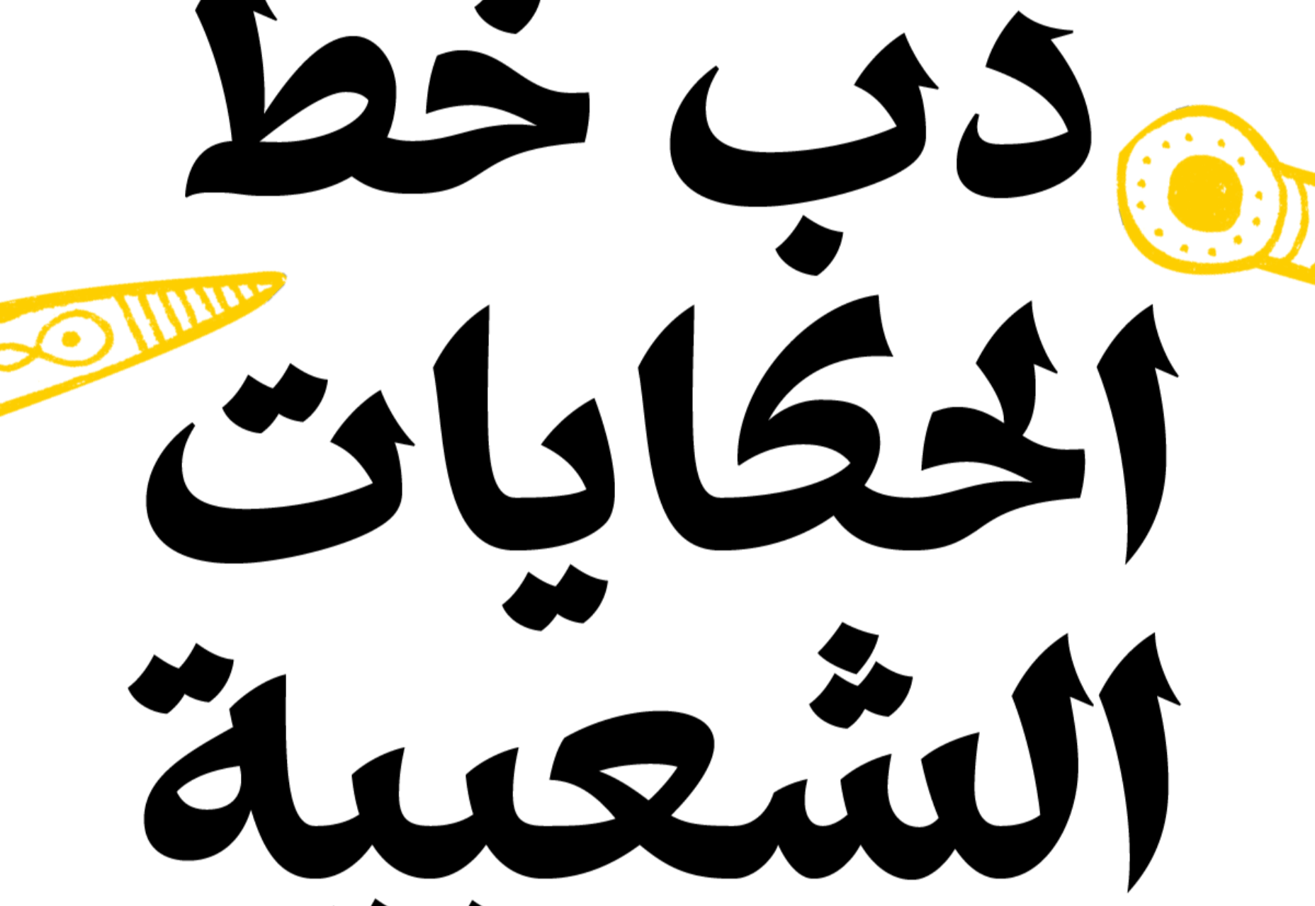
Dobb is an Arabic typeface designed to offer a playful and expressive option for pairing with illustrations. It has a graphic novel feel in extended text blocks.

Hatch

Hatch is a slab serif that has drawn inspiration from reverse stress typefaces of the nineteenth century. It has some quirky details that make it distinctly modern and a beautiful italic.

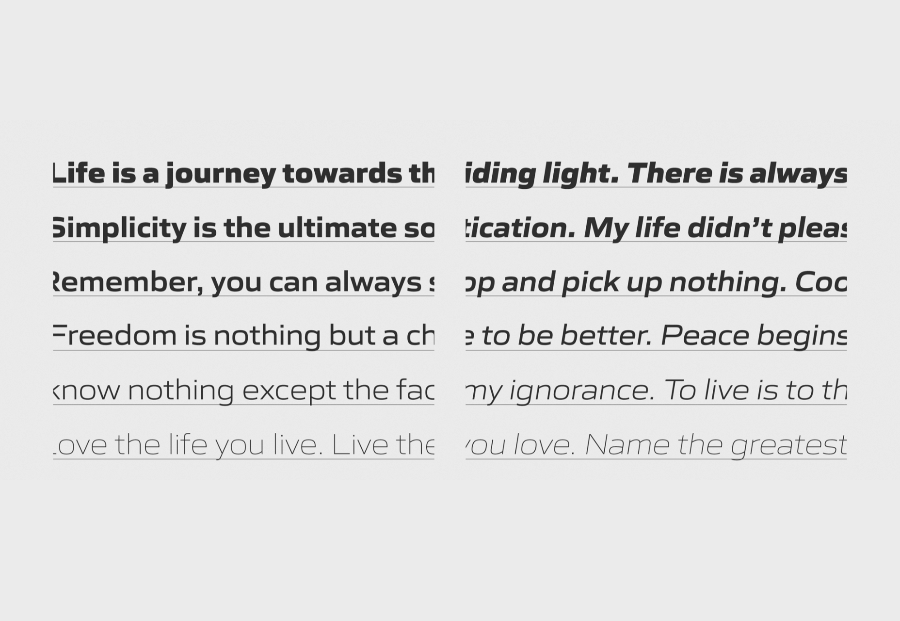
Sculpin

Sculpin is a sans serif with sharp strokes and corners, inspired by the sharp edges of tools like chisels. It comes in five weights with matching italics, and there is a variable font available.

Source

The post 20 Best New Fonts, June 2021 first appeared on Webdesigner Depot.


Source de l’article sur Webdesignerdepot