Articles

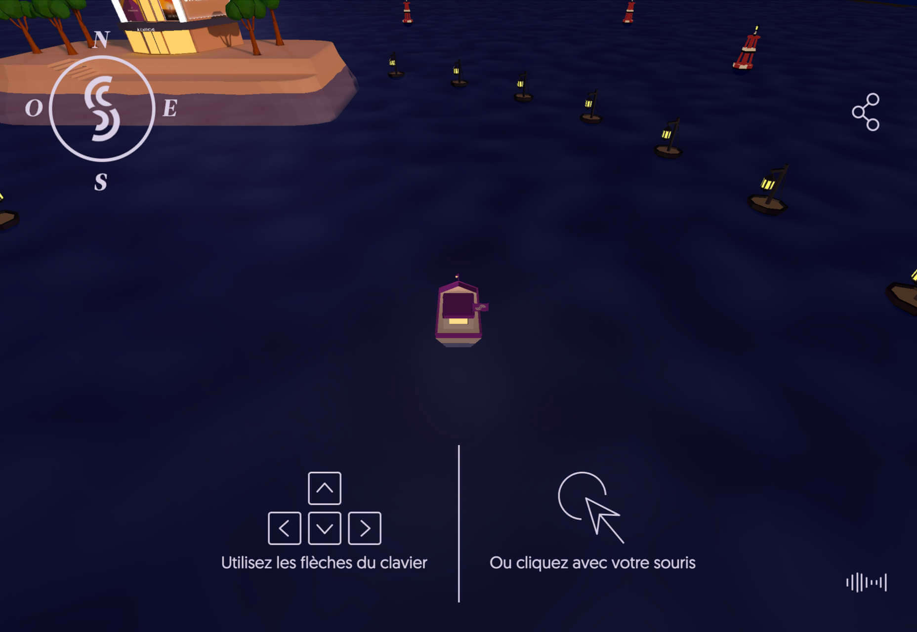
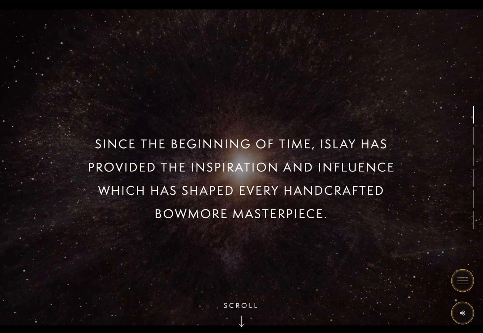
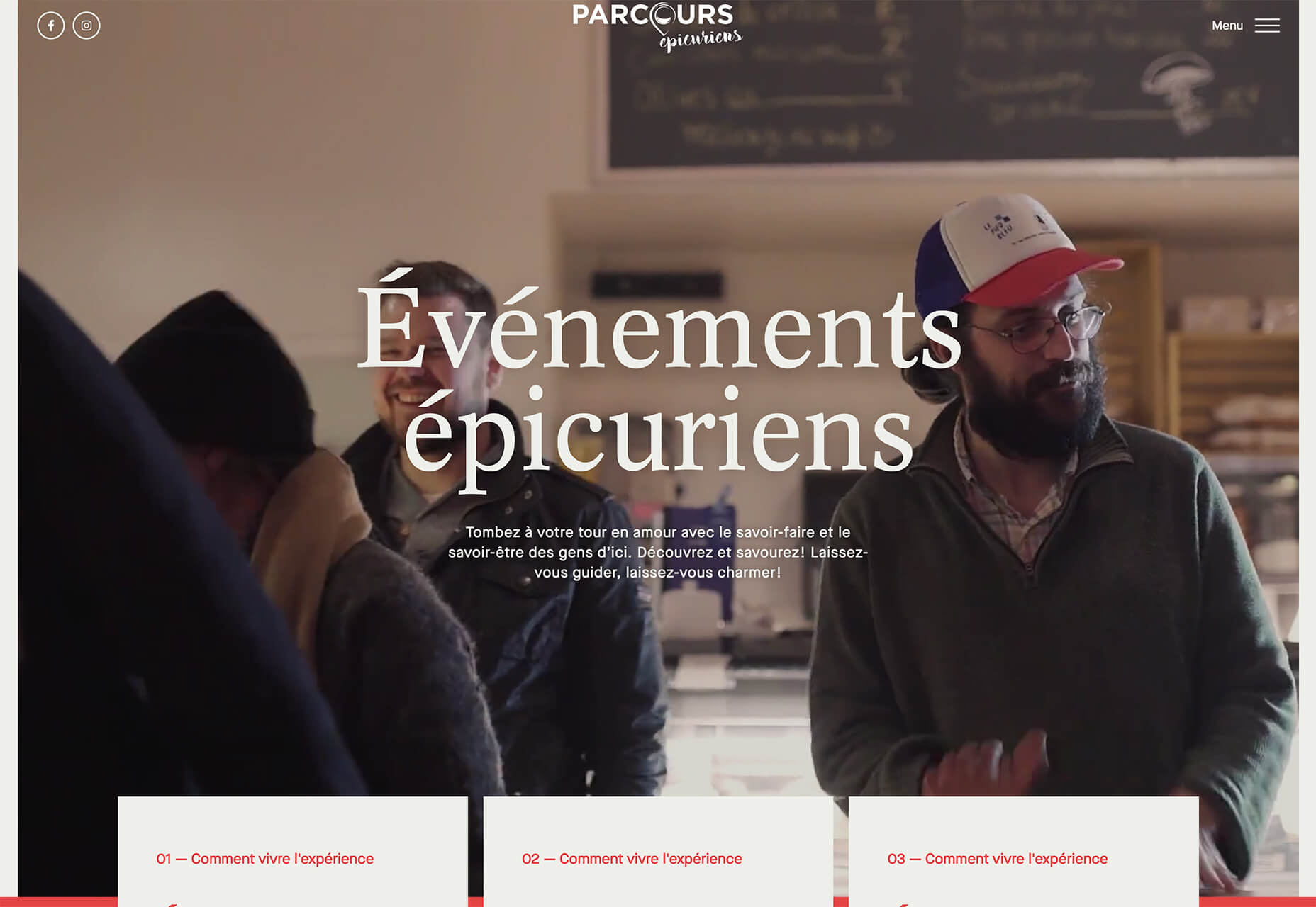
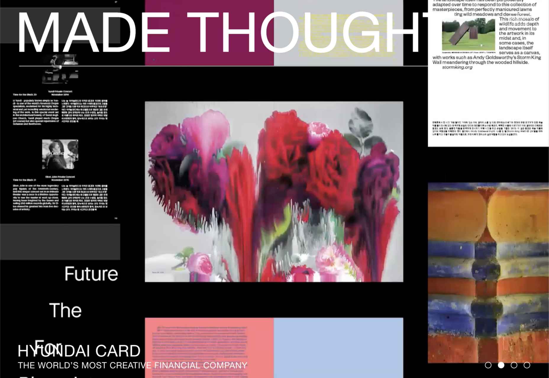
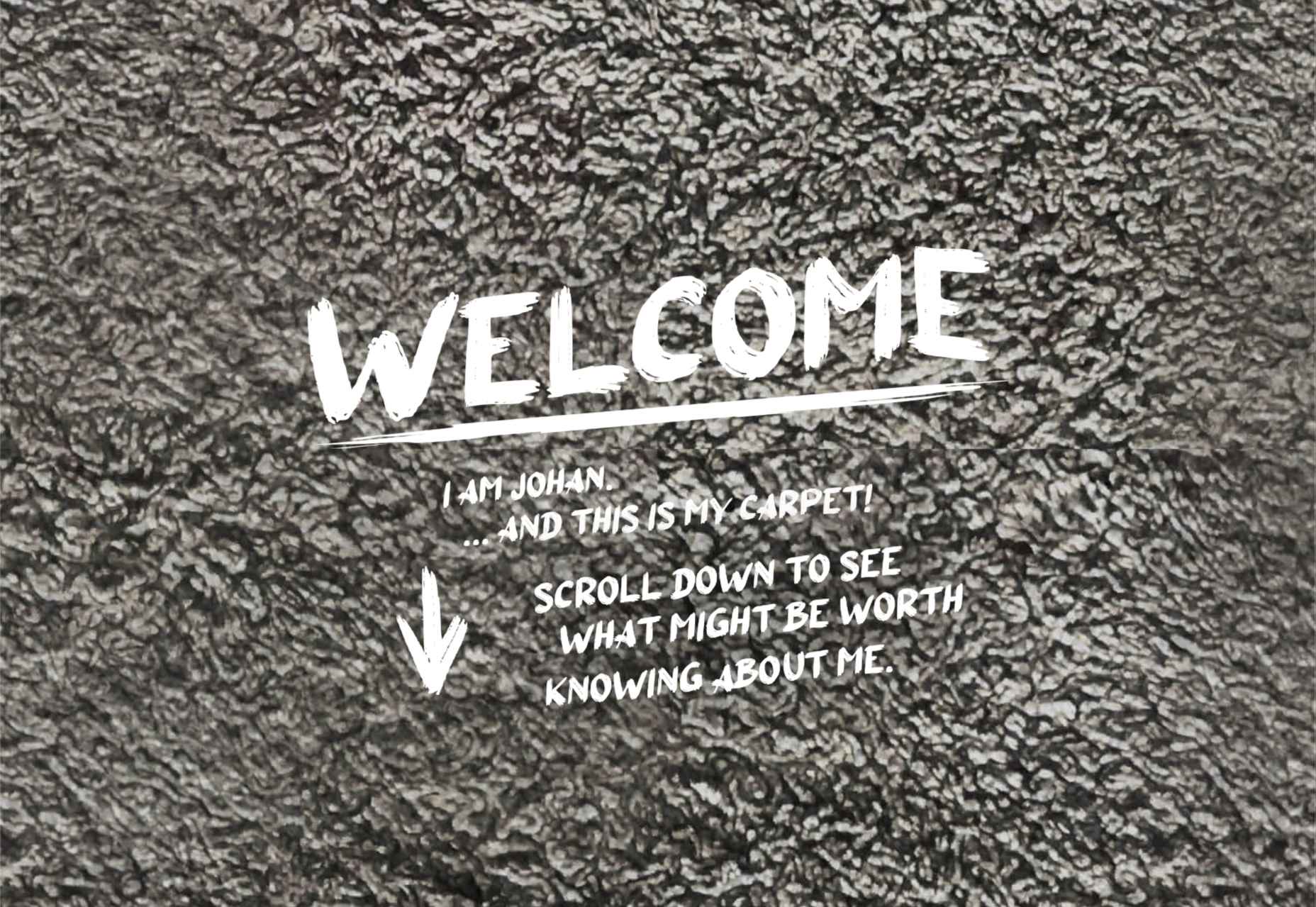
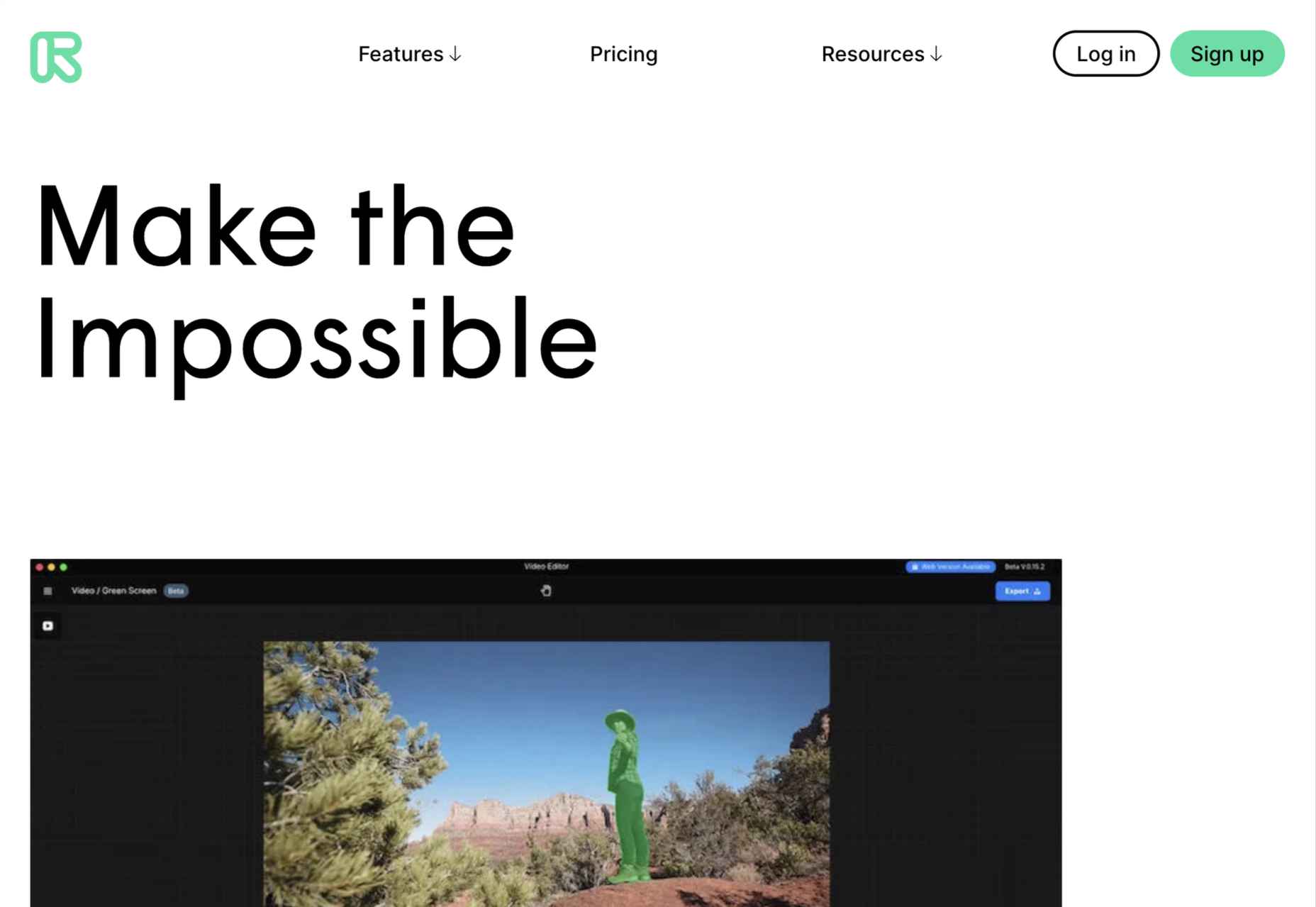
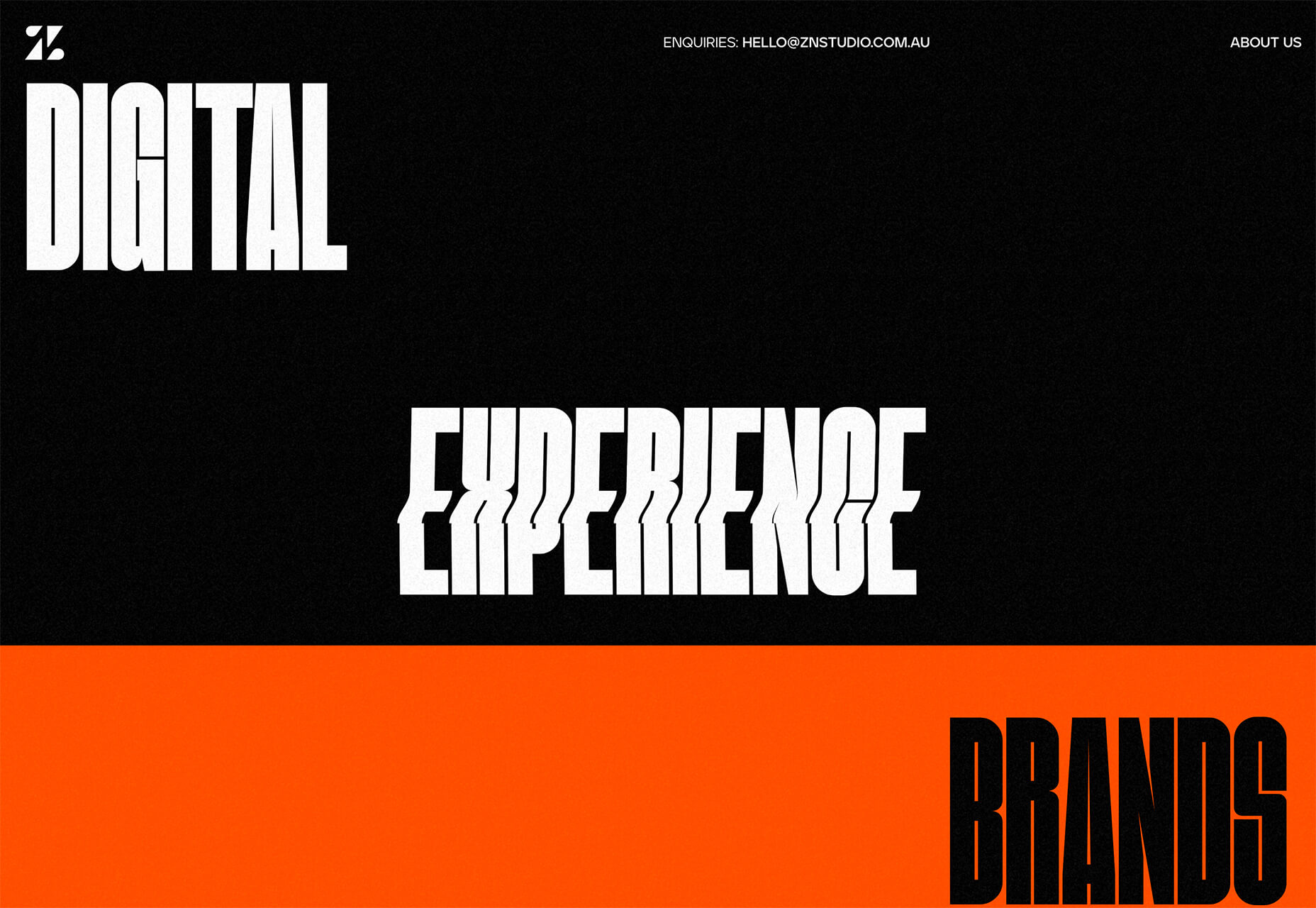
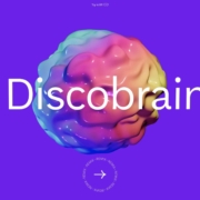
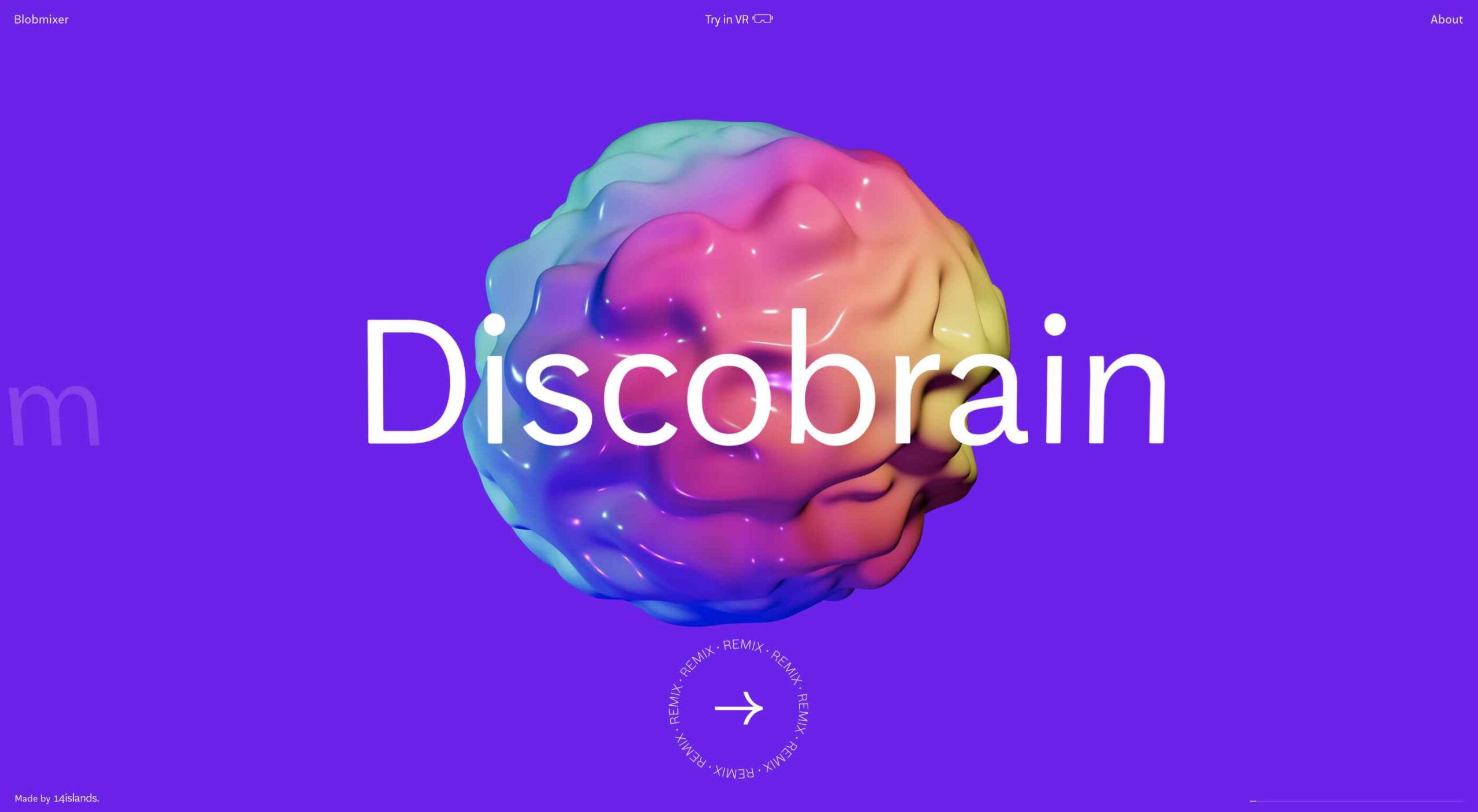
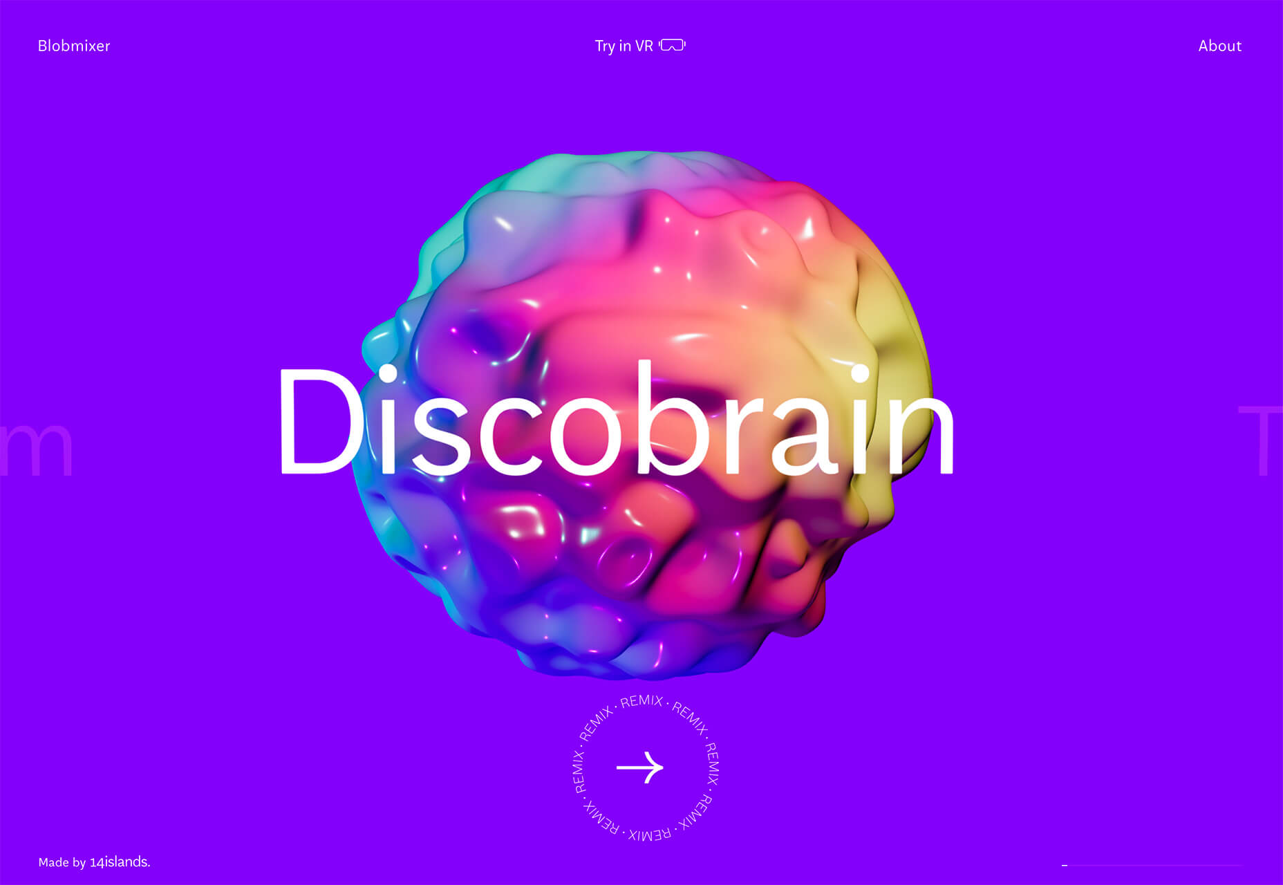
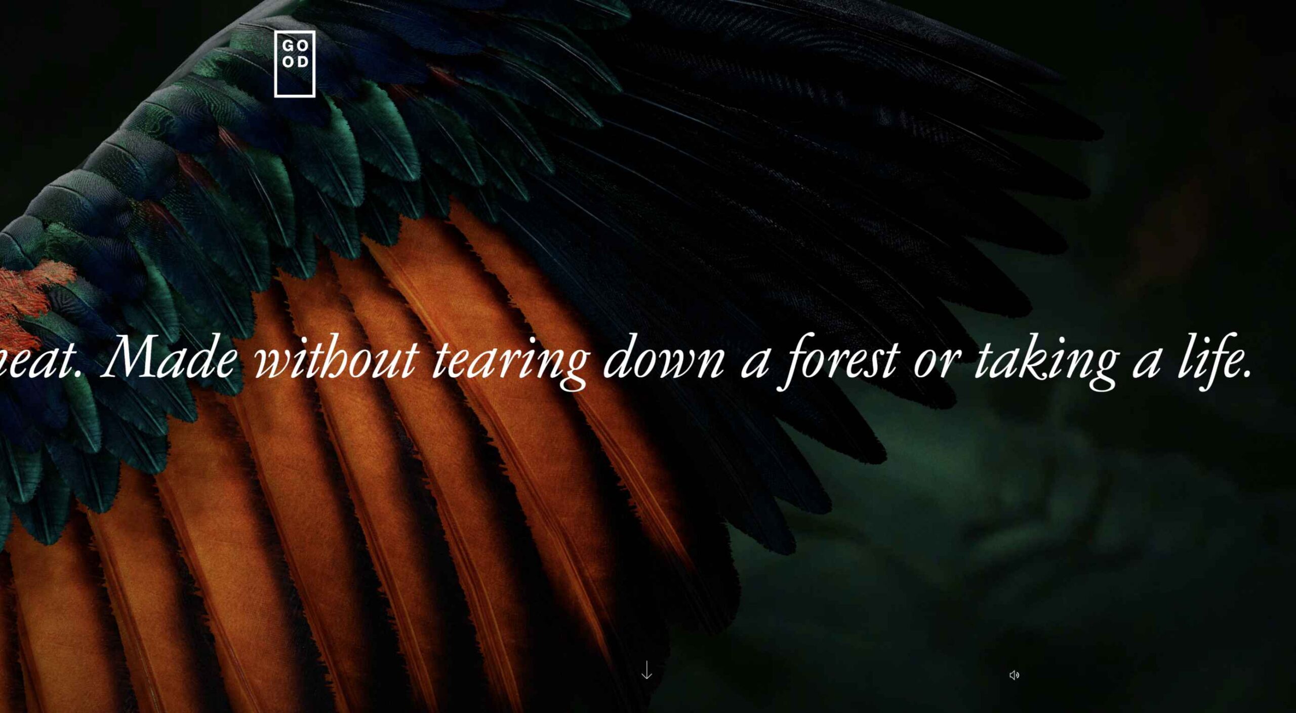
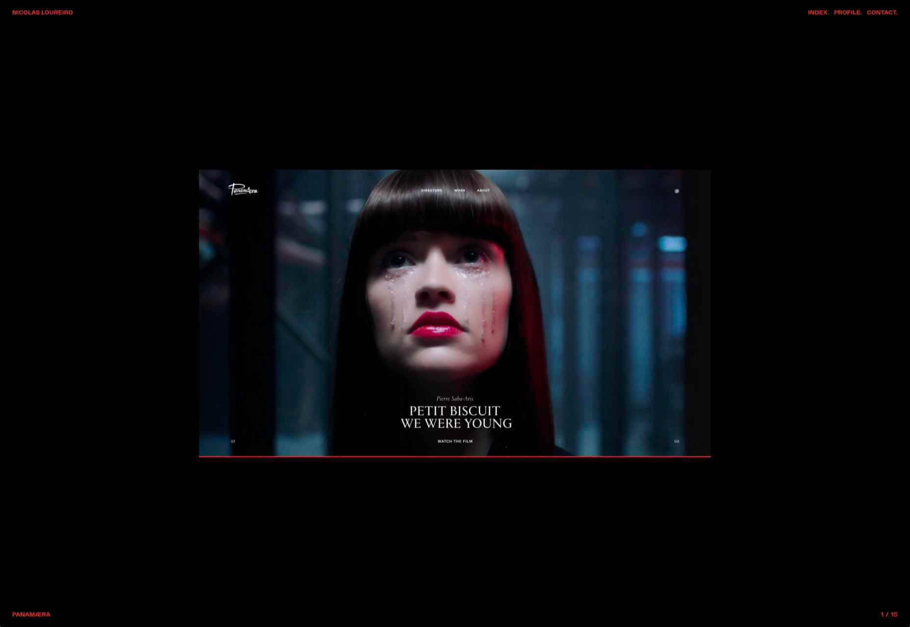
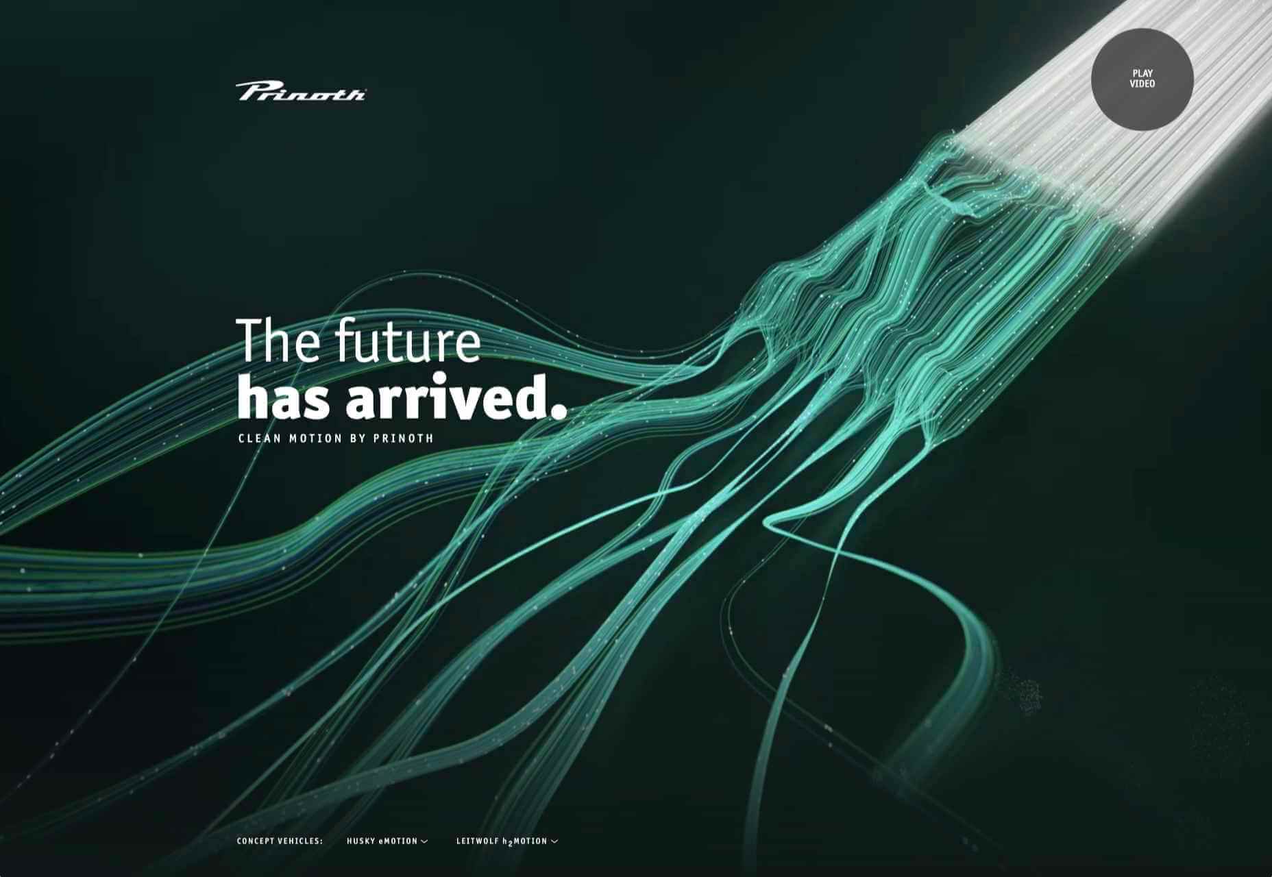
This month we have several examples of brutalism used to good effect as a foil to showcase products and/or work. By contrast, at the other end of the scale, we have brands who have chosen to go more of an immersive experience route, using full-screen images, sound, animation, and even VR.

Both are valid approaches, depending on the content. The former tends to work better as a backdrop for artwork, photography, and artisanal craft goods — acting as a virtual gallery space — while the latter is better for consumer goods and experiences, particularly food, drink, and accommodation.

There is, of course, a whole range in between these extremes, and we’ve got that covered too. Enjoy!

Grainne Morton

A simple layout, soft pastel colors, and clear navigation provide an excellent backdrop for Grainne Morton’s handmade jewelry creations.

Gage Hotel

Good photography and a heritage-inspired color scheme give the Gage Hotel’s site a luxury feel.

Tejidos Roca

Tejidos Roca is a fabric manufacturer, and the design of their site uses a circle motif to bring rolls of fabric to mind.

La Passation Synerghetic 2021

Synerghetic is part of the Junior Enterprises Europe scheme – a network of businesses run by students. This year they are not holding the usual handover ceremony, so Synerghetic created this rather fun little digital celebration instead.

Redwood Empire

For Earth Month, Redwood Empire Whiskey has created a microsite promoting a competition styled to match their bottle labels.

Gabriel Cuallado

This site focusing on Spanish photographer Gabriel Cullado’s life and work features some great transitions and good use of horizontal scrolling.

Ombia Studio

In Ombia Studio’s site, atmospheric photographs stand out in a minimal layout. There is a sense of almost gallery curation here.

Headup

Headup uses a pleasing color scheme and geometric graphics to create a welcoming but businesslike approach.

the Figo

Spherical curves and line animations create interest in this site for boutique hotel, the Figo.

Boon Market

Boon Market is about promoting a toxin-free and waste-free lifestyle, and their site reflects this with its use of simple type and soft colors.

Unspoken Agreement

Unspoken Agreement’s website has a quietly confident feel, with clean lines and some pleasing type.

hnst

Another brutalist-inspired design here, but the use of bright red makes it fresh in hnst’s take on the style.

InteriorLAB

Part minimalist, part glossy magazine, InteriorLAB have succeeded in making the simple feel luxurious.

Bowmore Experience

Bowmore has opted for immersive video and visually beautiful images to present their limited-edition Timeless whisky range.

Oly Sheet

There is a slightly old-school start-up feel to Oly Sheet’s website, but it is still appealing with fresh, spring colors and well-organized content.

Aalto University

Aalto University has provided a pretty in-depth tour of its campus here. The navigation is clear, and the information is presented in ideal-sized chunks — enough detail, but not too much at once.

Wisr

Wisr features a Heath Robinson style machine that ‘runs’ as the user scrolls down the page. It provides a bit of interest (no pun intended) to the not very exciting subject of personal loans.

Rudl und Schwarm

Bright colors, cute, but not too cutesy, illustration, some nice scrolling, and transition effects are used really well on Rudl und Schwarm. And it’s got bees; bees are good.

Dr. Maul

This site for Dr. T. Maul manages to take orthodontistry past the usual image of uncomfortable wiring, elastic bands, and ‘train tracks and make it seem just a little more glamorous.

My Drink

There is a slightly vintage feel to this site for My Drink with its cocktail illustration. The blue text on grey is soothing without being bland.

Bonus Site: Imperial Style Guide

And finally not new, but a bonus in honor of May 4th, the Imperial style guide. Well, the Web would get boring if it was serious all the time.

Source

The post 20 Best New Websites, May 2021 first appeared on Webdesigner Depot.


Source de l’article sur Webdesignerdepot

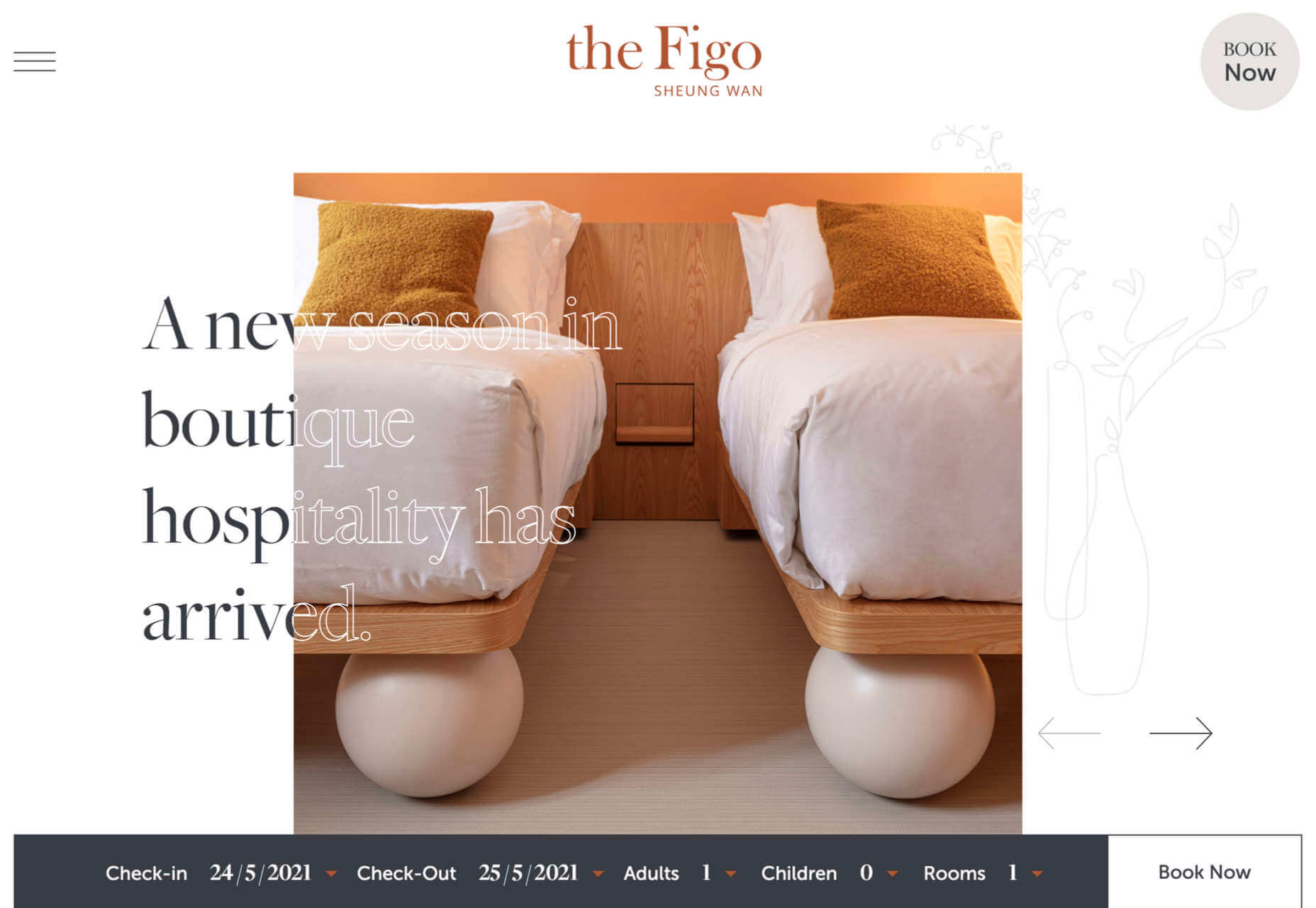
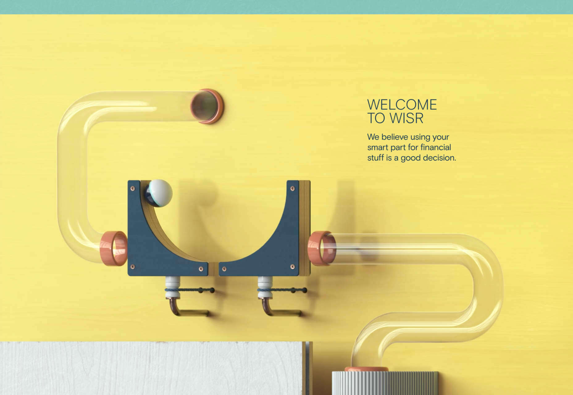
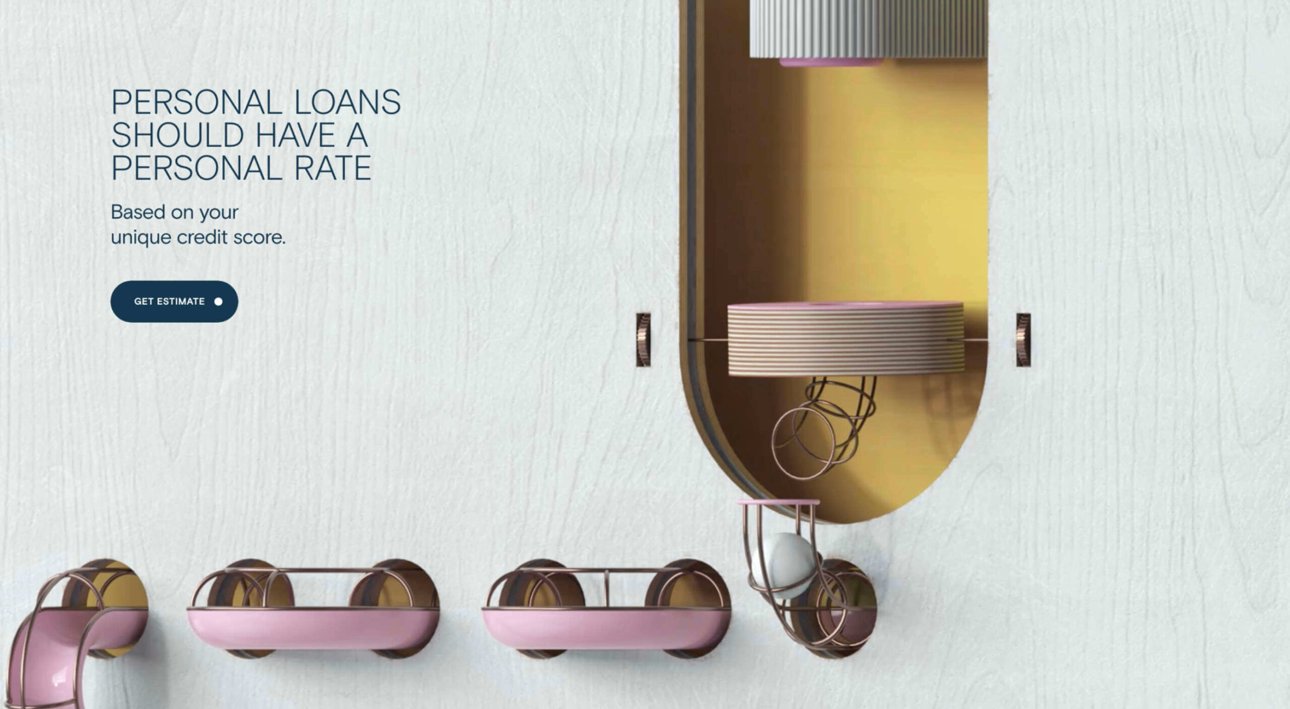
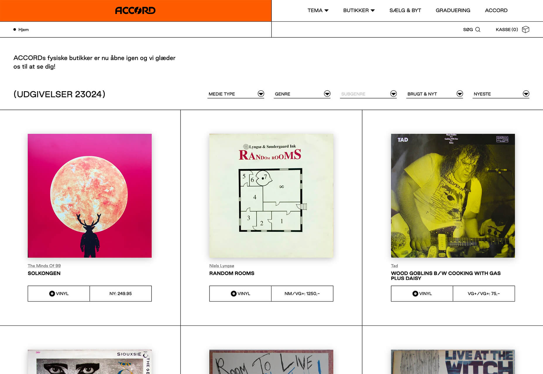
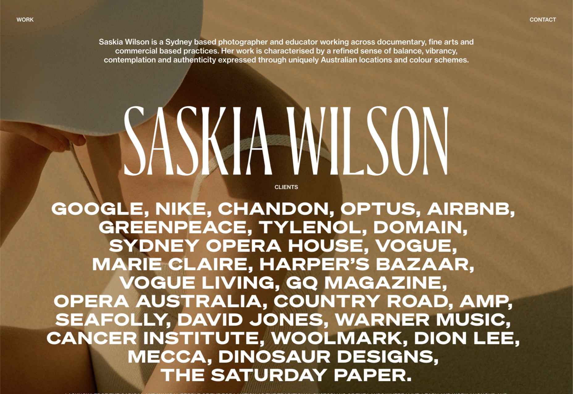
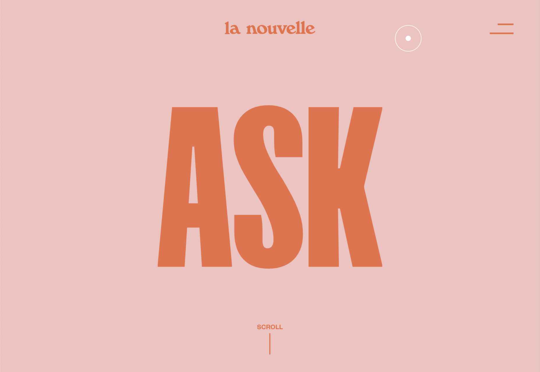
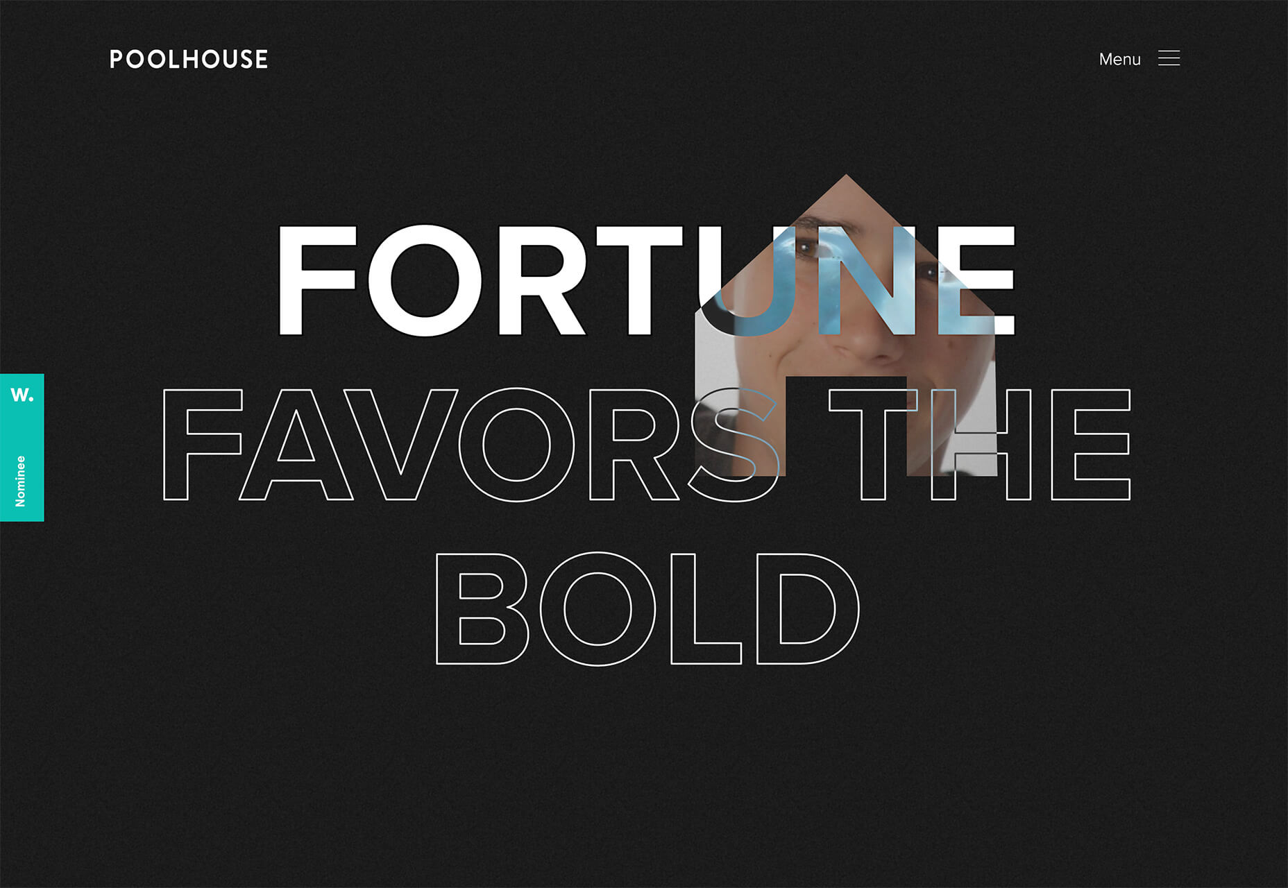
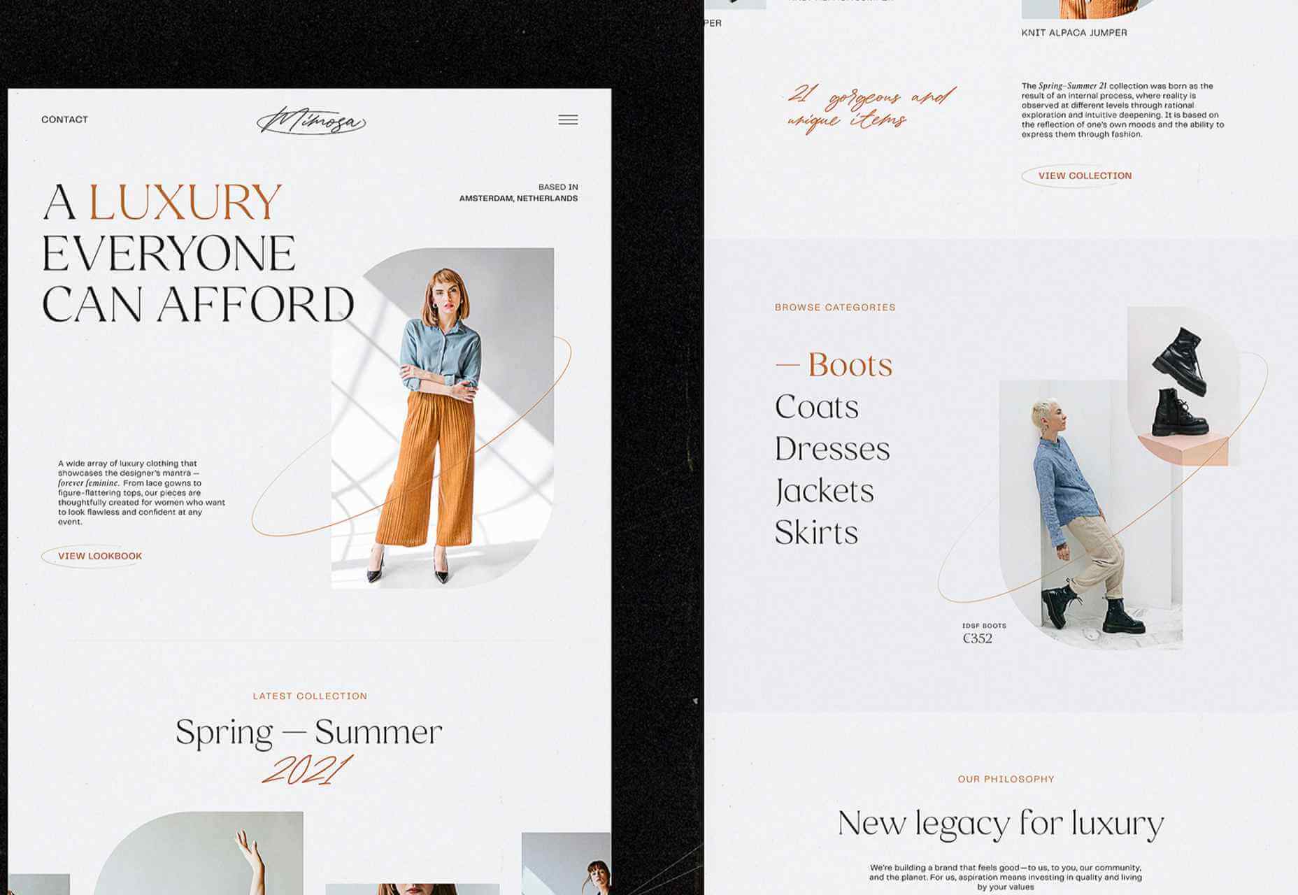
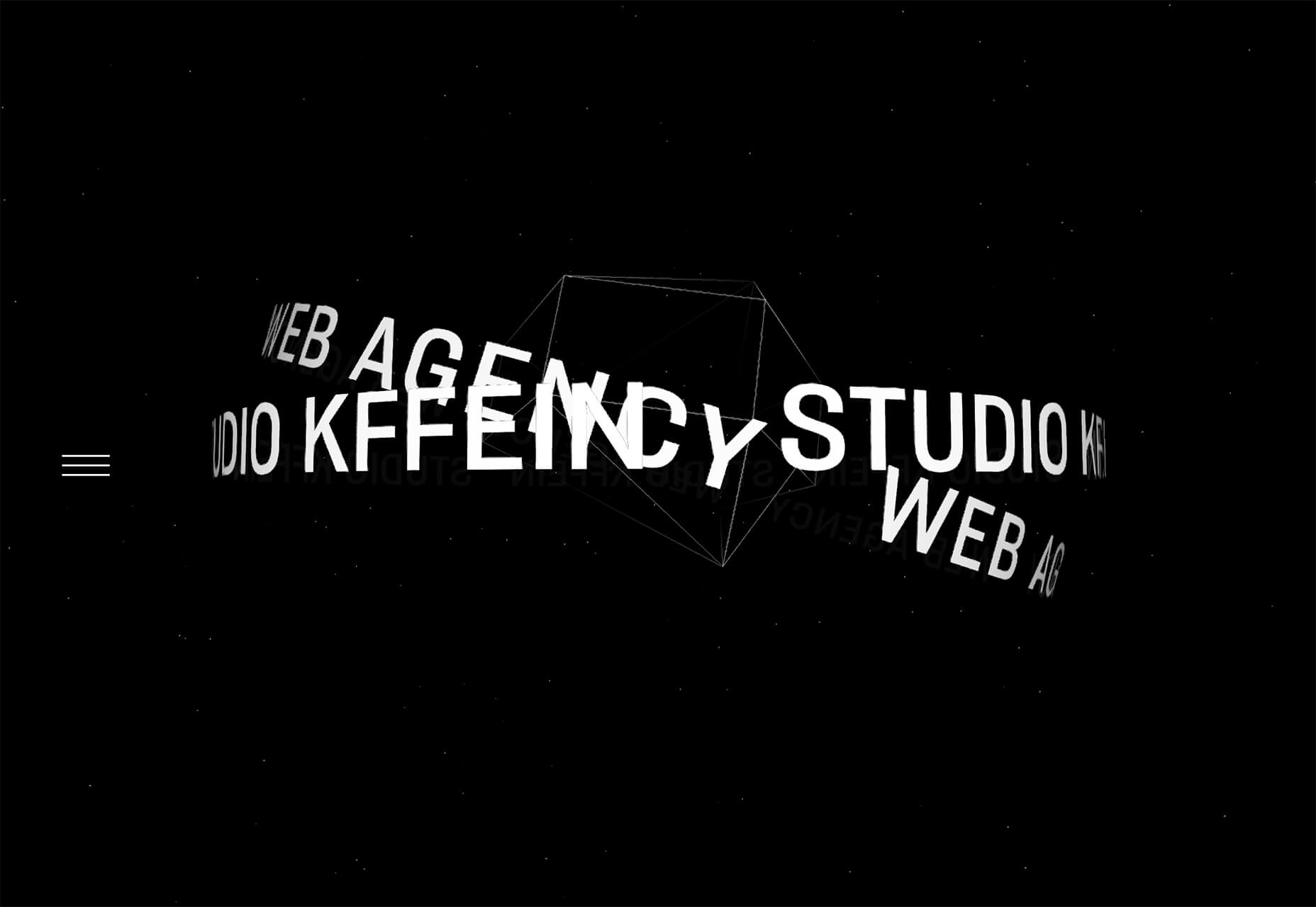
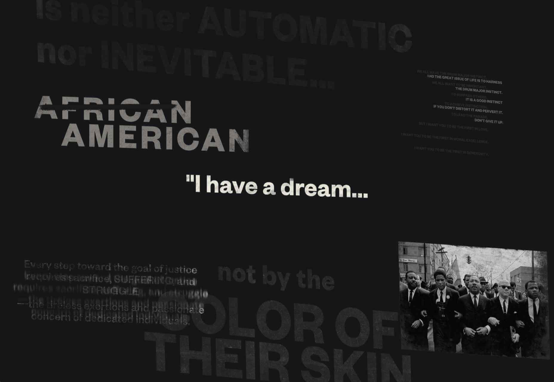
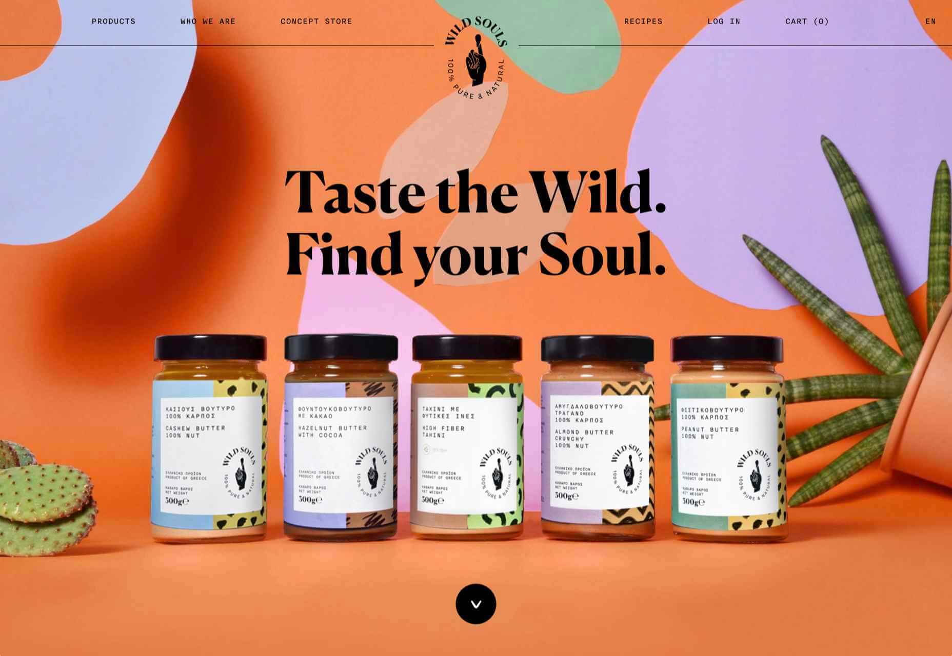
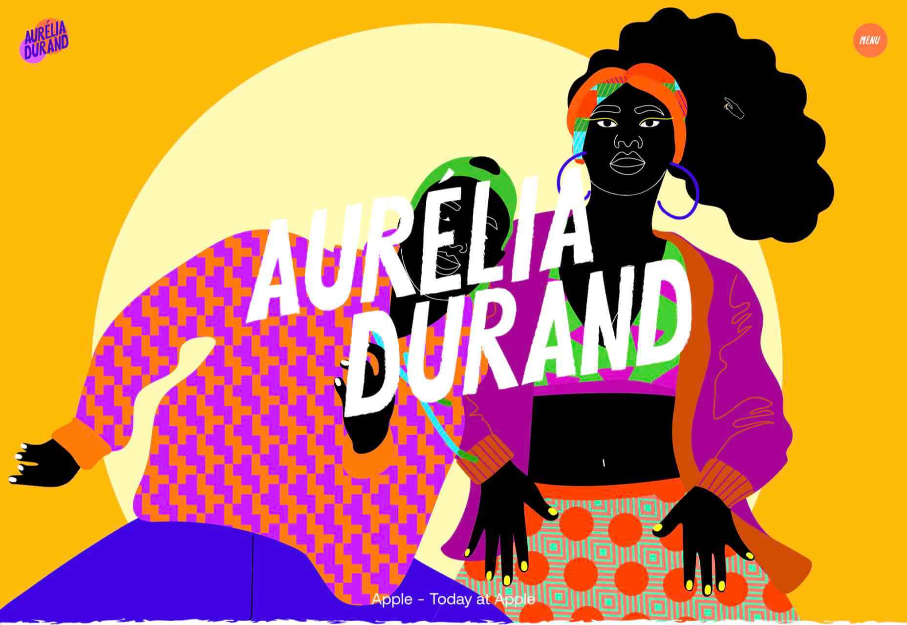
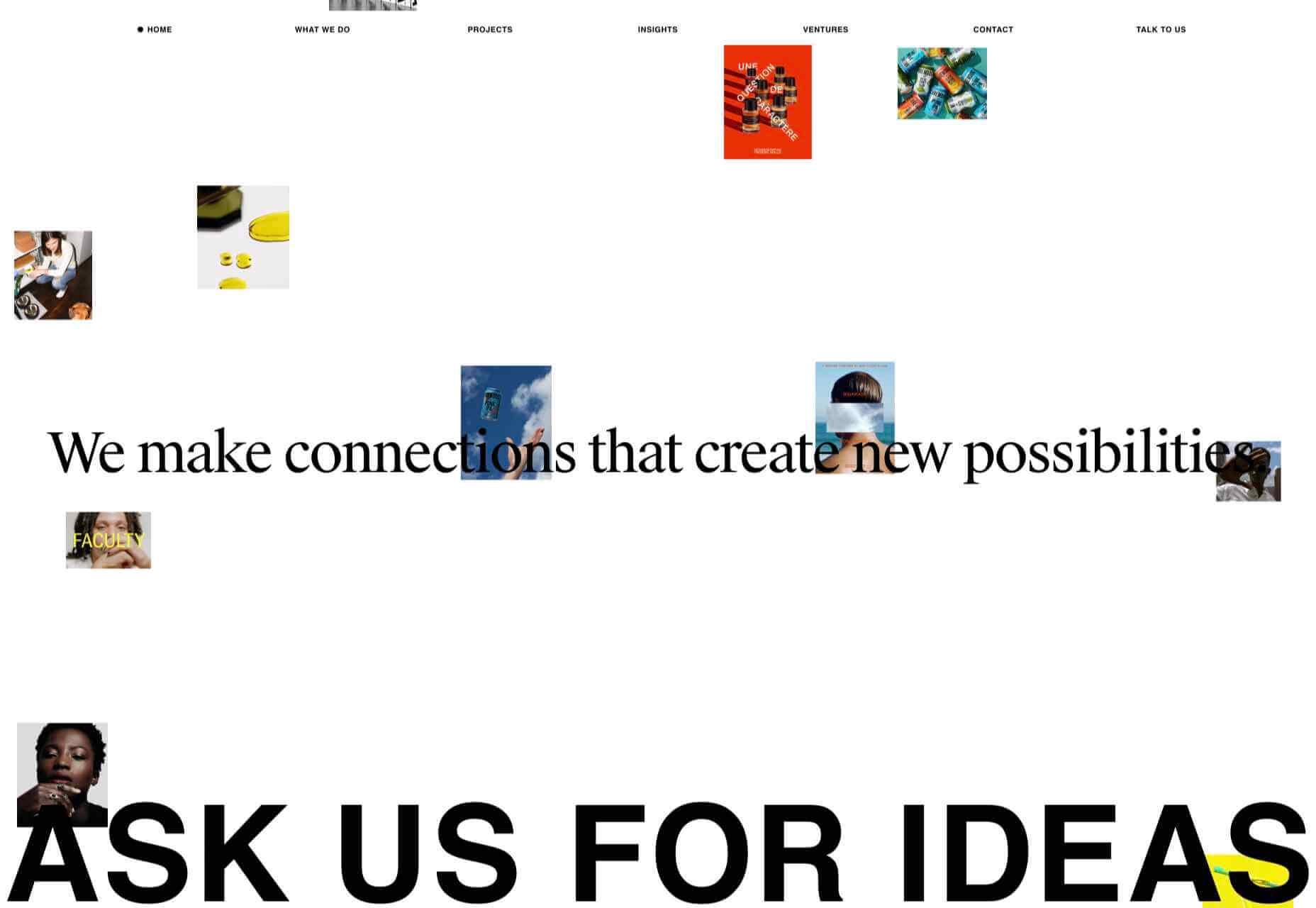
Spring and fresh designs are in the air. This month, it’s obvious that designers are feeling creative with new and interesting concepts that range from a new style for cards, homepage experimentation with multiple entry points or calls to action, and risky typography options.
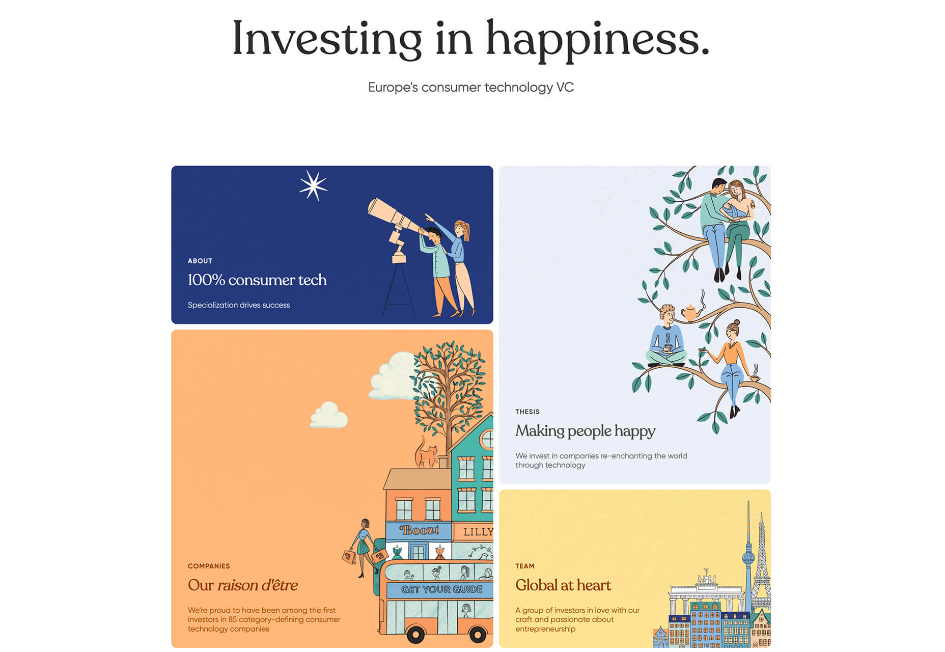
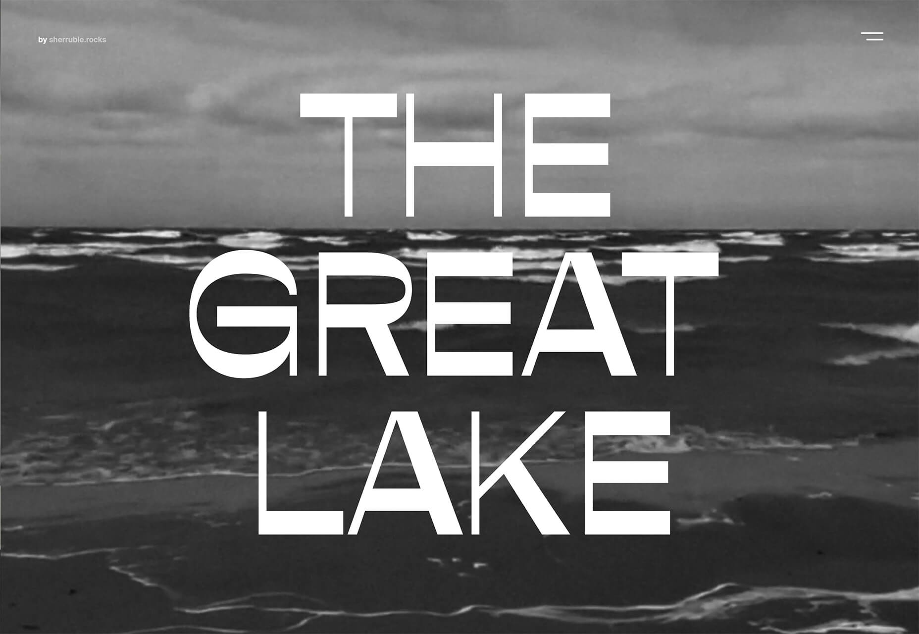
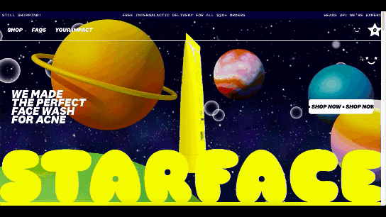
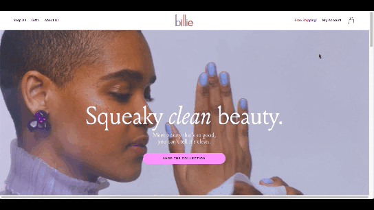
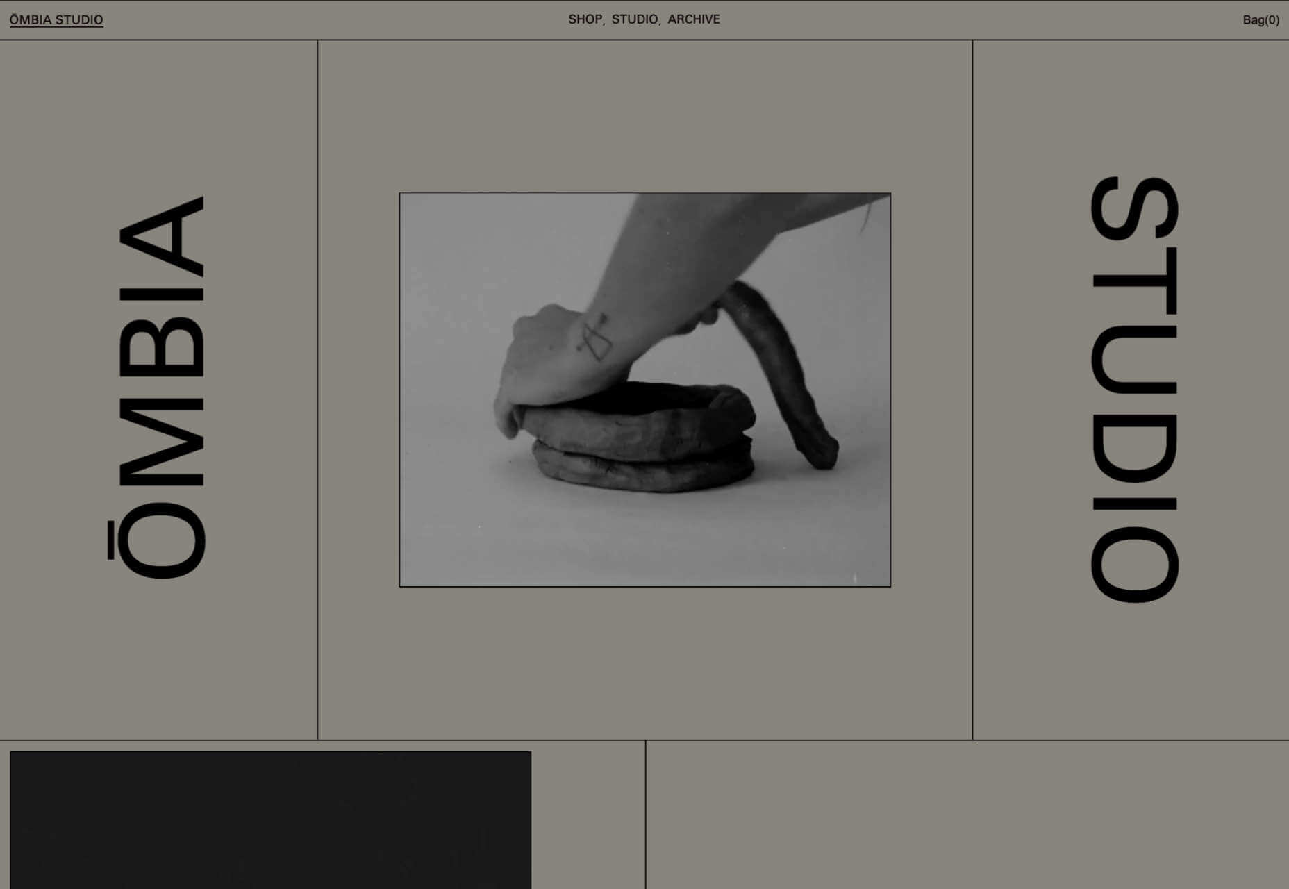
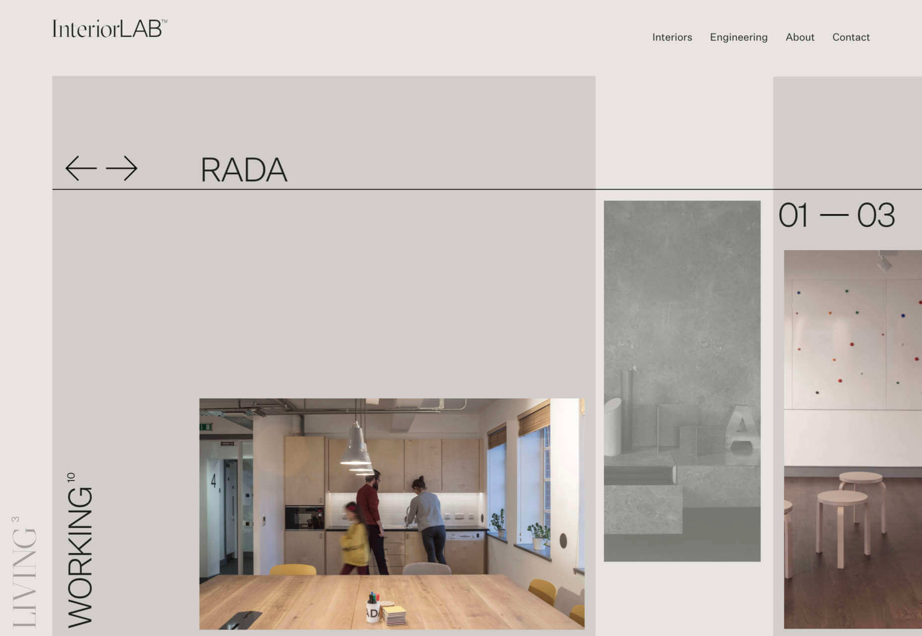
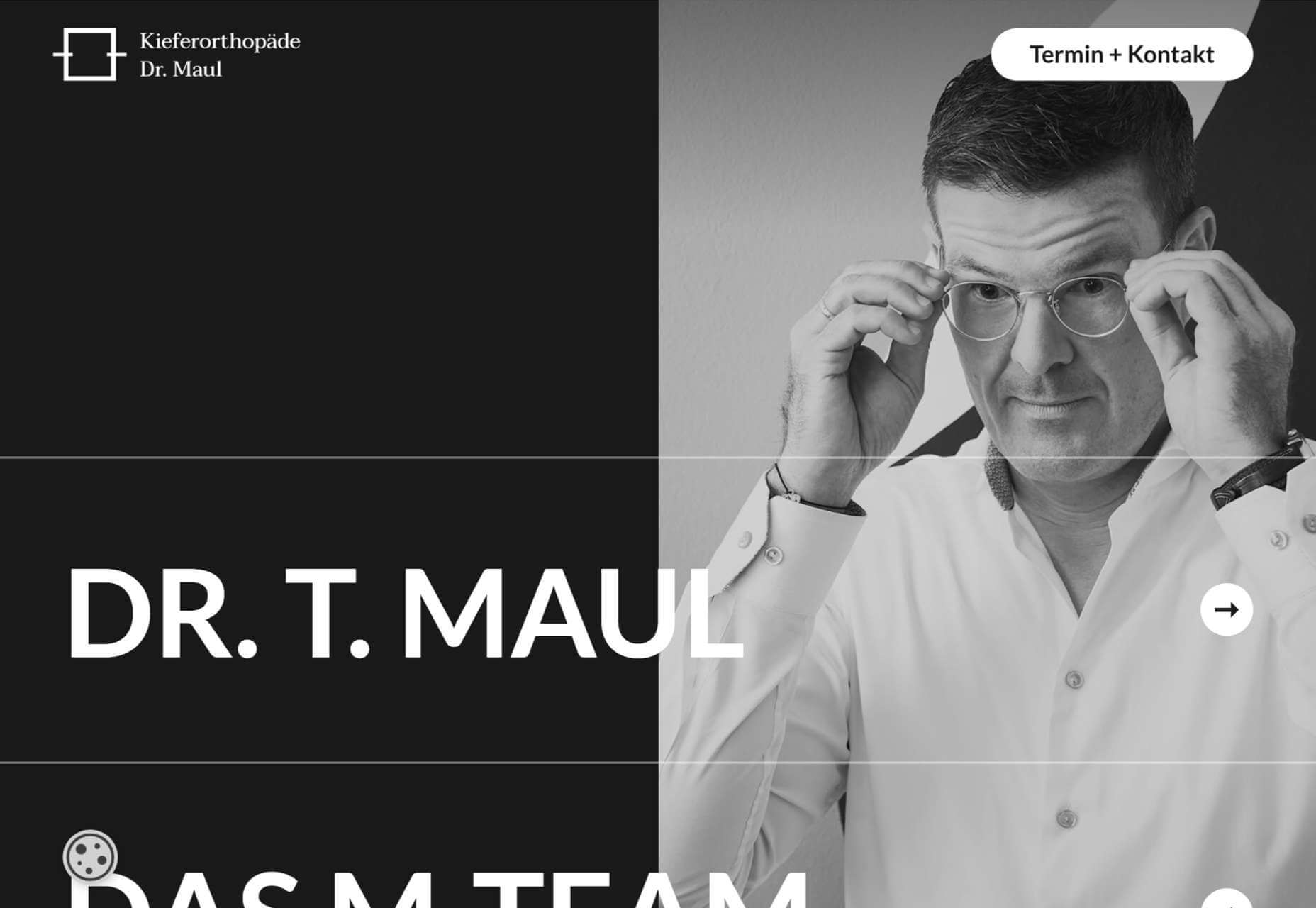
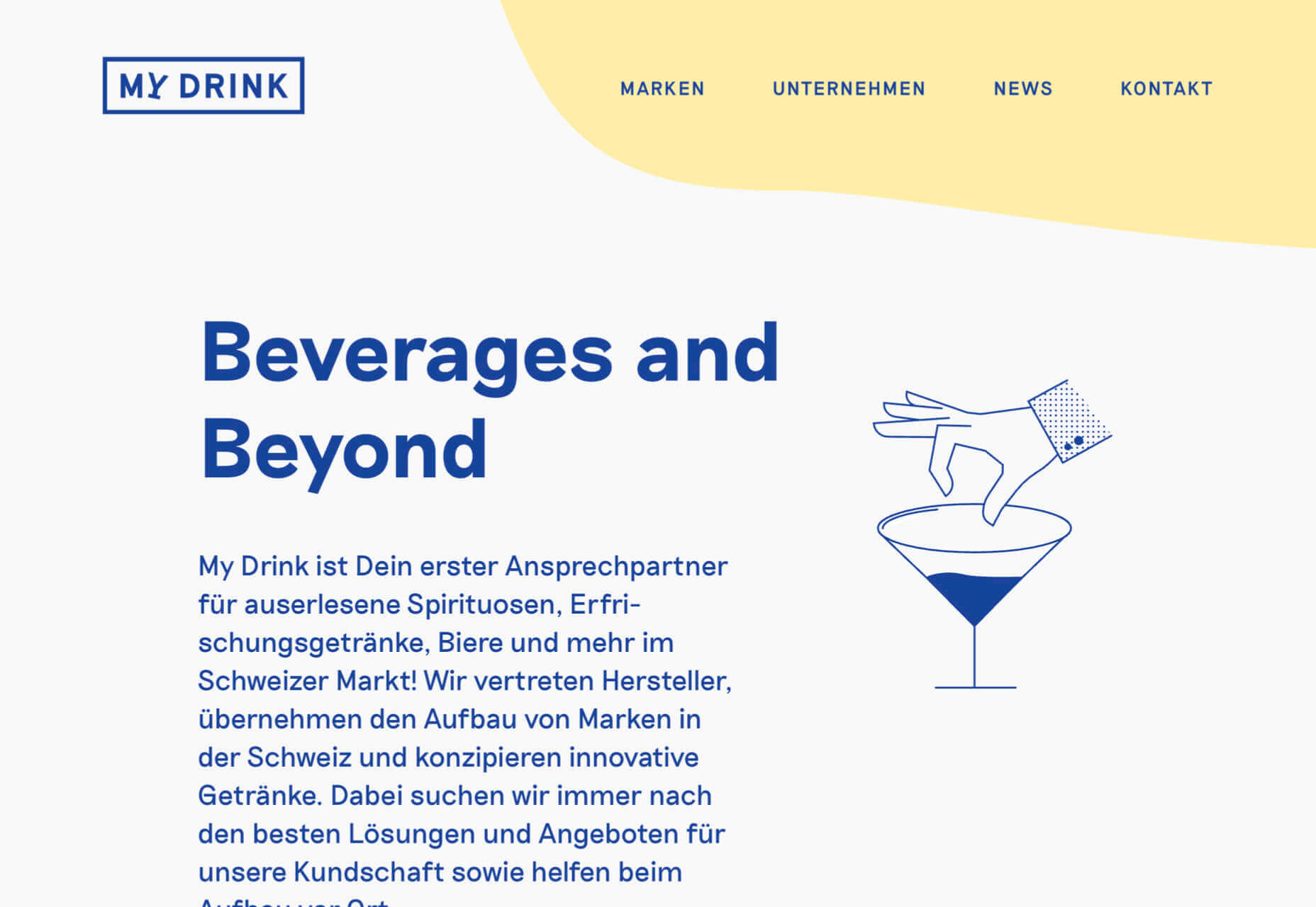
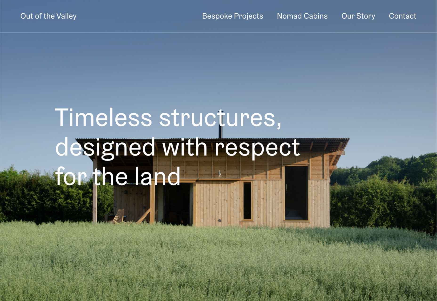
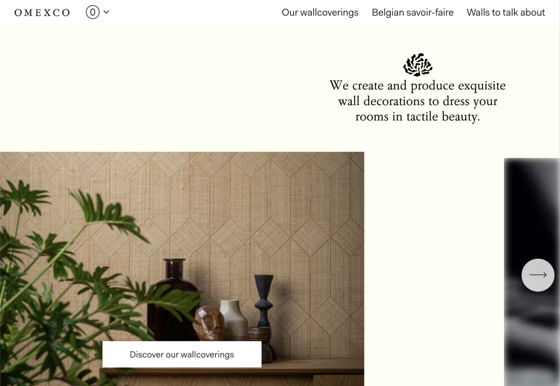
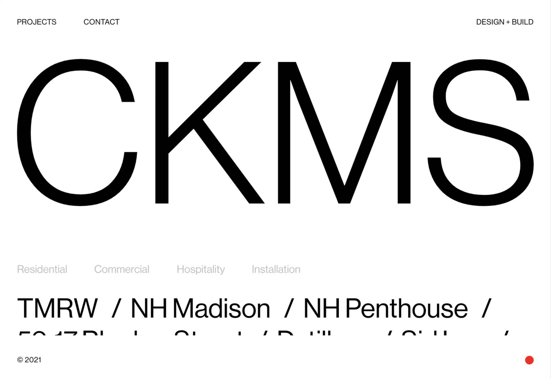
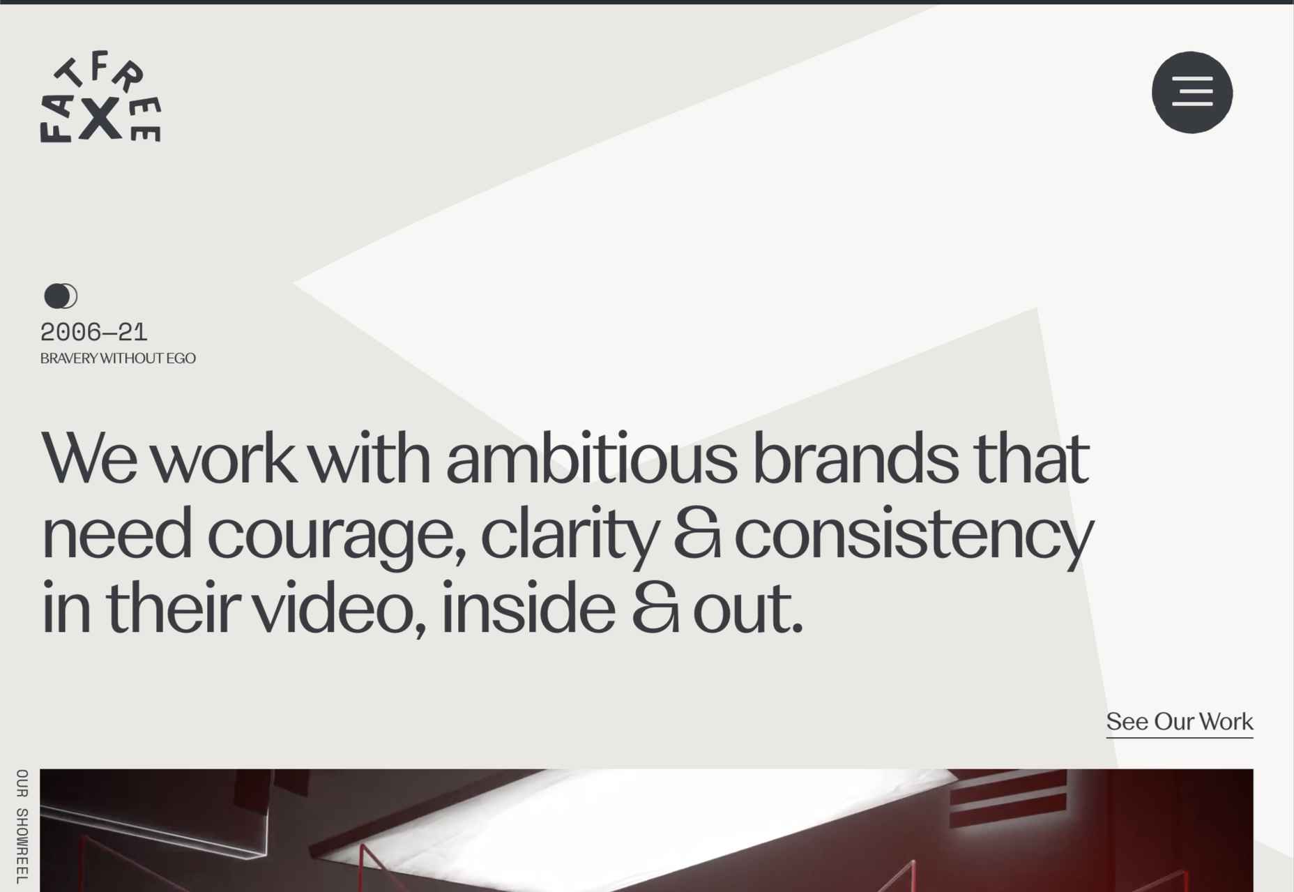
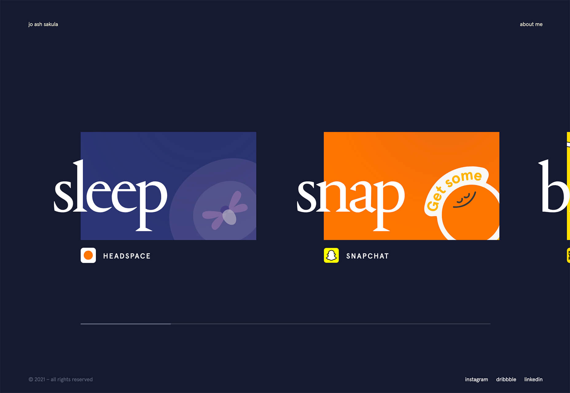
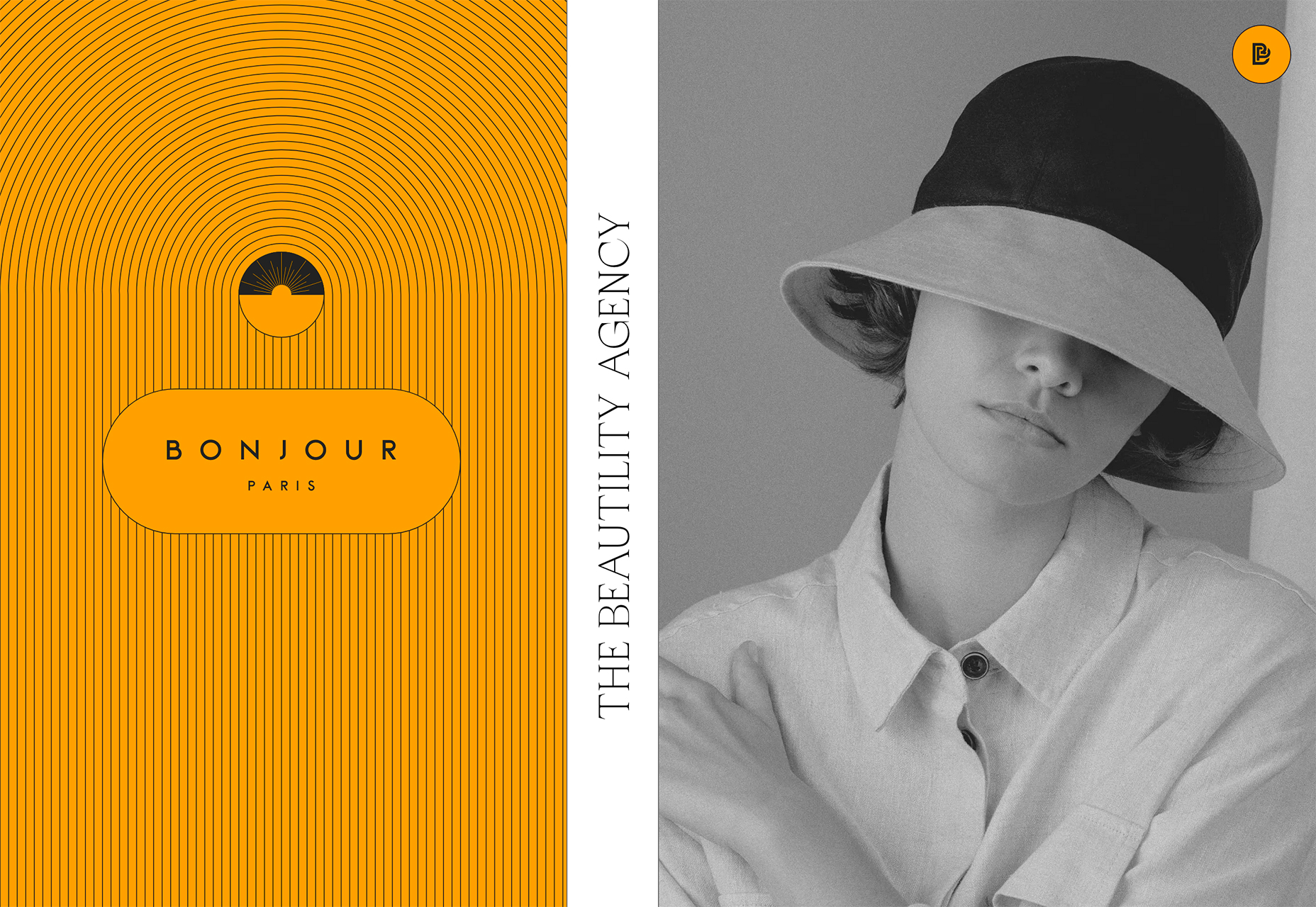
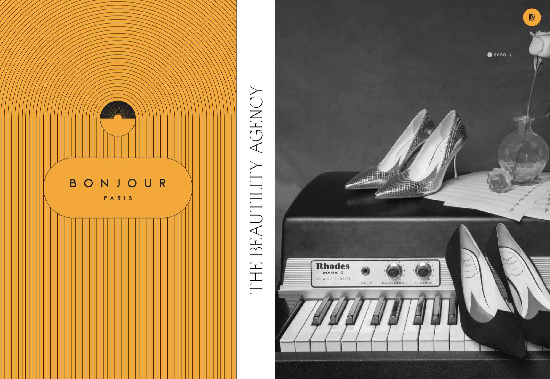
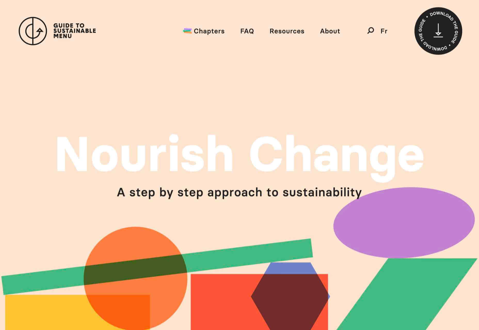
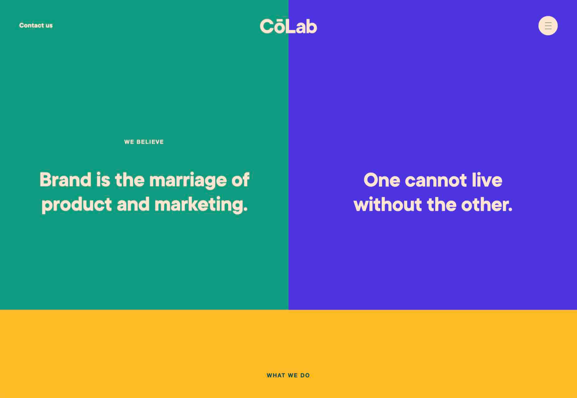
Here’s what’s trending in design this month.

1. “Flat” Cards

Card-style design elements that allow users to click through to other content aren’t new, but the design of these cards is fresh and interesting.

Rather than more heavily designed cards with shadows and layers of content, flat styles are trending. Expect this trend to explode thanks to usage by Google for a shopping experience page.

The Google example below is interesting because Google’s Material Design guidelines are what helped card-style elements grow in popularity previously. However, those cards did include more layers, color options, buttons inside the cards, and shadows.

Today’s trending cards are completely flat. And beautiful.

Each of these websites does it in a slightly different way.

Heartcore, a consumer technology VC company, uses a series of flat cards as a navigation element to help users find their way through the website. Each features a bright color background with an illustration and a simple text block.

Each card has a nice hover state where only the illustration zooms inside the card frame. This is an interesting effect because it is exactly the opposite of the previous iteration of cards, which zoomed the entire card as a hover state.

Google Shopping uses that whole card bounce hover state (plus a not-so-flat shadow) for each card. The initial design is sleek with the pairing of white and image cards with simple text in each. You are enticed to click around to see what happens.

Click on Greece is a travel website design that uses simple cards with a minimal color and text overlay. The consistency of these cards makes the design pop and the beauty of the images draw you in. Each card also has a hover state with a darker color mask to guide navigation and make text elements easier to read.

2. Multiple Homepage Entry Points

For a long time, designers have been working off the philosophy that the homepage should have one direct entry point, creating a direct funnel for the user experience.

These designs throw that idea out the window, with multiple entry points and click elements.

You can think of it as the “create your own adventure” option for these designs.

It can be a risky concept if you are diving into analytics to pay attention to user paths. You want to make sure you know what choices users are making so that you can help them on the journey to the content and information that you want them to get from the visit.

But this type of design scheme does feel somewhat personalized, putting the user in more control.

Parcouse Epicuriens uses three flat card-style elements to help users pick what they want to see from the home page. There’s no other button or direct call to action, which is somewhat uncommon in today’s website design landscape. Users have to pick from one of the cards, scroll, or enter using the hamburger menu icon.

Tasty Find uses search options to help users start their journey. What’s interesting here are the choices – search for the food you want, pick something random, or (in the small print) find even more options. Users get three choices to begin their journey with the website.

What’s interesting is how simple this complex user journey looks. The design is easy to digest, but so many options could overwhelm users. This is one of those situations where you have to watch return search data and information and weigh the risk versus the reward of so much choice. It’ll be interesting to watch this design over time and see if the options decrease in number.

Accord also has several levels of user engagement opportunity. Option 1: Every block contains a click element. Option 2: Use the search at the top to narrow choices. This is an interesting configuration as the homepage for an e-commerce website because they get right to product selection and shopping without a softer sell or introduction.

3. Risky Typography

Typographic risk has been an ongoing theme for a little while. Designers are embracing experimental and novelty typefaces to stand out in the cluttered website space. Sometimes it works beautifully, and other times, it can fall short.

Here, each of these trending website designs uses a risky typography treatment. The risks are a little different for each design, from readability to comprehension to font delivery.

How Many Plants has duel typography risks: A funky typeface paired with odd word breaks. Interestingly enough, readability isn’t as big of a concern as you might think. This is likely because there aren’t many words, and they are short. Plus, the imagery ties in nicely.

Do you notice a similarity between How Many Plants and The Great Lake? The typography has the same style with a blocky, slab, sans serif with alternating thick and thin strokes. (It’s the same font.)

The risk in the typography design for The Great Lake isn’t in the homepage display, although you might wonder what the design is about. It is carrying this font throughout the design. While it looks great large and with only a few words, it gets a little more difficult the more you see it. This type of mental reading weight can be difficult for visitors over time, creating an element of risk.

Zmaslo uses an interesting typeface with a liquid effect on top of an unusual word. That combination of text elements makes you think hard to read the homepage, despite its neat looks. The risk here is weighing visual interest against comprehension. Depending on the audience, this risk can be worth the chance.

Conclusion

Spring always seems to be that time of year where designers start thinking about new, fresh design elements. That might explain some of the “riskier” design choices and experimentation here.

Regardless of the motivation, it is always fun to see the creative stretch happen. It can be even more interesting to see what elements from these trends continue to grow in the coming months.

Source

The post 3 Essential Design Trends, May 2021 first appeared on Webdesigner Depot.


Source de l’article sur Webdesignerdepot

Our Self-presentation skills far supersede our verbal communication
We speak more through our bodies than our words. The posture we assume, the expression on our face, hand gestures, and our eye movement conveys far more than we would like to expose.
A subtle smile in a meeting can indicate a willingness to engage in a dialogue, while a stern look can instantly kill the conversation. Constantly checking the phone or looking at the watch can signal disengagement, while focusing on the other person signals interest.
Rolling our eyes expresses distrust or disgust in another person’s idea or behavior, while our eyes light up when we are genuinely curious about others. Keeping head down while walking in the hallway shows a lack of presence while acknowledging people passing by through a simple nod creates warmth. A firm handshake to begin an interview can exude confidence and power, while a limp handshake can reveal nervousness and weakness.
These non-verbal cues form a part of our body language that speaks even when we are silent, revealing how we are thinking and feeling in the moment.
Olivia Fox Cabane who has lectured at Stanford, Yale, Harvard, MIT, and the United Nations says:

In the scope of human evolution, language is a relatively recent invention. But we’ve been interacting well before this through nonverbal modes of communication. As a result, nonverbal communication is hardwired into our brains, much deeper than the more recent language-processing abilities. This is why nonverbal communication has a far greater impact.

She then points out ‘Without our realizing it, our bodies send out thousands of signals every minute. Just like our breath and heartbeat, these signals are part of the millions of bodily functions controlled not by our conscious mind but by our subconscious mind.’
Understanding the power of our body language and the role it plays in workplace communication and collaboration can bring us together by adopting positive communication styles as opposed to setting us apart through bridges of misunderstanding.

Importance of Body Language in Communication

Our body language plays a key role in impression management, the art of influencing how we are perceived by others.
A positive body language can show our enthusiasm to contribute, confidence in our abilities, being comfortable in taking on challenges, passion to drive results, and present to recognize future demands. It can open a world of new possibilities.
A negative body language can send strong signals of our resistance to contribute, doubt of our abilities, uneasiness to take on challenges, indifferent and uncaring attitude towards outcomes, and disconnected from reality to be able to handle future potential. It can close doors to success and growth.
Maya Angelou said, ‘People may not remember what you said, but they will remember how you made them feel.’
Since our emotions drive a large part of our decision-making, guess who will get the attention when a new project or a position opens up — a person who exhibited confidence in their body language or someone who looked like a nervous wreck?
Intelligence and brilliance are not enough to be successful at work. Our self-presentation skills far supersede our verbal communication.

The way you carry yourself is a source of personal power — the kind of power that is the key to presence. It’s the key that allows you to unlock yourself—your abilities, your creativity, your courage, and even your generosity. It doesn’t give you skills or talents you don’t have; it helps you to share the ones you do have. It doesn’t make you smarter or better informed; it makes you more resilient and open. It doesn’t change who you are; it allows you to be who you are. — Amy Cuddy

What happens when what we say is not in alignment with what we believe? We can lie through our words, but our bodies will reveal the truth. The non-verbal cues that we send through our body speak stronger than words.
Consider this. Someone approaches you with advice on a new strategy. Instead of expressing your true opinion, you simply nod in agreement. But, the tension around your eyes, the tone of your voice, and many other non-verbal cues can make the other person uncomfortable and leave them feeling unsure of your advice with the decision to never trust you again.
The idea is not to be inauthentic through your body language but to be aware of its implications. 
Research shows that we form impressions about others within a few minutes of meeting them and then our confirmation bias guides us in picking data that confirms our point of view. Anything that strengthens our belief system is readily accepted and that which contradicts it is rejected.
Being aware of the role our body language plays in forming this impression can help us twist the outcome of an interview in our favor.
For someone in a leadership position, body language is extremely important since people in an organization mimic not only the way leaders talk but also pick on their non-verbal cues.
A leader with positive body language appears approachable, open to feedback and shows a willingness to change while a leader with negative body language appears inaccessible, closed to feedback, and arrogant to adapt and change with the future demands.
Amy Cuddy asks, ‘Our non-verbals govern how others think and feel about us, but do our non-verbals govern how we think and feel about ourselves?’
Absolutely. Mastering the art of non-verbal communication not only leads to better communication with others, but it benefits us too. Presenting our best self forward by adopting positive body language enables us to be the creator of our future as opposed to being a victim of other’s perceptions. It leads to more opportunities for growth with higher chances of success.

4 Body Language Mistakes and How to Fix Them

1. Mind Is Not Attuned to The Body

When our mind is not in congruence with our body, we may try to portray a state which is in conflict with our inner self by controlling our posture and expression on our face, but sooner or later this incongruence will show up in our body language.
A positive body language cannot keep up with the negative mental state — what goes up in our mind will show up in our body. Without our realization, these ‘microexpressions’ will be noticeable to the people around us.

Our body language expresses our mental state whether we like it or not. Our facial expressions, voice posture, and all the other components of body language reflect our mental and emotional condition every second. Because we don’t control this flow consciously, whatever is in our head will show up in our body language — Olivia Fox Cabane

How to Align Our Mind and Body:

Research shows that our mind cannot distinguish imagination from reality. So, whatever our mind believes, our body will project.
We can bring out the desired body language by catching ourselves in those moments of negative mental states — disagreement, insecurity, angst, frustration, anxiety, criticism, and self-doubt, and choosing to get into a positive one.

  1. When you need to project confidence, seek inspiration.
  2. When you feel angst due to a disagreement, ask yourself ‘What can I learn from the other person?’ and ‘How are my biases causing me to be closed-minded?’
  3. When all you can see is negativity, choose to ask ‘What’s the one positive thing I can think about this situation.’
  4. When self-doubt consumes you, tell yourself ‘I need to let go of my fears to create a better version of myself.’
  5. When you exaggerate a negative outcome, ask yourself ‘What’s the worst that can happen?’ and ‘Is it really that bad or am I making up stories?’
Adopting a positive frame of reference and moving from a problem to a solution mindset can help us shift gears from a negative internal state to a positive one.

2. We Do Not Make a Commitment to Be Present

‘Being present—paying attention to what’s going on rather than being caught up in your thoughts — can yield immense rewards. When you exhibit presence, those around you feel listened to, respected, and valued,’ explains Olivia Fox Cabane.
When we are not engaged in a conversation, consumed in our own thoughts, and pretend to listen, it clearly shows up in the non-verbal signals we send to the other person.
We may start fidgeting with our phone or laptop showing signs of distraction, look here and there instead of making eye contact signaling we are not interested in what they have to say and may even shift too many times in our position out of discomfort.
Without our awareness, our body language will convey disrespect and distrust to the other person.
How to Be Present:

You must commit to a conversation, even the brief ones, or walk away. If you’re too distracted, admit that to both yourself and the other person. Be present or be gone. — Celeste Headlee 

It’s more polite to walk away from a conversation that doesn’t interest you than pretend to be present.
Once you decide to participate, you first need to convince and tell yourself that you want to be present. Say ‘I choose to be present,’ and then adopt body language that aligns with it — look at the other person with enthusiasm, lean just a little to build interest, and try to grasp what the other person intends to say.
You may occasionally drift away, but by choosing to be mentally present, you can bring your mind back to the conversation. Active listening though difficult is the most effective form of non-verbal communication that requires continuous practice and training of the mind.

3. We Ignore Context

When we talk to someone, their perception of us is based on the context of the meeting, their expectations, and their own personal and cultural filters.
Without recognizing that people operate within a certain context, we may send non-verbal signals that conflict with their values, contradicts their mental state, or even violates their sense of self.
How to Apply Context:
When engaged in a difficult conversation, without empathizing with how the other person might be feeling in the moment, we may appear cold, unemotional, and downright rude. By adopting kindness and warmth in our body language, we can convey the right message without necessarily making them feel bad.
When someone is passed up for a promotion, showing an attitude of indifference without understanding the value it holds in their life can make them resent you. Body language that shows presence and concern by giving them an opportunity to express their feelings can build better relationships.
When a co-worker is grieving a personal loss, you may appear too intrusive in your body language when all they need is space to let the feelings subside. It could be a personal preference or a cultural nuance, but without understanding their context you may actually do more harm than good.
When dealing with difficult people, your body language may switch to a fight-or-flight response. But, if you take a moment to analyze the situation without being at the effect of a fundamental attribution error, you may understand the rationale behind their behavior.
Every situation is unique. We need to project the right body language for each person by taking their context and personal filters into account.

4. We Tell a Conflicting Story

We may believe that we are highly approachable, but others may find us unapproachable. We may also think that we are open-minded, while others may find us biased. We may assume that we provide a psychologically safe environment to our people, but our employees may be terrified to make mistakes.
Now, it’s easy to say that ‘it’s just them, not me. I have already communicated to them multiple times.’ But really, is that the true story? Your intention may be far from the reality of your situation.    

Just after we observe what others do and just before we feel some emotion about it, we tell ourselves a story. We add meaning to the action we observed. We make a guess at the motive driving the behavior. Why were they doing that? We also add judgment — is that good or bad? And then, based on these thoughts or stories, our body responds with an emotion. — Kerry Patterson

When our body language doesn’t match our words, people pick up on our non-verbal signals — the sign of contempt on our face when someone makes a mistake, pacing back and forth when conveying bad news, showing nervousness by fidgeting when asking for feedback, rolling eyes when we disagree, making hand gestures that signal blame and so on.
So, while you may communicate one thing with your words, your body may speak the opposite. And when people get confusing signals, they tend to go with what they observed and not what they heard.
How to Tell the Right Story:
Bring your body language in sync with the message you wish to convey. People find it easy to trust a person when their body language reflects their words.
When asking for feedback, look the person in the eye and don’t be distracted. When someone makes a mistake, show curiosity in your face to enable them to learn from their mistakes. When telling people to feel comfortable to approach you, make open arm-hand gestures. When communicating bad news, be intense but show confidence in your ability to make things right by looking at people with passion and hope.
People spend a lot of time perfecting their speech without verifying what their speech is conveying through their body. When it comes to making the right impression, don’t just speak through your words, make your body language count too.

Summary

Master the art of non-verbal communication in the workplace by:

  1. Tuning to a positive state of mind: Be self-aware of your negative mental states and choose to get into a positive one.
  2. Committing to being present: Practice active listening and engage fully in the conversation instead of being simply present.
  3. Taking context into account: Connect with the other person by taking their values, mental state, and sense of self into account.
  4. Telling the right story: Bring your body in sync with the message you wish to convey.
Previously published here.

Source de l’article sur DZONE

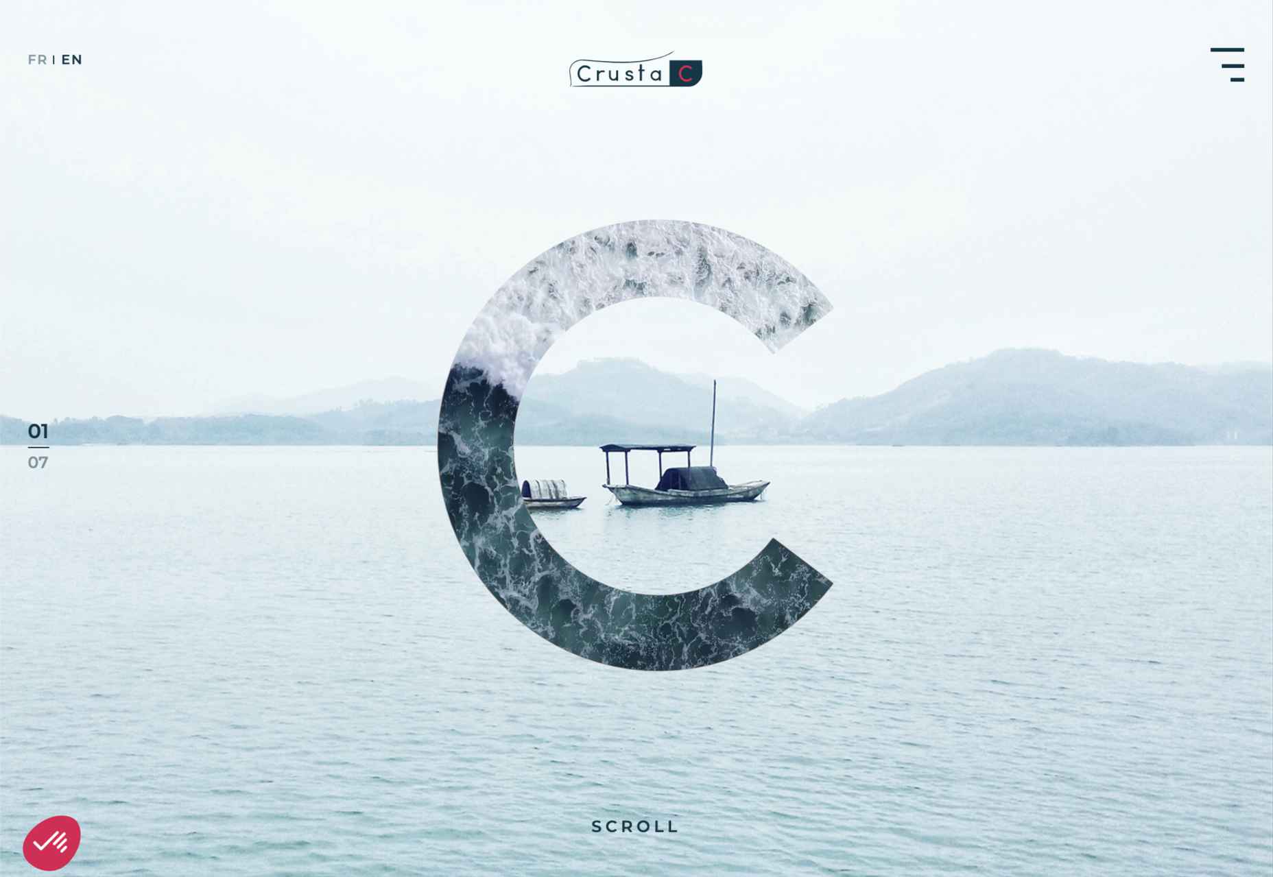
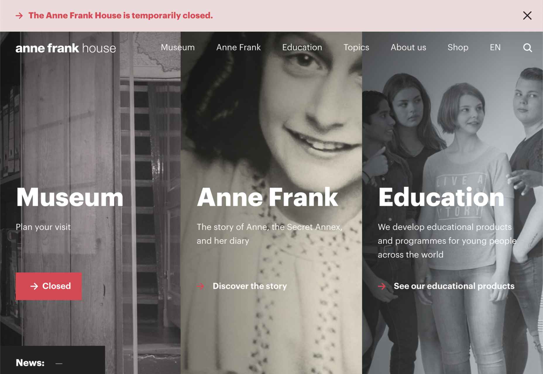
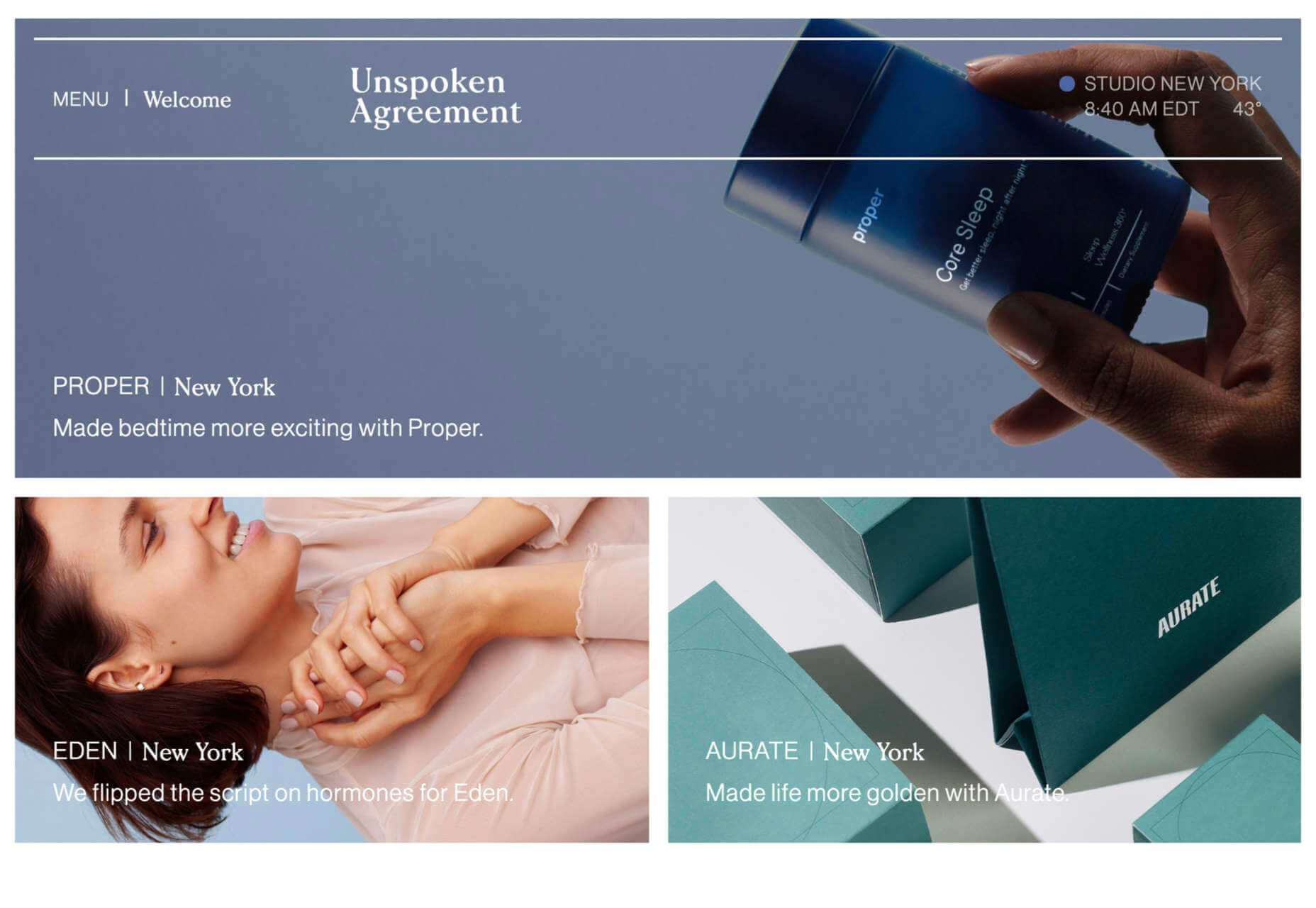
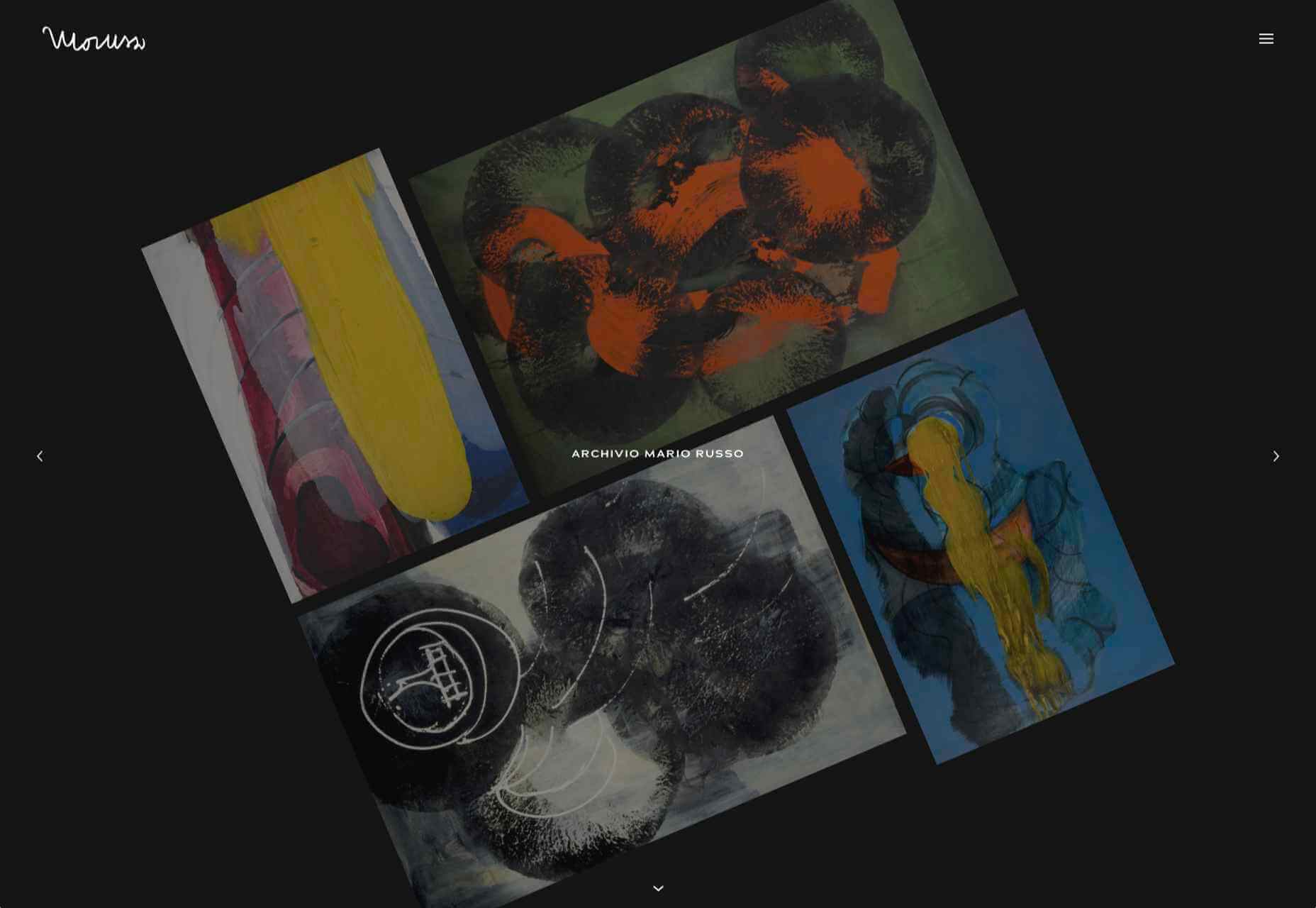
The best thing about writing about website design trends each month is looking at all the great sites that are being developed. Designers are stretching creatively and exploring new techniques and ways of doing things all the time.

It’s refreshing and inspiring. This month, some of those trends include a style that nods to brutalism, slide scrolling that’s interesting and fresh, and animated typography.

Here’s what’s trending in design this month…

1. Almost Brutalism

Brutalism can be a lot to handle and only really works for certain types of projects. That being said, some of the elements of brutalism can be the foundation for an interesting aesthetic.

So, it’s not surprising that an “almost brutalism” trend has emerged.

Designers are working with some of the design elements – slab fonts, simple color schemes with a lot of contrast, twitchy animation, mono typefaces, and overall design patterns that are almost over-simplified.

The result is a striking design that isn’t so harsh that it turns users away. It’s the right combination of brutalism and usability to create something with a harder-edge feel that people understand.

Good Garms uses a typewriter-style typeface, simple patterns, and one of the most streamlined designs you might find for an ecommerce store. It’s effective and makes you look because it is different.

Dockyard Social uses an unexpected color combination with high contrast, sharp shapes, and design elements, and bold slab typography to grab your attention right away. The theme continues on the scroll with new color combinations with equally brutal design elements. It feels a little tight and uncomfortable in places but still highly usable – exactly what almost-brutalism intends to do.

ZN Studio uses the same big, bold type elements as the previous example with a twitchy-style animation to draw you into the design. The entire design uses clever animation effects with a brutal aesthetic to keep you scrolling.


2. Beautiful Slide Scrolling

You can argue the value – or lack thereof – of website sliders as long as you want to. The reality, though, is that, for the most part, they are clunky and get in the way of the content. It’s a lazy option that keeps you from having to make a content choice.

Not with these beautiful slide-scrolling website designs.

Each of these designs uses side-scrolling as a design asset. Here’s the trick that makes it work: Slide scrolling isn’t a “feature” above a bunch of other content. It is how the content is featured.

These examples show you how to use the trend well and should get you excited about slide (or side) scrolling.

Eduardo del Fraile uses a side scroll to show different projects in his portfolio. In addition to scroll, each element also has a simple and beautiful animation that allows you to see each product he has designed. Everything about the scrolling motion is intuitive, and the site never scrolls vertically, which is where many side scrollers go wrong.

Jo Ash Sakula uses a similar concept for the side scroll here but with different design elements. The bold card elements are striking in terms of color, contrast, and design. You know the scroll will move horizontally because a third element sneaks into your field of vision on the right side. It’s simple, clean, and highly usable.

Crimea is interesting because it has an “almost brutalism” style design and uses a side-scrolling pattern. The design is bold and almost overwhelming, but the scroll works to tell a nice story with visuals and content.


3. Typography Animations

Web typography can make or break a design from font choice to size and color to animation, every detail with text elements matters.

This trend explores and pushes the boundaries of animation with text elements in website design. And it is so tricky. The difference between an amazing result and a design fail is a thin line that can be quite subjective.

Each of these examples does something unique with text and animation together to create just the right feel. The flow for each is seamless and text elements – while incorporating movement – maintain readability.

Visages Du Rhone has two layers of animation. The first happens as the words come onto the screen as the color and fade change within the letters. The second is a subtle hover state with a fluid feel for the letters that match the design’s underwater theme. What’s special about the typography animation is that it happens without distorting the letters, something many other liquid text animations do.

Poolhouse uses transparent letters with movement in a layer behind the words. What’s very neat here is the additional filtering so that the background motion still works while maintaining the integrity of each letterform. Again, the focus on keeping text readable is what sets this design apart and makes it trend-worthy.

Komnata takes a wholly different approach with letters that float and look like balloons. The motion mimics what you would expect from an element that looks and feels like something in the real world. The user doesn’t have to do anything for this motion to take place. The animation might be even more effective if the scroll and pointer did not have a tail that “draws” on the screen as a distracting element.


Conclusion

The good thing about looking at variations of different trends is that you can see the practical application and apply it to your projects. While you might not move to a full sliding scroll on your website homepage, you could use that concept in another part of the design.

Experiment, have fun and draw inspiration from trending website designs.

Source

The post 3 Essential Design Trends, April 2021 first appeared on Webdesigner Depot.


Source de l’article sur Webdesignerdepot

Everyday design fans submit incredible industry stories to our sister-site, Webdesigner News. Our colleagues sift through it, selecting the very best stories from the design, UX, tech, and development worlds and posting them live on the site.

The best way to keep up with the most important stories for web professionals is to subscribe to Webdesigner News or check out the site regularly. However, in case you missed a day this week, here’s a handy compilation of the top curated stories from the last seven days. Enjoy!

SVG Generators

15+ Useful Web Development Tools That You Might Not Know

Free Font Alternatives: The Ultimate Guide

Best Lightweight SVG Icon Sets for Web Designers and Developers

Modular UX Platform for eCommerce

Unsplash Is Being Acquired By Getty Images

The Junior Designer Starter Pack

Building a Magical 3D Button

UI Inspiration: 20+ Web Design Concepts for E-Commerce

Tools for Auditing CSS

Create Beautiful Charts With Styled Components

Font Size Is Useless; Let’s Fix It

Source

The post Popular Design News of the Week: March 29, 2021 – April 4, 2021 first appeared on Webdesigner Depot.


Source de l’article sur Webdesignerdepot

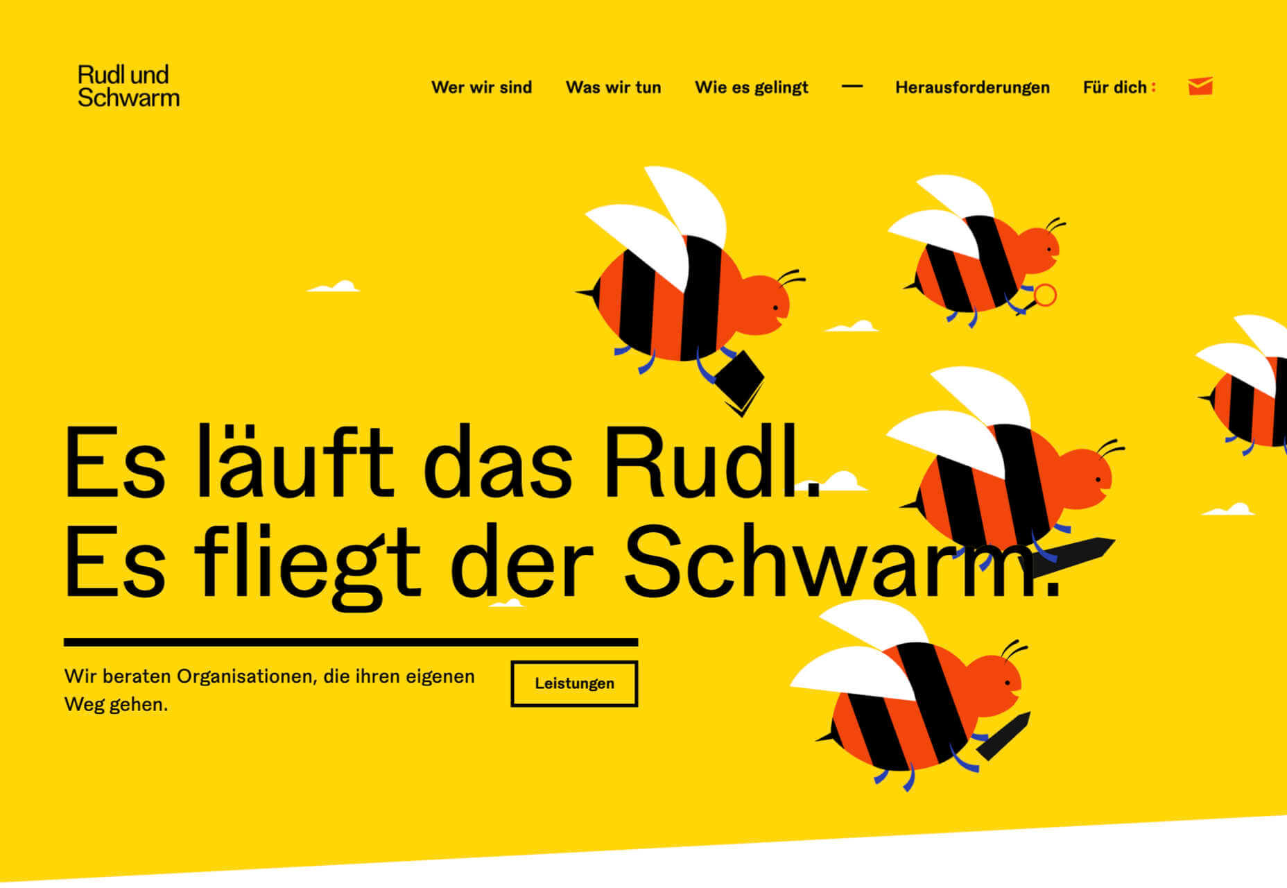
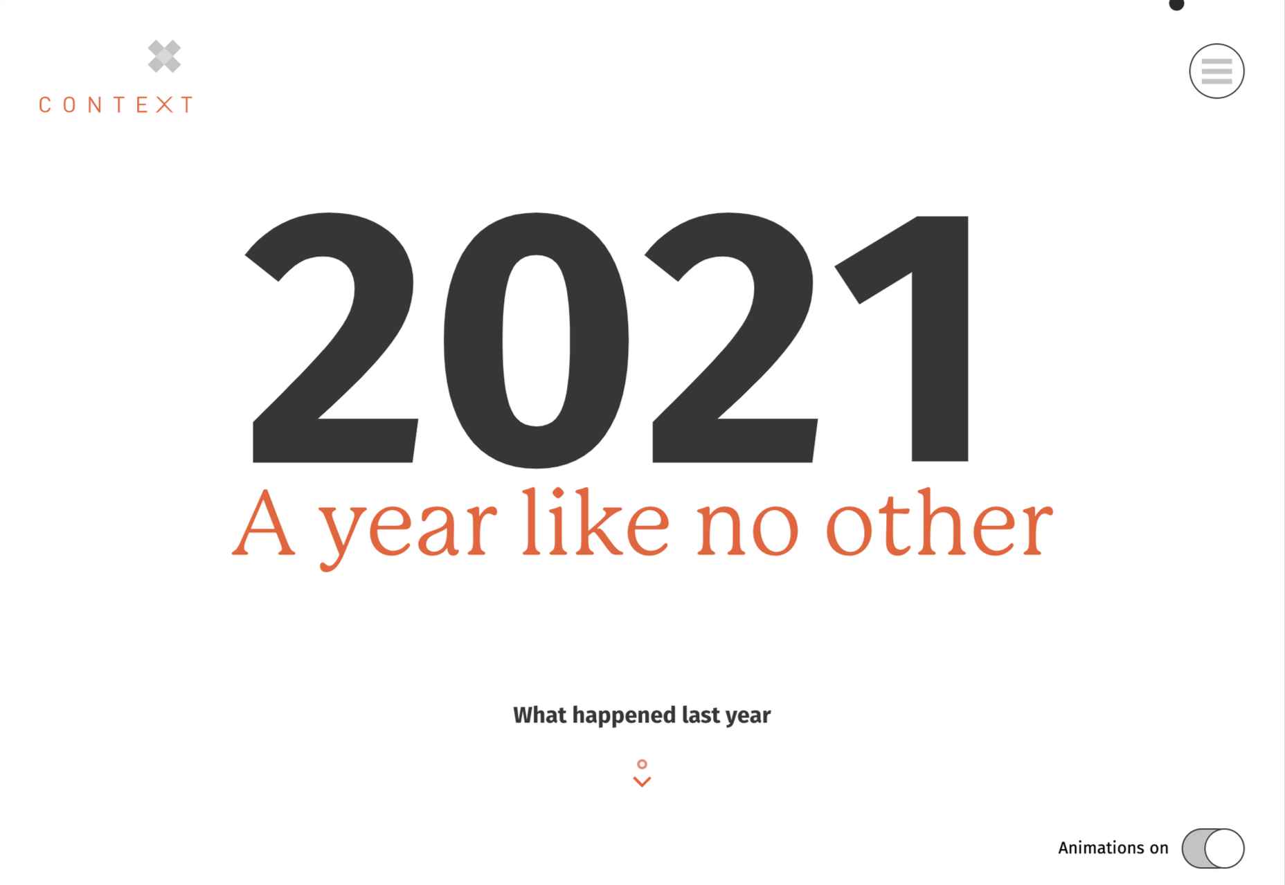
March is that time of year where the feeling of newness starts, from the first Spring days to fresh design projects. These trends are no exception, with fun new takes on some classic concepts.

Circles are always popular, but the top trend is an animated take on the traditional element; plus, fun pink and purple color palettes and a few faux split screen designs round out trending styles.

Here’s what’s trending in design this month.

Circle Animations

Circles are one of those shapes that never leave the design sphere. They have a lot of classical meaning and are flexible in terms of design options.

Designers are having a lot of fun with this shape right now. From animations to text circles to image frames, they seem to be all over the place.

More recently trending is more circle-shaped animations. This trend maintains a circle’s properties as a unified and harmonious element with movement to create more engagement and make you look at the design just a little bit more.

Each of these examples uses circles in a different but equally interesting – and animated – way.

Universal Favourite uses a circular blob. It’s almost like a giant bubble. It wiggles and flows, and stretches within the space without any help from the user. It has a smoothly quality that makes you want to stare at it. The color here helps, with the circle and background not having an immense amount of contrast. Also, note the cute little circle button in the bottom corner.

Kenta Toshikura put most of the subtle animation for this design inside the circle. With a hover state, the entire circle moves on the screen with a second layer of animation, and the cursor is also a circle that hops around the black background.

Kffein takes a totally different approach with a circle made from the primary test elements. Identifying website information rotates in a circle around another geo shape on the main plane. Not only is there a circular animation, but an almost three-dimensional effect that happens due to the way elements are layered here.


Pink and Purple Palettes

The prevalent pink and purple color combination isn’t for everyone – although you wouldn’t know it from the number of designs using similar colors.

This bright combination almost screams “spring” and has a lightness to it that almost seems to lift the mood of any project. (Maybe color selection is a reflection of how we all want to feel.)

What’s nice about these colors is that they flow into one another nicely. They can also be expanded to fall into neighboring hues on the color wheel, such as red from pink and blue from purple.

Maybe the most popular use of this color pair is as a gradient. You can find pink to purple everywhere, from background gradients to image overlays to buttons and user interface elements. There’s no lack of use here.

Each of these examples shows opportunities with this color combination.

SMU uses bright pink, blue, and purple to create a giant “road sign” in the design that jumps out from the rest of the project. The sign almost seems out of place and doesn’t fit as part of the normal color palette. This is what draw you right to it.

USA Volleyball uses the popular gradient option and extends the pink to the purple palette to hints of blue and red. What’s great about this design is that it uses a super trend element and color option and makes it work with their current color palette. You can almost imagine the design conversation when someone wanted to use a pink to purple gradient for a brand that features red, white, and blue. The gamble paid off, and it works beautifully without being off-brand.

Blobmixer uses purple, pink, and a few other bright colors – note the animated circles, too – to draw users into the design. The entire project is a fun, customizable experience that you can play with, and the color choices are what make you interested enough to try. This design also offers a great example of tactile animation and elements that feel real even when you interact with them using a mouse on the screen.


Faux Split Screens

Split-screen designs were a huge trend for about two years. The aesthetic was also functional for content that required a this or that choice on the part of users.

Now, we see the design elements but without the function. (Maybe because it just looks nice and creates a sense of balance without a symmetrical design.)

These projects look like they might offer multiple gateways to content, but there is only one call to action on the dual-screen aside from navigation elements.

What this design option does is help draw the eyes across the screen. One side will immediately appeal to you, and when done well, you’ll feel a subtle push of pull from the color, text, and images to look at the other side as well.

Renaissance TV does it with heavy animation with “dancing dots” from an old TV that doesn’t work. But then you need to look at the green text to understand what is happening.

Yacht uses text weight and space to push the eyes across the screen. Almost everyone will go to the heavier areas first and then gaze across the screen through blocks of space to the final small text on the right side. And it all happens in a fraction of seconds.

Bonjour Paris pairs bold color with black and white images. You may look at either side first, depending on personal preference, but the other half of the screen is necessary for a complete understanding of the website.


Conclusion

While all of these design trends are evident in new and recent projects, the use of pink and purple color palettes – particularly with a gradient – seems to be everywhere you look. These color choices are popular and come in a lot of forms.

Maybe the most obvious is with brighter pink and purple gradients, but other variations are also trending. It’s definitely one to watch in the longer term.

Source

The post 3 Essential Design Trends, March 2021 first appeared on Webdesigner Depot.


Source de l’article sur Webdesignerdepot

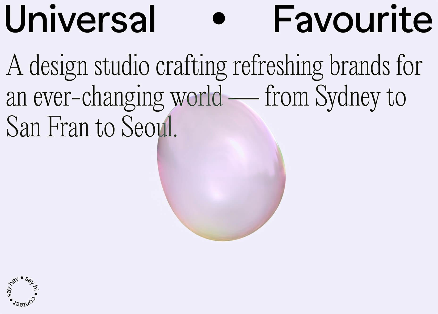
It’s February, and the spring sun is finally starting to peep through the winter clouds. While many of us are still largely restricted to our homes, the web has kept on growing.

We see a shift in attitude towards natural health, wellbeing, and sustainability, and these are now being branded less often as outliers and increasingly mainstream. We’re also seeing more and more color all the time, ranging from an emotional signifier in the background to being a functional element in its own right.

GOOD Meat

Gorgeous color in the background image and the scrolling narrative pull the user in on this site for lab ‘grown’ meat.

Hanwag 100 Years

This page celebrating 100 years of outdoor footwear company Hanweg uses a mix of illustrations and photographs to create a timeline marking the company’s highlights alongside what else was happening at the time. Any excuse to get Yoda in.

Gaffer

Gaffer describes itself as bridging the gap between football, music, fashion, and culture. The site has a glossy feel, with strong art direction and an easily navigable architecture.

Remember MLK

This rather beautifully made tribute to Martin Luther King uses some great typographic effects, and the variations, in contrast, create a layering of the different content elements.

Bonjour Agency

The home page for design agency Bonjour Paris uses sideways scrolling to give an overview of the whole site. There is a lot of content, but it doesn’t feel like waffle, and exploring the site is a pleasant experience in itself.

Wild Souls

Wild Souls is a Greek company that principally makes nut butters, tahini, and halva. The site is very colorful but warm, and the display type — Canela — has a slight softness to it that is appealing.

Nicolas Loureiro

This is a strong portfolio site for interactive and graphic designer Nicolas Loureiro. The work is front and center, and the navigation is pleasing.

Studio Nanna Lagerman

Studio Nanna Lagermann is a small interior design studio that works on private homes, public spaces, and set design. The site creates a feeling of space and calm. Colors are soft and neutral, and the type, although massive in places, is clean and sophisticated.

Aurelia Durand

Illustrator Aurelia Durand created her own typeface that she uses in her work, and it is used as the main display font here too. This site has a sense of joy about it that is hard to resist.

Archivio Mario Russo

This site documents the life and work of 20th-century Italian artist Mario Russo. The layout is thoughtful, and the text, while informative, doesn’t detract from the work being shown.

Gigantic Candy

Gigantic Candy makes vegan chocolate candy bars. The site is big, bold and lo-fi, and has a sense of fun to it.

dBodhi

dBodhi sells handcrafted furniture from Java, made from reclaimed teak and locally grown plant materials. The clean layout combined with a slight sepia tone on all the photography creates a feeling of quietness and nature.

Menu Durable

Menu Durable is a guide to creating healthier, sustainable food menus in Canadian healthcare facilities. There is a lot of information here, and it is well written and attractively presented with clear color coding.

Virgile Guinard

This is a lovely, simple portfolio site for photographer Virgile Guinard. By using blocks of color pulled from each photograph’s predominant color and only revealing each photograph on rollover, each image is allowed to stand out.

The Bold Type

This site for The Bold Type Hotel in Patra, Greece, is a boutique hotel website archetype, but it is done well. The pinky sand background color is a good choice, and the photographs are excellent.

NOR NORM

Nor Norm provide an office furniture subscription service. The site is clean with a feeling of light and space. There is a good balance between an overview of the process and details of the individual items available.

Ask Us For Ideas

At first glance, Ask Us For Ideas looks like a creative agency, but it is actually a creative broker, matching clients with agencies.

Prinoth Clean Motion

Prinoth has been making snow groomers since the 1960s, and this microsite is to mark the launch of their new hydrogen and electric versions. It is as slick and glossy as any luxury car website. And now I know what a snow groomer is.

Pschhh

Design agency Pschhh has embraced the use of circles, reflecting the sound of bubbles their name suggests.

CōLab

CōLab is a design and marketing firm. There is a great use of color and movement here, and you don’t really notice initially that there is no actual work on show.

Source

The post 20 Best New Websites, February 2021 first appeared on Webdesigner Depot.


Source de l’article sur Webdesignerdepot

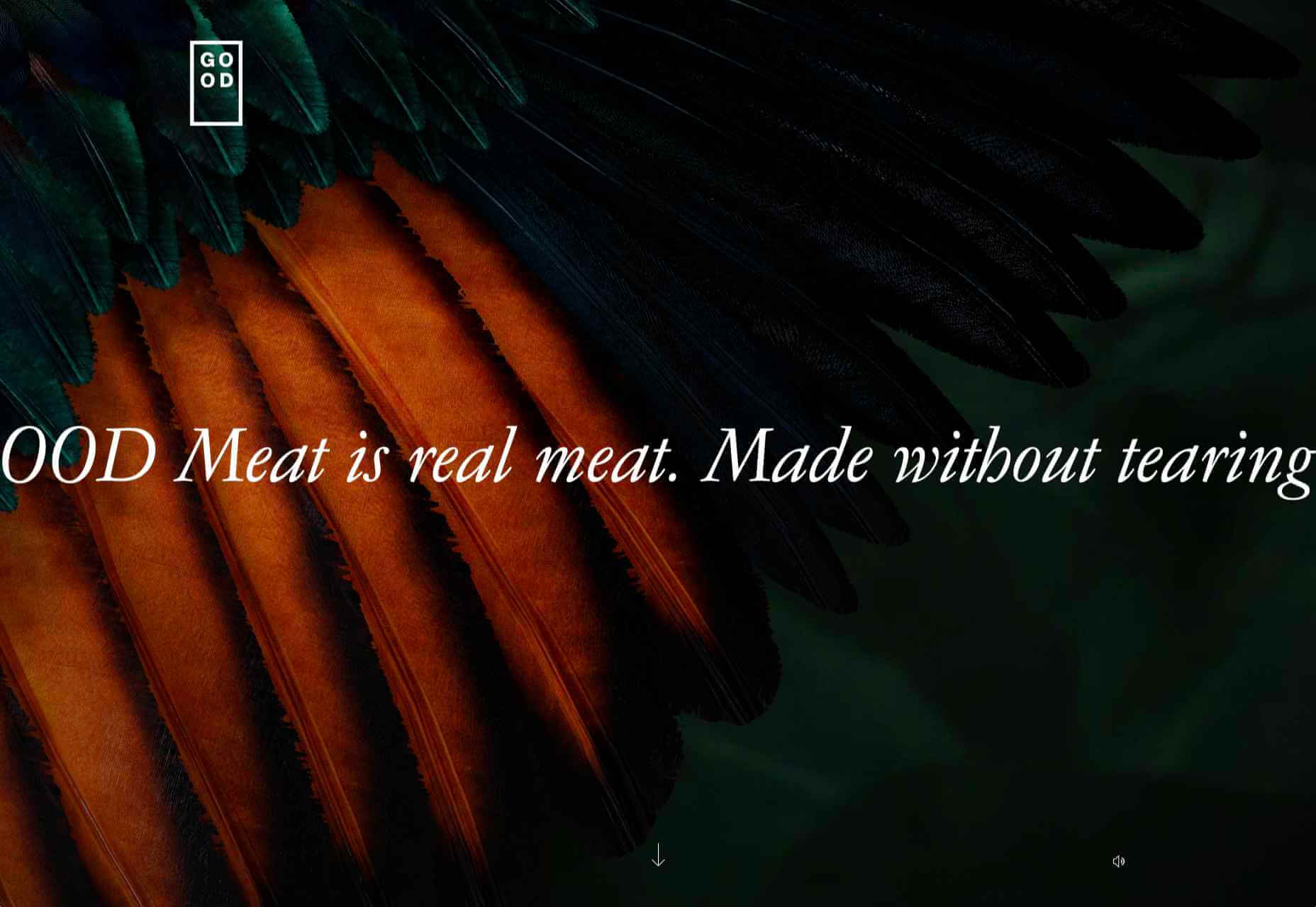
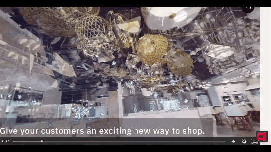
There are some interesting shake-ups on the horizon for ecommerce: Experiential shopping, Virt-ical worlds, Au naturale models.

We’re starting to see signs of them already — many of them spurred on thanks to the events of 2020. Below, we’re going to explore what’s going on with these new ecommerce trends and technologies and take a look at a bunch of sites that are setting really cool examples for each.

1. Experiential Shopping

With many stores, either closed to in-person shopping during the pandemic or their capacities severely limited, online shopping and BOPIS became much more attractive options for consumers.

That said, buying something like a pair of jeans or a new pair of glasses is much different than the pack of toilet paper someone’s bought for years. There are just some things you have to try to know if you’re going to like it and make sure it fits.

Augmented reality and other immersive shopping tools are bringing those “try-on” capabilities to people’s homes.

There are a number of technologies built specifically for this purpose:

Obsess is a particularly noteworthy one. It’s an ecommerce platform that enables retailers to build virtually immersive shopping experiences. Charlotte Tilbury is one such retailer that is taking advantage of it.

Obsess, the augmented reality and immersive shopping experience platform

At the end of 2020, Obsess announced that it had received $3.4 million in seed funding, so expect to see more Obsess-powered ecommerce sites and apps.

ByondXR is another platform that empowers brands to design immersive experiences for online shoppers:

ByondXR helps brands create experiential shopping

Retailers like Lancome, Procter & Gamble, and Calvin Klein have used ByondXR’s immersive commerce technology.

Another option is offered by Matterport:

Matterport's virtual shopping experiences and 3D store mapping tech

This technology is interesting as you’re not just creating a virtual store. You can also design a 3D model of a brick-and-mortar shop that in-store shoppers can use to get in and out quickly.

2. Virt-ical Worlds

There’s a new trend brewing, and we see it most commonly on websites for fresh and youthful brands. I wouldn’t say it’s nostalgic design, per se, though there are certainly some elements reminiscent of the bold, in-your-face style of the web in the late ‘90s and early ‘00s.

No, I think what we see here is a creative reimagining of our world.

With so many people having spent time in their homes and with their faces glued to screens, there’s been a blurring between our VIRTual and physICAL worlds. This new web design trend is one I’m going to call the Virt-ical World. While parts of these sites look like the websites we’ve designed in years past, there are motion, color, and sizing elements that feel more like a trippy virtual simulation.

Let’s look at some examples.

Starface is a company that creates acne-fighting products.

Starface's in-your-face website design

This is one of the more experimental designs in this set of examples. Still, it’s one that shows us how far the boundaries can be pushed without totally compromising the online shopping experience.

Billie is another company having fun with this trend. I’d say this is on the opposite end of the spectrum.

Billie has a fun, candy-colored website design

For the most part, this ecommerce site looks similar to other small retailer sites. However, the fun, candy-colored palette, the bobbing products, and the color shifts add a somewhat surreal element to the design.

Catching THEO is another ecommerce brand playing around with this Virt-ical World.

Catching THEO mixes nostalgia and modern design

See what I mean by this style feeling somewhat nostalgic? Thankfully, this site commits to today’s good, clean, responsive design while only using some of the more fun and quirky elements from the past.

Au Naturale Models

When I talk about au naturale models, I’m really referring to the makeup-less faces, relaxed hairstyles, and casual apparel that we’re seeing ecommerce models don these days.

I think it’s safe to say we have the pandemic to thank for this. And it’s not just because many of us took a more casual approach to getting dressed during the week. It’s also because the pandemic wiped away the glitz and glamour from many of our lives.

I don’t know about you, but it was kind of nice seeing fewer Instagram influencers flaunting their luxurious lifestyles and more real people rocking their matching pajama sets. I think brands have sensed this change in mood over the last year, and they’re now putting forward their own simple and casual styles for us to connect to.

There are tons of ecommerce websites we’re seeing this on in 2021.

Here’s Dove’s homepage, where they specifically call attention to the lack of digital distortion in the photo:

Thinx also uses more natural and realistic-looking models to show off its undergarment products:

Madison Reed takes a unique approach with this trend:

Madison Reed shows off some of the real faces of its customers

While the hair color brand does a great job of using diverse models around the site, it also has this scrolling bar showing off its customers’ very natural and real faces.

Wrap-Up

It feels like ecommerce trends and technologies are changing at a rapid pace these days. To help you stay on top of what’s new in ecommerce, stay tuned to this blog for more interesting news and changes to the landscape.

Source

The post What’s New in Ecommerce, February 2021 first appeared on Webdesigner Depot.


Source de l’article sur Webdesignerdepot