According to Adobe, design-led companies reported 50% more loyal customers and 41% greater market share when the design is implemented in a top-priority and high-quality manner. It plays a multi-level role in helping not only to guide product development but also in establishing a connection with the customer by providing a well-differentiated experience.
Articles
Three weeks ago, you started a web design agency. Then over the last two weeks, you’ve taken a leap toward making your business viable by defining who you are as a business and putting together your documents.
This week, we’ll tie up loose ends so that you’re a fully functional agency able to pick and choose the work you accept.
Day 22: Pitch Deck
Over the next few years, you’ll be doing a lot of pitching: walking into a room and trying to convince someone to give you their business.
Here’s the good news: if you’re in the room, you’ve probably got the job. Stakeholders in successful businesses are usually very busy, so if they take the time to see you, they take you seriously.
The best way to allay their doubts and secure the work is to walk in with a pitch deck. Pitch decks are usually associated with startups but work well for design agencies.
Consider your pitch deck a portfolio formatted for business concerns. Include work samples if you have them, your elevator pitch, and as many provable facts about the service you offer as possible. Keep it short, and use it as a framework for meetings.
Day 23: Kick-Off Checklist
No one is going to suggest that web design is painting by numbers. You can’t knock out websites with a checklist as if you were doing your laundry. However, some stages of the process are repetitive, one of which is the kick-off process.
Far too many projects are derailed by a slow start. You’ve probably agreed to a deadline, and making sure you have everything you need to make progress is vital in hitting that deadline.
As with any repetitive process, creating a document, in this case, a checklist, is advisable to speed up this stage of your projects.
Day 24: Find Some Backup
Whether starting as a freelancer, in a partnership, or with a skeleton crew, you can’t do everything yourself.
This doesn’t mean hiring staff — that is a costly step that you should only consider if you have the financial resources to guarantee a stable cash flow.
Instead, reach out to your network or even freelance boards and see who’s available if and when you need assistance. For example, it is always helpful to have the contact details of an experienced server admin — you’ll only need them once or twice a year, but when you need them, they’re worth their weight in gold. It’s also worth having a couple of contacts who can do simple, time-consuming tasks like image processing.
Outsourcing means focusing on the parts of the job that maximise your profits. Don’t wait until you need them; start developing these networks now, so when the need does arise, you know who to reach out to.
Day 25: Website
OK, 25 days in, it’s finally time to build your website. Yes, in one day.
You already have your elevator pitch, logo, and the niche you intend to target. You also have the terms of service and a link to your social media. That’s everything you need to get a simple business card design online.
Naturally, as you begin to onboard clients, you will develop a portfolio that will allow you to improve your site. But right now, you need a presence quickly.
You picked up your hosting on day 19; today’s the day to put something on it.
Day 26: Client No. 1
The biggest challenge for any web design agency is acquiring good, paying clients.
I know an agency that burnt through seed money for a whole year, waiting for clients to knock at the door. I also know an agency that was only founded because one high-profile client turned up at the creative director’s dorm room. Those are the extremes, but no matter your story, your clients will define it.
Way back on day eight, you wrote a list of potential clients. Today, you’re going to approach one. Your goal is to set up a meeting at which you can sell your service to them. You don’t have to telephone or visit in person; it’s OK to email or message them on social media if those are your strengths. Then, invite them for coffee and an informal chat at the coffee shop you picked on day twelve.
Most of you are going to get knocked back. That’s the nature of the business. The key is to get back on the horse. Try to learn from your approach, and take steps to improve next time.
Your first cold approach is nerve-racking; if it isn’t, then maybe you aren’t taking this seriously enough. But I can promise that approach number two is more easier, and by the time you’ve done a few dozen, you may even start to enjoy it.
Day 27: Quit
A wise man once said, “You’ll never make money working for someone else.” Twenty-seven days ago, you started this process, hoping to seize control of your destiny.
The last step is to quit whatever dead-end job you’ve been tolerating up until now. You don’t need to burn your bridges; you don’t need to punch the boss and kiss your office crush on the way out the door; you do need to take a mental break from your old life to focus on the future.
If you can’t afford to quit, then it’s fine to quiet quit. Just make sure you find the mental space to give your agency the attention it needs.
Day 28: Rest
Over the past four weeks, you’ve manoeuvred yourself into the best position possible to launch your new agency. You’ve decided who you are, who you plan to become, and how you’ll communicate that to the world.
Whether this plan is viable long-term is entirely up to you. You make your own luck in this life.
Today, do what you always do on the last day of the week and rest. Then, tomorrow, you’ll start forging your path to success.
Featured image via Pexels.
The post How to Start a Web Design Agency in 28 Days: Week Four first appeared on Webdesigner Depot.
Python is a robust object-oriented programming (OOP) language that finds a lot of use in the field of artificial intelligence. It is so useful that mega tech companies like Google have made libraries such as Tensorflow to help people to leverage powerful machine learning algorithms and models for various purposes.
People have made ‘sign language’ interpreters, Motorcyclist helmet detectors, and item identifiers using Python and its free libraries.
Purpose of Routing
Routes are created to allow nodes to communicate data packets across networks. In order to route data packets to their destination, they travel along a series of links, each link having a single direction (one-way). A link is formed by joining two adjacent routers together; the router at either end of a link is called the ingress or egress router.
The purpose of routing is to find the best path between two points. Routers exchange information about what routes exist between them using standard protocols. When a packet of data arrives at a router, the router will examine its header to determine where it should send the packet. If the router does not know how to reach the specified destination address, it sends the message to an adjacent router via a neighboring node. Each router stores a table of addresses it knows about. These tables are known as routing tables.
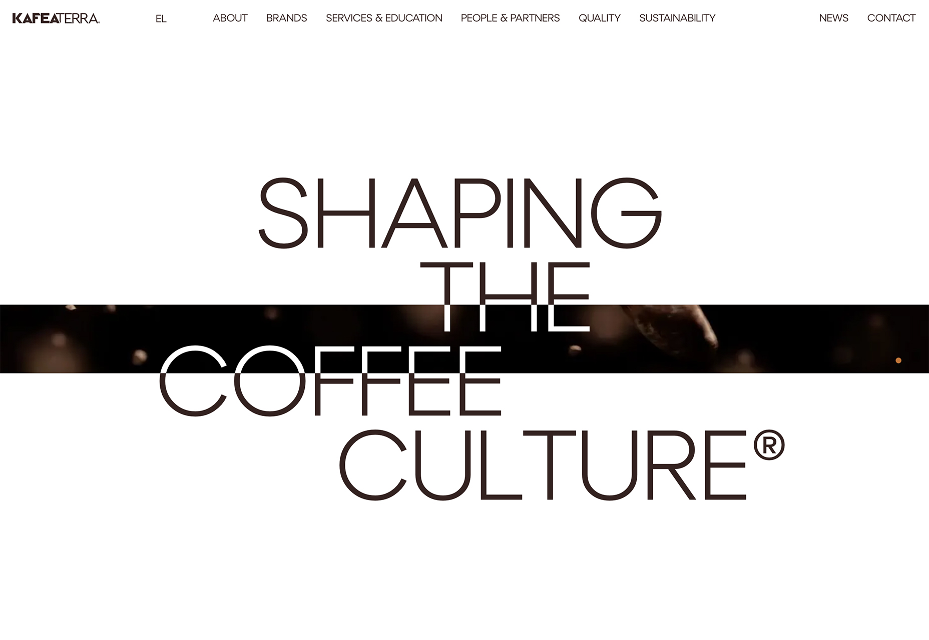
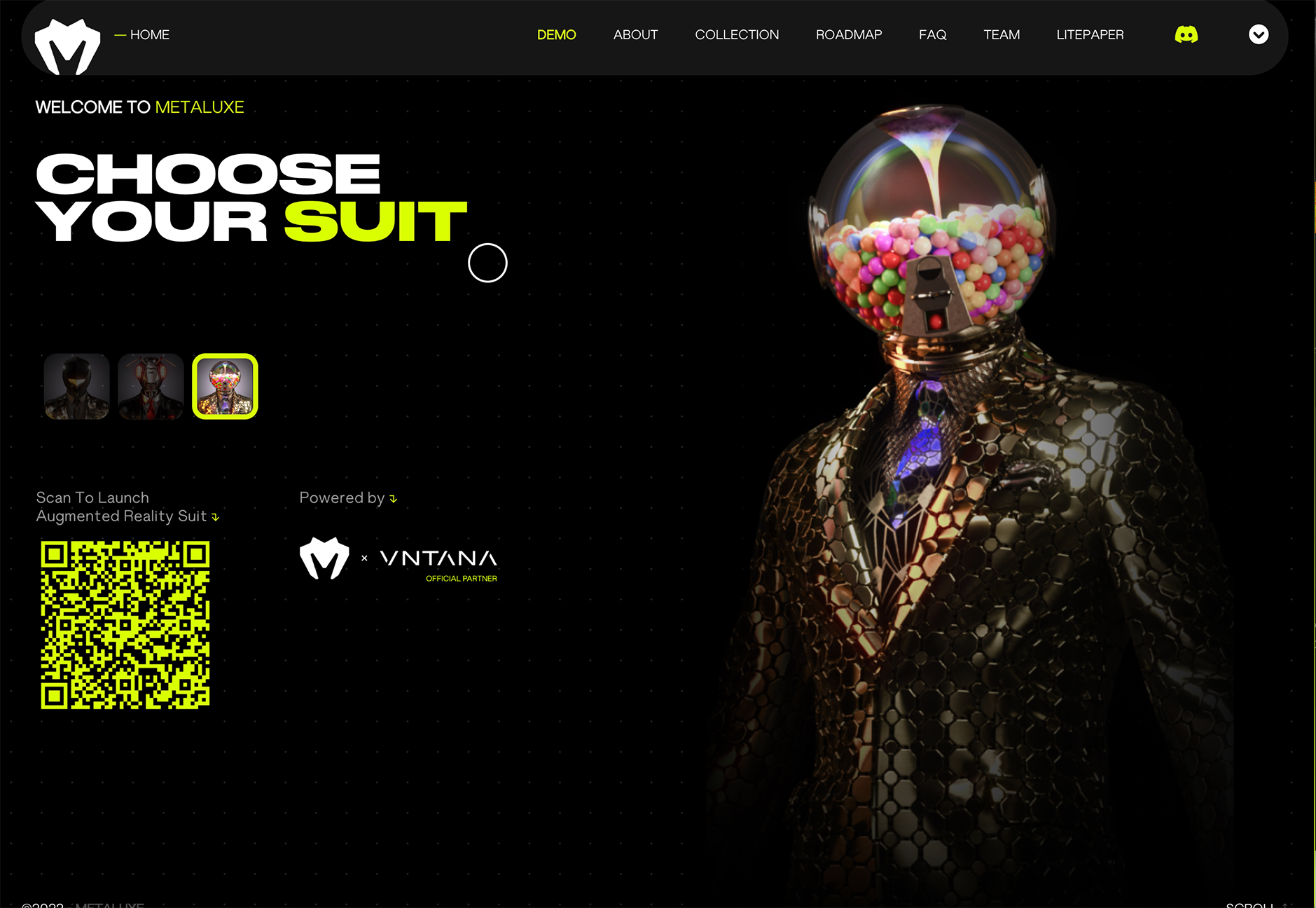
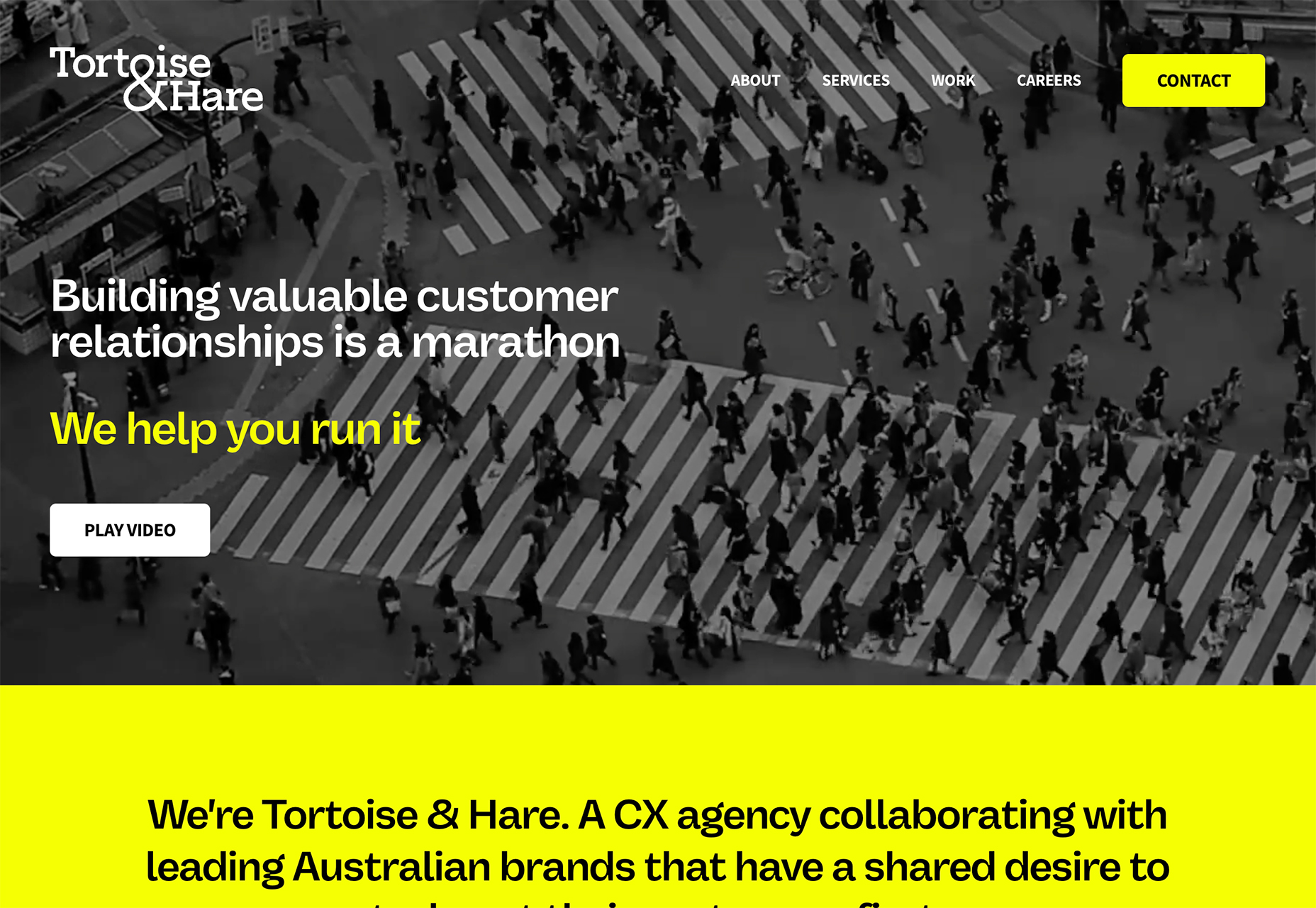
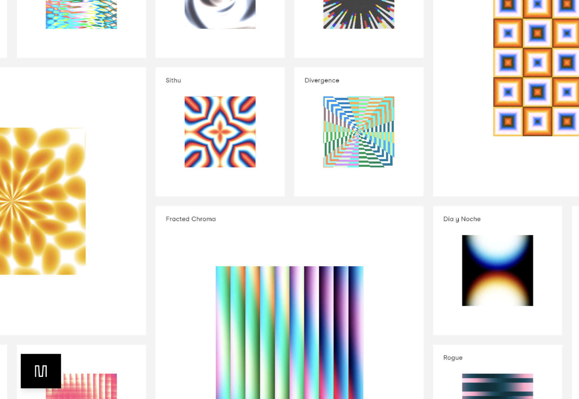
As the season starts to change, so do some of the trends that web designers are using in projects. From a return of blur to interesting frame edges for images to neon color, there’s a lot to get excited about.
Here’s what’s trending in design this month.
1. Blur is Back
Blur as a design element is gaining traction in a big way. This web design trend can look like a lot of different things and be used in a variety of ways.
From backgrounds to blur in images to blurred elements in the foreground, there’s a use case for almost everything.
The thing that makes blur a highly usable design element is that it is easy to create and use. Blur can be created in Adobe Photoshop or similar software, with CSS, or be part of the way an image is created. It can be soft or hard, with or without color, and any size or shape.
The versatility and flexibility make it a popular choice for backgrounds and foreground elements, as you’ll see below.
Future London Academy uses blur in a bit of an unusual way with a blur element in the foreground that blurs the edges of some oversized lettering. The technique is repeated on the scroll and on some images as well.
Outcrowd uses blur in the background with animation to help create visual focus as you scroll. The colorful blurred circles get smaller and less blurred as the user moves down the page to contribute to the story the design is trying to communicate.
Bricklayer Dao uses blur in the background, almost as a red “sunspot” to help create a focal point on the center of the screen. Note how the blur here does not have a distinct shape; it’s almost a swash that leads the eye across and down the screen.
2. Interesting Edges
Most containers that you see for images and videos online are either rectangular or circular. Straight lines help separate content elements from one another.
But more designers are thinking outside the box – literally – with interesting edges for content elements. (Note this website design trend is pretty tricky to pull off and you’ll really have to think about these shapes work together, especially when you switch from horizontal to vertical orientations.)
The commonality with all of these projects that use interesting edges is that images are tucked in behind an element that isn’t a shape you’d typically expect. Most include some element of motion as well, from a load or scroll animation to video. (You should click through to see how each of these examples works.)
Lenka Daviesova has an image behind two cut out shapes that includes a simple load animation. What makes this interesting is that you don’t feel like anything is missing from the parts of the image you can’t see. Your brain fills in the blanks for you.
Ho Daigi Mountain Resort has moving images behind a foreground element in the shape of a mountain. This shape helps provide information about the location and is a clever way to tuck the logo into the lower third of the home hero area. The mountain edge is carried through every scroll on the homepage design.
Kafeaterra uses interesting edges in a totally different way. While the shape is a common rectangle, it’s highly dramatic and text elements encroach into the space. It’s so unexpected that the overlap of elements with no real space of their own, sets a very specific tone for the content.
3. Neon Yellow
One of the most difficult color choices to portray on screens is trending – neon yellow.
Neons are traditionally difficult because they can create visual and contrast challenges and not always look as intended due to user settings. Neon yellow is showing up everywhere right now with black or dark backgrounds though. (Maybe because of the popularity of dark mode.)
The commonality for most of these trending designs is that the yellow is an accent and is not used widely, for the most part. Too much neon can get difficult to read or result in eyestrain.
There also seems to be a consistent vibe with these projects that feels somewhat masculine and stark.
Metaluxe uses neon yellow for text accents and a giant QR code on the homepage. The hue is designed to help move you through content with ease from top to bottom to the call to action.
Robbert Lokhorst uses neon yellow – two shades here, actually – in the logo, as a button highlight, and for keywords in the all-text hero area. Note how the logo and button hues are more yellow than the primary text.
Tortoise & Hare CX Agency uses neon yellow on a black and white video roll as a text and button accent. While this could be a tricky combination, the extra shading over the video helps create enough contrast for it to all come together. Generally, it is not advised to use a neon yellow over white or light colors because there isn’t enough contrast to read it. Here, though, they do a great job of pulling the pieces together.
Conclusion
One of the things that’s interesting about this collection of trends is that we are seeing new iterations of things that were popular in the not-so-distant past. Blur was a major trend just a couple of years ago and seems to be re-emerging again. Neons seem to come and go pretty regularly.
If nothing else, these “recycled” trends are a good reminder to file work well so you can dig out some of those old ideas when they come into fashion again.
The post 3 Essential Design Trends, September 2022 first appeared on Webdesigner Depot.
Cyber threats have become more sophisticated. Hence, it is a good idea to utilize the expertise of public cloud providers to better manage assets against security threats. Cloud security is a collection of proactive measures to protect your cloud assets from internal and external threats. In this Refcard, we will walk through common cloud security challenges, continuous security for cloud infrastructure, and advanced strategies for securing cloud workloads.
Source de l’article sur DZONE
I won’t introduce Dependabot. Lots and lots of developers use it daily on GitHub. I do use it as well. However, it suffers from two drawbacks:
- While it’s perfectly integrated with GitHub, integrations with other platforms are less seamless.
-
It’s limited in the list of ecosystems it supports For example, I generally use Docker Compose files for my demos. When necessary, I use Kubernetes. Dependabot supports none.
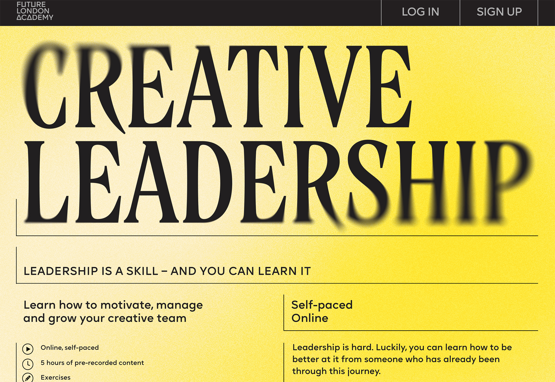
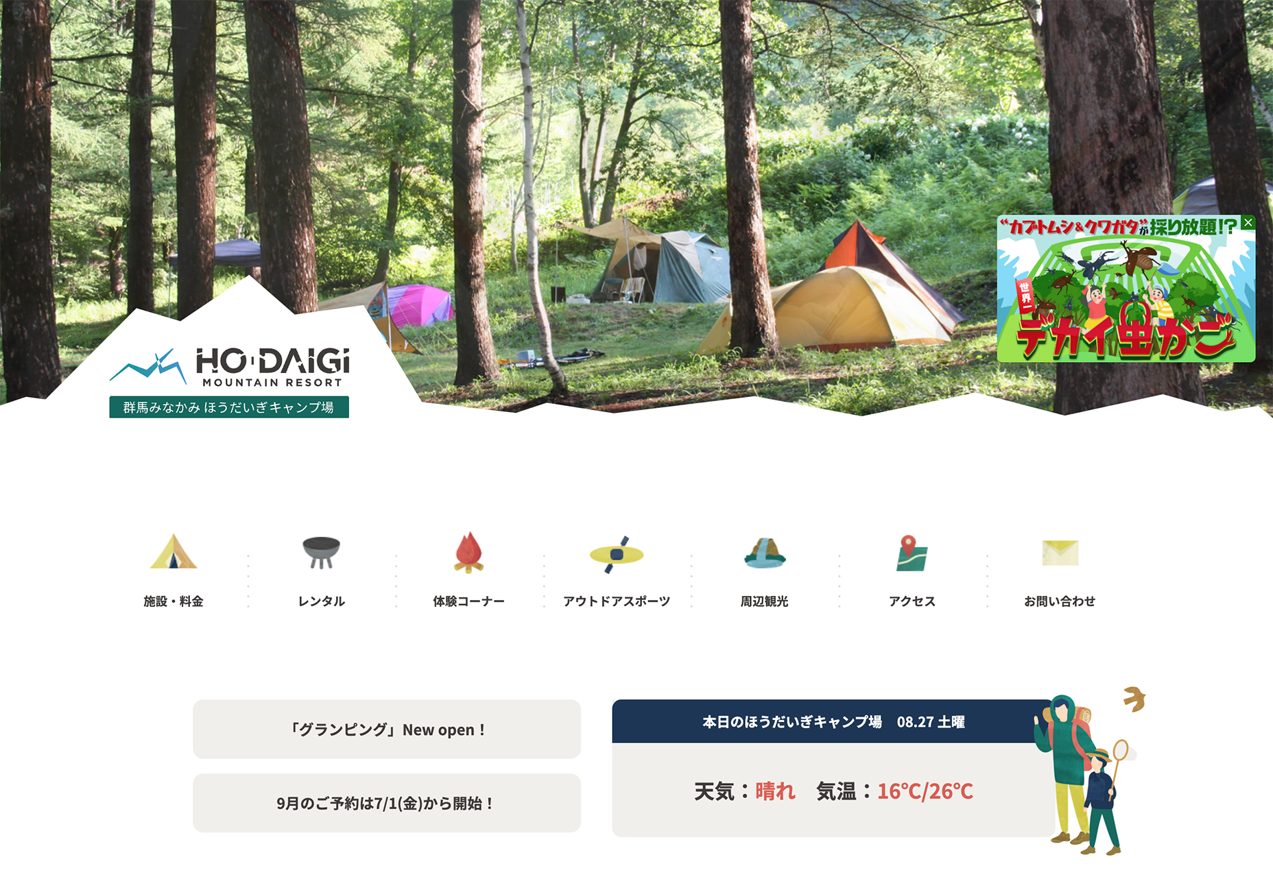
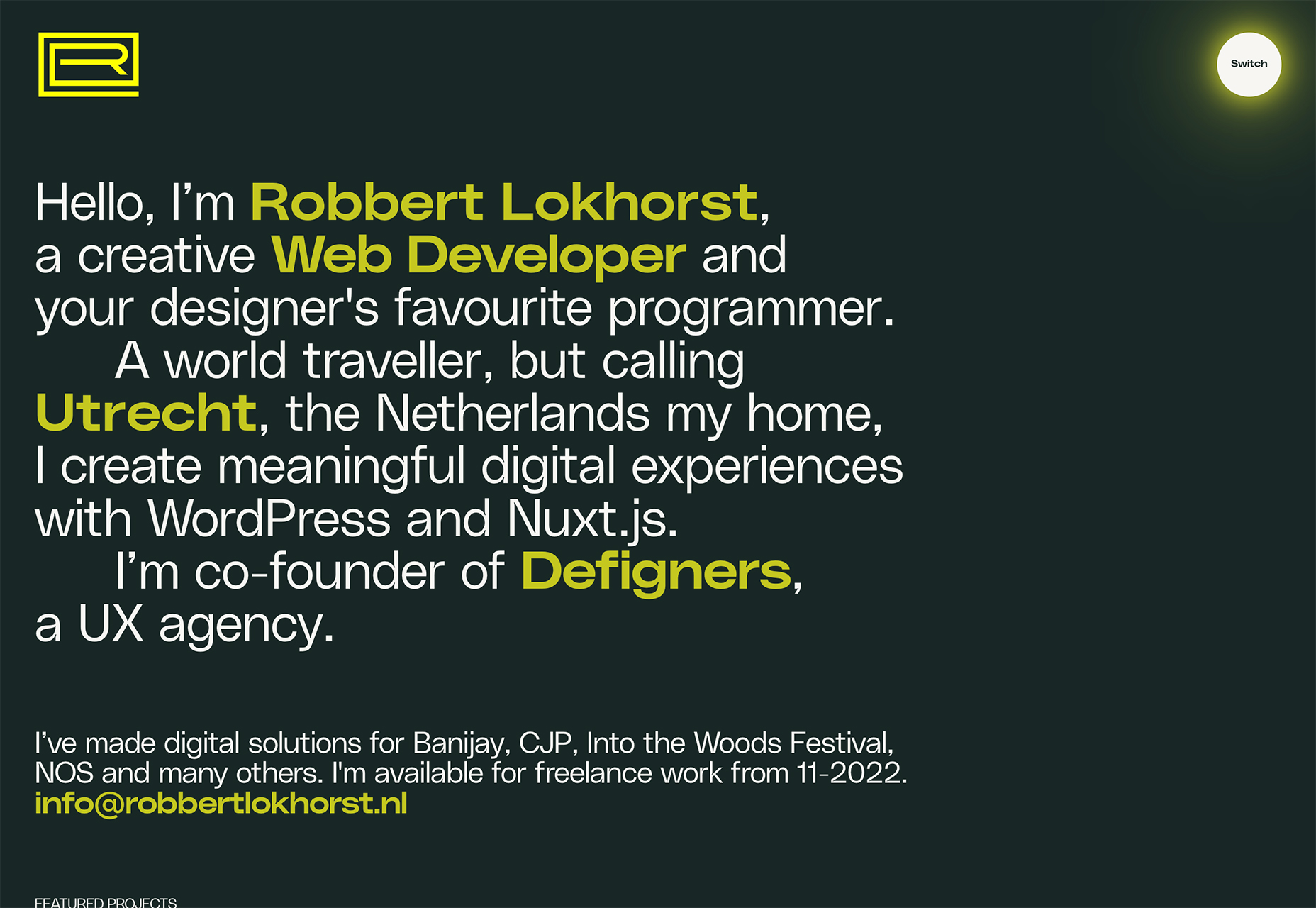
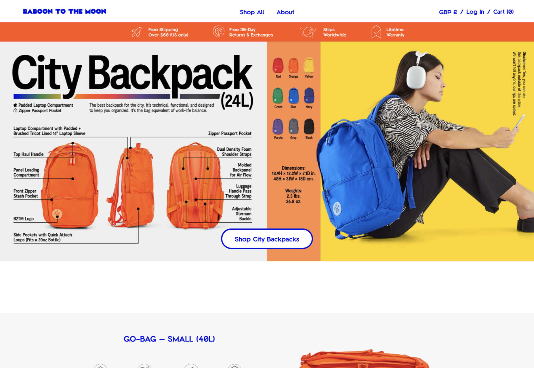
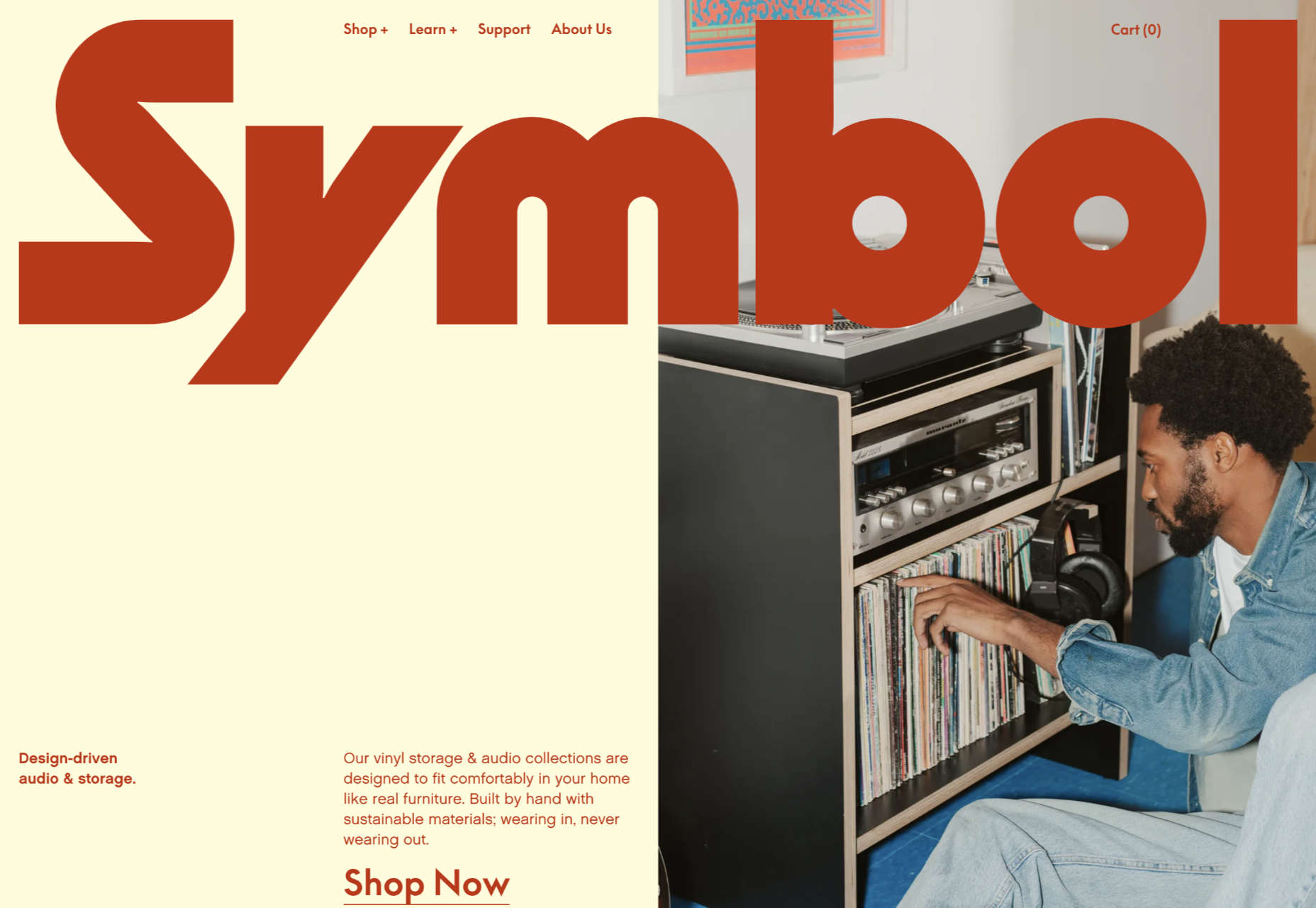
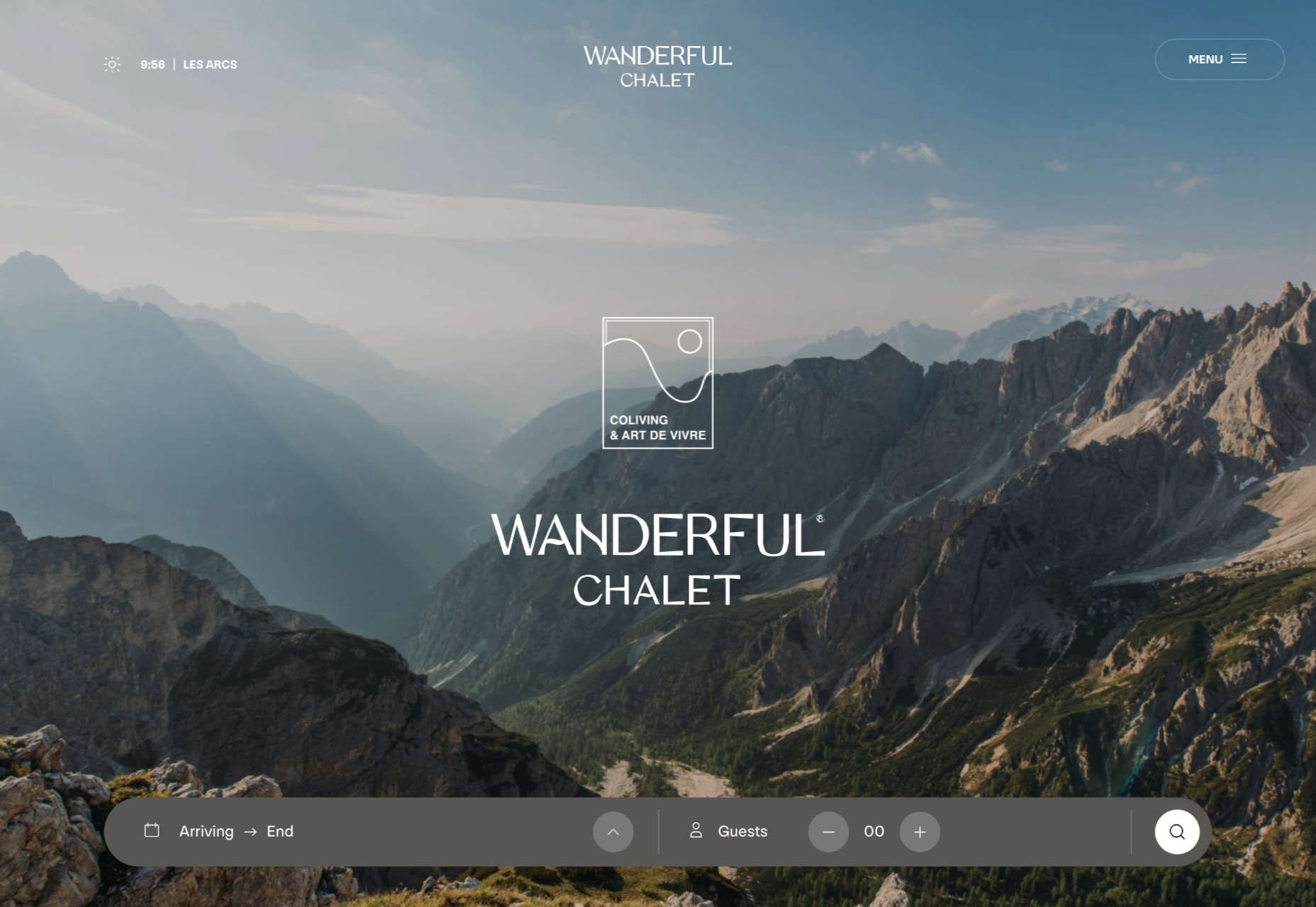
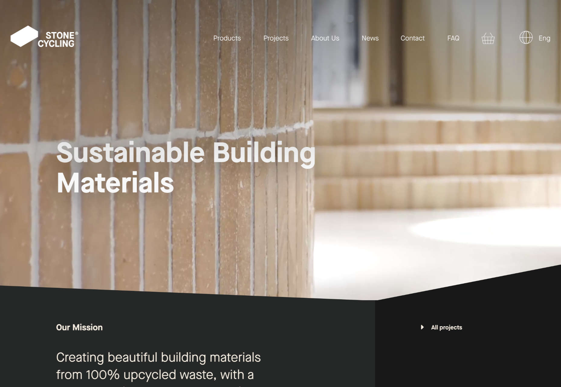
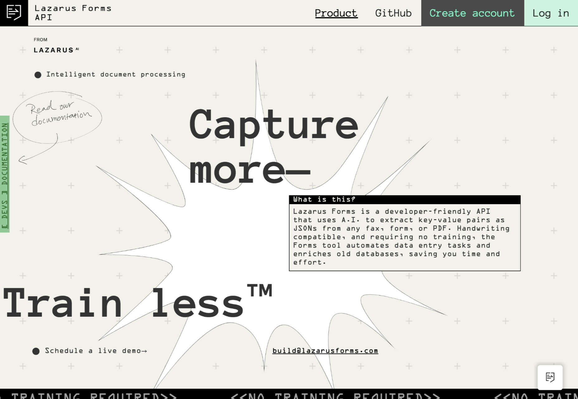
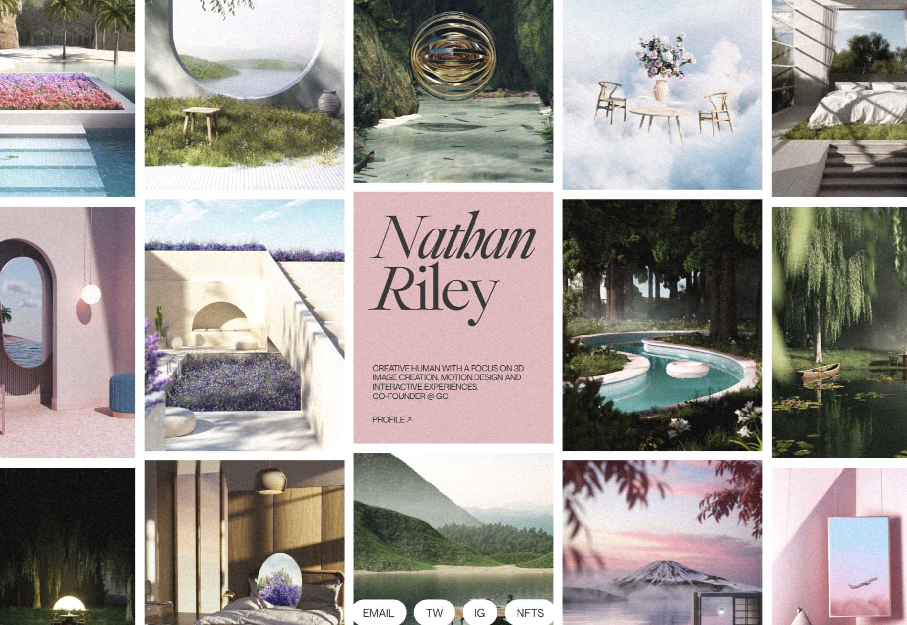
The purpose of a website is to reach new customers and keep current ones engaged. Therefore, customer-first should be at the top of your list for design features. After all, without your clients, your business won’t grow or succeed.
Customer-first has been a buzzword for a few years now. In a nutshell, it’s easy to imagine what customer-first design means. The needs of consumers come before anything else. However, the concept isn’t quite as simple in practice. A lot of nuances enter the equation.
Just what does it mean to have a customer-first web design? What are the must-haves to reach users on their level and keep their attention for the long haul?
Embracing quality customer experiences has driven loyalty for as long as anyone can remember. However, we now live in a time of uncertainty, and when people leave companies on a dime if they’re dissatisfied with any aspect. So you must hit the high notes on every song – your website is your purest online persona and must engage users and keep them entertained.
Whether you embrace causes that matter to your customers and share information on them or tweak your design to meet accessibility guidelines, many factors come into play with a customer-centric design.
In a recent report, researchers found that about 88% of company leaders feel customer engagement impacts revenue. You can’t control every variable, but you can ensure your website hits all the strong points for a customer-first web design that grabs them and keeps them on your page.
Here are our favorite tips to create a customer-first approach. You may already be doing some of these things. Pick and choose what makes the most sense for your business model. Even small changes can have a big impact.
1. Know Your Customers
Before creating a website centered around your customers’ needs, you must know who they are. What are the demographics of your typical clients? Survey them and find out what their needs and expectations are. How can you best help them?
You may also want to survey them about your website. What’s missing that might help them? Is there anything they love? What do they hate? The more you know, the better your design can match their expectations. Create buyer personas based on their preferences.
At the same time, buyers will sometimes say one thing but actually feel another way. No one is quite sure why people do this when being surveyed. One way around that issue is to do some A/B testing to see how they actually feel about various changes. Do they respond the way you thought? What other adjustments need to be made?
2. Find the Right Color Palette
Different industries trend toward various hues. For example, businesses in the banking industry trend toward blues and occasionally reds. Blue elicits trust from users and has a calming effect. On the other hand, the fashion industry might tap into brighter shades, such as lime green. Think about what colors people expect in your industry, and then find your color palette.
Each hue has its emotional impact. For example, red is a color of power and can elicit excitement in the viewer. Choose your shades accordingly to get the most emotional punch possible.
3. Accept Feedback
One of the best ways to improve your site over time to match the needs and preferences of your audience is by allowing feedback. Add reviews, place a feedback form in your footer, and even send out requests for feedback to your mailing list.
It’s also a good idea to find a mentor who has been successful at running a business. Ask them to look at your site and give you advice. You might also enlist the help of a marketing professional.
4. Stick With the Familiar
Have you heard of Jakob’s Law? The rule of thumb states that people prefer common design patterns they’re most familiar with. So when they see a pattern they know, such as a navigation bar layout, it boosts their mood and improves their memory of the site.
When making edits, don’t make significant changes. Instead, implement minor adjustments over time to give your followers a chance to acclimate to the shift.
5. Cut the Clutter
If you want users to feel wowed by your page and engage, you have to limit their choices. Add in too many options, and they may not know where to go first.
Start by choosing an objective for the page. Cut anything that doesn’t point the user toward the goal. Ideally, you’d have a little info, an image, and a call to action (CTA) button. However, this may vary, depending on where your buyer is in the sales funnel and how much information they need to decide to go from browser to customer.
6. Choose Mobile Friendliness
Recent reports indicate about 90% of people use mobile devices to go online at times. With phones gaining greater capabilities and 5G bringing faster speeds to communities, expect people to use their mobile devices even more frequently for internet browsing.
Making sure your site translates well on smaller screens makes sense for your company and for your customers. Be sure to test everything. Click through all links. Fill in forms. Ensure images and text auto-adjust to the correct size, so people don’t have to scroll endlessly.
7. Make Multiple Landing Pages
Like most businesses, you probably have several buyer personas as you segment your audience. Don’t just create a single home page and expect it to fulfill the purpose of every reader. Instead, create unique pages for each persona to best meet their needs.
Make sure each landing page speaks in the natural language patterns of your specific audience. Think about the unique needs of each group. How do their pain points differ? How can you best meet their needs?
8. Keep Important Info Above the Fold
People are busy. They work, have families, and might visit your site on the 15-minute break they get in the afternoon. Most consumers want the information they need to decide and don’t want to dilly-dally around with other things.
Place the essential headlines and info they need above the fold, so they see it first. Make it as readable as possible by using headings and subheadings. Add in a few bullet points. People also absorb information easier in video format, so add a video highlighting your product’s or service’s main benefits.
You should also place a CTA button above the fold if it makes sense for your overall design. Keep in mind people may have visited and already read some of the information. Some users return just to sign up and want to find the CTA quickly.
Step Into Your Customers’ Shoes
Look at your site through the eyes of your audience. What works well? What needs to be adjusted? Over time, you’ll develop a customer-first web design that speaks to those most likely to buy from you. Then, keep making changes and tweaking your site until it hits the perfect balance for your customers.
Featured image via Freepik.
The post What Customer-First Web Design Looks Like first appeared on Webdesigner Depot.
A data pipeline, at its base, is a series of data processing measures that are used to automate the transport and transformation of data between systems or data stores. Data pipelines can be used for a wide range of use cases in a business, including aggregating data on customers for recommendation purposes or customer relationship management, combining and transforming data from multiple sources, as well as collating/streaming real-time data from sensors or transactions.
For example, a company like Airbnb could have data pipelines that go back and forth between their application and their platform of choice to improve customer service. Netflix utilizes a recommendation data pipeline that automates the data science steps for generating movie and series recommendations. Also, depending on the rate at which it updates, a batch or streaming data pipeline can be used to generate and update the data used in an analytics dashboard for stakeholders.
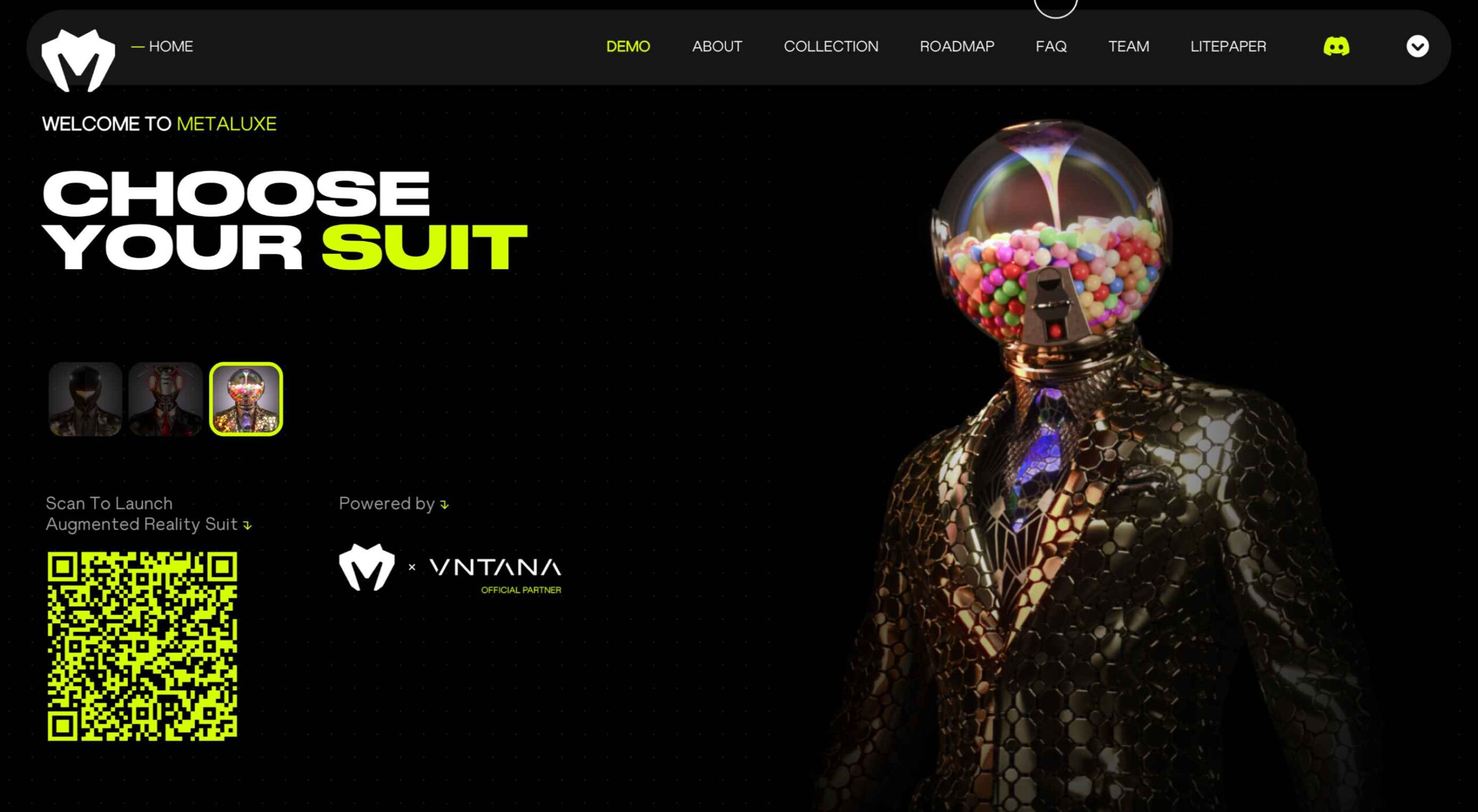
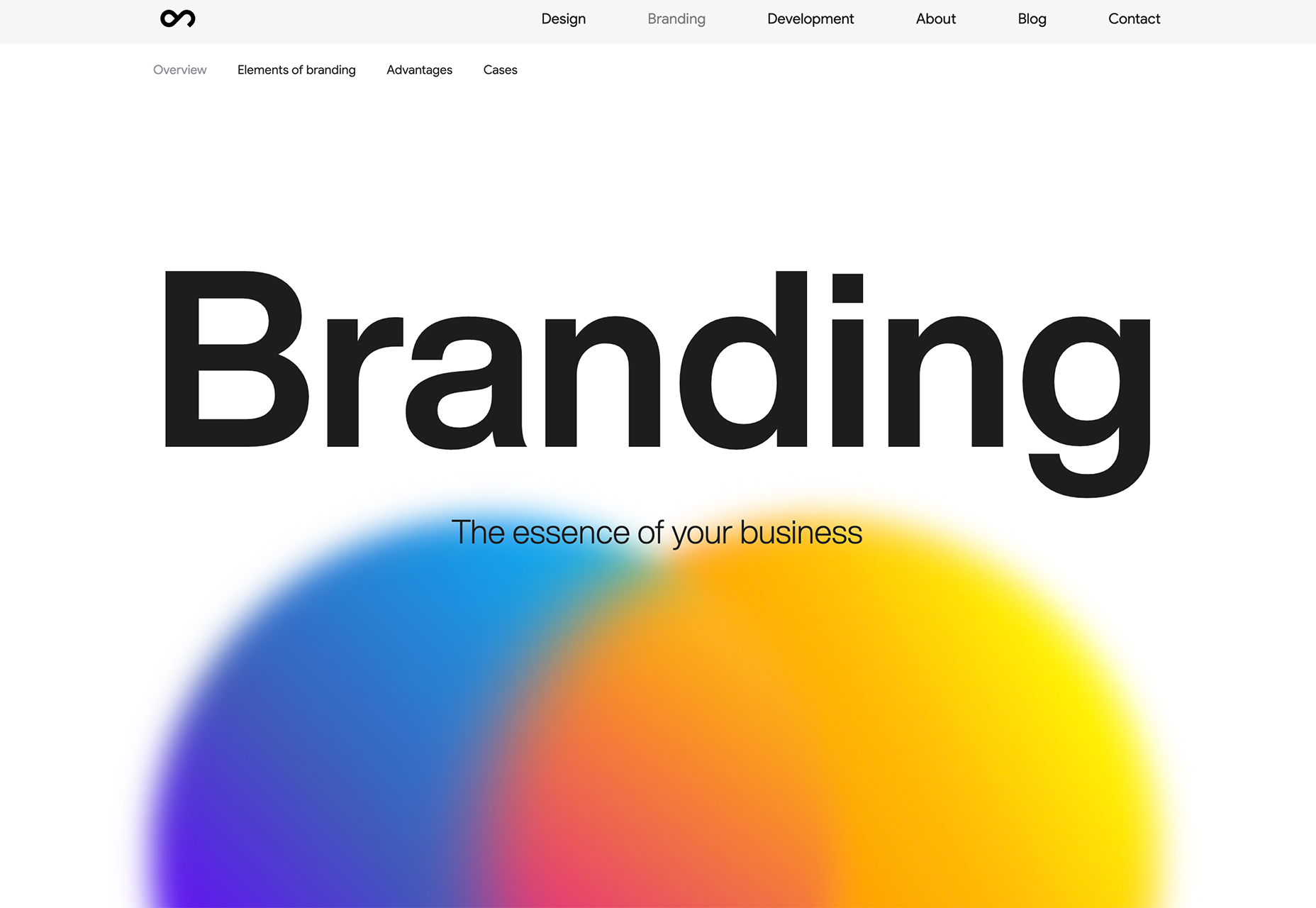
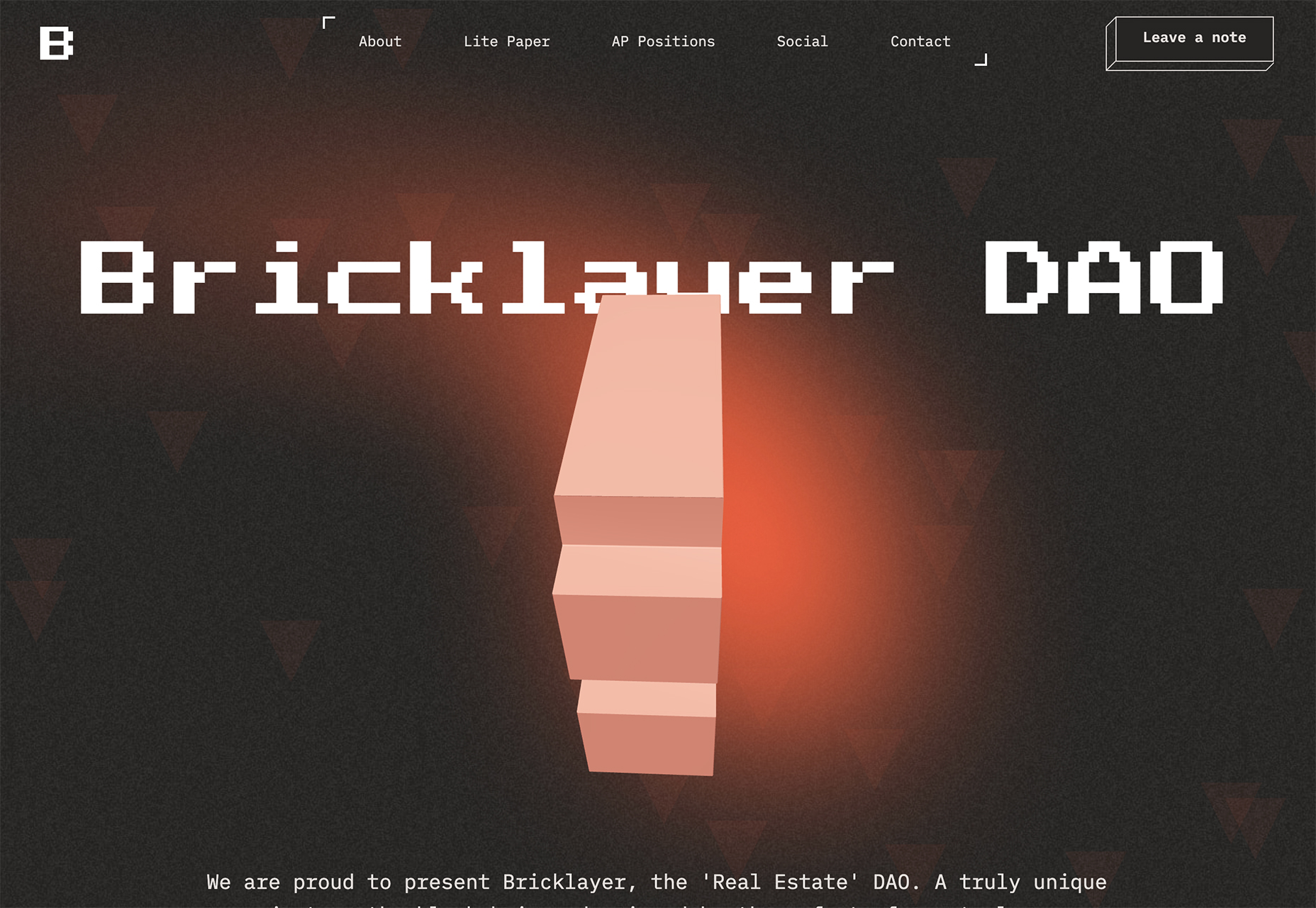
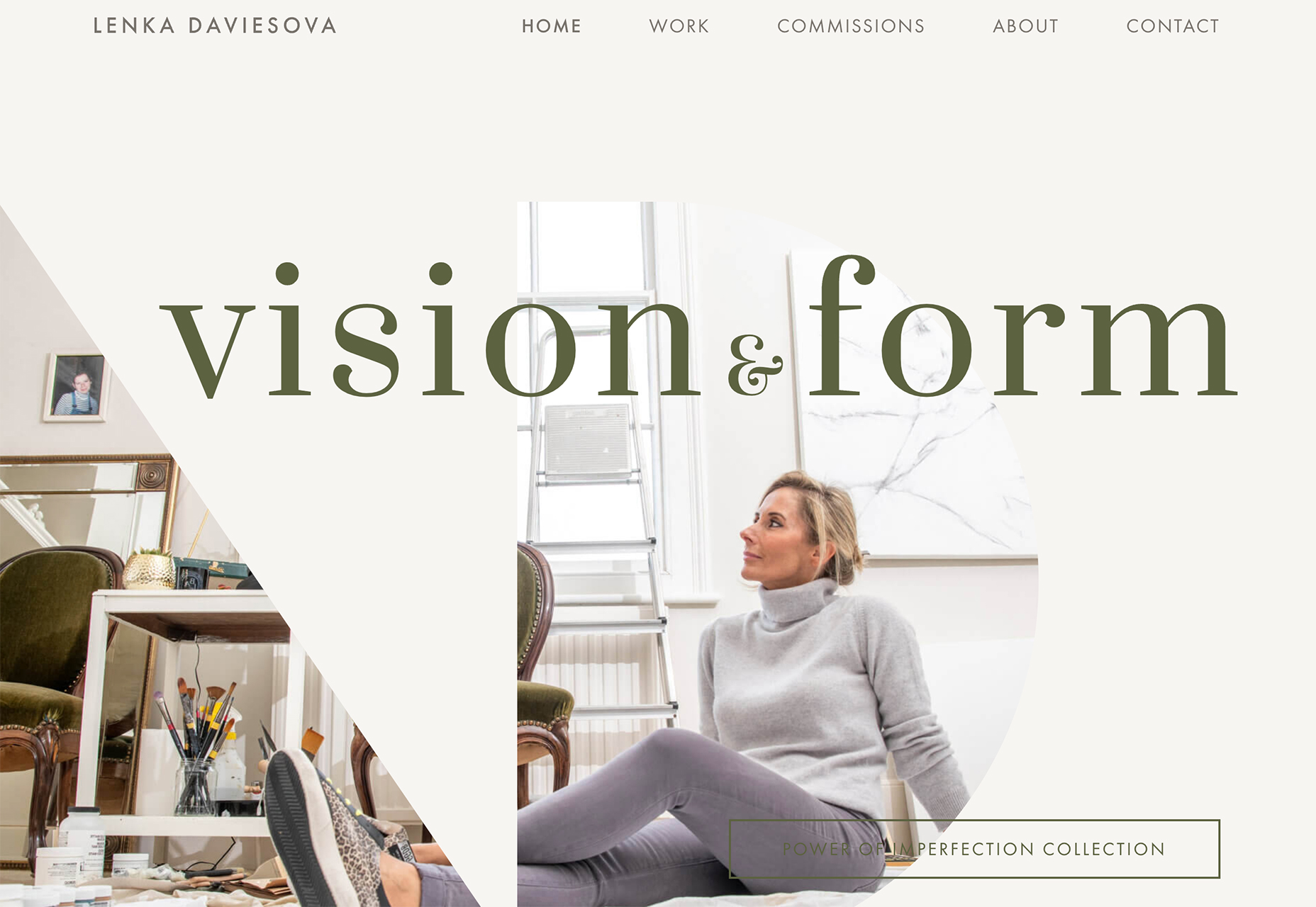
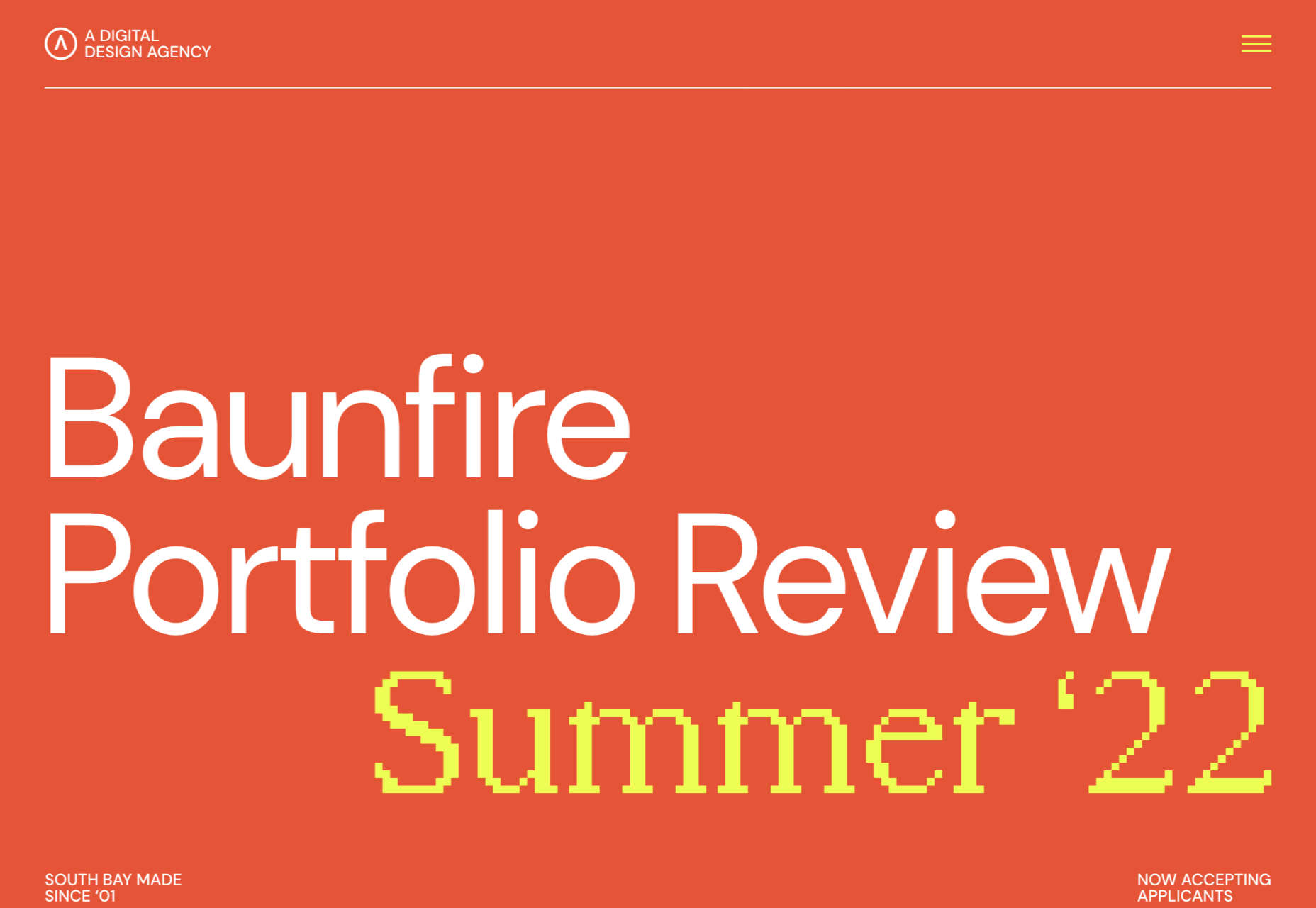
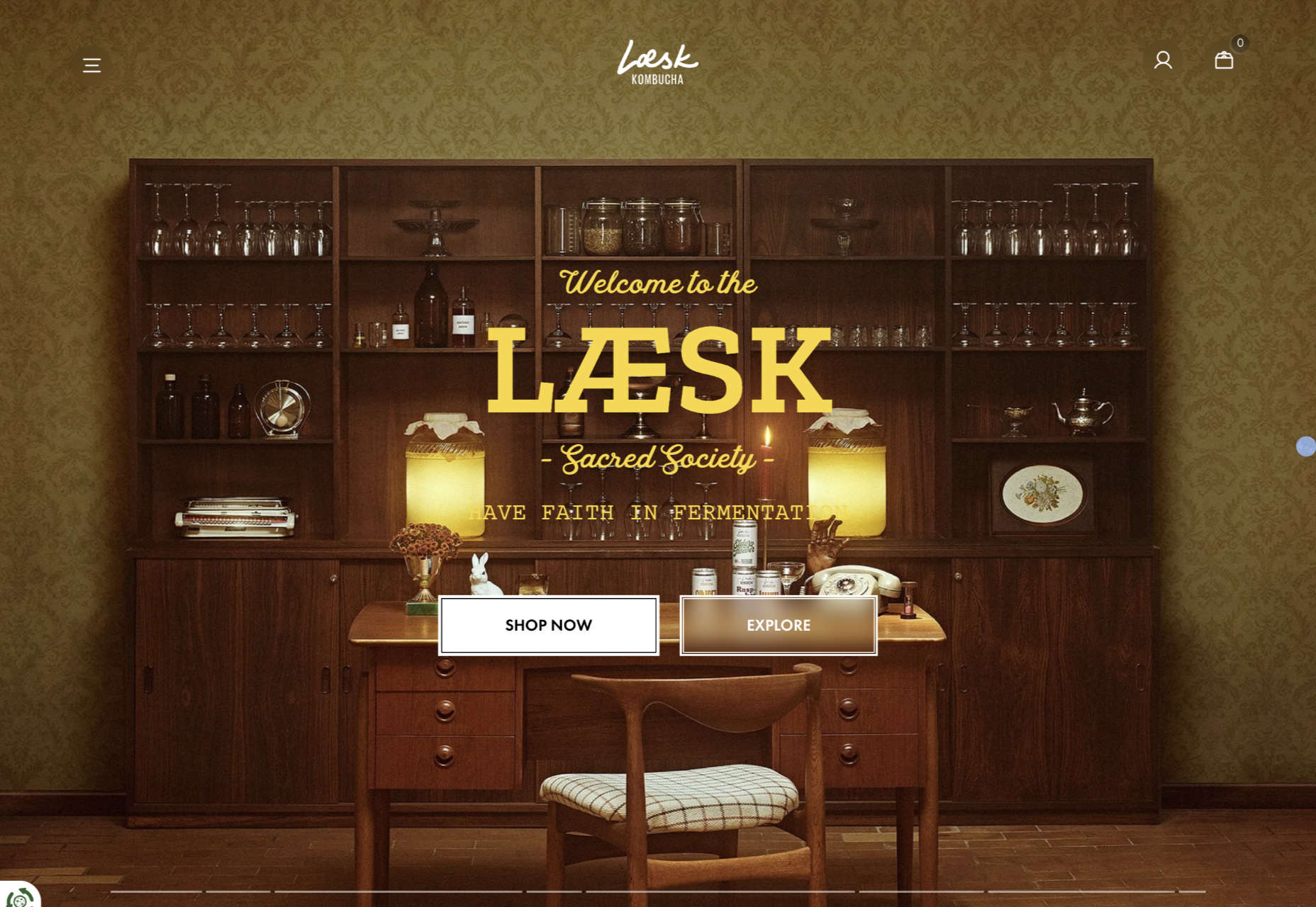
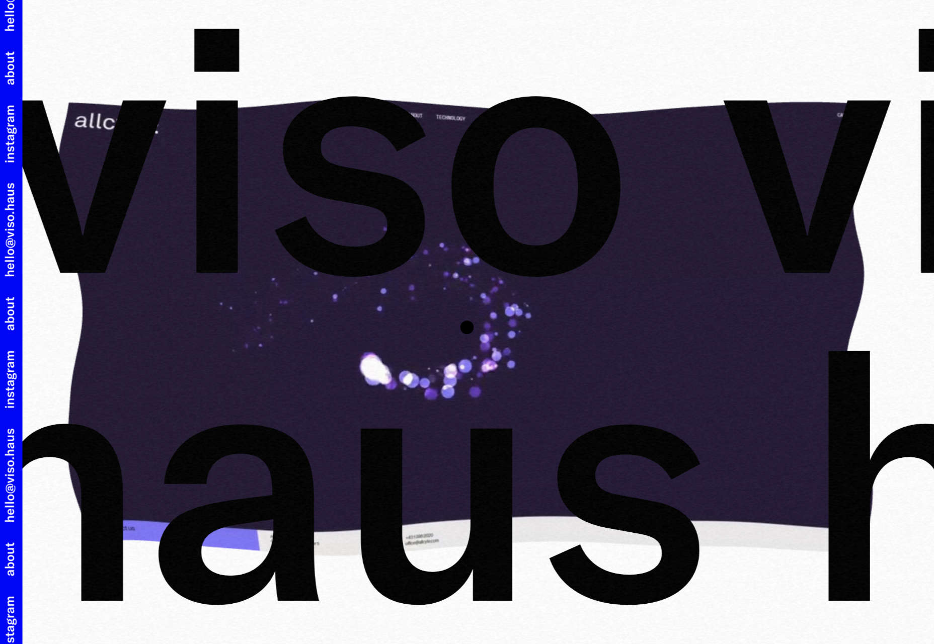
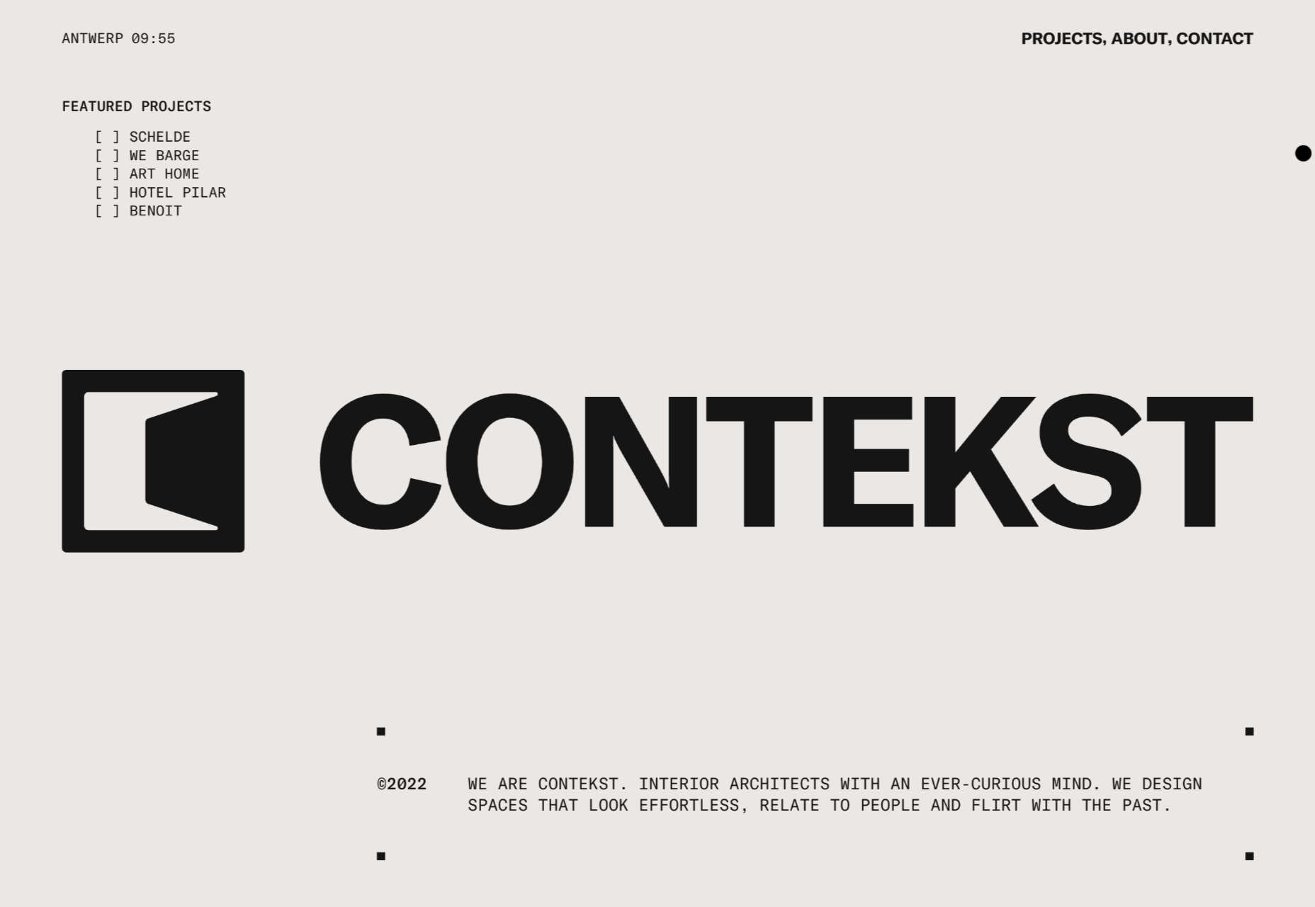
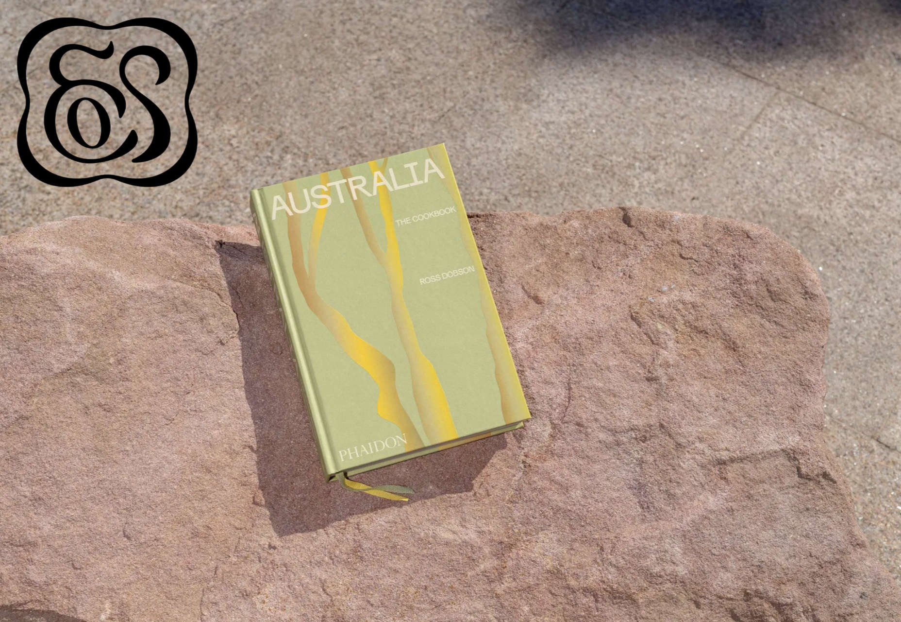
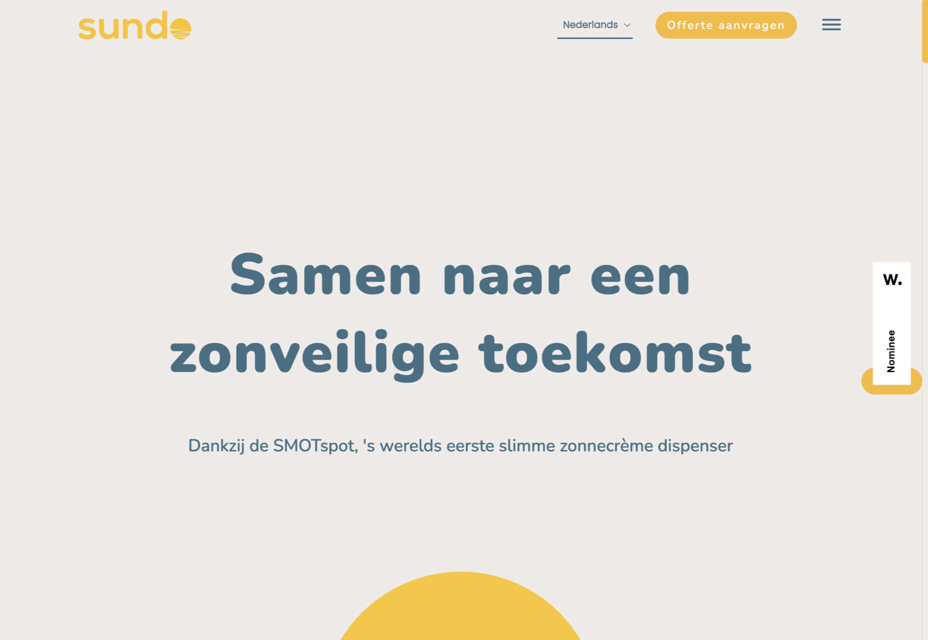
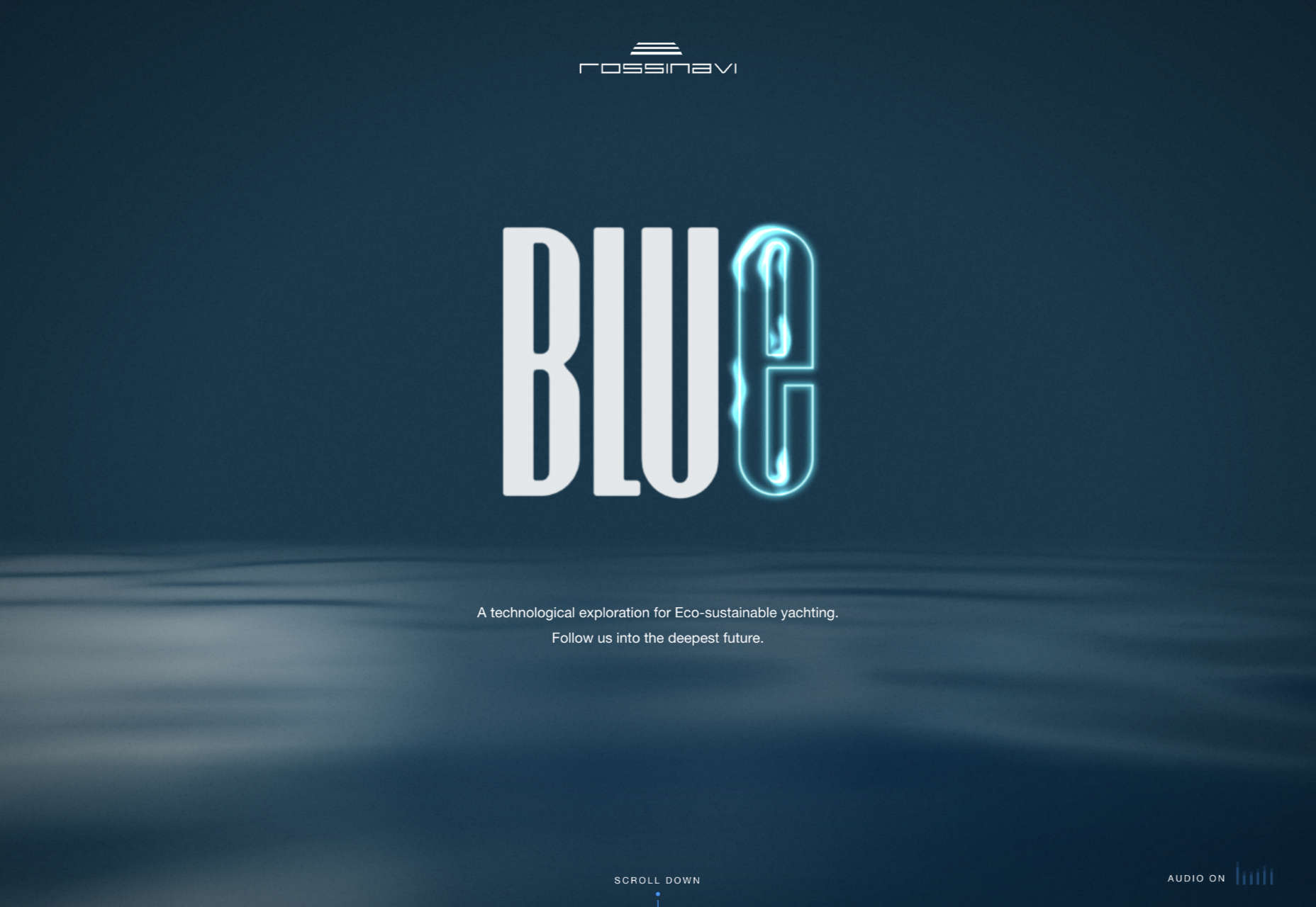
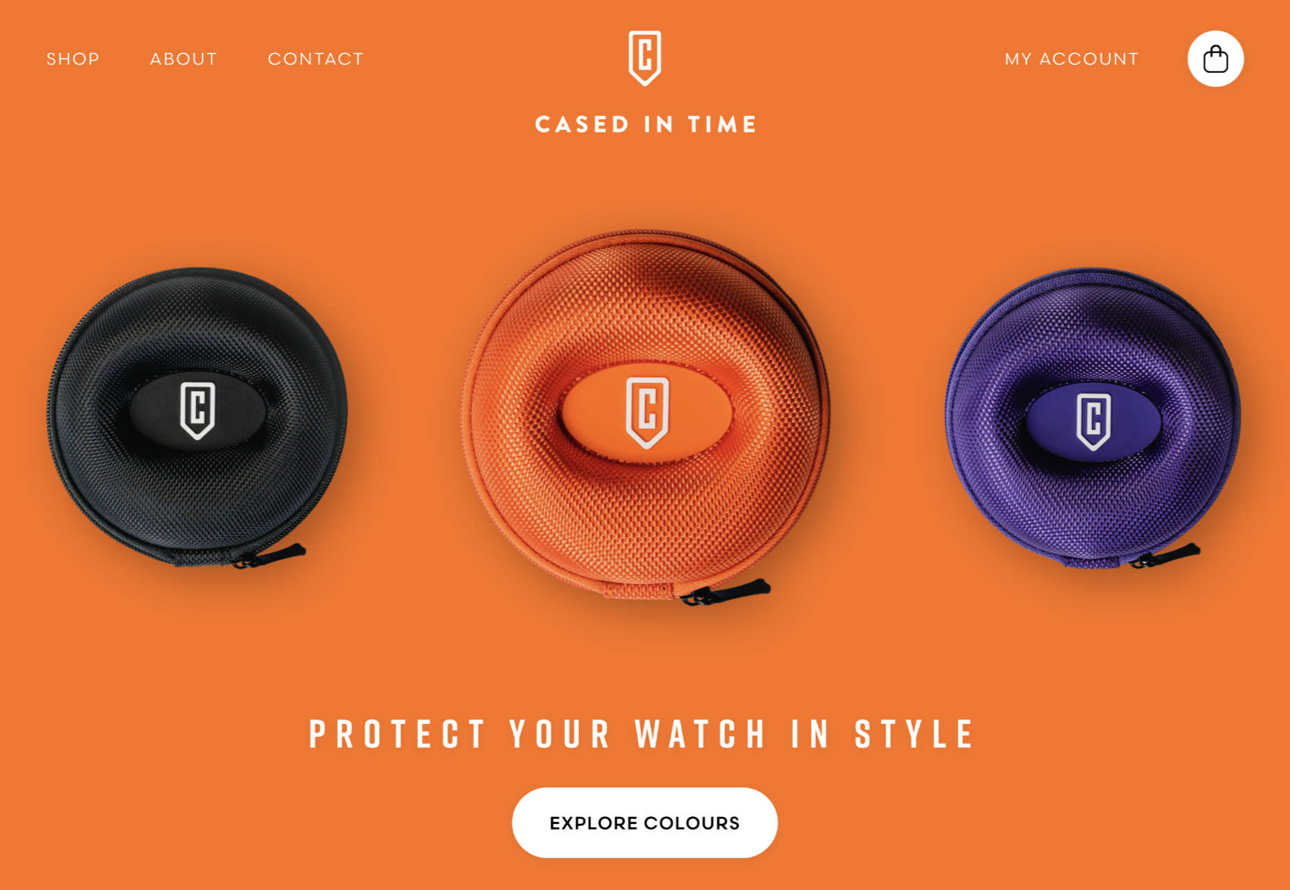
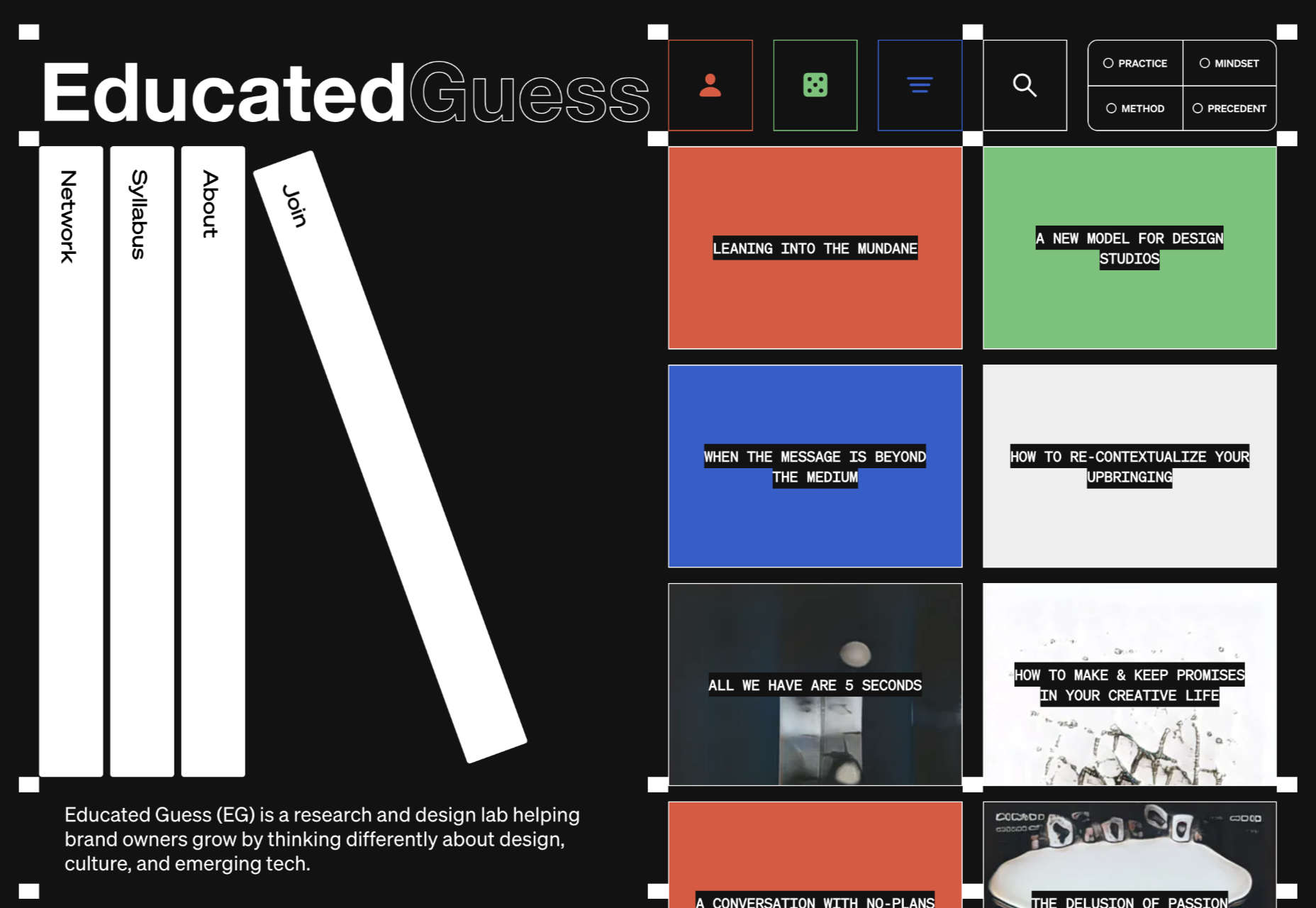
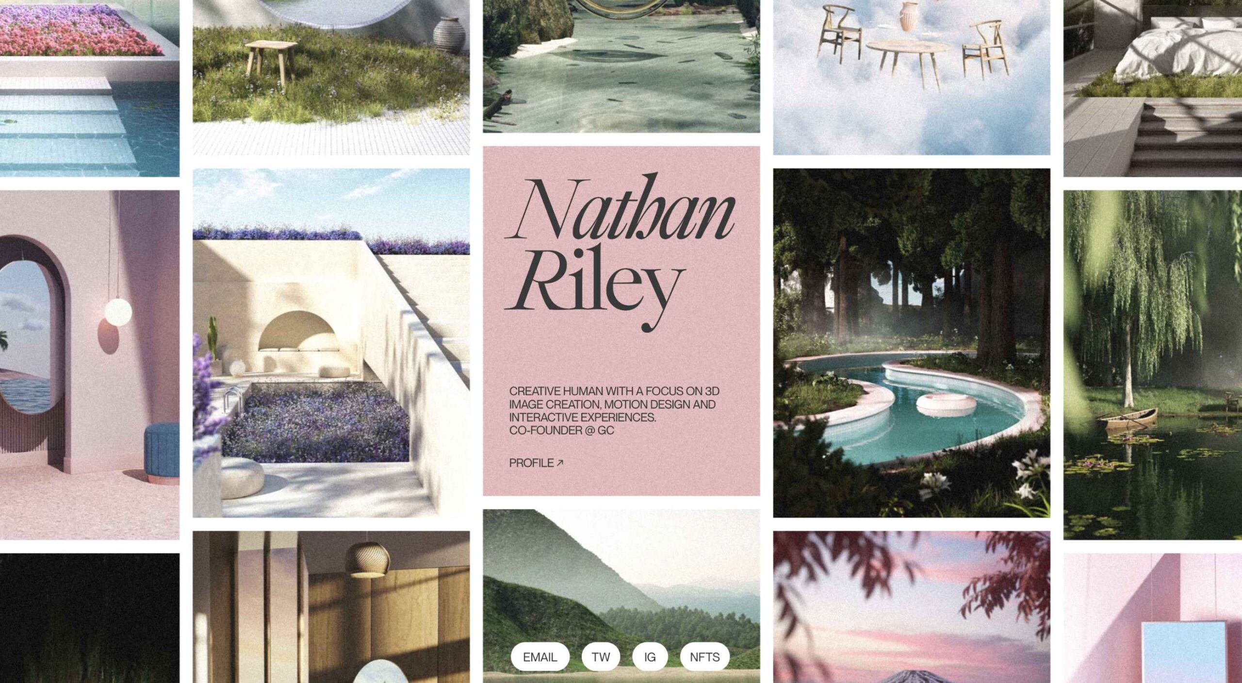
This month we’re seeing websites that are very conscious of the design trends they’re following. Designers are making conscious choices to adopt styles, and opting out when it doesn’t suit the site. What we end up with is a crop of sophisticated, well-designed websites that use style as a technique to further their aims.
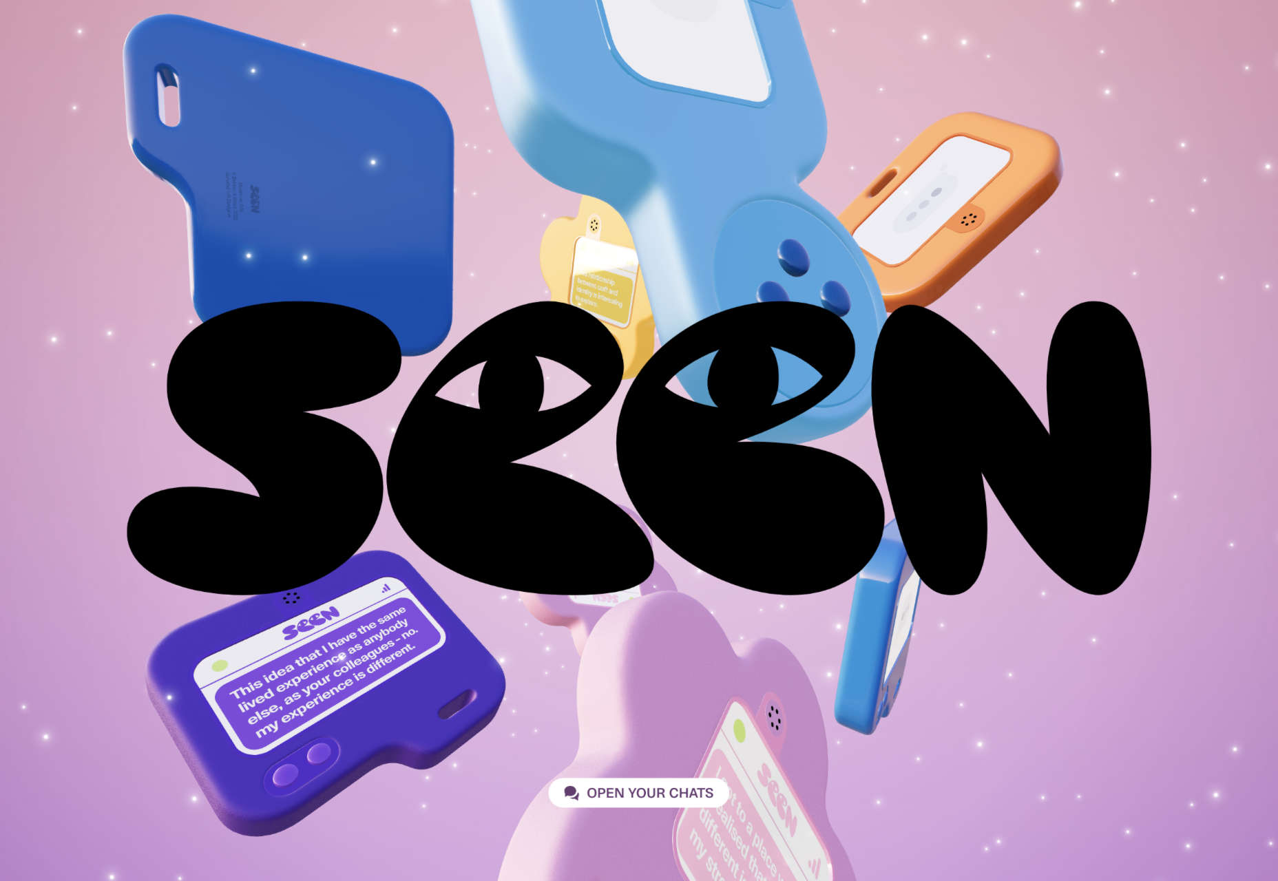
Here are the sites that caught our eye this month, enjoy!
Seen
Seen uses conversations to explore themes surrounding ethnicity and racism in creative fields. Displaying these conversations as online chats creates a sense of intimacy.
Baboon to the Moon
There is a lot of color in Baboon to the Moon’s product shots, so the rest of the site is kept simple, with good clear navigation too.
Fleava
There is a strong sense of luxury to digital agency Fleava’s glossy brochure portfolio site.
Baunfire Portfolio Review 2022
This site for Baunfire digital agency’s creative networking event is bold, personable, and fun.
Laesk Kombucha
There is more than a touch of Wes Anderson’s style to this site for Laesk Kombucha; somewhere just out of sight is Bill Murray in a red beanie.
Viso Haus
Viso Haus doesn’t do anything hugely groundbreaking here with their brutalist-style portfolio site, but they do it very well.
Mario Carillo
Artist/programmer Mario Carillo has opted for a minimal approach, allowing the work to do the talking.
Symbol
There is a warmth to Symbol’s site, created by the color tones and combinations used here.
Contekst
Interior architects Contekst favor a brutalist visual style for their site, but with some nice little animated extras.
Arcane Type Fair
No, you haven’t missed the font lover’s answer to Comic Con: the Arcane Type Fair is fictitious and a clever showcase for Rain Foundry’s Conacher typeface.
Capsul’in Pro
With lovely scrolling animation and soothing colors, this site for Capsul’in Pro manages to turn coffee pods into objects of desire.
Wanderful Chalet
Random illustrations and a quirky display type add character to Wanderful Chalet’s brochure site.
Stone Cycling
Bricks made from rubbish don’t sound like the most exciting thing ever, but this site evokes a lovely clean feel: like an old building gleaming in the sunlight after all the soot has been scraped off it.
Lazarus Forms
Lazarus Forms is an API for AI document processing. This site succeeds in being transparent in its explanation without being overly technical and pleasing visually.
Nathan Riley
An excellent example of masonry combined with variable scrolling speeds creates tension in digital artist Nathan Riley’s portfolio.
Evi O. Studio
Sometimes the simplest things, like this full-screen image transition for Evi O. Studio’s portfolio, can be so well done it’s an absolute pleasure to scroll through.
Sundo
Sundo has created SMOTSpots – smart sunscreen dispensers for public areas. The tone of the site is suitably utilitarian with a soft edge.
Blue
The Blue experience from Rossinavi luxury boat builders is a pleasing immersive microsite showcasing their new hybrid-electric boats.
Cased in Time
This site is an excellent example of how to make a single product commerce site that doesn’t feel lacking in content.
Educated Guess
Educated Guess is a podcast for creatives by creatives. The accompanying website is pleasing to use, easy to navigate, and allows the user to focus on the content.
The post 20 Best New Websites, September 2022 first appeared on Webdesigner Depot.