 Modals, a nifty little feature that allows you to display different messages at the top of your website, have been touted as extremely useful. Some even claim that they are helpful enough to completely replace the banner ads we all hate so much. But are modals in web design a UX disaster?
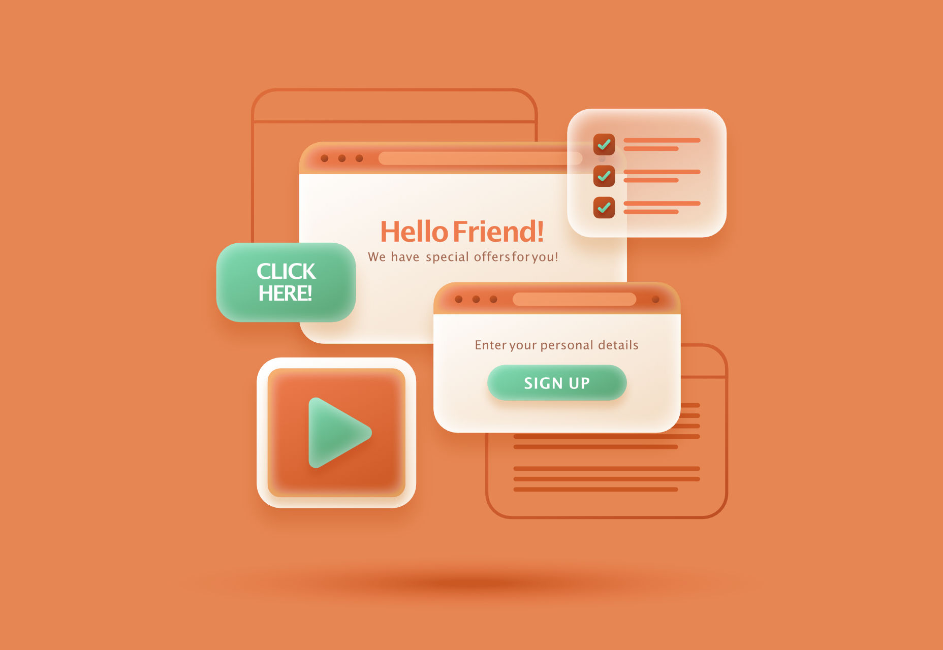
If you are unfamiliar with the term, a modal is a dialogue window appearing when a visitor clicks on a hyperlink or hover image.
Suppose you want to collect on-site subscribers or you want visitors to sign up for a freebie. In that case, you can use modals.
However, many web designers – and some website visitors – are against using modals in web design. The main argument is that it affects the user experience. But are modals in web design a UX disaster? Read on to find out.
What Do Modals Do?
Modals often appear as pop-up windows on a web page, requesting a visitor to take action. Most times, they appear following a click on a page element.
Also known as lightboxes, modals isolate the page’s main content. The user will have to complete the action requested by the modal or close it before reassessing the page.
Web designers use modals to capture a visitor’s attention. Since other page contents are inaccessible, a visitor must interact with the modal.
Cons Of Modals In UX
While there are different cons of modals in UX, they all sum up to one con – interruption. When modals appear, they interrupt whatever the user is doing.
Unlike regular pop-ups, users cannot simply ignore the modal and continue browsing. As a result, modals demand immediate attention.
A user may be interested and decide to interact with the modal. However, if the modal’s content differs from the page’s, the user could forget what they were doing after interacting with the modal.
Furthermore, sometimes modals require action related to information on the page. For example, suppose the user wants to review the information before taking action. In that case, they’ll have to close the modal since the main page is inaccessible.
Statistics show that up to 82% of users dislike pop-ups. Most website visitors aren’t knowledgeable about the technicalities of web design. As a result, they won’t be able to differentiate between regular pop-ups and modals.
After all, modals are a type of pop-up. Some users may consider modals worse since they darken the page’s primary content, making it inaccessible.
Furthermore, people want to visit a website and get what they want immediately. Hence, time is significant. Therefore, modals that require actions that take time can make a website lose visitors.
With all of these cons, you can understand why many web designers say modals are a UX disaster in web design.
Can Modals Be Useful in UX?
In some situations, modals are helpful, and they can improve UX. Many web designers swear on the usefulness of modals, and it’s not difficult to understand why.
Firstly, modals can help simplify a website’s content. For example, a user can immediately exit the page if your website is relatively complex, with lots of content and elements.
You can use a modal to explain the content on the page so that the user doesn’t get confused. Perhaps the modal can display when the user clicks on the back button. The modal can highlight the most critical content on the page and tell the user what to do next.
Secondly, modals are invaluable if you must capture your user’s attention. For example, perhaps you want to display a warning or pass any crucial information that users must know before they continue browsing.
As mentioned before, a user can easily ignore a pop-up, especially if it opens in a new window. However, with modals, the user must at least view the content before they proceed.
Thirdly, a modal can make a web page easier to navigate. It sounds ironic considering the cons, but it’s true if properly implemented. Rather than packing different elements on a web page, you can set some to display as modals.
For example, you can have a page with just text to improve readability. Then, users can click to view visual elements like images and videos as modals.
How To Use Modals the Right Way
Using modals correctly is key to ensuring they don’t negatively affect UX. Here are some ideal situations when you can use modals:
1. Display Warnings
Using modals to give users crucial warnings is ideal, especially if their subsequent actions have serious consequences.
For example, most websites display modals when users click the delete button. Deletion is always critical because, in most cases, it’s irreversible.
A practical example would be an eCommerce website where a user opts to delete items from their cart. You can use a modal to ask the user to confirm before deleting.
2. Input or Collect Information
Modals are effective in prompting users to input information. Sometimes, users must enter specific details before they continue browsing.
A practical example would be a review site where a user wants to submit a review. Before submitting the review, you can use a modal to request the user’s name and other necessary information.
3. Simplify Navigation
As mentioned before, modals can simplify a complex website. In addition, it will help a user navigate better, which is a UX boost.
A practical example would be a news site with many stories and updates. You can use a modal to highlight the day’s trending news stories so that users can visit the web pages with one click.
Conclusion: Are Modals a Disaster in UX?
In conclusion, modals affect a site’s user experience since visitors must interact with them. However, it doesn’t always have to be a negative effect.
Modals become a UX disaster in web design when wrongly used. However, if you follow good practices, modals can improve your website’s user experience.
Generally, only use modals when necessary and in a way that won’t frustrate the users.
Featured image by Freepik.
Source
The post Are Modals In Web Design A UX Disaster? first appeared on Webdesigner Depot.
Source de l’article sur Webdesignerdepot

 Apple has released an OS update. Packaged in with it is the latest version of Safari, 16.
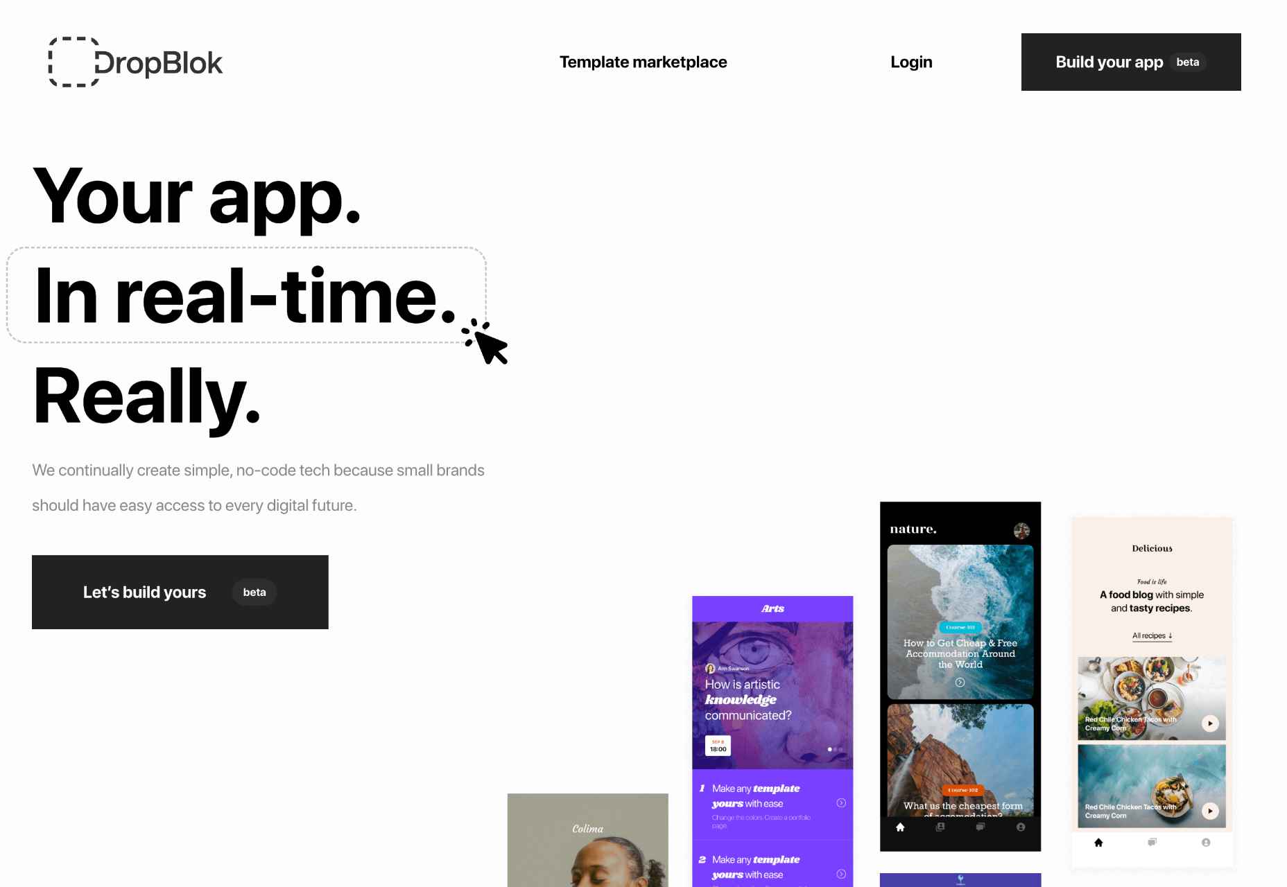
 The Summer’s over, and we’re back at our desks to discover that the web’s best app builders, font designers, asset creators, and developers have been hard at work to deliver this bumper collection of exciting new tools for designers and developers.
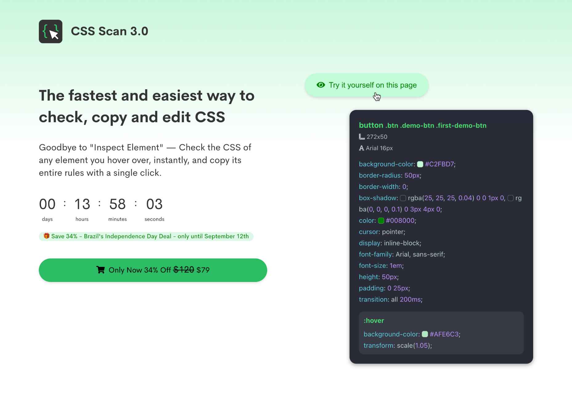


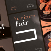
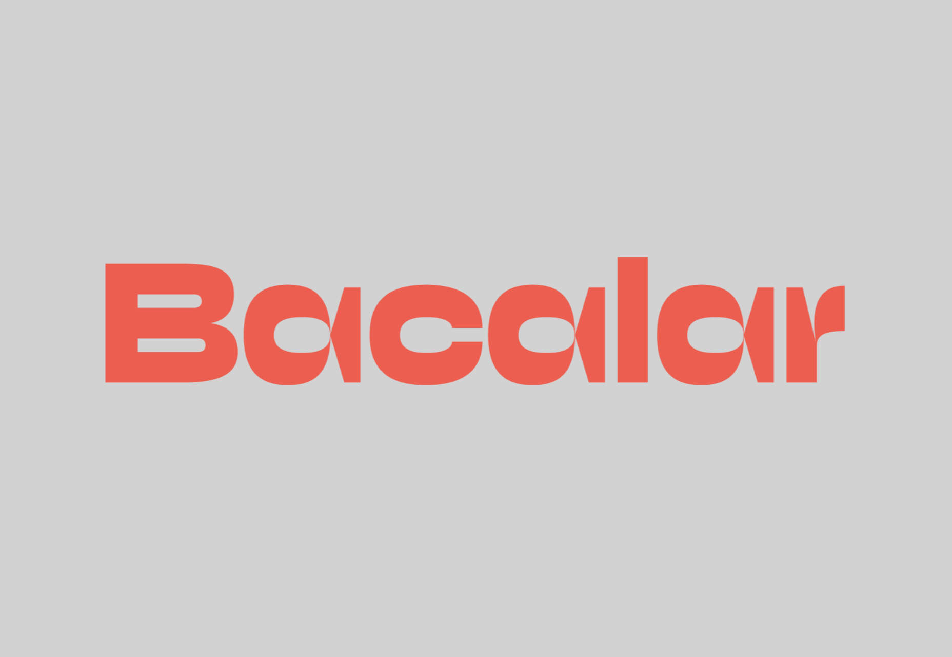
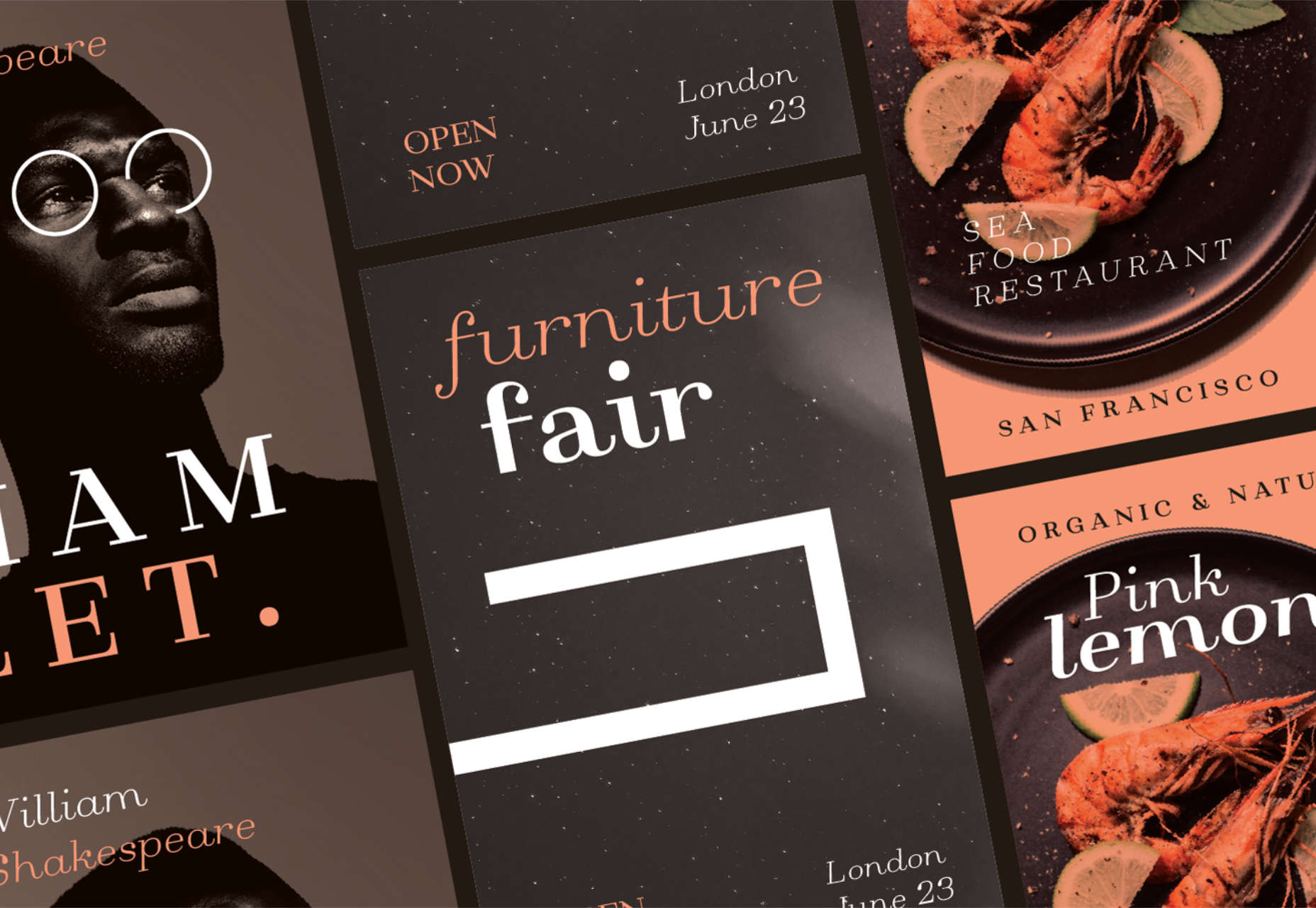
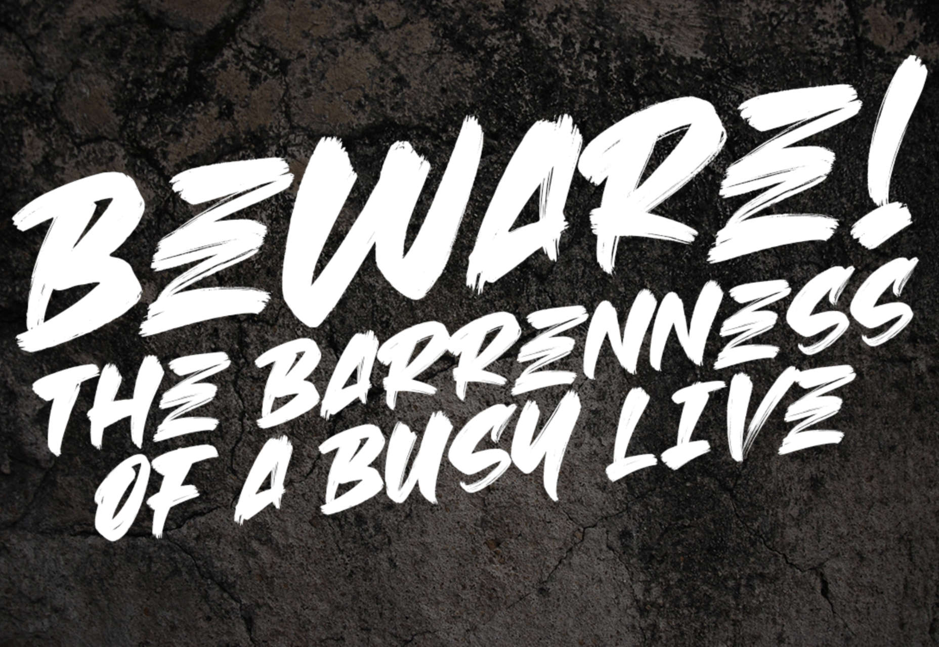
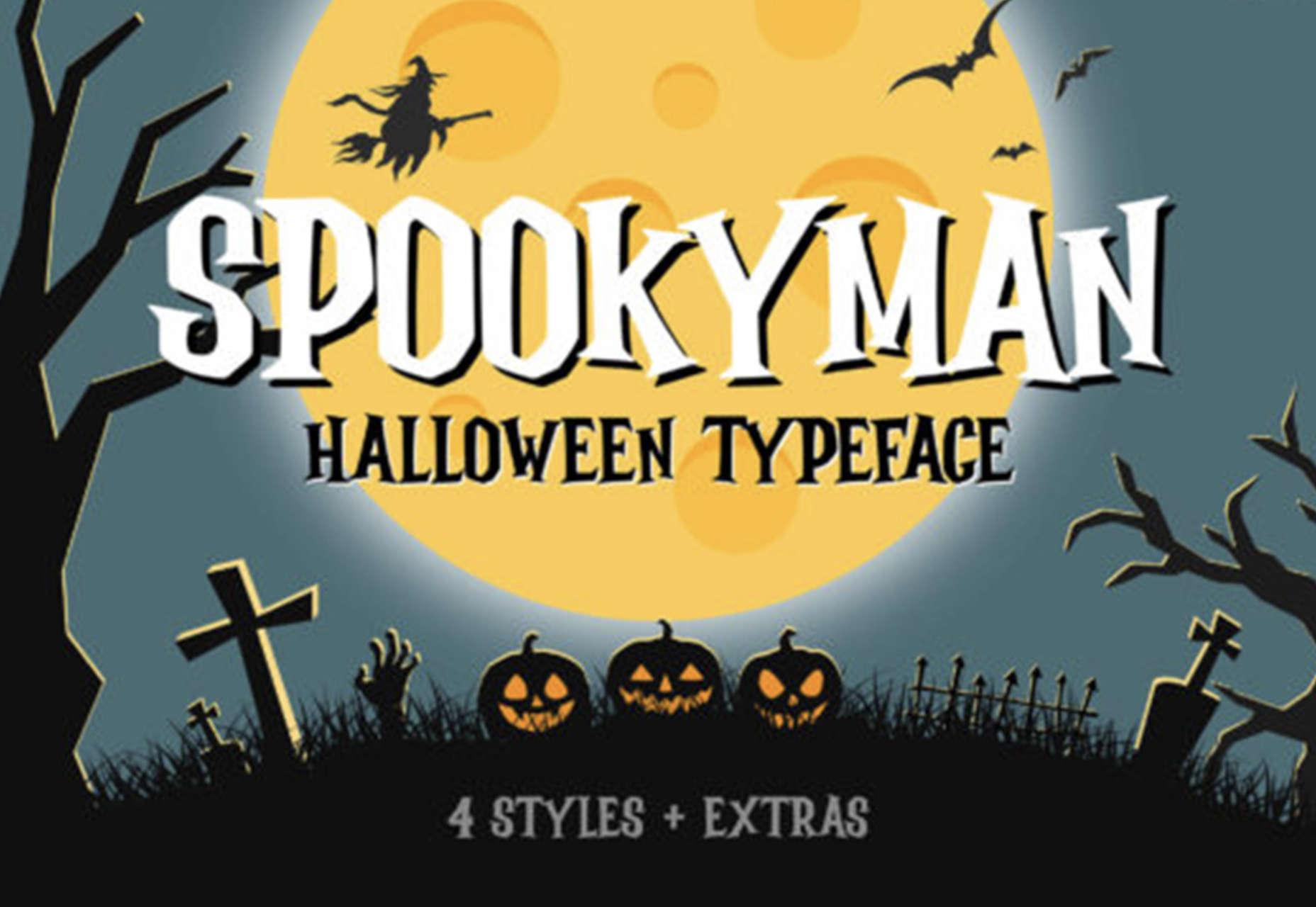
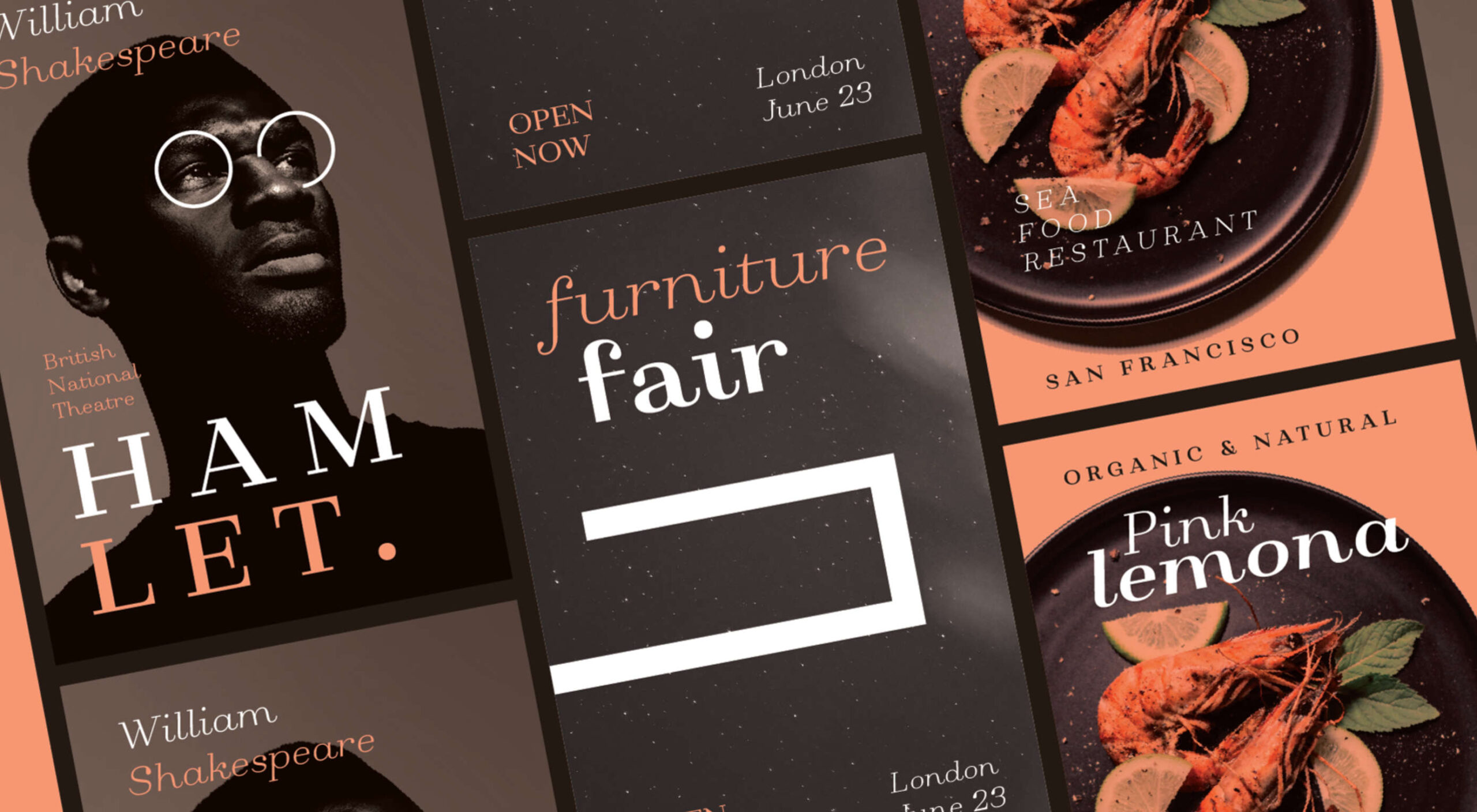 Typefaces give expression to text, communicating personality in a way that no other design element can. And so, we put together this collection of the best new fonts we’ve seen on the web each month.
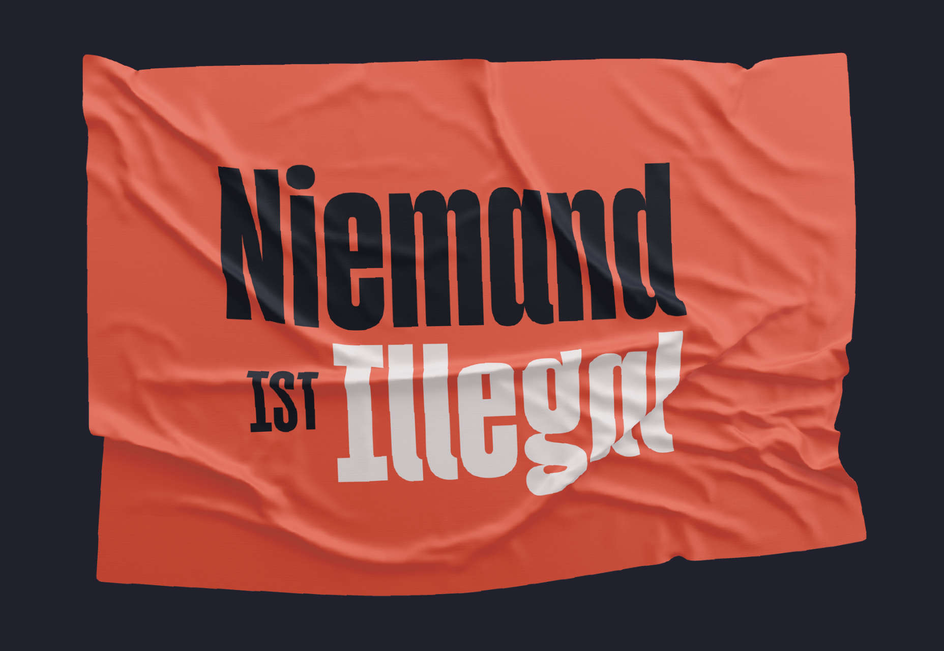


