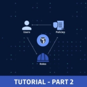
Part 1 connected to this article focuses on users, groups, and policy automation with Terraform. If you haven’t read it yet, it’s called Managing AWS IAM With Terraform: Part 1.
Following the first part, in this tutorial, we will cover:
Part 1 connected to this article focuses on users, groups, and policy automation with Terraform. If you haven’t read it yet, it’s called Managing AWS IAM With Terraform: Part 1.
Following the first part, in this tutorial, we will cover:
A few months ago, we wrote a blog post on finding and terminating long-running operations in MongoDB. To help make it even easier for MongoLab users* to quickly identify the cause behind database unresponsiveness, we’ve integrated the currentOp() and killOp() methods into our management portal.
* currentOp and killOp functionality is not available on our free Sandbox databases because they run on multi-tenanted mongod processes.

 This month, it’s all about the images. Each of the design trends we spotted has to do with the images you select – or don’t select – for a project and how you use them.
Here’s what’s trending in design this month.
Sometimes you design off the grid intentionally. Other times you are designing on a grid that’s maybe not-so-obvious. One of these things is happening with the floating images website design trend.
Here, you’ll see images and image containers that don’t seem to have any direction with their placements. They may or may not include animation, that further emphasizes the floating effect.
Floating images can include:
The challenge with this style is that it can look cohesive and organized or can turn into a jumble of parts rather quickly. It can take a lot of user testing to find the right balance.
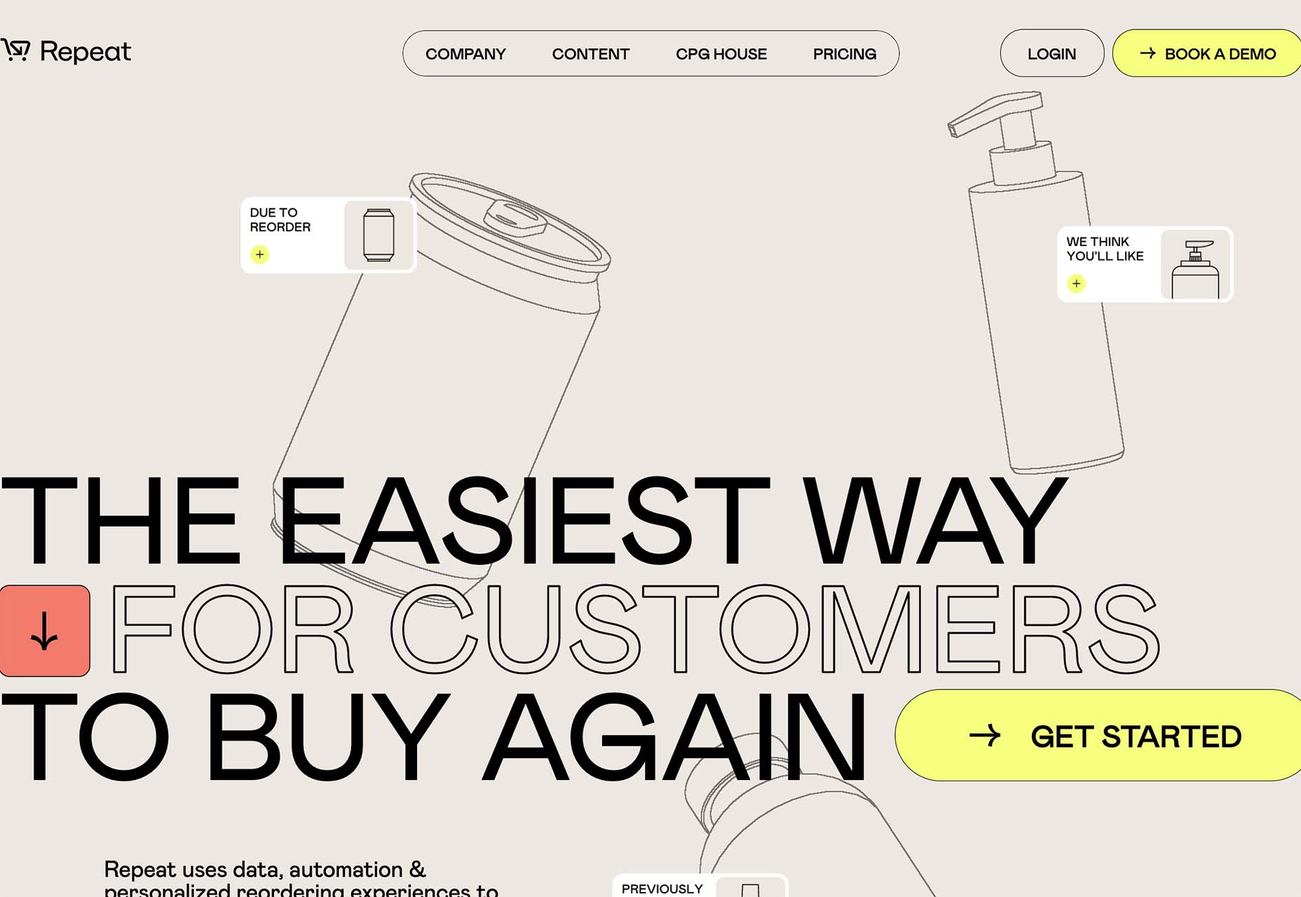
Repeat uses animated, outline-style images in the background that have seemingly random placements. The floating effect is further emphasized by animation and the overlapping of images and other elements.
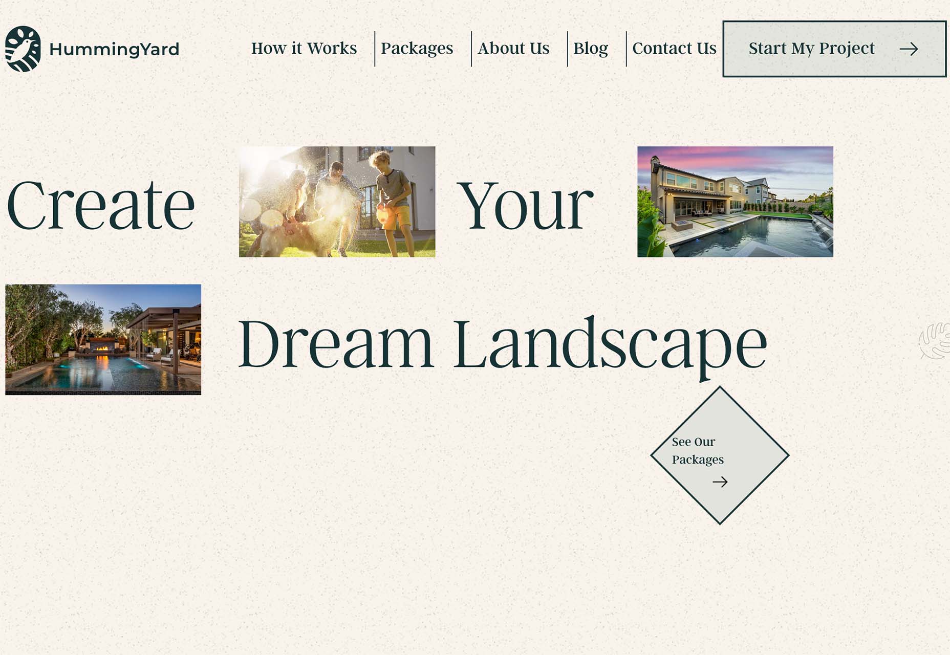
HummingYard uses images in a container in the design but the placements don’t have obvious meaning. There’s also a floating leaf on the right side of the canvas and a call to action button that appears to be off the grid as well. Each of the elements seems almost haphazardly placed, creating a floating effect for the entire design.
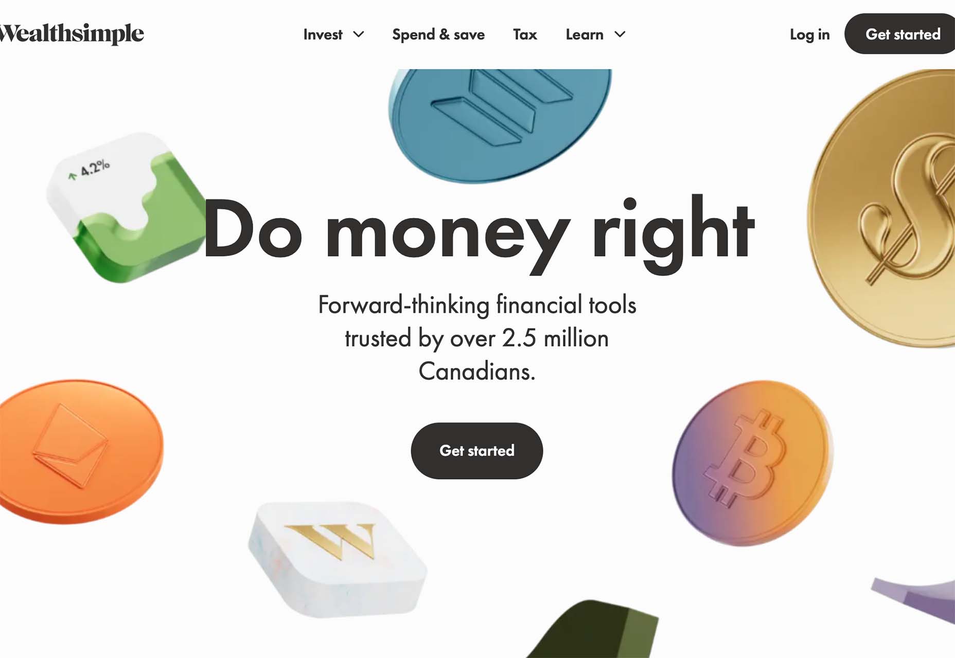
Wealthsimple uses a bunch of smaller different images to create a floating cascade of elements. The three-dimensional icons almost look like they are falling down the screen. Some overlap text elements, but most do not. It all feels a little random, but the images do frame and help bring the eyes toward the center-screen text elements and call to action.
If floating images aren’t your thing when considering a trendy design element, maybe no images is the answer.
In this design trend, the aesthetic comes together without any true imagery. The design uses mostly text with maybe an icon, logo, or small divot. The result can be a fairly stark design, but there’s a distinct focus on the words.
This trend is not so difficult to design, but storytelling and language are vital if you want users to interact with the design. No images can sometimes be off-putting to users who are looking for something visual.
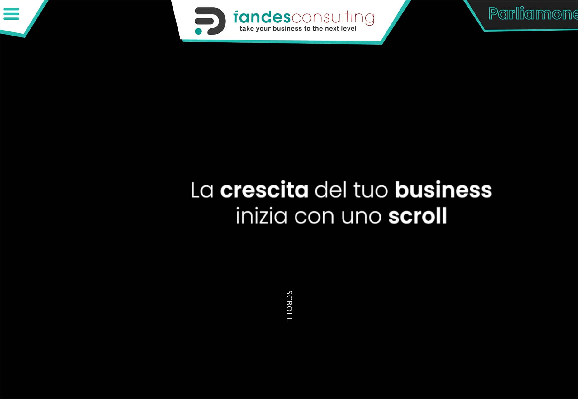
Fandes Consulting uses a super simple black and white design with a simple call to action on the homepage. The scroll cue has a nice animation that helps you get a little deeper into the design quickly. (There are also more interactive elements and images after the scroll.)
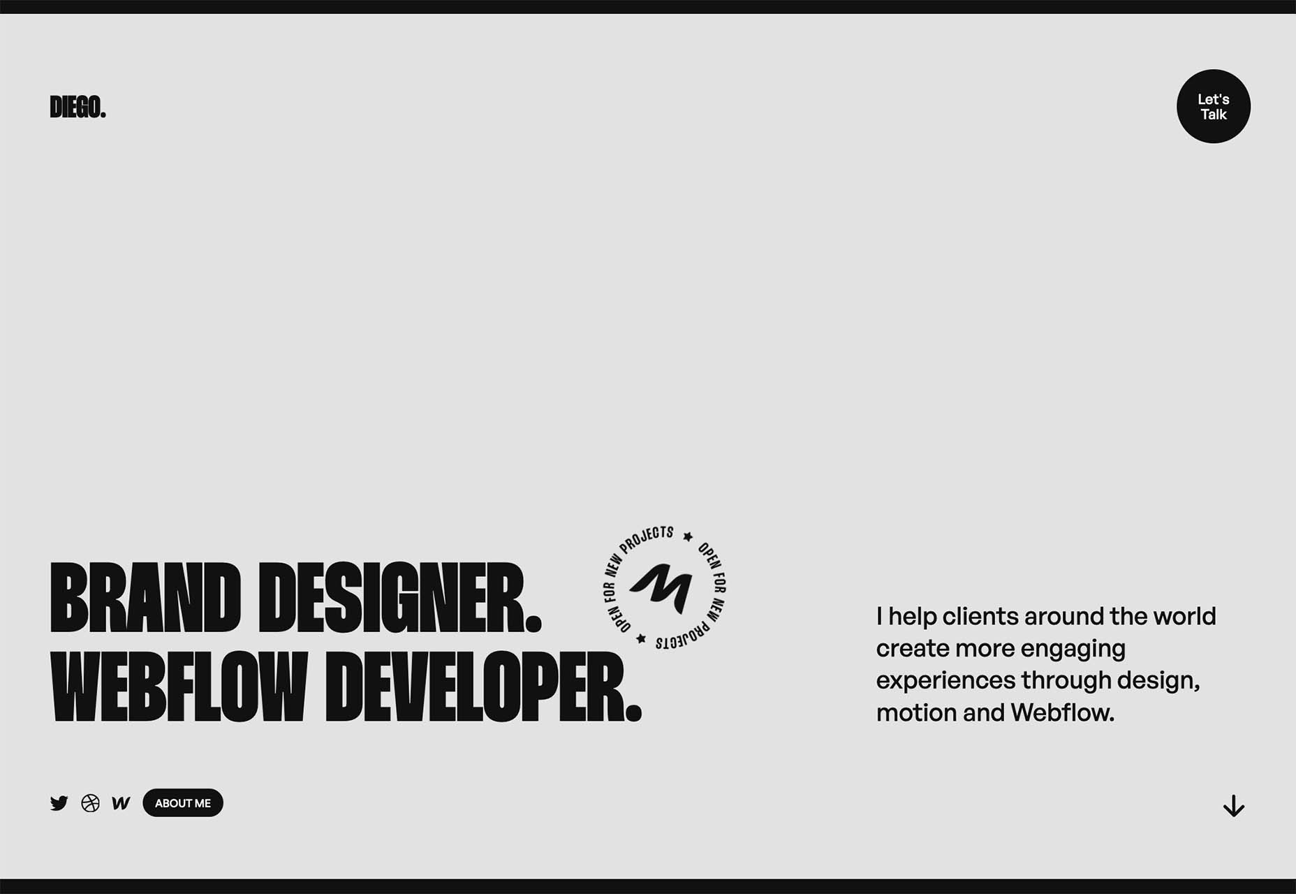
Diego also uses a simple and stark aesthetic for his website. Again, there’s a simple animation for engagement and there’s more color and some imagery beyond the scroll.
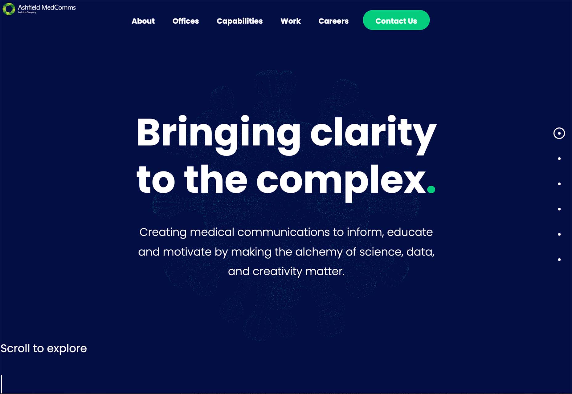
Ashfield MedComms has the most color of these no-image website examples. With a navy background and a green icon, you can feel your eyes moving more on the screen here. There’s also more to read and a scroll animation to further the engagement.
The merged text and images trend is the most complex of these design examples. Here, designers are creating overlapping layers for text and image (or animated) elements on the screen so that there’s a lot to consume visually. This can be a highly engaging concept, but also one that’s difficult to develop.
This design trend can be immensely beautiful when done well. Layered elements are exciting and have a “designed” feeling to them.
The visual challenge is this: Maintaining the readability of words and letters, especially when you are thinking about the responsiveness of the website. Animation or motion can add another level of complication.
If you are planning a design like this, it is important to plan for breakpoints and even have a fallback for what to do when readability becomes a concern. The desktop and mobile aesthetics might have different feels here to ensure that you have an easy-to-understand visual theme for both.
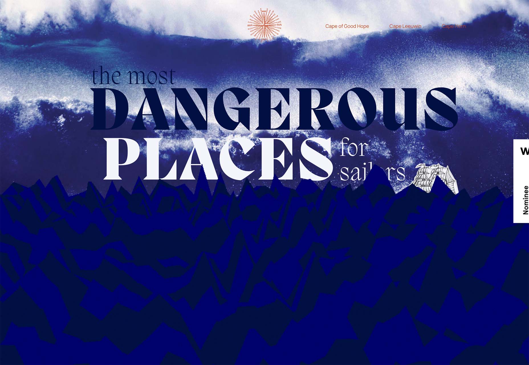
The Most Dangerous Places for Sailors includes text and an image element (the ship) that are tucked behind an animated water layer. What’s especially nice about this design is how the water looks just as dangerous as the words convey thanks to motion and the shape and color of the graphics.
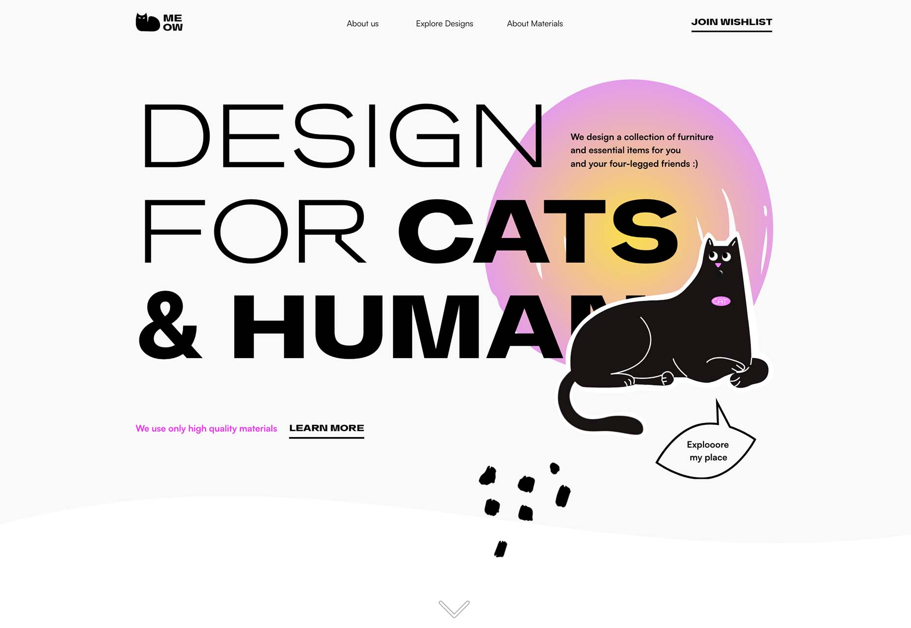
Meow overlaps text and an image in a way that almost obscured readability, but the word has enough context that it’s generally understood. If you click through, there’s a fun little animation with the cat as well.
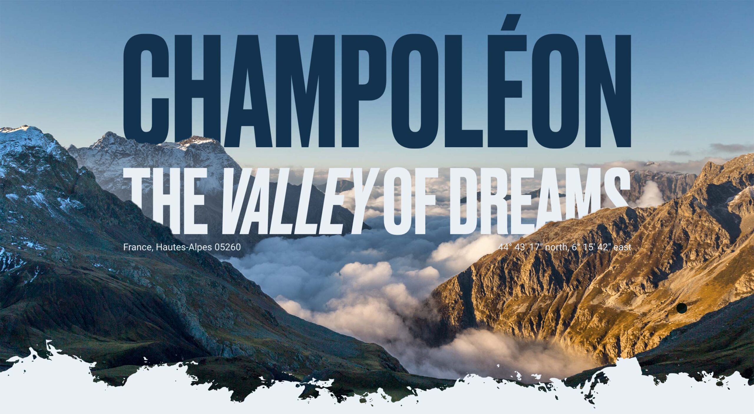
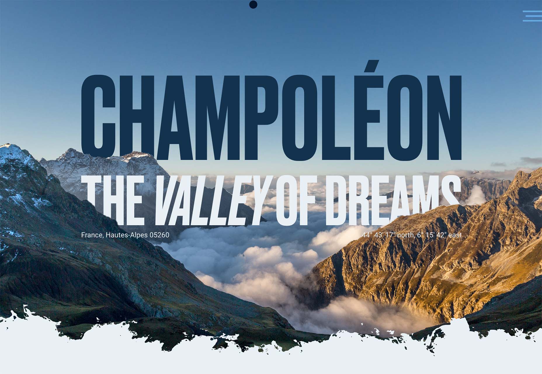
Champoleon the Valley of Dreams tucks part of the text into the mountains for a foreground to text to background layer set that’s beautiful and unified. There are a lot of layers in this design, making it much more complex than it appears on the surface. On the scroll, the rest of the site continues this layered theme with text and images that overlap and share space.
Which of these image trends is most appealing to you? They are vastly different approaches to website design and can work for different projects in different ways. They also range in development complexity, from super easy to manage – no images at all – to potentially challenging – merged text and images.
The post 3 Essential Design Trends, October 2022 first appeared on Webdesigner Depot.
The serverless offerings of AWS (or any other public cloud provider today) are getting more and more popular. One of the biggest reasons is of course not needing to think about infra (server provisioning and so on). The other reasons include the offerings themselves, which at times fit well into the technical need for finding solutions to the given problems. But on the other side, it remains a challenge to know the offerings in detail to leverage them properly. There could be always some new feature hidden deep inside the bulk of the documentation.
A retail company decided to leverage the AWS Serverless offering for modernizing their on-premises integrations for order management business process. We can go serverless in the cloud in various ways, but the initial solutioning was decided to leverage the Step Function and Lambda Function along with some more integration offerings from AWS, namely SNS, SQS, and EventBridge.

 A design portfolio is an excellent way to demonstrate your skills as a freelancer. As a web designer, you compete with millions of other web designers. Therefore, you must have a strong portfolio to land a high-paying web designing job in such a competitive space. A strong portfolio sets you apart from others. Having no clients, however, can make it challenging to get your portfolio noticed and build up any momentum.
People typically build portfolios from projects they do for clients. Hence, it seems unlikely for a new web designer without clients to have a strong portfolio. However, it’s attainable. You can build a design portfolio with no clients, and you’ll find out how in this post.
A good portfolio should display your best work, as most clients want to see your best. However, your best work may not be client work. In addition, what’s more, important than displaying your best work is showing your versatility.
Being a versatile web designer will land you more jobs than being an expert in just one type of web design. Notably, you don’t need to have many clients to be versatile in web design. Instead, you become versatile by taking on different projects.
A good design portfolio should include professional recommendations. Testimonials from previous clients are valuable here, but anyone can recommend you. It could be a web designer friend, collaborator, or even your tutor.
Furthermore, a good portfolio should feature non-client work; even if you have thousands of past clients, featuring personal projects is still ideal. It shows your growth as a web designer isn’t limited to what clients ask you to do.
Many other factors constitute a good portfolio, but these points are the most important regarding showing your skill. You can build a portfolio that includes them even if you have no clients.
You can try all or some of these methods to build a design portfolio if you have no clients.
A simple way to build a strong web design portfolio is by competing in challenges. It’s helpful whether you have clients or not.
Winning a design challenge is like finishing at the top of the class. It demonstrates that you’re the best web designer in the room and the type of web designer clients want to hire. Generally, taking on design challenges will help sharpen your skills.
You can partake in competitions arranged by renowned web design communities. You can find such competitions on websites like 99designs and Design Crowd. More often than not, winning a web design challenge will land you a job.
Carrying out personal projects is similar to competing in challenges. However, in this case, you’re challenging yourself.
Have you ever had a unique idea for a website? Don’t wait until a client asks you to build such a website. Instead, you can begin the project on your own. Then, if you succeed, you can proudly display the project in your portfolio.
When you get clients, you wouldn’t need to convince them that you can handle such tasks; the personal project is a testament to it.
You can carry out as many personal projects as you envisage, no matter how simple or complex. Furthermore, you don’t always have to complete them. Even failed personal projects can be part of your portfolio.
When most clients contact you, they’ll want you to create a website similar to some existing website. You can give yourself a head start by cloning some popular websites and featuring the projects in a portfolio.
Your ability to build a replica of a professional website from scratch shows expertise. In addition, you most likely won’t get a 100% match with the original version. Your version may have improvements that subsequent clients would appreciate.
Furthermore, some website designers specialize in cloning. Suppose you plan to provide such services to clients. In that case, displaying your previously cloned website projects is all you need to create a strong portfolio.
Your family and friends are potential clients. Hence, you can offer to build websites for them, even if it is for free. Afterward, you should include the work in your portfolio.
If your friend or relative has an offline business, for example, you could offer to build a website to give them an online presence.
Even if they eventually don’t use the website, you can include it as a demo project in your portfolio.
You’re not the only web designer with no clients who wants to build a strong portfolio. Therefore, you can draw inspiration from others.
Dribbble, the social networking platform for designers, is among the best options you have. Dribbble allows you to find thousands of new and veteran web designers with varying portfolios.
You can scan the portfolios, examine the content, and try to replicate what you can in yours. Furthermore, you can even build a portfolio directly on Dribbble.
Not having clients shouldn’t discourage you as a new web designer. You can still build a strong design portfolio with the methods discussed in this article.
After creating your portfolio, you can then use it to secure jobs. Subsequently, you can update the portfolio with your best client work.
Featured image by storyset on Freepik.
The post How To Build A Design Portfolio With Zero Clients first appeared on Webdesigner Depot.

Value Stream Management (VSM) is about empowering delivery organizations to measure, mitigate, and monitor complexity. Simply put, it aims at improving the flow of value in your organization. The VSM Consortium recently released their highly anticipated report on The State of Value Stream Management Report 2022.
In this article, we recap some of the findings and look at it specifically from a software engineering and DevOps point of view. Can we capture some key lessons that lead to healthier and more productive engineering teams? What has worked and what has not? Can we simplify and adapt ideas of organizational change to create a thriving engineering organization?

 Each month we publish this roundup of the best new fonts for designers to help you find new ways of packing personality into your designs.
In October’s edition, you’ll find a number of revivals and a ton of vintage inspiration, all wrapped up with a modern twist. After years of geometric sans-serifs, a few decorative flourishes are more than welcome. Enjoy!
The Future and its accompanying monospace The Future Mono is a homage to the classic Futura. The Future is a great revision of classic forms, and The Future Mono is a blend of Western Modernism and Japanese typographic styles.

Rapida and Rapidissima began as part of a master’s course at the Royal Academy of Art in Den Haag. While Rapida is a careful, usable serif with lots of thoughtful details, Rapidissima is a visually exciting exploration of speed.

Aiglon is a pseudo-geometrics sans-serif with beautiful proportions. It draws inspiration from 20th-century architectural lettering. It’s a tremendous alternative to Gotham for those looking for a more European aesthetic.
Raskal Oner Write is a script font for designers that don’t want a script font. All of the classic feel of handwritten letters is here, but the construction is entirely original. Contextual alternatives combine to create the visual look of lettering.
Grostino is an elegant display typeface. The enormous contrast in width between its rounded glyphs and its square glyphs adds enormous personality. It’s ideal for branding projects that need to evoke classicism.
Figtree is a highly usable sans-serif packed with practical features, including fractions, monospaced numbers, and scientific inferiors. It’s both minimal and friendly, making it an ideal choice for corporate design systems. It’s free to download.
Gills & Co is a modern serif that draws inspiration from Art Nouveau to create beautiful finials and ligatures. It works really well as a logotype and for packaging.
Catalog is a sturdy, easy-to-use serif with thick slab serifs. It has a simplified shape and is easily readable on lower-resolution screens. It features an unusual lowercase g, which adds visual interest to passages of text.
Kreol Display is a didone typeface with some interesting details that raise it above similar designs. The lowercase ‘a’ and the uppercase ‘R’ are particularly pleasing.
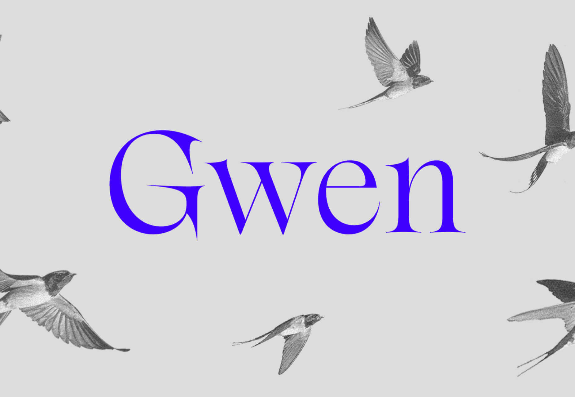
Gwen is a typeface family that includes a highly characteristic display face and a more subtle text face. There are seven different weights, and it is available as a variable font.
Benogi is a display font run through with wave-like forms. The ’70s aesthetic is continued in the proportion of the glyphs. It’s a great option for health and beauty product branding.
Marcin Antique is inspired by early French grotesque typefaces. It has just been reissued with new widths, additional weights, and redrawn italics, making it an even more usable sans-serif.
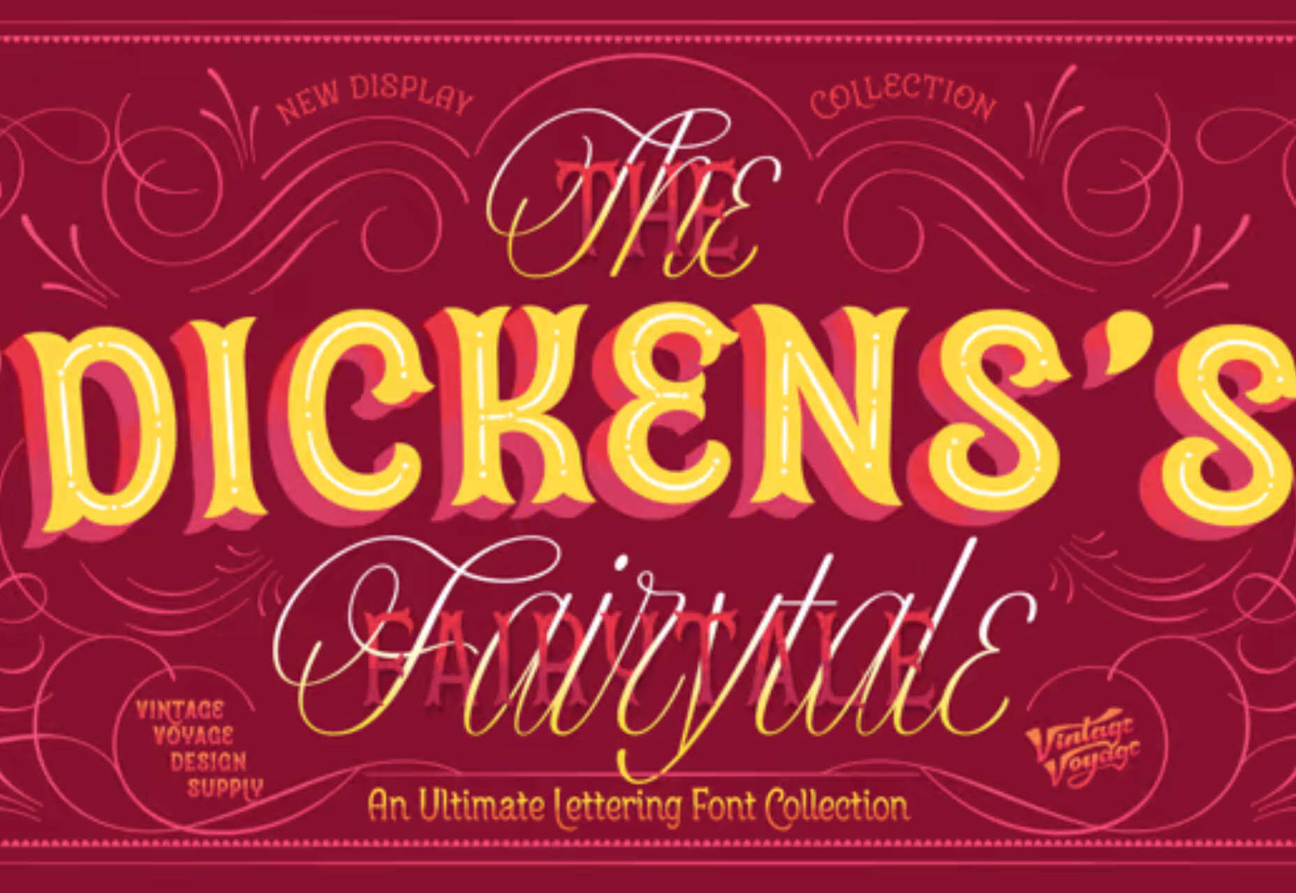
It’s horrifying to say it, but yes, the holiday season is just weeks away. If you’re preparing marketing material with a heritage feel, then check out The Dickens Tale, it’s as classic as candy canes and Peanuts reruns.
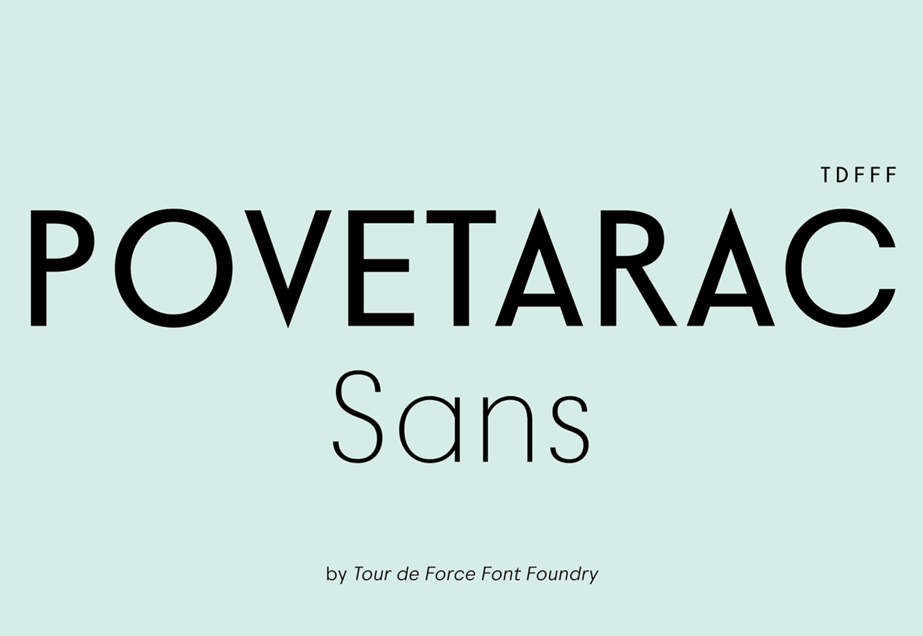
Povetarac Sans is a workhorse of a sans-serif that performs well as both display and running text. Inspired by vintage designs, it comes with six weights and supports fractions.
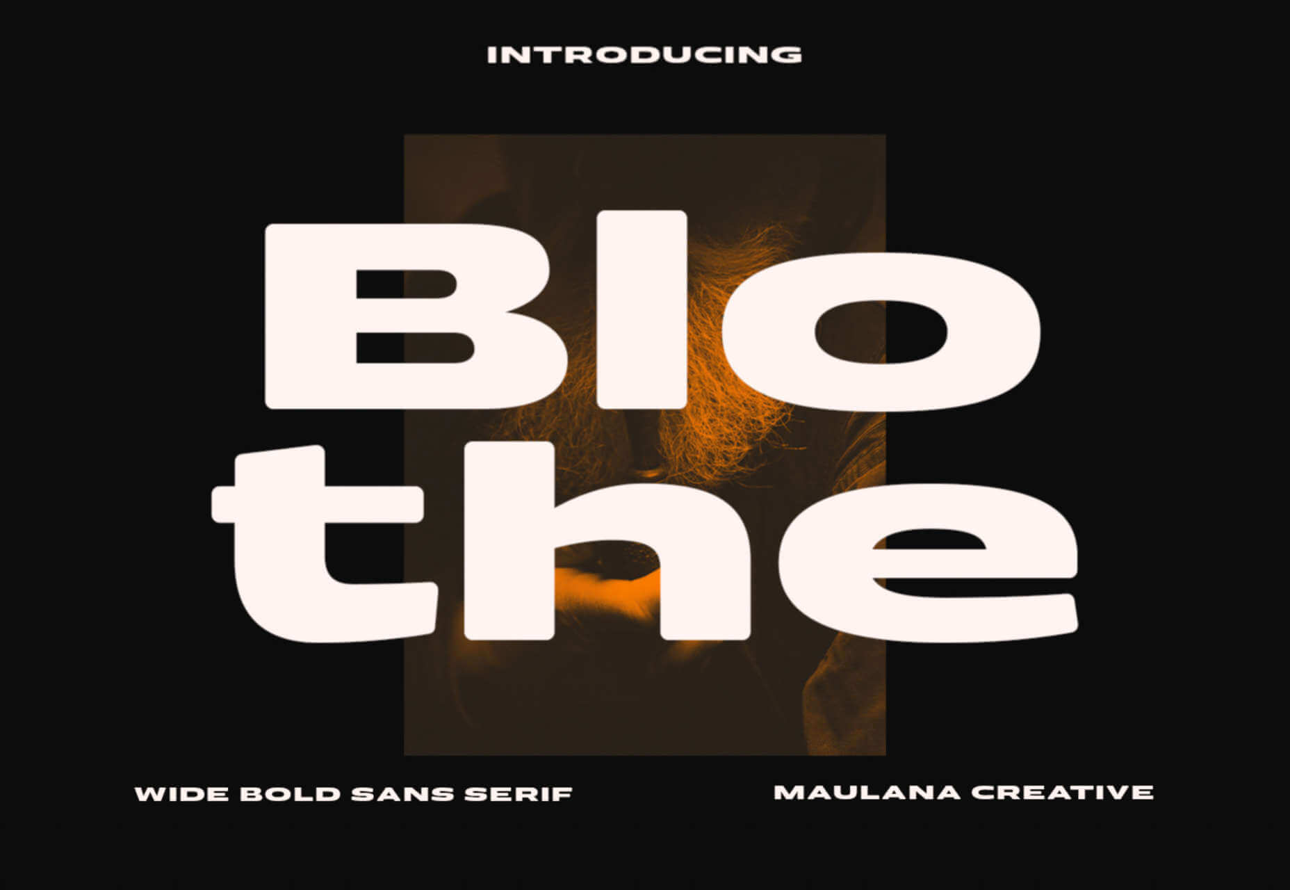
Blothe is a fabulously chunky display face that is drawn wide, thick, and rounded. Use it at huge sizes to make the most of its weighty presence.
The post 15 Best New Fonts, October 2022 first appeared on Webdesigner Depot.

In this tutorial, we’ll go over how to use and understand React Hooks. This article is an extension of article how-to-manage-state-with-hooks-on-react-components. It has been expanded with other Hooks and logic and Lessons Learned.
Here we create a simple product page with a shopping cart (see image 2). The shopping cart represents the memory (or the ‘state’) of the product page. The state generally refers to application data that must be tracked.

Efficient code doesn’t just run faster; if it’s using less compute-resource, it may also be cheaper to run. In particular, distributed cloud applications can benefit from fast, lightweight serialization.
Chronicle-Wire is an OpenSource Java serializer that can read and write to different message formats such as JSON, YAML, and raw binary data. This serializer can find a middle ground between compacting data formatting (storing more data in the same space) versus compressing data (reducing the amount of storage required). Instead, data is stored in as few bytes as possible without causing performance degradation. This is done through marshaling an object.
Technologies such as artificial intelligence (AI), machine learning (ML), and natural language processing (NLP) have led the way to software robots that reduce the manual, time-consuming, and repetitive actions performed on digital platforms. The concept of automating tasks on digital platforms is called robotic process automation (RPA). RPA is a software robot that interacts with computer-centric processes and aims to introduce a digital workforce that performs repetitive tasks previously completed by humans. This Refcard introduces RPA technology, how it works, key components, and how to set up your environment.
Source de l’article sur DZONE