Articles

It’s February, and the spring sun is finally starting to peep through the winter clouds. While many of us are still largely restricted to our homes, the web has kept on growing.

We see a shift in attitude towards natural health, wellbeing, and sustainability, and these are now being branded less often as outliers and increasingly mainstream. We’re also seeing more and more color all the time, ranging from an emotional signifier in the background to being a functional element in its own right.

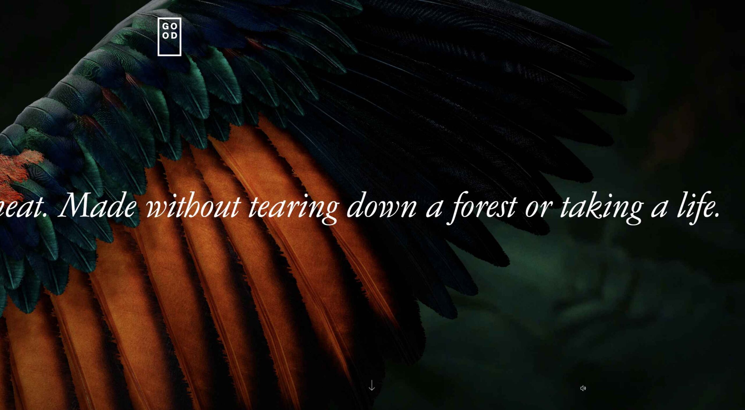
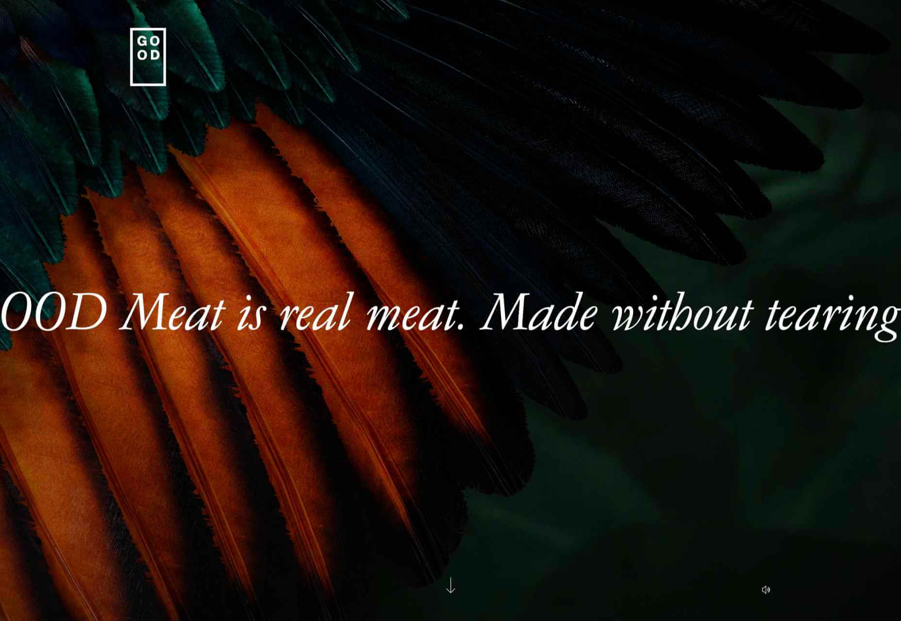
GOOD Meat

Gorgeous color in the background image and the scrolling narrative pull the user in on this site for lab ‘grown’ meat.

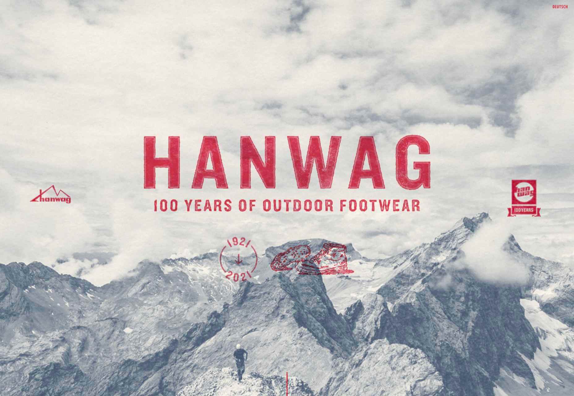
Hanwag 100 Years

This page celebrating 100 years of outdoor footwear company Hanweg uses a mix of illustrations and photographs to create a timeline marking the company’s highlights alongside what else was happening at the time. Any excuse to get Yoda in.

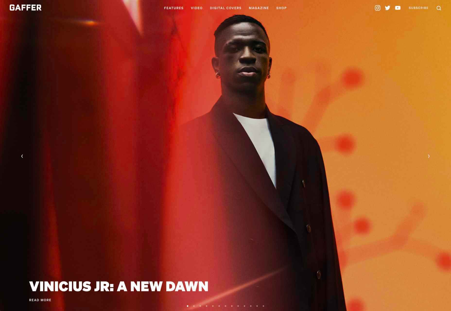
Gaffer

Gaffer describes itself as bridging the gap between football, music, fashion, and culture. The site has a glossy feel, with strong art direction and an easily navigable architecture.

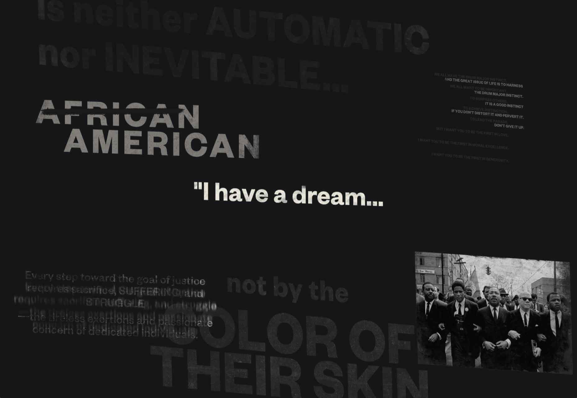
Remember MLK

This rather beautifully made tribute to Martin Luther King uses some great typographic effects, and the variations, in contrast, create a layering of the different content elements.

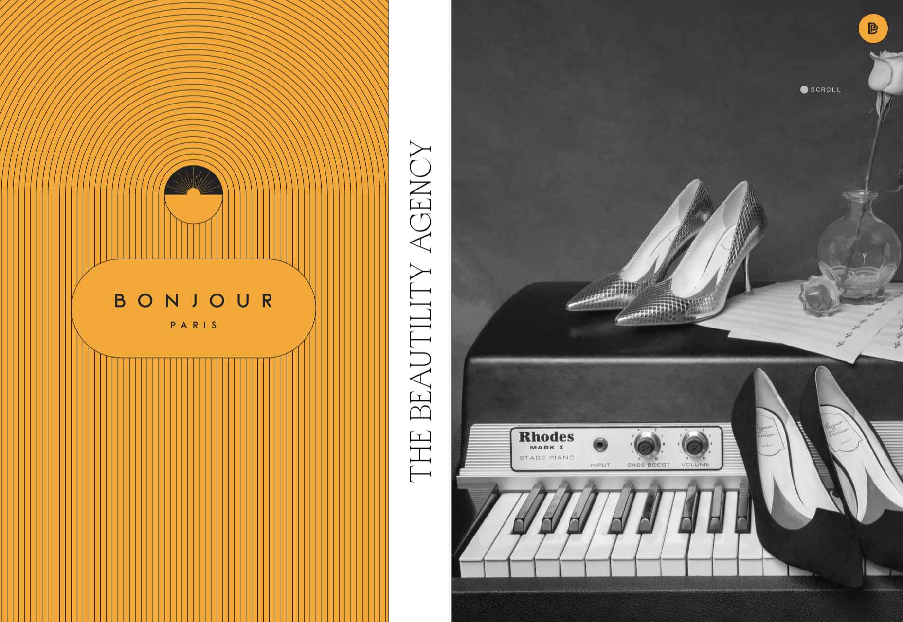
Bonjour Agency

The home page for design agency Bonjour Paris uses sideways scrolling to give an overview of the whole site. There is a lot of content, but it doesn’t feel like waffle, and exploring the site is a pleasant experience in itself.

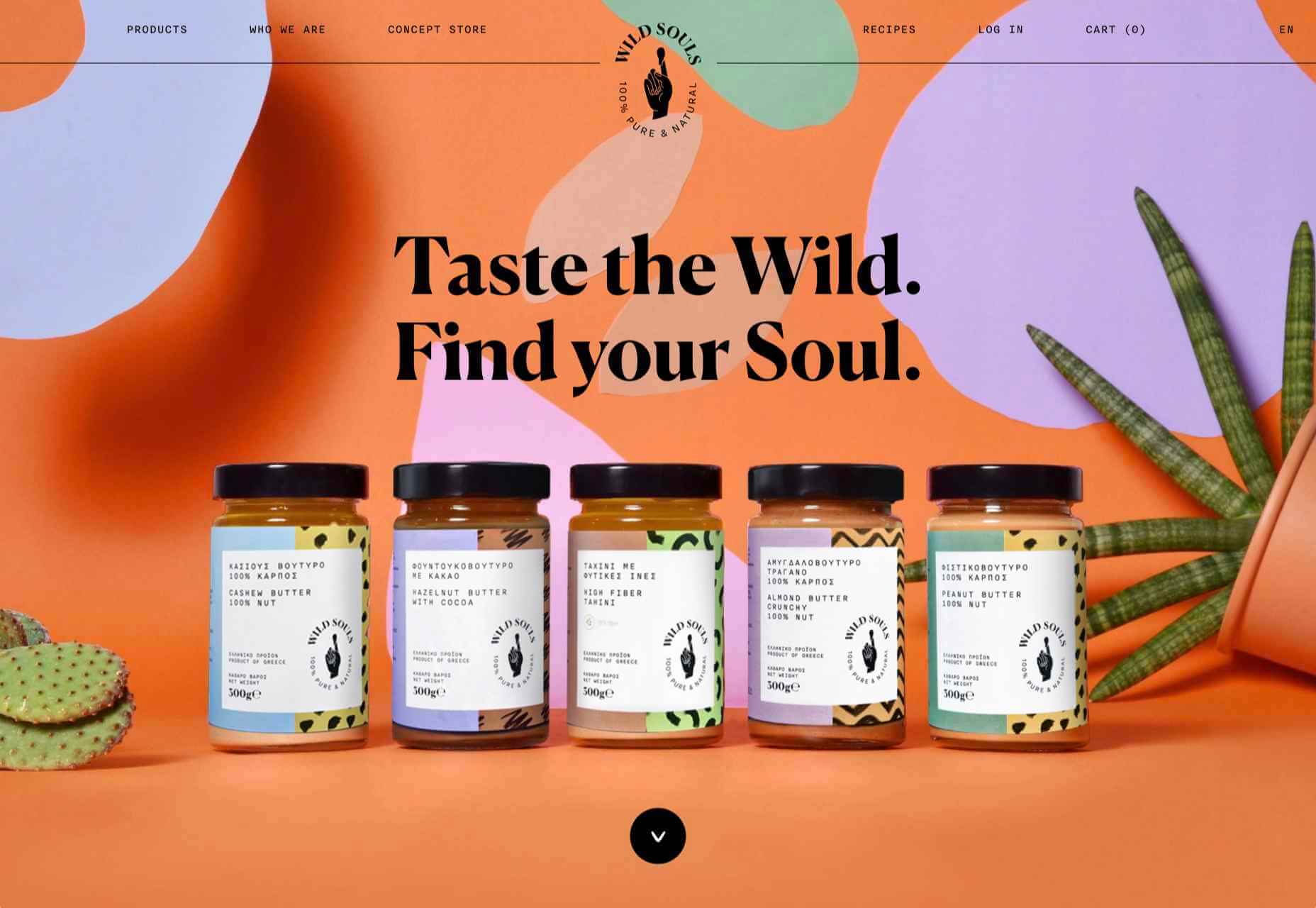
Wild Souls

Wild Souls is a Greek company that principally makes nut butters, tahini, and halva. The site is very colorful but warm, and the display type — Canela — has a slight softness to it that is appealing.

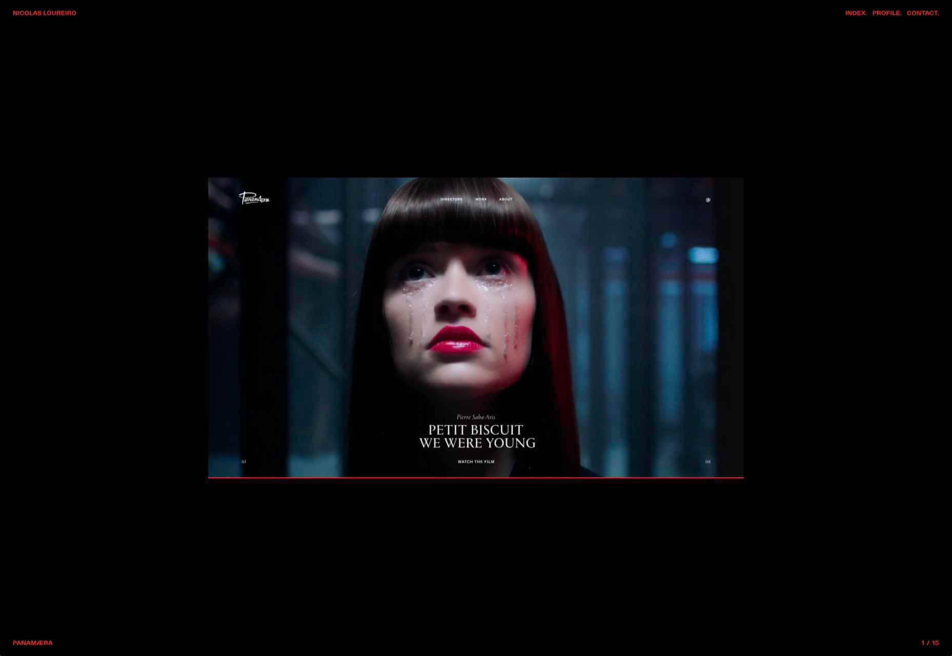
Nicolas Loureiro

This is a strong portfolio site for interactive and graphic designer Nicolas Loureiro. The work is front and center, and the navigation is pleasing.

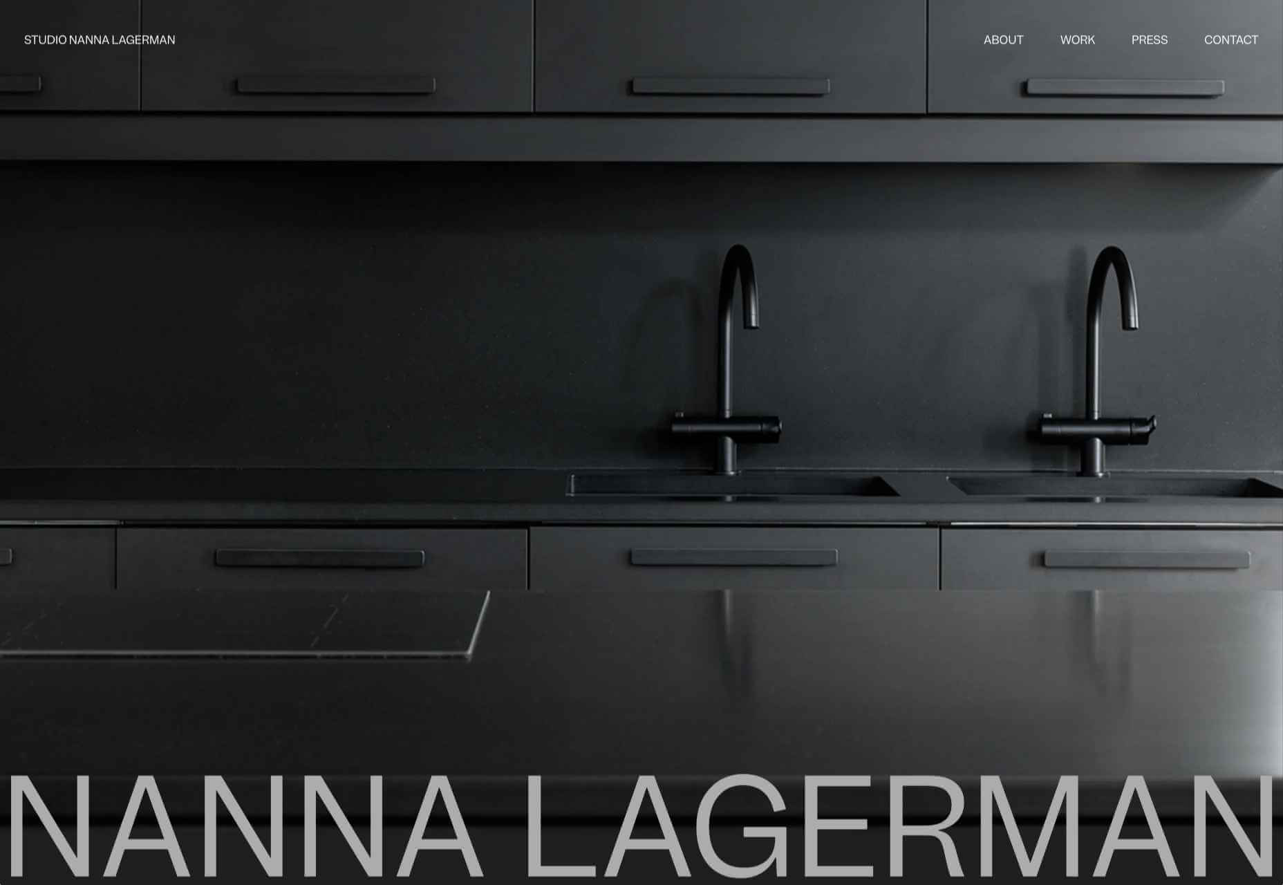
Studio Nanna Lagerman

Studio Nanna Lagermann is a small interior design studio that works on private homes, public spaces, and set design. The site creates a feeling of space and calm. Colors are soft and neutral, and the type, although massive in places, is clean and sophisticated.

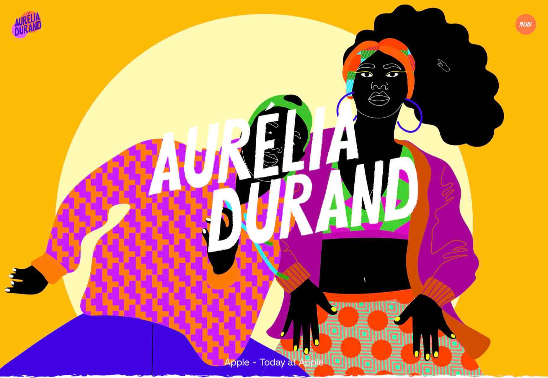
Aurelia Durand

Illustrator Aurelia Durand created her own typeface that she uses in her work, and it is used as the main display font here too. This site has a sense of joy about it that is hard to resist.

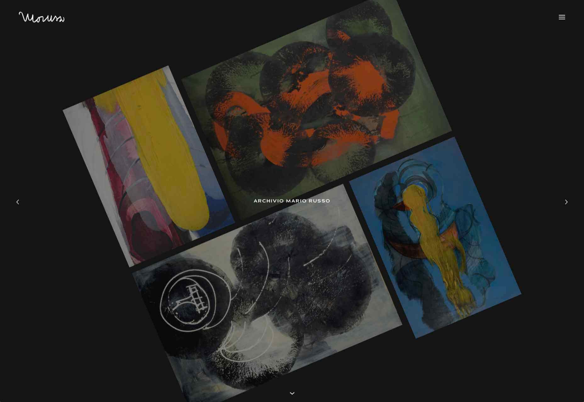
Archivio Mario Russo

This site documents the life and work of 20th-century Italian artist Mario Russo. The layout is thoughtful, and the text, while informative, doesn’t detract from the work being shown.

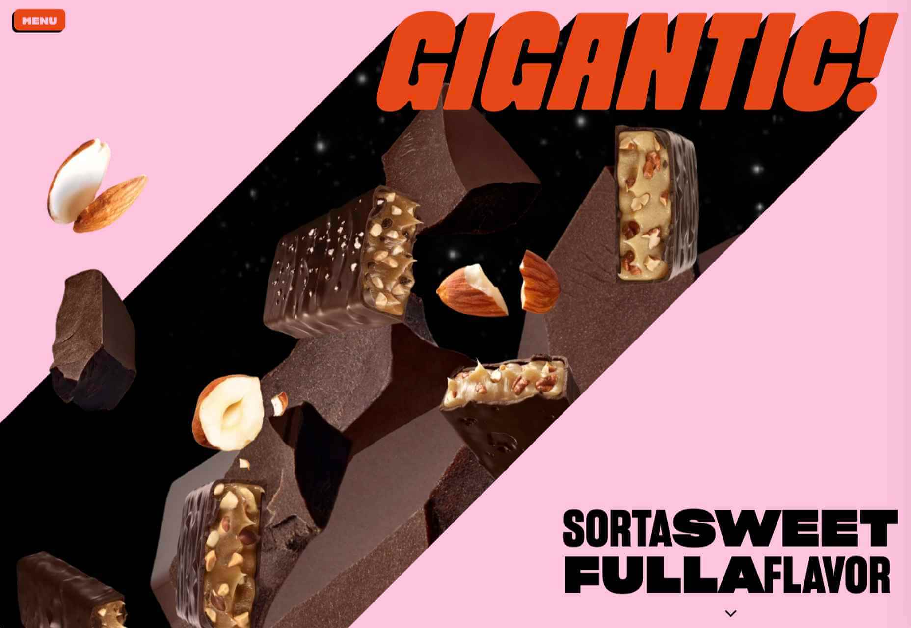
Gigantic Candy

Gigantic Candy makes vegan chocolate candy bars. The site is big, bold and lo-fi, and has a sense of fun to it.

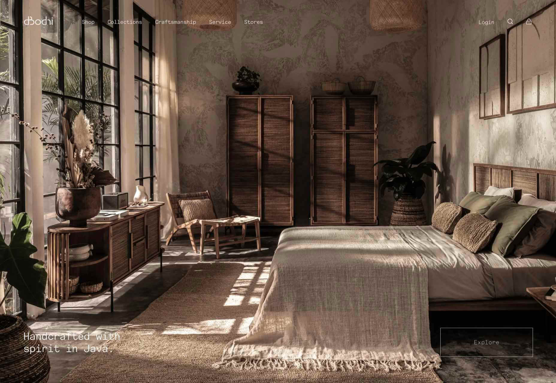
dBodhi

dBodhi sells handcrafted furniture from Java, made from reclaimed teak and locally grown plant materials. The clean layout combined with a slight sepia tone on all the photography creates a feeling of quietness and nature.

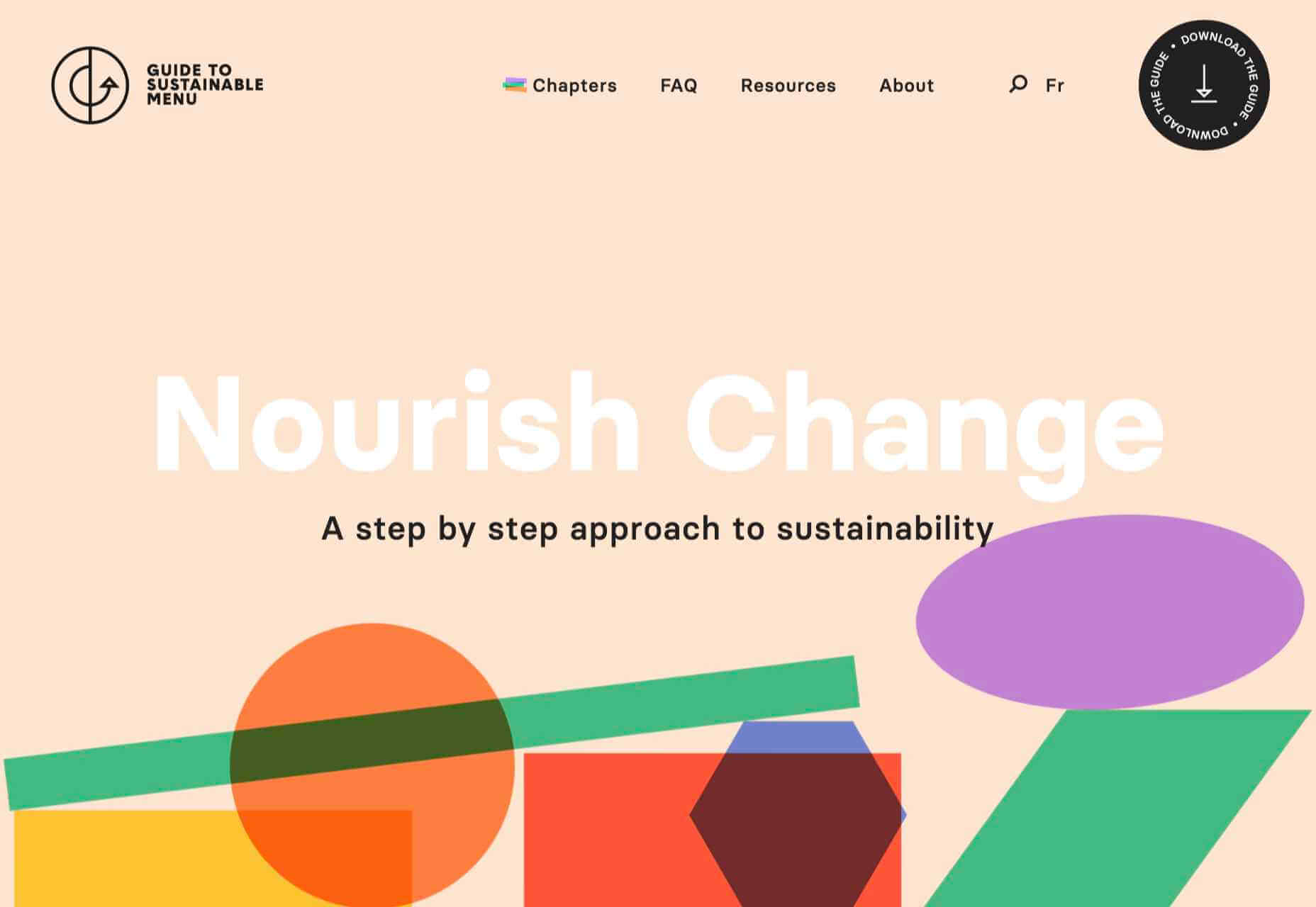
Menu Durable

Menu Durable is a guide to creating healthier, sustainable food menus in Canadian healthcare facilities. There is a lot of information here, and it is well written and attractively presented with clear color coding.

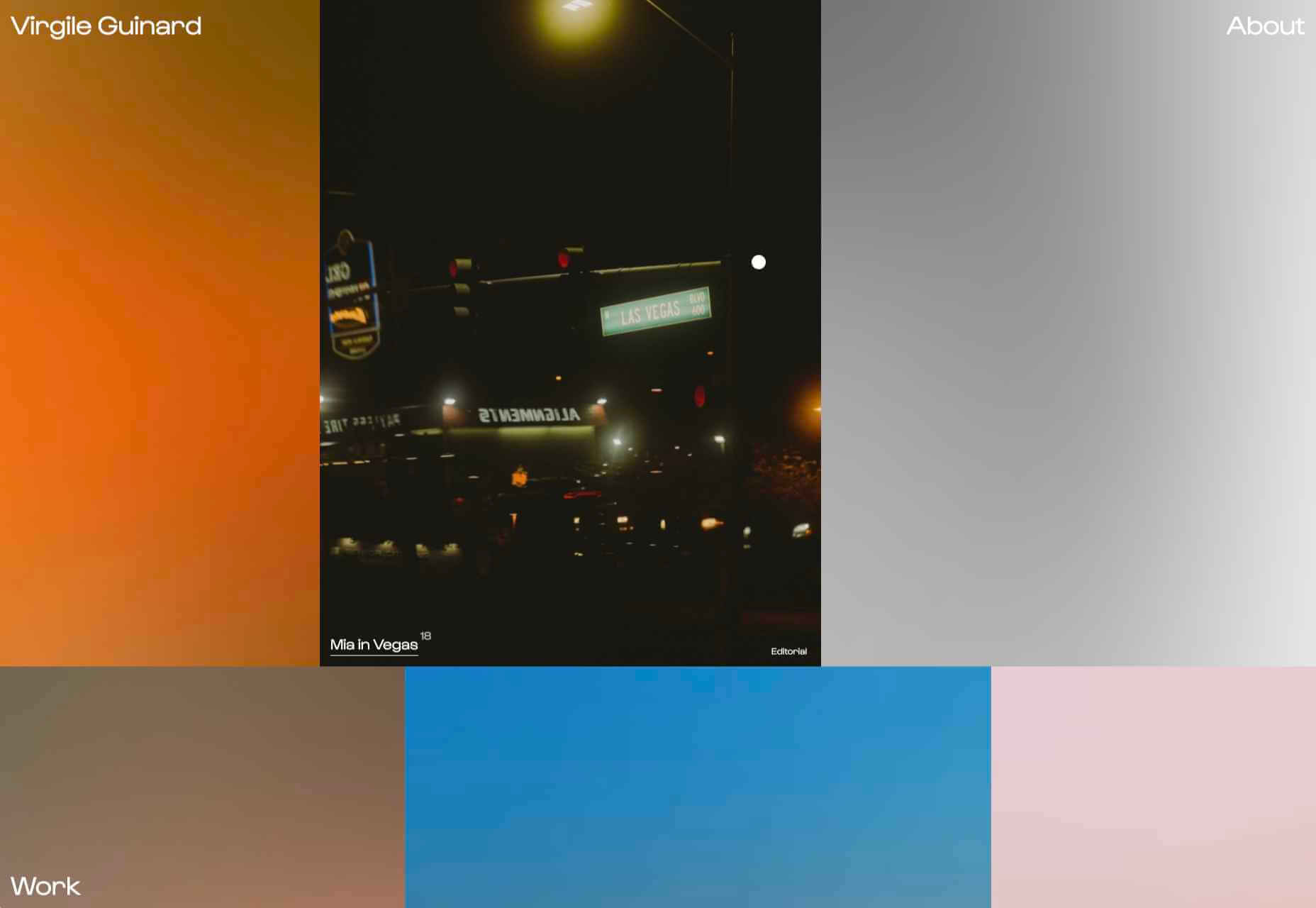
Virgile Guinard

This is a lovely, simple portfolio site for photographer Virgile Guinard. By using blocks of color pulled from each photograph’s predominant color and only revealing each photograph on rollover, each image is allowed to stand out.

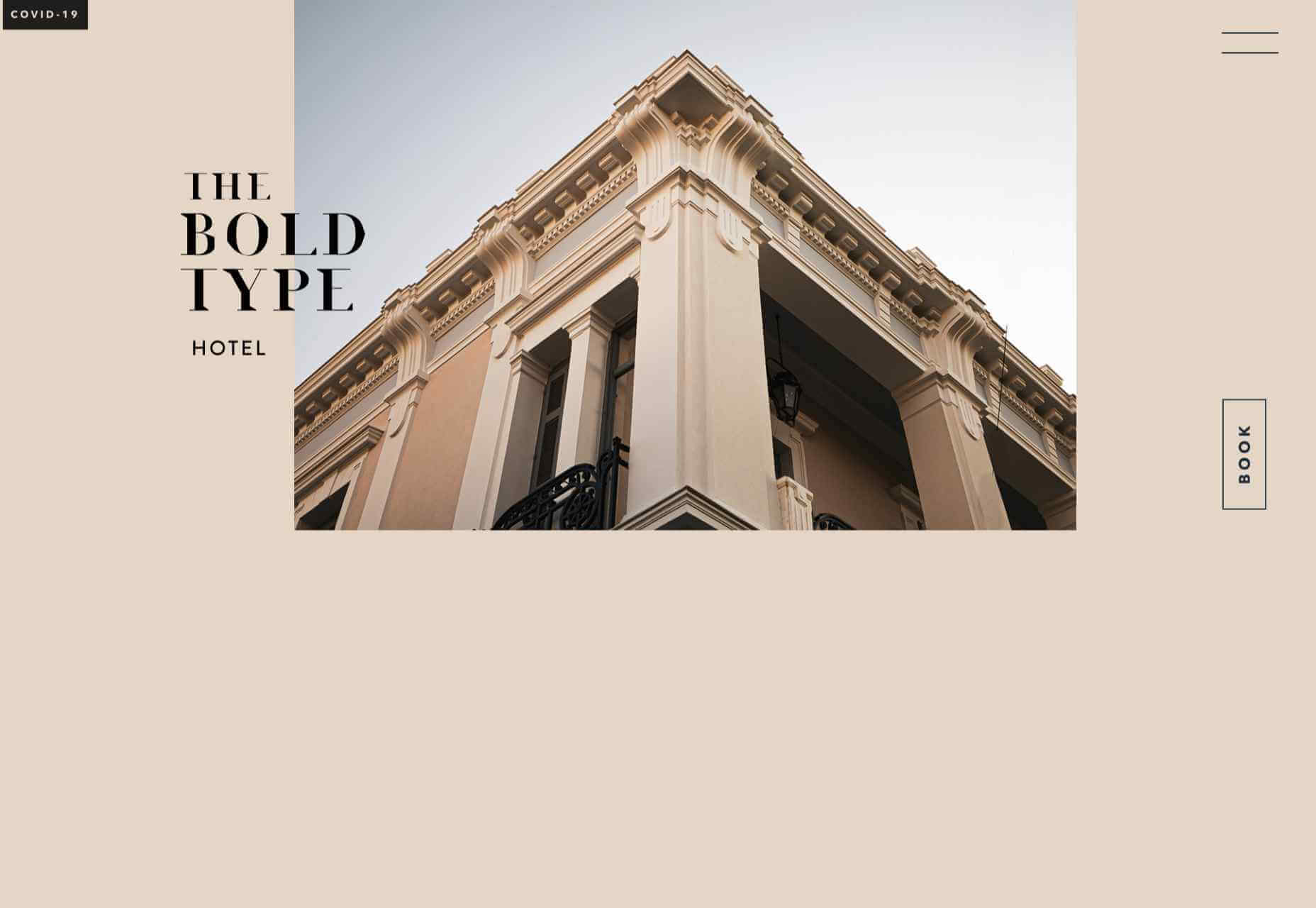
The Bold Type

This site for The Bold Type Hotel in Patra, Greece, is a boutique hotel website archetype, but it is done well. The pinky sand background color is a good choice, and the photographs are excellent.

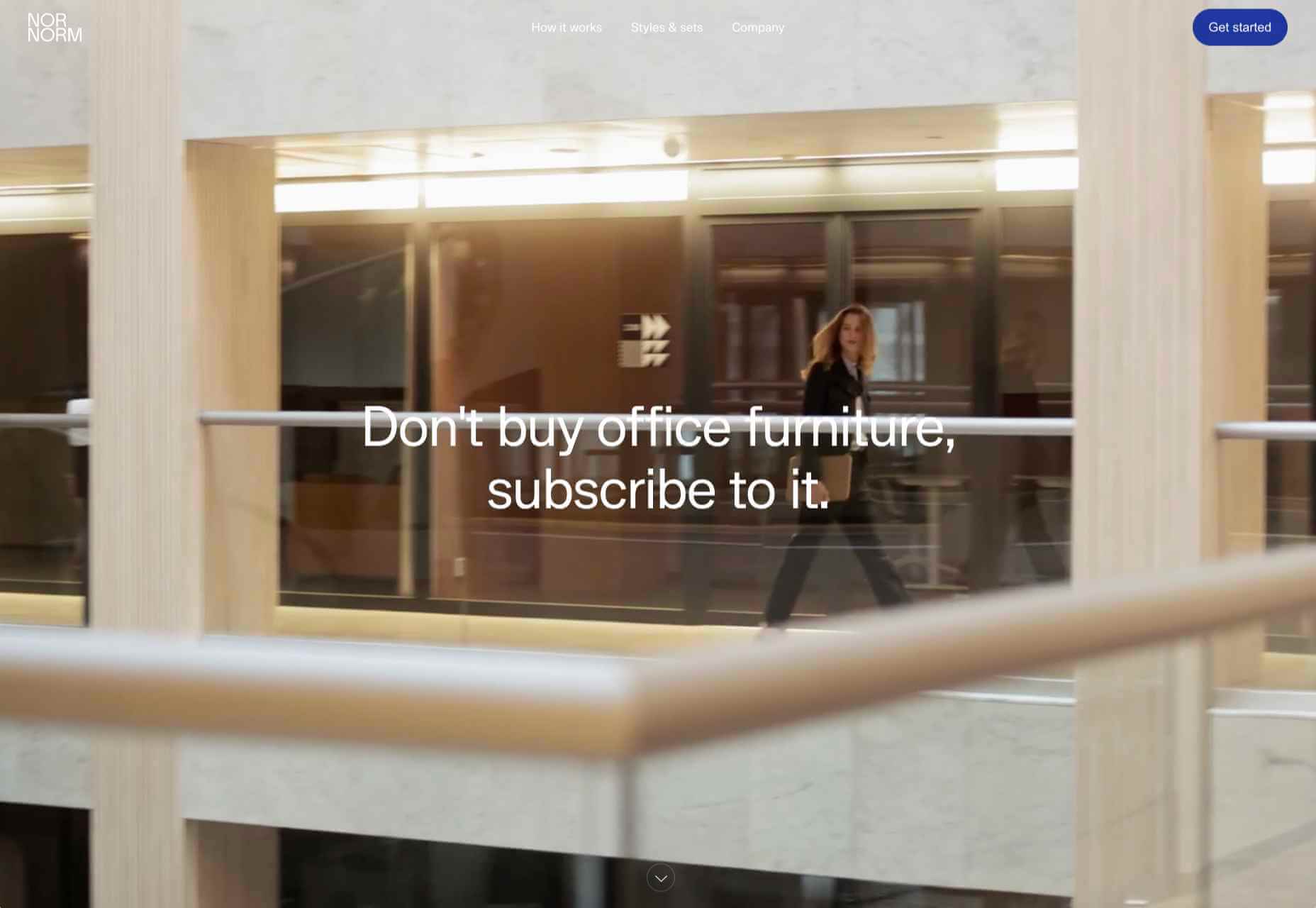
NOR NORM

Nor Norm provide an office furniture subscription service. The site is clean with a feeling of light and space. There is a good balance between an overview of the process and details of the individual items available.

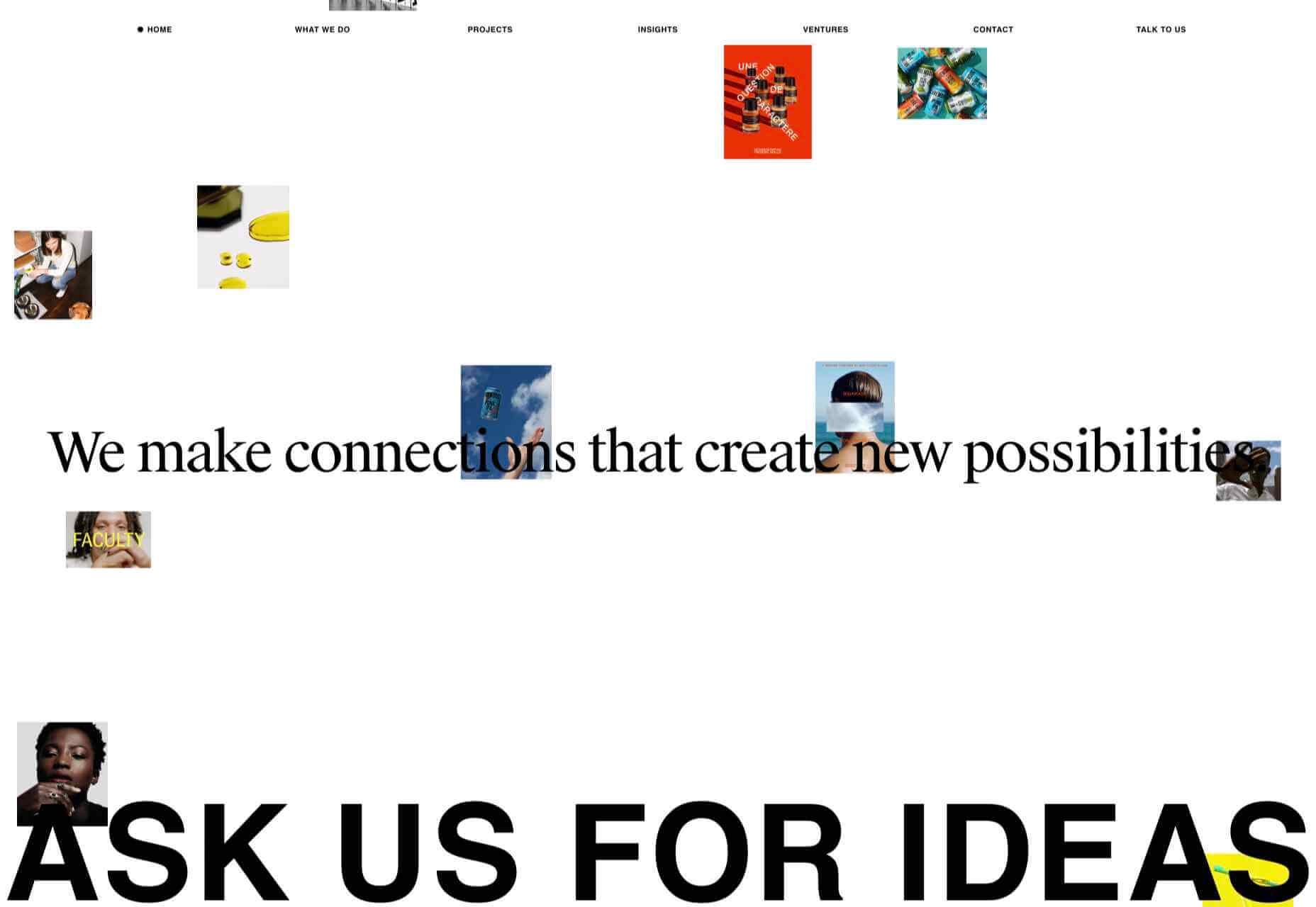
Ask Us For Ideas

At first glance, Ask Us For Ideas looks like a creative agency, but it is actually a creative broker, matching clients with agencies.

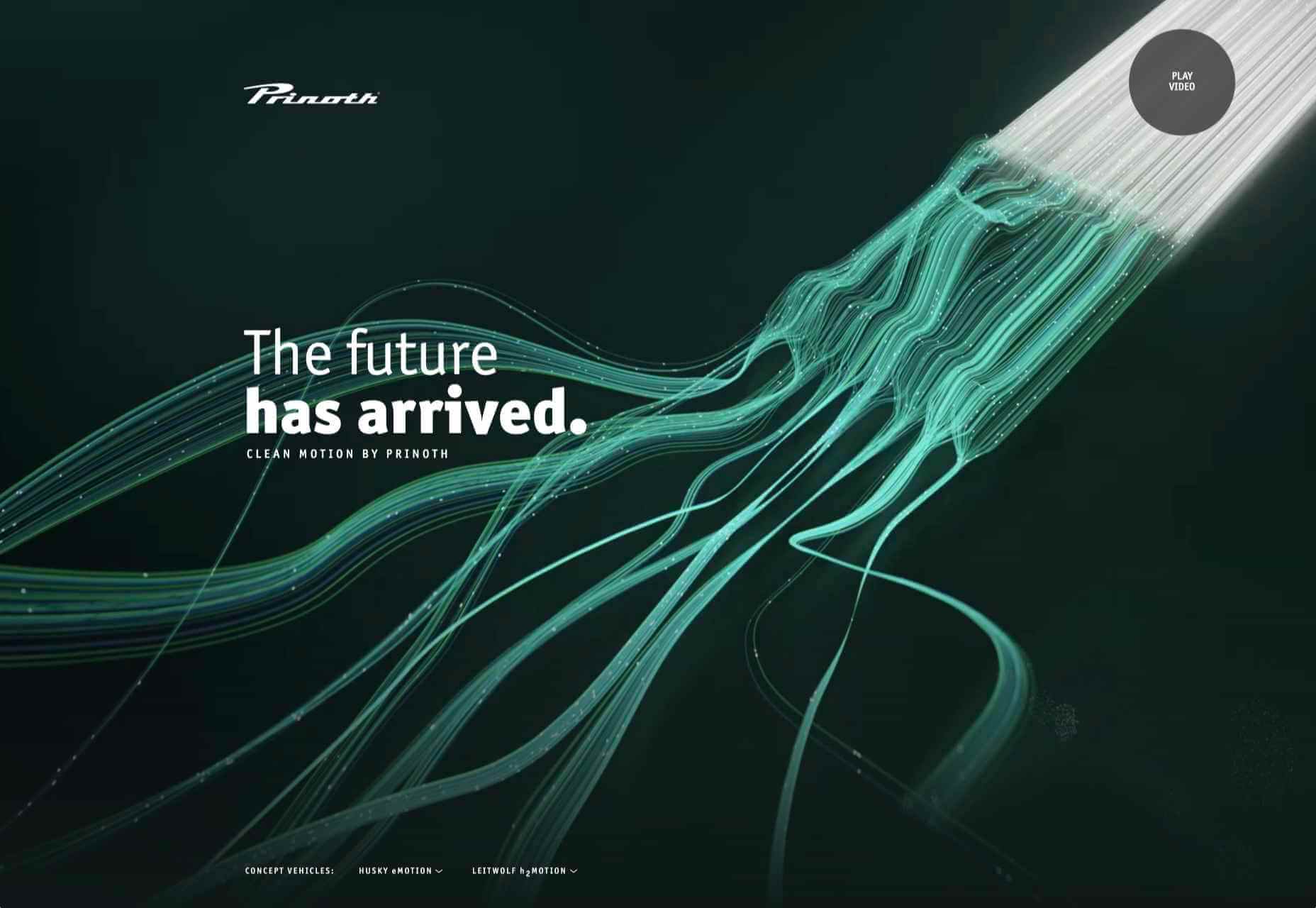
Prinoth Clean Motion

Prinoth has been making snow groomers since the 1960s, and this microsite is to mark the launch of their new hydrogen and electric versions. It is as slick and glossy as any luxury car website. And now I know what a snow groomer is.

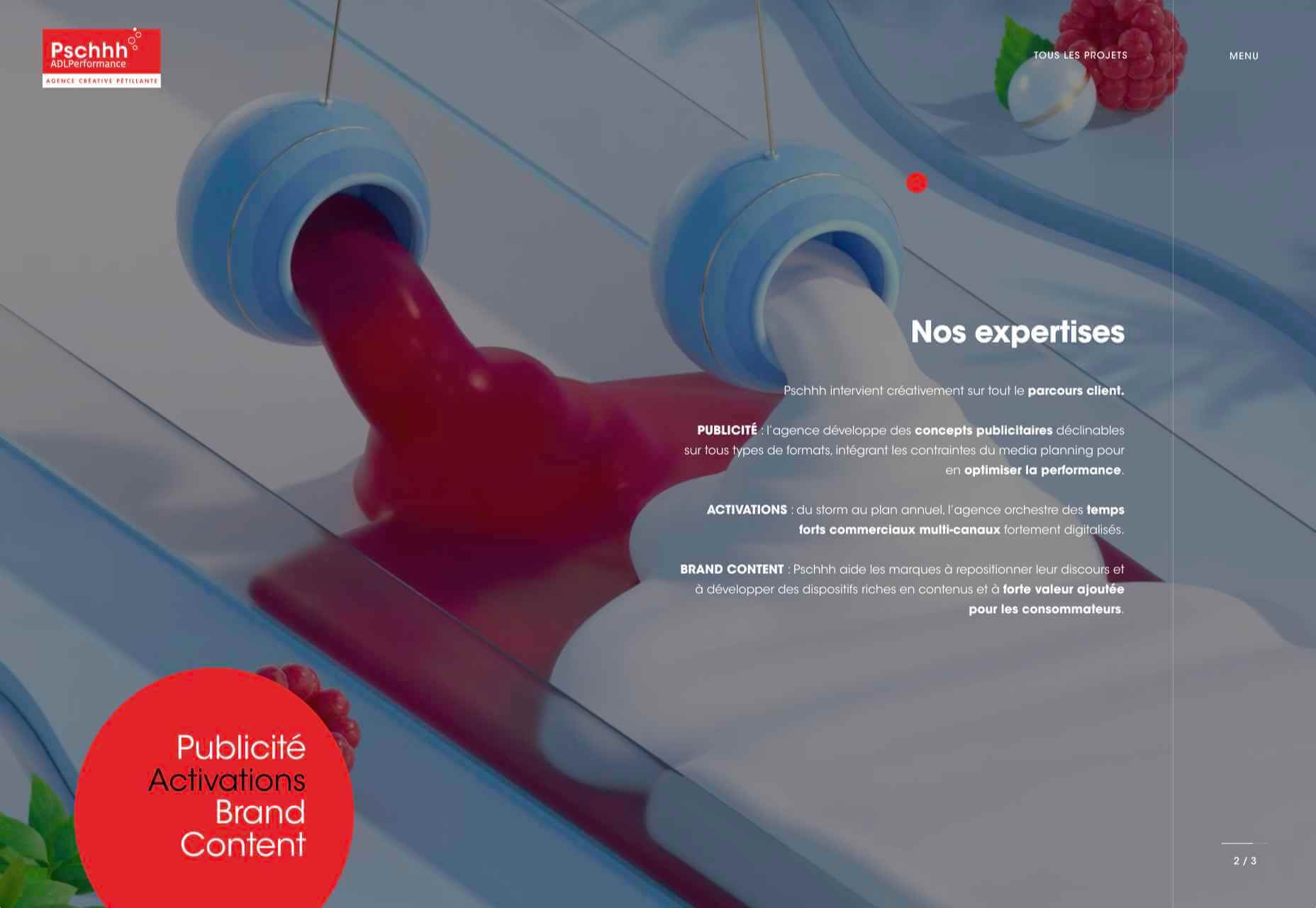
Pschhh

Design agency Pschhh has embraced the use of circles, reflecting the sound of bubbles their name suggests.

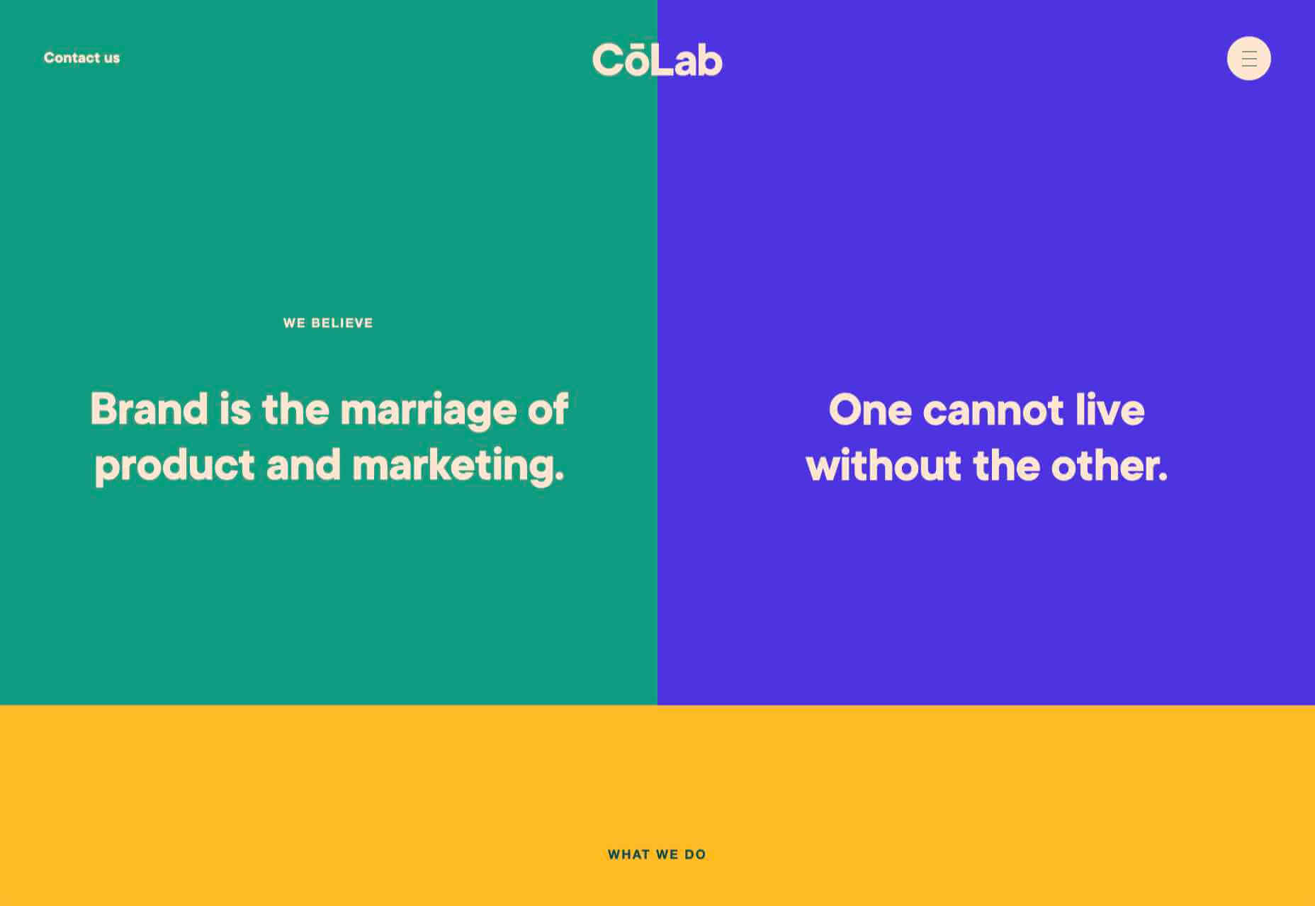
CōLab

CōLab is a design and marketing firm. There is a great use of color and movement here, and you don’t really notice initially that there is no actual work on show.

Source

The post 20 Best New Websites, February 2021 first appeared on Webdesigner Depot.

Source de l’article sur Webdesignerdepot

Everyday design fans submit incredible industry stories to our sister-site, Webdesigner News. Our colleagues sift through it, selecting the very best stories from the design, UX, tech, and development worlds and posting them live on the site.

The best way to keep up with the most important stories for web professionals is to subscribe to Webdesigner News or check out the site regularly. However, in case you missed a day this week, here’s a handy compilation of the top curated stories from the last seven days. Enjoy!

The New Trello – Going Beyond the Board

Flameshot – Superb Screenshot Tool

GitHub Surf – Open repositories in a VSCode Environment

The Never-Ending Job of Selling Design Systems

The Secret Ingredients to Design

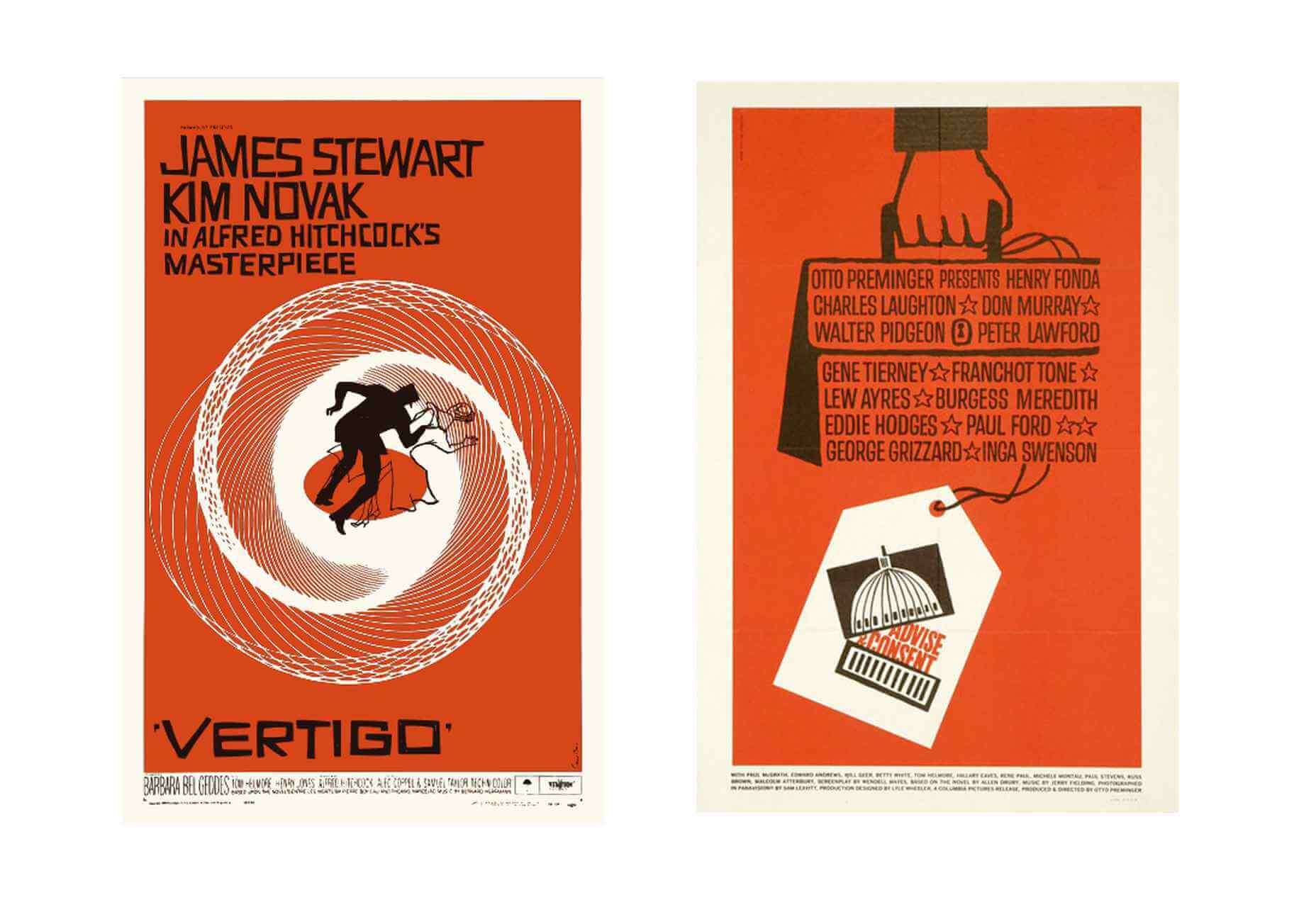
What Saul Bass Can Teach Us About Web Design

2021 Planner for Notion – A Smart Notion Workspace

Ideas for CSS Button Hover Animations

Ray.so – Create Beautiful Images of Your Code

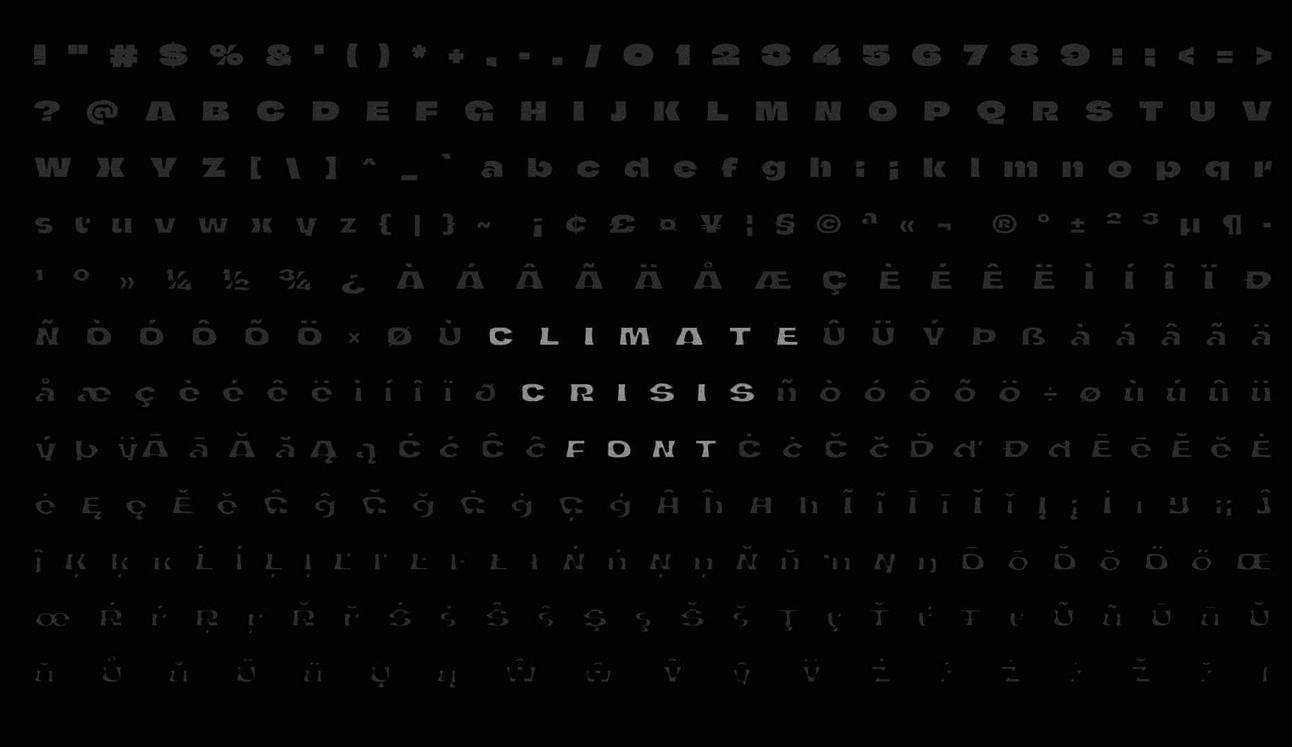
Variable Font Reveals The Full Horror of The Climate Crisis

Design Systems For Figma: Year In The Life Of A Material Design Advocate

Interface Market – An Extensive Collection of App UI Kits

DogeHouse – Open-Source Audio Chat on the Web

Interaction Design is More Than Just User Flows and Clicks

Design Trends 2021

Straw.Page – Extremely Simple Website Builder

The Impact of Web Design and SEO Conversion Rates

Powerful Microinteractions to Improve Your Prototypes

What’s New in Ecommerce, February 2021

Colortopia – The Easiest Way to Find Colors

5 Simple Design Patterns to Improve Your Website

TextBuddy for macOS – A Swiss Army Knife for Plain Text

Upcoming Interesting JavaScript ES2021 (ES12) Features

WordPress 5.7: Big ol’ jQuery Update

JavaScript reducer – A Simple, Yet Powerful Array Method

Source

The post Popular Design News of the Week: February 15, 2021 – February 21, 2021 first appeared on Webdesigner Depot.

Source de l’article sur Webdesignerdepot

Do you have the recurring thought that you don’t have enough time or that it is too late to accomplish what you want to?  If so, you may be suffering from what is referred to as “time anxiety.” It is pretty common, especially in today’s day and age with social media portraying unrealistic expectations and forcing our lives to rush us by.

Time anxiety is no fun and can be weighing you down in your everyday life. Here is everything you need to know and some strategies and tips to overcome this anxiety and work towards being more at peace with the way that you are living.

Source de l’article sur DZONE

Since the skeuomorphism of the early 00s, the design trend of choice has been minimalism. In fact, minimalism has been de rigueur for substantially longer than that.

You can make a fair case that minimalism was the defining theme of the 20th century. Beginning with the widespread adoption of grotesque typefaces in mass advertising the century before, continuing through the less-is-more philosophies of the middle part of the century, and culminating in the luxury of 80s and 90s consumerism.

Minimalism has been central to the design practice of almost every designer that we recognize as a designer. It underpins the definition of the discipline itself.

With the weight of such illustrious history, it’s no wonder that the fledgling web — and in the scale of history, the web is still a very new phenomenon — adopted minimalism.

And then there’s the fact that a minimalist approach works on the web. Multiple viewports, multiple connection speeds, multiple user journeys, all of these things are so much easier to handle if you reduce the number of visual components that have to adapt to each context.

And yet, despite this, an increasing number of designers are abandoning minimalism in favor of a more flamboyant approach where form is function. It’s clearly happening. What’s not clear is whether this is a short-lived, stylistic fad or something altogether more fundamental. In other words, are designers about to abandon grids, or are they just slapping some gradients on an otherwise minimal design?

Featured image via Pexels.

Source

The post Poll: Is Minimalism a Dead Trend Walking? first appeared on Webdesigner Depot.

Source de l’article sur Webdesignerdepot

If you’re paying attention to anything that’s happening in the development world, you’re likely familiar with the term “observability.” We’re seeing more and more monitoring companies from all different backgrounds jumping on the term to describe their solutions, many claiming their observability tool to be the factor that will take businesses to the next level.

Growing out-of-control system engineering, observability allows dev teams to unify and study the behaviors of various IT systems through the external outputs of the internal systems. In the case of software, that’s log events, distributed tracing, and time-series metrics. By unifying the data streaming through today’s complex IT environments, it certainly gives SREs and DevOps practitioners a leg up from traditional monitoring. But the data alone is no longer enough.

Source de l’article sur DZONE

When photographers take images to sell commercially, like every other business, they want to maximize their returns, so they adapt their ideas to meet commercial trends. As a result, stock always looks like stock, and that minor deception introduces a small amount of doubt in users.

But the rise of camera phones, and the increasing affordability of DSLRs, has led to a growth in people who aren’t monetizing every shot. What that means is if you know where to look, you can find images that are less posed, more natural, less clichéd, and far more diverse.

Here are ten places to look for engaging, and trust-building stock images, all free to use…

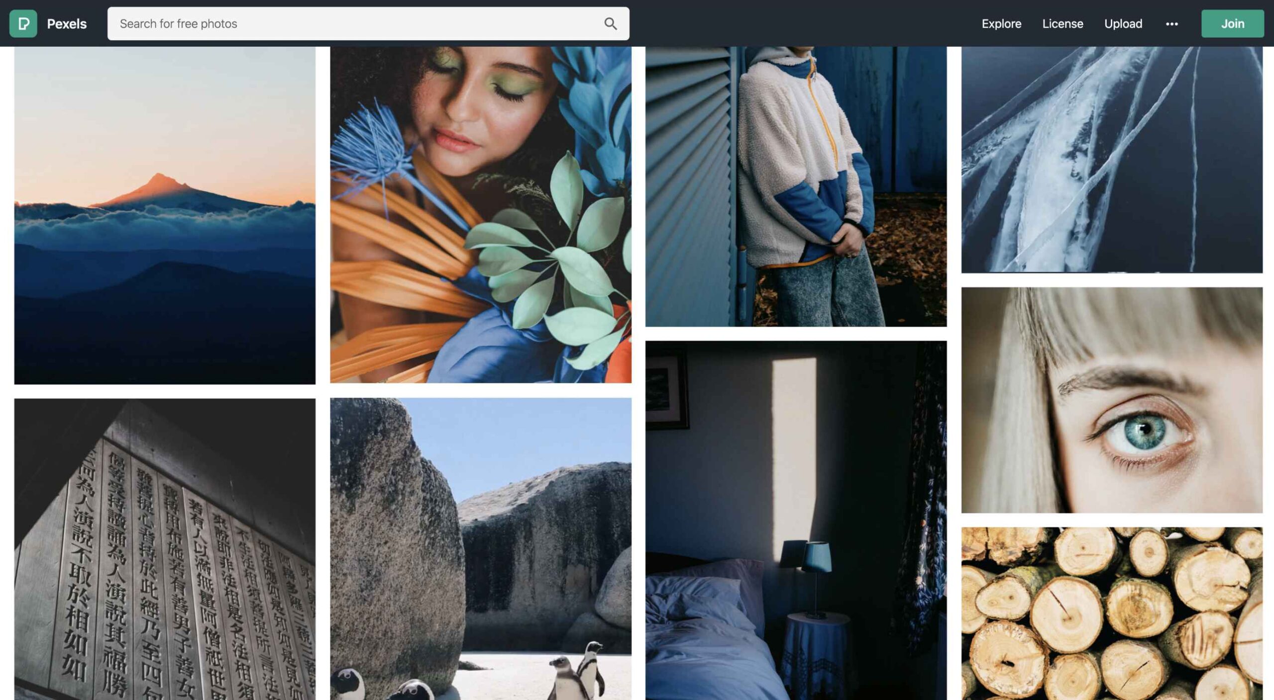
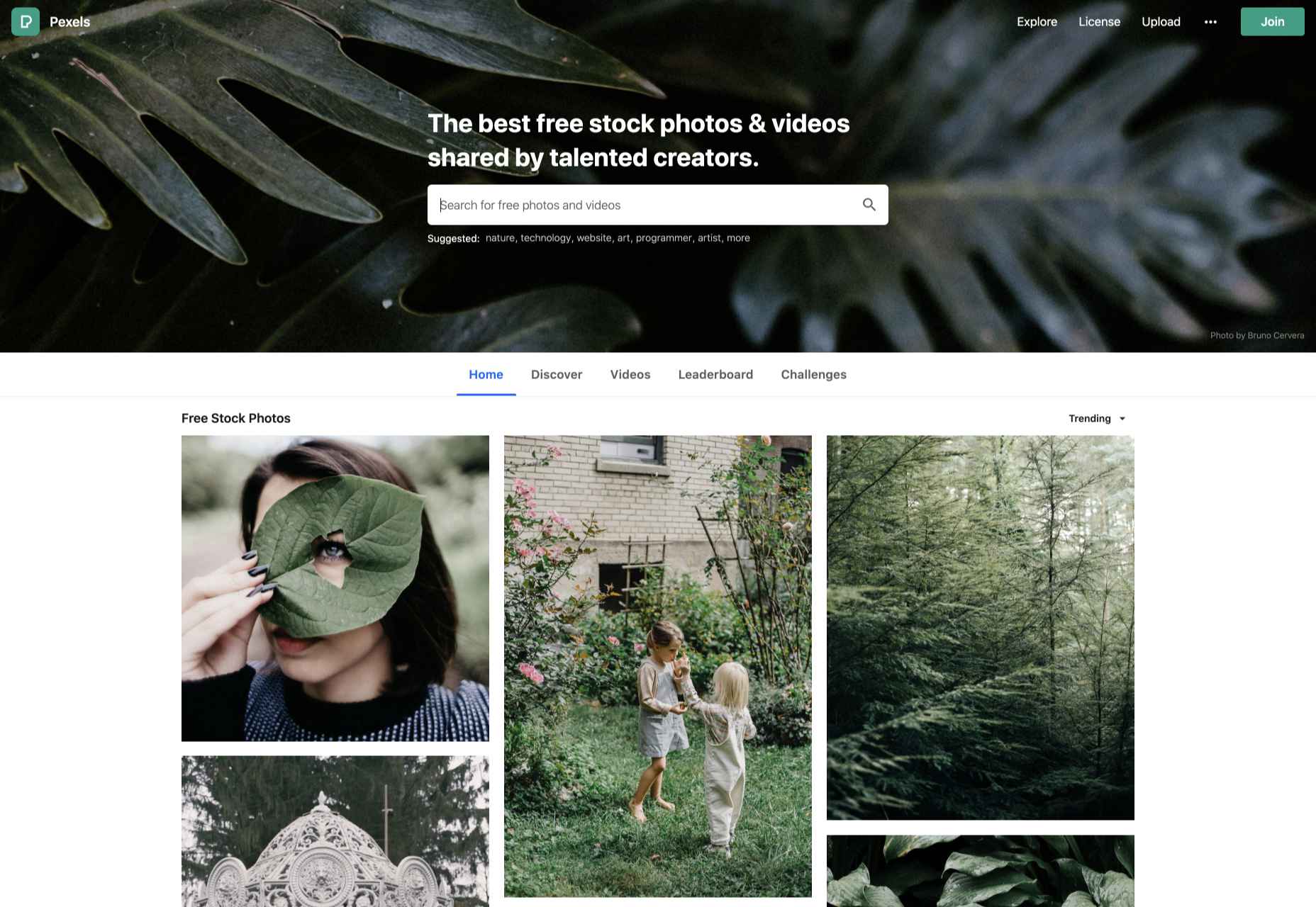
1. Pexels

Pexels has a huge collection of high-quality images that would not feel out of place on a ‘premium’ site. You’ll also find a ton of free videos. Pexels’ search feature is particularly well-tuned. Pexels also runs regular challenges, with cash prizes for photographers; reviewing the past competitions is a great shortcut to finding original images.

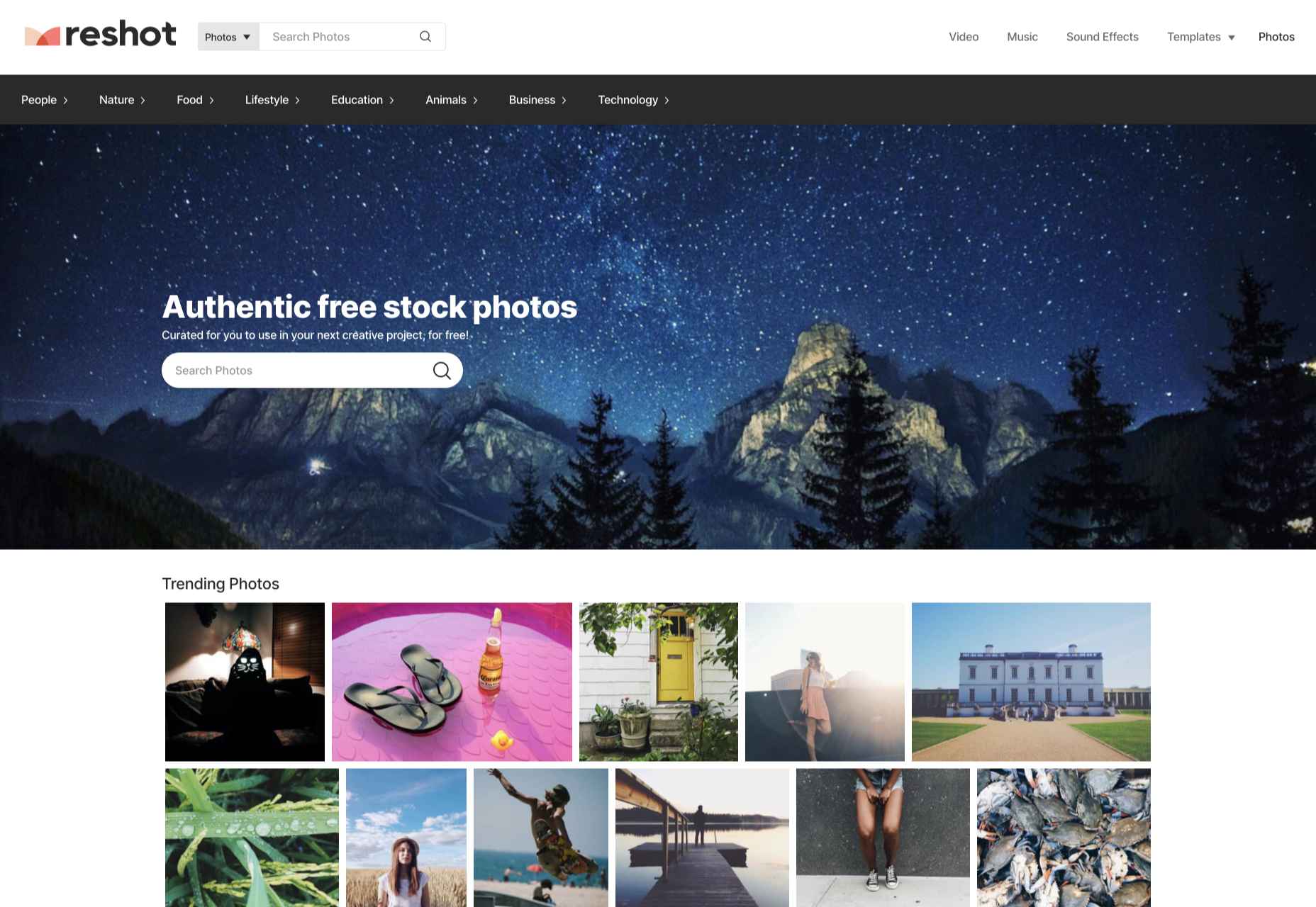
2. Reshot

Reshot is one of the better stock sites on the web, with a wide selection of curated images. There’s a distinctly Instagram feel to the images on Reshot; they don’t feel staged, in many cases, they don’t look like stock at all. That gives them an authentic feel that many ‘premium’ stock sites fail to deliver.

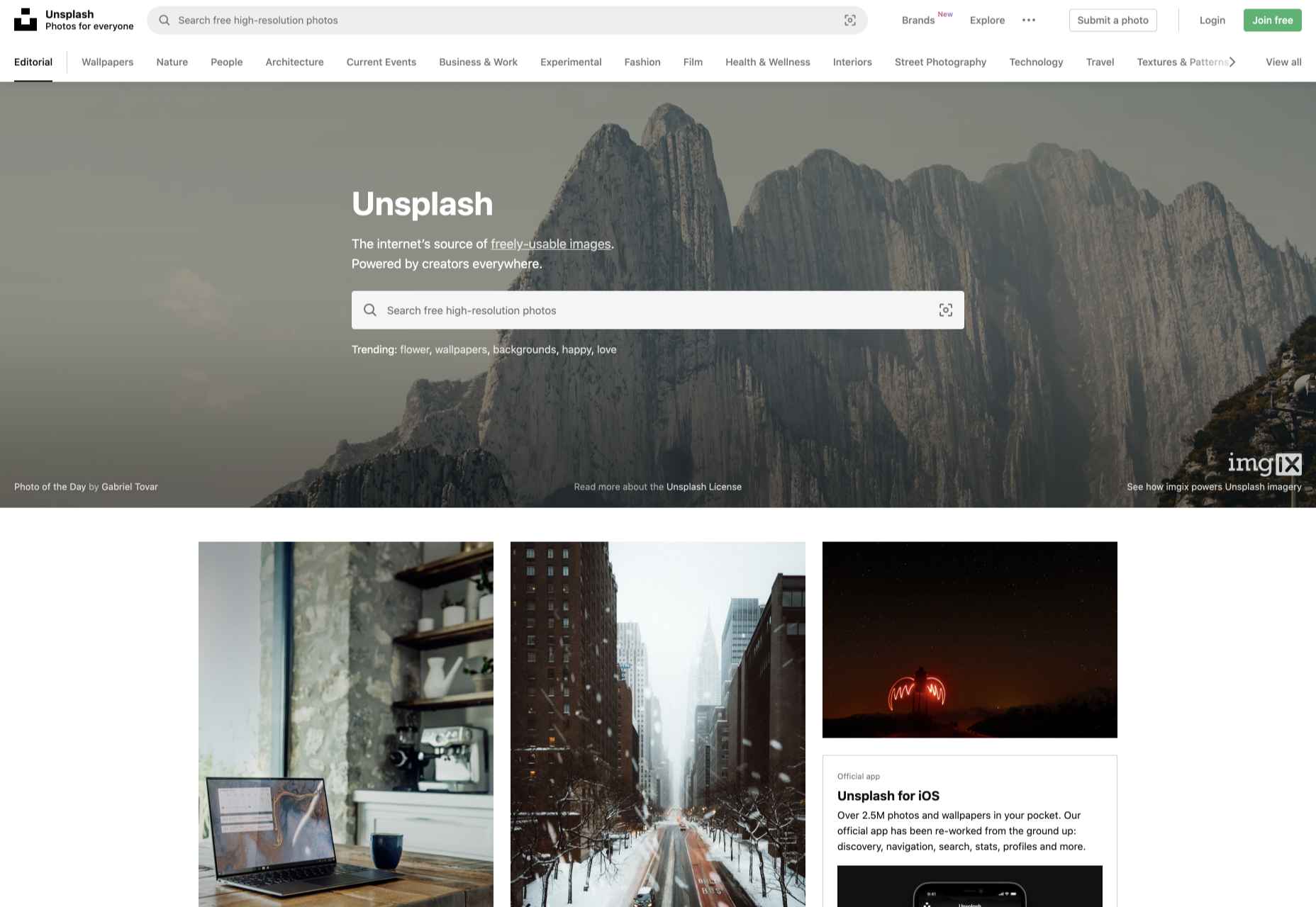
3. Unsplash

Unsplash is one of the largest collections of free images on the web. It has a good collection of standard stock and a growing collection of more creative, experimental images. Its free-forever approach is backed by product placement instead of adverts or premium sections, which means you may find the more marketable images include easily identifiable brands.

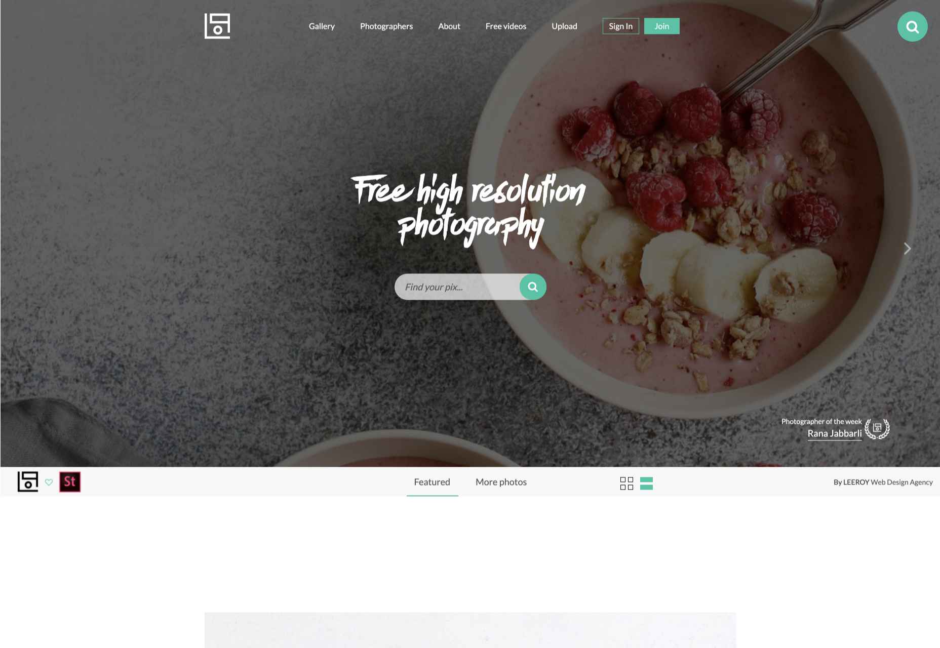
4. Life of Pix

Life of Pix highlights one photographer per week to feature ten images; that adds a competitive angle to the site as photographers submit premium shots to get noticed. Unless you’re very fortunate, the ideal shot for you isn’t going to be found in the current set, but click the ‘Gallery’ link, and you’ll have access to all the shots that have previously been uploaded.

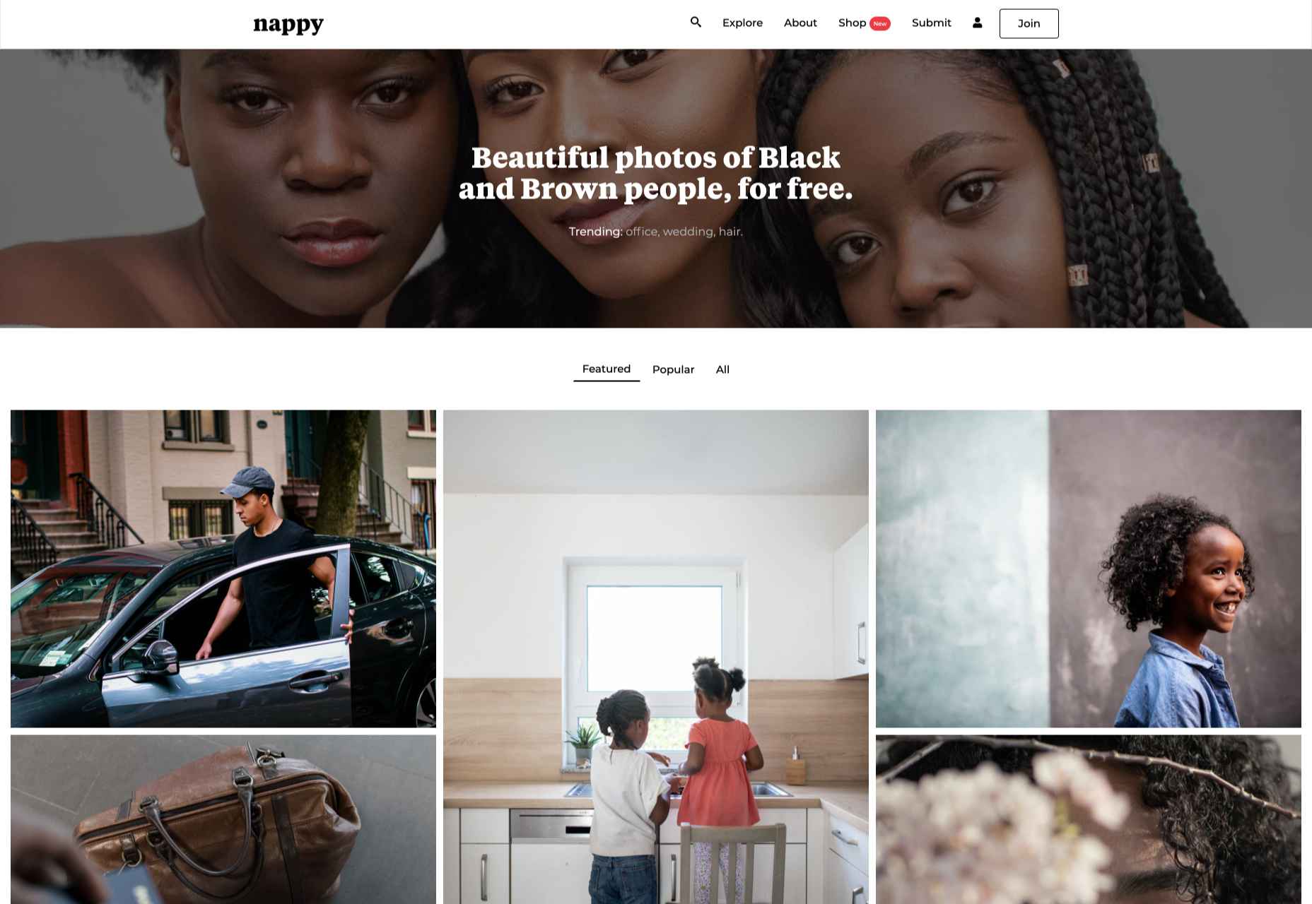
5. Nappy

Unlike ‘premium’ sites that are set up to turn a profit, free stock sites often set out to address a hole in the market. Nappy was set up to redress the underrepresentation of black and brown people on many stock sites. At least some of your users fall into this demographic, and it’s a great idea to show them they’re valued by using images like these.

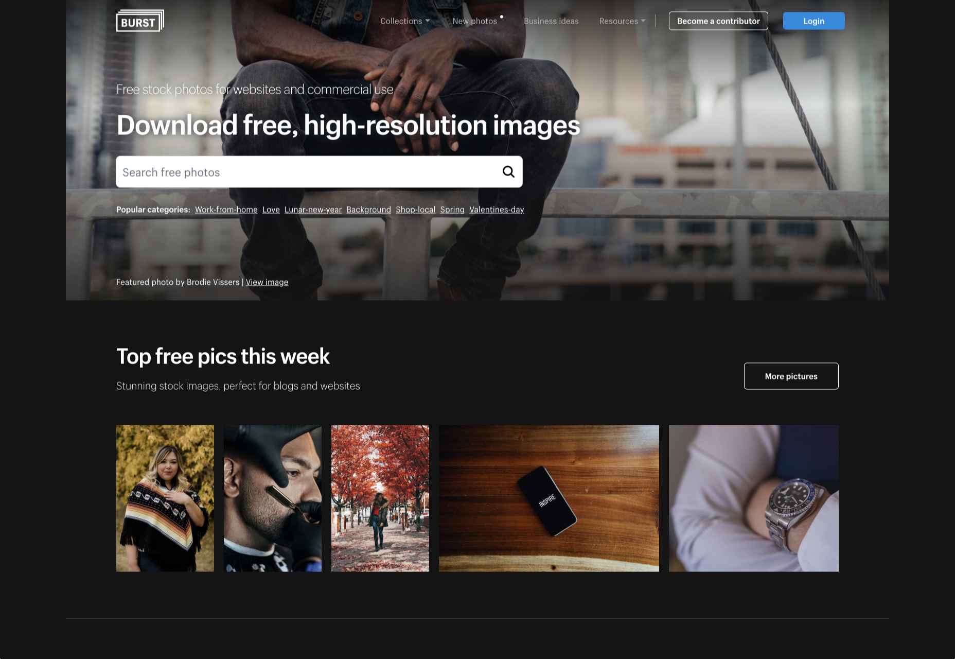
6. Burst

Burst is a stock site provided by Shopify to help new entrepreneurs find stock to help them sell products. Anyone can use the shots, but there is a natural inclination towards commercial rather than editorial images. There’s a good mix that rivals many paid sites and some less obvious shots.

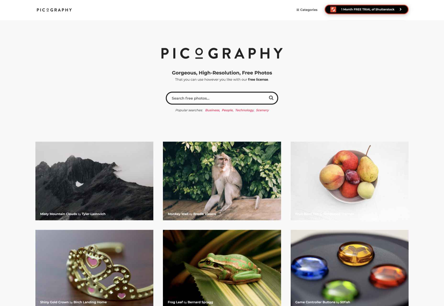
7. Picography

If quirky and offbeat isn’t right for your project — and it may very well not be — then check out Picography for a more middle-of-the-road collection of free stock images. There’s a wide selection, but they do tend to feel more stock-like than many other collections.

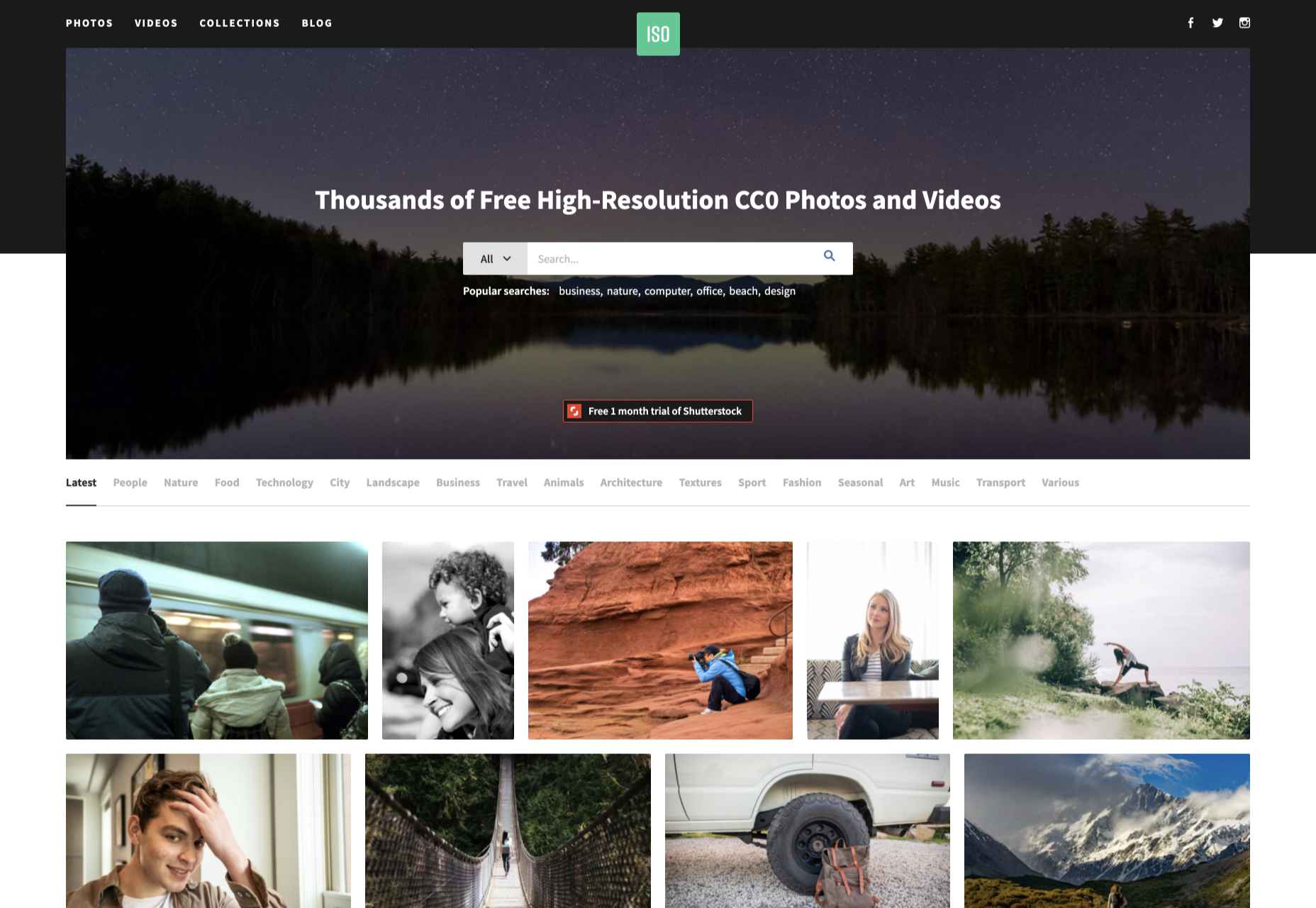
8. ISO Republic

ISO Republic has a broad range of images and videos to choose from. Again, the images tend to be more stock-like than some other options, and you do have to dig around to find the best. ISO Republic is a good place to search when you want to swap like-for-like with a ‘premium’ stock source.

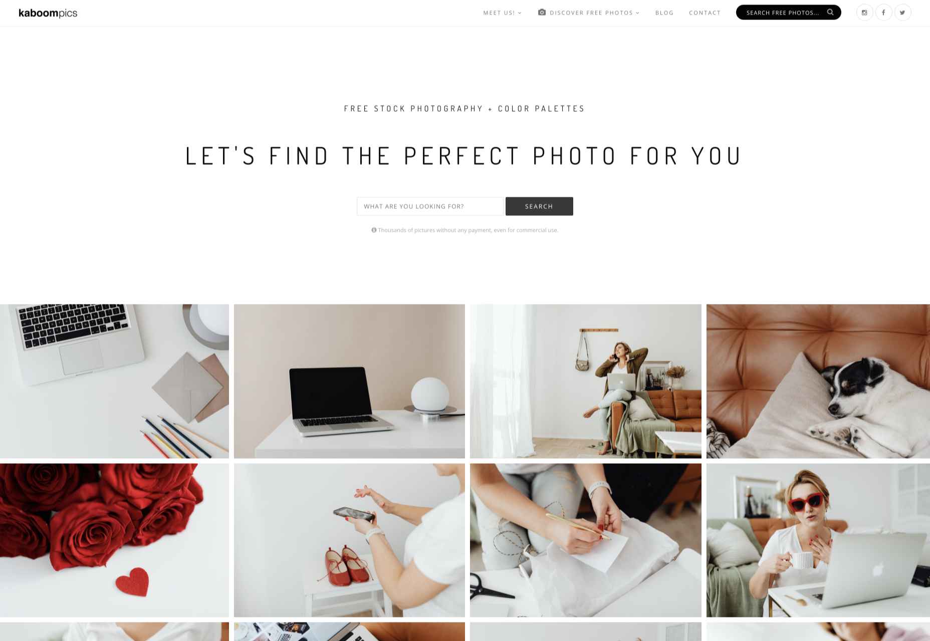
9. Kaboompics

Kaboompics specializes in lifestyle images. If you’re hoping for a woman sipping a frappuccino while making commanding business decisions, you’re in the right place. Kaboompics is a one-woman show, so the perspective is a little narrower than the ideal, but the free images are consistently high-quality.

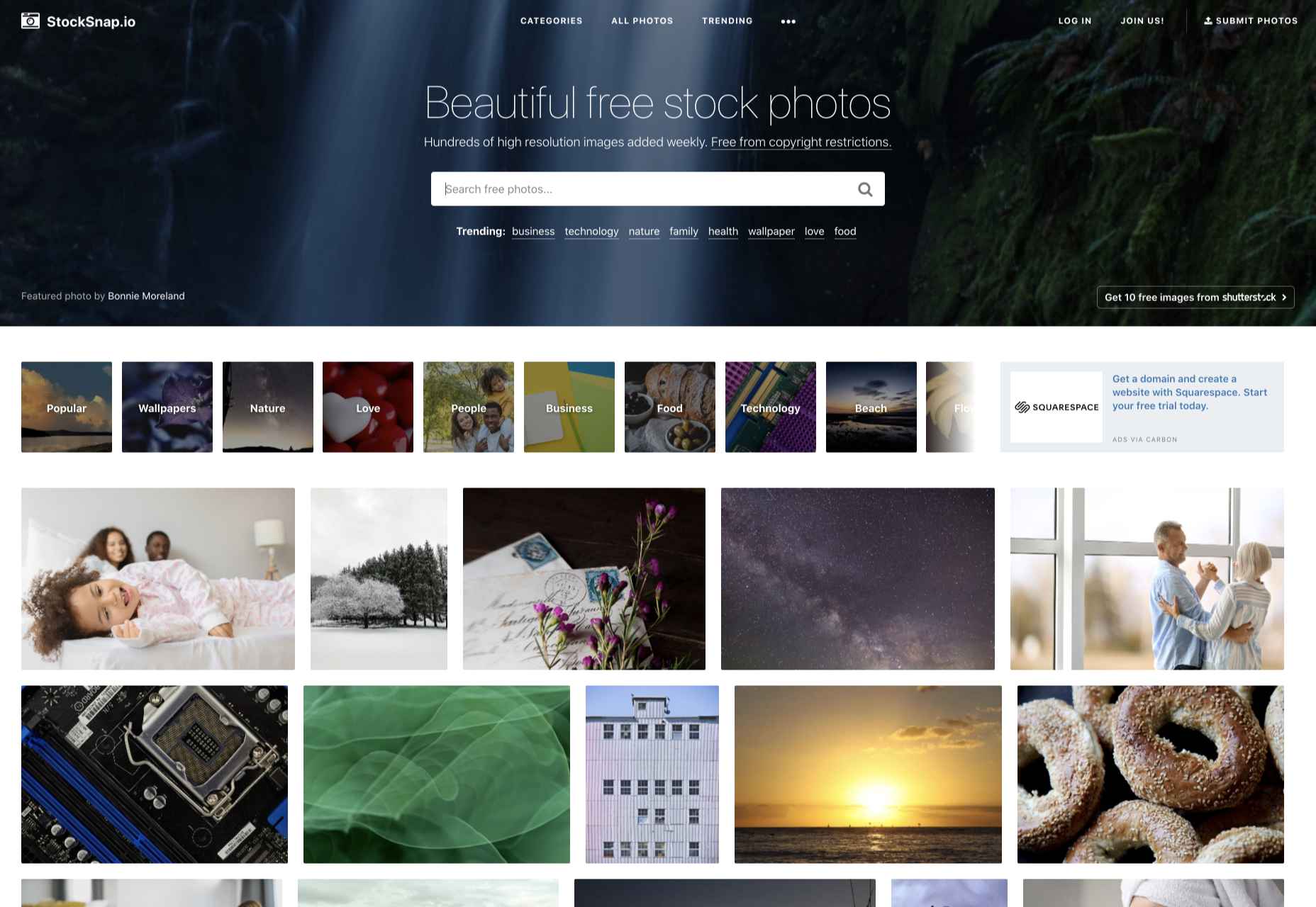
10. StockSnap

StockSnap has a good balance of images. Many professional photographers use sites like StockSnap to upload the images they choose not post to ‘premium’ sites for one reason or another, so you’ll often find premium-quality shots for absolutely nothing.

Source

The post 10 Best Free Stock Image Sites For 2021 first appeared on Webdesigner Depot.

Source de l’article sur Webdesignerdepot

There are numerous benefits of having a unified advertising mechanism for the business of an organisation. Today, most of the advertising that is done across various media is disparate and not having a unified mechanism for generation, distribution, maintenance, reporting, or collection. To bridge this gap, I conceptualized and coined the term Meld Advertising (Referred to as ‘It’). Meld Advertising brings out all of these in the form of providing tools to automate most of these processes and to directly connect with all unique advertising channels. The tools help in the creation, beta, subscription, payments, real-time reporting, cost-effectiveness, and overall maintenance of the advertisements.

It helps all types of users including the end contractors who work on actually putting up advertising for diverse media. These include all tools which facilitate the entire workflow of advertising. It also recognizes that usage of effective tools, which are simple to use and create advertisements online, will lead to a faster execution of marketing campaigns. Also, ready-made templates, tie-ups with other advertising tools, and online expert help will allow for a more efficient generation of advertisements.

Source de l’article sur DZONE

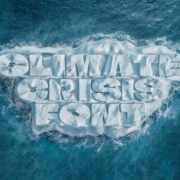
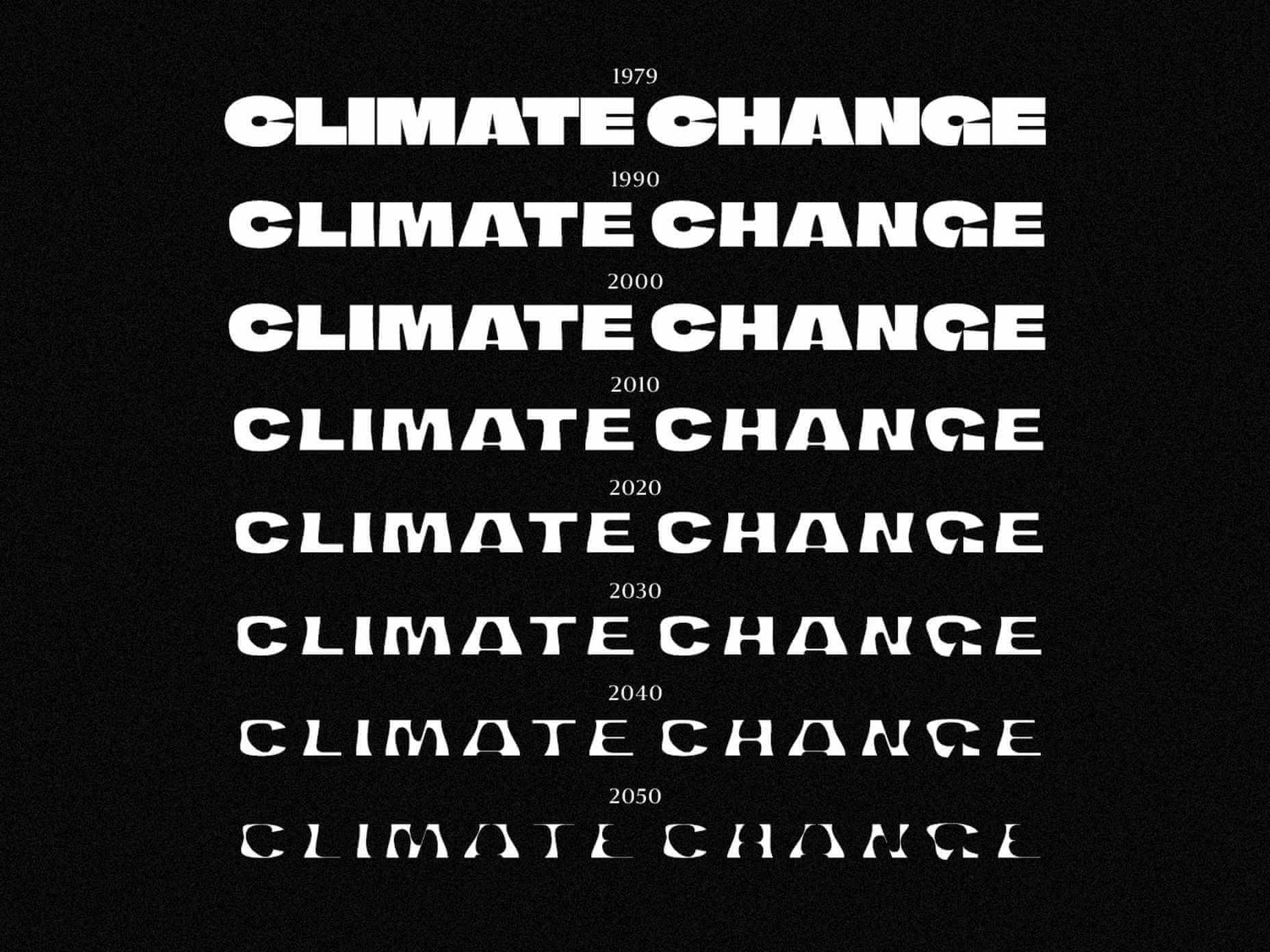
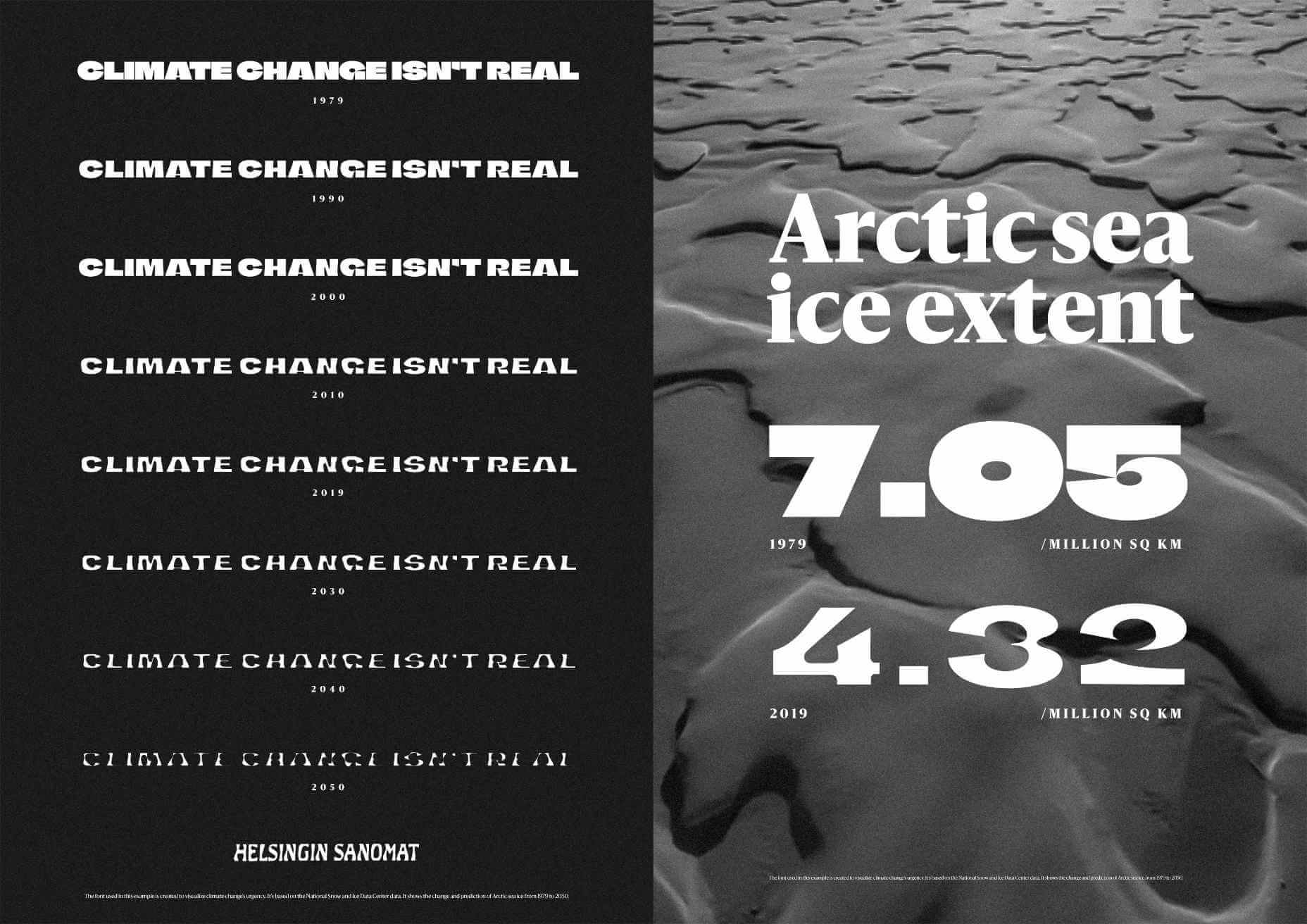
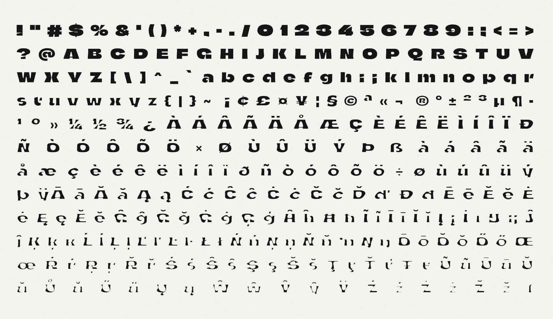
Finnish newspaper Helsingin Sanomat has developed a variable font, that is designed to make the effects of human-driven climate change tangible in a simple graphical form.

Whereas most type designers use variable font techniques to embed a range of weights in a single font file, the team — lead by Helsingin Sanomat’s art director Tuomas Jääskeläinen, and typographer Eino Korkala — used the technique to “melt” the typeface.

In the design process, we tried out countless letter shapes and styles, only to find that most of them visualized the disaster right in the earliest stages of the transformation. That’s something we wanted to avoid because unlike a global pandemic, climate change is a crisis that sneaks up on us.

— Tuomas Jääskeläinen

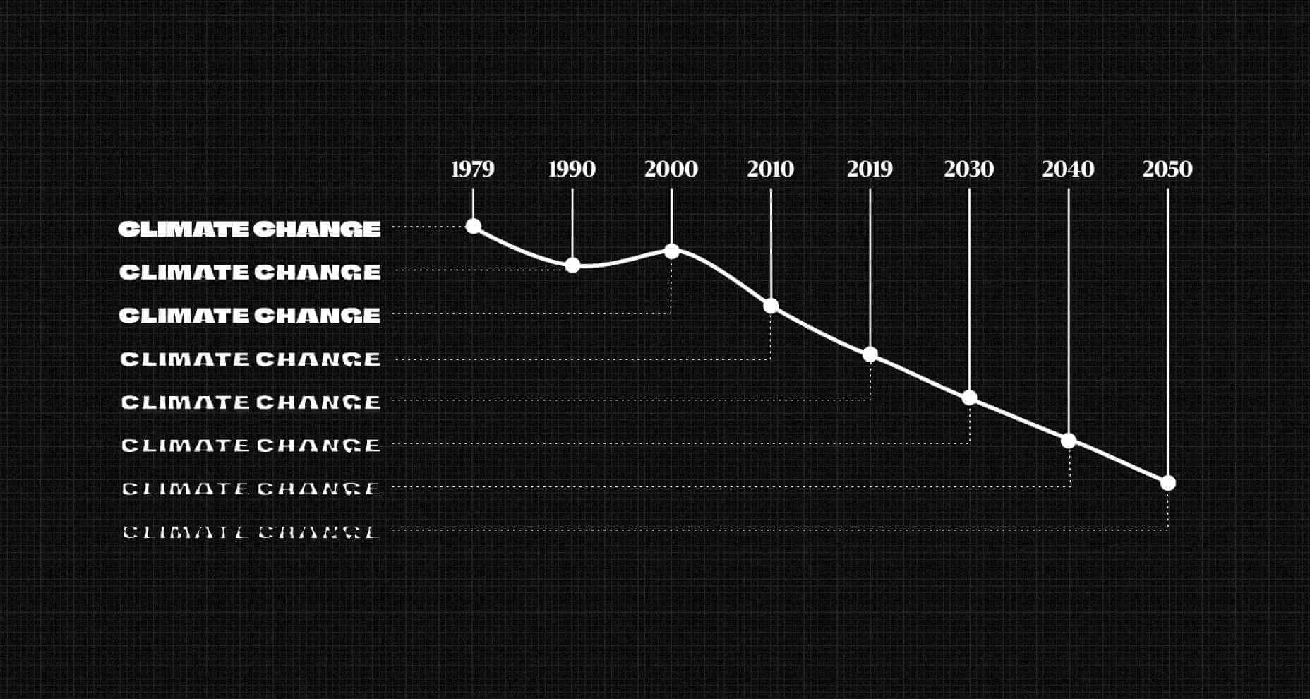
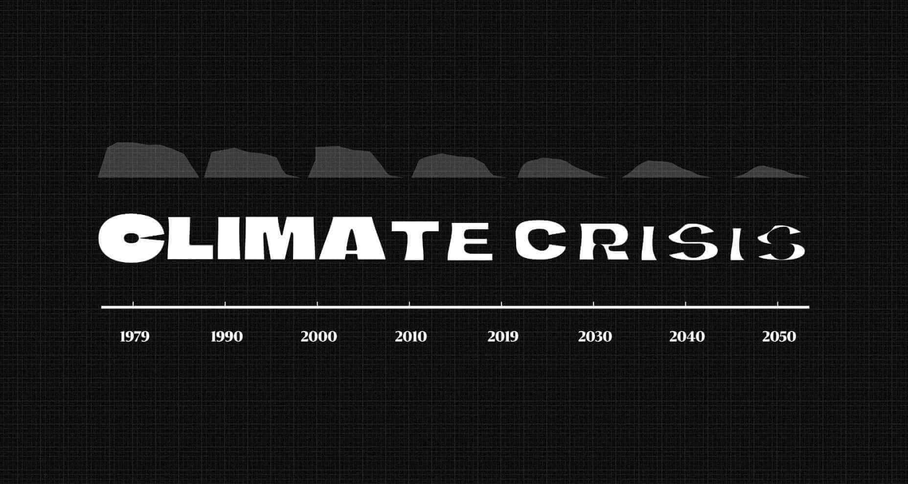
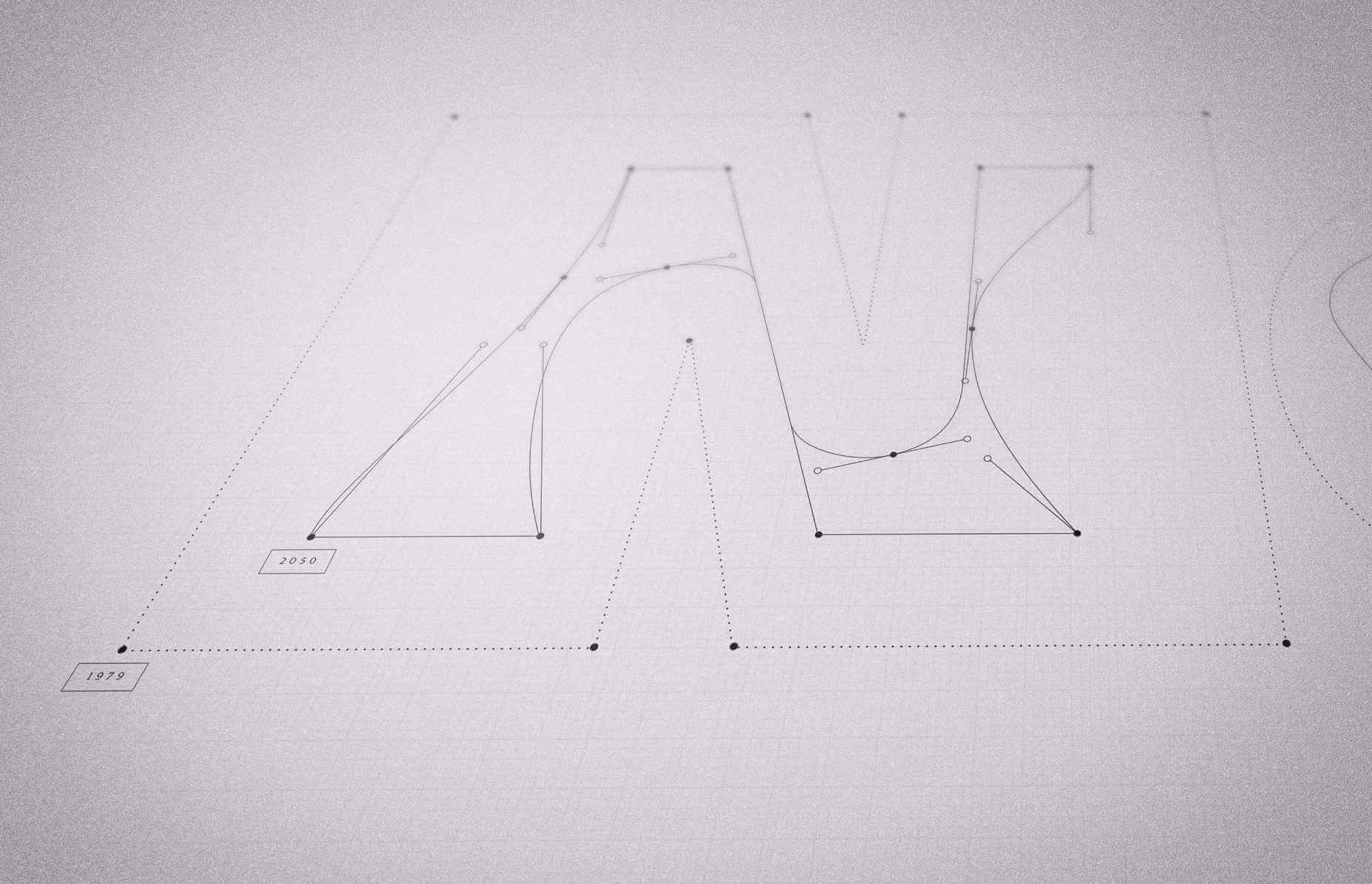
The default typeface represents the volume of Arctic sea ice in 1979 (when records began). It’s a rather beautiful, chiseled, chunky sans-serif, with cut-aways that open up counters to give it a modern appeal. As you move through the years towards 2050 the shapes appear to melt away, to the point that they’re barely legible.

Set the scale to 2021 and you’ll see an already dramatic loss of Arctic sea ice, and the resulting desalination of the ocean.

As depressing as these outlines are, they aren’t an estimate. The typeface’s outlines precisely match real data — there was an unexpected uptick in Arctic sea ice in 2000, and that’s reflected in the font.

The historical data is taken from the NSIDC (The US National Snow and Ice Data Center) and the predictive data comes from the IPCC (The Intergovernmental Panel on Climate Change).

We hope that using the font helps people see the urgency of climate change in a more tangible form – it is a call for action.

— Tuomas Jääskeläinen

You can download the font for free, for personal or commercial work.

Source

The post Variable Font Reveals The Full Horror of The Climate Crisis first appeared on Webdesigner Depot.

Source de l’article sur Webdesignerdepot

2020 was a transformative year for many industries, and IT and software development was no exception. Customer demands and behavior have changed in many ways, causing companies to quickly react and adjust to these shifts.

Aside from the unpleasant side of the pandemic, such a dynamic environment has led to new solutions and better business models.

Source de l’article sur DZONE

There are some interesting shake-ups on the horizon for ecommerce: Experiential shopping, Virt-ical worlds, Au naturale models.

We’re starting to see signs of them already — many of them spurred on thanks to the events of 2020. Below, we’re going to explore what’s going on with these new ecommerce trends and technologies and take a look at a bunch of sites that are setting really cool examples for each.

1. Experiential Shopping

With many stores, either closed to in-person shopping during the pandemic or their capacities severely limited, online shopping and BOPIS became much more attractive options for consumers.

That said, buying something like a pair of jeans or a new pair of glasses is much different than the pack of toilet paper someone’s bought for years. There are just some things you have to try to know if you’re going to like it and make sure it fits.

Augmented reality and other immersive shopping tools are bringing those “try-on” capabilities to people’s homes.

There are a number of technologies built specifically for this purpose:

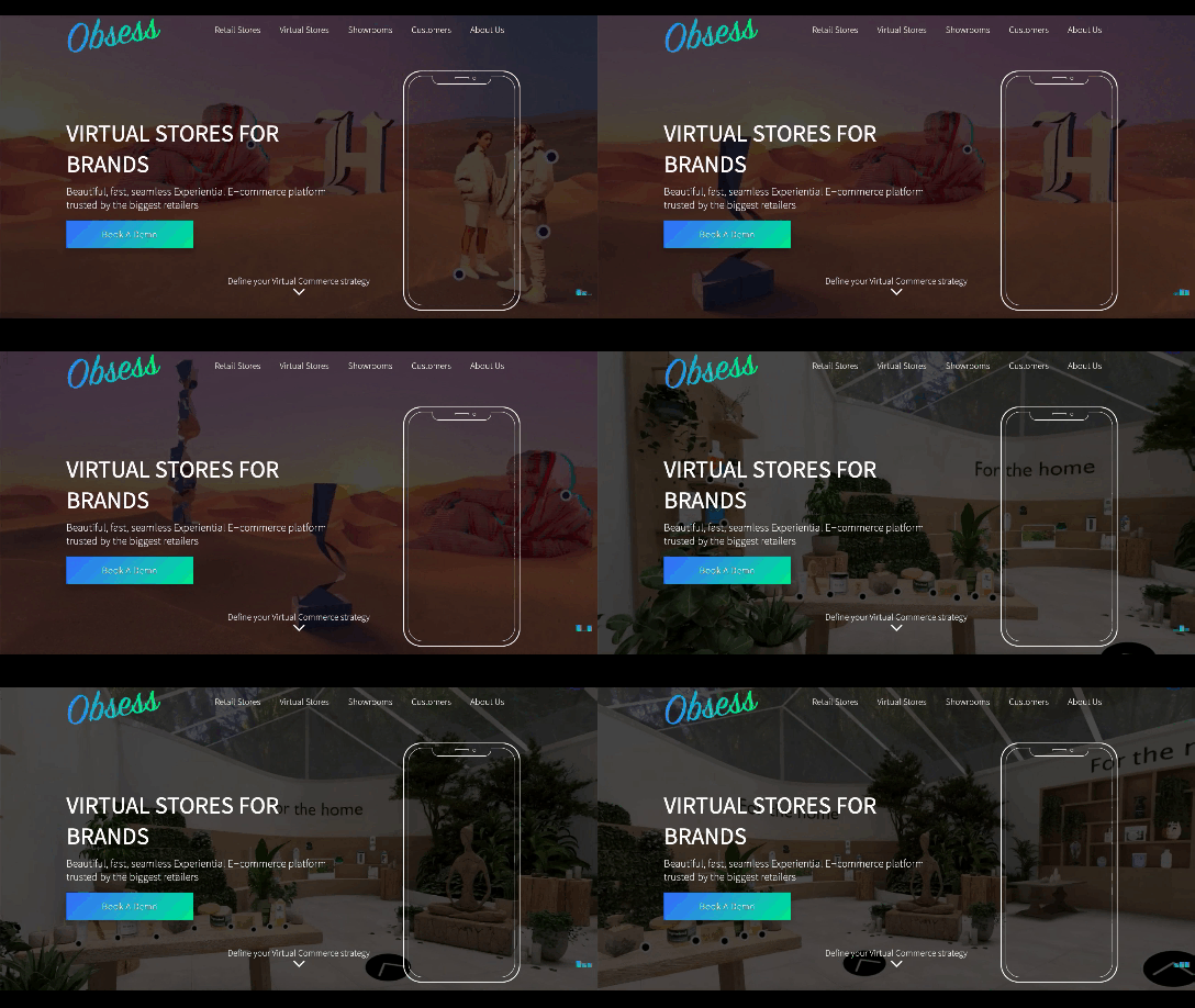
Obsess is a particularly noteworthy one. It’s an ecommerce platform that enables retailers to build virtually immersive shopping experiences. Charlotte Tilbury is one such retailer that is taking advantage of it.

Obsess, the augmented reality and immersive shopping experience platform

At the end of 2020, Obsess announced that it had received $3.4 million in seed funding, so expect to see more Obsess-powered ecommerce sites and apps.

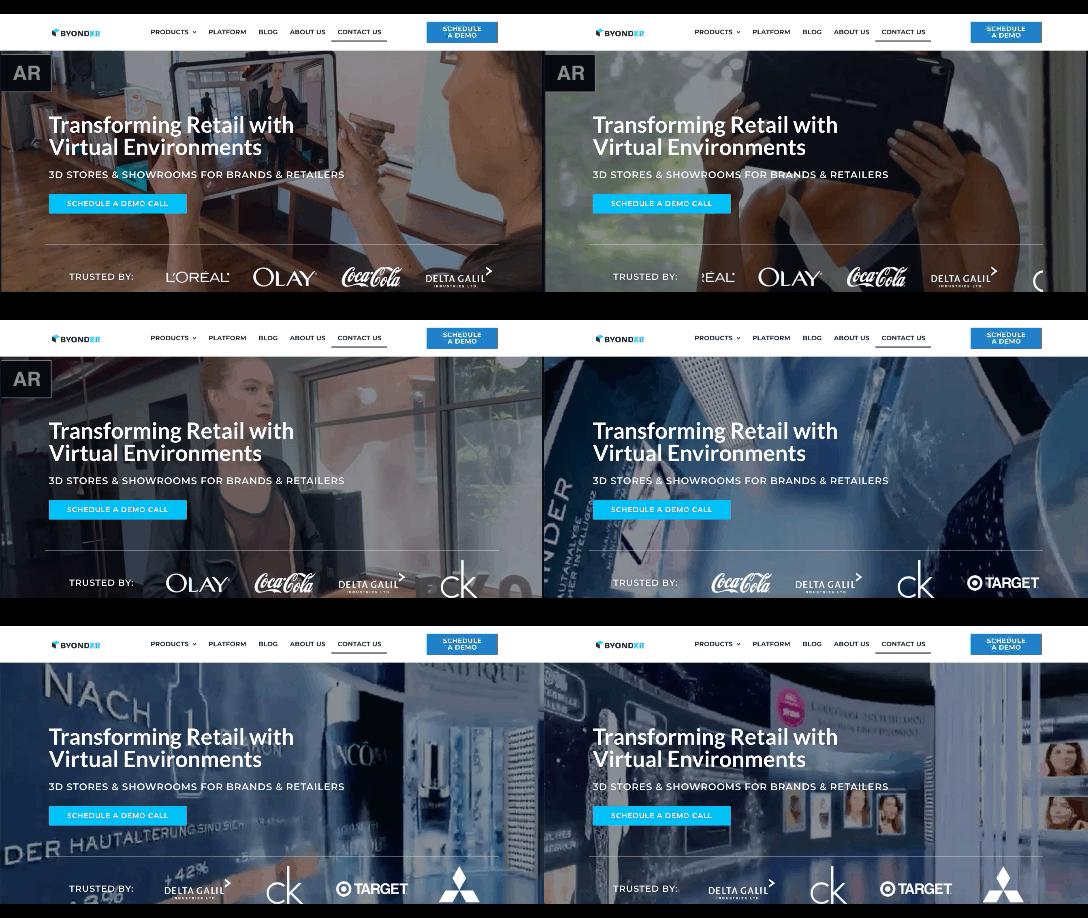
ByondXR is another platform that empowers brands to design immersive experiences for online shoppers:

ByondXR helps brands create experiential shopping

Retailers like Lancome, Procter & Gamble, and Calvin Klein have used ByondXR’s immersive commerce technology.

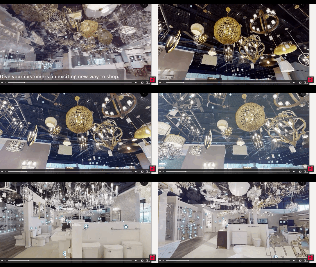
Another option is offered by Matterport:

Matterport's virtual shopping experiences and 3D store mapping tech

This technology is interesting as you’re not just creating a virtual store. You can also design a 3D model of a brick-and-mortar shop that in-store shoppers can use to get in and out quickly.

2. Virt-ical Worlds

There’s a new trend brewing, and we see it most commonly on websites for fresh and youthful brands. I wouldn’t say it’s nostalgic design, per se, though there are certainly some elements reminiscent of the bold, in-your-face style of the web in the late ‘90s and early ‘00s.

No, I think what we see here is a creative reimagining of our world.

With so many people having spent time in their homes and with their faces glued to screens, there’s been a blurring between our VIRTual and physICAL worlds. This new web design trend is one I’m going to call the Virt-ical World. While parts of these sites look like the websites we’ve designed in years past, there are motion, color, and sizing elements that feel more like a trippy virtual simulation.

Let’s look at some examples.

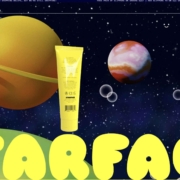
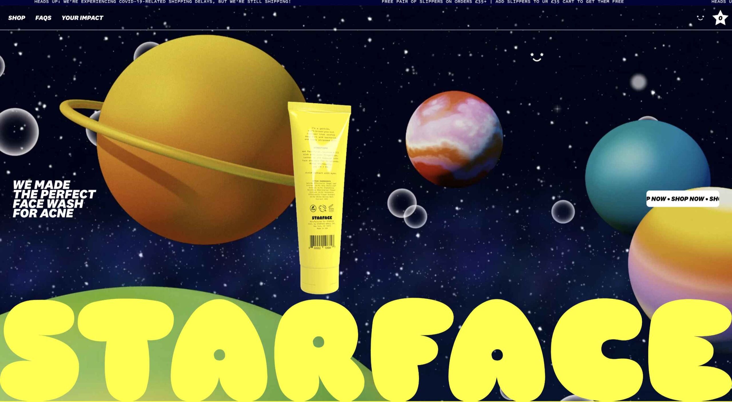
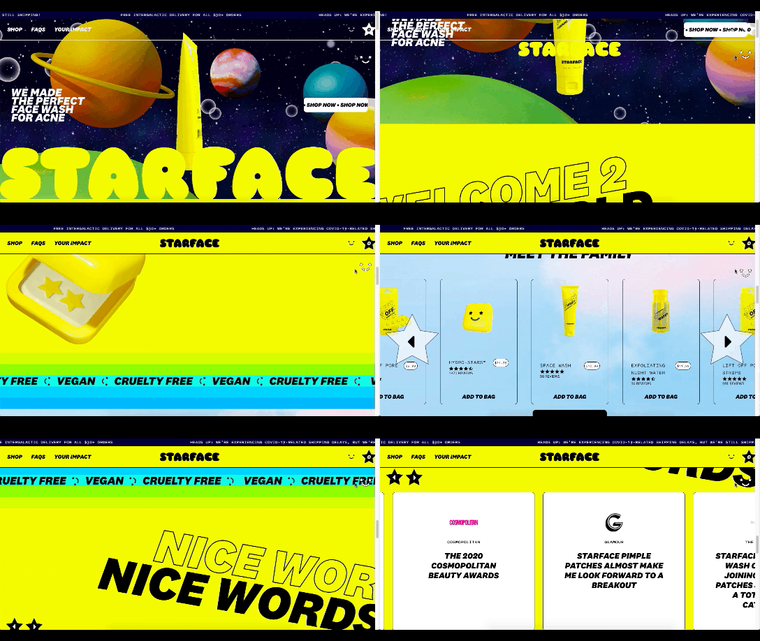
Starface is a company that creates acne-fighting products.

Starface's in-your-face website design

This is one of the more experimental designs in this set of examples. Still, it’s one that shows us how far the boundaries can be pushed without totally compromising the online shopping experience.

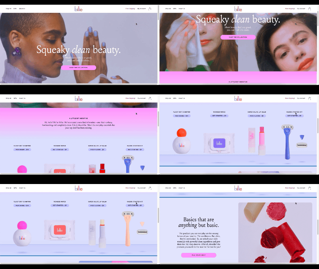
Billie is another company having fun with this trend. I’d say this is on the opposite end of the spectrum.

Billie has a fun, candy-colored website design

For the most part, this ecommerce site looks similar to other small retailer sites. However, the fun, candy-colored palette, the bobbing products, and the color shifts add a somewhat surreal element to the design.

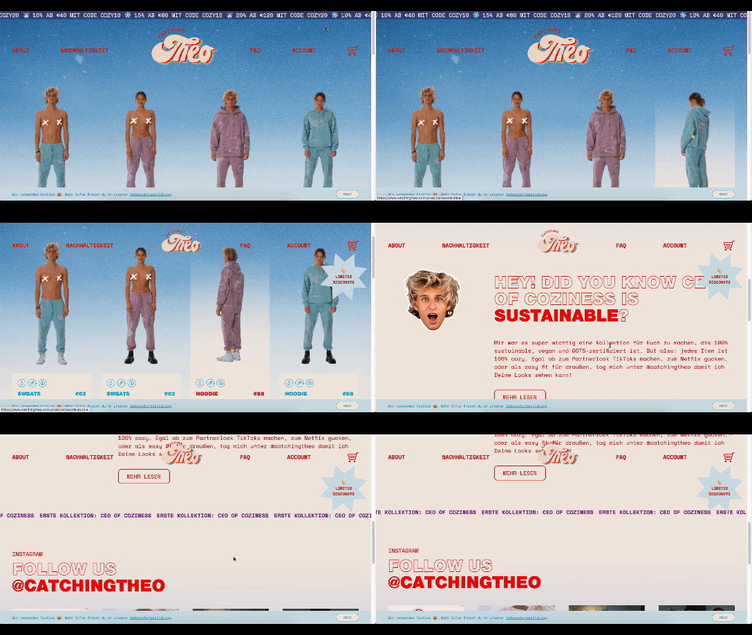
Catching THEO is another ecommerce brand playing around with this Virt-ical World.

Catching THEO mixes nostalgia and modern design

See what I mean by this style feeling somewhat nostalgic? Thankfully, this site commits to today’s good, clean, responsive design while only using some of the more fun and quirky elements from the past.

Au Naturale Models

When I talk about au naturale models, I’m really referring to the makeup-less faces, relaxed hairstyles, and casual apparel that we’re seeing ecommerce models don these days.

I think it’s safe to say we have the pandemic to thank for this. And it’s not just because many of us took a more casual approach to getting dressed during the week. It’s also because the pandemic wiped away the glitz and glamour from many of our lives.

I don’t know about you, but it was kind of nice seeing fewer Instagram influencers flaunting their luxurious lifestyles and more real people rocking their matching pajama sets. I think brands have sensed this change in mood over the last year, and they’re now putting forward their own simple and casual styles for us to connect to.

There are tons of ecommerce websites we’re seeing this on in 2021.

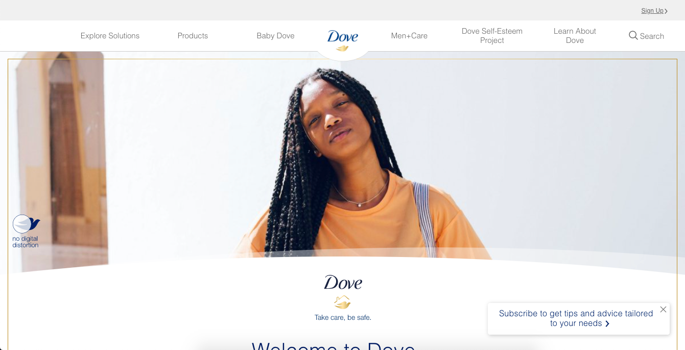
Here’s Dove’s homepage, where they specifically call attention to the lack of digital distortion in the photo:

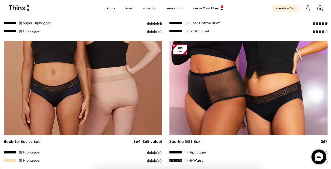
Thinx also uses more natural and realistic-looking models to show off its undergarment products:

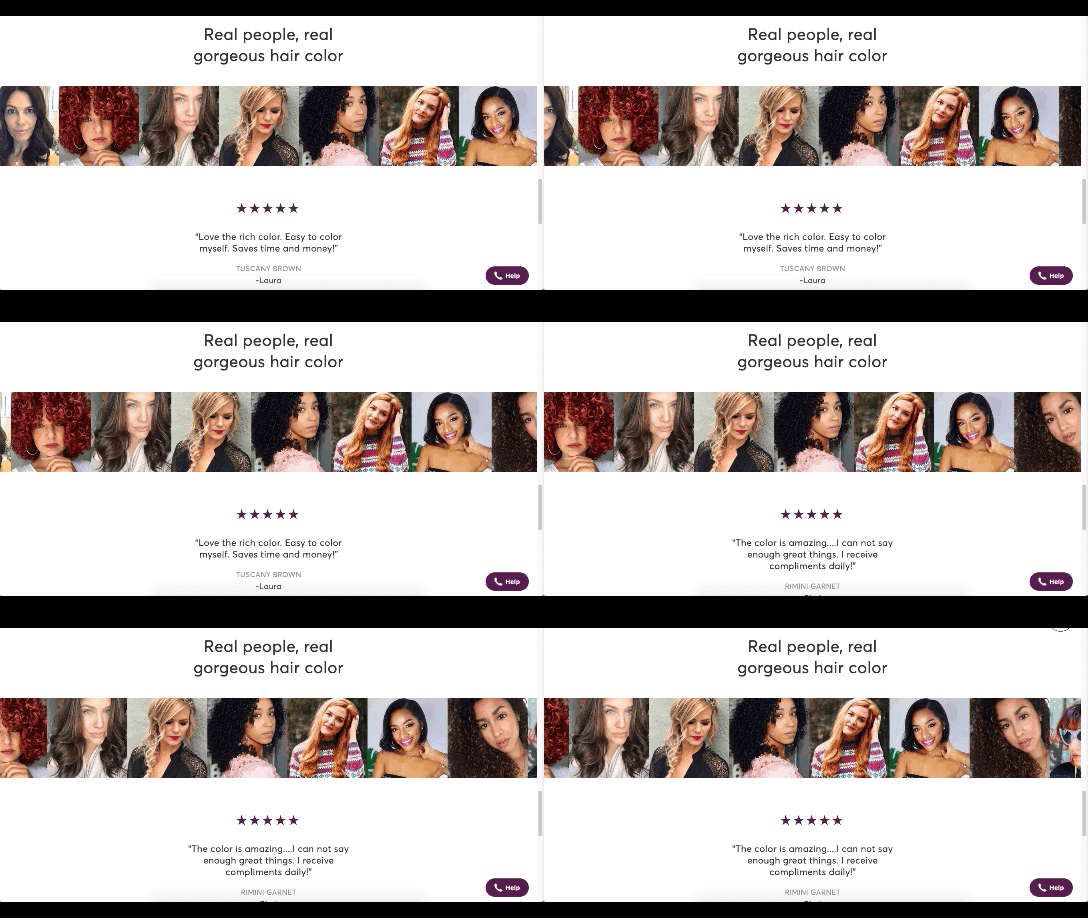
Madison Reed takes a unique approach with this trend:

Madison Reed shows off some of the real faces of its customers

While the hair color brand does a great job of using diverse models around the site, it also has this scrolling bar showing off its customers’ very natural and real faces.

Wrap-Up

It feels like ecommerce trends and technologies are changing at a rapid pace these days. To help you stay on top of what’s new in ecommerce, stay tuned to this blog for more interesting news and changes to the landscape.

Source

The post What’s New in Ecommerce, February 2021 first appeared on Webdesigner Depot.

Source de l’article sur Webdesignerdepot