Articles

Developers who tried to build at least one product for an end-user know how many things are essential in a product: thoughtful UX, friendly UI, good performance and stability, security and data consistency, logging and maintenance, etc.
Multiply this to the number of platforms that you have to support. Add marketings and licensing, client support and bug reports, new feature requests, and competitive product pressure.

It’s hard to track everything in one head, and it is even harder to be perfect at every job. That’s why we work in teams. That’s why we use project management processes.

Source de l’article sur DZONE

Sass – the extended arm of CSS; the power factor that brings elegance to your code.

With Sass, it is all about variables, nesting, mixins, functions, partials, imports, inheritance, and control directives. Sass makes your code more maintainable and reusable.

And now, I will show you how to make your code more structured and organized.

The organization of files and folders is crucial when projects expand. Modularizing the directory is necessary as the file structure increases significantly. This means structuring is in order. Here is a way to do it.

  • Divide the stylesheets into separate files by using Partials
  • Import the partials into the master stylesheet – which is typically the main.sass file.
  • Create a layout folder for the layout specific files

Types of Sass Structures

There are a few different structures you can use. I prefer using two structures — a simple one and a more complex one. Let’s have a look.

Simple Structure

The simple structure is convenient for a small project like a single web page. For that purpose, you need to create a very minimal structure. Here is an example:

  • _base.sass — contains all the resets, variables, mixins, and utility classes
  • _layout.sass — all the Sass code handling the layout, which is the container and grid systems
  • _components.sass — everything that is reusable – buttons, navbars, cards, and so on
  • _main.sass — the main partial should contain only the imports of the already mentioned files

Another example of the same simple structure is the following:

  • _core.sass — contains variables, resets, mixins, and other similar styles
  • _layout.sass — there are the styles for the header, footer, the grid system, etc
  • _components.sass — styles for every component necessary for that project, including buttons, modals, etc.
  • _app.sass — imports

This is the one I usually use for smaller projects. And when it comes to making a decision of what kind of structure to be used, the size of the project is often the deciding factor.

Why Use This Structure?

There are several advantages why you should use this organisational structure. First of all, the CSS files cache and in doing so, the need to download a new file for every new page visit is decreased. In this way, the HTTP requests decrease as well.

Secondly, this structure is much easier to maintain since there is only one file.

Thirdly, the CSS files can be compressed and thus decrease their size. For a better outcome, it is recommended to use Sass/Less and then do concatenation and minification of the files.

In case files become disorganized, you would need to expand the structure. In such a case, you can add a folder for the components and break it further into individual files. If the project broadens and there is a need for restructuring the whole Sass structure, consider the next, more complex pattern.

The 7-1 Patterned Structure

The name of this structure comes from 7 folders, 1 file. This structure is used by many, as it is considered to be a good basis for projects of larger sizes. All you need to do is organize the partials in 7 different folders, and one single file (app.sass) should sit at the root level handling the imports. Here is an example:

sass/
|
|- abstracts/
| |- _mixins // Sass Mixins Folder
| |- _variables.scss // Sass Variables
|
|- core/
| |- _reset.scss // Reset
| |- _typography.scss // Typography Rules
|
|- components/
| |- _buttons.scss // Buttons
| |- _carousel.scss // Carousel
| |- _slider.scss // Slider
|
|- layout/
| |- _navigation.scss // Navigation
| |- _header.scss // Header
| |- _footer.scss // Footer
| |- _sidebar.scss // Sidebar
| |- _grid.scss // Grid
|
|- pages/
| |- _home.scss // Home styles
| |- _about.scss // About styles
|
|- sections/ (or blocks/)
| |- _hero.scss // Hero section
| |- _cta.scss // CTA section
|
|- vendors/ (if needed)
| |- _bootstrap.scss // Bootstrap
|
- app.scss // Main Sass file

In the Abstract partial, there is a file with all the variables, mixins, and similar components.

The Core partial contains files like typography, resets, and boilerplate code, used across the whole website. Once you write this code, there is no further overwriting.

The Components partial contains styles for all components that are to be created for one website, including buttons, carousels, tabs, modals, and the like.

The Layout partial has all styles necessary for the layout of the site, i.e., header, footer.

The Pages partial contains the styles for every individual page. Almost every page needs to have specific styles that are to be used only for that particular page.

For every section to be reusable and the sass code to be easily accessible, there is the Section/Blocks partial. Also, it is important to have this partial so that you don’t need to search whether particular code is in the home.sass or about.sass files in the Pages partial.

It is a good idea to put each section in a separate .sass file. Thus, if you have two different hero sections, put the code in the same file to know that there you can find the code for the two sections. And if you follow this pattern, you will have the majority of files in this folder.

The Vendors partial is intended for bootstrap frameworks so, if you use one in your project, create this partial.

I recommend you use app.sass as the main folder. Here is how it should look:

// Abstract files
@import "abscracts/all"; // Vendor Files
@import "vendor/bootstrap.scss"; // Core files
@import "core/all"; // Components
@import "components/all"; // Layout
@import "layout/all"; // Sections
@import "sections/all"; // Pages
@import "pages/all";

Instead of having a lot of imports in the file, create an all.sass file in every folder. Each all.sass file should contain all the imports for that folder — and to make it more visible and understandable, create a main file.

Organisation

The biggest benefit of this structure is organisation.You always know where to check if you need to change something specific. For example, if you want to change the spacing on a Section/Block you go directly to the Sections/Blocks folder. That way, you don’t need to search in the folder to find the class in a file.

Facilitation

When the code is structured, the processes are promptly facilitated. They are streamlined and every segment of the code has their own place.

Final Words

Organizing code is essential for developers and together with all other skills, it is the most effective way to improve the functioning of the site. And even though there are multiple ways of organisation and different strategies, opting for simplicity helps you avoid the dangerous pitfalls. And finally, there is no right or wrong choice since everything depends on the developer’s work strategies.


Featured image via Reshot.

Source


Source de l’article sur Webdesignerdepot

It’s that time again: the self-fulfilling prophecy that is the Pantone Color of the Year has been announced for 2021.

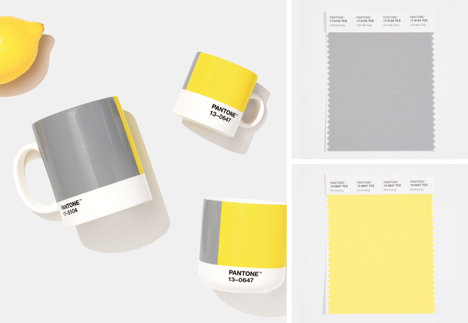
For 2021, we’re getting two colors of the year. The colors selected to grace museum gift shops, and end-of-year blog posts are Ultimate Gray (a mid-range gray somewhere around #939597) and Illuminating (a citrus yellow that’s approximately #F5DF4D).

A marriage of color conveying a message of strength and hopefulness that is both enduring and uplifting.

The last time Pantone selected two colors was Rose Quartz & Serenity in 2016, and we all know what a tranquil, serene year that was; so 2021 will presumably unleash the curse of an ancient mummy on the world, or see us collide with the Sun.

2020’s color, “Classic Blue”, probably wasn’t much of a color of the year unless it happens to be the color you painted your home office. If the company had genuine foresight, it might have opted for the blandest beige it could find — in fact in the Summer paint brand Dulux almost opted for that for 2021, naming “Brave Ground” its color for next year, but for beige’s “resilient” qualities rather than any lockdown boredom.

Perhaps that’s why Pantone’s PR department opted for two colors in 2021: a nondescript grey to keep us going until we’re all vaccinated, and a wildly luminous yellow for the latter part of the year.

In fairness to Pantone, its color choices aren’t predictions as is often reported, rather aspirations. Pantone believes the pairing “expresses a message of positivity supported by fortitude” which may be just what the world needs right now.

A combination of colors is much more sensible than a single color, with so much about color dependent on context. But the actual color treatment of 2021 is much more likely to be multi-color gradients.

You can try out Pantone’s colors for 2021 on Instagram, or on Pantone Connect.

Source


Source de l’article sur Webdesignerdepot

Although still in its infancy, 2020 has been a year of significant growth for Natural Language Processing (NLP). In fact, research from Gradient Flow found that even in the wake of the COVID-19 pandemic, 53% of technical leaders indicated their NLP budget was at least 10% higher compared to 2019, with 31% stating their budget was at least 30% higher than the previous year. This is quite significant, given most companies are experiencing a downturn in IT budgets, as companies adjusted their spending in response to the pandemic. 

With the power to help streamline and even automate tasks across industries, from finance and healthcare to retail and sales, leaders are just beginning to reap the benefits of NLP. As the technology advances further and its value becomes more widely known, NLP can achieve outcomes from handling customer service queries to more mission-critical tasks, like detecting and preventing adverse drug events in a clinical setting. As NLP continues on its growth trajectory, here are some of the top trends to watch in 2021. 

Source de l’article sur DZONE

By the end of the year, the number of global smartphone users is expected to reach 3.5 billion. That’s a significant 9.3% increase over the last 12 months.

In a world where everyone is constantly connected to their mobile devices, it makes sense that web developers and designers would need to consider new rules for how they create engaging experiences. After all, most of us find browsing from our smartphones to be much more convenient than sitting down at a laptop each day.

With a little luck, you’re already taking steps to mobile optimize your website but standards are changing all the time. To make sure your website is up to scratch, here’s your guide to prioritizing your site for mobile, ready for the new year.

Understanding Mobile-First Design

The first step in updating your web design and development principles, is understanding the concept of mobile first design, and how it’s changed.

With a responsive website, you create something that adjusts to the screen size of any device; with a mobile-first site, you’re focusing first-and-foremost on the user experience that people get when they’re on mobile, taking that as your starting point, and building from there. Instead of building your website for the desktop and using mobile as an afterthought, you start with a consideration of mobile.

Even Google is highlighting the demand for this process lately, with the mobile-first indexing algorithm. If you can’t design for mobile-first, then you could risk your clients being unable to rise up the search engine ranks.

So, how do you get started?

1. Start With the Right Tools

Web developers and designers are nothing without a great toolkit.

The good news is that there are solutions out there that can help you to master the right skills for a mobile-focused user experience. For instance, Skeleton is excellent for small-scale projects that require fluid grids and minimal compiling.

Alternatively, Bootstrap can offer a one-size-fits-all solution for the front-end development for mobile devices. There’s a default grid system available, plenty of components, and JavaScript plugins to work with.

With the right tools, you can minimize and prioritize the content that’s most valuable for your website projects. This is crucial for maximizing website speed and creating clarity when it comes to content and imagery.

For instance, check out the ESPN website; it’s split into very easy-to-follow categories of content that are perfect for scrolling on a smartphone. The grid of videos makes it feel like you’re using a tool like YouTube.

2. Prioritize Mobile-First Elements

Once you have the right tools to assist you, it’s time to begin building your mobile-first website from the ground up. Rather than jumping straight into considerations of the latest design trends, it’s important to start with the foundations.

For instance, navigation within a mobile page is usually hidden under a hamburger button. However, you can take this concept to the next level too. For example, the Shojin mobile website only demonstrates the most important website options within the navigation bar to avoid overwhelming users.

The key here is to keep things as simple as possible, without restricting what your audience can do when they visit your website. Although you want to keep the number of interactive elements on your site small, you also need to ensure that those elements are easy to find and use.

All buttons and CTAs should be clear and tappable. Fonts need to be large enough to read from any screen, and your navigation system needs to be 100% simple, without slowing anything down.

On average, we recommend making all clickable elements at least 48 pixels in height.

3. Use Responsive Imagery and SVGs

Images are a crucial part of any website. They add context and appeal to your design. However, they can also seriously slow down your website if you’re not careful.

Remember, different devices have different demands when it comes to imagery. A desktop page may need a 1200px wide image, while a mobile-only needs the image to be 400px wide at most. The old way of making your images work was to load a large resolution image and use the same file on every platform. Unfortunately, this slows downloading time significantly.

Instead, it’s better to have at least two different versions of the same image for your mobile and desktop solutions. You can also consider SVG.

SVGs are incredibly scalable – more so than bitmaps. With SVG, you can ensure any icon or graphic continues to look sharp and clickable across all devices. Because these files are often smaller, your site loads quicker too! Hubspot is great at using SVGs.

Intricate illustrations are a massive component of HubSpot’s brand. If those images were saved as PNGs or other alternative files, then they would take forever to load. Because they’re all SVGs, you can enjoy the same consistent experience across desktop and mobile.

4. Get the Typography Right

It’s not just the big graphics and images that make a huge difference to your website when it comes to mobile-first design. You also need to think about the legibility and clarity of your website across all devices and platforms. If people can’t read the value proposition of the company that you’re designing for, you’re going to have a major problem.

Focus on making your content as easy to read as possible. Look into the typefaces that seem most appealing on a range of devices.

Remember to balance the body and heading font sizes for the device size too. You’ll need to ensure that the experience feels consistent and smooth as your users scroll through each page. Just take a look at the mobile version of the IMPACT website, for instance.

The headings aren’t as huge as they are on the desktop version of the website, and they’re displayed below, rather than above the featured image. However, this helps to give a more immediately eye-catching and structured experience to mobile users.

There’s even a handy “Search Engine Optimization” tag included, that users can click on if they want to find more related articles.

When it comes to typography, remember that it’s not just size and clarity that matter, but how things are structured throughout your website too. Your type should naturally guide your visitors along the page.

5. Master Available Device Features

Finally, on smartphones, you can accomplish a range of amazing things that you might not be able to do when using a desktop device. Your users can make calls, open apps, send messages, and more, all from within their mobile browser. They can also move their smartphone around a room, taking advantage of concepts like AR and VR.

Taking advantage of the unique capabilities that smartphone design can offer gives you a chance to get unique with your user experience.

Making the most of the mobile experience can be much simpler than you’d think. For instance, on a desktop site, you could list your phone number on a contact page. On a mobile site, the number can begin a call when clicked. You can also take the same approach with email addresses, and social media icons too.

Depending on how experimental you feel, there’s also plenty of opportunities to go above and beyond with your mobile features. You may decide to create a mobile app version of a website that your customers can download onto their phones.

Alternatively, you can look into things like AR technology. This could allow your users to practice placing items of furniture that they may be thinking of buying from an online retailer into their house, so they can see how well they work with their other interior design choices.

Making the Most of Mobile-First Design

Ultimately, having a responsive website that works on both mobile and desktop devices is mandatory in the modern world. However, going above and beyond with mobile-first design is a great way to get ahead of the game.

If you can focus on building a website that puts the experiences of mobile users first, then you can create something that’s much more likely to grab audience attention and deliver amazing experiences.

If nothing else, showing your clients that you have what it takes to design for mobile is an excellent way to ensure that you can gain as many new project opportunities as possible.

Source


Source de l’article sur Webdesignerdepot

Vos utilisateurs et clients sont déjà habitués à utiliser leurs applications mobiles, comme Facebook ou Google Docs, pour interagir et travailler en toute flexibilité. Mais derrière le cloud computing, il y a bien plus qu’une simple interface web moderne. Le temps de réponse, le stockage des données, l’accès aux informations, la fiabilité et la sécurité sont autant d’éléments vitaux pour toute entreprise qui envisage une « migration dans le cloud ». Vos pairs vous auront sans doute parlé des avantages du cloud computing : accès aux technologies les plus récentes, flexibilité accrue et coûts IT réduits.

Qu’est-ce que la technologie cloud ?

Le cloud computing propose des services tels que le stockage des données, la sécurité, la mise en réseau, des applications logicielles et de la business intelligence, via internet et sur la base d’un abonnement.

En découvrant peu à peu le monde du cloud computing, vous voudrez sans doute vous familiariser avec certains des mots, définitions et choix qui s’offrent à vous. Vous trouverez ici un assortiment d’informations pertinentes, y compris des explications des termes SaaS, PaaS, IaaS, cloud public, cloud privé, cloud hybride et leurs différences. Le cloud offre de nombreux avantages que nous allons d’abord brièvement passer en revue.

Les avantages du cloud computing

  • Fiable : sûr, sécurisé et disponible. Bénéficiez d’un accès 24h/24 et 7j/7 au système de cloud computing de n’importe où et avec un excellent temps de réponse. Exécutez sur des serveurs sécurisés avec une équipe d’experts sécurité à temps plein. Vos données sont copiées et sauvegardées à distance.
  • Flexible: obtenez la puissance de calcul dont vous avez besoin, quand vous en avez besoin. Ajoutez ou enlevez des serveurs, du réseau, du stockage. Intégrez de nouveaux utilisateurs instantanément. Étendez vos activités à de nouvelles zones géographiques. Tout est fait rapidement et facilement.
  • Economique : Ne payez que pour ce dont vous avez besoin. Pas de frais initiaux pour le matériel ou les infrastructures. Réduisez le temps consacré par le personnel informatique à la maintenance et à la mise à jour des systèmes. Investissez plutôt vos ressources dans des projets qui génèrent des revenus.
  • Actualisé : ayez toujours la dernière version de la plateforme, base de données, des applications logicielles. De plus, profitez des technologies émergentes telles que le Machine Learning (ML), l’intelligence artificielle (AI), l’Internet des objets (IoT), et plus encore. Restez toujours au fait des dernières innovations.

Les différents types de services de cloud computing

Le cloud computing est divisé en trois grandes catégories de services : SaaS, PaaS et IaaS. Certains fournisseurs combinent ces services et d’autres les proposent séparément.

Qu’est-ce que le SaaS ?

Avec le SaaS (software-as-a-service), les logiciels sont hébergés sur un serveur distant et les clients peuvent y accéder partout et à tout moment, à partir d’un navigateur web ou d’une intégration web standard. Le fournisseur de SaaS se charge des sauvegardes, de la maintenance et des mises à jour. Les solutions SaaS comprennent l’enterprise resource planning (ERP), la gestion de la relation client (CRM), la gestion de projets, etc.

Qu’est-ce que le PaaS ?

La plateforme en tant que service (PaaS) est un environnement de développement d’applications basé sur le cloud qui fournit aux développeurs tout ce dont ils ont besoin pour créer et déployer des applications. Avec le PaaS, les développeurs peuvent choisir les fonctionnalités et services cloud qu’ils souhaitent sur la base d’un abonnement ou d’un paiement à l’utilisation.

Qu’est-ce que l’IaaS ?

L’IaaS (Infrastructure-as-a-service) permet aux entreprises de « louer » des ressources informatiques, telles que des serveurs, réseaux, du stockage et des systèmes d’exploitation, sur la base d’un paiement à l’utilisation. L’infrastructure est modulable et les clients n’ont pas à investir dans le matériel.

IaaS vs. PaaS vs. SaaS

Comparez le SaaS, le PaaS et l’IaaS et découvrez ce que vous pouvez attendre de chaque modèle « as-a-service ». La plupart des entreprises utilisent aujourd’hui un mélange des trois, et les limites entre les trois peuvent parfois s’estomper.

SaaS PaaS IaaS
Qui l’utilise Utilisateurs Business Développeurs Administrateurs système
Ce que vous obtenez Applications logicielles Plateforme de développement Ressources informatiques
Objectif Mener à bien des tâches business Construire et déployer des applications Accéder en ligne au stockage, aux réseaux, aux serveurs et à d’autres infrastructures
Contrôles du fournisseur cloud Applications, données, runtime, middleware, O/S, virtualisation, serveurs, stockage, mise en réseau Runtime, middleware, O/S, virtualisation, serveurs, stockage, mise en réseau Virtualisation, serveurs, stockage, mise en réseau
Contrôles du client N / A – tout est géré par le fournisseur Applications, données Applications, données, runtime, middleware, O/S

Types de déploiement cloud

Il existe trois types différents de déploiement cloud : public, privé et hybride. De nombreuses entreprises combinent plusieurs approches et mettent en place un environnement multi-cloud.

  1. Cloud Public : les services sont fournis aux clients sur un réseau disponible pour les clients du fournisseur. Le cloud public est efficace, abordable et est souvent multilocataires, ce qui signifie que le fournisseur gère votre service dans un environnement partagé.
  2. Cloud Privé : les services sont maintenus sur un réseau privé protégé par un pare-feu. Vous pouvez créer un cloud privé dans votre propre data center ou vous abonner à un cloud privé hébergé chez un fournisseur. Le cloud privé offre plus de sécurité et de contrôle.
  3. Cloud Hybride : combinaison d’un cloud public, cloud privé et d’une infrastructure sur site. Le cloud hybride vous permet de conserver des informations sensibles dans un data center traditionnel ou un cloud privé, tout en profitant des ressources du cloud public.

Cloud public vs privé vs hybride

Comparez les trois différents types de déploiements cloud pour découvrir celui qui conviendrait le mieux à votre entreprise.

Cloud public Cloud privé Cloud hybride
Environnement Ressources informatiques publiques partagées Ressources informatiques privées Mix de ressources publiques et privées
Mise à l’échelle automatique Élevé Peut être limité Élevé
Sécurité Bonne – mais dépend de la sécurité du fournisseur Plus sûr – toutes les données sont stockées dans un data center privé Très sûr – les données sensibles sont stockées dans un data center privé
Fiabilité Moyenne – dépend de la connectivité Internet et de la disponibilité du fournisseur de services Élevée – tout l’équipement est installé dans les locaux ou hébergé chez un fournisseur de services en cloud privé dédié Moyenne à élevée – une certaine dépendance à l’égard du fournisseur de services
Coût Faible – modèle « payez pour ce dont vous avez besoin » et pas besoin de stockage et de ressources sur site Modéré à élevé – peut nécessiter des ressources sur site telles qu’un data center, de l’électricité et du personnel informatique Modéré – mélange de modèle « payez pour ce dont vous avez besoin » et de ressources sur site
Pour qui ? Les entreprises qui souhaitent tirer parti des dernières applications SaaS et de l’IaaS flexible. tout en maintenant des coûts bas Organismes gouvernementaux, prestataires de soins de santé, banques et toute entreprise qui gère un grand nombre de données sensibles Les entreprises qui souhaitent préserver la confidentialité des applications et des données critiques – tout en utilisant les services de cloud public

La sécurité du cloud

Le cloud est-il vraiment sécurisé ? La sécurité du cloud dépend de la manière dont il a été déployé et des capacités du fournisseur. Mais il a été démontré que, dans la plupart des cas, le cloud offre plus de sécurité que les installations sur site. Il y a plusieurs raisons à cela :

  • Emplacement des données : avec un déploiement sur site, vos données se trouvent dans votre installation. Or la 1ère étape pour quelqu’un qui cherche à voler vos données est de savoir où elles se trouvent. Les grands fournisseurs de cloud computing ont de nombreux serveurs à différents endroits, il est donc difficile de savoir où se trouvent les données.
  • Sécurité : avec une installation sur site, votre personnel gère toutes les procédures de sécurité et mises à jour logicielles. Récemment, une grande compagnie d’assurance a été victime d’une faille de sécurité, et il s’est avéré que le service informatique n’avait pas installé de mises à jour de sécurité depuis de nombreux mois. Grâce à un fournisseur de cloud computing réputé, les entreprises disposent d’experts en sécurité à plein temps pour protéger leurs données.
  • Sauvegarde : dans le cadre d’une installation sur site, vous êtes responsable de la sauvegarde régulière de vos précieuses informations. Si votre entreprise adopte ce type de déploiement, il est nécessaire d’avoir des copies à jour stockées hors site.

Proposez de nouvelles technologies via le cloud

Les départements informatiques subissent une pression croissante pour passer du statut de centre de coûts à celui de créateur de valeur – et doivent maintenant mener la charge en matière d’innovation. Le cloud computing et le Platform-as-a-Service (PaaS) peuvent être un catalyseur pour les DSI qui souhaitent maintenir avec succès un environnement informatique bi-modal qui encourage l’innovation rapide tout en soutenant en toute sécurité le noyau stable et critique de l’entreprise.

The post Qu’est-ce que la technologie cloud computing ? appeared first on SAP France News.

Source de l’article sur sap.com

The end of the year tends to be busy for a variety of reasons and it can limit some of the freshness we see in designs during much of the year. Regardless, there are a few trending design elements.

What we are seeing right now is rooted in deep simplicity with a focus on the message.

Here’s what’s trending in design this month…

Activism and Engagement

Websites with a focus on societal issues have moved to the forefront. While the look and design techniques used for these websites can vary greatly, there’s a common theme of activism, community engagement, and support.

What’s great about this movement – and what it reflects – is that people can take to the digital space to help amplify their message or find support with people who are going through the same things they are.

While some of these efforts are backed by people and brands you may know, that’s not always the case.

The designs also work best when they reflect the personality of the spokesperson or mood of the issue at hand. Note the vast differences in the three examples.

The I Weigh Community uses bright color with a black and white image of promoter and celebrity Jameela Jamil to bring attention to mental health issues.

Wear the Waste by retailer H&M uses simple typography in a natural environment to set the stage for more eco-friendly clothing options.

Wavering Stripes uses an illustrative approach to bring attention to the stories of immigrants in detention.

Each design is vastly different but all are striking and draw attention to the causes therein. The common thread is that each design is simple enough to draw you in and help you better understand the message and not get lost in tricks or design effects.


In Your Face Products

’Tis the season for product promotion.

Designers are opting for larger-than-life product images that allow shoppers to see every detail before making a purchase. (Seems like a good plan in a socially-distanced pandemic world.)

It can work in a number of ways:

  • With an oversized image and ability to use on-screen controls to take a closer look;
  • With video and animation effects to see the product in action;
  • With super high-resolution and zoomed in photography.

Pair these visuals with strong descriptive language and you’ve got a winning combination.

The variance in the examples is a good showcase of how to do this well, while not over-doing effects.

The Fitbit Charge 4 website uses an opening image of the device that’s way larger in scale than reality (especially if you are on a large desktop screen). Users control using click and scroll to get more views and details of the device. Zoom and animation aren’t overwhelming, providing a solid look at the product.

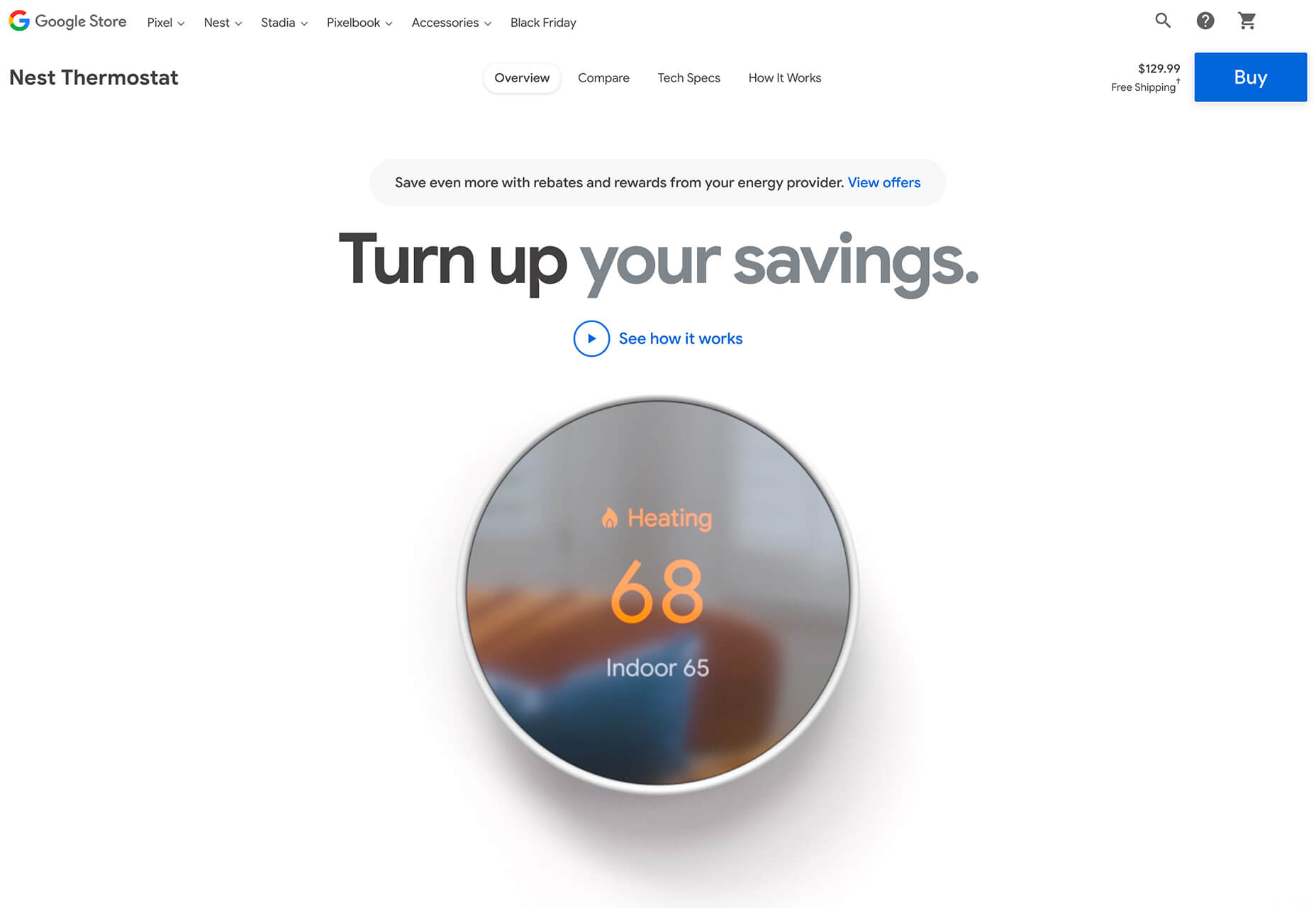
The Nest Thermostat opens with a video animation of the device moving into the forefront of the screen. (It’s rather quick.) From there, if you want more detail, there’s a video to watch that provides deeper product information in a digestible manner.

The final example isn’t really a product at all, but rather an art installation. What’s interesting is that it uses these same oversized options to show the art in detail. This is a great way to handle seeing something that you may not be able to experience in person. What makes it work so well is that the angles of the photography mimic how you would view it, looking up toward the piece hanging from the ceiling.


Simple Motion for Impact

Carrying on the theme of big, bold, and oversized designs, this trend focuses on simple animation for maximum impact.

While all-out cinematic animation can be fun to watch, it can be a little overwhelming at times. This more subtle approach is easier to digest and helps put the focus on the content at hand rather than the effect on the display.

There are plenty of ways to use simple animated effects, including scrolling animations, hover actions, and constantly moving elements. (You can see each of these if you click through the examples.)

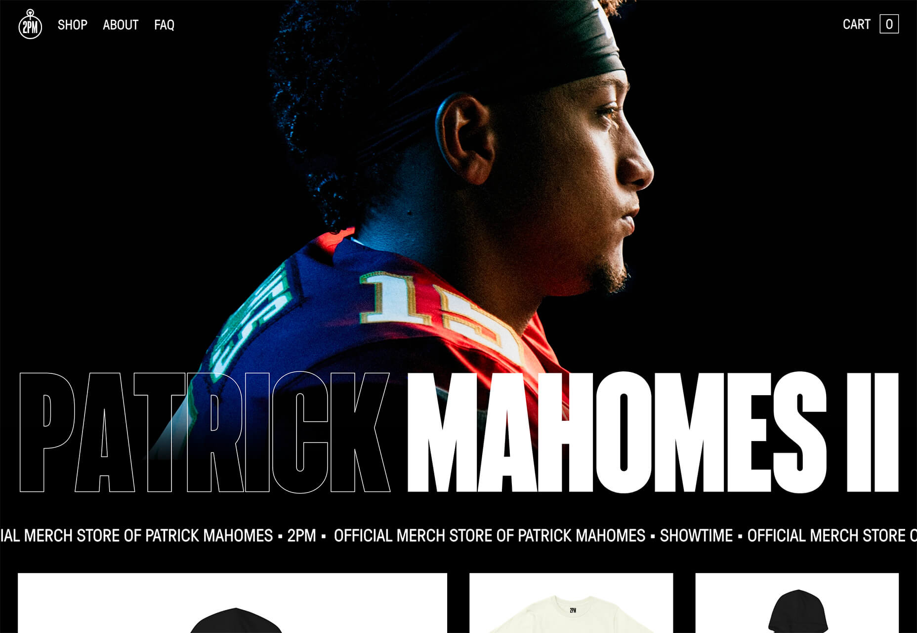
The Patrick Mahomes store, 2PM, uses a single line of moving text that tells you what the website is about. It differentiates the retail store website from information about the athlete or his other efforts. White text on a black background is classic and easy to read. The most important thing of note may be the speed of the animation; it’s timed in a way that’s scannable but not dizzying. Sometimes the hardest part of nailing an animation is getting the speed right.

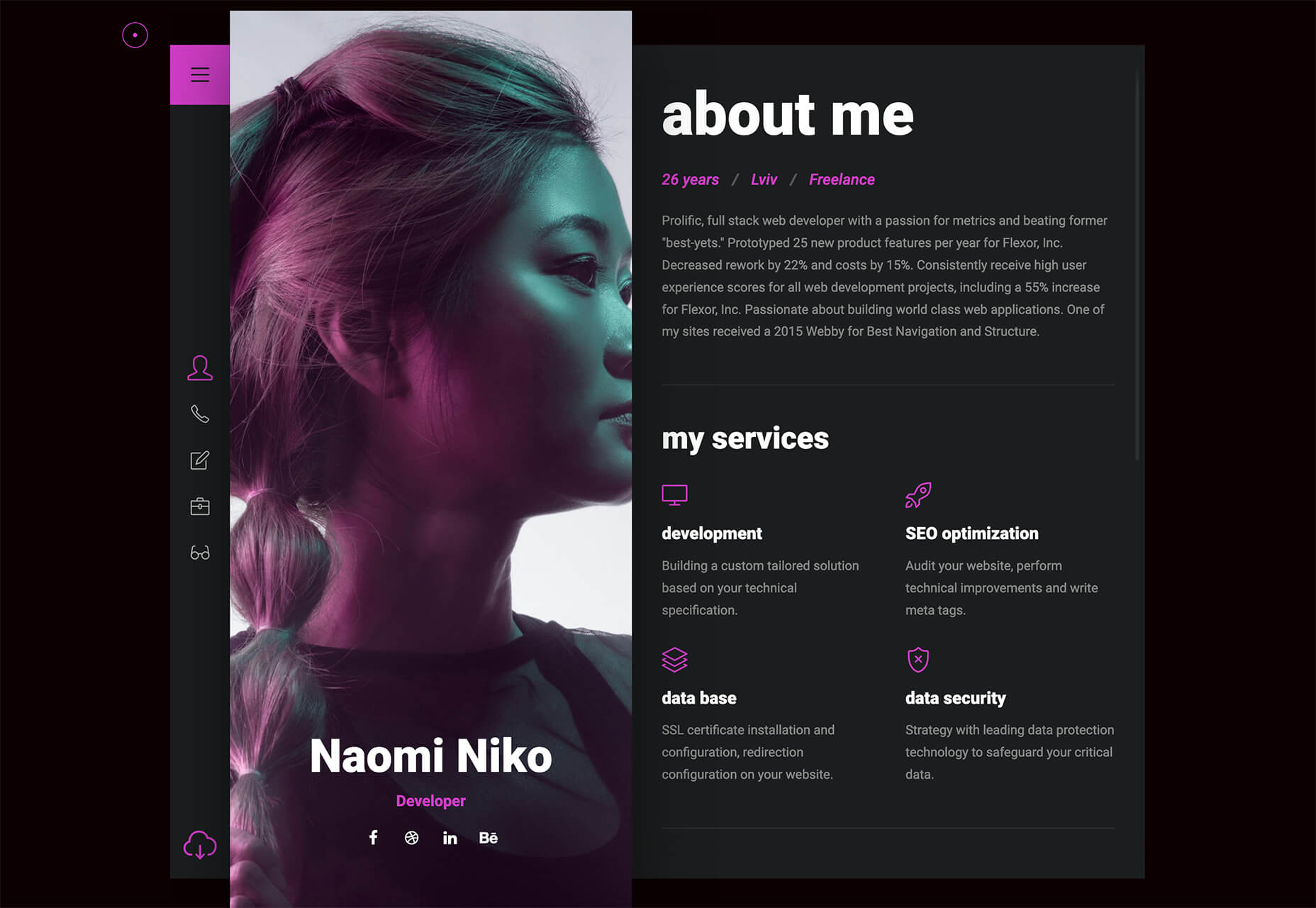
The resume-style website for Naomi Niko is striking and simple, but neat hover effects and a simple scroll animation for her resume only – and not the photo or details on the left side of the screen – make the design intriguing. The almost awkward crop and directional pull of her image also creates interest and makes you want to get further into the design.

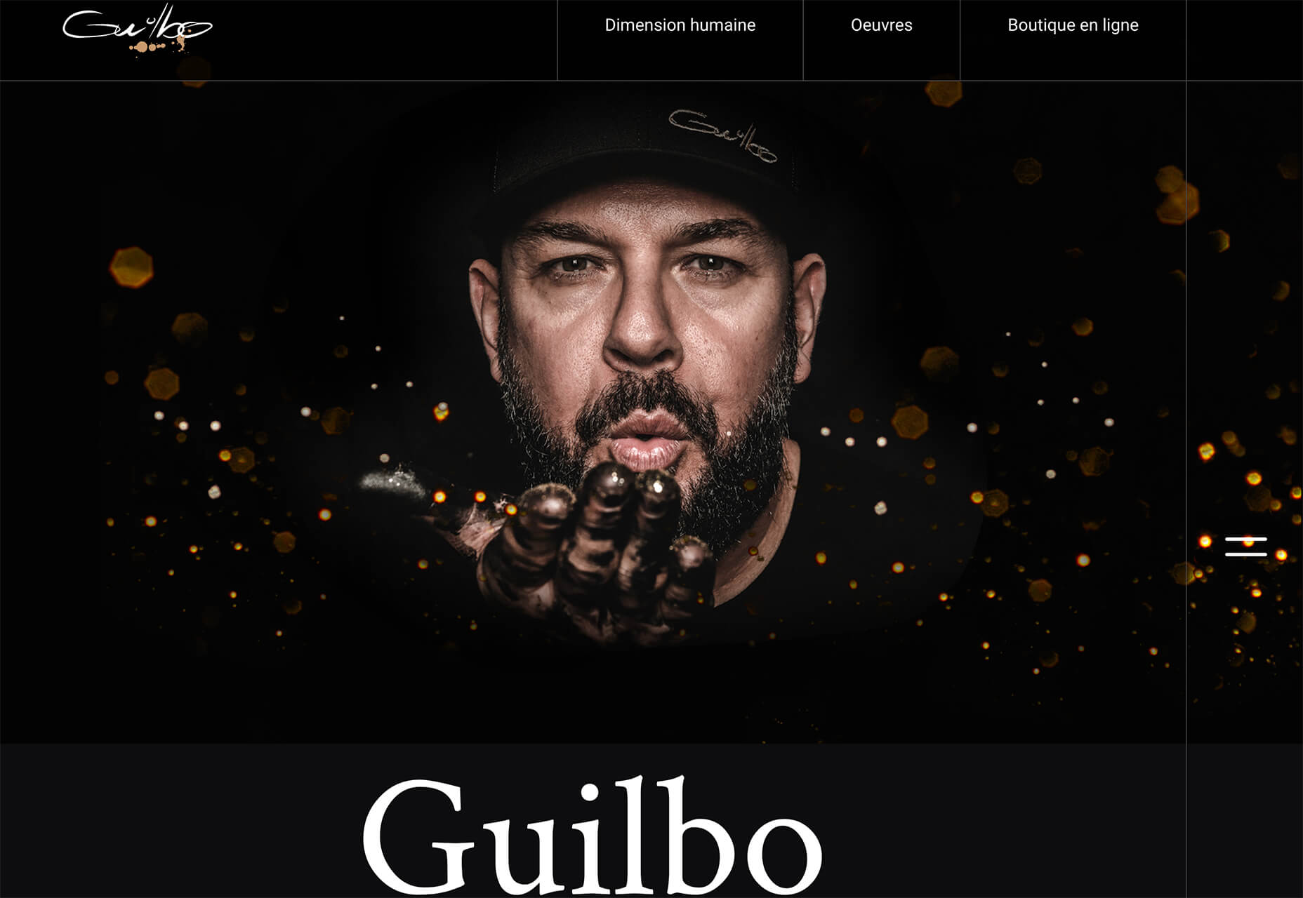
Guilbo uses layered hover animation to make it look like he’s blowing a glittery-dust off the screen and at the user. The rugged detail of his face with the sparkle of the animation is a fun contrast. The design uses layering with dots in the foreground and background for an additional depth effect. It’s also especially nice that the objects are made to stay off his face for a realistic effect.


Conclusion

While 2020 has been an interesting year, designers have continued to find new ways to evolve the craft and create visual experiences that are inspiring. These trends are no exception.

It shows that even in unusual circumstances or with odd constraints, that amazing work and creativity can thrive. Stay creative everyone, and keep those new designs – and potential trends – coming!

Source


Source de l’article sur Webdesignerdepot

As we have discussed before, the PDF is the ideal file format for saving, sharing, and protecting documents, both small and large. Its high compatibility with most Operating Systems makes it popular amongst most users for sharing information with different parties. Furthermore, it provides a more static platform for working with important documents like contracts and manuals, as steps can be taken to prevent any unwanted access or editing to the file. 

With large and highly complex files like this, however, different systems may have difficulty uploading, downloading, and reading the formatting for your document. This can lead to file corruption or increased loading times that can halt productivity. Thus, streamlining large PDF files can greatly benefit organizations that regularly use this format in day-to-day operations. 

Source de l’article sur DZONE

Using the Prometheus Operator has become a common choice when it comes to running Prometheus in a Kubernetes cluster. It can manage Prometheus and Alertmanager for us with the help of CRDs in Kubernetes. The kube-prometheus-stack Helm chart (formerly known as prometheus-operator) comes with Grafana, node_exporter, and more out of the box.

In a previous blog post about Prometheus, we took a look at setting up Prometheus and Grafana using manifest files. We also explored a few of the metrics exposed by YugabyteDB. In this post, we will be setting up Prometheus and Grafana using the kube-prometheus-stack chart. And we will configure Prometheus to scrape YugabyteDB pods. At the end, we will take a look at the YugabyteDB Grafana dashboard that can be used to visualize all the collected metrics.

Source de l’article sur DZONE

In my role as a consultant for CleanSlate Technology Group, I am required to enter my time on a periodic basis. Our company currently utilizes the FinancialForce solution within Salesforce for professional services billing. For years, I have found that it is easier to enter my time on a daily basis. This allows me to provide detailed comments on what was accomplished with each time entry. At the start of the month, I work with the service delivery manager and my clients to establish a personal goal. This goal is normally set in total hours for a given month.

I like to make my goal and create a personal burndown chart, so I can quickly see how my billable hours compare to the hours expected. I quickly realized that Salesforce did not provide a default reporting solution that met my needs. Using Microsoft Excel, I was able to create a sheet which included a burndown chart:

Source de l’article sur DZONE