Articles

Every day design fans submit incredible industry stories to our sister-site, Webdesigner News. Our colleagues sift through it, selecting the very best stories from the design, UX, tech, and development worlds and posting them live on the site.

The best way to keep up with the most important stories for web professionals is to subscribe to Webdesigner News or check out the site regularly. However, in case you missed a day this week, here’s a handy compilation of the top curated stories from the last seven days. Enjoy!

Fresh Resources for Web Designers and Developers

The Metaverse is BS

8 JavaScript Set Methods You Should Master Today

7 Web Design Tips To Improve Your Site

Visual Git

Nazca – New GUI for the Web

Dashana – Visualize your Data in Less than a Minute

Color Peeker – Color Code in the Menu Bar

Bootstrap V4.6.1

Why We Love FIFA’s New Women’s World Cup 2023 Logo

Source

The post Popular Design News of the Week: November 1, 2021 – November 7, 2021 first appeared on Webdesigner Depot.


Source de l’article sur Webdesignerdepot

Is sketching essential to UX and UI designers? Well, if you think of sketching as a way to explore problems and record potential solutions, then yes, it absolutely is.

One of the most challenging tasks of any design process is capturing the initial idea. We’ve all spent countless hours thinking through an innovative solution to a project, only to lose the idea again. It turns out that sketching is a brilliant solution to this problem.

In this guide, you’ll learn how to improve your UX designs using sketching as a tool. First, we’ll answer the question of how sketching benefits design, then we’ll look at the tools you need, and finally what an efficient sketching process looks like. By the end of this 3-minute read, you’ll have valuable new knowledge that will help you as a designer.

Why Sketching Is Important For Designers

When you start working on a project, it’s tempting to jump straight into high-resolution wireframes. But in doing so, you run the risk of spending hours on each little detail, only to discover that the overall concept doesn’t work.

Sketching — unlike drawing, which is about communicating an idea — is a free-flowing, process that allows you to get your ideas down on paper (yes, paper!) fast.

If there’s one thing you take away from this guide, let it be this: sketches aren’t for clients, or colleagues, or Dribbble, sketches are just for you. They’re a non-written way of rapidly making notes. Sketches will help you recall all the possible routes to consider.

Sketching is all about visualizing your ideas quickly and efficiently. When you’re sketching, you don’t have to worry about details, and you don’t have to worry about communicating with anyone else.

By sketching ideas without detail, you can quickly explore numerous solutions for a project. It’s fascinating how sketching can help you visualize an idea and revise it again and again along the way with minimal effort.

So, what revolutionary new tools do you need?

What Tools Do You Need For Sketching?

Designers love new tools, but when it comes to sketching there are relatively few, and you probably already have them to hand.

First, you’re going to need paper. A notebook is fine, it doesn’t have to be high-quality paper; in fact, you will probably feel freer and less restrained if you make sure that it is cheap.

You’ll need something to make a mark on the paper. A pencil is fine, as is a pen, a biro, and just about anything else. Don’t worry about an eraser, sketching isn’t about correcting mistakes, but you will need a sharpener if you’re using a pencil — never draw with a blunt pencil!

Whatever implement you choose, it’s a good idea to have a heavy marker, like a Sharpie, to pick out an important detail, and perhaps a fine pen to add small detail (if required).

Finally, make sure you have a timer to hand. A chess clock is perfect for an old-school aesthetic, but a timer on your phone is perfectly fine. The timer is to make sure you don’t spend too long on one sketch, so you don’t have time to get wrapped up in perfecting the details.

Sketching 101: A Step-by-Step Process

When you’ve been sketching for a while, you’ll discover your own process, and preferred methods. But for anyone new, here’s how to get started.

1. The Initial Idea

As with designing a wireframe, the most challenging step is getting started. Usually, at the beginning of a project, we are overwhelmed. This is because there are so many ideas, and we do not know where to start. For this reason, a detailed analysis of the project is essential.

You can start by thinking about the most important interactions you need to create. This way, you will find out the most important and exciting aspects of the project.

Since most of us get caught up in the fine details, it is beneficial to think of sketching as a brainstorming session. This session is simply about coming up with an innovative solution for a project and visualizing it.

It’s fine to have an idea that you’ll ultimately disregard. This is not the time to edit yourself.

2. Start Sketching

Take a piece of paper and use your sketching tool to divide it into six sections. Set your timer for 5 minutes and start drafting mockups for the first interaction.

Often, designers struggle with this step, and fall back on what they’re used to, i.e. wireframing and high-res mockups. If you find that you’re struggling to start sketching, start by making a mark on the paper; any mark at all. Then, make a second mark. With the third mark, try to position it in a way that says something to you about the project, by its size, weight, position — anything at all. Keep going, and before you know it you’ll have a complete sketch.

It’s vital that you do not exceed the time you give to yourself because sketching is not about fine details. The time is better spent exploring multiple ideas, even if those ideas only serve to confirm that the first idea was the most promising.

Repeating this step can be very valuable. Once you are happy with the results, you can move on to the next and final step.

3. Self-Editing

Unfortunately, you can not take away every concept you have outlined. This step is about choosing your most effective ideas and expanding on them.

Most designers want to create top-notch, detailed designs, and that’s fine. However, sketches are only really helpful for the early stages of a project, and creating perfect sketches in the first stages of a project may not be productive — in fact, it can be restrictive.

It’s often a good idea to combine some of your designs. Redraw them together, and once you’ve done that expand and refine them.

Improve Your Design With Sketching

It doesn’t matter if you think you’re bad at sketching — no one is going to see your sketches except you. Many of us would struggle to sing in public, but are absolutely fine singing in the shower.

Remember that sketching is not about your artistic skills; it’s about capturing an idea and expanding on it. After all, once you have your final design, you will recreate it digitally.

You don’t have to be an artist to be a designer. And since sketching can improve your UX designs, there are many reasons you should give it a try.

Once you’re comfortable with sketching, you’ll find it an invaluable tool for identifying sticking points in a project, and solving them before you reach the wireframe stage.


Featured image via Pexels.

Source

The post How To Improve UX With Sketching first appeared on Webdesigner Depot.


Source de l’article sur Webdesignerdepot

As the year begins to wind down, there are still plenty of new and evolving website design trends going strong. Much of what you’ll see this month carries over from things we’ve been seeing all year but with fresh touches.

From peek-a-boo designs with neat animated elements to vertical bars to brutalist blocks, there are a lot of highly usable trends to work with.

Here’s what’s trending in design this month.

Peek-a-Boo with Animation

Designers have been experimenting with cut-out and layering elements with animation for some time, which has evolved into full peek-a-boo styles with a lot of visual interest.

How each design comes together is a little different. Some have the animation in the back, others in the front, and some include text as part of the style. There’s almost no set of actual rules to how to make this design trend work.

Each of the examples below does it somewhat differently with varying degrees of success. The commonality here is that it is almost one of those visuals that you either see and love or hate.

Jatco Insurance is the most stunning example here, with a bold color choice and a peek-a-book element inside the oversized “J.” The overall effect is soothing and interesting and naturally draws the user across the screen from the top left to the background video layer. The small tagline, “Individual attention you deserve,” is perfectly placed.

Liron Moran Interiors takes a different approach with the peek-a-boo concept with the letters peeking out from behind an image. The animation is restricted to a hover and scroll effect that adds a liquid element to the image as well as changes to the image and color background. The challenge here is in readability. More of the words show on wider screens, but is it enough?

Melon Fashion also layers text and animated effects for a neat peek-a-book style that almost seems cut out from the background. The overall look appears to have three layers: background video, middle layer for the yellow color block, and text on top. The opacity of text elements with the peeking video is interesting and well pulled together without sacrificing too much readability.

Vertical Bars

Vertical color bars are a design element that keeps popping up in different ways. Designers can use it as a standalone element or container for content, such as navigation or other click actions.

Vertical elements are helpful because they can help create a more consistent and unified user experience from desktop to mobile screens. This shape can also be somewhat disruptive because you don’t see it featured that often. (Although with this style trending that might become less true over time.)

New Classrooms uses a vertical color bar on the left to help you move through the design. The color actually changes as each slide progresses on the homepage.

Serving uses multiple vertical bars as links to different content entry points. Clickability is emphasized with a change from a red overlay to a full-color image. The navigation is also tucked inside a white bar on the left side of the screen with a hamburger menu therein.

TechnoAlpin goes with a skinny vertical navigation menu on the right side of the screen. The icons with menu elements make navigation highly visual and intuitive. The color, which significantly contrasts with the rest of the design, also helps.

Brutalist Blocks

Not many people thought brutalism would stick around when it started trending. Elements of brutalism keep sneaking in, though, although they are much less stark and harsh than some of those original trending website designs.

This version of brutalism focuses on block elements that contain images or text and often click to other pages in the design. The blocks themselves are essentially the buttons that help you navigate to additional content.

The critical question about this design technique is whether this click action is intuitive enough. Will users interact without buttons?

The answer likely depends on your audience base, but if you opt for a style like this, it is essential to keep a close eye on analytics to ensure that users know and understand how to engage.

Milli Agency might be the most intuitive example of the brutalist blocks trend. The homepage is essentially a giant navigation menu. Each block changes from white to yellow on hover and expands, further encouraging clicks.

Sick Agency uses brutalist blocks with experimental typefaces and bold color for an in-your-face design. You can’t help but look at all the different things happening here. The biggest question might be, where should you focus and click next? The cursor provides some visual cues, but it’s not quite as intuitive as you might want it to be.

Mawo mixes brutalist blocks with a big blue cursor to help users click through the design to see more clothing options. Even the images here have a rather stark feel, which isn’t typical for e-commerce. Every block element above the scroll on the homepage includes a click action from the navigation blocks across the top to the “Shop Women” and “Shop Men” images. Further, the blue cursor dot helps show where users can click, and text buttons change to blue on hover as well.

Conclusion

Most of the examples here show trends as homepage elements, but you aren’t limited to that application. Try some of these techniques on landing pages or interior pages that you want to add a little something special to.

This can be an excellent way to test the design and see if your users like the style and know-how to interact with it. If it works, then you can extend the aesthetic to more of the design.

Source

The post 3 Essential Design Trends, November 2021 first appeared on Webdesigner Depot.


Source de l’article sur Webdesignerdepot

Customer reviews are incredibly valuable to your company. Around 95% of customers say they read reviews before they make a purchase. Another 72% say that they won’t even consider buying your items until they’ve read the reviews associated with your business or product. 

No matter how good your marketing and promotion strategies might be, your audience will always turn to other customers for a credible insight into what buying from your brand is really like. That’s why it’s so important to leverage as much social proof as you can.

Unfortunately, gathering reviews and displaying them correctly on your website can be challenging.

In this article, we’re going to look at what you can do to make your reviews stand out when you’re ready to display them online. 

The Different Kinds of Review

Before we get into looking at all the different ways you can effectively display your reviews on your website, let’s get the basics out of the way. 

There’s more than one type of review. Some are simply comments left on the bottom of your product pages by customers that were impressed by whatever you sold. Other reviews are available in the form of videos or badges. When you want your website to look as credible as possible, the best thing you can do is decide which types of reviews will have the most impact. 

Ideally, you’ll want a combination of different review types to add depth to your site. Putting various kinds of reviews on your website increases your credibility while also boosting your SEO

Here are your main options:

The Testimonial

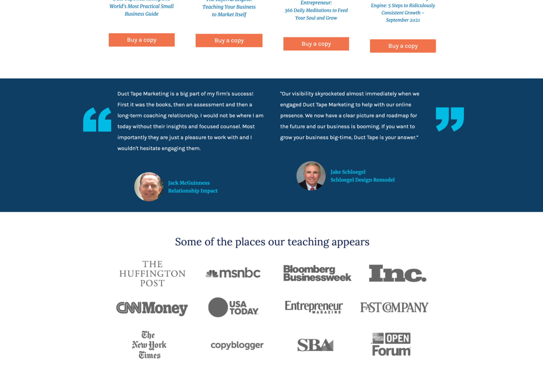
Testimonials are one of the most common types of review. Essentially, these are the messages shared by your customers that highlight the things they liked and didn’t like about your product. Testimonials often include a picture of the person leaving the message, and their name, to give them a greater sense of authenticity. You might also include a link to a website or case study with a testimonial to give it more depth. 

Most testimonials go at the bottom of pages. You can showcase these reviews on your home page to start generating credibility as soon as someone interacts with your brand. Alternatively, you could allow users to place their reviews on product pages. Here’s an example of what a testimonial might look like from ducttapemarketing.com:

Review Badges and Widgets

If your customers tend to leave reviews about your company on other sites, like Angie’s List or Yelp, then you can add a widget or badge to your website that makes it easier for other customers to find them. Sometimes, you’ll just include a small button on the bottom of a website pay that says, “find us on Yelp.” Other times, you can add your star rating too.

Some review sites will also give you the option to showcase the actual reviews in a widget that frequently updates with new messages. 

If you’re only showing reviews from one third-party site on your website, it’s best to focus on Google reviews, as it’s one of the most recognizable options. 

Provided that you’re using them correctly, badges and review widgets shouldn’t slow your website down too much, and many can be customized to suit the style of your site too. However, it’s essential to ensure that you don’t add too many widgets to your site if you want to avoid performance issues. 

Case Studies

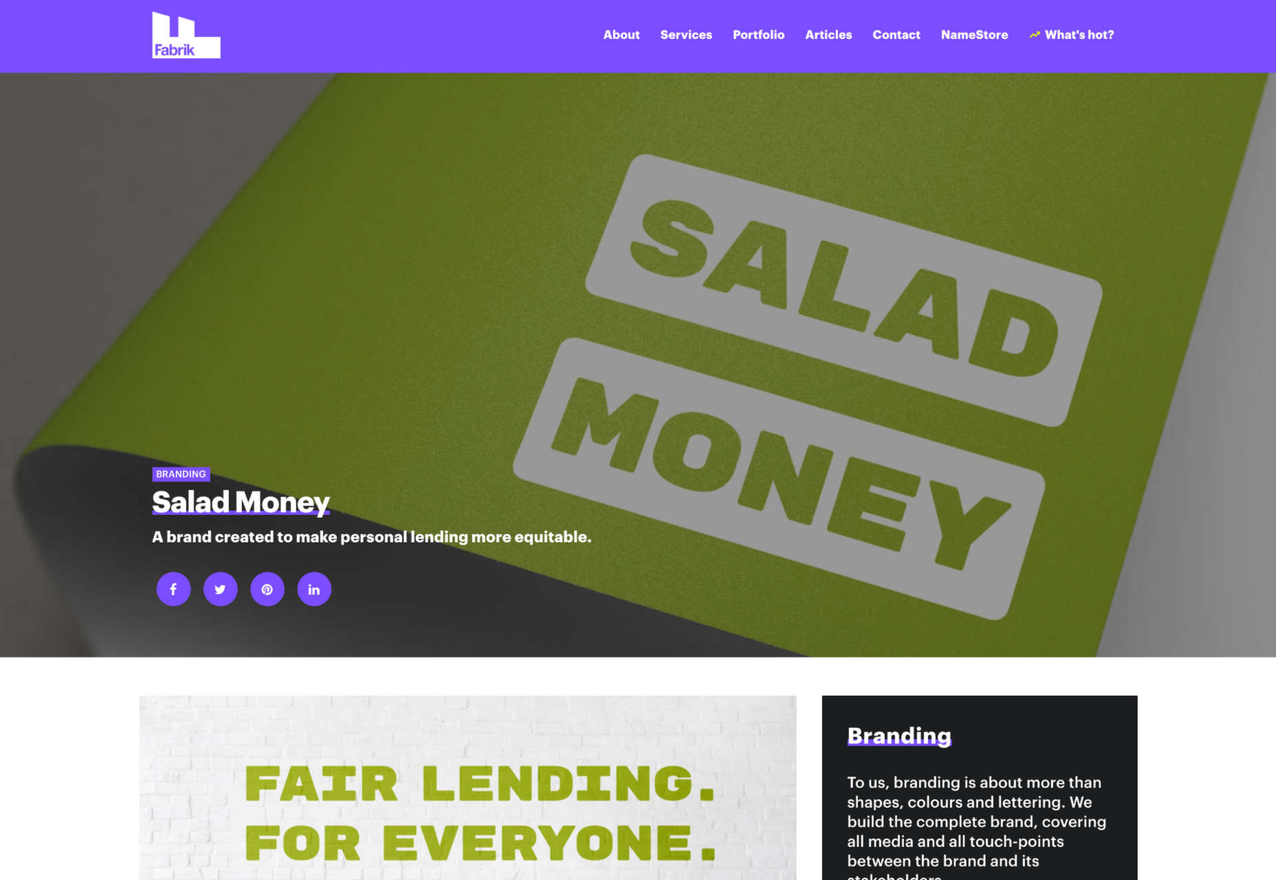
Case studies go beyond the basics of the standard review and provide potential leads with a tremendous amount of information about how you’ve previously interacted with other companies. With a case study, you’ll often create a structured document that demonstrates a customer’s problem and your strategies to overcome those issues. 

Case studies often exist on their own pages, so you can go in-depth with sharing valuable information. For example, you’ll include an overview that introduces the customer you worked with and details on the outcomes you achieved together. 

Although it’s much harder to interview customers for complete case studies and get all the statistics and numbers that make these reviews appealing, it’s often worth the effort. Particularly if you’re running a B2B company, case studies demonstrate the effort you go through to support your customers. They also act as proof of your success and set valuable expectations for customers. Here’s an example of a case study page by Fabrikbrands.com:

The Rating

If you’re just posting basic five-star ratings on your website or asking your customers to give you a number between one and ten for how positively they’d rate your service, then you can use a few handy automation tools to create one of these visuals. 

All you need to do is add a little basic CSS to your website or use a star rating widget that automatically calculates your average score based on all of the reviews that you collect from customers. 

Just make sure that your star ratings are positive not just on your website but on other review sites too. For instance, if you give yourself five stars by adjusting the CSS and then get three stars from Yell, customers will begin questioning your authenticity. 

Notably, while star ratings grab customer attention, they are a little basic if you’re trying to convert people and convince them to buy an expensive product. Most customers will often need more information than a basic star rating can provide. 

How to Display Reviews on Your Website

Now that you know what kind of reviews customers can leave about your product or brand, you can start exploring ways to display them on your website. 

You could decide to let your reviews show up on other third-party sites and leave it at that. For instance, if you’re a hotel manager, you may know that your customers are already leaving reviews on Booking.com and TripAdvisor. However, leaving your audience to seek your reviews out for themselves means that they spend less time where you want them – on your website. 

There’s also a risk that failing to add reviews to your site will make you look less credible. If you don’t own your rating or score, customers might wonder what you have to hide. 

Fortunately, we’ve got some great options to help you get started.

1. Create a Testimonials Page

The first and perhaps most accessible option for showcasing your reviews and testimonials is to design a page where your customers can easily find all the information they need about your brand. Having a dedicated testimonials page can be a great way to demonstrate transparency as a brand and show your customers that you’re not hiding anything. 

You could even add a form at the bottom of your testimonials page that allows other customers to leave their reviews and information. Just make sure that you have a CAPTCHA or another security measure in place to prevent people from spamming your site. 

It makes sense to showcase some of your most positive reviews at the top of your page, so your customers see those first. However, it could also be a good idea to showcase some negative reviews alongside them. That’s because customers generally expect to see at least some negativity associated with your brand. If all your reviews are positive, they might assume that you’re hiding something.

When displaying your negative reviews, make sure you also show that you’ve responded to them and are working hard to address any issues. You can even publish the “thank you” you get from an unhappy customer after rectifying the problem. 

2. Show Reviews in Your Website Header

The great thing about using reviews and testimonials on your website is that if you have a little coding knowledge and the correct information, you can display them wherever you choose. Most companies leave the reviews at the bottom of the website, but this could mean you’re missing out on an excellent opportunity to connect with your audience as soon as they visit you. 

Having a positive review highlighted at the top of your page could immediately boost your credibility and give your audience a reason to keep reading. Remember that a picture of the person sharing the review and their name can make them look a lot more credible when you’re trying to build trust. 

3. Add Some Reviews to Your About Us Page

It’s best not to hide your reviews somewhere your customers will have to search for them, but that doesn’t mean that you can’t scatter a few testimonials around other pages. A great way to give more credibility to your brand and your website is to create a sidebar on your “About Us” page or just showcase a handful of reviews underneath the description of your business. 

Suppose you don’t want to show customer testimonials on your About Us page. In that case, you could always show different kinds of reviews, like badges that show your certification with certain industry bodies or awards and recognition you’ve received.

Showing that you’re connected with major industry groups and that you’ve been recognized in your sector is a kind of review in itself. It indicates that other people have already assessed your business and see you in a positive light. 

Every review doesn’t necessarily have to come from your customers. Any business or person who can give more credibility to your business deserves some representation too!

4. Embed a Carousel on Your Site

As your business begins to grow, the number of regular reviews and testimonials you get from happy customers should start to skyrocket too. You might even get to a point where you’re not sure how to fit all the reviews you want to showcase onto the same page of your website. If you already have a dedicated “reviews” page where people can go to get more insights into your growing collection of social proof, try a carousel. 

Carousels are a great and dynamic way to showcase customer reviews while getting your audience more involved with your website. Give them a button they can click so that they can browse through a broader range of reviews after they’ve seen the ones that show up straight away on your carousel. It’s also worth including a link nearby the carousel widget that the user can click to visit your review page or your company’s page on a dedicated review website. 

If you want to go beyond putting carousels on your home page, remember that you can add them to your product pages and menus too. Online reviews impact around 67.7% of purchasing decisions, so it makes sense to put them somewhere your customers will see them when they’re figuring out whether or not they should hit the buy button. 

5. Add Reviews to Your Social Media Ads

Reviews can be an excellent way to add an extra spark to your advertisements elsewhere in the digital landscape. Telling your audience on Facebook that you have the best steaks in the country is great – but it’s not going to make a significant impact on most of them. That’s because every business claims to be the best. Most of your clients expect you to speak well of yourself. 

However, if you can combine an attractive image on social media with a quoted review from one of your happy customers, your ads will make more of an impact. You can include the quote from your customer in the text above your Facebook ad or create an image to display it instead.

Remember to add any hashtags and extra information that might make your ad more appealing and share it as often as you can with the right audience. Targeting your audience carefully towards people who are in the “consideration” stage of the buyer journey may help you to get more conversions. 

While customers usually scroll past dozens of social media ads every day, a genuine statement from a real person still shakes up the status quo and grabs attention. Include a button below the ad so your customer can learn more about the product the customer is talking about. 

6. Link to Reviews in Email Signatures

Finally, social media ads aren’t the only way to bring attention to your reviews outside of your website. If you want to get more external customers to go and check out your products or rediscover what your business is all about, you can add review links to your email signature too. These links can go directly to the case study or review pages on your website, reminding customers what it is that makes your service or product special. Alternatively, you can get dedicated signatures for your email that link to specific review sites too. 

Showing your clients how many ratings you have on Yelp or how many stars your products have earned with Google Reviews gives every message you send a lot more credibility. Most email marketing software solutions make it relatively easy to add information like this to the footer of your email.

Remember, your signature shouldn’t take up too much space in your email, so don’t add any specific reviews from customers. A star rating and a link back to a page where consumers can get more information will spruce up your content without weighing down your emails. 

Show Off Your Social Proof

Successfully collecting positive reviews that show your prospects how much customers love your company can be challenging enough. However, that’s just the first piece of the puzzle. Once you’ve got all those great reviews, you also need to show them off in the most effective way. From dedicated pages on your website to scrolling carousels and Facebook ads, there are a million ways to prove your credibility to your customers with testimonials.


Featured image via Pexels.

Source

The post How To Leverage Social Proof Successfully first appeared on Webdesigner Depot.


Source de l’article sur Webdesignerdepot

One of the core things I’ve been working on for the past 10 years is APIs — everything from simple APIs that are used by one client to multi-device and multi-purpose APIs. During those years, I’ve also had the opportunity to work with many third-party APIs like Stripe, Twilio, and others who are less popular and glamorous. Almost all of those APIs were REST-based and unique in some way. 

There are many reasons why REST is so popular. It’s simple to understand, it’s flexible, it works on any scale, it has a great community and tools built around it. But besides those, I’d also say that a lot of popularity came from the fact that’s its oldest rival, SOAP, is just horrible.

Source de l’article sur DZONE

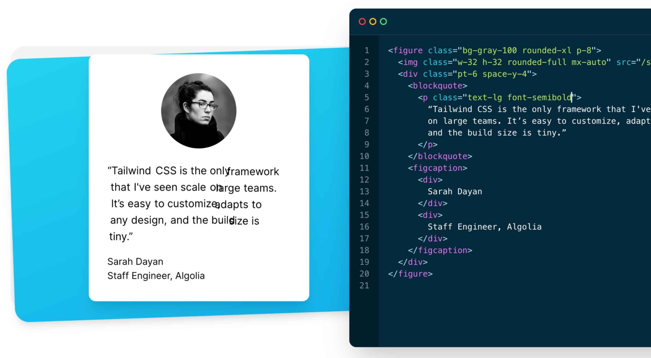
As a utility-first CSS framework, Tailwind has rapidly become popular among developers. With its fast styling process and the freedom it offers when designing a website, it’s really no wonder why.

But how can you make sure this is the right CSS framework for your upcoming development projects? In this blog post, you’ll learn what Tailwind is, and how it differs from other frameworks like Bootstrap, or Foundation.

In addition, we will highlight the main advantages and disadvantages of the framework. By the end, you will be able to make an honest and objective assessment as to whether Tailwind is the right framework for you. So without further ado, let us dive deeper into it. 

What is Tailwind CSS?

First released in May 2019, Tailwind CSS is a front-end CSS framework. It is currently at version 2.2. Since its release, Tailwind has created quite a following. More than 260k developers have used it to enhance their design systems.

Stats like these make Tailwind one of the most popular CSS frameworks on the market, and all in less than two years. There are many reasons for this. Primarily, because its features make it the ideal choice for a wide variety of projects. Tellingly, most developers prefer it to create React projects.

The main difference between Tailwind and its competitors is that it gives developers complete control over the styling of a web application. So, is it the right CSS framework for you? To answer this question, let us take a look at Tailwind’s advantages and disadvantages.

Tailwind CSS: Pros and Cons

Tailwind CSS: Advantages

1. Control Over Styling

Tailwind is a unique CSS framework when it comes to styling web applications, meaning that Tailwind does not have a default theme that you have to use like other CSS frameworks.

For example, you can give each project a different look even if you use the same elements (color palette, size, etc.). Therefore, it’s one of the few CSS frameworks that is not opinionated on how you should style your project. 

2. Faster CSS Styling Process

There is no faster framework than Tailwind when it comes to styling HTML. As a result, you can easily create good-looking layouts by styling elements directly. This is possible because Tailwind offers thousands of built-in classes that do not require you to create designs from scratch.

Therefore, you do not have to write CSS rules yourself. These CSS classes are the main reason why building and styling with Tailwind is so fast. 

3. Responsiveness and Security 

With Tailwind’s pre-built classes, you can design the layout directly in an HTML file. This makes it a very responsive, mobile-friendly CSS framework. Apart from that, Tailwind has proven to be a stable framework since its initial release.

The framework was developed by top-notch engineers, which is why bugs and breaks are rare. 

4. Additional Features 

Tailwind CSS works in the front end of a website. For this reason, it is reasonable for developers to demand ultimate responsiveness. Well, Tailwind provides the ability to create responsive themes for your web applications and remove all unused CSS classes. With PurgeCSS, Tailwind helps you keep your final CSS as small as possible.

Tailwind CSS: Disadvantages

1. Styling and HTML are Mixed

Because you do not have to write CSS rules yourself, Tailwind works differently than most CSS frameworks. While this is great for those unfamiliar with CSS, it also means that Tailwind mixes style rules in with your HTML files.

This goes against the principle of the “separation of concerns.” Many developers prefer to separate page structure and style, claiming that classes make the Tailwind markup process verbose. 

2. It Takes Time to Learn 

Because of the built-in classes, Tailwind CSS is quite learning-intensive. Even for experienced developers, it can be a challenge to learn how to use and fully utilize the pre-built classes. But, of course, as with any other development task, practice makes perfect.

However, if you are confident and quick when it comes to writing CSS classes, Tailwind may not be the best choice for you. Even if that’s true, Tailwind generally makes CSS styling faster in the long run.  

3.  Lack of Important Components

Unlike Bulma and Bootstrap, Tailwind does not have many significant styling components. Unfortunately, this means you have to manually add features like headers, buttons, and navigation bars for web apps.

This is not a significant drawback, as experienced developers can implement these features quickly. However, you will need to spend some time doing so. 

4. Documentation 

Although Tailwind CSS has made great strides when it comes to adding guides and video tutorials, it still lags behind competitors like Bootstrap. Of course, you can always contact the developers if you have a problem.

However, keep in mind that this may take some time. For this reason, you may need to customize the framework to your needs manually.

Is Tailwind Worth Trying?

In a few words, working with Tailwind is quite different from other CSS frameworks. We have identified its main advantages and disadvantages. Based on these features, we can easily say that Tailwind is:

  • An excellent solution for developers familiar with CSS who want to speed up the creation and design process in the long run.
  • Not such a good idea if you are not familiar with CSS or do not want to spend time learning a new CSS framework. 

It becomes clear that it all depends on your personal needs and preferences. However, if saving time on CSS styling is a priority for you, you should definitely give Tailwind a try.

Regardless of whether you choose to use Tailwind or not, it’s evident that many developers use it for good reasons. Since it offers a faster styling process and is a responsive and stable framework, it’s here to stay.

Tailwind can help you save time and change the way you design websites, and so taking the time to test it out is worthwhile.

Source

The post The Pros and Cons of Tailwind CSS first appeared on Webdesigner Depot.


Source de l’article sur Webdesignerdepot

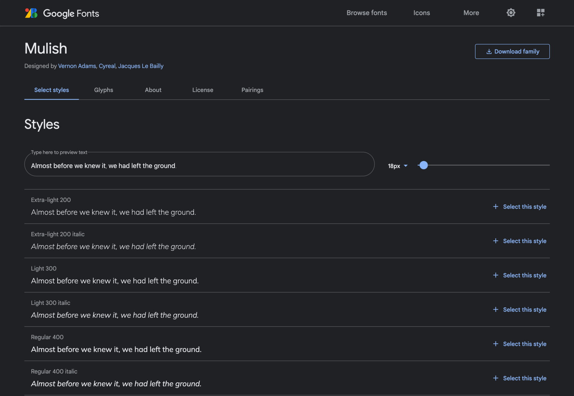
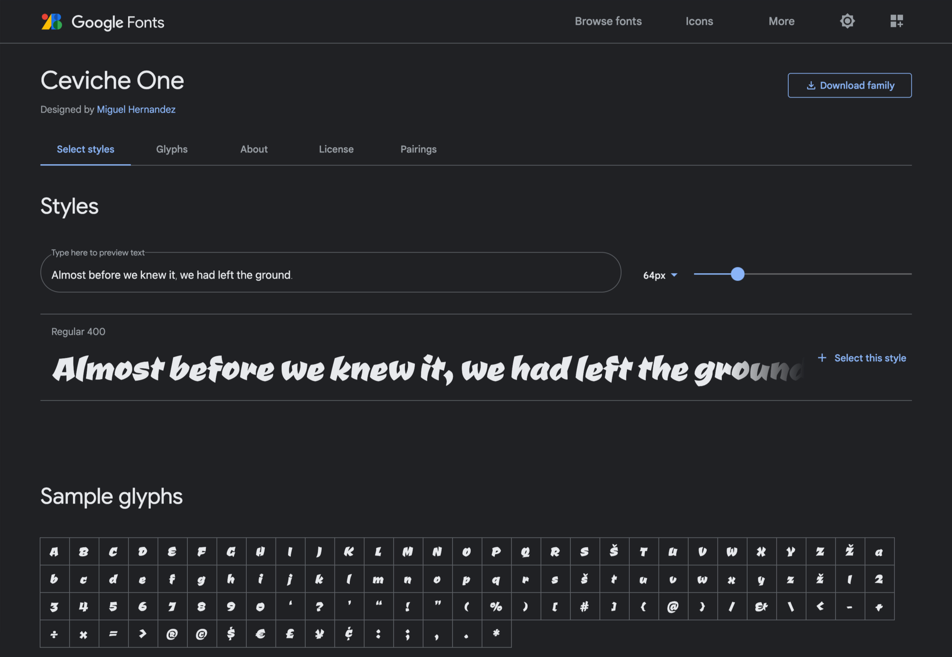
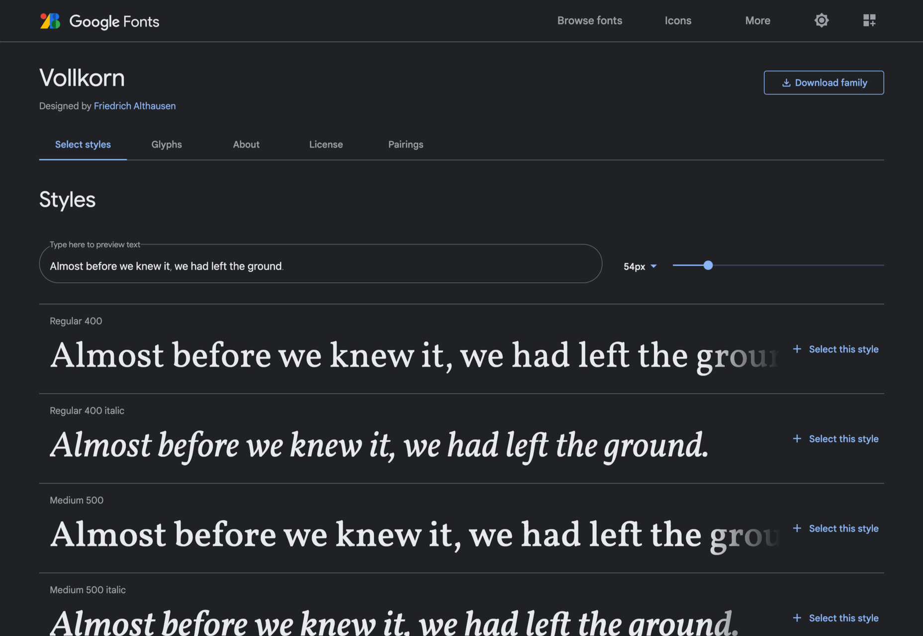
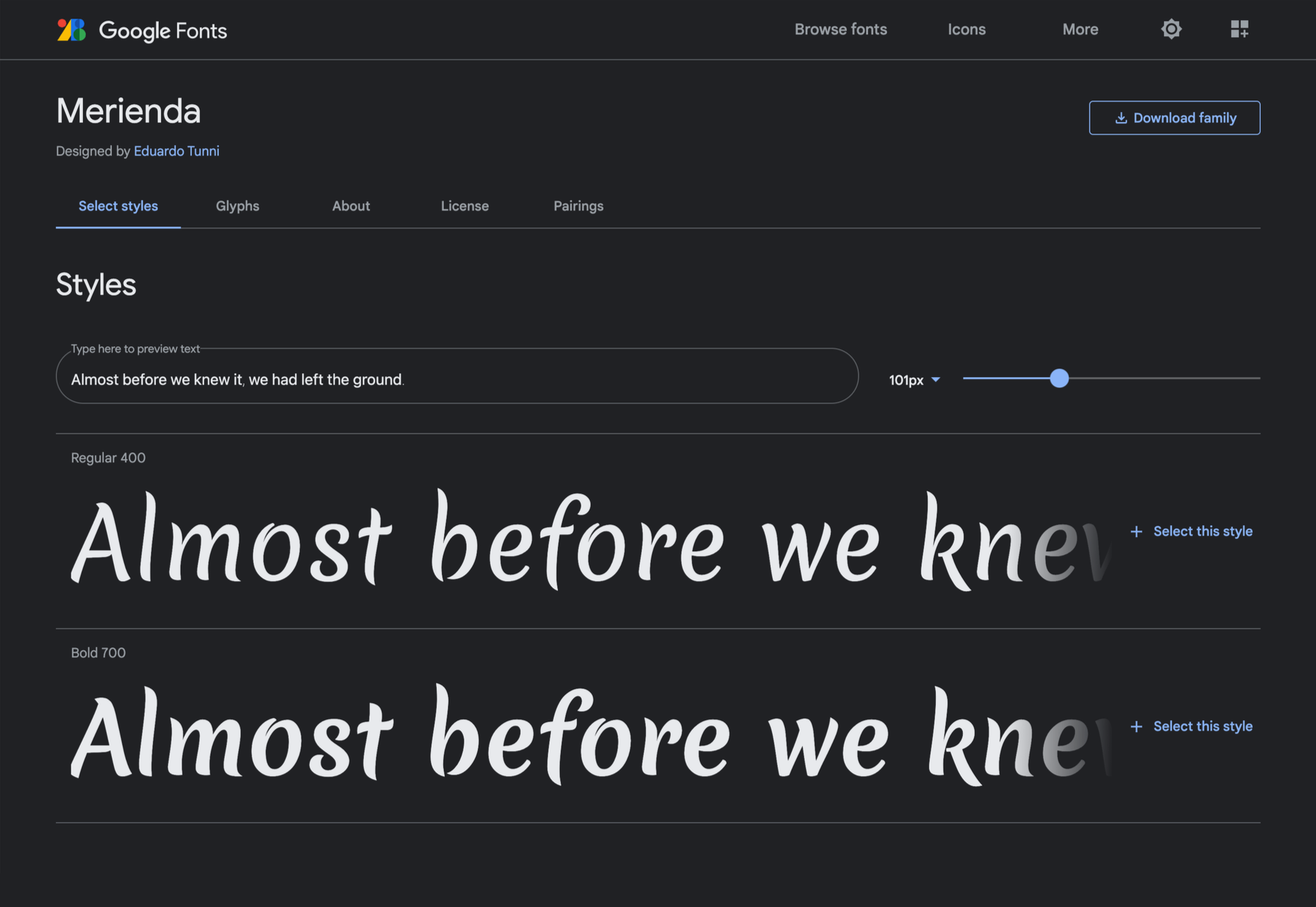
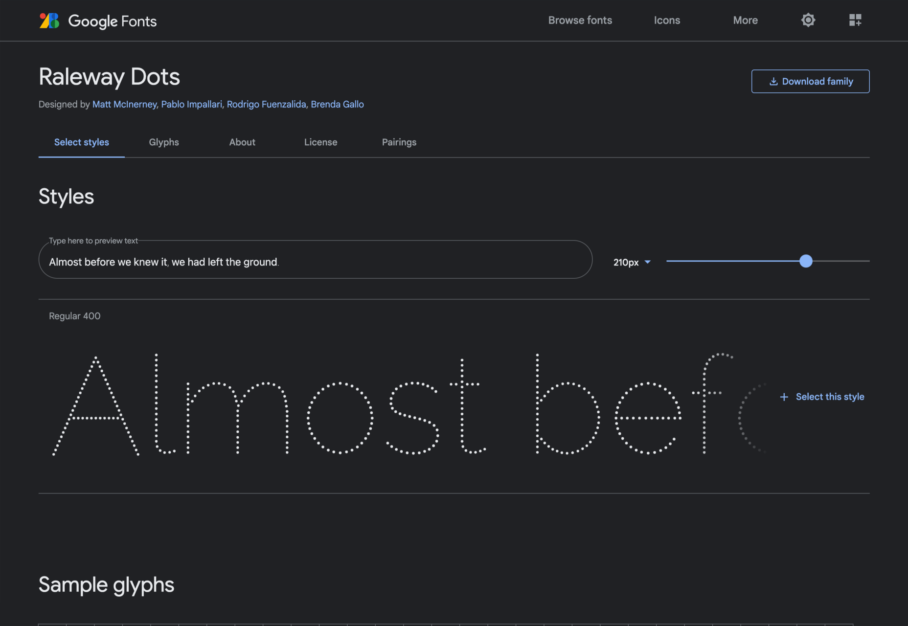
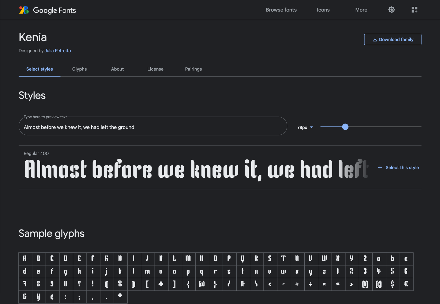
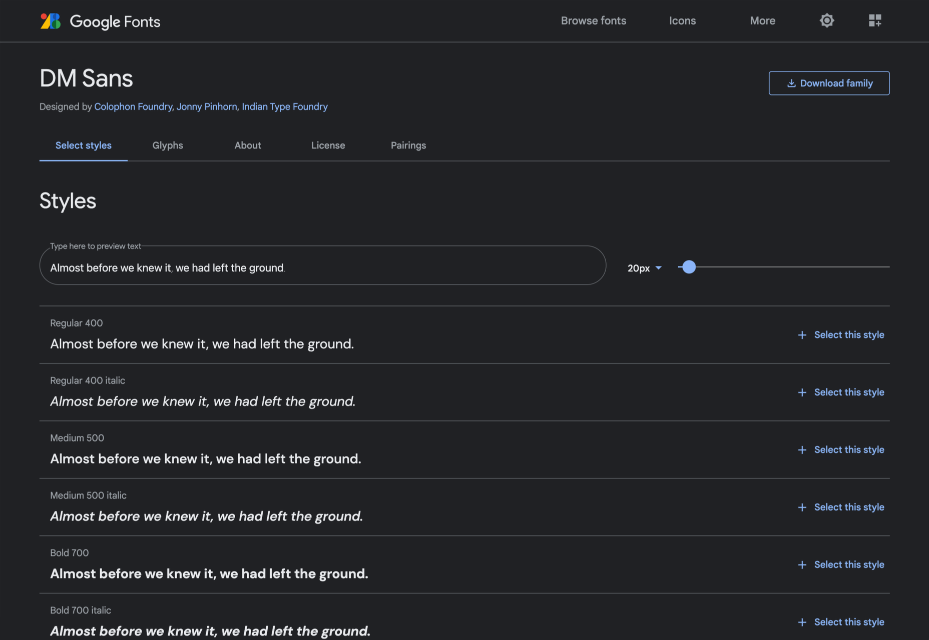
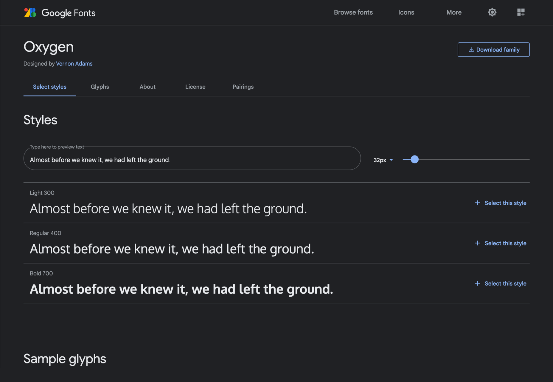
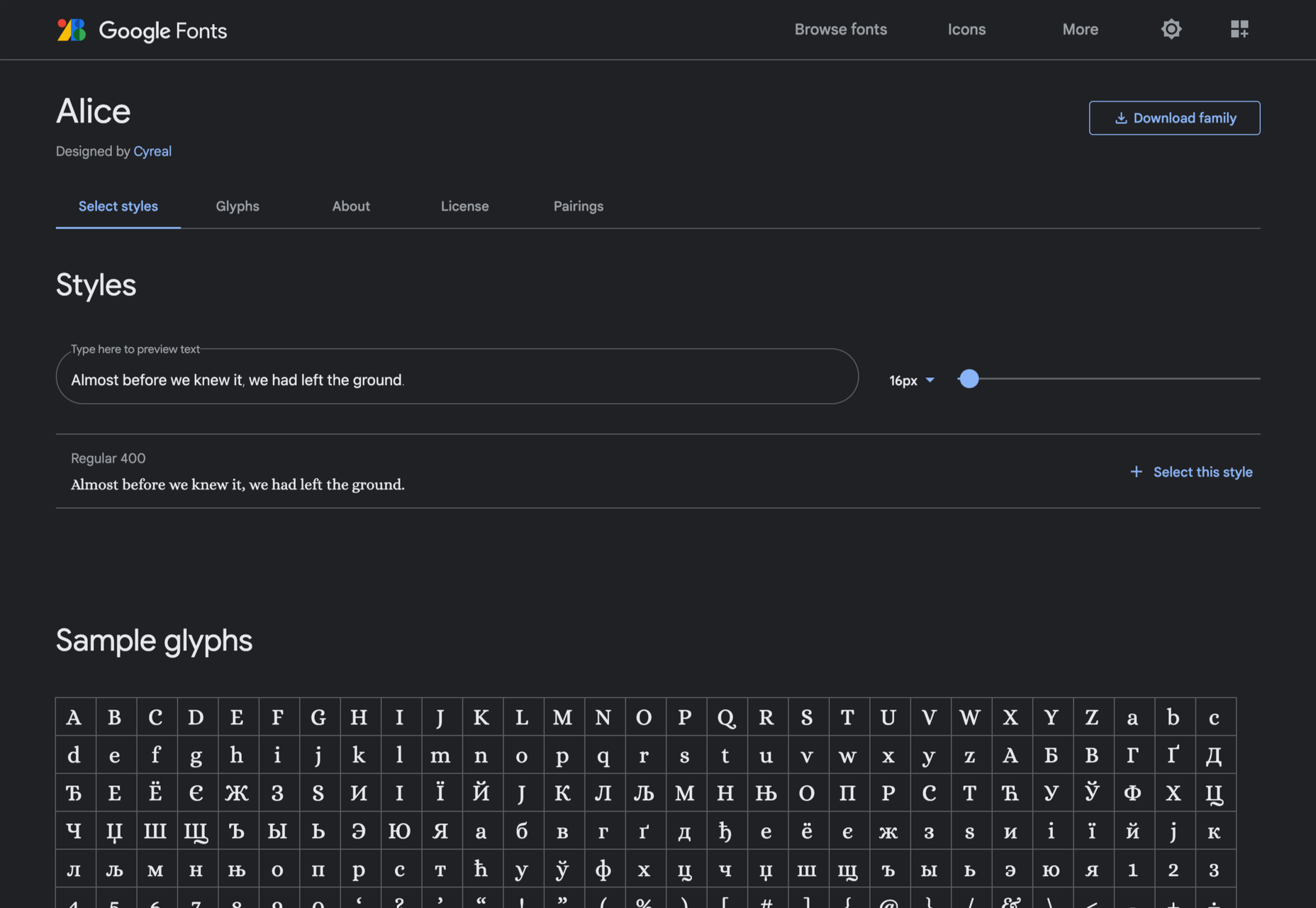
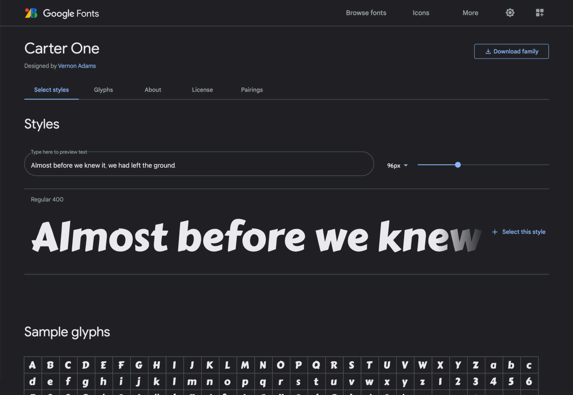
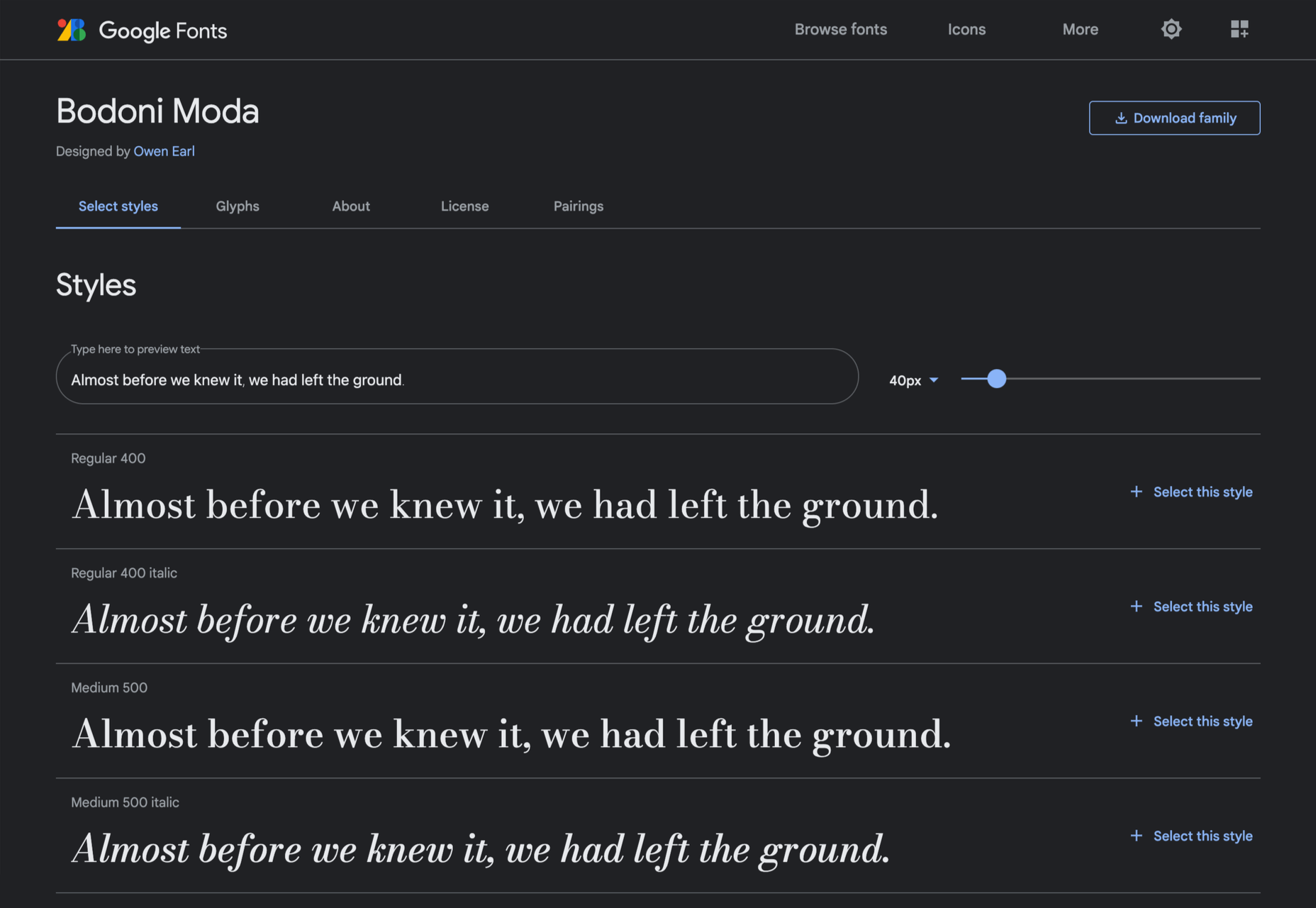
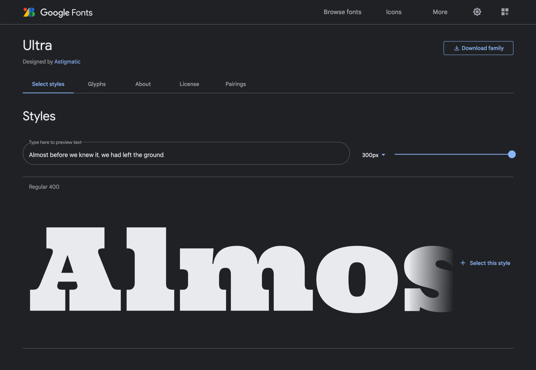
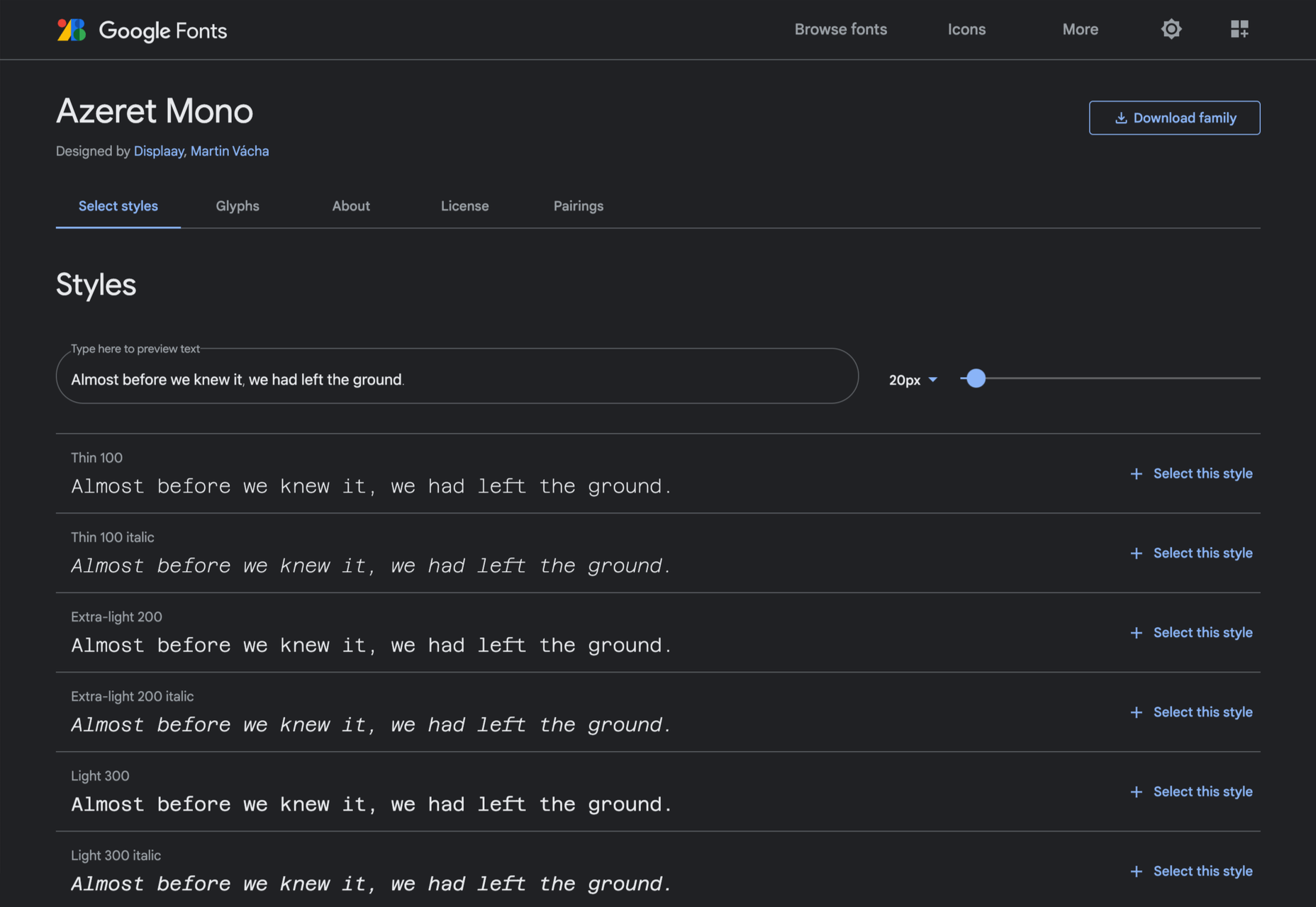
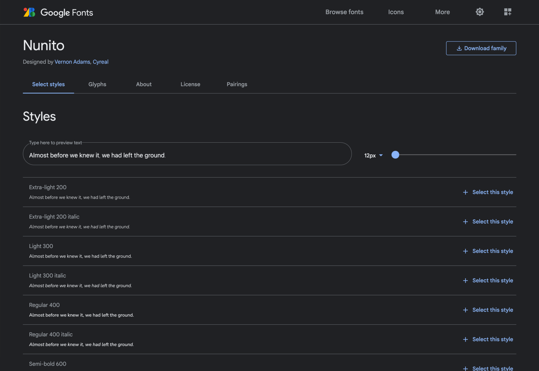
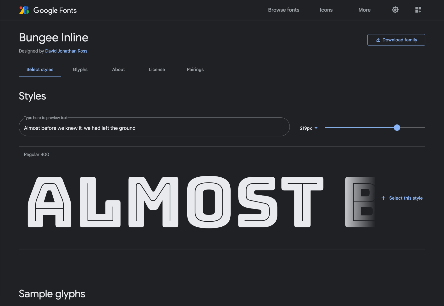
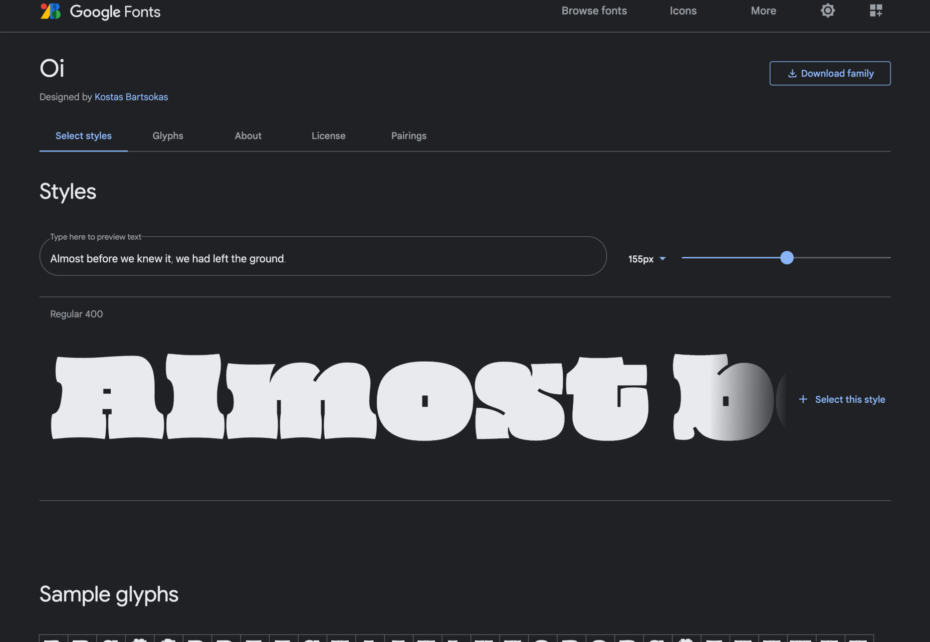
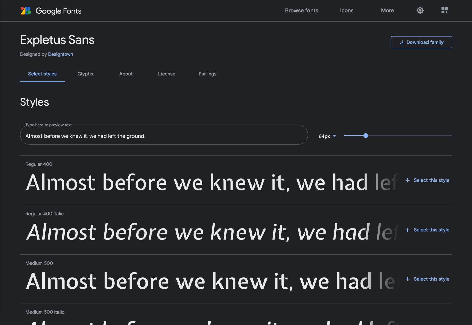
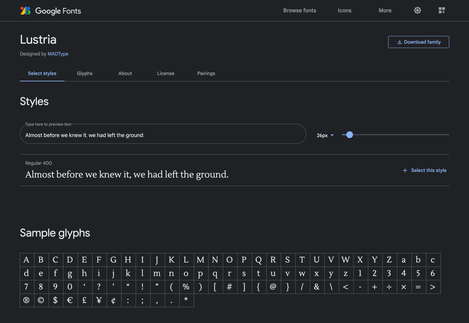
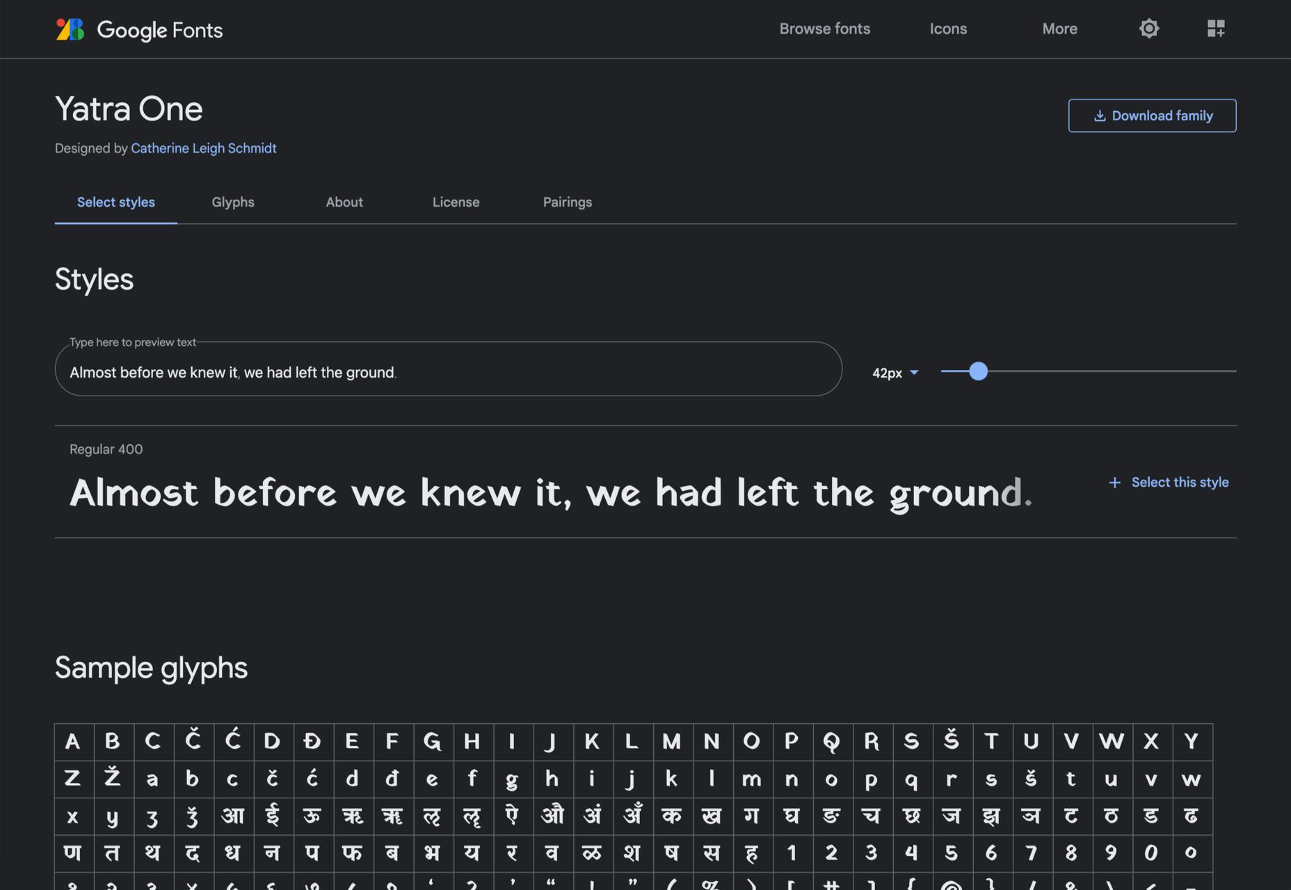
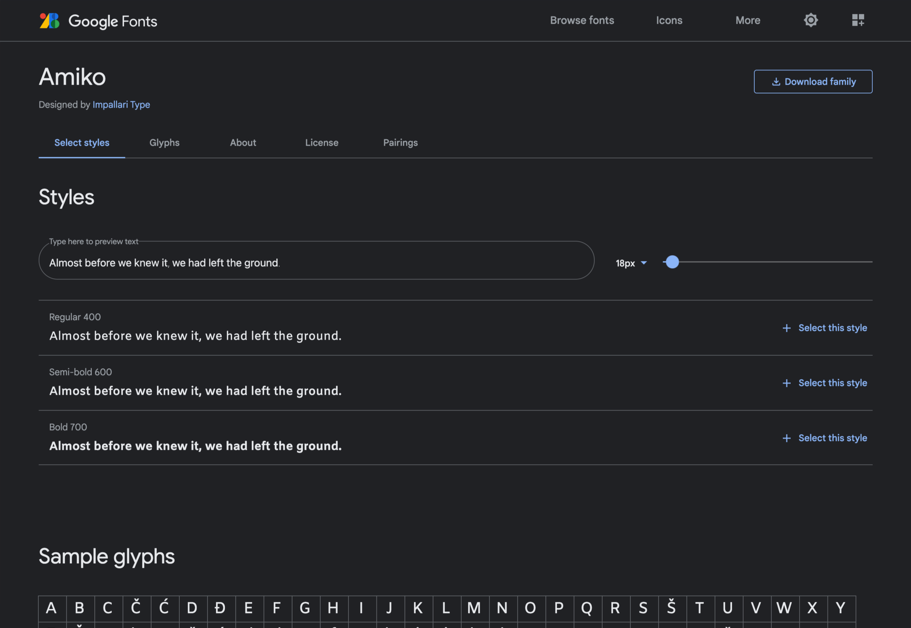
Google Fonts may be the single most significant contribution Google has made to the evolution of the web — yes, more significant than search, advertising, or analytics.
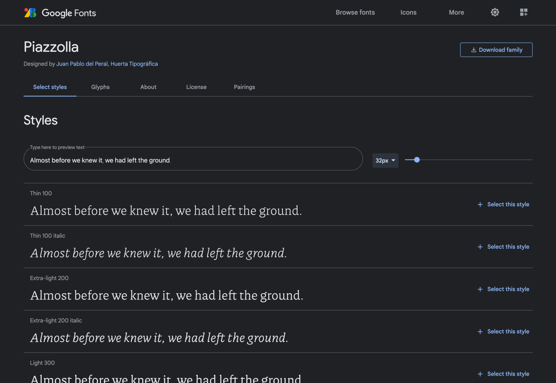
Google Fonts gives every business access to a visual voice with which to distinguish itself. Fonts can be downloaded for use in design software and then embedded using best practices for a consistent experience on the web.

If there’s anything wrong with Google Fonts, it’s that its default listings are based on “Trending,” a self-fulfilling criterion that keeps Noto Sans high up the list, destined to be over-used.

But if you spend a little time lower down the listings, you’ll find some exceptional typefaces that are hardly used. Yes, some of them are highly stylized, but there are also usable sans, serifs, and display fonts worthy of your consideration.

All you have to do is scroll; here’s a selection of some of the treasures you’ll find if you do…

Piazzolla

Piazzolla features dramatic and expressive angular shapes when previewed in large sizes, but its real strength is in setting large amounts of body text.

Mulish

If you’re looking for a solid workhorse sans, look no further than Mulish. Halfway between a humanist and geometric sans, there’s even a variable font version.

Ceviche One

Reminiscent of the cool lettering of 60s advertising, Ceviche One is packed with energy, thanks to the dramatic zig-zag formed along its baseline.

Vollkorn

Released by Friedrich Althausen in 2005, Vollkorn is an excellent typeface for body copy, excelling at small sizes. It now boasts a variable font option.

Merienda

Merienda is a delightfully energetic display script. The bold weight feels more confident, but both weights have a dancing rhythm that brings the page alive.

Raleway Dots

Raleway is a hugely popular — and perhaps overused font — but this dotted version is less known. It’s a simple geometric sans that functions as a display face.

Kenia

Kenia is a wonderful, uncategorizable typeface. The stencil forms result in entirely original letter constructions, and the lowercase s is magnificent.

DM Sans

DM Sans is a low-contrast geometric sans-serif that performs wonderfully well at smaller sizes. It only has three weights, but each comes with a matching italic.

Oxygen

Designed by Vernon Adams as part of the KDE project for GNU+Linux, Oxygen is a very readable sans-serif, with a generous x-height and a hint of pen stroke.

Alice

Ksenia Erulevich’s Alice was inspired by Lewis Carrol’s novel Alice’s Adventures in Wonderland. It presents itself as an Edwardian serif with fanciful flourishes.

Carter One

Carter One uses bold strokes, with a medium amount of contrast, to create a sans-style script. It has dozens of beautiful details like the notch on the lowercase o.

Bodoni Moda

Bodoni Moda is a didone-style serif with strong vertical strokes and high-contrast slab-like serifs. It’s the best variable font in this genre that I’ve found.

Ultra

Ultra is a slab-serif that you won’t even consider for body text. Its sculptural shapes are almost American-western. The counter on the lowercase n is charming.

Azeret Mono

Most mono-spaced fonts fail to inspire; practical they can be, charming they are not. But Azeret Mono bucks that trend, its bold weights being particularly fantastic.

Nunito

It’s tough to find a serious sans-serif with rounded terminals, but Nunito is it. There’s also a Nunito Sans with square terminals, but I love the rounded tips.

Bungee Inline

Designed for signage, Bungee is great for display sizes and works well vertically. There are several versions, but my favorite is this classy inline version.

Oi

Oi is unapologetically loud. A slab-serif that swallows its own detail, the counters and ink traps give it a 3D quality, and the curves feel almost nautical.

Expletus Sans

One of the significant trends in typography is the angled clip of adjoining strokes, creating the effect of shadow. This effect is brilliantly achieved in Expletus Sans.

Lustria

It’s comparatively unusual to find a serif face designed to work well at display sizes. At large sizes, Lustria’s rounded terminals evoke ink spread delightfully.

Yatra One

Yatra One is a Devanagari and Latin typeface that uses the Devanagari brush angle for its strokes, giving the Latin text an unusually slanted, stand-out character.

Amiko

Amiko is a highly legible typeface and excellent at tiny font sizes. It’s perfect as a secondary font if your main font is too fancy for elements like legal notices.

Keep Scrolling

It’s always tempting to leap at the first typeface you find that meets your needs, but if you dig a little deeper into Google Fonts, you’ll find a vast range of typefaces that offer both practicality and character.

Source

The post 21 Exceptional Google Fonts You Probably Haven’t Discovered Yet first appeared on Webdesigner Depot.


Source de l’article sur Webdesignerdepot