Articles

This week Google announced further details of its plan to remove cookies from ad tracking. The strategy, which the ad giant expects to be fully implemented by 2022, has come about due to increasingly stringent privacy laws in a growing number of territories around the globe.

Google’s first step was the announcement in January of FLoC (Federated Learning of Cohorts). Google itself is still testing and fine-tuning the system, but in essence, Google will replace 3rd-party cookies in Chrome with groups of anonymized users.

Critics of the plan have questioned whether users will be genuinely anonymous or whether Google will be tracking individuals to group them properly. The answer came earlier this week in a low-key announcement of KaST.

What is KaST?

KaST (Key and Surface Tracking) is the first iteration of Google’s new tracking technology. It works entirely without cookies and is fully device-agnostic.

The technology behind KaST is surprisingly old. It was first trialed in 1987 as a simple process for auditing the input of stenographers. Although the latest version of the technology draws heavily on voice recognition software algorithms, the original version of KaST — software named TAAA (Typist Account Accuracy Audit) — predates modern voice recognition by at least two years.

KaST uses…biomechanical and cognitive patterns, identifying individual users based on their keystrokes.

Just as your voice has a unique, identifiable modulation — anyone who uses telephone banking will be familiar with speaking their password — so too does your biomechanical input.

When you type on a keyboard or a touchscreen, the force, speed, and accuracy with which you hit characters are dependent on two things: your cognitive process and the unique biomechanics of your hands (the bones, ligaments, and muscles).

For example, when I type WordPress, I almost always type it as WordPRess (with a capitalized R). That is one facet of my combined biomechanical and cognitive process.

KaST uses keyboards and touch screens to track combined biomechanical and cognitive patterns, identifying individual users based on their keystrokes.

Mobile Approaches to KaST

KaST is heavily reliant on BMaC (Bio-Mechanical and Cognitive) input. Although Google hasn’t released any data to support the accuracy of KaST, BMaC is known to be surprisingly accurate.

Reports suggest that the KaST algorithm is 89.7% effective for character strings of 12 characters or more, leaping to 97.6% for 19 characters or more on a single device. That makes it too inaccurate for high-end processes like security but well within the necessary margin of error for a non-critical process like serving ads.

Google will be able to identify you on any machine, on any device, in any context, as soon as you type 19 characters or more

When switching to a touch-screen device, the accuracy plummets to just 87.8%. This may be one reason Google has been low-key in its trumpeting of the new technology so far.

According to TechBeat, initial trials of the tri-axis position of a device (X, Y, and Z rotation) were abandoned as inaccurate. Still, even without those additional tracking signals, Google claims KaST on mobile will achieve ~94% accuracy by the 1st quarter of 2022.

What Does KaST Mean for Users?

Much like many of the algorithms that govern our daily lives, KaST will be largely invisible to most of us. Unlike cookies that can be legislated for and removed from a local machine, your BMaC is as inescapable as your DNA.

Where privacy concerns really grow is that your BMaC follows you from device to device. How you type at home is identical to how you type at work. Your personal and professional profiles are now instantly connectable; Google will be able to identify you on any machine, on any device, in any context, as soon as you type 19 characters or more.

KaST Prompts Pre-M1 MacBook Rush

Within 24 hours of KaST’s announcement, Apple stores were reporting rush orders of pre-M1 MacBook Pros. With some stores reportedly selling out late on Wednesday.

The rush came in the wake of a Reddit post — that has since been removed — that claimed that the notoriously bad butterfly keyboard on pre-M1 MacBook Pros circumvented KaST because the inaccuracy of the keystrokes, and the tendency of the keys to stick introduced a random element that disguised the end-user from the KaST algorithm.

Although the Reddit post is unsubstantiated, it transpires that M1 Mac owners may not be the lucky ones after all.

Should You Worry About KaST?

Advocates maintain that KaST — and Google’s wider FLoC strategy — are beneficial to users and the web as a whole. They claim that identifying users without 3rd party cookies does more to protect privacy than hinder it.

Opponents argue that in a digital world rife with user tracking, privacy compromises of this magnitude cannot be contemplated simply to enable more sophisticated ad-serving.

Despite KaST’s early stages of development, privacy concerns are mounting, and a campaign has been launched to regulate Google’s use of the technology.

Source

The post Key and Surface Tracking Comes to Chrome first appeared on Webdesigner Depot.


Source de l’article sur Webdesignerdepot


Introduction

Ever since Patrick Debois coined the word DevOps back in 2009, teams and organizations have been clamoring to adopt relevant practices, tools, and a sense of culture in a bid to increase velocity while maintaining stability. However, this race to incorporate “DevOps” in software development practices has resulted in a perversion of the concept. This does not mean that there are no successful practices of teams adopting DevOps practices, but the word overall has become a buzzword. As per the DORA 2019 State of DevOps report, team managers are more likely to proclaim that their teams are practicing DevOps compared to the actual frontline engineers and developers.

Therefore, this piece aims to realign the meaning of DevOps as well as highlight the need for considering debugging as a core element of the practices and cultures that enable DevOps for teams. The argument for debugging as a core component in the DevOps pipeline is a result of the evident need for a shift-left in the way we build and release software, empowering developers to adhere to the intrinsic principle of you build it you run it.

Source de l’article sur DZONE

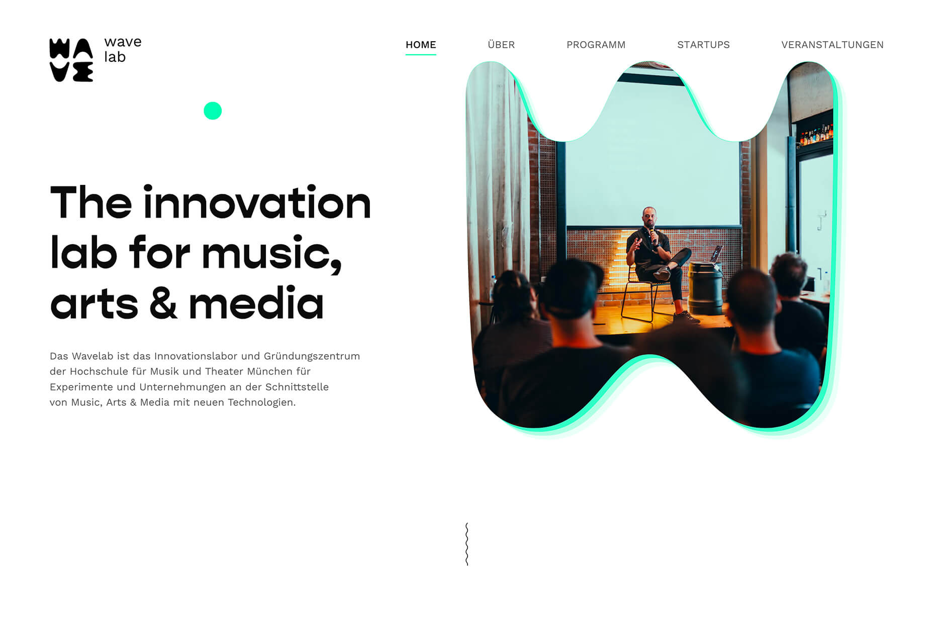
There are many reasons you might be wanting to improve your design skills this year. Perhaps you have extra time on your hands and want to put it to good use. Or maybe you’re new to web design and finding that there’s a lot you still don’t know how to do. It could also be that you recognize that the web is changing, and your skills could use some refreshing to keep up.

Whatever the reason, there are many ways to level up your web design skills in 2021. Here are 12 ideas to get you started:

Tip 1: Niche Down If You Haven’t Already

Jack-of-all-trades designers might be able to say “yes” to everyone. However, they’re going to be stretched very thin as they attempt to strengthen every skill needed to keep up with demand.

It’s much easier to become a trusted designer and to improve your skills if you have a smaller and more specific skill set to develop.

Just keep in mind that niching down doesn’t necessarily mean focusing on a particular industry. For instance, you might choose to be a UX designer instead of a web designer. Or you might specialize in designing ecommerce websites instead of monetized blogs. Just find something that you’re passionate about and will be good at doing, and zero-in on the skills needed for it.

Tip 2: Play Around in the Sandbox

Local development environments are useful for staging websites, doing redesigns, and testing updates safely away from live sites. But you can also use them for experimenting with new design techniques, trends, templates, plugins, and more.

Local by Flywheel is the one I prefer to use:

Here’s a good exercise to start with:

Take a website you like — something you’ve looked at in awe and couldn’t imagine ever building on your own. Then, put yourself to the test. See if you can recreate it in your sandbox.

Don’t be hard on yourself if you don’t figure it out right away. Consult your resources and give yourself time to make sense of what’s going on and implement it with the available skills and tools.

Tip 3: Redesign One of Your First Projects

There’s always a clear evolution in a designer’s skill set, from the day they begin designing to the present day. And that’s a good thing. If your work doesn’t improve or change with time, then you’re going to have a lot of catching up to do when the stagnation begins to hurt your business.

Want to see how much progress you’ve made so far? Revisit one of your first projects and look at it with fresh eyes. I bet you’ll see a big change in how you design today from how you designed that site then.

Now, ask yourself what you would do differently. And then, go to your sandbox and do the redesign.

Tip 4: Work on a Passion Project

A friend of mine is taking a UX design course and needed some users to run through a prototype he created for the class. He could create anything he wanted, so he designed an app related to his other love: Music.

While he could’ve easily thrown together some carbon copy of Spotify or SoundCloud, he came up with a completely new concept. And it was really impressive, to the point where I urged him to put it into production and see if he could list it in the app stores.

I think it’s when we’re really passionate about something that we’re willing to push past our limits. So, carve out some time to tackle that passion project you’ve been toying around with and see where it takes you.

Tip 5: Share Your Designs on Dribbble and Ask for Feedback

One of the reasons UX designers do user testing is how valuable users’ raw input is. While it would be nice to think that design is a completely subjective matter, that isn’t really the case when usability becomes compromised due to design choices.

Understanding what users like and dislike is an important part of taking your design skills to the next level. And a good way to do that is to share your designs on Dribbble.

Here’s an example of UI8 asking for feedback:

Tip 6: Create a Design Toolbox

I’m a huge fan of automation and shortcuts powering things behind the scenes in business.

After all, one of the reasons you become a web designer is so you can design, right? When you’re bogged down with administrative and logistical tasks, that’s time spent away from doing what you enjoy.

One way in which you can streamline your backend processes is by putting together a design toolbox. Your preferred CMS. Flexible templates or apps you use from project to project. Website testing tools. And so on.

As you do this, it’ll force you to examine how you build websites. Are you really working as efficiently as possible? Are there newer apps or systems that’ll help you design better sites? And as you improve your design toolbox, you’ll improve your design skills.

Tip 7: Subscribe to Your Favorite Blogs

I have a hard time recommending this one, only because I’m reluctant to sign up for yet another newsletter. That said, I do see the value in subscribing to some blog newsletters as I don’t always remember to revisit their websites and check out the latest content.

What I’d suggest you do is pick one or two design blogs that have a good variety of content and publish regularly. And then pick one small business or freelance blog.

WebdesignerDepot, of course, is a good one to start with as it comes at a good frequency, recommends great reads from all around the web, and is fluff-free:

I’d also recommend signing up for one that’s focused on your niche as well as one for business.

As a freelancer, I’d vote for the Freelancers’ Union newsletter. There’s always something timely and useful in there.

Tip 8: Listen to a Podcast

I just adopted a second dog, so I’ve spent a lot more time on walks while house-training her. At first, I was stressed about it because it was time spent away from work. However, I started to fill that time with podcasts and found that it helped me work better for the rest of the day.

One reason is that I’ve been listening to work-related podcasts, which are always chock full of helpful tips. Another reason is that it gives my eyes a rest from looking at the screen so that when I come back 15 or so minutes later, I feel refreshed and ready to go.

Rebekah Carter has a good set of web design podcast recommendations to get you started.

Tip 9: Take a Free Online Design Course

There’s an overabundance of information online. If you want to brush up on CSS, there are hundreds of YouTube courses that cover it. If you want to learn how to use a new WordPress plugin, you’ll find dozens of great tutorials across various online course platforms, YouTube channels, and even people’s blogs.

There’s no need to go back to school to become a better designer. Here are five places where you’re bound to find free courses for web designers.

Tip 10: Read a Book on Design Principles or Theory

It’s easy to lose sight of design principles when your clients are clamoring for a website that will make them a lot of money, get them a lot of readers, and so on. Sure, you can design a UI and UX that works, but do you remember why the design choices you made are effective?

Choose a book — just one to start — that’ll help you reconnect with the roots of good web design. Not only will you get a good refresher on web design principles or design theory, but you might learn something brand new.

Here are some of my favorite books for web designers:

Tip 11: Find Your People

Now more than ever, finding a community of like-minded web designers, developers, or freelancers is important. It’s not just about having a group of people to vent to when clients drive you nuts (though that’s great, too).

It’s about finding a group that brings something new to the table and enriches your understanding of web design and what it means to be a web designer.

If you’re on Facebook or LinkedIn, start there. There are tons of web design and freelance groups that have productive discussions every day. If you prefer to meet up with local designers and developers, check out Meetup.

You may be surprised by how many groups there are and the kinds of meetups they have planned.

Tip 12: Attend a Virtual Conference

Did any of you attend a design conference last year? I did. I virtually attended Adobe MAX — from the comfort of my home, in my pajamas, for three days.

I scheduled my assignments around the sessions I wanted to attend and didn’t have to pick one over the other (i.e., “Do I make money or do I learn something new?”).

Some of the sessions showed us how to do more with Adobe’s tools, while some of them featured design and business leaders who shared personal insights on how to work more effectively. It was a great way to shake up my normal routine and to get a ton of information about the future of web design in a short period of time.

Which of These Tips Will You Use to Improve Your Design Skills?

Like I said before, there’s a lot you can do to improve your design skills. Just be careful not to overdo it.

Pick one or two things on this list to start with. If you have more time in your schedule and you’re excited about what you’ve learned so far, add a couple more.

Just take it slowly. Your brain will only be able to absorb so much at once. Plus, the last thing you want is to burn yourself out on skills training and not have the energy to complete your work.


Featured image via Unsplash.

Source

The post 12 Tips to Improve Your Web Design Skills in 2021 first appeared on Webdesigner Depot.


Source de l’article sur Webdesignerdepot

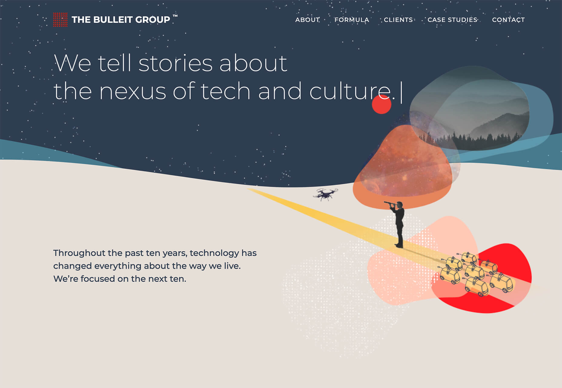
UX principles guide many of our decisions when we design and build sites and apps. Understanding UX principles doesn’t mean you can dodge your own testing, but they do give you a head start.

Often named for the researcher who identified a particular truth, or pattern, these laws are the product of hundreds, and sometimes thousands of hours of lab and field-based research.

How well do you know these UX laws? We’ll start you off with an easy one…

Featured Image via Pexels.

Source

The post Quiz: How Well Do You Know UX Principles? first appeared on Webdesigner Depot.


Source de l’article sur Webdesignerdepot

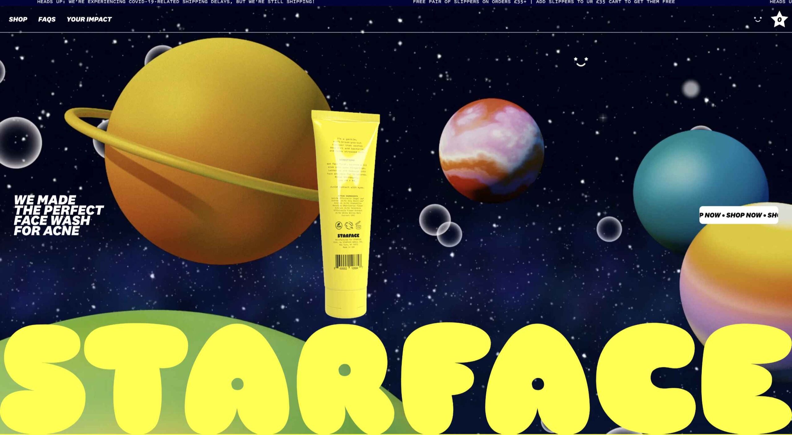
There are some interesting shake-ups on the horizon for ecommerce: Experiential shopping, Virt-ical worlds, Au naturale models.

We’re starting to see signs of them already — many of them spurred on thanks to the events of 2020. Below, we’re going to explore what’s going on with these new ecommerce trends and technologies and take a look at a bunch of sites that are setting really cool examples for each.

1. Experiential Shopping

With many stores, either closed to in-person shopping during the pandemic or their capacities severely limited, online shopping and BOPIS became much more attractive options for consumers.

That said, buying something like a pair of jeans or a new pair of glasses is much different than the pack of toilet paper someone’s bought for years. There are just some things you have to try to know if you’re going to like it and make sure it fits.

Augmented reality and other immersive shopping tools are bringing those “try-on” capabilities to people’s homes.

There are a number of technologies built specifically for this purpose:

Obsess is a particularly noteworthy one. It’s an ecommerce platform that enables retailers to build virtually immersive shopping experiences. Charlotte Tilbury is one such retailer that is taking advantage of it.

Obsess, the augmented reality and immersive shopping experience platform

At the end of 2020, Obsess announced that it had received $3.4 million in seed funding, so expect to see more Obsess-powered ecommerce sites and apps.

ByondXR is another platform that empowers brands to design immersive experiences for online shoppers:

ByondXR helps brands create experiential shopping

Retailers like Lancome, Procter & Gamble, and Calvin Klein have used ByondXR’s immersive commerce technology.

Another option is offered by Matterport:

Matterport's virtual shopping experiences and 3D store mapping tech

This technology is interesting as you’re not just creating a virtual store. You can also design a 3D model of a brick-and-mortar shop that in-store shoppers can use to get in and out quickly.

2. Virt-ical Worlds

There’s a new trend brewing, and we see it most commonly on websites for fresh and youthful brands. I wouldn’t say it’s nostalgic design, per se, though there are certainly some elements reminiscent of the bold, in-your-face style of the web in the late ‘90s and early ‘00s.

No, I think what we see here is a creative reimagining of our world.

With so many people having spent time in their homes and with their faces glued to screens, there’s been a blurring between our VIRTual and physICAL worlds. This new web design trend is one I’m going to call the Virt-ical World. While parts of these sites look like the websites we’ve designed in years past, there are motion, color, and sizing elements that feel more like a trippy virtual simulation.

Let’s look at some examples.

Starface is a company that creates acne-fighting products.

Starface's in-your-face website design

This is one of the more experimental designs in this set of examples. Still, it’s one that shows us how far the boundaries can be pushed without totally compromising the online shopping experience.

Billie is another company having fun with this trend. I’d say this is on the opposite end of the spectrum.

Billie has a fun, candy-colored website design

For the most part, this ecommerce site looks similar to other small retailer sites. However, the fun, candy-colored palette, the bobbing products, and the color shifts add a somewhat surreal element to the design.

Catching THEO is another ecommerce brand playing around with this Virt-ical World.

Catching THEO mixes nostalgia and modern design

See what I mean by this style feeling somewhat nostalgic? Thankfully, this site commits to today’s good, clean, responsive design while only using some of the more fun and quirky elements from the past.

Au Naturale Models

When I talk about au naturale models, I’m really referring to the makeup-less faces, relaxed hairstyles, and casual apparel that we’re seeing ecommerce models don these days.

I think it’s safe to say we have the pandemic to thank for this. And it’s not just because many of us took a more casual approach to getting dressed during the week. It’s also because the pandemic wiped away the glitz and glamour from many of our lives.

I don’t know about you, but it was kind of nice seeing fewer Instagram influencers flaunting their luxurious lifestyles and more real people rocking their matching pajama sets. I think brands have sensed this change in mood over the last year, and they’re now putting forward their own simple and casual styles for us to connect to.

There are tons of ecommerce websites we’re seeing this on in 2021.

Here’s Dove’s homepage, where they specifically call attention to the lack of digital distortion in the photo:

Thinx also uses more natural and realistic-looking models to show off its undergarment products:

Madison Reed takes a unique approach with this trend:

Madison Reed shows off some of the real faces of its customers

While the hair color brand does a great job of using diverse models around the site, it also has this scrolling bar showing off its customers’ very natural and real faces.

Wrap-Up

It feels like ecommerce trends and technologies are changing at a rapid pace these days. To help you stay on top of what’s new in ecommerce, stay tuned to this blog for more interesting news and changes to the landscape.

Source

The post What’s New in Ecommerce, February 2021 first appeared on Webdesigner Depot.


Source de l’article sur Webdesignerdepot

I am an « automation fundamentalist ». What I mean by that, is that I will go through large amounts of pain to avoid having to manually type code if I am able to have my computer do it automatically for me. The reasons are fairly self evident, because all bugs originates from a human being having written code at some point in time. Hence, if I can completely avoid manually writing code, the argument is that I can create 100% perfect software systems, that won’t even in theory be allowed to contain bugs of any kind. This idea extends to writing Unit Tests too.

Therefor, I created the ability to automatically generate Unit Tests in Magic. To understand how, watch the following video, where I demonstrate how I invoke an HTTP REST endpoint, for then to persist the invocation, allowing me to « replay » it later. The idea of course, is that being able to replay an HTTP invocation, can help me sanity check my system further down the road, as I modify it for whatever reasons I have to modify it.

Source de l’article sur DZONE

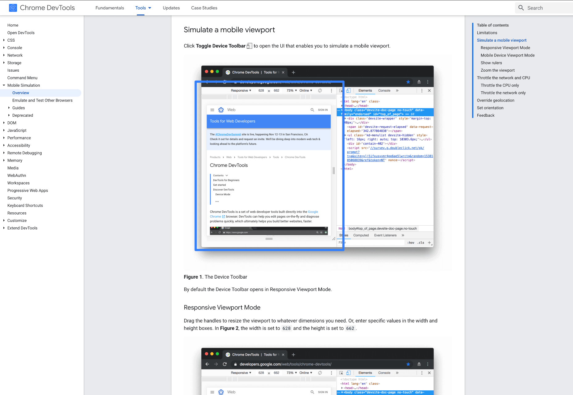
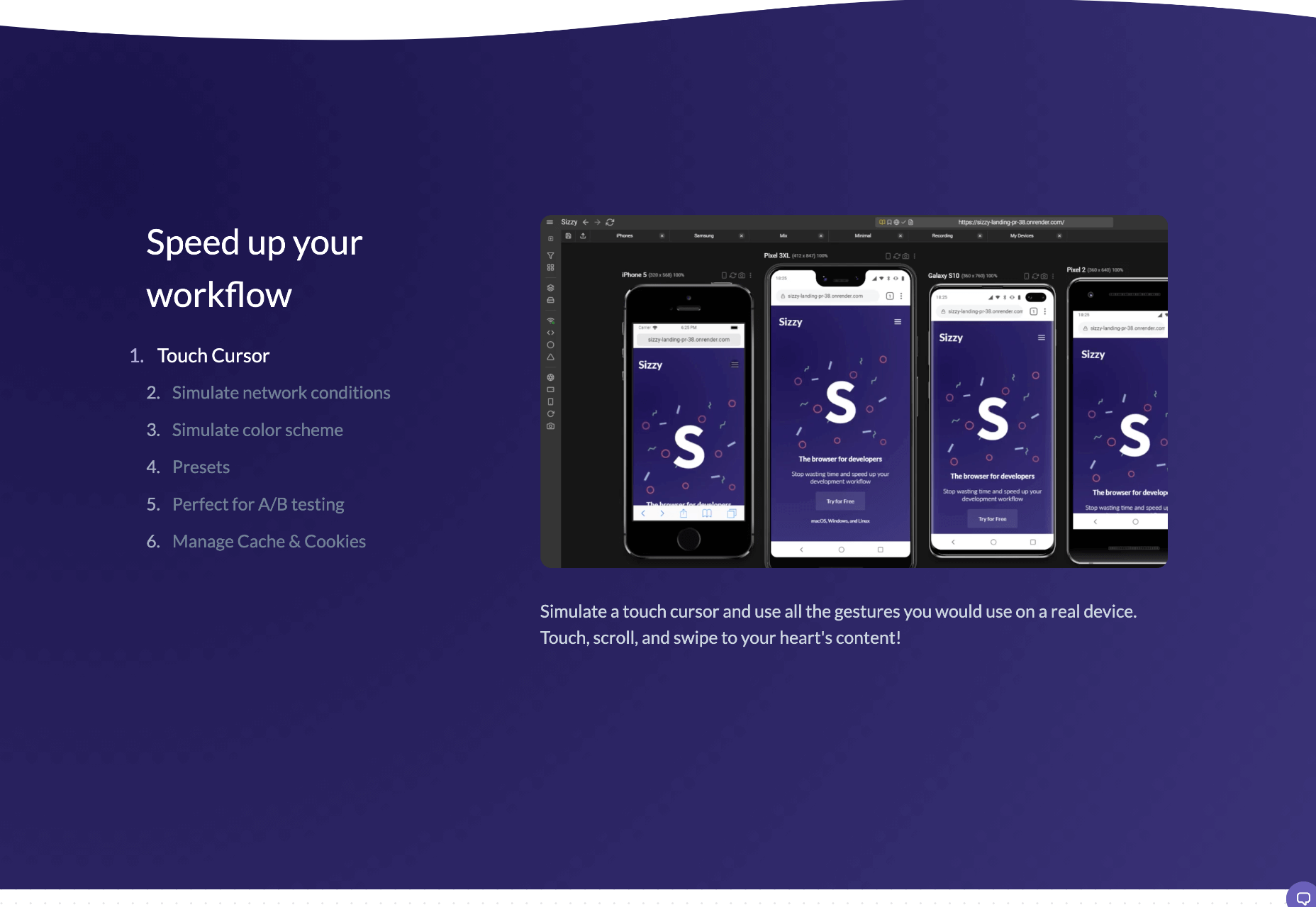
When creating a website, it’s vital to remember that not only does it need to work and look great on the device you are creating it on, but on all the other devices, it might be used on too.

Mobile and tablet optimization is important not only for the user journey but from an SEO point of view too, and badly created mobile sites just don’t cut it anymore.

With more and more devices entering the market, you need to check any website you create is compatible across the board. One bad experience and users are likely to leave and not come back again, which can be catastrophic for a business, particularly if it is just starting out.

It’s vital to check how a site looks and behaves when browsed differently from how you would use it. A common mistake is to assume users only browse websites on mobile devices in portrait mode; they don’t; landscape browsing is common, especially if the user is used to watching video.

Here are some of our top tools for testing websites on devices without the need for an entire device library:

1. Multi-Screen Test

WhatIsMyScreenResolution offers a great little tool to test how your site will look on different devices easily, and it costs absolutely nothing. You put the URL and choose between desktop, mobile, tablet, and television and then the orientation. Each device can also be broken down into different sizes and resolutions (or you can enter your own), making it easier than ever to test what a site will look like on different devices.

2. Responsinator

Responsinator is another great tool to test how a site looks on other devices without dipping into your wallet. Put your URL in the top bar, and it will instantly show you what it looks like on generic devices. This is a great, easy to use tool, and you can click through any links on your site to check the usability of multiple pages. This site is free, but if you want to “create your own” template, you need to sign up.

3. Google Dev Tools

Google Dev Tools is one of the most commonly used free tools. Add it to Chrome, and you can see how your site looks in a multitude of different screen sizes and resolutions. You can simulate touch inputs, device orientation, and geolocation to test how they work. It’s great to easily spot problems using their remote debugging tool to view, change, debug and profile a page’s code directly from your laptop or computer while viewing it on your mobile device.

4. Browser Stack

Browser Stack allows you to test your site on over 2,000 real devices and browsers, enabling you to see in real-time how your site looks. It is no hassle to set up, and it can be seamlessly integrated into your setup. As it tests on real browsers on real machines, you know the results are more reliable and accurate. It also enables you to debug in real-time using their pre-installed developer tools for ease of editing. The tests are all run securely on tamper-proof physical devices and are wiped clean of all data after each session, so you don’t need to worry about security being compromised.

5. TestComplete Mobile

TestComplete Mobile allows you to create and run UI tests across real mobile devices, virtual machines, and emulators. You can test both mobile device layouts and apps with script-free record and replay actions. This can help you to edit and fix any potential issues that may arise during the tests. Due to them being conducted on real devices, you know it is less likely to have errors in the system than a simulated device. This is free for 30 days then can get pricier, so make sure you take advantage of the trial and try the service before committing to it.

6. Sizzy

Sizzy is a great tool for checking sites, and it has a host of features to assist you. You can rotate the screen between portrait and landscape, filter by OS and device type, switch themes, and take screenshots. These little things mean it’s a super easy to use and convenient tool. It claims to simulate each device’s viewport and user agent, meaning the results are the same as what you would actually see on that phone/ tablet, etc. It can’t simulate different browser rendering engines however, so there’s a chance there might be some minor differences compared to the actual thing. Sizzy offers a free trial or has different price packages starting at $5 per month.


Featured image via Unsplash

Source

The post 6 Tools for Rapid Cross-Device Website Testing first appeared on Webdesigner Depot.


Source de l’article sur Webdesignerdepot

If you were paying close attention to your IT department around the 8th of December, you might have heard some quiet sobbing and the occasional wail of, “Why? Why?! WHY?!” Now, it was the year 2020, so this might have seemed normal to you, but it’s actually something of a problem that could affect your business: CentOS is pretty much dead.

For the non-total-nerds among us, here’s the skinny: CentOS is a Linux-based operating system, typically used on servers. CentOS has been incredibly popular, and quite a few businesses run on it. But now, that’s changing.

CentOS is a Linux-based operating system, typically used on servers…But now, that’s changing

CentOS used to be released in thoroughly tested versions, the latest being CentOS 8. CentOS 8 was released in September of 2019 and was supposed to be supported for ten years. Now, it’s been decided that CentOS will no longer have versioned releases, opting for a rolling-release style of updates. That means there’ll be one version that constantly gets new software.

That’s cool in theory, but it means the operating system will be less stable overall. Essentially, it’s going to be used as a development branch of / testing ground for Red Hat Enterprise Linux and is no longer its own OS. If you have CentOS-based servers, you should migrate to another OS sooner rather than later.

And I just got my own CentOS-based VPS set up the way I wanted it.

Wait, What Does Red Hat Have To Do With This?

Here’s the short, short version of the history of CentOS: Red Hat (an OS developer) has two Linux distributions of its own and has had for a long time. There’s the free and community-focused Fedora and the business-focused highly expensive Red Hat Enterprise Linux (AKA RHEL).

Funny story: RHEL, despite its expensive licenses, is still mostly made from open source code, which anyone can access and use. And it’s a good OS, particularly for people who like stability.

In 2004, some smart people took all the open-source parts of RHEL and made a brand new, nearly identical operating system with it: the Community Enterprise Operating System, or CentOS. Basically, people could download and use an enterprise-level server OS for free. All the documentation for RHEL was compatible, and you could get support from the community.

It was the perfect alternative for anyone who didn’t have the budget for expensive software licenses.

In 2014, Red Hat offered to partner with the CentOS community. The idea was basically this: “It’s pretty much the same software. If our company and your community work together, both our products will be better! We make our money from enterprise customers, anyway.”

Most importantly, with Red Hat doing a lot of the heavy lifting in terms of updates and support, the CentOS community could focus on growing in other ways.

Red Hat pinky swore [citation needed] that they were in this for the long haul, and CentOS did continue to flourish. You know, until 2020.

Well, So Much For Pinky Swearing

Red Hat must have eventually decided that having a popular free version of its own enterprise software and managing it themselves no less — wasn’t that good for business. So they all but shut the project down.

Well, technically, they just changed how it operated. Instead of producing tested, production-ready versions, CentOS is merely a testing ground for RHEL. It is no longer, in my opinion, a good option for anyone who wants to run a stable server.

Current and Future CentOS Alternatives

So if you jumped on the CentOS 8 bandwagon, what should you put on your physical and virtual servers now? Well, you’ve got options.

Debian / Ubuntu

For those who don’t mind going to a very different kind of Linux, Debian has been the picture of OS stability and sysadmin-friendliness for a long time. If you want more frequent software updates, the Debian-based Ubuntu Server is popular and pretty good.

Oracle Linux

Yes, that Oracle has a RHEL-compatible Linux distribution of its own. But it’s not a clone, exactly. I mean, this is Oracle. It’s set up to use their tools and ecosystem, so I hope you like Oracle products. But hey, the OS itself is free!

ClearOS

ClearOS is another RHEL-compatible OS that’s mostly doing its own thing, though I’m not entirely sure what that thing is. Does the company have some deal with Hewlett-Packard? Anyway, they do have a free community edition and paid editions for home and business use.

The CloudLinux RHEL Fork

This is an upcoming release from the makers of CloudLinuxOS. It looks like they intend to load the new RHEL-based OS with some of their own tools, such as reboot-less server update tech. The first release is intended to be a more or less drop-in replacement for CentOS 8.

Rocky Linux

So the community that made and loved CentOS in the first place is, to say the least, ticked. They are so ticked that Greg Kurtzer (a co-founder of CentOS) has decided to do it all over again by making Rocky Linux and keep it in the community this time.

Again, the goal is to make a re-build of RHEL, a drop-in replacement for CentOS (at least for now). Eventually, the goal is to migrate from CentOS to Rocky Linux as easy as using a single, one-line command. The ETA for initial release isn’t quite set in stone, but I can personally vouch for how hard the community is working.

[See, full disclosure here… after writing this article, I joined the Rocky Linux documentation team.]

So Yeah, You Have Options

Some are out now, and others will be soon. Again, CentOS 8 will be supported until the end of 2021. CentOS 7, weirdly, will be supported until June 2024.

Migration shouldn’t be too complicated. Still, a pain in the rear that we have to do this at all, though.

Source

The post How CentOS Became 2020’s Final Victim first appeared on Webdesigner Depot.


Source de l’article sur Webdesignerdepot

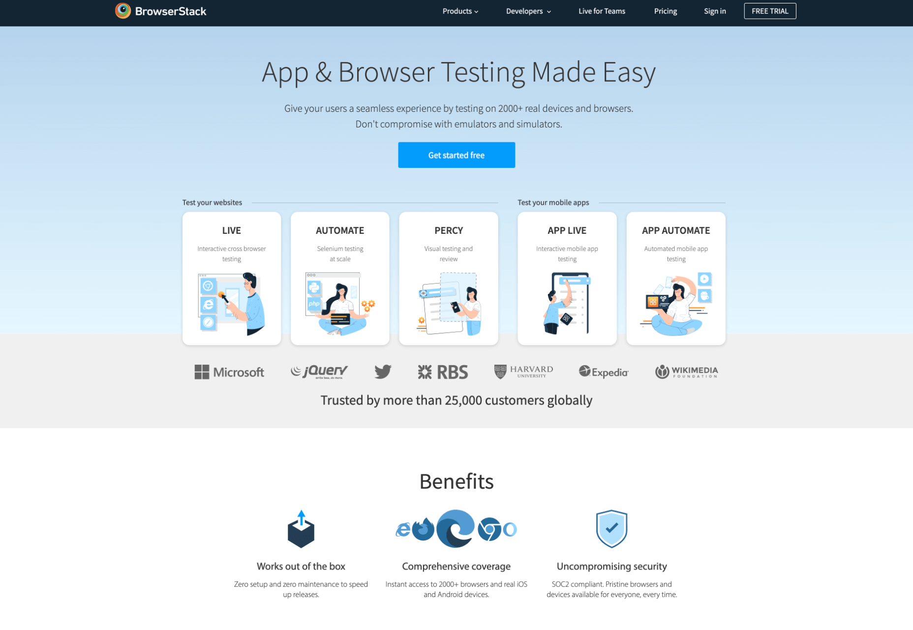
There are dozens of factors that influence the UX of your site, app, or game. Most of them are beyond your control; user connection speed, end-system resources, even browser technology is all out of your hands. So when you do have the opportunity to influence your project’s infrastructure, you should seize it.

The world’s fastest muscle car can’t perform at its best when traffic is gridlocked bumper to bumper; likewise, the most finely tuned website can’t meet its potential running on shared hosting.

If you want your website, application, or service to run quickly and securely, maximizing both UX and SEO, then you need to look at the bare metal servers from OVHcloud.

Bare Metal Performance

Bare metal (or dedicated) servers aren’t uncommon. Still, most hosts only offer a single type of server, expecting small startups to pay for resources at the same rate as global giants, which can make dedicated hosting prohibitively expensive.

OVHcloud is different; it offers a range of bare metal server products optimized for a wide variety of challenges. That means small startups can invest in fast, easily scalable solutions that meet the most demanding security requirements without breaking the bank.

Whatever your aims, there’s a different OVHcloud solution configured for you:

OVHcloud Rise

Rise is the perfect option for a website, or web app hosting. With its low entry-cost, Intel-powered performance, bundled DDoS protection, and simplified administration, Rise is the natural choice for your first step into bare metal servers.

OVHcloud Advance

To meet SMEs’ need for reliable infrastructure to run mission-critical applications, OVHcloud configured Advance. From in-house CRMs to web-facing SaaS products, Advance is a solid foundation upon which to build your business.

OVHcloud Storage

Storage is ideal for storing large amounts of data securely. Hosting data on standard servers is a colossal waste of resources; with OVHcloud’s Storage product you can host up to 504TB and seamlessly access it via a performance-tuned server.

OVHcloud Infrastructure

For large companies with thousands of employees, global non-profits, colleges, and even local governments, OVHcloud Infrastructure offers scalability and flexibility beyond the average dedicated server.

OVHcloud High-End

For web apps that are leveraging cutting edge technology like machine learning and big data, OVHcloud’s High-End product is a no-compromise custom solution, the humdinger of bare metal servers, with every conceivable option available.

OVHcloud Game

If you’re developing video games, then lightning-quick, reliable streaming servers are essential. OVHcloud’s Game product delivers the type of speed your customers demand, with massive performance gains over comparable bare metal servers.

How to Choose a Bare Metal Server

It’s easy to get bogged down in detail, especially if this is your first foray into bare metal servers.

But here’s the good news: every OVHcloud bare metal server is a massive boost in performance over shared web hosting. That’s because, with a dedicated server, all of the server’s resources are…dedicated; that is, you don’t have to share with anyone. Shared hosting is pot-luck: You might wind up on a server with thoughtful users who don’t eat up all the resources, and you might end up on a server with one selfish user who hogs the processes and compromises the security. With a bare metal server, that’s not an issue.

Choosing a bare metal server is a two-step process. The first step is to think about what you intend to use it for:

Are you going to store a lot of data? If so, think about OVHcloud’s Storage product. But a lot of data doesn’t mean a WordPress blog. Let’s say you’re a polling company, collating millions of records that you hope to analyze to predict political movement; that requires a lot of storage. On the other hand, all servers have some storage. OVHcloud’s Rise product comes with 500Gb and can be configured with more. So if you’re planning to host something the size of a blog, then OVHcloud’s Storage might be using a sledgehammer to crack a nut.

The second step is to ask how complex the operations you’re going to ask the server to perform will be:

Hitting up a database to retrieve some data is not a complex operation. Even something like a complex search isn’t too taxing. If that’s the kind of process you expect to perform, OVHcloud’s Rise is more than adequate. But if you’re manipulating large amounts of data, like resizing hundreds of raster images dynamically; or using facial recognition to search through millions of biometric data records; or even managing your advertising application serving millions of ads to sites across the web; in those cases, you need the sort of performance OVHcloud’s Infrastructure product delivers.

OVHcloud’s products are all scaleable. Its High-End bare metal server product is entirely customizable. Whatever you choose, and however your needs change over time, you can be confident you’re running the optimum server for your project.

Why Choose OVHcloud

There are a mind-boggling array of processors, and OS, and a seemingly infinite — and increasingly expensive — amount of hardware on offer on the web. OVHcloud radically simplifies running a bare metal server by delivering a range of popular packages, tailored for everyday uses, that are both customizable and scaleable.

What OVHcloud delivers is a clear choice, letting you choose the right server for your product.

Whether you need lighting fast response times to maximize your SEO or the space to store a digital archive of the world’s most important art, for reliability and choice, opt for OVHcloud bare metal servers.


[— This is a sponsored post on behalf of OVHcloud —]

Source

The post How to Choose a Bare Metal Server From OVHcloud first appeared on Webdesigner Depot.


Source de l’article sur Webdesignerdepot