Articles

It would be way too easy to answer this question with: “Whoever pays your bills.” And, honestly, I don’t think you can be a very successful web designer if you’re only driven by what the person paying you tells you to do.

Then again, that doesn’t mean you should swing to the exact opposite end and say that you only serve the end user.

When you take an extreme view or approach to this, you’re bound to leave someone or something important out. Everyone along the chain of command — your boss (if you work at an agency), your client, and their customers — matters.

So, what I’d suggest you do instead is approach the idea of who you really work for the way you would Maslow’s Hierarchy of Needs.

Establishing Your Own Hierarchy of Needs

Who do web designers really work for? I think the true answer to this question is: “Everyone.” But there’s a catch…

Think about some of the requests you’ve received from superiors, or clients in the past. How many times have you rolled your eyes at their wacky requests?

  • “The contact form would be better in the header so visitors can always see it.”
  • “Let’s use this stock photo of two women shaking hands that I’ve seen a few other companies use.”
  • “Why don’t we redesign all of this and make it look like this site my brother built last night?”

You’re the design professional. That’s why they’re paying you to design their website and they’re not doing it themselves. So, there comes a point where you have to push aside what they want for what they need. And this will ultimately help you figure out who you work for and what you actually owe them (because fulfilling every nitpicky and unreasonable request will never lead to anything good).

So, here’s where the Hierarchy of Needs comes in. If we’re creating our own, it would look like this to start:

Working for the Boss

According to Dr. Neel Burton on Psychology Today:

Maslow called the bottom… levels of the pyramid ‘deficiency needs’ because we do not feel anything if they are met but become anxious or distressed if they are not.

I’d argue that these basic needs are like the ones we fulfill for bosses (or clients, if you’re a freelancer and work for yourself). It would look something like this:

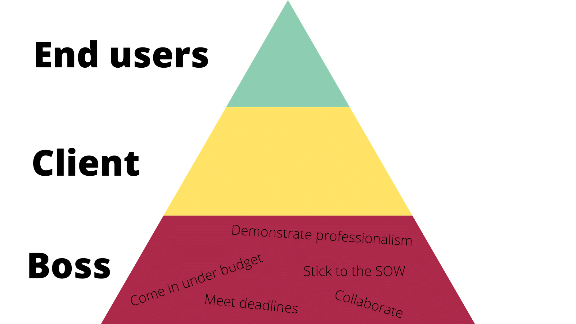
Of course, you’ll feel a sense of accomplishment by meeting these needs, but, as a creator, how important are these really to you? These are the basic things you have to do in order to make your boss happy and to stay gainfully employed. They also help to ensure that the client is happy with the boss and agency in the end.

Bottom line: Without these needs fulfilled, you won’t be able to move any deeper into the triangle/hierarchy. So, when focusing on working for your boss, make sure the basic needs are met so you can move on and serve others as they need you to.

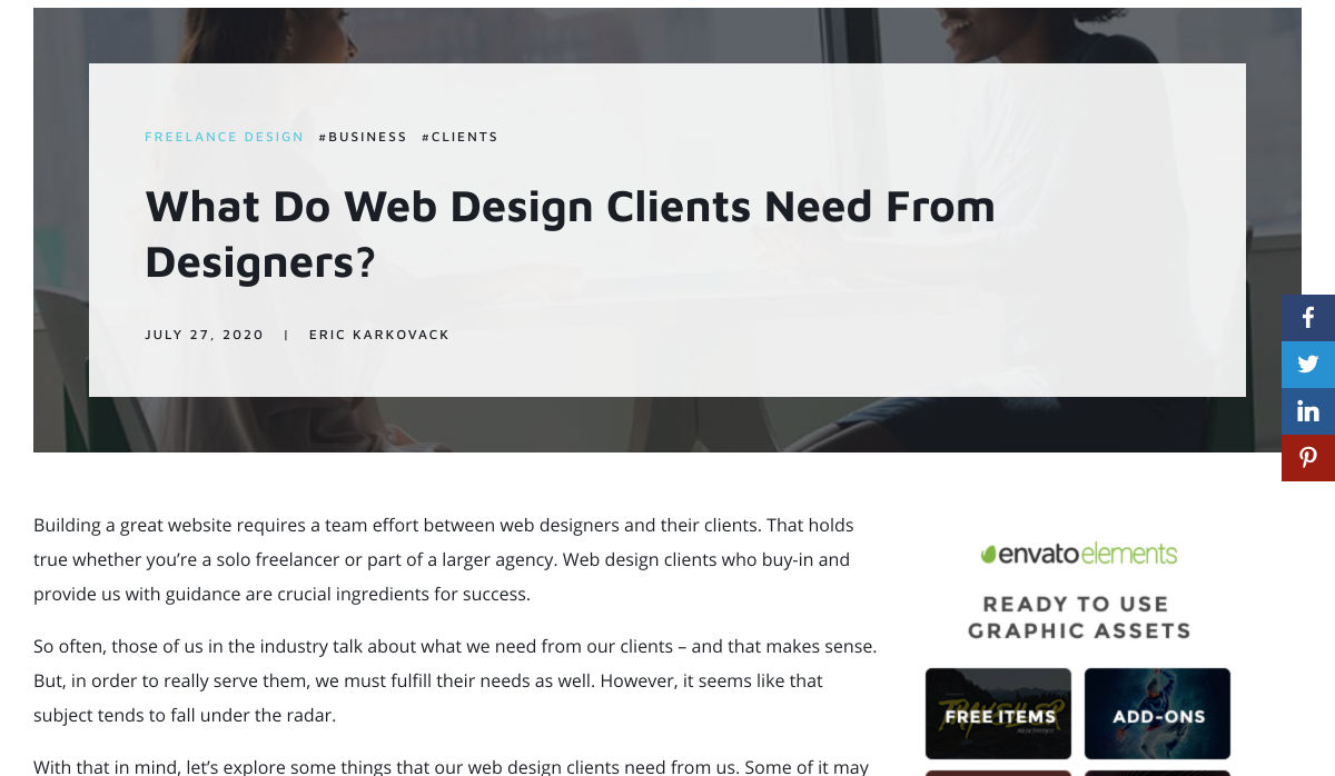
Working for the Client

Now, if your boss and client are two different people, you’ll have a second layer of needs to attend to here.

Just as your boss wants you to help them make more money and earn a strong reputation within their space, so too does your client. However, the work you owe them is different. Here’s how it would be represented in the triangle:

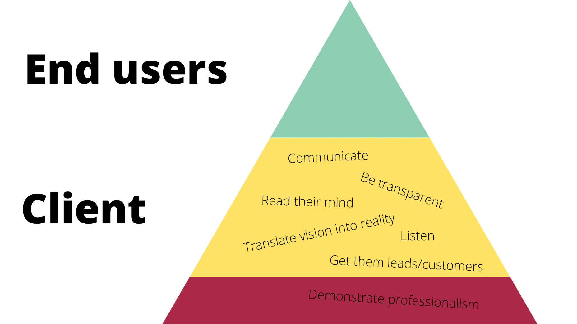
Again, you’ll be pleased if you can do and be all these things that your client needs, but is this ultimately what drives you as a designer? Sure, you want to build great relationships with clients so they return to you time and time again with all their website and marketing needs. But in terms of being fulfilled by being a good listener or a timely communicator? Probably not.

All the same, it’s important to be skilled in this type of work and to know how to serve your clients in order to get to that top level. It’ll also help you prioritize their needs accordingly, so you’re not jumping at every single thing or request they claim to “need” and blowing the budget or scope of the job.

For example, if they start demanding more of you (like bombarding you with emails every day wanting to know what’s going on), you can confidently remind them that things are under control (because you’re adhering to the project deadlines, per your boss) and you’ve already scheduled the next client check-in for this week (because you’ve been a good communicator, just as they need you to be).

Working for the End User (Customer)

Maslow refers to the top-level of the pyramid as the growth need. And here’s how Dr. Burton sums this one up for us:

Once we have met our deficiency needs, the focus of our anxiety shifts to self-actualization, and we begin, even if only at a sub- or semi-conscious level, to contemplate our bigger picture. However, only a small minority of people are able to self-actualize because self-actualization calls upon uncommon qualities such as independence, awareness, creativity, originality, and, of course, courage.

These characteristics perfectly sum up everything you want to and should be as a web designer. Unfortunately, it’s those employer and client needs that can stand in your way before you can truly flex your muscles as a creative.

Once you’ve attended to the basics, though, you’ll get your chance to design the kinds of user experiences you know will delight your client’s customers.

Here’s how their part of the triangle should look:

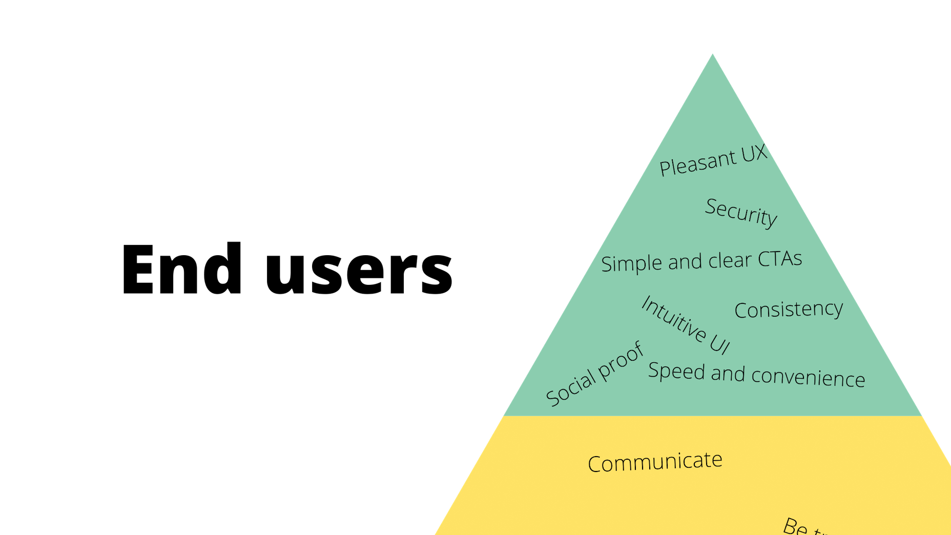
These are universally applicable needs and cannot be ignored.

After you’ve addressed them, though, you will have fulfilled your responsibility to all three parties: your boss, your client, and your end users. And once you’ve done that, you are free to be the creative designer that you are.

Wrap-Up

What I want you to take away from this, is that there are certain basic needs which you must fulfill when working as a web designer. These are the ones you’ll put into your own hierarchy of needs.

Take a systematic approach, starting with your boss and ending with the customer:

  • What do you have to do to ensure that your boss is happy to have you on the team?
  • And that the client is pleased with the site you’ve built them?
  • So you can design a website and experience that end users respond to positively?

Once you’ve figured all this out, you’ll unlock the answer to whom you work for and, more importantly, how you should work for them.


Featured image via Pexels.

Source


Source de l’article sur Webdesignerdepot

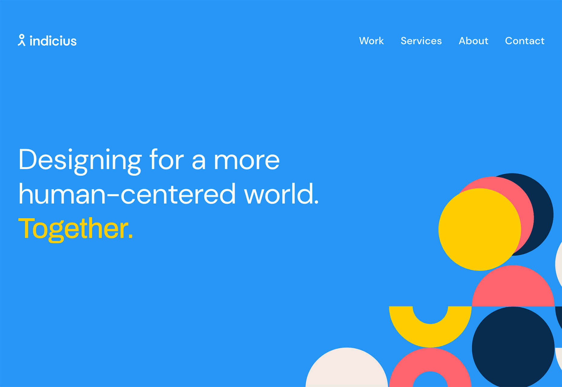
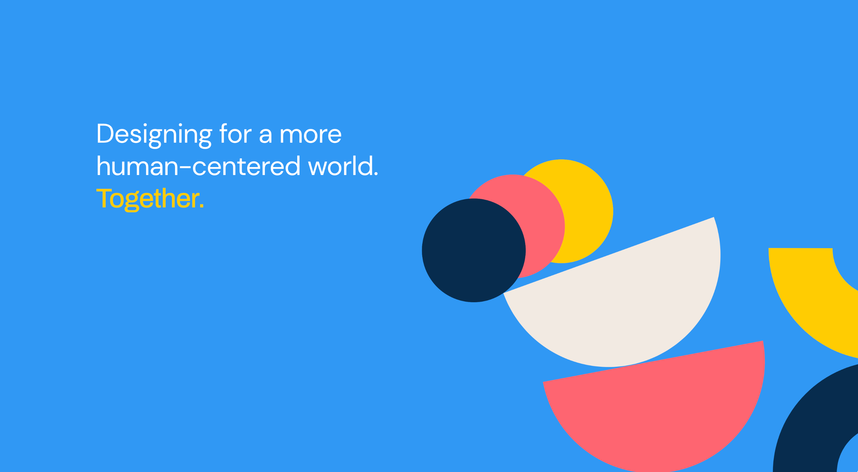
Design can make a statement. It evokes feeling and can encourage thought and conversation. That’s the common theme among the three trends in website design this month.

Each trend is rooted on the time and place where we live and includes elements that provoke thought. Kudos to these designers and design teams for jumpstarting conversations. Here’s what’s trending in design this month.

1. “Taking a Stance” Design

From social to environmental issues, design projects are echoing the sentiments of their audiences and organization in a way that take a stance on an issue.

Once taboo, this is becoming increasingly used as a technique for brands who are no longer worried about turning off a certain segment. The goal is to rally the core audience and people who feel the same way about an issue or cause.

There’s also a secondary thing happening here. Some designs aren’t really position based, but use imagery and language that resonates with a movement to associate with that feeling.

Never Heart uses “Join the Revolution” and a dark image with a heart to tug at your feelings. It can help create an association to a cause that you believe in without stating that cause directly. The design feels strong and inviting while making you feel like part of something.

Skye High uses “powerful” twice in the headline to convey a particular messages to women. The agency is looking to work with “powerful” women. It’s a timely statement and message that could resonate with a lot of business-women at various levels of their careers.

Discovered Wildfoods is a brand that is rooted in sustainability. The corporate model and responsibility of the brand shows through in the website. This type of design helps connect people with mutual feelings to the brand and products.

It’s refreshing to see more websites and brands embracing social causes and issues. It can be tricky for a number of reasons. But for some brands, it pays off.

2. Abstract Art Elements

If you are worried about a lack of images, or not sure how to portray images in an appropriate way due to the worldwide pandemic – groups or not, masked or not – abstract art elements can be the solution.

Widely used for startups and apps, more abstract design elements are everywhere. It’s an easy way to create strong visual interest without photography.

The most common use of abstract art elements is often in the form of geometric shapes with animation. This is something that almost anyone can understand and simple shapes and movement can be quite stunning when done well.

The good news is this aesthetic can work for almost any type of website. Try it for a redesign when you don’t have photography that feels appropriate in the current environment or if you want to create focus for content that drives website visitors to the words or scroll. This works with more abstract concepts when they are simple and help you move quickly from the visual to text.

Here’s how each of the examples handles abstract art elements:

Indicius uses bouncing circles that move toward text and down the screen to drive users to the headline and scroll action.

With Code uses a fun fuzzy circle with different animations to draw you in.

Appimized uses bright color and a monotone scheme with geometric shapes to sell its services.

3. Images That Make You Think

This might be the most visually interesting, and thought-provoking, website design trend we’ve seen in a while. These designs all feature images with a little something different or unusual that make you think.

There are a lot of different ways to do this – marry photographs and illustrations, create imaginary imagery, animations or effects, visual tricks that play on depth perception or create pseudo-3D effects.

The commonality is that the visual is so striking and unusual that website visitors stop and engage with the design. What do the “oddball” visuals mean? What message do they convey? How did they do that?

All of the questions could be associated with this different style of visual representation.

Bling uses a combination of a photo with illustrated animated elements to draw the eye. The yin and yang between reality and fantasy is quickly evident and makes you want to know more. (It doesn’t hurt that the animation uses dollars and lightning.)

Kibun is interesting because the photo choices create an optical illusion of depth. It matches the content of the design well because the website features artistic textile panels with an artistic design. The illusion is in the angles and coloring of photographs and their placements on the screen. The only downside of this design is that it loses the artistic panache on mobile because the images stack.

Oddball images can sell. We Are Mad stands out because it uses a contrived image, but doesn’t go oversized with it. The more subtle placement is ideal and arguably more attention-grabbing.

Conclusion

Website design can be a powerful thing, as these trends and examples show. Don’t discredit the power of choices in color, imagery, animation, and text when creating a digital experience. Design can mean a lot of different things depending on the audience as these examples show.

At the same time, these design trends are powerful and meaningful. They provide context into our world, our time, and our feelings. Don’t be afraid to experiment and make a statement with your design work. Just remember to keep in mind all potential impacts (positive and negative) before taking the project live.

Source


Source de l’article sur Webdesignerdepot

Artificial intelligence. Just hearing the phrase has been a trigger for many in the technology world since that creepy Haley Joel Osment film circa 2001. But more recently, artificial intelligence and machine learning strike fear into the hearts of skilled workers for an entirely different reason: job security, or lack thereof.

Smart-home devices, streaming services, self-checkouts, even Google searches are ways that artificial intelligence has seeped into everyday life, exemplifying the abilities of computers and machines to master both simple and complex tasks. In some instances, these technological advancements make our lives easier, but for some people, their proliferation has meant job loss and skill replacement. There’s no wonder that when artificial intelligence starts being mentioned along with web design and site creation, the spidey senses of designers all over the world start tingling.

designers think outside the box, something that AI just can’t do

But let’s get real about what AI and automation really mean for designers for a second. Talented designers with busy schedules should view these advancements as virtual assistants. For some small businesses on a limited budget, the websites that artificial intelligence can pump out might be fine…for a while. However, as businesses grow, change, require updating and customization to adapt to their customer base, the expertise of creative and talented designers will always be needed. Even the best AI that we see today is limited by evaluating, replicating, and revising what already exists. It may be able to mix 1,000 different color schemes into 10 million potential combinations, but great designers think outside the box, something that AI just can’t do.

In fact, rather than being scared of automation, designers ought to embrace automation and artificial intelligence as a way to unleash their creative thinking. Delegate repetitive, straightforward tasks to the right software, and suddenly you have time to bring your best ideas to the table and push the boundaries of your own innovation. 

Where AI has Failed in Design

The ultimate goal of artificial intelligence and automation in design work is a grand vision that has yet to be realised.

Consider the case of The Grid, which began as a crowdfunding campaign in 2014. The “revolutionary” product posed itself as an artificial intelligence solution for building thoughtfully, yet automatically, designed websites in five minutes. Research “Reviews of the Grid” in any search engine and you’ll be met with scathing criticism with only some small praise sprinkled in. Most of the initial users cite underwhelming results, the feeling of being duped by the Grid’s marketing tactics, nonsensical placement of text, and ultimately, the Grid being a complete waste of money for the resulting product. Even at the low cost of $100, compared to hiring a talented designer, most users felt their investment was wasted.

For the AI capabilities that exist now, most small business owners, or those looking to put together a simple website, are better off using drag and drop site builders (Wix, Squarespace, Weebly, etc) that have been around for ages. Even so, there are plenty of businesses still willing to hire designers to take this simple task off their plate due to a lack of technical expertise or lack of time. And let’s be honest, are there even enough talented (keyword here!) designers out there to keep up with the millions of websites created every year, without each one working themselves to death? 

Where Automation Shines for Designers

Fortunately for good designers, it appears for now that the days of artificial intelligence completely taking over their jobs is a fantasy. However, what AI and automation do offer designers is a solid starting point for success, eliminating much of the lower-level grunt work that most designers would rather skip anyway.

Even well-received AI website builders like Firedrop still require a basic eye for design and specialised knowledge to produce truly unique, high-converting, and user-friendly websites. Tools and practices that designers should adopt are the artificial intelligence and automation resources that will help them do their jobs better, faster, and leave them with more time to focus on project elements that AI cannot accomplish on its own.

Bridging the Gap Between Designers and Developers

Well-established brands are likely to already have design systems in place that guide the creation of new elements across their digital profiles whether on social media, various mobile apps, or different sections of a website. But even in large corporations — excepting those who have perfected the process — there’s often a breakdown between a designer’s vision and resulting product from the developers. It stems from the basic difference in how they each approach their work and the limitations of the systems they use.

While component libraries — or even full design systems for that matter — won’t reconcile every question, they provide both developers and designers a source of truth to work from that both parties can understand. Design collaboration tools like Invision and Visme, specifically, keep designers and developers on the same page with automated version saving and code-friendly workflows.  

Understanding the Consumer

I don’t suggest using artificial intelligence to produce content for your site

Digging into and understanding the behaviours and habits of site users is a relatively new component of site design, but offers invaluable insights. Tools like HotJar, Mouseflow, or Smartlook make it simple to see holes or leaks in your conversion funnels, detect which page elements users are interacting with, and which they’re not interested in to refine the look and feel of a page for maximum conversions. Even though these tools provide the data, it still takes a keen eye and understanding of design to implement the right changes to improve site performance.

Site content is another way that artificial intelligence has the potential to improve our understanding of customer behaviour and improve site performance for individual users. I don’t suggest using artificial intelligence to produce content for your site, no matter how much the results have improved. However, static landing pages or a single set of further reading recommendations are unlikely to appeal to the majority of site visitors. Artificial intelligence tools like CliClap and Personyze instantly collect and analyse consumer data to provide dynamic, personalised experiences that drive more leads and encourage conversions. Creative designers will also learn from this data to improve customer experience with other pages or elements throughout the site.

Removing Distracting, Time-Sucking Administrative Tasks

Because “artificial intelligence” has become a term with such negative connotations, we often overlook the simple way that AI actually makes our work lives better and easier. Machine learning in email filtering is a great example of this. Consider a simple interface like a Gmail inbox. We have the option to mark certain senders as spam or as important, and our inbox learns that type of communication is and isn’t useful to the user. Pandora, Spotify, Apple Music, and more all take cues from the user behaviour of liking a certain song, artists, or genre of music to build customised playlists. There are a myriad of ways that artificial intelligence and its branches of disciplines merge with our everyday lives. 

Some of the most useful automations for business, and especially for designers, are related to the administrative tasks that frequently take time away or distract from more pressing projects. A perfect example of automation that can relieve stress and cut down on mindless work is an email autoresponder. I’ve always found that having time blocked off in my calendar to tackle complex or important projects helps me to focus on the task at hand and be more efficient. In order to more effectively block out my time, closing my email and setting an autoresponder to reply to all incoming emails serves two purposes: 

  1. Lets those trying to get in touch with me know that I only check my email at certain times of the day and that my response may not be immediate — tempering their expectations of when they might hear from me.
  2. Relieves my personal stress of being tethered to my inbox, splitting my focus, and also saves the time of having to initially respond to each email individually. 

This is just one simple way to use automation in your email, although there are many others to explore.

While Zapier isn’t the only workflow automation service on the market, it’s probably the most well known. Workflow automation reduces time spent on mind-numbing, repetitive tasks and helps designers connect apps that might not natively work together. Do you keep a task list in Todoist? Set up a Zap, then create a task in Todoist anytime someone mentions you on Asana or assigns you a task in Trello.

This is especially helpful for freelance designers who work with multiple clients across various project management platforms. The potential for automation to relieve unnecessary mental overhead for designers is nearly limitless.

Don’t be Afraid of AI, Embrace It

The bottom line of this brief overview of artificial intelligence and automation in design is that this emerging technology isn’t something designers should be scared of. In fact, it’s something to welcome with open arms because ultimately it can make our jobs, and our lives, better. Leave the monotonous tasks of collecting and analysing huge amounts of data or administrative minutiae to the machines; they can handle it.

Save the interesting, creative, abstract work for the talented designers who can turn AI recommendations into unique and intuitive digital experiences. Making the relationship between artificial intelligence and design symbiotic will yield the best results for every entity involved: the business, the AI, and yes, even the designer.


Featured image via Unsplash.

Source


Source de l’article sur Webdesignerdepot

We live in an era of reliability where users depend on having consistent access to services. When choosing between competing services, no feature is more important to users than reliability. But what does reliability mean?

To answer this question, we’ll break down reliability in terms of other metrics within reliability engineering: availability and maintainability. Distinguishing these terms isn’t a matter of semantics. Understanding the differences can help you better prioritize development efforts towards customer happiness.

Source de l’article sur DZONE

Hyper implies web, and lambda implies function – Hence, Hyperlambda translates into "web functions", and this is a fairly accurate description. However, hyper also implies "super fast", and by super fast here, I mean super fast! 1 minute and 45 seconds was what I needed to create CRUD endpoints wrapping my database table, manually creating my endpoints in the following video, while explaining how I did it simultaneously.

According to modern studies in the subject, the number of lines of code your project consists of, is directly proportional to the amount of energy and resources you’ll need to spend maintaining it. Hence, the fewer lines of code, the fewer resources are required to maintain it. In the video above, I copy and paste 50 lines of code, and I end up with 4 HTTP REST CRUD endpoints. Comparing this to C# is arguably unfair. Simply the boiler plate code for my Controller, would probably end up exceeding this number. You can find my code for all endpoints below.

Source de l’article sur DZONE

In today’s look at the latest research for web designers, we’re going to look at studies and reports from Payoneer, Robert Half, Hootsuite, and Contentsquare to see what they have to say about things like:

  • Current freelancer demand
  • Web designer earning potential
  • A change in ecommerce shopping trends
  • Unseen content rates

1. There’s Light At the End of the COVID-19 Tunnel for Freelancers

Payoneer’s The State of Freelancing During COVID-19 had to take a different approach to reporting on the freelancer workforce than in years passed.

Here’s why:

When 1000+ freelancers around the globe were asked how demand for their services changed during COVID-19, this was the response:

Less than 17% of freelancers experienced an increase in demand for their services and less than 23% saw demand remain the same.

An overwhelming majority of freelancers experienced a shrink in demand, with nearly 29% saying it slightly decreased while almost 32% said it greatly decreased.

However, the data collected wasn’t just assessed on a global scale. Payoneer also looked at freelancing demand trends in various parts of the world:

Notice the differences between Asia and Australia (who were hit with COVID-19 earlier) and North America and Europe (where the pandemic arrived a little later).

It appears as though Asian and Australian freelancers are, economically speaking, already starting to feel the effects of recovery from the pandemic with demand working in their favor.

So, if you’re feeling like there’s no end to the hardships you’ve faced during COVID-19, and were considering dropping your prices, hold on for just a little bit longer. Freelancers are starting to feel optimistic about demand for their services increasing. If you go devaluing yourself now, it’ll be hard to return to where you were before COVID-19 when things get back to normal.

2. Robert Half’s Salary Guide Breaks Down the Earning Potential for Web Designers

On a related note, let’s talk about demand from the employer’s point of view.

According to Robert Half’s 2020 Salary Guide for creative marketing professionals, there’s big demand for digital talent:

So, that’s number one. We know that almost 50% of hiring managers feel as though their digital teams are inadequately staffed. That’s good news for web designers.

However, these same managers complain about creative marketing professionals’ lack of up-to-date skills as the biggest barrier to hiring or retaining them. Although the report doesn’t say so, I’m going to assume this refers both to employees as well as contractors.

This should be a no-brainer. By keeping up with the latest web design trends and techniques, you can make top-dollar for your services — and hold onto those valuable client relationships for a long time.

According to the report, this is how much you stand to earn working in web design (in the U.S.) today:

If you’re eyeballing those salaries in the 95th percentile, then you know what you need to do. Hiring managers have spoken up about what’s holding them back from hiring.

For those of you who feel as though you’ve gone as far as you can as a web designer, it might be worth exploring a new specialty. Like one of the following:

As you can see, designers in the UI, UX, and interactive space (along with web developers) have the opportunity to make more money, even earlier on in their careers. You may also find that more job opportunities are available as you move into these niches (because of less competition), which might cut down on any demand issues you’ve been experiencing because of COVID-19.

3. Hootsuite’s Digital 2020 Report Reveals an Interesting Trend in Ecommerce

Hootsuite’s Digital 2020 report is always a great resource for learning about social media marketing trends. That said, that’s not why I read it.

It’s for hidden gems like these:

It’s no surprise that we’re seeing changes in retail and ecommerce during COVID-19. What is a surprise, however, is how consumers’ online shopping habits have changed.

Here’s what we’re seeing when we compare 2020 ecommerce data with the pre-COVID benchmarks:

Site visits are 1.7% lower than expected. That would make sense considering how budget-conscious consumers are right now. It likely keeps them from going on unnecessary shopping sprees.

Session durations are 3.3% lower. This could be related to fewer site visits. It might also indicate greater consumer confidence. If they come to a website with a plan for what they need to buy, they’re going to take a straight line to conversion instead of spending time window shopping that prolongs their session.

The number of transactions is 19.1% higher and the conversion rate is 21.6% higher. Considering shoppers aren’t spending as much time with ecommerce websites, this point suggests that there’s a massive shift happening from in-store shopping to online shopping.

If that’s the case (even if consumers are currently spending less money), that means web designers need to set their sights on the ecommerce space. With the holiday shopping season expected to start sooner rather than later this year, now is the time to get in there and make sure these sites provide as streamlined an experience as possible.

4. Contentsquare Studies the Unseen Content Rates By Industry

Contentsquare analyzed more than 7 billion user sessions globally to create the 2020 Digital Experience Benchmarks report.

There’s some interesting data in here about website traffic and conversion trends, but what I find the most valuable is the breakdown by industry.

It was this chart, in particular, that really caught my eye:

According to Contentsquare’s data, between 60% and 75% of a website’s content is unseen. Some industries fare better than others, like home supplies and luxury retailer websites, but the numbers still aren’t flattering.

For example, what does it mean when consumers miss 75% of a financial service provider’s content?

Does this mean that the financial advisory content — which I’m assuming comprises the bulk of the pages on the site — is useless or irrelevant? Or perhaps it’s an issue of discoverability since blog content and other resources often take a backseat to service and product promotion?

What about ecommerce brands in the apparel or beauty space?

If two-thirds of their pages are unseen, does that mean their websites are overrun with obsolete inventory? Or, again, is it an issue of navigability and discoverability around the store?

As a web designer, I’d suggest performing your own unseen content analysis on the websites you’ve built. If over 60% of your pages never get any views, you’re going to have to decide what to do with them:

Option 1: Fix the navigation or search function so people can actually find these unseen pages.

Option 2: Remove them from the site and make room for content your visitors actually find valuable.

Wrap-Up

As you encounter research and reports online — whether it’s written specifically for web designers or other creative professionals — spend some time looking for hidden gems.

As you can see above, there’s a ton of relevant research for web designers out there, even if it’s hiding behind the mask of a larger issue or matter. And it’s this data that will help you get a leg up on the competition since it’ll get you thinking about your business and your approach to design in different ways.

Source


Source de l’article sur Webdesignerdepot

I often see freelancers on social media asking what the secret is to working fewer hours, making more money, and helping new clients to find them. While those things tend to happen the longer you’ve been freelancing, it doesn’t happen without some effort.

If you’re wondering how you can change things so that your business becomes more profitable and easier to manage, education is the key.

But it’s not just mastering new design techniques that will take you to the next level. It’s important to invest your time in a well-rounded education so that you can grow not just as a web designer, but also as a freelancer and business owner.

The good news is that you don’t have to spend a ton of cash on courses or resources. In the following round-up, I’m going to share some of the best free courses to help you level up.

5 Best Free Courses and Resources for Web Designers

Rather than sign up for Udemy, Skillshare and other premium course membership sites, I recommend taking a bootstrapping approach to self-education. I mean, the whole point in learning new skills and strengthening existing ones is so you can run a better business and make more money, right?

Once you have extra funds to throw at premium courses, definitely explore those options. For now, let’s focus on the free courses and resources that’ll help get you to that next level:

1. edX

edX was created by Harvard and MIT in order to provide university-level training and education to anyone, anywhere. While you can’t get certified without paying a few hundred dollars, you can go through entire courses for free.

Courses are offered over a wide range of categories. As a freelance web designer, you’d do well to focus on the following areas:

Design
Learn more than just how to design beautiful interfaces. Learn about the technical side of it, too — things like AI, IoT, and cybersecurity.

Computer Science
Learn web development and coding.

Business & Management
Learn essential business skills like:

  • Project management
  • Finance management
  • Leadership
  • Marketing and analysis

Communication
Learn things like branding, negotiation, reputation management, and critical thinking.

2. Envato Tuts+

Envato Tuts+ might be best known for its succinct step-by-step design and development tutorials. However, it has a new section of free video courses to take advantage of.

Although you won’t learn any soft skills here, this is a great resource if you want to master the tools of your trade.

Free courses give you a deeper look at tools like:

  • HTML, CSS, and JavaScript
  • Adobe’s suite of software
  • Sketch
  • WordPress
  • Video conferencing tools

3. YouTube

YouTube is more than just a place to watch entertaining videos. There are some amazing YouTube channels for web designers at all skill levels.

When choosing a design channel and course to follow, look for ones that are well organized. If they’re just posting videos at random without any rhyme or reason, it’ll be difficult to focus on and master one skill set before moving onto the next.

Here are the channels I recommend you follow:

Flux

Learn skills related to:

  • Web design
  • Getting started as a freelancer
  • Strengthening your processes
  • Building your portfolio
  • Design theory and strategy

CharliMarieTV

Learn skills related to:

  • Web design
  • Building sites with Figma or Webflow
  • Career paths for designers
  • Productivity hacks

NNgroup

Learn skills related to UX:

  • Web design
  • User psychology
  • Usability testing
  • Design thinking
  • Research and data analysis
  • Journey mapping
  • Get access to UX Conference seminars, too

4. Moz Whiteboard Fridays

Even if you don’t offer SEO as a standalone service, it’s important for web designers to understand the role they play in SEO and to stay abreast of the latest and greatest strategies.

If you haven’t tuned in for one of Moz’s Whiteboard Fridays yet, I’d recommend you start now.

Some of the topics might not be relevant to you (like creating a content strategy). However, there are others you’ll get some great tips from, like the one above that talks about creating great visuals, preparing web pages with tags and schema markup, and optimizing for featured snippets.

5. Nir Eyal – Indistractible

Nir Eyal has made a name for himself over the years as an author and presenter on the subject of human psychology and behavior. His first book (Hooked) examined consumer behavior and how to design around it. His second (Indistractible) turned the focus on us — the doers and creators who build experiences and products for consumers.

The first of his free resources to explore is this 30-minute presentation on why we’re so easily distracted and how to keep those distractions (and ourselves) from getting in the way.

The second free resource to snag up is the 80-page workbook available on the homepage. Here’s a preview of what it looks like:

You’ll learn about common distractions, identify those that are specific to you, and then work through exercises to defeat them.

If this is something you’re struggling with, these resources will empower you to make a much-needed change.

BONUS: WebDesigner Depot

Although WebDesigner Depot doesn’t offer video courses, I consider each of the articles contained within this site to be mini-courses of their own. And you’ll learn everything you’ve ever wanted to know about becoming a web designer and growing your freelance business.


Featured image via Unsplash.

Source


Source de l’article sur Webdesignerdepot

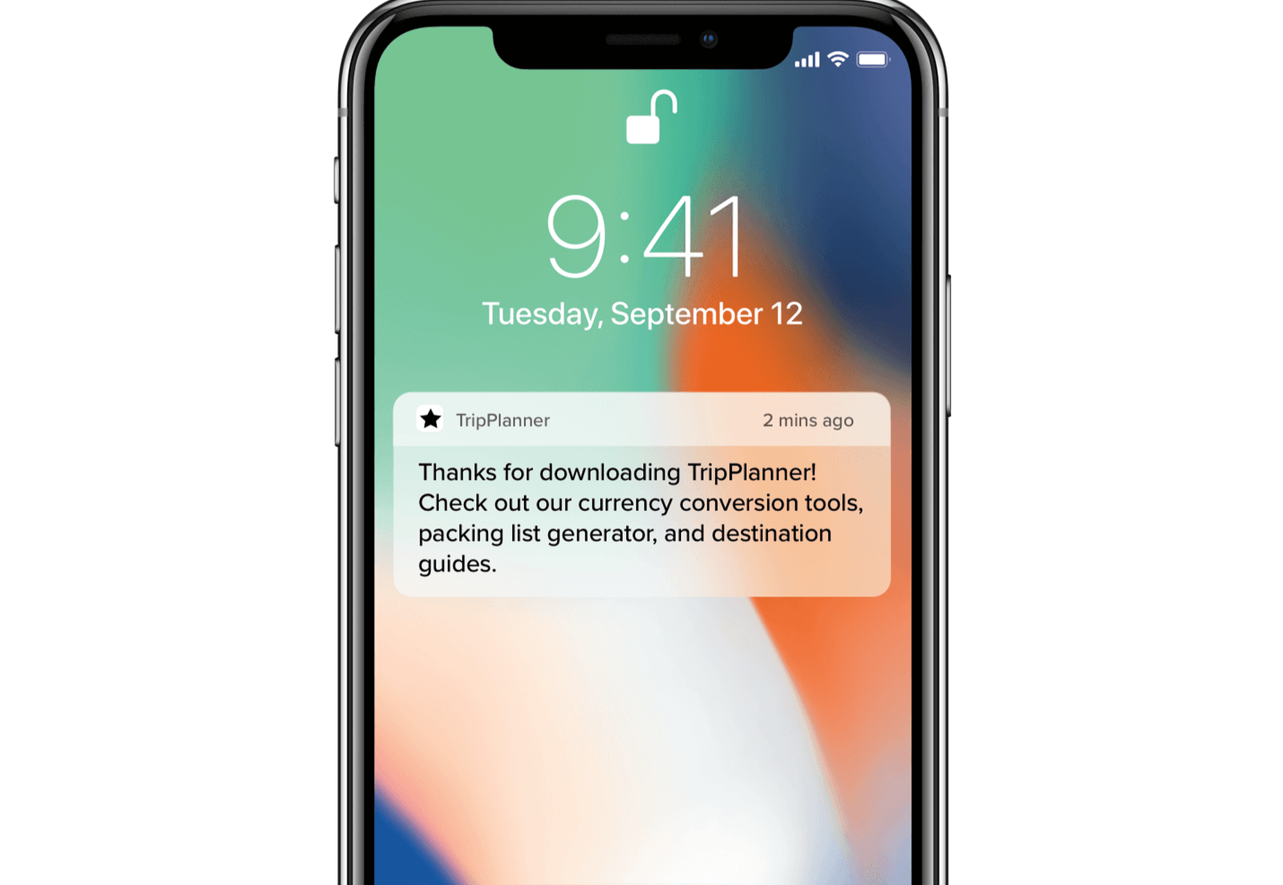
To understand why user onboarding is such an indispensable tool, we need to empathize with the people using our products; we all come from different backgrounds and cultures, we make different assumptions, and we see the world differently.

User onboarding helps mitigate these differences by making your product’s learning curve less steep.

However, companies often make unfortunate mistakes that hinder user experience and cause frustration. In today’s article, we’ll take a look at eight ways companies ruin their products’ onboarding process.

Let’s dive right in, shall we?

1. No User Onboarding at all

As a part of the team that created a product, you’ve probably spent hundreds of hours going over its features and the most minute detail. Naturally, you know the product like the back of your hand. The user does not.

Naturally, you know the product like the back of your hand. The user does not

We may believe that the app we’ve worked on is straightforward and that user onboarding is probably overkill — but that’s almost never the case. Guiding our users through a product will help with retention, conversion, and their overall satisfaction.

However, there are very rare cases when you can do without user onboarding, here are a few:

  • Your product is too straightforward to cause any confusion;
  • Your product has a formulaic structure, similar to that of other products’ in your category, i.e., social media or e-commerce;
  • Your product relies heavily on Google or iOS design guidelines with common design patterns;
  • Your product is too complex (enterprise or business-oriented) — in such cases, users need special training, rather than just an onboarding;

2. Assuming That Users “Get It”

 One of the vital UX mottos we should always be mindful of is that “we are not our users.” When onboarding them, we always need to assume that they’re at square one. We should communicate with them as if they have no prior knowledge of our product, its terminology, and the way it works.

Providing freshly-registered users with highly contextual information will most likely confuse them. As a result, this will render your attempts to create a helpful onboarding process useless.  

3. Onboarding Users on a Single Touchpoint

it’s tempting to brainstorm which features should make it into the onboarding, then design and code them; that’s a very bad idea

The main problem with the previous point is that it’s too contextual for new users. However, providing no context altogether can be problematic as well. This is commonly found in onboarding processes that focus on a single touchpoint while leaving out the rest of the product.

By choosing to inform users of our product’s features, we force them to detour from their “normal” course of action. This comes at the cost of the user’s frustration.

Since we’re asking people to pay this price, it’s best to provide them with information that will also help them navigate the entire product. As a result, this will decrease the number of times we’ll have to distract them from their ordinary flow.

4. Forcing Users Through Onboarding

We’ve previously mentioned that we mustn’t assume that users have any background knowledge about our products.

The opposite argument can be made — experienced users don’t need a basic onboarding process. It will most likely frustrate them, and it won’t provide them with any real value. Also, forcing users through this process will most likely take the onboarding frustration to a whole other level.

This is why it’s essential that we allow them to skip the parts they don’t find useful. This way, we’ll address the knowledge gaps of the people who really want it and need it.

5. Onboarding Based Purely on Assumptions

This is yet another point that’s implicit in “we are not our users”. Oftentimes, it’s tempting to brainstorm which features should make it into the onboarding, then design and code them; that’s a very bad idea.

Here’s what every designer should do instead:

  • Do user interviews: You should conduct these before having anything designed; user interviews will help you shortlist and prioritize features in terms of their significance, so that the onboarding is focused around the features that matter most.
  • Do usability testing: Once you have a good idea of what features your users consider most important, design onboarding that reflects that; having completed your design, make sure to conduct at least 5 usability testing sessions with users, so that you can make sure that your design works.

6. Just Letting Users Quit

While we shouldn’t force people to go through onboarding, it doesn’t mean we shouldn’t nudge them in the right direction.

find that sweet spot between being front of mind and annoying

People choose not to onboard for many reasons, but showing them around will benefit both parties. Therefore, it’s never wrong to remind them that they can always resume onboarding via email or push notifications (unless you’re too pushy). Make sure to find that sweet spot between being front of mind and annoying. 

Similarly, these two mediums are a great way to deliver valuable information as well.

Here’s a great example of an onboarding email from InVision:

And here’s a clever notification from TripPlanner:

Source: clevertap.com

7. Asking For Too Much Information

We need to always be mindful of the fact that the product’s spokesperson should act as a guide during onboarding. Its goal at the very beginning is to build trust.

We can ask for small favors when we’ve built a solid and lasting relationship

Not only is asking for too much information from the get-go unproductive, but it will also undermine the trust that the user already gave us.

It’s best to abstain from asking freshly-registered users for their credit card information. Nearly 100% of businesses care about profits — and there’s no shame in it. However, today’s most successful companies make money by providing users with value. So it’s best to stimulate users to share their financial data in subtler ways while focusing on customer experience.

The same can be said about subjecting the people using your service to extensive questionnaires. At the first steps of our interaction, it’s all about giving and gaining trust. We can ask for small favors when we’ve built a solid and lasting relationship.

8. Onboarding for the Sake of Onboarding

While there are dozens of reasons why you should guide your users through your product, it needs to be done well. A pointless onboarding process that doesn’t provide users with value is more frustrating than the lack thereof.

Onboarding can be a bit frustrating at times. Pointless onboarding will just raise eyebrows. It will slow users down and disengage them, which is exactly the opposite of what we want.

Conclusion

The process of introducing your users to your product is one of the factors that will define its success.

A critical aspect of user onboarding that we need to always take into account is value. Is this detour from our user’s ordinary course of action valuable to them? Will this improve their experience with the product?

Onboarding demands careful and continuous tailoring. Once perfected, this process will help you win new users’ hearts and help you build brand loyalty.


Featured image via Unsplash.

Source


Source de l’article sur Webdesignerdepot

Every week users submit a lot of interesting stuff on our sister site Webdesigner News, highlighting great content from around the web that can be of interest to web designers.

The best way to keep track of all the great stories and news being posted is simply to check out the Webdesigner News site, however, in case you missed some here’s a quick and useful compilation of the most popular designer news that we curated from the past week.

How to Make Halftone Gradient in Photoshop


Drawing Simple Line Patterns Using HTML5 Canvas


10 Online Design Tools You Never Knew You Needed


4 Best Content Management Systems (CMS) for Marketing


9 Mistakes Designers Still Make


6 Visual Design Principles that UX Designers Should Be Aware of


Best Way to Lazy Load Images for Maximum Performance


17 Stunning Examples of Sites with Horizontal Scrolling


Less is a Bore. Why Tech is Finally Embracing Maximalism


What Does it Mean to Have a High-Quality Website in 2020?


8 Project Management Tips for your Next Web Development Project


MergeURL – Shorten Urls for Free Without User Registration


13 Design Challenges to Improve and Showcase your Skills


How to Find Web Design Clients


Waitlist API – Quick and Easy Waitlist with Built in Referral


What is the Small Web?


24 Beautifully Designed Pricing Page Examples


7 Practical Tips for Better Microcopy


15 Awesome Developer Home Workstations


Pentagram Designs “edgier” Visual Identity for Rolls-Royce


Gorgeous Gradients: A Curated Collection of Dreamy Color Transitions


Experts Weigh in on the Biden-Harris Logo


50+ Modern Fonts to Use on your WordPress Website in 2020


15 Florist Websites that will Inspire Every Flower Lover


Create your First React Native Android App


Want more? No problem! Keep track of top design news from around the web with Webdesigner News.

Source


Source de l’article sur Webdesignerdepot

Many people dream of a career in web design, but it may actually be more attainable than you think.

There are countless online courses, of variable quality, with little to no academic structure; self-learning is an option, but it doesn’t come with a curriculum. Without a professional structure and a comprehensive curriculum your dream career might never be more than that.

But there is a practical, fast-track option to making a career in web design a reality, and that’s the Parsons Web Design and Development Certificate.

Built around the innovative teaching approach that Parsons is known for, you’ll learn human-centered design, explore the latest tools, evaluate techniques and approaches, and uncover the secrets of UX. The certificate even offers two distinct tracks, one for designers, and one for developers, so you can take control of your own future.

It’s one of the most creative approaches to a formal design education in the world, and what’s more, because it’s entirely online you can study from anywhere.

What Will I Learn?

Parsons offers a flexible curriculum to suit both designers and developers. There are two core courses, followed by three specialist courses.

learn human-centered design, explore the latest tools, evaluate techniques and approaches, and uncover the secrets of UX

The core courses cover the essentials of web and mobile design, plus JavaScript for designers. Each of the core courses lasts nine weeks. When you’ve completed them, you can opt for a design specialism or a development specialism. (You don’t have to make your choice until you’ve completed the core courses!)

If you prefer design work, you’ll spend a total of 21 further weeks learning mobile design patterns, studying emerging platforms, working with interactive typography, and mastering design systems.

If development is more your thing, then on the 21 week development track you’ll cover advanced HTML, CSS, and JavaScript, learn how to work with APIs, and finish up with experimental JavaScript.

To earn the Web Design and Development Certificate you need to complete the two core courses, plus three specialist courses within two years — a total of 39 weeks of study. Parsons recommend that you take two courses per semester, but it’s possible to complete the entire certificate program in one year.

Is This Really For Me?

Parsons Web Design and Development Certificate is a recognized qualification from a reputable institution that will stand you in good stead in future job interviews. But what’s more important, is the knowledge and experience you’ll gain from the course.

Thanks to the creative, flexible approach to learning, the certificate is suitable for designers and developers at any stage of their career

Thanks to the creative, flexible approach to learning, the certificate is suitable for designers and developers at any stage of their career.

If you’re just starting out, the certificate is a superb way of exploring the field, all the while building skills that will make you stand out to employers.

If you’re a print designer, or a programmer, the Web Design and Development Certificate is a great way to supplement your existing skills and make a lateral move into web work.

And if you’re a grizzled industry professional with decades of experience, you’ll benefit from the track you know least well; designers studying development, developers studying design. Not only will it open up new creative avenues to you, but you’ll find project management easier with a broader outlook on the web.

The best thing about the Parsons Web Design and Development Certificate is that because it’s made up of modules, you can still work part-time as you tick off the courses.

Why Choose Parsons?

Parsons College of Design is part of The New School, a New York-based university. Open Campus, the platform that will run the certificate, is the New School’s online system for pre-college, professional, and continuing education courses.

Thanks to Covid-19, most learning institutions are planning online-only courses for at least the next 12 months, so why not enroll in a program run by an institution that already excels at online teaching.

Innovative courses, underpinned by the creative approach to teaching that Parsons College of Design is renowned for, mean the design education you embark on this fall will be second to none.

Individual courses cost between $577 and $850, with the entire Web Design and Development Certificate costing just $3,704.


[– This is a sponsored post on behalf of Parsons College of Design –]

Source


Source de l’article sur Webdesignerdepot