Articles

Yesterday’s creativity won’t keep pace with tomorrow’s requirements; businesses need speed and agility without sacrificing creative quality.

“The creativity that was needed in the past is not the creativity that is needed today,” according to Matthew Rayback, a creative director at Adobe. He’s not talking about the function of creativity but rather about the process of creative management in a marketing context. 

What is needed today? Speed and agility without sacrificing quality. 

Why? Because the pace of change has accelerated. As Rex Salisbury, a deal partner for the venture firm a16z noted early in the pandemic, “Businesses of all kinds are experiencing two years’ worth of digitization compressed into months.”

This accelerated digital transformation has put pressure on marketing teams to turn campaigns around faster. In turn, that places pressure on creative teams to generate the requisite creative for those campaigns. Leaders need to sharpen their awareness of the unfolding creative management trends to keep pace. To that end, below are five such trends to watch in 2022. 

1. In-House Creative Teams Continue to Grow

Companies have been building in-house creative teams for the better part of a decade. A 2018 study by Forrester Research and the In-House Agency Forum (IHAF) found the number of in-house teams has grown 22% in the last ten years or so. As The Wall Street Journal reported, more than half of advertisers (64%) have shifted their creative organizations to an in-house team.  

According to a more recent version of that same study, the in-housing movement didn’t stop throughout the pandemic. It revealed, “80% of respondents said they have brought more marketing assignments in-house since the onset of the pandemic, with 50% saying the increase was directly triggered by the events of the past two years.”

Businesses seem well-satisfied with the results because the urge to in-house is poised to grow beyond creative teams. For example, a recent survey by the customer intelligence company Axciom found about 50% of respondents believe the “in-housing is currently a top marketing objective, and 40% expect it will remain a top priority in the coming years.”

2. Outside Agencies Hired for Specialized Skills

Despite the in-housing trend, there is still opportunity for agencies, consultants, and freelancers, particularly those with specialized skills. Even the consumer-packaged goods giant Proctor & Gamble, a leading example of brands bringing marketing and creative teams in-house, still needs outside service providers.

Indeed, while in-house creative teams produce the lion’s share of creative work, the vast majority (86%) also continue to partner with agencies and freelancers; according to our own research, published in our 2021 Creative Management Report, which was facilitated by Lytho (formerly inMotionNow) and based on a survey of 400 creatives and marketers. 

When the survey asked creatives why they hire outside resources, the top reason was access to specialized skills (60%). That was followed in a distant second by a need for increased capacity (44%), help with developing strategy (24%), and, lastly, to get work done faster (20%). 

“It is very unusual for an in-house team to have no outside resources that they lean on,” wrote Alex Blum of Blum Consulting Partners, Inc. in a written assessment of the survey results.

He says there are two primary ways to partner with agencies. “First, for overflow capacity. There is always a need for more creative resources, and agencies can offer that flexibility without the cost of maintaining larger teams,” he wrote. “Second, in-house teams can divide areas of ownership with an agency based on the skill sets they have in-house.”

3. The Creative Process Evolves

Marketing today is dominated by an insatiable thirst for fresh content, produced and polished by creative teams. The demand for that content continues to explode. 

What does this portend for creative teams? Despite adding headcount, creative requests exceed the creative team’s capacity to produce it – even as lead times shrink. Matthew Rayback, the creative director at Adobe, suggested the creative process must evolve. 

He likens creatives to an auto factory, where “creatives used to be the assembly line to make a single car.” However, today, creatives are tasked with creating more cars, each with unique adjustments such as personalization. 

“The assembly line we built can’t accommodate that speed or volume,” he says. So the whole factory – the entire creative process – must be overhauled to adapt. 

4. Quantitative Measurement Drives Creative Priorities

Current methods for measuring the value of creative teams center on outputs. That is to say, the metrics tracked tend to quantify the number of creative projects in progress, the rounds of review, and the number of projects completed over time. 

These metrics are important, but alone they are insufficient. A complementary way to prioritize large volumes of creative requests is focusing on those tasks most likely to move the business needle. The barrier to achieving this is that most creatives aren’t kept informed as to the outcomes of marketing campaigns fueled by their creative efforts. This must change.

With the growing demand for content, the margin of error for applying creative resources to projects that don’t correlate to business results shrinks. Marketing organizations must build a feedback loop that brings quantitative results back to the creative team. In turn, creative teams must learn to use the data to drive their work priorities in collaboration with marketing. 

5. Creative Resource Management Becomes Essential

Resource management is both a leadership concept and technology (or a combination of technologies). It’s a means to plan, track, collaborate and measure creative operations, including people, processes, and budgets.  

Traditionally, planning and tracking of all things creative and marketing occurred in a spreadsheet. It works well when the future is generally predictable – yet cliché as it may be to say it – we are living in a state of uncertainty. 

Like many trends over the last 18-24 months, the global pandemic “forced virtual experiences, disrupted marketing channels and campaigns, and accelerated companies’ transition to digital marketing,” according to Forrester. The research firm calls resource management “essential” because it helps move “planning from static spreadsheets to a dynamic and real-time environment.” 

Final Thoughts

Yogi Berra paraphrased an old Danish proverb when he said, “It’s tough to make predictions, especially about the future.” Even so, the pandemic has accelerated trends that were already underway, and these five trends are good examples. More than just watching them, creative and marketing leaders should take steps now to get ahead of them.


Featured image via Pexels.

Source

The post 5 Creative Management Trends to Watch in 2022 first appeared on Webdesigner Depot.

Source de l’article sur Webdesignerdepot

So here we are, in a brand spanking new year—time for looking forward with fresh ideas and renewed hope for the year ahead. We are kicking off 2022 with a mixed bag and, we hope, something for everyone.

Whether you’re looking for inspiration to update your site or a fresh approach to work for a new client or want to spend a little while browsing around some corners of the internet you might not usually, welcome to the first collection of the year. Enjoy!

Justice Reskill 

Justice Reskill offers a learning platform and support for people who have been through the justice system. Information is presented clearly in a positive, uplifting tone, emphasized by a bright color scheme and friendly type.

TBD Post 

TBD Post’s site is fuss-free, clean, and pleasant to navigate. Work is well presented, in an organized way, with just the right amount of supplementary information.

Speedy 

Speedy is an online business bank, and this is a pretty standard, slick fin-tech site for the most part. The added extra is that the five versions of the site–with the same content in each–have different color accents based on the flag of the specific country listed.

Nuka 

This site for Nuka eternal stationery is a beautifully simple single page. The use of handwritten type in places adds an intimacy while emphasizing the nature of the products.

Omono 

This site for online business management app Omono presents a lot of information clearly, and with a calmness projected by the use of blues and greys and subtle animation.

Pienso 

A combination of bold type, a slightly tweaked red, green, and blue color scheme, and on-scroll animations makes this site for Pienso pop.

Maison Margiela 

Maison Margiela fully embraces the digital alternative to a live catwalk with this blend of single video and edited clips.

Marie O’Shepherd 

This portfolio site for book designer and art director Marie O’Shepherd takes a minimal approach and allows the work to take center stage.

Angry Ventures

Angry Ventures add personality and humor to their site to draw the user in and entertain, while their actual portfolio is only available on request.

Chapter One 

Chapter One’s site has light and dark theme options and some engaging animated graphics.

Vesti il Futuro 

Vesti il Futuro for Mani Tese uses comic book-style interactive graphics to raise awareness of issues surrounding the environment and fast fashion.

Gazelle No.1 

Some scroll-activated video enlivens this single-page site for Gazelle’s No.1 model.

TROA 

This site for creative agency Troa is an excellent example of the effectiveness of a monochrome color scheme, and there are some pleasing transitions too.

BDCC 

BDCC’s site has a bold, slightly jumbled feel that works really well. The falling lozenge menu items are a nice feature.

Mekanism

This is a great example of a stylish website for an agency portraying itself as well-established and super polished.

Redbrick 

Redbrick’s site has a youthful, vibrant feel with colors that change to match the product branding.

Accounting Box 

This site for Accounting Box makes good use of split-screen swapping from a vertical split on desktop to a horizontal split on mobile. The animations are pleasing too.

François-Joseph Graf 

The design for François-Joseph Graf’s site does the right thing by getting out of the way to avoid competing with the rather stunning products on show.

Monsta Cats 

Monsta Cats is a site dedicated to community focussed NFTs. The site is suitably anarchic and fun to browse.

Bien Fondé 

And finally, some customizable good wishes for the year ahead from digital agency Bien Fondé.

Source

The post 20 Best New Websites, January 2022 first appeared on Webdesigner Depot.

Source de l’article sur Webdesignerdepot

Few things are more important to a web designer or developer’s chances of success than having the proper workflow. The term “workflow” applies to the set of standardized steps you or your company uses to create, test, and deploy designs or products.

Over the years, as development processes have evolved, so too have the workflows experts use to bring their ideas to life. The MVP workflow, or “Minimum Viable Product” strategy, is one of the most popular options in 2022.

Here’s what you need to know about the MVP workflow and how it differs from some of the other standard workflows developers may be used to.

What is the Designer/Developer Workflow?

As mentioned above, the designer/developer workflow is a series of steps used by experts in the web design world to achieve a creative goal. The process includes the steps taken to start a project, evolve it, and finish it. Since software is never developed without tools, the technology you’ll access throughout the development process is also considered in most workflows.

An example of a standard development workflow might look like this:

  • Scaffolding: This is the stage wherein you start your new web project, creating a git repo, downloading libraries, preparing file structures, and completing other tasks to make sure your product is ready to roll out into the world.
  • Develop: This is where you’ll spend most of your time writing code for your application or website. The development process may include various specific tools and support from other staff members.
  • Test: In this stage, you examine the functionality of your code to determine if everything works as it should. If there are errors or issues, you can go back and develop fixes to the potential problems. Your code may go through the development/test process several times before you can move to the next stage.
  • Integrate: This is when you merge the code for your part of the development process with the rest of the team. You can also integrate your code into websites and existing apps at this point. If you’re working solo, you can skip this process.
  • Optimize: You prepare all your assets for use on a production server during the optimization stage. Files are generally optimized to ensure your visitors can view your site easily or access your applications with ease.
  • Deploy: In the deployment stage, developers push code and assets up into the server and allow for changes to be viewed by the public.

What is MVP? (Minimum Viable Product)

Now you know what a developer workflow looks like, you can begin to assess the concept of the “MVP” workflow. The term “MVP” stands for Minimum Viable Product.

The idea of “Minimum Viable Product” applies to a range of industries, from education to healthcare and government entities. This term comes from lean start-up practices and focuses heavily on the value of learning and changing during the development process.

When you adapt your workflow to focus on an MVP, you’re essentially adjusting your focus to a point where you can create a stripped-back version of something new – like an app or a website. The MVP is built just with the core features (the minimum), so you can bring the idea to market and test it as quickly as possible.

For instance, if your goal were to create an attractive new website for a client, an MVP would focus on implementing the crucial initial tools, and nothing else. While you may create checkout pages, product pages, and other aspects of the site, you wouldn’t populate it with content or start experimenting with bonus widgets and apps.

So, how does this offer a better alternative to the standard workflow?

Simply put, an MVP workflow is quick, agile, and easy. The idea is you can validate key concepts with speed, fail quickly, and learn just as fast. Rather than having to build an entire app and almost start over from scratch every time you find an error, you can race through the iteration and development process.

MVP workflows are also highly appealing to start-ups and entrepreneurs hoping to validate ideas without a massive amount of upfront investment.

Examples of MVP Workflows

Still confused? The easiest way to understand how an MVP workflow works is to look at an example.

Let’s start with a conceptual example. Say you were building a voice transcription service for businesses. The desired features of this product might include the ability to download transcription, translate them into different languages, and integrate them into AI analytics tools.

However, using the MVP approach, you wouldn’t try to accomplish all of your goals with your software at once. Instead, you’d focus on something simple first – like the ability to download the transcripts. Once you confirm you can do that, you can start a new workflow for the next most important feature for the app.

One excellent example of a company with an MVP approach is Airbnb. The entrepreneurs behind this unicorn company, Joe Gebbia and Brian Chesky, didn’t have a lot of cash to build a business with at first. They had to use their own apartment to validate the idea of creating a website where people could share their available “space” in a home or apartment with the public.

To begin, Airbnb only created a very basic website, published photos of their property, and waited to see the results. After discovering people were genuinely interested in renting another person’s home, the company was able to begin experimenting with new ideas to make a site where people could list their properties for travelers.

The Pros and Cons of an MVP Workflow

There are a lot of benefits to the MVP workflow – particularly when it comes to gaining agility and developing new products quickly. However, there are downsides too.

Pros

  • With an MVP approach, you can maximize your learning opportunities and create a more innovative, successful product at speed. You get to test every step of the way.
  • You release iterations or versions of your product quickly, which means you discover problems faster, allowing you to quickly solve these issues.
  • You build on the benefits of customer fans, “evangelists” in the marketplace who are keen to help your product or service grow.
  • An MVP gives you more freedom to try out unique ideas and “risks” you might otherwise avoid with a traditional workflow.
  • Because you’re focusing on creating only the “minimum viable product,” you don’t have to spend a fortune on initially setting up your workflows.

Cons

  • Agile work with an MVP flow requires a lot of effort in collecting constant feedback from customers and releasing iterations.
  • You’ll need to dedicate yourself to releasing many small and frequent product releases on a tight schedule.
  • You might have to revise the functionality of your product or app a number of times.

Creating Your MVP Workflow

If you believe an MVP workflow might be effective for you, the first step is defining your “Minimum Viable Product.” The app, website, or product you design needs to align with your team’s strategic goals, so think about what your company is trying to achieve at this moment – before you get started. If you have limited resources, or specific purposes, like improving your reputation as a reliable company, now might not be the right time to develop a new MVP.

Ask what purpose your minimum viable product will serve and what kind of market you’re going to be targeting. You’ll need to know your target customer to help you test the quality and performance of each iteration of your MVP. Once you know what your ideal “product” is, ask yourself what the most important features will be.

You can base these decisions on things like:

  • User research
  • Competitive analysis
  • Feedback from your audience

For example, if you’re producing an AI chatbot that helps companies to sort through customer inquiries, the most important “initial feature” may be the ability to integrate that bot into existing websites and apps owned by the company.

MVP Approach Guidelines

Once you have your hierarchy of most valuable features for your minimum viable product, you can translate this into an action plan for development. Remember, although you’re focusing on the “minimum” in development, your product still needs to be “viable.” In other words, it still needs to allow your customer to achieve a specific goal.

  • Review your features: Reviewing your prioritized product requirements and the minimum level of functionality you can deliver with each of these “features.” You need to ensure you’re still providing value to your customer with anything you produce.
  • Build your solution: Build your minimum set of features for the product or service. Remember to build only what is required. You can use methodologies like the agile or waterfall method to help guide your team during this process.
  • Validate your solution: Release your offering into the market, and ensure you have tools in place to gather feedback from early adopters. Use beta programs, focus groups, and market interviews to understand how your solution works for your customers and where you can improve on your current offer.
  • Release new iterations: Based on what you learn from your target audience, release improvements to your product quickly. Use your validation strategies to collect information from your audience with each release.
  • Review again: Go back to your product requirements and desired features and start the process over again, this time focusing on the next most valuable functionality. Over time, the value of your minimum viable product will increase.

Using the MVP Workflow Approach

While the MVP workflow approach might not be the right solution for every development or design team, it can work very effectively in the right circumstances. The MVP approach doesn’t minimize the importance of understanding market problems and delivering value. Instead, the focus is on delivering quick value that gradually increases and evolves over time.

As many developers and designers know, the most useful form of product validation in most cases is real-world validation. When your customers have had an opportunity to use a product on a day-to-day basis, they can provide much more effective feedback.

Just keep in mind that committing to the MVP approach also means changing your workflow and committing to iterations – otherwise, other features may never be completed. You’ll need to be willing to work quickly and in small bursts without getting too heavily caught up in one feature or functionality.


Featured image via Pexels.

Source

The post How to Get Started with the MVP Workflow first appeared on Webdesigner Depot.

Source de l’article sur Webdesignerdepot

Picture a dark office, blinds drawn. Picture a UX designer smoking a cigar. See the light filtered through the smoke whipped to fog by a spinning ceiling fan. Watch as the UX designer sits at a desk and considers the website.

The UX designer has devised a series of tests to determine if a green button is better than a red button. One of them involves tipping a tortoise onto its back. He looks the website over carefully and says, “Describe in single words, only the good things that come to mind about your mother.”

The website pauses, sweating under pressure, then replies, “Let me tell you about my mother…”

BLAM! The website pulls the trigger of an unseen gun, and the UX designer collapses, leaving the project to be rebuilt from scratch in Material by Harrison Ford, with overuse of Post-its delegated to Edward James Olmos.

Who Does UX Testing Actually Serve?

In the past’s bleak dystopian future (1982’s Blade Runner was set in 2019) no one benefitted from asking the wrong questions. And little has changed.

Designing any test to verify UX is fraught with as many complications as administering the test. Questions are skewed by bias, conscious or otherwise, and competing agendas. Even with something as apparently simple as a split test, the potential for distortion is immense.

When planned by a designer, a UX test offers little benefit to a client; the benefit is to the designer, who can then say their ideas are validated (or not).

Imagine hiring a developer to code a website, only to discover that the developer didn’t know CSS and expected to be paid to learn it before completing the work. You would hire someone else because that developer isn’t qualified.

From a client’s perspective, a UX designer should know, through experience, whether a green button is better than a red button. Designing an elaborate test to split-test the button color serves little purpose other than indemnifying the designer against mistakes.

The ROI of UX Testing

It’s widely accepted that there is substantial ROI (Return On Investment) from UX testing. We’ve all heard apocryphal stories about sites that split-tested their checkout and improved retention by 5%.

I’m going to go out on a limb and say that without user testing, that site could have improved its checkout retention by 4.9% simply by hiring a competent, experienced designer. But what about the remaining 0.1%? Well, for most sites, 0.1% represents very little profit. And the cost of recovering it via testing far exceeds the benefits.

When a company the size of Amazon, Netflix, Spotify, or Google split tests a website, it can afford to allocate $25k for user testing because it stands to gain 0.1%, and that represents far more than $25k. To meet the same 0.1% improvement, a small business has to design and run the same tests, incurring the same costs. But in the case of a small business, $25k could eat up all of its profits.

UX testing almost always works. But it is only profitable at scale.

If a good UI designer with a grounding in UX can improve checkout retention by 4.9%, tripling the project budget for just 0.1% more is a tough sell. Bluntly, that $25k is better spent on advertising.

What UX Designers Can Learn From Psychiatry

We all have the tendency to think we’re unique. It’s a survival trait attributed to our prehistoric brain. That belief in uniqueness is particularly strong in highly competitive people. We all think our site, our side-project, our approach are original. And we’re all wrong.

When a psychiatrist sits down with a patient, they have two immediate goals: categorize that patient into an established diagnosis, and assess the severity of the condition. It may be that the patient is depressed or anxious or even suffering from a potentially more debilitating condition like schizophrenia. What the psychiatrist is not trying to do, is define a new illness.

Occasionally — perhaps once per decade — a genuinely unusual patient will present themselves, and a new form of illness is considered. New treatments are found and tested. These treatments are rarely developed on behalf of individual patients; doctors work with grants from governments, medical schools, or the pharmaceutical industry and publish their results.

The vast majority of websites face similar problems. They deal with similar demographics, work within a similar culture, and deal with similar technology. As such, they can be categorized in the same manner a psychiatrist categorizes patients.

The key to delivering successful UX solutions is not UX testing in individual cases, but rather UX research, examining similar projects, and cribbing their solutions. If you categorize a project accurately, you’ll find a solution readily available.

Replacing User Testing With UX Best Practices

Your client doesn’t need to pay for UX testing to benefit from it. Enterprise sites, government sites, and even personal projects will test UX patterns. Sites like Shopify or Stripe will user-test their checkout processes at scale and enable companies to benefit from the results by adopting their platforms.

If you’re currently testing designs for small business, one of two things is true: either you’re wasting your client’s money investigating a problem someone else has already solved, or you’re designing something so original that it has no precedent (and you probably shouldn’t be).

Designers should be opinionated. Designers should know UX best practices and how they apply to a range of scenarios. Designers should be capable of making an educated guess. Designers should be self-validating.

Once or twice in your career, you may find a legitimate need to test something. However, the vast majority of the time, the correct answer is to tip the tortoise back onto its feet and choose whichever color button has the higher contrast.

Featured image: Still of Brion James in Blade Runner. Copyright Warner Bros. Entertainment

Source

The post The Case Against UX Testing first appeared on Webdesigner Depot.

Source de l’article sur Webdesignerdepot

There was a point at which I was very close to losing my business, and I didn’t realize how close.

I wasn’t always a good planner, and I didn’t plan to start an agency. One day I was a freelance graphic designer, my job list grew, I hired some help, and suddenly I was managing a team.

There isn’t a guidebook for new business owners, you have to learn on the job, and there’s no one-size-fits-all approach. We expanded rapidly from two to four people, then seven, and suddenly we hit 16 employees in just 18 months. It was pretty scary and felt like driving on the freeway without brakes. A client shared a story that they were turning over $20m, and the owner was only taking home $30k. It felt like where I was headed. At that point, I could easily have lost it all.

I took a hard look at the numbers and realized that we were barely breaking even, let alone profitable. That needed to change to stabilize the business and regain control of my operations. The change wasn’t easy, and there were some hard lessons, but 11 years later, with a strong local team and 40+ awards for our work, I’m thankful for that wake-up call.

There are other people in my position struggling with the same issues I faced, so I’d like to share the four key things I did that helped turn things around and move us from surviving to thriving.

1. Don’t Diversify Your Services

I wanted to do it all, and as the business owner, it was hard to turn down a new client. Our instincts are to help, and declining opportunities feels wrong. In our industry, digital agencies, especially web design agencies, try to cover all bases from marketing, SEO, adwords, design, photography, and coding. Everyone wants to be a one-stop shop for clients. I used to be that person: I would wash your car and shine your shoes if I could.

Do not give in to that fear.

When you’re a generalist, you spread yourself too thin. I know: a decade ago, we were offering dozens of services outside of the web design realm: packaging, branding, copywriting, sticker design, SEO, hosting, analytics, you name it, we provided it. We used over seven different CMS for our projects. If a client wanted it, we tried to offer it, no matter how unsuitable it was for us.

On the surface, we fulfilled our projects, and our clients were always thrilled with the results. But below the surface, our operations were dissolving into a mess. Our eyes weren’t on the prize; we were always chasing after each little job for cash. It took too much time to learn new skills. When I looked at our timesheets and deducted the unbillable hours, our projects would hardly break even.

What hurt us even further is that with diversifying, we had to manage multiple workflows, software, and systems: Sketch, Illustrator, Photoshop, WordPress, Joomla, Drupal, Google Analytics, Final Cut Pro, etc. It was expensive with minimal return. It was like an Olympic swimmer signing up for a swimming-diving-ice-skating club when their passion is swimming.

So I took a step back. I boiled it down to what we enjoyed and excelled at. Ask yourself: for what do you want to be known? For us, it was psychology-driven, conversion-focused web design. This was the service our team had the most skills in and collectively could give the best value to our clients. Once I’d figured that out, it was easy to eliminate those other services and specialize.

You can niche down by service or industry and be the specialist in what you offer.

2. Know Your Numbers

The first red flag that my business was in trouble was when I said to my accountant, “I feel like my business is doing great.” He replied, “I don’t care how you feel. The facts are in the numbers. Show me your accounts, and I’ll tell you if you’re actually doing well.” As an intuition-driven guy, it was a real eye-opener; I’d only ever relied on gut instinct.

At one point, we had a ton of work coming in, so I hired a few juniors to help the rest of the team. The team grew to 16, and the vibes in the studio were great, but the numbers weren’t. Instead of increasing efficiency, projects took 40 hours longer than they should have done. Why? The seniors and mid-level designers were taking time out to train the juniors! Reassessing the team showed me I needed to hire experienced staff, so projects ran on time and budget. It was a hard decision but a necessary one to keep us afloat.

The crucial numbers for any design agency are your timesheets, where bottlenecks lie, how much you’re spending, how long a project takes; these determine your actual margins. Setting up quantitative software like Toggl, Gantt, and Asana were a game-changer for us. They gave our project management real purpose and potential. Knowing the average hours our primary type of project took made it easy to give clients realistic deadlines, anticipate the need for fresh hiring, and know when our plates were full. You do not want to bite off more than you can chew.

3. Become The Best Fit For Your Target Market

You can’t please everyone, and frankly, you shouldn’t be trying to. One type of bait won’t attract every kind of fish. First, identify the type of fish you want to catch, the pond where this type of fish lives, and finally, bait your hook with something that type of fish can’t resist.

Your sales team should be able to identify them instantly, and all you then need to do is streamline your team, process, and systems towards being the best fit for them.

4. Double Down On Marketing That Works

There are many different marketing avenues you can go down, but go down too many, and it becomes a tangled web of confused messaging.

Remember, just because your competitors are doing it does not mean it’s the most effective approach for your target market.

There are really only inbound and outbound types of strategies, and it’s a great idea to list out the pros and cons (and the ROI of each) concerning your target market. Or, you can approach marketing based on your existing skillset — for example, if you detest being in front of a camera and don’t want to do video marketing, then just don’t do it.

Identify what works for you, and then be consistent. Consistency is the secret to a successful marketing strategy.

Source

The post How I Saved My Design Agency & Tripled My Profits first appeared on Webdesigner Depot.

Source de l’article sur Webdesignerdepot

Happy New Year, fabulous new website design trends!

This month’s design trends are a collection of the somewhat unexpected – from NFT website design to large text to illustrations; you won’t see a single photo or video here. Here’s what’s trending in design this month.

NFT Websites

This website design trend has more to do with the greater trends in digital marketplaces and commerce but has value in the design space as well. NFT websites are popping up everywhere.

Marketplaces for non-fungible tokens use modern design effects to draw users in and help them make purchases and view available images. If you haven’t delved into the world of NFTs, they are data units – often in the form of gifs – stored on a blockchain digital ledger. You can buy, sell, and trade these digital nuggets on various marketplaces.

The designs of NFTs could be explained as a trend of their own. Here, we’re focusing on the look and feel of the websites surrounding them. While some designs are relatively primitive, the best marketplaces have a full e-commerce feel with easy-to-use interfaces and a modern design.

Each of these three NFT marketplaces does it a little differently.

Styllar puts a focus on NFT avatars with a minimal aesthetic that gives plenty of room to individual NFTs. Sit on the website too long, though, and hundreds of options begin to cover the screen. Each visual element has a small text element to match that explains each image. It feels like a modern e-commerce experience that instills trust with users because of clean visual patterns. The site itself is just a gateway to a more traditional marketplace, but the calls to action are large, clear, and easy to follow.

OpenSea treats the NFT marketplace more like an art gallery with card-style buttons to look at different elements and images. Everything about the website design is tailored for the mobile user and quick browsing with large areas to click in the card format and easy-to-read headers that help you find your way through the NFT space, whether you want to buy, create, or sell. The site also does one more thing that’s not as common with e-commerce – it explains how to get started in this new digital territory with plenty of resources.

Rarible has an almost social media feel with lots of small blocks showing different NFTs. Digestible content in a grid-based design helps you navigate from images to rankings to what’s trending in NFTs. This site design is set up for high interaction and engagement, also featuring card-style elements and the ability to favorite items before bidding.

The key commonality with NFT website designs is that they are made for mobile users. These sites look good on desktops, but they are highly focused on a mobile, instant gratification user.


Text-Based Hero Headers

A trend in website design from 2021 is bleeding into 2022 with a lot of popularity: Hero headers that are mostly text. These designs have background texture and color, but for the most part, they don’t have a lot of other visuals.

These designs often rely on powerful language or messaging to help get user engagement. A secondary theme is the use of bright colors to help add focus and attention to the typography.

Font choices seem to be fairly neutral, with a lot of thicker sans serifs for the main headline and something a little lighter for secondary text options.
WeTransfer uses a smaller text block with multiple lines to create weight. The off-center placement draws the eye and is interesting even with the neutral background. Stacking elements create a nice focal area that encourages reading.

Halborn Blockchain Security goes with a less traditional font option and flips the color to the text to enhance the visual display. This design also uses an off-center, asymmetrical approach to create focus on the text element. The dark counterweight on the screen is an excellent guide to draw you back to the main hero headline.

FWD goes with giant oversized text elements to create a strong visual focus with this design. Other than the faint animation of the arrows next to “Here’s what they said,” everything is still and static. The color and blocky depth of the background help draw the eye through the text and to clickable elements so that you know what to do next.


Intricate Illustrations

Another trending design element is the use of intricate illustrations on homepages. These highly detailed images can tell a visual story, help add meaning to messaging, or serve as a remarkable visual element when you don’t have a photo or video.

The great thing about this trend is that the only limitation is your imagination.

Once you find someone to create the illustration (if you can’t do it yourself), the world is open to interpretation.

We are seeing three major themes within this trend, as showcased in the examples.

Multi-layer illustrations with hints of animation, such as the one from Highvibe Network. This illustration used lots of colors, layers, unexpected elements within outlines, and a little animation to pull it all together. The effect is rather stunning and provides a lot of interest for the user.

Realistic, painting-style illustrations, such as the one from Healthline, bring the content to life without real people or images. This technique is especially nice for industries where you may want to anonymize people in images. (Perfect for a healthcare website design because you don’t know if the illustrations are of real people or not.)

Detailed geo shapes and lines, such as the design from Radio Meuh Circus Festival. With great color and lines that draw the eye, this design can keep you looking and finding new depth for a long time. Color also helps draw you into the striking imagery.


Conclusion

What’s nice about all these design trends is that they have flexible elements that you can use and replicate across industries and projects. The common factor is that they lack traditional dominant imagery, which works exceptionally well.

These trends are likely a result of the worldwide pandemic as well. With less social contact, creating without conducting photo or video shoots is an ideal situation. Good luck trying some of these trending design elements on your own.

Source

The post 3 Essential Design Trends, January 2022 first appeared on Webdesigner Depot.

Source de l’article sur Webdesignerdepot

There are a lot of factors that contribute to a better user experience on a website. Pages need to load quickly to give users peace of mind and efficiency. Navigation must be clear and straightforward, with direct pathways for visitors to follow when finding your contact pages, blog posts, and products. Your colors need to work seamlessly together while providing just enough contrast in the areas that need it most.

Excellent user experience needs to be considered for every part of your website that acts as a touchpoint with a potential customer or user.

One of the most significant touchpoints of all is your forms.

All websites need some form of interactive content to thrive. Users need to be able to do something with the site, whether it’s looking for information with a search bar, contacting a team for a quote, making a booking, or completing a purchase. Forms power the majority of the interactive activities available on websites.

If you know how to master great UX on a form, you can contribute to more meaningful interactions between your brands and their customers. But not all web forms are the same. Here are some of the top types of forms you need to master and how you can optimize them.

The “Opt-In” Form

The Opt-in Form is probably the best-known form in the digital landscape. It’s essentially a form that asks visitors to “opt-in” to a specific offer. Sometimes, this means signing up for a webinar; other times, it’ll be agreeing to an email newsletter or a regular series of blog updates.

Opt-in forms grab attention quickly and ask for something specific from the audience. For instance, this example from HuffPost encourages visitors to “Subscribe to the Morning Email.”

Opt-in forms are all about generating action.

Sometimes, they’re placed at the bottom of a landing page after a company has had a chance to explain precisely what they’re offering. Other times, you’ll find the opt-in form situated on a sidebar of a website, constantly enticing people to “sign up” if they like what they see on a blog post or article.

It’s also common for opt-in forms to appear as pop-ups and exit pop-ups on modern websites. For example, a brightly colored opt-in form that promises an immediate benefit to a customer could encourage them to hand over their details before they abandon your website.

How to Design a Great Opt-In Form

So what kind of best practices go into an excellent opt-in form?

  • Start with simplicity: If you’re asking your visitors to do something, don’t overwhelm them with too big of a request straight away. Keep the form short and simple, so it doesn’t seem like too much extra work for the visitor. Something like “Subscribe to our newsletter” should ask for nothing more than an email. 
  • Highlight the benefits: Most customers won’t want to give you a place in their inbox or the opportunity to interact with them further unless you can offer something in return. Even if you’re asking for something small, like an email address, let the customer know what’s in it for them. In the HuffPost example above, the company highlights that you can wake up to the day’s “most important news.” 
  • Give the visitor the power: Let your visitor know they’re in control here. They want to see that they’re getting exactly what they need from you in exchange for their contact details. This means reassuring them that their email address won’t be used for spam, like H&B Sensors does here: 

The Contact Form 

The Contact Form is another crucial part of building an effective UX for your website – but it’s also an element that web designers and business owners often overlook. When customers decide they want to learn more about a business, they need a quick and easy way to get in touch.

Contact forms need to be easy to find and use on any website. Usually, your user will expect to see a link to the contact form situated somewhere at the bottom of your webpage. It might be called “Contact Us” or “Customer Support.” Avoid anything that would go over the user’s head.

Aside from being easy to track down, your contact form also needs to reassure an audience that they’re making the right decision by getting in touch. Therefore, the content needs to be short, sweet, and authoritative—highlight why the user might contact your company and how they can do so.

Avoid any unnecessary information in the contact form. For example, you don’t need to know your client’s age and their job to answer a question about where their nearest physical branch is. Keep form fields to the point, or you’ll chase customers away.

How to Design a Great Contact Form

Design something personalized but straightforward to make the most of your contact form. Use features like smart content and conditional logic, if possible, to adapt the page to the user’s needs. Dynamic content is becoming increasingly valuable these days. Other best practices include:

  • Set the right expectations: Let your customers know how active you are and how quickly they can expect to hear back from you. Imagery and the right fonts can also set expectations about the kind of communication your audience can expect. For example, this contact page from the Marvel app is fun and playful, like the company itself:

  • Provide multiple options: If your customer doesn’t want to use your contact form, give them another way to get in touch. Ensure the contact page includes information like where to find you on social media and your professional phone number. 
  • Simplify things on your end: To ensure that you can contact your audience as quickly as possible, allow your customers to choose a specific subject that their query is connected to. Allowing them to choose “Sales” or “Order issues” means you can automatically direct the message to the right team member on the back-end. 

The Online Payment Form 

Sometimes, when your customers have seen what you have to offer and they’ve checked out the competition, they decide to go ahead with their purchase. To facilitate this, you’re going to need an online payment form. Online forms ensure that your customers can safely enter their credit or debit card details to purchase whatever you have to offer.

Most payment processing companies like PayPal, Square, and Stripe come with payment forms included, so you can easily embed them into a website in minutes. However, there’s always the option to customize those payment forms.

For instance, ideally, you’ll need a payment form that keeps your customer on the same page, so they don’t have to log into another browser to make their purchase. The fewer transitions your client has to make, the safer they’ll feel.

How to Design a Great Payment Form

When designing any payment form, simplicity and security are the two most important factors. Your customer should be able to enter their information quickly and easily and get through the transaction process without worrying about their details.

Remember to:

  • Keep it simple: The fewer fields the visitor has to fill out, the better. Customers still feel uncomfortable sharing personal information and payment details online. Make the experience as painless as possible. If your client already has an account with your business, you might create a system that automatically fills some of the fields, such as their email address, name, and billing address. 
  • Offer the right integrations: The proper payment forms will integrate with the payment services your customers prefer to use. Options include PayPal, Stripe, Square, Verified by Visa, and Mastercard. Get a developer to integrate the right APIs with your form to give your customers the broadest range of options. 
  • Ensure security: Give customers peace of mind by providing as much security evidence as possible. An SSL certificate that places the padlock on the top of the browser next to the URL is a great way to make customers feel more secure. Integrating verification options so your customers can avoid fraud issues is another significant step. Sometimes just putting logos from the card types you accept on the page will make a customer feel more secure. 

Support Forms

Some companies bundle the contact form and the support form together. Others have a separate support form to get their queries routed directly to the people most capable of helping them. If you want to take the second route, it might be a good idea to design a “help” section on your website where you can locate the support form.

The “Help” section on a site often appears alongside other links on the footer. For instance, it could appear alongside “About” links and “Contact” options. Here’s an example of Hubspot’s Customer Support options:

The best customer support pages come with various ways for clients to help themselves and find answers to their most pressing questions. For example, you might have a search bar where your audience can search for the answers to their queries or a knowledge base full of helpful blogs.

Hubspot allows users to choose between a blog, knowledge base, academy training center, community forum, developer discussion board, and assistance from a certified partner.

How to Design a Great Customer Support Form

Designing a good customer support form is about getting your audience the information they need as quickly as possible. Once again, you’ll need to stick to as few form fields as possible here to avoid angering an already frustrated customer. Also, remember to:

  • Ask for the right information: Find out what the query is about by giving the customer a drop-box menu full of possible topics to choose from. If you need a product reference number or something similar, ask for that at the top of the form, then allow the customer to provide extra information about their query underneath. 
  • Set expectations: Let your customers know when they can expect to get a response to their concerns and provide them with advice on what to do next. For instance, you could invite them to check out your knowledge base while they wait for a response. 
  • Keep it simple: Avoid using technical jargon on your support request forms. Be direct in your requests for summaries of the issue at hand, contact information, and other supplemental data. 

Customer Feedback Forms

According to Microsoft, around 96% of customers say that customer service is crucial in determining their loyalty to a specific brand. Another 52% of global customers believe that companies need to respond to the feedback provided by customers.

To ensure your customer service strategies are on-par with what your customers expect, you need to get feedback from your audience. That’s where a feedback form comes in. Customer feedback forms often appear after a client has finished purchasing on the “thank you” screen. They may also occur after a customer has completed a service interaction online.

Here’s an example of an Apple feedback form:

How to Design a Great Customer Feedback Form

By leaving you feedback, your customer is doing you a massive favor. They’re giving you a chance to learn from your mistakes and improve the service you can give next time around. Feedback is one of the best tools for any business that wants to grow and thrive.

If you want your customers to use your feedback forms, you’ll need to make them as simple as possible. Your customers don’t have time to waste on a complex form.

  • Don’t make any fields mandatory: Don’t stop your customers from submitting a form unless they’ve completed every field. Allow them to enter the information they consider to be the most important, and that’s it. You can even fill some of the form out for your customer, if possible, by entering their name and email address if they’re already a member of your site.
  • Make it mobile responsive: Remember there are around 3.5 billion smartphone users worldwide. You can’t afford to lose feedback because your form isn’t responsive. Every form should look and feel incredible on any device. 
  • Include a rating option: If your customers don’t have much to say about your service, or they’re not wordsmiths, they might prefer a rating option instead. A one-to-five rating system that allows your customer to judge your product or service on a scale of poor to wonderful is a great way to gain quick information. Check out the Uber Engineering example here:

Though you can pre-enter some information on a feedback form to make your customer’s life easier, don’t overstep your bounds. Adding your customer’s email address to the form is fine if they’re already a customer with you. Pre-selecting the “very satisfied” rating above would look presumptuous.

Top Tips to Improve Every Form Design

The online form is an essential part of any web design project, but it’s also frequently overlooked. Unfortunately, without a good set of forms, your customers will struggle to interact with your company in a meaningful way.

When creating any form, remember:

  • Reduce friction: Reduce the friction for your customers by asking as few questions as possible. The less your customer has to answer, the better. If you can pre-populate forms with information like your customer’s name and email address, this could help. 
  • Keep it simple: Make sure that the form is clean and easy to use. Your customers shouldn’t be confused about where to click or how to submit their information. A single-column design is often better than a multi-column option.
  • Be clear in error messages: Don’t just tell your visitors that something has gone wrong. Let them know what they need to do to submit the form successfully. If possible, use inline validation with real-time feedback to let your audience know that you recognize the information they’ve submitted.
  • Keep data secure: Make sure your audience feels safe by letting them know how you will use this information and why you’re asking for it. If you’re asking for an email address, make the benefits of entering that information clear. 
  • Make fields optional: Allow your audience to add more information to a form if they want to – but don’t demand it. Give some freedom to the visitor. 

The better your forms are, the more effective your interactions with customers will be. Remember, it’s not just the face-to-face interactions that your customers judge when making decisions about your business and whether to trust you. Today’s digital world has prompted a new demand for more meaningful virtual experiences.

Your form could be the first interaction you have with a client, whether it’s a contact form, a booking form, or something else entirely. Get that right, and you can improve your chances of your customers coming back to interact with you again later.


Featured image via Pexels.

Source

The post The Top 5 Form Types to Use in Your Web Design  first appeared on Webdesigner Depot.

Source de l’article sur Webdesignerdepot

Every year, at this time, blogs like this one like to try and predict what’s going to happen in the year ahead. It’s a way of drawing a line under the archive and starting afresh. A rejuvenation that, as humans, we find life-affirming.

Ten years ago, I would have had high confidence in these predictions — after all I was eventually right about SVG adoption, even if it took a decade. But the last few years have shown that web design is tightly interwoven with the muggle world, and that world is anything but predictable.

So as we look at what might occur in the next year (or five), think of it less as a set of predictions and more as a wishlist.

Last Year’s Predictions

When I write this post every January, I like to keep myself honest by glancing back at the previous year’s predictions to gauge how accurate (or not) my predictions have been.

Last year I predicted the long-term trend for minimalism would end, WordPress would decline, cryptocurrency would go mainstream, and then hedged my bets by saying we’d make both more and fewer video calls.

Gradients, maximalism, and the nineties revival pulled us away from minimalism. It’s still popular, just not as dominant.

WordPress is still the biggest CMS in the world and will continue to be for some time. But the relentless grind of no-code site builders at the low end, and being outperformed by better CMS at the high end, mean that WordPress has passed its peak.

Over-inflated predictions for BitCoin reaching $100k by December 2021 turned out to be a damp squib. In the end, Bitcoin only tripled in value in 2021. However, with micro-tipping and major tech companies moving into the arena, it’s clear digital currency arrived in the public consciousness in 2021.

And how could I be wrong about more but also fewer video calls? So I’m calling that my first clean sweep ever. With that heady boast, let’s take a look at the next twelve months.

What Not to Expect in 2022

Do not expect the Metaverse to be significant in anything but marketing speak. Yes, the hardware is slowly becoming more available, but the Metaverse in 2022 is like playing an MMORPG on PS5: theoretically, great fun, until you discover that absolutely none of your friends can get their hands on a console.

Ignore the blog posts predicting a noughties-era retro trend. All those writers have done is looked at the nineties-era trend and added a decade. Fashions aren’t mathematical; they’re poetic. Retro happens when people find a period that rhymes with present-day hopes and fears. After the last couple of years, if we revisit a decade, it’s likely to be the late-forties.

Finally, don’t expect seismic change. Material design, parallax scrolling, and jQuery are still with us and are still valid choices under the right circumstances. Trends aren’t neat; they don’t start in January and conclude in December.

5 Web Design Predictions for 2022

Predictions tend to be self-fulfilling. So we’ve limited ourselves to five trends that we believe are either positive or, at worst harmless. Of course, there are no guarantees, but if these come to pass, we’ll be in good shape for 2023.

1. The Blockchain is Coming

Underpinning the cryptocurrency industry are blockchains. In simple terms, they’re a set of data that can be appended to but can’t be edited or deleted. Think of it as version control for data.

As with most technology, the first wave has been a way to make a fast buck. However, the exciting development is blockchain technology itself and the transformative nature of the approach. For example, Médecins Sans Frontières reportedly stores refugees’ medical records on the blockchain.

Imagine the Internet as a set of data, editable for a micro-fee, and freely accessed by anyone anywhere. Instead of millions of sites, a single, secure, autonomous source of truth. Someone somewhere’s working on it.

2. Positivity & Playfulness & A11y

Even before world events descended into an endless tirade of grim news, time was running out for dull, corporate, geometric sans-serif design.

We added gradients, we added personality, we embraced humor. And contrary to the established business logic, we still make money. Over the past few years, there have been extraordinary efforts by designers and developers to examine, test, and champion accessibility, and thanks to them, inclusive design is no longer reliant on the lowest common denominator.

In 2022 you can get experimental without obstructing 10%+ of your users.

3. Everything Green

Green is a fascinating color, the primary that isn’t (except in RGB, when it is).

Green has the same visual weight as blue, is substantially more flexible, and yet to date, has been radically underutilized in digital design.

Green has a prominent cultural association with the environment. At a time when tech companies are desperate to emphasize their ethical credentials, marketing companies will inevitably begin promoting a brand color shift to green as a quick fix for all those dumped chemicals, strip mines, and plastic-filled seas.

We’ve already seen earthy hues acquire popular appeal. At the other end of the vibrancy scale, neons are popular. Green spans both approaches with everything from calm sages to acidic neons.

In 2022, if you’re looking for a color to capture the moment, look to green.

4. Hero Text

A picture is supposed to be worth 1000 words, although I’m not sure anyone has actually tried to measure it. The problem is that sites increasingly rely on stock images, so the 1000 words that we’re getting may or may not accurately reflect 100% of our message.

In 2022, a handful of well-chosen words will be worth more than an image, with hero images taking a back seat to large hero text. This is aided by a number of minor trends, the most notable of which is the willingness of businesses to look beyond the geometric sans-serif to a more expressive form of typography.

Reading through the prediction posts on sites other than this, almost everyone agrees on large hero text replacing images, which virtually guarantees it won’t happen. Still, at the start of 2022, this seems to be the direction we’re taking.

5. Bring the Noise

One of the unexpected consequences of the past couple of years has been a renewed connection with nature. The effortless complexity in nature is endlessly engaging.

We’ve already begun to popularise gradients — there are no flat colors in nature — and the next logical step is the addition of noise.

In visual terms, noise is the grainy texture that sits so beautifully in vector illustrations. Noise has dipped in and out of trends for years, hampered a little by the leap in file size it creates. However, with WebP and Avif file types, noise is now usable on production sites.

Designing in 2022, when in doubt, throw some noise at it.


Featured image via Unsplash.

Source

The post 5 Big Web Design Predictions for 2022 first appeared on Webdesigner Depot.

Source de l’article sur Webdesignerdepot

Many people believe that UX design is all about creating slick, engaging images and top-notch user flows. While those things have their merits, UX designers do much more than that.

UX writing is an essential skill in developing an app or solving a UX problem for a client. UX writing is when we craft UI text to communicate with a product/service user. UX writing includes valuable text like instructions, buttons, menus, just-in-time warnings, etc.

This article will analyze what you need to look out for even before you start writing. After that, we will explore ten crucial tips for UX writing that every UX designer should know.

Practical Tips and Tricks to Improve Your UX Writing

As with UX design in general, UX writing is about achieving a goal. Think of a wireframe you have created: The first thing you do when designing is to identify the real problem and set out to find the right solution. The same goes for UX writing.

Accordingly, before you start writing, make sure that you:

  • Have identified the UX problem;
  • Understand the goals of the client’s digital product;
  • Are familiar with the target audience;
  • Know the style and tone of voice you should use.

Once you are familiar with all of the above, you are ready to start writing. Let us explore all the tips and tricks you can follow to improve your UX writing.

1. Be Concise

This is one of the most important tips concerning UX writing. UX designers should always seek the shortest path from point A to point B. This is not only true for UX writing.

So conciseness is all about shortening your sentences and writing only what is necessary. This way, you’ll achieve a better user experience. Remember that most people tend to quickly scan instead of actually reading.

2. Be Clear and Helpful

If you are concise, the text you write will be clear and valuable. Since our goal is a compelling user experience, you should avoid being wordy. Our text needs to be helpful to the reader. What does a user need to know about the product or service?

All you need to do is anticipate what users need and what they are concerned about. Then, by analyzing your target audience, you can easily remove unnecessary text and make your UX text clear and useful.

3. Be Positive

You want the user to have a positive feeling when they first engage with your digital product. Well, for the target audience to be positive, your writing needs to be positive as well. To achieve that, you should avoid negative statements.

Of course, this is not a rule that you must always follow. For example, using “don’t” is not always bad because you can use it for emphasis. Nevertheless, try to avoid such words when describing your product or service.

4. Be Consistent 

Consistency has everything to do with sticking to the guidelines you (or a client) set at the beginning of the UX project. Your UX text must always match the style and tone you have chosen.

Try to pay attention to details. For example, when it comes to numbers, you can write 2,000 follows, 2.000 follows, and 2000 follows. It does not matter which you choose, as long as you remain consistent throughout the project.

5. Use Active Voice

Although it is not always wrong to write in the passive voice, the active voice is generally more helpful for UX writing. Your text will be more precise, tailored to your audience, and more potent with the active voice. And when your written text is clear and powerful, it is also more engaging.

6. Don’t Get Wordy

In most cases, when you are done writing, you believe that your text is clear and valuable. And that’s reasonable. However, it is wise to reread your text and delete all the filler words.

Adjectives and adverbs are usually unnecessary, and you can remove them from your UX text.

7. Choose Strong Verbs

But if you have no adjectives and adverbs, how can you emphasize and strengthen your text? All you need to do is use the correct persuasive verb. Strong verbs help you formulate compelling CTAs without being wordy.

8. Use “You” Words

Now that we have mentioned CTAs, there is nothing more convincing than the word “you.” Words and phrases like “you,” “you will,” “you are,” “you have,” “your,” “yours,” etc., are the best way to connect with your target audience and let them be the leading character on your UX Journey Map.

9. Avoid Articles and Exclamation Points

Although it may sound bizarre, the use of articles is not necessary for people to understand what you are saying. The same goes for exclamation points. Of course, you can use exclamation points for emphasis, but not always. Save them for the most exciting aspects of your project.

10. Don’t Use UX Writing to Point Out UI

This is a widespread mistake made by us UX designers. If you have to point out an interface element of your design with text, there is probably something wrong with the design.

Remember, UX text is not about explaining your user interface; it’s about providing valuable and transparent information about your digital product.

Wrap Up

You should keep in mind that the above tips are only guidelines and not strict rules. For example, there are occasions when the passive voice or an exclamation point should be used in UX writing. In any case, you will be one step closer to your goal if you make sure that your UX text is concise, clear, valuable, and consistent.


Featured image via Unsplash.

Source

The post 10 Tips for Effective UX Writing first appeared on Webdesigner Depot.

Source de l’article sur Webdesignerdepot

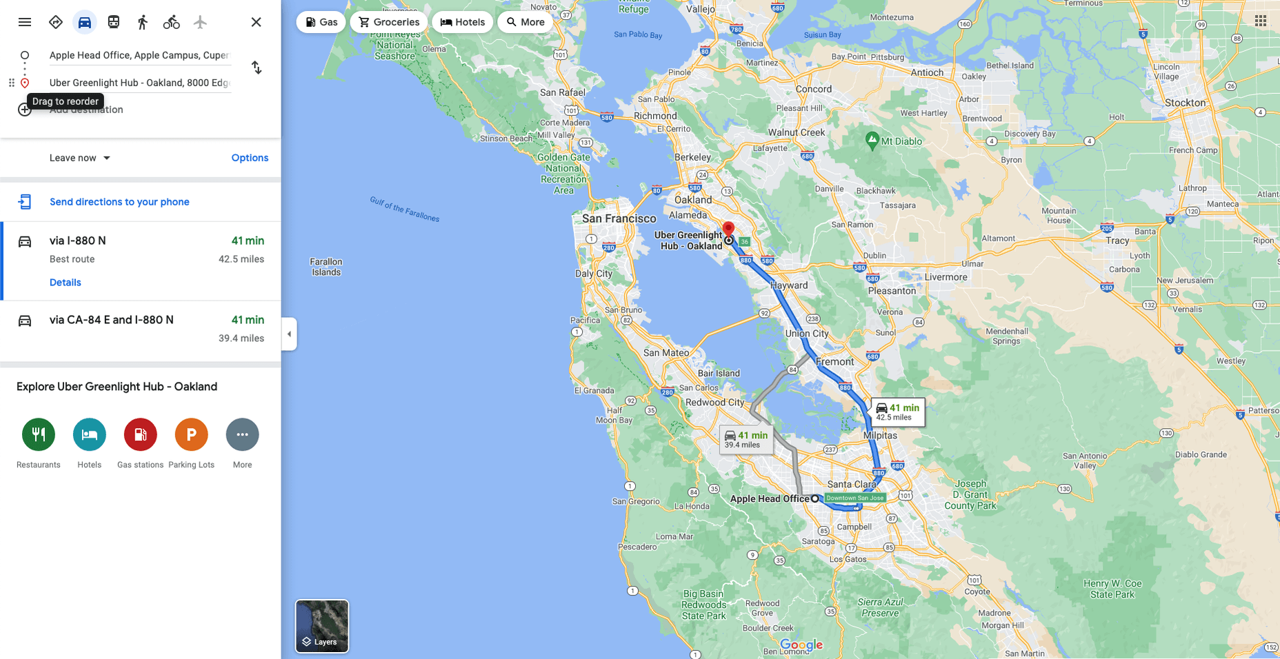
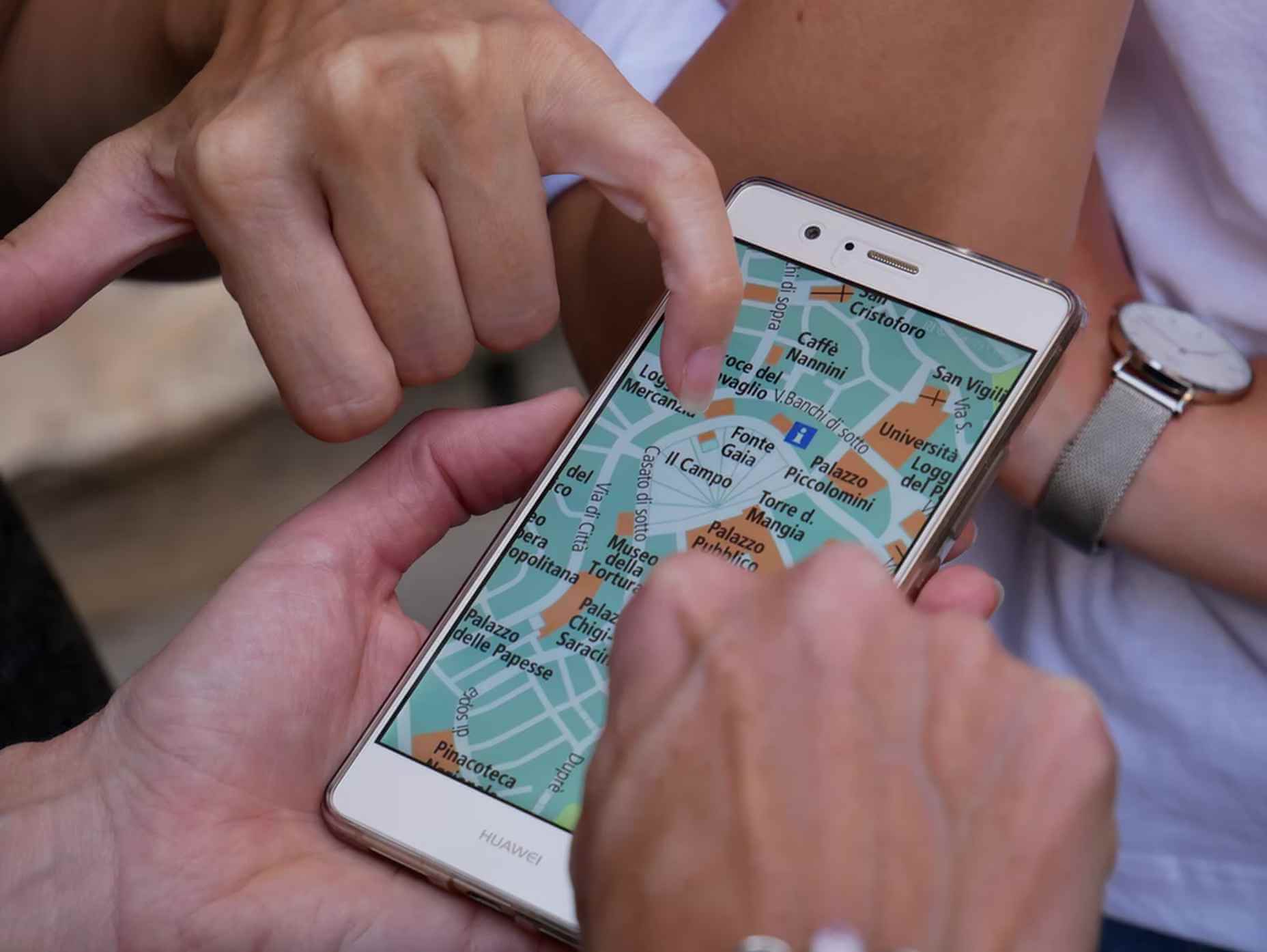
Maps are a fascinating method for delivering content. At their best, they can create an intuitive way of presenting information and interacting with it. This is the advantage that digital maps, through mobile apps and websites, have over print maps and images where no interactivity is possible.

But it’s important to understand that more data ≠ better experiences. We all now have so much data available to us through multiple services that, arguably, the greatest challenge isn’t sourcing information but filtering it out. We can only handle so much information input before we become overloaded. This issue risks being omnipresent with maps. There are so many potential points of interest on a map that it’s essential to be clear about what needs to be exposed to users.

Also, UX design, map design, and user interface are all critical. While maps can be a powerful way of drawing people in, if end-users feel that you didn’t even consider the visual design, they’ll ‘bounce off’ your site or app in moments.

Common Use Cases

When are maps useful, and what problems do they solve? Let’s dive right into the most common use cases for maps used in web design.

Navigation and Direction

Like Google Maps shows, navigation and direction are arguably the classic case study for interactive maps. You are in one place and need to get to another. You can enter your destination, your current location, and the map will present suggestions for getting there. You can select the method of travel and adjust desired departure or arrival times. But you need to understand first what functionality your users need. How these options are exposed to users is a critical piece of UX design.

Also, if users are searching for options such as somewhere to eat, it’s not so straightforward. Then, how your map handles panning in real-time as users swipe around a city is going to be a big issue.

Showing Relationships and Trends Geographically

This is something that you’ll see in every election in any western country. We’re all used to seeing maps that give us a state-of-play for which state or seat is held by which party. Then, we might see projections based on voter intentions and projected voting swings deriving from that. Then, exit poll data can be projected with the map updated on an ongoing basis until the final result is confirmed.

The capability to do this is essential because if a static map were used, it’d be out of date any time a new poll was released. Also, voting intentions can change over a campaign, so such maps need to be dynamic. Of course, such maps are only as accurate as the available data, as the US 2016 election map showed.

Show Points of Interest

As mentioned previously, there’s a lot of data that can be exposed to map users. However, that doesn’t automatically mean that it should be. Usability is key. For example, when you look at a map, you’ll typically first see key points of interest. Which points of interest are going to be presented to you can vary.

One variant is zoom level. If your map is currently showing an entire city, the level of detail the map presents is deliberately limited. You’ll see districts, large roads, or geographic features such as rivers. If more detailed information were presented, users on mobile devices, in particular, would be overwhelmed. Even at this level, you’ll notice typography differences. These can include the city name being in bold or the names of different areas in capital letters. So the level of detail is coupled with the scale of the map. Zooming in a few notches will expose significant points of interest, such as museums. Zooming in to specific districts will reveal restaurants, coffee shops, and universities. This visual hierarchy is a critical way of managing the exposed level of information.

But information is still being abstracted away. It’s not until you tap on the museum that you’ll see information on opening hours and busy times. This is also typically presented with user photos and reviews. Context is also taken into account, so you’ll start to see local hotels and restaurants. So it’s not just individual points of interest that are important, but the connections between them.

6 Tips For Improving Interactive Maps

What are the challenges of creating effective maps, and how do people address the data overload problem? We’ll answer this question and go over the must-know aspects of map creation.

1. Ensure Security and Brand Trust

GDPR or General Data Protection Regulation. This is a critically important European law that extends a wide range of legal protection to European citizens regarding personal data. It’s not possible here to cover the full extent of the law, but here are some quick key points:

  • Consent is required for the processing of personal data; it cannot be assumed
  • You need to have a retention policy for information that’s capable of identifying people

Be aware that the latter doesn’t just cover commercial purposes. Research students have to submit GDPR forms that address what kind of data they’re sourcing and how they’ll be retaining it.

But the most crucial context is commercial. If a business suffers a data breach, it can be fined up to 20 million euros or 4% of annual worldwide turnover in the preceding financial year, whichever is greater. Therefore, any business storing data that could identify their customers will need to assess risk and compliance. Remember: it’s 4% of worldwide turnover, not EU turnover.

Also, anything of your business that you expose to your customers or users is an extension of your brand. Therefore, you need to assess your maps for brand compliance too. If you have primary brand colors and your map doesn’t abide by them, that’s a very poor look. Source the color hex codes directly from your brand team and involve them in design.

2. Use the Appropriate Type of Map

It’s also important to consider what type of map is most appropriate for your use case. Think carefully about what your users need, what you’re trying to communicate, what information you need to present, and how best to present it.

For example, points of interest style maps in a tourist app will be way more helpful than heat maps: people want to know where something is, key data like opening hours, and how to get there. A heat map showing the number of visitors to each attraction or area of a city is unlikely to be useful to tourists. However, it could be useful to the attractions themselves to map their visitors by heat map over time. This could help larger museums chart which exhibits are most popular.

Transport for London is charting passenger movement on the London Underground by detecting when a device with Wi-Fi comes into range and then passes out of range. They’re using this to understand overall user journeys and movements within individual stations to better manage disruptions.

3. Avoid Pop-Ups

It should go without saying by now that auto pop-ups are despised. It doesn’t matter what they’re doing or what they’re offering; an unwanted pop-up can only get in the way. The level of impact is even greater on a phone where pop-ups take up even more screen space.

Given this, many users close them without even reading them. So if you’re using pop-ups, don’t kid yourself. You’re likely just irritating users and increasing the likelihood that they’ll ‘bounce off’ or uninstall.

4. Avoid Auto-Geolocation

Auto-geolocation sounds incredibly convenient but can result in some real problems. For example, if there are any bugs with auto-geolocation, you could get false results. If someone connects through public building Wi-Fi, you could get false results. If they’re connecting through a VPN then, unless you get the user’s IP address and check if it’s the exit portal of a VPN, you could get false results.

The problem is most significant with mobile maps. If a map user is looking at a points of interest map, they likely have a specific and immediate use. This means it’s in their best to get the most accurate results possible. So why not just ask them?

Precision and Accuracy

These terms have specific meanings in geolocation. ‘Precision’ is the exactness of the data. ‘Accuracy’ is how closely the information on a map matches the real world. So you want precision and accuracy to be spot on, or data risks losing value. This applies not just to the gathering of data but to the representation of it. For example, if you have street-level data but your maps don’t present individual streets, then any representation of data on that map is likely to have poor accuracy. That map might succeed in abstracting irrelevant information but presenting an imprecise and inaccurate view.

5. Avoid Map Legends as Much as Possible

In many cases, primarily points-of-interest maps, they’re just not needed anymore. An essential part of user experience design isn’t just visual hierarchy but information hierarchy. You can mouse over on a desktop or laptop to get the essentials of a location, e.g., the museum’s name and its opening hours. On a mobile device, you can tap on that location to get the essentials, and you can tap on another location to move on; you don’t even have to press back. Given that, a legend would get in the way. So this simple piece of information design solves information overload issues.

As with all rules, there are exceptions. A good one is a heat map where a density of what’s being measured needs to be communicated. It doesn’t matter what the data is; it just needs to be something where mapping provides greater insight, especially if it informs decision-making. Sales is an excellent example for a national or multinational company. Of course, weather forecasting can make use of literal heat maps.

6. Accessibility Compliance

Not everyone has perfect eyesight. Even if someone has excellent vision, they could still be colorblind (8% of men and 0.5% of women are). Given that, take the W3C’s accessibility standards into account and treat them as a baseline or minimum barrier to entry for compliance. You shouldn’t feel good about the possibility of excluding 8% of your potential audience or customers. Ensure you keep your UX designers involved and don’t shy away from creating senior-friendly web designs.

Put simply: imagine if you could appeal to a new demographic that’s not catered to. If your competitors ignore them, you could give them a real reason to choose you instead by taking some straightforward steps. If your competitors are catering to them, you also need to. If you don’t, you’re just giving potential customers a big reason to ignore you.

Conclusions

The key takeaway is that there’s far more to creating good maps than just good cartography. That can be critical, too, though this may vary depending on the use case.

This will be a team effort because your map will involve data sets, design decisions, and, yes, cartography. You’re going to need to involve brand and IT too. So think about design principles and development methodologies.

First and foremost, what are your users’ needs? If you haven’t done any user research or taken the time to understand the customer journey, are you adding anything or getting in the way? It’s easy to see the department that requested the map as stakeholders, but you should probably view your users as stakeholders too.

This sounds complex, but as you hopefully now appreciate, a map is probably more complicated than you thought.


Featured image via Pexels.

Source

The post The UX of Maps in Web Design first appeared on Webdesigner Depot.

Source de l’article sur Webdesignerdepot