Articles

The start of the year is always a good time to reassess priorities and consider new approaches, but 2021 is more of a reset than we expected this time last year. 2020 is unlikely to go down in anyone’s autobiography as the best year of their life, but it has done something positive: it’s prepared the ground for rapid change in the next 12 months.

More than any other year in our lifetimes, 2021 is set to be revolutionary, with emerging trends that will last well into the new decade. Here’s what we think you can look forward to around the next corner.

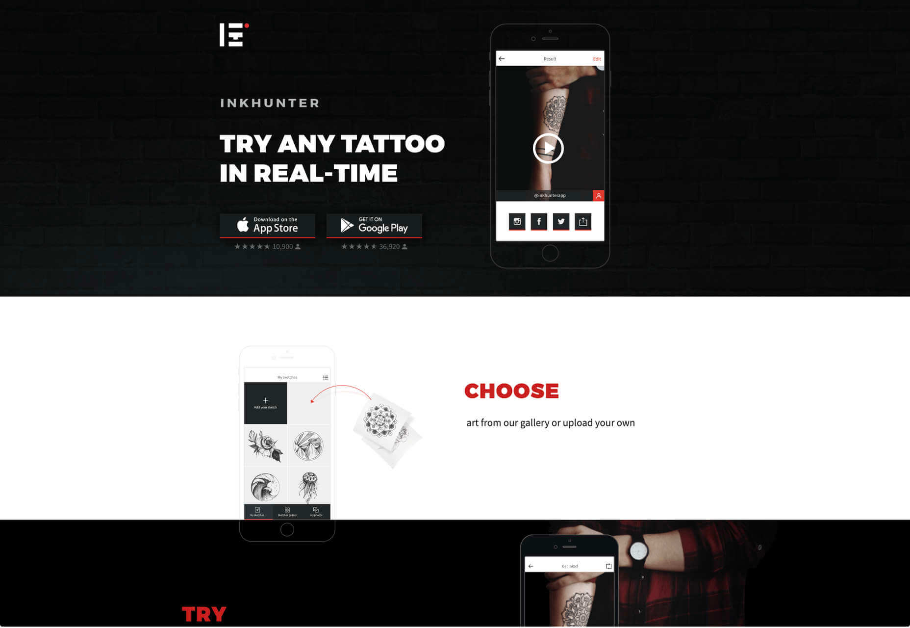
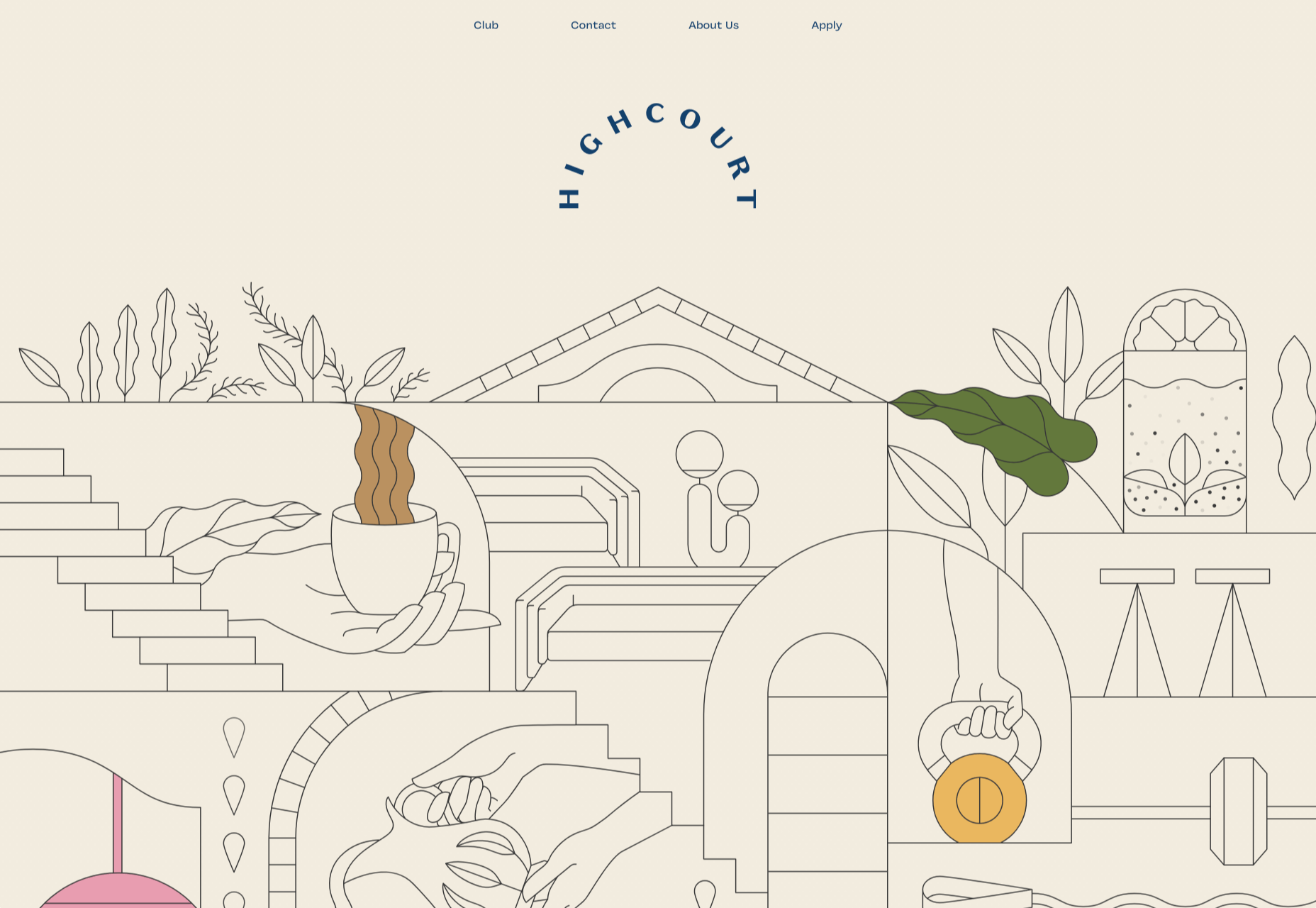
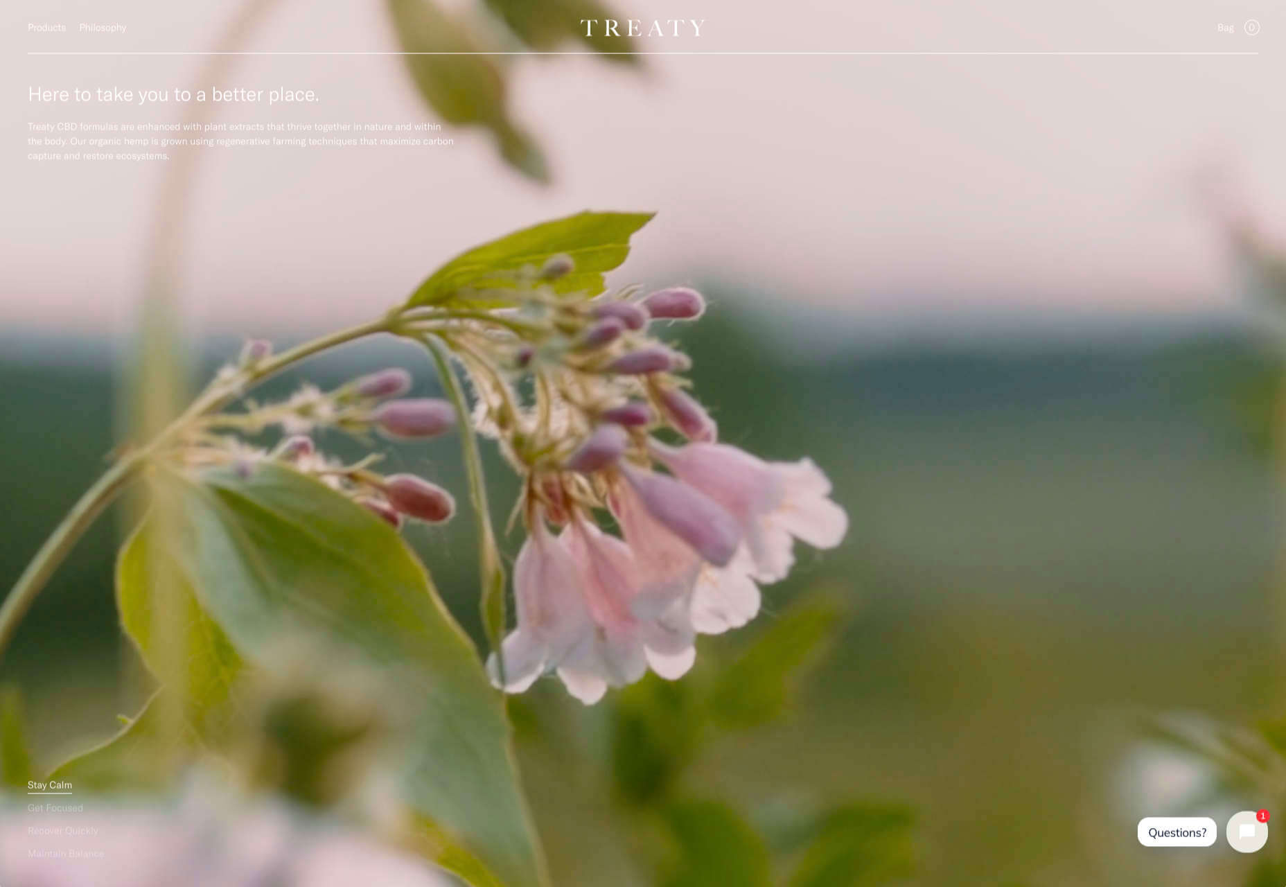
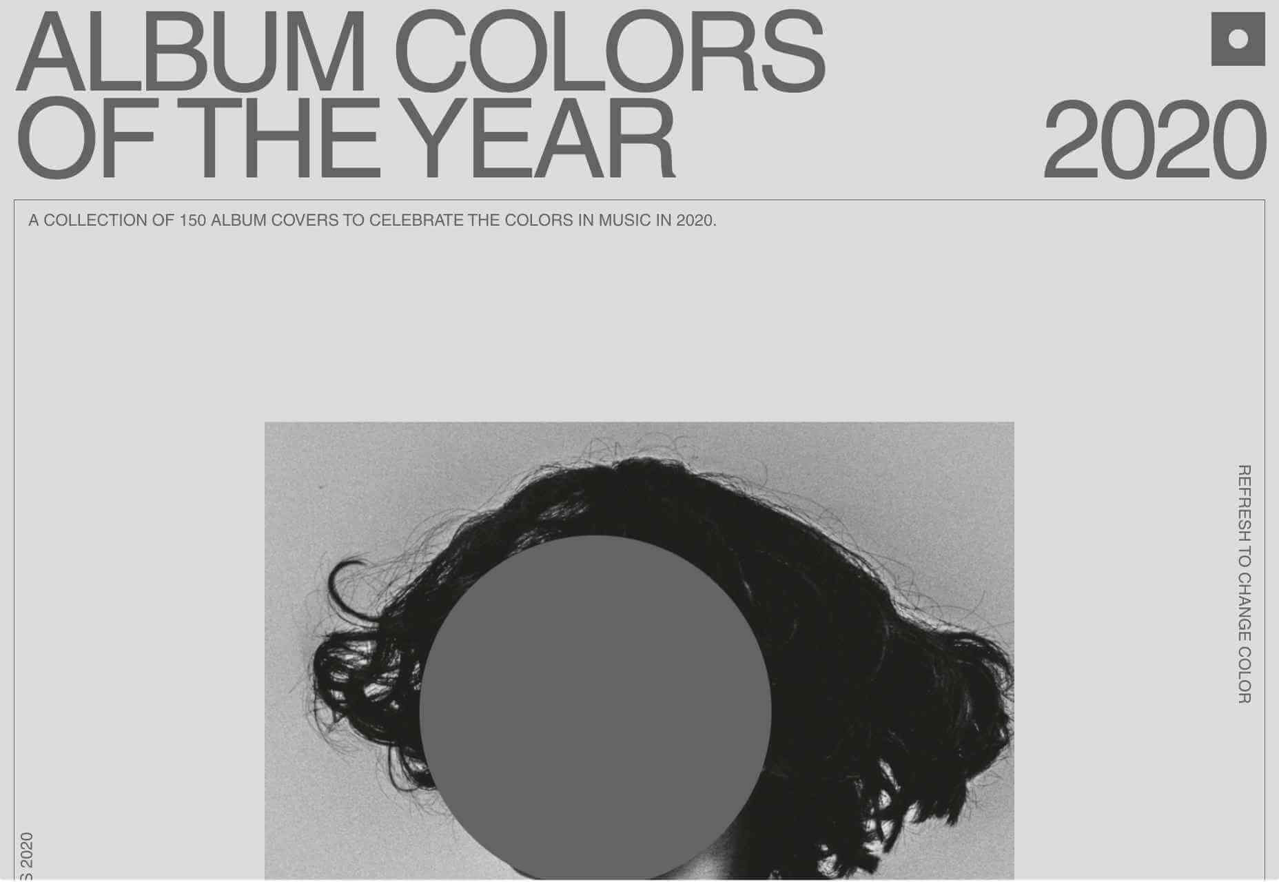
1. The End of Minimalism

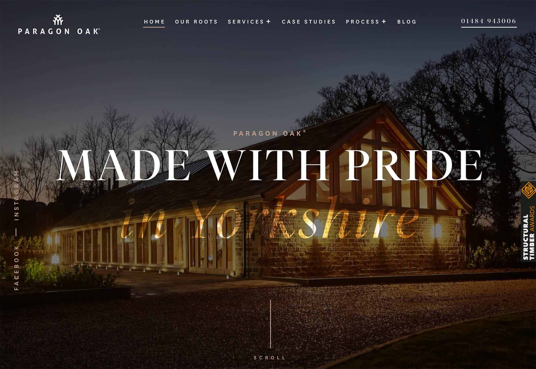
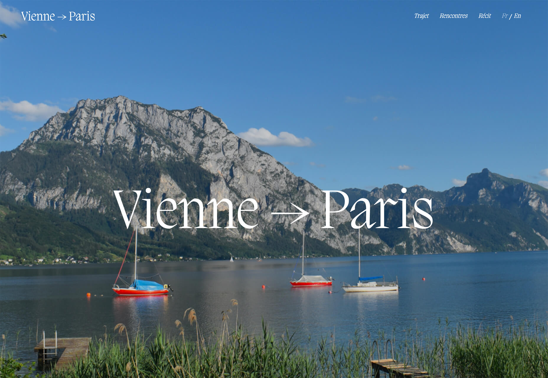
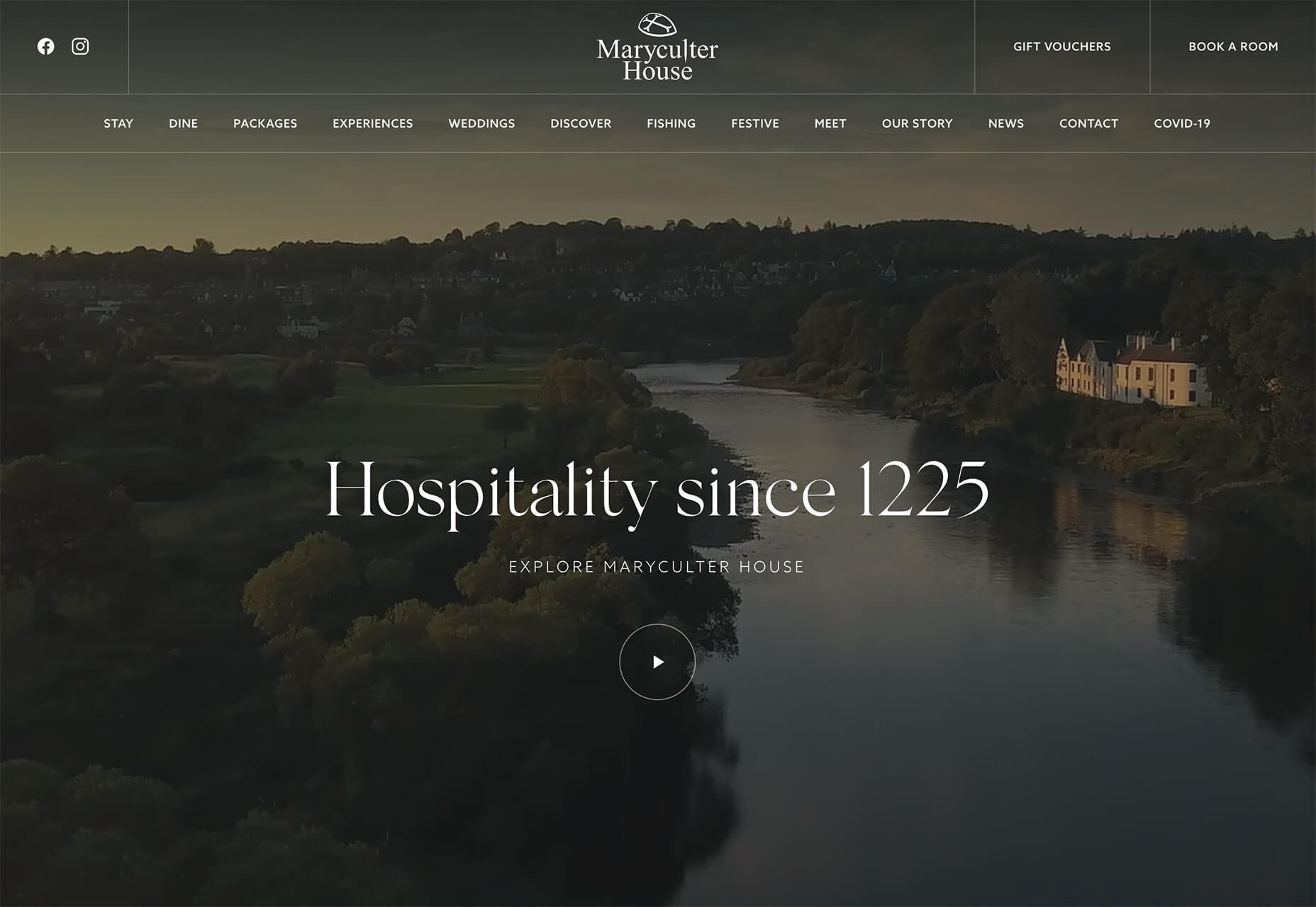
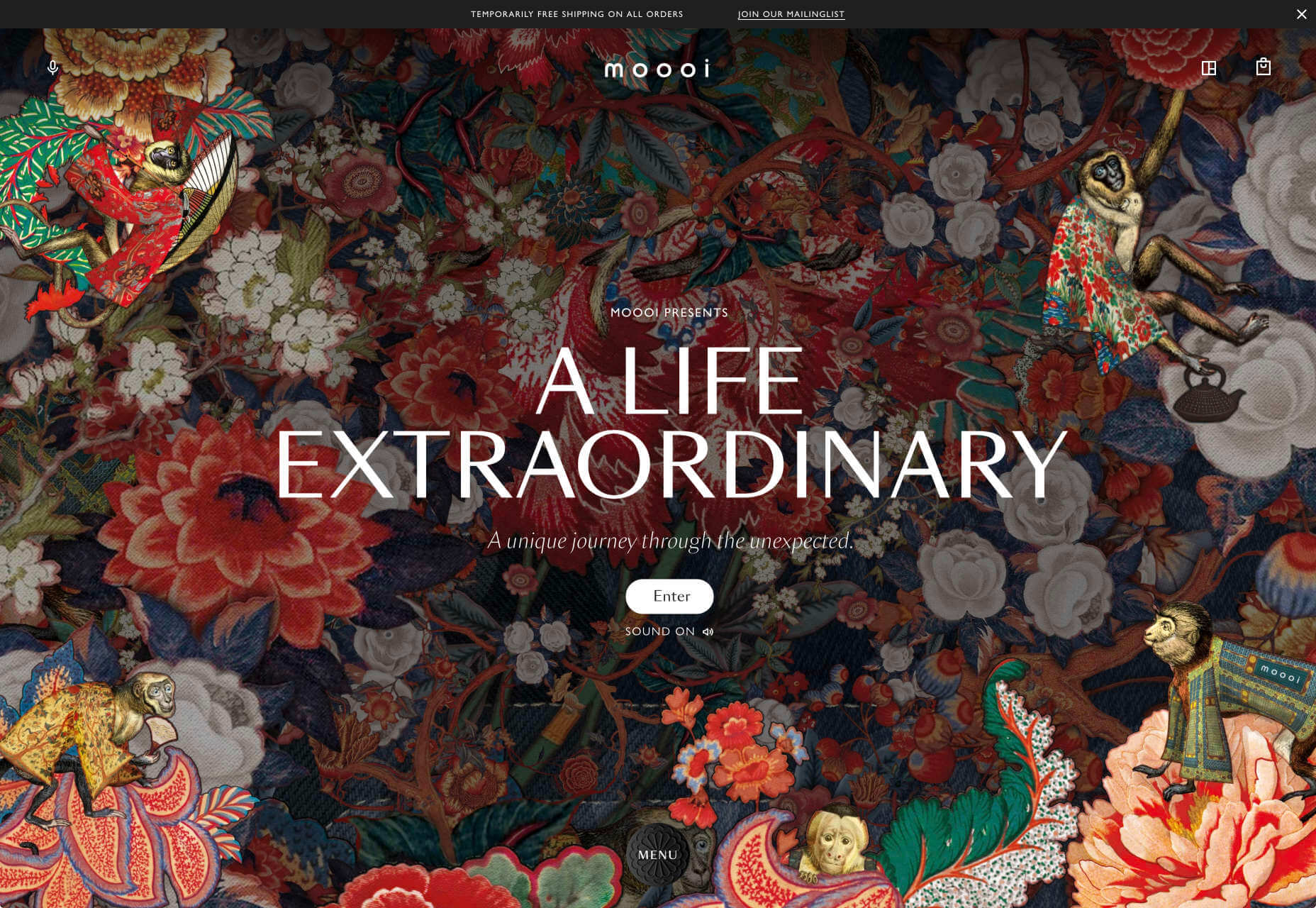
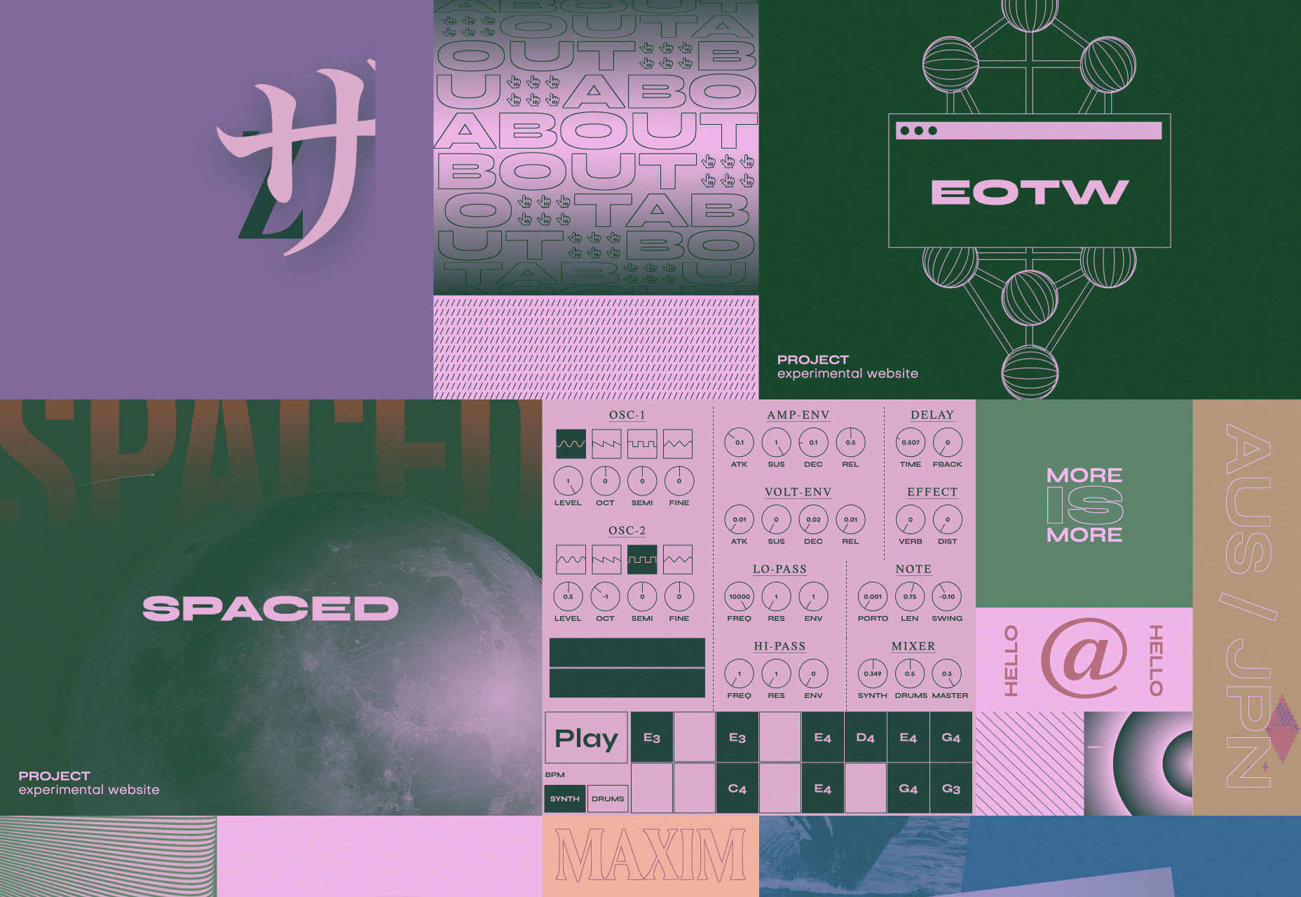
Minimalism has been the de facto approach to web design for the last decade because it works.

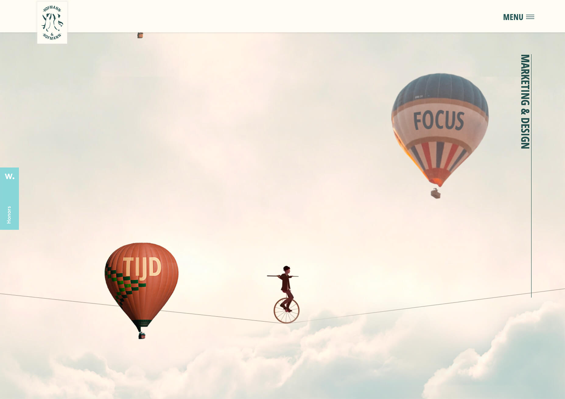
But design reflects the zeitgeist. Where minimalism once felt clean and fresh, it’s starting to feel dull and uninspired. There have been a few false-starts breaking out of the long-term trend, but thanks to the pandemic, 2021 will be the year minimalism finally folds — at least for a while.

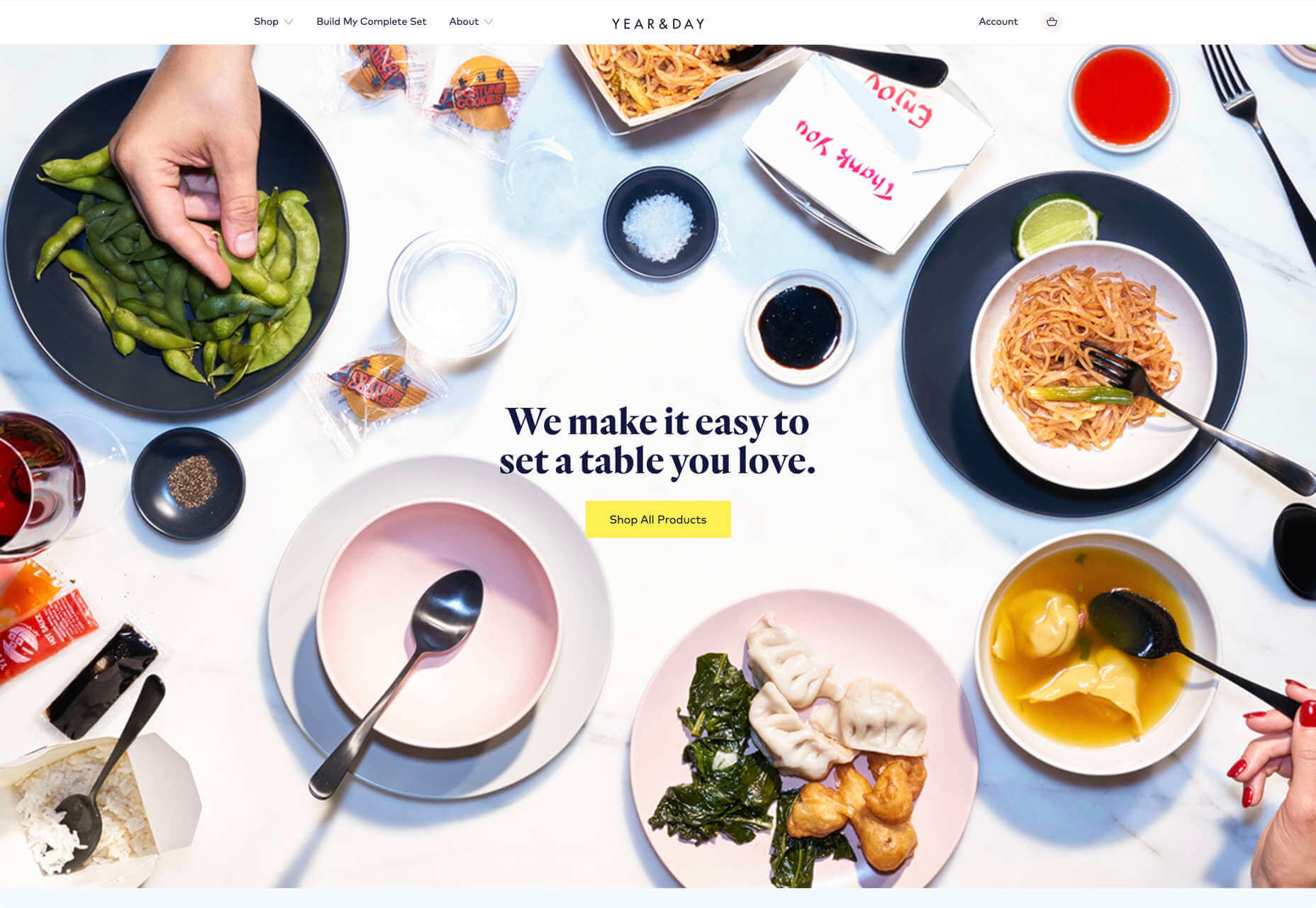
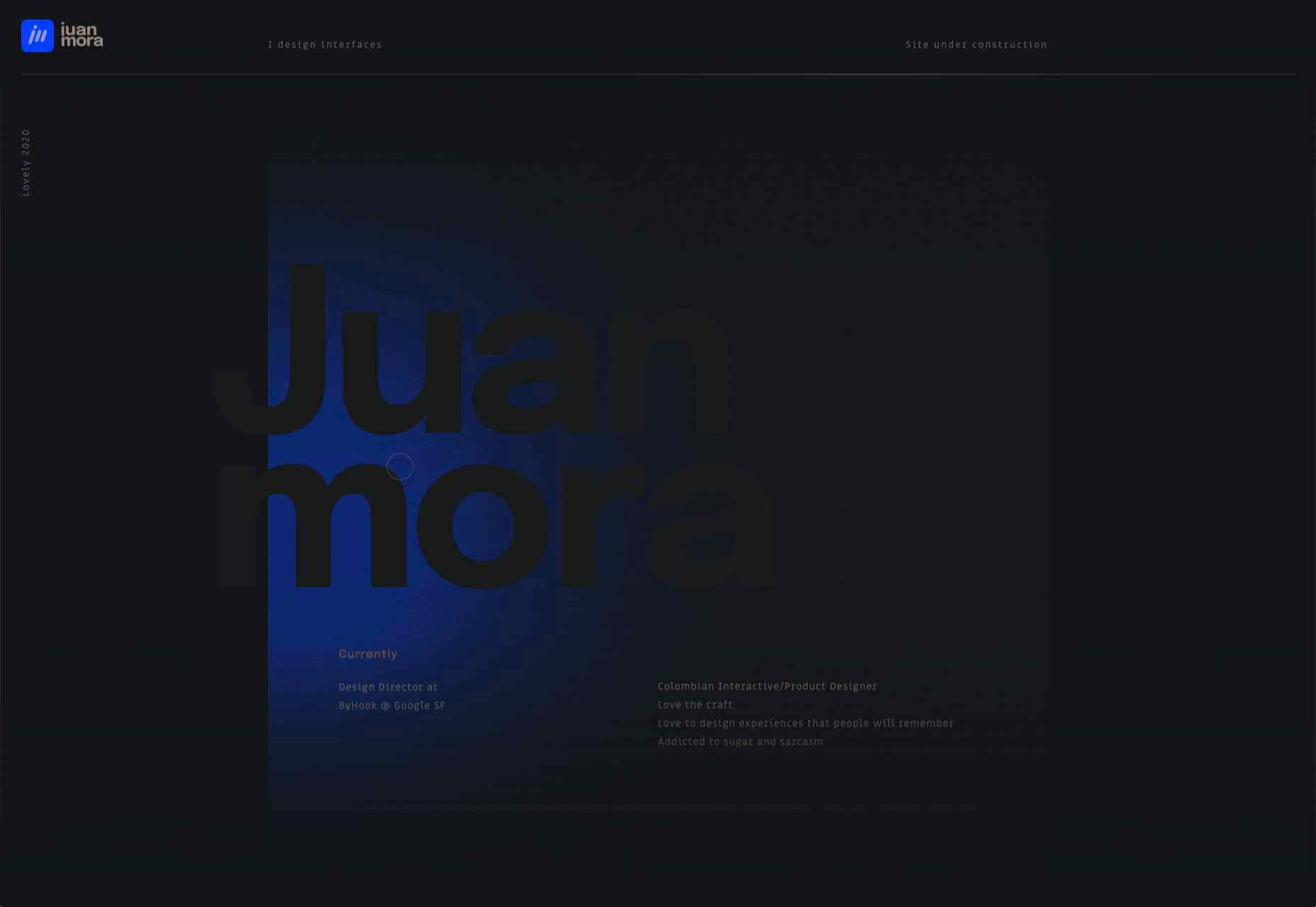
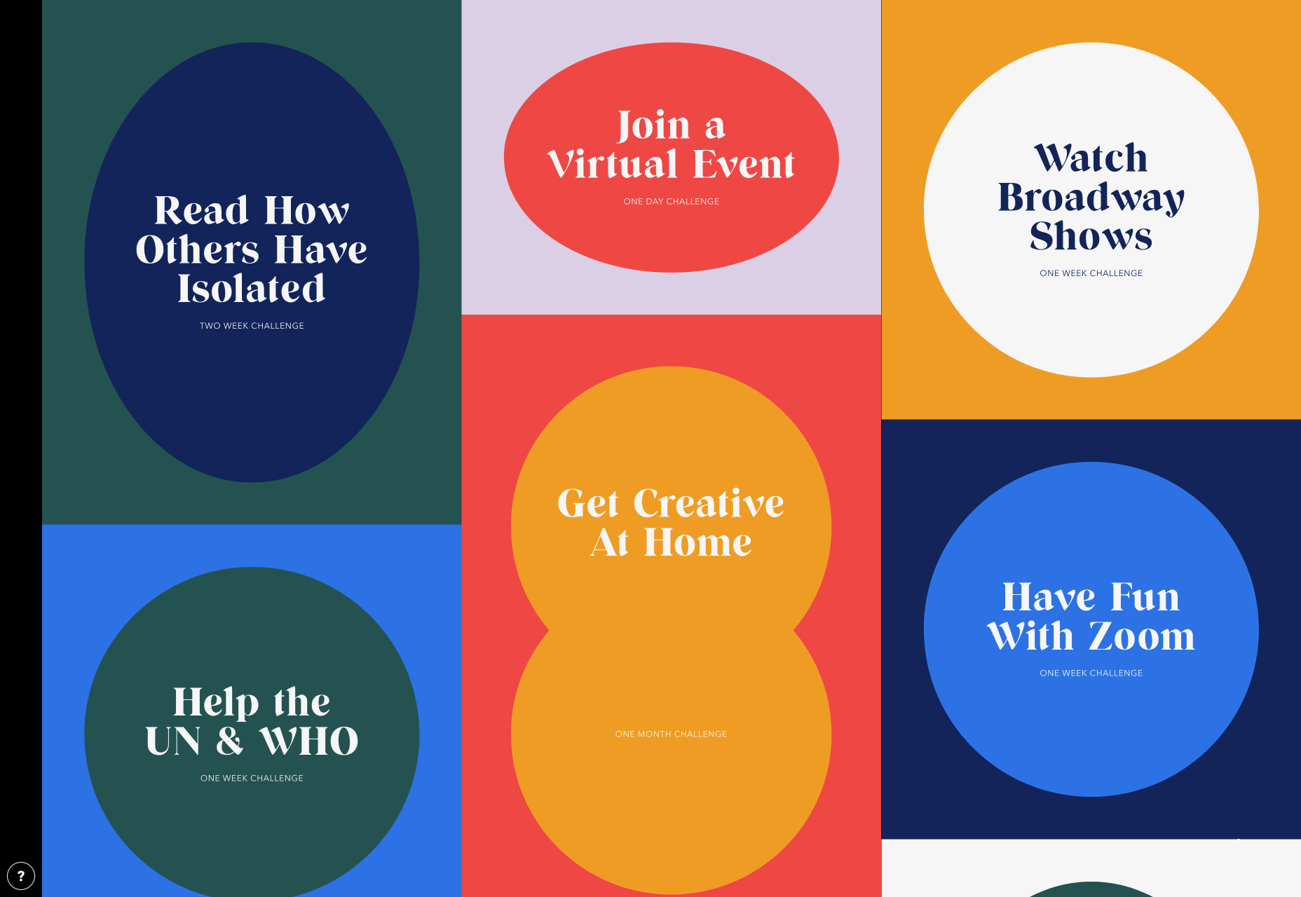
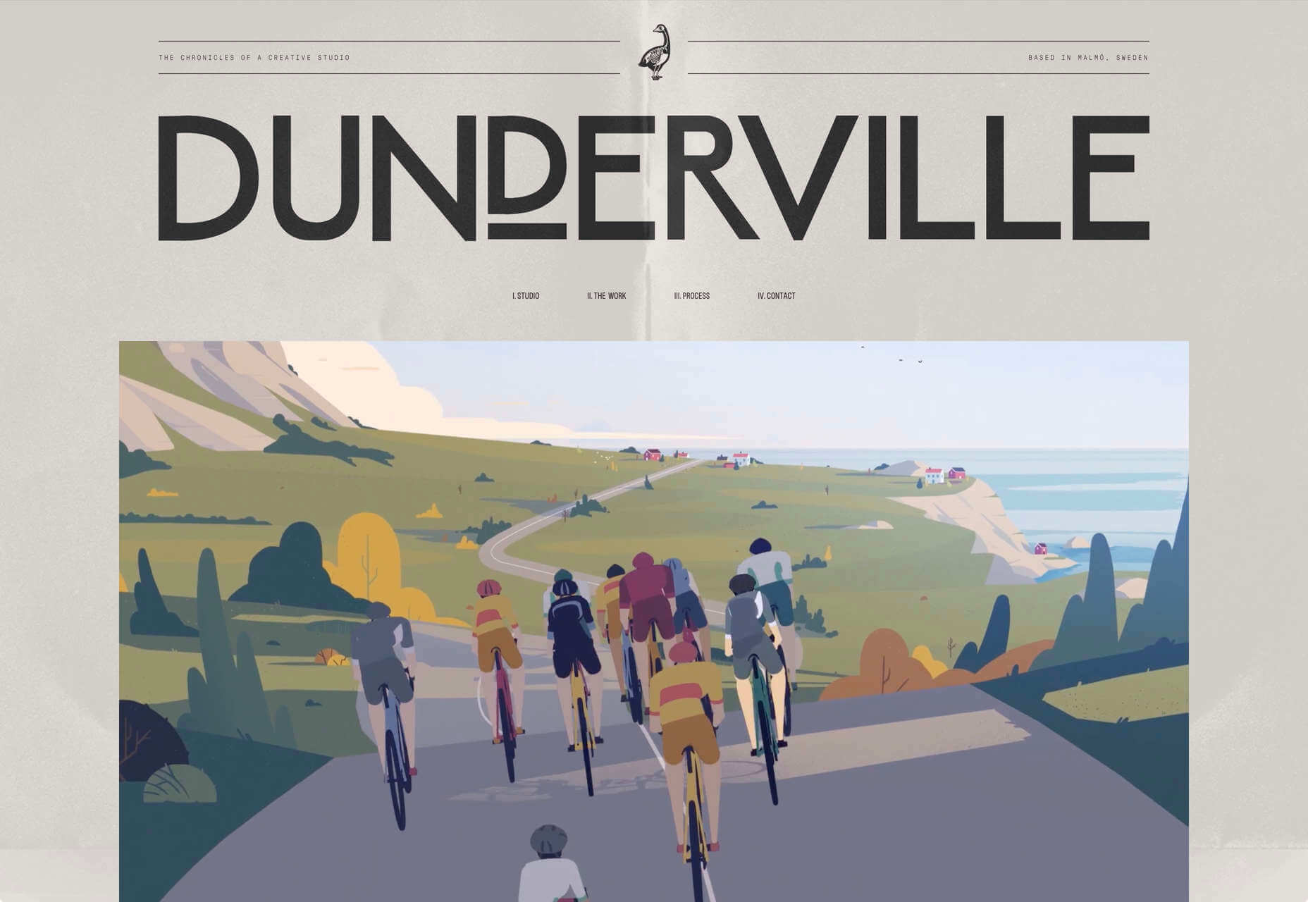
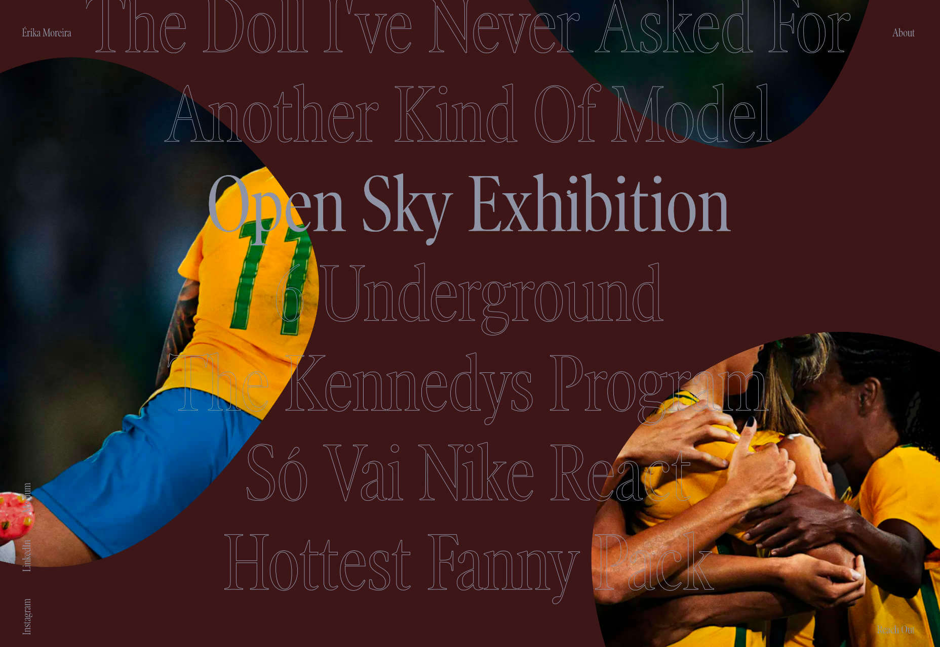
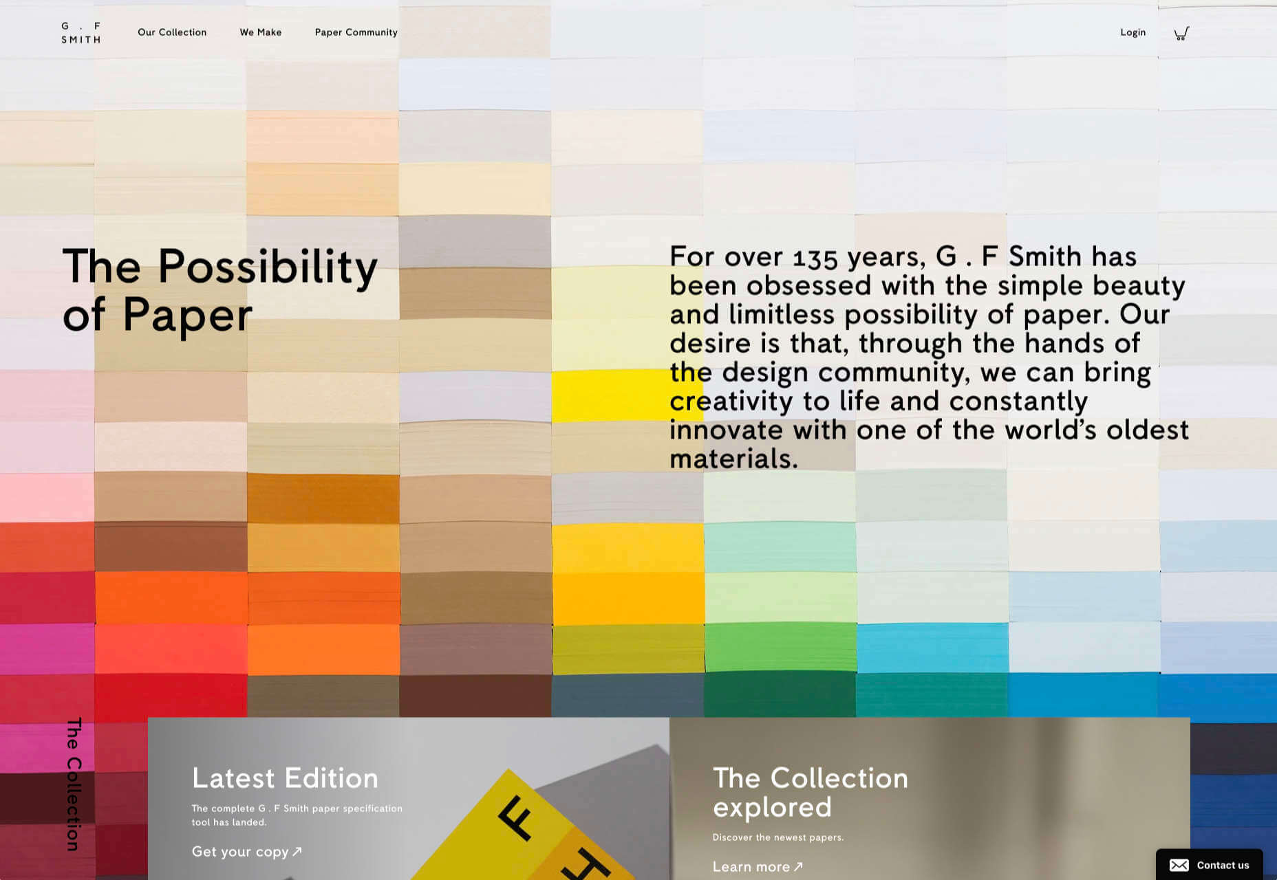
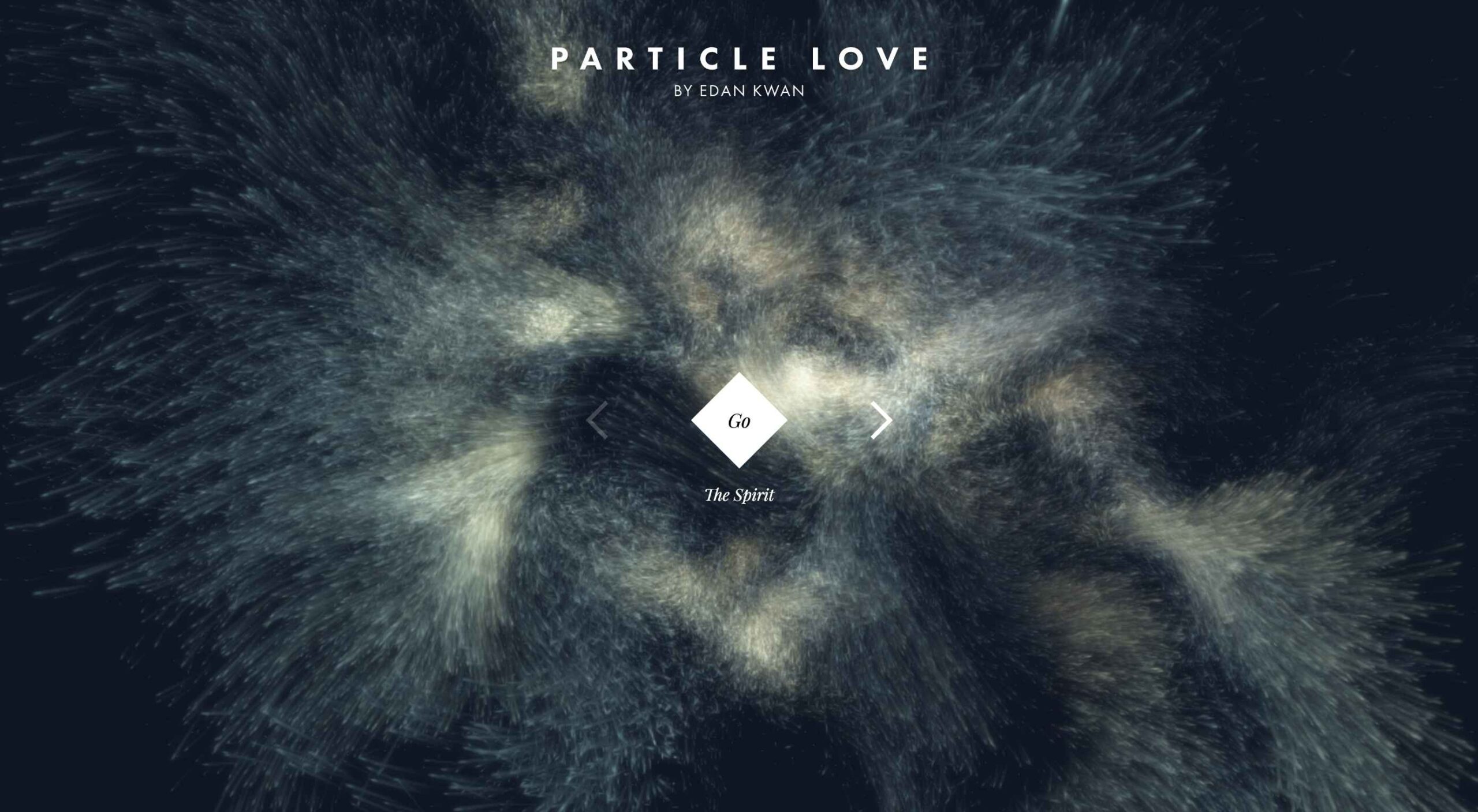
Prior to coronavirus-mandated lockdowns worldwide, there were already signs of a more vibrant, more decorative, more joyful approach to design. Simple typefaces have been replaced with more decorative examples — faces that use ink-traps to fake 3D effects are surprisingly popular.

trends are cyclical, and the wheel always turns

One of the biggest aspects of this blossoming trend is the move away from Material Design-style flat color not just to gradients but to multi-color gradients and even animated gradients. Even Apple, the last bastion of the clean white-box approach, jumped on the gradient bandwagon with its Big Sur branding.

One of the few things COVID-19 hasn’t slowed is the adoption of new web technology, and CSS, in particular, has had some major developments in the last year. CSS Grid is now a practical technology, and our ability to code standards-compliant designs that aren’t dependent on hierarchical boxes is greatly enhanced.

After more than a year of pretty grim news for most people, much of the world will be vaccinated over the next twelve months, and life will rapidly return to normal. The last global crisis on this scale was the 1918 influenza pandemic, and it led directly to the decade known as the Roaring Twenties.

Minimalism was already dipping in popularity — trends are cyclical, and the wheel always turns — but lockdown, or perhaps more precisely the end of lockdown, is the catalyst for significant change.

2. The Decline of WordPress

In Autumn 2020, something entirely unexpected happened: The W3C announced the platform its new web presence would be built on, and WordPress — the previous choice of the web’s steering committee — didn’t even make the list of finalists.

Due to accessibility concerns, the W3C development team opted to migrate away from WordPress to Craft CMS. The decision was met with a mixture of glee and outrage. But whether you agree with the decision or not, it’s hard to see it as anything other than yet another symptom of WordPress’ decline.

WordPress faces a triple threat: there are web builders that do an adequate job for low-end web projects; there are newer rivals like Craft that outperform WordPress as a CMS; there’s a growing interest in alternate approaches, like Jamstack.

So will it all be over for WordPress in 2021? Not even close. There are myriad reasons WordPress will continue to be the choice of designers and developers for years to come. Tens of thousands of professionals worldwide have invested their whole careers in WordPress; there are millions of themes, plugins, templates, and build processes that are tightly woven into the WordPress ecosystem. What’s more, there are millions of sites with substantial content archives powered by WordPress [WebDesignerDepot is one such site].

WordPress reportedly powers approximately 37% of the web, and it will still be the dominant CMS in 2022. But it’s unlikely to grow beyond that 37%, and by 2030 its market share will be in rapid contraction.

2020 was the high-tide mark for WordPress

But for all its faults — and it’s undeniable that WordPress is full of faults — WordPress is the best of the web; it has given a voice to millions of people, launched countless careers, and empowered entrepreneurship worldwide.

2020 was the high-tide mark for WordPress, but it’s not an extinction-level event — even the much-maligned Flash, which was killed dead in a matter of months by the first generation iPhone, limped on until a few weeks ago.

WordPress will have to find a niche and accept a smaller market share; in doing so, it will address the single biggest complaint that anyone has about WordPress: that it’s trying to do too much.

WordPress is one of the great success stories of the web. In a decade, it may have to settle for powering just 10% of the web — a level of failure most of its rivals can only dream of.

3. The Digital Currency Explosion

2021 is undoubtedly the year that cryptocurrency goes mainstream. In 2020 Bitcoin grew by almost 400%; currently valued at around $35k, conservative predictions for a December 2021 valuation are $100k, with five-year predictions as high as $1m. And Bitcoin isn’t the only cryptocurrency; the value of developer-friendly Ether has jumped by more than 50% in the first few weeks of 2021.

In the US, the incoming Biden administration is preparing a multi-trillion dollar relief package, which many believe young Americans will invest in cryptocurrency. Perhaps more importantly, large investment banks are now pumping hundreds of millions in digital currencies. PayPal and Visa are both in the advanced stages of adopting blockchain technology.

The biggest threat to the new digital economy is the volatility of cryptocurrency. You cannot price services in XRP if XRP’s dollar price could crash at any time — as it did a few weeks ago.

And so there are two routes in which this trend will unfold for ecommerce. Either pricing will remain in dollars, and the equivalent price in various cryptocurrencies will be calculated in real-time. Or, transactions will make use of stablecoins like Tether that are tied to the value of the US dollar.

Cryptocurrency is the latest gold-rush, and whether you think it’s the chance of a lifetime or yet another Ponzi scheme, it will become increasingly high-profile in ecommerce throughout 2021.

4. No More Video Calls and also More Video Calls

2020 was the year of Zoom. Its growth from bit-player to overtaking Skype is a material lesson for entrepreneurs that every obstacle is an opportunity.

every obstacle is an opportunity

Over the last year, we’ve discovered two things: meetings are more creative in person, and office costs are significantly reduced when staff work remotely.

There’s going to be a shift in the business landscape this year. Remote working will continue to be normal for years to come as businesses enjoy rent savings. Video calls will still be common for quick update meetings. But expect to travel to physical meeting places periodically for in-depth strategic planning.

Expect to see major cities with deserted office buildings and a rapid expansion of co-working spaces, especially those with meeting spaces — if WeWork can hold on a little longer, there may be light at the end of the tunnel.

As a web professional, you’re in a unique position to thrive in the new business world, even more so if you’re a freelancer. Remember, if you’re working onsite, be mindful of your physical health, and if you’re working remotely, be mindful of your mental health.

What Do You Think?

No one saw 2020 coming. Sometimes world events are outwith our control, and we have to hang on and hope it gets better. It’s been a tough 12 months, and the truth is we’re not through it yet.

But the 2020 coronavirus pandemic is the first pandemic in human history that we’ve had the technology to shorten.

2021 offers the opportunity for enormous change. Will designers look for new, more decorative approaches? Will we replace our technology stack? Will you be billing clients in Ether this year? Will you suffer the misery of a packed evening commute ever again?


Featured image via Unsplash

Source

The post 4 Predictions for the Web in 2021 first appeared on Webdesigner Depot.


Source de l’article sur Webdesignerdepot

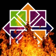
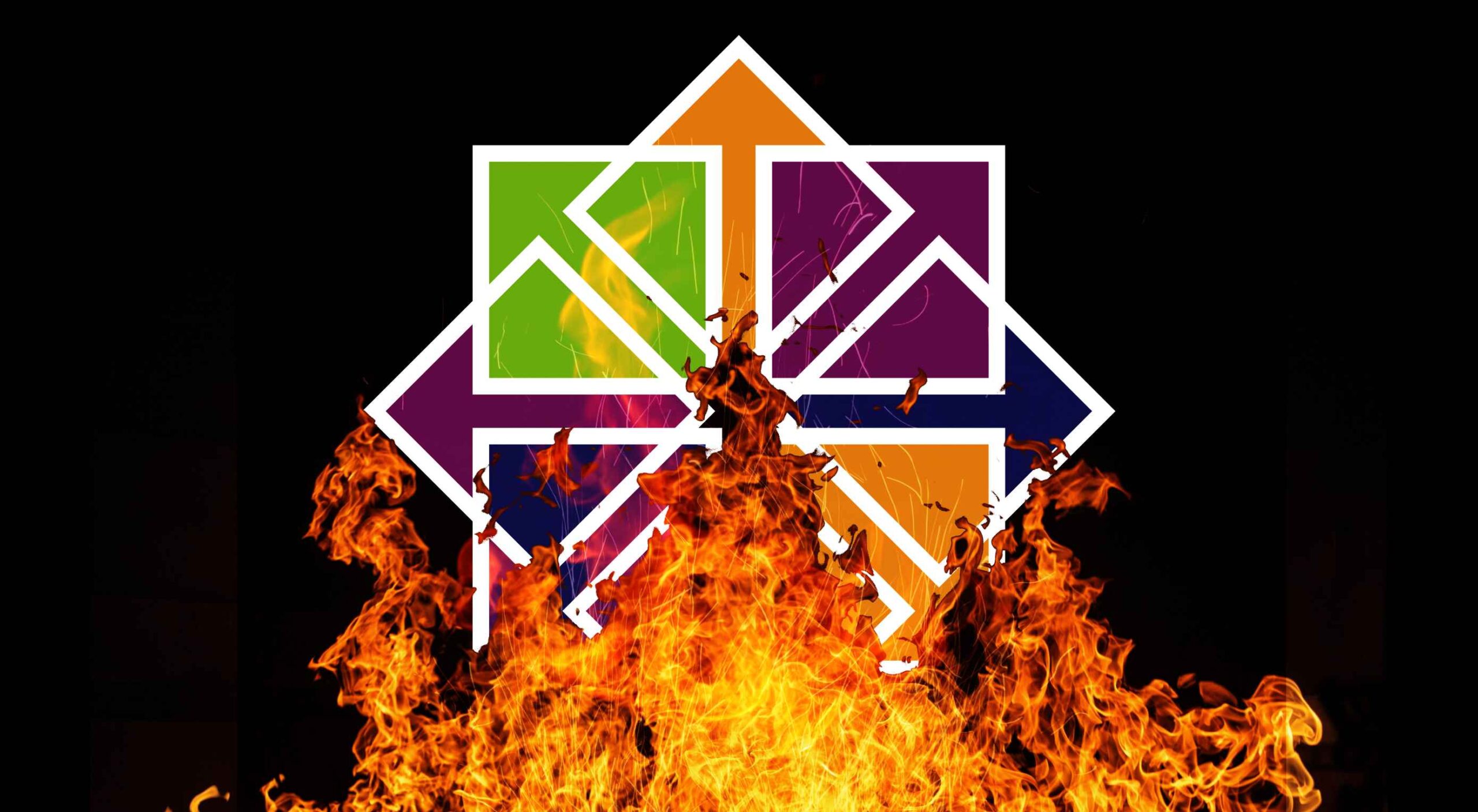
If you were paying close attention to your IT department around the 8th of December, you might have heard some quiet sobbing and the occasional wail of, “Why? Why?! WHY?!” Now, it was the year 2020, so this might have seemed normal to you, but it’s actually something of a problem that could affect your business: CentOS is pretty much dead.

For the non-total-nerds among us, here’s the skinny: CentOS is a Linux-based operating system, typically used on servers. CentOS has been incredibly popular, and quite a few businesses run on it. But now, that’s changing.

CentOS is a Linux-based operating system, typically used on servers…But now, that’s changing

CentOS used to be released in thoroughly tested versions, the latest being CentOS 8. CentOS 8 was released in September of 2019 and was supposed to be supported for ten years. Now, it’s been decided that CentOS will no longer have versioned releases, opting for a rolling-release style of updates. That means there’ll be one version that constantly gets new software.

That’s cool in theory, but it means the operating system will be less stable overall. Essentially, it’s going to be used as a development branch of / testing ground for Red Hat Enterprise Linux and is no longer its own OS. If you have CentOS-based servers, you should migrate to another OS sooner rather than later.

And I just got my own CentOS-based VPS set up the way I wanted it.

Wait, What Does Red Hat Have To Do With This?

Here’s the short, short version of the history of CentOS: Red Hat (an OS developer) has two Linux distributions of its own and has had for a long time. There’s the free and community-focused Fedora and the business-focused highly expensive Red Hat Enterprise Linux (AKA RHEL).

Funny story: RHEL, despite its expensive licenses, is still mostly made from open source code, which anyone can access and use. And it’s a good OS, particularly for people who like stability.

In 2004, some smart people took all the open-source parts of RHEL and made a brand new, nearly identical operating system with it: the Community Enterprise Operating System, or CentOS. Basically, people could download and use an enterprise-level server OS for free. All the documentation for RHEL was compatible, and you could get support from the community.

It was the perfect alternative for anyone who didn’t have the budget for expensive software licenses.

In 2014, Red Hat offered to partner with the CentOS community. The idea was basically this: “It’s pretty much the same software. If our company and your community work together, both our products will be better! We make our money from enterprise customers, anyway.”

Most importantly, with Red Hat doing a lot of the heavy lifting in terms of updates and support, the CentOS community could focus on growing in other ways.

Red Hat pinky swore [citation needed] that they were in this for the long haul, and CentOS did continue to flourish. You know, until 2020.

Well, So Much For Pinky Swearing

Red Hat must have eventually decided that having a popular free version of its own enterprise software and managing it themselves no less — wasn’t that good for business. So they all but shut the project down.

Well, technically, they just changed how it operated. Instead of producing tested, production-ready versions, CentOS is merely a testing ground for RHEL. It is no longer, in my opinion, a good option for anyone who wants to run a stable server.

Current and Future CentOS Alternatives

So if you jumped on the CentOS 8 bandwagon, what should you put on your physical and virtual servers now? Well, you’ve got options.

Debian / Ubuntu

For those who don’t mind going to a very different kind of Linux, Debian has been the picture of OS stability and sysadmin-friendliness for a long time. If you want more frequent software updates, the Debian-based Ubuntu Server is popular and pretty good.

Oracle Linux

Yes, that Oracle has a RHEL-compatible Linux distribution of its own. But it’s not a clone, exactly. I mean, this is Oracle. It’s set up to use their tools and ecosystem, so I hope you like Oracle products. But hey, the OS itself is free!

ClearOS

ClearOS is another RHEL-compatible OS that’s mostly doing its own thing, though I’m not entirely sure what that thing is. Does the company have some deal with Hewlett-Packard? Anyway, they do have a free community edition and paid editions for home and business use.

The CloudLinux RHEL Fork

This is an upcoming release from the makers of CloudLinuxOS. It looks like they intend to load the new RHEL-based OS with some of their own tools, such as reboot-less server update tech. The first release is intended to be a more or less drop-in replacement for CentOS 8.

Rocky Linux

So the community that made and loved CentOS in the first place is, to say the least, ticked. They are so ticked that Greg Kurtzer (a co-founder of CentOS) has decided to do it all over again by making Rocky Linux and keep it in the community this time.

Again, the goal is to make a re-build of RHEL, a drop-in replacement for CentOS (at least for now). Eventually, the goal is to migrate from CentOS to Rocky Linux as easy as using a single, one-line command. The ETA for initial release isn’t quite set in stone, but I can personally vouch for how hard the community is working.

[See, full disclosure here… after writing this article, I joined the Rocky Linux documentation team.]

So Yeah, You Have Options

Some are out now, and others will be soon. Again, CentOS 8 will be supported until the end of 2021. CentOS 7, weirdly, will be supported until June 2024.

Migration shouldn’t be too complicated. Still, a pain in the rear that we have to do this at all, though.

Source

The post How CentOS Became 2020’s Final Victim first appeared on Webdesigner Depot.


Source de l’article sur Webdesignerdepot

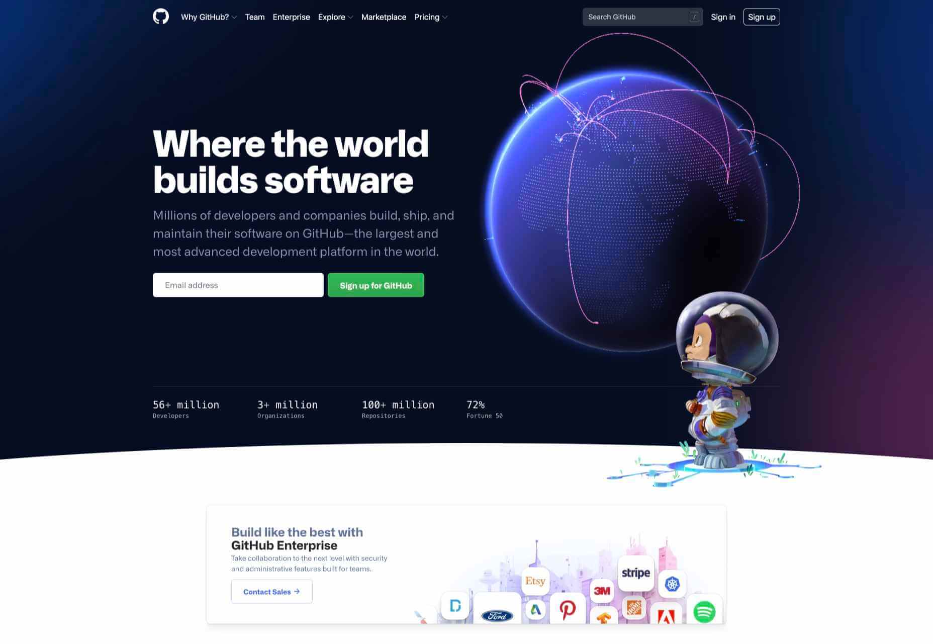
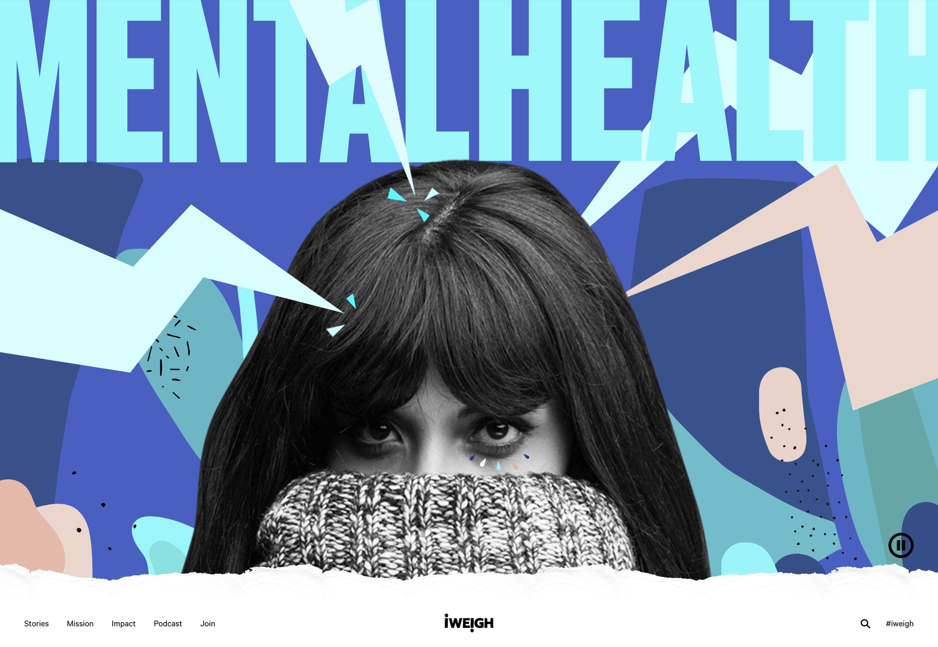
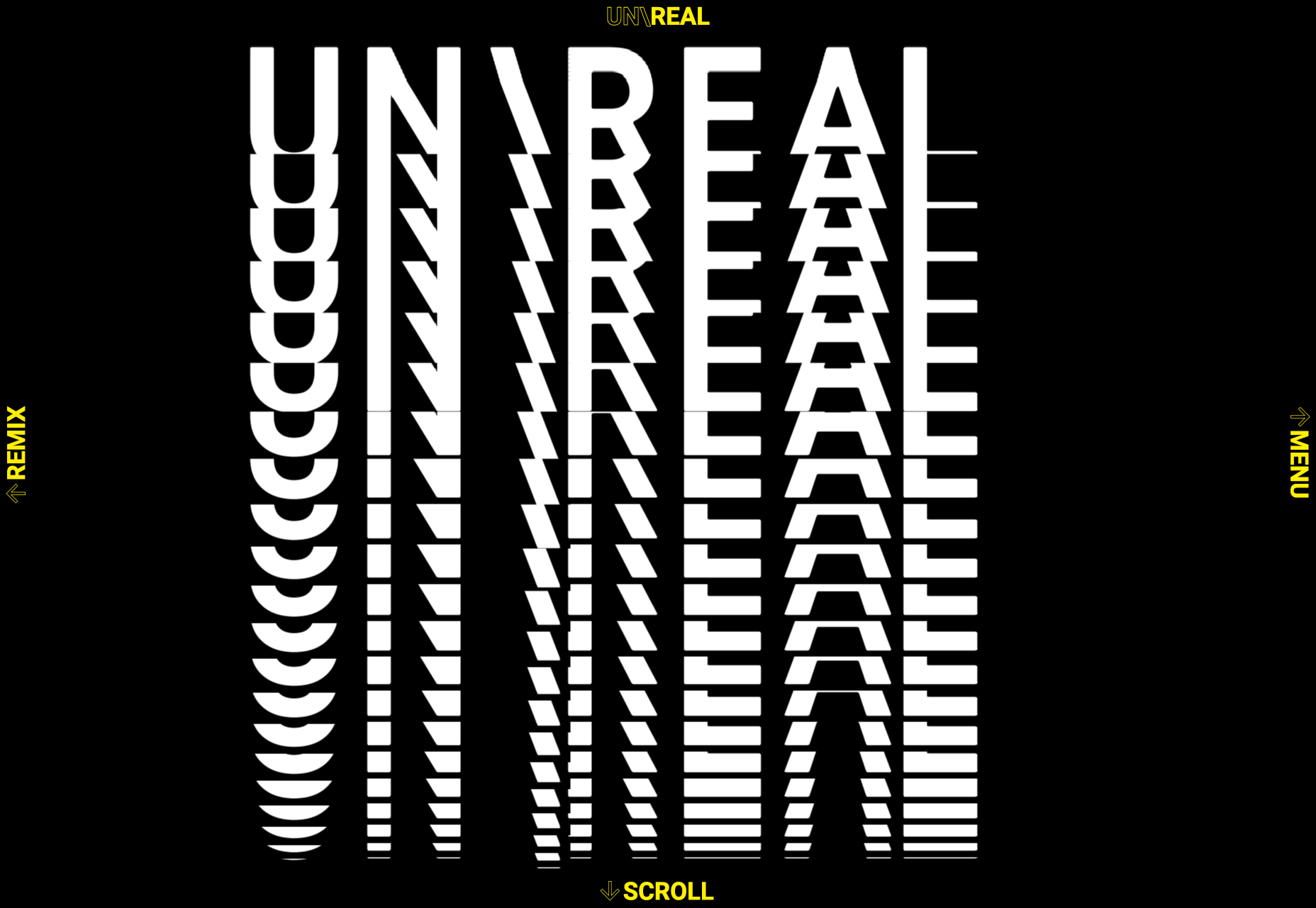
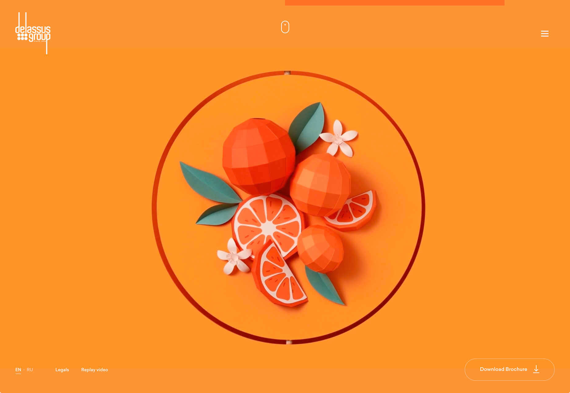
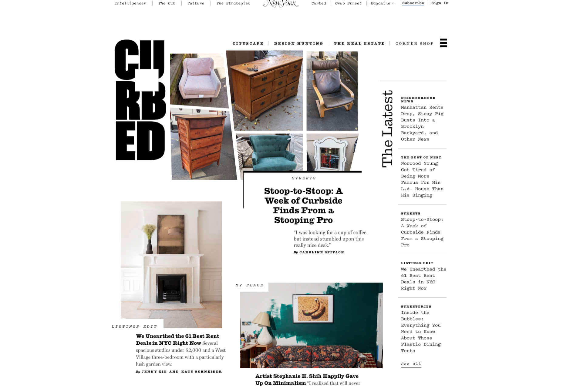
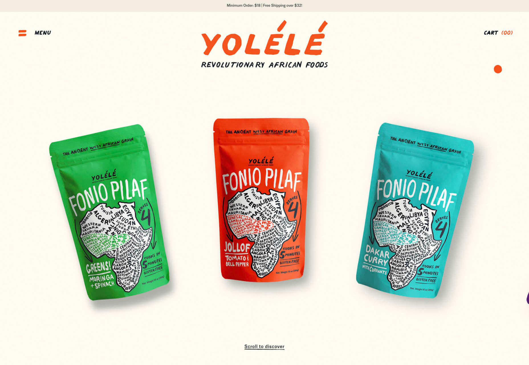
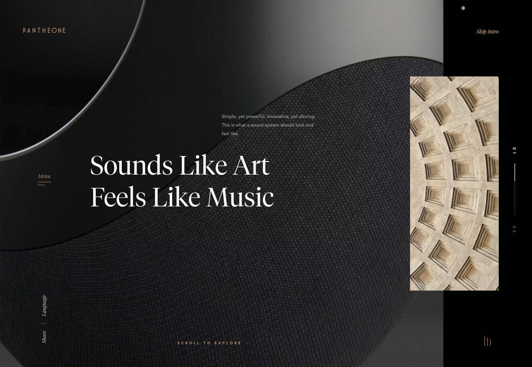
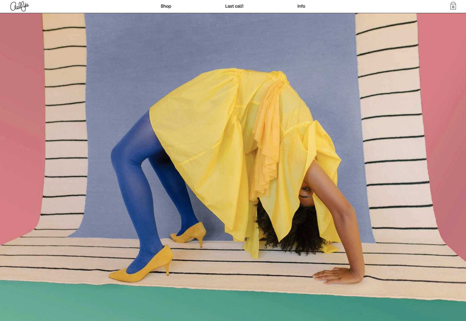
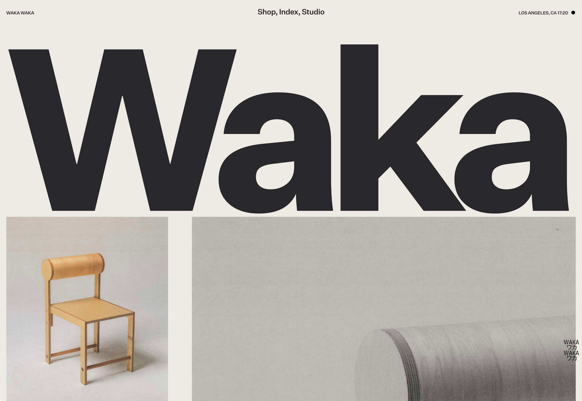
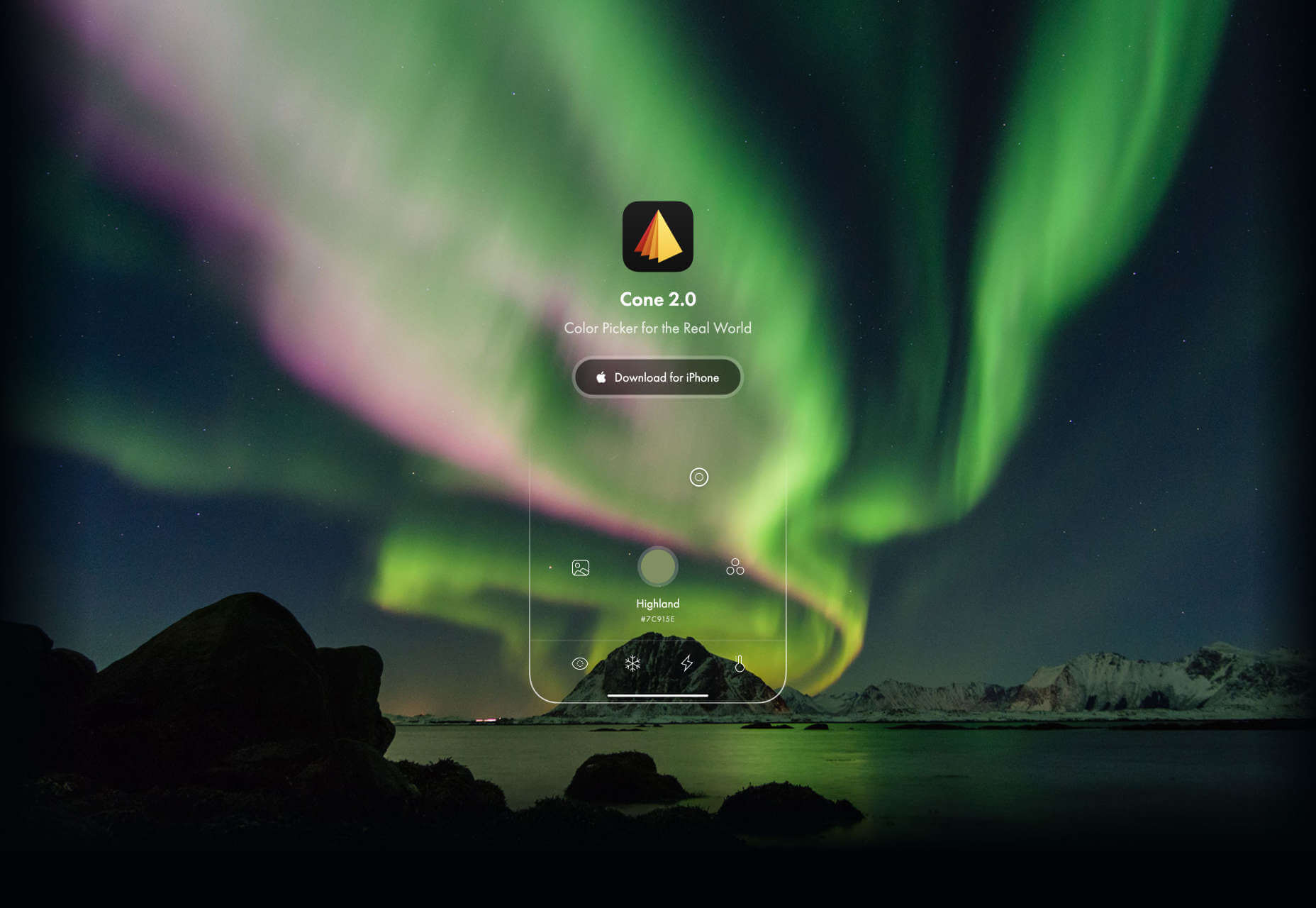
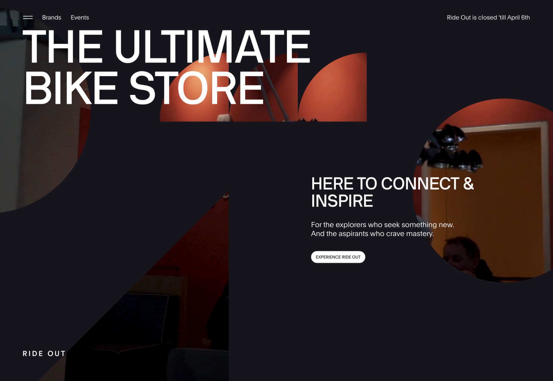
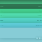
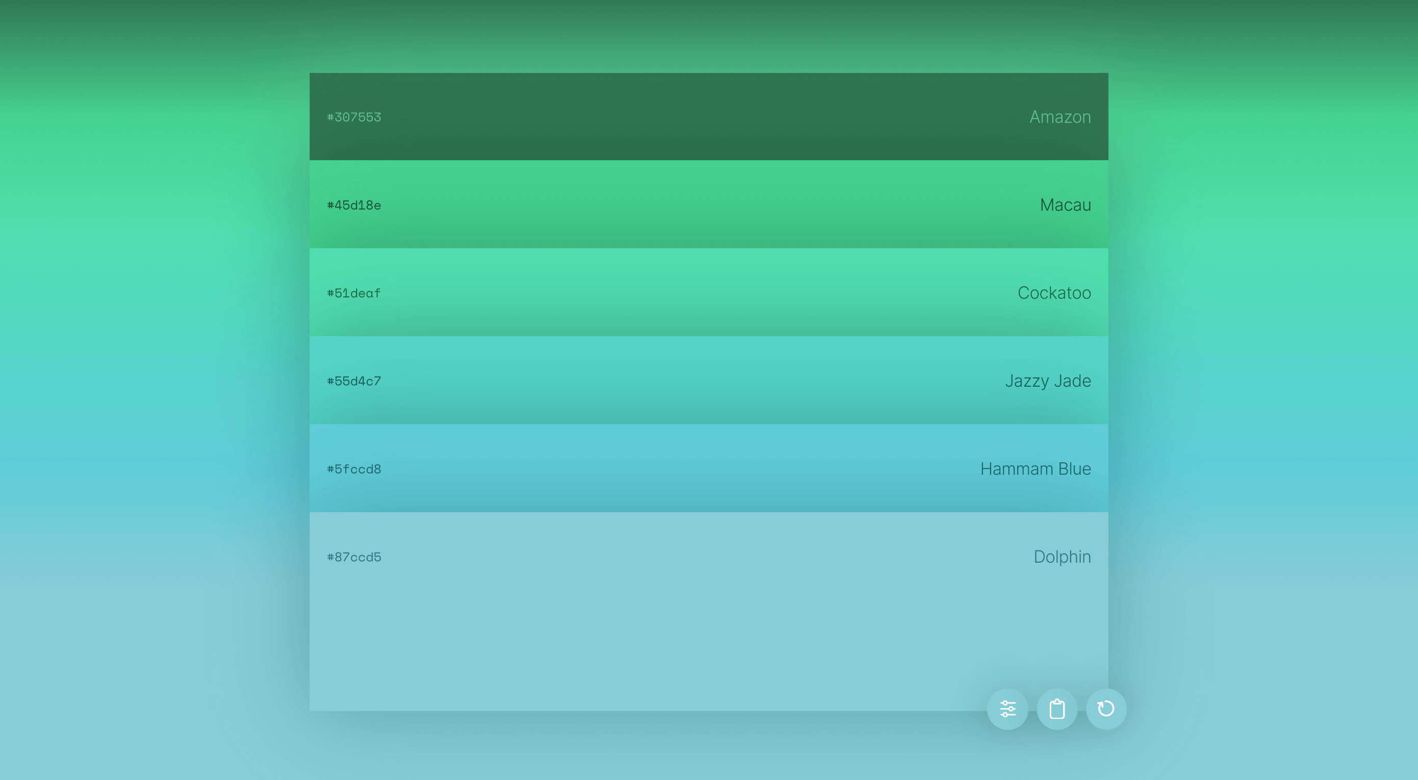
Don’t drop the ball on these website design trends for the new year. All of the trends featured here this month are visual in nature – not as many user interface elements as previous months, but all just as stunning and usable.

Here’s what’s trending in design this month.

1. 3D Scenes on White (Light)

Three-dimensional scenes are not just a trend this month but are likely to be one of the biggest website design trends that you see all year.

They offer a great way to show off product imagery, design something with illustrations or animation for visual impact, and provide usability and understandability cues for users.

It’s a versatile technique that can work with real or created images and are also “COVID-friendly,” something designers have had to think a lot about in the past few months. (Appropriate imagery in design is a real concern, as is trying to design projects without the ability to produce traditional photoshoots.)

What’s neat about all of these projects – and plenty of others – is that they root the design in white or light backgrounds. The light effect creates an easier visual mood that’s clean and emphasizes the imagery.

This website design trend solves a lot of those problems and looks good doing it.

Google’s Cloud design uses 3D illustrated animation on a white background with plenty of depth elements. The primary color palette of illustrated objects pulls it all together and guides the eye through each of the callout labels.

The red words on the screen Crystal Pure fit perfectly with the white-on-white 3D imagery of this design. Red accents pull you into different places on the screen, and it all has a clean feel.

Hofmann & Hofmann uses the same concept with a slightly different approach. The background is still light with a realistic feel and 3D objects, but it is a lot less stark and white. The feel is a little warmer and more inviting than a flat white aesthetic.


2. So Many Stacked Capitals

If you don’t have great artwork or imagery, make your own with typography.

This trend seems like it might be yelling at you just a little, but it still works for the most part — well, as long as you don’t land on too many of these website designs in a row!

What’s interesting about this trend is that many of the designs feature all caps type and serifs. These styles have been making a bit of a comeback, but this use is interesting for many reasons.

The hardest part when using all caps is maintaining readability. That’s why you see some variances in regular, italics, and bold weights, as well as the use of multiple typefaces. The goal is to create a good reading flow with a stunning visual presence.

This trend works best when you have “easy” words on the screen to facilitate scanning. Too many long or complicated letter combinations can get challenging quickly.

Make sure to look for the Easter eggs in each of these projects:

Emotion Agency has tiny “waving” illustrations next to each word (which doubles as the navigation) when you hover over them.

Mill3 Studio has a few animations, from the text flying in and out on load and scroll to subtle movements in the emojis.

Bizarro has this fun little cat video with a tiny warning not to hover over it, but you definitely should.


3. Empty Places

The final trend in this roundup is a stark reminder of current times. Each of the website design features empty places or locations.

This style of imagery would have been avoided pre-pandemic because tourism locations would want visitors to feel like a part of a bustling environment. Not today. If you travel, chances are you may feel safer or want to be in a more secluded environment.

All of the images and videos from these locations show just that.

Designers are doing this with new stark imagery that stands alone for the design or inserting a few empty place frames into video clips or among images that show more populated times. Even scenes that contain people show very few people and focus on more solitary activities.

Paragon Oak does this by showing a beautifully lit location at night. Note that using a nighttime photo eliminates questions about where the people are or what they are doing. (This is a clever option when showing imagery of an empty place.)

Vienne to Paris shows boats on the water with a beautiful background. While you assume there are people on the water vessels; you don’t see them and get the feeling that everyone is separated in their own “pod,” a pandemic-friendly option for travel.

The Maryculter House shows various images without people – the resort’s location on beautiful grounds; empty, but immaculate rooms, and a few images of a person alone on the grounds. Again, the empty nature of the place feels more appropriately welcome for the time we live in.


Conclusion

One of the things that we’ve seen with design trends in the past year is pandemic-related. The composition of images to the way elements are arranged on the screen influences every aspect of our lives.

While the empty place image and video trend is big now, it may fade post-pandemic. Although, it could still be relevant for quite some time. It will be interesting to see what happens as the year progresses with this trend – will it hold on or fade away?

These trends might continue to hold well into 2021.

Source


Source de l’article sur Webdesignerdepot

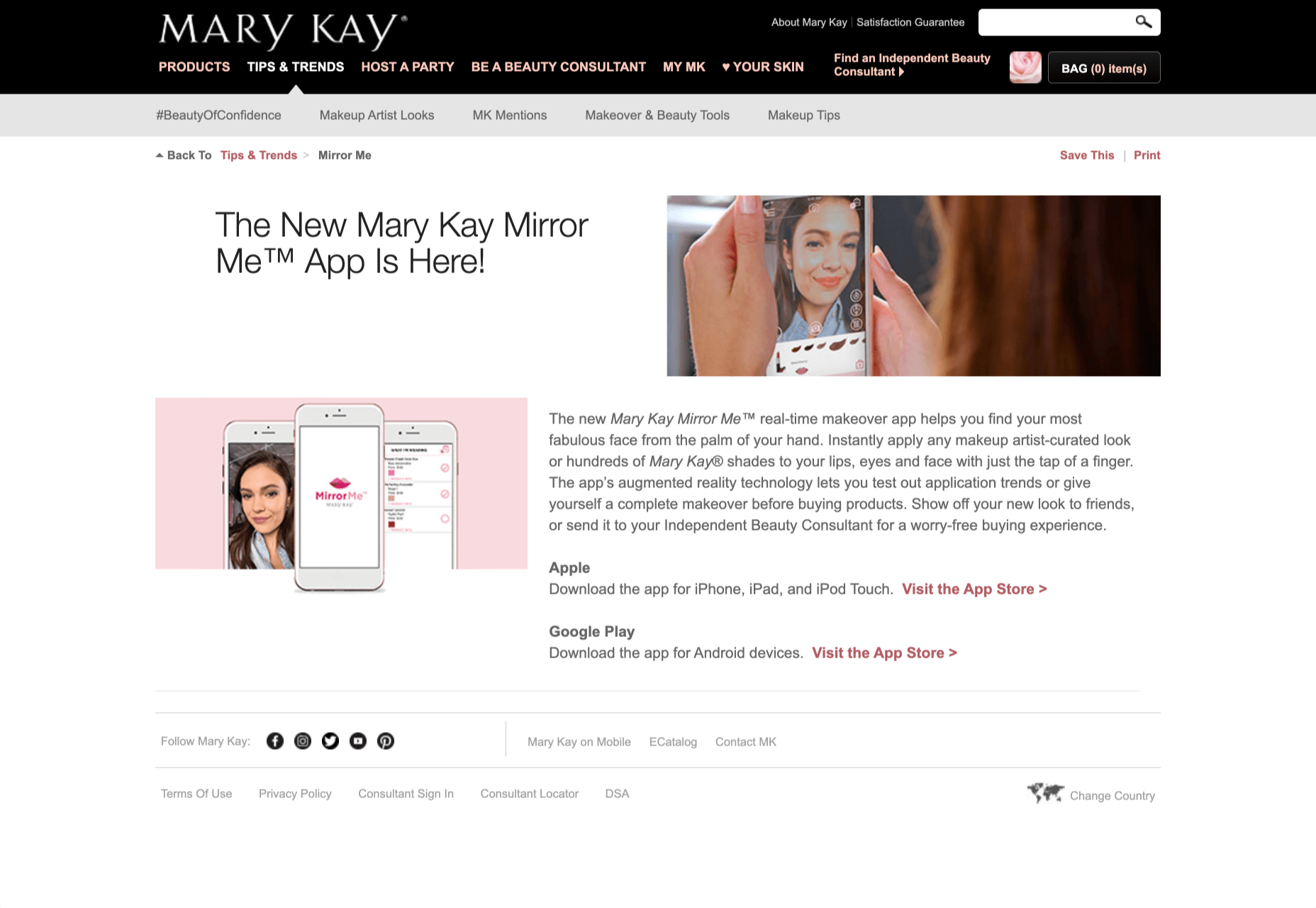
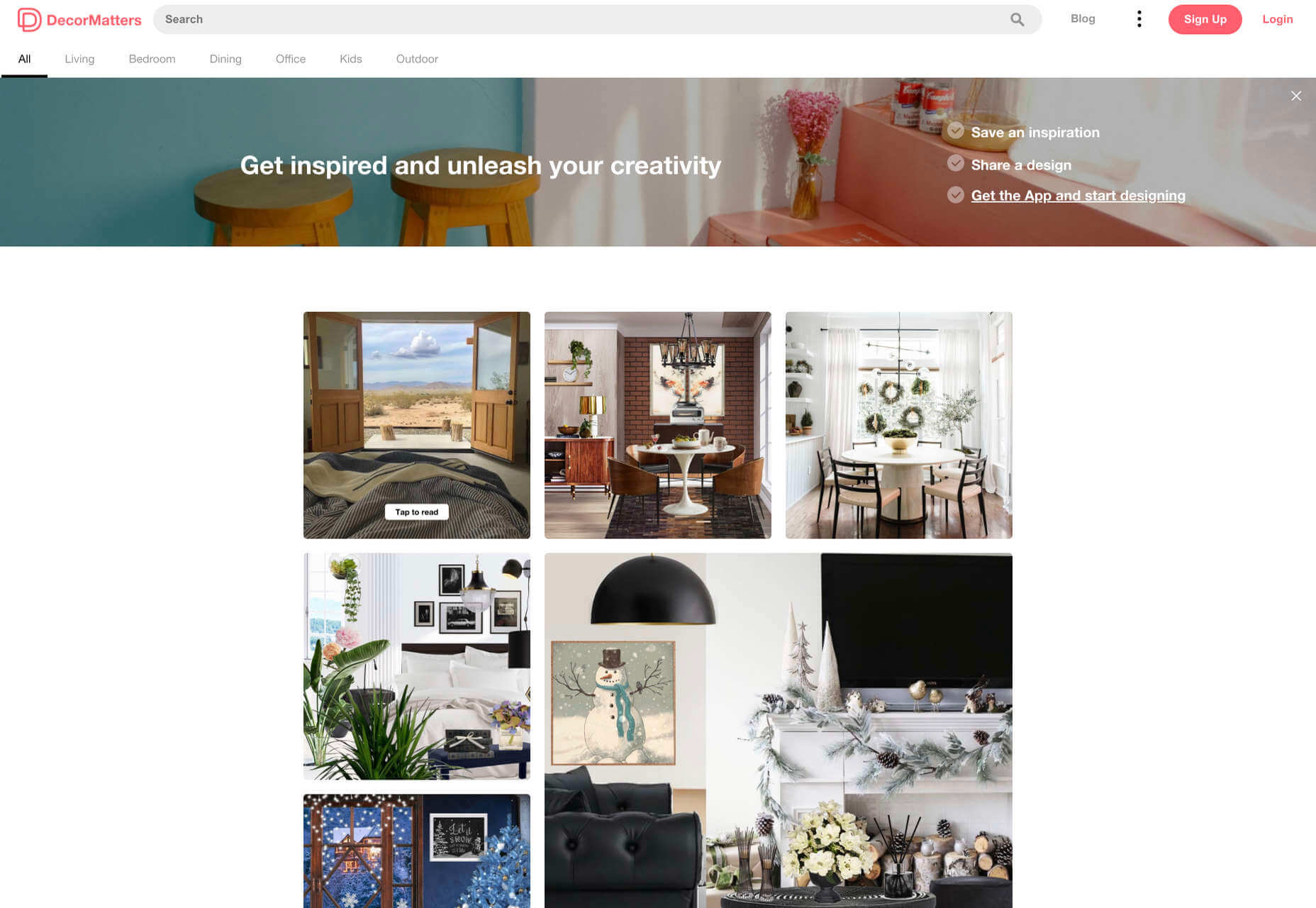
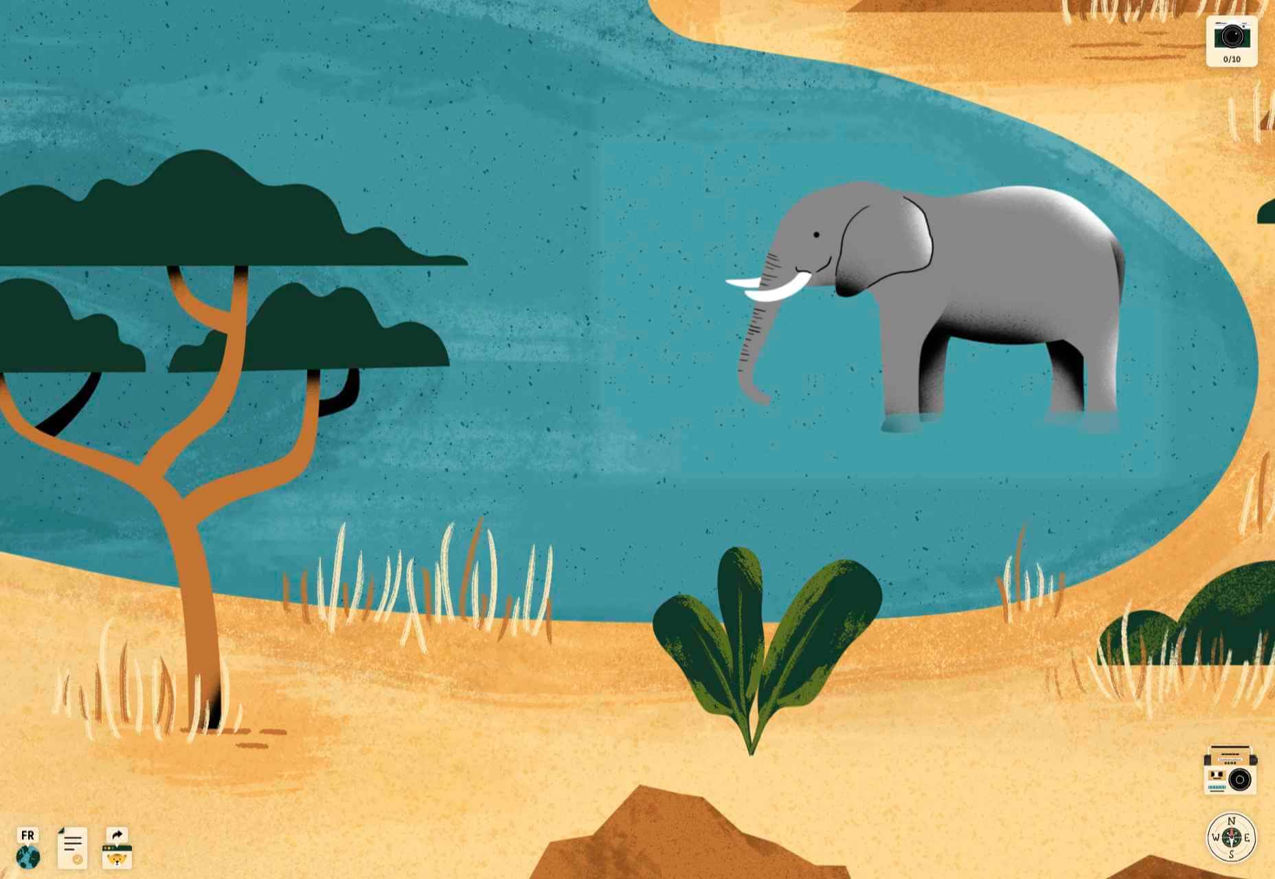
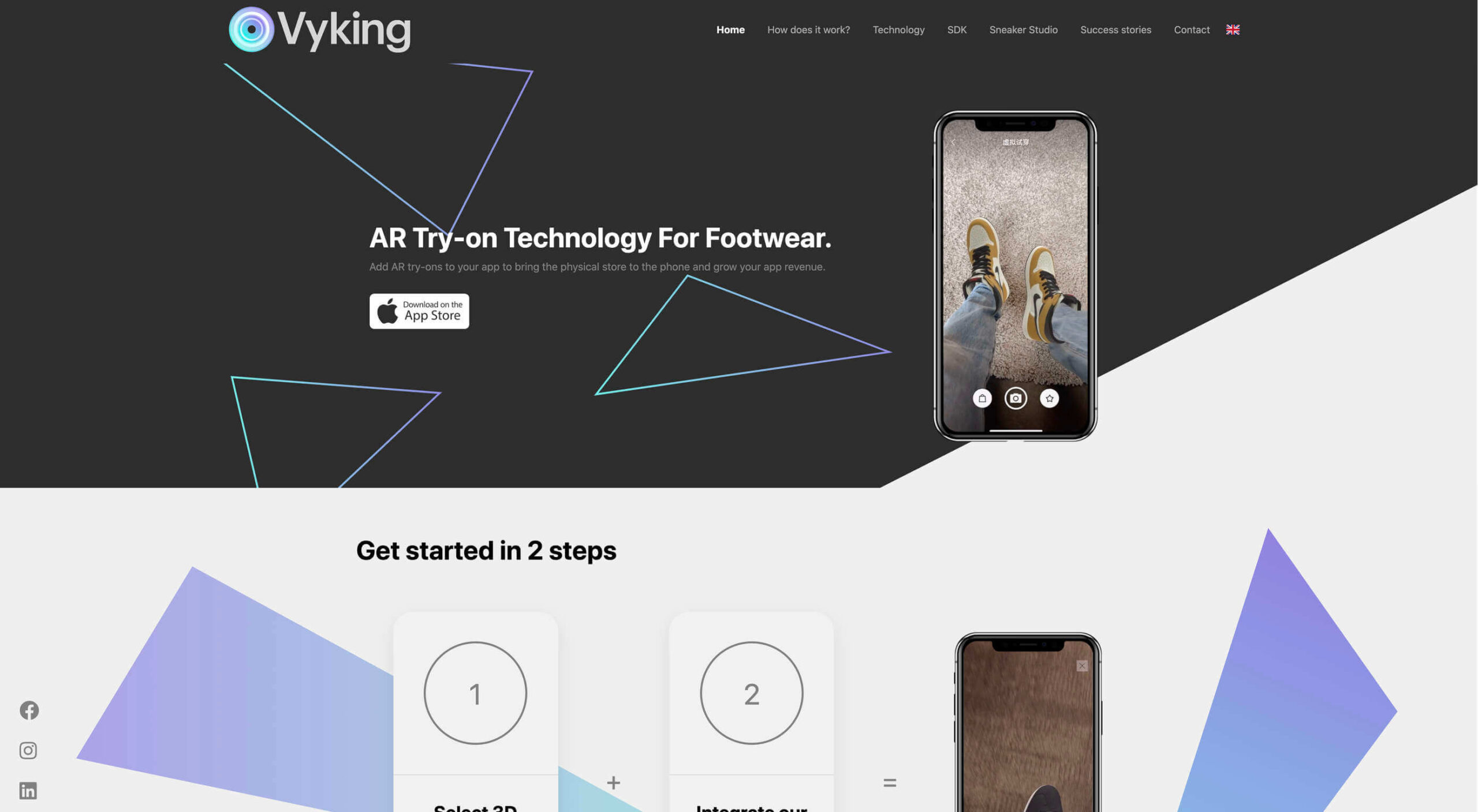
Over the years, experts have repeatedly discussed the possible impact of mixed realities on web design. Concepts like AR and VR are expected to have the potential to change the way that we interact with websites on a fundamental level.
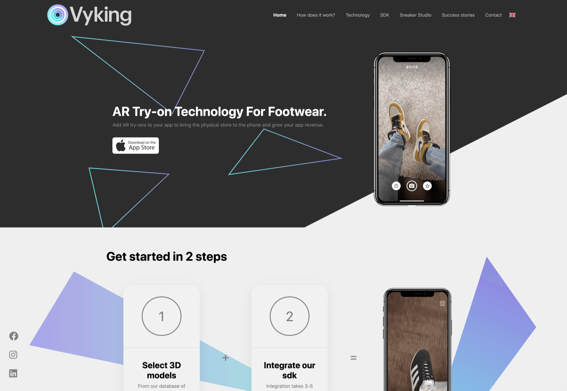
Now that we’re in the year 2021, however, discussions about AR aren’t just observational anymore. The age of mixed-reality interfaces is here, in everything from Pokémon Go, to Snapchat filters.

The question is, how do web designers create incredible user experiences in a world where there are now multiple digital realities to consider?

The Benefits of Experimenting with AR

Before we look at some of the steps that web designers can take to enhance their projects with AR, it’s worth examining the benefits of interacting with augmented reality in the first place. 

While virtual reality replaces the typical world around us completely with digital components, AR augments it. This means that developers and designers need to learn how to thrive in an environment where the real world and the digital one work together. 

The most common AR application for website owners is to provide a solution for real-time and remote product visualization. Imagine being able to try on a pair of shoes before you buy them online. That’s a service that the Vyking brand can deliver by creating technology that “reinvents” the digital shopping experience. 

This test functionality plays a massive role in purchasing decisions. In a world where people can’t see a shade of make-up in person when they’re shopping online, or check how an item of furniture looks in their home, AR has a crucial role to play. 

In simple terms, AR helps shoppers to make more informed purchases. 

Here’s how you can use augmented reality to deliver incredible UX. 

1. Focus on Real-Time Feedback

Augmented reality is all about connecting the real world to the virtual world. 

Doing this provides users a unique experience – one that’s filled with real-time feedback that can deliver crucial and insightful information. For instance, an augmented reality system in a GPS app can calculate the average time before reaching a destination based on previous trips.

Another option is for an augmented reality to use solutions like face-mapping to help customers determine how a certain makeup product will look before they buy it. For instance, that’s the case for the Mary Kay Mirror Me app, which simplifies the process of shopping for make-up. 

When designing for AR, experts need to consider how they can provide customers with real-time information that they can use to make better purchasing decisions. 

2. Define input and output

Although you’ve probably performed similar exercises when designing for traditional websites and applications in the past, defining inputs and outputs of UX in AR environments can be tough.

Defining inputs and outputs allows you to determine which elements of an interface your user can actually interact with, in your interface. This gives you a better idea of what to “augment.” For instance, you might decide that physical gestures like a swipe of the hand will be essential for AR inputs. However, you’ll also need to consider how each mobile device offers different input possibilities. 

Outputs are a little simpler. For instance, you could offer a three-dimensional model of a product that your customers are interested in. Once you have that output, you can think about how the customer will interact with it by changing colors or position.

3. Embrace Customer-Friendly Performance

Another feature at the heart of AR applications is interactivity. 

Good designs in the augmented reality world need to be simple to access and use, otherwise customers will end up avoiding them. For instance, 60% of customers say they want to use AR when they’re shopping for furniture. However, they’re only going to use your app if it actually works. 

The Décor Matters website and app mix gamification with home decorating features that help customers get a better view of the home goods they’re planning on buying. The website even has inspiration pages available to help users find and try new design options with their AR technology. 

When designing for AR, think about how you can make your applications or technology as simple to use as possible, so customers actually want to interact with it. 

4. Address the Environment

In augmented and virtual reality applications, it’s important to remember that interfaces aren’t bound by physical screens. The viewport will move with the user, shifting perspectives in response. Most AR designers will use four different signifiers to describe AR environments:

  • Public environment: The entire body of the user is involved as a controller, like with the Xbox Kinect or Nintendo Wii;
  • Intimate environment: Where a user can be seated – often in a desktop environment;
  • Personal environment: AR on smartphones, mobile devices, and tablets, like Pokémon Go;
  • Private environments: Completely private spaces, such as with wearable technology like the Google Glass solution.

The environment that you’re designing for will be crucial for your project outcomes. Remember, spatial considerations need to be carefully considered when accounting for how users will interact with objects in a frame. 

5. Remember User Fatigue

Another thing to keep in mind when designing for AR technology is that user fatigue is likely to be a much more significant consideration. After all, people interact with websites and applications in a much more intimate and in-depth way when AR is involved. 

AR applications can often use the entire body of a customer as a controller. Because of this, designers need to be careful about exhausting interactions. High-effort and repetitive interactions could tire the user out mentally and physically, causing them to give up on the interaction. 

When designing, you’ll need to consider how you might over-stimulate the user with too many interaction-focused elements at once. Keep it simple.

6. Remember the Essential Principles of UX Design

Remember, just because you’re tapping into a relatively new technology doesn’t mean that you should abandon all the basic tenets of user experience design that you’ve come to understand over the years. Although UX is constantly evolving and changing, it’s always going to keep a few fundamental principles in mind. 

For instance, you’ll always strive to give users the best digital experience in exchange for the lowest amount of effort on their part. Additionally, you’ll need to think about how you can make end-users as comfortable as possible when they’re interacting with new types of technology on websites and apps. 

For instance, since AR is most commonly associated with gaming in the current environment, it might be a good idea to implement gamification concepts into your AR design. What can you do to make sure your customers are having fun?

For instance, Inkhunter is an app that allows users to try on tattoos just like using a filter on Snapchat. The experience feels familiar, comfortable, and exciting.

Unlocking the Potential of AR Web Design

Augmented Reality technology has come a long way over the years. Today, developers and designers can access simple plug-in tools like WordPress VR, allowing designers to upload 360-degree videos into WordPress sites and other unique web extensions. 

Augmented reality is becoming much more readily available on sites and apps of all shapes and sizes. Additionally, customers are accessing more ways to unlock AR’s power through everything from headsets to mobile interfaces. 

However, just like any new technology in the web design world, designers need to think carefully about how they will overcome the challenges in user experience that AR can present. For instance, though AR can offer more information for a customer and help them make purchasing decisions faster, there are also risks. For instance, add too many interactive features to a single website or application, and you could scare users off with too much information. 

In the short-term, web designers need to explore the new tools that are available to them and think about the customers they’re designing for. Only this way will we be able to make any considerable advances in the possibilities of AR. 

Are You Ready to Embrace AR?

Designing for augmented reality applications and websites can be an intimidating concept – even for seasoned designers. However, this is just another technology that creatives can use to drive better experiences for end-users. 

Learn how the latest technology works and get an insight into your customers’ needs, and you’ll be amazed at what you can accomplish in the AR world.

Source


Source de l’article sur Webdesignerdepot

2020 has been one of the most memorable years in our history. Few of us have been alive long enough to experience a more turbulent time. But throughout the year, we saw design respond to challenging events with positivity, color, and a desire to elevate those people and projects working to make the world better.

As we head into 2021, there’s no denying that 2020 has changed our outlook on life and marked a major turning point in web design trends.

Here’s a collection of the websites we loved the most this year. Enjoy!

Looks Like You Need Iceland

On Looks Like You Need Iceland, you are invited to record a scream, which will then be broadcast into the Icelandic wilderness. It’s meant as a form of therapy. The idea is that you will one day visit Iceland in person. That might still be some way off for most of us, but we could certainly use a good therapeutic scream.

Black Lives Matter

Across 2020 there were major protests around the world in support of Black Lives Matter. The movement’s website is a central hub for news, resources, and civil rights information in 38 countries.

2º Earth

2ºC Earth takes the user to 5 locations worldwide and shows what will happen there if global temperatures rise by 2ºc. Sound is used really well here to create an immersive experience, along with some beautiful photography.

Github

Along with some new features announced earlier this month, GitHub has a glossy new homepage. It has a clean feel, with some nice scrolling animation and sparing but effective use of illustration.

I Weigh Community

Political and social initiatives were big in 2020, and non-profit activism initiative I Weigh Community is the brainchild of actress Jameela Jamil. It’s devoted to radical inclusivity, communicated with bold, expressive graphics.

UNREAL

Back in January, we clicked around UNREAL’s site for hours, enjoying the sharp transitions. The Swiss agency produced a wonderfully chaotic love letter to web animation.

Delassus

Delassus grows fruit, from citrus to avocados. The Moroccan company employs a cornucopia of 3D design to make its site bold, fun, and practical.

Lynn Fisher

We loved everything about Lynn Fisher’s site back in May. The homepage illustration was awesome. It was a humorous approach to RWD that we really appreciated. The site has since changed, with tons more to explore.

Minervo

The Minervo site feels distinctly Latin, with the hot pinks and sun-blasted desaturation feeling suitably South American. We love the cropping on the custom typeface.

Babord

Norwegians have an almost mystical connection with the sea, which is evident in the site for Babord, a Norwegian seafood supplier. We loved the brand font too.

Calexo

Calexo makes THC-infused beverages, and back in April, we loved the color and positivity of the site. The animated hamburger menu was a hit too.

Moooi

Moooi’s site layers illustration with a maximal effect that makes you feel like you’re chasing a white rabbit. There are tons of great UI details here, especially the bar that reveals the product videos.

Blind Barber Anniversary

The Blind Barber celebrates 10 years of success with this microsite. A deconstructed grid and an entirely black and white design, but with color photos, create energy and a sense of joy.

Zand Harirchi Architects

Zand Harirchi is an architecture firm based in Tehran, Iran. Its site features subtle references to architecture, like the delightful thumbnails reminiscent of small windows.

WFN

The WFN (Women’s Funding Network) is an international alliance supporting women’s foundations and gender justice funders. The sophisticated color palette and clean type are both confident and feminine.

Nathan Taylor

We loved exploring Nathan Taylor’s playful site all the way back in January. The different lighting modes were a firm favorite.

Käthe Kollwitz Memorial

A tribute to the life and work of Käthe Kollwitz, an Expressionist printmaker. There’s a catalog of her work, presented alongside large type and splashy color transitions.

Emotive Feels

Emotive Feels is a design manifesto from the Emotive Brand agency that illustrates an A–Z of potential brand emotions with simple animations that we likened to a Blue Note release.

A. N Other

A.N Other’s site for perfume highlights quality ingredients, materials, simplicity, craftsmanship, and the environment; in the process, it cleverly invokes a sense of luxury.

Playtype

Danish type foundry Playtype’s site fits its name perfectly. The playful site with bright blocks of color and the occasional animation shows off some pretty nice typefaces.

Feijoo Montenegro

All-text sites are always a thrill, and back in June, we were treated to this simple one-pager by Feijoo. Details like the numerals being replaced by words are delightful.

Wavering Stripes

Although this site’s subject matter is harrowing, it is presented in a very beautiful, thoughtful manner.

The Oyster & Fish House

Sophisticated typography, the wave textures, the nostalgic feel of the photography, and even the cookie notice’s on-brand styling all show attention to detail, which gives this site its appeal.

Who Cares

Find and ‘photograph’ the endangered species to learn about them in this delightfully illustrated game.

Curbed

When Curbed came under the umbrella of New York magazine earlier this year, it got a makeover. Neon highlights and a distorted grid give an edge to the classic magazine layout.

Yolélé

The carousel of fonio (it’s a West African grain) products on Yolélé’s landing page is a good example of horizontal scrolling that works well. There are some great page transitions too.

Pantheone Audio

Pantheone Audio’s site employs elegant scrolling to enable seamless navigation of an extremely luxurious site, underpinned by a complex grid.

Aelfie

Bright color, an irregular grid, illustrations, and a display type that feels almost hand-drawn perfectly captures the aesthetic of this NY-based home furnishing brand.

Highcourt

This site for private membership leisure club Highcourt uses subtle background color changes and simple line illustrations to create a sense of calm. Black and white are softened to dark blue and ivory, and gentle animation adds interest.

Kate Jackling

Kate Jackling’s site takes a step back and allows the content to bask in the glow of attention, placing her photography at center stage.

Treaty

While there is less hustle and bustle outside than we were used to pre-pandemic, we could certainly all use some calm. Treaty’s site for CBD oils reflects that calm with a combination of video, whitespace, and botanical drawings.

Ukrainian Railroad Ladies

Ukrainian Railroad Ladies is a book of photographs of women, and some men, who work on the Ukrainian railways. The site is basic, even brutalist, but it has charm, and the photographer’s fascination with his subject comes through.

Year & Day

Year & Day is an ecommerce site that sells tableware, from glassware to ceramics. The colorful collection is designed to complement different types of food, and the site’s color scheme reflects that perfectly.

Juan Mora

Juan Mora’s ‘under construction’ holding page has probably been crafted with more care than many full-blown sites. This showcase cleverly manages to demonstrate its subject’s skills without showing a single piece of work.

Lucciano’s

Lucciano’s homepage hero video alone will have your mouth watering for some of their gelato. Much of the appeal of food is visual, and the photography here does not disappoint. Circular text boxes in ice cream colors complement the product shots nicely.

Bored Solutions

Back in April, we were already a little weary of lockdown — if only we’d known how long it would last! The amazing color blobbing of bored.solutions was the ideal distraction.

Grand Matter

Grand Matter is an artist agency representing illustrators. There is a wealth of talent on show here and a broad enough range of styles to keep the web interesting for a good while.

Dunderville

This site for Dunderville motion design studio features a paper fold detail, which adds tactility to the virtual. Some superb type and vector animations showcase an impressive portfolio.

Album Colors of the Year

Album Colors has taken the covers from 150 albums released this year and arranged them by dominant color. The hex code for each color is provided if you want to copy it.

Mammut Expedition Baikal

Mammut uses stunning photography and a strong narrative to present its Eiger Extreme outdoor clothing. Longing for the great outdoors will either be alleviated or exacerbated by this one.

808303

808303.studio is a virtual Roland TR-808 drum machine and TB 303 bass synthesizer. You can program, record, and share your very own 80s techno masterpiece.

Bliss

Humor can be hard to get right, especially when you want to be taken seriously at the same time. Here, it works, and the result is a memorable site, oozing with confidence.

Jazz Keys

Type your message into Jazz Keys, and you’ll hear it in sound. You can send the message to anyone and let them hear your words — the web lives for side-projects like this.

Érika Moreira

The fabulous, simple site for Sao Paulo-based Érika Moreira has some awesome big type and creative case studies. It’s an excellent example of a non-visual portfolio.

G.F Smith

Earlier this year, the site for leading paper supplier G.F Smith got a redesign. It is a simpler design than the previous site and keeps the visual focus on the products and the colors.

Abbotsford Convent

Abbotsford Convent is a creative arts venue in Melbourne, Australia, based in a former convent. The UI for its site blends architectural forms to acknowledge the building’s heritage.

Waka Waka

Waka Waka designs and builds wooden furniture. The mid-century typography and the noise textures transport the site to the last century’s radical graphic design. There’s some clever disruption to the typical thumbnail approach.

Cone

Sites advertising apps always seem to want to box the design into a hastily de-branded mock-up. Cone takes a daringly refreshing approach by depicting a more expansive mobile experience.

Ride Out

Amsterdam’s Ride Out bike store teases the content with an intriguingly masked video. Plus, we love the wheel-inspired spinning links.

Puddle Sound

This site is a model of minimalism. Beautiful photographs and very little text, there is nothing to distract from the product on display.

Source


Source de l’article sur Webdesignerdepot

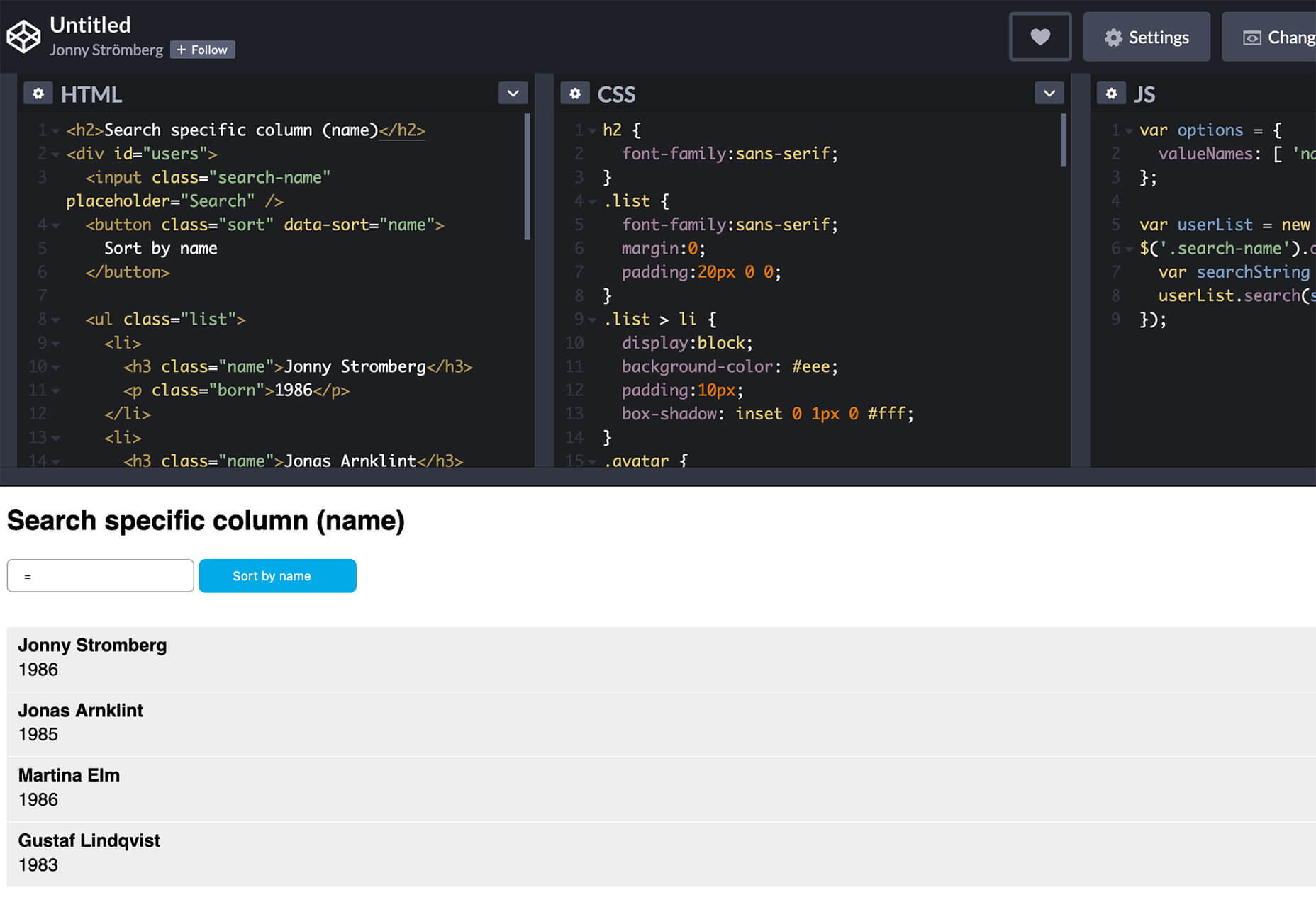
User experience is one of the most important aspects of web design, but many experts overlook that UX doesn’t just apply to web pages. User experience as a concept encompasses all aspects of end-user interaction with a company.

That means you need to discover the right UX strategies for everything from your homepage to your email marketing and even your listings on Google.

Today, we’re going to explore some of how you can apply UX principles to your client’s image on search engines.

Why Your Search Engine Listing Matters

Let’s start with the basics: 89% of customers start their purchasing process with a search engine. That means that whether you’re creating a portfolio to sell your services or building a website for a client, the first connection a customer has with your design isn’t on the homepage.

Most of the time, you’re driving a specific experience for an end-user before you even realize it. Before you can wow an audience with a beautiful site design or an amazing CTA offer, you need to convince them to click on your Google link.

When you invest in user experience, you think carefully about the journey that an end-user goes through when interacting with a brand. This often means considering things like the user’s intent, their needs, and their pain points.

Those same principles apply to create an impressive search engine listing.

UX on a website is all about giving your audience what they need in an informed, and strategic manner; UX in the search engine results works the same way.

How to Make Your Search Listing Stand Out with UX

So, how do you begin to apply the principles of UX to your Google Search results?

It’s much easier than you’d think.

Step 1: Show Immediate Value

Delivering an excellent experience on a website often means providing end-users with the information they need as quickly as possible. Imagine designing a landing page; you wouldn’t want your audience to scroll forever to find what they need. Instead, you’d make sure that the value of the page was immediately obvious.

When creating an image for your search engine listing, you’ll need to take the same approach. This often means thinking carefully about two things: your headline and your meta description.

Around 8 out of 10 users say that they’ll click a title if it’s compelling. That means that before you do anything else to improve your SEO strategy, you need to make sure that your web page’s title is going to grab your audience’s attention.

The best titles deliver instant value. These titles tell the audience exactly what they’re going to get when they click onto the page. The promise drives action, while clarity highlights the informed nature of the brand.

The great thing about using an excellent title for a page is that it doesn’t matter where you’re ranked on the search results. Whether you’re number 2 or number 5, your customers will click if they find something they want.

It’s just like using a CTA on a landing page. Make sure your titles are:

  • Informative — show your audience value immediately;
  • Optimized for mobile — remember, your audience might not see your full title on some screens; this means that you need to make the initial words count;
  • Easy to read — keep it short, simple, and clear, speak the end-users’ language.

Step 2: Build Trust with Your URLs

Trust factors are another essential part of good UX.

When you’re designing a website for a new brand, you know that it’s your job to make visitors feel at ease. Even in today’s digital world, many customers won’t feel comfortable giving their money or details to a new company.

Within the website that you design, you can implement trust symbols, reviews, and testimonials to enhance brand credibility. On search engines, it all starts with your URL.

Search-friendly URLs that highlight the nature of the page will put your audience’s mind at ease. When they click on a page about “What is SEO” in the SERPs, they want to see an URL that matches, not a bunch of numbers and symbols

Use search-friendly permalink structures to make your listing seem more authoritative. This will increase the chances of your customer clicking through to a page and make them more likely to share the link with friends.

Once you decide on a link structure, make sure that it stays consistent throughout the entire site. If a link doesn’t appear to match the rest of the URLs that your audience sees for your website, they may think they’re on the wrong page. That increases your bounce rate.

Step 3: Be Informative with Your Meta Description

To deliver excellent UX on a website, you ensure that your visitor can find all of the answers to their most pressing questions as quickly as possible. This includes providing the right information on each page and using the correct navigational structure to support a visitor’s journey.

In the SERPs, you can deliver that same informative experience with a meta description. Although meta descriptions often get ignored, they can provide a lot of value and help you or your client make the right first impression.

To master your meta descriptions:

  • Use the full 160 characters — make the most of your meta description by providing as much useful information as you can within that small space;
  • Include a CTA — just as CTAs help to guide customers through the pages on a website, they can assist with pulling in clicks on the SERPS; a call to action like “read about the” or “click here” makes sense when you’re boosting your search image;
  • Focus on value — concentrate on providing your customers with an insight into what’s in it for them if they click on your listing.

Don’t forget that adding keywords to your meta description is often helpful too. Keywords will boost your chances of a higher ranking, but they’ll also show your audience that they’re looking at the right result.

Step 4: Draw the Eye with Rich Snippets

You’ve probably noticed that the search engine result pages have changed quite a bit in the last couple of years. As Google strives to make results more relevant and informative, we’ve seen the rise of things like rich snippets. Rich snippets are excellent for telling your audience where to look.

On a website, you would use design elements, like contrasting colors and animation, to pull your audience’s attention to a specific space. On search engines, rich snippets can drive the same outcomes. The difference is that instead of telling a visitor what to do next on a page, you’re telling them to click on your site, not a competitor’s.

When Google introduced rich snippets, it wanted to provide administrators with a way of showcasing their best content. Rich snippets are most commonly used today on product pages and contact pages because they can show off reviews.

Install a rich snippet plugin into your site if you’re a WordPress user or your client is. When you enter the content that you need into the website, use the drop-down menu in your Rich snippet tool to configure the snippet.

Ideally, you’ll want to aim for the full, rich snippet if you want to stand out at the top of the search results. Most featured snippets have both text and an image. It would help if you aimed to access both of these by writing great content and combining it with a relevant image.

Step 5: Provide Diversity (Take Up More of the Results)

As a website designer or developer, you’ll know that different people on a website will often be drawn to different things. Some of your visitors might immediately see a set of bullet-points and use them to search for the answer to their question. Other visitors will want pictures or videos to guide them. So, how do you deliver that kind of diversity in the SERPS?

The easiest option is to aim to take up more of the search result pages. Google now delivers a bunch of different ways for customers to get the answers they crave. When you search for “How to use Google my Business” on Google, you’ll see links to blogs, as well as a list of YouTube Videos and the “People Also Ask” section.

Making sure that you or a client has different content ranking pieces for the same keywords can significantly improve the experience any customer has on the search engines. Often, the process of spreading your image out across the SERPs is as simple as creating some different kinds of content.

To access the video’s benefits, ask your client to create YouTube videos for some of their most commonly asked questions or most covered topics. If you’re helping with SEO marketing for your client, then make sure they have an FAQ page or a way of answering questions quickly and concisely on articles, so they’re more likely to appear in “People Also Ask”:

Step 6: Add Authority with Google My Business

Speaking of Google My Business, that’s another excellent tool that’s perfect for improving UX in the search results. GMB is a free tool provided by Google. It allows business owners to manage how information appears in the search results.

With this service, you can manage a company’s position on Google maps, the Knowledge Graph, and online reviews. Establishing a company’s location is one of the most important things you can do to help audiences quickly find a business. Remember, half of the customers that do a local search on a smartphone end up visiting the store within the same day.

Start by setting up the Google Business listing for yourself or your client. All you need to do is hit the “Start Now” button and fill out every relevant field offered by Google. The more information you can add to Google My Business, the more your listing will stand out. Make sure you:

  • Choose a category for a business, like “Grocery store”;
  • Load up high-quality and high-resolution images;
  • Ensure your information matches on every platform;
  • Use a local number for contact;
  • Encourage reviews to give your listing a five-star rating.

Taking advantage of a Google My Business listing will ensure that your audience has all the information they need to make an informed decision about your company before they click through to the site. This means that you or your client get more warm leads and fewer people stumbling onto your website that might not want to buy from you.

Step 7: Use Structured Data Markup to Answer Questions

If you’re already using things like rich snippets in your Google listings, you should also have a structured schema markup plan. Schema markup on Google tells the search engines what your data means. This means that you can add extra information to your listings that will guide your customers more accurately to the support they need.

Providing additional schema markup information to your listings gives them an extra finishing touch to ensure that they stand out from the competition. You might add something like a “product price” to a product page or information about the product’s availability.

Alternatively, you could provide the people who see a search result with other options. This could be an excellent option if you’re concerned that some of the people who might come across your listing might need slightly different information. For instance, you can ask Google to list other pages along with your search results that customers can “jump to” if they need additional insights.

Baking structured data into your design process when you’re working on a website does several positive things. It makes the search engine’s job easier so that you can ensure that you or your client ranks higher. Additionally, it means that your web listings will be more thorough and useful.

Since UX is all about giving your audience the best possible experience with a brand, that starts with making sure they get the information they need in the search results.

Constantly Improve and Experiment

Remember, as you begin to embed UX elements into your search engine listings, it’s important to be aware of relevant evolutions. Ultimately, the needs of any audience can change very rapidly. Paying attention to your customers and what kind of links they click on the most will provide you with lots of valuable data. You can use things like Google analytics to A/B test things like titles, pictures, featured snippets, and other things that may affect UX.

At the same time, it’s worth noting that the Google search algorithms are always changing. Running split tests on different pages will give you an insight into what your customers want. However, you’ll need to keep an eye on the latest documentation about Google Search if you want to avoid falling behind the competition.

Like most exceptional UX aspects, mastering your SERP position isn’t a set it and forget it strategy. You’ll need to constantly expand your knowledge if you want to show clients that you can combine UX and SEO effectively.

It’s easy to forget that there’s more to UX than making your buttons clickable on mobile devices or ensuring that scrolling feels smooth. For a designer or developer to deliver wonderful UX for a brand, they need to consider every interaction that a company and customer have. Most of the time, this means starting with the way a website appears when it’s listed on the search engines. Getting your SEO listing right doesn’t just boost your chances of a good ranking. This strategy also improves your reputation with your audience and delivers more meaningful moments in the buyer journey.


Featured image via Unsplash.

Source


Source de l’article sur Webdesignerdepot

Animation is a fun and interesting way to bring life to a website. Used correctly, it can capture audience attention, make your website more engaging, and even improve your chances of delivering conversions for your clients.

Unfortunately, like many things in the web design world, it’s also easy to get too carried away with animation. As professional designers and developers, it’s up to us to find the line between making the most of animation on our website projects and creating a site that’s overwhelmed with too much activity.

Fortunately, by the time you’ve finished reading this article, you’ll have a deeper insight into how you can use animation in web design, without going too over the top.

Introducing Animation in Web Design

Animations are virtually everywhere on the web today.

In the past, when designers first discovered that they could embed movement into their websites, the amount of animation we saw was often higher than it needed to be. It wasn’t uncommon to find some websites running entirely on Flash, where every element could be animated.

Fortunately, the trends of modern web design have left those practices behind. These days, it’s a lot more common to make animation a part of the overall user experience, rather than focusing on them as a centerpiece attraction. For instance, you’ve probably noticed plenty of animated sliders showing off pictures in a gallery, or transition animations when people hover over a button.

Since it’s entirely possible to construct an entire website with no animations at all, the key to creating an engaging website today is making sure that every animation you use serves a specific purpose. Your animations should make a website more attractive, easier to use, and better for navigation. Add too many, and you could even risk slowing down a site.

So, where does it make sense to use animation for web design?

1. Loading Animations

One of the best ways to use animations in a website is to distract and delight users as a page loads. You can use the animation to deliver a unique experience, or even just highlight the playful nature of your brand. For instance, just check out this classic load animation called “Tightrope.”

You can also use things like particle animations to capture a customer’s attention and help your visitors relax when they visit a website. Particle animations can be interactive or non-interactive, and they’re a great way to stop visitors from feeling frustrated when a page takes too long to load.

A website by Edan Kwan called “Particle Love” shows you exactly what kind of experience you can create with real-time animations.

The more you can delight visitors with experiences that keep them engaged while the information they need is loading, the less likely people will be to hit the “back” button.

2. Microinteraction Animations

Microinteractions are quick and simple animations that come with specific use cases. Usually, this animation works to provide visual feedback and information when you interact with a specific element.

For instance, this microinteraction design from Colin Garven encourages users to enter their email address and password into a login field:

Ideally, the best way to use microinteractions is to make them as subtle as possible. These tools aren’t here to steal the spotlight from other information on the page. However, they can sometimes encourage your viewers to take the next stage in their conversion journey.

Animated microinteractions can be as complex or as basic as you choose. For instance, you could use them when:

  • Highlighting if a feature is switched on or off;
  • Letting users know when actions were successful (like sending a message in a contact form);
  • Showcasing important information, like prices on a table;
  • Animating icons on your site to encourage action;
  • Depending on your experience with animations, you can even find themes and plugins that come with options already built-in.

3. Dynamic Backgrounds

An animated background can be an excellent way to make your website stand out from the crowd. However, it’s important to remember that excessive animation has a habit of making your site slower and more clunky than it needs to be.

The animated background on the mystaticself.com website is fantastic for introducing customers to new information with a handy dynamic menu.

Often, the only reason that you should create your own dynamic background for a website, is if it’s going to improve your customer’s experience in some way.

Remember, ensure that the animations that you’re using on your website aren’t going to make any aspect of your site more difficult to use. Animated backgrounds need to offer a compliment to your existing website, rather than distracting customers from what they want to do.

Before you go all-in with your background animations, focus on animating small sections of an image, one piece at a time. You can also animate components with very small motions too.

4. Reveal Hidden Messages

Another excellent way to use animation in web design is to harness it for showcasing important information. For instance, a navigation menu is an important component in your website design, but it can also take up a lot of valuable space.

In some cases, a hidden menu that appears when a customer scrolls over a small box or icon could make a lot of sense. You can also think about animated drop-down menus if you’re working with a website that has a large number of pages.

Check out this fun example of an animated CSS3 menu:

The sections change color and move as you hover over them, making it easier to see exactly where you’re clicking.

It’s up to you exactly how creative you want to be when you’re playing with animated menus. The easiest option is often just to have a component that changes color or shape with a hover effect. However, you can also expose hidden menus and extra information too.

For instance, with some websites, you can create pictures that turn over to show information on the other side. That means that you could create an about page with pictures of team members, which flip to show biography information.

Just make sure that everything works smoothly, both on desktop and mobile.

5. Try Carousels

Finally, we come to perhaps the simplest and most popular way of using animation in web design. Carousels are a common component of almost every theme on the web today. They’re great for showing off useful information, such as what a website has to offer, or which deals are available.

When creating a carousel, you can either give your users control over how quickly an image transitions, or you can implement automatic movement. On the heathfield.co.uk website, the designer has added buttons to let you flip backwards and forwards between photos, while also ensuring that the animation is automatic.

Without the animation to show you the pictures sliding into space, the transitions between each picture would be instant – which is a little more jarring for viewers.

Sliders are such a common component of web design today that customers almost expect to see them on many websites. That means that you can enjoy a very effective experience if you want to avoid doing anything too dramatic with your websites.

You can use sliders for everything from showing off products, to displaying testimonials from customers and more. It’s a great way to compress a lot of useful information into one small space on a site.

Use Website Animation Carefully

The most important thing for most designers to remember with animation and web design is that it’s entirely possible to have too much of a good thing. When it comes to creating amazing designs for your clients, you can take advantage of animation to encourage more engagement and a unique experience. However, you shouldn’t allow yourself to go too over the top.

Rather than animating every aspect of a page to constantly grab visitor attention, think about how you can make the visitor experience more compelling with the right animation choices. If an entire page of animation on the background isn’t right for your target audience, perhaps custom animations on a navigation bar or a slider would be a good option instead.

At the same time, remember to make the most of the latest technologies on the market for adding animation to web design. A good combination of CSS3, JavaScript, and HTML5 often makes it easier to create more immersive, high-quality animations that users can interact with on desktop and mobile alike.

Source


Source de l’article sur Webdesignerdepot

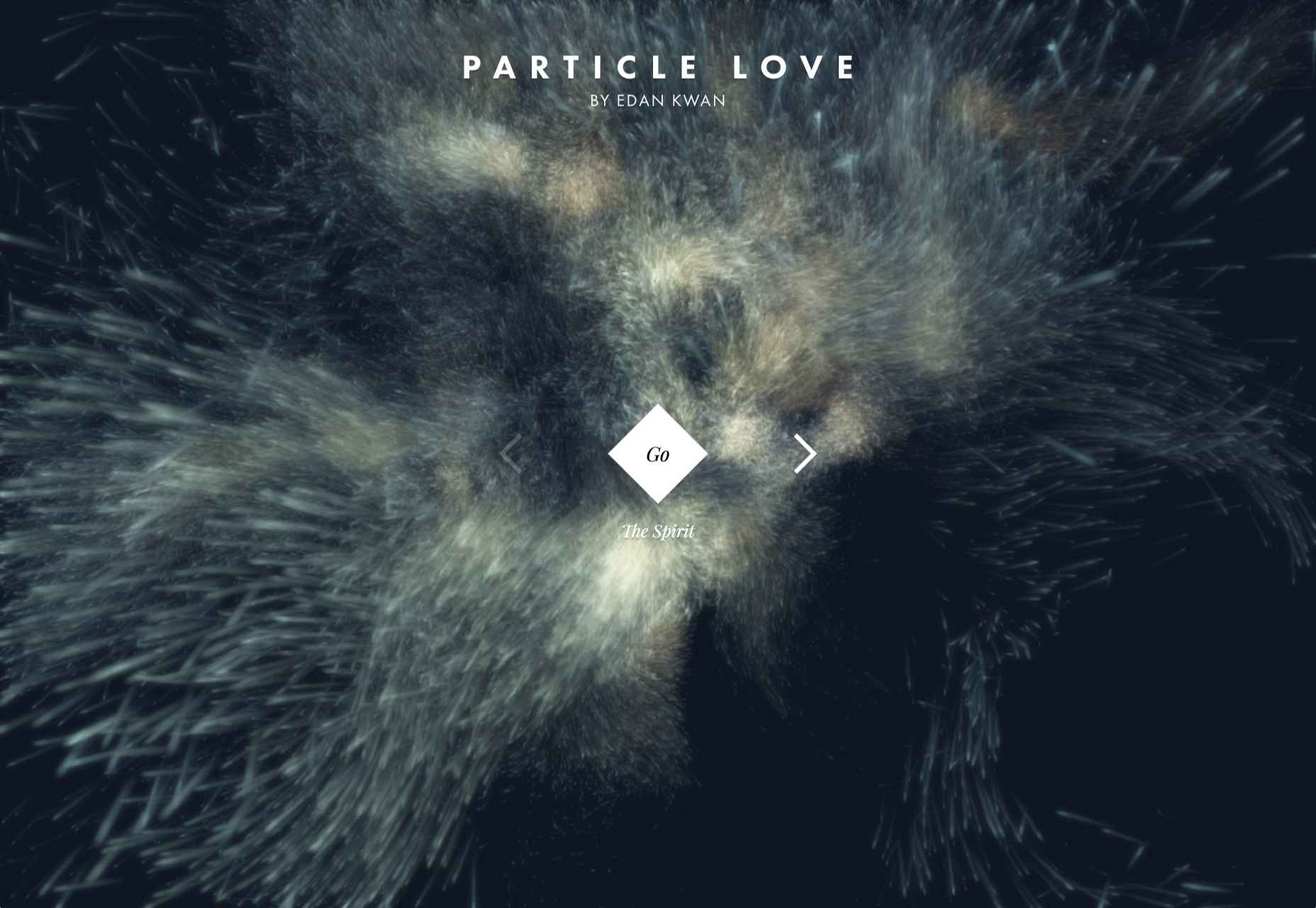
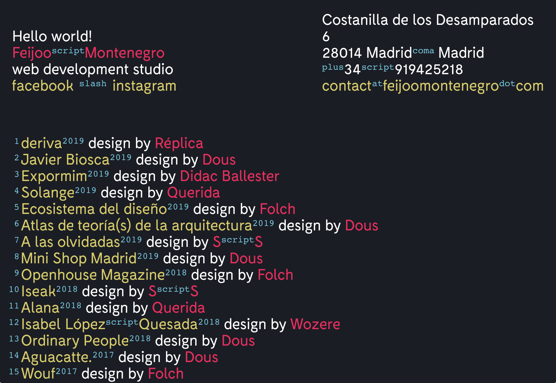
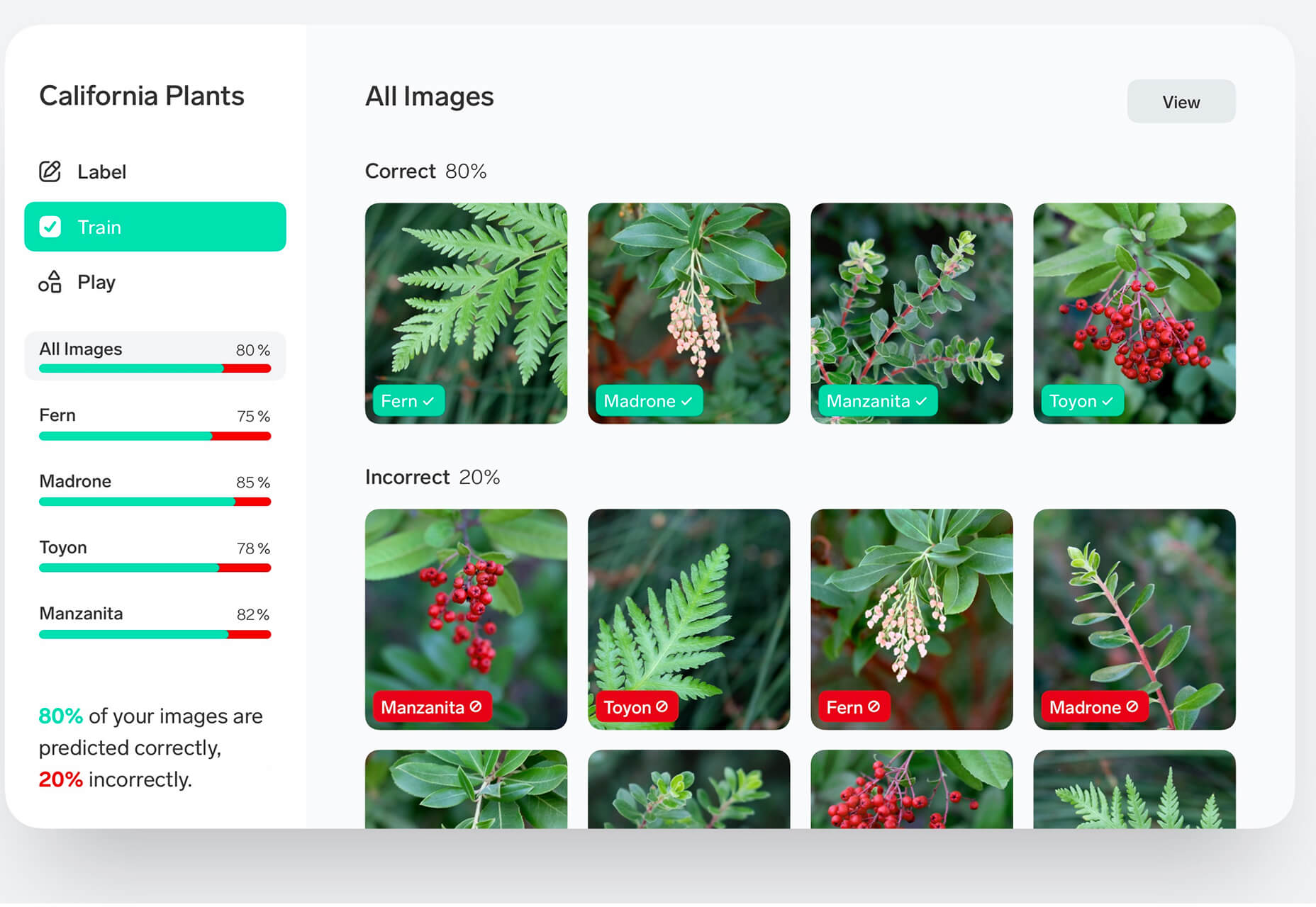
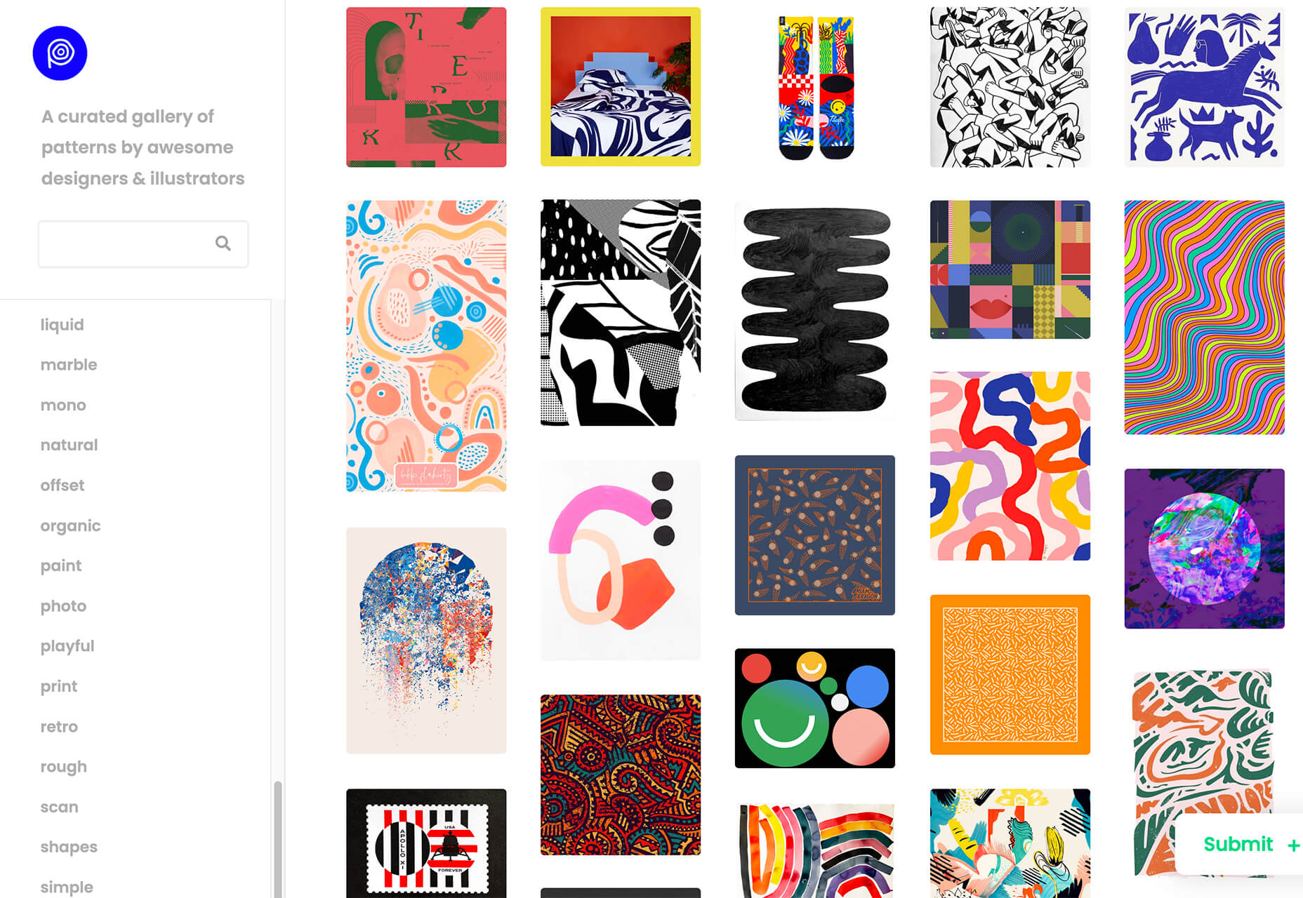
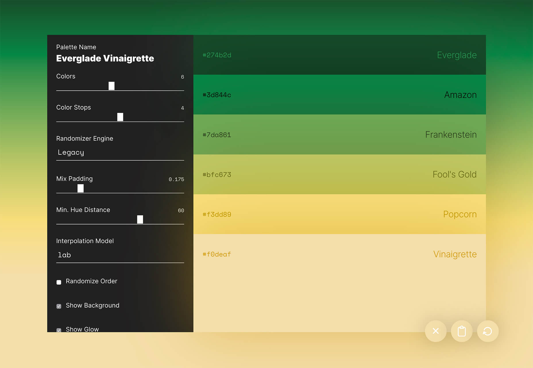
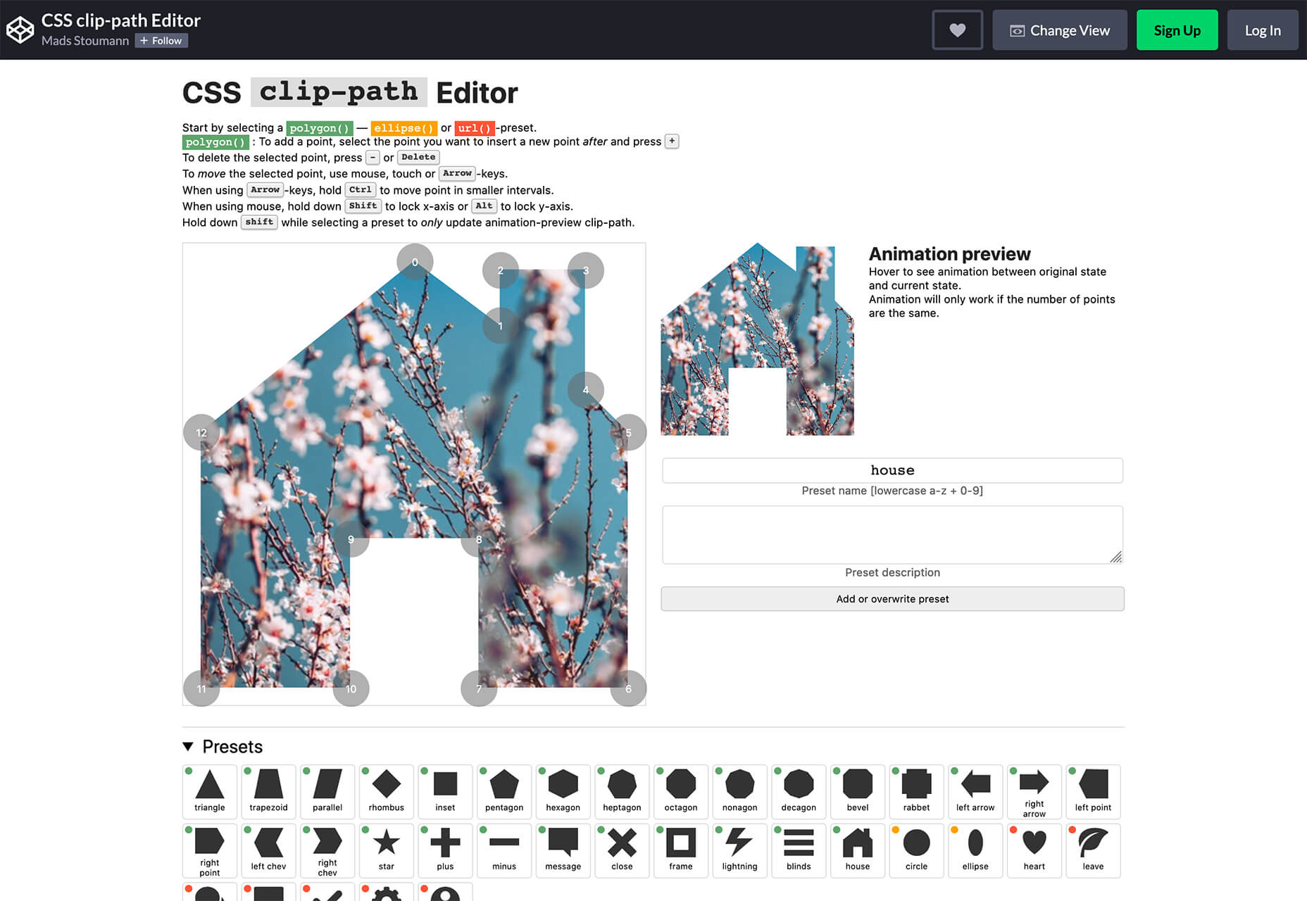
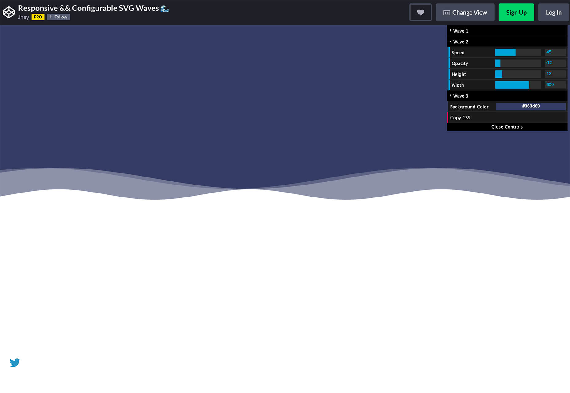
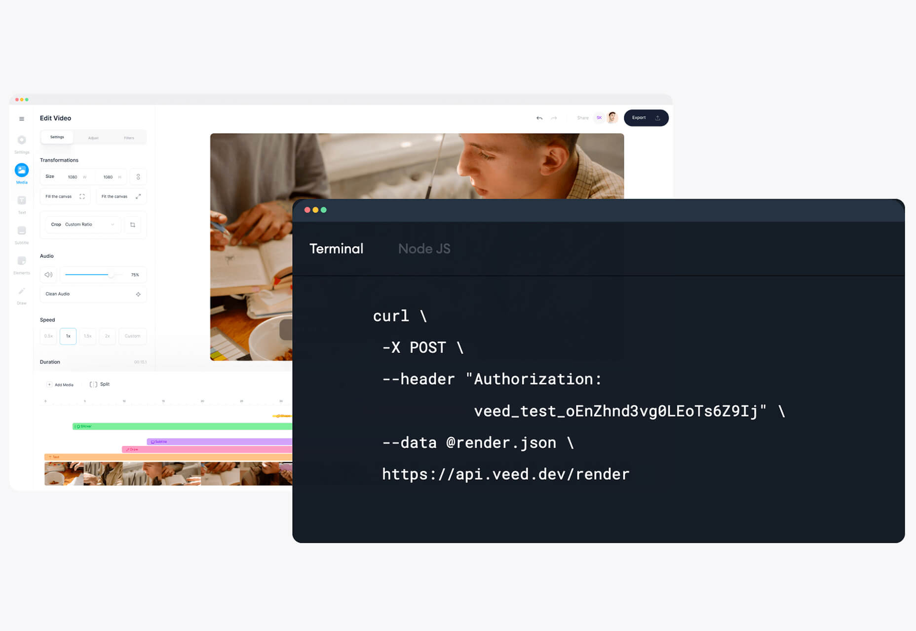
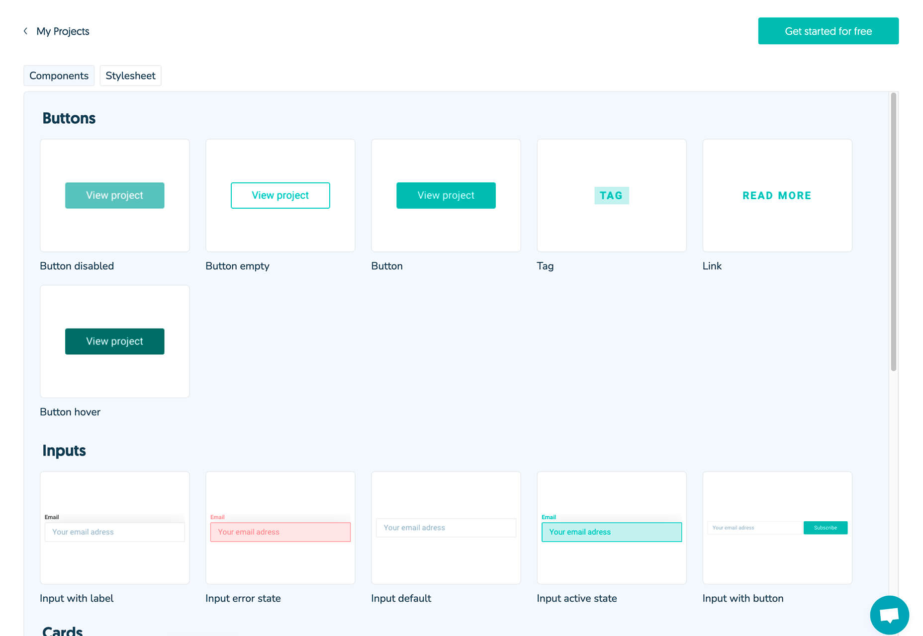
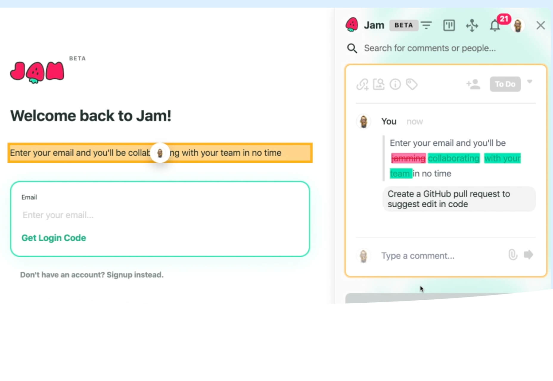
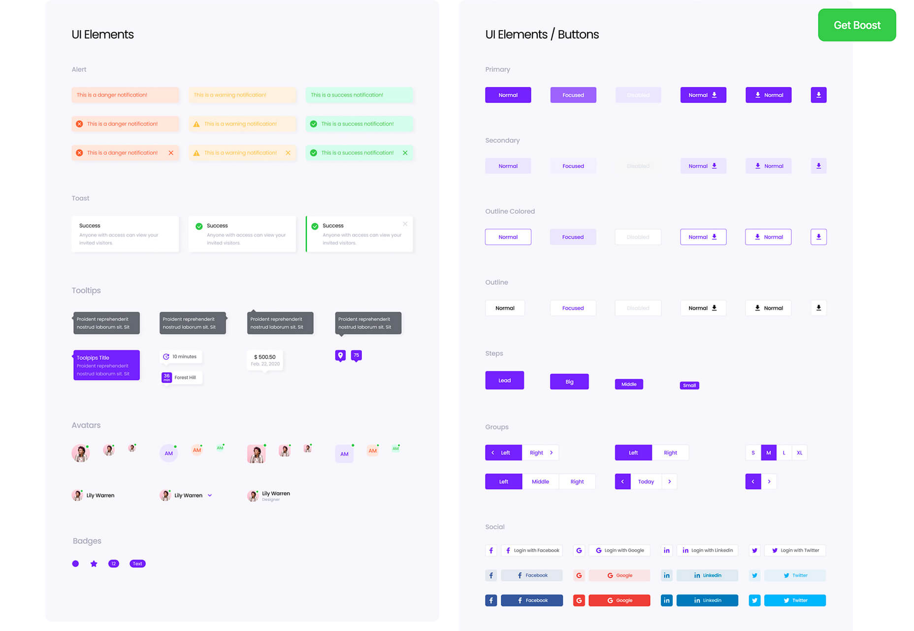
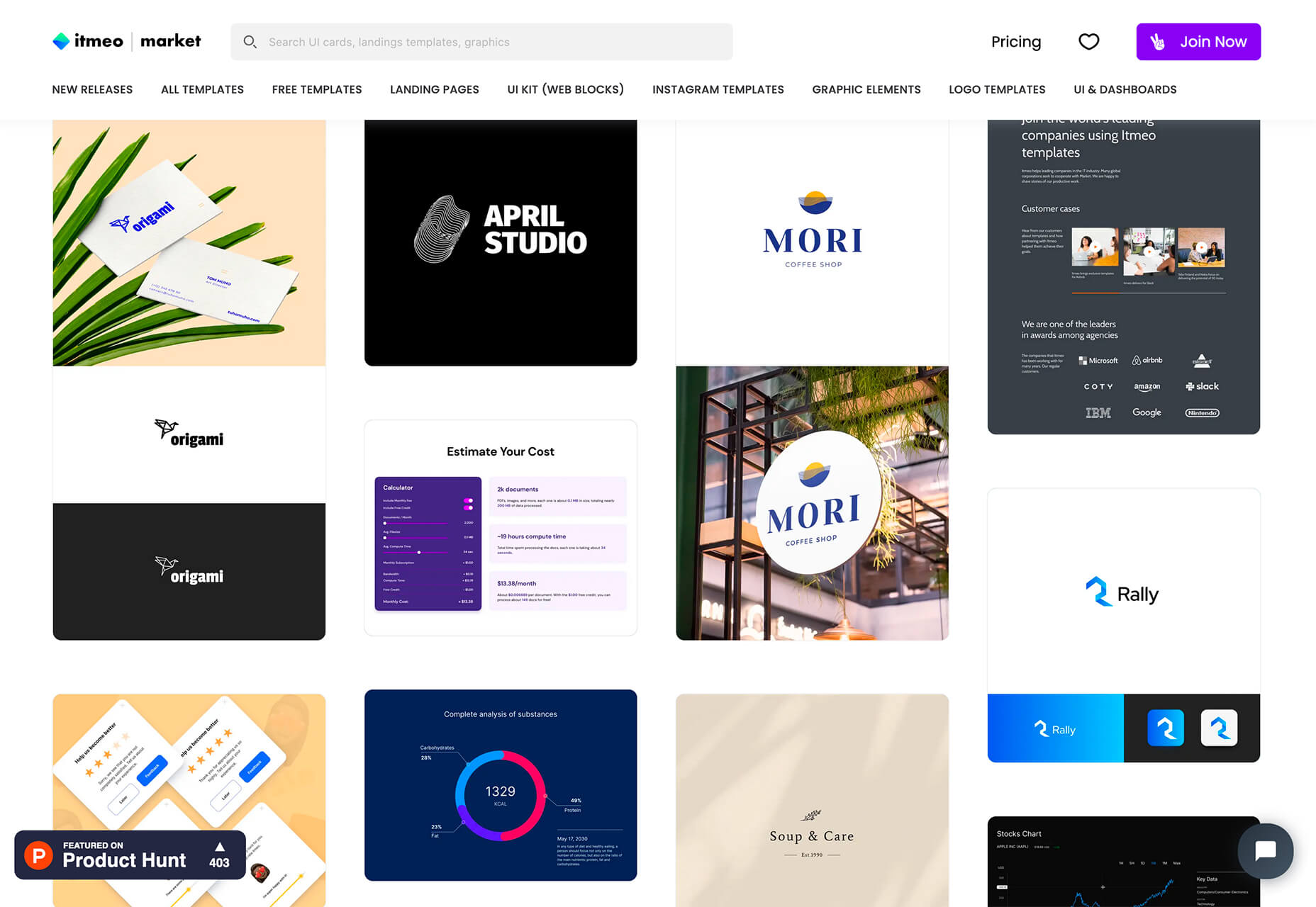
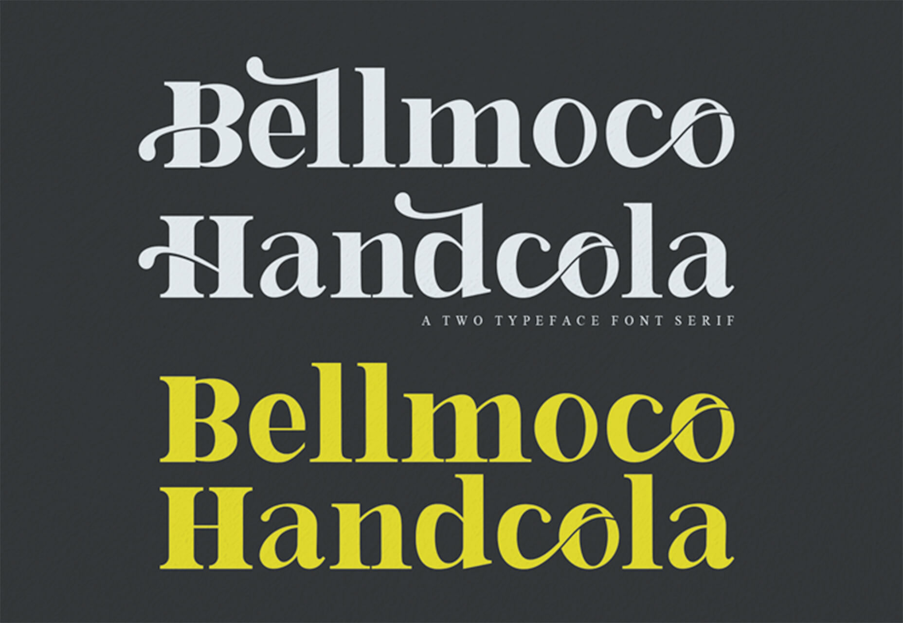
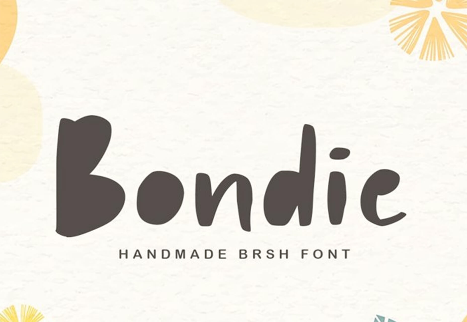
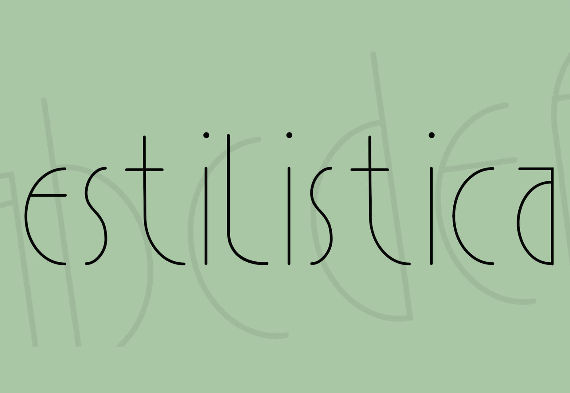
Jumpstart your next design project or speed up a workflow with some of these new tools and resources. With so many new tools being developed all the time, you are almost certain to find something that can help you with projects.

Here’s what new for designers this month.

Everypixel Patterns

Everypixel Patterns solves a common design problem: Creating seamless patterns with graphic editors is such a long and exhausting process. That’s why some people choose to get patterns from stock websites but that can be a challenge too (and difficult to search). This tool makes getting patterns less time-consuming. It includes a gallery of well-designed content, which you can customize and edit as needed.

Multiavatar

Multiavatar is a free and open-source multicultural avatar maker. Type something in the input field and generate one of 12 billion avatars. (Everything is randomly generated and free to use.)

Lobe

Lobe is a machine learning app from Microsoft that helps you create and train models. Start by showing the app examples of what you want it to learn and it will train a model for you. The tool is pretty easy to understand and you don’t need or experience or code knowledge to use it and you can train an app for free on your computer.

Laser Cat

Laser Cat is a silly and fun Google Chrome extension that adds a cartoon cat to your browser that allows you to zap away anything you want to remove in the browser window. It’s light and fun. Go play!

Pattern Collect

Pattern Collect is a curated gallery of patterns by various designs and illustrators. You can download patterns for use in projects or submit your own to share with the design community. The library is searchable and you can get new patterns via email if you subscribe.

FarbVelo

FarbVelo is a color palette generator that shows a new and random scheme with every refresh. The color choices are fresh and could work for a variety of projects, too.

CSS Clip Path Editor

CSS Clip Path Editor is a cool little pen by Mads Stoumann that puts an image inside of almost any clip path you can imagine. There are presets to choose from or you can adjust the settings and paths to create your own image shape.

Responsive & Configurable SVG Waves

Responsive & Configurable SVG Waves is a soothing pen by Jhey. Change the background and wave elements for a simple and cool animation in SVG.

Veed

Veed lets you host, edit, and deliver videos in the cloud using a REST API. It works on any browser, device, and bandwidth, and keeps your website light, even when delivering heavy video content.

Overlay

Overlay is a plugin for Figma or Sketch that transforms components and symbols into clean and reusable React, Vue, or HTML code. The benefit? Use it to create more consistent websites and design systems more quickly and in a pixel-perfect manner.

List.js

List.js is a library for adding search, sort, filters, and flexibility to tables, lists, and other HTML elements. It is built so that it will work on existing HTML and be invisible. Plus, it is simple to install and use.

What Are Design Tokens?

Design tokens are a “hot term” says Andy Bell. So, he wrote an explainer that breaks down what they are and how they might look in a standard data format like JSON. Read the explainer and you’ll be able to identify design tokens and understand them.

SVG Path Editor

SVG Path Editor makes it easy to manipulate paths for any SVG element. The grid – if you choose to use it – helps edits stay symmetrical and easy to manage.

Operator Lookup

Operator Lookup is a practical and fun tool. Enter a JavaScript operator in the search box to learn more about what it does. (You can also choose from a “keyboard” of options.) Thanks for the tutorial, Josh W. Comeau.

Beacon

Beacon is a tool designed to help you write, run, and share SQL in Slack. It makes collaboration easy so you can work on and run queries, debug, and resolve issues all in a single platform.

Plaiceholder

Plaiceholder transforms your images into lightweight placeholders using pure CSS or SVG.

Machine Translation

Machine Translation is available as Cloud API, on-premise translation server, and SDK that can be easily integrated into lots of business cases. Both solutions work with 110 languages.

Draggable Blend Generator

Draggable Blend Generator does just what the name implies. Change the blend mode of a background and foreground using a draggable tool so that you can see the changes in real time. Just enter the URL of a background image or pattern and color swatch and you are ready to go.

Jam Wand

Jam Wand is a “magic wand” for making changes on your website, starting with copy. Click on any text, edit it, and submit the change to GitHub to be merged into the code. Copy changes as easy as click, type, and click again. (This tool is still in beta.)

Boost UI Kit

Boost UI Kit is a collection of elements and components that will help you finish website design projects using a bright and airy style. It works with Figma for easy integration.

Romanizer

Romanizer is a fun game that tests your knowledge of Roman numerals. With two modes – a randomizer and a challenge you can participate in – you’ll learn to convert numbers visually in minutes.

Itmeo Market

Itmeo Market is a new online graphics marketplace with exclusive and ready-to-use templates for a variety of projects. Templates include elements for logos, UI kits, graphic elements, Instagram templates, landing pages, and more. (This is a paid/subscription-based resource.)

Bellmoco Handcola

Bellmoco Handcola is a beautiful decorative typeface with fun swashes and serifs. The free version is for personal use only.

Bondie

Bondie is a handmade brush typeface with fills in many of the letterforms. It contains 106 characters and is free for personal use.

Bovino

Bovino has multiple weights that can work for display or body text. The modern serif is free for personal use.

Estilistica

Estilistica is a thin modern style sans serif with smooth lines and a vertical profile. It is best suited for display use and is free for personal use.

Source


Source de l’article sur Webdesignerdepot

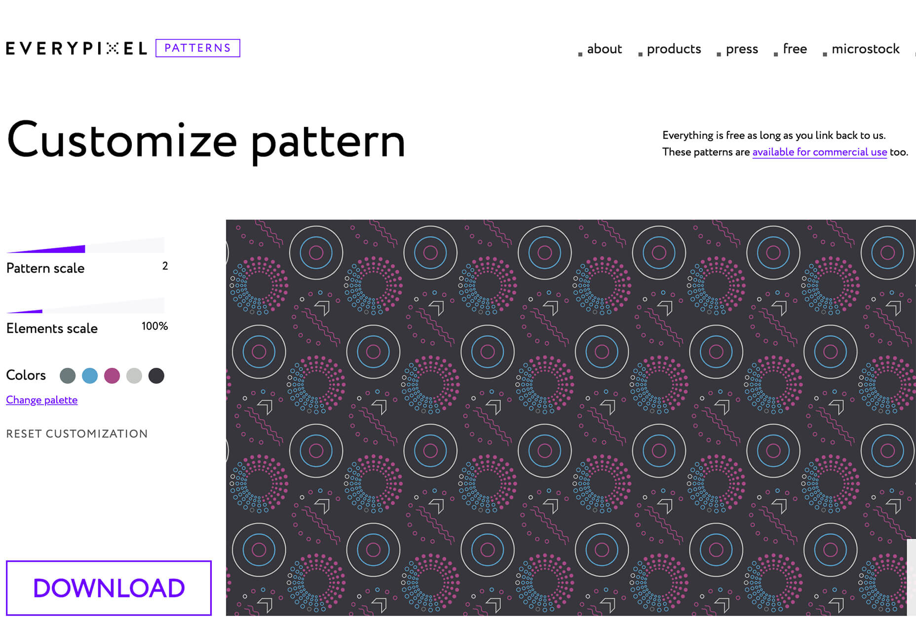
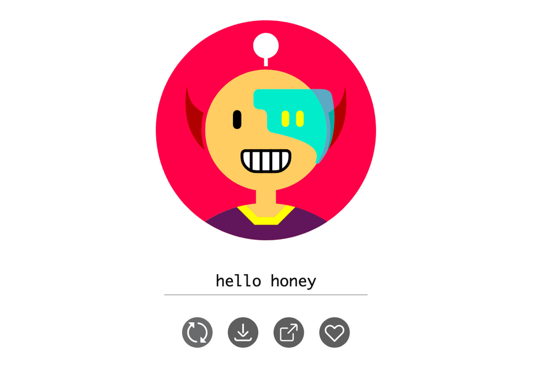
By the end of the year, the number of global smartphone users is expected to reach 3.5 billion. That’s a significant 9.3% increase over the last 12 months.

In a world where everyone is constantly connected to their mobile devices, it makes sense that web developers and designers would need to consider new rules for how they create engaging experiences. After all, most of us find browsing from our smartphones to be much more convenient than sitting down at a laptop each day.

With a little luck, you’re already taking steps to mobile optimize your website but standards are changing all the time. To make sure your website is up to scratch, here’s your guide to prioritizing your site for mobile, ready for the new year.

Understanding Mobile-First Design

The first step in updating your web design and development principles, is understanding the concept of mobile first design, and how it’s changed.

With a responsive website, you create something that adjusts to the screen size of any device; with a mobile-first site, you’re focusing first-and-foremost on the user experience that people get when they’re on mobile, taking that as your starting point, and building from there. Instead of building your website for the desktop and using mobile as an afterthought, you start with a consideration of mobile.

Even Google is highlighting the demand for this process lately, with the mobile-first indexing algorithm. If you can’t design for mobile-first, then you could risk your clients being unable to rise up the search engine ranks.

So, how do you get started?

1. Start With the Right Tools

Web developers and designers are nothing without a great toolkit.

The good news is that there are solutions out there that can help you to master the right skills for a mobile-focused user experience. For instance, Skeleton is excellent for small-scale projects that require fluid grids and minimal compiling.

Alternatively, Bootstrap can offer a one-size-fits-all solution for the front-end development for mobile devices. There’s a default grid system available, plenty of components, and JavaScript plugins to work with.

With the right tools, you can minimize and prioritize the content that’s most valuable for your website projects. This is crucial for maximizing website speed and creating clarity when it comes to content and imagery.

For instance, check out the ESPN website; it’s split into very easy-to-follow categories of content that are perfect for scrolling on a smartphone. The grid of videos makes it feel like you’re using a tool like YouTube.

2. Prioritize Mobile-First Elements

Once you have the right tools to assist you, it’s time to begin building your mobile-first website from the ground up. Rather than jumping straight into considerations of the latest design trends, it’s important to start with the foundations.

For instance, navigation within a mobile page is usually hidden under a hamburger button. However, you can take this concept to the next level too. For example, the Shojin mobile website only demonstrates the most important website options within the navigation bar to avoid overwhelming users.

The key here is to keep things as simple as possible, without restricting what your audience can do when they visit your website. Although you want to keep the number of interactive elements on your site small, you also need to ensure that those elements are easy to find and use.

All buttons and CTAs should be clear and tappable. Fonts need to be large enough to read from any screen, and your navigation system needs to be 100% simple, without slowing anything down.

On average, we recommend making all clickable elements at least 48 pixels in height.

3. Use Responsive Imagery and SVGs

Images are a crucial part of any website. They add context and appeal to your design. However, they can also seriously slow down your website if you’re not careful.

Remember, different devices have different demands when it comes to imagery. A desktop page may need a 1200px wide image, while a mobile-only needs the image to be 400px wide at most. The old way of making your images work was to load a large resolution image and use the same file on every platform. Unfortunately, this slows downloading time significantly.

Instead, it’s better to have at least two different versions of the same image for your mobile and desktop solutions. You can also consider SVG.

SVGs are incredibly scalable – more so than bitmaps. With SVG, you can ensure any icon or graphic continues to look sharp and clickable across all devices. Because these files are often smaller, your site loads quicker too! Hubspot is great at using SVGs.

Intricate illustrations are a massive component of HubSpot’s brand. If those images were saved as PNGs or other alternative files, then they would take forever to load. Because they’re all SVGs, you can enjoy the same consistent experience across desktop and mobile.

4. Get the Typography Right

It’s not just the big graphics and images that make a huge difference to your website when it comes to mobile-first design. You also need to think about the legibility and clarity of your website across all devices and platforms. If people can’t read the value proposition of the company that you’re designing for, you’re going to have a major problem.

Focus on making your content as easy to read as possible. Look into the typefaces that seem most appealing on a range of devices.

Remember to balance the body and heading font sizes for the device size too. You’ll need to ensure that the experience feels consistent and smooth as your users scroll through each page. Just take a look at the mobile version of the IMPACT website, for instance.

The headings aren’t as huge as they are on the desktop version of the website, and they’re displayed below, rather than above the featured image. However, this helps to give a more immediately eye-catching and structured experience to mobile users.

There’s even a handy “Search Engine Optimization” tag included, that users can click on if they want to find more related articles.

When it comes to typography, remember that it’s not just size and clarity that matter, but how things are structured throughout your website too. Your type should naturally guide your visitors along the page.

5. Master Available Device Features

Finally, on smartphones, you can accomplish a range of amazing things that you might not be able to do when using a desktop device. Your users can make calls, open apps, send messages, and more, all from within their mobile browser. They can also move their smartphone around a room, taking advantage of concepts like AR and VR.

Taking advantage of the unique capabilities that smartphone design can offer gives you a chance to get unique with your user experience.

Making the most of the mobile experience can be much simpler than you’d think. For instance, on a desktop site, you could list your phone number on a contact page. On a mobile site, the number can begin a call when clicked. You can also take the same approach with email addresses, and social media icons too.

Depending on how experimental you feel, there’s also plenty of opportunities to go above and beyond with your mobile features. You may decide to create a mobile app version of a website that your customers can download onto their phones.

Alternatively, you can look into things like AR technology. This could allow your users to practice placing items of furniture that they may be thinking of buying from an online retailer into their house, so they can see how well they work with their other interior design choices.

Making the Most of Mobile-First Design

Ultimately, having a responsive website that works on both mobile and desktop devices is mandatory in the modern world. However, going above and beyond with mobile-first design is a great way to get ahead of the game.

If you can focus on building a website that puts the experiences of mobile users first, then you can create something that’s much more likely to grab audience attention and deliver amazing experiences.

If nothing else, showing your clients that you have what it takes to design for mobile is an excellent way to ensure that you can gain as many new project opportunities as possible.

Source


Source de l’article sur Webdesignerdepot