Articles

Domain Authority (DA) is a ranking metric that predicts how well a site will rank online. It goes by a scale of 1 to 100 — the closer you are to 100, the better your odds of ranking in search engine result pages (SERPs), thus giving you more clicks.

To see how your site currently ranks, visit Moz’s free Link Explorer to test your DA. Just type your website URL in the search bar and click “Analyze”. Just remember: don’t kick yourself if your DA is smaller than 30 to 50. If you follow these 9 tips today, you’ll most definitely see your DA score improve.

1. Domain Name Age

You know that old saying, right? Wisdom comes with age. Well, guess what? The same is true for your domain name. If your domain name doesn’t have an ‘old’ age, then it’ll rank lower, and users online might not see your site as legitimate.

But with an older domain name, not only will users see your site as more legitimate, but it’ll also have a much higher DA score than younger domain names. In other words, every time you change your domain, you might be doing more harm than good to it, since you’re actually knocking down the credibility you’ve built up over the years by starting from scratch.

Therefore, pick an easy-to-remember domain name that’s not only relevant to your niche, but it’s also something that you’re willing to keep for a very long time.

2. On-Page Optimization

Then, it’s time to optimize all the following on your pages:

  • Code;
  • Content;
  • Site structure;
  • Metatags;
  • Other on-page elements (H1, Title tags, Image alt tag, Site architecture, etc.).

Improving your DA with optimization can make your site be more search-engine-friendly.

3. Create Great Content

Want to attract high-quality links from multiple domains in your niche? Good news! More attraction to your site comes from creating high-quality content that appeals to your target audience. Otherwise, poor-quality content will only scare people away.

So, in providing the best content possible, that will definitely help you improve your DA score (and even give you many additional SEO benefits).

4. Internal Link Improvement

Why worry about earning external links when your internal links need the most attention? Yes, focusing too much on external links can make you lose sight of linking internally.

So, why internal links? These links help nudge visitors to what they’re trying to look for on your website. In that way, visitors are getting the best user experience, while you reap the rewards of having an increased DA score.

5. Link Profile Clean-Up

Having a clean link profile is essential, since it helps you obtain and maintain a great DA score. So, to clean up your link profile, you must remove the bad links from it.

In this process, you can use tools like:

These tools help you figure out any inappropriate or unwanted links.

After the link audit is complete, contact the website owners to have them either delete the link or add the “nofollow tag” (devalues the link). If this doesn’t work, use the Google Disavow tool to remove said links from your profile.

6. Know Your Niche

When running a site, it’s important for you to be the expert in what you have to offer online – and your DA is no exception to this. Becoming an authoritative figure in your niche allows you to gain the confidence of readers, while providing expert advice to the community.

If you have amazing content (i.e. guest blogs on industry-related forums) and clever ways to engage your target audience, then people will see you as an authority to your niche. This not only enhances your brand, but also increases your DA score.

7. Be Mobile-Friendly

Nowadays, people are on their phones, tablets, etc. Whatever device that they can use on the go, they’ll use. In other words, mobile isn’t just the way of the future – it’s happening right now, outpacing laptops since 2014. So, if your website isn’t mobile-friendly yet, then now is the time to fix that!

If your website hasn’t been optimized for mobile use yet, not only will it hurt your search rankings (since Google favors mobile-friendly sites), but you’ll also lose out on users visiting your site to begin with.

So, go to Google’s Mobile-Friendly Test, and then run a test for your domain. Afterwards, Google will give you a detailed report of how mobile-friendly your site is, and what you can do to improve it.

8. Improve Page Speed

Let’s face it: No one likes to wait for a webpage to load; they want quick results. So, if your site isn’t loading fast enough, then users will get frustrated and most likely go to another site. So, why not improve your page speed?

First, find the cause of your website running slower than it should. You can do this by running your website through Google’s PageSpeed Insights; it’ll analyze the speed of your site. And then, it will identify some effective ways for you to make your site faster and consequently improve your DA score.

9. Utilize Social Media

Finally, it’s important to increase your social signals, when it comes to gaining more authority with your domain. While search engines like Google won’t insist that sites make social signals a priority to increase their rankings, site runners must still take advantage of social media to do the following:

  • Promote their sites;
  • Promote their products and services;
  • Tell people about any events and contests.

As a result, sites are more likely to get likes, shares, and tweets through social media, versus going solo in search engines.

Conclusion

Domain authority is extremely important for your site. First, DA allows you to analyze how well your website does in the search space. Plus, it allows you to compare the performance of your website with that of your rival sites, thus showing you where you stand in search engine results.

So, why not get your site thriving today by improving and maintaining your DA score today? Your site will thank you for it!


Featured image via Unsplash.

Source


Source de l’article sur Webdesignerdepot

As we turn the corner into the final part of the year, many of the new websites and redesigns that we see during much of the rest of the year tend to slow down. Many businesses are focusing on fourth quarter and holiday sales.
With that being said, there are plenty of holiday flourishes already showing up on many websites. But there are still a few trends that don’t have a holiday theme.

Here’s what’s trending in design this month.

1. Beautiful Connectivity

Web elements that merge and flow into one another can be difficult to design but the payoff is totally worthwhile. This website design trend exemplifies connected elements in a way that’s beautiful and mesmerizing.

You can accomplish it with static elements or interactivity; the common theme is that design parts enter the space of one another and merge in ways that are seamless and visually interesting.

The thing that makes it exceptionally tricky is responsiveness. To ensure that pieces work well at all sizes when they overlap or encroach on the space of one another takes a lot of planning and testing.

Here are a few examples of projects that do it well – and each one does it in a different way.

Kirk Whayman’s website uses a floating ice cube over simple lettering. The interactivity is spot on here with hover actions that allow you to move the block with the letters refracting in an expected manner. (It would be easy to play with it all day.) But the coolest interaction happens when you “break it” (click on the cube). The elements continue to merge and interact in a new and different way.

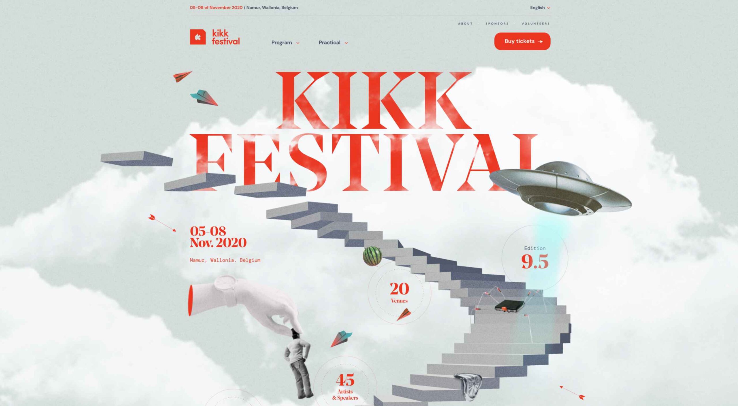
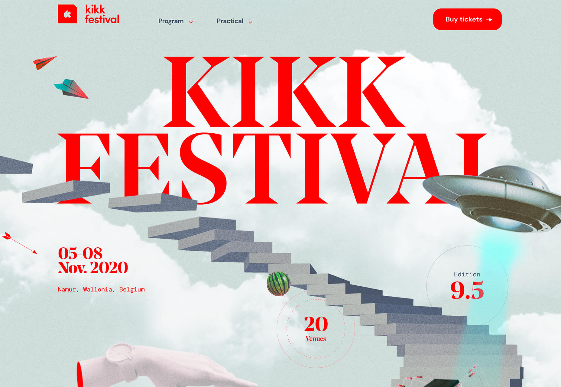
Kikk Festival uses animations and giant scrollable illustrations and plenty of elements that overlap within the space. What’s neat is that everything on this canvas seems to touch everything else. The staircase design encourages scrolling and lettering and smaller animated elements all connect to the steps in the sky motif.

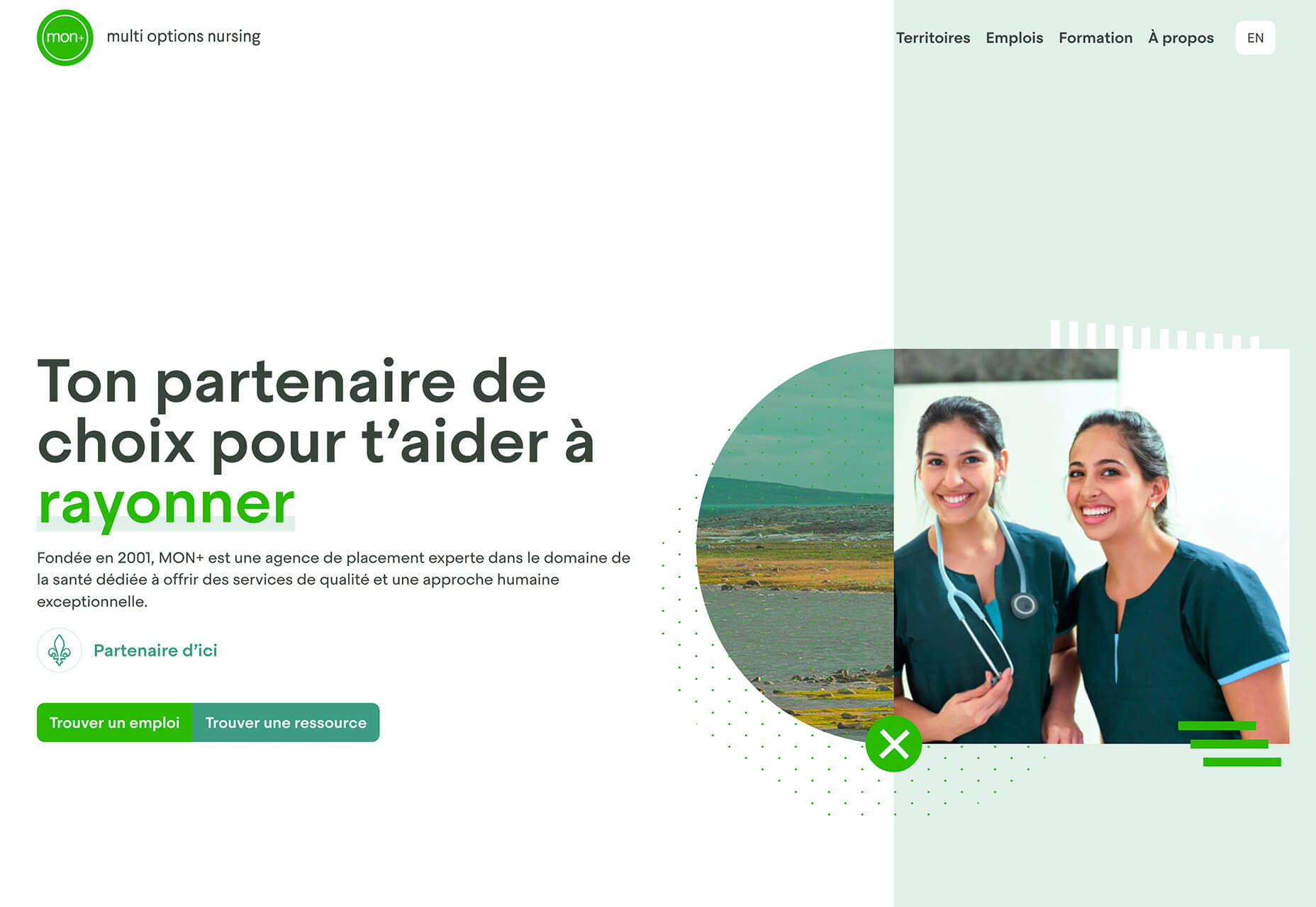
Multi Options Nursing takes a totally different approach. It uses a static split screen with a photo on the right side that merges into a round graphic element. It takes two not-s-interesting images and makes something out of them. The design carries this theme below the scroll as well and this style of image presentation carries a nice visual weight without feeling heavy.

2. Almost Brutalism

Brutalism just seems to keep coming back around. For those that love this trend, it keeps evolving as well.

The latest styles of brutalism are a little less mono but still pretty sharp with harsh lines, questionable type readability, and a lot going on in a compressed space. These projects also seem to be embracing color and alternative font choices more readily.

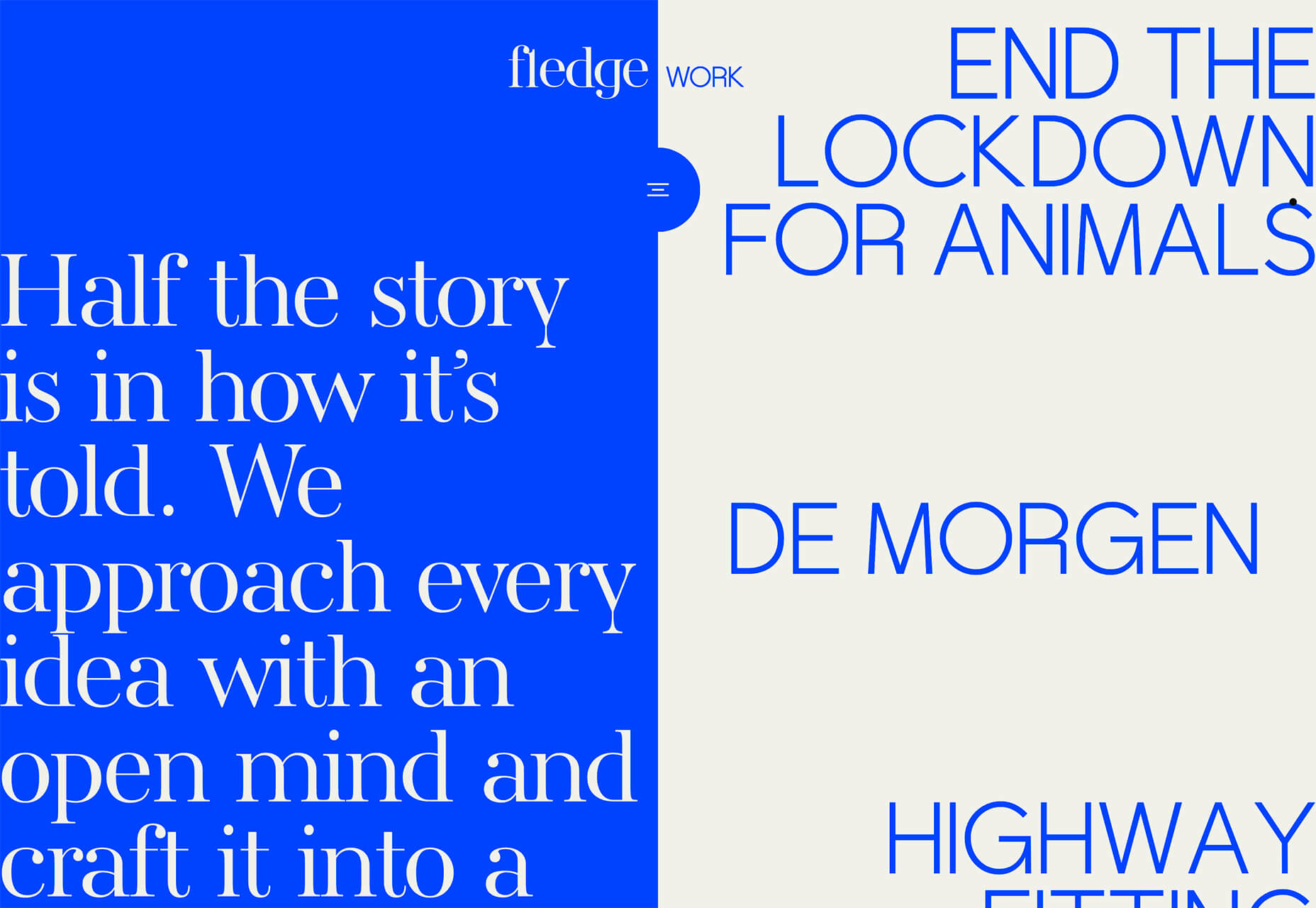
Fledge uses a split screen – still a dominant trend two years running – with a blue that’s almost too bright with an almost white offset color. The text is big and smooshed into the space tightly. Depending on the breakpoint, you might not even get the whole phrase on the left side. The design challenge is what are you supposed to do here? There are some hover animation cues, but they aren’t very direct.

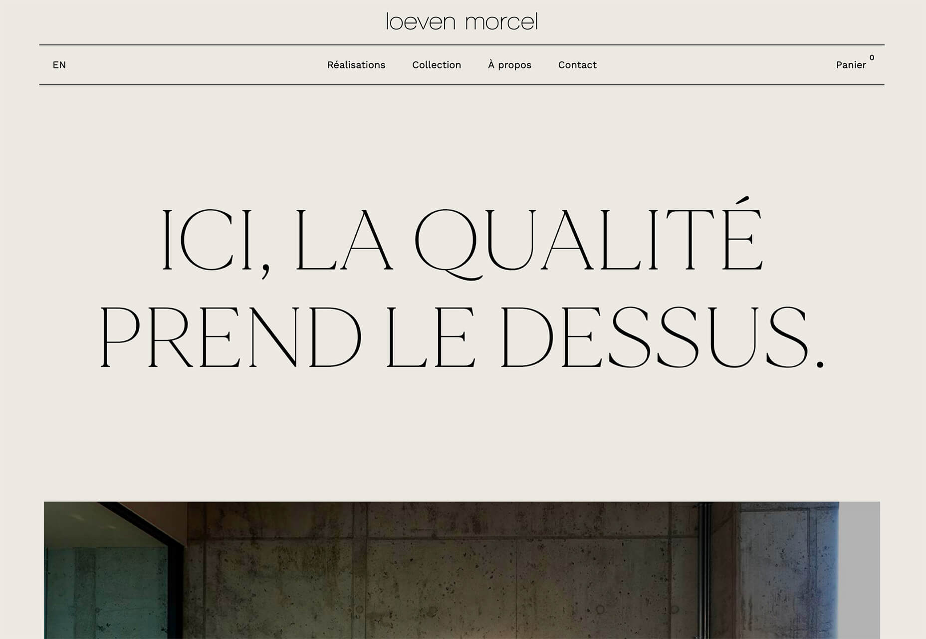
Loeven Morcel’s design has hints of brutalism and elements of elegance. What makes this design skew toward the brutal side is use of space and typography. Like the previous example, it falls into the territory of “what should I do here” with some concerns about readability. Most of these issues are resolved on the scroll if you move beyond the homepage.

Szymon Michalczyl’s site is another that is close to brutal in style but has an element of sleekness that doesn’t quite carry it over the edge. The simple framework has that brutalist feel but the use of simple, clean fonts with plenty of space pulls it back into a more mainstream design scheme.

3. Beige Everything

Is a shade of beige the color of the year for 2020? Or is it just how we all feel?

Beige backgrounds are everywhere, making this one of those design trends that you can’t miss. The good news is that designers are playing with different shades of beige as well as warm and cool variations. Beige on its own can take on some of the color from accent hues and imagery, so that’s important to keep in mind when using this in the background.

The other variable is how saturated to make beige coloring. Most designs are using some of the more muted options while mostly playing with the levels of green and red. But darker beiges are also an option.

Simon Daufresne uses a beige that is the color that comes to mind when you think beige. It’s simple, a hint reddish, and is used with black only to maintain true color.

Discovered Wildfoods uses a more neutral feeling beige with a more green undertone (or is that color feel coming from other design elements). The neutral and natural color fits the brand and association this website is trying to create.

Aebele Interiors also uses a more traditional beige but with a bold mustard accent that makes the color feel exceptionally warm. What’s nice about this color combination is that in small sizes the mustard colored-type almost falls into the beige background, but at larger sizes seems to almost jump off the screen. It’s an interesting color juxtaposition.

Conclusion

Personally, this month’s trends are a mixed bag. I love the lines and interactivity of the beautifully connected examples. It shows that elements can cross and work together well.

On the flip side, brutalism and beige just aren’t my style. But apparently, they appeal to a lot of people based on the number of projects using these styles. What do you think? I’d love to know how you feel about these trends. Let me know on Twitter.

Source


Source de l’article sur Webdesignerdepot

When it comes to compliance, website developers need to keep their eyes on more than just ADA regulations and Section 508. Privacy laws are a big consideration and decisions on how to build privacy into a website start with architects. 

And that’s exactly what website developers (and designers!) are. They build up attractive, functional websites and apps for their clients. Yes, they work closely with clients, copywriters, vendors, and other professionals to get the job done, but the developers are the ones who put it all together. 

That’s why it’s critical that website developers are well-versed in marketing privacy laws — these regulations directly impact the end results of their work. But how does a website architect create a digital platform that honors both user privacy and the needs of their clients? 

What Privacy Laws Are Important For Web Developers?

The two biggest privacy laws that web developers need to keep tabs on are the General Data Protection Regulations (GDPR) and the California Consumer Privacy Act (CCPA). Each law has its own unique scope and provisions, but they both shifted the landscape in defining an individual’s rights to their personal data and set mechanisms for how these rights would be protected and enforced.

Each regulation also carries with it fines, fees, and legal measures for non-compliance. These can be substantial. And if that’s not enough, there’s an ever-increasing consumer demand for websites that prioritize privacy and security. Consider these statistics:

  • 82% of Americans surveyed say they are concerned about the security of their online data
  • 79% of adults claim they are very or somewhat worried about how companies use the data they collect about them
  • 63% of Americans believe they understand very little or nothing at all about privacy laws and regulations that are intended to protect their data

How Can Developers Implement These Laws?

Privacy by Design is Critical for Websites

Under GDPR, web developers are required to adopt the Privacy by Design framework, which is a multi-point methodology intended to standardize data protection measures. 

Building privacy into websites shouldn’t happen at the end stages. It should start with how the websites are conceptualized in the first place. Here are points to prioritize:

  • Minimize that data you’re collecting and pseudonymize it to protect data privacy
  • Are you capturing consent? How? Where?
  • Integrating security measures to protect data — anytime you capture data or implement a third party product, a security risk is born.
  • Knowing where you’re introducing privacy and data sharing notices
  • Implement just-in-time notices to provide consumers transparency and build trust 
  • Giving your users the opportunity to manage their personal data

Let’s look at these a little more closely…

Data Minimization is the Goal

Data minimization is an important principle embedded in GDPR. Data minimization itself is a pretty straightforward concept: organizations should limit how much personal data they collect and only process the information necessary to accomplish their business purposes. Once the data is no longer useful, it should be deleted. 

For web developers, this means several things. When it comes to building websites, forms, cookies, and other methods should only ask for essential information. For example, if you are creating a pop-up to collect email addresses, don’t ask for their location unless it’s relevant to the email list and better serving their needs.

How and Where Do You Introduce Privacy Policies and Notices?

Let’s say you take data minimization seriously. That’s great! Now you need to put those data collection practices into words and share them with your customers. 

Privacy policies and notices are a big part of both GDPR and CCPA. Both the CCPA and the GDPR mandate that your privacy policy detail why you’re collecting information and how it will be used, as well as what the individual’s rights are and how they can exercise them. 

CCPA takes a slightly different angle, requiring privacy policies to disclose if the business sells personal data and what third parties have access to the data. CCPA also dictates that privacy policies and notices are current, updated at least annually.  (Nota bene: GDPR also asks for updated privacy documents, but doesn’t specify frequency.) 

How does this translate from policy into web development?

  • If you’re collecting data to improve user experience, allow for targeted ads, or sharing information with third-parties, this information will need to be included in a privacy notice. Remember, CCPA works with a broad definition of selling data, so you may need to account for a “Do Not Sell” link on your home page. 
  • Considering using data beyond these purposes? Plan to obtain explicit user consent for each additional purpose.
  • What’s your plan for the data after the user gives it to you? Where is it stored? Who has access to it? How long are you keeping it? These are all questions that a website developer should consider, and that needs to go into a privacy notice. 

Just-in-Time Notices for Transparency and Trust

Part of Privacy by Design is the use of individual components of your website to create transparency and support compliance. From a development and design perspective, this means you should always be looking for ways to communicate the hows and whys of data collection. 

Yes, your privacy policies and notices aid in this, but going beyond these pieces is important. Customers recognize when businesses go the extra mile for them, after all. 

So consider implementing just-in-time notices at points where users enter their information. These notices are a chance to share your data collection practices with your users. It’s transparent! It’s open! It aids in consumer awareness! 

Keep Users in the Loop

Want to win over your customers? Make it as easy as possible for them to manage their personal data and how it’s being used. This starts with making sure they are aware of why you’re requesting their information and how you’re planning on using it for the website. You should also:

  • Get user consent — clear and unambiguous user consent — prior to gathering any data at all. This includes cookies.  
  • Don’t pre-tick boxes for consent. Just don’t. (It’s bad practice AND it’s against GDPR.)
  • Link to all legal documents on the site. Users should be required to agree to them before using the service. 
  • Want to send marketing communications like email newsletters to your customers? Make sure they agree to this. Expressly. 

One helpful tool for keeping users in the loop is a marketing preference center. A marketing preference center allows users easy access to their information. From there, they can manage, edit, and delete their information at their discretion.  

Bonus? A marketing preference center is an excellent point at which to communicate a business’ commitment to privacy. While users will pick up this through all the discrete elements of privacy on your website, putting it all into one hub that also allows users control over their data really reinforces this message. 

Remember, it’s not just on the consumer to manage their data. Web developers should commit to managing the data in their systems. This means they should:  

  • Maintain accurate and clean records of users’ data consent preferences
  • Send regular reminders to users to update their personal information in your system
  • If a user deletes their account, promptly delete all of their personal information  
  • If your client goes out of business or is sold, they should delete all personal information in their system

Make it User Friendly

A final point: making your websites user friendly is important regardless of privacy compliance. Users expect websites that don’t make them think deeply about, or worry about, their privacy. Make it accessible and easy. Don’t make people figure it out on their own.

Give them value for sharing their data

Your users don’t have to share their data. They’re choosing to. So in exchange for their personal information, make sure you’re using it to provide a user-friendly website. Offer them a secure, enjoyable experience.  

But don’t ask for more than you need

Let’s loop back around to this point again. While consumer data can help you build a better website, don’t plan your websites around it and don’t demand data to create a good experience. 

Usability, web design, and website security; all of these things benefit from consumer data. But privacy laws should always guide how any personal data is collected and used, and respect for consumers’ individual rights, and honoring their privacy should be top-of-mind for web developers. 


Featured image via Pexels.

Source


Source de l’article sur Webdesignerdepot

The world of search engine optimization was born with all sorts of different hacks and shortcuts that many people use in an effort to grow their business.

Knowing effective SEO tricks would be incredibly profitable, but unfortunately it’s not that easy

This becomes evident as soon as you do a Google search about anything SEO-related, only to find pages and more pages replete with blog posts and videos disclosing all the tips and tricks you “need to know” in order to achieve the best SEO results, in the fastest way possible.

Knowing effective SEO tricks would be incredibly profitable, but unfortunately it’s not that easy.

In its essence, SEO isn’t about hacks, shortcuts, and hidden optimizations, but rather about resource allocation. Keep reading to learn why!

Be Careful About Over-Reliance on Hacks

Before we start talking about resources, it’s important to understand why the quick and easy SEO hacks we’ve all read about online aren’t as reliable as they might seem.

The reality is that yes, there are some traditional hacks and optimization tactics that many people swear by. However, SEO has become way too competitive for these hacks to still work.

Think about it: anyone can learn about these hacks and shortcuts in a matter of seconds, which means that anyone can use them, which means that they’re not going to help your website stand out. By way of example, when thinking about keyword usage, many websites simply decide to put them everywhere on their website, without actually planning and strategizing. Perhaps years ago, doing so would lead to excellent results, but that’s not the case anymore.

What I want to go over, and what I mean with this article, is that when developing your SEO plan, you should think less about hacks, and try to focus on strategy and resources instead.

As tempting as they might be, most SEO hacks won’t really go that far.

What does go far are those strategies and resource allocation decisions, which you can master as long as you know three things:

  • Who your competitors are;
  • What you have;
  • and What strengths you can double down on.

Base Your SEO Strategies on Your Business’s Resources

So, SEO is about resource allocation – we know that now…but what exactly does that mean?

Well, this logic is based on something you might have heard of before, and that is the three pillars of SEO.

As a refresher, everything in SEO revolves around three pillars:

  • Link building and referring domains;
  • Content development and content marketing;
  • Technical SEO.

Many businesses have a limited digital marketing budget and, as if that wasn’t enough, their SEO budget tends to be even more restricted.

This means that we can’t try every hack out there or do every campaign we can come up with, hoping it will lead to positive results. On the contrary, it means we need to be methodical and understand which strategies have the most potential and are actually worth exploring.

In summary, there’s one big challenge that every SEO team and company experiences, and that is the limitation of resources versus possible operations, and that leads us to a question: what mix of SEO pillars will give us a good shot at ranking high and surpassing our competitors?

Develop Your SEO Strategies Based on Your Inherent Strengths

The mistake that a lot of business owners make after reading SEO articles or hearing about amazing case studies is that they try and copy the strategies they learned about, from beginning to end.

However, contextually, each case study or article could refer to a strategy that was specifically optimized for a different type of business.

So, although copying what other successful businesses can work in certain situations when speaking about SEO, it’s best to borrow ideas and use the ones that fit your inherent strengths.

Based on the pillars of SEO that we discussed earlier, there are three strong points that a company can have:

If You Have a Strong Network…

Some businesses don’t have the resources to create an in-house content development team or outsource writing services.

However, they have another strong suit, which lies in their ability to go out into their community, speak, and be heard. They can do this because they have built a strong network over the years and, in cases like this, what we often do is use a backlinking approach.

When working with businesses that have a strong community presence, go out and double down on their network. Pitch their relevant contacts for guest speakership and guest posts, building thought leadership, while also driving links to their website.

If You’re Not That Popular But Are Good With Words…

Right now, some of you might be thinking: “Yeah, well, that’s easy when you’ve built the exposure, but not all of us are lucky enough to be well-known”.

Listen, I get it, we’ve all been in that position.

For clients and businesses that feel like they don’t have the brand equity or exposure to develop a strong backlinking strategy, opt for another route, and invest much more on content (and/or technical SEO, see below).

If the client has a team who’s ready to put its head down and get to work, then focus on producing a lot of content for their website.

Ultimately, the goal is to build a content library that is thorough and expansive, and that provides the client with more opportunities for keyword rankings, while also reinforcing the relevance of their website for those specific SEO keywords.

If Technical Knowledge is Your Forte…

You may not like (or have time) to write and you may not have a strong community presence, but if you have advanced technical skills and the ability to create a strong website quickly, then there’s another approach you can take.

This leads us into the third pillar of SEO: technical SEO.

This solution is indicated for technical teams that can create large websites, databases and user experiences in no time, and it is typically adopted by tech startups that are trying to create an app that provides user value.

First and foremost, winning at technical SEO requires strong technical skills that will allow you to build the web assets that you need, but that’s not all. It also requires you to understand how you can double down on these skills and manage large websites in the rather complex Google ecosystem.

So you need, for example, to know how you can get Google to notice and properly index the new pages you create on your website, even if you already have 100,000 pre-existing pages.

Or to ensure that each of your new pages is properly optimized for the best keywords.

Needless to say, using technical SEO does become a complex operation. However, when done right, it can lead your SEO to grow by sheer size, with the hopes that certain relevant keywords will start to rank for your business naturally.

Conclusion: Your Strategy Will Probably Be a Combination of the Three Pillars

When it comes to SEO, honing in on your strengths and accepting the fact that you can’t do everything is definitely the way to go.

When you’re running an SEO campaign, you should always focus on what you’re good at, know your resources, and augment what you already master – and that will put you in the right direction.

By focusing your resources on any of the pillars of SEO (or even a mix of them), you substantially increase your chances of achieving long-term success, which will not happen if you go for hacks and shortcuts instead.

A long-term, highly-organized, resource-allocated SEO strategy won’t only guarantee continuous success, but it can ultimately become self-sustaining, meaning that it will allow you to keep growing and growing, becoming an organic part of your marketing plan.

I’ve seen a lot of people try SEO hacks for two weeks, only to realize that they didn’t work and that their efforts had been in vain. 

It’s unfortunate because by doing so, you’re turning your back on a marketing channel that is very valuable to a lot of people, and these hacks trick people into thinking it’ll be overnight.

So remember, resource allocation over hacks and shortcuts!

Source


Source de l’article sur Webdesignerdepot

With billions of internet users worldwide spending several hours online each day, the online presence of brands is now a necessary avenue for building, boosting, and maintaining positive value and attracting and interacting with customers. 

This has created increasing pressure for web design agencies when creating and managing websites. This pressure is multiplied by all the projects that web design agencies have to handle at one time. This is because different clients demand different things for their websites, whether it’s a signature feature or specialized functionality. 

Hence, it’s vital that the tools the agencies use to work are simple enough and suited to the tasks they have to accomplish in order to build and maintain these projects. Having the right tools can increase efficiency and effectiveness in managing websites.

Challenges in Modern Web Design

Building a website with all the essentials in mind is always easier said than done. Websites have to be both functional and easy on the eyes to invite traffic, disseminate information, or appeal a product or service to a target audience, and all while having an attractive and convenient interface.

The good news is that it’s perfectly possible to design a quality website and without spending a fortune to do so. Below are some of the challenges that web design agencies face when trying to deliver and reconcile efficient user experience and effective user interface in web design.

1. Appealing User Experience

Designing a good website means ensuring that the user experience is appealing to a general audience, but this is one of the most difficult parts of web design. Agencies must be careful not to turn off users with a confusing user experience. For instance, making important information difficult to find on web pages, using technical jargon that ordinary users wouldn’t understand, and focusing too much on the design rather than the overall experience are a few big mistakes that no designer should ever commit.

Instead, web design agencies should focus not only on making the design look good but also on making the experience smooth and fast for the regular site visitor. This includes improving design elements to make navigation easier as well as optimizing webpage load speeds.

2. Working With a Budget

It’s common for the client and the web design agency’s budgets to not line up at all times. Either the client will find the project quote too high, or the designer will find the client’s budget too low. The cost of a web design project can vary greatly, depending on what needs to be done. 

Although having to build a good website on a budget may be difficult, it’s important for both parties to come up with a set amount before the project even starts. The client should always specify what they want to achieve and how much they’re willing to pay to get it, and the agency should let the client know beforehand if this is possible.

3. Integrating Third-Party Functionality

Sometimes, clients may make requests for third-party functions that may not be easily integrated into the site. To prevent this, web design agencies should always consider integration when building a site. Most businesses and companies now have at least one social media account, so it doesn’t make sense for their site to remain disconnected.

When a website visitor shares an excerpt on a social media site like Facebook, Pinterest, or Twitter, other people who can see their posts may become interested in visiting the original post on the website. Properly integrating third-party applications and functions into a website can get it more online presence and popularity.

4. Suitability to Different Devices

There are many devices that people can use to access the web. From smartphones to desktop computers, from cars to game consoles, and even wristwatches and digital cameras, all of these can be web-enabled as long as there’s an available internet connection. 

Websites nowadays should always be compatible with any of the devices people might use to go to the website. They should look pleasing and load fast regardless of what device a visitor is using.

5. Security of Personal Information

Most websites require personal or financial information, whether for account verification, for website subscription, or something else. Websites should be designed with personal security in mind, which is even more important since hacking has been on the rise since the coronavirus hit.

One of the biggest threats that websites face today is phishing, or when an attacker will pretend to be a trusted contact and attempt to compel you to click a malicious link. Another is ransomware, or where cybercriminals hold customer data for ransom and attempt to extort online business owners. Yet one more is SQL injections, or where hackers will attempt to execute malicious SQL commands in your website’s database. 

The best practices in regards to web design to mitigate these risks include third-party plugins and themes, keeping all of your software up to date, setting your web applications so they run the fewest privileges possible, and utilizing SSL certificates and HTTPS protocols. 

Adopting Site-Building Platforms

Gone are the days where you had to be technologically gifted to design a website from scratch, usually through manual HTML codes. Back then, you had to know your way around the web if you wanted to set-up and manage a site of your own.

Now, there are a lot of good website builders that allow you to create websites in a faster period of time. Even web design agencies now make use of such builders in order to make the job easier and more convenient. Not to mention, it allows agencies to focus on the design alone.

Although these platforms offer predesigned templates based on the most common purposes of websites, they normally allow the user to white label the website into the branding specific to the business or agenda of the website owner. The text styles, colors, and sizes coordinated to the website’s theme, and colors can be designed specifically to match the business or organization’s image and identity. 

Simply put, creating websites through a web builder platform can provide web design agencies with easy-to-understand tools that their teams and members can all uniformly use to more effectively and more efficiently handle all their projects.

With services that allow mobile optimization, site management, and even drag-and-drop editing, web design agencies can now better manage their projects and finish with their tasks more quickly.

Not only that, by using white labelling, services can conserve their time and energy into focusing on creating the best website for their client. With all the website builders currently available on the market today, just picking the right one can give web design agencies the best tools to use when creating, designing, and maintaining websites. 


Featured image via Pexels.

Source


Source de l’article sur Webdesignerdepot

In the next couple of years, 5G will be available worldwide, but for many people, the technology remains incomprehensible. Let’s figure out what 5G Internet is and what advantages it has.

Research in the field of 5G technology has been conducted for several years. Since 2019, local operators of some countries have already launched the 5G Internet service for their clients. It is likely that in the next couple of years, a new generation of the Internet will become available around the world. However, the essence of 5G remains incomprehensible for many people, and this leads to extraordinary occurrences that can be quite sad sometimes. In this article, together with specialists from Andersen, we will analyze what 5G is, what advantages this technology has, and whether there are any reasons to be afraid of it.

Source de l’article sur DZONE

Dark themes are everywhere these days. 
As human beings continue to spend more of their time interacting with technology, dark themes provide a more relaxing way to engage with the digital world. More often than not, these themes are easier on the eyes, more attractive, and perfect for the dedicated user

Throughout 2020, countless leading brands have debuted their own version of the dark theme. Google has a solution for your Drive, while Apple and Android have built dark theme performance right into their operating systems. 

If you haven’t learned how to make the most out of dark mode yet, then you could be missing out on an excellent opportunity to differentiate your design skills, and earn more clients going forward. 

Why Dark Mode?

Before we dive too deeply into the possibilities of creating your own dark theme, let’s examine what dark mode is, and why it’s so effective. 

Ultimately, dark themes are created to reduce the amount of luminance emitted by everything from your desktop and laptop, to your smartphone and smartwatch. Dark themes help to improve the visual ergonomics of design, by reducing eye strain, adjusting brightness to suit current lighting conditions, and more. Additionally, many dark mode offerings are also fantastic at conserving battery life. 

Here are some of the main benefits of adding dark themes to your design portfolio

  • Better user experience: A focus on user experience is one of the most important trends of the digital age. You need to be willing to deliver incredible experiences to everyone who visits your website if you want to stand out today. Dark mode reduces everything from eye strain, to battery power consumption. This helps to keep customers on a website for longer.
  • Innovation and cutting edge appeal: Most companies want to prove that they can stay on the cutting edge of their industry. The ability to offer an opt-in dark mode version of a website theme or appearance can help your clients to stand out from the crowd. As the environment becomes more mobile-focused, more companies will be looking for designers that can provide the best mobile experiences. 
  • Support for universal design: Dark mode isn’t just great for people who have light sensitivity at night. This solution could be more comfortable for visually-impaired users who would struggle with eye strain when visiting your websites otherwise. If you want your content to be more inclusive for a wider range of viewers, then learning how to design for dark mode is a good way to start.

Best Practices When Designing for Dark Mode

Designing for dark mode is easier than you’d think. Most of the time, it involves simply thinking about how you can replace some of the brighter, more overwhelming aspects of your site, with something deeper and darker. 

Here are some useful tips that will get you moving in the right direction. 

1. Experiment with Colors

A big issue for a lot of web designers when it comes to developing a dark mode solution is that they get too caught up with things like pure white text against pure black backgrounds. However, this high-contrast option can be a little much after a while. 

It’s often much easier to use a dark grey as your primary surface color, instead of a true black. Additionally, rather than using bright white, think about slightly off-white alternatives that will be warmer to the eye.

Experiment with surfaces and color combinations that are unlikely to cause too much eye strain. Dark grey foundations often offer a wider range of depth, too, because you can demonstrate shadows on grey. 

Additionally, when you are experimenting with colors, remember that saturated colors often vibrate painfully against very dark surfaces, making them harder to read. Desaturating your colors will help to reduce the contrast and make your websites more welcoming. 

Lighter tones in the 200-50 range will have better readability on dark themes. However, you can always experiment with your choices. Google Material Design recommends using a contrast level of around 15:8:1 between your background and text. 

2. Consider the Emotional Impact

Much of the effort involved with dark mode design is figuring out how certain colors work together. It’s easy to get carried away with stark contrasts, particularly when you’re used to working with a white background. However, you need to remember that you’re designing for a user that’s primarily looking for an easier and more subdued browsing experience.

While you’re working, remember to consider the emotional aspect of the design too. The emotion in colors can make or break a buyer’s journey in any environment. However, an often overlooked-aspect of color psychology, is that people perceive shades differently when they’re on a black background

For instance, think of the color green. On a light background, it conveys nature and even financial wealth. However, on a dark background, the same green could come across as something venomous, toxic, or even sickly. It’s important to think about the kind of impressions end users are going to get when they arrive on your site.

3. Give Users the Freedom to Choose

One of the biggest mistakes you can make when you begin designing for dark mode, is thinking that you should focus entirely on your dark themes, and nothing else. This lines you up for a problem if you interact with users who want the best of both worlds. If you’re designing for apps in particular, you’re going to need web pages that can switch naturally between light and dark themes. 

Learning how to implement both a dark mode and a light mode option into the desks you create will help you to reach a wider selection of customers. Remember, you’ll need to test the performance and impact of your designs in both themes, to check that they deliver the same kind of experience, no matter how your user chooses to browse. 

Although dark mode should offer a different experience to end-users, it still needs to feel as though they’re browsing on the same website. That means that you’re going to need to experiment with the most natural combination of light and dark mode options.

4. Remember the Basics

Remember, although the three tips above will help you to get on the right path for dark mode design, you’ll also need to consider the opportunities and limitations of the platforms that you’re designing for. The kind of dark mode experience you can deliver for Google Chrome websites is going to be very different to what you can create for something running on iOS.

Examining the documentation provided by the system that you’re designing for will help you to develop something with a close insight into what’s actually possible. 

Other top tips for dark mode design include:

  • Focus on your content: Make sure that your content stands out on the page, without being too overwhelming. 
  • Test your design: In both light and dark appearances, you need to make sure everything is working as it should be.
  • Adopt vibrancy for your interfaces: Vibrancy helps to improve the contrast between your background and foreground. 
  • Use semantic colors: Semantic colors adapt to the current appearance of a website automatically. Hard-coded color values that don’t adapt can seem more aggressive. 
  • Desktop tinting: Try experiment with things like transparency and filters to give your websites and apps a slightly warmer tint – ideal for late-night browsing
  • Icons: Use individual glyphs and icons for dark and light modes if necessary. 

Ready to Design for Dark Mode?

Preparing your web development and design portfolio for an era addicted to dark mode can be a complex experience. You need to think carefully about how people are going to browse through your websites and apps when they’re searching for something more subtle, and less visually overwhelming than the websites that we’re used to making. 

The most important thing to remember is that everything on your website or application should look just as beautifully tailor-made in dark mode as it does in light mode. Simply adding a dynamic black background when people want to switch settings in an app isn’t enough. You need to go in-depth with your designs and examine how different fonts, colors, and images work together.

Source


Source de l’article sur Webdesignerdepot

When starting a new business (or even venturing into the world of freelancing for the first time), there are some really big, important steps you have to take.
Step #1 is choosing the right business name for your brand identity.

Your business name isn’t something you can casually choose either — especially if you have lofty long-term goals for your company. It’s not as though you can’t change the name down the road, but that comes with a ton of work and will require you to rebuild pretty much everything all over again: your visual brand identity, your reputation, and your SEO…

So, it’s a good idea to spend time choosing a business name that’s going to work for you now and long into the future.

Today, we’re going to go through the process of how to name your brand. These questions will have you thinking beyond just “What name do I like the sound of?” and have you more focused on important questions like “What is my unique value proposition?”.

Let’s get started:

How to Name Your New Business

For those of you considering taking the easy way out and using a business name generator tool, let me show you why that’s a bad idea:

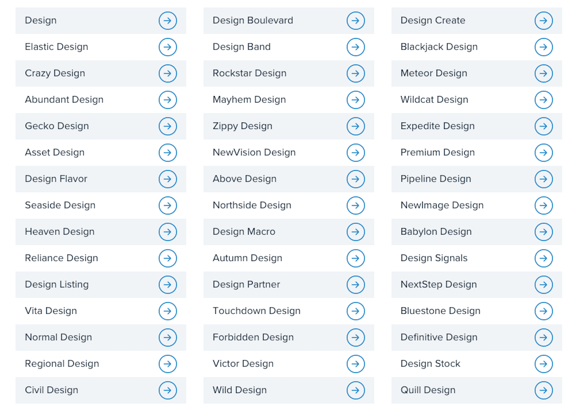
This is a list of business names suggested to me when I told the generator that my business is related to “design”:

  • Design
  • Normal Design
  • Regional Design
  • Design Partner
  • Design Stock

Even the more unique names on the list are unusable; they have no connection to me personally or to the kind of business I plan to start.

This is why it’s so important to sort out your brand identity and make sure you pick a business name that resonates with you, and your target audience. To do this yourself, answer the following seven questions:

1. What Services Will You Provide Or Products Will You Sell?

The one thing that name generators get right is including a descriptive word related to your business. That way, it doesn’t take an actual visit to your website or a look through your portfolio to figure out what you do.

Even if you have a very niche specialty, sum up your offering in one or two words. For instance:

  • Web design
  • Digital design
  • Design & development
  • UX design
  • Graphic design

Unless you run your business through your own name (which I’ll talk about shortly), your business name should include a simplified version of your offering in it.

2. Who Is Your Target User Persona?

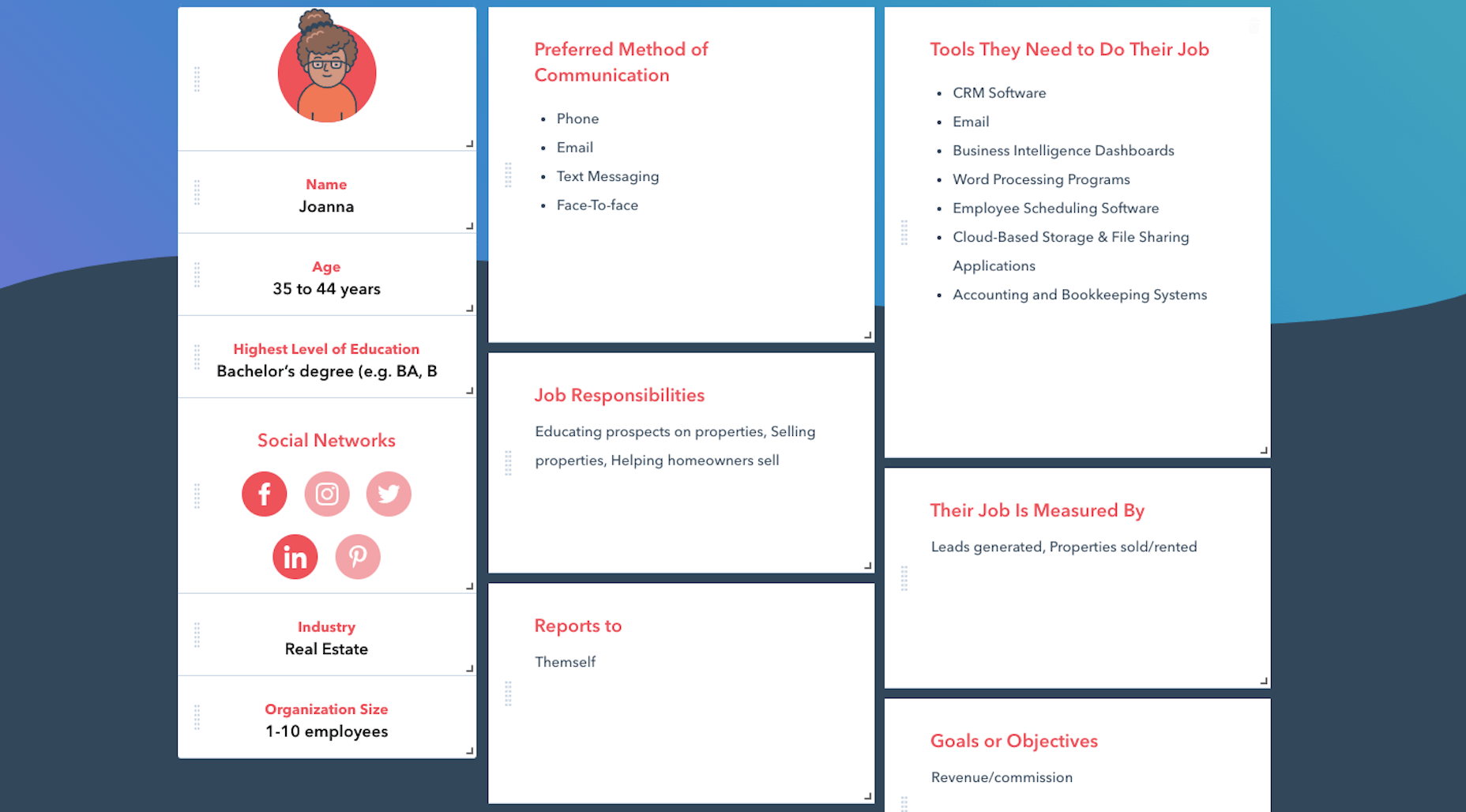
A user persona is a fictional character created using the demographics and psychology of your ideal customer or client. You can use Hubspot’s Make My Persona generator to create a card that documents these details:

Once you sort out who you serve, what makes them tick, and how it fits into the bigger picture of their business, you can better pitch your solution to them.

For instance, Joanna above is a real estate agent and owner whose primary goal is to capture leads and generate sales. You know how effective a real estate website can be for improving an agent’s visibility online and streamlining how they earn money.

So, including words in your business name that speak to that persona as well as their goals might be really useful.

Just keep in mind that web designers don’t always commit to one niche or stick with the same niche over the long run. So, you might not want to make your business name too specific to an industry (e.g. “Real Estate Design Solutions”) and more related to higher level themes and goals.

3. What Are The Names Of Your Top Competitors?

Do you know who your main competitors will be upon entering this space? If not, now’s the time to look them up.

When it comes to business names, you want to see if you can identify common threads among them. Perhaps they use puns or include location-specific descriptors. Or they just stick with the names they were born with.

While you don’t want to come off as a copycat, you can imbue your business name with a similar theme or tone if it’s proven to be successful with your shared audience. 

4. What Makes You Different?

Every business has a unique value proposition (UVP) — something that sets them apart from everyone else in the space. What’s yours?

Do you operate within a large metropolitan area where your prospective clients’ industry is booming?

Did you previously work in the industry for which you now build websites?

Are you an SEO expert who builds enterprise websites that rank?

In business, it’s good to be different — so long as it benefits your clients.

If you have a particular UVP that’s going to make you stand out, you’re going to use it everywhere to market yourself — your website, social media, sales pitches, etc. So, you might want to consider using a unique keyword from it within your business name.

5. Where Do You Envision Yourself In Five Years?

No one’s future is set in stone. However, if you’re seriously thinking about starting a new web design business, you have some ideas about where you want to go with it:

  • Do you like the idea of being a lifelong freelancer or digital nomad?
  • Would you like to operate your own design agency?
  • Do you have aspirations to build and sell website products, like plugins, themes, or UI kits instead?

If you expect to pivot your business at some point, be careful about choosing a business name that paints you into a corner. Keep it broader so that prospects don’t have to wonder what it is you really do.

And if you plan on scaling your business beyond yourself, using your own name might not be the best idea. You’ll want clients to associate the brand name with your agency, not with you specifically.

6. Will Your Business Name Be Easy To Remember?

At this point, you have some business names brewing. So, now we need to look at the more technical aspects of naming your brand.

Here’s what you need to do.

a. Write down no more than three to five business names you like.

For example:

  • Honeymooners Web Design
  • Charles Murphy Design & Development
  • FoREver Websites
  • SOLD Web Design Agency

b. Mash each name into one long lowercase string. Don’t include any punctuation.

For example:

  • honeymoonerswebdesign
  • charlesmurphydesignanddevelopment
  • foreverwebsites
  • soldwebdesignagency

c. Are any of the names difficult to read? Too long? Do any of them cause confusion and look like they mean something else?

If so, get rid of them as a matching domain name won’t work. Or, if you absolutely love them, fix the name so it’s clear, readable, and short. For instance:

charlesmurphydesignanddevelopment becomes charlesmurphydesign or just charlesmurphy.

7. Does The Name You Want Already Exist?

It’s a good idea to have a backup name in case you discover that the name you want already exists. Due to trademarking issues as well as possible confusion for your clients, you’ll want to avoid using a name that overlaps with or is the same as any other company (in or outside of web design).

Do a Google search for the business name you want to use. Check out the top 10 search results to see if there are any other matches.

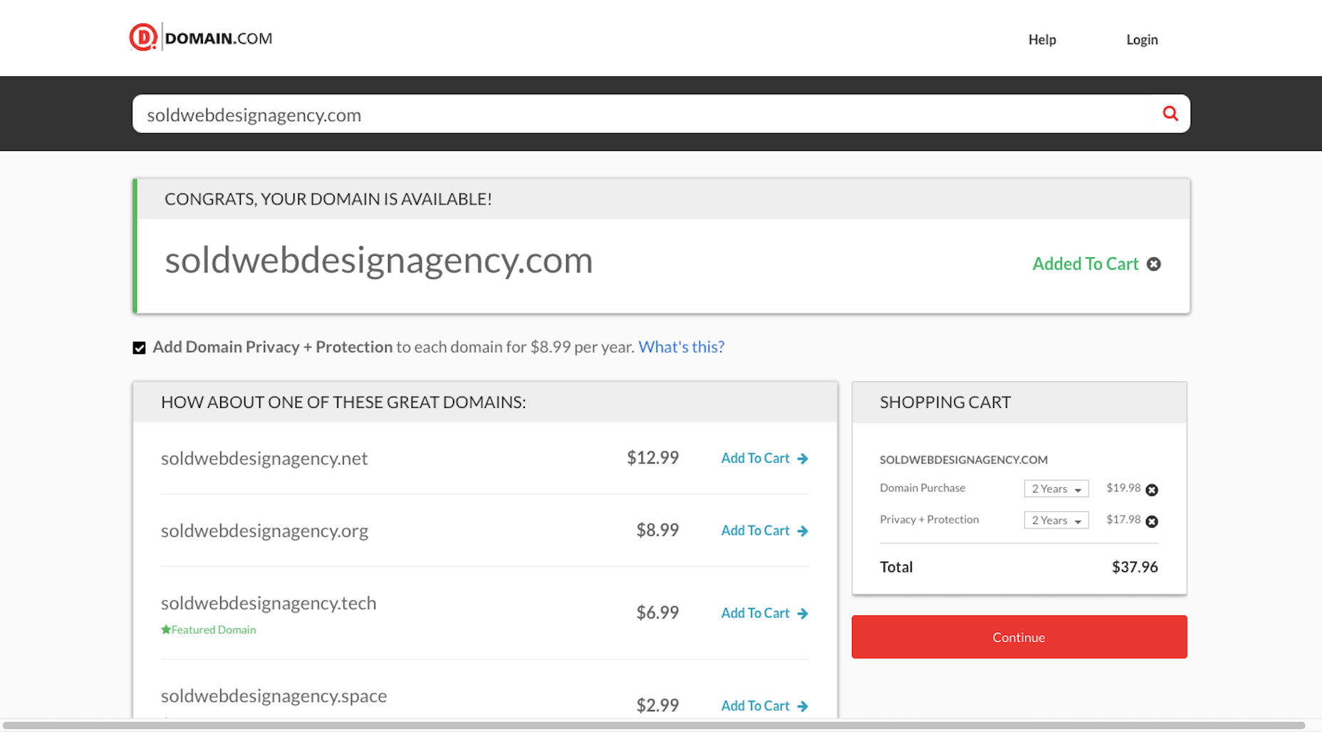
You’ll also want to test out the domain name. Go to Domain.com and run your business name string through it:

You have a few options if this happens:

  1. Choose a different top-level domain (e.g. .tech, .io, .design).
  2. Use an abbreviated version of your business name  (e.g. solddesignagency.com).
  3. Move your backup business name to the front of the line and see if it’s available.

It all depends on how attached you are to the business name you’ve chosen. Just make sure that any changes you make to it (like shortening the domain name or using an alternate TLD) doesn’t cause confusion for prospects who look you up online. You don’t want them confusing someone else’s domain name for yours if business name and domain name don’t line up.

Choosing a Business Name Is Just the First Step…

Once you’ve settled on your business name, share it with a few people you trust. They’ll let you know if you’ve totally missed the mark or if it’s something you should be excited to run with.

As soon as you’re 100% sure it’s the right name, buy the domain name and register your company. Then, it’ll be official!

Of course, this isn’t the end to branding your new business. In our next Branding 101 post, we’re going to look at the next step: How to create the visual identity for your business.

Stay tuned!


Featured image via Pexels.

Source


Source de l’article sur Webdesignerdepot

No-code and low-code technologies have been making inroads for years but have never quite delivered on their promise as reliable alternatives to traditional software development for complex, business-critical applications. Then COVID-19 forced a new, expedited timeline for moving analog in-person processes to semi- or fully-automated online ones. At the same time, IT and engineering roadmaps have been thrown out the window as technical teams scramble to adjust to new distributed working conditions while juggling multiple "hair on fire" problems. As a result, operations and business teams have been left with urgent needs for new business applications and scant developer resources, creating the perfect storm for no- or low-code solutions to emerge as the savior of productivity. But decision-makers should be wary of treating these platforms as a panacea to avoid costly failures and lost time.

What Are No-Code and Low-Code Technologies?

To understand how no- and low-code solutions fill the gap between business demand for development and supply of technical resources, it is helpful to understand what those terms mean exactly. No-code platforms allow people with no technical knowledge to stand up complex, cloud-based business applications using simple, drag-and-drop tooling. Relatedly, low-code platforms are also based on the concept of abstraction through pre-built software building blocks oriented towards accelerating time to development by reducing the amount of “original” code that needs to be written in any given application. Perhaps because of their shared DNA, there is a trend towards convergence; as no-code platforms become more powerful and versatile with add-ons and application marketplaces, and low-code platforms build features to require less coding. Given this trend, we can collectively refer to these platforms as Low-code Development Platforms.

Source de l’article sur DZONE