 It’s hard to believe we are more than a month into 2021 already. But that means more trends to dive into this year, right?
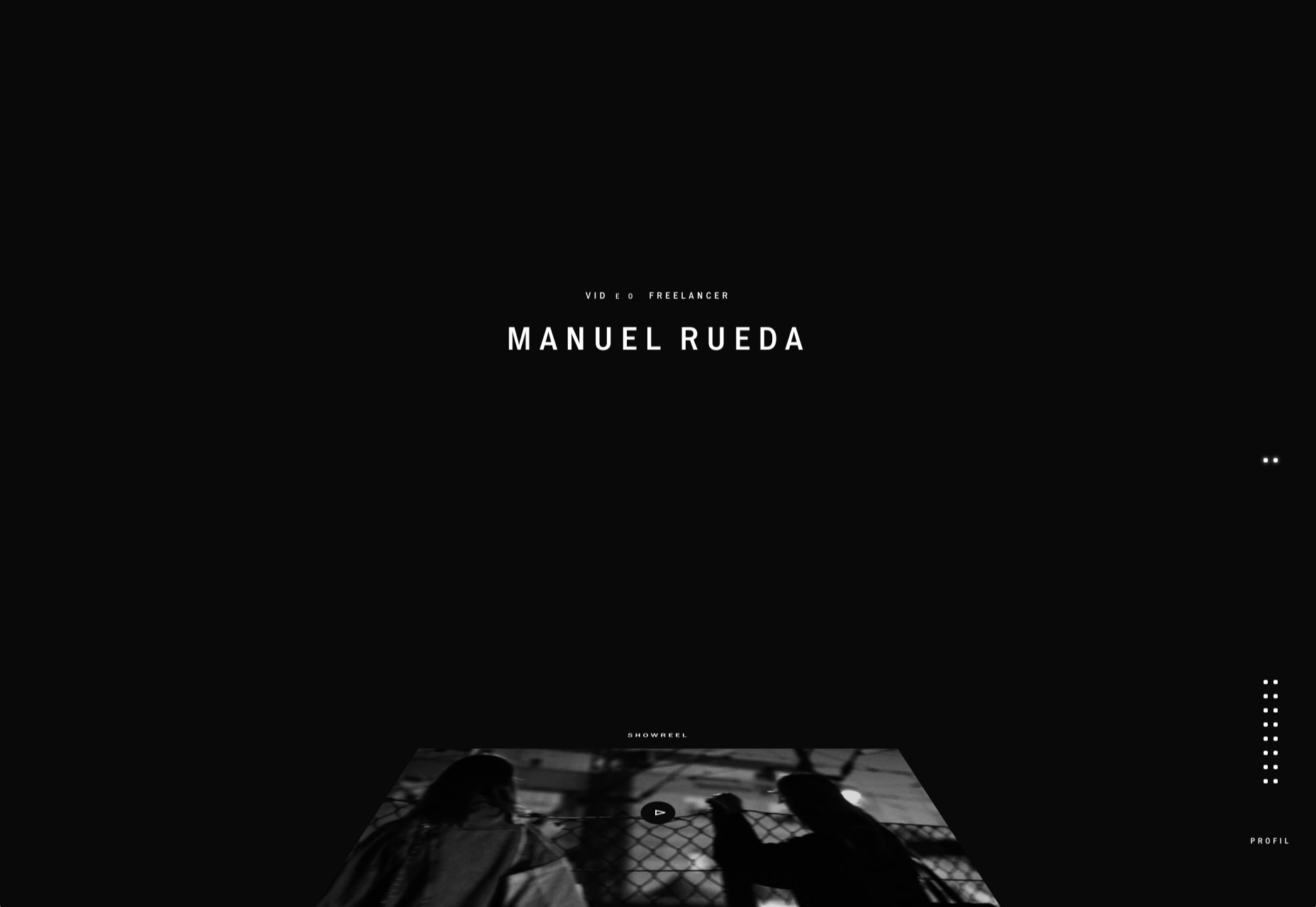
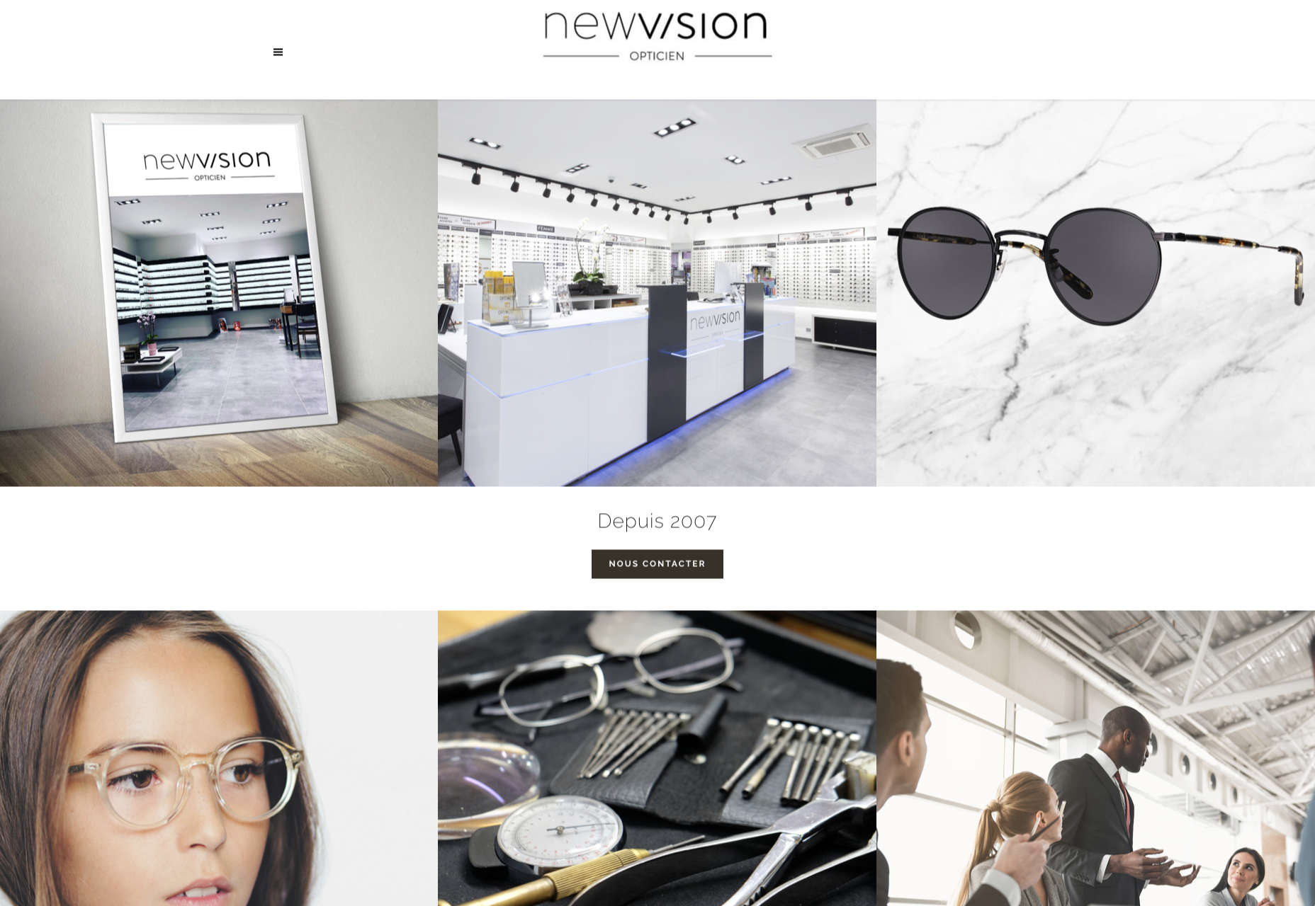
So far, the biggest trend of 2021 in website design is an overall lack of people in imagery. It’s not that surprising with a worldwide pandemic happening, but it can mean that designers are branching out in other ways to enhance visual interest in their designs. Here’s what’s trending in design this month.
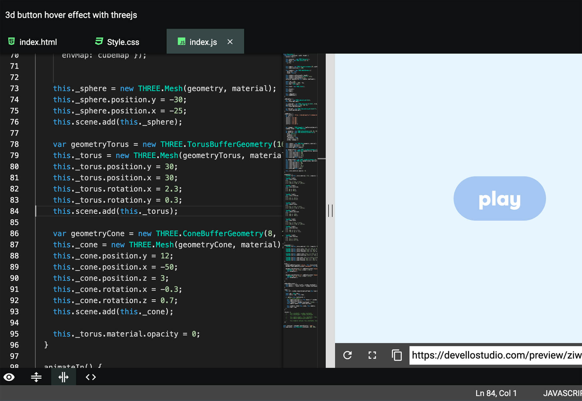
1. Non-Traditional Nav
An interesting way to create visual interest can be to mix up the location, size, or placement of the main navigation menu.
While it can be hard to think about not using a top navigation element or a corner placement for a hamburger menu or icon, it is a solid option depending on the number of menu items and surrounding content.
And there are so many options when you start to think about it. Each draws the eye to different locations on the screen because it is unexpected and different.
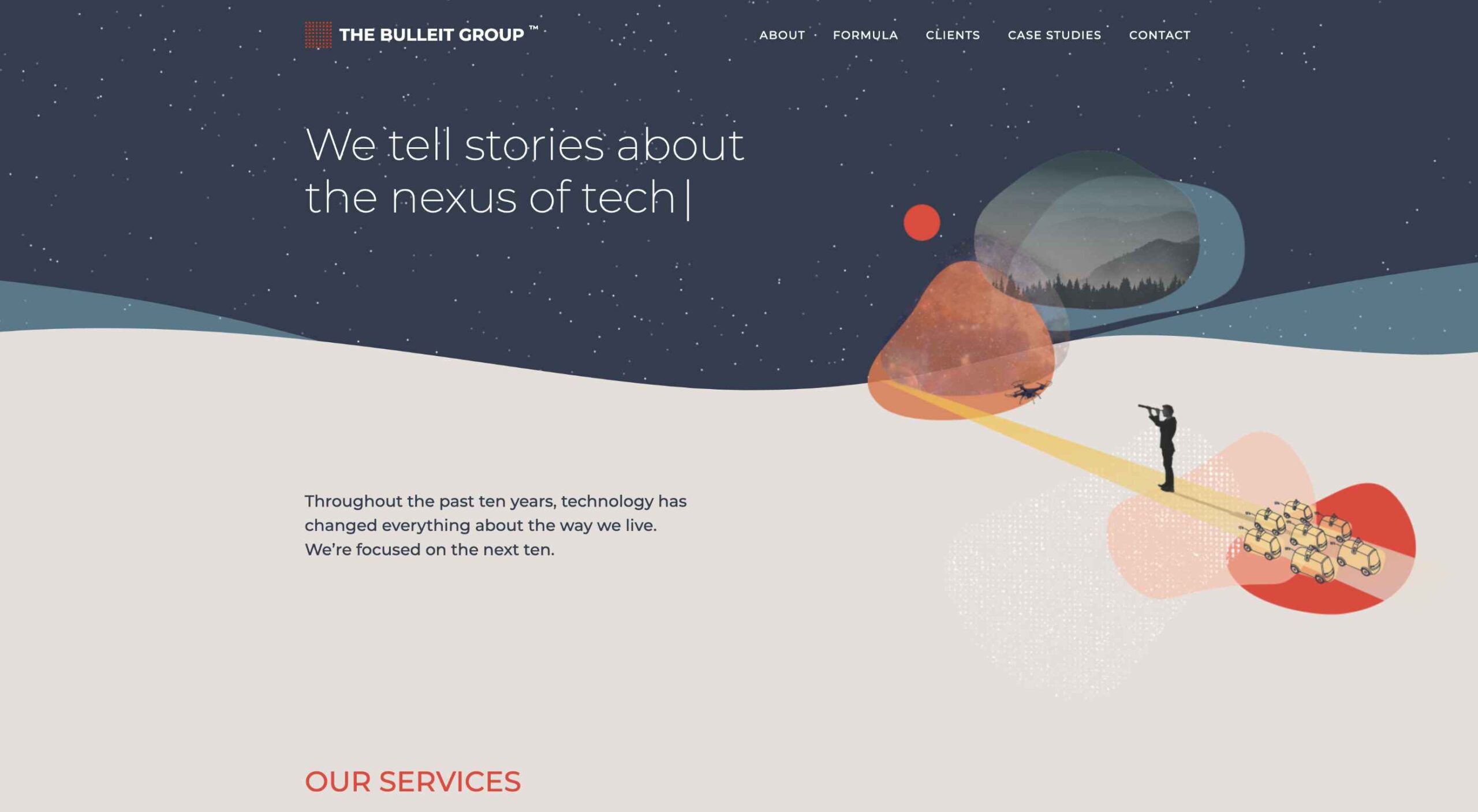
Tilda uses a navigation menu anchored to the right side of the screen. But as you move through the almost file folder-style tabs, the flip to the right side of the screen. It has an authentic feel that’s interesting without being overwhelming to the user.
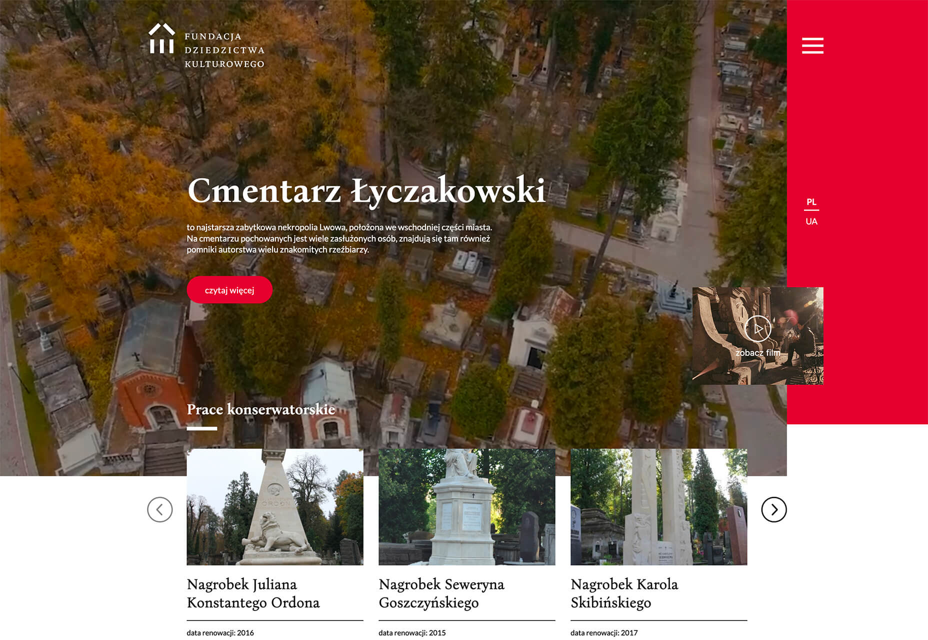
Cmentarz Łyczakowski also has a navigation element on the screen’s right side, but it is a closed, red frame with only a hamburger icon. It’s a rather unusual use of space for a navigation element, but it pulls together with the overlapping video box. Clicking the hamburger navigation pulls up a full-screen menu from the bottom (also a slightly different approach) with oversized clickable elements to move throughout the website.
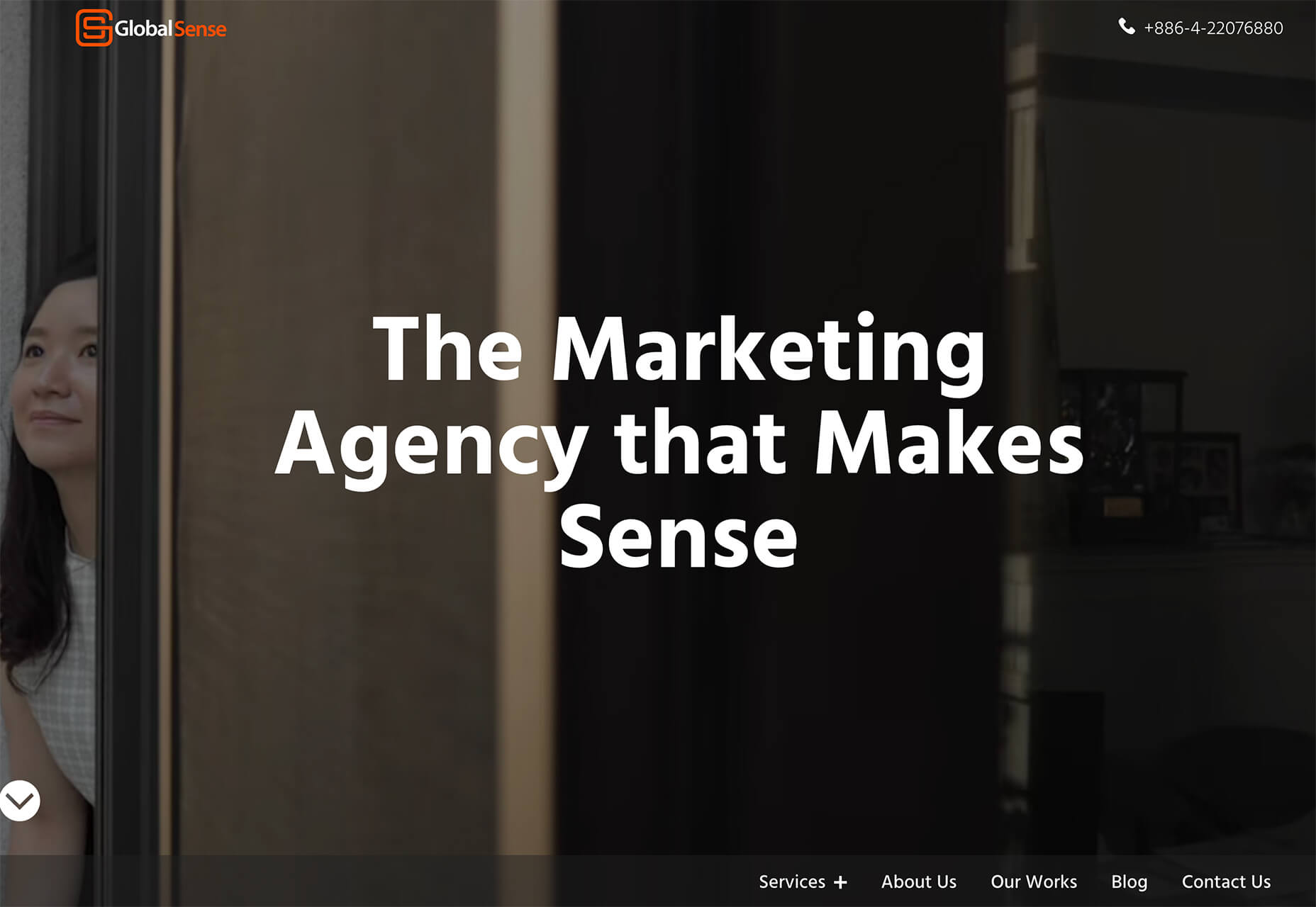
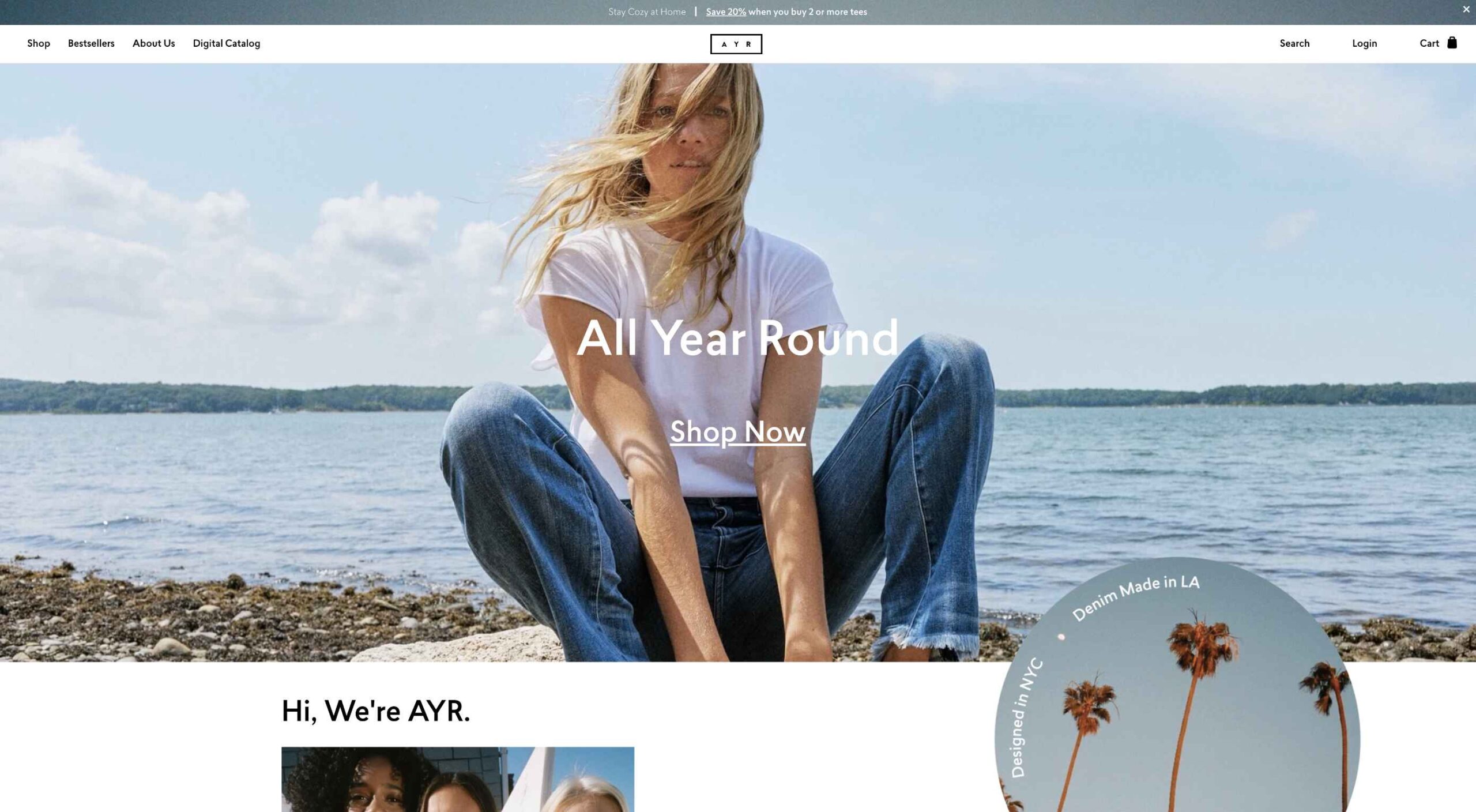
Global Sense shifts the focus from top page navigation to the bottom of the home page. What makes it especially nice is that the navigation bar floats to the top and sticks on scroll. This ensures that while the homepage has a different look and feel, users don’t get lost without navigation as they move through the design.
2. Signature-Style Marks
Website designers use signature-style marks – from logos to headlines – to add a more personal touch to their website projects. And the result is a collection of stunning scripts and novelty typefaces.
So how can you replicate this trend?
You don’t have to digitize your actual signature. (That’s probably not the best idea from a security perspective.) But you can find a font that evokes the same feeling as your own handwriting or contract someone to create an experimental typeface for you.
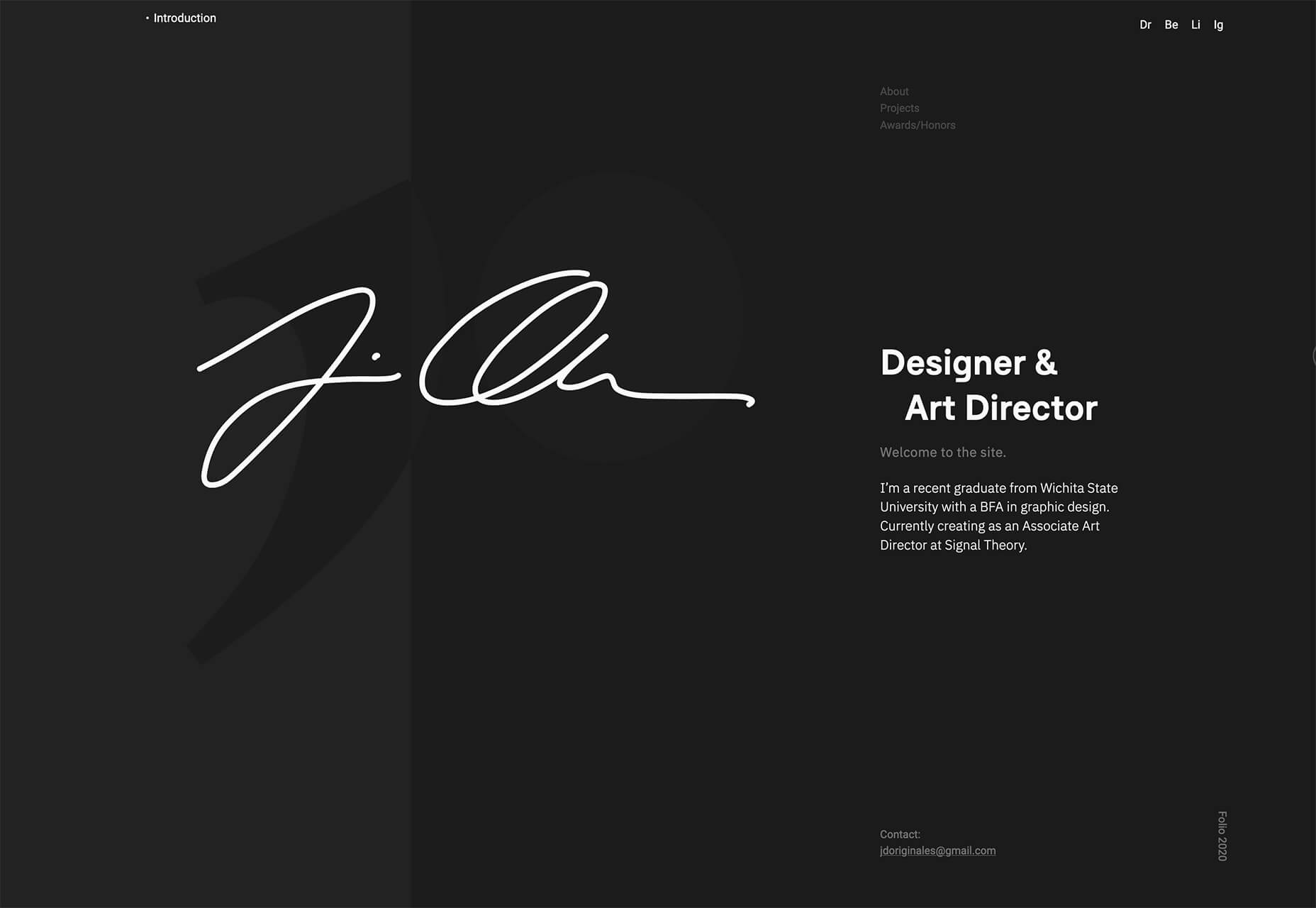
The portfolio of “Zeus” has a beautiful handwriting style element layered over a dark geo-background. (Can you see the outline of the J and O from the signature there?) The signature-style mark works so well because everything is simple and understated, but with depth and dimension elements.
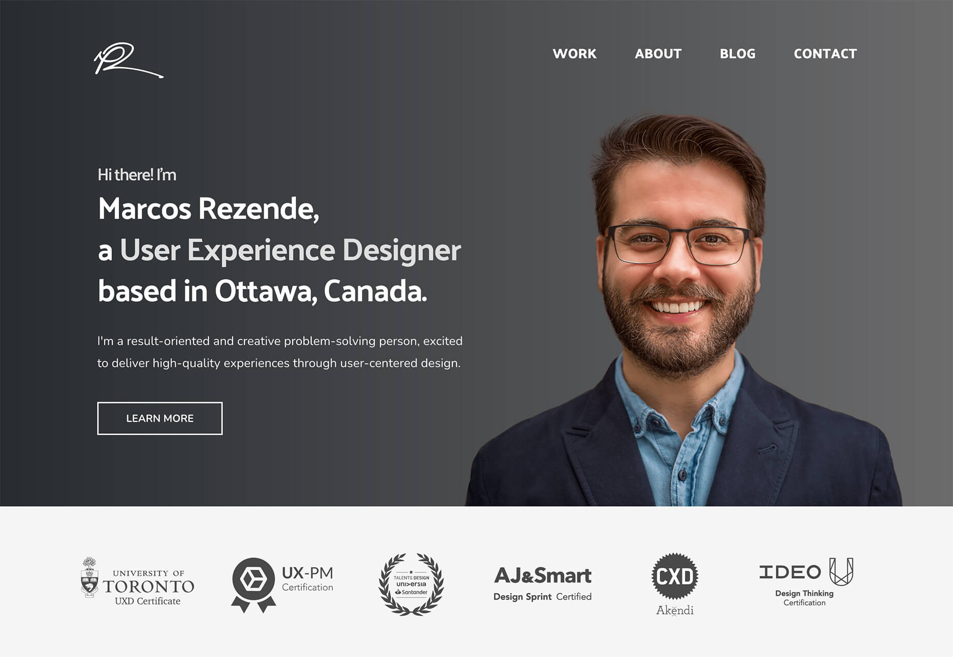
Another portfolio site, this one for Marco Rezende, uses a signature mark as the site logo. It’s an interesting divot that gives just a little more panache and flair to the overall design scheme to feel weighty and professional. Also, note that the designer used a mostly dark background with a white (light) mark. That’s also quite a common visual theme with this website design trend.
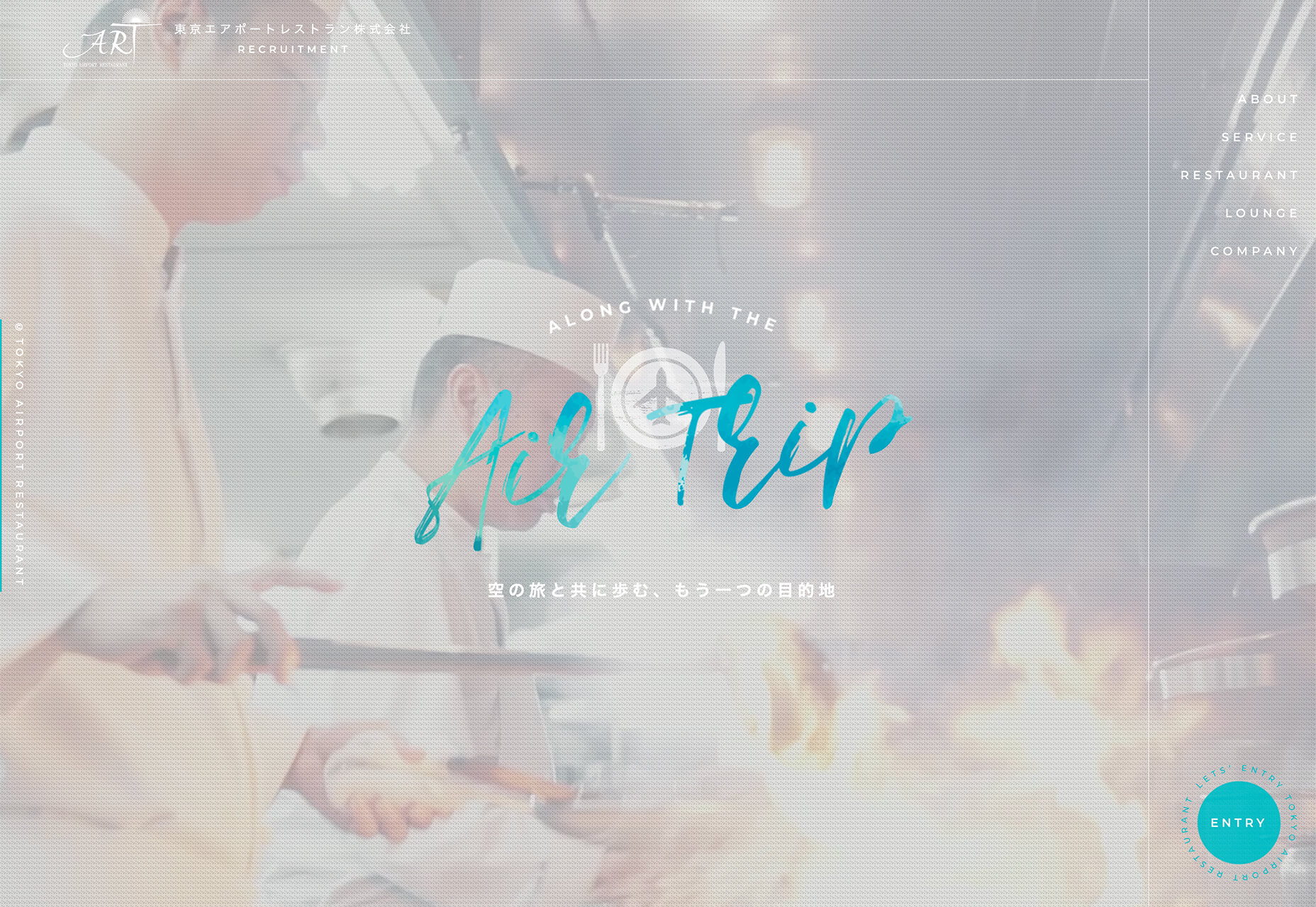
On the other end of the spectrum of this trend is Airport Restaurant. This isn’t a personal site, but the signature-style mark on the homepage gives it a more personal feel. It is almost reminiscent of signing the check after you eat. The additional use of color and size give this treatment a visual boost that helps propel the design forward.
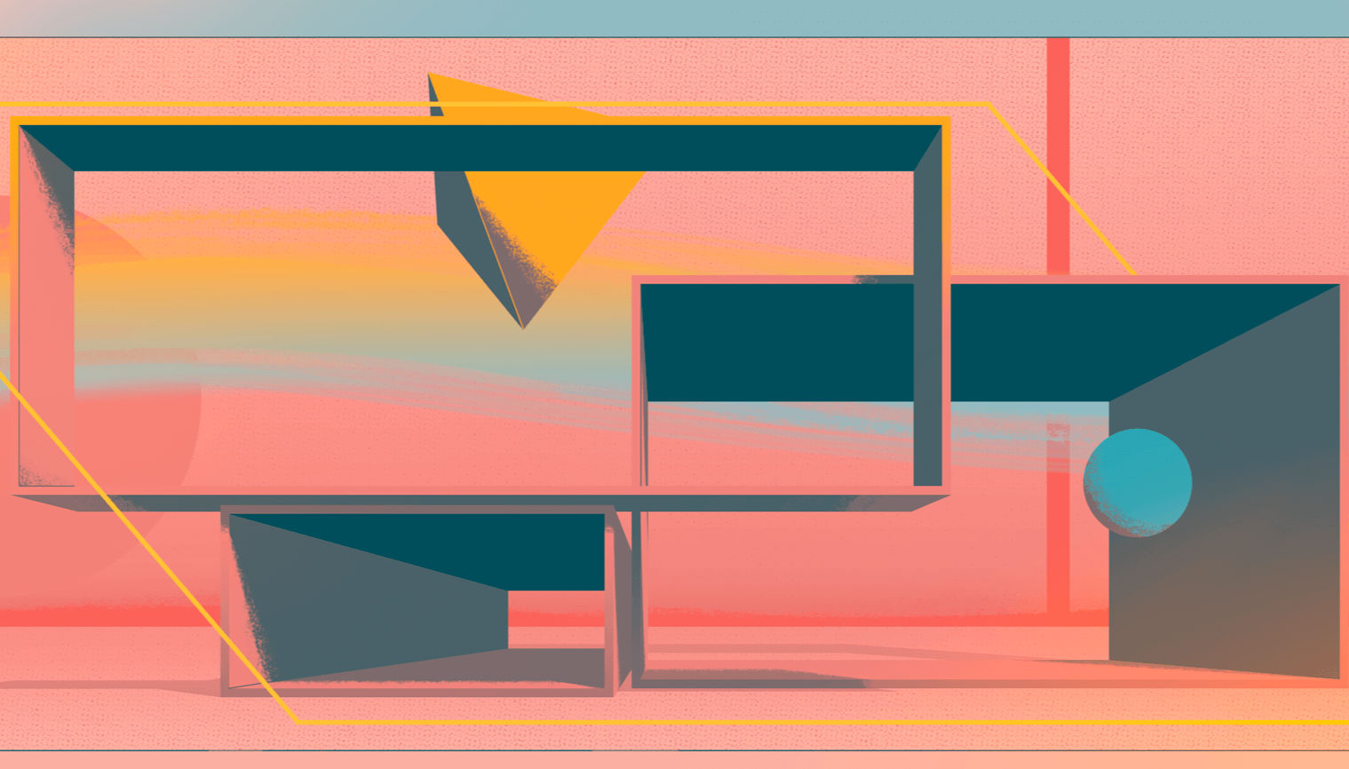
3. Fluid Shapes
Using different types of shapes to create a visual theme has been popular for a few years. Most everyone probably has experimented with some geometric pattern or background by now.
Shapes are taking on a more fluid feel now, and much of that is due to adding hints of animation to shapes and backgrounds to create more liquid looks or harmonic flow.
This trend can work for bigger visual elements such as image frames or the overall homepage art element or smaller patterns or layering effects. The overall goal with fluid shapes is to create something smooth and almost seamless so that users aren’t focused on it but delighted by it.
Each of the three examples below takes a different approach to this website design trend.
Eder Anaya has a rotating rectangle with a fluid animation inside. The overall shape itself is also animated and changes from a rectangle to a trapezoid-type shape to a flat plane.
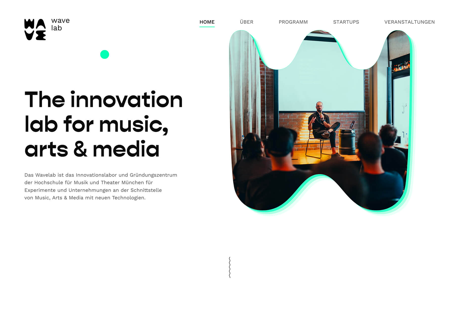
Wave Lab might have one of the coolest fluid shape animations out there. With images inside the shape, plus a colored outline, plus a subtle bounce, you’d think this is too much for a single element. But it works thanks to plenty of white space and a generally minimalistic aesthetic otherwise. The cleverest part is that one of the shapes is the “W” from the brand logo.
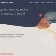
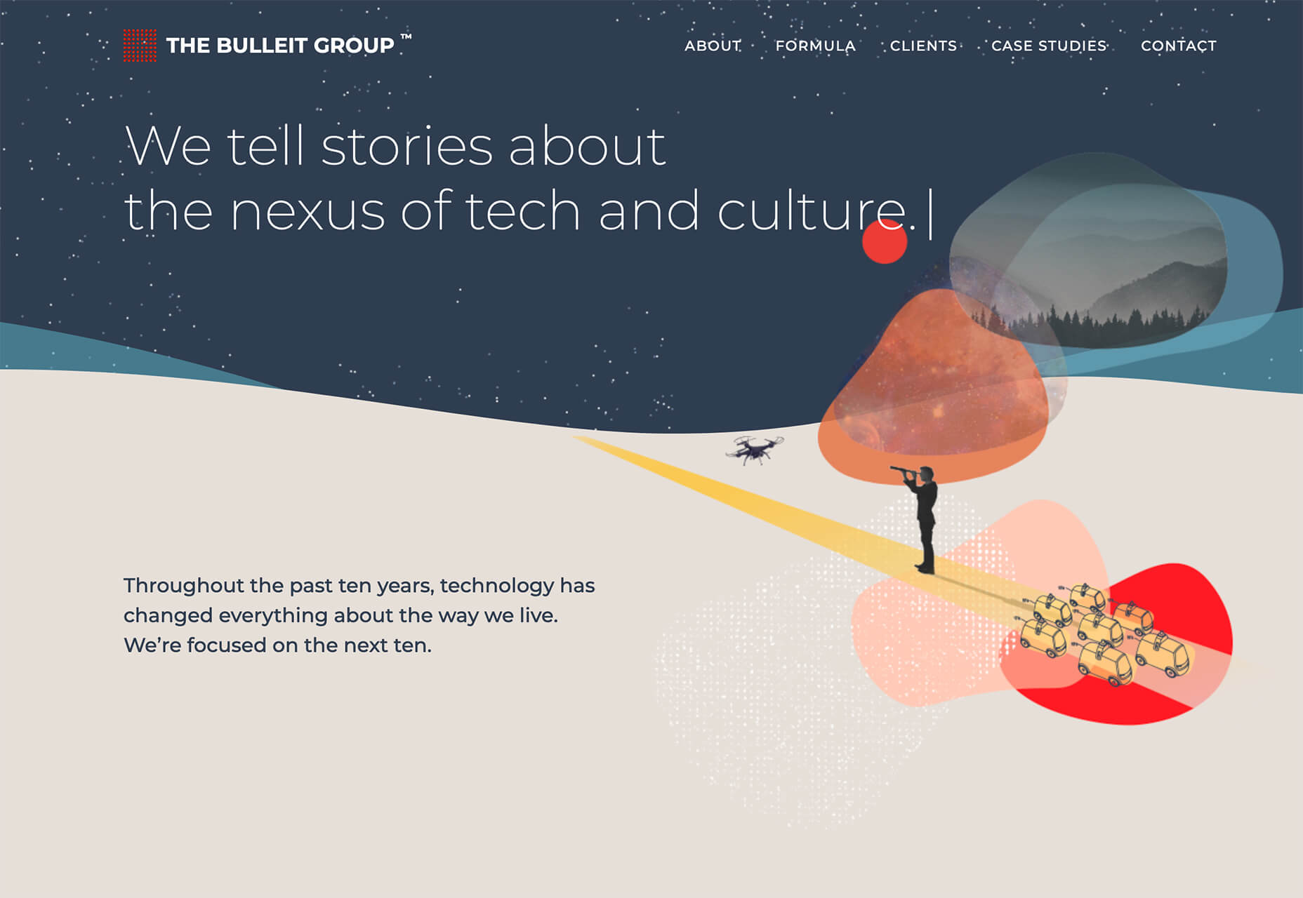
The Bulleit Group also uses fluid shapes but sans-animation. Animated elements are surrounding the shapes but not the shapes themselves. The design’s overall simplicity is intriguing, and the shapes create interest in a place where it might have been difficult otherwise. It’s also nice that they use this shape theme throughout the design and not just on the home screen.
Conclusion
How are you working with fewer images of people? Or is it something you are ignoring altogether with your website projects? Make sure to share some of the ways you are designing this year with me on Twitter, @carriecousins.
And keep those trends coming! It’s so much fun to explore new design elements.
The post 3 Essential Design Trends, February 2021 first appeared on Webdesigner Depot.
 As human beings, we like to think that we’re rational creatures.


 When it comes to compliance, website developers need to keep their eyes on more than just ADA regulations and Section 508. Privacy laws are a big consideration and decisions on how to build privacy into a website start with architects.
 Today, great design isn’t just about conveying the right amount of information in a certain number of pages.
 Every week users submit a lot of interesting stuff on our sister site Webdesigner News, highlighting great content from around the web that can be of interest to web designers.

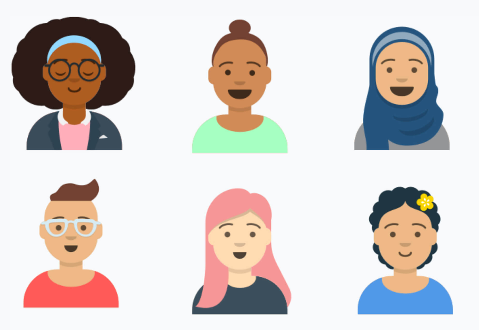
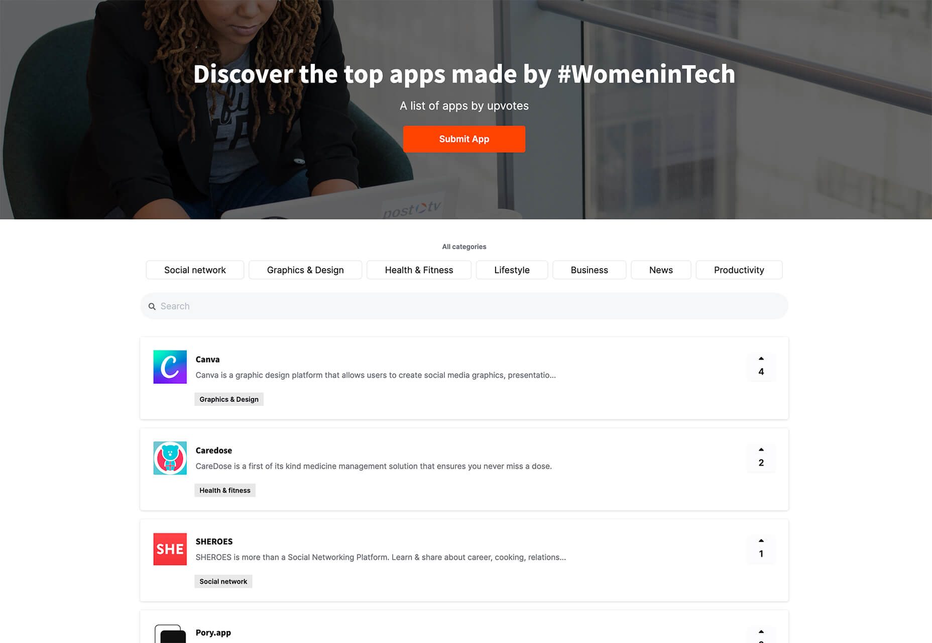
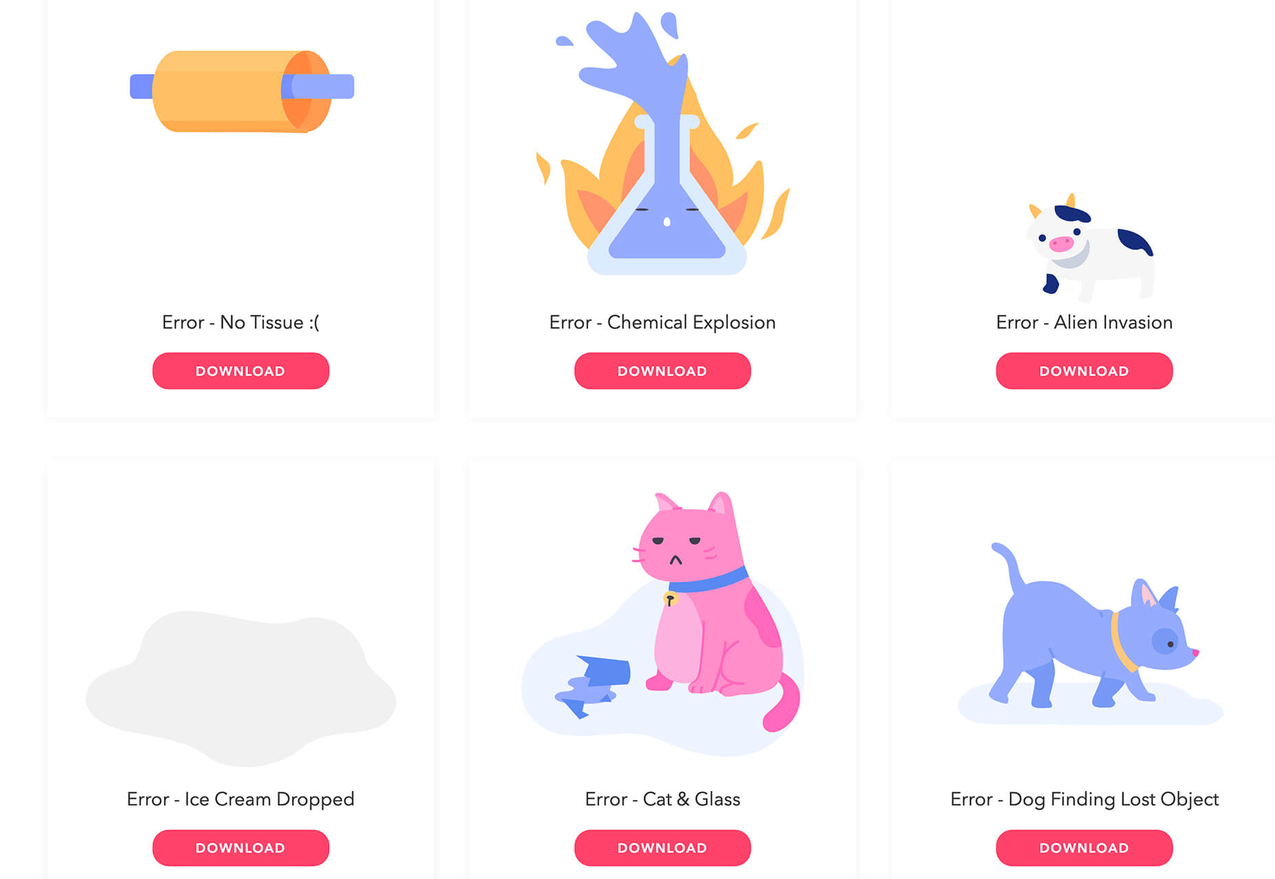
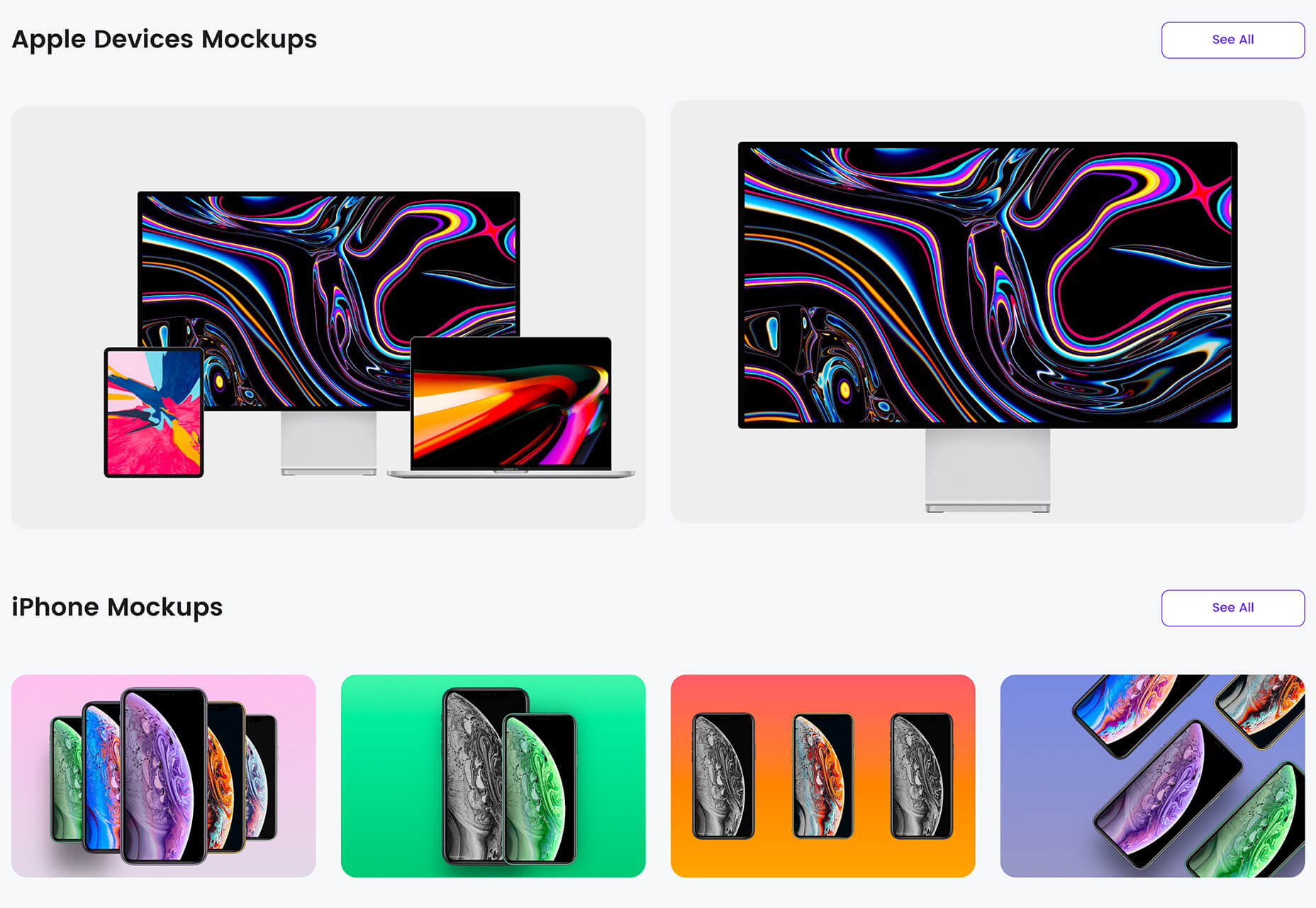
 It’s fun to see new website design tools that reflect current times and the state of the world. That’s very true this month with new databases devoted to diversity and women in technology, as well and resources to make your design life easier.


 As a freelance web developer, how many clients do you get from your website? If you’re like most, you’re probably lucky to get one client every 2-3 months. Unfortunately, that’s very common.
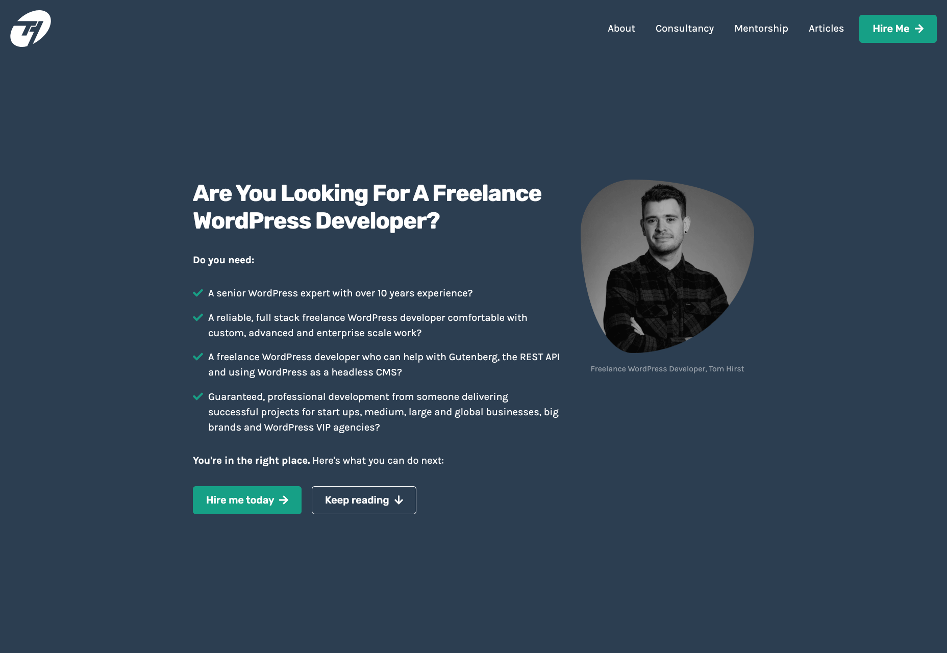

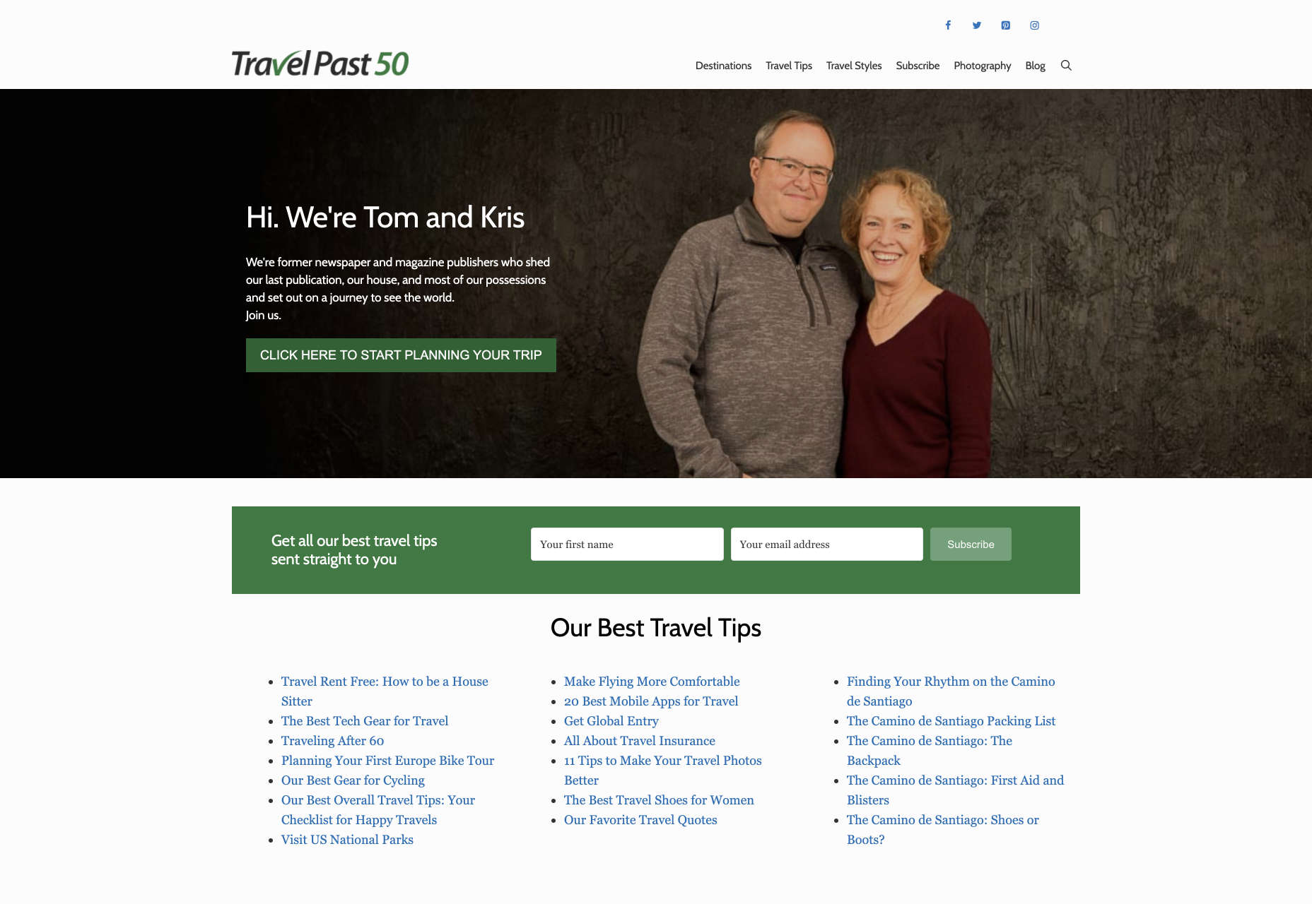
 It’s no secret that the senior population is growing. By 2030, people over the age of 65 are predicted to make up