Articles

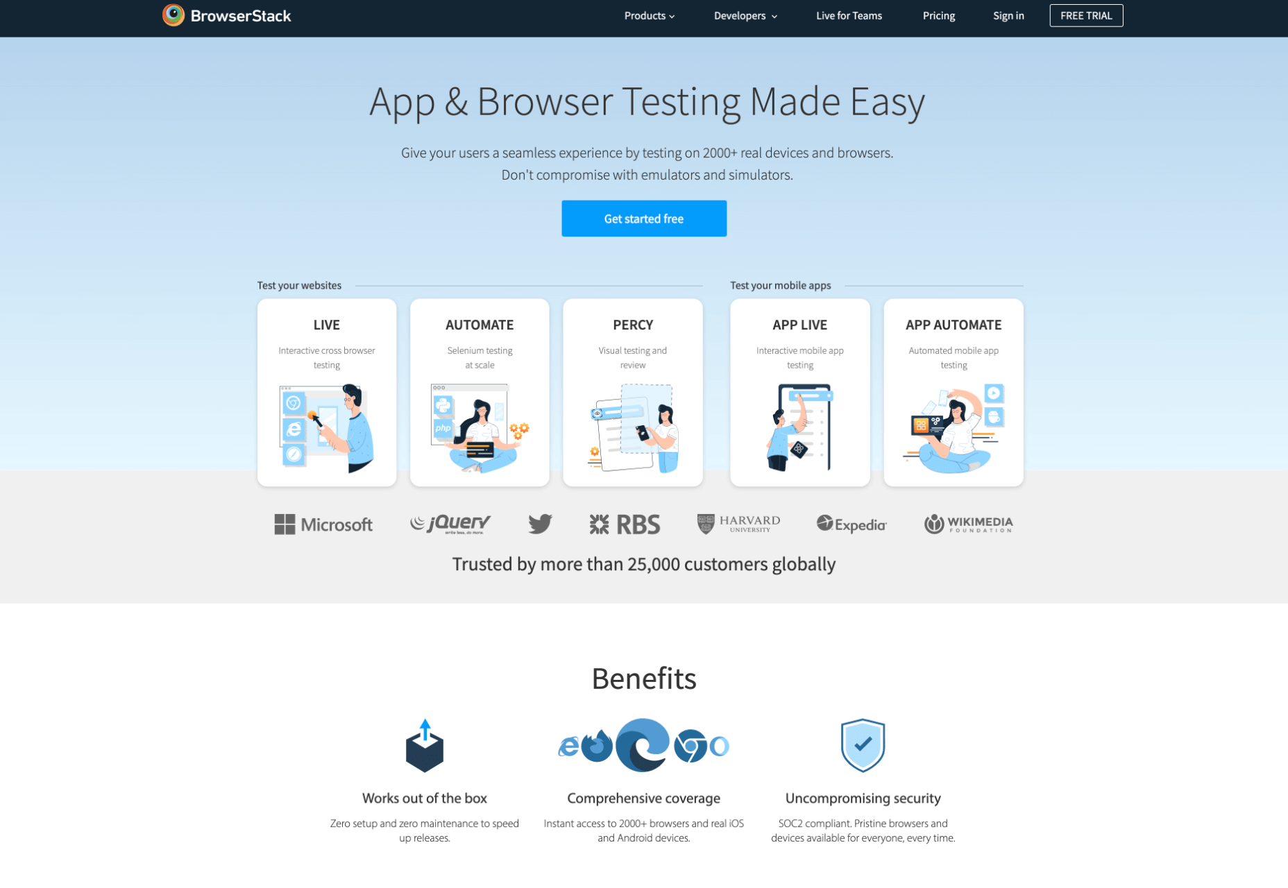
When you think of installing analytics, you probably reach for Google Analytics. And you wouldn’t be alone. The platform’s tight integration with SEO and the implication that using Google products is beneficial to ranking means that Google Analytics is the most commonly installed analytics solution globally.

Google Analytics isn’t a bad choice: it’s free, it’s fairly comprehensive, and it does indeed tie most SEO efforts up with a nice bow.

But Google Analytics is also slow, extremely bad for privacy — both yours and your users’ — and for many people, it’s too unwieldy, having grown organically over the years into a relatively complex UI.

Some alternatives are fast, privacy-friendly, and geared towards different specialisms. Today we’re rounding up the best…
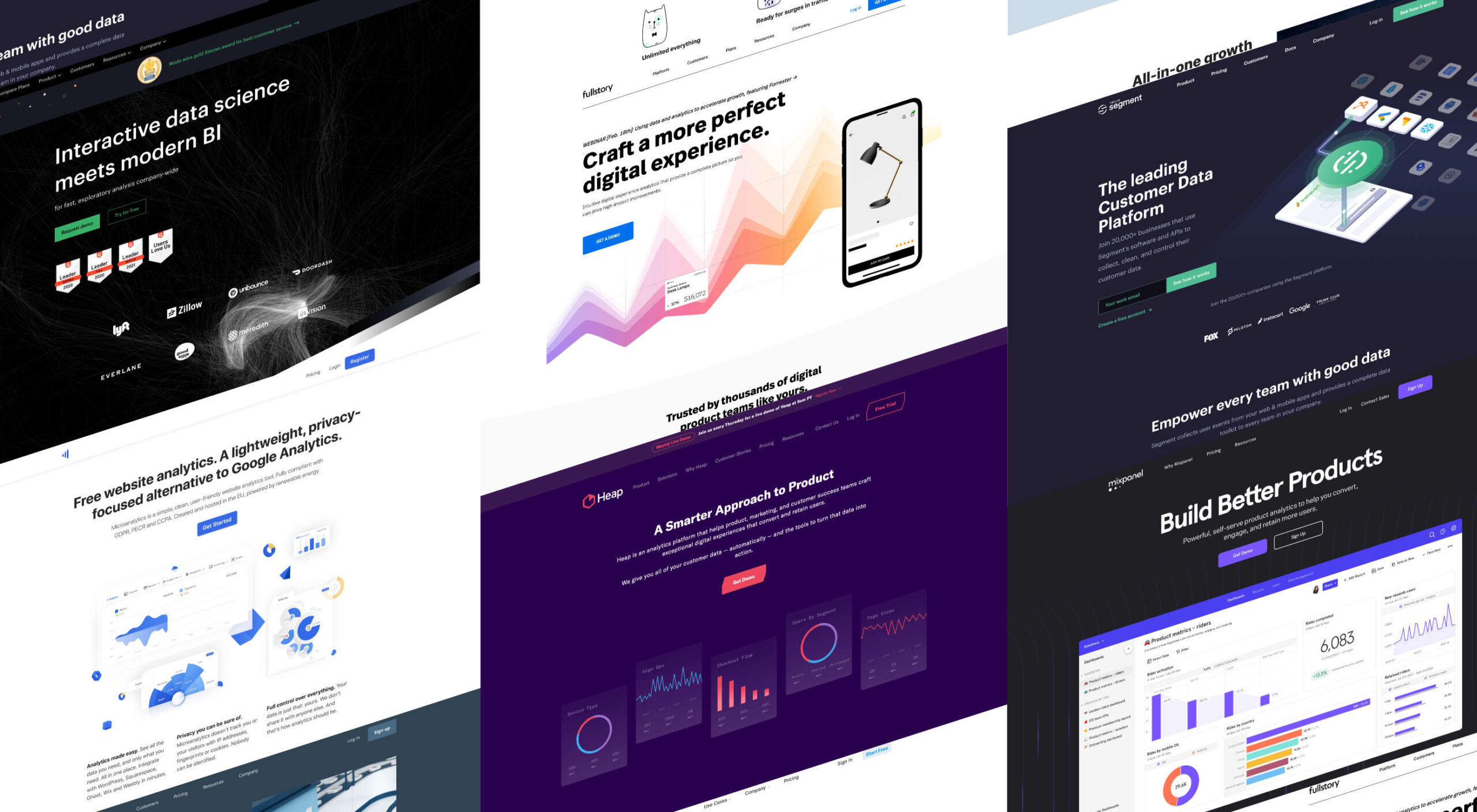
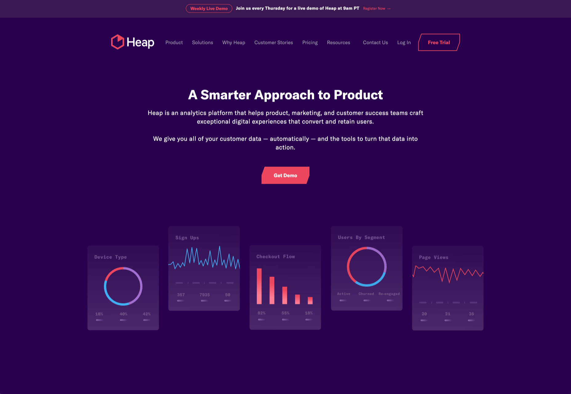
1. Heap

Heap is an event-based analytics platform. That means you can tell not just how many people visited your site but what actions they took when they were there. This isn’t a unique proposition, but Heap is one of the best implementations.

Heap offers an auto-track tool, which is ideal for new installations because you can get up and running immediately and fine-tune the details later. That makes it great for startups, although it’s also the choice of major corporations like Microsoft.

Heap’s free plan includes 60k sessions per year and 12 months of data history, but when you outgrow that, the business plans start at $12,000/year.
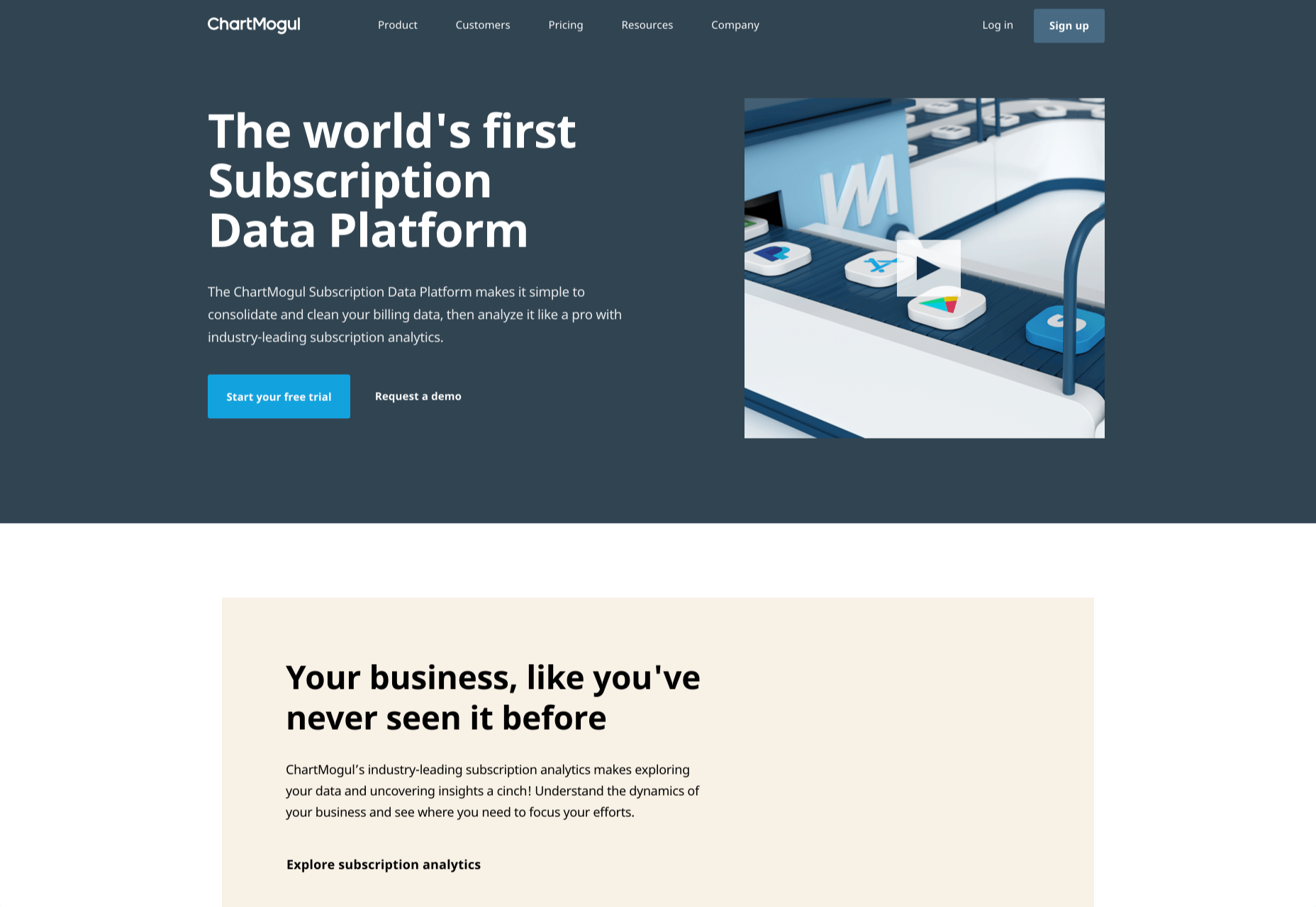
2 ChartMogul

ChartMogul is geared towards SaaS that offer subscription plans, staking a claim as the world’s first subscription data platform.

Services like Buffer and Webflow use ChartMogul to monitor their revenue and analyze the ROI of changes to their features, design, and user experience.

Ideally suited for startups, ChartMogul pricing is based on monthly recurring revenue; it has a free plan for up to $10,000 MMR; after that, pricing starts at $100/month.
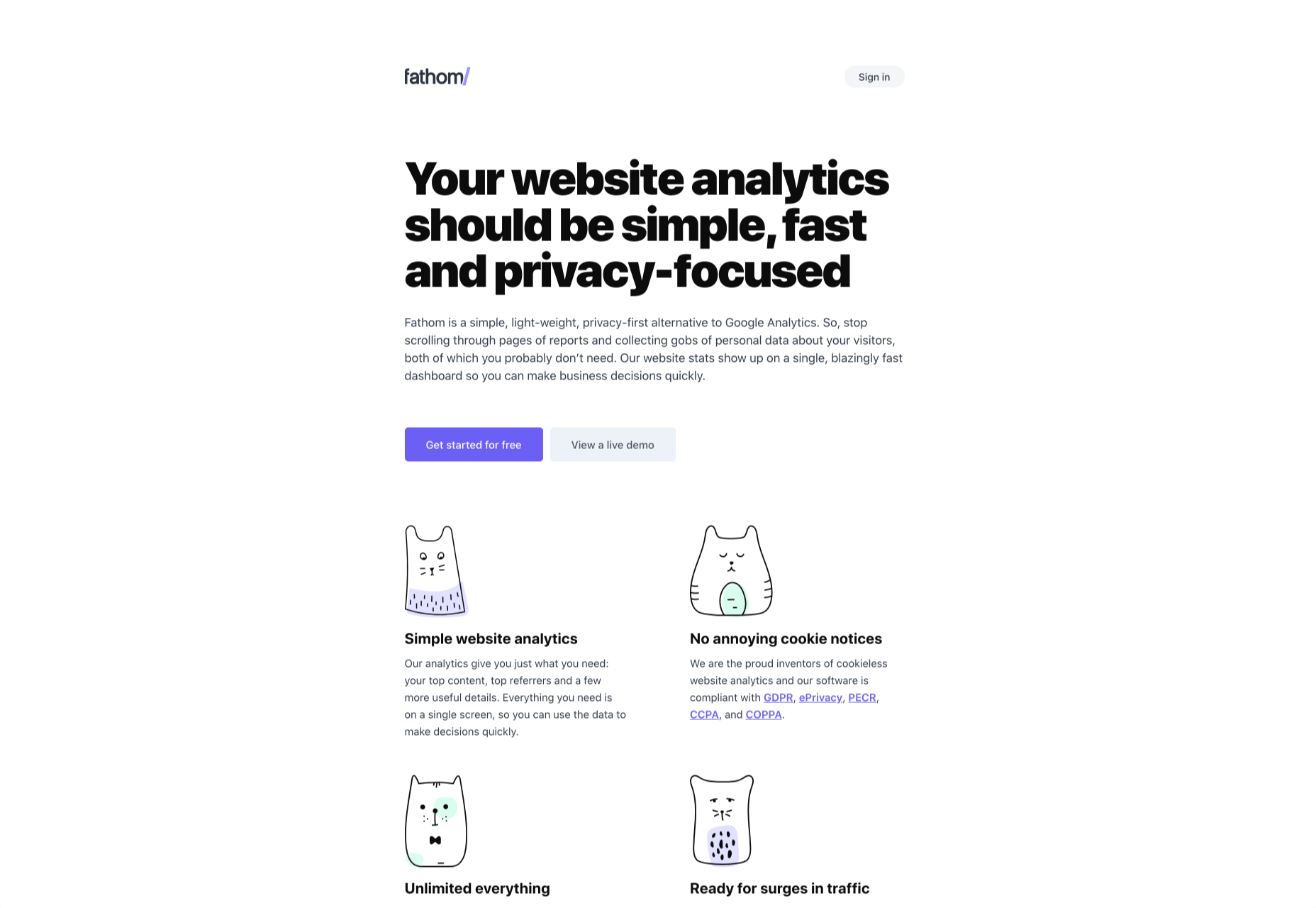
3. Fathom

Fathom is an awesome, privacy-first analytics solution. It offers a simple dashboard and is ideal for anyone looking for simple analytics information to verify business decisions.

Fathom is ideally suited to freelancers, or entrepreneurs with multiple projects, as it allows you to run multiple domains from a single account. Fathom is entirely cookieless, meaning you can ditch that annoying cookie notice. It’s GDPR, ePrivacy, PECR, CCPA, and COPPA compliant.

There’s a seven-day free trial; after that, Fathom starts at $14/month.
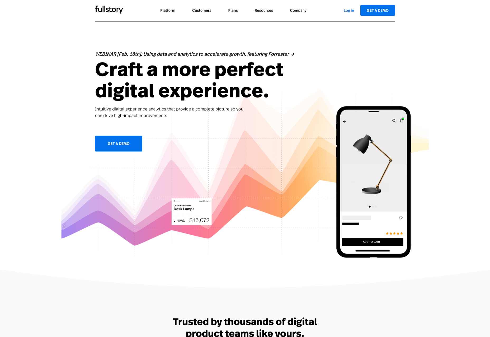
4. FullStory

FullStory is designed to help you develop engaging online products with an emphasis on user experience.

FullStory is a set of tools, making it ideal for large in-house teams or in-house teams working with outside agencies or freelancers. It pitches itself as a single source of truth from which everyone from the marketing department to the database engineers can draw their insights, helping digital teams rapidly iterate by keeping everyone in the same loop.

FullStory uses AI to track and interpret unexpected events, from rage clicks to traffic spikes, and breaks those events down to a dollar-cost, so you can instantly see where your interventions will have the most impact.

There’s a free plan for up to 1k sessions per month; once you outgrow that, you need to talk to the sales team for a quote.
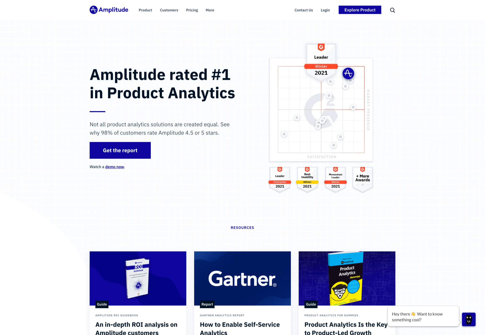
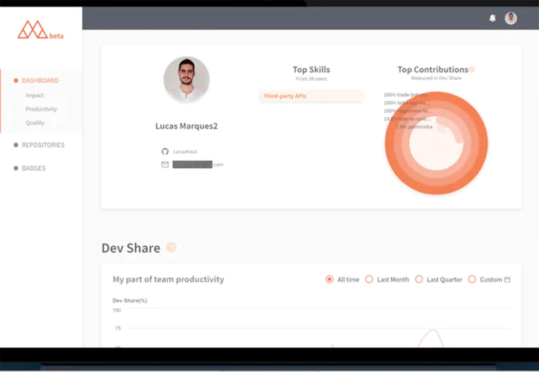
5. Amplitude

Amplitude has one of the most user-friendly dashboards on this list, with tons of power behind it. For project managers trying to make science-based decisions about future development, it’s a godsend.

The downside with Amplitude is that to make the most of its powerful data connections, you need to pump a lot of data in. For that reason, Amplitude is best suited to sites that already have a substantial volume of traffic — among those customers are Cisco and PayPal.

Amplitude provides a free plan, with its core analytics and up to 10m tracked actions per month. For premium plans, you have to contact their sales team for a quote.
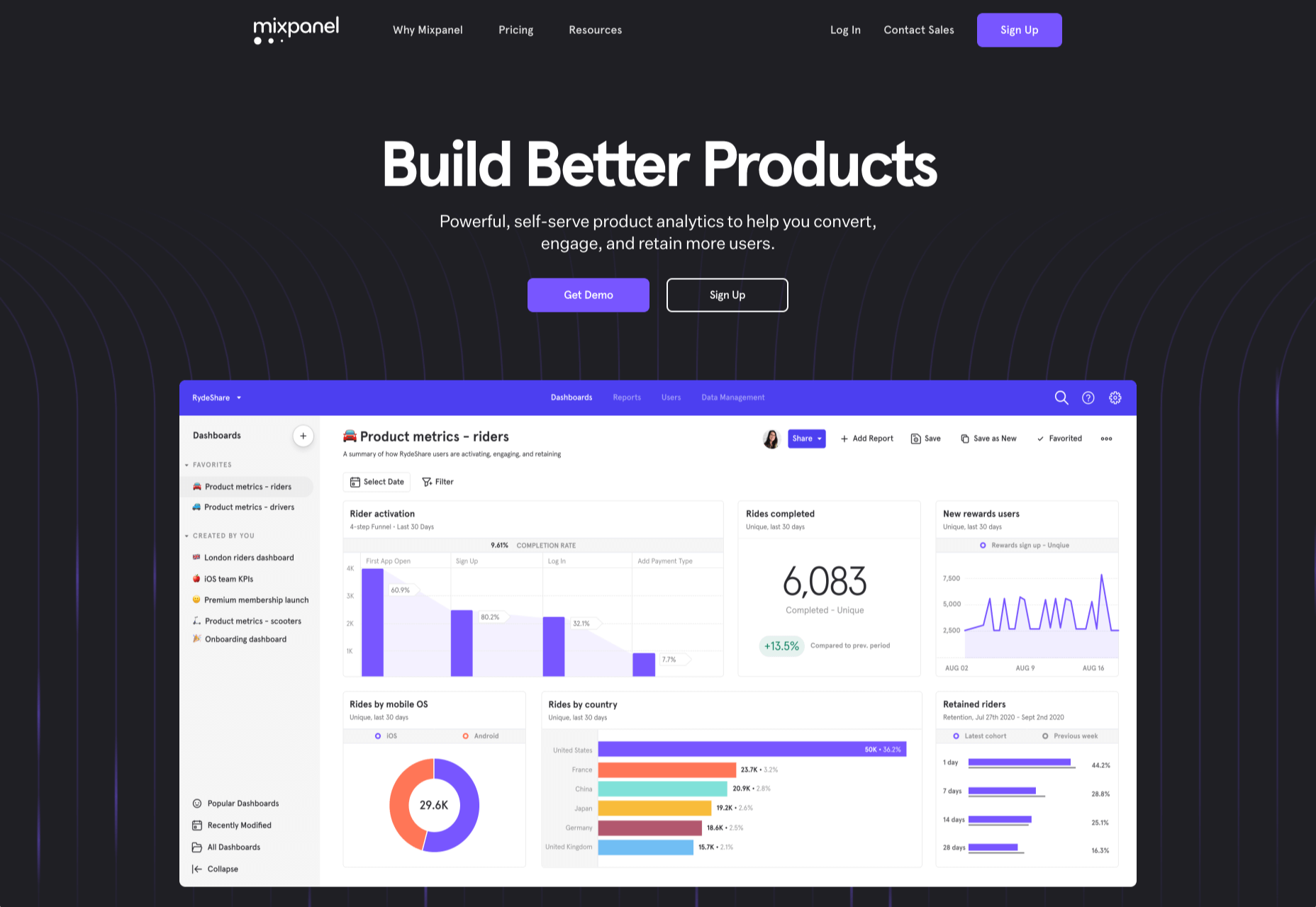
6. Mixpanel

Mixpanel is a little bit more than an analytics program, aiming to be a whole suite of web tools it has ventured into split testing and notifications.

Mixpanel is laser-focused on maximizing your sales funnel. One look at the dashboard, and you can see that Mixpanel, while very well designed, has too many features to present them simply; Mixpanel is ideally suited to agencies and in-house development teams with time to invest — you probably want to keep the CEO away from this one.

Mixpanel has a generous free plan for up to 100k monthly users, with its business plans starting at $25/month.
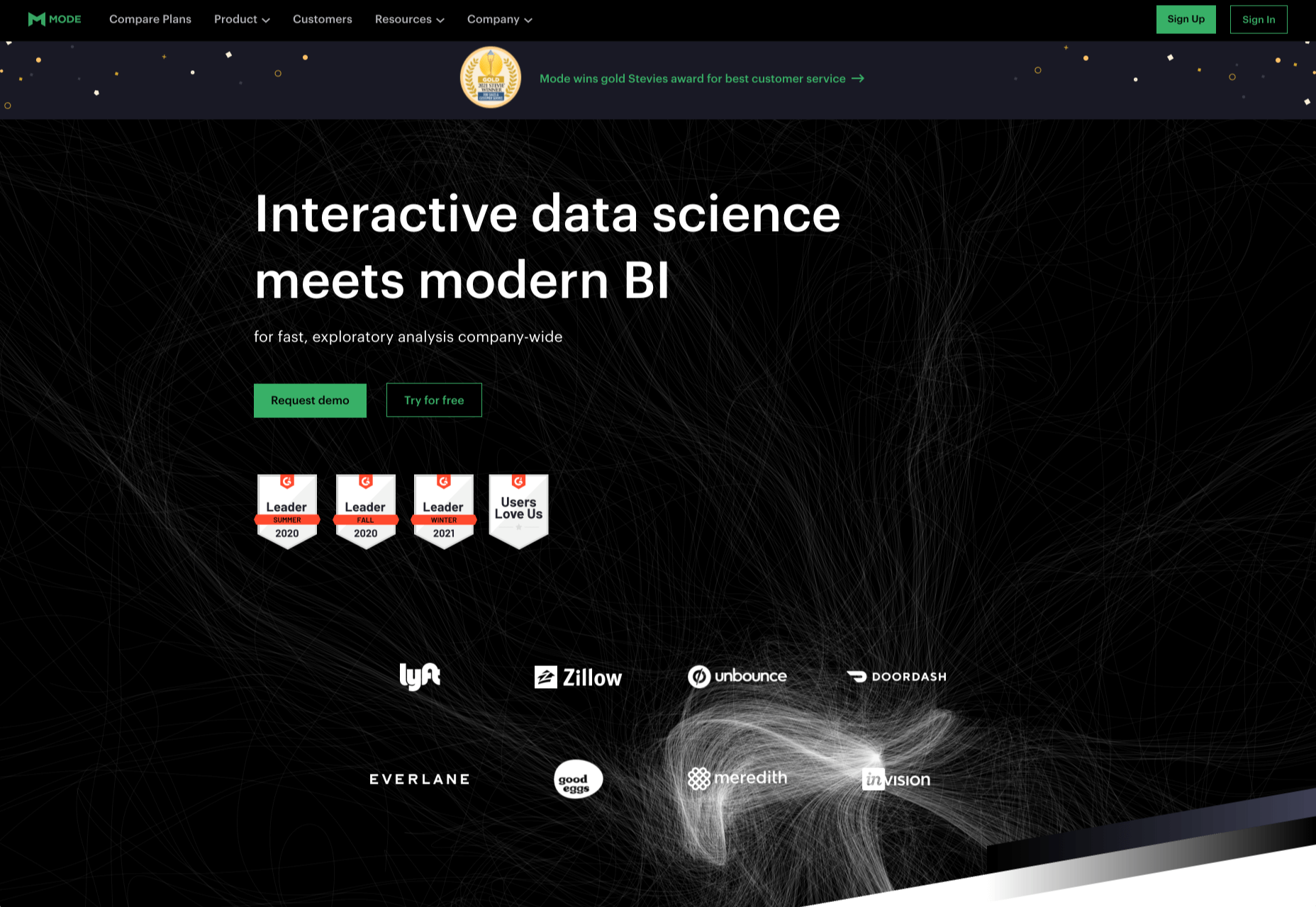
7. Mode

Mode is a serious enterprise-level solution for product intelligence and decision making.

Ideally suited to in-house teams, Mode allows you to monitor financial flow and output the results in investor-friendly reports. You can monitor your entire tech stack and, of course, understand how users are interacting with your product. Wondering who handles the analytics for Shopify? That would be Mode.

Mode has a free plan aimed at individuals, but this tool’s scope is really beyond freelancers, and the free plan’s only likely to appeal to high-price consultants and tech trouble-shooters. For the full business plan, you need to contact Mode’s sales team for a quote.
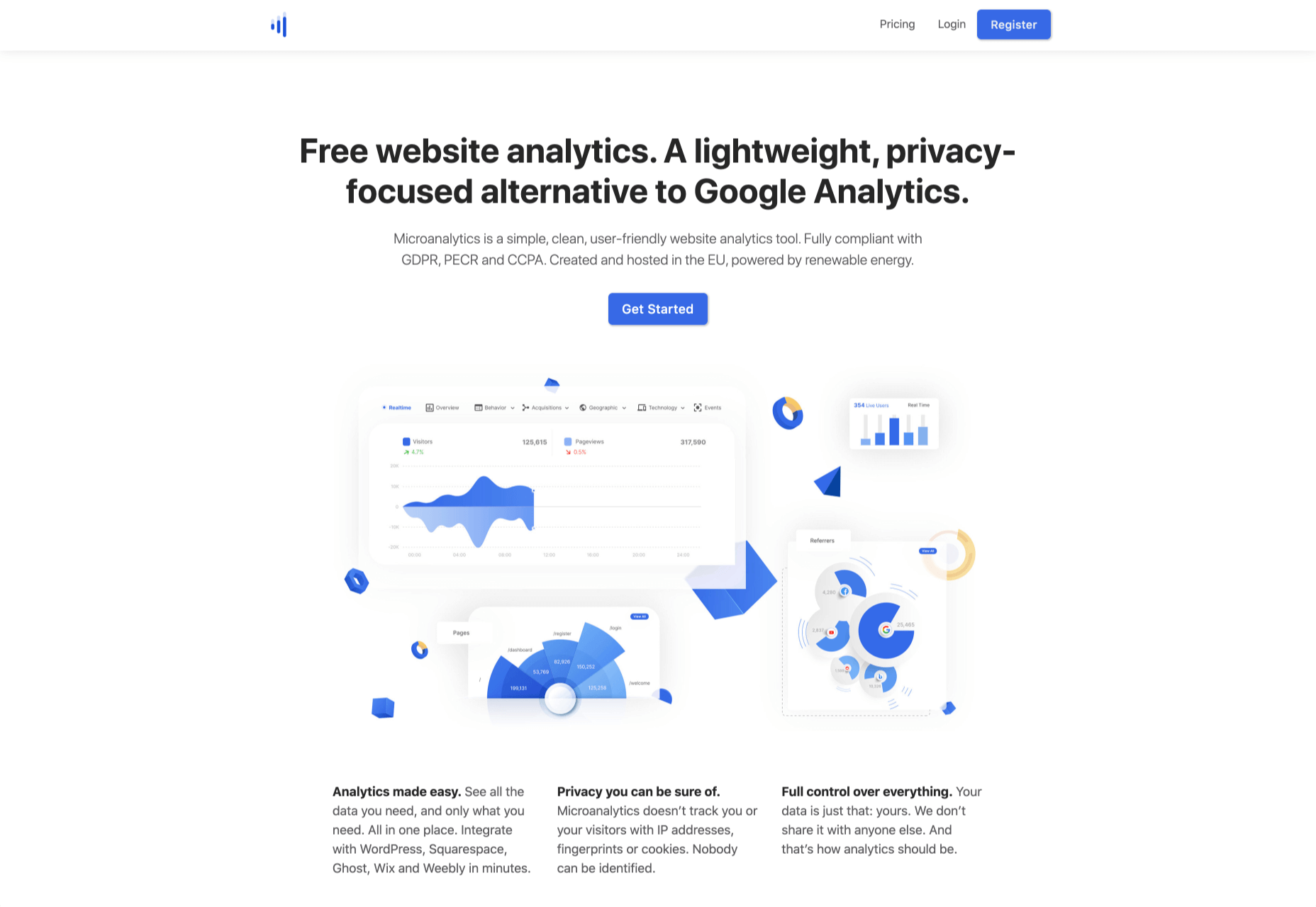
8. Microanalytics

Microanalytics is a relatively new analytics program with a lightweight, privacy-focused approach.

Microanalytics provides a simple dashboard with acquisitions, user location, technology, and the all-important event tracking to monitor user behavior. Microanalytics is compliant with the web’s most stringent privacy laws, including GDPR, PECR, and CCPA. The tracking code is just 1kb in size, meaning that you’ll hardly notice its footprint in your stats.

Microanalytics is free for up to 10k pageviews/month; after that, the monthly plan starts at $9.
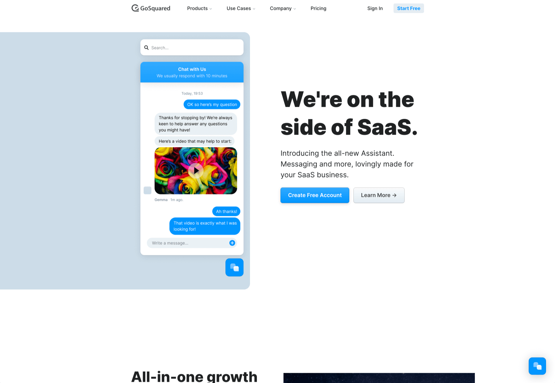
9. GoSquared

GoSquared is another suite of tools, this time aimed at SaaS. Its primary product is its analytics, but it also includes live chat, marketing tools, and a team inbox.

If you’re tired of comparing multiple tools to help make the most of your startup, GoSquared kills several birds with one stone. Perhaps most importantly, if you’re beginning to build a team and don’t have any engineers onboard yet, GoSquared has an award-winning support team and an idiot-proof setup process.

GoSquared has a free plan that’s fine for evaluating the suite and integrating data from day one. As you begin to grow, paid plans start at $40/month.
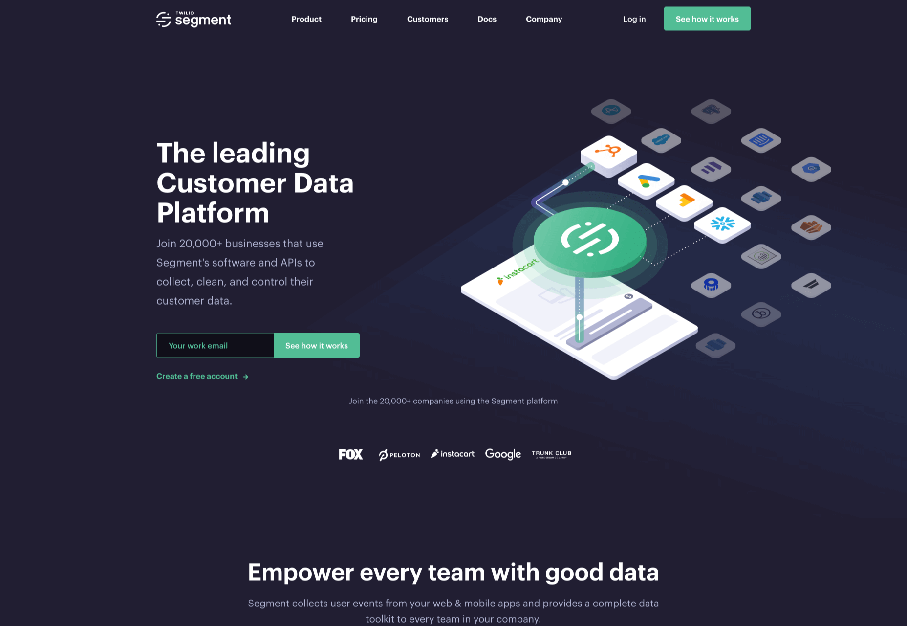
10. Segment

Segment is a little different from the other analytics tools on this list; Segment is a layer that sits between your site and your analytics. It integrates with many of the tools on this list.

There are several benefits to this approach. The main one is that different teams within your enterprise can access analytics data in a form that suits them — designers can access complex data, and management can stick to revenue flow. It also means that you can switch analytics programs with a single setting in Segment and even migrate historical data into new apps. If you’re an enterprise that wants to future-proof its customer intelligence gathering, Segment is worth considering.

Segment is trusted by some of the web’s best-known names, from IBM to Levis, and…ahem…Google.

Segment is free for up to 1k visitors per month, and after that, the team plan starts at $120/month.

Source

The post 10 Best Alternatives to Google Analytics in 2021 first appeared on Webdesigner Depot.
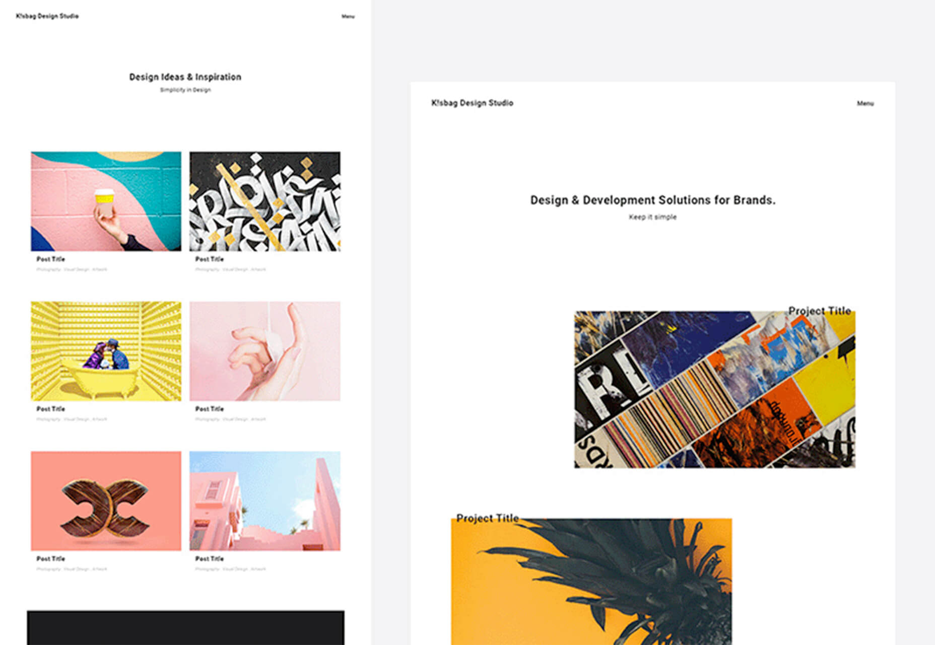

Source de l’article sur Webdesignerdepot

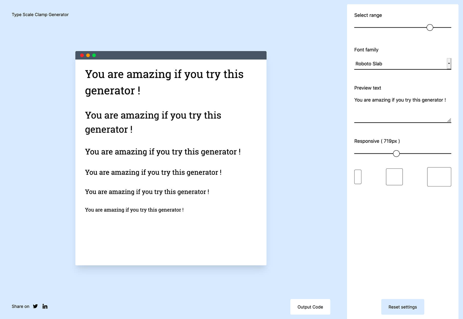
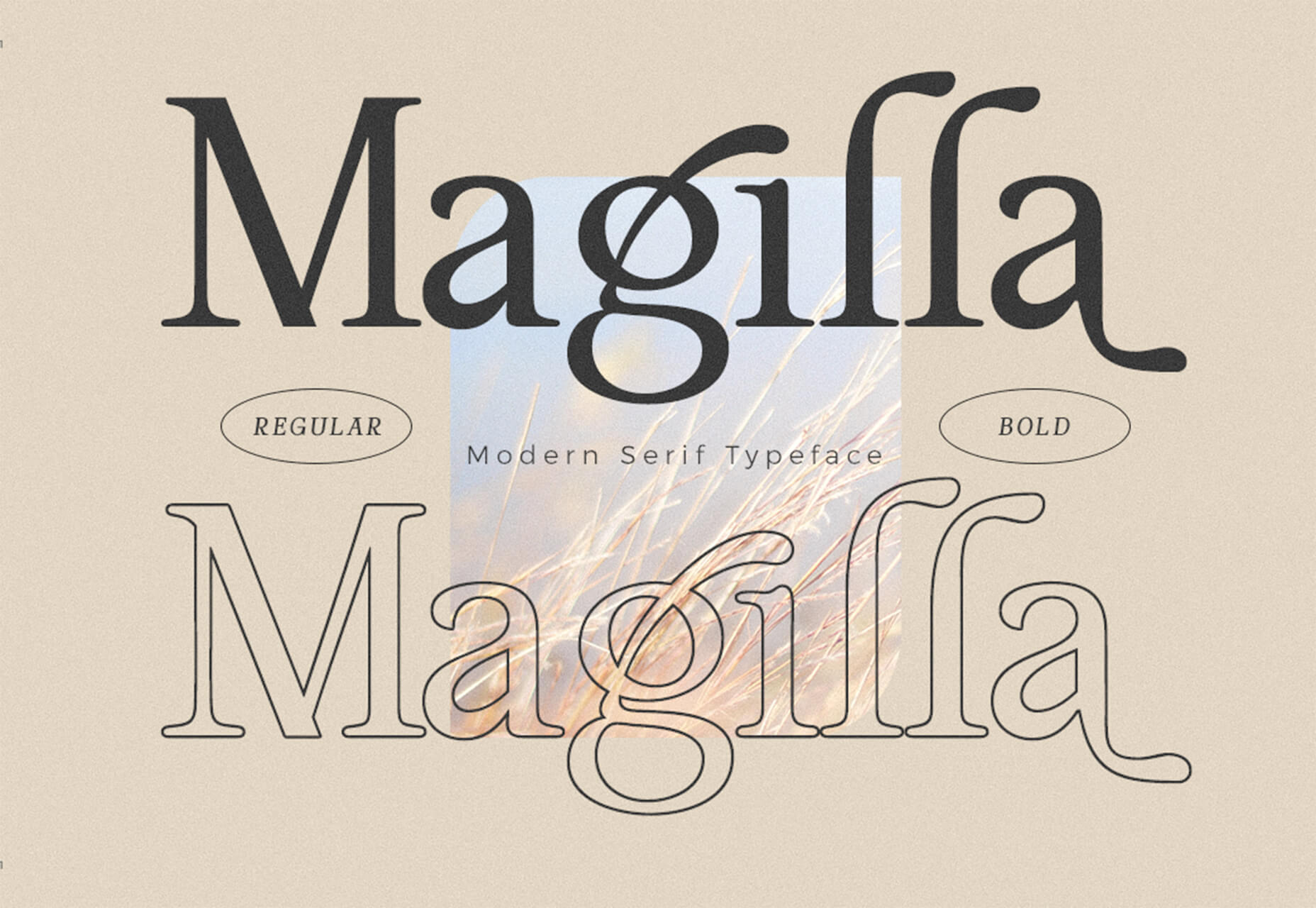
Typography is one of the most important elements of any site, having a measurably large impact on brand and experience.

So fundamental is it that making wholesale changes to your typography — opting for a new font, changing the measure, increasing leading — is complex and fraught with potential time-sinks.

But there are some simple changes that you can make to your typography that won’t break your grid and can be achieved in 30 minutes or less. Here are eight of the easiest.

1. Increase Color Contrast

When laying out text, it’s common for designers to see text as a block within a visual design. A designer’s relationship to text is very different from a user’s; a designer positions text as a shape, a user reads it line by line. Consequently, designers tend to underestimate the amount of contrast text requires.

Light grey text is aesthetically beautiful but functionally useless. Text is meant to be read and needs to meet WCAG AA standards on desktop and WCAG AAA standards on mobile — or in any situation with many ambient light sources. The larger the text is, the more leeway you have.

Text should be thoroughly tested for contrast, but as a starting point, 18px text on a white background should never be lighter than #595959.

2. Tighten Heading Spacing

The vast majority of typefaces are designed for use as body text — large blocks of running text, multiple lines long. When the font was made, it was spaced for this use.

Unlike running text, headings tend to be short and are surrounded by more whitespace — especially above and below. Extra whitespace visually floods the negative space in the word shapes and forces letters apart.

To compensate, tighten the letter-spacing and word-spacing of headings by 1–5%.

3. Loosen Non-Word Spacing

When we read, our brain doesn’t spell out words letter by letter; it recognizes word shapes and even word groups’ shapes.

Most micro-typography is concerned with not disrupting those word shapes. However, there are times when you do want to prevent words from forming and allow individual characters.

Loosen the letter-spacing on any text intended to be read as a series of characters, such as serial numbers, tracking codes, and tabular data.

4. Use System Fonts for Inputs

Privacy is a big issue for users. Anything you can do as a designer to reassure users their data is safe will increase your site’s positive UX.

Style your HTML inputs to use system fonts — the default fonts set by the OS your user is accessing the site with. This creates a clear delineation between the brand data in the brand fonts and the user’s data in the user’s fonts.

Using system fonts in this way encourages the user to feel ownership of their data, builds trust, and increases conversions.

5. Mark Paragraphs Once

Paragraphs of text need a visual indication that they have begun. There are three ways in which this is normally conveyed: following a heading, with a vertical space before the paragraph, or indenting the first line.

Each paragraph should use one of these indicators and one only. Due to the nature of web content and the benefits headings have for quickly scan-reading content, for most sites, the best choice is a combination of following a heading and vertical spacing.

6. Use Genuine Styles

For various reasons ranging from the availability of fonts to aggressive optimization, it’s common for sites to fake alternative styles using CSS. Italics can be faked as obliques with a skew, bold weights can be faked by using the browser’s defaults, and small caps can be faked by setting text to uppercase and reducing the font-size.

These tricks do more harm than good, creating distorted word shapes that interrupt the natural flow of text.

If you cannot deploy genuine italic, bold, and small caps, then don’t fake them. Find alternative ways of creating emphasis, such as changing colors.

7. Use the Correct Quotes

Apostrophes, single, and double-quotes are specific characters. Most fonts provide a glyph for them that is distinct from the quick single or double-quote key on your keyboard.

These quote marks are most commonly referred to as “smart” quotes because word-processing apps usually have the option to be “smart” about which glyphs they use.

Using the correct quotes is one of the simplest ways to deliver a refined piece of text.

8. Hyphenate Text Properly

Hyphenation is the breaking of a word over two lines. It allows a less extreme ragged-right text, and it is vital on mobile devices where the available page width is relatively small compared with desktop.

The web has surprisingly poor support for correct hyphenation, but it is gradually improving, and it can be applied as a progressive enhancement.

CSS allows you to set hyphenation to none (no hyphens), auto (the browser inserts automatically), and manual (in which you specify where hyphens should appear using the soft hyphen character).

Typographically, a hyphen may be inserted in any word that is five characters or longer; there must be at least two characters preceding the hyphen and at least three following the hyphen.

You should never hyphenate three consecutive lines of text, but addressing this requires JavaScript. You can minimize this problem by increasing your measure.


Featured image via Unsplash

Source

The post 8 Easy Ways to Improve Your Website Typography in Under 30 Minutes first appeared on Webdesigner Depot.


Source de l’article sur Webdesignerdepot

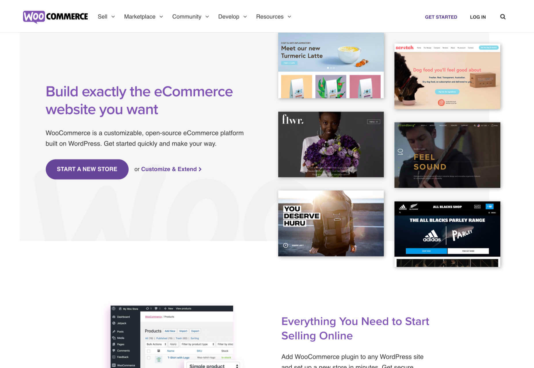
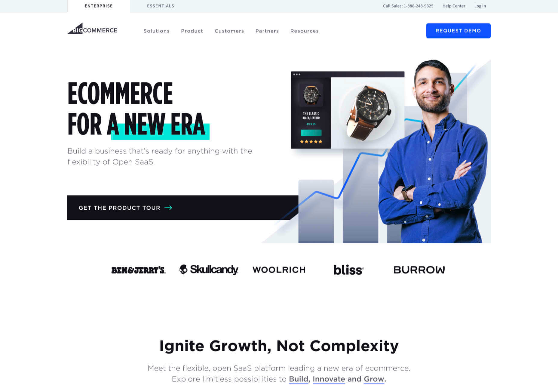
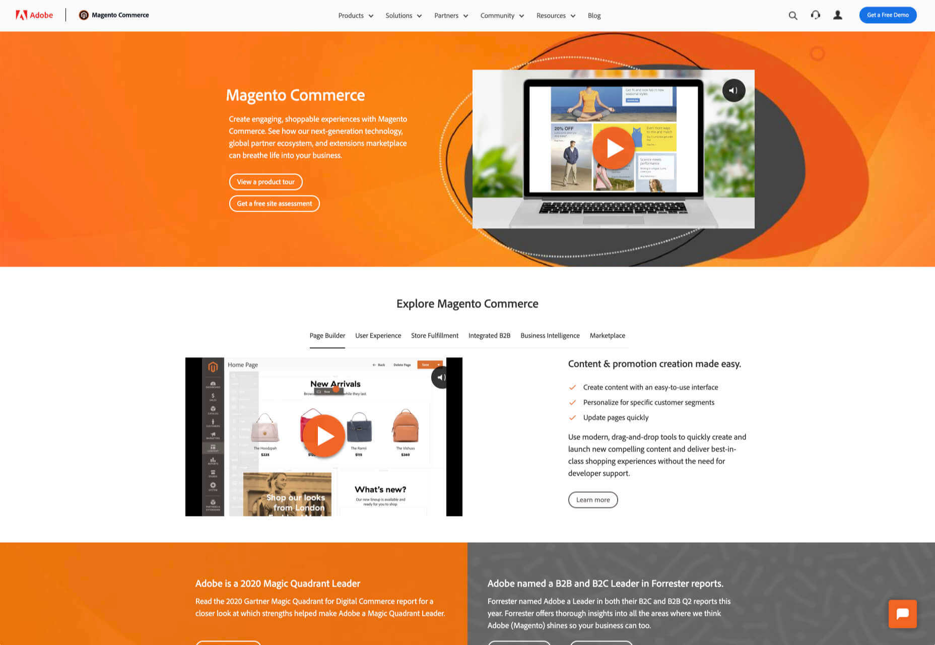
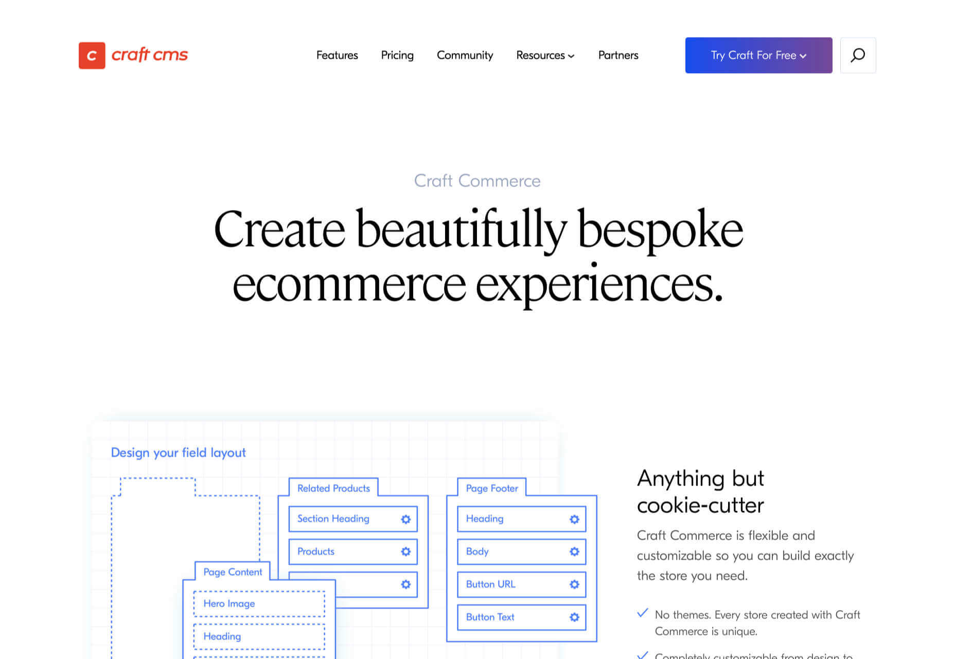
It’s never been easier to set up an ecommerce store and start selling. There are a dizzying array of ecommerce solutions available in 2021, and most are feature-rich and competitively priced.

Ecommerce sites are notoriously difficult to migrate from platform to platform, so more often than not, you’ll be committed to your chosen solution for years. The key when choosing an ecommerce solution to maximize your return on investment, is to consider not just what your business needs today but what it will need tomorrow.

There are two basic approaches to ecommerce. The first is a dedicated platform that handles everything. The second is a plugin that adds ecommerce features to an existing CMS. Both approaches have benefits and drawbacks.

1. Shopify: Best for Almost Everyone

Shopify is a well-known, well-liked, and reliable dedicated ecommerce platform. As a system for getting a business off the ground and selling fast, it is peerless.

Shopify jealously guards developer access, with templates and plugins pre-vetted. Unlike some marketplaces, you can be confident that there are no hidden surprises in your shiny new store.

And because Shopify has passed the point of market saturation, it’s worthwhile for big players to provide their own plugins; credit services like Klarna and shipping companies like netParcel can be integrated with a few clicks.

The admin panel is a touch complex, as Shopify is designed to allow a single account to be linked to multiple stores. But once you’re set up and familiar with where to find everything, it’s a slick, streamlined business management system.

Whenever a client says, “we want to start selling online.” My first thought is, “Shopify.” And for 90% of clients, it’s the right choice.

And that’s where this roundup should end…except there’s still that 10% because Shopify isn’t perfect.

For a start, an all-in-one platform doesn’t suit everyone. If you already have a website you’re happy with, you’ll either need to migrate or lease a dedicated domain for your store.

Shopify’s platform is very secure, which inspires confidence in buyers, but the price of that security is a lack of flexibility in the design.

Then there’s the infamous variant limit. Shopify allows 100 variants on a product. Almost every client runs into that wall at some point. Let’s say you’re selling a T-shirt: male and female cuts are two variants; now add long or short sleeves, that’s four variants; now add seven sizes from XXS to XXL, that’s 28 variants; if you have more than three color options, you’ve passed the 100 variant limit. There are plugins that will allow you to side-step this issue, but they’re a messy hack that hampers UX for both customer and business.

Shopify should certainly be on every new store owner’s shortlist, but there are other options.

2. WooCommerce: Best for WordPress Users

If you’re one of the millions of businesses with a pre-existing site built on WordPress, then adapting it with a plugin is the fastest way to get up and running with ecommerce.

WooCommerce is regularly recommended as “Best for WordPress Users,” which is a back-handed compliment that belies the fact that WooCommerce reportedly powers 30% of all ecommerce stores. If running with the crowd appeals to you — and if you’re using WordPress, it presumably does — then you’re in the right place.

WordPress has a gargantuan plugin range. As such, there are other plugins that will allow you to sell through a WordPress site. The principle benefit of WooCommerce is that as the largest provider, most other plugins and themes are thoroughly tested with it for compatibility issues; most professional WordPress add-ons will tell you if they’re compatible with WooCommerce. If your business is benefitting from leveraging WordPress’ unrivaled ecosystem, it can continue to do so with WooCommerce.

The downside to WooCommerce is that you’re working in the same dashboard as the CMS that runs your content. That can quickly become unmanageable.

WooCommerce also struggles as inventories grow — every product added will slow things a little — it’s ideally suited to small stores selling a few items for supplementary income.

3. BigCommerce: Best for Growth

BigCommerce is an ecommerce platform similar to Shopify, but whereas Shopify is geared towards newer stores, BigCommerce caters to established businesses with larger turnovers.

The same pros and cons of a dedicated ecommerce solution that applied to Shopify also apply to BigCommerce. One of the considerable downsides is that you have less control over your front-end code. This means that you’re swapping short-term convenience for long-term performance. Templates, themes, and plugins — regardless of the platform they’re tied to — typically take 18 months to catch up with best practices, leaving you trailing behind competitors.

BigCommerce addresses this shortcoming with something Shopify does not: a headless option. A headless ecommerce platform is effectively a dedicated API for your own store.

Enabling a headless approach means that BigCommerce can be integrated anywhere, on any technology stack you prefer. And yes, that includes WordPress. What’s more, being headless means you can easily migrate your frontend without rebuilding your backend.

BigCommerce also provides BigCommerce Essentials, which is aimed at entry-level stores. It’s a good way to get your feet wet, but it’s not BigCommerce’s real strength.

If you have the anticipated turnover to justify BigCommerce, it’s a flexible and robust choice that you won’t have to reconsider for years.

4. Magento: Best for Burning Budgets

If you have a development team at your disposal and a healthy budget to throw at your new store, then Magento could be the option for you.

You can do almost anything with a Magento store; it excels at custom solutions.

Magento’s main offering is its enterprise-level solution. You’ll have to approach a sales rep for a quote — yep, if you have to ask the price, you probably can’t afford it. Magento has the track-record and the client list to appeal to boards of directors for whom a 15-strong development team is a footnote in their budget.

That’s not to say that a Magento store has to be expensive; Magento even offers a free open source option. But if you’re not heavily investing in a custom solution, you’re not leveraging the platform’s key strengths.

5. Craft Commerce: Best for Custom Solutions

If you’re in the market for a custom solution, and you don’t have the budget for something like Magento, then Craft Commerce is ideally positioned.

Like WooCommerce for WordPress, Craft Commerce is a plugin for Craft CMS that transforms it into an ecommerce store.

Unlike WordPress, Craft CMS doesn’t have a theme feature. Every Craft Commerce store is custom built using a simple templating language called Twig. The main benefit of the approach is that bespoke solutions are fast and relatively cheap to produce, with none of the code bloat of platforms or WordPress.

Because your site is custom coded, you have complete control over your frontend, allowing you to iterate UX and SEO.

You will need a Craft developer to set up Craft Commerce because the learning curve is steeper than a CMS like WordPress. However, once you’re setup, Craft sites are among the simplest to own and manage.

6. Stripe: Best for Outliers

Ecommerce solutions market themselves on different strengths, but the nature of design patterns means they almost all follow a similar customer journey: search for an item, add the item to a cart, review the cart, checkout. Like any business, they want to maximize their market share, which means delivering a solution that caters to the most common business models.

Occasionally a project happens along that doesn’t fit that business model. Perhaps you’re selling a product that’s uniquely priced for each customer. Perhaps you’re selling by auction. Perhaps you don’t want to bill the customer until a certain point in the future.

Whatever your reason, the greatest customization level — breaking out of the standard ecommerce journey — can be managed with direct integration with Stripe.

Stripe is a powerful payment processor that handles the actual financial transaction for numerous ecommerce solutions. Developers love Stripe; its API is excellent, it’s documentation is a joy, it’s a powerful system rendered usable by relentless iteration.

However, this approach is not for the faint-hearted. This is a completely custom build. Nothing is provided except for the financial transaction itself. Every aspect of your site will need to be built from scratch, which means hefty development costs before seeing any return on investment.

The Best eCommerce Solution in 2021

The best ecommerce solution is defined by three factors: the size of your store, the anticipated growth, and the degree of custom design and features you want or need.

Shopify is the choice of most successful small stores because you can be selling inside a day. For businesses with an existing presence and a smaller turnover, those on WordPress will be happy with WooCommerce. For larger stores planning long-term growth, BigCommerce’s headless option is ideal. Craft Commerce is a solid performer that marries low costs with flexibility for businesses that need a custom approach.


Featured image via Unsplash.

Source

The post 6 Best Ecommerce Solutions for 2021 first appeared on Webdesigner Depot.


Source de l’article sur Webdesignerdepot

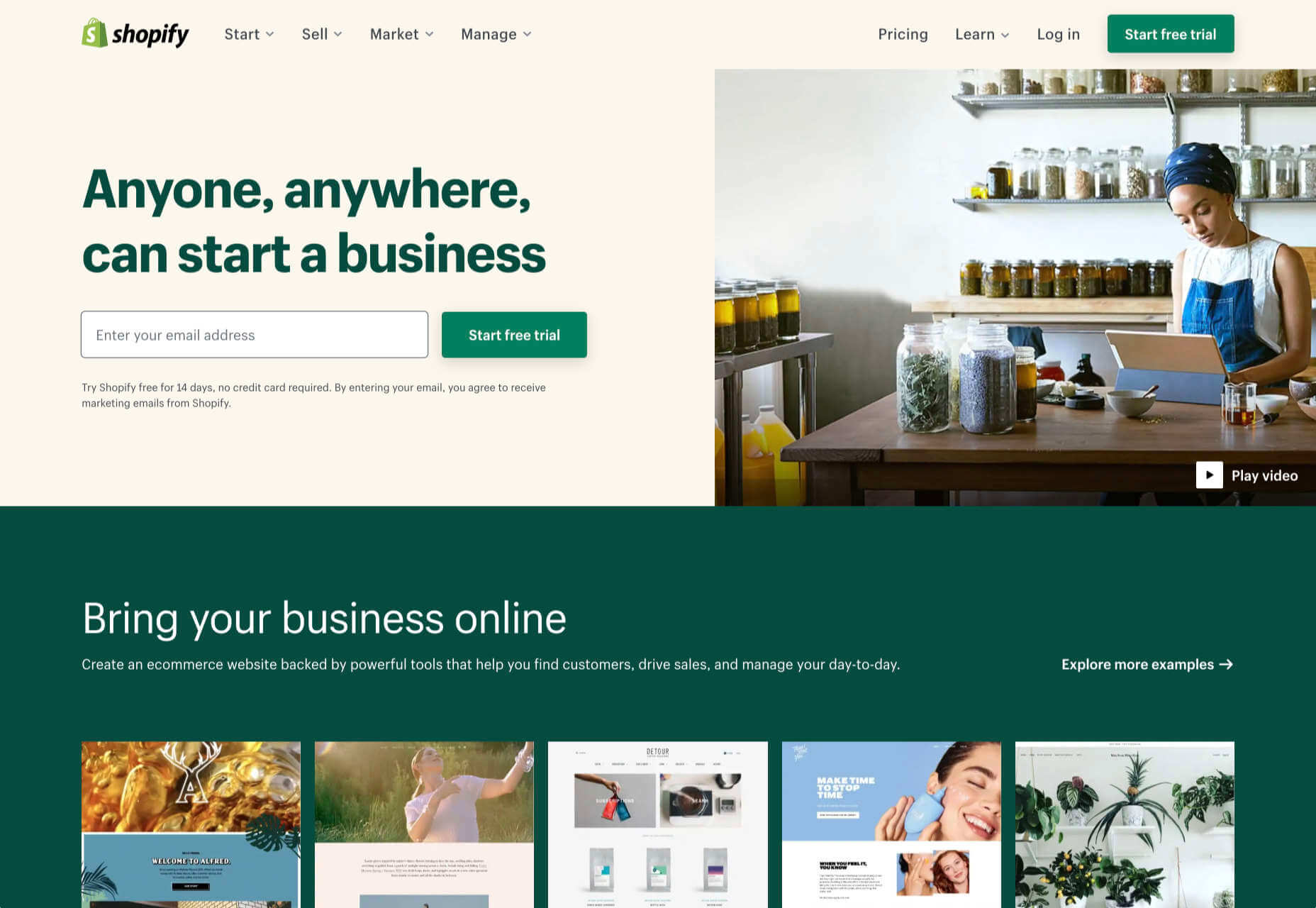
The new year is often packed with resolutions. Make the most of those goals and resolve to design better, faster, and more efficiently with some of these new tools and resources.

Here’s what new for designers this month.

Radix UI

Radix UI is an open-source UI component library for building high-quality, accessible design systems and web apps. It includes examples and guidelines for all kinds of user interface elements that provide guidance and really make you think about accessible website design. (And everything is usable!)

Froala Charts

Froala Charts is made to help you create data visualizations for web or mobile apps. Build any chart you can imagine – bar, line, area, heat map, sankey, radar, time series, and more. Plus, you can customize anything and everything, so it all matches your brand. This premium tool is enterprise-level and comes with a one-time license fee.

CSSfox

CSSfox is a collection of designs that you can use for inspiration. The curated community project includes posts, reviews, and award nominees and winners.

Pattern Generator

Pattern Generator is a tool to create seamless and royalty-free patterns that you can use in projects. Almost every element of the pattern design is customizable, and you can “shuffle” to get new style inspiration. Design a pattern you like and export it for use as a JPG, PNG, SVG, or CSS.

Type Scale Clamp Generator

Type Style Clamp Generator helps you create a visualize a typographic scale for web projects. Pick a font and determine a few other settings and see the scale right on the screen. You can even put in your own words to see how they would look. Then, flip to see how sizes appear on different devices. Find a scale you like and snag the code with a click.

Flowdash

Flowdash is a premium app that helps you build custom tools, data sets and streamline your business operations with one tool. Manage data and processes without code. The tool combines a spreadsheet’s familiarity with a visual workflow builder, plus built-in integrations to automate repetitive tasks so your team can focus on what matters.

Scale

Scale is a website that provides new and open-source illustrations that you can use for projects. Maybe the illustration generator’s neatest part is that you can change the color with just a click to match your brand. Then download the image as an SVG or PNG.

Pe•ple

Pe•ple is a tool that adds a “customizable community” to any website to help grow your fanbase and provide a boost to SEO. It allows you to integrate chat, commenting, emojis, and passwordless login, among other things.

K!sbag: Free Minimal Portfolio Template

K!sbag is a free minimal website template that’s made for portfolio sites. (Did you resolve to update yours in 2021?) It includes 6 pages in a ready-made HTML format and PSD.

Merico Build

Merico Build is like a fitness tracker for code. It uses contribution analytics to empower developers with insight dashboards and badges focused on self-improvement and career growth. Sign up with tools you already use – Github or Gitlab.

Automatic Social Share Images

Automatic Social Share Images solves a common website problem: Missing or broken images when posts or pages are shared on social media. This tutorial walks you through the code needed to create the right meta tags so that popular social media channels pick up the image you want for posts. The best part is this code helps you create a dynamic preview image, so you don’t have to make something special every single time.

Animated SVG Links

Animated SVG Links can add a little something special to your design. This pen is from Adam Kuhn and includes three different link styles.

Blush

Blush helps you create illustrations. With collections made by artists across the globe, there’s something for everyone and every project. All art is customizable, so you can play with variations to create something unique.

Palms

Palms is a set of 43 sets of hands to help illustrate projects. Each illustration is in a vector format and ready to use.

Tabbied

Tabbied allows you to create and customize patterns or artwork in a minimal style for various projects or backgrounds. Tinker with your artwork and patterns and then download a free, high-resolution version.

How to Create Animated Cards

How to Create Animated Cards is a great little tutorial by Johnny Simpson that uses WebGL and Three.js to create a style like those on Apple Music. The result is a stylish modern card style that you can follow along with the CodePen demo.

Bandero

Bandero is a fun slab with a rough texture and interesting letterforms. The character set is a little limited and is best-suited for display use.

Magilla

Magilla is a stunning modern serif with great lines and strokes. The premium typeface family has six styles, including an outline option.

Roadhouse

Roadhouse is one of those slab fonts that almost screams branding design. The type designer must have had this in mind, too, with stripe, bevel, inline, half fill, outline, drop extrude, and script options included. (This family is quite robust, or you can snag just one style.)

Street Art

Street Art is for those times when a graffiti style is all that will do. What’s nice about this option – free for personal use – is that the characters are highly readable.

Source

The post Exciting New Tools for Designers, January 2021 first appeared on Webdesigner Depot.


Source de l’article sur Webdesignerdepot

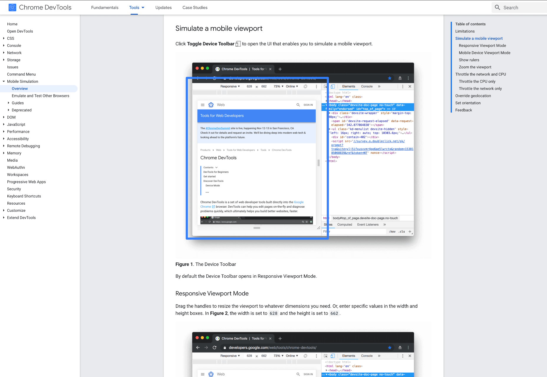
When creating a website, it’s vital to remember that not only does it need to work and look great on the device you are creating it on, but on all the other devices, it might be used on too.

Mobile and tablet optimization is important not only for the user journey but from an SEO point of view too, and badly created mobile sites just don’t cut it anymore.

With more and more devices entering the market, you need to check any website you create is compatible across the board. One bad experience and users are likely to leave and not come back again, which can be catastrophic for a business, particularly if it is just starting out.

It’s vital to check how a site looks and behaves when browsed differently from how you would use it. A common mistake is to assume users only browse websites on mobile devices in portrait mode; they don’t; landscape browsing is common, especially if the user is used to watching video.

Here are some of our top tools for testing websites on devices without the need for an entire device library:

1. Multi-Screen Test

WhatIsMyScreenResolution offers a great little tool to test how your site will look on different devices easily, and it costs absolutely nothing. You put the URL and choose between desktop, mobile, tablet, and television and then the orientation. Each device can also be broken down into different sizes and resolutions (or you can enter your own), making it easier than ever to test what a site will look like on different devices.

2. Responsinator

Responsinator is another great tool to test how a site looks on other devices without dipping into your wallet. Put your URL in the top bar, and it will instantly show you what it looks like on generic devices. This is a great, easy to use tool, and you can click through any links on your site to check the usability of multiple pages. This site is free, but if you want to “create your own” template, you need to sign up.

3. Google Dev Tools

Google Dev Tools is one of the most commonly used free tools. Add it to Chrome, and you can see how your site looks in a multitude of different screen sizes and resolutions. You can simulate touch inputs, device orientation, and geolocation to test how they work. It’s great to easily spot problems using their remote debugging tool to view, change, debug and profile a page’s code directly from your laptop or computer while viewing it on your mobile device.

4. Browser Stack

Browser Stack allows you to test your site on over 2,000 real devices and browsers, enabling you to see in real-time how your site looks. It is no hassle to set up, and it can be seamlessly integrated into your setup. As it tests on real browsers on real machines, you know the results are more reliable and accurate. It also enables you to debug in real-time using their pre-installed developer tools for ease of editing. The tests are all run securely on tamper-proof physical devices and are wiped clean of all data after each session, so you don’t need to worry about security being compromised.

5. TestComplete Mobile

TestComplete Mobile allows you to create and run UI tests across real mobile devices, virtual machines, and emulators. You can test both mobile device layouts and apps with script-free record and replay actions. This can help you to edit and fix any potential issues that may arise during the tests. Due to them being conducted on real devices, you know it is less likely to have errors in the system than a simulated device. This is free for 30 days then can get pricier, so make sure you take advantage of the trial and try the service before committing to it.

6. Sizzy

Sizzy is a great tool for checking sites, and it has a host of features to assist you. You can rotate the screen between portrait and landscape, filter by OS and device type, switch themes, and take screenshots. These little things mean it’s a super easy to use and convenient tool. It claims to simulate each device’s viewport and user agent, meaning the results are the same as what you would actually see on that phone/ tablet, etc. It can’t simulate different browser rendering engines however, so there’s a chance there might be some minor differences compared to the actual thing. Sizzy offers a free trial or has different price packages starting at $5 per month.


Featured image via Unsplash

Source

The post 6 Tools for Rapid Cross-Device Website Testing first appeared on Webdesigner Depot.


Source de l’article sur Webdesignerdepot

Ecommerce design may seem fairly straight-forward; you build an online store that showcases a company’s products or services and gives customers a quick and pain-free way to purchase them.

While that formula will always hold true, ecommerce is undergoing some big changes, and web designers need to be prepared to keep up with them. This monthly ecommerce trends roundup will explore these new and evolving design, sales, and marketing trends.

1. Calmer Color Palettes

Although we’re not likely to see this trend go near the sites for big box stores, it’s something smaller ecommerce companies are adopting. And with good reason.

As consumers become wary about how much money they’re spending, they don’t need to feel pressured or rushed into a purchase. And ecommerce sites that employ calmer color palettes — like pastels and earth tones — will do a better job of putting their customers at ease.

Bicycle saddle manufacture Brooks England shows how this trend plays out in ecommerce design:

It’s not just outdoors or sporting goods companies that can use more natural-looking colors, either. CBD product vendor Cannaray is another company that uses a more subdued color palette:

Really, any store that wants to do a better job creating satisfying experiences for customers and gaining their long-time loyalty should consider toning things down with color.

2. No-rush Shipping Rewards

For years, we’ve seen consumers go crazy for brands that offer free and fast shipping. But thanks to the surge in online shopping in 2020, ecommerce companies, their shipping partners, and delivery service providers just haven’t been able to keep up with the pace.

When customers are unhappy with slow deliveries, they’re going to go to social media and review sites to bombard brands with complaints, as has been happening with Loft since November:

Although many ecommerce stores still don’t inform customers ahead of time about these delays, we’re starting to see a new checkout trend.

Here’s how Gap is encouraging and rewarding customers for choosing no-rush shipping:

Amazon is another ecommerce site that encourages no-rush shipping at checkout with a reward:

Not only does this set better expectations for customers before they finish their purchases, but it encourages everyone to slow down a bit so that ecommerce companies and their shipping/delivery partners can keep up.

3. More Human and Empathetic Assistance

Each year, design trend roundups suggest that AI will play a greater role in web design.

While that may be true for things like the search bar or personalized recommendations, ecommerce sites are pulling back the reins on automated support and assistance.

Best Buy, for instance, offers customers the option to “Shop with an Expert”:

After shoppers go through a quick survey, they’re given a variety of options — based on their own level of comfort and convenience — to work with the expert:

Something that might’ve been left in the hands of a self-service quiz or automated chatbot is being given the human touch once more.

We’re seeing a similar trend with retailers like Warby Parker. While it still offers a virtual AR try-on, the main navigation actually emphasizes the home try-on option:

Again, this is another example of ecommerce companies becoming less reliant on automated support to give their customers a better and more confident shopping experience.

Wrap-Up

Ecommerce trends are always evolving. Sometimes it’s due to new technologies. Other times it has to do with what’s happening in the world around us. And sometimes it’s simply to keep up with changing consumer expectations.

Stay tuned as we explore new and emerging ecommerce trends in the coming months…

Source

The post What’s New in Ecommerce, January 2021 first appeared on Webdesigner Depot.


Source de l’article sur Webdesignerdepot

The start of the year is always a good time to reassess priorities and consider new approaches, but 2021 is more of a reset than we expected this time last year. 2020 is unlikely to go down in anyone’s autobiography as the best year of their life, but it has done something positive: it’s prepared the ground for rapid change in the next 12 months.

More than any other year in our lifetimes, 2021 is set to be revolutionary, with emerging trends that will last well into the new decade. Here’s what we think you can look forward to around the next corner.

1. The End of Minimalism

Minimalism has been the de facto approach to web design for the last decade because it works.

But design reflects the zeitgeist. Where minimalism once felt clean and fresh, it’s starting to feel dull and uninspired. There have been a few false-starts breaking out of the long-term trend, but thanks to the pandemic, 2021 will be the year minimalism finally folds — at least for a while.

Prior to coronavirus-mandated lockdowns worldwide, there were already signs of a more vibrant, more decorative, more joyful approach to design. Simple typefaces have been replaced with more decorative examples — faces that use ink-traps to fake 3D effects are surprisingly popular.

trends are cyclical, and the wheel always turns

One of the biggest aspects of this blossoming trend is the move away from Material Design-style flat color not just to gradients but to multi-color gradients and even animated gradients. Even Apple, the last bastion of the clean white-box approach, jumped on the gradient bandwagon with its Big Sur branding.

One of the few things COVID-19 hasn’t slowed is the adoption of new web technology, and CSS, in particular, has had some major developments in the last year. CSS Grid is now a practical technology, and our ability to code standards-compliant designs that aren’t dependent on hierarchical boxes is greatly enhanced.

After more than a year of pretty grim news for most people, much of the world will be vaccinated over the next twelve months, and life will rapidly return to normal. The last global crisis on this scale was the 1918 influenza pandemic, and it led directly to the decade known as the Roaring Twenties.

Minimalism was already dipping in popularity — trends are cyclical, and the wheel always turns — but lockdown, or perhaps more precisely the end of lockdown, is the catalyst for significant change.

2. The Decline of WordPress

In Autumn 2020, something entirely unexpected happened: The W3C announced the platform its new web presence would be built on, and WordPress — the previous choice of the web’s steering committee — didn’t even make the list of finalists.

Due to accessibility concerns, the W3C development team opted to migrate away from WordPress to Craft CMS. The decision was met with a mixture of glee and outrage. But whether you agree with the decision or not, it’s hard to see it as anything other than yet another symptom of WordPress’ decline.

WordPress faces a triple threat: there are web builders that do an adequate job for low-end web projects; there are newer rivals like Craft that outperform WordPress as a CMS; there’s a growing interest in alternate approaches, like Jamstack.

So will it all be over for WordPress in 2021? Not even close. There are myriad reasons WordPress will continue to be the choice of designers and developers for years to come. Tens of thousands of professionals worldwide have invested their whole careers in WordPress; there are millions of themes, plugins, templates, and build processes that are tightly woven into the WordPress ecosystem. What’s more, there are millions of sites with substantial content archives powered by WordPress [WebDesignerDepot is one such site].

WordPress reportedly powers approximately 37% of the web, and it will still be the dominant CMS in 2022. But it’s unlikely to grow beyond that 37%, and by 2030 its market share will be in rapid contraction.

2020 was the high-tide mark for WordPress

But for all its faults — and it’s undeniable that WordPress is full of faults — WordPress is the best of the web; it has given a voice to millions of people, launched countless careers, and empowered entrepreneurship worldwide.

2020 was the high-tide mark for WordPress, but it’s not an extinction-level event — even the much-maligned Flash, which was killed dead in a matter of months by the first generation iPhone, limped on until a few weeks ago.

WordPress will have to find a niche and accept a smaller market share; in doing so, it will address the single biggest complaint that anyone has about WordPress: that it’s trying to do too much.

WordPress is one of the great success stories of the web. In a decade, it may have to settle for powering just 10% of the web — a level of failure most of its rivals can only dream of.

3. The Digital Currency Explosion

2021 is undoubtedly the year that cryptocurrency goes mainstream. In 2020 Bitcoin grew by almost 400%; currently valued at around $35k, conservative predictions for a December 2021 valuation are $100k, with five-year predictions as high as $1m. And Bitcoin isn’t the only cryptocurrency; the value of developer-friendly Ether has jumped by more than 50% in the first few weeks of 2021.

In the US, the incoming Biden administration is preparing a multi-trillion dollar relief package, which many believe young Americans will invest in cryptocurrency. Perhaps more importantly, large investment banks are now pumping hundreds of millions in digital currencies. PayPal and Visa are both in the advanced stages of adopting blockchain technology.

The biggest threat to the new digital economy is the volatility of cryptocurrency. You cannot price services in XRP if XRP’s dollar price could crash at any time — as it did a few weeks ago.

And so there are two routes in which this trend will unfold for ecommerce. Either pricing will remain in dollars, and the equivalent price in various cryptocurrencies will be calculated in real-time. Or, transactions will make use of stablecoins like Tether that are tied to the value of the US dollar.

Cryptocurrency is the latest gold-rush, and whether you think it’s the chance of a lifetime or yet another Ponzi scheme, it will become increasingly high-profile in ecommerce throughout 2021.

4. No More Video Calls and also More Video Calls

2020 was the year of Zoom. Its growth from bit-player to overtaking Skype is a material lesson for entrepreneurs that every obstacle is an opportunity.

every obstacle is an opportunity

Over the last year, we’ve discovered two things: meetings are more creative in person, and office costs are significantly reduced when staff work remotely.

There’s going to be a shift in the business landscape this year. Remote working will continue to be normal for years to come as businesses enjoy rent savings. Video calls will still be common for quick update meetings. But expect to travel to physical meeting places periodically for in-depth strategic planning.

Expect to see major cities with deserted office buildings and a rapid expansion of co-working spaces, especially those with meeting spaces — if WeWork can hold on a little longer, there may be light at the end of the tunnel.

As a web professional, you’re in a unique position to thrive in the new business world, even more so if you’re a freelancer. Remember, if you’re working onsite, be mindful of your physical health, and if you’re working remotely, be mindful of your mental health.

What Do You Think?

No one saw 2020 coming. Sometimes world events are outwith our control, and we have to hang on and hope it gets better. It’s been a tough 12 months, and the truth is we’re not through it yet.

But the 2020 coronavirus pandemic is the first pandemic in human history that we’ve had the technology to shorten.

2021 offers the opportunity for enormous change. Will designers look for new, more decorative approaches? Will we replace our technology stack? Will you be billing clients in Ether this year? Will you suffer the misery of a packed evening commute ever again?


Featured image via Unsplash

Source

The post 4 Predictions for the Web in 2021 first appeared on Webdesigner Depot.


Source de l’article sur Webdesignerdepot

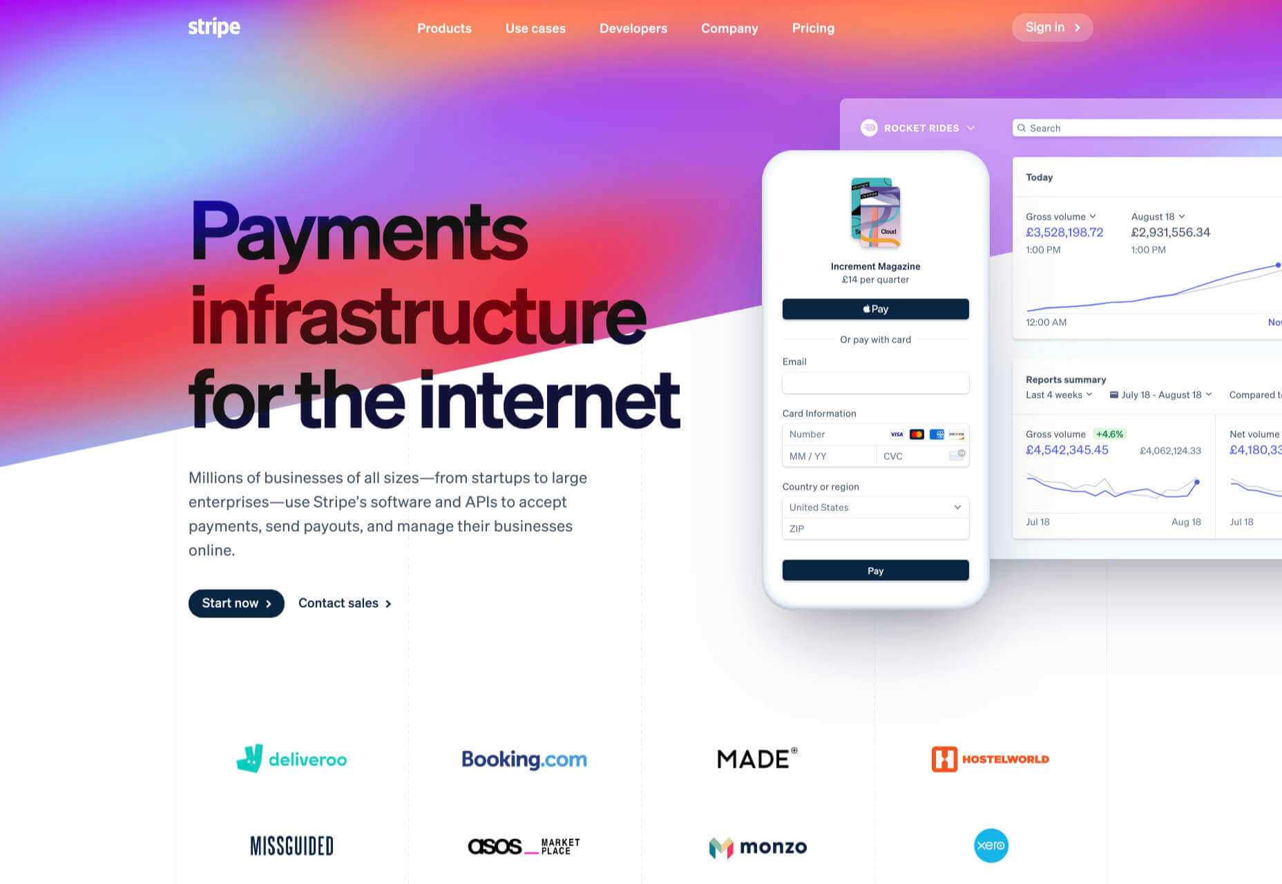
There are dozens of factors that influence the UX of your site, app, or game. Most of them are beyond your control; user connection speed, end-system resources, even browser technology is all out of your hands. So when you do have the opportunity to influence your project’s infrastructure, you should seize it.

The world’s fastest muscle car can’t perform at its best when traffic is gridlocked bumper to bumper; likewise, the most finely tuned website can’t meet its potential running on shared hosting.

If you want your website, application, or service to run quickly and securely, maximizing both UX and SEO, then you need to look at the bare metal servers from OVHcloud.

Bare Metal Performance

Bare metal (or dedicated) servers aren’t uncommon. Still, most hosts only offer a single type of server, expecting small startups to pay for resources at the same rate as global giants, which can make dedicated hosting prohibitively expensive.

OVHcloud is different; it offers a range of bare metal server products optimized for a wide variety of challenges. That means small startups can invest in fast, easily scalable solutions that meet the most demanding security requirements without breaking the bank.

Whatever your aims, there’s a different OVHcloud solution configured for you:

OVHcloud Rise

Rise is the perfect option for a website, or web app hosting. With its low entry-cost, Intel-powered performance, bundled DDoS protection, and simplified administration, Rise is the natural choice for your first step into bare metal servers.

OVHcloud Advance

To meet SMEs’ need for reliable infrastructure to run mission-critical applications, OVHcloud configured Advance. From in-house CRMs to web-facing SaaS products, Advance is a solid foundation upon which to build your business.

OVHcloud Storage

Storage is ideal for storing large amounts of data securely. Hosting data on standard servers is a colossal waste of resources; with OVHcloud’s Storage product you can host up to 504TB and seamlessly access it via a performance-tuned server.

OVHcloud Infrastructure

For large companies with thousands of employees, global non-profits, colleges, and even local governments, OVHcloud Infrastructure offers scalability and flexibility beyond the average dedicated server.

OVHcloud High-End

For web apps that are leveraging cutting edge technology like machine learning and big data, OVHcloud’s High-End product is a no-compromise custom solution, the humdinger of bare metal servers, with every conceivable option available.

OVHcloud Game

If you’re developing video games, then lightning-quick, reliable streaming servers are essential. OVHcloud’s Game product delivers the type of speed your customers demand, with massive performance gains over comparable bare metal servers.

How to Choose a Bare Metal Server

It’s easy to get bogged down in detail, especially if this is your first foray into bare metal servers.

But here’s the good news: every OVHcloud bare metal server is a massive boost in performance over shared web hosting. That’s because, with a dedicated server, all of the server’s resources are…dedicated; that is, you don’t have to share with anyone. Shared hosting is pot-luck: You might wind up on a server with thoughtful users who don’t eat up all the resources, and you might end up on a server with one selfish user who hogs the processes and compromises the security. With a bare metal server, that’s not an issue.

Choosing a bare metal server is a two-step process. The first step is to think about what you intend to use it for:

Are you going to store a lot of data? If so, think about OVHcloud’s Storage product. But a lot of data doesn’t mean a WordPress blog. Let’s say you’re a polling company, collating millions of records that you hope to analyze to predict political movement; that requires a lot of storage. On the other hand, all servers have some storage. OVHcloud’s Rise product comes with 500Gb and can be configured with more. So if you’re planning to host something the size of a blog, then OVHcloud’s Storage might be using a sledgehammer to crack a nut.

The second step is to ask how complex the operations you’re going to ask the server to perform will be:

Hitting up a database to retrieve some data is not a complex operation. Even something like a complex search isn’t too taxing. If that’s the kind of process you expect to perform, OVHcloud’s Rise is more than adequate. But if you’re manipulating large amounts of data, like resizing hundreds of raster images dynamically; or using facial recognition to search through millions of biometric data records; or even managing your advertising application serving millions of ads to sites across the web; in those cases, you need the sort of performance OVHcloud’s Infrastructure product delivers.

OVHcloud’s products are all scaleable. Its High-End bare metal server product is entirely customizable. Whatever you choose, and however your needs change over time, you can be confident you’re running the optimum server for your project.

Why Choose OVHcloud

There are a mind-boggling array of processors, and OS, and a seemingly infinite — and increasingly expensive — amount of hardware on offer on the web. OVHcloud radically simplifies running a bare metal server by delivering a range of popular packages, tailored for everyday uses, that are both customizable and scaleable.

What OVHcloud delivers is a clear choice, letting you choose the right server for your product.

Whether you need lighting fast response times to maximize your SEO or the space to store a digital archive of the world’s most important art, for reliability and choice, opt for OVHcloud bare metal servers.


[— This is a sponsored post on behalf of OVHcloud —]

Source

The post How to Choose a Bare Metal Server From OVHcloud first appeared on Webdesigner Depot.


Source de l’article sur Webdesignerdepot

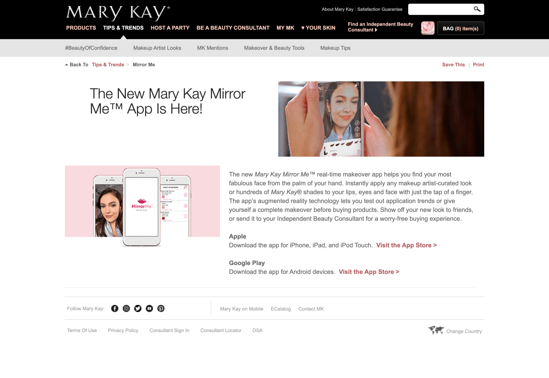
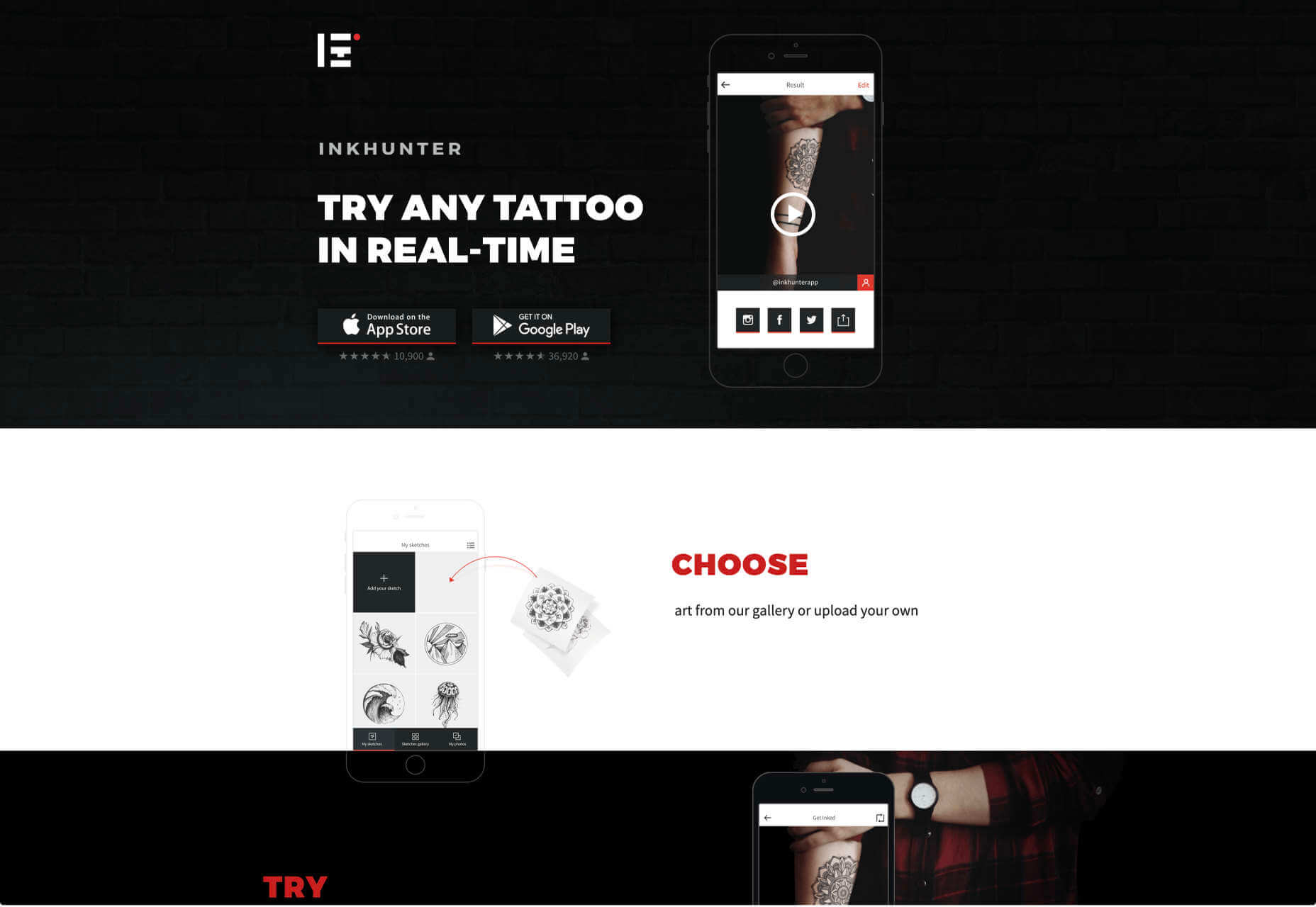
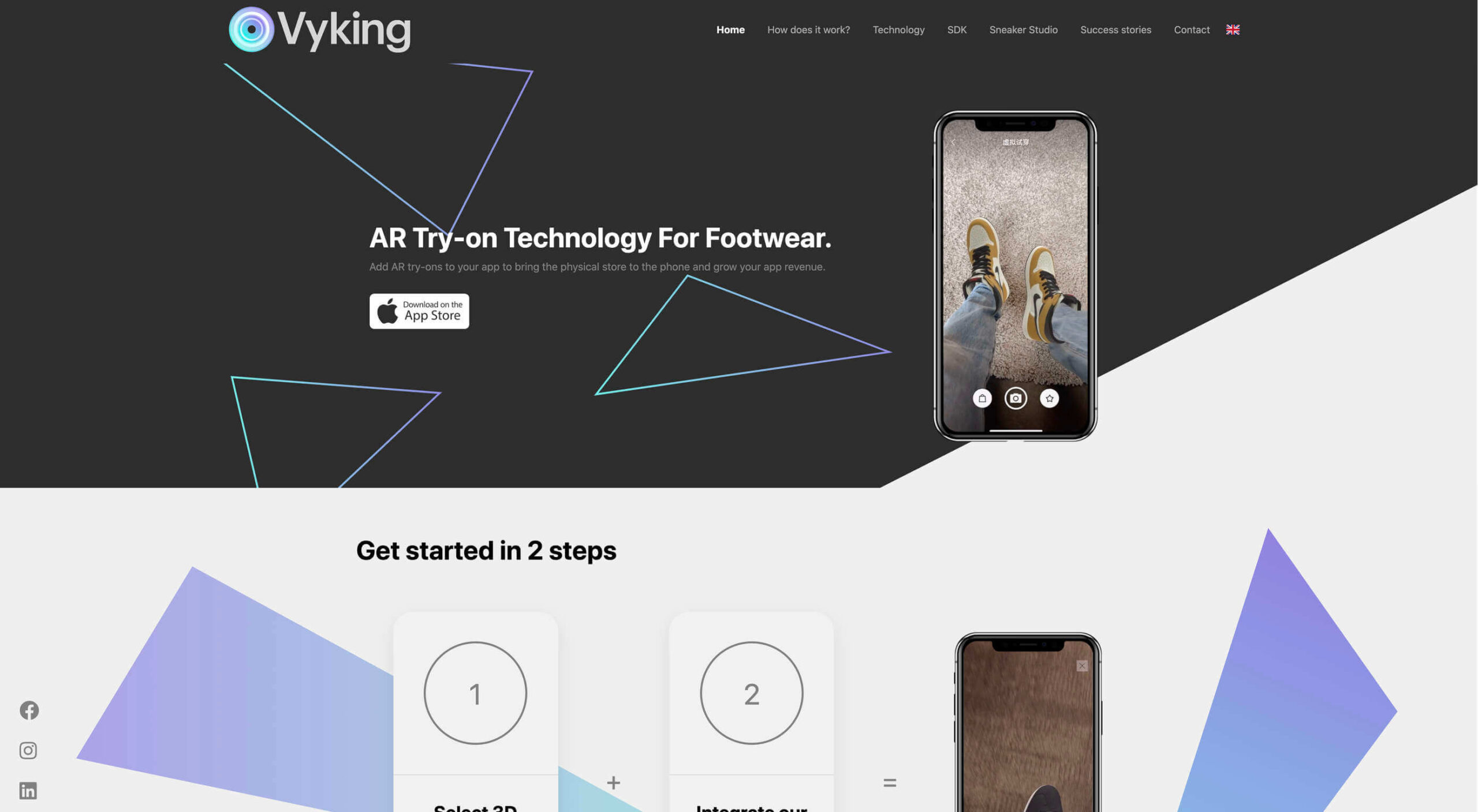
Over the years, experts have repeatedly discussed the possible impact of mixed realities on web design. Concepts like AR and VR are expected to have the potential to change the way that we interact with websites on a fundamental level.
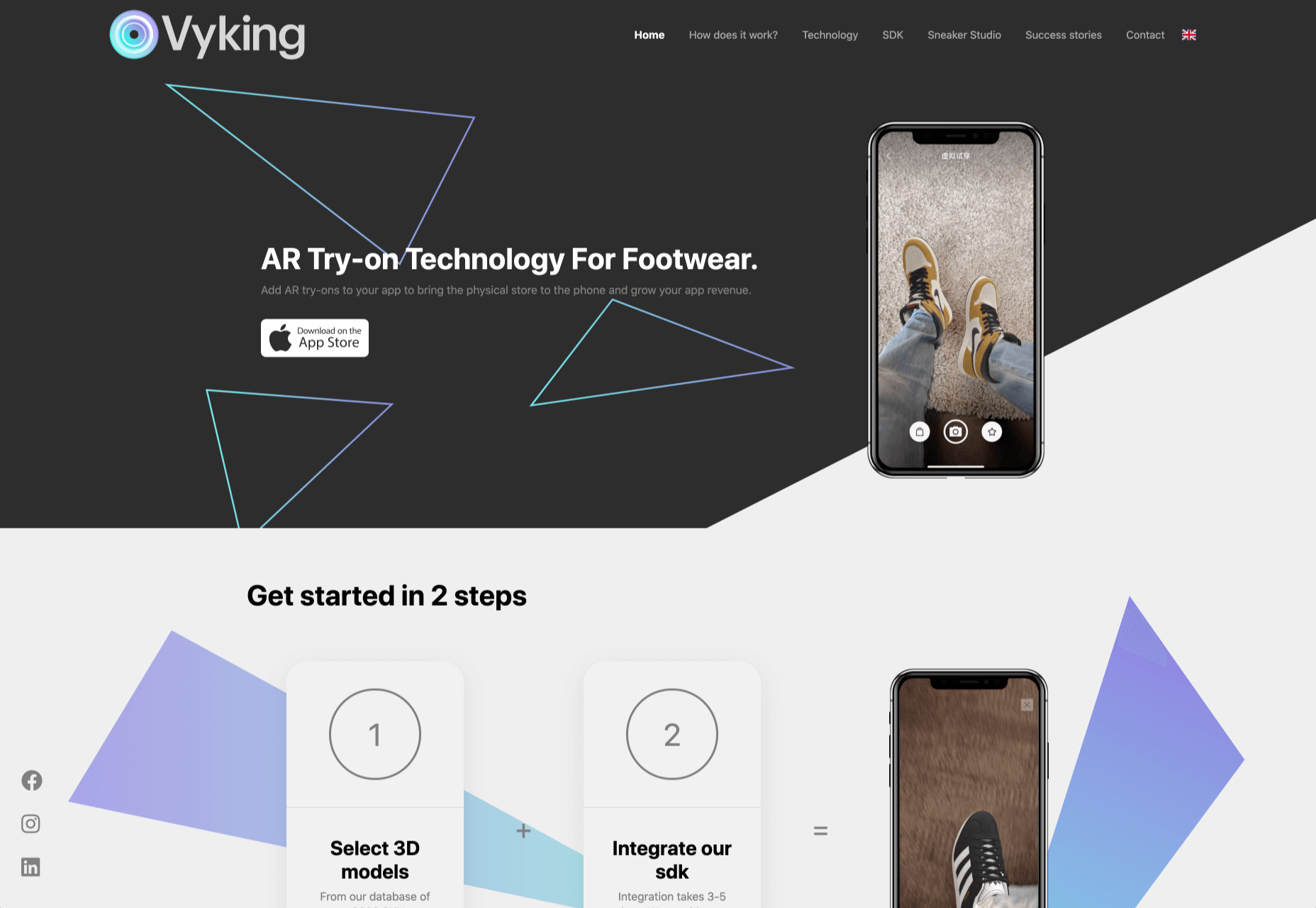
Now that we’re in the year 2021, however, discussions about AR aren’t just observational anymore. The age of mixed-reality interfaces is here, in everything from Pokémon Go, to Snapchat filters.

The question is, how do web designers create incredible user experiences in a world where there are now multiple digital realities to consider?

The Benefits of Experimenting with AR

Before we look at some of the steps that web designers can take to enhance their projects with AR, it’s worth examining the benefits of interacting with augmented reality in the first place. 

While virtual reality replaces the typical world around us completely with digital components, AR augments it. This means that developers and designers need to learn how to thrive in an environment where the real world and the digital one work together. 

The most common AR application for website owners is to provide a solution for real-time and remote product visualization. Imagine being able to try on a pair of shoes before you buy them online. That’s a service that the Vyking brand can deliver by creating technology that “reinvents” the digital shopping experience. 

This test functionality plays a massive role in purchasing decisions. In a world where people can’t see a shade of make-up in person when they’re shopping online, or check how an item of furniture looks in their home, AR has a crucial role to play. 

In simple terms, AR helps shoppers to make more informed purchases. 

Here’s how you can use augmented reality to deliver incredible UX. 

1. Focus on Real-Time Feedback

Augmented reality is all about connecting the real world to the virtual world. 

Doing this provides users a unique experience – one that’s filled with real-time feedback that can deliver crucial and insightful information. For instance, an augmented reality system in a GPS app can calculate the average time before reaching a destination based on previous trips.

Another option is for an augmented reality to use solutions like face-mapping to help customers determine how a certain makeup product will look before they buy it. For instance, that’s the case for the Mary Kay Mirror Me app, which simplifies the process of shopping for make-up. 

When designing for AR, experts need to consider how they can provide customers with real-time information that they can use to make better purchasing decisions. 

2. Define input and output

Although you’ve probably performed similar exercises when designing for traditional websites and applications in the past, defining inputs and outputs of UX in AR environments can be tough.

Defining inputs and outputs allows you to determine which elements of an interface your user can actually interact with, in your interface. This gives you a better idea of what to “augment.” For instance, you might decide that physical gestures like a swipe of the hand will be essential for AR inputs. However, you’ll also need to consider how each mobile device offers different input possibilities. 

Outputs are a little simpler. For instance, you could offer a three-dimensional model of a product that your customers are interested in. Once you have that output, you can think about how the customer will interact with it by changing colors or position.

3. Embrace Customer-Friendly Performance

Another feature at the heart of AR applications is interactivity. 

Good designs in the augmented reality world need to be simple to access and use, otherwise customers will end up avoiding them. For instance, 60% of customers say they want to use AR when they’re shopping for furniture. However, they’re only going to use your app if it actually works. 

The Décor Matters website and app mix gamification with home decorating features that help customers get a better view of the home goods they’re planning on buying. The website even has inspiration pages available to help users find and try new design options with their AR technology. 

When designing for AR, think about how you can make your applications or technology as simple to use as possible, so customers actually want to interact with it. 

4. Address the Environment

In augmented and virtual reality applications, it’s important to remember that interfaces aren’t bound by physical screens. The viewport will move with the user, shifting perspectives in response. Most AR designers will use four different signifiers to describe AR environments:

  • Public environment: The entire body of the user is involved as a controller, like with the Xbox Kinect or Nintendo Wii;
  • Intimate environment: Where a user can be seated – often in a desktop environment;
  • Personal environment: AR on smartphones, mobile devices, and tablets, like Pokémon Go;
  • Private environments: Completely private spaces, such as with wearable technology like the Google Glass solution.

The environment that you’re designing for will be crucial for your project outcomes. Remember, spatial considerations need to be carefully considered when accounting for how users will interact with objects in a frame. 

5. Remember User Fatigue

Another thing to keep in mind when designing for AR technology is that user fatigue is likely to be a much more significant consideration. After all, people interact with websites and applications in a much more intimate and in-depth way when AR is involved. 

AR applications can often use the entire body of a customer as a controller. Because of this, designers need to be careful about exhausting interactions. High-effort and repetitive interactions could tire the user out mentally and physically, causing them to give up on the interaction. 

When designing, you’ll need to consider how you might over-stimulate the user with too many interaction-focused elements at once. Keep it simple.

6. Remember the Essential Principles of UX Design

Remember, just because you’re tapping into a relatively new technology doesn’t mean that you should abandon all the basic tenets of user experience design that you’ve come to understand over the years. Although UX is constantly evolving and changing, it’s always going to keep a few fundamental principles in mind. 

For instance, you’ll always strive to give users the best digital experience in exchange for the lowest amount of effort on their part. Additionally, you’ll need to think about how you can make end-users as comfortable as possible when they’re interacting with new types of technology on websites and apps. 

For instance, since AR is most commonly associated with gaming in the current environment, it might be a good idea to implement gamification concepts into your AR design. What can you do to make sure your customers are having fun?

For instance, Inkhunter is an app that allows users to try on tattoos just like using a filter on Snapchat. The experience feels familiar, comfortable, and exciting.

Unlocking the Potential of AR Web Design

Augmented Reality technology has come a long way over the years. Today, developers and designers can access simple plug-in tools like WordPress VR, allowing designers to upload 360-degree videos into WordPress sites and other unique web extensions. 

Augmented reality is becoming much more readily available on sites and apps of all shapes and sizes. Additionally, customers are accessing more ways to unlock AR’s power through everything from headsets to mobile interfaces. 

However, just like any new technology in the web design world, designers need to think carefully about how they will overcome the challenges in user experience that AR can present. For instance, though AR can offer more information for a customer and help them make purchasing decisions faster, there are also risks. For instance, add too many interactive features to a single website or application, and you could scare users off with too much information. 

In the short-term, web designers need to explore the new tools that are available to them and think about the customers they’re designing for. Only this way will we be able to make any considerable advances in the possibilities of AR. 

Are You Ready to Embrace AR?

Designing for augmented reality applications and websites can be an intimidating concept – even for seasoned designers. However, this is just another technology that creatives can use to drive better experiences for end-users. 

Learn how the latest technology works and get an insight into your customers’ needs, and you’ll be amazed at what you can accomplish in the AR world.

Source


Source de l’article sur Webdesignerdepot