Articles

De spécialiste de l’ingénierie industrielle, ATS accélère sa transformation numérique et lance sur le marché un portfolio de nouveaux services digitaux notamment sur base de solutions SAP Cloud PLM et Assets (de l’Ingénierie à la machine as a service). Un acteur OT et IT, capable d’accompagner les organisations dans leur voyage vers l’industrie 4.0.

ATS, c’est avant tout une aventure familiale, démarrée en 1989 au Creusot. L’histoire d’un spécialiste en ingénierie industrielle (ATS Engineering), mais aussi en conception et réalisation de moyens de production automatisés (ATS Solutions). L’entreprise compte aujourd’hui 200 collaborateurs, pour un chiffre d’affaires annuel d’environ 20 millions d’euros.

“La quatrième révolution industrielle nous donne l’opportunité de transformer l’industrie, en la rendant à la fois plus performante et plus attractive. Notre ambition est d’accompagner dans leur transformation les femmes et les hommes (end-users) opérant sur des sites industriels, en apportant de nouveaux outils et services pour remettre l’Homme au centre et réinventer l’expérience Homme-machine.” Explique Rodolphe Roy, Président d’ATS. “Faire grandir l’Humain pour amener plaisir et reconnaissance dans l’industrie : Un élément crucial pour booster l’attractivité et attirer de nouveaux talents.”

Le numérique, nouveau pilier d’ATS

Le premier jalon de la transformation d’ATS est posé en 2011, lorsque Rodolphe Roy en devient l’actionnaire unique. En 2017, une fois le rachat sécurisé, la transformation du groupe peut commencer, avec comme nouvel axe le numérique.

La société est dans le même temps repérée par BPI France, qui l’invite à rejoindre le programme accélérateur PME/PMI, puis la French Fab, le porte-drapeau de l’industrie française en tant qu’ambassadeur pour la Bourgogne. Ce programme accélérateur pousse également ATS à aller au-delà de l’OT pour proposer des services IT à ses clients et remettre l’innovation au centre de sa transformation.

Des LAB’Innovation sont ainsi déployés sur chacun des sites d’ATS, afin de permettre à tous les collaborateurs de l’entreprise d’explorer et d’innover avec de nouvelles technologies digitales, comme le cloud, l’ingénierie collaborative en Réalité Virtuelle, l’impression 3D ou encore la capture de la réalité. Le tout en lien avec les clients et partenaires de l’entreprise.

« Notre langue maternelle est l’OT, mais nous avons fait IT seconde langue, ce qui nous permet d’accompagner les industriels dans leur transformation numérique. Nous avons pour vocation à être la courroie de distribution entre ces deux mondes. »

Il est vrai qu’en tant que concepteur de moyens de production automatisés, et connectés, ATS Solutions apporte déjà un savoir-faire à mi-chemin entre OT et IT, pour le compte de clients prestigieux comme Air Liquide, Arkema, Schneider Electric ou encore le CEA.

ATS Connect, l’intégrateur OT/IT des industriels

“Avec ATS Solutions, nous proposons aux industriels des nouveaux moyens de production (CAPEX) automatisés, connectés et flexibles, rappelle Rodolphe Roy. Toutefois, nous étions un peu frustrés de ne pas pouvoir les accompagner dans leurs phases d’exploitation (OPEX), ni dans leurs projets de numérisation de leurs parcs machines existants.”

“Notre nouvelle activité portée par ATS Connect répond à cela, mais pas seulement : nous accélérons sur l’accompagnement à la transition énergétique et environnementale des industriels, jusqu’aux projets de villes intelligentes (smart city).” Complète Jordan Lecat, COO d’ATS Connect.

ATS Connect est chargée de porter les projets de connexion digitale des équipements. Cela commence par un audit 4.0 du moyen de production, des échanges systématiques avec les utilisateurs finaux pour identifier leurs points de douleurs. Nous traitons ensuite la collecte des données et le traitement de l’information pour créer les bons outils de suivi de performance et de maintenance. Le tout en faisant appel au besoin à des technologies innovantes capables de projeter les entreprises dans le monde de l’industrie 4.0. À ce titre, ATS Connect devient un intégrateur de bout en bout de solutions OT/IT.

SAP, éditeur clé pour ATS

Autre jalon de la transformation d’ATS, la rencontre avec SAP en 2018. ATS voit dans les solutions Cloud Public PLM et Assets, respectivement SAP Enterprise Product Development (SAP EPD) et SAP Intelligent Asset Management (SAP AIM) associé à SAP Business Technology Platform (SAP BTP), une plate-forme ouverte et collaborative de choix pour gérer les équipements des industriels et porter des projets avancés, comme la mise en place de jumeaux numériques connectés. Cette plateforme Cloud devient ainsi un catalyseur pour le développement commercial des nouveaux services numériques d’ATS Connect.

« ATS Connect se positionne clairement comme offreur de solutions Industrie 4.0, explique Jordan Lecat. Nous collectons la data, que nous faisons remonter sur la plate-forme Cloud SAP, afin de proposer des services innovants à nos clients. Par exemple de la maintenance prédictive. Avec ATS Connect, nous pouvons enfin proposer une gestion de bout en bout des moyens de production des industriels. »

Dans le cadre du partenariat entre SAP et le Collectif Continuité Numérique, ATS Connect participe par ailleurs au développement de démonstrateurs Industrie 4.0 autour des jumeaux numériques, lesquels sont déployés sur les Experience Centers SAP de Paris et Barcelone. ATS rejoint ainsi l’écosystème SAP relatif à l’industrie du futur. « Ceci nous rend d’autant plus fiers que nous partageons les valeurs et ambitions portées par SAP et ses Experience Centers : Meet, Inspire, Engage. »


The post ATS accompagne les industriels dans leur transformation numérique appeared first on SAP France News.

Source de l’article sur sap.com

WordPress 6.0 has been released, and another niche jazz musician will be enjoying extra Spotify royalties next month.

WordPress 6, named for latin-jazz musician Arturo O’Farrill, is the realization of a change of direction the WordPress Foundation adopted several years ago.

All versions of WordPress now power around 42% of the web. That’s approximately 810,000,000 sites. If you looked at each site for a single second, without pausing to blink, it would take you over 25 years to see the home page of each one — of course, if you factor in how long a typical WordPress site takes to load it would take well over a century.

Some people (i.e., me) have been predicting the decline of WordPress for so long that sooner or later, we were bound to be correct. And, despite its astonishing reach, there are some signs that its market share may now be in decline. Even the W3C abandoned it in favor of Craft.

Of the 1,930,000,000 sites that currently make up the web, only around 400,000,000 are active. WordPress’s long-term dominance, coupled with a stalling market share, means that a disproportionate number of abandoned sites are WordPress. With site builders like Wix, Squarespace, and Shopify taking huge chunks of WordPress’ share of new sites, WordPress is facing something of a cliff edge.

What the ill-informed naysayers (i.e., me) hadn’t counted on was that WordPress had already seen the writing on the wall and formulated a plan…

WordPress’s problem has always been its legacy code; supporting out-of-date ideas and a spaghetti-like codebase has meant a great deal of work to do anything new. As a result, the last few releases have seen great ideas stifled by labored implementation. Even the most loyal WordPress user has to admit that Gutenberg, while filled with potential, doesn’t work the way it should. However, with WordPress 6, all the work may be starting to pay off.

With version 6, the block editor in WordPress is starting to feel like a design tool that, if not perfect, is at least usable. Editing content no longer feels like you’re fighting against the UI. Most importantly, the bar for creating a site is much, much lower. WordPress 6 also offers improved performance and accessibility, both areas that have traditionally been lacking. Security is still something of an issue, but that is mainly due to the ROI for hackers that massive market shares generate.

WordPress, it seems, has arrived at two conclusions: its main competition isn’t other CMS but other site builders. To maintain its market dominance, it needs to cater not to professionals but to amateurs.

Don’t get me wrong; the WordPress ecosystem will benefit from WordPress 6, at least reputationally. New sites run by amateurs eventually become established sites run by, if not professionals, then at least knowledgeable amateurs.

OK, so WordPress probably isn’t a good choice for enterprise sites. And there are certainly better options for ecommerce. And as for SEO, well, probably best not mentioned.

But in WordPress 6, we have a free, open-source site builder that lowers the bar for making a new site. It’s a credit to the community that has persevered to produce it.

Source

The post WordPress 6.0 Lives Up To The Hype first appeared on Webdesigner Depot.

Source de l’article sur Webdesignerdepot

In scanning the IT landscape, the call for DevOps engineers remains toward the top of many companies’ priorities. A nationwide search through various job posting sites returns literally thousands of DevOps opportunities. However, reviewing these job postings shows that the skillsets required are widely varied. In comparison, software development job descriptions and requirements tend to have a narrower focus – broadly speaking, a language and a particular framework. DevOps job descriptions and requirements range from implementing continuous integration and continuous delivery (CI/CD) processes, to building infrastructure, to configuration management, to cloud operations, to writing code in any number of languages, and so on. It’s an impressive and intimidating list. Have you considered joining the DevOps wave but have been challenged in getting a clear picture of what DevOps is or means? If so, you’re not alone.

What is DevOps?

While many organizations have DevOps teams, even within a single organization, there are likely to be multiple roles within a DevOps team. Why is that? The reason is that DevOps is a process, and various roles within a DevOps team each contribute to the process. The DevOps process is a product of the evolution of Agile development processes. With Agile, production-quality software is iteratively delivered, which drives the need to deploy software more often. The process of getting software into production needed to be streamlined, thus the DevOps movement and process was born.

Source de l’article sur DZONE

Websites haven’t always been as adaptable as they are today. For modern designers, “responsivity” is one of the most significant defining factors of a good design. After all, we’re now catering to a host of users who frequently jump between mobile and desktop devices with varying screen sizes. 

However, the shift to responsive design didn’t happen overnight. For years, we’ve been tweaking the concept of “responsive web design” to eventually reach the stage we’re at today. 

Today, we’re going to take a closer look at the history of responsive web design.

Where Did Web Design Begin?

When the first websites were initially created, no one was worried about responsivity across a range of screens. All sites were designed to fit the same templates, and developers didn’t spend a lot of time on concepts like design, layout, and typography.  

Even when the wider adoption of CSS technology began, most developers didn’t have to worry much about adapting content to different screen sizes. However, they still found a few ways to work with different monitor and browser sizes.

Liquid Layouts

The main two layout options available to developers in the early days were fixed-width, or liquid layout. 

With fixed-width layouts, the design was more likely to break if your monitor wasn’t the exact same resolution as the one the site was designed on. You can see an example here

Alternatively, liquid layouts, coined by Glenn Davis, were considered one of the first revolutionary examples of responsive web design. 

Liquid layouts could adapt to different monitor resolutions and browser sizes. However, content could also overflow, and text would frequently break on smaller screens. 

Resolution-Dependent Layouts

In 2004, a blog post by Cameron Adams introduced a new method of using JavaScript to swap out stylesheets based on a browser window size. This technique became known as “resolution-dependent layouts”. Even though they required more work from developers, resolution-dependent layouts allowed for more fine-grained control over the site’s design. 

The resolution-dependent layout basically functioned as an early version of CSS breakpoints, before they were a thing. The downside was developers had to create different stylesheets for each target resolution and ensure JavaScript worked across all browsers.

With so many browsers to consider at the time, jQuery became increasingly popular as a way to abstract the differences between browser options away.

The Rise of Mobile Subdomains

The introduction of concepts like resolution-dependent designs was happening at about the same time when many mobile devices were becoming more internet-enabled. Companies were creating browsers for their smartphones, and developers suddenly needed to account for these too.

Though mobile subdomains aimed to offer users the exact same functions they’d get from a desktop site on a smartphone, they were entirely separate applications. 

Having a mobile subdomain, though complex, did have some benefits, such as allowing developers to specifically target SEO to mobile devices, and drive more traffic to mobile site variations. However, at the same time, developers then needed to manage two variations of the same website.

Back at the time when Apple had only just introduced its first iPad, countless web designers were still reliant on this old-fashioned and clunky strategy for enabling access to a website on every device. In the late 2000s, developers were often reliant on a number of tricks to make mobile sites more accessible. For instance, even simple layouts used the max-width: 100% trick for flexible images.

Fortunately, everything began to change when Ethan Marcotte coined the term “Responsive Web Design” on A List Apart. This article drew attention to John Allsopp’s exploration of web design architectural principles, and paved the way for all-in-one websites, capable of performing just as well on any device. 

A New Age of Responsive Web Design

Marcotte’s article introduced three crucial components developers would need to consider when creating a responsive website: fluid grids, media queries, and flexible images. 

Fluid Grids

The concept of fluid grids introduced the idea that websites should be able to adopt a variety of flexible columns that grow or shrink depending on the current size of the screen. 

On mobile devices, this meant introducing one or two flexible content columns, while desktop devices could usually show more columns (due to greater space). 

Flexible Images

Flexible images introduced the idea that, like content, images should be able to grow or shrink alongside the fluid grid they’re located in. As mentioned above, previously, developers used something called the “max-width” trick to enable this. 

If you were holding an image in a container, then it could easily overflow, particularly if the container was responsive. However, if you set the “max-width” to 100%, the image just resizes with its parent container. 

Media Queries

The idea of “media queries” referred to the CSS media queries, introduced in 2010 but not widely adopted until officially released as a W3 recommendation 2 years later. Media queries are essentially CSS rules triggered based on options like media type (print, screen, etc), and media features (height, width, etc). 

Though they were simpler at the time, these queries allowed developers to essentially implement a simple kind of breakpoint – the kind of tools used in responsive design today.  Breakpoints refer to when websites change their layout or style based on the browser window or device width.

Viewport Meta tags need to be used in most cases to ensure media queries work in the way today’s developers expect. 

The Rise of Mobile-First Design

Since Marcotte’s introduction of Responsive Web Design, developers have been working on new ways to implement the idea as effectively as possible. Most developers now split into two categories, based on whether they consider the needs of the desktop device user first, or the needs of the mobile device user. The trend is increasingly accelerating towards the latter. 

When designing a website from scratch in an age of mobile-first browsing, most developers believe that mobile-first is the best option. Mobile designs are often much simpler, and more minimalist, which matches a lot of the trends of current web design.

Taking the mobile first route means assessing the needs of the website from a mobile perspective first. You’d write your styles normally, using breakpoints once you start creating desktop and tablet layouts. Alternatively, if you took the desktop-first approach, you would need to constantly adapt it to smaller devices with your breakpoint choices.

Exploring the Future of Responsive Web Design

Responsive web design still isn’t perfect. There are countless sites out there that still fail to deliver the same incredible experience across all devices. What’s more, new challenges continue to emerge all the time, like figuring out how to design for new devices like AR headsets and smartwatches. 

However, it’s fair to say we’ve come a long way since the early days of web design. 


Featured image via Pexels.

Source

The post A Brief History of Responsive Web Design first appeared on Webdesigner Depot.

Source de l’article sur Webdesignerdepot

Dans le cadre de sa transformation, le Groupe ISB investit dans un nouveau système d’information. La modernisation de son SI va s’effectuer par l’adoption de l’ERP SAP S/4HANA en mode cloud, avec l’offre RISE with SAP. Ce projet sera mené en partenariat avec NTT Data Business Solutions France (NDBS France).

Groupe ISB est un spécialiste du bois qui souffle cette année sa soixantième bougie. Acteur incontournable français des produits et solutions bois pour l’habitat et la construction, il est également spécialiste du rabotage de bois résineux en Europe.

L’entreprise s’appuie essentiellement sur deux marques fortes : Silverwood (bois rabotés : bardages, lambris, terrasses, etc.) et Sinbpla (trading de panneaux et bois résineux). Le groupe compte environ 430 collaborateurs, répartis sur différents sites : usines, hubs portuaires, plateformes logistiques et agences commerciales.

2015 : l’année de l’émancipation

Groupe ISB est né du rachat de la division Importation et Solutions Bois (ISB) de Wolseley par ses cadres en 2015. Suite au rapprochement en 2019 avec SCA Wood France, Benjamin Bodet a pris la direction générale du groupe et engagé la transformation d’ISB sur ses deux principaux métiers, qui sont l’importation et la transformation du bois. « Nous avons retravaillé tout d’abord notre modèle économique, puis notre organisation commerciale. Dans le cadre de notre plan stratégique Impact 2026, validé début 2022, nous avons notamment travaillé sur la création de valeur tout le long de la value chain, des pays producteurs à nos clients distributeurs et industriels. »

Groupe ISB a comme ambition de mettre sa politique RSE au cœur de ses activités, en proposant notamment des produits bas carbone, durables et toujours plus respectueux de l’environnement.

Le plan Impact 2026 comprend un volet visant à investir dans les solutions SAP avec comme projet clé l’adoption de l’ERP SAP S/4HANA. Un choix né d’une intense phase de réflexion : « Nous avons passé 18 mois à challenger les différents éditeurs du marché. La balance a finalement penché en faveur de SAP. C’est un environnement que nous connaissons bien, proposé par un acteur qui nous ressemble ; innovant et leader sur son marché. »

Un ERP nouvelle génération… en mode cloud

NTT Data Business Solutions France a été choisi pour accompagner le Groupe ISB dans la mise en place de l’ERP SAP S/4HANA, la méthodologie de travail proposée et l’expertise logistique NTT correspondant aux besoins du Groupe ISB, le logisticien du bois. Une solution que la société a souhaité construire depuis une feuille blanche et déployer en mode cloud, avec RISE with SAP. « Nous voulions disposer d’un outil global, capable d’intégrer au maximum nos processus, mais sans reproduire les défauts de l’ancien système, trop sur mesure, trop permissif et manquant parfois de rigueur, par exemple sur la gestion des données. »

« Opter pour SAP est un véritable challenge qu’on se sent prêt à relever, poursuit Benjamin Bodet. Cela va nous obliger à nous structurer. C’est aussi pour cela que nous avons choisi SAP. » La difficulté principale de ce projet reste d’adapter l’ERP aux spécificités d’un métier qui demeure particulier, le bois. « Notre approche consiste à coller au maximum aux standards de la solution, mais sans écarter toutefois la mise en place de processus spécifiques. Nous allons nous appuyer sur l’expertise en intégration de NDBS FRANCE pour cela. Mais il nous faudra rester raisonnables dans nos envies d’adaptation de l’outil. »

Le projet a été lancé en début d’année 2022 et devrait s’achever avec le go live de la solution SAP S/4HANA, programmé pour le 1er août 2023. 18 mois donc pour mettre en place un ERP au périmètre large (finance, contrôle de gestion, achat, vente, production et logistique) et couvrant toutes les entités du groupe.

Déjà des projets autour de l’ERP SAP S/4HANA

L’adoption d’une solution cloud devrait permettre de faciliter l’accès à l’ERP en France comme à l’étranger. « Nous avons des partenaires un peu partout dans le monde, explique Benjamin Bodet. L’un de nos projets serait par ailleurs d’intégrer SAP le plus en amont possible chez nos partenaires logistiques chargés d’exporter du bois en direction de nos hubs portuaires français. » L’objectif est de connaître au plus tôt et avec le plus de précision possible le contenu de chaque chargement, afin de mieux gérer les stocks et de mieux orienter les flux.

Autre sujet, le transport : « Nous affrétons 20.000 camions chaque année. Investir dans un module avancé de gestion des transports nous permettra de disposer d’une tour de contrôle de l’ensemble de nos flux, routiers comme maritimes, ce qui nous permettra de distribuer nos produits avec la road to market la plus directe possible. »

Dernier défi enfin, l’empreinte carbone, qui est au cœur du plan stratégique Impact 2026 de Groupe ISB. « Pour optimiser notre empreinte carbone, que ce soit lors de la production ou du transport, il nous faut des outils. SAP Product Footprint Management est une solution que nous souhaitons implémenter, car en nous donnant la capacité de mesurer l’impact carbone de nos produits elle pourrait nous apporter un net avantage compétitif et aligner avec les valeurs de notre entreprise que nous portons. »

The post Groupe ISB mise sur SAP pour soutenir ses ambitions de transformation en leader du bois… bas carbone appeared first on SAP France News.

Source de l’article sur sap.com

Every day design fans submit incredible industry stories to our sister-site, Webdesigner News. Our colleagues sift through it, selecting the very best stories from the design, UX, tech, and development worlds and posting them live on the site.
The best way to keep up with the most important stories for web professionals is to subscribe to Webdesigner News or check out the site regularly. However, in case you missed a day this week, here’s a handy compilation of the top curated stories from the last seven days. Enjoy!”

What’s New in WordPress 6?

From PHP to Next.js: What Trivago Learned

4 CSS Progress Bars You Can Use on your Website

Lesser-Known and Underused CSS Features in 2022

Responsive Forms with CSS Flexbox

20 Best New Sites, June 2022

Building a Button Component

15 Web Design Principles for a Customer-Friendly Website

How I Created a Minimal Linktree Page in Just 2 Hours

Pixelarticons

Source

The post Popular Design News of the Week: May 23, 2022 – May 29, 2022 first appeared on Webdesigner Depot.

Source de l’article sur Webdesignerdepot

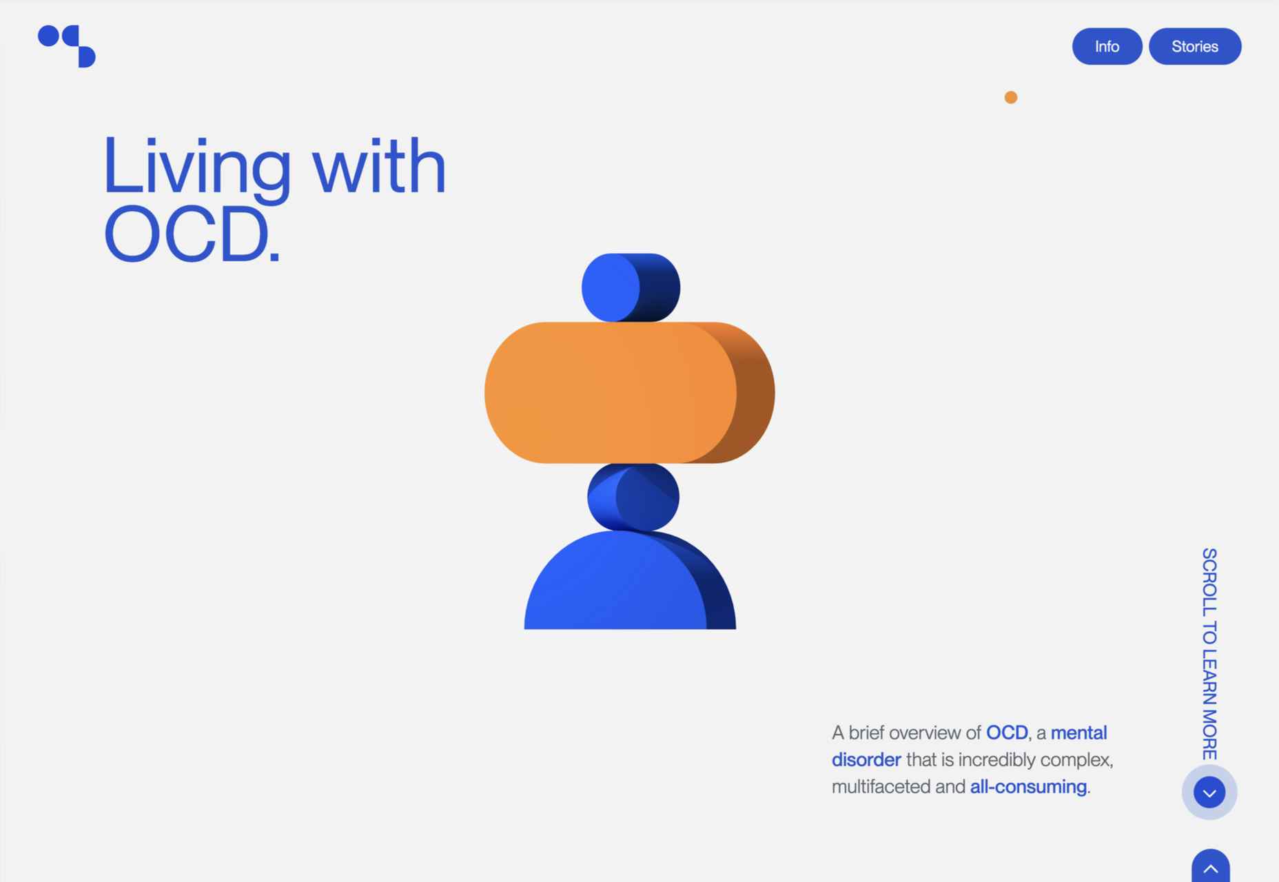
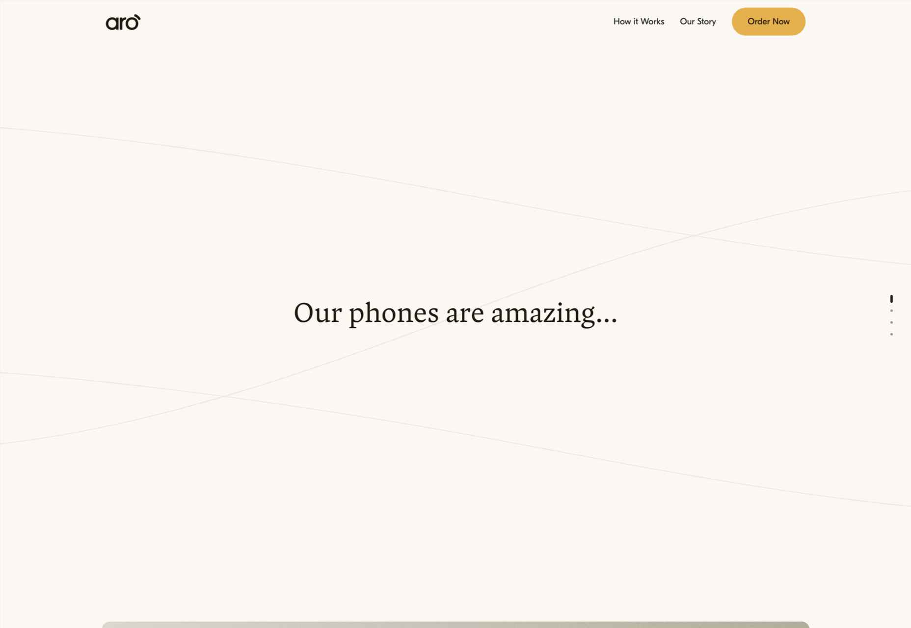
This month’s collection of the best new sites is a mixed bag. Positivity remains from last month’s edition, and what we’re seeing is designers being far more ambitious for the experiences they create.

We have a couple of sites helping to alleviate the damage of war, some unusual approaches to topics that are normally very dour, and some excellent portfolios to be jealous of. Enjoy!

Sarah Fatmi

Characterful illustration and desktop sideways scrolling make this portfolio site for illustrator Sarah Fatmi stand out.

Vestiaire Impact Report

Green is the new black, and fashion resale platform Vestiaire presents its green credentials in an informative and engaging way.

Houseplant

Houseplant is a collection of cannabis-related products designed by Seth Rogen and Evan Goldberg; this site is a lot classier than the average headshop.

FreshCut BarberShop

The site for FreshCut BarberShop is modern, bold, and gets its message across clearly, even if the user doesn’t read French.

Feed The 300

Feed the 300 is an appeal in aid of the animals in Ukraine’s zoos. It is very simple in concept and design, but endearing animated line drawings give it character.

Honeymoon Chicken

Luscious photography combined with surprisingly delicate illustrations makes Honeymoon Chicken very inviting.

Patachou Inc

Patachou Inc operates a group of eateries and the site does a good job of conveying both the very different individual brand identities of each establishment, and the common ethic behind all of them.

Living With OCD

Many design studios do showcase projects, and Living With OCD by designedbyla is one of the more publicly beneficial, and well-executed, examples around.

Aro

Aro is a product with a very simple concept — basically, a box to put away a phone, that also charges it — but this website does a great job of increasing the product’s desirability.

Kim Kniepp

The navigation on this site for Kim Kniepp’s design studio feels very interconnected, an effect heightened by the overlapping masonry grid.

Triniti

There is a calming, reassuring quality to the color used here for Pan-Baltic law firm Triniti. The perpetual motion style hero video adds a confident, soothing touch too.

Herezie

Creative agency Herezie uses saturation and gradual color changes to pleasing effect in this confident, assured website.

MetalColor

The color choices in this site for MetalColor, and how they are used, succeed in evoking what results the company could achieve without focusing on the less glamorous parts of the process.

Gras

Architecture and design studio Gras goes for a clean feel with an irregular grid layout and carefully curated images. The blog sidebar works well too.

Vendredi Society

Dark green and bright yellow make a strong statement in this portfolio site for brand strategists Vendredi Society.

HUB

HUB describes itself as a progressive property developer and this site does a great job of leaving behind the corporate image usually associated with property developers.

Nowhere Bakery

Nowhere Bakery makes vegan, paleo, gluten-free cookies, which don’t sound all that appealing on paper. This site manages to make them seem both really tasty and healthy.

Apotheke zur Triumphpforte

The botanical illustration style images on Apotheke zur Triumphpforte’s site help create an approachable brand identity while adding visual interest.

B!POD

A good balance of images, animation, and illustration combine to create an impactful presence for B!pod’s first product, a food vacuum storage system.

The New Exhibition

The New Exhibition is a showcase platform for Ukrainian creatives — type designers, illustrators, graphic designers, photographers, and others — whose ability to get work has been affected by war.

Source

The post 20 Best New Sites, June 2022 first appeared on Webdesigner Depot.

Source de l’article sur Webdesignerdepot

WordPress has made it easy for everyone to launch a blog, but even though launching a blog isn’t a difficult task any longer, driving traffic to your blog certainly is!
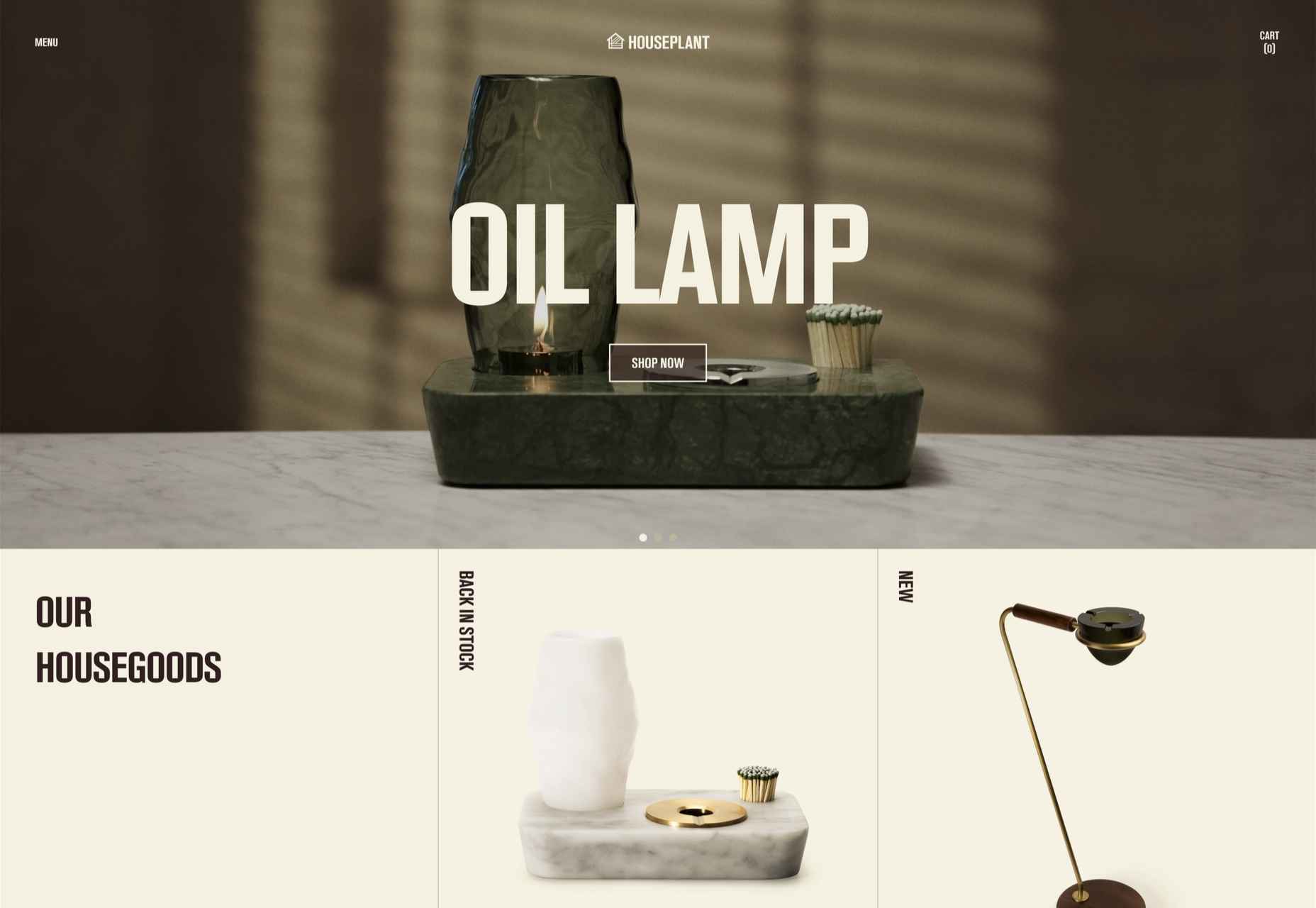
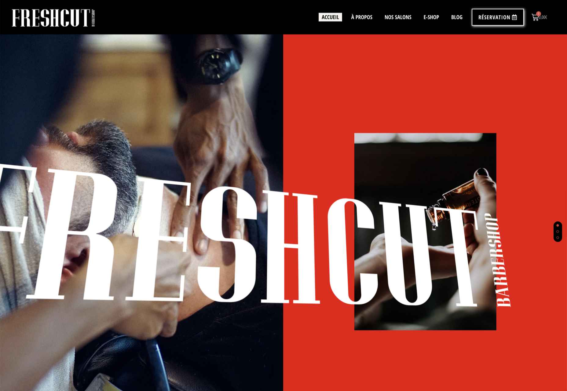
In this article, I’ll share some tried and tested strategies that have worked well for my clients’ blogs. You do not have to be an expert or a marketing guru to get traffic to your WordPress website. Follow the helpful tips I share in this article and watch the visitors start pouring in.

Tip 1: Use Powerful Headlines

The first thing related to your blog that a user reads in the search engine results is your article headlines. Of course, nobody wants to click on a boring article title. But a powerful headline stands out from the rest and gets you more clicks. 

In most themes, your article headlines are translated into meta titles for the pages. Meta titles indicate the topic of your articles to Google and other search engines. 

Tip 2: Build an Email List

Consider offering your visitors a newsletter signup form through which they can subscribe and get notified about new posts on your blog. You can offer them an incentive for free to persuade them to subscribe to your blog. It can be anything from an e-book, membership, useful templates, or an e-course. 

Building an email list gives access to the inboxes of your visitors. You can share your blog content with this prospective audience every time you post a new article. This will help you get consistent traffic to your WordPress blog.

Tip 3: Use Free Giveaways and Contests

Free giveaways work as an incentive for your WordPress blog visitors. To offer an entry to your blog’s free giveaway, you can ask your visitors for an email subscription, comment on your blog posts, share it on their social media channels, and ask for other such things. 

The trick is to think about the actions of your visitors that will increase traffic to your blog and provide them with one or multiple giveaway entries for such actions. 

Tip 4: Optimize For Keywords

All successful bloggers optimize their content for keywords. You need to perform proper keyword research to find sentences and words that your target audience is typing in Google and other top search engines. 

Instead of guessing the keywords for your articles, consider using some helpful tools like SEMrush’s Keyword Magic Tool and Google Ads Keyword Planner. This way, you can find the terms people are genuinely interested in and the keywords that do not have too much competition.

You must ensure to choose the keywords that have some excellent traffic volume but, at the same time, have less competition. Such keywords will help in the better ranking of each of your articles.

Tip 5: Optimize WordPress Site Speed

It has been proven that loading time is a ranking factor for SEO, as Google tends to assume that fast sites are high-quality sites.

Signing up for a hosting provider specializing in WordPress guarantees you get the best optimization features for your WordPress site. However, that alone is not enough because you need a hosting provider that can also handle a high volume of visitors.

Optimizing your WordPress website will help in the faster loading of your blog pages. Images are generally the biggest culprit in slowing down your website. So you must first optimize them through an image optimization plugin like Smush, Imagify, or Optimus. 

Enabling caching on your WordPress blog will considerably improve its speed. You can store your website data locally with caching, thereby reducing your server load to a large extent. Your website will, therefore, load faster on your visitors’ end, especially when they are repeat visitors.

Tip 6: Take Advantage of Social Media

Try building your presence on some of the top platforms like Facebook, Instagram, Twitter, LinkedIn, and Pinterest. Post multiple times a day on these websites and share your blog articles.

You must also include social sharing buttons with your blog posts to make sharing easier for your audience. It will allow your blog visitors to share your post on different social platforms. This dramatically increases the chances of your blog post going viral.

Tip 7: Internal Linking Strategy

The only key here is to link articles that are closely related to each other. Your visitors might be interested in such related content and read more of your blog posts, thereby increasing your page views. It also increases the chances of visitors sharing your blog content since they find it valuable.

Tip 8: Be a Guest Blogger

Guest blogging involves creating content for other websites for mutual benefits. It helps you establish your authority in the blogging world while attracting more visitors to your WordPress website. 

Becoming a guest blogger allows you to spread the word about your blog to a new set of audiences and bring in organic traffic. It expands your work portfolio and helps build or enhance your online reputation.

Tip 9: Pay for Traffic

Consider using Google Ads, Facebook Ads, Microsoft advertising, and other top advertising platforms when paying to bring traffic to your blog. Be aware of your blog audience and use the most suitable criteria to target it. 

I’d recommend setting a weekly budget for paid ads and tracking the ad performance at the end of the week.

If you are satisfied with the traffic results, use the same criteria for the next week. On the other hand, if the ad performance is not as per your expectations, try different criteria to reach your target audience.

Conclusion

Getting traffic to your WordPress blog is an incentive for all the hard work that you do in creating content and managing your website. It builds a name for your blog and improves its search engine ranking. All this leads to better user engagement and revenue.


Featured image via Pexels.

Source

The post 9 Ways To Drive Traffic To Your WordPress Blog first appeared on Webdesigner Depot.

Source de l’article sur Webdesignerdepot